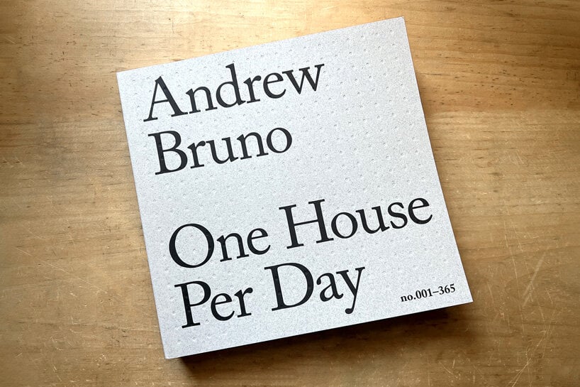
andrew bruno publishes year-long sketch series ‘one house per day’
CategoriesArchitecture

andrew bruno publishes year-long sketch series ‘one house per day’

designing and drawing ‘one house per day’


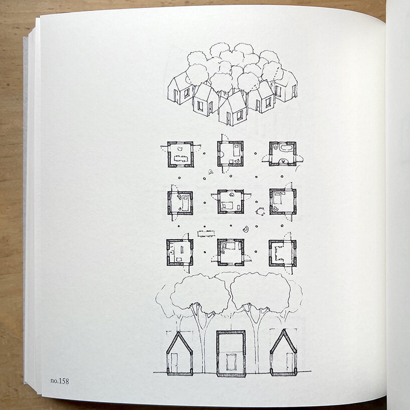
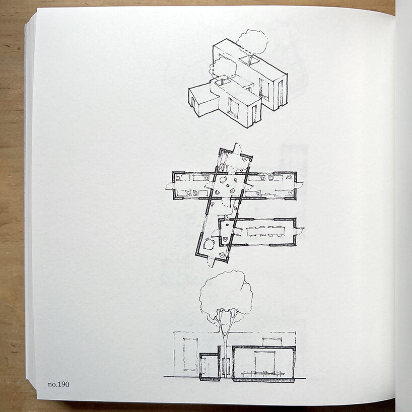
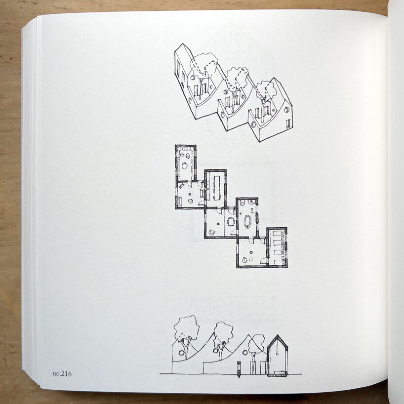
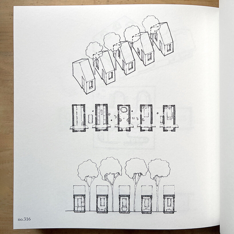
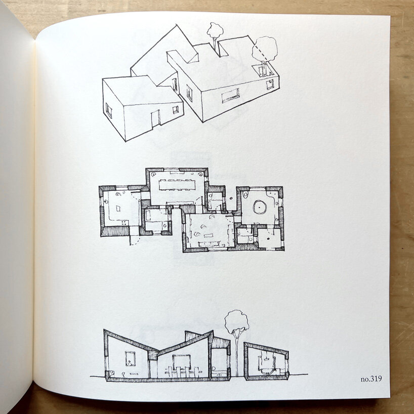
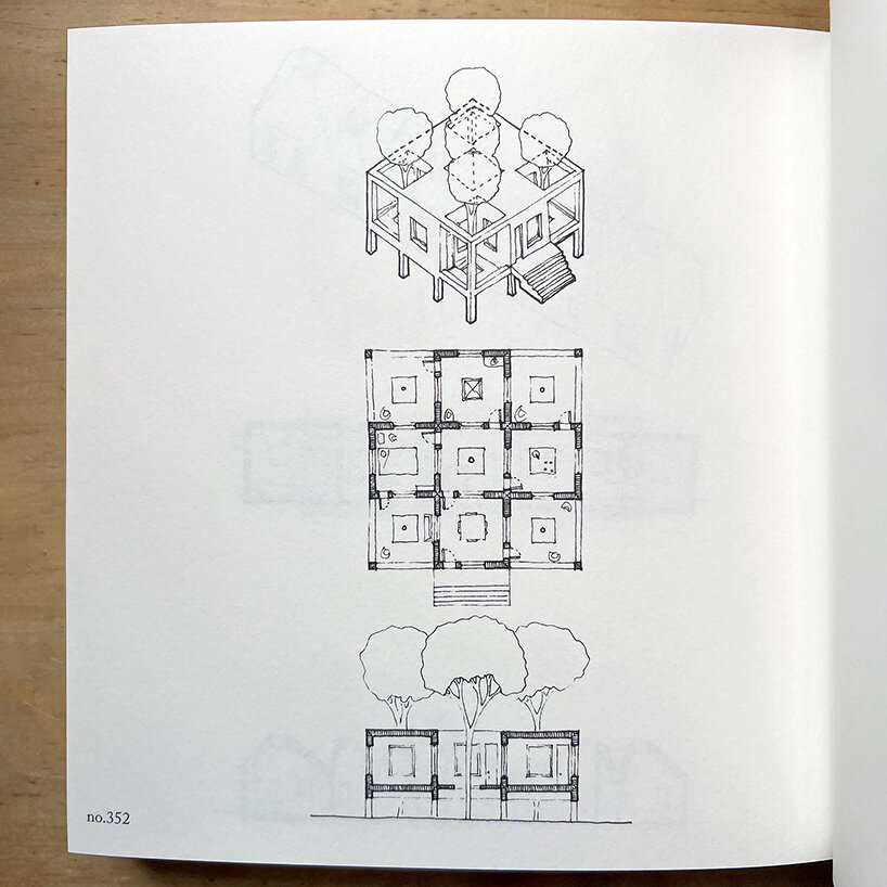
Following a year-long exploration of domestic space, architect Andrew Bruno celebrates the completion of his newly published book, ‘One House Per Day.’ Each day for the year of 2020 while living in Brooklyn, Bruno imagined and sketched a new dwelling each day with a compound drawing comprising an isometric, planar, and sectional view. He has now moved to Atlanta on a teaching fellowship while these 365 drawings have been collected together in a comprehensive publication in the order they were drawn, as high-quality 1:1 reproductions. Readers are invited to explore the designer’s year-long investigation, and discover imaginary spaces that range from the familiar to the radical.


The exercise began on social media as a rejection of the single nuclear family program with which the detached house has become synonymous. ‘Even the most architecturally radical houses are typically designed to serve the ends of the single-family patron,’ writes Andrew Bruno in an essay. ‘One House Per Day responds to this arbitrary constraint by imagining over and over how the architectural form of the house might be detached from its association with the monocultural single family.’

andrew bruno publishes 'one house per day,' a year-long series of sketches
photos by designboom, drawings by Andrew Bruno | @one_house_per_day


andrew bruno reimagines domestic space


Andrew Bruno’s One House Per Day proposes a captivating collection of domestic spaces imagined with new and inventive expressions. The concept of the single nuclear family home has long been a general archetype in the realm of residential architecture. It has become increasingly essential to question the relevance of this singular design approach to accommodate the complex and evolving nature of human relationships and societal structures. While this typology has long represented privacy, autonomy, and personal success, it simultaneously poses significant limitations in fostering communal living, adaptability, and sustainability.


Nonetheless, Bruno acknowledges the enduring American desire for suburban living. ‘The desire for a detached house in a suburban landscape is ingrained in American culture,’ Bruno explains, ‘and architects risk consigning themselves to irrelevance if they ignore it.’
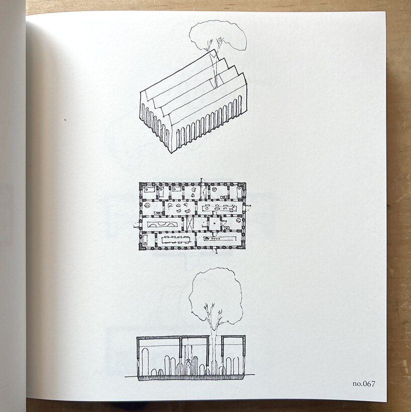
andrew bruno one house‘a collection of rooms divided by arcades with arched openings of varying heights…’


exploration through ritualization


The cover of Andrew Bruno’s One House Per Day showcases 365 indented circles to symbolize the 365 houses, providing the book with a distinctive tactile quality. Printed on on grey recycled paper, each drawing is allocated a full page followed by an index containing a brief and description.


The publication contains a forward by Keith Krumwiede, contributions by Malcolm Rio, Alessandro Orsini and Nick Roseboro, along with a section listing ‘One Sentence Per Day,’ by architect and author Clark Thenhaus — who explores Bruno’s ‘ritualized’ process of creation by embarking on a journal of daily reflections. The book concludes with a short essay in which Bruno examines the role of the detached house in American culture from social, political, and economic viewpoints.
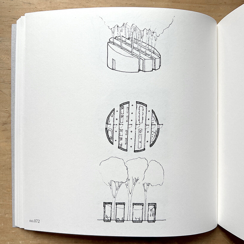
andrew bruno one house‘a cylindrical volume sliced to create four rooms with sloped ceilings, punctuated by tree-filled voids’
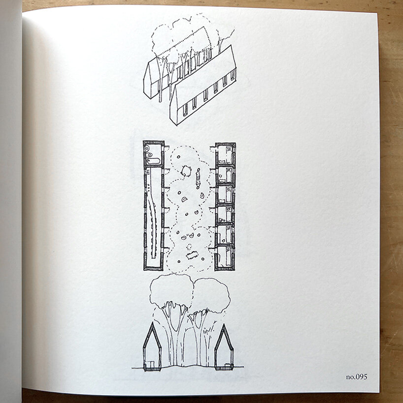
andrew bruno one house
‘two long and narrow gabled volumes separated by a wide tree-filled yard…’
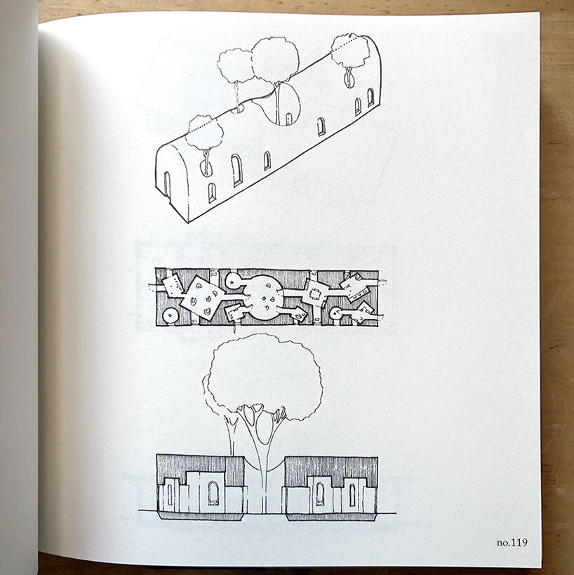
andrew bruno one house‘composed of a series of voids carved from a vaulted solid’ andrew bruno one house
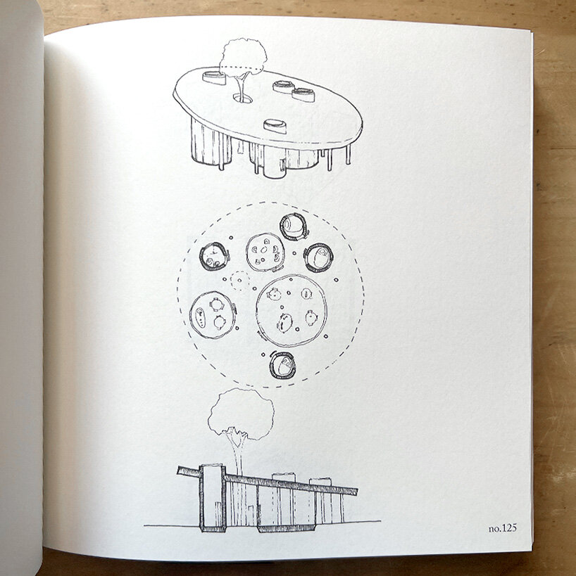
‘a collection of separate circular rooms of different sizes and opacities under one large canted circular roof’


1/6

'a grid of nine separate gabled rooms with trees and outdoor furniture occupying the interstitial spaces'

‘a grid of nine separate gabled rooms with trees and outdoor furniture occupying the interstitial spaces’

andrew bruno publishes ‘one house per day,’ a year-long series of sketches


andrew bruno publishes ‘one house per day,’ a year-long series of sketches


andrew bruno publishes ‘one house per day,’ a year-long series of sketches


andrew bruno publishes ‘one house per day,’ a year-long series of sketches


andrew bruno publishes ‘one house per day,’ a year-long series of sketches


project info:


project title: One House Per Day

designer: Andrew Bruno

publisher: Oro Editions


Reference

10K House in Barcelona is a “labyrinth that multiplies perspectives”
CategoriesSustainable News

10K House in Barcelona is a “labyrinth that multiplies perspectives”

Spanish studio Takk took cues from snugly stacked Russian dolls for the interior renovation of this Barcelona apartment, which features rooms nestled inside each other to maximise insulation.

Called 10K House, the 50-square-metre apartment was renovated by Takk using a material budget of only 10,000 euros with the aim of updating the home to be as sustainable as possible.

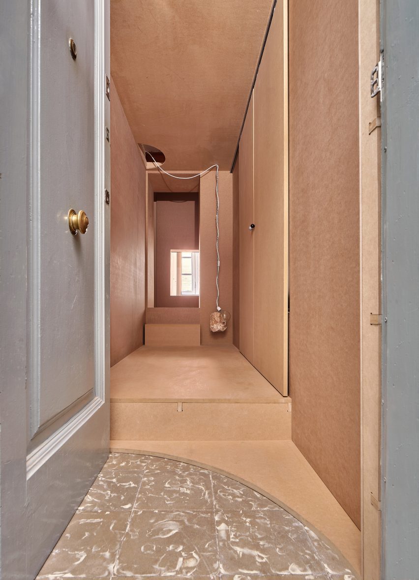
Wood-clad entrance to low-cost Barcelona apartment
10K House is a residential interior design project

The project was informed by concerns about climate change as well as the global energy crisis faced by homeowners and renters.

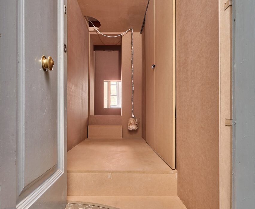
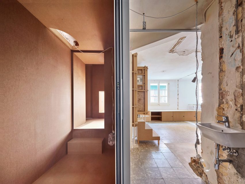
Arranged across one open level, rooms were built “inside one another” in a formation that mimics the layers of an onion and places the rooms that require the most heat at the centre of the apartment, according to Takk.

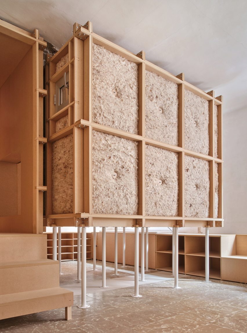
Elevated bedroom encased in sheep's wool and MDF
The bedroom is raised on recycled white table legs

“This causes the heat emitted by us, our pets or our appliances to have to go through more walls to reach the outside,” principal architects Mireia Luzárraga and Alejandro Muiño told Dezeen.

“If we place the spaces that need more heat – for example, the room where we sleep – in the centre of the Matryoshka [a Russian doll] we realise that we need to heat it less because the configuration of the house itself helps to maintain the temperature.”

“The result is a kind of labyrinth that multiplies perspectives,” explained the architects, who designed the project for a single client.

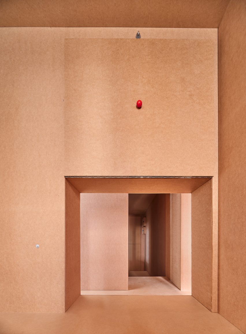
MDF walls and raw fixtures within apartment in Barcelona
MDF was used throughout the apartment

Recycled table legs were used to elevate these constructed rooms to allow the free passage of water pipes and electrical fittings without having to create wall grooves, reducing the overall cost.

For example, the raised central bedroom is clad in gridded frames of medium-density fibreboard (MDF) that are enveloped by slabs of local sheep’s wool – utilitarian and inexpensive materials that feature throughout the interior.

“Despite being a small apartment, it is very complex to ensure that you never get bored of the space,” said Luzárraga and Muiño.

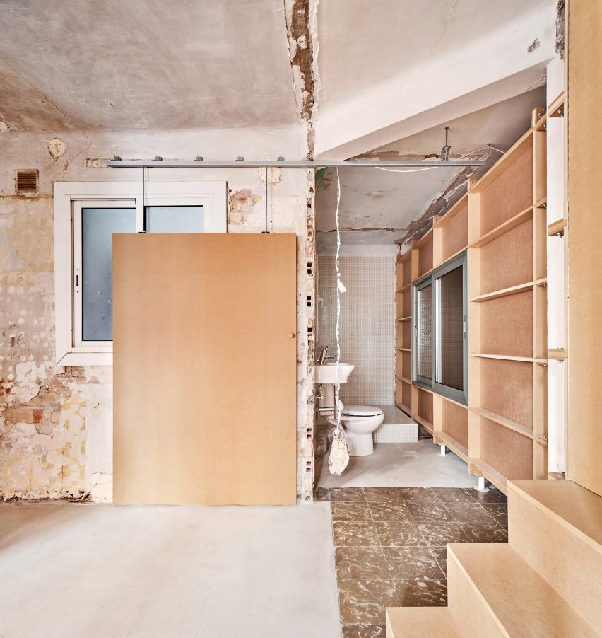
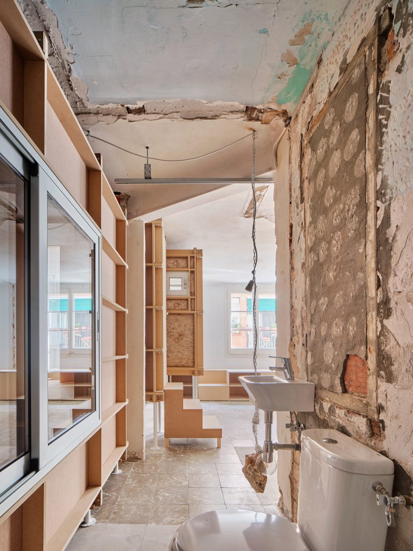
Wood-clad steps and walls within 10K House in Barcelona
The remnants of previous partitions were left exposed

After demolishing the apartment’s existing internal layout, Takk chose not to apply costly and carbon-intensive coatings to the floors and walls.

Rather, the architects scrubbed the space clean and left traces of the previous partitions and dismantled light fixtures visible, giving the apartment a raw appearance and maintaining a reminder of the original floor plan.

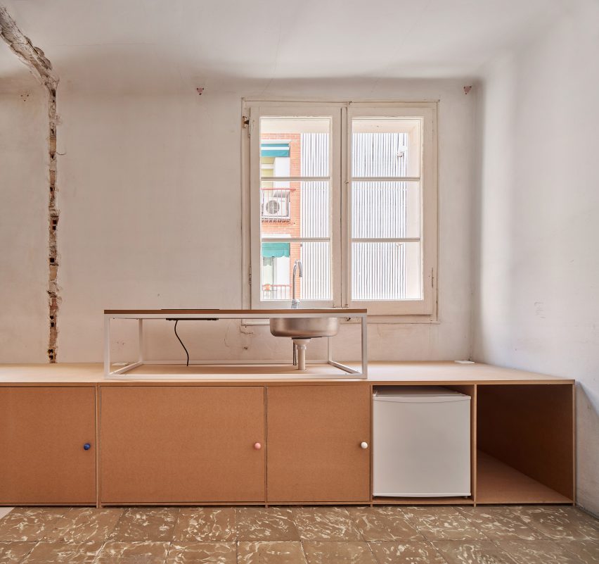
Low-slung wooden cabinets within the kitchen of apartment with white walls
The kitchen features a metallic sink and low-slung cabinets

The kitchen is located in the most open part of 10K House, which includes timber geometric cabinetry and an exposed metallic sink.

According to the architects, the open kitchen intends to act as a facility “without associated gender” and address stereotypes typically attached to housework.

“Traditionally, the kitchen has been understood as a space to be used mainly by women, whether they own the house or do domestic work,” reflected Luzárraga and Muiño.

“This has meant that [historically] this space has been relegated to secondary areas of the house, poorly lit and poorly ventilated, especially in small homes.”

“One way to combat this is by placing the kitchen in better and open spaces, so that everyone, regardless of their gender, is challenged to take charge of this type of task,” they added.

Boxy rooms created from CNC-milled MDF slabs
10K House was constructed using CNC-milled component

The dwelling was constructed using CNC-milled components that were cut prior to arriving on-site and assembled using standard screws.

Takk chose this method to encourage DIY when building a home, and armed the client with a small instruction manual that allowed them to assemble aspects of the apartment themselves “as if [the apartment] were a piece of furniture”.

Exposed wall and white toilet within 10K House by Takk
Takk was informed by soaring energy prices when designing the project

10K House is based on a previous project by the architecture studio called The Day After House, which features similar “unprejudiced” design principles, according to Luzárraga and Muiño.

The architects – who are also a couple – created a winter-themed bedroom for their young daughter by inserting a self-contained igloo-like structure within their home in Barcelona.

The photography is by José Hevia.

Reference

ERRE Arquitectos designs Chilean house overlooking the Pacific Oceans
CategoriesArchitecture

ERRE Arquitectos designs Chilean house overlooking the Pacific Oceans

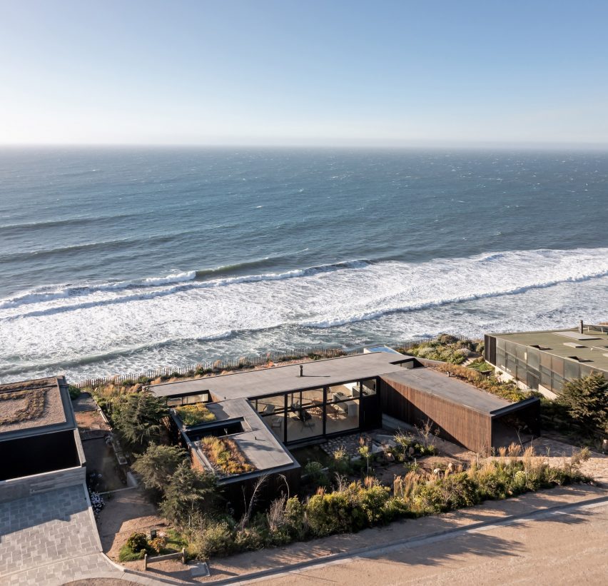
Chilean studio ERRE Arquitectos has constructed Casa Ferran, a low-profile holiday house in Matanzas on the coast of Chile.

Raimundo Gutiérrez of ERRE Arquitectos designed the 240-square-metre (2,580-square-foot) residence as a U-shape on the edge of a cliff that limits the buildable area of the 2,200-square-metre site, as it drops steeply down to the Pacific Ocean.

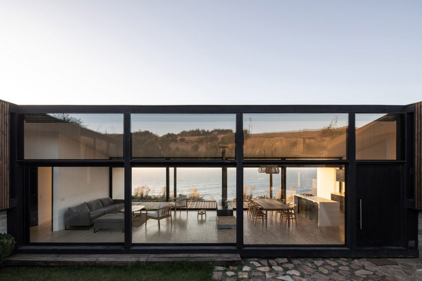
Exterior of a one-storey open-plan home with glazed walls overlooking the sea
The home is located on a cliff overlooking the Pacific Ocean

Gutiérrez considered three main factors when laying out the plan: creating an exterior zone that is protected from the prevailing southwestern wind, maintaining privacy on the north and south sides, and taking full advantage of the sea views.

To accomplish this, the U-shaped plan points away from the ocean with a protected central courtyard on the high side of the slope, which connects to the sea through the fully glazed common area.

A U-shaped home on a hillside overlooking the sea
The home has a U-shaped layout

“What the project seeks is to generate a transversal and permeable axis in the east-west direction, which connects two exterior areas with dissimilar characteristics through the interior common area,” the studio told Dezeen.

“The rest of the program is arranged to contain and give shape to this axis.”

Interior of an open-plan home with large glass sliding doors opening to decking overlooking the sea
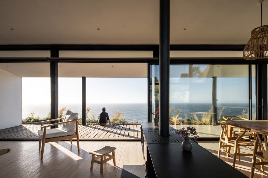
Sliding glass doors in the living area open onto a covered patio

Two wings are located on either side of the central volume – one containing three bedrooms and two planted atriums, the other angled outwards to catch the covered parking area that feeds into the service zones and guest bedroom.

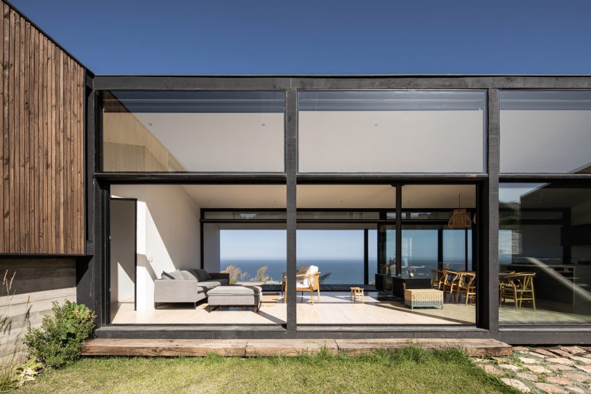
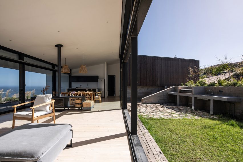
The central volume containing the kitchen, dining, and living spaces is see-through and light-filled, with floor-to-ceiling windows on both sides and sliding glass doors that extend the space onto a covered patio that runs parallel to the sea.

Set on a board-formed concrete foundation, the house is primarily constructed out of black-coloured steel, creating strong framing lines along the form and around the expansive glazing.

The exterior cladding is vertical one-inch by two-inch pine boards that provide a tonal variation along the north and south facades – which are a cut-off diamond shape as the house accommodates the sloped site – and transitions into a lattice for the parking area.

Outdoor garden of an open-plan home with large glass sliding doors overlooking the sea
Black steel forms the home’s structure

On the interior, a soft white palette and warm wood flooring amplify the scale of the rooms and allow the surrounding sea view to be the focal point of each space.

The home’s arrangement brings sunlight into each room, maximizing passive heating from the coastal climate in both the summer and winter.

Interior of an open-plan living space with sliding glass doors leading to a grass garden
Light wood flooring and white painted walls and ceilings finish the interior

“To complement and achieve higher temperatures during the coldest days, there is a wood-burning fireplace in the common space and central heating radiators throughout the house,” the studio said.

The end of each wing has a planted green roof.

“The design responds to elements of organic architecture,” the studio said. “However, formally rigid features appear, which are the result of several variables, conditions and demands that were presented.”
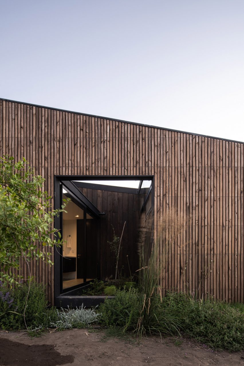
Exterior of a timber-clad home with a sloped roof and rectangular opening
Pine boards clad the exterior

Similar to Casa Ferran, Chilean architect Juan Pablo Ureta designed a beach house on Chile’s northern coast that is oriented around a central courtyard, however, this one opens toward the sea.

In El Pangue, architecture studios Combeau Arquitectura and Andrea Murtagh designed an ocean getaway with clustered gabled forms.

The photography is by Nicolás Saieh.


Project credits:

Architect and constructor: Raimundo Gutiérrez
Structure: Joaquin Valenzuela
Project Manager and carpenter: Guillermo Chamorro

Reference

recessed angular frames form art house cinema’s facade in france
CategoriesArchitecture

recessed angular frames form art house cinema’s facade in france

L’Atalante art house cinema by Farid Azib in Bayonne


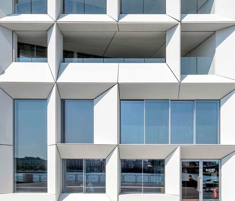
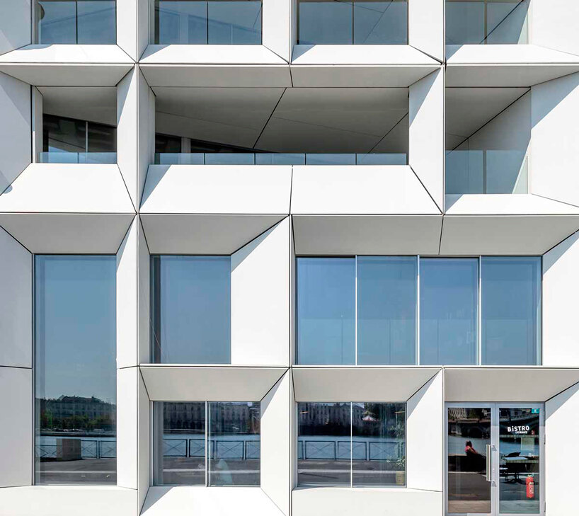
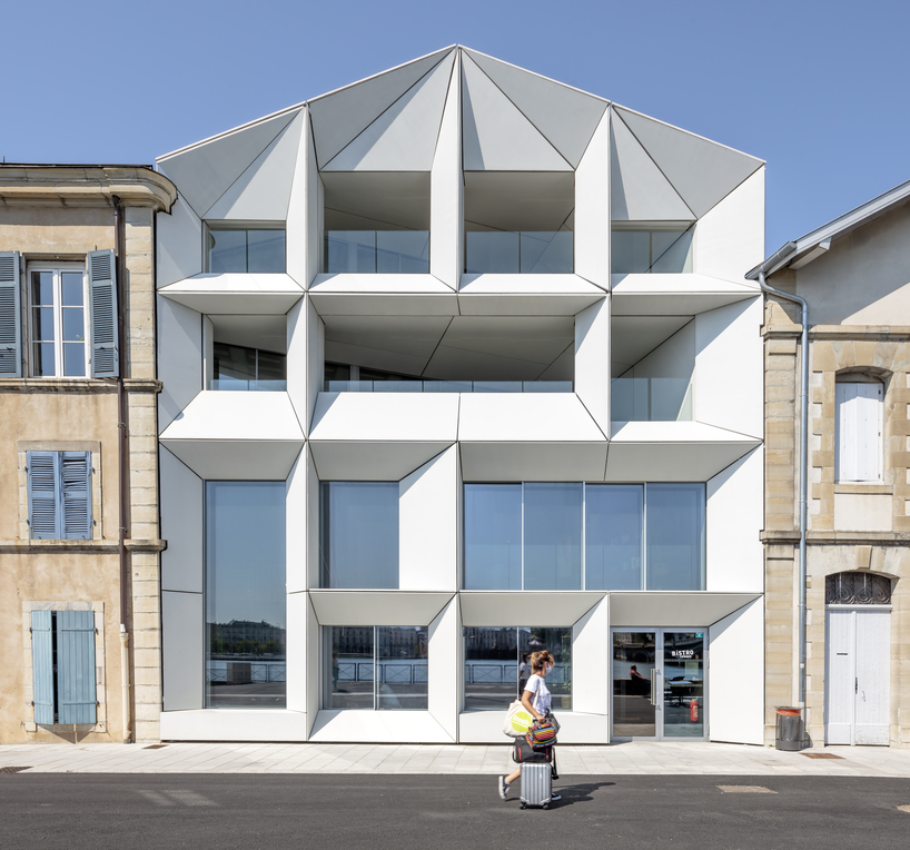
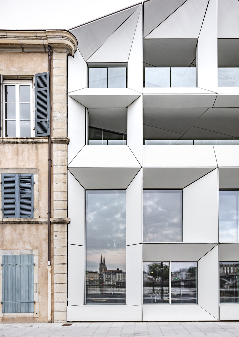
Paris-based architectural firm Farid Azib reconstructs L’Atalante art house cinema in the center of Bayonne, France, forming a contemporary white angular facade. Originally built in 1990, the edifice is located on the waterfront of Amiral-Antoine-Sala on the right bank of the Adour, just below the Saint-Esprit bridge leading to the city center. The refurbishment program demanded the conjunction of two cinemas adjoining one building and expanding the dedicated theater plan. Aiming for a design that retains the historical character of the site yet explores the possibilities of architectural modernity, the project shapes contrasting forms and materials displaying its dynamic frame in striking white color, standing out between the rest of the buildings on the embankment.

recessed angular frames form art house cinema's facade in france
L’Atalante art house cinema | all images by Luc Boegly


angular frames are a conceptual nod to the Seventh Art


Drawing from a conceptual take on windows and frames in connection to the Seventh Art, the design team at Farid Azib Architects focuses on the main feature of the facade’s openings to form the building’s external identity, sharing ‘the cinema facade is essential in enhancing our visibility with its openings on to the river and its uniqueness which makes it very cinematic-like’


The frames are exposed to the southwest allowing the light on each side to pass through both the interior and the exterior, regarding natural and artificial light respectively. ‘The facade stands all at once discreet and surprising, integrated and singular, asymmetrical, deconstructed and harmonious, angular and wise, soft and open’. The glass apertures project landscapes, movements, silhouettes, and lights like an ever-changing film scene underlined by the orientations of the different viewpoints. Thus the facade is made up of prismatic projecting volumes, created with light prefabricated elements forming an interaction between the interior and exterior space.
recessed angular frames form art house cinema's facade in france
the project sets up a contemporary white angular facade


The cinema hall undergoes specialized interior planning


The interior arrangement of the building consists of a new hall, a bar-restaurant, and cinema zones, combining the reception and dining area through a system of a wooden mesh on three levels channeling the flows and allowing the installation of access control points to the cinema halls. Two apartment units are housed within the plot of L’Atalante, setting sound protection as one of the major planning factors.


The transversal bar-restaurant forms the strategic link between the existing transformed spaces and the extension, shaping a long wooden counter made of oak wood sourced from the original building’s flooring construction. Thus, the cinema and music bar-restaurant rooms are designed as airtight boxes to avoid any sound leaks. Acoustic lining and independent double wall, double frame, uncoupled from the structure, as well as floors with independently treated slabs complement the protected framework. The restoration remodels the screening rooms providing expanded seating areas and larger projection screens. The structure opens toward the city and the riverbank shaping wide frames along with loggias and terraces.

L'Atalante art house cinema
recessed prismatic frames form the building’s external identity

Reference

Ryan Leidner adds bridge to geometric San Francisco house
CategoriesArchitecture

Ryan Leidner adds bridge to geometric San Francisco house

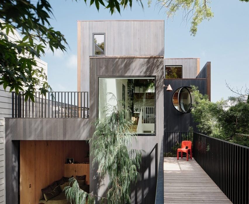
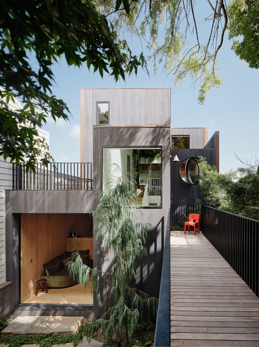
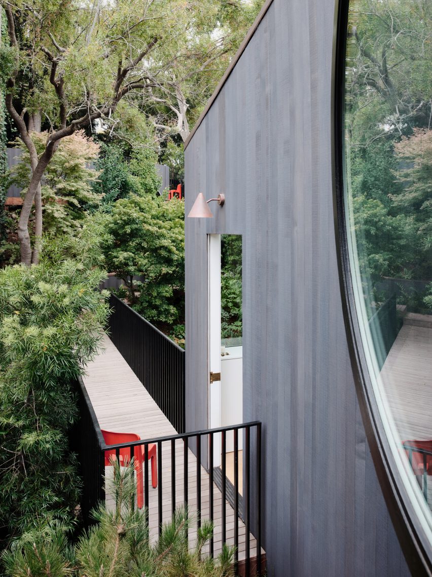
Local studio Ryan Leidner Architecture renovated a 1940s home in the Bernal Heights neighbourhood of San Francisco, resolving entry access with a bridge over the front garden.

Ryan Leidner Architecture completed the 2,500-square-foot (230-square metre) Hosono House in 2021, cladding the house in charcoal-stained cedar siding with a copper, standing seam roof.

Bridge over garden at Hosono House in San Francisco
Hosno House features a statement bridge

The original structure was built at the rear of a steeply sloped 2750-square-foot (255-square-metre) lot, “giving the home a unique sense of privacy and a feeling of being a true retreat,” the studio said.

However, the setback challenged the home’s circulation, causing people to cross the yard, descend a long staircase, and climb back up three flights to access the primary living space.

Ryan Leidner Architecture house in San Francisco
The bridge is arranged over the front garden

During an initial walkthrough with the clients, founding principal Ryan Leidner threw out a “crazy idea” – to redirect access from the street to a new front door with a bridge.

The bridge would span the lush front garden and connect to the house between the top and middle stories.

“The front entrance sequence was totally reimagined,” Leidner told Dezeen.

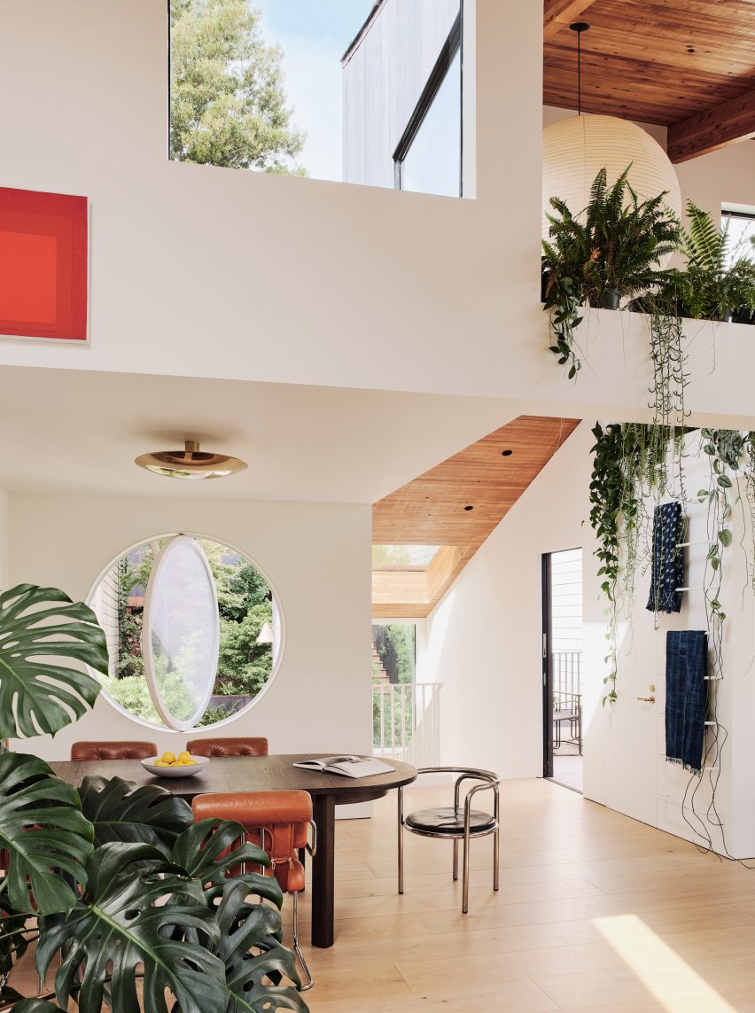
Blackened facade featuring a circular pivot window
A circular pivot window marks the front facade

The studio rebuilt the front facade – now marked by a circular pivot window that replaced a leaking solarium – gutted the interior and rearranged spaces.

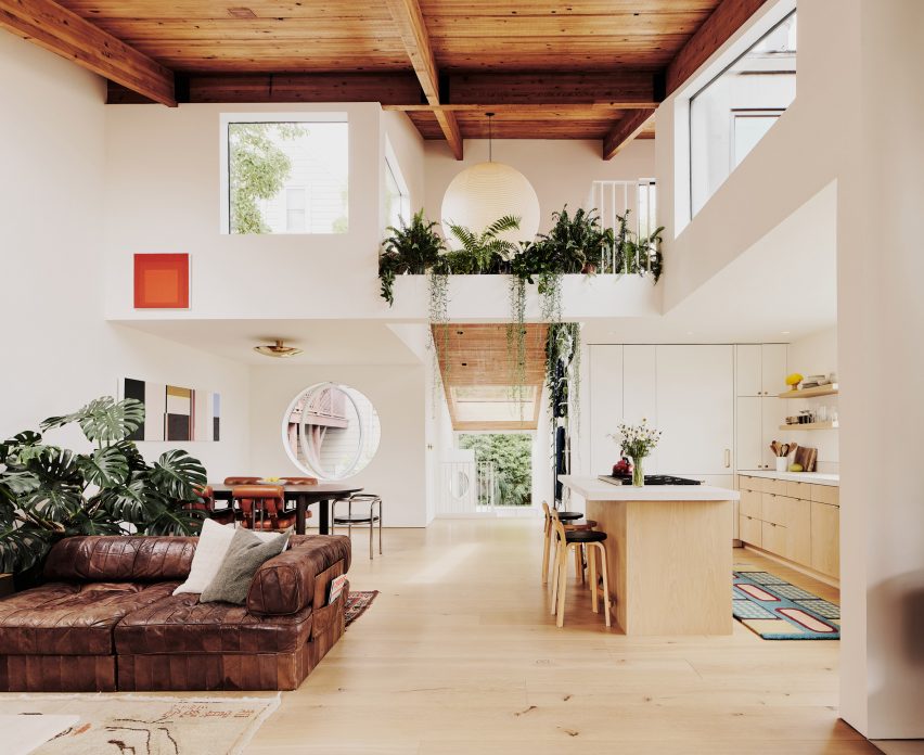
“Wanting to preserve the historic character of the house, the existing wood beams and ceiling were refinished and left exposed while all of the original windows, floors and finishes were replaced, creating a greater sense of material continuity throughout the house,” Leidner said.

Wood-toned interior within Hosono House with skylights
Natural wood tones and white surfaces characterise the interior

The subtle palette of natural wood tones and white surfaces allows the interior spaces to serve as a canvas for the owners’ affinity for design.

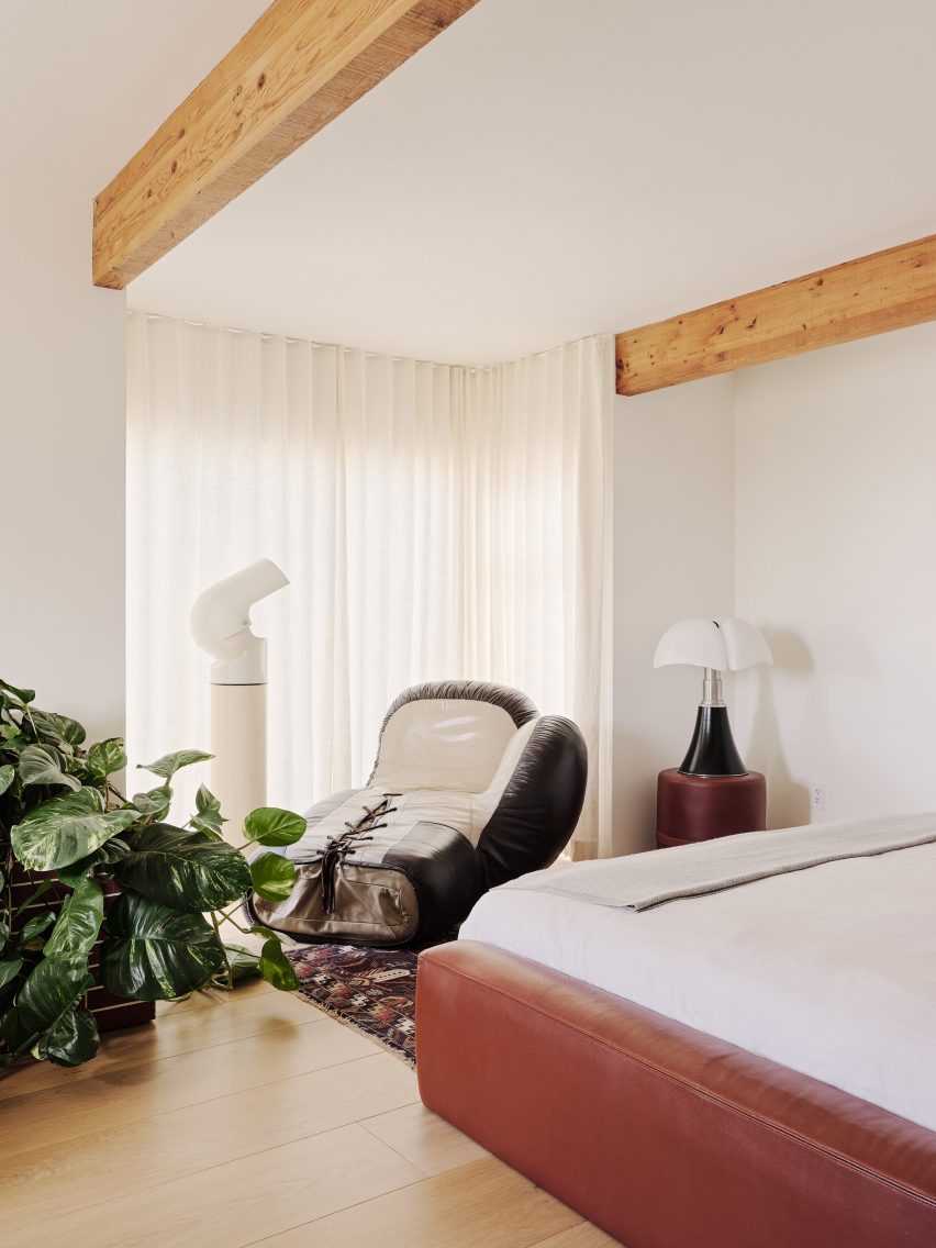
“The interior spaces are filled with a mix of vintage Italian furnishings and custom pieces, while the overall sensibility of the space was inspired by trips to Norway and Japan, and the ethos of Californian hippie modernism,” Leidner noted.

Nobuto Suga dining table within Hosono House by Ryan Leidner
A custom Nobuto Suga dining table is framed by statement chairs

The top-floor kitchen, living and dining areas enjoy sweeping views of the San Francisco skyline through a variety of window shapes.

Plant-filled niches that reference 1960s and 70s Italian projects surround a space that holds accent furniture including a custom Nobuto Suga dining table, vintage Guido Faleschini chairs and a Gae Aulenti armchair.

Bedroom by Ryan Leidner
Two bedrooms are on the second floor

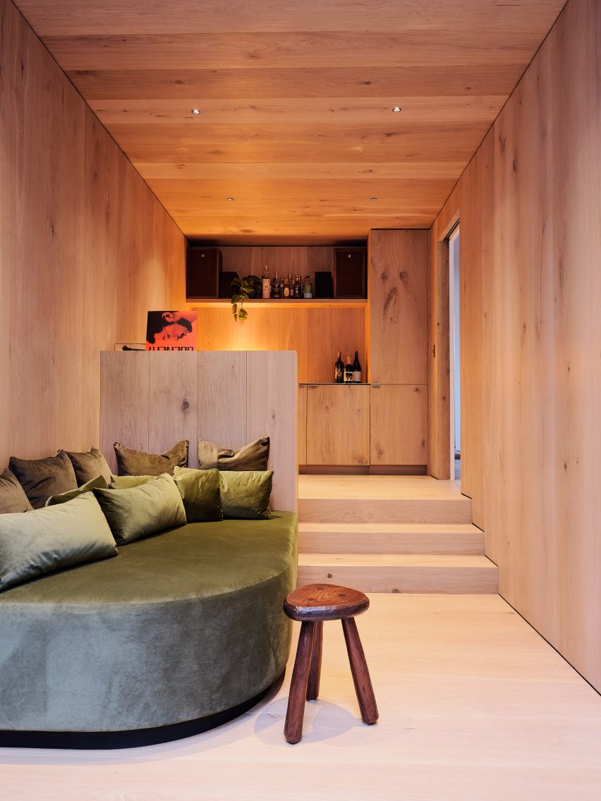
The second floor contains two bedrooms, a Venetian-plastered primary bathroom and a lounge space inspired by a Tokyo whiskey bar with warm wide-plank white oak and a custom velvet daybed.

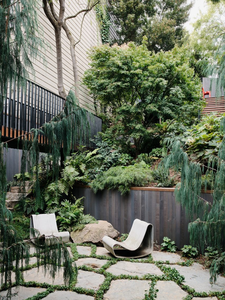
A large opening in the lounge leads to the lower courtyard, which was reimagined by landscape architect Stephen Design Studio.

The lowest level boasts one of the home’s most unique spaces: the guest bedroom.

“A textured hemp-plaster was used on the walls and ceiling, and a custom tiled bed frame and furnishings give a nod to the history of Italian modernism,” the studio said.

Ryan Leidner interiors
Ryan Leidner added luxurious touches throughout the home

Throughout the home, custom fabricated brass details – like countertops, sinks and CNC Dieter Rams-inspired exhaust covers – add a luxurious touch that will patina over time.

Ryan Leidner Architecture had previously collaborated with Stephen Design Studio to remodel a midcentury Eichler home, complete with twin gables and a lush central courtyard.

The photography is by Joe Fletcher.


Project credits:

Architects: Ryan Leidner Architecture
Landscape Design: Stephens Design Studio
General Contractor: DKG Construction
Landscape Contractor: Ground Cover Landscaping

Reference

Scalloped concrete walls anchor California house by Laney LA
CategoriesArchitecture

Scalloped concrete walls anchor California house by Laney LA

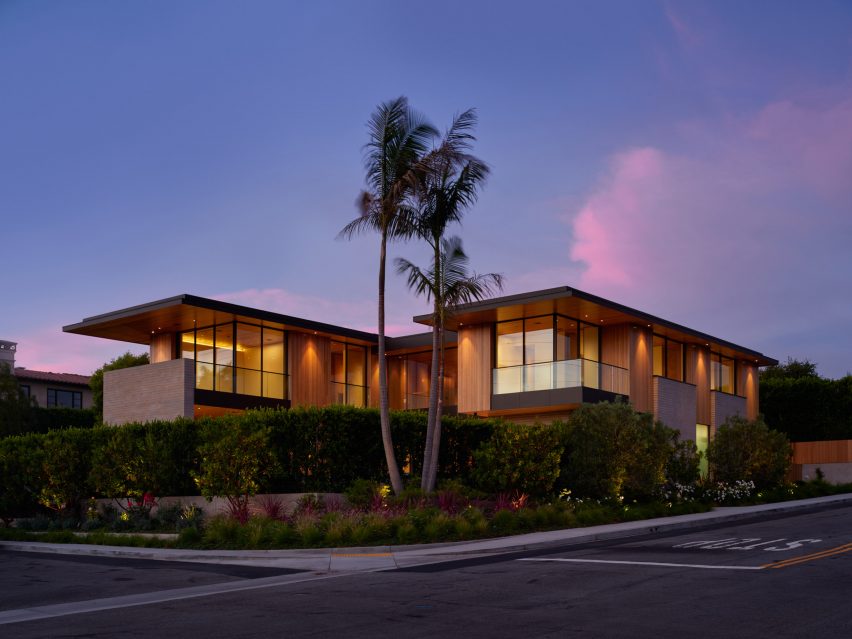
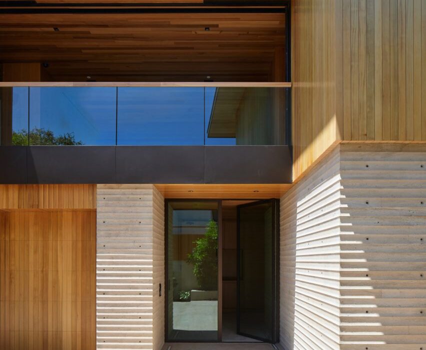
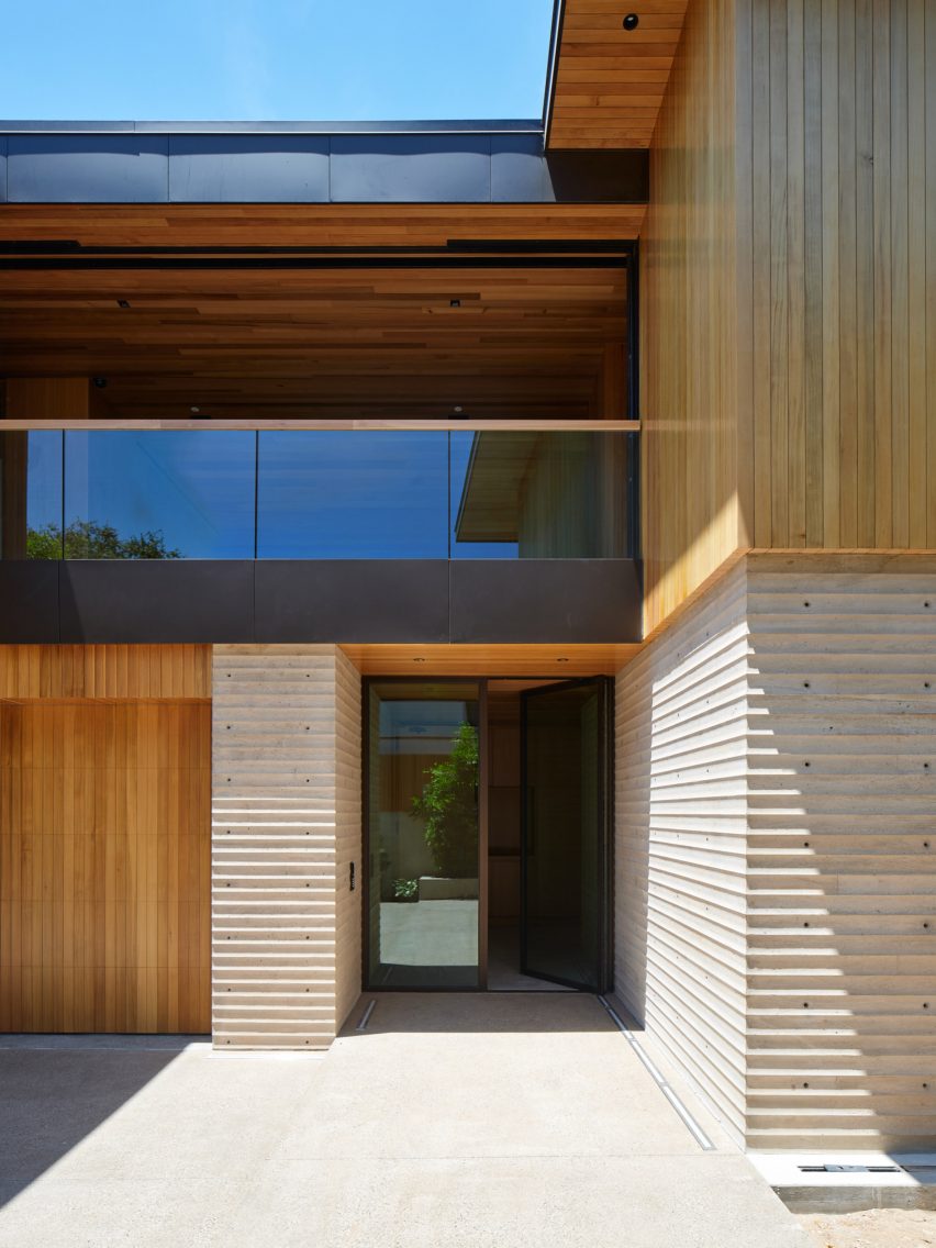
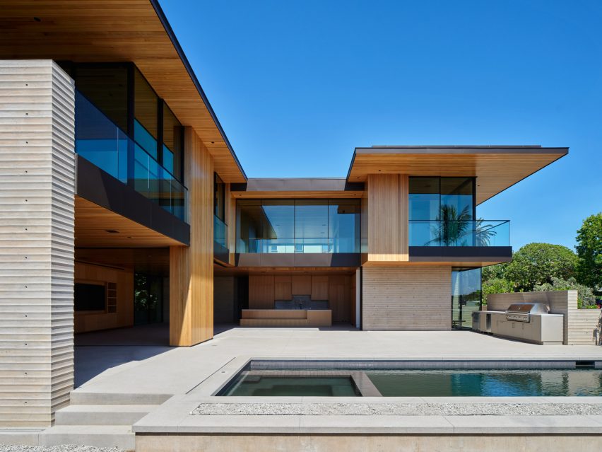
Undulated concrete walls form the lower portion of this Californian house by architecture studio Laney LA, while its top half is wrapped in glass and cedar.

The aptly named Scalloped Concrete House sits on a hill in the Manhattan Beach neighbourhood, just south of LAX airport, which affords the property sea views.

Entrance to the house with balcony

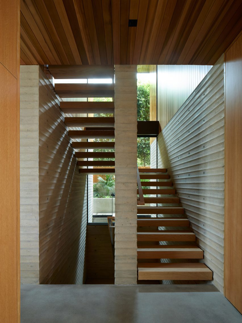
Its lower storey is mainly constructed from unusually formed concrete. It features a pattern of inverted curved ridges known as scalloping.

The material is exposed both on the exterior and continues across some interior walls, and “reveals its form most strikingly at each corner”, according to Laney LA.

Concrete pool terrace
The back of the house opens onto a pool terrace

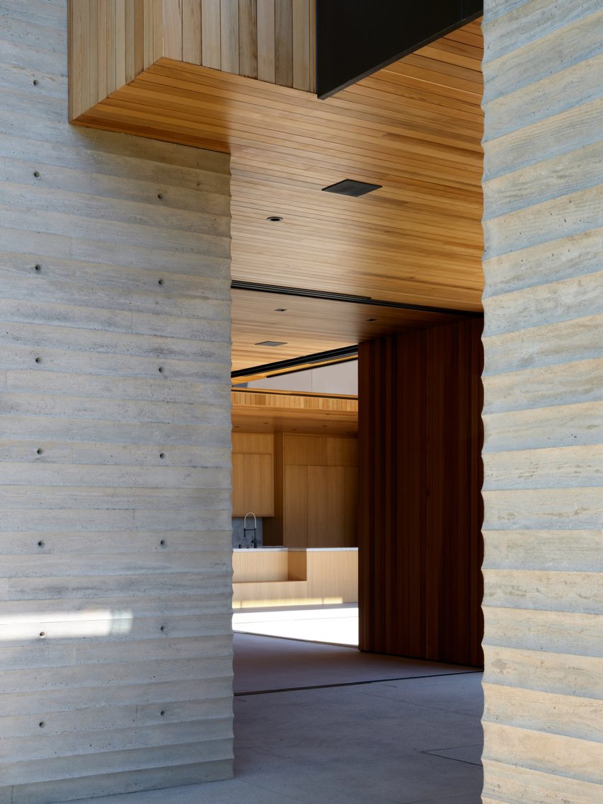
“Like cliffs carved from water, the scalloped walls are even engrained with the faint grain of the formwork that shaped them,” said the studio. “Each piece of formwork was custom milled to accomplish the undulating form.”

Some of the concrete sections stretch up to windows on the upper level, while cedar clads any remaining areas that aren’t glass.
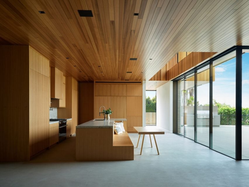
wooden Kitchen with bench island
Minimalist millwork wraps around the kitchen

Rooms at ground level feature retractable panels that open the kitchen and living room up to a concrete pool terrace and barbecue area.

More shaded outdoor spaces are created by the deep cedar overhangs from the upper floor and the roof.

Pocket door open to verdant view
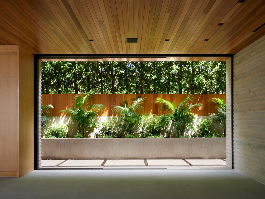
A large pocket door frames a verdant view from the dining room

A 16-foot-long (4.9-metre) pocket door frames a verdant view from the dining room.

In the kitchen, millwork hides the majority of the appliances and has no visible handles for a minimal appearance.

Staircase with wooden steps and scalloped concrete walls
The staircase is sandwiched between concrete walls

Concrete forms the backsplash and countertops, as well as that of a large island that incorporates a built-in bench.

The lower level is kept private by the concrete walls, as well as strategically placed fencing and plants.

Meanwhile, the upstairs is much more open, with large windows positioned across all elevations.

Balconies that face the Pacific Ocean are accessed via full-height glass doors from the bedrooms.

Concrete corners
The scalloped pattern is most evident at the corners of the concrete walls

“With its panoramic ocean views and echoes of that element within its own walls, the architectural language of this structure speaks to a beauty shaped by the impermanent,” said the studio.

Laney LA was founded by architect Anthony Laney and was longlisted for the Dezeen Awards 2022 in both the urban house and house interior categories for its HT Residence in California.

Night view of Scalloped Concrete House
The cedar and glass upper floor overlooks the Pacific Ocean

The studio joins a long list of architects that have employed scalloping for their building facades, at varying scales.

Brooks + Scarpa used the pattern vertically for a supportive housing development in Los Angeles.

The photography is by Roger Davies.


Project credits:

Architect: Laney LA
Interior designer: Tim Clarke & Waterleaf
Builder: Silicon Bay
Landscape architect: Stephen Gabor

Reference

PPAA submerges bedrooms of Mexican house into stony terrain
CategoriesArchitecture

PPAA submerges bedrooms of Mexican house into stony terrain

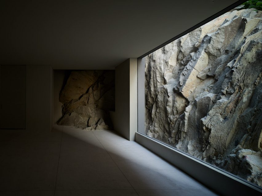
Local architecture studio PPAA has completed the Echegaray house in the State of Mexico, which features bedrooms looking out to the rocky excavated ground and a communal living space on the top floor with panoramic views.

PPAA created the Mexican house to appear like a black stone rising from the rocky terrain.

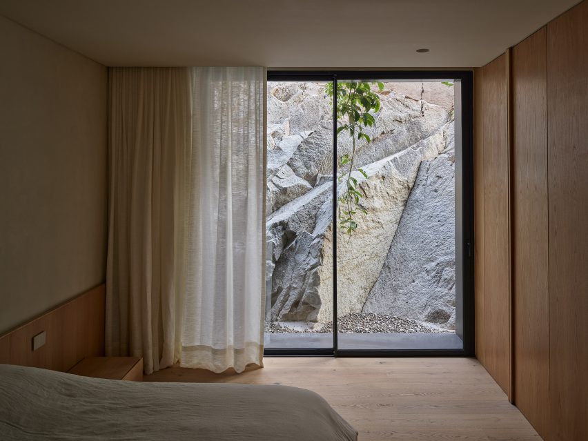
Warm-toned bedroom with timber wardrobe and floor-to-ceiling windows looking onto rocky terrain
Rocky terrain surrounding the bedrooms provides privacy

Topped with a wooden pavilion, the Echegaray house has a reversed layout compared to typical houses, with communal spaces on the top floor and bedrooms on the floor below.

The stone terrain surrounding the bedrooms helps to add a sense of privacy and connection to nature.

A dark empty room with floor-to-ceiling window looking onto rocky terrain
Private spaces are located on the lower floor levels

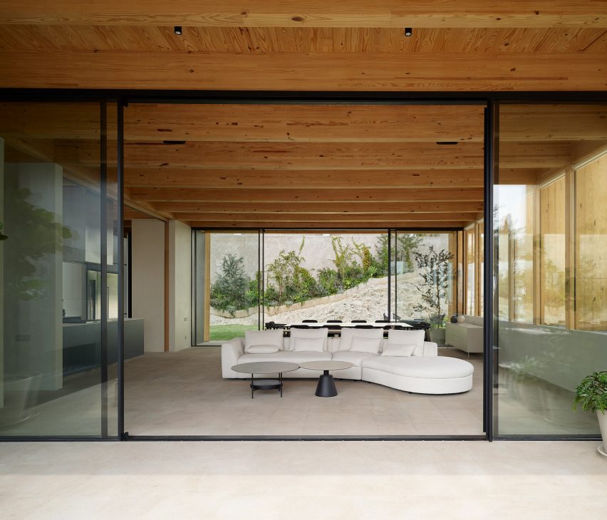
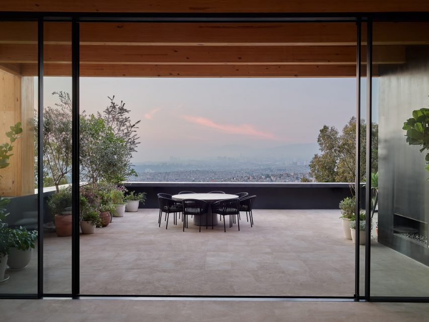
Living and dining areas are on the top floor, inside the wooden structure where large glass sliding doors let in natural light and allow for panoramic views of the surrounding landscape.

“The house breaks with the construction paradigms of the area, where the usual thing is to place the public area on the ground floor and the private area on the upper level,” PPAA founding partner and creative director Pablo Pérez Palacios told Dezeen.

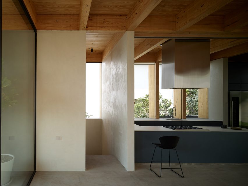
Open-plan kitchen with a timber roof structure and blue kitchen units
The top floor has a wooden structure

“Based on the topographic understanding of the land, as well as the analysis of the context, we decided to invert this arrangement of the programme, which allowed us to provide more privacy to the rooms and grant a panoramic view of that part of the city to the public area, which is turned into a lookout,” Palacios continued

“The house is like a mountain that you have to climb to finally appreciate and discover the view that the project gives you.”

The ground floor, which contains car parking, is finished in grey tones while the floor above where the bedrooms are is finished in warmer colours.

A skylight over the staircase illuminates the circulation space, which guides visitors to the public and social spaces on the top floor without having to move through the more private floor levels.

Terrace with large sliding glass doors leading to an open-plan living room with a white sofa and timber roof structure
Communal areas on the top floor have large glass sliding doors

“The project is a transition of atmospheres, you go from privacy to common, from darkness to light,” said the architect.

The ground floor and first floor are constructed from concrete block walls and according to the Palacios, excavation of the site was kept minimal.

Roof terrace with black dining table and chairs
The openness of the top floor stands in contrast with the lower floor levels surrounded by stone

“In terms of construction, this programme arrangement allowed us to make a minimal excavation on the site, while at the same time making the natural terrain part of the rooms and their natural landscape,” said Palacios.

“This also made the construction of the house more efficient, and in ecological terms, contributed to reducing CO2 emissions.”

PPAA, which stands for Pérez Palacios Arquitectos Asociados, has completed a number of homes in Mexico, including a pair of houses with large glass doors opening onto patio spaces and a home clad in board-formed coloured concrete.

The photography is by Fernando Marroquin.

Reference

Wood and stone surfaces bring “rich texture” to Primrose Hill House interior
CategoriesInterior Design

Wood and stone surfaces bring “rich texture” to Primrose Hill House interior

Architecture for London has updated a 1960s house in London, creating an open-plan interior filled with natural materials and an improved connection to the rear courtyard garden.

The house is one of two detached properties set in a modernist estate in Primrose Hill that primarily consists of painted brick courtyard houses and small terraces.

Photo of Primrose Hill House
Primrose Hill House was designed by Architecture for London

The new owner asked Architecture for London to transform the interior into a modern layout that is better suited to their lifestyle.

“The house had a very broken plan consisting of lots of small rooms,” the studio’s director Ben Ridley told Dezeen. “The client wanted to create a family house that was more open plan with better views of the garden.”

Exterior photo of Primrose Hill House
The studio added a rooftop extension clad in white bricks

The remodelled interior improves the connection with the garden by incorporating a large picture window in the kitchen, along with sliding wood-framed doors in the living area.

The ground floor also contains a smaller reception area next to the entrance hall, with folding doors allowing this space to be separated from the kitchen and dining area.

Image of Primrose Hill House
Sliding wood-framed doors open the living room up to the garden

A bespoke blackened-steel staircase provides access to four bedrooms on the first floor, including a main suite with a juliet balcony overlooking the garden.

Following a detailed cost and sustainability review, a decision was made to demolish all of the property’s interior walls and rebuild them in order to achieve the required spaces.

Interior image of Primrose Hill House
The interior was finished in a rich material palette

This solution also offered the best energy-efficiency potential, according to Ridley, with a layer of wall insulation added alongside a heat recovery ventilation system (MVHR).

The home’s first-floor plate was replaced using steel beams and timber joists to enable the demolition of the ground-floor walls and the opening up of the interior.

Interior photo of Primrose Hill House
Flooring was used to define different zonessp

The project also involved the addition of a timber-framed rooftop extension, clad with white-painted brick to tie in with the rest of the house and set back so it’s largely hidden from view.

The extension contains a flexible mezzanine space for yoga and meditation that is accessed from the main bedroom suite.

Throughout the home, Architecture for London applied a pared-back palette of natural materials that is intended to create a sense of calmness and connection with the garden.

Internal walls treated with breathable lime plaster provide a neutral backdrop for furniture designed by architect Christian Brailey, which includes a dining table made from locally sourced London plane trees.

Photo of a dining area
Doors and windows are framed with wood

“We intentionally didn’t use a lot of colour so there’s a strong feeling of consistency,” Ridley said. “The choice of stone and timber brings a rich texture to the palette.”

A reference image of a Portuguese manor house, featuring a tiled trompe l’oeil frieze around a doorway, informed the use of materials to define space within the interior.

Photo of a bar at the home
The shared living areas have an open-plan layout

In the living room, stone floor tiles in different shades create a border around the room, as if an area rug has been placed on the floor to demarcate where furniture could be placed.

Ben Ridley founded Architecture for London in 2009 following his studies at London’s Barlett School of Architecture. The studio aims to create places that improve how people live and work, with a focus on reducing their operational emissions.

Photo of a staircase at the London home
Wood lines the interior walls of the home

Ridley’s own London house recently featured in our round-up of five UK house renovations designed to improve energy efficiency.
“Ultimately we are going to have to accept some changes in the appearance of our traditional homes,” he said, speaking to Dezeen as part of a feature on architects who have retrofitted their own homes.

The photography is by Christian Brailey.

Reference

studio MEMM fronts tree house in brazil with playful solar shading
CategoriesArchitecture

studio MEMM fronts tree house in brazil with playful solar shading

‘tree house’ by studio MEMM, a multigenerational hub


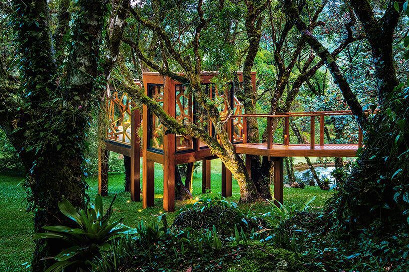
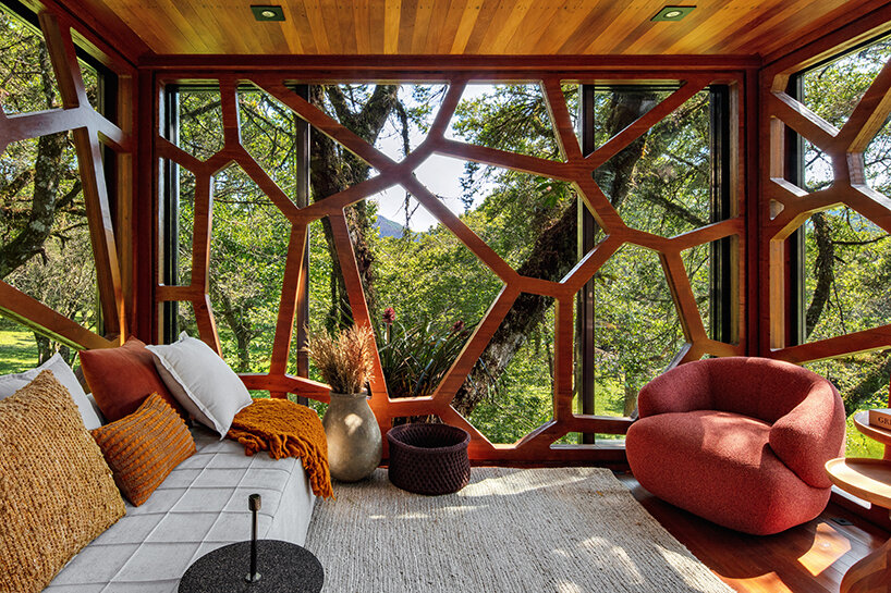
On a sloping land in Monte Verde, Brazil, Studio MEMM has completed a tree house as a multigenerational wooden hub connected by a walkway. Covering 18 sqm, the project ‘emerged as a playful idea. In a moment of family expansion, with new grandchildren and nephews, the client understood that the ludic universe of the tree house could add to the experience of staying in Monte Verde, Minas Gerais,’ explains the practice.
 

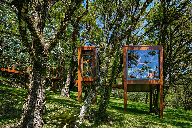
The design is located close to the main residence and features two volumes positioned among tree branches, emphasizing the sense of playfulness. The first and smaller module spanning 6 sqm serves as a reception area. In comparison, the second 12 sqm volume functions as the primary activity hub, initially displaced to accommodate a torsion of trunks that change position as they gain height. Two walkways support these structures: the first and smaller pathway connects both modules while the second, larger one gently regulates the terrain slope and links the tree house to the main property promenade.
studio MEMM fronts two-volume tree house in brazil with solar shading inspired by leaves
all images © Nelson Kon


‘Before conceiving the project, it was necessary to choose the tree and understand its context. The client already had in mind options in an area near the lake on the site. Around it, programs such as a pool annex, a deck, a natural pool, and the new house would fence the surroundings of the body of water. The garden, densely populated by numerous tree species, brings privacy and ambiance to each program around the wetland area. In addition, a gentle, continuous slope extends across the land so that the lake’s surroundings are arranged in gentle plateaus,‘ shares the Studio MEMM team

studio MEMM fronts two-volume tree house in brazil with solar shading inspired by leaves


using glass, brise-soleils, and light for a deeper immersion 


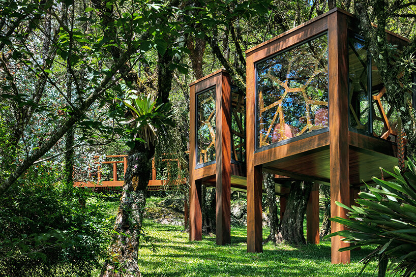
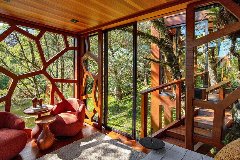
All façades of the ‘Treee House’ are clad in glass panels, encouraging a strong visual connection to the outdoors. Bordering the panels are aluminum frames that attach the glass to the façades; thanks to their dark graphite finish, these frames stand out from the wooden structure and emphasize the limit between solid and void. They also contribute to the water drainage on rainy days, preventing puddles from accumulating in the lower parts of the frame and eventually deteriorating the wood. 

studio MEMM fronts two-volume tree house in brazil with solar shading inspired by leaves
a two-volume structure connected by a walkway


Inspired by the geometries of the surrounding sycamore leaf structures, Studio MEMM fronted the two-volume shed with a CNC-milled brise-soleil, industrially built with glued laminated timber.  Installed from the inside, this architectural element ‘embraces the guest and creates an impression of a dome that contains this entire universe in the interiors, instigating immersion and disconnection from the external world, transporting the user to a shelter that allows them to experience a feeling of unrecognizable enchantment,’ continues the team. 

studio MEMM fronts two-volume tree house in brazil with solar shading inspired by leaves
the brise-soleils evoke the geometry of sycamore leaves


Lastly, the lighting design by Futura Iluminação highlights both the unique aesthetic and sculptural branches engulfing the ‘Tree House’ without undermining the charm of night-time darkness. ‘The light spots placed on the ground level reveal the trunks and tree tops. The softly lit branches and leaves filter the dark sky above. Inside, light fixtures on the floor illuminate the brise soleil from bottom to top, bringing light, instead of shadow, to the lower part of the geometries. The solution emphasizes the view of the inside from the outside of the house and contributes to the discovery effect of the element in the heights,’ says Studio MEMM. 

studio MEMM fronts two-volume tree house in brazil with solar shading inspired by leaves


Reference

Pema Studio designs Forte House as “a dense and closed fortress”
CategoriesArchitecture

Pema Studio designs Forte House as “a dense and closed fortress”

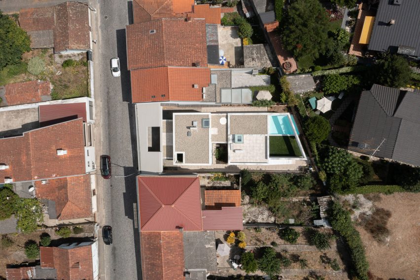
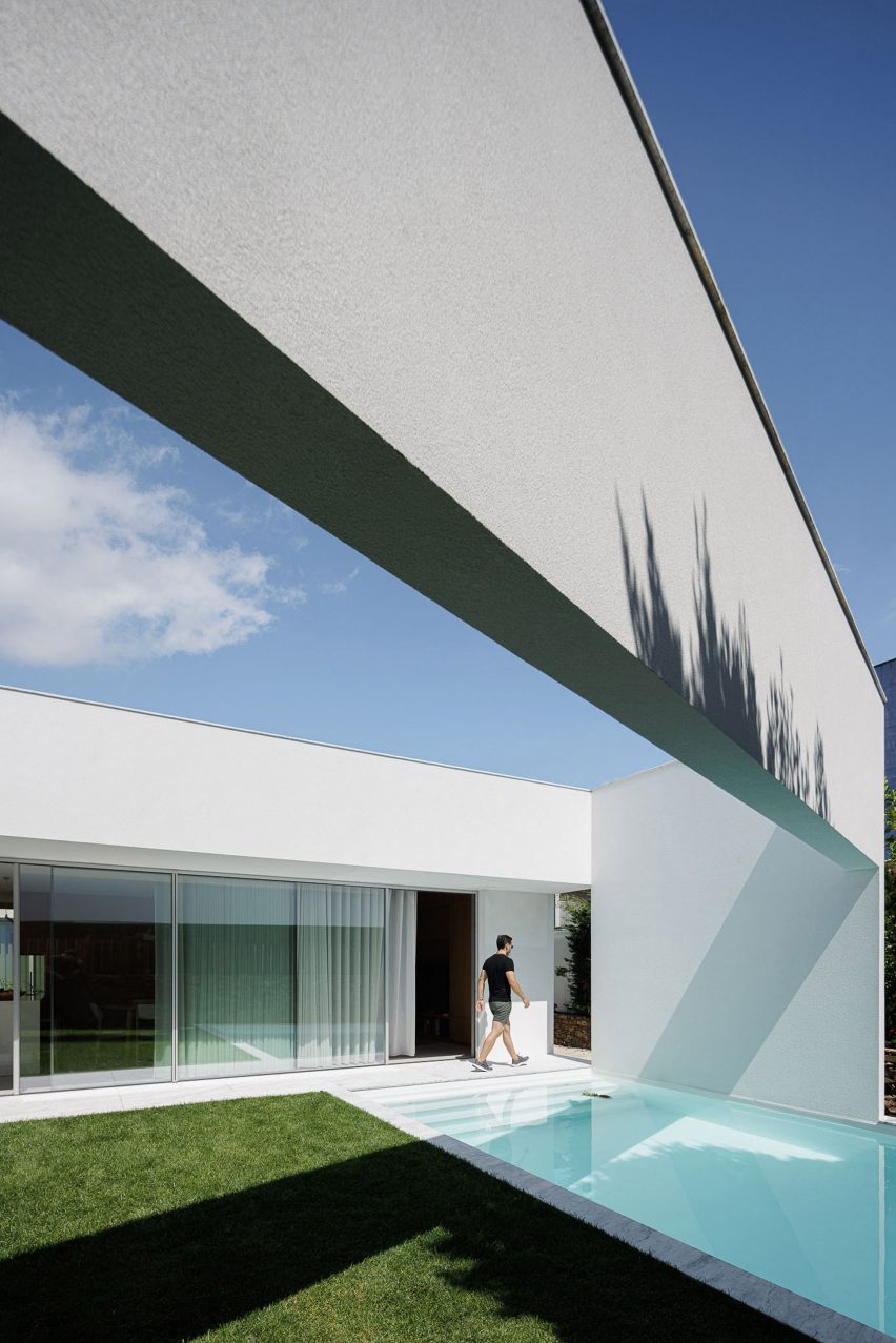
Architecture practice Pema Studio drew on the idea of a protected fortress when creating the Forte House, a blocky, white-rendered home that replaces a neglected existing structure in Santo Tirso, Portugal.

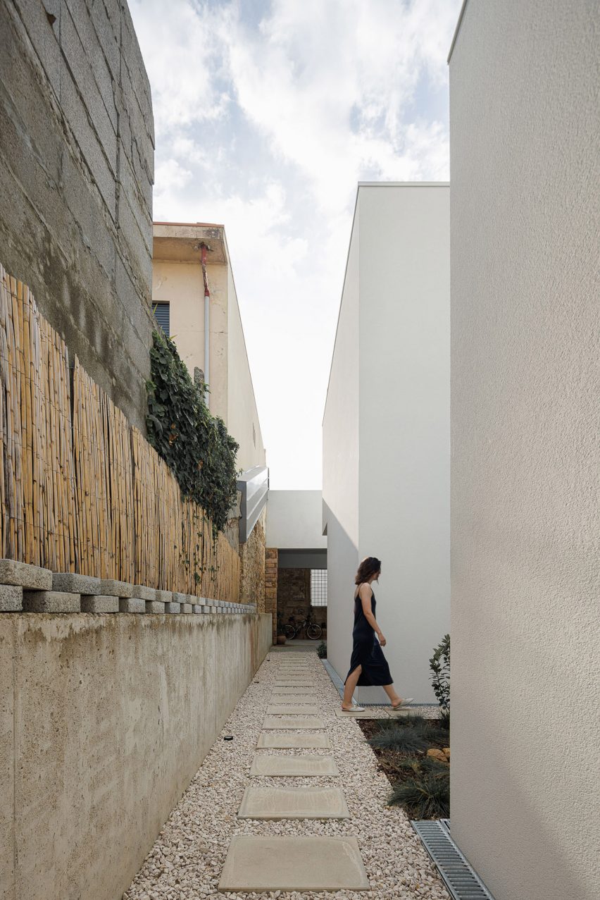
The dwelling is set back from a retained facade and sits within existing stone perimeter walls on the site, creating an exterior space around its edges with private, skylit patios.

Aerial view of Forte House in Santo Tirso
Pema Studio drew on the idea of a protected fortress when creating the Forte House

“The house is designed in a complex balance between the creation of a dense and closed fortress and the reinterpretation of the typical patio house, looking for a protected oasis in its intimate relationship with the sky,” said Pema Studio.

“The intervention starts from a massive block that impertinently detaches from the limits and mimics the land plot outline.”

Sheltered outdoor space at Portuguese house
The white-rendered home is set back behind an existing facade

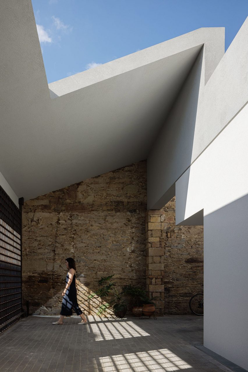
The retained facade and a metal gate of the former building now lead into an entrance courtyard, sheltered by a sloping roof punctured by a large opening.

Set back from the street, an entrance is tucked into the northern side of the home’s white exterior, leading into the more secluded study and bedroom at the front.

Courtyard outside Portuguese home
It sits within an existing stone wall

“The old facade, an element of the pre-existing [fabric], is one of the few remaining elements,” said the studio.

“With the necessary functional changes, it was restored and rehabilitated as an element of cohesion and framing with the adjacent urban fabric, reducing the intervention’s impact on the street,” it continued.

From the entrance, a corridor leads through to a more open living, kitchen and dining area at the rear of the home. This space is connected to a garden and swimming pool that can be independently accessed using the narrow pathways along each side of the site.

Two small planted courtyards have been cut out of the home’s southern edge, providing access to natural light and ventilation.

Swimming pool at Forte House by Pema Studio
There is a swimming pool

Stairs on both the interior and exterior lead up to Forte House’s first floor, where two additional bedrooms connect to rooftop seating areas and a balcony overlooking the street at the front of the site.

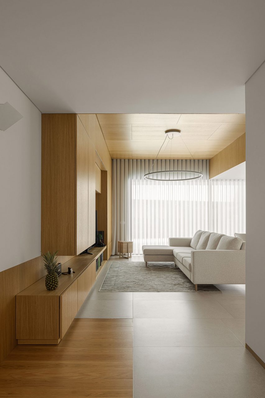
Inside, walls of white plaster in the circulation areas echo the design language of the exterior, while wooden panelling has been introduced in the bedrooms and living spaces, and used to create large areas of built-in storage.

White-walled living room with wooden cabinets
The living space echoes the white exterior of the house

Based in Santo Tirso, Pema Studio was founded by Tiago Pedrosa Martins in 2019.

Other homes recently completed in Portugal include a cork-clad dwelling near Lisbon by Inês Brandão Arquitectura and a minimalist white home on a narrow site in Ponta Delgado by Box Arquitectos.

The photography is by Ivo Tavares.


Project credits:

Architect: Pema Studio
Collaborator: Daniel Carvalho/Livre Atelier and Dário Cunha
Main architect: Tiago Pedrosa Martins
Construction: Construções Alves e Freitas, Lda.
Engineer: M2 – Gabinete de Estudos

Reference