FOG Architecture transforms Beijing courtyard house into fragrance store
CategoriesInterior Design

FOG Architecture transforms Beijing courtyard house into fragrance store

Chinese studio FOG Architecture has turned a courtyard house in Beijing into a flagship store for fragrance brand ToSummer with exposed wooden roof trusses and columns.

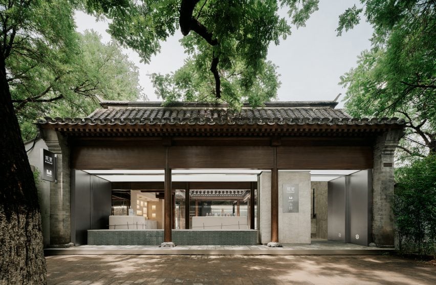
Located within a 500-square-meter Siheyuan complex, the store occupies  a 280-year-old courtyard house that are common in the region.
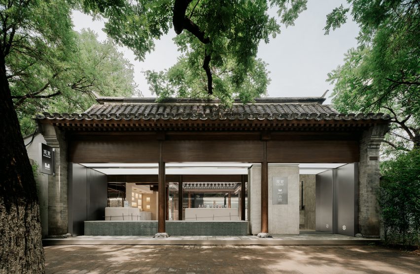
ToSummer Beijing storefront
The store is located at a restored courtyard house in Beijing

FOG Architecture renovated the building to reveal its original architecture, which features triangle-shaped timber roof trusses and series of wooden columns.

Layers of decorations added on the structure over the years as well as some of the interior walls were removed to expose the core wooden structure of the building as well as to create an open view of the space.
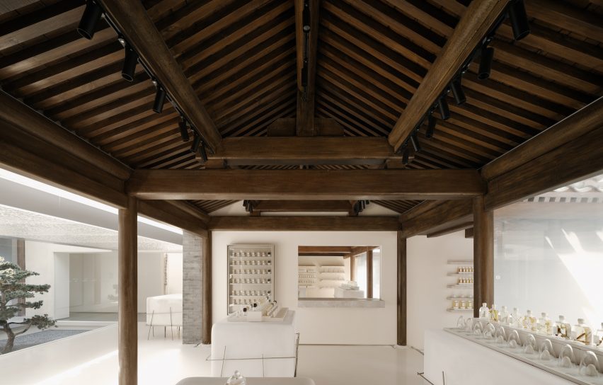
Wooden roof trusses of ToSummer Beijing
The studio exposed the wooden roof trusses and columns of the original building

“We ‘skimmed’ the building to expose its ‘skeleton’,” said the studio. The resultant ‘column field’ became the visual centre of gravity of the space as well as what defines its outline.”

“One of the challenges of the project had to do with the building’s old and new functions – more specifically, how to transform this venerable courtyard which has stood for nearly 300 years as a private residence into a commercial space that is neighbourly, communal, and all-inclusive,” it continued.
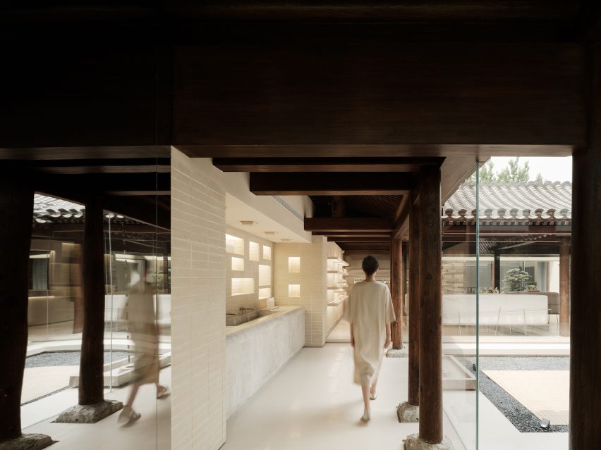
ToSummer Beijing
Product display areas are arranged around the courtyards

Glass windows were installed at the storefront, inviting visitors on the street to observe the complex layout of the old courtyard house, while glass walls were used to divide the space.

Product display areas were arranged around three courtyards of various sizes at the ground level of the complex, each connected by a bridging hallway, which the studio described as “symbol of graduating from the past to the present”.

On the first floor,  FOG Architecture remodelled the roof space to create a lounge area overlooking the building’s roofs.

These roofs were restored with the same grey brick tiles from the original building layered in the same density.
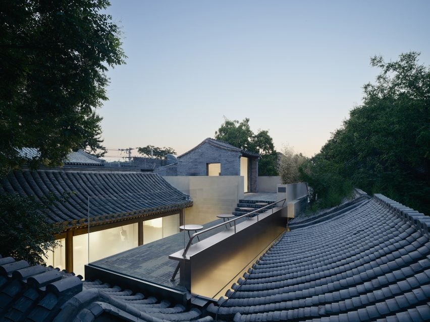
Rooftop view of ToSummer Beijing
Grey brick tiles from the original building are restored

A rain chain was hung from the roof connecting to a hundred-year-old well of the site. The well-preserved brickwork of the well echoes the delicate crafts of the roof tiles.

FOG Architecture was founded by Zheng Yu and Zhan Di and has offices in London, Shanghai and Chongqing.

Previously the studio has completed flagship stores for ToSummer in Beijing and Shanghai. Other recent retail project from the studio include Super Seed’s Hangzhou store featuring kinetic display.

The photography is by InSpace Architectural Photography.


Project credits:

Design team: Zou Dejing, Wu Leilei, Wang Shengqi, Tang Mo, Lei Ronghua, Jiang Lu, Huang Yingzi, Zhuang Shaokai, Sun Yuan, Zhang Xinyue, Chen Yixuan, Zheng Yining, Tao Xinwei, Cao Xiaomao, Hou Shaokai, Xiong Aijie, Khoon Choi (client representative), Zhan Di, Zheng Yu
Project management: Shen Qianshi (client representative)
Lighting Design: Zhang Xu, Liben Design
Structural engineering Consultant: Tao Xinwei, Wang Haibo
Construction drawing: BS Design
Contractor: Youlong Jinsheng

Reference

Green Solution House 2.0 is CLT-framed hotel designed by 3XN
CategoriesSustainable News

Green Solution House 2.0 is CLT-framed hotel designed by 3XN

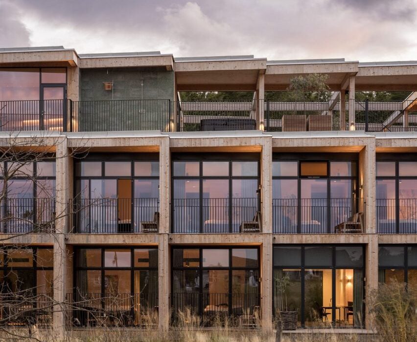
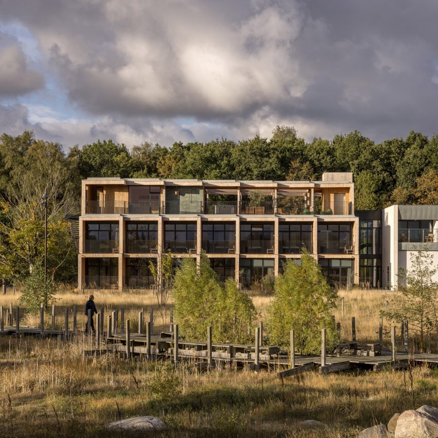
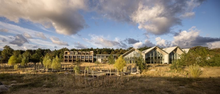
Timber provides almost all the building fabric of Green Solution House 2.0, a hotel on the Danish island of Bornholm completed by architecture studio 3XN.
Located in the town of Rønne, the modular building consists of a structural frame of cross-laminated timber (CLT), an exterior of timber boards and a layer of wood fibre insulation.
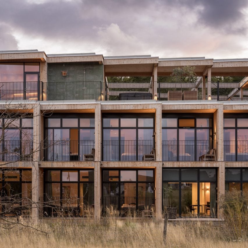
Modular facade of Green Solution House 2.0 by 3XN
Green Solution House 2.0 has a modular CLT frame

The design was developed by 3XN with its sister studio GXN, which specialises in circular architecture, and is intended as a model for sustainable construction.

As well as specifying natural materials, the design team planned the hotel so that it could be built quickly and efficiently, with minimal waste.

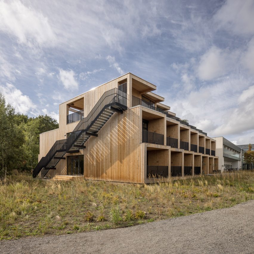
Side view of timber-framed hotel by 3XN
Timber clads the exterior above a layer of wood fibre insulation

Its CLT frame was designed as a kit of parts and manufactured off-site. Material offcuts were carefully calculated and then used to create bespoke furniture elements within the building.

The building also incorporates granite surfaces made using waste material from local quarries.

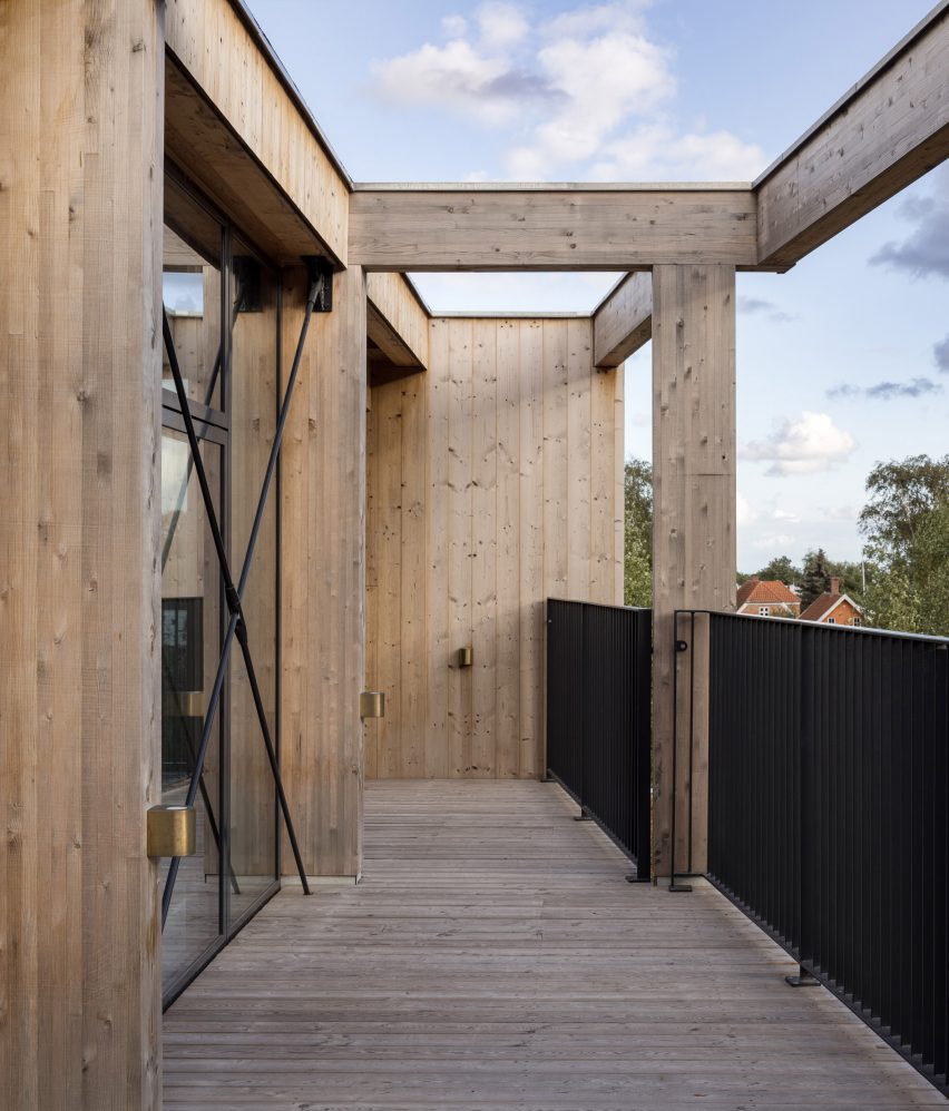
Balcony of Green Solution House 2.0 by 3XN
The structure was designed as a kit of parts and built off-site

“The widespread use of timber is both good for the climate and gives a particularly warm atmosphere,” said Lasse Lind, partner at GXN and project lead for Green Solution House 2.0.

“The building itself is an expression of the hotel’s ambition to make green solutions an attractive element for guests.”

Staircase and atrium of 3XN-designed hotel in Denmark
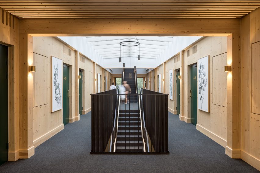
Hotel rooms sit on either side of a central atrium and staircase

Green Solution House 2.0 is an extension of Hotel GSH, also designed by 3XN, which opened in 2015.

The three-storey building contains 22 single bedrooms, one double bedroom and two dedicated meeting rooms.

Its interior is organised around a linear atrium, sandwiched between two rows of rooms on the ground and first floors.

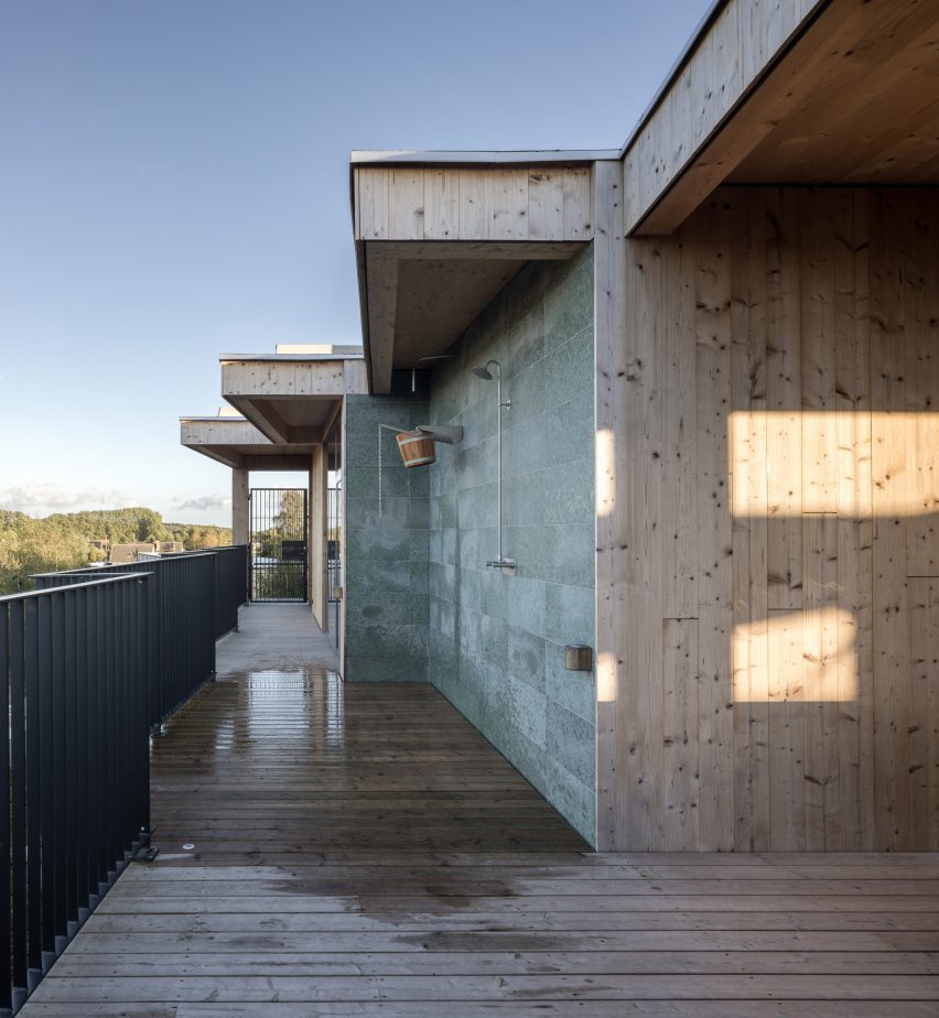
A generous staircase rises up through its centre, leading up to a terrace and spa on the uppermost floor.

Bedroom in Green Solution House 2.0 by 3XN
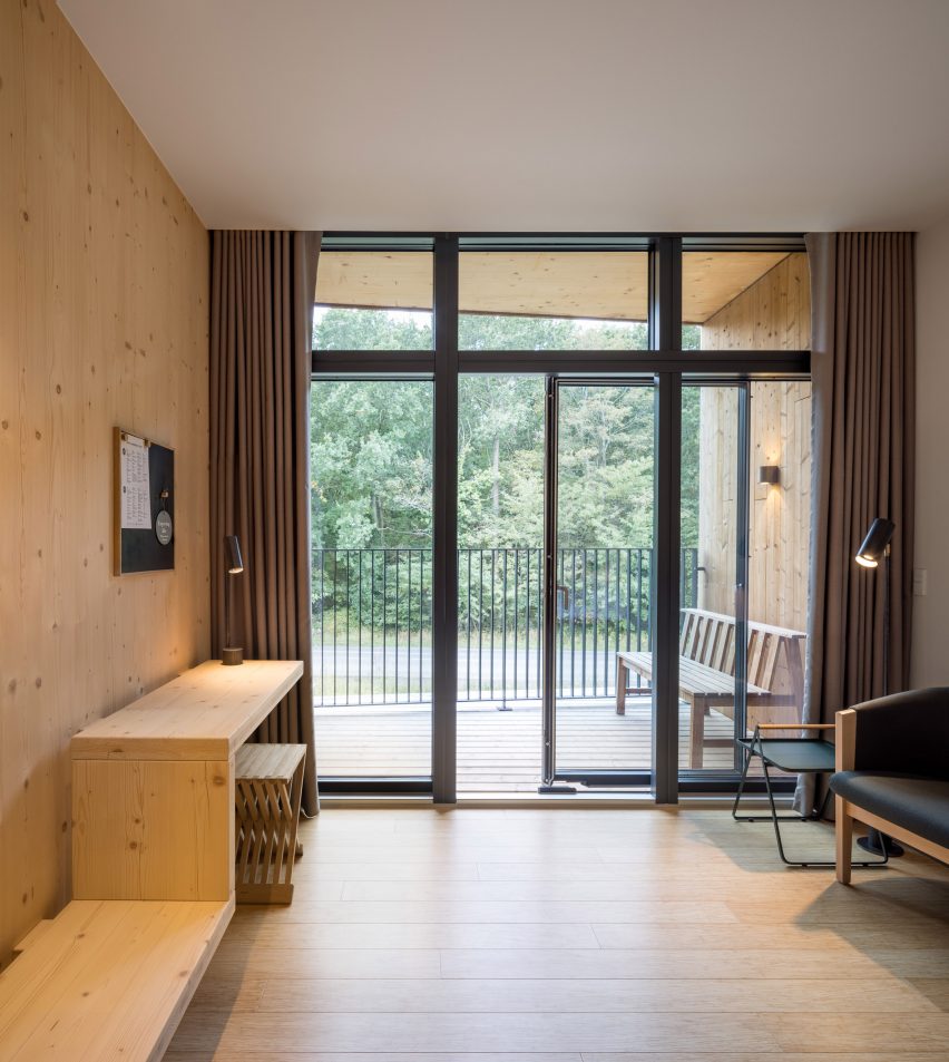
CLT offcuts were used to create bespoke furniture

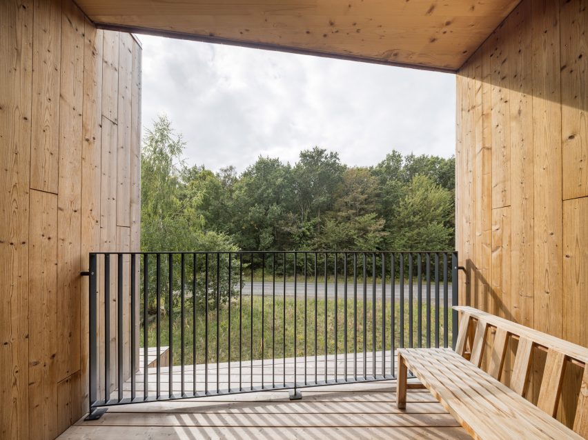
A sheltered balcony or terrace fronts each room, helping to naturally shade floor-to-ceiling glazing while also providing guests with private outdoor space.

Inside the rooms, the CLT structure is left exposed to create a warm cabin-like feel.

View from balcony of Denmark hotel
Each room has its own balcony or terrace

Modularity was key to minimising waste in Green Solution House 2.0.

The building is formed of repeating box-like modules, arranged in a staggered formation to capture as much natural daylight as possible.

This standardised approach meant that offcuts were of the same size and dimensions, making it easier to utilise them for multiple furniture elements.

Top floor of Green Solution House 2.0 by 3XN
A spa is located on the uppermost level

Timber is a recurring material in 3XN projects, with recent examples including the Klimatorium climate centre, also in Denmark, and the planned extension to the Ecole Polytechnique Fédérale de Lausanne in Switzerland.

The extensive use of the material for Green Solution House 2.0 has led to the project being named a 2022 winner of Årets Byggeri, a prestigious architectural award in Denmark. Hotel GSH received the same award in 2015.

Wooden facade of Denmark hotel by 3XN
The facade is staggered to maximise natural daylighting

“We are very proud to receive this award, which focuses on the impact that architecture can have on society,” said Lind.

“As an office, we seek to inspire through our projects, and we hope the Green Solution House 2.0 will inspire people to build with biogenic materials, use local and upcycled resources, and make holistic sustainability the main design driver.”

Facade of Green Solution House 2.0 by 3XN
Green Solution House 2.0 forms part of Hotel GSH in Rønne

The building also incorporates rooftop solar panels and water recycling to reduce its energy footprint.

The studio expects the building to have a very low carbon footprint across its lifespan.

The photography is by Adam Mørk.

Reference

Calif. Embraces Passive House for Zero Carbon Multifamily Housing
CategoriesSustainable News Zero Energy Homes

Calif. Embraces Passive House for Zero Carbon Multifamily Housing

The housing crisis in California is leaving thousands unsheltered and millions more with high rent burdens, threatening low-income communities, who are disproportionately people of color. Meanwhile, the climate crisis is causing wildfires, dangerous air quality, and widespread power shut-offs. A recent study funded by the California Public Utilities Commission highlights how Passive House (PH) design principles should be utilized in new construction to create zero carbon multifamily housing and contribute to more comfortable, healthy, and safe buildings for residents.

The Advancing Options for Decarbonization in Multifamily Buildings study developed by BluePoint Planning will inform the state’s zero-carbon program for new multifamily construction, and is designed to shape future California Energy codes (Title 24 part 6). The intention is to reduce greenhouse gas emissions from multifamily buildings, promote occupant safety and comfort, and provide greater resilience in the face of climate change and extreme weather.

The study promotes deep energy efficiency practices and encourages market actors to go beyond code, by integrating ultra-efficient PH approaches in the design and construction of new zero carbon multifamily housing. Passive House design elements emphasize airtight construction, reduced thermal bridging, and passive daylighting, heating, and cooling as much as possible.

Why Passive House?

Building on stakeholders’ and technical advisors’ input, the study highlights that PH in multifamily buildings is cost-effective and is one of the best building sectors to focus on. PH buildings can use up to 80% less energy than existing standard construction, and 20% less energy than current California energy code. The PH model has been around for more than 40 years and can be applied to all building types—including multifamily residential and mixed-use commercial and multifamily. The technique has become popular throughout Europe, while gaining ground in the United States as well, with the square footage of PH buildings more than doubling every 2 years over the past decade. Today, there are more than 100 multifamily Passive House buildings in the US, equaling more than 2.7 million square feet; though there are few in California.

PH construction relies on a  well-insulated building envelope that minimizes air leaks and thermal bridging, to create an ultra–energy-efficient building. Other elements such as double- and triple-paned, properly installed windows are also needed to achieve proper insulation. The resulting energy efficiency and reduction in demand is critical to meet California’s climate goals, to support the electrical grid, and to lower costs to ratepayers.

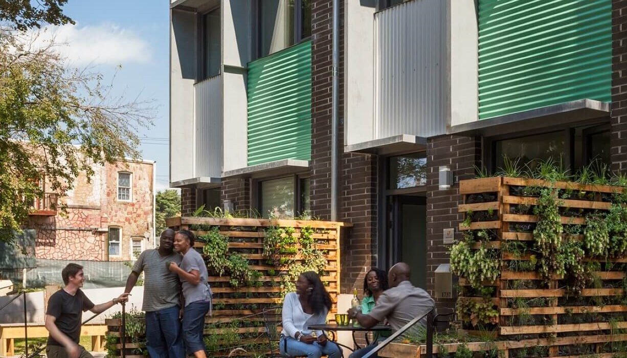
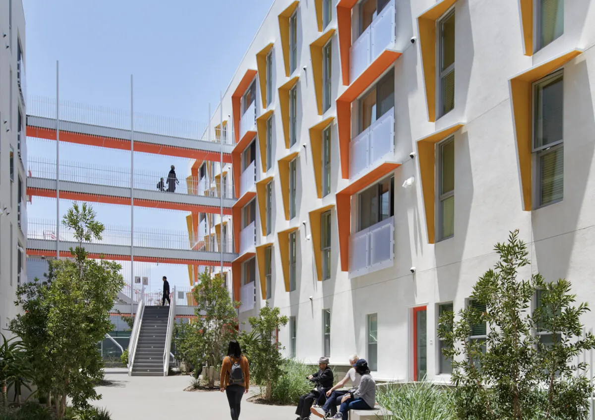
Smiling adults socialize and dine on outdoor patio, amid attractive plantings

Building systems and beyond

Zero carbon multifamily buildings must be all-electric, utilizing efficient heat pump HVAC and heat pump water heaters. Note that the elimination of natural gas infrastructure helps reduce construction costs. Did you know that that plug loads consume 30% to 44% of whole building energy for multifamily buildings (depending on climate zone), because each unit has less space to be heated and cooled but still uses roughly the same number of appliances? Thus, highly efficient appliances will have high impact in reducing energy consumption. Consider induction cooktops, heat pump clothes dryers, and ENERGY STAR rated or other third-party certified microwaves, dishwashers, clothes washers, and refrigerators. In addition, the study requires that operation and management of multifamily buildings actively reduce emissions associated with energy use.

The study expands the discussion beyond the building’s systems and considers siting, connection to other buildings, and potential for scaled infrastructure. Proper site design, orientation to the sun, and site shading all affect the need for heating and cooling. When done correctly, these elements work in tandem with airtight insulation to maintain comfortable indoor temperatures with minimal active heating and cooling.

Solar battery storage for resilience

Solar and storage are also critical elements to creating low carbon, resilient buildings. Once a multifamily building approaches ultra-low energy use intensity (EUI) targets, solar and storage must be integrated to help satisfy the building’s daily energy demands and to support basic electricity needs during a power outage. For multifamily properties, it’s essential to consider rooftop configurations and availability, and to enable siting solar over parking areas or other parts of the site. The decarbonization study also covers integration of electric charging stations and vehicle-to-grid technologies that can help to raise the overall benefits of a zero carbon building and its resilience.

Passive House design is known best as helping to create high-performing buildings and reducing energy use. However, key elements like insulation, energy efficient appliances, and solar with battery storage, can have invaluable resilience benefits in a world where climate change impacts are becoming more extreme and life-threatening.

Resilience and equity in zero carbon multifamily housing

The study considers equity as an essential principle, and advocates that PH buildings provide a durable sanctuary for residents in the face of disaster, extreme weather, or smoke from wildfires. (Durable sanctuary refers to a home or building that ensures a safe and healthy living space for its occupants both every day and during emergencies, including power outages for multiple days.) This is particularly important for disadvantaged populations who are more likely to have increased vulnerability to climate threats and are more likely to experience health complications from such an event.

One study showed that PH buildings can maintain a sufficient indoor temperature in the case of a power shut off in the extreme cold for over 6 days, compared to traditionally designed buildings, which only stay comfortable for about 1 day. The potential for Passive House as a resilience tool and mechanism to promote safety and potentially life-saving services in the face of disaster is ready to be realized.

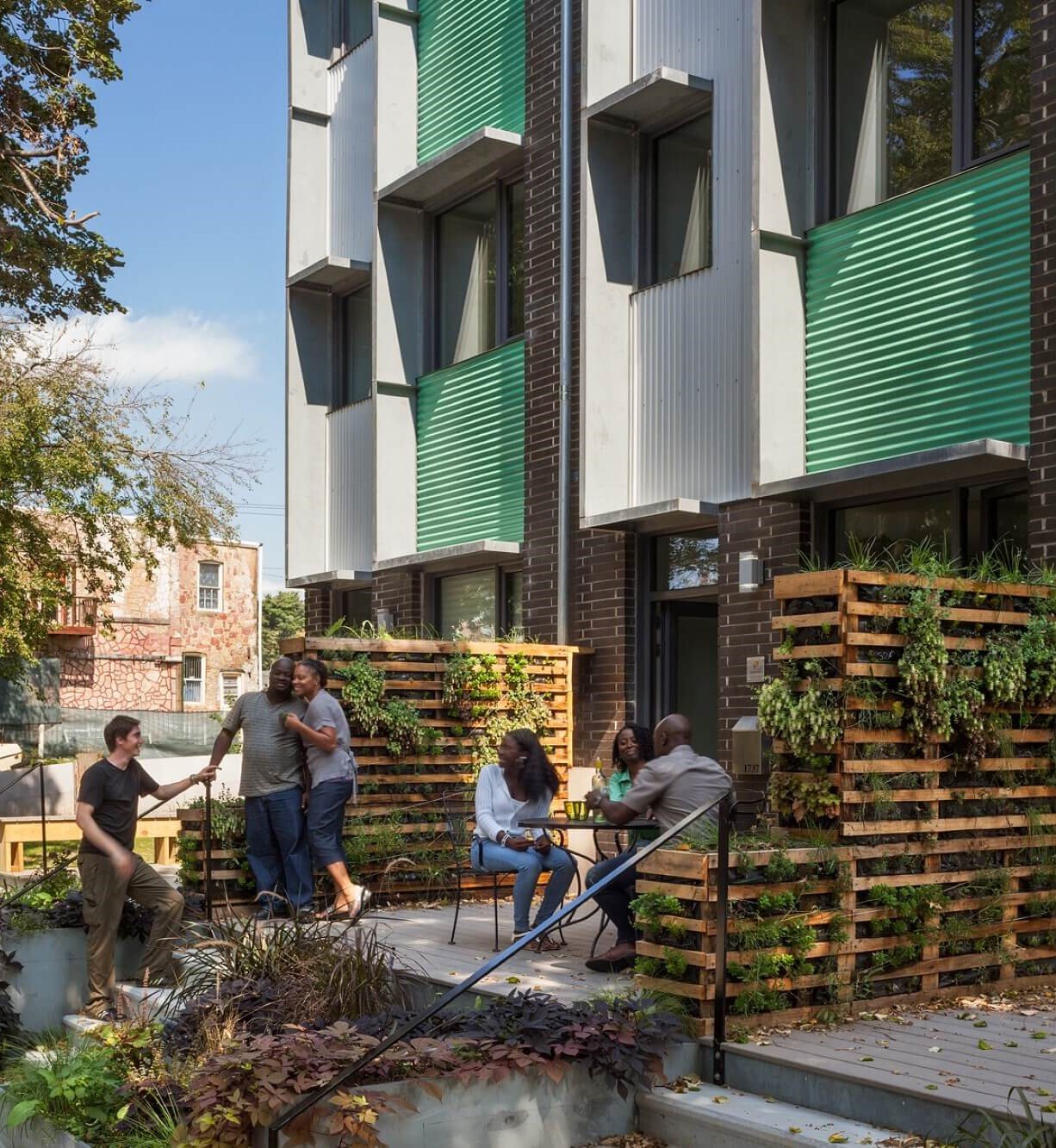
Residents wal and socialize in courtyard of sustainable affordable housing development

The Advancing Options for Decarbonization in Multifamily Buildings study can be considered a reference point for where the housing industry in California is headed. As such, it can act as a tool for design and construction professionals in California to help align their industries towards Passive House standards and more climate-friendly and resilient multifamily buildings. This includes promoting and expanding relevant training, aligning energy modeling tools, and advocating for resilience standards and certifications in their projects.

Bianca Hutner has a background in climate policy advocacy and local government climate planning. At BluePoint Planning, she helps California local jurisdictions reduce emissions and promote resilience through climate planning efforts and assists in regional and statewide efforts to curb climate change and promote an energy-resilient future. Hutner is a co-author of the Multifamily Zero Carbon Action Plan for the California Public Utilities Commission.

Reference

Alexander & Co carves out spaces for calm and play inside Pacific House
CategoriesInterior Design

Alexander & Co carves out spaces for calm and play inside Pacific House

Australian architecture practice Alexander & Co has overhauled this oceanside home in Sydney to make it more suitable for family life.

Before its renovation, the five-bedroom house had a disjointed floor plan that was proving inefficient for its two young owners and their three children. Many of the rooms were also cut off from views of the garden and the ocean beyond.

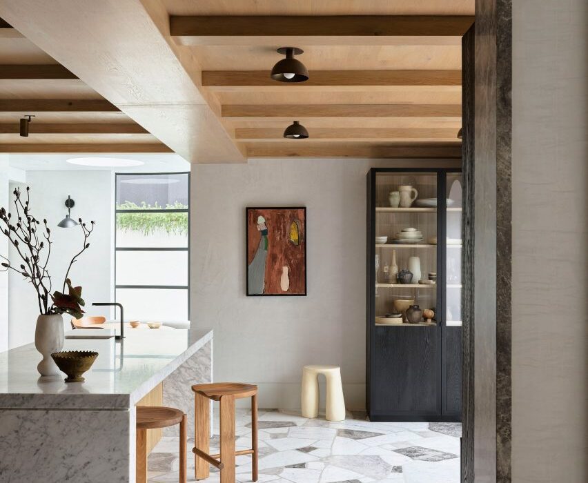
Kitchen interior of Pacific House designed by Alexander & Co
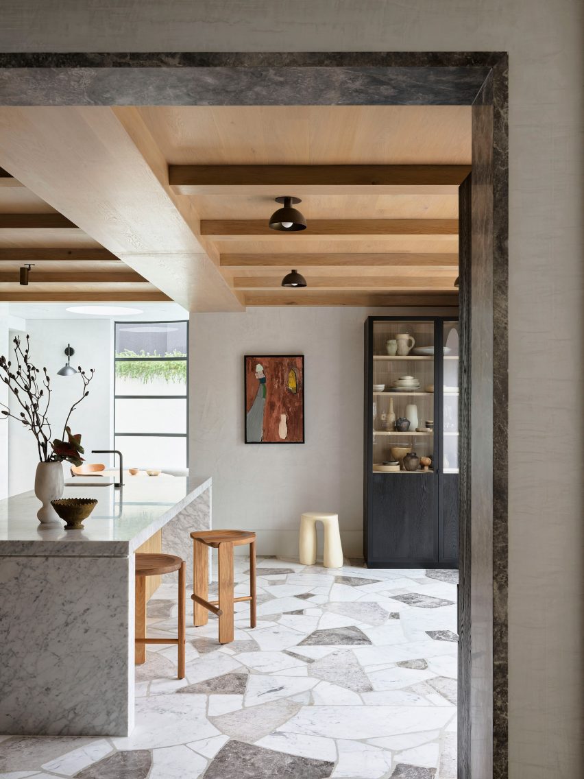
Pacific House’s kitchen is decked out with oakwood and different types of marble

“[Pacific House] was substantial in structure but devoid of spirit and certainly absent of any operational utility,” said Alexander & Co‘s principal architect Jeremy Bull.

Tasked with making the home a “functional engineer of family life”, the practice decided to carve out areas for activity and play, alongside spaces with a calmer, more contemplative ambience for the adults.

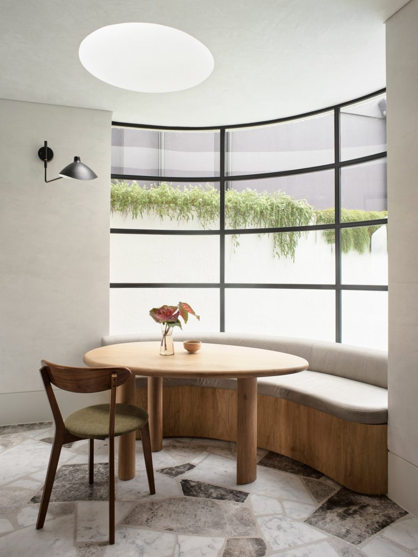
Breakfast nook in front of curved window
The cosy breakfast nook backs onto a curved window

At the heart of the plan now sits an expansive kitchen. All of the cabinetry is made from warm-hued American oak, while panels of a paler European oak were laid across the ceiling.

Jagged-edged pieces of Grigio Firma, Grigio Lana and Carrara marble were set into the kitchen floor.

Garden of Pacific House designed by Alexander & Co
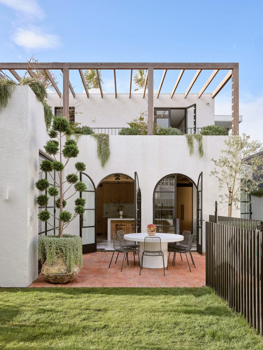
Arched doorways open onto the garden

Inhabitants can eat at the central island or take a seat at the breakfast nook, which is tucked against a huge concave window.

Its form nods to the architectural style of P&O – an offshoot of modernism that was popular in 1930s Sydney and drew on the streamlined curves of Pacific and Orient-line cruise ships.

Dining room by Alexander & Co with muted colour scheme
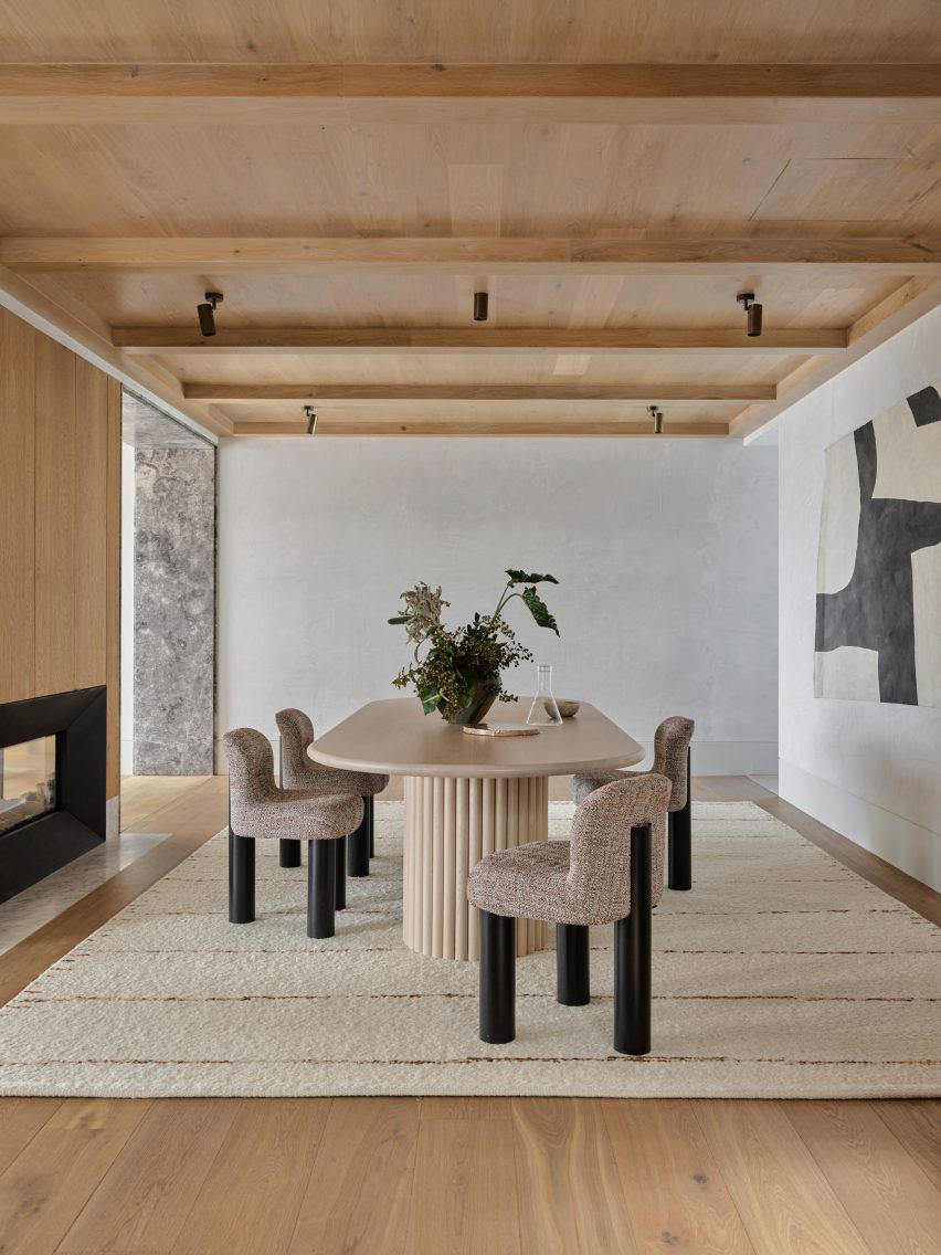
Neutral hues were applied throughout the formal dining area

Two arched doors at the front of the kitchen grant access to the garden, where there’s an alfresco seating area.

A new swimming pool was added in an excavation pit that had previously been created in the home’s driveway.

The rest of Pacific House’s ground floor includes a rumpus room for games, parties and recreation, plus a sophisticated dining area decked out in neutral hues.

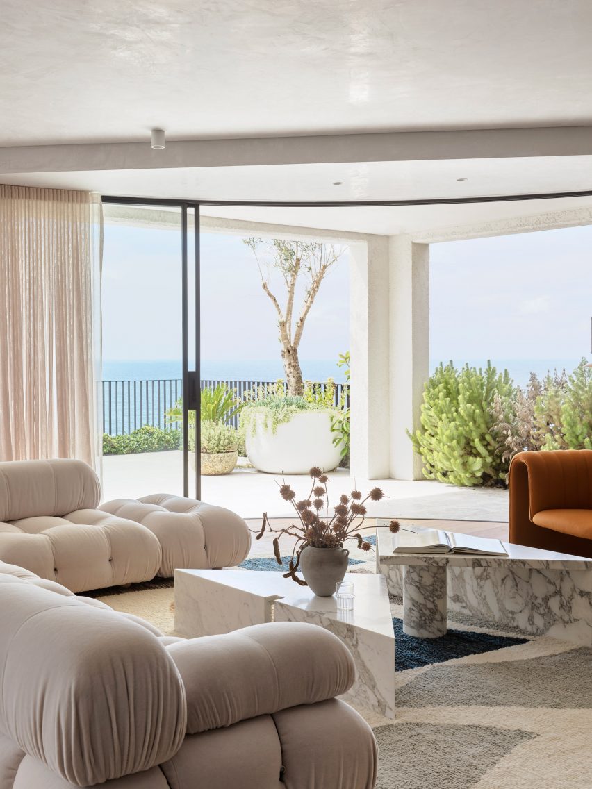
There’s also a spacious living area with Mario Bellini’s Camaleonda sofa for B&B Italia, which looks out across the ocean waves.

An Afghan rug printed with abstract shapes and a couple of triangular marble coffee tables add to the more fun, graphic look that the practice sought to establish in this room.

Living room interior of Pacific House designed by Alexander & Co
The living area is arranged to prioritise ocean vistas

Spaces become slightly more muted on the floor above, which is accessed via an oakwood staircase.

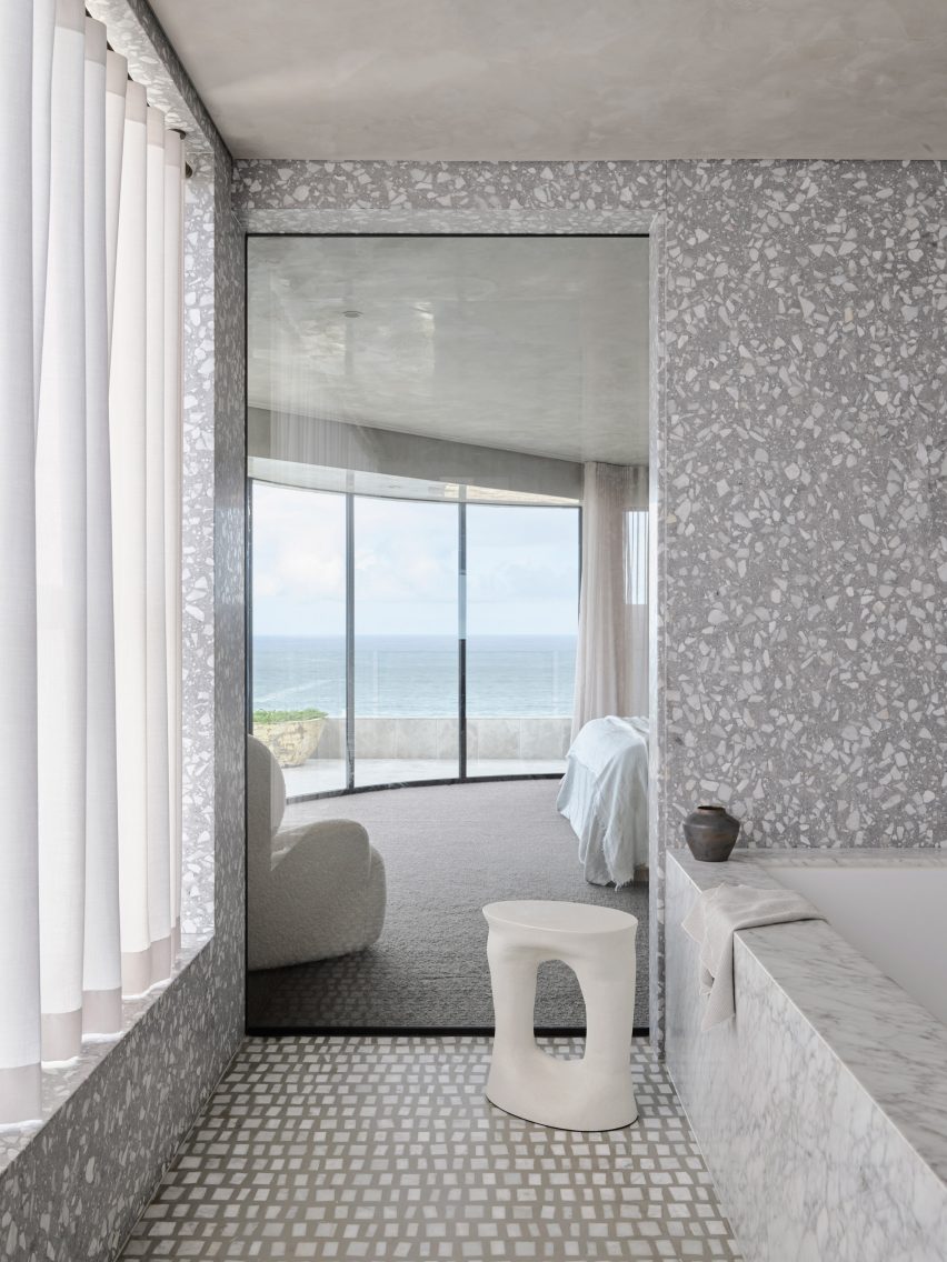
In the principal bedroom – which features another P&O-style curved window – walls are rendered in concrete.

Grey terrazzo and marble was used to cover surfaces in the bathroom, clashing against the pattern of the grey mosaic flooring.

Bathroom interior by Alexander & Co with pattern-clashing greyscale surfaces
The primary bedroom has a curved window and a greyscale en-suite

Alexander & Co has completed a number of other projects in Sydney including an Italian trattoria and most recently its own studio, which is housed in a converted Victorian-era residence.

Formal workstations are built into the building’s basement, but the remaining residential-style floors accommodate a kitchen, living room and library where staff can brainstorm ideas.

The photography is by Anson Smart.

Reference

fria folket organizes house in sweden around an extensive library
CategoriesArchitecture

fria folket organizes house in sweden around an extensive library

Library House by Fria Folket


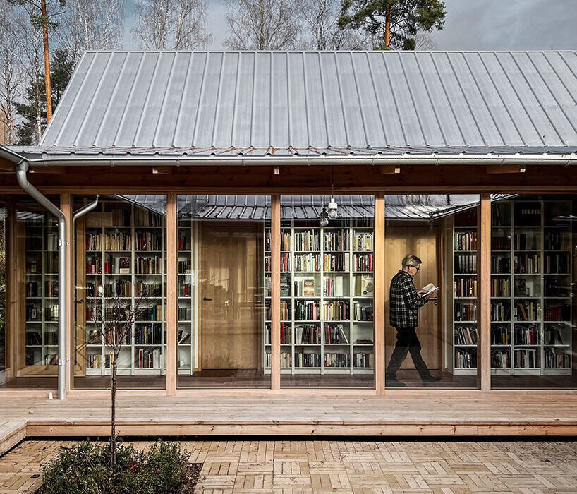
Architectural studio Fria Folket has designed ‘Library House’ for a ceramist and a lawyer with an extensive book collection. Located on the edge of a sparse pine forest by Lake Voxsjoen in Sweden, the building is organized around a library that frames a small courtyard and is designed to provide spaces for comfortable living, working, and creative activities.

‘Having different needs and rhythms and at the same time enjoying each other’s company and presence – the couple wanted a house where they could find peace to work individually without entirely screening each other off.’ lead architect Hanna Michelson explains. 

emerging from a swedish forest, fria folket's house is organized around an extensive library
the building is organized around a library that frames a small courtyard | all images courtesy of Fria Folket


a library that acts as the heart and bloodstream of the project


In response to the couple’s wishes, Fria Folket (find more here) composed a house with a centrally located library in the form of a book gallery. The north, east and west facades are closed off from the surroundings with a few carefully selected views, while the south side opens onto the lake.


Four gabled buildings complement the central library, each solving its own specific part of the program in accordance with the adjacent area. The east building houses the cooking and gardening areas, while the south building serves as the arts and crafts area. The western building covers law, science, and music, and the northern building houses the areas for rest and recreation, meditation, and self-development. By linking the volumes together – both thematically and systematically – the library acts as the heart and bloodstream of the project.

emerging from a swedish forest, fria folket's house is organized around an extensive library
the small courtyard in the heart of the residence


following the course of the sun


The four houses are arranged in the order of the sun’s course, with the beginning point of the house, that is, the entrance, coinciding with the beginning point of the day in the east. Moving through the house, the sun finally rests in the north, just like the house.


The degree of privacy follows the same loop. From the most social rooms, hallway and kitchen, to the most private rooms at the end of the circle. The clockwise movement is encouraged by the arrangement of the windows, which give a view of the surroundings when you walk clockwise, while counterclockwise you see the closed bookshelf walls. Four doors, one in each corner of the book gallery, provide access to the courtyard from all parts of the house, making it easy to move between inside and outside.

emerging from a swedish forest, fria folket's house is organized around an extensive library
four gabled buildings complement the central library, each solving its own specific part of the program


simple materials complement the library’s broad color spectrum


The strong square boundary provided by the bookshelves and the transparency of the glazed enclosure of the courtyard reinforce the impression that the library transcends the climate envelope, making the courtyard an open-air reading space – A space defined by its purpose rather than its physical boundaries.


Given the library’s broad color spectrum, the interior materials are spare and simple. From the blonde palette of white, whitewashed pine and natural pine, the ceramic tile floor stands out with its warm brick-red color. In the pursuit of sustainability, the home was adapted to the family’s existing furniture to reduce the need for new purchases and replacements. For example, the iconic Ikea ‘Billy’ bookshelf played a key role in determining the dimensions of the home, as it houses the existing library.

emerging from a swedish forest, fria folket's house is organized around an extensive library
the four houses are arranged in the order of the sun’s course


To reduce the ecological footprint, the walls and roofs were built without plastic and insulated with flax fiber, as is common in the area. The facade is clad in untreated pine from a local sawmill, and the concrete-free foam glass foundation was made from recycled glass.


Rainwater from the roof is collected in an underground tank that supplies water to the greenhouse. Following old Nordic building traditions, one of the studios was constructed in such a way that it can be separated from the rest of the house in terms of heating. This provides the opportunity to downsize the house when the temperature drops. A certain rhythm permeates the house, as the grid of the structure is reflected in the load-bearing glass partitions, which were made by a local window carpentry store. ‘Like bar lines in a sheet of music, the mullions divide the bookshelves like beats in a bar.’ the architects share.

emerging from a swedish forest, fria folket's house is organized around an extensive library
given the library’s broad color spectrum, the interior materials are spare and simple

emerging from a swedish forest, fria folket's house is organized around an extensive library
glass openings connect the interior to the courtyard which serves as an open-air reading space

Reference

Td-Atelier and Endo Shorijo transform traditional machiya house in Kyoto
CategoriesInterior Design

Td-Atelier and Endo Shorijo transform traditional machiya house in Kyoto

Japanese design studios Td-Atelier and Endo Shorijo Design have renovated a century-old machiya townhouse in Kyoto with minimal interiors that intend to honour the home’s existing architecture.

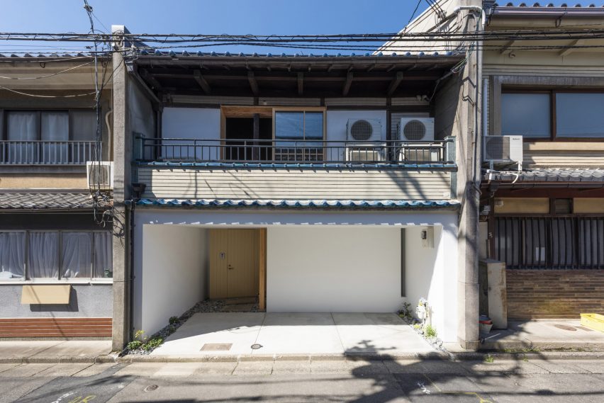
Called House in Marutamachi, the Japanese house was built over 120 years ago and is arranged across two floors on a long and narrow site.

Machiya house
House in Marutamachi is a traditional machiya house in Kyoto

Tucked between two other residential properties, the house is an example of the wooden machiya townhouses that were once common in Japan’s historical capital Kyoto but are now at risk of going extinct.

“Traditional Kyoto townhouses are being destroyed at a pace of 800 houses a year,” Td-Atelier explained.

“Old buildings don’t match modern life. However, we want to stop the decline of Kyoto townhouses by fusing tradition, design and new life.”

Td-Atelier kitchen interior
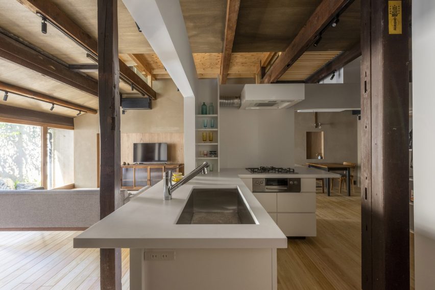
The kitchen is encased in a white volume

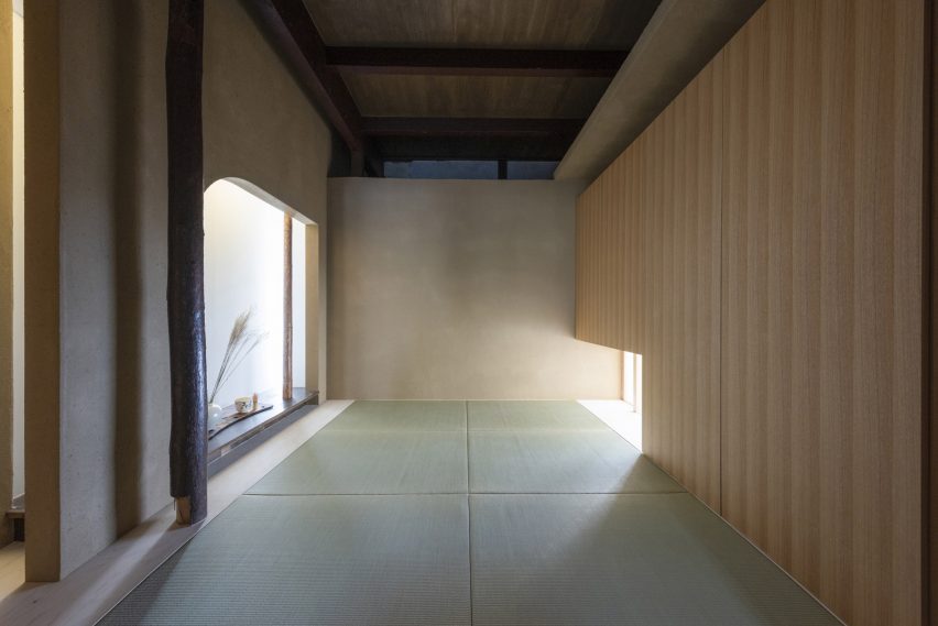
Td-Atelier and Endo Shorijo Design dressed House in Marutamachi’s interior with new components including sleek tiles and geometric furniture alongside materials reused from the original house, as seen in the traditional team room.

The studios retained the building’s wooden columns and beams but added white volumes to house rooms including the kitchen and study to avoid disturbing the existing architecture with harsh structural materials.

Bathroom in Kyoto house
The tea room was constructed using materials reused from the original building

These variously sized cubes were designed to mimic the contrasting heights of buildings in a cityscape.

“The gaps and omissions created between the volume group and the existing columns, beams, walls and floors create continuity in the space,” Td-Atelier said.

Throughout the house, Td-Atelier and Endo Shorijo Design adopted a minimal material and colour palette including a combination of light and dark woods alongside smooth concrete.

A thin, sculptural light is suspended above the timber breakfast bar on the second floor, where occupants can sit on clusters of subtle-coloured stools.

Td-Atelier garden
Original features were maintained in the garden

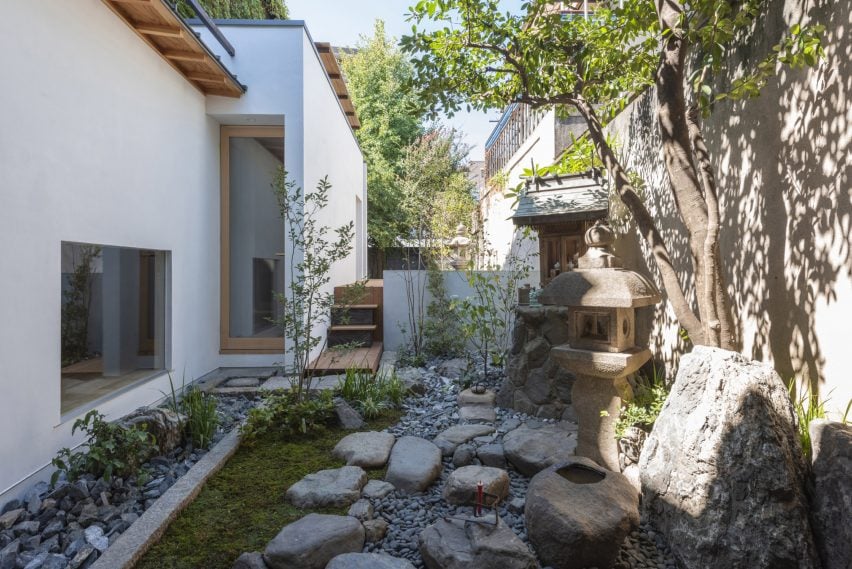
Outside, a plant-filled garden features elements from the building’s original architecture such as sandy-hued lanterns and a chōzubachi – a traditional stone water bowl historically used for washing hands before a tea ceremony.

House in Marutamachi was shortlisted for house interior of the year at the 2022 Dezeen Awards.

Dezeen recently announced the winners of this year’s interiors categories, who are now competing to win the overall interiors project of the year award.

The photography is by Matsumura Kohei.

Reference

Crushed TV screens cover Hundred Acre Wood house by Denizen Works
CategoriesArchitecture

Crushed TV screens cover Hundred Acre Wood house by Denizen Works

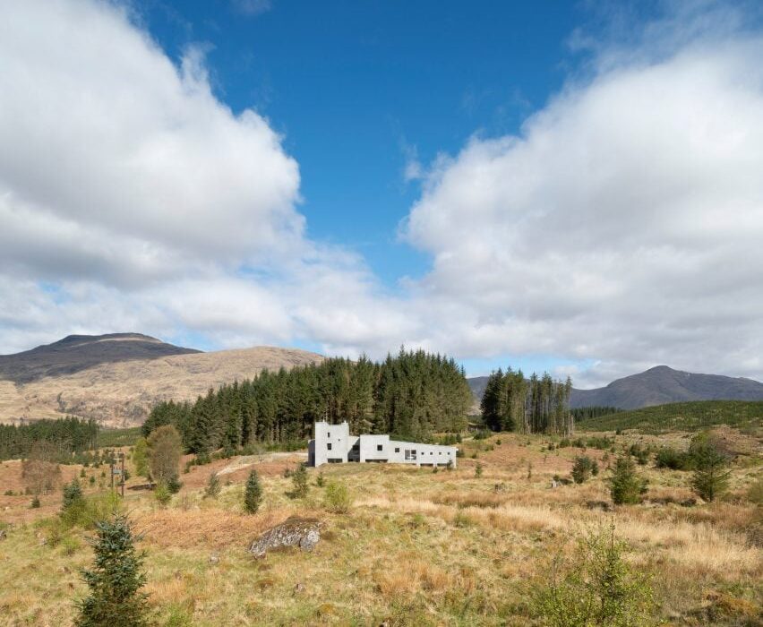
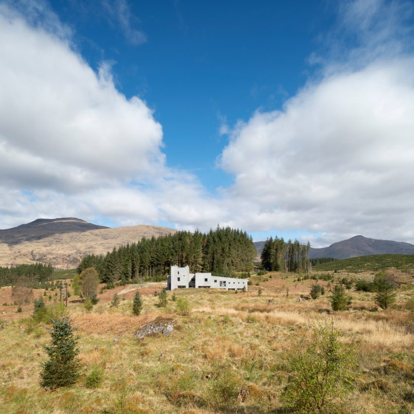
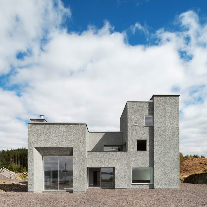
Recycled TV screens cover the walls of the seven-bedroom Hundred Acre Wood house, which architecture studio Denizen Works has created on a site overlooking Loch Awe in Scotland.

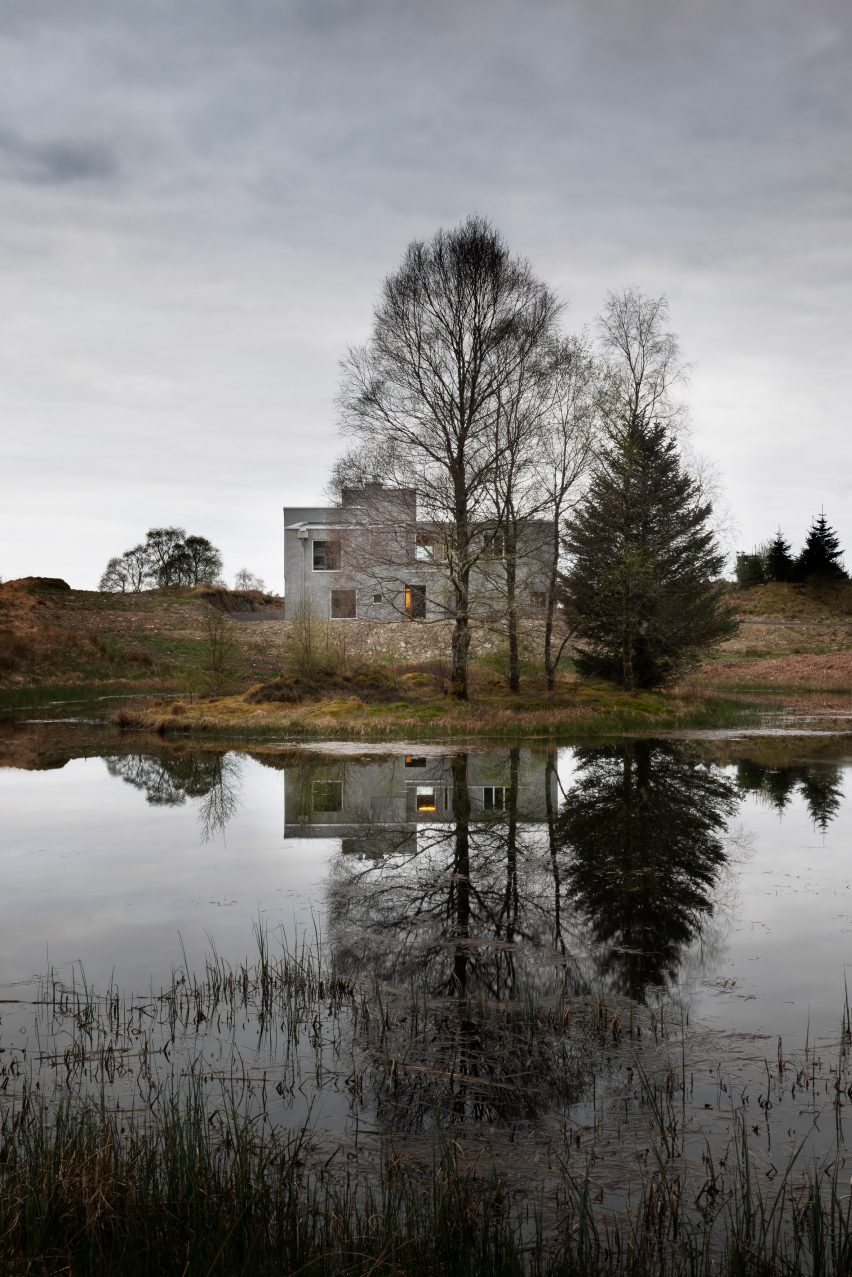
Named Hundred Acre Wood, the castle-like dwelling was designed for a couple with six children on former Forestry Commission land with its own private lochan – a small lake.

House in former Forestry Commission land by Denizen Works
Denizen Works has created the Hundred Acre Wood house

Denizen Works has lowered the house into a hollow in the landscape, making it appear as though it emerges out from the ground on the north and south elevations.

According to the studio, this aims to give the home a protective quality, with the help of its monumental appearance that references the work of Spanish sculptor Eduardo Chillida.

Hundred Acre Wood beside lochan in Scotland
Its located on former Forestry Commission land with a lochan

“The brief was for a family home for our clients and their six children – as well as an increasing number of grandchildren – that would reflect their personalities and provide a lasting legacy for the family,” project architect Andrew Ingham told Dezeen.

“Conceptually, it was conceived as a sculpted solid, referencing the work of Eduardo Chillida, to heighten the sense of a protective shell that appears as a robust object in the landscape.”

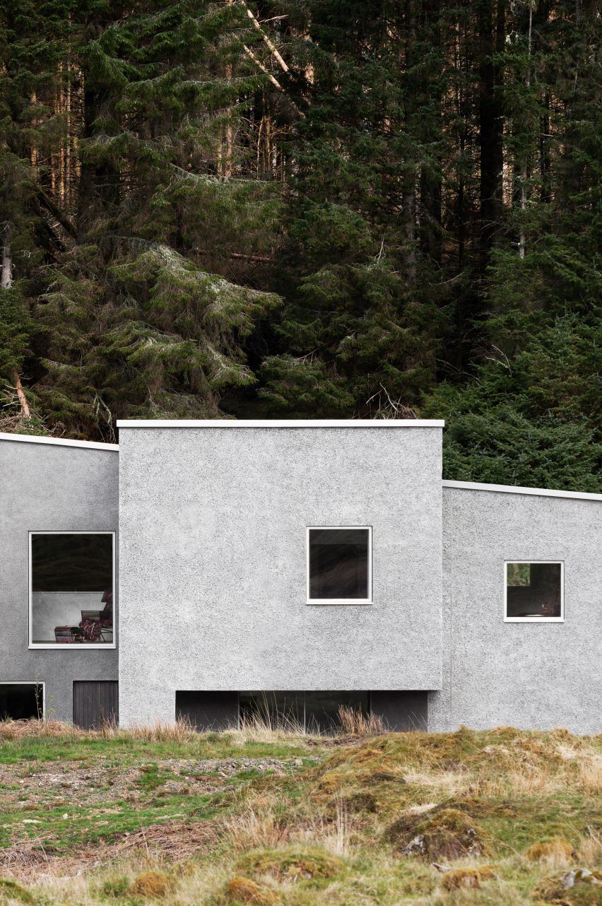
Side profile of Hundred Acre Wood house by Denizen Works
The building has a monolithic form

While referencing the work of Chillida, the form of Hundred Acre Wood has also been developed in response to the home’s environmental context.

Its layout aims to ensure it has the least visual impact on the nearby road, it makes the most of its vantage point above Loch Awe and its rooms align with the movement of the sun.

Close-up of facade clad in recycled TV screens
It references the work of Spanish sculptor Eduardo Chillida

“The plan is narrow on the west elevation, where it was considered more sensitive due to views from the road below,” said Ingham.

“The form responds to the environmental context, key views and the site’s topography.”

Close of facade clad in crushed TV screens
Its rough exterior is clad in recycled TV screens

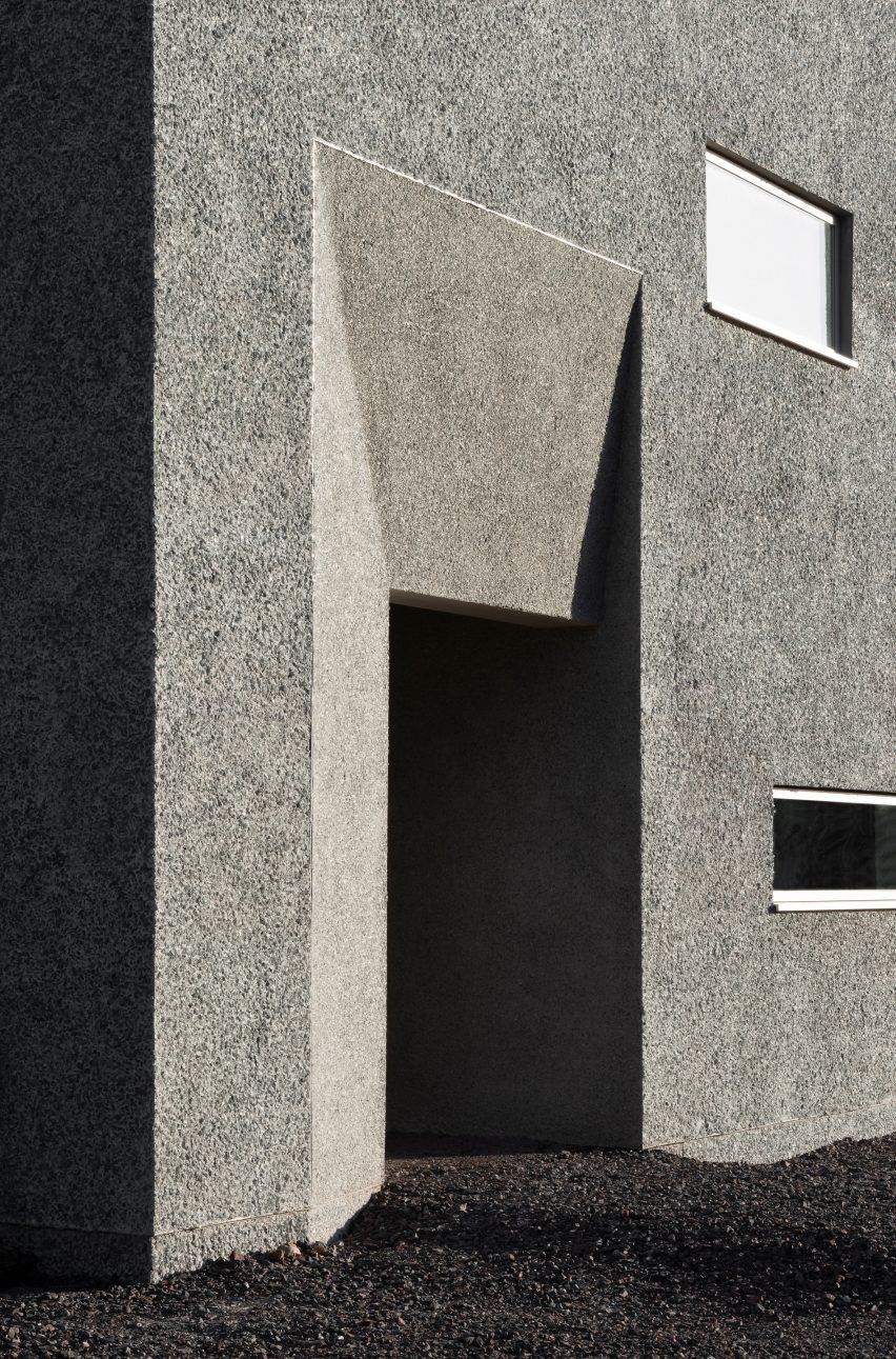
One of the most unusual features of Hundred Acre Wood is its facade, which is covered in recycled and crushed TV screens for a low-maintenance, pebbledash-like finish.

This was developed by Denizen Works as a “take on a traditional Scottish harling” – a rough wall finish that is made from lime and aggregate.

Hall of Hundred Acre Wood house by Denizen Works
The hall is the home’s centrepiece

“We sourced a decorative glass chipping created from recycled TV screens collected in Scotland which come in a lovely range of blue-greys which we felt was appropriate for the moody Scottish skies,” Ingham explained.

“Our client is also not keen on TVs, so there was an element of playfulness in their use.”

Circular skylight
It is naturally lit by an oculus

As the material had not been used on a building before, the studio had to develop prototypes with the construction materials company Sika to test its performance.

“Large sample panels were produced for client sign-off and to help convince the planners that the system would be successful,” added Ingham.

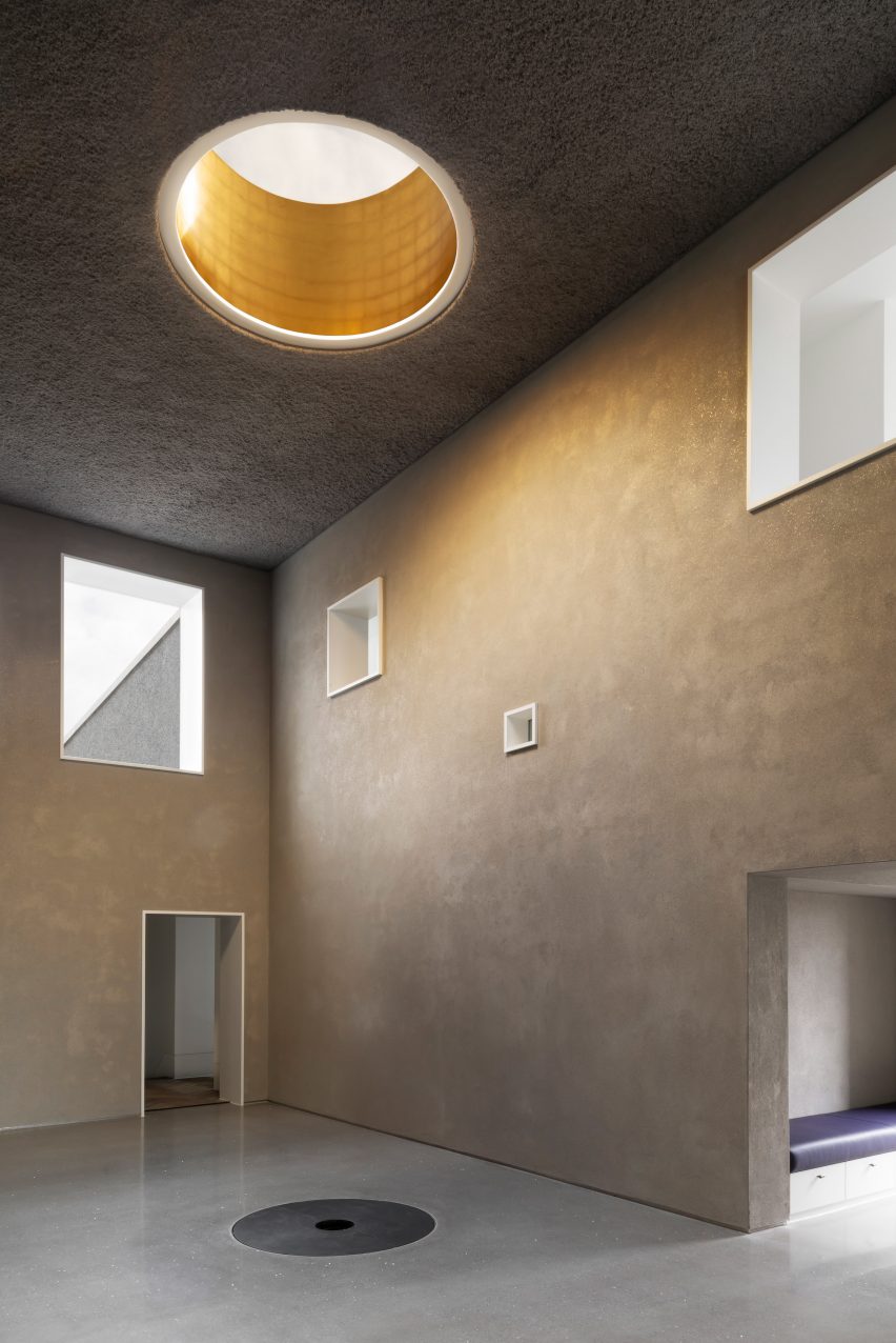
Inside, the focal point of Hundred Acre Wood is a central, double-height hall lit by an oculus in the ceiling.

This was designed to accommodate a five-metre-tall Christmas tree – one of the client’s main requests for Denizen Works.

Pared-back interior of Hundred Acre Wood by Denizen Works
Living spaces are arranged around the hall

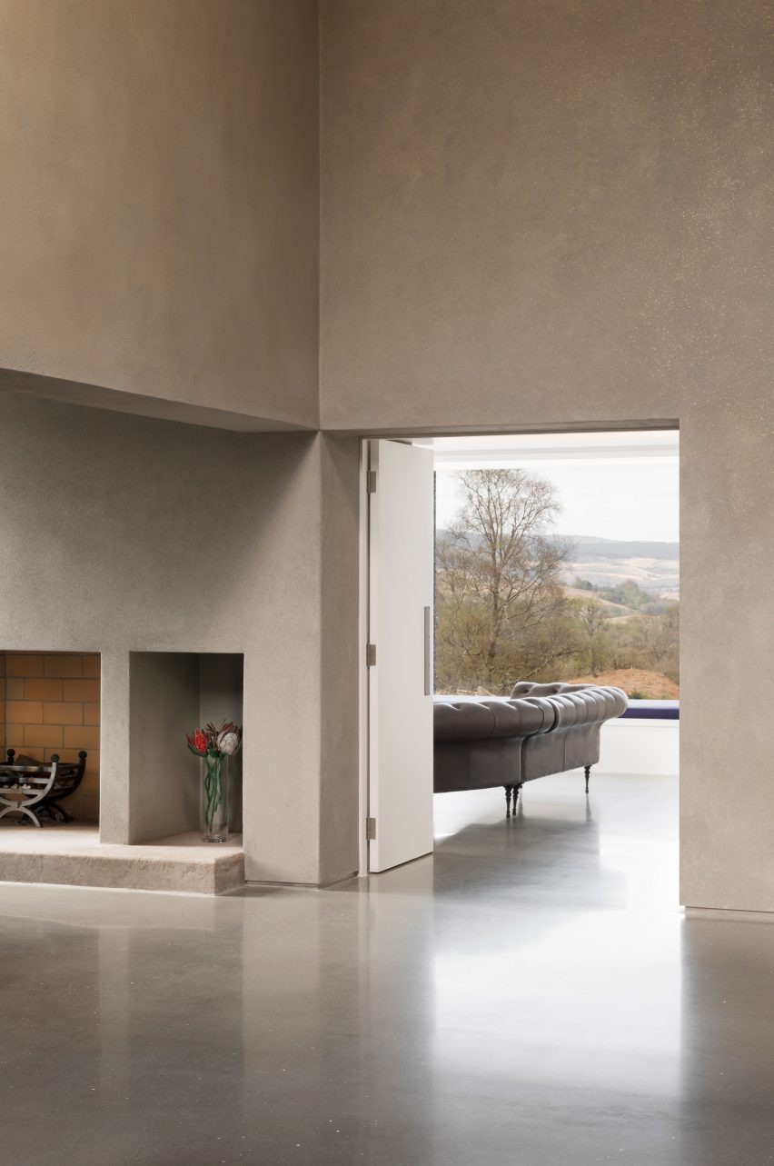
Around the hall are the main living spaces and the seven bedrooms, all arranged to maximise views of the loch and sun throughout the day.

The majority of the interior has a deliberately pared-back finish to retain focus on the client’s furniture collection, but the hall is designed to be more dramatic.

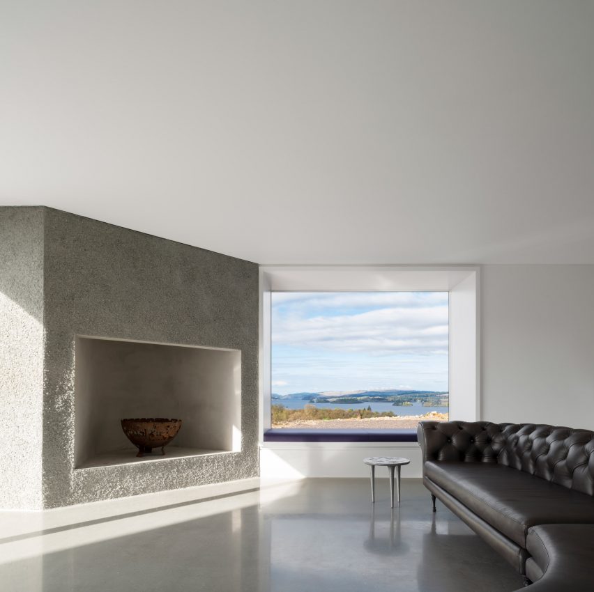
Living room overlooking Loch Awe
The rooms have views over Loch Awe

“We wanted to use the finishes to create a sense of drama,” said Ingham, referencing the studio’s design for the hall.

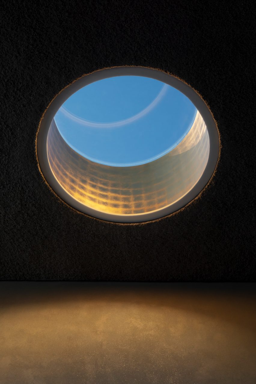
“It features a recycled paper ceiling, clay walls with gold mica flecks and a screeded floor with exposed mirror aggregate,” he continued. “A large, gold-lead-lined oculus is situated over the Christmas tree pit and casts a warm glow into the space.”

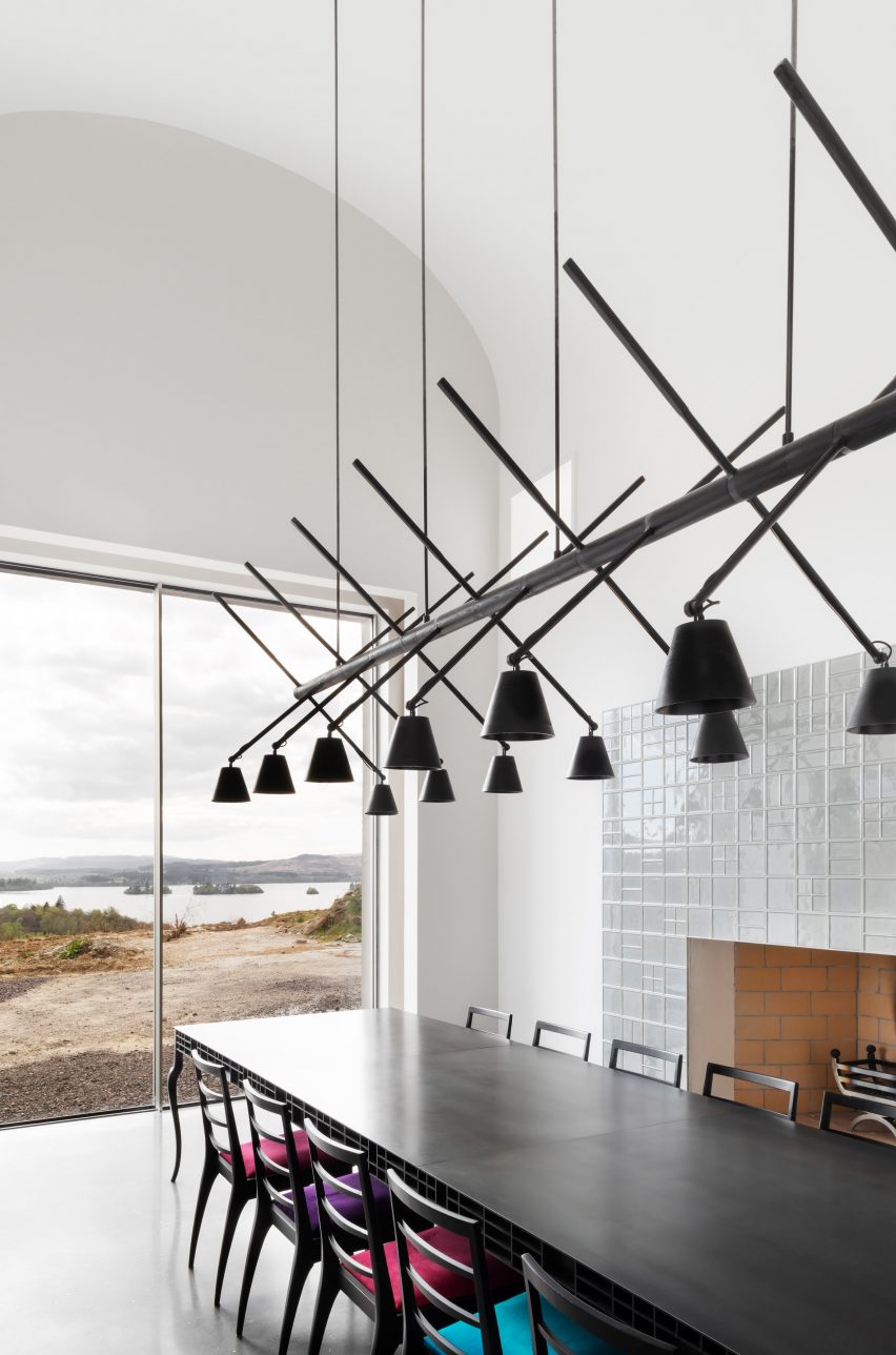
Kitchen with sculptural pendant light and glazed wall
The interiors of deliberately pared-back

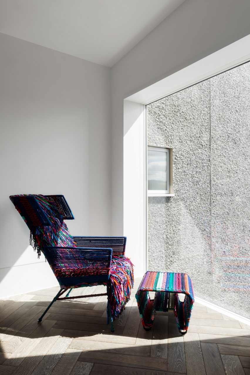
The thick walls of the home are visible in the deep window reveals of each room, bringing the sense of protection granted by its sculptural exterior to the interior.

Finishing details of the house include a ground source heat pump that provides heating and hot water, while a private borehole provides fresh water to the whole house.

As part of the landscape design, reed beds have been introduced to treat wastewater and rainwater, which is sent to the lochan.

Interior of Hundred Acre Wood by Denizen Works
The client’s furniture pieces have been used as focal points

Founded in 2011 by Murray Kerr, Denizen Works is an architecture studio with offices in London and Glasgow.

Other recently completed projects by the studio include the Floating Genesis church, which is crowned by a pop-up roof, and a house on the Scottish island of Tiree with a gable-shaped glass wall.

The photography is by Gilbert McCarragher.


Project credits:

Architect: Denizen Works
Project team: Charlotte Airey, Matthew Barnett, Andrew Ingham, Murray Kerr, Dimitri Savitchev
Client: Private

Reference

Malik Architecture punctures house in Delhi with multi-storey voids
CategoriesArchitecture

Malik Architecture punctures house in Delhi with multi-storey voids

A series of openings that let in natural light penetrate a residential building in Delhi named House of Voids, created by Indian architecture studio Malik Architecture.

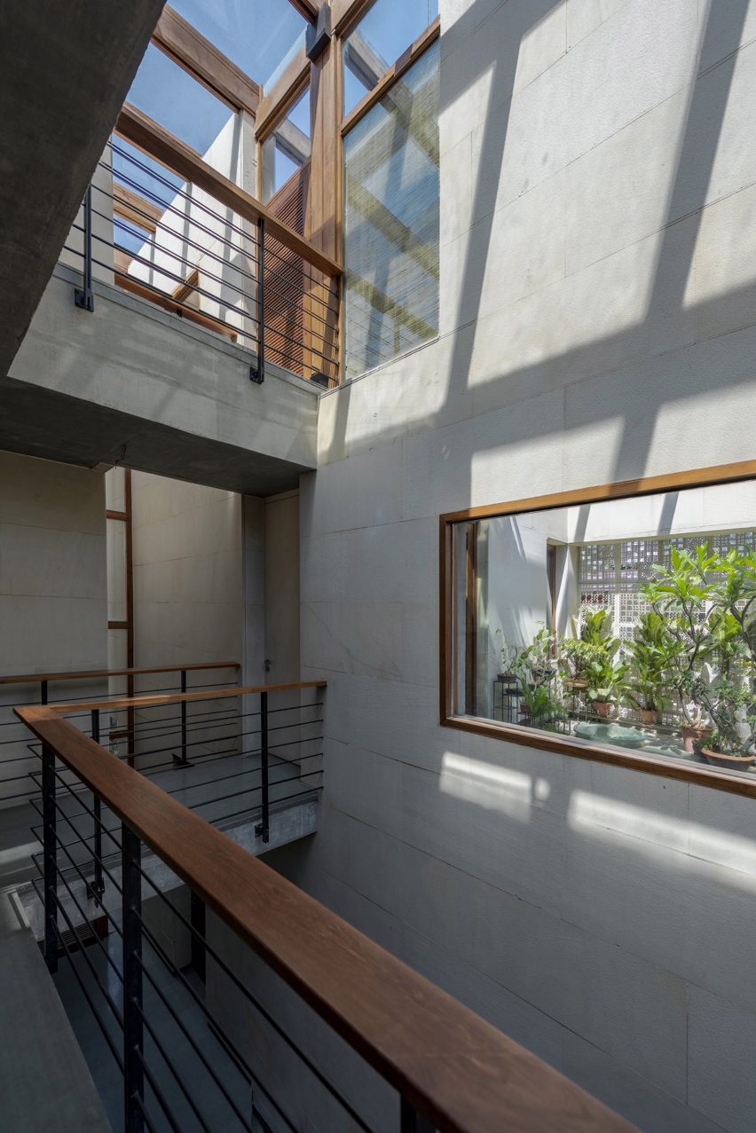
The Indian house is on a dense urban site, which led Malik Architecture to design skylights and openings between floor levels to maximise natural light entering the home.

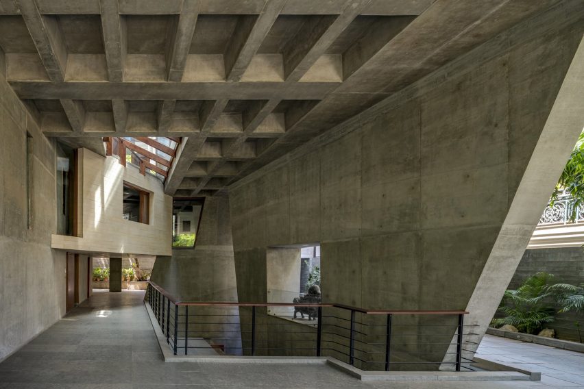
Concrete interior of House of Voids by Malik Architecture
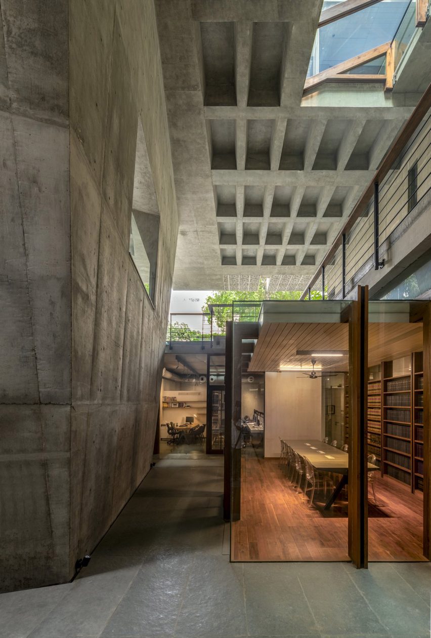
The living spaces on the first floor are supported by a large stilt

The structure was made from reinforced cement concrete with exterior walls clad in Gwalior mint sandstone.

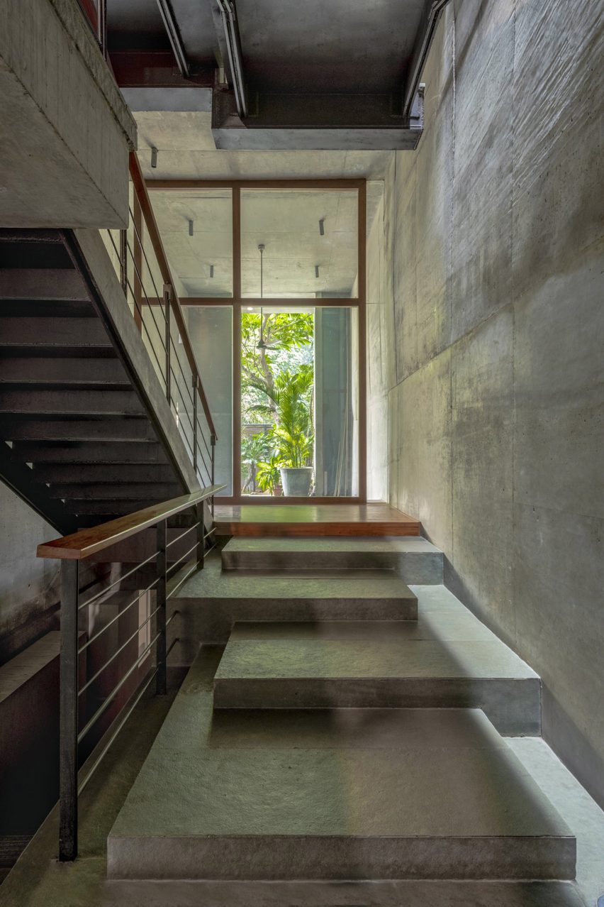
Malik Architecture separated the house’s circulation from the main living and office areas with the stairwell situated on the east side of the home, where there is little opportunity to gain natural light as the site shares a wall with the adjoining plot.

Interior light well of House of Voids by Malik Architecture
Skylights and voids increase natural lighting in the house

The western facade of the house is set back six metres from the neighbouring building.

Malik Architecture created openings, screens and characteristic voids that penetrate multiple floor levels to flood the living spaces on this side of the home with sunlight.

Basement offices of House of Voids by Malik Architecture
An opening in the ground floor lets sunlight into the offices in the basement

Office spaces were located in the basement and mezzanine level above the ground floor while the main living spaces begin from the first floor, which is cantilevered six metres above a ground-level courtyard.

The living room on the first floor opens onto a terrace that is surrounded by the foliage of the ground-floor trees.

Exterior of House of Voids by Malik Architecture
The living room on the first floor leads to an outdoor terrace

“The excisions are very deliberate; for example, the angular slice at the northwest corner, where the living room opens into the veranda deck, is made to maximise the experience of large trees within the plot and beyond,” Malik Architecture told Dezeen. “This same slice turns into a north light for the living room.”

“The slices, voids and excisions are the protagonists for the spatial and structural frameworks of the house – connecting people to light and the trees,” the architecture studio continued.

According to Malik Architecture, Delhi’s neighbourhoods have traditionally been characterised by two-storey houses with front gardens that separate the buildings from tree-lined roads.

Malik Architecture designed House of Voids with green spaces and openings that let in light and restore thermal balance in ways that are indicative of the traditional Delhi building typology.

Exterior courtyard at House of Voids in Delhi
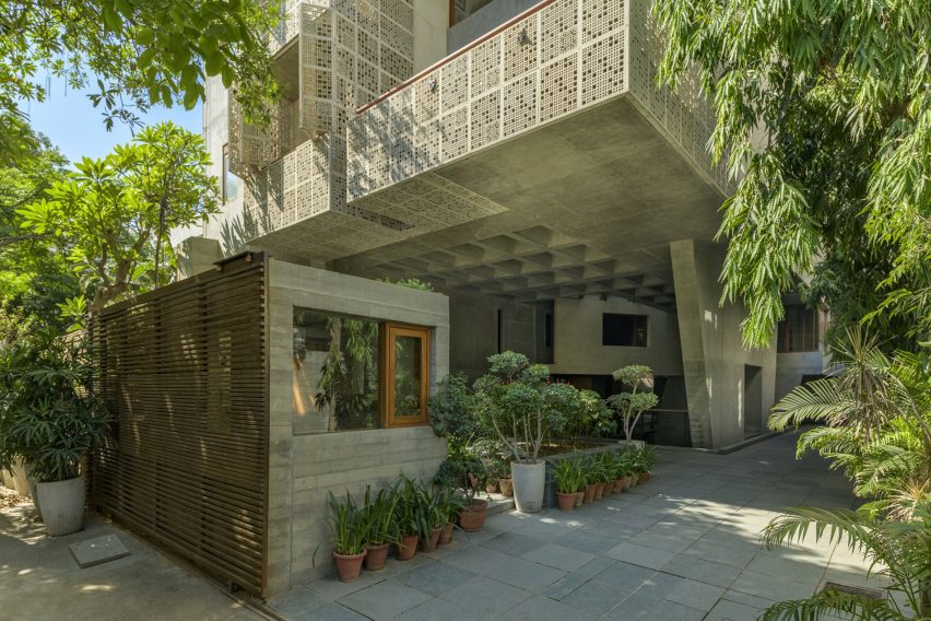
The upper floors of the house cantilever over the courtyard to provide shade

“This proposal re-evaluates the typology of the building form as prescribed by the current guidelines and adapts it to re-establish the sensation of the pre-existing urban condition by introducing a network of labyrinthine voids running through the house, catching light and restoring thermal balance, expressed as a combination of green spaces, deep fissures and skylights,” said Malik Architecture.

“A gigantic structural pylon is the load-bearing pivot for the cantilevered superstructure, creating shaded ground and resonating the language of Delhi’s monumental institutions.”

Interior staircase at House of Voids by Malik Architecture
The circulation is separated from the rest of the home

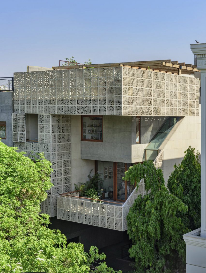
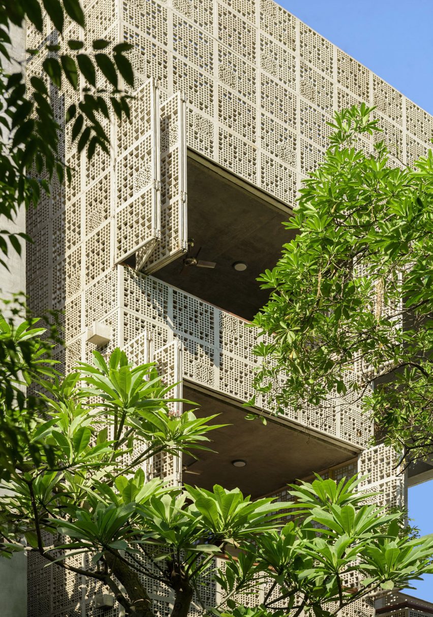
Malik Architecture created fixed and operable sandstone screens for the exterior of the house to provide shading and privacy, which were cut by hand and water jet techniques.

The design of the screens references traditional Indian jaali – perforated stone or lattice screens with ornamental patterns.

Exterior of House of Voids in Delhi
Perforated screens shade the house

“We resisted the urge to use intricate or ornamental patterns for the screens, choosing instead to focus on the sense of the heavy stone mass dissolving into abstract compositions of light and shadow,” said Malik Architecture.

“A few panels with traditional patterns were randomly inserted into the overall composition.”

House of Voids has been shortlisted in the urban house category of Dezeen Awards 2022, alongside a compact family home in Tokyo where the staircase is designed as a relaxing social space and a house in Melbourne that makes the most of its narrow plot with eight courtyards and gardens.

The photography is by Bharath Ramamrutham.

Reference

Sarah Jefferys creates Passive House in Brooklyn with cedar screen
CategoriesInterior Design

Sarah Jefferys creates Passive House in Brooklyn with cedar screen

American studio Sarah Jefferys Architecture + Interiors has renovated a slender townhouse in Brooklyn with airy rooms and a cedar screen on the facade to meet Passive House standards.

Located in the Park Slope neighbourhood, the Passive House project involved the overhaul of a brick-faced, three-storey townhouse built in 1921 and owned by a family of four.

Passive Brooklyn Townhouse cedar facade
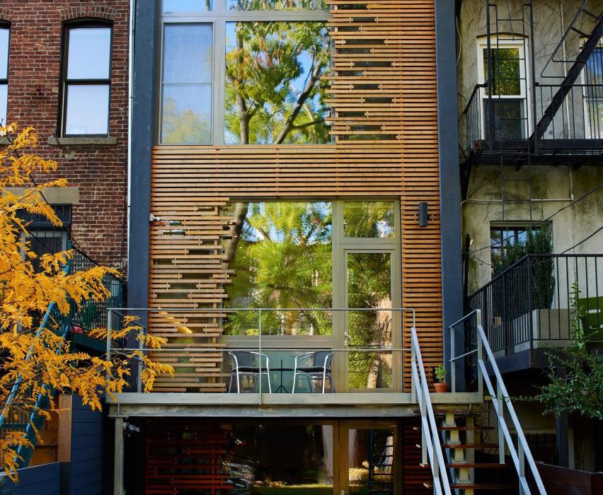
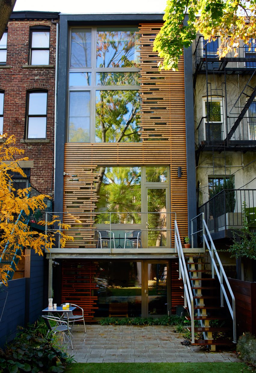
Sarah Jefferys Architecture + Interiors remodelled a Brooklyn townhouse into a passive house

New York-based Sarah Jefferys Architecture + Interiors sought to create a tranquil living atmosphere with elements that pay homage to the family’s Indian and Danish roots.

Moreover, the team wanted the 3,000-square-foot (279-square-metre) building to align with Passive House standards for energy efficiency.

Brooklyn Passive House interior
High-quality windows were installed

To significantly reduce heating and cooling needs, the team installed triple-pane Zola windows, which are often used in passive houses. Walls were reconstructed to create an airtight envelope, which included the addition of cellulose insulation.

The team also added an electric heat pump and an energy recovery ventilator, which helps purify the air.

The front facade was kept intact and refurbished, while the rear wall was redesigned to add ample glazing. To provide privacy and to modulate incoming daylight, the team added an artful cedar screen that acts as both “a sculpture and a veil”.

Brooklyn Passive House with Dutch furniture
White oak was used to complement the bright colours

Within the slender home, the team incorporated pops of colour and pale materials such as white oak.

“We strategically used light hues and reflective materials, and created an airy environment to offset the narrow footprint of the townhouse,” the team said.

The ground level has an open plan and holds the communal spaces.

Brooklyn Passive House kitchen
Reflective and light materials helped the studio meet environmental standards

Up front is the living room, where one finds a blue Living Divani sofa, rattan chairs from Fritz Hansen and a Muuto table.

A wood-burning fireplace, an element not often found in passive homes, sits between the living and dining areas.

To curb emissions from the hearth, the architects added a triple-pane glass enclosure and an extraction fan with an insulated cap. Still, because of the fireplace, the home does not fully meet the PHIUS certification requirements, the architect said.

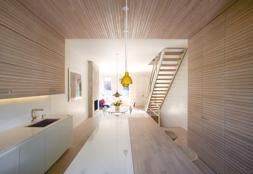
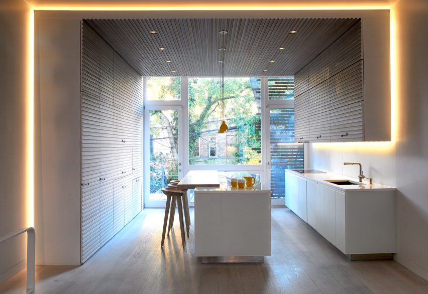
The all-white dining room is furnished with Ant chairs by Arne Jacobsen and a PH50 pendant by Poul Henningsen. Just beyond is the “showpiece kitchen”, which is framed with an LED light cove.

Brooklyn passive house white stairway
The staircase has a skylight above

“The light cove acts as a separation point – an outline – and provides an atmospheric glow throughout the kitchen,” the team said.

In addition to the special lighting, the kitchen features slatted wooden cabinetry, yellow pendants by Louis Poulsen, and an island topped with Glassos crystallized glass.

Part of the island consists of a live-sawn slab of white oak, which is lined with bar stools.

Brooklyn Passive house living room from above
The living room features a Muuto table

“The beautiful juxtaposition between Glassos and white oak exemplifies the nature of the kitchen as both a practical work area and a leisurely lounge space for entertaining,” the team said.

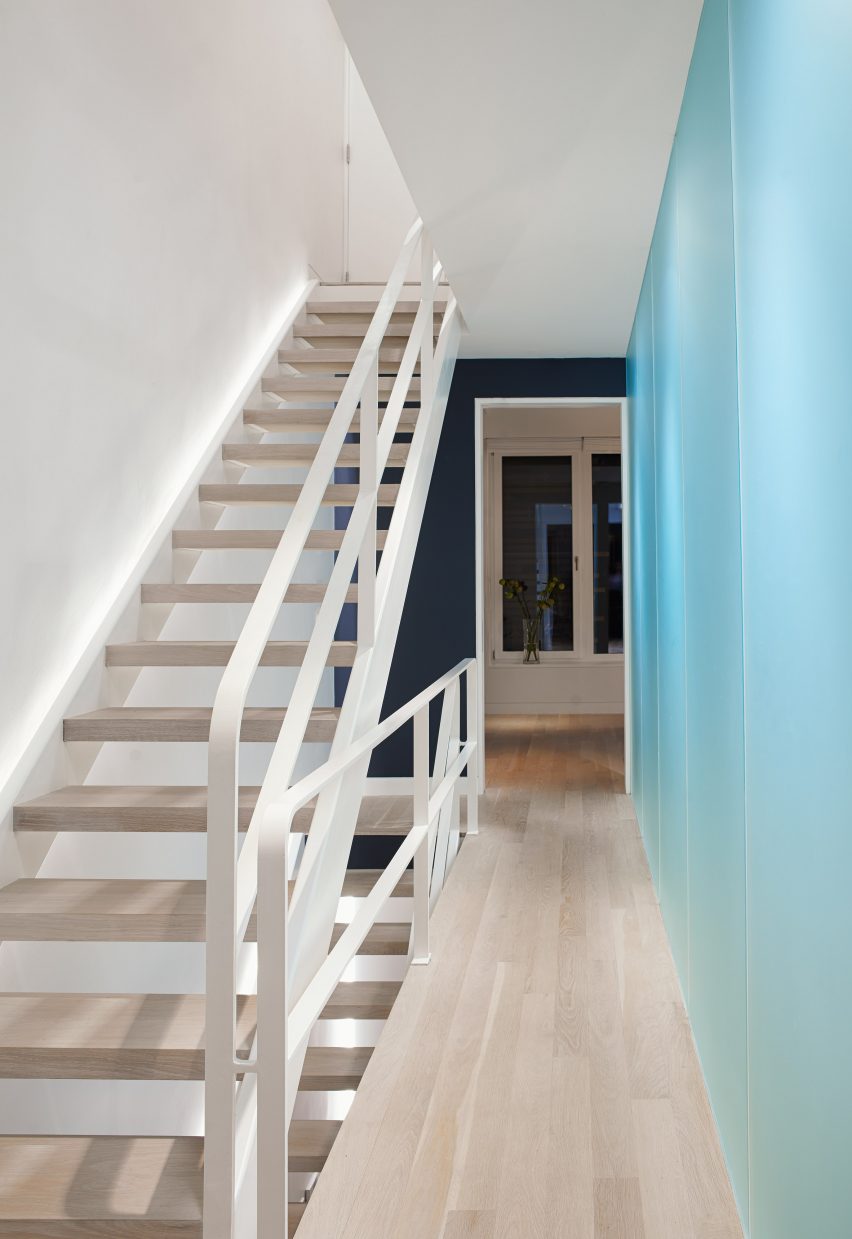
A sky-lit staircase leads to the upper levels. The first floor holds the main bedroom and bathroom, along with an office – all of which are arrayed along a corridor lined with frosted glass.

The main bedroom features a BoConcept bed, sconces by Robert Dudley Best for Bestlite and a graphic blanket by Pia Wallén for HAY. The bathroom is adorned with matte glass and penny-round tiles from Ann Sacks.

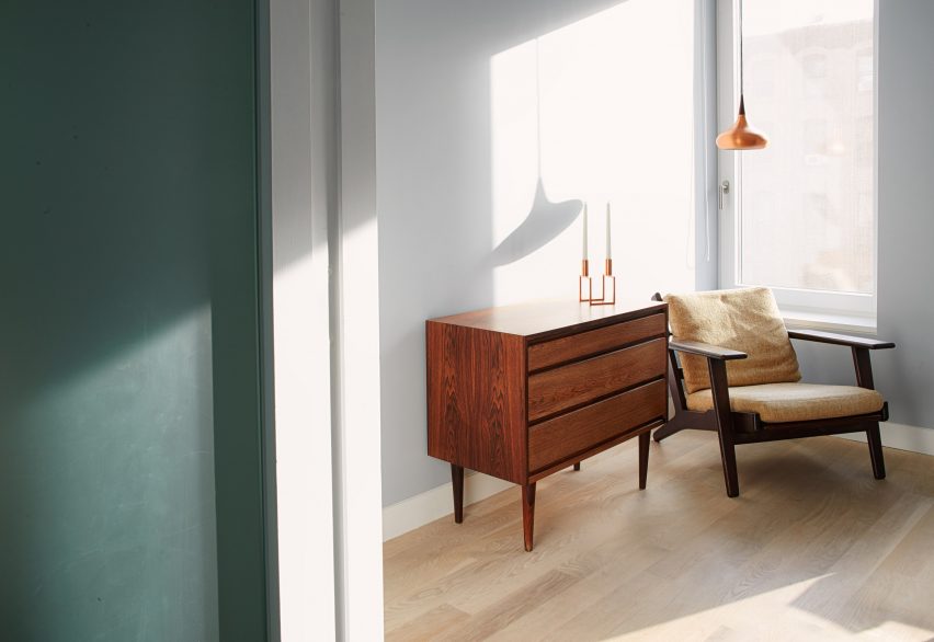
The office is infused with a “touch of nostalgia”. Pieces include a Hans Wegner armchair, a teak Danish dresser and a 1962 copper pendant by Jo Hammerborg.

Brooklyn Passive house bathroom
Bright colours were used throughout

The top level contains a den and two additional bedrooms. The house also has a cellar.

Other Brooklyn townhouses include a house by Space4Architecture that has a skylit staircase and minimalist decor, and the family home of architects Fanny and Matthew Mueller, which features floating steps and a wood-and-steel bridge.

The photography is by Morten Smidt.

Reference

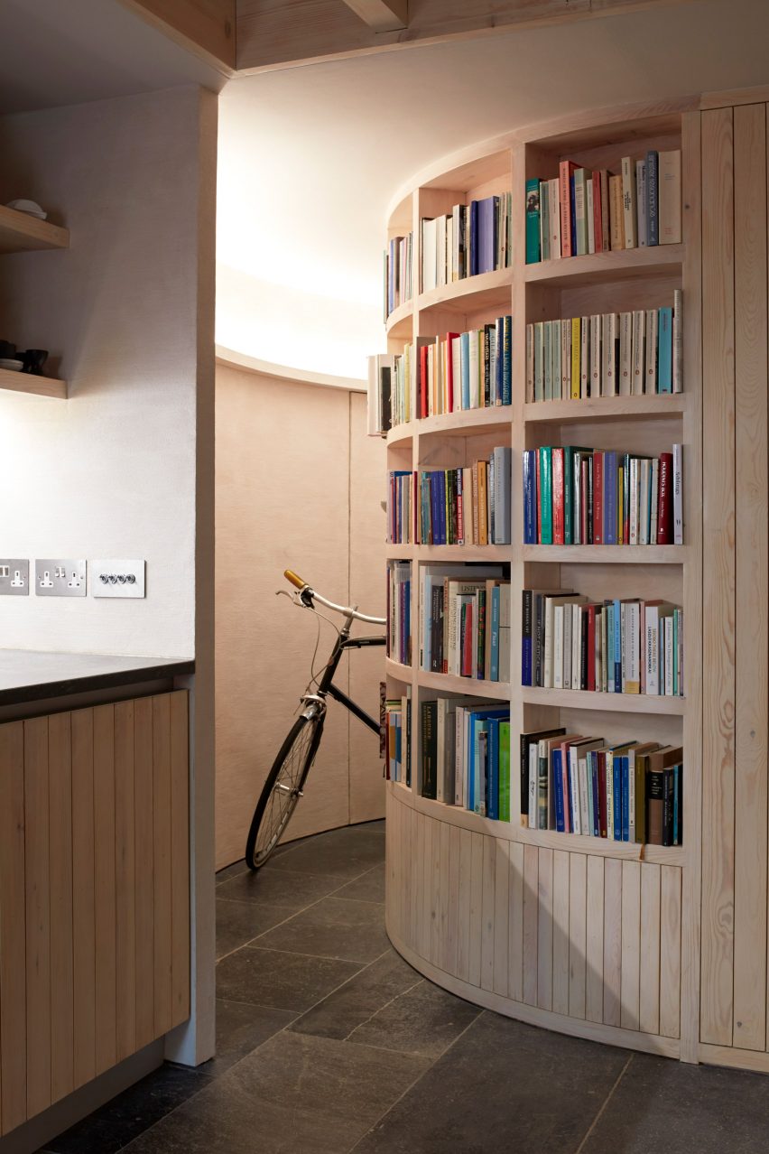
Macdonald Wright Architects creates low-energy Library House in London
CategoriesSustainable News

Macdonald Wright Architects creates low-energy Library House in London

London studio Macdonald Wright Architects has created the low-energy and heavily insulated Library House on an infill plot in Hackney.

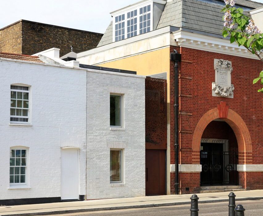
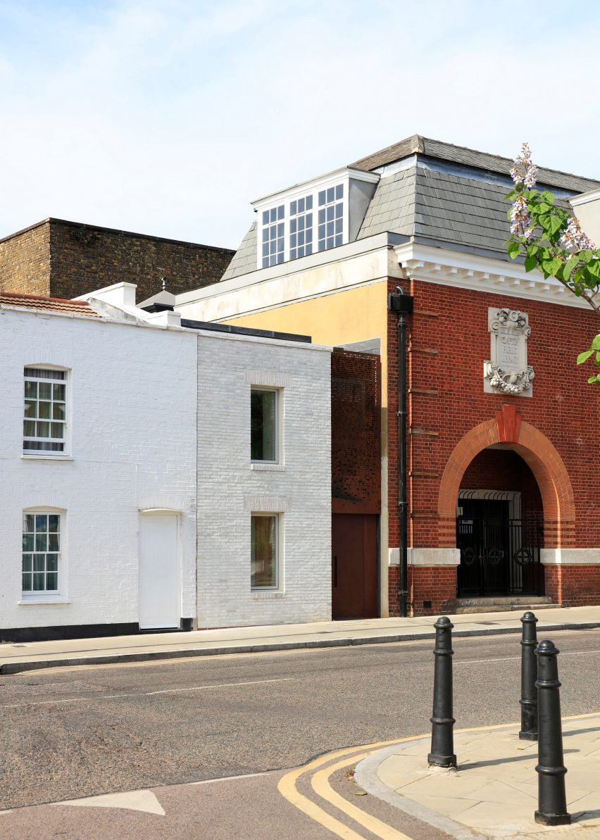
Designed as a rental property for studio founder James Macdonald Wright, the two-storey home was built on a four-metre-wide plot, which was previously used as a junkyard adjacent to the listed Clapton Library.

Exterior of infill house in Clapton
Macdonald Wright Architects has created a house on an infill plot in Hackney

The aim of the project was to demonstrate how an affordable, low-energy house could be created using simple yet robust materials.

Macdonald Wright Architects wanted to use the opportunity to study the energy performance of the home, which has the same footprint as “the average UK dwelling”, to inform its future projects.

Kitchen with wooden cabinets
The dwelling is heavily insulated and low energy

Working with certified Passivhaus designer Conker Conservation, the studio created Library House to meet the Association for Environment Conscious Building (AECB) standard.

The standard focuses on using simple techniques and technologies to reduce the operational carbon dioxide emissions of a building by 70 per cent when compared to the average UK structure of the same size and typology.

Interior of Library House by Macdonald Wright Architects
The material palette was chosen to be simple yet robust

“We selected the AECB route over Passivhaus because it offered a more practical and affordable route to achieving excellent performance,” the studio’s founder told Dezeen.

“The AECB Building Standard is aimed at those wishing to create high-performance buildings using widely available technology,” Macdonald Wright explained.

Wooden staircase and landing
Douglas fir and spruce detailing features throughout

This standard was met by creating a heavily insulated external envelope for the dwelling, teamed with a Passivhaus-rated front door and triple glazed windows and roof lights.

To retain heat, the house also makes use of mechanical ventilation with heat recovery (MVHR). It achieves an airtightness of 1.3 [email protected], which is significantly less than UK building regulations that require airtightness of 10 [email protected] or less. This refers to the number of air changes per hour at a pressure difference of 50 pascals.

Kitchen with stone flooring and wooden cabinets
All the windows are triple glazed

The dwelling is complete with an electric boiler for top-up heating and a photovoltaic array, from which surplus electricity is supplied to the national grid.

Since completion, the house has been occupied by private tenants. However, the electricity bill has been monitored and paid for by Macdonald Wright Architects.

The studio has calculated that the “operational energy for heating the house is a tenth of the requirement of a new build house under current building standards”.

Interior of Library House by Macdonald Wright Architects
Blue Lias stone is used as flooring

Visually, the Library House is designed to mirror the proportions, styles and details of the neighbouring red brick library and a row of white cottages.

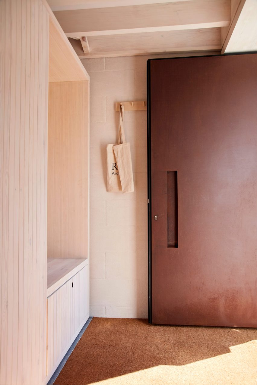
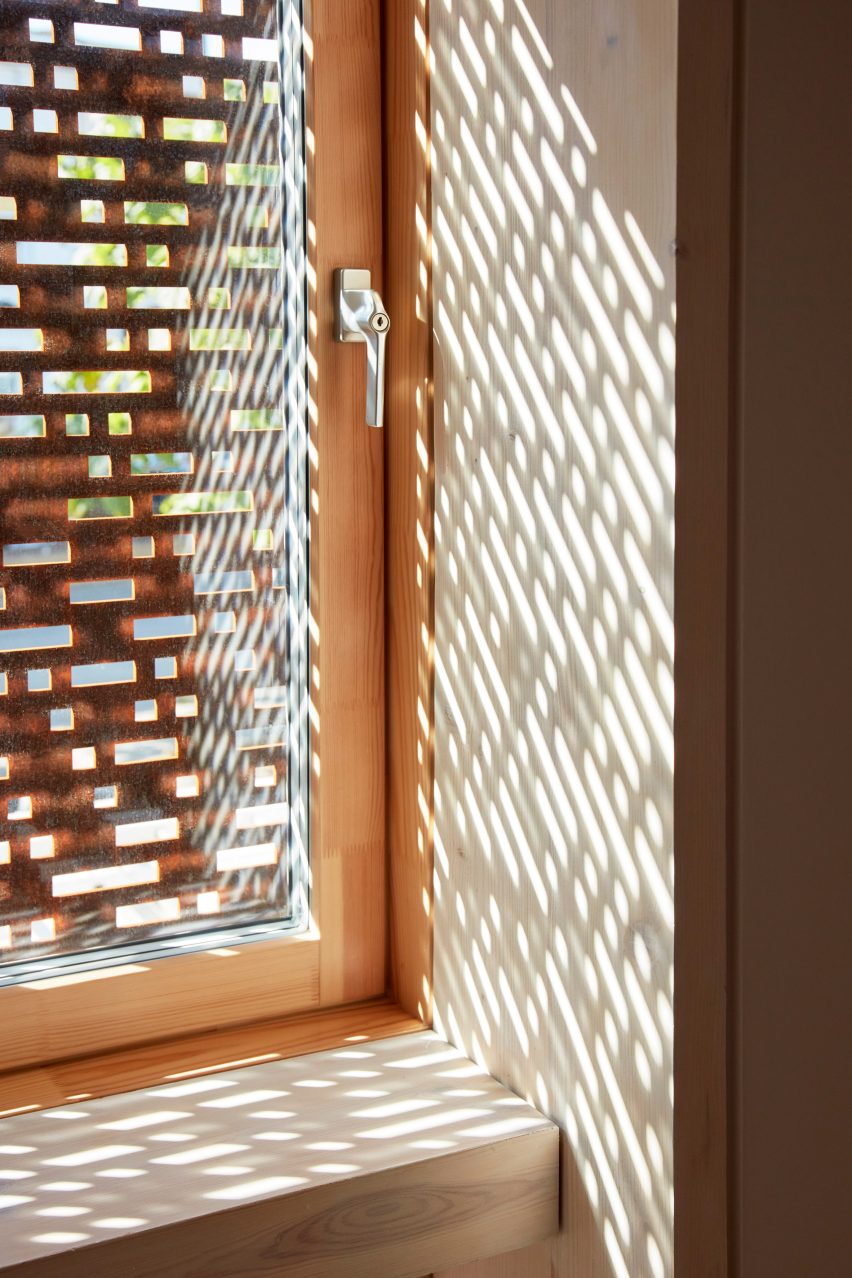
Lime-pointed white brickwork is teamed with a russet-hued Corten steel panel outside, which incorporates the front door and perforated solar shading for the first floor.

Corten steel door of Library House
The russet-hued front door is Passivhaus-rated

Materials used throughout Library House were selected to minimise the need for maintenance and reduce the embodied-carbon footprint of the dwelling.

This includes the use of Porotherm clay block party walls and timber structure, along with internal finishes such as Blue Lias stone flooring sourced and sustainably sourced douglas fir and spruce detailing.

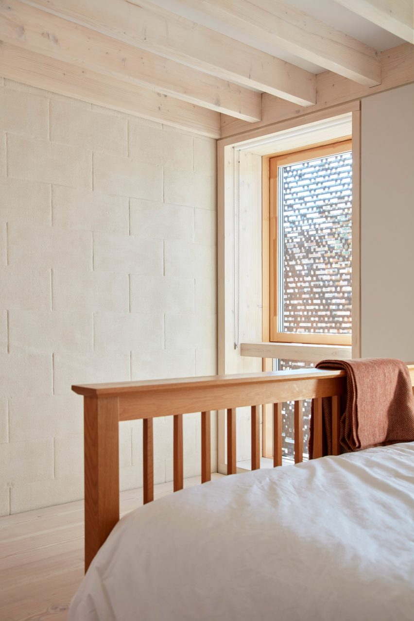
Internally, walls are predominantly finished in a parge coat, trowelled over the Porotherm clay blockwork for a textured finish that also contributes to the home’s high airtightness.

Macdonald Wright Architects hopes that the Library House will become a “scalable prototype” and inform its future projects at various scales.

Bedroom with blockwork wall
Porotherm clay blocks are used on party walls

“Each project we complete informs the next,” Macdonald Wright explained. “The use of Porotherm block and Larsen Truss has helped us develop techniques of external envelope construction we are now developing in larger scale designs.”

“By focusing on the build quality, airtightness and thermal performance of the external envelope construction we can reduce the overall cost of building to higher levels of sustainability,” he continued.

Window with perforated solar shading
Corten steel functions as solar shading

Another recently completed low-energy house on Dezeen is the Devon Passivhaus, which McLean Quinlan nestled into a sloped walled garden of an old English country house.

The building’s envelope performs to the highly energy-efficient Passivhaus standard, achieved using substantial amounts of insulation and triple glazing throughout.

White and stone bathroom
Rooflights feature throughout the house

Macdonald Wright founded his eponymous studio in east London in 2005. Another notable project by the studio is the Caring Wood country house in Kent, which won the 2017 RIBA House of the Year.

Designed in collaboration with architect Niall Maxwell, the dwelling is topped with chimney-like roofs and provides a residence for three generations of the same family.

The photography is by Heiko Prigge.


Project credits:

Architect: Macdonald Wright Architects
Structural engineer: Osbourne Edwards
Sustainability consultant: Conker Conservation
Quantity surveyor: GQS Services.
Contractor: Daneco Build
Groundworks: Hauge Construction

Reference