Portsea House // Wood Marsh
CategoriesSustainable News

Portsea House // Wood Marsh

Text description provided by the architects.

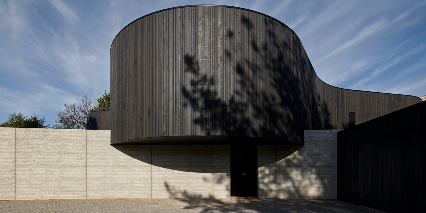
In contrast to the prevailing aesthetic of its location, this house is a discrete, contemporary insertion in a leafy pocket of Portsea. As much an entertainer as a retreat, it is divided into two contrasting areas, distinguished by light and dark, openness and containment. Anchoring the form to the site is a curved, rammed-earth, blade wall, which wraps like a scroll across the site.

© Wood Marsh

© Wood Marsh

© Wood Marsh

© Wood Marsh

Its mass acts as a thermal regulator and balances the upper level as it cantilevers out from the slope. Formally it creates privacy from the street, a key factor of the brief and is reinforced by the structure’s discrete siting and use of dark timber weatherboard cladding. Indigenous landscaping further frames and filters the view of the building and this interaction between the natural environment and the built form continues as a central theme throughout.

© Wood Marsh

© Wood Marsh

© Wood Marsh

© Wood Marsh

Beyond the blade wall, the eye is drawn around the curved walls, the form softened by the absence of edges. The external spaces encourage interaction between built form and site while maintaining a distinction in form and accentuating the contrast between the formalist architecture and the naturalist landscape.

Upon entering the front door through the monolithic blade wall a grand staircase winds up to the open living space above.

© Wood Marsh

© Wood Marsh

© Wood Marsh

© Wood Marsh

The full-height glazed rear facade allows the landscaping beyond to act as the internal wallpaper of the living area. An expansive deck flows from this space and both connects to, and floats over, the site, utilising the natural slope up to the rear corner. A pool area at the rear of the deck is partially screened by a curved masonry dwarf wall, which responds to the form of the building and provides a degree of privacy.

The sloping site largely informed the spatial organisation of residence into three distinct wings, across two levels, arranged around a central open-air atrium.

© Wood Marsh

© Wood Marsh

© Wood Marsh

© Wood Marsh

Two of these wings accommodate bedroom and service spaces, while the third and largest wing is used for the living spaces including a secluded bar, entertaining area and kitchen. A rumpus room is provided at the basement level, which opens onto private courtyard spaces shielded from the street view..

© Wood Marsh

© Wood Marsh

© Wood Marsh

© Wood Marsh

Portsea House Gallery

Reference

REDO Architects creates new interior for Puppeteers House in Sintra
CategoriesInterior Design

REDO Architects creates new interior for Puppeteers House in Sintra

REDO Architects had stage sets in mind when redesigning the interiors for a pair of houses in the former Puppeteers’ Quarter in Sintra, Portugal.

The two homes, now known as Puppeteers House, are part of a series of buildings that were originally built for a local puppeteer’s family, but had more recently been used as storage for farming tools.

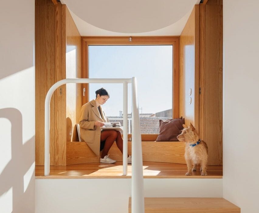
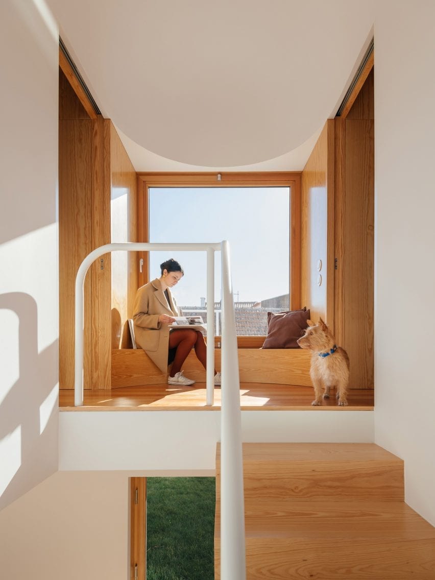
First floor window seat in Puppeteers House by REDO Architects
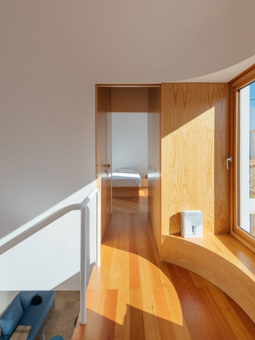
A curved wooden bench creates a window seat on the first-floor landing

With its renovation, Lisbon-based REDO Architects has brought the buildings back into residential use as homes for two of the puppeteer’s great grandchildren.

The revamped buildings are designed to capture the spirit of their heritage, with lightweight wooden joinery constructions that evoke theatrical scenography and circular details that suggest a playful character.
Window seat in Puppeteers House by REDO Architects
Bathrooms are concealed within the wooden joinery

An all-new interior layout was needed, so this was designed to reinforce the theatrical feel.

Elements like the staircase and first-floor window seat have a stage-like quality, while secondary spaces like bathrooms are concealed within the walls.

Puppeteers House by REDO Architects
The larger house contains a dedicated kitchen and dining space

“The relation between the existing external walls and the new interior walls – two different skins – was explored and dramatised throughout the project on different scales,” explained studio founder Diogo Figueiredo.

“This friction generated misalignments, which are expressed in the windows as opaque panels,” he told Dezeen, “and it also created in-between spaces for built-in furniture and bathrooms, like a back-of-stage area.”

Courtyard in Puppeteers House by REDO Architects
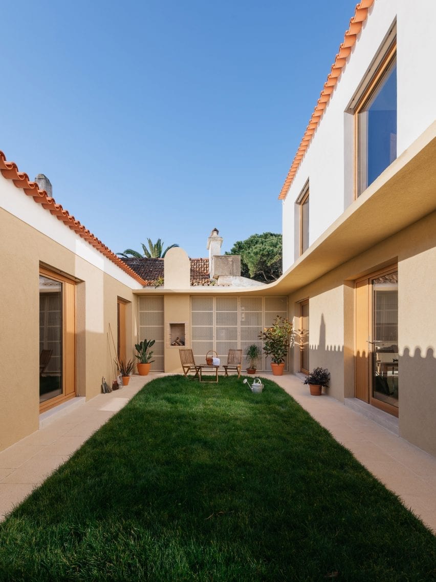
The homes sit on opposite sides of a garden courtyard

One of the houses is single-storey, the other is double-storey, and they are located either side of a private courtyard.

The buildings are designed to function as self-contained properties, but they are also very open to one another, with large windows fronting the shared courtyard garden.

Bedroom in Puppeteers House by REDO Architects
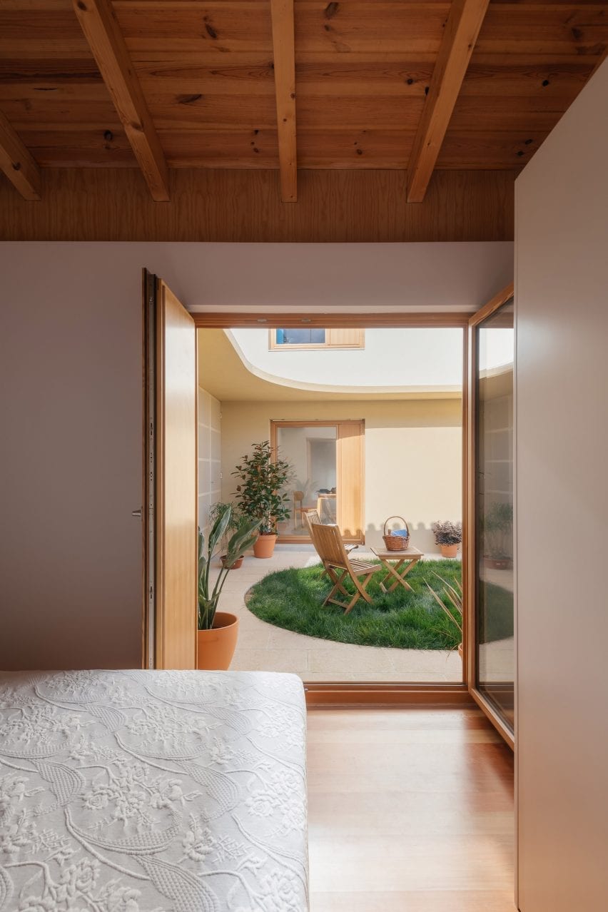
The smaller property contains one bedroom on the ground floor

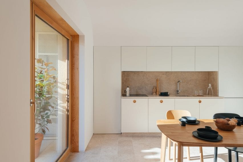
The smaller of the two homes contains a living space with a kitchenette, a separate bedroom and a bathroom.

The other home has a similar layout, with a living room and a separate kitchen and dining space on the ground floor, and two en-suite bedrooms upstairs.

Curved wall in Puppeteers House by REDO Architects
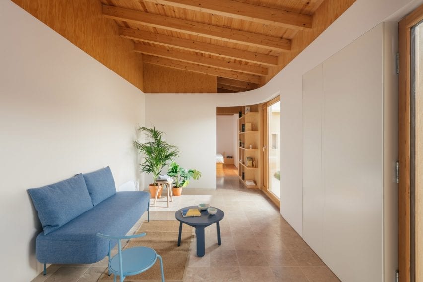
Living spaces feature lioz stone flooring

A consistent materials palette features throughout. An ivory-toned regional stone known as lioz was used flooring in the main living spaces and surfaces for the kitchen and bathrooms.

Flooring in the bedrooms is wood, matching the doors, furniture and shelving that feature throughout the two homes.

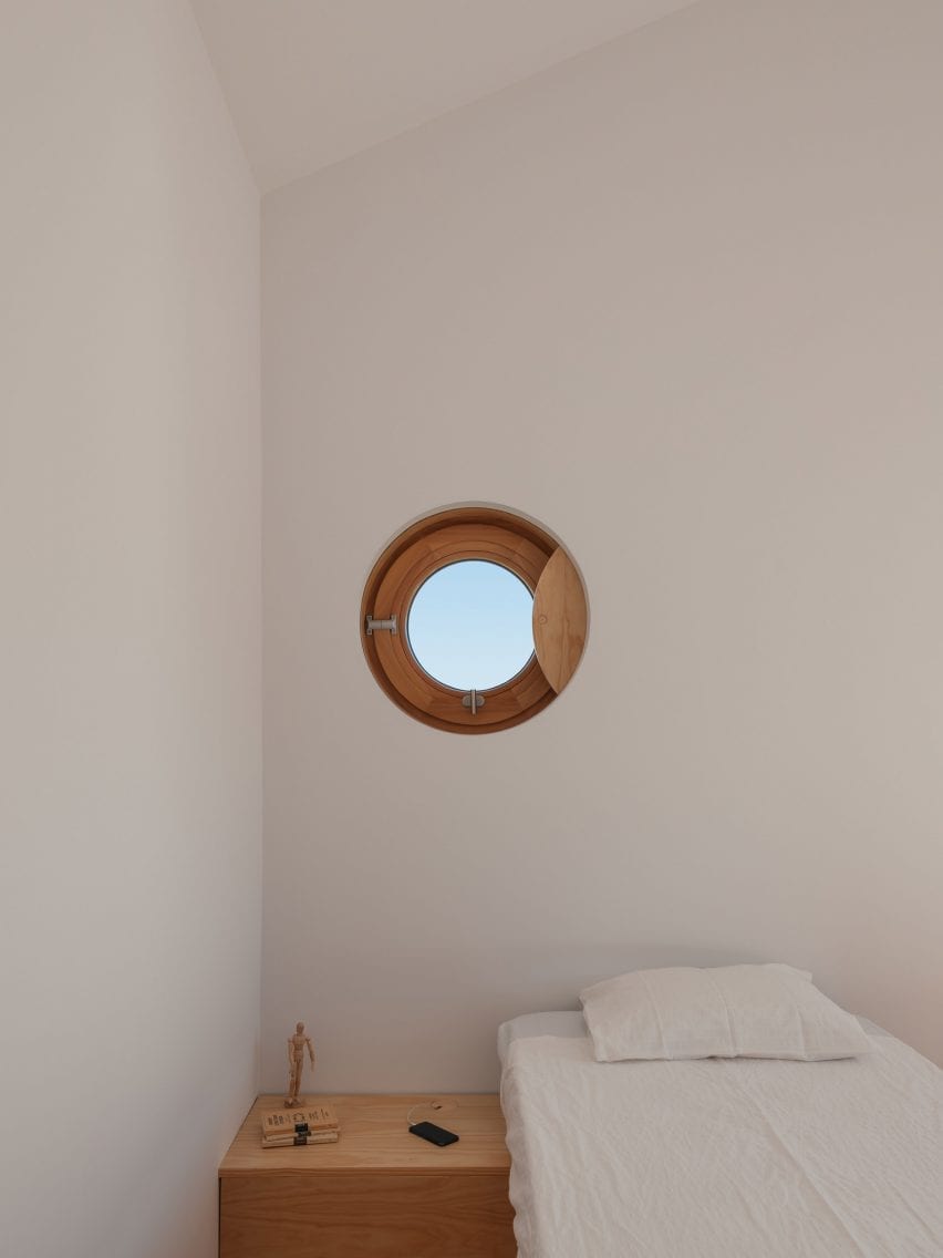
Circular details feature throughout the interiors, at a range of scales. Some are full circles, like the porthole window and cabinet handles, while others are large curves, like the window seat or the rounded wall partitions.

“We used a precise quarter of a circle as a tool – like a compass – in different radii, orientations, combinations and materialities,” explained Figueiredo.

Bedroom in Puppeteers House by REDO Architects
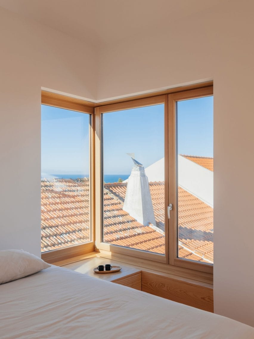
The main first-floor bedroom features a corner window

“It was explored in different moments of the project: to differentiate and disconnect the new internal layer from the existing walls, to connect different rooms, and to create smooth circulation routes,” he said.

Many of these curves are mirrored in ceiling details directly overhead, which contrast with the linearity of the exposed roof beams.

Porthole window in Puppeteers House by REDO Architects
The second first-floor bedroom features a porthole window

Other recent examples of house renovations in Portugal include House in Fontaínhas, a home with candy-coloured details, and Rural House in Portugal, a house created in an old granite community oven.

Photography is by Do Mal o Menos.


Project credits

Architect: REDO Architects
Project team: Diogo Figueiredo, Pedro França Jorge

Reference

Limdim House Studio uses curved walls and arched niches in Vietnam apartment
CategoriesInterior Design

Limdim House Studio uses curved walls and arched niches in Vietnam apartment

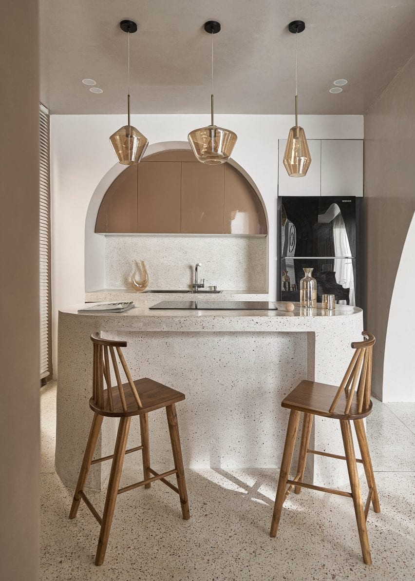
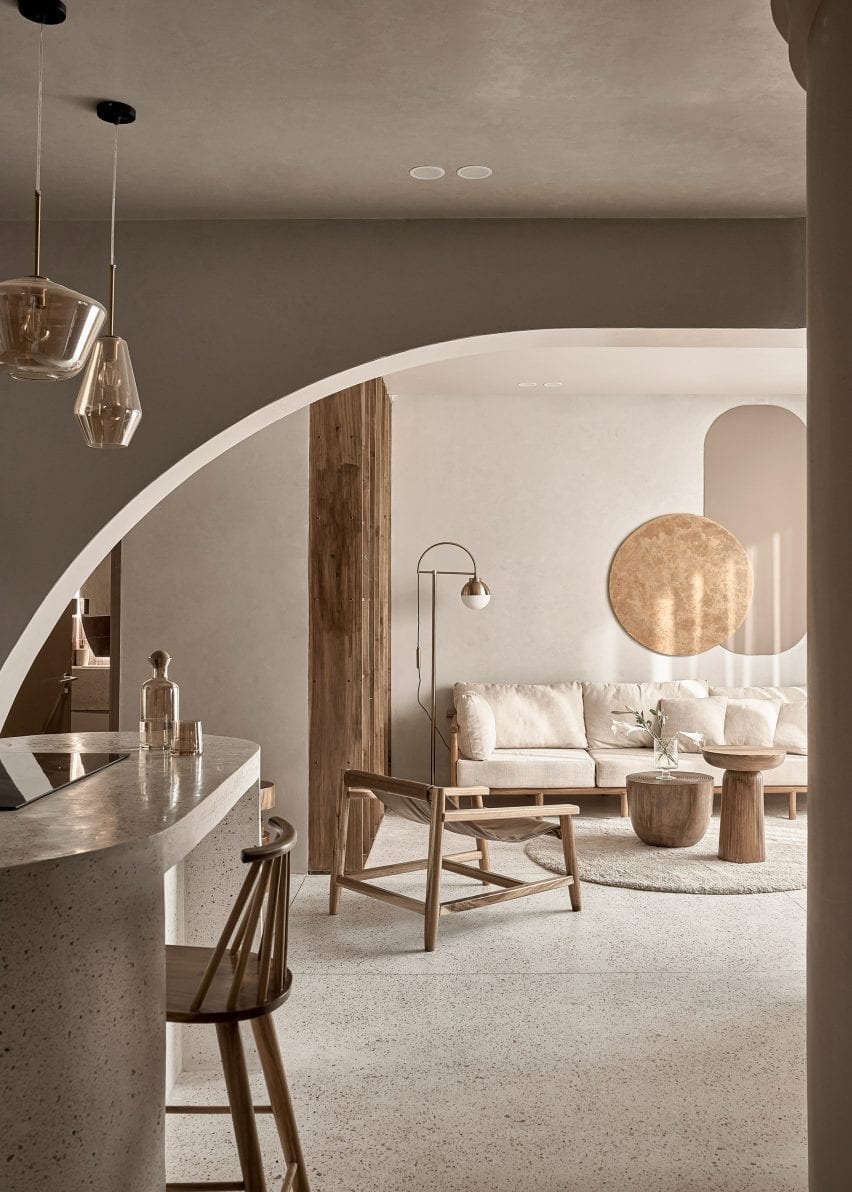
Architecture firm Limdim House Studio has renovated the Brown Box apartment in Vietnam adding curving walls, tiered cornices and terrazzo surfaces that aim to create a “calm” and “gentle” space. 


Limdim House Studio reorganised the previously “commercial” two-bedroom apartment by removing walls to convert it into a spacious one-bedroom home named Brown Box.

Brown Box has a neutral colour palette
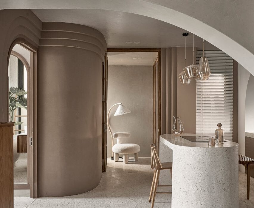
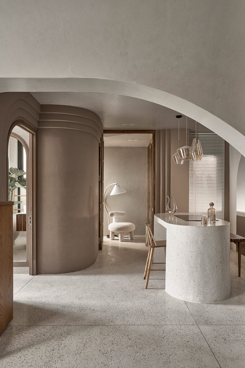
Top: a curving arched wall divides the open plan living space. Above: terrazzo was used throughout the apartment

“The idea comes from the byname of the owner of the house, Ms Brown,” studio founder Tran Ngo Chi Mai told Dezeen. “Since she also loves the colour brown, our idea was to create a living space as gentle and calm as this colour itself.”

“[We] processed the space with the aim of creating a new colour, a new breath to get rid of the boredom in commercial apartments.”

A kitchen island doubles as a breakfast bar at Brown Box
The island is blanketed in terrazzo

As part of the opening up of the home, the studio removed existing walls and added curving partition walls in their place.

The curved walls were surrounded by stepped cornices as a modern take on crown mouldings that remove the harshness of corners in the open-plan kitchen diner.

Wood and stone was used throughout the apartment
The studio added new partition walls

The studio used a natural colour palette throughout, employing light browns, beige and wood tones to create a peaceful yet sophisticated look.

“We choose tones around brown and beige,” explained Chi Mai. “when designing with this colour tone, we want the apartment to be peaceful, plain and still full of sophistication.”

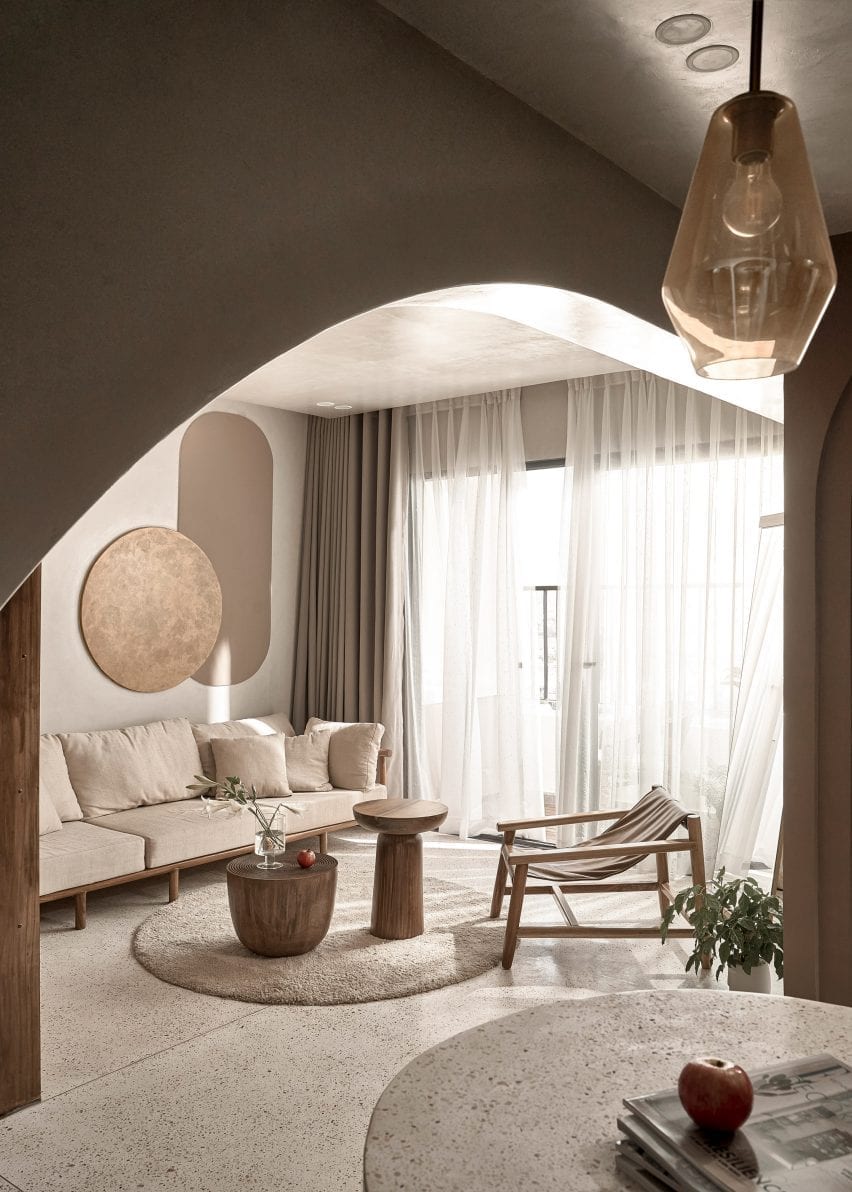
Sheer curtains surround a balcony at the apartment
Circular furnishings and motifs reference the design of the apartment

A rounded island at the centre of the kitchen diner was clad in pale terrazzo to provide additional counter space in the one-wall kitchen.

An arched niche frames a sink, terrazzo countertops and a row of taupe brown overhead cabinetry which was arranged in a semicircle to fit within the alcove.

Terrazzo slabs extend across the floors of the apartment and to the living space which is zoned by floor-to-ceiling Melaleuca wood cabinetry and wooden furnishings.

The ceiling above the living area has a curved design and merges into an arched wall that visually separates the living area from the kitchen diner.

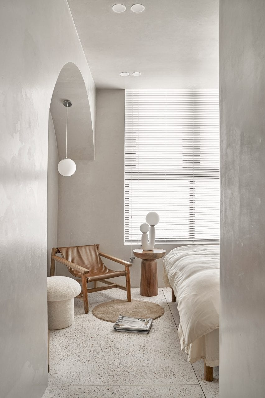
Terrazzo was used in the bedroom of the apartment
The bedroom has a light and airy look

“We use terrazzo all the way from the kitchen island, like a stream going down the floor and spreading everywhere,” said Chi Mai.

“Choosing this type of material helps the colour in the house to become light and soothing.”

“Physically, Terrazzo has good hardness, just enough gloss, and more heat dissipation than wooden floors, so it creates a cool feeling, especially in tropical areas.”

Textural paint covers the walls of Brown Box apartment
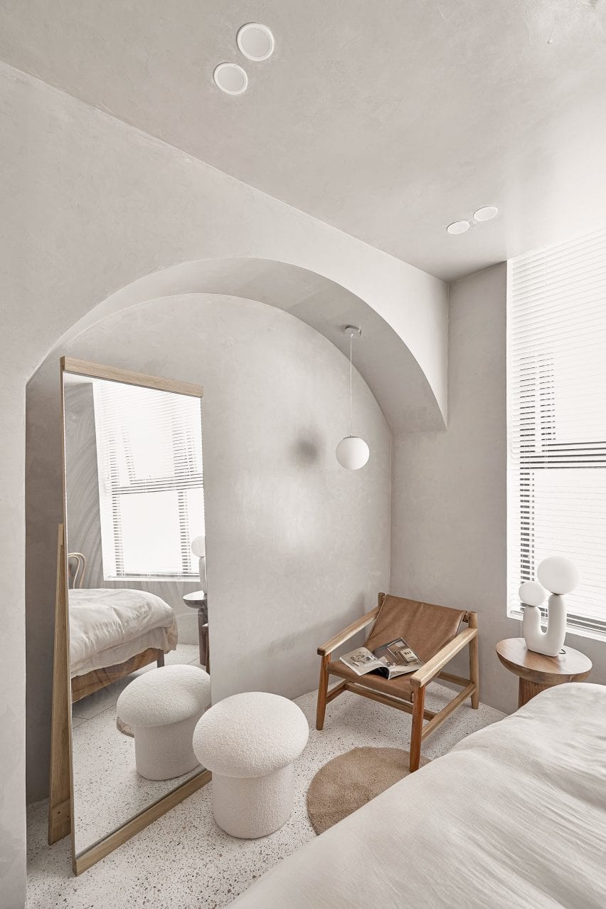
An arched niche houses a mirror and a reading chair

An arched doorway leads from the open-plan living area to the bedroom space. Its walls were covered in a grey plaster-like finish providing a textural quality.

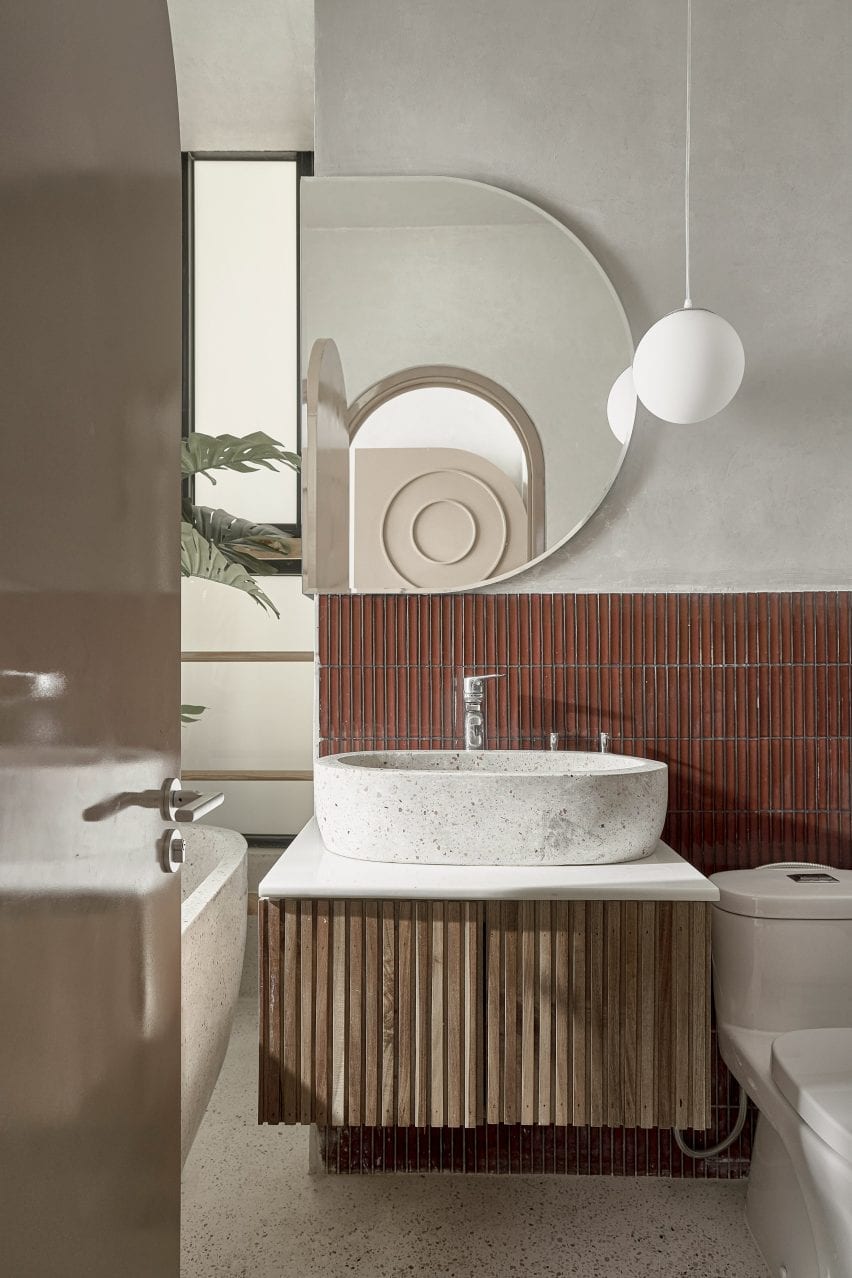
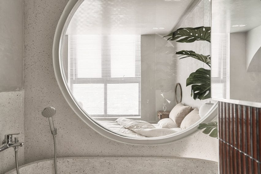
An en-suite next to the bedroom was fitted with a free-standing terrazzo bathtub below a large circular window that looks into the bedroom.

The apartment has an en-suite
Redbrick tiling was used in the en-suite

“The important thing when designing a space, in our opinion, is to create a new, sophisticated and especially to bring comfortable feeling to the owner,” said Chi Mai.

“If the owners come back after a hard days work, they don’t enjoy the life in this space, this space will forever be just a place to provide basic needs like eating, sleeping and that will be our failure in this project.”

A terrazzo bathtub was placed in the en-suite
A large circular window connects the bedroom and en-suite

Limdim House Studio is an architecture, design and interior design practice based in Vietnam.

Other Vietnamese projects include this apartment by Whale Design Lab which references the work of Louis Kahn, along with this holiday home that has a thatched roof.

Photography is by Do Sy.

Reference

Matthew Giles Architects uses beams to frame views in London house
CategoriesInterior Design

Matthew Giles Architects uses beams to frame views in London house

Matthew Giles Architects used white oak joinery and different floor levels to break up the open-plan ground floor of this redesigned and upgraded six-bedroom house in Wandsworth, London.


The Victorian terraced house belongs to a young family that wanted to create a home that was more suited to entertaining and having relatives stay over.

Matthew Giles Architects designed the project
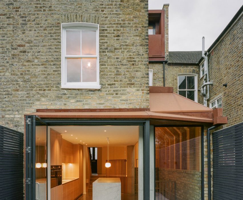
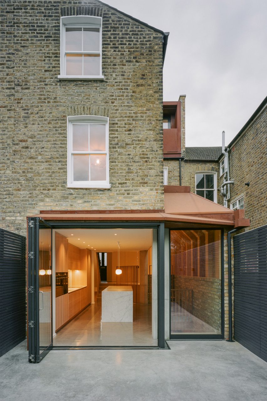
A small rear extension was added

Originally a four-bedroom house, London practice Matthew Giles Architects was asked by the owners to add two bedrooms and a basement for services and storage.

The family wanted to enhance the connection between inside and outside, as well as improve the light flow and visual connections throughout the house.

To create extra space, the architects added a side-return and a small rear extension with a Corten steel roof, a loft extension and a basement floor. These additions increased the internal floor area from 155 square metres to 216 square metres.

Matthew Giles Architects designed the London townhouse
Light and neutral tones define the home

“With a small courtyard garden at the rear, the size of the ground floor extension was designed to strike a balance between internal space gained and loss of garden,” Giles told Dezeen.

“Although modest, the ground floor extension acts as a tool for enhanced light flow throughout the ground and basement levels. The vaulted side extension provides much-needed height to create a sense of light and space.”

Matthew Giles Architects inserted a reading nook into the ground floor
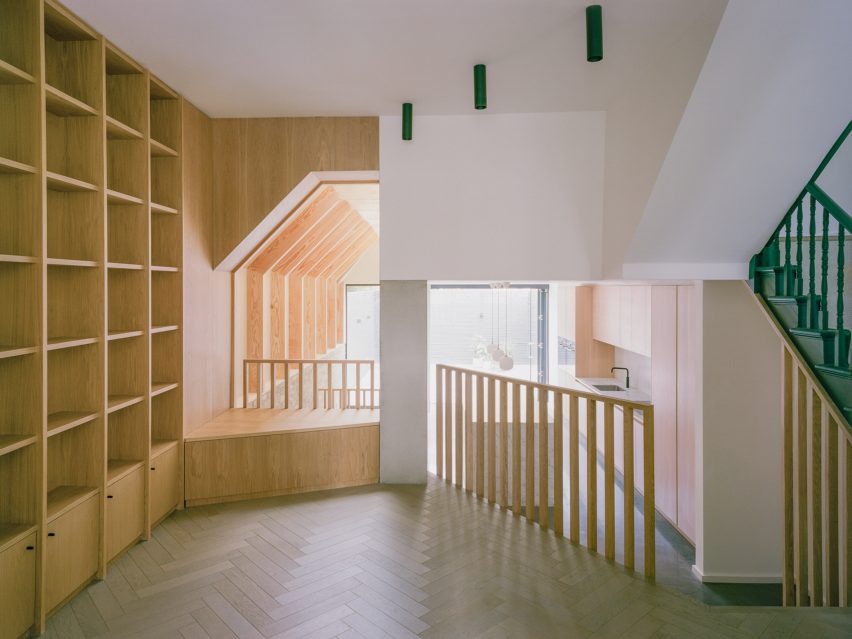
A reading nook has been created on the ground floor

The interior is finished with a neutral palette of raw materials such as timber, stone, concrete, timber and brick.

On the ground floor, at the front of the house, a new parquet flooring draws the eye through the lobby towards the light from the garden at the rear. Varying floor levels have been used to divide the narrow space into three distinct zones.

Neutral tones in the kitchen
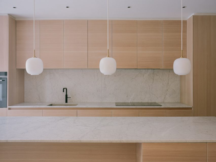
White marble surfaces were used in the kitchen

The first is an entrance area that faces onto the street, the second serves as a reading nook with white oak joinery and railings, and the third is a sunken kitchen and dining space that looks out over the garden through full-height glass doors.

The kitchen features Douglas Fir timber cranked beams, timber cabinetry, white Carrara marble surfaces and exposed London stock brickwork that covers the sidewall.

“The kitchen acts as a point around which other activities flow,” said the studio. “The exposed beams create an enhanced light quality and sense of order when looking along the length of the house towards the garden and framing views as you move through the house.”

Polished concrete floors were installed in the kitchen and dining area and on the adjoining external terrace to help blur the boundaries between inside and outside.

The design has an intimate connection with nature
Parquet flooring adds texture to interior spaces

“The design has been executed so that in all areas there is an intimate connection with nature,” explained the architects. “Seated within the lofty, vaulted dining space the view out is framed by two in-situ cast concrete columns that are filleted to broaden the view.”

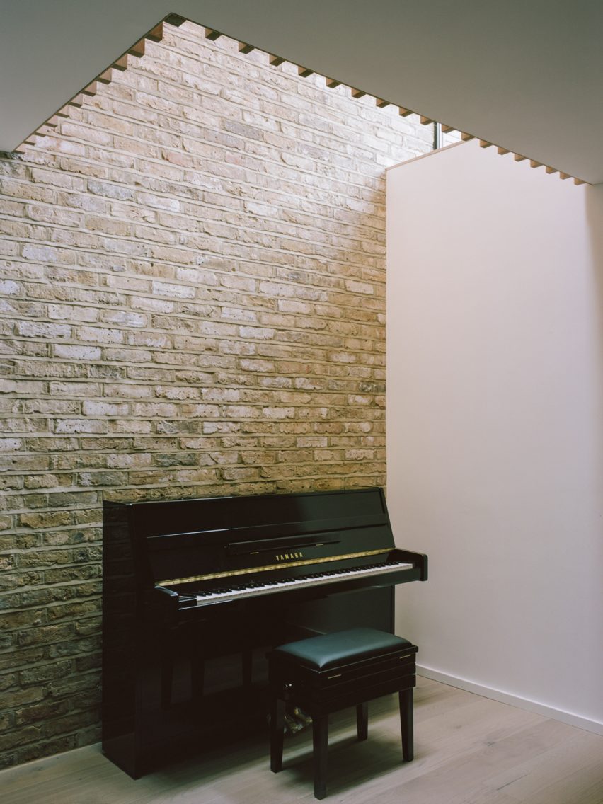
The basement houses a playroom area, a new ensuite bedroom and a utility room that is brightly lit by openings in the floor above and a capping skylight. The skylight also creates a visual connection between the playroom and the kitchen.

Matthew Giles Architects kept rooms light and bright
Neutral tones also feature upstairs

“This sectional approach adds a sense of drama,” said the practice. “The shadows drift down the brickwork wall and clouds are framed in the skylight two storeys overhead.”

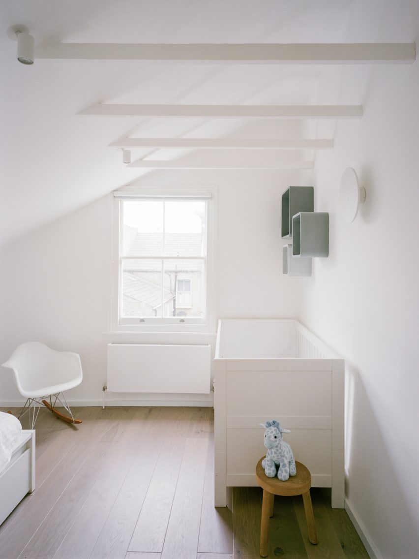
The restrained colour and material palette is continued in the upstairs bedrooms and bathrooms with the addition of Tadelakt polished plaster in the bathroom.

A skylight in the basement
A skylight floods the basement with natural light

Matthew Giles founded his practice in 2020 after 12 successful years in collaboration with architect Tom Pike.

As half of Giles & Pike, he completed a number of residential projects across the capital, including a stepped glass extension to a house in Putney, the conversion of a Victorian workshop into a home and a timber-clad residence designed for a tiny plot.

Photography is by Lorenzo Zandri.

Reference

VATRAA adds pink plaster walls in south London council house renovation
CategoriesInterior Design

VATRAA adds pink plaster walls in south London council house renovation

Architecture studio VATRAA has won a Don’t Move, Improve! award with this London council house renovation featuring pink-toned plaster walls and an oversized window.


Called Council House Renovation, the project involved a full refurbishment and remodelling of the two-bedroom home in Bermondsey, south London.

VATRAA’s design was a joint winner in the 2021 Compact Design of the Year category for Don’t Move, Improve!

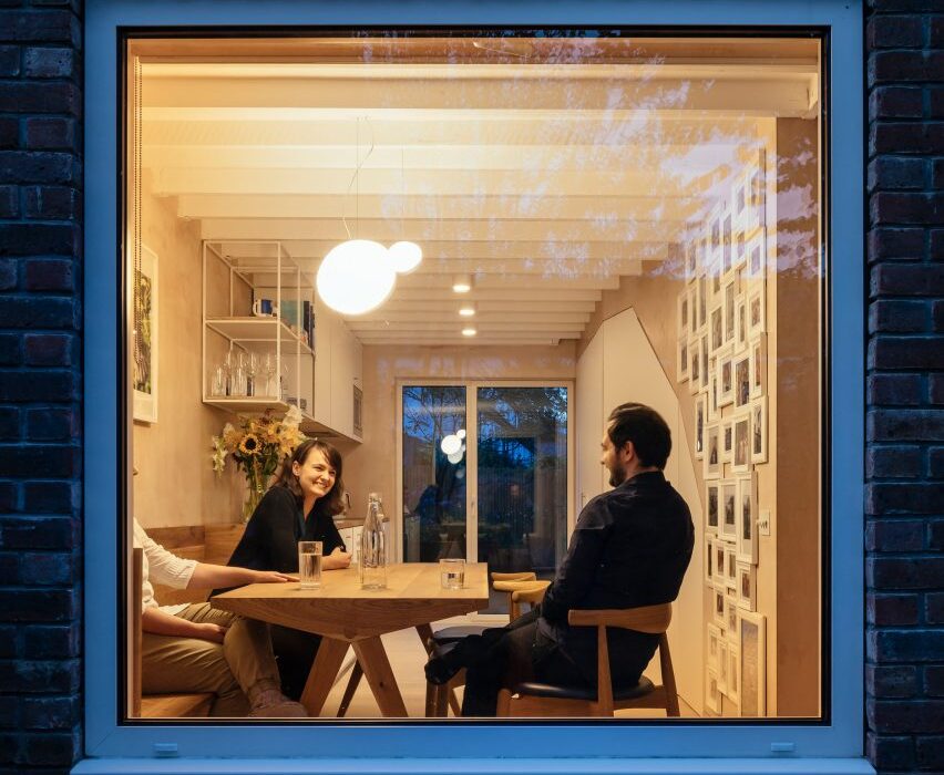
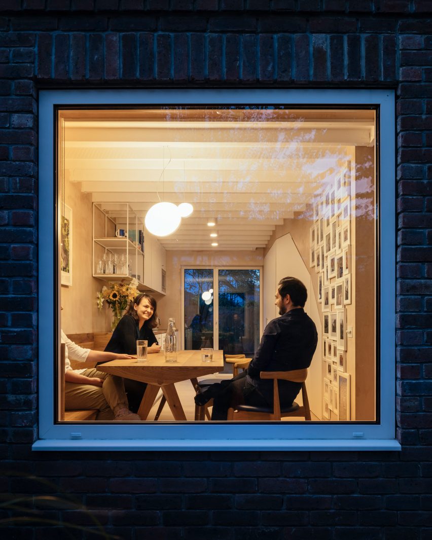
Large square window looking into house with people dining
An oversized window creates transparency from front to back in the Council House Renovation

VATRAA‘s client wanted a warm, contemporary interior that gave her more space but without an extension that would disrupt the appearance of the council estate, which was built in the 1980s.

Instead, the architects aimed to create spaciousness within the small, 76-square-metre flat by making only minimal interventions.

Council House Renovation with pink plaster walls
The architects created a warm and contemporary look

Seeing the opportunities the small seven-by-seven-metre footprint presented for enhanced front-to-back transparency, the architects swapped out an ornamental bay window for a larger clean-lined square one.

It forms a new aesthetic feature and frames views of the evergreen front garden.

Living room with pink plaster walls
Ceiling joists are exposed in the living room

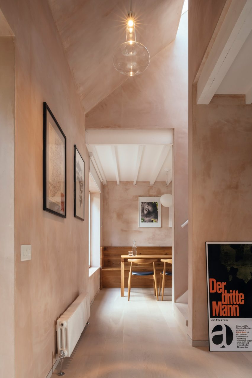
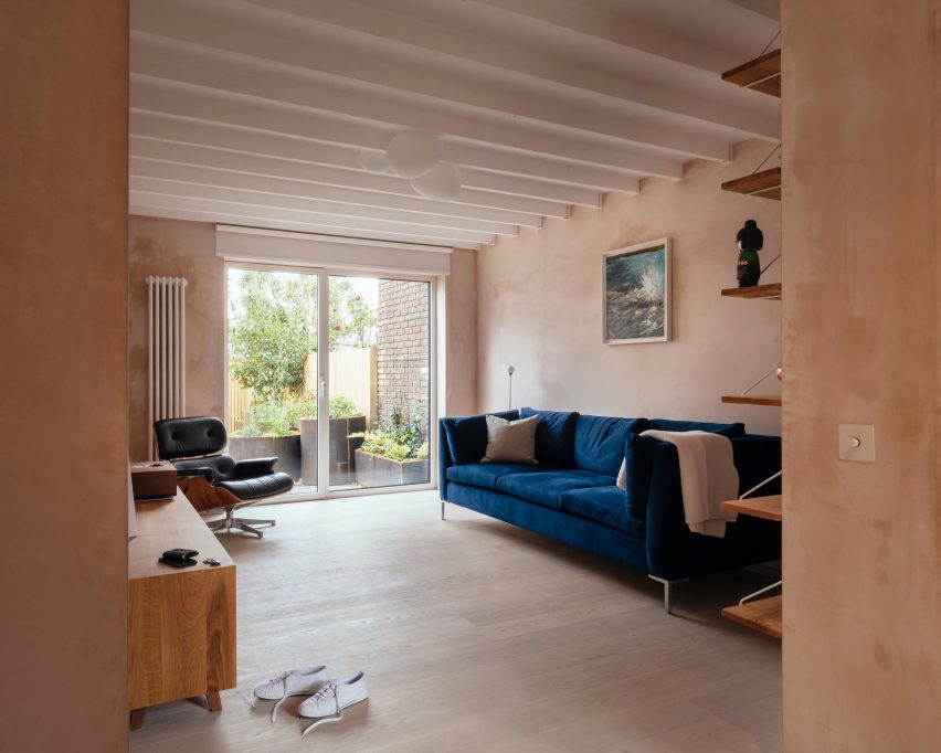
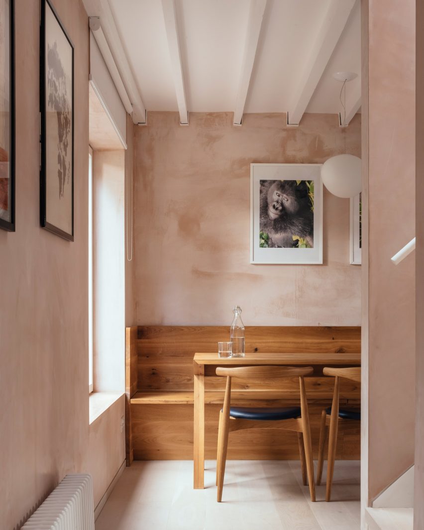
Another key feature is the textured, dusky pink-coloured walls.

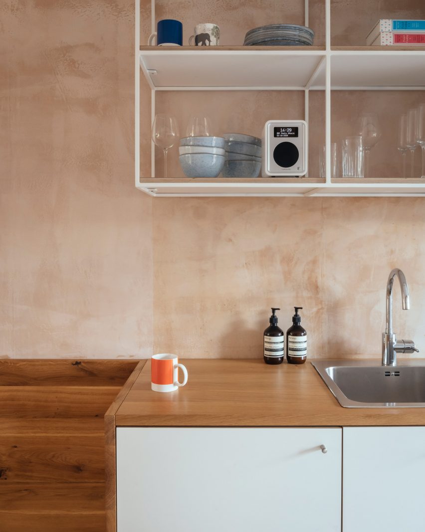
This effect is created with what VATRAA describes as a “banal” plaster, British Gypsum Multifinish, avoiding the cost and resources of wall paint altogether.

VATRAA applied the plaster carefully to achieve a textured and slightly reflective finish that responds well to daylight, creating different moods and effects at different times of the day.

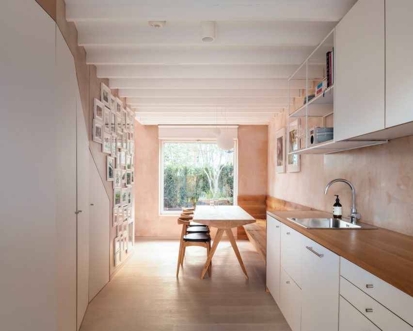
Teamed with white ceilings and white-washed oak floors, it forms an aesthetic backdrop to the client’s collection of art and design objects.

Oak dining table with light coming through a large window
There are white-washed floors and white ceilings

For the floor plan, VATRAA were guided by the existing stairs and heating source, a pre-feed water tank that is part of a communal system.

To take advantage of its heat, they placed the laundry room around it so clothing would air-dry faster, and the bathroom directly above so the floor tiles would be warmed without additional heating.

White pantry and kitchen cabinets
An angled pantry optimises the space under the stairs

Each of the other spaces is given its own atmosphere according to function.

The architects made the entrance lobby grander by opening the ceiling to the pitched roof and incorporating the old external loggia into the interior.

Kitchen sink in Council House Renovation
The kitchen has bespoke furniture and cabinetry

In the living room, they exposed the previously concealed structural joists in the ceiling, making the 2.4-metre-high space feel loftier.

In the dining room, they created an angled pantry feature that makes the most of the awkward space underneath the stairs and added bespoke solid oak dining furniture.

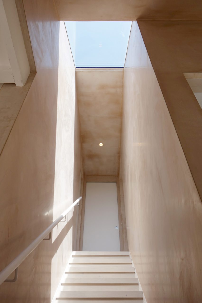
Staircase with skylight
Different qualities of light create different moods in the house

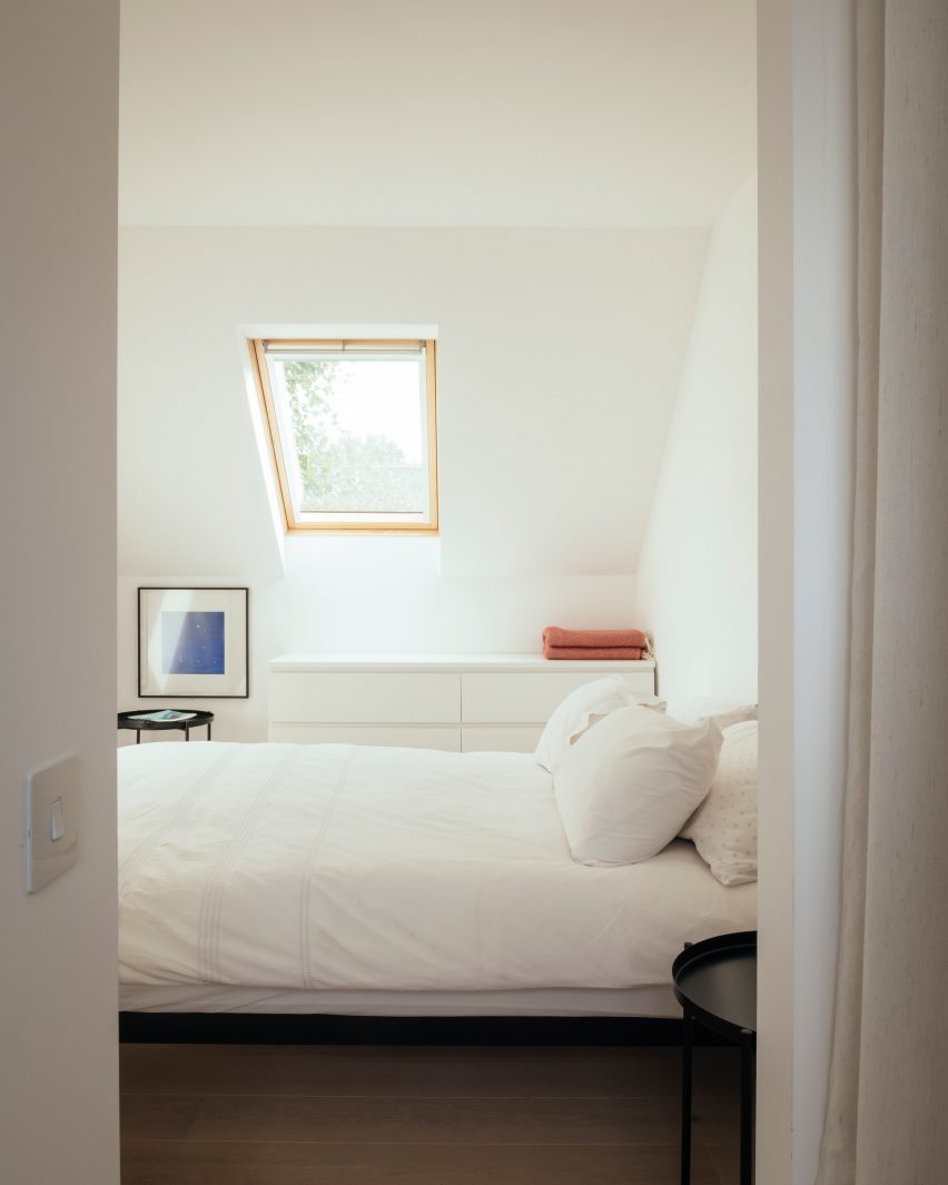
Upstairs, the two bedrooms are finished in calming all-white to create a contrast to the stimulating warmth of the downstairs living areas.

“The morning transition between the night and day zones becomes an event, giving the homeowner a sensation of energy, immediately as she steps into the stairwell and descends to the ground floor,” said VATRAA.

“With thoughtful decisions fully grounded in the context we operated in, we managed to turn a nondescript ex-council house into a home with a distinctive character, now proud to tell its story through space, light and materials.”

White bedroom with roof light
The upstairs bedrooms are a contrast in clean white

VATRAA was founded in 2018 by Anamaria Pircu and Bogdan Rusu, who are based across London and Bucharest. They completed the Council House Renovation in 2020.

It was named the Don’t Move, Improve! Compact Design of the Year alongside Two and a Half Story House by B-VDS Architecture, another project in a council estate.

Photography is by Jim Stephenson

Reference