The latest edition of “Architizer: The World’s Best Architecture” — a stunning, hardbound book celebrating the most inspiring contemporary architecture from around the globe — is now available. Order your copy today.
There is a crack in everything / That’s how the light gets in
– Leonard Cohen
The most memorable buildings are not always the most stunning ones. A bit of awkwardness — clunkiness even — can help a building stick in the mind, much like a crooked nose or a lazy eye can give a human face “character.” There is a Japanese term for this idea: wabi-sabi. The Random House Unabridged Dictionary defines wabi-sabi as an aesthetic attitude “which delights in the tarnish on an ancient silver bowl and the old uneven cobblestones.” Wabi-sabi is not the valorization of ugliness but of beautiful objects that seem to approach perfection, only then to veer away from it at the last moment. Perhaps in this way, they signal that they belong to the world of things and not ideas.
Wabi-sabi is precisely what AI-generated designs will always lack. It is also what is missing from Brasilia, the immaculate, centrally planned capital city of Brazil that people famously hate living in because it seems too sterile. In fact, I would argue that it was precisely a lack of wabi-sabi that doomed the International Style, opening the way for postmodernists to restore decorative motifs, whimsy and weirdness of various kinds to their designs.
You can’t bottle wabi-sabi though. Just because one intends to lend their building a charming sense of imperfection doesn’t mean one will succeed. In fact, it is perhaps not advisable to intend to create such an effect. Think back to the archetypal examples of wabi-sabi: a tarnished bowl, uneven cobblestones. These details simply emerged organically, and they remain as an index of the object’s contact with the world.

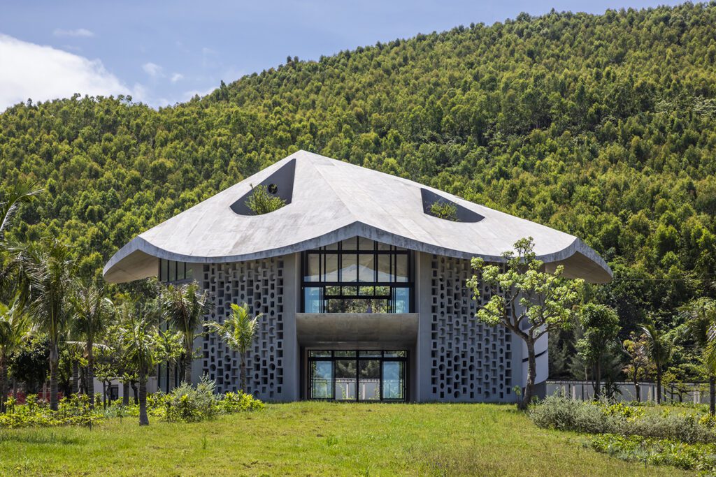
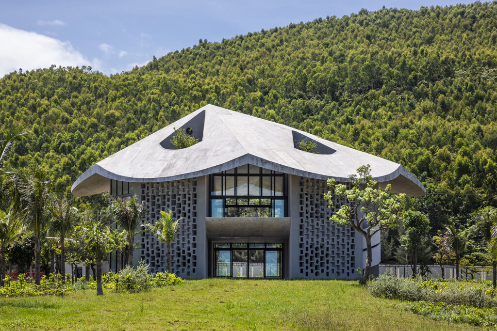
The Kaleidoscope by Inrestudio, Quang Binh Province, Vietnam. Note the dramatically scaled and off-kilter roof.
Nevertheless, some new buildings do achieve a sense of wabi-sabi, a charming awkwardness. And I think they achieve this effect by working with the environment, seeking neither a pure functionalism nor a dramatic ornamental scheme. One building that inhabits this zone is The Kaleidoscope, a mixed-use workplace and residential studio in central Vietnam designed by the firm Inrestudio under the direction of lead architect Kosuke Nishijima.
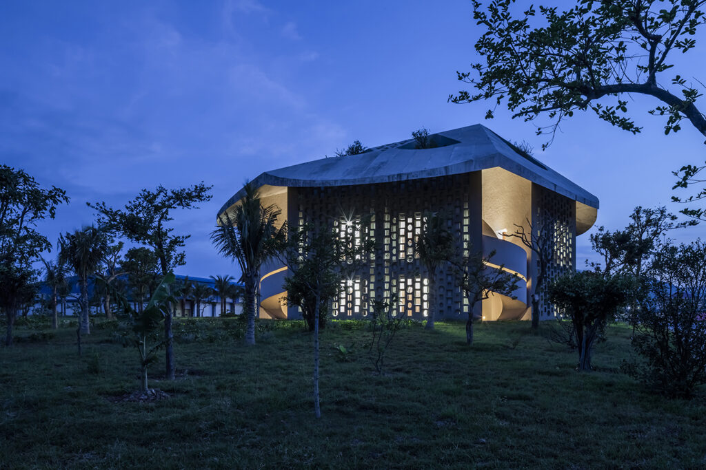
The Kaleidoscope, which was Jury Winner in the 11th Annual A+Awards’ Office – Low-Rise category, makes a strong impression when one encounters it in the forests of Vietnam, wedged between a forested hill and the sea. Relatively small (two stories, 3,150 square feet) but sturdy, it at first appears to be a kind of squat brutalist fortress, perhaps some sort of municipal building or outpost for forest rangers. But then one notices the roof – heavy, sculptural,and off-centered, with dramatic eaves that shade the trunk of the building like a mushroom cap. Walking around the building, one then notices the perforated ventilation blocks and, finally, the outside of a white spiral staircase. The design elements all work together nicely but not cleanly. There is a sense of bricolage, of different ideas pieced together according to a design that is idiosyncratic but not random.

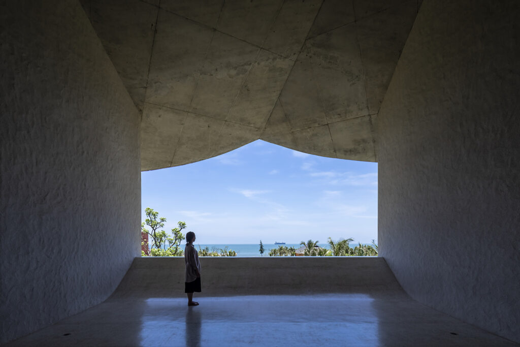
The Kaleidoscope by Inrestudio, Quang Binh Province, Vietnam
When one looks into the rationale behind this beautiful roof, one learns that it indeed has a function tied to the harsh tropical climate of central Vietnam. “Resembling a “nón lá”, a traditional farmer’s hat of Vietnam, a large conical roof casts shadows on the entire building,” explains Inrestudio. “The ventilated cavity between the double layered roof functions as a natural heat insulator against the sunlight, while the deep eaves enable the central space’s windows to remain open even during the rains. The main function of the building is placed at the center of a floating slab, which keeps the space protected from the ground moisture.”
So this is the purpose of the squat Brutalist fortress – to allow individuals to experience fresh air even during typhoons. The perforated walls enhance this relationship to the outdoors. As the sun moves across the sky, the shadows cast inside the building change, much like the patterns of a kaleidoscope change when the end is rotated.

The Kaleidoscope by Inrestudio, Quang Binh Province, Vietnam
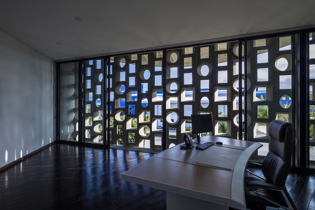
“Perforated ventilation blocks are common building elements in tropical regions, not only to moderate environmental factors but also casting impressive light patterns,” explains Inrestudio. “Custom precast ventilation blocks compose the outer surfaces of the triangular volumes to provide privacy to the inner rooms. These fiber-reinforced concrete blocks have larger dimensions than usual, and match the grand scale of the surrounding backdrop.”

The Kaleidoscope by Inrestudio, Quang Binh Province, Vietnam | Interior view of perforated ventilation block.
The intended use of this building is interesting as well. It is both a living and working space. Located near a factory in a relatively remote area of Vietnam, the building houses offices on the lower level and residences above. Inrestudio explains that they placed a large emphasis on natural light in their design in order to highlight the transition from day to night, when the function of the building will shift from working to living.
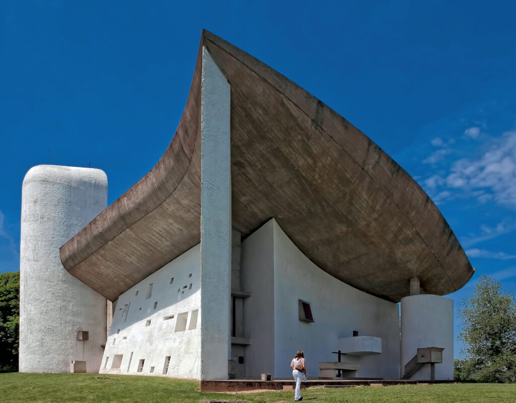
Wabi-sabi is a Japanese term, but the idea has been embraced by Westerners as well – even those one wouldn’t expect. Le Corbusier, for instance, is remembered as the archon of high modernism, drawing up wicked plans to flatten Paris to make room for concrete high rises. And yet, the building he is best remembered for looks a lot like The Kaleidoscope. In fact, it would be hard for me to believe that Inrestudio did not have the Ronchamp Chapel in mind when they designed The Kaleidoscope.
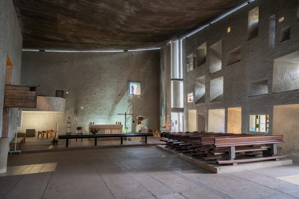
Completed in 1954, near the end of his career, Ronchamp Chapel is a masterpiece that seems to bear little resemblance to the harsh symmetries of Corbusier’s earlier buildings. It replaced a stone chapel that had been destroyed in the second world war, and one gets the impression that Corbu understood that his design should preserve some of the gentleness, or wabi-sabi, of the original, even though his design was entirely original. Like the Kaleidoscope, its greatest features are its sculptural roof, which seems to float above the structure, and the way it draws in natural light in the interior. In the case of Ronchamp Chapel, this is done through a charming array of stained glass windows – arranged in an irregular pattern of course.

Interior view of Ronchamp Chapel. Note the slight gap at the roof line, which lets in a crack of sunlight. Photo by Richard Hedrick on Unsplash
Like The Kaleidoscope, Ronchamp Chapel is possessed of a humble beauty that is easy to relate to. It might be an odd building, but it is not unserious of self-consciously quirky. Above all, it is very much itself. I hope to see more buildings designed in this mode in the coming years.
The latest edition of “Architizer: The World’s Best Architecture” — a stunning, hardbound book celebrating the most inspiring contemporary architecture from around the globe — is now available. Order your copy today.
