Front elevation view of concrete maritime academy in Denmark by EFFEKT and CF Moller Architects
CategoriesArchitecture

Concrete grid defines Svendborg International Maritime Academy

Front elevation view of concrete maritime academy in Denmark by EFFEKT and CF Moller Architects

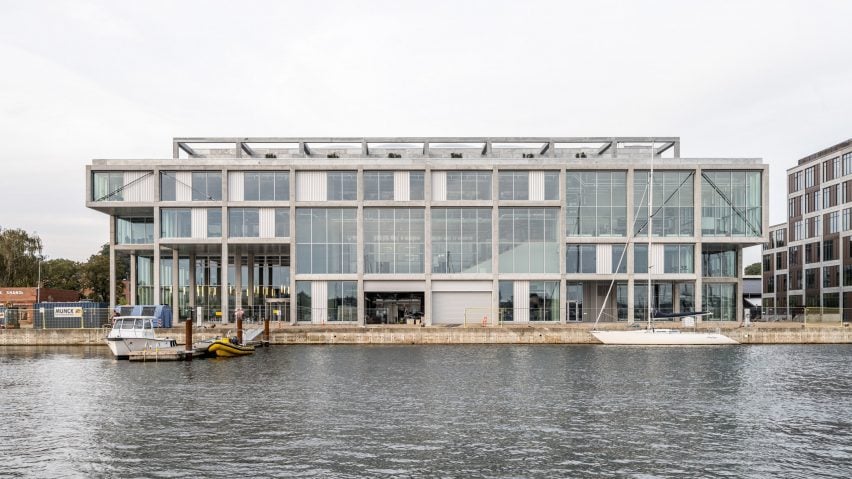
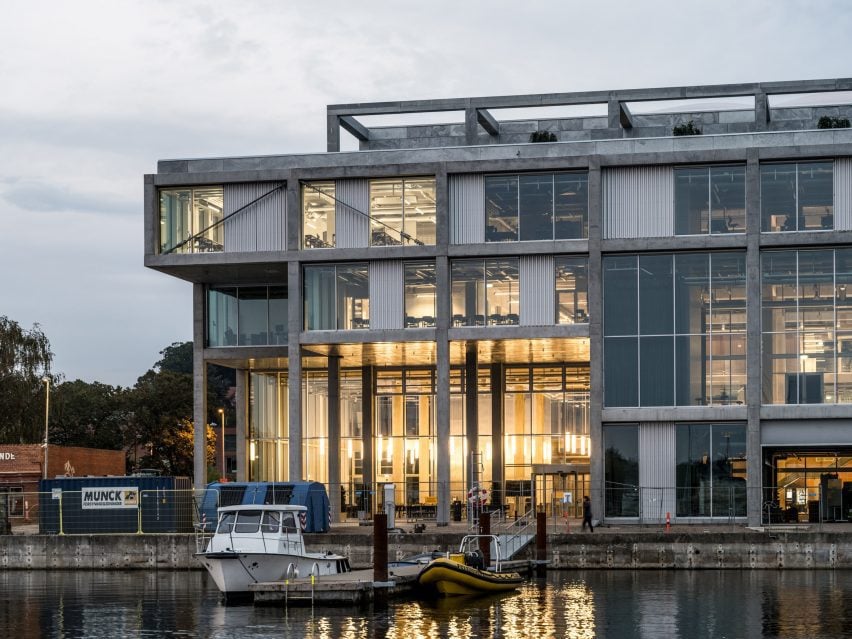
Danish studios EFFEKT and CF Møller Architects have completed the Svendborg International Maritime Academy in Denmark, using an exposed concrete frame to echo its industrial surrounds.

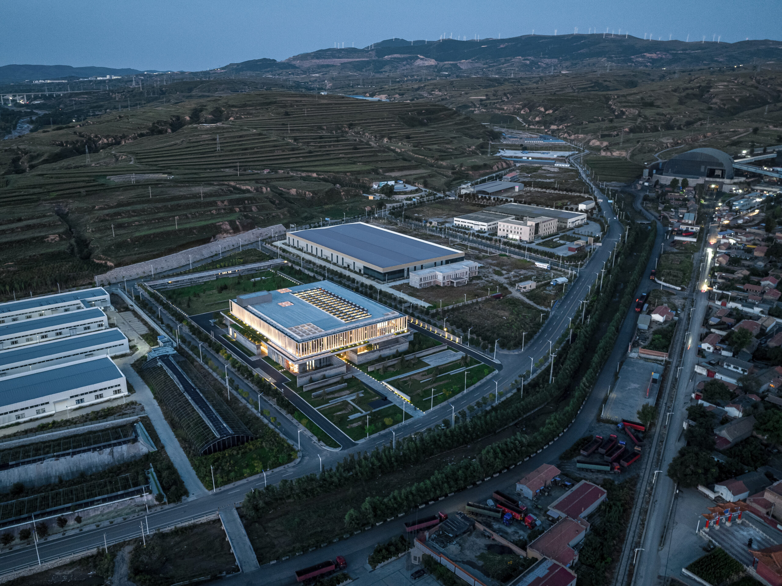
Overlooking the harbour in the North Quay of the former port city Svendborg, the 12,500-square-metre centre unites several previously separate departments of Svendborg International Maritime Academy (SIMAC), providing combined study spaces for 1,000 students.

Front elevation view of concrete maritime academy in Denmark by EFFEKT and CF Moller ArchitectsFront elevation view of concrete maritime academy in Denmark by EFFEKT and CF Moller Architects
EFFEKT and CF Møller Architects have created a building for Svendborg International Maritime Academy

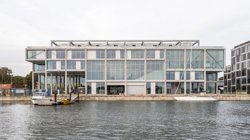
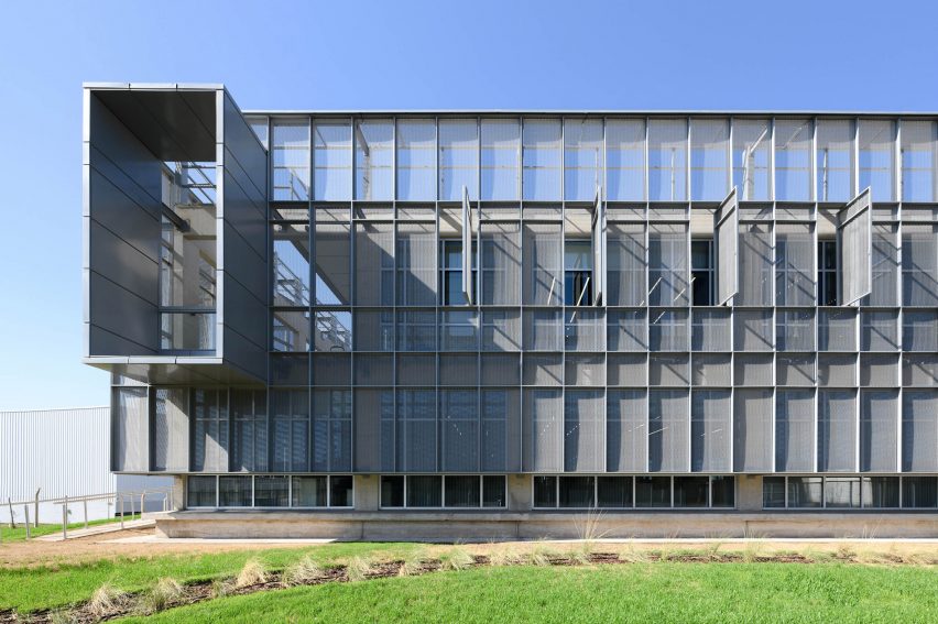
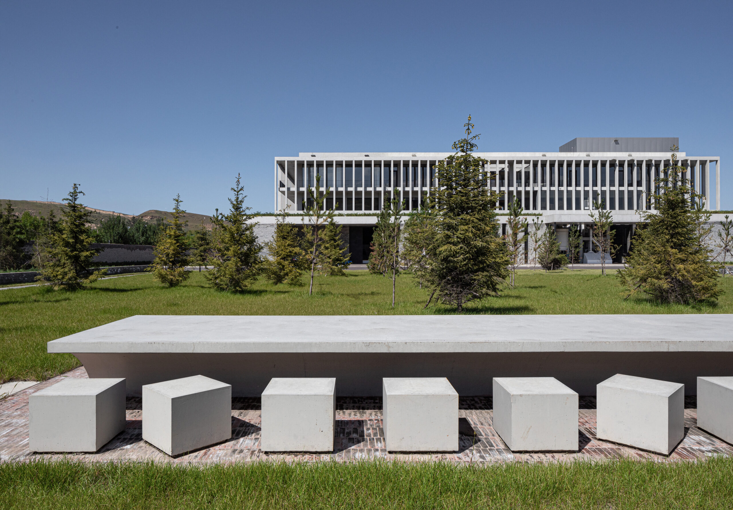
EFFEKT and CF Møller Architects designed a “resilient grid” for the building formed of prefabricated concrete elements, which nods to the surrounding architecture and is divided with glass partitions to create teaching spaces that can be easily modified or adapted in future.

“We set out with the desire to create an extremely raw and transparent grid structure, contextually adapted to its industrious setting while capable of staging the school’s workshop-based content,” explained CF Møller Architects partner Mads Mandrup.

Facade dusk view of concrete maritime academy in Denmark by EFFEKT and CF Moller ArchitectsFacade dusk view of concrete maritime academy in Denmark by EFFEKT and CF Moller Architects
It is characterised by an exposed concrete grid

“[It is] a scaffolding of spatial possibilities, centred around encouraging young people to encounter and exchange ideas through informal meetings, both within and out towards its surroundings, activating the whole harbour front of Svendborg,” Mandrup added.

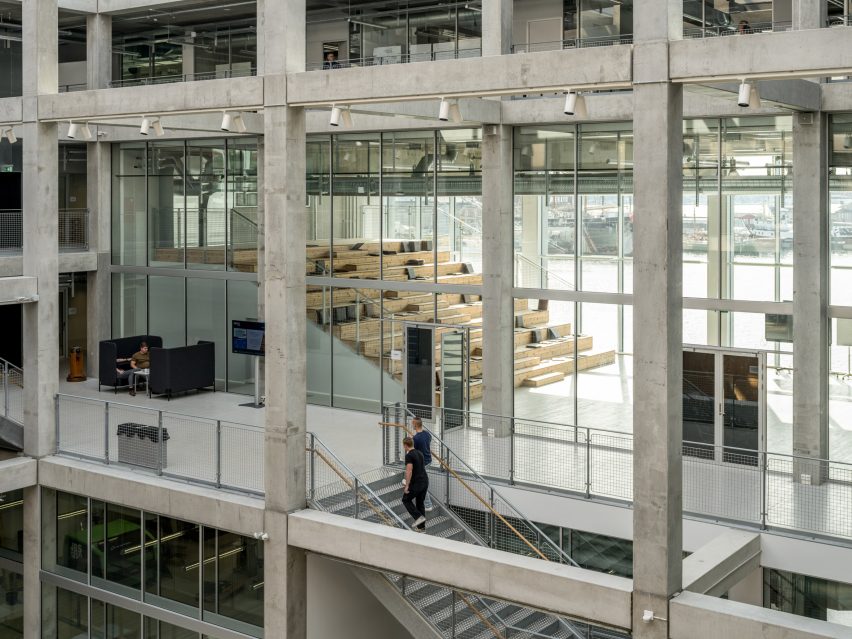
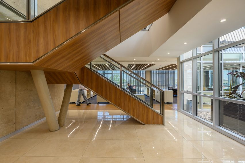
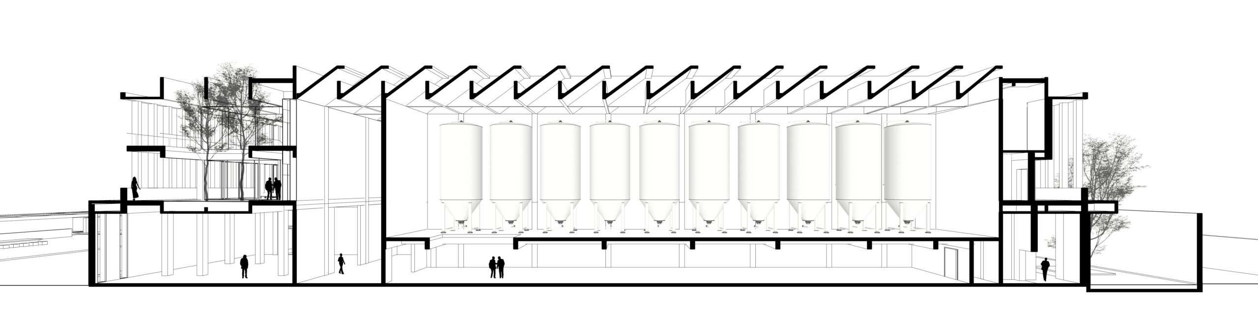
SIMAC’s teaching spaces are organised across five storeys around a central 20-metre-high atrium. Lined with balconies, this atrium visually connects each level to a communal seating area on the ground floor.

Internal frame of concrete maritime academy in Denmark by EFFEKT and CF Moller ArchitectsInternal frame of concrete maritime academy in Denmark by EFFEKT and CF Moller Architects
Five storeys of educational facilities surround a 20-metre-high atrium

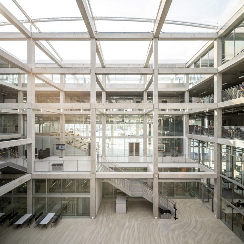
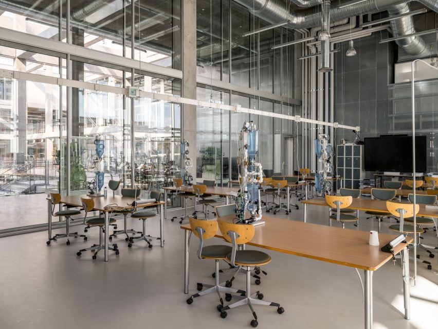
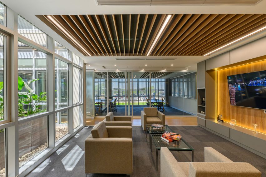
Double-height spaces house specialist workshops alongside conventional offices and classrooms, with the glass partitions intended to “stimulate communication and informal exchange” between areas, said the studios.

On the roof is a communal terrace for students and staff, providing both internal and external spaces with expansive views out across the harbour framed by the hollow concrete grid.

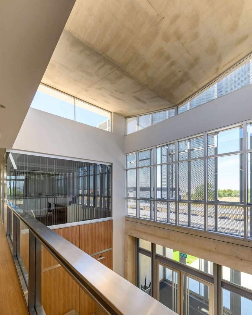
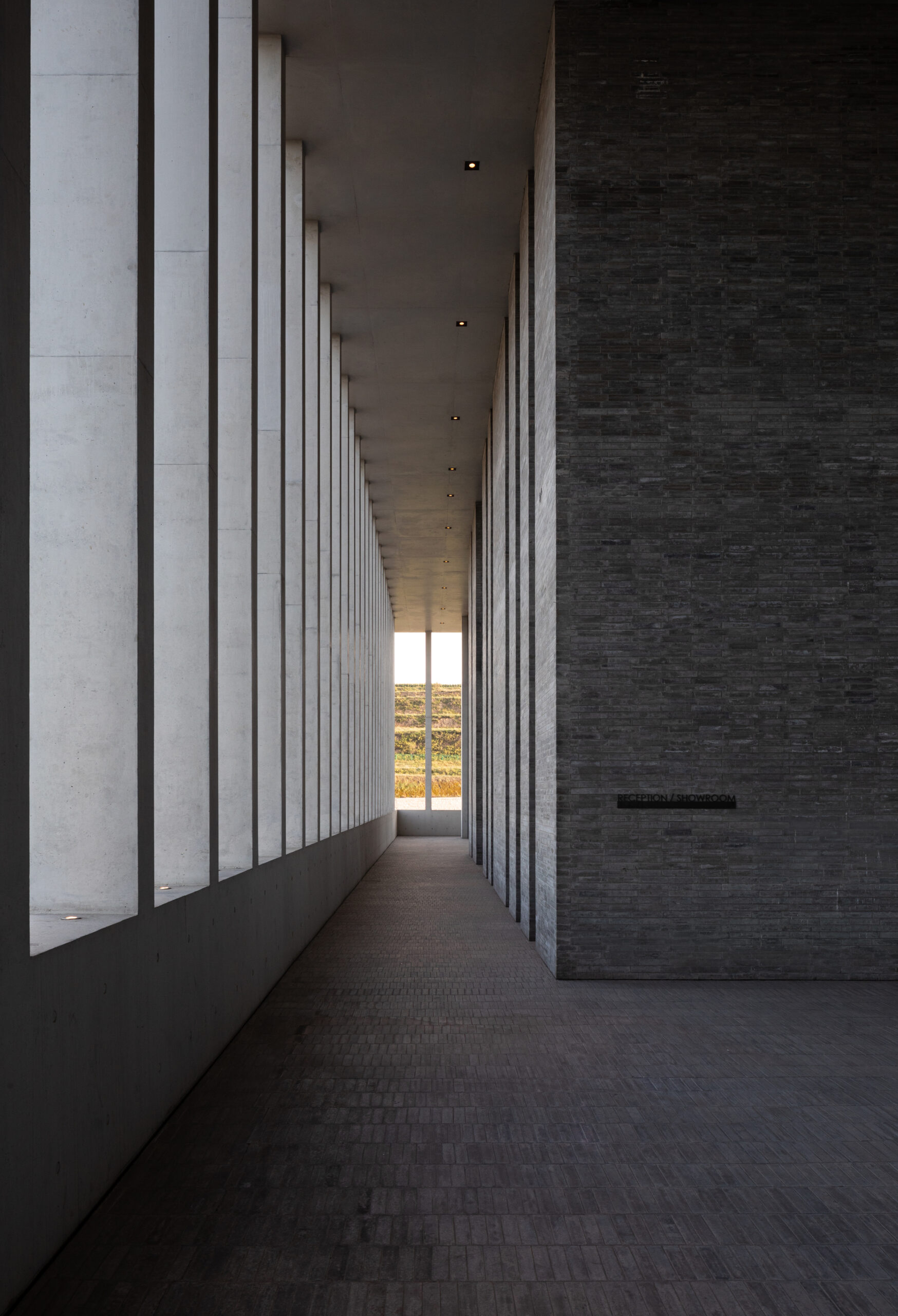
Taking cues from the raw concrete structure, interior finishes have been kept minimal and unfinished, with exposed ducting and steel balustrades. Social areas are visually softened by wooden details, including an area of tiered seating.

On the building’s exterior, panels of glazing and corrugated metal have been pulled back to express the concrete structure. In each corner, the grid is cut away to create sheltered external areas for the cafe and canteen, which are open to the public.

Stairs and frame of concrete maritime academy in Denmark by EFFEKT and CF Moller ArchitectsStairs and frame of concrete maritime academy in Denmark by EFFEKT and CF Moller Architects
An area of tiered communal seating is among those with wooden detailing

“You see the same raw, minimalist exposed column-girder structure both from the outside and the inside,” said EFFEKT co-founder Sinus Lynge.

“The space essentially flows through the building’s structure, and the intriguing aspect concerning the concrete elements is that SIMAC’s structure is the architecture,” he added.

Education space in concrete maritime academy in Denmark by EFFEKT and CF Moller ArchitectsEducation space in concrete maritime academy in Denmark by EFFEKT and CF Moller Architects
Exposed ducting contributes to the raw interior aesthetic

SIMAC is the first project to be completed as part of a wider masterplan for a new district in Svendborg, which is set to transform 5.5 hectares of industrial area with new education, business and residential buildings.

Elsewhere, EFFEKT also recently completed Denmark’s first treetop walkway at the Hamaren Activity Park in Fyresdal and CF Møller Architects created the headquarters for Lego in Billund with a bright yellow atrium.

The photography is by Rasmus Hjortshøj.

Reference

A long industrial building
CategoriesArchitecture

Santiago Viale and Juan Manuel Juarez use screens for Córdoba offices

A long industrial building

Local architects Santiago Viale and Juan Manuel Juarez have wrapped the offices of an animal feed plant in Córdoba with a perforated metal screen.

The 18,040 square foot (1,676 square metre) administrative building is part of a larger 199,000 square foot (18,460 square metre) industrial complex for Biofarma, which produces feed for animals including poultry, swine and cattle.

A long industrial buildingA long industrial building
Local architects Santiago Viale and Juan Manuel Juarez have wrapped an office building in a metal screen in Córdoba

Santiago Viale and Juan Manuel Juarez organized offices, meeting rooms, printing areas and lounge areas across two rectangular floors, punctuated by two internal courtyards at the centre.

The courtyards, along with wood-clad staircases at either end of the building, create collaborative and interactive spaces for employees across the two levels, according to the team.

The front doors on a facade of an industrial buildingThe front doors on a facade of an industrial building
The building is part of an industrial complex that produces animal feed

The office and meeting spaces were distributed along the internal perimeter, with one side abutting floor-to-ceiling windows that span the exterior and the other, a central passageway.

Glass partitions enclose several office spaces, while others were left open.

A building wrapped in a metal skinA building wrapped in a metal skin
A perforated metal skin wrapped around the exterior provides sun protection

“The company managers’ offices are distributed around a double-height space that connects with a hierarchized entrance on the ground floor, reinforcing the sense of institutional identity,” said the team.

Visitors enter the building’s lobby through a concrete vestibule that extends out from underneath a metal screen enclosing the exterior.

Wooden staircase in a lobbyWooden staircase in a lobby
Two internal courtyards and staircases create interactive spaces for employees

A small auditorium sits next to the lobby, clad in wooden panelling with integrated lighting running through its ceiling and walls. Large windows extend along its side.

Lounge areas and a coffee break space provide additional gathering spaces on the second floor, while a dining area opens onto a roof terrace.

Couches and chairs in the lobby of an animal feed buildingCouches and chairs in the lobby of an animal feed building
The offices line the internal perimeter

Reinforced concrete was used for the building’s structure, which was then wrapped in pre-painted grey galvanized expanded metal sheet skin.

A gap of 27 inches (70 centimetres) sits between the metallic screen and the building’s exterior to create sun protection.

Lobby area with concrete ceilingLobby area with concrete ceiling
Concrete was used for the building’s structure

“This skin plays a significant role in the project, as it forms an intermediate shaded space between the glass closure and the exterior, reducing direct sunlight radiation and, consequently, the building’s energy consumption,” said the team.

Moveable panels were also integrated into the cage-like wrapping, while integrated vertical blinds provide further sun protection for inhabitants.

“It also gives the building the language and institutional character of the company,” said the team.

Two large metal-framed openings were placed on either side of the building, which open onto the outdoor dining area.

A small wood paneled room with theatre seating and large windowsA small wood paneled room with theatre seating and large windows
A small auditorium, dining spaces and terrace were also integrated

A metal “Biofarma” sign was also placed on the exterior.

Other projects recently completed in Córdoba include a black concrete house by AR Arquitectos and two modular cabins by Set Ideas.

The photography is by Gonzalo Viramonte.


Project credits:
Collaborators: Salvador Viale, Tito Maximiliano Gonza, Francisco Gavilán, Nicolás Macasso, Santiago Viale Beviglia, Rocío Cornacchione, Emiliano Pino, Nicolás Borra, Lourdes Bruno, Fiama Ríos, Ricardo Cortesse, Eduardo Storaccio, Sonja Czeranski, Juan Macías
Deployed metal: ETC.
Integral front: Abest
Curtains: Suquía Curtains
Vinyl floor: Julia Sol
Auditorium Seats: Rassegna


Reference

Volcanic batteries for industrial heat solutions
CategoriesSustainable News

Volcanic batteries for industrial heat solutions

Volcanic batteries for industrial heat solutions

Spotted: Heat is crucial for many manufacturing processes. However, generating that heat is also emissions-intensive, with industry responsible for 30 per cent of all of the UK’s heating-related greenhouse gas emissions. One solution is the use of renewable sources, like solar, but this is an intermittent energy source and is not always available when it is needed. To solve this problem, British startup Caldera has developed a new type of heat storage system.

Caldera’s system includes a solar array of almost any size. The solar power is stored as heat, using novel storage cells made of an aluminium-volcanic rock composite encased in vacuum insulation. These highly efficient modular cells are rapidly heated to 500 degrees Celsius and can store this energy for hours, ready to deliver heat on demand at temperatures between 80 to 200 degrees Celsius, which is the temperature range needed for many industrial processes.

The cells can deliver heat whenever required, allowing businesses to substitute on-site solar for more expensive, and non-renewable, gas and electricity. As Caldera explained, the system allows industrial players to capitalise on affordable and abundant solar energy, which can be generated on-site or nearby, and stored until it’s ready to be used.

Video source Caldera

In June of this year, Caldera was awarded £4.3 million (around €4.9 million) from the UK Department for Energy Security & Net Zero to build a full-scale demonstrator of the system.

Heat storage is a focus of a number of recent innovations spotted by Springwise, including using scrap aluminium to transport heat and hydrogen and a storage system that captures waste energy for reuse.

Written By: Lisa Magloff

Reference

St John Street, UK, by Emil Eve Architects
CategoriesInterior Design

Seven cosy living rooms with industrial material palettes

St John Street, UK, by Emil Eve Architects

Living rooms with tactile brick, concrete and wood surfaces feature in this lookbook, which shows that opting for industrial materials doesn’t have to sacrifice cosiness.

Typically informed by old and unrefined factories, lofts and warehouses, industrial-style interiors are a go-to for many contemporary designers.

Homes of this style are often characterised by a combination of man-made and natural materials, including brick, wood, concrete and metal, and the exposure of details that are usually concealed, such as ductwork.

While, for some, the image of industrial spaces can conjure up feelings of being cold and unwelcome, this list of living rooms proves that with the right finishes, the style can actually be warm and inviting.

This is the latest in our lookbooks series, which provides visual inspiration from Dezeen’s archive. For more inspiration see previous lookbooks featuring interiors with furry walls, sculptural wooden staircases and rustic Italian interiors.


St John Street, UK, by Emil Eve Architects
Photo by Mariell Lind Hansen

St John Street, UK, by Emil Eve Architects

Emil Eve Architects retained the raw aesthetic of this former warehouse while transforming it into a warm and inviting home.

In the living room, old brick walls, metal window frames and a rough concrete ceiling form a tactile backdrop to contemporary wooden furnishings and an abundance of tall plants.

Find out more about St John Street ›


Living room of Michigan Loft by Vladimir Radutny
Photo by Mike Schwartz

Michigan Loft, USA, by Vladimir Radutny Architects

A suspended black-metal fireplace is the centrepiece of this lofty apartment, which is located in Chicago and dotted with floor furnishings including a Toga sofa.

The fireplace is complemented by exposed black ducting and hanging lights, which pop against the surrounding brick, warm wood and concrete elements.

Find out more about Michigan Loft ›


Gale Apartment living room with brown lounge chairs and concrete walls
Photo by Fran Parente

Gale Apartment, Brazil, by Memola Estudio

Exposed services, ducting and concrete help achieve an industrial look in this living room, which is located in a Brazilian apartment designed by Memola Estudio.

To add warmth to the space, these finishes are balanced with natural details including dark wooden floorboards and furniture, suede chairs and a textile wall tapestry.

Find out more about Gale Apartment ›


Photograph showing large sofa in living area looking into dining area
Photo by Andrey Bezuglov and Maryan Beresh

Relogged House, Ukraine, by Balbek Bureau

This living room belongs to a Ukrainian cabin, designed by Balbek Bureau with a utilitarian aesthetic that aims to challenge conventional cabin interiors.

Concrete is the predominant material, but stainless steel and wooden elements such as horizontally stacked logs also feature throughout. To add warmth, a giant fireplace takes centre stage and is positioned opposite a modular sofa on which visitors can cosy up.

Find out more about Relogged House ›


Living room of South 5th Residence by Alterstudio
Photo by Casey Dunn

South 5th Residence, USA, by Alterstudio Architecture

In this lounge, the stripped-back material palette helps to draw attention to the “dramatic vistas” over a valley in Austin, Texas.

Rough-textured concrete forms the walls of the space, while polished concrete lines the floor. Window frames made of wood and steel add to the room’s industrial look, and colour is introduced through furnishings including a tubular pink-metal armchair.

Find out more about South 5th Residence ›


Living room of A Forest House by Aquiles Jarrín
Photo by JAG studio

A Forest House, Ecuador, by Aquiles Jarrín

Aquiles Jarrín married dark Chonta wood with black-steel beams and rough concrete for the design of this textural living room, found in A Forest House in Quito.

The wooden elements help break up the open-plan interior, carving out cosy nooks and storage spaces for the owner. The seating area is warmed by a cowhide rug and tan butterfly chairs.

Find out more about A Forest House ›


Kundig faulkner Analog House Truckee
Photo by Joe Fletcher

Analog House, USA, by Olson Kundig Architects

A tactile material palette of metal, concrete and glass tones was used for the living room of Analog House, a home in a Californian forest created by Olson Kundig Architects with the ​​founder of Faulkner Architects – the client for the project.

In the lounge, these materials are paired with light wooden floors and minimalist furnishings including hanging lights, a sleek black sofa and tubular chairs.

Find out more about Analog House ›

This is the latest in our lookbooks series, which provides visual inspiration from Dezeen’s archive. For more inspiration see previous lookbooks featuring interiors with furry walls, sculptural wooden staircases and rustic Italian interiors.

Reference

Site Overview of Project
CategoriesArchitecture

Factory Reset: These Architects are Giving the Industrial Typology a Much-Needed Update

Site Overview of Project

Architizer is thrilled to announce the winners of the 11th Annual A+Awards! Interested in participating next season? Sign up for key information about the 12th Annual A+Awards, set to launch this fall.

Designing industrial buildings, particularly factories, is usually a process that is dominated by the complicated functional and logistical requirements that limit architects creatively, overpowered by the technical specifications of the machinery and the production lines that occupy the entirety of the building space and leave little space for the form to develop beyond the functional limitations.

That being said, one would ask, What comes first? Form or Function?

Site Overview of Project

The Oatmeal Factory in Ningwu, Shanxi province by JSPA Design.

This question has been the topic of hot debate among architects throughout history, with contrasting perspectives among the modernists and postmodernists, among others. During the late 19th and the 20th century, particularly within the field of industrial design, architects believed that “form follows function,” as expressed by architect Louis Sullivan, which indicated that the function of the building is what generates its form and guides its design process. For Frank Lloyd Wright, that design principle has been misunderstood, because, “Form and function should be one, joined in a spiritual union.”

When studying the design of the Ningwu Oatmeal Factory in Shanxi, China, which was both the Jury Winner and won the Popular Choice vote during Architizer’s 11th Annual A+Awards, one could argue that JSPA Design was inspired by Wright’s principle. This is especially evident in the way they eloquently strike the balance between both, breeding what could be described as a spiritual union between form and function. The design shows a high level of attention to the factory’s user experience, the selection of materials and the relationship with the site. In short, JSPA Design conceived of a home for production processes that is more than just a factory; the Ningwu Oatmeal Factory is a building that produces a lot more than just oatmeal.

The main entrance to the factory emphasized by the use of brick walls.

The Beijing-based French design studio produced a design that strokes the right balance between the complicated functional requirements and the humanization of the work environment, juggling the different design components while also introducing an interesting user experience that invited the public into the building while redeeming the integrity of the factory’s different operations.

From the outside, the surrounding context was challenging to work with, with the factory being located within dry and arid industrial landscapes punctured with coal mines on their outskirts. In response to this context, the design team chose to orient the building inwards, introducing a variety of horizontal and vertical boundary-demarcating elements that fostered a crisp and clean indoor environment, experientially detaching the building from the outside while enhancing the user experience and orchestrating an interesting walkthrough across the complex’s different sections. Meanwhile, visitors are spatially separated from staff for safety and logistical reasons.

An overview of the factory’s industrial context.

From an environmental perspective, the building’s relationship with the outdoors is further regulated through a network of patios and gardens that invite sunlight to enter the factory’s various spaces. These design provisions enrich the quality of the indoor environment, allowing floods of northern light to illuminate the central production space through a sequence of skylights.

A cross section through the main production space showing the skylights and the production machinery.

By using grey bricks as the main construction material, the designers establish a more materialistic connection with the surrounding context. By harnessing local construction methods to erect a series of brick walls that became the prominent design feature, the material amplifies the building’s relationship with the site and the surrounding landscapes.

Similar to the flow of production lines that transform raw oat into flour products, a variety of brick walls organize the circulation flows through the factory, starting at the entrance and leading each user group to their designated section, while also organizing entry and exit to the building, the delivery of materials and the loading of products. For the visitors, the ground floor serves as an opaque passage, with the brick walls concealing the technical spaces from the public that are lead instead to the first floor where the public spaces are located, including a café, a shop and a garden.

Brick walls guide the different users groups through the factory.

At the factory’s entrance, the public are greeted with a seating area and kids pools, mediating the relationship between the inside and the outside and softening the edge that separates the functional from the social sections of the factory. Brick makes a gradual and smooth appearance at the entrance, first appearing on the benches, before moving to the fences, and then extending vertically and becoming a series of walls that soon become the factory.

The seating area in front of the main entrance that acts as part of the public spaces of the factory.

The bricks walls that organize movement through the landscape aligned with the factory walls.

Despite how the brick walls have acted as boundary demarcating elements that organized the factory’s spaces, circulation and relation with the site, this project is an excellent example of architecture that blurs the line between form and function, with each fundamentally playing a role in shaping the other, without one necessarily needing to precede the other.

One of the interior gardens of the factory that regulate the relationship with the outside, demarcated by the brick walls .

The design team strategically chose key places to expose and conceal the factory’s different spaces, as well as varied sites where the factory is either connected or disconnected from the outside. Other binaries include rhythmic alternations between soft and hard, experiential and technical; and outward-reaching and inward-turning (click here to see plans, sections and more details from the A+Award-winning project). The sum of these complex calculations is proof that factory design need not be entirely automated. It shows that there is always a space for humans to intervene and be present within industrial sites.

Architizer is thrilled to announce the winners of the 11th Annual A+Awards! Interested in participating next season? Sign up for key information about the 12th Annual A+Awards, set to launch this fall.

Reference

alt=
CategoriesArchitecture

Infrastructuring Nature: Appropriating the Industrial Ruins of New York City

alt=

Architizer’s new image-heavy daily newsletter, The Plug, is easy on the eyes, giving readers a quick jolt of inspiration to supercharge their days. Plug in to the latest design discussions by subscribing. 

In his essay Nature, Infrastructure and Cities, Antoine Picon writes, “Before the rise of the environmental crises we now face, nature served as the support for infrastructures. Roads, bridges and canals were generally located in natural settings. However, in our contemporary technologically driven world, nature increasingly appears as a fragile entity that is itself in need of infrastructure support.”

New York has been the melting pot for architectural experimentation and innovation as well as the home to many industrial settings and infrastructures that are no longer operative. This, along with the more environmentally conscious approach architects are enforcing, has led to the appropriation of many of these settings fused with natural elements. These seven architectural projects showcase new, intuitive ways of “infrastructuring nature” by repurposing old industrial systems to create a “greener” New York City. As Antoine Picon points out, nature will never be prevalent in current metropolitan cities, nor will it be sustainable without artificial support. Nevertheless, the damage of overdevelopment is not irreversible as long as there are projects that recognize the hidden opportunities of these forgotten industrial ruins.


High Line

By James Corner Field Operations & Diller Scofidio + Renfro, Manhattan, New York, United States

Jury Winner, 2014, A+Awards, Concepts – Architecture + Light

alt=

alt=
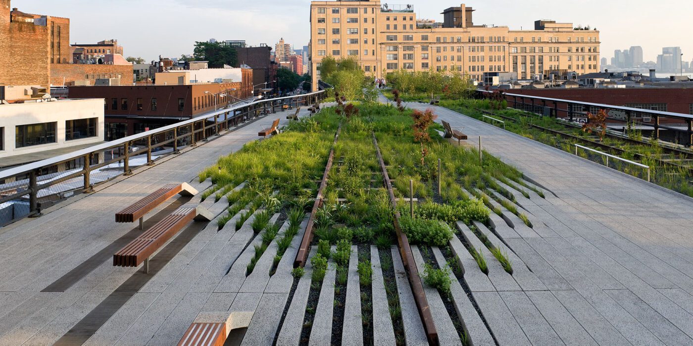
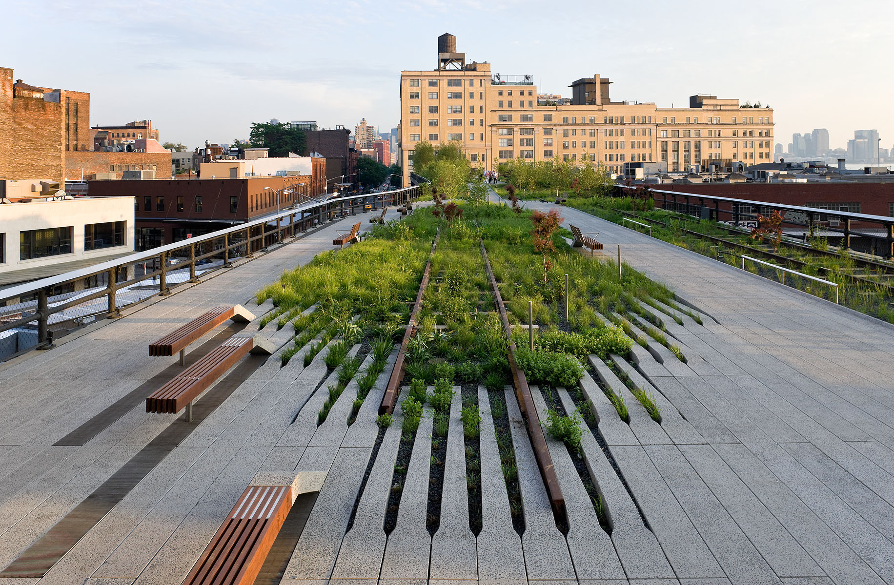
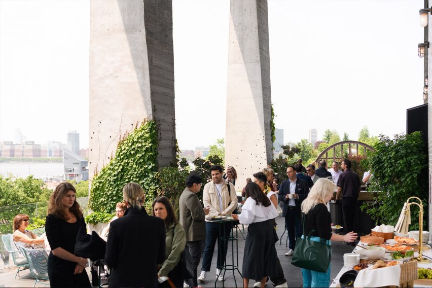
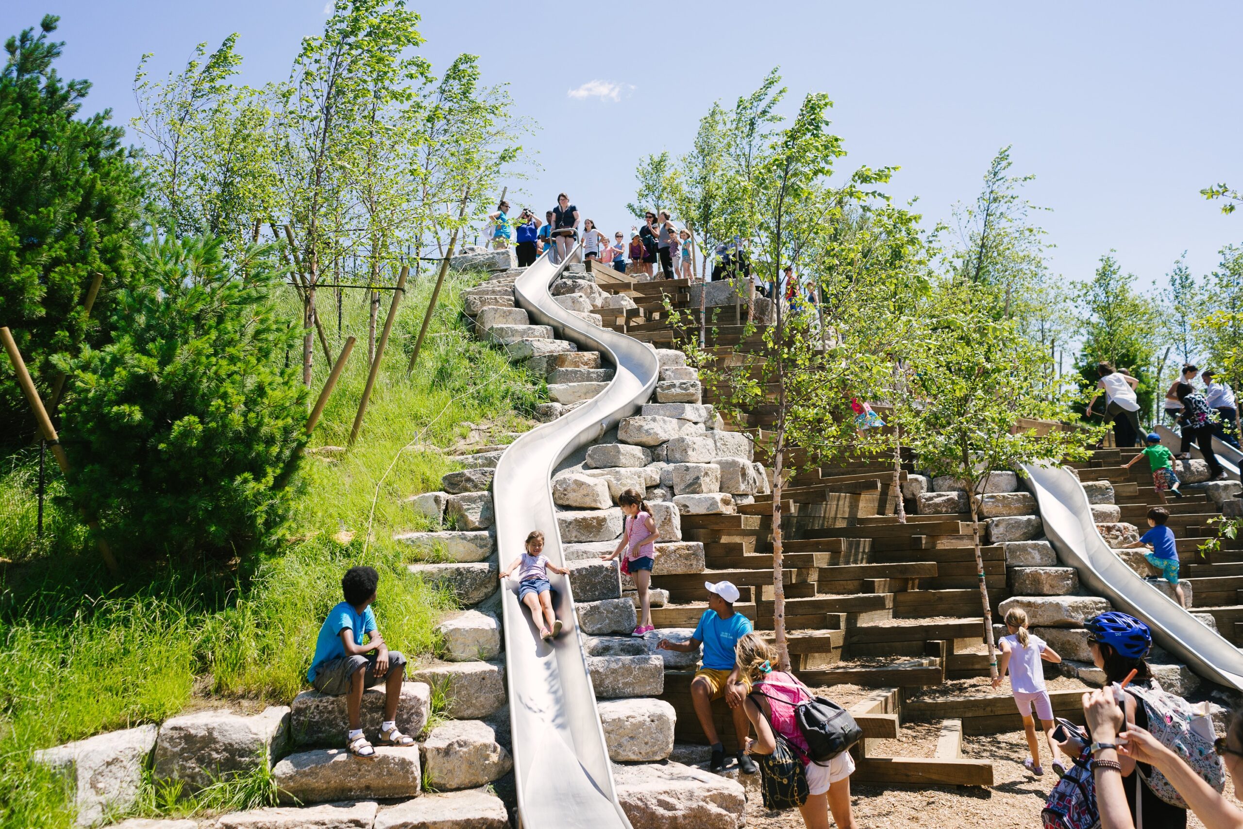
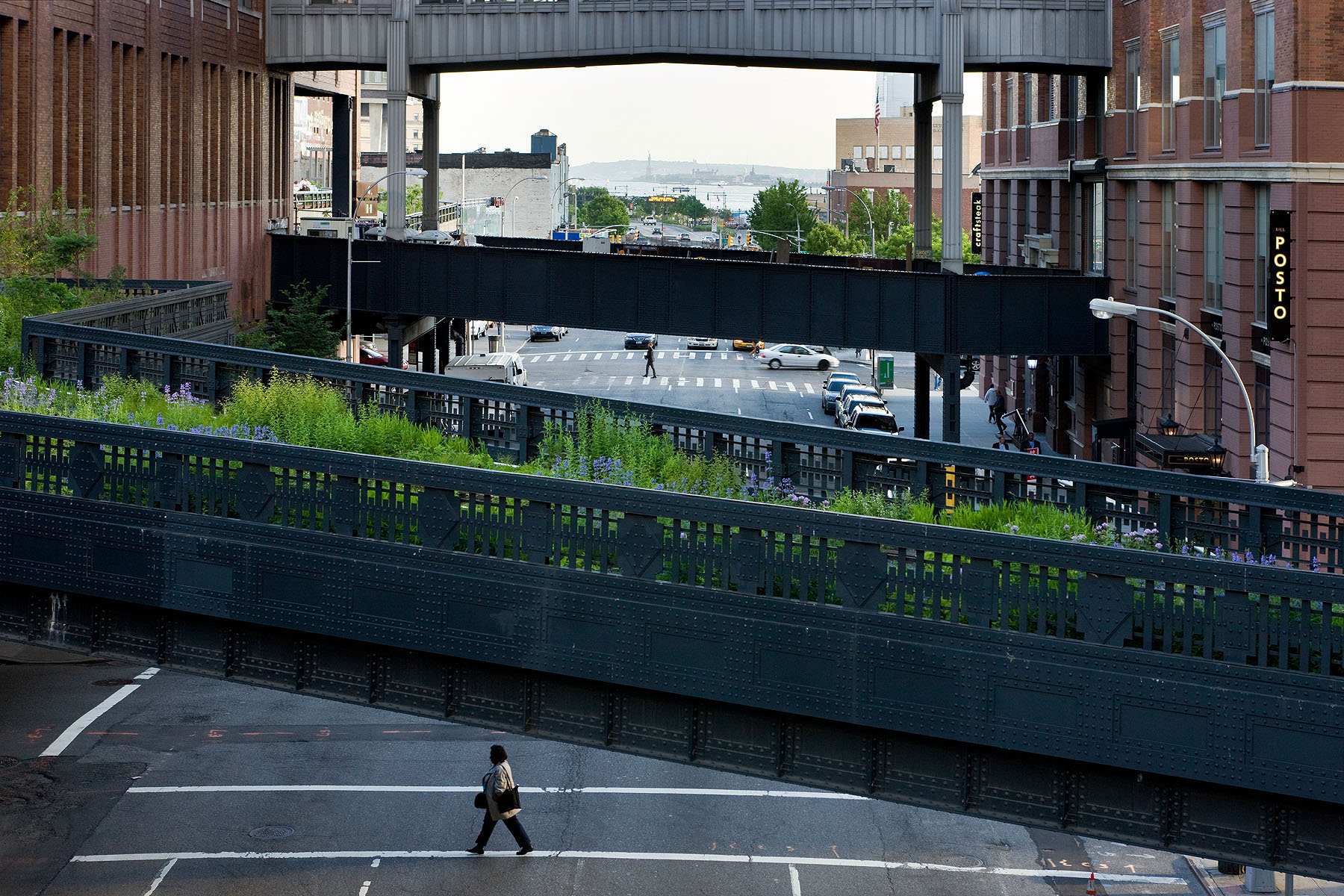
How can an abandoned railroad be reused by the citizens of New York City? Connecting the Meatpacking District with the Hudson Railyards, 1.5 miles (2.5 kilometers) of elevated rail tracks have been transformed into the High Line project: a public park that stands as an agricultural oasis amidst the franticness of the big city. Prior to the project’s realisation, the deserted railroad had already been “reclaimed” by nature. Consequently, when James Corner Field Operations and Diller Scofidio + Renfro designed the High Line they celebrated these natural diversities, by employing the strategy of “agri-tecture”. Irregular paving patterns and planting beds form a series of asymmetrical pathways, allowing the people of New York to experience the city through a different, more impromptu, type of lens.


Terminal Warehouse

By COOKFOX Architects, Manhattan, New York, United States

alt= alt=
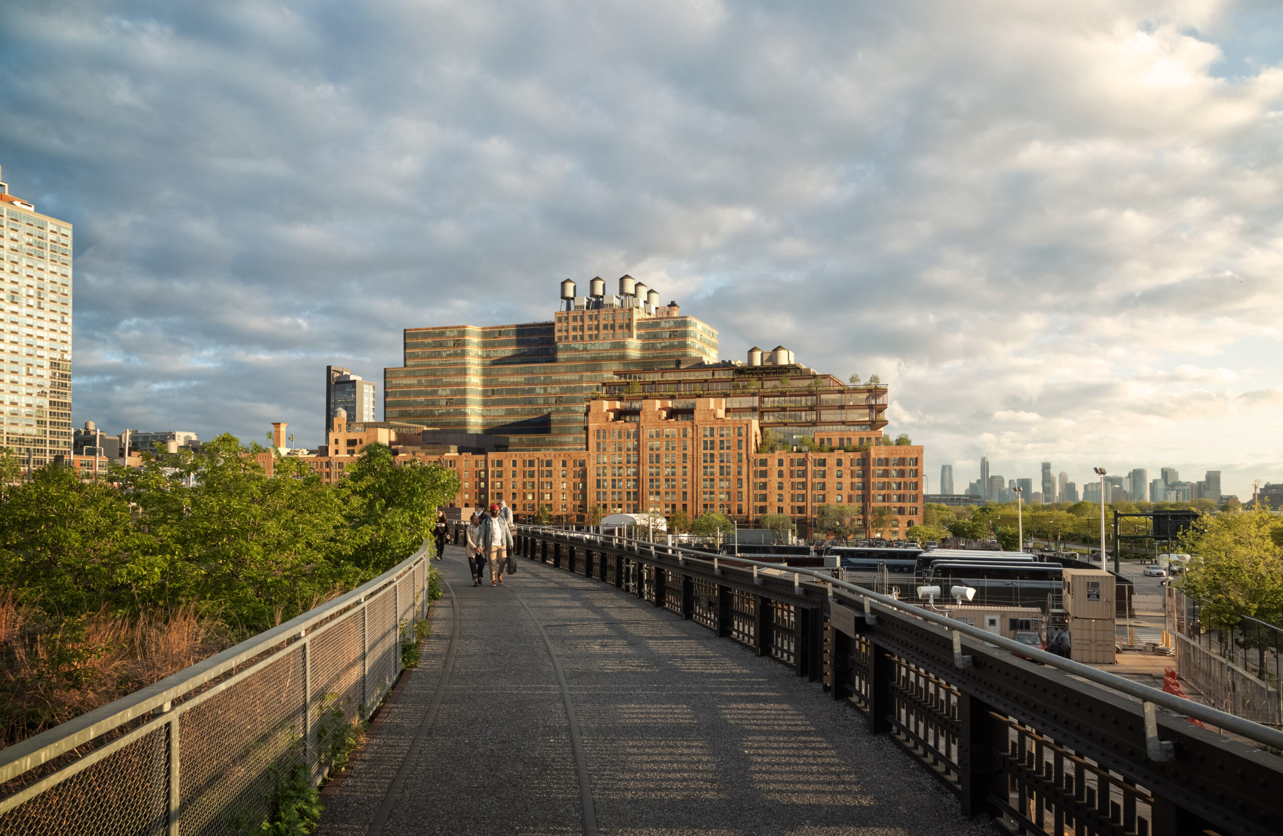
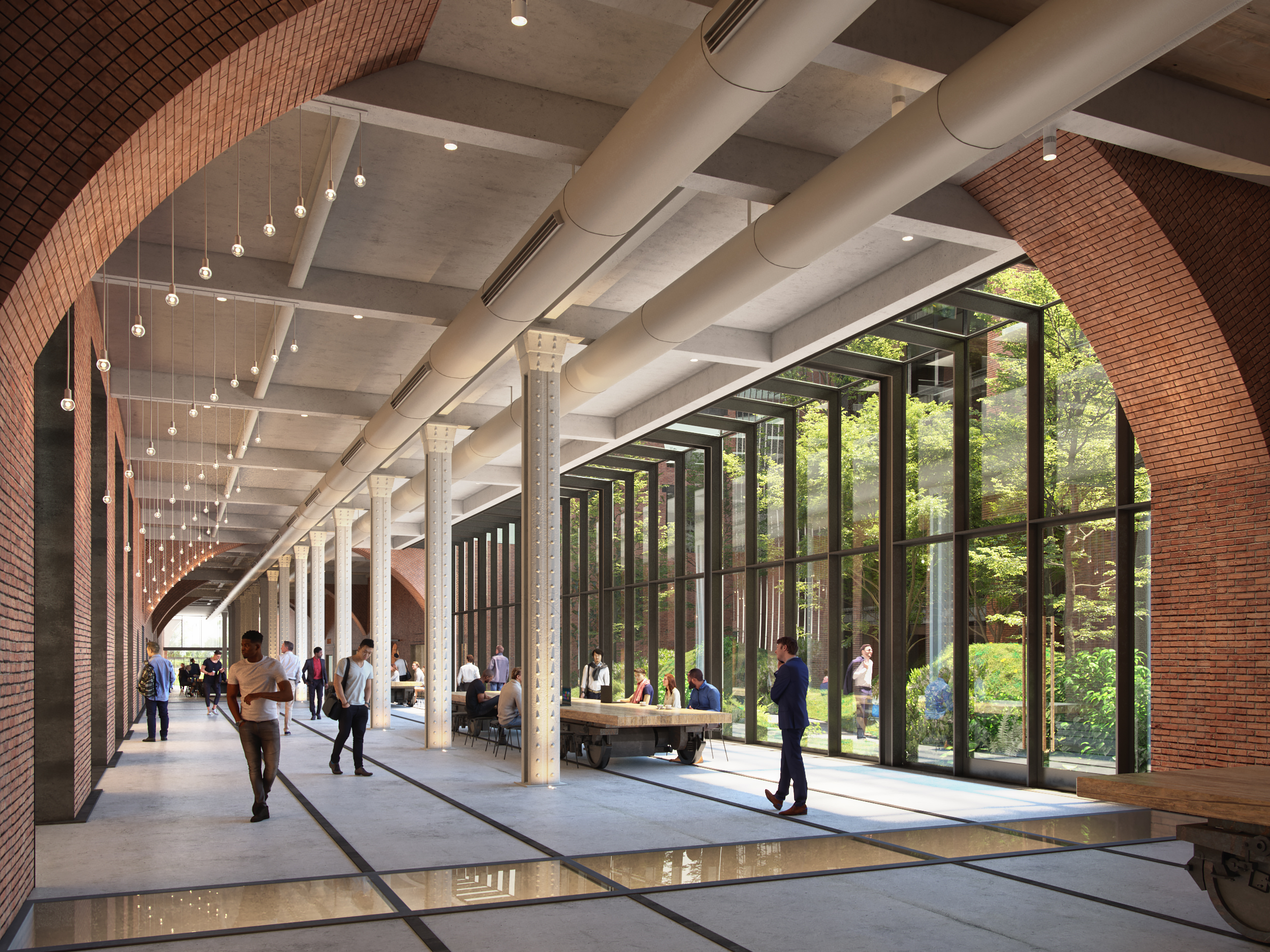
Built in 1891, the Terminal Warehouse is an iconic post-industrial ruin of New York. No longer needing the traditional warehouse in West Chelsea district, the Terminal Warehouse is gradually being transformed into a collection of biophilic office spaces. As part of their design strategy, COOKFOX Architects have preserved the building’s historic architectural typology and used its masonry structure as an infrastructure for supporting a series of gardens and green terraces. Additionally, through a set of rail tracks, the Terminal Warehouse is directly linked with Hudson river. The disregarded railroad becomes an opportunity for reuse and is transformed into a pedestrian route that reestablishes the link between city and water.


Governors Island Park and Public Space

By West 8, Manhattan, New York, United States

Jury Winner, 2017, A+Awards, Public Park
alt=

Photo by Iwan Baan

alt=

Photo by Noah Devereaux

Infrastructure comes in all shapes and sizes. The Governors Island, located south of Manhattan, is a piece of land that has been repurposed countless times. From an unspoiled landscape to a military base to a hotel and racetrack, the island was expanded through artificial means to host a number of contradicting functions. Finally, in 2006, West 8 won the competition for creating a masterplan that transforms the island into a public destination and landmark. They designed a historic park, a plethora of public spaces and a large promenade that wraps around the island. Nowadays, Governors Island has formed a symbiotic relationship with the New York harbor, eventually becoming its natural extension.


F.R.E.D., Fostering Resilient Ecological Development

By Ennead Architects, Queens, New York, United States

Jury Winner, 2017, A+Awards, Unbuilt Masterplan

alt= alt=
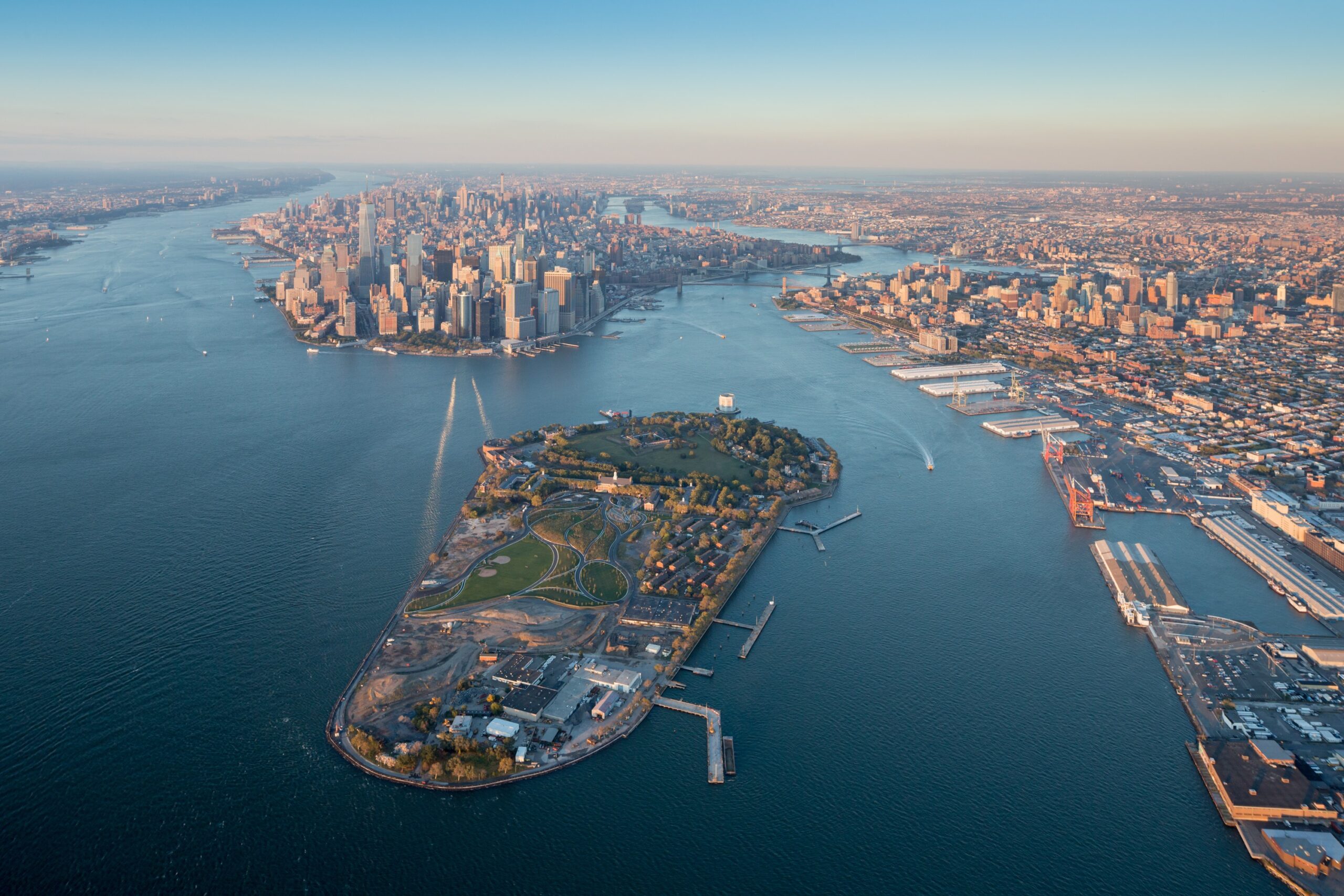
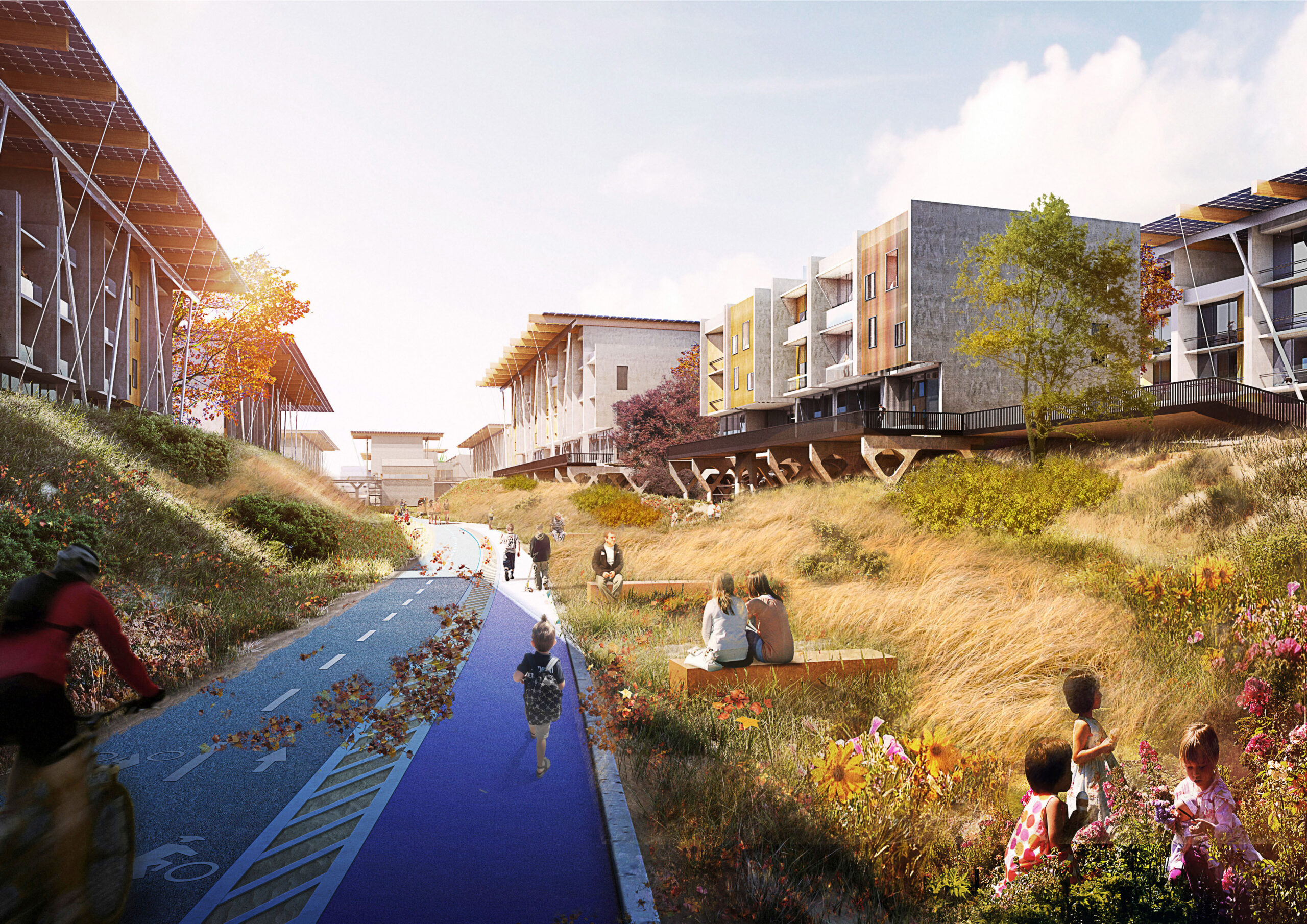
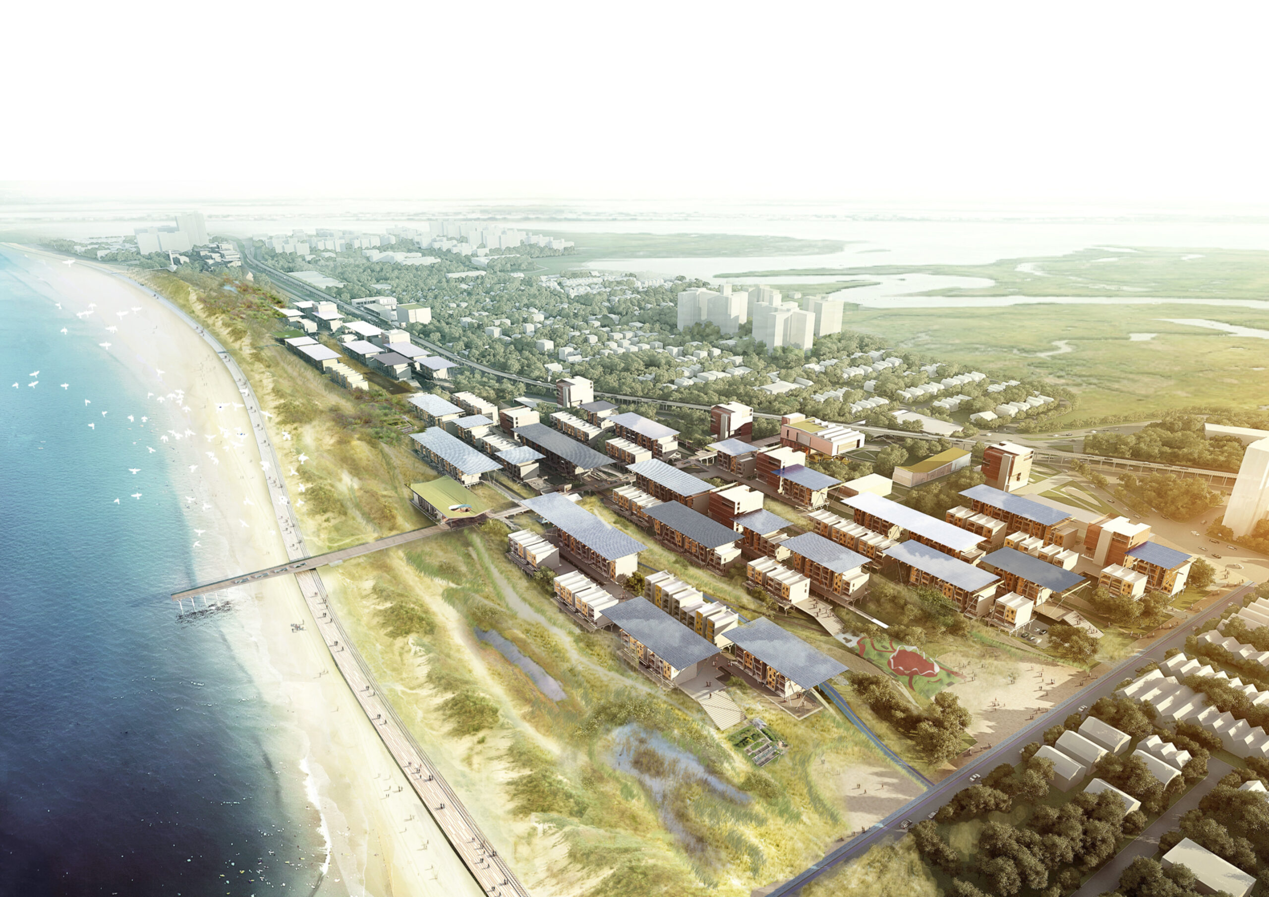
Located in a beach-front site in the Rockaways, the F.R.E.D. proposal introduces a new type of pairing between nature and infrastructure. Ennead Architects used the iconic Row House typology and the local sand dunes as the two components for designing a resilient infrastructure system. Their aim was to create a flexible strategy, which could be easily repurposed for other waterfront sites with the same characteristics and expand upon the research on “infrastructuring nature”.


Hunter’s Point South Waterfront Park

By SWA/Balsley & WEISS/MANFREDI Architecture/Landscape/Urbanism, Queens, New York, United States

alt="Hunter'sPoint-01" alt="Hunter'sPoint-02"
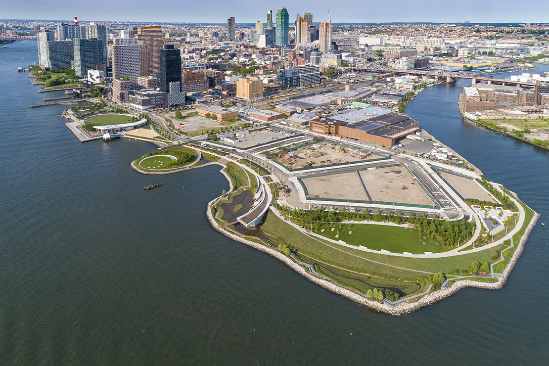
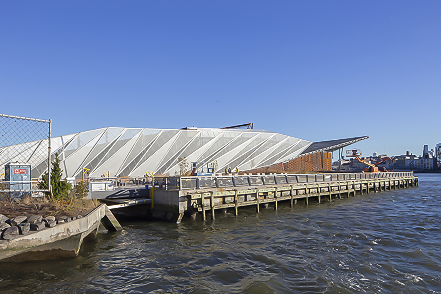
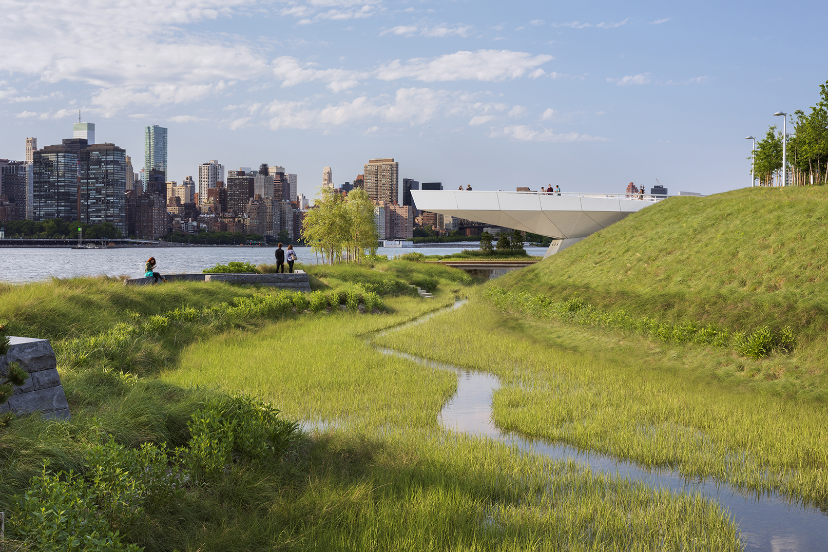
For two hundred years, Hunter’s Point was a series of wetlands on the East river. Later on, the site was turned into an industrial hub and rail station. Eventually, it was diminished to a post-industrial ruin filled with decaying piers and steep landfills, inaccessible to the wider public. Finally, in 2018 it became one of the most transformative and ecologically driven projects in the city. A coastal park, a footbridge, a cantilevered overlook and even a landfill peninsula transformed what used to be an empty industrial site into an adaptable infrastructural system that reinvented the once iconic water edge.


Pier 35

By SHoP Architects, Manhattan, New York, United States

alt= alt=
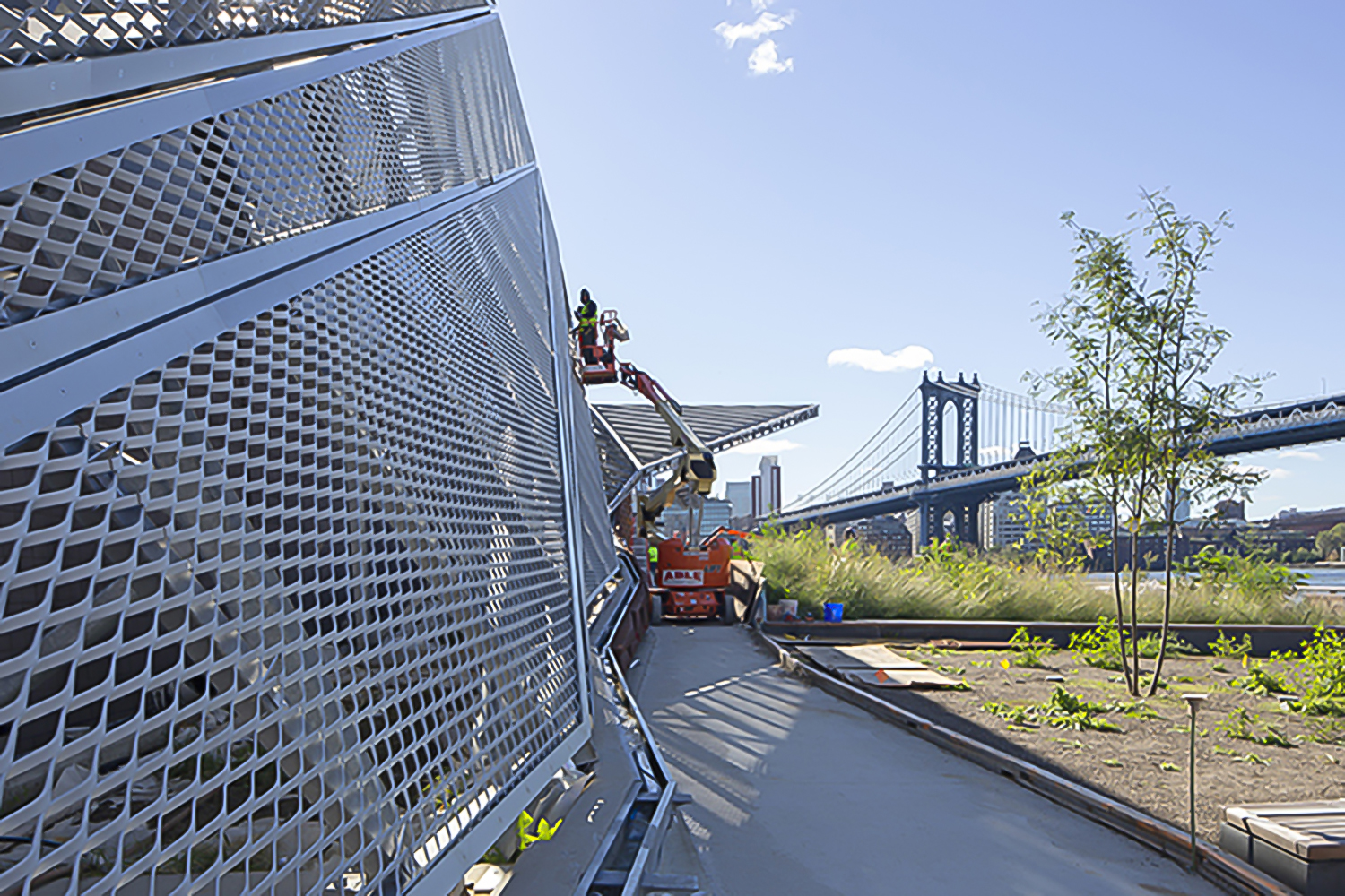
Enclosed by the Hudson and East rivers, the island of Manhattan is naturally surrounded by many raw, uninviting concrete piers. Fortunately, the Pier 35 proposal transformed one of these flat blocks of artificial land into a much needed esplanade project. Pier 35 is literary “infrastructuring nature”. It consists of a folded landscape that gradually slopes down to the surface of the water. Its crinkled form interacts with the varying tidal currents, while replicating the physical characteristics of the East river shoreline. Above the water, a series of landscape lawns, dunes and inclined plant-covered screens form pedestrian walkways filled with vantage points towards Brooklyn and Manhattan bridge.


The Dryline

By Rebuild by Design & BIG – Bjarke Ingels Group, Manhattan, New York, United States

Jury Winner, 2015, A+Awards, Masterplan

alt= alt=
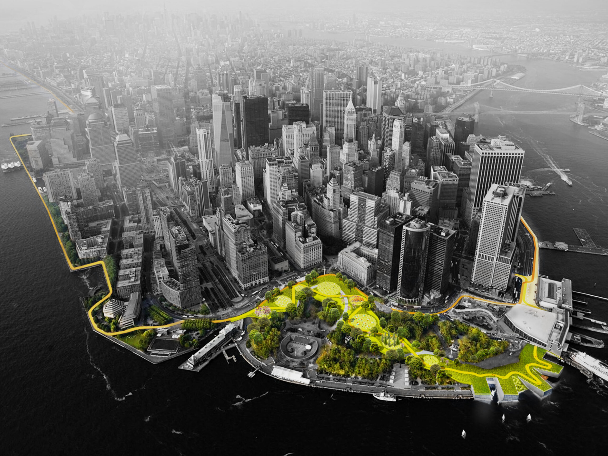
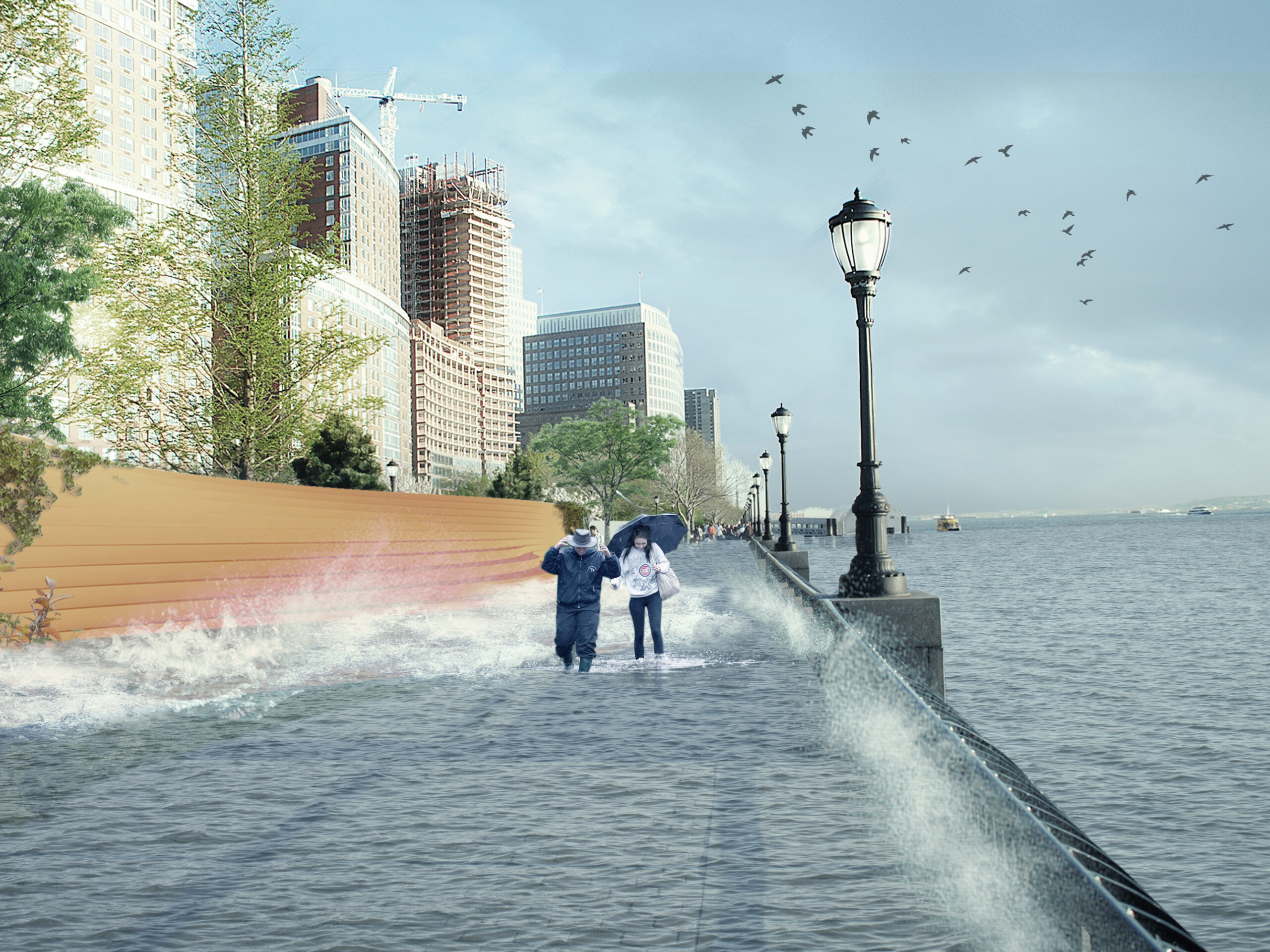
Also known as “The Big U,” this conceptual 10-mile-long (16 kilometer) protective ribbon around Manhattan was imagined in the wake of Superstorm Sandy. Ultimately, it was deemed unfit to respond to the challenging weather conditions that increasingly threaten the city. Subsequently, the Dryline is a project that redesigns lower Manhattan’s water edge, proposing a series of components that will aid to both the physical and social infrastructure requirements of the neighboring districts. More specifically, the project consist of a continuous protective element that also operates as playful street furniture, an elevated pathway and finally, a series of overarching greenways. In short, the Dryline project has essentially become the blueprint for effectively designing social as well as physical infrastructure strategies for coastal cities, providing new insights for “infra structuring nature” practices.

Architizer’s new image-heavy daily newsletter, The Plug, is easy on the eyes, giving readers a quick jolt of inspiration to supercharge their days. Plug in to the latest design discussions by subscribing. 

Reference

Lobby lounge at Mona Athens hotel
CategoriesInterior Design

House of Shila designs industrial yet sultry interiors for Mona Athens

Lobby lounge at Mona Athens hotel

The ancient Acropolis of Athens is in full view from the rooftop of this boutique hotel, which design studio House of Shila has housed in a former factory building.

Mona Athens is located in the city’s lively Psirri district, within an eight-storey 1950s building that once served as a textile factory.

Lobby lounge at Mona Athens hotel
The Mona Athens lobby features an eclectic mix of furniture and decor

House of Shila, led by New York-based entrepreneur Shai Antebi and Greek photographer and creative director Eftihia Stefanidi, chose to keep as much of the building’s bones as possible when converting it into a 20-key hotel.

This meant retaining its original dramatic iron staircase, terrazzo flooring, metal window frames and marble facade.

Staircase in communal area of hotel by House of Shila
The spilt-level communal space houses a lounge and cafe

“We designed Mona with great respect for the building’s 1950s architecture,” said Stefanidi.

“The structure itself remains unchanged, revealing 70 years of history. Emphasis was given to preserving original features.”

Iron staircase in the lobby of Mona Athens
House of Shila retained as many of the building’s original details as possible

Layering over industrial materials like exposed concrete and weathering steel, the team added wooden furniture and textured fabrics to bring warmth and tactility to the spaces throughout.

Accessed from the street, the 200-square-metre split-level lobby serves as a lounge and a cafe that can host pop-up events and installations.

Guest room with exposed concrete walls in hotel by House of Shila
A variety of textured materials are layered over the building’s industrial bones

An eclectic mix of furniture and decor populate the space, which can be opened to the outside via full-height folding glass doors.

The hotel’s six different room categories range from intimate rooms of around 16 to 20 square metres all the way up to the 55-square-metre penthouses and Mona’s Suite, with some of the larger rooms providing access to private balconies and patios.

Guest room at Mona Athens
Wash areas are open to the sleeping quarters in many of the rooms

All feature a similar sultry-meets-industrial aesthetic, which House of Shila compares to a “sensual refuge”, characterised by curtains of sheer cotton and richly-coloured velvet, low minimalist beds, custom-knitted carpets and soft lighting from bespoke fixtures.

In the majority of the guest rooms, the washing areas are open to the sleeping quarters – with separate water closets for privacy – and some feature comfy lounge seating.

Bathroom in suite at hotel by House of Shila
Larger suites have access to porches, balconies and patios

White freestanding Corian bathtubs and industrial-style rain showers are shrouded by translucent curtains, creating a “certain balance of comfort and drama”, according to the design studio.

The open rooftop offers a direct view of the Parthenon and other structures atop the Acropolis, the UNESCO-listed epicentre of Ancient Greece, while the tourist entrance to the site is a 15-minute walk from the hotel.

Reserved for Mona Athens guests and members, this outdoor space includes a long glass-and-metal communal table, cushioned sofas, outdoor showers, lush planting and a bar that serves cocktails and “eclectic fare” with ingredients sourced from the local food market.

There’s also a speakeasy venue in the basement, where pop-up exhibitions and private events can take place.

Corian bathtub in Mona Athens guest room
Freestanding Corian bathtubs are set against weathering steel

All of the decorative items in the rooms are available for guests to purchase, from the organic cotton bedsheets to the ceramic coffee cups.

Antebi’s background is in real estate development while Stefanidi was previously the creative director for immersive entertainment company Secret Cinema.

rooftop bar in hotel by House of Shila
The rooftop is reserved for hotel guests and members

The duo founded House of Shila after working together on their first hospitality project Shila – another boutique hotel-cum-arts venue in Athens’ Kolonaki neighbourhood.

Once a quick stopover for tourists on the way to the Greek islands, the capital is becoming a popular destination for city breaks in its own right, thanks to its rich history, growing culinary scene, year-round fair weather and relative affordability.

Acropolis view from Mona Athens rooftop
A prime view of the Acropolis can be enjoyed from the roof

The owner of Carwan Gallery described Athens as “the new Berlin” when the contemporary design gallery relocated there from Beirut in 2020.

Several boutique hotels have opened or undergone renovation in the downtown area over the past few years, including the neo-modernist Perianth Hotel and the Evripidis Hotel, which received a new rooftop bar and breakfast room.

The photography is by Ana Santl.

Reference

David Yonker, Vice President, Insights Research Center at SAP, photo by Daniel Salemi
CategoriesSustainable News

“Build empathy with users” says industrial designer Ayse Birsel

David Yonker, Vice President, Insights Research Center at SAP, photo by Daniel Salemi

Designing with empathy for the consumers of today and the future is a challenge we must take on, says Birsel + Seck co-founder Ayse Birsel at a talk filmed by Dezeen for Global Design Forum in partnership with SAP.

“If we have the users in the room thinking with us and using our tools to think creatively, that changes everything,” Birsel said.

Called Creating a Compelling Reason for Change as part of the Circular Design Series, the talk brought together a panel of design and digital thought leaders to discuss how to design for consumers in the face of global economic, environmental and social pressures.

David Yonker, Vice President, Insights Research Center at SAP, photo by Daniel Salemi
David Jonker is vice president of the Insights Research Center at SAP

“When we get to designing and changing the system, it’s a multifaceted challenge,” said vice president at SAP Insights Research Centre David Jonker during the talk.

“Those who will be the disruptors are those who are willing to question some of the fundamental assumptions that we take for granted,” he continued.

Eli Halliwell, chairman at Hairstory, photo by Daniel Salemi
Eli Halliwell is the chairman of haircare company Hairstory

There is an opportunity to design products to be inherently better and cleaner, said executive chairman and co-founder of Hairstory Eli Halliwell.

“The step-function change comes from rethinking the actual problem that you’re trying to solve, versus just iterating on the delivery mechanism or the packaging,” Halliwell said.

Ayse Birsel, co-founder of Birsel + Seck, photo by Daniel Salemi
Ayse Birsel is an industrial designer and co-founder of Birsel + Seck

Birsel also spoke about how inclusive consumer research can promote change, explaining that consumer datasets historically tend to be skewed towards men.

“For example, pianos are not measured and made for women, and that means there are very few great pianists who are women in the world, not because they are not talented, but because the products are not designed for that data set,” said Birsel.

“It’s on us to design great products for this new era, which is our future,” she continued. “We’re living longer and longer but the planet’s life is shorter and shorter.”

Birsel expressed that consumers in today’s world have the opportunity to collaborate with designers.

“When I think of circularity of design, it’s not only design and brand together anymore, it also includes the user. When we can do that, we build incredible empathy with our users. They feel heard, they feel seen,” she said.

The Standard High Line Hotel, photo by Daniel Salemi
The talk was held at The Standard, High Line in New York City

Global Design Forum is London Design Festival’s curated thought-leadership programme. Its flagship event will take place as part of the London Design Festival in September.

Photography is by Daniel Salemi.

Creating a Compelling Reason for Change is the second talk filmed by Dezeen as part of Global Design Forum’s The Future of Packaging symposium, which took place on 23 May 2023 at The Standard High Line Hotel during design festival NYCxDesign. See Dezeen Events Guide for an up-to-date list of architecture and design events taking place around the world.

Partnership content

This video was produced by Dezeen as part of a partnership with London Design Festival. Find out more about Dezeen partnership content here.

Reference

Crittal-style window inside Ghost House by BPN Architects
CategoriesInterior Design

Eight living spaces with industrial Crittal-style windows

Crittal-style window inside Ghost House by BPN Architects

Industrial-looking living spaces with Crittal-style windows and doors are the focus of this lookbook, which includes an apartment in Israel and a rural Chinese house.

Crittal-style windows and doors are characterised by their gridded metal frames, traditionally made of steel with a bold black finish.

They are modelled on the iconic Crittal windows by ironmonger Francis Henry Crittall, which were developed in the late-19th century and became a feature in many art deco and modernist buildings.

Today they are seeing a resurgence in popularity, with their clean graphic lines bringing an industrial quality to contemporary homes around the world.

This is the latest in our lookbooks series, which provides visual inspiration from Dezeen’s archive. For more inspiration see previous lookbooks featuring striking accent walls, stylish bookshelves and tranquil sunken baths.


Crittal-style window inside Ghost House by BPN Architects
Photo is by Felix Mooneeram

Ghost House, UK, by BPN Architects

This double-height Crittall-style window doubles as the wall to an open-plan living and dining room in an industrial concrete house in Warwickshire, England.

It is one of several steel-framed windows that enclose the home, which was designed by BPN Architects to have an “ethereal presence” – leading to it being named Ghost House.

Find out more about Ghost House ›


Interior of Tel Aviv apartment by Maayan Zusman and Amir Navon
Photo is by 181

Tel Aviv apartment, Israel, by Maayan Zusman and Amir Navon

Interior designer Maayan Zusman and architect Amir Navon opted for gridded black window frames when renovating this apartment in Tel Aviv.

Complemented by other delicate black furnishings, the windows form part of a wider design strategy that centred on creating an interior that felt “airy yet framed”.

Find out more about the Tel Aviv apartment ›


Crittal-style windows inside the Returning Hut in China
Photo is by Wu Yong-Chang

Returning Hut, China, by Xu Fu-Min

The Returning Hut is a two-storey home just outside the city of Xiamen in China, designed by Xu Fu-Min to offer their client a peaceful retreat where they can connect with nature.

Among its key features is an open living room with a giant wall of glazing. Lined with gridded metal frames, it slides open to create a seamless connection to the garden. 

Find out more about Returning Hut ›


Ditton Hill House by Surman Weston in Surbiton
Photo is by Johan Dehlin

Ditton Hill House, UK, by Surman Weston

Surman Weston honoured its “client’s love for all things industrial” when creating the Ditton Hill House, a London residence with an exposed steel frame that nods to mock-Tudor homes nearby.

This steel framework enabled the studio to create spacious, column-free interiors, such as this open-plan living area. Here, Crittal-style windows overlook the garden and are paired with exposed steel floor decks for a warehouse-like aesthetic.

Find out more about Ditton Hill House ›


Crittal-style windows inside Little Peek by Berman Horn Studio
Photo is by Greta Rybus

Little Peak, USA, by Berman Horn Studio

Black gridded windows and doors puncture the facade of Little Peak, a holiday home that the founders of Berman Horn Studio, Maria Berman and Brad Horn, built themselves on an island in Maine.

According to the duo, they were chosen for their industrial look and to help “bring focus onto the textures and colours of the stone, huckleberry, bay and lichen that surround the house”.

Find out more about Little Peak ›


Interior of Burnt House by Will Gamble Architects
Photo is by Ståle Eriksen

Burnt House, UK, by Will Gamble Architects

These Crittal-style windows and doors help to create a minimalist aesthetic for the Burnt House, a residential extension that Will Gamble Architects has modelled on a Japanese tea house.

They are intended to evoke a shoji screen and were complemented by a large window seat finished in blackened wood that sits up against the glazing.

Find out more about Burnt House ›


Interior of Binh Thuan House
Photo is by Trieu Chien

Binh Thuan House, Vietnam, by MIA Design Studio

MIA Design Studio used white gridded frames on the sliding doors at the Binh Thuan House in Vietnam.

The steel frames were complemented by its industrial all-white structure, which is modular and designed for easy modification or expansion in the future.

Find out more about Binh Thuan House ›


Harrison Residence by Jeffrey Dungan
Photo is by William Abranowicz

Harrison Residence, USA, by Jeffrey Dungan Architects

These black Crittal-style windows form the focal point of the living space at the Harrison Residence, a home in Florida designed by Jeffrey Dungan Architects.

Framing the surrounding tall trees, the windows help bring colour into the otherwise monochrome interior, which features black shelving and a coffee table, and white walls and sofas.

Find out more about Harrison Residence ›

This is the latest in our lookbooks series, which provides visual inspiration from Dezeen’s archive. For more inspiration see previous lookbooks featuring striking stylish bookshelves and tranquil sunken baths.

Reference

Kith Williamsburg
CategoriesInterior Design

Kith creates “industrial ambiance” for its Williamsburg store

Kith Williamsburg

American clothing brand Kith has created a flagship store in Williamsburg, Brooklyn, that uses brick, wood and steel to reference the industrial history of the neighbourhood.

Designed by Kith‘s founder Ronnie Fieg and the brand’s in-house team of architects, the Williamsburg location is located in the Gensler-designed 25 Kent Plaza office building, where Kith also has its corporate offices.

Kith Williamsburg
Kith designed a store for its apparel in Williamsburg

The design takes elements that carry through some of the other Kith stores, such as marble finishes and metal fins, and adds details that situate it in the context of Williamsburg.

These include a massive circular structure at the heart of the store that is covered with red brick on the outside and lined with white oak inside. The piece was custom-made at a nearby, undisclosed wood workshop.

Kith Williamsburg
It features a central structure made of brick and wood

This central element has a domed wooden ceiling with a wooden column and circular light fixtures that radiate out towards the edges concentrically.

A number of sloping arched voids in the structure have metal-lined undersides and provide an entryway on two sides and display cases for the brand’s collection of sneakers on another.

“We constructed the central dome completely from scratch and created the exterior from the same exact bricks used on the outside of the main building so it feels very cohesive as you enter,” said Fieg.

“Every inch of that dome is custom which meant our precision down to the last minute detail was crucial.”

“Outfitting the interior with rounded wood panels, shaping the footwear shelves to sit flush within the windows, every detail was poured over.”

Kith polished concrete floor
It steps down from an outdoor plaza

Outside the circular area, the lights radiate perpendicularly, like sun rays, towards the walls.

The perimeter of the store is lined with metal fins that block the sun from the glass-lined eastern exposure while also creating a massive logo when viewed from outside.

Also lining the perimeter of the store are custom wooden clothing racks.

Mosiac in polished concrete flooring
A custom mosaic was placed in the floor

Polished concrete flooring runs through the space, which steps down from the public plaza at the centre of 25 Kent.

The designers oriented the entrance towards the plaza and placed garden boxes in the corners of the store to better connect it with the public space outside.

Marble snack bar
Marble clads the snack bar

“The industrial ambiance is balanced with lush oak trees outside, and an abundance of greenery spread throughout the store,” the brand said.

The Kith Treats Area at the entrance – where a combination of ice cream and cereal are served – was lined with Rosa Aurora marble and has a to-go window that opens up to the plaza.

Wooden dome inside Kith store
The wooden elements were custom made nearby

A wall of stainless steel panels separates the treats area from the retail space, while the walls opposite the street-facing glass are matte concrete with wooden insets for further display and service areas.

On the floor, Kith installed a brand logo made of mosaic tiles.

It is the third store in New York City for the brand, which was founded in 2011, and creates apparel for men, women and children.

To celebrate the opening, the brand launched a sneaker with footwear companies Clarks and Adidas.

Gensler Williamsburg Kent
It is in a Gensler-designed building in Williamsburg

This is the twelfth store opened by Fieg, who moved to Williamsburg himself with his family in 2017, and the Kith headquarters there in 2021.

“The restaurants, the shops, the people, and the atmosphere make it a very special area in New York and were all factors in us moving our brand HQ there in 2021,” he said.

“It’s my home, our team’s home, and it only made sense for us to make it a home for our community.”

Many of Kith’s prior locations, in Miami and Los Angeles, for instance, were designed by designer Daniel Arsham and his studio Snarkitecture.

In both the Paris and original downtown Brooklyn locations, Kith installed chandeliers made up completely of Nike Air Max sneakers.

Reference