mixed-use wooden house showcases traditional japanese and global influences
CategoriesArchitecture

mixed-use wooden house showcases traditional japanese and global influences

Akio Isshiki infuses three distinct functions into wooden house


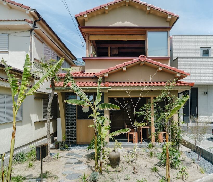
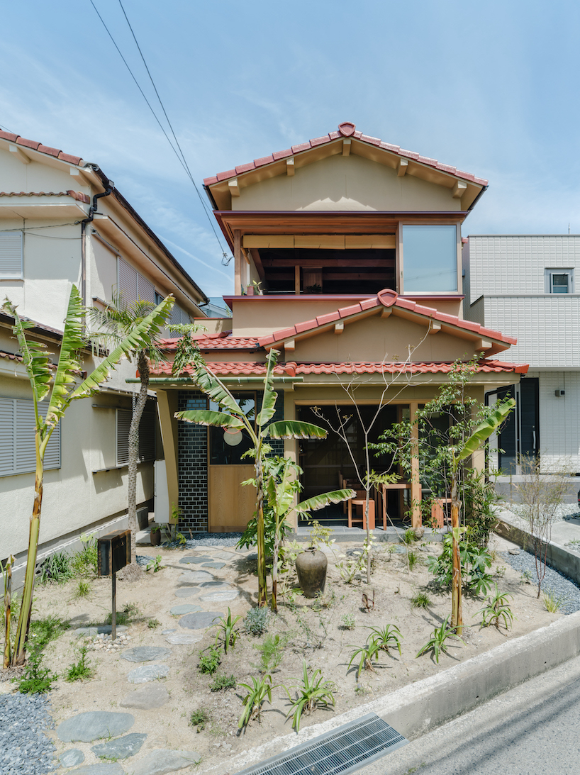
Akio Isshiki Architects renovates a wooden house near the beach in Akashi City, Hyogo Prefecture into the designer’s own residence and workplace, as well as a curry restaurant. Within this modest 73 sqm space, the coexistence of three distinct functions creates a unique environment in which notions of time and space, cultural elements, work, and living settings coexist. The design draws from traditional Japanese architecture and employs local materials and techniques while integrating global inspirations.


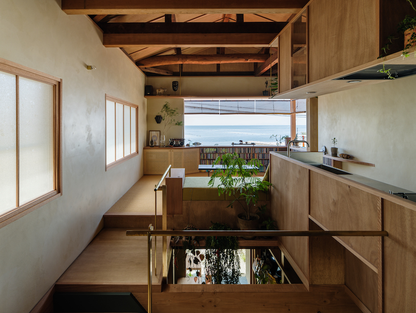
A noteworthy feature that pays homage to the region’s history of tile production is the flooring, where tiles coat the dirt ground surface. Handcrafted by Awaji’s skilled artisans, these tiles subtly echo the textures and shapes reminiscent of lava stone streets from Central and South American towns. The integration of partitions that resemble mosquito nets and Sudare blinds set against Shoji screens stand as a nod to ancient Japanese architecture. By intertwining spaces both horizontally and vertically, a gentle separation is achieved through the inclusion of native drooping plants. On the second floor, a wall facing the sea displays a scraped texture tinted with red iron oxide, skillfully completed by a local Awaji plasterer. This attempt incorporates vibrant hues of global architecture within a Japanese context. A large window cuts through the volume providing views of the sky and the sea.
mixed-use wooden house showcases traditional japanese and global influences
all images by Yosuke Ohtake


the architecture Integrates Original and Contemporary Elements


The harmony of various dimensions introduces a sense of depth into the space. Rather than accentuating contrasts between old and new, Akio Isshiki Architects‘ approach acknowledges historical materials and designs as important parts of the ensemble. The intent is to craft an environment that harmonically fuses both the original elements and newly incorporated features, creating a timeless and contemporary look. Existing structural elements such as pillars and beams blend with new architectural features, while new Shoji screens are layered to allow glimpses through the existing figured glass. A cypress pillar stands atop natural stones giving off a feeling of timelessness. Materials with various time axes are mixed and coexist.
mixed-use wooden house showcases traditional japanese and global influences
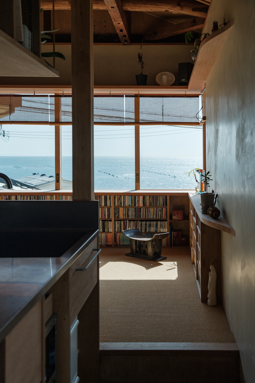
L-shaped windows allow views of the seascape
mixed-use wooden house showcases traditional japanese and global influences
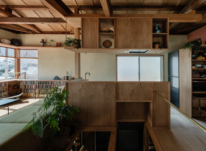
the kitchen appears overhanging above the atrium
mixed-use wooden house showcases traditional japanese and global influences
the kitchen area seamlessly flows into the living room
mixed-use wooden house showcases traditional japanese and global influences
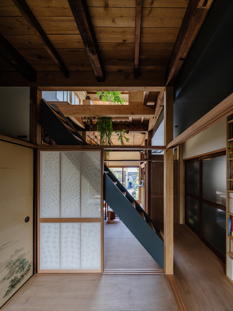
existing Fusuma doors are reused within the interior of the wooden house

Reference

The Mint List brings mid-century influences to north London family home
CategoriesInterior Design

The Mint List brings mid-century influences to north London family home

Interior design studio The Mint List has brought light, space and warmth to this Edwardian house in London with multiple extensions, a hidden playroom and plenty of tactile materials.

The renovated end-of-terrace house in Kensal Rise belongs to a film-industry couple that wanted a cosy family home with mid-century elements, in particular referencing the work of designers Charles and Ray Eames.

North London house by The Mint List
The Mint List has renovated and extended an Edwardian house in north London

“The clients had a leaning towards mid-century style but they didn’t want that to overwhelm the scheme,” The Mint List founder Camilla Kelly told Dezeen.

“The Eames House was a good mid-century reference in terms of encompassing warm, repurposed textures, a sense of scale and an abundance of light.”

North London house by The Mint List
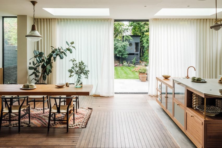
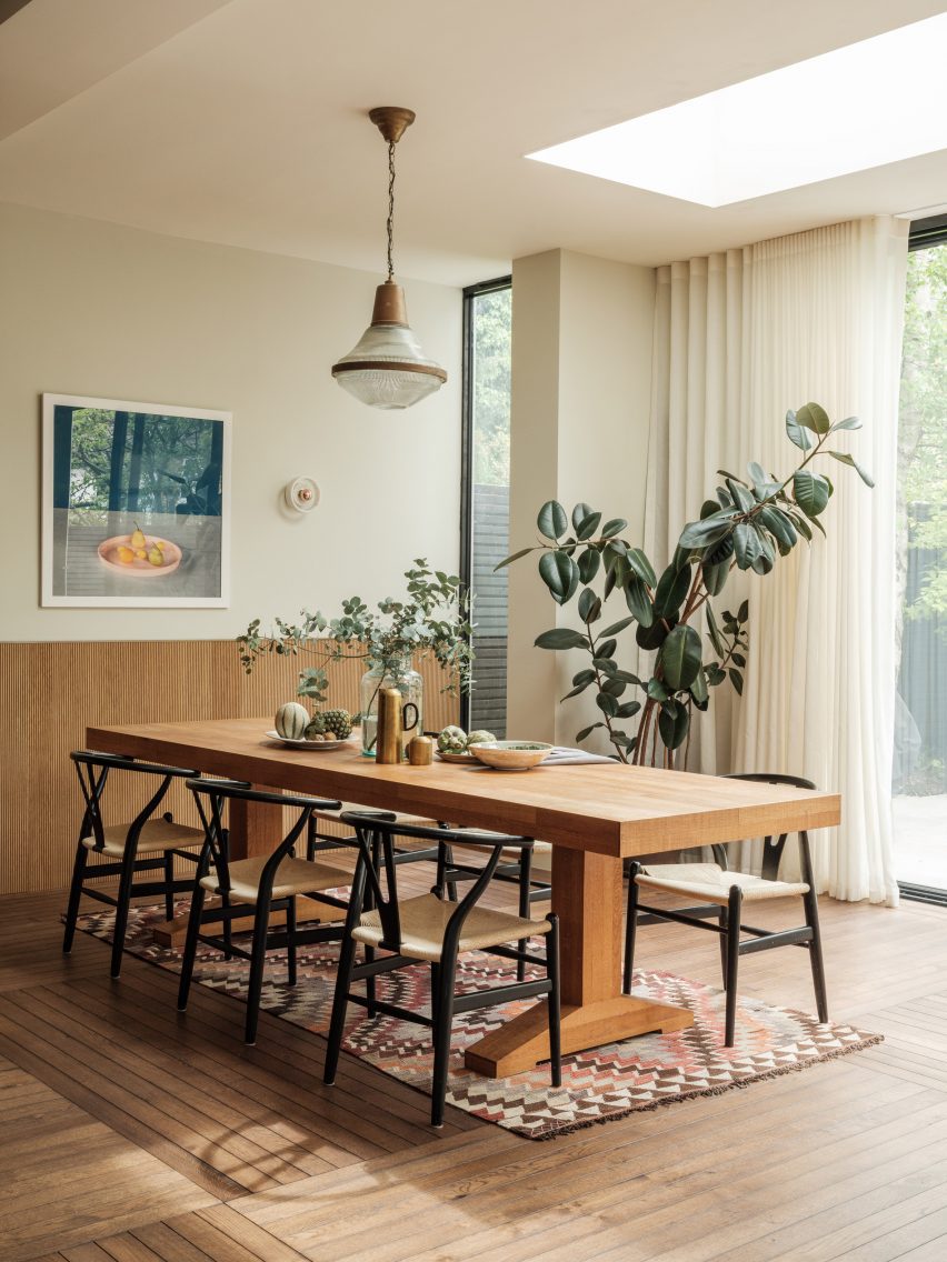
A new rear extension houses the home’s kitchen and dining space

The brief was to open up this formerly dark and “unremarkable” home and create an improved sense of flow.

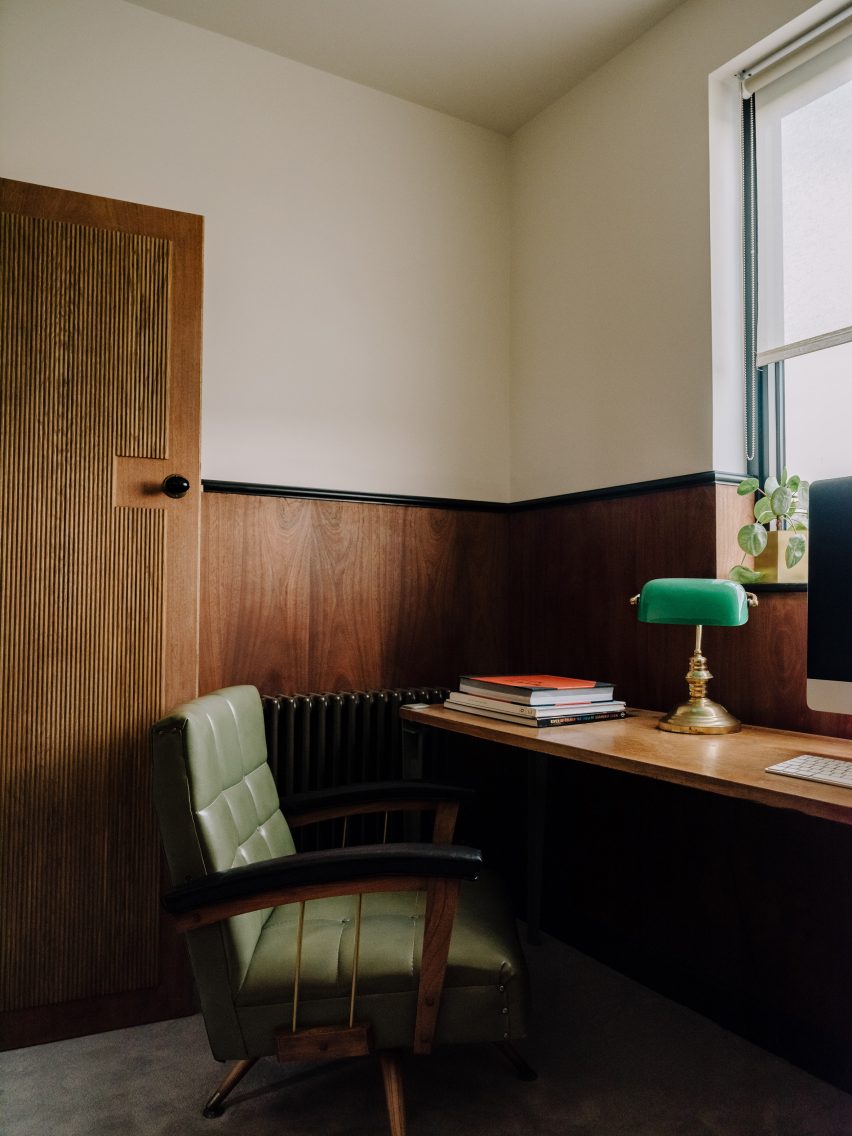
As well as adding two bedrooms and a small study in the newly converted loft, The Mint List created a rear extension to house the kitchen-dining space and absorbed the property’s former garage into the house, providing a mudroom, pantry and playroom.

North London house by The Mint List
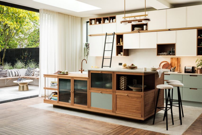
The custom-built kitchen island has two levels

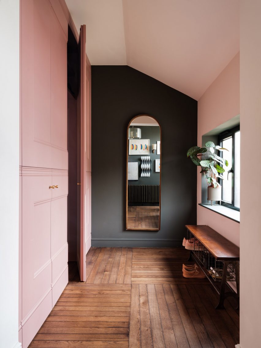
The playroom is cleverly concealed behind a bank of new storage in the hallway, which has also been enlarged by opening it up into the former porch.

“There was huge importance given to light in the design,” said Kelly. “Wherever possible, we created tall windows benefiting from the south-facing aspect.”

North London house by The Mint List
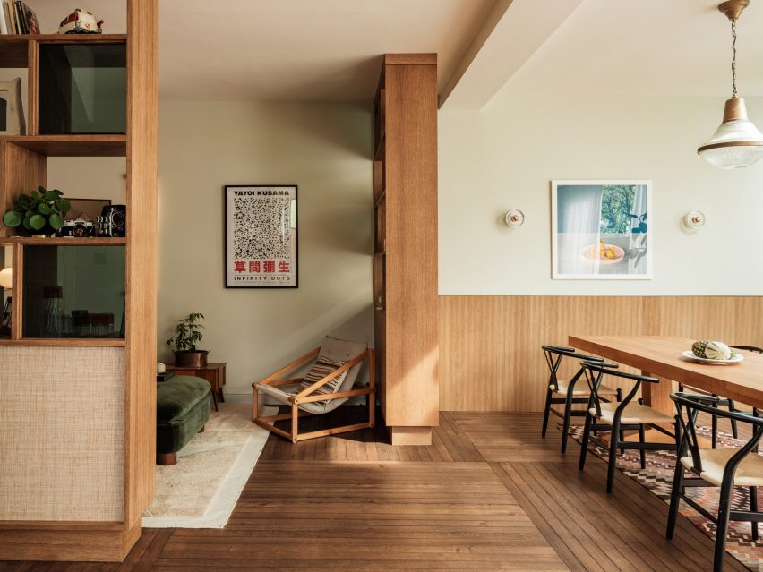
Bookshelves act as room dividers to form a hybrid library and snug

The house is full of custom-designed features and finishes at the request of the client.

The floor uses unusually slim lengths of oak, laid at right angles to each other in huge grids, while the thresholds were distinguished with slender fins of brass that add subtle visual interest.

North London house by The Mint List
The children’s playroom is hidden inside a wall of storage in the hallway

Drawing on the design language of mid-century furniture, the kitchen was completely custom-built for the space with a clean-lined, yet playfully asymmetric design.

“We centralised the assembly and used high windows on either side of the cabinets to emphasise the cubic nature of the design,” said Kelly. “The asymmetric cubes that form the cabinets were built using walnut, with cream-painted doors for the covered storage.”

The material mix includes walnut veneer, reeded glass, olive-coloured door fronts and antique brass detailing, as well as concrete and reclaimed iroko wood worktops.

“I’m averse to keeping things all in one colour,” the designer said. “It’s a missed opportunity to bring texture, colour and character to a space.”

North London house by The Mint List
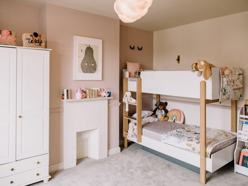
The children’s bedroom is located on the first floor

The kitchen island was designed to account for the owners’ love of entertaining, with a section of the worktop raised to bar height to draw guests away from the cooking area.

“The island is even more asymmetric, with different levels, drawers, shelves and openings that served to show how the geometry of a design can sometimes be off-kilter and still look neatly intentioned, as long as it sits correctly within the scale of the space,” Kelly said.

North London house by The Mint List
A small study now occupies the loft alongside a primary bedrooms suite

The curved bar provides a visual link to the rounded steps that lead down into the kitchen area, as well as to other curved elements throughout the house.

“I like to include some curves in my projects through room openings, joinery and countertops,” Kelly said. “They help to soften spaces and improve flow from one area to the next.”

North London house by The Mint List
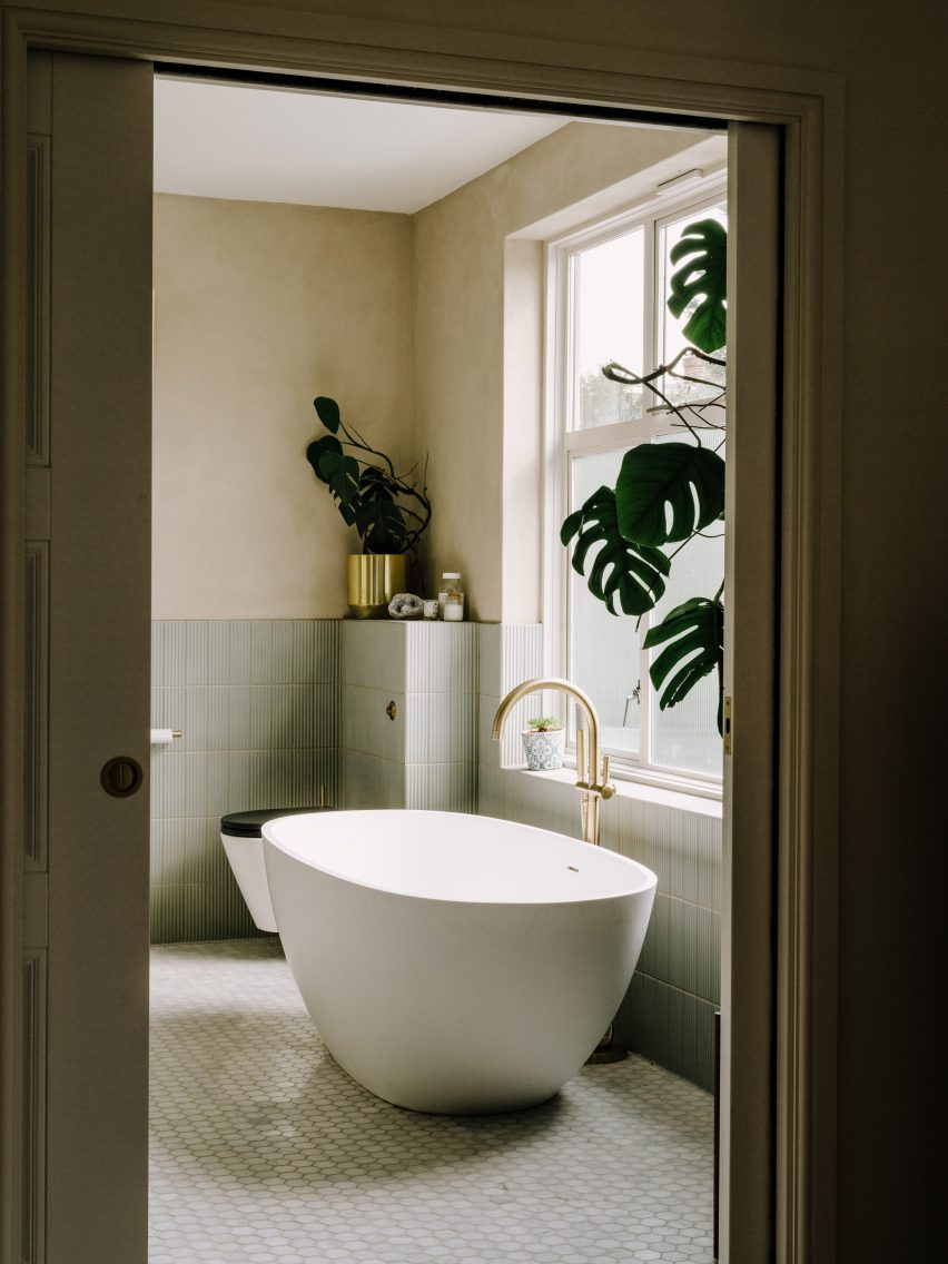
The main bathroom is held in pale blue and green tones

Adjoining the kitchen is a hybrid library and snug, which is partially enclosed with oak shelving finished in glass and raffia, that double up as room dividers and nod to the Eames House in California.

“We didn’t want this to be a dead space,” Kelly said. “It’s a quiet spot where you can curl up with a book or listen to music. And when the couple is entertaining, this is a soft space where you come to catch up with someone.”

Four bedrooms are spread across the home’s upper levels, including a shared children’s bedroom with bunk beds on the first floor and two added bedrooms in the converted loft.

North London house by The Mint List
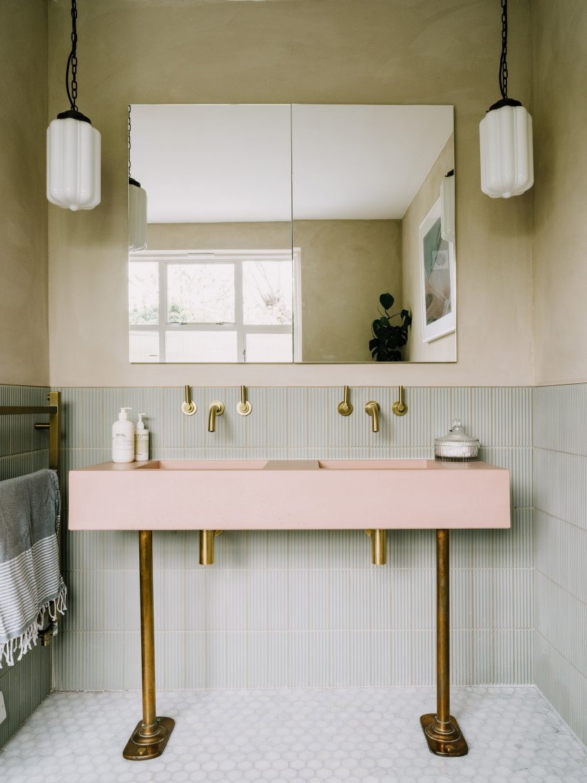
A baby pink sink provides a pop of colour

Since founding The Mint List in 2011, Kelly has completed a number of interior projects in London.

Among them are the headquarters of music management company Everybody’s in Highbury, which she kitted out with mid-century-style movable furniture.

The photography is by Dave Watts.

Reference

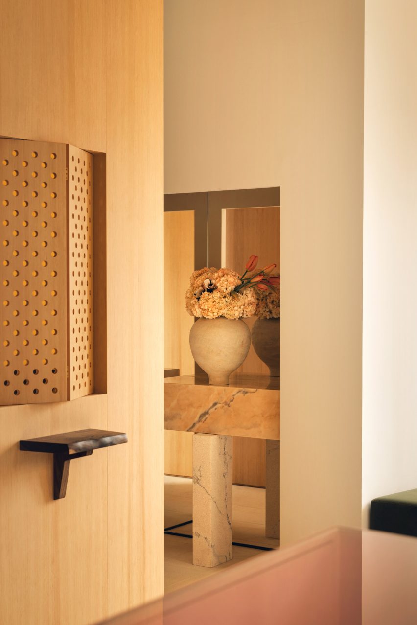
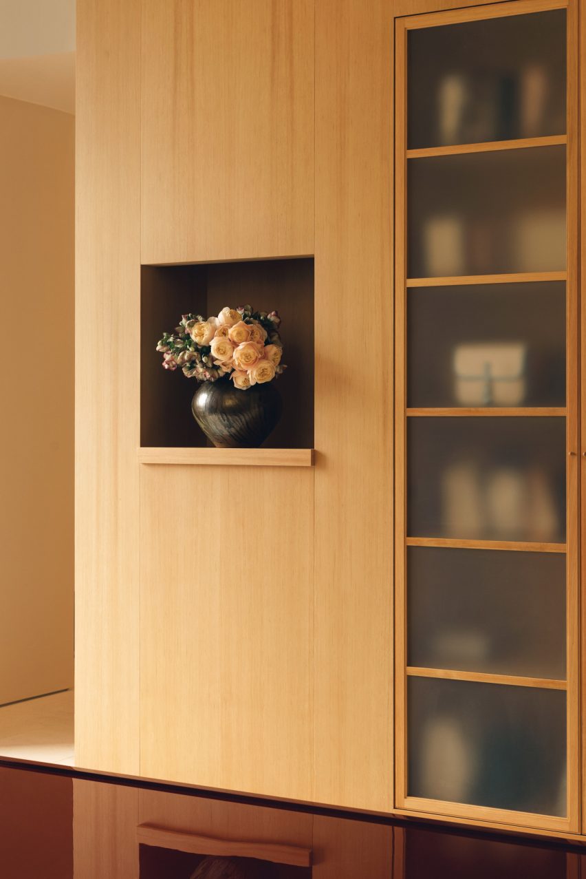
Halleroed mixes French and Japandi influences inside L/Uniform boutique
CategoriesInterior Design

Halleroed mixes French and Japandi influences inside L/Uniform boutique

In the arty Paris district of Saint-Germain-des-Prés, Stockholm design studio Halleroed has designed a new boutique for French bag and luggage brand L/Uniform.

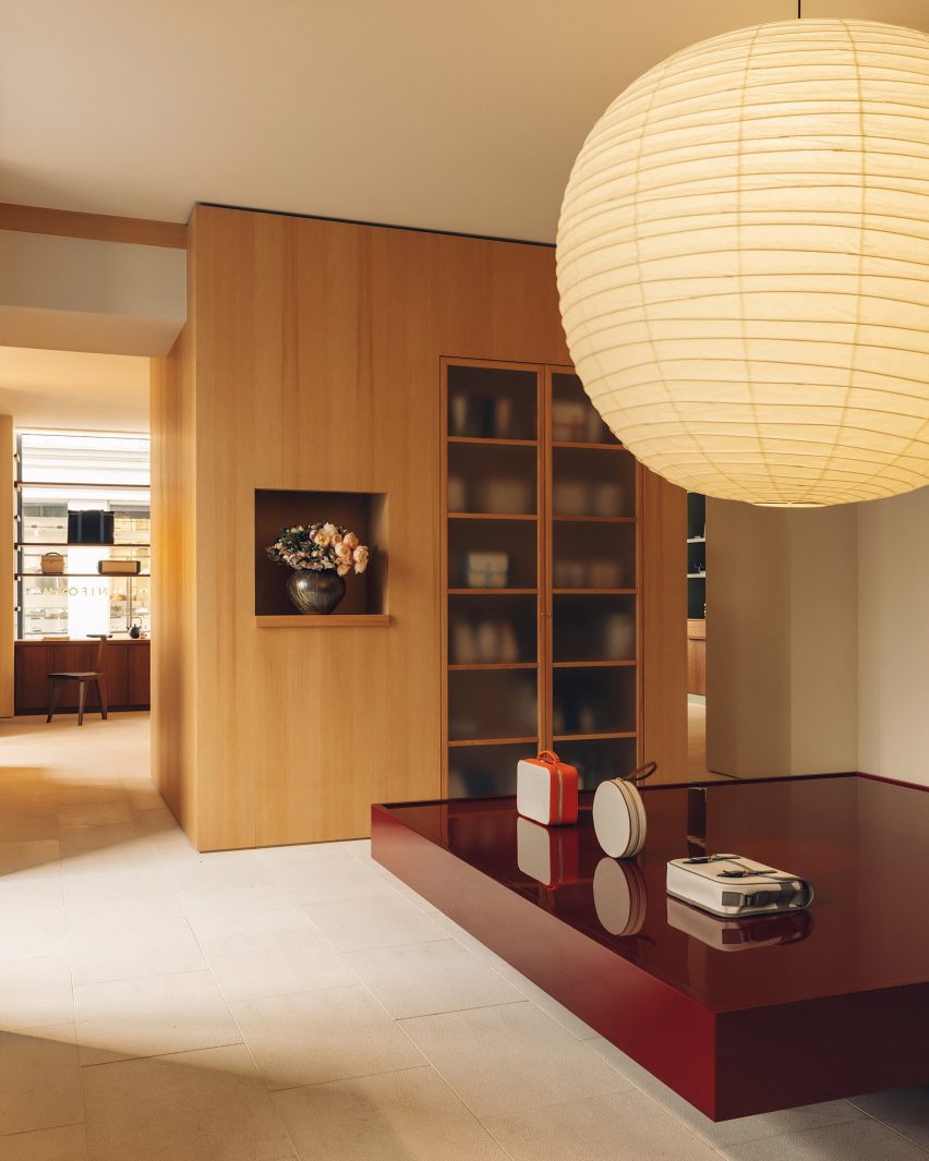
Taking cues from the brand’s simple, rational approach to design, Halleroed design lead Ruxandra Halleröd created a series of backdrops that allow the products to “pop out in a beautiful way”.

Wooden display cabinets in boutique in Paris by Halleroed
Halleroed has designed a boutique for L/Uniform in Paris

The boutique is comprised of two rooms that drawing on L/Uniform‘s French heritage alongside a mixture of Japanese and Scandinavian design traditions – also known as Japandi.

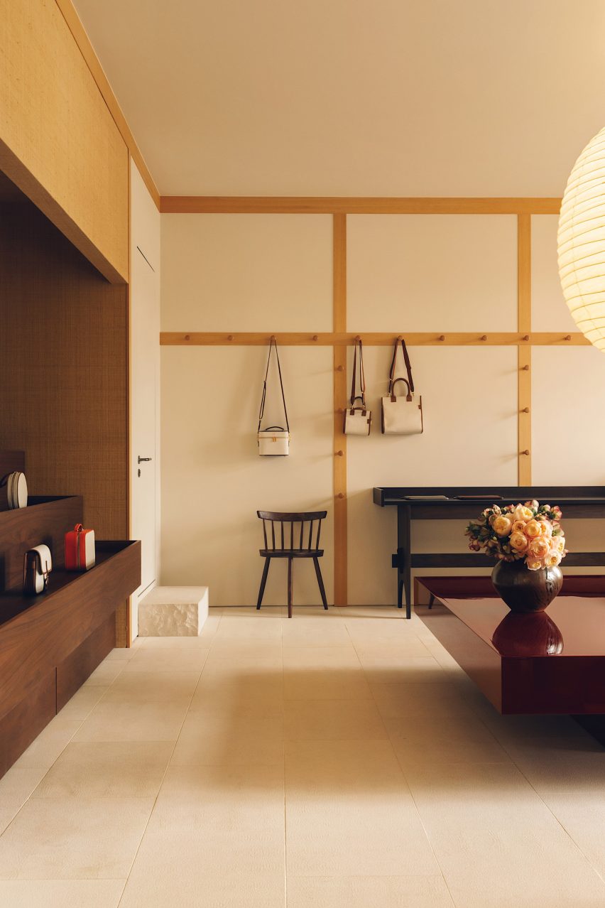
The first room was designed to nod to the vernacular of the traditional French marketplace, with stepped display furniture and rustic materials, such as walls papered in woven raffia.

Bags hand on walls in L/Uniform boutique
In the first room, bags are hung from integrated wooden hooks

“It reminds us of L/Uniform’s use of French canvas on its more functional bags, but on a bigger scale,” Halleröd told Dezeen.

“We used a Shaker-inspired approach where bags are hung from hooks. There’s an association with everyday market life because some of these bags are specifically made for bringing to the market.”

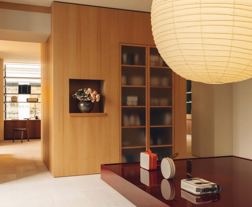
To create a striking visual contrast with the natural textures of this space, Halleroed added a monolithic display table in deep burgundy with a high-gloss finish.

Mint green display cabinets in boutique in Paris by Halleroed
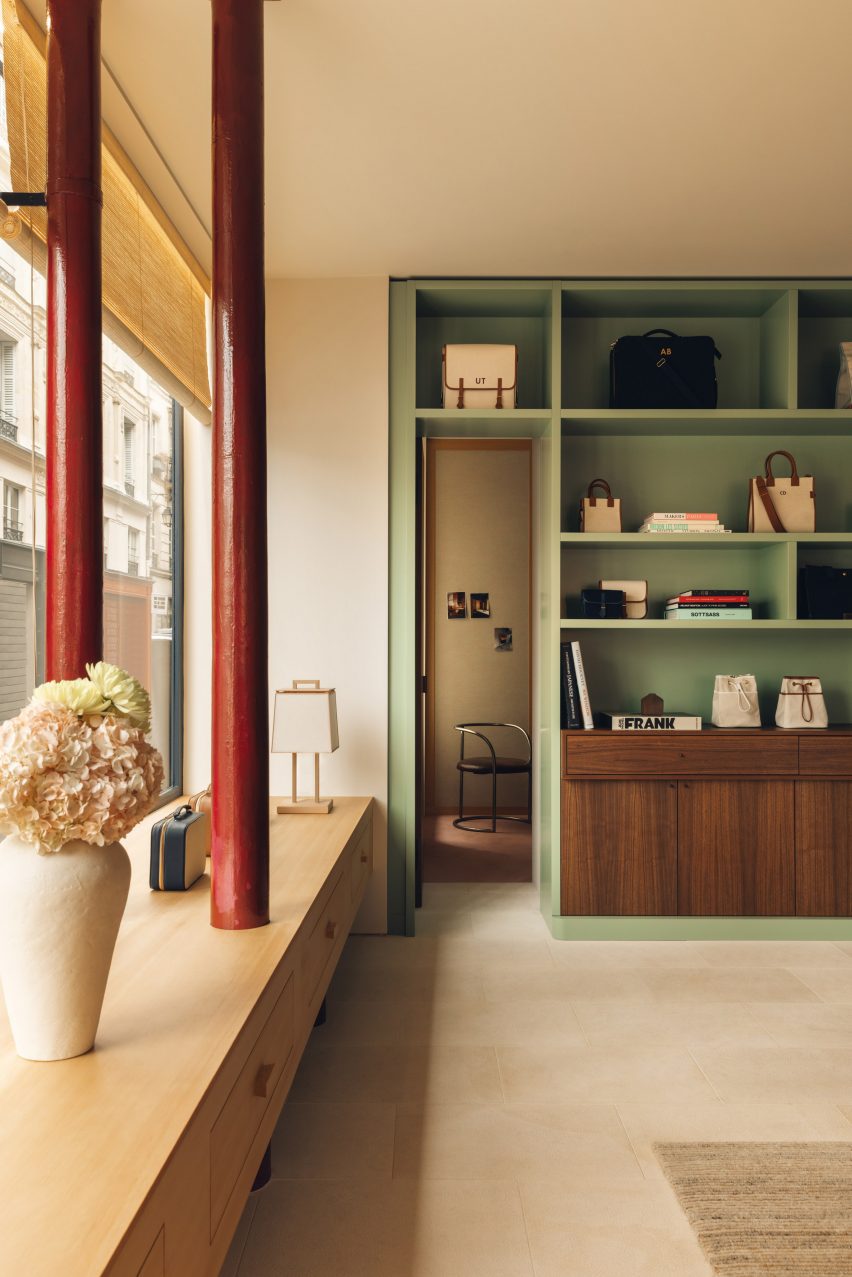
Glossy red details feature throughout the store in finishes and furnishings

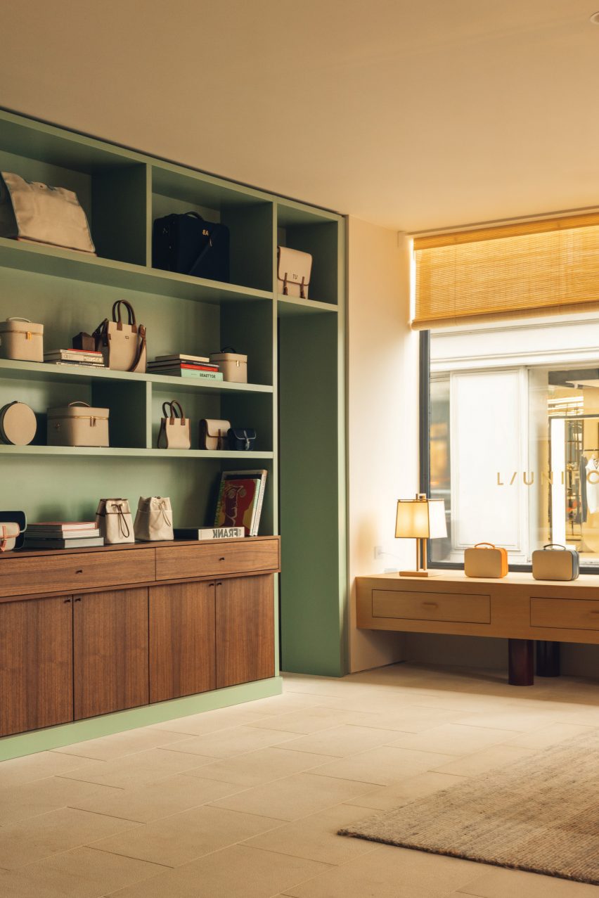
The second room is more “elegant and eclectic”, according to Halleröd. Here, L/Uniform’s leather handbags are displayed against a palette of soft pink and green, featuring an olive-coloured velvet sofa and pistachio display cabinet alongside tactile elements like the handwoven jute-and-wool carpet.

The same glossy red finish from the first room is also reprised – in this case applied to two exposed pipes, around which Halleroed has constructed a low timber cabinet.

Mint green display cabinet in L/Uniform boutique
Pistachio display cabinets provide additional storage

“We worked with colour, texture and material as one entity, creating contrast and also unity,” said Halleröd.

Around the counter, Halleroed added cedar cladding “for a Japanese look and feel”.

This is mirrored across the shop with details such as a rice-paper pendant light by Isamu Noguchi and chairs by George Nakashima, as well as cedar table lamps with rice-paper shades created by a Japanese cabinetmaker.

Gallic influences are reflected in the lighting by Pierre Chareau and Charlotte Perriand and the bush-hammered limestone floor, which according to Halleröd has a “calm, vintage touch that for us is very French”.

Hallway of boutique in Paris by Halleroed
Travertine floors and stone counters bring a sense of refinement to the space

Halleroed also brought Swedish elements into the mix, reflecting the studio’s own approach.

“With our minimalist Scandinavian mindset, we prefer to work with fewer elements and materials but in a conscious and precise way,” said Halleröd.

“Working with wood and craft is something that I think is common for both Japan and Sweden, while we think of the warm tones here as being both French and Japanese.”

Wooden storage cabinets in L/Uniform boutique
Timber joinery nods to Japanese and Scandinavian craft traditions

“Many of the items in the store were handmade specifically for the space, which was important for us since we believe that this reflects the L/Uniform mentality and approach,” she added.

Since it was founded in 1998, Halleroed has completed a number of high-end boutiques around the world.

Among them are an Acne Studios store in Chengdu and various outposts for Swedish streetwear brand Axel Arigato in Berlin, Paris, Copenhagen and London.

The photography is by Ludovic Balay

Reference