O’Neill McVoy inserts Bronx Children’s Museum into a 1920s powerhouse
CategoriesArchitecture

O’Neill McVoy inserts Bronx Children’s Museum into a 1920s powerhouse

Brooklyn studio O’Neill McVoy Architects has adapted a historic powerhouse into a museum for children in the Bronx that highlights the historical building while adding playful details.

O’Neill McVoy Architects inserted the Bronx Children’s Museum into the second floor of the rectilinear building “with old and new in a symbiotic relation heightening the qualities of the other,” the studio said.
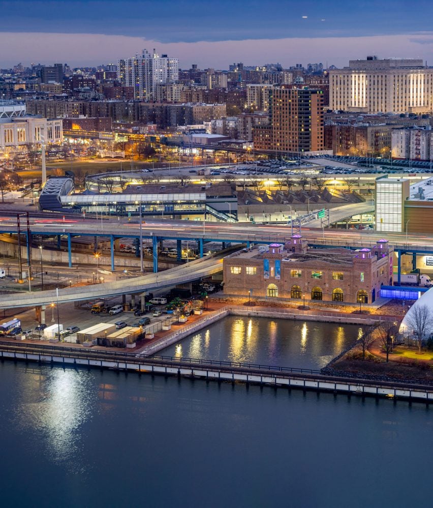
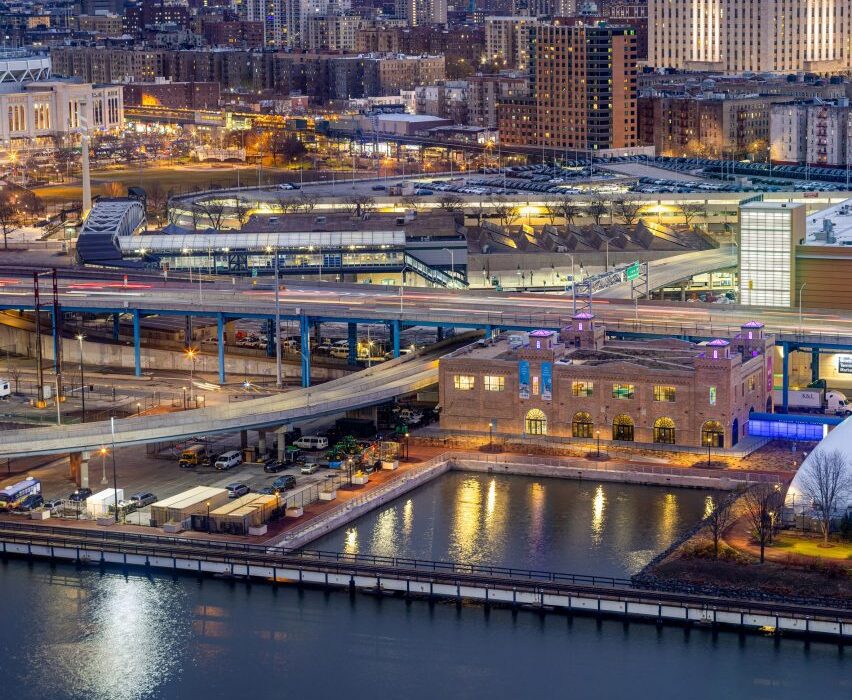
Exterior of the Bronx Children's Museum on O'Neill McVoy on a city waterfront
The Bronx Children’s Museum is located on the Harlem River

Located on the Harlem River and Mill Pond Park, the 1925 Historic Bronx Terminal Market Powerhouse was decommissioned in 2004 and the building’s exterior was restored in 2009, leaving the interior concrete and steel loft space open for a new program.

Owned by the New York City Department of Parks, it broke ground in 2017 but wasn’t completed until 2022 due to the COVID-19 pandemic and bureaucratic delays.
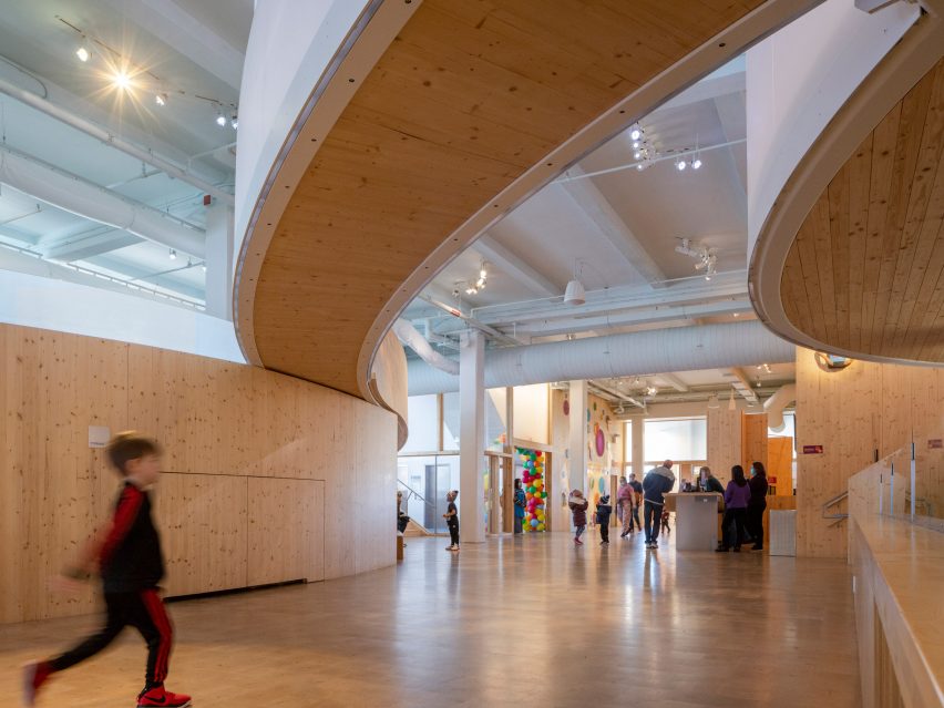
Interior of the Bronx Children's Museum with wood flooring and overhead wooden walkways
Curving shapes inside the building were designed for children

The 15,160-square foot (1,400-square metre) museum is accessed through a double-height, river-side lobby space that opens to curving forms designed specifically for a child’s perspective.

As the first facility in the burrow dedicated to young children, “the design’s flow creates a new kind of space, unlike the city’s cellular rooms and street grids, that connects Bronx kids to the experience of natural landscape and the waterfront”, the studio said.
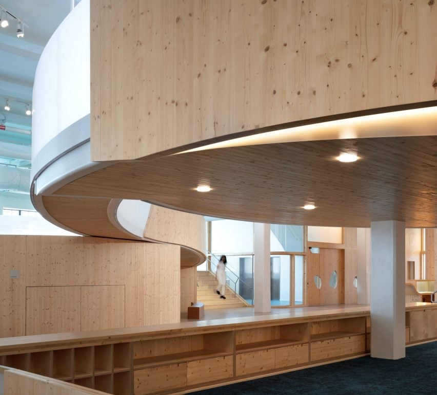
Museum interior with wooden storage and overhead wood walkway
Ramps separate exhibition spaces

Drawing from Jean Piaget’s book Child’s Conception of Space, the studio used a series of unspooling spaces catered to children under 10 years old.

Museum visitors move through the space via ramps, and focused exhibits are separated by partial-height, curved wooden and translucent acrylic partition walls that spiral, diverge and reconnect.
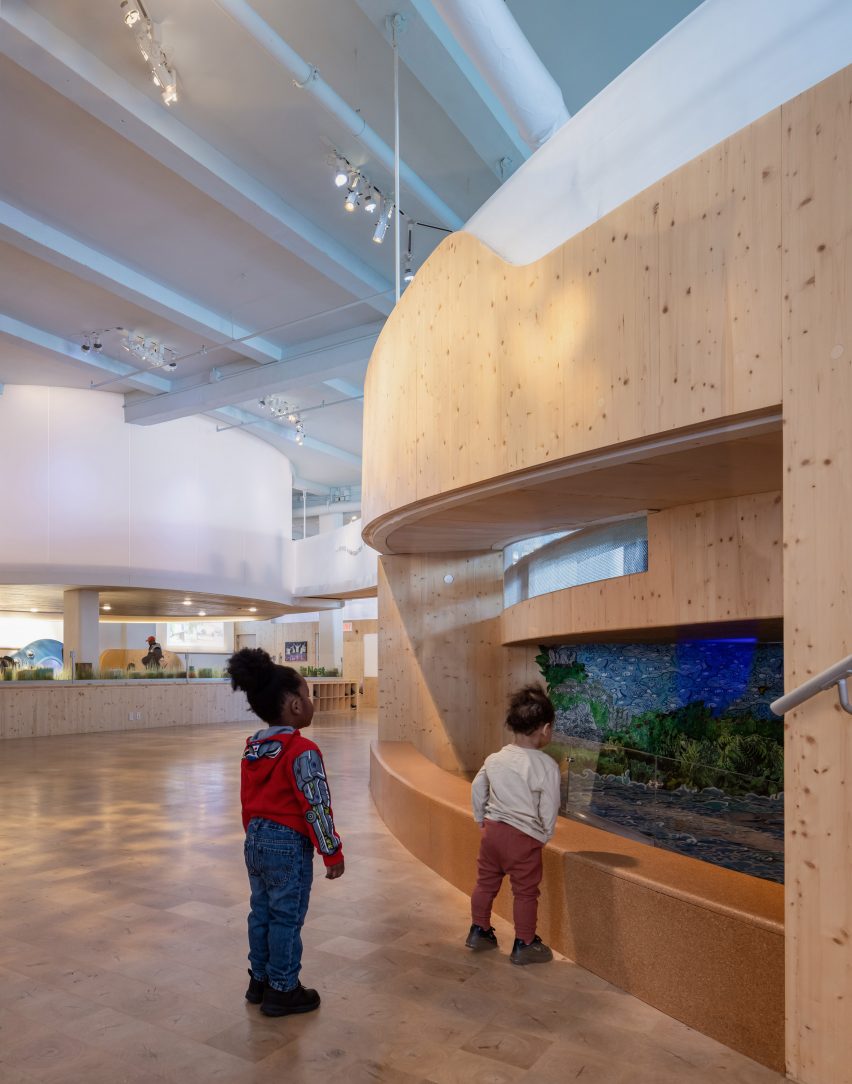
Museum interior with wood floors and children looking into a window display
The curving forms were made from cross-laminated timber

The spaces step up, moving from the Waterways exhibition that directs views to the neighbouring river, across a bridge, to the Cloud performance mezzanine that features an interactive installation by local artist Jerome LaMarr called Bronxtopia.

The LEED Gold-certified project is the “first use of curved cross-laminated timber (CLT) in the U.S.,” according to the studio.

The  CLT was reportedly sustainably harvested and selected for its light weight and strength.

It was “fabricated with advanced digital technology allowing for varying radii arcs to form organic space”.

“Large wall and guardrail interlocking panels, many with pebble-shaped windows, were molded and CNC-milled to exact size allowing quick assembly on site,” the team continued, referencing the custom molds of Charles and Ray Eames’ laminated plywood splints.
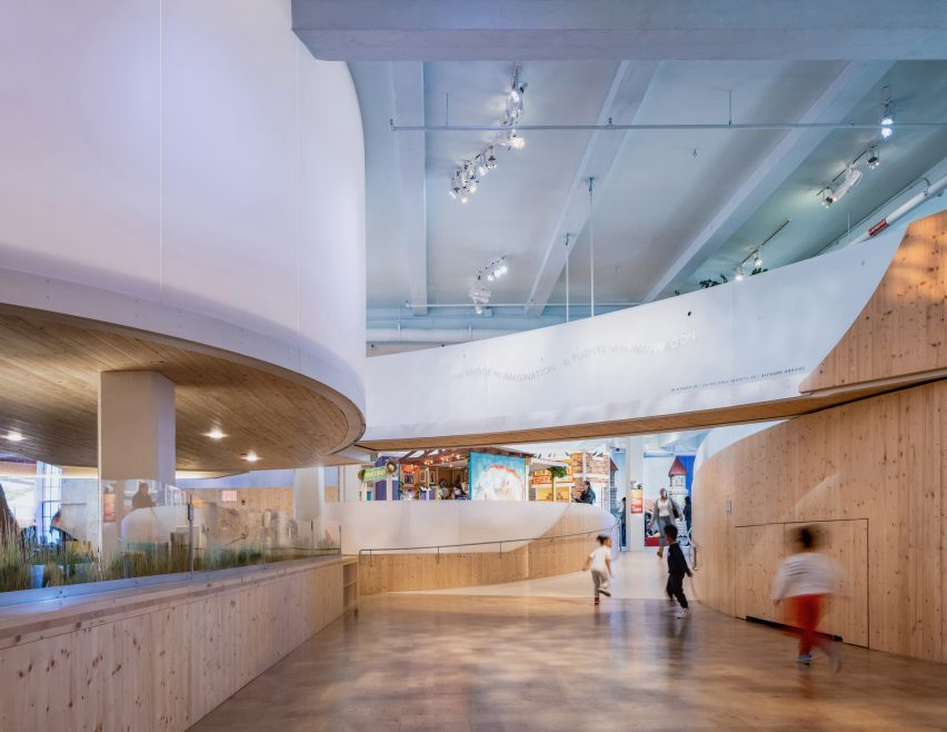
Museum interior with wood floors and overhead curving walkways
The project is located on the second floor of a powerhouse

The CLT panels also interlock with etched, recycled-acrylic panels that are softer to the touch than glass.

Overhead, the exposed structural beams and mechanical services were painted blue, as was the acoustical plaster, to form a sky where fabric ducts hang as clouds.
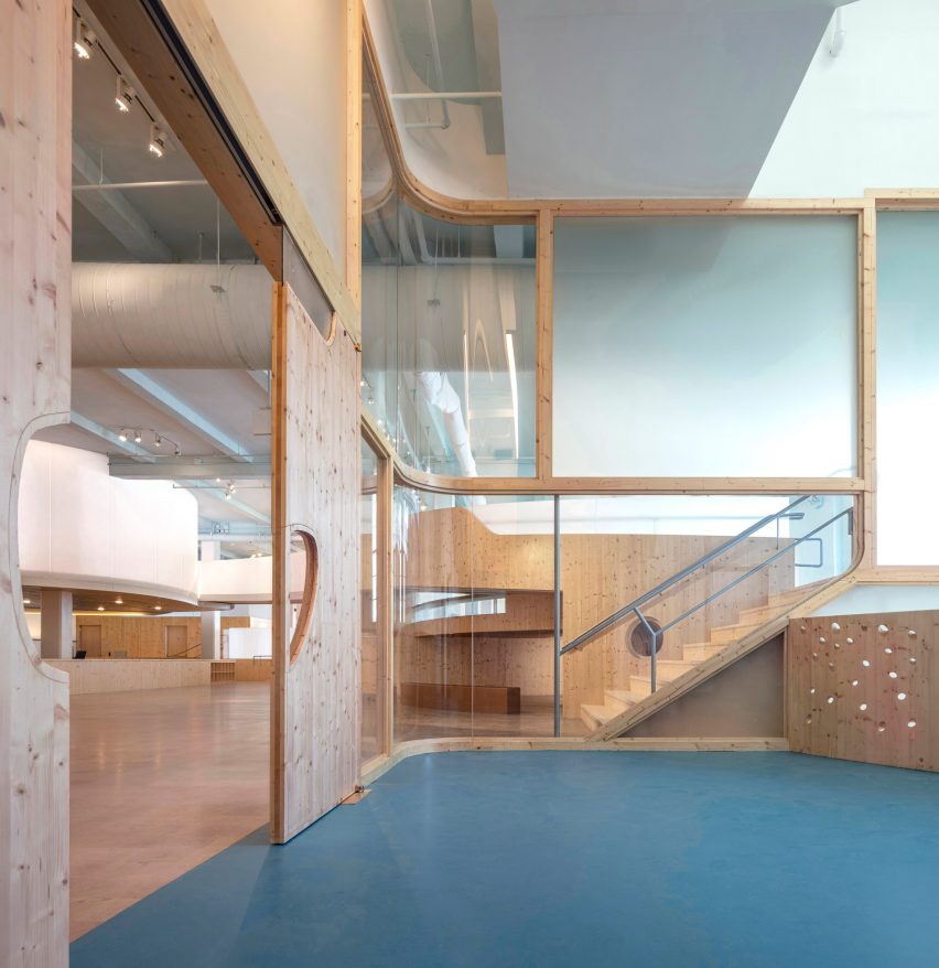
Playroom in a museum with green carpet, square glass windows and a wood sliding door
O’Neill McVoy used recycled acrylic panels instead of glass

The museum also uses translucent film on the east-facing windows to mitigate the daylight that sweeps through the open plan, and dimmable LED fixtures and daylighting sensors optimize light.

Operable windows allow for ventilation and sensors help reduce HVAC energy consumption.
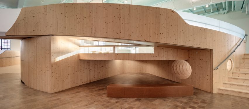
Museum interior with wood flooring and a ramped curving wood walkway
Playful spaces were designed for children

The exterior of the brick building was relatively untouched but the “distinctive turrets are given new life with prismatic film and spectral LED lighting to serve as beacons for the children’s museum in the community.”

Similarly, Olson Kundig inserted a curved timber ark into a concrete market hall to create the ANOHA children’s museum in Berlin.

The photography is by Paul Warchol.


Project credits:
Architect: O’Neill McVoy Architects
Beth O’Neill, AIA, Principal
Chris McVoy, Principal
Ruso Margishvili, Associate-in-Charge
Richard Stora, Project Architect
Penelope Phylactopoulos, Meghan O’Shea, Trevor Hollyn Taub, Irmak Ciftci, Project Team
Structural engineer: Silman
Mechanical engineer: Plus Group Consulting Engineering, PLCC
Electrical engineer: Plus Group Consulting Engineering, PLCC
General contractor: A Quest Corporation
Lighting designer: Tillotson Design Associates
Code consultant: CODE LLC
LEED consultant: ADS Engineers
AV/IT/Security consultant: TM Technology Partners
Exhibits: Bronx-connected artists through the museum’s ‘Arts Builds Community’ program

Reference

Halleroed inserts sculptural travertine plinths in Axel Arigato’s Paris store
CategoriesInterior Design

Halleroed inserts sculptural travertine plinths in Axel Arigato’s Paris store

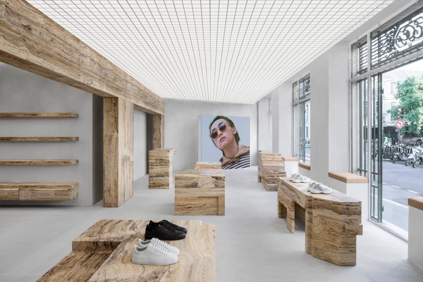
Design studio Halleroed has used travertine podiums to display sneakers like sculptures in the Paris store of streetwear label Axel Arigato.


Located in the Marais district on Rue Vieille du Temple, the boutique stocks the brand’s full range of footwear, clothing and accessories, in addition to a curated selection of design objects.

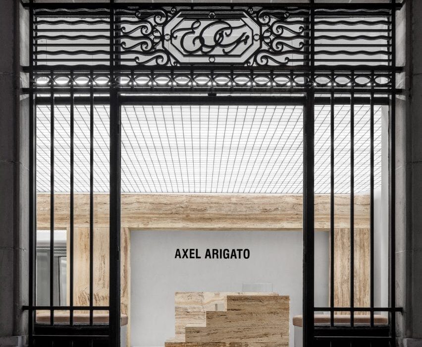
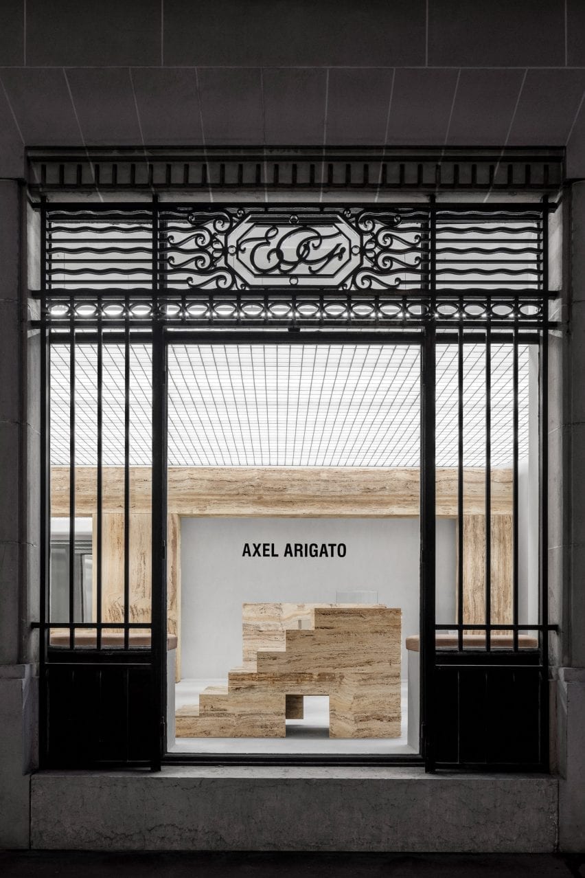
Entrance to Axel Arigato Paris store with travertine displays
Axel Arigato’s Paris store is dotted with travertine display plinths

The store occupies two rooms divided by a freestanding wall of light-yellow travertine, which references the columns and beams found in classical architecture.

Walls and floors are finished in raw concrete while overhead, a punctured grid ceiling conceals the store’s lighting system.

A series of sculptural display plinths made from honed, bush-hammered or raw travertine stone help to create a “grandiose” entrance, designed to emulate the feeling of stepping into an art gallery.

Retail interior by Halleroed with shoes displayed on travertine blocks
A freestanding travertine wall divides the space into two

“The normal model for a sneaker brand is to cover every centimetre of the back walls in products from floor to ceiling,” Axel Arigato‘s co-founder and creative director Max Svärdh told Dezeen.

“We do the opposite by displaying our product on podiums in the centre of the room instead, like a piece of sculpture.”

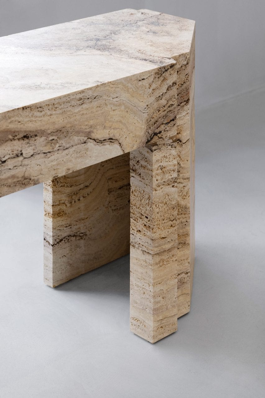
Close-up of travertine stone table in Axel Arigato Paris store
The stone was hammered, honed or left raw

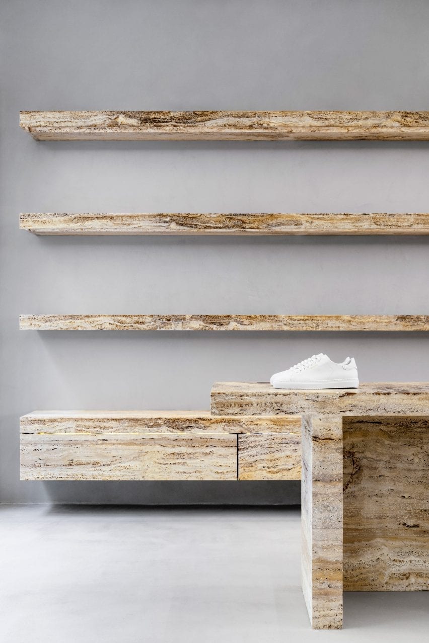
Travertine was also used to form a series of shelves in the rear of the store and custom chairs in the dressing room.

According to Svärdh, the stone has been a key element in all of Axel Arigato’s retail locations so far.

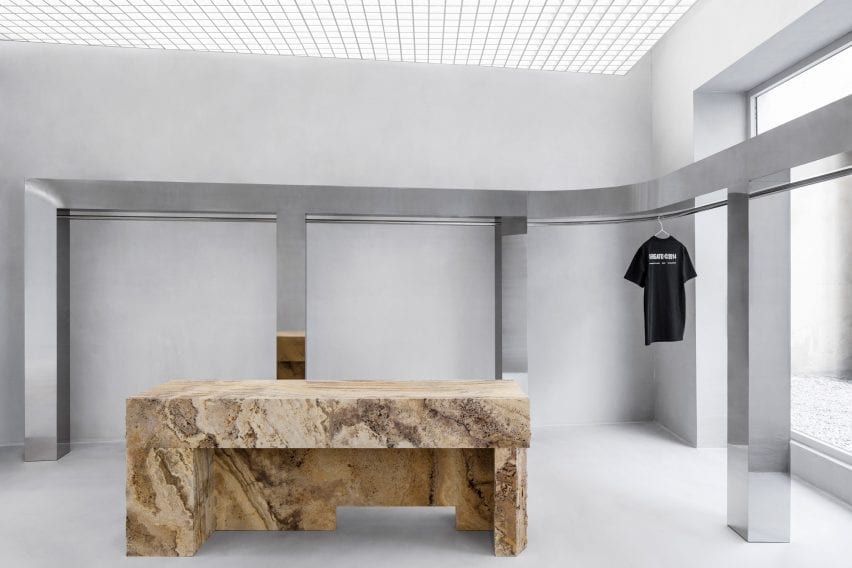
Mirroed steel clothes rail in retail interior by Halleroed
A mirrored steel clothes rail wraps the back of the store

“Our brand colour is a pale yellow so we were naturally drawn to the light yellow travertine,” he explained.

“We worked with different finishes to bring out its characteristics and more specifically highlight its impurities, which in itself makes it more beautiful.”

To contrast with the travertine, Halleroed wrapped an upholstered bench seat around one of the columns and introduced a chunky, stainless steel clothes rail.

This lines the store’s back wall and extends out into a courtyard filled with white gravel.

Travertine wall, mirrored clothes rail and upholstered bench in Axel Arigato Paris store
An upholstered bench is wrapped around a central column

Axel Arigato was launched in 2014 as an online store for luxury streetwear. It opened its first brick-and-mortar space in London’s Soho in 2016 and has since expanded into four standalone spaces.

“We always look to the neighbourhood and the specific building that we are in [when designing a store],” Svärdh said.

“Paris is the home of luxury and the use of rich travertine stone really embodies that. All standalone stores have a gallery-esque feeling to them with mutual design codes but offer completely unique experiences.”

White sneaker on travertine shelves in retail interior by Halleroed
The displays are designed to exhibit trainers as if they were sculptures

A large freestanding LED screen is used for displaying creative content in the Paris store.

The brand has previously worked with Halleroed – founded in 1998 by Christian and Ruxandra Halleroed – on its London, Stockholm and Copenhagen flagship stores, which all feature monochromatic colour palettes and concrete surfaces.

Photograhy is by Benoit Florençon.

Reference