The Future of Architecture: Social Housing Projects From Around the World
How can architecture be a force for good in our ever-changing world? During Future Fest, we’re pose this question to some of the world’s best architects. We’re hosting daily virtual talks from September 12th to 30th, which are 100% free to attend. Check out the full schedule!
Diverse housing types are the foundation of better cities. This is especially true across households of different multigenerational and socio-economic backgrounds. Architects and developers have a central part to play in the discussion in providing places to rent, own, and provide shelter for a range of rural and urban communities. Exploring more equitable models of living, we’re inviting experts in housing and development to discuss the future of architecture for an entire week this September. The virtual event, Future Fest, will be 100% free to attend.
Housing is becoming increasingly important as we realize the compounding issues of housing scarcity. Social housing is unique in that the defining characteristics of this architecture aren’t shared across projects. Some models are even defined by open source blueprints, hoping to create similar projects in the future. They can be large or small, a mix of programs or a single residential typology. They also differ widely depending on how the projects are supported and developed. Showcasing how cities are thinking about the architecture of social housing, the following projects represent diverse explorations drawn from around the world. Together, they give a glimpse into the future of urban development and how to equitably design for new ways of living.
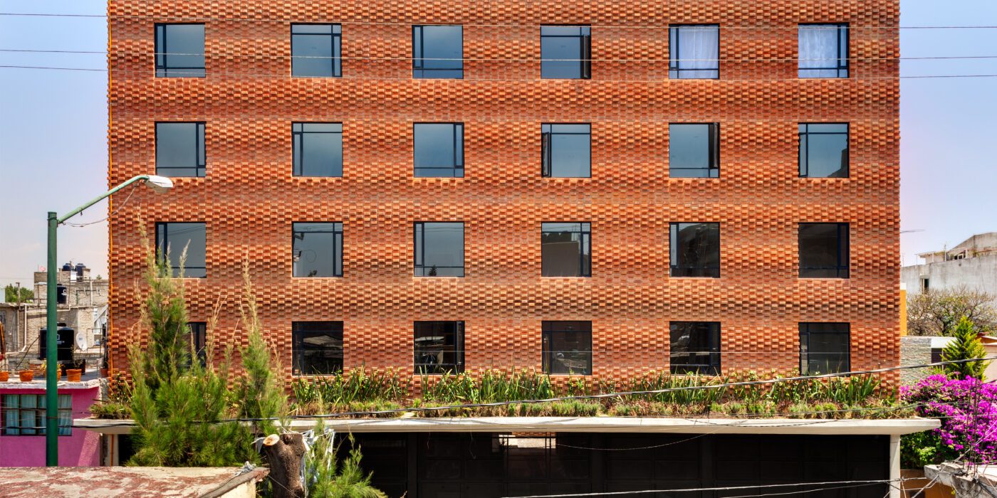
Housing Z53
By MICHAN ARCHITECTURE, Azcapotzalco, Mexico
Popular Choice Winner, 2015 A+Awards, Architecture +Low Cost Housing
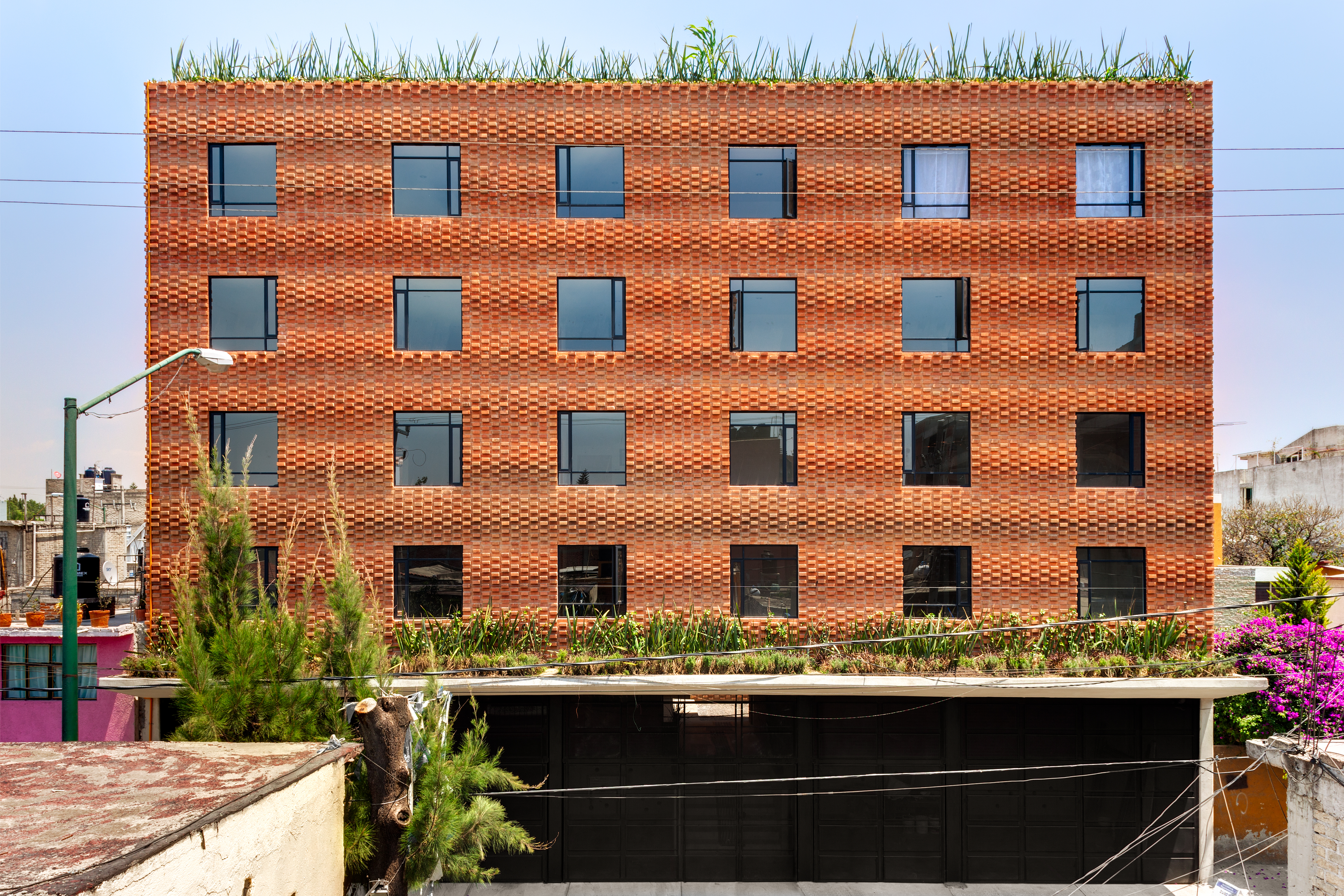
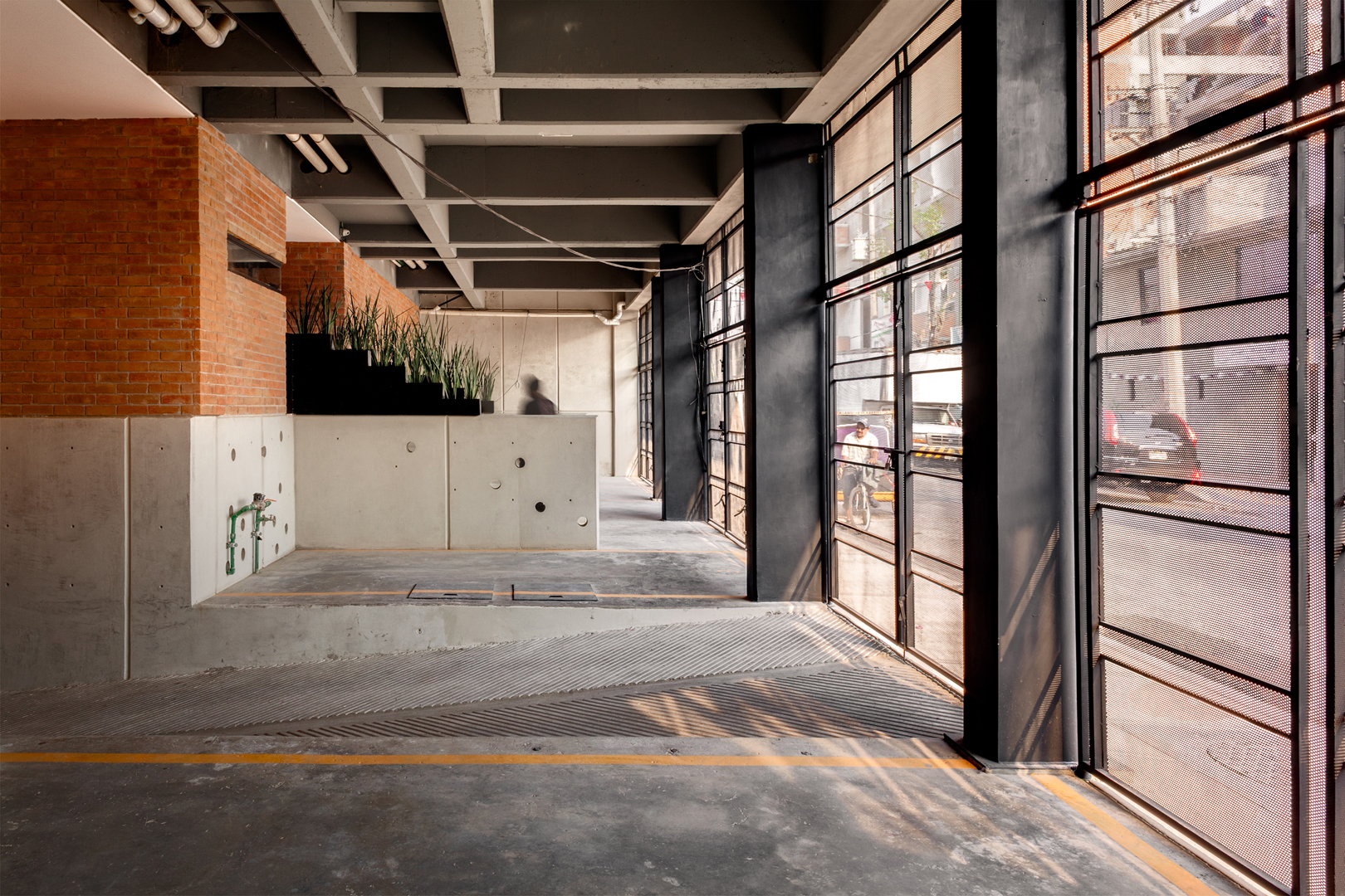 Addressing a high demand for social housing in Mexico City, this project is located on a rectangular plot with its shortest side facing the street. The 42 units are placed in three towers, generating interior courtyards for views and natural ventilation for each apartment, connecting them with vertical cores and bridges above the patios. The masonry brick walls play an important role on the project as they are part of the structure and re-interpret the traditional brick wall, blurring the boundary between structure and ornament. With the use of a single unit; red mud artisanal brick, the team was able to create walls that respond to light and shadow.
Flor 401 Lofts
By Koning Eizenberg Architecture, Los Angeles, CA, United States
Popular Choice Winner, 10th Annual A+Awards, Multi-Unit Housing Mid-Rise (5-15 Floors)
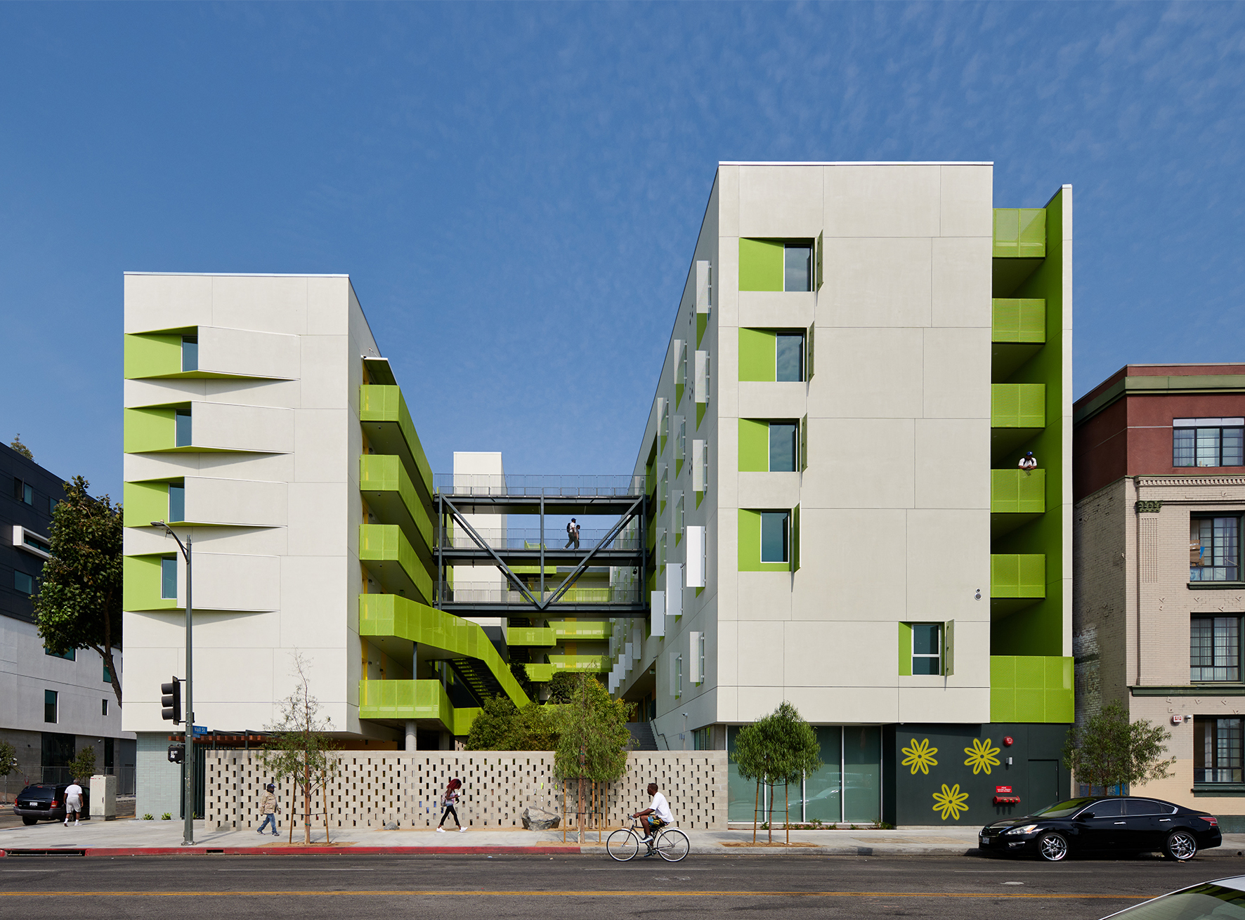
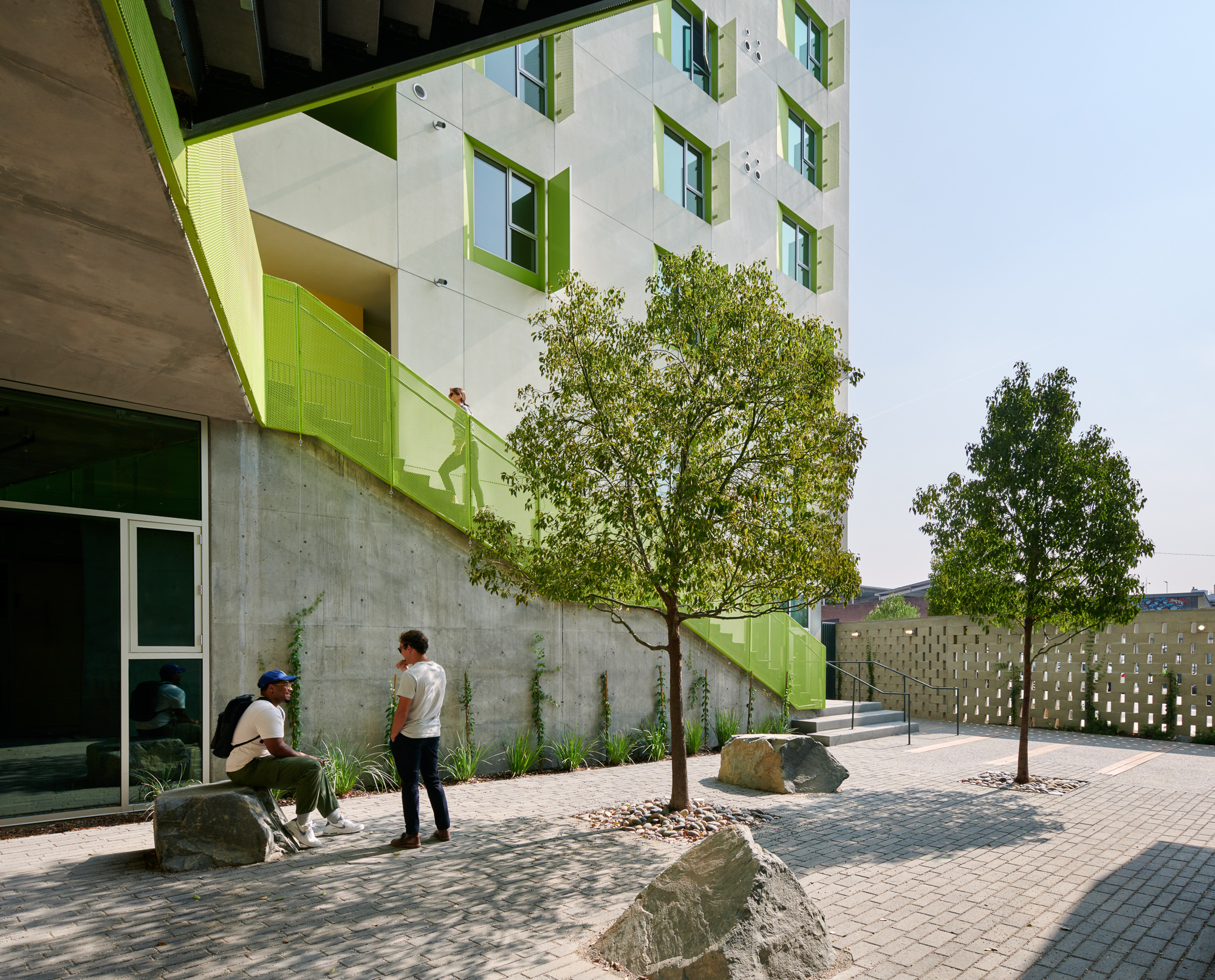 At the heart of the Flor project was an effort to try and stabilize the lives of people in the city. As permanent supportive housing, the project features large windows, units with a micro kitchen, and each with their own doorbell to reinforce a sense of respite and privacy. Tree-canopied courtyards and indoor and outdoor activity spaces encourage social interaction to add a sense of wellbeing and community.
The design team also created a trellised entry to welcome residents home. The cascading courtyard anchors daily life and is encircled by the apartments reached by elevator, stairs and bridges. The design converts required hidden egress into a visible circulation path to encourage informal exercise and social interaction, while also augmenting passive security.
71 Social Housing Units
By Mobile Architectural Office and JTB. architecture, La Courneuve, France
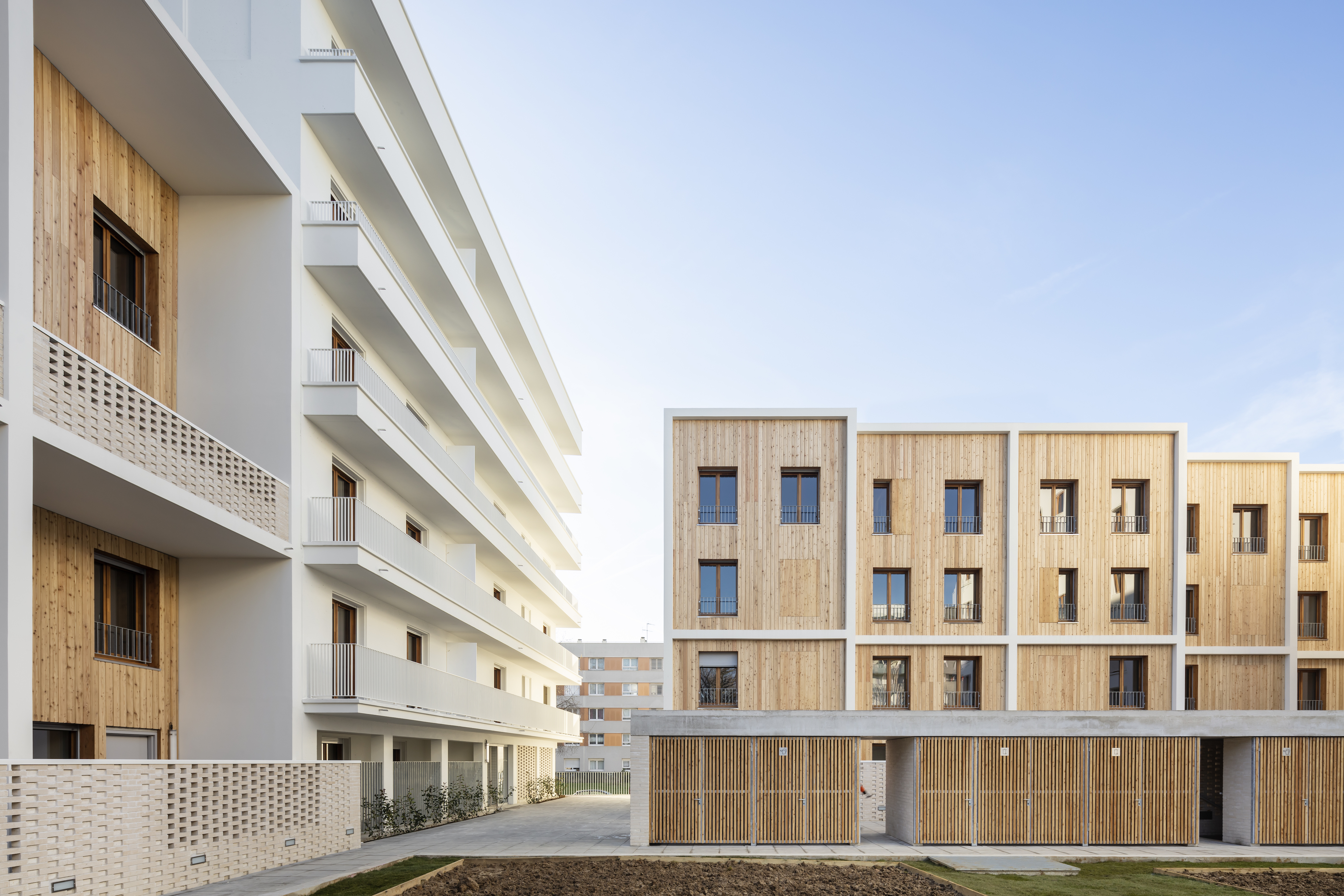
 For La Courneuve, two buildings and 18 duplex units were designed to provide a diversity of housing. A meticulous architectural style contributes to the regeneration of the Cité des 4000. Built in 1956 by the Ville de Paris, this large-scale operation was designed as an estate composed of blocks sited alongside each other. This siting principle generated undefined and unused free spaces, preventing the appropriation of public spaces which are wasted. The regeneration aimed to suppress the effect of uniform and impersonal blocks to give, once again, meaning to the public space with a true landscape and human dimension. The proposal gives a new identity to the neighborhood while integrating this diversity previously missing at all scales of the project.
CasaNova Social Housing
By cdm architetti associati, Bolzano, Italy
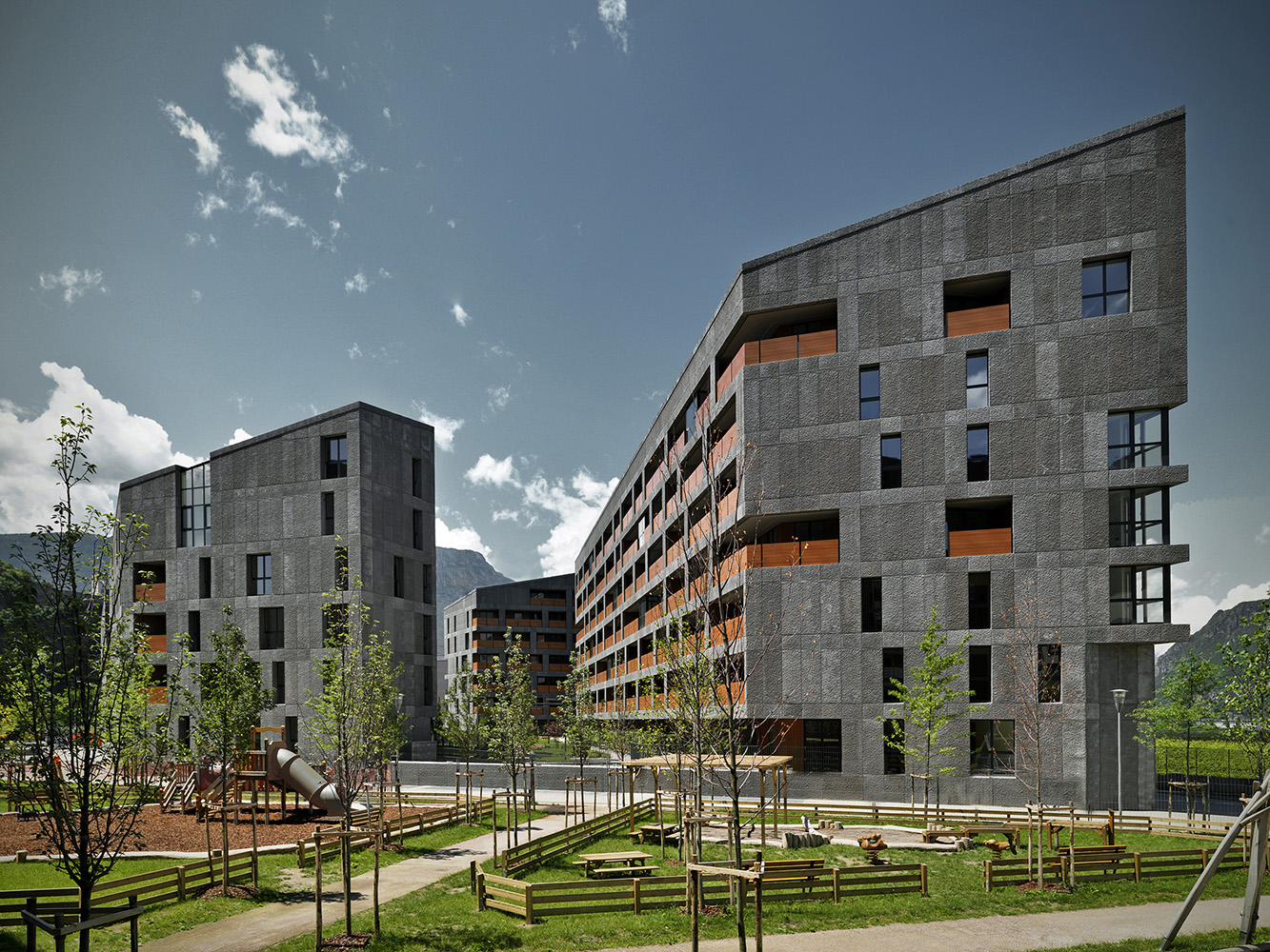
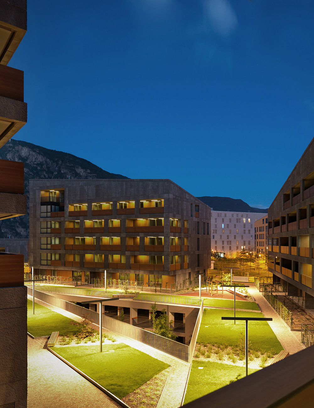 CasaNova was an exploration that began with a competition publicly announced by the Social Housing Institute based on a Detailed Plan for the residential expansion. This is a tool the municipal administration had to face the need of social housing with a settlement pattern clearly recognizable in the peripheral context. The plan provided the creation of blocks, the “castles”, made of three to four buildings located around an open tree lined court. Following the numerous plan restrictions, the building emphasizes the unity of the plot by working on the concept of block and by identifying a single kind of construction for the front.
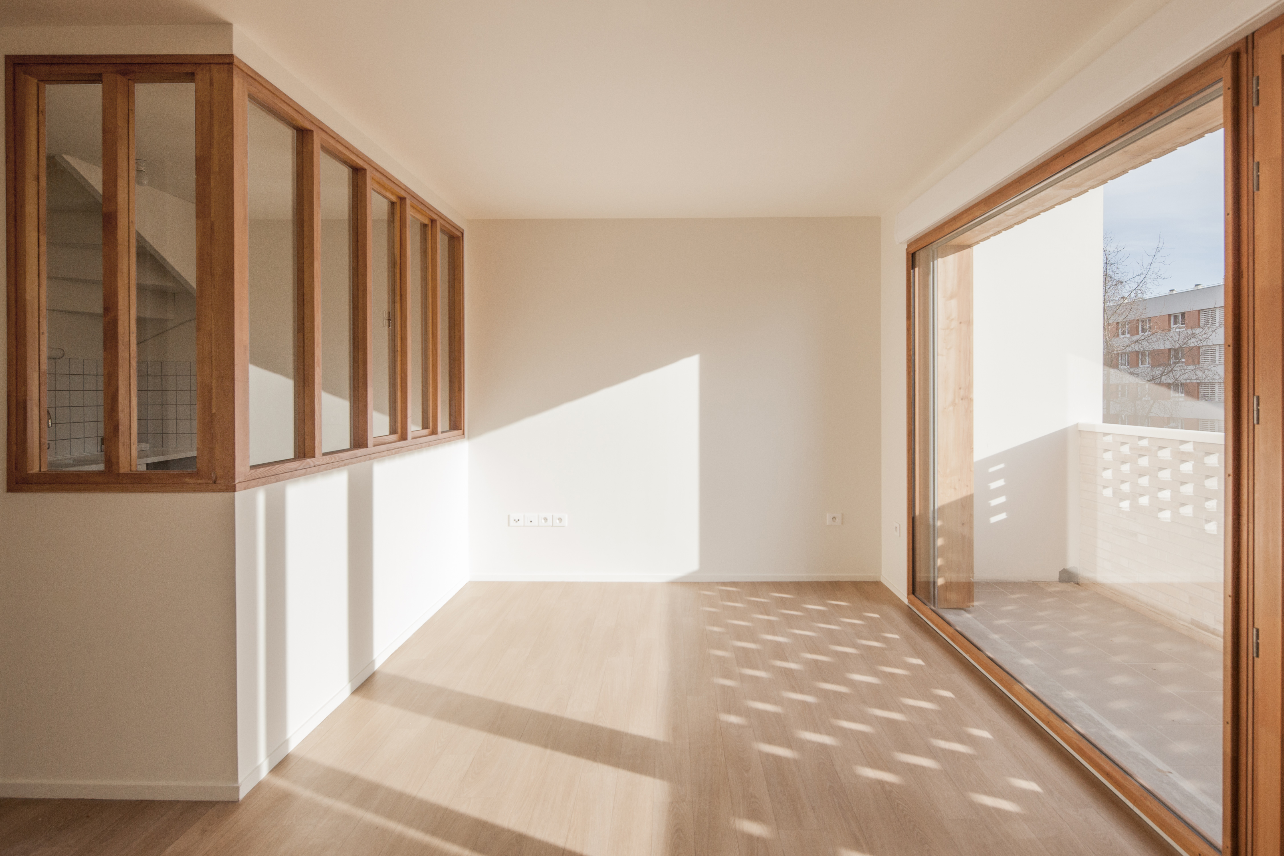
Social-Housing Units in Paris
By Atelier du Pont, Paris, France
![]()
![]() For this innovative project in Paris, the team wanted to embrace the neighborhood. Close to avenue de Flandre and just a stone’s throw from the canal de l’Ourcq, rue de Nantes is a fairly traditional Parisian street of Haussmann and inner-suburb buildings. The project gently inserts itself into a narrow parcel bordered by dense, adjoining housing. On the street side, it extends the building streetscape in a simple manner. On the garden side, the staggering from the 1st to the 6th floors creates large, private, south-facing terraces and allows for an unencumbered view of the sky. The “L” shape and the general volumetrics allowed for the creation of a true, collective garden at the ground level, planted with tall trees.
For this innovative project in Paris, the team wanted to embrace the neighborhood. Close to avenue de Flandre and just a stone’s throw from the canal de l’Ourcq, rue de Nantes is a fairly traditional Parisian street of Haussmann and inner-suburb buildings. The project gently inserts itself into a narrow parcel bordered by dense, adjoining housing. On the street side, it extends the building streetscape in a simple manner. On the garden side, the staggering from the 1st to the 6th floors creates large, private, south-facing terraces and allows for an unencumbered view of the sky. The “L” shape and the general volumetrics allowed for the creation of a true, collective garden at the ground level, planted with tall trees.
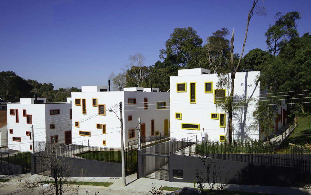
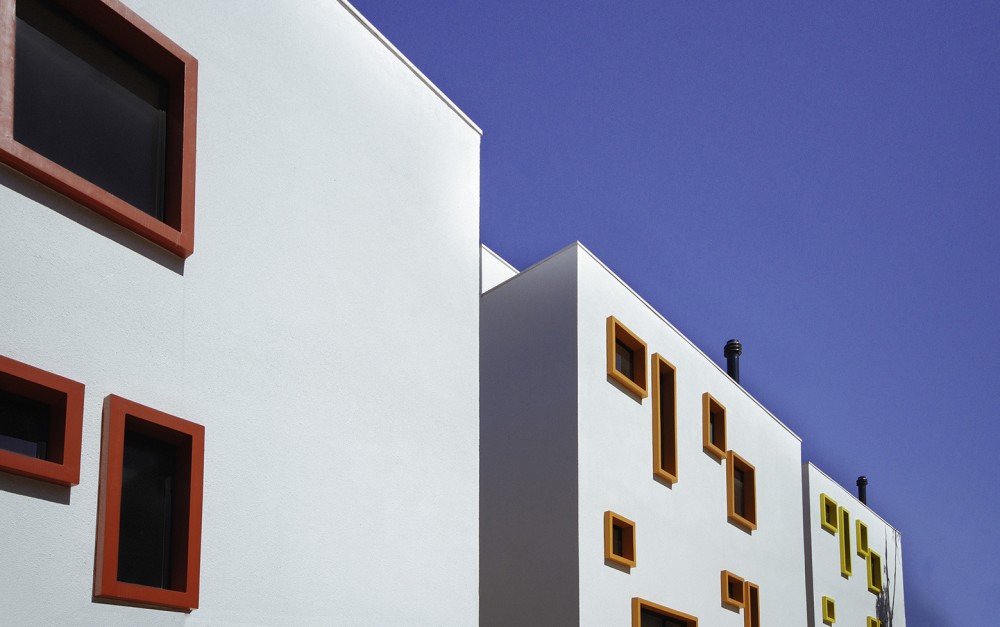
Multigenerational Housing
By major architekci, Wrocław, Poland
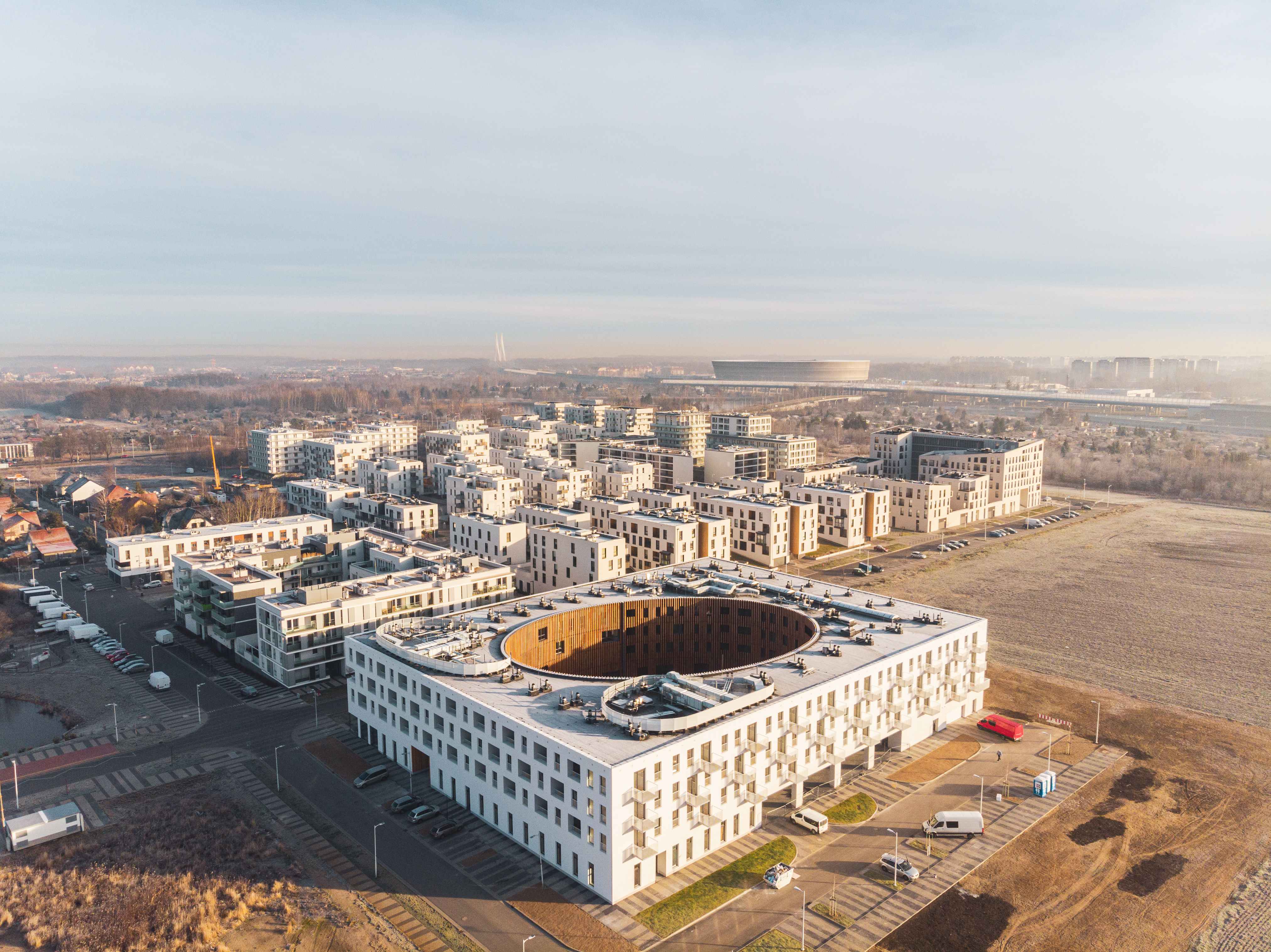
 Looking to the future, multigenerational house is a social housing located in Wrocław, Poland. The building design combines three functions for three generations: flats with a care service for the elderly and the people with disabilities, flats for rent dedicated for the young and families, and a nursery school on the ground floor. House generates 117 apartments with different typologies. The building is part of the model housing estate Nowe Żerniki, where local architects collectively tried to respond to the growing housing problems and poor spatial quality. One of the initial assumptions of the project was to create a facility conducive to the integration of all its residents and users, so the multigenerational house was designed as a quarter.
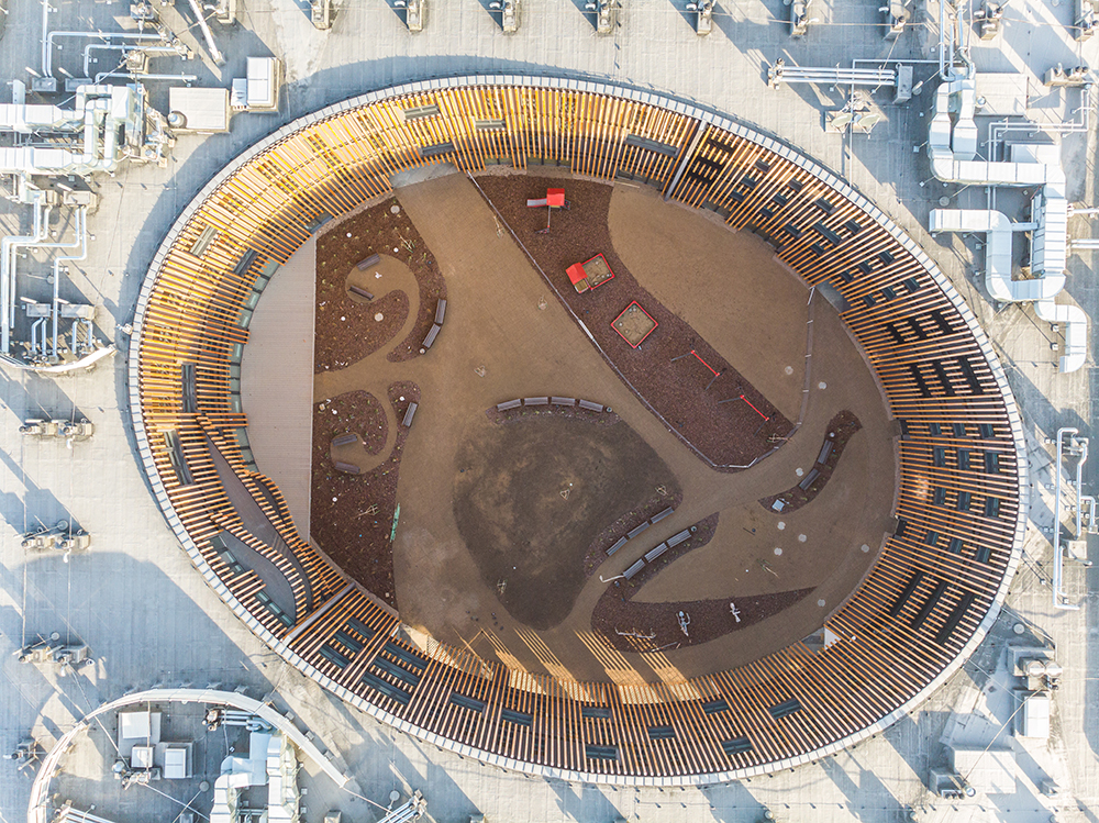
Collective Mine – Housing in Gungjeong
By Gubo Architect, Seoul, South Korea
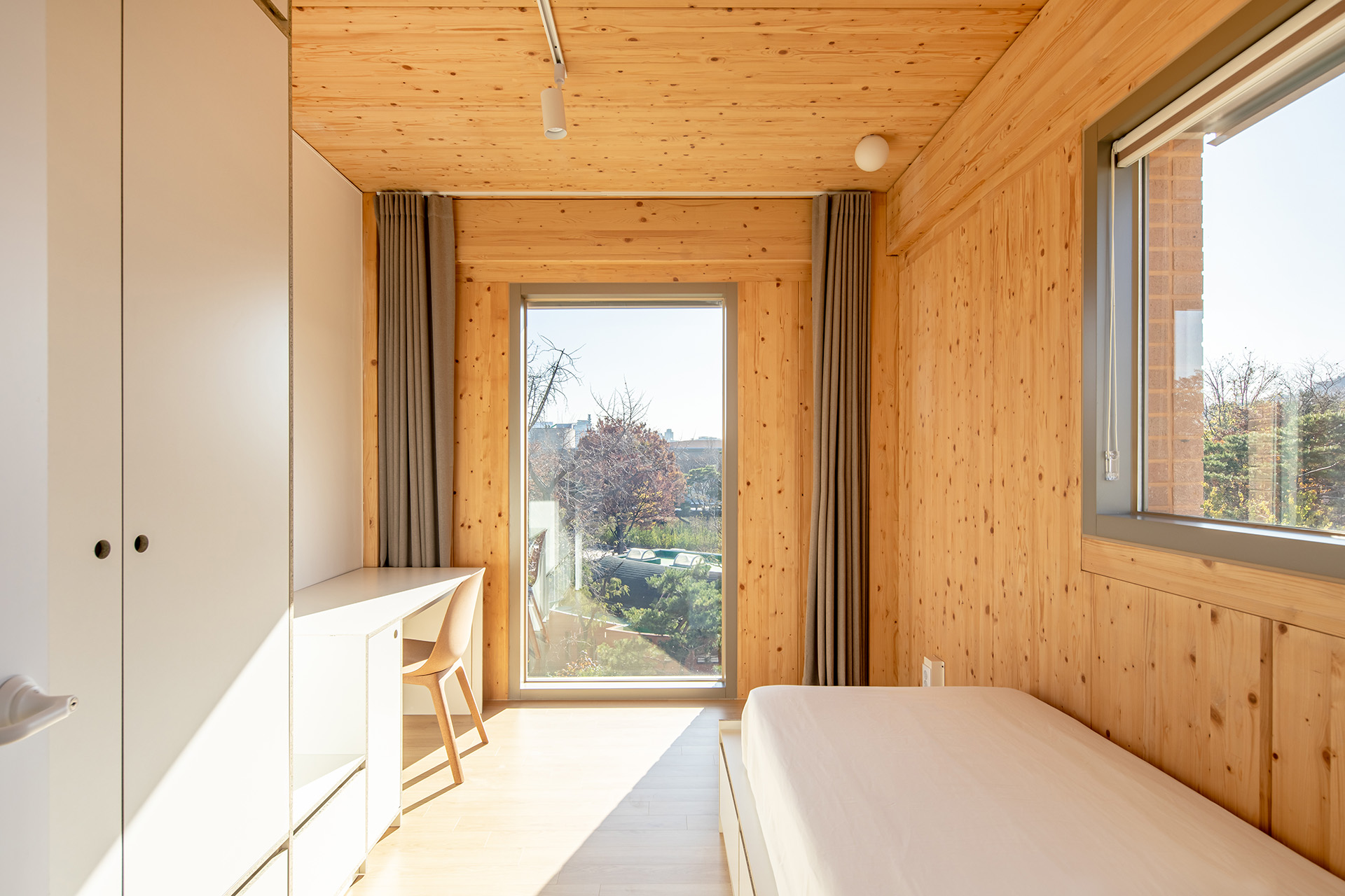
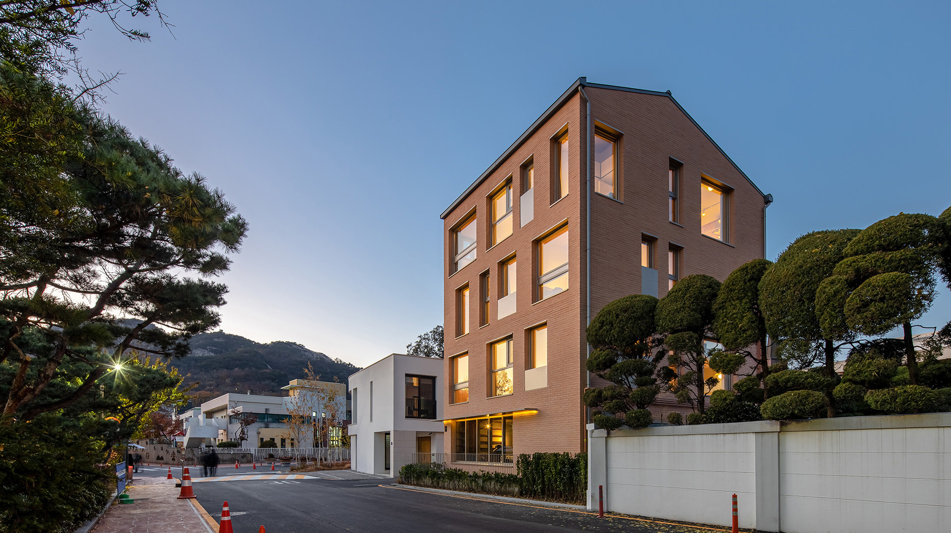 The ‘”Gungjeong Social Housing’ project was carried out for a new residential space experiment for the millennial generation of Korean society. For the younger generation in Korea, residential space is turning into a private space and, at the same time, a community space in loosely solidarity with people of similar tastes. They are seeking the possibility of living and sharing various convenient spaces together because of the expensive housing costs in Seoul. In this project, community lounge cafes will be planned for use by residents on the first and second floors, while the remaining three floors will have a shared house that can accommodate a total of 11 people. Four people reside on each floor, and there is a shared kitchen with a high ceiling on the top floor.
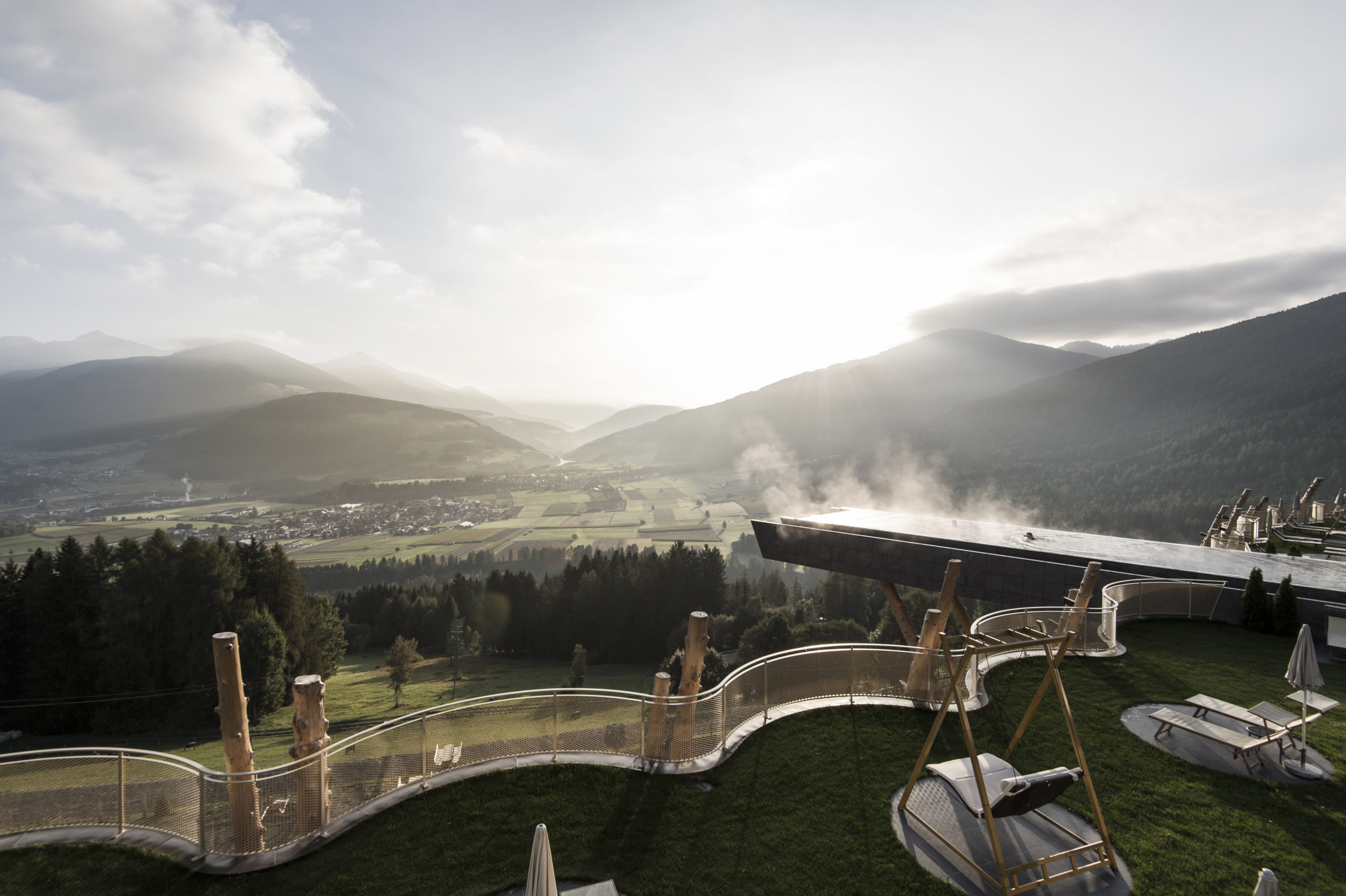
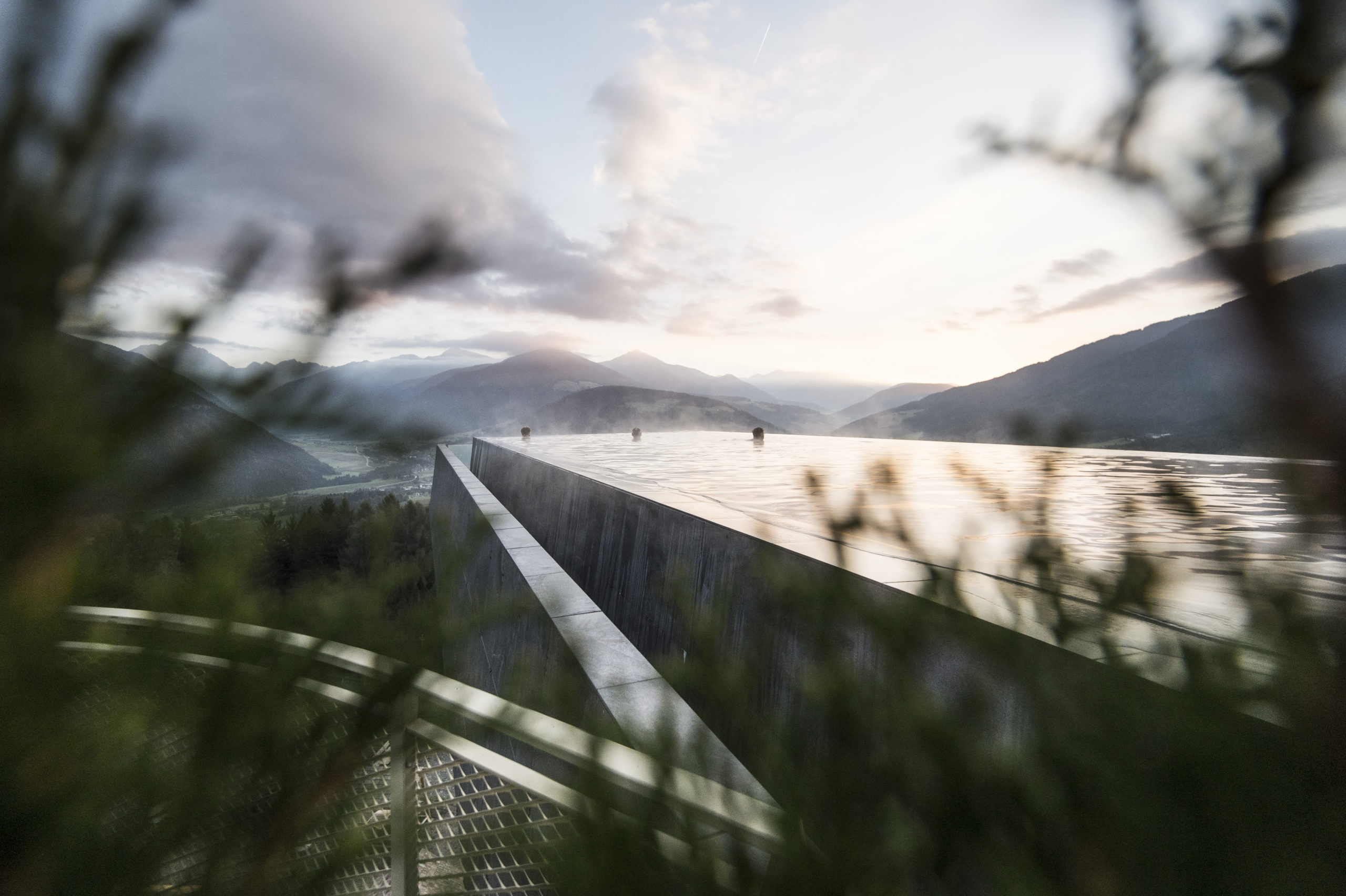
The Iceberg
By JDS ARCHITECTS, SeARCH, and CEBRA, Aarhus, Denmark
Jury Winner, 2013 A+Awards, Mid-Rise (5-15 Floors)
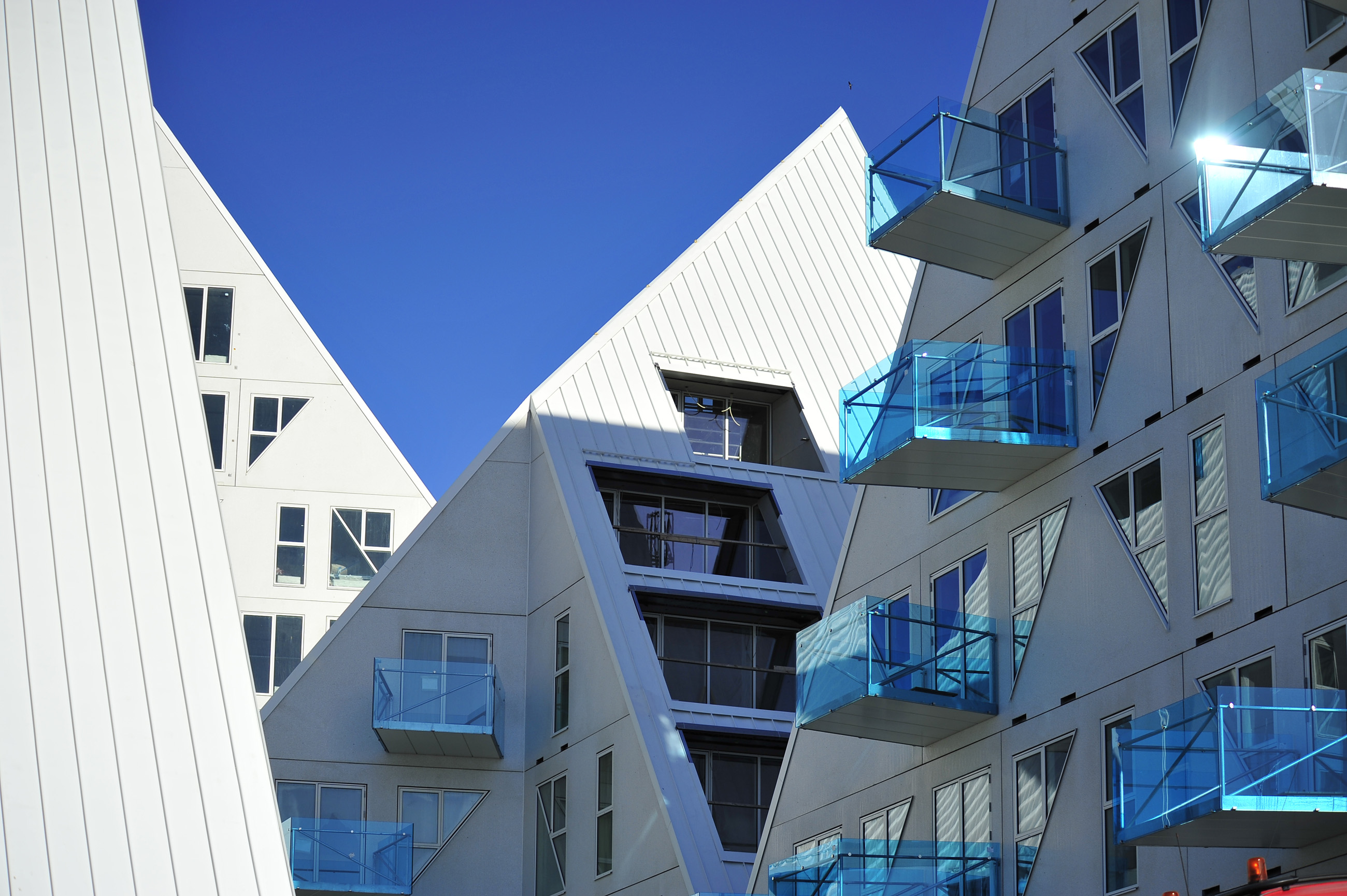
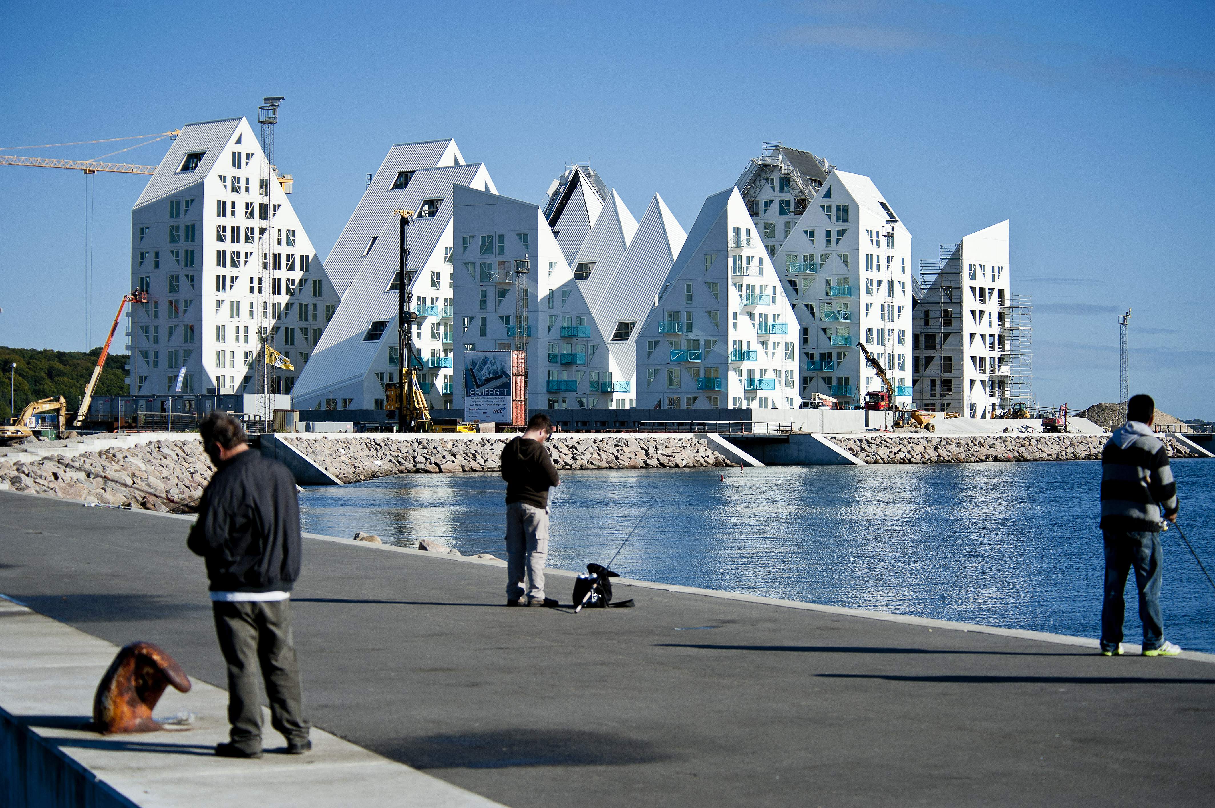 Creating a new urban model, the Iceberg development aimed to create an opportunity for Denmark’s second largest city to develop in a socially sustainable way by renovating its old, out-of-use container terminal. Looking to the future while creating a distinct district, the area is comprised of a multitude of cultural and social activities, a generous amount of workplaces, and a highly mixed and diverse array of housing types. The Iceberg Project was designed to work within the goals of the overall city development. A third of the project’s 200 apartments are set aside as affordable rental housing, aimed at integrating a diverse social profile into the new neighborhood development.
How can architecture be a force for good in our ever-changing world? During Future Fest, we’re pose this question to some of the world’s best architects. We’re hosting daily virtual talks from September 12th to 30th, which are 100% free to attend. Check out the full schedule!

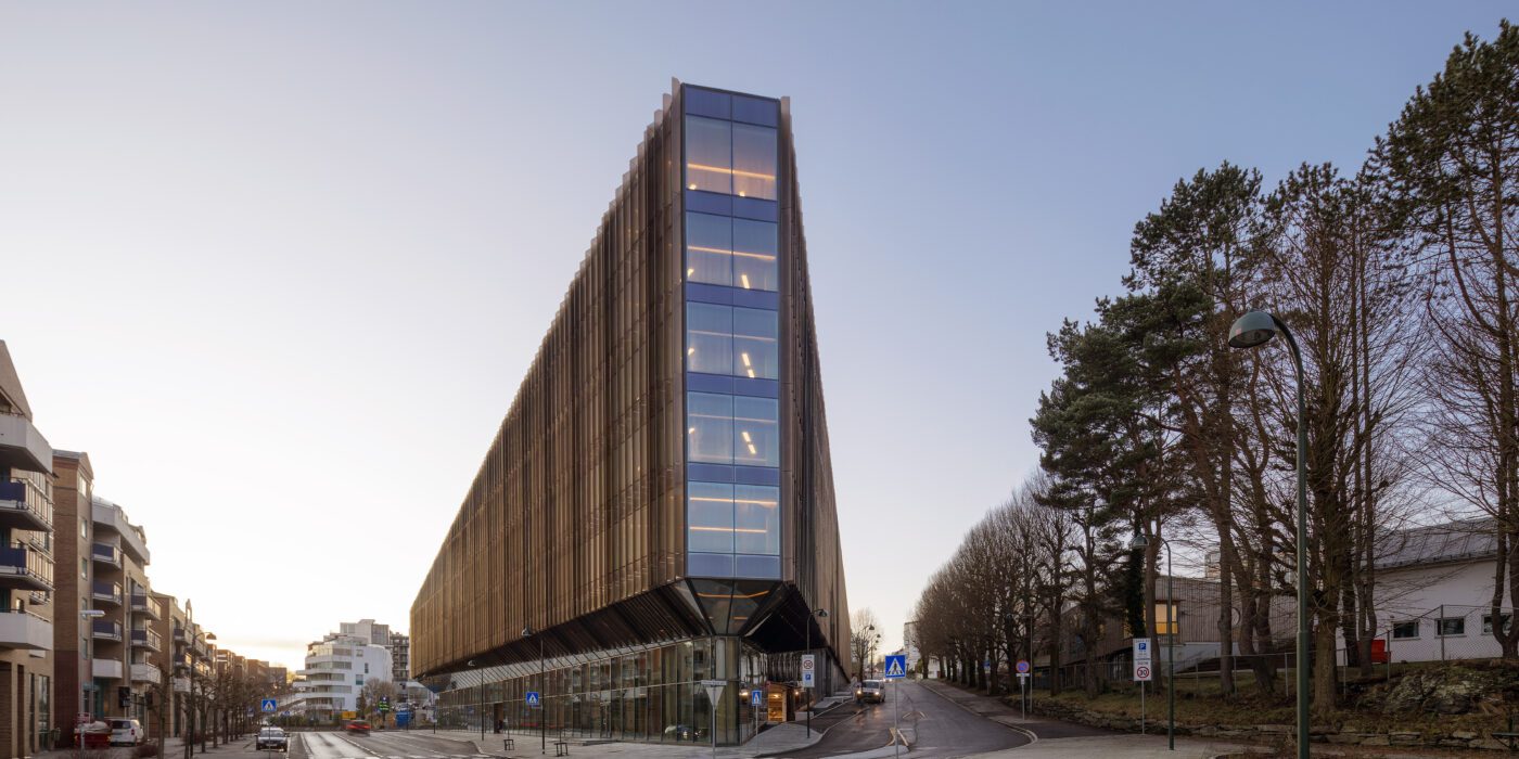
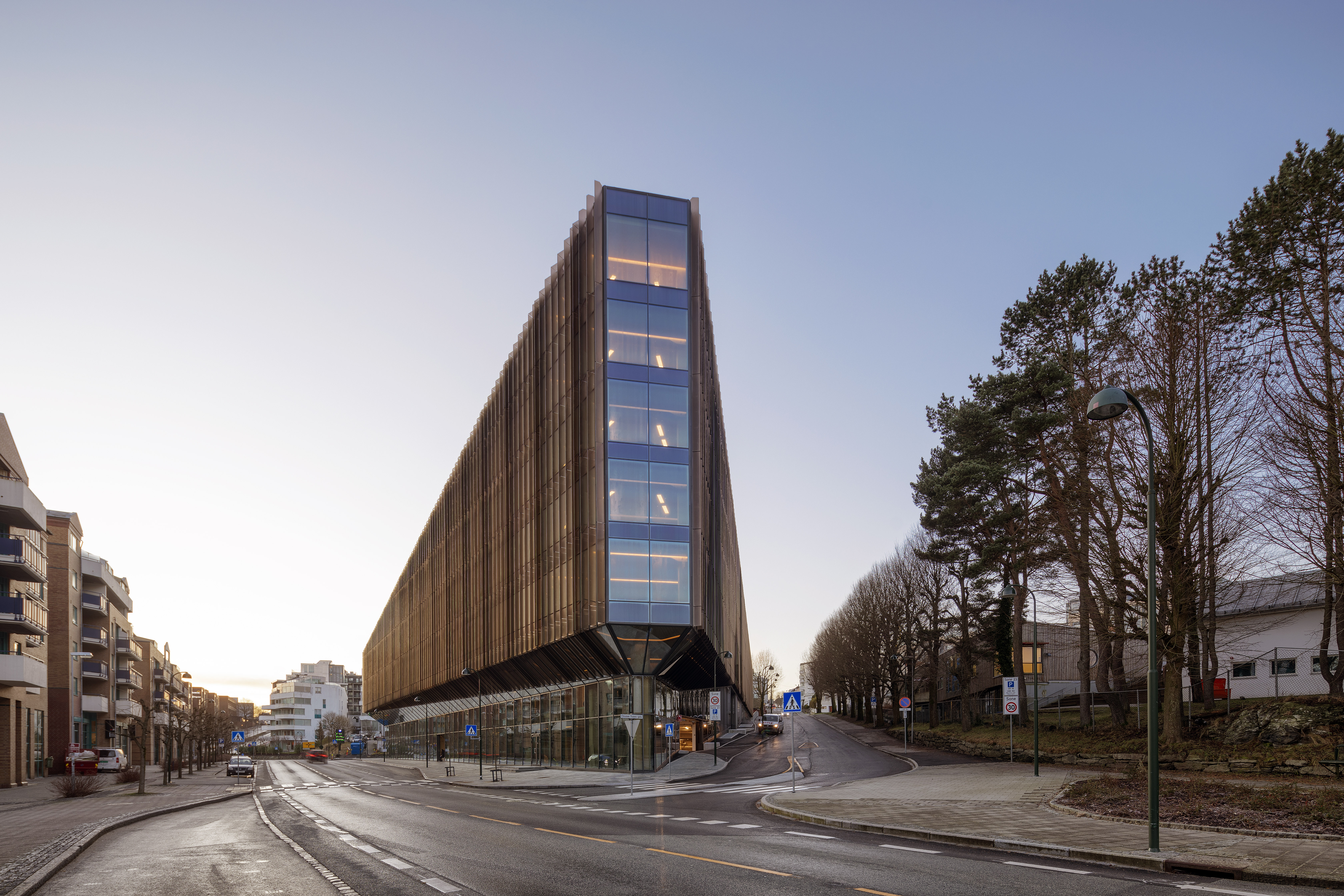
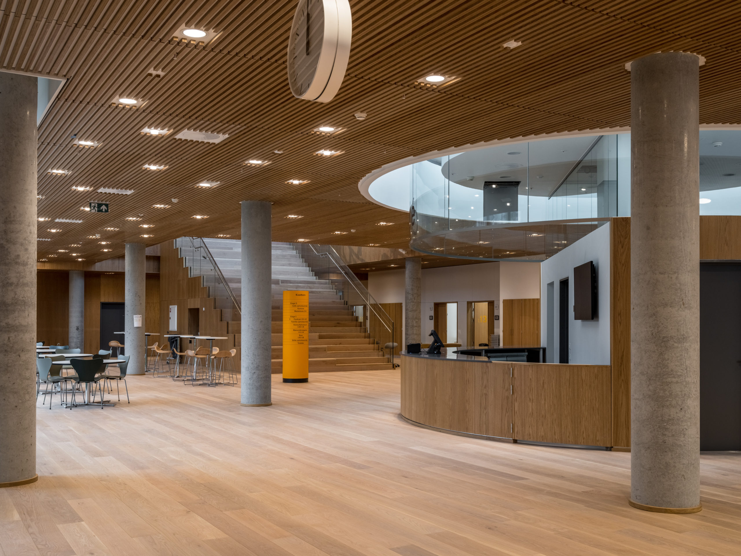
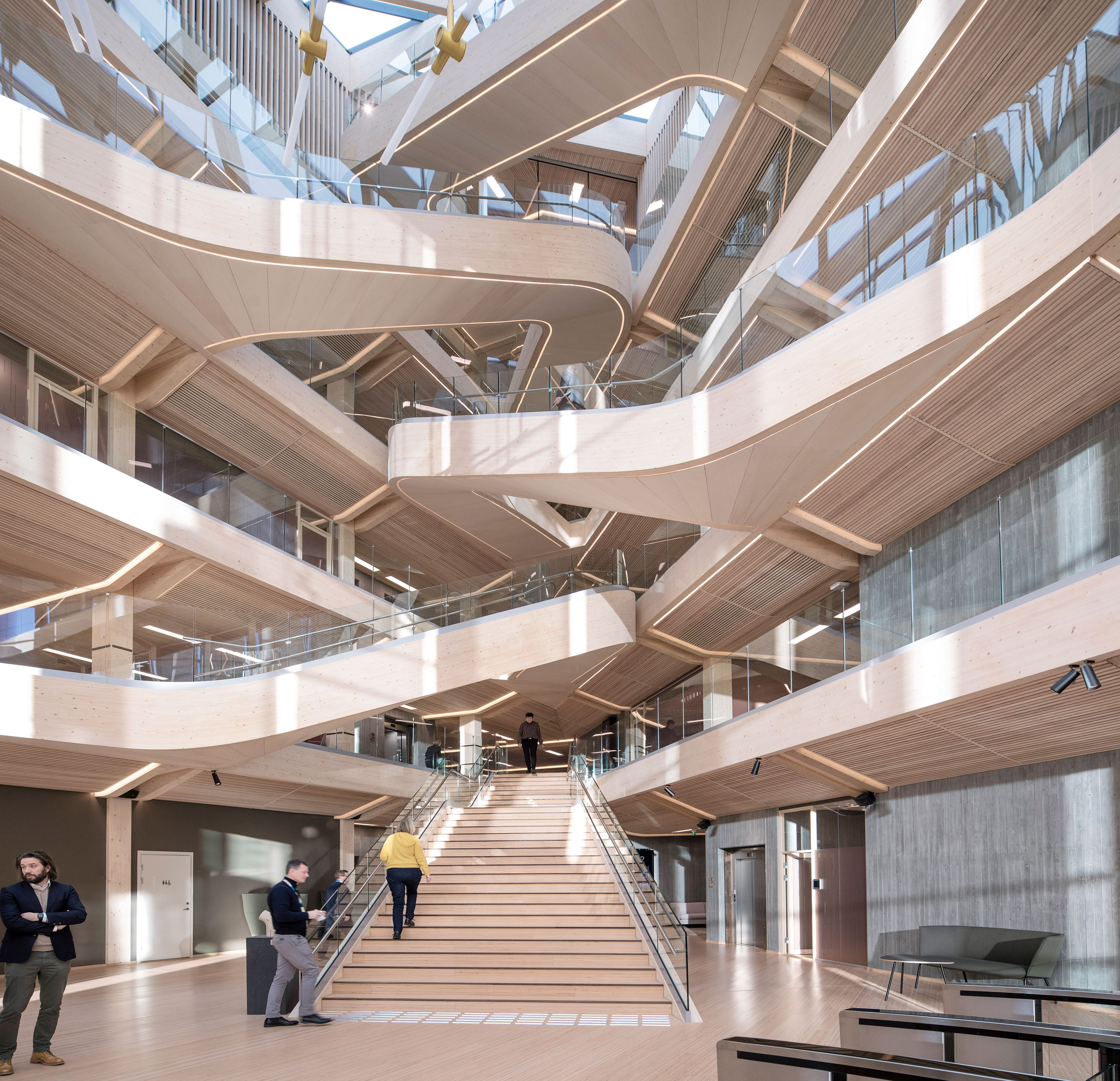 For the Bjergsted Financial Park in Stavanger, Sparebank 1 SR-Bank wanted a place where the company could realize its visions and offer the best for the surroundings. This seven-floor high building is an example of a future workplace and is one of Europe’s largest office buildings in timber. The volume varies in height to accommodate the varied scales and character of the surrounding buildings. There is a central atrium which brings in light, air and green qualities into the building. Social areas and meeting rooms are organized around this space and act as a buffer towards the quieter workplaces along the façades of the building. The galleries are connected by a spectacular open stair. There is a strong contrast between the sharp, triangulated exterior of glass and metal, against the interior organic design in timber.
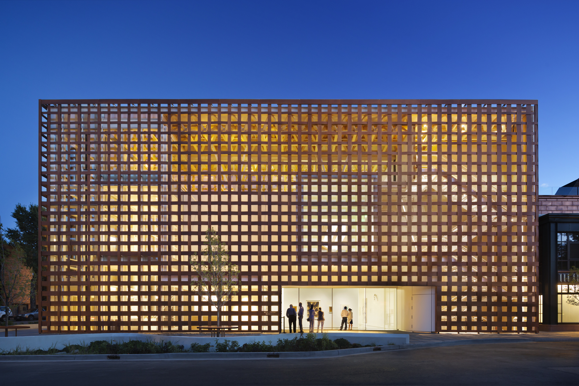
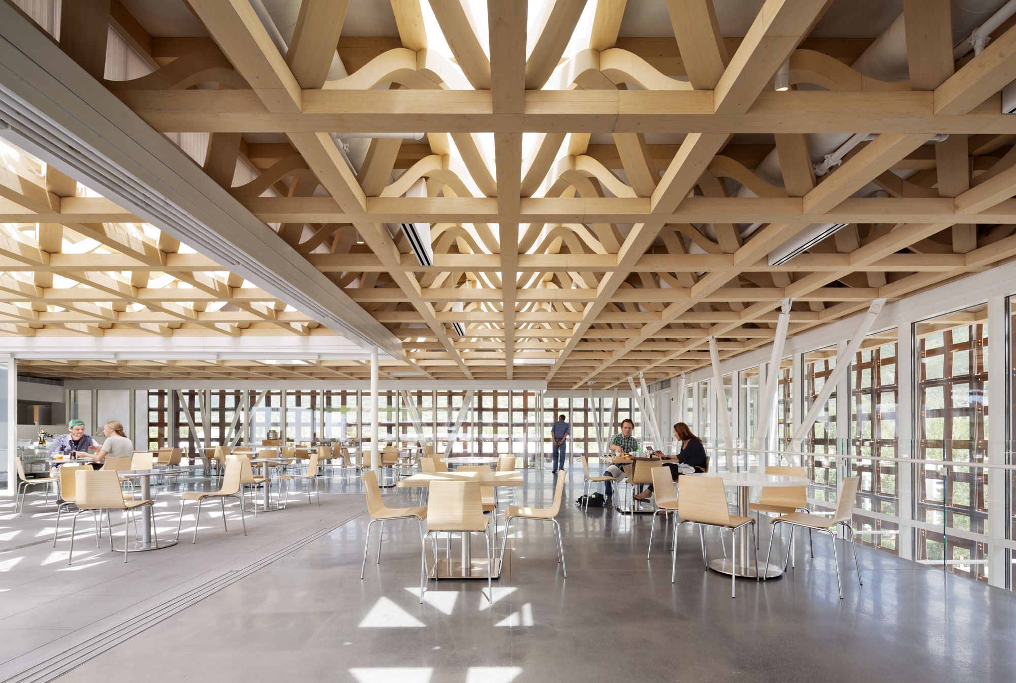 The New Aspen Art Museum is located in the center of the high mountain town of Aspen Colorado on a prominent downtown corner site. The three story kunsthalle provides galleries on the first two floors above ground level and on one floor below. The third floor is a multi-function space and café. Half of the third area is given over to an outdoor terrace with views up to the mountains. Design features include an innovative long-span timber space-frame roof structure, woven panel façade, structural glass floors for gallery day-lighting, outdoor gallery stair which connects the site plaza to the third floor roof level and glass elevator.
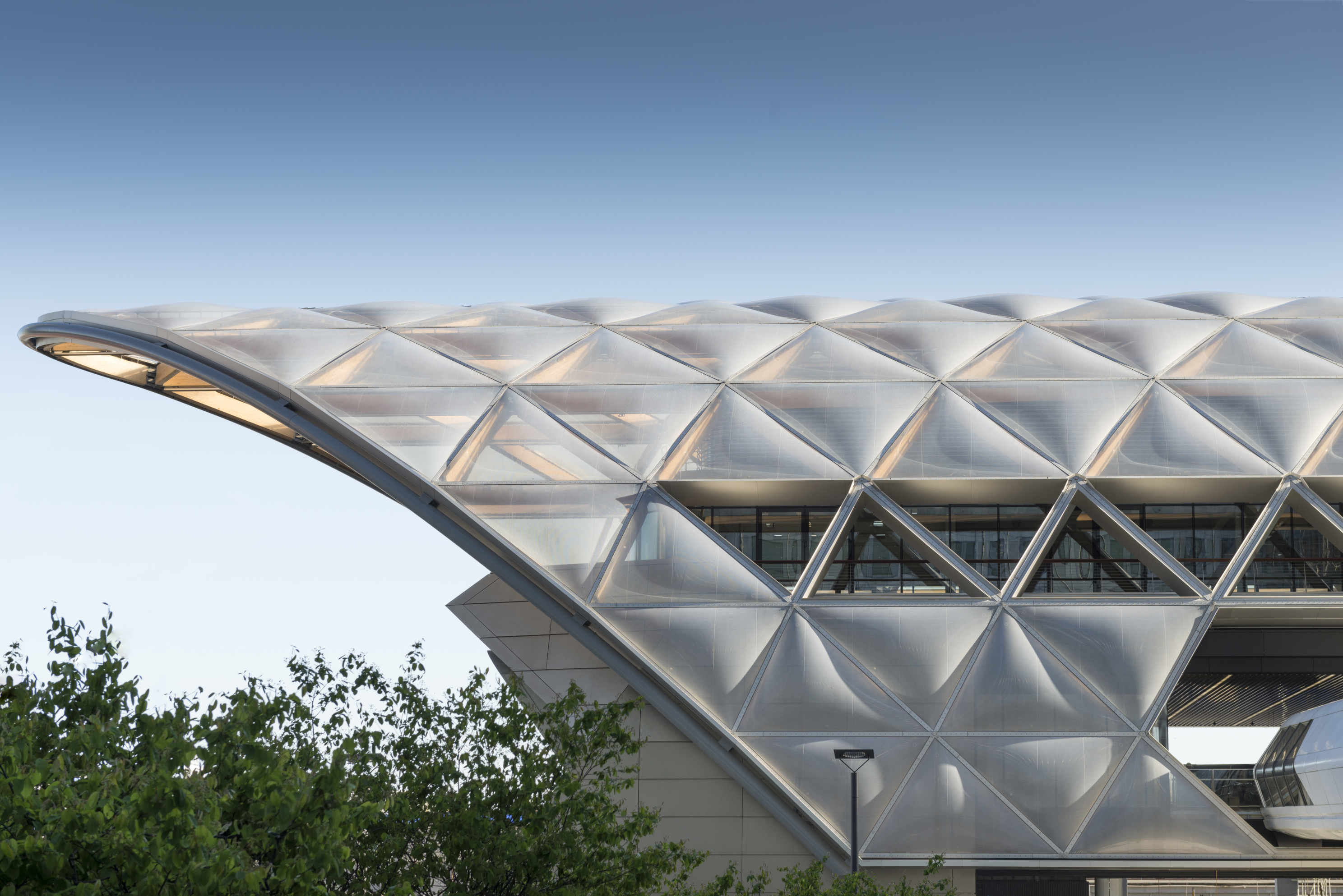
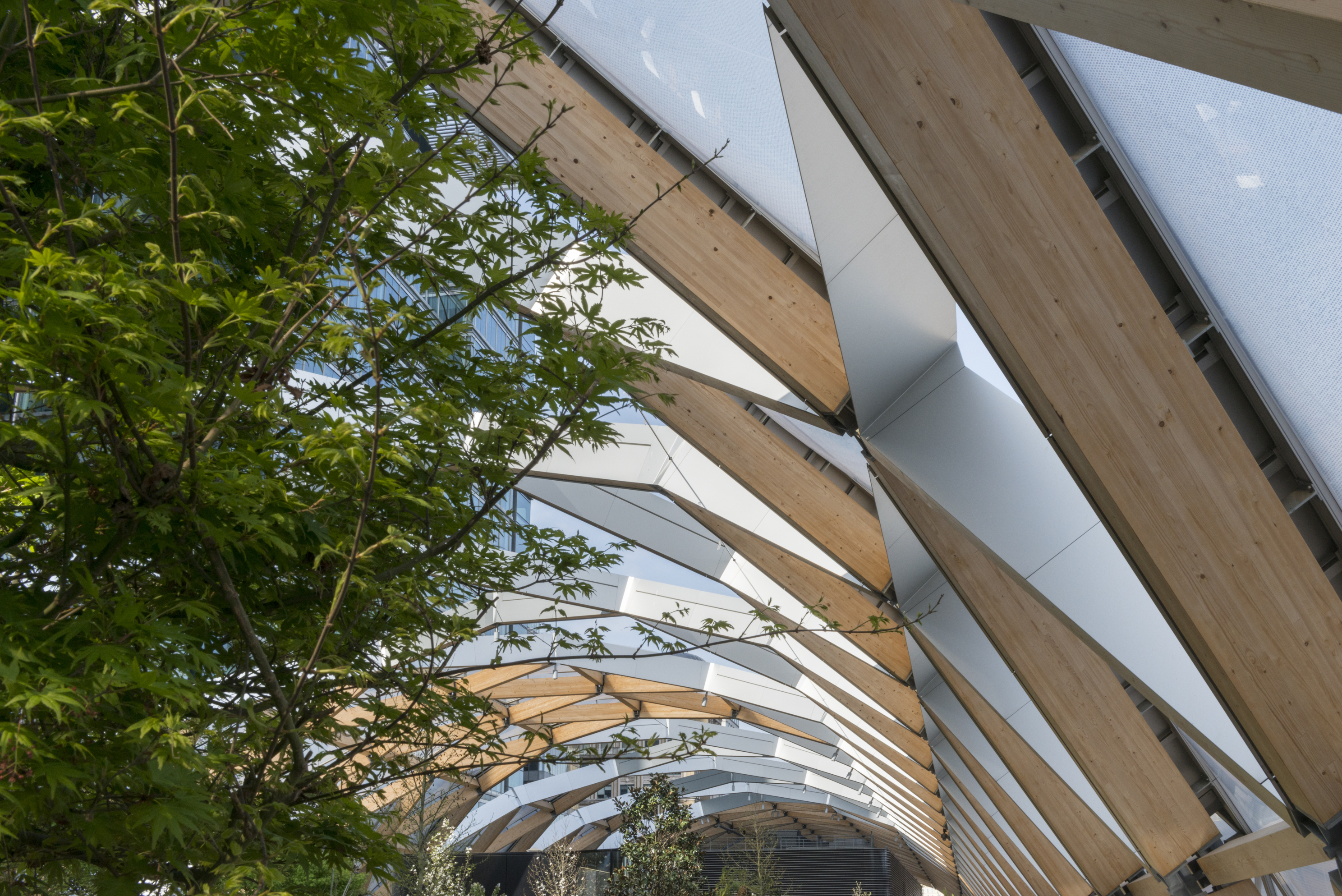 This mixed-use scheme was designed to encompass the over-ground elements of a new station for the Crossrail project at Canary Wharf. At the heart of the project was a new enclosure unifying the station and other elements including new retail units and a park. The park and the rest of the building is enclosed by a distinctive roof, which wraps around the building like a protective shell. This 300 meter-long (328 yard) timber lattice roof opens in the centre to draw in light and rain for natural irrigation. Timber was an appropriate material to enclose the park: it is organic in nature and appearance, strong, adaptable and is sustainably sourced. Despite the smooth curve of the enclosure, there are only four curved timber beams in the whole structure.
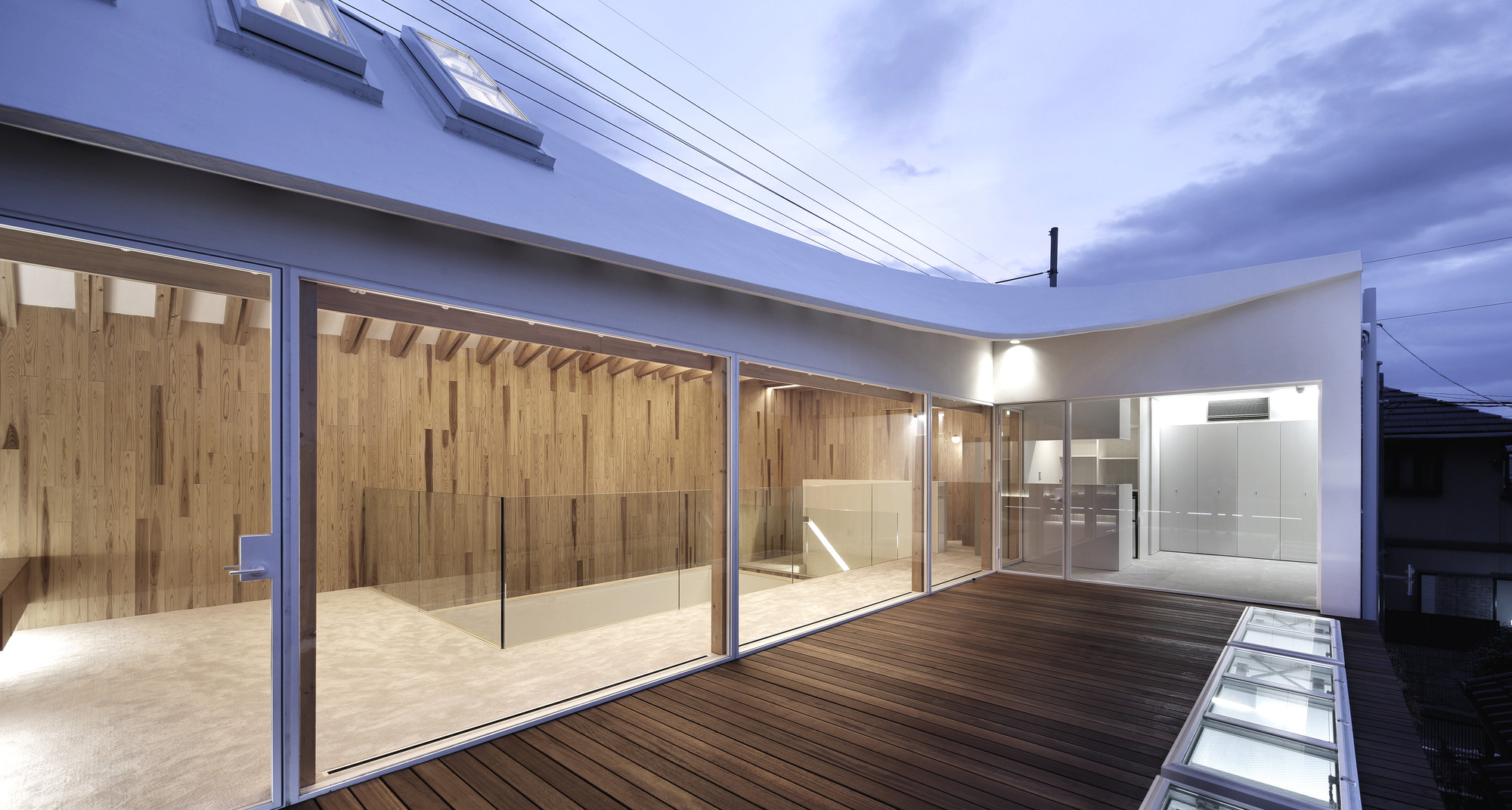
 Looking to introduce warmth and light into this unique site, this home was built on the location of the former Housing Expo from ninety years ago. Orientation and shape of the surrounding residential area influenced the silhouette of the structure’s west elevation. A gable roof blends into the neighborhood and draws an arc towards the west side, showing a hint of modernism. To give a warm impression to the exterior facade, natural wood materials were used, where walls stand as a white canvas that complements cherry blossoms in season. The timber structure is enhanced by the transparency of glass, which draws attention from the eye-level pedestrian on the first floor.
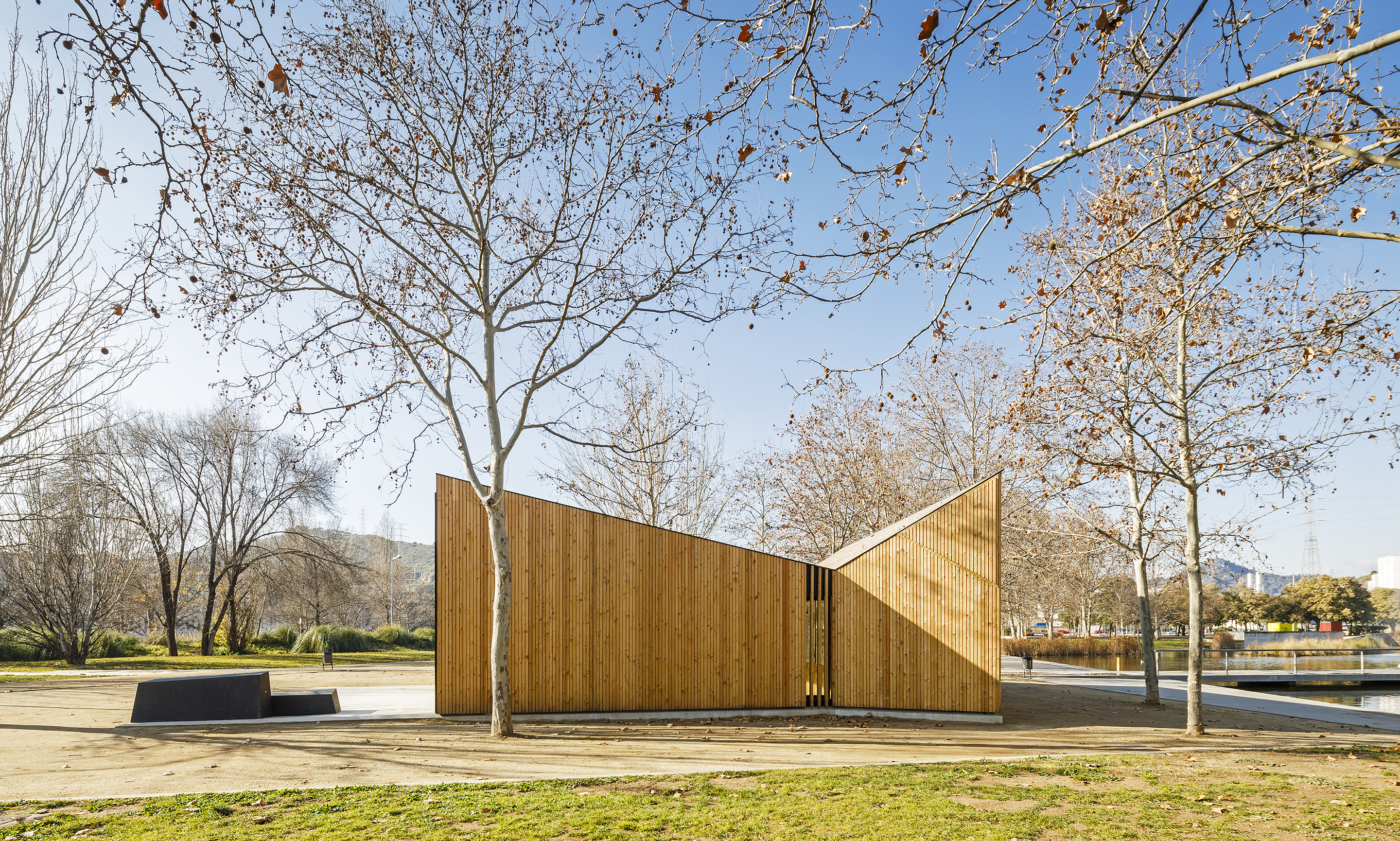
 Created to be a modular classroom, this timber design includes the construction of a prototype module for environmental education, a learning and discovery space to be installed in different locations of the Metropolitan Area of Barcelona park’s network. It is proposed that it becomes also the habitat for some species of animals such as insects, invertebrates, birds, bats… As the team explained, it must be a space open to the outside; it is necessary that one could see the trees from the classroom, to perceive the light and feel the climate. The building was planned as a prefabricated module, flexible and as economical as possible, capable of responding to the different requirements of each municipality for environmental education.
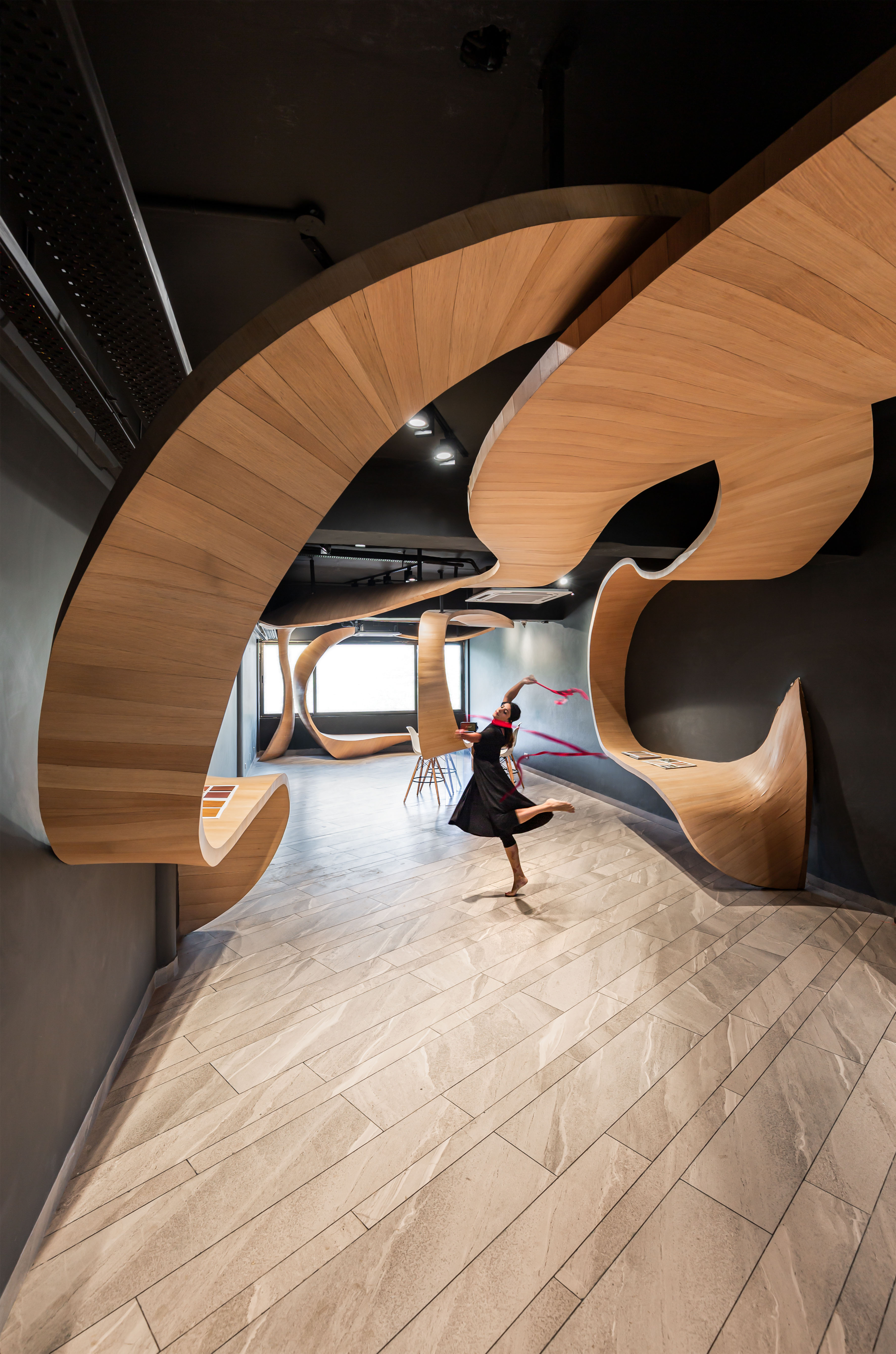
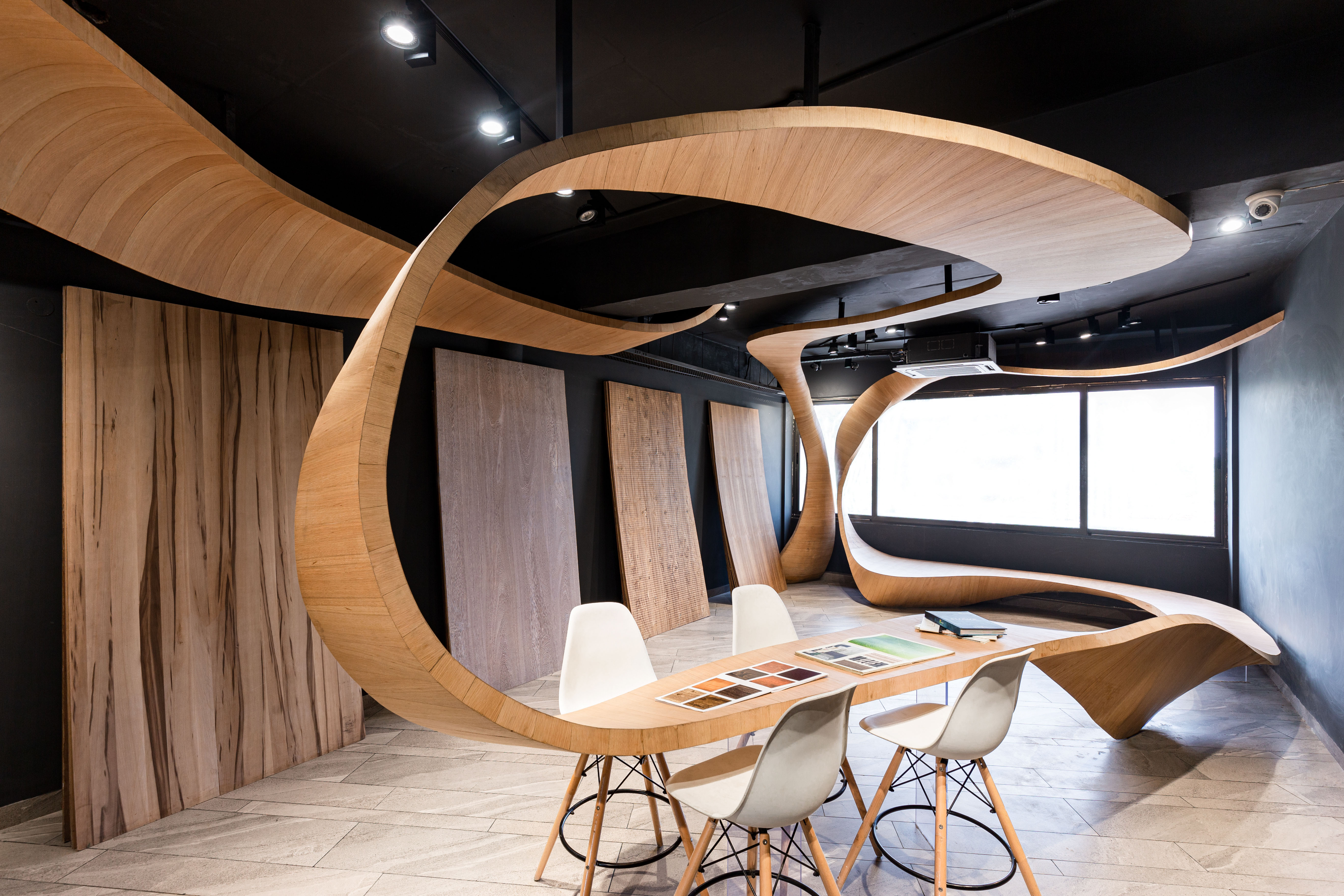 As the design team explored in Timber Rhyme, wood-art has been an integral part of Indian history. Sutradhar community, according to legend, are the carpenters (also known as ‘badhaee’) descended from Maya, the son of Vishwakarma (the divine engineer). This design explored conventional limitations of the material sold by the client, veneers and plywood, and its protagonist role in a conversation that has existed in the ancient past. ‘Timber Rhyme’ occupies the first story of a retail shop in a market complex, Chandigarh. The challenge was to invite a walk through the existing 71′ by 18′ linear block. A timber ribbon invites passerby into the space and to engage with the materials.
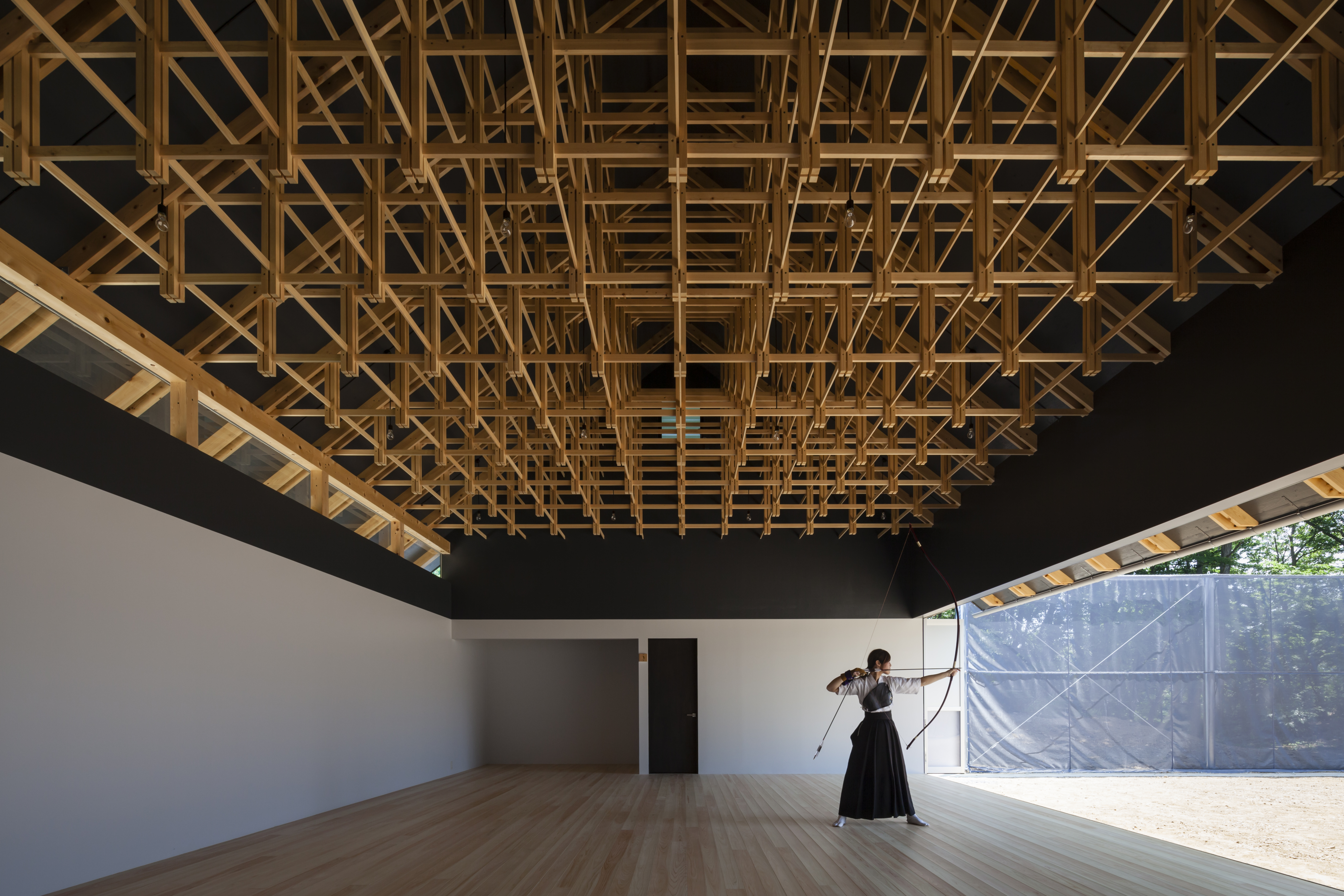
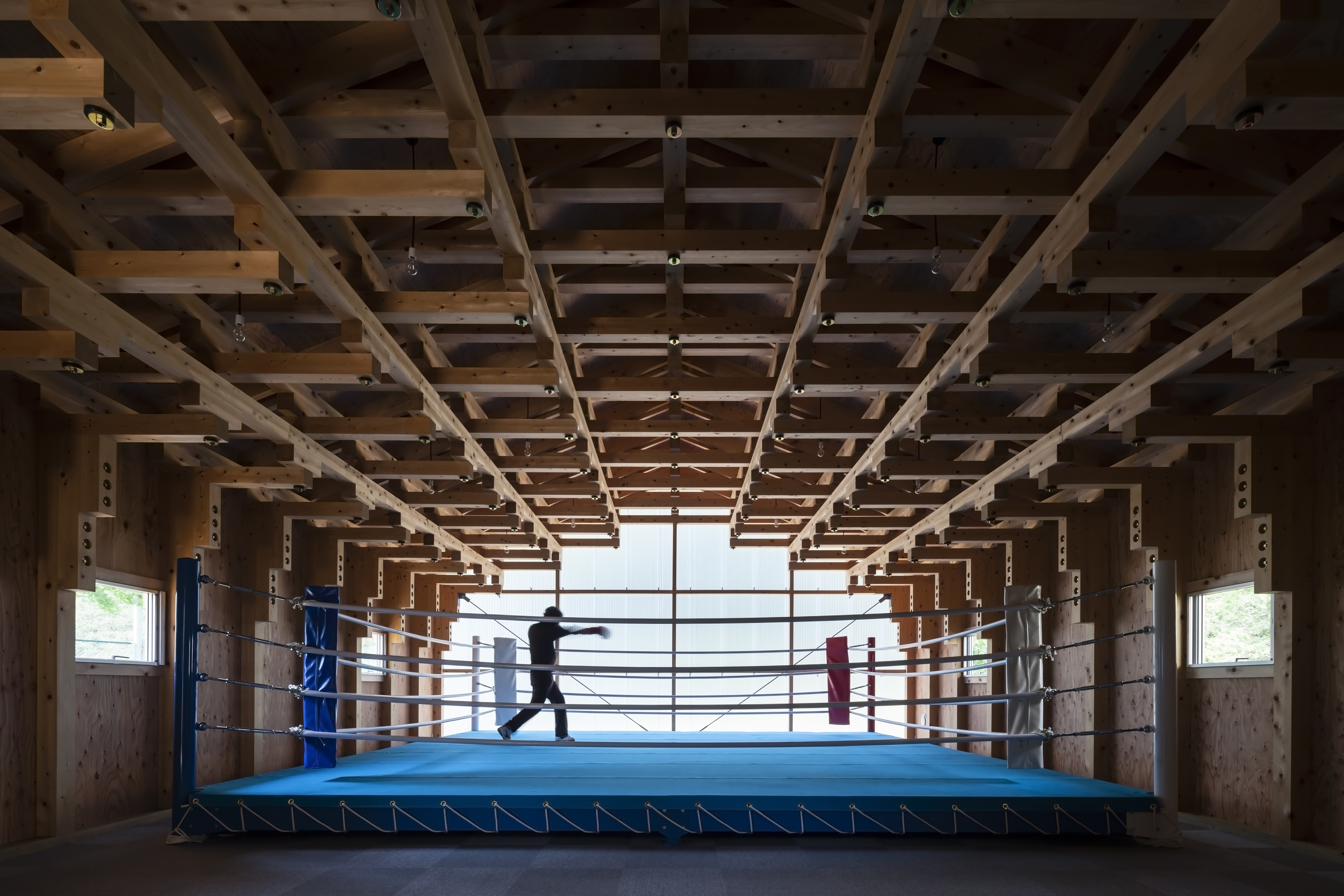 When considering the design expression for a new archery hall and boxing club, FT Architects created a pair of buildings a few hundred meters apart on the grounds of Kogakuin University in west Tokyo. The University’s brief was for low-cost structures made of locally sourced timber to provide accessible and inspiring spaces for the students. By chance, both facilities called for a column-free space scaled to a size comparable to a sacred hall in a traditional Japanese temple.
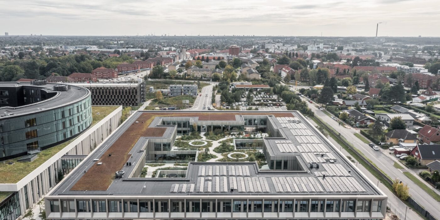
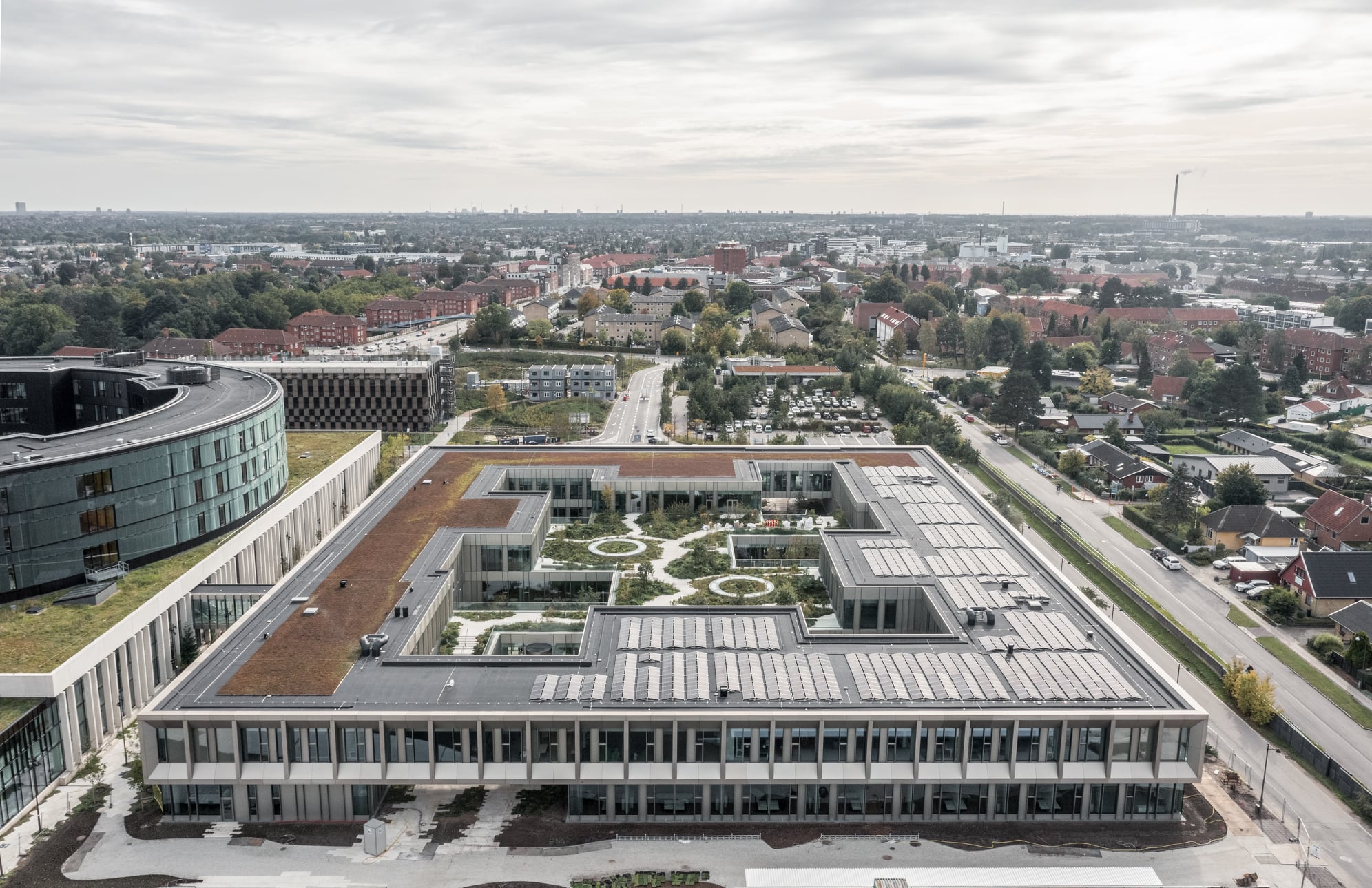
 Steno Diabetes Center Copenhagen is a hospital for preventing and treating diabetes. The hospital occupies a rectangular site with two entrances open on two opposite sides. There are four inner gardens on the first floor and two of them greet the visitors immediately upon their entry. Common areas such as circulation spaces and reception sit in the middle of the floor plan, while most individual rooms are lined on the outer ring.
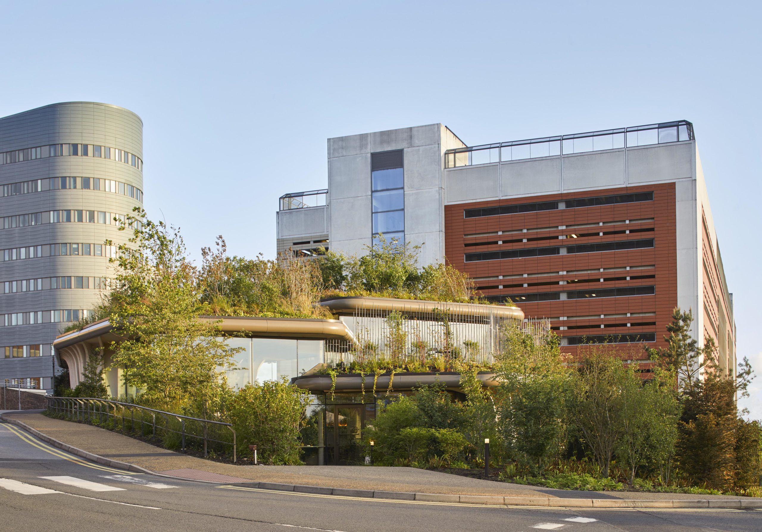
 Maggie’s centers provide free cancer support and information to patients and their friends and families. The centers are located across the UK, each in a unique style while all of them embrace nature as a way of healing. Maggie’s Leeds stands on the last patch of greenery at St James’s University Hospital. The sloping site is bounded by roads and a multi-story car park. Instead of flattening the landscape, the spaces descend along the landscape, creating views that vary from open to secluded.
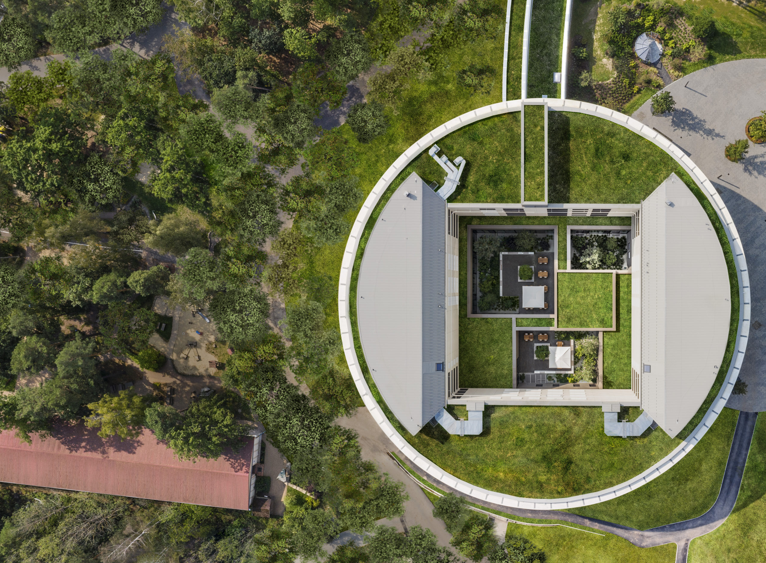
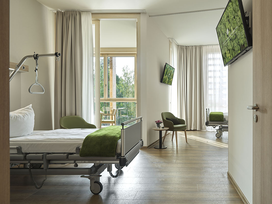 This new hospital wing of the orthopedic center Waldkliniken Eisenberg enjoys an immersive view of the Thuringian Forest. The six-story building has 128 patient rooms, all located on the outer ring of the circular floor plans. Floor-to-ceiling windows invite unblocked views of the natural landscape into the rooms while providing natural light and fresh air to the rooms.
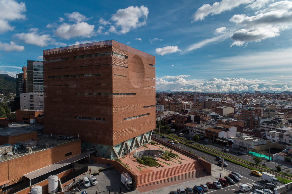
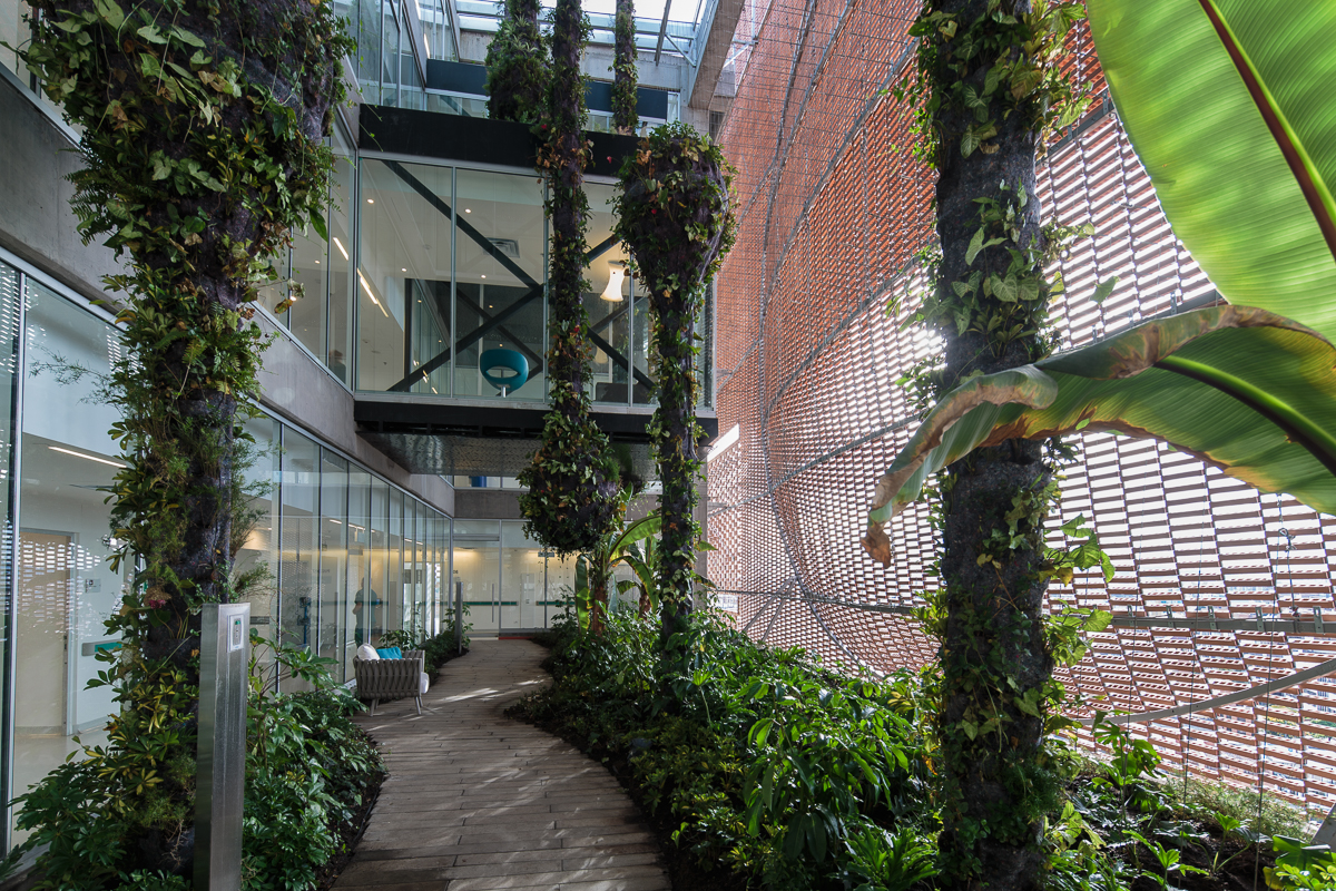 The expansion of Santa Fe de Bogotá Foundation is sited in the compact urban context of the city of Bogotá. It comprises an eleven-story block and a single-story base. The roof of the base becomes a plaza opening to the roads, with staircases inviting people onto it. Red bricks cover the expansion as a response to the existing buildings around. Strips of pavement on the plaza are replaced by plants. Different types of plants vary in height, breaking the flatness and solidity of the brick plaza.
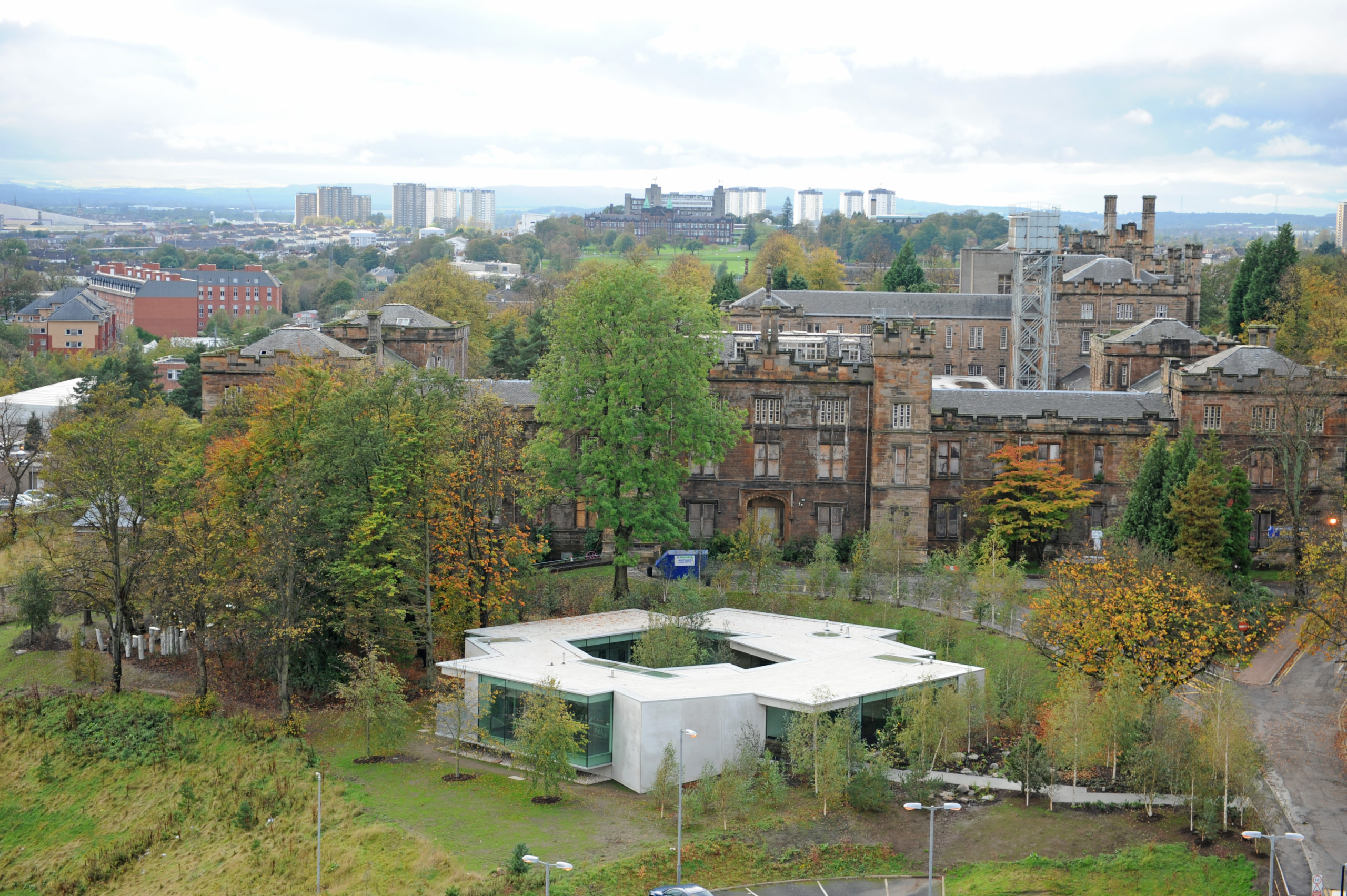
 Maggie’s Gartnavel sits humbly on the land of the Gartnavel hospital in Glasgow, close to the Beatson West of Scotland Cancer Centre. The single-level volume comprises a series of interlocking rooms, with an inner garden in the middle of the ring of rooms. With a flat roof and floor levels that respond to the natural topography, the rooms vary in height. Common areas including the dining room, kitchen, library and a large activity room are on the side with taller ceilings and the counseling rooms are more intimate.
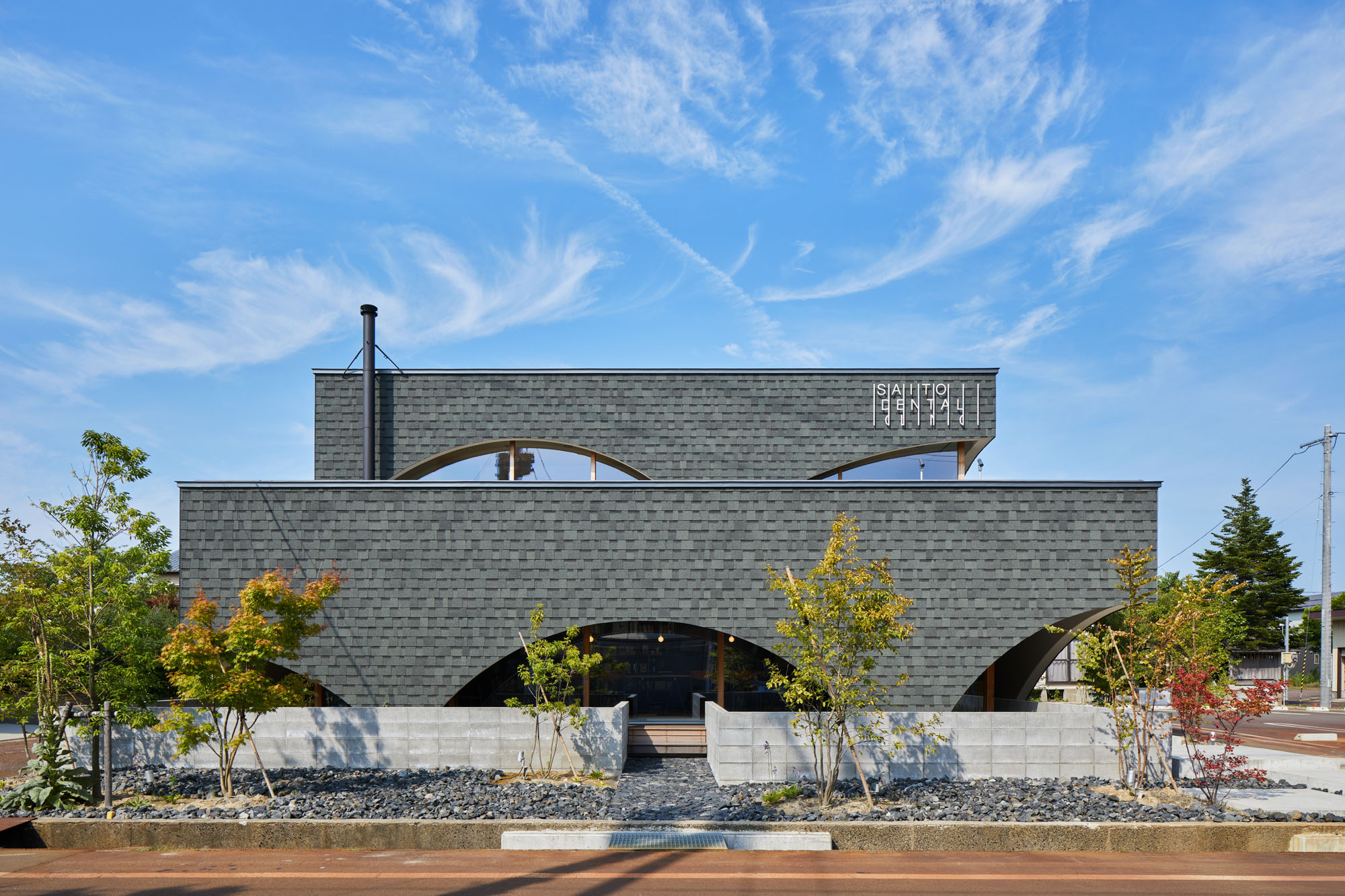
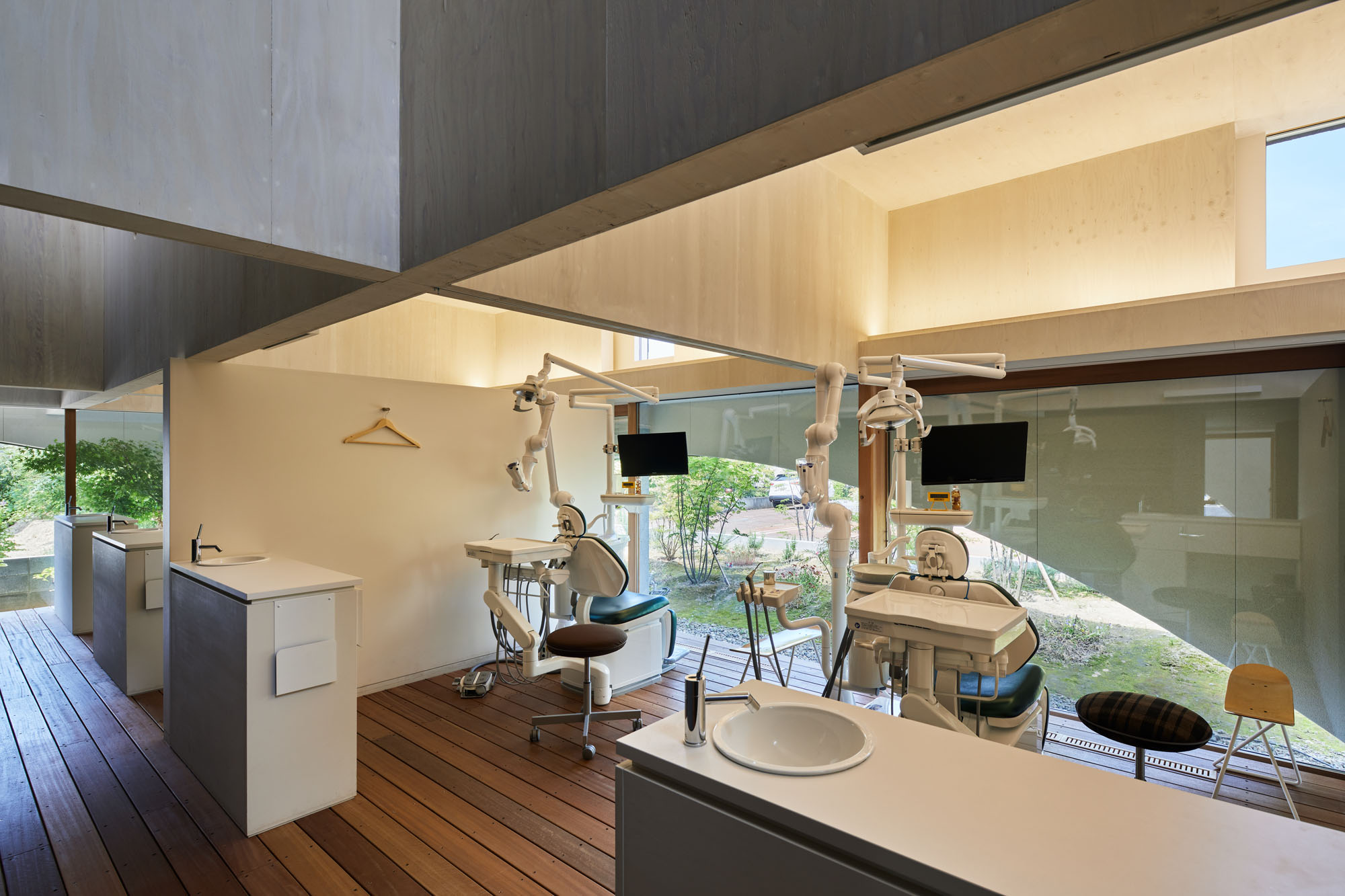 Neighboring a nursery, elementary school and junior high school, this dental clinic is designed as an enjoyable place for both children and parents. This two-story timber building accommodates not only a clinic but also a bookstore and daycare center. By combining programs, the design team wishes to encourage people to come not just for their appointment.
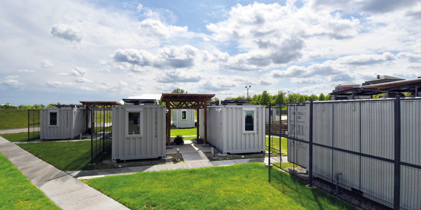
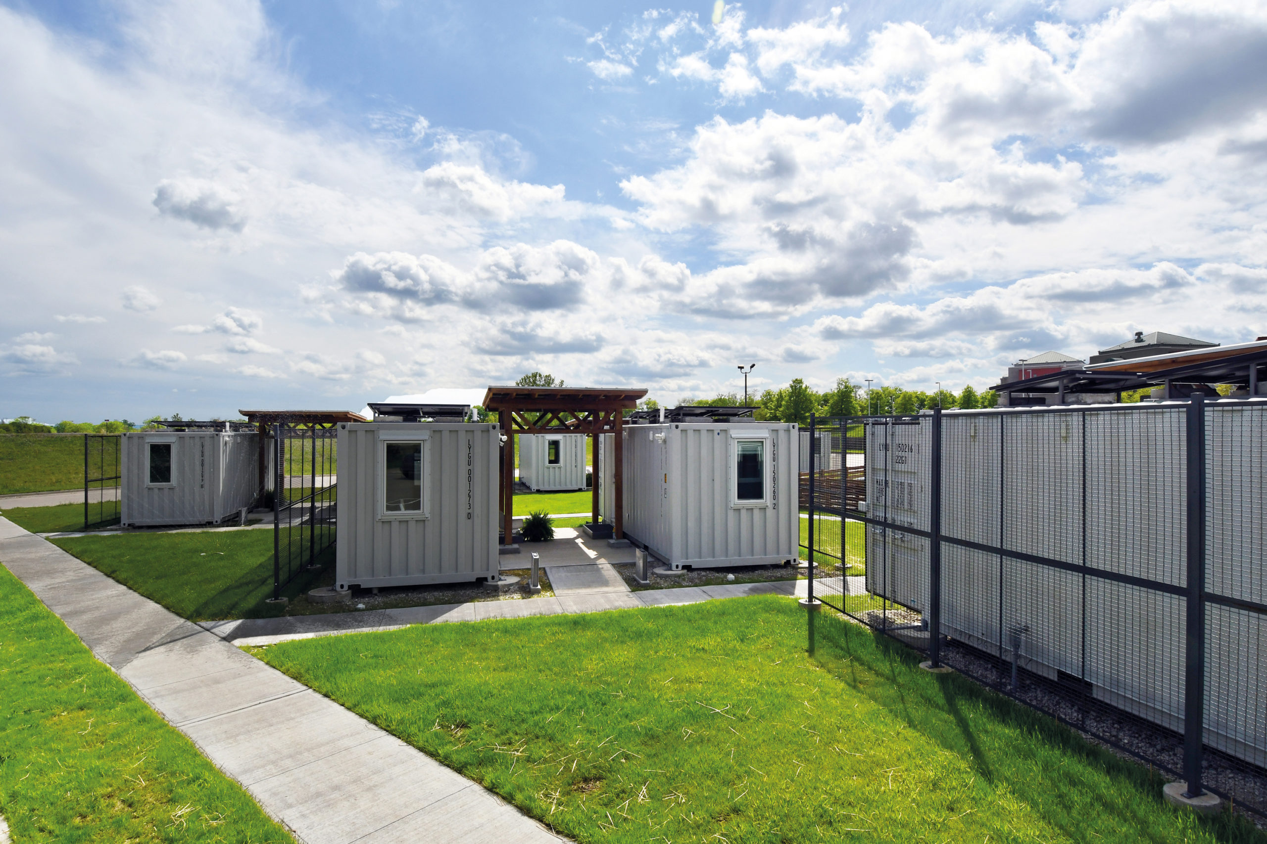
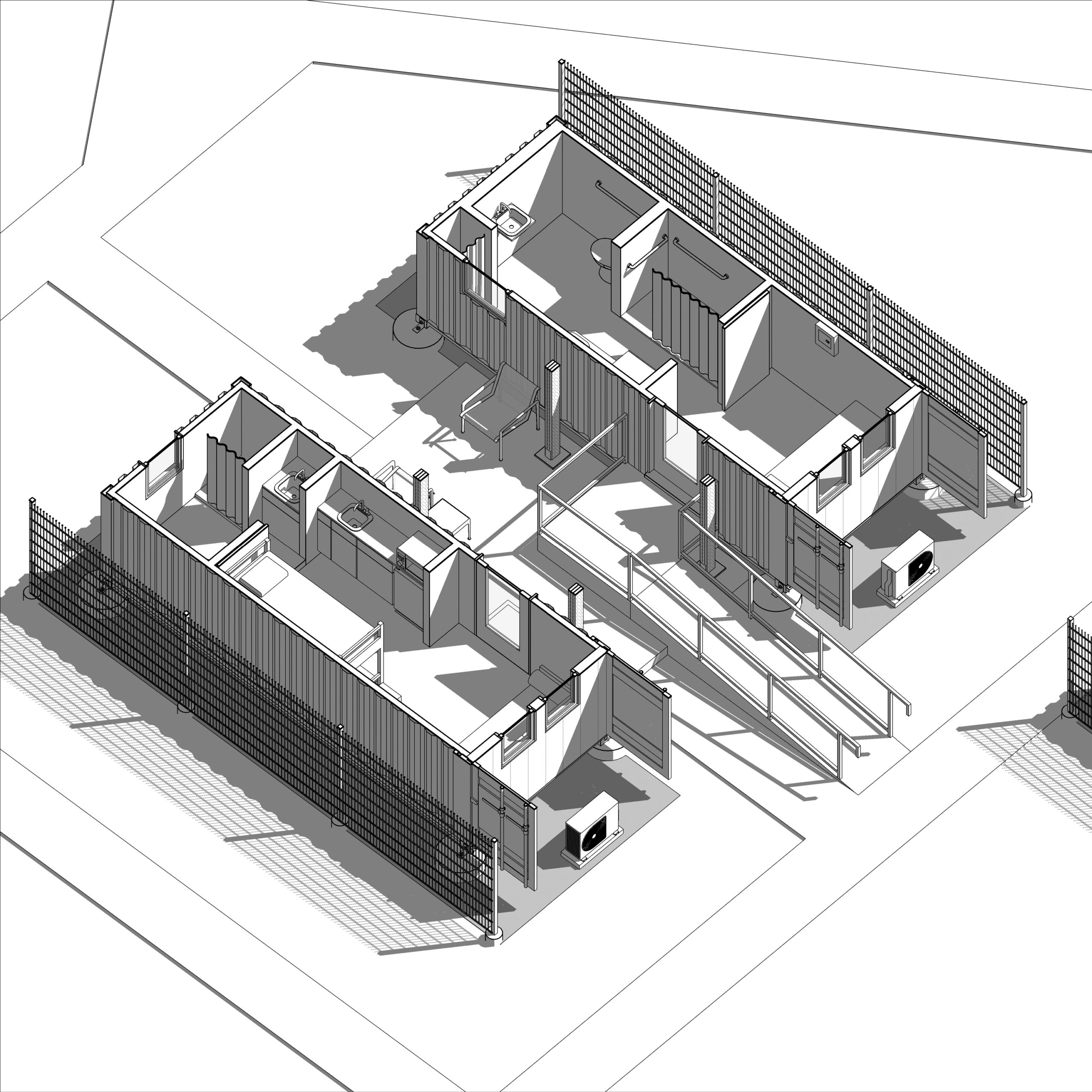
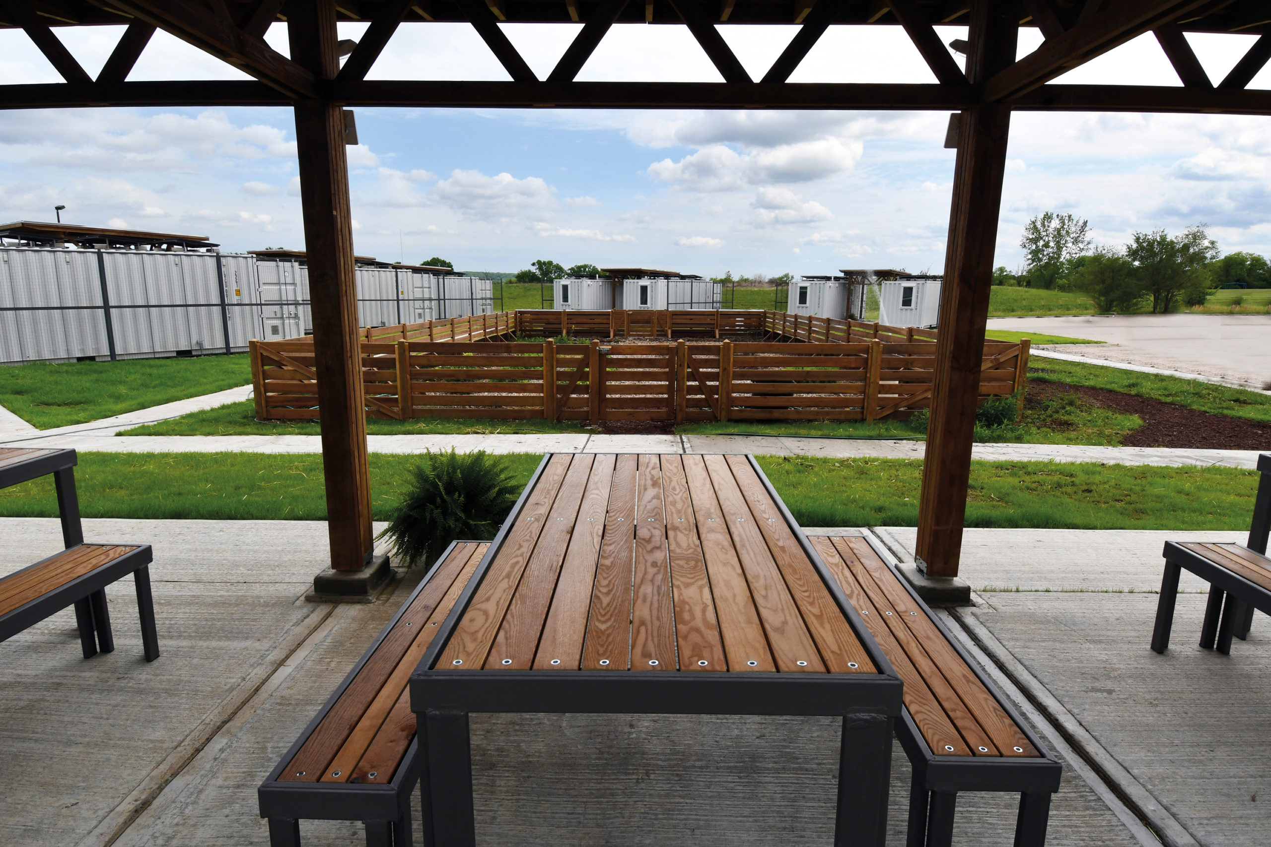 At the University of Kansas School of Architecture, graduate students have the option to enroll in Studio 804, which recently received a donation of a dozen shipping containers. The students worked to convert this gift into tiny homes for families who needed isolate during the pandemic. (The alternative was congregate housing.) Three solar collectors were placed on top of each unit to provide some electricity for inhabitants on the four beds inside.
 This project joins a growing movement towards architecture that blends in rather than standing out by acting as an extension of the existing landscape. Following the natural movement of the site, this design responds to crowds moving by through and around the building by raising up the green space of the original landscape and incising it with terrazzo paths.
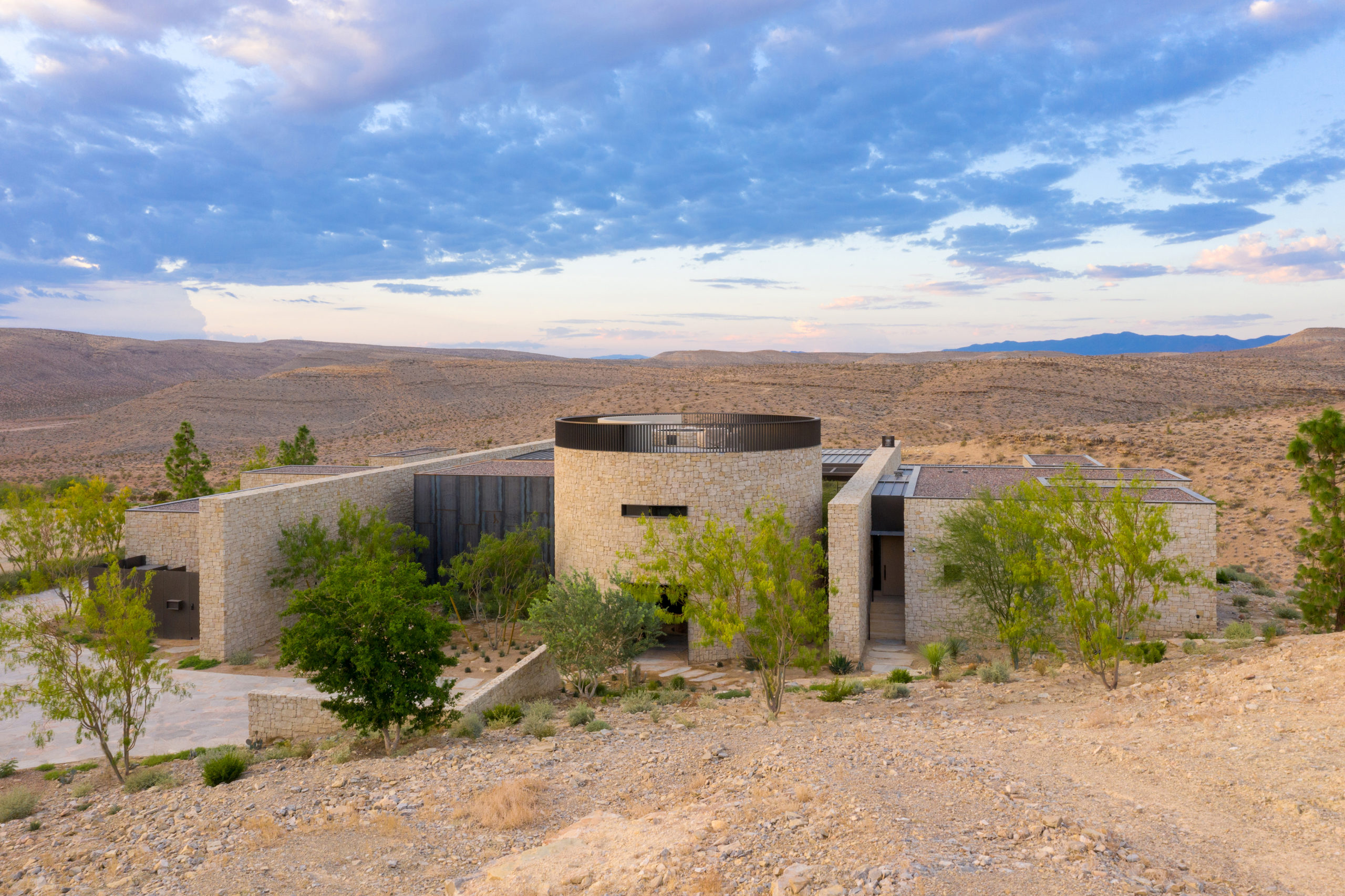
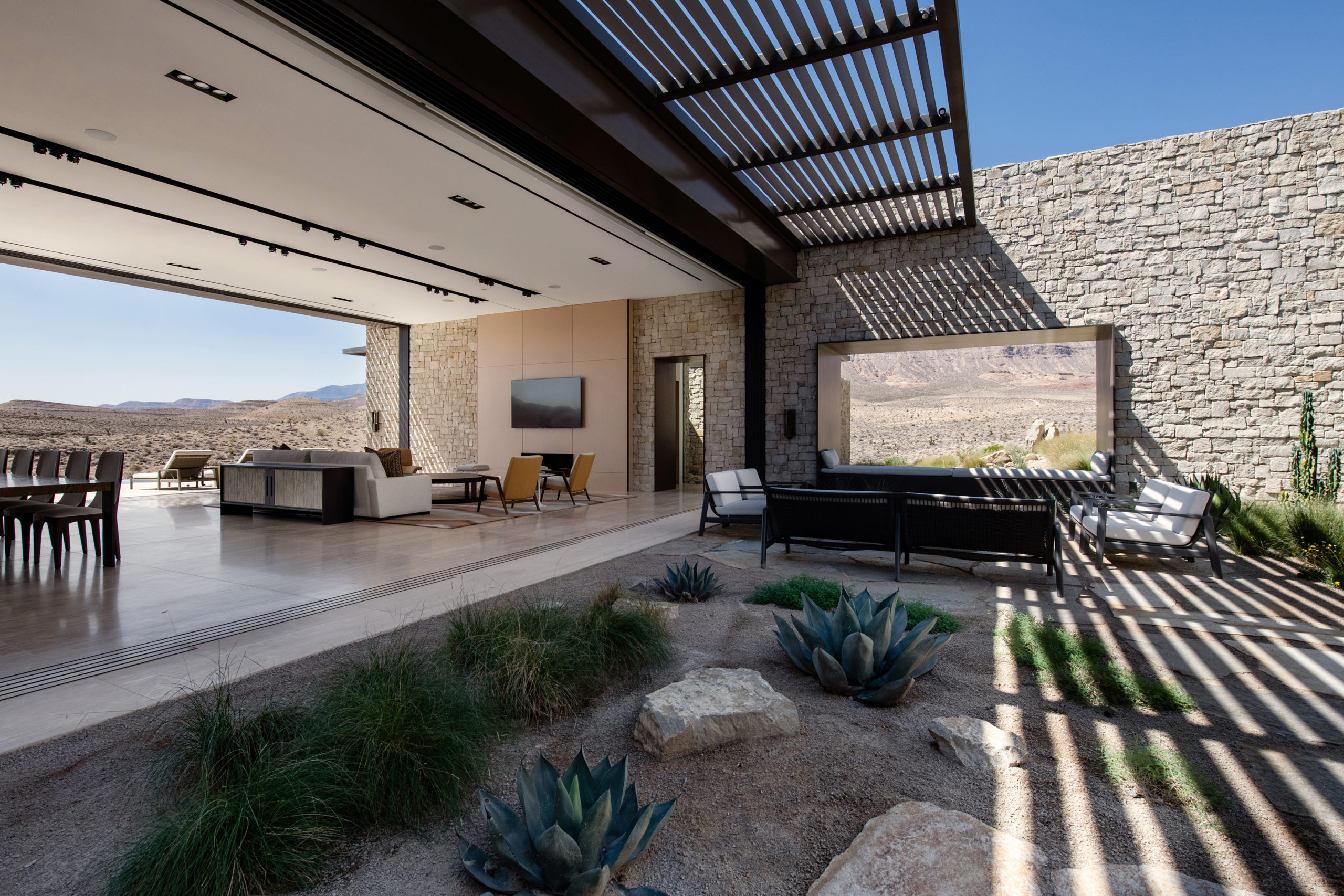 Perched on the most remote edge of the Las Vegas Valley, this scheme aims to immerse the client in the isolated landscape while maximizing unobstructed views of the surrounding desert and canyons. Like a stronghold in the desert, the site also inspired the design and materiality, which pays homage to the historic forts, hand forged from site-sourced materials, that dotted the fringes of the Southwest frontier.
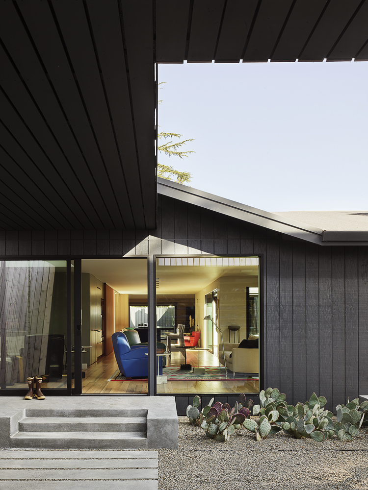
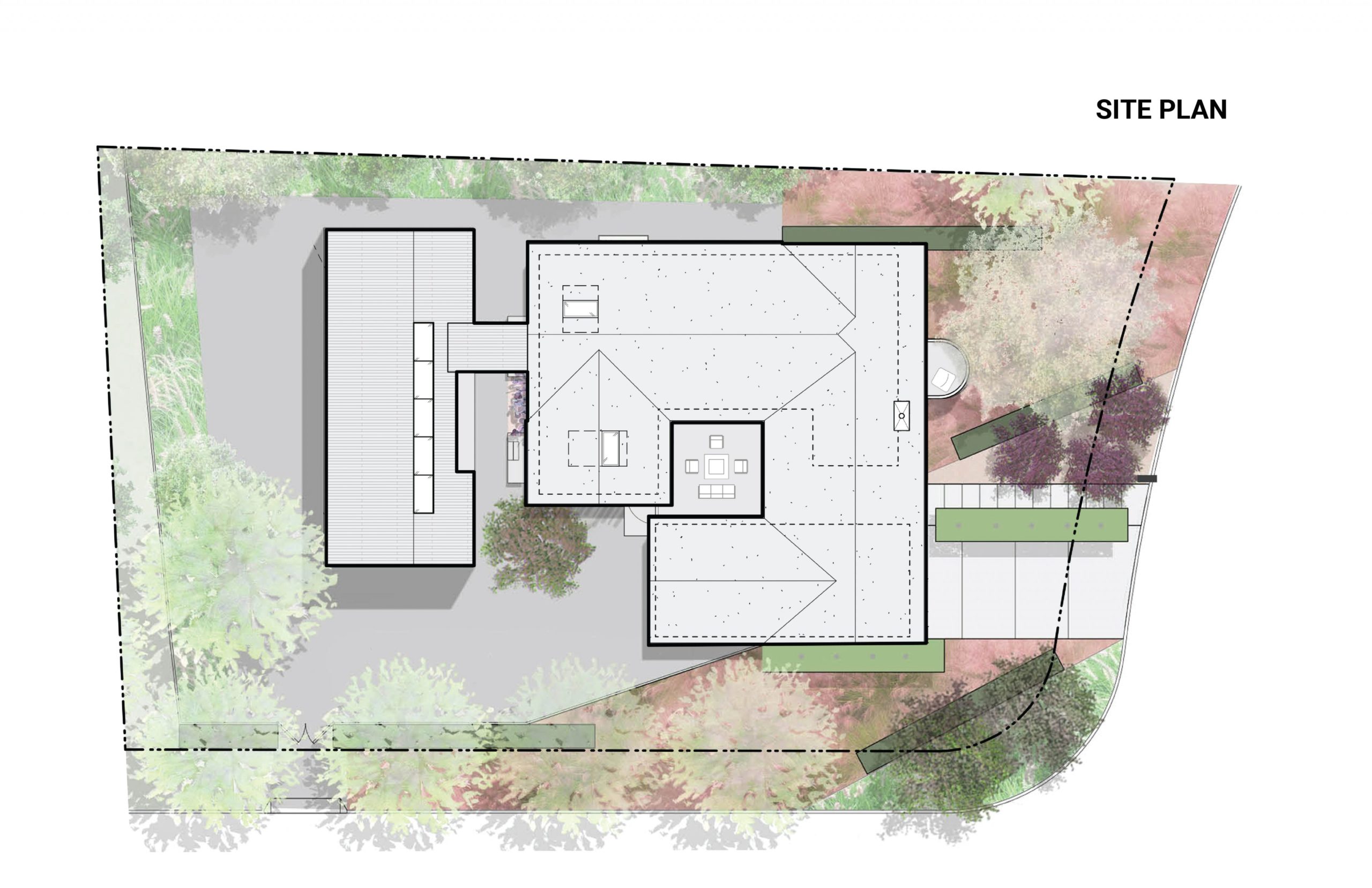
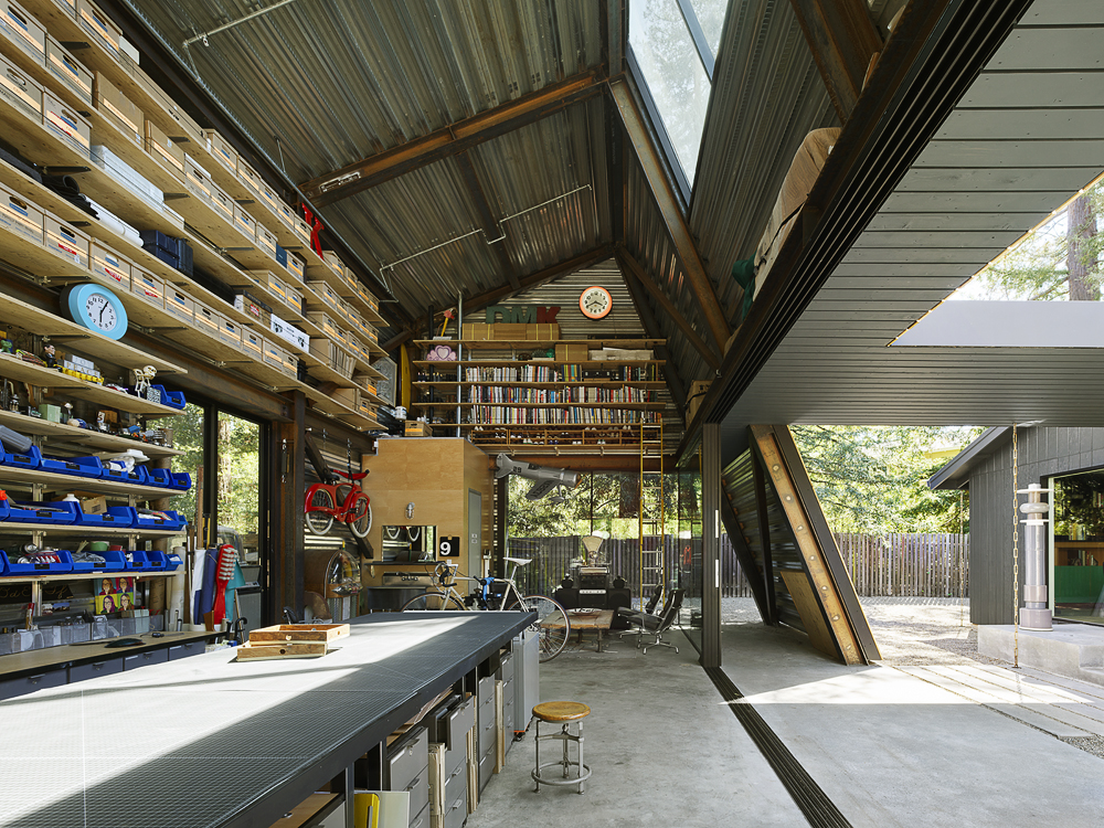 Reworking and remodeling this 1960’s house also involved integrating a new and unconventional workshop for the owner, a university professor. Yet, as the architects explain, “inherent in [the] work was a questioning of the suburban vernacular,” which manifested as a raw and tough space that is ready for anything. While an angled industrial frame, wrapped in wood and glass, offers a clever reply to local pitched-roof mandates, the connecting breezeway emphasizes a parti about flow, both creative and spatial.
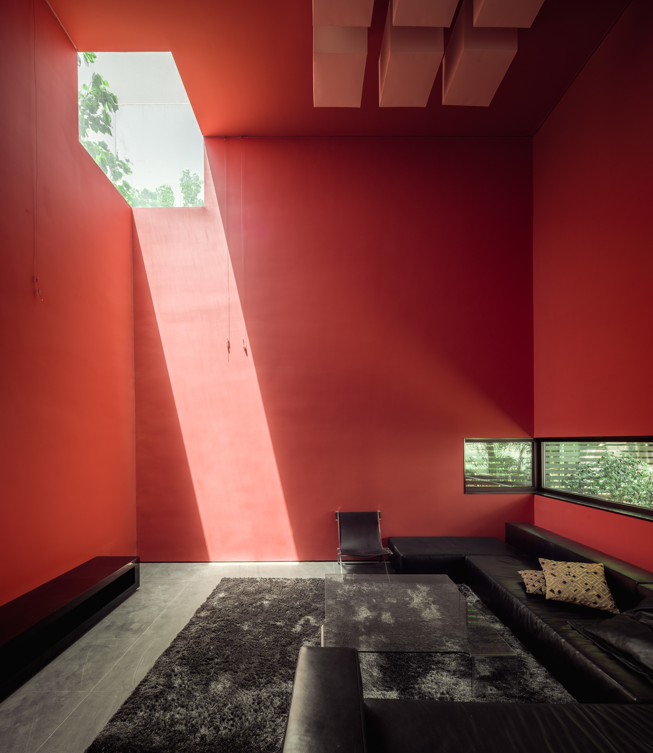
 On one aspect the house seeks to express the laid-back nature of the seaside town; yet, because the surroundings are quite cramped, the architect had to carefully study the massing placement. This resulted in a sort of inside-out house, with an arrival courtyard penetrating to the central living deck that creates an in-between area that is convertible to be either indoor or outdoor living area.
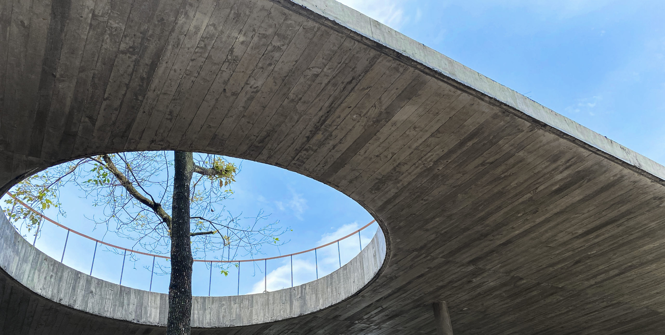
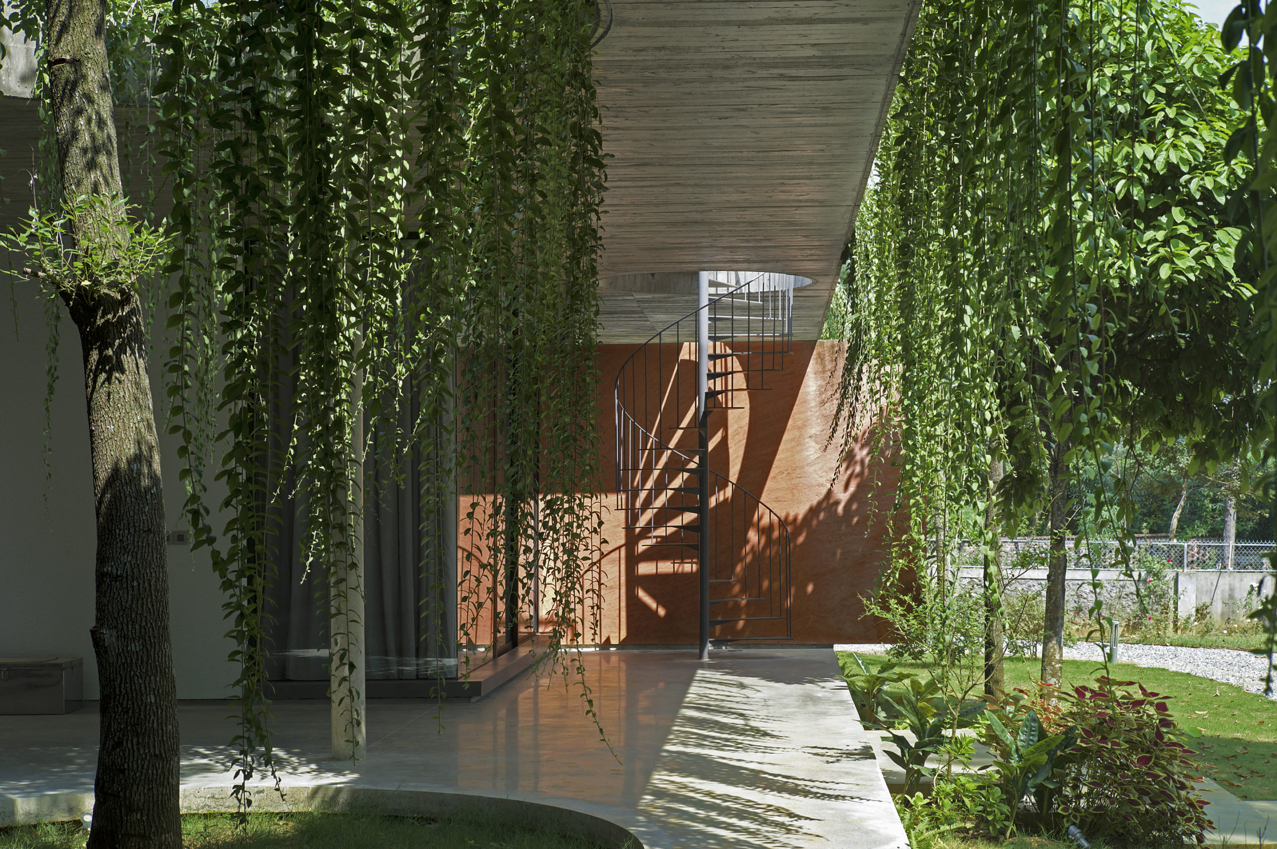
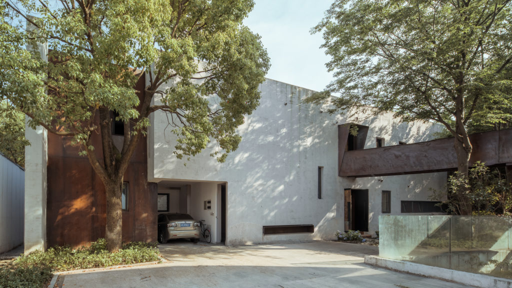
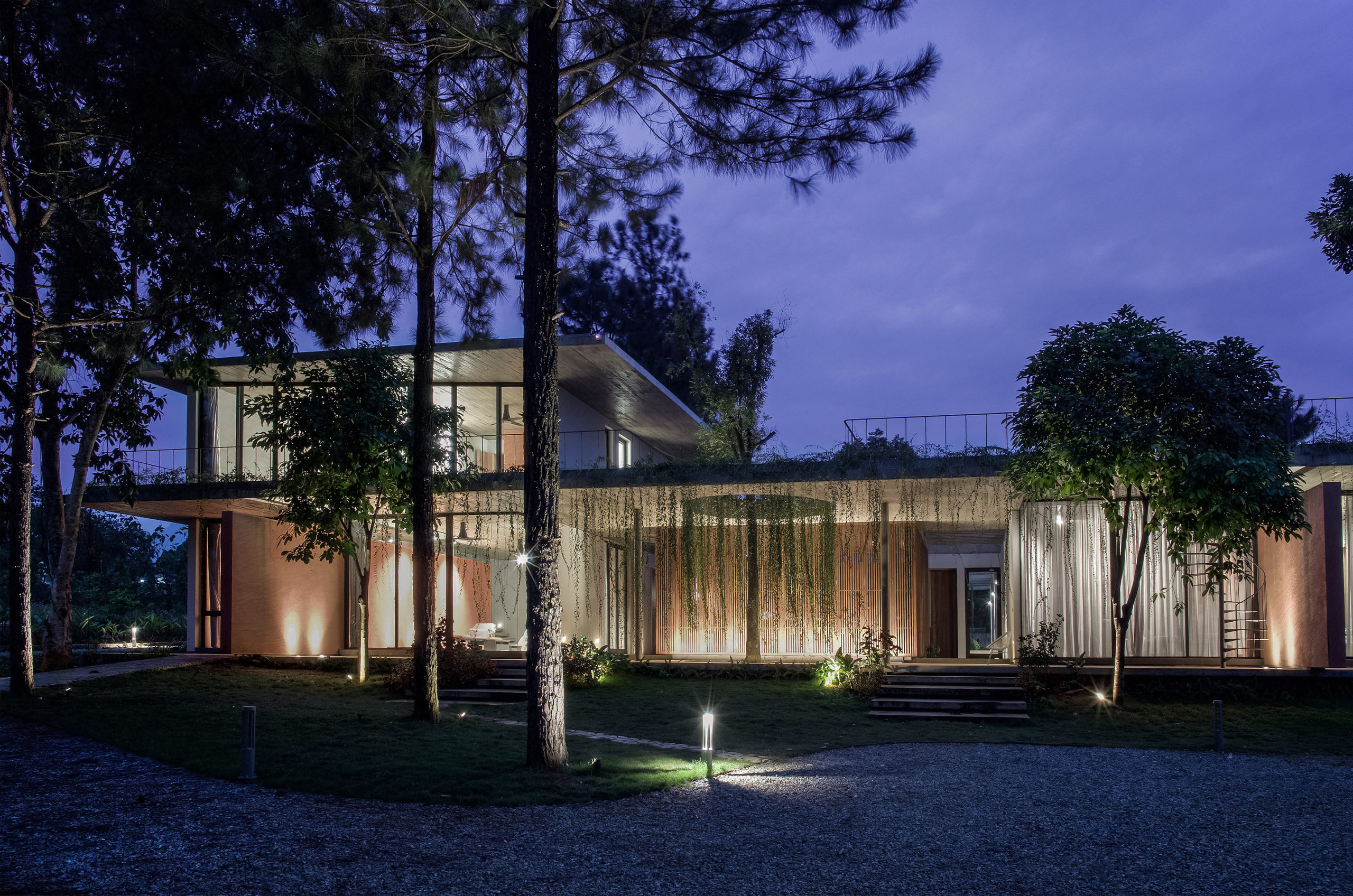 This house is home to family members across generations, meaning that it requires spaces that accomodate differences in family members’ lifestyles, ages and personal needs. While the grandparents are used to the traditional Vietnamese lifestyle, the married couple and their children are familiar with the modern way of living in foreign countries. Faced with designing a massive structure, the architects needed to find a way to ensure that it blended in well with its surroundings.
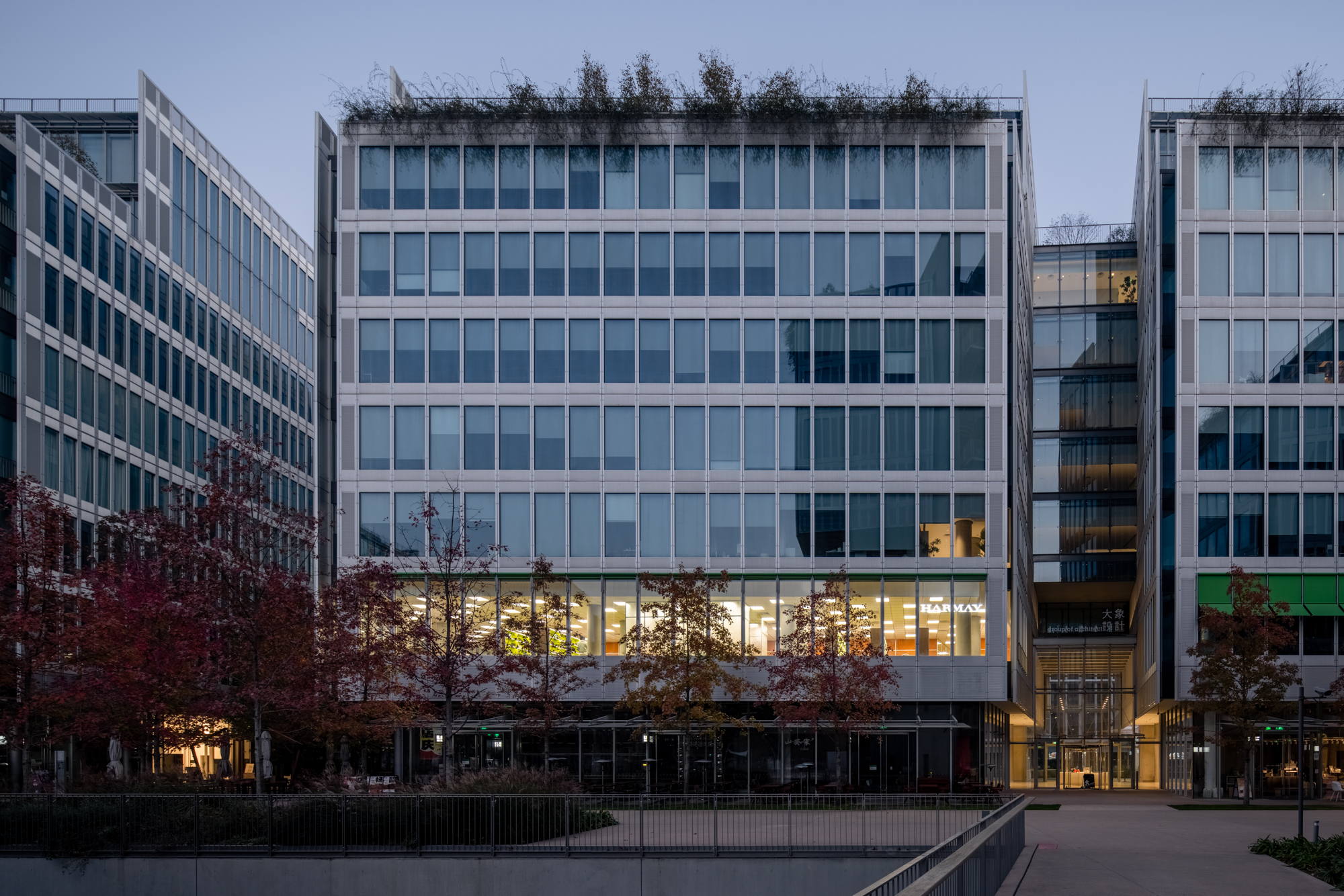
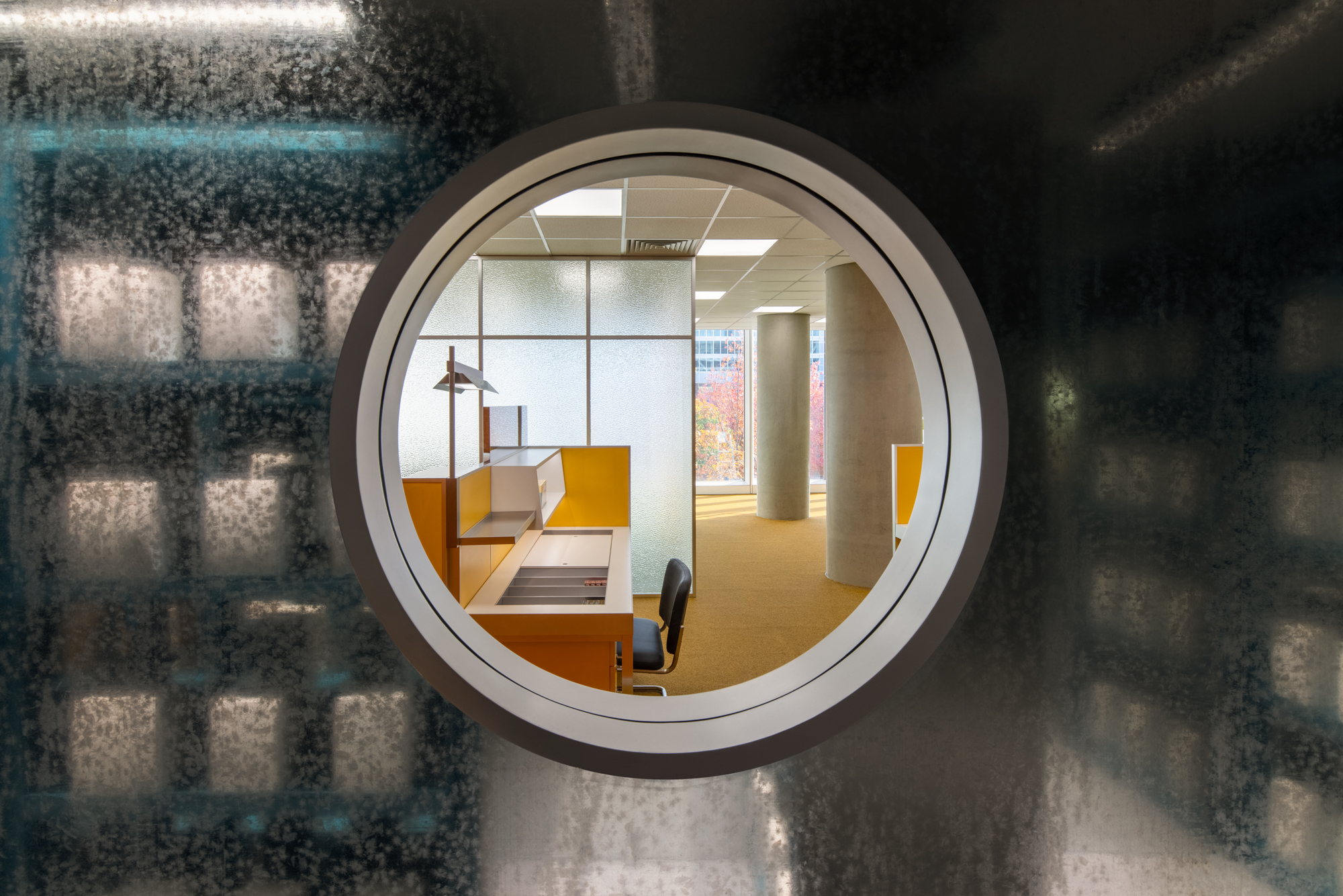
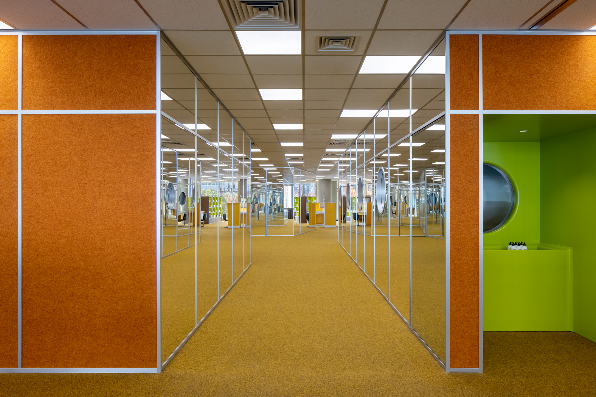 Set on the second floor of a building in a mixed-use office park designed by Renzo Piano Building Workshop in 2020, this store is inspired by its immediate surroundings. The space with floor to ceiling high curtain wall windows and an enclosed center core is the perfect platform to explore a place closely related to our day-to-day environment, the office. Representing a 70’s romanticized image of what an office life looks like, consumers experience this illusion of time wandering between the past and present. Working with bright color tones, soft carpets, and different textures creates a mood of future positivism.
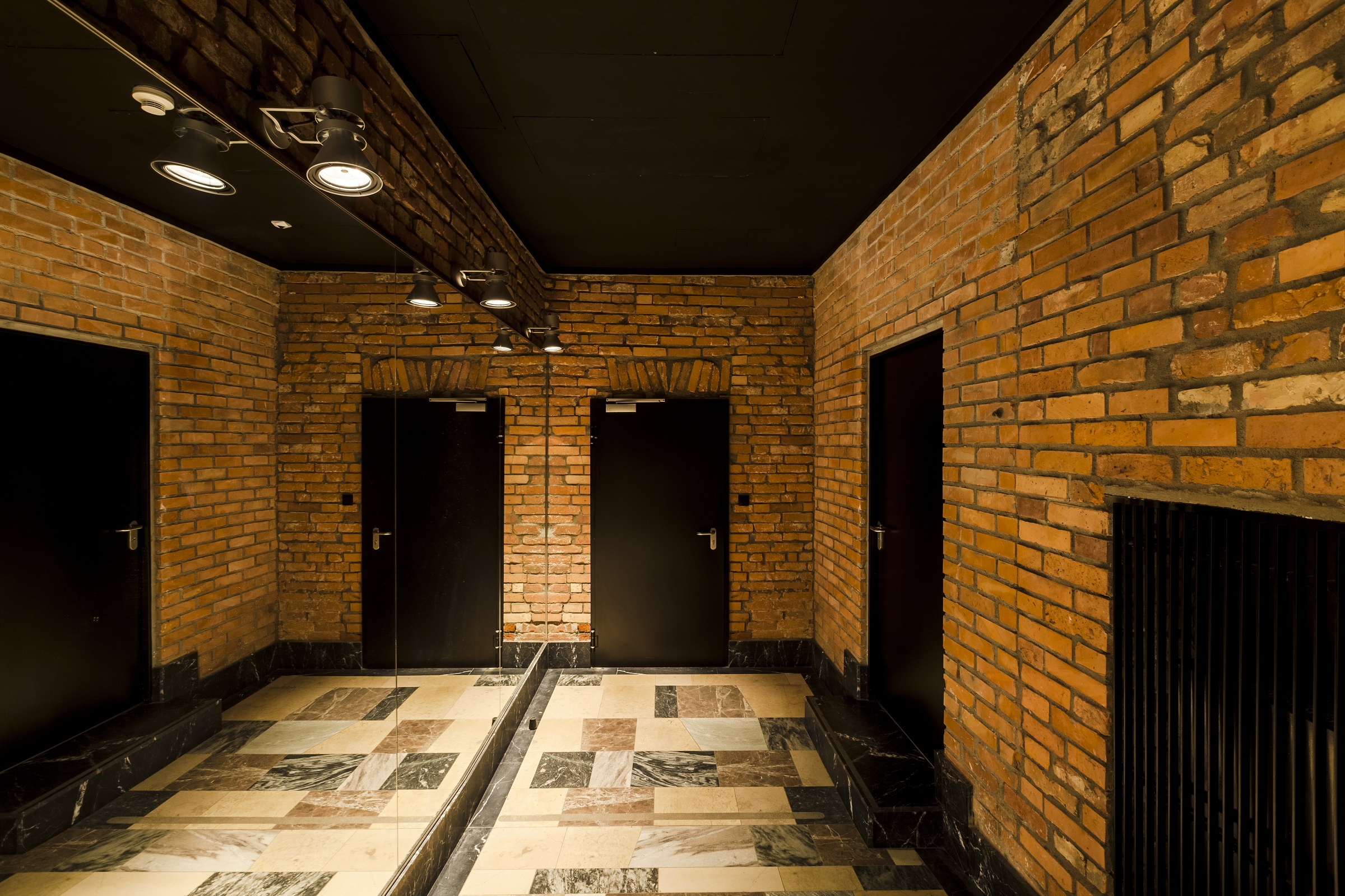
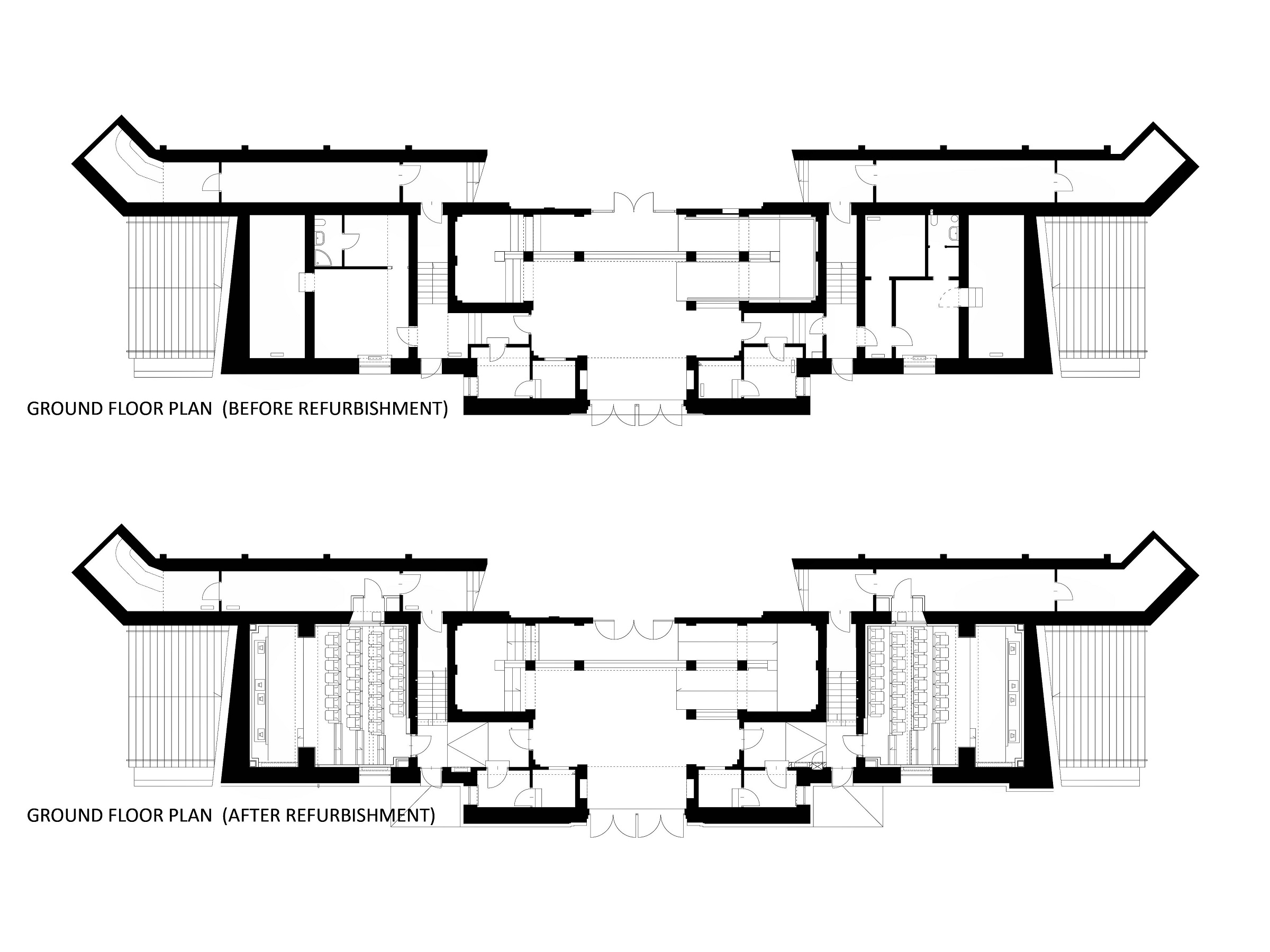
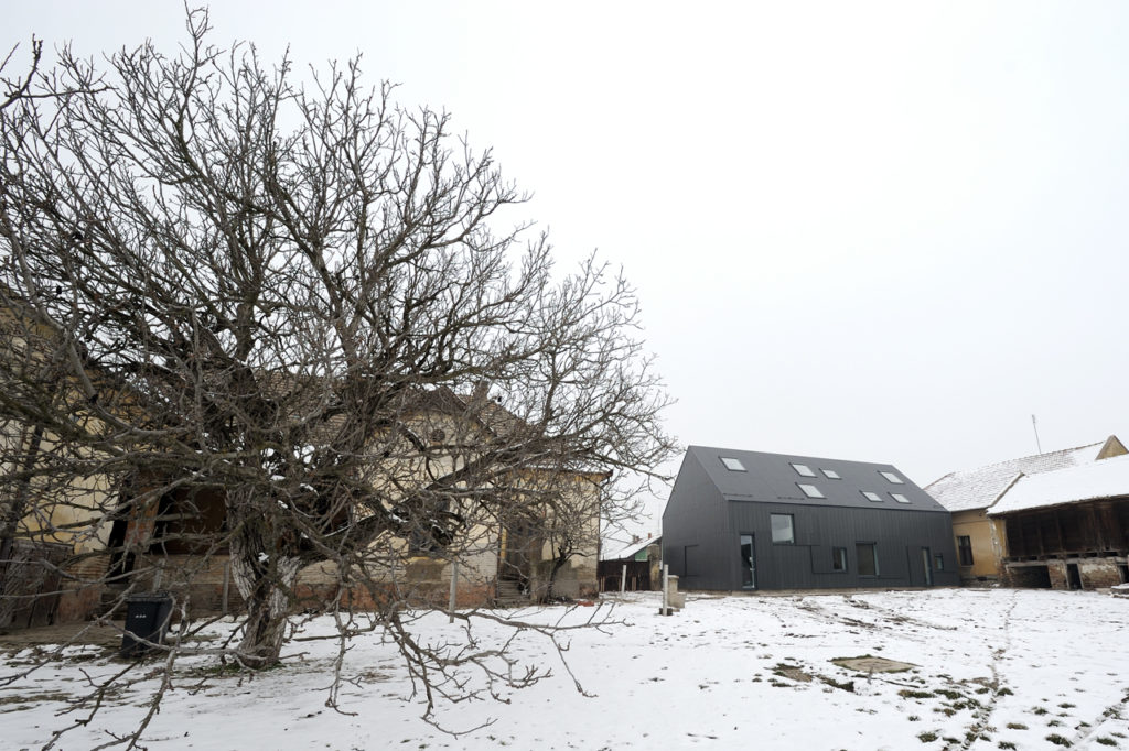
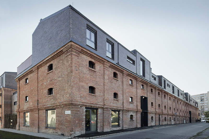
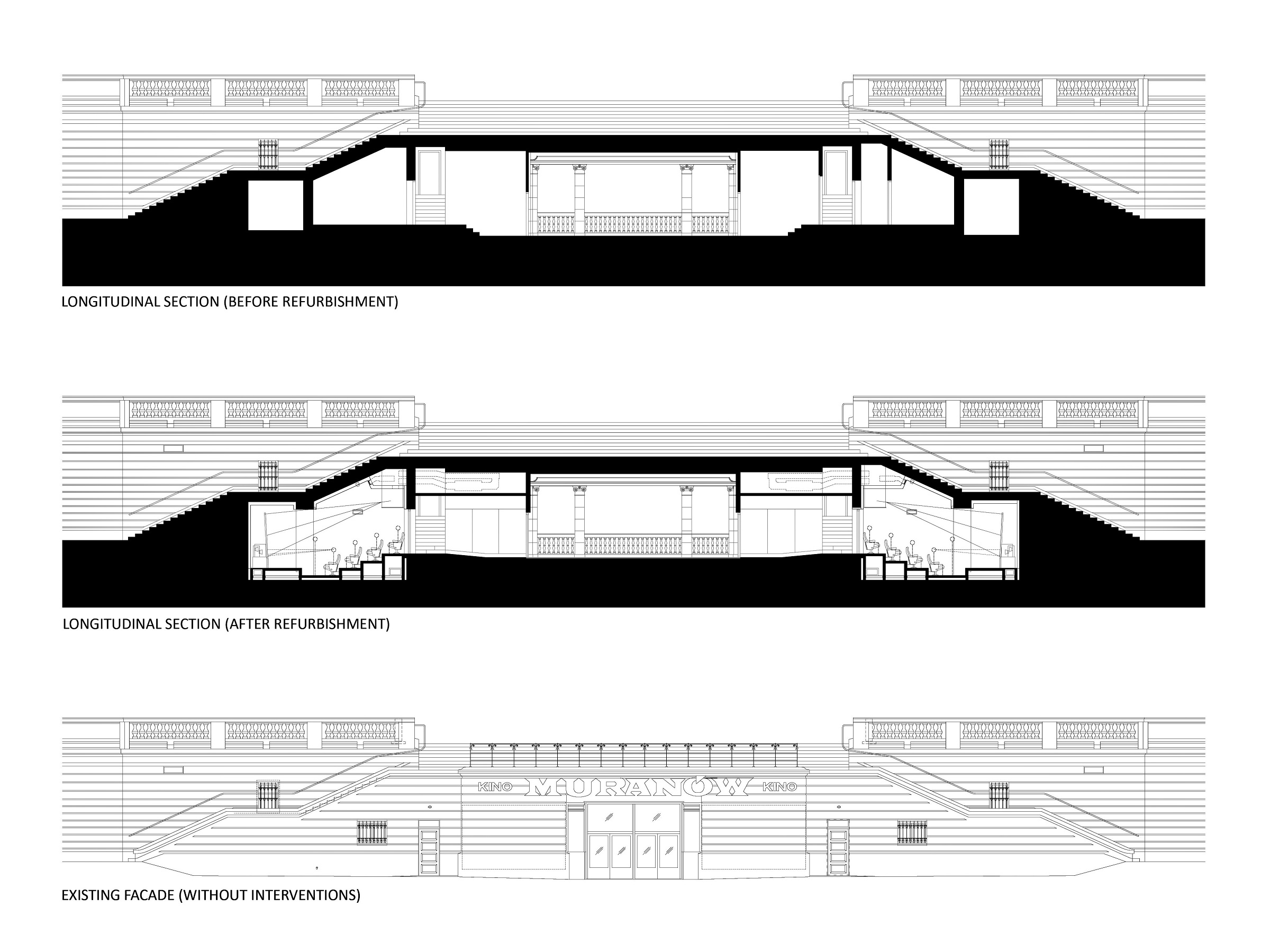 The cinema is located in the area of a former Jewish quarter destroyed by the Nazis during the WWII. In the aftermath, the area was rebuilt using rubble from the former buildings. The designer of the cinema, the excellent pre-war architect Bohdan Lachert, faced a choice: either to design in the socialist realist style or not to design at all. It was only decades later that his ideas were appreciated. Seventy years later, these stories from the past had a strong influence on Piotr Hardecki Architekt’s refurbishment project.
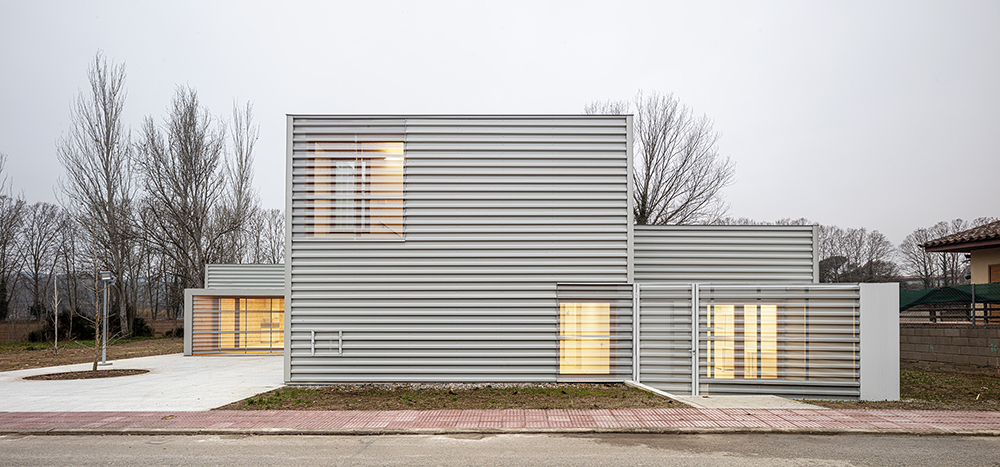
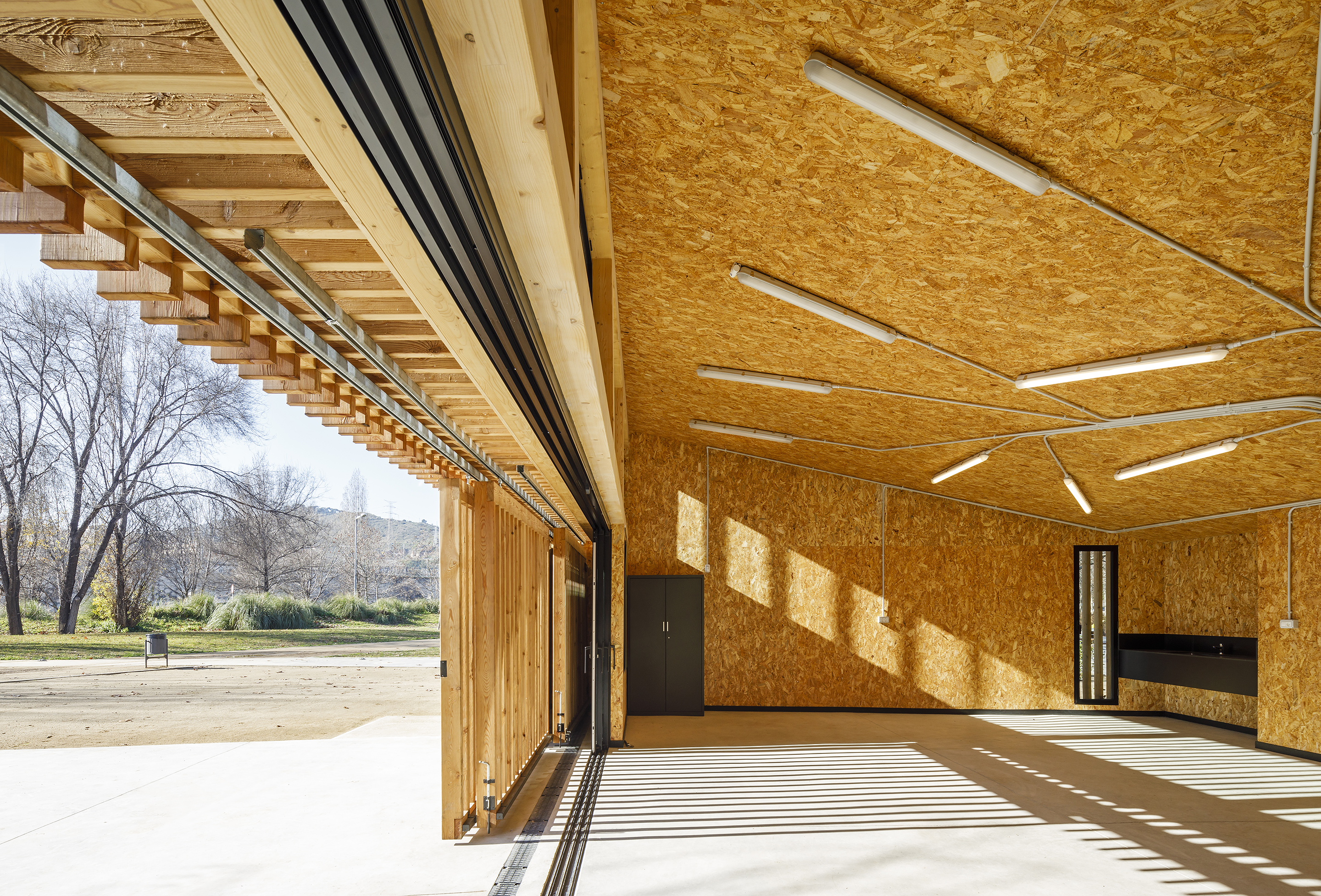
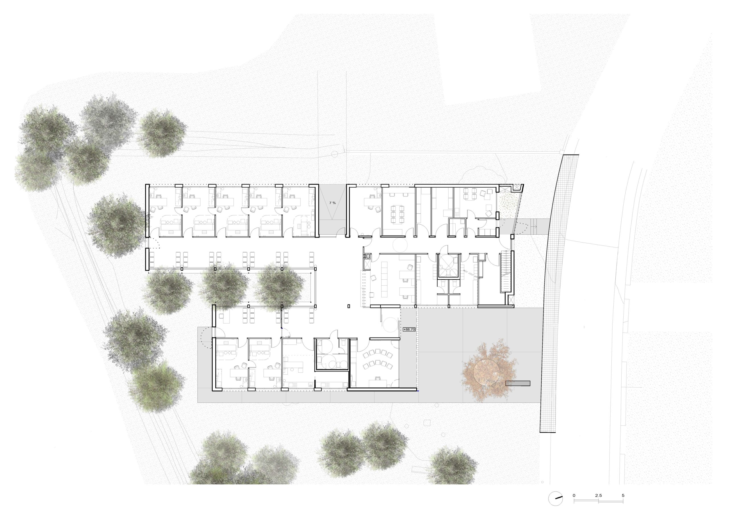 A Primary Care Center (CAP) is an ideal public facility to consider the health of people from the construction itself, minimizing the generation of CO2 in the life cycle of materials and ensuring a healthy environment in the interior. This project introduces the surrounding landscape inside the building through a linear courtyard related to the waiting rooms. The use of the structure with microlaminated wood (CLT) for the first time in a CAP in Catalonia, generates a conceptual dialogue with the forests of Montseny (biosphere reserve) visible from the building, reduces the execution deadlines and waste and allows to achieve the highest energy rating A.
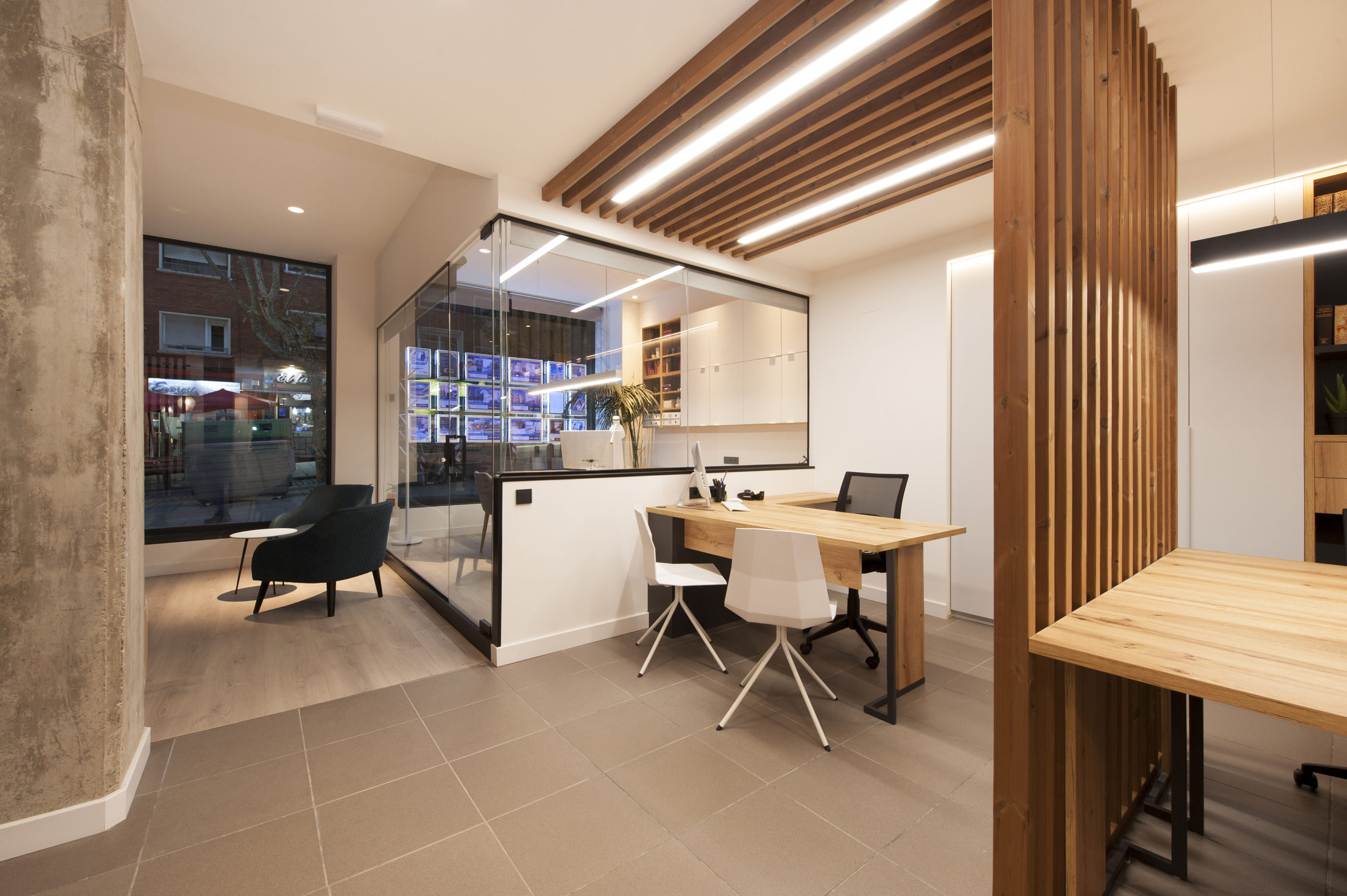
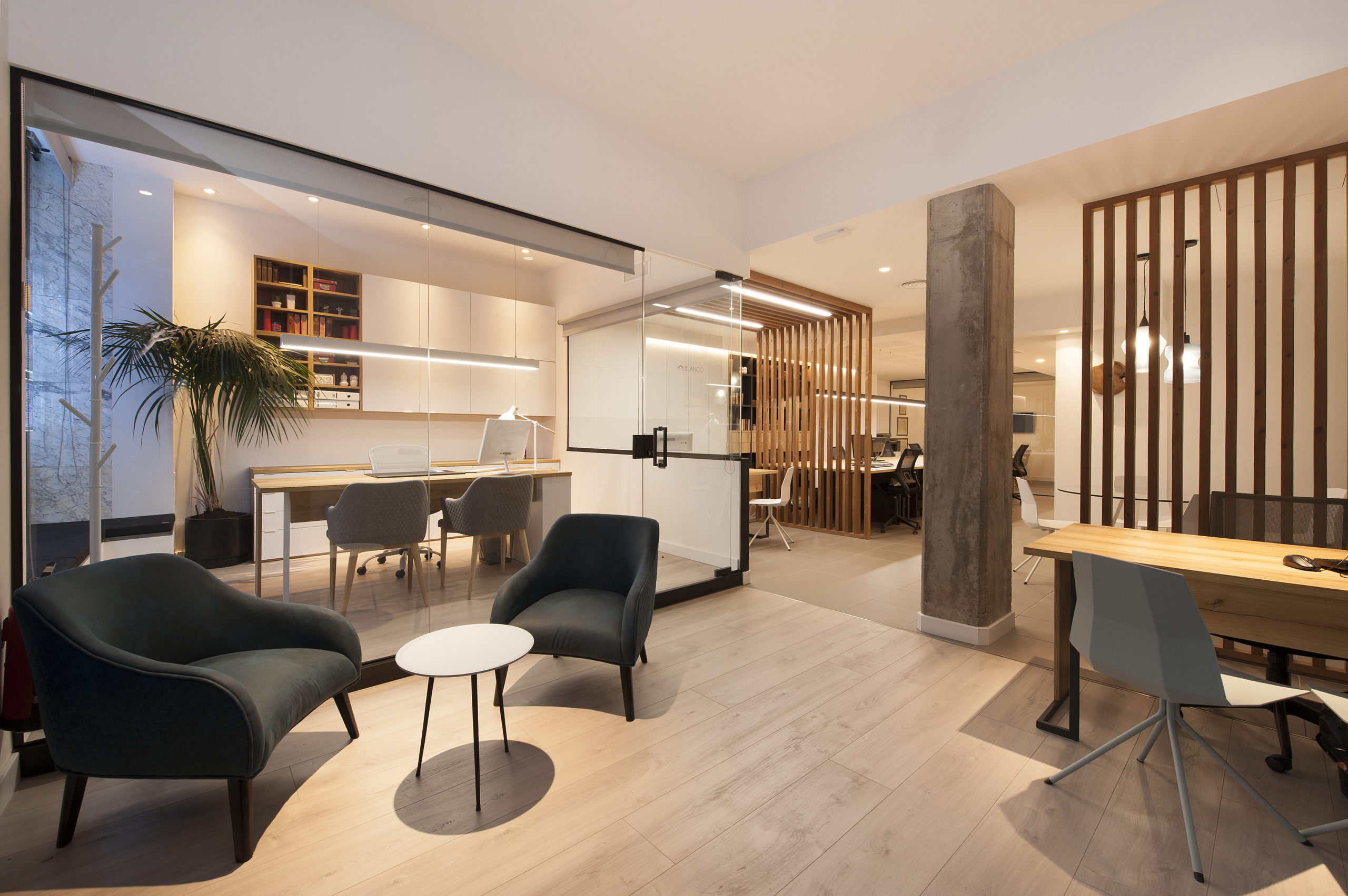 The complete redesign of the corporate image of the 15-year-old offices of a real estate company in Barcelona. The interior has been designed in a Nordic style, expressed through the use of wood that brings warmth, along with the minimalism of white. The structures made with wooden slats also function as spatial divides that simultaneously imbue the space with character and personality.
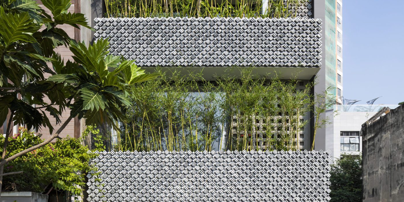
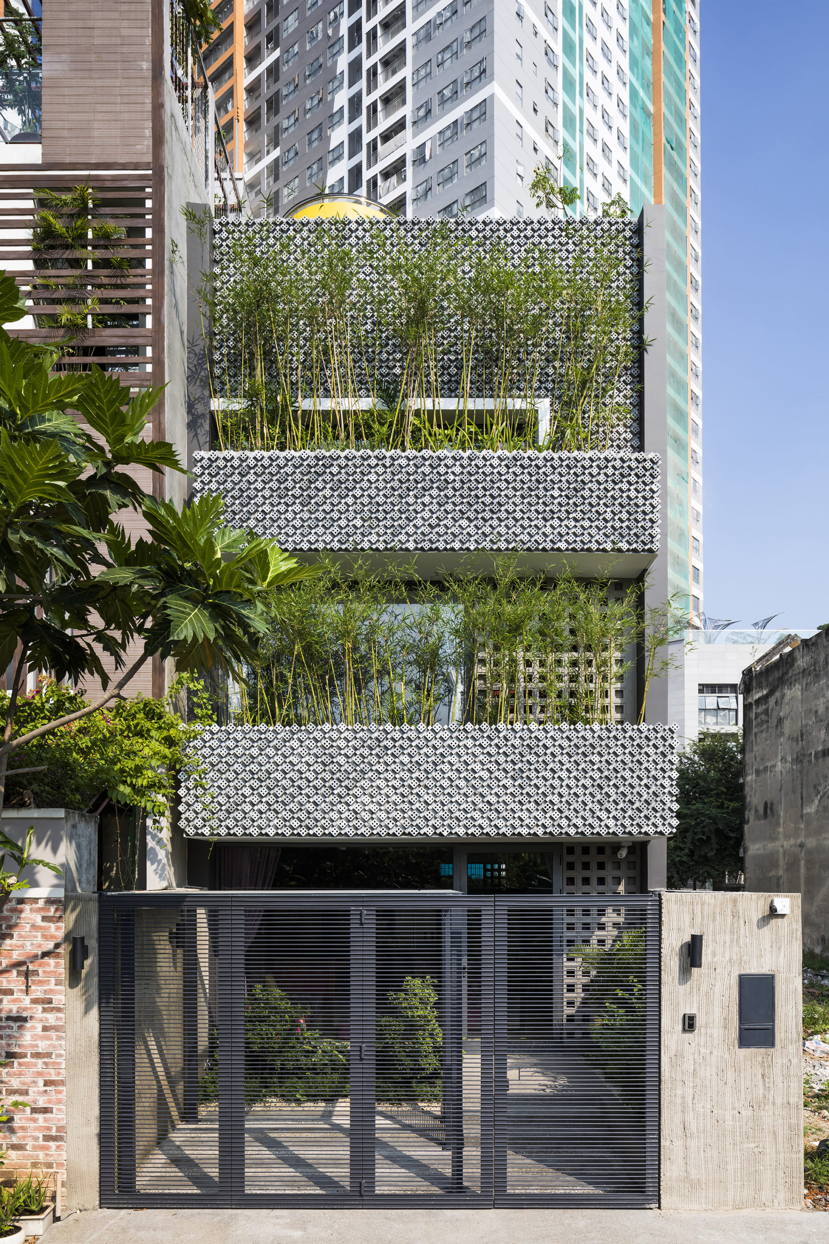
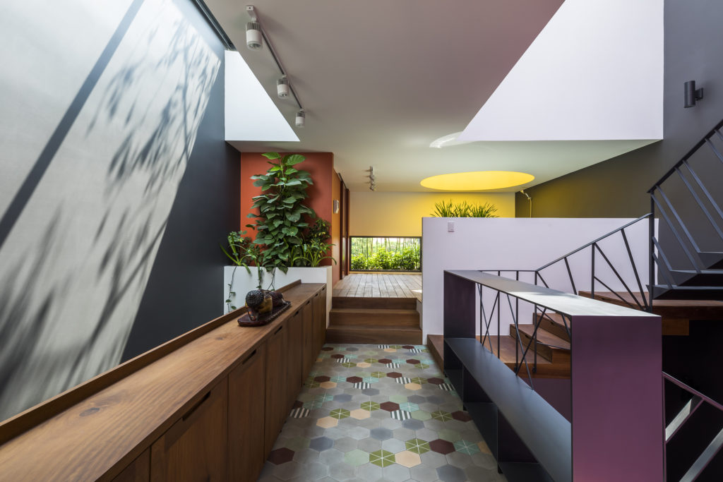
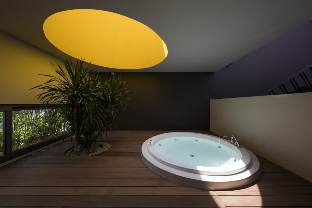 This modernist construction in Ho Chi Minh combats the perception that shophouse-style buildings suffer from a lack of natural light because of the inherent narrowness of their lot. The designers do so with a textured combination of cement breeze blocks and brick patterned walls, letting sunlight gently diffuse inside. Bamboo trees, meanwhile, create their own natural screen to filter the direct sunlight coming through the street-facing windows.
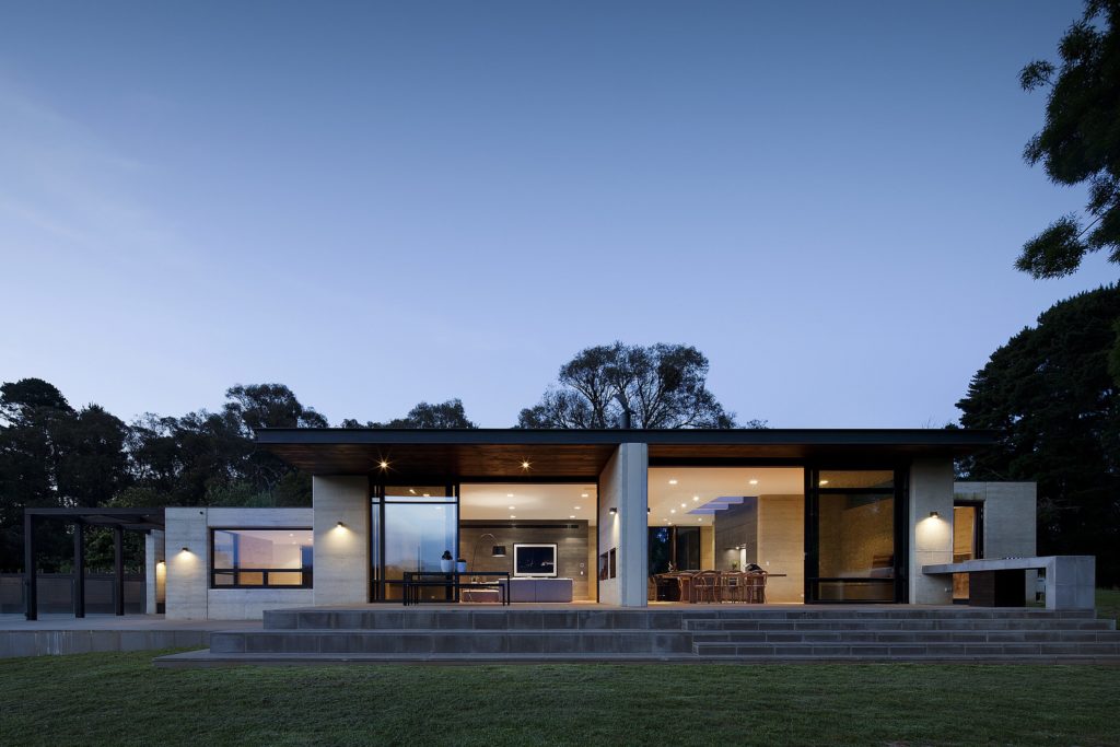
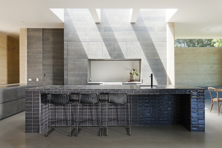
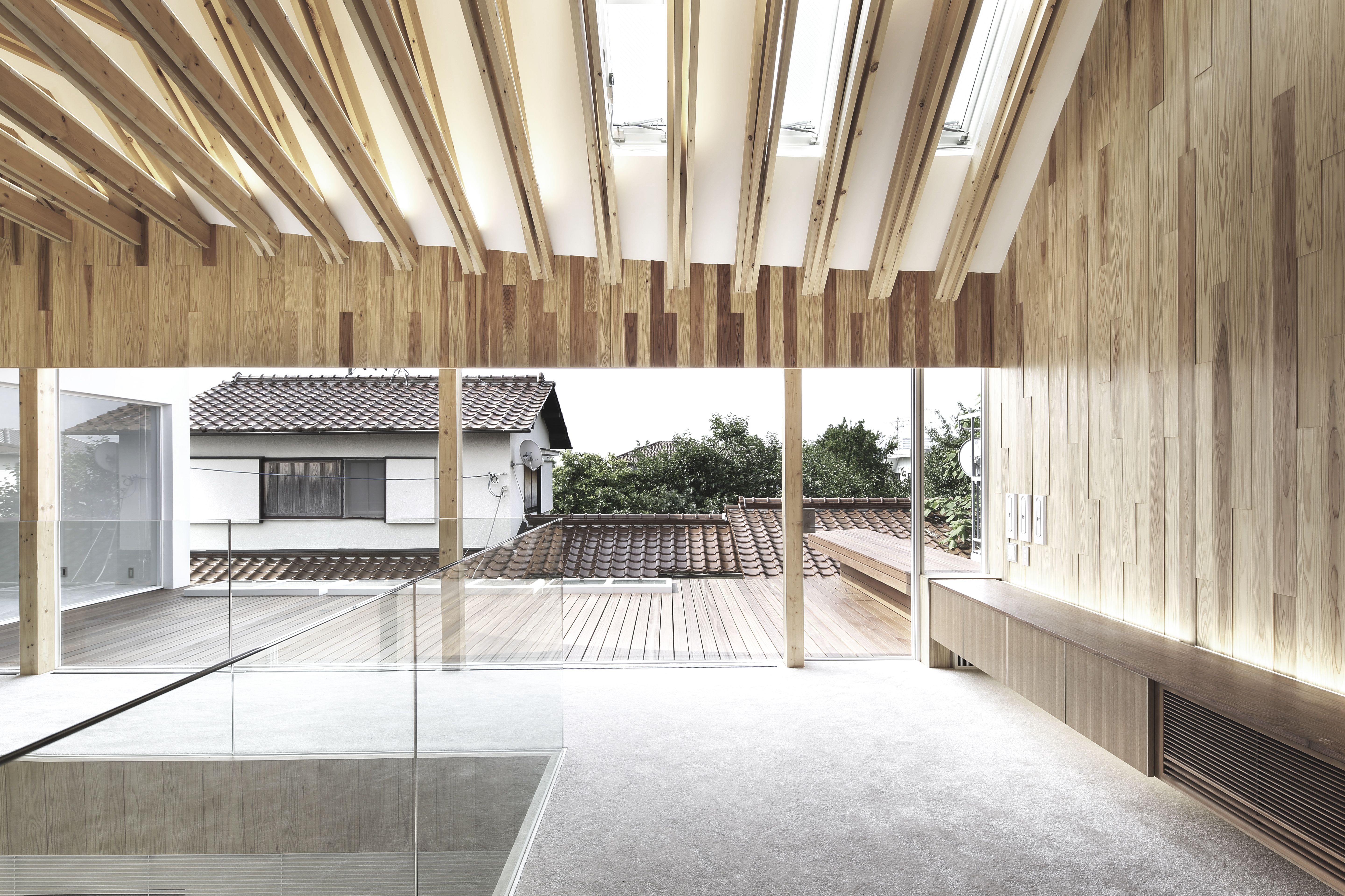
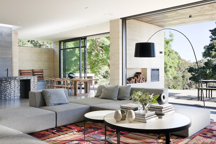 The family commissioning this rural home near Melbourne wanted to ensure plenty of natural light within the living space, but without the harsh direct northern and western sun. To resolve this issue, Robson Rak Architects designed large eaves to shade thin long high-level windows around the house, creating an evenly glowing living room and dining room. In similar fashion, the architects added two wall-like beams underneath the kitchen’s skylight, parsing out the strong sunlight into milder segments.
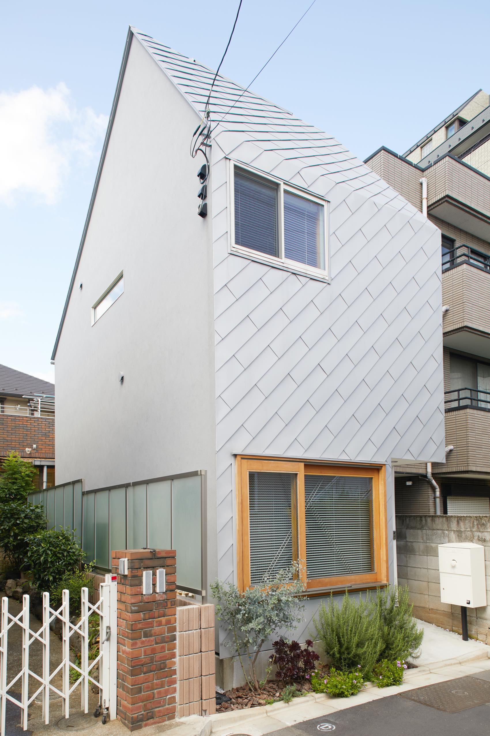
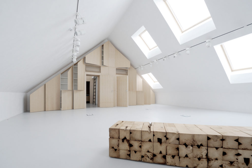
 Rejecting the idea of the theatrical space as a necessarily dark and solemn place, this new estate espouses a more open (and bright) setting for its cultural projects thanks to a series of large skylights. From the outside, the playfully random assortment of skylights and windows healthily counterbalances the more serious dark-grey exterior.

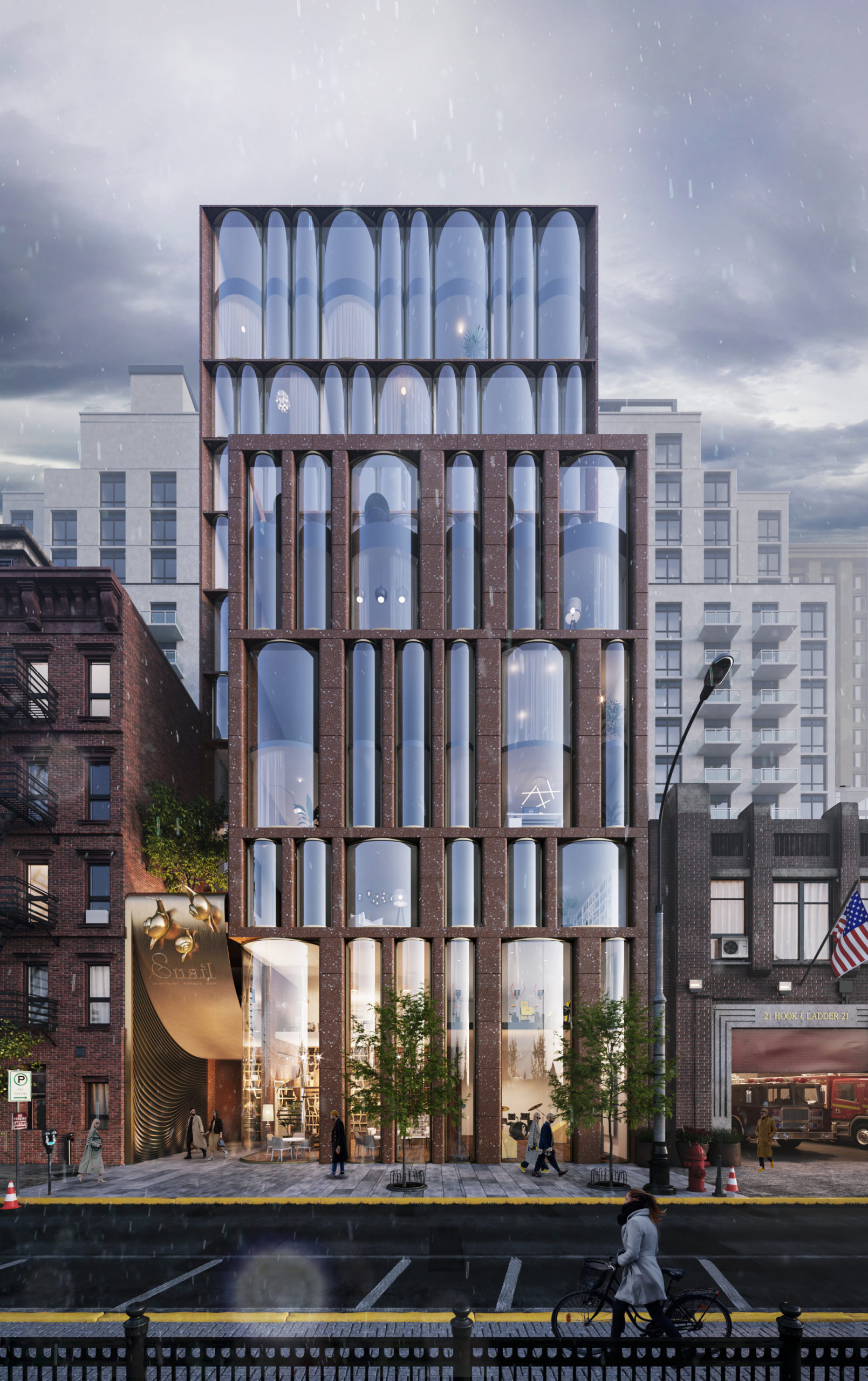
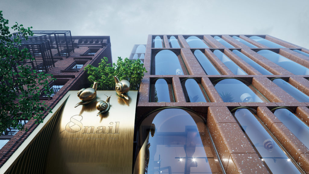 The design concept for this residential project in Chelsea, New York combines features from two different eras of the city’s architectural history: 19th and 20th century brick housing and contemporary glass skyscrapers. Yet, neither inspiration can account for the arrangement of floor to ceiling cylindrical-shaped windows which give the façade a lively character. It’s ironic that the project’s emblem is a snail because the design leaps towards an exciting vision of the future.
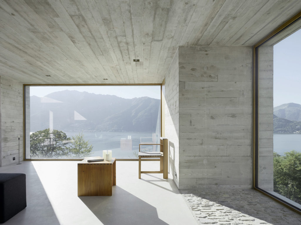
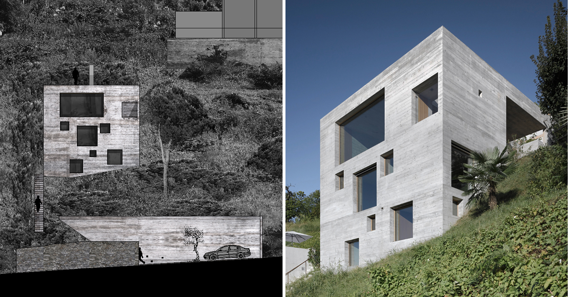 Standing on a steep slope near Lake Maggiore in the Swiss Alps, this new house keeps things simple with a cubic shaped structure and wood panel cast concrete walls. The irregularly placed large square and rectangular windows breaks with the monolithic façades and ensures no view of the stunning lake goes unseen.
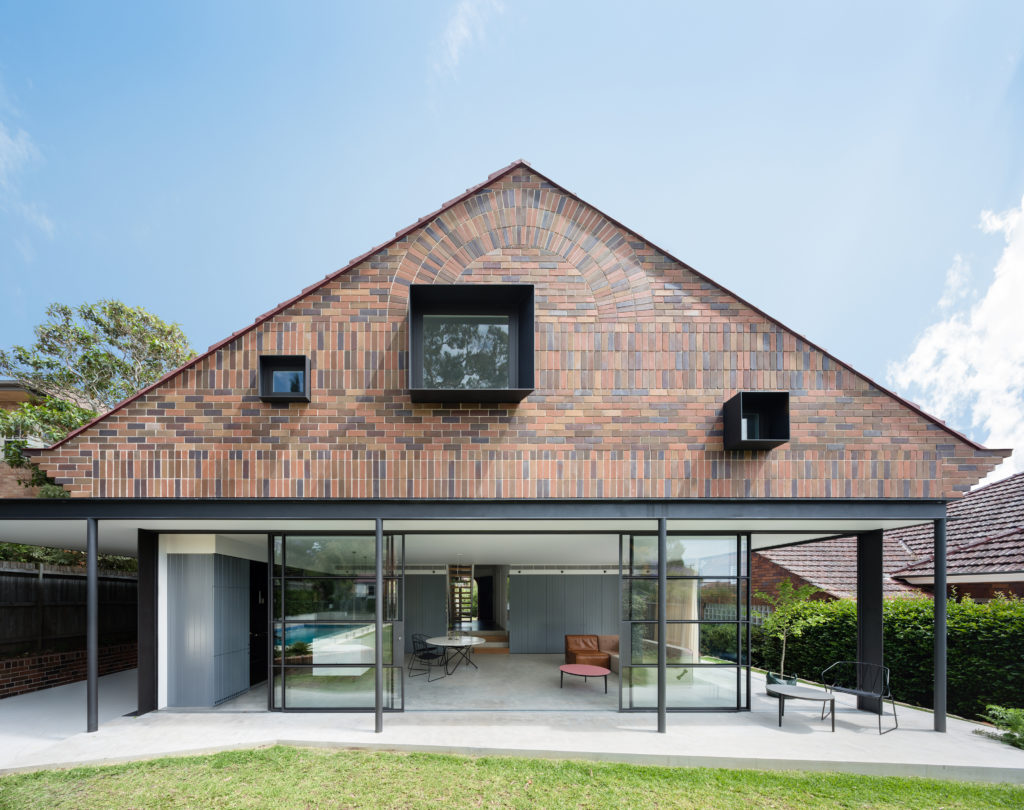 The rear extension to this modest 1930s bungalow in a leafy Sydney suburb reproduces many of the sensible design choices of the original house: herringbone brick gables, a brick sunburst and some Tudor detailing among other details. However, three deep-set square windows bring a pop of modernity to the rear façade, matching the design ethos of the new living room on the floor below.
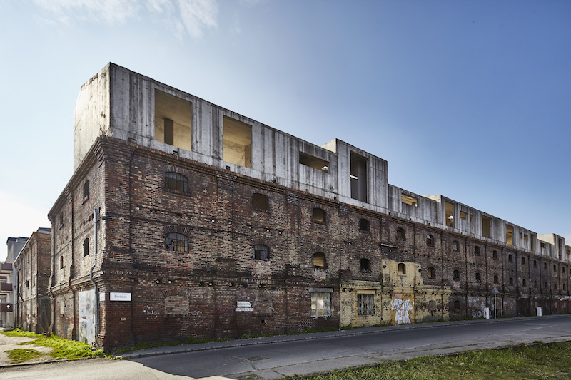
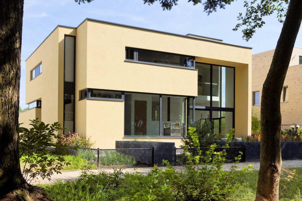
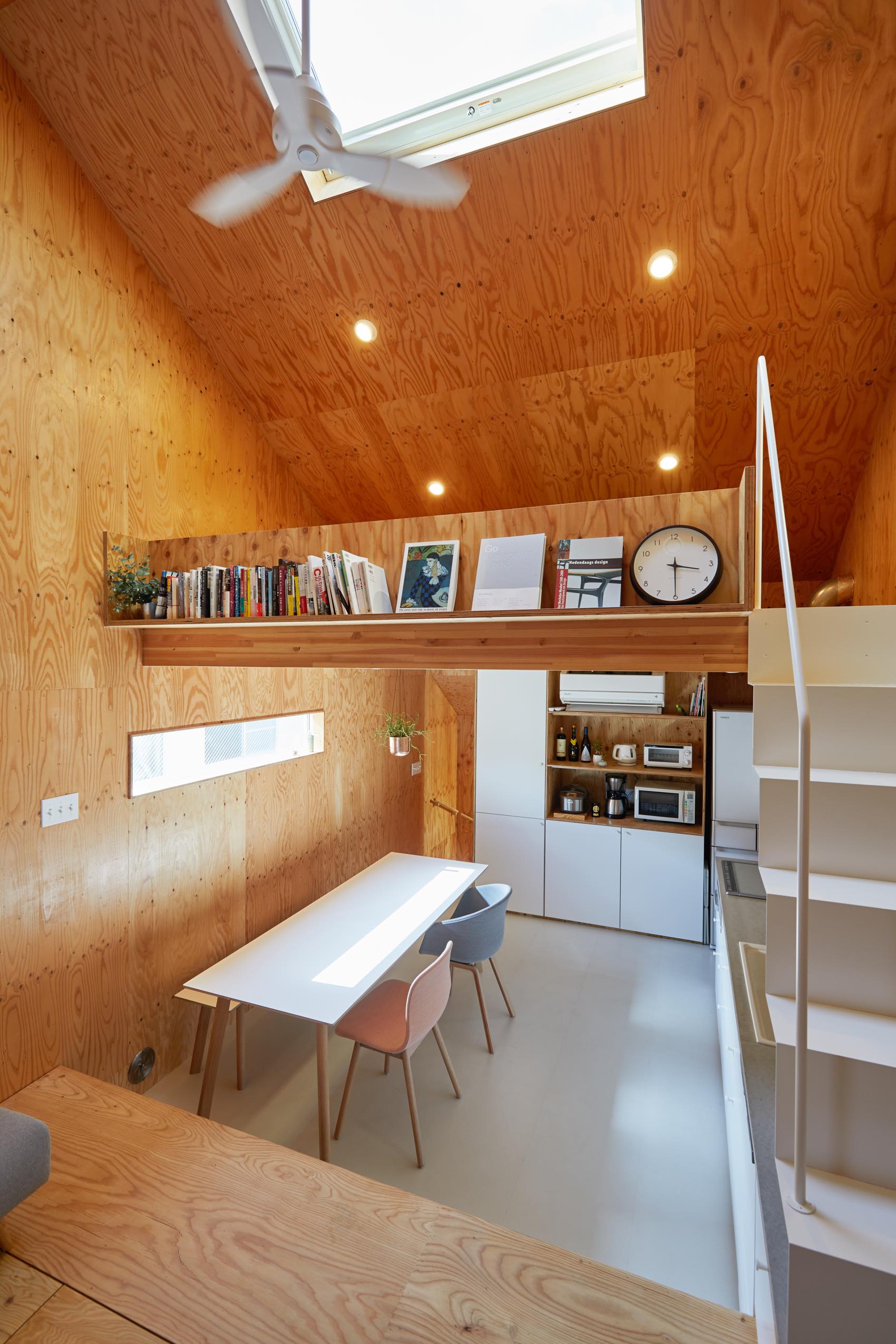
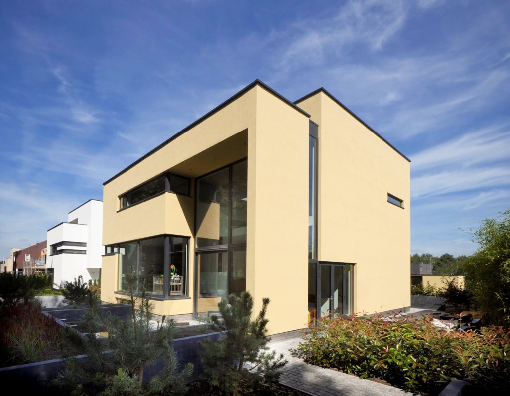 This new residence in Eindhoven is a playful remix on Le Corbusier’s ribbon window. The architects add a vertical dimension to the horizontal windows, ensuring one continuous flow of glass over two floors carved within the yellow cubic volumes. These offer generous vertical views of the nearby forestry while maintaining enough privacy for the second-floor bedrooms.
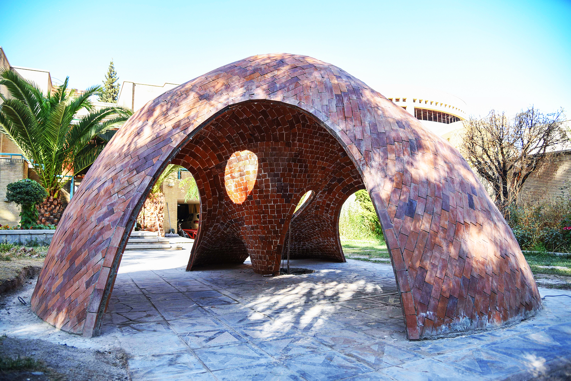
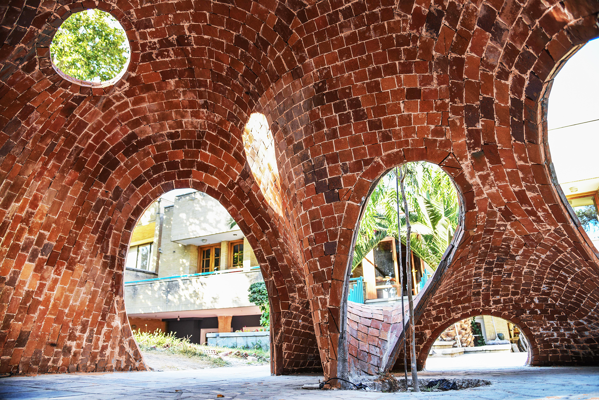
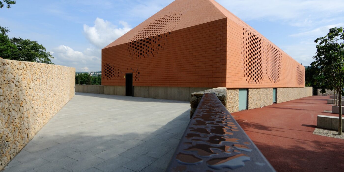
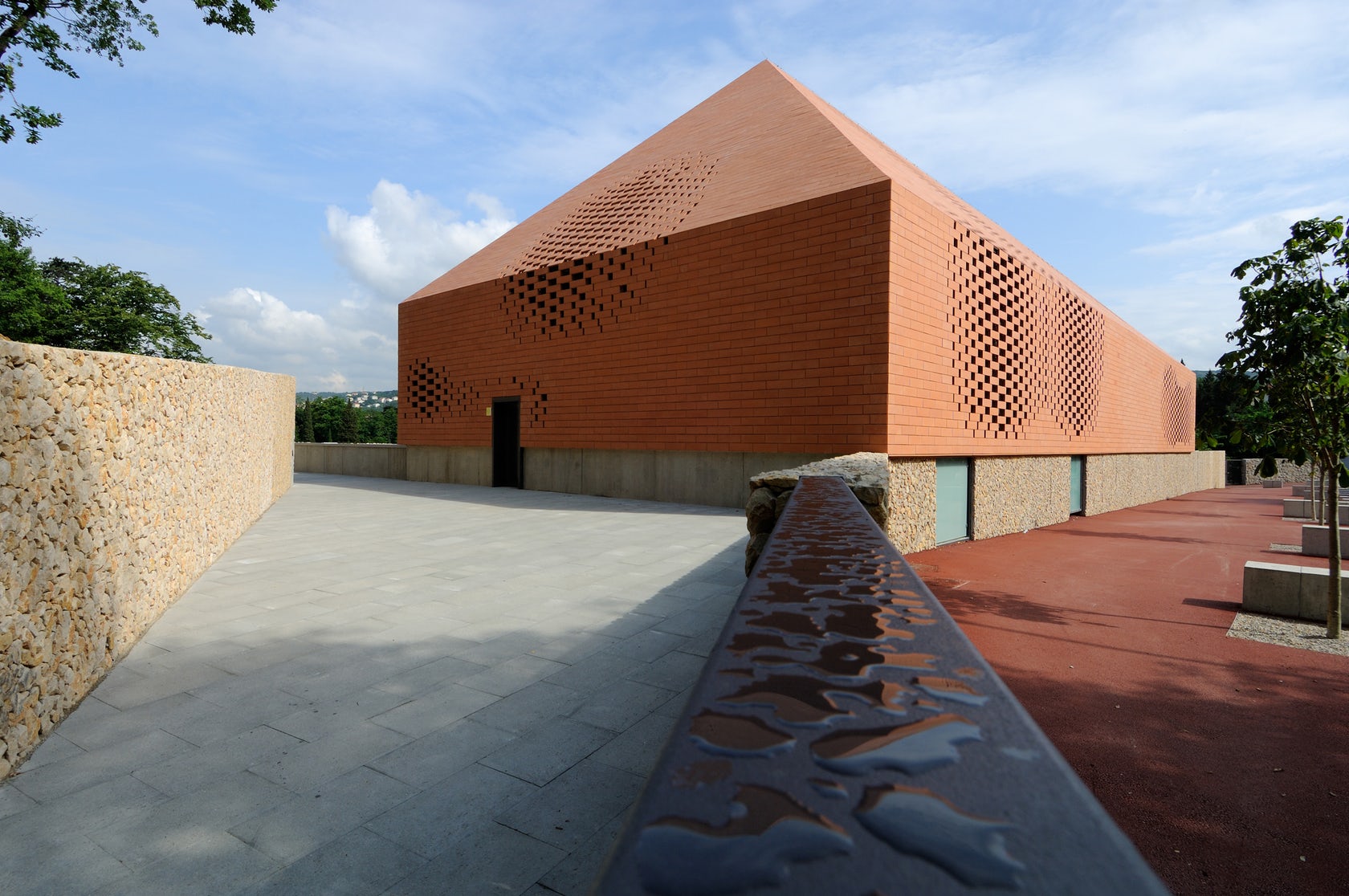
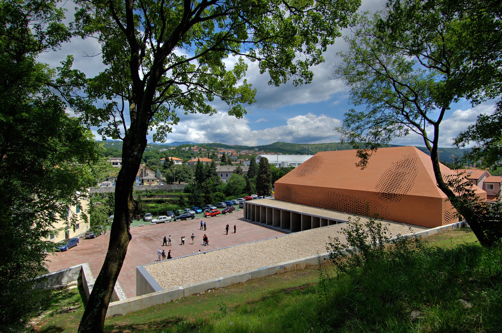 Sited in one of the most important pilgrimage sites in Croatia, this Great Hall was designed alongside the Pope’s visit to Rijeka. Housing cultural activities of the monastery, the project also creates a new major entrance for the pilgrims and a large public walk. A pixel-ized terracotta volume was designed to filter light inside the structure while a columned portico forms a new public square outside.
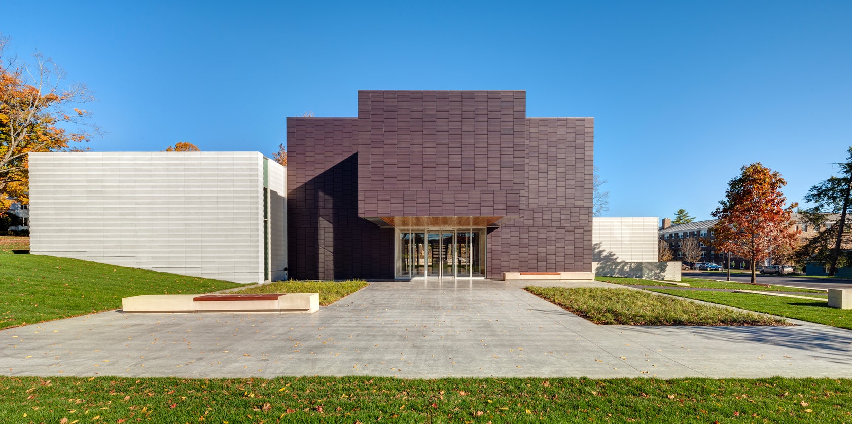
 Located on the Hamilton College campus, the Wellin Museum of art was designed as part of a new arts quad. The building includes admin offices, seminar rooms, galleries, and a monumental two-story glass archive hall. Dark terracotta cladding was used along the central volume to reinforce its role programmatically and organizationally.
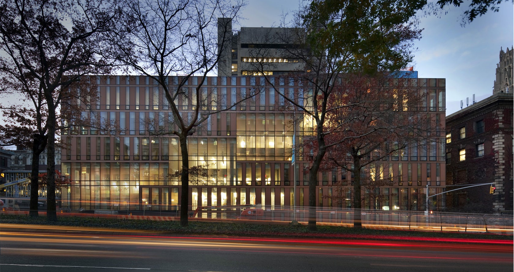
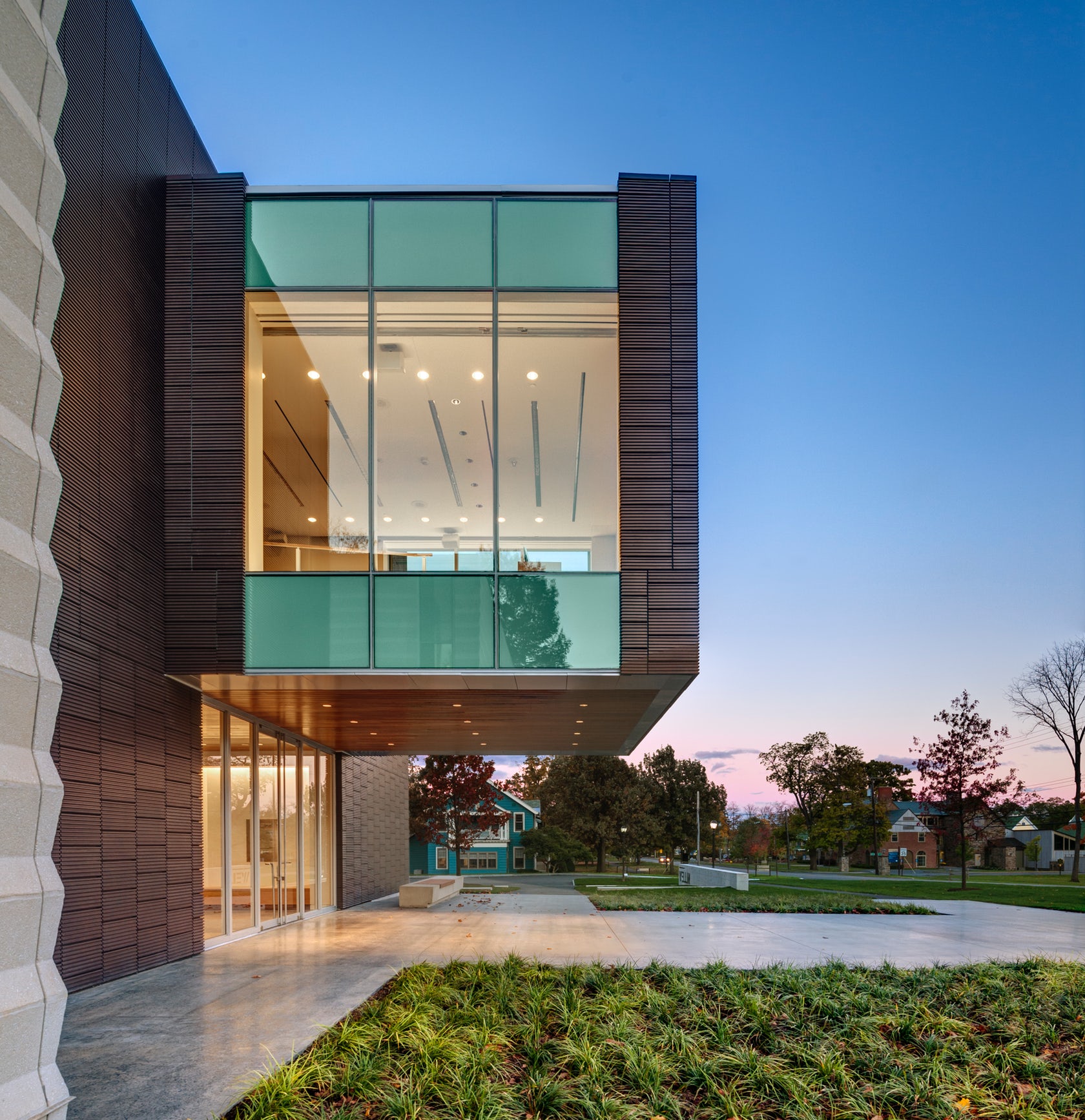
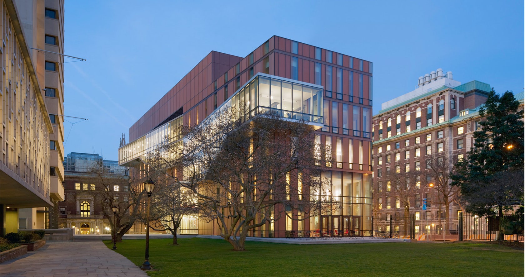 Located at Barnard College, the Diana Center includes a gallery space, a library, classrooms, dining, and a black box theater. A slipped atria links spaces vertically and becomes connected through ascending stairs. Luminous terracotta glass panels were used throughout the building envelope. Surrounded by a campus defined by brick and terracotta, the Diana translates the static opacity of masonry into a luminous curtain wall.
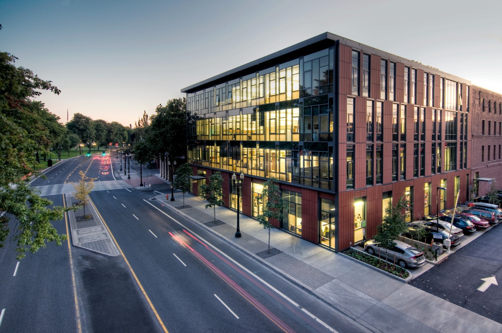
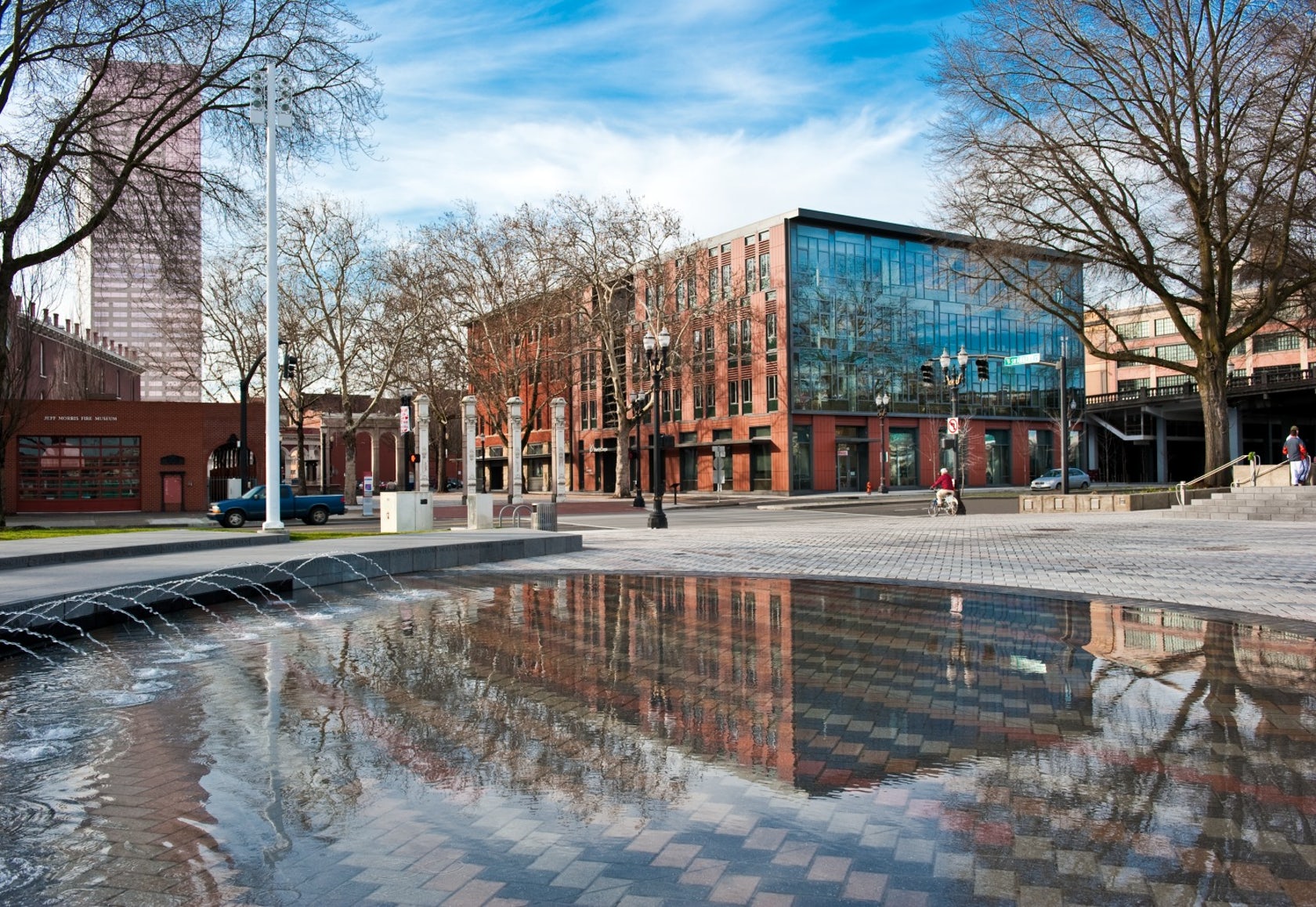 The Mercy Corps building was built to exemplify a sustainable, community-focused approach while encouraging visitors to engage with contemporary issues. Doubling the size of the historic Portland Packer-Scott Building, the landmark project combined a green roof, with resource-friendly landscaping and a glass and terracotta envelope.
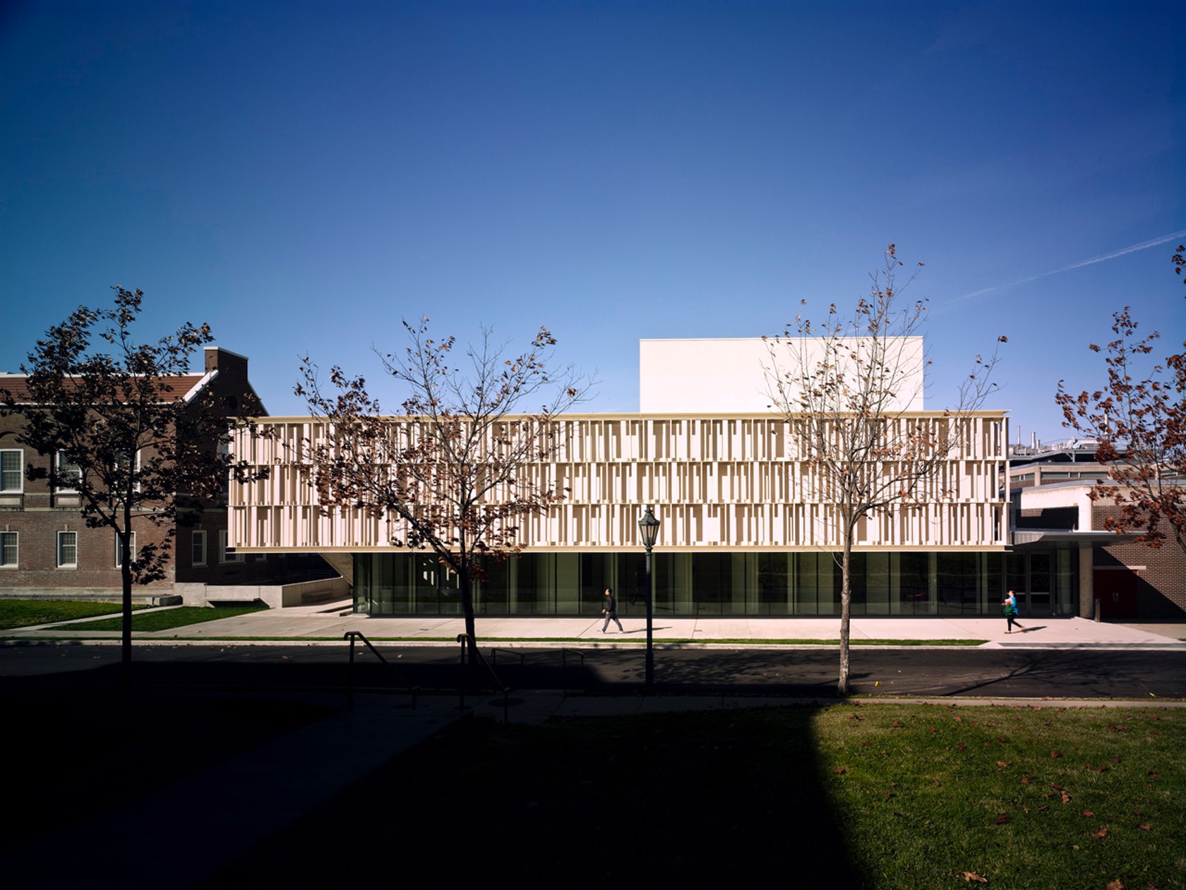
 The terracotta tube façade for this ceramics pavilion screens both rain and solar heat, while its staggered pattern was inspired by pottery racks. The Art Pavilion was created as a “ceramic vessel” holding both light and art. The design was inspired by the region’s history of manufacturing ceramics, and incorporates the unglazed, hollow tubes with an off-white pigment.