Coach Houses Are Full of Creative Potential
Architizer is thrilled to announce the winners of the 10th Annual A+Awards! Want to earn global recognition for your projects? Sign up to be notified when the 11th Annual A+Awards program launches.
Coach houses first appeared in England around the 18th century and eventually took off in the United States a century later. Such structures were originally intended to store horse-drawn carriages and eventually used to house automobiles. Unlike a modern-day garage, coach houses were a symbol of status; only a select few could afford personal transportation and as a result, these structures were reserved for the wealthy. The traditional coach followed a distinct layout, they were typically two-storied volumes built separately from the main dwelling. There was space designated for the carriage and a private room built for the driver. These structures were functional in nature and reflected the architectural aesthetic of the main house.
Today, those fortunate enough to come across a property with an existing coach house have the chance to restore and rebuild the edifice into whatever they please. Whether it be an elevated garage or a cozy apartment, the potentialities of a coach house are limitless.
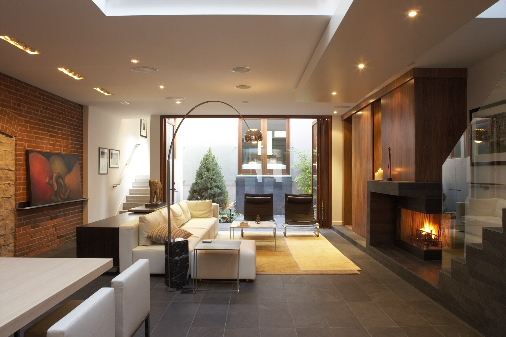
Photo by Harold Clark
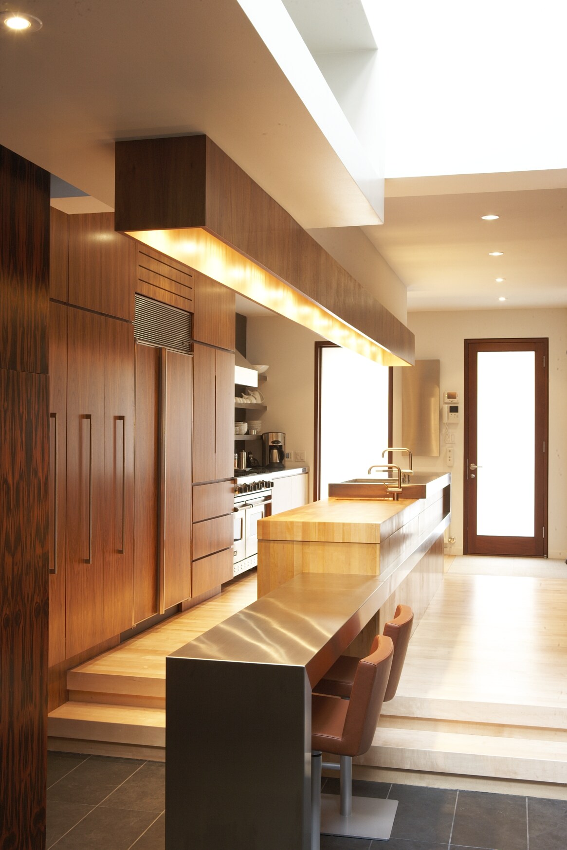
Photo by Harold Clark
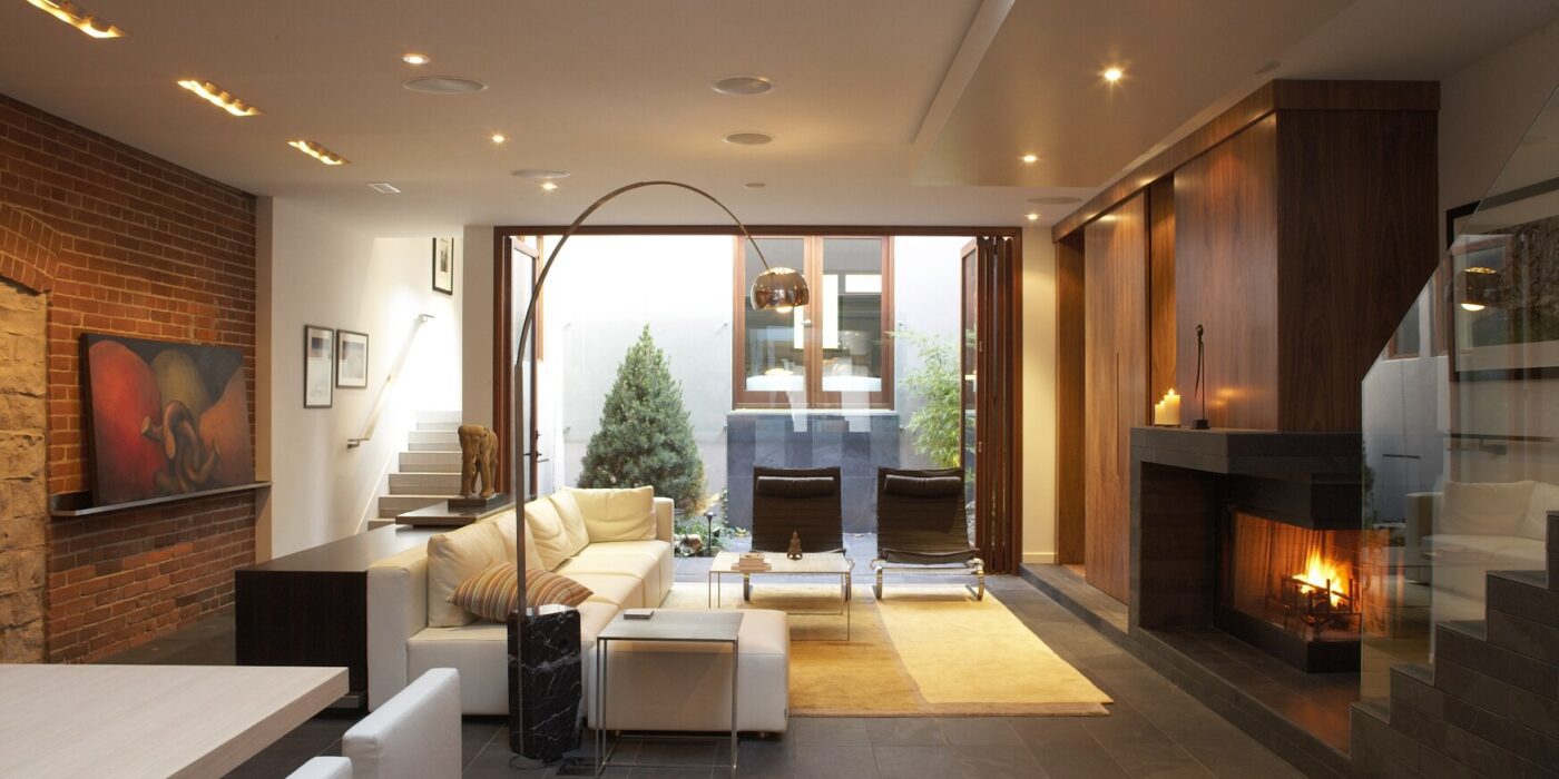
Cabbagetown Coach House by CORE Architects Inc., Toronto, Canada
This Toronto coach house was remodeled into a functional and minimalist apartment. The coach is roughly 2,500 square feet, which meant that all desired functions and amenities could be easily equipped in the home. The two-storied coach house features a spacious living room, a comfortable kitchen and a separate formal dining area. The dining room was positioned in the atrium to maximize space and comfort as the homeowners enjoy cooking. The kitchen is finished with stainless steel counters, a built-in cutting board and an “appliance garage” perfect for the cooking enthusiast. Bi-fold doors in the living room lead onto a relaxed outdoor courtyard space. The outdoors can equally be enjoyed by the upstairs master bedroom, which leads onto an upper floor exterior space.
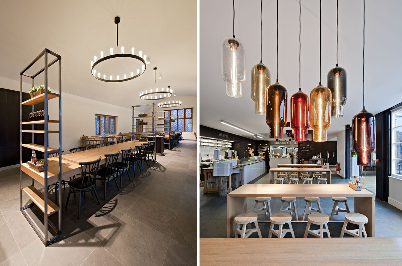
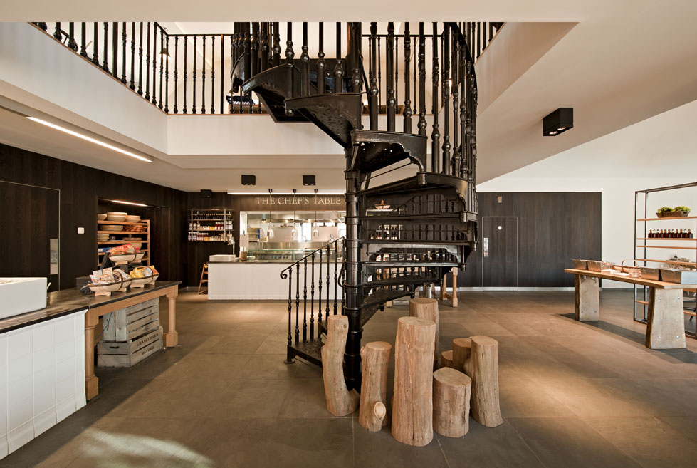 Coach House Restaurant by SHH, London, United Kingdom
Located on the historic grounds of Hatfield House is a renovated 19th-century coach now turned elevated eatery. The premise of this construction was to create a space that would maximize revenue, increase year-round access and contribute to the cost of maintaining the historic property. In order to do so, the architects designed a dining space that could be enjoyed by the site’s visitors, tenants and nearby residents.
The coach house was redone using materials that reflected the original 19th-century structure and surrounding buildings. The architects blended older-appearing materials with a contemporary design to create a functional dining environment. The original tea house was expanded to two floors, with a glass extension leading to the exterior grounds. Moreover, a rooftop terrace can be accessed via a central spiral staircase. The renovation has increased the floor space by 70 percent and offers a deli, bakery and chef’s table option.
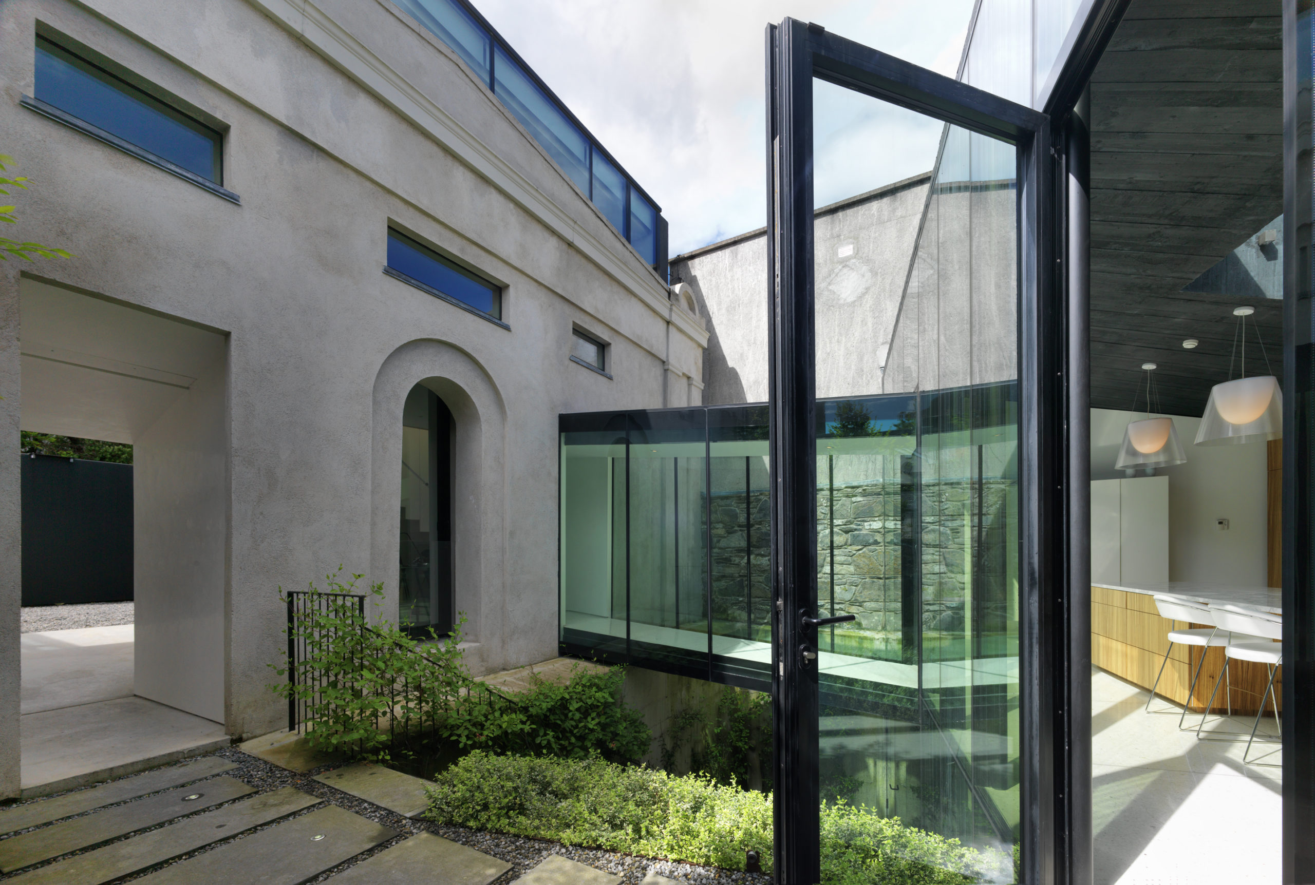
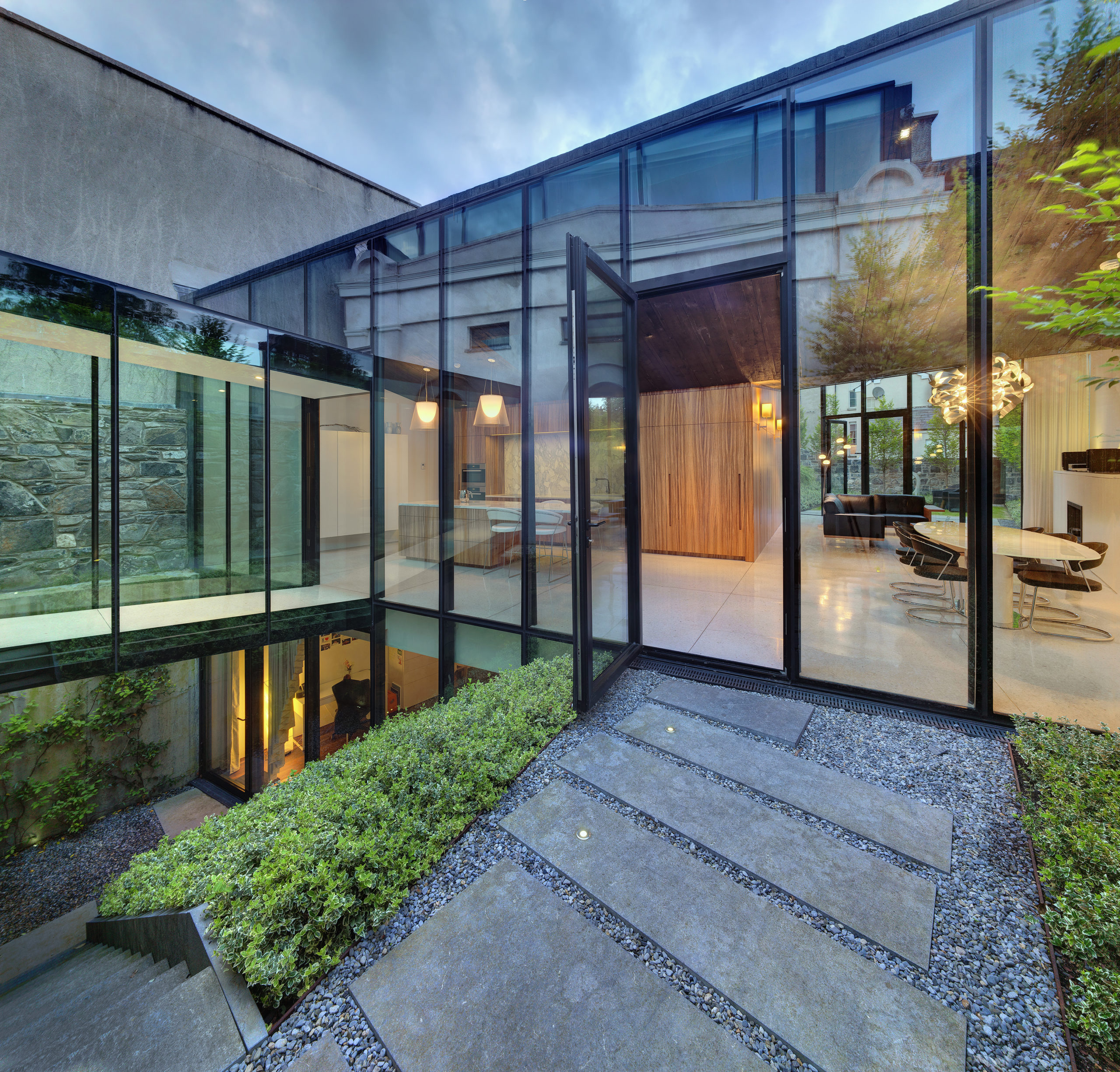 Flynn Mews House by Lorcan O’Herlihy Architects (LOHA), Dublin, Ireland
Finalist, 2014 A+Awards, Single Family Home M 1,000-3000 sq ft
This residential dwelling is located in the heart of Dublin and celebrates the site’s historic fabric. The home was built on the site of a previous 19th-century coach house and retains its history through a respectful contemporary design. The traditional mews entrance features large floor-to-ceiling windows, which ensure that the new edifice remains connected to the original preserved wall. The home is comprised of two volumes attached by a central sunken courtyard; it is a special indoor/outdoor living environment not typically found in Dublin.
An enclosed glass bridge connects the two volumes and creates a rather striking juxtaposition. The home took part in the Dublin Green Building Pilot Program and features a solar panel water heating system and an underground gray water pump. The project is an exemplar of preserving the old and blending it with the new.
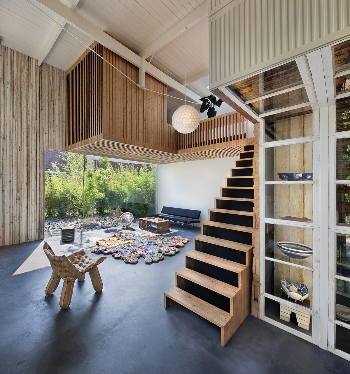
Photo by Christel Derksen & Rolf Bruggink
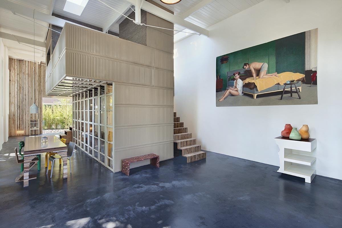
Photo by Christel Derksen & Rolf Bruggink
House of Rolf by ROLF.FR, Utrecht, Netherlands
Located in Utrecht, Netherlands, this 19th-century coach was turned into a truly unique space that underwent a distinctive design and building process. The home was constructed using materials that came from a demolished building nearby and proves that waste can, in fact, create something beautiful.
The original edifice was built in 1895 behind an aristocrat’s home, and then in 1955, an additional outbuilding was constructed adjacent to the coach. The current homeowners acquired both structures and the surrounding garden to build a singular dwelling. The interior space was divided into three zones, each of which offer a distinctive living environment. The first zone was left relatively void so that the original coach atmosphere can be experienced. A freestanding structure, standing separate from the coach, forms a second zone housing the kitchen, bedroom, bath and office space. The third zone, meanwhile, is a sculptural structure attached to the shell of the original volume. The entire house was furnished using local Dutch designers.
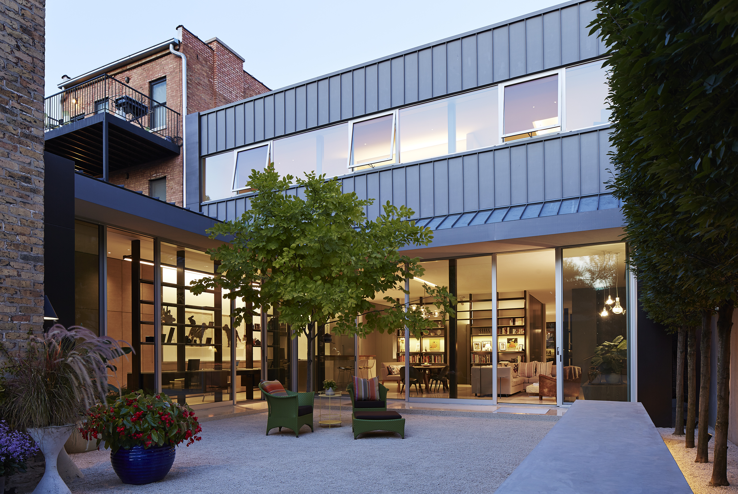
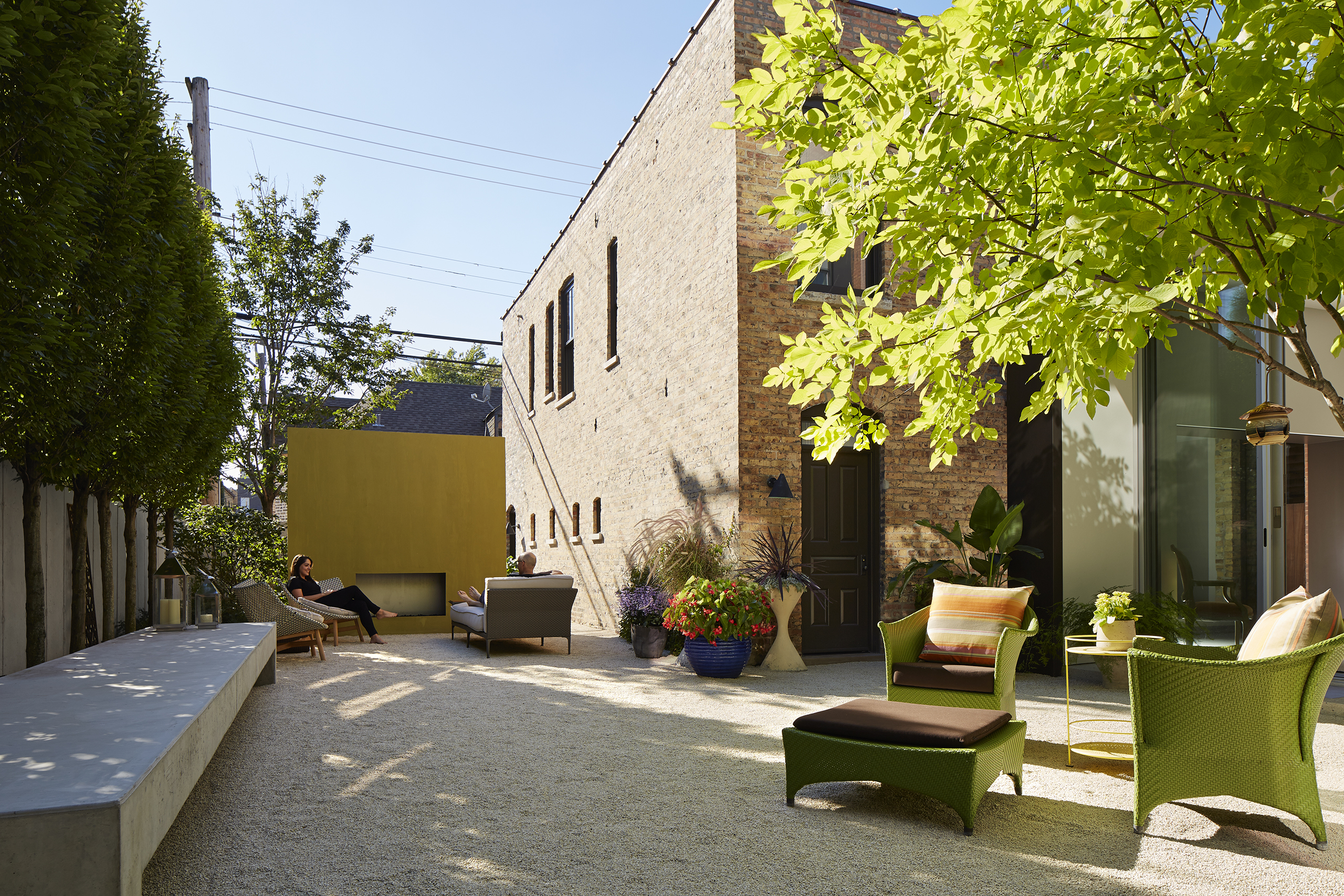 Wicker Park Residence by Wheeler Kearns Architects, Chicago, IL, United States
This single-family residence consists of two separate volumes — a primary dwelling and a historic coach — which are attached by an enclosed glass walkway. Located in one of Chicago’s Landmark Districts, the design carefully respects the neighborhood’s historic architecture. The original coach was viewed as a special asset to the property and informed the material choices and decorative elements found in the main dwelling. The interior of both the house and the coach embrace a contemporary aesthetic, while the exterior design is more reflective of the historic neighborhood. For example, metal doors and dark window frames were purposefully incorporated to complement the design of the original coach. Equally, the new edifice is clad in brick which speaks to the coach’s brick façade. Floor-to-ceiling windows adorn the home’s façade and look onto the original structure, thus furthering the connection between the two volumes.
Whether it be for commercial or private use, there are countless ways to design, reinvent and interpret the traditional coach house structure. The possibilities are limitless and the outcome is a special bespoke space.
Architizer is thrilled to announce the winners of the 10th Annual A+Awards! Want to earn global recognition for your projects? Sign up to be notified when the 11th Annual A+Awards program launches.
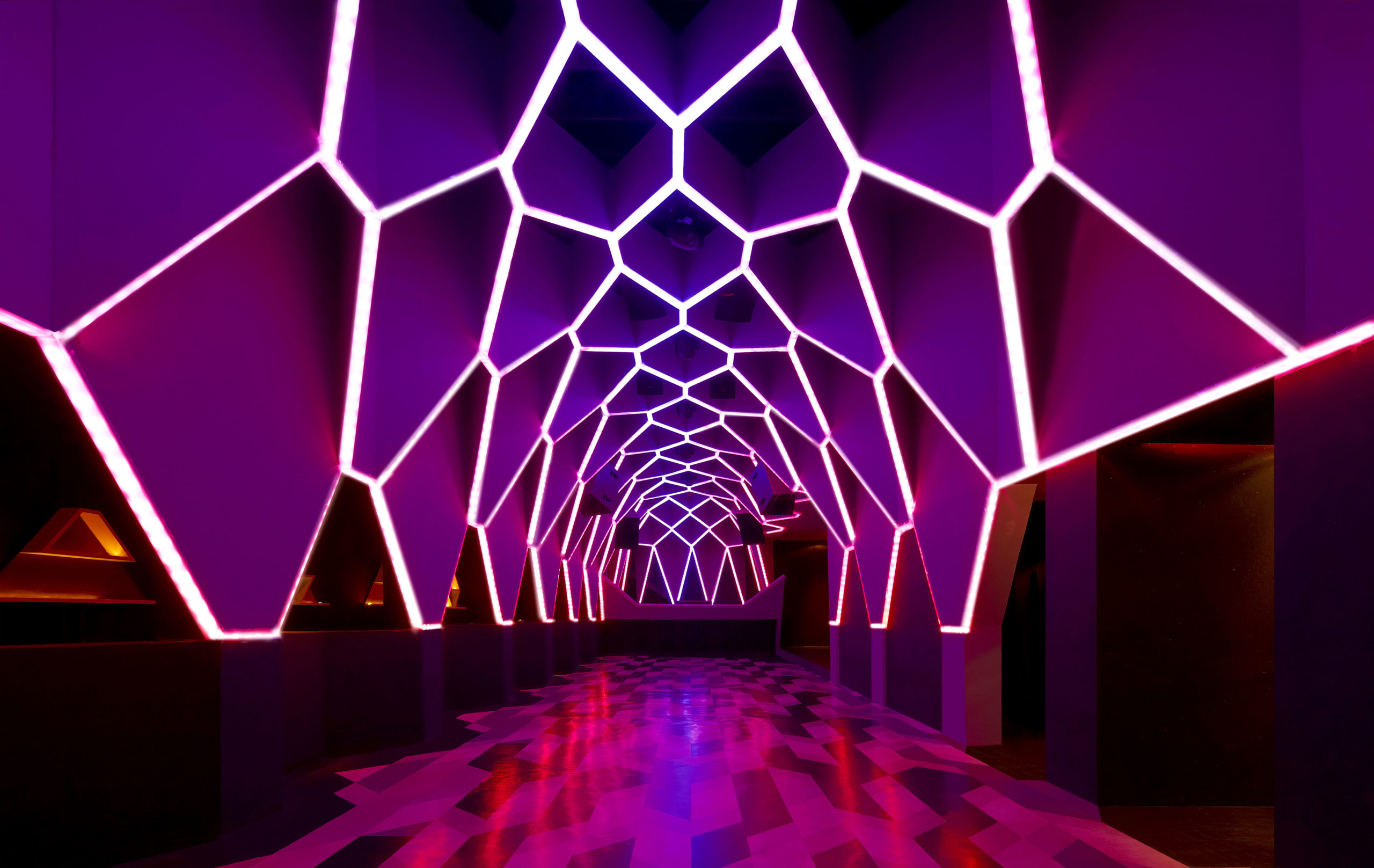
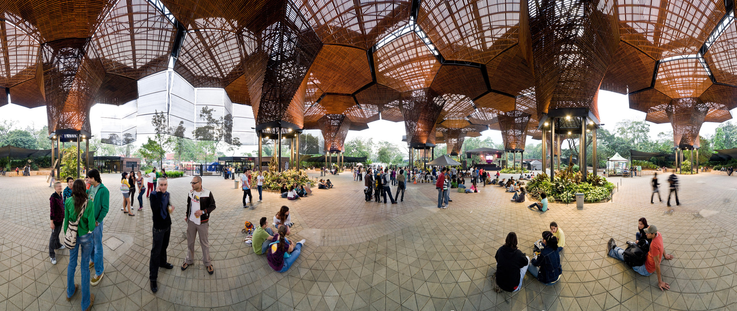
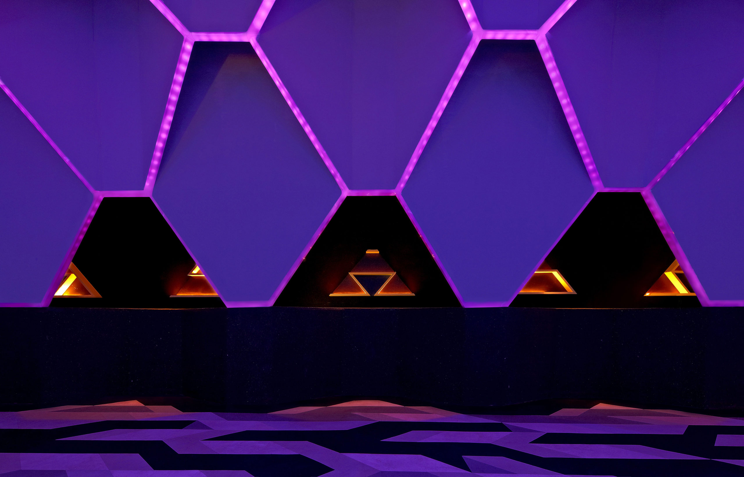 Josefine/ Roxy Club by Fred Mafra, Belo Horizonte, Brazil
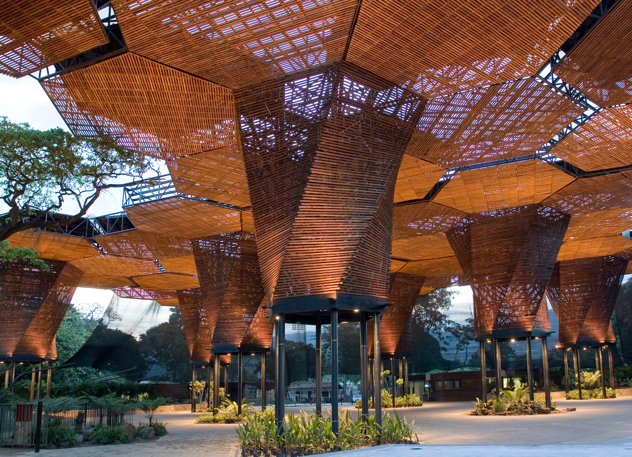
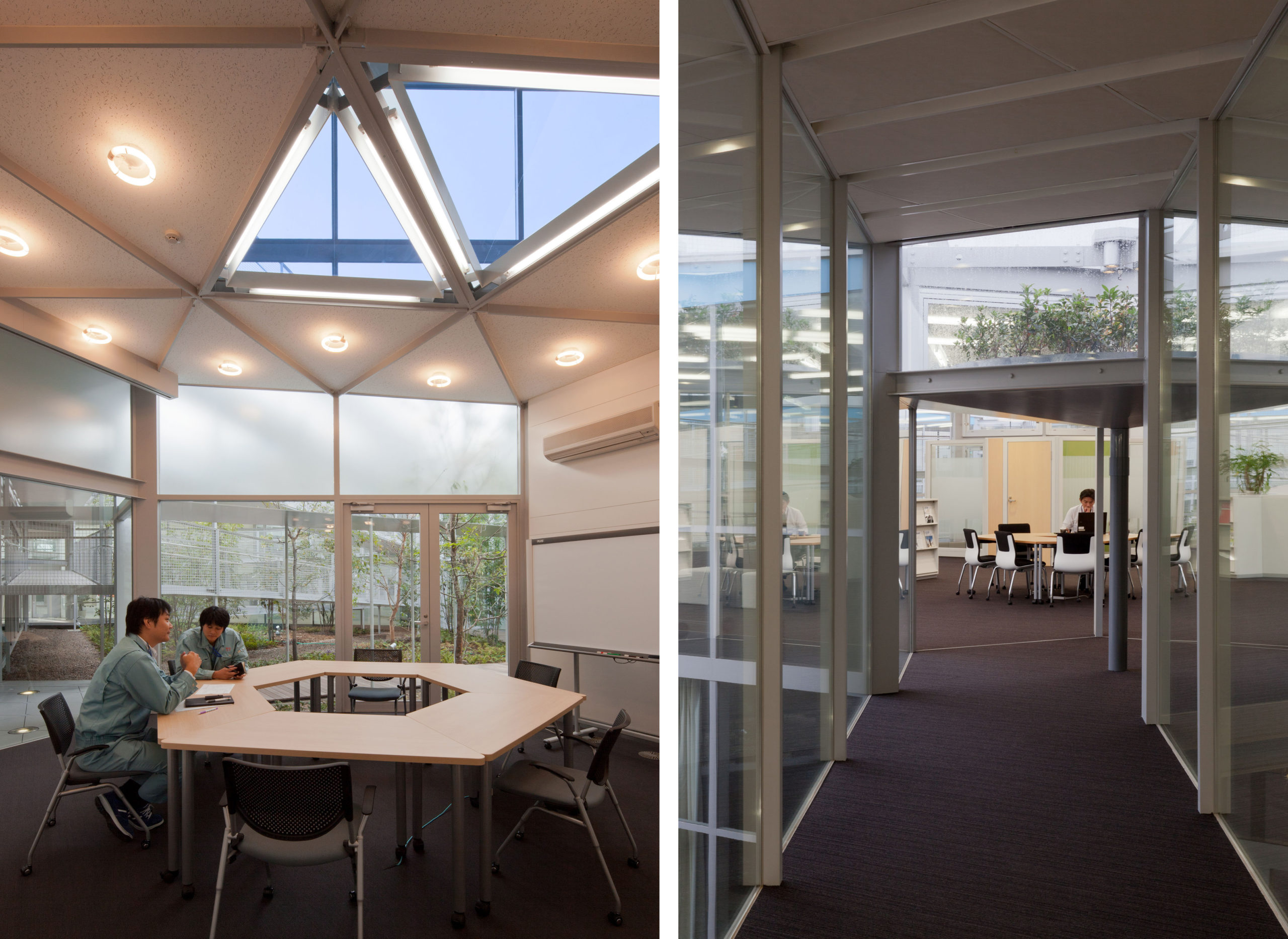 Aron R&D Center by Osamu Morishita Architect & Associates, Aichi, Japan
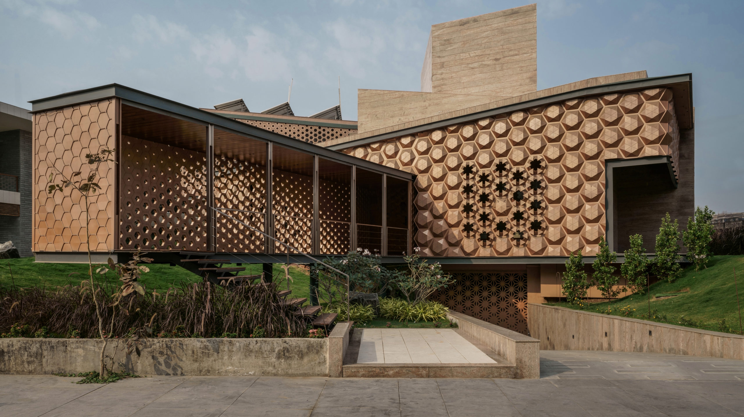
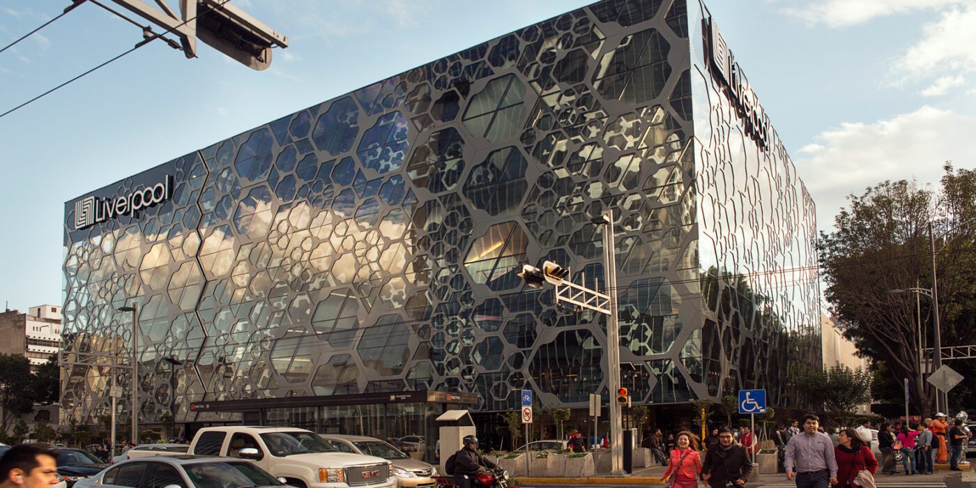
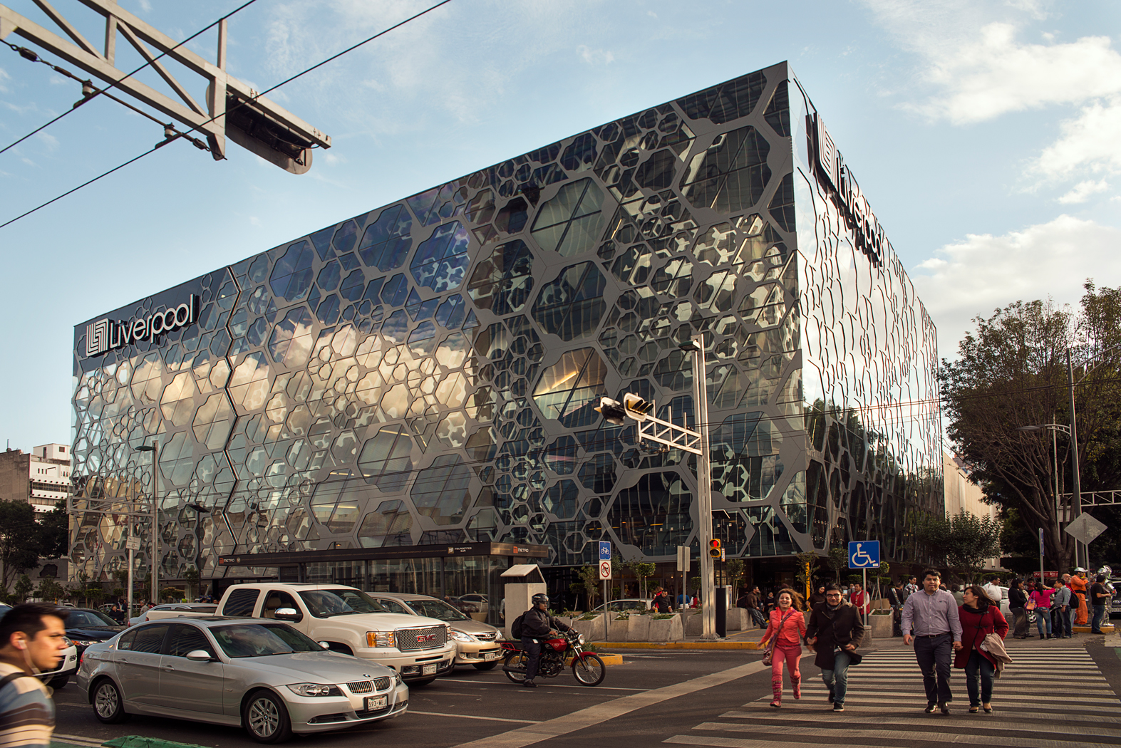
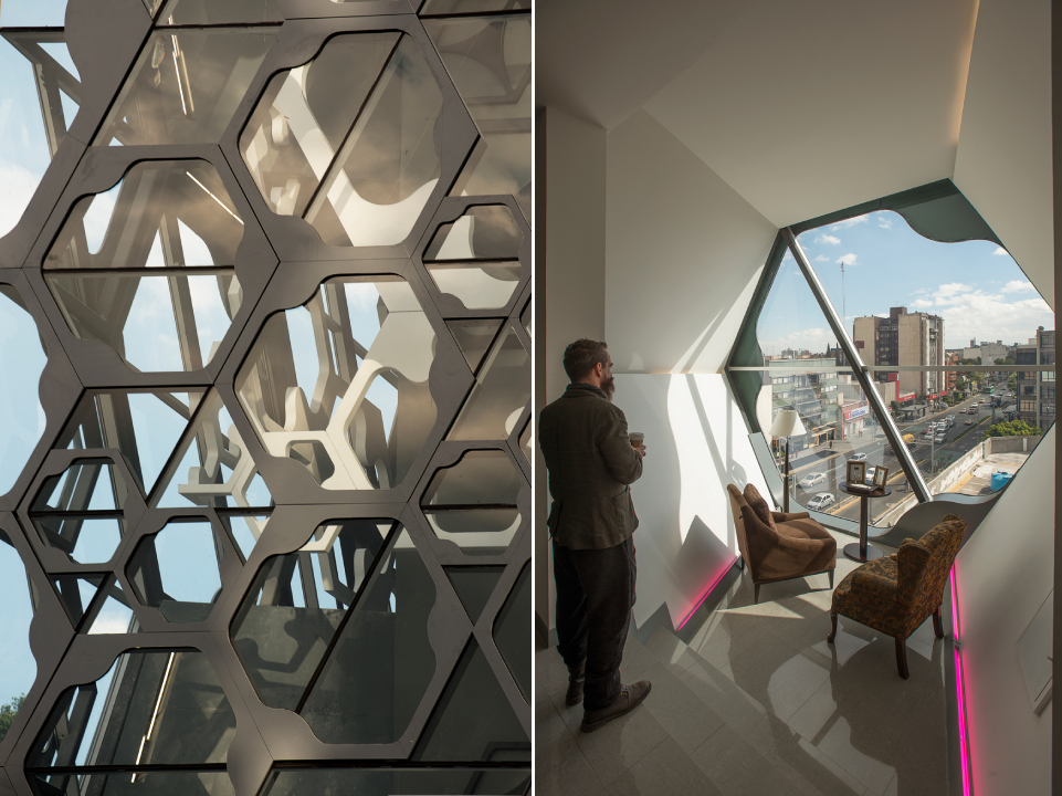
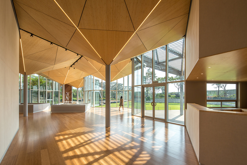
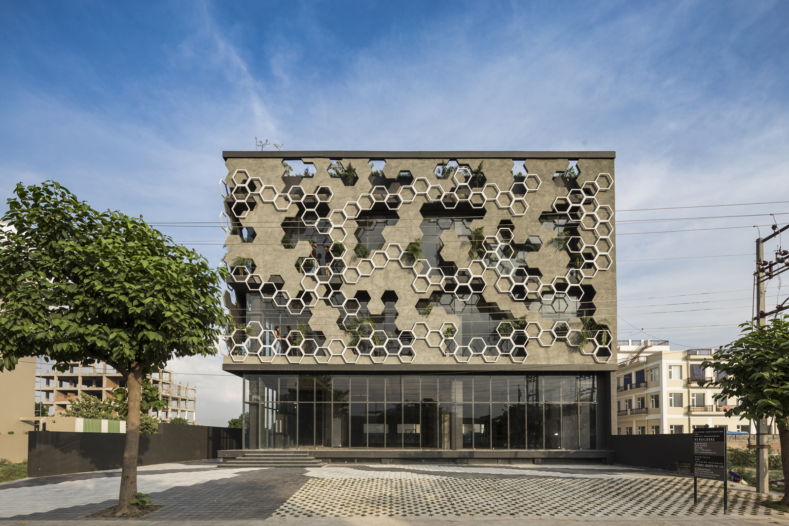
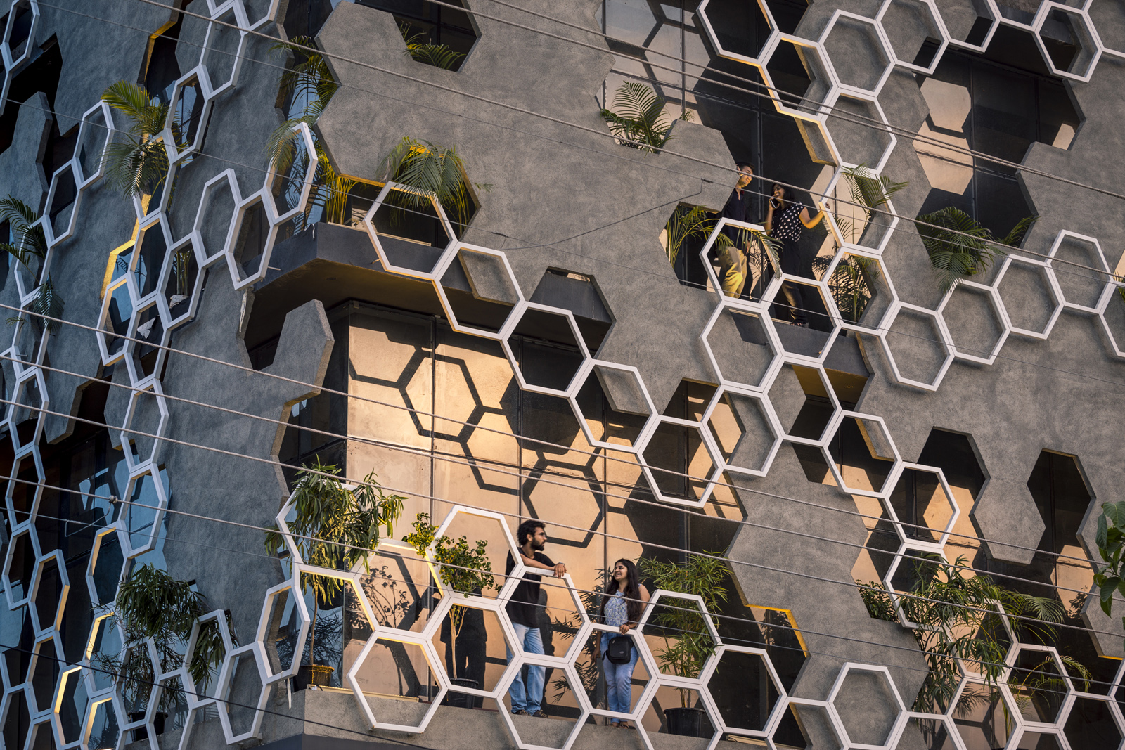
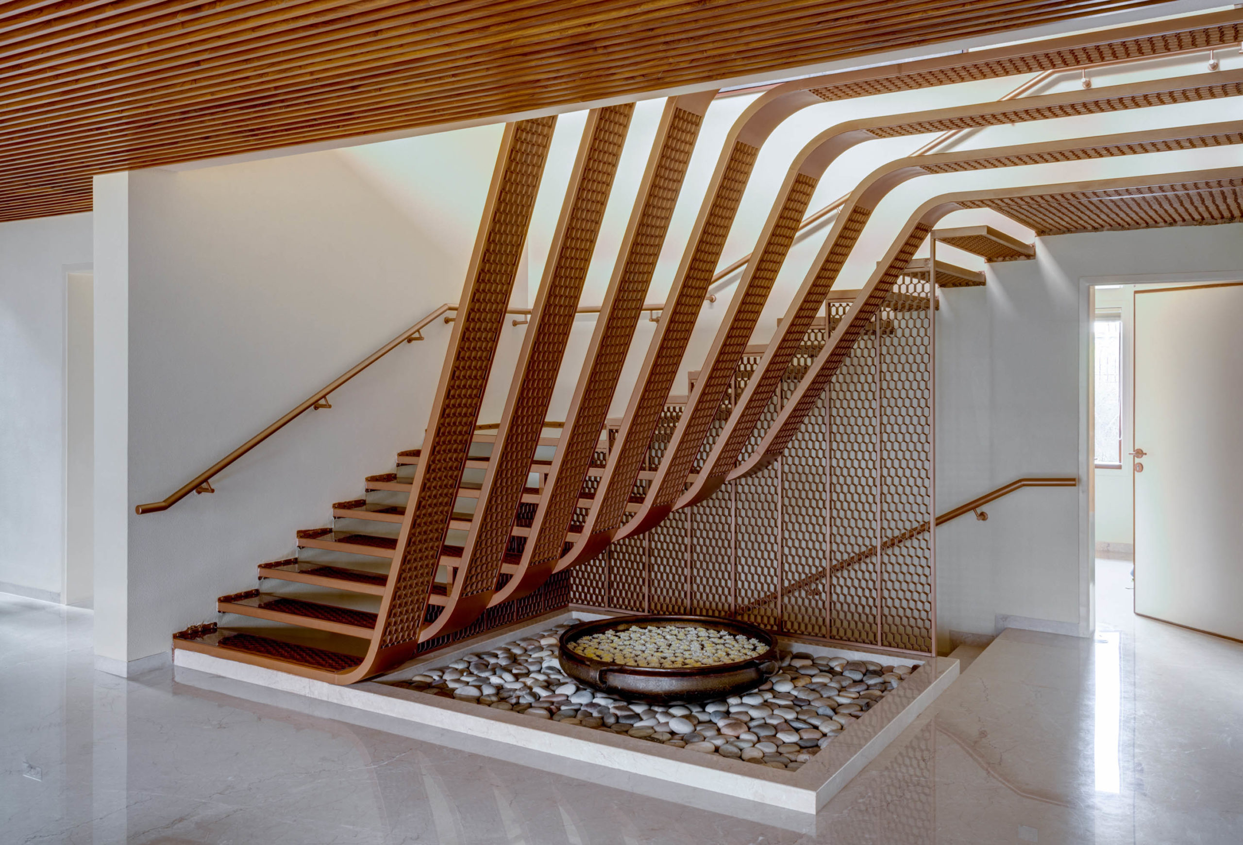 Hive by OPENIDEAS ARCHITECTS, Surat, India
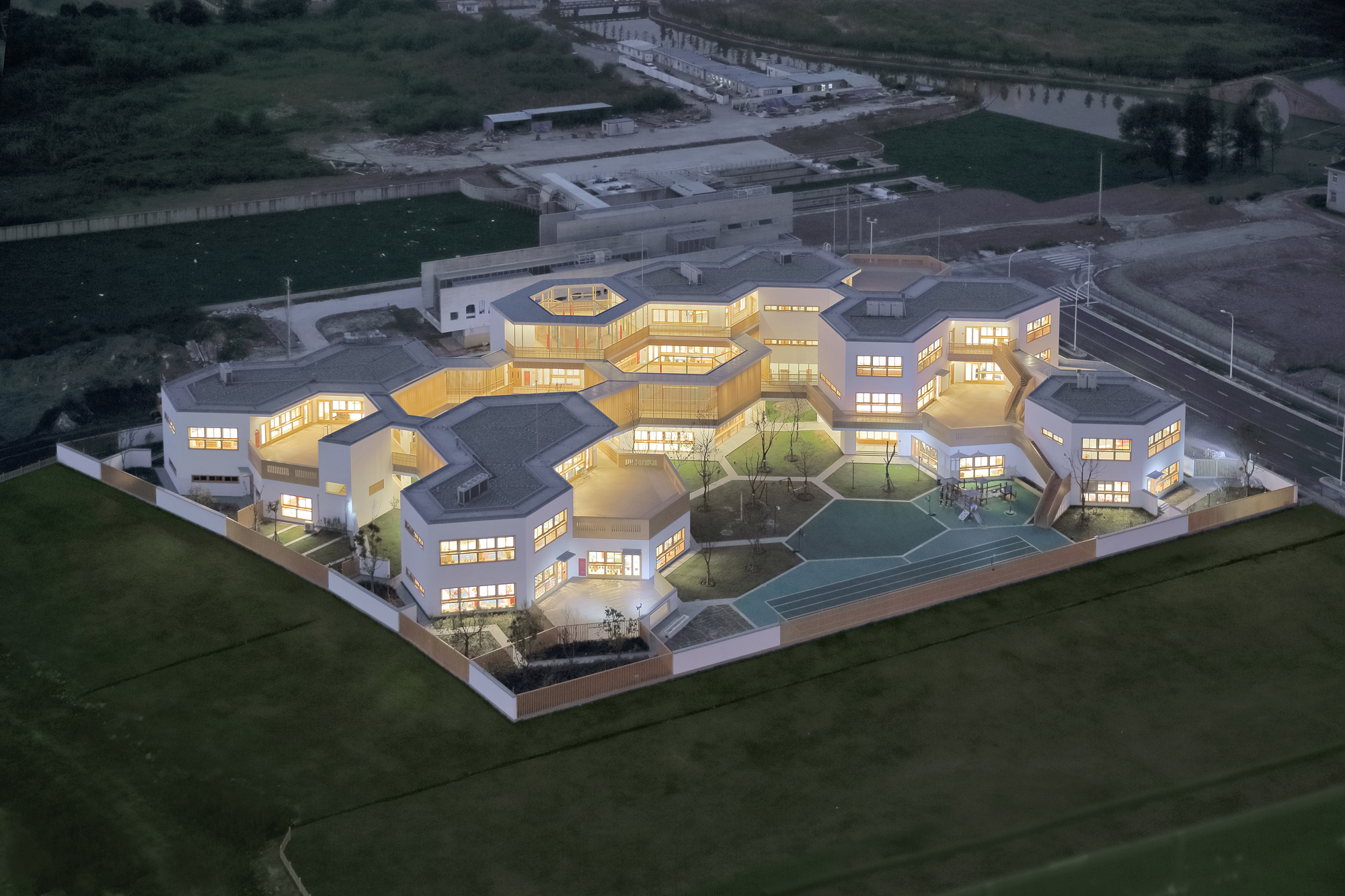
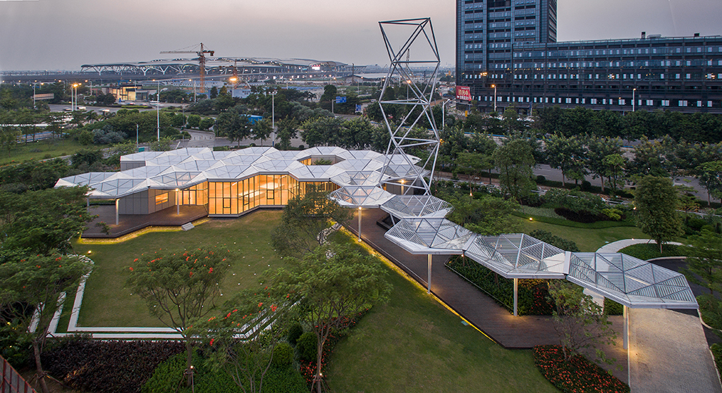
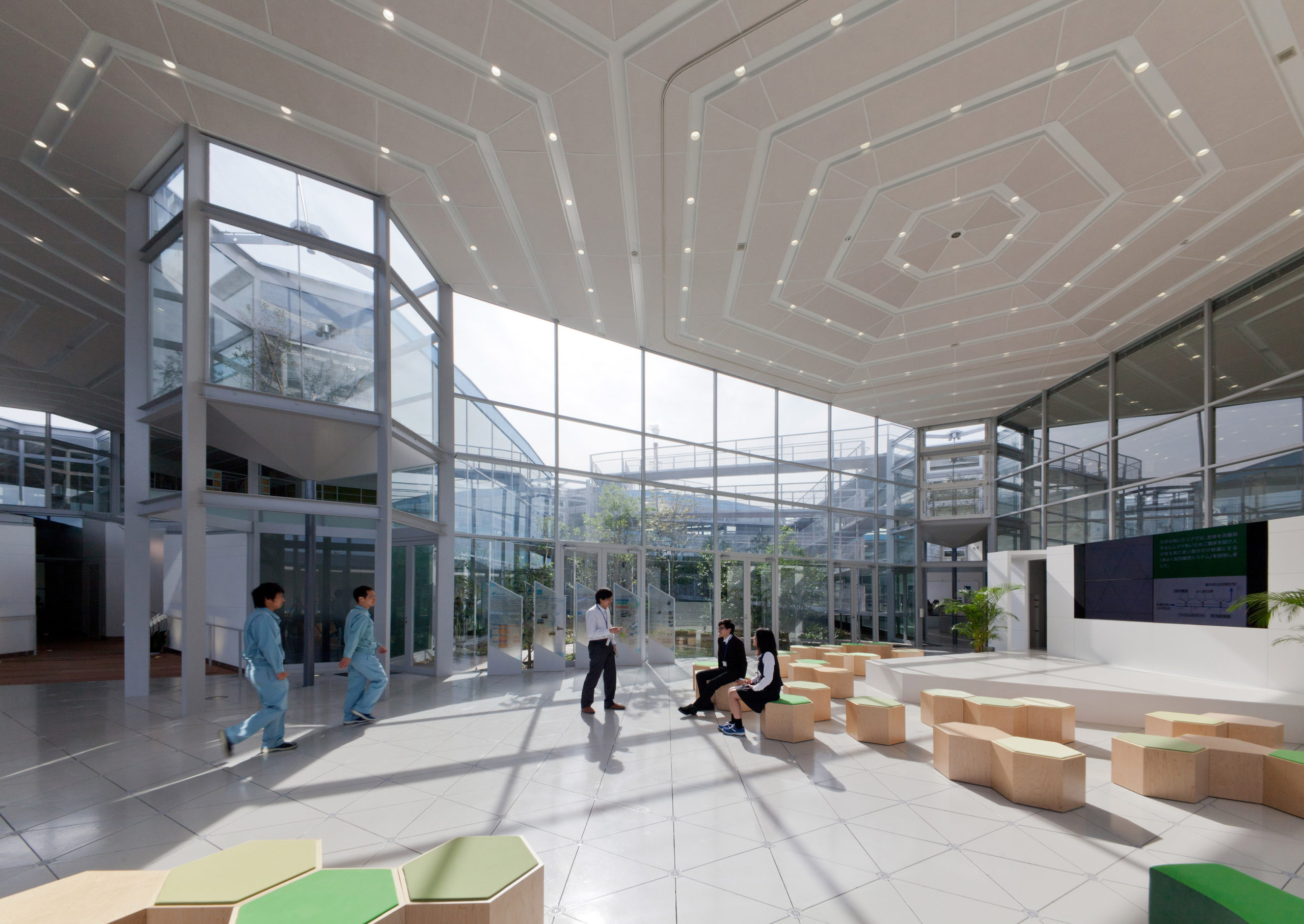
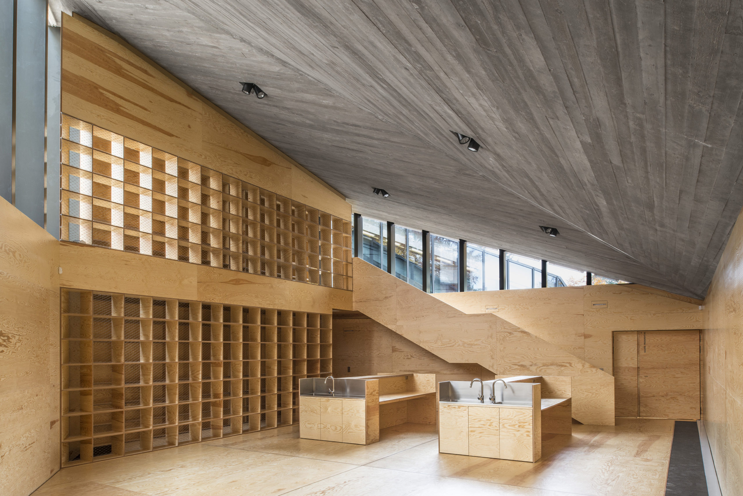
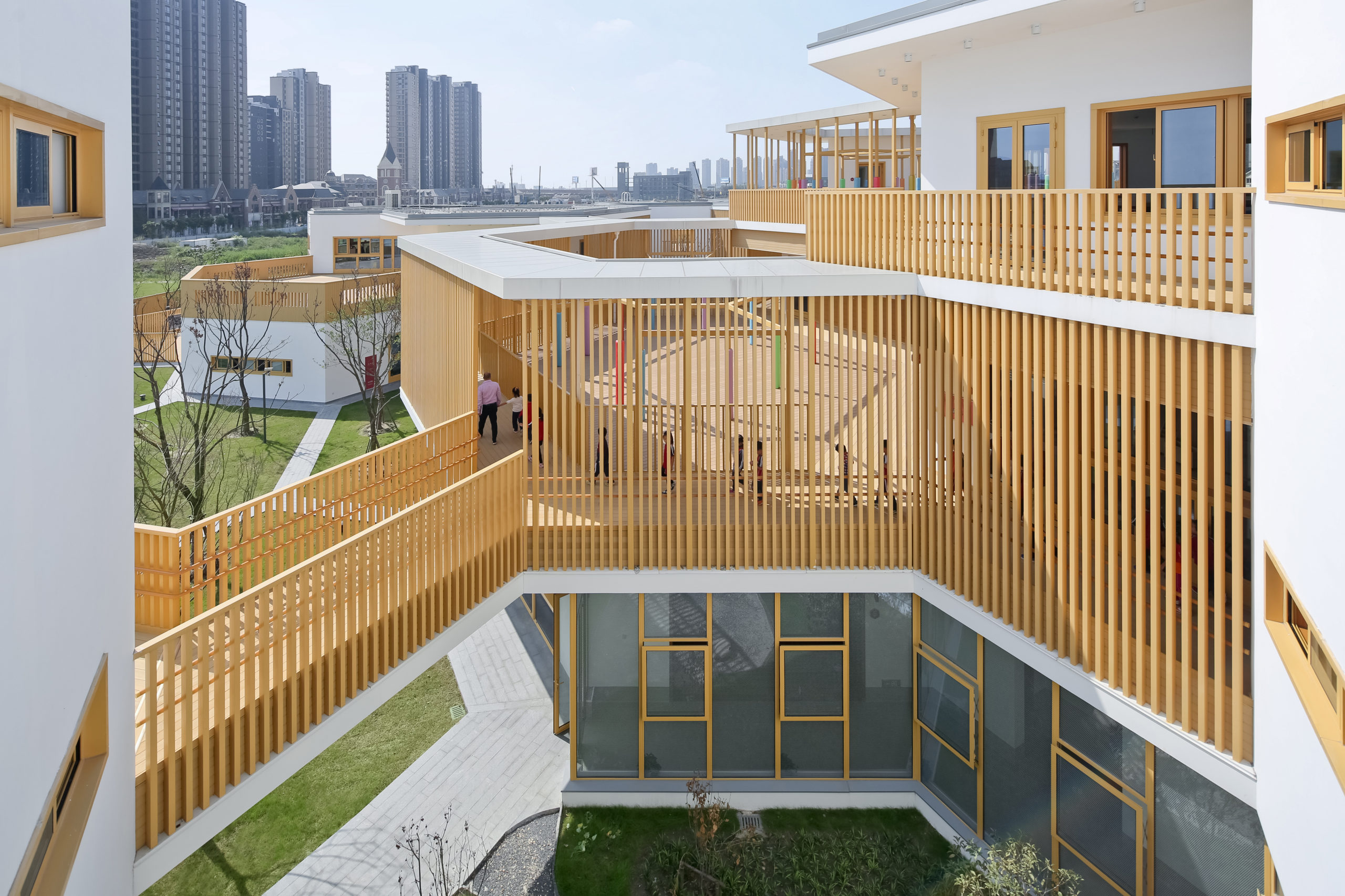 East China Normal University Affiliated Bilingual Kindergarten by Scenic Architecture, Shanghai, China
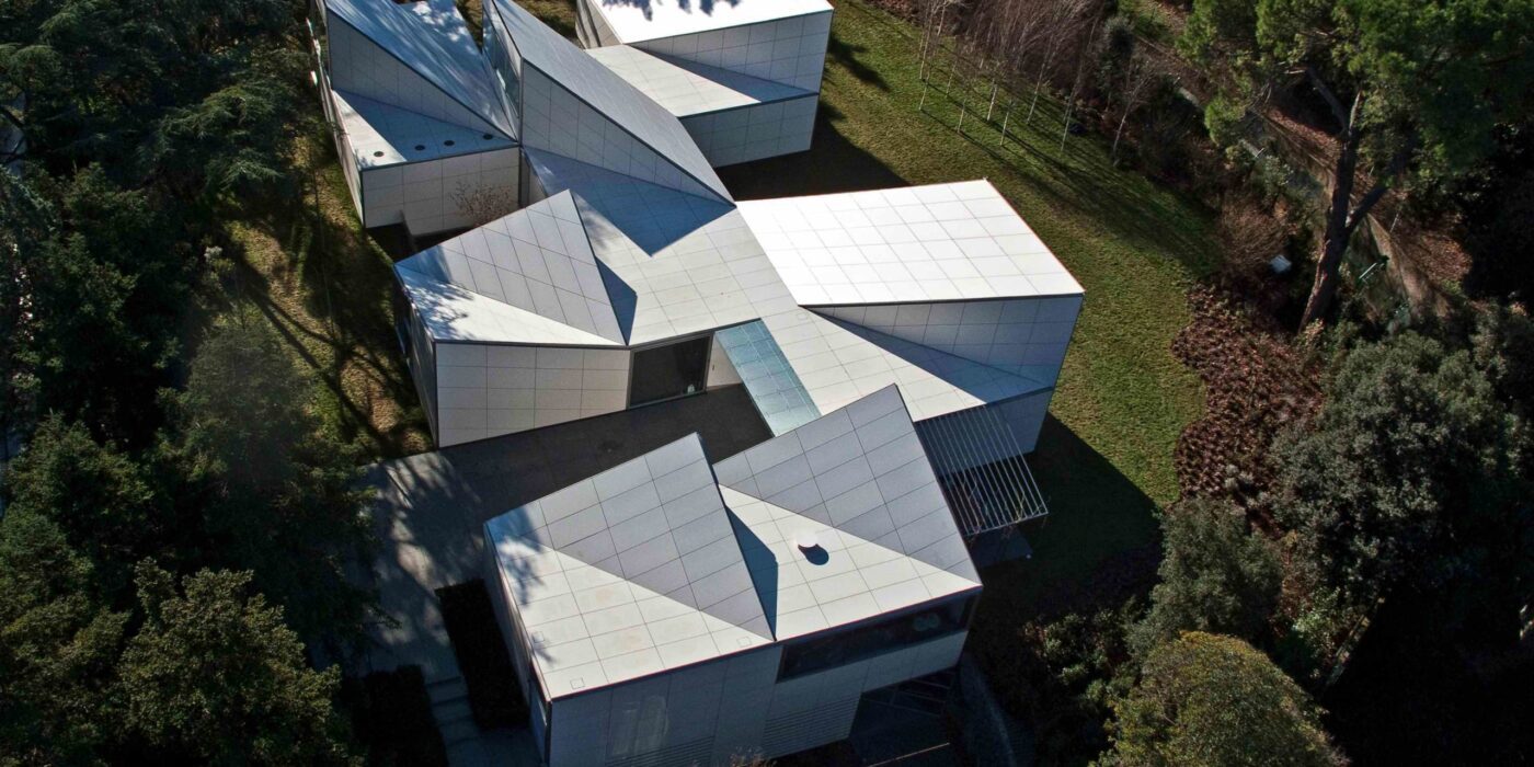
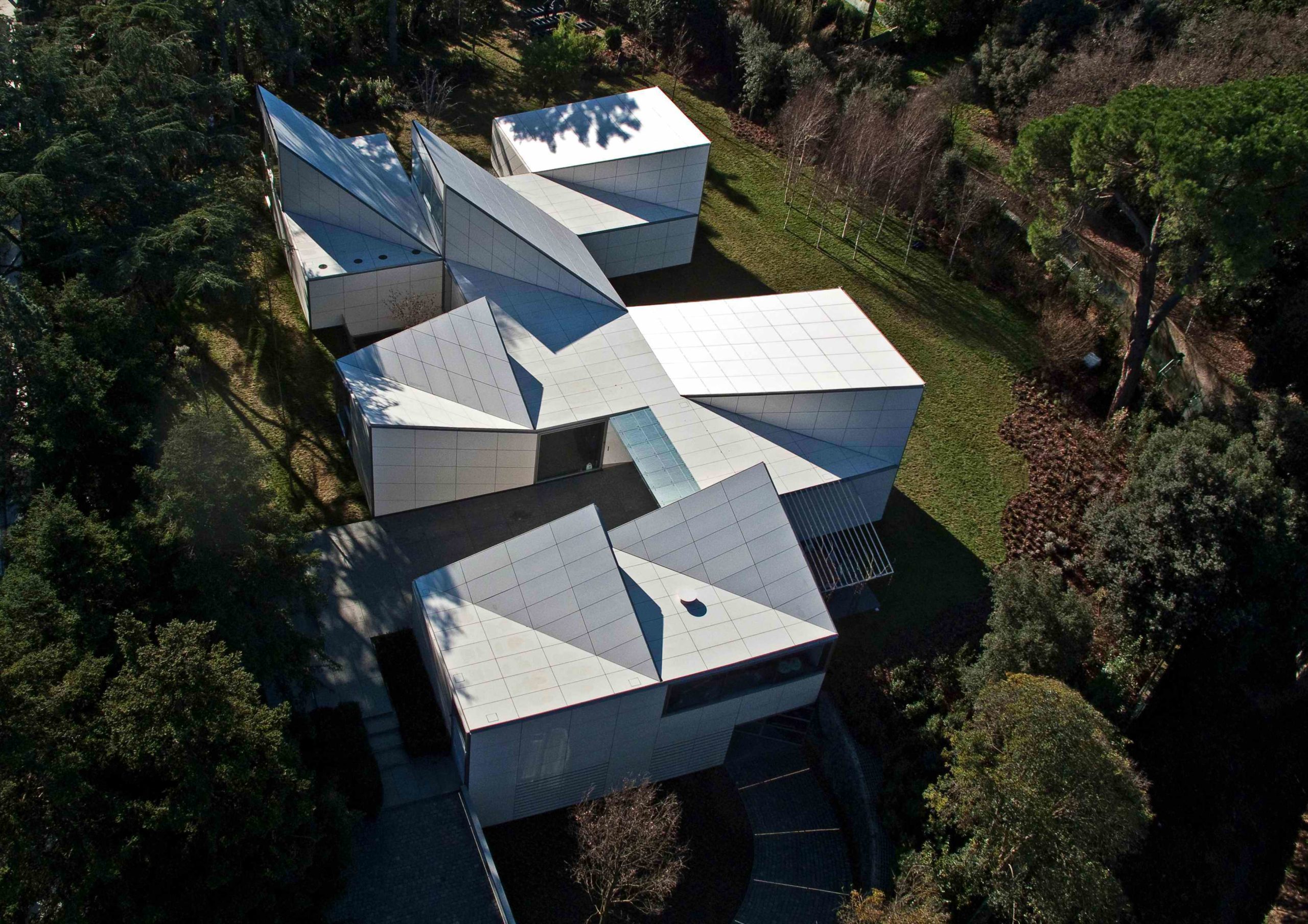
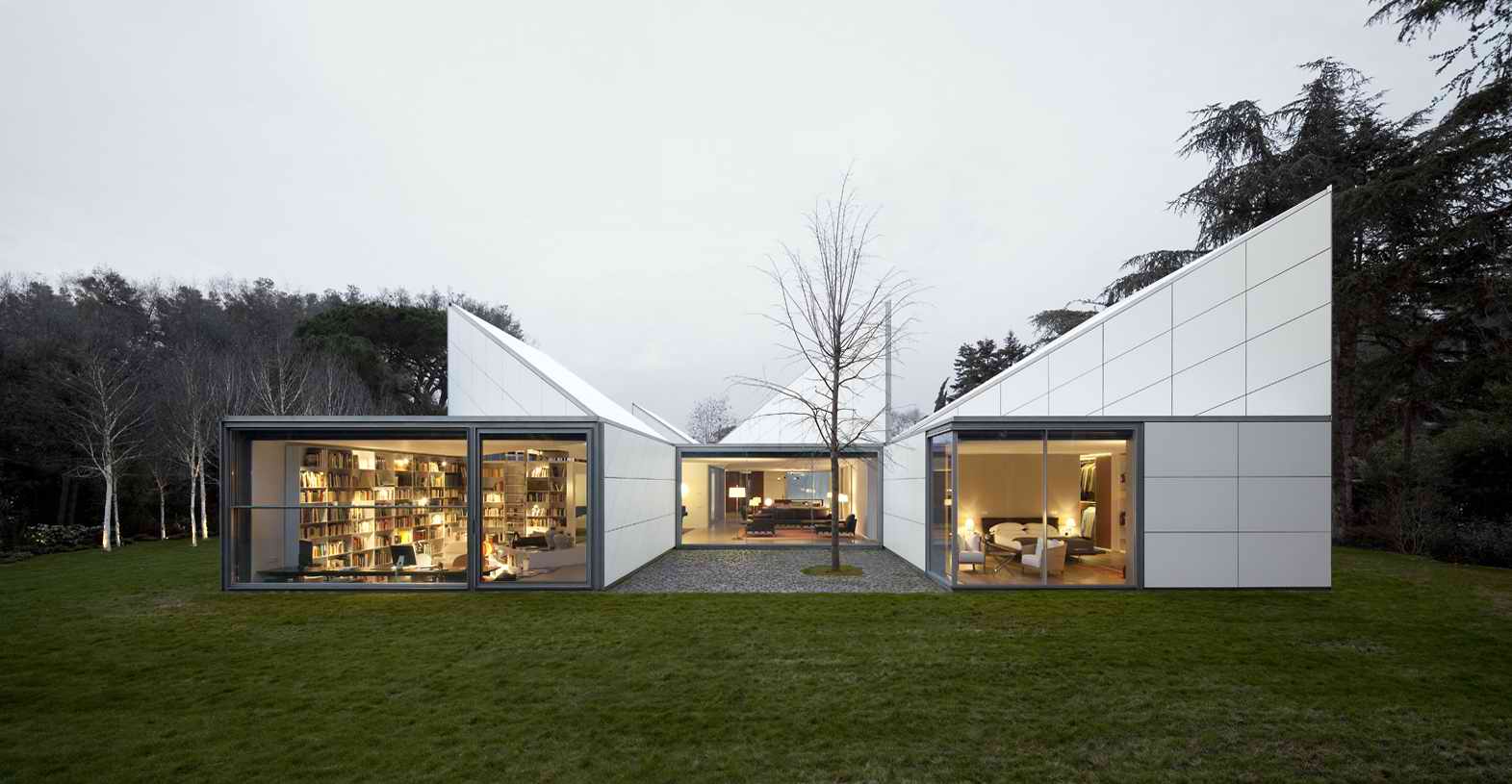 Origami House by Office of Architecture in Barcelona, Sant Cugat, Spain
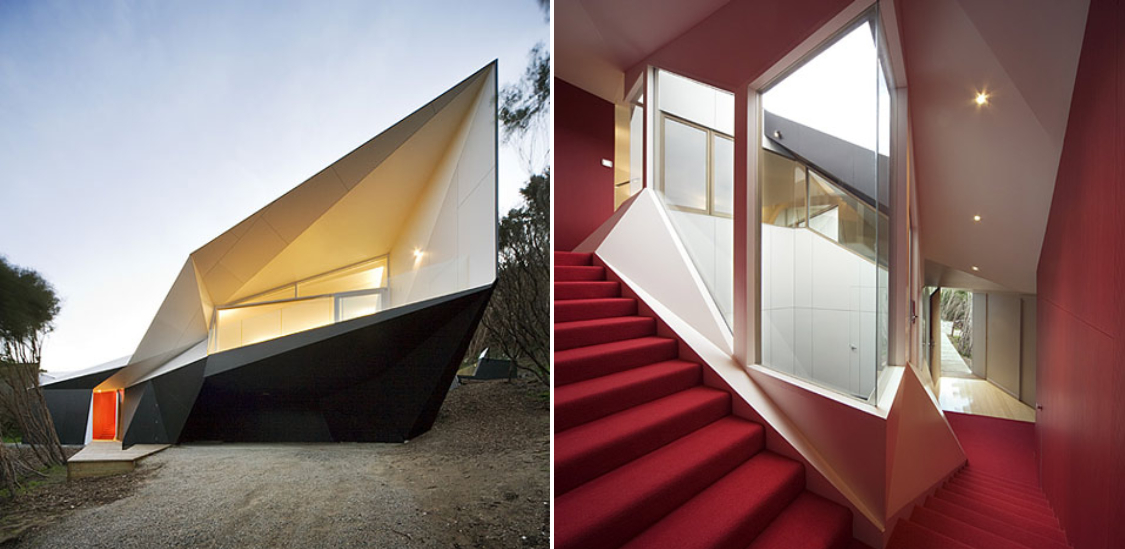 Klein Bottle House by McBride Charles Ryan, Rye, Australia
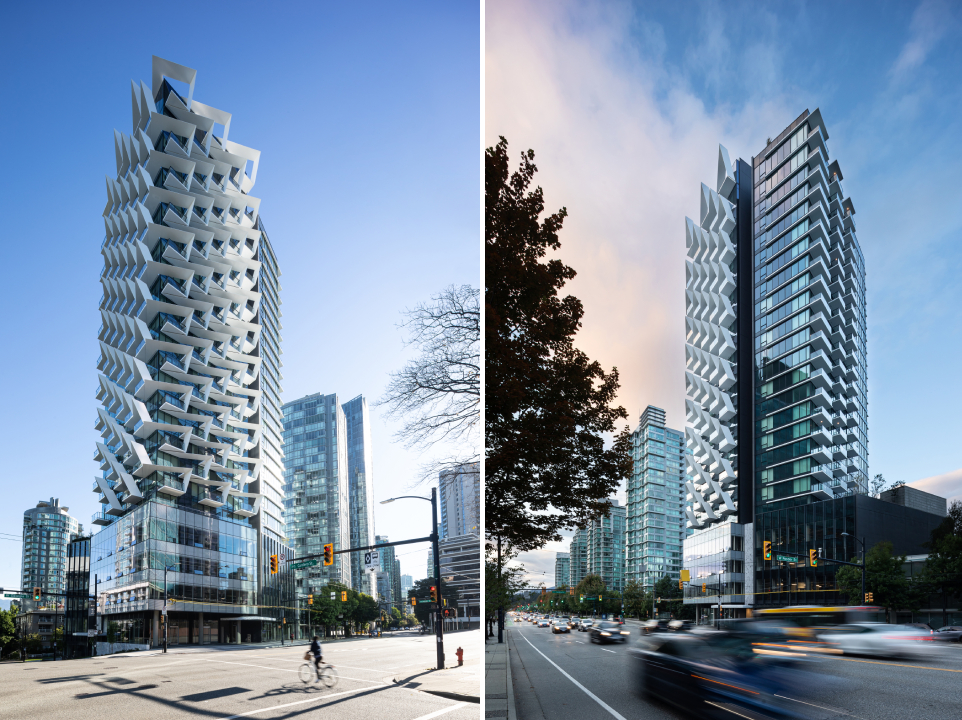
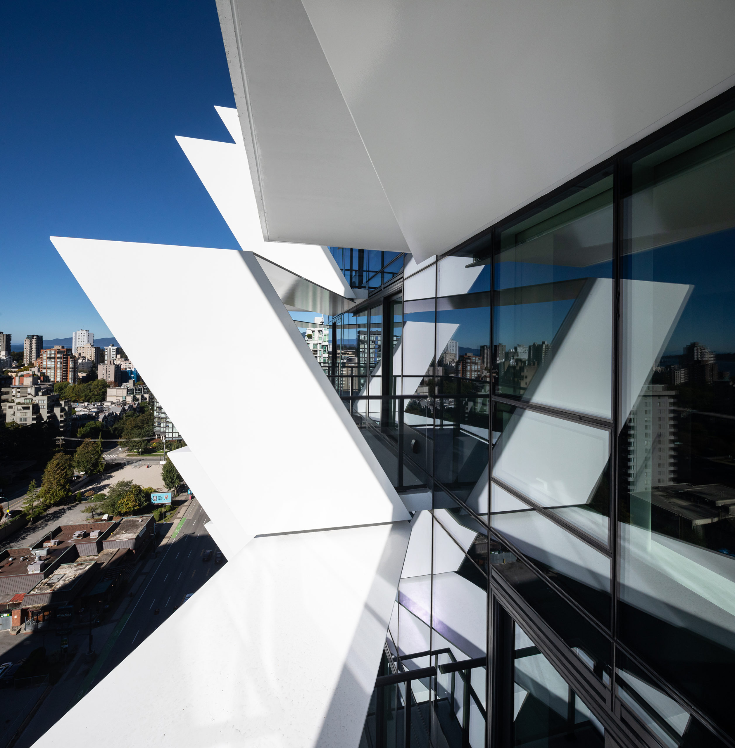 Cardero by Henriquez Partners Architects, Vancouver, Canada
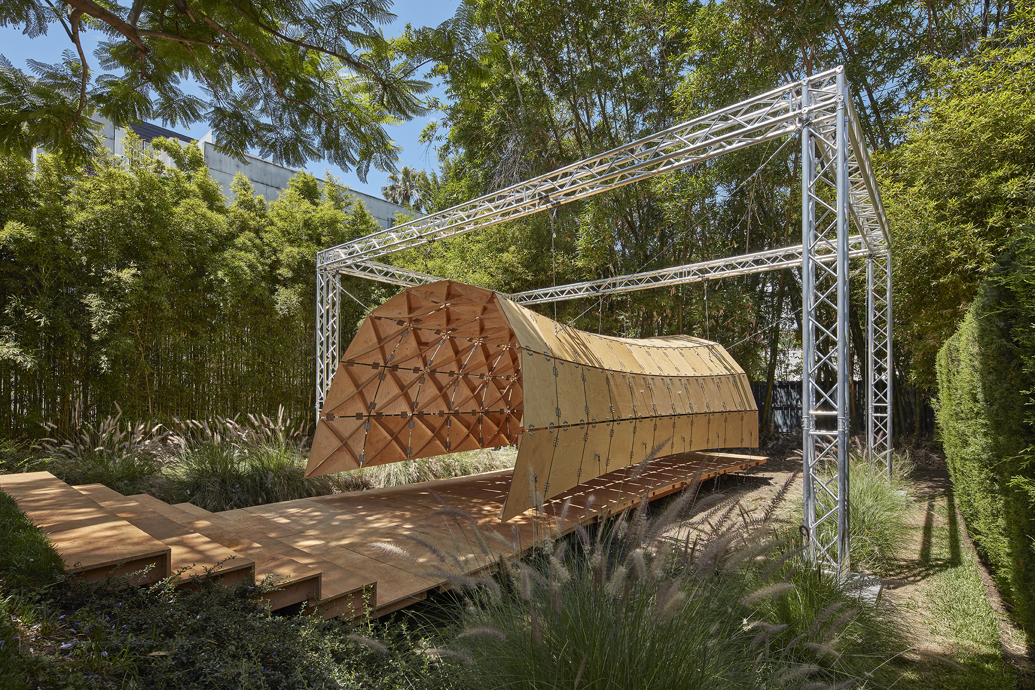
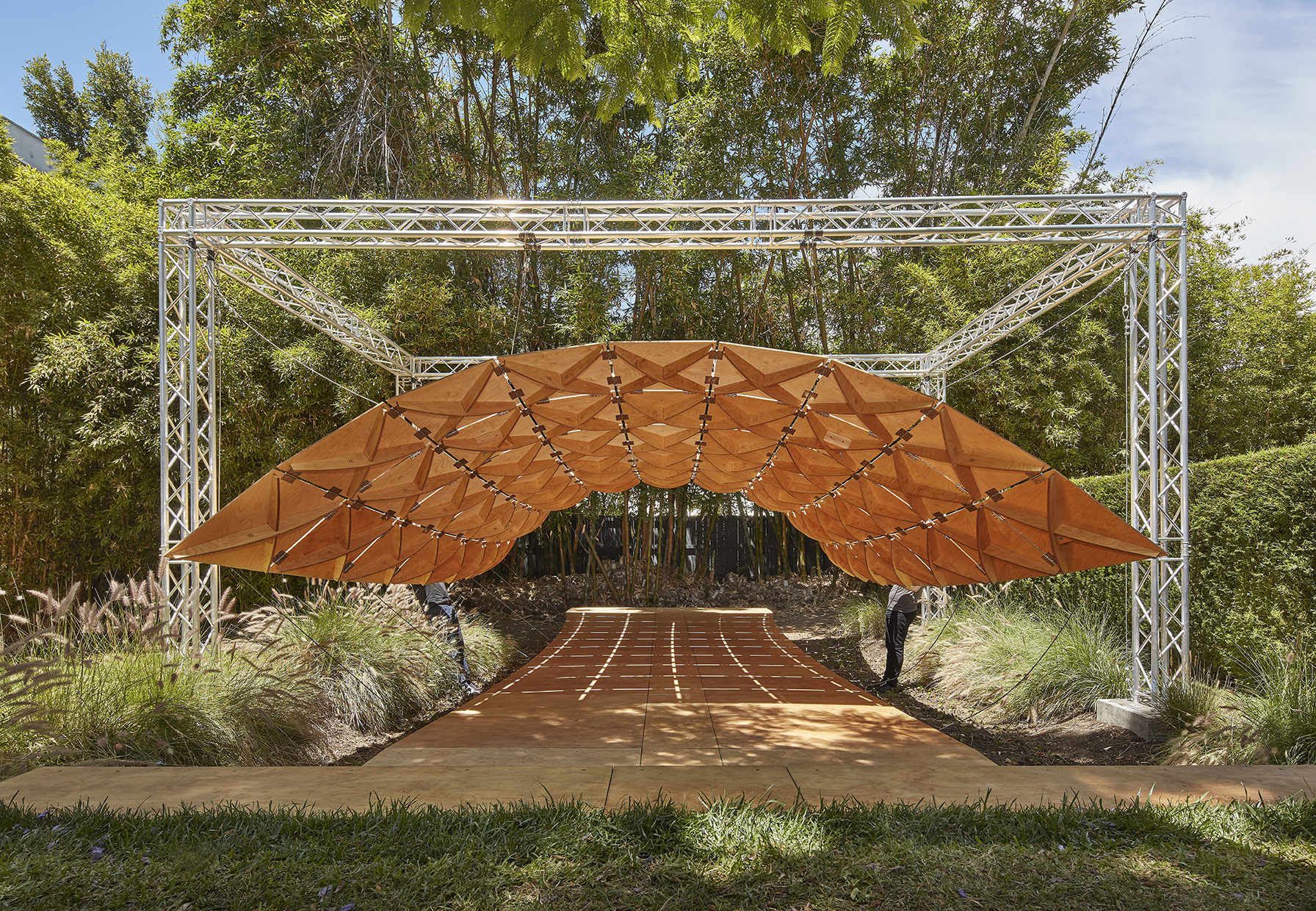 Kinematic Sculpture by Skidmore, Owings & Merrill (SOM), Chicago, Illinois
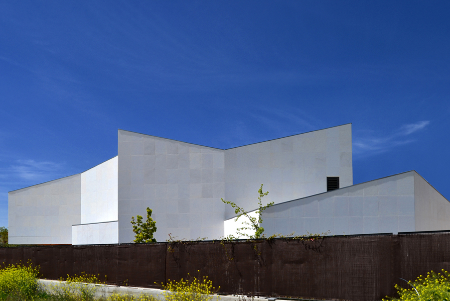
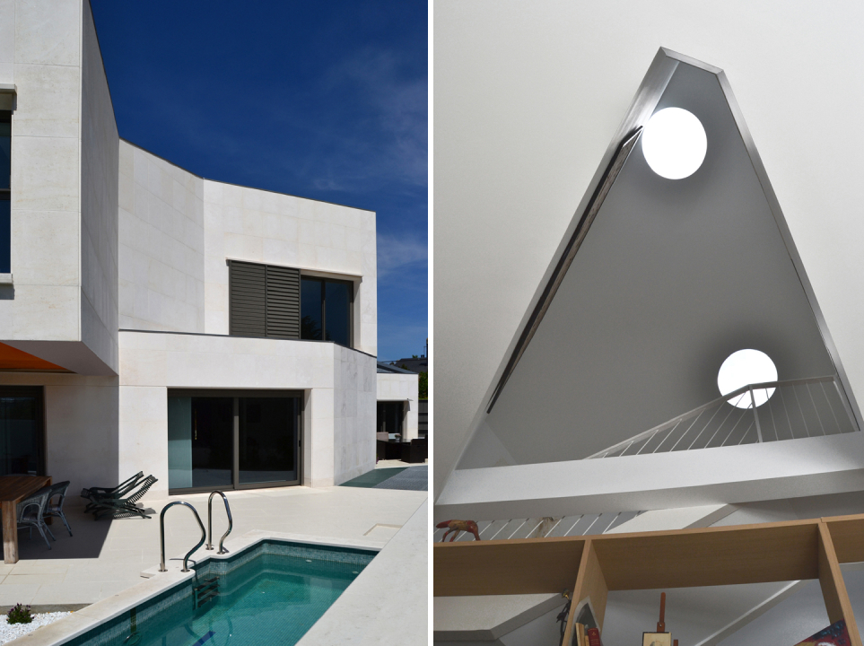 Zigzag House by Cobaleda & Garcia Arquitectos, Pozuelo de Alarcón, Spain
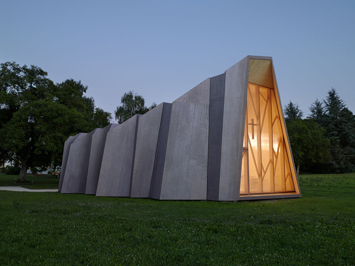
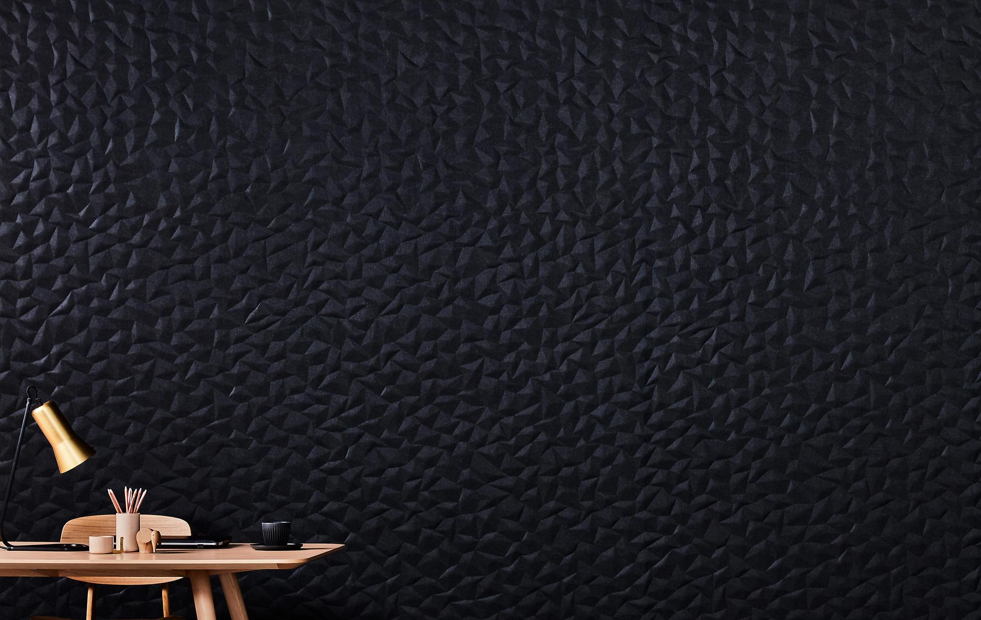 The Embossed Acoustic Panel Series from Woven Image, distributed in the USA by Kirei
 Silestone® Sunlit Days by Cosentino Group
 Brace by Davis Furniture
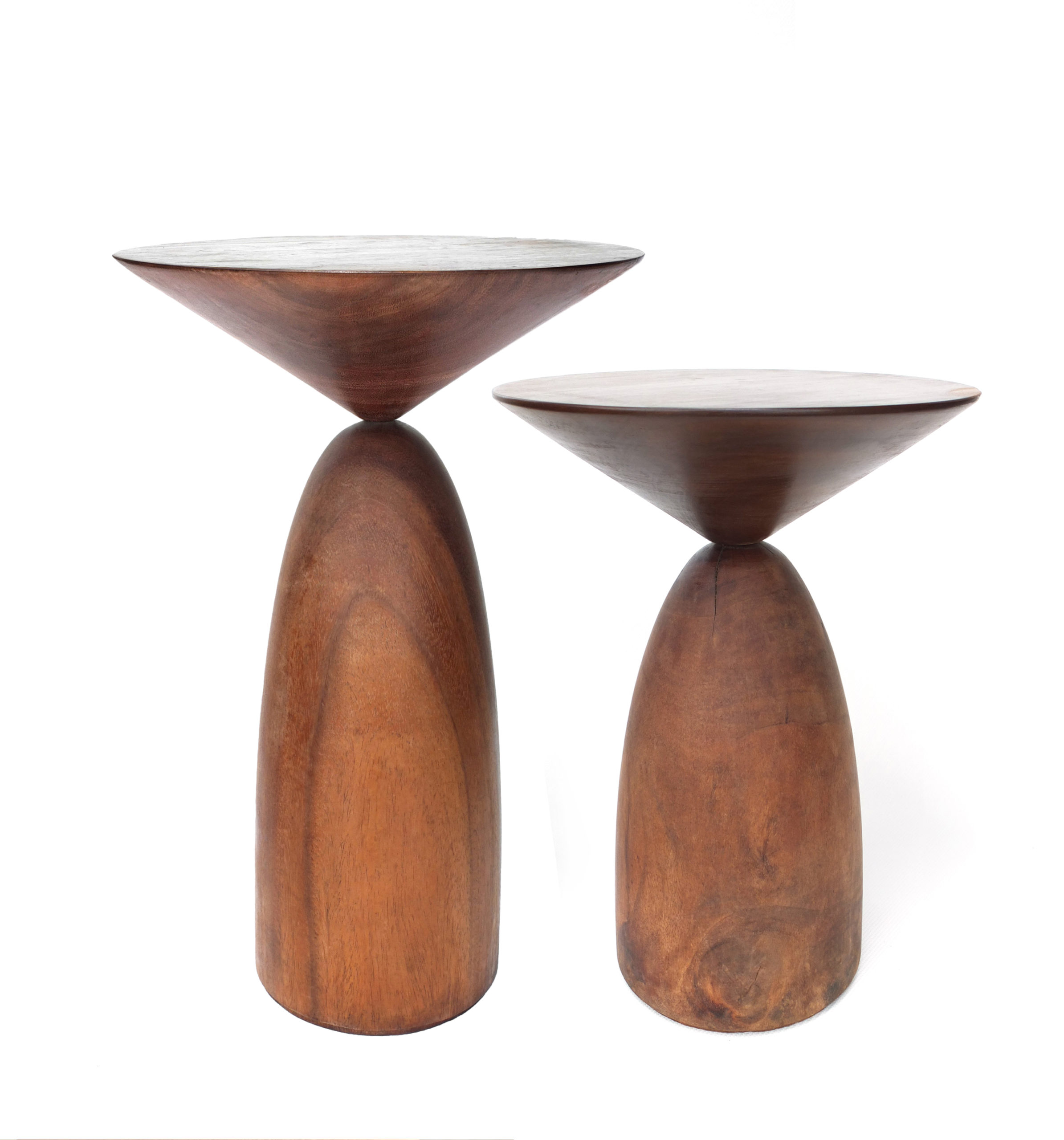 Koroi Side Table by MAJA
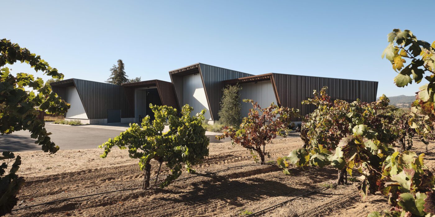
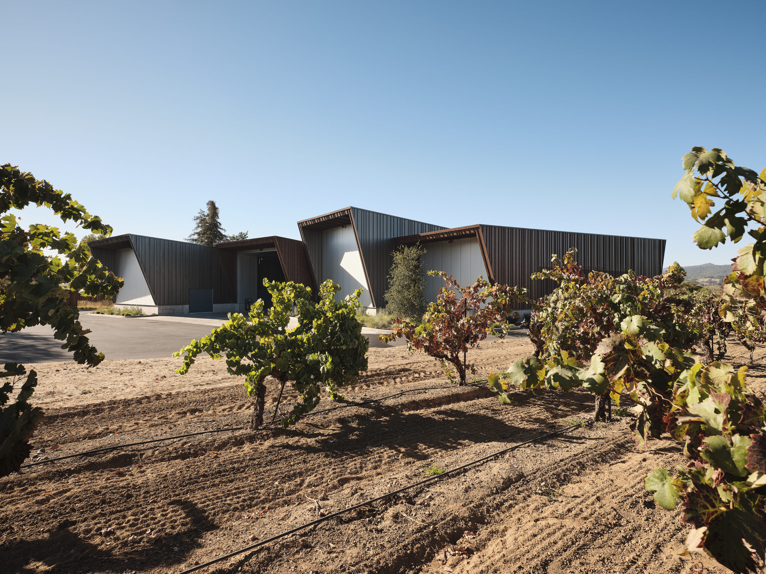
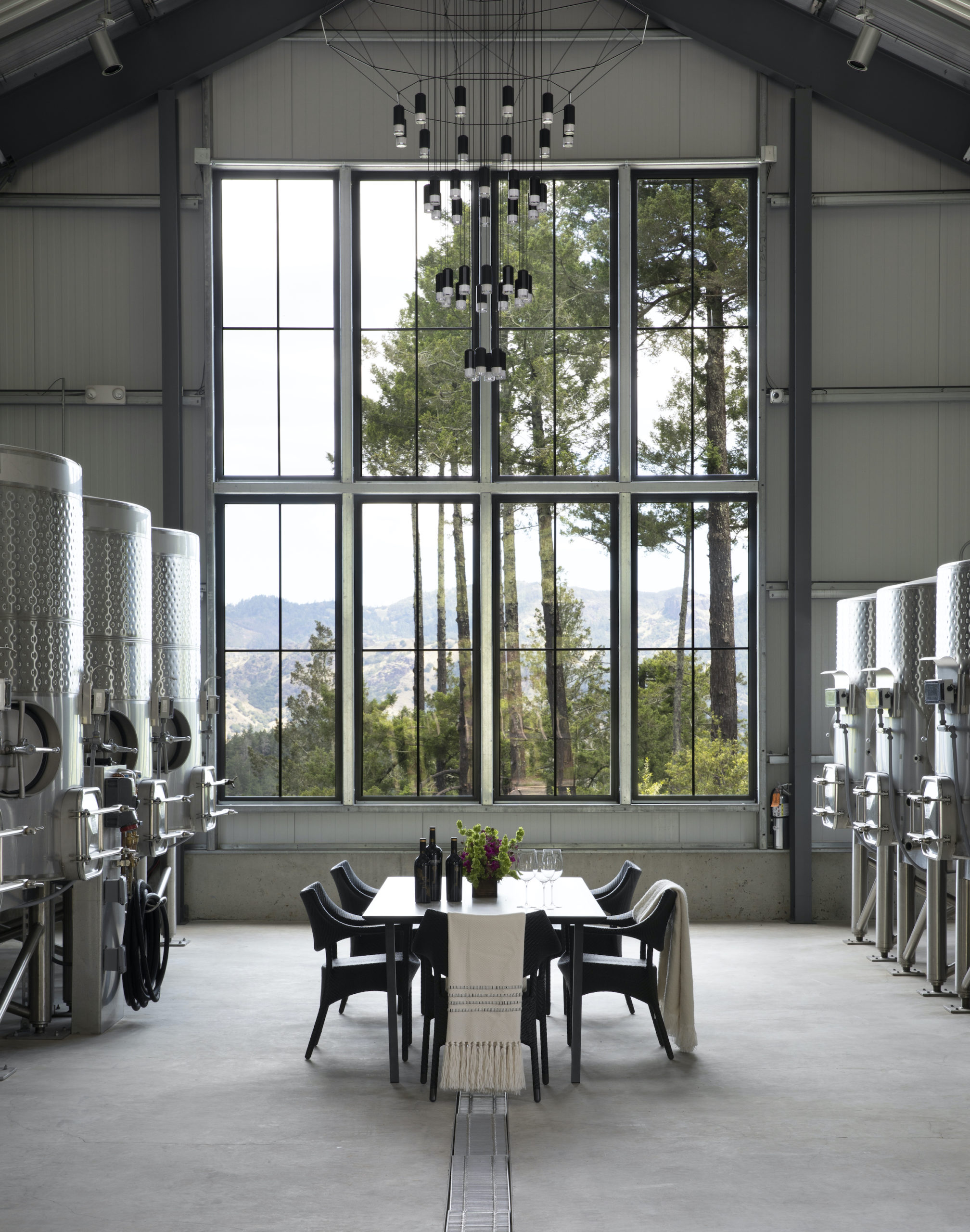
 Aperture Cellars by Signum Architecture, Healdsburg, CA, United States
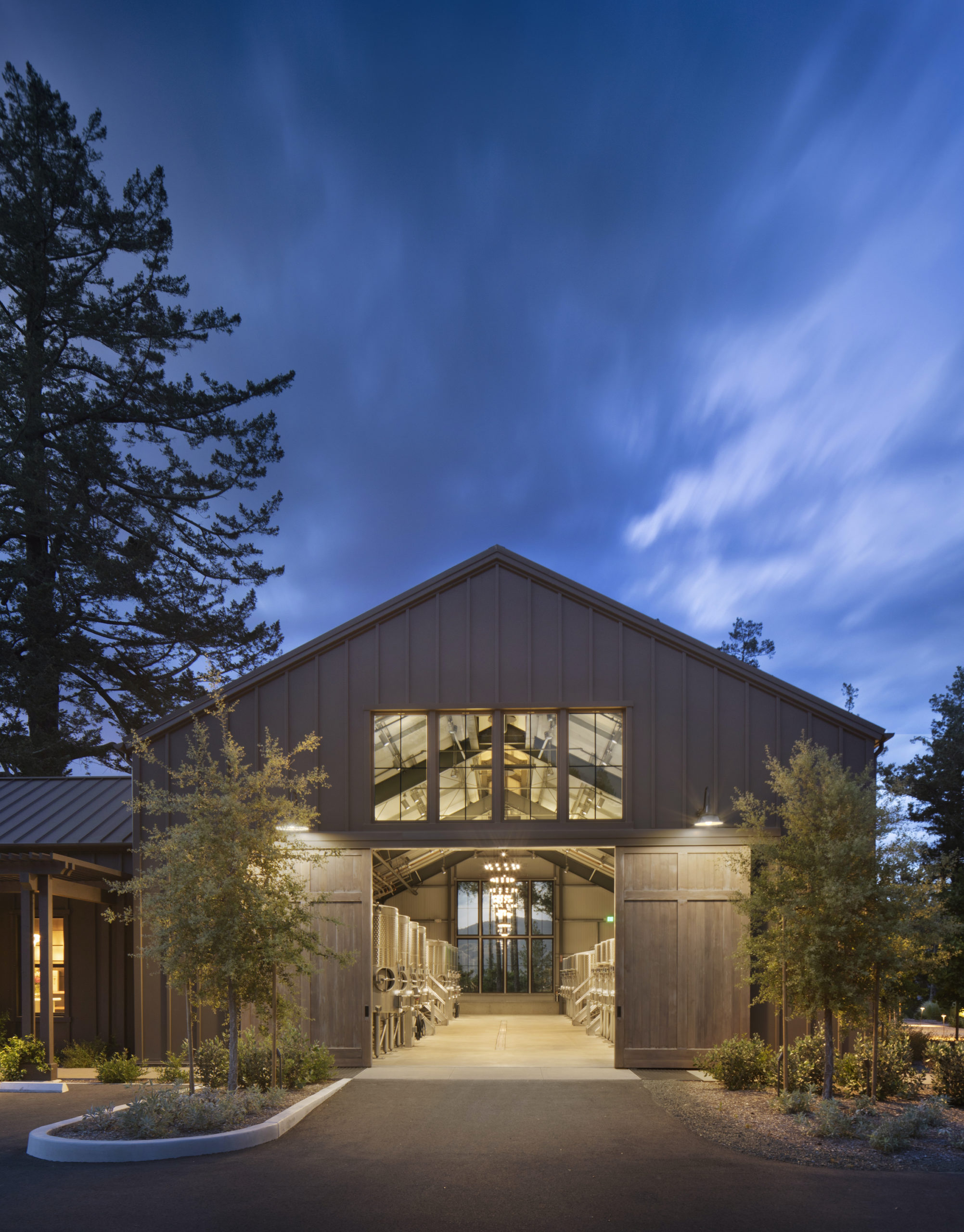
 Theorem Winery by Richard Beard Architects, Calistoga, CA, United States
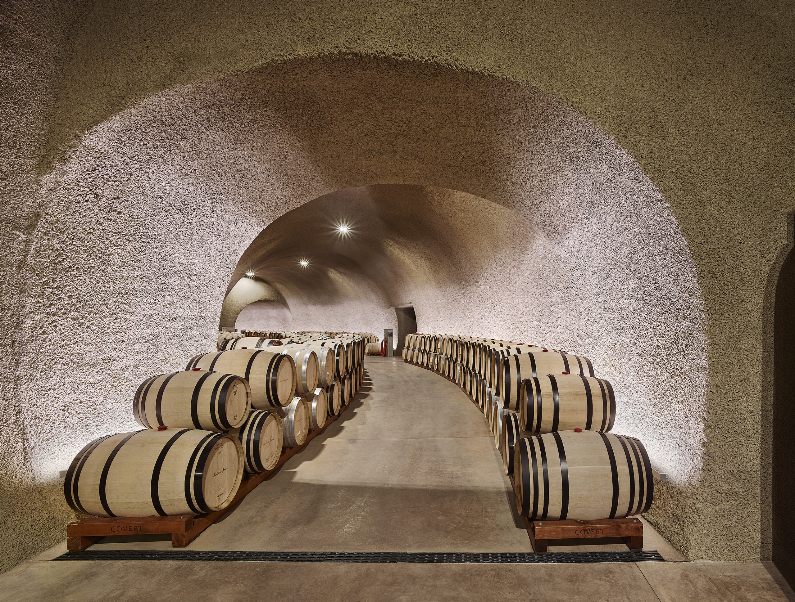
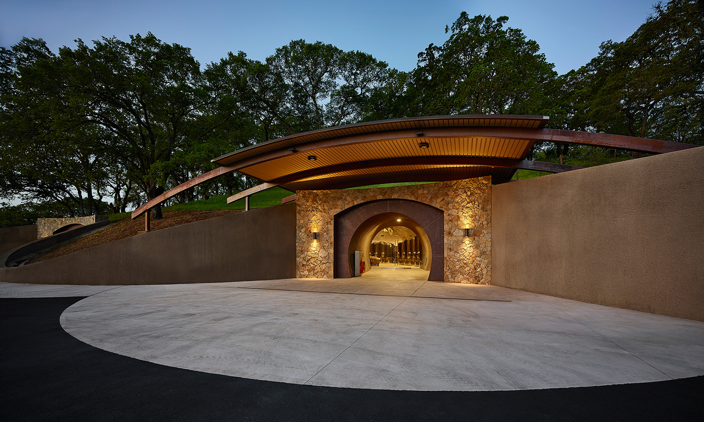 Covert Estate Winery by Signum Architecture, Napa, CA, United States
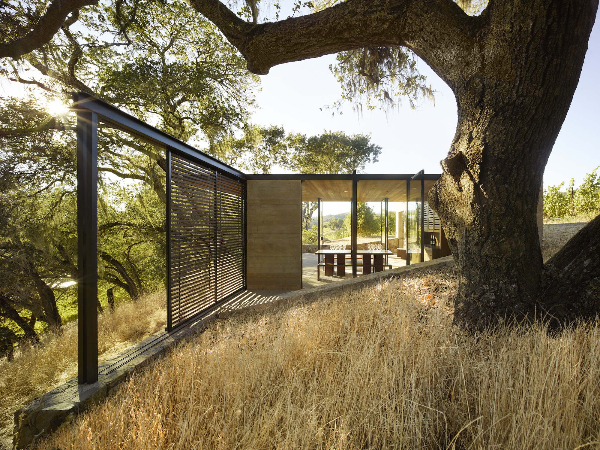
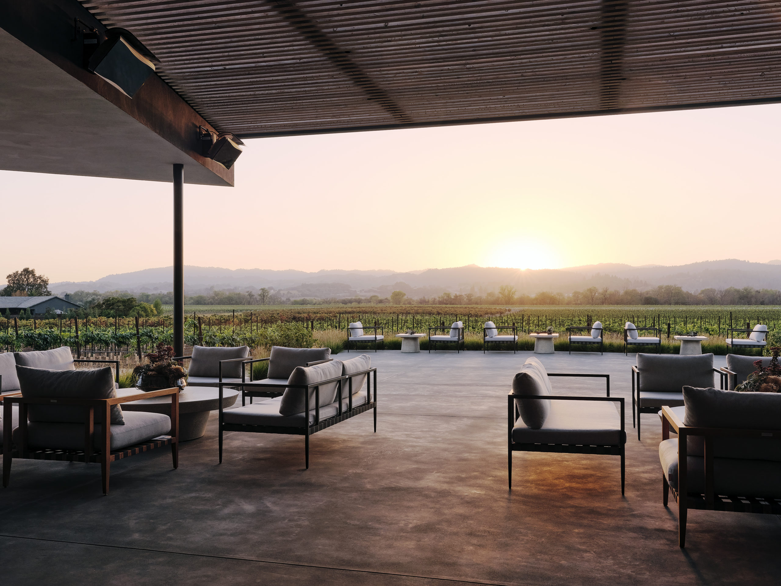
 Quintessa Pavilions by Walker Warner Architects, Saint Helena, CA, United States
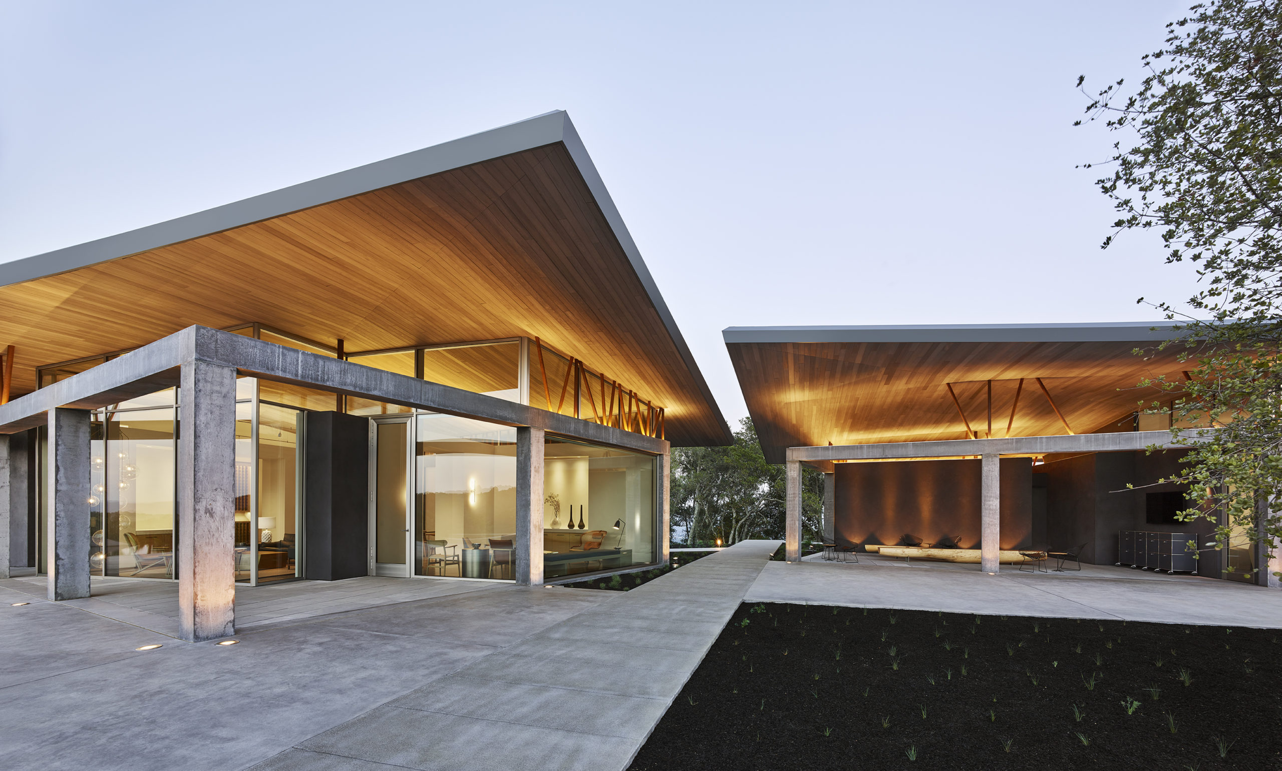
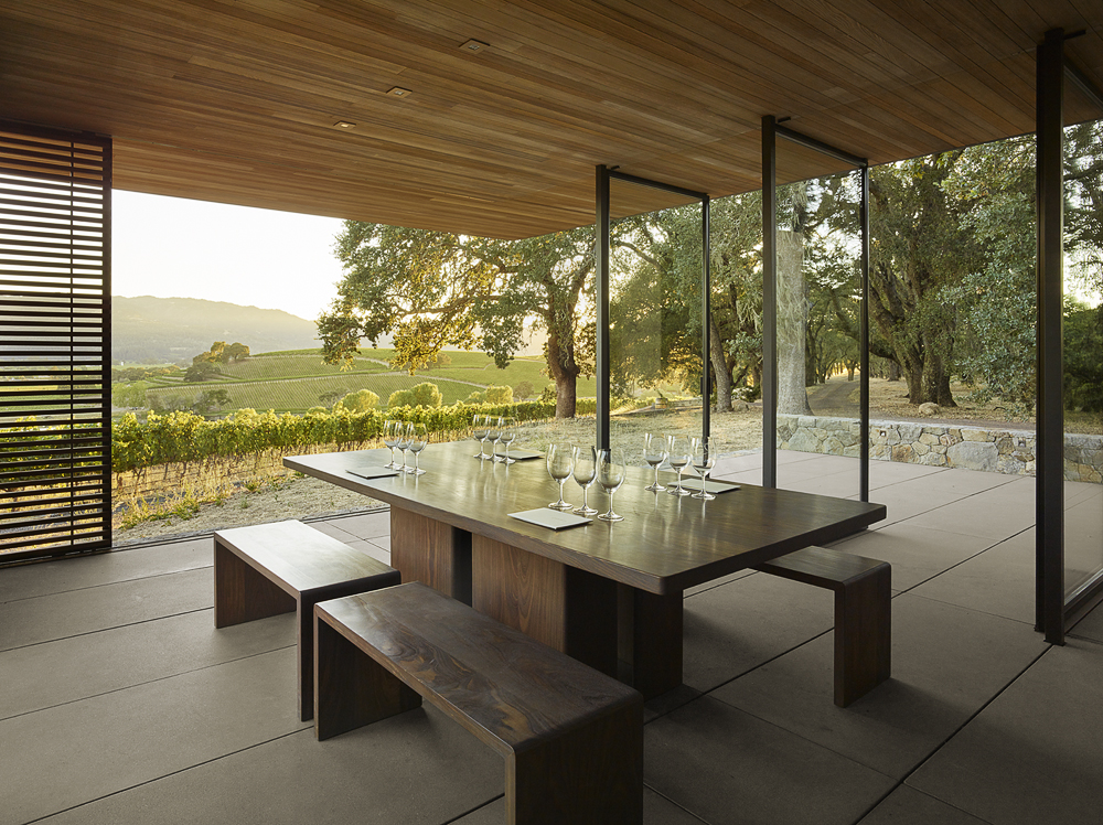
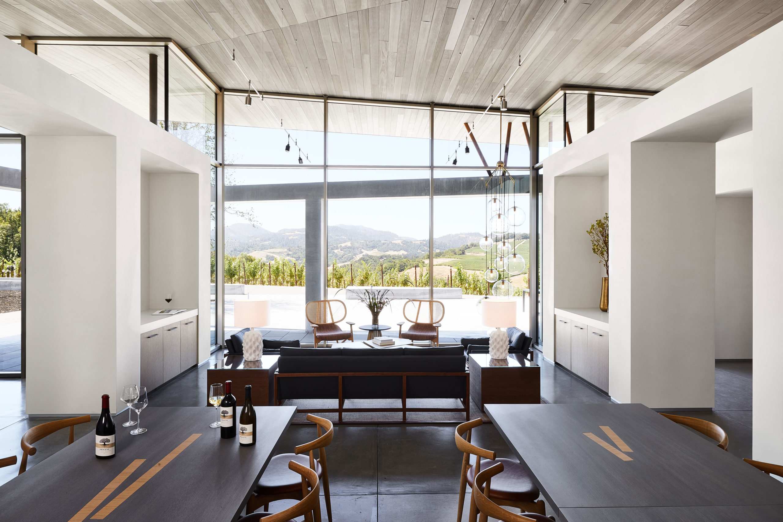 Progeny Winery by Signum Architecture, Napa, CA, United States
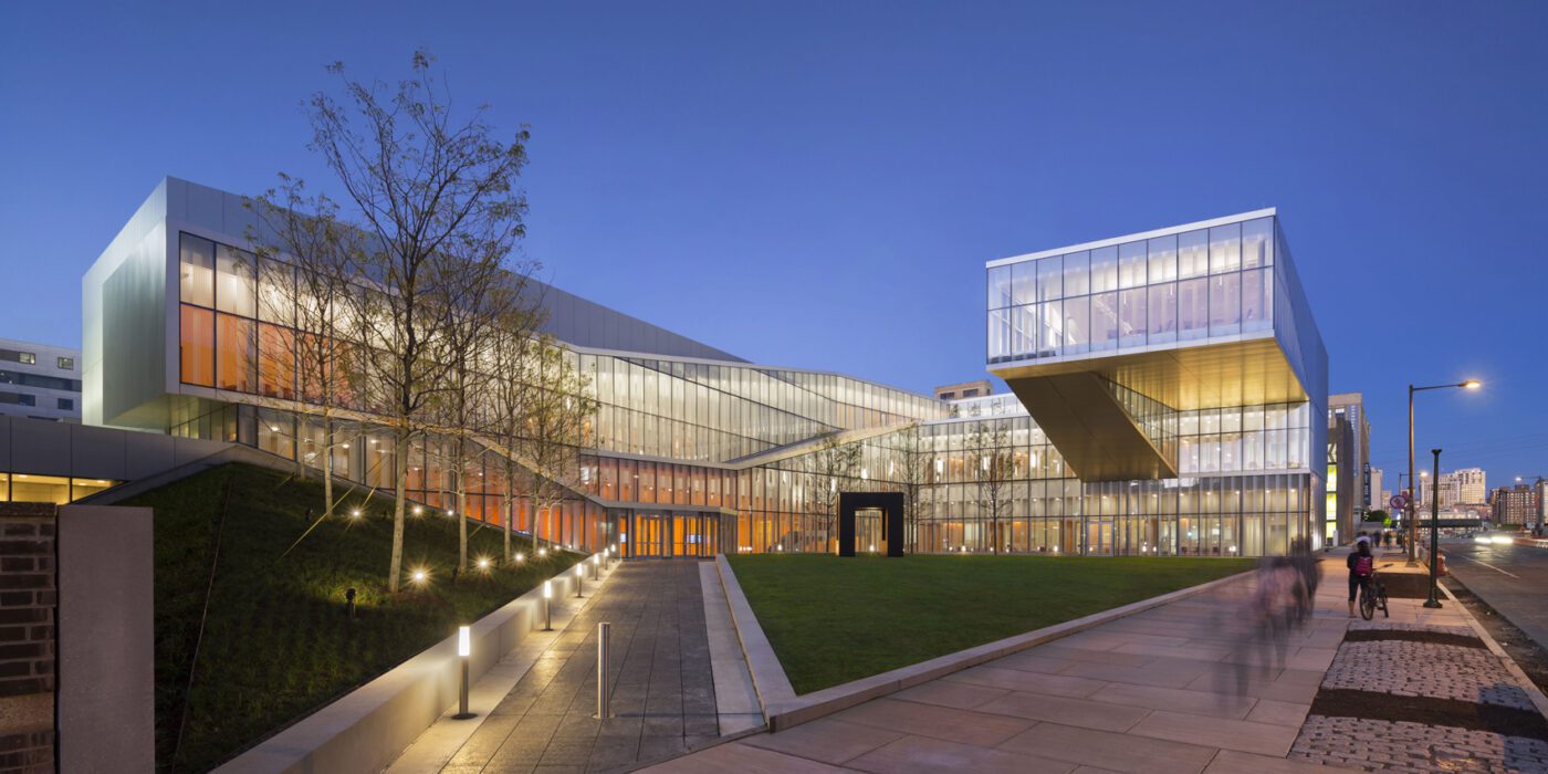
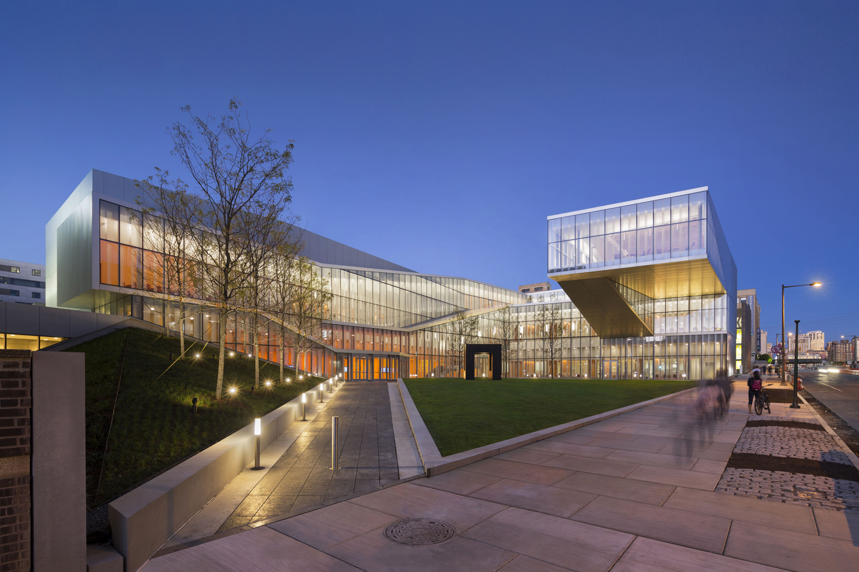
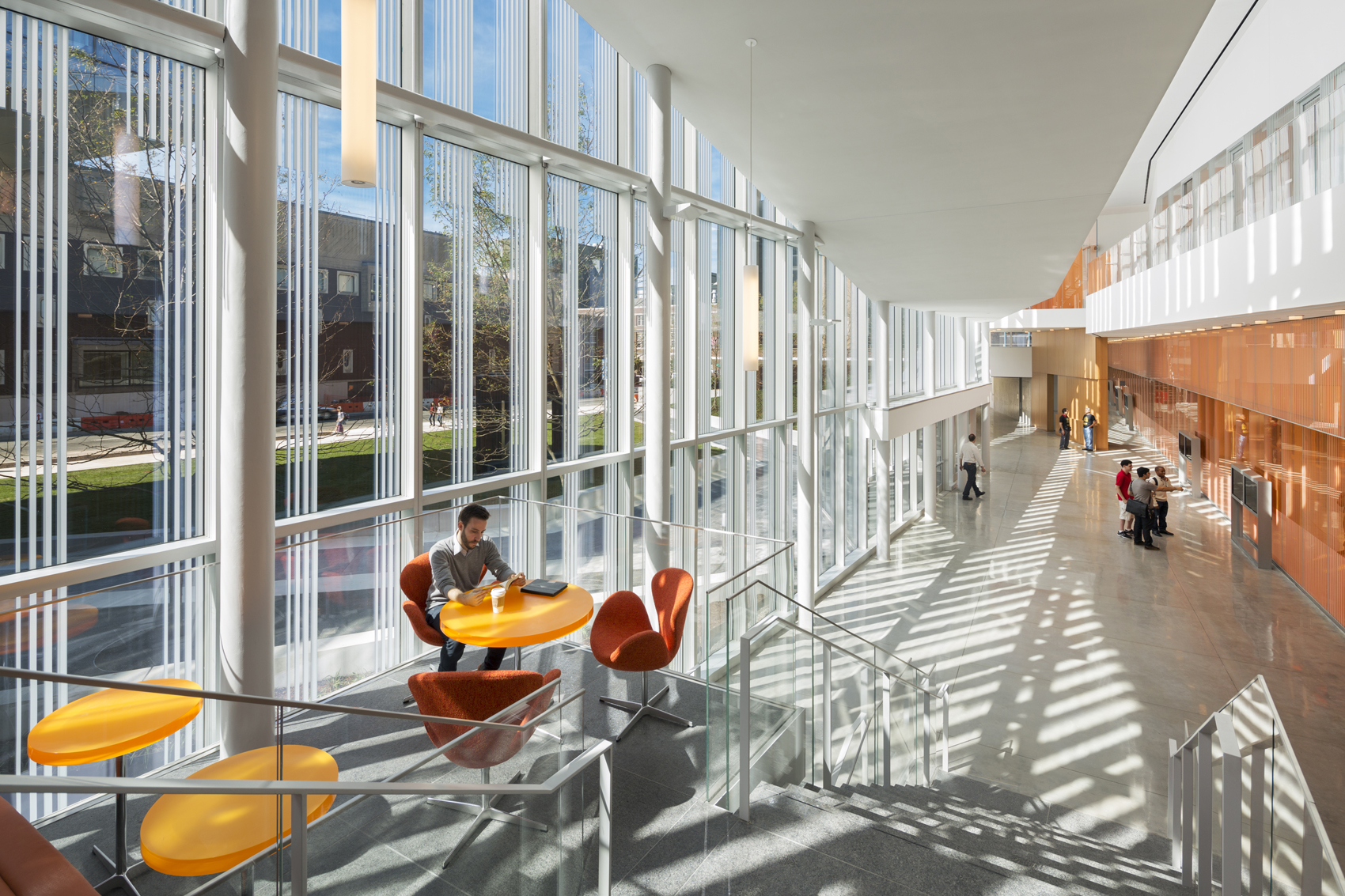 Krishna P. Singh Center for Nanotechnology by WEISS/MANFREDI, Philadelphia, PA, United States
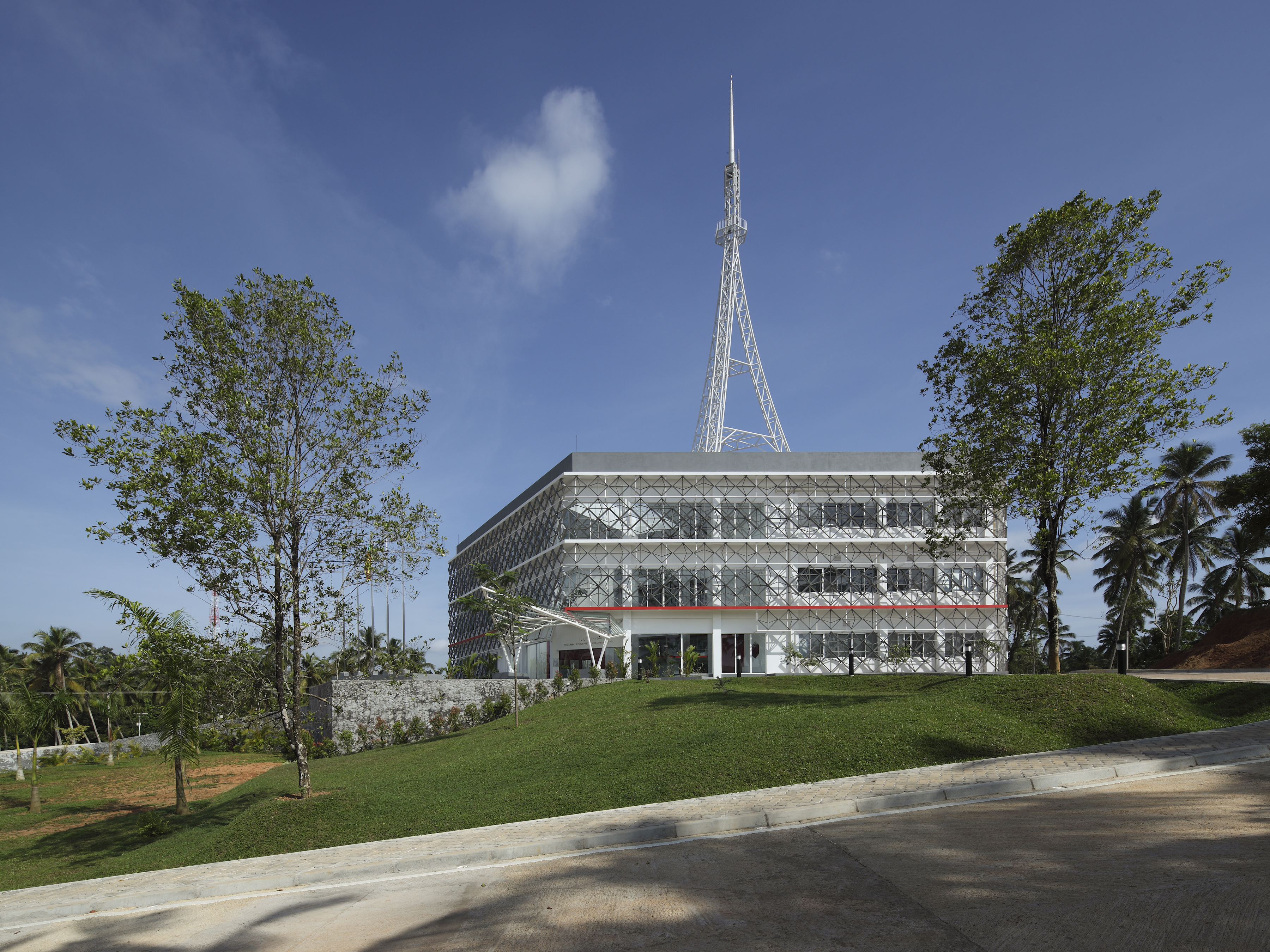
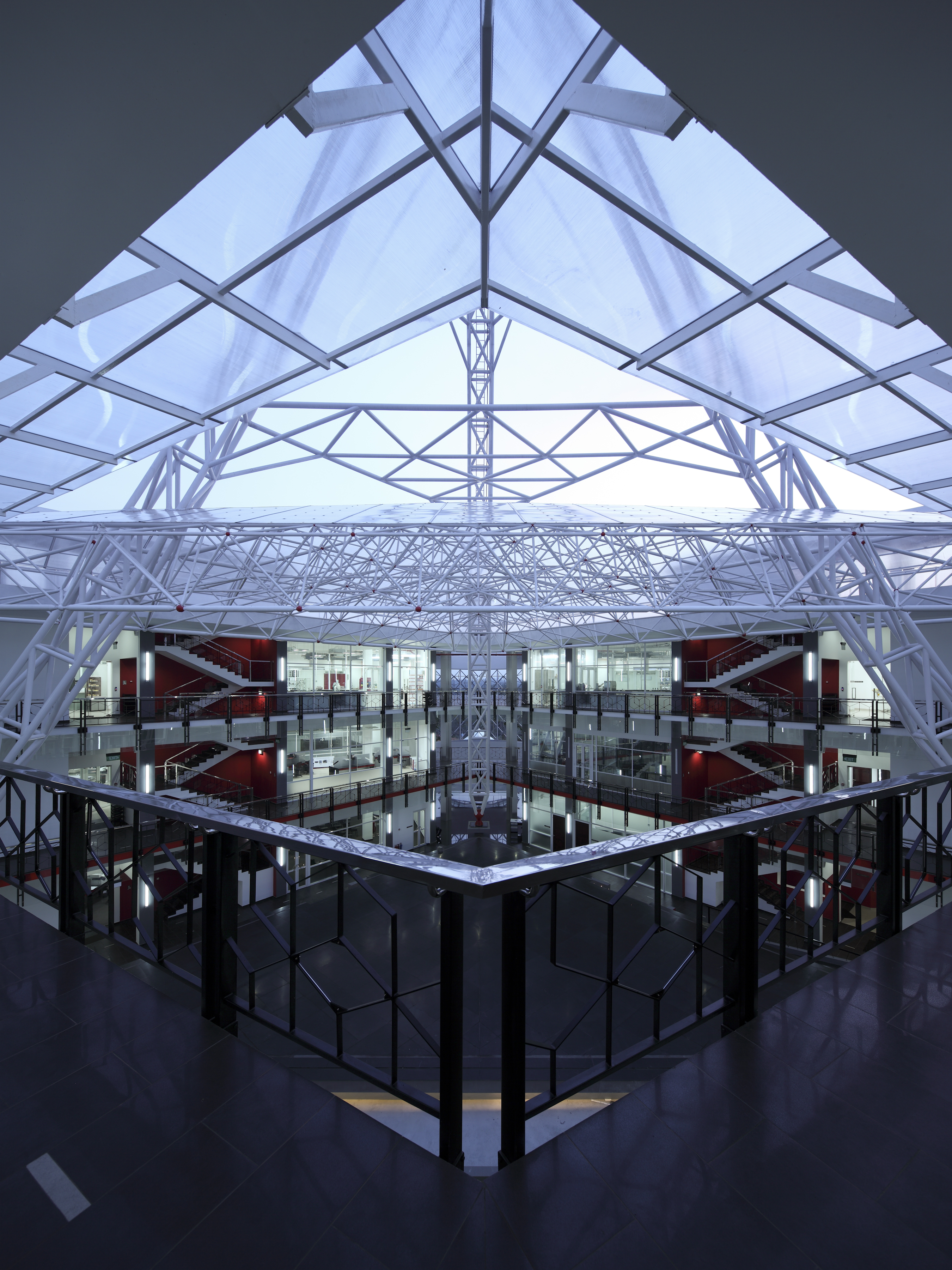 National Nanotechnology Park by Arch International Pvt Ltd., Homagama, Sri Lanka
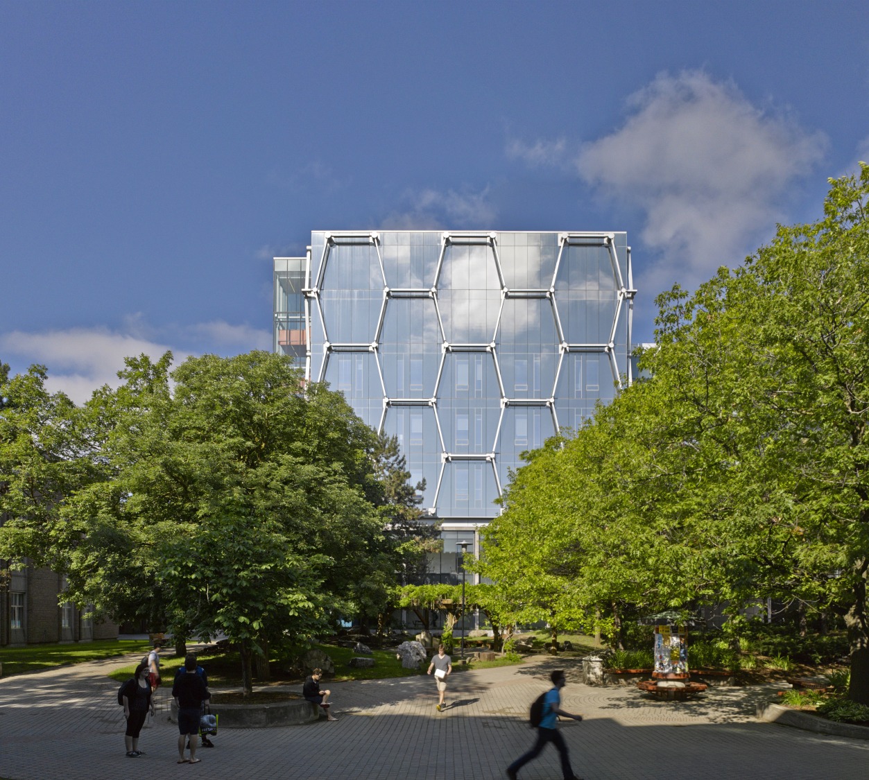
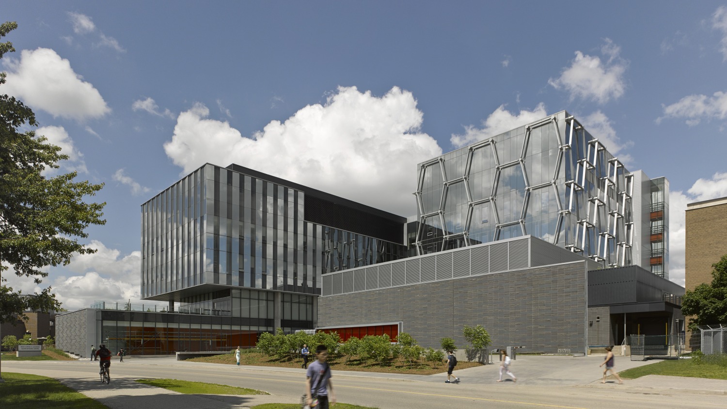 Mike & Ophelia Lazaridis Quantum-Nano Centre by KPMB Architects, Waterloo, Canada
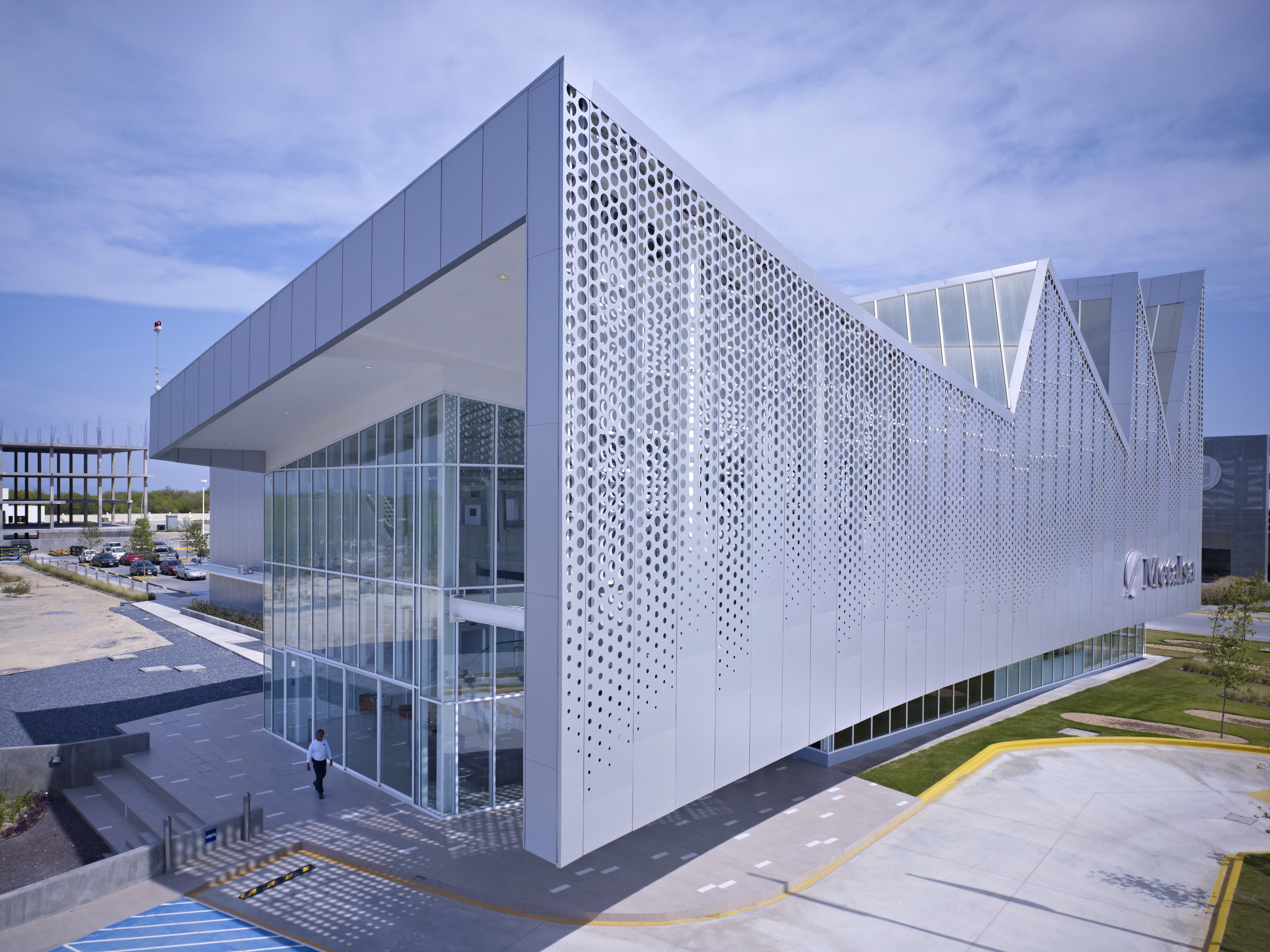
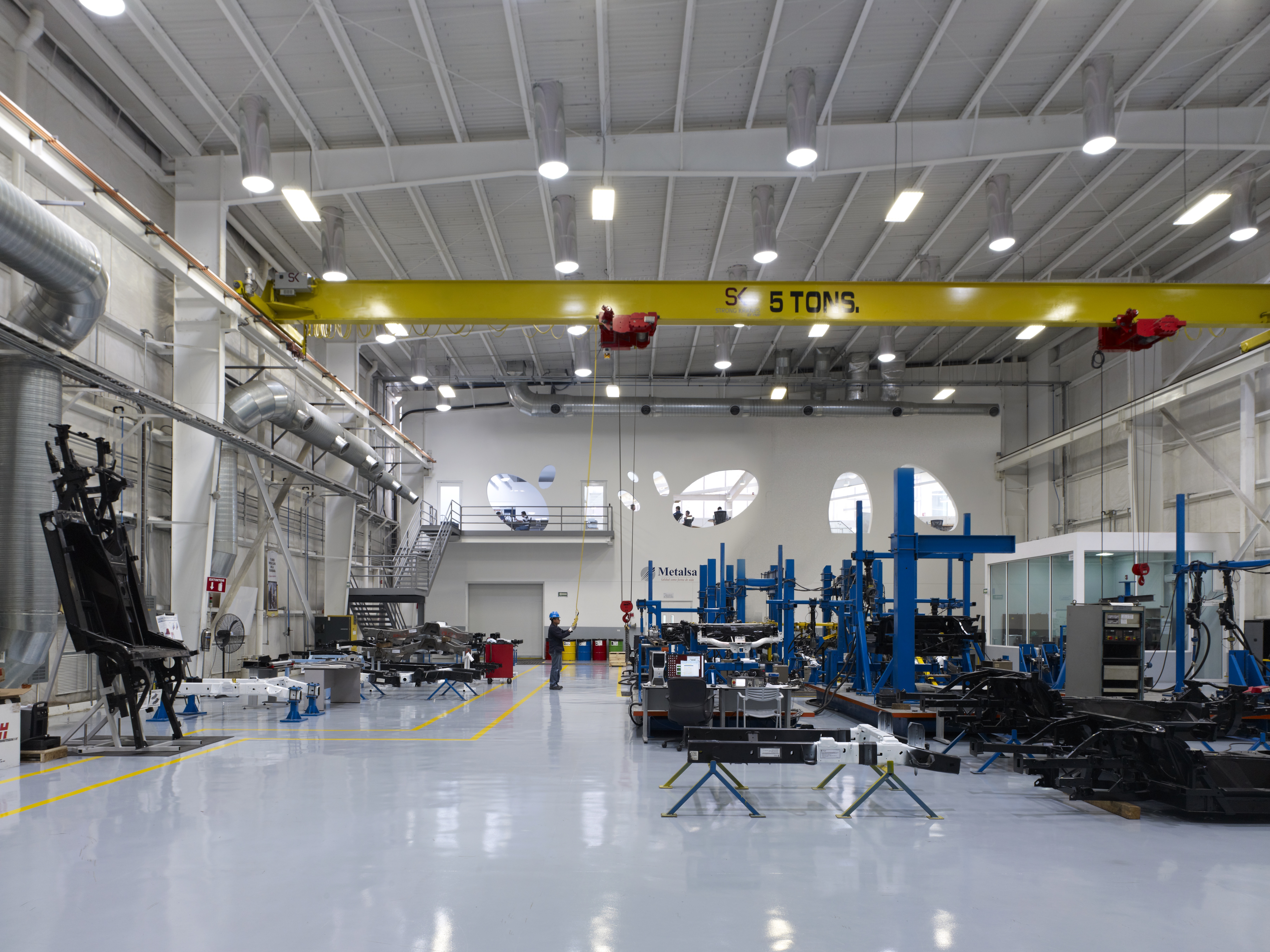 New Center for Manufacturing Innovation by Brooks + Scarpa Architects, Monterrey, Mexico
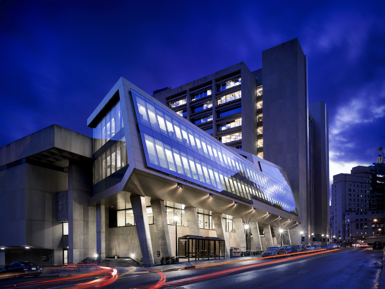
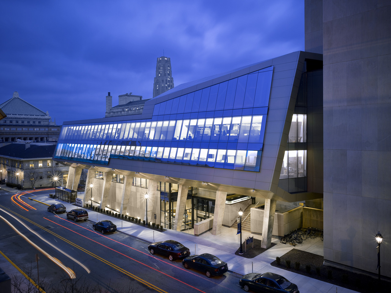 Mascaro Center for Sustainable Innovation
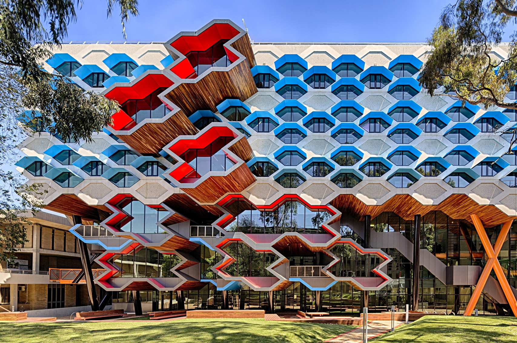
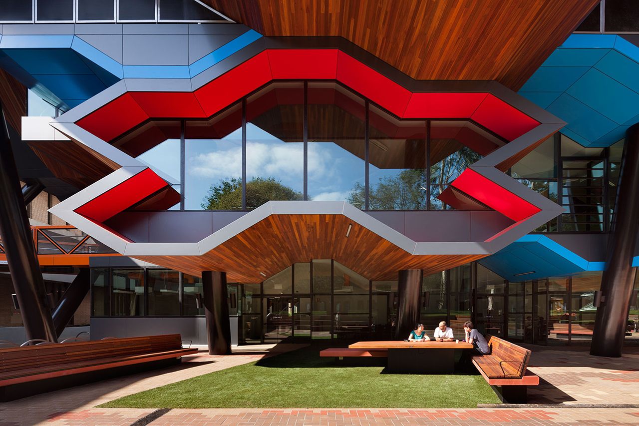 La Trobe Institute for Molecular Science by Lyons, Melbourne, Australia
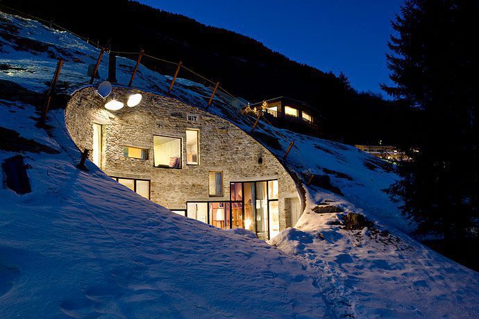

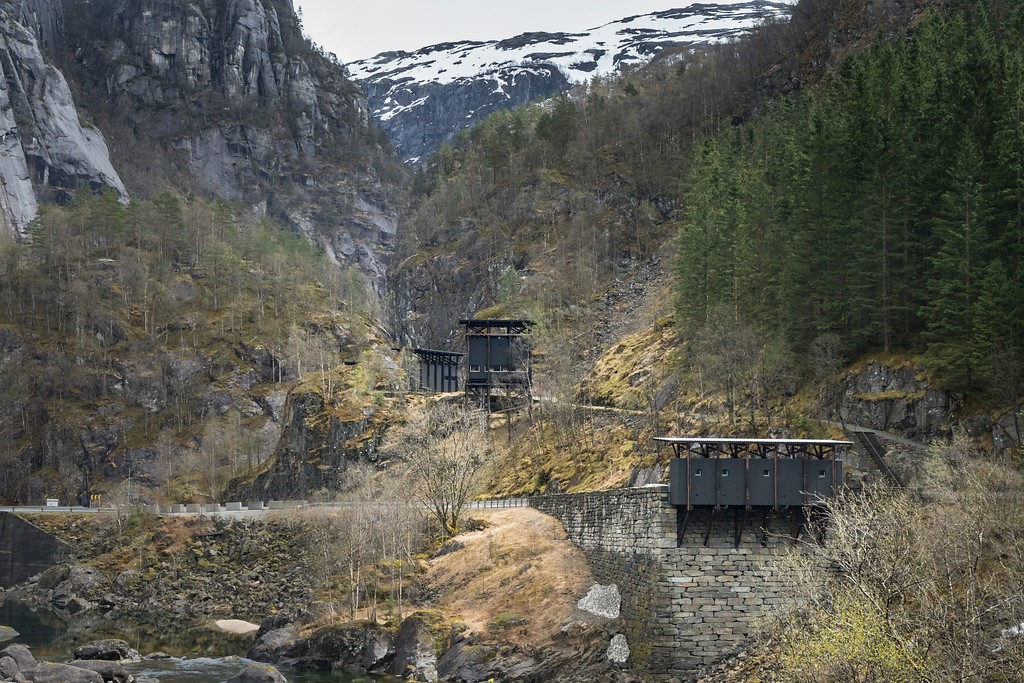
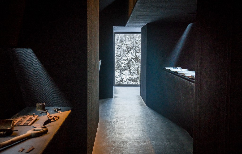
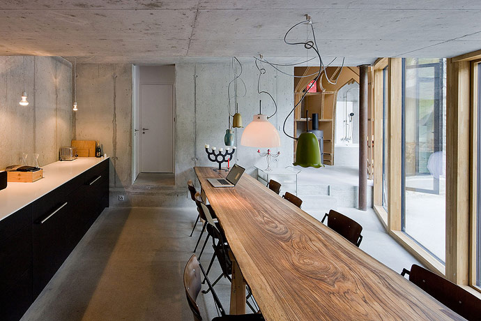 Villa Vals by SeARCH, Vals, Switzerland
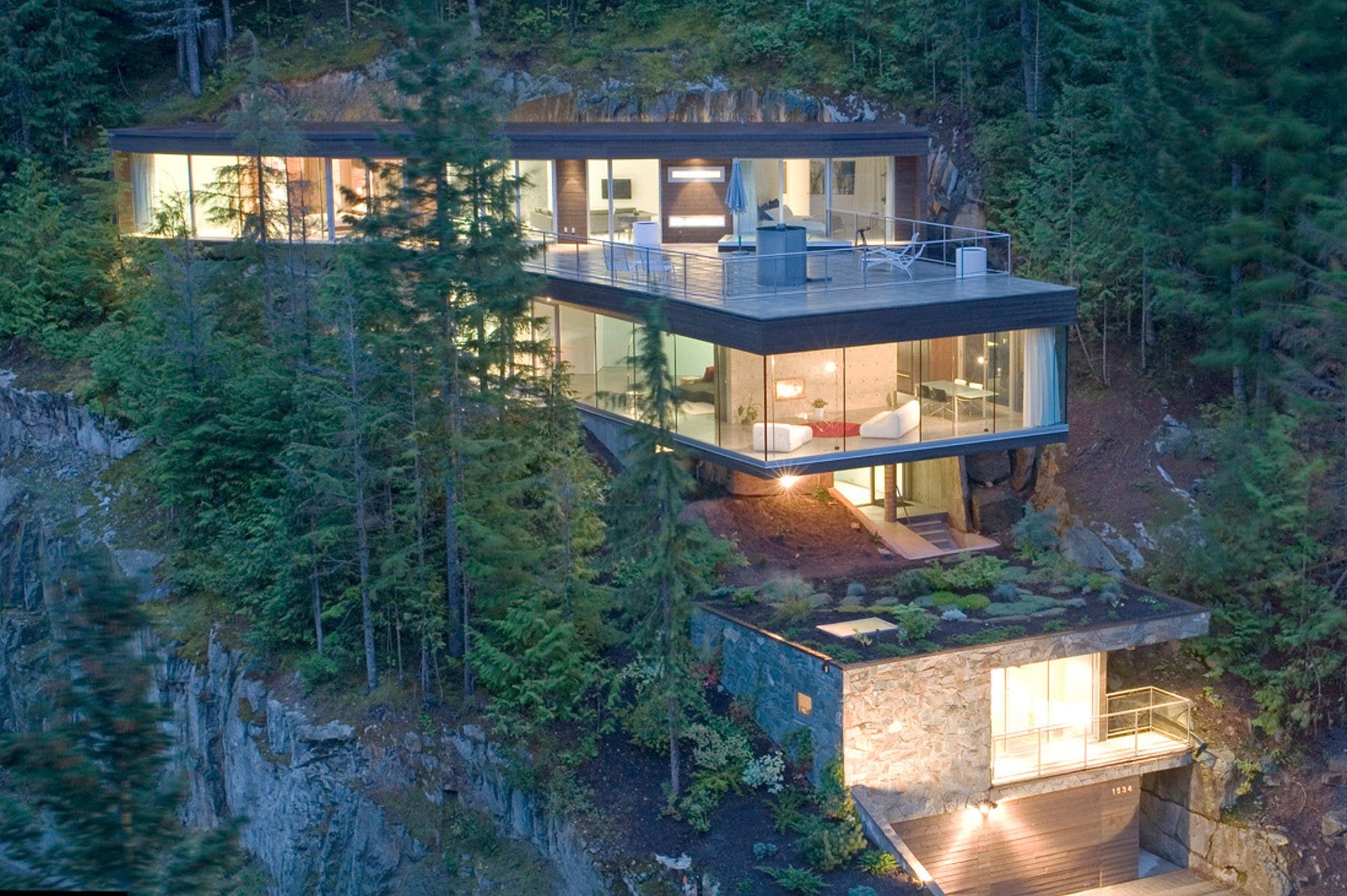
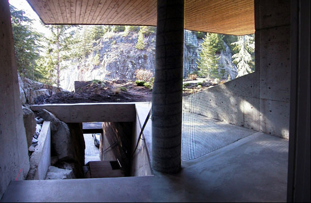 Khyber Ridge by Studio NMinusOne, Whistler, Canada
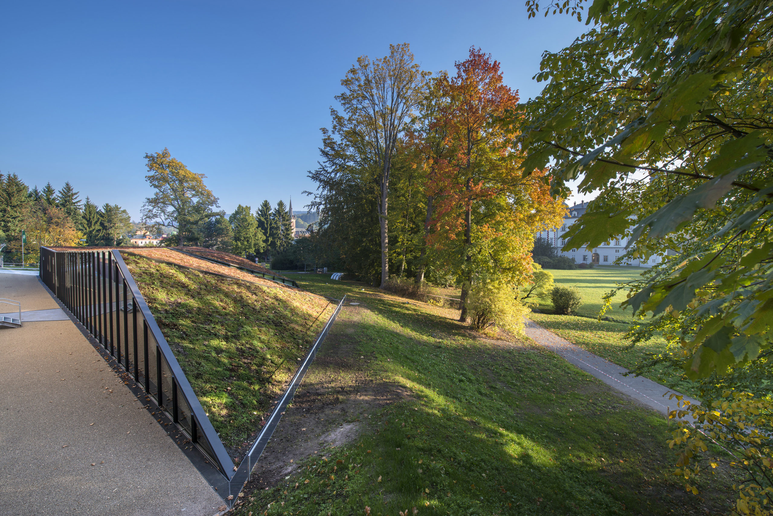
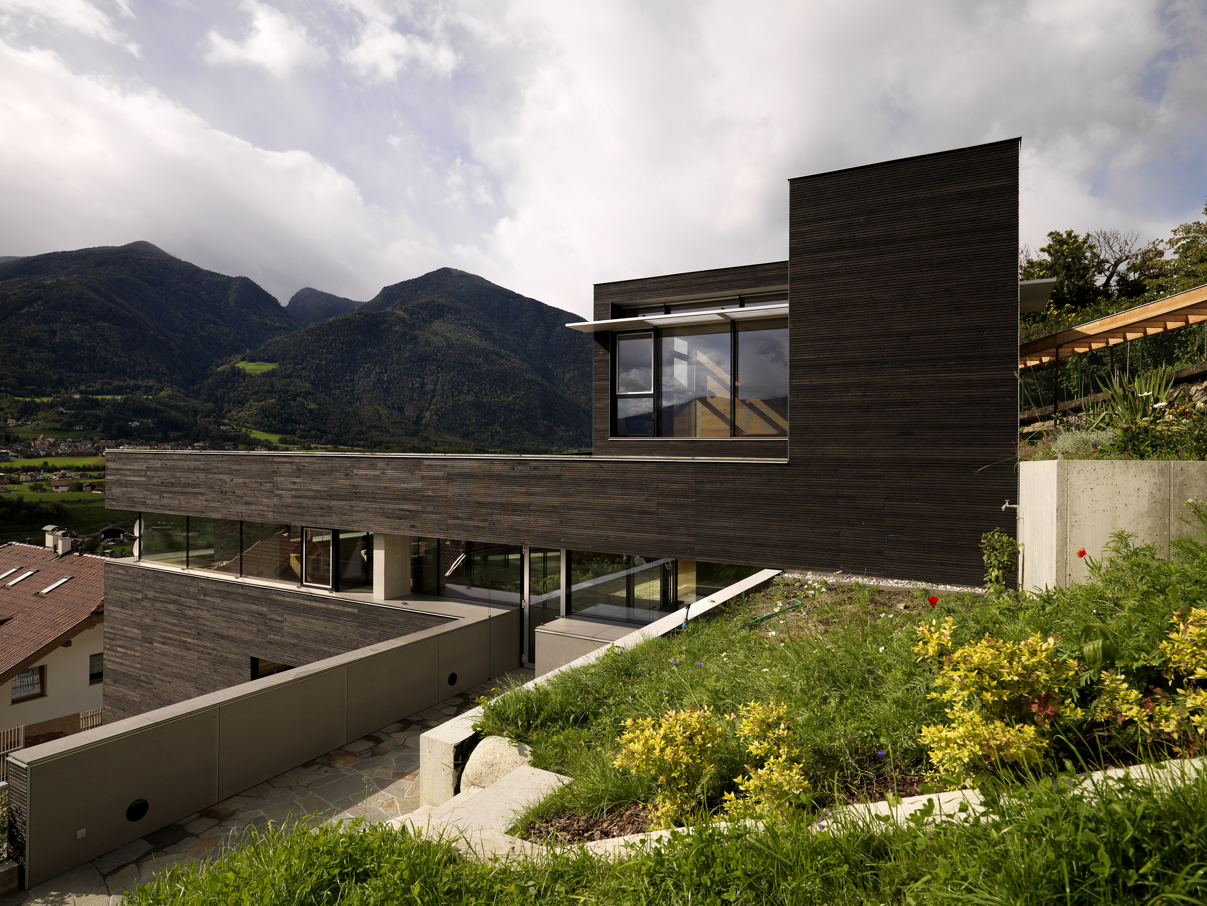
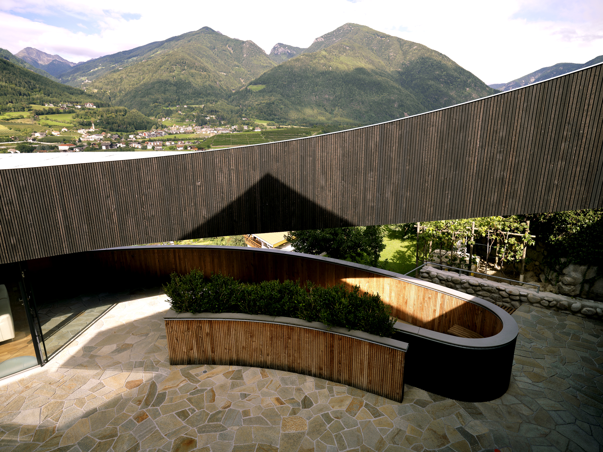 House D by PAUHOF Architekten, Austria
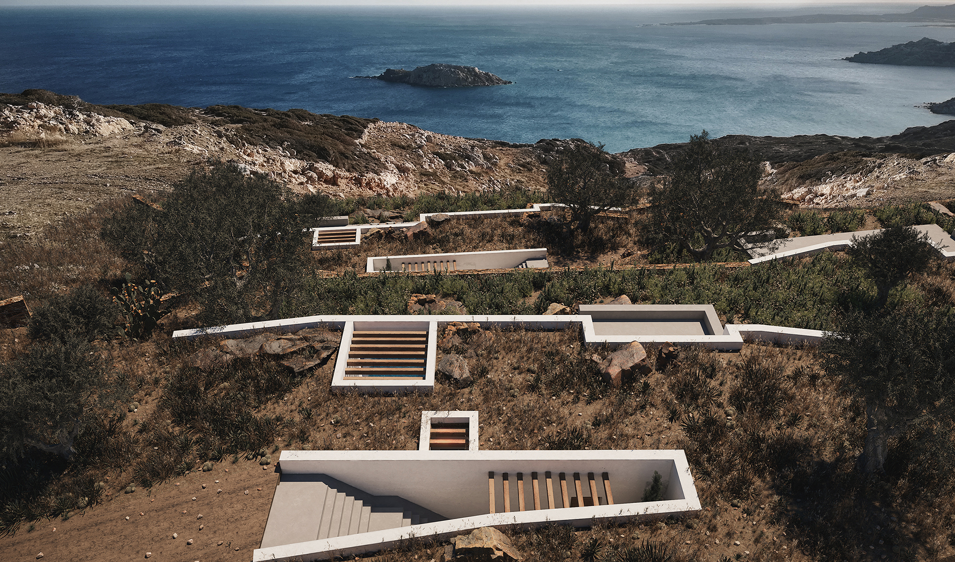
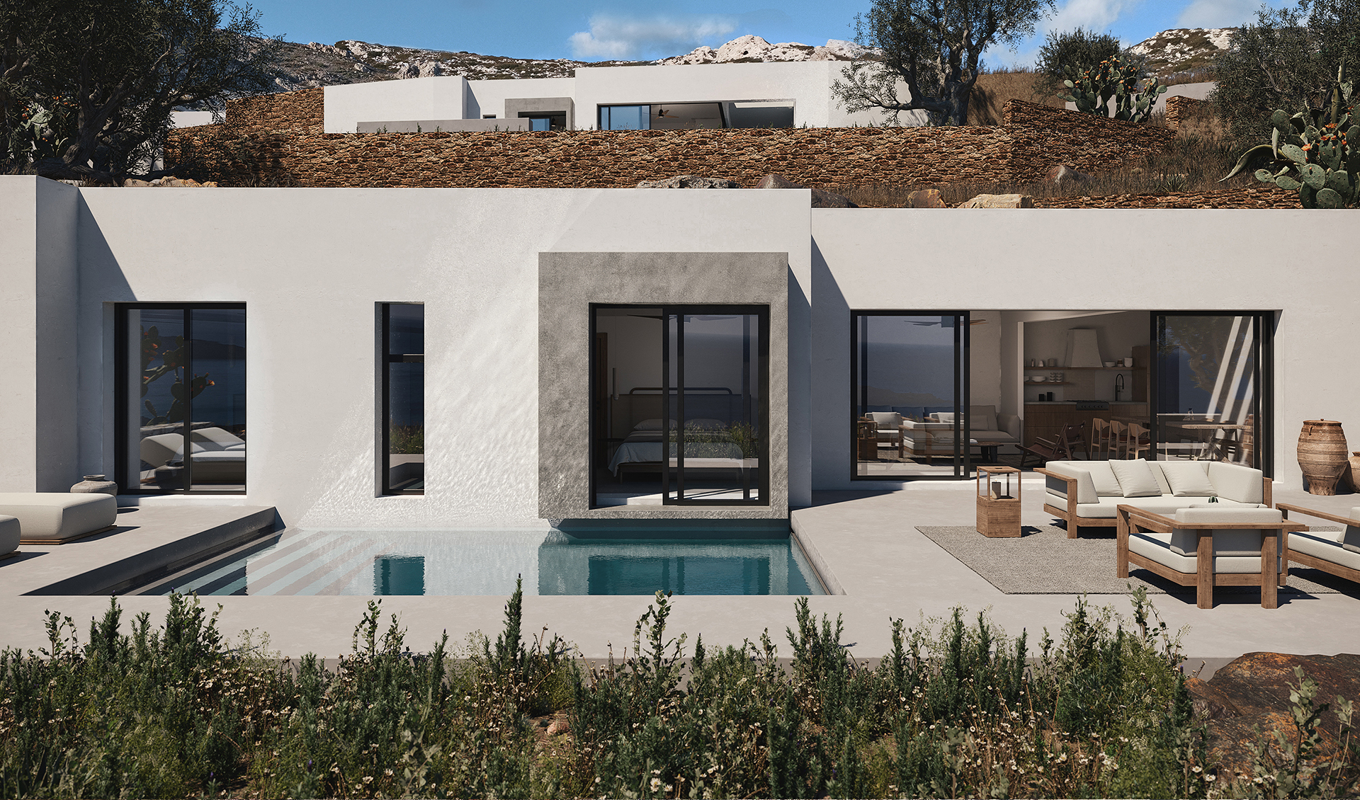 Sheltered Villas by A&M Architects, Karpathos, Greece
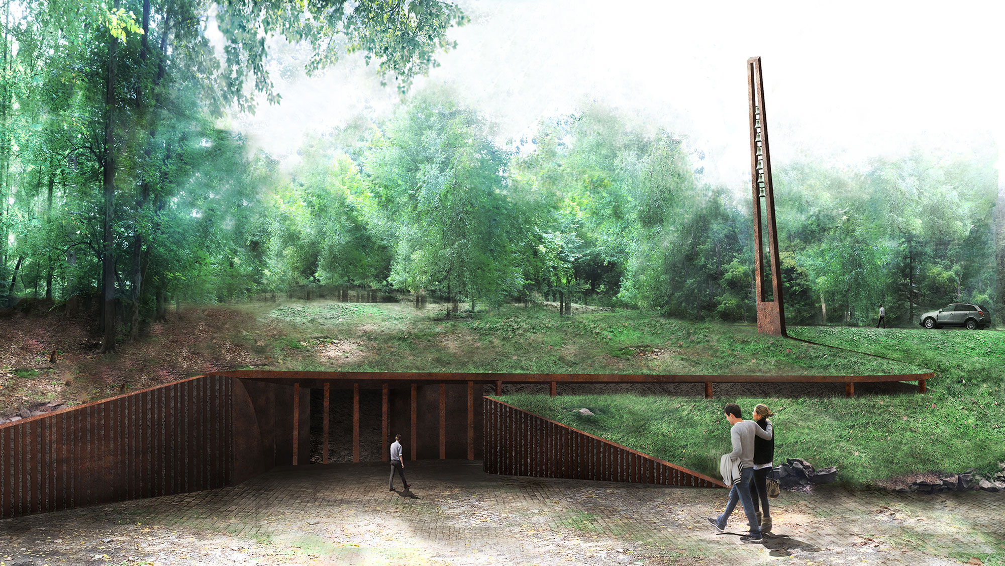
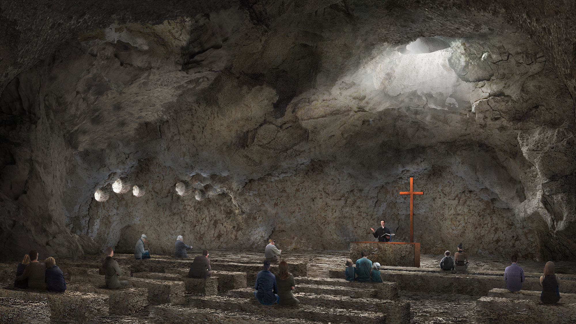 Ebenezer Chapel by Vilalta Studio, Raleigh, North Carolina
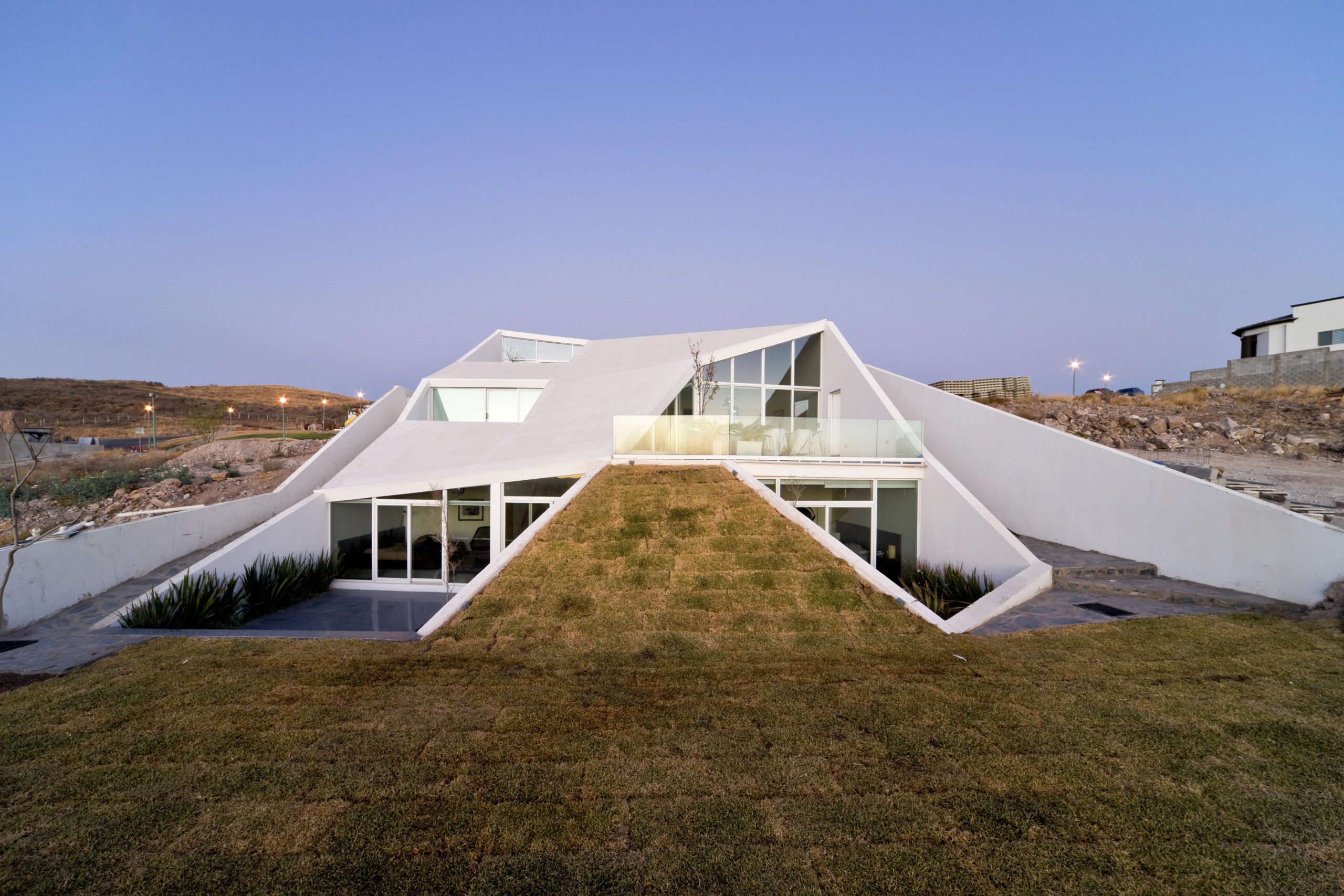
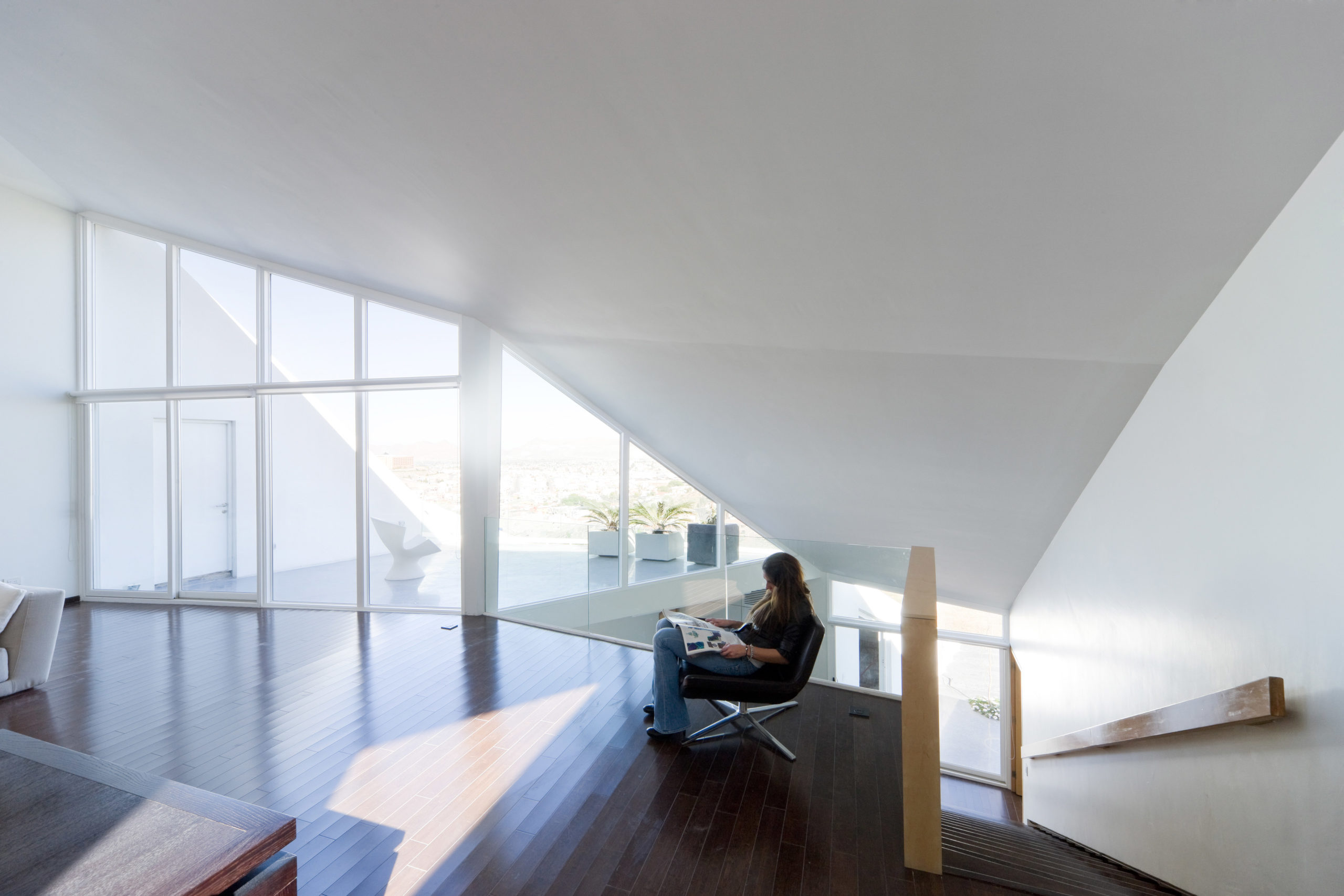 House in Chihuahua by Productora, Chihuahua, Mexico
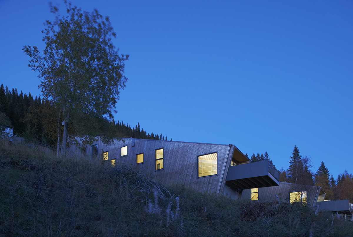
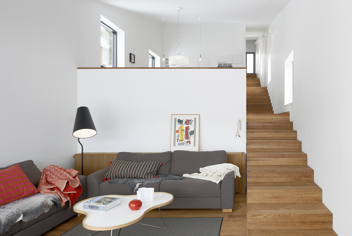 Åre Solbringen by Waldemarson Berglund, Åre, Sweden