Why Every Architect Should Read Walter Benjamin
CategoriesArchitecture

Why Every Architect Should Read Walter Benjamin

Judging is now underway for the 10th Annual A+Awards Program! Want to earn global recognition for your projects? Sign up to be notified when the 11th Annual A+Awards program launches. 

The word “modernity” was coined by the French poet Charles Baudelaire, who used it to describe the “fleeting, ephemeral experience of life in an urban metropolis.” In his 1867 essay “The Painter of Modernity,” Baudelaire exhorts artists to reject classicism and embrace the flickering, tragicomic life of the streets. He argues that the modern artist must become a flaneur, or connoisseur of urban life, if they hope to produce work that is vital and alive. 

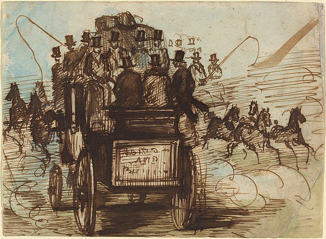
Watercolor and ink sketch by Constantin Guys (1802 – 1892). Baudelaire named Guys the ultimate “painter of modernity” due to the interest he took in city crowds.

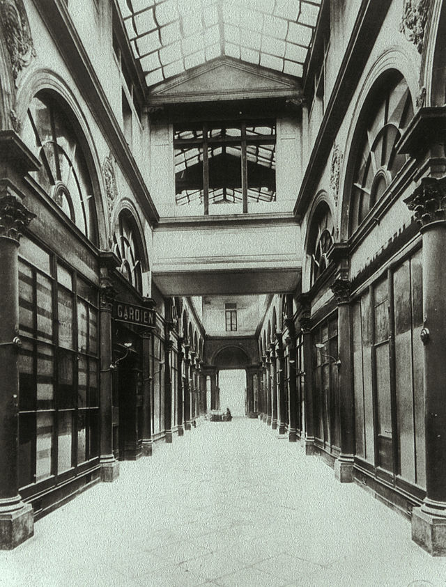
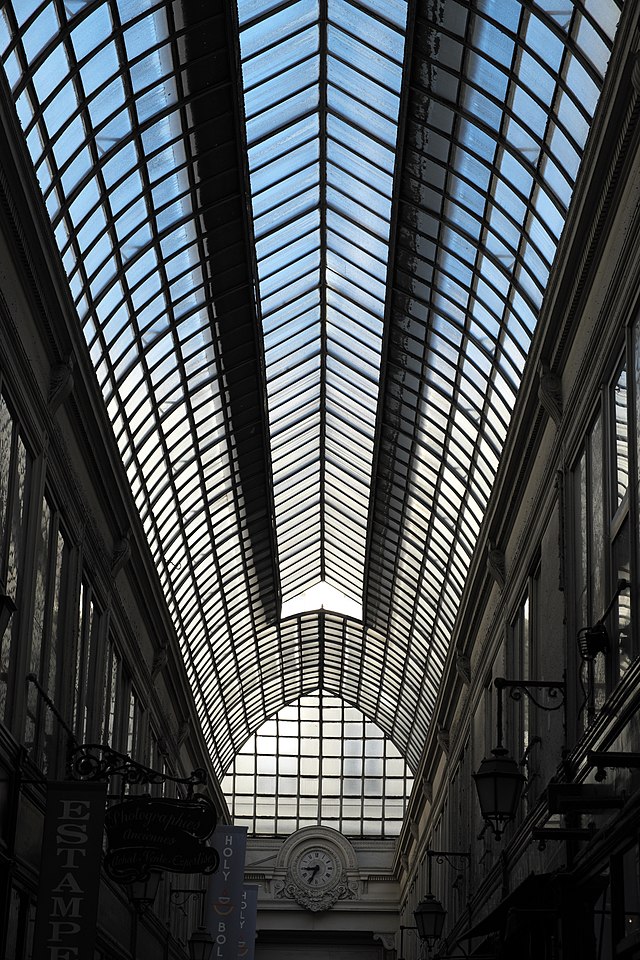
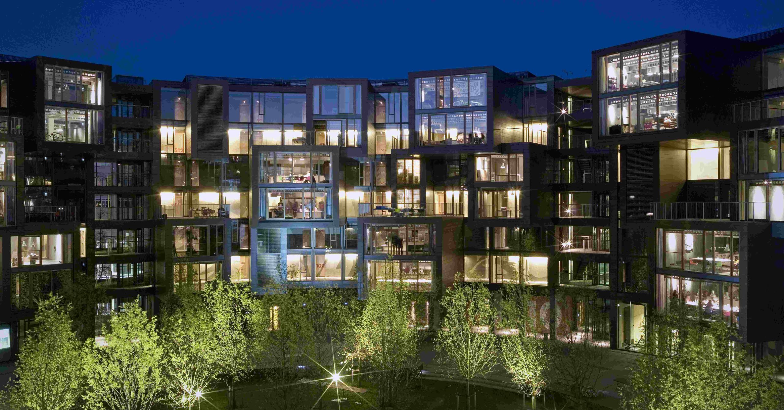
For Baudelaire, the quicksilver newness of modernity was made possible by architecture, by the way his fellow Parisians moved through built spaces. And the most interesting built spaces in Baudelaire’s Paris were the arcades. Constructed in the first half of the 19th century, the Paris arcades were covered walkways that housed various shops, newsstands and cafes. With vaulted ceilings made from glass and iron, the arcades offered an elegant respite from the grime and noise of the city street. In guidebooks to Paris from the time period, the arcades were always listed as a major attraction. 

The philosopher and critic Walter Benjamin believed the arcades were the most important architectural form of the century. In his unfinished masterpiece, The Arcades Project, written between 1927 and 1940, Benjamin attempts to reconstruct Baudelaire’s Paris using an experimental method, assembling thousands of textual fragments into a kind of collage. His goal was not simply to write a historical narrative, but to bear witness to the birth of modernity. The result is a fascinating meditation on the dialectical relationship between architecture and history — a subject that is just as relevant today as it was in Benjamin’s time. 

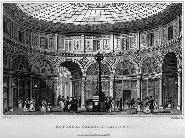
1831 engraving of the rotunda at Galerie Colbert. Along with the nearby Galerie Vivienne, Galerie Colbert was one of Paris’s largest and most famous arcades.

The most unique aspect of The Arcades Project is its structure. The book opens with a series of impressionistic but otherwise conventional essays, establishing the historical period with overviews of subjects such as the origin of the arcades, the history of the Paris Commune, and Baron Haussmann’s dramatic redesign of Paris between 1850 and 1870, in which many of the arcades were destroyed to make way for the wide boulevards and uniform city blocks that define the city as we know it today. After these sections, however, things take a more radical turn. 

The majority of the text is comprised of pieces that Benjamin calls “convolutes,” which are textual fragments that he collected through his vast reading on the period. Quotations from newspapers, letters and academic texts are placed alongside the author’s own reflections. The fragments are ordered by an alphabetical system, with the letters corresponding to different topics. For example, section A concerns the arcades; B is about fashion; and C, Ancient Paris and the Catacombs. Some of the sections combine topics in an idiosyncratic way, such as D, which covers both boredom and Nietzsche’s concept of “Eternal Return.” A number of fragments are cross-referenced, corresponding to more than one letter, which allows readers to see how these different ideas relate to each other, like points in a web or constellation. 

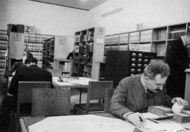
When Walter Benjamin wasn’t strolling through the arcades, he spent most of the 1930s in Paris’s public libraries and archives.

All told, The Arcades Project isn’t written so much as constructed, like a building. The ordering system of the convolutes resembles the directory of a massive shopping mall. Readers of this book do not follow a narrative or argument, but move through a kind of endless exhibition. They enter into the period, discovering it for themselves. 

The book begins with a note that the majority of the Paris arcades were built in the “decade and a half after 1822.” Readers learn that the arcades were made possible by the “boom in the textile trade” and “the advent of building in iron.” This was long before Baron Haussmann’s transformation of Paris. The arcades really belong to an earlier era, before the Second Empire, before even Baudelaire.

As Benjamin explains, Paris in the 1820s was a filthy, crowded, “subterranean” city, prone to outbreaks of cholera and revolution. And yet the arcades, which were open to the public, were glittering modern spaces, temples of the new religion of consumerism. At their entrance were boot scrapers, simple iron tools built into crevices in the wall that visitors would use to scrape the city muck off the soles of their shoes, a type of ritual cleansing.

Galerie Colbert in 1900

It was in the arcades that the flaneur, Baudelaire’s archetypal city wanderer, could contemplate the crowd as an aesthetic spectacle. Urban life, in its messiness and variety, now had an elegant stage on which it could be observed. 

The iron and glass ceilings of the arcades suggested that these spaces were harbingers of a utopian future. As Benjamin points out, the only other place city dwellers were likely to encounter this type of construction was in exhibition halls such as the Crystal Palace, in which new technologies were often debuted. New technologies were introduced in the arcades as well. Benjamin notes that “they are the scene of the first gas lighting.” 

Passage Verdeau today. This was one of Benjamin’s favorite arcades to visit as it was home to dozens of bookstores and antique shops. Built in 1847, it was one of the last arcades to be constructed.

In a fascinating paragraph, Benjamin argues that the appearance of “the new” always draws the imagination back to “elements of prehistory, that is of a classless society.” A dream about the future is always also a wish to recover what one has lost. Benjamin believes it is no coincidence that socialist thinking — especially of the utopian variety — exploded in France at the same time that the arcades appeared. Charles Fourier’s famous phalanstery, his scheme for a self-contained, egalitarian living and working community, was essentially “a city of arcades,” Benjamin argues. It was the arcades that showed Fourier that variegated human activities could be organized under a single roof. 

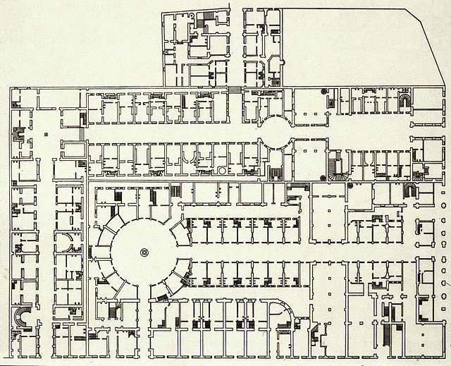
1826 floor plan of Galeries Colbert and Vivienne

When Benjamin mailed his early drafts of The Arcades Project to colleagues, many found it baffling. Why give all this attention to 19th century shopping malls? How was this relevant at a time when fascism was on the move all across Europe? Walter Benjamin was a German Jew and a committed Marxist. When he wrote The Arcades Project, he was living in France as a political exile. And yet, he believed that the best use of his time and talent was to investigate the conditions that gave rise to modernity, especially the emergence of the commodity form. Here, he felt, he would uncover the deep roots of fascism, and perhaps better understand how it could be resisted.

Writing under the shadow of Nazism, Benjamin understood modernity differently than Baudelaire had. He had mixed feelings about it, or to use his terminology, he approached it “dialectically.” While modernity offered new possibilities for freedom, in the end it had created the conditions for fascism. Without modern technology, the Nazi regime would never have been able to exercise the level of destructive control that they did. Even the spectacle of the crowd, which Baudelaire had celebrated as a symbol of diversity, was menacingly transfigured into an image of uniform state power in the Nazi propaganda films of Leni Riefenstahl. The crowd, like so much else, had been engineered for totalitarian ends. 

When Walter Benjamin sat down to write his book, the spectacle of the urban crowd had been transformed into something menacing and authoritarian.

Something had obviously gone very wrong with modernity. What was it? This is the question Benjamin asks in The Arcades Project. Importantly, he doesn’t seek to answer it, at least not in any direct way. What he does instead is try to bring Baudelaire’s Paris to life with his collage method. His hope is that these juxtapositions of facts, quotations, and speculative commentaries will cause a “dialectical image” of the period to “flash up” in the reader’s mind, allowing them to see things that cannot be described in a straightforward way: the diverted hopes and buried possibilities of the period. 

The Arcades, as a site of commerce, played an important role in the history of the commodity form. This uncanny photo of a Parisian storefront was taken by the street photographer Eugene Atget in the early 20th century.

Benjamin saw the modern world as a kind of dream, or “phantasmagoria,” in which the true relations between people are obscured by capitalist ideology and commodity fetishism. The arcades, then, were the earliest dream factories, a spectacle of consumption in which the actual history of the objects on display, and the labor that went into producing them, was deliberately concealed.

Visitors to the arcades were encouraged to think of themselves as consumers, maybe even flaneurs, but never as exploited workers. While the form of life Baudelaire celebrated produced flashes of revolutionary possibility, in the end it had lulled the masses into a false consciousness, preventing them from taking hold of their own destiny. 

The goal of The Arcades Project was to snap readers out of the capitalist dream so they could resist the fascist nightmare. Like Freud, Benjamin believed that one needed to descend into the murky depths of the past in order to recover the insights they needed to move forward. If  there is one sentiment that runs through the project, it is hope — hope of a desperate sort. 

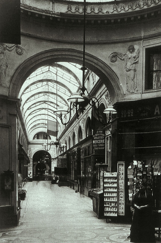
Galerie Vivienne in 1905

In 1940, Walter Benjamin died at the age of 48 in Portbou, Spain while in police custody. He was fleeing Nazi-occupied France when he and his companions were arrested by Spanish authorities, who told them that they would be deported back to France the following day. Believing he would be sent to a concentration camp, Benjamin took a deliberate overdose of morphine in his prison cell. However, the next day his companions were all released and allowed to continue on their journey to America. If Benjamin had held on just one more day, he could have traveled with them. 

The tragic story of Benjamin’s death is often told with the suggestion that it carries a poignant lesson. However, I never understood what that lesson was supposed to be. So in lieu of commentary, I am simply going to leave it here, as Benjamin would have, as a stray piece of the historical puzzle. 

Walter Benjamin’s work remains an important resource, not only for philosophers and cultural critics, but for architects. Architects today would do well to think about cities the way Benjamin did, as living collages that place the present in conversation with the past. If architects studied Benjamin, they would learn to see their projects not as stand alone entities, but as points of light within a vast, ever-shifting constellation. 

Judging is now underway for the 10th Annual A+Awards Program! Want to earn global recognition for your projects? Sign up to be notified when the 11th Annual A+Awards program launches. 

Reference

Round Up: Contextualizing the Rising Trend in Ring-Shaped Housing
CategoriesSustainable News

Round Up: Contextualizing the Rising Trend in Ring-Shaped Housing

Have your say in which architects will take home Architizer’s prestigious A+Awards: Public Voting opens this spring. Interested in next year’s program? Subscribe to our newsletter for updates.  

Recently, The Almanac by Sweco Architects Denmark made headlines for its conceptual community-centric approach to housing. Evoking themes associated with its namesake, the proposal features ring-shaped housing blocks with a large courtyard at its core. The lower floor of the building features cafes and other recreational spaces, tying it with the communal exterior spaces. The core also acts as the cultural center for each structure. The upper floor has a continuous balcony that connects to individual homes, all placed adjacent to each other along the ring form.

The Almanac by Sweco Architects Denmark

Like chawls found in Western India, the connected balcony on the exterior encourages neighbors to interaction. Additionally, the corridor on the inner side also forces people to walk by each other’s homes. Simply walking past the windows of other neighbors increases the chances of impromptu conversations and sharing of meals. Unlike apartments in big cities, it is almost impossible to not know who your neighbors are in this typology. Given the curved form, residents have the opportunity to interact with neighbors across the rings as well as those in the central garden.

The circular form has long been popular in architecture. Vernacular dwellings across the world were rounded, perhaps as an imitation of shapes and geometries found in the natural environment. But this form had several advantages as well. In comparison to a square or rectangular perimeter, a circular exterior has a lesser surface area, helping thermal conditions in cold climates. This shape also allowed for more connection points between the roof and the walls, making them stronger. These homes are also more resistant to strong winds, snow and earthquakes.

Image by ming yang via Pixabay

Over time the form of such buildings has evolved. Using a donut shape for multi-unit housing dates back to the 12th Century. The Tulou is a ring-shaped home made by the Hakka community in the Fujian province of China is one of the most well-known examples. There were some rectangular ones but the ring shape remained more popular. Given its robust walls and limited entrances, its structure was both built to protect its inhabitants and foster community living.

The building had small windows on the outside but was opened up inside. Each Tulou could have two to four floors. Made from thick load-bearing earthen walls, each building could easily house about 800 people along with other community spaces such as halls, wells and storerooms. Each Tulou was created for one Hakka clan and their extended family to live together. The uniform sizes of each home unit inside underscored the overarching design theme: unity.

Image by limo23 via Pixabay

In addition to protection and interaction, these structures were also very sustainable (primarily due to its durability). Today, these rammed earth structures are still standing. It should be noted that they have a minimal carbon footprint; in additional to sustainable material sourcing, the material structure itself also helps to regulate the temperature within. Furthermore, the unique donut shape allows ample light to enter the homes as well as in the common spaces, reducing the need for man-made light sources. There is also good circulation of the air through the entrances and the courtyard.

Apart from vernacular housing, the circular form with multiple units also found different uses through the 18th century. One such example is the Narrenturm in Vienna. The structure, built in 1784, was designed to accommodate psychiatric patients. This shape was thought to be helpful when trying to look at the occupants of the whole building from the center.

This idea was also the foundation for the conceptual Panopticon prisons, imagined by Jeremy Bentham. The building was to house prisoners in cells across the external ring and have a central watchtower for guards to observe prisoners from, much like an internal panorama. Fortunately, the use of the form has now reverted back to private homes, apartment complexes, museums and even commercial buildings.

62M by 5468796 Architecture, Winnipeg, Canada

Today, we’re seeing a renewed interest in this unique building footprint, and the idea of building a round housing structure is now popping up in cities across the world. Take, for example, 62M, a housing dormitory in Winnipeg, which resembles a flying saucer. The disk-shaped structure stands on tall columns to provide better views from the 40 studios within and help with climatic conditions.

The entrance of the building as well as the circulation elements are located at the center. Additionally, the continuous corridor was devised to reduce the alienation caused by connectors with dead ends and present opportunities for the residents to meet their neighbors. The circular form also reduces the external surface area, thereby making heating spaces more efficient in cold winters.

Tietgen Dormitory by Lundgaard & Tranberg Architects, København, Denmark

Similar themes are seen in the Tietgen Dormitory in Denmark. The structure comprises 360 residential units along the perimeter as well as some community spaces along the internal surface. Unlike previous structures in the article, homes in this dorm are staggered to create a sense of individuality. Several apartments are grouped together with a common community space that protrudes to help it stand out. While there is no common corridor inside, the circular form allows for increased visual connectivity.

The ring a ring a roses by GVultaggio

Lastly, a competition entry proposes a housing structure that increases interaction with the landscape as well as other residents. The different homes in the ring are placed at different heights and enclose the central space, creating a secured courtyard. The spaces on the lower level are classified as day-time functions whereas the upper level is for night-time or private functions.

All of these new structures draw on historic precedents but also bring new 21st century insights into the fold. While ringed housing complexes may never be a dominant residential floorplan in our cities, the host of design benefits suggest that this upward trend will bring more user-friendly, community-building housing stock to urban areas in the coming years.

Have your say in which architects will take home Architizer’s prestigious A+Awards: Public Voting opens this spring. Interested in next year’s program? Subscribe to our newsletter for updates.  

Reference

What's Yellow, Blue and Red All Over? Showcasing Sweden's Stunning Scarlet Architecture
CategoriesArchitecture

What’s Yellow, Blue and Red All Over? Showcasing Sweden’s Stunning Scarlet Architecture

Architects: Want to have your project featured? Showcase your work through Architizer and sign up for our inspirational newsletter.   

The color red has been a part of residential architecture in Sweden since the 16th century when Falu red paint was first created from the residue found in copper mines in the country’s Falun region. Locals realized that this reddish sludge, when treated correctly, formed a paint that was very affordable, durable, weather-resistant and also helped mimic the appearance of brick houses that were owned by wealthier families.

Now, that particular shade of red is iconic and is knowingly used to help houses stand out in the verdant landscape. Today, the tradition continues evolving. Shades of Falu red now coats a variety of Swedish structures ranging from small homes and barns to large-scale university and apartment buildings. Here are a few buildings that illustrate the timelessness and exuberance of the color.

Images by Johan Fowelin

The Pavilion by Marge Arkitekter, Stockholm, Sweden

Unlike traditional pavilions, this Stockholm structure is stacked like a building. It is conceived to become the focal point of the redesign of the city block around it. The different levels help accommodate the slope of the site and provide access to visitors from both sides. The rouge tone helps it stand out among the beige and brown hues of the buildings around and also acts as a beacon for the citizens. The patterned exterior, created in collaboration with artist Gunilla Klingberg, is made of red-dyed concrete. The language is kept consistent by painting the awnings and window frames as well.

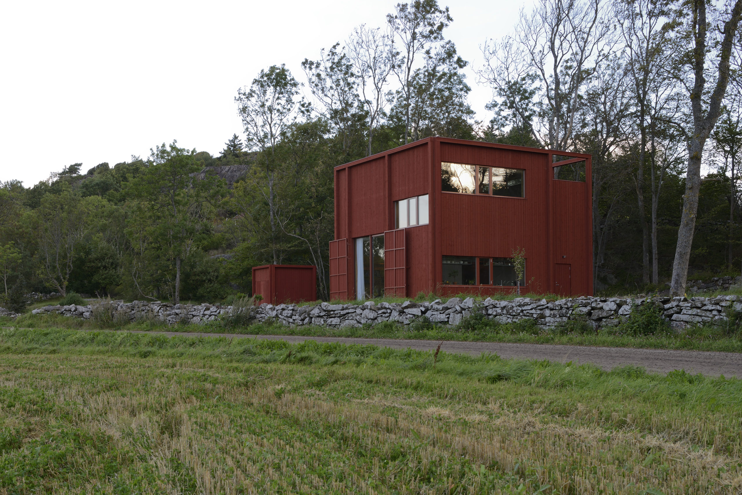
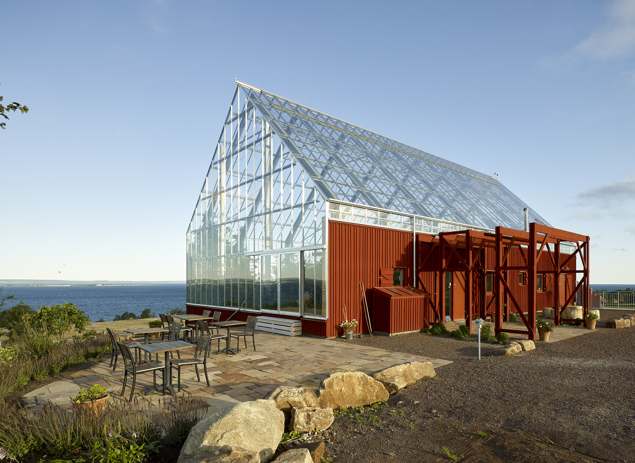
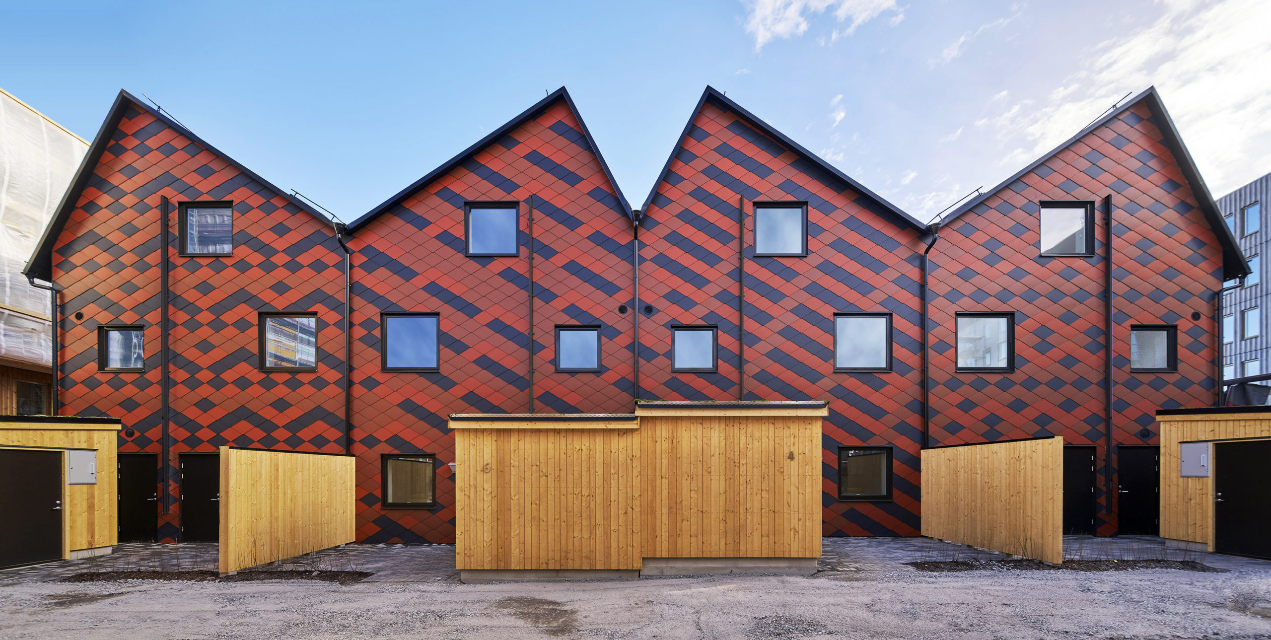
Späckhuggaren / House for a drummer by Bornstein Lyckefors Arkitekter, Kärna, Sweden

Coated in the traditional Falu red color, this house was designed for a single father of two. At one point, the site housed an old farm stall and a warehouse that was destroyed in a fire. The form of that warehouse is what inspired the design of this house. While the home appears heavy and solid from the outside, the interiors are open and airy. The spaces inside vary in height and there are mesh-covered gaps between levels to allow light to penetrate diagonally across floors.

Images by Ulf Celander

Uppgrenna Naturehouse by Tailor made arkitekter, Uppgränna, Sweden

This café and event space is a remodel of a red barn that was extant on the site. The red base, reminiscent of the previous structure, is given a modern facelift with the addition of a large greenhouse on top. The addition of panels to the base and doors not only helps maintain the barn aesthetic but also helps reduce heat radiation. On top, the greenhouse is equipped with a sewage and waste recycling system that also aids the growth of plants within. This eliminates the need to be connected to the municipal sewage system.

Images by Åke Eson Lindman

Passive Townhouses in Vallastaden by Kjellgren Kaminsky Architecture AB, Linköping, Sweden

The townhouse is broken up into four different apartments, with each one showcasing a slightly different personality. The continuous volume is broken up into four parts using separate roofs and façade patterns. These patterns are created using a mix of black, bright red and brick-toned tiles. The individuality of the apartments is also reflected in the kitchens and bathrooms inside. Additionally, this building features a courtyard, garden and storage space.

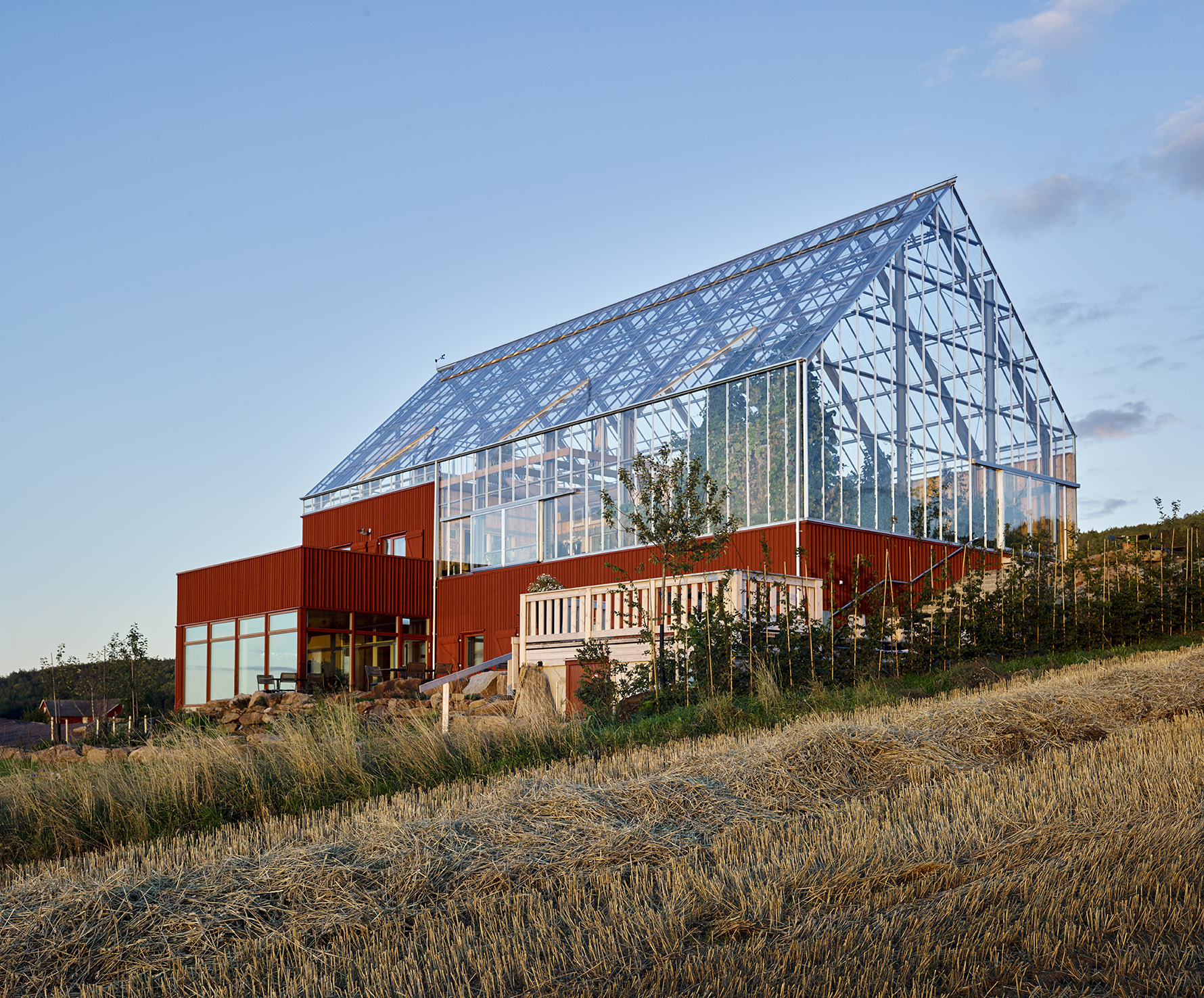
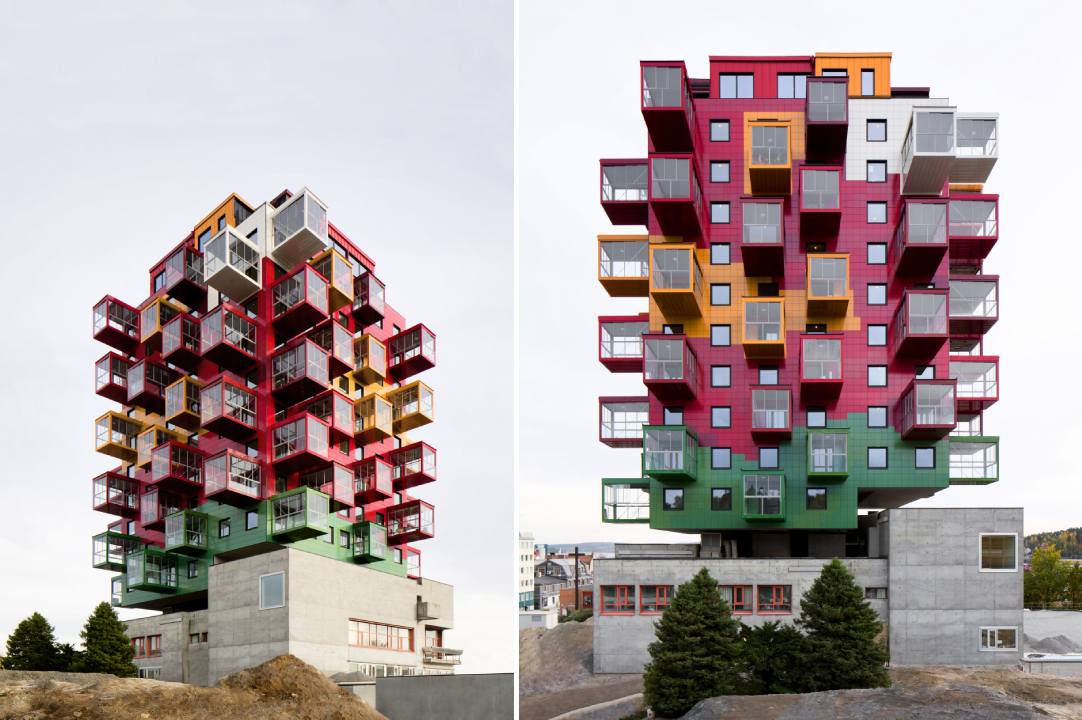
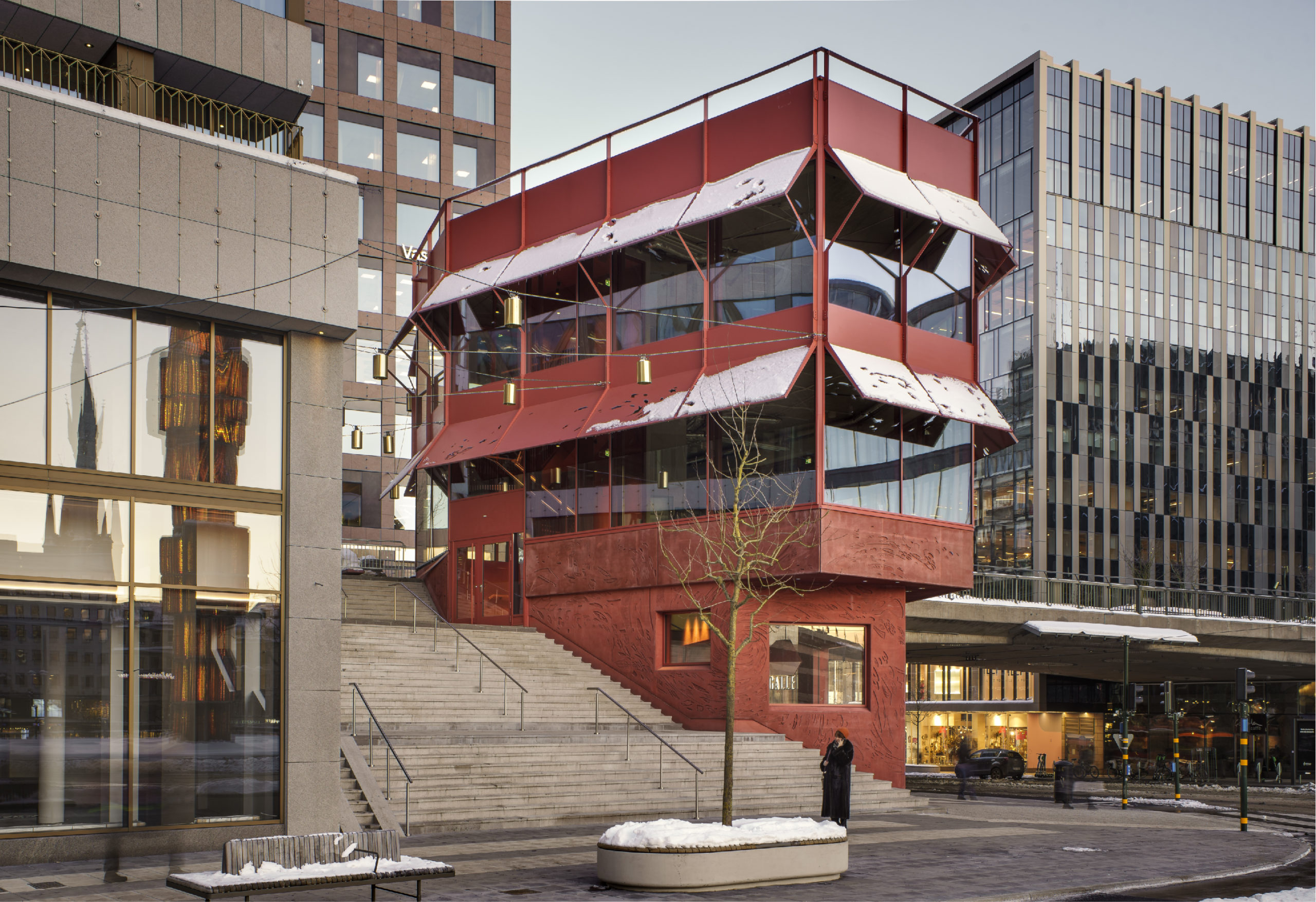
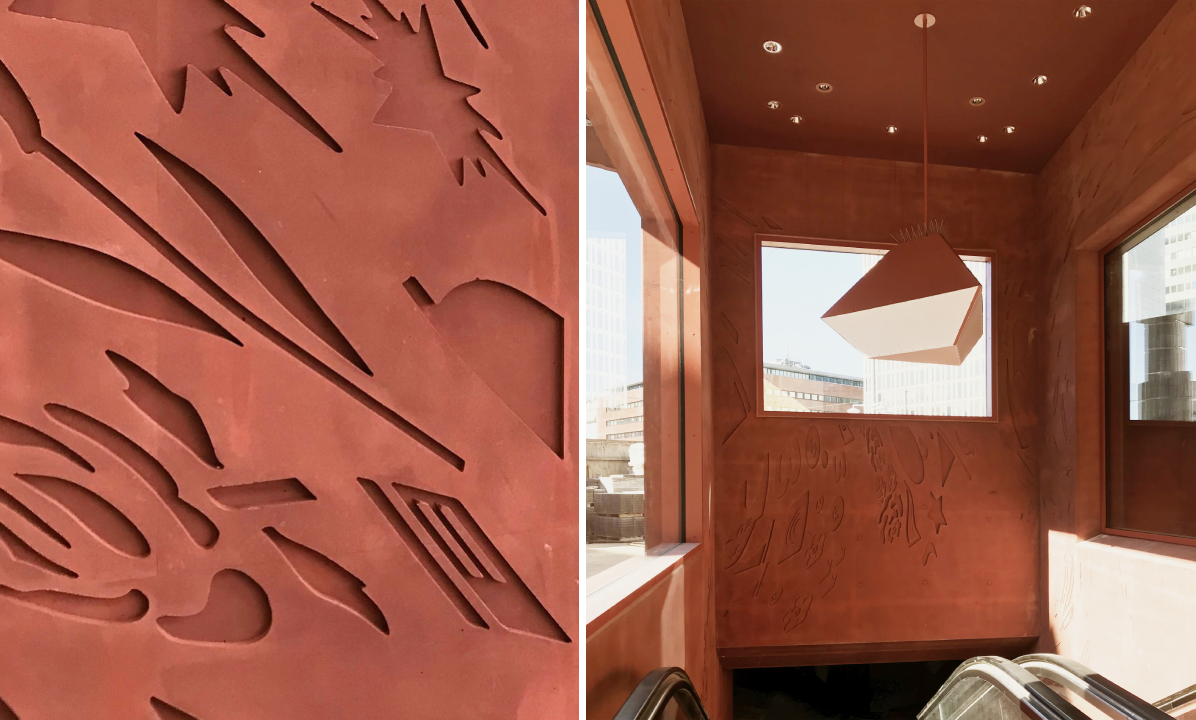
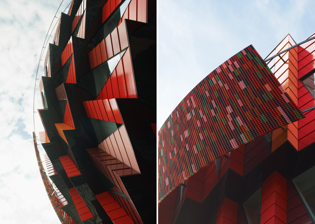
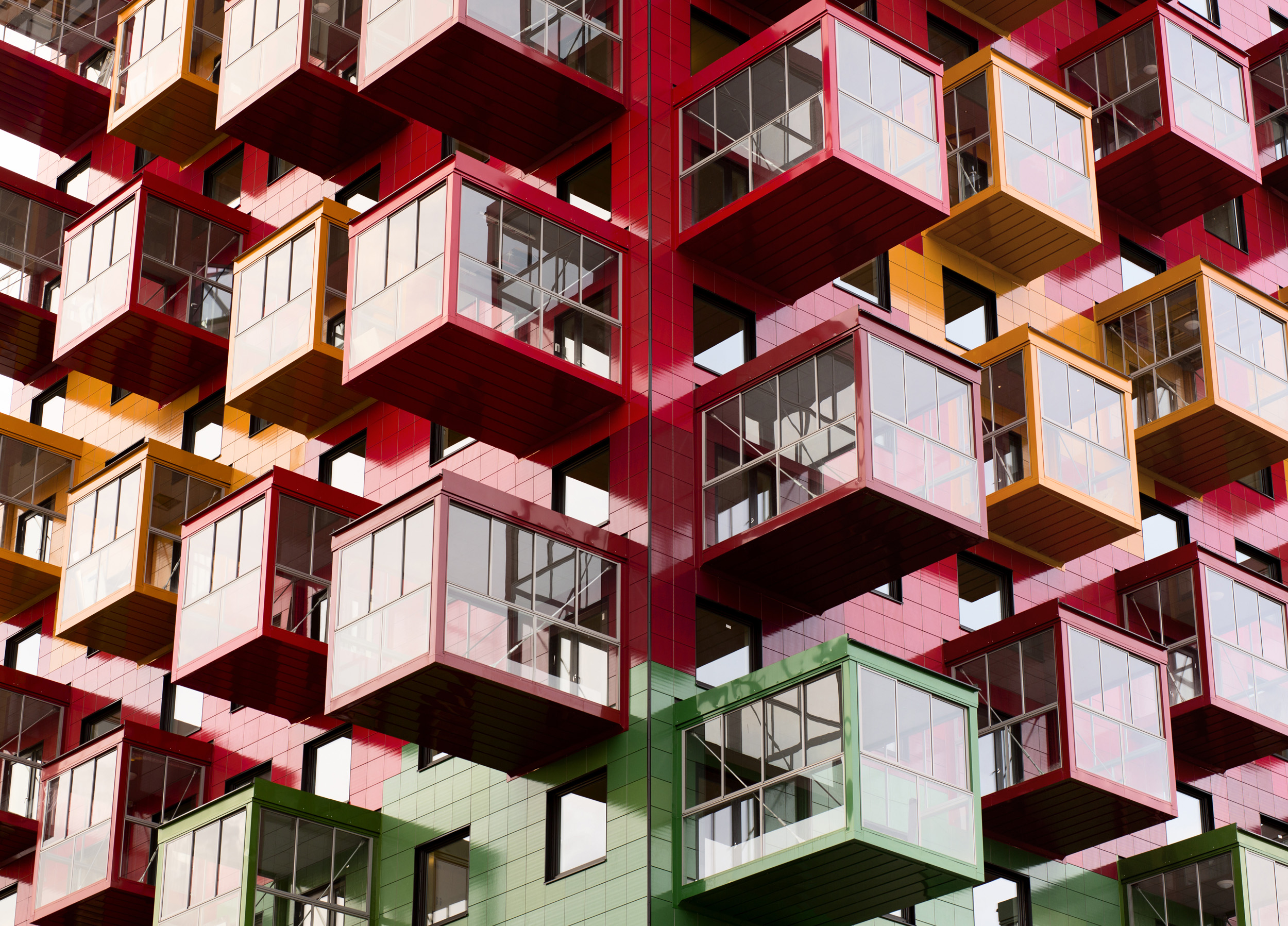
Tower on the Ting by Wingårdh Arkitektkontor AB, Örnsköldsvik, Sweden

Niklas Nyberg, a local builder, bought a courthouse that was built in 1967 after discovering it was rarely used and hoped to construct an apartment building on top of it. Taking inspiration from one of his favorite artists, Bengt Lindström, the architect set out to design a multidimensional apartment block. The square plan of the building is broken up into nine parts like a hashtag. Each level of the structure is made up of five apartments placed around a central block. The exterior is covered in glazed ceramic tiles in colors found in Lindström’s artwork.

Images by Tord-Rikard Soderstrom and Åke Eson Lindman

Kuggen by Wingårdh Arkitektkontor AB, Gothenburg, Sweden

The colorful glazed terracotta panels on this university building almost make it appear as if it is in motion. The red tones are a nod to the wharves and the harbors in the region and the other tones help add dimension and contrast. The structure is shaped like a tapered cylinder to shade the lower floors and increase floor space. The upper levels of the southern portion of the building project a bit further than the others to provide more shade throughout the day. Similarly, the triangular windows emerged from lighting considerations; they are designed to draw in sunlight from the ceiling and ensure that it reaches the building’s core. Meanwhile, motion-activated lights and ventilation systems help to conserve energy.

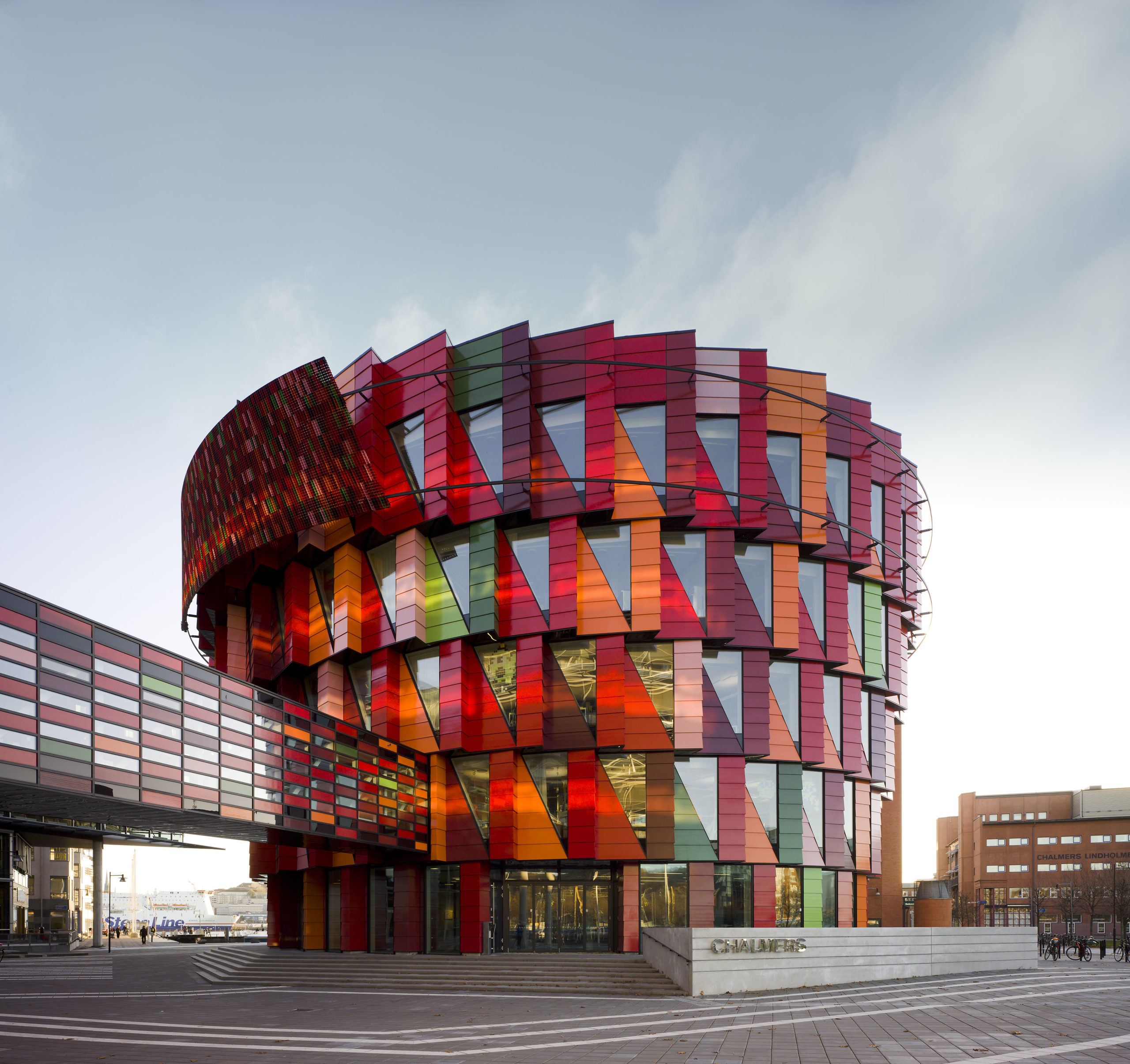
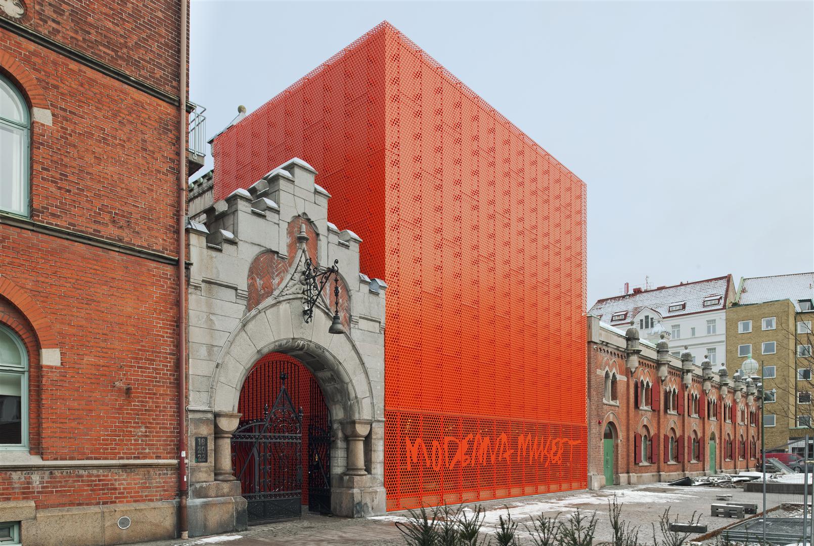
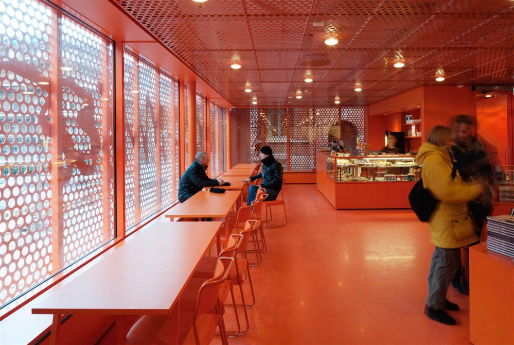
Moderna Museet Malmö by Tham & Videgård Arkitekter, Malmö, Sweden

The new branch of the Swedish Museum of Modern Art stands is a remodel of an old electricity station. The remodel is marked with the addition of a bright vermillion cubical extension with a perforated façade placed right next to a traditional entrance. The larger perforations on the lower level help the museum’s sign stand out as well. The floor is glazed to filter the sunlight coming in and the same vibrant hue is painted across every surface as well as the furniture inside the café. The other exhibition spaces are painted white or other neutral tones, intentionally creating a contrast.

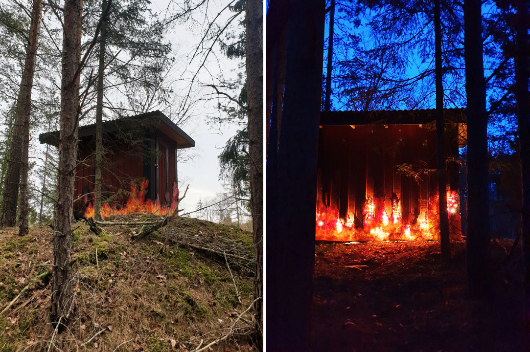
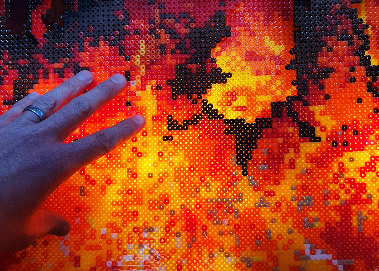
Fire House by Ulf Mejergren Architects (UMA), Stockholm, Sweden

After the previous outhouse burned down, the architect decided to rewrite the story of its demise in the replacement design. The client’s requirement for a red shed was taken up a notch by adding recycled beads, arranged to mimic a burning blaze, on the walls. This was paired with lights to bring this composition to life. In addition to being a point of conversation, the faux fire also helps keep the deer and rabbits away. The effect produced was so realistic that the owners had to inform their neighbors that it was art and not actual fire when they called the fire brigade.

Architects: Want to have your project featured? Showcase your work through Architizer and sign up for our inspirational newsletter.   

Reference

7 Ways to Recreate the Timeless Charm of Regency Interiors
CategoriesArchitecture

7 Ways to Recreate the Timeless Charm of Regency Interiors

Architects: Want to have your project featured? Showcase your work through Architizer and sign up for our inspirational newsletter.    

Period dramas are all in rage, both in written fiction and cinematic productions. Fans of Emma and Downtown Abbey are now indulging in the Netflix adaption of Julia Quinn’s popular Bridgerton novels. In addition to causing sleepless nights of binge-watching, the series has also prompted several Pinterest searches for Regency-era aesthetics and décor.

This dramatic aesthetic developed in the 19th Century, under George IV’s rule as Prince Regent. The style of design is synonymous with grandeur and flamboyance. It was influenced by Greek, Egyptian, Gothic and Chinese architecture, celebrating art in all forms. Muted hues, decorated wall panels, ornamental moldings, plus seating, noteworthy chandeliers, fluted columns, brass inlays, rich woods and large mirrors are just a few components that combine to make up this style.

Adapting the Regency style for today’s homes is not straightforward; it can be approached by adding individual elements that reflect the era or by recreating an entire setup that exudes regal European charm. Some of the extravagant elements mentioned above can be statement pieces in minimal interiors — like an imposing chandelier in an otherwise plain hallway. On the flip side, if used subtly, they can all come together to create a cozy and inviting home that displays hints of history while being rooted in today. Channeling this style also presents a great opportunity to upcycle vintage furniture and old decor pieces, or to try some DIY experiments on plain IKEA furniture. Below are a few examples of how these elements have been used in spaces across the world.

Children’s Room Design by Ami Austin Interior Design, Memphis, Tennessee | Image by Chip Pankey

Powdery blues, soft pinks, pistachio greens and luxurious cream hues were a staple in this era. This pastel palette can be layered in any space by using patterned wallpapers, painted furniture and matching upholstery. The combination of patterns prevents the space from becoming monotonous and creates interest in an otherwise muted palette.

This technique is clearly exhibited in the children’s room design by Ami Austin Interior Design. The same tone of powder blue is used in the wall, curtains, window seating and a desk chair. The white baseboards and mirrored vanity make it more current and add some brightness.

Beautiful living room in palace style by Mirt

This palatial setting might be hard to replicate in contemporary interiors as is but there are some elements that could be introduced in modern homes to give them a historic touch. Decorating the walls with patterned wallpapers and then strengthening that design language with ornate mirrors and gold-framed paintings can be one way to spruce up dining or living areas. This can also be taken a step further by breaking up the walls with molded panels to divide functions in a large space without using walls.

Ladbroke Grove Townhouse by BWArchitects, London, United Kingdom

Gold and pearlescent tones have long been indicators of wealth and luxury. And since the Regency style was all about celebrating opulence, furniture and fixtures with such finishes were not uncommon. Adding golden or cream edges to highlight the lines of tables or desks, or even using gold in lights or bathrooms fittings is an easy way to incorporate this trend. This soft aqua cabinet with beige panel outlines in a townhouse designed by BWArchitects is a great example of vintage-style furniture in a modern setting.

Pattern House by ALEKSA studio, London, United Kingdom

Gilded fixtures can also be paired with white marble tabletops in salons or countertops in bathrooms. Due to its versatility, marble can also be used on floors or be carved to create intricate sculptures and more. In Pattern House, ALESKA studio has paired marble slabs with metallic gold or brass sinks and taps to elevate the simple layout. Golden doorknobs and light fixtures further help build the aesthetic.

Living room design in light tones by Mirt

Another characteristic design element from this era was a sitting room with plush sofas and ornate chaises. As evidenced in this living room design, multiple seating options, all with curved lines and decorative embellishments, add an air of comfort and luxury to any living space. These can be upholstered in velvet or delicately patterned fabrics. When paired with equally embellished furniture, they can effortlessly transport users back to the 1800s.

Jerusalem Penthouse by Annette Frommer-Interior Design, Jerusalem, Israel

We often underestimate how dramatically curtains change the look of a space. Pleated drapes with thick fabrics or sophisticated prints that go all the way from the ceiling to the floor can give the appearance of bigger windows and higher ceilings. They can also be accompanied by decorative ties or layered with sheer curtains to make the setup more luxurious. As showcased above, curtains can be a good way to add depth, color and texture to living spaces.

Chateau in height by Estudio Jorge Felli, Buenos Aires, Argentina

No Regency setup would be complete without a grand chandelier. Large suspended illuminators with dazzling crystals and romantic swirls celebrate the artistic expression of the period. These can also work with minimal spaces with sleek lines or more themes setups. In a bedroom in the Chateau in Height, the large chandelier is accompanied by matching drapes and beddings, marble and wooden floors and a dark floral wallpaper to create a balanced room.

Architects: Want to have your project featured? Showcase your work through Architizer and sign up for our inspirational newsletter.    

Reference

Top 10 Architecture Projects on Architizer in March 2022
CategoriesArchitecture

Top 10 Architecture Projects on Architizer in March 2022

Architects: Want to have your project featured? Showcase your work through Architizer and sign up for our inspirational newsletter. 

Architizer’s journal is fueled by the creative energy of the thousands of architects from around the world who upload and showcase their incredible work. From conceptual designs to projects under construction to completed buildings, we are proud to serve as a platform for showcasing global architectural talent and the brilliance of visualizers, engineers, manufacturers, and photographers who are crucial members of the industry. A stellar drawing, rendering or photo, as well as a detailed project description, can go a long way in making a project stand out, as does indicating the stellar contributors on a project.

Firms who upload to Architizer share their work with professionals and design enthusiasts through our Firm Directory and Projects database. They also gain exposure by having their projects shared on our FacebookInstagram, and Twitter pages, as well as in our Journal feature articles. Indeed, through these various channels, hundreds of thousands of people in the global design community have come to rely on Architizer as their architectural reference and source of inspiration. In 2022, we’ll be rounding up our database’s top 10 most-viewed, user-uploaded architecture projects at the end of each month.

By JJP Architects and Planners, New Taipei City, Taiwan

This church sits at the heart of a planned long-term elderly care village in a rural coastal district in northern New Taipei City, Taiwan. Inside, three hyperbolical solid shells form two voids and are enclosed by fully transparent glass. Horizontally, the church is bisected by a double-height glass corridor. The curved top of the shells form a unique gap that follows the sun’s path, inviting a flood of natural light into the interior space throughout the day, as well as a modern representation of longstanding church imagery of “open heavens”.

By XRANGE Architects, Penghu County, Taiwan

This house is named after a famous archipelago west of Taiwan where vernacular coral stone homes — characterized by a nine-square plan, distinctive “rolled” roof ridges resembling a curved gable and “slits and pillars” — are unique. This modern home reinterprets its forebears. From a distance, the overlapping layers of rolled roof ridges create the illusion of a village made up of many small homes. Likewise, the traditional slits-and-pillars openings are reimagined as screens that shade floor-to-ceiling glass doors, which improves access to natural light and ventilation.

By Wood Marsh, Point Lonsdale, Australia

The majestic, undulating terrain of the Australian coastland stands alone as an aesthetic experience. So, the architects who designed the Lonsdale Links — a club house for a golf course — sought to create a building that appeared as a “relic” in “the prehistoric landscape.” The soft contours and stunning volume of the building act like a natural extension of the site. Positioned on the crest of a hill, it appears differently from various sight lines. Dark laminated timber beams create a soft and radiant contrast to the verdant links; their finishing ahas a raw weathered quality that timelessly integrates with the coastal context.

By Metaform Architects, Expo 2020 Dubai, UAE

While the formal aspects of this project are visually dazzling, an even more impressive aspect of the the design remains invisible to the naked eye: it is built of 70% reused or recycled materials. While the steel structure was a natural choice to help reach this goal. fiberglass membrane is more surprising. Although difficult to recycle, the latter can be reused by the producer, who specifically agreed to it for this project.

By GUILLEM CARRERA arquitecte, Tarragona, Spain

Nestled in a small fold of the urban fabric, a small neighborhood with a triangular perimeter has quietly persisted over the the past half century. The houses here sit on small plots, rubbing shoulders with their neighbors. This new addition to the community seeks to maintain that dialogue; yet, interestingly, the main façade faces the back garden, rather than the street. The house pivots around a central porch, which is located in the belly of the structure.

Photos by Ivo Tavares Studio

By ESQUISSOS, Sintra, Lisbon, Portugal

The idea centers on the desire to develop a lower area beneath the home. To this end, a white closed building seemingly emerges in a crisp, clean volume from the topography. This design move ensures greater privacy and protection, superior energy efficiency, simple and clean, almost “monolithic” construction, in addition to wind protection and sunlight appreciation. Meanwhile, two independent boxes are perched above the white ground level, bringing the organizational plan into dialogue with the street level. The wooden slats add a textural intrigue and visual permeability that softens the purism of the white prism.

By A-001 Taller de Arquitectura, Valle de Bravo, Mexico

This two-storey weekend home is set on a 9,000 square meter site; hence, it is just one part of a larger, sustainable microsystem, within which the dwelling is respectfully integrated. This reinterpretation of the region’s traditional homes plays with the geometry of superimposed volumes. A nearby body of water feeds a hydraulic mill, which meets 70% of the home’s hydraulic needs; it is also the source of irrigation of vegetables, fruit trees and a series of wetlands. Additionally, a rainwater collection system helps feed the plumbing fixtures, the pool, and the irrigation of green areas.

By Fran Silvestre Arquitectos, Valencia, Spain

With a series of NIU projects, this Spanish firm is exploring innovating construction systems. The N70 is the smallest model in this series, which juxtapose aluminum walls and extruded spaces to open glazing. The goal is to make more sustainable, quicker-to-build homes that promote healthier lifestyles.

By RISOU, Ho Chi Minh City, Vietnam

In Ho Chi Minh City, townhouses are often long and narrow slices that run back from the street. As a result, the interiors have less windows and access to sunlight than residents desire. With this design, the architects prioritized the creation of natural light while optimizing construction costs. The result is a luminous family home that is enlivened by a central atrium, which invites the sun’s rays to dance in the deepest nooks and crannies.

By Mado Architects, Mazandaran Province, Iran

Set in a suburb that is dotted with gabled roofs and homes made of brick, cement and wood materials, this project subtly distinguishes itself from the neighborhood in sophisticated ways. The design is rooted in the geometric archetype of nine-squares, which is the guiding principle of its programmatic distribution. The interconnected network of courtyards, pools and domestic faces interlock like a Mondrian composition, resulting in a dynamic and highly functional home.

Architects: Want to have your project featured? Showcase your work through Architizer and sign up for our inspirational newsletter. 


Reference

Will Architects Prioritize Passenger Experience in the Post-Pandemic World?
CategoriesArchitecture

Will Architects Prioritize Passenger Experience in the Post-Pandemic World?

Have your say in which architects will take home Architizer’s prestigious A+Awards: Public Voting opens this spring. Interested in next year’s program? Subscribe to our newsletter for updates.  

Traveling is an exhilarating endeavor. Whether it be by bus, train or air, successful travel requires stamina, organization and the ability to adapt. When traveling by plane, the initial leg of the journey often causes stress. From document checks to security lines, the entire airport process can feel arduous; however, when you touch down at your destination, the exhausting journey begins to feel worthwhile.

With the added complexities of the pandemic, flying feels more like a burden than it does a favorable experience. The excitement to board a plane is replaced by a fierce worry that something will go wrong. Today, passengers are greeted with long lines, rigorous document controls and a heightened stressful atmosphere. It is hard to predict when the return to normalcy will be — or if that will ever happen — but what is certain is that stress goes hand-in-hand with travel. Will the pandemic change the ways in which architects design transport interiors? Can architecture act as a mediator between stress and calm? Can it facilitate relaxed movement while not compromising practical requirements?

The check-in and administrative side of air travel are likely not to change, and airport security checks will likely remain long and unfavorable; however, once headed to the gate, the energy in the airport can shift. The second leg of the journey can be more relaxing, and architects can have a hand in that.

San Francisco International Airport, Boarding Area E by Gensler, San Francisco, CA, United States. Popular Winner, 2015 A+Awards, Transportation – Airports. © Joe Fletcher Photography

One way to help alleviate travel-related anxiety is through access to outlets. As society turns to digital solutions, passengers are required to arrive at the airport with their documents ready to go and as a result, many rely on their personal electronics to store travel documents. From boarding passes, immunization proof, to test results, electronic devices have become essential for air travel – especially during the COVID-19 pandemic. Most airports were built before the digital era and as a result, are only equipped with a mere number of accessible outlets. Airports travel will likely continue within this digital realm and aviation architects are beginning to catch on and ensure their designs are fitting of the times.

San Francisco International Airport, Boarding Area E by Gensler, San Francisco, CA, United States. Popular Winner, 2015 A+Awards, Transportation – Airports. © Joe Fletcher Photography

While aviation architecture continues to evolve, some designs were ahead of their time. Take San Francisco International Airport, Boarding Area E renovation for example. Back in 2014 design team, Gensler was commissioned to transform the airport’s Boarding Area E into a travel oasis — and they did just that. The design features passenger spaces that are not typically found in most airports. From private dressing rooms to yoga centers, this airport terminal truly encourages its passengers to unwind and take a moment for themselves.

O’Hare Global Terminal by Skidmore, Owings & Merrill (SOM), Concept.

Meanwhile, the recently conceptualized Chicago O’Hare Global Terminal design revives the city’s spirit while prioritizing the passenger’s experience. In a collaborative effort by SOM, Ross Barney Architects and Arup, the team designed a terminal that incorporates atypical airport spaces: the outdoors. The gate’s dining, shopping and entertainment options reflect Chicago’s dynamic art and culinary scene. Meanwhile, passengers can unwind inside or outdoors. An open-to-the-sky concourse garden offers guests a chance to connect with the outdoors before boarding their plane. Surrounded by trees and hammocks, this atypical use of the outdoors facilitates relaxation by offering passengers a chance to breathe after making it past the stressful check-in and security lines.

Guadalajara International Airport, Terminal 2 Concept by CallisonRTKL. Finalist, 2021 A+Awards, Transportation – Unbuilt Transportation

The Guadalajara International Airport Terminal 2 design concept equally promotes passenger experience. Conceptualized by CallisonRTKL, this design enhances the local Mexican culture and cuisine. Interior gardens, comfortable waiting lounges, pet care centers and family facilities – this airport was conceptualized to cover any and all possible passenger requests. The arts are also celebrated in this design. Virtual art galleries and live performance spaces house local dancers and offer passengers a chance to unwind through visuals displays.

Most airports were built before the digital era and prior to the COVID-19 pandemic. Upgrading and renovating old terminals and airport spaces is a massive undertaking and costs a pretty penny. But the pandemic has offered a moment to pause, and as large-scale projects start up once again, we see a shift in aviation architecture practices and a newfound prioritization towards enhancing the passenger experience. Ultimately, such shifts in design practices will help mitigate travel-related stresses and encourage passengers to relax whilst waiting to board.

Have your say in which architects will take home Architizer’s prestigious A+Awards: Public Voting opens this spring. Interested in next year’s program? Subscribe to our newsletter for updates.  

Reference

8 Contemporary Ways to Resurrect Art Deco Glamor
CategoriesArchitecture

8 Contemporary Ways to Resurrect Art Deco Glamor

Browse the Architizer Jobs Board and apply for architecture and design positions at some of the world’s best firms. Click here to sign up for our Jobs Newsletter.

Art Deco, which is short for Arts Décoratifs, emerged as a design style in France just before World War I and predated the more minimal and functional Mid Century design. Characterized by bold sleek forms, geometric patterns, reflective finishes, metallic and inlaid wood embellishments as well as luxurious materials, the aesthetic later gained popularity in the 1920s and 1930s, where it was showcased across architecture, interiors, fashion, automobiles and more.

The style married high-quality opulence and dramatic simplicity while also paying homage to technological advancements and mass manufacturing. In addition to Cubism and Viennese Succession, Art Deco also draws inspiration from cultures across India, China, Egypt and Mesopotamia. For many in North America, it is epitomized by icons like the Chrysler and Empire State buildings, completed when America was on the brink of the Great Depression. When America emerged from the crisis, the world had changed and so had aesthetic preferences. Today, we’re exploring how 21st century architects and designers are reviving Art Deco sensibilities and adapting them for the contemporary era.

San George by Framework Studio, Amsterdam, Netherlands

Chevrons and starbursts were some of the most defining elements of the Art Deco style. These patterns can be used in walls, furniture and even floors. Statement zig-zag floors in a high-gloss black and white pattern create a neutral base to place colorful furniture while also adding a stylistic layer to the design. In the San George restaurant, the bold floors come together with bright turquoise and rich emerald tones to create a retro aesthetic without it being too overwhelming.

Restroom in Art Deco Style by Futuris Architects, Yerevan, Armenia

Gold is an easy way to bring in the glamour of the roaring 20s. Instead of large metallic furniture pieces, the color can be introduced in a subtle way by using it in the edges or outlines of décor and furniture pieces, molding, lighting or handles. In this restroom, the studio added oblong mirrors with gilded frames and then reinforced this design language with gold-finished lights and matching accessories. The dark tones of the walls and furniture also help the metal stand out more.

Jazz Billet by Envisage, Gurugram, India

Starburst, solar forms, and stepped patterns are other characteristic elements from this era. These geometric forms were often used in wallpapers, moldings, mirrors and even building exteriors. An Art Deco-style apartment in India showcases these patterns in the form of wall paneling. A dramatic living room wall arrangement is achieved by staggering curved and flat panels of different lengths with recessed light fixtures.

Death & Company Los Angeles by AAmp Studio, Los Angeles, California

Jewel tones have long been associated with wealth and grandeur. Deep shades of red, green, navy or purple can either act as a backdrop or be used in furniture as accents. In Death & Company Los Angeles, these rich hues create a moody atmosphere that is part nostalgic but also contemporary. These colors are juxtaposed with dark wooden panels, light natural stone, metallic accents and floors with geometric tiles.

Beau Cloud Mansion / The Cascade by Bean Buro, Hong Kong Island, Hong Kong

Taking inspiration from the automobiles and ocean liners in that era, curvilinear forms and clean lines also became a part of the style in the 1930s. The Bean Cloud Mansion / The Cascade does the same in a modern way. Corners, wall edges and furniture profiles have all been given smooth edges or curved profiles. This is even replicated in cabinet doors and wall dividers. The curved lines are also incorporated at a smaller scale by adding fluting to the dining table.

Santomate by Daniela Bucio Sistos // Taller de Arquitectura y Diseño, Morelia, Mexico

Art Deco is the epitome of making a statement, and lighting can be a big part of this. Illuminators with sleek or geometric forms can easily spruce up simple spaces. This is exhibited in the design of Santome — a restaurant and bar in Morelia Mexico. Globe lights attached to oblong profiles are suspended in a row over the bar. The setup also comprises recessed lighting in the same warm hue to create a halo effect.

Project 1874: Photorealistic 3D Rendering Restaurant by Yantram Architectural Design Studio, Rio Rancho, New Mexico

In addition to floors or walls, patterns can also be introduced on the ceiling. In a conceptual design for a restaurant in New Mexico, the firm used a striped pattern in green and ivory to decorate the ceiling. The Art Deco theme is further reinforced with the addition of geometric starburst lights.

5550 Wilshire by TCA Architects, Los Angeles, California

The style manifests in different forms for the exteriors as well. The most iconic Art Deco buildings across the world often mimic lines and forms of old ocean liners. Curved edges, flat roofs, bands of windows, circular openings, horizontal bands, ship railings and ziggurat-shaped decorations are just a few examples. The 5550 Wilshire is a building that encapsulates this style masterfully. The horizontal mass of the structure is further broken up with vertical divisions to create the illusion of height.

Browse the Architizer Jobs Board and apply for architecture and design positions at some of the world’s best firms. Click here to sign up for our Jobs Newsletter.

Reference

7 Restaurants Serving Up an Industrial Aesthetic
CategoriesArchitecture

7 Restaurants Serving Up an Industrial Aesthetic

Architects: Want to have your project featured? Showcase your work through Architizer and sign up for our inspirational newsletter.    

Unfinished concrete surfaces, metal pipes, visible ducts, high ceilings and exposed structural systems are common sights in old factories and warehouses. However, in recent years, we have seen an increasing demand for this aesthetic in both residential and commercial spaces. Those remodeling old warehouses or pre-war buildings into homes have been choosing to preserve elements of their older structures. Some offices are incorporating similar design elements to make their spaces more trendy, and less clinical or formal.

The industry that has seen a massive adoption of this trend is the hospitality sector, especially in the past two decades. Restaurants and bars across the world are taking cues from old factories and playing with unfinished surfaces, metallic accents, industrial lights and heavy-duty hardware to create an atmosphere that is both nostalgic and modern. Designers have found several ways to soften these harsh materials and craft spaces that are welcoming. Below are just a few examples.

Images by Mikael Axelsson

USINE by Studio Richard Lindvall, Stockholm, Sweden

It is hard to tell that this restaurant and meeting area was once a sausage factory. The remodeled space combines Scandinavian minimalism with a more industrial aesthetic, while also referencing hotels in Shanghai, New York and Amsterdam. Materials like concrete, galvanized steel and black cast iron are softened with cognac leather and maple wood. All the ventilation systems are left exposed and painted in white. Light fixtures with bold black details are juxtaposed against this lighter canvas to strengthen the aesthetic.

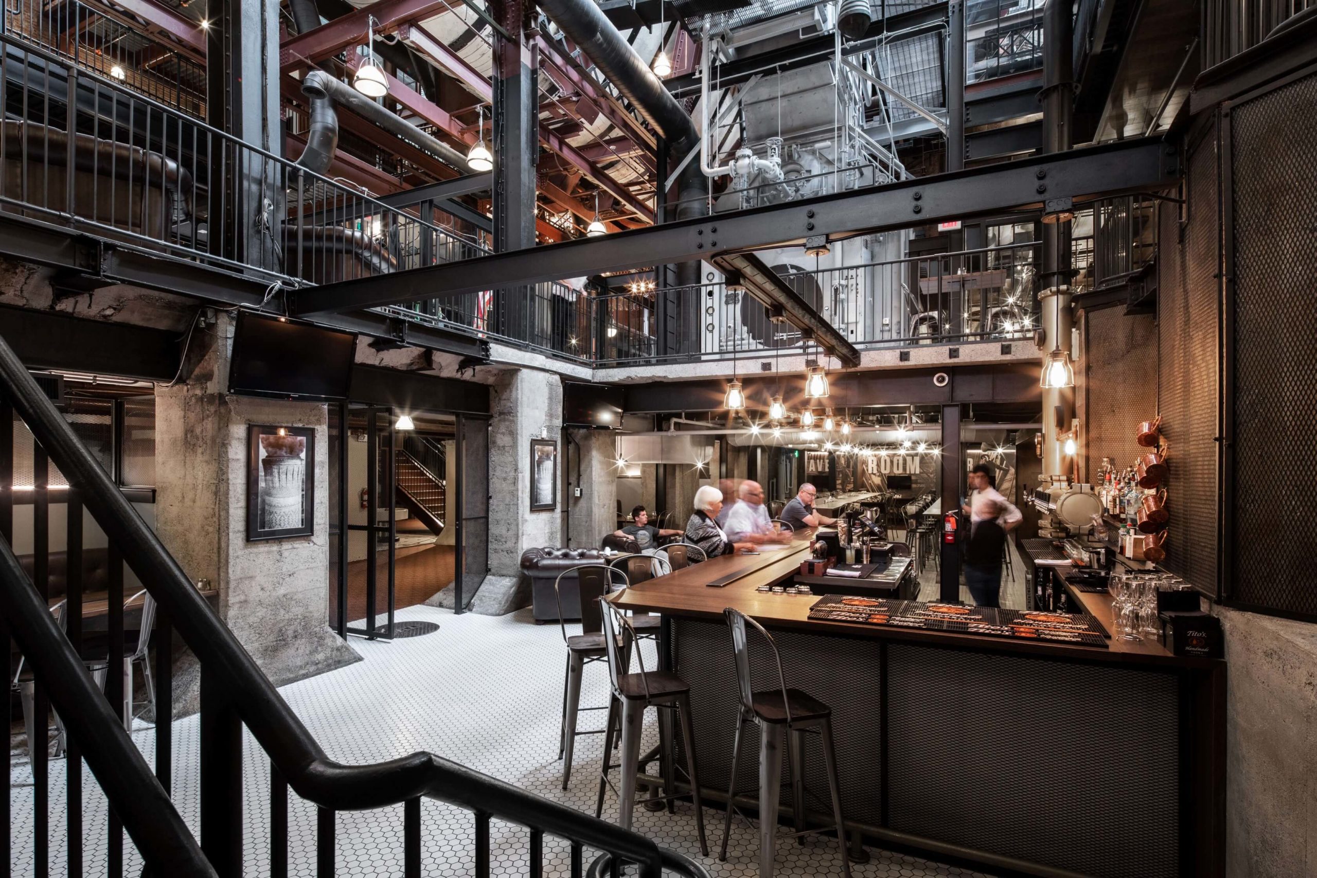
Spokane Steam Plant by HDG Architecture, Spokane, Washington

This restaurant design is conscious of the century-long history of the steam plant in Spokane. The metal columns and beams are not only left exposed but also painted in black to have them blend ini. These structural details are joined by black-tinted furniture, mesh-covered concrete walls, metal-backed chairs and dramatic pendant lights. Furthermore, the studio also used copper-toned pipes to create a drink dispenser at the bar.

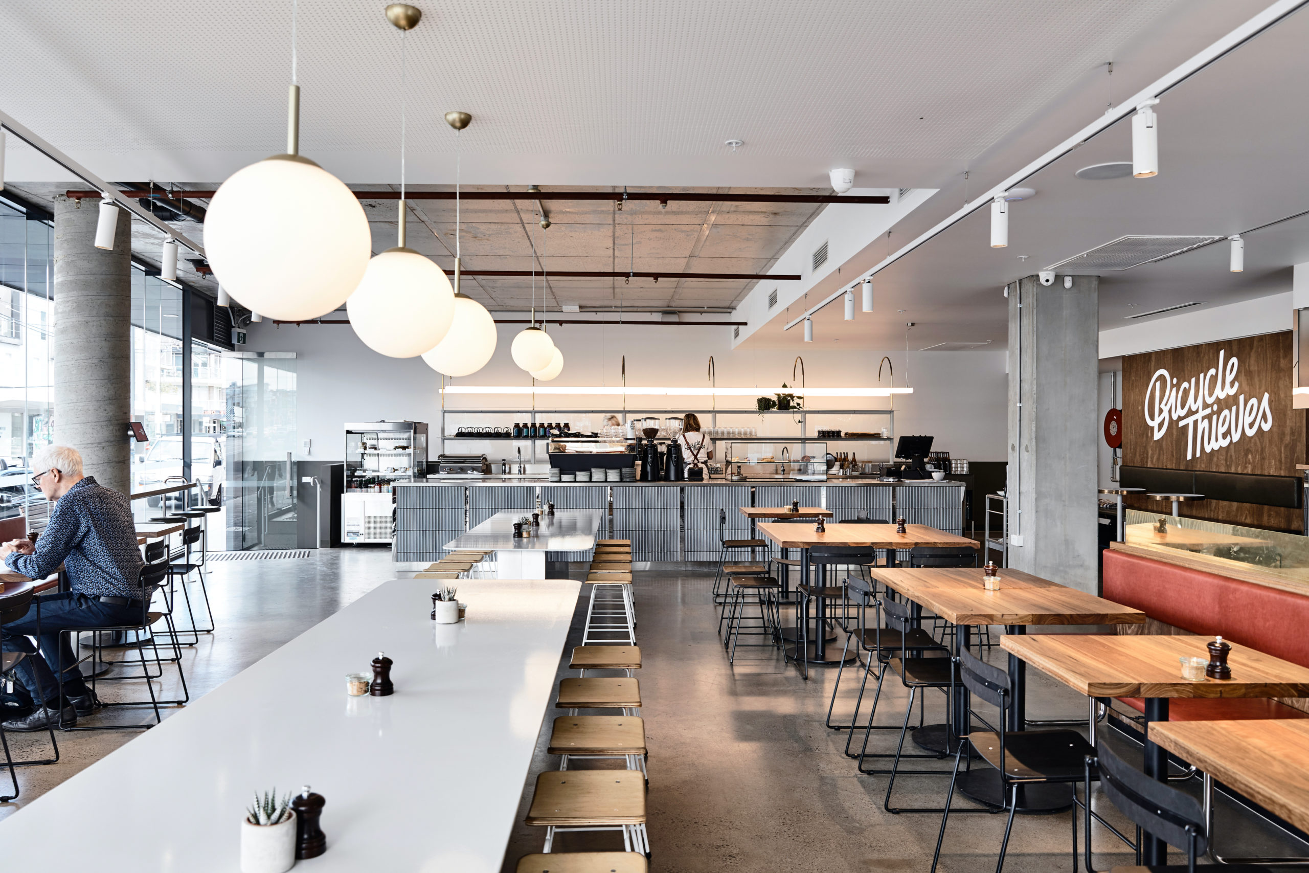
Bicycle Thieves by Pierce Widera, Northcote, Australia

Named after the best-known film of Italian neorealism, this eatery is a lighter and fresher take on the traditional industrial style.  It references the late 1940s (when the film was released) with the use of mid-century modern materials and details. Suspended lighting acts as dividers, breaking up the open plan into smaller seating areas. Linear pendant lights are used above the bar, Globe lights over the communal tables and track lights around the periphery where the smaller tables are placed. Exposed concrete and cement finishes cove the walls, columns, floors as well as the ceiling.

Images by Dirk Weiblen

Tribeca by Linehouse, Shanghai, China

The New York-style gastropub evokes images of drinks with friends, city streets and late-night food cravings. The ceiling drops down in different parts to separate spaces. White false ceilings form the periphery whereas a suspended shelf canopy hangs over the bar. Mirror bulbs frame the entire space to infuse old-world glamour.

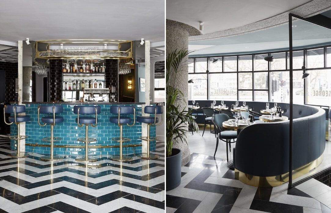
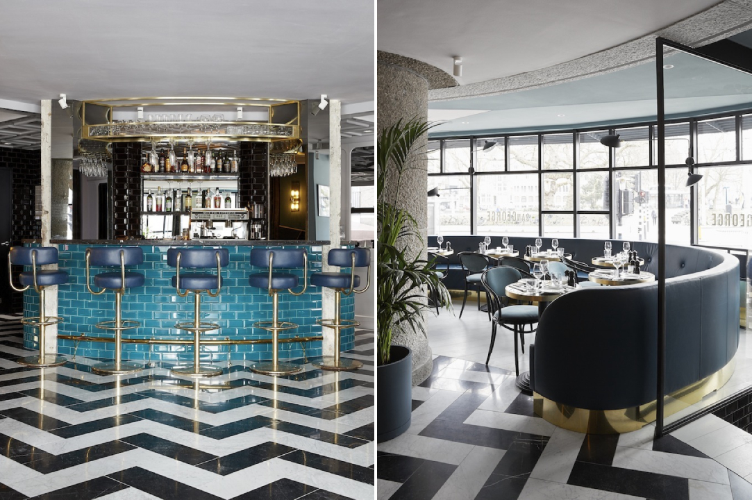
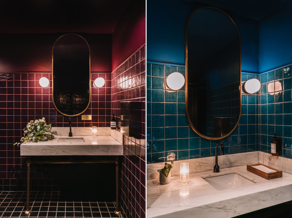
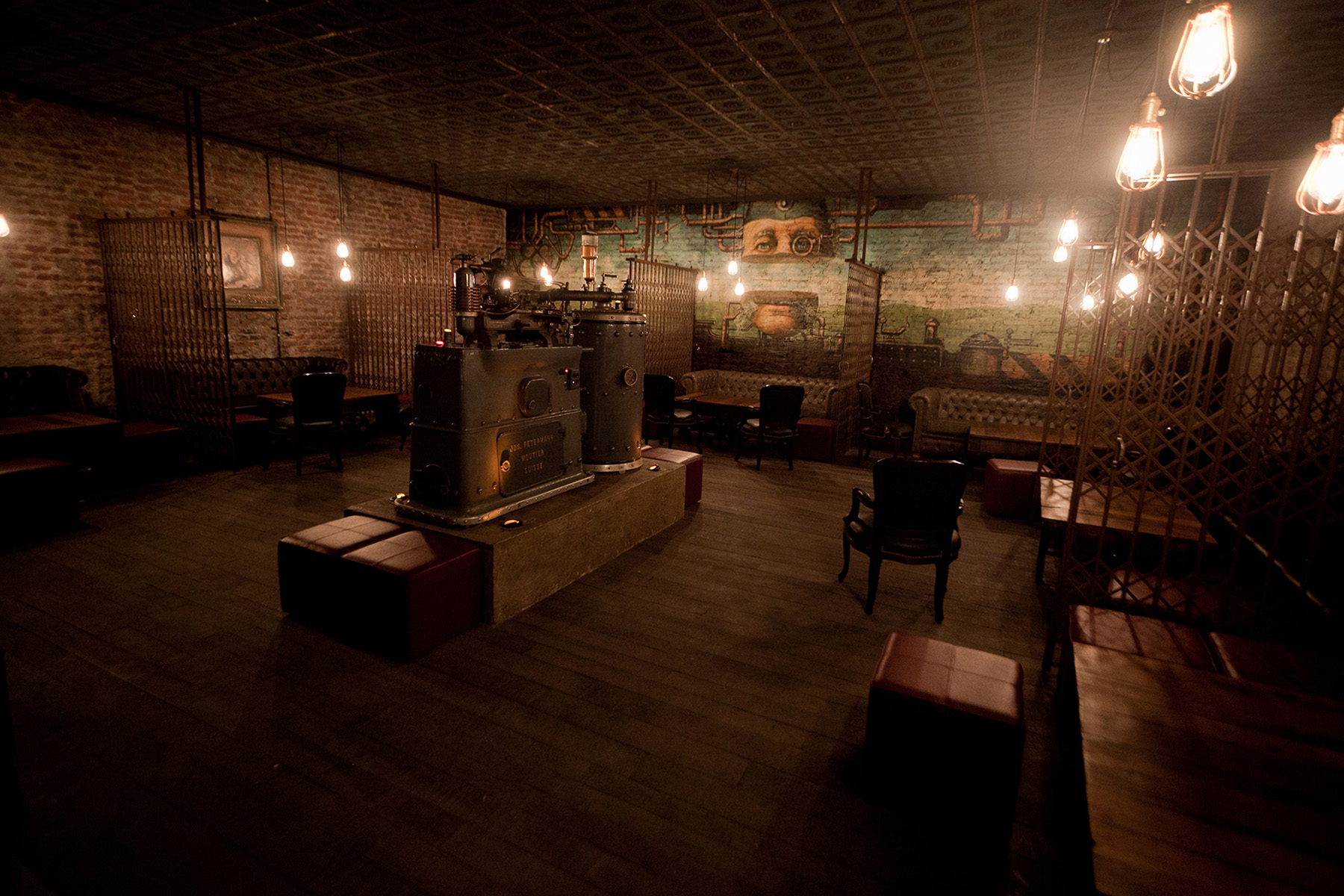
Restaurant & Bar Nazdrowje by Studio Richard Lindvall, Stockholm, Sweden

Minimal, raw and timeless: these words encapsulate the essence of Nazdrowje. The restaurant was initially a parking lot and the studio decided to use the natural atmosphere of the space as inspiration for the final design. Concrete is the predominant material in the space. The light grey concrete seats were cast and mounted directly into the walls, tying them with the concrete floors. The space also includes a large copper fireplace and visible copper pipes throughout.

Images by Andres Martellini

Victoria Brown Bar & Restaurant by Hitzig Militello arquitectos, Buenos Aires, Argentina

The bar has the mysteriousness of a speakeasy and the flash and flair of a private social club from the 19th century. Staying true to the theme, it also features a secret entrance through a coffee shop in the front. The space evokes nostalgia with a combination of elements like aging barrels, uneven brick walls, rich leather, vintage seating and suspended light bulbs. In one room, scissor screens break up the larger area into intimate pockets for small groups.

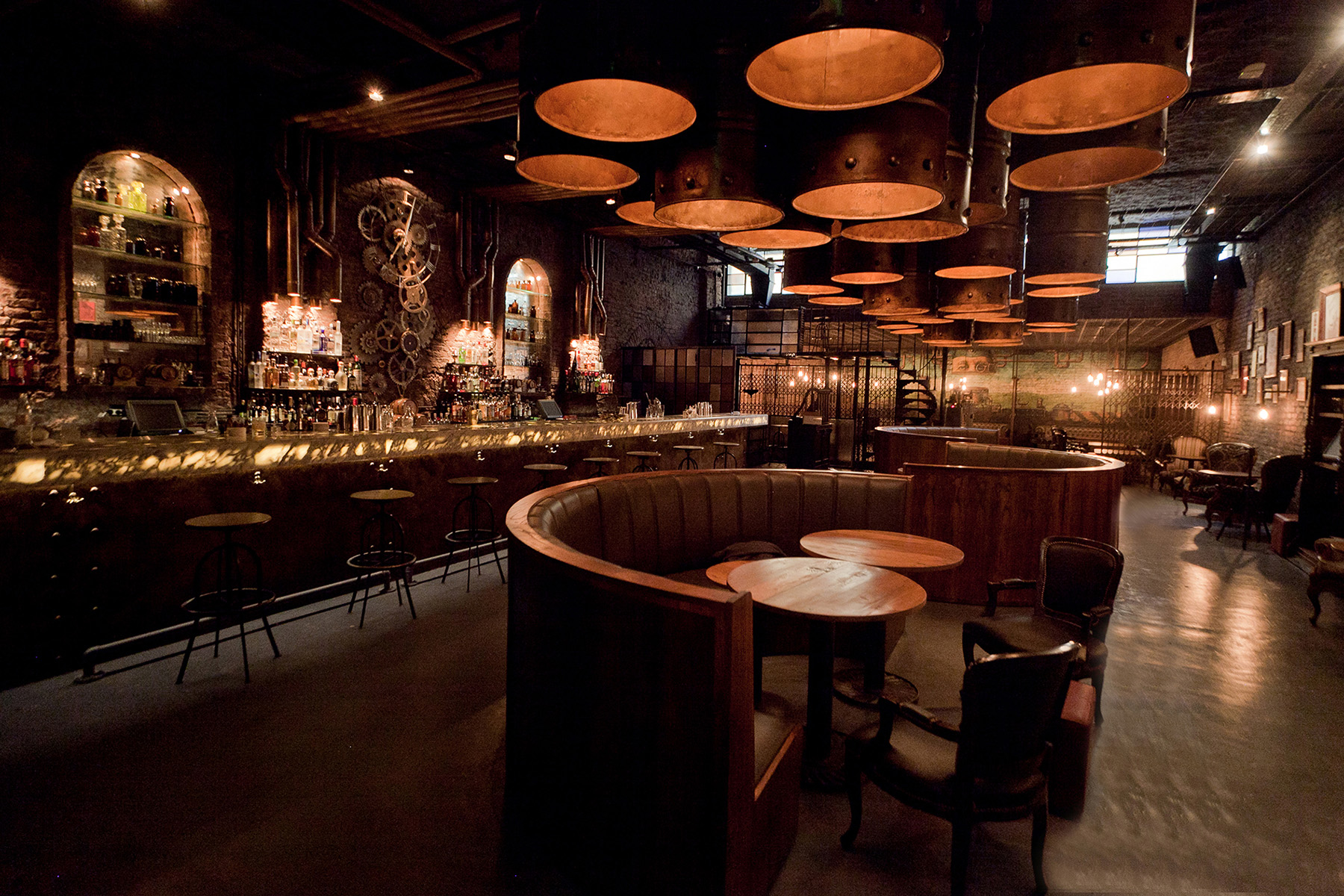
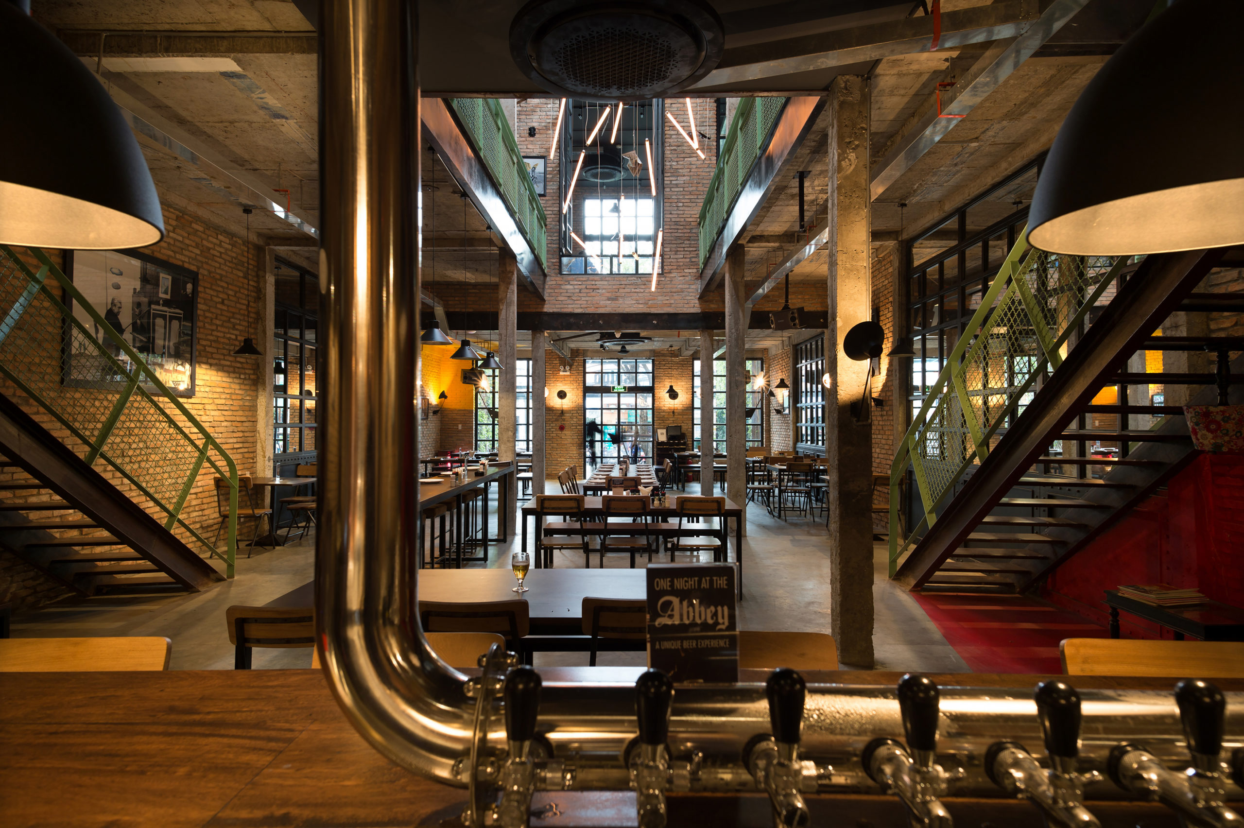
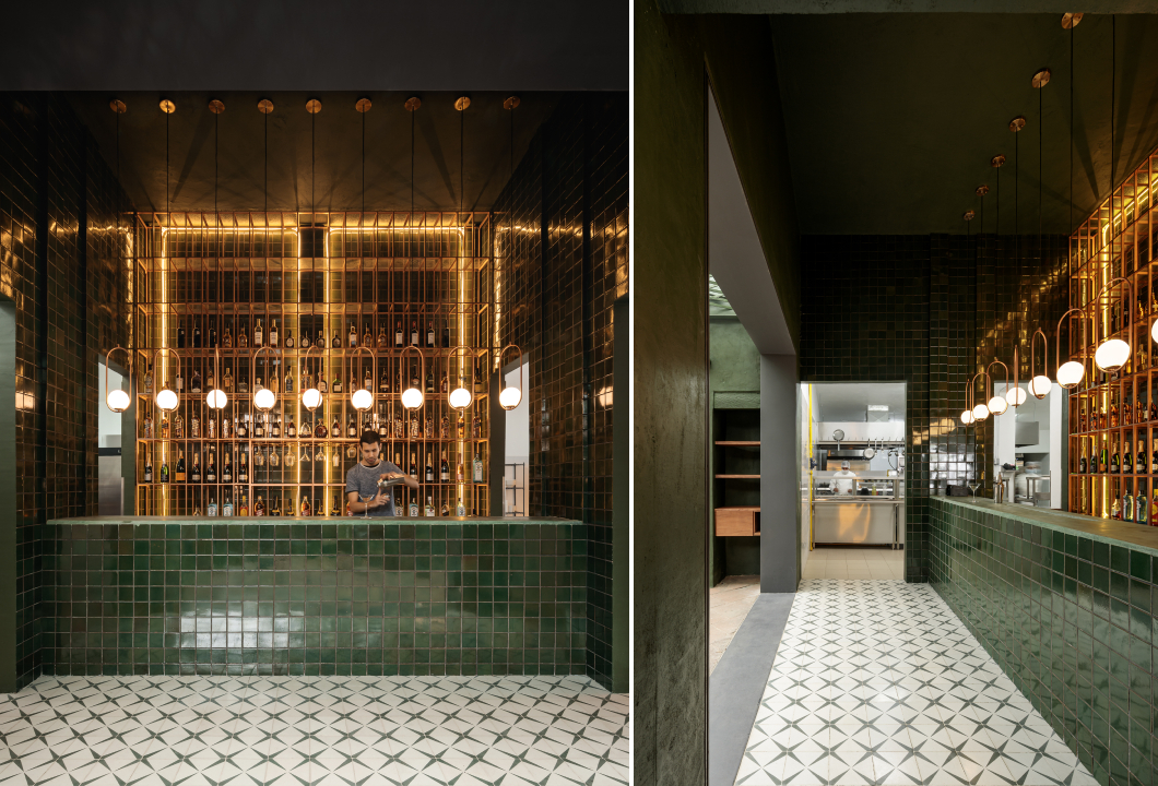
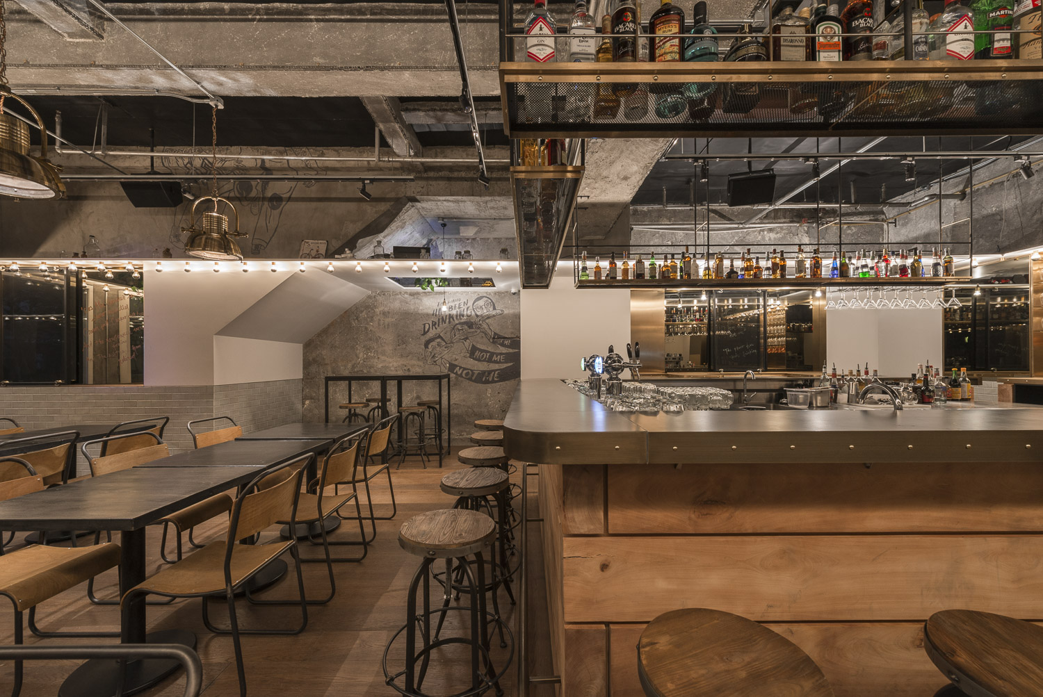
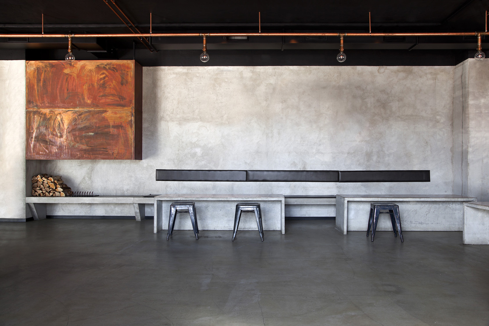
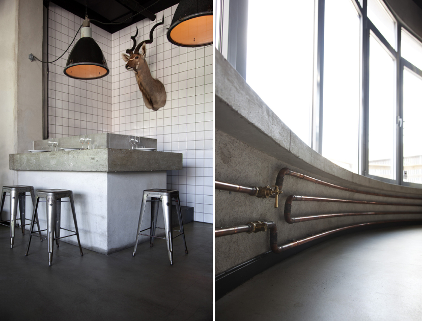
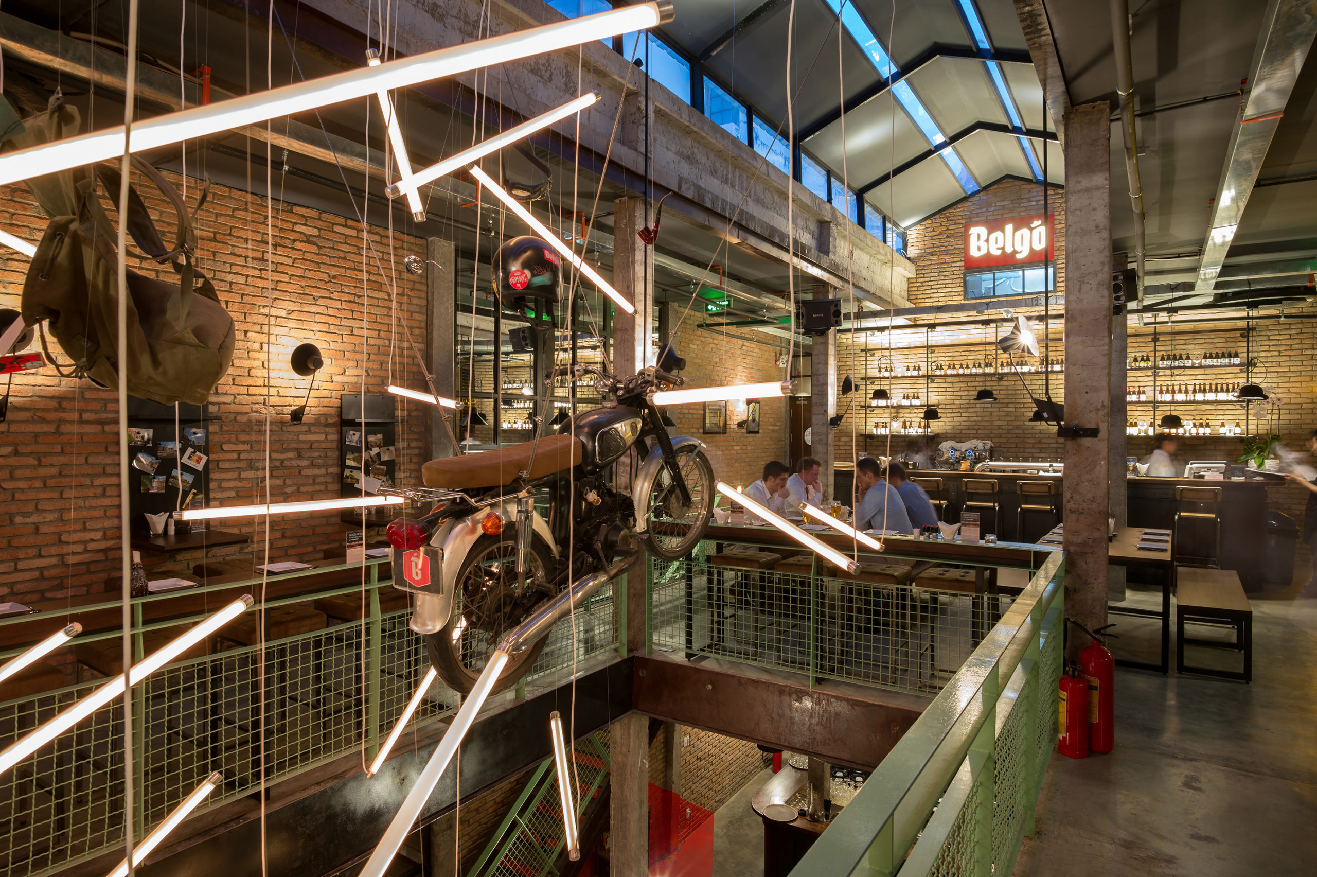
Industrial Brewery Pub in Saigon by T3 Architects, Ho Chi Minh City, Vietnam

The studio wanted to adopt the industrial aesthetic from 20th century Europe given that the brewery serves Belgian beers and food. Traditional European elements have been given a tropical twist by using local ventilation mechanisms and ceiling fans. The design also uses second-hand bricks sourced locally to reduce the carbon footprint. Pops of green, black and white posters and photographs, hanging backpacks and a suspended motorcycle also bring in the humorous side of the Belgian culture.

Architects: Want to have your project featured? Showcase your work through Architizer and sign up for our inspirational newsletter.    

Reference

What Kéré Architecture’s Renderings Reveal About the Firm’s Design Process
CategoriesArchitecture

Diébédo Francis Kéré Makes History as the 2022 Pritzker Prize Winner

Have your say in which architects will take home Architizer’s prestigious A+Awards: Public Voting opens this spring. Interested in next year’s program? Subscribe to our newsletter for updates.  

Burkina Faso-born architect, educator and social activist Diébédo Francis Kéré has made history after being named the 2022 Pritzker Prize laureate. Known as Francis Kéré, the founder of Kéré Architecture is recognized for his “commitment to social justice and engagement, and intelligent use of local materials to connect and respond to the natural climate, he works in marginalized countries laden with constraints and adversity, where architecture and infrastructure are absent.” He is the first African and the first Black architect to win the prize since it began being awarded in 1979.

Trained first as a carpenter and later as an architect, his deep knowledge and concern for materiality is visible in his work. Though based in Berlin, his practice often gravitates towards works throughout the continent of Africa. From contemporary school institutions to health facilities, and professional housing to civic buildings and public spaces, his designs steer clear of simple categorizations: global vs. local, aesthetic vs. social, and so on.

As the Pritzker jury succinctly put it, “Francis Kéré’s entire body of work shows us the power of materiality rooted in place. His buildings, for and with communities, are directly of those communities – in their making, their materials, their programs and their unique characters. They are tied to the ground on which they sit and to the people who sit within them. They have presence without pretense and an impact shaped by grace.”

Though many architectural enthusiasts around the world may only now be acquainting themselves with his larger body of work, they are likely already familiar with his design for the 2017 Serpentine Pavilion — a timber structure accented with indigo blue that ingeniously connected different times and spaces and reinterpreted form of the massive tree at the heart of his home town.

His signature architectural vocabulary of double roofs, thermal mass, wind towers, indirect lighting, cross ventilation and shade chambers (replacing conventional windows, doors and columns), confounds attempts to separate practicality from poetry in design. Yet, while Kéré’s architectural reputation is strongly tied to the work’s built realization, yet, his working images and visualizations are also remarkable in their own right.

“Francis Kéré’s work also reminds us of the necessary struggle to change unsustainable patterns of production and consumption, as we strive to provide adequate buildings and infrastructure for billions in need,” the Jury noted. “He raises fundamental questions of the meaning of permanence and durability of construction in a context of constant technological changes and of use and re-use of structures. At the same time his development of a contemporary humanism merges a deep respect for history, tradition, precision, written and unwritten rules.”

Have your say in which architects will take home Architizer’s prestigious A+Awards: Public Voting opens this spring. Interested in next year’s program? Subscribe to our newsletter for updates.  


Reference

8 Student Projects Demonstrate Ingenious Approaches to the Future of Accessibility
CategoriesArchitecture

8 Student Projects Demonstrate Ingenious Approaches to the Future of Accessibility

Universal Design, the practice of creating environments equally usable by anyone regardless of physical circumstance, is increasingly gaining traction among design professionals. As this practice requires designing beyond minimum standards set by codes that seasoned practitioners have spent decades learning to master, a change in approach must come from the bottom up. That’s why the University of Arizona’s College of Architecture, Planning and Landscape Architecture hosts an annual Universal Design awards program for architecture students with Ascension Wheelchair Lifts.

Now in its second year, the program aims to instill in future architects an inclination to envision how the spaces they design will be used. “The ability to imagine spatial experience is essential in architecture,” Teresa Rosano, one of the program’s studio professors, said. “Doing so can hone our awareness of all our senses and also serve as a practice in empathy – a skill that transcends any discipline.”

For this year’s program, students were asked to design an arts center on a steeply sloped site in Bisbee, Arizona, a town defined by elevation changes. Public staircases, emblematic of the challenges facing the implementation of Universal Design, are famously utilized by the town to connect vertically separated streets, including on the site chosen for the competition. Here’s a look at the winning designs.


“Bisbee Mercado” by Alexis Campion

First place honors went to Alexis Campion’s Bisbee Mercado, an open-air space for local artisans to make and sell their work. Neatly organized around a three-story atrium, each floor opens to the exterior directly at grade, connecting to an adjacent commercial district, city park and residential neighborhood without level changes.

Campion also considered sensory concerns caused by the site’s slope. “Digging into the earth can create an environment similar to a basement,” she said. “To resist this, I split the space down the center to create an atrium bringing light into all the spaces.”


“Bisbee Art Center” by Andy Demetriou

Inspired by an existing graffiti-covered wall on the site, Andy Demetriou’s Bisbee Art Center was awarded the second place prize. Demetriou’s design kept the existing wall in place, expanding it into an ever-evolving outdoor gallery. “Over time, the graffiti changes into new designs and layers on top of each other,” he said.

The outdoor gallery is distributed onto several levels connected by a simple, intuitive system of ramps. These levels are all aligned with the levels of an adjacent, indoor multi-purpose space, leading one juror to describe the solution as “masterfully integrated Universal Design.”


“Apiledo Theatre Company” by Brandon Willmon

Coming in third, Brandon Willmon’s Apiledo Theatre Company reconciled Universal Design principles with the enjoyment of kinetic performance styles. Centered around the exhibition of Capoeira, a Brazilian martial art that combines acrobatics with music and dance, mid-air stages hang dramatically in a triple-height performance venue ringed by fully accessible viewing areas on multiple levels.

“My inspiration for a ‘free floating’ performance, in lieu of a better phrase, was derived mostly from the fluid nature of Capoeira coupled with getting physically challenged members of the community involved in such a physically demanding art form,” he said.


“Bisbee Sculpture Park & Museum” by Ralph Mersiowsky

Ralph Mersiowsky’s Bisbee Sculpture Park & Museum earned the program’s “Innovation in Universal Design” award by co-locating multiple modes of vertical circulation, ensuring a common experience of traveling from floor to floor. Distributed across three levels with minimal overlap, the challenge of artfully placing a staircase, elevator and ramp adjacent to each other was overcome by making each one a unique architectural feature.


“Light + Life + Performance” by Tyler Newman

Garnering the “Innovation in Graphics” award, Tyler Newman’s design for a group living community explores the effect that light and materiality have on perception. Focused on tactile experience for the benefit of people with differing levels of sensory ability, walls and floors featuring wood, concrete and other materials offer feelings of warmth, coolness or other sensations depending on the time of day.


“Culinary Arts Center” by Eva Serbin

Eva Serbin’s methodology for creating a culinary arts center bisected by an open-air thoroughfare likened to a canyon won the program’s “Innovation in Design Narrative + Process” award. All the various uses in the multi-level “canyon” are connected with an ingenious system of ramps one juror described as “an exciting spatial experience all can participate in.”


“The Living Mural” by Alyssa Fink

Alyssa Fink’s The Living Mural distributes its program across separate buildings but makes the paths between them the star of the show, “highlighting the spatial quality and experience of the in-between spaces,” as one juror put it. Switch-backing ramps between buildings are surrounded by artful graffiti displayed on dramatic architectural forms, earning the project one of two “Innovation in Design Concept” awards.


“To Intersect & Carve” by Freddy Arvizu

Awarded the second “Innovation in Design Concept” honor, Freddy Arvizu organized spaces dedicated to painting and artist housing within overlapping, angular forms one juror called “a strong generative move that is carried throughout the spatial experiences.” Eschewing ramps, a centrally located elevator offers easy access to all parts of the building.

To learn more about how you can make your upcoming projects accessible with the help of the experts at Ascension Lifts, click here.

Reference