kraken installation made of reclaimed wood spreads its tentacles in lyon
CategoriesArchitecture

kraken installation made of reclaimed wood spreads its tentacles in lyon

UV LAB unveils Le Kraken ephemeral wooden installation


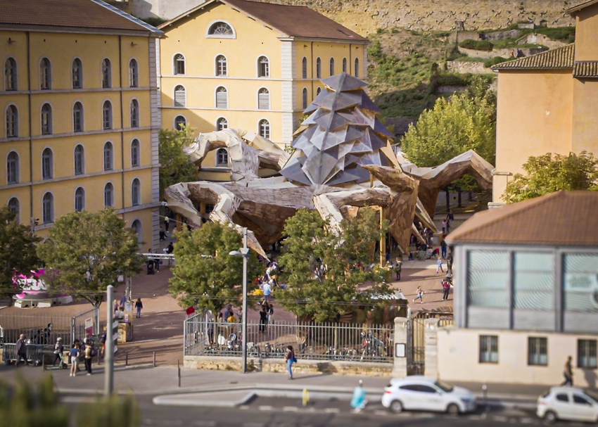
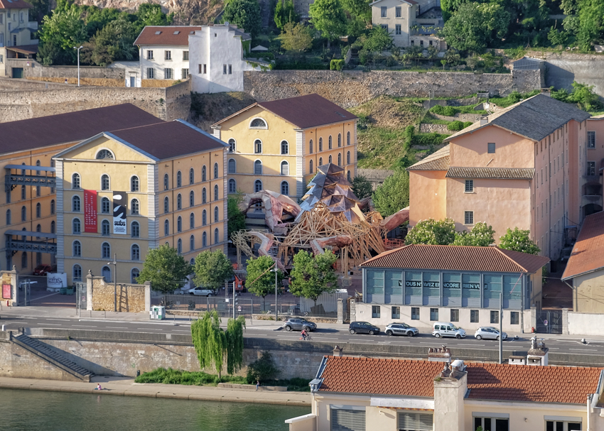
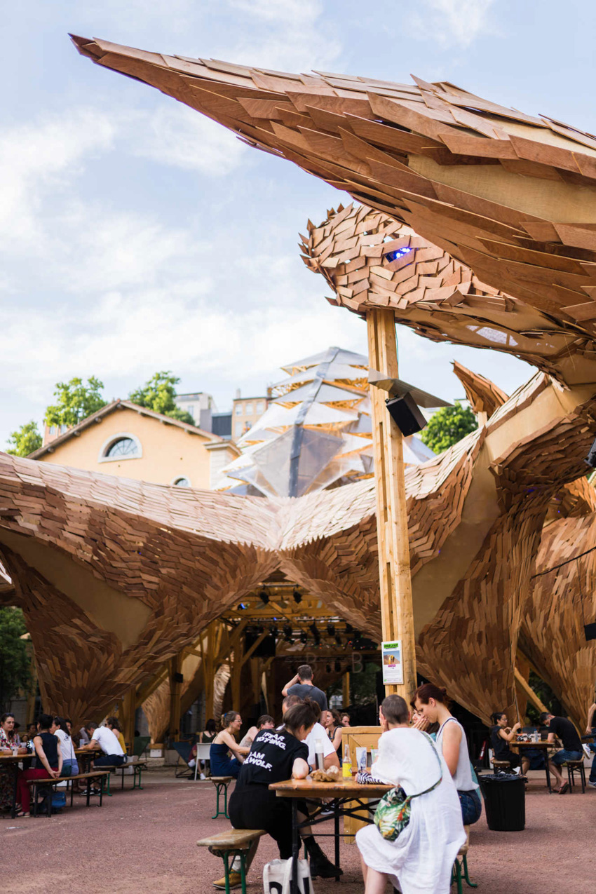
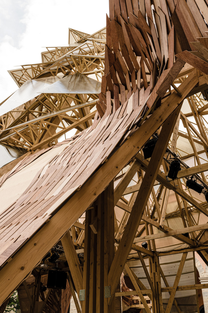
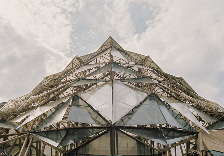
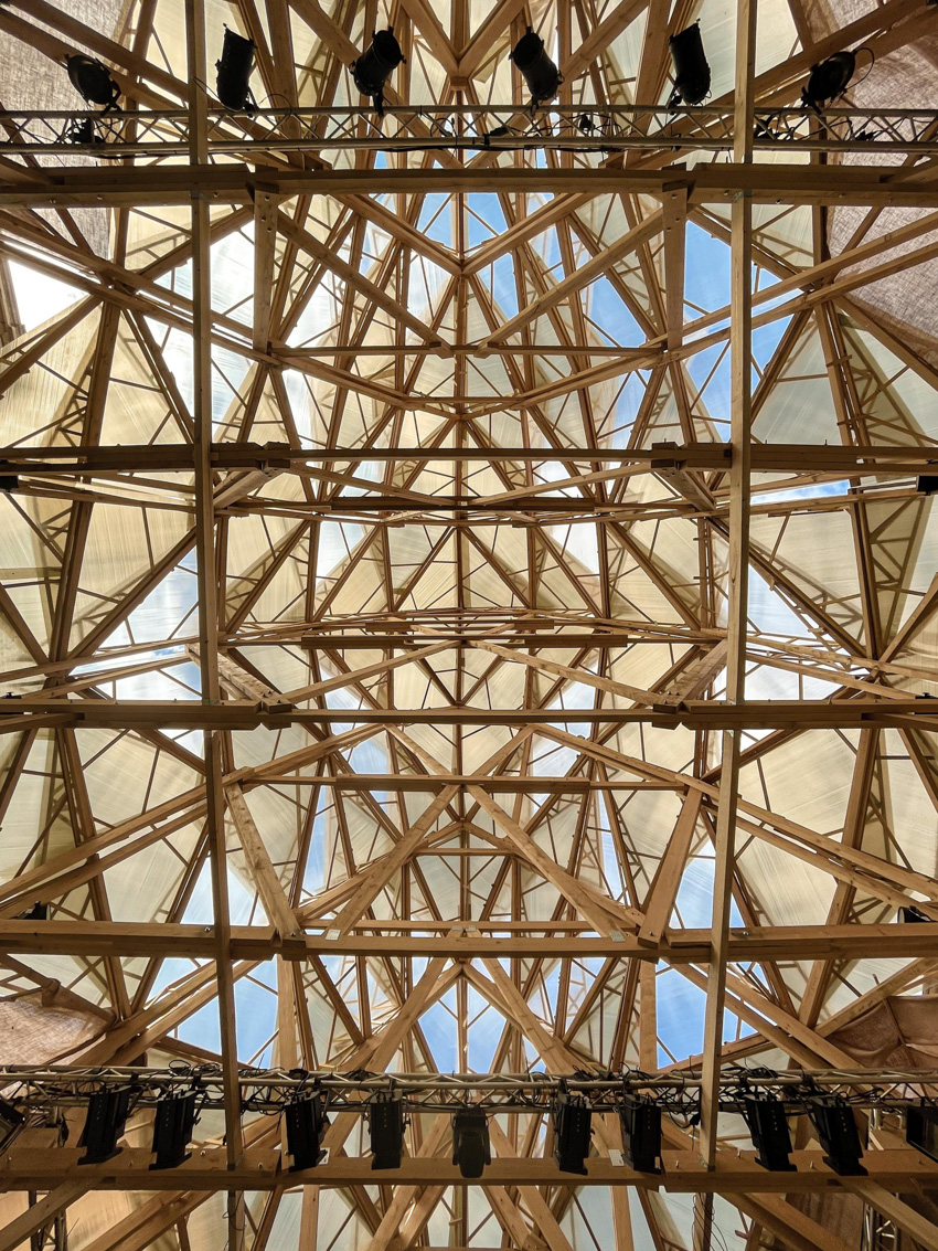
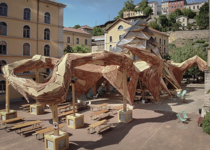
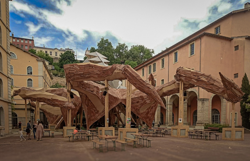
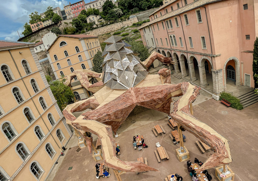
Le Kraken by UV LAB emerges as an ephemeral monumental installation gracing the central esplanade of the historical site housing Les SUBS and the fine arts university of Lyon ENSBA. With dimensions stretching 25m wide, 15m high, and boasting 180m of tentacles, Le Kraken commands attention, constructed from 1000 sqm of reclaimed wood over a period of six weeks with the collective effort of 30 professionals and students.


This imposing wooden structure evokes a sense of awe, transporting viewers to another epoch or perhaps an alternate history. Despite its chilling presence, the Kraken invites interaction, drawing visitors to explore its labyrinthine form and unravel its mysteries.

kraken installation made of reclaimed wood spreads its tentacles in lyon
all images by Collectif des Flous Furieux


Le Kraken acts as A Dynamic Space for Dialogue and discovery


The immersive experience shifts perceptions; what initially appears as a formidable beast transforms upon closer inspection. Visitors can touch, walk through, and even climb the Kraken, blurring the lines between art and reality. The living quality of the installation challenges conventional notions of architectural integrity, embodying a sense of fragility and inclusion.


Le Kraken transcends traditional ontological categories, embodying a political figure that disrupts established hierarchies and boundaries, representing freedom and unpredictability. Its presence challenges the established order, sparking curiosity and prompting contemplation about its next move.

Le Kraken serves as more than just an artwork; it’s a dynamic space for dialogue, play, and discovery, highlighting UV LAB‘s innovative design approach.
le kraken 5

le kraken 6

le kraken 11

le kraken 2


le kraken 3

le kraken 10

le kraken 7
le kraken 12


project info:


name: Le Kraken
designer: UV LAB | @uv.lab
location: Lyon, France

photography: Collectif des Flous Furieux | @lesflousfurieux


designboom has received this project from our DIY submissions feature, where we welcome our readers to submit their own work for publication. see more project submissions from our readers here.


edited by: christina vergopoulou | designboom


Reference

Crosby Studios creates office-themed installation for The Frankie Shop
CategoriesInterior Design

Crosby Studios creates office-themed installation for The Frankie Shop

New York-based Crosby Studios has piled office equipment around a long metallic table as part of a pop-up installation for fashion brand The Frankie Shop in Los Angeles.

The month-long installation titled The Office was launched to coincide with LA Art Week and the Sag-Aftra film festival and marked the New York label The Frankie Shop‘s first presence in the Californian city.

A long, metallic conference table within an industrial-style buildingA long, metallic conference table within an industrial-style building
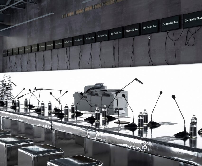
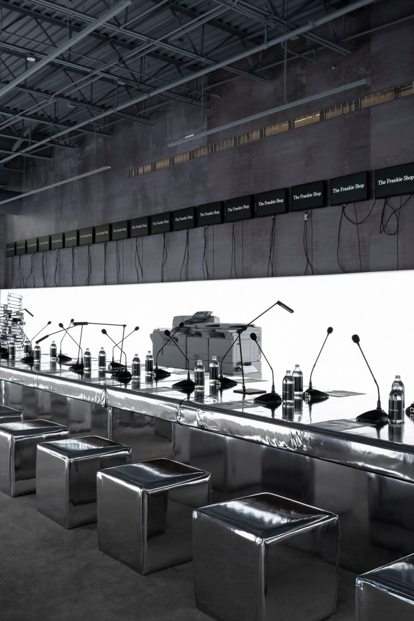
A long, metallic conference table formed part of The Office installation created by Crosby Studios

The brand’s founder Gaëlle Drevet and Crosby Studios creative director Harry Nuriev met at his studio, talked for 2.5 hours and decided to work together.

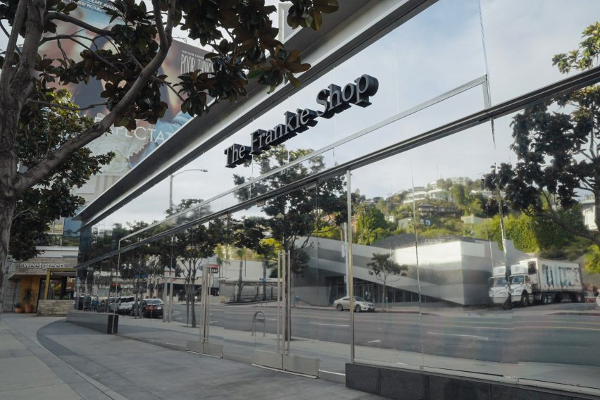
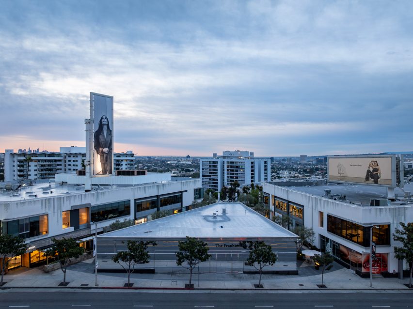
The resulting installation occupies a trapezoidal building on Sunset Boulevard wrapped in metallic film on all sides.

Equipment like printers, office chairs and water coolers arranged around a roomEquipment like printers, office chairs and water coolers arranged around a room
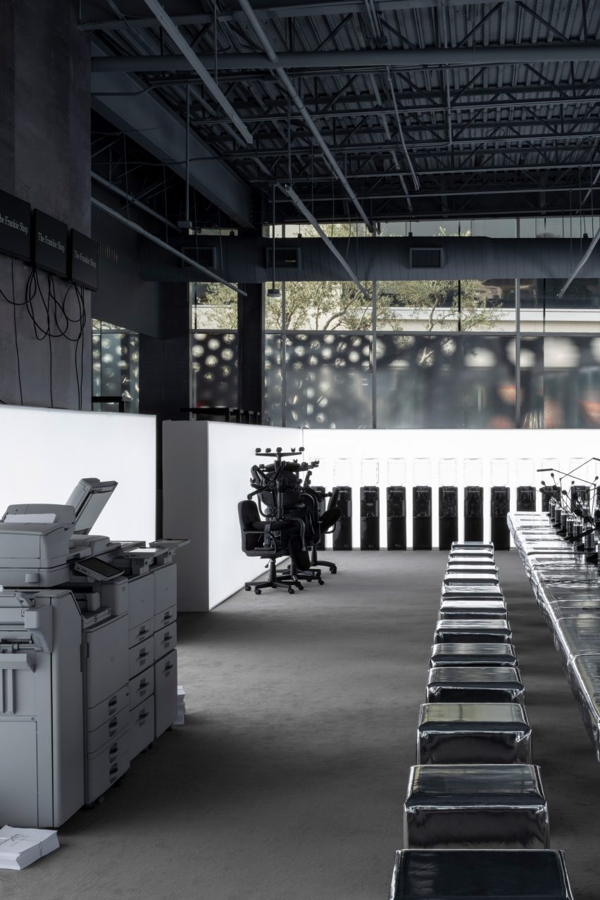
Equipment like printers, office chairs and water coolers were arranged around the perimeter of the space

Inside, the warehouse-like space features a long table also covered in a reflective material, with matching cube-shaped stools set along either side.

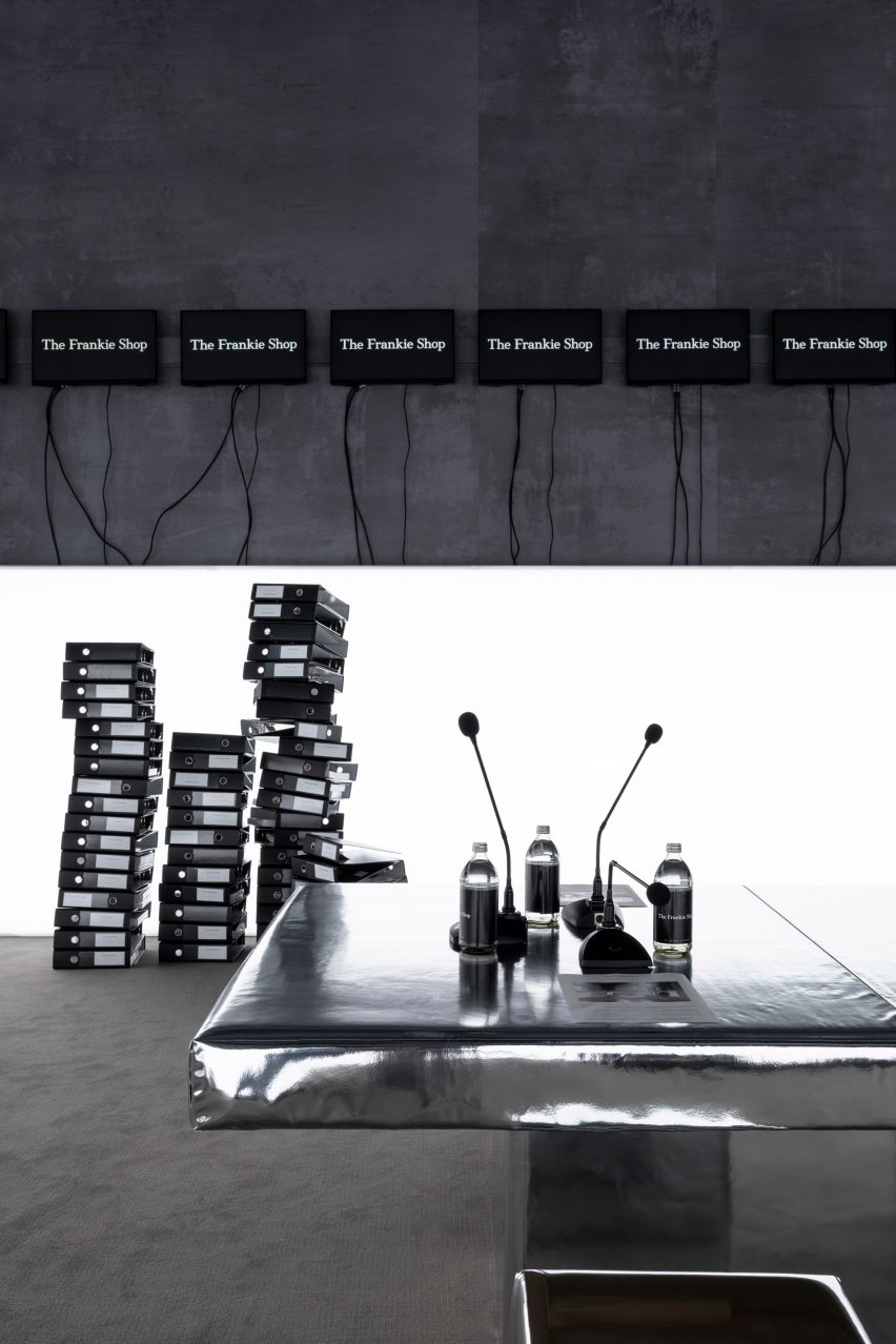
Articulated desk lamps, microphones and bottles of water were arranged on the table as if set up for delegates at a convention.

Metallic table with water bottles and microphones on topMetallic table with water bottles and microphones on top
The central table featured microphones and water bottles as if set up for a meeting

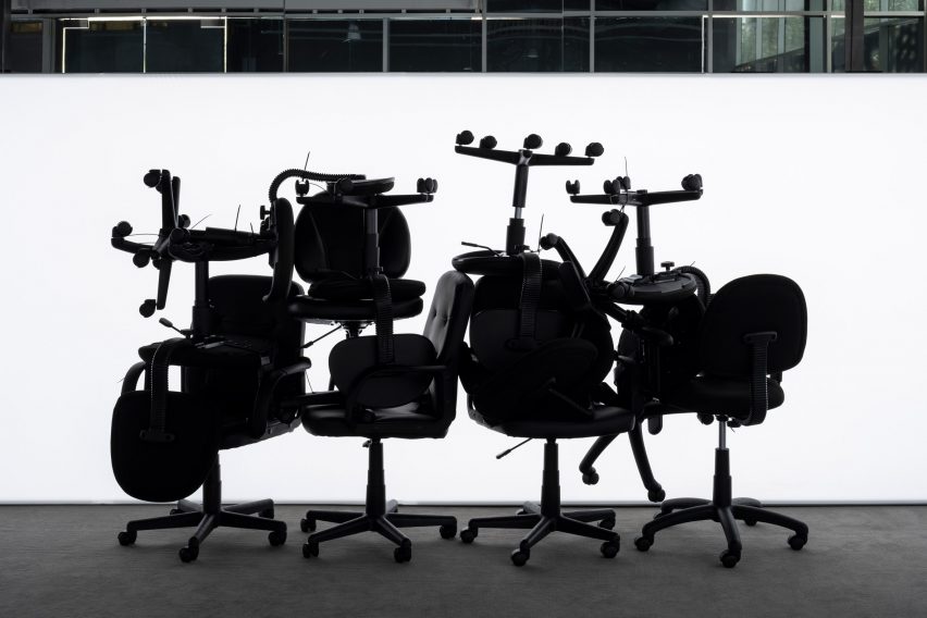
Around the perimeter, Nuriev placed recycled office equipment, such as a large printer, a stack of binders and a pile of plastic-wrapped office chairs.

A row of water coolers was lined up along one end of the room, encircled with glowing light boxes to create sharp silhouettes of the equipment in front.

Pile of office chairs silhouetted against a bright light boxPile of office chairs silhouetted against a bright light box
Light boxes that encircle the space create sharp silhouettes of the office furniture placed in front

“It’s not really about the office, it’s more about what happens after the office,” Nuriev told Dezeen. “I was thinking it’s time to officially move on from the office and consider the future. However, in this project, we’re uncertain about what the future holds exactly.”

A selection of apparel by The Frankie Shop is interspersed among the vignettes, while a “storage” area in the back serves as a fitting room.

Plastic-wrapped silver furniturePlastic-wrapped silver furniture
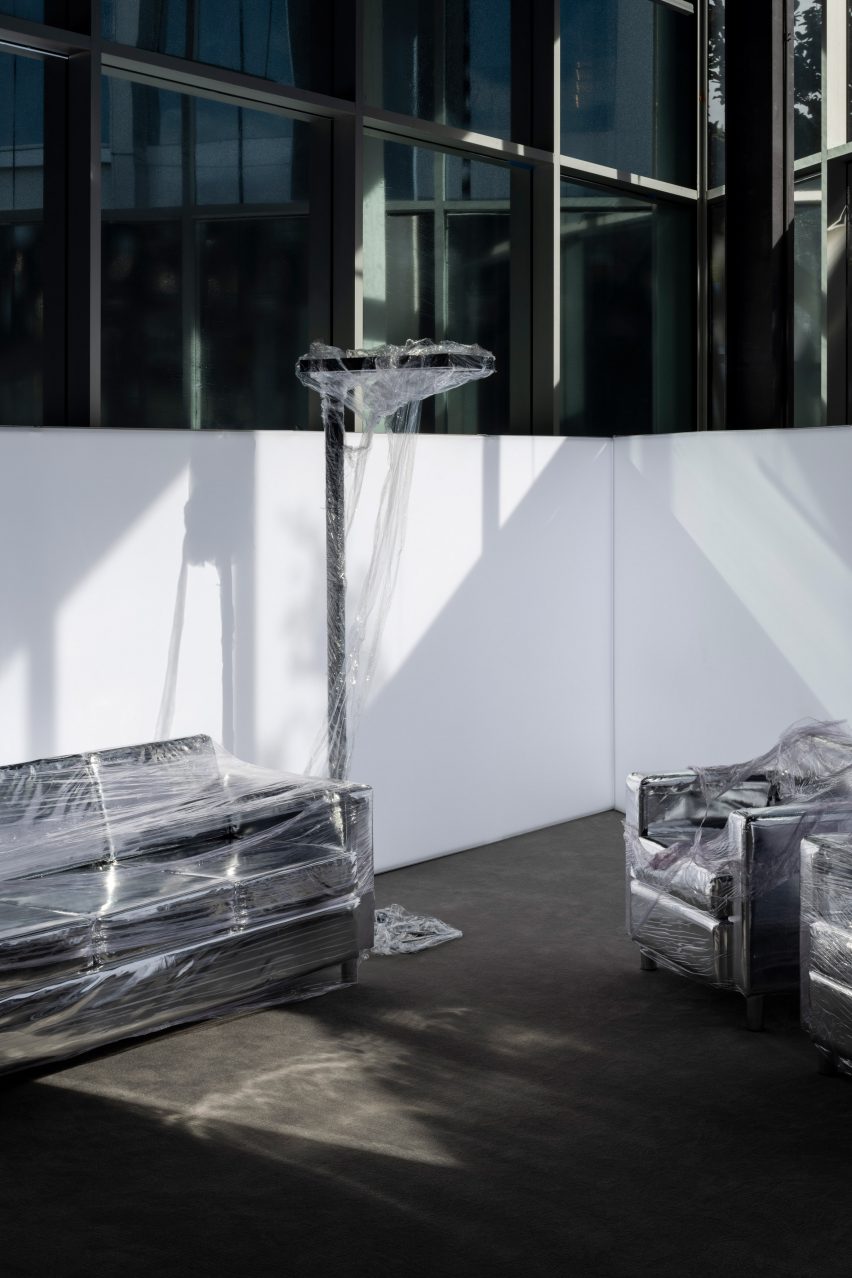
Some of the furniture is plastic-wrapped, appearing as though just installed or ready to be shipped away

Together, the industrial style of the building, the silvery materials, the lighting and the equipment served to highlight the brand’s reinterpretation of businesswear.

“The pop-up design blends a dynamic combination of fashion and nostalgia, where the power suits of the past seamlessly align with the modern attitude of The Frankie Shop,” said the team.

Metallics are commonplace in Nuriev’s interior projects, appearing prominently in a Berlin jewellery store, a Moscow restaurant and his own New York apartment amongst others.

However, he is vague about the reasons or intentionality behind this recurring theme.

Exterior of a building on Sunset Boulevard covered in reflective filmExterior of a building on Sunset Boulevard covered in reflective film
The exterior of the building on Sunset Boulevard is also covered in reflective film

“I don’t really think about ‘why’; it’s just my instincts, and I prefer to follow my feelings,” said Nuriev. “For this project, I had a vision of silver, and I think it works perfectly.”

Originally from Russia, the designer founded Crosby Studios in 2014 and is now based between New York and Paris.

Zoomed out view of The Frankie Shop building in LAZoomed out view of The Frankie Shop building in LA
The month-long installation marks The Frankie Shop’s first presence in LA and was timed to coincide with the city’s art week

He recently completed the interiors for New York nightclub Silencio, based on the original location in Paris designed by film director David Lynch.

Nuriev frequently collaborates with fashion brands, on projects ranging from a virtual sofa upholstered with green Nike jackets to a transparent vinyl couch filled with old Balenciaga clothing.

The photography is by Josh Cho.

The Office is on show in Los Angeles from 23 February to 24 March. For more events, talks and exhibitions in architecture and design visit Dezeen Events Guide.

Reference

epiphany architects’ public installation in chengdu undulates like a petal
CategoriesArchitecture

epiphany architects’ public installation in chengdu undulates like a petal

A Petal in the Urban Oasis by epiphany architects in chengdu


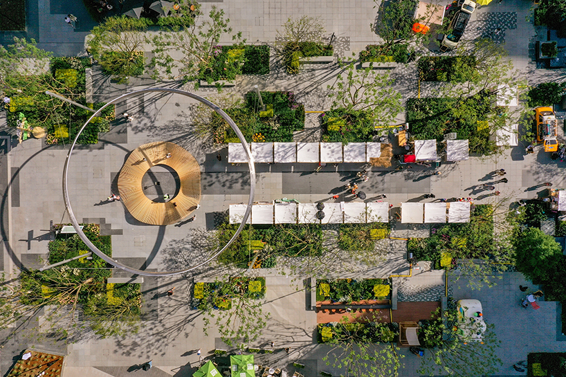
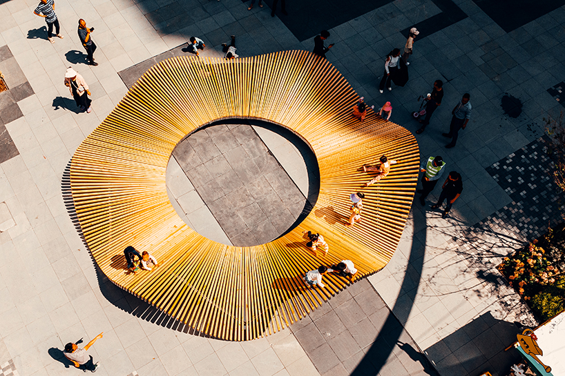
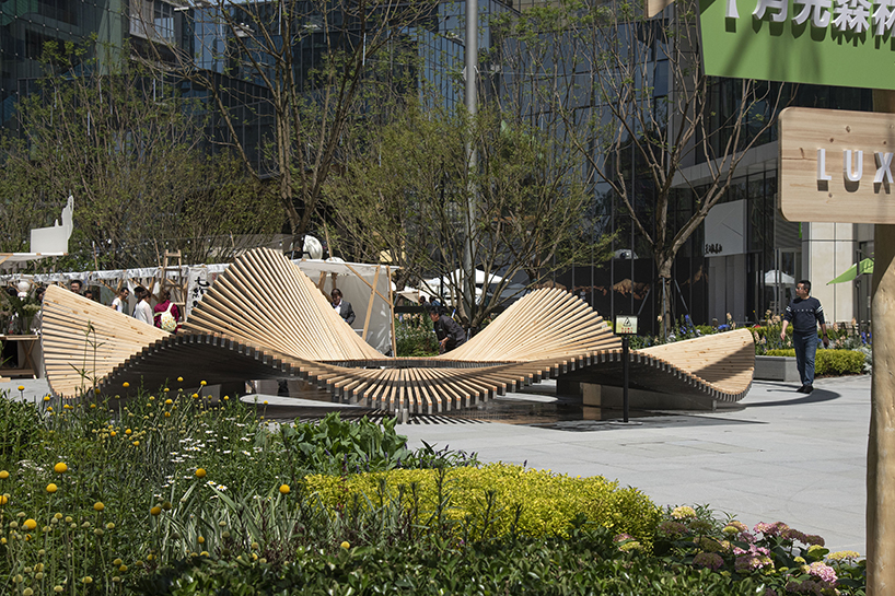
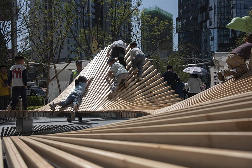
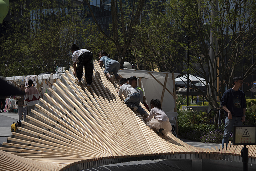
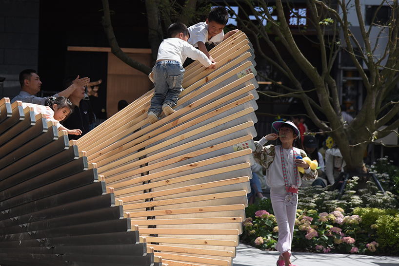
Sited in Chengdu‘s Luxezone Plaza, A Petal in the Urban Oasis is a new public installation completed by Chinese studio Epiphany Architects. The wooden design gracefully flows and undulates amid the lush urban greenery, creating playful light and shadow effects for visitors to enjoy. ‘Through interaction with the surrounding environment, it flexibly adjusts its shape to present itself in the most suitable way. This petal welcomes every resident and visitor with open arms,’ shares the studio. At its center, a circular void offers a uniform height to create a comfortable social space. At the same time, its outer, undulating body reveals different heights that lead to a more lively and dynamic appeal and more opportunities for interaction — namely playing, sitting, leaning, gathering, and resting. The children’s engagement brings a particularly more interesting dimension to the dynamics. 

a petal in the urban oasis 2
A Petal in the Urban Oasis | all images courtesy Epiphany Architects


using 300 wooden pieces of varying lengths


Supporting the installation by Epiphany Architects (see more here) are six mirror bases cleverly designed to align with six points where the petal ‘drops’. This design visually integrates the bases with the petals, echoing its image of lightness and buoyancy. In addition to the bases, the installation utilizes curved steel trusses to support the entire form. These trusses are connected to the lightbox using a snap-fit method, ensuring the overall structure’s stability while effectively concealing the trusses between the wood and stainless steel lightboxes. This unique petal is meticulously composed of 300 wooden elements of varying lengths and stainless steel light boxes. Each lightbox has a different angle of connection with the trusses, resulting in 600 other forms of connectors. In the production process, the sequence of node design, data output, data organization, CNC machine input and output, and overall assembly showcases the perfect integration of technology and art.

a petal in the urban oasis 1
creating varying light and shadow effects

a petal in the urban oasis 4
the undulating wooden installation mimics the movement of a petal

a petal in the urban oasis 6
children exploring the structure by Epiphany Architects

a petal in the urban oasis 7
climbing to the top

a petal in the urban oasis 8
a continuous wave-like surface

Reference

Rattan installation meanders through Thai art gallery by Enter Projects Asia
CategoriesInterior Design

Rattan installation meanders through Thai art gallery by Enter Projects Asia

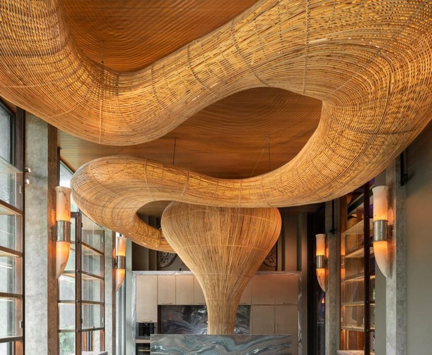
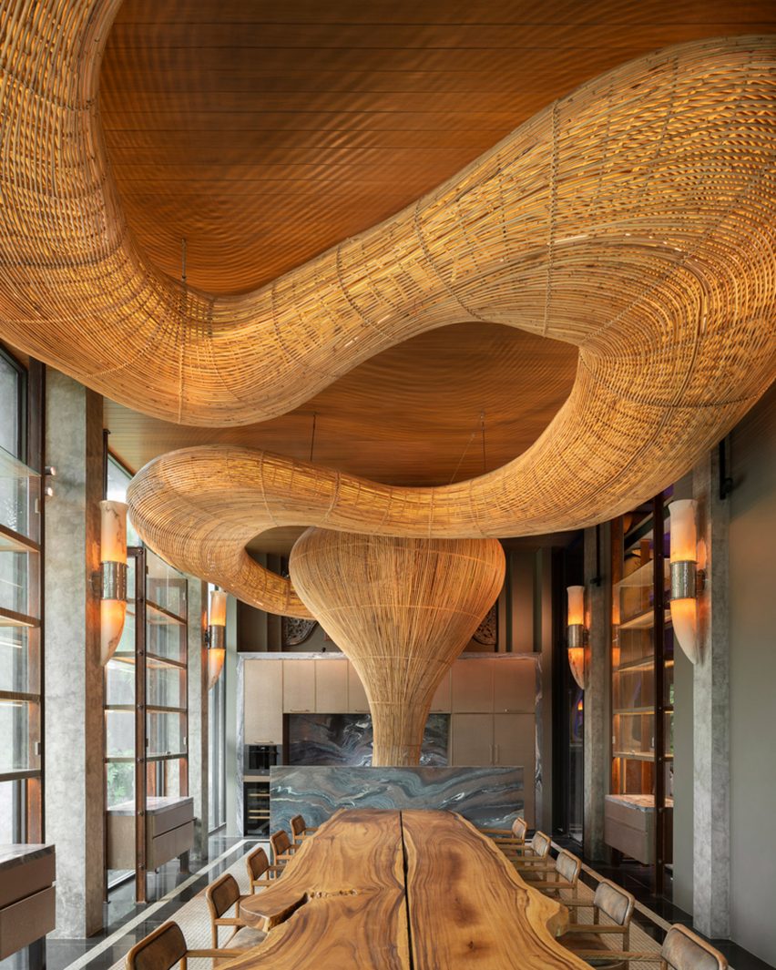
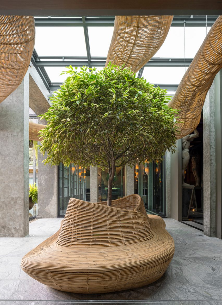
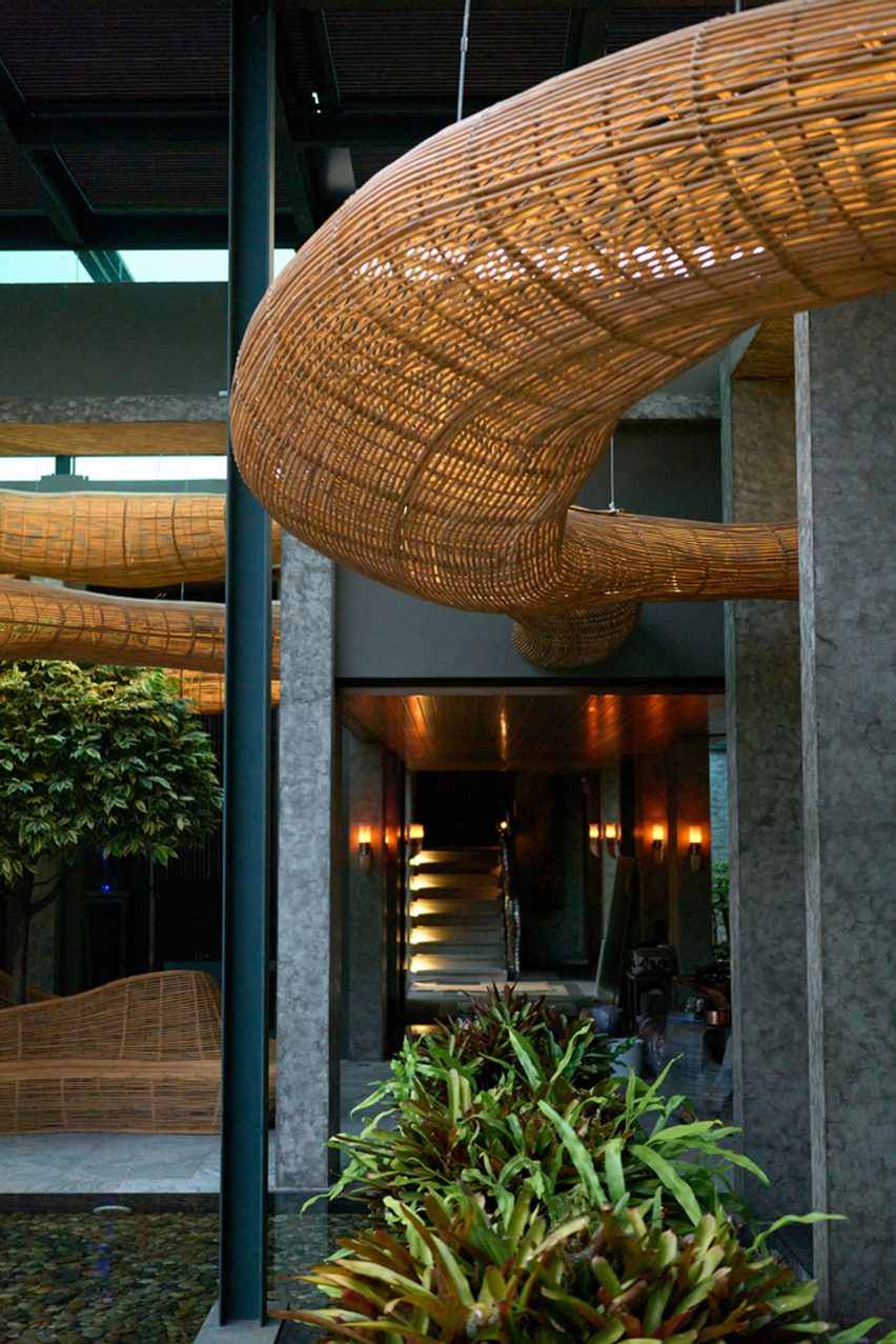
Architecture studio Enter Projects Asia has completed a private gallery for a collector in Chiang Mai, Thailand, featuring an undulating rattan structure designed by an algorithm that weaves its way in and out of the building.

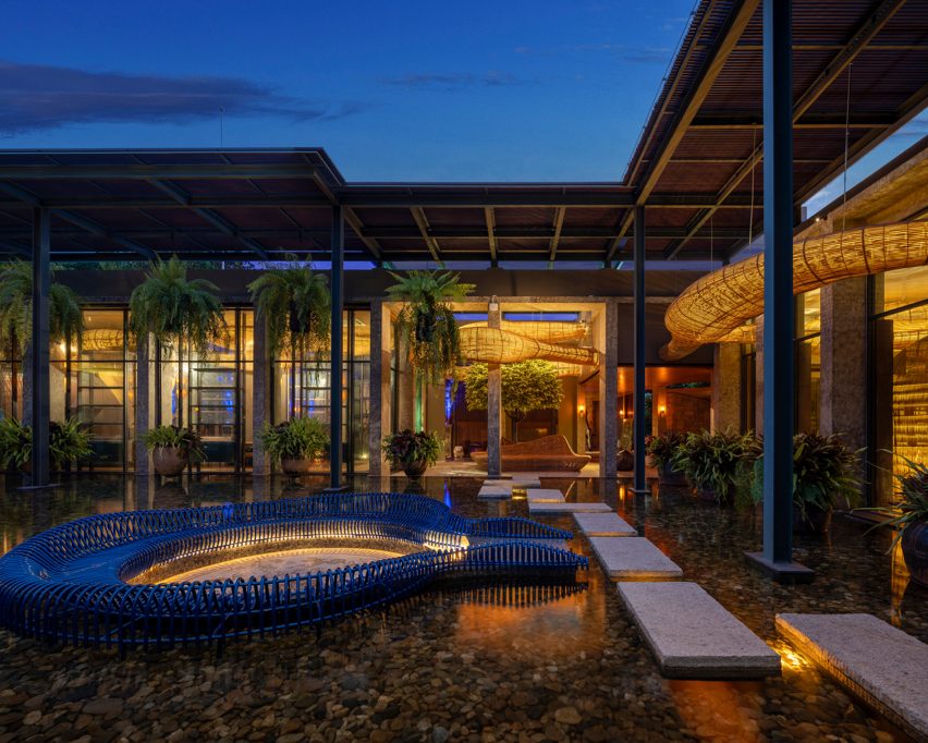
The 2,000-square-metre gallery complex comprises gardens, water features and a series of pavilions for displaying the owner’s collection of silverware, fine china and porcelain, including what is reportedly the largest collection of Wedgwood porcelain in Southeast Asia.

Meandering rattan structure in a dining room by Enter Projects Asia
A rattan installation weaves throughout the gallery

Enter Projects Asia, which is based on the Thai island of Phuket, developed a holistic proposal for the project that spanned everything from spatial planning to lighting and furniture, with the fluid rattan structures providing a consistent element throughout the scheme.

The aim was to create a less “clinical, antiseptic” interpretation of a traditional gallery, based on the studio’s research into parametric design and dynamic forms, Enter Projects Asia director Patrick Keane explained.

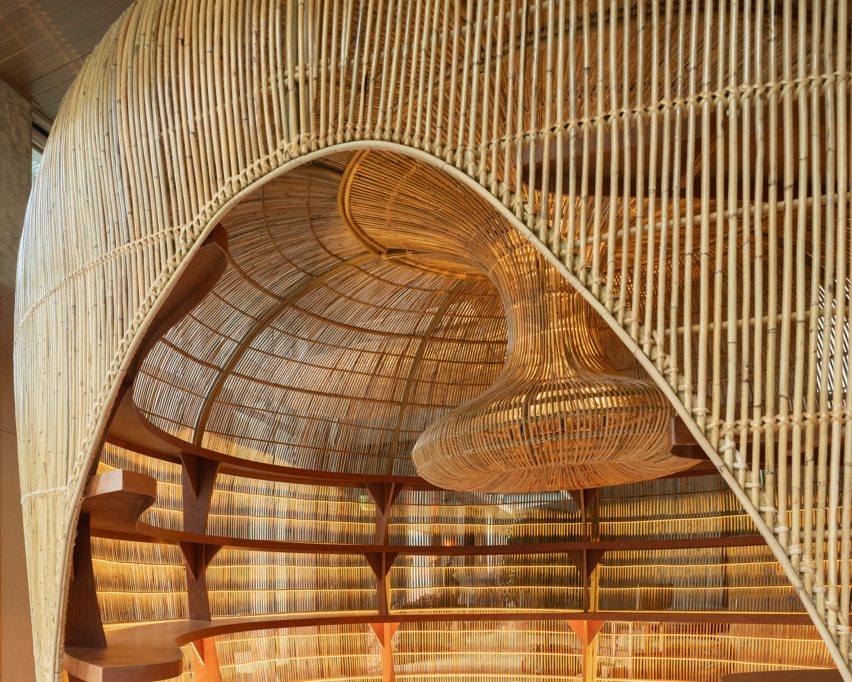
Inside of a rattan pod with built-in shelving
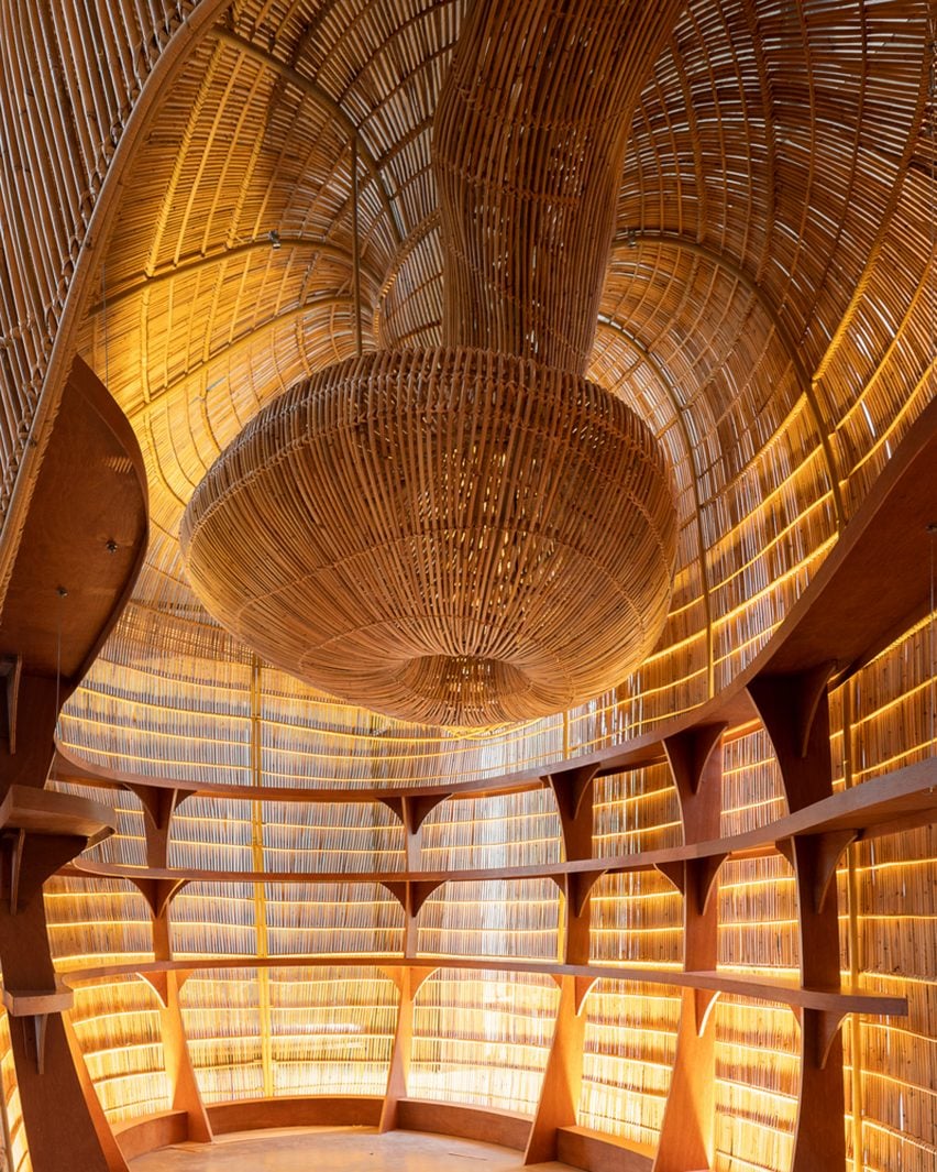
The overhead rattan structure drops down to form several pods

“We sought to create an immersive experience, giving the space a warmth and depth uncharacteristic of conventional art galleries,” he said.

The gallery features two wings arranged on either side of a central entrance. Each wing contains an exhibition space, with a private dining area also accommodated in the larger of the two volumes.

Meandering rattan structure around a courtyard tree
The gallery complex also includes gardens

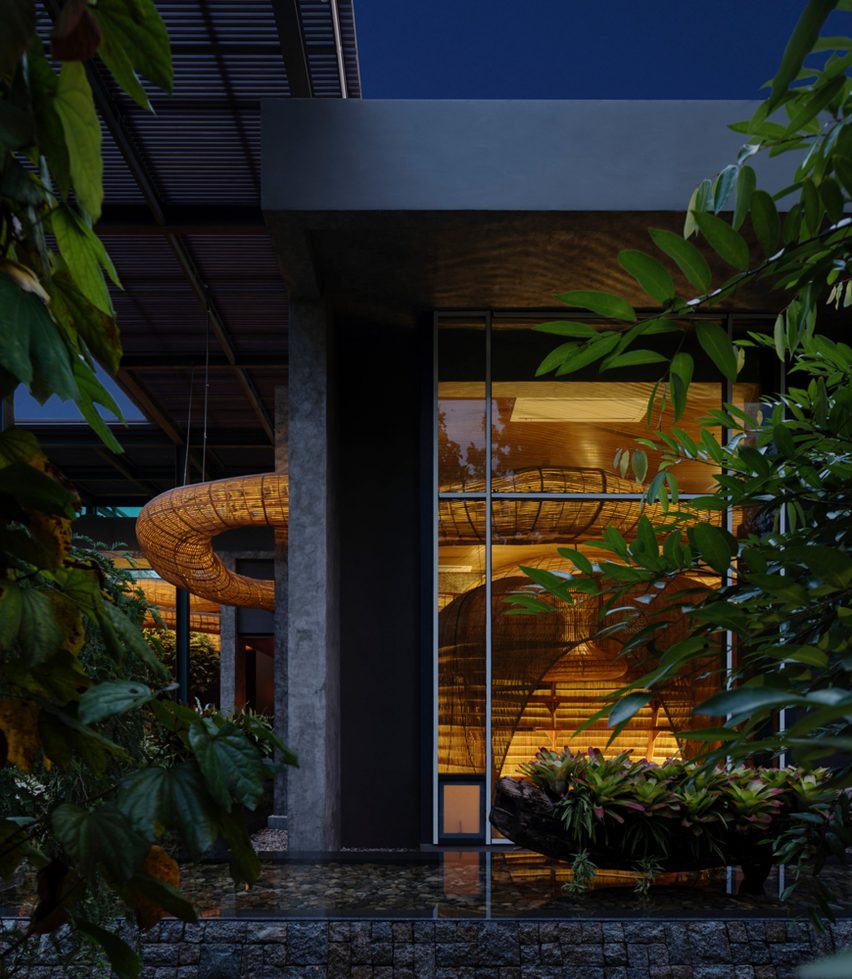
The rattan installation begins at the entrance and traces an overhead route through the building, seamlessly transitioning between inside and outside.

At several points, the suspended structure drops down to create bulbous open-sided pods, incorporating shelves for displaying artworks and objects.

Meandering rattan structure by Enter Projects Asia
The rattan structure weaves in and out of the building

The installation’s complex form was generated using generative design software and is intended to simulate the movement of clouds and steam.

Its shape seems to change constantly when viewed from different perspectives, adding visual dynamism to the interior.

Lighting integrated within the overhead structure creates a warm glow both during the day and night, while concealed lights illuminate the display areas.

The three rattan pods – measuring five, four and three-and-a-half metres in height respectively – were fabricated in a factory during the coronavirus lockdowns before being transported to the site and assembled.

Meandering rattan structure by Enter Projects Asia
Lighting was incorporated into the rattan shapes to create a warm glow

Enter Projects Asia regularly works with rattan palm, which is a naturally abundant resource in the region. Previously, the studio produced a similarly sculptural wickerwork installation for an office and factory building in Waregem, Belgium.

During the pandemic, the practice also launched an initiative called Project Rattan that focuses on creating bespoke rattan furniture and lighting using local craft skills.

Meandering rattan structure incorporated into outdoor landscaping by Enter Projects Asia
The rattan structure creates a cohesive scheme throughout the gallery

According to Keane, the fast-growing palm species are well suited to use in interior design, offering a sustainable alternative to conventional building materials.

“It is not hard to be sustainable in construction if we adapt to our environment,” he said. “Why would we use synthetic, toxic plastics when we have all the noble materials we need at our fingertips?”

Inside of a rattan pod with built-in shelving
The bulbous shapes were created with parametric design software

Keane founded Enter Projects in 2005 after completing his studies in Australia and the USA. Since relocating to Asia, the firm’s projects aim to combine a focus on innovation with a strong sustainable agenda.

Previously, a rattan studio the practice designed for yoga brand Vikasa was named leisure and wellness interior project of the year at the 2020 Dezeen Awards.

The photography is by William Barrington-Binns.


Reference

Biophilic design informs moss-covered installation at luxury bag store
CategoriesInterior Design

Biophilic design informs moss-covered installation at luxury bag store

Creative studio Spacemen looked to biophilic design principles to construct a tree-like installation covered in moss, which forms the centrepiece of a flagship outlet for luxury leather brand Braun Büffel in Malaysia.

Described by Shanghai-based Spacemen as a store that straddles an art gallery and a laboratory, the studio wanted to create an interior that would attract a younger audience and serve as “an abstract oasis” in Putrajaya’s IOI Mall.

Interior of bag store in Malaysia with marble cabinetry
Spacemen designed the store interior for bag brand Braun Büffel

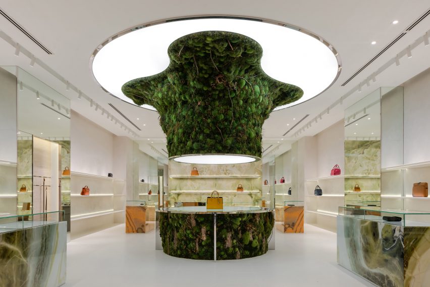
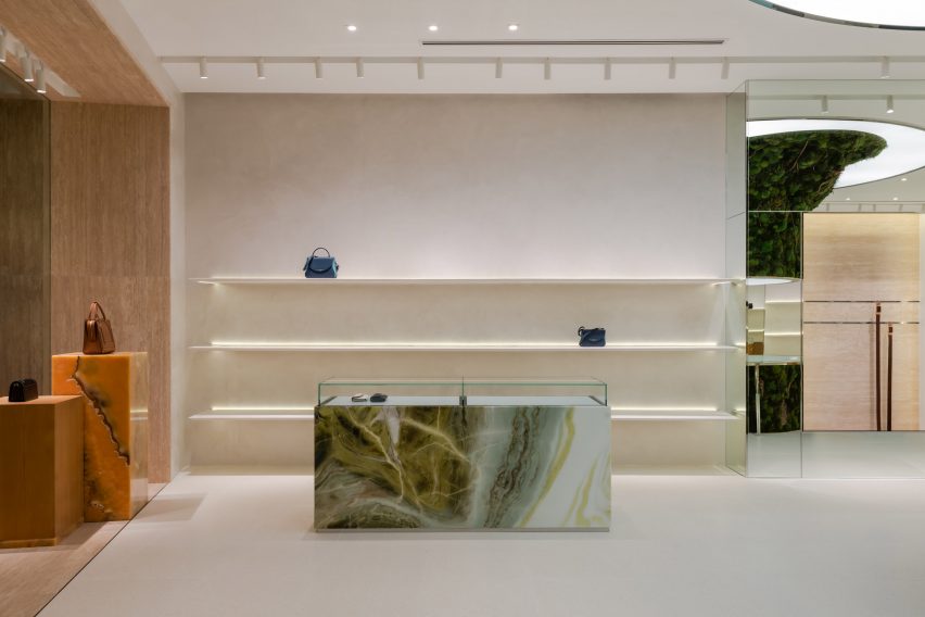
Central to this design is an oversized, organic-shaped sculpture clad in preserved flat moss, ball moss and lichen that is suspended from an illuminated disc in the middle of the shop.

A rounded table clad in the same plants was positioned directly below to complete the installation. It also doubles as a plinth for Braun Büffel leather bags, which are displayed sparsely across the store like museum artefacts.

Organic-shaped moss-covered installation that recalls a sprouting tree
It is characterised by a central moss-covered sculpture

The sculpture takes cues from biophilic design – a concept that encourages a closer connection between humans and nature when creating interior spaces.

“The form was designed to seem as though it is sprouting from the ground towards the ceiling – towards the sun – hence why we integrated the membrane lighting ceiling above it, just like how it would grow out of a beaker in a mad scientist’s lab towards natural light,” explained Spacemen founder Edward Tan.

“We envisioned an otherworldly concept akin to something out of a Hollywood sci-fi movie,” he told Dezeen.

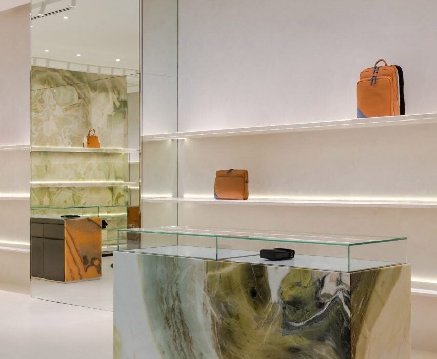
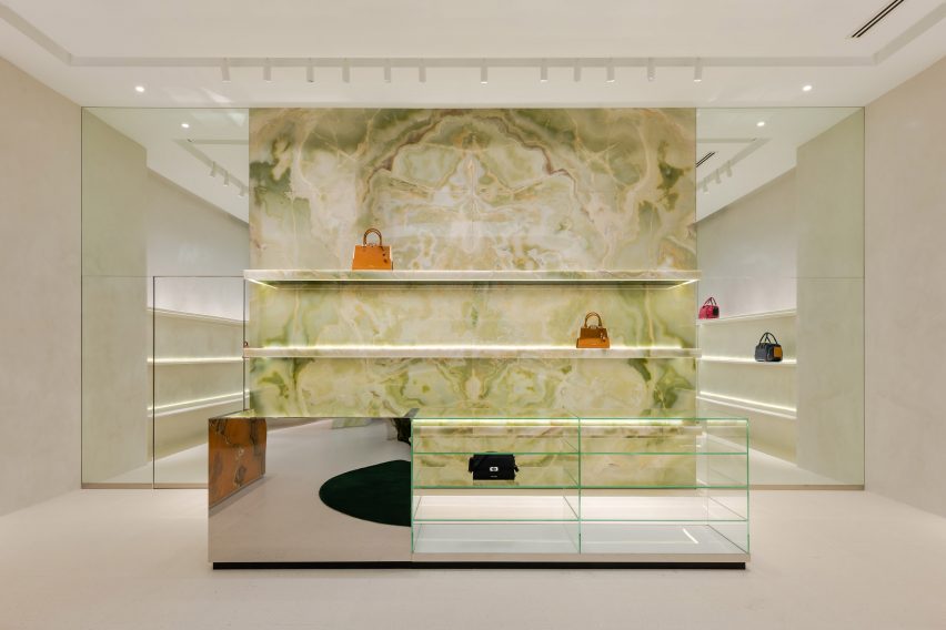
Green onyx feature wall with handbags displayed on its shelving
A green onyx feature wall was placed at the back of the store

Tan said that Spacemen adopted a “maximal minimalism” approach when creating the store interiors, in an attempt to challenge the neutral shapes and colours often associated with luxury.

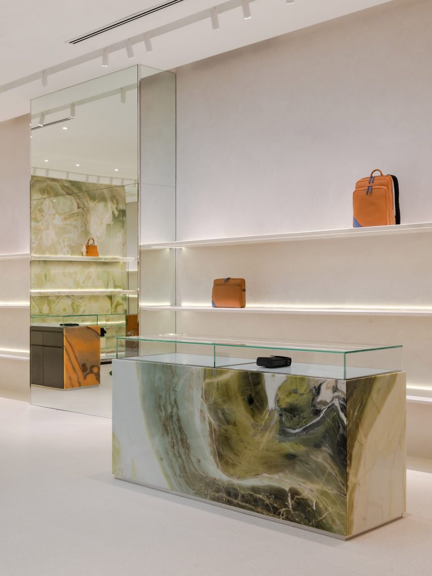
Throughout the shop, lime plaster walls and bright white terrazzo floors are interrupted by various ornate display units and shelves magnified by floor-to-ceiling mirrors.

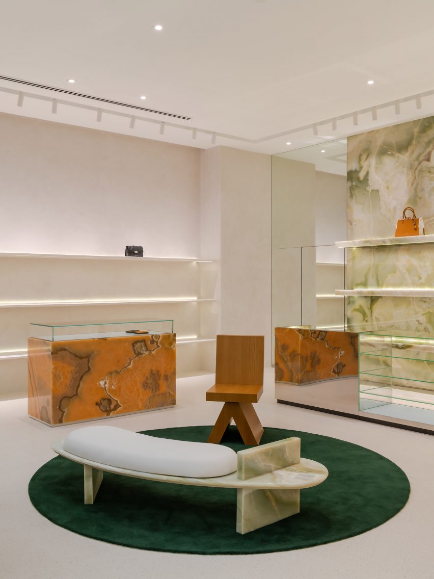
This cabinetry is made from decadent slabs of swirly orange onyx and jade marble, some of which are topped with glass vitrines that reveal small leather goods.

Spacemen placed a green onyx feature wall at the back of the store, which sits behind furniture including a bespoke curved bench created from the same material as well as a custom oak armchair.

Waiting area in store by Spacemen with bespoke furniture
Bespoke seating creates a waiting area for customers

Explaining the decision to incorporate biophilic design into the Braun Büffel outlet, Tan said, “I think with the pandemic, people have taken to appreciating nature a lot more than before.”

“This is especially true for people living in big cities where they live in apartments and are confined to office cubicles all the time, and do not have access to nature and greenery as much as they should.”

“Therefore it has become a new form of luxury to be able to afford lush greenery and gardens indoors,” he concluded.

Green and orange marble and onyx cabinetry within store interior by Spacemen
Green and orange hues add colourful accents to the space

Other retailers featuring similar designs include a store in Seattle for beauty brand Glossier with a mossy mushroom-covered mound and a Celine boutique in Paris that is characterised by large expanses of brass and marble.

The photography is by David Yeow Photography.


Project credits:

Interior design: Spacemen
Moss artist: Ohsum Mossum

Reference