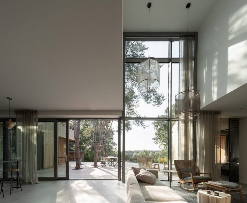
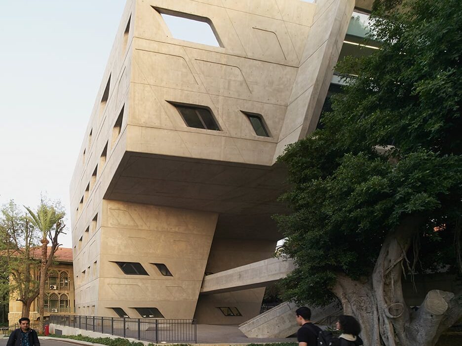
Eight airy terraces and balconies that become extensions of the interior
CategoriesInterior Design

Eight airy terraces and balconies that become extensions of the interior

From a plant-enclosed terrace in Mexico to a large rooftop garden set beneath a metal pergola in Tokyo, Dezeen’s latest lookbook highlights eight interiors with impressive balconies and terraces.

Each of these balconies and terraces is accessed via glazed walls or floor-to-ceiling glass and provides their homes with not only a physical but also a visual extension of the interior that merges the in- and outdoors.

This is the latest in our lookbooks series, which provides visual inspiration from Dezeen’s archive. For more inspiration see previous lookbooks featuring cave-like interiors, gallery interiors, and garden swimming pools.

Terrace With a House by the Lake by UGO
Photo is by Alex Shoots Buildings

Terrace With a House by the Lake, Poland, by UGO

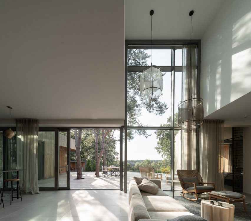
This summer holiday home was created by Poznań architecture studio UGO and is located near a lake in Wielkopolska, Poland.

From the home’s main living area, a large 120-metre-long wooden terrace is accessed via expanses of floor-to-ceiling glass sliding doors and double-height glazed walls. The studio described the terrace as an additional room for the home.

Find out more about Terrace With a House by the Lake ›

House in Xalap by Lopez Gonzalez
Photo is by César Béjar

House in Xalap, Mexico, by Lopez Gonzalez

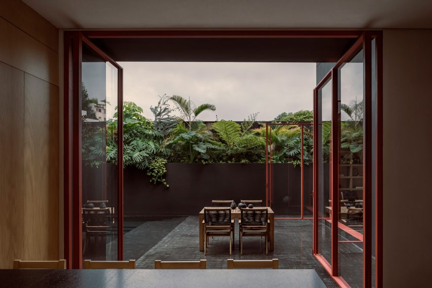
House in Xalap is a 528-square-metre residence that was built on a slight slope. The exterior of the home was rendered in cement which was painted black to mimic the look of a rock formation.

From a dining area, which was clad in black marble and wooden panels, maroon-framed glass doors lead out to a volcanic stone-tiled patio that is walled by lush and tropical planting and geometric sculptures.

Find out more about House in Xalap ›

Exterior of Espirit House in Tokyo by Apollo Architects & Associates
Photo is by Masao Nishikawa

Espirit House, Japan, Apollo Architects & Associates

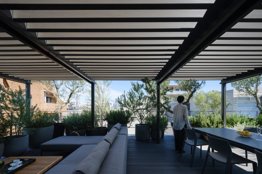
A large roof terrace tops Espirit House in Tokyo, which was designed by Apollo Architects & Associates. The terrace is covered by a metal pergola that transforms the open-air space into an additional room of the home.

The terrace is accessed on the third floor of the home from behind a fully glazed wall. A sectional sofa, dining table and large planters filled with local shrubbery decorate the terrace.

Find out more about Espirit House ›
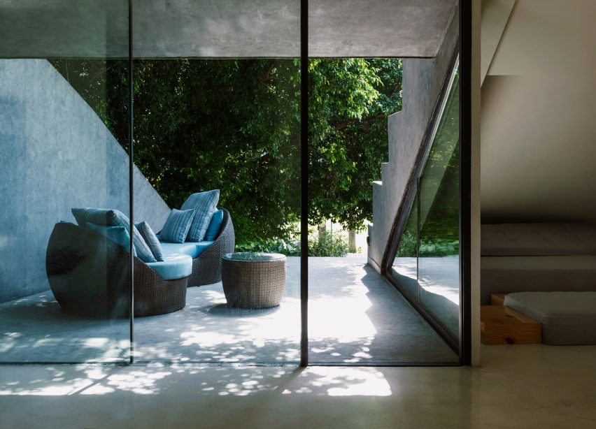

Photo of Villa KD45 by Studio Symbiosis
Photo is by Niveditaa Gupta

Villa KD45, India, by Studio Symbiosis

This concrete home in Dehli was designed by Studio Symbiosis for a large family of eight. As a result of thinly framed floor-to-ceiling windows and the home’s exterior concrete floors carrying through to the interior, the boundaries of the indoors and outdoors are blurred.

Studio Symbiosis also nestled small terraces between both of the home’s floors. Decorative seating provides residents with relaxing outdoor areas that are shaded from the Indian sun.

Find out more about Villa KD45 ›

Interior of Rescobie Pavilion by Kris Grant Architect
Photo is by Dapple Photography

Rescobie Pavilion, Scotland, by Kris Grant Architect

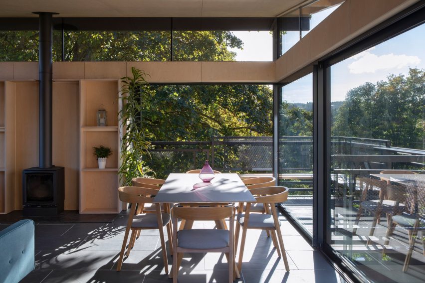
A cantilevered balcony wraps around the exterior of the two-storey Rescobie Pavilion in rural Scotland. The structure was created as a free-standing extension of a nearby home so that its residents could immerse themselves in the landscape.

The structure was topped with a mono-pitched roof that orients the interior to the landscape, and is enveloped in expanses of glass that provide the pavilion with unobstructed panoramic views of the hamlet.

Find out more about Rescobie Pavilion ›

835 Hightstreet by Carr
Photo is by Rory Gardiner

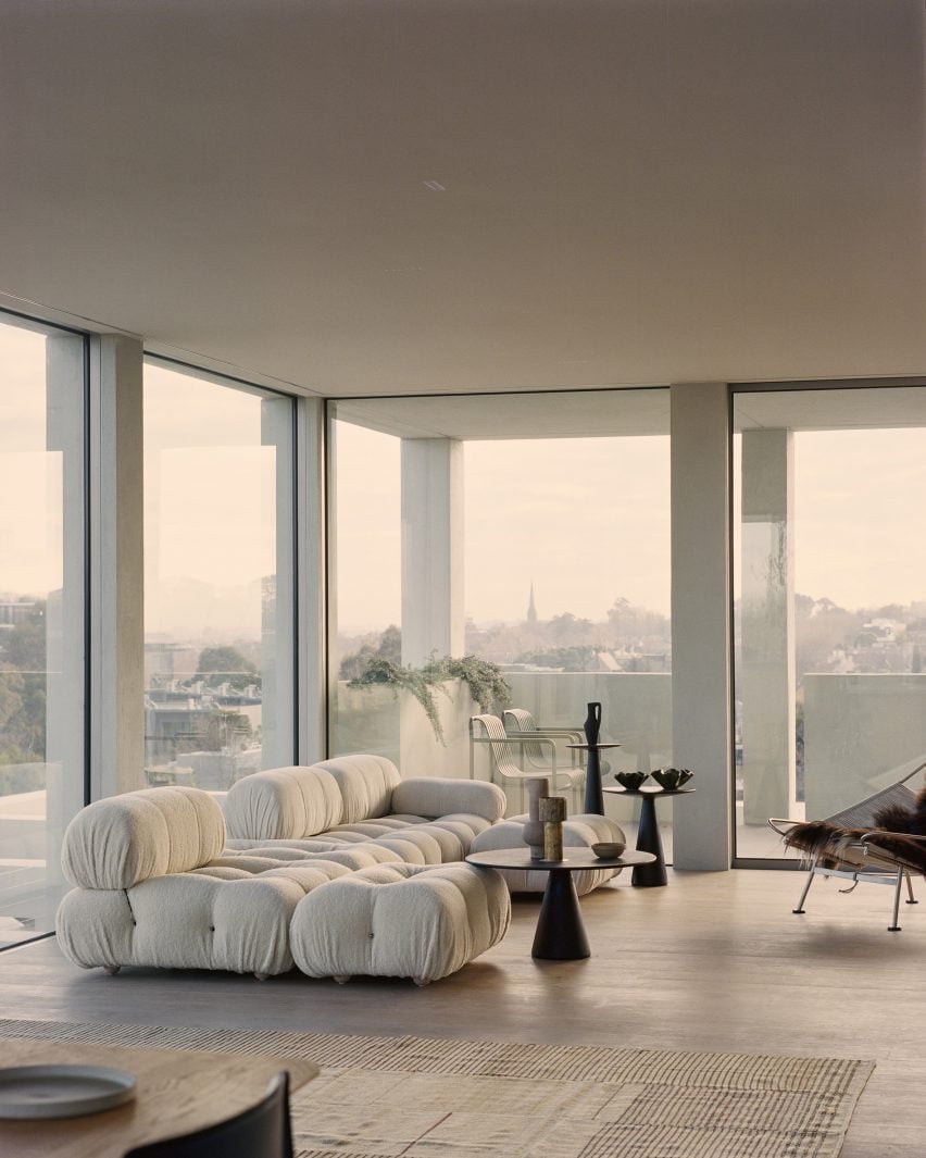
835 High Street, Australia, by Carr

At 835 High Street, a residential apartment block in Melbourne, Australian architecture studio Carr looked to play with feelings of openness within the interior.

It added large wrap-around floor-to-ceiling windows that lead out to covered balconies, which aim to complement and juxtapose the relationship between the interior and exterior. The interiors feature a paired-back scheme and were decorated with designer furniture, including a Mario Bellini Camaleonda sofa.

Find out more about 835 High Street ›

Moenda House by Felipe Rodrigues arquiteto
Photo is by Pedro Vannucchi

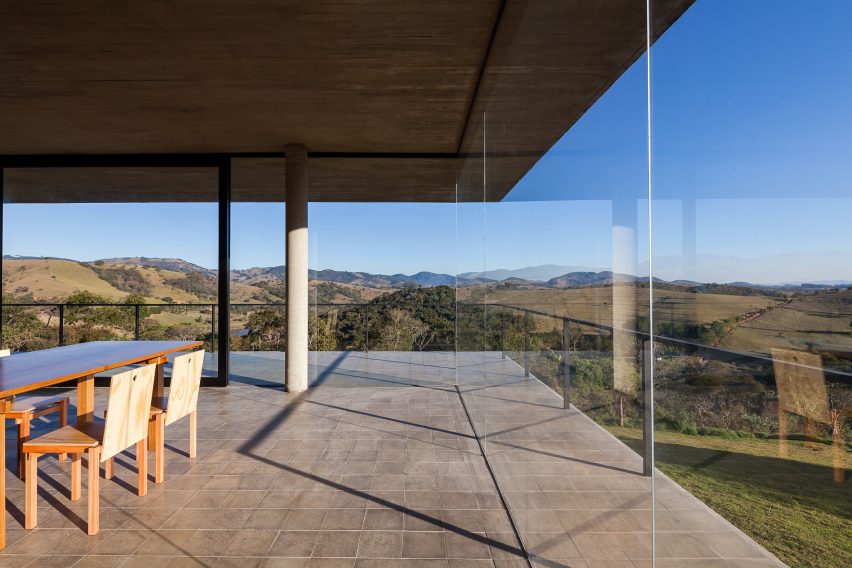
Moenda House, Brazil, by Felipe Rodrigues

This split-level home in southeastern Brazil was designed by Brazilian architect Felipe Rodrigues and has undisrupted views of the Mantiqueria mountains.

The ground floor of the home contains shared living spaces, which have an open-plan design. The open-plan kitchen, living and dining room are surrounded by a cantilevered wrap-around balcony that is covered in grey tiles similar to those used throughout the interior.

Find out more about Moenda House ›

Ying'nFlo Hong Kong by Linehouse
Photo is by Jonathan Leijonhufvud

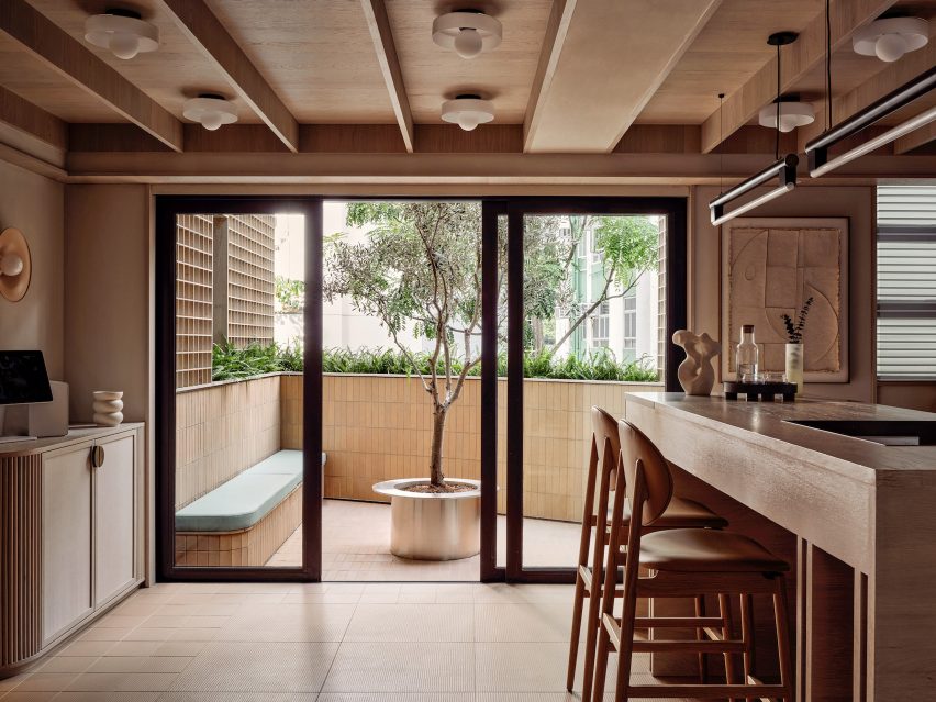
Ying’nFlo, Hong Kong, by Linehouse

An angular balcony protrudes from the interior of the Ying’nFlo guesthouse in Wan Chai, Hong Kong. The guesthouse was designed by Chinese interior design studio Linehouse, which looked to create the feeling of an inviting home.

One of the rooms at the guesthouse features a neutral palette and incorporates hand-rendered walls, timber panelling and linen cabinetry. From here, glass sliding doors lead out to a beige tiled balcony that was fitted with a built-in bench and an olive tree at its centre.

Find out more about Ying’nFlo ›

This is the latest in our lookbooks series, which provides visual inspiration from Dezeen’s archive. For more inspiration see previous lookbooks featuring cave-like interiors, gallery interiors, and garden swimming pools.

Reference

Five highlights from Zaha’s Moonsoon: An Interior in Japan
CategoriesInterior Design

Five highlights from Zaha’s Moonsoon: An Interior in Japan

The Zaha Hadid Foundation has opened an exhibition about Zaha Hadid’s Moonsoon restaurant in Sapporo, Japan. Here, exhibitions officer and curator Johan Deurell selects five highlights from the show.

Zaha’s Moonsoon: An Interior in Japan is a case study of architect Hadid’s first built project outside of the UK – the Moonsoon Bar and Restaurant in Sapporo, Japan, which was constructed in 1989.

The exhibition offers a journey from the conception of the venue  – conveyed through a series of archival models, presentation documents and sketches – through to its built form, presented through images and one-to-one recommissioned furniture from the bar’s interior.

“Our latest exhibition showcases the creative processes behind one of Zaha Hadid’s earliest and less well-known projects,” said Zaha Hadid Foundation director Paul Greenhalgh. “Moonsoon was created at the time of the incredible explosion of the Japanese economy, and the design boom that accompanied it.”

“Japan provided opportunities for emerging architects to work on experimental projects. For the foundation, it is a chance for us to dive deep into the archives and highlight works rarely seen before.”

Monsoon’s design referenced some of the early 20th-century avant-grade movements that emerged out of Russia, such as the works of Russian abstract artist Kazimir Malevich.

Angular, twisting and geometric shapes were translated into functional architectural volumes and layers. Additional design references include the works of sculptor Alexander Calder, French liquor commercials from the 1950s and imagery of orange peel and pasta.

Zaha’s Moonsoon: An Interior in Japan takes place at the Zaha Hadid Foundation headquarters in Clerkenwell, London, which functioned as Hadid’s headquarters from 1985 until her death in 2016.

Read on for Deurell‘s five highlights:


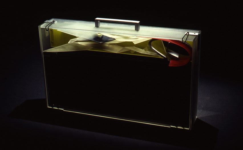
Photo of a presentation briefcase at Zaha's Moonsoon: An Interior in Japan

Presentation case, acrylic and aluminium by Zaha Hadid Architects, 1989-90

“The idea of our exhibition came about with the discovery of a Perspex briefcase in the archive. This briefcase was made by Daniel Chadwick as a container for the Moonsoon design concept.

“It carried elements of model as well as 14 paintings, six perspective drawings and 13 collages shown in this exhibition. The case would be taken to the clients as a form of presentation strategy, where the works on paper would be laid out and the model assembled.”


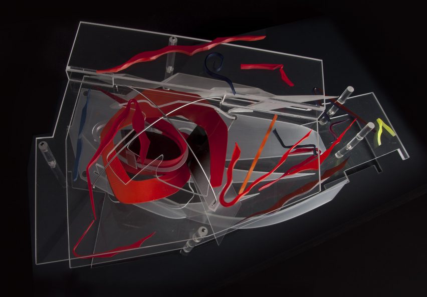
Photo of a model at Zaha's Moonsoon: An Interior in Japan

Presentation model, acrylic by Zaha Hadid Architects, 1989-90

“This model, made by Daniel Chadwick, was created to illustrate a concept, rather than as a replica of the restaurant’s final form. Here an ‘orange peel’ shape swirls through the two floors, and the colourful shards represent the furniture and interior elements. At the time it was made, the interior and furniture designs had yet to be finalised.

“Zaha Hadid Architects embraced the transparency of acrylic to make the relationship between interior and spatial elements in the model easier to view. In the future, digital models would provide the transparent layering effects that Hadid sought to achieve through the early use of acrylic.”


Painting on show at Zaha's Moonsoon: An Interior in Japan

Interior concepts, acrylic paint on black cartridge paper by Zaha Hadid Architects, 1989-90

“This painting belongs to a suite of 14 paintings originally stored in the Perspex briefcase. Moonsoon’s concept was partially inspired by fire (for the first-floor bar) and ice (for the ground-floor restaurant), which is illustrated through the reds and blues in this painting. A swirling ‘orange peel’ shape represents the central furnace penetrating through the two floors, whereas splintered ‘ice shards’ symbolise tables.

“Zaha Hadid Architects used paintings to explore concepts that could not be shown through conventional perspective drawings. Various team members contributed to the paintings. The works were derived from sketches, which had been transferred to tracing paper and then onto cartridge paper, and subsequently coloured in, often by Hadid herself. Their warped shapes and layering anticipated the possibilities later offered by CAD software.”


Zaha’s Moonsoon, by Marwan Kaabour, 2023

“Not everything in the show came from that briefcase. There were boxes upon boxes of archival material too. During the research phase, colleagues at Zaha Hadid Architects told me: ‘go find the little doodle’. That turned out to be a sheet of Arabic letterforms spelling out Zaha and Moonsoon, and the recurring swirly shape, which you see in the model and paintings.

“With some help from Marwan Kaabour, who designed the graphic identity for the exhibition, I learnt that the swirl is a stylised version of the letter H in Zaha. Marwan has done some amazing work for Phaidon and V&A before and runs the Instagram account Takweer on queer narratives in the SWANA region. I asked him to make a video based upon the archival material we had found.

“This snippet is taken from that video. It charts the development of Moonsoon’s ‘orange peel’ structure, from the brief to its final built form. Beginning with sketches of the words مونسون [Moonsoon] and زها [Zaha] based on Arabic letterforms, through references to orange peel, pasta, and the works of Alexander Calder, it concludes with their eventual translation into the technical drawings informing the construction, as well as images of the construction and built.”


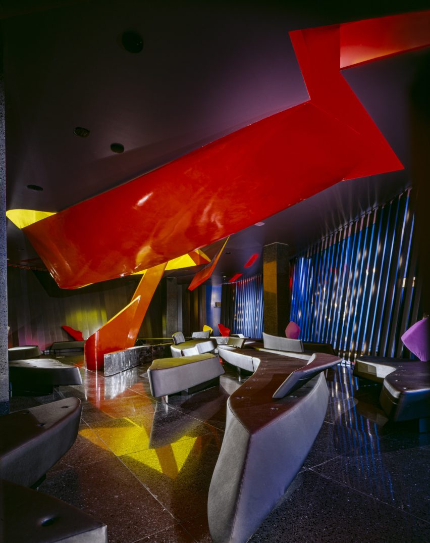
Interior photo of the restaurant
Photo by Paul Warchol

Sofa and tray table by Zaha Hadid Architects, 1989-90 (remade in 2014)

“Finally, the exhibition includes a boomerang-shaped sofa from the bar. The furniture for Moonsoon employed intersecting curves and diagonal planes to create an interior landscape. Designed by Michael Wolfson, the differently sized sofas have interchangeable plug-in backrests and tray tables, which came in different colours and finishes.

“Waiters could set the tables on their stands when delivering the drinks to guests. I am not sure how well this waiting method worked in practice, but it is interesting to think about this furniture as part of a design historical tradition of flexible seating landscapes. We know that Zaha was a fan of Verner Panton’s work, for example.”

Zaha’s Moonsoon: An Interior in Japan is on show at the Zaha Hadid Foundation in London from 20 April until 22 July 2023. See Dezeen Events Guide for an up-to-date list of architecture and design events taking place around the world.


Reference

Six interior designers style rooms at L’Appartamento in Milan
CategoriesInterior Design

Six interior designers style rooms at L’Appartamento in Milan

Six interior design studios, including Kingston Lafferty Design and T.ZED Architects, have overhauled a room at the 1930s L’Appartamento for commerce platform Artemest at Milan design week.

The designers each used furniture, lighting and art from the brands, designers and artists represented on the Artemest platform to showcase their own style in a room at the apartment in Milan’s 5Vie district for the L’Appartamento exhibition.

“We wanted to bring this stunning apartment back to life and show how different interior design studios, each with its own style and design approach, can work with Artemest to create inspiring and surprising interiors that celebrate authentic Italian beauty,” said Artemest founder Ippolita Rostagno.

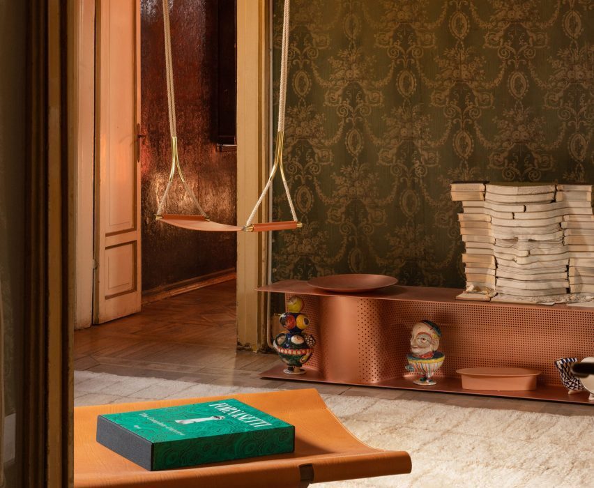
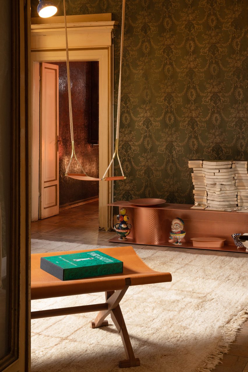
Entryway at Artemest’s L'Appartamento in Milan by Dubai-based studio T.ZED Architects
T.ZED Architects designed the entrance space at Artemest’s L’Appartamento

In the entryway, Dubai-based studio T.ZED Architects aimed “to set the tone for what is yet to come” by preserving the character of the room and adding selected pieces.

The studio choose a mix of furniture in off-white, cream and brown, including copper and leather finishes that plays off the green tones of the richly patterned, period wallpaper.

Mirrors – including a Sybilla mirror with console by Ettore Sottsass for Glas Italia, and an Itaca floor mirror by Atlasproject – were placed to illuminate and enlarge the space, while amplifying the period details.
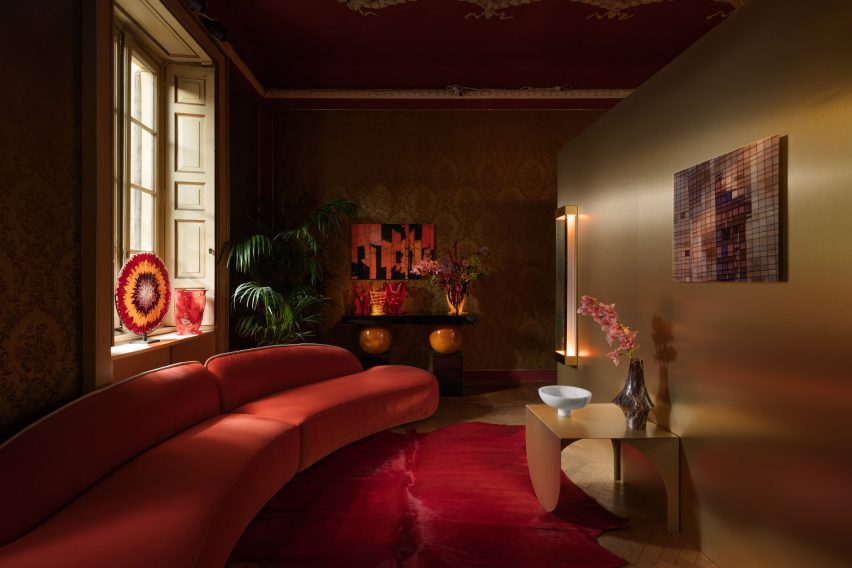
Living room at Artemest's L'Appartamento in Milan by Kingston Lafferty Design
Kingston Lafferty Design placed a golden block in the living room

In the adjoining room, Dublin-based studio Kingston Lafferty Design aimed to “challenge visitors’ sense of what a living room should be” by placing a sculptural monolithic block seems to glow with a soft golden sheen in the centre of the space.

The block splits the room into two distinct spaces and contains a mirrored space described by the studio as “a gallery of lights”.

Golden block in living room
The golden block divides the space into two

On one side of the block is an informal living room that evokes a sense of playfulness through the use of oversized furniture in bright colours, including the Osaka Blue Sofa by Pierre Paulin for La Cividina.

The other side has a rich palette of jewel-tones to creates a more decadent atmosphere.

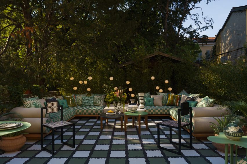
Terrace at Milanese villa
Moniomi aimed to create a room on the terrace

Leading from the living room a large terrace was reworked by Miami-based studio Moniomi, which aimed to create an outside room that felt like an interior space.

The studio used a combination of large-scale upholstered pieces, gridline patterns and graphic blacks and whites, softened by lush greens to reference the outdoor location.

The design language here features saturated colours and layered patterns – including the Nuovola 01 dining table by Mario Cucinella for Officine Tamborrino, which represent the studio’s Hispanic roots.
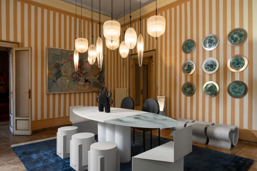
Dining space in Milanese apartment
Nina Magon designed the apartment’s dining space

Another US-based designer, Nina Magon, created the L’Appartamento dining room, playing with monochromatic hues to enhance the authenticity of the original finishes here.
Sculptural furniture, such as the Trompe-l’oeil Trois dining table by DelMondo Studio, topped with a cluster of Flow[t] pendant lamps by Nao Tamura for WonderGlass was added to the space.

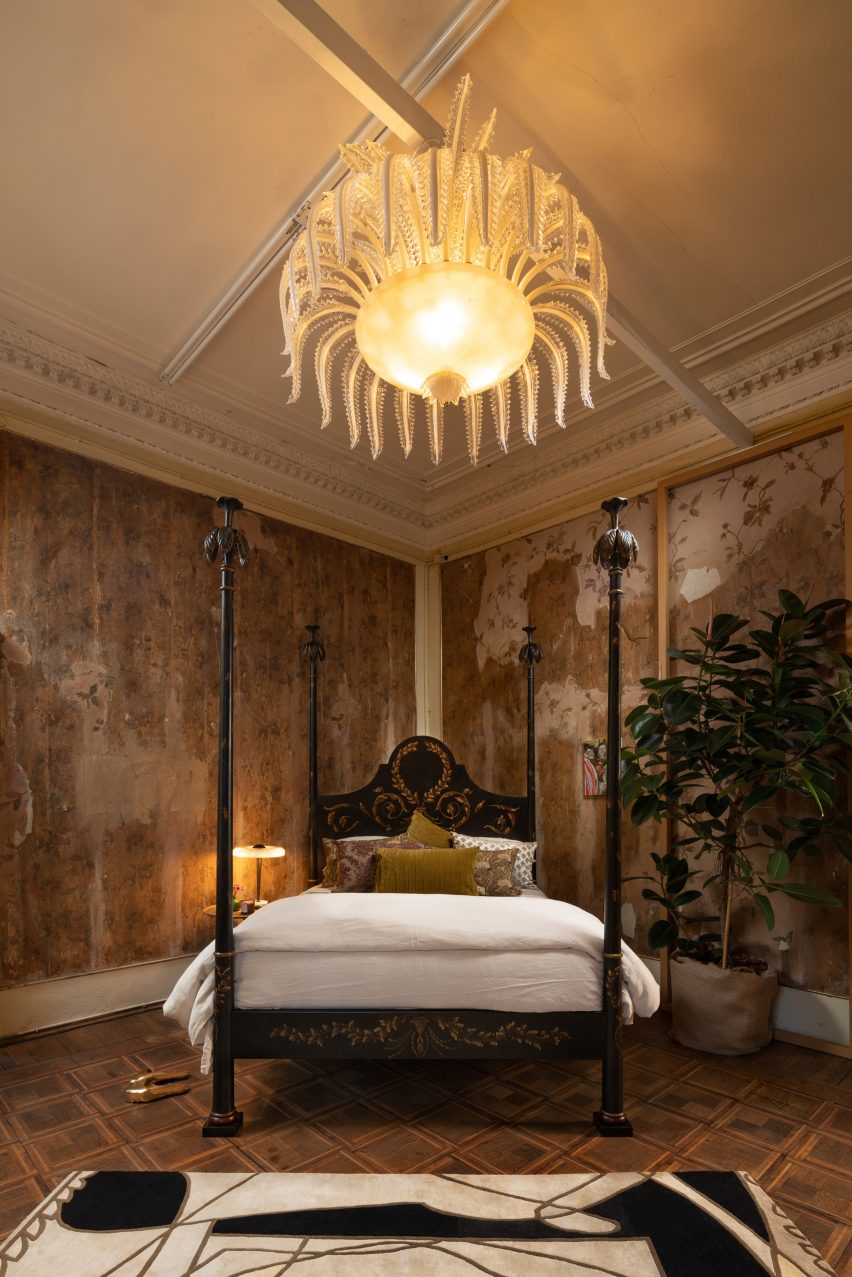
Bedroom designed by Styled Habitat
The bedroom was designed by Styled Habitat

In the bedroom, Dubai-based studio, Styled Habitat, delved into the history of the 1930s to translate the romance of that era into the modern day and evoke a sense of timeless glamour.

To capture the experimental and avant-garde trends of European modernism, Styled Habitat juxtaposed new and old, with a Czech Chair by Hermann Czech for Gebrüder Thonet Vienna, alongside pieces like the Calle Pinzi Murano Glass Chandelier by Luci Italia.

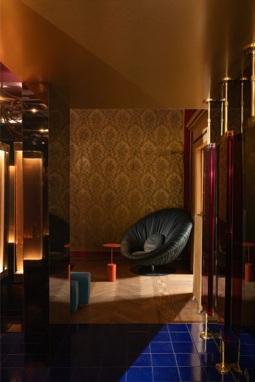
Finally, for L’Appartamento’s hallway and the studio, Paris-based interior designer Anne-Sophie Pailleret was informed by her first reaction to seeing the apartment.

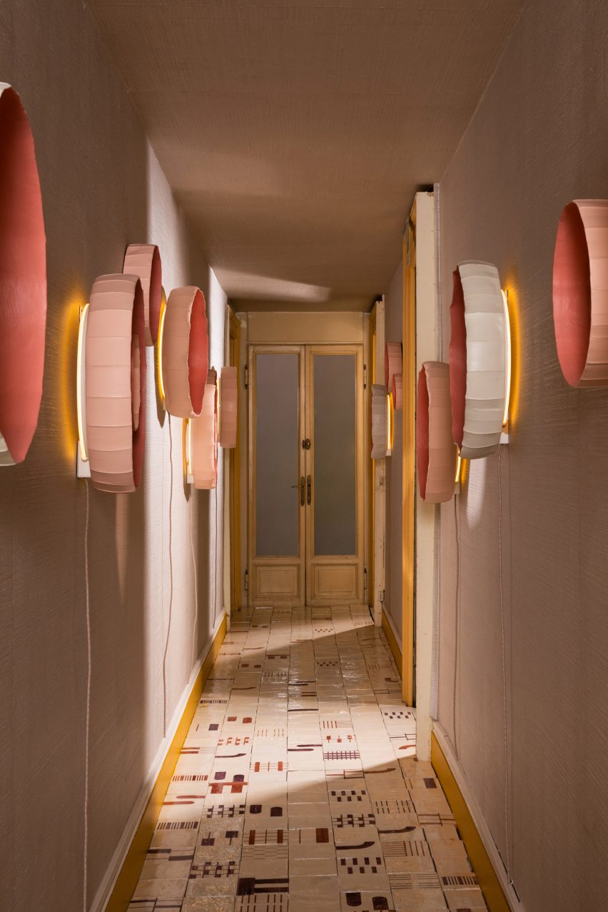
The long, narrow hall, has been covered with the textural Tra 1100 Wallpaper hand-crafted by La Scala Milano Wallcovering, contrasting with geometric Alfabeto Tiles by Margherita Rui for Ninefifty, on the floor.

Corridor by Anne-Sophie Pailleret
Anne-Sophie Pailleret styled the corridor

The walls are further decorated with Ninfea wall lamps by Giovanni Botticelli in collaboration with Paola Paronetto, functioning as a gallery-style grouping of lights.

For the studio room, Pailleret created a mix of warm colours and graphic patterns, with comfortable and curvaceous furniture.

The photography is courtesy of Artemest.

L’Appartamento takes place from 17 to 23 April 2023 at Via Cesare Correnti 14, 20123 Milan, Italy. See our Milan design week 2023 guide on Dezeen Events Guide for information about the many other exhibitions, installations and talks taking place throughout the week.

Reference

Ten Tokyo apartments with minimalist interior designs
CategoriesInterior Design

Ten Tokyo apartments with minimalist interior designs

Cleverly concealed kitchens and subtle wooden accents feature in our latest lookbook, which collects Tokyo apartments characterised by minimalist and serene interiors.

These apartments in Japan’s capital are united by their muted colours and an abundance of wood – elements often associated with traditional Japanese interior design.

As one of the world’s most densely populated cities, Tokyo homes often feature smaller floor plans or less natural light than those located in more spacious cities.

Architects and designers have created plenty of understated solutions to these restrictions, such as inserting space-saving storage into open-plan living areas.

From a flat informed by traditional Kyoto townhouses to an Airbnb dressed in subtle geometric furniture, here are 10 Tokyo apartments with minimalist interior designs.

This is the latest in our lookbooks series, which provides visual inspiration from Dezeen’s archive. For more inspiration see previous lookbooks featuring concrete bathrooms, cosy cabins and homes with elevators.


Norm Architects and Keiji Ashizawa's minimalist interior design
Image is courtesy of Norm Architects and Keiji Ashizawa Design

Kinuta Terrace by Norm Architects and Keiji Ashizawa Design

Two apartments within Tokyo’s 1980s-designed Kinuta Terrace apartment block were renovated by Norm Architects and Keiji Ashizawa Design to include more natural light.

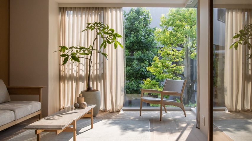
The studios reconfigured the floor plans to form fewer but larger living spaces, which are characterised by smooth concrete, timber fixtures and sheer sandy-hued curtains.

“Nature feels integrated into the apartment from most rooms so that, when looking out into the courtyard, you can’t quite tell you’re in a city as immense as Tokyo,” said Norm Architects designer Frederik Werner.

Find out more about these Kinuta Terrace apartments ›


Minorpoet applies traditional Japanese design to a renovated apartment in Tokyo
Photo is by Satoshi Shigeta

Apartment in Kitasando by Minorpoet

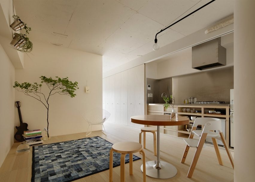
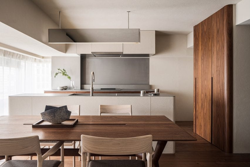
This 1960s apartment contains a sleek kitchen counter and storage space concealed behind folding doors informed by traditional Japanese screens known as Byōbu.

Design studio Minorpoet took cues from traditional Kyoto townhouses for the project, which features a hidden kitchen that cannot be seen from the living room.

Minimalist furniture and finishes match the pared-back theme, including iconic Finnish architect Alvar Aalto’s stackable wooden 60 stool.

Find out more about Apartment in Kitasando ›


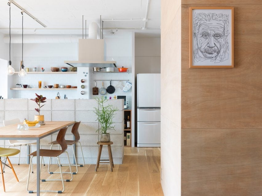
Shibuya Apartment 201,202 by OgawaArchitects
Photo is by Kaku Ohtaki

Airbnb apartments by Hiroyuki Ogawa Architects

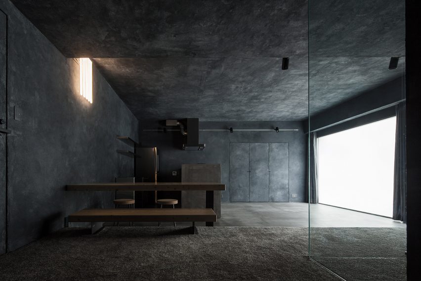
Local studio Hiroyuki Ogawa Architects renovated two Airbnb apartments in Tokyo’s Shibuya ward with completely contrasting designs. One has floors and walls clad in light wood (main image), while the other pairs a plush grey carpet with dark plasterwork.

Neon lighting in the latter apartment was chosen to remind guests of the bustling city while cork stools, metallic kitchen cabinetry and charcoal-toned accents create a moody atmosphere.

Find out more about these Airbnb apartments ›


The Life concept apartment by I IN
Photo is by Tomooki Kengaku

The Life concept apartment by I IN

The Life concept apartment is an understated residence set within a 1980s building by Tokyo design firm I IN. According to the studio, the project was created to encourage people to rethink renovated apartments in Japan, rather than favour newbuilds.

An open-plan living space contains a kitchen, living room and bedroom characterised by reeded glass partitions, stucco walls and luxurious red walnut joinery.

Find out more about The Life concept apartment ›


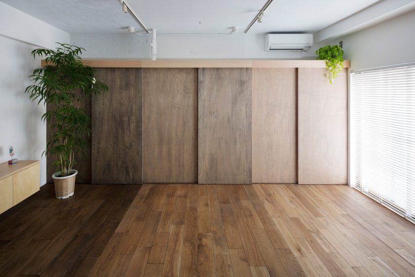
Apartment by FrontOfficeTokyo
Photo is by Toshiyuki Yano

Akasaka apartment by FrontOfficeTokyo

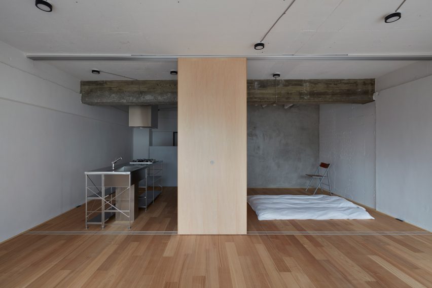
Almost all of the walls within this 50-square-metre flat were replaced with multi-functional box units and sliding partitions to make the space feel bigger and brighter.

Local studio FrontOfficeTokyo stripped the apartment down to a single room, which features designated zones to lounge, cook, eat and sleep.

Raw and simple materials emphasise the utilitarian interior design, including exposed ceilings, pale timber floors and a corner bathroom contained in a concrete box.

Find out more about this apartment ›


Tokyo apartment by Snark Architectures
Image is courtesy of Snark Architectures

House in Chofu by Snark Architectures

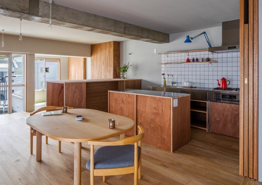
Snark Architectures renovated an apartment in Chofu – a city to the west of downtown Tokyo. Located at the base of Mount Takao, the dwelling intends to mirror traditional cabins.

With an open-plan layout that references mountain huts, House in Chofu is characterised by lauan plywood cabinetry and floor-to-ceiling glazing that offers views of the surrounding scenery.

“The house is the base camp connecting mountains and cities,” Snark Architectures director Yu Yamada told Dezeen.

Find out more about House in Chofu ›


Tokyo apartment by G Studio Architects
Image is courtesy of G Studio

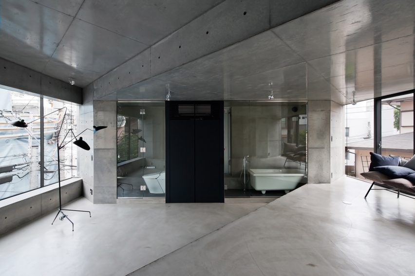
Tokyo Loft by G Studio Architects

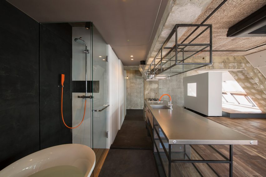
Located on one of the top floors of a 1980s housing block, Tokyo Loft is short-term accommodation that intends to balance home comforts with industrial finishes.

G Studio worked with architects Teruya Kido and Suma-Saga-Fudosan to complete the interior look, which includes original sloping concrete walls that were illustrated with splashes of white paint in a nod to traditional Japanese washi paper.

Rows of skylights were added to the walls to flood the apartment with natural light, while bright orange electrical wires and plumbing features were left exposed. A freestanding bathtub adds a playful touch to the main living space.

Find out more about Tokyo Loft ›


J House by Domino Architects
Photo is by Domino Architects

J House by Domino Architects

Wooden panelling creates “corners, blind spots and niches” in J House – a pared-back apartment renovated to maximise restricted floor space for a growing family.

Japanese studio Domino Architects used low-cost exposed plywood for its simplicity, while rough concrete in the kitchen adds to the dwelling’s minimalist interior design.

Find out more about J House ›


Motoazabu Apartment sYms
Photo is by Shigeo Ogawa

Motoazabu Apartment sYms by Kiyonobu Nakagame Architect & Associates 

Diagonally stepped floors and ceilings create a dynamic layout of triangular zones within a pair of apartments in Tokyo’s Motoazabu neighbourhood.

Smooth, understated concrete defines the central interior spaces, which are surrounded by kitchen worktops and glazed bathrooms.

“What we aimed to do with this structure was to create something that would blend with its surroundings and maintain absolute simplicity,” explained architect Kiyonubu Nakagame.

Find out more about Motoazabu Apartment sYms ›


Opera apartment
Image is courtesy of Taka Shinomoto and Voar Design Haus

Opera Apartment by Taka Shinomoto and Voar Design Haus

A material and colour palette influenced by the different shades of an Opera cake – a famed French dessert – informed the “layered” coffee-hued interiors in this apartment.

The hallway features sliding geometric cupboard doors stained in various shades of brown while a mixture of glossy, matte and textured coatings cover the white walls.

Find out more about Opera Apartment ›

This is the latest in our lookbooks series, which provides visual inspiration from Dezeen’s archive. For more inspiration see previous lookbooks featuring concrete bathrooms, cosy cabins and homes with cleverly designed lifts.

Reference

Demountable electric-blue grid engulfs On-Off store interior in Milan
CategoriesInterior Design

Demountable electric-blue grid engulfs On-Off store interior in Milan

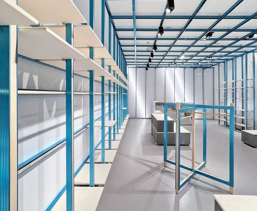
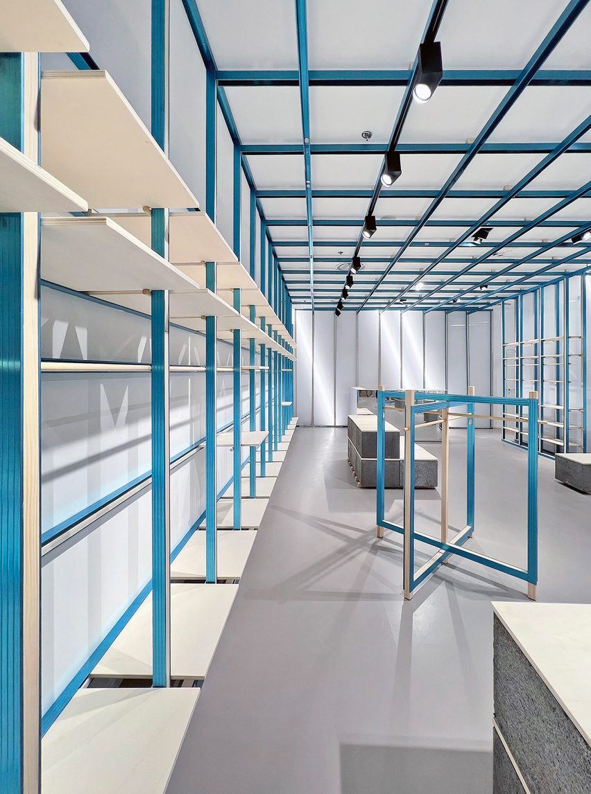
Italian architect Francesca Perani has teamed up with design studio Bloomscape to create a reversible fit-out for this clothing store in Milan, which is dominated by a flexible gridded shelving system.

Perani and Bloomscape installed the grid with its moveable shelves as a way to let the On-Off store effortlessly change its display arrangements.

Shelving system in Milan store by Francesca Perani and Bloomscape
A gridded blue framework covers the entire interior of Milan’s On-Off store

It was also a matter of making the store reversible, meaning that the fit-out could be easily dismantled should the retailer move on to a different site, saving waste and leaving behind a clean slate for the next occupier.

“Too often, the world of retail is still insensitive to sustainability; its lifecycle, however, is too short to continue being ignored,” explained Bloomscape co-founder Rosario Distaso.

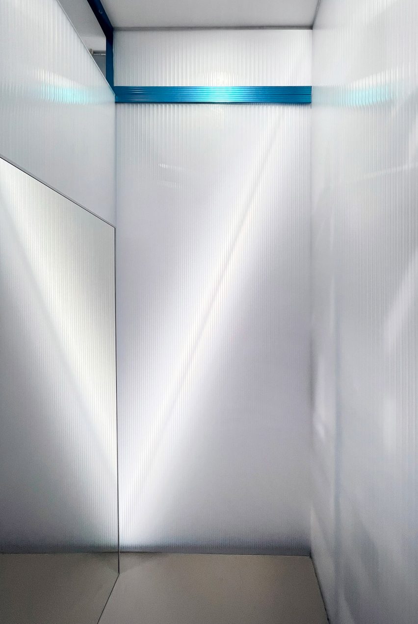
Polycarbonate walls in ON-OFF store in Milan
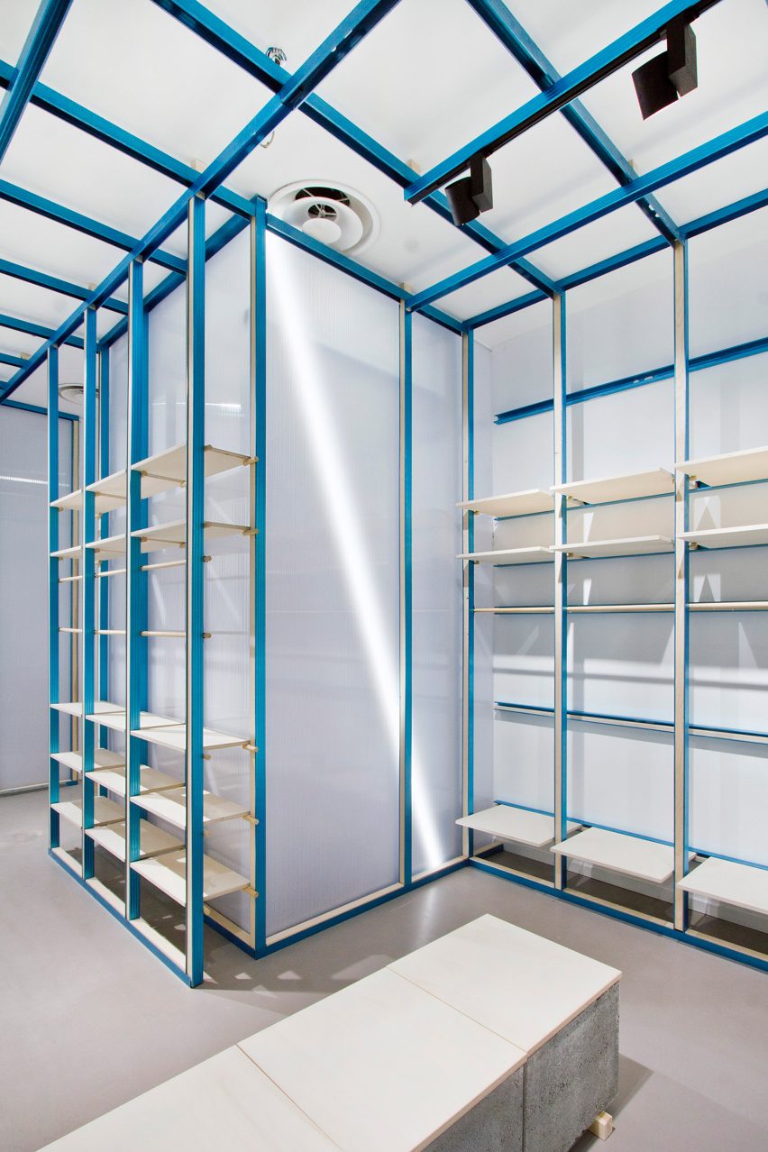
Concrete chimney blocks form display plinths and benches

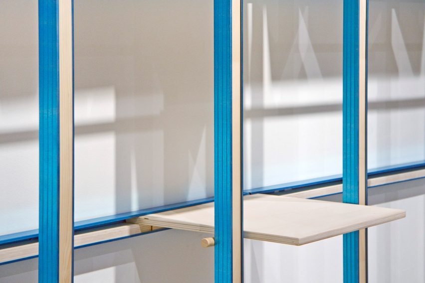
The gridded framework comprises beams of poplar wood surrounded by metal frames that were anodised to produce a vivid electric-blue colour.

The system runs along the walls and across the store’s ceiling, allowing On-Off to hang wayfinding signage.

Wood and metal shelving in Milan store by Francesca Perani and Bloomscape
Shelves can be moved around in the framework to create different displays

All of the shelves can be pulled out or slotted in at different points of the framework.

A fixed wooden clothes rail runs between two of the columns, allowing the hung garments to appear almost as part of the store’s architecture.

As the team was working with a limited budget, just a handful of materials were applied throughout the rest of On-Off.

The same metal-clad poplar wood was used to create freestanding clothing rails that appear at the edges of the store. Sheets of poplar also form the top of the store’s display plinths and bench seats, which have chimney cement blocks for a base.

Mirrored cash register in ON-OFF store in Milan
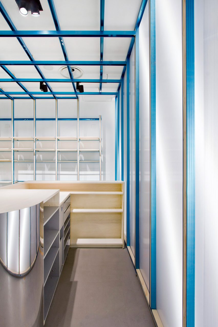
Mirrored panels clad the store’s cash register desk

At the rear of the floor plan is a mirror-clad cash register, set against a wall lined with translucent polycarbonate sheets.

More panels of polycarbonate were used to enclose On-Off’s changing rooms, with a shiny silver curtain suspended in front of each cubicle for privacy.

Polycarbonate changing rooms in Milan shop by Francesca Perani and Bloomscape
Polycarbonate walls and silver curtains feature in the changing rooms

Other striking retail spaces in Milan include the Marni flagship with its very own artists’ studio and IoNoi – a hybrid store and gallery dedicated to the work of Italian designer Fabio Novembre.

The photography is courtesy of Francesca Perani.

Reference

MEE Studio creates wood-and-copper interior for Nikolaj Kunsthal cafe
CategoriesInterior Design

MEE Studio creates wood-and-copper interior for Nikolaj Kunsthal cafe

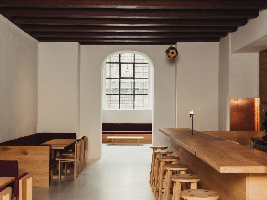
Architecture firm MEE Studio has designed the interiors and bespoke wooden furniture for a cafe and boutique in the Nikolaj Kunsthal art gallery within an old church.

The municipality-run gallery, which is set in a deconsecrated church in central Copenhagen, asked MEE Studio to design a “lively and functional” space.

Before designing the interior spaces, which feature warm and tactile materials such as copper and wood, the rooms in Nikolaj Kunsthal first had to be restored.

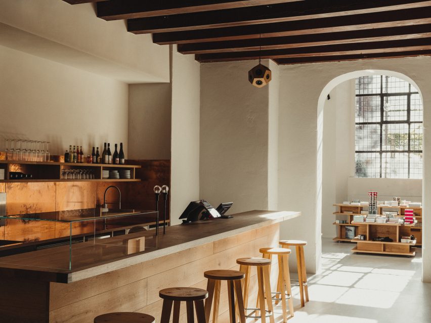
Wooden bar in Nikolaj Kunsthal by MEE Studio
The gallery is located in a former church

“The spaces had been used for various purposes since the 1980s including art installations and other changing uses,” MEE Studio founder Morten Emil Engel told Dezeen.

“This has left the spaces with remnants of ad-hoc electrical wiring, bricked-up arches, blocked-off windows and arbitrary lighting. Additionally, there was no water supply or plumbing in the spaces that now have the cafe.”

The studio reestablished the grand door and window openings in the space and replaced the old acrylic paint with breathable lime-based paint, while also adding acoustic plaster to improve the acoustics of the spaces.

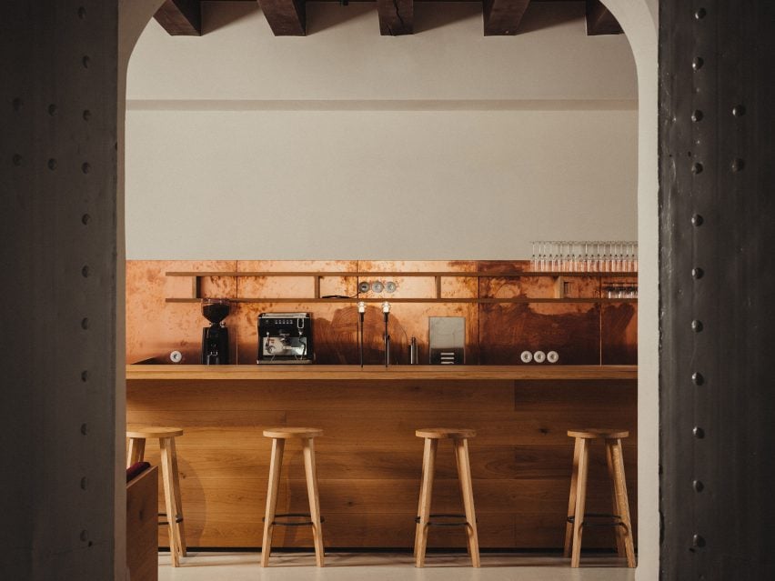
Copper splashback and oak bar in Danish cafe
Untreated copper was used as a backsplash for the bar

At the centre of the cafe, Engel created a long bar that also functions as a ticket counter and is made from solid oak wood.

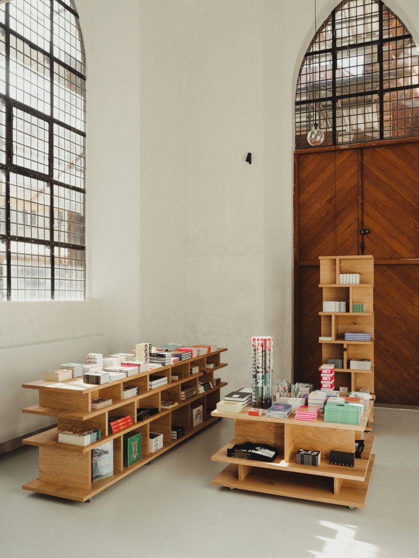
Wood was also used for all the other furniture, including benches, tables and sculptural shelves, which Engel designed specifically for the project using European oak from sustainable forestry.

“I wanted the benches to reference church benches – a bit chunky and heavy,” he said. “The church architecture is very robust with the church tower having two-metre thick walls. So the furniture had to have some substance to them.”

Wooden furniture by MEE Studio
The furniture complements the “robust” church architecture

Engel also aimed to give the pieces a contemporary feel by fusing their “heavy look” with more contemporary elements.

“All the furniture has visible joinery and tectonics in fumed oak, which allows the user to see how they are made and assembled,” he said.

“I added some decorative inlays in the bar counter and boutique shelves. Inlays were traditionally used as a way of repairing wood and I wanted to symbolise that repair can be beautiful and sustainable,” he added.

“In this way, it is sending the message that the furniture should have a long life and be repaired if it ages.”

Furniture in Nikolaj Kunsthal by MEE Studio
Artworks decorate the walls, here Pull by Martha Hviid

Behind the central bar, a copper backsplash adds an eyecatching material detail together with the matching sink and worktops, which were designed in reference to the roof of the old church.

“As many traditional buildings in Copenhagen, the roof of St Nikolaj Church is made with traditional copper roofing, which has aged to a rich green patina over time,” Engel said.

“I wanted to reference the existing material palate of the church but use it in a new way. So the kitchen features worktops, sinks and backsplash in raw untreated copper, which will evolve beautifully with time.”

Copper details in Nikolaj Kunsthal cafe
Lime-based paint was used for the walls

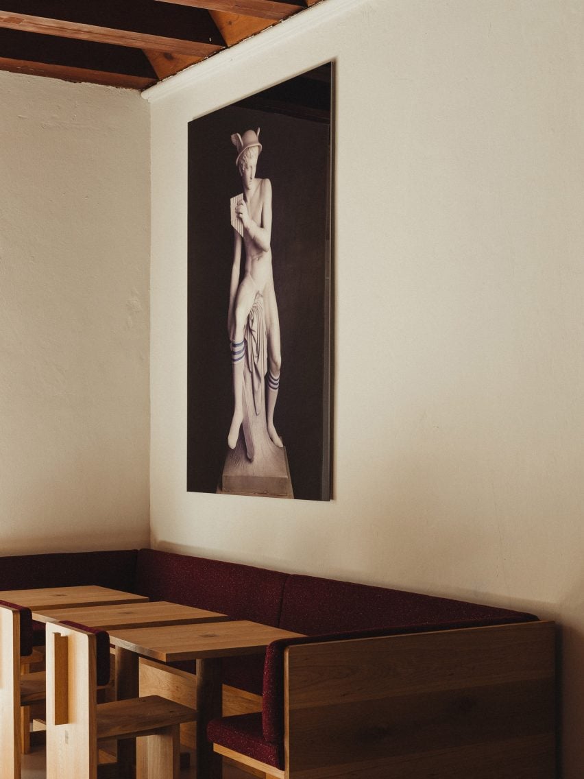
The white walls of the cafe and store were contrasted with not just the copper and wood but also a burgundy red fabric designed by fashion designer Raf Simons for Kvadrat, which was used for the cushions and backs of the sofas and chairs.

The colour was a nod to some of the space’s original colour but could also help disguise red wine spills in the cafe.

“Oakwood was already used throughout the church so it seemed natural to use oak as a material,” Engel explained.

“There was also the burgundy red paint which had been used originally for some woodwork, for instance, the stairs in the tower and the ceiling in what is now the cafe,” he added.

“So it seems natural to work with an interpretation of the burgundy red for the color of the cushions. I matched the burgundy red to a fantastic Kvadrat textile designed by Raf Simons and it worked in providing vibrancy, but also as a practical colour in a cafe where red wine is served.”

Artwork in Nikolaj Kunsthal
Red fabric was used for the seating, with the artwork Mercury (socks) hanging above

As well as the bespoke furniture pieces, the space was also decorated with carefully chosen artworks that have ties to the city of Copenhagen.

“Mercury (socks) is a photograph by the famous Danish/Norwegian artist duo Elmgreen & Dragset from a series of classical sculptures by the world-famous Danish sculptor Bertel Thorvaldsen,” Engel explained.

“The Thorvaldsen Museum is located only a few minutes away from Nikolaj Kunsthal, so the work relates both to art from the 19th century and contemporary art from the 21st century which is what you find in Nikolaj Kunsthal.”

Other recent interior projects in Copenhagen include Space10’s headquarters, which has a kiosk-like design library, and the cafe and shop design for Designmuseum Denmark by OEO Studio.

The photography is by Paolo Galgani.

Reference

Snøhetta combines clay and oak for minimalist interior of Holzweiler store
CategoriesInterior Design

Snøhetta combines clay and oak for minimalist interior of Holzweiler store

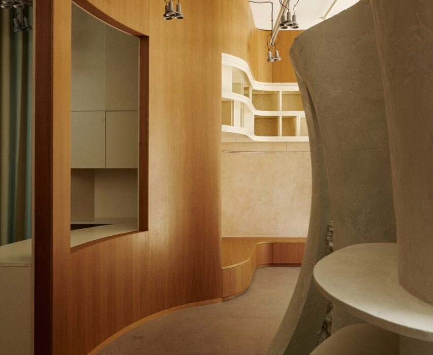
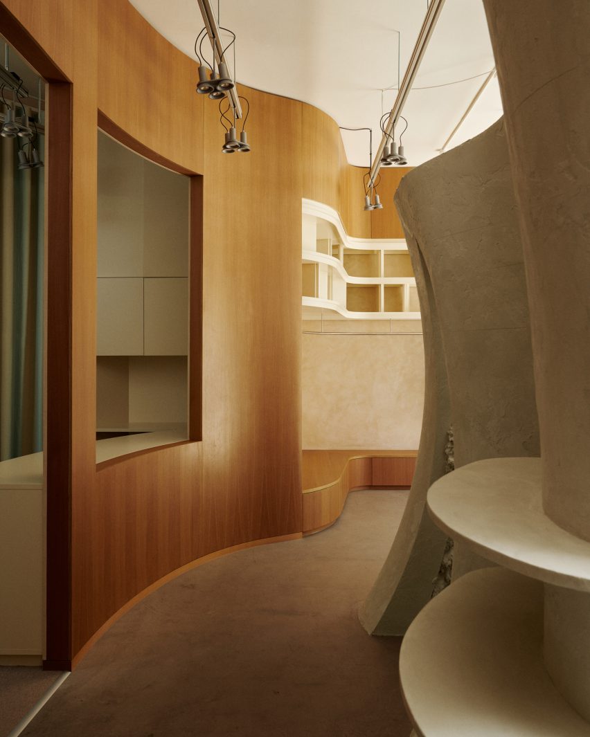
Architecture practice Snøhetta stuck to natural materials for the fit-out of the Holzweiler boutique in Copenhagen, incorporating subtle references to the fashion brand’s Norwegian heritage.

Snøhetta is a long-term collaborator of Holzweiler‘s, having designed the company’s flagship store and showroom in Oslo, as well as a number of its pop-up shops, runway sets and its digital identity.

Copenhagen store features minimalist interiors by Snøhetta
Snøhetta has designed Holzweiler’s Copenhagen outpost

For Holzweiler’s first international outpost in Copenhagen, Snøhetta followed the concept of “tracing” – devising an interior scheme that shows traces of the brand’s Norwegian roots alongside the minimalist aesthetic found in its previous retail spaces.

“Reminiscent of a memory or feeling that remains, the idea of ‘traces’ evokes an emotional sense of the brand’s beloved heritage as it travels to a new city,” the practice said.

Holzweiler's Copenhagen store features minimalist interiors by Snøhetta
A clay sculpture by Ingeborg Riseng sits at the heart of the store

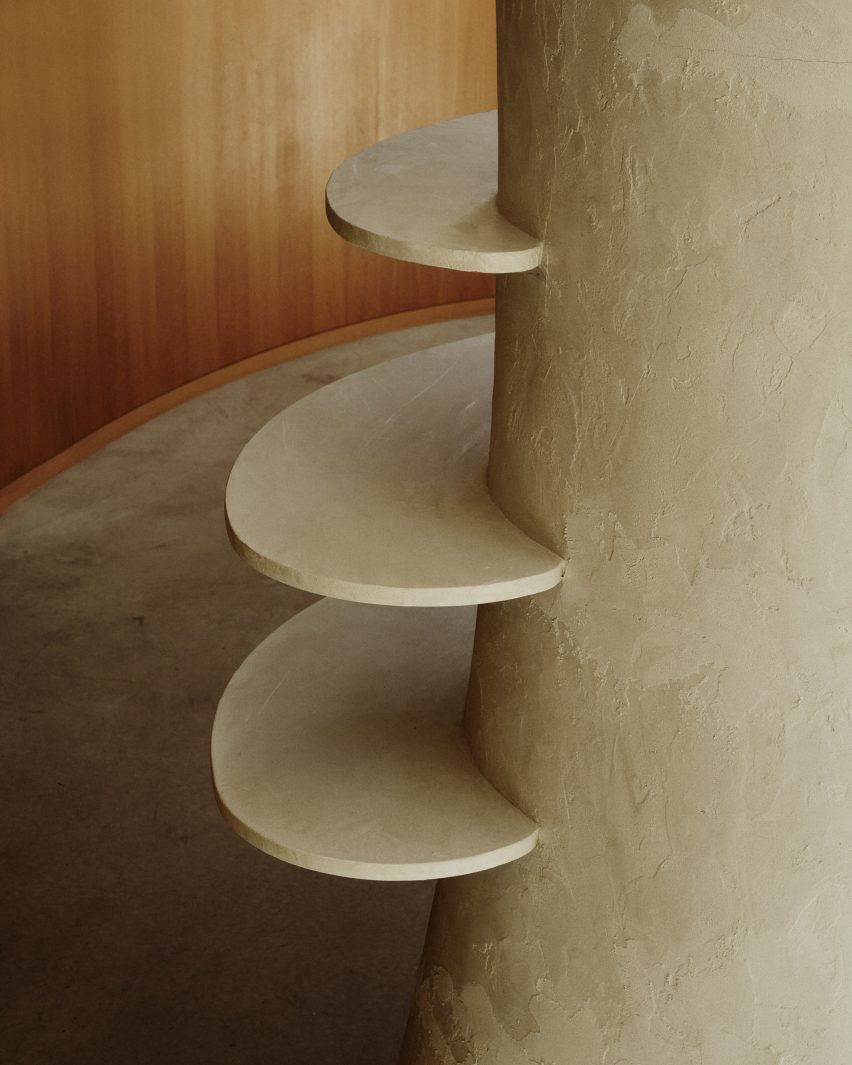
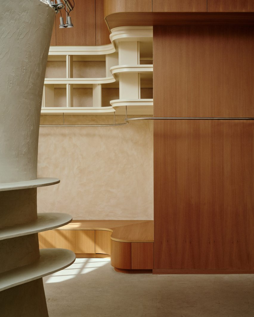
At the centre of the 100-square-metre store is a tall, hollow sculpture by Norwegian artist Ingeborg Riseng, which shoppers can step into. Its undulating outer walls are fitted with display shelves and coated in a smooth layer of clay, while the inside has a rough, craggy surface.

An oakwood display plinth winds its way around the periphery of the store, eventually connecting to a curved timber partition at the rear of the floor plan.

Copenhagen store features minimalist interiors by Snøhetta
Around the edge of the store is an oak display plinth

Behind the wall lies a changing area with cubicles and curtains created by Danish textile design studio Tronhjem Rømer.

The fabric is digitally printed with subtle yellow and pale blue stripes, designed to evoke the shifting shades of the Norwegian sky.

To contrast the store’s largely natural material palette, Snøhetta added some industrial-style finishing touches like metal clothing rails and custom strip lighting, developed by Swedish brand Ateljé Lyktan.

Both the floors and ceilings were preserved from the store’s previous fit-out.

Holzweiler's Copenhagen store features minimalist interiors by Snøhetta
Garments hang from steel rails

Other recent projects by Snøhetta include Bolder Star Lodges, a quartet of wooden cabins that overlook a fjord in Norway.

Meanwhile in Denmark, the practice employed boat construction techniques to create a timber community centre in Esbjerg.

The photography is by Magnus Nordstrand, courtesy of Snøhetta and Holzweiler.

Reference

Traditional Hong Kong diners inform interior of Bao Express in Paris
CategoriesInterior Design

Traditional Hong Kong diners inform interior of Bao Express in Paris

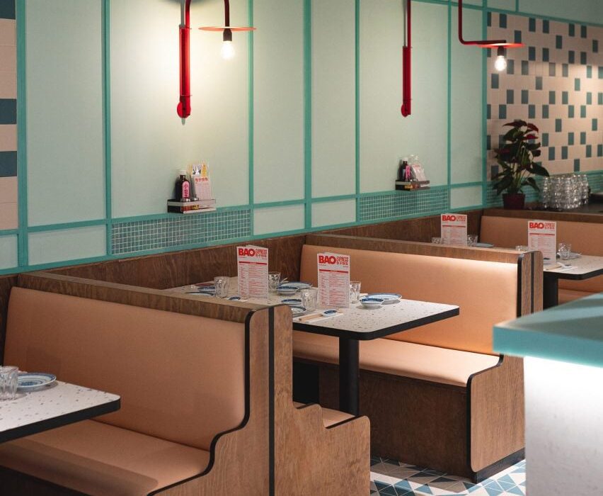
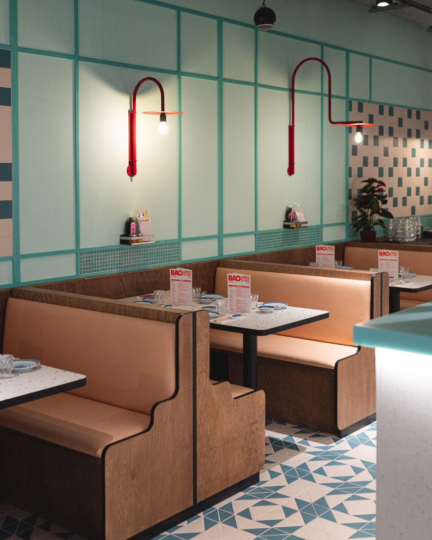
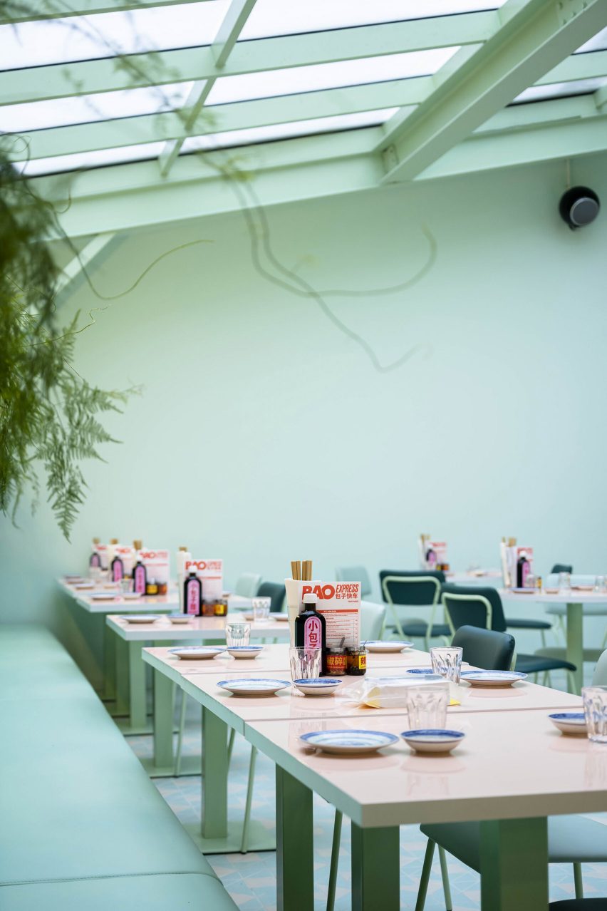
Design studio Atelieramo has completed a retro interior for a Chinese restaurant in Paris, featuring celadon-green walls and curvaceous wooden booths modelled on those found in Hong Kong diners from the 1970s.

Architect Tala Gharagozlou and designer Virginie de Graveron oversaw the interior concept for Bao Express, a restaurant near Bastille in the 11th arrondissement that serves dim sum and bao buns.

Wood-framed seating booths in Bao Express
Bao Express is a Chinese restaurant in Paris. Top photo by Géraldine Martens

Housed in a former button factory, the 500-square-metre space is divided into three areas: a bakery, a diner and a basement bar.

Atelieramo set out to create a series of distinct yet connected spaces that evoke the architecture and pop culture of 1970s Hong Kong – in particular its greasy spoon cafes, locally known as cha chaan tengs.

Wood-lined seating booth in Paris restaurant by Atelieramo
Diners can sit in the eatery’s cosy wood-lined booths

“We reinterpreted snippets of that vibrant Hong Kong urban atmosphere with its coloured pavings, pastel colours, neon lights and dense mix of patterns and motifs,” said the studio.

“The aim was not to create a decor but rather, with a playful nod to these references, create a new atmosphere distinct to Bao’s new space.”

Mint-green dining room of Bao Express restaurant in Paris
A larger skylit dining area is located in the rear. Photo by Géraldine Martens

The adaptation of the existing abandoned building involved significant alterations to the floor plates and structure, along with the addition of a new staircase and circulation.

From the street, customers enter a small bakery and cafe serving sweet and savoury snacks to eat in or take away. What appears as a simple neighbourhood cafe conceals the presence of the larger dining areas, which are set back in the building’s plan.

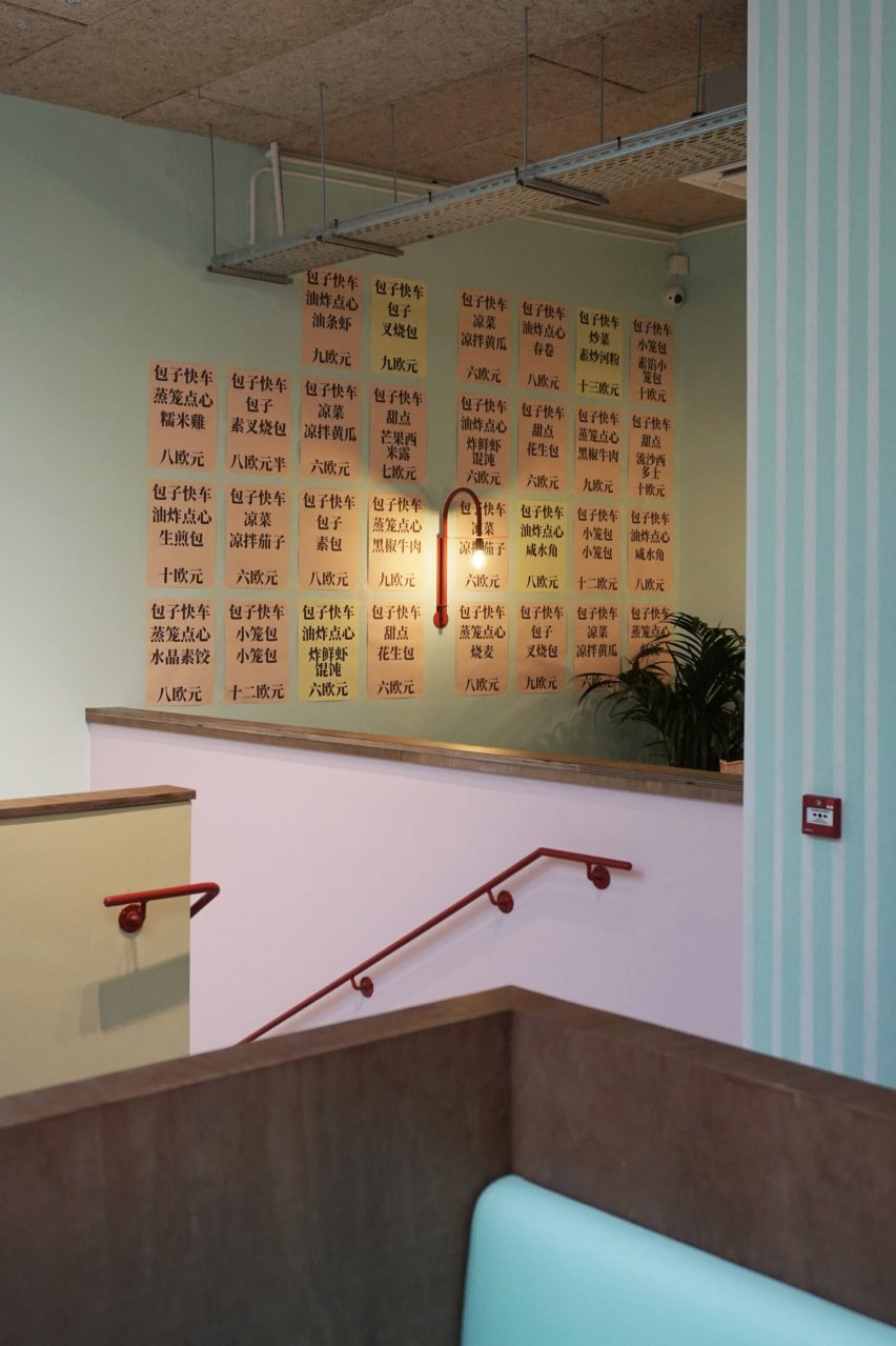
Pastel-hued staircase in Chinese restaurant by Atelieramo
A new staircase leads down to the basement bar. Photo by Bérénice Bonnot

The kitchens are visible from the street and guests walk past colourful crates of raw produce before passing through a metal curtain to reach the main Bao Express diner.

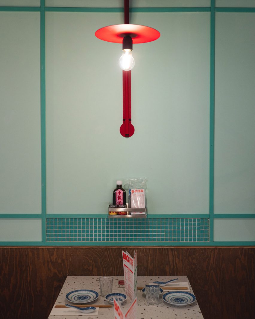
The long dining space features cosy booths with sinuous wooden frames. The pastel-green walls are contrasted with bespoke bright-red sconces and simple mosaic panels that echo the materials of the central bar.

Towards the rear of the building is a larger dining area topped with an expansive skylight. This bright and airy space is filled with plants that create the feeling of dining in a winter garden.

Exposed masonry walls painted in celadon-green form the basis for a playful colour palette featuring contrasting peach and pink elements as seen in the glossy tabletops.

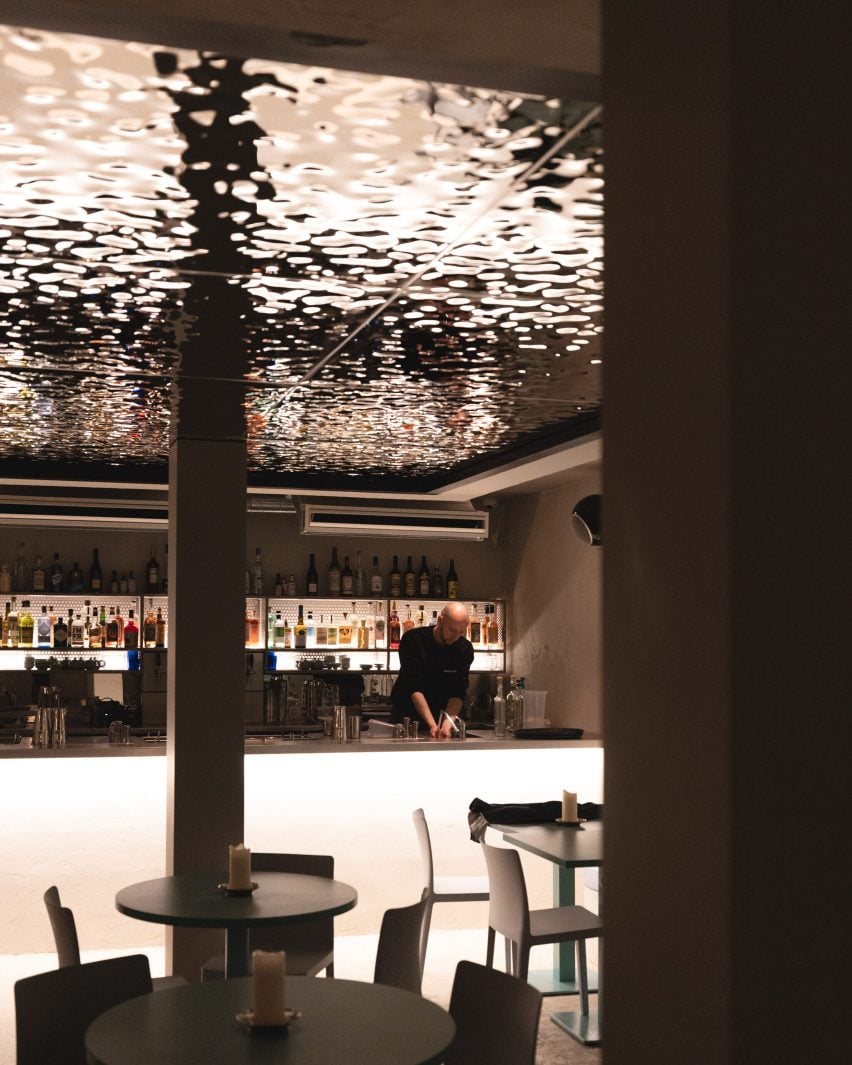
Bar with hammered-metal ceiling in Bao Express restaurant in Paris
A hammered-metal artwork by SupaKitch decorates the ceiling in the bar

The studio’s eclectic use of colour and pattern extends to the geometric tiled floors and punchy black-and-white stripes that are painted on the walls of the staircase leading down to the basement bar Underpool.

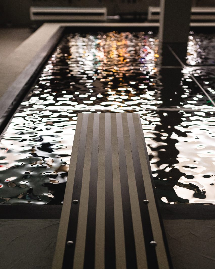
This bar area features a hammered-metal ceiling installation by French artist SupaKitch, with a rippled surface that reflects the blue-green interior and creates the impression of looking up at an upside-down swimming pool.

Swimming pool ceiling installation in Chinese restaurant by Atelieramo
The artwork creates the impression of looking up at a swimming pool

Bao Express is part of a family of eateries in Paris owned by restaurateurs Céline Chung and Billy Pham. Atelieramo was responsible for designing several of the duo’s restaurants, each of which has a unique character inspired by different aspects of Chinese culture.

Another eatery informed by traditional cha chaan tengs is The Astor restaurant in Hong Kong’s Eaton hotel, designed by New York studio AvroKO, which mixes elements of the city’s diners and street food stalls with nods to the arthouse films of Wong Kar-Wai.

The photography is by Carole Cheung unless otherwise stated.

Reference

Wood and stone surfaces bring “rich texture” to Primrose Hill House interior
CategoriesInterior Design

Wood and stone surfaces bring “rich texture” to Primrose Hill House interior

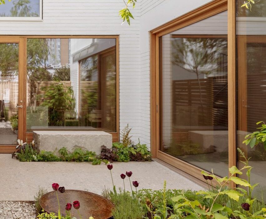
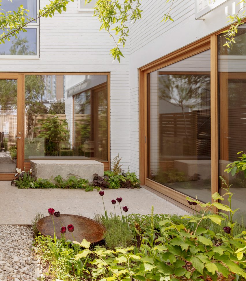
Architecture for London has updated a 1960s house in London, creating an open-plan interior filled with natural materials and an improved connection to the rear courtyard garden.

The house is one of two detached properties set in a modernist estate in Primrose Hill that primarily consists of painted brick courtyard houses and small terraces.

Photo of Primrose Hill House
Primrose Hill House was designed by Architecture for London

The new owner asked Architecture for London to transform the interior into a modern layout that is better suited to their lifestyle.

“The house had a very broken plan consisting of lots of small rooms,” the studio’s director Ben Ridley told Dezeen. “The client wanted to create a family house that was more open plan with better views of the garden.”

Exterior photo of Primrose Hill House
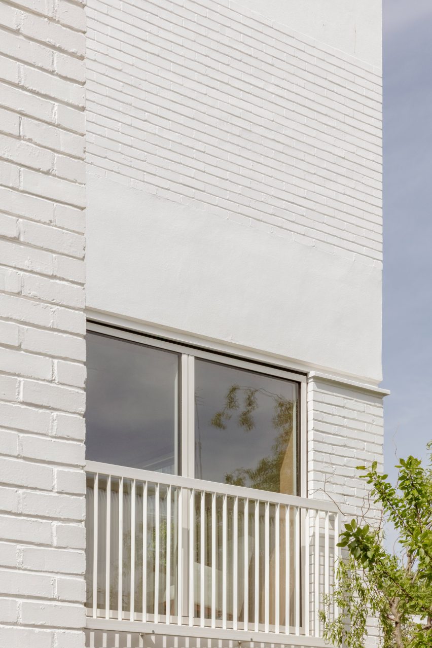
The studio added a rooftop extension clad in white bricks

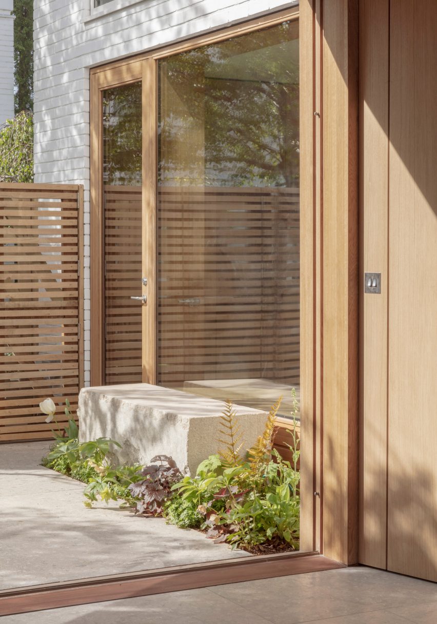
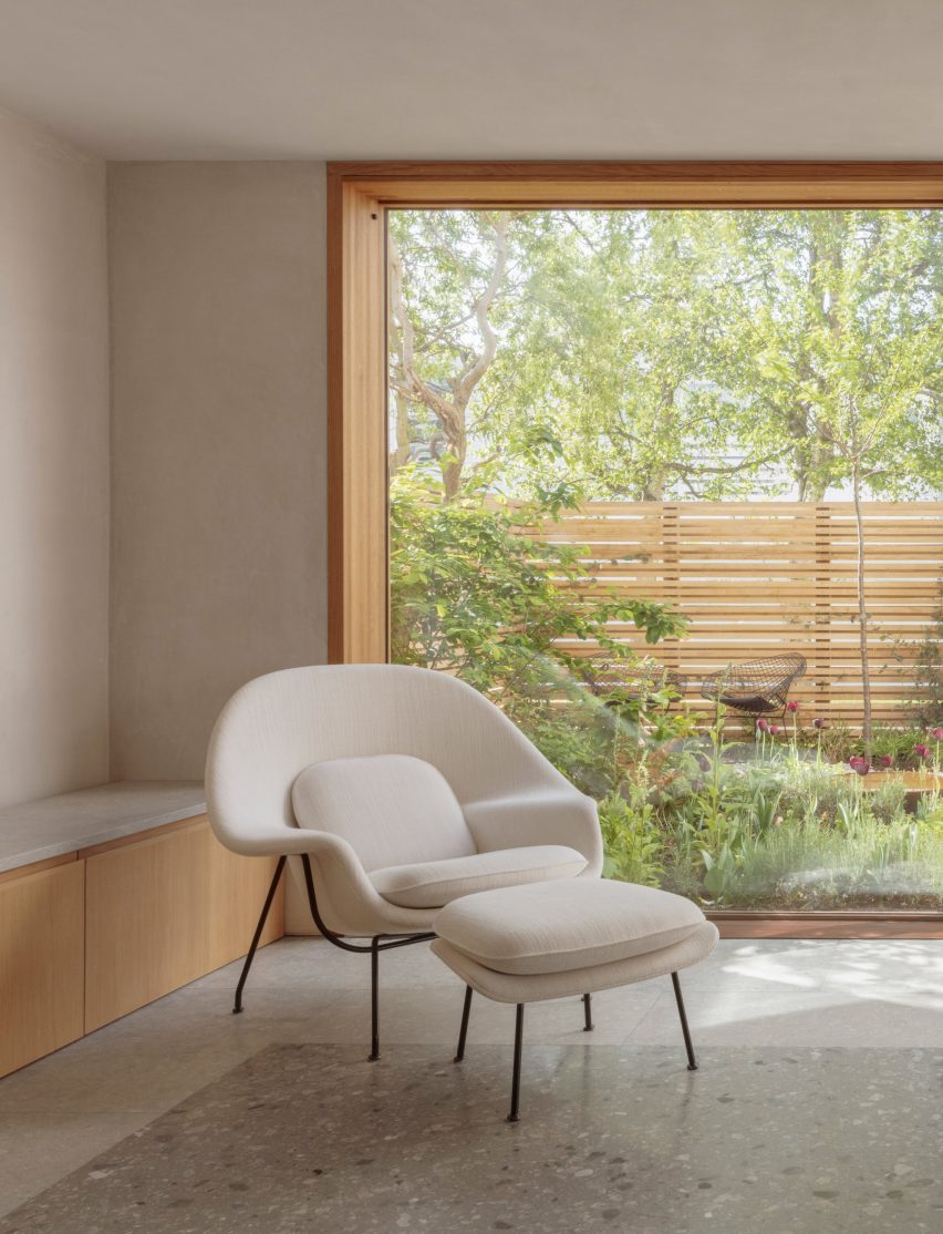
The remodelled interior improves the connection with the garden by incorporating a large picture window in the kitchen, along with sliding wood-framed doors in the living area.

The ground floor also contains a smaller reception area next to the entrance hall, with folding doors allowing this space to be separated from the kitchen and dining area.

Image of Primrose Hill House
Sliding wood-framed doors open the living room up to the garden

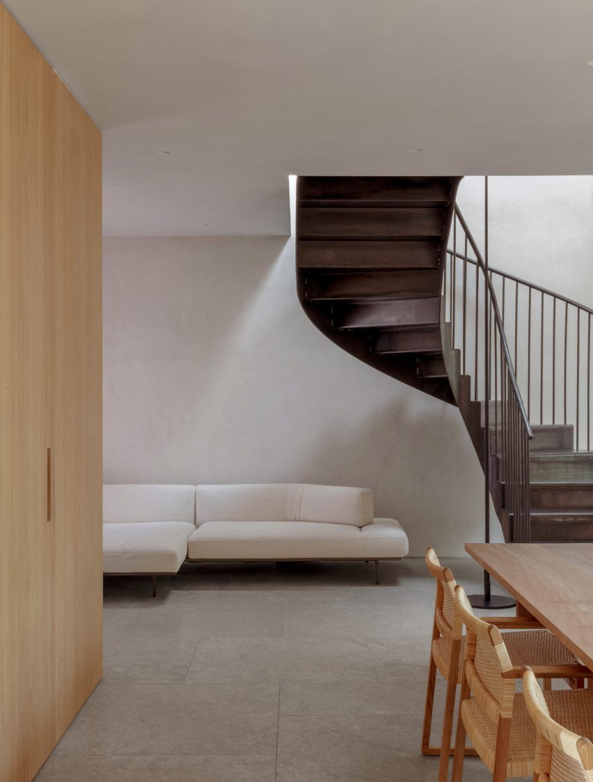
A bespoke blackened-steel staircase provides access to four bedrooms on the first floor, including a main suite with a juliet balcony overlooking the garden.

Following a detailed cost and sustainability review, a decision was made to demolish all of the property’s interior walls and rebuild them in order to achieve the required spaces.

Interior image of Primrose Hill House
The interior was finished in a rich material palette

This solution also offered the best energy-efficiency potential, according to Ridley, with a layer of wall insulation added alongside a heat recovery ventilation system (MVHR).

The home’s first-floor plate was replaced using steel beams and timber joists to enable the demolition of the ground-floor walls and the opening up of the interior.

Interior photo of Primrose Hill House
Flooring was used to define different zonessp

The project also involved the addition of a timber-framed rooftop extension, clad with white-painted brick to tie in with the rest of the house and set back so it’s largely hidden from view.

The extension contains a flexible mezzanine space for yoga and meditation that is accessed from the main bedroom suite.

Throughout the home, Architecture for London applied a pared-back palette of natural materials that is intended to create a sense of calmness and connection with the garden.

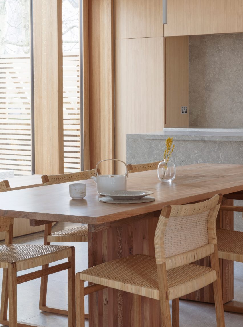
Internal walls treated with breathable lime plaster provide a neutral backdrop for furniture designed by architect Christian Brailey, which includes a dining table made from locally sourced London plane trees.

Photo of a dining area
Doors and windows are framed with wood

“We intentionally didn’t use a lot of colour so there’s a strong feeling of consistency,” Ridley said. “The choice of stone and timber brings a rich texture to the palette.”

A reference image of a Portuguese manor house, featuring a tiled trompe l’oeil frieze around a doorway, informed the use of materials to define space within the interior.

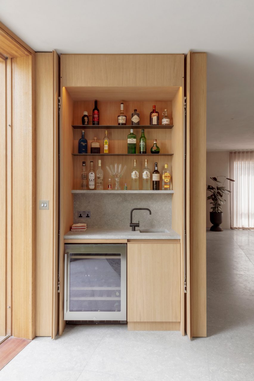
Photo of a bar at the home
The shared living areas have an open-plan layout

In the living room, stone floor tiles in different shades create a border around the room, as if an area rug has been placed on the floor to demarcate where furniture could be placed.

Ben Ridley founded Architecture for London in 2009 following his studies at London’s Barlett School of Architecture. The studio aims to create places that improve how people live and work, with a focus on reducing their operational emissions.

Photo of a staircase at the London home
Wood lines the interior walls of the home

Ridley’s own London house recently featured in our round-up of five UK house renovations designed to improve energy efficiency.

“Ultimately we are going to have to accept some changes in the appearance of our traditional homes,” he said, speaking to Dezeen as part of a feature on architects who have retrofitted their own homes.

The photography is by Christian Brailey.

Reference

Golem creates “pleasure-driven” pink interior for Superzoom gallery
CategoriesInterior Design

Golem creates “pleasure-driven” pink interior for Superzoom gallery

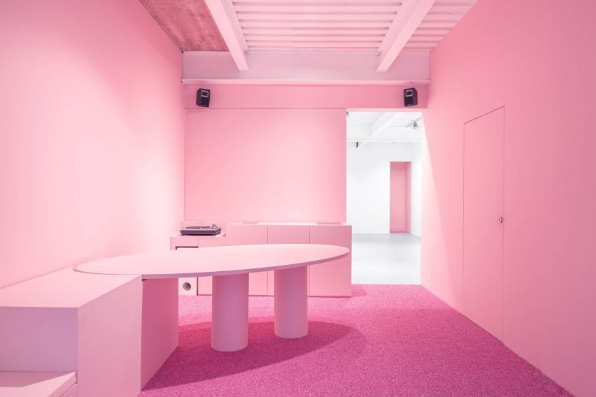
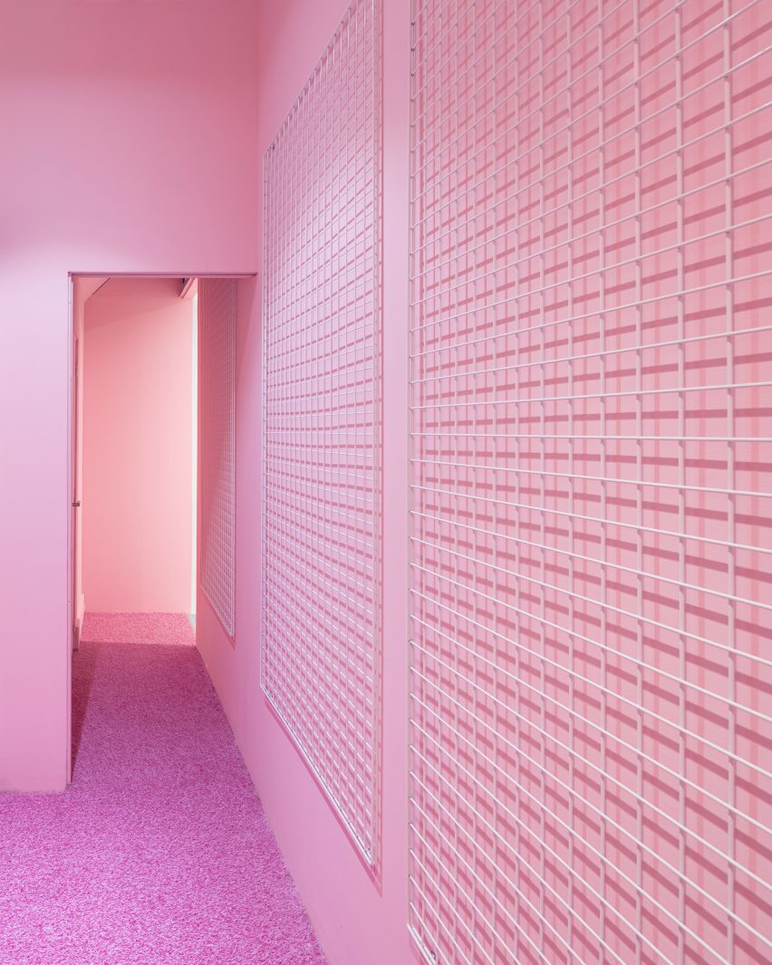
Bubblegum-pink walls, floors and furniture create unconventional spaces for displaying art at this gallery in Paris designed by local studio Golem.

Headed by architect and artist Ariel Claudet, the practice was invited to design the interior for the Superzoom art gallery, which is located in the historic Le Marais district.

Superzoom gallery in Paris with all-pink interiors
Superzoom gallery in Paris features bubblegum-pink interiors

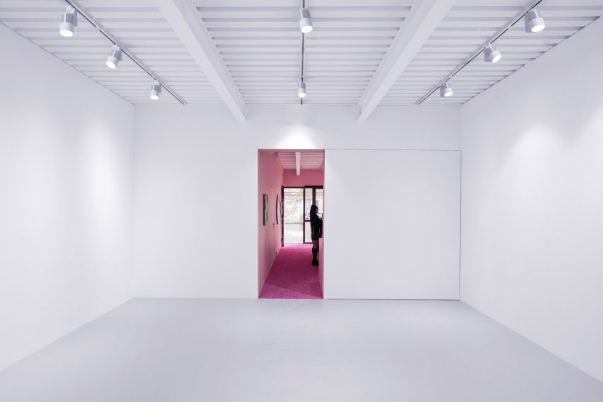
The gallery comprises three spaces arranged in an unusual order, with the gallery director’s office at the entrance, a white-cube gallery space in the centre and an accessible storage space at the rear.

“We flipped upside-down the classic and elitist sequence of an art gallery, offering visitors a new pleasure-driven experience and the gallery managers three spatial tools for a large range of curatorial approaches,” explained Claudet.

All-pink walls and floors in Superzoom gallery in Paris
Pink is Superzoom’s signature colour

Superzoom’s signature colour pink was used as the basis for the design, reflecting the vibrancy of the local nightlife and techno scene where the gallery mingles with artists and collectors, according to Claudet.

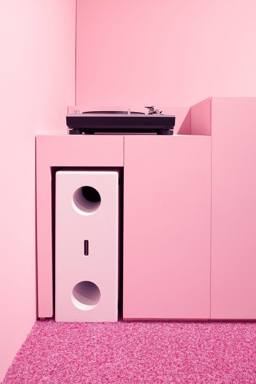
An integrated sound system hooked up to a vinyl record player provides a soundtrack of electronic music to enhance this connection.

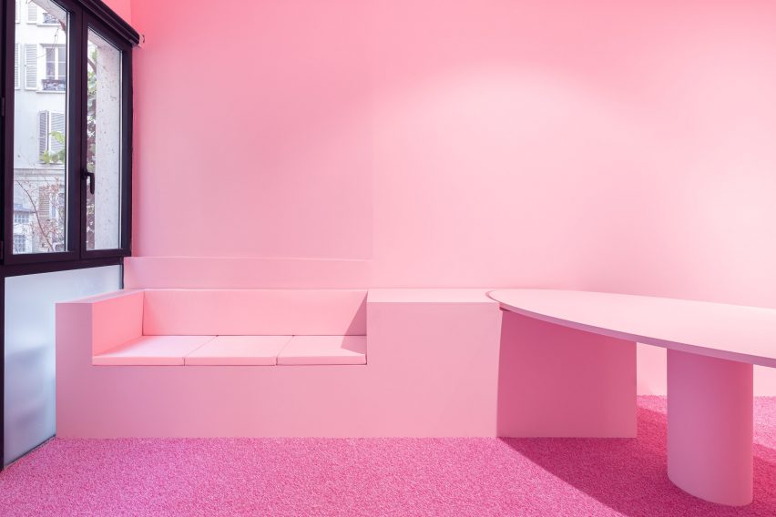
The “pink den” contains a built-in bench for visitors and a synthetic grass

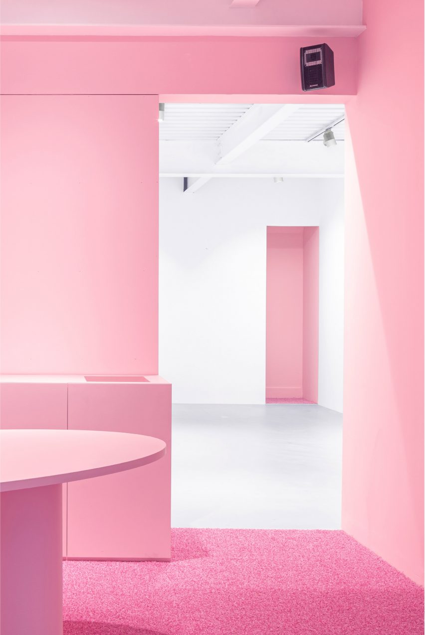
By placing the director’s bright-pink office at the front, Golem aimed to create an entrance that is warmer and more inviting than a typical white gallery space.

The “pink den” contains a built-in bench for visitors and a fake grass carpet that contributes to the warm, tonal aesthetic.

Record player within art gallery by Golem
The integrated sound system is hooked up to a record player

Visitors can continue through into a large and versatile white-walled gallery. This display area remains connected to the main spatial concept thanks to the pink openings on either side.

The final space within the gallery is a storage area with walls painted the same shade of lively pink. In a conventional gallery setting, this space would be hidden away. But here, it is open and accessible to visitors.

Each of the spaces in Superzoom’s gallery can be used for exhibiting work, either independently or together.

For example, Golem suggested the white cube could be used for a solo show while other artists’ work is presented in the director’s office and storage space.

White-walled gallery with overhead lighting by Golem
A white-walled gallery provides more space for exhibiting art

All of the furniture and the pink wall separating the white cube from the director’s office are mobile and can be removed to create a larger space for exhibitions or parties.

Golem designed the baby pink table featured in the director’s office as an emblem of the gallery that can be taken to art fairs or used for client dinners.

Pink interiors at Superzoom gallery
The pink office table can be removed and brought to art fairs

Claudet founded Golem in 2021 after working as an architect for practices including Rem Koolhaas’s Rotterdam-based firm OMA.

Other all-pink interiors published on Dezeen include a fur-covered Balenciaga store in London and the Minimal Fantasy holiday apartment in Madrid.

The photography is by Cyrille Lallement.

Reference