Dezeen’s top 10 staircases of 2023
CategoriesInterior Design

Dezeen’s top 10 staircases of 2023

Continuing our 2023 review, we have selected 10 striking staircases published on Dezeen this year, from prefabricated plywood steps at a Cornish home to a colourful set for an opera in a Swiss theatre.

Architects and designers have continued to find clever solutions to travelling on foot from one storey to another in 2023 by creating staircases that are both beautiful and functional.

Ranging from the spectacular to the space-saving, here are Dezeen’s top 10 staircases of 2023:

Ribbon HouseRibbon House
Photo by Purnesh Dev Nikhanj

Ribbon House, India, by Studio Ardete

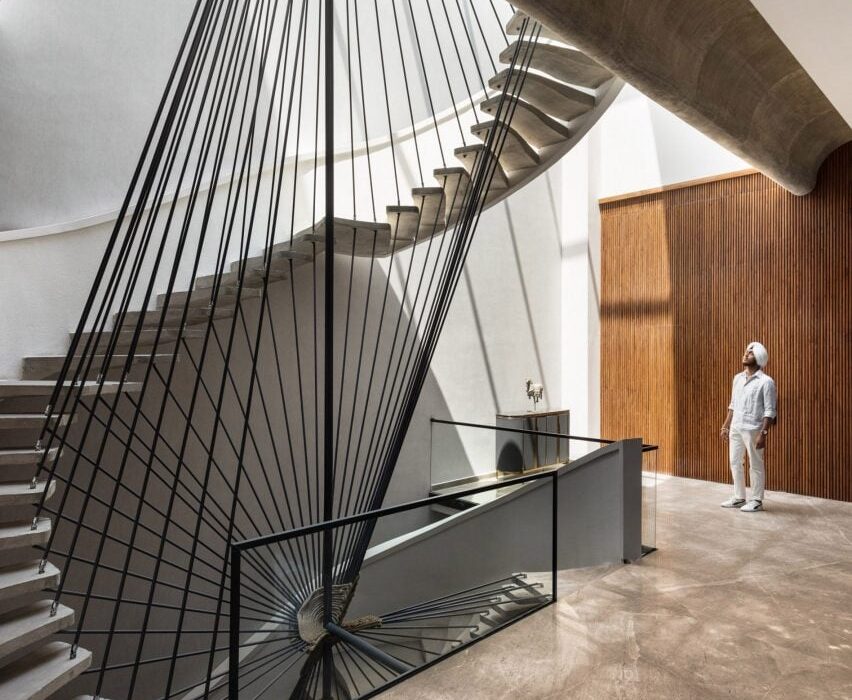
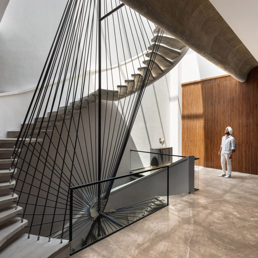
An angular balustrade with tilting black rails twists around sweeping concrete steps to form the staircase at Ribbon House, a home in Punjab with an equally sculptural exterior.

Architecture office Studio Ardete placed open living spaces next to the staircase on each floor to create lobby-like communal areas on the house’s different levels.

Find out more about Ribbon House ›

House by the Sea in CornwallHouse by the Sea in Cornwall
Photo by Lorenzo Zandri

House by the Sea, UK, by Of Architecture

House by the Sea is the home of a surfer-and-artist couple in Newquay, Cornwall, that was designed to be “simple, robust and utilitarian”.

For the interior, London studio Of Architecture inserted prefabricated plywood steps leading to a cosy mezzanine level tucked beneath the dwelling’s sloping roof.

Find out more about House by the Sea ›
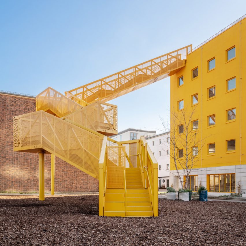

HAUS 1 by MVRDVHAUS 1 by MVRDV
Photo by Schnepp Renou

Haus 1, Germany, by MVRDV and Hirschmüller Schindele Architekten

A bright yellow, zigzagging staircase juts out from the facade of the Haus 1 building in Berlin, creating the appearance of a striking crane and providing a beacon for approaching visitors.

Dutch studio MVRDV worked with local studio Hirschmüller Schindele Architekten to design Haus 1, which forms part of the city’s Atelier Gardens redevelopment.

Find out more about Haus 1 ›
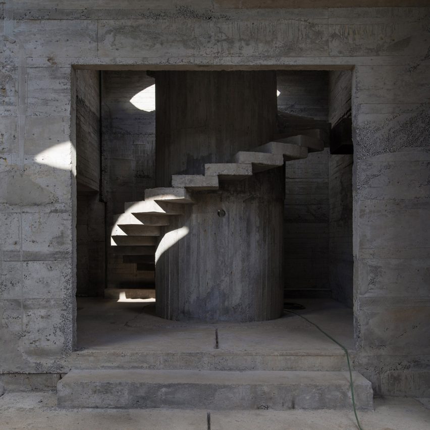

Staircase at Luna HouseStaircase at Luna House
Photo by Pezo von Ellrichshausen

Luna House, Chile, by Mauricio Pezo and Sofia von Ellrichshausen

Brutalist-style spiral staircases connect the storeys of Luna House, an expansive geometric complex in Chile comprised of 12 individual buildings.

Chilean studio Pezo von Ellrichshausen designed the stairs and the majority of the structure in reinforced concrete, which is highly textured thanks to imprints left behind by wooden formwork.

Find out more about Luna House ›
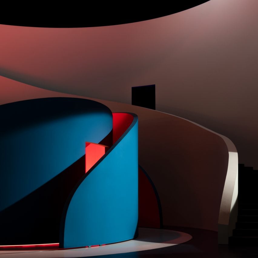

Pierre Yovanovitch staircase set design Basel operaPierre Yovanovitch staircase set design Basel opera
Photo by Paolo Abate.

Rigoletto set design, Switzerland, by Pierre Yovanovitch

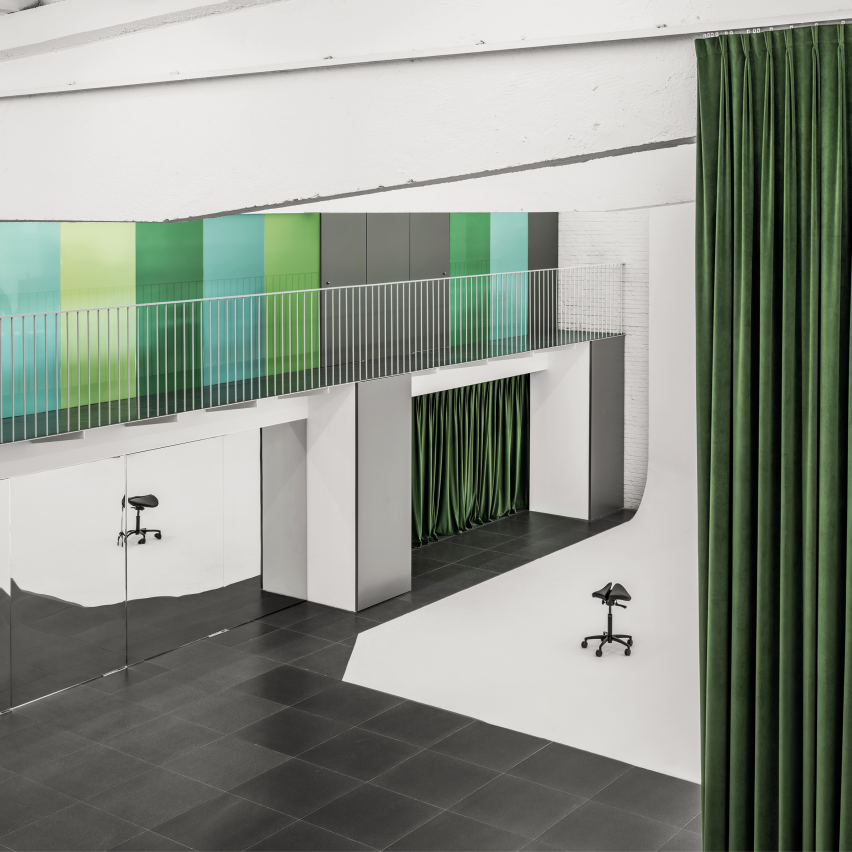
French interior designer Pierre Yovanovitch embedded moving, curved walls within an undulating staircase that stretched the full width of the stage for a production of Giuseppe Verdi’s opera Rigoletto at Theatre Basel.

Bathed in coloured light, the flexible walls created a neutral set for the performers to balance the play’s complex plot, according to the designer.

Find out more about this staircase ›
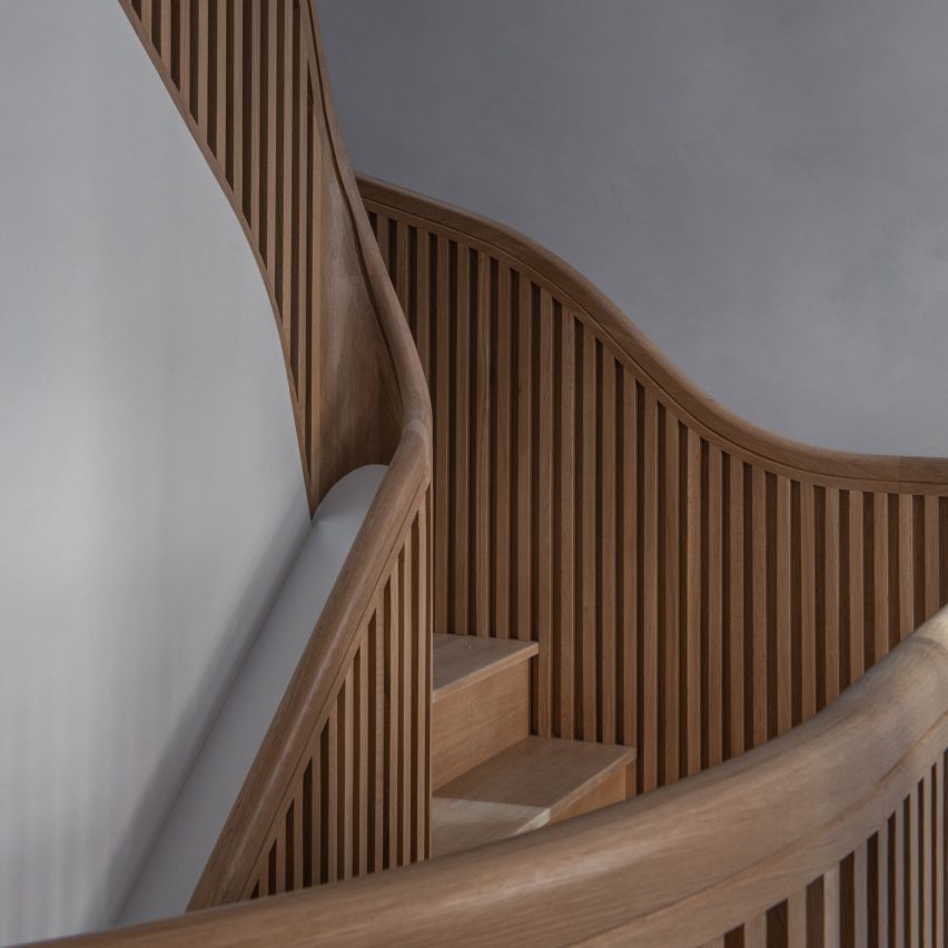

Staircase inside Hairpin House by Figure and Studio J JihStaircase inside Hairpin House by Figure and Studio J Jih
Photo by James Leng (also top)

Hairpin House, USA, by Studio J Jih and Figure

This Boston house was renovated to revolve around a sculptural “hairpin” staircase informed by the twists and turns of mountain roads.

Designed by American firms Studio J Jih and Figure, the white oak stairs were created to increase the home’s useable floor area by 20 per cent.

Find out more about Hairpin House ›
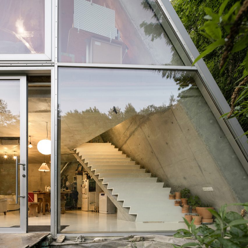

Trapezoidal concrete and glass houseTrapezoidal concrete and glass house
Photo by Alex Shoots Buildings

House in Pernek, Slovakia, by Ksa Studený

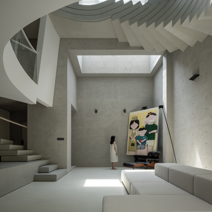
This home in the village of Pernek, Slovakia, was designed in the shape of an isosceles trapezoid, mirroring its longitudinal profile.

Architecture studio Ksa Studený positioned a chunky white staircase over a slanted slab of concrete to divide the interior space.

Find out more about this house ›
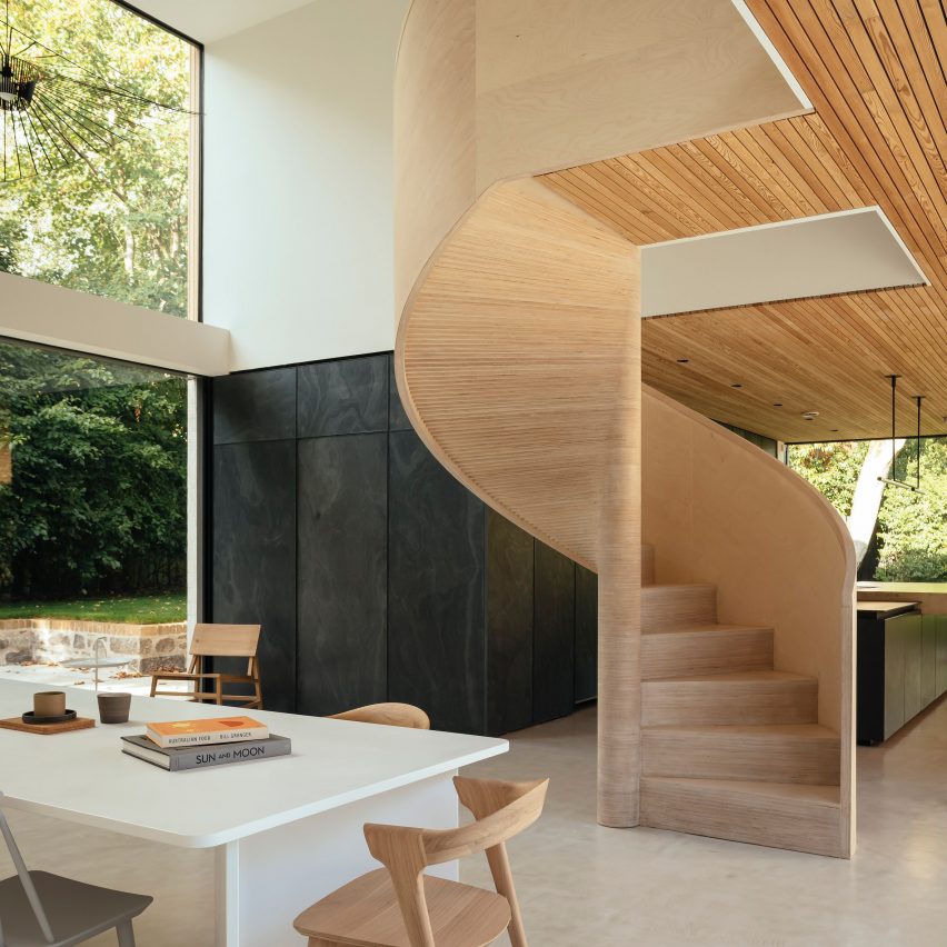

The Arbor House in ScotlandThe Arbor House in Scotland
Photo by Jim Stephenson

The Arbor House, Scotland, by Brown & Brown

A spiral staircase made from birch plywood winds into the dining area at The Arbor House by Brown & Brown, located in a conservation area in Aberdeen.

The studio assembled the stairs over three weeks, with timber treads individually cut and hand-layered to form a smooth curve.

Find out more about The Arbor House ›
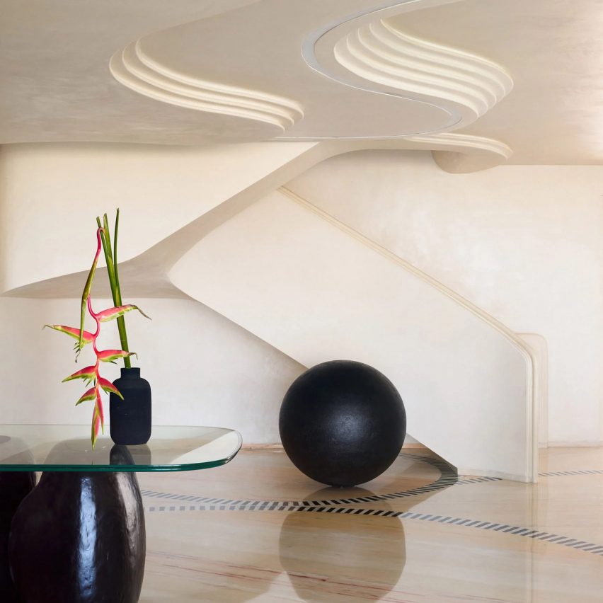

Apartment by FADD StudioApartment by FADD Studio
Photo by Gokul Rao Kadam

SNN Clermont residential tower, India, by FADD Studio

Indian practice FADD Studio renovated two apartments within the SNN Clermont residential tower in Bangalore to create a fused multi-generational home.

The studio took cues from the curves of caterpillars when creating a swooping staircase, which connects the two flats and features deep red marble risers.

Find out more about these apartments ›
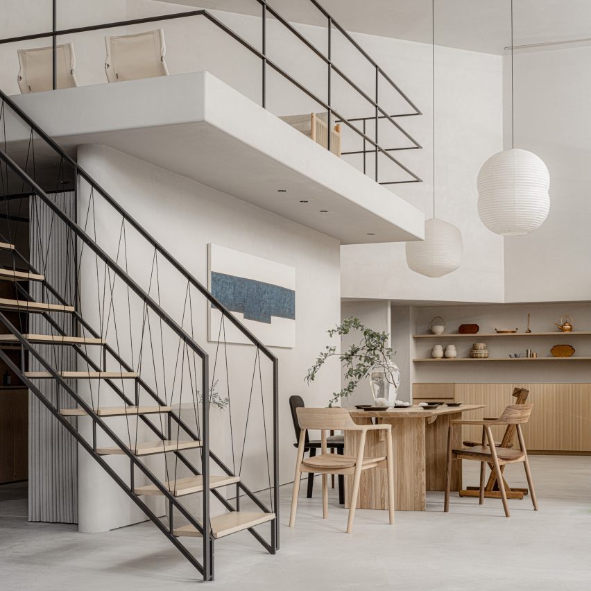

 Keiji Ashizawa-designed Conran Shop Keiji Ashizawa-designed Conran Shop
Photo courtesy of The Conran Shop

The Conran Shop, Japan, by Keiji Ashizawa 

Japanese designer Keiji Ashizawa created interiors for The Conran Shop in Tokyo to reflect the inside of someone’s home.

The store’s mezzanine floor is accessible by a minimalist geometric staircase featuring a handrail made from black paper cords.

Find out more about The Conran Shop ›

Reference

Ten rustic Italian interiors that evoke the history of the Mediterranean
CategoriesInterior Design

Ten rustic Italian interiors that evoke the history of the Mediterranean

This lookbook collects 10 interiors in Italy with a distinctly rustic feel, including homes and hotels replete with wooden beams, cool stone and other rich textures.

As well as being known for its contemporary furniture and lighting design, Italy is home to some of Europe’s oldest buildings and has numerous historic cities and villages.

From a 17th-century house in Puglia to a hotel in a 1,000-year-old castle, below are 10 examples of projects that pay homage to the Mediterranean country’s history while catering to modern tastes.

This is the latest in our lookbooks series, which provides visual inspiration from Dezeen’s archive. For more inspiration see previous lookbooks featuring chequerboard floors, lime plaster walls and Mediterranean-style interiors.


Monteverdi Tuscany boutique hotel by Michael Cioffi and Ilaria Miani
Photo courtesy of Monteverdi Hotel

Monteverdi Hotel, Tuscany, by Ilaria Miani

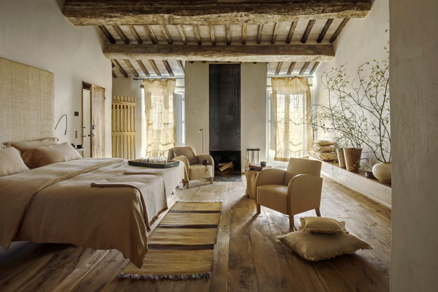
Restoration specialist and interior designer Ilaria Miani helped transform several crumbling buildings in Val d’Orcia into a boutique hotel that aims to balance the history of the area with contemporary design influences from Milan and Rome.

In the bedroom suites, chunky exposed beams made from salvaged wood are complemented by natural colours and textures, while nearly all the furniture is handmade by local artisans.

Find out more about Monteverdi Hotel ›

Cascina by Jonathan Tuckey Design
Photo by Francesca Iovene

Cascina, Piemonte, by Jonathan Tuckey Design

London-based Jonathan Tuckey Design was tasked with returning this 19th-century farmhouse in northern Italy to its original state following a heavy 1980s renovation.

Stone walls and wooden beams now feature prominently, with a cool chalky palette offset by brass lamps and chestnut panelling and furniture.

Find out more about Cascina ›

Casa Soleto living room
Photo by Salva López

Casa Soleto, Puglia, by Studio Andrew Trotter and Marcelo Martínez

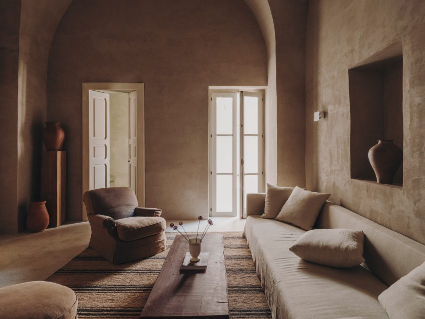
Parts of Casa Soleto in Puglia are more than 400 years old. Architecture firm Studio Andrew Trotter and its studio manager Marcelo Martínez renovated the building without making any structural changes, leaving the irregular walls in place.

To give the interiors an authentic, natural feel, the designers used lime plaster for the walls, linen fabrics for the sofas and curtains, jute rugs, terracotta ceramics and antique furniture.

Find out more about Casa Soleto ›


Monastero Arx Vivendi
Photo by Alex Filz

Monastero Arx Vivendi, Trentino-Alto Adige, by Network of Architecture

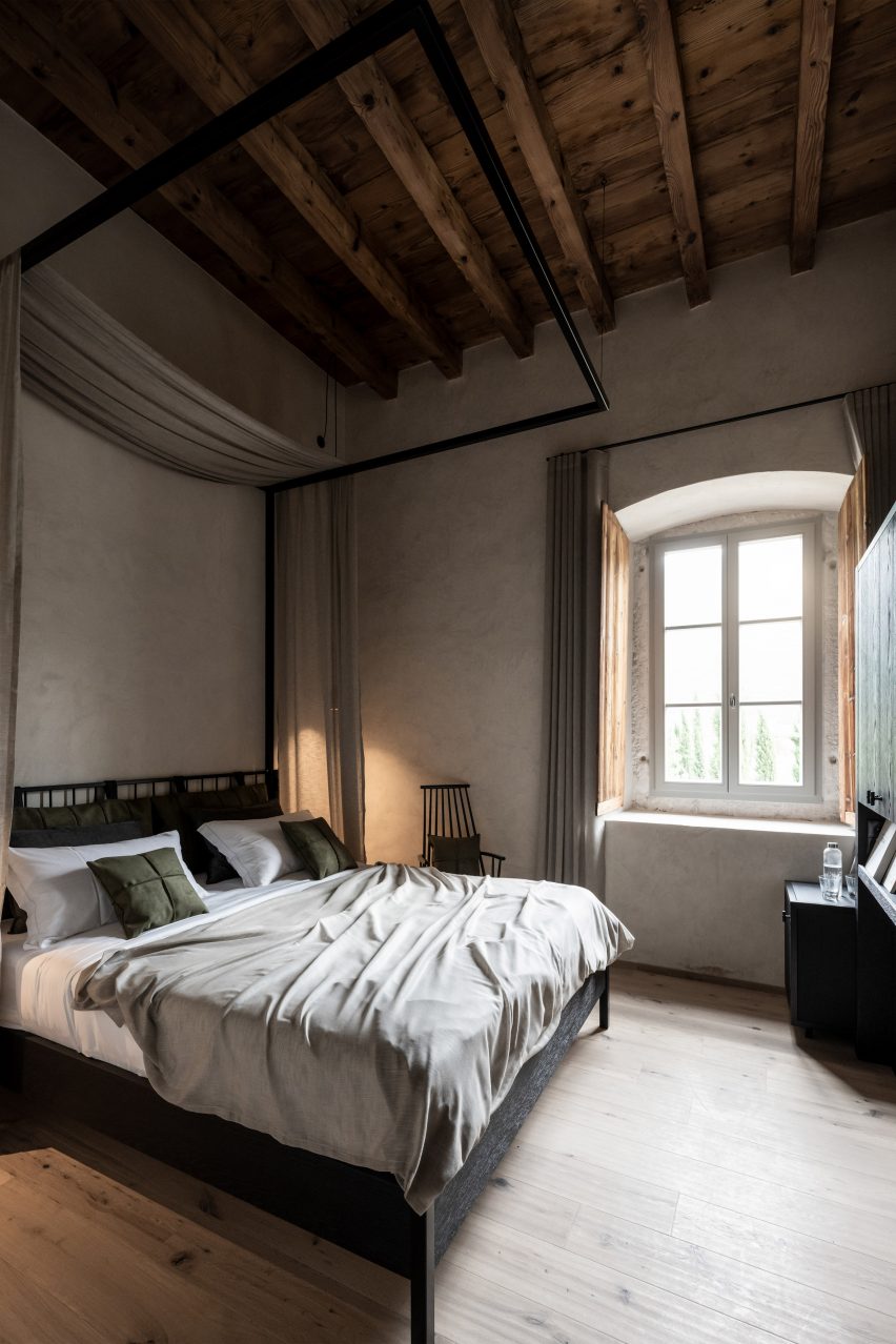
Network of Architecture applied rippled antique-effect plaster to the walls of this 17th-century ex-monastery near Lake Garda, which is now a hotel.

The plaster is complemented by pale wooden floors, black iron furniture and earth-toned fabrics, while the original doors have been retained and restored.

Find out more about Monastero Arx Vivendi ›


Interior of Casolare Scarani in Puglia by Studio Andrew Trotter
Photo by Salva López

Casolare Scarani, Puglia, by Studio Andrew Potter

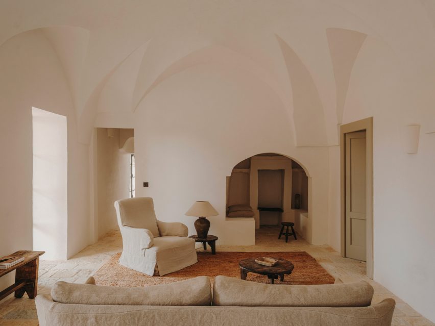
Casolare Scarani is a home created from the renovation of a long-abandoned girls’ school built in the style of a traditional Puglian villa – but still modest in size.

The vaulted ceilings were kept intact and covered in lime plaster, while the rooms were finished with earthy tones and traditional stone flooring.

Find out more about Casolare Scarani ›


Hotel Castello di Reschio
Photo courtesy of Hotel Castello di Reschio

Hotel Castello di Reschio, Umbria, by Count Benedikt Bolza

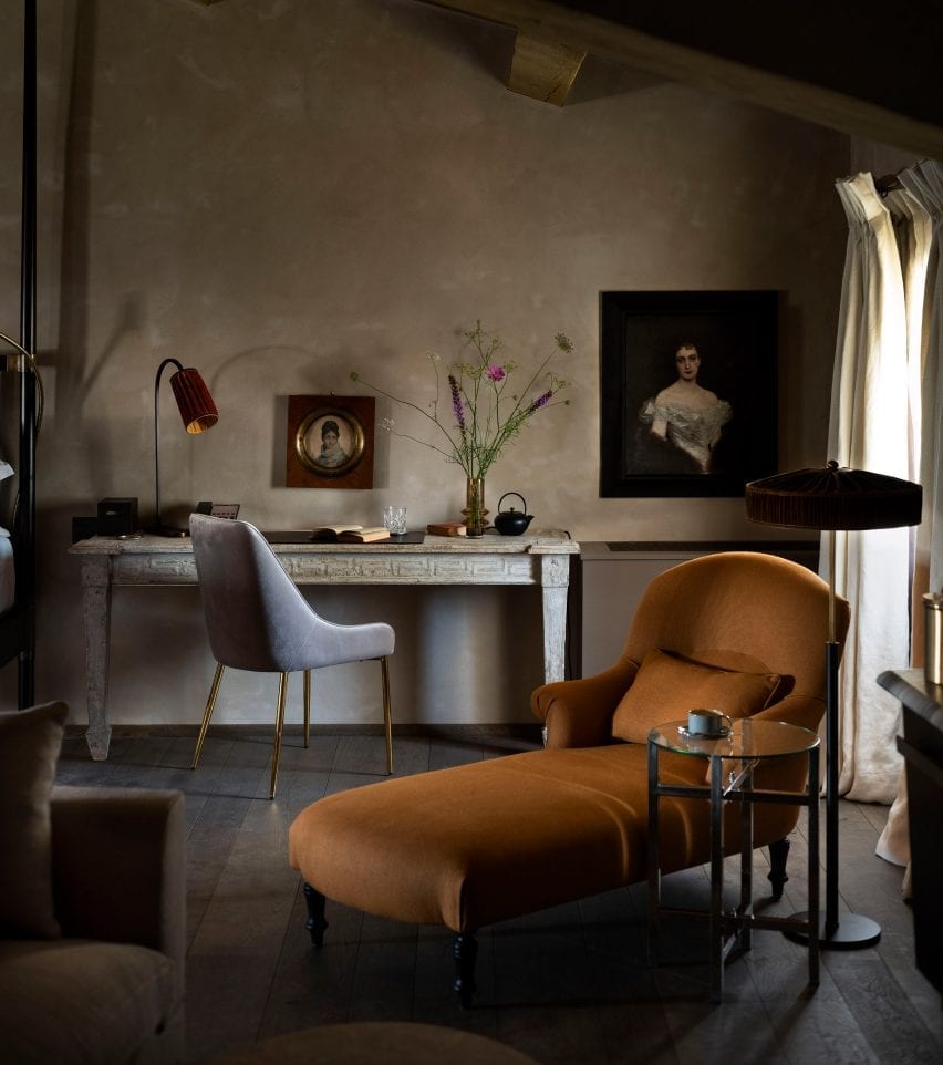
Hotel Castello di Reschio occupies a 1,000-year-old castle in the Umbrian hills that was transformed by count Benedikt Bolza and his family.

Rooms have been decorated with terracotta-brick or wooden floors, hand-stitched linen curtains, Italian fabrics and locally crafted marble and brass vanities alongside portraits sourced from nearby antique markets in a reference to the building’s rich history.

Find out more about Hotel Castello di Reschio ›


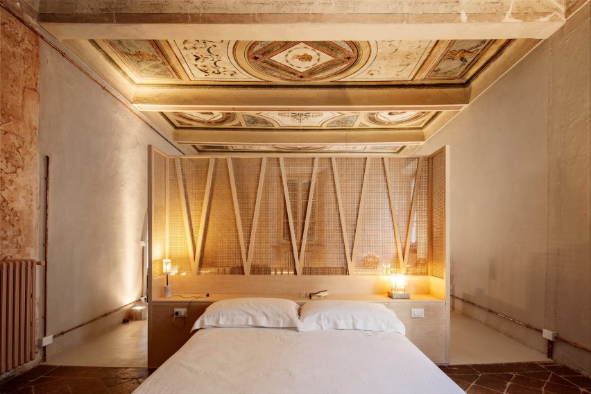
Appartamento Brolettuono by Archiplanstudio
Photo by Davide Galli Atelier

Brolettouno Apartment, Lombardy, by Archiplan

Located in a building in Mantua that dates back to the 15th century, this apartment was overhauled on a budget by local design studio Archiplan.

The studio decided to honour the interior’s timeworn aesthetic by retaining the distressed floor tiles and faded frescos, combining these features with functional light-hued wooden furniture.

Find out more about Brolettouno Apartment ›


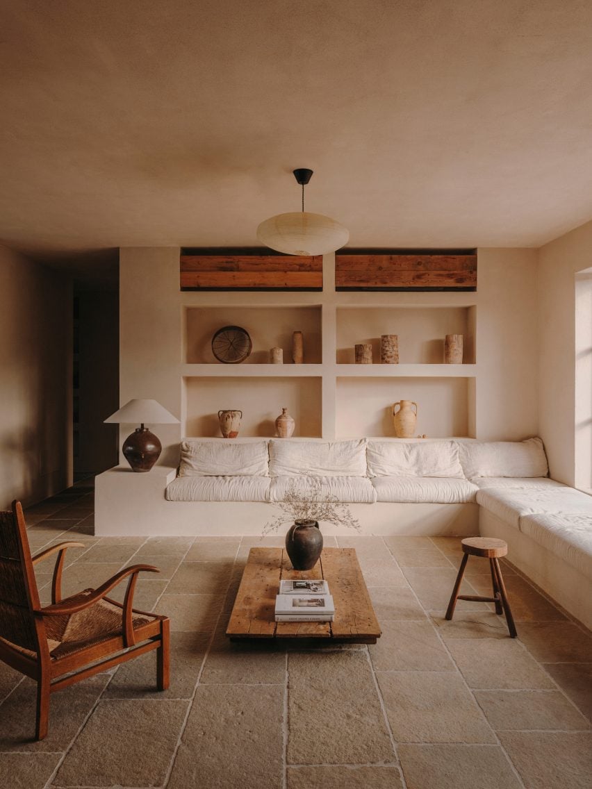
Interior of Casa Maiora by Studio Andrew Trotter in Puglia
Photo by Salva López

Casa Maiora, Puglia, by Studio Andrew Trotter

Another project from Studio Andrew Trotter, this villa is in fact a newly built project – but carries heavy rustic influences from traditional homes in the area.

Flagstone floors, lime-washed walls and locally sourced antiques combine to create a soothing, timeless feel.

Find out more about Casa Maiora ›


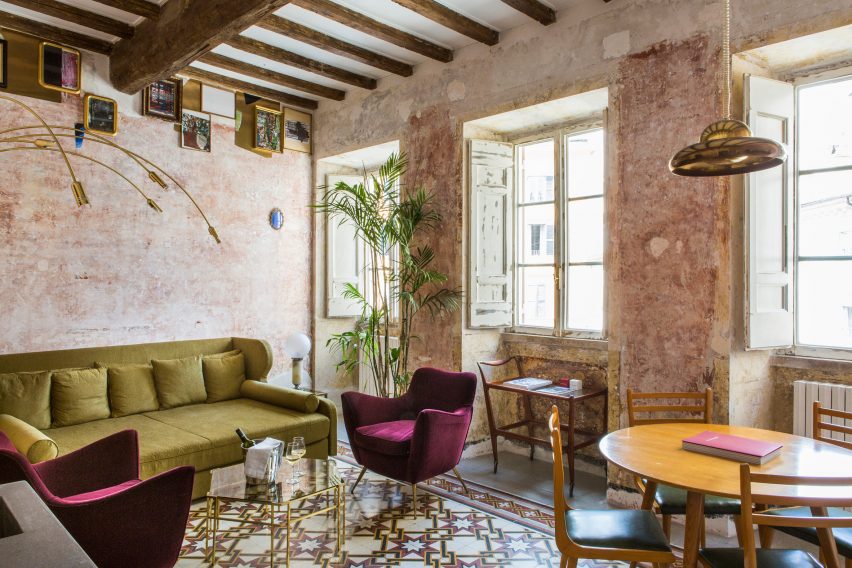
G-Rough hotel Rome
Photo by Serena Eller

G-Rough, Lazio, by Gabriele Salini

Features showcasing the building’s 400-year-old history were juxtaposed with contemporary art and mid-century furnishings at this boutique hotel in Rome, Italy’s capital.

The imperfections of age, particularly on the patina walls, combine with furniture inspired by modernist Italian designers like Ico Parisi, Giò Ponti and Piero Fornasetti for a rough-yet-refined aesthetic.

Find out more about G-Rough ›


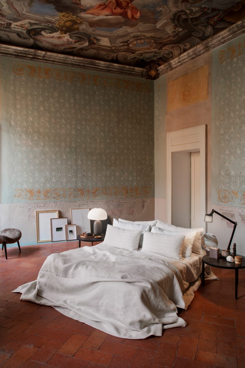
Bedroom at the Vipp pop-up hotel
Photo by Irina Boersma César Machado

Palazzo Monti hotel, Lombardy, by Julie Cloos Mølsgaard and Vipp

A collaboration with Danish homeware brand Vipp saw interior designer Julie Cloos Mølsgaard create a pop-up hotel in a 13-century palazzo in Brescia.

To keep the focus on the building’s many historic features, Mølsgaard took a minimalist approach to the furnishings, with mattresses sitting directly on the floor and artwork propped up against the walls.

Find out more about the Palazzo Monti hotel ›

This is the latest in our lookbooks series, which provides visual inspiration from Dezeen’s archive. For more inspiration see previous lookbooks featuring chequerboard floors, lime plaster walls and Mediterranean-style interiors.

Reference

Eight bright and airy interiors illuminated by perforated brick walls
CategoriesInterior Design

Eight bright and airy interiors illuminated by perforated brick walls

Dezeen’s latest lookbook explores eight interiors – from bright, airy residential spaces to cool, open-plan offices – illuminated by perforated brick walls.

Perforated brick walls are often used as a cooling strategy in warmer climates. This lookbook highlights their effect on the lighting and shading of interior spaces and how they can be used to create a playful, light atmosphere.

This is the latest in our lookbooks series, which provides visual inspiration from Dezeen’s archive. For more inspiration see previous lookbooks featuring homes with light-filled kitchens, sculptural wooden staircases and airy, pared-back loft conversions.


Interiors of Mind Manifestation's self-designed studio in Pune, India
Photo by Hemant Patil

Studio by the Hill, India, by Mind Manifestation

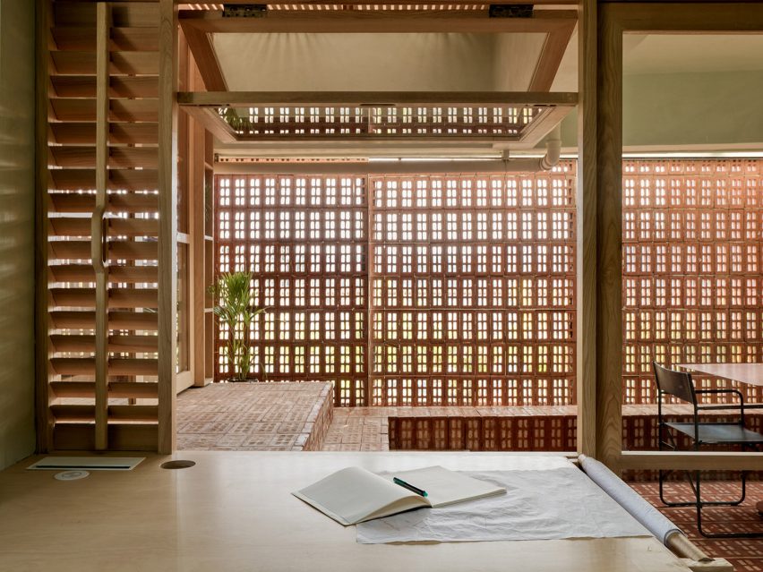
This converted apartment in Pune, India – designed by architecture studio Mind Manifestation to house the studio’s office – uses perforated bricks to create a well-lit and ventilated workspace.

Bricks was used extensively across the flooring and complemented by green lime plaster walls.

“The material palette has been tastefully chosen so as to match with the different shades of the hill throughout the year,” Mind Manifestation explained.

Find out more about Studio by the Hill ›


Cuckoo House by Tropical Space in Da Nang, Vietnam
Photo by Oki Hiroyuki

Cuckoo House, Vietnam, by Tropical Space

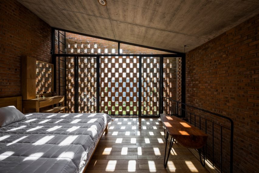
Cuckoo House, designed by Tropical Space, is a two-storey home situated atop a cafe in Da Nang, Vietnam, encased by a shell made from local clay bricks.

Living spaces on the upper floor feature perforated brick for privacy and ventilation, with the design resulting in a playful chequered lighting pattern across the wooden and concrete interior.

Find out more about Cuckoo House ›


Wall House in Vietnam designed by CTA | Creative Architects
Photo by Oki Hiroyuki

Wall House, Vietnam, by CTA

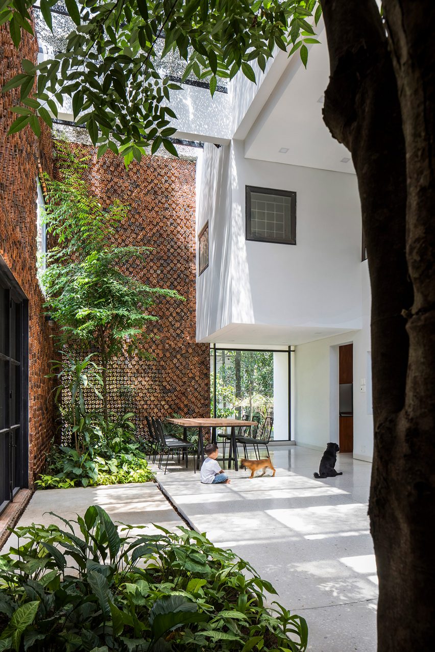
Square perforated bricks salvaged from nearby buildings sites are used on the exterior of CTA’s Wall House in Bien Hoa, Vietnam.

Stacked in an irregular formation, the punctured bricks filter sunlight and air into the space, creating dotted shadows across the plant-filled double-height living room.

Find out more about Wall House ›


Wall House in Vietnam by CTA
Photo by Hemant Patil

Gadi House, India, by PMA Madhushala

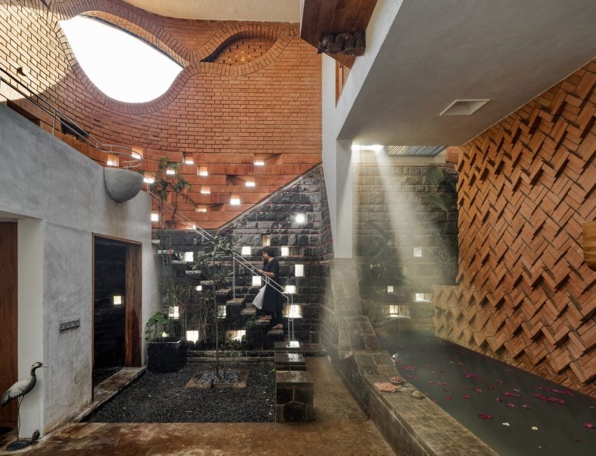
Gadi House in Maval, India, by PMA Madhushala is a compact arrangement of volumes and courtyards.

Dimly-lit courtyards and living spaces are illuminated by pockets of sunlight accessed through perforations in the brick and stone walls.

Find out more about Gadi House ›


Equipo de Arquitectura Intermediate House Narrow Paraguay
Photo by Federico Cairoli

Intermediate House, Paraguay, by Equipo de Arquitectura

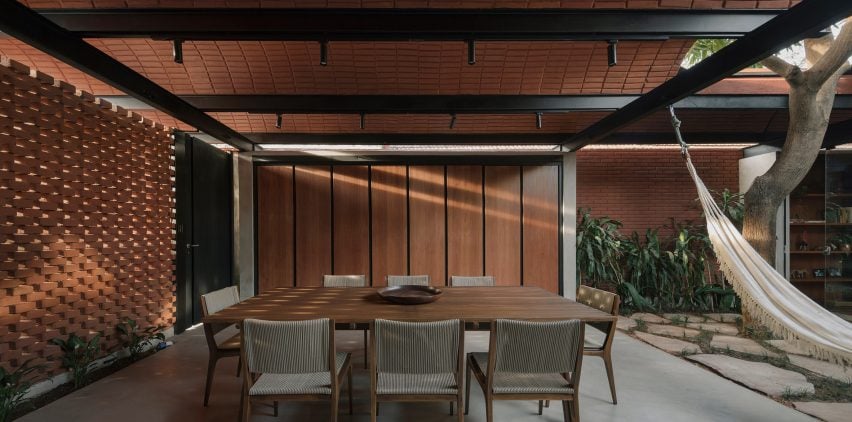
The Intermediate House by Paraguay-based studio Equipo de Arquitectura is a narrow residence in Asunción organised around an open-air courtyard.

Manually pressed, unfired bricks form the perforated street-facing facade – drawing sunlight and air through the vaulted brick-roofed dining room and into adjacent spaces.

Find out more about Intermediate House ›


Tropical Space design perforated brick house in Vietnam
Photo by Oki Hiroyuki

The Termitary House, Vietnam, by Tropical Space

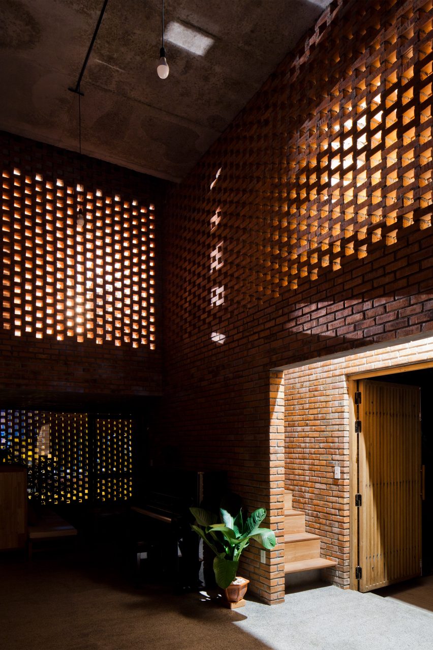
Patterned shadows decorate the dimly-lit brick and wood interior of The Termitary House in Da Nang, Vietnam, designed by Tropical Space.

Inspired by earthen termite nests, the studio used perforated brick on the facade and internal walls to bring natural light into the interiors during the day and draw in artificial light at night.

Find out more about The Termitary House ›


Cloud House in Melbourne designed by Dean Dyson Architects
Photo by Timothy Kaye

Cloud House, Australia, by Dean Dyson Architects

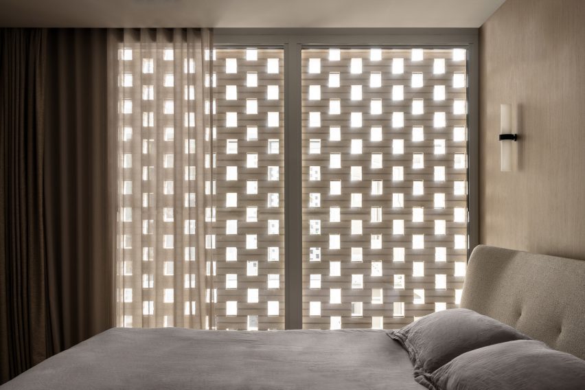
Australian studio Dean Dyson Architects designed the Cloud House – a two-storey home in Malvern – using an exterior layer of grey, perforated brickwork.

Intended to create a “private oasis” for the clients, the perforated brick pours light into the interior living spaces, with passive ventilation enabled by operable windows.

Find out more about Cloud House ›


Tropical Shed
Photo by Joana França

Tropical Shed, Brazil, by Laurent Troost Architectures

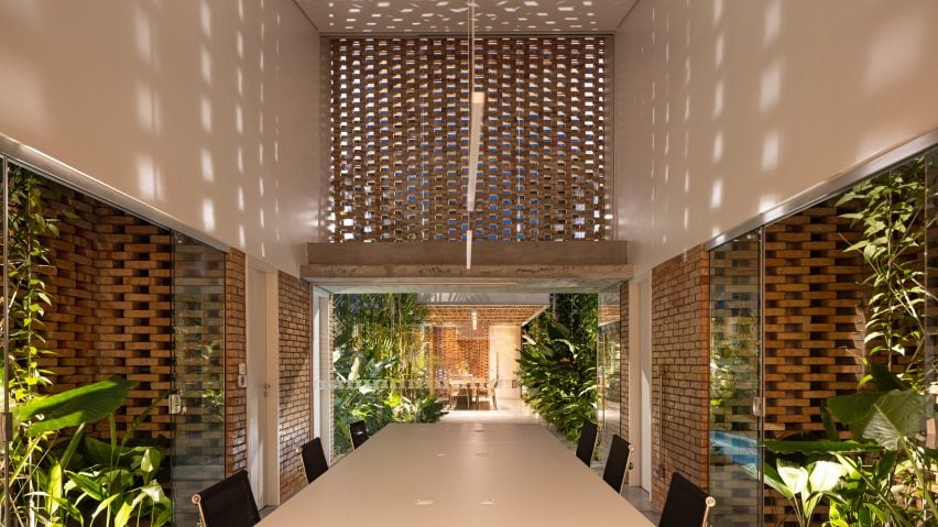
Located on a long, narrow plot in Manaus, Tropical Shed is a plant-filled office with a centralised courtyard designed by Brazilian studio Laurent Troost Architectures.

Interlocking bricks – repeated throughout the design – form a perforated wall in the double-height office to create a cool work environment decorated with playful shadows.

Find out more about Tropical Shed ›

This is the latest in our lookbooks series, which provides visual inspiration from Dezeen’s archive. For more inspiration see previous lookbooks featuring homes with light-filled kitchens, sculptural wooden staircases and airy, pared-back loft conversions.

Reference

Eight imaginative home interiors created on a budget
CategoriesInterior Design

Eight imaginative home interiors created on a budget

In this lookbook, we collect eight residential interiors that were put together with limited funds but still have a certain richness.

Featuring exposed structures, simple materials and sparing use of finishes, these budget interiors prove that adventurous design doesn’t have to be reserved for the very wealthy.

This is the latest in our lookbooks series, which provides visual inspiration from Dezeen’s archive. For more inspiration see previous lookbooks featuring interiors made with reclaimed materials, inviting entrance halls and industrial-but-cosy living rooms.


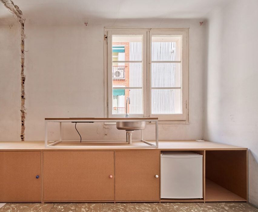
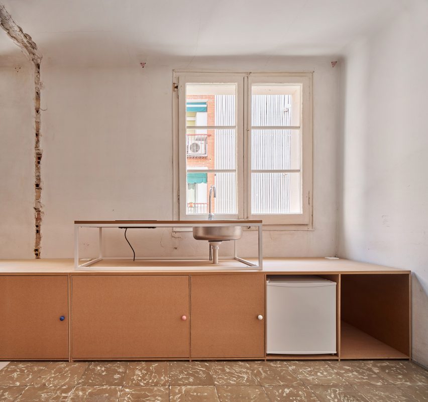
10K House by Takk
Photo by José Hevia

10K House, Spain, by Takk

Renovated on a material budget of only 10,000 euros, this Barcelona apartment takes raw, pared-back aesthetics to extremes.

Leaving traces of dismantled fixtures visible, Spanish studio Takk chose not to apply coatings to the floors and walls, while utilitarian medium-density fibreboard features throughout.

Find out more about 10K House ›


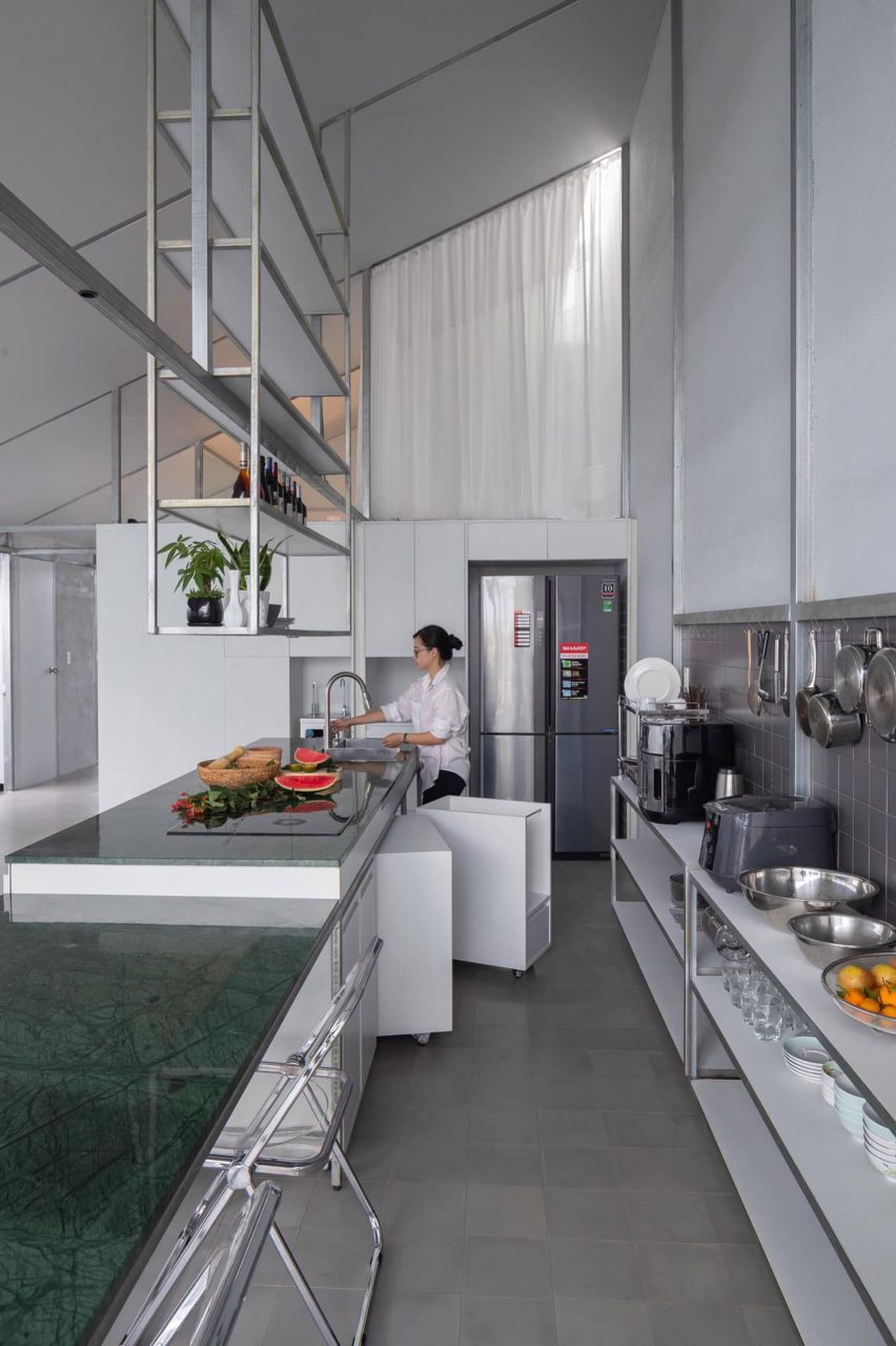
Mono-pitched steel kitchen with green marble table and overhead shelving
Photo by Trieu Chien

Binh Thuan House, Vietnam, by MIA Design Studio

Simple white curtains divide spaces inside the Binh Thuan House, designed by MIA Design Studio for a family of four using limited resources.

An exposed steel frame lends a distinctly industrial feel and is also an easily adaptable means of fitting windows, curtains, furniture and pictures.

Find out more about Binh Thuan House ›


Segal House by Fraher & Findlay
Photo by Taran Wilkhu

Segal House, UK, by Fraher & Findlay

UK architecture studio Fraher & Findlay avoided using specialist trades and bespoke products to keep costs down in the renovation of this house in south London that was originally designed according to Walter Segal’s self-build methods.

Extensive use of plywood meant there was no need to hire a plasterer, for example, while other materials and products were chosen for being widely available off the shelf.

Find out more about Segal House ›


Casa Nakasone by Escobedo Soliz
Photo by Ariadna Polo/Sandra Perez Nieto

Casa Nakasone, Mexico, by Escobedo Soliz

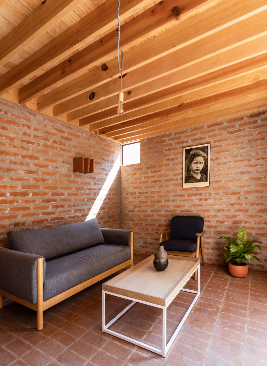
This small, simple house on the outskirts of Mexico City was designed by Escobedo Soliz for a retired teacher.

Cheap structural materials were left exposed in the interiors, such as brickwork walls, tiled floors and pale wooden beams on the ceilings.

Find out more about Casa Nakasone ›


Minimum House is a home in Japan that was designed by Nori Architects
Photo by Jumpei Suzuki

Minimum House, Tokyo, by Nori Architects

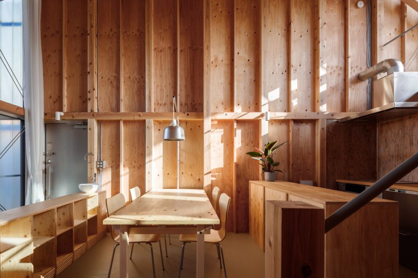
Minimum House, in Tokyo, was designed by Nori Architects as a prototype for a low-cost, low-waste, adaptable model of urban housing.

Ductwork and wiring was left exposed with only simple light fittings, while the timber structure is left uncovered on the walls and used for kitchen and storage units.

Find out more about Minimum House ›


White-tiled bathroom at 105JON
Photo by José Hevia

105JON, Spain, by Vallribera Arquitectes

Simple materials feature throughout this house in Vallès, Spain, modernised by Barcelona studio Vallribera Arquitectes.

Chunky chipboard is a recurring motif, contrasting with blue linoleum flooring in the bathroom and with exposed brick party walls in the living spaces.

Find out more about 105JON ›


Living room of Maison Pour Dodo by Studio Merlin
Photo by Richard Chivers

Maison Pour Dodo, UK, by Studio Merlin

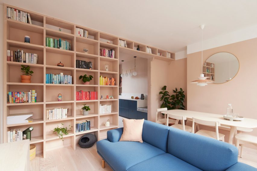
Studio Merlin incorporated an abundance of storage in its revamp of this Stoke Newington flat to ensure that the available space could be kept luxuriously serene and clutter-free.

Touches include a large floor-to-ceiling shelving unit in the living and dining area, and a wall of deep-set IKEA cabinets with smokey blue door fronts from Danish brand Reform in the kitchen.

Find out more about Maison Pour Dodo ›


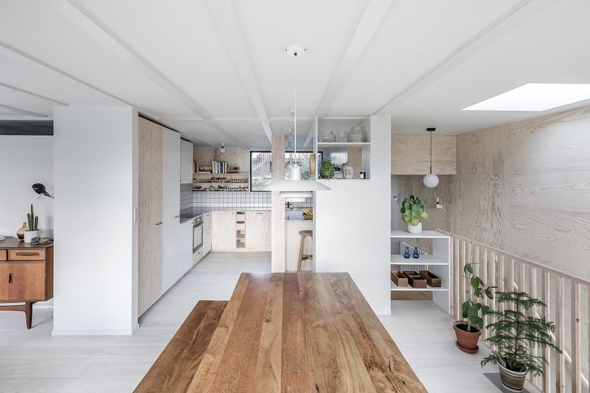
New level in Madrid flat
Photo by Javier de Paz García

UpHouse, Madrid, by CumuloLimbo Studio

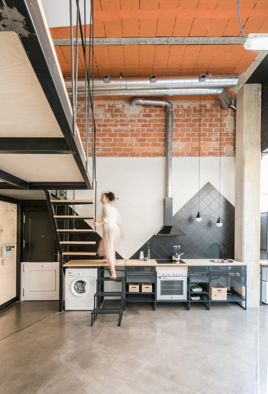
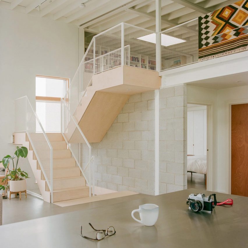
Completed on a shoestring budget of $39,000, this extensive renovation of an apartment in Madrid by CumuloLimbo Studio prioritised using inexpensive materials such as salvaged plywood.

The kitchen area features a simple open shelving system with a black-tile backsplash, while the counter forms part of an unusual staircase leading up into a newly inserted mezzanine.

Find out more about UpHouse ›

This is the latest in our lookbooks series, which provides visual inspiration from Dezeen’s archive. For more inspiration see previous lookbooks featuring interiors made with reclaimed materials, inviting entrance halls and industrial-but-cosy living rooms.

Reference

Dezeen Awards China 2023 interiors shortlist revealed
CategoriesInterior Design

Dezeen Awards China 2023 interiors shortlist revealed

Dezeen has announced the 28-strong interiors shortlist for the inaugural Dezeen Awards China, which includes projects by FOG Architecture, UNStudio and Atelier d’More.

The shortlisted projects, which are in the running for awards in six different interiors project categories, represent the most striking interiors recently created in the country.

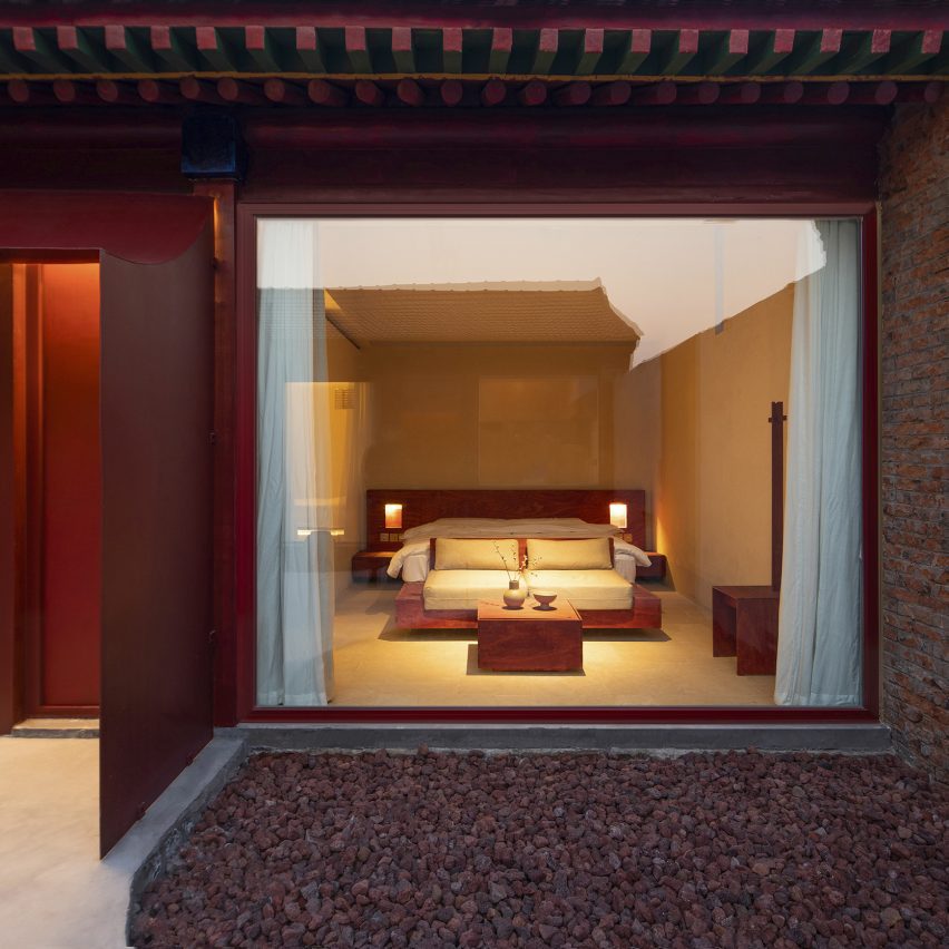
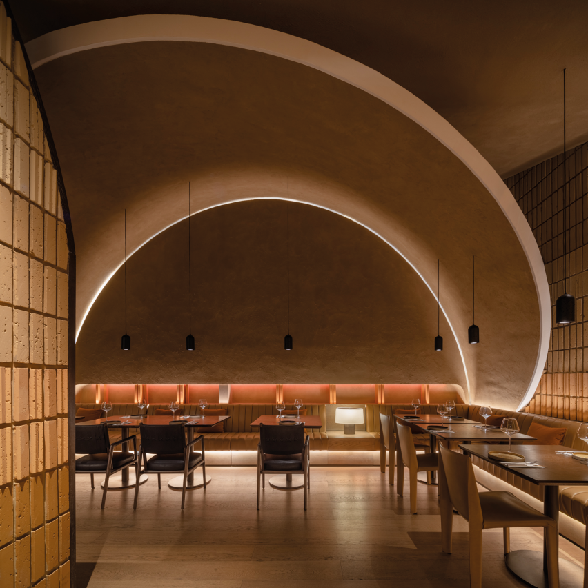
Among the projects, which are located in 14 different cities across China, is a Spanish restaurant in a former prison, a hostel on Shanghai’s Chongming Island that integrates local materials and an office space with mottled concrete walls and exposed steel frames.

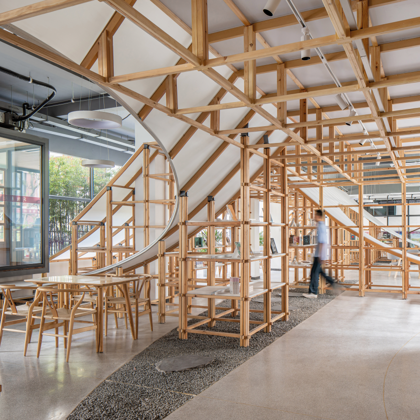
The shortlist also features a library with a sweeping wooden bookshelf and a clothing store informed by local markets.

Dezeen Awards China 2023 shortlists revealed this week

The shortlisted projects were scored by our interior jury which includes interior architect André Fu, Hong Kong-based Alex Mok, US interior designer Kelly Wearstler, Studioilse founder Ilse Crawford and Li Xiang of X+Living.

This is the first edition of Dezeen Awards China, which is in partnership with Bentley Motors. The architecture shortlist was published on Monday and following the interiors shortlist, the projects shortlisted in the design and China designers of the year categories will be unveiled tomorrow and Thursday respectively.

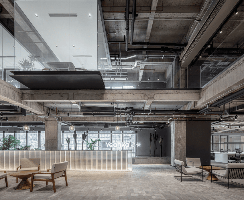
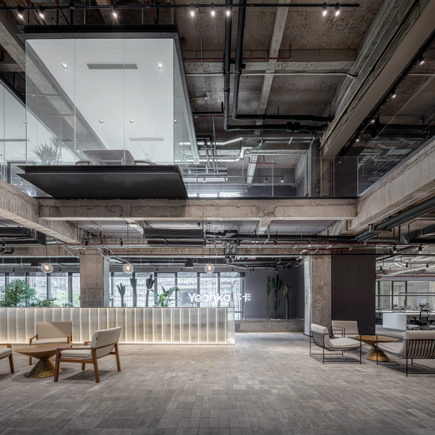
Yeahka Headquarters Office
Above: An office building in Shenzhen’s Kexing Science and Technology Park is one of the shortlisted projects. Photo by Schran Images. Top: Other shortlisted projects include an eye hospital in Taiyuan, China.

All shortlisted interiors are listed below, each with a link to a dedicated page on the Dezeen Awards China website, where you can find more information about the project.

The winner of each interiors project category will be announced at a party in Shanghai in December, with the six winners competing for the title of Chinese interiors project of the year, which is sponsored by Gaggenau.

Read on for the full interiors shortlist:


Light House by 323 Studio. Photo by 323 Studio

Home interior

› Light House, Zhengzhou, by 323 Studio
› Illumined Freedom: An Artistic Home, Hangzhou, Zhejiang, by More Design Office
› Z&S House, Hangzhou, Zhejiang, by Outlooker Design
› Beijing West Road Private Residence, Shanghai, by Slow Studio
› Muzi House, Shanghai, by Wuy Architects


This is Zack! by Guò Bàn Ér. Photo by Boris Shiu

Workplace interior

› NCDA Studio, Hong Kong, by NC Design & Architecture
› Yeahka Headquarters Office, Shenzhen, by JSPA Design
› Phantom Rings: S-Game Office, Beijing, by LYCS Architecture
› Diningr:um, Shanghai, by Pronounced Design
› This is Zack!, Beijing, by Guò Bàn Ér


Book Mountain Store by Ray&Emilio Studio. Photo by Ray&Emilio Studio

Retail interior

› To Summer Beijing Flagship Store, Beijing, by FOG Architecture
› FREITAG Store Shanghai, Shanghai, by Kooo Architects
› ZUCZUG Bazaar, Xiamen, by Sò Studio
› Book Mountain Bookstore, Hangzhou, Zhejiang, by Ray&Emilio Studio


Self Revealing
Self Revealing by Studio X4. Photo courtesy of Studio X4

Health and wellbeing interior

› FlySolo Rehabilitation Medical Centre, Beijing, by UNStudio
› Self Revealing, Taipei, by StudioX4
› Big Eyes Panda Eye Hospital, Taiyuan, by Karv One Design
› BoF hair salon, Zhengzhou, by Name Lab


Twosome Inn
Twosome Inn by Atelier d’More. Photo by Atelier d’More

Hotel and short-stay interior

› Cloud Retreat Hotel, Ganzhou, by Shanghai Cocoon Studio
› Sunac Mogan Valley Zhulinli Demonstration Area, Deqing, Yunnan, by WJ Studio
› The Tree and Villa, Dali, Yunnan, by Fusion Design & Architecture
› Som Land Hostel, Chongming Island, Shanghai, by RooMoo Design Studio
› Twosome Inn, Beijing, by Atelier d’More


RooMoo Design Studio
B3 by RooMoo Design Studio. Photo by RooMoo Design Studio

Restaurant and bar interior

› B3, Shenzhen, Guangzhou, by RooMoo Design Studio
› Lai Zhou Bar, Shanghai, by RooMoo Design Studio
› Artifact Bar, Hong Kong, by NC Design & Architecture
› Agora, Hong Kong, by Collective
› Biiird Yakitori, Guangdong, by Biger Club Design

Dezeen Awards China 2023

Dezeen Awards China is the first regional edition of Dezeen Awards, to celebrate the best architecture, interiors and design in China. The annual awards are in partnership with Bentley Motors, as part of a wider collaboration that will see the brand work with Dezeen to support and inspire the next generation of design talent in China.

Reference

Five interiors with furry walls that beg to be touched
CategoriesInterior Design

Five interiors with furry walls that beg to be touched

Faux fur is liberated from the realm of fashion and used to cover entire walls in this lookbook, which rounds up five interior projects including an igloo-shaped children’s room and a surreal Prada set by AMO.

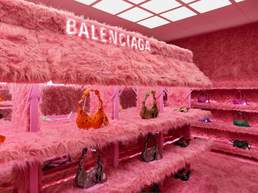
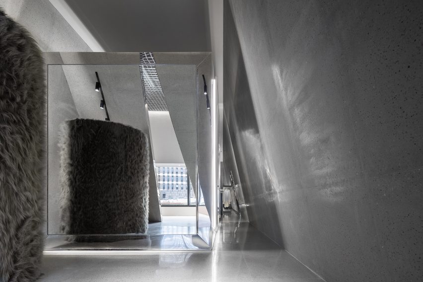
Rendered in grabby colours, furry textiles are increasingly being used by interior designers to make retail environments feel more enticing, as seen below in the all-pink makeover of Balenciaga’s London store and the monochrome grey fit-out of Chinese womenswear boutique SND.

But in colder climes – like the ski town of Aspen – fake fur can also serve a practical purpose by providing some much-needed cosiness.

Read on for five examples of interiors that are using this unconventional material on an architectural scale.

This is the latest in our lookbooks series, which provides visual inspiration from Dezeen’s archive. For more inspiration see previous lookbooks featuring subway-tiled bathrooms, chequerboard floors and rustic Italian interiors.


Sant Ambroeus Coffee Bar Aspen, US, by Giampiero Tagliaferri Studio
Photo by Billal Baruk Taright

Sant Ambroeus Coffee Bar Aspen, US, by Giampiero Tagliaferri Studio

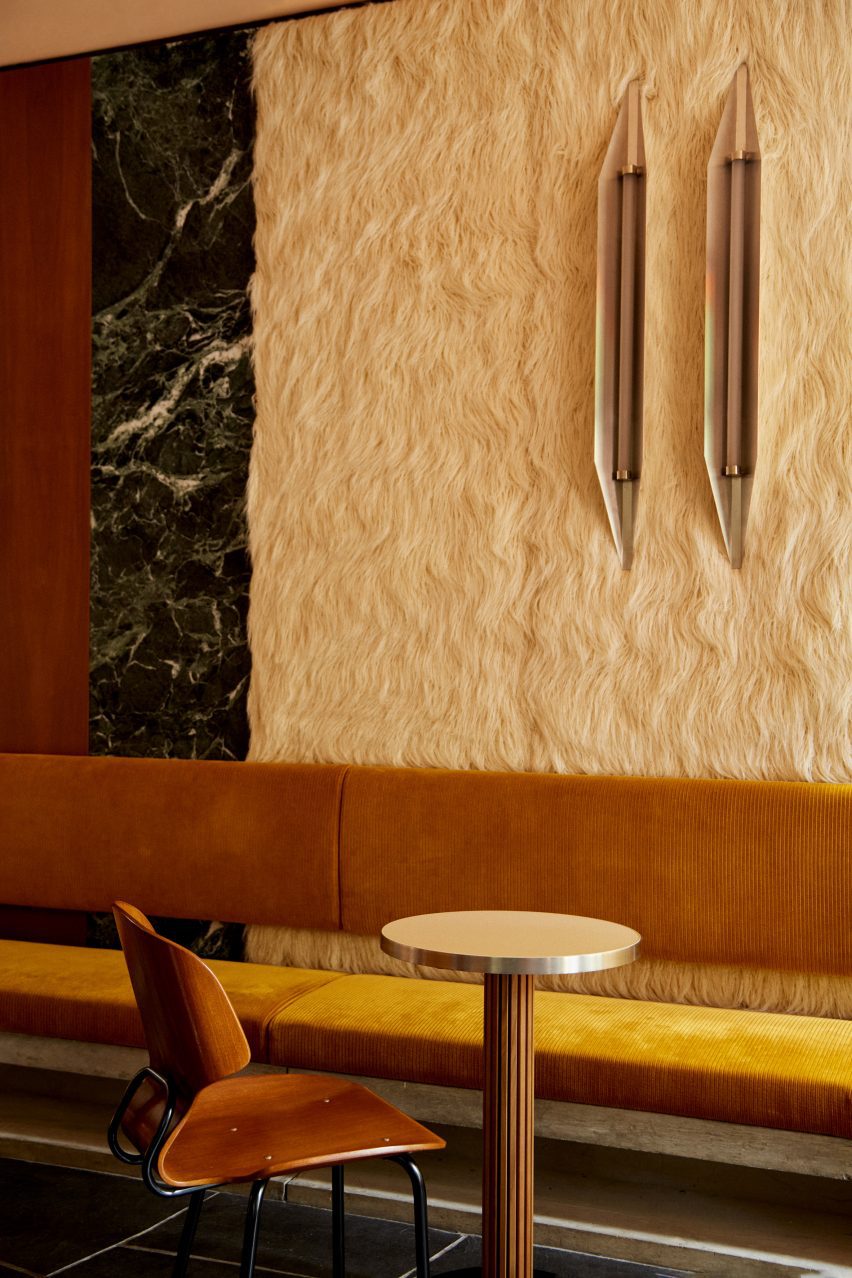
Cosy Alpine touches meet midcentury Italian glamour inside this coffee bar that designer Giampiero Tagliaferri has completed in the ski town of Aspen.

Here, the walls are clad in alternating panels of walnut wood, deep green Verde Alpi marble and faux fur that was designed to resemble shaggy Mongolian lamb wool.

Find out more about the Sant Ambroeus Coffee Bar Aspen ›


Mount Street store, UK, by Balenciaga

Mount Street store, UK, by Balenciaga

Every surface inside Balenciaga’s London store – from the walls and floors to the columns and shelves – was wrapped in furry bright pink textile as part of a temporary installation last April.

The intervention was designed to celebrate the brand’s popular Le Cagole bag and its maximalist spirit, with the materials used now set to be reused for future projects.

“We are currently researching the best way in which we can donate the faux fur, so that it can be reused in manufacturing toys for example,” Balenciaga told Dezeen.

Find out more about the Mount Street store ›


Winter Bedroom (for a Big Grrl), Spain, by Takk
Photo by José Hevia

Winter Bedroom (for a Big Grrl), Spain, by Takk

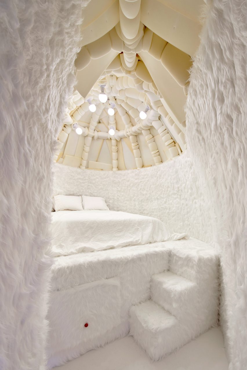
This winter-themed bedroom belongs to the young daughter of Spanish designers Mireia Luzárraga and Alejandro Muiño and is topped with a 3.5-metre-high dome designed to resemble an igloo.

Fuzzy white carpet clads almost every inch of the space to create the impression that the all-white interior is covered in a blanket of snow.

Find out more about Winter Bedroom (for a Big Grrl) ›


Prada AW21 2021 menswear show, Italy, by Rem Koolhaas and AMO
Photo by Agostino Osio

Prada AW21 2021 menswear show, Italy, by Rem Koolhaas and AMO

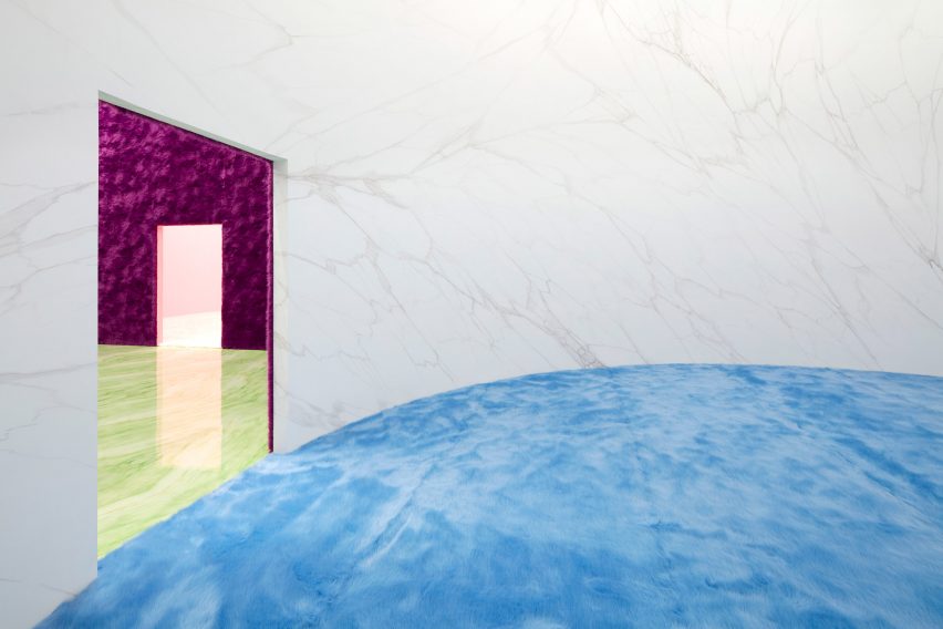
For Prada’s Autumn Winter 2021 menswear presentation, research studio AMO created a sequence of four geometric rooms designed to create “the illusion of a never-ending route”.

Each room inverts the material arrangements of the one that came before, with white marble walls and fluffy sky-blue carpet making way for glossy stone flooring and furry walls in a moody magenta colour.

Find out more about the Prada AW21 menswear show ›


SND Boutique Buyer's Shop by Various Associates
Photo by Shao Feng

SND boutique, China, by Various Associates

In the absence of colour, Chinese studio Various Associates relied on contrasting textures and dramatically slanted walls to provide aesthetic interest inside this womenswear store in Chongqing, China.

The interior combines furry changing-room pods will full-height mirrors to make the store feel more “visually magical and spacious”.

Find out more about SND boutique ›

This is the latest in our lookbooks series, which provides visual inspiration from Dezeen’s archive. For more inspiration see previous lookbooks featuring subway-tiled bathrooms, chequerboard floors and rustic Italian interiors.

Reference

ICRAVE unveils sci-fi interiors of MSG Sphere Las Vegas
CategoriesInterior Design

ICRAVE unveils sci-fi interiors of MSG Sphere Las Vegas

US studio ICRAVE has revealed images of the public spaces inside the world’s largest spherical structure in Las Vegas.

Chosen through an international competition, ICRAVE was tasked with designing the interiors of the public spaces within the MSG Sphere Las Vegas by Sphere Entertainment – the giant venue’s operator.

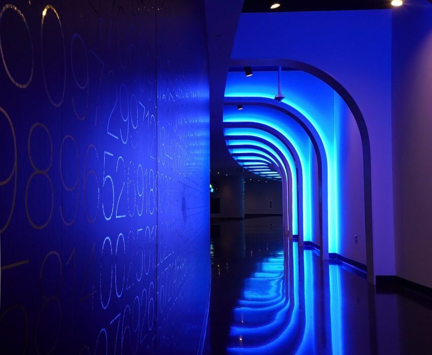
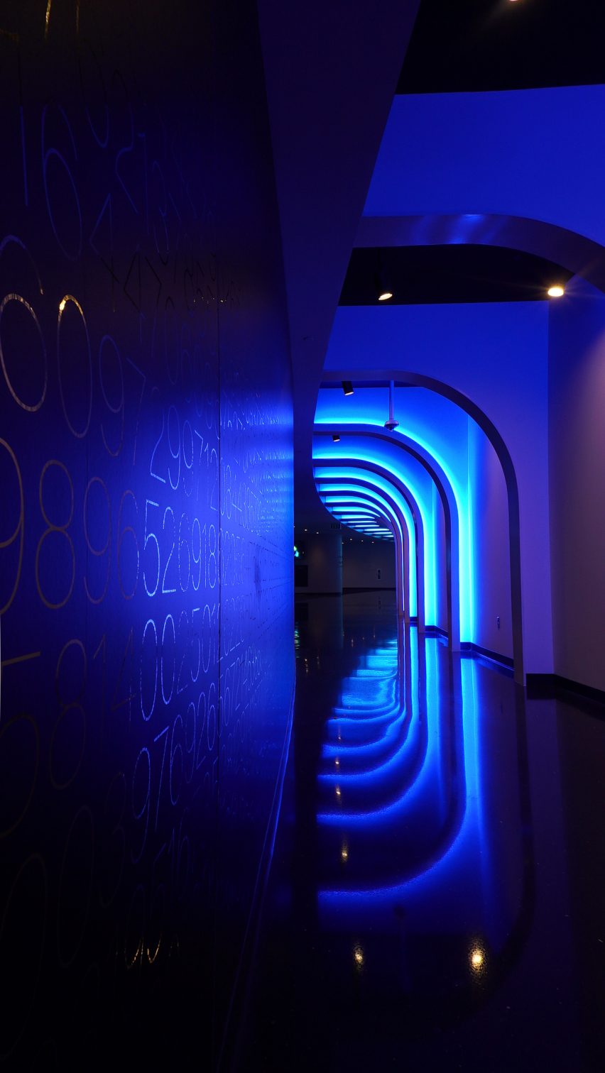
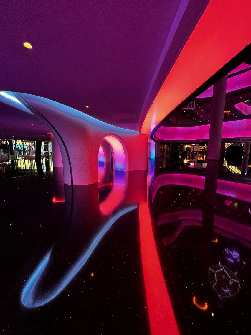
Dark tunnel with arches illuminated with blue light
Upon entering the MSG Sphere Las Vegas, visitors are ushered through an arched passageway

The scope included the building’s entry bridges, lobby and guest welcome areas, the main concourse, food and beverage outlets, as well as private artist dressing rooms, and VIP clubs and suites.

The 20,000-person venue, designed by architecture firm Populous, was unveiled over the summer.

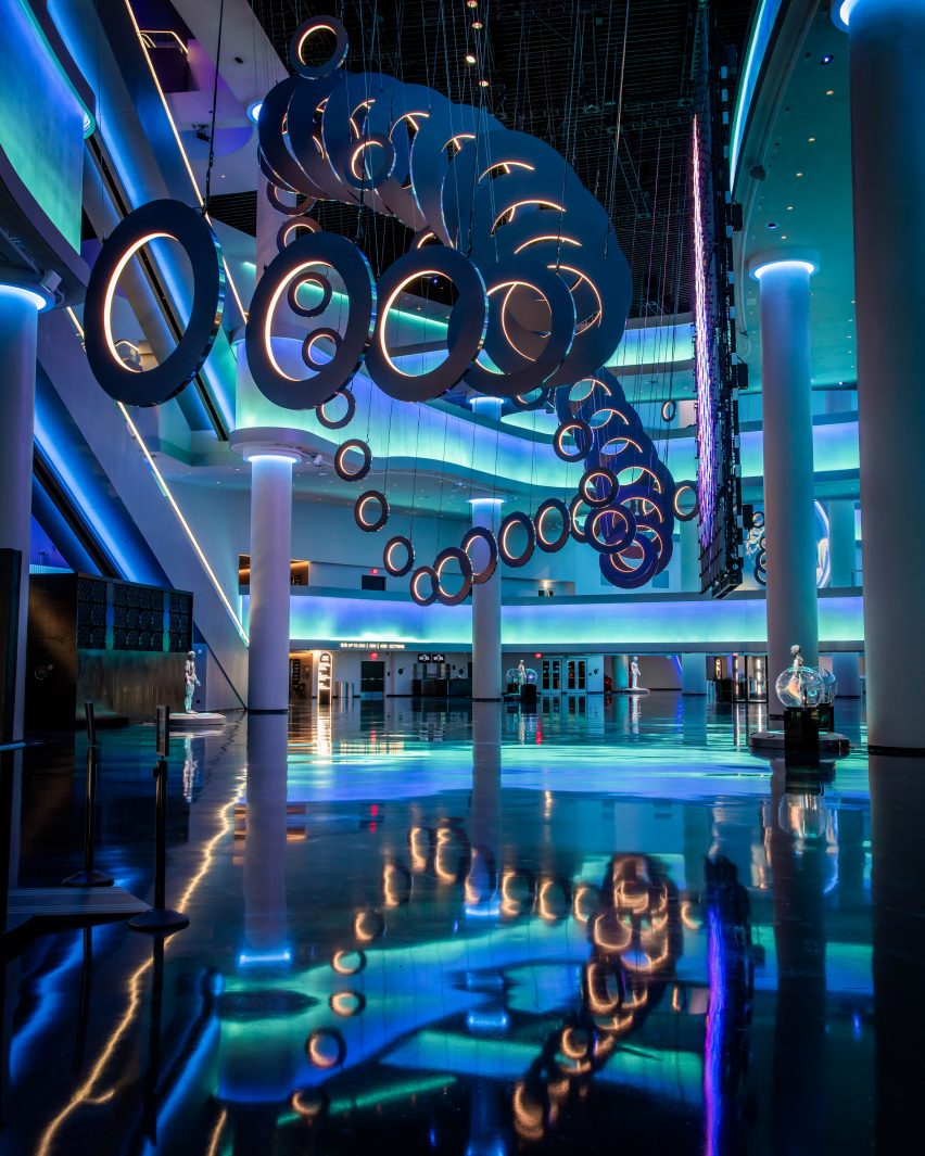
Atrium with shiny black floors and walls lit up in blue
In the main atrium, the building’s curves continue across the intersecting balconies and bridges. This photo and top are by Rich Fury / Sphere Entertainment

While the building’s exterior is covered with 580,000 square feet (53,900 square metres) of programmable LED panels, the inside glows with bands of coloured indirect lighting.

“The spectacle that is Sphere on the outside sets the stage and bar for how magical the designed experience ICRAVE was tasked with must be on the inside,” said the studio, which has offices in New York City and Miami and is led by Lionel Ohayon.

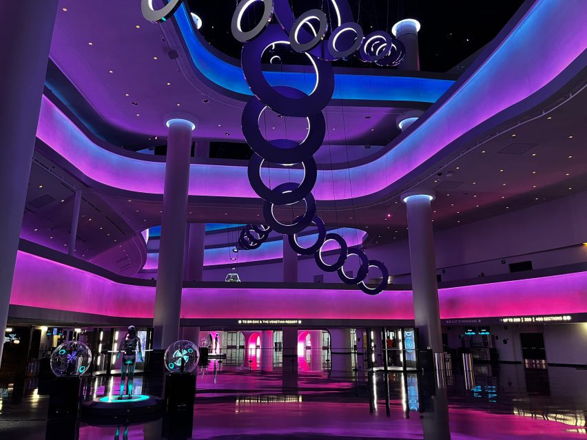
Pink lighting in the atrium
The colourful indirect lighting throughout the public spaces can be customised for different performances

Upon entering the venue, visitors are ushered through a series of repeated illuminated archways before arriving in a vast eight-storey atrium.

Here, the building’s curved form is continued through a series of sweeping balconies and bridges, which intersect at different points across multiple levels to create “a sense of continuous motion”.

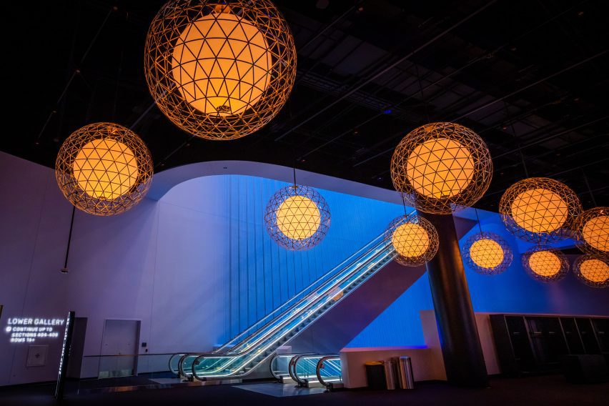
Thresholds and doorways are also shaped as either circles or ovals, while beside the escalators, a 160-foot-tall (49-metre) scrim wall hanging acts as a huge lenticular light installation.

Reflective black terrazzo flooring creates a sci-fi feel within the public spaces, which is further enhanced by the coloured lighting.

Arched opening in a pink-lit wall
Thresholds and doorways are shaped as circles and arches, while black terrazzo flooring reflects the light

“The lighting sets the tone and ‘performs’ as part of the Sphere experience from entry, to Atrium activation, to showtime, and as you transition out of Sphere and back to the bustle of Vegas,” ICRAVE said.

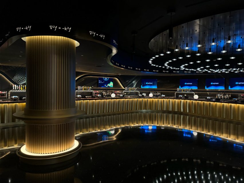
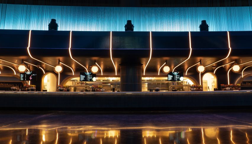
The studio also designed the various food and beverage spaces within the venue, each carrying a distinct character.

Dark bar area with gold-lit counter and column
Each of the food and beverage outlets features a different design

Tucked into areas where the ceiling height is lower, these bars and food vendor spots include fluted panels, dark counters, and more indirect lighting.

Throughout the building, mathematical graphics added to surfaces are derived from the equations used in the Sphere’s construction.

In the dressing rooms, artists can enjoy lounge areas and massage chairs, as well as makeup stations, private bathrooms and showers.

Meanwhile, the VIP viewing suites feature a mix of absorptive and reflective materials intended not to distract from the performances.

Long bar with lighting installations
The venue can accommodate up to 20,000 visitors

“In an effort to create a transformative entertainment space that takes artists and fans out of the mundane and into the future, ICRAVE sought to bring life to every inch of Sphere, not just the stage,” said the studio.

“With a sophisticated mix of lighting, soundscape, visuals, ambiance and tactile elements, audiences and the artists will have a captivating experience like nowhere else in the world.”

Scrim wall behind an escalator bank, with spherical pendant lights in the foreground
A huge scrim wall behind the escalators acts like a lenticular lighting installation. Photo by Rich Fury / Sphere Entertainment

The Sphere began its programming in October with a concert by U2, featuring visuals by designer Es Devlin, artist John Gerrard and more on an enormous wrap-around screen.

A similar venue was also planned for London, but the government put the project on hold earlier this year to give the Secretary of State more time to review the proposal.

The photography is by ICRAVE unless stated otherwise.


Project credits:

Owner and developer: Sphere Entertainment
Architect: Populous
Interior designer: ICRAVE
Lighting designer: Journey
Audio engineer: ARUP
Audio tech / manufacturer: Holoplot

Reference

Ten rustic Italian interiors that evoke the historic Mediterranean
CategoriesInterior Design

Ten rustic Italian interiors that evoke the historic Mediterranean

This lookbook collects 10 interiors in Italy with a distinctly rustic feel, including homes and hotels replete with wooden beams, cool stone and other rich textures.

As well as being known for its contemporary furniture and lighting design, Italy is home to some of Europe’s oldest buildings and has numerous historic cities and villages.

From a 17th-century house in Puglia to a hotel in a 1,000-year-old castle, below are 10 examples of projects that pay homage to the Mediterranean country’s history while catering to modern tastes.

This is the latest in our lookbooks series, which provides visual inspiration from Dezeen’s archive. For more inspiration see previous lookbooks featuring chequerboard floors, lime plaster walls and Mediterranean-style interiors.


Monteverdi Tuscany boutique hotel by Michael Cioffi and Ilaria Miani
Photo courtesy of Monteverdi Hotel

Monteverdi Hotel, Tuscany, by Ilaria Miani

Restoration specialist and interior designer Ilaria Miani helped transform several crumbling buildings in Val d’Orcia into a boutique hotel that aims to balance the history of the area with contemporary design influences from Milan and Rome.

In the bedroom suites, chunky exposed beams made from salvaged wood are complemented by natural colours and textures, while nearly all the furniture is handmade by local artisans.

Find out more about Monteverdi Hotel ›


Cascina by Jonathan Tuckey Design
Photo by Francesca Iovene

Cascina, Piemonte, by Jonathan Tuckey Design

London-based Jonathan Tuckey Design was tasked with returning this 19th-century farmhouse in northern Italy to its original state following a heavy 1980s renovation.

Stone walls and wooden beams now feature prominently, with a cool chalky palette offset by brass lamps and chestnut panelling and furniture.

Find out more about Cascina ›


Casa Soleto living room
Photo by Salva López

Casa Soleto, Puglia, by Studio Andrew Trotter and Marcelo Martínez

Parts of Casa Soleto in Puglia are more than 400 years old. Architecture firm Studio Andrew Trotter and its studio manager Marcelo Martínez renovated the building without making any structural changes, leaving the irregular walls in place.

To give the interiors an authentic, natural feel, the designers used lime plaster for the walls, linen fabrics for the sofas and curtains, jute rugs, terracotta ceramics and antique furniture.

Find out more about Casa Soleto ›


Monastero Arx Vivendi
Photo by Alex Filz

Monastero Arx Vivendi, Trentino-Alto Adige, by Network of Architecture

Network of Architecture applied rippled antique-effect plaster to the walls of this 17th-century ex-monastery near Lake Garda, which is now a hotel.

The plaster is complemented by pale wooden floors, black iron furniture and earth-toned fabrics, while the original doors have been retained and restored.

Find out more about Monastero Arx Vivendi ›


Interior of Casolare Scarani in Puglia by Studio Andrew Trotter
Photo by Salva López

Casolare Scarani, Puglia, by Studio Andrew Potter

Casolare Scarani is a home created from the renovation of a long-abandoned girls’ school built in the style of a traditional Puglian villa – but still modest in size.

The vaulted ceilings were kept intact and covered in lime plaster, while the rooms were finished with earthy tones and traditional stone flooring.

Find out more about Casolare Scarani ›


Hotel Castello di Reschio
Photo courtesy of Hotel Castello di Reschio

Hotel Castello di Reschio, Umbria, by Count Benedikt Bolza

Hotel Castello di Reschio occupies a 1,000-year-old castle in the Umbrian hills that was transformed by count Benedikt Bolza and his family.

Rooms have been decorated with terracotta-brick or wooden floors, hand-stitched linen curtains, Italian fabrics and locally crafted marble and brass vanities alongside portraits sourced from nearby antique markets in a reference to the building’s rich history.

Find out more about Hotel Castello di Reschio ›


Appartamento Brolettuono by Archiplanstudio
Photo by Davide Galli Atelier

Brolettouno Apartment, Lombardy, by Archiplan

Located in a building in Mantua that dates back to the 15th century, this apartment was overhauled on a budget by local design studio Archiplan.

The studio decided to honour the interior’s timeworn aesthetic by retaining the distressed floor tiles and faded frescos, combining these features with functional light-hued wooden furniture.

Find out more about Brolettouno Apartment ›


Interior of Casa Maiora by Studio Andrew Trotter in Puglia
Photo by Salva López

Casa Maiora, Puglia, by Studio Andrew Trotter

Another project from Studio Andrew Trotter, this villa is in fact a newly built project – but carries heavy rustic influences from traditional homes in the area.

Flagstone floors, lime-washed walls and locally sourced antiques combine to create a soothing, timeless feel.

Find out more about Casa Maiora ›


G-Rough hotel Rome
Photo by Serena Eller

G-Rough, Lazio, by Gabriele Salini

Features showcasing the building’s 400-year-old history were juxtaposed with contemporary art and mid-century furnishings at this boutique hotel in Rome, Italy’s capital.

The imperfections of age, particularly on the patina walls, combine with furniture inspired by modernist Italian designers like Ico Parisi, Giò Ponti and Piero Fornasetti for a rough-yet-refined aesthetic.

Find out more about G-Rough ›


Bedroom at the Vipp pop-up hotel
Photo by Irina Boersma César Machado

Palazzo Monti hotel, Lombardy, by Julie Cloos Mølsgaard and Vipp

A collaboration with Danish homeware brand Vipp saw interior designer Julie Cloos Mølsgaard create a pop-up hotel in a 13-century palazzo in Brescia.

To keep the focus on the building’s many historic features, Mølsgaard took a minimalist approach to the furnishings, with mattresses sitting directly on the floor and artwork propped up against the walls.

Find out more about the Palazzo Monti hotel ›

This is the latest in our lookbooks series, which provides visual inspiration from Dezeen’s archive. For more inspiration see previous lookbooks featuring chequerboard floors, lime plaster walls and Mediterranean-style interiors.

Reference

Eight quiet luxury interiors from Biarritz to Stockholm
CategoriesInterior Design

Eight quiet luxury interiors from Biarritz to Stockholm

Our latest lookbook focuses on quiet luxury and features projects including a French hotel and a Swedish Grace apartment that exemplify the trend for discrete, yet sumptuous interiors.

Classic, hardwearing materials and simple, neutral colour palettes characterise these eight quiet luxury interiors, which convey an elegant feeling without being over-the-top.

Gleaming marble decorates bathrooms and hallways, while polished wood and soft, tactile textiles add an exquisite touch to bedrooms and living rooms.

To create these quiet luxury interiors, designers have focused on the contrast and texture of different materials and added details such as sprigs of flowers and timeless designer furniture pieces.

This is the latest in our lookbooks series, which provides visual inspiration from Dezeen’s archive. For more inspiration see previous lookbooks featuring airy loft conversions, kitchen islands with waterfall countertops and art-filled living rooms.


Bedroom interior of Clermont Residence
Photo is by Gokul Rao Kadam

Clermont residence, India, by FADD Studio

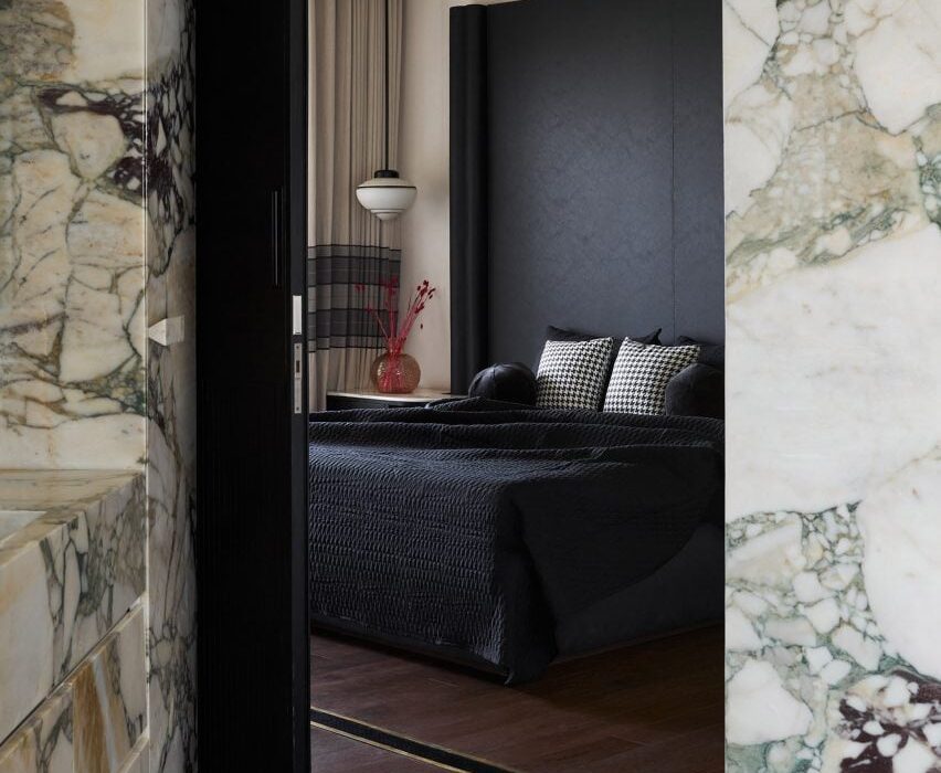
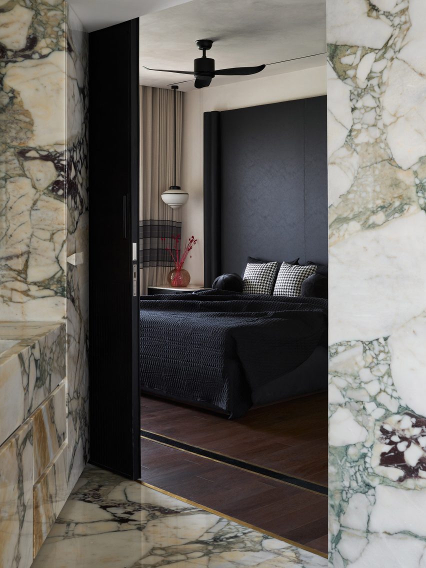
This multi-generational home in Bangalore, India, is a prime example of how the right material choice can make an apartment feel sophisticated without needing to splurge on many additional features.

Designer FADD Studio clad the bathroom in veiny marble for a striking effect, underlined by the contrast with the dark wood floor of one of the six bedrooms.

Find out more about Clermont residence ›


Dining room interior of Republique apartment by Hauvette & Madani
Photo is by Yannick Labrousse

Republique apartment, France, by Hauvette & Madani

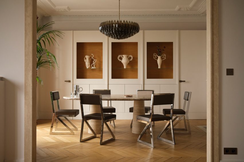
While this Paris apartment has a striking wine-red kitchen, the rest of the colour palette was kept neutral, but clever material use has given it a decidedly upmarket feel.

In the dining room, chromed cantilevered dining chairs have been combined with a marble table. A lustrous herringbone parquet floor adds a natural feel, while a playful modern chandelier in smoke-coloured glass completes the interior.

Find out more about Republique apartment ›


Bathroom in Biarritz hotel
Photo is by Mr Tripper

Regina Experimental, France, by Dorothée Meilichzon

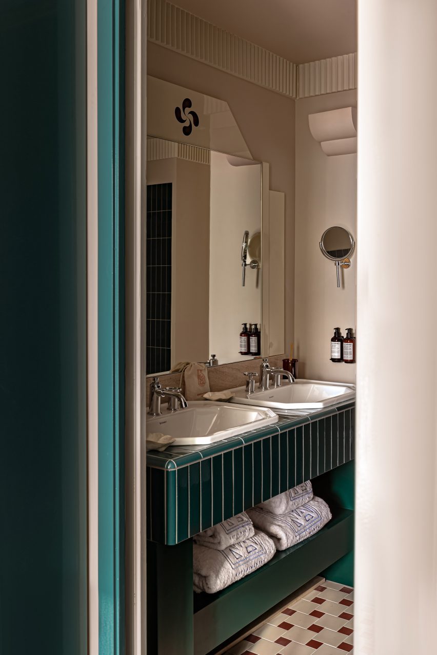
Located in a Belle Epoque-era hotel in the French seaside town of Biarritz, the Regina Experimental hotel has a number of luxurious touches.

In this bathroom, combining the colour of the doorframe and shelving with tiles in the same hue creates a coherent, stylish interior.

Fluted panelling at the top of the walls, classic porcelain sinks and shell-shaped soap holders add a nautical vibe.

Find out more about Regina Experimental ›


Interior of Stockholm apartment
Photo is courtesy of Note Design Studio

Habitat 100, Sweden, by Note Design Studio

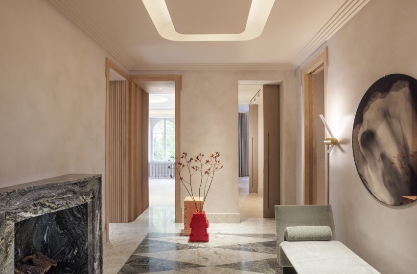
A calm hallway with patterned marble floors welcomes visitors into Habitat 100 in Stockholm, which was designed to resemble the original interior of the 1920s apartment.

Note Design Studio also used greyed wood and stained oak to create a quietly luxurious feel inside the flat, which is located in a building built during the Swedish Grace era, a romantic, refined style movement.

Find out more about Habitat 100 ›


Wooden walls in Mayfair residence
Photo is by Felix Speller and Child Studio

Mayfair residence, UK, by Child Studio

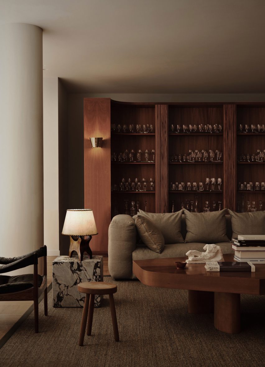
The interior of this Mayfair house was informed by fashion designer Yves Saint Laurent’s home and features a number of custom-made pieces.

These are combined with mid-century modern furniture, including a glassware cabinet and coffee table in dark, glossy wood. A marble side table and a brass wall sconce add more interesting material contrasts.

Find out more about Mayfair residence ›


Bedroom in Twentieth house by Woods and Dangaran
Photo is by Joe Fletcher

Twentieth House, US, by Woods + Dangaran

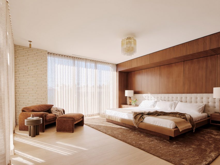
Twentieth House, a three-storey home in California, features a bedroom with a material mix that conveys a sense of restrained elegance.

Soft brown velvet seating along with a rug colour match the panelled wooden wall, creating a cohesive and relaxing interior. A modern chandelier adds a frivolous touch.

Find out more about Twentieth House ›


Dumbo loft with mezzanine
Photo is by Seth Caplan

Dumbo loft, US, by Crystal Sinclair Designs

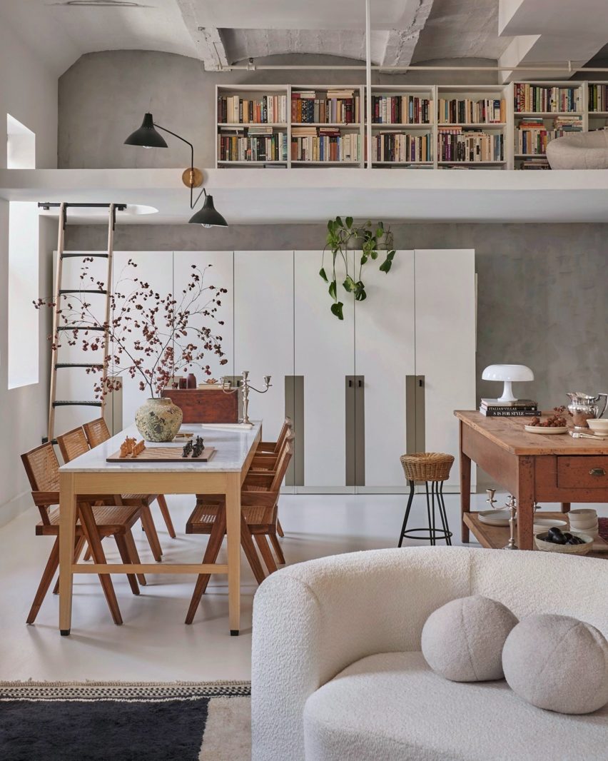
Interiors studio Crystal Sinclair Designs renovated this loft apartment in Brooklyn’s Dumbo neighbourhood (above and main image) to retain its industrial look while adding some “European flair”.

The result is a home that feels both cosy and elegant, with a practical mezzanine floor and stylish details, including a rough-hewn vase and a classic mushroom-shaped Artemide Nessino table lamp.

Find out more about Dumbo loft ›


Interiors of Fisherman's cottage
Photo is by Gavin Green

Fisherman’s Cottage, Australia, by Studio Prineas

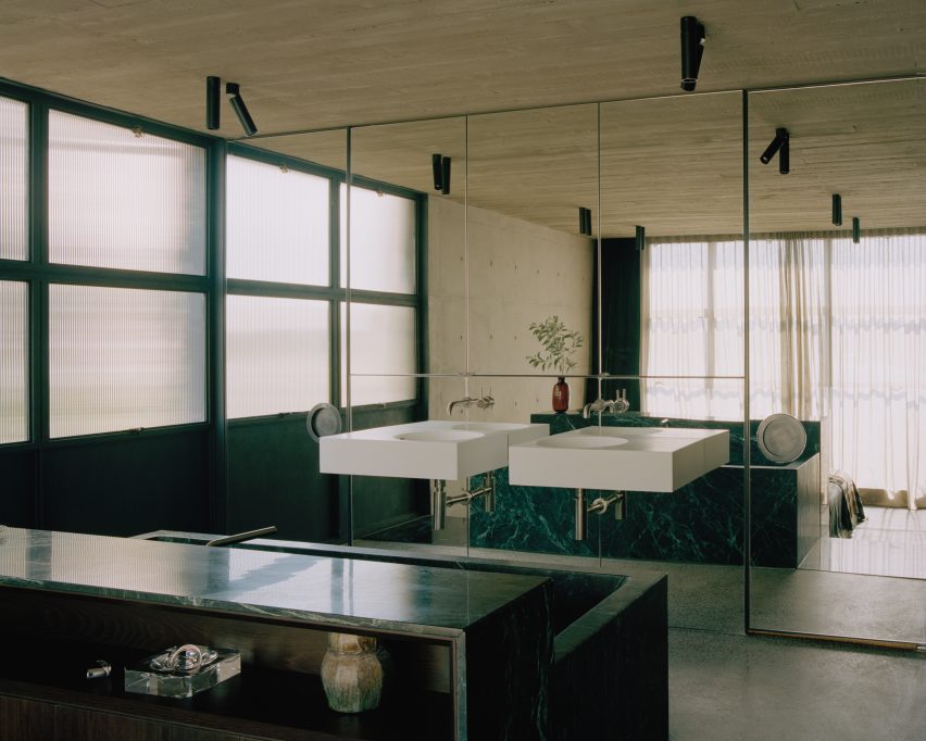
This former fisherman’s cottage in Sydney was extended with a concrete tower. Inside the home, a mirrored bathroom feels both industrial and upmarket at the same time.

Veined green marble was used for the deep bath, while minimalist white sinks and chrome taps add a modernist touch.

Find out more about Fisherman’s Cottage ›

This is the latest in our lookbooks series, which provides visual inspiration from Dezeen’s archive. For more inspiration see previous lookbooks featuring airy loft conversions, kitchen islands with waterfall countertops and art-filled living rooms.

Reference

Eight interiors where chequerboard flooring adds a sense of nostalgia
CategoriesInterior Design

Eight interiors where chequerboard flooring adds a sense of nostalgia

A cannabis dispensary, a hotel gym and an office in a converted 1930s military warehouse feature in this lookbook, proving that chequered floors aren’t just for kitchens.

Alternating squares of colour, a style hearkening back to the nostalgia of 1950s American diners and Victorian entryways, can provide a graphic backdrop to any room.

The examples below were realised using a range of materials, from tiles and stone slabs to wood parquet and paint, providing a clever way of bringing colour, pattern and texture into interiors.

This is the latest in our lookbooks series, which provides visual inspiration from Dezeen’s archive. For more inspiration see previous lookbooks featuring autumnal bedrooms, loft conversions and kitchen islands with sleek waterfall edges.


Chequered yellow floor with chequerboard flooring
Photo by Mikael Lundblad

Cafe Banacado, Sweden, by ASKA

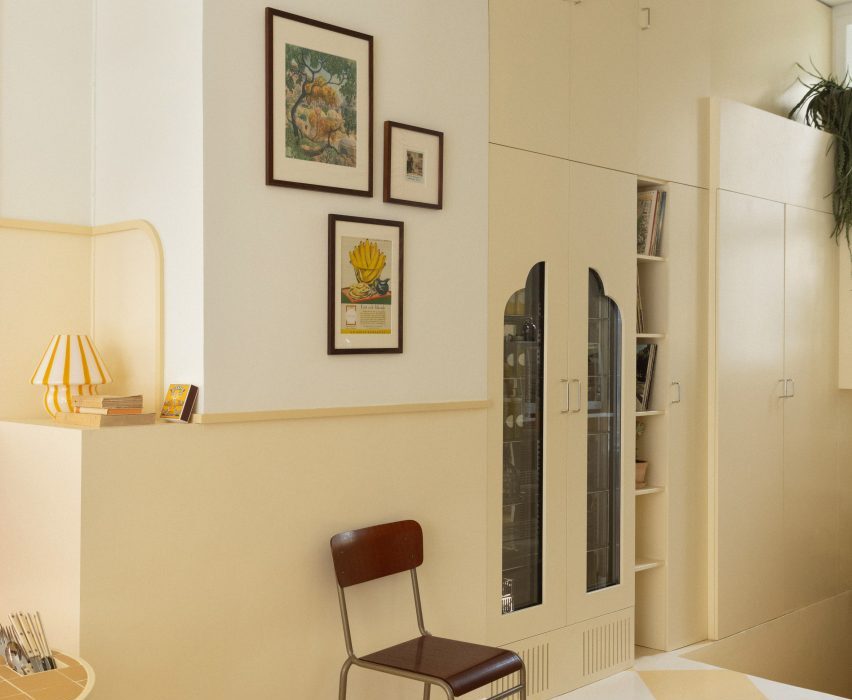
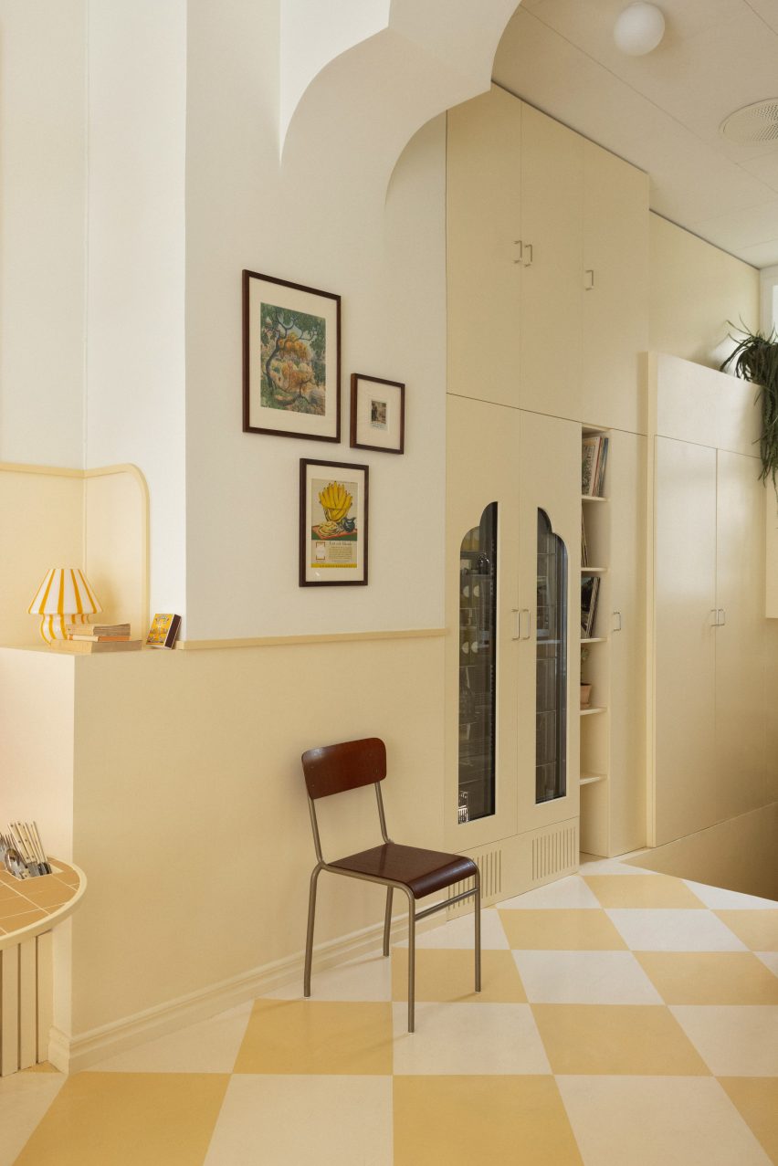
The sun-drenched bars of Cuba and the symmetry of Wes Anderson films informed the design of this all-day breakfast cafe in Stockholm.

This is reflected in its butter-yellow colour palette and the tonal squares painted onto the concrete floor, complemented by vintage touches including a vinyl player and a wall of Polaroid pictures.

Find out more about Cafe Banacado ›


Il Capri Hotel, Italy, by Graziella Buontempo and Arnaud Lacombe
Photo by Marine Billet

Il Capri Hotel, Italy, by Graziella Buontempo and Arnaud Lacombe

When renovating this hotel in a 19th-century Venetian-style palazzo, husband-and-wife duo Graziella Buontempo and Arnaud Lacombe aimed to balance the building’s old-school grandeur with a more pared-back contemporary elegance.

A classic black-and-white checked floor runs through all of the hotel’s communal spaces and was paired with a mix of new and antique furniture pieces to create a homely, lived-in feel.

Find out more about Il Capri Hotel ›


Bonne Vie patisserie with chequerboard flooring
Photo by Brian W Ferry

Bonne Vie patisserie, USA, by Home Studios

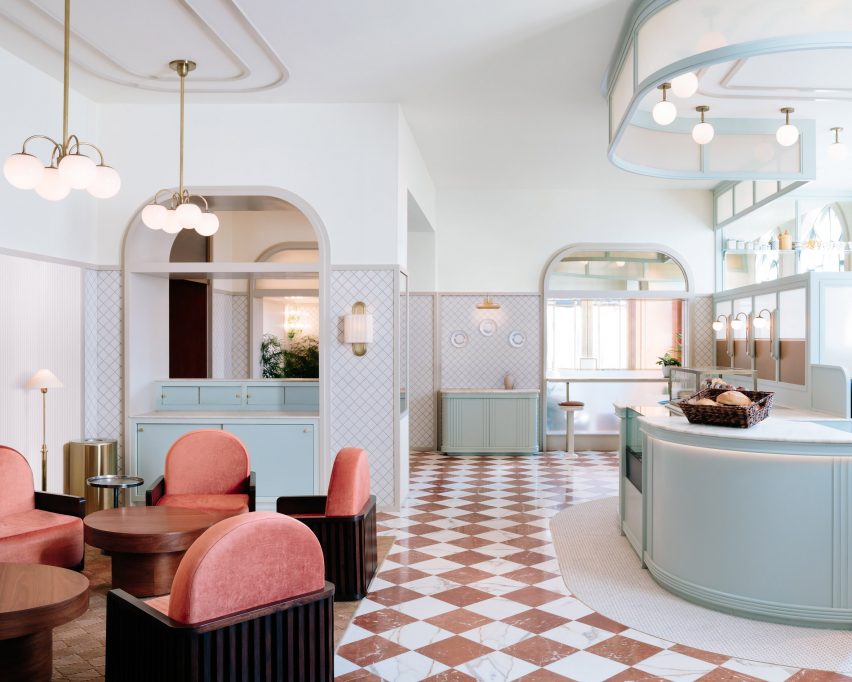
Alternating slabs of red and white marble pave the Bonne Vie patisseries at The Grand America Hotel, which was designed to bring European cafe culture to Salt Lake City.

Matching crushed velvet chairs create a small seating area and are offset against duck-egg blue millwork and art deco-style opal globe lights mounted on brass fixtures.

Find out more about Laurel Brasserie and Bar ›


022 Rodrigo da Fonseca by Aboim Inglez Arquitectos residential interiors
Photo by Ricardo Gonçalves

Rua Rodrigo da Fonseca apartment, Portugal, by Aboim Inglez Arquitectos

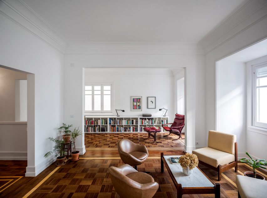
Portuguese studio Aboim Inglez Arquitectos stripped back the interior of this 1930s apartment in Lisbon to reveal its original parquet floors during a renovation.

Fulfilling much the same function as area rugs, the carefully restored patterns feature timber in different shades, laid into a subtle chequerboard pattern bordered by strips of light wood.

“We believe it was used to stress the independence of the rooms and circulation areas and at the same time acting as the element that unifies the whole house,” architects Maria Ana and Ricardo Aboim Inglez told Dezeen.

Find out more about Rua Rodrigo da Fonseca apartment ›


Clay Warsaw offices designed by Mateusz Baumiller with chequerboard flooring
Photo by Ernest Wińczyk

Clay.Warsaw office, Poland, by Mateusz Baumiller

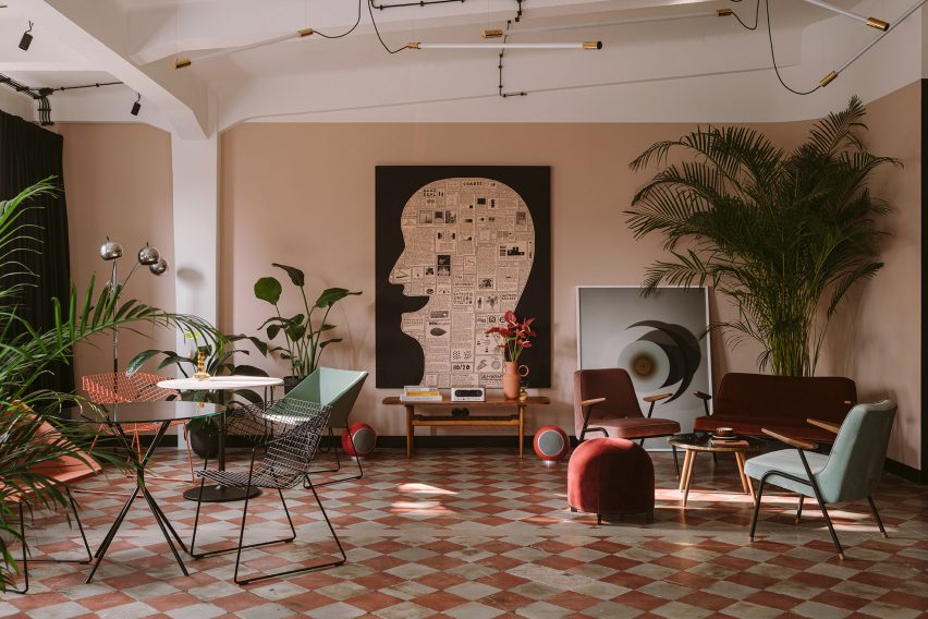
Tiled chequerboard floors are original to this former 1930s military warehouse in Warsaw, which now houses the joint offices of production companies Menu, Analog/Digital and Photoby.

To soften the building’s industrial shell, architect Mateusz Baumiller furnished the office much like a residential interior, bringing in modern Polish art and a mix of contemporary and vintage design pieces from local brands and artisans.

Find out more about the Clay.Warsaw office ›


A greent store with cannabis products
Photo by Alex Lysakowski

The Annex, Canada, by Superette

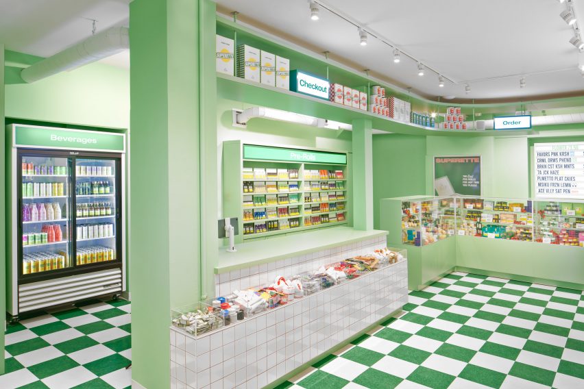
This cannabis dispensary in Toronto was modelled on an Italian delicatessen, complete with a deli counter that contains an array of pre-rolled joints and different strains and strengths of marijuana.

The kitschy nostalgic atmosphere was rounded off with green-and-white chequered flooring, while contrasting splashes of tomato red was used across stools and pendant lights.

Find out more about The Annex ›


Casa Cabanyal in Valencia by Viruta Lab with chequerboard flooring
Photo by David Zarzoso

Casa Cabanyal, Spain, by Viruta Lab

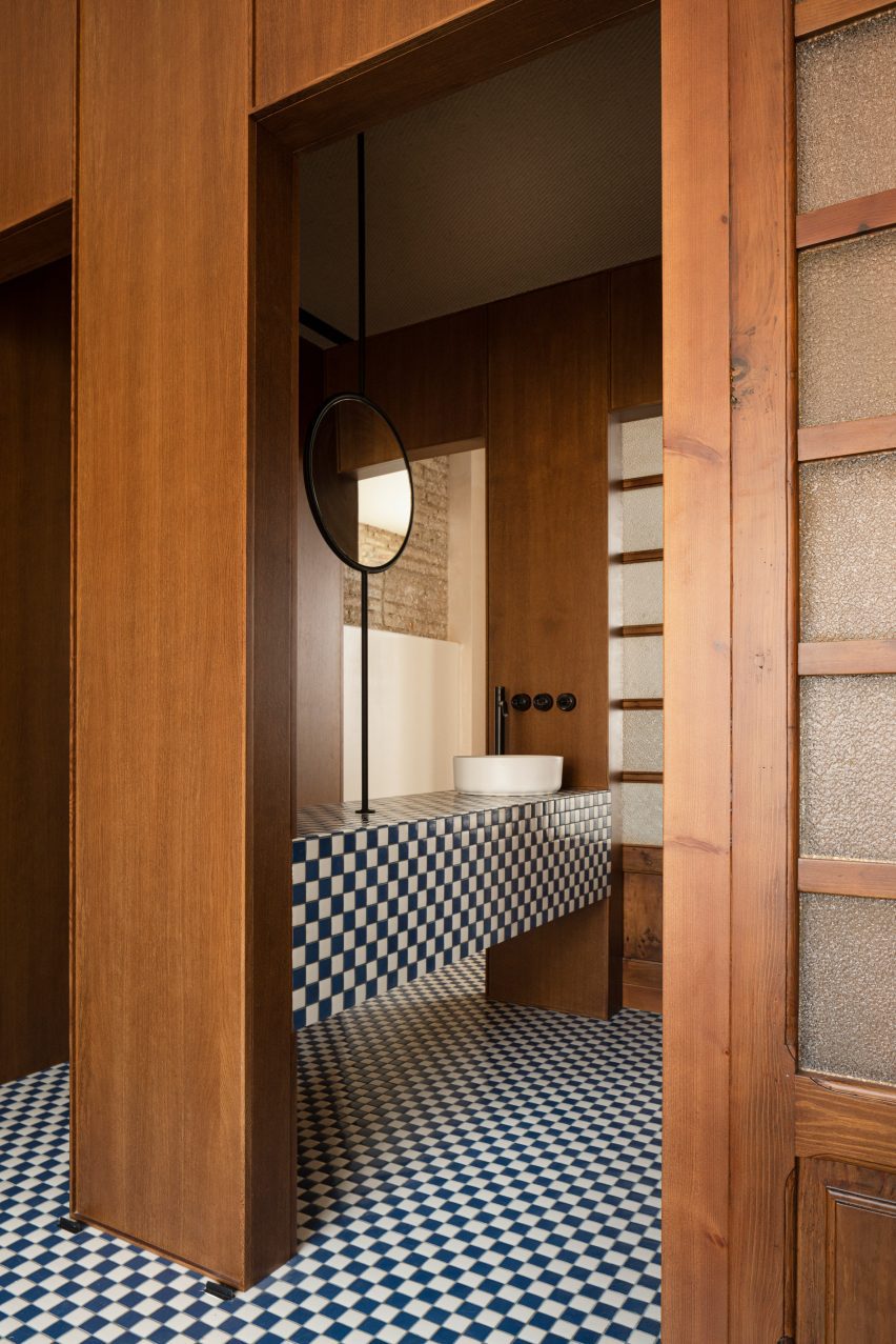
A mosaic of small navy blue and white tiles brings a subtle nautical feel to this home in Valencia’s traditional fishing neighbourhood El Cabanyal.

Featured throughout all the rooms, from the bathroom to the sleeping quarters, they nod to the traditional azulejo tiled facades found across the city, which has been a prolific exporter of ceramics since the 15th century.

Find out more about Casa Cabanyal ›


Gym inside Hotel Les Deux Gares in Paris
Photo by Benoit Linero

Hotel Les Deux Gares, France, by Luke Edward Hall

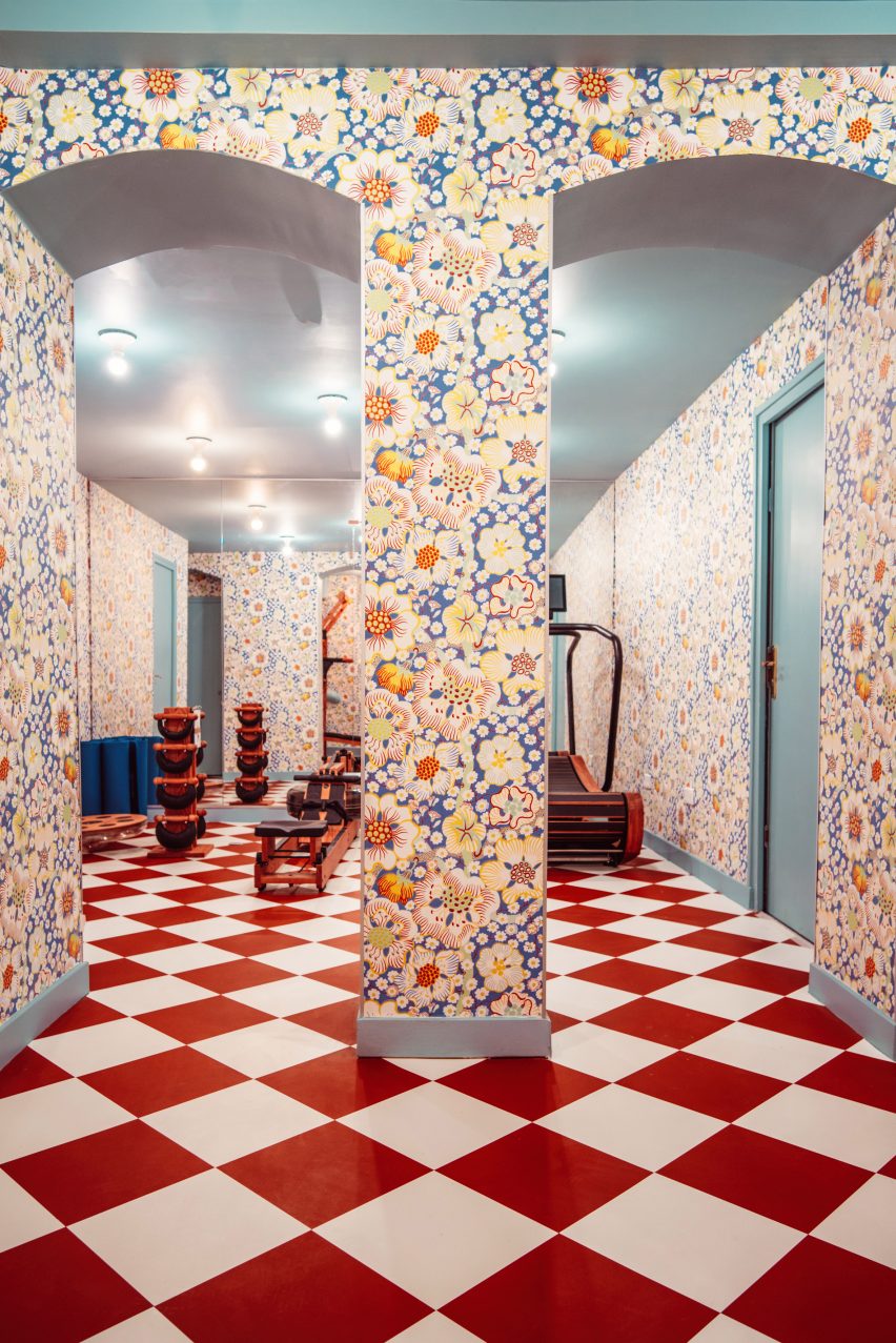
Colours and patterns clash merrily inside this renovated hotel, designed by British designer Luke Edward Hall to have an “anti-modern” feel that hearkens back to the Paris of the past.

Even its gym has been reimagined with wooden equipment, graphic red-and-white flooring and mismatched floral wallpaper designed by Austrian architect Josef Frank.

“I really wanted this space to feel above all joyful and welcoming and alive, classic but a little bonkers at the same time,” Hall told Dezeen.

Find out more about Hotel Les Deux Gares ›

This is the latest in our lookbooks series, which provides visual inspiration from Dezeen’s archive. For more inspiration see previous lookbooks featuring autumnal bedrooms, loft conversions and kitchen islands with sleek waterfall edges.

Reference