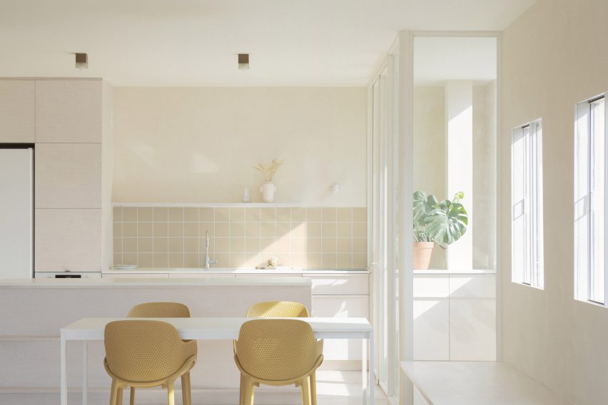
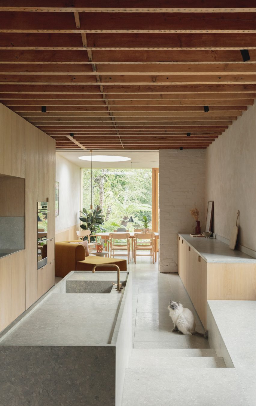
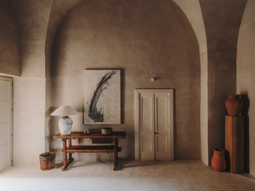
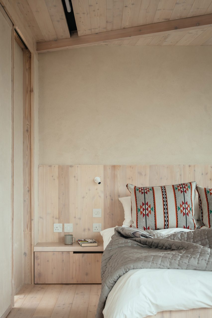
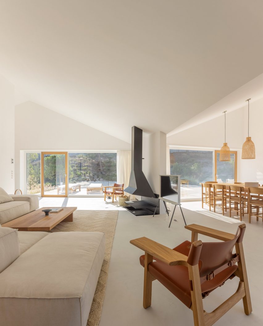
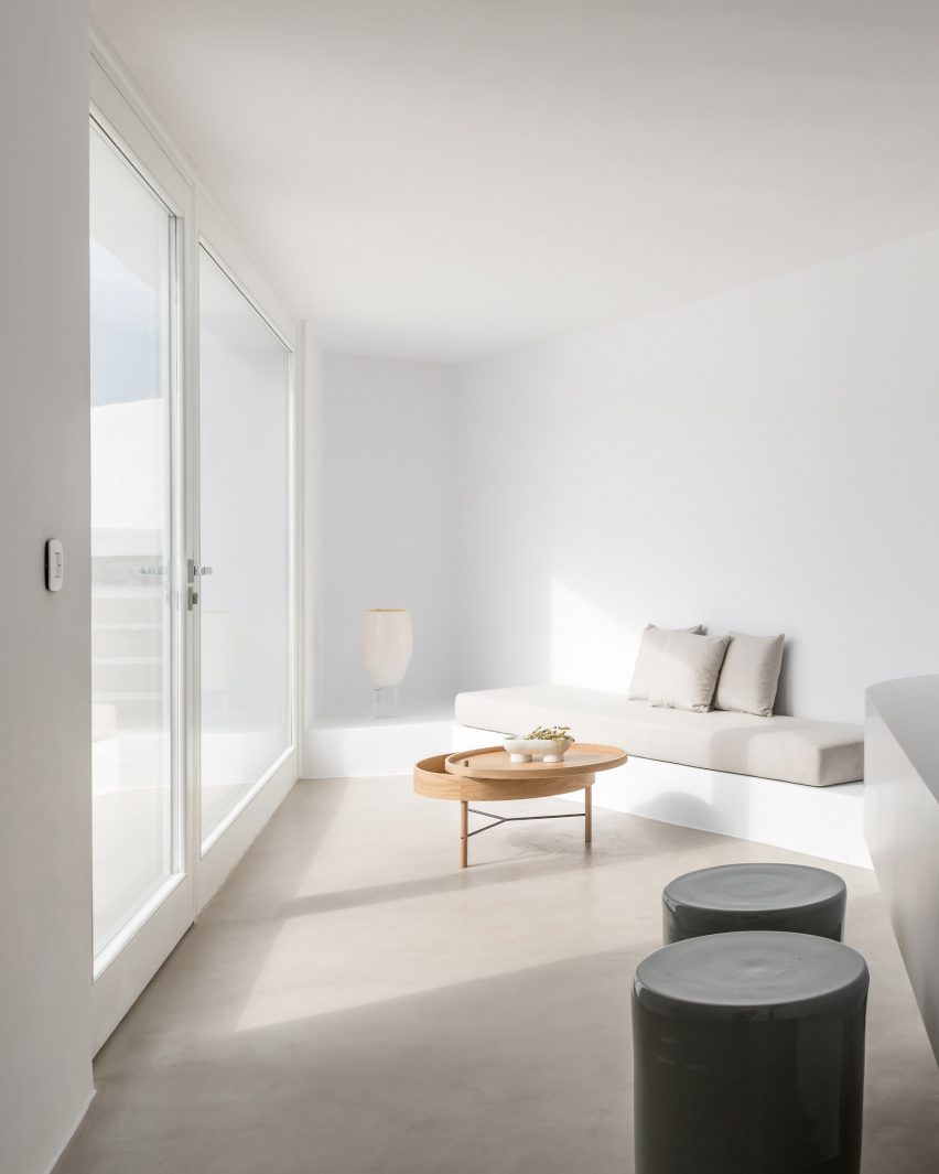
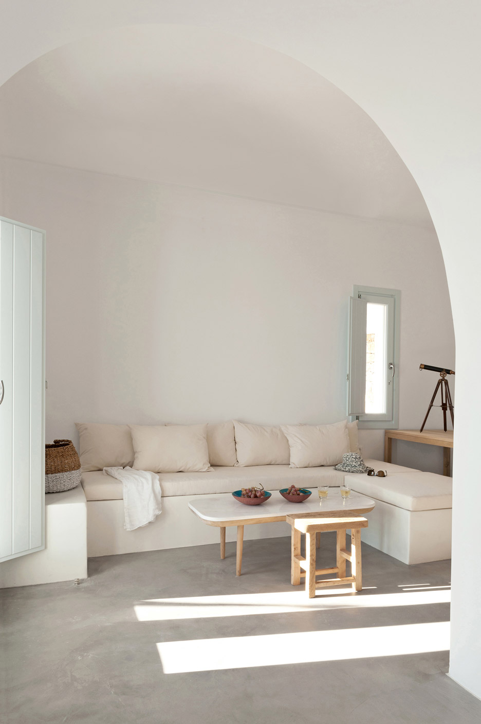
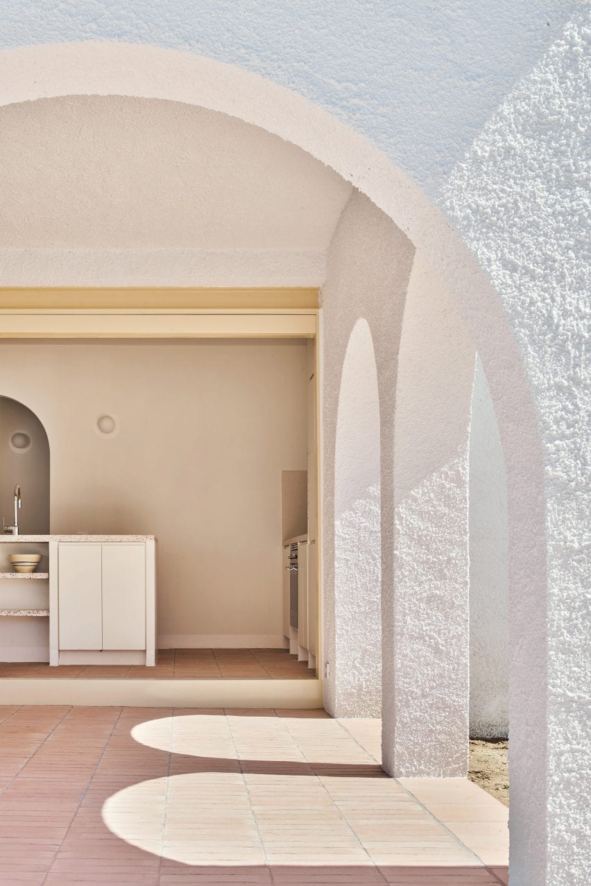
Dezeen Awards 2023 interiors longlist revealed
CategoriesInterior Design

Dezeen Awards 2023 interiors longlist revealed

Dezeen has announced the 150 projects longlisted for this year’s Dezeen Awards in the interior categories, including interiors by studios Olson Kundig, Neri&Hu, Patricia Urquiola and Morris+Company.

The 150 longlisted projects, which are in the running for awards in nine different interior project categories, are by studios located across 32 different countries including India, Slovakia, Belgium, Canada, Denmark and Latvia.

The top three represented studio countries are the UK, with 27 longlisted entries, followed by the US with 23 and Australia with 15.

The top project city locations are London, with 18 longlisted entries, followed by Shanghai with seven and Sydney and Paris tied with four each.

Amongst the longlisted interiors this year are a refurbished 280-year-old courtyard house in Beijing, a textured beige ceramic home interior in Kyiv and a playful red brick-clad rooftop cafe in South Korea’s Gyeonggi-do province.

Other longlisted projects include a monochromatic office in Barcelona, a restaurant with a curved metal-mesh ceiling in London and a retail space featuring salvaged and biomaterials.

All Dezeen Awards 2023 longlists revealed this week

Dezeen Awards 2023, in partnership with Bentley Motors, will reveal all longlisted projects this week. The architecture longlist was published yesterday and the design longlist will be announced tomorrow, followed by the sustainability longlist on Thursday.

Longlisted projects have been selected from over 4,800 entries from 94 countries for the sixth edition of our awards programme, which celebrates the world’s best architecture, interiors and design, as well as the studios and individuals producing the most outstanding work.
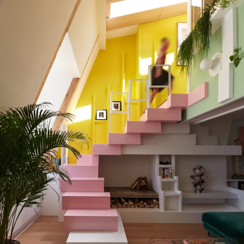

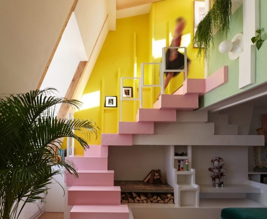
Sun Dial Apartment
Above: Sun Dial Apartment by Manuelle Gautrand Architecture. Photo by Gaelle Le Boulicaut. Top: Shiny Gold by Nelly Ben Hayoun Studios. Photo by Vinciane Lebrun

The next stage of Dezeen Awards 2023 will see all longlisted projects assessed by our international jury of leading professionals including interior designers Eny Lee Parker, Nick Jones and Tola Ojuolape.

The judges will determine the projects that feature on the shortlists, which will be announced in October. A further round of judging by our master jury will determine the winners, which will be announced in November.

One of the nine winners of the interior project categories will then be crowned the overall interior project of the year.

Read on for the full interiors longlist:
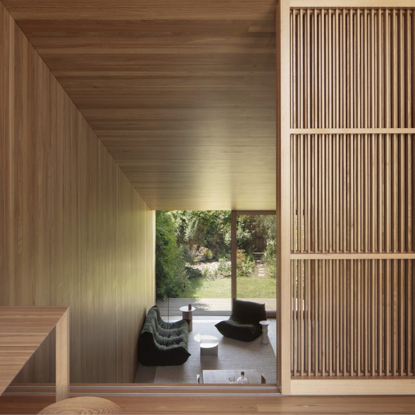

Union Street House
Union Street House by Prior Barraclough. Photo by Ben Hosking

Home Interior

› WKA Penthouse, Antwerp, Belgium, by Bruno Spaas Architectuur
› Leaside Avenue, London, UK, by Emil Eve Architects
› Another Seedbed: From Domesticity to Hospitality, New York, USA, by Future Projects
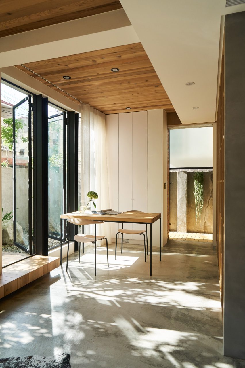
› House FC, Taipei City, Taiwan, by Fws_work
› Atelier Chabot, Montreal, Canada, by Indee Design
› Hiroo Residence, Tokyo, Japan, by Keiji Ashizawa Design
› Cape Drive Residence, Hong Kong, China, by Linehouse
› Mureli House, Kozyn, Ukraine, by Makhno Studio
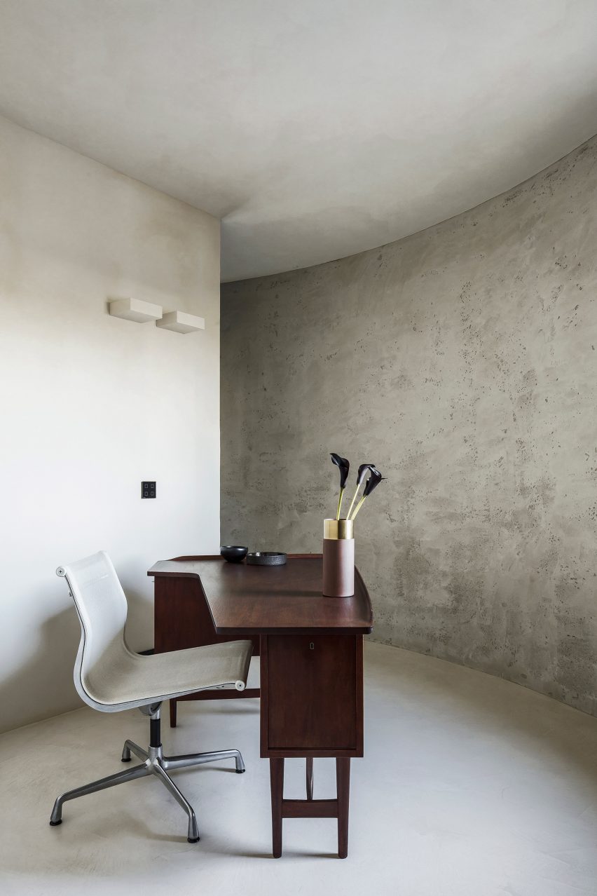
› Sun Dial Apartment, Paris, France, by Manuelle Gautrand Architecture
› Kamoi House, Barcelona, Spain, by Mas-aqui
› Hargrave Cottage Paddington, London, UK, by Michiru Higginbotham
› Adventures in Space, London UK, by Owl
› Union Street House, London, UK, by Prior Barraclough
› North London Family Home, London, UK, by Retrouvius
› Mexican and Galician influences in Madrid, Spain, by Sierra + Delahiguera
› Belgravia Townhouse, London, UK, by State of Craft Limited
› Tembo Tembo Lodge, South Africa, by Studio Asaï
› Light House, Singapore, by Studio iF
› Villa San Francisco, California, USA, by Studio Mortazavi
› A Resolutely Maximalist Mini Loft, Bagnolet, France, by Zyva Studio

Browse all projects on the home interior longlist page.
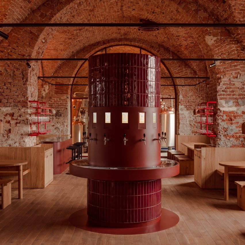

Taproom in the Brewery Tenczynek
Taproom in the Brewery Tenczynek by Projekt Praga. Photo by ONI Studio

Restaurant and bar interior

› Kiln at Ace Hotel, Sydney, Australia, by Atelier Ace
› Frescohallen, Bergen, Norway, by Claesson Koivisto Rune Architects
› Nebula, London, UK, by Common Ground Workshop
› Dolly, Unley, Australia, by Genesin Studio
› Mala Sichuan Bistro, Houston, USA, by Gin Design Group
› Beefbar Milan, Italy, by Humbert & Poyet
› Chleo, New York, USA, by Islyn Studio
› Gaga Coast, Shanghai, by Linehouse
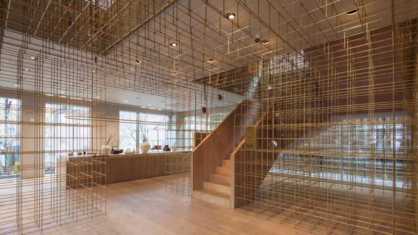
› Blue Bottle Zhang Yuan Cafe, Shanghai, by Neri&Hu Design and Research Office
› Noma Kyoto, Kyoto, Japan, by OEO Studio
› Prime Seafood Palace, Toronto, Canada, by Omar Gandhi Architects
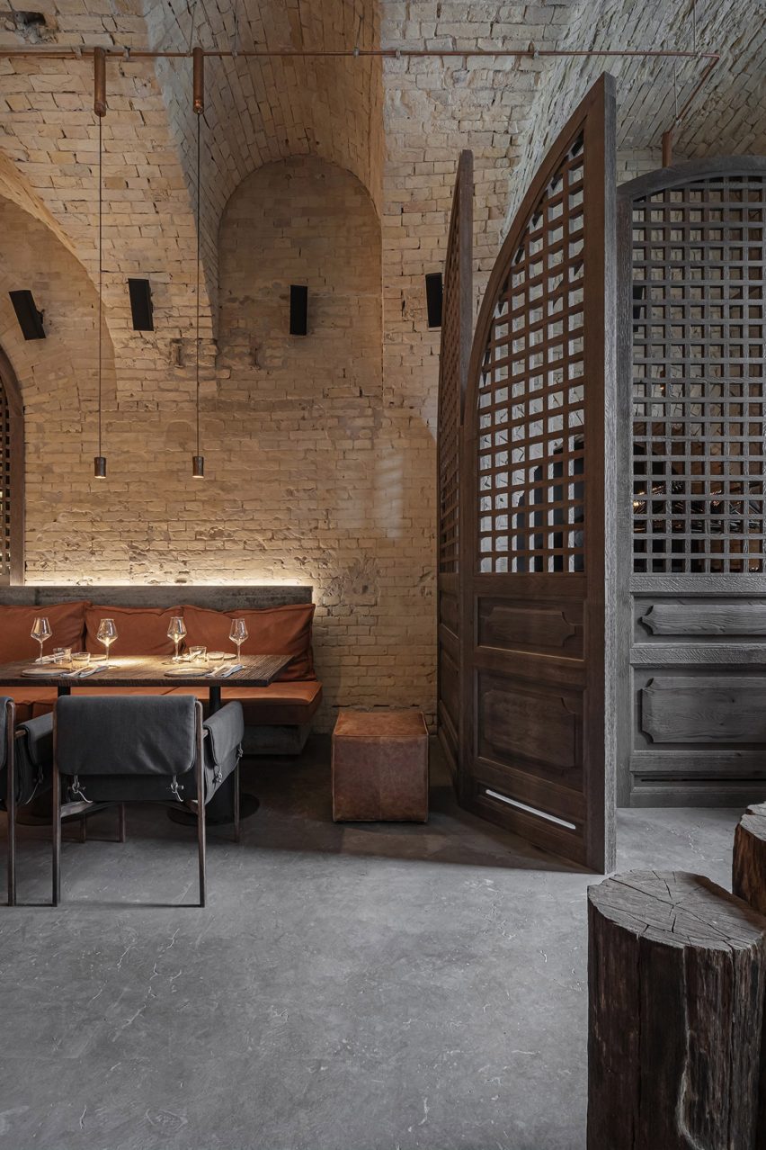
› Taproom in the Brewery Tenczynek, Poland, by Projekt Praga
› Xokol, Guadalajara, Mexico, by ODAmx and Ruben Valdez Practice
› Colemans Deli, Hathersage, UK, by SJW Architects
› Cozinha das Flores and Flôr, Porto, Portugal, by Space Copenhagen
› AOC Restaurant, Copenhagen, Denmark, by Spacon & X
› Ikoyi, London, UK, by David Thulstrup
› Light Years Asian Diner, Byron Bay, Australia, by Studio Plenty
› Parconido Bakery Cafe, Gyeonggi-do, South Korea, by SukChulMok
› Saint Hotel, Melbourne, Australia, by Telha Clarke

Browse all projects on the restaurant and bar longlist page.
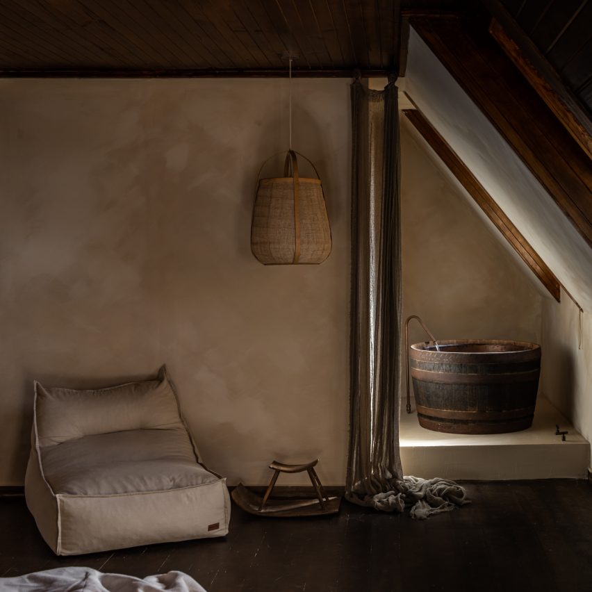

SABI
SABI by Grounded Living. Photo by Lean Timms

Hotel and short-stay interior

› Birch (Selsdon), London, UK, by A-nrd studio
› Drift Hotel, California, USA, by Anacapa Architecture
› Ace Hotel Toronto, Canada, by Atelier Ace
› Ember Locke, London, UK, by Atelier Ochre & House of Dré
› Capella, Sydney, Australia, by BAR Studio
› Bos-Cos Sevilla, Seville, Spain, by Febrero Studio
› SABI, Tasmania, Australia, by Grounded Living
› Albor Hotel, Tapestry Collection by Hilton, Guanajuato, Mexico, by Héctor Esrawe
› Ying’nFlo, Hong Kong, China, by Linehouse
› Monasty Hotel, Thessaloniki, Greece, by Not a Number Architects
› The Standard, Ibiza, Spain, by Oskar Kohnen Studio
› Our Habitas San Miguel de Allende, Mexico, by Our Habitas
› Six Senses Rome, Italy, by Patricia Urquiola
› Som Land Hostel, Shanghai, by RooMoo
› Heymo 1, Espoo, Finland, by Rune & Berg Design Oy
› The Standard, Bangkok, Thailand, by Standard International
› Hay Boutique Hotel, Polyanytsya, Ukraine, by YOD Group

Browse all projects on the hotel and short stay longlist page.
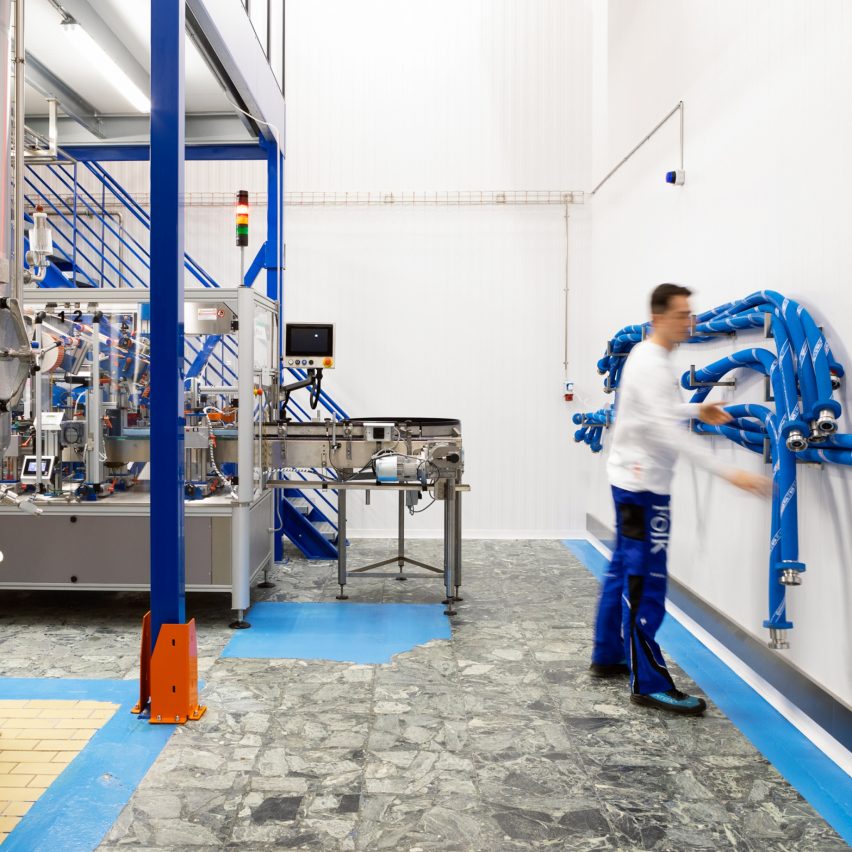

Folk Kombucha
Folk Kombucha by Spacon & X. Photo by Hedda Rysstad

Workplace interior (small)

› The Joint Works, Birmingham, UK, by 2G Design and Build
› Lincoln St Workplace, Boston, USA, by Atelier Cho Thompson
› Carnaby Club, London, UK, by Buckley Gray Yeoman
› Mitsui & Co, Minato-ku, Japan, by Flooat
› Studio Reisinger, Barcelona, Spain, by Isern Serra
› LAJ Office and Shop, Vancouver, Canada, by Marcela Trejo
› Workplace for the preparation of medicine in Riga, Latvia, by MUUD Architects
› ScienceIO Headquarters, New York, USA, by Office of Tangible Space
› Folk Kombucha, Copenhagen, Denmark, by Spacon & X
› The Forest of Knowledge – CCI Library, Mumbai, India, by Studio Hinge
› Artis Ventures, San Francisco, USA, by Studio O+A
› Alera, Vancouver, Canada, by Studio Roslyn
› Terroir Hobart Office, Hobart, Australia, by Terroir
› Chief London, London, UK, by Thirdway
› WOA Second Home, Ernakulam, India, by Workers of Art

Browse all projects on the workplace interior (small) longlist page.
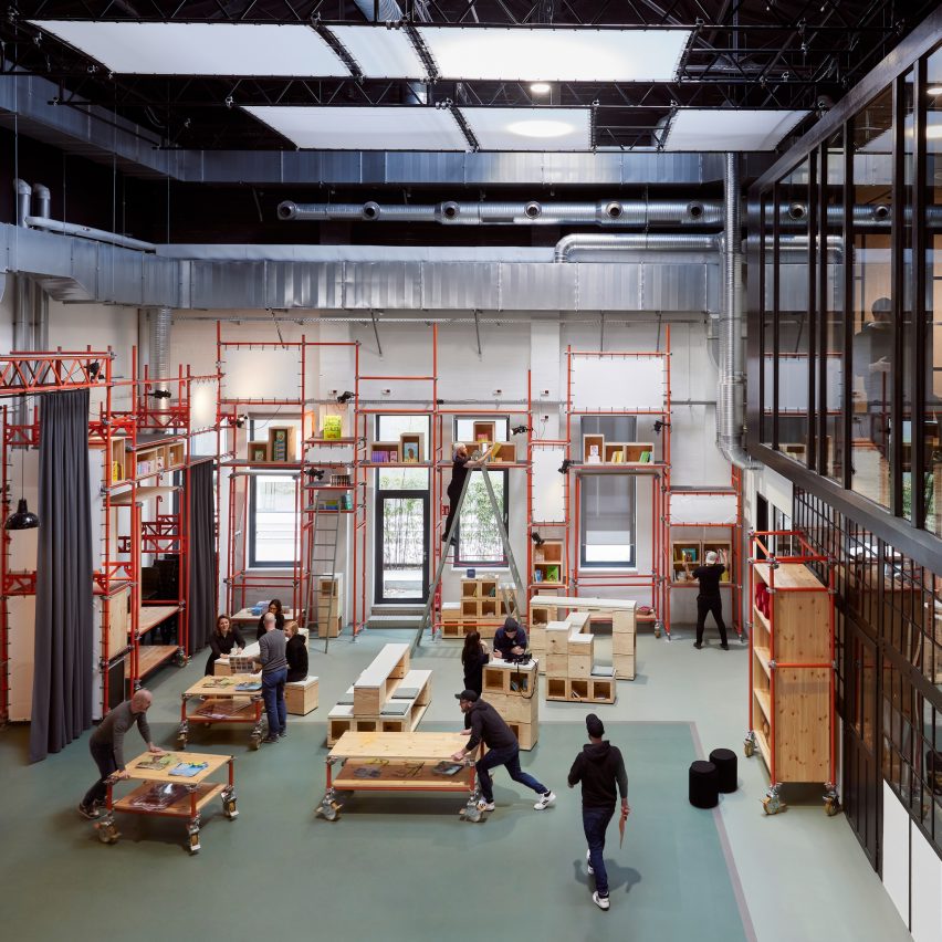

Carlsen Publisher Library
Carlsen Publisher Campus by de Winder Architekten. Photo by Mark Seelen

Workplace interior (large)

› Government Office, Abu Dhabi, UAE, by Agata Kurzela studio
› COX Sydney Studio, Australia, by Cox Architecture
› Carlsen Publisher Campus, Hamburg, Germany, by de Winder Architekten
› NeueHouse Venice Beach, California, USA, by DesignAgency
› Here+Now, Reading, UK, by Hawkins\Brown
› Sony Music UK HQ, London, UK, by MoreySmith
› 215 Mare Street, London, UK, by Morris+Company
› 800 Fifth Avenue, Seattle, USA, by Olson Kundig
› Dice, London, UK, by Sella Concept
› Bay Area Research Company by SkB Architects
› Canopy Menlo Park, California, USA, by Studio Mortazavi
› Adidas (GOLD, Performance Zone, and RED) campus, Portland, USA, by Studio O+A
› World of Klarna, Stockholm, Sweden, by Studio Stockholm
› 210 Euston Road, London, UK, by Universal Design Studio
› Convene at 22 Bishopsgate, London, UK, by Woods Bagot

Browse all projects on the workplace interior (large) longlist page.
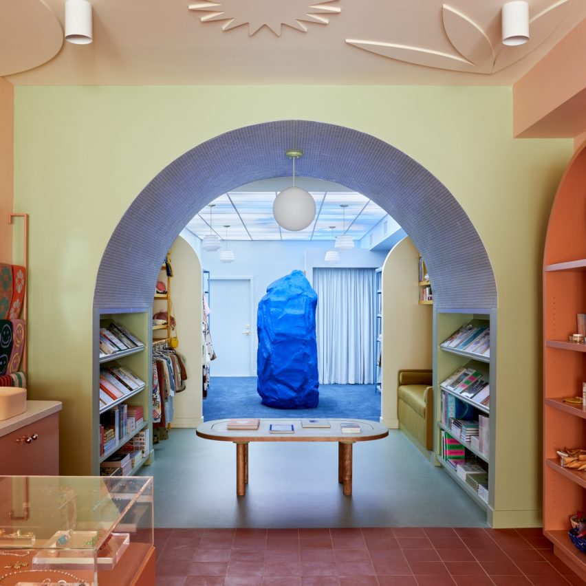

Dreams
Dreams by Adi Goodrich of Sing-Sing. Photo by Adi Goodrich and Ye Rin Mok

Retail interior (small)

› Aesop Palisades Village, Los Angeles, USA, by Odami
› Big, London, UK, by Nina+Co
› Bisque Golf Amsterdam, The Netherlands, by Barde vanVoltt
› Buff, Edinburgh, Scotland, by GRAS
› Camper Pop-Up Galeries Lafayette, Paris, France, by Penadés office
› Chimi Store at NK, Stockholm, Sweden, by Campus
› Coachtopia, London, UK, by Studio XAG
› Cover Story Paint Studio, Amsterdam, The Netherlands, by Cover Story Paint
› Dreams, Los Angeles, USA, by Adi Goodrich of Sing-Sing
› Finesse, Melbourne, Australia, by Studio Edwards
› Garrett Leight New York, USA, by West of West
› Glossier, New York, USA, by Glossier
› Mimco Flagship Store, Chadstone, Australia, by Studio Doherty
› Net Zero Ecoalf Store, Madrid, Spain, by Medina Varela MVN Arquitectos
› SOM Store, Bratislava, Slovakia, by D415
› The Art Gallery of NSW, Sydney, Australia, by Akin Atelier

Browse all projects on the retail interior (small) longlist page.
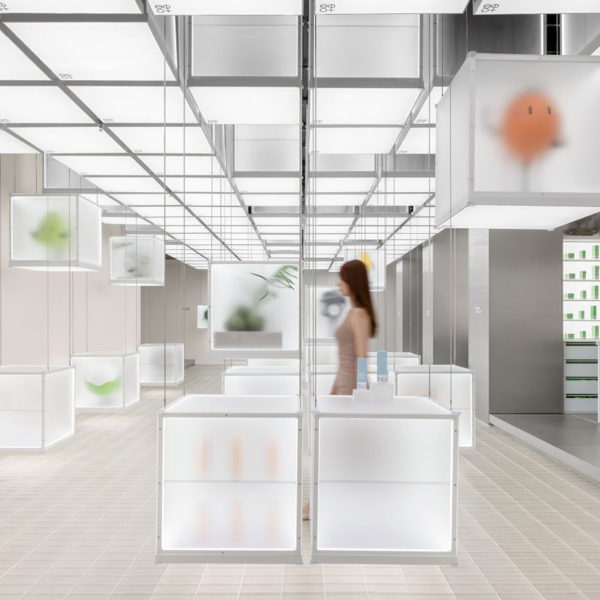

Superseed Concept Store
Superseed Concept Store by FOG Architecture. Photo by SFAP

Retail interior (large)

› Harmay Chongqing, China, by Aim Architecture
› Maison Special/Prank Project Fukuoka, Japan, by AtMa
› Calico Club Cottage, Nistelrode, The Netherlands, by Barde vanVoltt
› ToSummer Beijing Guozijian, China, by FOG Architecture
› Xiaozhuo Shanghai Boutique, China, by FOG Architecture
› Super Seed Concept Store, Hangzhou, China, by FOG Architecture
› Freitag Store Shanghai, China, by Freitag Lab
› GANT Flagship Store, Stockholm, Sweden, by GANT
› Jasmin Black Lounge, Seoul, South Korea, by Hyundai Department Store Group
› The Forum, Daegu, South Korea, by Hyundai Department Store Group
› GrubStreet Arts Center, Boston, USA, by Merge Architects
› XiaoZhuo Flagship Store, Shanghai, by Offhand Practise
› Salvatori Showroom, New York, USA, by Salvatori
› Cake 0 Emissions US Headquarters, Los Angeles, USA, by Shin Shin
› BSTN Store, London, UK, by Sunst Studio
› SVRN, Chicago, USA, by WGNB

Browse all projects on the retail interior (large) longlist page.
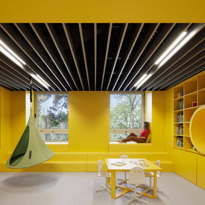

Leisure Area of Pediatric Ward Hospital
Leisure Area of Pediatric Ward of Hospital São João by ARG studio. Photo by Ivo Tavares Studio

Health and wellbeing interior

› Eterno Health Hamburg, Germany, by Ahochdrei – Labor für Gestaltung
› Leisure Area of Pediatric Ward of Hospital São João, Porto, Portugal, by ARG studio
› Insight Body and Mind, Aberfeldie, Australia, by Biasol Studio
› Placidus Student Welfare Spaces for Marcellin College, Melbourne, Australia, by Branch Studio Architects
› Chi Chi Club, Hamburg, Germany, by Deglan Studios
› Hooke London, UK, by Holland Harvey
› Gym Town, Hong Kong, China, by MR Studio
› Practice Dr. Sell + Dr. Stocker, Nuremberg, Germany, by Markmus Design
› Seattle Children’s Odessa Brown Children’s Clinic, USA, by NBBJ
› Ocean Cosmetics Clinic, Cottesloe, Australia, by Nickolas Gurtler Office
› Paw, Beijing, China, by Office AIO
› Symphony Orthodontics, Bristow, Australia, by OLI Architecture
› La Maison de Beauté Carita, L’Oréal-Luxe, Paris, France, by Rev/Studio
› Paste, Toronto, Canada, by Studio Author
› Flow Space, Shanghai, by Super Rice Architects

Browse all projects on the health and wellbeing longlist page.
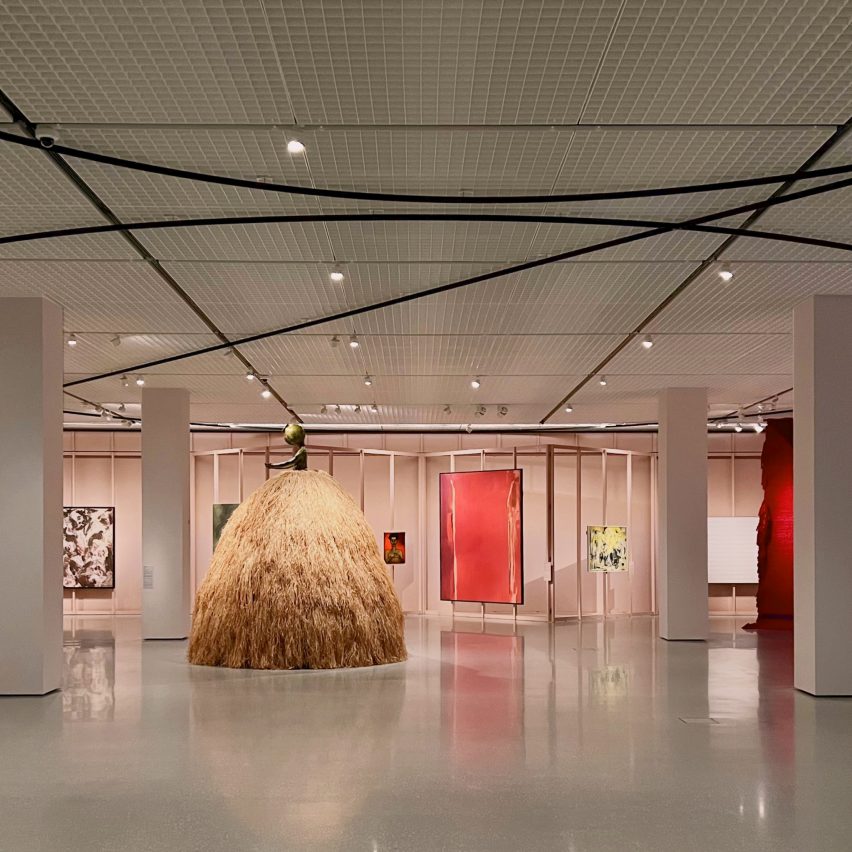

Søylerommet - The Pillars
Søylerommet – The Pillars by 2050+. Photo by 2050+

Exhibition design (interior)

› Søylerommet – The Pillars, Oslo, Norway, by 2050+
› Objects Of Desire: Surrealism and Design 1924, London, UK, by Alexander Boxill
› Plastics: Remaking Our World, Dundee, Scotland, by Asif Khan
› Scandinavian Design and the United States, 1890-1980 at LACMA, Los Angeles, USA, by Bestor Architecture
› Flow, Milan, Italy, by Daisuke Yamamoto Design Studio
› The Golden Age of Grotesque, Hannover, Germany, by Didier Fiuza Faustino / Mesarchitecture
› Fashioning Masculinities: The Art of Menswear, London, UK, by JA Projects
› Nature. And us?, Lenzburg, Switzerland, by Kossmanndejong & Stapferhaus
› BIO27 Super Vernaculars Exhibition Design, Ljubljana, Slovenia, by Medprostor
› Batman x Spyscape: Immersive Interactive Experience, New York, USA, by Mona Kim Projects
› Shiny Gold, Paris, France, by Nelly Ben Hayoun Studios
› Refik Anadol: Unsupervised, New York, USA, by Refik Anadol Studio
› Illustration corner, Ljubljana, Slovenia, by Sara&Sara
› The Welcome Center, Washington, USA, by Studio Joseph
› Flugt Refugee Museum of Denmark, Oksbøl, by Tinker imagineers
› Our Time on Earth, London, UK, by Universal Design Studio

Browse all projects on the exhibition design (interior) longlist page.

Dezeen Awards 2023

Dezeen Awards celebrates the world’s best architecture, interiors and design. Now in its sixth year, it has become the ultimate accolade for architects and designers across the globe. The annual awards are in partnership with Bentley Motors, as part of a wider collaboration that will see the brand work with Dezeen to support and inspire the next generation of design talent.

Reference

Studio Becky Carter creates “distinctly New York” interiors for Cecchi’s
CategoriesInterior Design

Studio Becky Carter creates “distinctly New York” interiors for Cecchi’s

Brooklyn-based Studio Becky Carter has pulled varied references, from Bauhaus luncheonettes to comedic characters, for the interiors of a bistro in Manhattan’s West Village.

Art deco dining rooms, 1960s Milanese architecture and “a distinctly New York feel” are all evoked at Cecchi’s, the first establishment from veteran restaurant maitre d’ Michael Cecchi-Azzolina.

Dining area with pistachio banquettes and wall mural
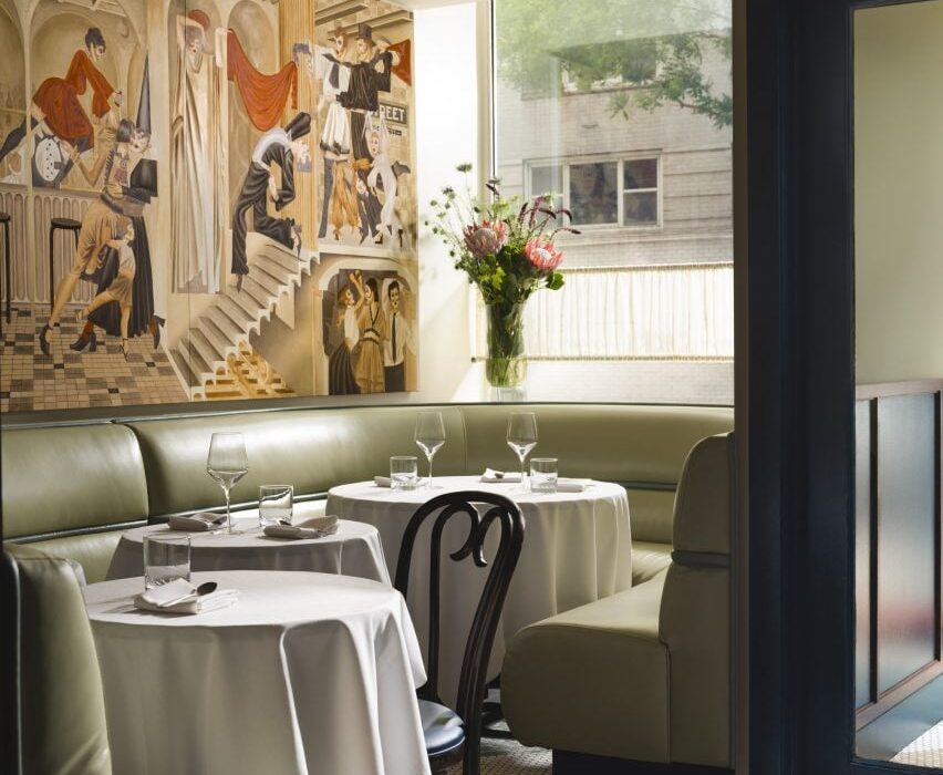
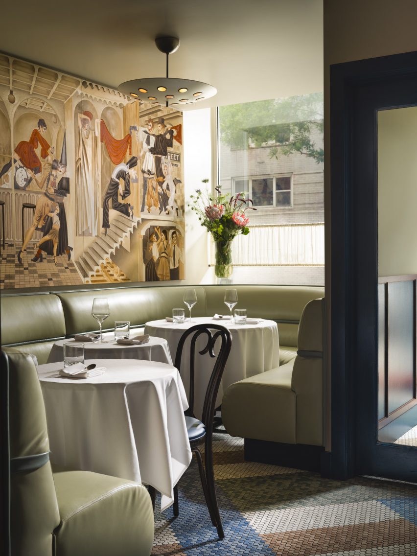
At the entrance to Cecchi’s, pistachio leather banquettes sit below a mural by Jean-Pierre Villafañe

Studio Becky Carter was given creative control to produce an environment that felt distinctively New York, but also presented a departure from the typical bistros.

“My style is retro-futurist, so I take strong cues from historic design narratives and process them through the lens of an imagined future society,” Carter told Dezeen. “When people enter Cecchi’s, I want them to feel like they’ve stepped into old-school, underground, NYC exclusivity, only this time everyone is invited.”

Marble lectern used as a host stand
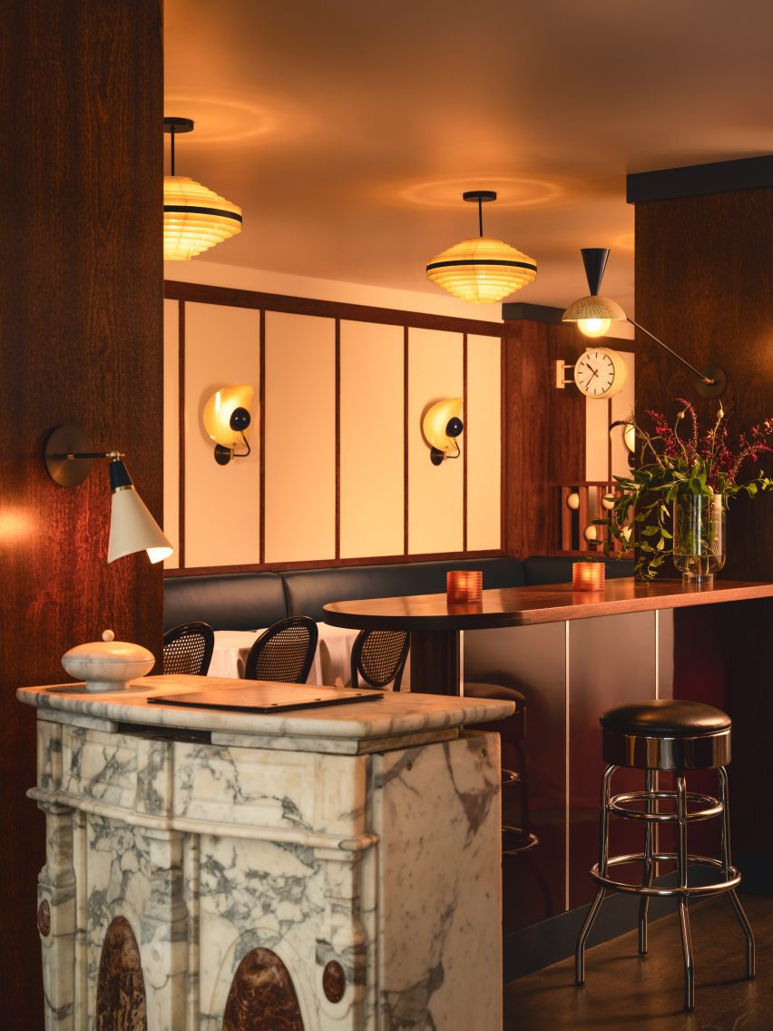
Elements retained from the space’s previous iteration as Café Loup include a marble lectern used as a host stand

A starting point for the design was the whimsical murals of artist Jean-Pierre Villafañe, who was brought on early in the process to create scapes for the restaurant’s walls.

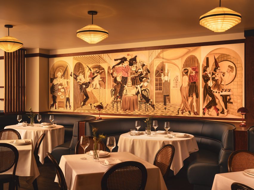
His “transportational” depictions of lively party scenes helped to inform the colour palette for the rest of the space, a mix of reds, blues and tonal browns.

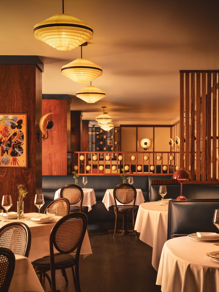
Dining area with navy banquettes, caned bistro chairs and 1970s lighting
Villafañe’s murals informed the colour palette for the restaurant’s interiors

Some of the dancing figures appear as historic European comedic characters, so Carter also looked to these for influences.

The spheres placed within dividing screens, for example, are reminiscent of those found on a Pierrot costume, a figure in French pantomime theatre, while mosaic floor tiling at the entrance is adapted from Harlequin patterns.

View down the dining room with multiple space dividers
Large columns and louvred dividers break up the space into different yet visually connected areas

“The beautifully finished spheres are just so tactile,” said Carter.”I can’t not touch them every time I’m in the restaurant.”

The long, narrow space posed several challenges, such as the lack of natural light towards the rear and large structural columns that interrupted the flow.

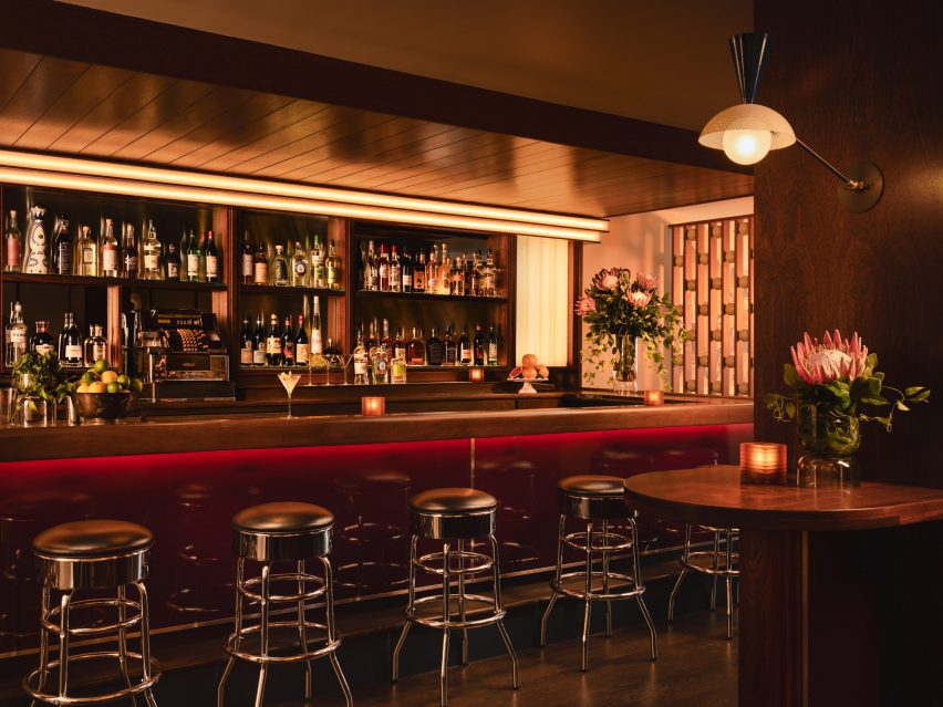
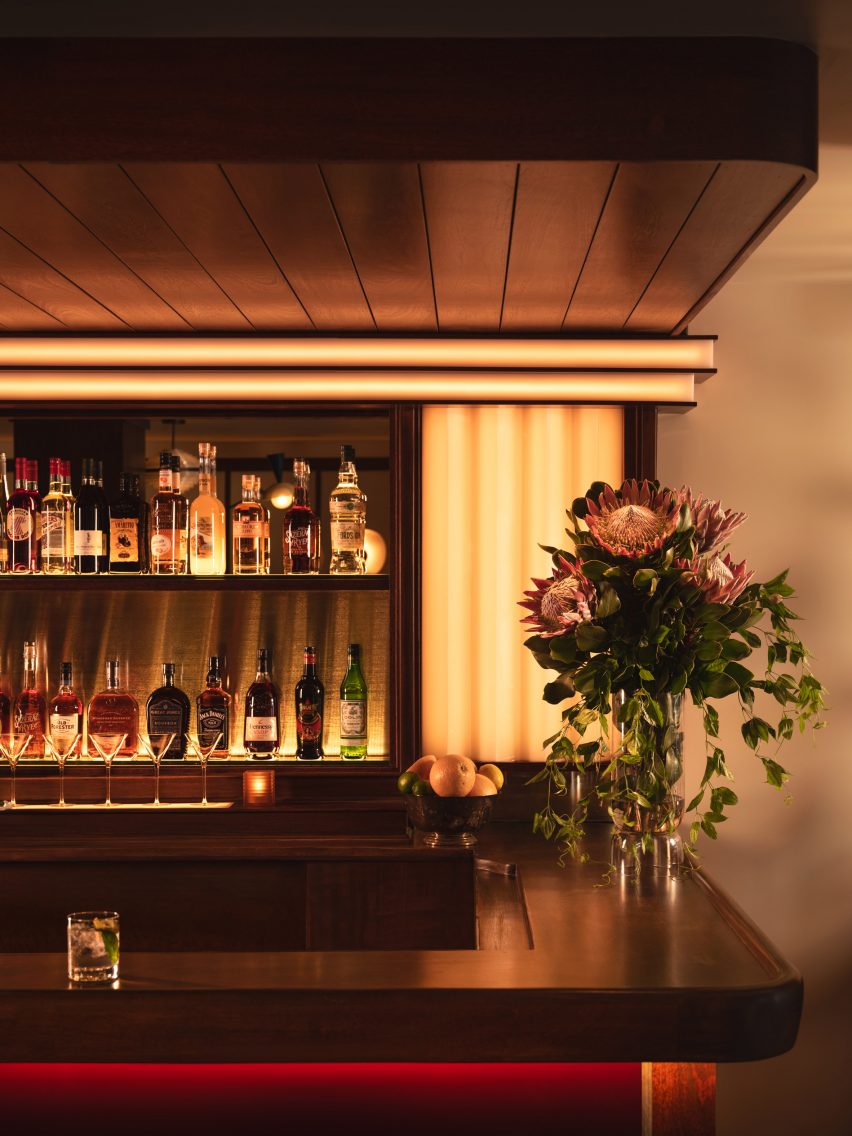
Bar with mahogany top and burgundy lacquered front
The mahogany bar top was also retained, while high-gloss burgundy lacquer was added to the front

Carter’s approach involved dividing up the restaurant into multiple areas, demarcated by the wood-wrapped columns, louvred dividers and built-in seating – all at different heights to allow visual connections across them.

At the entrance, pistachio green leather banquettes occupy the bright window niches, then the mood shifts to darker and cosier as guests venture further inside.

Bar corner with wood panelling and custom lighting
Soft lighting around the bar adds to the mood in the space

Several elements from the space’s previous iteration as Café Loup were retained or refinished as part of the new design, including the mahogany bartop and the restored caned bistro chairs.

The marble lectern that serves as the host stand and a chrome cash register were also saved, while 1970s Czech lighting was introduced overhead.

White tablecloths lend to the classic, old-school atmosphere, while contemporary details like custom wall sconces and the burgundy lacquered bar front add a more casual twist.

“Michael envisioned the servers being able to pull up a chair and have a conversation about the menu in a convivial manner, and the style was to reflect this,” Carter said.

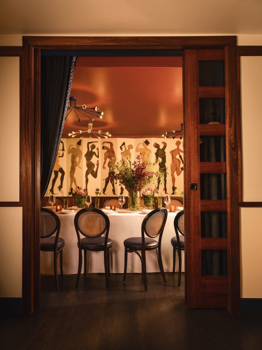
Doorway looking into a private dining room
A private dining room for parties is located at the back of the restaurant

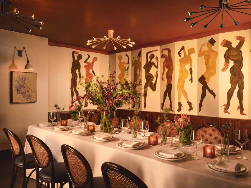
A private room for parties at the back features another Villafañe mural, as well as a rust-coloured ceiling and sci-fi lighting.

Overall, Cecchi’s offers a fine-dining experience that still feels approachable, warm and not too serious.

Long dining table laid for a party in front of a wall mural
The private room features another Villafañe mural, as well as a rust-coloured ceiling and sci-fi lighting

Carter founded her eponymous studio in 2016 and has completed a mix of residential and hospitality spaces on both coasts.

Other recently completed restaurants in the US that feature retro-futurist interiors include 19 Town, a Chinese eatery in Los Angeles by Jialun Xiong, while new openings in the West Village include the worker-owned Donna designed by Michael Groth.

The photography is by Joseph Kramm.

Reference

Eight interiors that use lattice screens as walls and room dividers
CategoriesInterior Design

Eight interiors that use lattice screens as walls and room dividers

For our latest lookbook, we have selected eight interiors that use lattice screens to conceal and divide spaces without blocking sightlines.

Lattice screens can come in a variety of materials and provide a versatile alternative to solid walls and room dividers, offering a way to create privacy between two spaces while still maintaining a connection between them.

From concealing bathrooms to establishing connections between interior and exterior spaces, this lookbook presents eight different ways in which lattice screens have been used in residential, hotel and restaurant interiors.

This is the latest in our lookbooks series, which provides visual inspiration from Dezeen’s archive. For more inspiration see previous lookbooks featuring period home renovations, open-plan interiors characterised by bold dining tables and interiors with reclaimed materials.


Lattice volume in Dende Duratex House by NJ Studio
Photo by Denilson Machado

Dendê Duratex House, Brazil, by NJ+

Brazilian architecture studio NJ+ took cues from Bahia, the Brazilian state that studio founder Nildo José grew up in, to create the interior of Dendê Duratex House. Here, it integrated a white latticework structure that separates the living space from the bedroom.

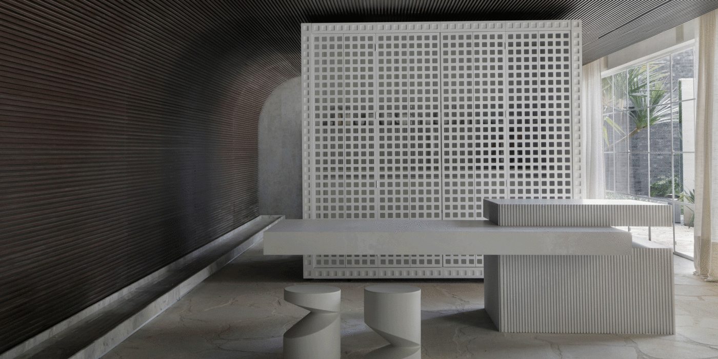
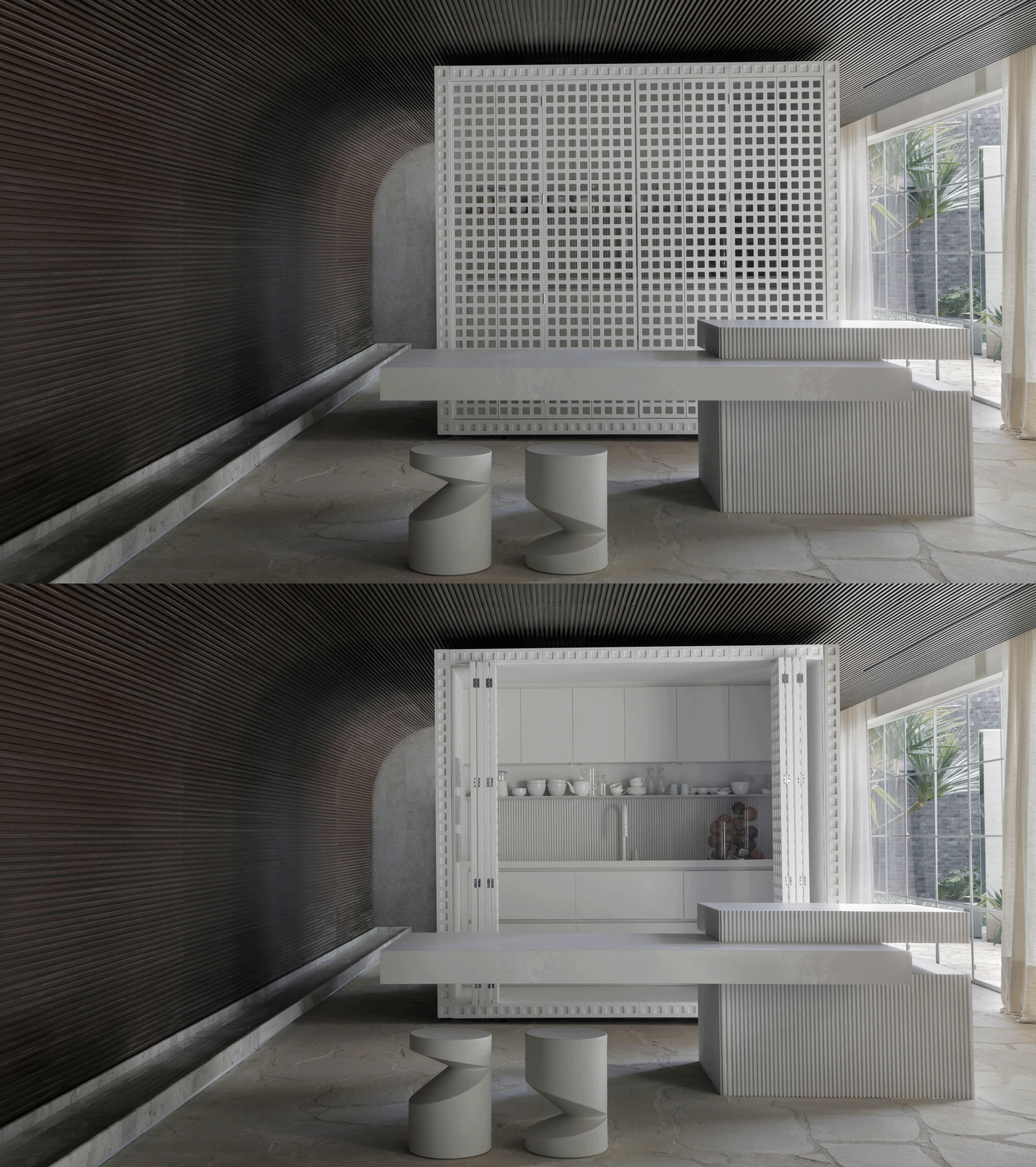
The volume encompasses the one-bedroom apartment’s bathroom and kitchen amenities while introducing texture to the monochrome minimalist home.

Find out more about Dendê Duratex House ›


P Duplex interior with lattice guardrail by Pitsou Kedem
Photo by Amit Geron

P Duplex apartment, Israel, by Pitsou Kedem Architects

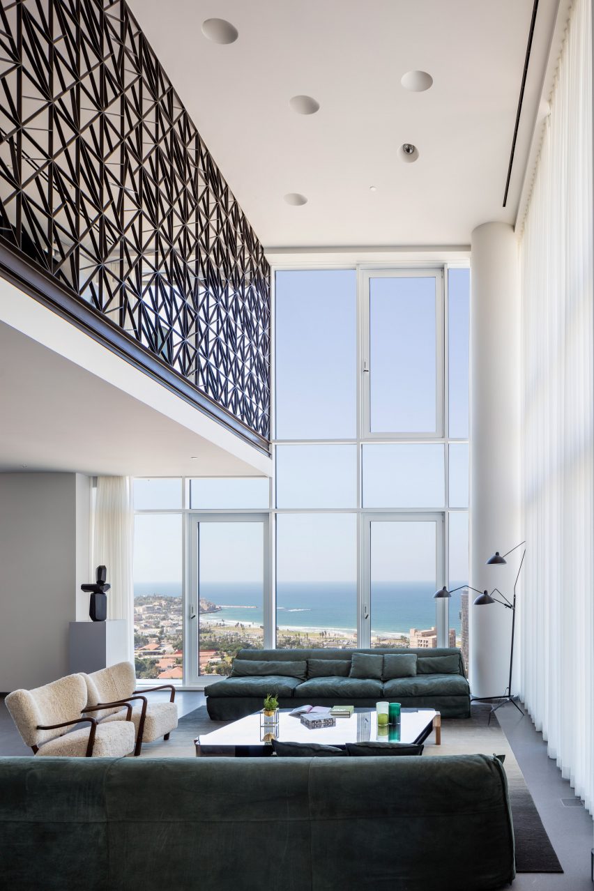
The second floor of this apartment in Tel Aviv was transformed into a mezzanine that overlooks a double-height living and dining room by local practice Pitsou Kedem.

A black metal guardrail wraps the upper level, tracing the route from the staircase to the upper floor and offering security while allowing views of the floor below. The see-through lattice design features triangular shapes compiled into rectangular modules.

Find out more about P Duplex apartment ›


Sulwhasoo Flagship Store interior by Neri&Hu
Photo by Pedro Pegenaute

Sulwhasoo Flagship Store, South Korea, by Neri&Hu

This five-storey flagship store, designed for Korean skincare brand Sulwhasoo, is characterised by large expanses of brass rods that form a lattice network. Used throughout the store, the latticed walls form see-through room dividers as well as shelving.

The framework continues from the exterior into the interior of the store, guiding visitors through the five floors. Architecture studio Neri&Hu’s concept was informed by lanterns and their role in illuminating journeys in Asian culture.

Find out more about Sulwhasoo Flagship Store ›


Wooden lattice screen in a restaurant
Photo by Andrii Shurpenkov

Virgin Izakaya Bar, Ukraine, by YODEZEEN

Timber screens and red metal webbed structures conceal and divide spaces within this Japanese restaurant in Kyiv, designed by Ukrainian architecture and design studio YODEZEEN.

The wooden lattice screens were introduced to soften the restaurant’s cold material palette, consisting of raw concrete and brick surfaces.

Find out more about Virgin Izakaya Bar ›


Casa Octavia boutique hotel by PPA ground floor
Photo by Luis Garvan, Luis Young and Maureen Evans

Casa Octavia, Mexico, by PPAA

Thin latticed timber screens shield this hotel’s interiors from harsh sunlight and cast intricate shadows throughout the day.

The screens aim to serve as a mediator between hotel guests and passerbys, fostering interaction between residents of the La Condesa neighbourhood in which its is located and the hotel itself, while maintaining a level of privacy.

Find out more about Casa Octavia ›


55 North bar with sliding lattice screens by Luchetti Krelle
Photo by Tom Ferguson

Manly Pacific, Australia, by Luchetti Krelle

Sliding lattice screens separate the reception from the bar in this hotel in Sydney, which was renovated by Australian studio Luchetti Krelle.

The partitions allow the two distinct spaces to blend together without losing their individual character, which is defined by contrasting material and colour palettes.

Find out more about Manly Pacific ›


Mimi Kakushi restaurant interior by Pirajean Lees
Photo by Maha Nasra Eddé

Mimi Kakushi, Dubai, by Pirajean Lees

London studio Pirajean Lees was informed by Japan’s jazz age, combining a variety of materials and textures such as beaded curtains, stained-glass windows and sliding gridded screens in this restaurant in Dubai.

The flexibility of the moveable lattice screens allows the restaurant to host events of varying crowd sizes, partitioning the open-plan layout into a variety of smaller spaces.

Find out more about Mimi Kakushi ›


Hiba restaurant in Tel Aviv features oak and granite interior
Photo by Amit Geron

Hiba, Israel, by Pitsou Kedem Architects

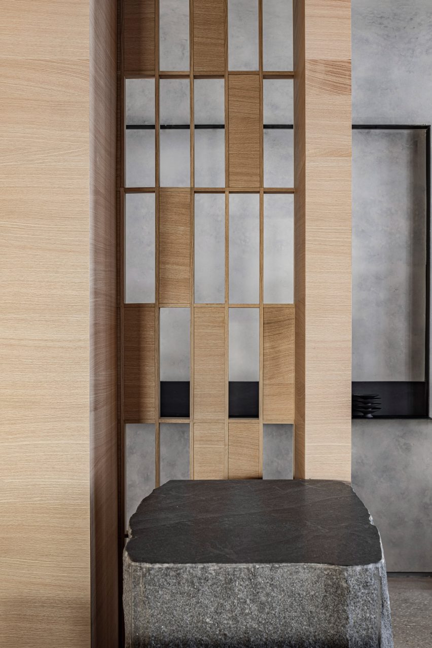
A combination of solid and hollow oakwood components forms a gridded screen that allows visitors to glimpse between the dining area and the entrance of this restaurant in Tel Aviv.

Alongside oakwood, the restaurant’s interior features granite slabs and concrete. Designers Pitsou Kedem Architects aimed for the raw material palette to reflect the restaurant’s use of fresh ingredients.

Find out more about Hiba ›

This is the latest in our lookbooks series, which provides visual inspiration from Dezeen’s archive. For more inspiration see previous lookbooks featuring period home renovations, open-plan interiors characterised by bold dining tables and interiors with reclaimed materials.

Reference

Eight open-plan interiors where dining tables take centre stage
CategoriesInterior Design

Eight open-plan interiors where dining tables take centre stage

A brutalist apartment in Belgium and a coastal house in Australia feature in this lookbook, which collects open-plan interiors where dining tables are the focal point.

With dining rooms often forming part of larger, multipurpose living areas in our homes, tables are an easy way to create a focal point that subtly breaks up space.

As demonstrated by this lookbook, dining tables also present an opportunity for homeowners to bring personal style into a room while carving out an intimate setting to entertain guests.

This is the latest in Dezeen’s lookbooks series, which provides visual inspiration from Dezeen’s archive. For more inspiration see previous lookbooks that feature interiors with reclaimed materials, art deco influences and sunny yellow finishes.


Dining area of Landaburu Borda by Jordi Hidalgo Tané
Photo by Jose Hevia

Landaburu Borda, Spain, by Jordi Hidalgo Tané

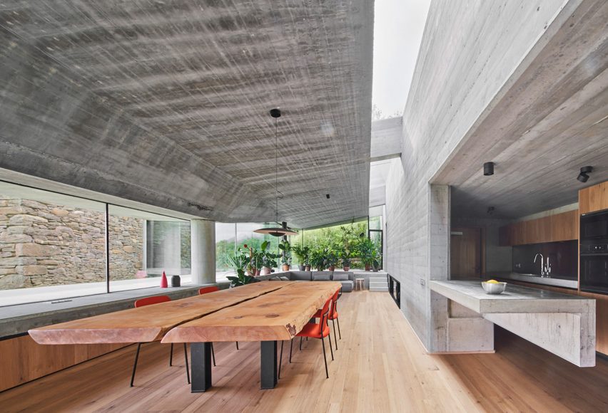
A dining table takes centre stage in this house extension, which architecture studio Jordi Hidalgo Tané added to Landaburu Borda in rural Navarra.

Supported by chunky metal legs, the table is formed of two giant pieces of wood and paired with bright red chairs that help it pop against a backdrop of concrete walls.

Find out more about Landaburu Borda ›


Interior of Riverside Tower apartment, Belgium, by Studio Okami Architecten
Photo by Olmo Peeters

Riverside Tower apartment, Belgium, by Studio Okami Architecten

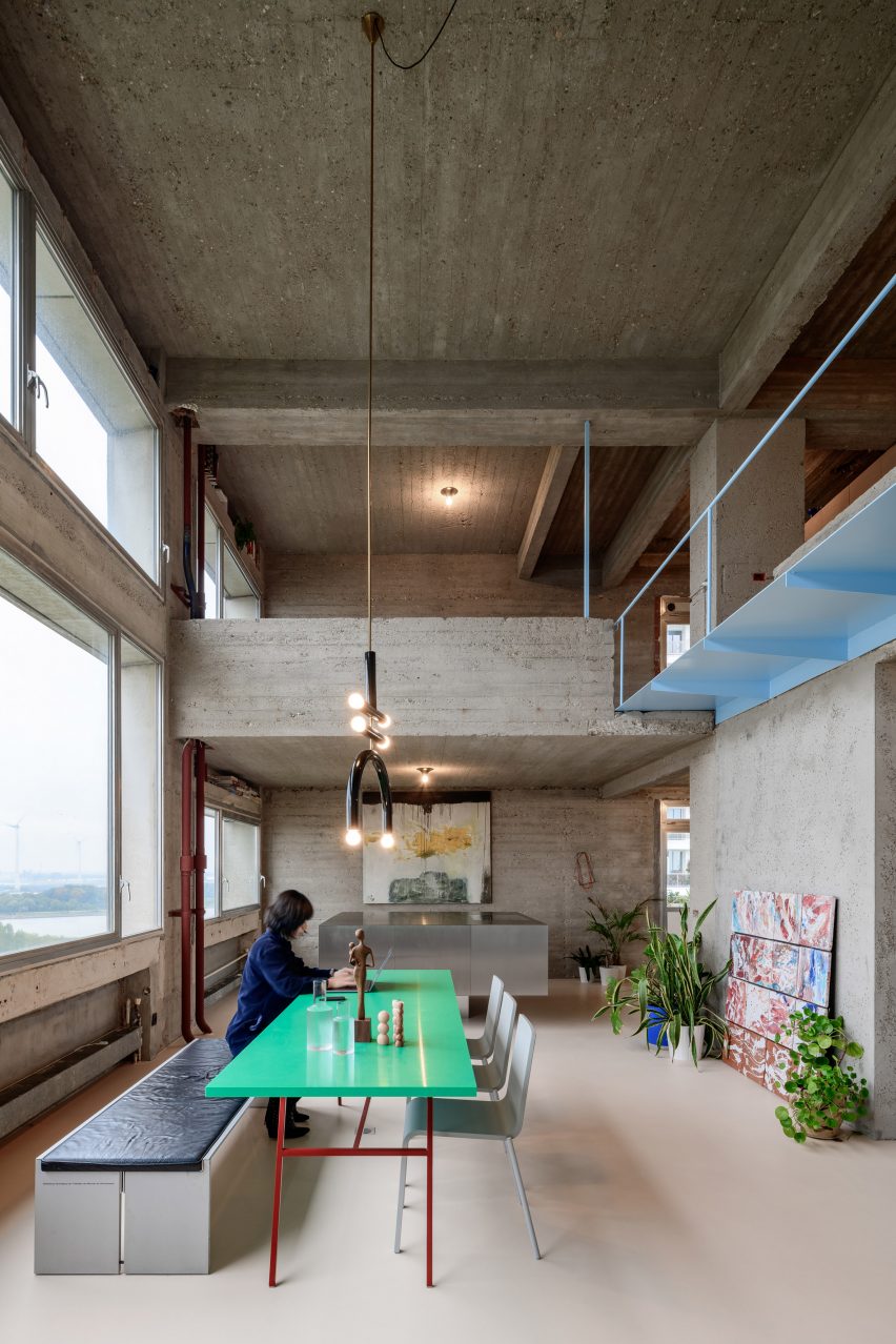
Studio Okami Architecten used the dining table as an opportunity to inject colour into this concrete apartment, which is located in a brutalist tower in Antwerp.

The bright aquamarine tabletop was married with slender red-metal legs, which draw the eye to the dining area with the help of a black ceramic chandelier plunging overhead.

Find out more about the Riverside Tower apartment ›


Pared-back dining room in Barwon Heads House
Photo by Timothy Kaye

Barwon Heads House, Australia, by Adam Kane Architects

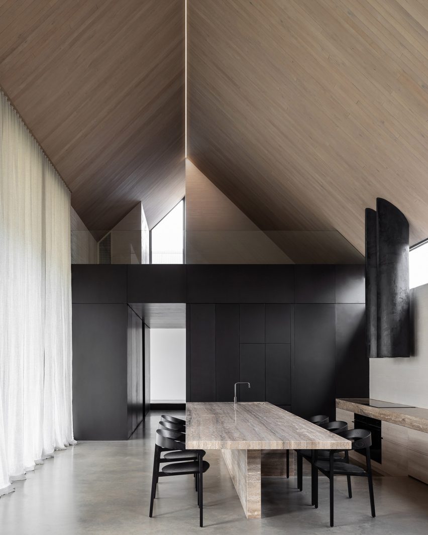
Slabs of travertine form this monolithic table, located in the large living and dining room at a coastal home in Barwon Heads.

It brings a lavish aesthetic to the otherwise understated room, which features black wooden chairs, sheer curtains and a pared-back colour palette.

At one end is a sink, allowing the table to also be used as an island for food preperation.

Find out more about Barwon Heads House ›


Pink dining table
Photo by Megan Taylor

Sunderland Road house, UK, by 2LG Studio

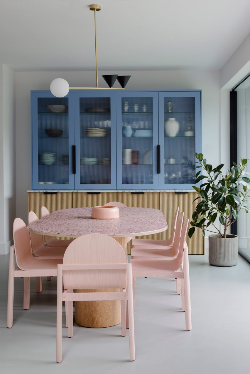
Pink was used throughout this renovated Edwardian house in London by 2LG Studio, including in the playful dining room set.

Set against white walls and a baby-blue vitrine, the statement table has a top made from waste wood chips and resin and matching sculptural pink chairs.

Find out more about the Sunderland Road house ›


Interior of Three Chimney House by T W Ryan Architecture
Photo by Joe Fletcher

Three Chimney House, USA, by T W Ryan Architecture

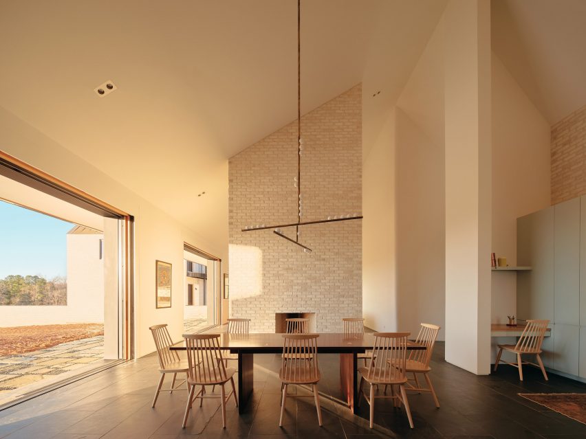
A mottled-brass chandelier was suspended over this big eight-seater table, which sits at the heart of Three Chimney House in Virginia.

Its minimalist yet striking wooden form stands boldly against white walls, a pale-brick chimney and delicate spindle-back chairs.

Find out more about Three Chimney House ›


Wooden dining table
Photo by Read McKendree

Sag Harbor 2, USA, by Kevin O’Sullivan + Associates

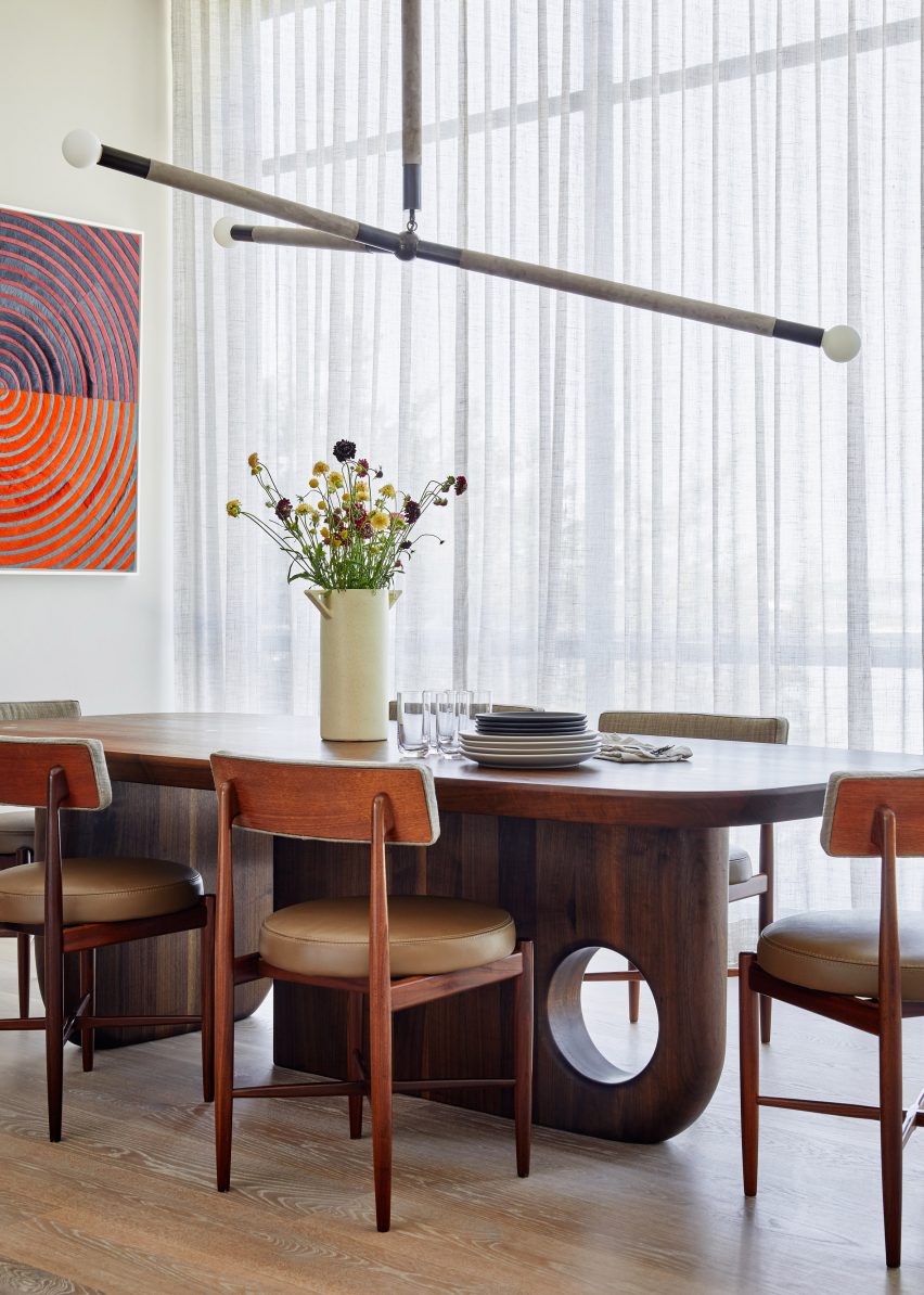
Smooth edges and a curved cut-out give a sculptural look to the wooden legs beneath this chunky dining table.

Teamed with vintage Fresco dining chairs by G Plan, it brings a mid-century-style focal point to the contemporary interior of Sag Harbor 2.

Find out more about Sag Harbor 2 ›


Exposed ceiling beams in Nieby Crofters Cottage by Jan Henrik Jansen and Marshall Blecher
Photo by Jose Campos

Nieby Crofters Cottage, Germany, by Jan Henrik Jansen and Marshall Blecher

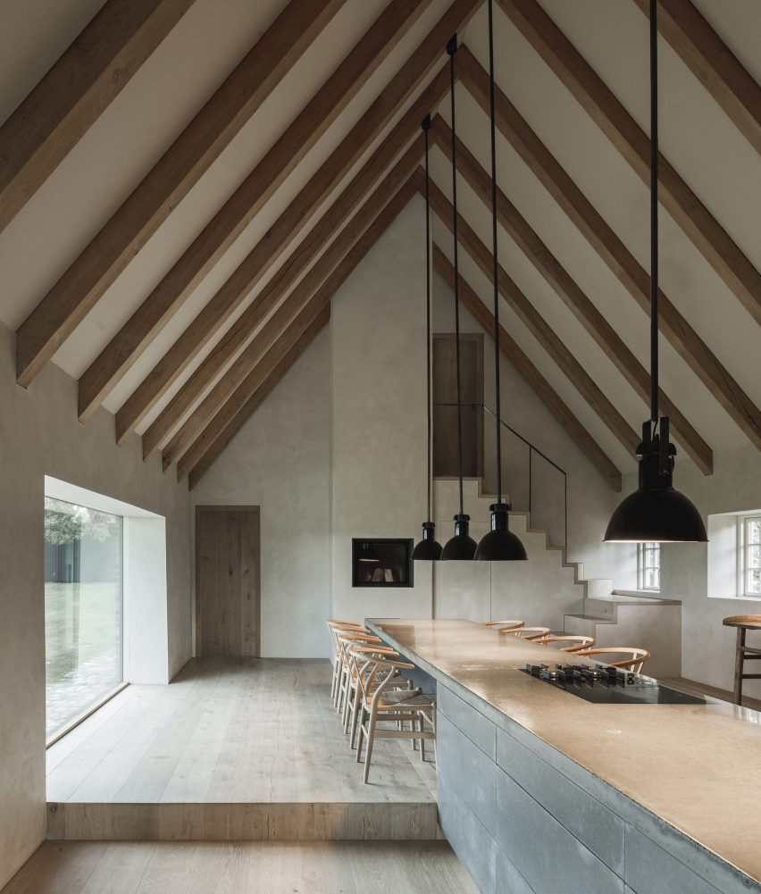
Architects Jan Henrik Jansen and Marshall Blecher designed this dining table as an extension of the island in the kitchen at Nieby Crofters Cottage.

Illuminated by low-hanging pendant lights, the table was surrounded by eight of Hans Wegner’s Wishbone chairs and creates an opportunity for the owner to entertain guests while preparing food.

Find out more about Nieby Crofters Cottage ›


Television Centre apartment interior
Photo by Michael Sinclair

Television Centre apartment, UK, by Waldo Works

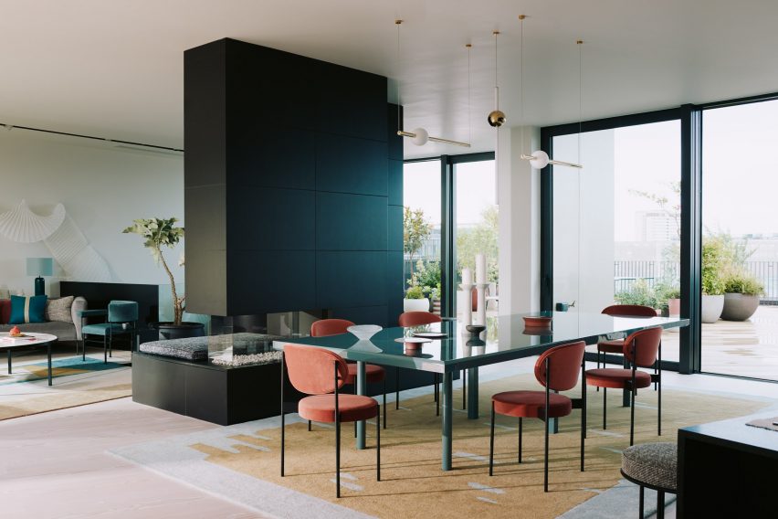
Flanked by a black fireplace and kitchen cabinetry, this dining table stands out because of its glossy pine-green top.

Waldo Works contrasted it with saffron-coloured chairs a mustard-yellow rug, which helps establish it as the focal point and social heart of the open-plan room.

Find out more about the Television Centre apartment ›

This is the latest in Dezeen’s lookbooks series, which provides visual inspiration from Dezeen’s archive. For more inspiration see previous lookbooks that feature interiors with reclaimed materials, art deco influences and sunny yellow finishes.

Reference

Eight interiors that feature reclaimed and recycled materials
CategoriesInterior Design

Eight interiors that feature reclaimed and recycled materials

For our latest lookbook, Dezeen has selected eight examples of interiors that were created with reclaimed and recycled materials, including a restaurant in Bangalore and a brick house in Ghent.
Recent decades have seen more awareness and reflection on environmental and sustainable issues both inside and outside the design world, leading a number of designers and architects to choose sustainable design for their projects.

From the use of unwanted items to the application of reclaimed bricks and recycled plastics, the eight projects in this lookbook present ways in which designers have rediscovered the value of waste.

This is the latest in Dezeen’s lookbooks series, which provides visual inspiration from Dezeen’s archive. For more inspiration see previous lookbooks featuring sunny yellow interiors, beds that have been built into interiors and tiled kitchen worktops.


Photo by Ishita Sitwala

Circus Canteen, India, by Multitude of Sins

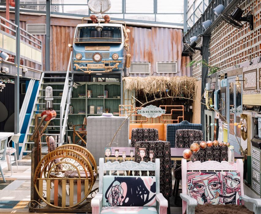
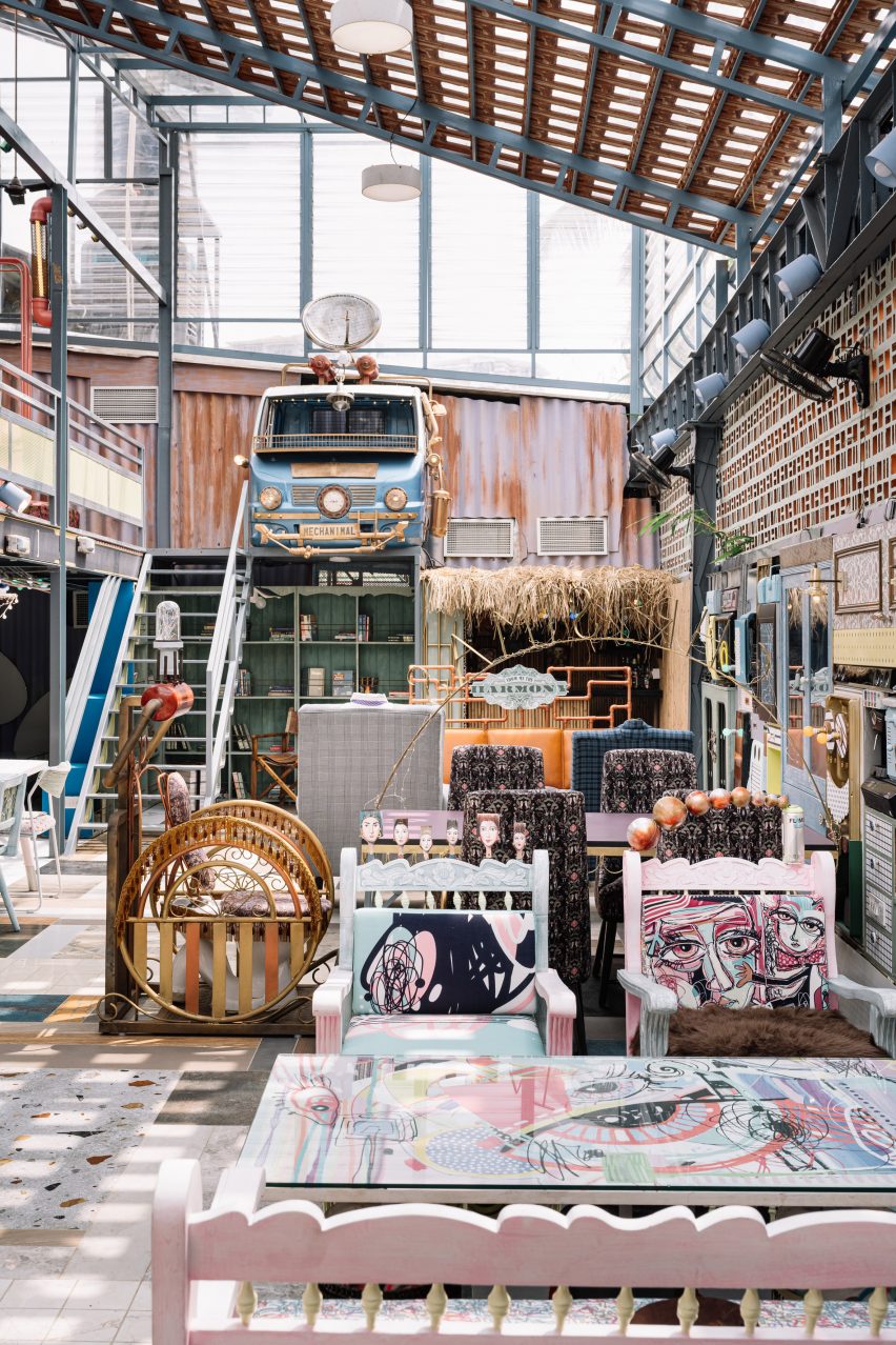
Bangalore studio Multitude of Sins designed this restaurant interior, which was shortlisted in the sustainable interior category of Dezeen Awards 2022, to showcase a collage of unwanted objects.

The salvaged objects were sourced locally from a donation drive in a few weeks. The studio categorised them, then organised them into a colourful, stylish interior.

Find out more about the Circus Canteen ›


Kamikatsu Zero Waste Centre, Japan, by Hiroshi Nakamura

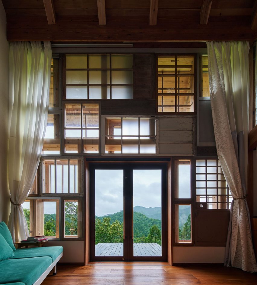
The Kamikatsu Zero Waste Centre (above and main image) was created as an eco-friendly community and educational space for recycling activities, and features a facade made of 700 windows donated by the local community.

Architect Hiroshi Nakamura attached harvesting containers from a mushroom factory to the wall to be used as bookshelves. Unwanted objects were also collected from abandoned houses, previous government buildings and schools in the local area.

Find out more about the Kamikatsu Zero Waste Centre ›


Silo restaurant designed by Nina+Co
Photo by Sam A Harris

Silo, UK, by Nina+Co

The dining tables of this zero-waste restaurant in London consist of flecked recycled-plastic tops and sustainably-sourced ash wood legs, with mycelium pendant lamps dangling above.

The dining space also features a long bar counter made from recycled plastic packaging.

Find out more about Silo zero-waste restaurant ›


Photo by Magdalena Gruber

Urselmann Interior’s office, Germany, by Urselmann Interior

The renovation of the ceiling in this Düsseldorf office was completed using poplar wood sourced from a tree felled in the nearby city of Krefeld. The studio preserved the existing wooden and terrazzo flooring.

The refurbishment of the office, which is the studio’s own, also included the use of biodegradable materials, glueless joinery and cellulose-based cladding.

Find out more about Urselmann Interior’s office ›


The Wendy House by Earthscape Studio
Photo by Syam Sreesylam

Wendy House, India, by Earthscape Studio

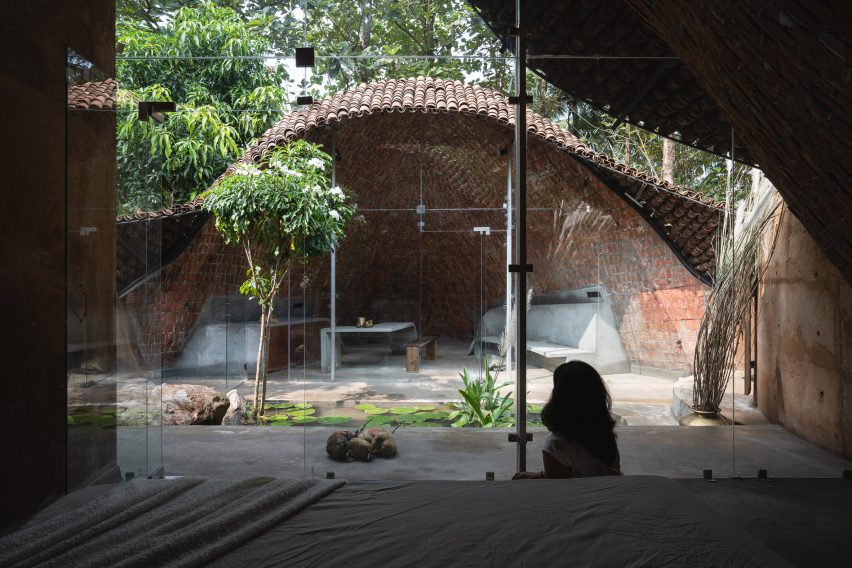
This vaulted residence in Bangalore, which sits among eight acres of dense forests, was covered with recycled mudga tiles. Its glass walls were framed with recycled rods.

Earthscape Studio also constructed the building with sithu kal bricks, a traditional technique that is currently not in use. This design revisited the neglected technique to help bring work opportunities to the local community.

Find out more about the Wendy House ›


GjG House built of reclaimed bricks by BLAF Architecten in Ghent, Belgium
Photo by Stijn Bollaert

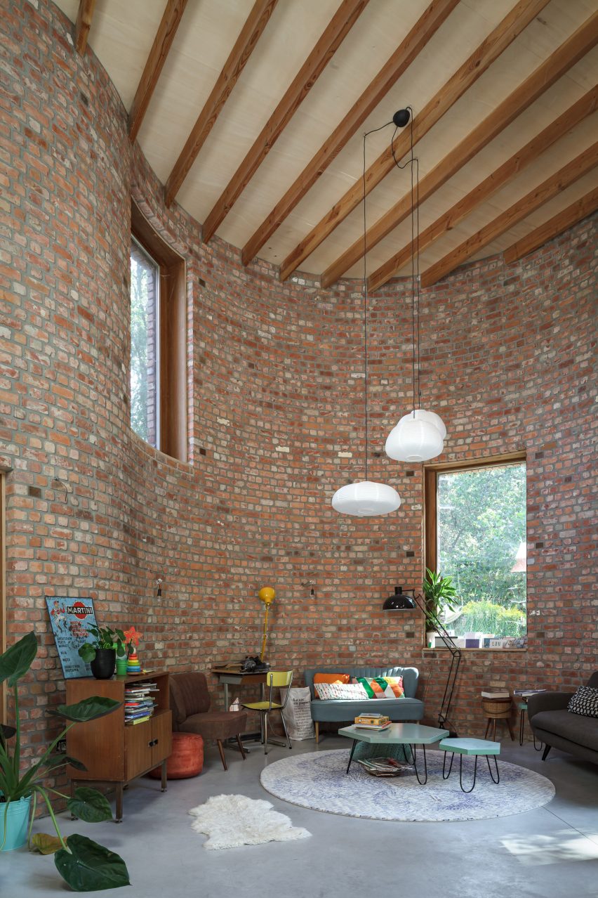
GjG House, Belgium, by BLAF Architecten

Built without supporting interior walls, this house was constructed with reclaimed bricks and features a curved form and brick bonding.

BLAF Architecten designed the unusual curvilinear walls in order for the house to fit in between surrounding trees on the site in Ghent.
Find out more about GjG House ›


10K House by Takk
Photo by José Hevia

10K House, Spain, by Takk

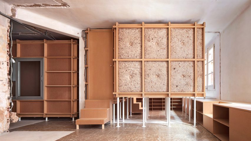
In the context of global climate change and the energy crisis, 10K House was built on a material budget of only 10,000 euros and features rooms built inside each other to maximise insulation.

Spanish Architecture studio Takk used recycled white table legs to lift one of the interior rooms in the Barcelona apartment, creating space for water pipes and electrical fittings without the extra cost of adding wall grooves.

Find out more about 10K House ›


Rylett House by Studio 30 Architects
Photo by Agnese Sanvito

Rylett House, UK, Studio 30 Architects

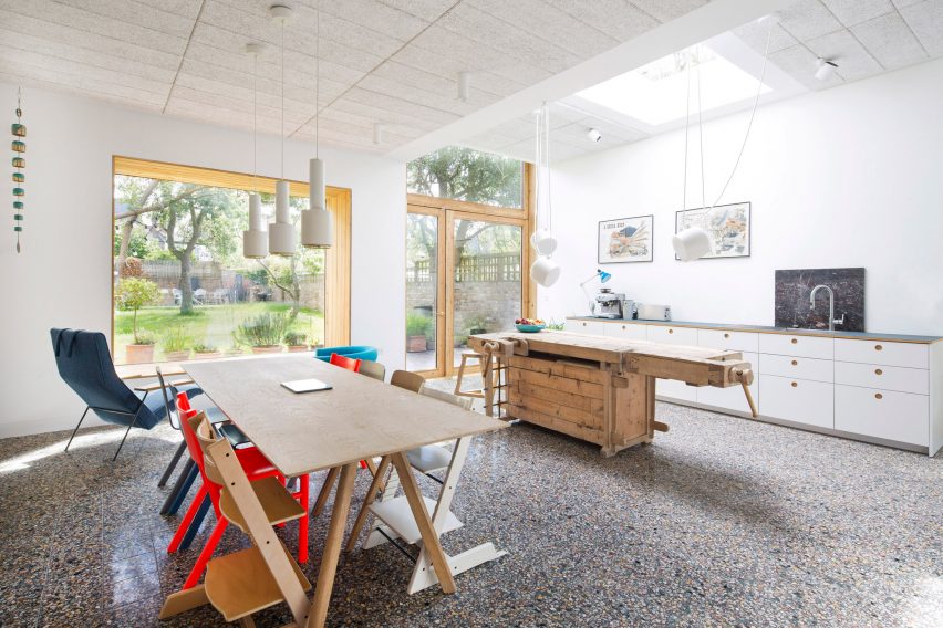
Studio 30 Architects transformed an old carpenter’s bench into a kitchen island for this London house extension, which includes a living, kitchen and dining area.

The extension was built on the site of a previous conservatory and overlooks the garden through a timber window decorated with plants.

Find out more about Rylett House ›

This is the latest in Dezeen’s lookbooks series, which provides visual inspiration from Dezeen’s archive. For more inspiration see previous lookbooks featuring sunny yellow interiors, beds that have been built into interiors and tiled kitchen worktops.

Reference

Eight sunny yellow interiors from kitchens to living rooms
CategoriesInterior Design

Eight sunny yellow interiors from kitchens to living rooms

One-palette rooms and statement staircases are featured in our latest lookbook, which explores the best yellow interiors from the Dezeen archives.

From soft, buttery hues to vivid primary colours and deeper mustards, these residential and commercial spaces have challenged the use of traditional shades to create unique, eye-catching yellow interiors.

The use of yellow has been incorporated into bedrooms, living rooms, kitchens and facades, whether it is contrasting with brighter colours, blending with other honey tones or standing out against neutral materials.

This is the latest in our lookbooks series, which provides visual inspiration from Dezeen’s archive. For more inspiration see previous lookbooks featuring interiors with lime plaster walls, Barbiecore pink aspects and retro nods to Wes Anderson.


Beresford Road by Russian for Fish
Photography is by Peter Landers

Beresford Road property, London, by Russian for Fish

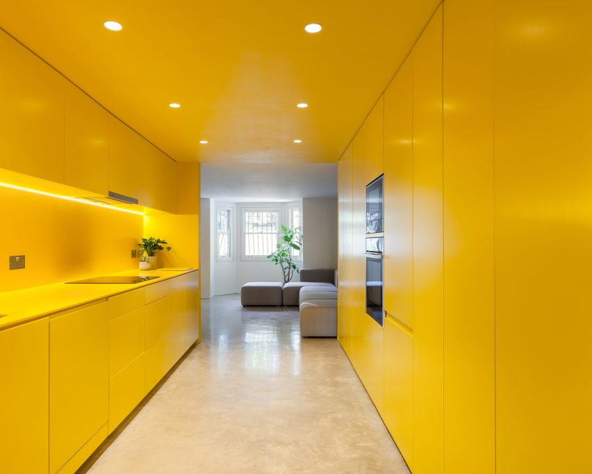
This London-based apartment features a statement yellow kitchen that was used to brighten the basement and complement the other colours in the space. Russian for Fish used the same vivid shade throughout the entirety of the kitchen, which also continues to the staircase.

Plant pots are added to the area to create dimension, with the green tones adding more colour to the otherwise yellow and neutral home.

“Yellow is a great colour – it brings out the ochre tones of the natural concrete floor, compliments the off-white walls, and creates warmth throughout the flat, even on the dullest of days,” says architect and founder at Russian for Fish, Pereen d’Avoine.

Find out more about Beresford Road property ›


Seven Lives by Anna and Eugeni Bach
Photography is by Eugeni Bach

Seven Lives, Spain, by Anna and Eugeni Bach

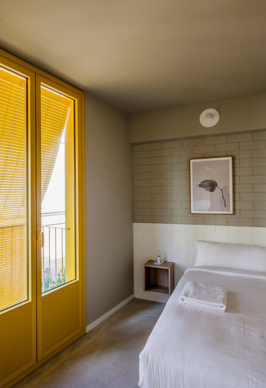
Spanish architecture studio Anna and Eugeni Bach built this apartment block in Barcelona, adding primary yellow features to the facade that add a vibrant touch to the interiors.

The building has yellow window frames and grills, balconies and blinds that are all visible from the apartments, as well as yellow internal doors to the balconies. These statement attributes contrast with the grey stucco and internal walls.

The shade – which was selected as it was approved by the area’s regulators – is also used in the communal staircase.

Find out more about Seven Lives ›


Bright yellow modular kitchen in compact apartment
Photography is by René de Wit and Pim Top

Residential complex, The Netherlands, by Shift Architecture Urbanism

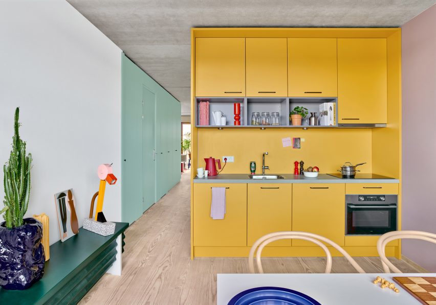
A variety of bright colours were used to decorate this residential complex designed by Shift Architecture Urbanism in Amsterdam. The 235 apartments feature shades of yellow, green, blue, red in the furniture, fixtures and appliances to create a playful atmosphere.

The homes feature laminate floors, white walls and concrete ceilings that create a neutral base for the additional colours used for the modular units, cupboard-style bedrooms and ceramic tiled walls.

Find out more about the residential complex ›


Photo of a room with a yellow ceiling
Photography is by Jesper Westblom

Apartment, Sweden, by Westblom Krasse Arkitektkontor

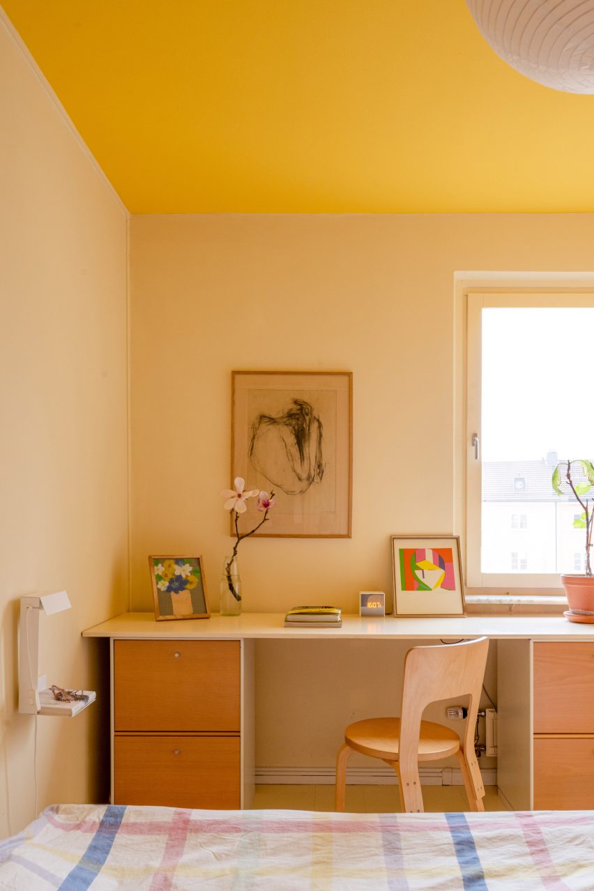
This apartment in Stockholm uses plenty of primary colours, with reds, blues and yellows used on the walls and on the furniture.

A butter shade decorates the walls of the main and children’s bedrooms, and is complimented by a sunshine hue on the ceiling. Soft yellow shades are also used to contrast maroon tiles and doors throughout the home.

Yellow accents can also be found on its accessories, such as lamps, crockery and artwork.

Find out more about the Stockholm apartment ›


Interiors of Casa Collumpio by MACH
Photography is by Del Rio Bani

Casa Collumpio, Spain, by MACH

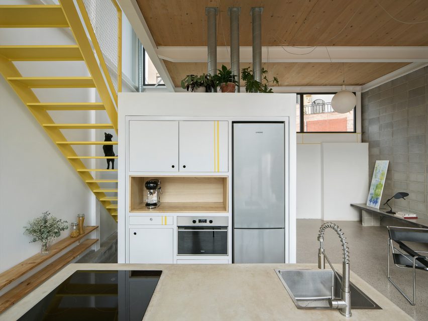
MACH designed this industrial-style house in Barcelona with lemon-yellow steelwork used on the interior and exterior.

Used as a focal point among grey concrete and wooden cladding, a bright yellow staircase with a protective mesh panel connects the upper floors of the building. To complement the feature, yellow stripes are added to the white kitchen cupboards.

The colour continues on the steelwork around the door, forming a decorative statement around the windows at the front and back of the home.

Find out more about Casa Collumpio ›


Duplex in Sant Gervasi by Arquitectura-G
Photography is by José Hevia

Apartment, Spain, by Arquitectura-G

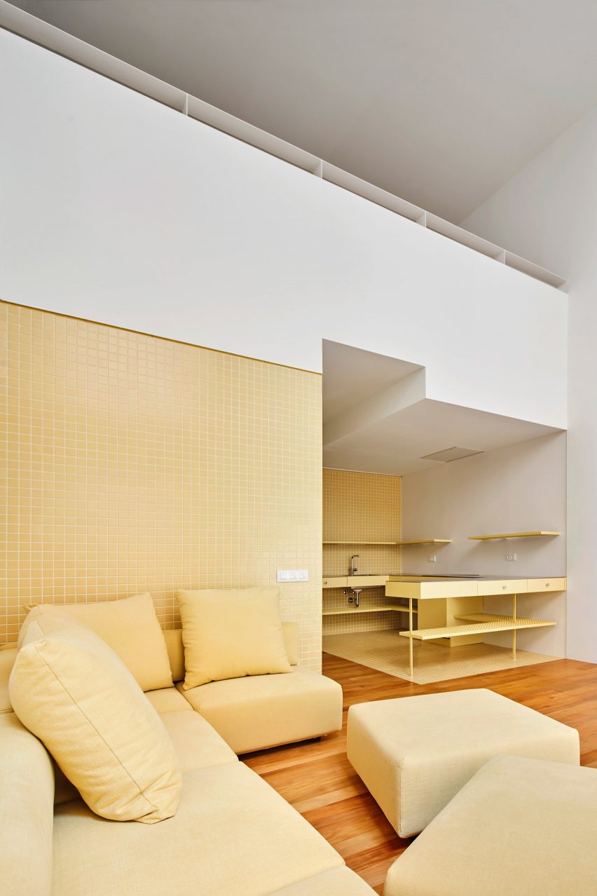
Arquitectura-G designed the interiors of this apartment in Barcelona with pastel yellow tones to create a lighter, more open space. The walls and floor of the space are covered in glazed square tiles, with the metal kitchen units matching in a similar tone.

Yellow furniture, such as a sofa and cupboards, complement the apartment’s colour palette.

“We prefer to use the same colour in the whole project, in order to give a strong visual impact and make it an essential part of the house’s identity,” sids Arquitectura-G.

Find out more about the Spanish apartment ›


Photo of a cafe in Stockholm
Photography is by Mikael Lundblad

Cafe Banacado, Sweden, by ASKA

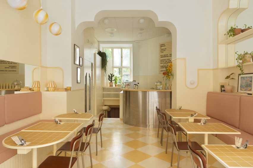
ASKA has created a picturesque cafe in Stockholm informed by film director Wes Anderson’s aesthetics, using shades of mustard, cream, pink and brown to adorn the space.

The yellow checkerboard floor was influenced by traditional Cuban styles of interiors and mirrored by similar tones in the tiled table tops.

“In order to create an environment that feels harmonious we work with subtle layering and tone in tone methods,” said ASKA co-founder Madeleine Klingspor. “The same yellow is used on the walls, lamps, tables and floor but in different scales and intensity,”

Find out more about Cafe Banacado ›


Pink, grey and chrome Kitchen in JJ16 apartment by Lucas y Hernández-Gil
The photography is by Jose Hevia

JJ16, Spain, by Lucas y Hernández-Gil

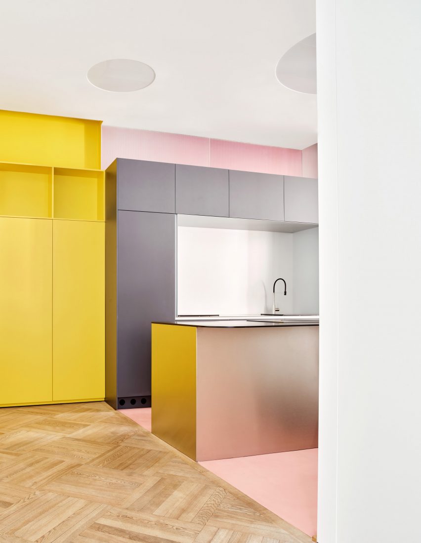
Citrus yellow offsets petal pink in this Madrid apartment by Lucas y Hernández-Gil, with a yellow built-in bookshelf lining the length of the corridor.

The hallway leads to the kitchen, which features a contrasting soft pink floor and walls and matte grey units.

The rest of the space has been decorated with similarly vivid colours and prints, including neon orange storage hidden by white doors, blue checkerboard flooring and an aubergine wardrobe.

Find out more about JJ16 ›

This is the latest in our lookbooks series, which provides visual inspiration from Dezeen’s archive. For more inspiration see previous lookbooks featuring interiors with lime plaster walls, Barbiecore pink aspects and retro nods to Wes Anderson.

Reference

Eight serene interiors with decorative lime plaster walls
CategoriesInterior Design

Eight serene interiors with decorative lime plaster walls

For our latest lookbook, we have gathered eight examples of homes where tactile and practical lime plaster walls give the interiors a natural, calming feel.

Lime plaster is a traditional wall coating typically made from sand, water and lime. It is often used in heritage buildings, since it is a breathable material that can be a good choice for damp spaces.

It also has a natural look and feel that can help to create a more rustic and peaceful atmosphere in modern homes.

This is the latest in our lookbooks series, which provides visual inspiration from Dezeen’s archive. For more inspiration see previous lookbooks featuring clever wine storage solutions, space-efficient bedrooms and Mediterranean-style interiors.


MA House by Timothee Mercier from Studio XM
Photo by Simone Bossi

MA House, France, by Timothee Mercier

Architect Timothee Mercier turned a rural farmhouse building in southeast France into a home for his parents that aimed to respect both the site and the region’s architectural history.

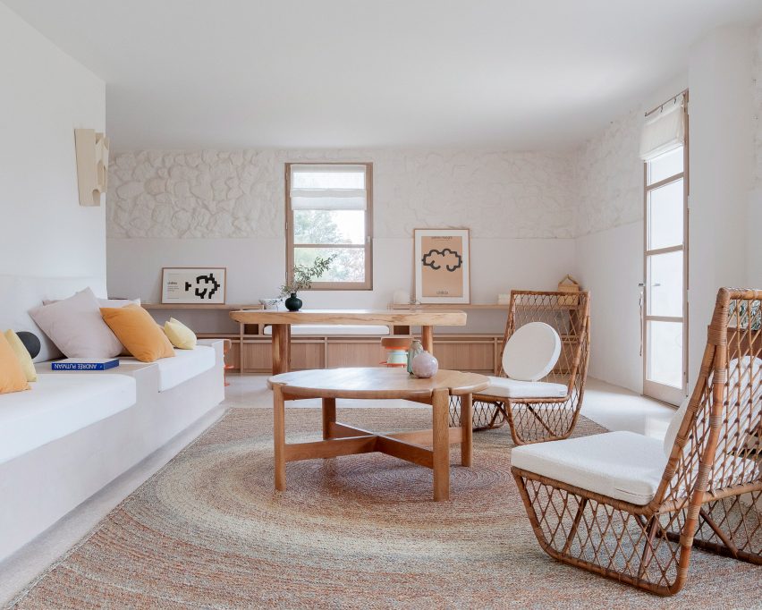
Inside, he went for a pared-back, spartan interior, where some of the house’s stone exterior was left exposed. Walls were white-washed with chaux – a local lime plaster – to create a clean backdrop for the living room’s wooden furniture.

Find out more about MA House ›


Polysmith house, London
Photo by Lorenzo Zandri

Cork House, UK, by Polysmiths

Cork-clad living spaces feature in this east London home, which architecture studio Polysmiths’ director Charles Wu designed for himself and his partner.

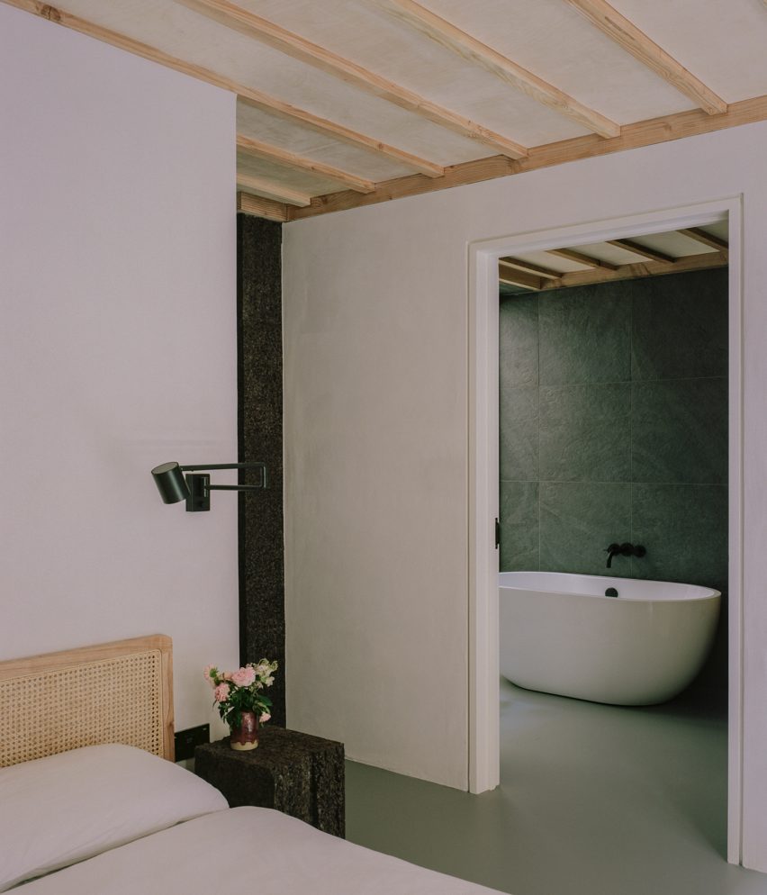
Wu used locally sourced timber and lime plaster for the house. A lime-plastered wall divides the main bedroom from its en-suite bathroom, which is lit by a corner lightwell.

Find out more about Cork House ›


Window seat in Herne Hill House extension by TYPE
Photo by Lorenzo Zandri

Herne Hill House, UK, by TYPE

The Herne Hill House extension replaced an existing conservatory at a south London terrace house, creating a bigger kitchen and dining room.

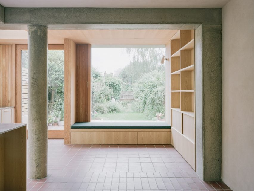
A peaceful window nook gives views out of the garden from the open-plan kitchen, which features walls covered in lime plaster. Their pale beige hue contrasts the warm terracotta-coloured quarry-tile floor.

Find out more about Herne Hill House ›


Interior by Menard Dworkind
Photo by David Dworkind

Québec home, Canada, by Ménard Dworkind

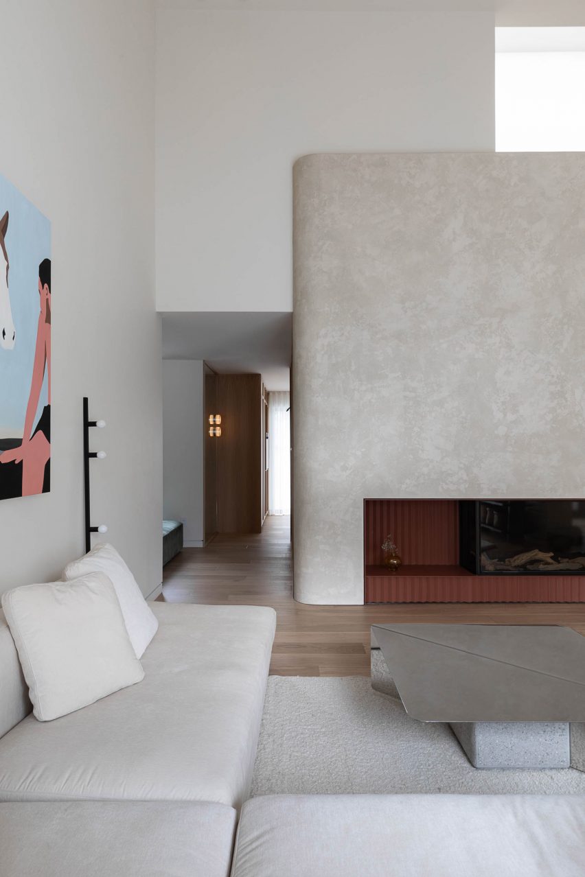
This home in Montréal centres around a lime-plastered, curved central block that sweeps around a staircase and forms a mezzanine level that overlooks the living room.

Here, the rounded wall holds a terracotta fireplace. A geometric steel table adds a more modernist and industrial feel to the organic interior.

Find out more about the Québec home ›


Plywood kitchen inside Iceberg apartment by Laila Architecture
Photo by Mikaela Burstow

Iceberg apartment, Israel, by Laila Architecture

Natural lime plaster covers the walls in this Israeli apartment, which gets its name from a large birch plywood storage volume resembling an iceberg.

In the kitchen, the plaster walls were complemented with birch plywood cabinetry and sunny pastel-hued chairs.

Find out more about the Iceberg apartment ›


Kitchen inside Low Energy House designed by Architecture for London
Photo by Lorenzo Zandri and Christian Brailey

Low Energy House, UK, by Architecture for London

The minimalist interior of this energy-saving home in north London was designed using wood, stone and lime plaster by studio Architecture for London.

Designed as a home for its founder, Ben Ridley, it had some problems with dampness. To help solve this, walls were coated with lime plaster to form an airtight layer, mitigating any heat loss.

Find out more about Low Energy House ›


Living room in Casa Soleto
Photo by Salva López

Casa Soleto, Italy, by Studio Andrew Trotter and Marcelo Martínez

Studio Andrew Trotter and Marcelo Martínez renovated this 17th-century Puglia house, using natural materials and colours wherever possible.

Earth-coloured lime plaster decorates the walls, adding to the rustic feel of the space and matching the tactile and rough-hewn materials and furniture used for the interior.

Find out more about Casa Soleto ›


Church Street extension by Whittaker Parsons
Photo by Jim Stephenson

North London home, UK, by Whittaker Parsons

A home in London’s Stoke Newington was given an additional storey made from copper, larch and structural insulated panels, which houses a bedroom suite.

Architecture studio Whittaker Parsons chose lime plaster for the walls of the space, which was designed to have a serene feel.

“Lime render is a calming tactile material, characterful and soft,” said Whittaker Parsons. “It is a low-carbon alternative to gypsum plaster. It’s also a hygroscopic material, so it naturally moderates the moisture level in the bedroom.”

Find out more about this North London home ›

This is the latest in our lookbooks series, which provides visual inspiration from Dezeen’s archive. For more inspiration see previous lookbooks featuring clever wine storage solutions, space-efficient bedrooms and Mediterranean-style interiors.

Reference

Eight airy interiors that draw on Mediterranean living
CategoriesInterior Design

Eight airy interiors that draw on Mediterranean living

With summer in full flow, we have gathered eight residential and hotel interiors for our latest lookbook that each has a breezy and cooling Mediterranean style.

Mediterranean interiors can often be defined by their minimal, paired back aesthetic that focuses on creating bright, airy and cool living spaces that offer an escape from the heat of the sun.

White-washed walls, exposed brick and stone or terracotta floors typically serve as the basis for these interiors with furniture made from natural materials.

From hotels in Greece built into caves to a home in a former ruin in France, here are eight interiors that are influenced by the Mediterranean.

This is the latest in our lookbook series, which provides visual inspiration from Dezeen’s archive. For more inspiration see previous lookbooks featuring Barbie-pink interiors, rustic interiors and Wes Anderson-style interiors.


MA House by Timothee Mercier from Studio XM
Photo is by Simone Bossi

MA House, France, by Timothee Mercier

Architect Timothee Mercier of Studio XM converted this former ruined farm building in Vacluse, France into a home that aimed to honour the original features of the building.

The interior of the home was blanketed in white, covering its walls and exposed stone surfaces. The space was sparsely decorated with light wood furnishings and natural materials to give the interior a Mediterranean feel.

Find out more about MA House ›


Casa A690 by Fino Lozano
Photo is by César Béjar

Casa A690, Mexico, by Delfino Lozano

Named Casa A690, this three-storey building dates back to the 1970s. It was renovated by Mexican architect Delfino Lozano who looked to combine Mediterranean and Mexican aesthetics.

“We use the term Mexiterraneo to describe the materials and feeling we try to give our projects, in which we interpret the Mediterranean architecture – simple, pure materials – and mix it with our Mexican traditional architecture,” said Lozano.

Find out more about Casa A690 ›


Berlin summer loft by Loft Szczecin
Photo is by Karolina Bąk

Berlin summer loft, Germany, by Loft Szczecin

Polish studio Loft Szczecin looked to historic Mediterranean architecture when overhauling the interior of this apartment in the suburbs of Berlin.

The brick walls of the home were painted white while the floors of the interior were finished with old bricks that were sourced from industrial demolitions across Poland. Throughout the apartment, doors were removed to create more of an open-plan interior.

Find out more about Berlin summer loft, ›


Pura Comporta by Falcão de Campos
Photo is by Fernando Guerra

Pura Comporta, Portugal, by Falcão de Campos

In Portugal, Lisbon studio Falcão de Campos implemented a Mediterranean-informed interior scheme throughout this triple-pitched roof beach house.

White walls were paired with minimal architectural detailing and finishes to achieve a Mediterranean look. A natural-toned rug was used to zone the living area, while a 10-person wooden table occupies the dining area of the home.

Find out more about Pura Comporta ›


Saint Hotel by Kapsimalis Architects
Photo is by Giorgos Sfakianakis

Saint Hotel, Greece, by Kapsimalis Architects

Greek architecture studio Kapsimalis Architects transformed a series of former homes, barns and cellars on the island of Santorini into a hotel with rooms in caves.

The interior was designed to match the all-white exterior of the hotel. Each of the rooms features an almost all-white finish with the exception of their poured concrete floors and furnishings.

Find out more about Saint Hotel ›


Summer house on the mountain by Kapsimalis Architects

Summer house, Greece, by Kapsimalis Architects

Large arched openings add character to the open-plan interior of these Santorini apartments, which were designed by Kapsimalis Architects.

Throughout the space, small, wood-framed windows pierce the walls and furniture was organised sparsely.

Find out more about summer house›


Las 3 Marías by Bajet Giramé and Nicolas Burckhardt
Photo is by José Hevia

Las 3 Marías, Spain, by Bajet Giramé and Nicolas Burckhardt

Terracotta tile floors, large arched openings and bi-folding glass doors blend the boundaries of the interior and exterior at this Spanish holiday home, which was designed by Bajet Giramé and Nicolas Burckhardt.
Much like homes found across the Mediterranean, white stucco covers its walls and Valencian terracotta tiles run through both the interior and exterior.

Find out more about Las 3 Marías ›


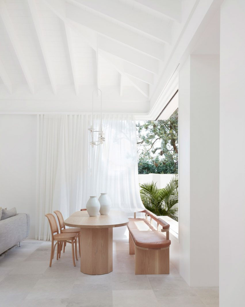
Woorak House in Palm Beach, Sydney designed by CM Studio
Photo is by Prue Ruscoe

Woorak House, Australia, by CM Studio

CM Studio looked to bring a coastal, Mediterranean feel to the interior of this home in Australia through the use of a paired back interior palette and natural materials such as wood, stone and paper.

In the dining room, a wooden table, chairs and bench were placed beside a glazed corner of the home beneath exposed beams that run through the home.

Find out more about Woorak House ›

This is the latest in our lookbook series, which provides visual inspiration from Dezeen’s archive. For more inspiration see previous lookbooks featuring Barbie-pink interiors, rustic interiors and Wes Anderson-style interiors.

Reference

Eight interiors that embrace the principles of wabi-sabi
CategoriesInterior Design

Eight interiors that embrace the principles of wabi-sabi

In this lookbook, we collect eight interiors informed by the Japanese design philosophy of wabi-sabi, which celebrates imperfection and impermanence.

Notoriously difficult to define, wabi-sabi is a concept rooted in Zen Buddhism that author Beth Kempton describes as helping us “to see beauty in imperfection, appreciate simplicity and accept the transient nature of all things”.

In interiors, it is often associated with the blending of rustic and minimalist elements as well as natural, earthy tones and raw surfaces. Below are eight interpretations of the aesthetic from around the world.

This is the latest in our lookbooks series, which provides visual inspiration from Dezeen’s archive. For more inspiration see previous lookbooks featuring Japandi living rooms, bedrooms with earthy colour palettes and calming organic-modern interiors.


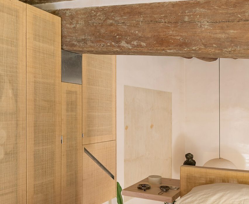
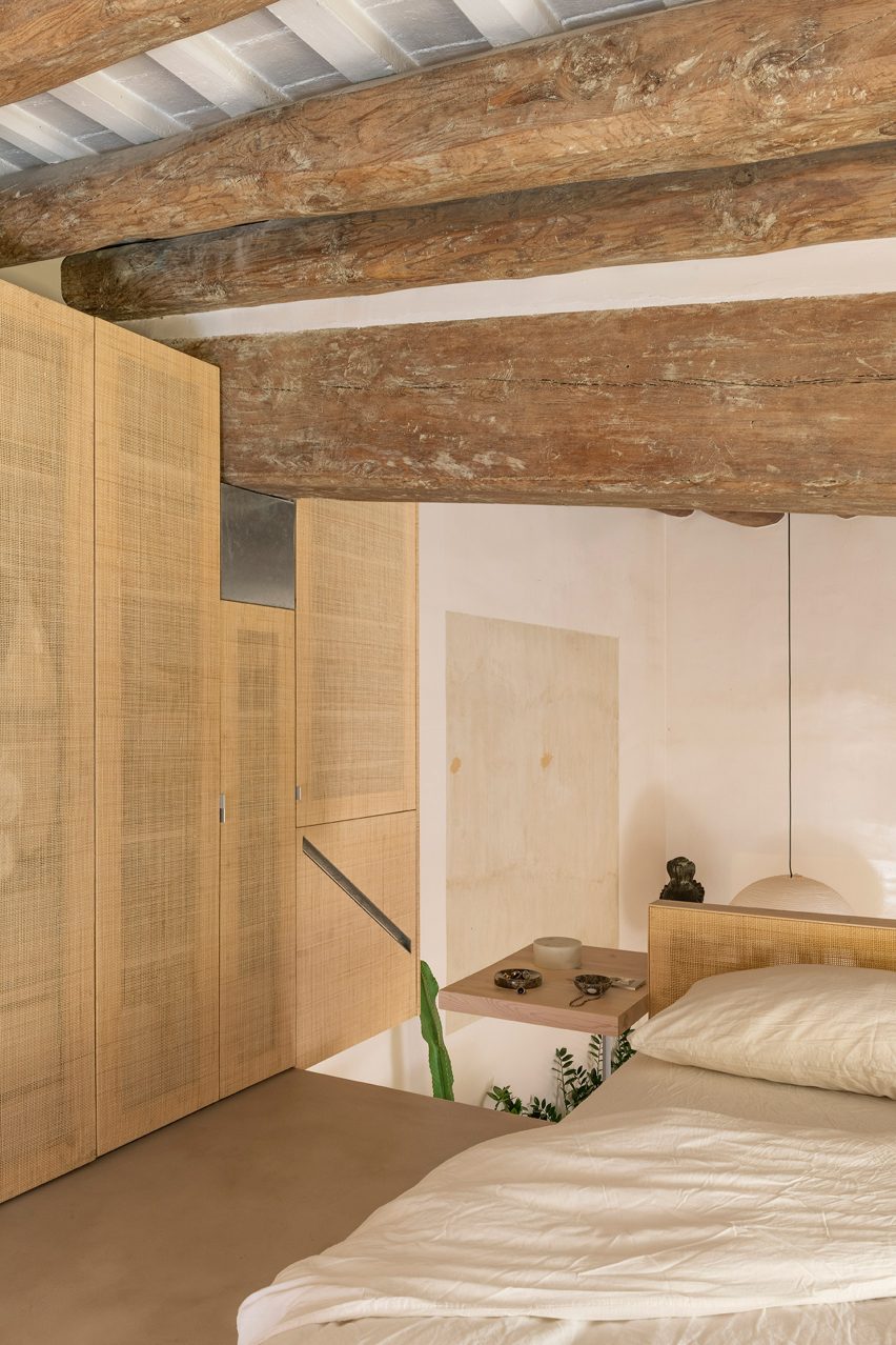
Bedroom interior of Palau apartment by Colombo and Serboli Architecture
Photo by Roberto Ruiz

Palau apartment, Spain, by Colombo and Serboli Architecture

Barcelona studio Colombo and Serboli Architecture sought to highlight the “imperfect” features of this apartment in a renovation project.

Rough-textured wooden beams were left exposed, with the contemporary elements prioritising sturdy, simple shapes like circles and squares.

Find out more about Palau apartment ›


Imperfect Residence by NC Design & Architecture
Photo by Harold De Puymorin

Imperfect Residence, Hong Kong, by NC Design & Architecture

Grainy wood and veiny marble come together as symbols of nature’s flaws at Imperfect Residence in Hong Kong.

NC Design & Architecture also introduced finishes such as oxidised bronze and textured plaster to heighten the feeling of a sanctuary in the city.

Find out more about Imperfect Residence ›


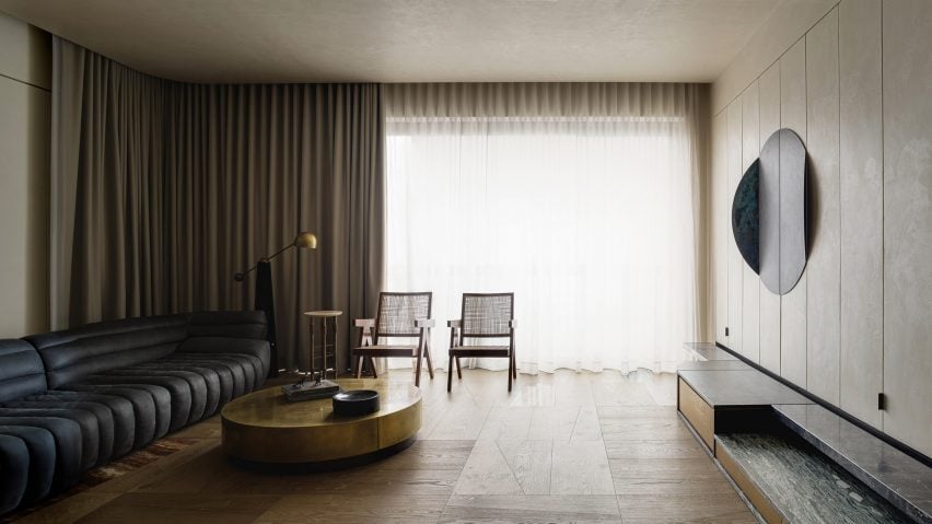
Kyiv apartment, Ukraine, by Sergey Makhno
Photo by Andrey Avdeenko

Kyiv apartment, Ukraine, by Sergey Makhno

Ukrainian architect Sergey Makhno is among the key European practitioners of the contemporary wabi-sabi style.

He applied the concept at his own apartment in Kyiv (top and above), installing oak beams in the living room alongside furniture specifically designed for the home to complement his collection of ancient Eastern European ceramics.

Find out more about this Kyiv apartment ›


C4L House by Cubo Design Architects
Photo by Koji Fujii/TOREAL, Takashi Yasui

C4L House, Japan, by Cubo Design Architects

Traditional Japanese materials sit alongside contemporary finishes at this house in  Tokyo designed by Cubo Design Architects.

“We believe houses that are rooted in an understanding of Japan’s cultural context and a respect for the skills and innovations of our ancestors, which can nevertheless be passed onto future generations, are the kind of houses we should be building in Japan today,” said founder Hitoshi Saruta.

Find out more about C4L House ›


Interior of Butterfly House in Australia by Dane Taylor Design
Photo by Daniel Mulheran

Butterfly House, Australia, by Dane Taylor Design

This home on the coast of New South Wales was designed to have a therapeutic effect for its owner, who lives with multiple sclerosis.

Dane Taylor Design interpreted accessible design principles through a wabi-sabi lens, using a warm material palette and understated furniture pieces.

Find out more about Butterfly House ›


Tilden Hotel by Studio Tack
Photo courtesy of Tilden Hotel

Tilden Hotel, USA, by Studio Tack

Brooklyn design firm Studio Tack decided to evoke wabi-sabi in its revival of this art-deco hotel in San Francisco.

In a subtle nod to the philosophy, clean lines were mixed with organic textures throughout the distinctly modernist interior.

Find out more about Tilden Hotel ›


Wabi-Sabi house by Soar Design
Photo by Soar Design Studio

Wabi-Sabi House, Taiwan, by Soar Design Studio and Chen-Tien Chu

Taiwanese practice Soar Design Studio and architect Chen-Tien Chu created an open-plan layout when renovating this house in Taichung, allowing all the spaces to have a connection to the outdoors via a series of garden terraces.

In the lounge area, the wooden deck extends from the outside into the room, enhancing the feeling of nature being invited in.

Find out more about Wabi-Sabi House ›


Silo apartment by Arjaan de Feyter
Photo by Piet Albert Goethals

Silo apartment, Belgium, by Arjaan De Feyter

Belgian interior architect Arjaan De Feyter is another prominent proponent of wabi-sabi design, as seen in his renovation of this apartment that occupies the former silos of a distillery outside Antwerp.

Here, he left the structure’s curving concrete walls exposed and applied a micro-topping surface to the floors while installing bespoke oak furniture designed in collaboration with Tim Vranken.

Find out more about Silo apartment ›

This is the latest in our lookbooks series, which provides visual inspiration from Dezeen’s archive. For more inspiration see previous lookbooks featuring Japandi living rooms, bedrooms with earthy colour palettes and calming organic-modern interiors.

Reference

Eight interiors where Barbiecore pink adds a playful touch of colour
CategoriesInterior Design

Eight interiors where Barbiecore pink adds a playful touch of colour

As the upcoming Barbie film has created a shortage of pink colour and launched a real-life dollhouse in Malibu, we gathered eight pink interiors to exemplify the Barbiecore aesthetic for this lookbook.

The pink hues that are usually associated with Barbie, a children’s toy first launched by manufacturer Mattel in 1959, are influencing both clothes and interiors ahead of Great Gerwig’s live-action Barbie film.

The style, which has become known as Barbiecore, can add a joyful touch of colour to otherwise pared-back interiors, or be used as a hyper-bright nod to 1980s opulence.

Here, we have gathered eight interiors where pink was used to give interiors additional warmth and a touch of whimsy.

This is the latest in our lookbook series, which provides visual inspiration from Dezeen’s archive. For more inspiration see previous lookbooks featuring rustic interiors, Wes Anderson-style interiors and welcoming wood-panelled dining rooms.


Living room of Minimal Fantasy, a pink apartment in Madrid
Photo by JC de Marcos

Minimal Fantasy, Spain, by Patricia Bustos Studio

The Minimal Fantasy apartment is anything but minimalist – instead, Patricia Bustos Studio aimed to create an “aesthetic madness” for the interior of this Madrid rental in a 1950s residential building.

The holiday home features 12 different shades of pink, with the entire living room covered in a pastel bubblegum pink.

“Pink vindicates the fall of stereotypes – everything is possible, nothing is planned or established and that’s the beauty of it,” the studio told Dezeen.

Find out more about Minimal Fantasy ›


San Francisco Residence by Jamie Bush
Photo by Matthew Millman

San Francisco house, US, by Jamie Bush

A more discrete take on adding pink to an interior can be found in this San Francisco house by architect Jamie Bush, who gave it an overhaul using an eclectic array of furniture.

Bush added pink walls to the dining room, where they contrast against dark-wood vintage furniture and white details including a lamp and sheer curtains to create a playful, yet elegant atmosphere.

Find out more about San Francisco House ›


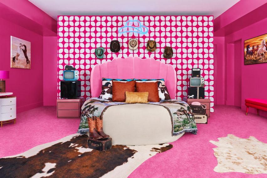
Pink bedroom in Barbie's Malibu Dreamhouse
Photo by Hogwash Studios

Barbie’s Malibu Dreamhouse, US, by Ken

The most Barbiecore interior of them all can naturally be found in the Barbie Malibu Dreamhouse, which is being rented out by the doll’s boyfriend Ken on Airbnb.

Inside the California mansion, located beachside in Malibu, guests can enjoy pink rooms including the bright-fuchsia bedroom that has been decorated with cowboy hats, boots and cowhide rugs to add more “Kenergy”.

Find out more about Barbie’s Malibu Dreamhouse ›


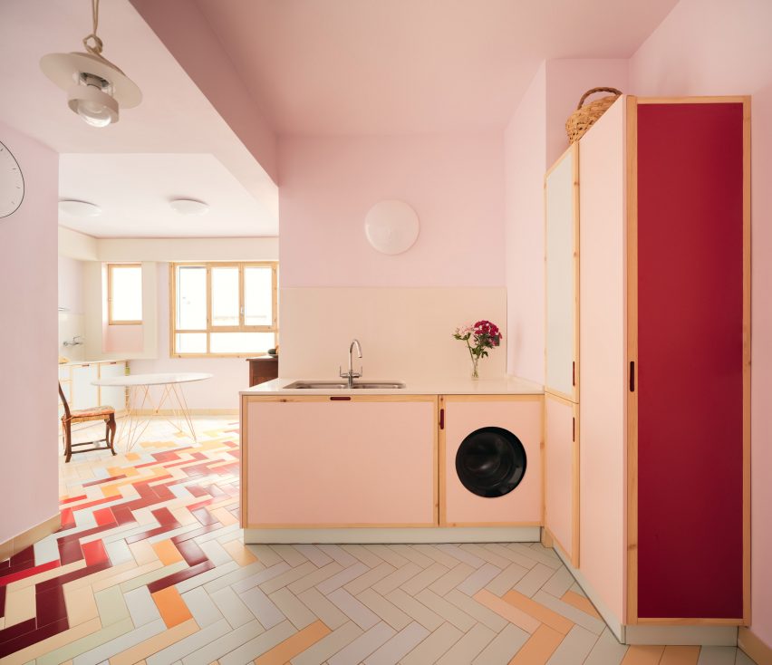
Mixtape Apartment by Azab
Photo by Luis Díaz Díaz

Mixtape apartment, Spain, by Azab

A dusky baby-pink kitchen decorates the Mixtape apartment in Bilbao, which was designed by architecture studio Azab.

The white and pink cupboards are boarded by light timber strips, and the appliances in the room have also been painted pink. A multicoloured floor with pale green and yellow as well as darker red herringbone tiles give the space a vibrant feel.

Find out more about Mixtape apartment ›


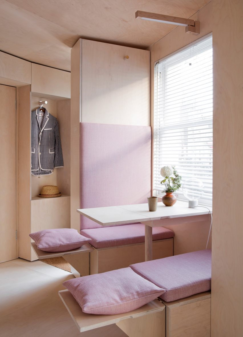
13 Square Metre House By Studiomama
Photo by Rei Moon of Moon Ray Studio

130-square-metre-house, UK, by Studiomama

“London’s smallest house”, a conceptual design by Studiomama, features an abundance of pink details throughout, including in its plywood-clad kitchen.

Here, the clever fold-out seating has been decorated with blush-pink cushions and pillows, with a pink cushion also forming a cosy backrest.

Find out more about 130-square-metre house ›


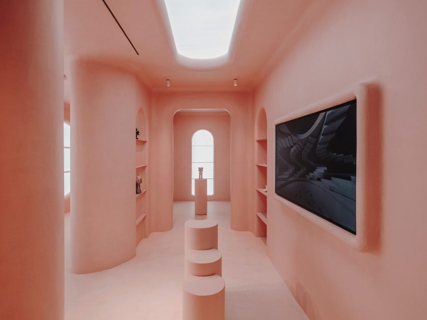
Pink interior of Moco shop in Barcelona, designed by Isern Serra and Six N. Five
Photo by Salva Lopez

Moco Barcelona, Spain, by Isern Serra

A computer-generated image was transformed into a real-life interior for the Moco Barcelona store, a rose-coloured shop inside the city’s Moco Museum.

Designer Isern Serra used pink micro-cement to achieve the same uniform, ultra-smooth surfaces as those of the computer-generated image, creating a dream-like interior filled with rounded corners and arches.

Find out more about Moco Barcelona ›


Interior of Pigment House by Unknown Works
Photo by Lorenzo Zandri

Pigment House, UK, by Unknown Works

London studio Unknown Works went all in on the pink for Pigment House, a Hampstead home that was renovated to add a pink-toned patio area.

While not technically part of the interior, it adds a splash of colour to the ground floor area, and is used for indoor-outdoor living in the summer months. The choice of pink was a reference to the colourful buildings of Mexican architect Luiz Barragán.

Find out more about Pigment House ›


Cats' Pink House by KC Design Studio
Photo by Hey! Cheese

Cats’ Pink House, Taiwan, by KC Design Studio

This holiday home in Taiwan got its name, Cats’ Pink House, as it includes cat ladders, a rotating carousel-shaped climbing frame and a fluffy pink cat swing.

KC Design Studio used a mineral-based paint to create the pink walls throughout the home, which also features a pink bathroom – with a pink cat litter box.

Find out more about Cats’ Pink House ›

This is the latest in our lookbook series, which provides visual inspiration from Dezeen’s archive. For more inspiration see previous lookbooks featuring rustic interiors, Wes Anderson-style interiors and welcoming wood-panelled dining rooms.

Reference