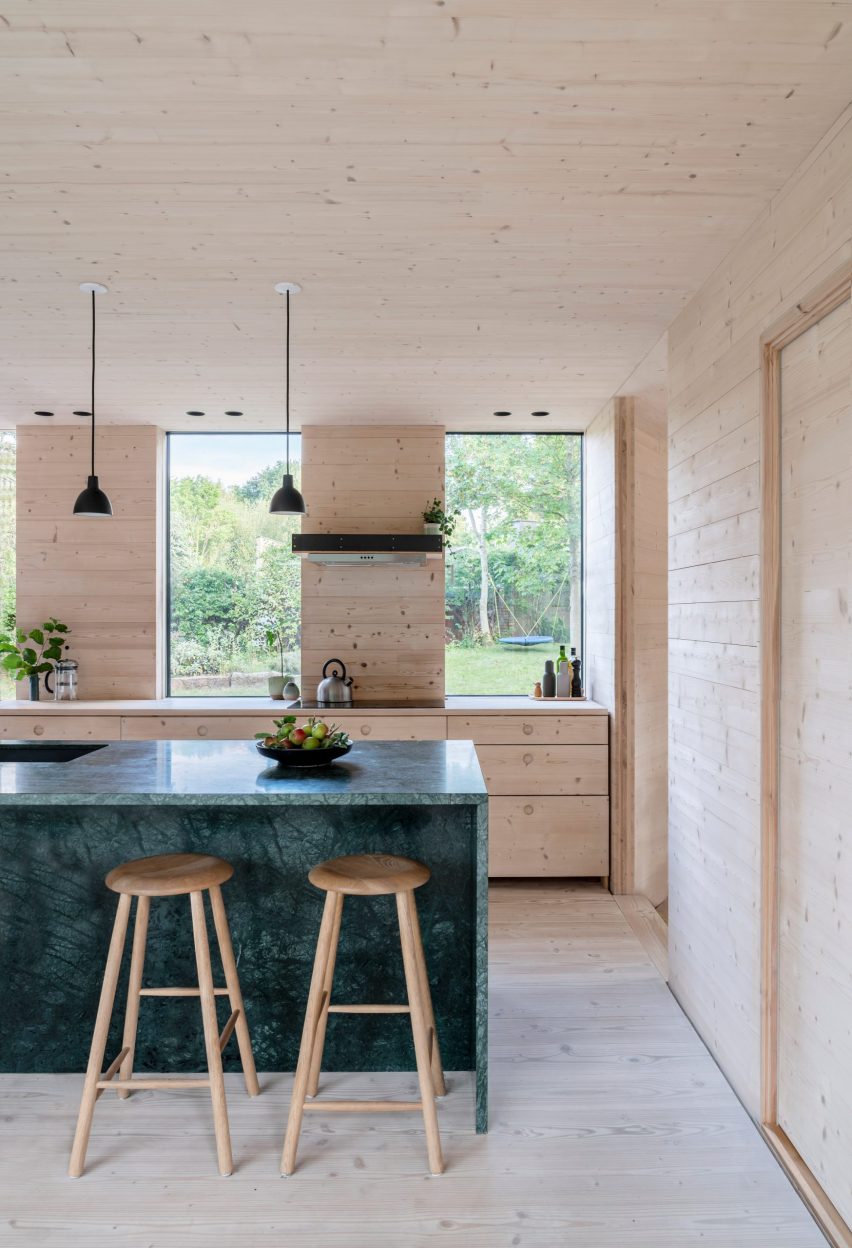
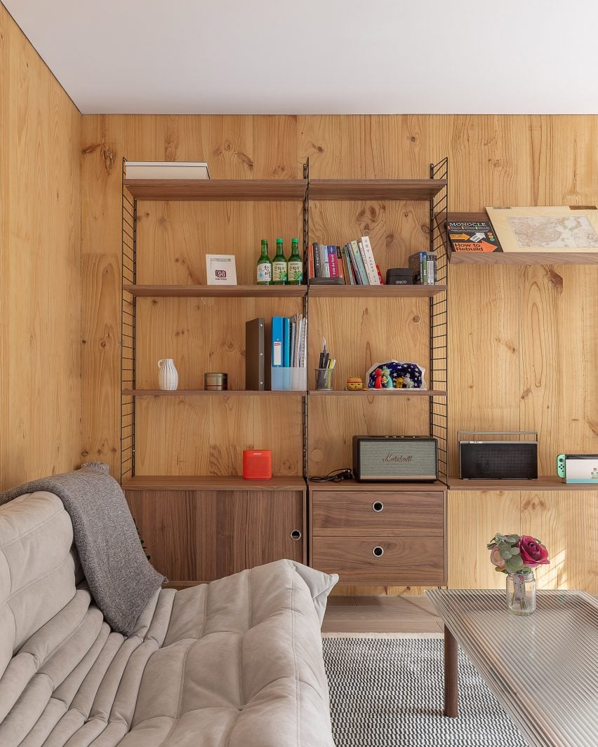
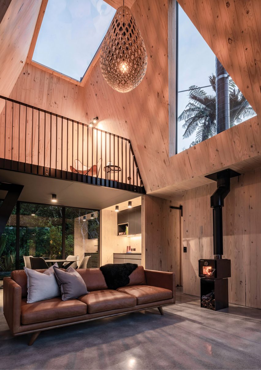
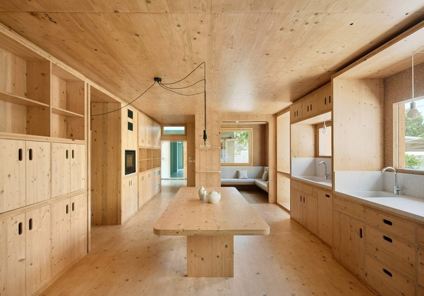
Eight home interiors that make a feature of exposed services
CategoriesInterior Design

Eight home interiors that make a feature of exposed services

Our latest lookbook showcases eight home interiors that make a visual statement by revealing their services, including wires, cables, ducts and plumbing.

Stripping back interiors can expose services including pipework that runs along walls and ceilings to provide heating, water, electricity and airflow to our homes.

This roundup features homes with industrial and unfinished appearances that make a feature of exposed services, including a Parisian studio that uses copper pipework as hanging space and a stripped-back apartment in Brazil with blue-painted pipes.

This is the latest in our lookbooks series, which provides curated visual inspiration from Dezeen’s archive. For more inspiration see previous lookbooks featuring Milanese home and hotel interiors, living rooms decorated in the primary colours and terracotta-tiled kitchens.
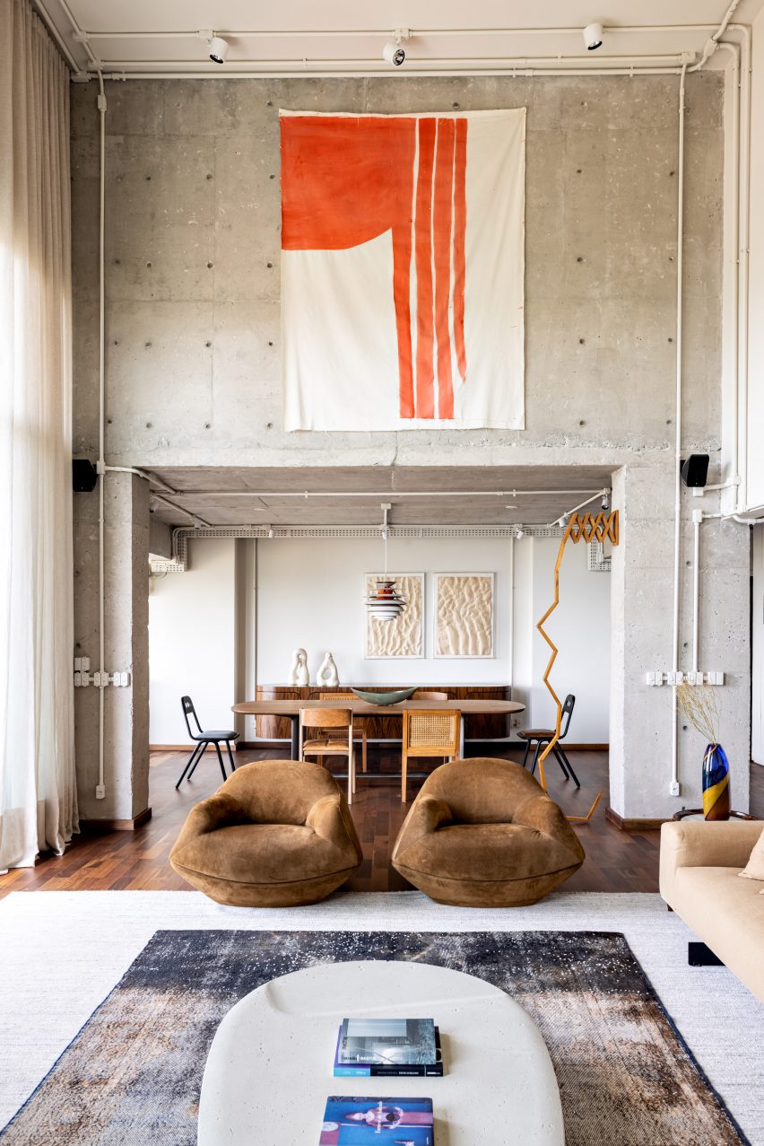

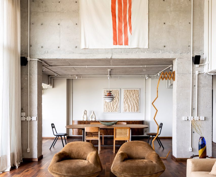
Gale Apartment living room with brown lounge chairs and concrete walls
Photo is by Fran Parente

Gale Apartment, Brazil, by Memola Estudio

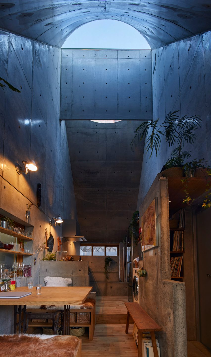
Brazilian studio Memola Estudio renovated this São Paulo apartment to better suit the owner’s tastes, stripping back finishes on the walls and ceilings to expose the building’s concrete structure, piping, wiring and ductwork.

The studio contrasted the industrial look of the apartment with warm, earthy-toned furniture and contemporary artwork.

Find out more about Gale Apartment ›
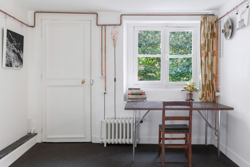

ARL008_Shaker Studio by Ariel Claudet with exposed copper wires
Photo is by Cyrille Lallement

Shakers Studio, France, by Ariel Claudet

A network of copper pipes snakes around the perimeter of this studio apartment in a 17th-century Parisian building, which architect Ariel Claudet added to make it stand out on Airbnb.

Informed by traditional Shaker peg rails, the pipes conceal electrical cables and double as a hanging rail to display ornaments and household items.

Find out more about Shakers Studio ›
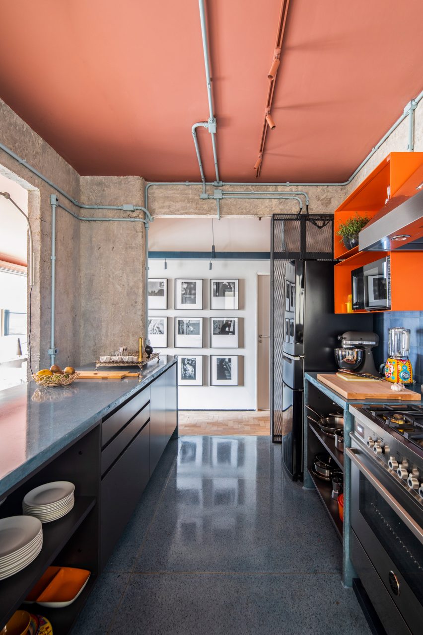

Kitchen with exposed services at the RF Apartment by SuperLimão with peach ceilings and concrete walls
Photo is by Maíra Acayaba

RF Apartment, Brazil, by SuperLimão

Located inside a modernist São Paulo building completed in 1958, Brazilian studio SuperLimão exposed the pipes in the RF Apartment and painted them a pale shade of blue-green that was in keeping with the period the building was constructed.

SuperLimão also painted the ceiling a burnt pink colour and peeled back the edges of the entryways to reveal large chunks of plaster and brick.

Find out more about RF Apartment ›
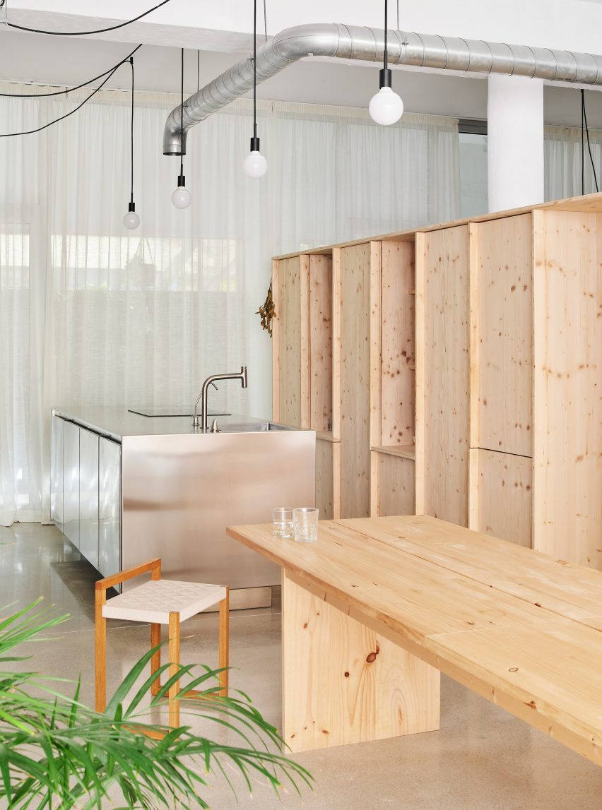

Interior of the open-plan kitchen with exposed services at NZ10 Apartment in Spain by Auba Studio with wood cabinets
Photo is by José Hevia

NZ10 Apartment, Spain, by Auba Studio

Spanish architecture firm Auba Studio transformed a former bakery in Palma into an apartment, stripping back the interior to reveal the building’s high ceilings and bare structure.

Auba Studio added a stainless steel kitchen island to complement the industrial look of the exposed ductwork and light fittings.

Find out more about NZ10 Apartment ›
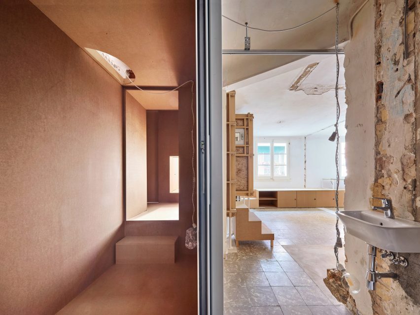

Exposed services, wiring, plumbing and plaster walls at the 10K House by Takk
Photo is by José Hevia

10K House, Spain, by Takk

10K House is a 50-square-metre Barcelona apartment that Spanish studio Takk renovated, adding rooms nestled inside one another to maximise insulation.

Water pipes and electrical fittings were left exposed to allow free passage between the Russian-doll-like rooms and to keep material costs down.

Find out more about 10K House ›
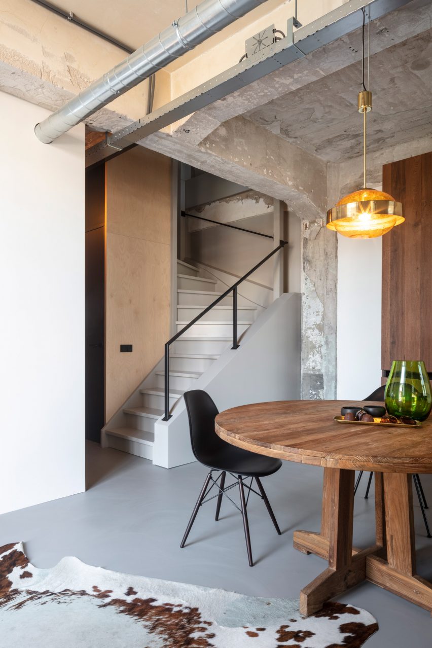

Wooden table and chair and exposed services inside the De Lakfabriek by Wenink Holtkamp Architecten
Photo is by Tim van de Velde

De Lakfabriek apartments, the Netherlands, by Wenink Holtkamp Architecten

Eidenhoven studio Wenink Holtkamp Architecten converted a 20th-century factory in Oisterwijk, the Netherlands, into apartments that maintain the industrial character of the building.

The apartments have an open-plan layout with the building’s raw concrete structure, metal ductwork and wiring left visible.

Find out more about De Lakfabriek apartments ›
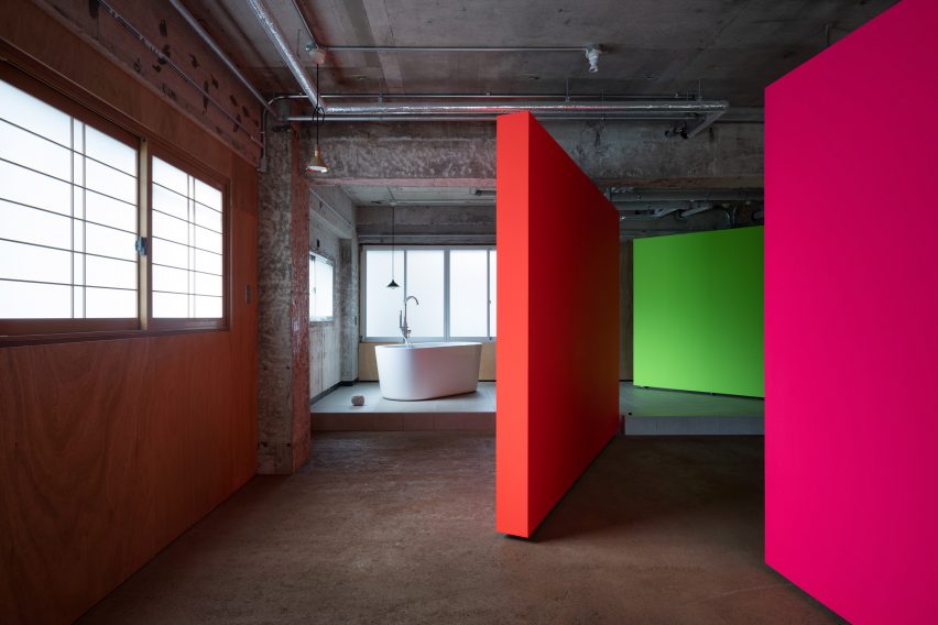

Fluorescent rotating partition walls revealing a freestanding bathtub in a concrete apartment
Photo is by Takumi Ota

Fishmarket, Japan, by Ab Rogers Design

Fishmarket is an artist’s studio and residence in Kanazawa, Japan, with an interior that was stripped back to its industrial shell by London-based studio Ab Rogers Design.

The studio added a series of fluorescent rotating partition walls that transform how the space is used and add bright pops of colour that stand in contrast against the grey concrete and metal pipework.

Find out more about Fishmarket ›
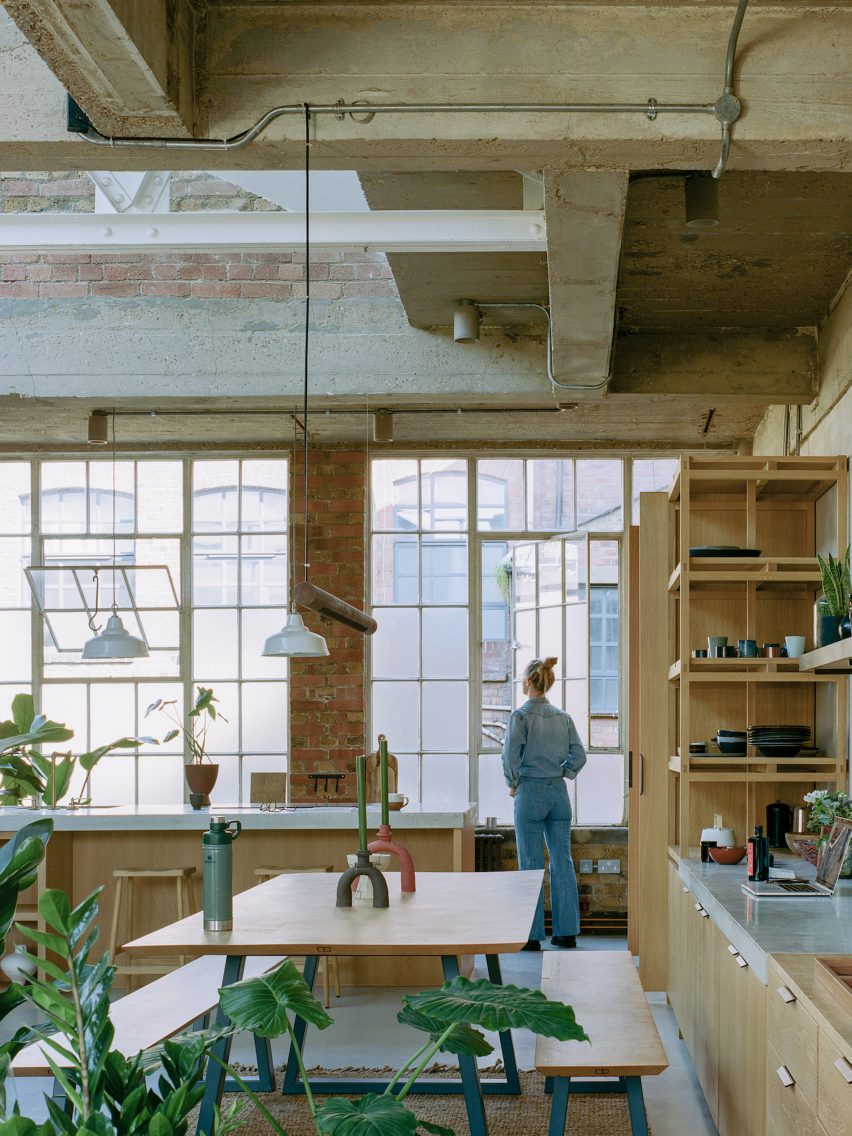

Open-plan kitchen with concrete ceiling and brick wall at Earthrise Studio by Studio McW
Photo is by Lorenzo Zandri

Earthrise Studio, UK, by Studio McW

London-based architecture practice Studio McW transformed this London warehouse into a studio and office that enhances the building’s original features.

The practice removed some of the redundant overhead services that were restricting the ceiling height. The remaining exposed services add to the industrial look of the property, while custom oak joinery adds warmth to the spaces.

Find out more about Earthrise Studio ›

This is the latest in our lookbooks series, which provides curated visual inspiration from Dezeen’s archive. For more inspiration see previous lookbooks featuring Milanese home and hotel interiors, living rooms decorated in the primary colours and terracotta-tiled kitchens.

Reference

Eight Milanese interiors with eye-catching material palettes
CategoriesInterior Design

Eight Milanese interiors with eye-catching material palettes

In the lead-up to Milan design week, we have rounded up eight residential and hotel interiors in the Italian city that are united by their use of muted colours and diverse materials.

As the Salone del Mobile furniture fair is set to kick off next week, alongside its surrounding Fuorisalone events programme, these interiors provide a glimpse into some of the city’s design-led apartments, homes and hotels.

Among the featured projects in Italy’s industrial capital is a hybrid home and office space in a former dental studio, a home set within a 200-year-old palazzo and a nunnery-turned-hotel.

This is the latest in our lookbooks series, which provides curated visual inspiration from Dezeen’s archive. For more inspiration see previous lookbooks featuring accent walls, bookshelves and terracotta tiles.


Teorema Milanese by Marcante-Testa
Photo is by Carola Ripamonti

Teorema Milanese, Italy, by Marcante-Testa

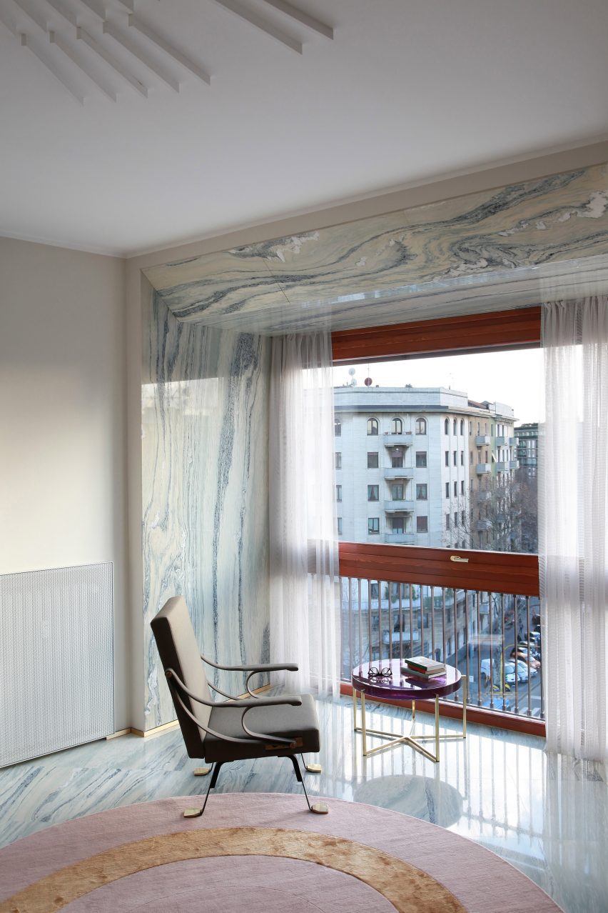
With the exception of removing a partition wall to create an open-plan living and dining area, Italian design studio Marcante-Testa looked to maintain the classic layout of this apartment in a 1960s building on Corso Sempione during its renovation.

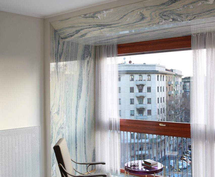
The studio decorated the apartment in muted colours and used pale grey cipollino tirreno marble as a “carpet” across the sitting area. Elsewhere, a pale lemon-hued cabinet functions as a partition while the bathroom is clad in a maroon-streaked salomè marble.

Find out more about Teorema Milanese ›


Out of the Blue by AIM

Out of the Blue, Italy, by AIM

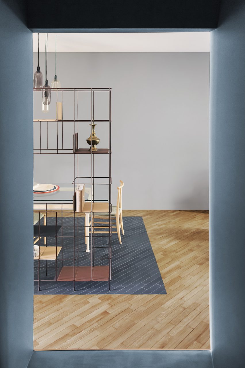
Italian design studio AIM made liberal use of the colour grey when renovating the interior of this 150-square-metre home in Milan. The concealed staircase that forms the centre of the renovation is framed in the distinctive bluey-grey hue.

And in the dining area, the home’s wooden flooring was decorated with a painted rectangle that aims to visually zone and separate the space from its surroundings. Brass fixtures complement its grey hue, which can also be found across light fixings and ornaments.

Find out more about Out of the Blue ›


Private apartment by Untitled Architecture
Photo is by Giovanni Emilio Galanello

Private apartment, Italy, by Untitled Architecture

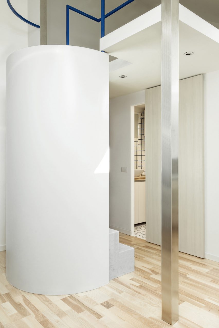
A cylindrical staircase and metal structural elements are the focal features of this small apartment, designed by local studio Untitled Architecture.

The apartment has a minimal paired-back aesthetic, with white-painted walls and bleached wood elements contrasted against tiny pops of colour introduced through blue-hued grouting and balustrades.

Find out more about the private apartment ›


CPR Apartment by +R Piuerre
Photo is by Michele Filippi

CPR Apartment, Italy, by +R Piuerre

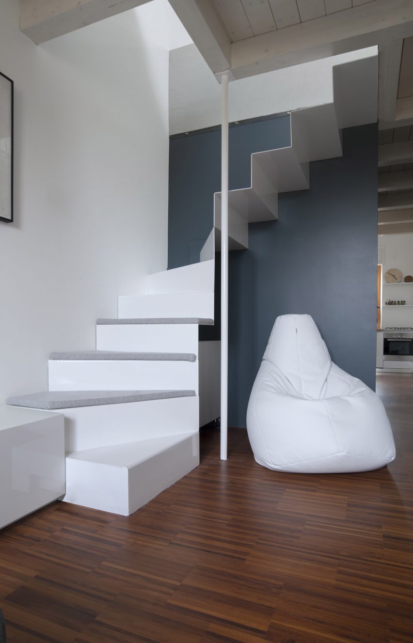
Housed in a former dental studio, this hybrid home and office belongs to a young remote-working couple and was designed to combine Milanese modernism with Nordic design.

Two areas of the apartment were colour-coded according to their function, with the bedroom, office and entryway covered in tones of grey while the living area and kitchen are marked by a bright yellow hue. The spaces are connected by a white-painted staircase constructed from sheets of folded metal.

Find out more about CPR Apartment ›


Room Mate Giulia by Patricia Urquiola

Room Mate Giulia, Italy, by Patricia Urquiola

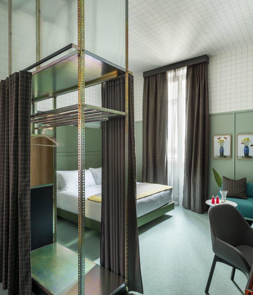
Pistachio green was used to colour the dado wall panelling and soft furnishings inside this suite in Milan’s Room Mate Giulia hotel decorated by Spanish designer Patricia Urquiola. Meanwhile, the upper half of the walls and the ceilings are covered in white wallpaper with a geometric grid pattern.

Industrial materials and furnishings, including a galvanised metal shelving unit, were repurposed as boutique storage solutions and room partitions.
Find out more about Room Mate Hotels ›


Casa Salvatori by Elissa Ossino Studio

Casa Salvatori, Italy, by Elissa Ossino Studio

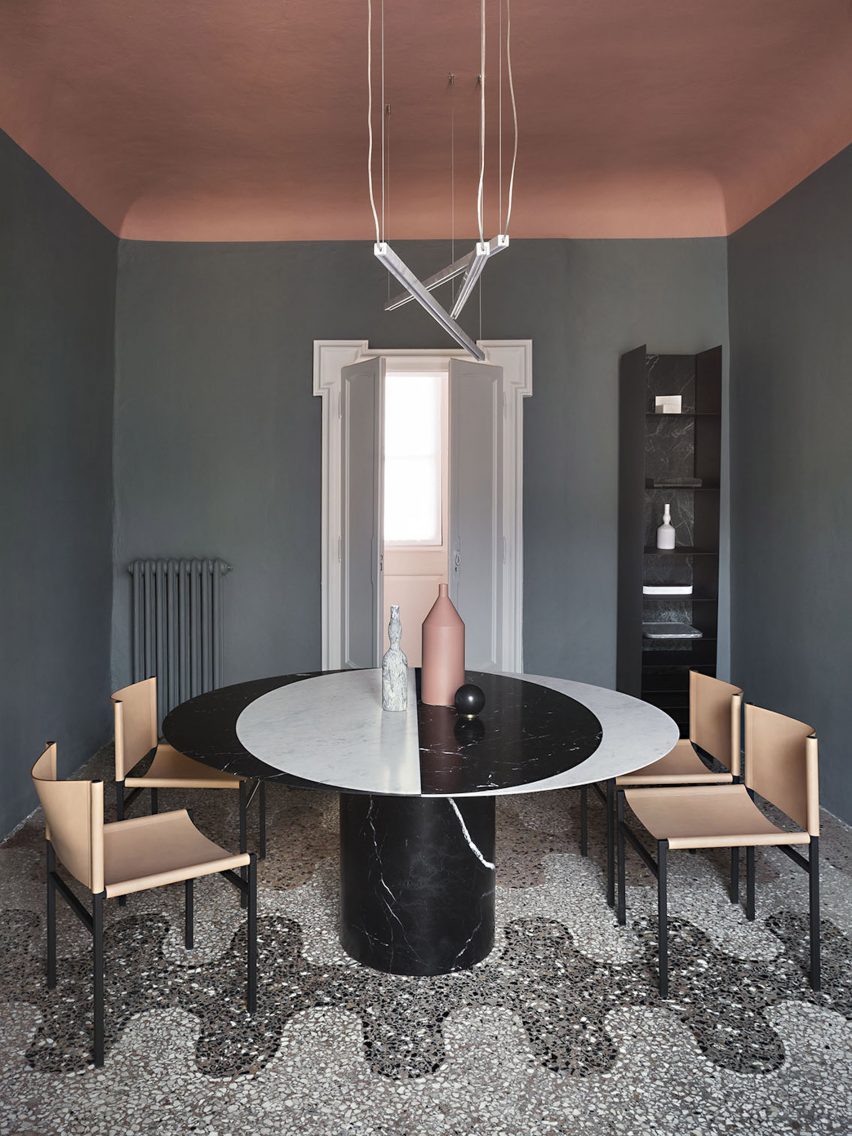
This home, designed by Milanese architecture practice Elissa Ossino Studio for the head of Italian stone company Salvatori, brings together marble furnishings and flecked terrazzo floors to link the interior with Salvatori’s stone manufacturing history.

Dulled hues of blue, peach, green and yellow were carried through the interior of the home, which is set within a 200-year-old palazzo in the city’s Brera district.

Find out more about Casa Salvatori ›


House with an iron staircase by Roberto Murgia and Valentina Ravara
Photo is by Giovanna Silva

House with an iron staircase, Italy, by Roberto Murgia and Valentina Ravara

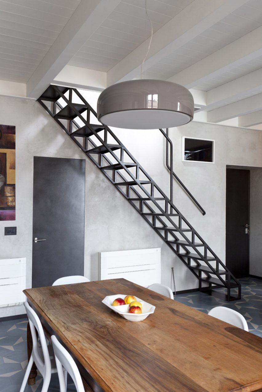
An iron staircase with a zig-zagging framework reminiscent of structural trusses was installed along one wall of this apartment in the Isola district, designed by Italian architects Roberto Murgia and Valentina Ravara.

The floor of the main living space features a geometric design, achieved through the use of hexagonal cement tiles. Each of the tiles is handmade and coloured in shades of light blue and white to provide tonal variation.
Find out more about House with an iron staircase ›


The Sister Hotel by Quincoces-Dragò
Photo is by Alberto Strada

The Sister Hotel, Italy, by Quincoces-Dragò

Housed in a former 16th-century nunnery in Milan’s city centre, The Sister Hotel features decadent yet eclectic interiors by architecture studio Quincoces-Dragò.

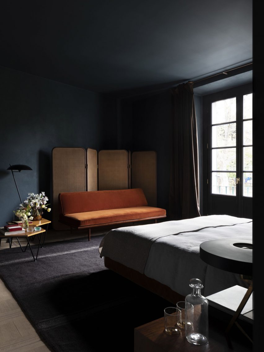
The studio looked to grandiose private townhouses when designing the interiors, opting for moody shades of navy blue and deep green within the bedrooms. Furnishings introduce brighter colours into the suites, including a velvet-upholstered orange sofa.

Find out more about The Sister Hotel ›

This is the latest in our lookbooks series, which provides visual inspiration from Dezeen’s archive. For more inspiration see previous lookbooks featuring accent walls, bookshelves and terracotta tiles.

Reference

Eight eclectic interiors enhanced by striking accent walls
CategoriesInterior Design

Eight eclectic interiors enhanced by striking accent walls

Blotchy slate tiles, playfully patterned murals and a single oversized circle form these eye-catching interior accent walls that we have collected for our latest lookbook.

An accent or feature wall is one that differs in colour, material or texture from the other walls that surround it. Accent walls can feature in both interior and exterior locations.

Architects and designers often use these statement walls to delineate different spaces in a room, or simply to create striking and joyful interior details.

From a New York apartment to a Helsinki teahouse, here are eight eclectic interiors defined by eye-catching accent walls.

This is the latest in our lookbooks series, which provides visual inspiration from Dezeen’s archive. For more inspiration see previous lookbooks featuring offbeat bakeries, inviting entrance halls and homes with split-level living areas.


Heat 360 House in Ukraine
Photo is by A Avdeenko

Heat 360, Ukraine, by Azovskiy & Pahomova Architects

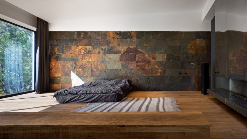
This house in the Dnepropetrovsk region of Ukraine features a bedroom with a dark slate-tile wall defined by dramatic rust blotches.

Azovskiy & Pahomova Architects made the adjacent wall from floor-to-ceiling glazing that illuminates the room’s earthy-hued interiors.

Find out more about Heat 360 ›


Interiors of Polychrome House, designed by Amber Road
Photo is by Prue Ruscoe

Polychrome House, Australia, by Amber Road and Lymesmith

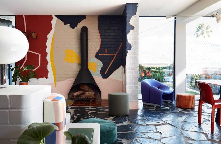
An abstract mural packed with colourful geometric shapes covers one of the walls in the living space at Polychrome House in Sydney.

The bold interiors are enhanced by graphic paved floors and a mismatch of bright furniture in hues ranging from burnt orange to sea green.

Find out more about Polychrome House ›


Harry Nuriev and Tyler Billinger Residence
Photo is by Dylan Chandler

New York apartment, USA, by Harry Nuriev and Tyler Billinger

Designer Harry Nuriev and partner Tyler Billinger – both of Crosby Studios – renovated their New York home with Nuriev’s “signature boldness”.

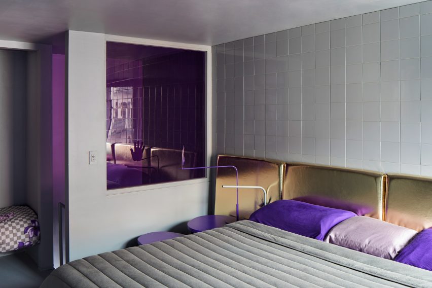
A white-tiled accent wall features in the otherwise colourful bedroom, which features a plush gold-lame headboard and ultraviolet elements including a hand-shaped bedside lamp.

Find out more about this New York apartment ›


Minimal interiors of Teemaa teahouse in Helsinki, designed by Yatofu
Photo is by Aleksi Tikkala

Teemaa, Finland, by Yatofu

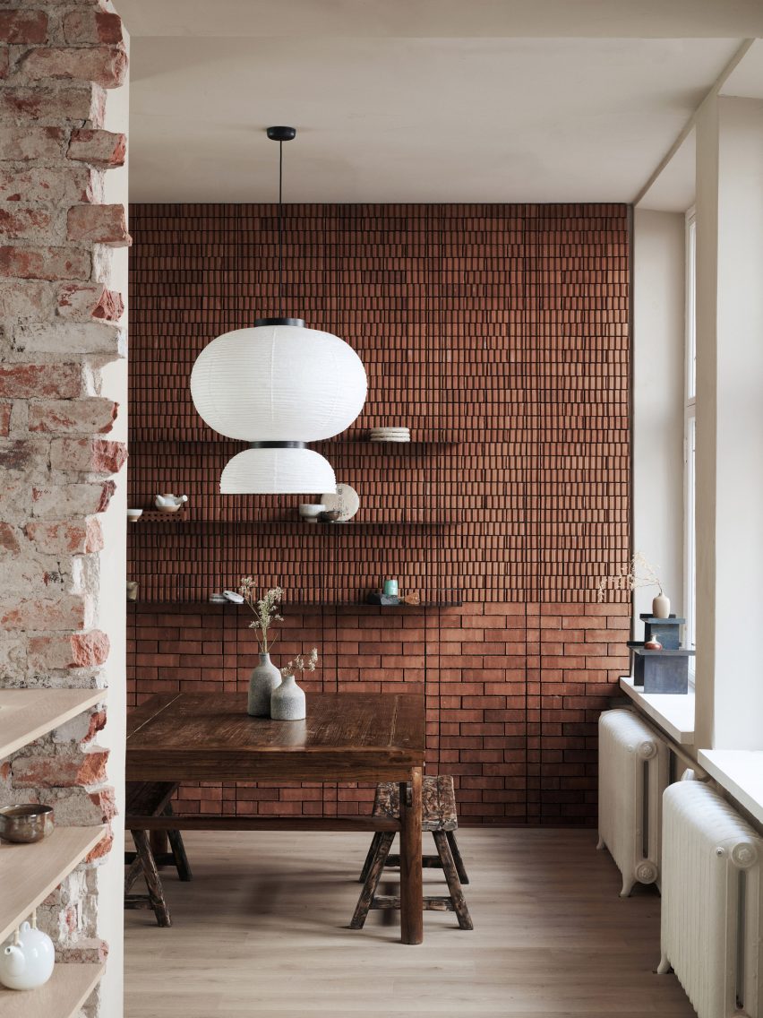
A combination of traditional flat bricks and grooved bricks comes together in the tasting room of Helsinki’s Teemaa teahouse to create an eclectic accent wall.

Design studio Yatofu aimed to reference the raw tactility of tea leaves when creating the interiors, which are also characterised by elements of oak and oxidised steel.

Find out more about Teemaa ›


Bedroom of Casa A12 in Madrid
Photo is by José Hevia

Casa A12, Spain, by Lucas y Hernández-Gil

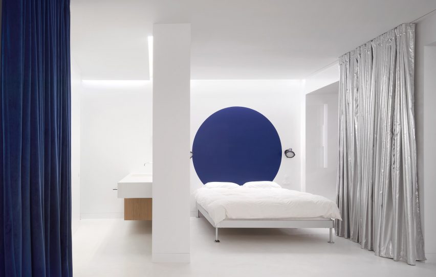
The white floors and sheets in the bedroom suite at Casa A12 form a neutral backdrop for a large cobalt blue dot circle that creates a playful feature wall.

Local studio Lucas y Hernández-Gil added various other space-delineating accents to the Madrid apartment, including swathes of silvery curtains and corrugated metal partitions.

Find out more about Casa A12 ›


Shkrub by Sergey Makhno Architects
Photo is by Serhii Kadulin

Shkrub, Ukraine, by Sergey Makhno

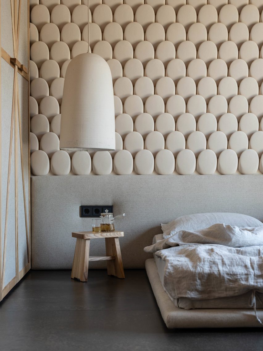
Built by architect Sergey Makhno for him and his family, the Shkrub house includes a feature wall made up of rows of rounded ceramic tiles that resemble jumbo fish scales.

These were made from several types of clay finish that were usually mixed with flax seeds, rye and wheat in accordance with Ukrainian traditions.

Find out more about Shkrub ›


Chelsea Pied-à-Terre by STADT Architecture
Photo is by David Mitchell

Chelsea Pied-à-Terre, USA, by Stadt Architecture

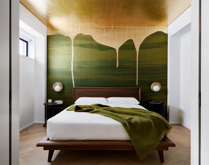
Decadence takes centre stage at this renovated New York apartment in the form of a green bedroom mural that is “dripping” with globules of gold paint.

Covering an entire wall and moving up into the ceiling, the design was created by Brooklyn-based Calico Wallpaper and references the lush nature of Vancouver’s Stanley Park – a location that is meaningful to the dwelling’s Canadian occupants.

Find out more about Chelsea Pied-à-Terre ›


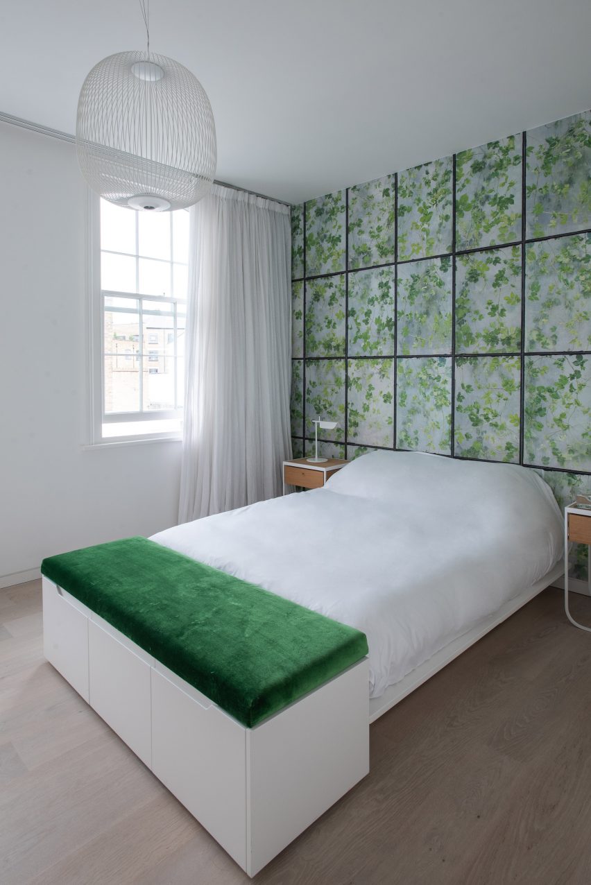
Leaf-patterned wall in white bedroom
Photo is by Alexandria Hall

582 Rydon Street, London, by Moxon Architects

British studio Moxon Architects renovated a Victorian townhouse in north London’s Islington area by adding a sunken garden and minimalist interiors.

Throughout the home, subtle reminders of its early 19th-century history were inserted into the design. These include a floral gridded feature wall in the primary bedroom.

Find out more about 582 Rydon Street ›

This is the latest in our lookbooks series, which provides visual inspiration from Dezeen’s archive. For more inspiration see previous lookbooks featuring offbeat bakeries, inviting entrance halls and homes with split-level living areas.

Reference

Ten interiors featuring natural materials and timeless accents
CategoriesInterior Design

Ten interiors featuring natural materials and timeless accents

For this special lookbook sponsored by Danish design company D Line, we’ve selected ten interiors that showcase architectural details by the brand including door handles, taps and drawer pulls.

Door furniture and other pieces of practical hardware provide the finishing touches to interior schemes, and can create physical touchpoints that play a significant role in how people interact with the spaces they inhabit.

D Line has been designing and manufacturing architectural hardware and sanitary ware since 1971. Collaborators include Danish architects Knud Holscher and Arne Jacobsen and British designer Tom Dixon.

Here are 10 projects where D Line’s products have been used to add timeless accents to interiors with natural materials, including homes, hotels, restaurants and even a medical facility.


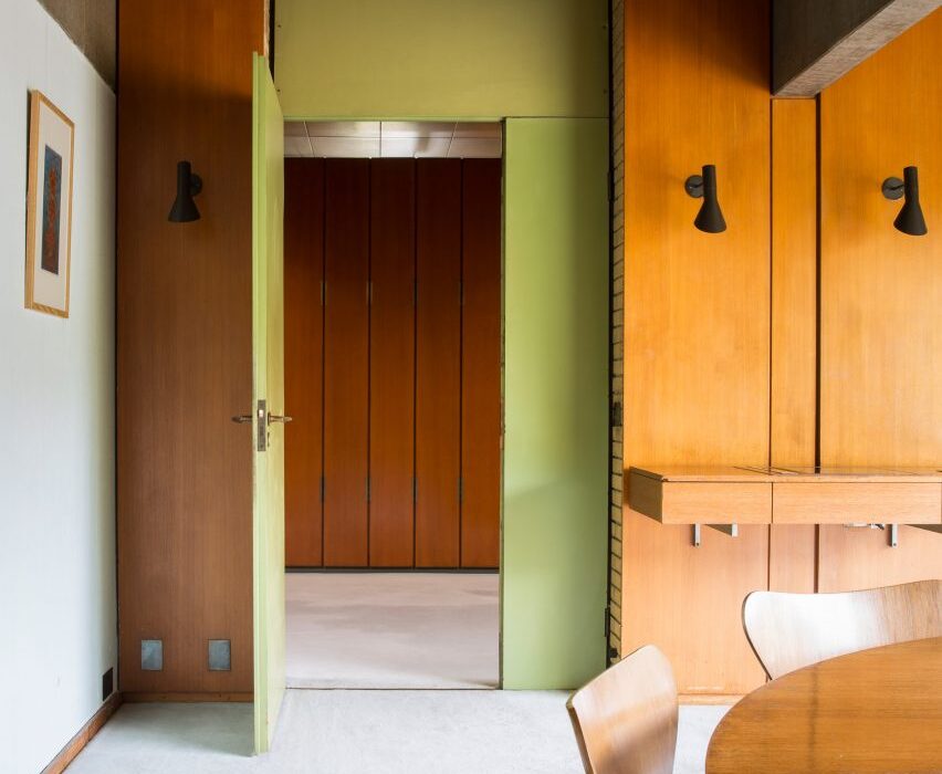
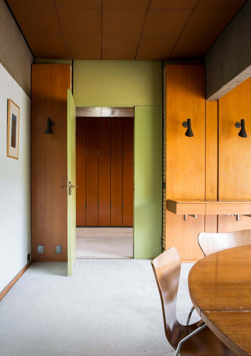
Photograph showing room with wood panelling and green wall
Photo is by Jonas Bjerre Poulsen

St Catherine’s College, Oxford, by Arne Jacobsen and Knud Holscher

Jacobsen designed the modernist concrete exterior as well as the interior and furnishings of St Catherine’s College at the University of Oxford, which opened in 1962.

Details as small as the handles on the interior doors – named AJ lever handles in reference to the designer’s initials – echo the curved, smooth form of the college’s larger design elements.


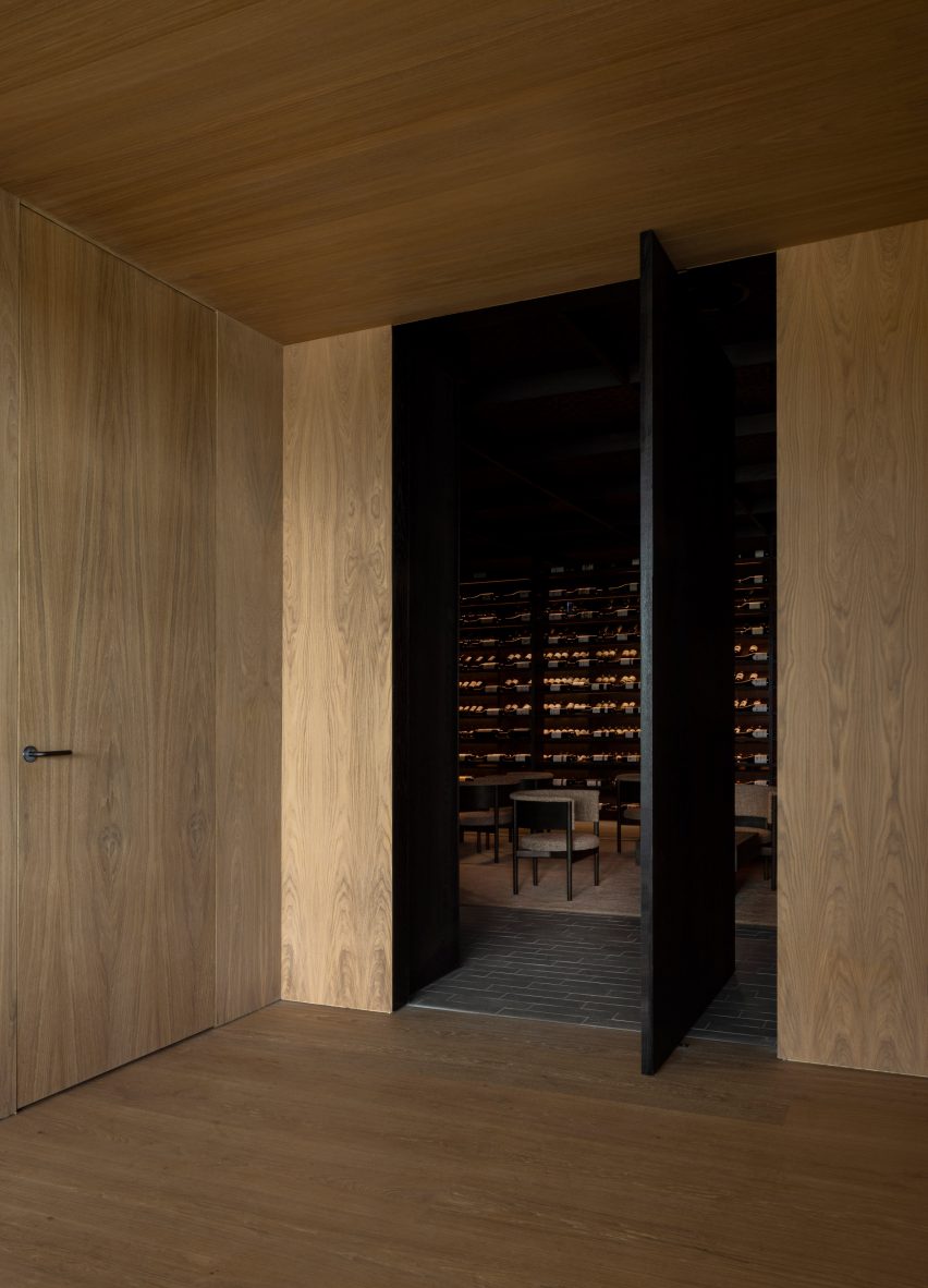
Äng restaurant by Norm Architects
Photo is by Jonas Bjerre Poulsen

Äng restaurant, Sweden, by Norm Architects

Danish studio Norm Architects has designed Äng, a restaurant in Sweden with both an above-ground structure resembling a greenhouse and a subterranean wine cellar.

D line’s distinct L lever handle in a gunmetal finish was used on doors throughout both spaces, where it matches other metal lighting fixtures as well as the building’s structural components.

Find out more about Äng restaurant ›


Photograph showing room with white door and light blue walls
Photo is courtesy of Norm Architects

SAS Royal Hotel, Copenhagen, by Arne Jacobsen

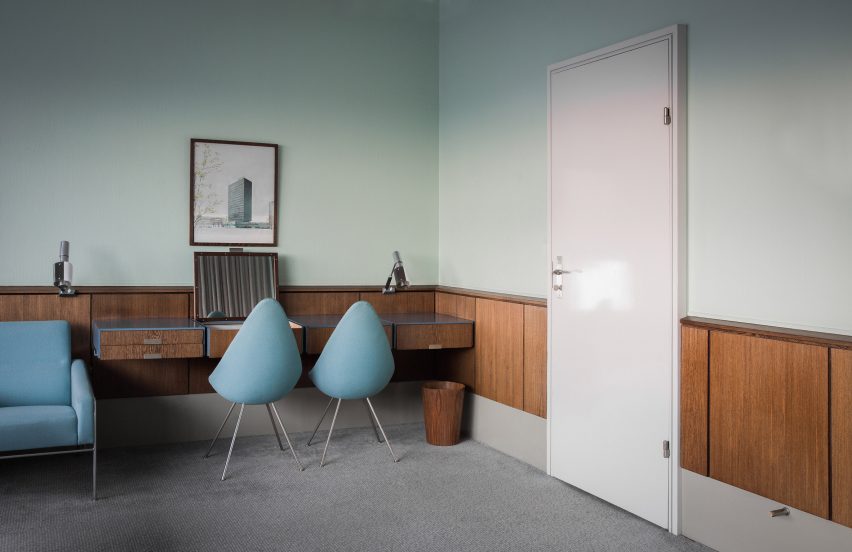
Another project by Jacobsen, who designed all the elements found in the SAS Royal Hotel in Copenhagen – which opened in 1960 – in line with his all-encompassing approach to architecture and interior design.

Subsequent remodelling means that only Room 606 remains in its original form. Here, steel AJ lever handles were chosen to tie in with the cool duck-egg blue walls and other silver hardware, such as the frame of the blue seats and sofa.

Find out more about SAS Royal Hotel ›


Photograph of neutral toned living area with large cone shaped lamp shade
Photo is by Jonas Bjerre Poulsen

Archipelago House, Sweden, by Norm Architects

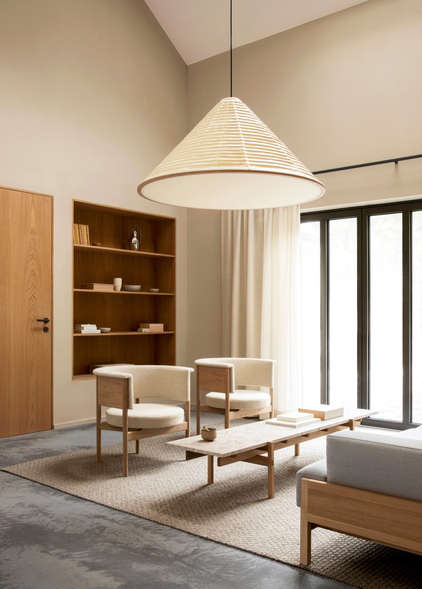
This holiday home by Norm Architects is situated in a coastal area of Sweden and combines Scandinavian design with Japanese aesthetics.

The L lever handle in charcoal from D line’s Holscher range provides a steady rhythm of graphic contrast in the interior, which primarily uses light wood furnishings and bright neutral finishes.

Find out more about Archipelago House ›


View through coastal dwelling onto sea
Photo is courtesy of Rubow Architects

Private Summer Residence, Denmark, by Rubow Architects

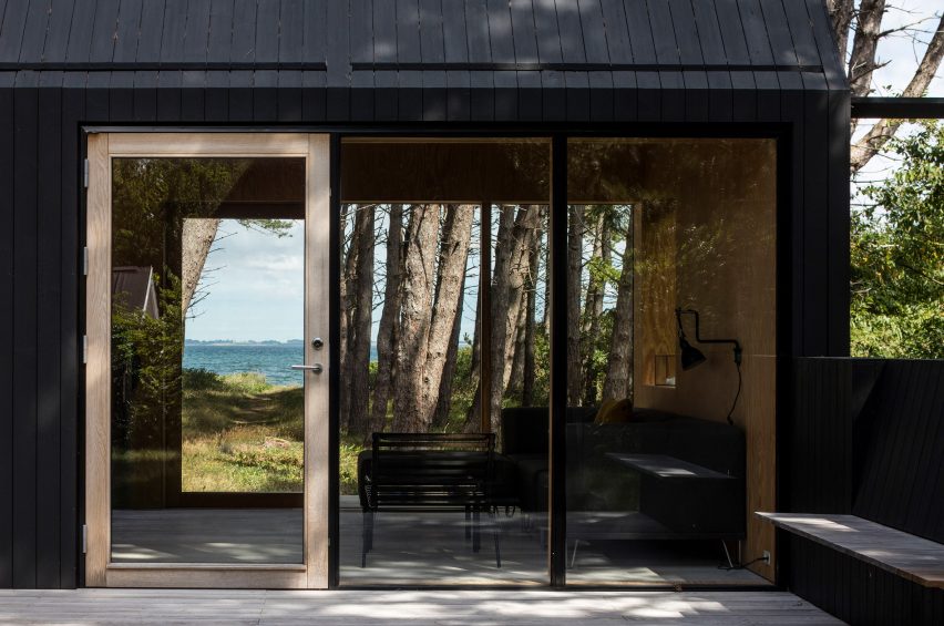
Designed by Danish studio Rubow Architects, this holiday home in Denmark aims to blend in with its surroundings by using neutral tones and floor-to-ceiling windows that allow natural light and views of nature into the house.

The L lever handle provides an unobstructive finish to the house’s doors and helps give the house its indoor-outdoor feel.


Neutral interior with mismatched furniture
Photo is by Enok Holsegård

Barbara’s atelier, Copenhagen, by Barbara Bendix Becker

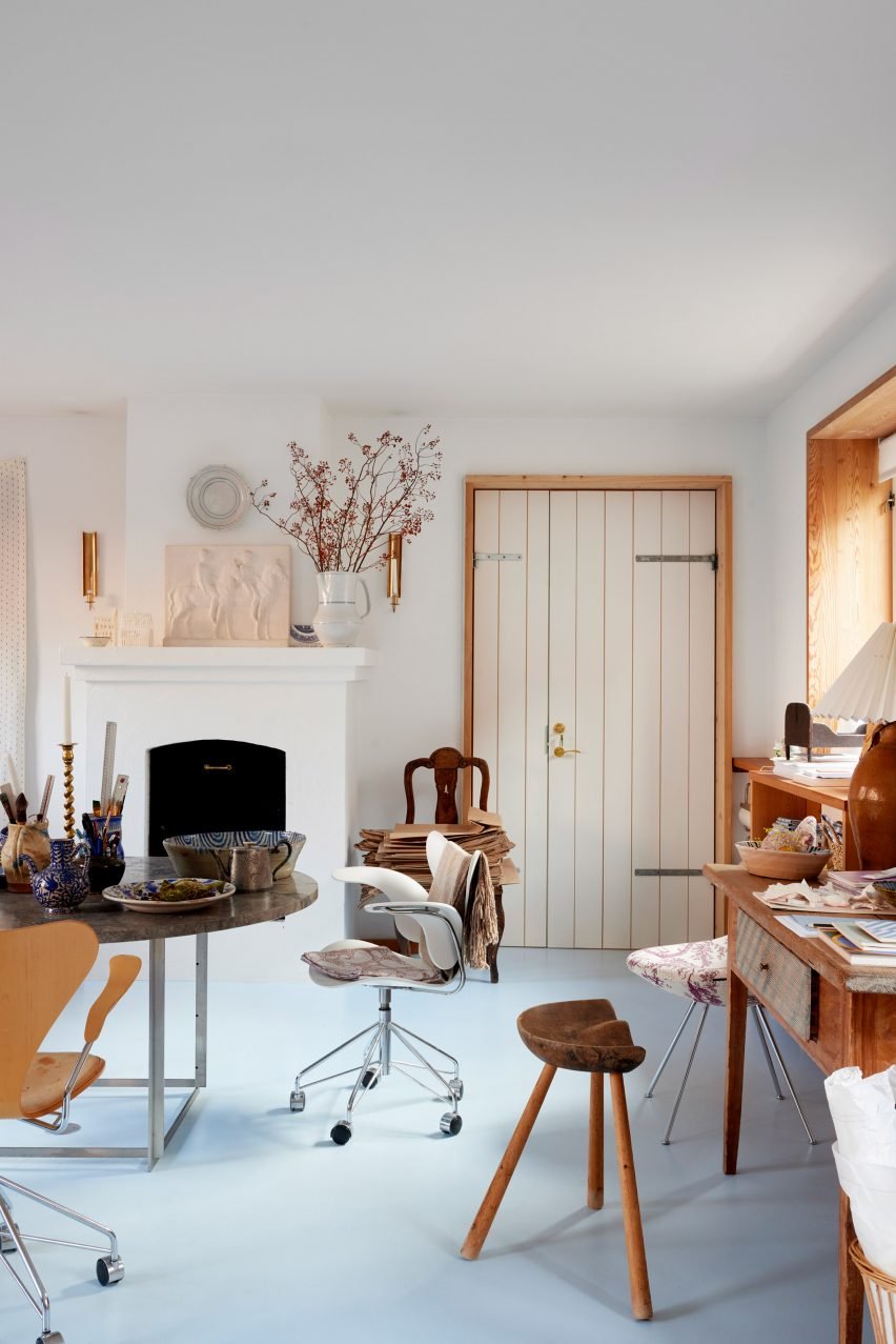
Textile designer Barbara Bendix Becker’s Copenhagen-based antiques and collectibles atelier is full of Nordic ceramics, lighting and furniture by celebrated Scandinavian designers.

The brass Arne Jacobsen lever handle features alongside these other design classics and has been seamlessly integrated with other warm-toned metal finishes, as well as the atelier’s honey-coloured wooden elements.


Photograph of bathroom with bath below long window
Photo is courtesy of MTJ Studio

Stockholmsgade bathroom, Copenhagen, by Emil Thorup

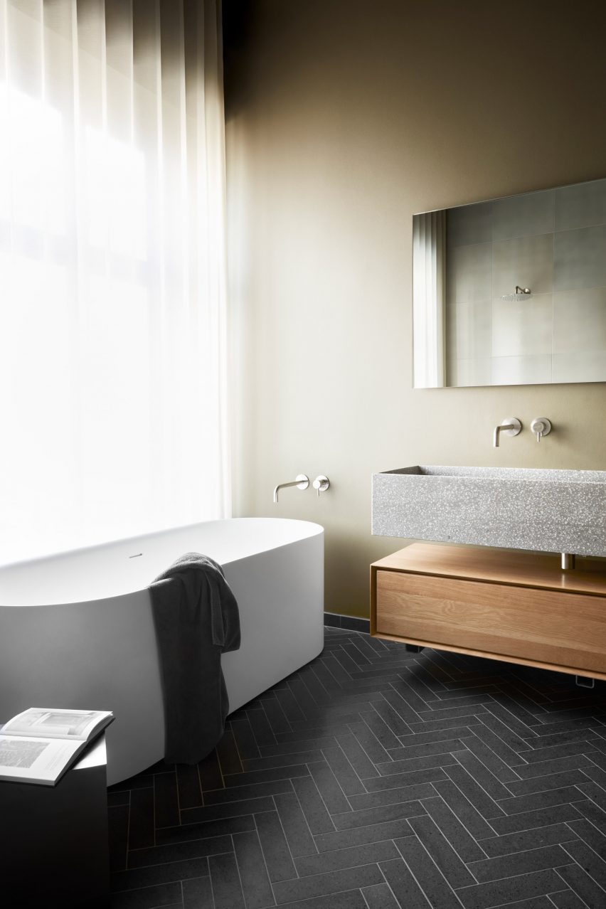
This bathroom scheme created by interior designer Emil Thorup is characterised by its rhythmic herringbone tile floor, muted sage-coloured walls and round-cornered, freestanding bathtub.

D-line’s Qtoo bathroom hardware collection in a subtle brushed-steel finish was used for part of the bath, sink and shower setup, and creates a nice metallic contrast to the pale green walls and natural materials used in the room.


Dentology+ by Norm Architects
Photo is by Jonas Bjerre Poulsen

Dentology+ clinic, Antwerp, by Norm Architects

Norm Architects went against the grain with the design of this dental surgery, which avoids overtly clinical interiors in favour of soft neutral finishes that encourage calmness in patients.

Charcoal-toned L lever handles punctuate the otherwise light and airy interior, alongside unexpected homely details like low-slung sofas and translucent draped curtains.

Find out more about Dentology+ clinic ›


Kitchen island with red handles in front of tall curtains
Photo is courtesy of &Shufl

&Shufl x D Line collaboration

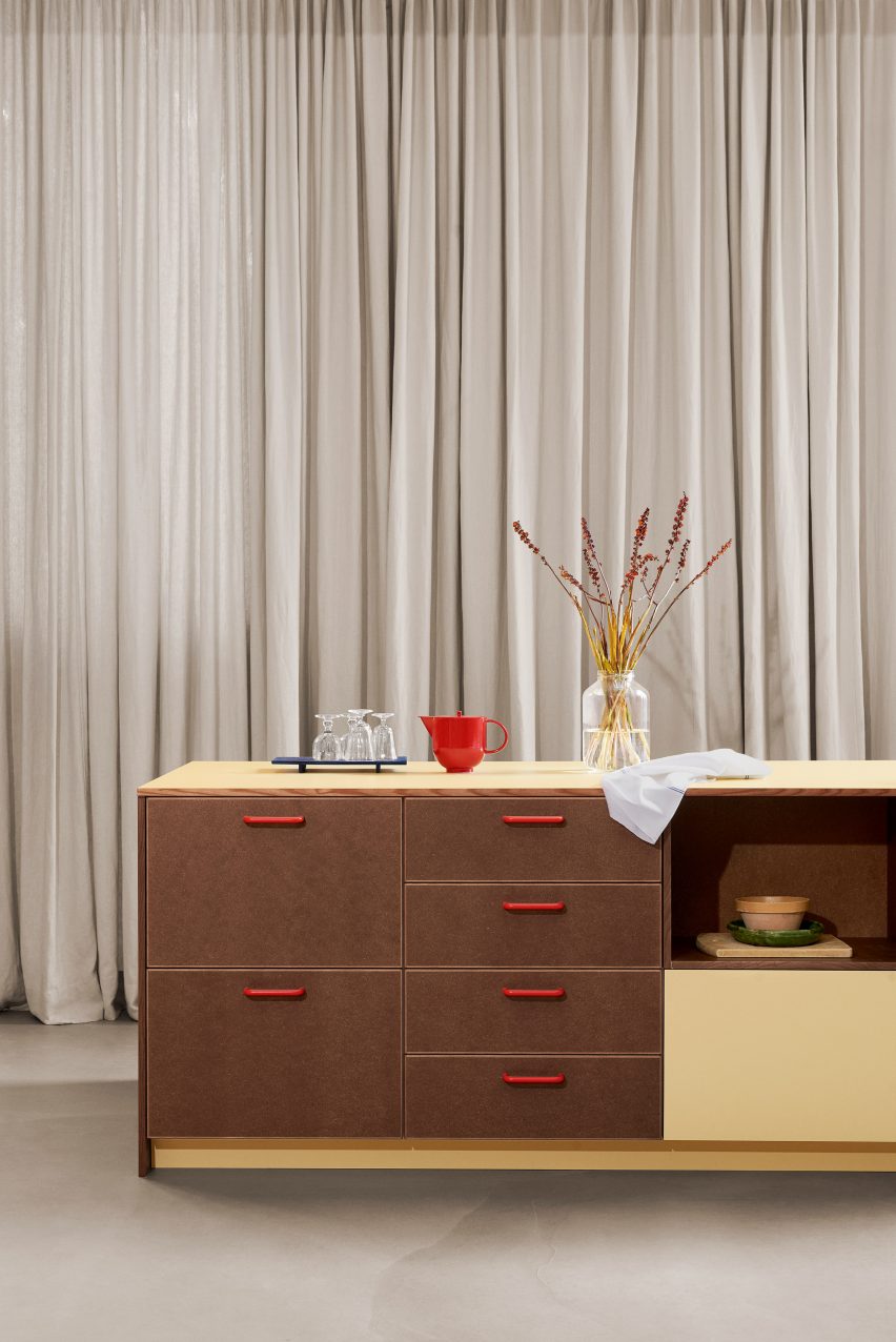
Danish design company &Shufl provides carpentry and hardware elements that are compatible with IKEA kitchens, bathrooms and wardrobes to give existing schemes a facelift.

D Line’s bar handles, which have featured in its catalogue for over 50 years, are used for the &Shufl designs, where they come in a curated palette of different colours and finishes.


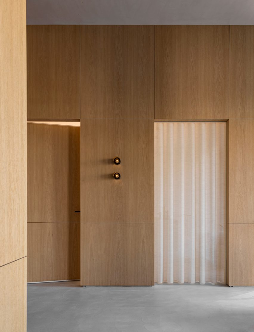
Neutral room with light wood clad door
Photo is by Luke Arthur Wells

Luke Arthur Wells x Fat collection by Tom Dixon

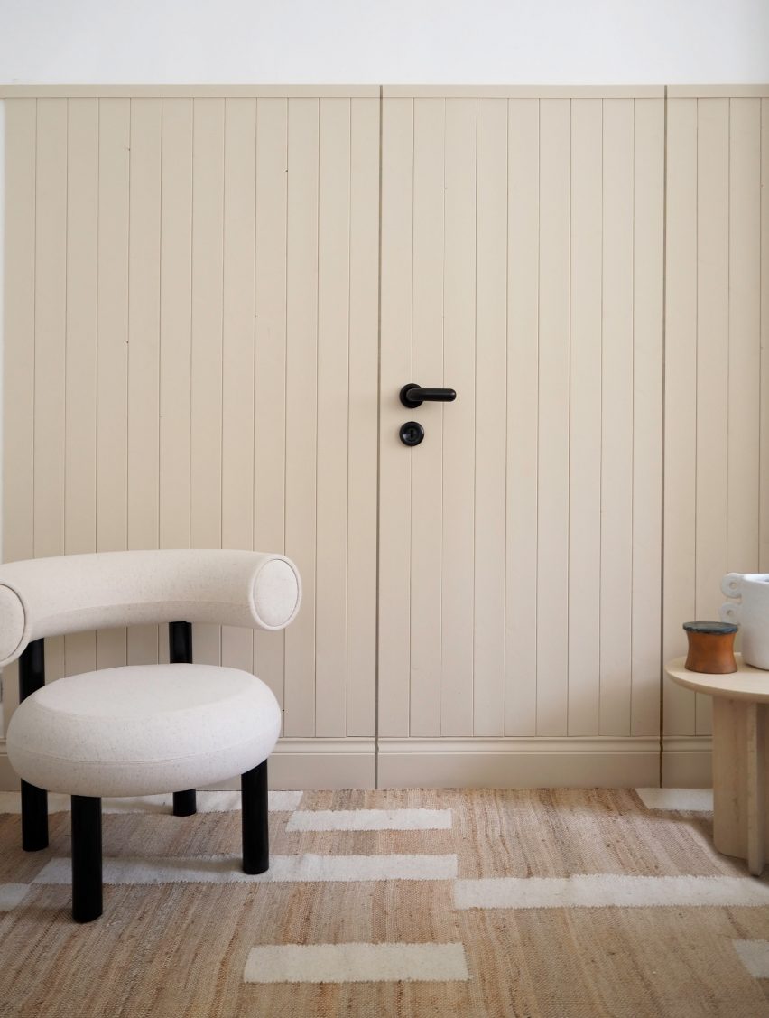
British interior designer Luke Arthur Wells devised an interior scheme that encourages peacefulness by using rounded furniture, handmade ceramics and soft floor coverings.

D Line’s FAT lever handle – part of a wider collection by Dixon – is shorter, thicker and more rounded than traditional door furniture and further softens the already gentle interior.


This is the latest in our series of lookbooks providing curated visual inspiration from Dezeen’s image archive. For more inspiration see previous lookbooks showcasing sociable split-level living spaces, subtly installed lifts, cosy cabins and opulent hotels.

This lookbook was produced by Dezeen for D line as part of a partnership. Find out more about Dezeen partnership content here.

Reference

Dezeen Pinterest roundup features eight warm restaurant interiors
CategoriesInterior Design

Dezeen Pinterest roundup features eight warm restaurant interiors

Restaurant interiors with natural finishes have been popular on Pinterest this week, including a beach club restaurant in London and a Japanese restaurant in Canada featuring paper lanterns. Follow Dezeen on Pinterest and read on to find out more about the projects.

Pinners have been predominantly drawn to the Dezeen’s boards that feature restaurant interiors. The most popular have soft, warm lighting schemes and make use of natural materials and wooden furniture.

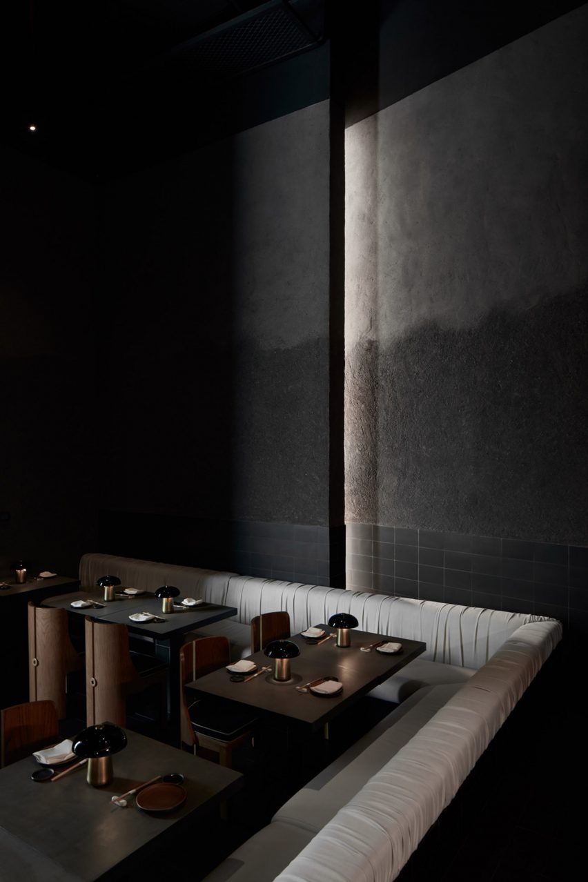
A sushi restaurant in Dubai stood out due to its black tiles, grey plaster and dramatic lighting.

Scroll down to see eight popular projects pinned on Dezeen’s Pinterest and browse our restaurants Pinterest board to see more projects.


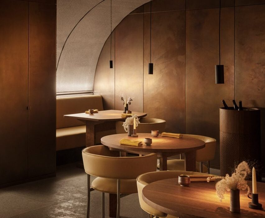
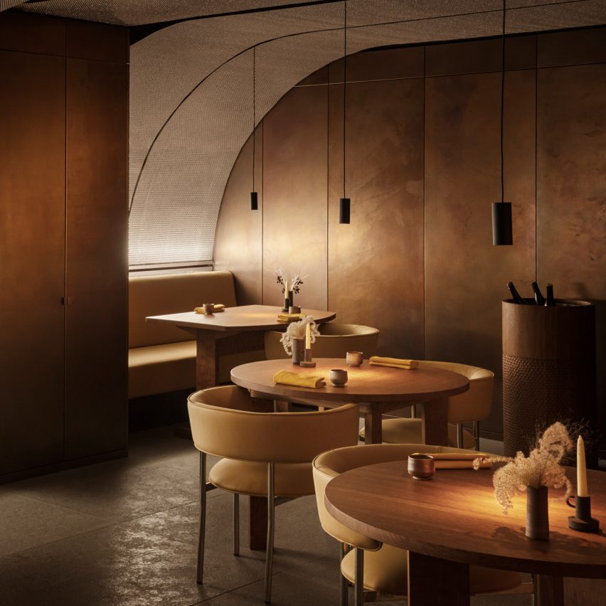
Ikoyi restaurant interior

Ikoyi restaurant, UK, by David Thulstrup

Copenhagen-based designer David Thulstup carried out a complete renovation of the interiors of London’s Ikoyi restaurant.

Informed by spices from sub-Saharan Africa, he created a warm and earthy colour palette featuring a variety of materials including copper and oak.

Find out more about the Ikoyi restaurant ›


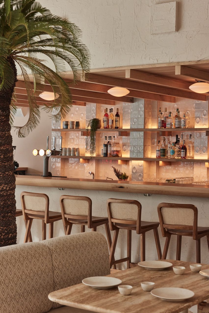
Milk Beach Soho restaurant by A-nrd

Milk Beach Soho, UK, by A-nrd

Natural materials feature in this eatery designed by London design office A-nrd to resemble an Australian beach club.

The restaurant’s seating is made from timber and rattan, while sandy-hued Palladian terrazzo covers the floor.

Find out more about Milk Beach Soho ›


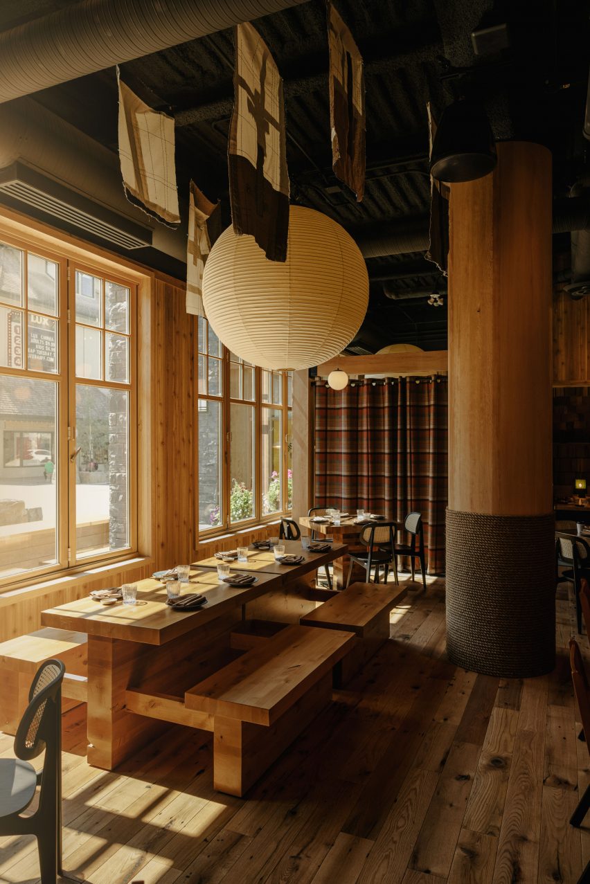
Paper lantern above bench seating

Hello Sunshine, Canada, by Frank Architecture

Japanese design elements like paper lanterns and ceiling-hung textile artworks feature in the interiors of the Hello Sunshine bar and restaurant in Alberta, Canada.

The studio incorporated plaid curtains, stone and wood to suit the restaurant’s mountain location.

Find out more about Hello Sunshine ›


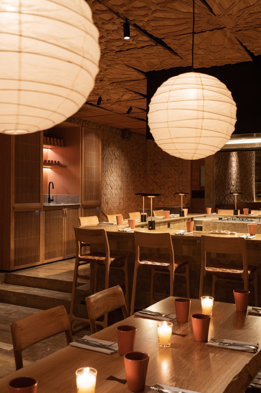
The interiors of a Moroccan restaurant

Sahbi Sahbi, Morocco, by Studio KO

Influenced by female chefs and Morrocan cuisine, Studio KO used earthy colours and natural materials like wood to create a warm and inviting space for guests at Sahbi Sahbi (above and top).

Finer details include rust-coloured ceramic urns, clay pots and pans and orange-brown paint used for an alcove above a sink.

Find out more about Sahbi Sahbi ›


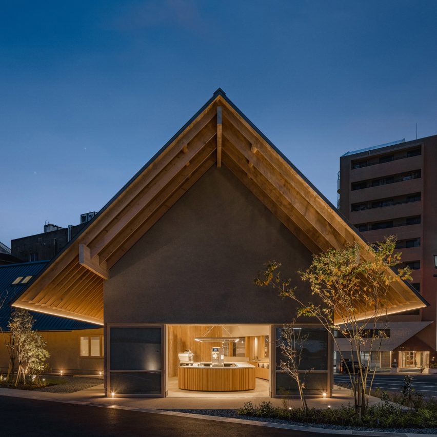
Saga Hirakawaya restaurant, Japan, by Keji Ashizawa

Saga Hirakawaya restaurant, Japan, by Keji Ashizawa

Materials “with a sense of simplicity” including wood and concrete were used to create minimalist interiors for a tofu restaurant in Japan’s Saga prefecture.

Wood was used for the entrance, windows and undersurface of eaves to match the wood from Ariake, a furniture brand also based in Saga. To complement its stripped-down interior, Japanese designer Keji Ashizawa added wooden furniture and pale grey walls.

Find out more about The Saga Hirakawaya restaurant ›


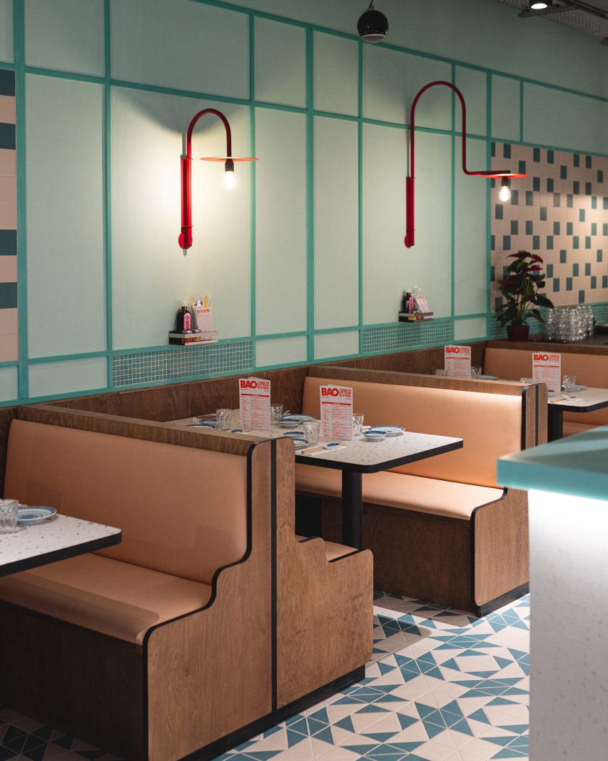
Bao Express restaurant in Paris by Atelieramo

Bao Express, France, by Atelieramo

Traditional Hong Kong diners informed the design of Bao Express, Paris.

To recreate the 1970s Hong Kong urban atmosphere, the studio included celadon-green walls and curvaceous wooden booths. Pastel colours and neon lights also feature.

Find out more about Bao Express ›


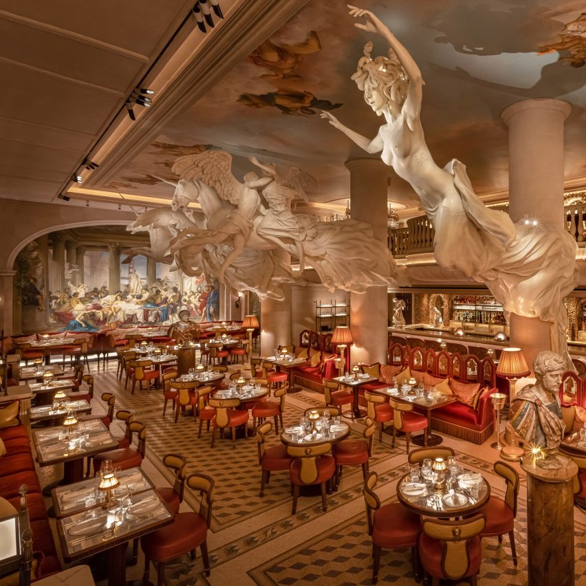
Restaurant interior with table settings and lights

Bacchanalia London, UK, by Martin Brudnizki Design Studio 

Martin Brudnizki Design Studio was informed by classic Greek and Roman mythology when designing the interiors of this London restaurant.

Sculptures more than 2,000 years old can be found at the bar and five specially-commissioned monumental statues by Damien Hirst dominate the main dining room.

Find out more about Bacchanalia London ›


Origami sushi restaurant in The Dubai Mall by VSHD Design

Origami, Dubai, by VSHD Design

A moody and dark interior was created for a sushi restaurant in The Dubai Mall, United Arab Emirates.

To replicate the atmosphere of Japanese underground sushi bars, VSHD Design used textured grey plaster, matte-black tiles and dramatic low lighting.

Find out more about Origami ›

Follow Dezeen on Pinterest

Pinterest is one of Dezeen’s fastest-growing social media networks with over 1.4 million followers and more than ten million monthly views. Follow our Pinterest to see the latest architecture, interiors and design projects – there are more than four hundred boards to browser and pin from. Currently, our most popular boards are Apartments and Concrete houses.

Reference

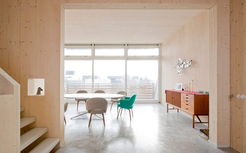
Fourteen homes where cross-laminated timber creates cosy interiors
CategoriesInterior Design

Fourteen homes where cross-laminated timber creates cosy interiors

Our latest lookbook features cross-laminated timber interiors, including a colourful German vacation home and a tenement-style housing development in Edinburgh, and is part of Dezeen’s Timber Revolution series.

Architects looking to offset the carbon emissions of a building often choose cross-laminated timber (CLT), a type of mass-timber made from laminated timber sections that can be used as structural building materials.

The material, which is normally made from larch, spruce or pine, absorbs atmospheric carbon as it grows and subsequently retains it during its life in a building.

In interiors, CLT can create a luxurious effect even for projects with a tight budget and gives rooms a light, modern feel.

This is the latest in our lookbooks series, which provides visual inspiration from Dezeen’s archive. For more inspiration see previous lookbooks featuring interiors with split-level living areas, mix-and-match flooring and homes with cleverly hidden lifts.


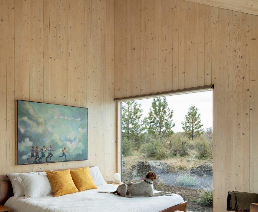
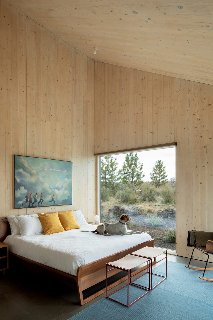
The interior of a bedroom in Octothorpe House
Photo is by Jeremy Bitterman / JBSA

Octothorpe House, US, by Mork-Ulnes Architects

The natural forms, custom furniture and organic colours and textures that appear throughout Octothorpe House were selected by studio Mork-Ulnes Architects for their resemblance to the surrounding Oregon desert landscape.

The cabin-cum-house was built using American-made CLT for a client that wanted an “environmentally progressive” and flexible design.

Find out more about Octothorpe House ›


Interior of Bert treehouse by Precht
Photo is by Christian Flatscher

Bert, Austria, by Precht

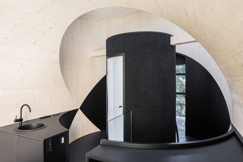
Hidden in the woodland surrounding the Steirereck am Pogusch restaurant in the rural village of Pogusch, this playful tubular guest dwelling was informed by cartoon characters.

It was designed by Austrian architecture studio Precht to feel dark and cosy inside, with the structural CLT walls providing contrast against the black flooring and dark textiles.

Find out more about Bert ›


Kitchen and dining space in Haus am Hang by AMUNT
Photo is by Rasmus Norlander

Haus am Hang, Germany, by AMUNT

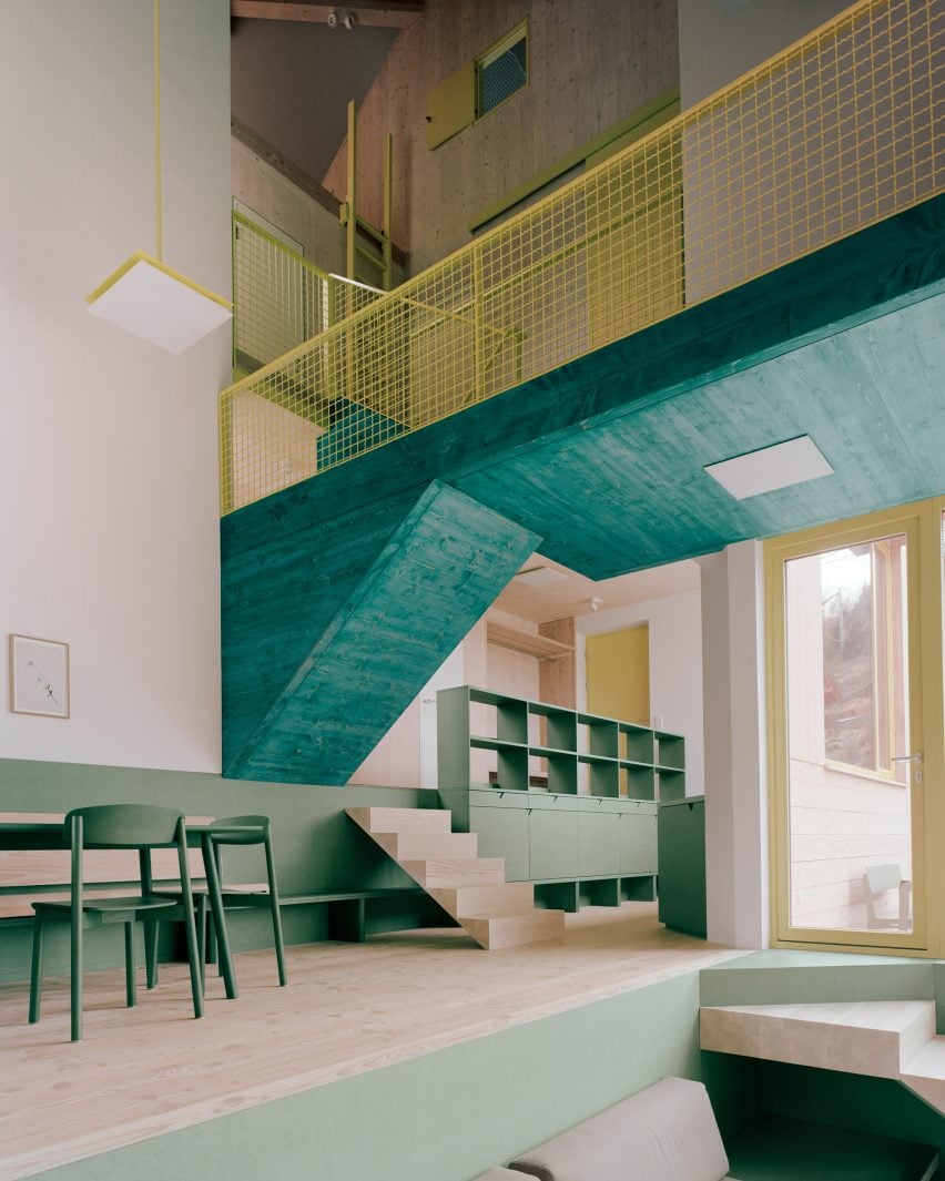
German architecture office AMUNT was drawn in particular to CLT’s sustainability credentials when creating this hillside vacation home in the Black Forest.

Designed for a client who wanted to promote sustainable travel, the home features surfaces and joinery finished in shades of green inspired by local tree species and its layout was organised to make the most of natural light.

Find out more about Haus am Hang ›


Kynttilä by Ortraum Architects
Photo is by Marc Goodwin

Kynttilä, Finland, by Ortraum Architects

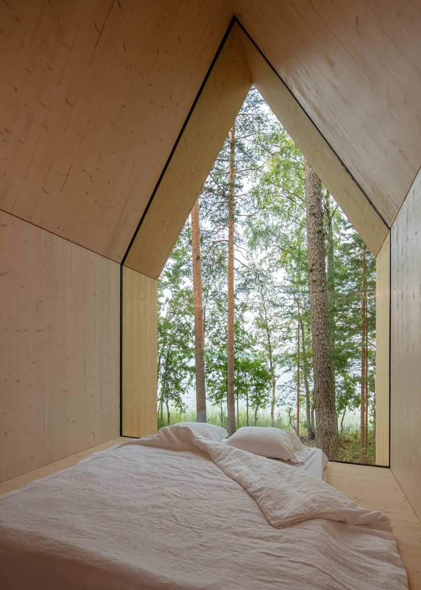
Structural CLT was used to form the floor walls and angled roof of this 15-square-metre cabin on Lake Saimaa in Finland.

Its gabled form encloses a bedroom and a small kitchen, which feature natural CLT walls. A large bedroom window provides views of the forest outside the cabin.

Find out more about Kynttilä ›


Interior of CLT House in London by Unknown Works
Photo is courtesy of Unknown Works

CLT House, UK, by Unknown Works

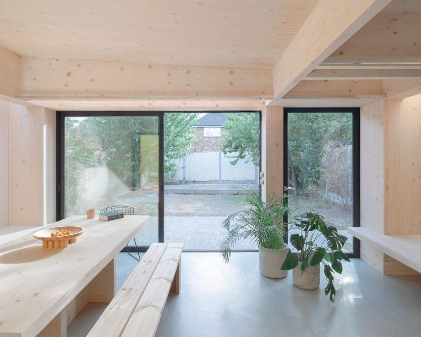
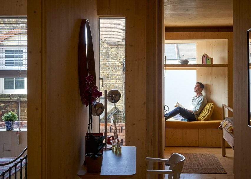
Named after its spruce CLT structure, CLT House is a semi-detached house in east London that architecture studio Unknown Works remodelled and extended to open up and improve its connection to the back garden.

On the ground floor, the timber walls, storage and seating areas create a minimal backdrop for the family’s musical and creative pursuits, parties and family gatherings.

A combined kitchen and dining space are housed in a bright yellow rear extension that opens onto the garden’s brick-paved patio.

Find out more about CLT House ›


The Rye Apartments by Tikari Works
Photo is by Jack Hobhouse

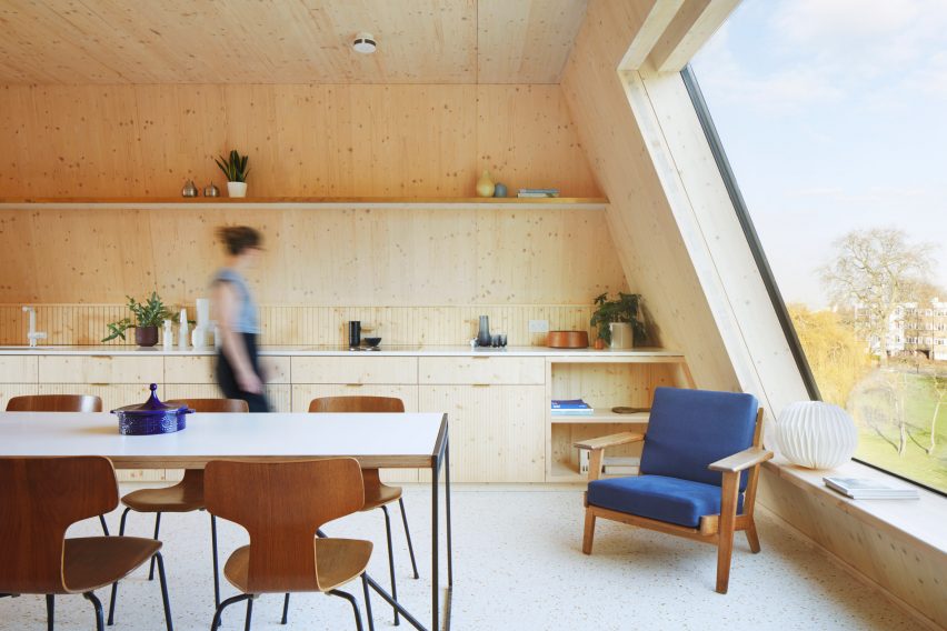
Rye Apartments, UK, by Tikari Works

The four-storey Rye Apartments block in south London was designed by local studio Tikari Works, which used CLT for the structure and left it exposed across the majority of the apartments’ gabled walls and ceilings.

This was combined with spruce wood kitchen cabinetry, storage units and shelving. Terrazzo-style flooring with amber and cream-coloured flecks was added to compliment the timber finishes.

Find out more about Rye Appartments ›


R11 loft extension by Pool Leber Architekten
Photo is by Brigida González

R11 loft extension, Germany, by Pool Leber Architekten

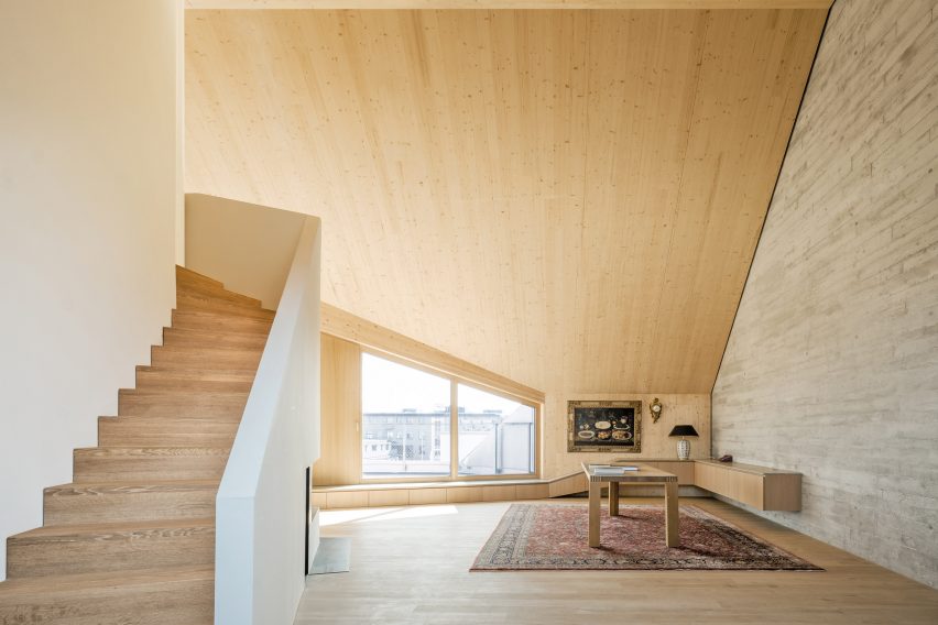
The R11 loft extension is a two-storey CLT extension that Pool Leber Architekten added to a 1980s housing block in Munich, creating a series of loft spaces.

Inside the lofts, the structural timber was left visible on the walls, ceilings and floors. The material was also used to create sculptural storage cabinets that double as window seating.

Find out more about Pool Leber Architekten


Barretts Grove by Amin Taha Architects
Photo is by Tim Soar

Barretts Grove, UK, Amin Taha Architects

Amin Taha Architects created this six-storey CLT block, which contains six apartments, between a pair of detached brick buildings in Stoke Newington, London.

“The ability of the CLT to serve as structure and finish removed the need for plaster-boarded walls, suspended ceilings, cornices, skirtings, tiling and paint; reducing by 15 per cent the embodied carbon of the building, its construction cost and time on site,” the studio said.

Find out more about Barretts Grove ›


A CLT split level interior
Photo is by Markus Linderoth

Twelve Houses, Sweden, by Förstberg Ling

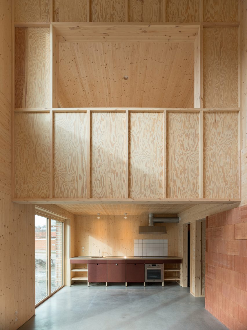
The CLT structure that forms the foundations of Twelve Houses by Förstberg Ling has been left exposed throughout the walls, floors and ceilings of the interior living areas, giving the space a warm and inviting feel.

A back bedroom on the first floor overlooks a double-height area of the living room, which has a concrete floor and reddish-brown wall panelling.

Find out more about Twelve Houses ›


Villa Korup kitchen interior
Photo is by Gabrielle Gualdi

Villa Korup, Denmark, by Jan Henrik Jansen Arkitekter

A CLT structure made from Baltic fir was used to construct this home on the Danish island of Fyn, which features exposed CLT panels throughout the interiors.

Designers Jan Henrik Jansen Arkitekter, Marshall Blecher and Einrum Arkitekter treated the material with soap and lye to lighten and protect the timber inside.

Find out more about Villa Korup ›


Interior of Simon Square apartments by Fraser/Livingstone
Photo is by Fredrik Frendin

Simon Square, UK, by Fraser/Livingstone

Comprised of six flats set within a mass-timber tenement-style housing development in Edinburgh, Simon Square has a structural timber frame that has been left exposed internally.

Architecture studio Fraser/Livingstone hoped that the presence of CLT indoors would improve the residents’ well-being. Potted plants and a neutral interior colour scheme provide an added sense of calm.

“When solid timber is exposed internally, the D-limonene the timber gives out has been shown to produce calm environments, with occupants’ hearts beating slower, and stress reduced,” project architect Ayla Riom told Dezeen.

Find out more about Simon Square ›


Interior of the Biv Punakaiki cabin by Fabric Architecture
Photo is by Nancy Zhou

Biv Punakaiki, New Zealand, by Fabric

In an attempt to balance the high carbon levels of the cabin’s concrete floor and aluminium cladding, architecture studio Fabric chose to use CLT for the cabin’s structure, which was left exposed inside.

From the double-height living room, the residents can look up through large skylights that punctuate the ceiling and gaze at the stars above.

Find out more about Biv Punakaiki ›


A cross laminated timber kitchen interior
Photo is by José Hevia

MAS JEC, Spain, by Aixopluc

Catalan architecture office Aixopluc used lightweight materials for this CLT extension, which it added to a traditional Catalan house in the city of Reus.

The building was prepared off-site and erected in just two weeks. Another advantage of using CLT is that the thermal mass of the exposed CLT interiors helps to ensure a comfortable internal temperature when the afternoon sun hits the building.

Find out more about MAS JEC ›


Houten Herenhuis by MAATworks

IJburg Townhouse the Netherlands, by MAATworks

This Amsterdam townhouse was designed to reference wooden Scandinavian homes.

Architecture studio MAATworks arranged it around an angular staircase made from cross-laminated pine wood, which was also used to create the wall and ceilings of the home.

Find out more about IJburg Townhouse ›

This is the latest in our lookbooks series, which provides visual inspiration from Dezeen’s archive. For more inspiration see previous lookbooks featuring interiors with split-level living areas, mix-and-match flooring and homes with cleverly hidden lifts.

Timber Revolution logo
Illustration by Yo Hosoyamada

Timber Revolution

This article is part of Dezeen’s Timber Revolution series, which explores the potential of mass timber and asks whether going back to wood as our primary construction material can lead the world to a more sustainable future.

Reference

Mission Invisible: Door Details That Blend Seamlessly With Modern Interiors
CategoriesArchitecture

Mission Invisible: Door Details That Blend Seamlessly With Modern Interiors

There isn’t much an architect loves more than clean lines, seamless details and high quality materials, but successfully combining all three is an endless challenge. As many of their clients seek increasingly streamlined spaces in which to live and work, designers are being tasked with perfecting the art of Minimalism  — and it’s only made possible in collaboration with manufacturers that appreciate the complex technical considerations behind this goal.

Led by Isabel & Jan Karcher, door furniture business Karcher Design embraces this challenge. This innovative German company designs and manufactures door hardware with incredible rigor, constantly considering how its products will fit with the wider context of a project. Their latest lever set, entitled “Mission Invisible”, takes their vision of minimalism to another level, reducing the door handle to its purest form and providing architects with the perfect solution to their clients’ needs. The product topped the jury vote in the 2022 A+Product Awards.

Architizer spoke with Karcher to learn more about the inspiration behind Mission Invisible, how its design was developed, and the company’s plans for the future.
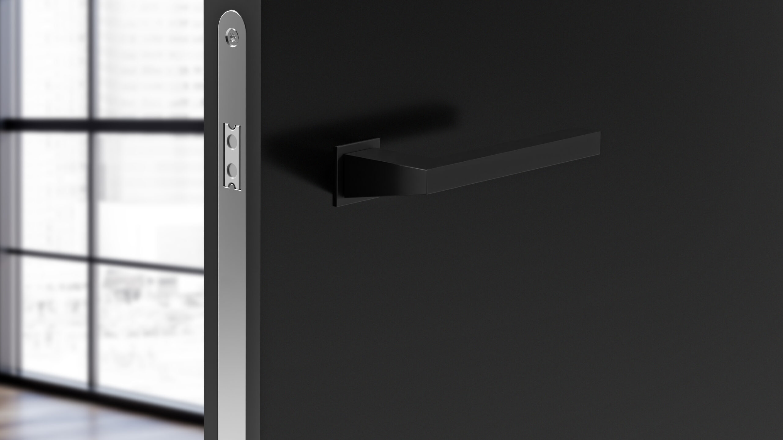
Congratulations on winning a 2022 A+Award! What does winning this accolade mean to you and your brand?

As a leading manufacturer of door and window levers in the European market, this award and the recognition it brings will help us bring even more of our modern but timeless style to America and expand our market there.

What inspired the design of your product?

Drawing on our European roots, we are always developing designs that are a little smaller, a little more sleek, a little more elegant. Mission Invisible is the pinnacle of minimalism, reducing the lever set to its bare essentials without compromising on quality. This trend can be seen everywhere in modern design, and we wanted to offer architects a product range which can blend seamlessly into their minimalist design concepts.

Tell us about the manufacturing process — What are the key stages involved and how do these help ensure a high quality end product?
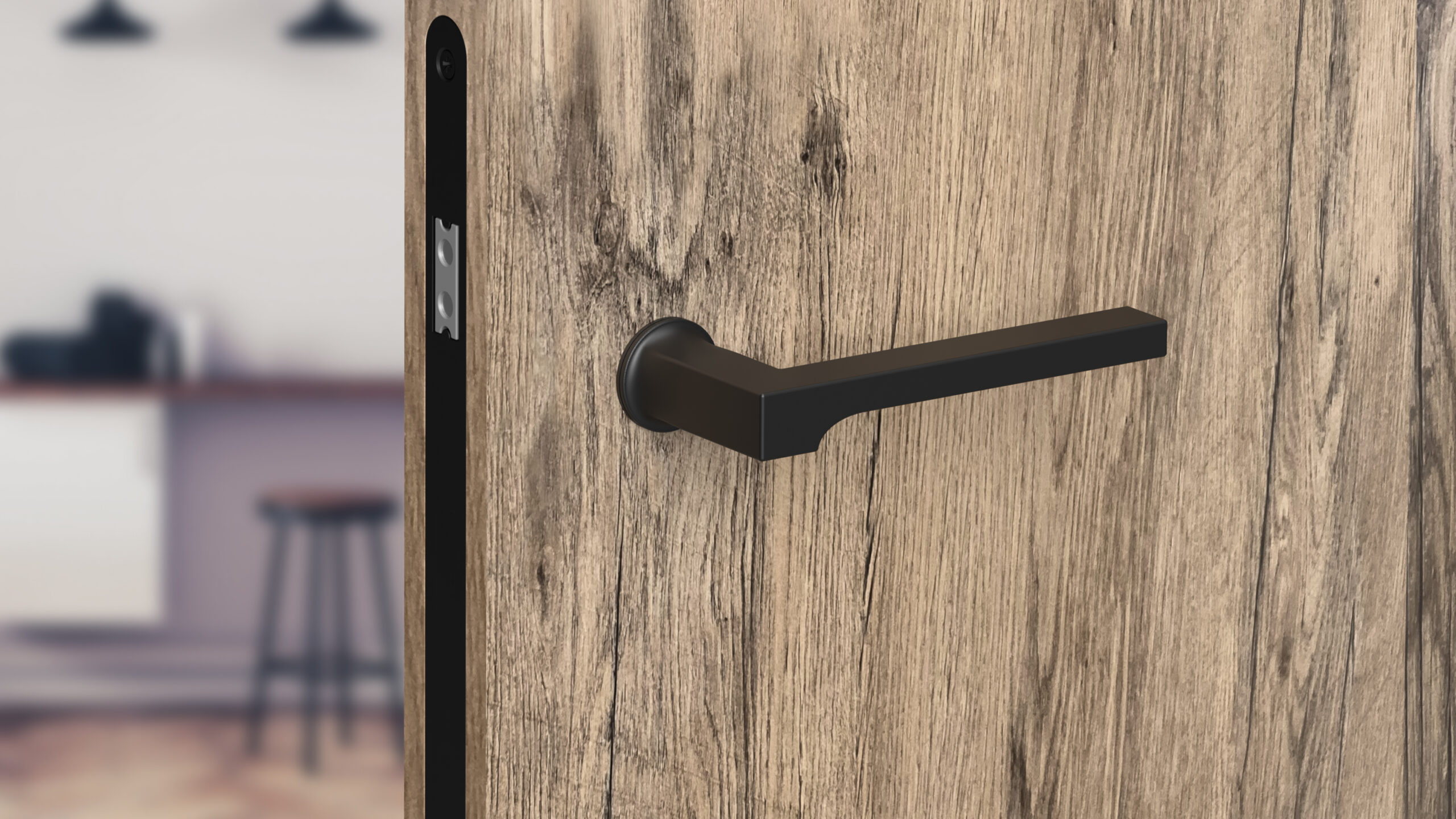
Our company motto “Edles aus Stahl” is a bit of a German play on words – Edelstahl, meaning stainless steel, directly translates as Nobel Steel. We recognized decades ago the value of using high quality materials — where brass and aluminum are cheap and easy to manufacture, stainless steel is more durable and adds that extra hint of quality and luxury.

Because of this, our Mission Invisible set (and many of our other lever sets) is made entirely of high quality stainless steel. Through precision investment casting and CNC machining processes, we ensure that our parts fit together every time and with as little play as possible. Combined with our European mortise locks, we ensure a long lasting, good-looking door opening experience.

What detail of your product was most challenging to design, and why? How did you resolve it?

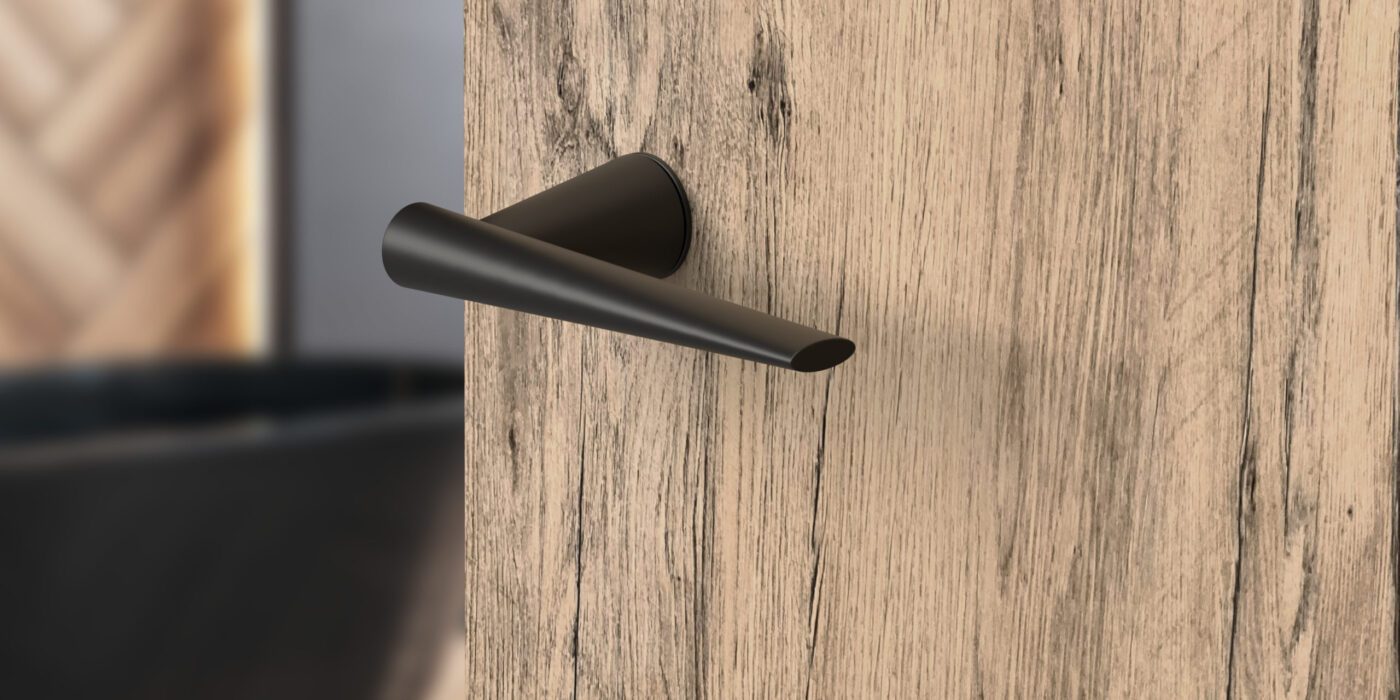
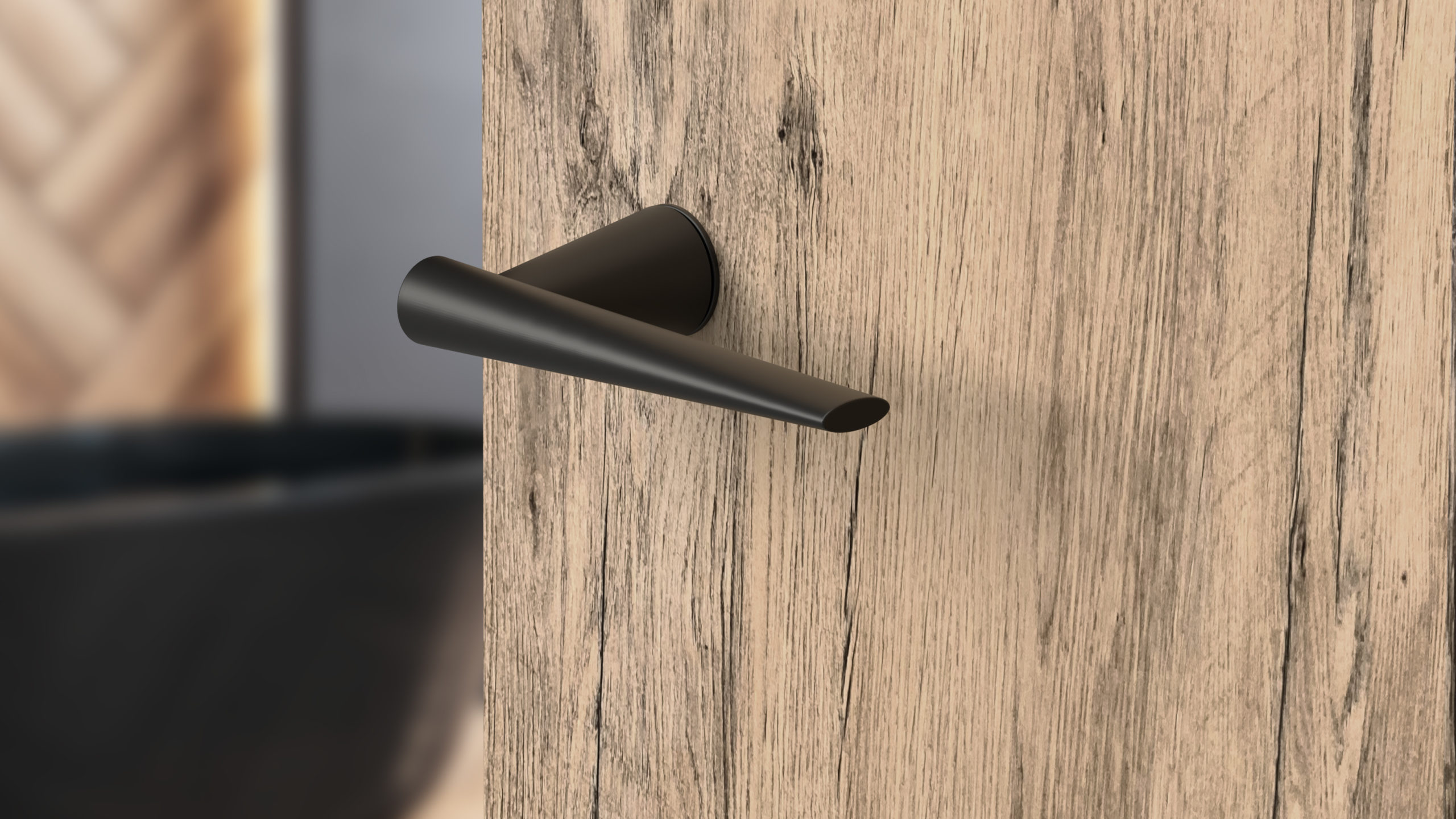
The standard door preparation for a lever set is a 2 1/8” diameter hole which is bored through the door. A standard lever set is designed to make use of this space. Now, imagine you have only a 1” diameter hole in the door, but you have to fit the same technology into less than half the space. Everything has to be thinner and smaller, but it can’t be more fragile.

The secret was to develop a lever rose which wasn’t fixed onto the door, but one which integrated itself into the door itself. The stainless steel rose has an array of flexible hooks which balance out any misalignment between the latch and the door. Once the handle is inserted into the rose, these hooks are pressed into the wood of the door and provide an incredibly stable base for the lever set. A small, but precision-cast, nylon bearing sits between the lever and the rose, ensuring a long life and silent operation.

What makes your product unique and of great value to specifying architects?
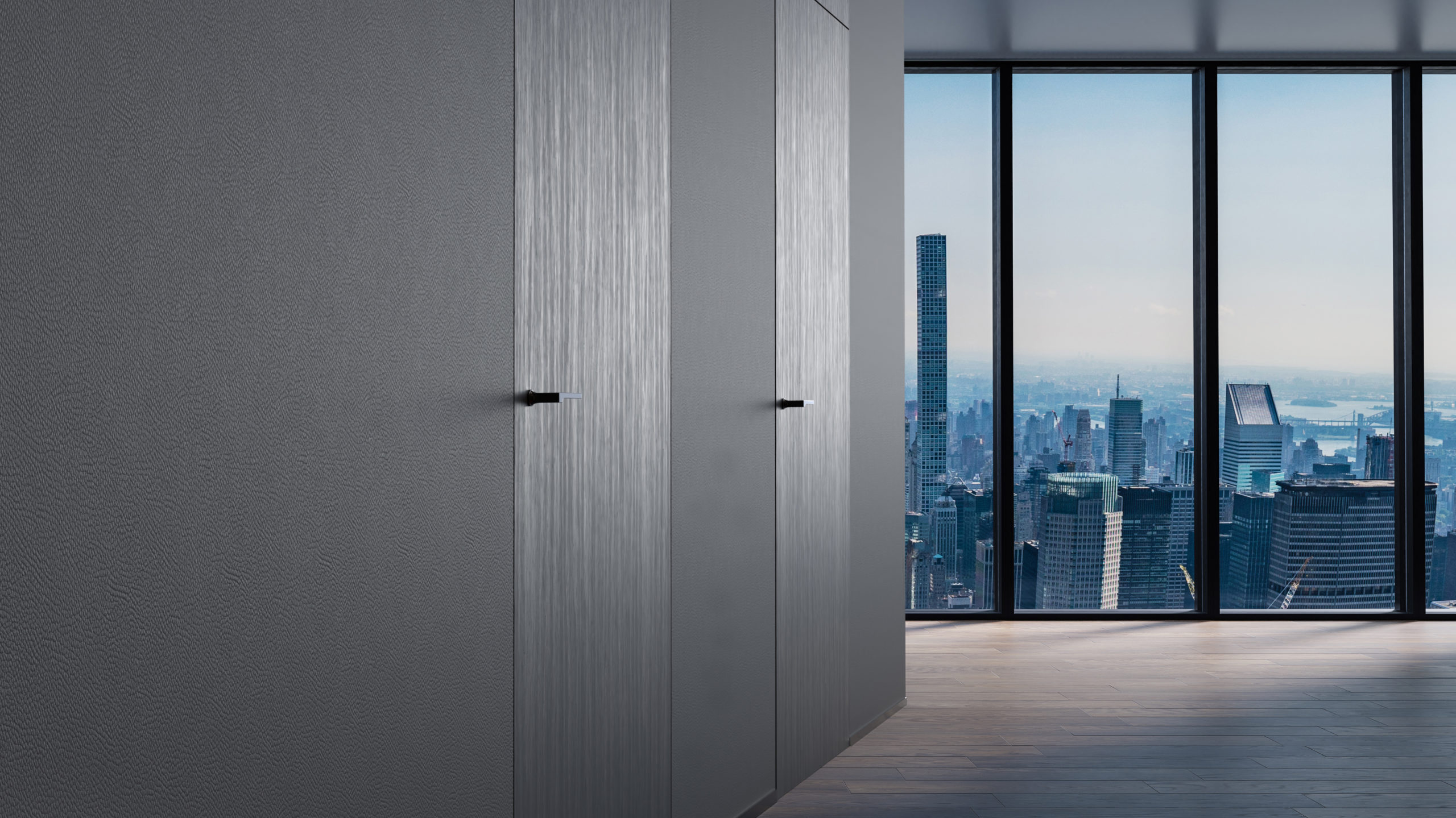
First and foremost, its minimalistic design and clean look is unique. Mission Invisible is also compatible with various different designs and finishes, so there are many possible applications. Then there is the size: Compare a standard lever rose (2 5/8” diameter and 7/16” thick) with the Mission Invisible mini-rose (1 3/16” diameter and 1/8” thick!).

Architects don’t have to accommodate the size of a Mission Invisible lever set; it blends into its surroundings. Combine this with a range of durable, powder coated finishes and lever designs specifically made for the Minimalist look, and you have a product which fits in anywhere. You don’t have to stand out to make a statement!

What has the reception to your product been like from architects/clients/consumers?

Architects have said that Mission Invisible opens up new ways to unify the look of a door within a room. They love how it combines with invisible hinges for a complete look, and is very easy to install. The overall reception from both architects and their clients has been very positive.

How do you see the product evolving in future?
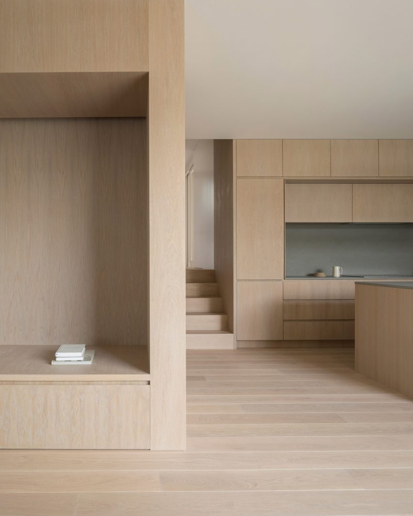
Developing an even smaller system isn’t really realistic, but if the minimalist trend in architecture continues, we might develop more products which compliment seamless transitions between design components. We’re also slowly introducing our range of European products to the USA. These are a great compromise for those who want something a bit more elegant, but aren’t quite into the full minimalist aesthetic.

To find out more about Karcher and Mission Invisible, visit their website, and reach out to one of their experts to learn how to implement the product in your next project.

All images courtesy of Karcher Design

Reference

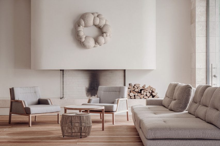
Eight neutral home interiors proving that beige doesn’t have to be boring
CategoriesInterior Design

Eight neutral home interiors proving that beige doesn’t have to be boring

A residence for retirees in Tel Aviv and a stripped-back Barbican apartment by minimalist architect John Pawson feature in this lookbook of beige interiors designed to bring a sense of calm into the home.

To compensate for their desaturated colour palette, these spaces rely on a varied material palette – ranging from pale timbers and limestone to textured plaster – in order to add visual and tactile interest.

Accompanied by plenty of storage, this helps to create peaceful, decluttered spaces even in tight urban areas.

This is the latest in our lookbooks series, which provides visual inspiration from Dezeen’s archive. For more inspiration see previous lookbooks featuring cosy cabins, save-saving pocket doors and Spanish apartment renovations with eclectic tiles.


Dollis Hill Avenue by Thomas-McBrien
Photo by Ståle Eriksen

Dollis Hill Avenue, UK, by Thomas-McBrien

British architecture firm Thomas-McBrien used pale bricks and whitewashed oak joinery to create a “calm and relaxing” atmosphere inside this house extension in London’s Dollis Hill.

In the pursuit of continuity, the timber was used to line everything from the kitchen cupboards and the floors to a newly added partition wall, which conceals a hidden utility room on one side and forms a cosy reading nook on the other.

Find out more about Dollis Hill Avenue ›


Mureli House in Kozyn, Ukraine, by Makhno Studio
Photo courtesy of Makhno Studio

Mureli House, Ukraine, by Makhno Studio

Completed just two months before Russia’s invasion of Ukraine, this home near Kyiv was designed to celebrate Ukrainian craft traditions and is finished almost entirely in beige.

“All materials in the home are natural,” architect Serhii Makhno told Dezeen. “The team used almost all Ukrainian brands and worked with several local contractors to minimise the distance and logistics.”

Find out more about Mureli House ›


Plywood kitchen inside Iceberg apartment by Laila Architecture
Photo by Mikaela Burstow

Iceberg apartment, Israel, by Laila Architecture

Israeli architect Talia Davidi of Laila Architecture used only pale, muted colours when designing this apartment in Tel Aviv, with the aim of turning it into a calm refuge for its retired owners.

To form a brighter, more open floor plan, almost all of the home’s partition walls were removed, while many of the surfaces – including the kitchen and the storage volume-cum-room divider in the living room – were finished in light birch plywood.

Find out more about Iceberg apartment ›


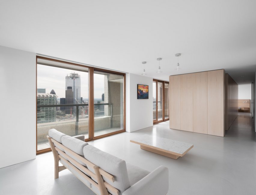
Barbican apartment designed by John Pawson

Barbican apartment, UK, by John Pawson

In keeping with his typically minimalist style, British designer John Pawson stripped this Barbican apartment back to its bare bones, adding only a smattering of furnishings and pale surfaces all around.

Full-height cupboards were integrated into a central timber volume made of bleached maple wood so that all belongings can be stowed away rather than cluttering the space.

Find out more about the Barbican apartment ›


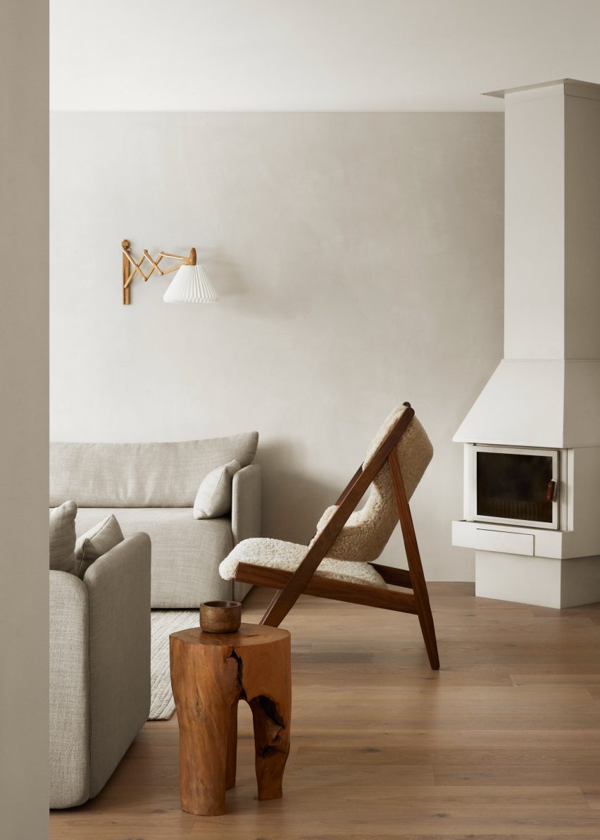
Minimal interiors of forest retreat designed by Norm Architects
Photo by Jonas Bjerre-Poulsen

Forest Retreat, Sweden, by Norm Architects

Sandy-hued Dolomite plaster, plump greige sofas and a sheepskin-covered lounge chair were used to dress the living room of this traditional timber cabin in a Swedish forest, which Danish studio Norm Architects has converted into a pared-back holiday home.

“Creating homes is often an exercise in restraint,” explained co-founder Jonas Bjerre-Poulsen. “And while the creation of a simple, authentic and welcoming space might seem effortless and natural once completed, the journey to simplicity and the exercise of finding essence is often rather complex and not an easy task.”

Find out more about Forest Retreat ›


Bedroom inside Low Energy House designed by Architecture for London
Photo by Lorenzo Zandri and Christian Brailey

Low Energy House, UK, by Architecture for London

Architecture for London founder Ben Ridley aimed to celebrate the “modest beauty” of this three-floor Edwardian house in Muswell Hill when turning the neglected building into his own home.

Instead of cement-based products, natural materials including limestone, lime plaster and timber were used throughout the scheme to emphasise the home’s original details while also lowering its embodied carbon footprint.

Find out more about A Brutalist Tropical Home ›


White bedroom with sculptural wooden furniture
Photo by Do Sy

Brown Box apartment, Vietnam, by Limdim House Studio

Creamy terrazzo features not just on the kitchen counters but spills out across all of the floors of this apartment in the Vietnamese port city of Huế, designed by local practice Limdim House Studio.

Curving walls covered in textural plaster provide a backdrop for the interior’s restrained colour palette, which is warmed up with a handful of wooden furnishings to evoke a sense of quiet sophistication.

Find out more about Brown Box apartment ›


Wood Ribbon apartment by Toledano + Architects
Photo by Salem Mostefaoui

Wood Ribbon apartment, France, by Toledano + Architects

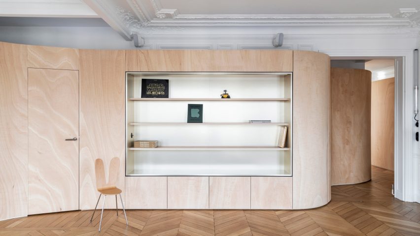
A sinuous plywood wall snakes its way through this Haussmann-era apartment in Paris, forming integrated shelves in the sitting room and storage cupboards in the kitchen that can be pushed back to reveal the sink and appliances.

The pale wood complements the apartment’s original parquet flooring and ornate plasterwork, paired with tonal furnishings including an oatmeal-coloured sofa in one room and a travertine island in the other.

Find out more about Wood Ribbon apartment ›

This is the latest in our lookbooks series, which provides visual inspiration from Dezeen’s archive. For more inspiration see previous lookbooks featuring cosy cabins, save-saving pocket doors and Spanish apartment renovations with eclectic tiles.

Reference

Ten residential interiors that make the most of narrow spaces
CategoriesInterior Design

Ten residential interiors that make the most of narrow spaces

Including tight living areas, kitchens wedged into corridors and interiors in skinny Japanese houses, this lookbook features 10 homes that make clever use of narrow spaces.

Projects on constricted urban sites or working within historical buildings often must contend with long-and-narrow interior layouts.

Here are 10 examples of interiors where narrow spaces have been utilised to their full potential thanks to intelligent design.

This is the latest in our lookbooks series, which provides visual inspiration from Dezeen’s archive. For more inspiration see previous lookbooks featuring mezzanine bedrooms, creative built-in furniture and homes that make a highlight of their corridors.


1.8 Metre House in Japan
Photo by Sobajima, Toshihiro

1.8m Width House, Japan, by YUUA Architects & Associates

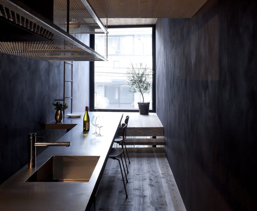
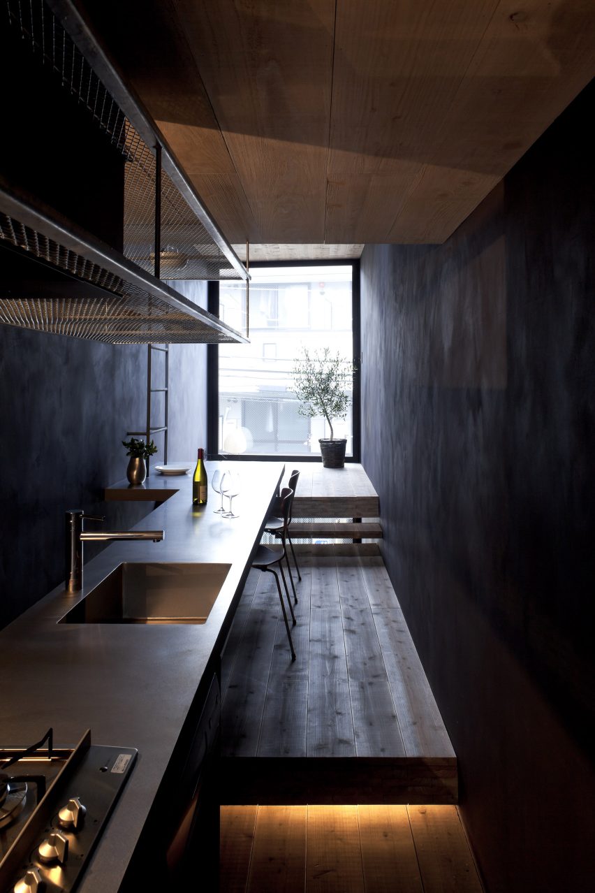
As its name suggests, the rooms in this house in central Tokyo are just 1.8 metres wide, so Japanese studio YUUA Architects & Associates had to plan the interior with meticulous care.

They used split-level floors to create natural partitions between different spaces, with a kitchen and dining area lined up along a single wall, while a dark colour scheme is intended to provide “a sense of depth”.

Find out more about 1.8m Width House ›


House in Valencia by DG Arquitecto Valencia
Photo by by Mariela Apollonio

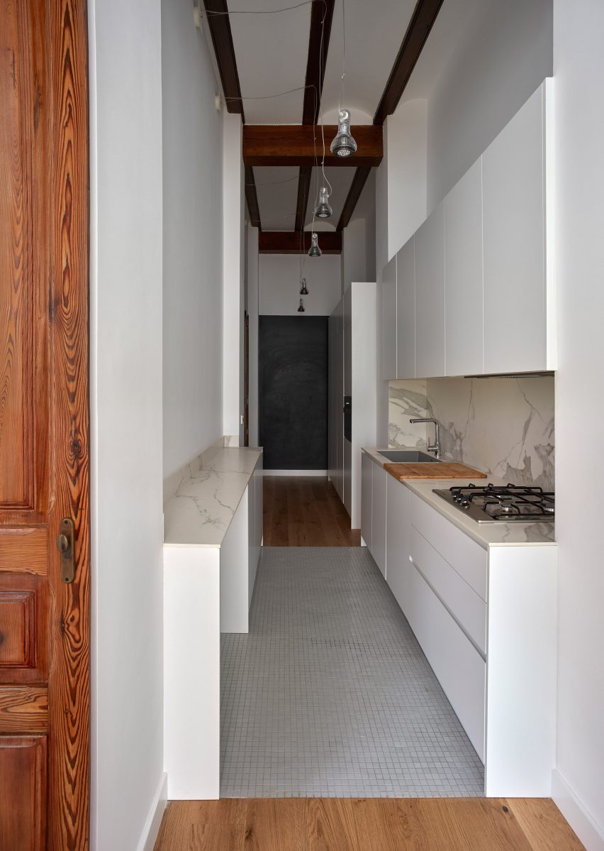
Horta Nord townhouse, Spain, by DG Arquitecto Valencia

DG Arquitecto Valencia sneaked a kitchen into a passageway in this Valencian townhouse as part of a renovation project for a young family.

White floor tiles and downlighting hanging from the high ceiling help the space maintain a sense of generous scale despite the narrow proportions.

Find out more about this Horta Nord townhouse ›


196 Orchard model residence in Manhattan by Alex P. White
Photo by Colin Miller

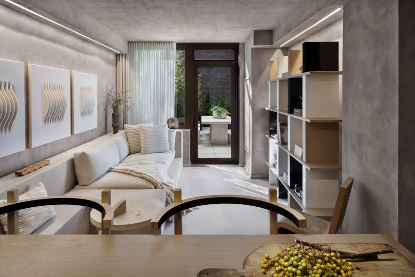
196 Orchard apartment, USA, by Alex P White

American designer Alex P White created a model unit for a high-end condominium building in Manhattan’s Lower East Side characterised by exposed calming concrete ceilings, grey plaster walls and neutral-toned decor.

In the narrow living room, a mix of shapes and textures combine with built-in furniture to provide added visual depth, from a series of ivory wall hangings by Los Angeles artist Mary Little to a large walnut shelving unit designed by White and a cardboard chair by Frank Gehry.

Find out more about this 196 Orchard apartment ›


Maisonette in Notting Hill by Francesco Pierazzi Architects
Photography is by Lorenzo Zandri

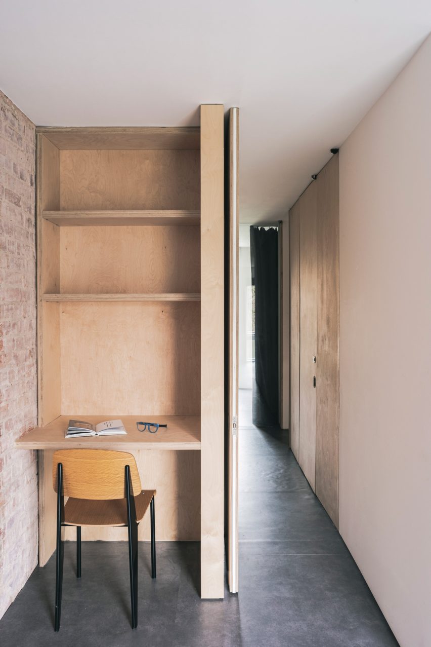
Notting Hill maisonette, UK, by Francesco Pierazzi Architects

A petite plywood study space was nestled into a hallway in this London maisonette overhauled by Francesco Pierazzi Architects.

To emphasise the home’s sense of height, the studio placed floor-to-ceiling doorways in all of its narrower rooms and left the brick shell exposed, offset by dark flooring.

Find out more about this Notting Hill maisonette ›


Nuwa guesthouse by Z_Lab
Photo by Texture on Texture

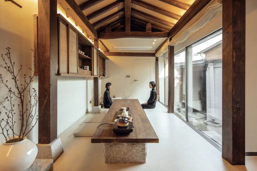
Seochon micro guesthouse, South Korea, by Z_Lab

Z_Lab’s serene interiors for this tiny guesthouse tucked down an alleyway in northern Seoul occupy a former traditional Korean home, otherwise known as a hanok.

In the main space, long and rectilinear, different functions are lined up from a cosy reading area on a timber bench to a lengthy walnut table for enjoying tea that sits directly beside a sunken water bath.

Find out more about this Seochan micro guesthouse ›


West Chelsea Apartment by BoND
Photo by Eric Petschek

West Chelsea Apartment, USA, by BoND

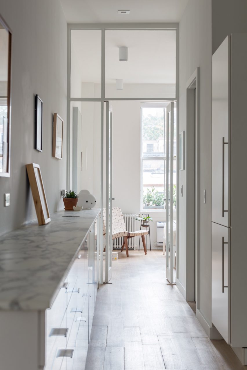
This long and narrow apartment in New York’s Chelsea neighbourhood was overhauled by architecture studio BoND, which replaced partition walls with glass doors to allow more light to reach the middle section while also “celebrating the apartment’s elongated proportions and maximising the illusion of depth”.

All utilities, including kitchen and bathroom fixtures, were moved to one wall to leave the other free for displaying art, while the direction of the floorboards and linear lighting fixtures help to emphasise the length of the interior.

Find out more about West Chelsea Apartment ›


Studio 6b bedroom
Photo by Itay Benit

Bauhaus Tel Aviv apartment, Israel, by Amir Navon and Maayan Zusman

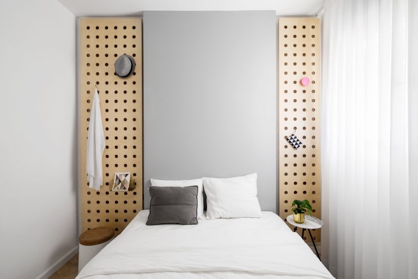
A “safe room” was turned into a snug spare bedroom as part of a refurbishment of this Tel Aviv apartment by architect Amir Navon and interior designer Maayan Zusman, who worked alongside graduates Dana Sagive and Naama Tison Vilotsky.

To compensate for a lack of width a light-toned oak herringbone floor was paired with pale colours, while two wooden plates with holes pierced in them to support brass hooks are a space-saving storage solution.

Find out more about this Bauhaus Tel Aviv apartment ›


Love2 House by Takeshi Hosaka in Tokyo Japan
Photo by by Koji Fujii Nacasa and Partners

Love2 House, Japan, by Takeshi Hosaka

This Tokyo micro home designed by architect Takeshi Hosaka for himself and his wife gathers household amenities into a linear floorplan spanning just 19 square metres.

Borrowing principles from the architecture of villas in ancient Roman villas, Hosaka divided up spaces for sleeping, bathing, eating and study using seven partitions that extend out from the concrete walls.

Find out more about Love2 House ›


Birch and Clay Refugio by Rise Design Studio
Photo by Ståle Eriksen

Birch and Clay Refugio, UK, by Rise Design Studio

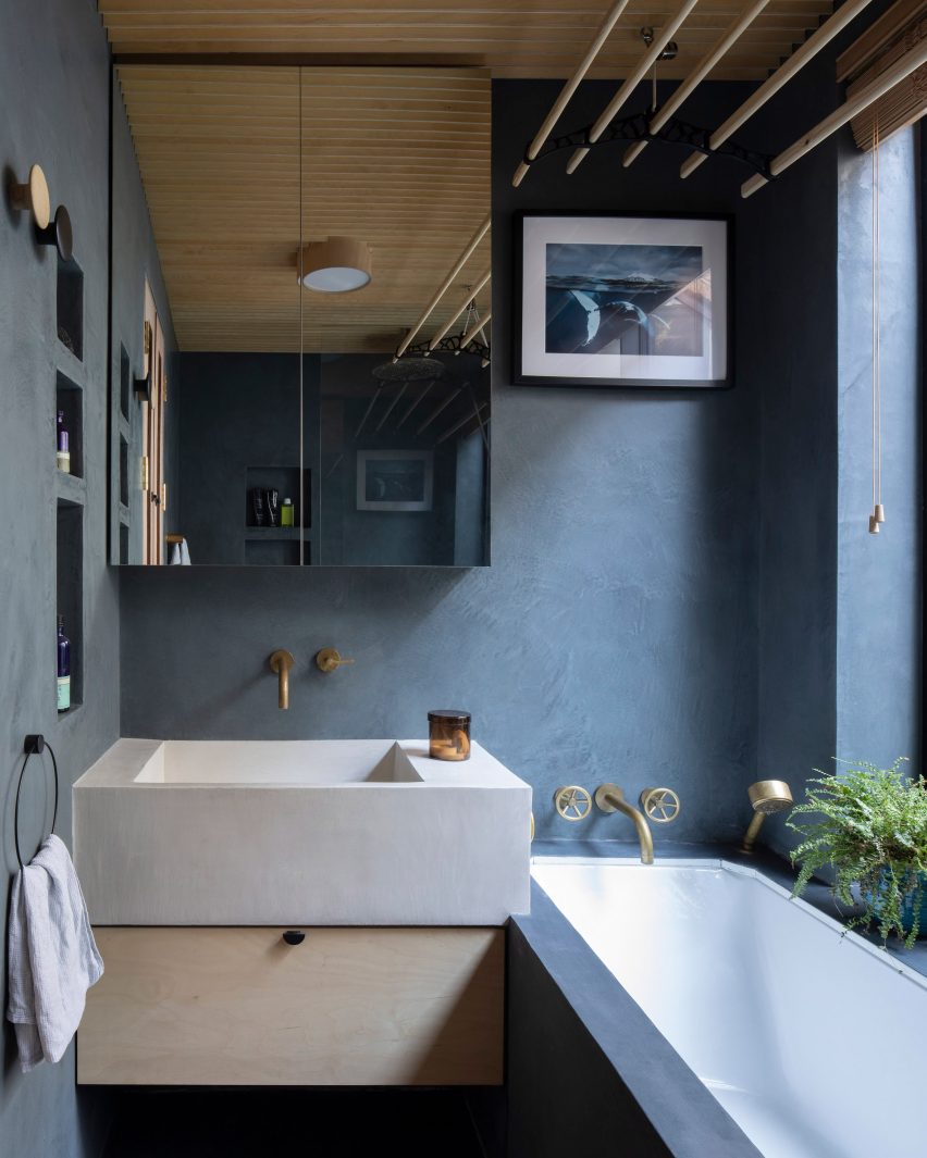
By cutting shelving into one wall, retaining a generous window sill and subtly overlapping the chunky sink and bathtub, Rise Design Studio was able to make the most of limited lateral space in this bathroom.

The room’s proportions were chosen to match an adjacent lightwell in the remodelled London flat, while the dark blue tadelakt walls and floor contrast with a birch plywood ceiling to convey an impression of solidity.

Find out more about Birch and Clay Refugio ›


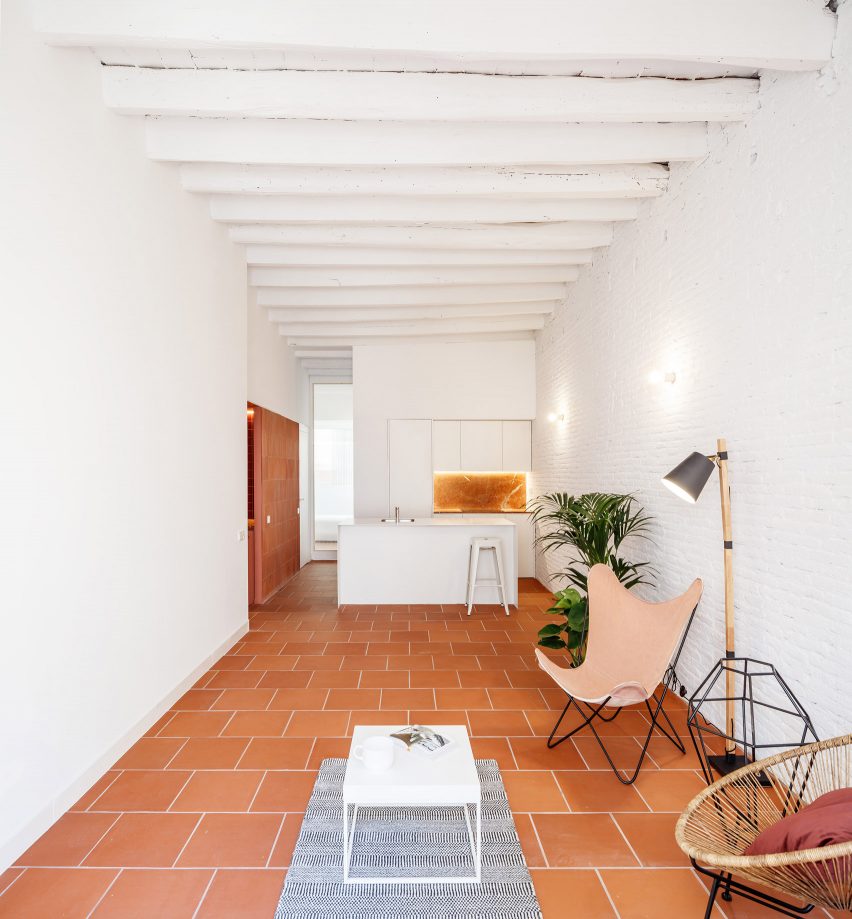
Interiors of La Odette apartment by Crü

La Odette, Spain, by CRÜ

Architecture studio CRÜ was tasked with transforming this Barcelona apartment from a cramped three-bedroom home into a spacious two-bed while optimising the use of space.

In the kitchen-living area, it removed the partition walls to create an open-plan space, with large terracotta floor tiles and white-painted brick walls.

Find out more about La Odette ›

This is the latest in our lookbooks series, which provides visual inspiration from Dezeen’s archive. For more inspiration see previous lookbooks featuring mezzanine bedrooms, creative built-in furniture and homes that make a highlight of their corridors.

Reference

Ten interiors that make use of statement carpets
CategoriesInterior Design

Ten interiors that make use of statement carpets

A bright red carpet covering the interior of an abandoned Mexico City mansion, a sisal carpet stretched over furnishings and a carpeted bathroom are among the floor coverings in our latest lookbook of 10 interiors with bold carpets.

Not only can carpets bring more texture and statement colour to an interior setting, but they can also help to insulate homes, especially if used in combination with a layer of underlay.

These interiors showcase how carpets in unusual shades and carpets displayed in unexpected ways can bring a unique look to homes and offices.

This is the latest in our lookbooks series, which provides visual inspiration from Dezeen’s archive. For more inspiration see previous lookbooks featuring hotel interiors with decadent jewel tones, kitchens with marble surfaces and residential interiors informed by biophilic design.


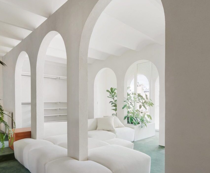
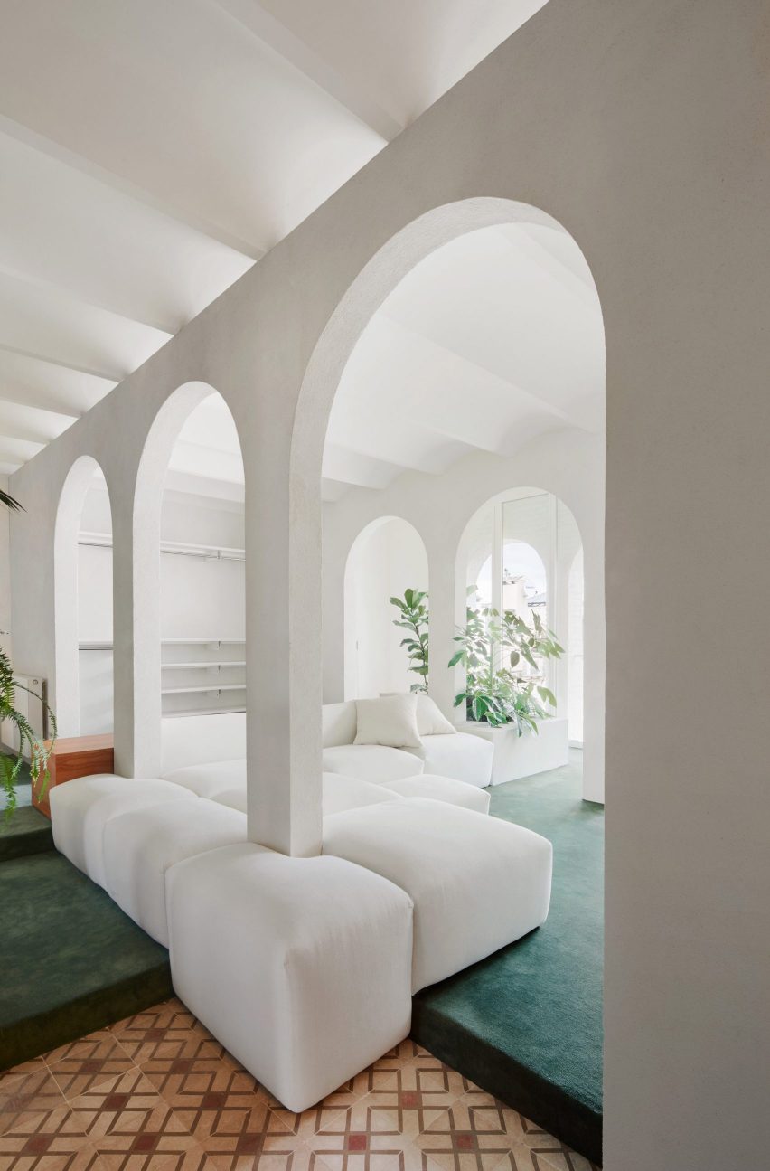
Barcelona apartment by PMAA
Photo is by José Hevia

Arches Apartment, Spain, by PMAA

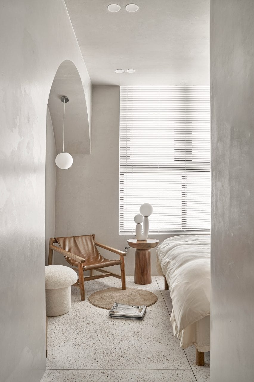
Spanish architecture studio PMAA overhauled the interior of this top-floor apartment in Barcelona’s Raval neighbourhood. The apartment is characterised by white-painted partitions with arched openings that run through and divide the interior of the home.

The living area, which is raised on a slight platform, was blanketed in a cool, sea green-toned carpet juxtaposed against the stark white walls. A large modular sofa wraps around the columns of the arched partitions.

Find out more about Arches Apartment ›


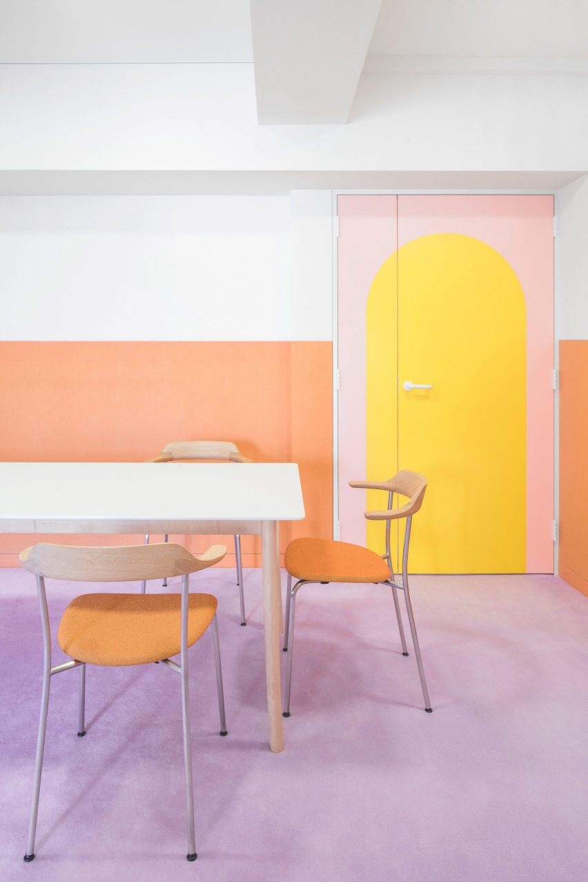
Nagatachō Apartment by Adam Nathaniel Furman
Photo is by Jan Vranovsky

Nagatachō Apartment, Japan, by Adam Nathaniel Furman

London designer Adam Nathaniel Furman renovated the interior of this formerly “claustrophobic” Tokyo apartment, adding a bold, pastel and sugar-sweet colour palette.

A low-pile, lilac carpet extends through the interior of the home and serves as a base for a rainbow of pastel hues that cover the walls, joinery and furniture throughout.

Find out more about Nagatachō Apartment ›


New York office by Halleroed
Photo is by Erik Undehn

New York Office, US, by Halleroed

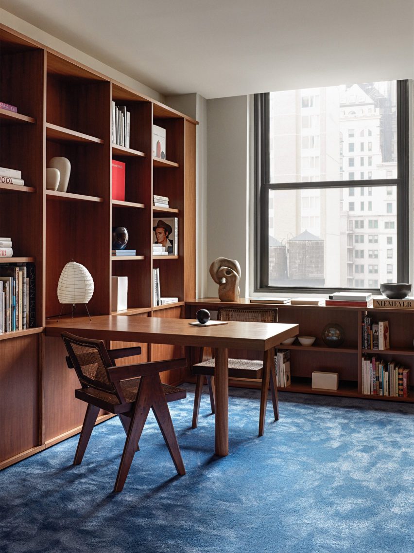
In New York City, Stockholm studio Halleroed made a bold feature out of plush blue carpets and wood panelling throughout the interior of an office building that covers almost 17 stories.

The interior scheme was informed by movies created by American filmmaker David Lynch. Most of the walls and surfaces of the interior were clad in veneer panels made from Makore wood, which is native to central and western Africa.

Find out more about New York Office ›


Antwerp A by Atelier Dialect
Photo is by Piet-Albert Goethals

Apartment A, Belgium, by Atelier Dialect

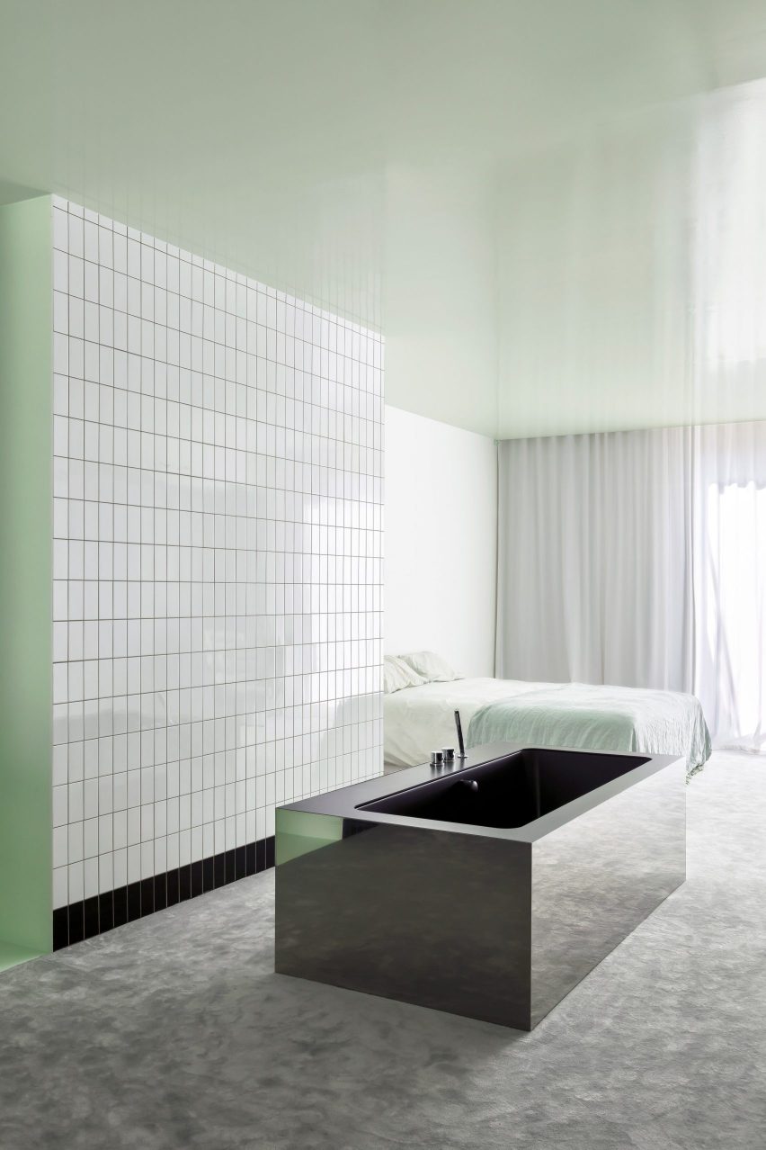
A rectangular stainless-steel bathtub sat on top of a heavy grey carpet form part of this Antwerp apartment, which underwent a contemporary renovation by Belgian design studio Atelier Dialect.

The primary bedroom has an open-plan design that adjoins an en-suite bathroom. Both spaces are linked by a grey carpet that covers the floor, and minty-green lacquer that stretches across the walls and ceiling of the open-plan spaces.

A reflective tub sits in the middle of the room in front of a wall of subway tiles.

Find out more about Apartment A ›


Mexico City manasion by Masa
Photo is by Genevieve Lutkin

Mexico City mansion, Mexico, by Masa gallery

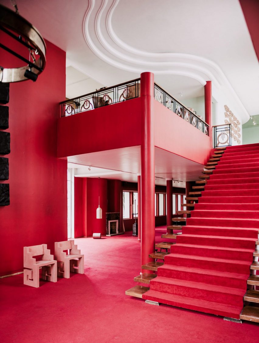
This 1970s mansion in Mexico City was used as a setting for the inaugural exhibit from Masa gallery. The venue was decorated with bright red walls and also features expanses of red and golden-hued carpets.

The mansion, which had been vacant since the 1970s, was kept as the gallery found it and decorated with works by a number of Mexico City-based designers and architects.

Find out more about Mexico City mansion ›


Barcelona apartment by Arquitectura-G
Photo is by José Hevia

Barcelona apartment, Spain, by Arquitectura-G

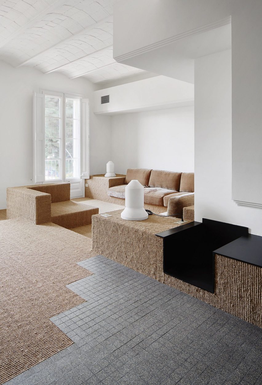
Located in the Ensanche district of Barcelona, this 149-square-metre apartment was renovated by Spanish studio Aqruitectura-G, which was assigned with opening up the interior and drawing in natural light.

The studio adapted the floor levels of the home to zone different areas across each floor. In the living area, a warm-hued sisal carpet extends across the stepped levels of the space, while also covering and wrapping around built-in seating, tables and other surfaces.

Find out more about Barcelona apartment ›


New York apartment by Harry Nuriev and Tyler Billinger
Photo is by Dylan Chandler

New York apartment, US, by Harry Nuriev and Tyler Billinger

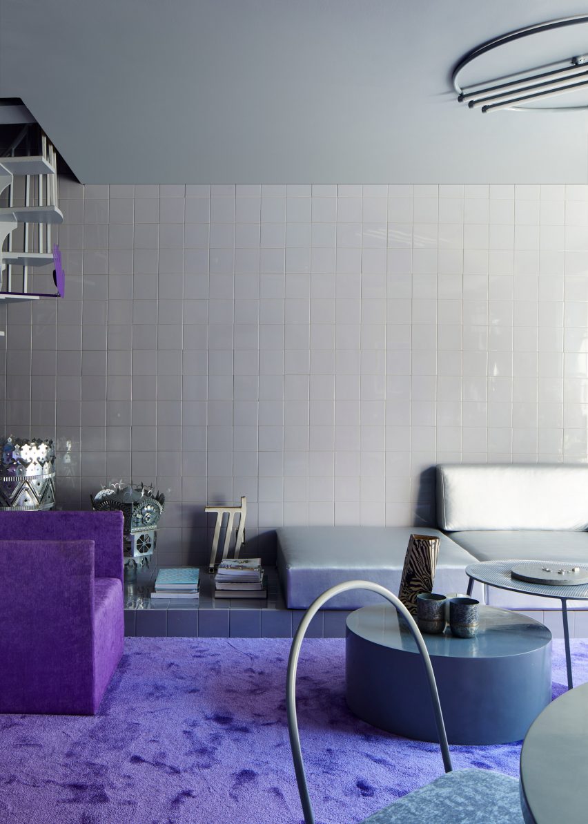
Crosby Studios founder Harry Nuriev and his partner and CEO Tyler Billinger renovated their NoLita apartment in Manhattan, New York City, in shades of violet. A heavy-pile purple carpet was fitted in the living area amid grey tile-clad surrounding walls and floors.

“We wanted a space that was not only elegant, but also liveable – we wanted to create a cosy sanctuary, which is why we used a warm grey as the base colour, and a vibrant purple as the supporting to give it that Crosby signature boldness,” said Billinger.

Find out more about the New York apartment ›


London townhouse by Studio Hagen Hall
Photo is by Mariell Lind Hansen

London townhouse, UK, by Studio Hagen Hall

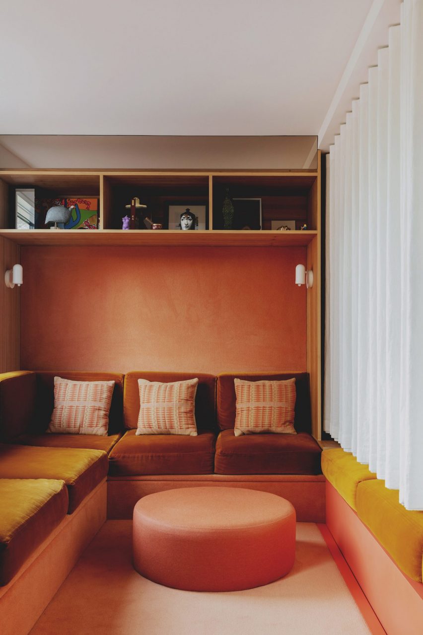
Architecture office Studio Hagen Hall transformed this townhouse in north London, decorating its interior with a scheme that nods to 1970s Californian modernism.

The lounge includes a custom sofa upholstered in a mustardy, orange-hued velvet. Beneath the sofa and across the walls, a peach carpet covers the surfaces as well as a circular ottoman at the foot of the sofa.

Find out more about London townhouse ›


Casa Lana by Ettore Sottsass
Photo is by Gianluca Di Ioia

Casa Lana, Milan, by Ettore Sottsass

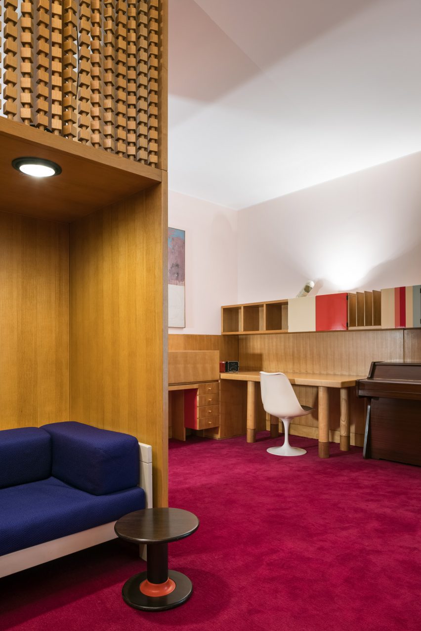
In 2022, the Triennale di Milano museum reconstructed the interior of a Milanese apartment that was designed by Memphis Group founder Ettore Sottsass.

A magenta-coloured carpet runs through the interior of the replica apartment, while wood-clad and boldly upholstered soft furnishings in contrasting blue hues were also placed in the room.

Find out more about Casa Lana ›


Winona House by Reigo and Bauer
Photo is by Lisa Petrole

Winona House, Canada, by Reigo and Bauer

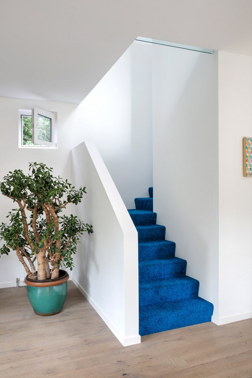
At Winona House, a family home in Toronto that was designed by local architecture studio Reigo and Bauer, residents and visitors are met by a bright blue carpet in the entrance hall that covers the stairs to the home’s upper levels.

Pops of colour were added throughout the home, including on the exterior, which features a hot pink-painted entrance that is surrounded by black shingles.

Find out more about Winona House ›

This is the latest in our lookbooks series, which provides visual inspiration from Dezeen’s archive. For more inspiration see previous lookbooks featuring pop-up shop interiors, kitchens with marble surfaces and interiors with stone furnishings.

Reference