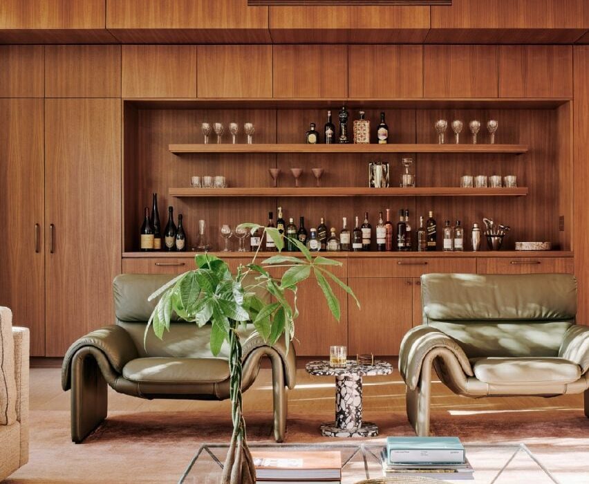
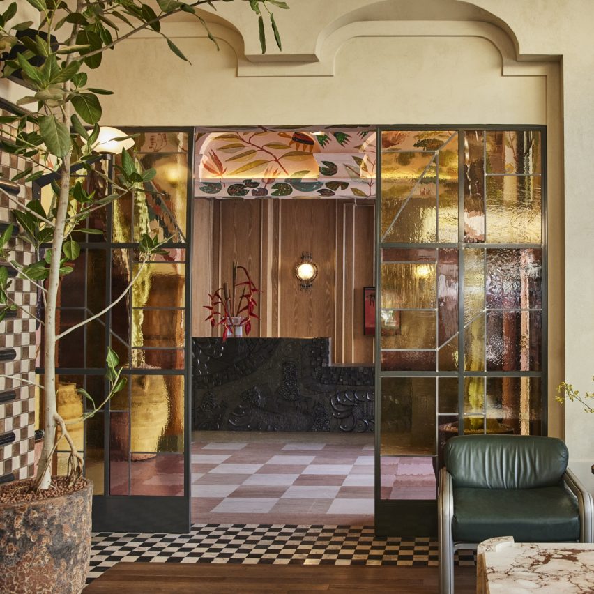
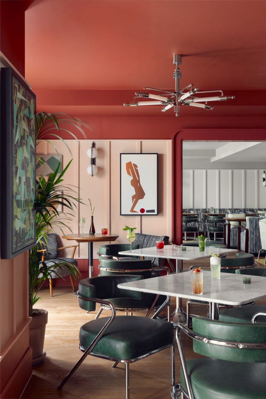
Eight hotel interiors enriched by decadent jewel tones
CategoriesInterior Design

Eight hotel interiors enriched by decadent jewel tones

Plush velvet upholstery, Moroccan rugs and chinoiserie-style ottomans feature in this lookbook of hotel interiors that use saturated jewel colours to bridge the gap between cosiness and luxury.

Shades of ruby red, cobalt blue and emerald can help to create interiors that are rich in depth and dimension, especially when accompanied by tactile materials such as silk or leather.

Read on for eight hotel interiors that demonstrate how to translate this palette into modern interiors without it feeling stuffy.

This is the latest in our lookbooks series, which provides visual inspiration from Dezeen’s archive. For more inspiration see previous lookbooks featuring 70s-style interiors, biophilic homes and innovative stone furniture.

Jewel toned sitting room in The Chloe hotel in New Orleans
Photo by Paul Costello

The Chloe hotel, USA, by Sara Ruffin Costello

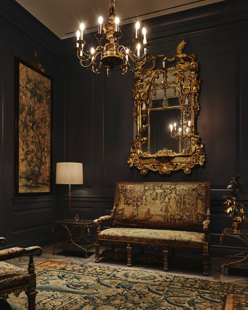
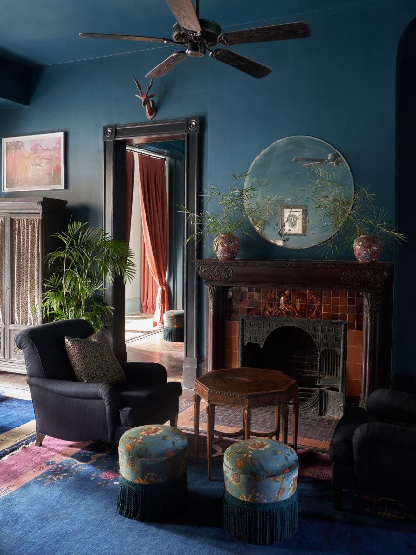
Interior designer Sara Ruffin Costello set out to emphasise the grand Southern Victorian architecture of this 1800s family mansion in New Orleans when converting it into The Chloe hotel (top and above).

Cobalt blue walls and matching chinoiserie ottomans help to complement the building’s original tall ceilings and dark wooden floors, as well as the burnt umber tiles that encircle the fireplace in the reception room.

“The Chloe is moody with dark, antique furniture, with an emphasis on Orientalism but updated and made culturally relevant through a very special art collection,” Costello told Dezeen.

Find out more about The Chloe hotel ›

Jewel toned carpet and couch in Nobu Hotel Barcelona, Spain, by Rockwell Group
Photo by Ricardo Labougle

Nobu Hotel Barcelona, Spain, by Rockwell Group

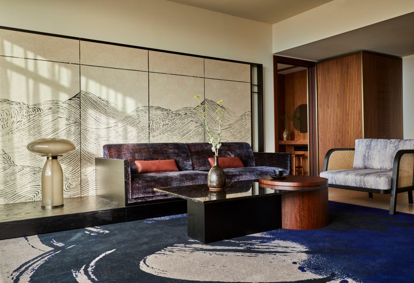
This Barcelona hotel by restaurant-turned-hospitality chain Nobu introduces elements of Japanese craft and design into the Catalan capital, with nods to traditional ink paintings, shoji screens and the gold-lacquer mending technique of kintsugi.

In the hotel’s moody suites, this is realised in the form of inky blue carpets and built-in millwork finished in saturated lacquer colours, while bathrooms feature traditional ofuro soaking tubs.

Find out more about Nobu Hotel Barcelona ›

Esme Hotel by Jessica Schuster Design
Photo by Christian Harder

Esme Hotel, USA, by Jessica Schuster Design

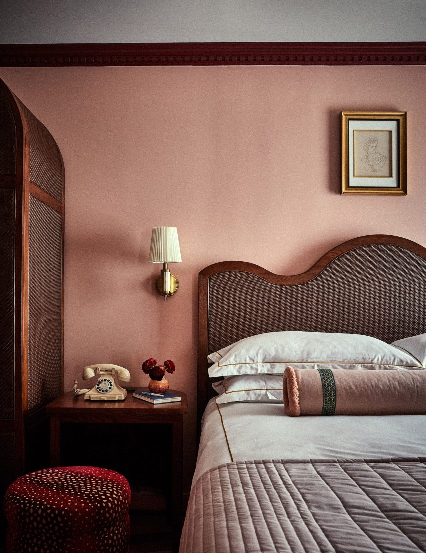
Interior designer Jessica Schuster worked with the Historic Preservation Board of Miami to revive the Mediterranean revival “grandeur” of this 1920s hotel in Miami, making liberal use of plaster and travertine. Pecky cypress, a type of cypress wood containing small holes, was used on the ceilings.

These are complemented by decadent furnishings, vibrantly clashing patterns and saturated colours, with bedrooms finished in either a rose quartz or emerald green colour scheme.

Find out more about Esme Hotel ›
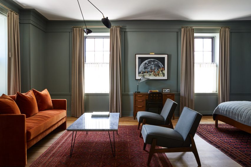

Jewel toned guest room in Hotel Kinsley by Robert McKinley
Photo by Nicole Franzen

Hotel Kinsley, USA, by Studio Robert McKinley

Interior designer Robert McKinley wanted to steer clear of the typical upstate New York aesthetic of “antlers or plaid” when designing Hotel Kinsley in the Hudson Valley.

Set over four historic buildings – including a former bank – the hotel instead draws on an unexpected material palette of boiled wool, intricate garnet-red Moroccan rugs and velvet upholstery in shades of mustard yellow and topaz.

Find out more about Hotel Kinsley ›
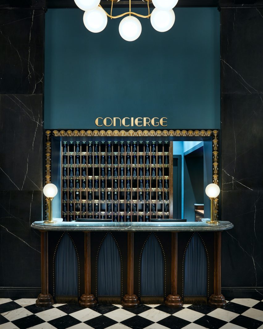

Jewel toned concierge counter at Maison De La Luz by Studio Shamshiri and Atelier Ace
Photo by Atelier Ace

Maison De La Luz, USA, by Atelier Ace and Studio Shamshiri

Housed inside the former annex to New Orleans’ town hall, this 67-room guest house offers a modern take on Southern hospitality by integrating furnishings and artworks that draw on the city’s uniquely multicultural heritage.

Among them are references to New Orleans as the home of America’s first pirate, alongside quirky details such as the sapphire-blue concierge desk, where guests can collect their tasselled keys.

Find out more about Maison De La Luz ›
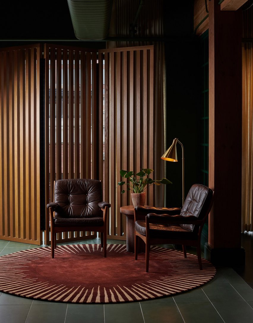

Interiors of Chief members club in Chicago, designed by AvroKO

Chief Chicago, USA, by AvroKO

Down to the service ducts, every surface in the lobby of this Chicago members’ club is painted a rich shade of green, with matching tiles laid across the floor.

This serves to set the backdrop for a mix of eclectic furnishings and abstract artworks, which design firm AvroKO chose to provide an alternative interpretation of traditional old-world luxury.

“Saturated walls are intentionally bold, balanced by the warmth of plush upholstery and broken-in leather, creating approachability with an overall style that is fresh and enduring,” the studio said.

Find out more about Chief Chicago ›
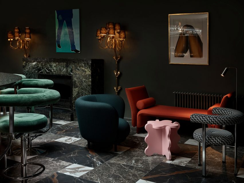

Hotel Torni by Fyra
Photo by Riikka Kantinkoski

Hotel Torni, Finland, by Fyra

Originally built in 1931, Helsinki’s Hotel Torni once served as a meeting place for spies during world war two and was later favoured by artists, journalists and other cultural figures, including Finnish composer Jean Sibelius.

Now, local studio Fyra has renovated the building while preserving its “bohemian ambience”, sticking to a moody emerald-green colour palette and layering different styles of furniture, including modern pieces by Swedish designer Gustaf Westman alongside tubular steel seats that were typical of the time.

Find out more about Hotel Torni ›
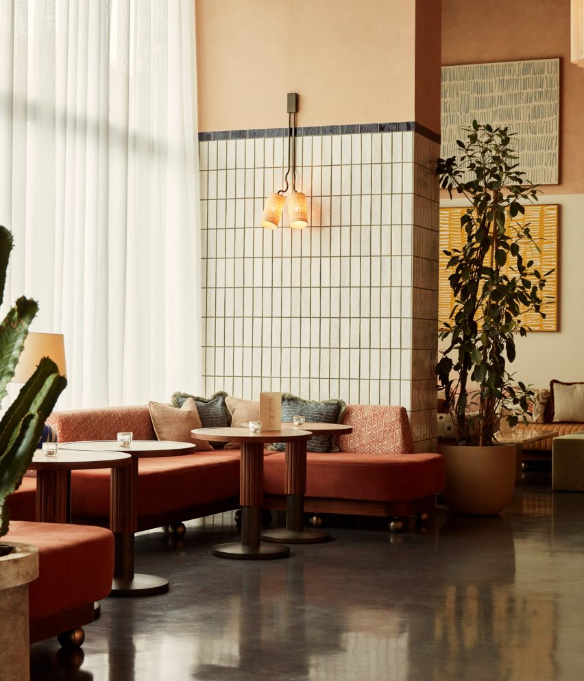

A corner seating section at The Hoxton, Poblenou
Photo by Heiko Prigge

The Hoxton Poblenou, Spain, by Ennismore

The Hoxton’s outpost in Barcelona proves that jewel tones can also work in sunnier climates, drawing on a slightly more muted palette of rust red, mustard yellow and aquamarine.

The scheme was informed by the distinctive colours and forms used by Spanish architect Ricardo Bofill, whose studio was located nearby.

Find out more about The Hoxton Poblenou ›

This is the latest in our lookbooks series, which provides visual inspiration from Dezeen’s archive. For more inspiration see previous lookbooks featuring 70s-style interiors, biophilic homes and innovative stone furniture.

Reference

GSL Gallery takes over disused Parisian factory with “punk” interiors
CategoriesInterior Design

GSL Gallery takes over disused Parisian factory with “punk” interiors

Weathered walls and concrete floors feature in this design gallery that creative collective The Guild of Saint Luke and architecture firm Studio ECOA have set up inside a former factory in Paris.

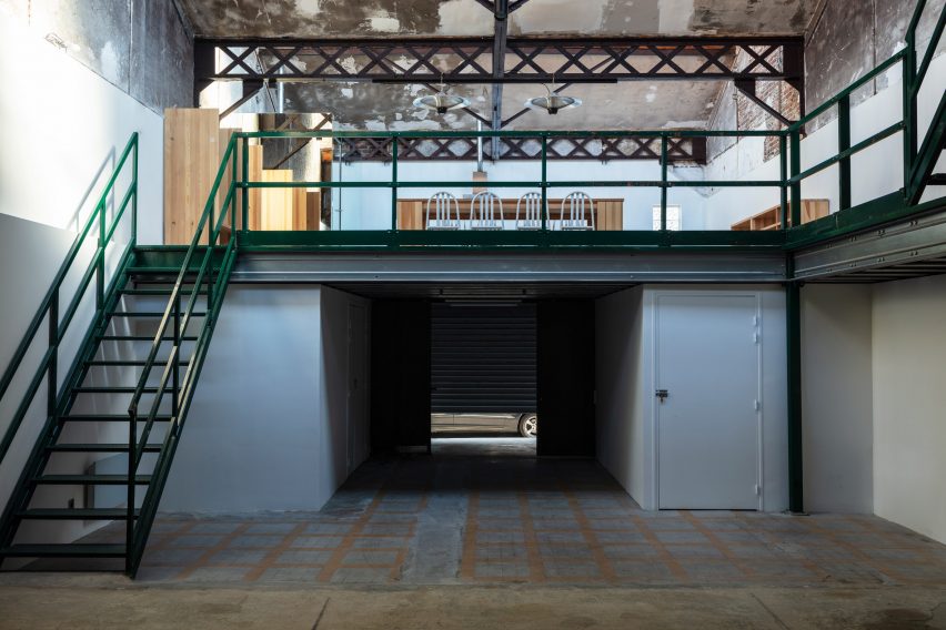
Spread across one storey and two mezzanines, GSL Gallery provides a mixture of studio and exhibition space for the group of architects, artists and artisans that make up The Guild of Saint Luke.

Mezzanine with green staircase by The Guild of Saint Luke
GSL Gallery sits inside an old factory

The gallery occupies a disused factory in Pantin, a neighbourhood in northeastern Paris with a growing arts and culture scene.

In recent years, the building operated as a classic car garage but was purchased by art dealer and gallerist Hadrien de Montferrand during the pandemic with the aim of transforming the site into a gallery.

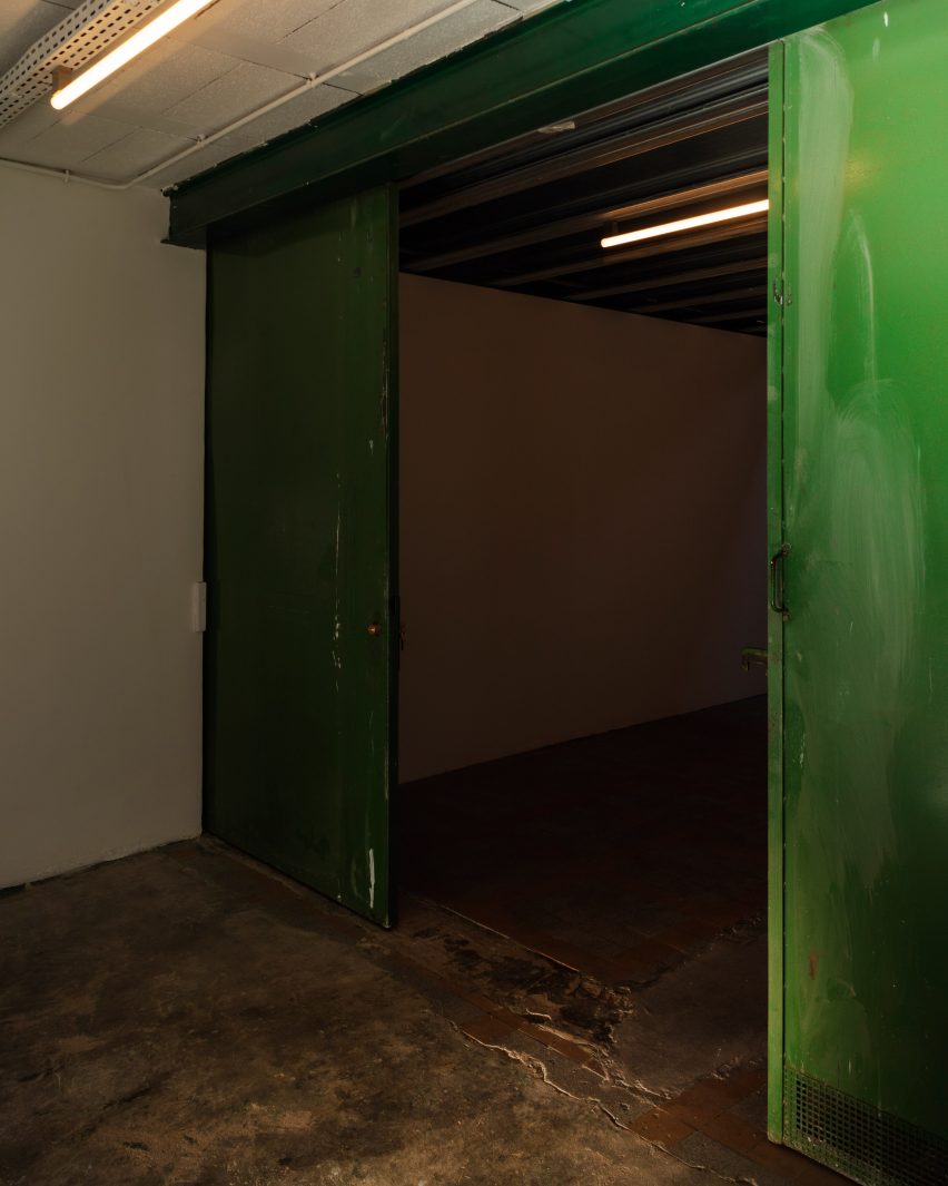
Industrial hallway with concrete floors and green metal doors
The building’s concrete floors were retained

De Montferrand enlisted locally based Studio ECOA to carry out all the necessary architectural changes and asked The Guild of Saint Luke (GSL) to steer the building’s design and become its first tenant.

“We were charmed by the space and found the patina and raw walls to be punk and accidentally on-point,” GSL’s creative director John Whelan told Dezeen.

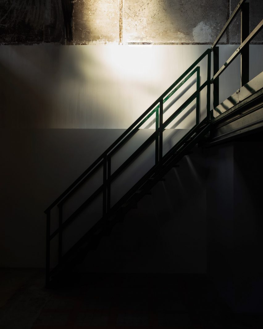
Close-up shot of green metal staircase
Clean white panelling was added to give the space the look of a typical gallery

“Working in close collaboration with Studio ECOA, we proposed a project that retained all of the rawness of the spaces with very minimal design interventions,” he continued.

“We felt that it would be criminal to interfere with the existing mood, which is melancholic and eerily beautiful.”

Studio ECOA restored the building’s facade and aluminium roof, as well as preserving its original concrete flooring.

The Guild of Saint Luke opens GSL Gallery in Paris
A live-work space can be found on GSL Gallery’s first mezzanine

Boxy storage units were built on either side of the front door to form a corridor-like entrance to the ground floor, where white panelling was added across the lower half of the patchy, time-worn walls to emulate the look of a typical gallery.

This ground-floor space will be used to display a changing roster of avant-garde installations, which GSL hopes to finance by using the gallery’s workspaces to produce more commercial projects for design brands.

“Commercial endeavours will help to fund more proactive ‘passion projects’, where we will exhibit GSL’s own designs along with designers and artists that we admire,” Whelan said.

“Our chief motivation is creative freedom, as we hope to produce installations that do not necessarily adhere to a commercial brief.”

The Guild of Saint Luke opens GSL Gallery in Paris
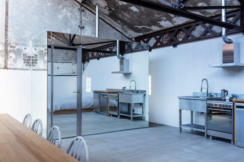
Bathroom facilities are contained in a mirrored volume

The building’s two existing mezzanines were cut back to create a central atrium, which draws natural light into the gallery’s interior.

The lower mezzanine now houses a hybrid live-work space where GSL members or visiting artists can stay the night.

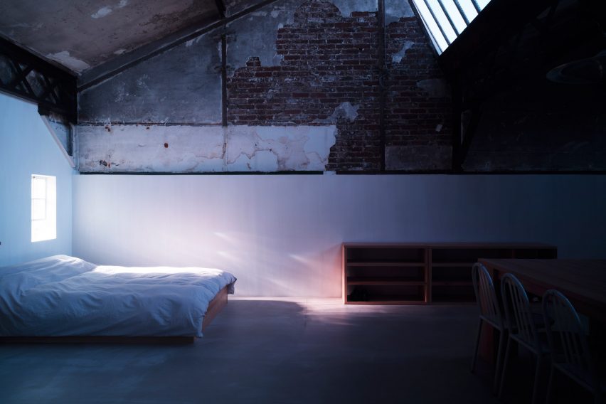
This space is centred by a large Donald Judd-style wooden table and also accommodates a bed, kitchenette and a bathroom concealed within a mirrored volume.

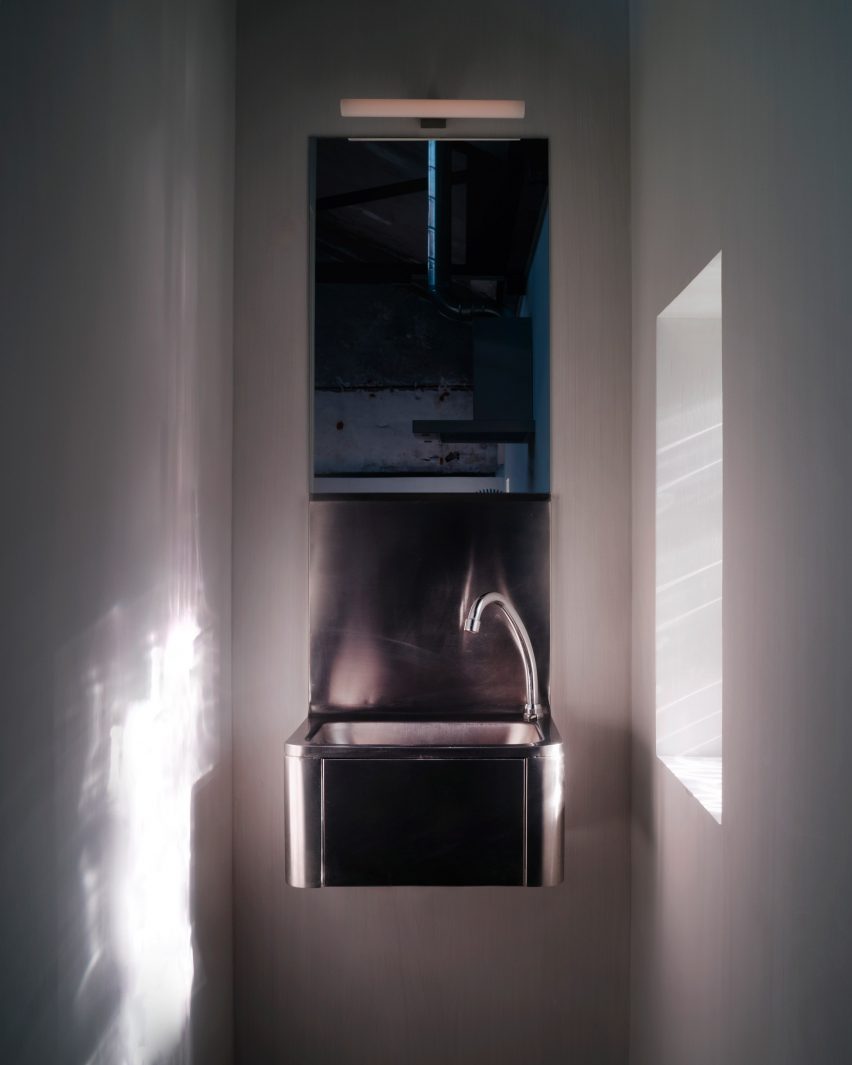
Stainless steel sink in a narrow bathroom
Metal sanitary ware reflects the light in the bathroom

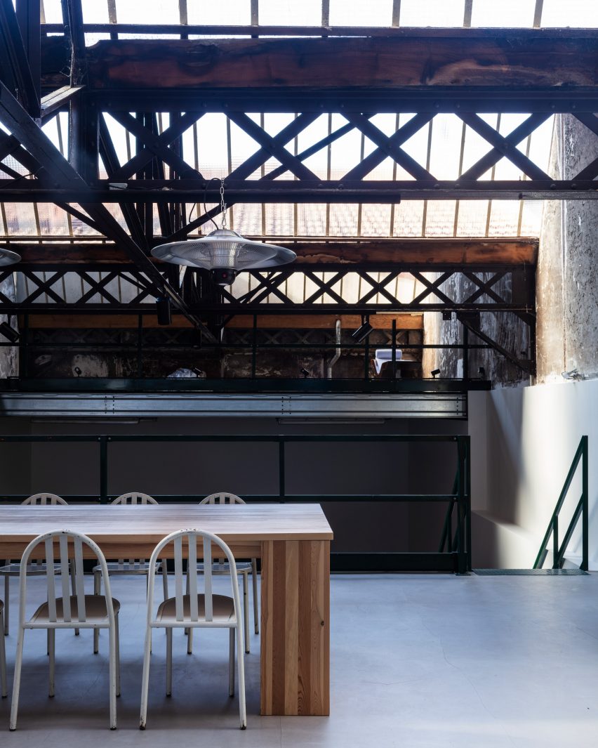
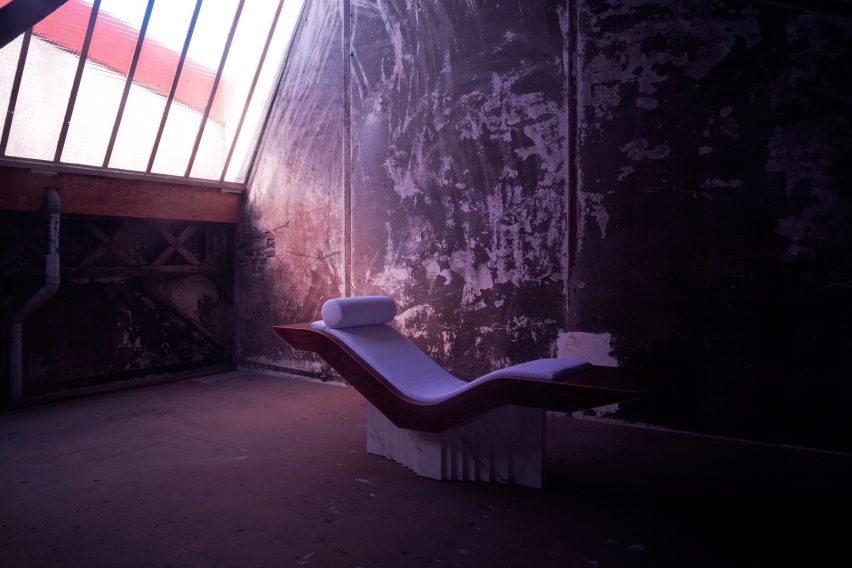
Extra exhibition space is provided on the secondary mezzanine that sits beneath the building’s roof, directly under a series of expansive skylights.

Prior to now, GSL has largely specialised in hospitality interiors – restoring historic brasseries across Paris and devising opulent restaurants such as Nolinski near the Musée du Louvre and Maison Francois in London.

The Guild of Saint Luke opens GSL Gallery in Paris
The lower mezzanine also houses a bed and a large table

“We hope that the gallery will be an extension of the aesthetic that we are trying to develop, embracing new ideas but never abandoning the pursuit of beauty,” Whelan explained.

“It feels like a good time to do so, as Covid has cleared and a mood of optimism in design has emerged. This bracing, minimal space feels almost like a clean slate and invites a multitude of possibilities.”

The Guild of Saint Luke opens GSL Gallery in Paris
The second mezzanine sits directly underneath the building’s skylights

Other recent additions to Paris’s cultural landscape include a major extension of the Musée Albert Kahn by Kengo Kuma and Associates, which made room for a historic collection of 72,000 photographs.

Elsewhere in the French capital, Bruno Gaudin Architectes just completed a 15-year renovation of the National Library of France, incorporating a number of new circulation routes and public spaces.

The photography is by Oskar Proctor

Reference

Bringing the Outside In: Using Biophilic Design Principles to Transform Commercial Interiors
CategoriesArchitecture

Bringing the Outside In: Using Biophilic Design Principles to Transform Commercial Interiors

Modernism was all about clean lines, raw surfaces, and celebrating the uncompromising rationality of the machine. The vision of LeCorbusier was revolutionary in its time, and caught on in ways he would likely not have expected. Today, most of the public spaces we move through, from offices and schools to hospitals and transport hubs, owe something to the modern movement and its penchant for no-frills design.

Not everyone is happy with this state of affairs. Today, there is a renewed interest in the textures, patterns, and curves, the very features of classical architecture that modernists once avoided. Design-thinkers have learned that natural forms, from the vein patterns in leaves to the curves of the human body, are based on fractals rather than grids. As human beings, we find fractals pleasing to the eye and emotionally restorative. Right angles, in contrast, are harsh and even exhausting. This is why so many people describe modern spaces as feeling grim, sterile, or anxiety provoking.

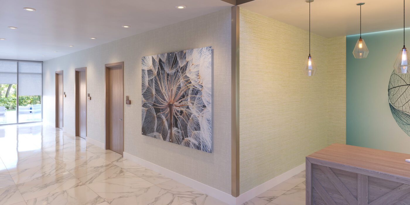
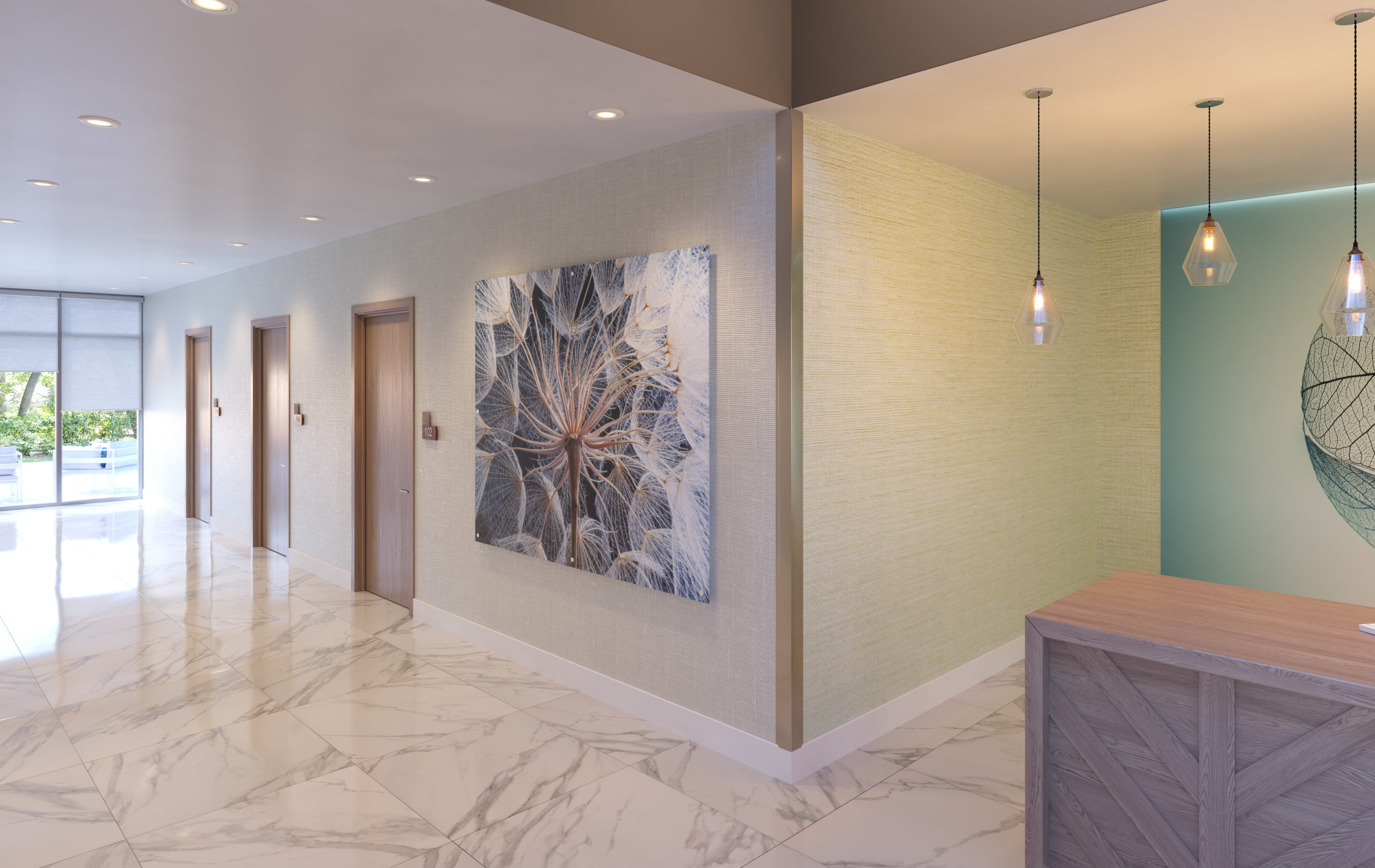
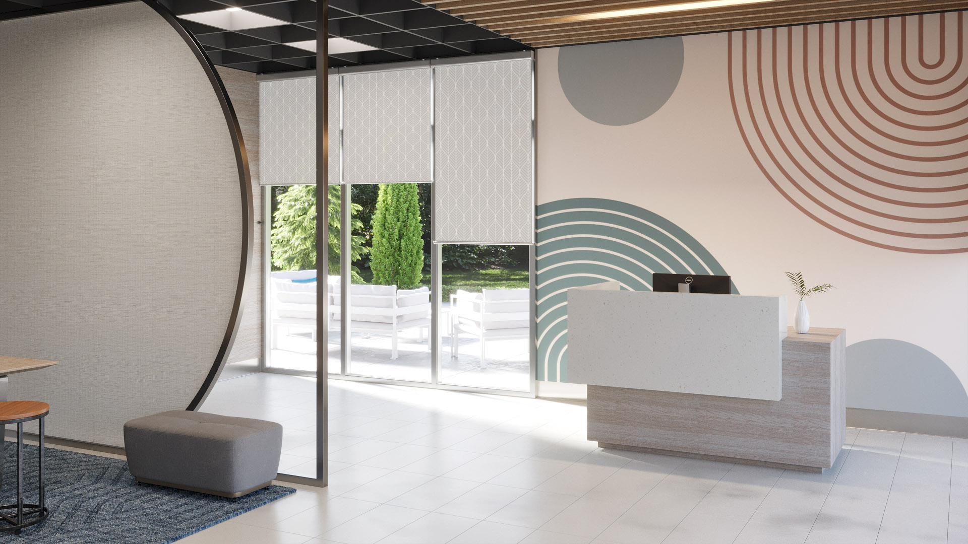
Wall art by Inpro

For architects that are looking to warm a space with natural forms, bringing in some of that fractal energy people literally crave, the experts at Inpro are providing new, high-tech solutions. They create high-end, digital artwork optimized for spaces such as offices, schools, hospitals and more, bringing vitality to spaces that would otherwise be merely functional 

Through their critical design research into art and biophilia, and from the inspiration that guides it, Inpro is looking to make art “work” for the occupants in any commercial building. How art, working through digital imagery or printed on an architectural product, can bring a brand, an idea or even a feeling to life.

Nick Cotter, Creative Director at Inpro, says: “The right image can have a calming effect, especially in healthcare environments where patients might be experiencing anxiety, fear or pain. Images of nature offer serenity in an otherwise sterile space, while bright and colorful artwork can stimulate interest and put smiles on faces.” Studies have shown that looking at images of nature is healing, much like spending time in nature. Art, then, is a crucial component of any healthcare space. 

As the company explains in their Imaging Products brochure, “North Americans spend nearly 90% of their time indoors. . . Whether it be promoting healing in healthcare, productivity in office environments, stimulating creativity in education, triggering brand recognition in hospitality or reinforcing positive transactions in retail and restaurant, the use of imagery, pattern and color can have an influence. . . these influences are seen even in our sleep, diet and mood.”

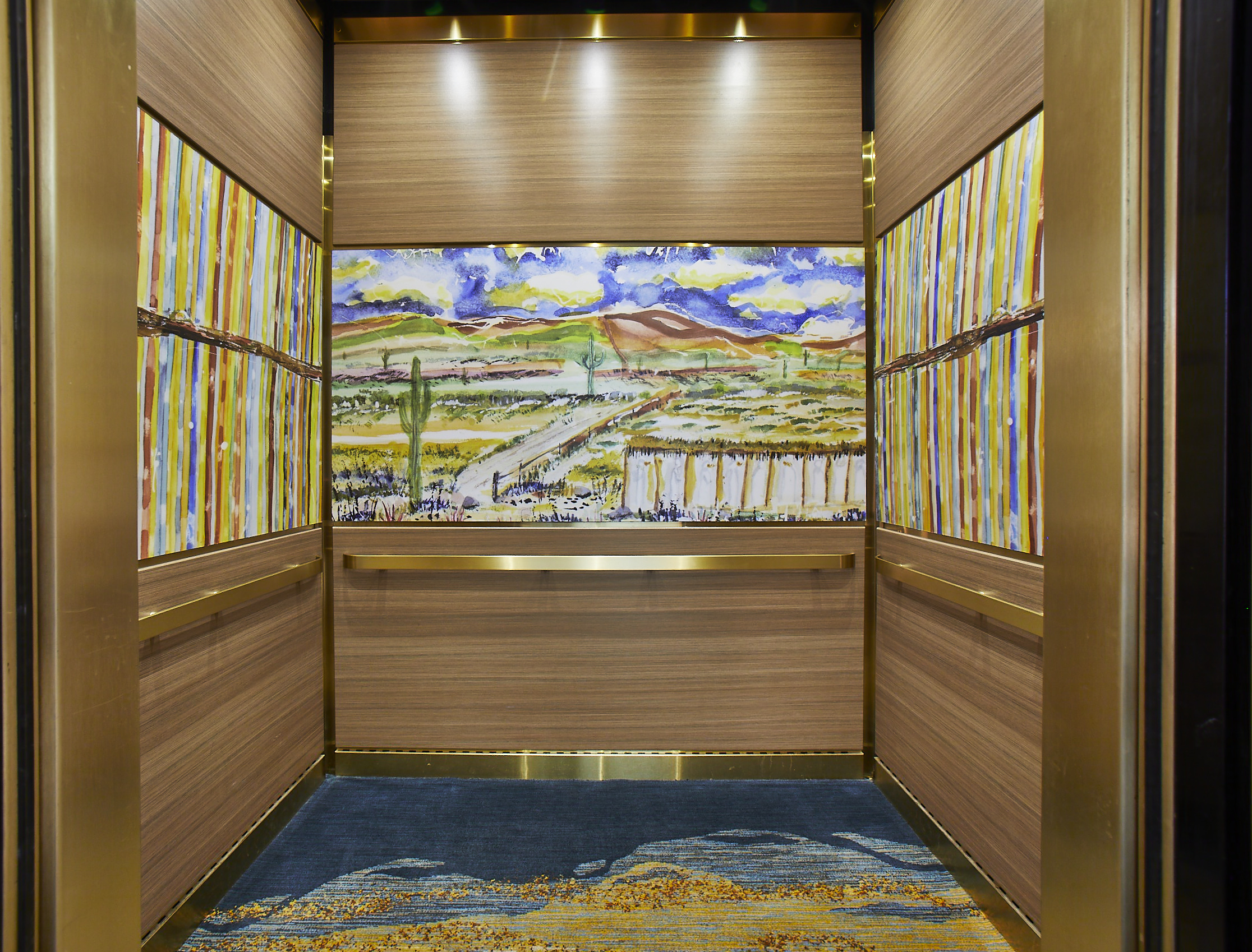
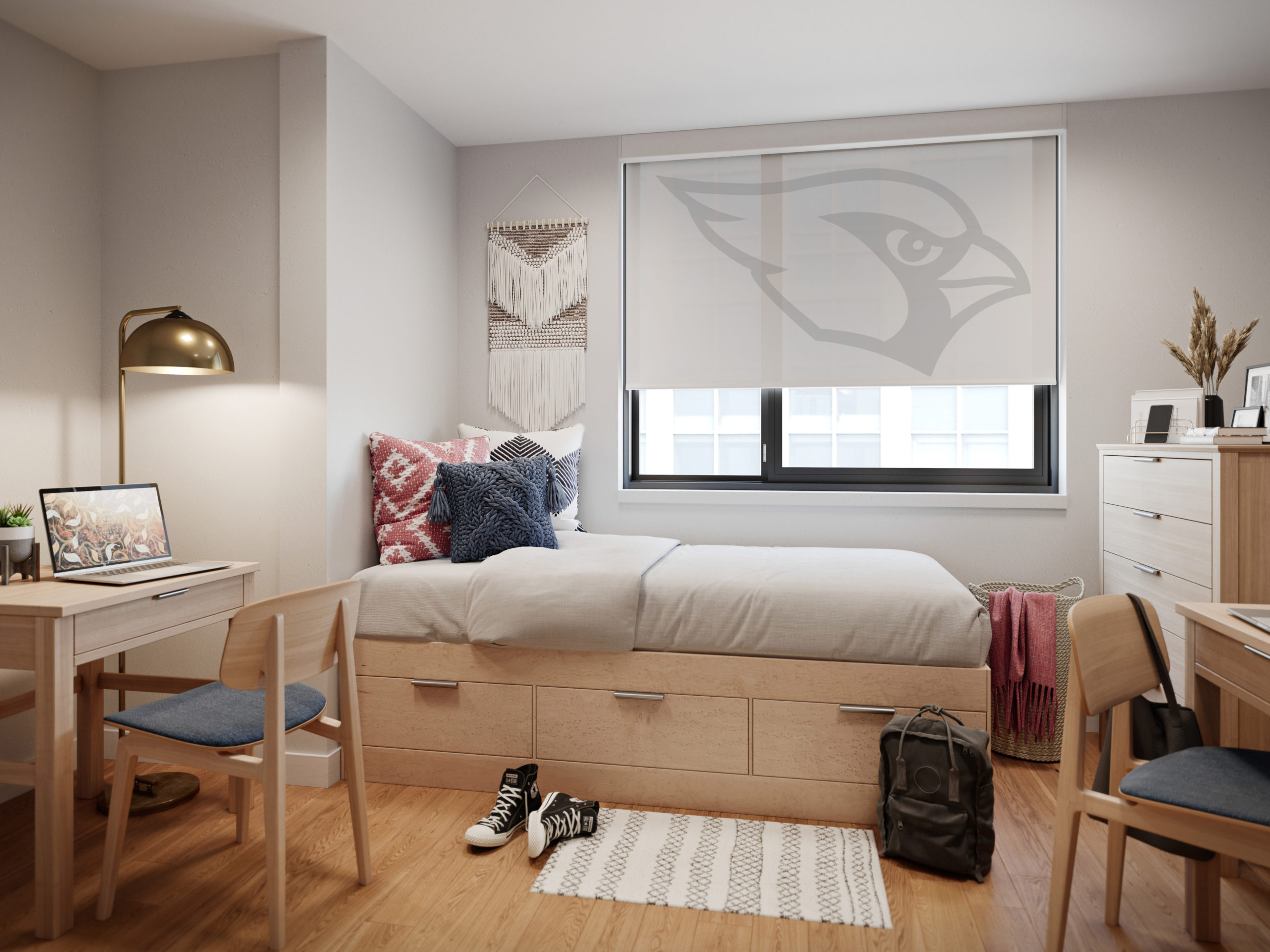
Inpro offers six product types for people looking to bring art and photo prints into their office, including Aspex® Printed Wall Protection, a printed, protective wallcovering that can be applied directly to the wall at virtually any size, and printed wall art, which hangs on the wall just like a painting. The brand also produces printed signage, which allows art to be integrated in creative ways throughout the space, durable wall panels that can be used in high traffic spaces like elevator interiors, and printed window shades, which can turn any office into a room with a view. Made from fiberglass, polyester, vinyl, and acrylic, these high-tech Solar Shades help to block glare and unwanted heat while still allowing a degree of natural light.

Elevator interior with prestige gold trim and Aspex panels showcasing local artwork.

Each of these products is durable and super high resolution. Furthermore, they are fully customizable. Inpro works with clients to select imagery suited to their brand. If no stock images fit the bill, the brand can help facilitate collaborations between clients and local artists to curate unique artwork for their space. In 2023, Inpro is also launching curated art galleries that can be printed on products based on moods, including categories like “comfort”, “focus”, “restore”, “inspire” and “energize”.

 The key is to think about your design needs, choose a theme, and stick to it. Like a real natural landscape, the whole is greater than the sum of its parts, and artworks function better when they are placed in harmonious relation to one another. Through the careful selection of Inpro products, shades can be integrated with wall coverings, art, and signage, creating a fully integrated space.

Personalized dorm room window shades by Inpro

“Adding imagery throughout your spaces brings continuity throughout your building and how people experience it,” Dan Roller, Product Manager at Inpro, explains. “For example, use an overall nature theme and create variations on each floor to help people remember different locations and change up the scenery.” This type of cohesiveness will strengthen your brand, whatever industry you are in, and elevate the experience of clients or other visitors to your professional space.

If biophilia isn’t your thing, Inpro can also create graphics that have a more streamlined, minimalist look. The key thing to remember is that with new digital imaging and printing techniques, the possibilities are endless when it comes to wall coverings. One is not limited to solid colors or patterned wallpaper. Any image you can think of can find a place on your walls, your signs or your window treatments.

Coordinated window shades and wall art by Inpro

Art is no longer something that hangs on the wall – an ornament for spectators to gaze at – but something that is ultimately functional, helping spaces work better for everyone. This sounds like something even LeCorbusier would approve of.

To learn more about Inpro’s extensive range of architectural products, check out their website and their brand profile on Architizer, or download their visual inspiration guide here.

Reference

Ten cottage interiors that offer a place for peaceful reflection
CategoriesInterior Design

Ten cottage interiors that offer a place for peaceful reflection

A renovated dwelling in rural China and a converted stable in Ibiza feature in our latest lookbook, which collects 10 cottage interiors that promise rest and relaxation.

Cottages are small dwellings that are traditionally characterised by a sense of comfort and cosiness. However, interior designers are increasingly pushing the boundaries of how to dress the insides of these homes, as seen in these innovative examples.

As the weather cools down in the northern hemisphere, here are 10 calming interior spaces in cottages by architects and interior designers from across the globe.

This is the latest in our lookbooks series, which provides visual inspiration from Dezeen’s archive. For more inspiration see previous lookbooks featuring neutral living rooms, homes in converted warehouses and Bauhaus-informed interiors.


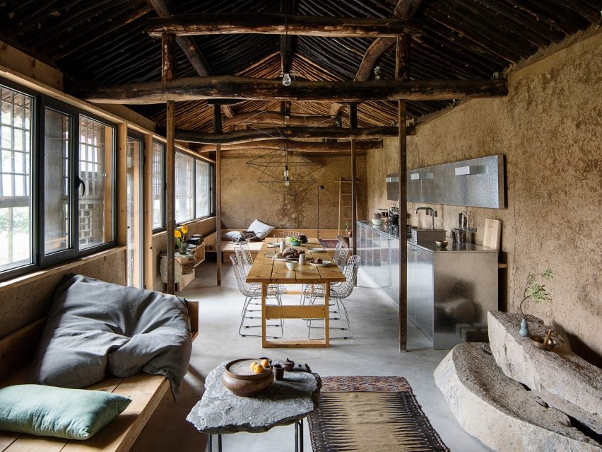
Studio Cottage by Sun Min and Christian Taeubert
Photo is by courtesy of Sun Min and Christian Taeubert

Hai Zhen cottage, China, by Sun Min and Christian Taeubert

Located in Hai Zhen, a village just outside of Beijing, this previously neglected cottage was renovated by fashion designer Sun Min and architect Christian Taeubert.

A large, open-plan lounge area displays a mixture of rustic features such as the original roof and timber beams, which are presented alongside more contemporary elements including stainless steel and spindly, wireframe lighting.

Find out more about this Hai Zhen cottage ›


Barwon Heads House
Photo is by Timothy Kaye

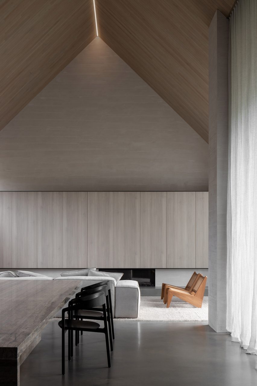
Barwon Heads House, Australia, by Adam Kane Architects

Barwon Heads House is a renovated cottage by Melbourne-based studio Adam Kane Architects with a barn-style extension defined by an open-plan living area.

Shortlisted for the 2022 house interior of the year Dezeen Award, the cottage interior features a monochrome interior palette and statement geometric furniture, such as a pair of Kangaroo Lounge Chairs by designer Pierre Jeanneret.

Find out more about Barwon Heads House ›


House in Hampshire
Photo is by Jim Stephenson

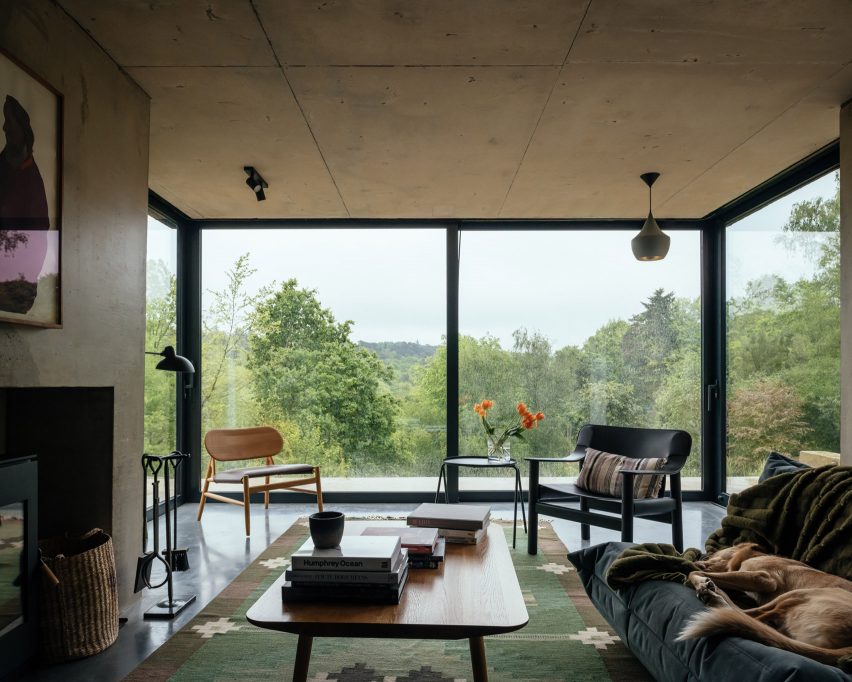
English cottage, UK, by Invisible Studio

Architecture practice Invisible Studio added a double-pitched extension to this cottage that is located on the borders of Hampshire and Surrey in England.

Exposed concrete accents contrast with rectilinear sliding glass doors in the living space, which cantilevers over the sliding patio doors below with the support of a concrete chimney.

“All the materials are fair-faced so had to be perfectly made,” explained studio founder Piers Taylor. “Nothing is covered up and everything exposed.”

Find out more about this English cottage ›


Ibiza Campo by Standard Studio & Ibiza Interiors
Photo is by Youri Claesens

Casa Campo, Ibiza, by Standard Studio

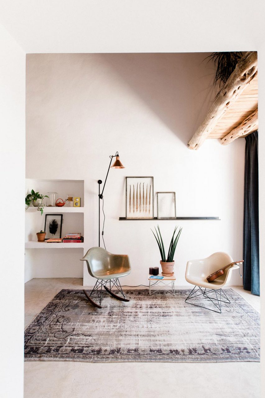
Casa Campo is a cottage in Ibiza that Standard Studio converted from a 200-year-old stable to an off-grid showroom and home for the owners of an interior design shop.

Original beams crafted from Ibiza’s native Sabina pine trees are paired with contemporary low-slung furniture in the double-height living space that is illuminated by bright white walls.

Find out more about Casa Campo ›


Artist retreat
Photo is by Jim Stephenson

Made of Sand, UK, by Studio Weave

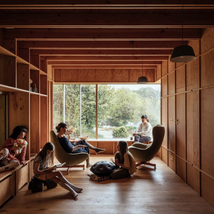
Architecture office Studio Weave designed a wooden extension to a stone cottage in Devon’s Blackdown Hills in the English countryside, which was created as a creative workspace for its owners and visiting artists.

Called Made of Sand, the extension’s interior is defined by built-in timber window seats and wall storage that is framed by large glass windows.

“The contrast between materials, old and new, in and out, are foregrounded to create a distinct sense of rest and relaxation in the new spaces,” said studio director Je Ahn.

Find out more about Made of Sand ›


Naturehumaine La Breche
Photo is by Ronan Mézière

La Brèche, Canada, by Naturehumaine

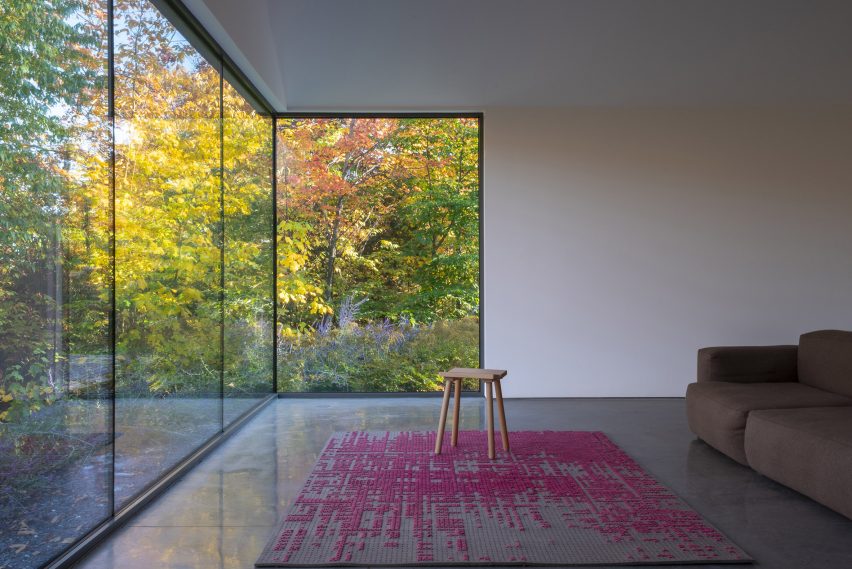
Two volumes connected by a walkway make up La Brèche, a ski cottage in Quebec by Montreal studio Naturehumaine that features facades informed by the area’s vernacular architecture.

Floor-to-ceiling corner windows illuminate the living space, which is characterised by a polished concrete floor and minimal accents of colour and texture.

Find out more about La Brèche ›


Muskoka cottage
Photo is by Joel Esposito

Muskoka Cottage, Canada, by Studio Paolo Ferrari

Named after its location in Canada’s Muskoka region, this cottage interior features exposed finishes informed by the surrounding natural forests and the area’s geological details.

These include sandy-hued, Douglas fir exposed ceilings and large slabs of granite that make up various statement islands throughout the home, as well as a large fireplace in the living space.

“The granite is coarse-grained and hard,” noted Studio Paolo Ferrari. “It references the minerality of the site and imbues the interiors with a sense of ruggedness.”

Find out more about Muskoka Cottage ›


Marlboro Music Cottages by HGA
Photo is by Paul Crosby Photography

The Marlboro Music Cottages, USA, by HGA Architects and Engineers

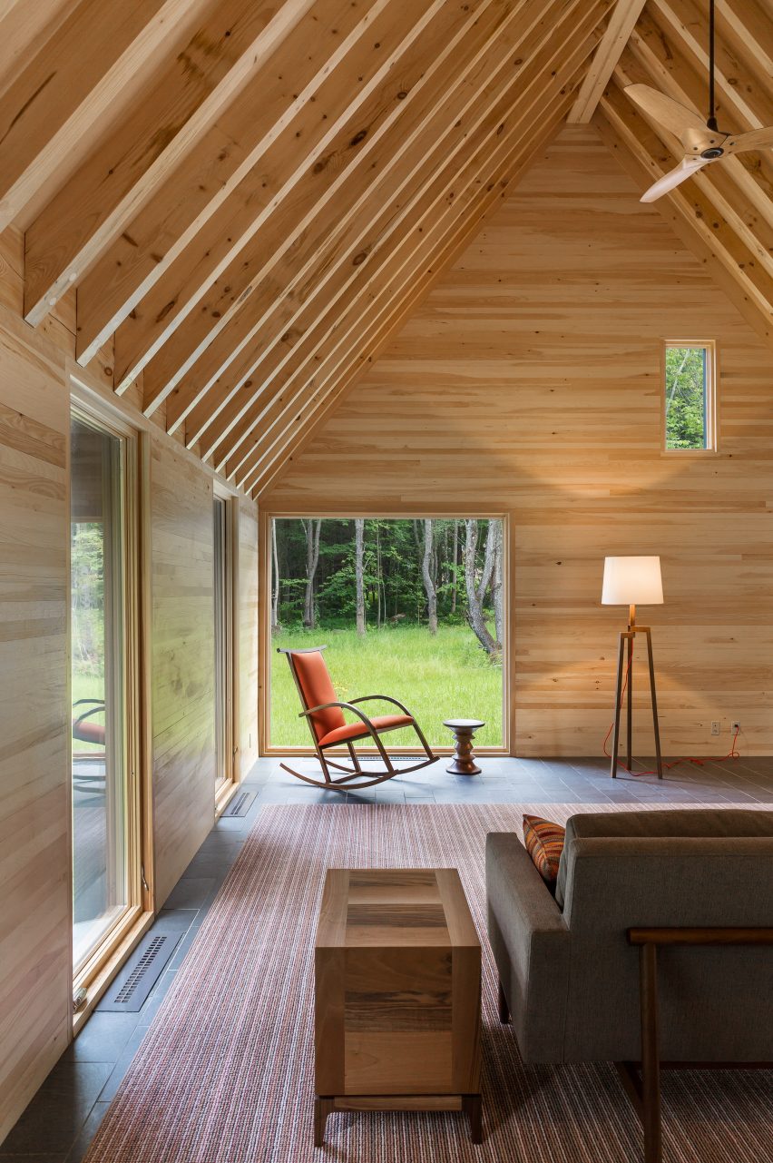
The Marlboro Music Cottages are a series of cabin-style dwellings by HGA Architects and Engineers (HGA) for musicians staying in New England over the summer during the Marlboro Music School and Festival, an annual event.

HGA took cues from the single-storey boxy dwellings with gabled roofs that populate Cape Cod for the cottages’ architecture. Cedar plank cladding and pitched roofs were used to embrace the homes’ natural setting.

Inside, the cottage interior features exposed timber ceilings, pine-sheathed walls and slate flooring, adding to this pared-back approach.

Find out more about The Marlboro Music Cottages ›


Birdseye Lathouse
Photo is by Michael Moran

Hamptons cottage, USA, by Birdseye Design

A double-height living space offers views of the surrounding Hamptons at this cottage by architecture studio Birdseye Design, which is wrapped in thin wooden slats that nod to local traditional buildings.

Eclectic geometric furniture makes up dining and living areas that anchor the west side of the property and open out onto an outdoor dining space.

“Operable glass walls open to a large stone terrace off the living room and the kitchen opens to a wood-slatted, pergola-covered porch,” said Birdseye.

Find out more about this Hamptons cottage ›


Captain Kelly's Cottage by John Wardle Architects
Photo is by Trevor Mein

Captain Kelly’s Cottage, Tasmania, John Wardle Architects

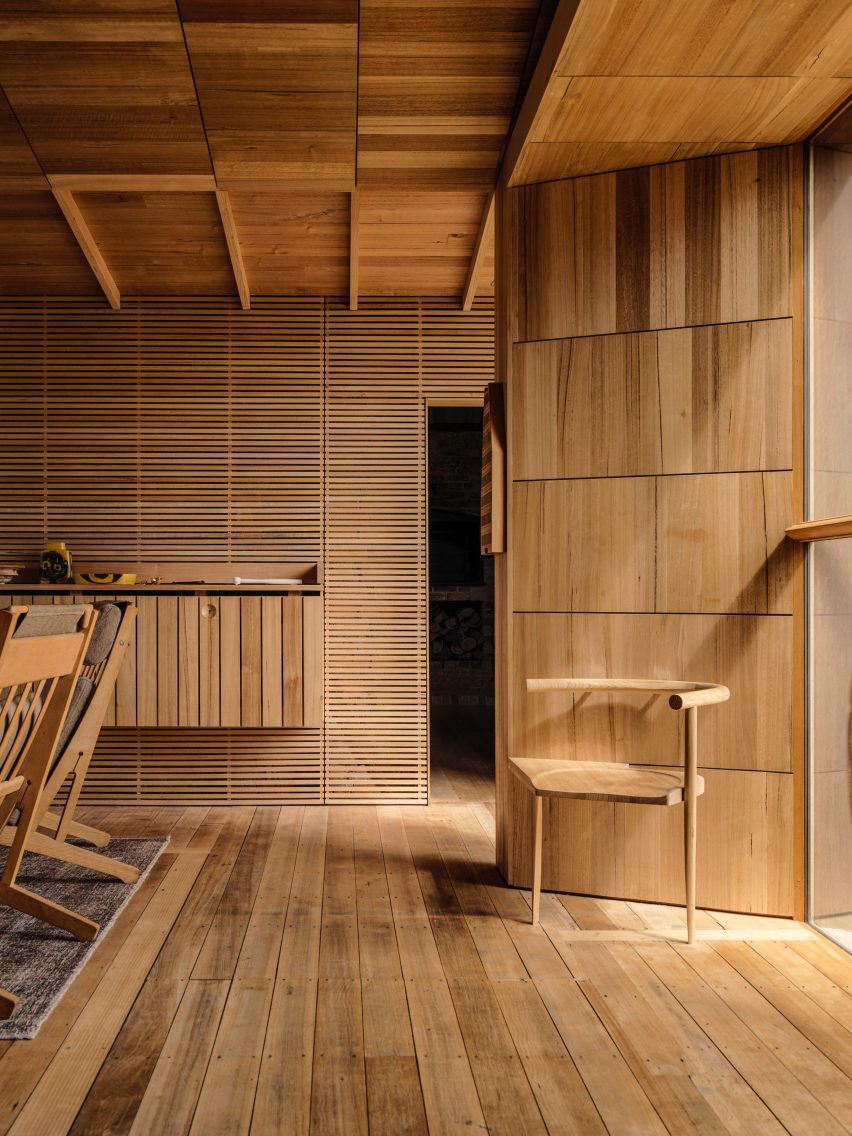
Australian studio John Wardle Architects has repaired this weatherboard cottage in Tasmania, which originally belonged to its architect, harbourmaster Captain Kelly, in the 1840s.

Furniture created from materials left over at the end of the project’s renovation feature in its updated design, while a focus on wooden interiors maintains a sense of the dwelling’s history.

“Over 175 years there had been many unsympathetic alterations to the small cottage,” said the studio. “Part of our work involved the removal of these non-original works, to respectfully return the cottage to its original form.”

Find out more about Captain Kelly’s Cottage ›

This is the latest in our lookbooks series, which provides visual inspiration from Dezeen’s archive. For more inspiration see previous lookbooks featuring neutral living rooms, homes in converted warehouses and Bauhaus-informed interiors.

Reference

Jaqui Seerman updates interiors of LA bank building to create Hotel Per La
CategoriesInterior Design

Jaqui Seerman updates interiors of LA bank building to create Hotel Per La

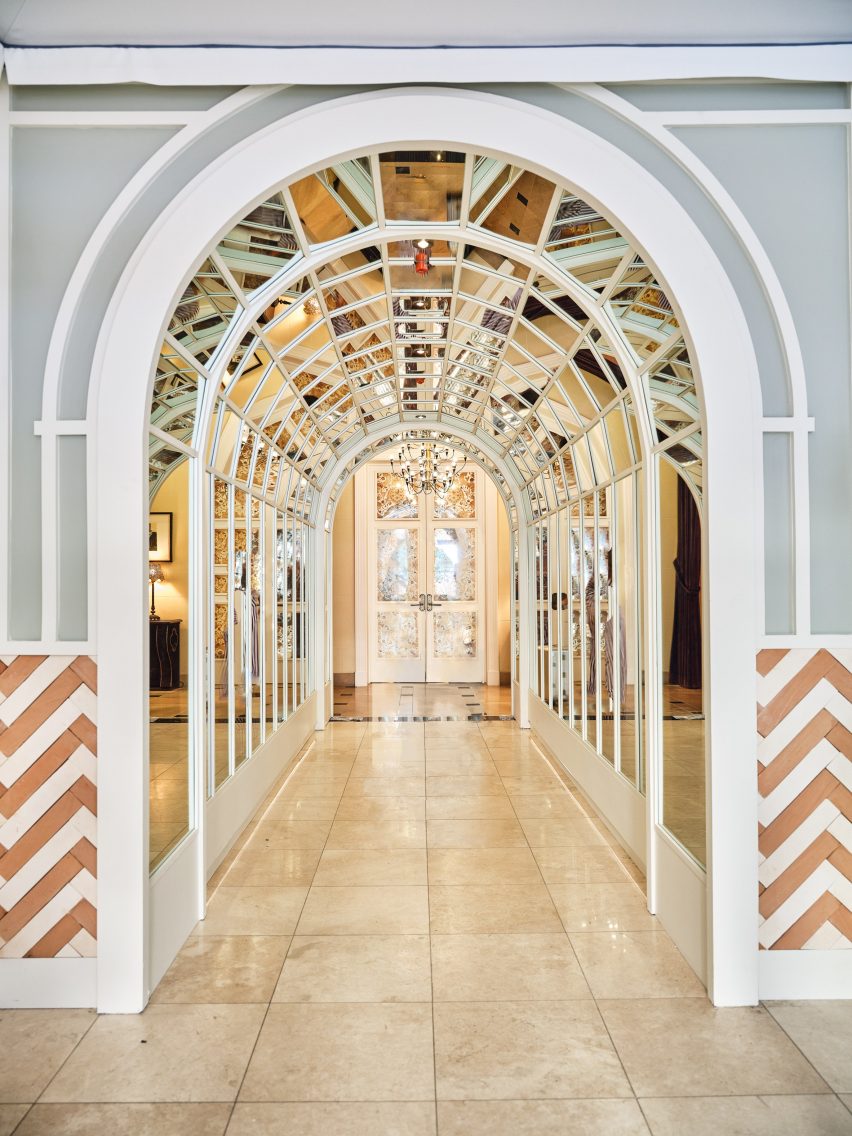
A new hotel occupies 1920s bank headquarters in Downtown LA, where Jaqui Seerman refreshed public spaces to include a botanical-themed lounge and a mirror-lined arched gallery.

Hotel Per La is housed in the neoclassical Giannini Building, built in 1922 as the headquarters for the Bank of Italy, and takes the place of the NoMad Los Angeles which closed its doors in March 2021.

Double-height lounge
Hotel Per La replaces the Nomad Los Angeles in the 1920s bank headquarters

Its 10,000 square feet (930 square metres) of public and event spaces have been refreshed by local interior designer Jaqui Seerman, who used the 12-storey property’s Italian connection to inform her updates.

“A nod to the building’s storied beginning as a bank for the people, the ‘Per La’ name translates to ‘for the’ in Italian,” said the hotel.

“[The bank’s] founder, Amadeo Pietro Giannini, believed in the dignity and abilities of those commonly overlooked, signifying the hotel’s inclusive spirit and name, essentially meaning ‘for Los Angeles, and people like you’.”

A mirror-lined arched gallery
A mirror-lined arched gallery opens into the main lobby

Demarcated by a pale blue awning, the hotel’s entrance has been relocated from 7th Street to Olive Street, leaving the doric columns across the grand facade fully visible.

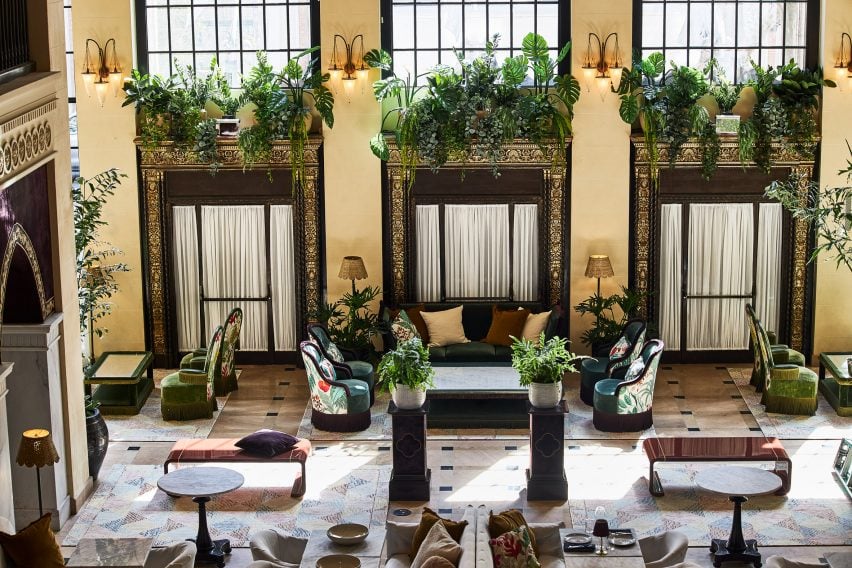
Through the doors, guests find themselves in a double-height lounge filled with plants and comfy chairs covered in botanical patterns.

Reception
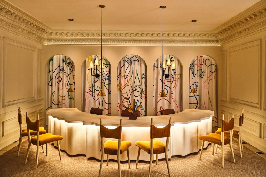
The custom front desk is by Voila Creative Studio and the hand-painted tapestry behind is by Jessalyn Brooks

An arched gallery lined with mirrors leads to the lobby, situated in what was once the main banking hall.

In the reception area, a custom-made curved plaster front desk influenced by linen fabric was designed by Voila Creative Studio, while a hand-painted tapestry that hangs in the niches behind was produced by LA muralist Jessalyn Brooks.

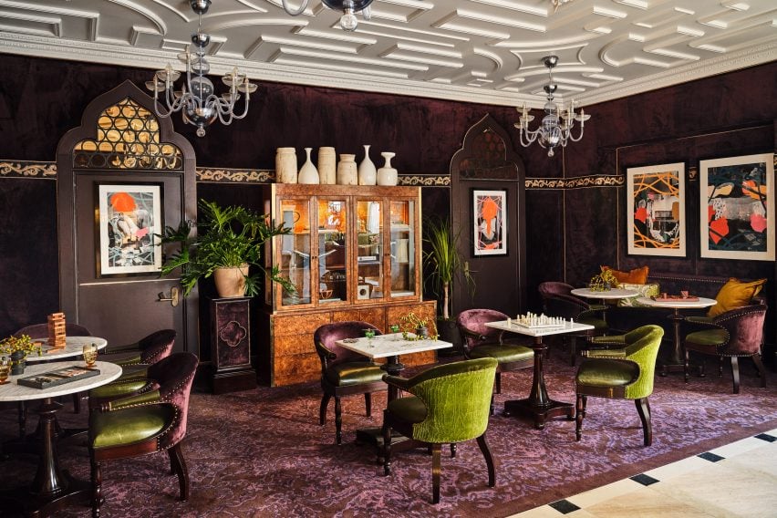
Purple games room
A purple games room features commissioned art and furniture from local artisans

A rich purple lounge features a new game cabinet, as well as commissioned art and furniture sourced from local artisans.

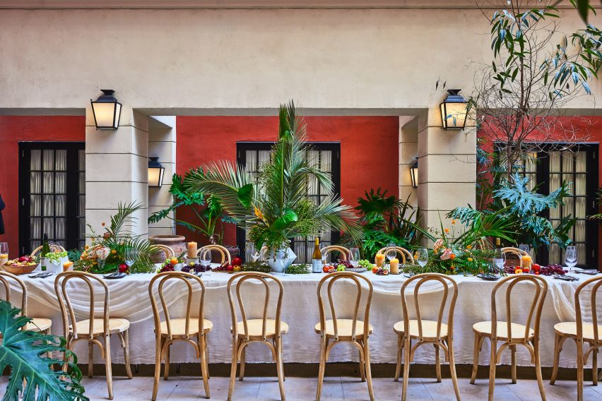
Event spaces range from a second-floor courtyard for private outdoor dinners, to larger spaces for up to 850 people.

Dining table in outdoor courtyard
A second-floor courtyard hosts private outdoor dinners

Dining options within the hotel include Per L’Ora, which serves Italian cuisine and features a light colour palette across curvaceous design elements influenced by the early 2000s.

“The bar of the restaurant acts as a dramatic centerpiece, with a custom-made marble top in shades of green, grey, and white, and globe-shaped light fixtures, while custom white plasterwork on the front of the bar offers a new sense of texture,” said the hotel operators.

Adjacent to the restaurant is a casual cafe modelled on a Venetian coffee shop, serving beverages, pastries and snacks.

On the rooftop, Bar Clara offers cocktails for poolside lounging and hosts live performances with the LA skyline as a backdrop.

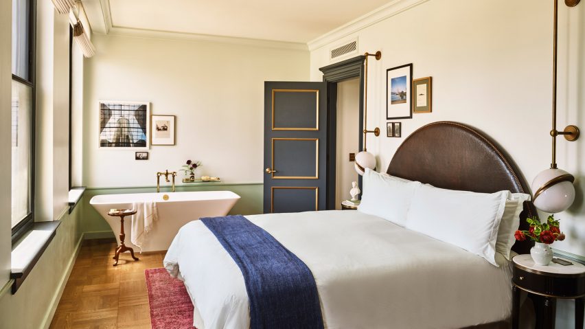
Guest room
Guest rooms are decorated to echo the ornate blue and gold ceiling in lobby

The 241 guest rooms and suites have retained much of the aesthetic created by French architect Jacques Garcia for the NoMad, referencing the restored gold and blue ceiling in the lobby.

Downtown LA, the city’s most walkable neighbourhood, has experienced a cultural renaissance over the past decade.

The hotel occupies the neoclassical Giannini Building
The hotel occupies the neoclassical Giannini Building in Downtown LA

The area is now home to several design-forward hotels including Kelly Wearstler’s Proper – which was just named hotel and short-stay interior of the year at the 2022 Dezeen Awards – a Soho House, and an Ace Hotel.

Per La is the latest hotel in the US to open in a converted bank building, following the likes of The Durham in North Carolina and The Quoin in Wilmington, Delaware.

The photography is by The Ingalls.


Reference

Dezeen announces interiors winners for Dezeen Awards 2022
CategoriesInterior Design

Dezeen announces interiors winners for Dezeen Awards 2022

Dezeen has revealed the winners of this year’s Dezeen Awards interiors categories, which include interiors by Proctor and Shaw, Kelly Wearstler and Woods + Dangaran.

The 11 winners awarded in Dezeen’s annual awards programme are located across nine different countries including Denmark, Taiwan, USA, Belgium and Canada.

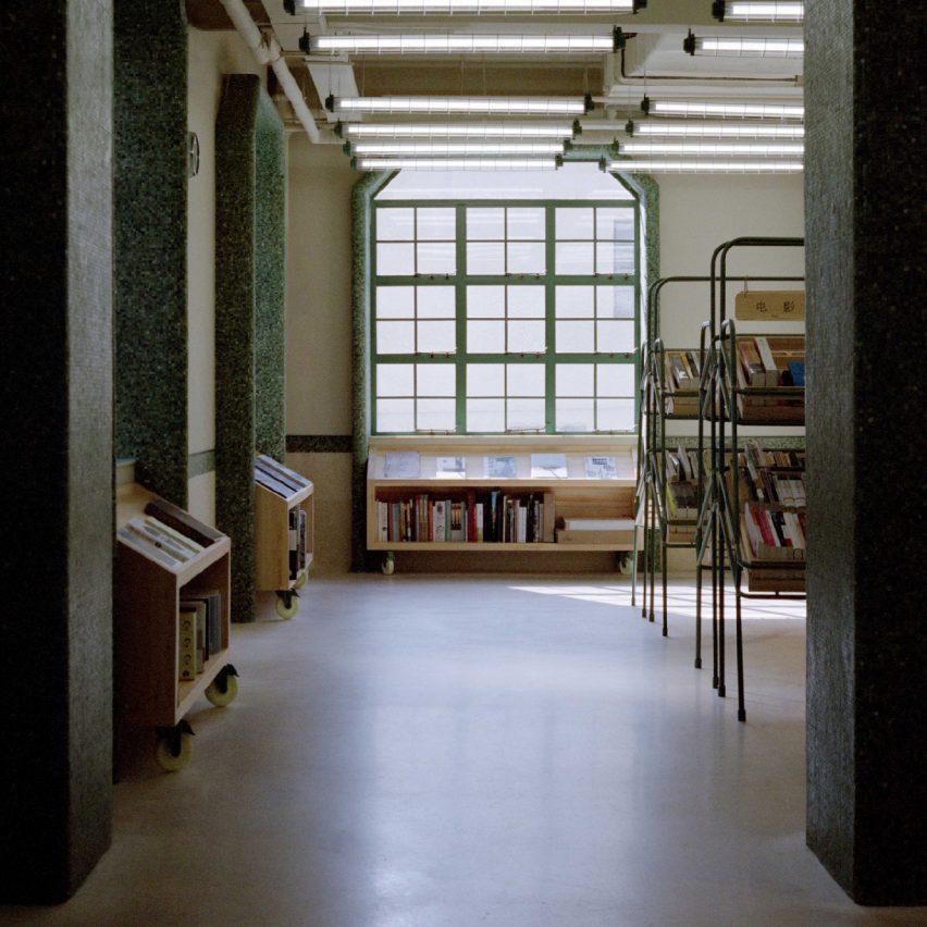
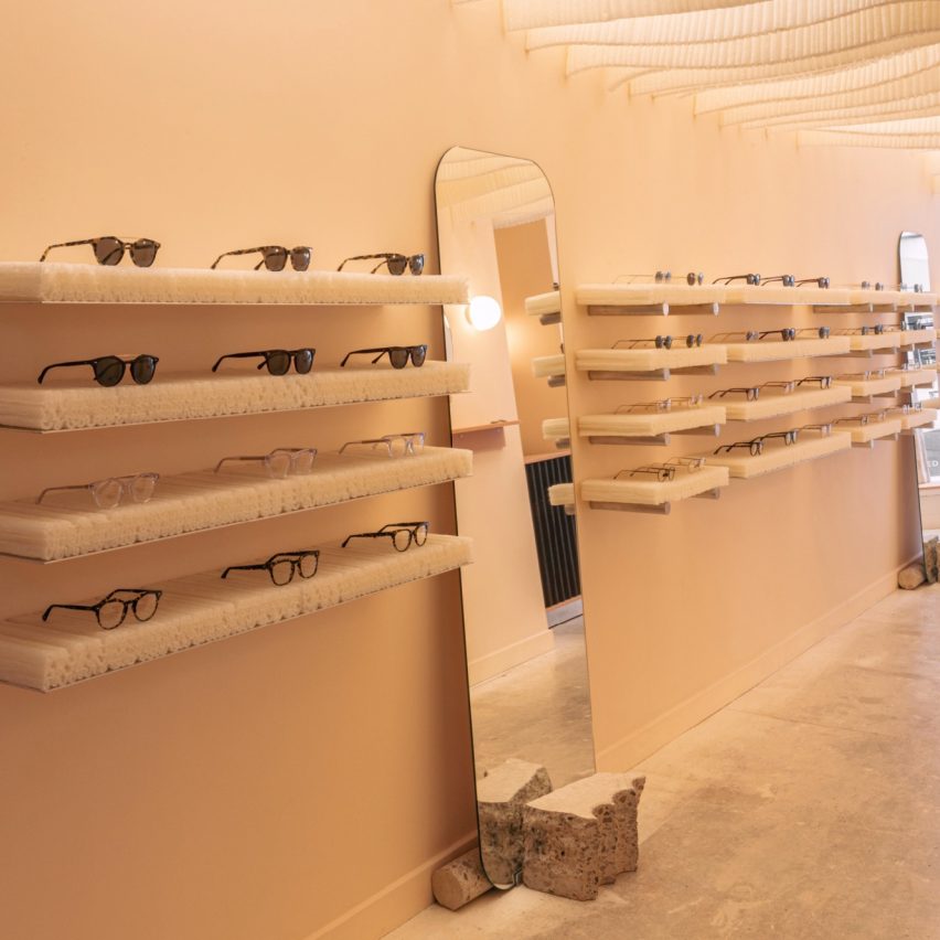
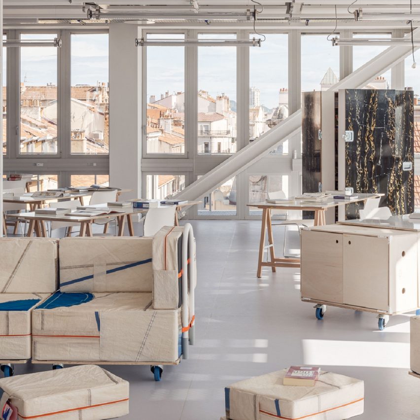
Three interiors that feature various reclaimed materials have been awarded this year, including a supermarket-style secondhand bookshop in China, a design school with mobile furniture in the south of France and a flexible retail interior for Italian eyewear brand Monc on London’s Chiltern Street.

Other winners this year include Atelier Boter for its glass-fronted community hub in a Taiwanese fishing village and Hariri Pontarini Architects for its warm wood-toned clinic in Canada.

Danish studio Tableau and Australian designer Ari Prasetya collaborated to design Connie-Connie Cafe at the Copenhagen Contemporary, winning them restaurant and bar interior of the year.

Entries were initially scored by our jury of 25 leading international interior designers before the winners were decided by a master jury that met at One Hundred Shoreditch in September and was made up of Lore Group creative director Jacu Strauss, Studiopepe co-founder Chiara Di Pinto and London-based fashion designer Mary Katrantzou.

They were joined by Design Haus Liberty founder Dara Huang and French architect and designer India Mahdavi.

The 11 project winners will now compete to win overall interiors project of the year award, which will be unveiled at the Dezeen Awards 2022 party in London on 29 November.

Find out more about the winning interiors projects on the Dezeen Awards website or read on below:


Twentieth by Woods + Dangaran
Photo by Joe Fletcher

House interior of the year: Twentieth by Woods + Dangaran

Twentieth is a three-storey house designed for a couple and their three young children in Santa Monica. Living spaces are organised around a courtyard with a decade-old olive tree with a U-shape ground floor, creating space for living rooms on both sides of the courtyard.

The kitchen and bathrooms designed by Los Angeles studio Woods + Dangaran feature dark grey marble surfaces with streaks of white.

“This project demonstrates a nice interplay between inside and outside and a good mix of different finishes and textures,” said the interiors master jury panel.

Read more about Twentieth by Woods + Dangaran ›


Shoji Apartment by Proctor and Shaw
Photo by Stale Eriksen

Apartment interior of the year: Shoji Apartment by Proctor and Shaw

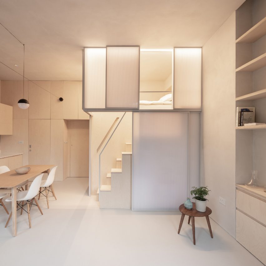
Shoji Apartment is a 29-square-metre micro-apartment in London that features birch plywood joinery throughout its interior.

The apartment has an elevated sleeping area enclosed in translucent panels, which reference Japanese shoji screens and lend the project its name.

“This is a highly innovative solution to the treatment of a challenging space that retains all the functionality of a normal apartment,” said the judges. “We would definitely accept an invitation to dinner!”

Read more about Shoji Apartment by Proctor and Shaw ›


Connie-Connie at Copenhagen Contemporary by Tableau and Ari Prasetya
Photo by Michael Rygaard

Restaurant and bar interior of the year: Connie-Connie at Copenhagen Contemporary by Tableau and Ari Prasetya

Connie-Connie is a 150-square-metre cafe located within the Copenhagen Contemporary art gallery, an international art centre in a former welding facility. Tableau created the overall spatial design while Prasetya was in charge of the design and manufacturing of the bar as well as several other furniture pieces.

The cafe explores how furniture can also be art and features chairs made by 25 designers from offcut wood.

“The project addresses everything we expect from an interior design today, not only does it connect on a physical level, it connects with the community,” said the interiors panel. “There is also an impressive sobriety and humility to the design.”

Read more about Connie-Connie at Copenhagen Contemporary by Tableau and Ari Prasetya ›


Downtown LA Proper Hotel by Kelly Wearstler Studio
Photo by The Ingalls

Hotel and short-stay interior of the year: Downtown LA Proper Hotel by Kelly Wearstler Studio

American designer Kelly Wearstler transformed the interior of the Proper Hotel group chain’s new hotel in downtown Los Angeles. Wearstler stripped out alterations made to the 1930s building to reveal existing grand ceilings, checkered tiled floors and wood panelling.

The interiors are furnished with custom furniture as well as vintage furniture and artwork.

“This project exudes a sense of joyfulness that needs to be rewarded!” said the judges. “The interior design evokes an experience that subverts the formality of conventional hotel design through its sense of identity and integrity throughout.”

Read more about Downtown LA Proper Hotel by Kelly Wearstler Studio ›


Dyson Global HQ, St James Power Station by M Moser Associates
Photo courtesy of Dyson

Large workspace interior of the year: Dyson Global HQ, St James Power Station by M Moser Associates

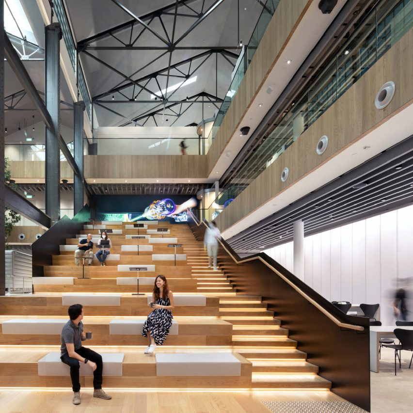
M Moser Associates reconditioned the interiors of a power station in Singapore to create the global headquarters for multinational technology company Dyson. The interiors feature amphitheatre-style seating to encourage informal gatherings and a sculptural spiral staircase in the former turbine hall.

The judges valued using an existing building to house a leading global enterprise such as Dyson.

“We were pleasantly surprised that Dyson, a bleeding-edge company in innovation and technology, have opted for a refurbishment rather than a new build,” they said. “We were impressed with how they took an old shell and modernised it.”

Read more about Dyson Global HQ, St James Power Station by M Moser Associates ›


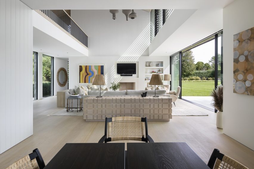
The F.Forest Office by Atelier Boter
Photo by James Lin

Small workspace interior of the year: The F.Forest Office by Atelier Boter

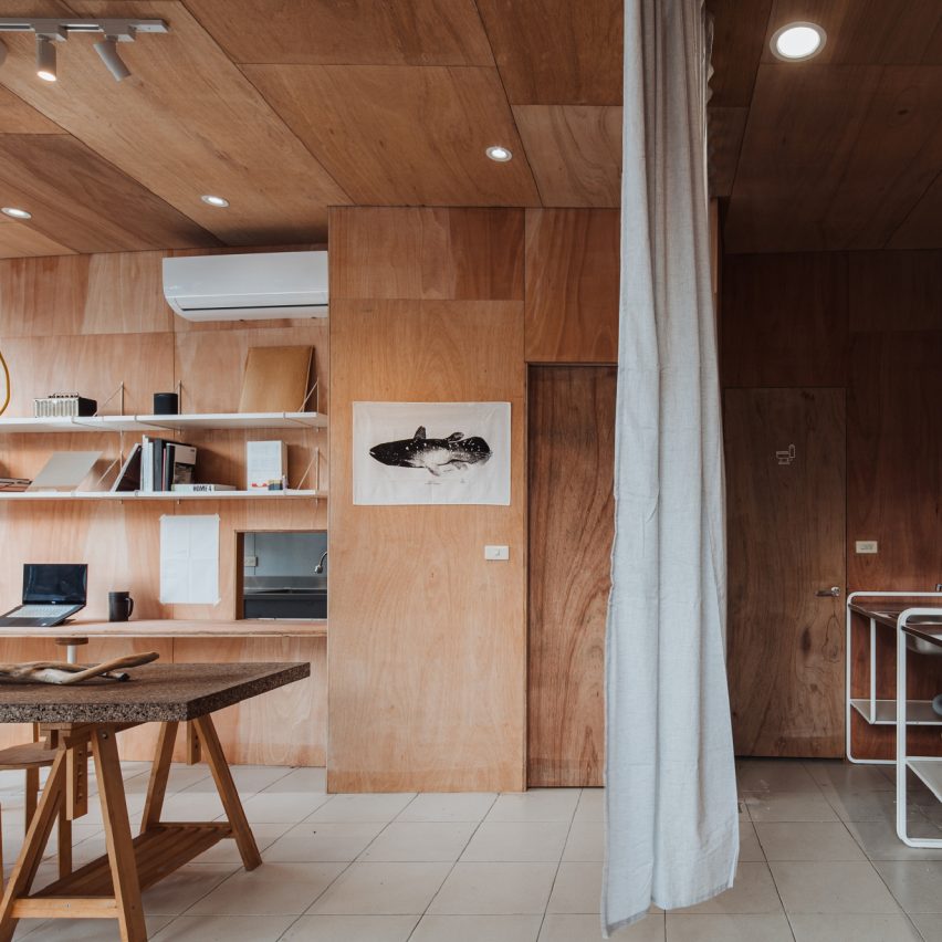
The community centre situated in a fishing village in Taiwan was designed by Atelier Boter as a hybrid dining, working and event space, loosely divided by a curtain.

The 53-square-metre venue is almost entirely lined with warm-hued plywood. A plywood partition wall at the end of the workspace is fitted with bookshelves and a small hatch, which connects to the kitchen.

“This project is very well embedded in its cultural context and, despite a small budget, the designers were able to create something beautiful and modern – a small jewel within an old fishing village,” said the interiors panel.

Read more about The F.Forest Office by Atelier Boter ›


Deja Vu Recycle Store by Offhand Practice
Photo by Hu Yanyun

Large retail interior of the year: Deja Vu Recycle Store by Offhand Practice

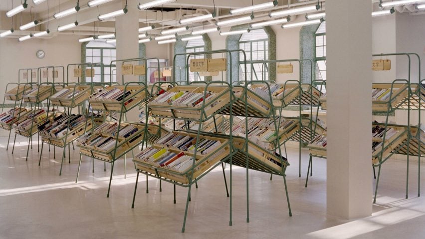
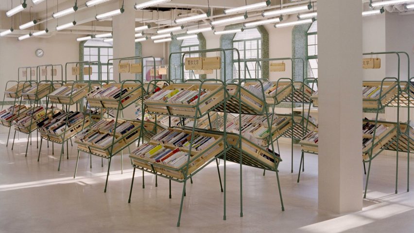
Deja Vu Recycle Store is a second-hand bookshop located on the first and second floors of a three-storey building in Shanghai. Local studio Offhand Practice aimed to create a relaxed shopping environment by mimicking the experience of grocery shopping. The clothes and books are displayed on shelves that resemble fruit and vegetable crates.

Green mosaic tiles made from stone off-cuts were used to frame the building’s windows and accentuate other architectural details.

“This is food for the mind!” said the judges. “It’s stripped back but in a confident way, exuding calmness and thoughtful simplicity.”

Read more about Deja Vu Recycle Store by Offhand Practice ›


Monc by Nina + Co
Photo courtesy of Nina+Co

Small retail interior of the year: Monc by Nina + Co

London-based Nina + Co incorporated biomaterials throughout the interior of eyewear brand Monc’s debut store.

The glasses made from bio-acetate rest on cornstarch-foam shelves and mycelium display plinths. Long mirrors lean on blocks of local salvaged concrete.

“This project demonstrates integrity between the finishes used and the product they are selling,” said the jury. “It is a very well-executed retail interior with an encouraging use of sustainable materials.”

Read more about Monc by Nina + Co ›


Barlo MS Centre by Hariri Pontarini Architects
Photo by A-Frame Photography

Leisure and wellness interior of the year: Barlo MS Centre by Hariri Pontarini Architects

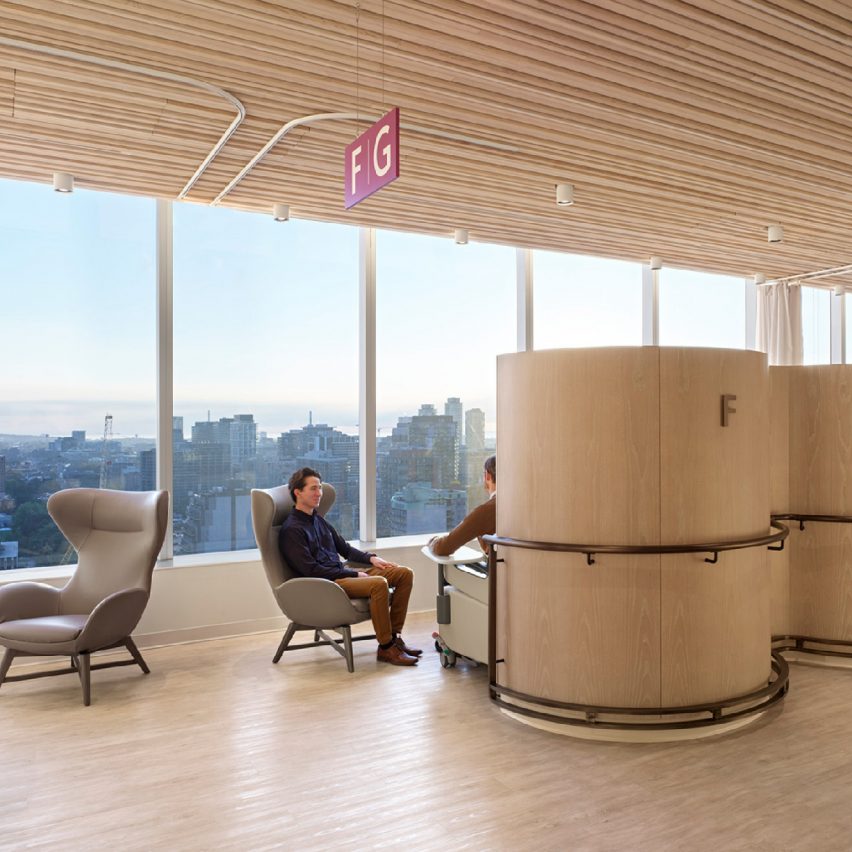
The clinic was designed by Canadian practice Hariri Pontarini Architects for patients who suffer from multiple sclerosis (MS), a complex autoimmune disease that affects the central nervous system.

As some MS patients experience vision and cognitive loss, as well as fatigue and decreased coordination, durability and accessibility were present throughout the design process. Barlo MS Centre features atypical colours, materials, textures and lighting to rethink sterile-looking healthcare spaces.

“We were impressed by the fusion of the spa and the medical facilities, introducing a wellness element into something that would not traditionally have such an emphasis,” said the judges.

“It is a more holistic approach to healthcare design, which is considerate to the mental aspects of healthcare environments.”

Read more about Barlo MS Centre by Hariri Pontarini Architects ›


Ecole Camondo Méditerranée by Émilieu Studio
Photo by Antoine Huot

Civic and cultural interior of the year: Ecole Camondo Méditerranée by Émilieu Studio

Émilieu Studio designed the interior of Camondo Méditerranée design school in Toulon, France. The studio aimed to create a large-scale flexible learning space, only furnished with reused local materials.

The project features a mobile furniture system that can be easily compiled, transported and deployed outdoors. The furniture is made from locally sourced construction offcuts.

“This school sets a new example of how to approach design education, creating a sense of openness and mobility, which is what a school should be all about,” said the interiors master jury panel.

Read more about Ecole Camondo Méditerranée by Émilieu Studio ›


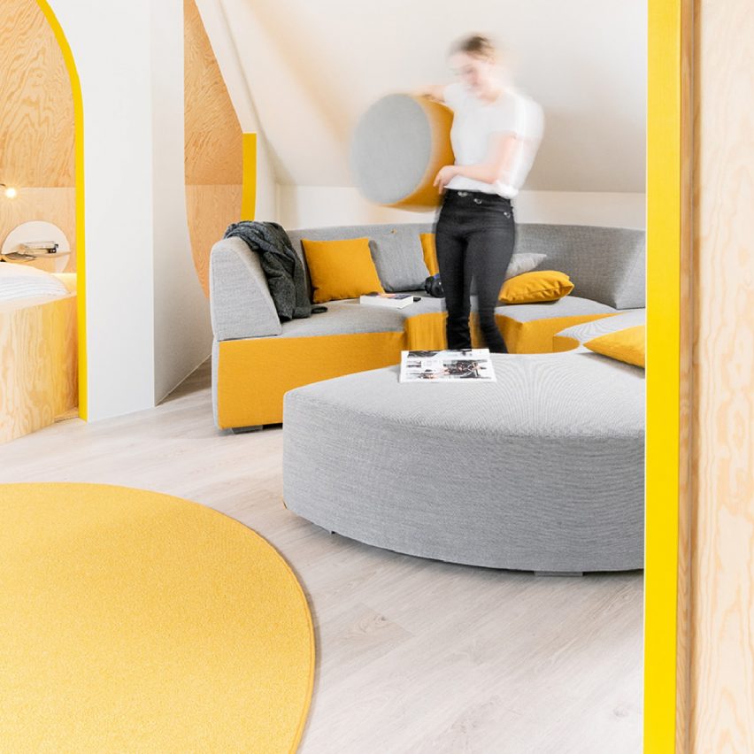
Relaxing Geometry with Pops of Yellow by Van Staeyen Interieur Architecten
Photo by Jochen Verghote

Small interior of the year: Relaxing Geometry with Pops of Yellow by Van Staeyen Interieur Architecten

Arched portals, curvy furniture and yellow decor accents feature in Van Staeyen Interieur Architecten’s revamped attic in Antwerp.

The local studio refurbished a neglected attic in a family home, turning the area into a multi-functional space.

“This is a good example of how design can be joyful and whimsical,” said the judges. “Accessible in many different aspects, financially and physically, it’s not just a playground for kids but a playground for everyone.”

Read more about Relaxing Geometry with Pops of Yellow by Van Staeyen Interieur Architecten ›

Reference

Studio Sofield completes interiors on world’s skinniest supertall skyscraper
CategoriesInterior Design

Studio Sofield completes interiors on world’s skinniest supertall skyscraper

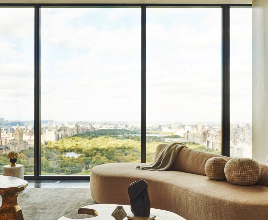
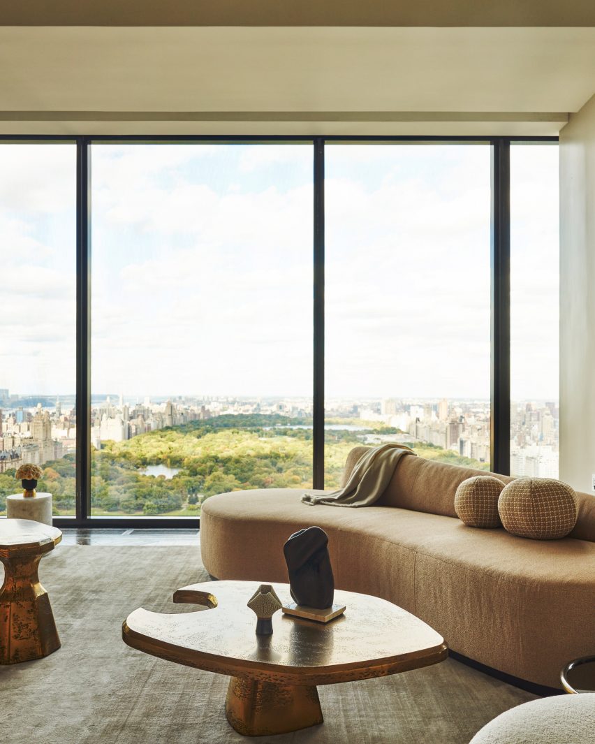
Studio Sofield has completed the interiors of 111 West 57th Street, also known as Steinway Tower – a supertall skyscraper designed by SHoP Architects in New York City.

The interiors mark the full completion of the 1,428-foot-tall (435-metre) skyscraper, which is the second tallest in the Western Hemisphere, and the skinniest in the world with a height-to-width ratio of 24:1.

Steinway tower interiors with modern furniture and view of central park
Studio Sofield completed interiors for Steinway Tower in Manhattan

Sited on a street bordering Central Park in Midtown that has come to be known as Billionaire’s Row, the skyscraper has views looking north and south.

New York-based Studio Sofield designed the interiors for the skyscraper as well as the adjacent Steinway Hall, which is connected to the tower.

The 91-storey skyscraper has 46 residences, with an additional 14 held in Steinway Hall, as well as a variety of amenities, and was developed by JDS Development Group and Property Markets Group.

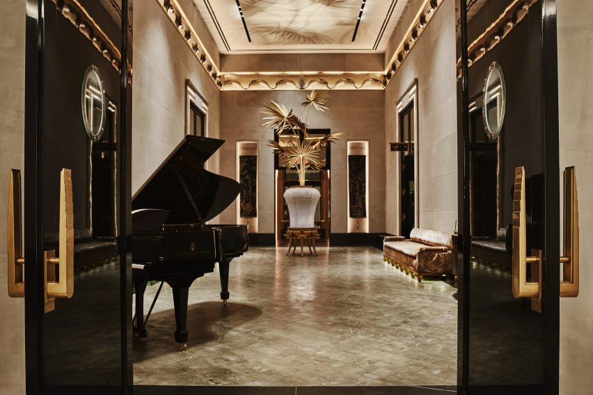
Steinway Tower lobby inteirors with pianos
The design included interiors for the lobby spaces that connect the tower and Steinway Hall

“With 111 West 57th Street, I set out to create interior architecture that was unmistakably and quintessentially New York,” said Studio Sofield founder William Sofield.

“While celebrating the vibrancy of today, I am a historian by nature and sought to honor and evoke the splendor of our city’s gilded age.”

Steinway Tower lobby interiors gilded frames
Studio Sofield wanted the public interiors to reflect the “gilded age” of New York City

Interiors designed by Sofield includes the “block-long lobby sequence” that connects the two aspects of the tower. Here, the studio restored the original flooring of the Steinway Hall and used limestone, marble, blackened steel and velvet accents.

Murals in bas-reliefs of gold and silver leaves depict architectural landmarks of New York, and elephants were depicted elephants roaming through the city as a”tribute to the history of pianos”.

Steinway Hall swimming poool
The swimming pool room has full-height windows

Another room in the lobby sequence was outfitted with bronze mirror cladding that leads to a “domed salon” lined with banquet seating.

On 58th street, a residence entrance featuring a granite porte-cochere with grillwork doors inspired by “the bronze filigree on the building’s exterior”.

Steinway hall room
Steinway Hall was renovated using themes from the original building

The bar area and the swimming pool are also in the hall structure. According to the studio, the bar was based on the “legendary King Cole Bar with its chic bar” with an ornamental balcony and skylights that further the material references to the original building.

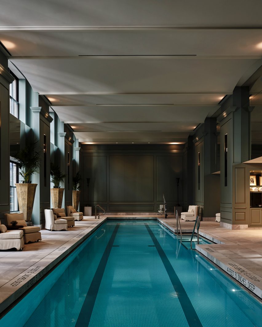
Elevator vestibules for the tower were completed using custom-made doors by artist Nancy Lorenz. The swimming pool is 82 feet long (25 metres) and is housed in a double-height room with floor-to-ceiling windows.

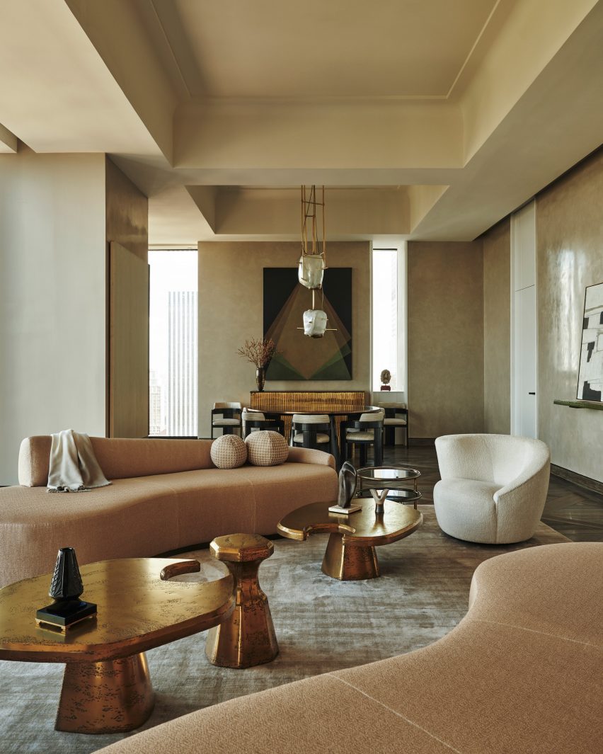
In the skyscraper, the residences each occupy at least a single floor. Each home has a central room where the views to the north and south are prioritised, and these rooms lead to a “signature great hall, which often spans the full width of the tower,” according to the studio.

Grey oak and macauba stone were used for the flooring and nine-foot-tall doors separate the room.

Steinway Skyscraper interiors
The skyscraper’s residences have wooden and stone floor

Hardware for the doors as well as other features like the freestanding bathtubs and the fixtures were sourced from long-standing US manufacturers such as PE Guerin, which, according to the studio, is the “country’s oldest architectural hardware firm”.

Other supertall skyscrapers – defined as one between 984 and 1,969 feet (300 and 600 metres) – designed by SHoP Architects include the Brooklyn Tower in Downtown Brooklyn, which is nearing its way to completion, having topped out earlier this year.

Billionare’s Row – the name for the luxury skyscrapers on 57th Street near Central Park in Manhattan, continues to see new developments, with New York studio ODA announcing the construction of a “fractal” skyscraper on the street.

The interior photography is by Adrian Gaut with exterior photography by David Sundberg.

Reference

Ten Bauhaus interiors that draw on the principles of design school
CategoriesInterior Design

Ten Bauhaus interiors that draw on the principles of design school

A hotel that pays tribute to early German modernism and an apartment within a ski resort designed by architect Marcel Breuer are among the projects collected in our latest lookbook, which explores interiors informed by the Bauhaus.

The most influential art and design school in history, the Bauhaus’ was established in Germany in 1919 and although it closed just over a decade later continues to influence interior designers today.

Work produced by students and teachers during the school’s 14-year history, centred on founder Walter Gropius’ ethos that art and craft should marry to create a new architecture.

The below projects feature distinctly Bauhaus elements including chrome tubular chairs, geometric shapes, primary colours and abstract textiles.

This is the latest in our lookbooks series, which provides visual inspiration from Dezeen’s archive. For more inspiration see previous lookbooks featuring living rooms that use warm neutrals to create a cosy ambience, bedrooms with wardrobes that are disguised as walls and contemporary living rooms in Georgian and Victorian homes.


Interiors of Flaine holiday apartment, revamped by Volta
Photo is by Arthur Fechoz

Cassiopeia Apartment, France, by Volta

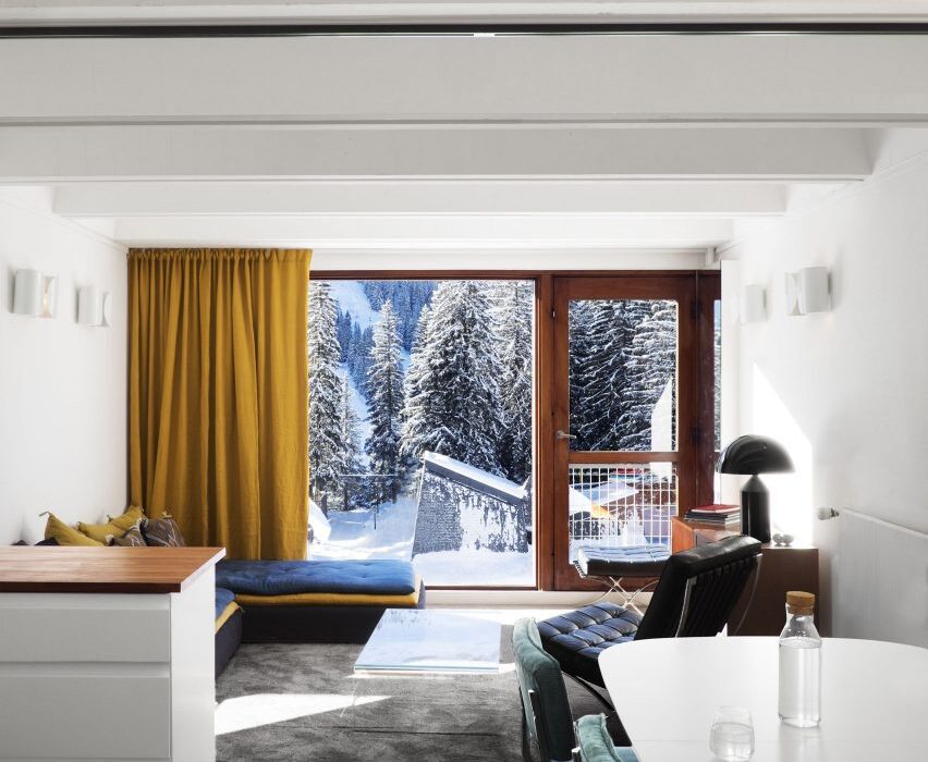
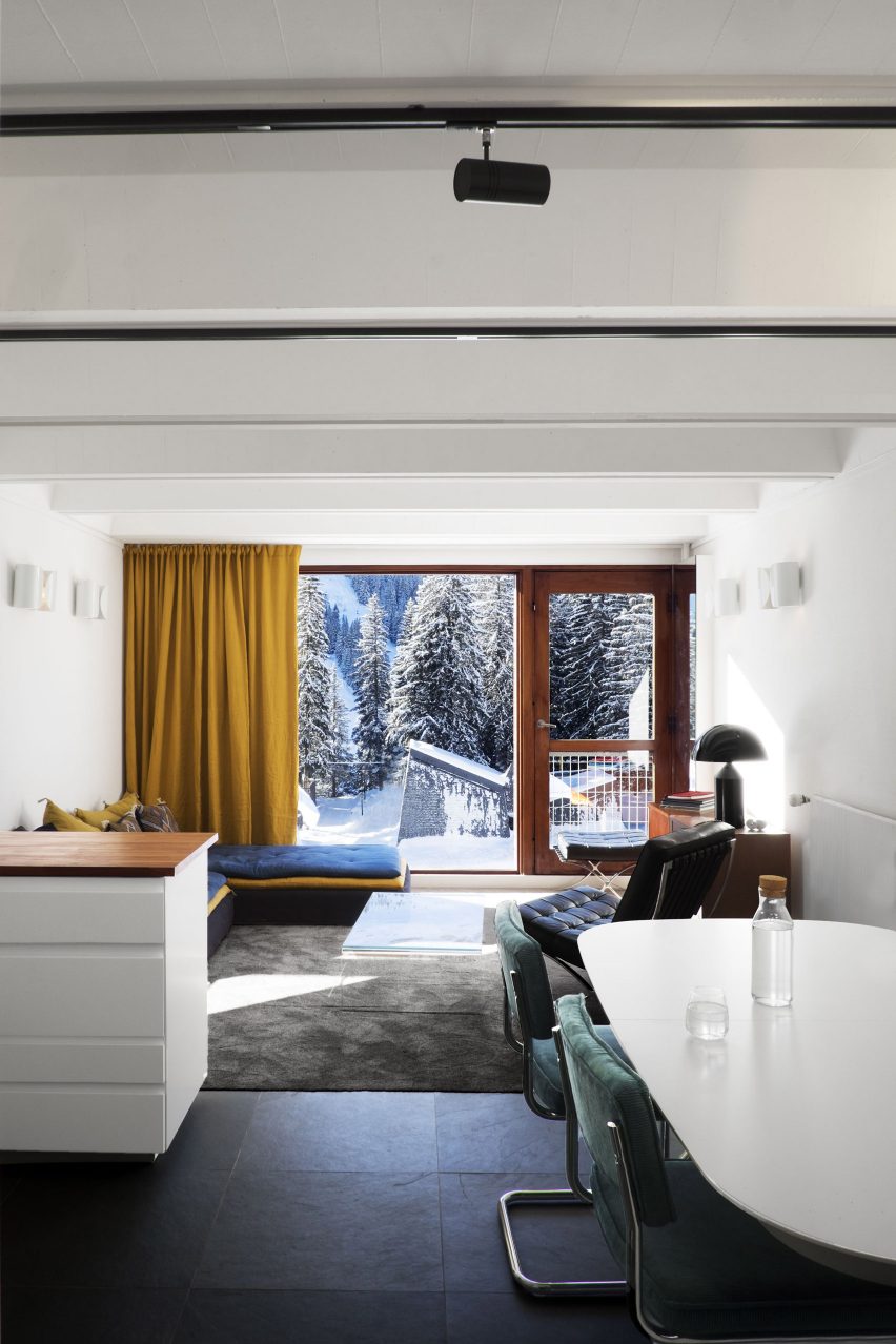
Tasked with reviving the “Bauhaus spirit” of this apartment set within a Breuer-designed ski resort, architecture studio Volta added soft furnishings in mustard yellows and royal blues, referencing the colour palette of movement.

Armchairs with steel frames that resemble Breuer’s Wassily Chair have also been used to decorate the living room.

“The Bauhaus movement was predominant in the design of the project,” said the studio. “It has influenced its history, its choice of materials and its furniture. The challenge was to revive its influences in a contemporary context.”
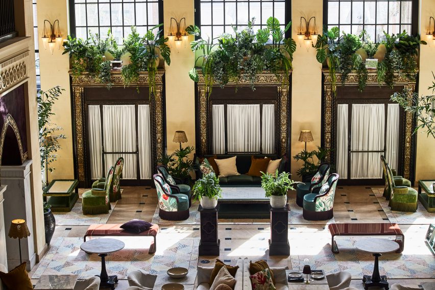
Find out more about Cassiopeia apartment ›


De Maria by The MP Shift
Photo is by Nicole Franzen

De Maria, US, by The MP Shift

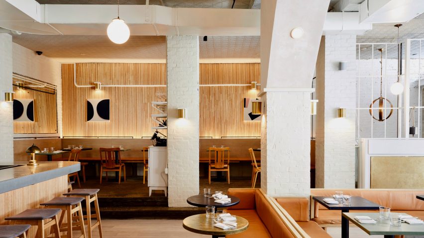
Design studio The MP Shift wanted De Maria, a contemporary American restaurant in Manhattan’s Nolita neighbourhood to look like an artist’s studio, complete with white brickwork and pink-tinted plaster.

The studio paid tribute to Bauhaus and 1970s Soho style by adding sofas upholstered in tan-coloured leather, orb-shaped pendant lamps and simple pieces of art with triangular shapes.

Find out more about De Maria ›


Nadzieja restaurant designed by Agnieszka Owsiany Studio
Photo courtesy of Agnieszka Owsiany Studio

Nadzieja, Poland, by Agnieszka Owsiany Studio

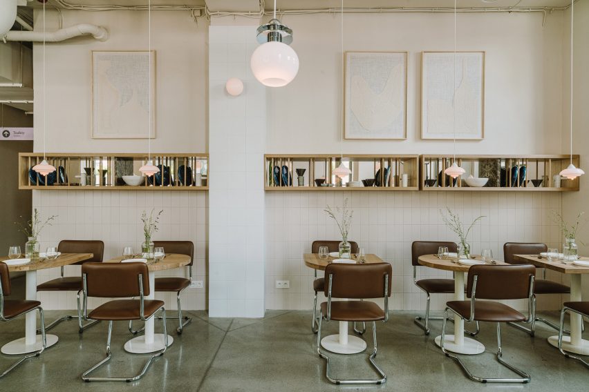
Design influences from the Bauhaus collide with Israeli flavours at Nadzieja, a restaurant in Poznań, Poland designed by local studio Agnieszka Owsiany Studio.

Filled with brown-leather chairs with tubular steel frames, high granite ivory counters and spherical pendant lights, the eatery has a bright and warm interior that draws parallels with the large number of Bauhaus buildings found in Tel Aviv.

Find out more about Nadzieja ›


Schwan Locke hotel Munich by Fettle
Photo is by Edmund Dabney

Schwan Locke Hotel, Germany, by Fettle

Influenced by the work of proto-Bauhaus association Deutsche Werkbund, design studio Fettle wanted the interiors of aparthotel Locke to be at once nostalgic and distinctly contemporary.

Its 151 apartment rooms feature a combination of light timber, raw plaster, chrome, steel and mohair materials set against a colourful yet muted pink and green backdrop.

Find out more about Schwan Locke hotel ›


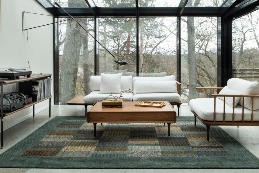
A living room with a geometric rug
Photo courtesy of Kasthall

Quilt by Ellinor Eliasson

In this living room, Swedish designer Ellinor Eliasson’s tufted rug acts as a centrepiece and gives the space a warm and richly textured look.

The graphic, modernist rug recalls the work of renowned Bauhaus weaving workshop teacher Anni Albers, who is best known for her textiles and recognisable lines, colours and forms.

Find out more about Quilt ›


Members' Club areas divided by metal shelving
Photo is by Andrew Joseph Woomer

Soho House Nashville, US, by Soho House

At the Soho House in Nashville, guests can enjoy a taste of the city’s musical heritage while uncovering the building’s industrial past as a knitting mill.

Designed to feel warm and rich, much like the rock and roll, jazz and blues music that Nashville is known for, the accommodation features bespoke lamps, brassy industrial finishes and plenty of tubular decor to create an industrial interior that still feels modern.

Find out more about Soho House Nashville ›


53 West 53 by Andre Fu 36B
Photo is by Stephen Kent Johnson

53 West Apartment, US, by André Fu and AFSO

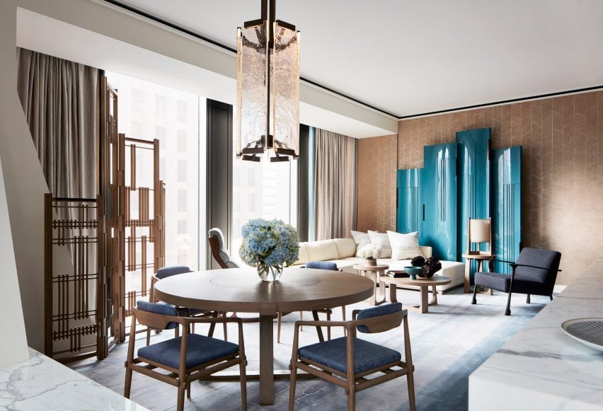
Architect André Fu and his Hong Kong studio AFSO referenced the geometric designs of the Bauhaus school for 53 West Apartment, a model unit set within architect Jean Nouvel’s New York tower block.

The two-bedroom apartment is peppered with sculptural pieces of furniture such as a room divider comprised of dark wood and rods, which compliments the existing walnut doors and oak floors and cabinets.

Find out more about 53 West Apartment ›


RP House by Estudio BG
Photo is by Fran Parente

RP House, Brazil, by Estúdio BG

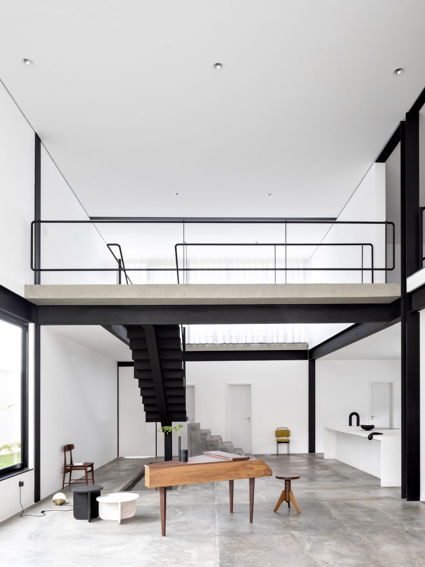
Inside this stripped-back two-storey residence called RP House, black steelwork, bare walls and simple white volumes stacked on top of each other come together to create a sparse yet light-filled Brazilian home.

São Paulo studio Estúdio BG said that the design referenced the principles of repeatability and standardisation advocated by designers of the Bauhaus.

“This 1920s movement was characterised by the replication of design in an industrial format,” the studio said. “The simple geometric volume, the elimination of decorative elements and the use of the roof as terraces reinforce the principles adopted in the project.”

Find out more about RP House ›


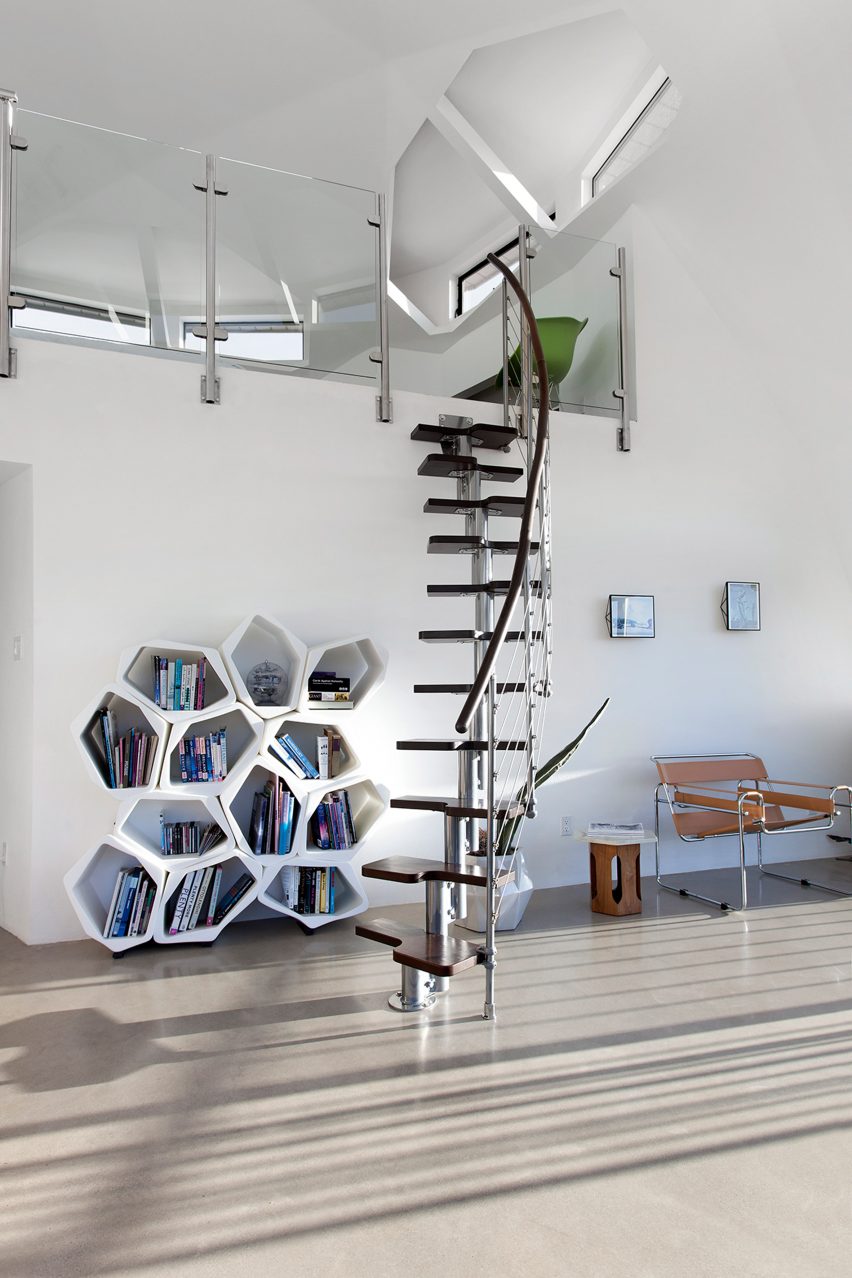
Dome House by Pavlina Williams
Photo is by Krista Jahnke

Palm Springs Dome House, US, by Pavlina Williams

Los Angeles-based architect Pavlina Williams added multiple windows and knocked down several walls in her renovation of this Californian house, transforming it from a gloomy residence into a desert sun trap.

In the open-plan living area, a caramel leather Wassily Chair by the Hungarian architect and designer Breuer sits alongside a spiral stainless-steel staircase that leads up to a loft.

Find out more about Palm Springs Dome House ›


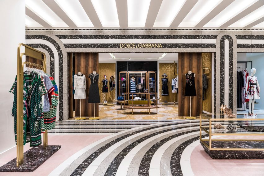
KaDaWe department store in Berlin
Photo is by Derek Hudson

KaDeWe, Germany, by India Mahdavi

French architect India Mahdavi borrowed from the Bauhaus’ preoccupation with strong graphic lines and shapes in her renovation of department store KaDeWe by adding sweeping black, white and grey stripes of Santa Margherita to the floor of the womenswear section.

Elsewhere in the 2,000-square-metre shopping space, pink carpeting is set off against triple-tiered, brass clothes rails and olive green and dusty pink velvet curtains.

Find out more about KaDeWe ›

This is the latest in our lookbooks series, which provides visual inspiration from Dezeen’s archive. For more inspiration see previous lookbooks featuring bathrooms where the sink takes centre stage, homes with arched openings that add architectural interest and bookshops designed to enhance the browsing experience.

Reference

OMA’s first residential tower in miami ‘the perigon’ reveals its sunlit interiors
CategoriesArchitecture

OMA’s first residential tower in miami ‘the perigon’ reveals its sunlit interiors

interior designer tara bernerd works with oma


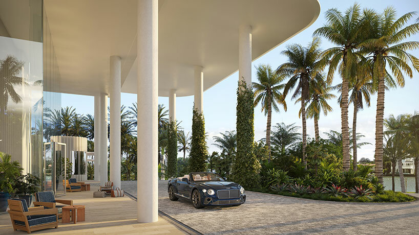
Sited proudly along the sparkling waterfront of Miami Beach, OMA‘s diamond-shaped residential high rise ‘The Perigon’ reveals a first look at its sunlit interiors. Fit for its exclusive, resort-minded location, the luxury tower will boast hotel-style amenities private to owners to blur the line between condominium and resort. Evoking the atmosphere of a five-star hotel, the interiors have been designed by Tara Bernerd, a renowned hospitality designer who has shaped iconic spaces from Belgravia to Vienna.


The architecture itself will take shape as an array of nesting towers, each rotated to enhance views for all residences toward the Atlantic Ocean. See designboom’s previous coverage here.
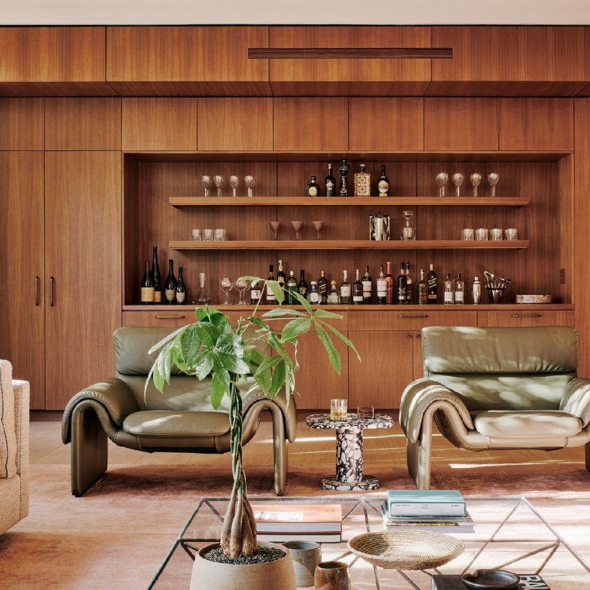
oma perigon miami
image, header image © Binyan Studios


the perigon: warm, welcoming, and sophisticated


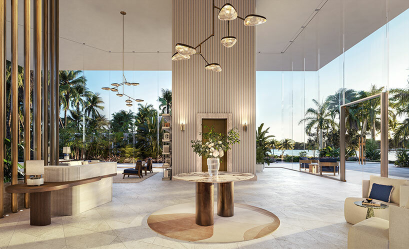
Curating the amenities of The Perigon, interior designer Tara Bernerd looked to the masterful architecture by OMA. Arriving to the building, residents are welcomed by a grand and inviting lobby with honed white travertine flooring showing a diamond pattern, a nod to the project’s distinctive footprint, an Italian stone finish connecting with the natural textures which are recognized throughout Miami.


The design team sought an atmosphere which is warm, organic and bright, while at once evoking the sophistication of the European Riviera — a design choice which draws from the future residents’ many seaside travels.

oma perigon miamiimage © The Boundary


We envisaged the residents at The Perigon to be well travelled, design-savvy and highly cultured,’ said interior designer Tara Bernerd.We have created interiors that speak to the architecture of the building, with a conversation between interior and exterior design, that would appeal to this individual and their penchant for an international design sophistication. The amenity collection epitomizes this ethos, with finishes and furnishings chosen to evoke a refined relaxation, so that it truly is a destination in and of itself.’

oma perigon miami
image © The Boundary


inside the miami beach tower


The amenities which have been revealed as part of the first look at OMA’s The Perigon are located along two levels and include a highly anticipated spa. These spaces will be finished with a combination of materials and fabrics selected both for their authenticity to the area and their connection to sought-after natural environments.


A billiards room was designed by Tara Bernerd as a refreshing, mature approach to a game room. The warmly lit space is located just off the lobby and features a floor-to-ceiling glass interior wall to invite participation and spectatorship. The building’s signature diamond pattern is repeated here via its clever wood flooring. The sunrise lounge and hospitality kitchen stay consistent with the building’s soft and natural color palette, with light wood paneling and a dramatic stone bar for entertaining and private events.

oma perigon miami
image © The Boundary


With views over Miami Beach, an awe-inspiring indoor-outdoor conservatory doubling as a breakfast lounge and terrace stands apart as one of the most hotel-like amenities at The Perigon by OMA. Residents will start their days in the serene, dedicated space, where a barista will be available upon request to serve hot or iced coffee to a resident’s liking. The staff at The Perigon will always ensure that every owner’s ideal daily morning routine, from reading the local paper to enjoying sunny-side-up eggs, will be realized.


The wine room and garden on the building’s south side is another unique space inspired by serenity, with views overlooking the property’s waterfall garden. The space will keep nearly 450 bottles of the most refined wine selections in stock and will offer storage services to residents with their own prized collections. A top sommelier will be on hand to host private tastings both at the bar and in the garden, while a celebrated chef will design a variety of pairing menus depending on the season.

oma perigon miami
image © The Boundary


When we first launched The Perigon, our buyers were struck by the tower’s remarkable design that is seemingly afloat above lush gardens,’ said Camilo Miguel, Jr., CEO of developer Mast Capital. ‘The architecture’s slender columns, soaring lines and wraparound terraces maximize the indoor- outdoor experience, and we had a clear vision to use this additional space to bring resort amenities and experiences into the condominium setting.


With reservations successfully converted to contracts, and incredible demand for the limited remaining inventory, we’re proud to reveal how The Perigon’s amenities are as impressive as the residences themselves, and a true extension of one’s home. The amenity collection will cultivate a community for private owners to enjoy this enriched everyday lifestyle together; with every need being met by a team of butlers and expert concierges ready to make any request a reality.’
Reference

Ten bookshop interiors designed to enhance the browsing experience
CategoriesInterior Design

Ten bookshop interiors designed to enhance the browsing experience

A second-hand bookstore styled like a greengrocer and an outlet modelled on old libraries are among the projects collected in our latest lookbook, which explores bookshop interior designs.
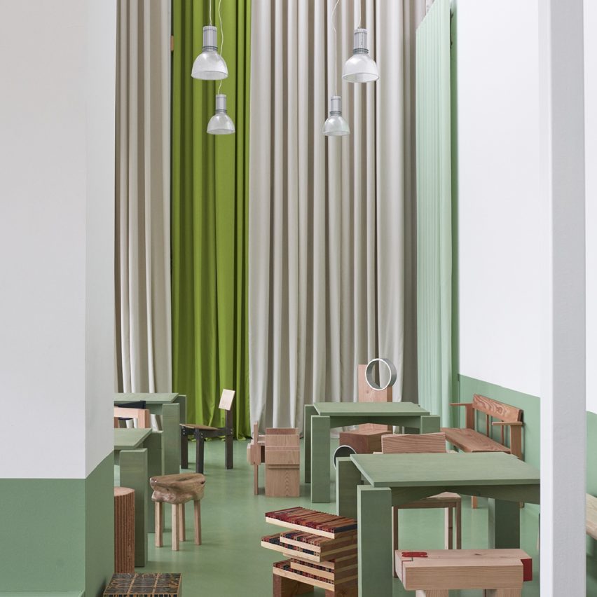
Architects and designers across the globe have created bookstores with striking interiors that offer more than just a place to buy things.

From a hall of zigzagged staircases in China to a yellow-hued grotto in east London, here are 10 bookshop interiors that provide immersive and unusual browsing experiences.

This is the latest in our lookbooks series, which provides visual inspiration from Dezeen’s archive. For more inspiration see previous lookbooks featuring brutalist interiors, light-filled atriums and walk-in wardrobes.


Supermarket-style shelves holding books in Deja Vu Recycle Store in Shanghai by Offhand Practice
Photo is by Hu Yanyun

Deja Vu Recycle Store, China, by Offhand Practice

Chinese architecture studio Offhand Practice designed a second-hand bookshop in Shanghai to mimic the interior of a greengrocer by displaying items in familiar supermarket-style crates.

Created to counter the “shabby” image commonly associated with second-hand retailers, Deja Vu Recycle Store features a light interior defined by stone off-cut mosaic tiles and natural pine.

“[The project] breaks the stereotypical image of a second-hand store and erases the ritualistic impression of a traditional bookstore full of full-height bookshelves,” said Offhand Practice.

Find out more about Deja Vu Recycle Store ›


Stone sculpture in wood-panelled bookstore
Photo is by Jonas Bjerre-Poulsen

New Mags, Denmark, by Norm Architects

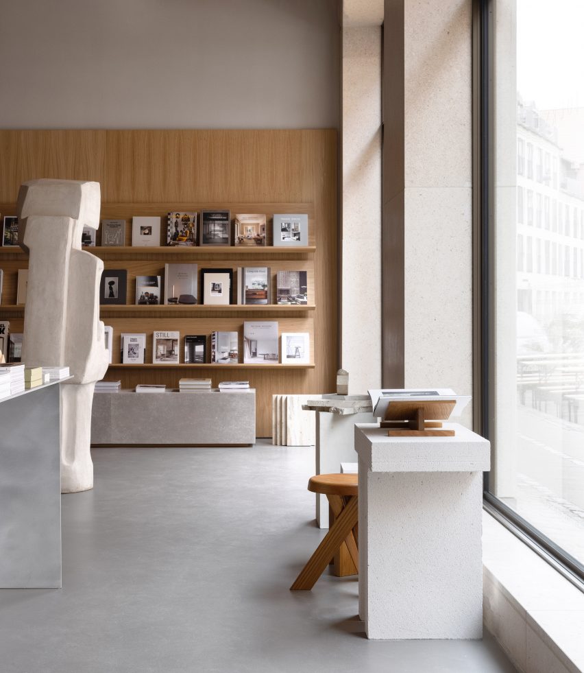
Coffee table book distributor New Mags commissioned Norm Architects to design the interior of its flagship store in Copenhagen, which nods to the serenity of old libraries.

Natural oak panels were used to create towering display walls for books. Various publications are also presented on stone plinths that echo a looming, organically shaped stone sculpture by local artist Josefine Winding.

Find out more about New Mags ›


Chongqing Zhongshuge Bookstore by X+Living
Photo is by Shao Feng

Chongqing Zhongshuge Bookstore, China, by X+Living

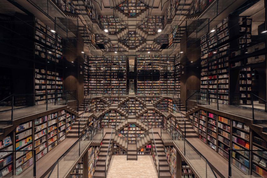
A maze of intricate staircases, amplified by a mirrored ceiling, forms a dramatic backdrop for this bookshop in Chongqing by Shanghai-based studio X+Living.

Thanks to their wide treads, the stairs double as reading nooks for customers, while the overall stepped outline created in the central space intends to reference Chongqing’s urban skyline.

Find out more about Chongqing Zhongshuge Bookstore ›


Bookshop in Italy
Photo is by Žiga Lovšin

Book Centre Trieste, Italy, by SoNo Arhitekti

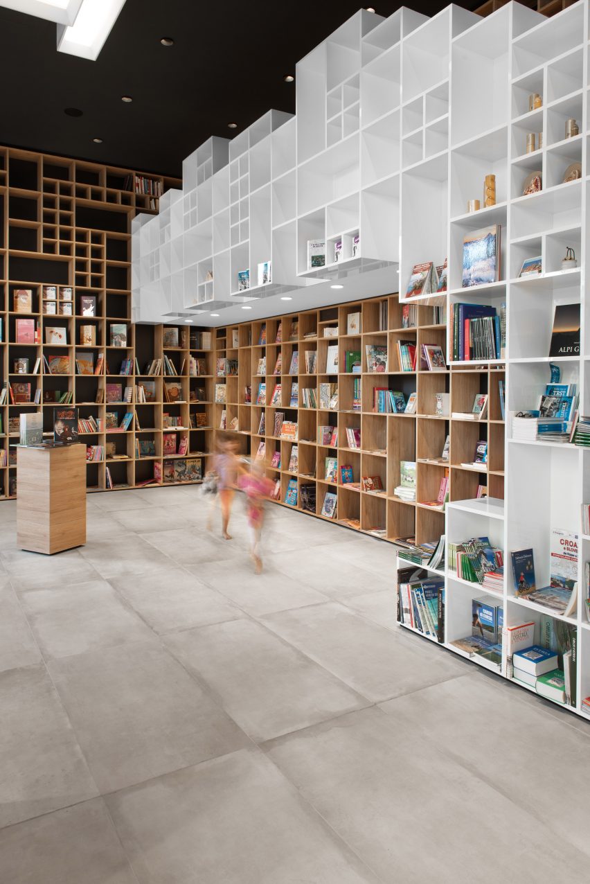
Another store interior that takes cues from its setting, this Trieste bookshop features boxy shelving that was informed by the diamond brick patterns of the nearby Trieste National Hall.

Slovenian studio SoNo Arhitekti repeated this motif on the shop’s two sofas, which have grid-patterned upholstery. It also reserved space for chunky display podiums and a children’s reading corner.

Find out more about Book Centre Trieste ›


Interiors of They Said Books shop, designed by Lado Lomitashvili
Photo is by Nakanimamasakhlisi

They Said Books, Georgia, by Lado Lomitashvili

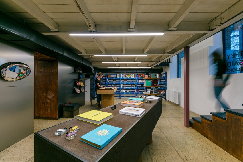
They Said Books is a bookshop-cum-cafe in Tbilisi with an interior characterised by Tetris cube-style shelving, yellowed terrazzo tiles and bubble-shaped reflective wall sculptures.

Georgian designer Lado Lomitashvili created the store, which is housed inside a 1930s building, to support the “cultural development” of the country’s capital city.

Find out more about They Said Books ›


Pulse On cinema and lobby
Photo is courtesy of Pulse On

SFC Shangying Cinema Luxe, China, by Pulse On

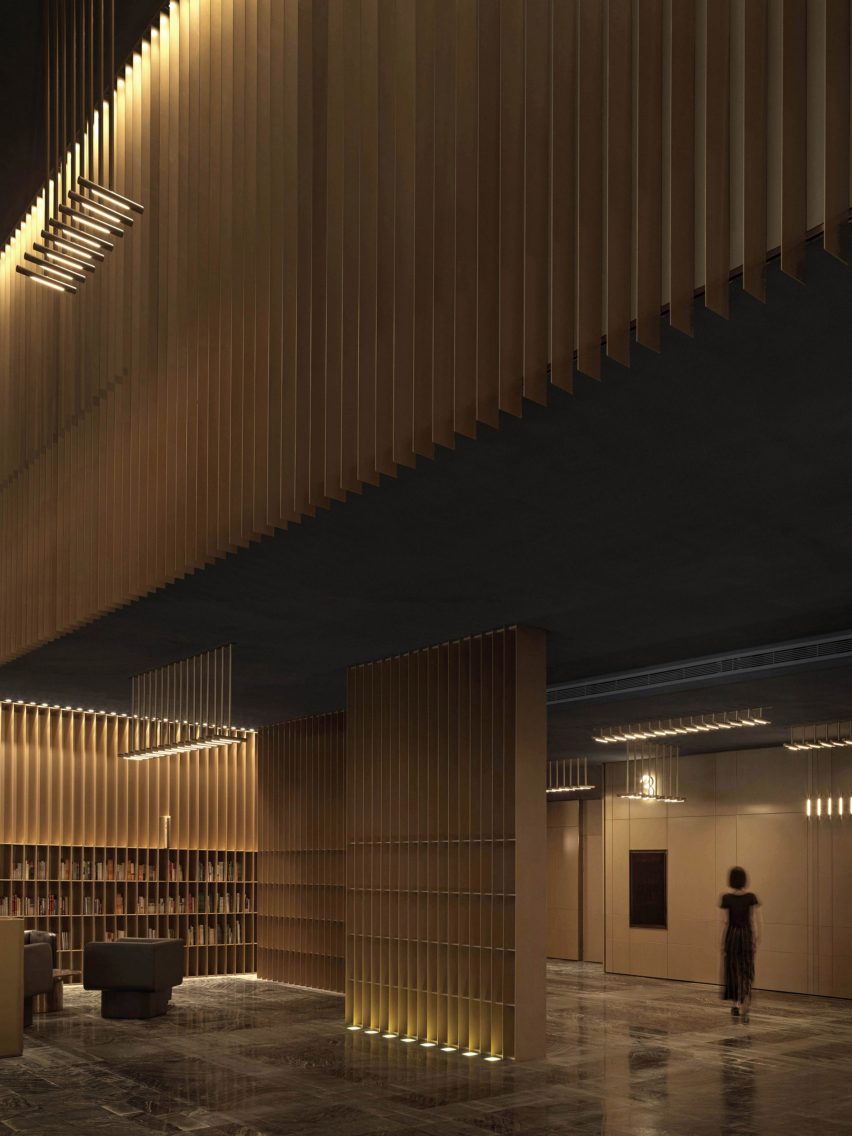
Hong Kong-based firm Pulse On was informed by the strings of musical instruments when designing the delicate interior of this Shanghai bookshop, which is also the lobby of a cinema.

Thin metal slats extend vertically from floor to ceiling to create bookshelves, while integrated lighting bathes various seating areas in a soft glow.

“We wanted to create a zen resting space for the guests through the mix of ‘strings’ and ‘books’,” explained the designers. “All of this boils down to simplicity and purity of lines – no highly-contrasting colours are used.”

Find out more about SFC Shangying Cinema Luxe ›


Libreria bookshop
Photo is courtesy of SelgasCano

Libreria, UK, by SelgasCano

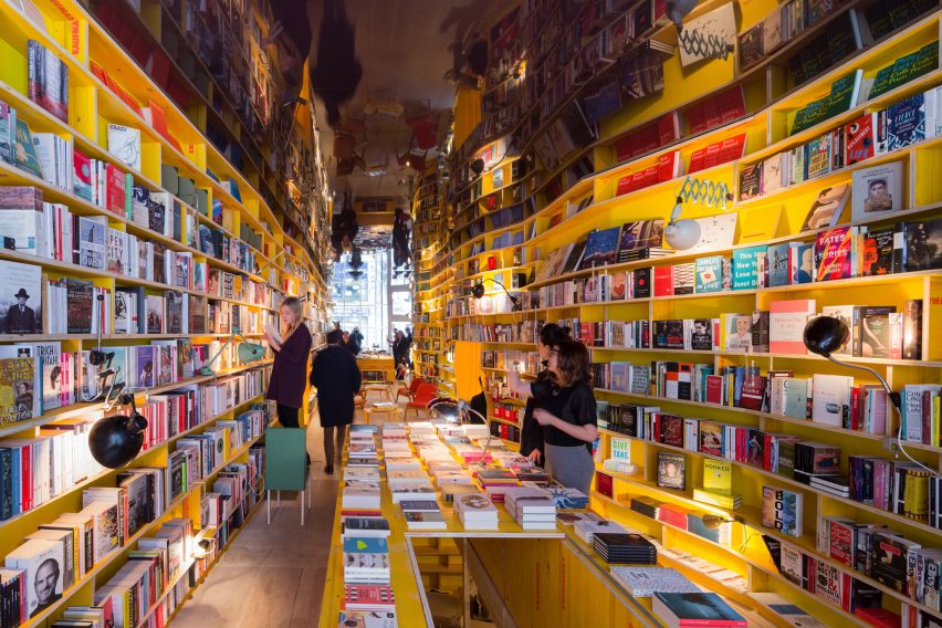
Author Jorge Luis Borges’ 1940s tale The Library of Babel informed the winding, cavernous interior of Libreria, a London bookshop designed by Spanish studio SelgasCano.

Handmade shelves were crafted in irregular shapes by artists from the Slade School of Fine Art using unfinished recycled wood. They house the store’s many books, which are arranged thematically rather than categorised traditionally, in order to encourage “chance encounters while browsing”.

Find out more about Libreria ›


Wutopia Lab Books in Clouds
Photo is by CreatAR Images

Duoyun Bookstore, China, by Wutopia Lab and Office ZHU

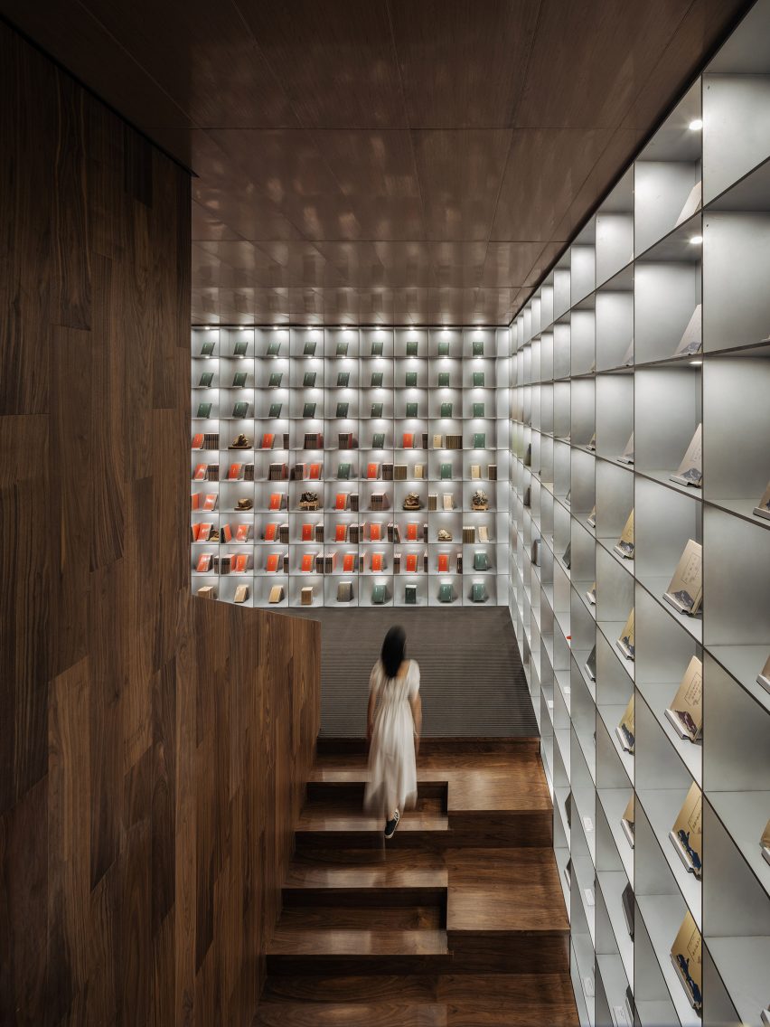
Five different colours delineate the zones inside this Huangyan bookstore, which includes reproductions of rare books exhibited in a tall, wood-panelled stairwell.

Duoyun Bookstore was designed by Wutopia Lab and Office ZHU to feature layers of perforated metal on its facade – a move that saw two disused buildings renovated to create the shop.

Find out more about Duoyun Bookstore ›


MUDA Architects bookshop
Photo is by Arch-Exist

Xinglong Lake Citic Bookstore, China, by MUDA Architects

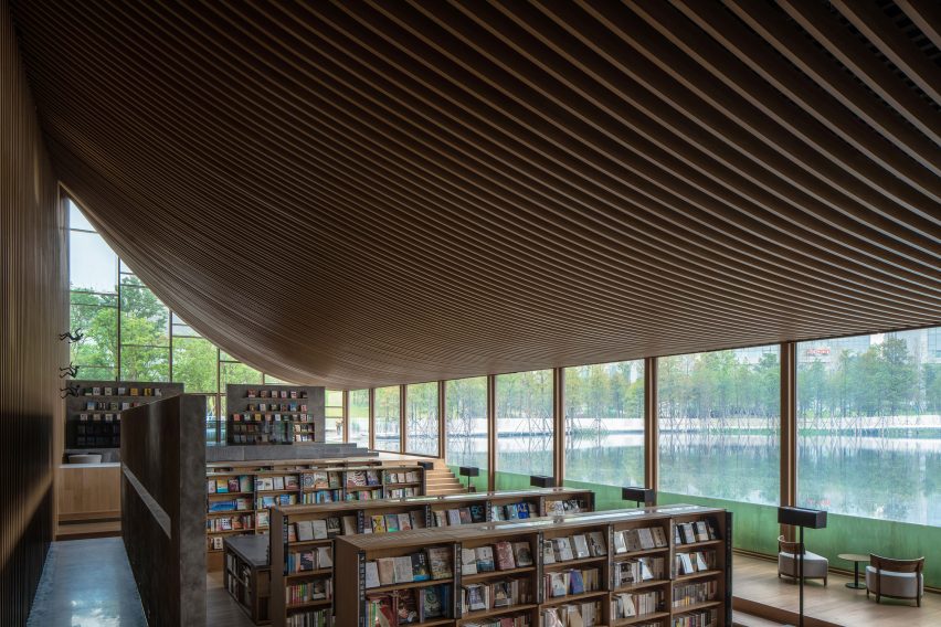
Chinese studio MUDA Architects topped a lakeside bookstore in Chengdu with a roof shaped like an upturned book that creates a sweeping ceiling on the interior.

Large rectilinear windows are positioned at the edge of the lake to offer views of the surrounding scenery, while the glass extends beneath the waterline to create a peaceful and immersive setting for reading.

Find out more about Xinglong Lake Citic Bookstore ›


Sao Paulo bookshop
Photo is by Fernando Guerra

Livraria Cultura, Brazil, by Studio MK27

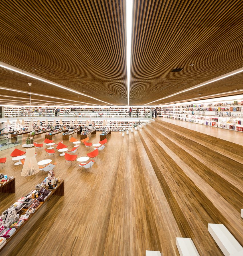
The Livraria Cultura – or Culture Bookshop – was designed by Studio MK27 in Brazil’s São Paulo to be “a bookstore of the 21st century” that encourages social interactions.

A vast double-height room is defined by wooden bleachers that span the 21-metre width of the space, where customers are invited to stay and read or meet up even after they have bought their books.

Find out more about Livraria Cultura ›

This is the latest in our lookbooks series, which provides visual inspiration from Dezeen’s archive. For more inspiration see previous lookbooks featuring colourful living rooms, decorative ceilings and deliberately unfinished interiors.

Reference