Brilliant Bio-Based Materials Curated for Commercial Interiors
CategoriesArchitecture

Brilliant Bio-Based Materials Curated for Commercial Interiors

Our esteemed jury is now reviewing the submissions for this year’s A+Product Awards. Stay tuned for the winner’s announcement later this summer.

We are often introduced to biomaterials regarding their application to support medical advancements. A massive amount of research is being conducted globally, with innovations being announced all the time. You’ve probably heard the word bouncing around the design industry too. However, crucially it must be understood that the two subjects, although identical in name, as products are wildly different. In medical terms, biomaterial refers to a substance engineered to interact with biological systems for a medical purpose (like a heart valve or bone graft). In the design industry, when we discuss biomaterials, we are actually talking about bio-based materials, which are derived and manufactured from living organisms.

Bio-based material is a new and fascinating industry that has come to fruition due to the need for more sustainable construction and manufacturing base materials. Across the world, the quantity of furniture, fabrics and materials that end up in landfill is staggering and arriving there at a rate that cannot be sustained. As a reaction to this, many designers are seeking inspiration from nature and natural life cycles.
Forager Foam by Ecovative Images provided by Ecovative

Forager Leather by Ecovative Image by Vasil Hnatiuk

One such company is Ecovative. Ecovative are experts in something called mycelium. Mycelium is an essential part of fungi. It is a web-like substance formed from the pores of fungi. Often residing beneath ground, the probing webs assist in growing the mushrooms we see above ground while interconnecting the fungi from below. The mycelium search for food, passing on nutrients and other information to the fleshy mushrooms above ground. At Ecovative, they have learned how to guide the growth process of the mycelium to create large webs that are almost completely solid. The result is a wide range of natural, biodegradable materials that form textiles, packaging, and even alternative food products.

As a material, mycelium is incredibly resilient, with many other valuable qualities. By studying the growth of mycelium, scientists at Forager Ecovative have drawn out the most useful traits such as tensile strength, waterproofing, fire resistance, pliability and texture. They are producing foams and leather alternatives that rival any on the market. Mycelium hides and foams offer many advantages over traditional leather and plastic materials. Vivid colors and durable, supple textures are possible without the need for caustic chemicals or waste.

Finishing can be achieved with heat, pressure, and bio-based chemicals rather than petroleum-derived coatings, with a wider variety than traditional leather, minus the variability and blemishes that impact price. The foams produced by Ecovative rival any plastic-based alternative in performance and are unmatched in their circularity — mycelium, when thrown away at the end of a product’s life, returns to the earth as a nutrient rather than a pollutant.
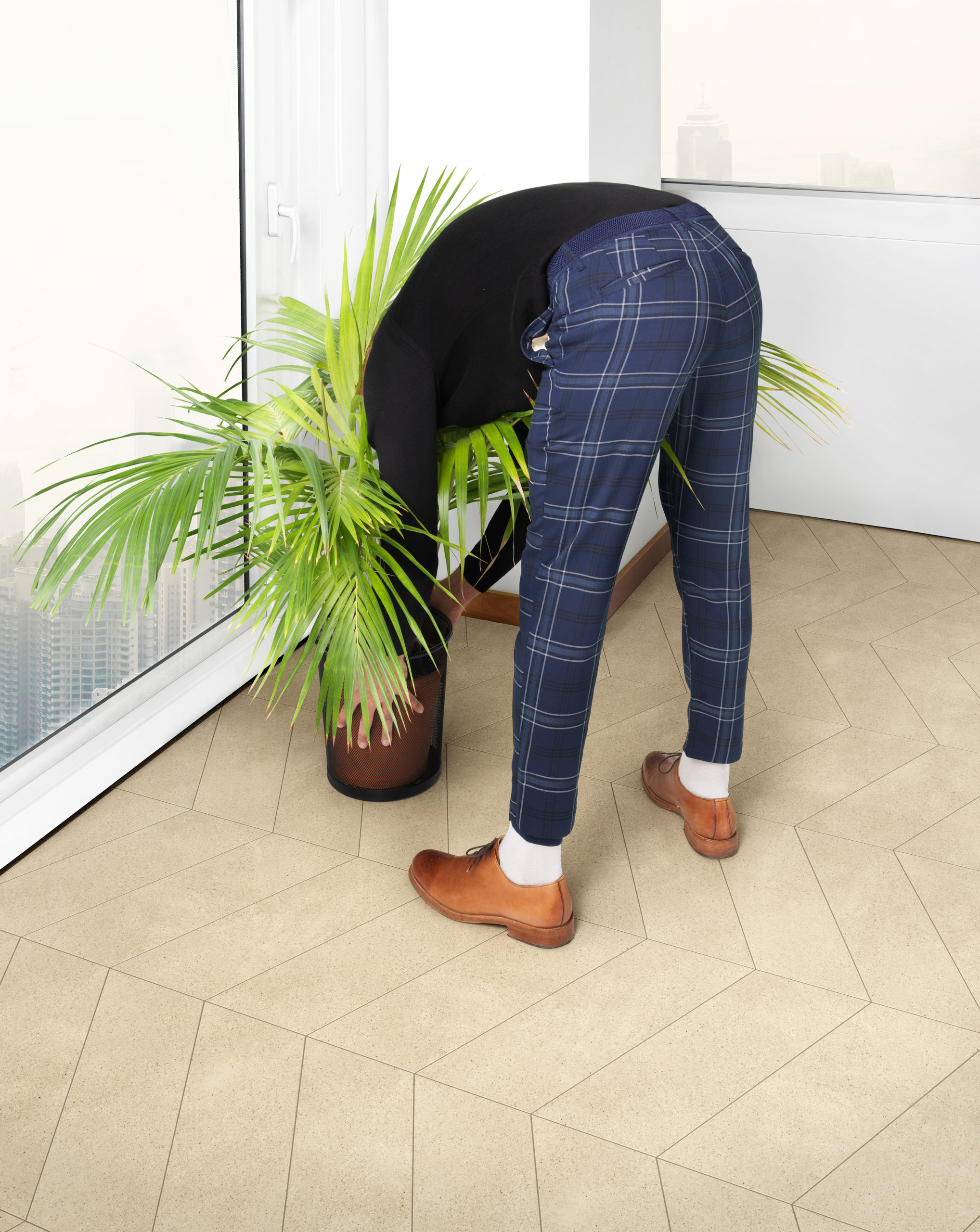
Mogu, Mycelium Resilient Floors ©mogu
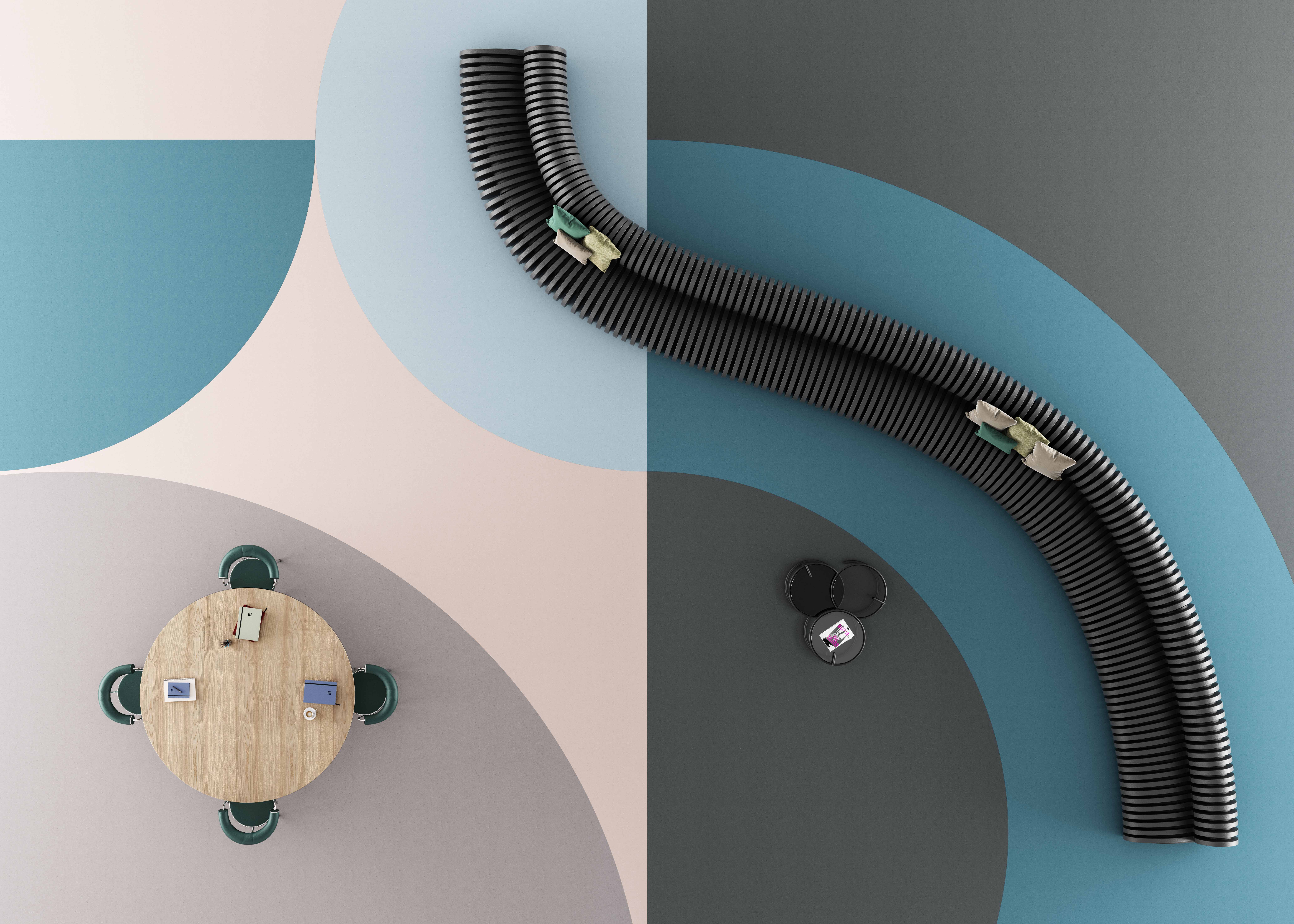
Mogu, Floor Flex ©mogu

Also working tirelessly with mycelium’s exceptional properties and potential are the team at MOGU. Offering functional, beautiful and meaningful products with a durable and sustainable life cycle, MOGU is committed to introducing the world to industrial processes with the lowest possible environmental impact.

“MOGU was founded on the belief that it is possible to employ nature’s intelligence to radically disrupt the design of everyday product, seeking a finer balance between the man-made and the rhythms of the ecosystem.”

MOGU’s floor finishes are genuinely remarkable. The floor finishes are made of solid and stable mycelium-based core boards coupled with high-performance bio-based coating. Each tile or roll integrates low-value biomasses such as corn crops, rice straw, spent coffee grounds, discarded seaweed and clam shells as an alternative to traditional industrial pigments. This choice in toning allows the natural pigments embedded in the product to appear visibly on the surface, creating a unique look to the materials that is elegant, on-trend and subtle.

That’s Caffeine by Atticus Durnell

Handmade in London by Atticus Durnell, That’s Caffeine is a unique bio-based material created from recycled coffee grounds that feels and looks like granite stone. The bio-based material is a composite of bio binders, minerals and plant-based resin, making it incredibly lightweight compared to its peers. The material is sustainable and biodegradable, water and heat-resistant, and successfully diverts coffee waste from landfills while enabling its distinctive surface finishes and colors.

Totomoxle by Fernando Laposse Images by Fernando Laposse

Bio-based materials do not need to be grown into something, as is the case for mycelium-based products. Mexico-based innovator Fernando Laposse has shown how waste material from our other consumables can also be utilized in making new, beautiful materials.

Totomoxtle is a new veneer material made with husks of heirloom Mexican corn. Ranging from deep purples to soft creams, Totomoxtle showcases the wealth of diversity of the native corns of Mexico.

Unfortunately, the number of native varieties of Mexican corn are in sharp decline. International trade agreements, aggressive use of herbicides and pesticides, and the influx of highly modified foreign seeds have decimated the practice. At the moment, the only hope for saving the heirloom species of maize lies with the indigenous people who continue to plant them out of tradition rather than for financial gain.

Laposse has been working with a group of families from the community of Tonahuixtla, slowly reintroducing native seeds in the village and returning to traditional agriculture. The husks collected from the harvest are now transformed by a group of local women into the veneering material, thus creating much-needed local employment and beautiful saleable materials that are forgiving to the environment.
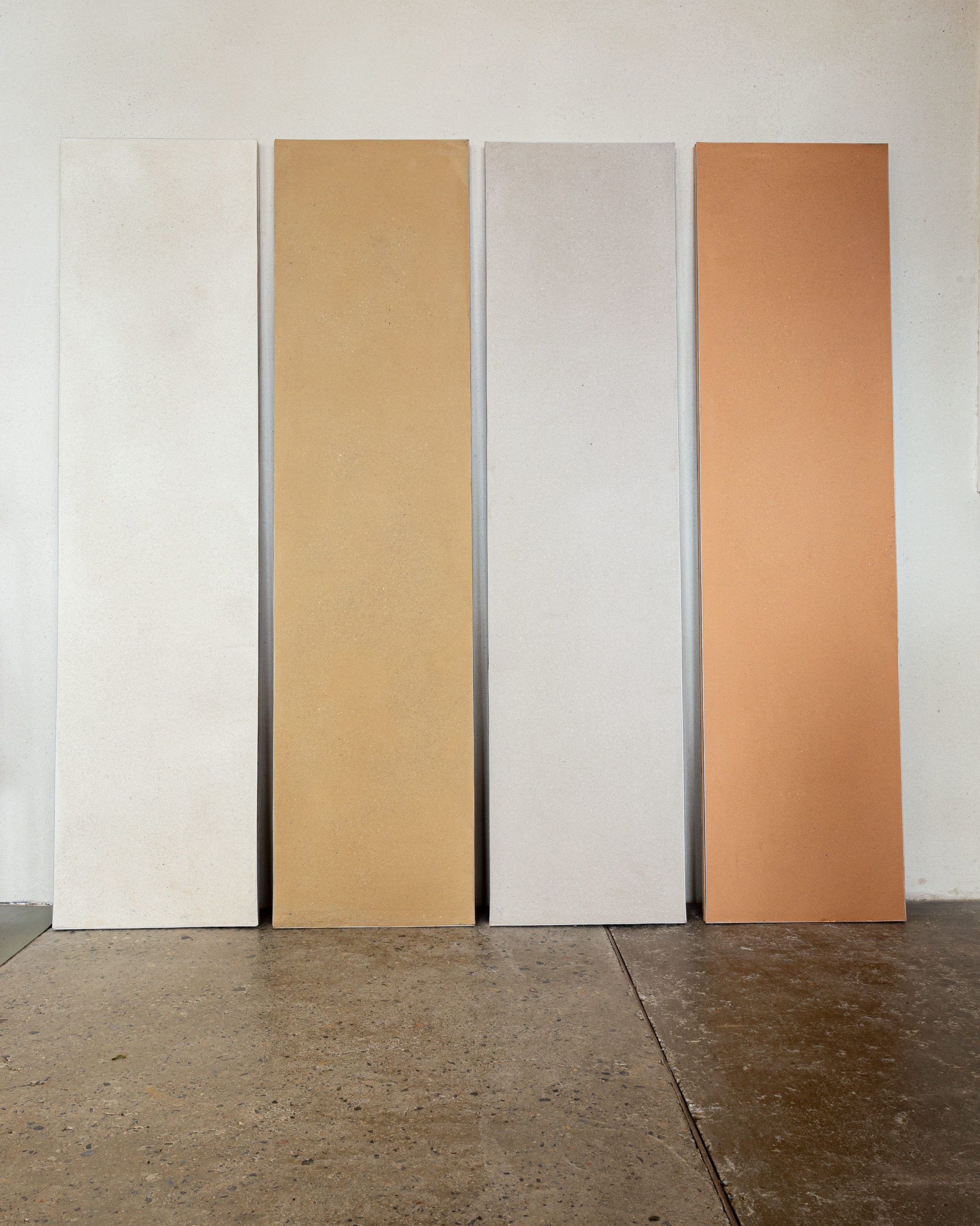
Brusseleir, Clay Plaster by BC Materials Image by BC Materials

BC Materials work on several bio-based products made for the construction industry from the construction industry’s waste. Using material taken from the ground during excavation, the Brussels-based company has created Brusseleir. This clay plaster alternative regulates the humidity of indoor climates and is also wholly vapor permeable all the while, the plaster alternative is four times more acoustically effective than traditional plaster finishes.

From an environmental perspective, biomaterials are a compelling choice: They are biodegradable and store carbon dioxide, which means they can lower the carbon footprint of a product or a building during its lifetime. These materials can often perform just as well, sometimes better, than less sustainable alternatives. We have barely scratched the surface of the potential of bio-based materials and are in no position to propose bio-based materials everywhere just yet. However, there is an argument that says that is precisely what we should be striving for.

Consider this, across all industries, consumers have changed; buyers no longer need items that last a lifetime, typically trends drive sales, and the majority of people want their surroundings to evolve as they do. In such a society, products manufactured from bio-based materials have a stronger appeal than ever. As their usefulness is met, items can be discarded without concern. Each piece naturally breaks down and returns to the earth while leaving space for something new. No need for landfill, no need for chemicals to break things down, just a product from the earth, going right back into the earth — like a leaf working its way through the seasons year after year. That is the future of bio-based materials; hopefully, with suitable investments, it’s not too far off.

Our esteemed jury is now reviewing the submissions for this year’s A+Product Awards. Stay tuned for the winner’s announcement later this summer.

Reference

Ten maximalist interiors that are saturated with colour and pattern
CategoriesInterior Design

Ten maximalist interiors that are saturated with colour and pattern

Clashing colours, statement furnishings and mismatched patterns feature in this lookbook, which rounds up ten flamboyant interiors that embody the maximalist aesthetic.

Maximalism is a style of art and design that rejects the rules of minimalism. Instead, exuberance is celebrated and anarchic use of pattern, colour and texture are encouraged.

According to Claire Bingham, author of the book More is More, the style can be attributed to the Memphis Group – the 1980s design and architecture collective known for their bold postmodern creations.

However, as demonstrated by this roundup, maximalism continues to make its mark today, as designers apply the aesthetic to the interiors of our homes as well as to public spaces.

This is the latest in our lookbooks series, which provides visual inspiration from Dezeen’s archive. For more inspiration see previous lookbooks showcasing brutalist interiors, walk-in wardrobes and colourful living rooms.


Maximalist interior of Hotel Les Deux Gares
Photo is by Benoit Linero

Hotel Les Deux Gares, France, by Luke Edward Hall

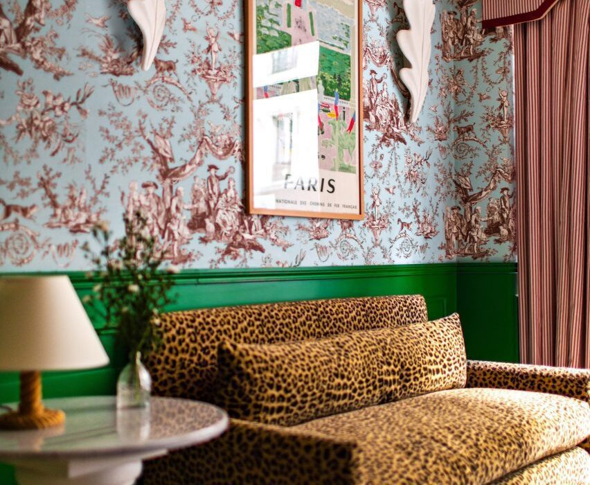
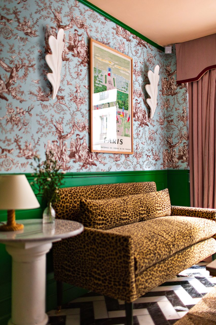
Contemporary pea-green walls stand in stark contrast to chintzy wallpaper and soft velvet sofas in the rooms of the Hotel Les Deux Gares in Paris.

According to its designer Luke Edward Hall, the aesthetic is intended to be “anti-modern” – harking back to a Paris of the past.

Find out more about Hotel Les Deux Gares ›


Kitchen and dining room of Casa TEC 205 in Mexico
Photo is by Adrián Llaguno

Casa TEC 205, Mexico, by Moneo Brock

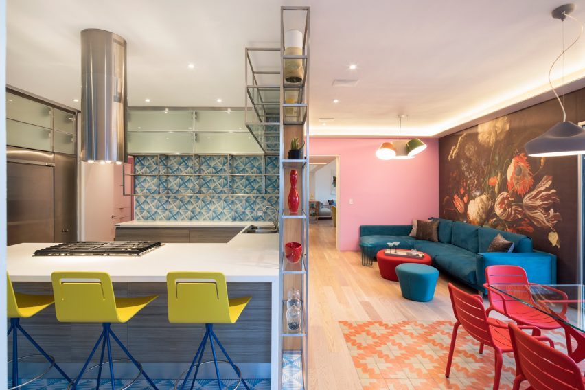
The bright-coloured works of Mexican architect Luis Barragán informed the look of this maximalist-style home in Monterrey, designed by architecture studio Moneo Brock.

Inside, striking wallpaper prints are juxtaposed with geometric tiling and colour-blocked walls, such as in the kitchen and dining room where a large floral mural takes centre stage.

Find out more about Casa TEC 205 ›


Maximalist interior of Rookies optician in Munich
Photo is by Günther Egger

Rookies, Germany, by Stephanie Thatenhorst

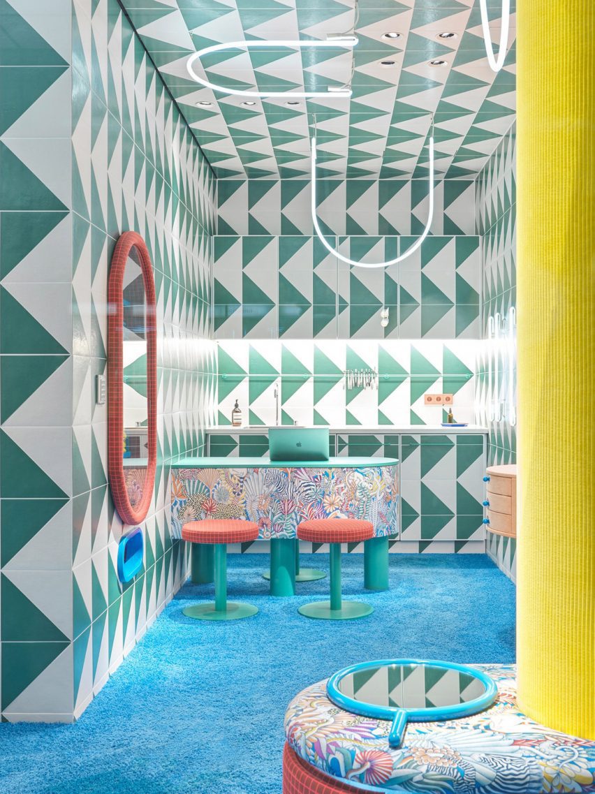
Designer Stephanie Thatenhorst challenged the conventional look of healthcare facilities when designing this kid-friendly optician in Munich.

Intended as a “noisy, wild and unique paradise for children”, it marries a bright blue carpet with geometric wall tiles, U-shaped neon lights and display areas covered in apricot-coloured fabric.

Find out more about Rookies ›


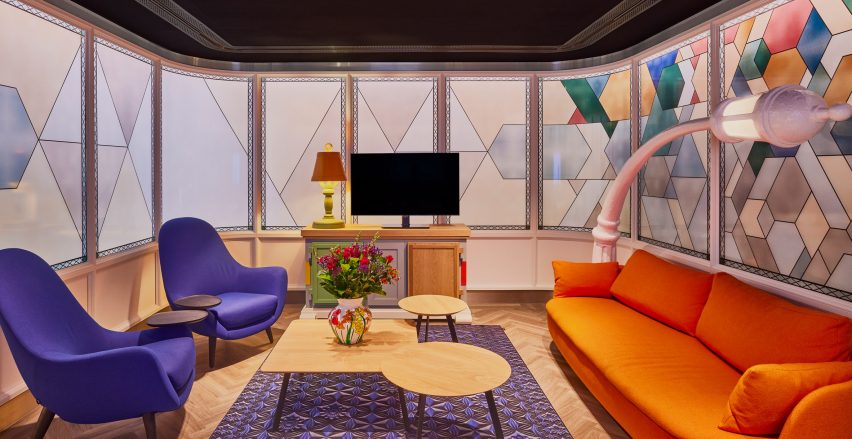
Interiors of VIP centre at Schiphol airport by Marcel Wanders

Schiphol airport lounge, Netherlands, by Marcel Wanders

The flamboyant rooms of the Schiphol airport lounge were all given a distinct look when renovated by Marcel Wanders, a creative best known for his uninhibited maximalist style.

Among them is an animated seating area that references canal houses in Amsterdam. Its finishes include wall panels resembling giant stained-glass windows and a cartoonish lamp that mimics a street light.

Find out more about Schiphol airport lounge ›


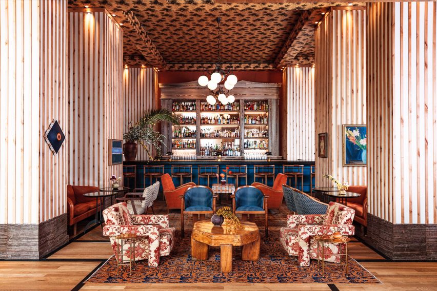
Goldie's Sunken Bar at Austin Proper Hotel and Residences by Kelly Wearstler
Photo is by The Ingalls

Austin Proper Hotel and Residences, USA, by Kelly Wearstler

Interior designer Kelly Wearstler teamed local art and textiles with one-off vintage details when creating the eclectic interior for Austin Proper Hotel and Residences.

This includes the hotel’s drinking establishment, which occupies a room with high ceilings covered in decorative wallpaper. Below, a cobalt blue-painted bar sits against low stuffed armchairs, chunky wooden tables and stone plinths.

Find out more about Austin Proper Hotel and Residences ›


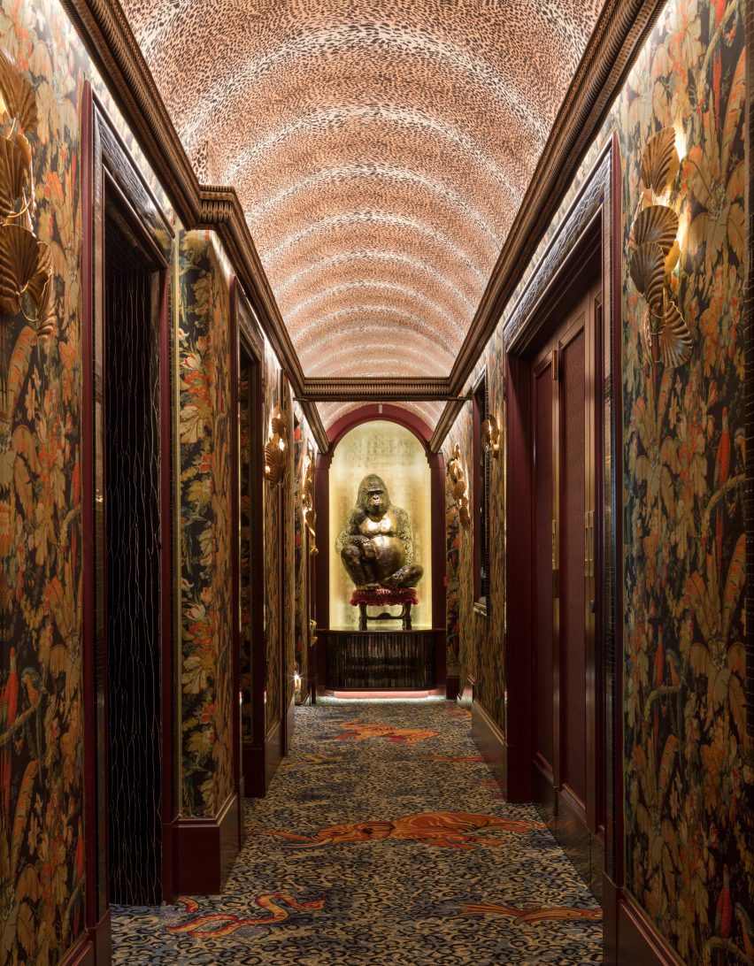
Hallway of members' club Annabel's by Martin Brudnizki Design Studio

Annabel’s, UK, by Martin Brudnizki Design Studio

This dim hallway features in London members’ club Annabel’s, which was recently overhauled by Martin Brudnizki Design Studio to make visitors feel as though they have been “transported somewhere else”.

Similarly to the rest of the building, the corridor features clashing animal prints across all its surfaces and is overlooked by a sculpture of a gorilla on a seat – just one of the fanciful features hidden inside.

Find out more about Annabel’s ›


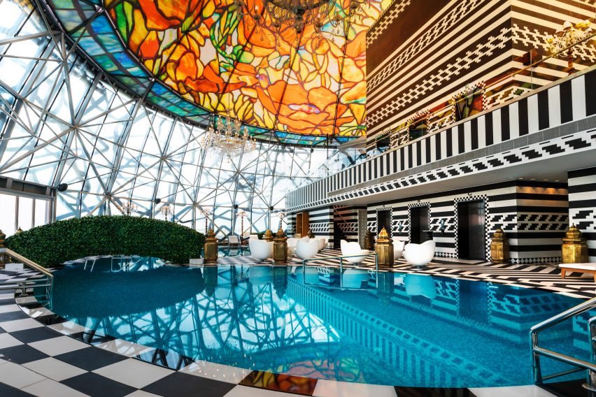
Pool area at the Mondrian hotel in Qatar

Mondrian hotel, Qatar, by Marcel Wanders

Marcel Wanders also applied his signature maximalist style to the interior of the Mondrian hotel in Doha, which is filled with mismatched patterns and oversized furnishings.

Among its standout spaces is the swimming pool on the 27th floor. Crowned by a floral-patterned stained-glass dome, it features bulbous white seating, a tactile grass-like bridge and monochrome tiling.

Find out more about Mondrian hotel ›


Maximalist bedroom inside the Studio Job office

Studio Job office, Belgium, by Studio Job

Studio Jobs’ founder Job Smeet describes his maximal self-designed home and office in Antwerp as being “like a visual assault”.

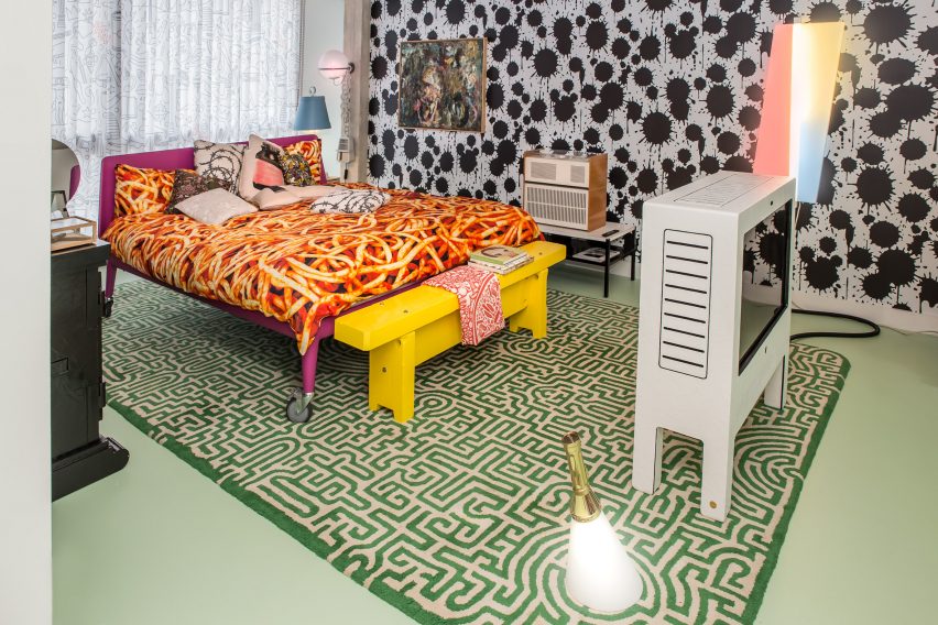
Encased by an exposed concrete shell, it comprises a central gallery space, kitchens, bathrooms and bedrooms – one of which clashes paint-splattered walls with shark-patterned wallpaper, a maze-like rug and spaghetti-print bed sheets.

Find out more about Studio Job office ›


A round bar at Esme Hotel with stools around it
Photo is by Christian Harder

Esme Hotel, USA, by Jessica Schuster Design

In an overhaul of the boutique Esme Hotel in Miami, New York studio Jessica Schuster Design opted for saturated tones and sculptural furnishings to “create an artful collage of bohemian grandeur”.

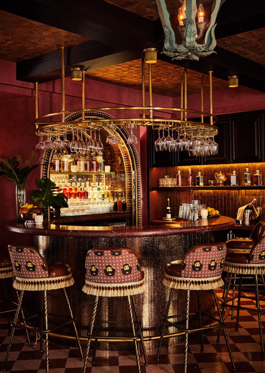
Among its decadent spaces is a mahogany cocktail bar that is encircled by fringed stools and sculptural pendant lighting, set against a checkered floor and a wooden ceiling.

Find out more about Esme Hotel ›


Living room of Polychrome House by Amber Road
Photo is by Prue Ruscoe with styling by Alicia Sciberras

Polychrome House, Australia, by Amber Road and Lymesmith

Pops of bright primary colours feature in every room of this 1960s house in Sydney, which was recently renovated by studio Amber Road and colour consultant Lymesmith.

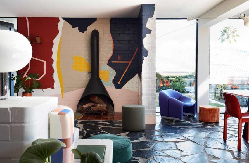
When extending the ground floor, the team introduced an open-plan living space with graphic paved floors modelled on aerial photographs of the surrounding terrain, which contrasts with white-painted brick walls that are partly covered by an abstract mural.

Find out more about Polychrome House ›

This is the latest in our lookbooks series, which provides visual inspiration from Dezeen’s archive. For more inspiration see previous lookbooks showcasing brutalist interiors, walk-in wardrobes and colourful living rooms.

Reference

See who’s ahead in the Dezeen Awards 2022 interiors public vote
CategoriesInterior Design

See who’s ahead in the Dezeen Awards 2022 interiors public vote

After 6,000 votes, projects by Adam Kane Architects and Hollaway Studio are ahead in the Dezeen Awards 2022 public vote interiors categories. Vote now for your favourite!

Other studios in the lead include Random Studio for its blue pop-up installation for Jacquemus in London’s Selfridges and Ennismore for its hotel inspired by the late architect Ricardo Bofill in Spain.

The public vote, which closes on 10 October, gives readers the chance to vote for projects shortlisted in the architecture, interiors, design, sustainability and media categories, as well as architects and designers who are battling to be named studio of the year.

​​Voting is open for another two weeks, so you still have time to vote for your favourite interiors!

Click here to vote ›

Public vote winners crowned in October

Public vote winners will be published 17 to 21 October on Dezeen. The public vote is separate from the main Dezeen Awards 2022 judging process, in which entries are assessed by our jury of renowned industry professionals.

We will be unveiling the Dezeen Awards 2022 winners in late November.

Who is in the lead?

Of almost 30,000 votes that have been cast and verified across all categories so far, the interiors categories received over 6,000 verified votes.

Continue reading on to see which projects and studios are ahead in the public vote.


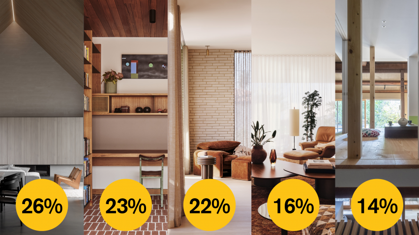
Dezeen Awards 2022 public vote house interior

House interior

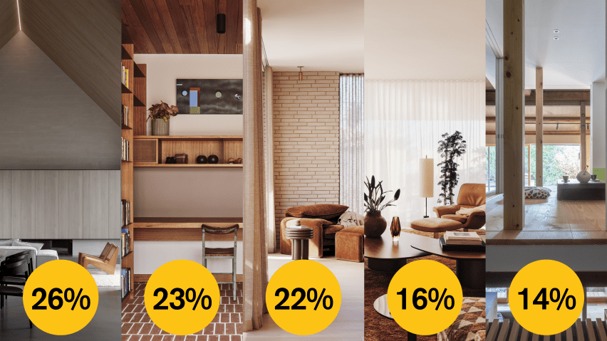
› 26 per cent – Barwon Heads House, Melbourne, Australia, by Adam Kane Architects
› 23 per cent – West Bend House, Melbourne, Australia, by Brave New Eco
› 22 per cent – Twentieth, Los Angeles, USA, by Woods + Dangaran
› 16 per cent – Clear Oak, Los Angeles, USA, by Woods + Dangaran
› 14 per cent – House in Marutamachi, Kyoto City, Japan, by Td-Atelier and Endo Shojiro Design

Browse all projects on the house interior shortlist page.


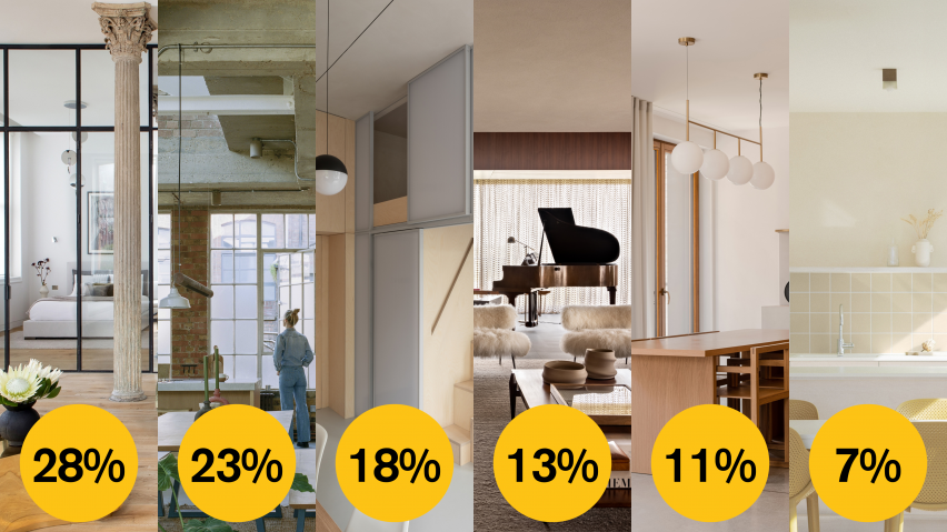
Dezeen Awards 2022 public vote apartment interior

Apartment interior

› 28 per cent – Tribeca Loft, New York City, USA, by Andrea Leung
› 23 per cent – Earthrise Studio, London, United Kingdom, by Studio McW
› 18 per cent – Shoji Apartment, London, United Kingdom, Proctor and Shaw
› 13 per cent – Flat 6, São Paulo, Brazil, by Studio MK27
› 11 per cent – The Hideaway Home, Gdańsk, Poland, by ACOS
› Seven per cent – Iceberg, Tel-Aviv, Israel, by Laila Architecture

Browse all projects on the apartment interior shortlist page.


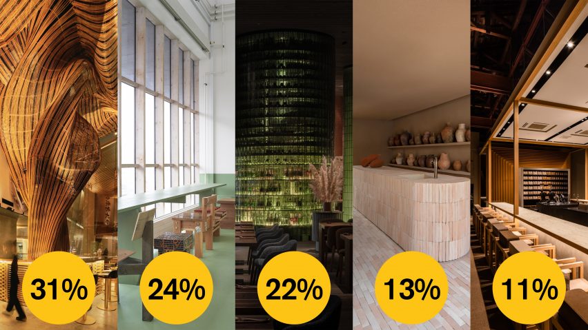
Dezeen Awards 2022 public vote restaurant and bar interior

Restaurant and bar interior

› 31 per cent – Spice & Barley, Bangkok, Thailand, by Enter Projects Asia
› 24 per cent – Connie-Connie at the Copenhagen Contemporary, Copenhagen, Denmark, by Tableau and Ari Prasetya
› 22 per cent – Terra, Vynnyky, Ukraine, by YOD Group
› 13 per cent – Dois Tropicos, São Paulo, Brazil, by MNMA Studio
› 11 per cent – Koffee Mameya Kakeru, Tokyo, Japan, by Fourteen Stone Design

Browse all projects on the restaurant and bar interior page.


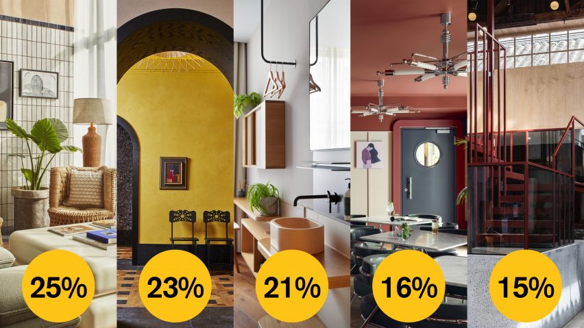
Dezeen Awards 2022 public vote hotel and short-stay

Hotel and short-stay interior

› 25 per cent – The Hoxton Poblenou, Barcelona, Spain, by Ennismore
› 23 per cent – Downtown L.A. Proper Hotel, Los Angeles, USA, by Kelly Wearstler Studio
› 21 per cent – Inhabit Queen’s Gardens, United Kingdom, by Holland Harvey
› 16 per cent – Schwan Locke, Munich, Germany, by Locke
› 15 per cent – Well Well Well Hotel Renovation, Beijing, China, Fon Studio

Browse all projects on the hotel and short-stay interior page.


Dezeen Awards 2022 public vote large workspace interior

Large workspace interior

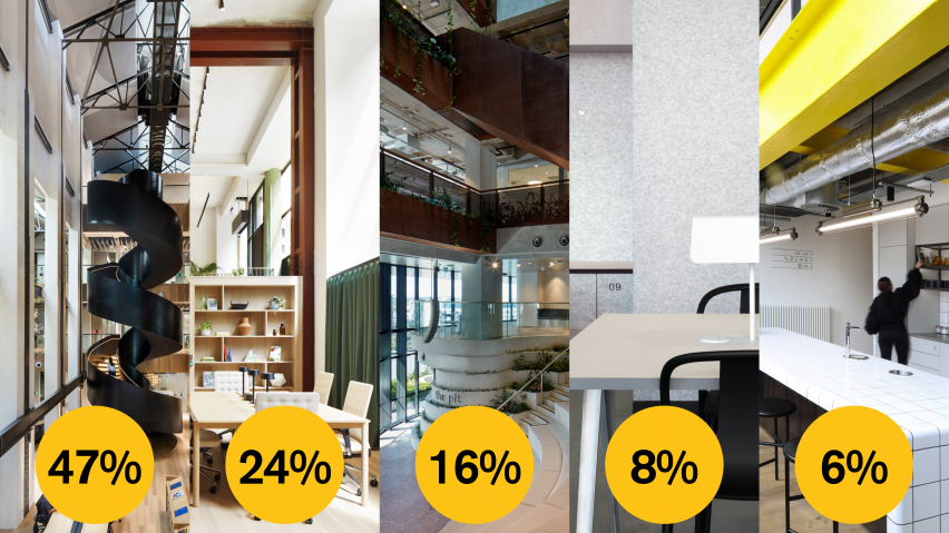
› 47 per cent – Dyson Global HQ St James Power Station, Singapore, by M Moser Associates
› 24 per cent – Victoria Greencoat Place, London, United Kingdom, by Fora
› 16 per cent – Midtown Workplace, Brisbane, Australia, by Cox Architecture
› Eight per cent – Design District Bureau Club, London, United Kingdom, by Roz Barr Architects
› Six per cent – Generator Building, Bristol, United Kingdom, by MoreySmith

Browse all projects on the large workspace interior page.


Dezeen Awards 2022 small workspace interior

Small workspace interior

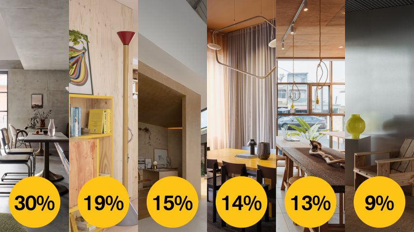
› 30 per cent – Alexander House, Sydney, Australia, by Alexander & Co.
› 19 per cent – OTK Ottolenghi, London, United Kingdom, by Studiomama
› 15 per cent – HNS Studio, Nanjing, China, Muhhe Studio Institute of Architecture
› 14 per cent – Samsen Atelier, Stockholm, Sweden, by Note Design Studio
› 13 per cent – The F.Forest Office, Linbian, Taiwan, by Atelier Boter
› Nine per cent – Asket Studio, Stockholm, Sweden, by Atelier Paul Vaugoyeau

Browse all projects on the small workspace interior page.


Dezeen Awards 2022 public vote large retail interior

Large retail interior

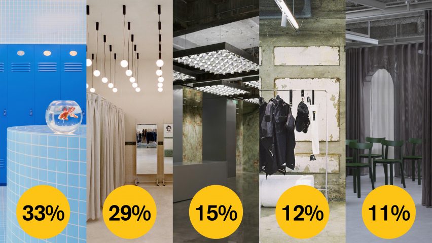
› 33 per cent – An Interactive Spatial Design and Scenography for Jacquemus at Selfridges, London, United Kingdom, by Random Studio
› 29 per cent – Deja Vu Recycle Store, Shanghai, China, by Offhand Practice
› 15 per cent – XC273, Shanghai, China, by Dongqi Design
› 12 per cent – Kolon Sport Sotsot Rebirth, Cheju Island, South Korea, by Jo Nagasaka / Schemata Architects
› 11 per cent – Proud Gallery Gotanda, Gotanda, Japan, by Domino Architects / HAKUTEN / Nozomi Kume (Studio Onder de Linde)

Browse all projects on the large retail interior page.


Dezeen Awards 2022 public vote small retail interior

Small retail interior

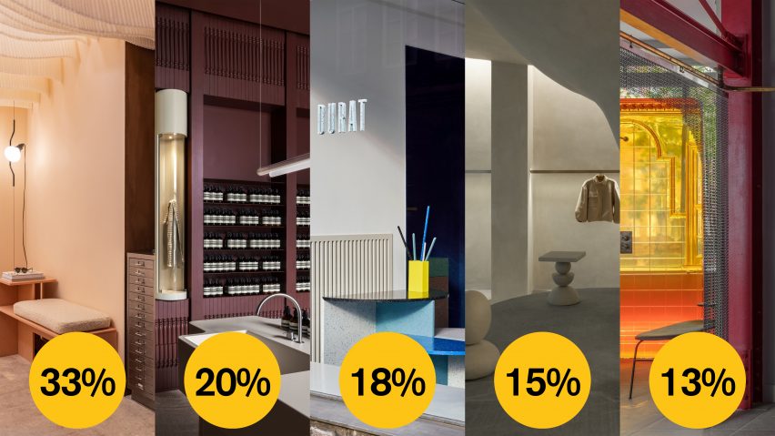
› 33 per cent – MONC, London, United Kingdom, by Nina+Co
› 20 per cent – Aesop Yorkville, Toronto, Canada, by Odami
› 18 per cent – Durat Showroom, Helsinki, Finland, by Linda Bergroth
› 15 per cent – Haight Clothing Store, Rio de Janeiro, Brazil, by Aia Estudio
› 13 per cent – The Market Building, London, United Kingdom, by Holloway Li

Browse all projects on the small retail interior page.


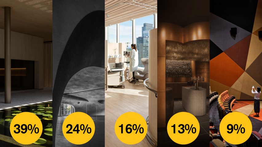
Dezeen Awards 2022 leisure and wellness interior

Leisure and wellness interior

› 39 per cent – Patina Maldives Spa, Fari Islands, Maldives, by Studio MK27
› 24 per cent – Self Revealing, Taipei City, Taiwan, by Studio X4
› 16 per cent – Barlo MS Centre, Toronto, Canada, by Hariri Pontarini Architects
› 13 per cent – Bath & Barley, Brussels, Belgium, by WeWantMore
› Nine per cent – Wan Fat Jinyi Cinema, Shenzhen, China, by One Plus Partnership

Browse all projects on the leisure and wellness interior page.


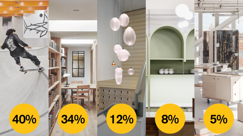
Dezeen Awards 2022 public vote civic and cultural interior

Civic and cultural interior

› 40 per cent – F51 Skate Park, Folkestone, United Kingdom, by Hollaway Studio
› 34 per cent – Stanbridge Mill Library, Dorset, United Kingdom, by Crawshaw Architects
› 12 per cent – The Groote Museum, Amsterdam, Netherlands, by Merk X
› Eight per cent – Yorck Kino Passage, Berlin, Germany, by Batek Architekten
› Five per cent – Designing Ecole Camondo Méditerranée’s Interior, Toulon, France, by Émilieu Studio

Browse all projects on the civic and cultural interior page.


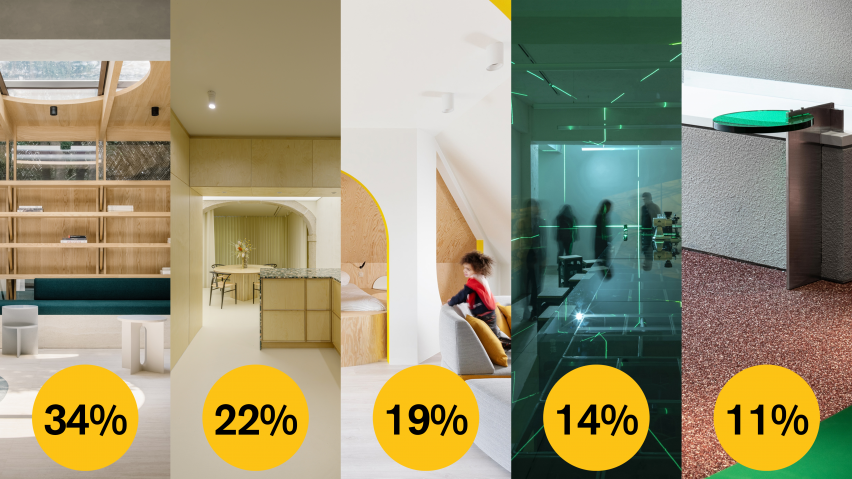
Dezeen Awards 2022 public vote small interior

Small interior

› 34 per cent – A Private Reading Room, Shanghai, China, by Atelier Tao+C
› 22 per cent – OHL Cultural Space for the Arts, Lisbon, Portugal, by AB+AC Architects
› 19 per cent –Relaxing Geometry with Pops of Yellow, Antwerp, Belgium, by Van Staeyan Interior Architects
› 14 per cent – Fatface Coffee Pop Up Shop, Shenyang, China, by Baicai Design
› 11 per cent – Sik Mul Sung, South Korea, by Unseenbird

Browse all projects on the small interior page.

Reference

Tiny Timber: 6 Small-Scale Retail Designs With Beautiful Wooden Interiors
CategoriesArchitecture

Tiny Timber: 6 Small-Scale Retail Designs With Beautiful Wooden Interiors

How can architecture be a force for good in our ever-changing world? During Future Fest, we’re pose this question to some of the world’s best architects. We’re hosting daily virtual talks from September 12th to 30th, which are 100% free to attend.  Check out the full schedule!

Shops can provide impressive shopping experiences even with limited floor areas. Instead of using shiny and luxurious materials that crowd the space, wood can easily bring intimacy and coziness to compact spaces. This collection includes six examples of retail designs that smartly employ wood in small store spaces. They demonstrate the possibility of timber-clad interiors, revealing how wood can evoke a range of atmospheres from quiet calmness to bright warmth to intimate mystery and more.


Mi Pan

By Concentrico, Mexico City, Mexico

Popular Choice Winner, 10th Annual A+Awards, Retail

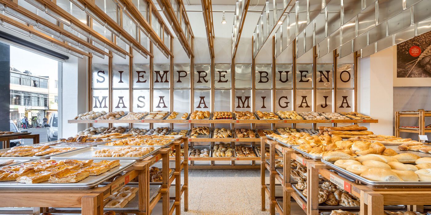
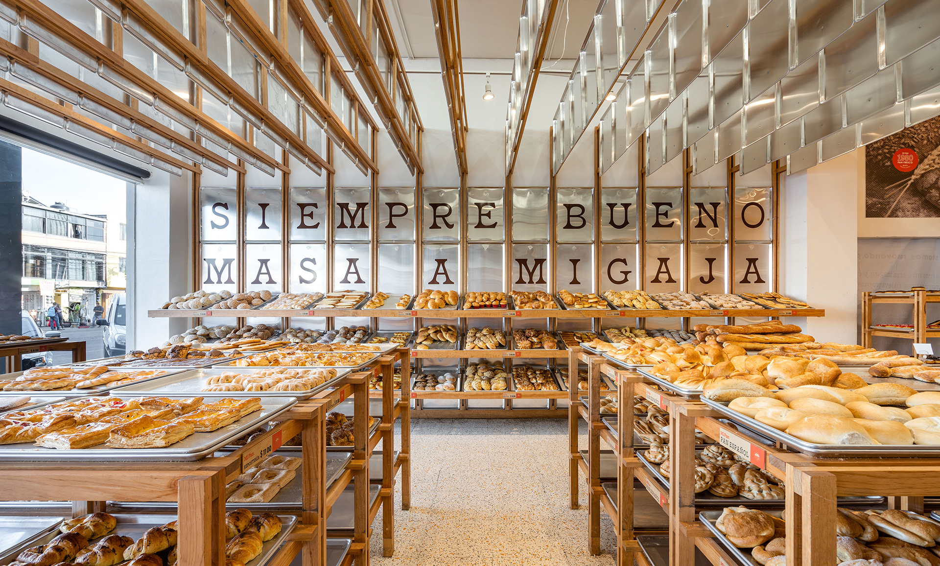
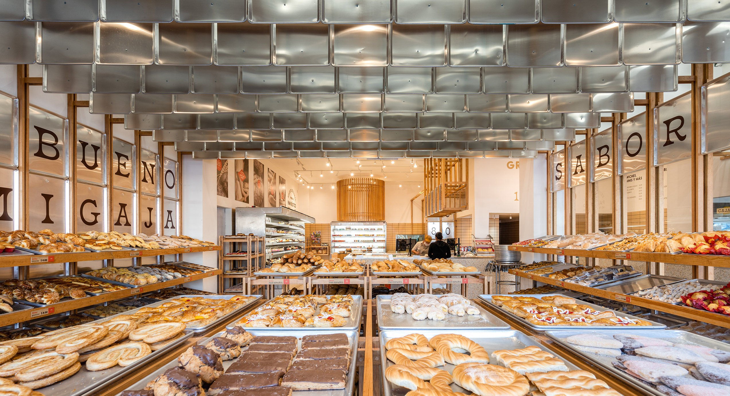
mi pan_interior_1mi pan_interior_2The bakery Mi Pan celebrates bakers’ hard work in making delicious bread. Metal trays reoccur on the shelves, wall cladding and ceiling decorations. These are the same type of tray used for bread production, reminding people of the heart of Mi Pan – the kitchen.
Instead of regular shelves, the design team uses trays and timber frames to hold freshly-baked bread. The trays emphasize the fact that the bread comes straight out of the kitchen as they are ready. Timber frames extend onto the walls and ceiling, breaking the boxy space into rhythmic fragments. The trays that hang from the ceiling hide cables from customers’ sight while making the bakery cozier by lowering the space.


Haregino Marusho

By Tsutsumi And Associates, Yokohama, Japan

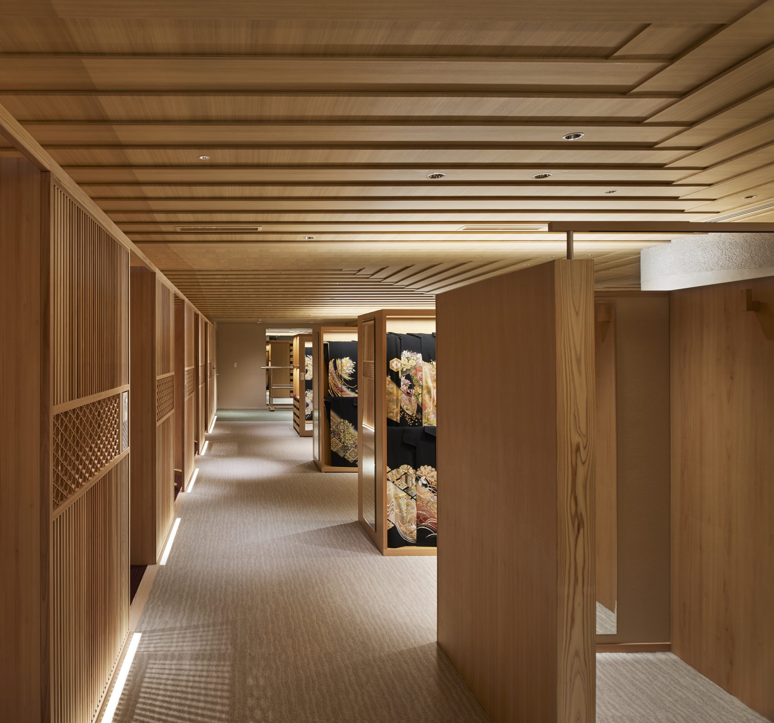
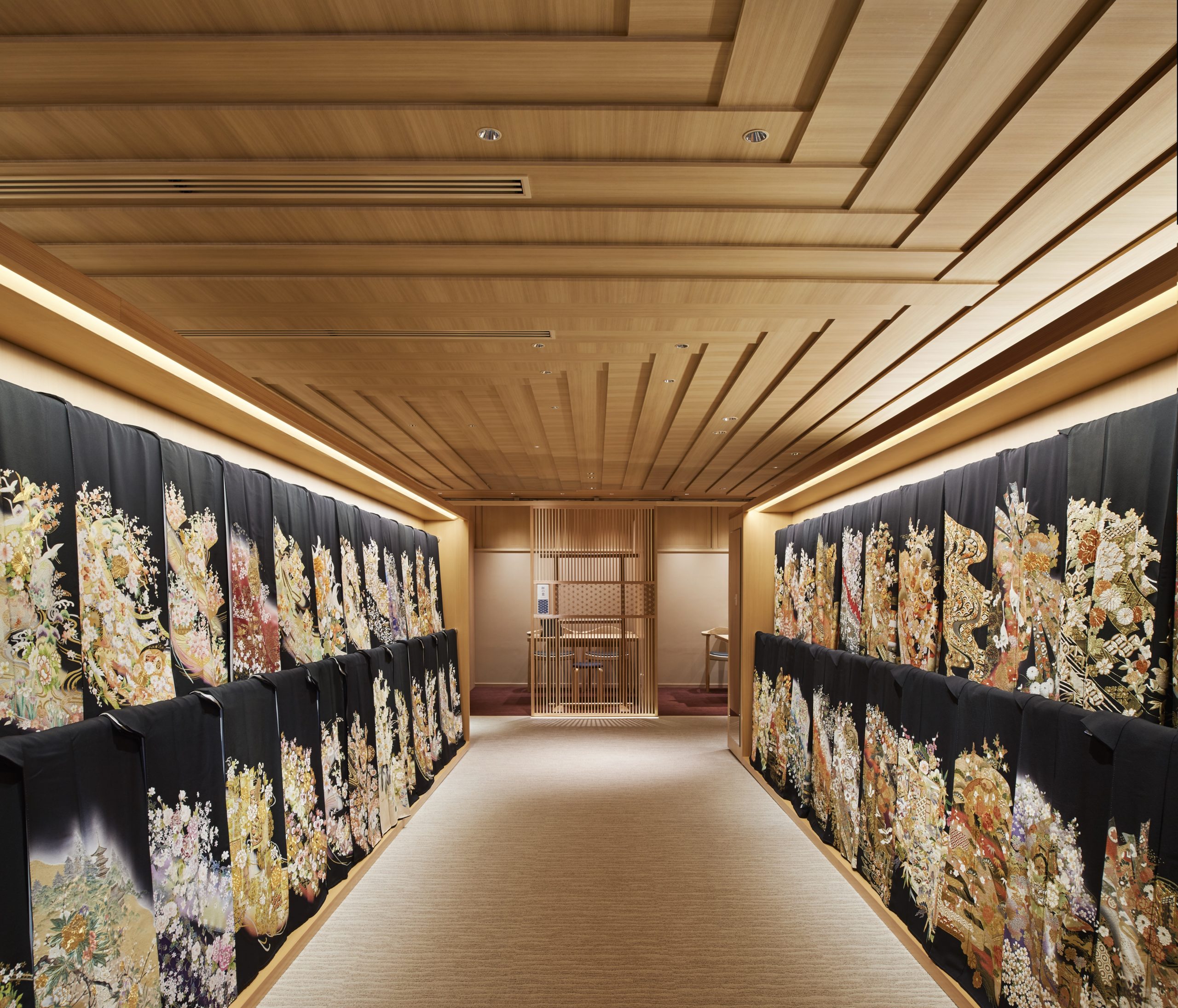
haregino marusho_interior_1haregino marusho_interior_3The design team refurbished the floor of the wedding Kimono in the traditional Japanese clothing shop Haregino Marusho and themed it with wood. Many spatial components, including display shelves, partitions and the ceiling, are in warm-color wood of similarly soft patterns. The space becomes an elegant wooden display box that does not take any spotlight from the kimono fabrics.
The ceiling panels are cut strategically to create a layering effect that resembles the Kasane (layering) of the Kimono. They also bring subtle changes in the ceiling height, making the monochromatic space more interesting to wander through.


Blackhills Cafe

By Mora + Suksumek, Lat Phrao, Bangkok, Thailand

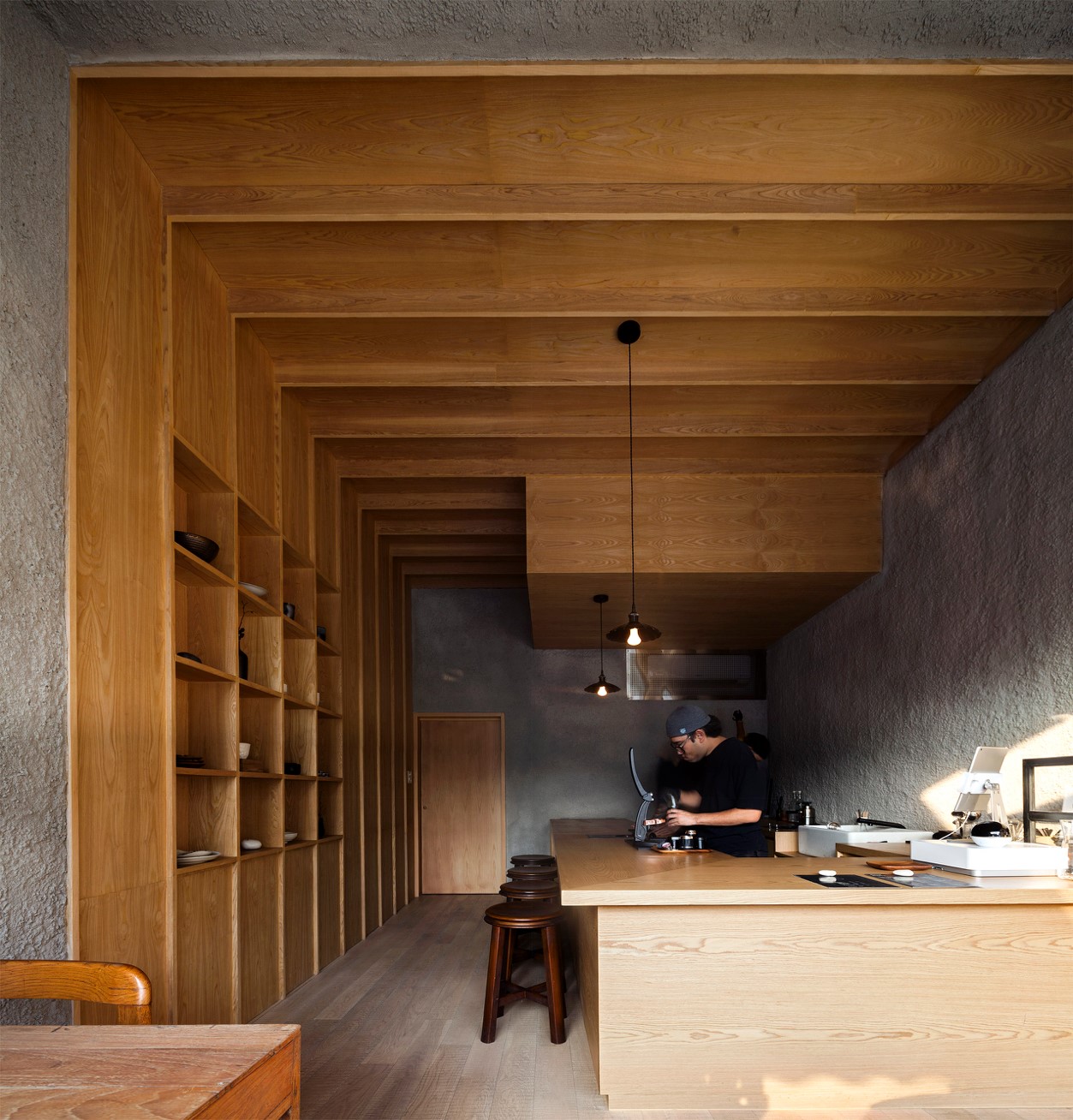
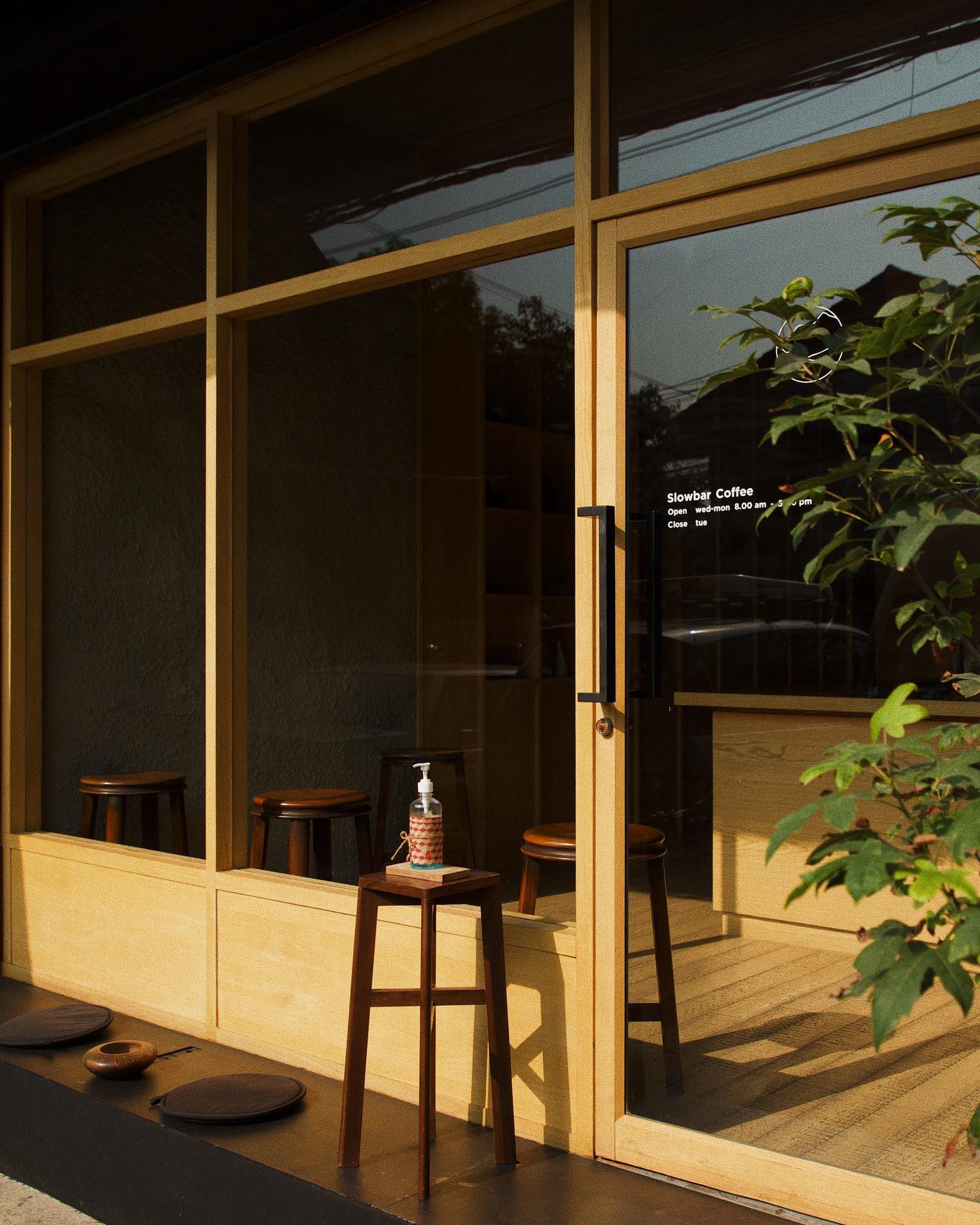
blackhills cafe_interior_1blackhills cafe_frontIn the coffee bar Blackhill, smooth wooden surfaces are put in conjunction with rough concrete surfaces. They together create a zen space for enjoying a moment away from the busy central Bangkok. In contrast to the colorful urban environment outside, the materials used in the coffee shop are limited to only wood and concrete. The simplicity of the design makes it almost a meditative space.
The coffee shop has a large, glazed front that welcomes late afternoon sunlight into the shop. Natural light gets through the open-plan interior. A few seats are available by the window and by the counter. Sunset, the visual and smelling experience of coffee-making are presented all at once.


Tsubomi House (Tokyo Bud House)

By FLAT HOUSE, Tokyo, Japan

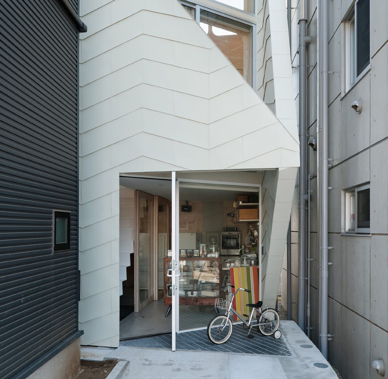
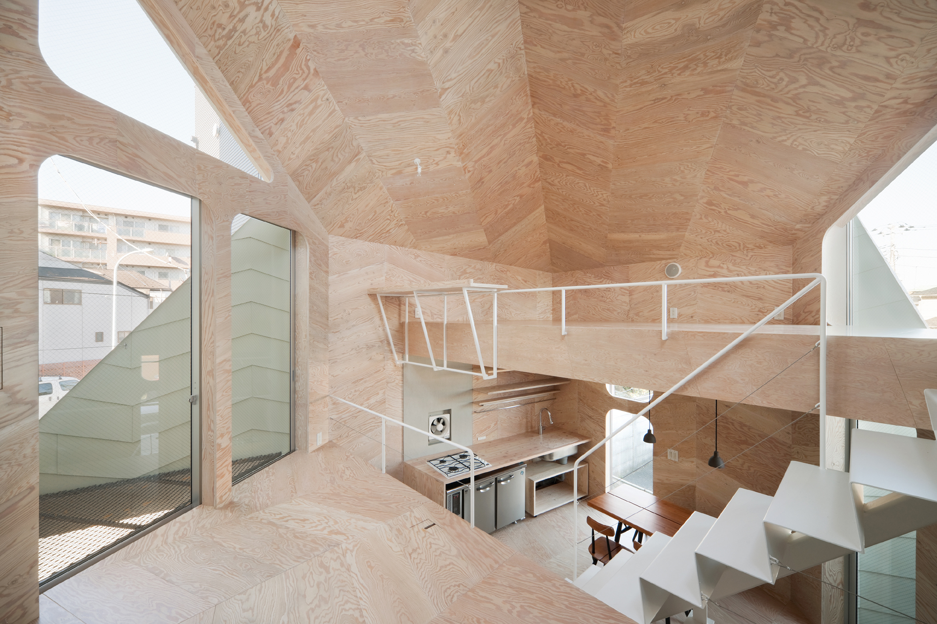
This small house has a footprint of only 280 square feet, yet it accommodates a biscuit shop and the shop owner’s family. Tsubomi House has seven different levels with no solid partitions between them. Each level is half a story higher/lower than the next one. Without walls separating each functional area, residents can move quickly from one space to another.

The interior finishing is largely in plywood which produces a gentle reflection of light. Natural light, therefore, comes in through openings on different levels and travels in the whole space. Paired with ivory steel, the light-color plywood makes the compact interior bright and continuous.


Sandra Weil Store

By Zeller & Moye, Mexico City, Mexico

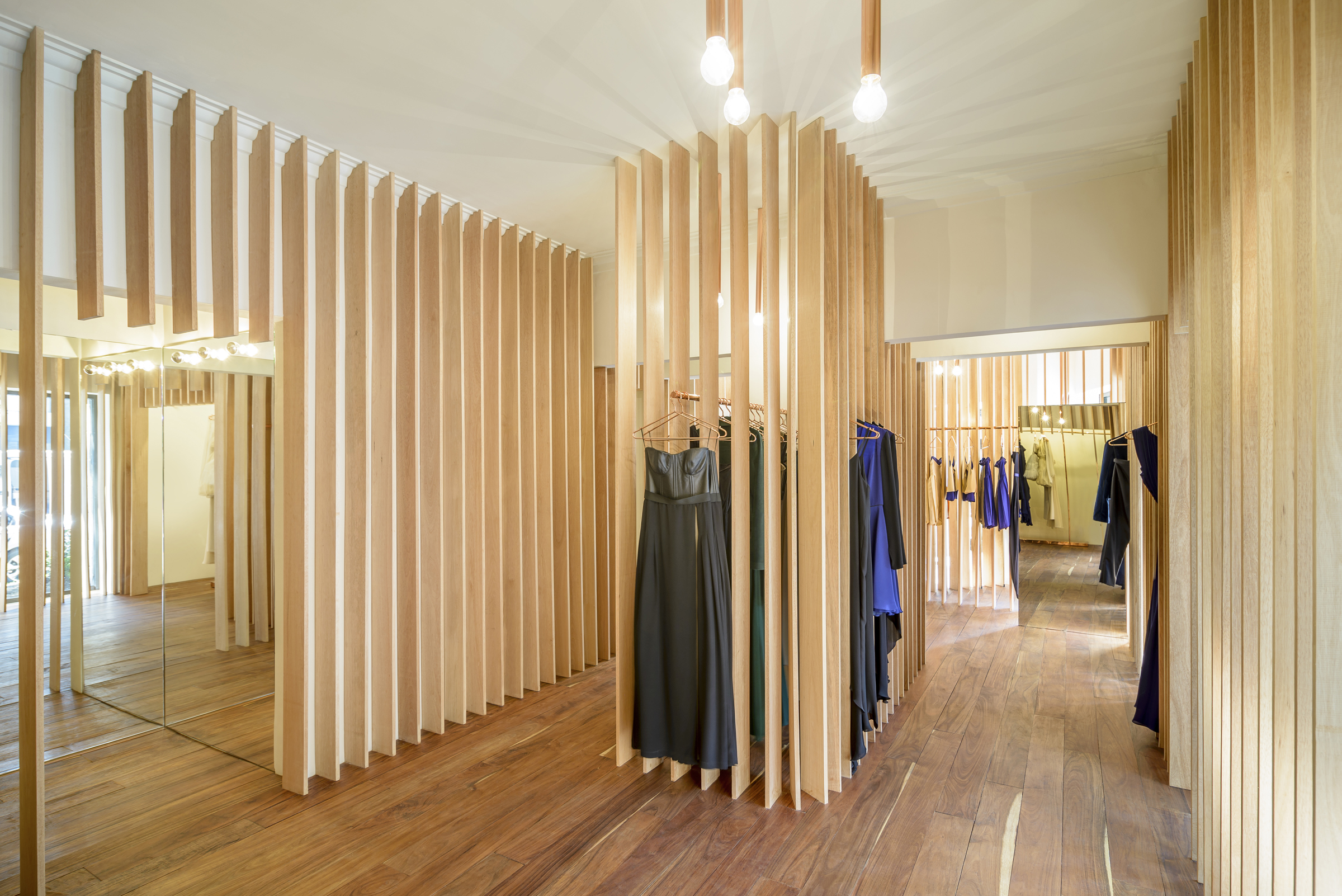
sandra weil_interiorsandra weil_detailInstead of presenting the garments all at once, Sandra Weil Store’s design gradually reveals the collections as customers walk around. Floor-to-ceiling slats made of local tropical wood stand in line with equal intervals between them. They form rhythmic partitions that are visually permeable only from certain angles. This allows a comfortable level of privacy in the shop without cutting the small store space into tiny fragments.
Garments hide between the slats, not showing themselves fully until the customer is in front of them. Meanwhile, the light and view change as well from one rack to another. The shopping experience in Sandra Weil is all about exploration.


RE x SUGAR

By CHINA ONDO Studio, Nanjing, China

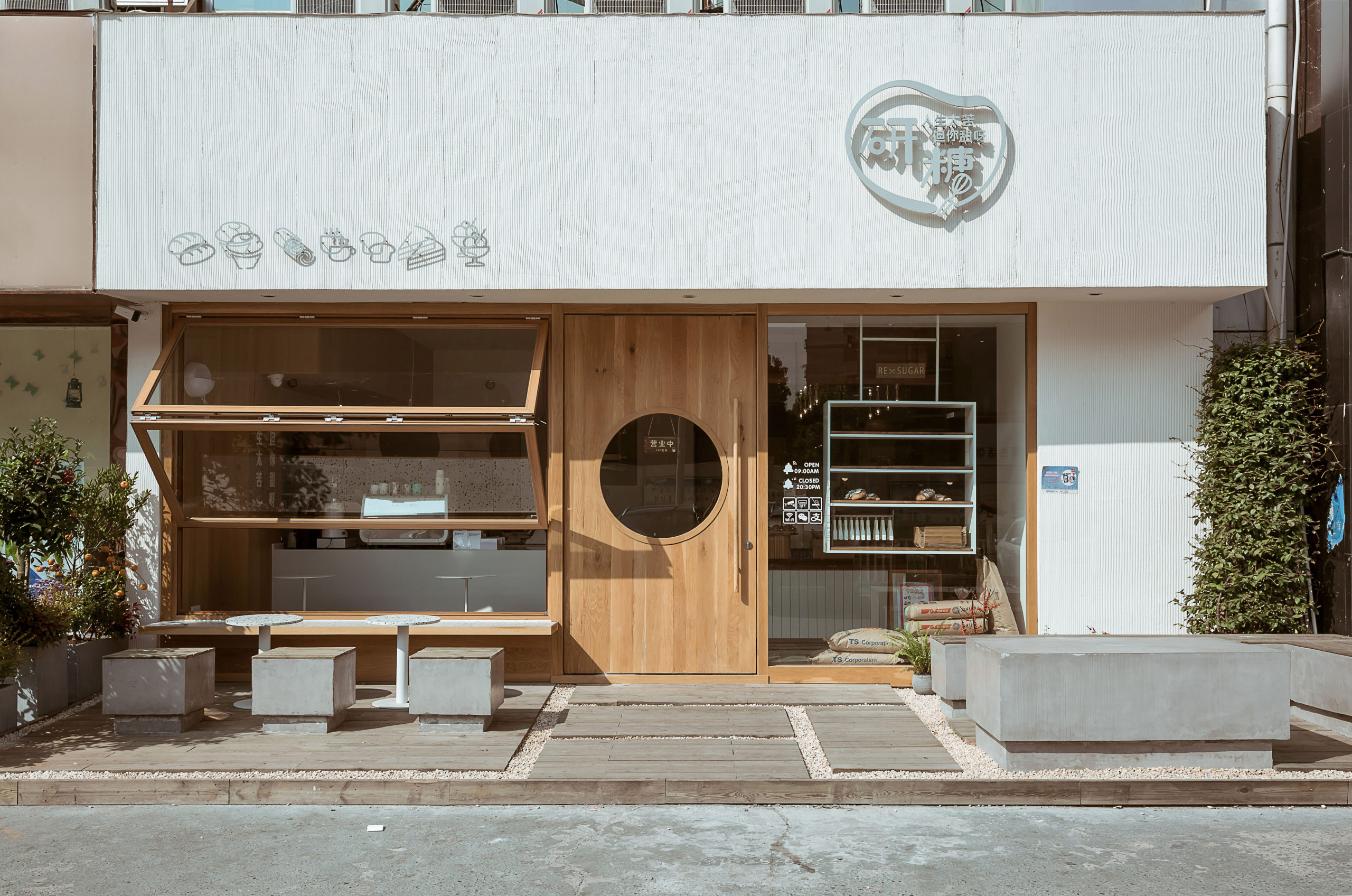
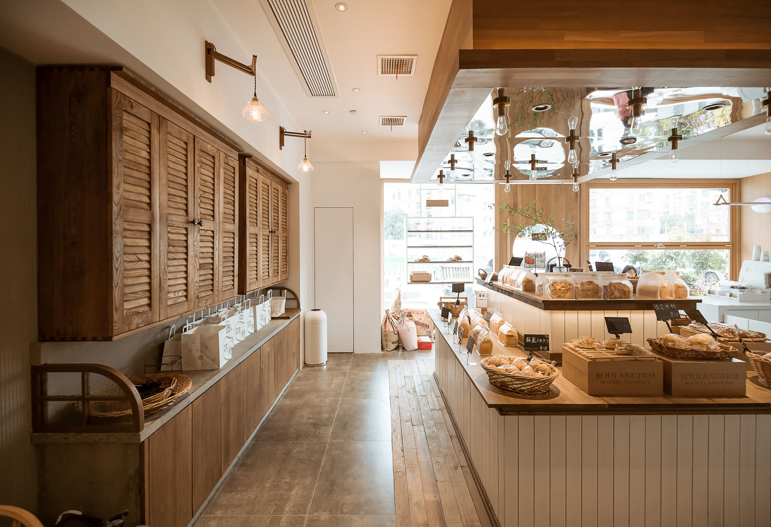
re sugar_frontre sugar_interiorThis community bakery uses large areas of warm-color timber to create a relaxing atmosphere. Like Blackhills Café, RE x SUGAR also has a transparent shop front that embraces the sunlight. A large folding window connects indoors and outdoors while the window sills become seats.
Woods of different textures create a harmonic yet interesting space. Some wooden surfaces are smooth, for example, the front door, walls, window frames and chairs. Cupboards, the display area of bread and the floor around it are covered in rather rough and pattern-intensive wood.

How can architecture be a force for good in our ever-changing world? During Future Fest, we’re pose this question to some of the world’s best architects. We’re hosting daily virtual talks from September 12th to 30th, which are 100% free to attend.  Check out the full schedule!

Reference

Hariri Pontarini rethinks cold medical interiors at BARLO MS Centre
CategoriesInterior Design

Hariri Pontarini rethinks cold medical interiors at BARLO MS Centre

Canadian architecture studio Hariri Pontarini has completed a clinic in Toronto for multiple sclerosis patients that features warm wood tones and spaces designed to feel like “first-class airplane lounges”.

The Barlo MS Centre is Canada’s largest clinic dedicated to those with MS, a complex autoimmune disease that affects the central nervous system.

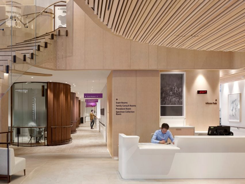
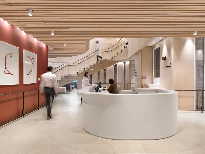
Entrance with curved reception desk
The BARLO MS Centre was designed with atypical colours, materials, textures and lighting

Named after its two biggest donors, the Barford and Love families, the centre occupies the top two floors of a new 17-storey tower at St Michael’s Hospital in Downtown Toronto.

The 30,000-square-foot (2,790-square-metre) facility was designed by local studio Hariri Pontarini Architects, which aimed to rethink sterile-looking healthcare spaces and focus on patient wellbeing through the use of atypical colours, materials, textures and lighting.

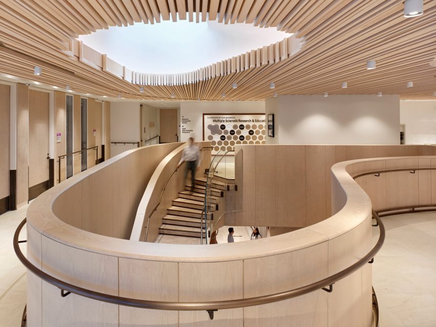
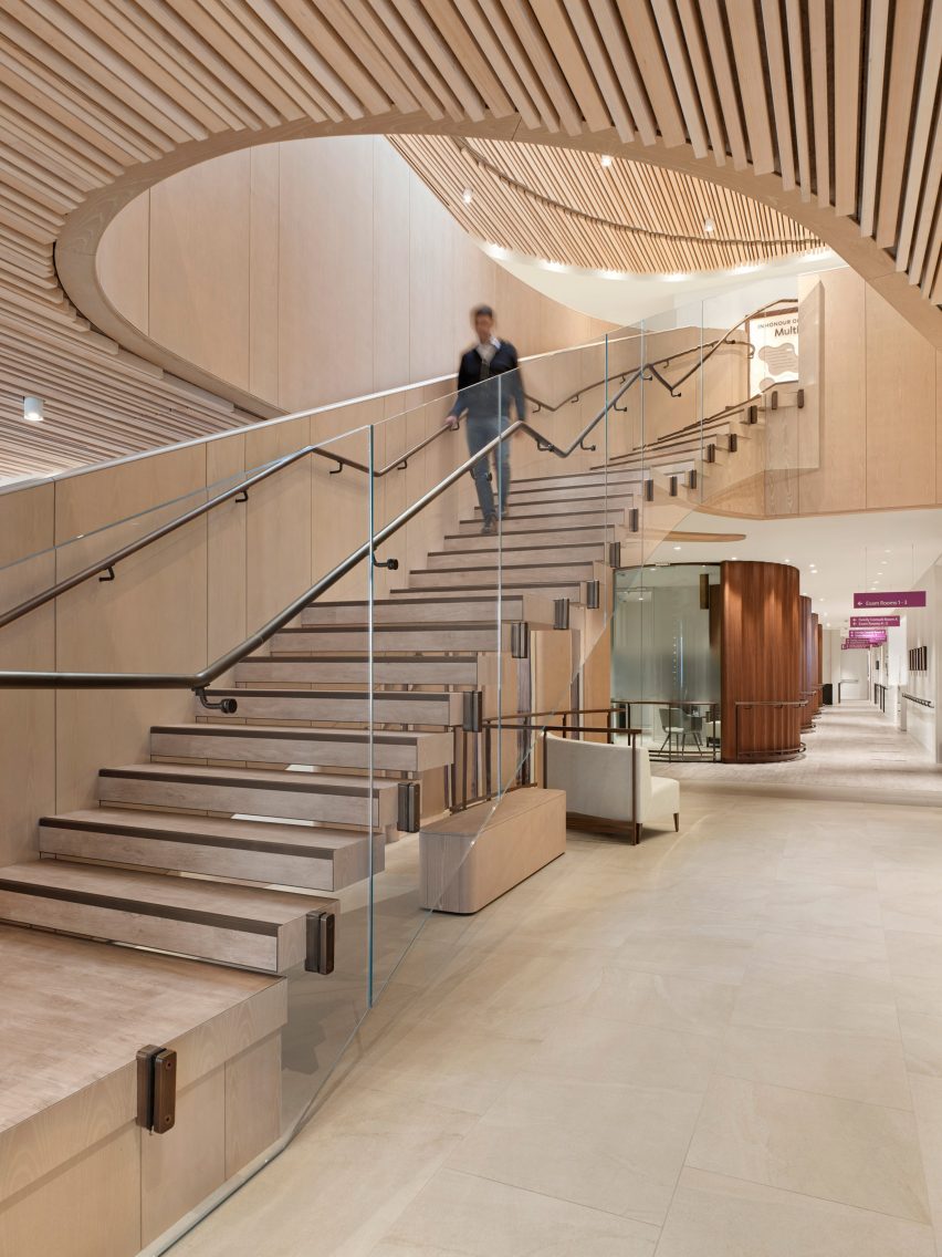
Feature staircase in the atrium
The clinic’s two storeys are connected by a staircase that rises through an atrium

“Canadians are particularly prone to MS for reasons that are unclear,” said the studio.

“This hospital’s mission is nothing less than to transform MS care and become the world’s leading MS centre through research and clinical treatment.”

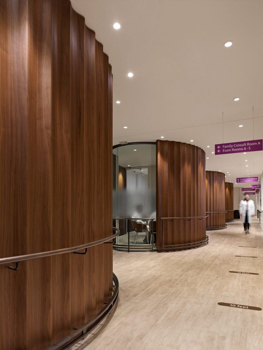
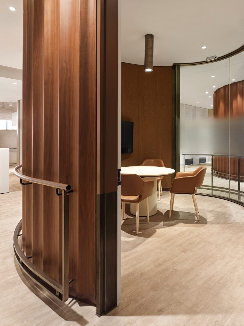
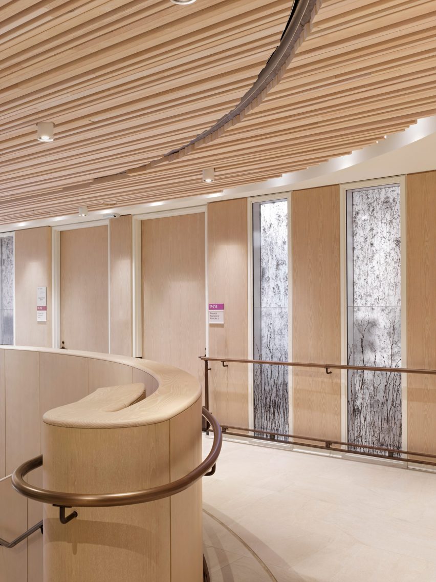
Walnut cladding around consultation rooms
Circular consultation rooms are partially clad in walnut

Taking cues from the hospitality industry, the team aimed to create a “comfortable and welcoming environment” by filling the spaces with daylight and offering views of the skyline.

The two floors are connected by a double-height atrium, topped with an oculus that allows more natural light in from above.

Inside a consultation room
The wavy panels conceal the rooms from the main circulation corridor

A staircase rises up through the atrium, curving towards the top with a glass balustrade to follow the shape of the opening.

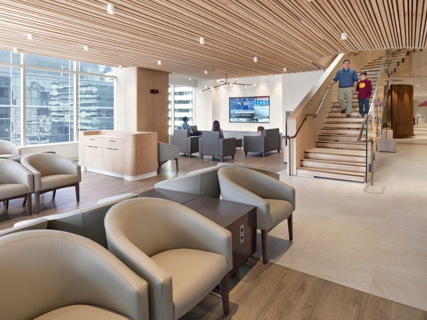
Downstairs, the atrium connects to a lounge at the corner of the building and a reception area anchored by a curved white counter.

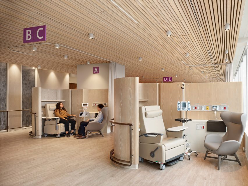
Infusion pods
Infusion pods are given privacy by pale wood screens

A wide corridor leads past a series of cylindrical consultation rooms that are partially glazed, but screened where they face the circulation area by wavy walnut panels.

On the other side of the floor plan, smaller and more open consultation booths named infusion pods are still offered privacy with curved pale wood screens.

Reception area
Different varieties of wood give the interiors a warm tone

“The infusion pods where patients may sit for up to eight hours are modelled to resemble a first-class airplane lounge and provide complete control over their environment,” the Hariri Pontarini team said.

Various light-toned woods are used for wall panels and balustrades, as well as thin slats that extend across the ceilings.

Lounge area
The atrium connects to a lounge and waiting area

All spaces were designed with durability and accessibility in mind, considering that some MS patients have vision and cognitive loss, fatigue and impaired coordination.

Bronze-coloured handrails were installed along the majority of walls and partitions, while anti-slip porcelain tiles cover the floors to aid patient mobility.

The centre also includes a gym, a mock apartment adapted for MS patients, and rooms for meetings, research and administration.

Together, it provides patients with a space to see a dedicated healthcare team in one location and clinicians the state-of-the-art resources to offer the best possible treatment.

Upper level lit by oculus
An oculus above the atrium brings daylight into the centre of the building

Hariri Pontarini Architects was founded by Siamak Hariri and David Pontarini in 1994.

One of the studio’s most recognisable buildings is the Bahá’í temple in Chile, featuring torqued wings made of steel and glass, while its work closer to home includes the glass-wrapped Tom Patterson Theatre in Stratford, Ontario.

Upper level corridor
Handrails are provided throughout the clinic to aid patient mobility

The Bar MS Centre is one of five projects shortlisted in the Leisure and Wellness Interior category of the Dezeen Awards 2022, along with a Shenzhen cinema and a spa in the Maldives.

See the full Interiors shortlist and vote now for your favourites.

The photography is by A-Frame.

Reference

Ten beautiful brutalist interiors with a surprisingly welcoming feel
CategoriesInterior Design

Ten beautiful brutalist interiors with a surprisingly welcoming feel

For our latest lookbook, we’ve collected 10 brutalist interiors from the UK to Brazil and Indonesia that show how textiles, plants and colours can be used to soften monolithic concrete spaces and create a cosy atmosphere.

Brutalism as an architectural style often makes use of concrete to create large, sculptural buildings. These interiors in brutalist buildings feature plenty of concrete and hard angles but still manage to feel both warm and welcoming.

Colourful tiling, wooden details and tactile textiles as well as an abundance of green plants were used to create inviting living rooms, bathrooms and even workspaces in these brutalist buildings, which include the Barbican in London and Riverside Tower in Antwerp.

This is the latest in our lookbooks series, which provides visual inspiration from Dezeen’s archive. For more inspiration see previous lookbooks featuring granite kitchens, terrazzo eateries and atriums that brighten up residential spaces.


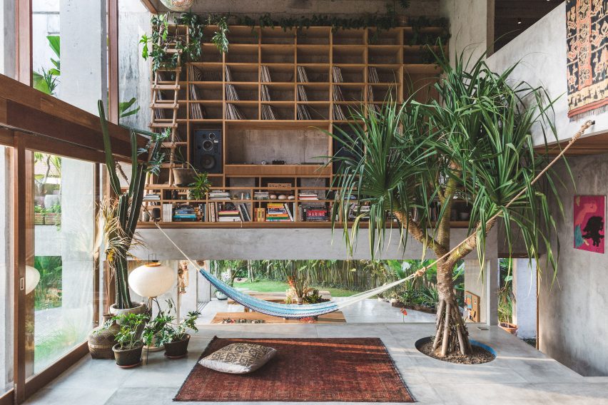
A Brutalist Tropical Home in Bali by Patisandhika and Daniel Mitchell
Photo is by Tommaso Riva

A Brutalist Tropical Home, Indonesia, by Patisandhika and Dan Mitchell

Designer Dan Mitchell worked with architecture studio Patisandhika to create this brutalist home in Bali, which features a double-height living room filled with books, records and green plants.

The house has a split-level design that was modelled on modernist architect Ray Kappe’s Kappe Residence. Inside, colourful objects, textiles and furniture draw on the work of Clifford Still, Ellsworth Kelly and the Bauhaus movement to make the house feel homely.

Find out more about A Brutalist Tropical Home ›


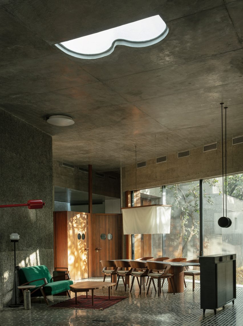
Large living room with concrete ceiling
Photo is by Niveditaa Gupta

House of Concrete Experiments, India, by Samira Rathod

As the name suggests, House of Concrete Experiments features sculptural concrete walls. Warm wood detailing offsets the grey hues, while the concrete floor has been inlaid with black stones to create an interesting pattern.

Large windows and geometric skylights help make the room feel bright and inviting.

Find out more about House of Concrete Experiments ›


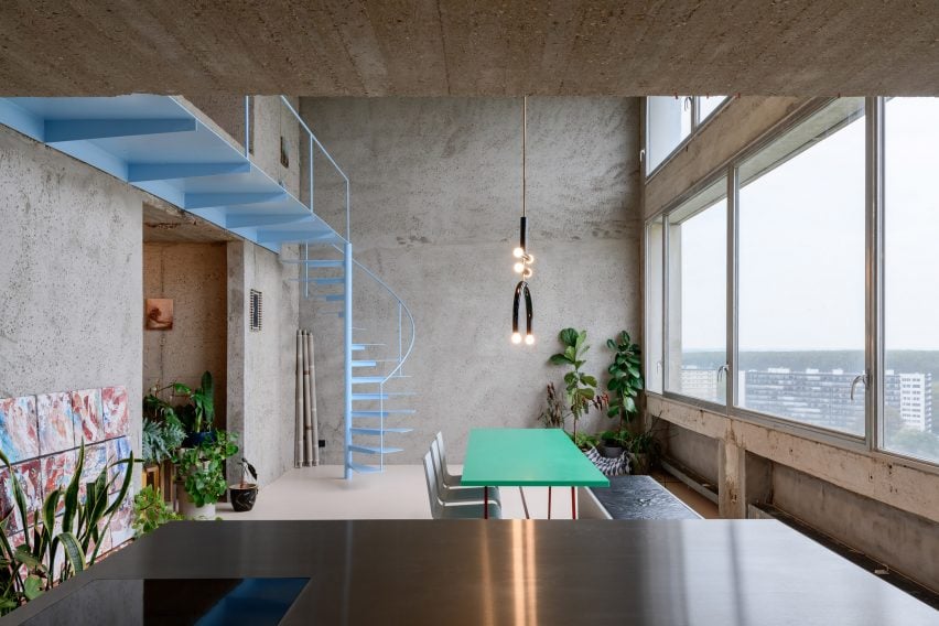
Turquoise table in room with concrete walls
Photo is by Olmo Peeters

Riverside Tower Apartment, Belgium, by Studio Okami Architecten

Studio Okami Architecten stripped the walls of this flat in Antwerp’s Riverside Tower to let its original structure take centre stage.

Colourful details such as a turquoise table and baby-blue spiral staircase and a playful, sculptural lamp make the home feel contemporary, while plenty of green plants give more life to the otherwise grey interior.

Find out more about Riverside Tower Apartment ›


Light-filled atrium in brutalist home
Photo is by Photographix

Beton Brut, India, by The Grid Architects

Designed as a “neo-brutalist” house, Beton Brut in India has a number of dramatic features, including a skylit atrium that extends through the home.

The Grid Architects described the home as “typified by bare concrete, geometric shapes, a monochrome palette and a monolithic appearance”. Wooden flooring and furniture and plenty of textiles soften the house’s brutalist interior and potentially stern appearance.

Find out more about Beton Brut ›


Shakespeare Tower apartment by Takero Shimazaki Architects
Photo is by Anton Gorlenko

Barbican flat, UK, by Takero Shimakazi Architects

This flat in the Shakespeare Tower of London’s brutalist Barbican estate was overhauled by Takero Shimakazi Architects in a nod to the client’s strong ties to Japan.

Details such as gridded timber panels and timber joinery were added throughout the flat, which also features Japan-informed details including an area lined with tatami mats.
Find out more about the Barbican flat ›


Debaixo do Bloco Arquitetura
Photo is by Joana França

Concrete home, Brazil, by Debaixo do Bloco Arquitetura

Debaixo do Bloco’s design for this sculptural house in Brazil is divided into three sections to provide a clear distinction between the various programmes.

Inside, the interior has a mid-century modern feel, with gleaming wood parquet flooring and a glass PH table lamp by Danish designer Louis Poulsen decorating a side table.

Find out more about the concrete home ›


An office table and chairs inside the office
Photo is by Lorenzo Zandri

Smithson Tower office, UK, by ConForm

The brutalist Smithson Tower in Mayfair is the location for this “homely” office designed by ConForm Architects. The studio split the space into eight zones defined by the strong structural grid of the existing building, and added low-level joinery.
The result is a design that softens the stark office spaces and makes the rooms feel more intimate.

Find out more about the Smithson Tower office ›


The Standard hotel in London by Shawn Hausman Design
Photo is courtesy of The Standard

The Standard London, UK, by Shawn Hausman

Designer Shawn Hausman created the colour-drenched interior of hotel The Standard in London, which is located in a brutalist building, to contrast “the greyness of London”.

“I would say with this property we were a bit more colourful than usual, and I think part of that is acting in contrast to the brutalist building that the hotel’s in,” explained Hausman.

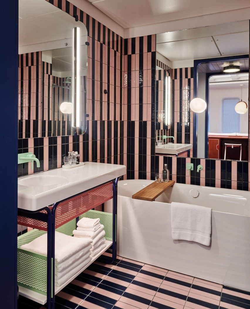
In the bathrooms, stripy pink-and-black tiled walls and pops of pale mint green give the room a fun, playful feel.

Find out more about The Standard London ›


The Preston Hollow by Specht Architects
Photo is by Casey Dunn

Preston Hollow, US, by Specht Architects

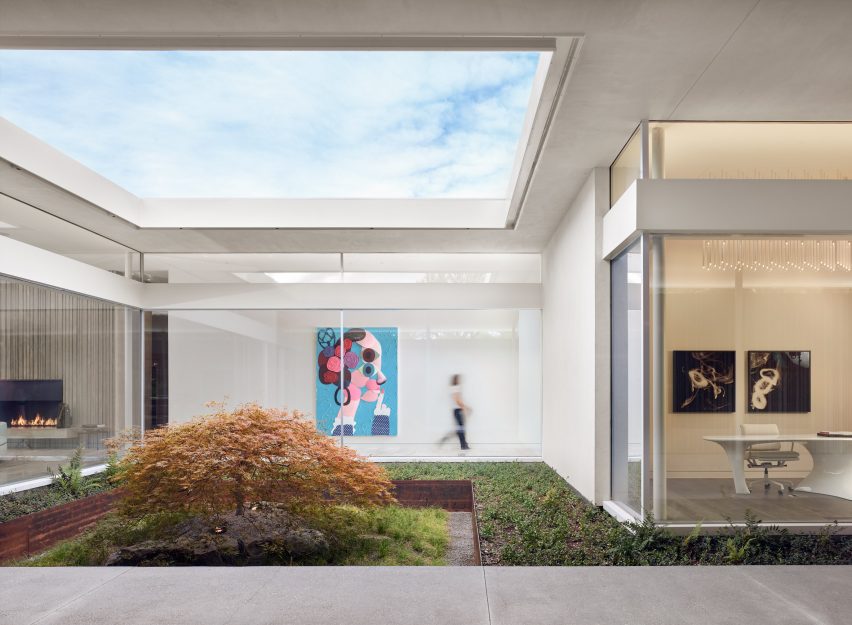
The long corrugated concrete volumes of Preston Hollow in Dallas were designed to reference brutalist Texan architecture from the 1950s and 60s, but the house was built to wrap around courtyards, creating a lively, open impression.

Inside the low-slung buildings, mid-century modern-style furniture nods to the home’s architectural references but the interior is brought up-to-date with the addition of modern art.

Find out more about Preston Hollow ›


Barbican apartment designed by John Pawson
Photo is by Gilbert McCarragher

Barbican apartment, UK, by John Pawson

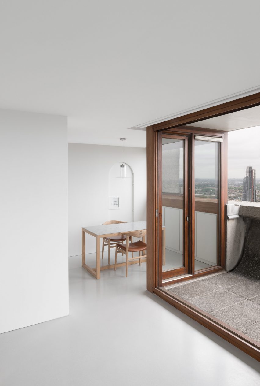
British architect John Pawson created this flat in London’s Barbican building using his signature minimalist aesthetic.

The flat, which overlooks central London and has a small concrete balcony, has been kept almost empty with just a smattering of furnishings and pale wooden surfaces. Three artworks, a Buddha sculpture and a grandfather clock are the only decorative elements in the space.
Find out more about the Barbican apartment ›

This is the latest in our lookbooks series, which provides visual inspiration from Dezeen’s archive. For more inspiration see previous lookbooks featuring granite kitchens, terrazzo eateries and atriums that brighten up residential spaces.

Reference

Ten kitchen interiors with polished granite surfaces
CategoriesInterior Design

Ten kitchen interiors with polished granite surfaces

The durable, stain-resistant qualities of granite make it a choice material for kitchens. Our latest lookbook showcases 10 kitchens on Dezeen that celebrate the light-coloured stone.

Waterproof and scratch-resistant, the igneous rock granite has been used in construction and interior design for centuries.

Today, the versatile material is often used as an alternative to marble to top kitchen counters and work surfaces, as well as in bathrooms or on floors.

From a large grey granite kitchen island in a Mexican apartment to a chevron-patterned granite floor in a London house, the examples below showcase the many ways in which the stone can be used to furnish kitchens.

This is the latest in our lookbooks series, which provides visual inspiration from Dezeen’s archive. For more inspiration see previous lookbooks homes with characterful floating staircases that appear to defy gravity, atriums that brighten and expand residential spaces and calm green bedrooms that showcase the power of natural colours.


Photo is by Federica Carlet

403 Greenwich, US, by Stefano Pasqualetti

A mix of materials including steel, marble, granite and wood were peppered throughout this New York residence, which Italian architect Stefano Pasqualetti aimed to make feel “soothing and timeless”.

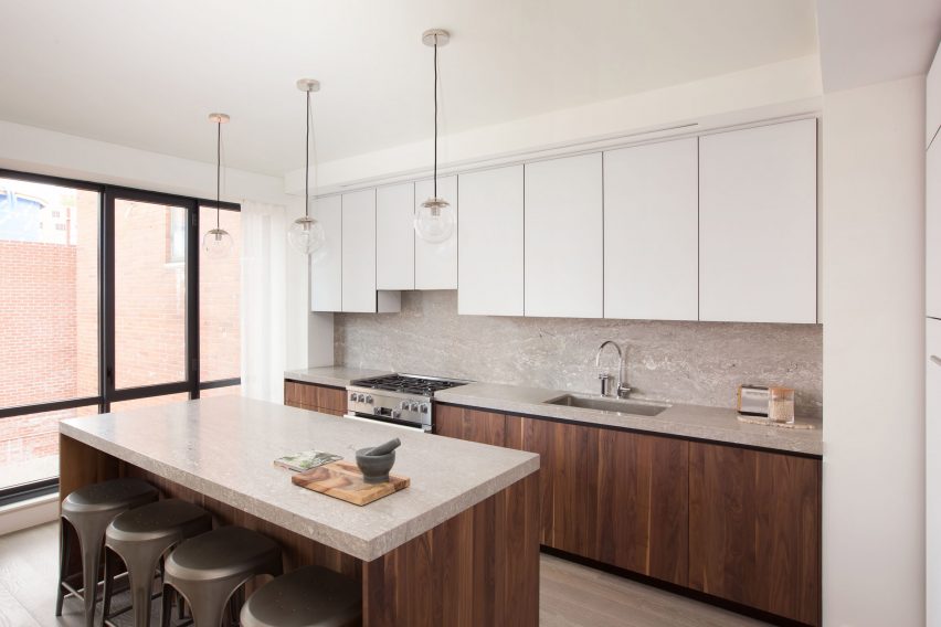
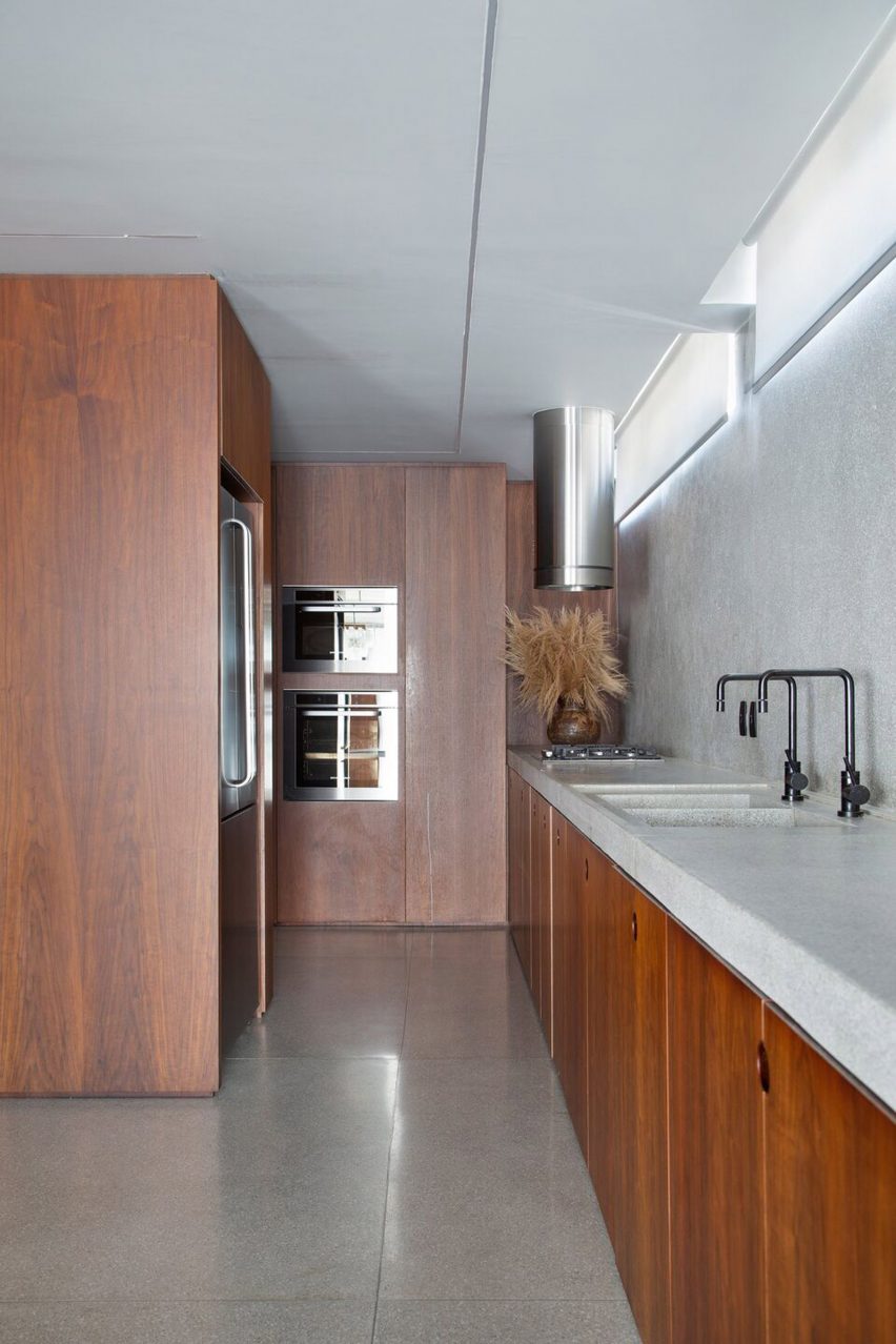
In the open-plan kitchen, which offers views onto Tribeca’s West Historic District neighbourhood, walnut cabinets are fitted with granite worktops while a standout blackened metal staircase runs through the property’s core.

Find out more about 403 Greenwich ›


Grove Park by O'Sullivan Skoufoglou
Photo is by Ståle Eriksen

Grove Park, UK, by O’Sullivan Skoufoglou Architects 

Designed for a client with a keen interest in the outdoors, Grove Park is a terraced house that offers expansive views of the greenery and wild woodland outside.

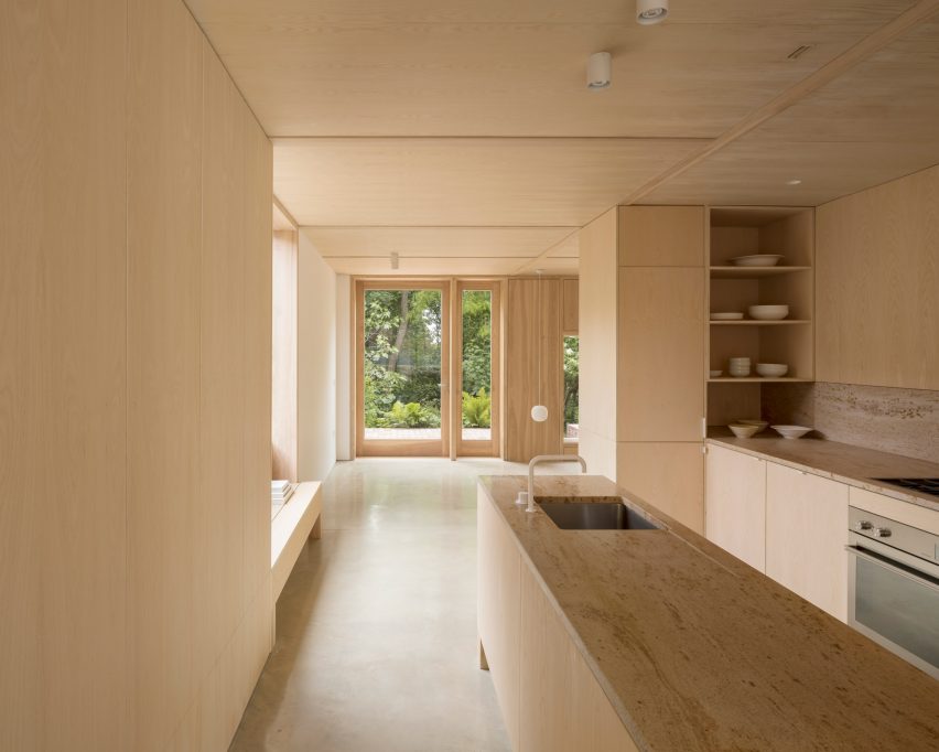
London-based studio O’Sullivan Skoufoglou Architects paired the ash-lined kitchen interior with creamy Shivakashi granite countertops and splashback and polished concrete flooring, which was cast in situ.

Find out more about Grove Park ›


A kitchen with grey granite countertops and wooden shelving
Photo is by Denilson Machado

DN Apartment, Brasil, by BC Arquitetos

Located in a 1970s building in the Jardins neighbourhood of São Paulo, this 230-square-metre apartment was designed for a landscape architect by local studio BC Arquitetos.

The apartment comprises a primarily warm natural walnut interior that is complemented with harder materials, such as concrete columns, stone flooring and granite countertops. A collection of mid-20th century art adds the finishing touch.

Find out more about DN Apartment ›


308 S Apartment by BLOCO Arquitetos
Photo is by Joana França

308 S, Brazil, by Bloco Arquiteos

Brazilian architecture studio Bloco Arquitetos transformed 308 S, an apartment in Brasília, by removing several walls and reconfiguring the challenging layout to make it more open plan.

To add to the stripped-back look, the architects opted for a neutral colour palette, while pale granite was used for the kitchen and bathroom countertops and flooring.

Find out more about 308 S›


Villarroel apartment by Raul Sanchez Architects
Photo is by José Hevia

Villarroel Apartment, Spain, by Raúl Sánchez Architects

The three main areas inside this apartment in Barcelona are distinguished by contrasting materials rather than traditional walls, making it appear more spacious and flexible.

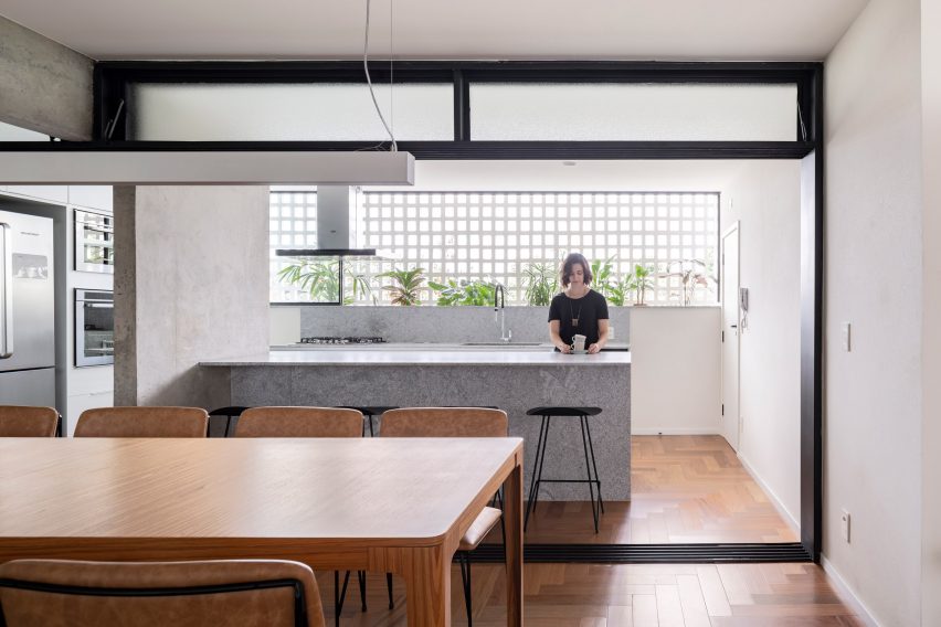
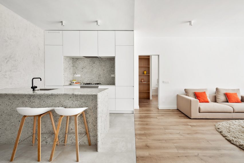
Wooden floors and white-washed walls define the living area while functional spaces such as the kitchen – where a granite breakfast island takes centre stage – are completed in shades of grey.

Find out more about Villarroel Apartment ›


Casa Nicte Ha by Di Frenna Arquitectos
Photo is by Onnis Luque

Casa Nicté-Ha, Mexico, by Di Frenna Arquitectos

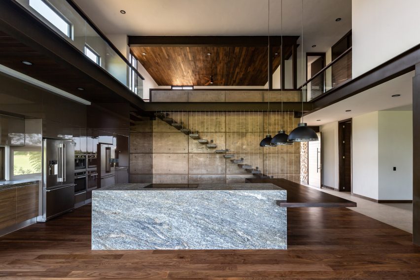
A large granite kitchen island with an adjoining wooden counter is positioned in the middle of the double-height kitchen and dining area inside Casa Nicté-Ha, a home designed by Di Frenna Arquitectos in Colima City, Mexico.

Elsewhere in the three-bedroom house, the studio mixed dark and light decor including white-painted walls, warm wood and concrete floors and exposed steel beams.

Find out more about Casa Nicté-Ha ›


A colourful kitchen with grey granite worktops
Photo is by Serena Eller

Diplomat Apartment, Italy, by 02A

Antique and mid-century furnishings join sleek, contemporary cabinetry to create this one-bedroom flat in Rome by local architecture and interiors studio 02A.

The stateless diplomat who owns and lives in the dwelling wanted to make his home a sanctuary filled with items he collected during his trips abroad.

Find out more about Diplomat Apartment ›


Berlin apartment by RAUM404
Photo is by Noshe

Art-Apart, Germany, by Raum404

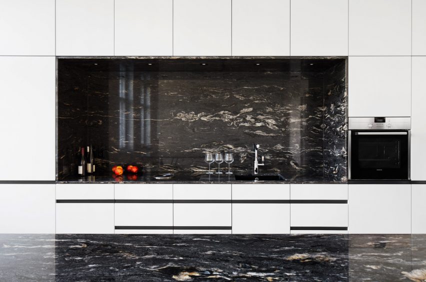
Swiss-based studio Raum404 chose to keep the interiors as minimal, white and spacious as possible in its renovation of Art-Apart, a 19th-century apartment-cum-gallery in Berlin.

The artist owner tasked the studio with creating a space that could be opened up to the public for exhibitions, which resulted in furniture that could be folded up and plenty of white cupboards that could conceal personal belongings.

Find out more about Art-Apart ›


Hackney House by Applied Studio

Hackney House, UK, by Applied Studio

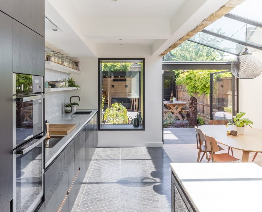
Black timber decor and plenty of windows were installed in architecture and interior design studio Applied Studio’s overhaul of this house in east London’s Hackney.

Afterward, the studio fitted the glass extension that houses the kitchen and dining table with chevron-patterned granite flooring.

Find out more about Hackney House ›


Kitchen in Golden Lane flat by Archmongers
Photo is by French + Tye

Golden Lane, UK, by Archmongers

Quirky modernist elements such as pops of primary colours and glossy furnishings were reinstated by Archmongers in its renovation of this 1950s flat in an inner city London estate.

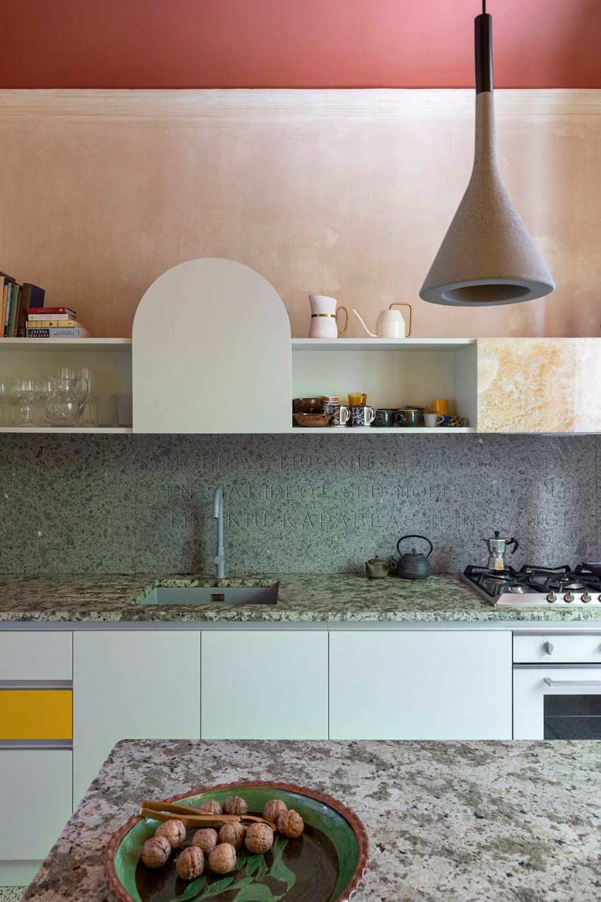
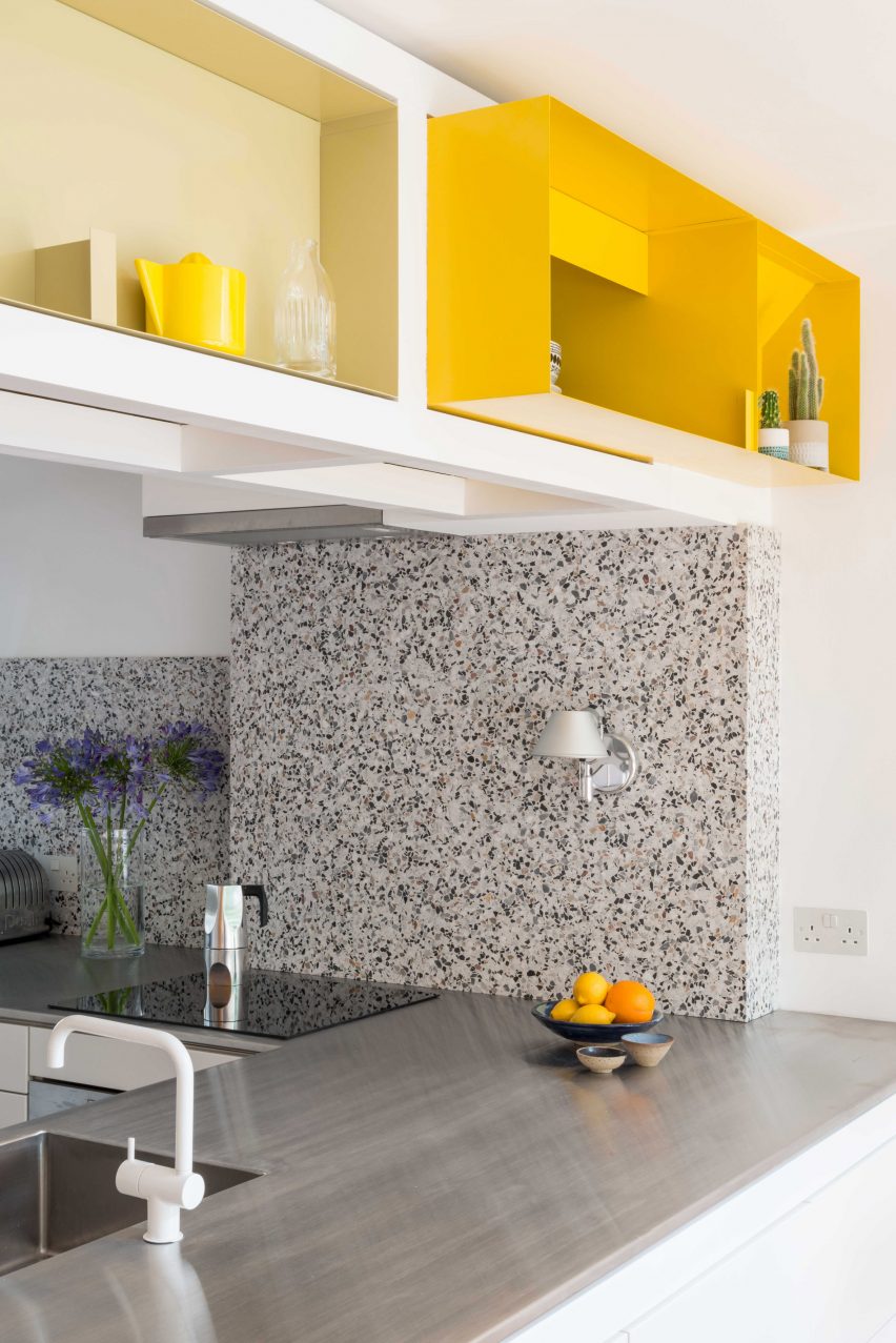
In the peninsula kitchen, which is separated from the dining area by chunky white door frames, white cabinets are topped with steel, while grey terrazzo with granite chips highlights the counter end and splashback.

Find out more about Golden Lane ›

This is the latest in our series of lookbooks providing curated visual inspiration from Dezeen’s image archive. For more inspiration see previous lookbooks showcasing residential interiors bolstered by exposed wooden beams, living spaces with glossy surfaces that create depth and dimension and gardens with swimming pools that are made for summer.

Reference

Designing Domestic Interiors for the Microbiome
CategoriesArchitecture

Designing Domestic Interiors for the Microbiome

Judging is now underway for the 10th Annual A+Awards Program! Want to earn global recognition for your projects? Sign up to be notified when the 11th Annual A+Awards program launches. 

One of the clearest byproducts of the pandemic has been a renewed focus on the domestic interior. As stewards of our own homes, we have found ourselves examining them under a new microscope, both for their aesthetic ability to bring comfort during a difficult period and for imagined traces of the virus, which we may have reluctantly brought indoors from the outside world at any time. Early on, bags of groceries often spent a day or more outside of our homes; they were punished as alleged viral transmitters and forced to enter a period of quarantine before being allowed in to provide much-needed sustenance. Countertops, doorknobs, and other surfaces that regularly made corporeal contact were scrubbed with a renewed vigor in an effort to sterilize our home from any living presence but our own.

Over the course of the last century, much of modernist architecture can be understood as a consequence of the fear of disease; the construction of physical space to facilitate an ability to cleanse rooms where bacteria lurk. Clean, empty white walls, open floor plans and industrial, highly polished surfaces became synonymous with functional space that allowed the occupant to feel comfortable, safe and germ-free — at least to the naked eye. Architects such as Le Corbusier famously thought that a house should function as a “machine à habiter” or machine for living in his 1923 manifesto for future habitation, Towards a New Architecture. But the lines immediately following this iconic phrase are equally revealing:

“Baths, sun, hot water, cold water, warmth at will, conservation of food, hygiene, beauty in the sense of good proportion… We must clear up a misunderstanding: we are in a diseased state because we mix up art with a respectful attitude to mere decoration.”

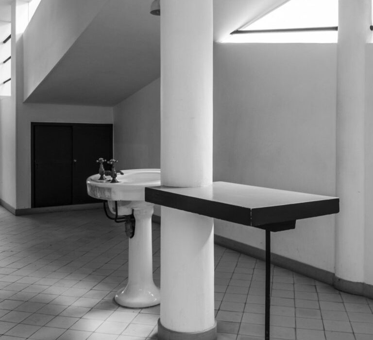
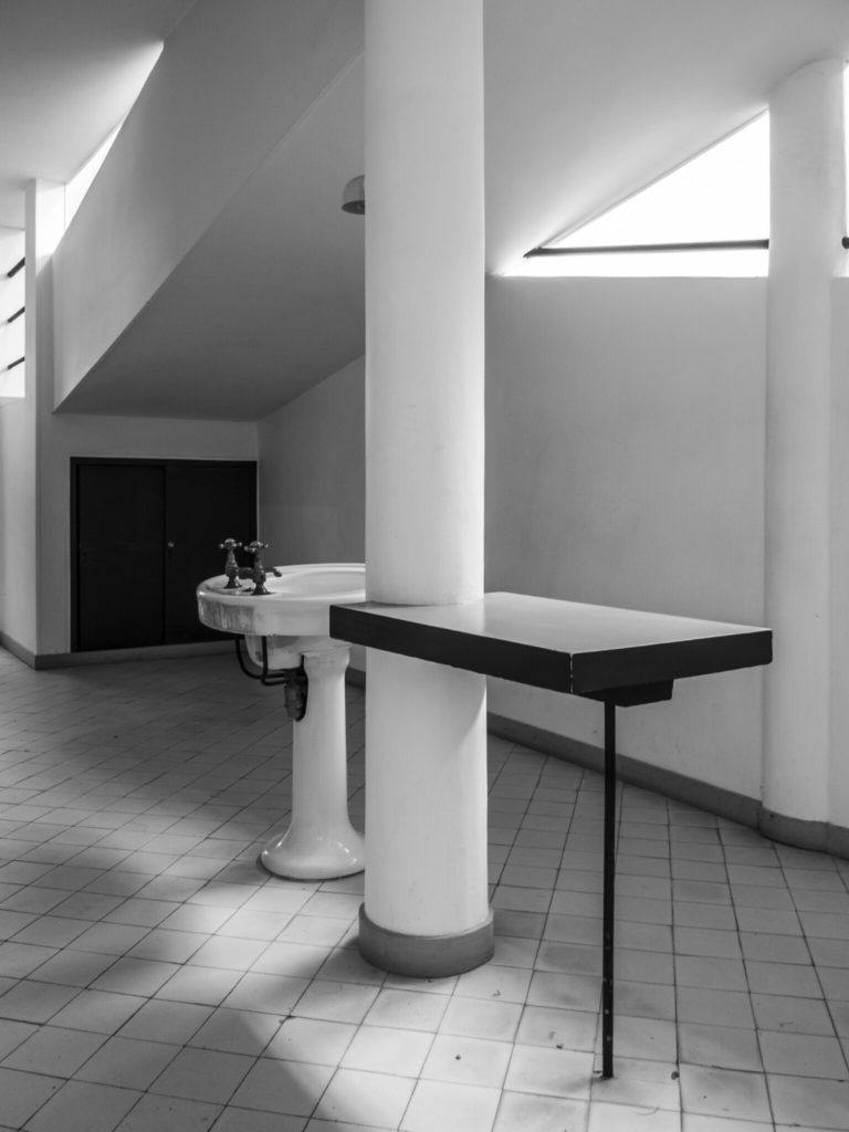
The entrance hall in Le Corbusier’s Villa Savoye. © Thomas Nemesker

On the surface, Corbusier’s aesthetic focused on the qualities of unornamented, rectilinear spaces. Yet, a deeper reading reveals an agenda of moral and physical cleanliness. While diseases like tuberculosis and the resulting technologies developed to diagnose them helped to shape modernism and the work of architects like Corbusier throughout the 20th Century; similarly, Covid-19 and our cultural propensity to spend time indoors (up to 90% of our days) will influence architecture in the near future.

Today, our culture is saturated with products focused on sanitizing and architectural surfaces that help to facilitate this ritual cleansing. We commonly hold that sterility is the ideal state of existence, even though it is impossible to achieve for more than even a brief moment. We regularly consume antibiotic treatments for even the most minor illnesses, hoping to eradicate all germs or bacteria on contact. In reaction to the pandemic, architectural publications widely circulated articles detailing products and surfaces with natural anti-microbial properties, including copper and cardboard (to name a few). While there are certainly architectural contexts including the healthcare industry that require starkly hygienic environments, this strategy exists at the expense of the “good” bacteria we need to foster healthy immune systems.

Colonies formed by a variety of bacterial and fungal species. © Scott Chimileski and Roberto Kolter

Conversely, we are composed of 100 trillion microbes, and over half of the cells in our body belong to foreign microbes that inhabit us. On an architectural scale, according to Emily Anthes’ book The Great Indoors, our homes are filled with up to 2000 different microbial “squatters” at any given time. Different areas of the home tend to reveal distinct differences; bacteria found in kitchens is most commonly associated with food, while doors and door knobs are covered in species most typically found in leaves and soil.

Domestic elements like toilet seats and pillowcases look more similar than you’d like to believe under a microscope — both harbor bacteria that typically lives on our skin and in our mouths. More recent research on hygiene espouses a modern microbial perspective that is complex and intertwined with both outdoor and indoor environments; a combination of strategies to expose the body to certain bacteria while targeting certain hygiene to create the framework for healthy protection from pathogens while restoring and reinforcing our microbiomes.

With this in mind, how should our interior domestic environments intervene to foster the restoration, growth or even flourishing of microbial cultures? Revisiting the kitchen with a renewed focus would not be a bad start. In order to re-frame our relationship with microorganisms, we should reference symbiotic examples from the world’s culinary traditions. Bread-baking, kombucha and other fermentation processes that revolve around the kitchen, all produce healthy bacteria that humans benefit from, both during the processes of production and following consumption. In some cases, as with sourdough bread, the microbes found on bakers’ hands even mirror the microbes within their starters, the bubbly mix of yeast, bacteria and flour that’s the basis of every loaf.

Kombucha is fermented by a floating biofilm made up of a symbiotic community of bacteria and yeast, or SCOBY. © Scott Chimileski and Roberto Kolter

In “Micro-ecologies of the Built Environment,” a chapter in The Routledge Companion to Biology in Art and Architecture, Ted Krueger argues that architecture’s conventional focus on the human scale should be brought down in scale to the microbial and that architects should operate more like “creative chefs than forensic doctors”, manipulating conditions to encourage the cultivation of healthy microbiota. In turn, as the architectural discipline evolves into a more microscopic realm, we should promote the design of micro-ecologies within our domestic spaces through the careful selection of materials and spatial conditions, that do not only destroy bacteria but work to nurture what may be beneficial to us.

How can we reframe the notion of cleanliness through the lens of architecture in an age where filth and germs might actually help us survive? It’s clear that our interior environments and the products we use within them need to evolve from a purely adversarial position towards microorganisms, to a far more symbiotic relationship with “good” bacteria. There is an urgent need to develop “architectural probiotics”; environments and surfaces that support the complex conditions needed to partner with microorganisms for mutual benefit. What would this architecture look like?

Judging is now underway for the 10th Annual A+Awards Program! Want to earn global recognition for your projects? Sign up to be notified when the 11th Annual A+Awards program launches. 

Reference

7 Ways to Recreate the Timeless Charm of Regency Interiors
CategoriesArchitecture

7 Ways to Recreate the Timeless Charm of Regency Interiors

Architects: Want to have your project featured? Showcase your work through Architizer and sign up for our inspirational newsletter.    

Period dramas are all in rage, both in written fiction and cinematic productions. Fans of Emma and Downtown Abbey are now indulging in the Netflix adaption of Julia Quinn’s popular Bridgerton novels. In addition to causing sleepless nights of binge-watching, the series has also prompted several Pinterest searches for Regency-era aesthetics and décor.

This dramatic aesthetic developed in the 19th Century, under George IV’s rule as Prince Regent. The style of design is synonymous with grandeur and flamboyance. It was influenced by Greek, Egyptian, Gothic and Chinese architecture, celebrating art in all forms. Muted hues, decorated wall panels, ornamental moldings, plus seating, noteworthy chandeliers, fluted columns, brass inlays, rich woods and large mirrors are just a few components that combine to make up this style.

Adapting the Regency style for today’s homes is not straightforward; it can be approached by adding individual elements that reflect the era or by recreating an entire setup that exudes regal European charm. Some of the extravagant elements mentioned above can be statement pieces in minimal interiors — like an imposing chandelier in an otherwise plain hallway. On the flip side, if used subtly, they can all come together to create a cozy and inviting home that displays hints of history while being rooted in today. Channeling this style also presents a great opportunity to upcycle vintage furniture and old decor pieces, or to try some DIY experiments on plain IKEA furniture. Below are a few examples of how these elements have been used in spaces across the world.

Children’s Room Design by Ami Austin Interior Design, Memphis, Tennessee | Image by Chip Pankey

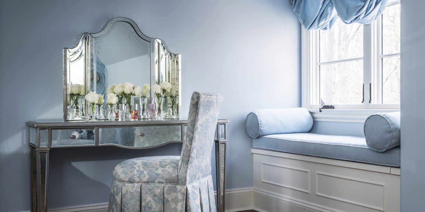
Powdery blues, soft pinks, pistachio greens and luxurious cream hues were a staple in this era. This pastel palette can be layered in any space by using patterned wallpapers, painted furniture and matching upholstery. The combination of patterns prevents the space from becoming monotonous and creates interest in an otherwise muted palette.

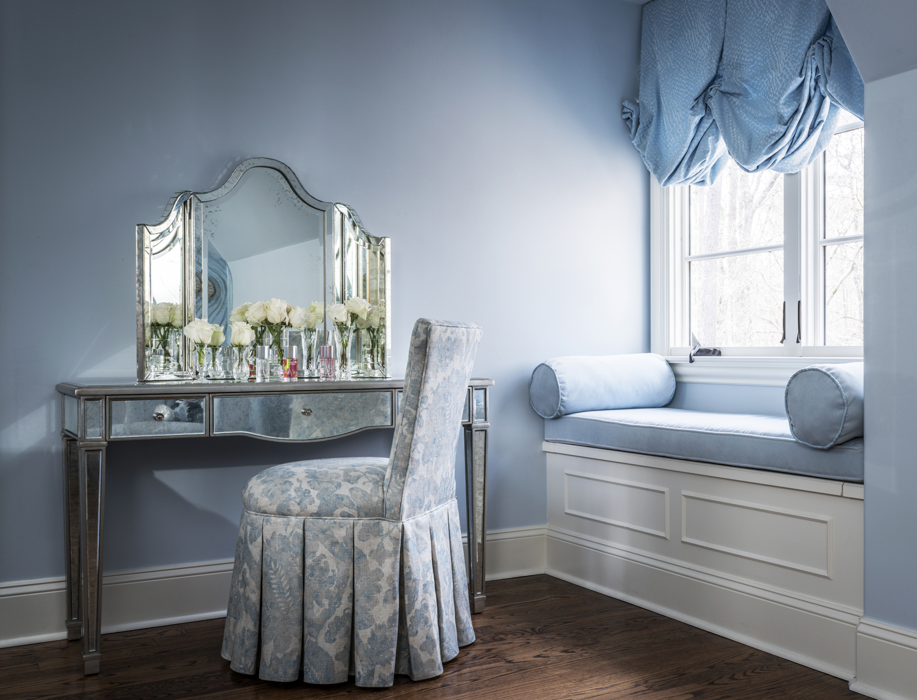
This technique is clearly exhibited in the children’s room design by Ami Austin Interior Design. The same tone of powder blue is used in the wall, curtains, window seating and a desk chair. The white baseboards and mirrored vanity make it more current and add some brightness.

Beautiful living room in palace style by Mirt

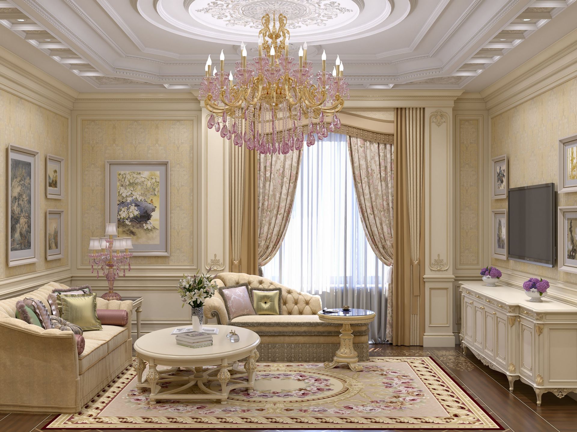
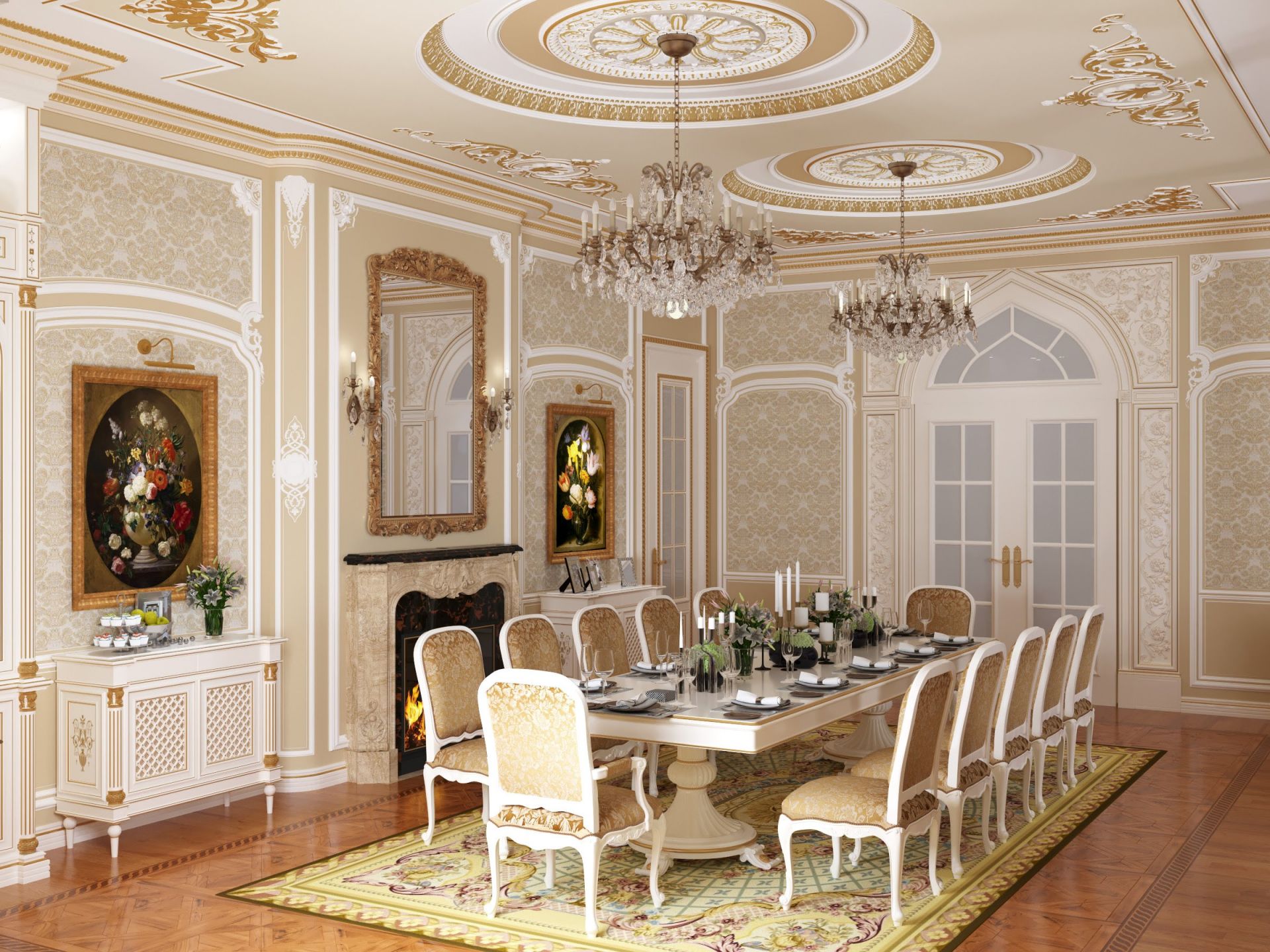
This palatial setting might be hard to replicate in contemporary interiors as is but there are some elements that could be introduced in modern homes to give them a historic touch. Decorating the walls with patterned wallpapers and then strengthening that design language with ornate mirrors and gold-framed paintings can be one way to spruce up dining or living areas. This can also be taken a step further by breaking up the walls with molded panels to divide functions in a large space without using walls.

Ladbroke Grove Townhouse by BWArchitects, London, United Kingdom

Gold and pearlescent tones have long been indicators of wealth and luxury. And since the Regency style was all about celebrating opulence, furniture and fixtures with such finishes were not uncommon. Adding golden or cream edges to highlight the lines of tables or desks, or even using gold in lights or bathrooms fittings is an easy way to incorporate this trend. This soft aqua cabinet with beige panel outlines in a townhouse designed by BWArchitects is a great example of vintage-style furniture in a modern setting.

Pattern House by ALEKSA studio, London, United Kingdom

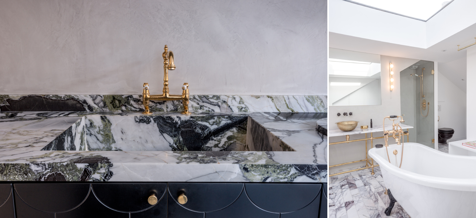
Gilded fixtures can also be paired with white marble tabletops in salons or countertops in bathrooms. Due to its versatility, marble can also be used on floors or be carved to create intricate sculptures and more. In Pattern House, ALESKA studio has paired marble slabs with metallic gold or brass sinks and taps to elevate the simple layout. Golden doorknobs and light fixtures further help build the aesthetic.

Living room design in light tones by Mirt

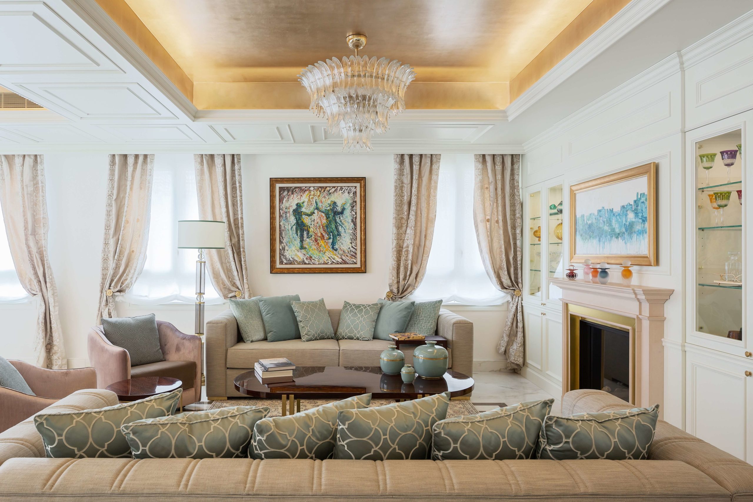
Another characteristic design element from this era was a sitting room with plush sofas and ornate chaises. As evidenced in this living room design, multiple seating options, all with curved lines and decorative embellishments, add an air of comfort and luxury to any living space. These can be upholstered in velvet or delicately patterned fabrics. When paired with equally embellished furniture, they can effortlessly transport users back to the 1800s.

Jerusalem Penthouse by Annette Frommer-Interior Design, Jerusalem, Israel

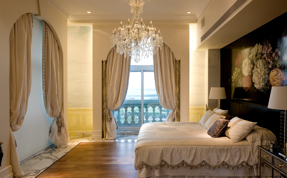
We often underestimate how dramatically curtains change the look of a space. Pleated drapes with thick fabrics or sophisticated prints that go all the way from the ceiling to the floor can give the appearance of bigger windows and higher ceilings. They can also be accompanied by decorative ties or layered with sheer curtains to make the setup more luxurious. As showcased above, curtains can be a good way to add depth, color and texture to living spaces.

Chateau in height by Estudio Jorge Felli, Buenos Aires, Argentina

No Regency setup would be complete without a grand chandelier. Large suspended illuminators with dazzling crystals and romantic swirls celebrate the artistic expression of the period. These can also work with minimal spaces with sleek lines or more themes setups. In a bedroom in the Chateau in Height, the large chandelier is accompanied by matching drapes and beddings, marble and wooden floors and a dark floral wallpaper to create a balanced room.

Architects: Want to have your project featured? Showcase your work through Architizer and sign up for our inspirational newsletter.    

Reference

Seven of the best colourful home interiors
CategoriesInterior Design

Seven of the best colourful home interiors

A growing number of designers are ridding homes of nondescript magnolia walls and instead painting surfaces a rainbow of colours. We pick out seven striking examples.


Colourful apartments roundup:

Nagatachō Apartment, Japan, by Adam Nathaniel Furman

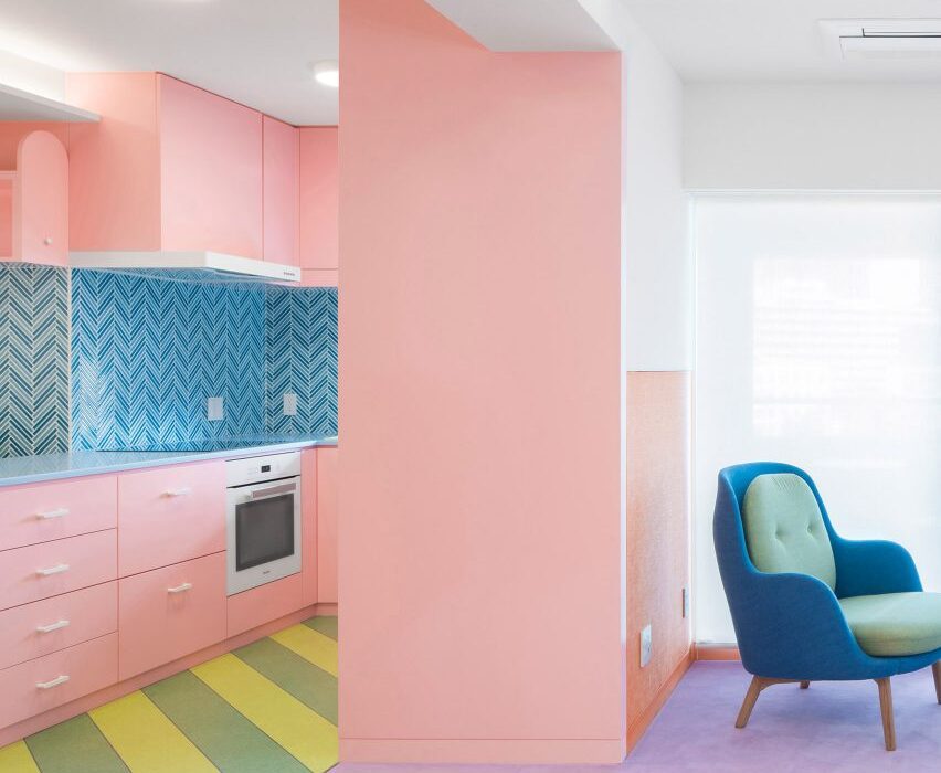
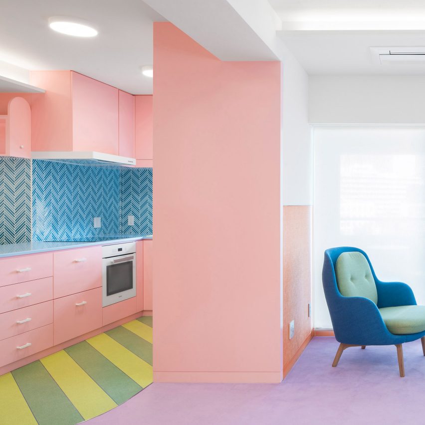
Sugary shades permeate this Tokyo apartment designed by Adam Nathaniel Furman. In the kitchen, candy-pink cabinetry juxtaposes watermelon-green vinyl on the floor, while lilac carpet in the dining room is meant to recall icing on a sponge cake. There are also “zesty” lemon-yellow fixtures in the bathrooms.

“The colour scheme became a matter of choosing ingredients for a beautifully calibrated visual feast,” Furman told Dezeen.

Find out more about the Nagatachō Apartment


Colourful apartments roundup:

Waterfront Nikis Apartment, Greece, by Stamatios Giannikis

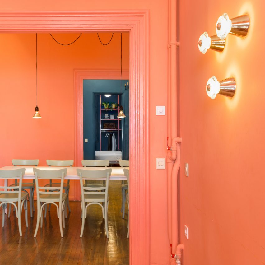
Architect Stamatios Giannikis selected three hues to organise living spaces within this Grecian apartment. Functional areas like the kitchen and bathroom are pistachio green, while deep-blue paint has been applied across street-facing rooms, channelling the colour of the nearby waves.

Spaces that have direct views of the Mediterranean Sea have been completed in a contrasting shade of coral-pink.

“The use of bold colour in the design of [the apartment] is done in an effort to complement and strengthen the power of the sea view, not to suppress it,” Giannikis explained.

Find out more about the Waterfront Nikis Apartment


Colourful apartments roundup:

Hidden Tints, Sweden, by Note Design Studio

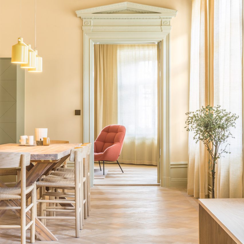
Note Design Studio decided to shun the typically restrained Scandinavian colour palette for the overhaul of this 19th-century family home.

The main shades that have been applied across its ornately bordered walls – pink, sage-green, and pale yellow – were inspired by the colour of three original tiled ovens which were found on the property.

“The approach to colour in architecture in the old days was much braver than we see today,” the studio explained, “it deserves it’s place again.”

Find out more about Hidden Tints


Colourful apartments roundup:

Twin Peaks Residence, Hong Kong, by Lim + Lu

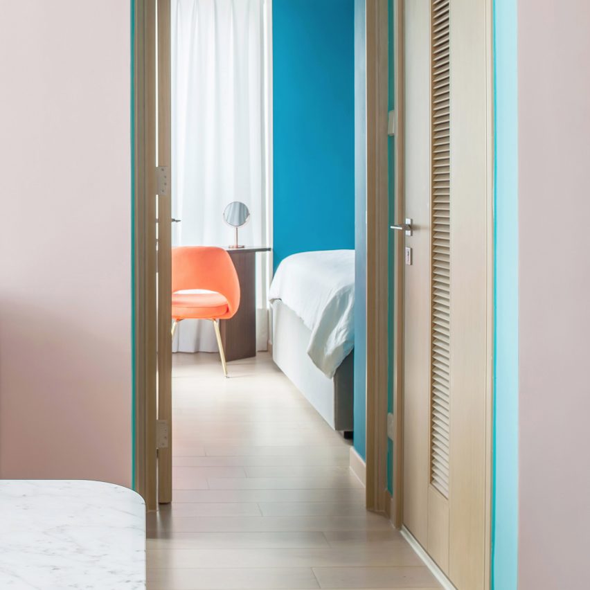
Design studio Lim + Lu added colour to the formerly bland interiors of this apartment in Hong Kong to more acutely reflect the flamboyant personality of its owner, a fashion designer hailing from Paris.

To avoid the home seeming “over the top”, coral-orange and sunshine-yellow furnishings are offset by soothing pale-pink walls. Some of the cabinets have also been clad in shiny gold-hued panels to add textural interest.

Find out more about Twin Peaks Residence


Colourful apartments roundup:

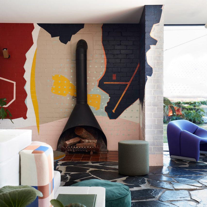
Polychrome House, Australia, by Amber Road and Lymesmith

Designed to offer a “joyful” living experience, the aptly named Polychrome House is decked out with an explosion of different hues – as well as a brick-red kitchen, it also boasts pink bathrooms and a lounge area anchored by a lime-green sofa.

The focal point of the property is a bold wall mural that features multi-coloured abstract patches, intended to resemble land formations on a map.

Find out more about Polychrome House


Colourful apartments roundup:

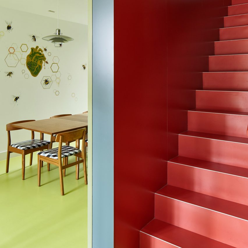
London house, UK, by R2 Studio

A vibrant colour palette helped R2 Studio reinvigorate the formerly cramped and light-starved rooms within this Victorian-era home in London’s Kennington neighbourhood.

The ground floor is mostly green – in a nod to the foliage seen in the back garden – while the two staircases have respectively been completed in orange and vermillion red. “Cold and shiny” surfaces in the kitchen have also been traded for playful blue and yellow cabinetry.

Find out more about London house


Colourful apartments roundup:

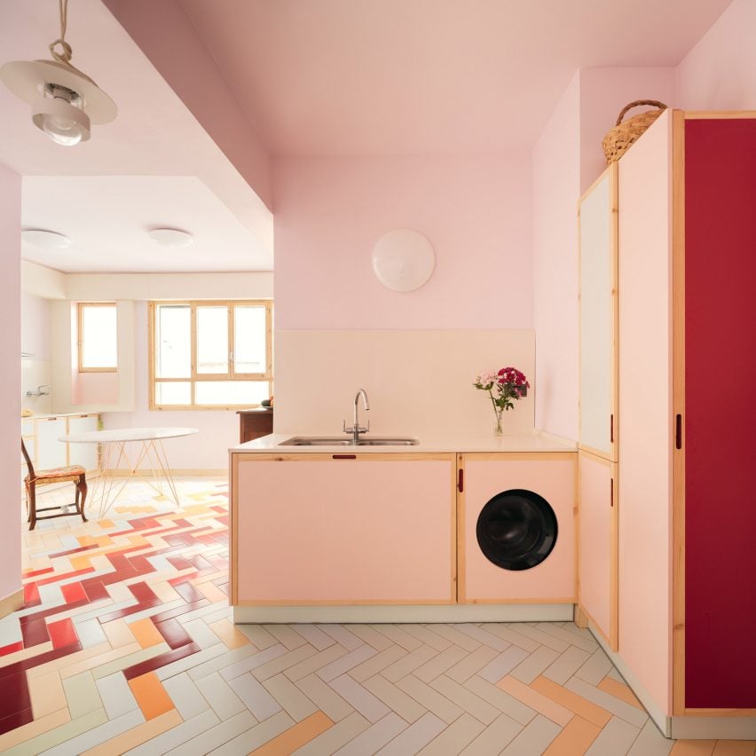
Mixtape Apartment, Spain, by Azab

Azab applied vivid hues throughout this Bilbao apartment after its retired owner said they felt the home had become “blurred in a greyish mood”.

It now includes a baby-pink kitchen suite, cherry-red sliding doors and a colourful abstract carpet, offering a bold backdrop to the client’s array of ornate wooden furnishings.

Find out more about the Mixtape Apartment

Reference