ePAVE Joins the Battle Against Urban Heat Islands
CategoriesSustainable News Zero Energy Homes

ePAVE Joins the Battle Against Urban Heat Islands

With 45% of urban areas covered by pavement, climate change is pushing cityscape temperatures to record highs. Innovative, sustainable pavement solutions are urgently needed. Whether used with asphalt or conventional concrete, “cool pavement” solutions, such as ePAVE, can decrease the urban heat island effect by mitigating greenhouse gas emissions and reducing heat absorption.

While on a vacation in Europe, after being seated for dinner with friends at an outside table at a popular restaurant, we could all feel the intense heat emanating from the asphalt nearby—even though the sun had set hours earlier. This scenario has become all too common and is being repeated in urban centers all over the world.

Across the planet, asphalt contributes to significant greenhouse gas emissions. Asphalt pavement absorbs solar radiation and re-emits the radiation as heat, warming the surrounding air and structures. This results in an escalating use of air conditioning (which further adds to outdoor heat) and drives up energy consumption. Due to high heat retention, darker asphalt surfaces are a major contributor to the urban heat island phenomenon.

During a day with a comfortable “ambient” temperature of 75° F (24° C), asphalt surface temperatures in full sun can rise to 125° F (52° C) or higher! Along with the significant heat emanating from the asphalt, comes an increase in toxic emissions into the environment.

How CoolPAVE works

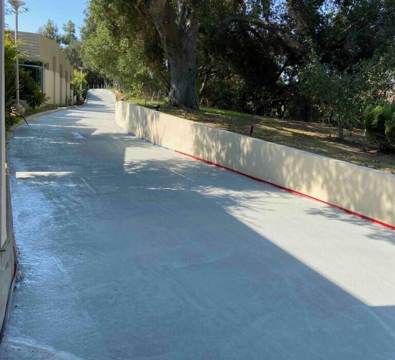
The CoolPAVE coatings from ePAVE reflect some solar radiation, so the pavement stores and emits less heat. Safe and cost-effective, ePAVE’s cool pavement solution also seals in toxic emissions from underlying surfaces. Further, ePAVE solutions enhance the durability of treated pavement surfaces, extending their lifespan.

ePAVE products work on new and old, asphalt and concrete surfaces. Trained applicators prepare the pavement surface (minimally) and then apply the CoolPAVE product cold. It cures quickly and is ready for foot and vehicle traffic in about an hour, which keeps closures and delays to a minimum.

ePAVE products are tested and proven to lower surface temperatures by 5–20° F. In summary, this non-toxic pavement preservation solution with high solar reflectance impacts three key remits:

  • Human: ePAVE solutions make cityscapes cooler and more hospitable for people and their pets, by making streets and neighborhoods more walkable, livable, and equitable. Mitigation of urban heat islands is expected to reduce the incidence of heat-related illnesses and deaths.
  • Environmental: the ePAVE cool pavement product makes communities cooler, thus lowering toxic emissions and energy consumption. Overall cooler ambient temperatures can reduce heat-related stress on urban habitats.
  • Economic: CoolPAVE can save energy and those associated costs, and may extend the lifespan of treated pavement by up to twice as long as standard pavement treatments, requiring less frequent repairs and reducing maintenance costs.

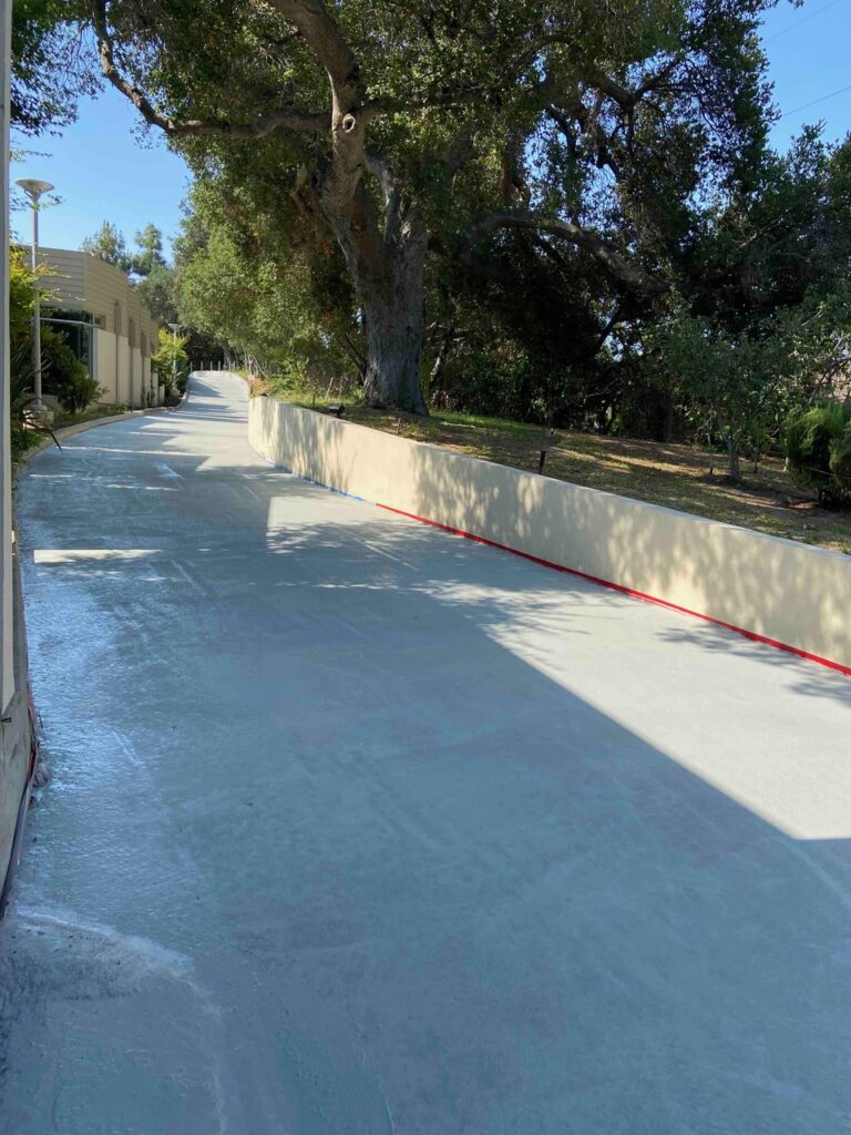
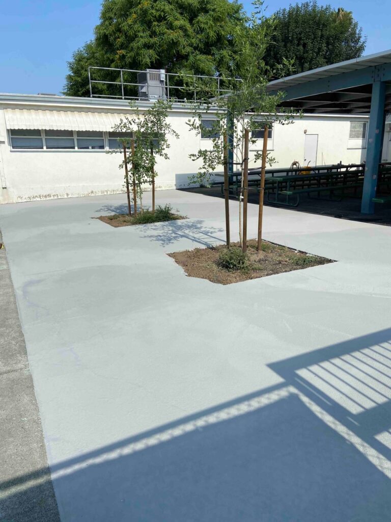
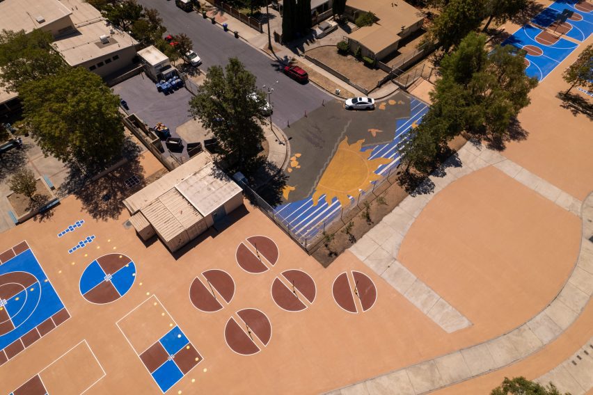
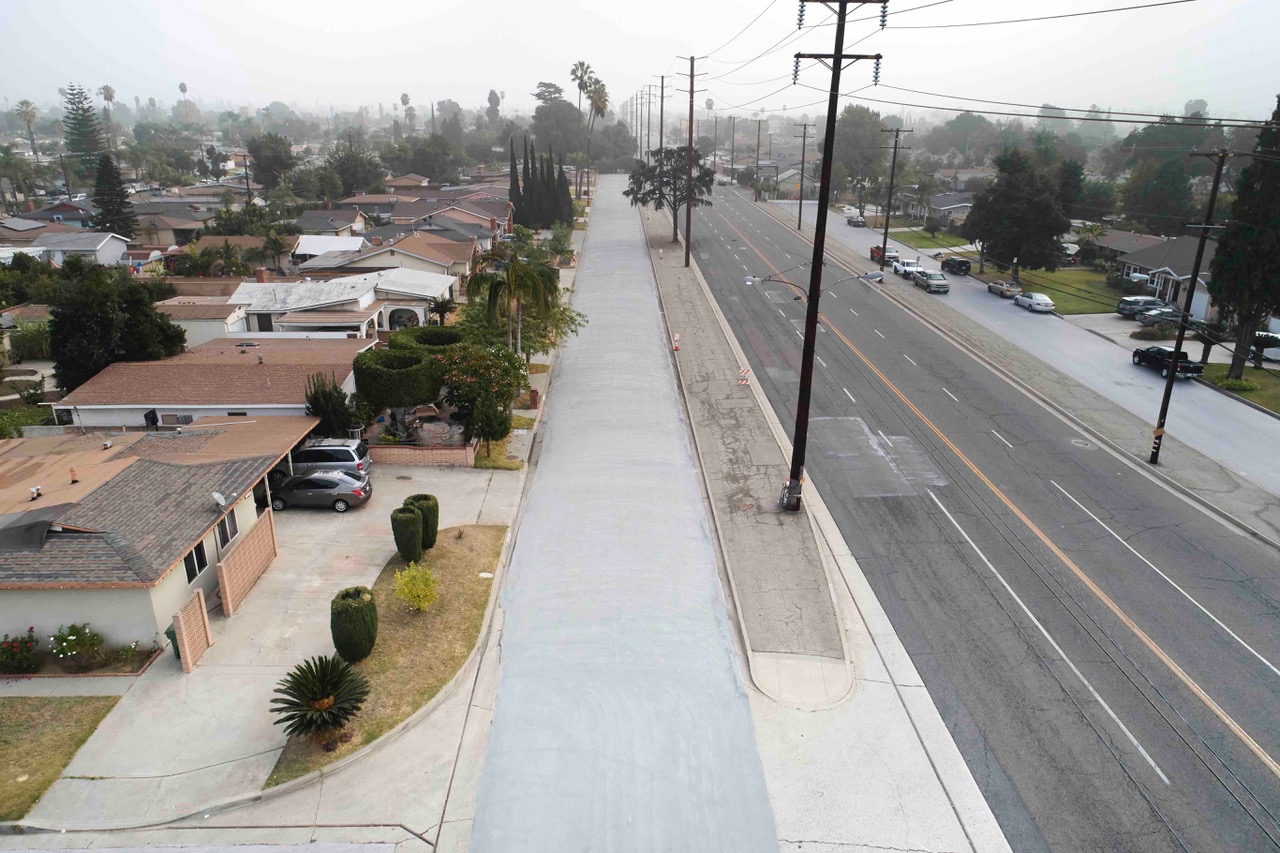
ePAVE solutions are nontoxic and free of volatile organic compounds (VOCs). ePAVE seals asphalt surfaces, preventing outgassing and leaching of harmful chemicals into the environment via stormwater. ePAVE may also contribute to LEED certification. Under Sustainable Sites, up to two points can be earned for impacts on the Heat Island Effect.aerial view of asphalt street; access road running alongside has gray cool-pavement coating to reduce temperatures - photo
 

USGBC-LA Net Zero Accelerator

ePAVE, LLC joined the 2020 cohort of the Net Zero Accelerator (NZA) to benefit from learning from subject matter experts in marketing, business development, and networking. The NZA, a program of the U.S. Green Building Council–Los Angeles (USGBC-LA) focuses on piloting projects in real-world, trackable implementations, to drive measurable adoption of net zero solutions, today.

Since its founding in 2018, the accelerator has guided the success of 85 growth-stage companies in the cleantech and proptech space across the US and Canada. The program bridges the gap between net zero building policy and current technologies in use in both commercial and affordable housing sectors. The NZA builds awareness of viable solutions and market-ready innovations through marketing, media, events, and curated networking. Then shepherds the tech to market through onsite pilots with committed green building leaders, accelerating scaled adoption. The goal? Make net zero carbon, energy, water, and waste a reality for Los Angeles and beyond.

The author:

Klara Moradkhan is Co-Founder and CEO of ePAVE, LLC. She is passionate about building a sustainable and eco-friendly pavement solution that fits the 21st century.

Reference

Eight kitchen islands that have sleek waterfall edges
CategoriesInterior Design

Eight kitchen islands that have sleek waterfall edges

For our latest lookbook, we spotlight eight contemporary kitchens that centre on islands with waterfall countertops made from concrete, stone and chunky terrazzo.

As its name suggests, a waterfall edge is a style of kitchen island or cabinet where the countertop appears to flow seamlessly from the surface to the ground.

The feature, also known as a mitred end, is popular in contemporary kitchens as it is an easy way to create a focal point while retaining a sleek, pared-back aesthetic.

As revealed by this lookbook, they are particularly impactful when made from materials such as marble and concrete, which give rise to sculptural, monolithic centrepieces.

This is the latest in our lookbooks series, which provides visual inspiration from Dezeen’s archive. For more inspiration see previous lookbooks featuring living rooms with striking art pieces, colourful bedrooms and living rooms with cowhide rugs.


Oak and marble kitchen of Botaniczna Apartment by Agnieszka Owsiany Studio
Photo is by Pion Studio

Botaniczna Apartment, Poland, by Agnieszka Owsiany Studio

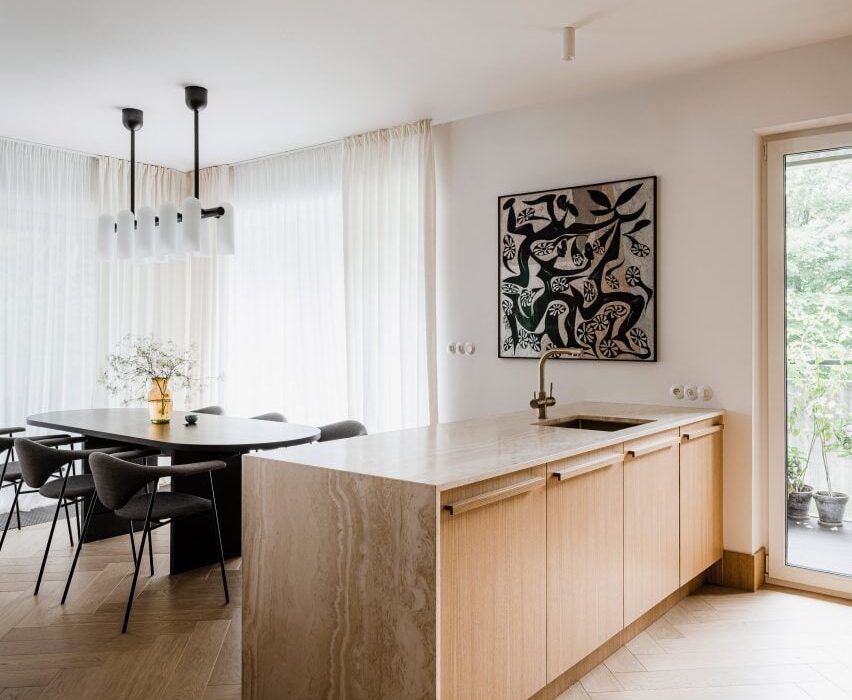
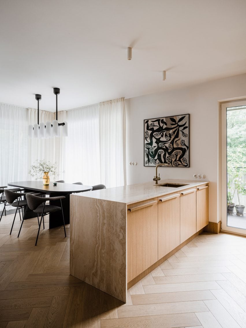
Agnieszka Owsiany Studio draped travertine over a series of oak cupboards to form this kitchen island. The wood helps accentuate the warm tones of the stone, which the studio chose because of its soothing and timeless qualities.

“I really wanted to create something timeless, hence the idea to use materials such as wood and travertine which age beautifully and hopefully won’t be replaced within many years,” said the studio’s founder Agnieszka Owsiany.

Find out more about Botaniczna Apartment


Kitchen island with a waterfall countertop
Photo by Megan Taylor

Sunderland Road, UK, by 2LG Studio

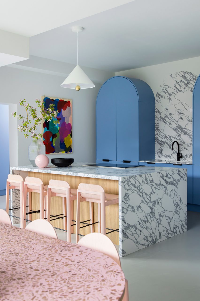
Sky-blue cabinetry offers a calm backdrop to the bold waterfall countertop in this kitchen, designed by 2LG Studio.

Made of white marble with grey veins, it extends over both ends of a wood-clad kitchen island and incorporates a hob for cooking. The countertop was paired with pink bar stools and is illuminated by a Cherry Pendant light by designer duo Daniel-Emma.

Find out more about Sunderland Road


Kitchen of Lake Geneva Residence by Collective Office
Photo by Mike Schwartz

Lake Geneva Residence, USA, by Collective Office

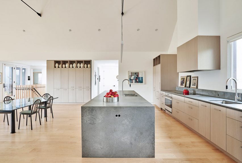
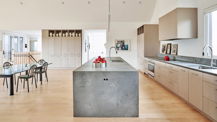
Concrete was used to form the mitred end of this kitchen island, creating a centrepiece that juxtaposes the light and natural look of its wood-lined surroundings.

It is complemented by matching concrete countertops on the adjacent wooden cabinets and incorporates a sink within its surface.

Find out more about Lake Geneva Residence


Kitchen island with mitred end in Montauk house by Desciencelab
Photo by Danny Bright

Montauk House, USA, by Desciencelab

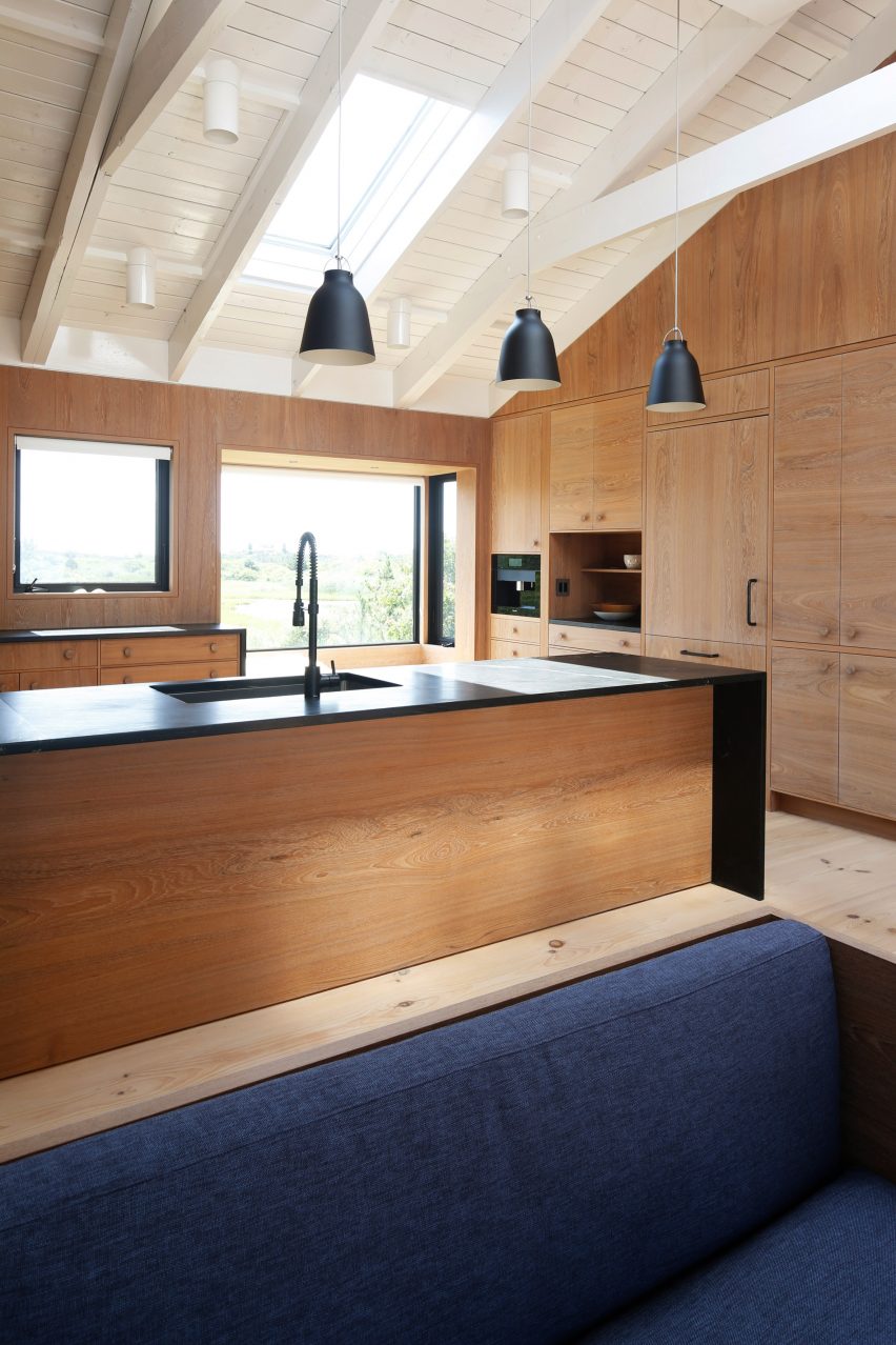
A black countertop overrides the wood-lined base of this central unit, found in the kitchen of a gabled house in Montauk, recently overhauled by Desciencelab.

Standing out against the surrounding wooden cupboards, it helps to demarcate the food preparation area within the open-plan room, which also contains the dining and living areas.

Find out more about Montauk House


Kitchen with a stone island and timber ceilings and floors
Photo by José Hevia

Paseo Mallorca 15 Apartments, Spain, by OHLAB

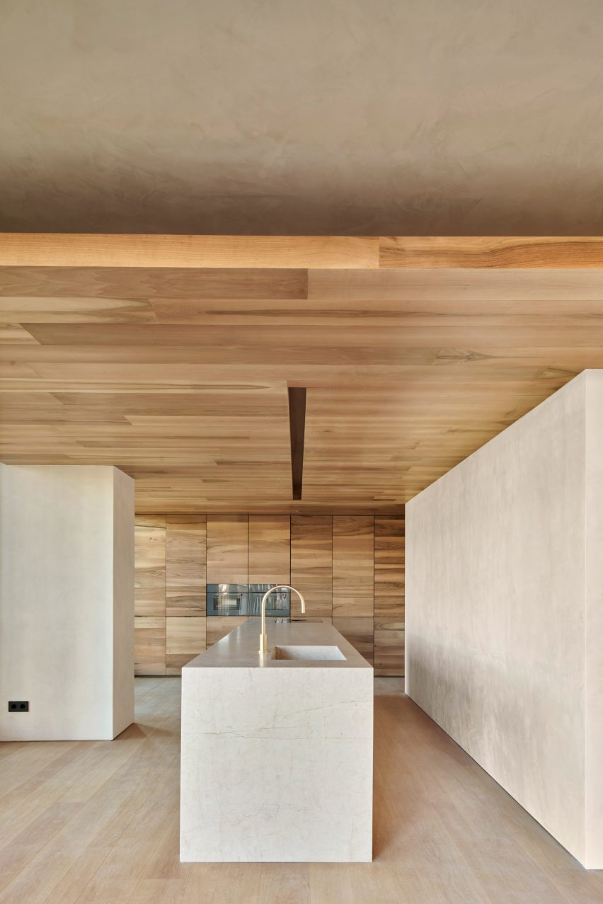
This clean-cut stone island is located in the light and airy interior of an apartment in a housing block in Mallorca.

Its minimalist aesthetic was paired with a more tactile material palette of rough plaster, dark wood and rustic fittings in the rest of the home, which OHLAB chose as a reflection of its Mediterranean setting.

Find out more about Paseo Mallorca 15 Apartments


Wooden kitchen with waterfall countertops
Photo by Daniëlle Siobhán

Family Home Zwaag, Netherlands, by DAB Studio

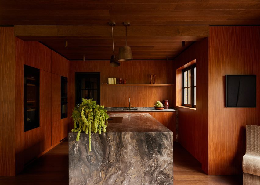
The sculptural waterfall countertops in this kitchen are formed from striking Arebescato Orobico marble.

Its earthy brown and grey tones are enhanced by the warm colours of the surrounding Afromosia wood joinery and oak ceilings and floors, which form part of DAB Studio’s wider “calm yet soulful” material palette.

Find out more about Family Home Zwaag


Terrazzo island in Glyn House extension designed by Yellow Cloud Studio
Photo courtesy of Yellow Cloud Studio

Glyn House, UK, by Yellow Cloud Studio

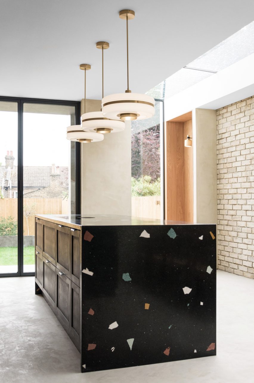
Oversized chunks of colourful aggregate were used to create the terrazzo finish of this statement kitchen unit, which is located in Glyn House by Yellow Cloud Studio in London.

Its waterfall edge conceals a series of black-painted drawers with silver handles and helps to “intensify the experience of raw, handmade surfaces” throughout the interior, the studio said.

Find out more about Glyn House


Kitchen with granite island
Photo by Fabián Martinez

Loma Residence, Mexico, by Esrawe Studio

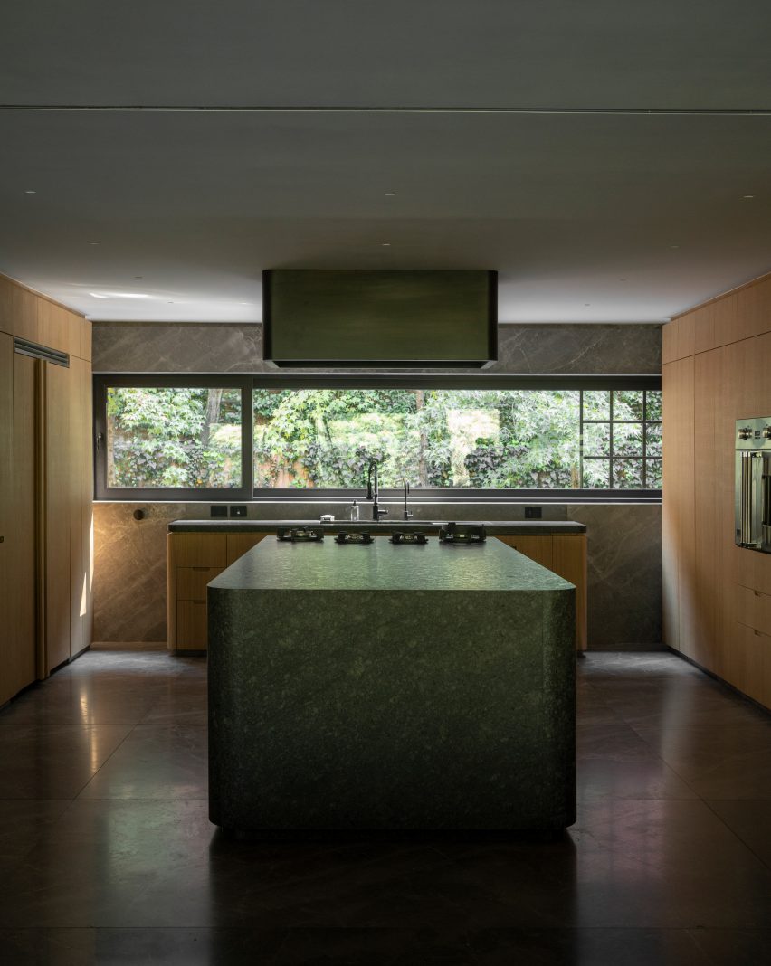
Curved sides and mitred ends soften the look of this monolithic kitchen island, which Esrawe Studio created as part of its remodelling of an apartment in Mexico City.

The unit sits in the centre of the home’s kitchen and was formed from a striking green-toned granite that pops out against its neutral surroundings.

Find out more about Loma Residence

This is the latest in our lookbooks series, which provides visual inspiration from Dezeen’s archive. For more inspiration see previous lookbooks featuring living rooms with striking art pieces, colourful bedrooms and living rooms with cowhide rugs.

Reference

GAF applies solar-reflective coating to mitigate Los Angeles heat islands
CategoriesArchitecture

GAF applies solar-reflective coating to mitigate Los Angeles heat islands

American roofing firm GAF has completed the first phase of a public-private initiative that seeks to mitigate urban heat in Los Angeles through solar-reflective coating.

The GAF Cool Community Project completed the first phase of their public project in Los Angeles’ Pacoima, covering asphalt roads and public areas in a 10-block radius to see if a reflective coating might reduce the effects of urban heating.

Aerial view of the nieghbourhood with foothills in the background
GAF installed thousands of square feet of solar-reflective coating to public areas in Los Angeles

Members of the GAF team and its street coating arm Streetbond worked with NGOs and city officials including the Global Cool Cities Alliance, Climate Resolve, and the Los Angeles Bureau of Street Service to coat over 700,000 square feet (65,032 square metres) of the neighbourhood’s pavement.

The project was initiated to mitigate the heat in heavily paved neighbourhoods, a problem in urban areas sometimes referred to as “heat islands”.

Playground with colourful solar-reflective coating
The initiative is called the GAF Cool Community Project

“This is one of the hottest neighborhoods in Los Angeles,” said Streetbond general manager Eliot Wall.

“There’s not a lot of alternative solutions. There are not a lot of shade structures. There are not a lot of trees – things that we also believe are necessary to help combat this – but this was something that without any other structural changes you could do tomorrow.”

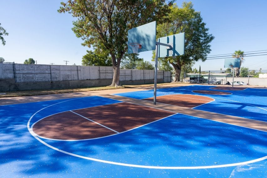
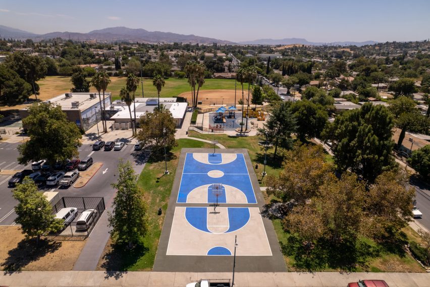
Basketball court with solar-reflective coating in blue and tan
The coating was applied to a 10-block radius

Because asphalt needs to be sealed and coated in dark colours to reduce tire marks and glare, it traps heat and holds it at street level.

The team’s solution was to paint over roads, parking lots and recreational areas with a proprietary coating that the company says may reduce the heat effect by 10-12 degrees Fahrenheit (5.5-6.6 degrees Celsius). The coating comes in a variety of different colours, with brighter colours used for recreational areas and dark ones for the roads.

The coating can be applied directly on top of preexisting asphalt. It can be applied by hand or by a paint-spraying machine.

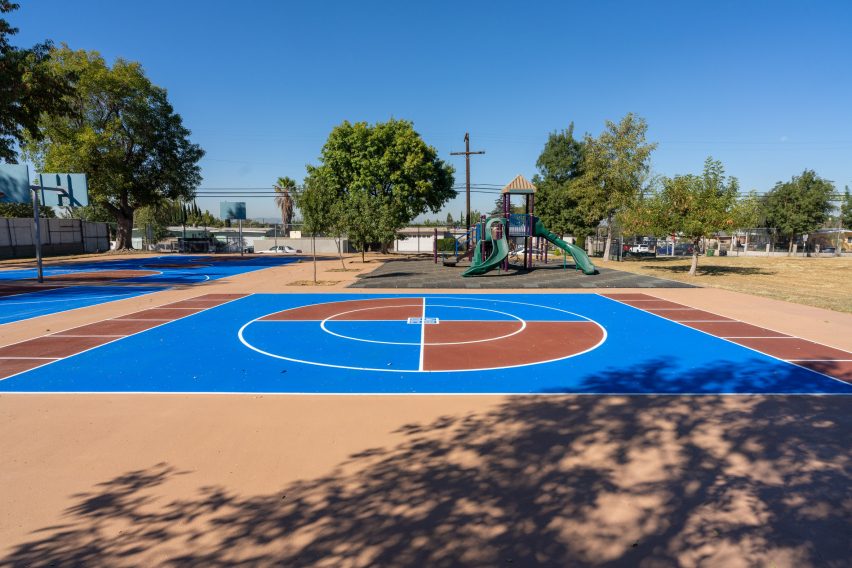
Ball court with solar reflective coating
The coating reflects sun and mitigates the heat island effect

Instead of simply lining sections of street with the product, the team wanted to test how the coating could affect the ambient temperature of the neighbourhood as a whole.

Some of the more recreational areas within the project’s scope, such as a basketball court and public park, were coated with colourful paint mocked up in patterns approved by the residents and a mural by local artist Desiree Sanchez was commissioned to be completed with the coating.

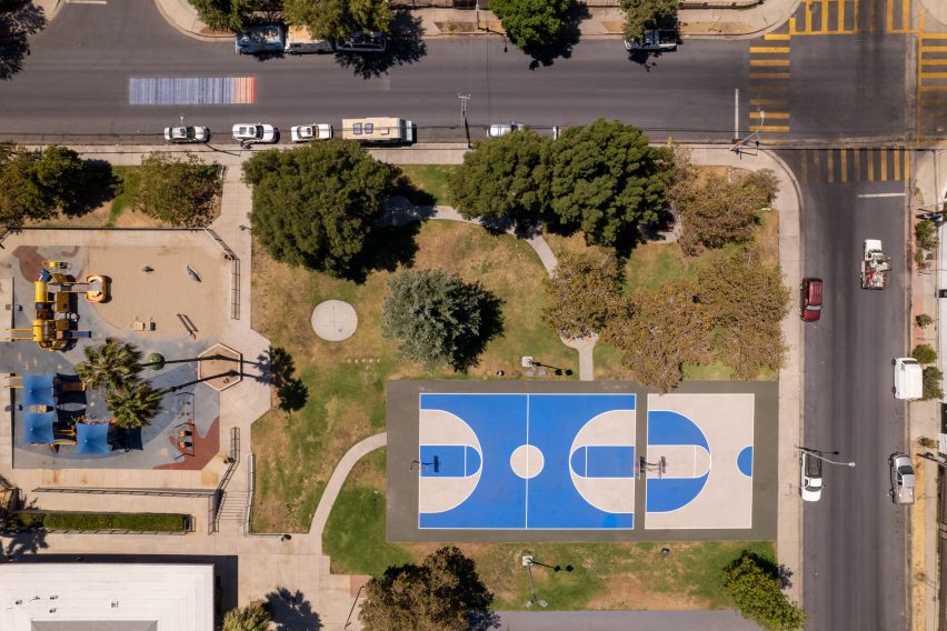
Aerial view of basketball court
Community members were consulted on a series of designs for the public park

Phase one of the project was completed last year and now the team is utilising a variety of measuring systems to monitor the heat in the neighbourhood as the summer approaches. Wall said that the felt effects of the coating are “pretty much instantaneous”.

“The community members themselves are saying it feels cooler,” he said.

Since the application last summer, the team has noted not only a drop of up to three degrees Fahrenheit (1.6 degrees Celsius) but changes in temperature downwind from the coated area.

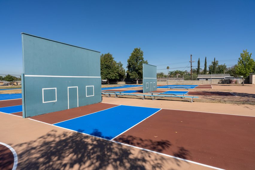
Wall ball court with solar-reflective coating
The team is testing the effects of the coat through monitoring systems

GAF director of building and roof science Jennifer Keegan added that there could added benefits from cooling large urban areas beyond the experience on the street.

Typically, the conversation around cooling technologies is limited to the application of materials on roofs and for cooling inside buildings, but paved public spaces present opportunities for bringing down the heat in the area in general.

“Not only are we helping the environment with that perspective of reducing the urban heat island effect, and if we keep our cities cooler, we’re reducing our carbon footprint,” she said.

Wall and Keegan said that the initiative hopes to expand the procedure to other areas that suffer from the heat island effect.

Sports field with solar-reflective coating
Residents have already commented on reduced temperatures

Other products that have been introduced to help reduce heat include a “chameleon-like” facade material developed by researchers at the University of Chicago.

Last year, Dezeen contributor Smith Mordak put together a guide for different strategies to reduce urban heating, read it here.

The photography is courtesy of GAF.

Reference

Gonzalez Haase AAS includes rammed-earth “islands” at clothing store
CategoriesInterior Design

Gonzalez Haase AAS includes rammed-earth “islands” at clothing store

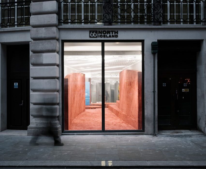
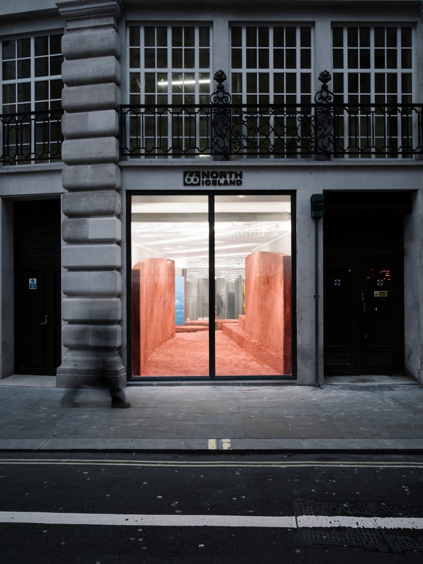
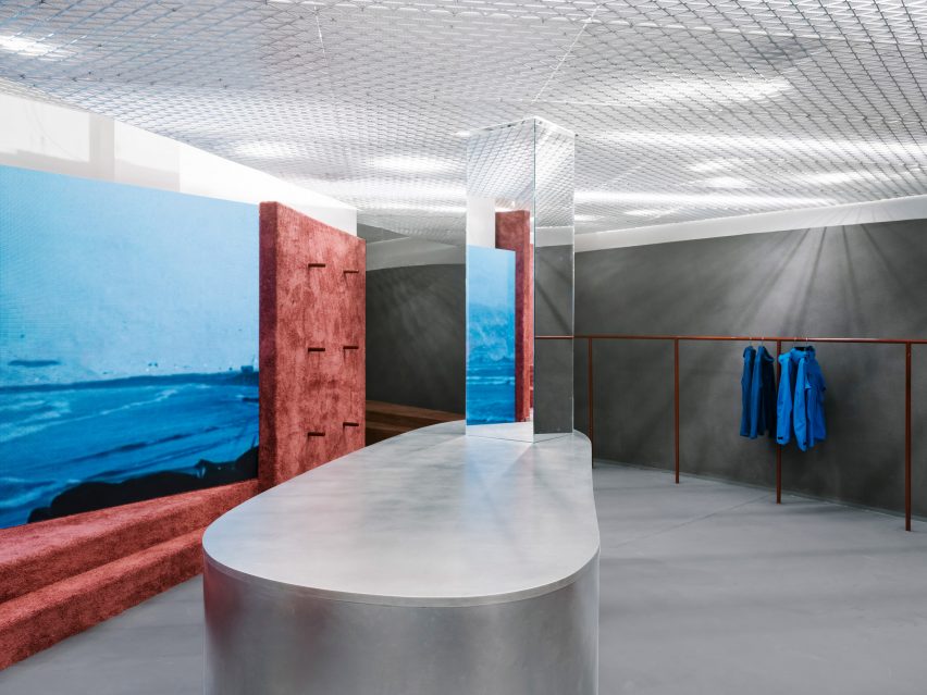
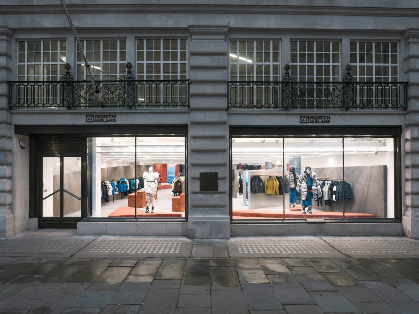
Architecture studio Gonzalez Haase AAS has completed a store on London’s Regent Street for Icelandic clothing brand 66º North, featuring curved walls and freestanding plinths made from rammed earth.

The Berlin-based studio headed by Pierre Jorge Gonzalez and Judith Haase set out to create a holistic concept for the store that represents Iceland in an original way, rather than relying on stereotypes.

Shop front with stone facade and large window looking into a store with rammed-earth islands
The shop interior was informed by Iceland’s volcanic landscapes

Gonzalez Haase AAS let the natural elements and the country’s geology inform key design features such as curved grey walls that evoke the shifting weather and rammed-earth islands that represent the earth.

“The weather in Iceland is a very real and prominent feature in the land and we classified this as static (the island) and forever changing (the weather),” the studio explained. “The static island of Iceland stands still in comparison to the constantly evolving and adapting weather, but this influences the perception of the island.”

Shop interior with grey floor and rammed-earth displays
Rammed-earth islands add colour and texture to the shop’s interior

Upon entering the space, visitors encounter a series of curved walls rendered in natural pigmented clay sourced from Cornwall in the south of England.

The designers said the use of different grey tones represents the changing weather: “the immaterial, movement, changing, blurry and informal”.

Shop interior with grey floor, silver island and rammed-earth steps and partition wall
Grey walls represent Iceland’s shifting weather

The curved walls vary in height and frame different views within the store. At the entrance, one of the walls stretches back 18 metres, drawing the viewer’s gaze into the space and offering a tactile introduction to the experiential interior.

“These curved walls create different perspectives and atmospheres,” the design team added. “They sit in front of the existing white walls to create a dramatic foreground of rolling soft curves.”

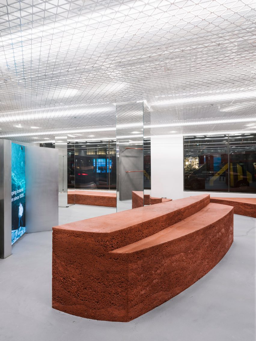
A series of monumental rammed-earth islands are inserted throughout the floor plan, adding colour and texture that evokes the earth and magma of Iceland’s volcanic landscape.

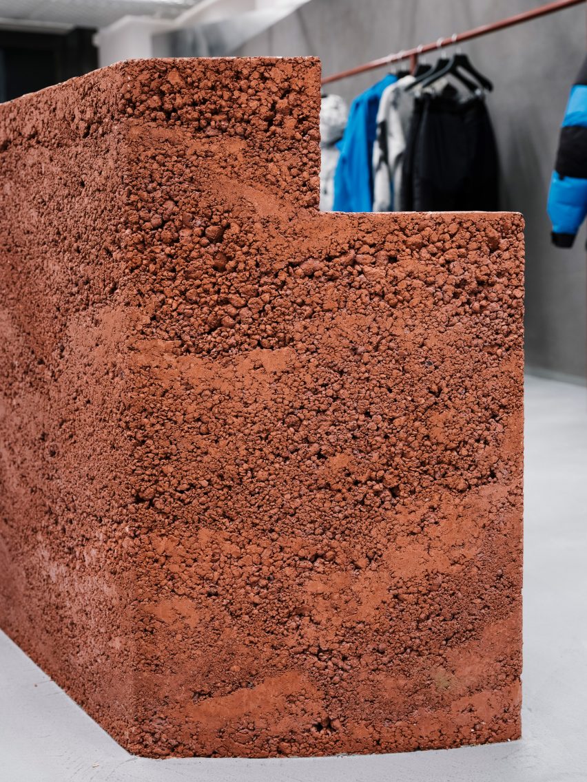
The islands were created by artist Lennart Frank, who cast and sculpted them from an aggregate mix of different lava rocks to create a layered effect.

Close up of the rammed-earth display islands at the 66 Degrees North clothing store
The islands were made from an aggregate mix containing different lava rocks

A combination of pigmented aggregate and sand gives the islands their reddish-brown hue, while the rugged texture brings a tactile element to the space that complements the brand’s clothing.

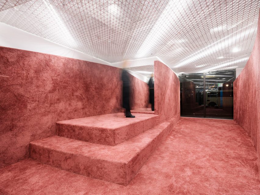
The earthy tones are echoed in the metal clothes rails, as well as in the colour of a carpet applied to the surfaces within a more intimate space at the rear of the store.

Shop interior with rammed-earth floor, steps and partition wall
Earth-toned carpet was used in parts of the shop

A custom-made mesh ceiling was designed to evoke a misty white sky, while also concealing lights and technical equipment.

Mirrors and screens displaying films of the Icelandic landscape help to define the flow of movement through the space and add a playful dimension to the shopping experience.

Shop front with stone facade and large window looking into a store with rammed-earth islands
The shop is located on Regent Street in London

Gonzalez and Haase founded their Berlin-based studio in 1999. The firm works on commercial, residential and cultural projects, developing spatial concepts and experiences that foreground the interplay between light and architecture.

Previous interiors designed by Gonzalez Haase AAS include a minimal office for a Berlin communications firm and a sparse, white-walled concept store in Lisbon that occupies a disused warehouse.

The photography is by Thomas Meyer, Ostkreuz Photography.


Reference

Studio MK27 creates Patina Maldives resort on Fari Islands
CategoriesInterior Design

Studio MK27 creates Patina Maldives resort on Fari Islands

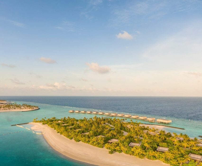
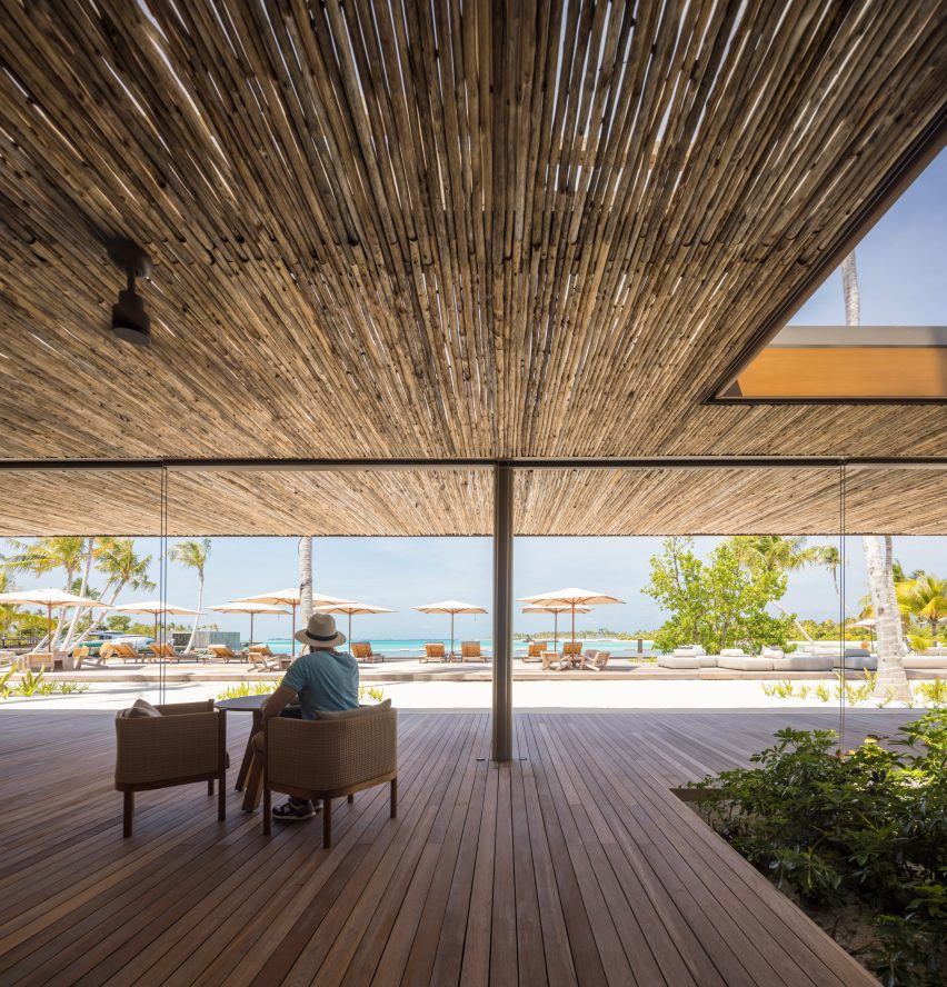
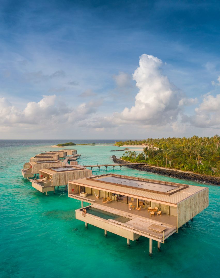
Brazil-based Studio MK27 has used wood, rattan and stone textures to create the buildings for a holiday resort on the Fari Islands archipelago in the Maldives.

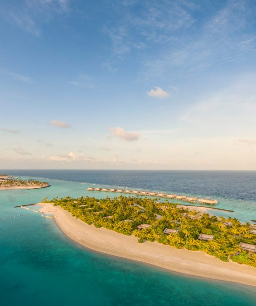
Patina Maldives occupies one of the four islands that makes up the artificial archipelago, which was built over approximately 10 kilometres of reef on the northern edge of North Male Atoll.

Aerial view of Patina Maldives
Patina Maldives is located within the new Fari Islands archipelago

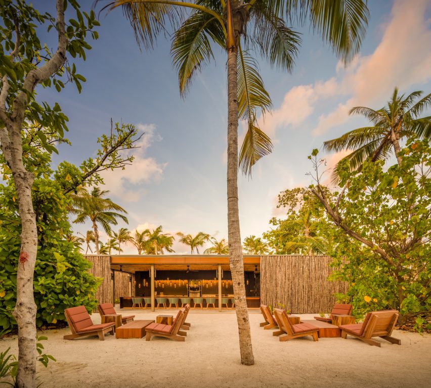
Studio MK27 has designed architecture and interiors for buildings across the island, including an arrival pavilion, a spa, a kid’s club, and a cluster of bars and restaurants.

Accommodation is provided by a mix of beach suites, private in-land villas and water villas that project out to sea.

Patina Maldives by Studio MK27
Studio MK27 designed architecture and interiors for the resort’s various buildings

Never rising above the tree canopy, the buildings are dotted around the island in an arrangement designed to create areas of vibrant social activity and spaces of complete seclusion.

“Patina is unique in the Maldives: an opportunity to be together in isolation,” said Studio MK27 founder Marcio Kogan. “[It is] one of the most remote places on Earth and still a place designed for people to meet one another.”

Deck at Patina Maldives by Studio MK27
Natural materials are combined with earthy colours

“Patina Maldives embraces our natural conflicts: desire for peace and party, for nature and design, technology and rusticity, self-indulgence and deep reflections,” he added.

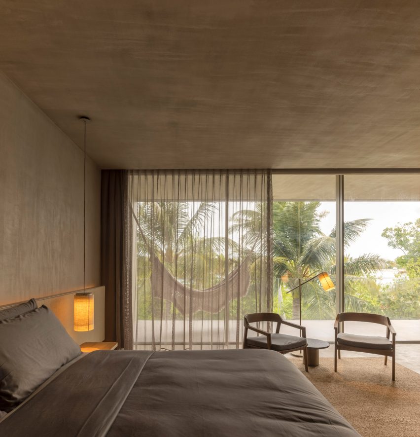
The materials palette throughout consists of earthy colours, matt finishes and natural textures that are intended to chime with the natural landscape.

Beach villa at Patina Maldives by Studio MK27
Water villas come with their own swimming pools

Many of Studio MK27’s own designs can be found in the furnishings, including woven lighting pendants, neatly crafted shelving units, and cabana and deck chairs co-designed with Norm Architects.

The villas feature high-tech sliding window systems that allow the interiors to be opened up on three sides at the touch of a button, as well as custom-made blackout blinds.

“We escalate the textures and emotions from zero to 100, from soft shadows to overwhelming light,” said Studio MK27.

“It’s a rhythm with contrast, pauses and transparencies. From slow dolce far niente to exuberant real vitality, it is a place for people to bond with nature and each other, for people to experience the essential with glamour.”

Villa at Patina Maldives by Studio MK27
There are also suites and villas inland and on the beach

Many of the buildings are characterised by clever details.

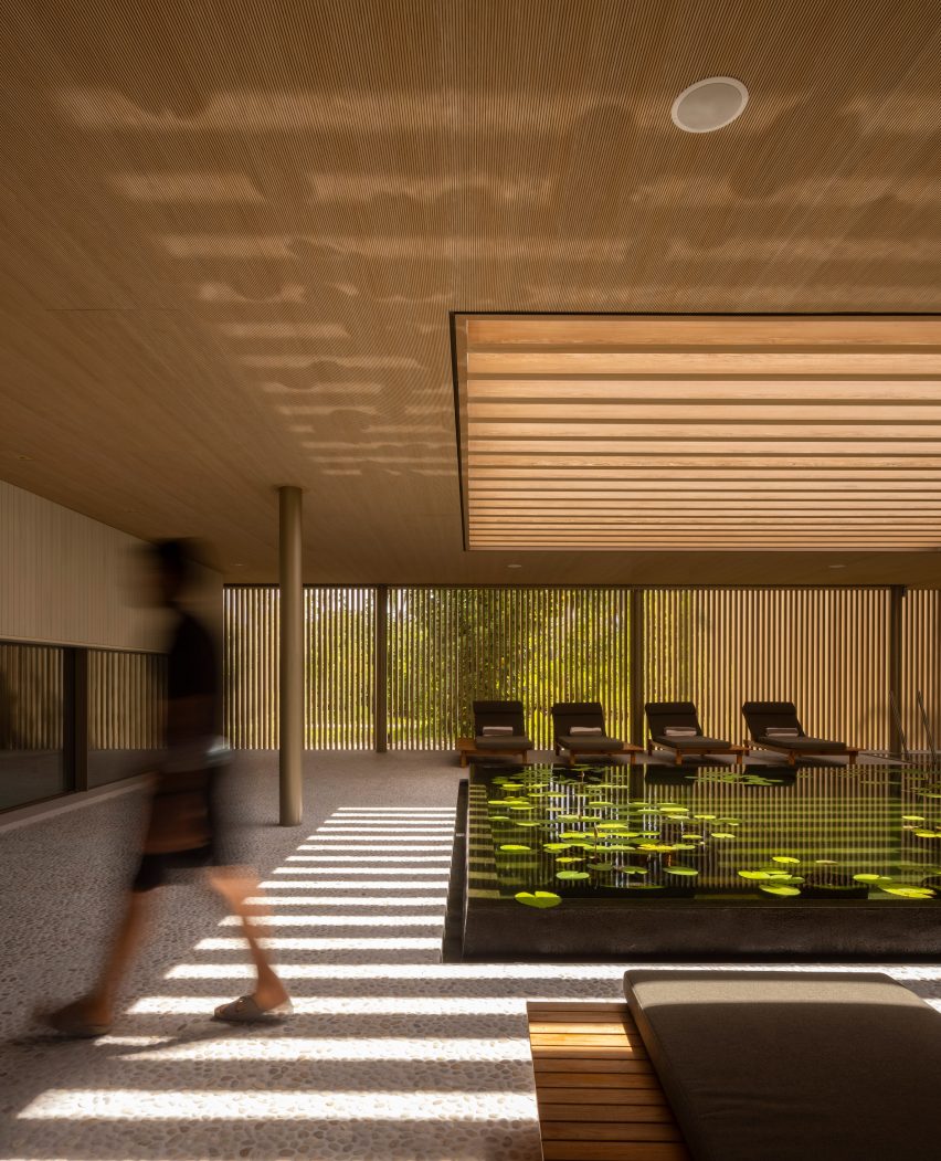
The spa centres around a shallow pool, with a skylight above offering a play of light and shadow, while the kid’s club is defined by colourful window apertures.

Spa at Patina Maldives by Studio MK27
The spa centres around a calming pool

The bar and restaurant area, known as the village, has its own sense of style.

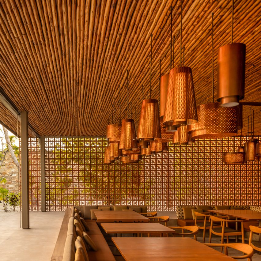
Arabesque, a restaurant serving Middle Eastern cuisine, combines patterned terracotta blockwork with copper lights, while the Brasa grill is designed as a Latin American smokehouse.

Restaurant at Patina Maldives by Studio MK27
The Village is a cluster of bars and restaurants

Studio MK27 has worked on many projects in idyllic locations, such as the beachside Vista House, or Jungle House, which is located in a rainforest.

The studio spent five years developing designs for Patina Maldives, which officially opened in May 2021.

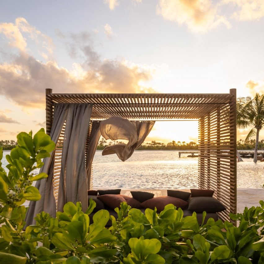
Cabana at Patina Maldives by Studio MK27
Studio MK27 custom designed much of the furniture

The hotel was longlisted for Dezeen Awards 2022 in the hospitality building category, while the spa is shortlisted in the leisure and wellness interior category.
It is one of three resorts located on islands within the Fari Islands archipelago, along with the Ritz-Carlton Maldives and the Capella-Maldives.

The photography is by Fernando Guerra.


Project credits

Architecture: Studio MK27
Lead architects: Marcio Kogan, Renata Furnaletto
Interior designers: Diana Radomysler, Pedro Ribeiro
Project team: André Sumida, Carlos Costa, Carolina Klocker, Diego Solano, Eduardo Glycerio, Elisa Friedmann, Gabriela Chow, Gustavo Ramos, Giovanni Meirelles, Julia Pinheiro, Lair Reis, Laura Guedes, Luciana Antunes, Renato Rerigo, Regiane Leão, Renata Scheliga, Ricardo Ariza, Marcio Tanaka, Mariana Ruzante, Mariana Simas, Samanta Cafardo, Suzana Glogowski, Tamara Lichtenstein, Thauan Miquelin
Developer: Pontiac Land Group
Landscape designer: Vladimir Djurovic Landscape Architects
Lighting design: The Flaming Beacon
Construction: Alhl Pvt
Project manager: Mace Group

Reference

Ten kitchens with islands that make food preparation easier and more enjoyable
CategoriesInterior Design

Ten kitchens with islands that make food preparation easier and more enjoyable

For this lookbook, we’ve chosen ten kitchen interiors featuring kitchen islands that are both practical and sociable.


Kitchen islands are freestanding counter-height units that are usually rectangular in shape and offer additional storage and preparation space.

They work particularly well in open-plan spaces, providing a clear line of sight between the kitchen and dining areas and offering a place where people can gather.

Here are ten architecture and interior projects that feature kitchen islands including one utilising a repurposed carpenter’s bench and another informed by the work of artist Donald Judd.

This is the latest roundup in our Dezeen Lookbooks series providing visual inspiration for the home. Previous kitchen-related posts feature green kitchens, terrazzo kitchens and kitchens with skylights.


Casa Aguantao, Chile, by Guillermo Acuña Arquitectos Asociados

Casa Aguantao, Chile, by Guillermo Acuña Arquitectos Asociados

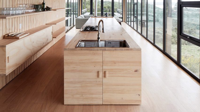
Santiago studio Guillermo Acuña Arquitectos Asociados used pale pine for this linear kitchen, with the multi-functional island drawing the eye down the length of the narrow, glazed dwelling towards the living area and terrace beyond.

The kitchen island features a large stainless steel sink and a hob at one end, with the other end serving as a dining table. The far end of the island incorporates a wood-burning stove that faces the lounge.

Find out more about Casa Aguantao ›


White Rabbit House, UK, by Gundry & Ducker

White Rabbit House, UK, by Gundry & Ducker

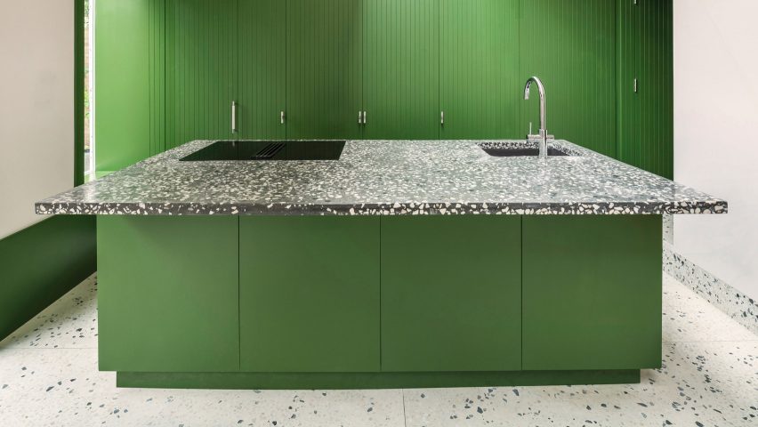
For the revamp of a 1970s house in London, British architecture studio Gundry & Ducker added this kitchen island painted a striking shade of absinthe green.

The countertop, which features a large cantilever on one side to create a breakfast bar, is made of dark terrazzo set with white stone chips. With full-height storage behind it, the island faces a generous-sized room with two glazed double doors that open onto the garden.

Find out more about White Rabbit House ›


Rylett House, UK, by Studio 30 Architects

Rylett House, UK, by Studio 30 Architects

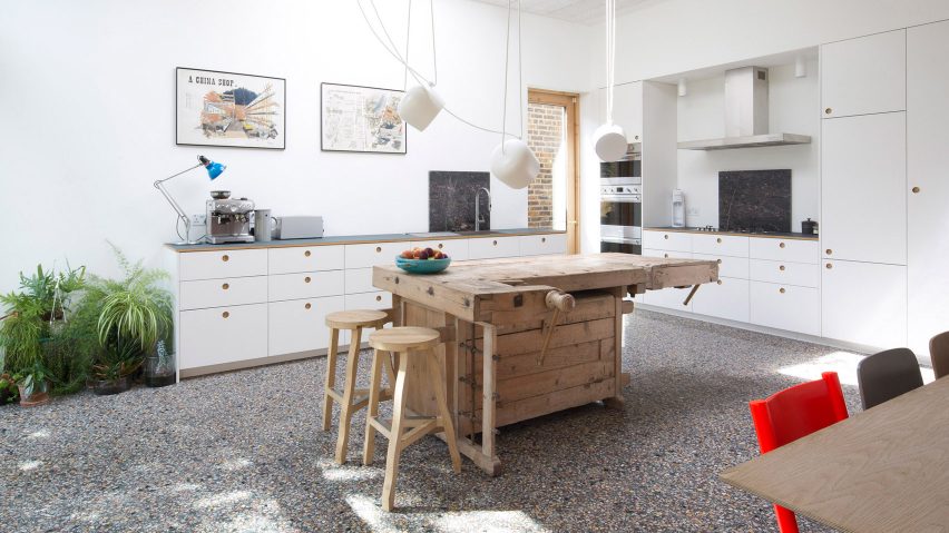
Studio 30 Architects repurposed an old carpenter’s workbench into a quirky island for this Victorian home renovation project.

The vintage wooden bench contrasts with the contemporary white kitchen units that line two walls. It serves as a sculptural bar that links the food-preparing area to the dining area on the other side of the spacious garden-facing room.

Suspended white Aim lights by the Bouroullecs hang above the island.

Find out more about Rylett House ›


Glyn House, UK, by Yellow Cloud Studio

Glyn House, UK, by Yellow Cloud Studio

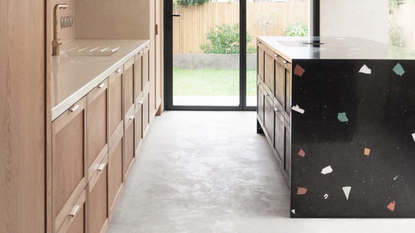
Striking black terrazzo surface with large, colourful aggregate clads all but one side of this minimalist kitchen island designed by Yellow Cloud Studio for a home extension project.

A double layer of oak drawers with bronze pull-tab handles sits below the kitchen-facing side of the counter, which has a flush hob. The other side of the island overhangs to create a narrow breakfast bar, beyond which is a dining table with bench seating set against an exposed brick wall.

Find out more about Glyn House ›


Hass House, USA, by Feuerstein Quagliara

Hass House, USA, by Feuerstein Quagliara

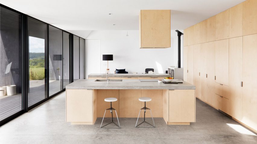
Architecture firm Feuerstein Quagliara designed not one but two parallel islands for the open-plan kitchen, dining area and living room in this house in rural New York state.

Set at ninety degrees to the full-height storage along one wall, the islands’ bases are made of the same plywood as the cupboards and are topped by slabs of polished concrete.

One island is inset with a deep sink and an induction hob and features a breakfast-bar niche for two adjustable-height Camp Stools by Chicago designer Greta de Parry.
Find out more about Hass House ›


Lake Geneva Residence, USA, by Collective Office

Chicago architecture practice Collective Office created a sharp, monolithic island to divide the kitchen and dining area of this contemporary take on a farmhouse in Wisconsin.

The island is made of a solid-surface material by Caesarstone that resembles rugged concrete and has pale wood-fronted cupboards underneath.

The colour palette complements the silvery shingles of Alaskan yellow cedar that clad the home’s exterior. An extra sink is set into the countertop and there are handy electric outlets at one end.

Find out more about Lake Geneva Residence ›


Step House, UK, by Grey Griffiths Architects

Step House, UK, by Grey Griffiths Architects

A grey, altar-like island sits in the middle of the open-plan kitchen-diner of this London extension project by Grey Griffiths Architects.

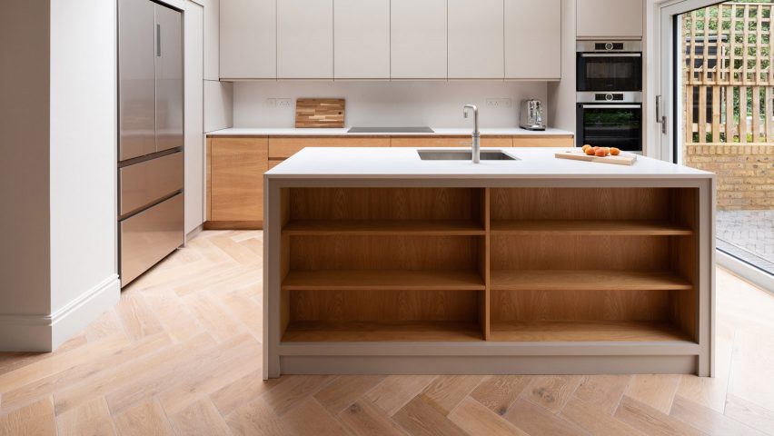
Deep timber shelves provide storage and display space along the side that faces the dining table, with a sink with an angled mixer tap set in the middle of the kitchen side.

Find out more about Step House ›


Ritson Road, UK, by Gresford Architects

Ritson Road, UK, by Gresford Architects

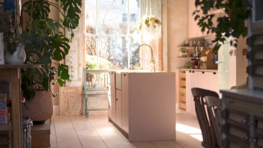
Pink is the theme of this kitchen extension built by Gresford Architects from rosy-hued coloured concrete in London’s Hackney neighbourhood. The vintage-style room has units along opposite walls, with a traditional Aga cooker on one side. The dining table is in an adjoining but separate space.

The narrow kitchen island, which sits in the centre of the room, has pink cupboards with slot handles. The apricot-coloured marble counter is cut away to make space for a traditional ceramic butler sink.

Find out more about Ritson Road ›


Shallmar Residence, Canada, by StudioAC 

Shallmar Residence, Canada, by StudioAC 

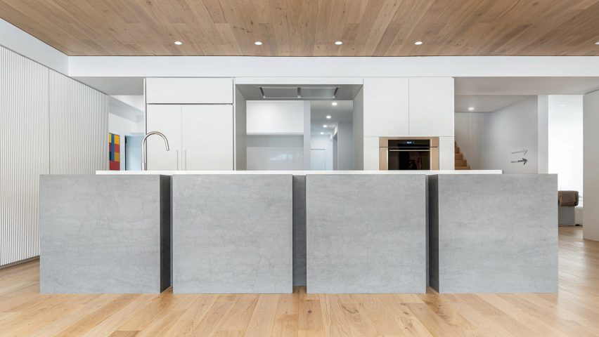
Canadian architectural practice StudioAC referenced the work of artist Donald Judd with this sculptural kitchen island for an art-filled house in Toronto.

The island is formed of four grey cubes made by kitchen materials brand Neolith and is topped by an offset white slab, which is interrupted only by a small recessed sink.

Find out more about Shallmar Residence ›


Barcelona Extension, Spain, by Bonba Studio

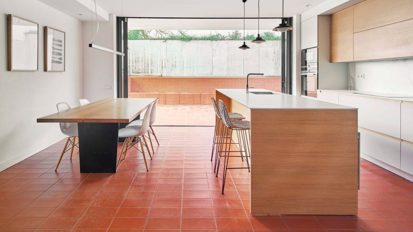
A simple wood-clad kitchen island provides extra surface space and a breakfast bar with bar stools in this kitchen extension by Bonba Studio.

A plain white countertop contrasts with the deep red terracotta tiles that lead out to the patio, creating a functional and spacious-feeling open-plan kitchen diner. It is illuminated by three pendant lights.

Find out more about Barcelona Extension ›


This is the latest in our series of lookbooks providing curated visual inspiration from Dezeen’s image archive. For more inspiration see previous lookbooks showcasing peaceful bedrooms, calm living rooms and colourful kitchens.

Reference