30 Best Architecture Firms in Japan
CategoriesArchitecture

30 Best Architecture Firms in Japan

These annual rankings were last updated on February 20th, 2024. Want to see your firm on next year’s list? Continue reading for more on how you can improve your studio’s ranking. 

Japanese architecture and building formulae have long been revered by the West. Even if the nation’s notably minimalist ethos remains somewhat elusive, the formal exchange between Japan and the rest of the world have been reciprocal and fertile. In addition to its characteristic Buddhist temples, vast Shinto shrines, traditional curved roofed structure and regenerative approach to preservation, Modernism took off in Japan following the Second World War and left a great impression on the international architectural community with its Metabolist movement. Immense structural rehabilitation took place after the war, and pioneering architects like Kenzō Tange made significant contributions to Japan’s built environment by synthesizing traditional architecture with modernism.

This reinterpretation of modernist architectural styles was championed through the 20th century by architects who underscored the interplay of architecture with the landscape. Japanese architects espouse a pragmatic approach to architecture, which can be explained by its unique geography prone to earthquakes and floods. This has led to an onslaught of innovative reinforcement techniques that continue to be explored today. Nevertheless, such structural requirements have never limited the Japanese from erecting transformative and quirky architecture in the past and present. For example, Tadao Ando, a vocal proponent of concrete, demonstrated the heavy material’s ability to embody lightness, and such explorations continue with today’s building community. Among the many structural typologies worthy of envy are Japanese school designs and THE TOKYO TOILET; the country’s pedagogical structures reflect its rich curriculum, which underscores discipline, curiosity and responsibility.

With so many architecture firms to choose from, it’s challenging for clients to identify the industry leaders that will be an ideal fit for their project needs. Fortunately, Architizer is able to provide guidance on the top design firms in Japan based on more than a decade of data and industry knowledge.

How are these architecture firms ranked?

The following ranking has been created according to key statistics that demonstrate each firm’s level of architectural excellence. The following metrics have been accumulated to establish each architecture firm’s ranking, in order of priority:

  • The number of A+Awards won (2013 to 2024)
  • The number of A+Awards finalists (2013 to 2024)
  • The number of projects selected as “Project of the Day” (2009 to 2024)
  • The number of projects selected as “Featured Project” (2009 to 2024)
  • The number of projects uploaded to Architizer (2009 to 2024)

Each of these metrics is explained in more detail at the foot of this article. This ranking list will be updated annually, taking into account new achievements of Japan architecture firms throughout the year.

Without further ado, here are the 35 best architecture firms in Japan:


30. Yasutaka Yoshimura Architect
© Yasutaka  Yoshimura Architect

© Yasutaka Yoshimura Architect

Yasutaka Yoshimura Architects is an architecture and urban design practice based in Tokyo. Our aim is to realize new forms of architecture and cities regarding market, laws, norms and environment as opportunities for our design.

Some of Yasutaka Yoshimura Architect’s most prominent projects include:

The following statistics helped Yasutaka Yoshimura Architect achieve 30th place in the 30 Best Architecture Firms in Japan:

Featured Projects6
Total Projects6

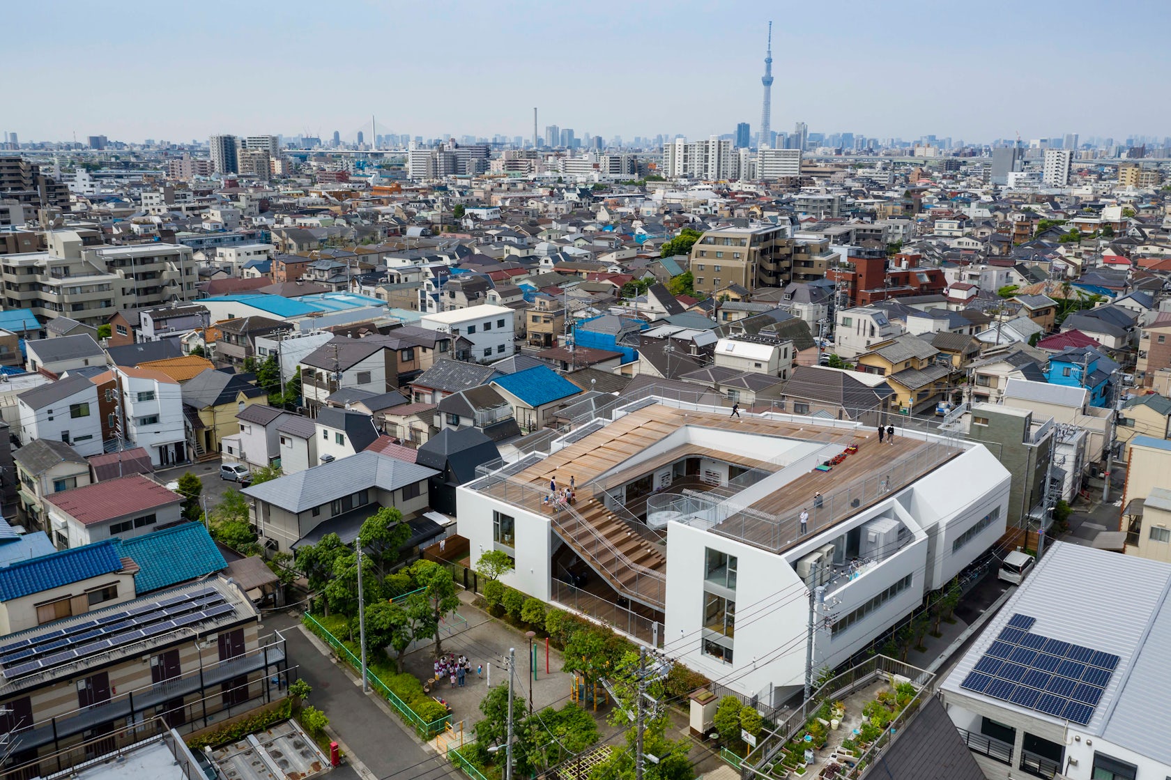
29. Aisaka Architects’ Atelier

© Aisaka Architects' Atelier

© Aisaka Architects’ Atelier

Aisaka architects’ atelier is located in densely populated suburban Tokyo. Her work revolved mostly around public projects.

Some of Aisaka Architects’ Atelier’s most prominent projects include:

  • AMANENOMORI NURSERY SCHOOL, Chiba Prefecture, Japan
  • Higashitateishi Nursery school, Katsushika City, Japan
  • house in todoroki, Tokyo, Japan
  • KEIUN BUILDING, Tokyo, Japan
  • Tesoro Nursery School, Kojimachi, Chiyoda City, Japan

The following statistics helped Aisaka Architects’ Atelier achieve 29th place in the 30 Best Architecture Firms in Japan:

A+Awards Finalist1
Featured Projects6
Total Projects6

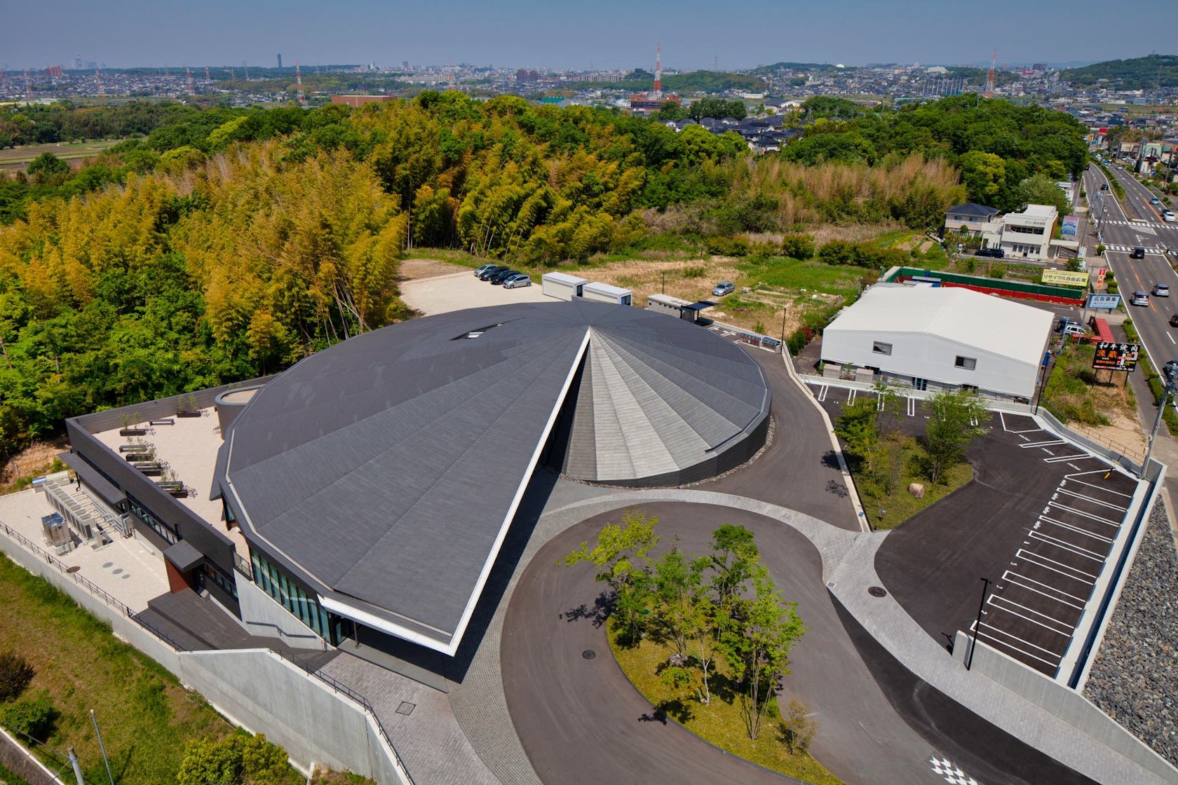
28. bandesign

© bandesign,Ltd.

© bandesign,Ltd.

Architecture has long life and difference from another design. I don’t design with an idea, but I do design for never changing. For example, the sun come up in the east, and set in the west. It is definitely never changing for ever. I want to design intentionally for long life. In addition, long life is closely related with architectural culture. Historical architecture is being existence strongly. Could you imagine the architect’s mind? If he were not enthusiastic, the historical architecture wouldn’t be existence. The design work might be for his life. It is clear that architecture is same as fine art, another art.

Some of bandesign,Ltd.’s most prominent projects include:

  • Mirrors, Gifu Prefecture, Japan
  • Involve, Nisshin, Japan
  • Turn,Turn,Turn,, Aichi Prefecture, Japan
  • Secret Garden, Aichi Prefecture, Japan
  • The Distance, Japan

The following statistics helped bandesign,Ltd. achieve 28th place in the 30 Best Architecture Firms in Japan:

A+Awards Winner1
A+Awards Finalist1
Featured Projects6
Total Projects7

27. CASE-REAL

© CASE-REAL

© CASE-REAL

Led by designer Koichi Futatsumata, CASE-REAL works on interior / architecture projects. With creative ideas and technological studies based on each environment, objective and tasks given for each project CASE-REAL will seek for an essential solution to fit each atmosphere.

Koichi Futatsumata is the representative director of “CASE-REAL” focusing on spacial design, and “KOICHI FUTATSUMATA STUDIO” which specializes in product design. He is based in Fukuoka and Tokyo working internationally with variety of works including architectures, interiors, furnitures and products.

Some of CASE-REAL’s most prominent projects include:

The following statistics helped CASE-REAL achieve 27th place in the 30 Best Architecture Firms in Japan:

Featured Projects6
Total Projects7

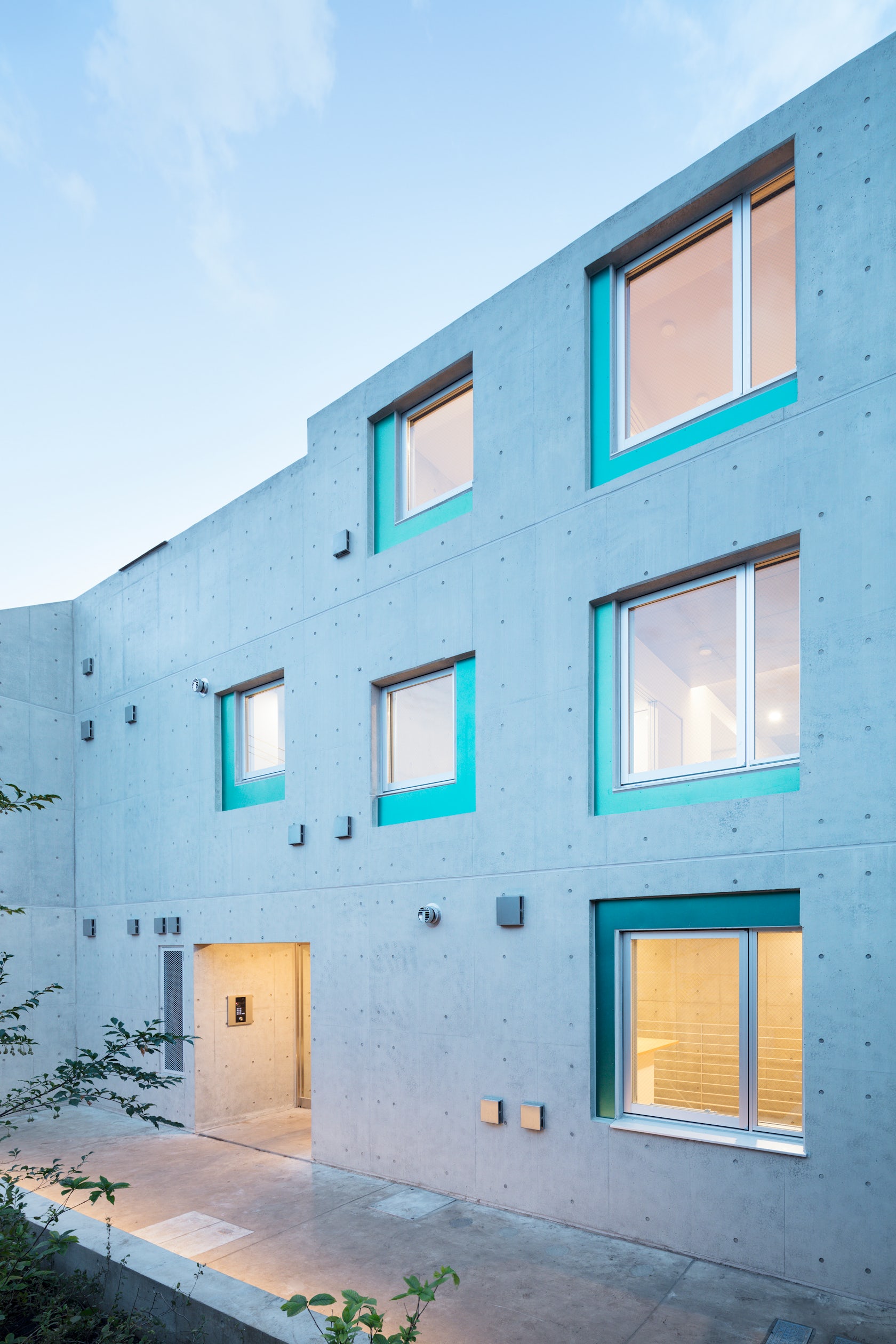
26. Yohei Kawashima architects inc.

© ©Koji Fujii /TOREAL (16)

© ©Koji Fujii /TOREAL (16)

Yohei Kawashima architects was founded in 2014 by Youhei Kawashima and is based in Tokyo, Japan. The firm is well versed in the design of large-scale apartment buildings as well as retail architecture.

Some of Yohei Kawashima architects inc.’s most prominent projects include:

  • M_building, Miyakojima, Japan
  • JINS Sendai Izumi, Sendai, Japan
  • O_apartment, Miyakojima, Japan
  • S_apartment, Miyakojima, Japan
  • N_apartment, Miyakojima, Japan

The following statistics helped Yohei Kawashima architects inc. achieve 26th place in the 30 Best Architecture Firms in Japan:

Featured Projects6
Total Projects10

25. MOVEDESIGN

Photo: Yousuke Harigane - © MOVEDESIGN

Photo: Yousuke Harigane – © MOVEDESIGN

There is no fixed color for our job. We design the passion and imagination of the owner and staff members, and convey it visually to the world. We also place the highest priority on creating a happy community where people who sympathize with the place gather. Therefore, MOVE DESIGN works not only with architecture and interiors, but also with interior designers, art directors, copywriters, and other members of the team to connect with customers and provide them with communication to achieve good results. Each store has different colors, and the more colors, the more interesting the city becomes. The concept of MOVE DESIGN is to make each store’s original color and make various colors.

Some of MOVEDESIGN’s most prominent projects include:

The following statistics helped MOVEDESIGN achieve 25th place in the 30 Best Architecture Firms in Japan:

Featured Projects6
Total Projects13

24. Ryuichi Sasaki Architecture

© Takumi Ota Photography

© Takumi Ota Photography

We seeks to re-interpreted architecture’s position within cultural practices that determine meaning, particularly within will of epoch analysis. The investigations traverse not only conventional notions of space, enclosure, and order but also the fluctuating frames that define spaces.

Some of Ryuichi Sasaki Architecture’s most prominent projects include:

The following statistics helped Ryuichi Sasaki Architecture achieve 24th place in the 30 Best Architecture Firms in Japan:

Featured Projects6
Total Projects15

23. Tsutsumi And Associates

© Tsutsumi And Associates

© Tsutsumi And Associates

We are an architectural design firm with two offices in Hiroshima and Beijing. Every site has a complex intertwining of various issues that are different from each other. We carefully untangle them, identify the conceptual issues, and aim to create a unique architecture for the client. Such an architecture will not be merely a style for show, but will live with the client for a long time with pleasure.

Some of Tsutsumi And Associates’s most prominent projects include:

  • ANZAS Dance Studio, Beijing, China
  • House in Dawanglu, Beijing, China
  • Tsingpu Baisha Retreat, Lijiang, China
  • Ryoutei Matsuko, Hangzhou, China
  • Hangzhou Spiral Villa, Hangzhou, China

The following statistics helped Tsutsumi And Associates achieve 23rd place in the 30 Best Architecture Firms in Japan:

Featured Projects6
Total Projects17

22. kasa architects

© kasa architects

© kasa architects

We want to create places, not buildings. We share our clients’ ideas and wishes, discovering the joys and comforts of a new way of life. We value the qualities of a place, and we want to create rich spaces by pursuing the possibilities of architecture.

Some of kasa architects’s most prominent projects include:

The following statistics helped kasa architects achieve 22nd place in the 30 Best Architecture Firms in Japan:

Featured Projects6
Total Projects18

21. noiz

© Daici Ano

© Daici Ano

New forms of music in their infancy have often been taken as noise.  The name of noiz / architecture, design and planning takes cue from developments in music history as an everyday reminder of the firm’s commitment to unique and insightful design solutions. Keisuke Toyoda and Jia-Shuan Tsai founded noiz / architecture, design and planning in the beginning of 2006.  Both founding principals have significant work experiences in institutional, commercial and residential design in Japan, China and the United States.

Some of noiz’s most prominent projects include:

The following statistics helped noiz achieve 21st place in the 30 Best Architecture Firms in Japan:

Featured Projects7
Total Projects47

20. MORIYUKI OCHIAI ARCHITECTS

© MORIYUKI OCHIAI ARCHITECTS

© MORIYUKI OCHIAI ARCHITECTS

Moriyuki Ochiai, born in Tokyo, Japan is an architect and designer. He established his own studio, Moriyuki Ochiai Architects that is active in architectural, interior, furniture, landscape and industrial design. The sources of our inspirations come from being captivated by the vivacious and lively beauty of nature or life.

We can also feel the influence coming from the delicate sensitivity responding to the unique Japanese nature, which can be found in Japanese temples and gardens. We wish to continue creating works that fulfill people’s dreams, become the energy for their lives, and then move on to a deeper dimension that exceeds life itself.

Some of MORIYUKI OCHIAI ARCHITECTS’s most prominent projects include:

The following statistics helped MORIYUKI OCHIAI ARCHITECTS achieve 20th place in the 30 Best Architecture Firms in Japan:

Featured Projects7
Total Projects14

19. Klein Dytham architecture

© Klein Dytham architecture

© Klein Dytham architecture

Klein Dytham architecture (KDa) is a multi-disciplinary design practice known for architecture, interiors, public spaces and installations. Established by Royal College of Art graduates Astrid Klein and Mark Dytham in Tokyo in 1991, today KDa is a multi-lingual office with an international reputation and a high-profile client list which includes Google, Tsutaya, Sony, Virgin Atlantic, Nike, Uniqlo, Selfridges and Japan Rail.

KDa’s built work includes flagship retail stores, restaurants, resort facilities, office fit-outs, houses and private residences. KDa has no stylistic recipe, preferring to work with the client, program and other project parameters to develop a uniquely tailored solution. Materials, technology and context are all key elements of KDa’s design approach, spiced always with an irreverent or surprising twist.

Some of Klein Dytham architecture’s most prominent projects include:

The following statistics helped Klein Dytham architecture achieve 19th place in the 30 Best Architecture Firms in Japan:

A+Awards Winner1
Featured Projects10
Total Projects10

18. Tadao Ando Architect & Associates

© Tadao Ando Architect & Associates

© Tadao Ando Architect & Associates

Born 1941 in Osaka, Japan. Self-taught in architecture. Established Tadao Ando Architect & Associates in 1969. Major works include the Church of the Light, Pulitzer Arts Foundation, and Chichu Art Museum. Awarded the Architectural Institute of Japan (AIJ) Prize for the Row House in Sumiyoshi in 1979, Japan Art Academy Prize in 1993, Pritzker Architecture Prize in 1995, Person of Cultural Merit (Japan) in 2003, International Union of Architects (UIA) Gold Medal in 2005, John F. Kennedy Center Gold Medal in the Arts in 2010, Shimpei Goto Award in 2010, Order of Culture (Japan) in 2010, Commander of the Order of Art and Letters (France) in 2013, Grand Officer of the Order of Merit (Italy) in 2015, and Isamu Noguchi Award in 2016. Held solo exhibitions at the Museum of Modern Art (MoMA) in 1991 and Centre Pompidou in 1993. Taught as a visiting professor at Yale University, Columbia University, and Harvard University. Professor at the University of Tokyo from 1997. Professor emeritus of the University of Tokyo since 2003.

Some of Tadao Ando Architect & Associates’s most prominent projects include:

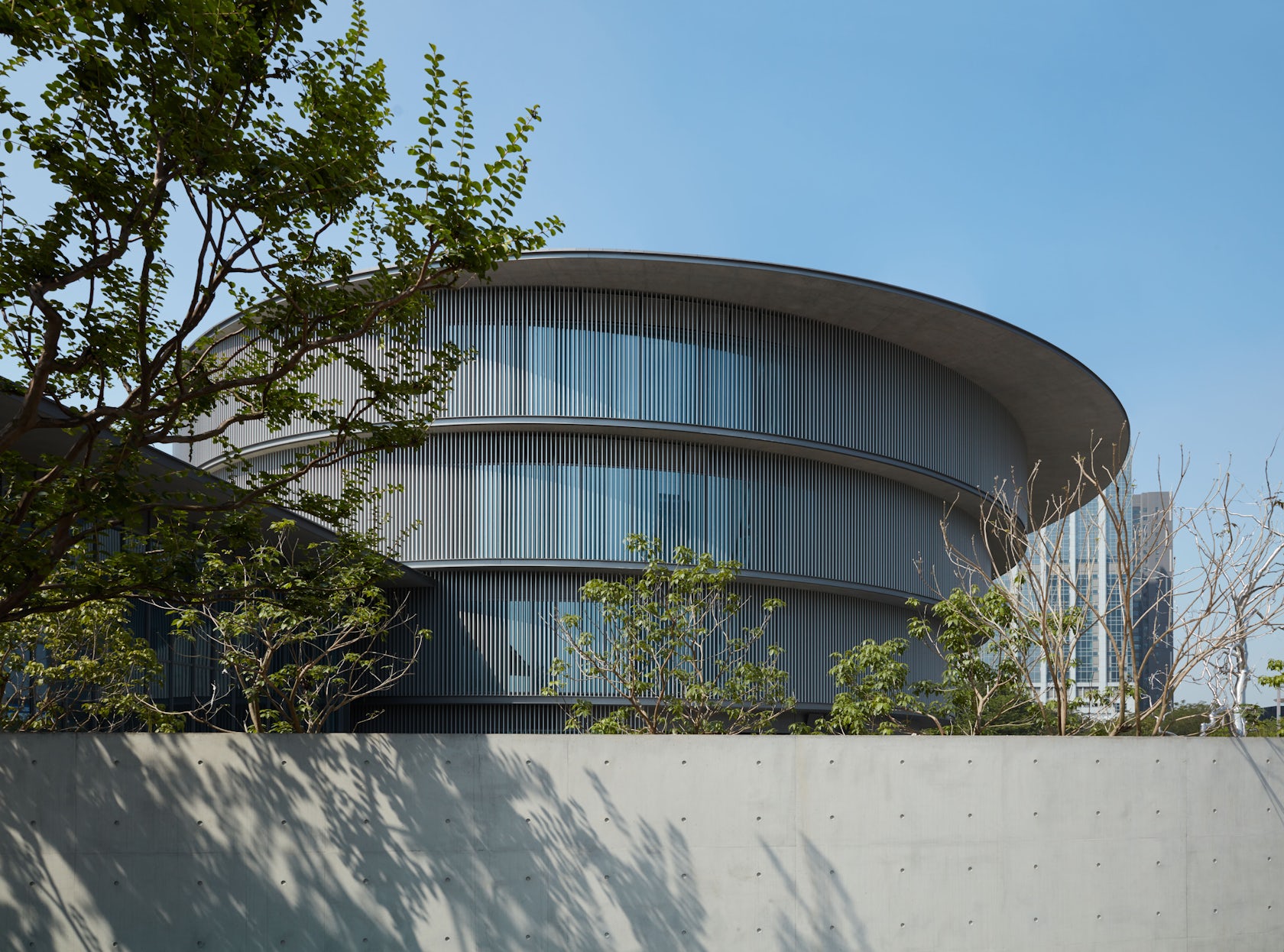
  • He Art Museum, Foshan, China
  • Centro Roberto Garza Sada de Arte, Arquitectura y Diseño, Monterrey, Mexico
  • ICHIGONI at 152 Elizabeth Street, New York, NY, United States
  • Asia Museum of Modern Art, Asia University, Taichung City, Taiwan

The following statistics helped Tadao Ando Architect & Associates achieve 18th place in the 30 Best Architecture Firms in Japan:

A+Awards Winner1
A+Awards Finalist5
Featured Projects5
Total Projects4

17. Kichi Architectural Design

© Kichi Architectural Design

© Kichi Architectural Design

We are Kichi Architectural Design based in Japan. The design of homes is our main business line, but we also design stores and offices. While appreciating the inherent energy of land, we cultivate expansive ideas through repeated consultations with each client. Our aim is to create unique spaces that resonate with the spirits of the people who will live there.

Some of Kichi Architectural Design’s most prominent projects include:

  • House of Blocks, Ushiku, Japan
  • Cubic House Of Kubogaoka, Moriya, Japan
  • Ripple House, Tsukubamirai, Japan
  • Scandinavian Middle, Tsukubamirai, Japan
  • Hotel PatInn, Ogasawara, Japan

The following statistics helped Kichi Architectural Design achieve 17th place in the 30 Best Architecture Firms in Japan:

Featured Projects8
Total Projects30

16. Florian Busch Architects

© Florian Busch Architects

© Florian Busch Architects

Florian Busch Architects is an office practicing architecture, urbanism and socio-cultural analysis. Based in Tokyo, FBA draws on a worldwide network of expert consultants, architects and engineers, accumulating several decades of experience in the ἀeld of building. Understanding architecture as the result of interactions between multiple ἀelds, FBA, from the outset of any project, devises speciἀc strategies working in feedback processes with a diversity of consultants to drive the project towards solutions beyond the imagined.

Florian Busch Architectural Design Office is an office that engages in research on architecture, urban planning, society and culture. Based in Tokyo, we have a network of numerous engineers who have decades of experience and trust in the architectural world.

Some of Florian Busch Architects’s most prominent projects include:

  • House in Takadanobaba, Tokyo, Japan
  • House in the Forest, Hokkaido, Japan
  • ‘A’ House in Kisami, Shimoda, Japan
  • L House in Hirafu, Abuta District, Japan
  • House that Opens up to its Inside, Yūkarigaoka, Sakura, Japan

The following statistics helped Florian Busch Architects achieve 16th place in the 30 Best Architecture Firms in Japan:

Featured Projects9
Total Projects15

15. SUGAWARADAISUKE Architects Inc.

© Takeshi Nakasa (Nacasa & Partners)

© Takeshi Nakasa (Nacasa & Partners)

SUGAWARADAISUKE is an architecture and art-direction office valued internationally, working on different areas like urban design, landscape, architecture, interior, graphic design and branding. Our target is to make our world beautiful and colorful by integrating different scales and elements. The cross-cutting creativity is based on global viewpoints and architectural background.

Some of SUGAWARADAISUKE Architects Inc.’s most prominent projects include:

The following statistics helped SUGAWARADAISUKE Architects Inc. achieve 15th place in the 30 Best Architecture Firms in Japan:

A+Awards Finalist2
Featured Projects8
Total Projects17

14. FORM / Kouichi Kimura Architects

© Keikichi Yamauchi Architect and Associates

© Keikichi Yamauchi Architect and Associates

Established in 1991 by Kouichi Kimura, FORM mission is to create spaces where quiet time flows. Working primarily with residential design, the firm’s architecture has been characterized as poetic, with great attention to form, shadow and light.

Some of FORM / Kouichi Kimura Architects’s most prominent projects include:

The following statistics helped FORM / Kouichi Kimura Architects achieve 14th place in the 30 Best Architecture Firms in Japan:

Featured Projects10
Total Projects8

13. Akira Koyama + KEY OPERATION INC. / ARCHITECTS

© Akira Koyama + KEY OPERATION INC. / ARCHITECTS

© Akira Koyama + KEY OPERATION INC. / ARCHITECTS

Our aim is to find the simplest and the most innovative space composition, construction method or other architectural technique that does tackle the different problems and give a coherent, clever, logical solution. In order to do so, we will investigate and analyze the customer’s requirements, observe the urban context, understand the social interactions, acknowledge local history, culture, regulations and natural environment, study building materials and techniques.

Some of Akira Koyama + KEY OPERATION INC. / ARCHITECTS’s most prominent projects include:

The following statistics helped Akira Koyama + KEY OPERATION INC. / ARCHITECTS achieve 13th place in the 30 Best Architecture Firms in Japan:

A+Awards Winner2
A+Awards Finalist2
Featured Projects7
Total Projects24

12. Kiriko design office

© Kiriko design office

© Kiriko design office

Kiriko Design Office was established four decades ago in Kochi Prefecture being surrounded by the Pacific Ocean and the mountains. The firm often works with local materials and designs all types of structures — nursery schools, clinics, apartment complexes, villas, shops and buildings.

Some of Kiriko design office’s most prominent projects include:

The following statistics helped Kiriko design office achieve 12th place in the 30 Best Architecture Firms in Japan:

Featured Projects10
Total Projects13

11. yoshihiro yamamoto architects atelier | yyaa

YYAA is an architect office based on Nara / Osaka , Japan. Founded by Yoshihiro Yamamoto, the firm approaches their work as “designers” rather than “architects” and celebrate the individuality of each plan.

Some of yoshihiro yamamoto architects atelier | yyaa’s most prominent projects include:

  • House for Aya, Osaka, Japan
  • Fukinagashi Flat, Osaka, Japan
  • Cafe Franz Kafka, Nara, Japan
  • Okayama Building, Osaka, Japan
  • Crossroad House, Sakai, Japan

The following statistics helped yoshihiro yamamoto architects atelier | yyaa achieve 11th place in the 30 Best Architecture Firms in Japan:

Featured Projects10
Total Projects23

10. Apollo Architects and Associates

photo: Masao Nishikawa - © Apollo Architects and Associates

photo: Masao Nishikawa – © Apollo Architects and Associates

The name “Apollo” originates from Apollon, god of sun and light in Greco-Roman mythology. The firm was named in 2000 with the hope of pursuing architecture composed of the simple materials of “light” and “shadow”, while also aiming to become a luminous presence within the city and society.

Architecture needs to be safe and functional, but it also needs to go beyond that. What we aim to do in addition to those basic requirements is to induce a rich spirituality within the space. Daily life, which is composed of the accumulation of simple and trivial events, requires an enduring continuity.

Some of Apollo Architects and Associates’s most prominent projects include:

The following statistics helped Apollo Architects and Associates achieve 10th place in the 30 Best Architecture Firms in Japan:

A+Awards Finalist1
Featured Projects11
Total Projects12

9. ALTS DESIGN OFFICE

‘It searches for always new universality and it is begun to make’various and special something – this is our work .If an architect’s office is requested, many people think that a threshold is high and high-cost and becomes a house in which it is hard to live by design serious consideration. However, such a thing never cannot be found. We search for always new universality, conversing with the chief mourner, and beginning to make various and rich space by using a simple and intelligible method. We are able to create that recast the gaze at fundamental views, reconstructing them from a different angle — a richer and newer space.

Some of ALTS DESIGN OFFICE’s most prominent projects include:

The following statistics helped ALTS DESIGN OFFICE achieve 9th place in the 30 Best Architecture Firms in Japan:

Featured Projects12
Total Projects52

8. Masahiro Miyake (y+M design office)
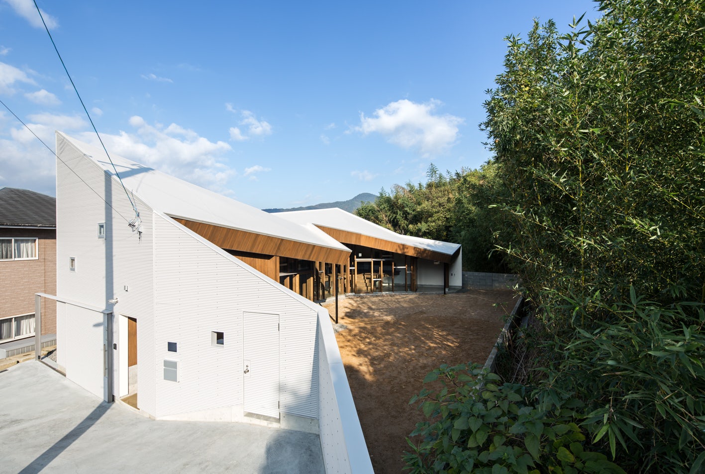
© Masahiro Miyake (y+M design office)

© Masahiro Miyake (y+M design office)

Cofounded by Hidemasa Yoshimoto and Masahiro Miyake, y+M design office is a Japanese architectural practice that attaches big importance to the idea of connections. Pondering connection between environments and humans, the firm seeks to find the most appropriate design solutions for its clients.

Some of Masahiro Miyake (y+M design office)’s most prominent projects include:

  • béret, Kagawa Prefecture, Japan
  • Floating-roof house, Kobe, Japan
  • House of a Backstage, Tokushima, Japan
  • Slide House, Hyogo Prefecture, Japan
  • Shawl House, Ehime Prefecture, Japan

The following statistics helped Masahiro Miyake (y+M design office) achieve 8th place in the 30 Best Architecture Firms in Japan:

Featured Projects14
Total Projects23

7. emmanuelle moureaux

© Daisuke Shima

© Daisuke Shima

Born in 1971, France. Emmanuelle Moureaux is a French architect living in Tokyo since 1996, where she established “emmanuelle moureaux architecture + design” in 2003. Inspired by the layers and colors of Tokyo that built a complex depth and density on the street, and the Japanese traditional spatial elements like sliding screens, she has created the concept of “shikiri”, which literally means “dividing (creating) space with colors.” She uses colors as three-dimensional elements, like layers, in order to create spaces, not as a finishing touch applied on surfaces.

Some of emmanuelle moureaux INC.’s most prominent projects include:

The following statistics helped emmanuelle moureaux INC. achieve 7th place in the 30 Best Architecture Firms in Japan:

A+Awards Winner2
A+Awards Finalist2
Featured Projects14
Total Projects23

6. Schemata Architects / Jo Nagasaka

© Kenya Chiba

© Kenya Chiba

Jo Nagasaka established Schemata Architects right after graduating from Tokyo University of the Arts in 1998. Currently he is based out of Kitasando,Tokyo. Jo has extensive experience in a wide range of expertise from furniture to architecture. His design approach is always based on 1:1 scale, regardless of what size he deals with. He works extensively in Japan and around the world, while expanding his design activity in various fields.

Some of Schemata Architects / Jo Nagasaka’s most prominent projects include:

  • ºC (Do-C) Ebisu, Tokyo, Japan
  • Takeo Kikuchi Store in Shibuya, Jingumae, Shibuya, Japan
  • WORLD BASICS Pop-Up Store @merci, Paris, France
  • Takahashi Hiroko Oshiage Studio, Narihira, Sumida-ku, Japan
  • House in Hatogaya, Saitama Prefecture, Japan

The following statistics helped Schemata Architects / Jo Nagasaka achieve 6th place in the 30 Best Architecture Firms in Japan:

Featured Projects14
Total Projects20

5. Takeru Shoji Architects

© Takeru Shoji Architects.Co.,Ltd.

© Takeru Shoji Architects.Co.,Ltd.

Our desire is not just to create a living space to solve the changing needs of a house, commercial area, or public spaces, but to also create a living environment that makes those in it by the sole fact of being in it, and those who see it, happy. I want not only those owning and residing in the building, but those living by or just passing by it to feel moved and feel the unique characteristic of the building. It is more important to me to create an “open” environment with my designs than the actual building themselves. My meaning of the word “open” is a place that is well suited for people, and allows them, as human beings, a comfortable place and time to just be.

Some of Takeru Shoji Architects.Co.,Ltd.’s most prominent projects include:

  • Hara House, Nagaoka, Japan
  • YNS, Nishi Ward, Niigata, Japan
  • Wow! Sta., Niigata, Japan
  • sa house, Japan
  • Shiro house, Narayama, Akita, Japan

The following statistics helped Takeru Shoji Architects.Co.,Ltd. achieve 5th place in the 30 Best Architecture Firms in Japan:

A+Awards Winner2
Featured Projects19
Total Projects17

4. Fujiwaramuro Architects

© Fujiwaramuro Architects

© Fujiwaramuro Architects

Fujiwara Muro Architects was established in 2022 by Shintaro Fujiwara and Yoshio Muroi in Osaka, Japan. The firm focuses on designing compact residences with great views.

Some of Fujiwaramuro Architects’s most prominent projects include:

  • House in Mukainada, Hiroshima Prefecture, Japan
  • House in Minami-Tanabe, Osaka, Japan
  • House in Muko, Muko, Japan
  • Tiny House in Kobe, Kobe, Japan
  • House in Sekiya, Nara, Japan

The following statistics helped Fujiwaramuro Architects achieve 4th place in the 30 Best Architecture Firms in Japan:

Featured Projects19
Total Projects38

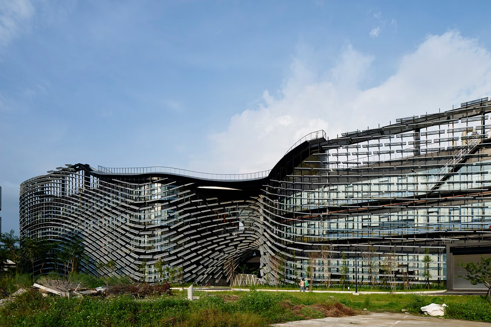
3. NIKKEN SEKKEI LTD

© Eiichi Kano

© Eiichi Kano

At Nikken Sekkei, we take an integrated approach to our projects as a professional service firm. Across all in-house disciplines of architectural design: urban design, research, planning and consulting — our teams work collaboratively to deliver better solutions for clients.

Some of NIKKEN SEKKEI LTD’s most prominent projects include:

  • Showa Gakuin Elementary School West Wing, Ichikawa, Japan
  • JR Kumamoto Railway Station Building, Kumamoto, Japan
  • Ariake Gymnastics Centre, Tokyo, Japan
  • On the water, Nikko, Japan
  • Yamato Konan Building, Tokyo, Japan
  • Top image: Daiwa Ubiquitous Computing Research Building, Tokyo, Japan

The following statistics helped NIKKEN SEKKEI LTD achieve 3rd place in the 30 Best Architecture Firms in Japan:

A+Awards Winner3
A+Awards Finalist9
Featured Projects22
Total Projects35

2. HIBINOSEKKEI+Youji no Shiro

© HIBINOSEKKEI+Youji no Shiro

© HIBINOSEKKEI+Youji no Shiro

Main services of ‘Youji no Shiro’ are designs and surveillances of buildings, renovation and interiors of preschools. We also provide branding consultation services for preschools. ‘Youji no Shiro’, which means ‘The Castle for Children’ in Japanese, is the name of a section of Hibino Sekkei Architecure, based in Kanagawa, Japan.

The company was founded in 1972 and had launched the section that specializes in the design of spaces for children in 1991, reflecting the rapidly altering social situation. By that time, the declining birth rate had become a serious issue in Japan. With fewer children continuing to develop, we became to think that existing preschool architecture where classrooms of same sizes and shapes were lined up weren’t just right.

Some of HIBINOSEKKEI+Youji no Shiro’s most prominent projects include:

  • SH Kindergarten and Nursery, Toyama, Japan
  • Hanazono Kindergarten and Nursery, Okinawa Prefecture, Japan
  • KB Primary and Secondary School, Sasebo, Japan
  • KM Kindergarten and Nursery, Izumi, Japan
  • ST Nursery, Saitama Prefecture, Japan

The following statistics helped HIBINOSEKKEI+Youji no Shiro achieve 2nd place in the 30 Best Architecture Firms in Japan:

A+Awards Winner4
A+Awards Finalist6
Featured Projects25
Total Projects55

1. Kengo Kuma and Associates

© Kengo Kuma and Associates

© Kengo Kuma and Associates

Kengo Kuma was born in 1954. He established Kengo Kuma & Associates in 1990. He is currently a University Professor and Professor Emeritus at the University of Tokyo after teaching at Keio University and the University of Tokyo. KKAA projects are currently underway in more than 40 countries. Kengo Kuma proposes architecture that opens up new relationships between nature, technology, and human beings. His major publications include Zen Shigoto(Kengo Kuma — the complete works, Daiwa Shobo), Ten Sen Men (“point, line, plane”, Iwanami Shoten), Makeru Kenchiku (Architecture of Defeat, Iwanami Shoten), Shizen na Kenchiku (Natural Architecture, Iwanami Shinsho), Chii-sana Kenchiku (Small Architecture, Iwanami Shinsho) and many others.

Some of Kengo Kuma and Associates’s most prominent projects include:

  • Teahouse in Coal Harbour, Vancouver, Canada
  • Botanical Pavilion, Melbourne, Australia
  • V&A Dundee, Dundee, United Kingdom
  • Darling Square, Sydney, Australia
  • Towada , Towada, Japan
  • Top image: Daiwa Ubiquitous Computing Research Building, Tokyo, Japan

The following statistics helped Kengo Kuma and Associates achieve 1st place in the 30 Best Architecture Firms in Japan:

A+Awards Winner5
A+Awards Finalist1
Featured Projects43
Total Projects45

Why Should I Trust Architizer’s Ranking?

With more than 30,000 architecture firms and over 130,000 projects within its database, Architizer is proud to host the world’s largest online community of architects and building product manufacturers. Its celebrated A+Awards program is also the largest celebration of architecture and building products, with more than 400 jurors and hundreds of thousands of public votes helping to recognize the world’s best architecture each year.

Architizer also powers firm directories for a number of AIA (American Institute of Architects) Chapters nationwide, including the official directory of architecture firms for AIA New York.
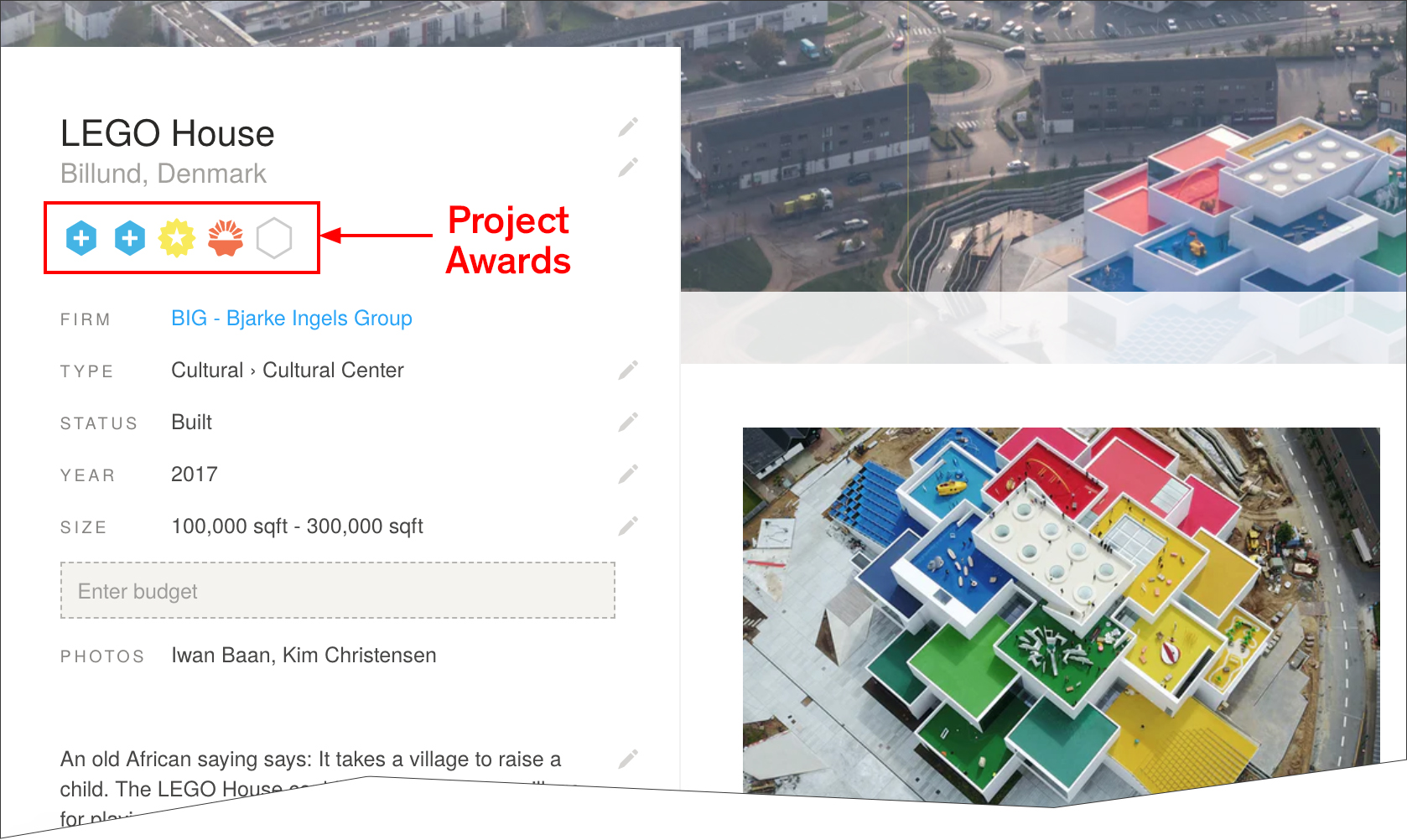
An example of a project page on Architizer with Project Award Badges highlighted

A Guide to Project Awards

The blue “+” badge denotes that a project has won a prestigious A+Award as described above. Hovering over the badge reveals details of the award, including award category, year, and whether the project won the jury or popular choice award.

The orange Project of the Day and yellow Featured Project badges are awarded by Architizer’s Editorial team, and are selected based on a number of factors. The following factors increase a project’s likelihood of being featured or awarded Project of the Day status:

  • Project completed within the last 3 years
  • A well written, concise project description of at least 3 paragraphs
  • Architectural design with a high level of both functional and aesthetic value
  • High quality, in focus photographs
  • At least 8 photographs of both the interior and exterior of the building
  • Inclusion of architectural drawings and renderings
  • Inclusion of construction photographs

There are 7 Projects of the Day each week and a further 31 Featured Projects. Each Project of the Day is published on Facebook, Twitter and Instagram Stories, while each Featured Project is published on Facebook. Each Project of the Day also features in Architizer’s Weekly Projects Newsletter and shared with 170,000 subscribers.


We’re constantly look for the world’s best architects to join our community. If you would like to understand more about this ranking list and learn how your firm can achieve a presence on it, please don’t hesitate to reach out to us at editorial@architizer.com.

Reference

Karimoku Case lines minimalist Tokyo apartment with local wood
CategoriesInterior Design

Karimoku Case lines minimalist Tokyo apartment with local wood

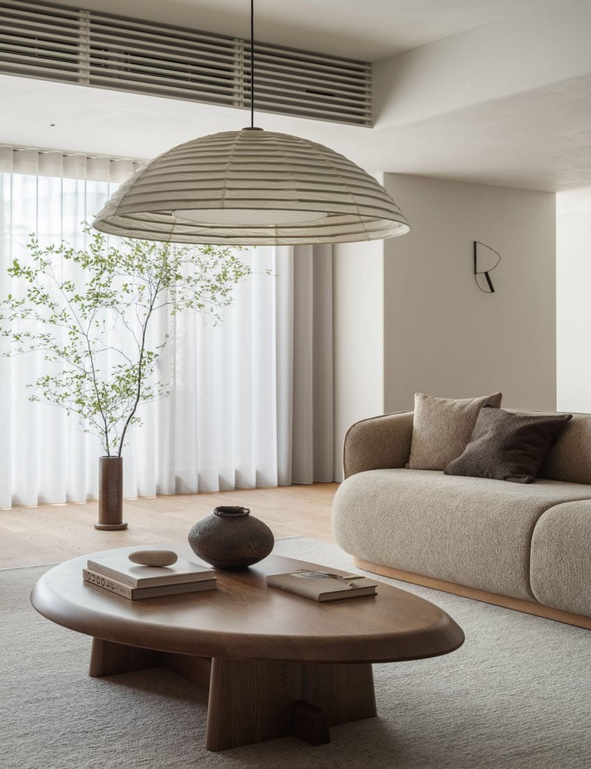
Japanese brand Karimoku Case has redesigned an apartment on a hilltop in Tokyo, using wood and a neutral colour palette to create a “calm and serene atmosphere”.

Named Azabu Hills Residence, the project was designed by Karimoku Case – a studio developed by Karimoku Furniture in collaboration with design studios Keiji Ashizawa and Norm Architects.

The studio used the project as an opportunity to optimise the use of local zelkova wood which is increasingly underutilised.

Living space interior of Azabu Hills Residence in JapanLiving space interior of Azabu Hills Residence in Japan
The apartment features furniture made from zelkova wood

“We sympathized with the story of how zelkova used to be a common material in Japan, but is now being chipped and discarded, and wished to explore the possibilities of zelkova through this project,” lead designer Keiji Ashizawa told Dezeen.

“When I first saw the sample of it, I felt that its gentle reddish hue, along with its story, was a good match for the project,” he continued.

“We decided to create the interior using zelkova that would come in harmony with the gentle light from the north side.”

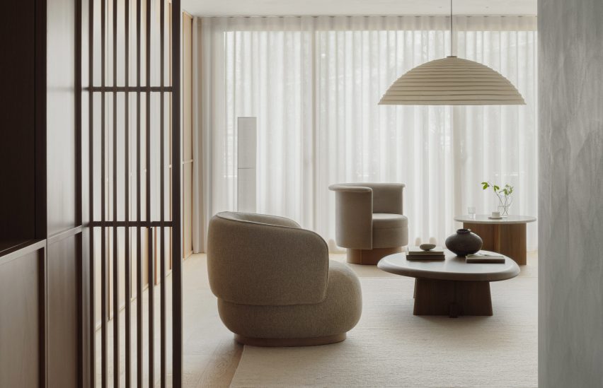
View into living space of Tokyo residence by Karimoku CaseView into living space of Tokyo residence by Karimoku Case
A neutral material palette creates a “calm and serene atmosphere”

The 226-metre-square apartment was centred around a spacious, open-plan living area and dining room illuminated by floor-to-ceiling windows.

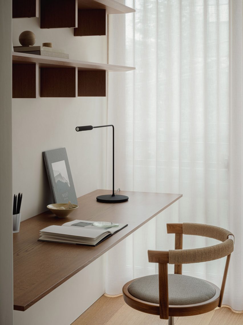
A small workspace nestled behind a wall in the living space makes use of the spacious interior, and is furnished with a desk, chair and shelving made from zelkova wood.

Desk space within Azabu Hills Residence in TokyoDesk space within Azabu Hills Residence in Tokyo
White plaster walls and wooden floors define the living spaces

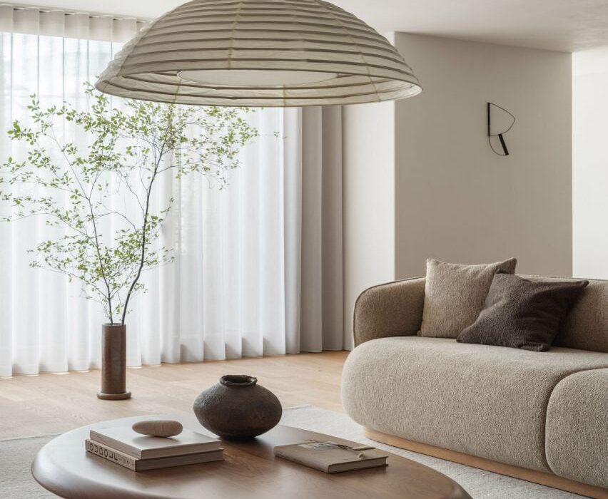
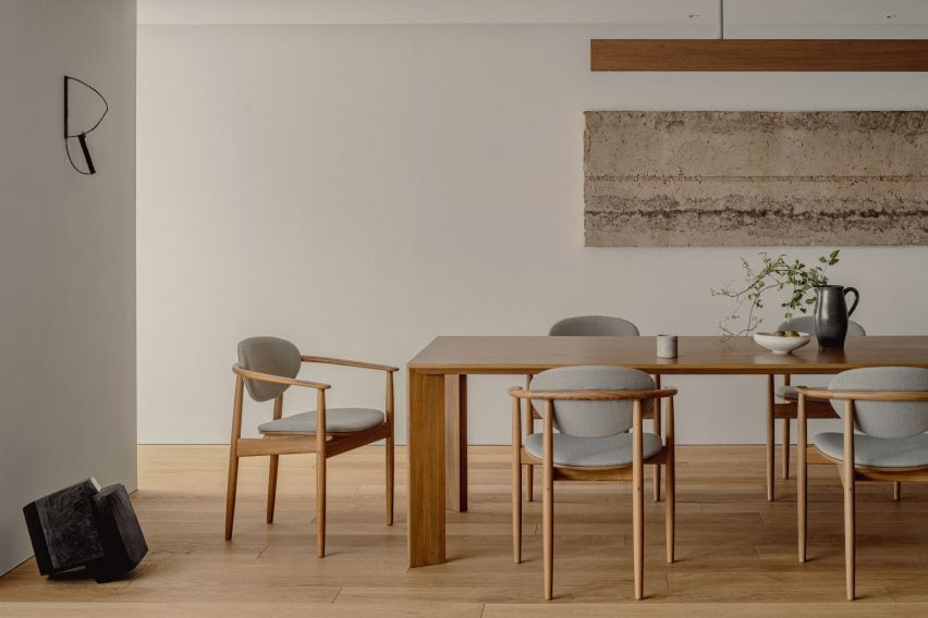
The minimalist interior is defined by textured white walls and wood used for flooring, window frames and fittings, which are tied together by cream furnishings, paper lighting fixtures and decorative artwork.

In the living space, lattice wooden screens were used to separate programmes as well as provide cross ventilation through the space to create airy interiors.

“With the residence being located in the middle of a large city like Tokyo, it was important to have a home-like atmosphere that makes you feel at ease,” Ashizawa said.

“We were conscious of the calmness and tranquility needed to achieve this, and designed the interior with well-curated furniture, lighting, and art to create an environment for this purpose.”

Minimalist dining space in Azabu Hills Residence in TokyoMinimalist dining space in Azabu Hills Residence in Tokyo
Wooden, lattice screens allow ventilation through the home

A counter made from zelkova wood divides the living space and adjacent kitchen, while also serving as an additional seating and dining space.

Within the kitchen, cabinets built from gridded wooden frames were finished with concrete countertops, complemented by tiled terrazzo flooring that also features in the home’s entryway.

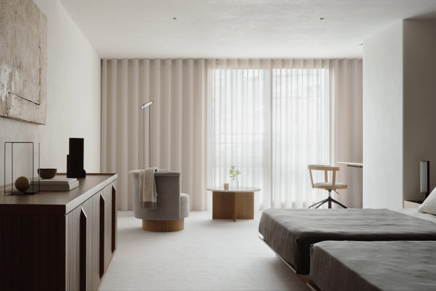
Bedroom interior of Tokyo apartment by Karimoku CaseBedroom interior of Tokyo apartment by Karimoku Case
Furnishings, paper lighting fixtures and pieces of artwork tie the interior together

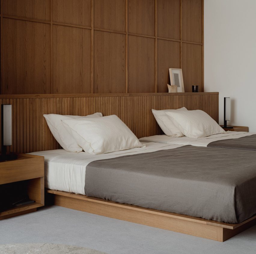
Gridded wooden frames are repeated for both storage in the living area and a wall in the main bedroom where the home transitions into a cosy-feel with carpet flooring.

A circular chair and marbled table sit in front of the bedroom’s floor-to-ceiling windows, with a study desk nestled into the corner.

Bedroom interior of minimalist apartment Tokyo by Karimoku CaseBedroom interior of minimalist apartment Tokyo by Karimoku Case
Gridded wooden frames feature in the kitchen, living space and bedroom

Other recently completed projects with minimalist interiors include a dental clinic in Montreal designed to feel like “someone’s home” and a London pub converted into a pared-back jewellery showroom.
The photography is by Tomooki Kengaku


Project credits:

Architect: Keiji Ashizawa Design
Project architect: Keiji Ashizawa / Ryota Maruyama
Client: reBITA / NTT Urban Development Coperation Tokyo
Construction: Tamarix
Furniture collaboration: Norm Architects
Furniture:
Karimoku Case
Lighting: Kojima Shoten / Saito Shomei
Lighting plan: AURORA / Yoshiki Ichikawa
Interior styling: Yumi Nakata

Reference

Keiji Ashizawa adds “residential calm” to Aloop clinic in Ginza
CategoriesInterior Design

Keiji Ashizawa adds “residential calm” to Aloop clinic in Ginza

Japanese architect Keiji Ashizawa has created the interior for a skincare clinic in Tokyo, using textiles and custom-made furniture to make it feel more residential than medical.

The Aloop Clinic & Lab, which provides “skin cure and care”, is located in the city’s upscale Ginza area and run by Japanese beauty company POLA. Ashizawa wanted to give it an interior that would feel peaceful, while also representing the brand.

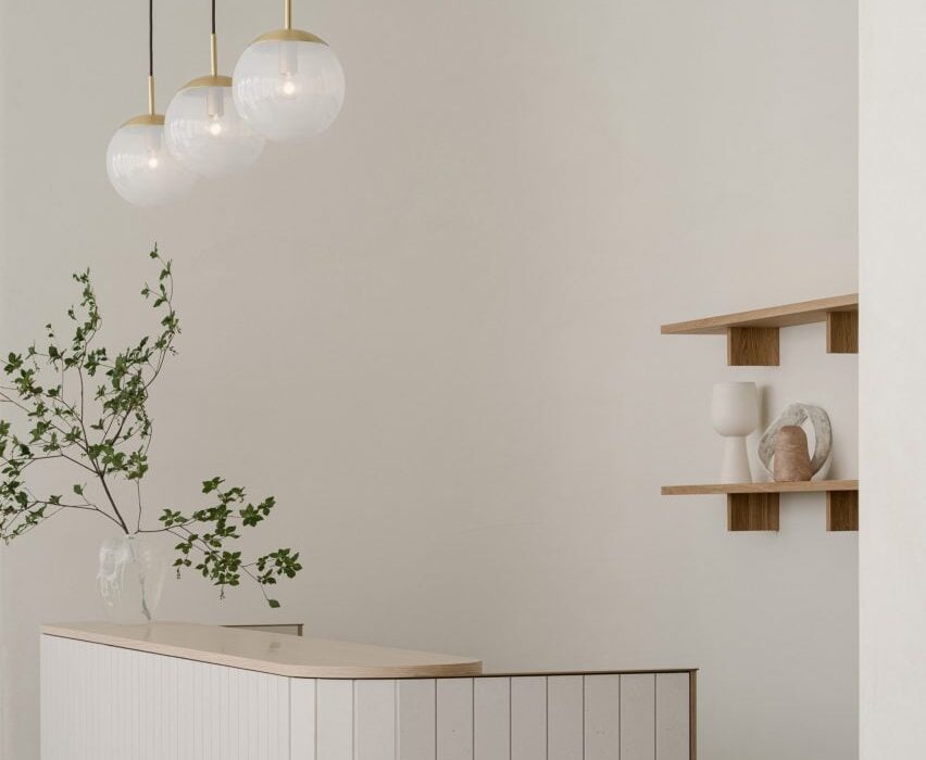
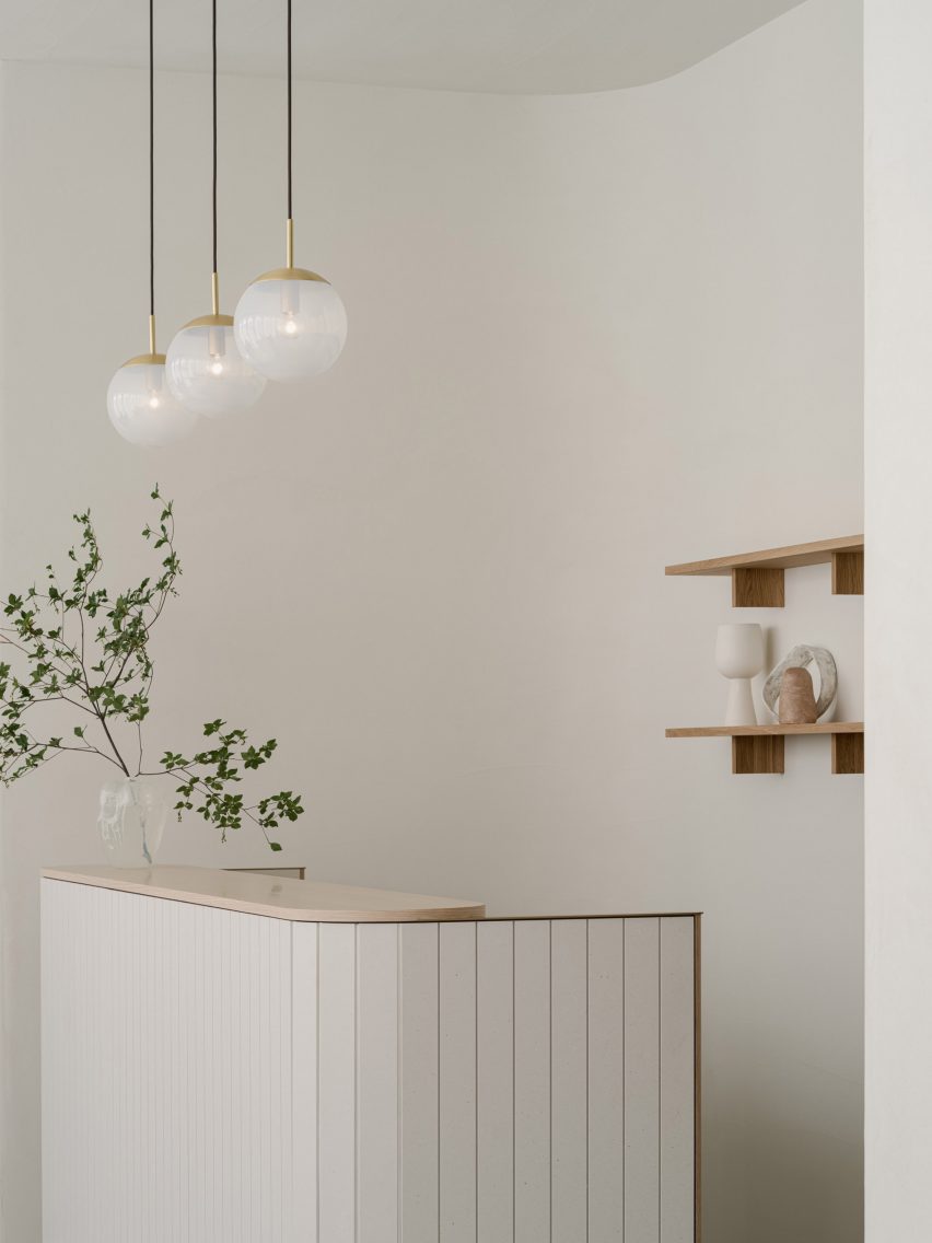
White Aloop clinic receptionWhite Aloop clinic reception
The Aloop clinic has a calm minimalist interior

“As a clinic that uses medical technology to deal with beauty, we thought that the space should have sincerity, calmness, and beauty in order to create a comfortable time for customers to feel at ease,” Ashizawa told Dezeen.

“In addition, considering that this is a completely new business for the POLA beauty brand, we felt that it was necessary to create a space that would enhance the brand.”

Wooden panelling inside Aloop clinicWooden panelling inside Aloop clinic
Wood was used throughout the space

To do so, Ashizawa looked at the design of the 210-square-metre clinic like he would if he were designing a residential space, giving it a calm, minimalist interior.

“Although it is a clinic, I considered the space to be similar to a hotel or a living space,” he said. “Therefore, I used materials that I use in designing living spaces and hotels.”

“The walls are plaster and the floor is a wool rug from Hotta Carpet,” he added. “The sofa and furniture at the characteristic entrance are made of Kvadrat wool textile to create a pleasant texture.”

Treatment room in Japanese skincare clinicTreatment room in Japanese skincare clinic
Treatment rooms were designed to have a residential feel

The architect used a clean, simple colour palette throughout the space, with white-painted walls contrasting against wooden panelling and wooden doors.

“Wood was used for doors, furniture and details because we wanted to create a residential calm rather than a clinic,” Ashizawa said. “We felt that a bright and healthy atmosphere was necessary.”

“The extensive use of wood was to create a residential atmosphere, and we wanted the space to be as far away from a typical clinic as possible,” he added.

Sofas by KarimokuSofas by Karimoku
Keiji Ashizawa created custom-made sofas with furniture brand Karimoku

His studio worked together with wooden furniture brand Karimoku to design the custom-made sofas for the space, which welcome customers as they enter the clinic.

“Of particular importance to this project were the custom sofas,” Ashizawa said.

“We asked Karimoku, with whom we communicate on a daily basis for furniture development and wood projects, to work with us on the development of the furniture.”

He compared his collaboration with the brand to that of mid-century modern Finnish architect Alvar Aalto and furniture brand Artek.

“For me, Karimoku has become an indispensable partner in thinking about space, just as Aalto is for Artek,” he explained.

Calm treatment room in TokyoCalm treatment room in Tokyo
Neutral colours contrast against pale wood

By creating the sofas with rounded edges, Ashizawa aimed for them to “gently envelop” customers after their treatments.

“The mere fact that something looks hard or painful makes the body tense, so we thought it would be desirable to eliminate such things,” he said.

“However, in order to maintain a comfortable sense of tension in the room, delicate details of metal and wood were used to achieve a balance.”

Sculptures in Aloop clinicSculptures in Aloop clinic
Small sculptures decorate the space

Small sculptures were dotted throughout the Aloop clinic, including in the treatment rooms.

Ashizawa has previously designed an interior with a similar colour palette for the Hiroo Residence in Tokyo, and also used plenty of wood for his and Norm Architects minimalist Trunk Hotel design.

The photography is by Tomooki Kengaku.

Reference

Dekton Ukiyo: Cosentino’s New Material Collection Celebrates the Aesthetic Wisdom of Japan
CategoriesArchitecture

Dekton Ukiyo: Cosentino’s New Material Collection Celebrates the Aesthetic Wisdom of Japan

Most people who love design also love Japan. In fact, it is impossible to truly appreciate the modern history of Western art and design without recognizing Japan’s influence. From the woodblock prints of Hiroshige that inspired Van Gogh to the Zen tea rooms that laid the foundation for minimalist architecture, Japanese aesthetics paved the way for modernism.

It is not just that Japanese design is beautiful. The nation has a long tradition of thinking carefully about aesthetics, and how the contemplation of beauty contributes to human flourishing. Consider the concept of wabi-sabi, or the art of imperfection, that was recently explored in an Architzer op-ed. Centuries before American architects lamented the homogeneity of the clean and orderly suburbs, Japanese philosophers recognized the paradoxical truth about beauty: that it requires flaws.

Dekton Ukiyo NACRE. Image courtesy Cosentino

It is this aspect of Japanese aesthetics — the theoretical side — that most inspired world-renowned interior designer Claudia Afshar in the development of her new collaborative collection with Cosentino, Ukiyo. The tagline for the series is “The Inner Texture,” which speaks to the Japanese understanding of interior design as an art that evokes a mental atmosphere of inner serenity. In the Japanese tradition, beauty and well-being go hand in hand.

The collaboration consists of a series of new patterns and textures for Cosentino’s versatile Dekton surfaces, a product we love and have profiled many times in the past. Scratch resistant, stain resistant, and able to endure the elements, Dekton is the surface of choice for designers looking for a material that is both resilient and visually alluring. The introduction of Dekton into the marketplace in 2013 completely upended the old conventional wisdom that natural materials are more beautiful than composites.

With Ukiyo, Claudia Afshar showcases the extraordinary potential of Dekton. Most Westerners recognize the term ukiyo as referring to a genre of woodblock prints that flourished in the 19th century, epitomized by the work of artists like Hokusai and Hiroshige. But in the promotional materials for this new collection, Afshar and Cosentino have chosen to emphasize the literal meaning of this term, listing the dictionary definition on the top of the collaboration webpage: “[u-key-yo], Japanese, (n). Living in the moment, detached from the bothers of life. ‘The floating world.’” The idea is drawn from Zen. It means that paradise is always at hand; all it takes is a choice to live in the moment.

Dekton Ukiyo KRETA. Image courtesy Cosentino

In a recent webinar hosted by Architizer, Cosentino’s Lauren Dron quoted Coco Chanel’s statement that “An interior is the natural projection of the soul”, emphasizing the depth of the question architects and designers must ask every time they take on a project. “Meaningful design in the built environment continues to be rooted in our minds and in our emotions,” she declared. “Design is a reflection and enhancement of the human experience.”

This second part — enhancement  — is key, and it is the place where architects can really have an impact on the world. In a social environment dominated by stress, conflict, and speed, architects can create environments of serenity and calm. They can remind people that “the floating world” is alway at hand if one is willing to adjust their perspective.

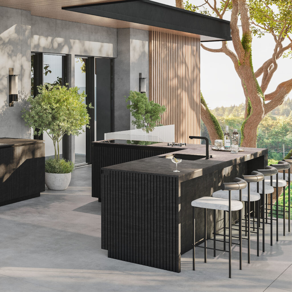
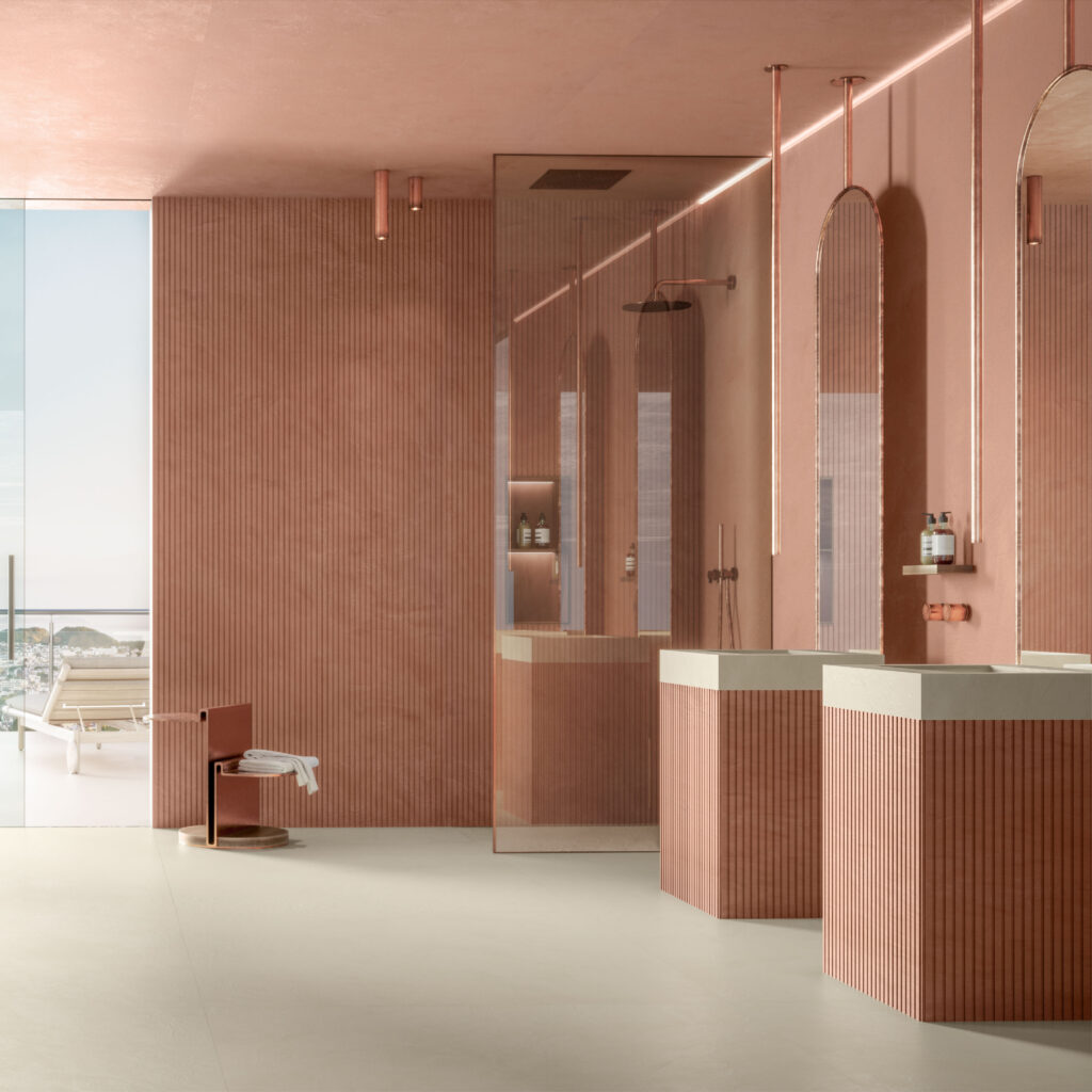
This, then, is the noble aim of Ukiyo, which features textures and colors that are simple, yet rich. As lush as any natural stone, and as meditative as a pool of still water, these surfaces bring serenity into all sorts of interiors, from domestic to commercial. Each Dekton color features the same delicate ribbed texture, which is reminiscent of the wood slats one often finds in Japanese homes. The texture also evokes the delicate patterns one finds raked into the sands of Zen gardens.

There are two different options when it comes to the size and spacing of the grooves. Ukiyo GV2 is wider, with 25 mm slats and grooves that are 5 mm wide and 3 mm deep. GV3 is finer, with 11 mm slats and grooves that are 4 mm wide and 4 mm deep.

Dekton Ukiyo BROMO. Image courtesy Cosentino

BROMO is the first color in the series. It is described as “a dark gray shade inspired by slate featuring subtle faded graphics and a carefully crafted texture with a natural aesthetic.” The graphics are really key here. The material is actually deeper and richer than slate, yet it has the same soothing matte finish, exuding sophistication.

The next color, KRETA, is inspired by concrete, a material that retains modernist cache despite its ubiquity. Some of the most lyrical architecture ever made with raw concrete was created by Japanese architects, including Tadao Ando. Cosentino notes that KRETA can “create lighter or darker spaces.” In this way, it  plays off the light conditions in its environment, just like real concrete — a true neutral.

NACRE and REM are both shades of cream or beige. NACRE is the lighter of the two, and can even be considered an off-white. It is a great choice for designers looking for a minimalist finish but wary of stark brightness. This tone is both light and warm. REM has a similar impact but is marked by more dramatic veining patterns. There is a luxe quality here that is perfect for commercial interiors.

Dekton Ukiyo UMBER. Image courtesy Cosentino

Finally there is UMBER, the most adventurous and unique color in the series. It is hard to look at this delicately textured terracotta without imagining the rooms one could create with this tone. Unlike the other colors, which are notable for their versatility, UMBER is a showstopper. It is the kind of color you build a room around.

Ukiyo is a truly inspiring series of surfaces. It is also ethically manufactured. Dekton is  the only “Cradle-to-Grave Carbon Neutral surface” as Cosentino offsets 100% of their CO2 emissions over the product’s life cycle. This too is very Zen. Dekton exists in harmony with its surroundings.

To learn more about Dekton Ukiyo and talk with Cosentino about how to integrate it into your next project, visit their website.

Reference

interconnected skipped floors outline compact toneyama house in japan
CategoriesArchitecture

interconnected skipped floors outline compact toneyama house in japan

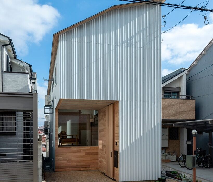
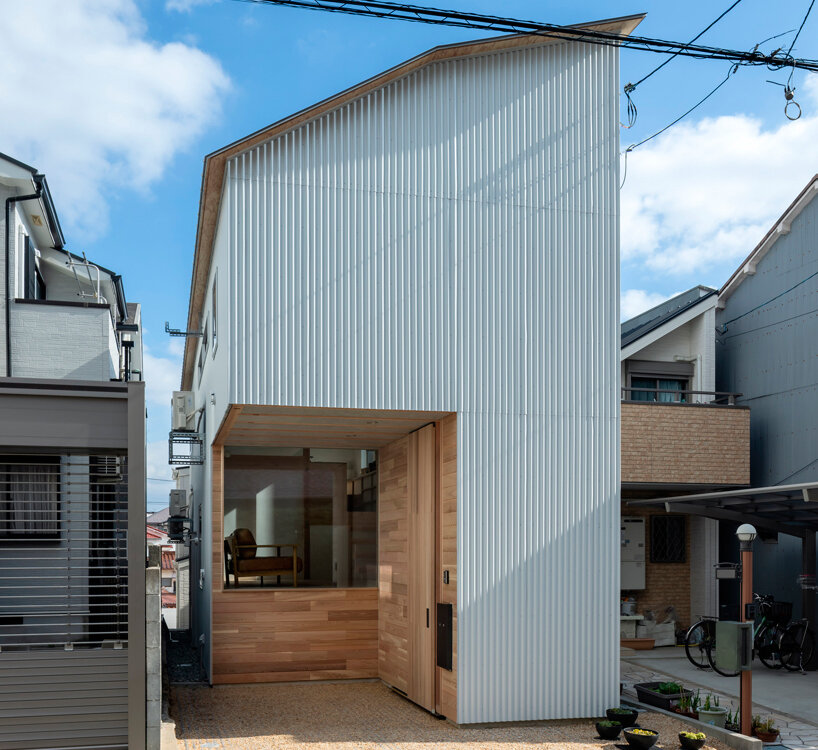
white metal sheets coat tiny Toneyama House’s facade


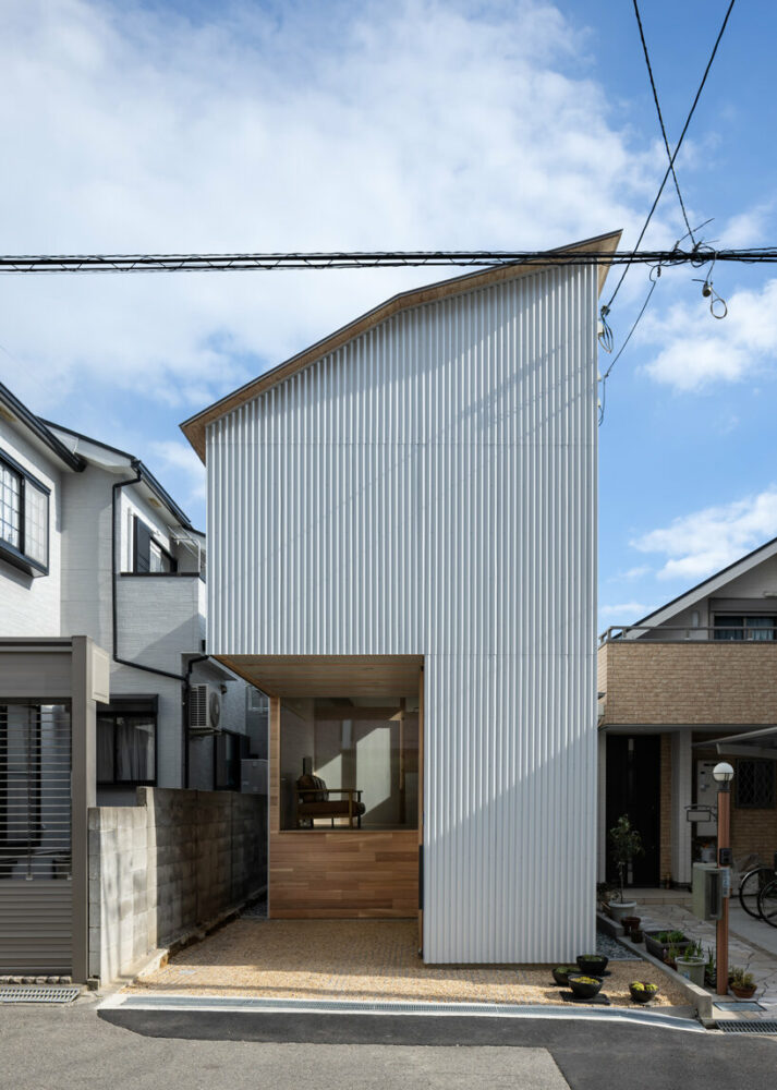
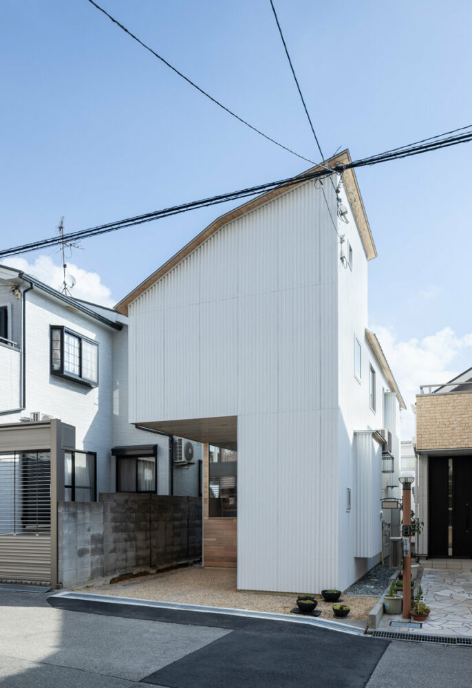
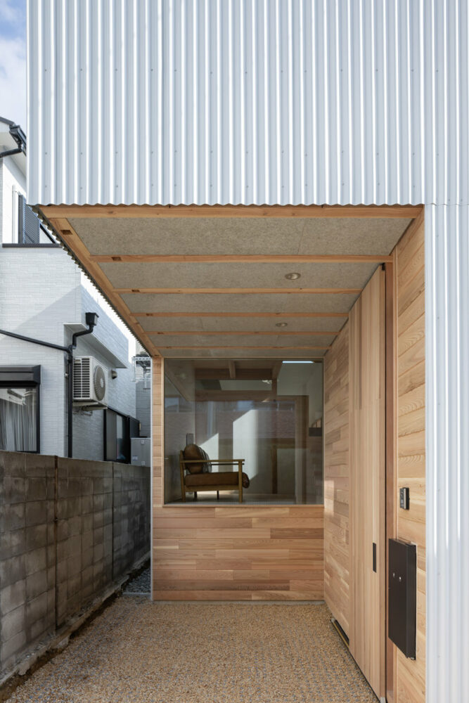
Takuya Takemoto Architects builds Toneyama House, a residence situated in Toyonaka City of Osaka Prefecture, Japan, showcasing innovative spatial design. The skip-floor structure covers a small lot of 76.72 sqm with a distinctive west-side access road. Facing constraints like a limited frontage, a long and narrow site shape from east to west, and a height difference from the neighboring land on the east side, the design embraces these challenges crafting a residence that defies the ordinary. Due to the restrictions imposed by the diagonal line on the north side, the ceiling height of the second floor cannot be sufficiently secured by standard design.

interconnected skipped floors outline the interior of compact toneyama house in japan
all images by Yohei Sasakura


Takuya Takemoto Architects sets up a skip-floor layout


The Toneyama House unfolds across fourteen interconnected spaces, cleverly linked by nine layers of skipped floors. This compact residence deviates from conventional layouts with stairwells and corridors, utilizing hanging floor and ceiling planes to liberate the building from height limitations. The design features several innovative elements, from the striking 2.13-meter cantilevered garage to the 3.64-meter column-free space with climbing beams. Vertical windows facing the stairwell and high sidelights cutting through the sky on the east facade add further layers of complexity and variety to the space. Takuya Takemoto Architects engages in an architecture that balances innovation and minimal design while maintaining a sense of everyday elegance.

interconnected skipped floors outline the interior of compact toneyama house in japan
Toneyama House pops up on a street in Toyonaka City

interconnected skipped floors outline the interior of compact toneyama house in japan
the structure boasts a striking exterior

interconnected skipped floors outline the interior of compact toneyama house in japan
a recess in the volume forms the entrance

Reference

GOSIZE wraps japan home in concrete walls of varying height
CategoriesArchitecture

GOSIZE wraps japan home in concrete walls of varying height

gosize melds external and internal spaces at ashiya s house


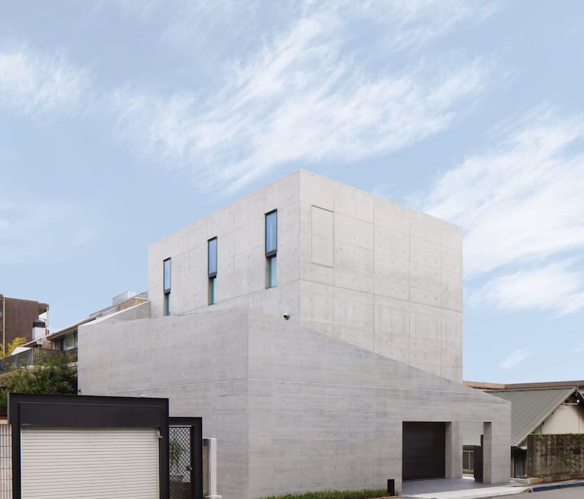
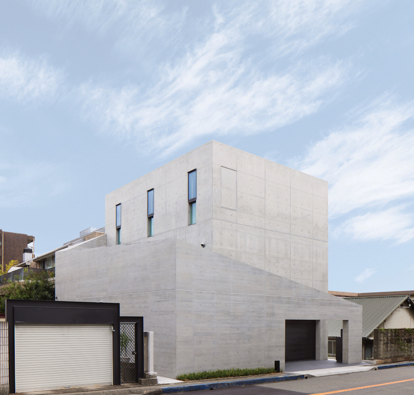
Amid an upscale residential neighborhood in Hyogo Prefecture, Japan, the Ashiya S House stands as a three-story block of concrete infused with a dynamic sequence of spaces. The home, conceived by Go Fujita of studio GOSIZE, fuses traditional Japanese perspectives with modern aesthetics, resulting in a space that blurs the boundaries between interior and exterior, motion and stillness, and yin and yang.


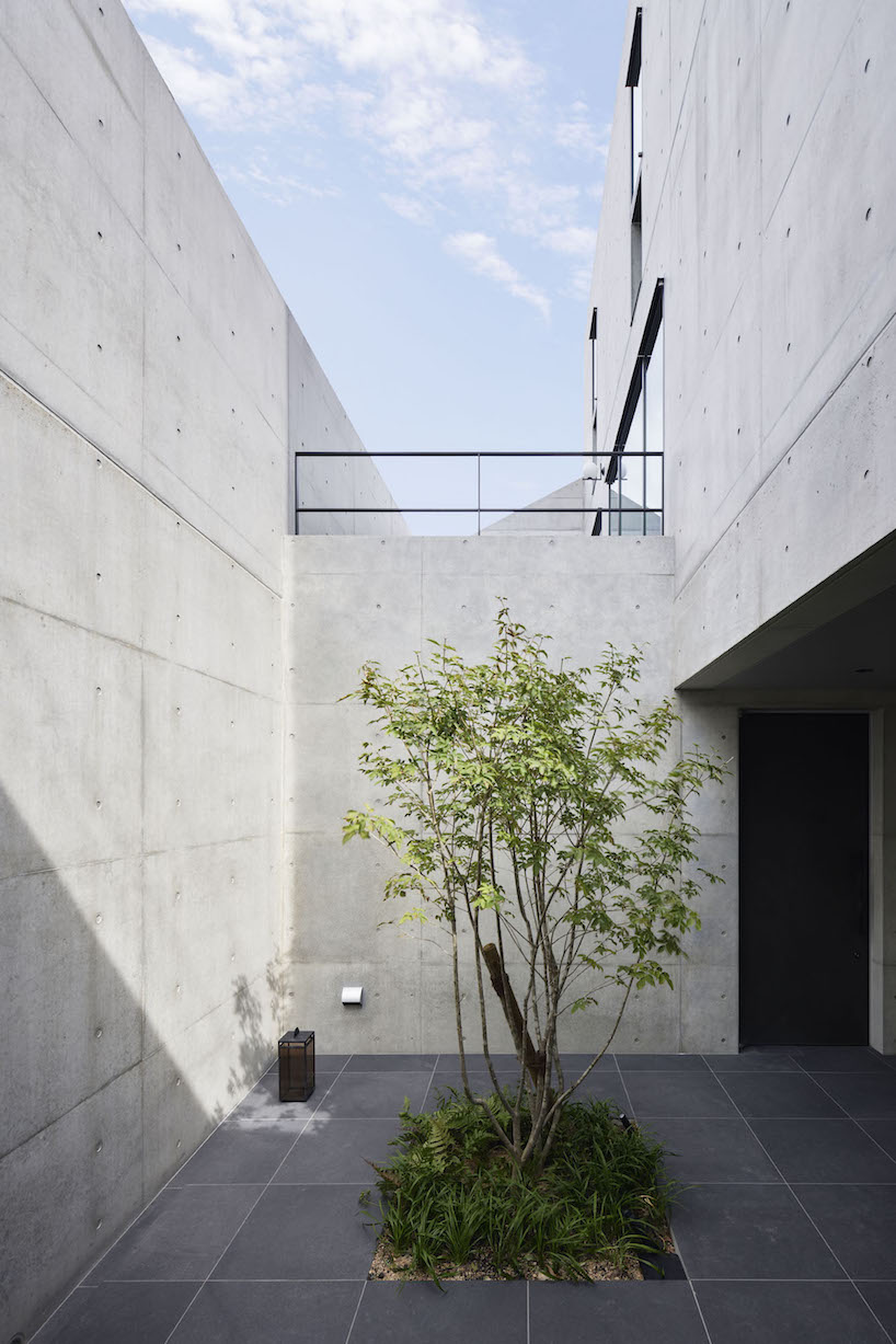
Situated in close proximity to neighboring apartment buildings and a busy road, the architects placed emphasis on blocking sightlines and noise, prioritizing privacy and tranquility for residents. The spatial solution devised a series of outer walls surrounding the building, each varying in height and strategically positioned to create an open space that fosters intimacy while inviting natural light and views inside.

dynamic curtain of concrete walls of varying heights engulfs japanese home by GOSIZE in tranquility
height-changing walls envelop the building | all images courtesy of Go Fujita / GOSIZE


fusion of traditional japanese design with modern aesthetics


Approaching the entrance, residents are guided along a semi-external path formed by gaps between overlapping exterior walls, marking a transition from public to private. Stepping inside, rough yet delicate tatami-finished walls adorned with contemporary art fuse traditional and modern elements, creating a serene ambiance that sets the tone for the rest of the Ashiya S House.


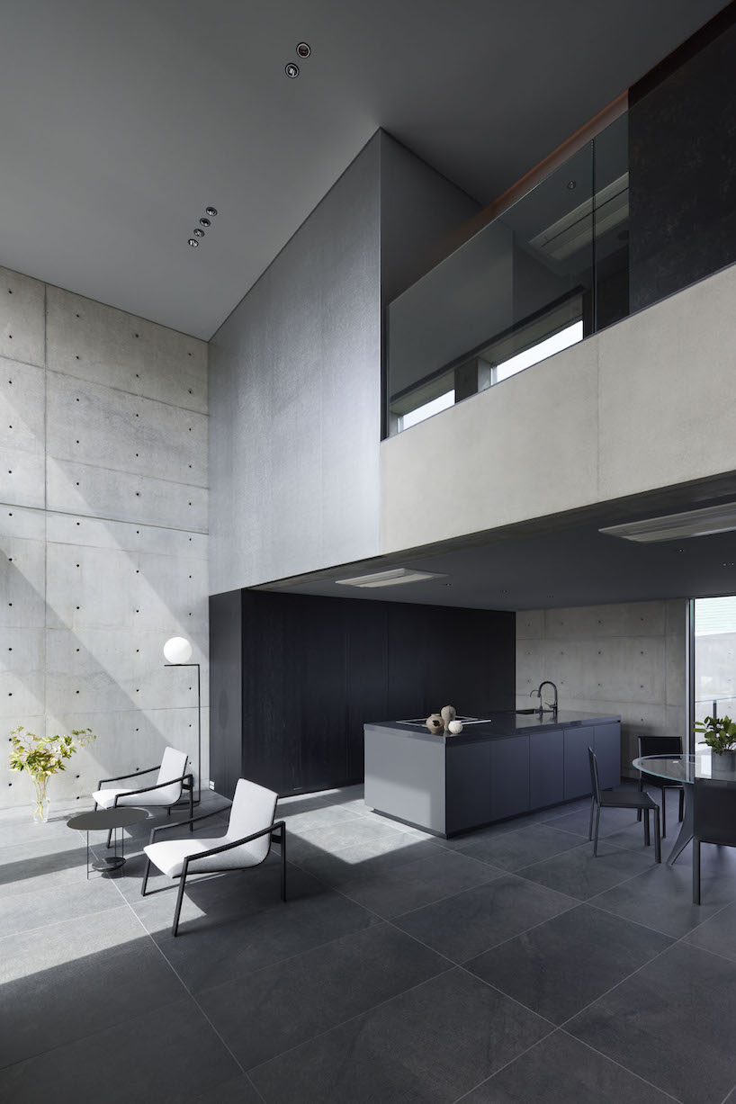
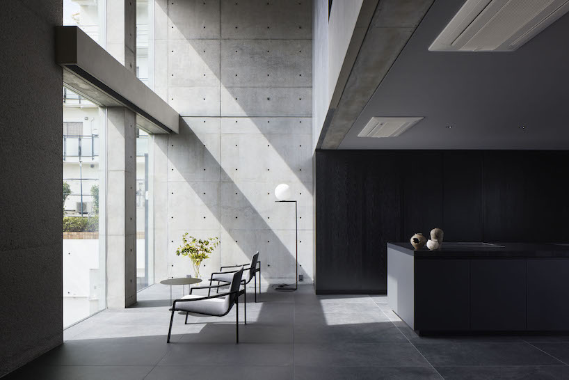
Ascending the stairs, guided by subtle indirect lighting, unveils a living area that exudes a sense of openness. The double-height windows allow sunlight to stream in, softly reflecting off the tin wallpaper and diffusing into every corner of the living space. The team at GOSIZE has carved these expansive openings into the thick walls to also serve as screens, framing the ever-changing views of the outside world, effectively merging the indoor and outdoor experiences.

dynamic curtain of concrete walls of varying heights engulfs japanese home by GOSIZE in tranquility
a walled courtyard and porch marking a transition from exterior to exterior

dynamic curtain of concrete walls of varying heights engulfs japanese home by GOSIZE in tranquility
GOSIZE’s design concept fuses traditional Japanese perspectives with modern aesthetics

dynamic curtain of concrete walls of varying heights engulfs japanese home by GOSIZE in tranquility
the living space is infused with light and openness despite the home’s location in a bustling area

Reference

residential unit in japan protrudes a cantilever concrete volume
CategoriesArchitecture

residential unit in japan protrudes a cantilever concrete volume

OHArchitecture reshapes apartment in Betsuincho


Kyoto-based OHArchitecture takes over the reconstruction of a two-leveled residential unit in Betsuincho, Japan. The concrete structure is cast with loose plates forming a rough texture that resembles abstract wrinkles. The first floor which serves as a rental module models a six-meter grid arrangement, while the second story protrudes a two-meter cantilever assembling separate residences. Each of the two floors is divided into maisonettes to enhance the strength of the space. The transformed collective housing makes use of the framework, forming several different living zones.

residential unit in japan protrudes a two-meter cantilever concrete volume
all images provided by OHArchitecture


interior applies nested iron black skin and wooden boxes


On the first floor, the space between the exterior eaves displays a full steel sash, while the ground floor area stands connected to the outdoor zone. On the second level, the slab is cut open and a steel staircase is installed to smoothly connect the upper and lower stories. The interior applies nested iron black skin and wooden box-like volumes. By compactly organizing the water and other areas, the design team at OHArchitecture achieves a high degree of free open space in the common center of the structure. Originally designed attached to a ground-floor shop, the construction transforms the house’s spaces and functions through a series of modifications that reserve the initial character.

residential unit in japan protrudes a two-meter cantilever concrete volume
the second story protrudes a two-meter cantilever

residential unit in japan protrudes a two-meter cantilever concrete volume
originally attached to a ground-floor shop, the construction transforms the house’s spaces and functions

Reference

yabashi architects stacks minimalist house and café in japan
CategoriesArchitecture

yabashi architects stacks minimalist house and café in japan

ezu house and café: multi-uses in harmony


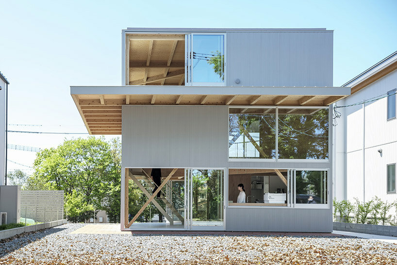
Nestled in a tranquil corner of a lakeside residential area in Kumamoto, Japan, the recently completed ‘EZU House and Café‘ stands as a testament to innovative architectural design, crafted by Yabashi Architects and Associates (YAA). this structure opens broadly out toward its surroundings to provide a unique experience for its occupants. The site’s terrain, with its stepped landscape along the lakeside, offers breathtaking views of nearby gardens, private house roofs, and distant mountains. By skillfully incorporating these elements into the design, the architects have created a multi-layered structure that fosters a sense of harmony between its retail and residential programs.

yabashi architects ezu houseimages © Yashiro Photo Office


the Vertical Spiral Movement


At the core of the design philosophy is a square plan that encompasses the site. The upper floors of the building are ingeniously divided diagonally, establishing a dynamic interplay of spaces. By shifting the floors to increase the parameter with the ground and connecting them through a spiral vertical movement, the architects have achieved a three-layered structure that presents an array of viewpoints at every turn. This deliberate arrangement allows for a varied experience on each floor, with minimal necessary functions, furniture, and plants. The result is a space that transcends conventional definitions, offering an open canvas for inhabitants to freely create their own personalized environments.

yabashi architects ezu house


Seamless Integration of Functions


The ground floor of the EZU House and Café serves as a retail area, seamlessly transitioning into the residential space on the upper floor. The distinction between these two sections is purposefully fragmented, employing diagonal load-bearing walls that create a continuous three-dimensional living space. This approach fosters a sense of connectedness and flow throughout the entire structure. Furthermore, the architects have emphasized the integration with the natural surroundings by incorporating a double structure. This design envelops the earthquake-resistant framework with elements dedicated to wind resistance and heat insulation, while the outer skin of the building serves as a gateway to the outdoor environment.

yabashi architects ezu house


Unobstructed Views by yabashi architects


The absence of partitions between spaces is a deliberate choice that enhances the occupants’ experience of the surrounding environment. Depending on one’s body position and movement, glimpses of the sky, verdant greenery, or sudden visual breaks may appear through the windows on adjacent floors. This design creates a spatial experience that emphasizes the inherent richness of the location and the generosity of life itself. In essence, the EZU House and Café may appear as a mere assembly of floors, outer panels, and openings. However, it transcends its utilitarian nature, transforming into a powerful tool that allows individuals to perceive the external environment as an integral part of the internal space.

yabashi architects ezu house
a double structure wraps earthquake-resistant elements with wind resistance and heat insulation yabashi architects ezu housethe multi-use space is flexible with a spiral vertical movement and minimal necessary functions
Reference

Five highlights from Zaha’s Moonsoon: An Interior in Japan
CategoriesInterior Design

Five highlights from Zaha’s Moonsoon: An Interior in Japan

The Zaha Hadid Foundation has opened an exhibition about Zaha Hadid’s Moonsoon restaurant in Sapporo, Japan. Here, exhibitions officer and curator Johan Deurell selects five highlights from the show.

Zaha’s Moonsoon: An Interior in Japan is a case study of architect Hadid’s first built project outside of the UK – the Moonsoon Bar and Restaurant in Sapporo, Japan, which was constructed in 1989.

The exhibition offers a journey from the conception of the venue  – conveyed through a series of archival models, presentation documents and sketches – through to its built form, presented through images and one-to-one recommissioned furniture from the bar’s interior.

“Our latest exhibition showcases the creative processes behind one of Zaha Hadid’s earliest and less well-known projects,” said Zaha Hadid Foundation director Paul Greenhalgh. “Moonsoon was created at the time of the incredible explosion of the Japanese economy, and the design boom that accompanied it.”

“Japan provided opportunities for emerging architects to work on experimental projects. For the foundation, it is a chance for us to dive deep into the archives and highlight works rarely seen before.”

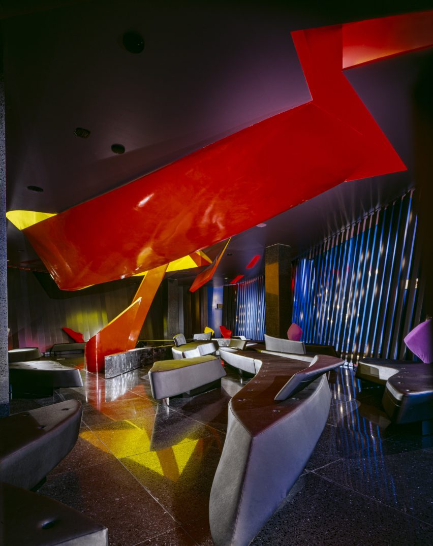
Monsoon’s design referenced some of the early 20th-century avant-grade movements that emerged out of Russia, such as the works of Russian abstract artist Kazimir Malevich.

Angular, twisting and geometric shapes were translated into functional architectural volumes and layers. Additional design references include the works of sculptor Alexander Calder, French liquor commercials from the 1950s and imagery of orange peel and pasta.

Zaha’s Moonsoon: An Interior in Japan takes place at the Zaha Hadid Foundation headquarters in Clerkenwell, London, which functioned as Hadid’s headquarters from 1985 until her death in 2016.

Read on for Deurell‘s five highlights:


Photo of a presentation briefcase at Zaha's Moonsoon: An Interior in Japan

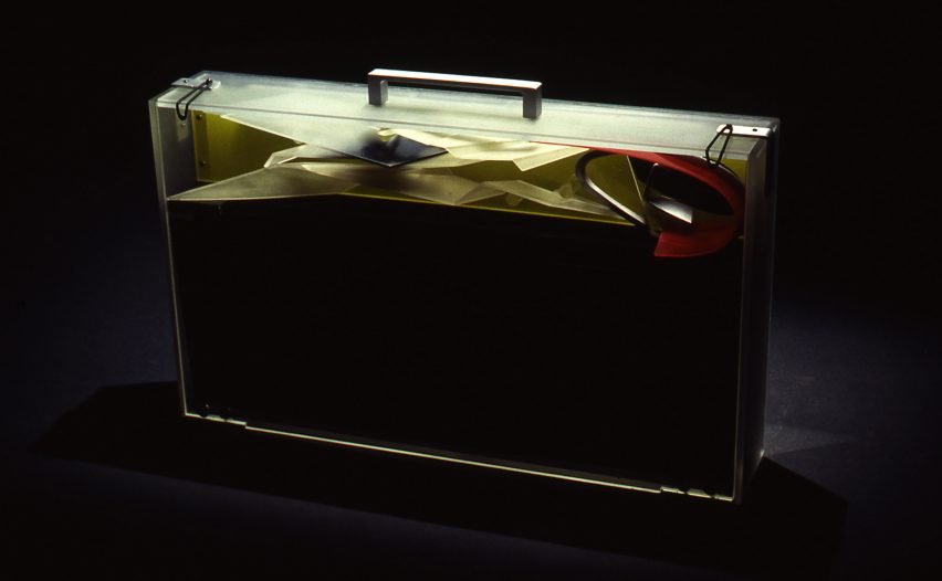
Presentation case, acrylic and aluminium by Zaha Hadid Architects, 1989-90

“The idea of our exhibition came about with the discovery of a Perspex briefcase in the archive. This briefcase was made by Daniel Chadwick as a container for the Moonsoon design concept.

“It carried elements of model as well as 14 paintings, six perspective drawings and 13 collages shown in this exhibition. The case would be taken to the clients as a form of presentation strategy, where the works on paper would be laid out and the model assembled.”


Photo of a model at Zaha's Moonsoon: An Interior in Japan

Presentation model, acrylic by Zaha Hadid Architects, 1989-90

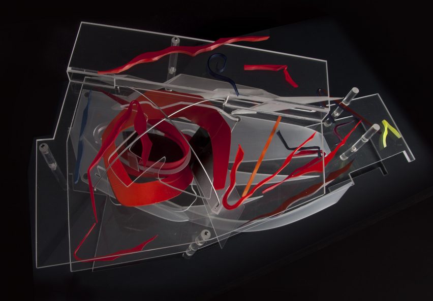
“This model, made by Daniel Chadwick, was created to illustrate a concept, rather than as a replica of the restaurant’s final form. Here an ‘orange peel’ shape swirls through the two floors, and the colourful shards represent the furniture and interior elements. At the time it was made, the interior and furniture designs had yet to be finalised.

“Zaha Hadid Architects embraced the transparency of acrylic to make the relationship between interior and spatial elements in the model easier to view. In the future, digital models would provide the transparent layering effects that Hadid sought to achieve through the early use of acrylic.”


Painting on show at Zaha's Moonsoon: An Interior in Japan

Interior concepts, acrylic paint on black cartridge paper by Zaha Hadid Architects, 1989-90

“This painting belongs to a suite of 14 paintings originally stored in the Perspex briefcase. Moonsoon’s concept was partially inspired by fire (for the first-floor bar) and ice (for the ground-floor restaurant), which is illustrated through the reds and blues in this painting. A swirling ‘orange peel’ shape represents the central furnace penetrating through the two floors, whereas splintered ‘ice shards’ symbolise tables.

“Zaha Hadid Architects used paintings to explore concepts that could not be shown through conventional perspective drawings. Various team members contributed to the paintings. The works were derived from sketches, which had been transferred to tracing paper and then onto cartridge paper, and subsequently coloured in, often by Hadid herself. Their warped shapes and layering anticipated the possibilities later offered by CAD software.”


Zaha’s Moonsoon, by Marwan Kaabour, 2023

“Not everything in the show came from that briefcase. There were boxes upon boxes of archival material too. During the research phase, colleagues at Zaha Hadid Architects told me: ‘go find the little doodle’. That turned out to be a sheet of Arabic letterforms spelling out Zaha and Moonsoon, and the recurring swirly shape, which you see in the model and paintings.

“With some help from Marwan Kaabour, who designed the graphic identity for the exhibition, I learnt that the swirl is a stylised version of the letter H in Zaha. Marwan has done some amazing work for Phaidon and V&A before and runs the Instagram account Takweer on queer narratives in the SWANA region. I asked him to make a video based upon the archival material we had found.

“This snippet is taken from that video. It charts the development of Moonsoon’s ‘orange peel’ structure, from the brief to its final built form. Beginning with sketches of the words مونسون [Moonsoon] and زها [Zaha] based on Arabic letterforms, through references to orange peel, pasta, and the works of Alexander Calder, it concludes with their eventual translation into the technical drawings informing the construction, as well as images of the construction and built.”


Interior photo of the restaurant
Photo by Paul Warchol

Sofa and tray table by Zaha Hadid Architects, 1989-90 (remade in 2014)

“Finally, the exhibition includes a boomerang-shaped sofa from the bar. The furniture for Moonsoon employed intersecting curves and diagonal planes to create an interior landscape. Designed by Michael Wolfson, the differently sized sofas have interchangeable plug-in backrests and tray tables, which came in different colours and finishes.

“Waiters could set the tables on their stands when delivering the drinks to guests. I am not sure how well this waiting method worked in practice, but it is interesting to think about this furniture as part of a design historical tradition of flexible seating landscapes. We know that Zaha was a fan of Verner Panton’s work, for example.”

Zaha’s Moonsoon: An Interior in Japan is on show at the Zaha Hadid Foundation in London from 20 April until 22 July 2023. See Dezeen Events Guide for an up-to-date list of architecture and design events taking place around the world.


Reference

Wooden logs frame Forest Office in Japan by Tomoaki Uno Architects
CategoriesArchitecture

Wooden logs frame Forest Office in Japan by Tomoaki Uno Architects

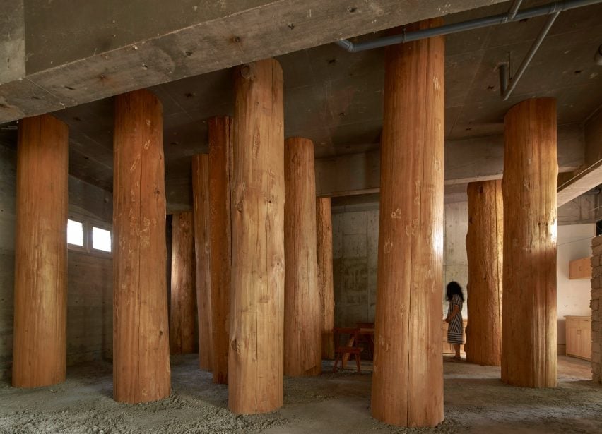
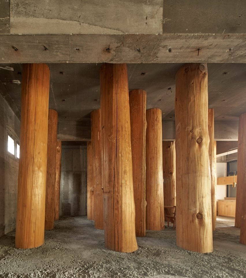
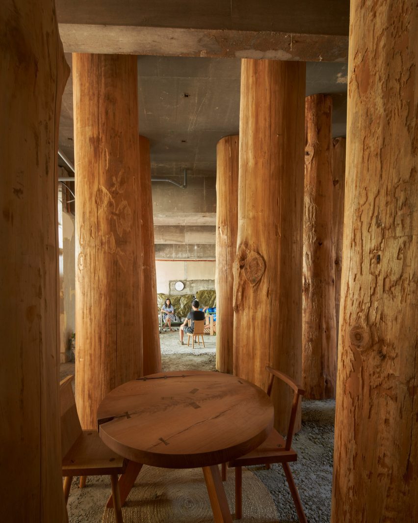
Columns made from thick wooden logs fill this office in Nagoya City, Japan, created by local studio Tomoaki Uno Architects at the base of a former apartment block.

Named Forest Office, the small workspace was commissioned by a client who simply requested that “something interesting” be created within half of his office space.

It was Tomoaki Uno Architects‘ second commission by the client, with the first being a sky-lit dwelling nearby named Ogimachi House.

Tomoaki Uno Architects-designed workspace in Japan
Tomoaki Uno Architects has created Forest Office in Japan

“There were no specific requirements for [the project],” studio founder Tomoaki Uno told Dezeen.

“As someone who usually works within functional constraints, this was an exciting opportunity for me,” he continued.

Drawing on the site’s natural surroundings and a nearby shrine, Tomoaki Uno Architects prioritised natural materials and rough finishes to create an atmospheric, multipurpose space.

Tree-trunk columns inside Forest Office in Japan
The workspace is filled with columns made from thick wooden logs

“I had long been inspired by the unique atmosphere I felt every time I walked along the approach to Ise Shrine,” said Uno.

“I knew that the irregular rows of large trees had a strong influence on this feeling. Therefore, I thought about using thick logs as a metaphor and seeing if I could recreate something similar,” he continued.

Interior of Forest Office by Tomoaki Uno Architects
A table is nestled at the centre

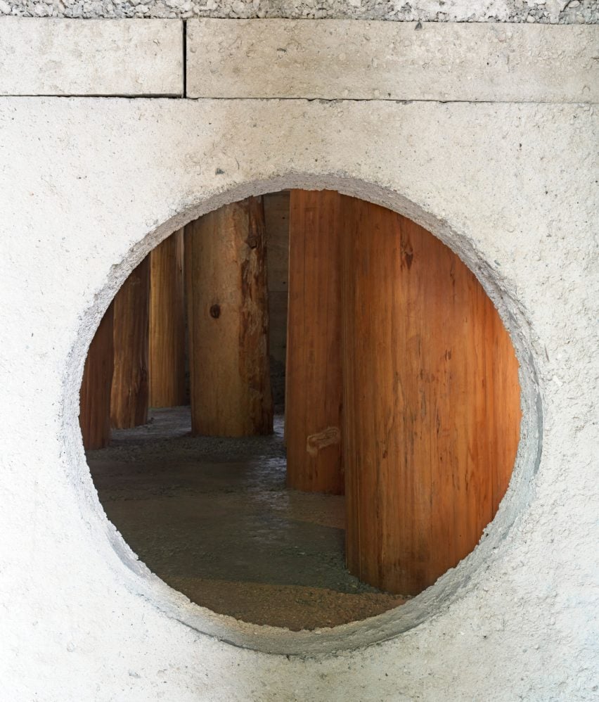
Inside, the concrete of the existing structure has been left exposed. It is teamed with a new floor and wall with a circular opening, both made of concrete with a rough aggregate.

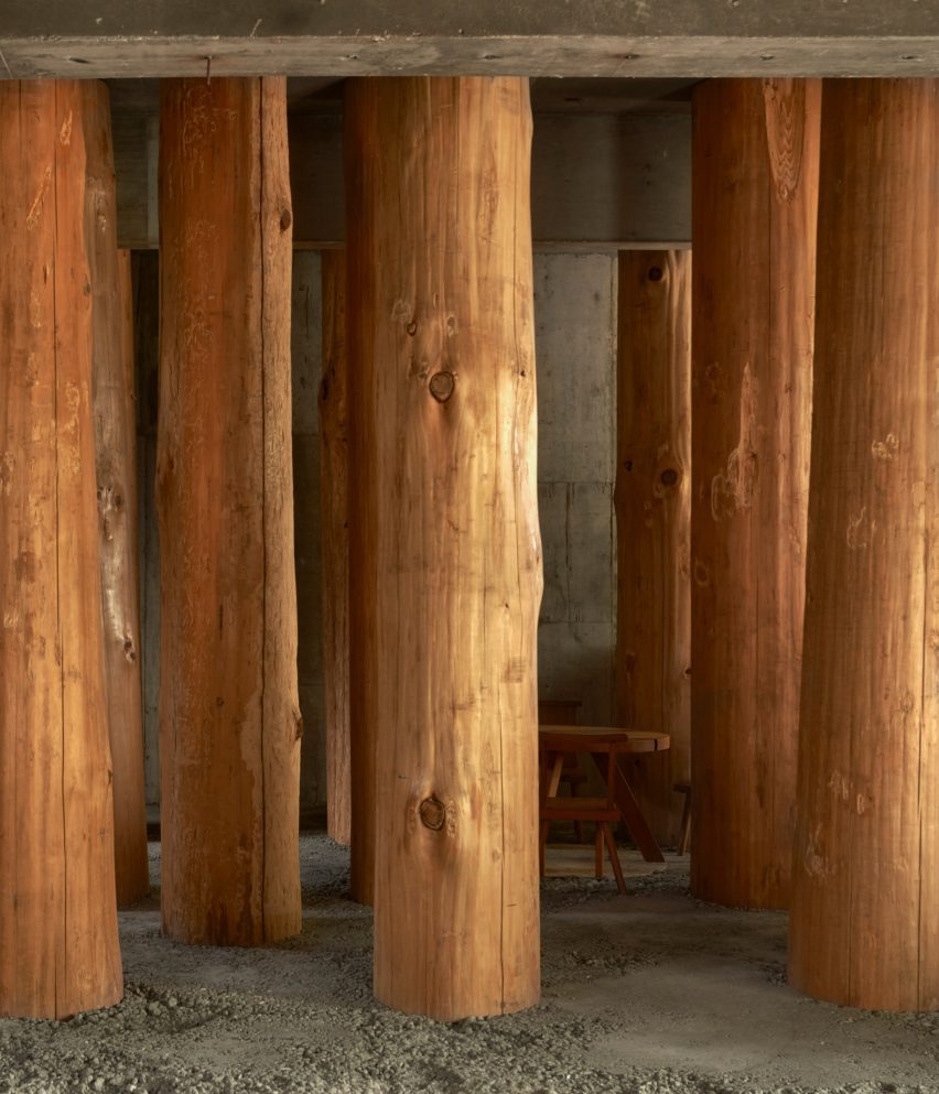
Large wooden logs, stripped of their bark and spaced equally in a grid, are set into the concrete floor to create the feeling of being in a forest.

Due to their size, the trunks had to be brought into Forest Office horizontally, before being hoisted into position and cast into the concrete floor.

One of these trunks could not fit in the planned location, and all of them ended up being slightly tilted and displaced during construction, which Uno embraced as “serendipity”.

Japanese workspace filled with tree trunks
The columns are set into the rough concrete floor

“In a nutshell, this is a question of how to deal with nature,” said Uno. “Whether consciously or not, architects are constantly being questioned in every aspect of how they approach nature and their thoughts,” he continued.

“I explored unbuilt boundaries with this project, and I wanted to confirm that the presence of the spirit felt in nature is the origin of architecture.”

Concrete wall inside Forest Office by Tomoaki Uno Architects
A wall with a circular opening has been added

A kitchenette and bathroom occupy one corner of Forest Office, while a small table and chairs nestle between the large trunks at the centre.

Tomoaki Uno Architects was founded by Uno in Nagoya in 1990. Its previous projects include a concrete home with an Aztec-informed pyramid and a minimal concrete home illuminated by dramatic light wells, both of which are also located in Nagoya.

The photography is by Edmund Sumner.

Reference