Wooden elements “take centre stage” in Studio Frantzén restaurant
CategoriesInterior Design

Wooden elements “take centre stage” in Studio Frantzén restaurant

Scandinavian and Japanese influences come together at Studio Frantzén, a restaurant in London’s Harrods department store designed by Joyn Studio.

Stockholm-based Joyn Studio created the sleek interiors for Studio Frantzén – the latest restaurant opened by chef Björn Frantzén.
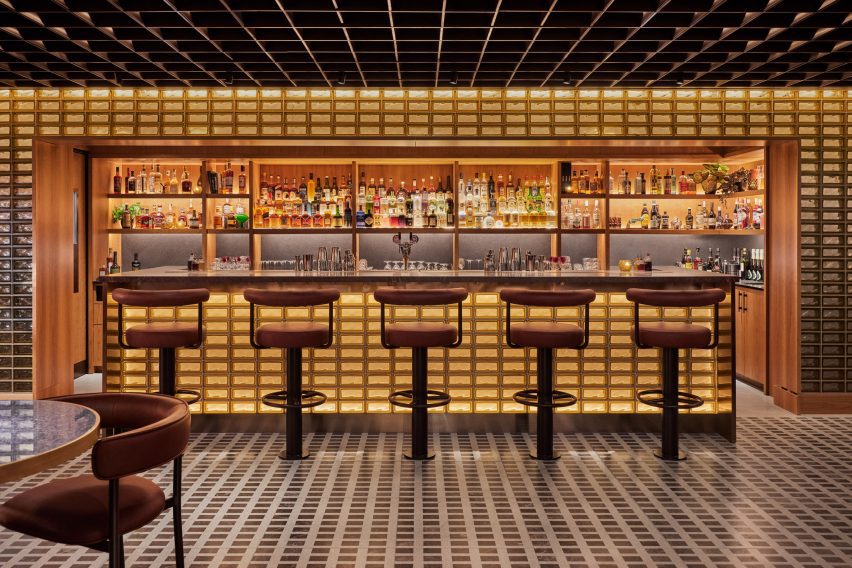
Back-lit glass brick bar at the Studio Frantzén restaurantBack-lit glass brick bar at the Studio Frantzén restaurant
Top: visitors enter via a domed reception area. Above: the bar is characterised by back-lit glass bricks

The two-storey eatery is arranged across a main restaurant and bar on the fifth floor, as well as on an additional mezzanine and rooftop terrace on the sixth floor of Harrods.

In stark contrast to the department store’s famed Edwardian baroque terracotta facade, Studio Frantzén features a contemporary palette that takes cues from both Scandinavian and Japanese design – a trend known as Japandi.
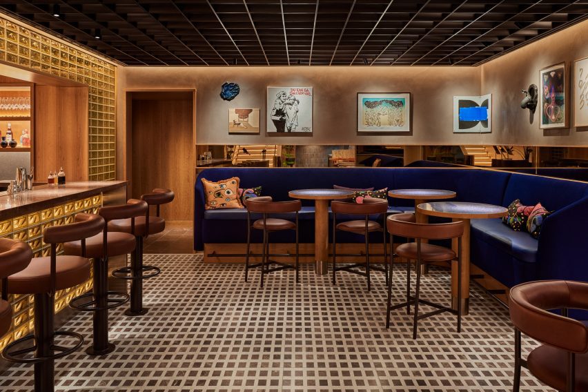
Bar at Harrods by Joyn StudioBar at Harrods by Joyn Studio
Studio Frantzén is located across two levels at Harrods

Visitors enter the restaurant at a domed reception area, which references Scandinavian churches and forest chapels, according to the studio.

The curved walls were clad with blocky cherry wood while illustrations of Nordic animals by Ragnar Persson decorate the ceiling and a Swedish wooden Dala horse was perched on the welcome desk.

“Undoubtedly, wood takes centre stage in this restaurant,” Joyn Studio founding partner Ida Wanler told Dezeen.
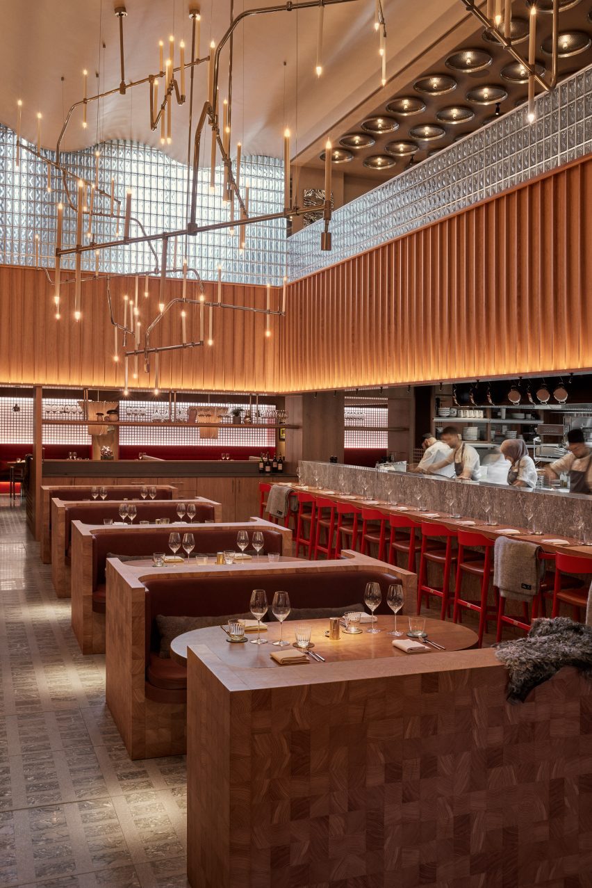
Main restaurant with bespoke timber seating by Joyn StudioMain restaurant with bespoke timber seating by Joyn Studio
The main restaurant is composed of two dining halls

The reception area gives way to a “glowing” bar composed of stacks of glass bricks bathed in amber light, which is mirrored by a ceiling of gridded copper.

Informed by traditional Japanese izakaya – a type of casual watering hole serving snacks – the large main restaurant is composed of two dining halls with bespoke geometric terrazzo and marble flooring.
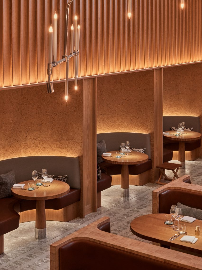
Bespoke timber seating illuminated by a chandelierBespoke timber seating illuminated by a chandelier
One features bespoke timber seating

One hall features an open kitchen and Joyn Studio-designed chunky seating booths and sofas carved out of end-grain wood. This was sourced from a large Hungarian pine tree, cut into cubes and then glued together piece by piece.

This double-height space is illuminated by a spindly oversized chandelier by Swedish studio Front.
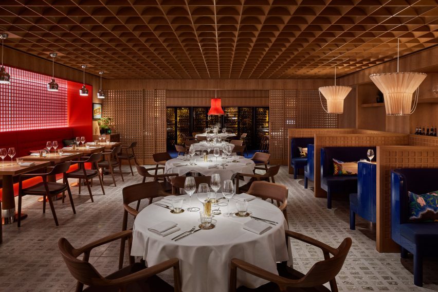
Gridded ceiling within dining hallGridded ceiling within dining hall
The other follows the same gridded geometry as the bar

The other dining hall, tucked around the corner and connected to a wine cellar, follows the same geometry as the bar.

Sliding timber doors and a gridded wooden ceiling are interrupted by ultramarine benches in booths and delicate, ribbed paper lampshades.

“To create a distinctive Nordic dining experience with Asian influences within a historic London building, we delved into the architectural and design legacy of the early 20th century,” explained Wanler.

“Inspired by the journeys of our predecessors to the far east, where they assimilated influences and pioneered a style known as Swedish Grace, we embraced the resonances between traditional Japanese and Nordic architecture and craftsmanship,” she continued.
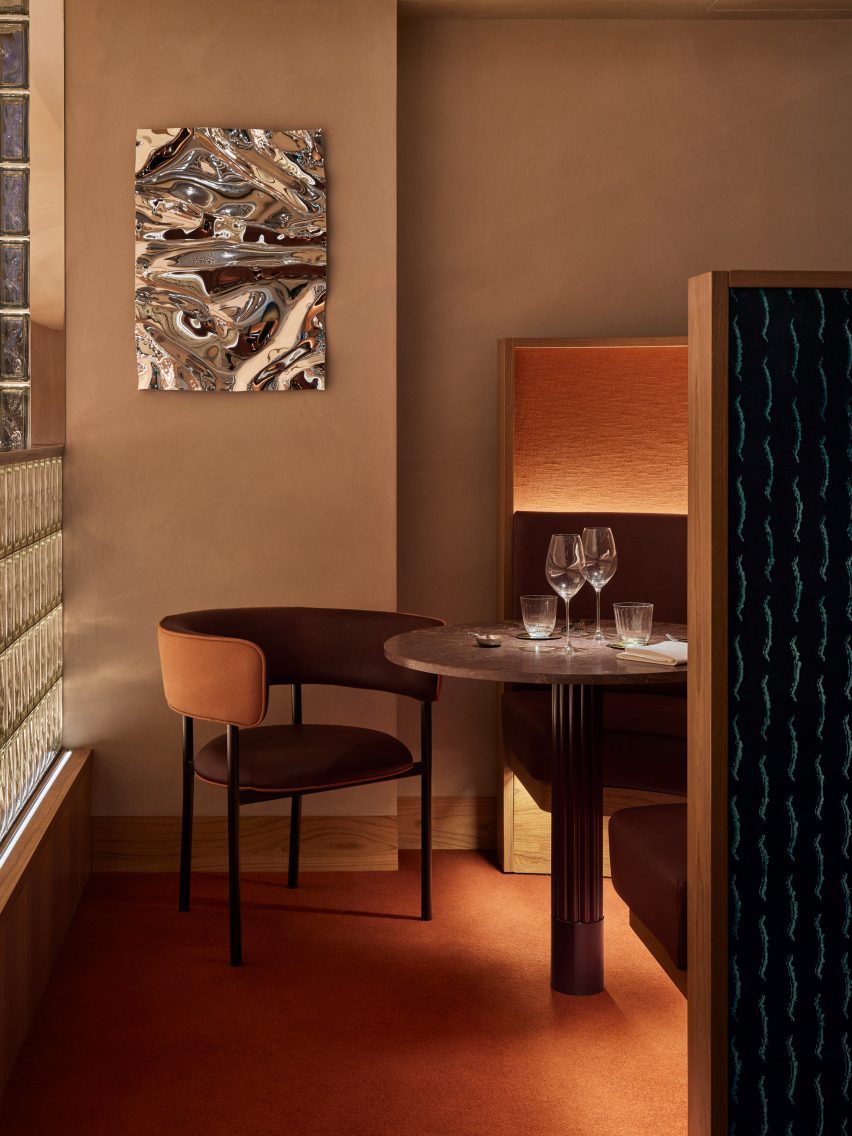
Mezzanine level by Joyn StudioMezzanine level by Joyn Studio
Mirrored artwork by Caia Leifsdotter was included in the mezzanine

On the upper floor, the mezzanine includes three intimate dining booths accentuated by a burnt orange carpet and a wall-mounted Psychedelic Mirror by designer Caia Leifsdotter.

Characterised by marble, rattan and wooden accents, the rooftop terrace offers expansive city views.
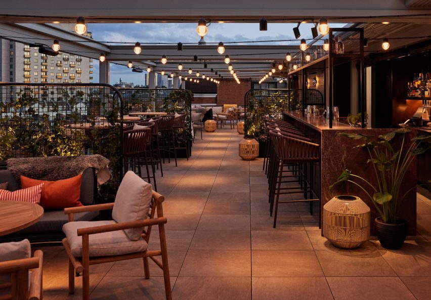
Rooftop terraceRooftop terrace
The rooftop terrace offers views of London

“Aiming to infuse creativity into the traditional luxury context of Harrods, we envisioned a relaxed and comfortable ambiance with sparks of richness created in unexpected ways,” said Wanler.

In 2022, Joyn Studio was longlisted for the title of emerging interior design studio of the year at the Dezeen Awards.

Elsewhere at Harrods, fashion house Prada recently opened a green-hued pop-up cafe that referenced one of Milan’s oldest patisseries.

The photography is by Åsa Liffner.


Reference

Halleroed mixes French and Japandi influences inside L/Uniform boutique
CategoriesInterior Design

Halleroed mixes French and Japandi influences inside L/Uniform boutique

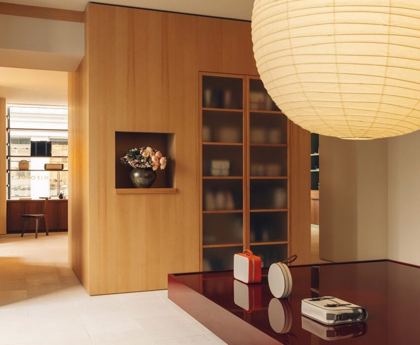
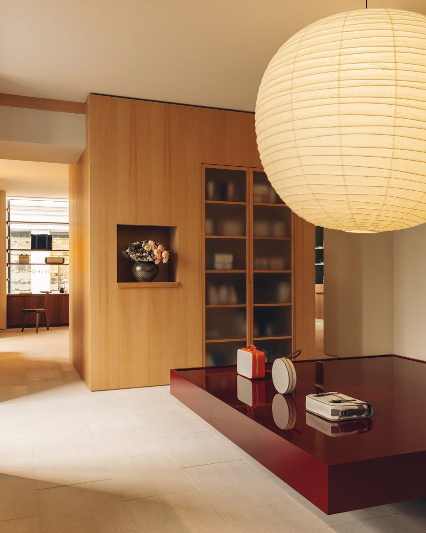
In the arty Paris district of Saint-Germain-des-Prés, Stockholm design studio Halleroed has designed a new boutique for French bag and luggage brand L/Uniform.

Taking cues from the brand’s simple, rational approach to design, Halleroed design lead Ruxandra Halleröd created a series of backdrops that allow the products to “pop out in a beautiful way”.

Wooden display cabinets in boutique in Paris by Halleroed
Halleroed has designed a boutique for L/Uniform in Paris

The boutique is comprised of two rooms that drawing on L/Uniform‘s French heritage alongside a mixture of Japanese and Scandinavian design traditions – also known as Japandi.

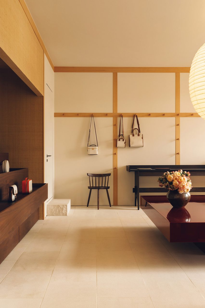
The first room was designed to nod to the vernacular of the traditional French marketplace, with stepped display furniture and rustic materials, such as walls papered in woven raffia.

Bags hand on walls in L/Uniform boutique
In the first room, bags are hung from integrated wooden hooks

“It reminds us of L/Uniform’s use of French canvas on its more functional bags, but on a bigger scale,” Halleröd told Dezeen.

“We used a Shaker-inspired approach where bags are hung from hooks. There’s an association with everyday market life because some of these bags are specifically made for bringing to the market.”

To create a striking visual contrast with the natural textures of this space, Halleroed added a monolithic display table in deep burgundy with a high-gloss finish.

Mint green display cabinets in boutique in Paris by Halleroed
Glossy red details feature throughout the store in finishes and furnishings

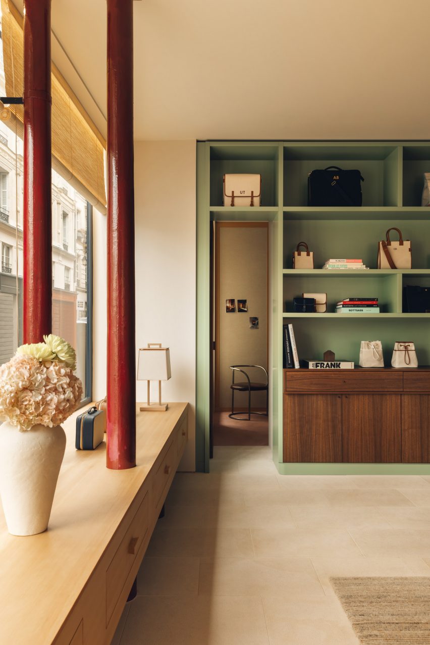
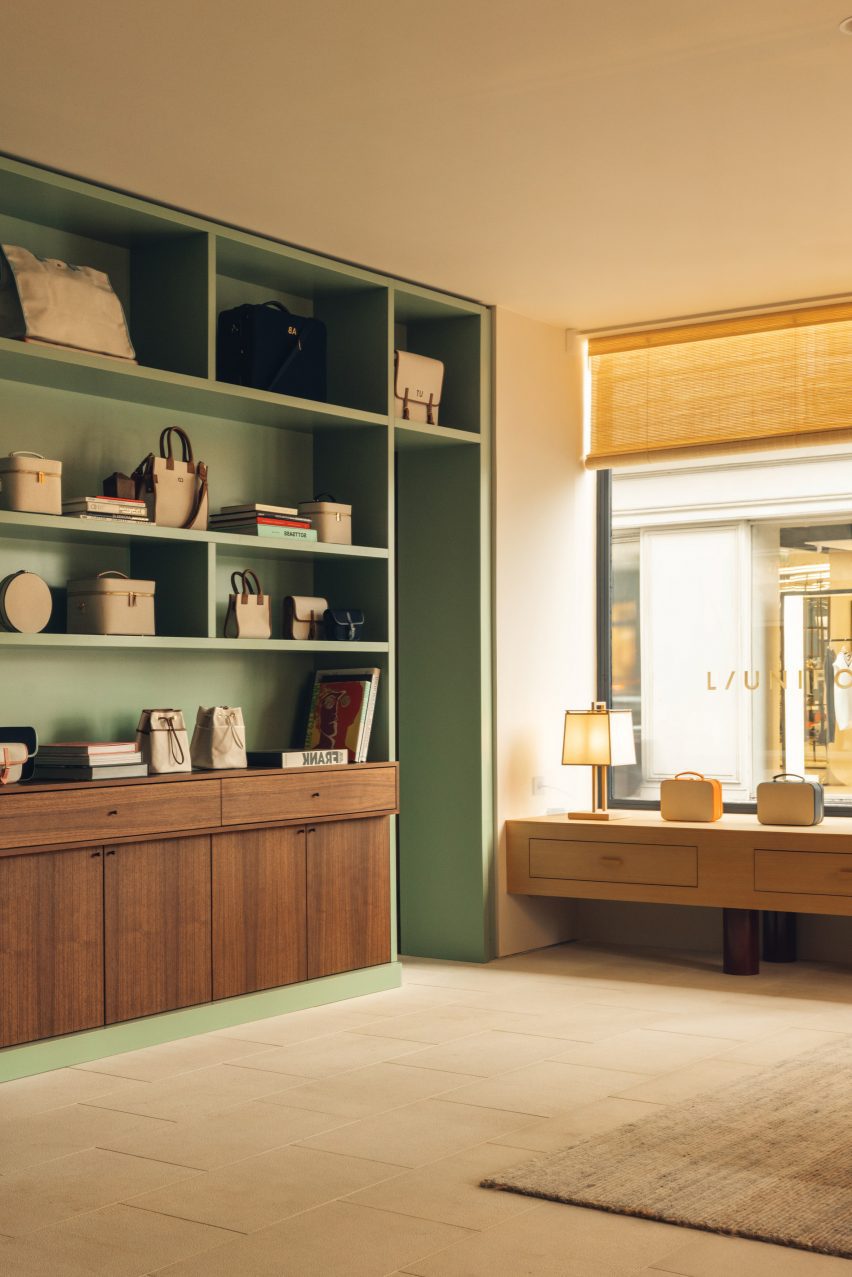
The second room is more “elegant and eclectic”, according to Halleröd. Here, L/Uniform’s leather handbags are displayed against a palette of soft pink and green, featuring an olive-coloured velvet sofa and pistachio display cabinet alongside tactile elements like the handwoven jute-and-wool carpet.

The same glossy red finish from the first room is also reprised – in this case applied to two exposed pipes, around which Halleroed has constructed a low timber cabinet.

Mint green display cabinet in L/Uniform boutique
Pistachio display cabinets provide additional storage

“We worked with colour, texture and material as one entity, creating contrast and also unity,” said Halleröd.

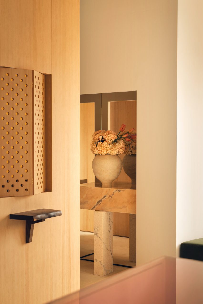
Around the counter, Halleroed added cedar cladding “for a Japanese look and feel”.

This is mirrored across the shop with details such as a rice-paper pendant light by Isamu Noguchi and chairs by George Nakashima, as well as cedar table lamps with rice-paper shades created by a Japanese cabinetmaker.

Gallic influences are reflected in the lighting by Pierre Chareau and Charlotte Perriand and the bush-hammered limestone floor, which according to Halleröd has a “calm, vintage touch that for us is very French”.

Hallway of boutique in Paris by Halleroed
Travertine floors and stone counters bring a sense of refinement to the space

Halleroed also brought Swedish elements into the mix, reflecting the studio’s own approach.

“With our minimalist Scandinavian mindset, we prefer to work with fewer elements and materials but in a conscious and precise way,” said Halleröd.

“Working with wood and craft is something that I think is common for both Japan and Sweden, while we think of the warm tones here as being both French and Japanese.”

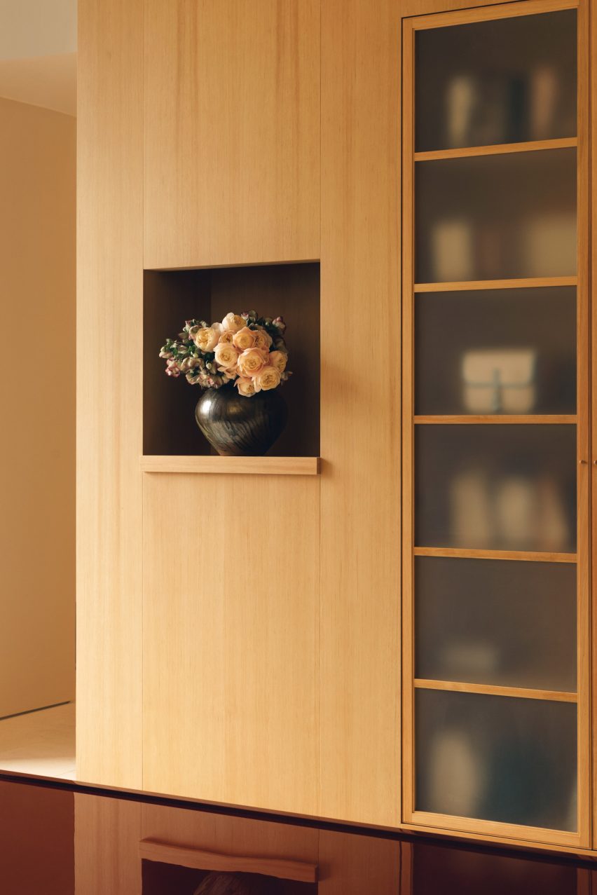
Wooden storage cabinets in L/Uniform boutique
Timber joinery nods to Japanese and Scandinavian craft traditions

“Many of the items in the store were handmade specifically for the space, which was important for us since we believe that this reflects the L/Uniform mentality and approach,” she added.

Since it was founded in 1998, Halleroed has completed a number of high-end boutiques around the world.

Among them are an Acne Studios store in Chengdu and various outposts for Swedish streetwear brand Axel Arigato in Berlin, Paris, Copenhagen and London.

The photography is by Ludovic Balay

Reference

Seven Japandi interiors that blend Japanese and Scandinavian design
CategoriesInterior Design

Seven Japandi interiors that blend Japanese and Scandinavian design

This Dezeen Lookbook presents seven interiors that combine design influences from Japan and Scandinavia in a style that has become known as “Japandi”.


A hybrid of east and west, the style is increasingly popular as a way to create interiors that are minimal without being cold. Japandi makes clever use of craftsmanship and tactile materials, such as textured wood and handmade ceramics, to add comfort and warmth.

It features pared-back styling, precise craft and natural materials – qualities that have long been central to the design traditions of Japan, and the Nordic countries, particularly Denmark and Sweden.

This is the latest lookbook in a series providing visual inspiration for interior designers and design lovers. Previous lookbooks in the series have showcased bathrooms with views, calm living rooms and peaceful bedrooms.


Living room in Archipelago House, Sweden

Archipelago House, Sweden, by Norm Architects

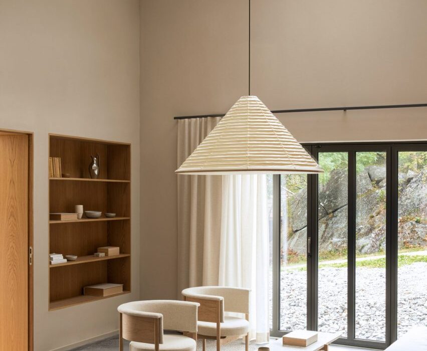
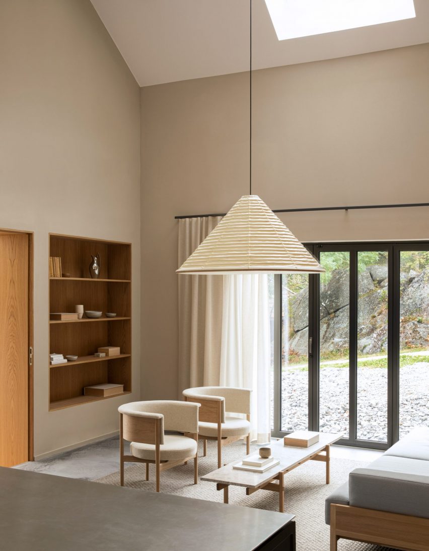
Norm Architects’ Archipelago House is a pine-clad holiday home that was designed to embody Swedish and Japanese aesthetics, a theme that comes through most clearly in the double-height living room.

Here, the owners can lounge on furniture that Norm Architects designed together with Karimoku Case Study – the sister brand of Japanese manufacturer Karimoku.

Creamy white and pale grey hues complement the light wood furniture in the room, where the main light source is a bespoke cone-shaped lantern. This was designed in washi paper by Japan’s Kojima Shouten, which has been making lanterns for over 230 years.

Find out more about Archipelago House ›


Ariake collection at Stockholm Design Week

A Quiet Reflection show, Sweden, by Ariake

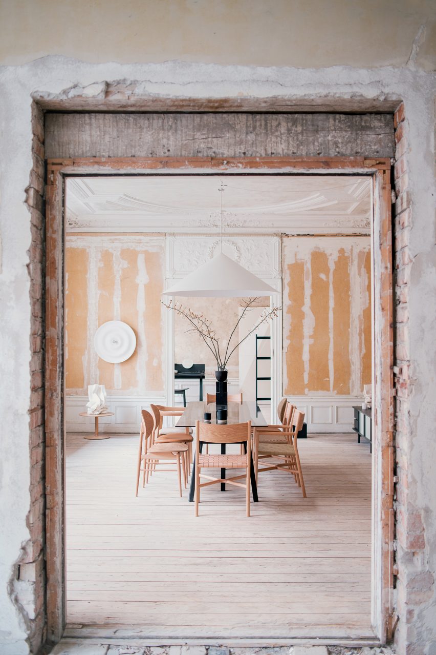
An exhibition by Japanese furniture producer Ariake at Stockholm Design Week showcased the label’s wooden furniture, which was designed in collaboration with a number of designers from all over the world (above and top).

Set in the dilapidated former Mexican embassy in Stockholm, the clean lines of the furniture stood out against the crumbling walls and stuccoed ceilings, creating a mix of texture and colour and an appreciation for older craftsmanship that perfectly embodies Japandi.

Find out more about A Quiet Reflection ›


Interior of Pantechnicon store, London

Pantechnicon, UK, by Farrells

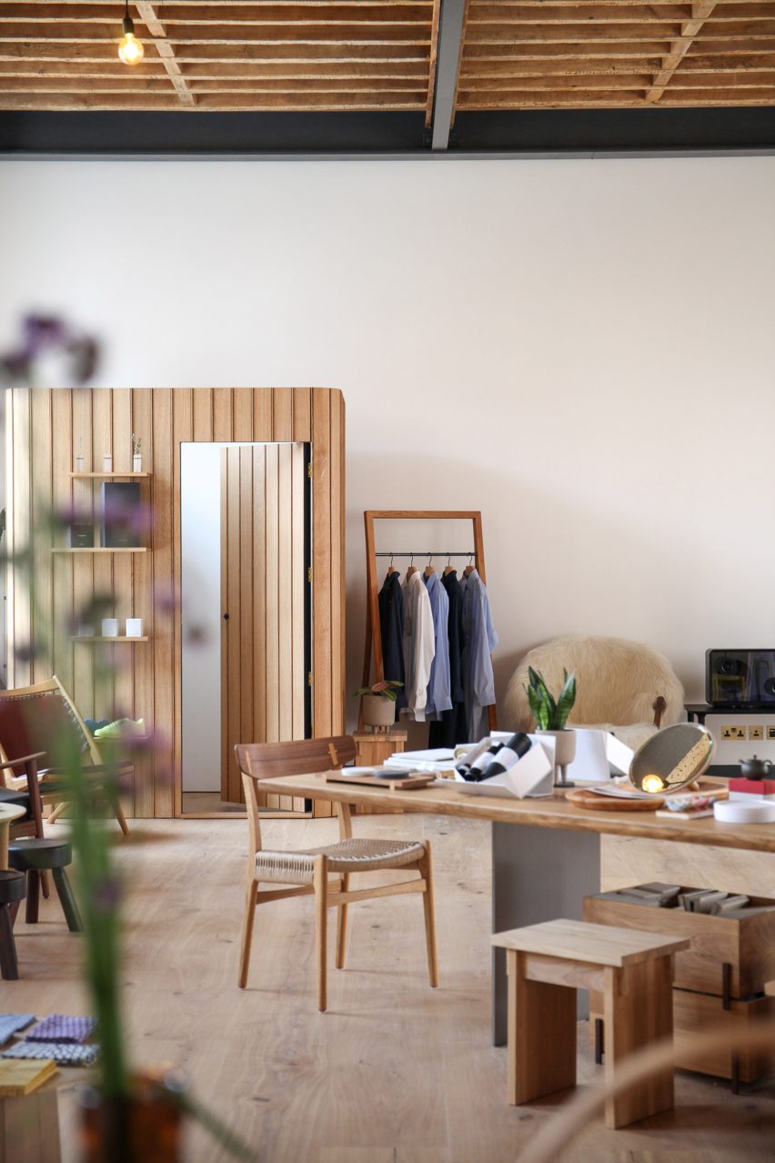
Pantechnicon, located in a 19th-century building in London’s Belgravia neighbourhood, is home to both shops and restaurants that focus on Japanese and Nordic culture. Tenants include a cafe by French-Japanese cult record label Kitsuné and a Nordic restaurant called Eldr.

While Pantechnicon’s interiors are pared-down, plenty of wood detailing gives the space an inviting feel, and lantern-like lights and green plants have been added to soften the minimalist aesthetic.

Find out more about Pantechnicon ›


Japandi interior in Hudson Woods house

Upstate New York Home, US, by Magdalena Keck

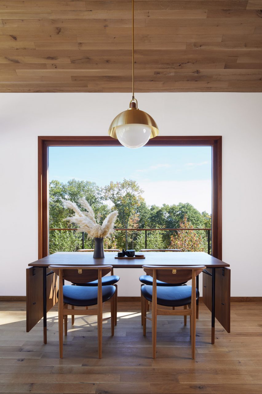
A family with Japanese and American heritage live in this home in the Catskill Mountains, which has an interior that draws on both their backgrounds and adds plenty of Scandinavian style.

In the open-plan living room, dining room and kitchen, a table and chairs by Danish designer Finn Juhl share the spotlight with Japanese pottery and woven mats sourced from Tokyo. Mid-century design and American crafts also feature in the house, balancing out the Japanese minimalism.

Find out more about Upstate New York Home ›


Copenhagen restaurant with Japanese-style interior

Izumi, Denmark, by Pan-Projects and Mok Architects

A Japanese restaurant in Copenhagen is the perfect setting for an interior style that mixes the two cultures.

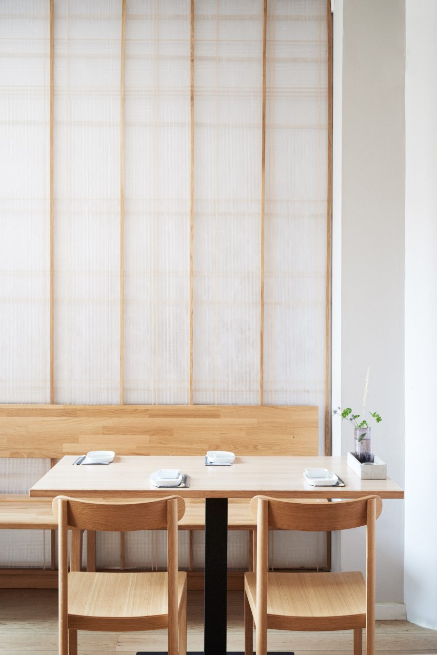
Izumi, in the city’s Charlottenlund suburb, draws on both Japanese restaurant interiors, with translucent screens that reference traditional paper sliding doors, and Scandinavian design. This can be seen in the curving oak panels that surround the open kitchen.

“Japan and the Nordic countries have a rich history of cultural interactions,” explained Pan-Projects’ founders Yurioko Yaga and Kazumasa Takada. “Especially in the field of design, there are many examples that are rooted originally in Japanese culture yet developed uniquely in the land of the Nordic region.”

Find out more about Izumi ›


Claesson Koivisto Rune Tokyo hotel

K5 Tokyo Hotel, Japan, by Claesson Koivisto Rune

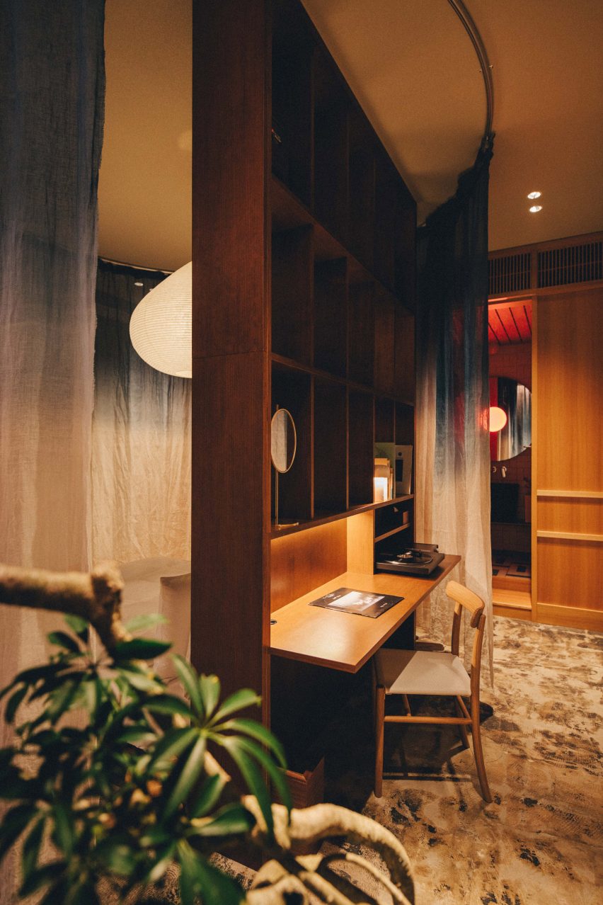
A converted bank building in Tokyo, bombed during world war two, was turned into a boutique hotel by Swedish studio Claesson Koivisto Rune. The studio created a warmer interior style than is usually associated with Japandi, using tactile details and saturated hues.

Thin blue ombre curtains evoke the traditional craft of Japanese indigo-dyeing, or aizome, while sturdy wooden room dividers nod to Scandinavian mid-century modern design. The studio based K5’s interior around the Japanese notion of “aimai”, which is used to describe things that are ambiguous or unclear.

Find out more about K5 Tokyo Hotel ›


Japandi-style interior, London

Powerscroft Road townhouse, UK, by Daytrip

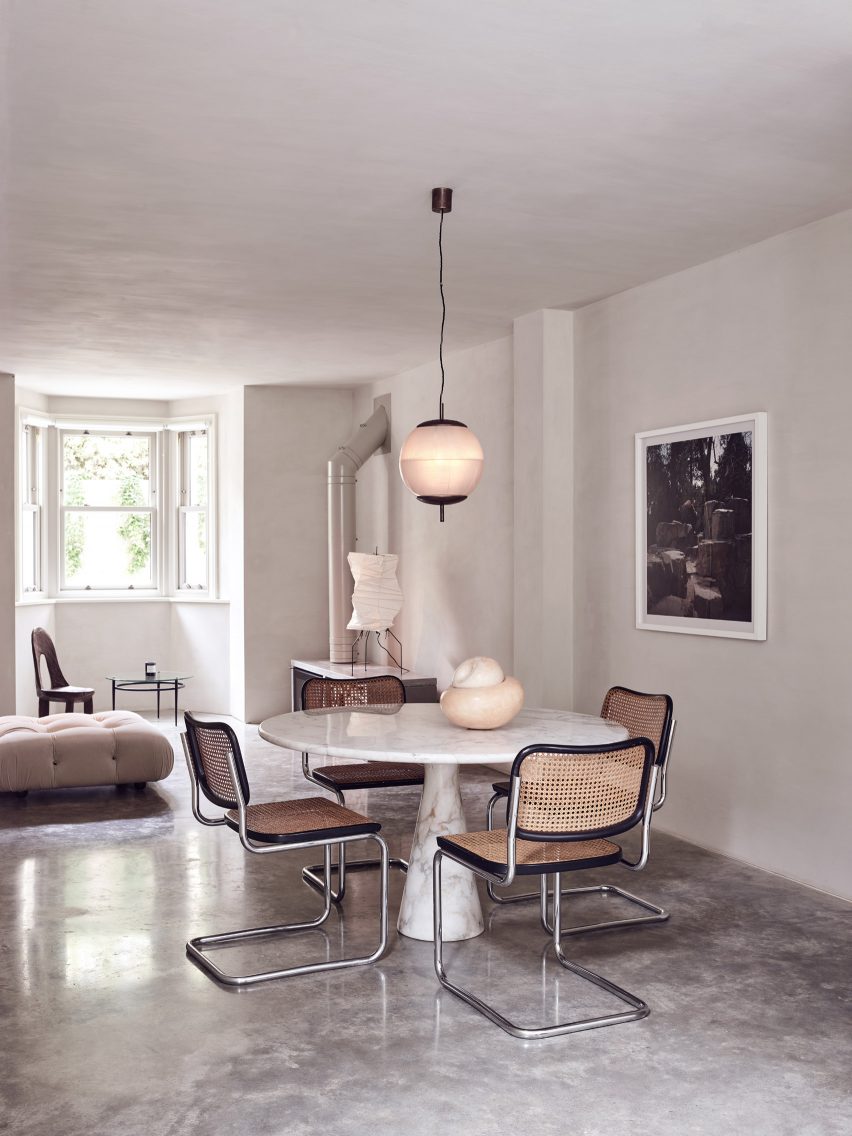
As part of the renovation and expansion of this London townhouse, London-based Daytrip loosely lime-washed the walls and added polished concrete floors to create a “calm and serene home”.

The Scandinavian influence can be seen in the warm wood details used throughout the flat – as in this dining room, where a dark-wood chair complements a dainty table underneath the window – while elegant lighting fixtures add an East Asian feel.

A Japanese paper lamp from designer Isamu Noguchi’s Akari range stands on a wood-burning stove stacked with logs, Scandinavian-style.

Find out more about Powerscroft Road townhouse ›


This is the latest in our series of lookbooks providing curated visual inspiration from Dezeen’s image archive. For more inspiration see previous lookbooks showcasing peaceful bedrooms, calm living rooms and colourful kitchens.

Reference