Cafe Kitsuné Los Angeles features Parisian interiors with “Japanese twist”
CategoriesInterior Design

Cafe Kitsuné Los Angeles features Parisian interiors with “Japanese twist”

Paris-based lifestyle brand Kitsuné has opened a cafe next to its boutique in Silver Lake, Los Angeles, both with minimalist interiors featuring white oak and stainless steel.

The interiors of the new Cafe Kitsuné and the renovated Maison Kitsuné store were designed by co-founder Masaya Kuroki to reflect the brand’s French-Japanese culture as well as the West Coast setting.

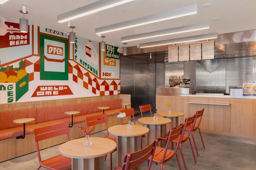
Cafe interior with white oak tables, burnt orange seats and a wall muralCafe interior with white oak tables, burnt orange seats and a wall mural
The Cafe Kitsuné interior includes a mural by Jeffrey Sinich that imagines the space as an old-school market

Facing Sunset Boulevard on the east side of the city, this is the brand’s fourth cafe in North America – following locations in Manhattan, Brooklyn and Vancouver – and its first in LA.

“A sprawling city of diverse findings, from cutting-edge restaurants to pockets of art and architecture second to none, LA has lent design inspiration and a backdrop to several campaigns for the fashion house,” said the Kitsuné team.
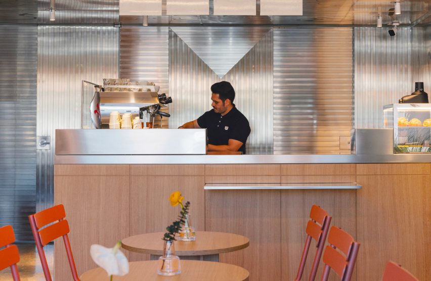
White oak counter front with stainless steel panels behindWhite oak counter front with stainless steel panels behind
White oak tables and surfaces are set against stainless steel counters and panelling for a minimalist look

“Now, it’s the perfect setting for Café Kitsuné, a physical extension of the brand’s Franco-Japanese DNA, and reinvention of the classic Parisian cafe and wine bar experience with a Japanese twist,” they added.

The building’s red-tile exterior and poured concrete flooring were preserved, and hand-painted signage by Californian artist Jeffrey Sincich was added over the large street-facing windows.
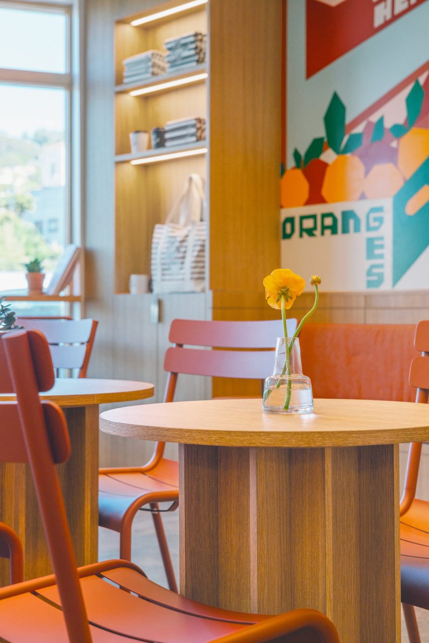
Burnt orange dining chairs and upholstered benchesBurnt orange dining chairs and upholstered benches
Burnt orange dining chairs and upholstered benches highlight the colours of the mural

Inside the 700-square-foot (65-square-metre) cafe, white oak tables and brushed stainless-steel counters feature alongside burnt orange dining chairs and upholstered benches.

Another Sincich mural covers the full length of a wall, offering “a whimsical take on Café Kitsuné’s standard appearance” and presenting the space as an “old-school market”.

A speaker system by Japanese audio company Rotel was installed in the cafe “to provide a top-notch sound experience for customers”, according to Kitsuné.

Next door in the boutique, a similar material palette is used for elements including a built-in storage and display unit across the back wall.
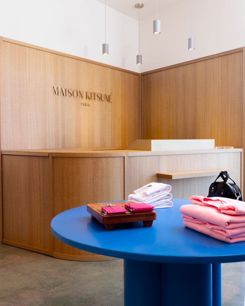
Maison Kitsuné boutique with oak panelling and bright blue central tableMaison Kitsuné boutique with oak panelling and bright blue central table
The existing Maison Kitsuné boutique next door has also received a refresh

White oak forms the framing, shelves and doors that lead to the stock and fitting rooms, while ribbed stainless-steel sheets provide a backdrop for the items on show.

More oak was used for the minimalist service counter and panelling behind, and a bright blue table sits in the centre to add a pop of colour.
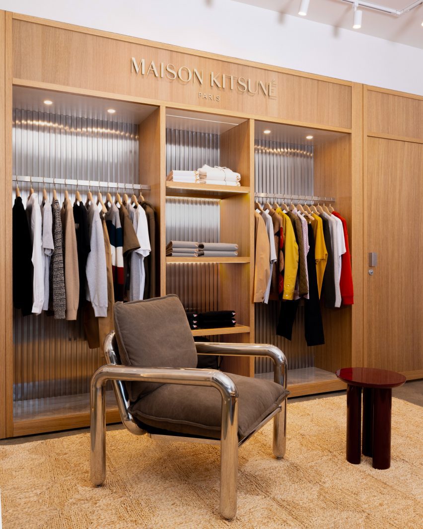
White oak built-in shelving display for clothing, with bent metal chair in frontWhite oak built-in shelving display for clothing, with bent metal chair in front
White oak and stainless steel are repeated in this space to create a visual connection with the cafe

Kitsuné was founded by 2002 by Kuroki and Gildas Loaëc and encompasses the fashion brand, Maison Kitsuné; a music label, Kitsuné Musique; and its line of cafes, bars and restaurants.

Back in 2017, French designer Mathieu Lehanneur designed the Kitsuné store interior in New York’s Soho, adding snaking metal rails for displaying garments.

The photography is by David Kitz.

Reference

Bird feathers inform Bar Miller interior by Polonsky & Friends
CategoriesInterior Design

Bird feathers inform Bar Miller interior by Polonsky & Friends

New York design studio Polonsky & Friends has lined this tiny New York omakase restaurant with burl wood veneer panels, while its counters and cabinetry are coloured to resemble bird feathers.

Designed as a sister location of Rosella, an East Village sushi spot that opened in 2020, Bar Miller is located a few blocks away in Alphabet City.

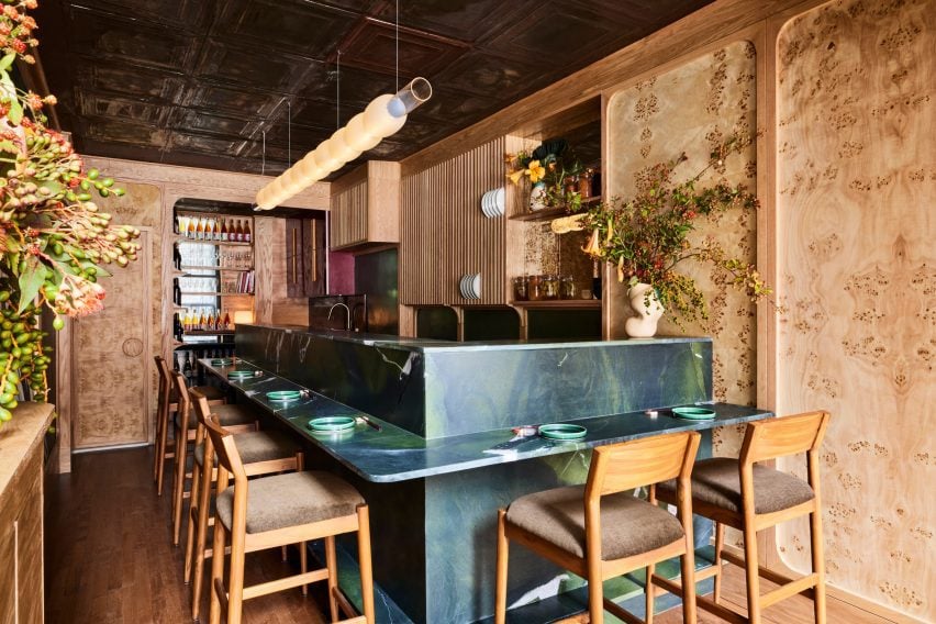
Small restaurant with dark blue-green counters and burl wood wallsSmall restaurant with dark blue-green counters and burl wood walls
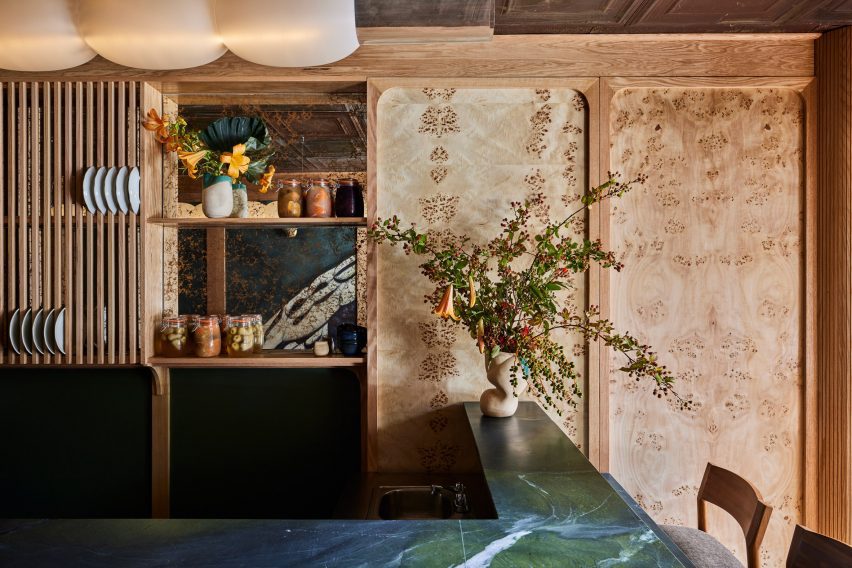
The compact Bar Miller space seats eight covers around a counter made from rare Avocatus stone

The owners brought back Polonsky & Friends to complete the interiors so that the two outposts could share the same “warm, welcoming energy”.

Although the menu borrows from traditional sushi craft, it’s not authentically Japanese, so the designers wanted to steer clear of any tropes that might deceive customers.

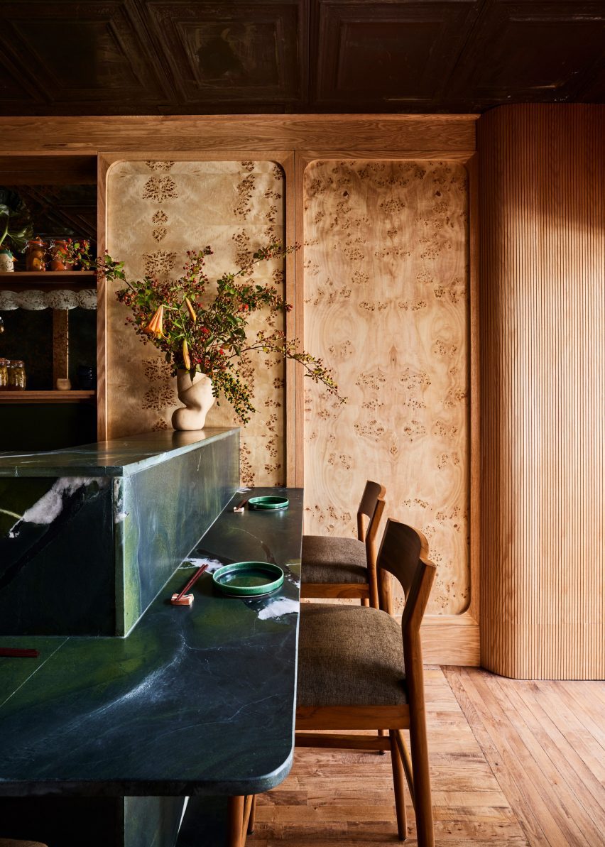
Burl wood veneer panels framed in white oak on the wallsBurl wood veneer panels framed in white oak on the walls
Burl wood veneer panels on the walls are framed in white oak, matching the building’s original floors

“The design had to incorporate local and craft-centric elements and honour the food’s Japanese inspiration, but not fall into any folklore since the team isn’t Japanese and the menu is untraditional,” studio founder Anna Polonsky told Dezeen.

The restaurant only seats eight covers, which surround the open kitchen in the centre of the compact space.

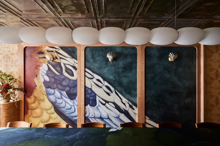
Trio of panels with hand-painted wallpaper displaying bird feathersTrio of panels with hand-painted wallpaper displaying bird feathers
Custom wallpaper hand-painted by Hollie M Kelley displays the feathers of an eastern rosella bird

Deep blue-green Avocatus stone – a rare quartzite with a leathered finish – forms the entire bar counter

A custom ceiling pendant by Madrid-based designer Pablo Bolumar is suspended above the counter like a string of pearly beads.

Blue-green counter with ceramic vase and flowers, in front of a wood-panelled wallBlue-green counter with ceramic vase and flowers, in front of a wood-panelled wall
Pieces by several local designers are featured in the restaurant, including ceramic vases by Fefostudio

On the walls, panels of burl wood veneer are framed in white oak, which matches the refinished original parquet floors.

“We were able to sand back [the flooring] after it was hidden for years in the previous restaurant,” Polonsky said.

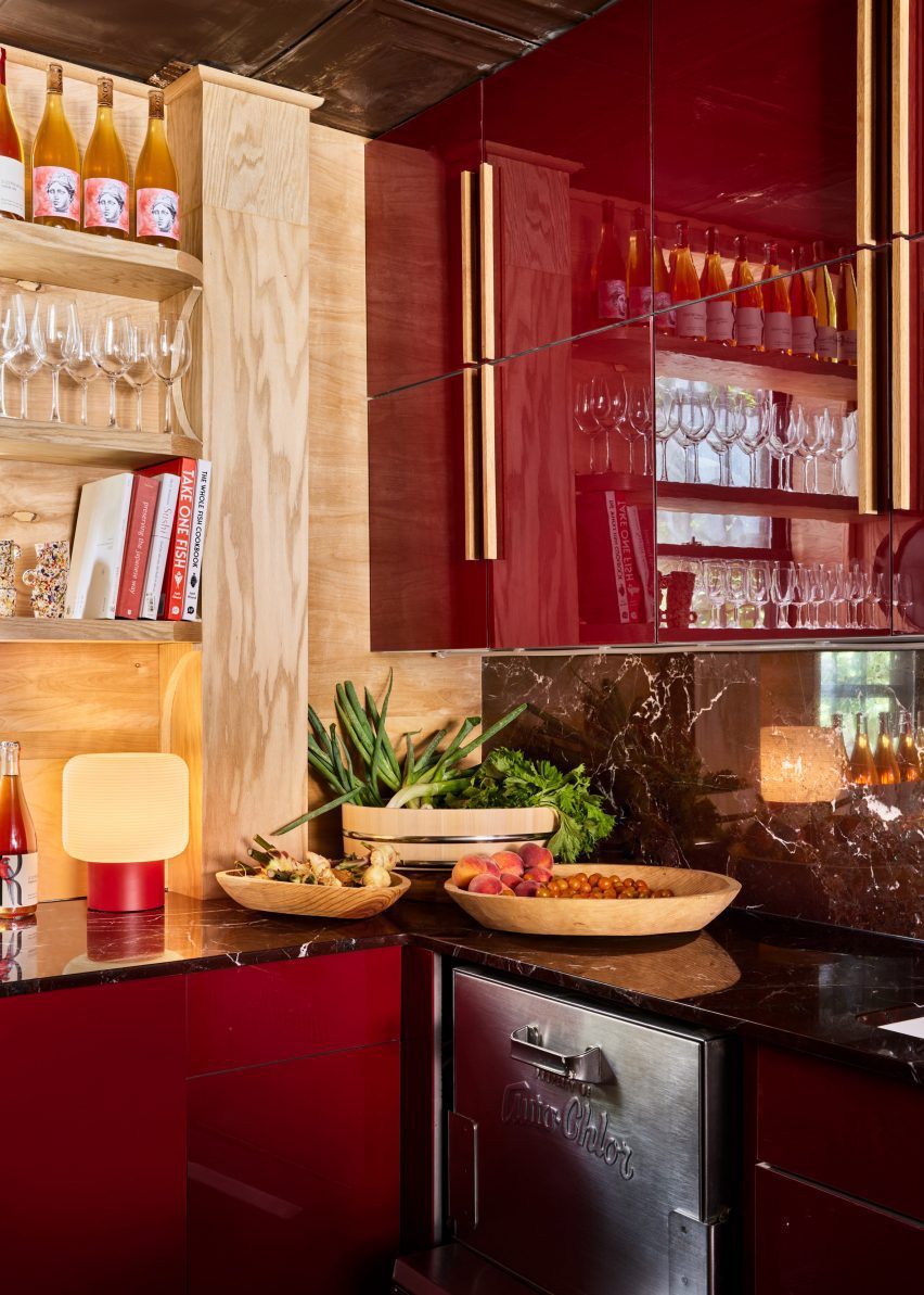
Glossy maroon kitchen cabinetsGlossy maroon kitchen cabinets
To contrast the blue-green dining area, kitchen cabinetry is coloured maroon as another nod to the rosella bird’s feathers

A trio of panels feature a custom wallpaper drawn by artist Hollie M Kelley, displaying the feathers of an eastern rosella bird.

Kelley also drew the icon for the sister restaurant, a western rosella, which has different colours in its plumage.

The maroon hues in the wallpaper are echoed on the cabinetry behind the kitchen counter, differentiating the food preparation area from the blue-green of the dining space.

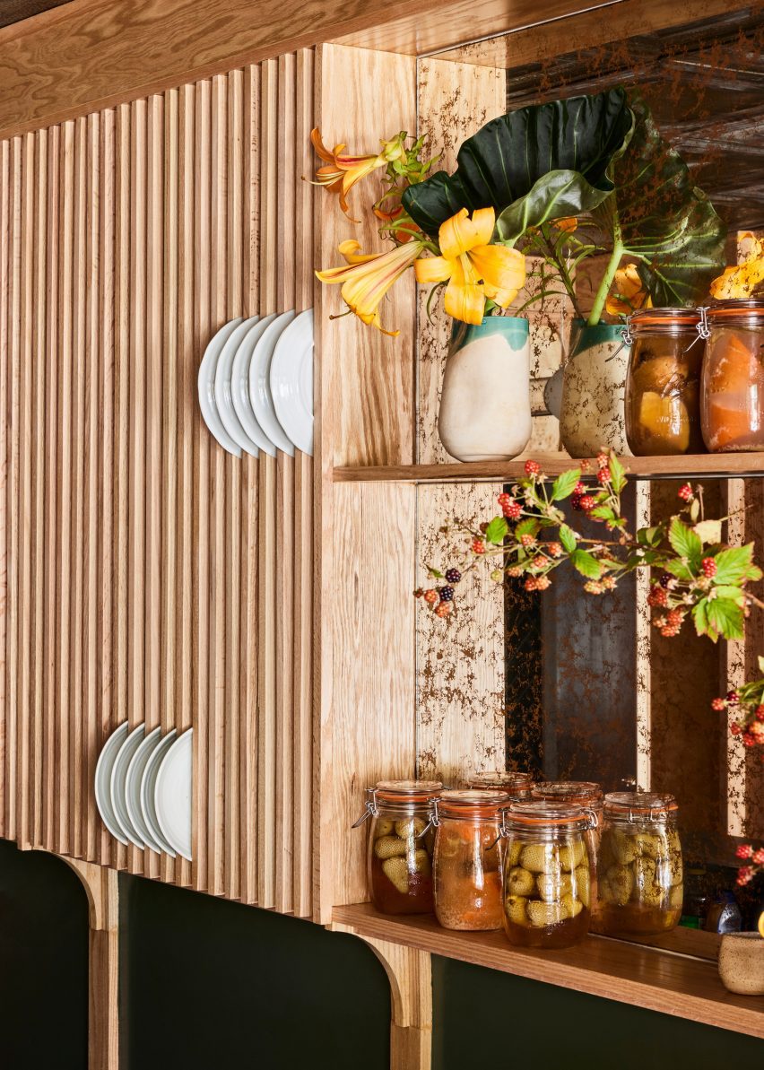
Other details include a panel of vertical wood slats for storing plates above the sink and moulded-glass scones shaped like scallop shells.

Vertical wood slats provide spaces for storing dishesVertical wood slats provide spaces for storing dishes
Vertical wood slats provide spaces for storing dishes

The bar stools were crafted by Maderas Collective in Nicaragua and upholstered by Ecua in Queens, while ceramic vases were sourced from New York-based Fefostudio.

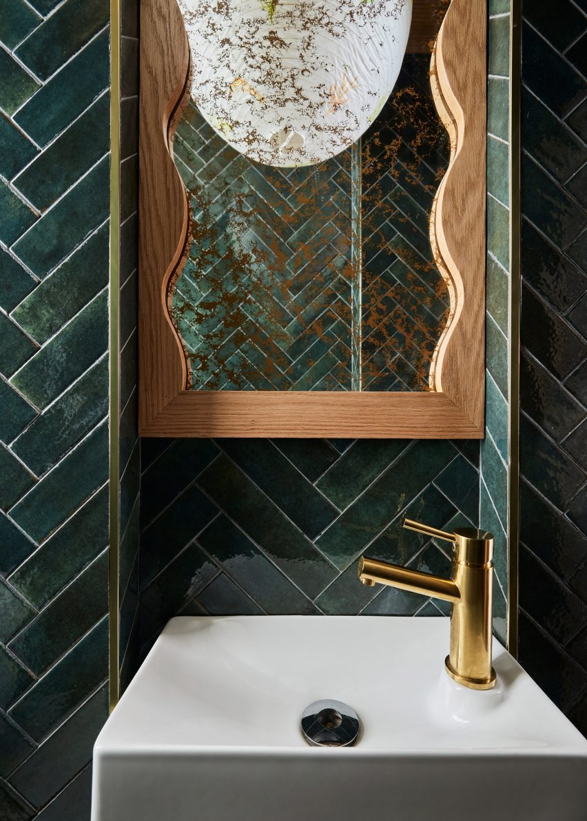
In the bathroom, green tiles laid in a herringbone pattern cover the walls and a rice paper pendant light hand-painted by Claire Dufournier hangs from the ceiling.

Bathroom featuring dark green tiles and a hand-painted rice paper pendant lightBathroom featuring dark green tiles and a hand-painted rice paper pendant light
The bathroom features dark green tiles and a hand-painted rice paper pendant light

For those looking for more Japanese restaurants with notable interiors, New York City has plenty of options to choose from.

Check out the Rockwell Group-designed Katsuya close to Hudson Yards, Rule of Thirds by Love is Enough in Greenpoint, and Tsukimi in the East Village designed by Post Company – formerly known as Studio Tack.

The photography is by Nicole Franzen.


Reference