Common Expansion Joint Field Problems and How to Avoid Them
CategoriesArchitecture

Common Expansion Joint Field Problems and How to Avoid Them

Are you struggling with the aesthetic and functional challenges of expansion joint covers in architecture? These essential components require careful integration and understanding to ensure they meet project needs effectively. This can be quite challenging, which is why many architects don’t like them. However, with the proper guidance, you can transform this challenge into an opportunity for innovative design and effective functionality.

In our recent webinar, we delved into the complexities of expansion joint systems, offering insights and practical solutions for architects and builders. If you missed the live session, don’t worry — the recording is available for you to watch at your convenience.
Register + Access

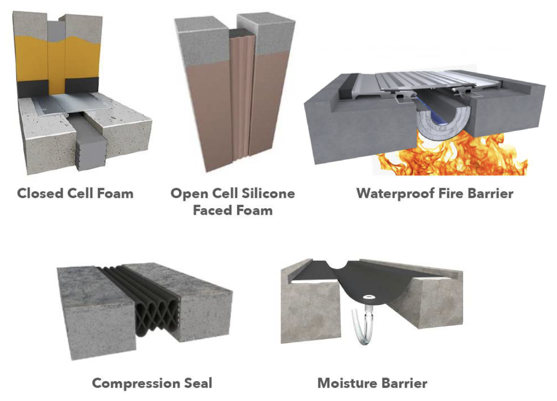
Exterior waterproofing options via Inpro Corp

Once again, we had the pleasure of hosting Matthew Fisher, the Senior Product Manager for the Expansion Joint Systems division at Inpro. Fisher, with his extensive 25-year experience spanning architecture, construction management and building materials management, brings a wealth of knowledge and practical insights. His expertise is particularly invaluable considering his background as a practicing architect and his deep understanding of both the design process and the on-site construction dynamics.During the webinar, Fisher covered a range of critical topics, helping participants to:

  • Examine common floor joint oversights regarding blockouts, concentrated loads and coverplate specification;
  • Discover the types of interior wall expansion joint systems and how to accommodate obstructions, changes in directionand functional requirements;
  • Examine and compare building envelope joints and recognize the importance of proper detailing for transitions;
  • Identify the types of expansion joint fire barriers and the dangers to life safety when seams and intersections installations are not assembled to specifications.
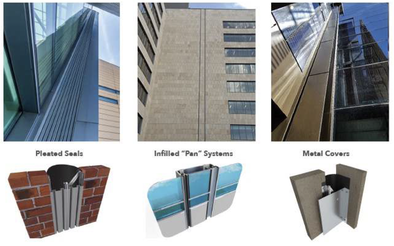
Exterior joint cover types via Inpro Corp

These topics were not just theoretical discussions but were backed by real-world scenarios and practical solutions, making the webinar an insightful learning opportunity for anyone in the field.

Register + Access

Don’t miss this chance to broaden your understanding of expansion joint systems and their critical role in architecture. Access the webinar now and equip yourself with the knowledge to tackle one of the most nuanced aspects of building design.


Kalina Prelikj

Author: Kalina Prelikj

A jack of all trades and a soon-to-be Master of Architecture, Kalina enjoys embracing her creative side and has dabbled in everything from marketing to design to communications. However, her main interest lies in architecture, as she loves to explore how it shapes our communities and transforms our daily experiences. With a deep appreciation for the art of puns, Kalina is constantly on the lookout for opportunities to craft clever wordplay.

Reference

Neon lighting illuminates Strip Joint Chicken by Amanda Hamilton
CategoriesInterior Design

Neon lighting illuminates Strip Joint Chicken by Amanda Hamilton

Canadian studio Amanda Hamilton Interior Design has used bold colour-blocking and neon lighting to give this Calgary chicken shop a “1990s meets Memphis” feel.

Strip Joint Chicken in the city’s East Village neighbourhood is a fast-casual restaurant that serves “chicken fingers with a twist”.

Midnight blue vestibule with neon strips across the walls and ceiling
A dark entrance vestibule sets the tone for Strip Joint Chicken’s dining space beyond

The brand is fun, playful and cheeky, so the interiors of its 2,200-square-foot (204-square-metre) space needed to reflect this.

Working with a return client, Amanda Hamilton Interior Design leant fully into the “offbeat” concept, creating an elevated interpretation of a seedy bar or nightclub that founder Amanda Hamilton described as “1990s meets Memphis”.

The words "Strip Joint" written on a wall in a striped typeface
A trio of colourful stripes is used to guide customers to the ordering area, and also spells out the brand’s name on the wall

“At times subtle (and sometimes not so subtle) design elements take a nod (or a big ol’ bow) playing to the restaurant’s name,” said the designer. “In a market saturated with options for fast casual, standing out was key.”

The main entrance vestibule is painted midnight blue and illuminated by vertical bands of neon lighting that connect wall-to-wall across the ceiling. This immersive passageway sets the tone for the main dining area, which is similarly lit with neon.

Fluorescent-blue neon tubes suspended above a service counter
Tangles of fluorescent-blue neon tubes are suspended above the service counter

Tangled fluorescent-blue tubes are positioned above the bar and service counter, while pink and yellow glow from LED strips within large colour-blocked arches that accommodate built-in seating for a row of dining tables.

“Coloured lighting is used extensively to feature architectural details, enhance volumetric space, ground the bar and highlight seating areas,” Hamilton said.

Pink arched niche with built-in seating and dining tables
LED strips illuminate colour-blocked arched niches, which accommodate bench seating

Part of a larger retail space that was divided into four units, the chicken shop is accessible from both sides of the building.

Therefore, close attention was paid to the flow of people through the space, and wayfinding tools were implemented to assist both dine-in and take-out customers.

A trio of arched niches lit up in pink and yellow
The arched niches provide space for dine-in guests to enjoy their chicken out the way of take-out customers

A trio of thin, coloured stripes are inlaid across floors to guide hungry patrons to the ordering area.

The same triple-line motif spells out the brand’s name in large letters across a wall, above a pink scallop-topped bench accompanied by small tables and terrazzo stools.

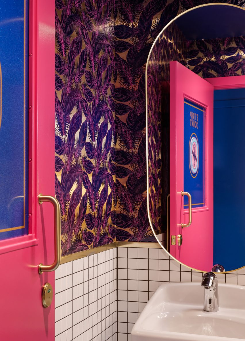
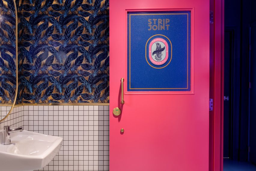
Custom-designed feathery wallpaper adorns the back of the central arch and inside the “tender neutral” bathrooms, which are tucked behind bright pink doors.

For guests wishing to stay longer, a private dining area named the Hens Den is obscured from view by gauzy drapery.

Bathroom interior with feathery wallpaper
Custom feathery wallpaper adorns the bathroom interiors

This monochromatic room features a brass pole in the centre of its dining table, around which a lazy susan for sharing food rotates.

“As an extension of the space, the predominately custom furniture is equal parts playful and sculptural, creating a conversation-worthy addition to the space,” Hamilton said.

Bathroom with feathery wallpaper and a bright pink door
Located behind bright pink doors, the bathrooms are designated as “tender neutral”

The designer founded her eponymous studio in Calgary, where she’s based, and also operates a second location out of Vancouver.

A trend for bright psychedelia in hospitality and entertainment spaces has been gaining pace recently, with other examples found in Seattle’s Supernova nightclub and the Resonant Head music venue in Oklahoma City.

The photography is by Joel Klassen.

Reference

CUT Architecture designs sunset-hued interior for Parisian burger joint
CategoriesInterior Design

CUT Architecture designs sunset-hued interior for Parisian burger joint

The mid-century architecture and roadside diners of the American west informed the interior of this nostalgic hamburger restaurant in Paris designed by CUT Architectures.


Located in Paris’s Citadium – a multi-brand department store on Boulevard Hausmann that is focused on lifestyle, streetwear, and sneaker culture – PNY Citadium is the hamburger chain’s seventh opening in the city.

Fluted panels line the bar and cashier area
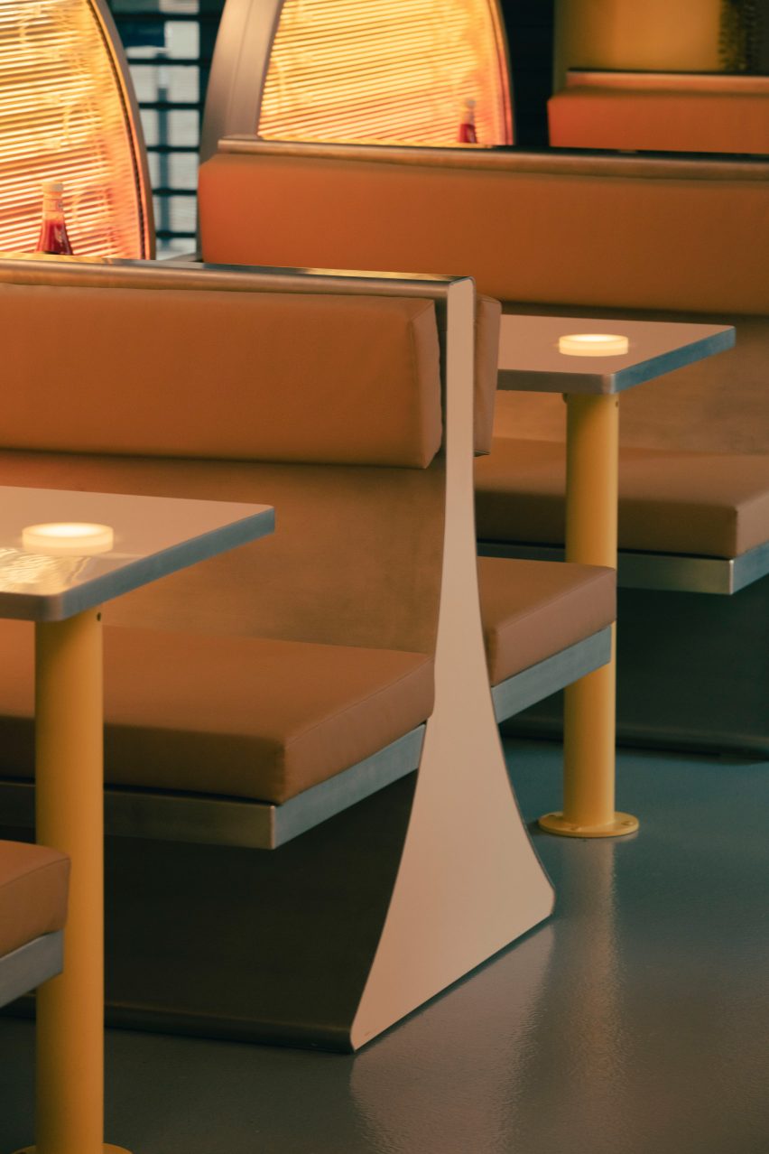
Top image: yellow booth seating has a mid-century look. Above: marquee lettering announces the menu

Paris studio CUT Architectures – which previously designed PNY’s first, second, third and fourth outposts – was invited back to create this location around the theme “electric tropical diner”.

The interior, which features neon tube lighting, aluminium walls and embossed stainless steel, seeks to capture the “vivid and unique” energy of America’s West Coast.

Bar tables were fitted with planters at PNY Citadium
Bar stools are paired with circular tables

In particular, the architects looked to the mid-century architecture of Venice Beach in Los Angeles, the Palm Springs’ houses of Albert Frey, and Palm Desert sunsets.

Set out over 75 square metres, the 51-seat restaurant is headed up by a curved crenellated aluminium bar that lines the back wall.

The back of the bar is clad in aluminium while overhead a retro lightbox sign that displays the menu wraps around the top.

PNY Citadium has an orange lit interior
The crenellated aluminium bar reflects light across the restaurant

“The place is conceived as an architectural parenthesis set in the Citadium; a roadside diner whose bar is clad in crenellated aluminium like a longhaul truck crossing the United States,” said CUT Architectures.

“The back bar is dressed in embossed stainless steel with a radiant pattern that increases the reflections.”

Seating is laid out over a series of classic diner booths with banquette seating, as well as a series of tall bar tables and stools.

The booths are positioned along the entrance to the department store and lined with large circular glass panels, lit by rows of warm neon tubes that fade from yellow to orange and pink.

Booth seating has an angular design
Sun-like panels were placed at the ends of tables for privacy

Designed to recall the setting sun on the Pacific Ocean, the panels provide privacy for diners and create a visual boundary between the restaurant and the rest of the department store.

“To achieve the specific hues and quality of light we wanted we used old school signage neon tubes instead of LED lights,” the studio told Dezeen.

A PNY Citadium sign is located above the bar
Sunset hues reflect off the surfaces

The bases of the taller tables are made from large steel cylinders lacquered in a faded yellow hue.

The cylinders pierce through glossy white circular tabletops to create planter centrepieces that are filled with arid vegetation native to the Californian desert.

Other sunset-informed eatery designs include designer Yota Kakuda’s sunset-hued counter installed within a Tokyo cheese tart shop.

While in a Hong Kong cafe, architecture firms Studio Etain Ho and Absence from Island pay homage to Australia’s spectacular sunsets with a terracotta colour scheme and semi-circular forms.

Photography is by Romain Laprade.

Reference

Masquespacio designs colour-blocked restaurant in Turin for burger joint
CategoriesInterior Design

Masquespacio designs colour-blocked restaurant in Turin for burger joint

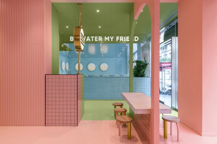
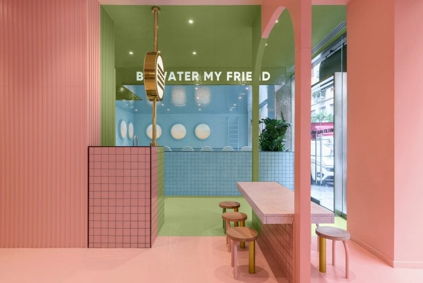
Spanish design agency Masquespacio has created the interiors of Italian fast food chain Bun’s Turin branch that combines blocks of pink and green with a blue seating area designed to look like a swimming pool.


Bun Turin is a burger joint that takes its bold identity from the first Bun restaurant in Milan, which was also designed by Masquespacio.

“This restaurant’s target customer is the urban lifestyle of people born late in the Millennium and the new Generation Z,” Masquespacio co-founder Christophe Penasse told Dezeen.

Masquespacio designed the colour-blocked interiors
The burger bar is in Turin

Characterised by three distinct colourful areas, the burger joint uses pink, blue and green in order to playfully carve out different spaces in the restaurant.

The sections are designed so that the restaurant’s three large windows present each colour as a separate blocked out space from the outside.

The restaurant is in Turin
Green and pink sections feature in the restaurant

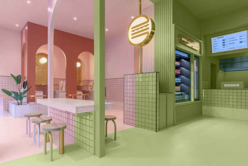
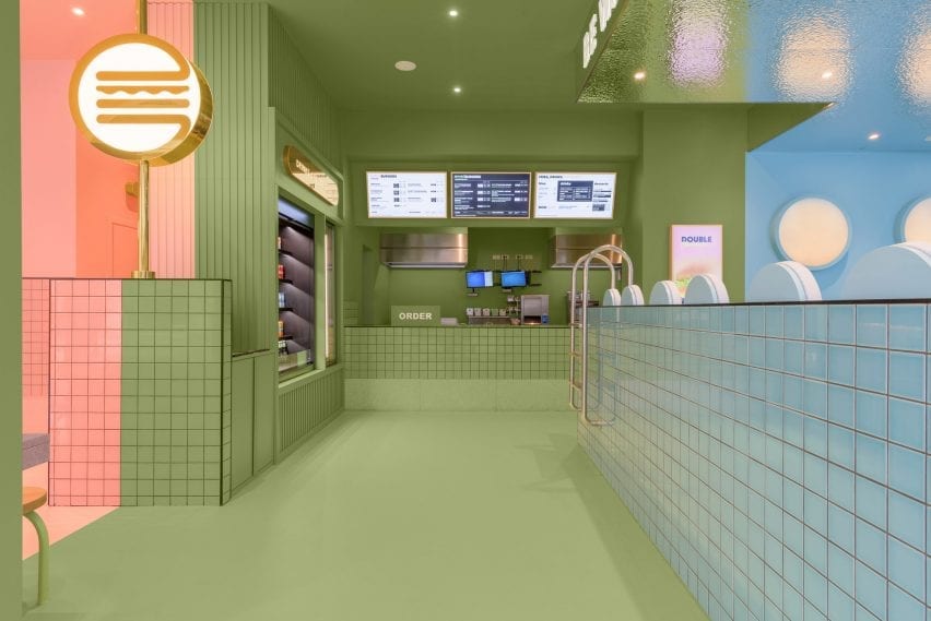
Upon entering Bun Turin, visitors are greeted with an ordering bar and drinks and ice cream fridge coloured in a dusty sage shade of the restaurant’s trademark green.

Lit-up digital menu boards with gold accents display the restaurant’s food options, while a version of the same neon burger logo found in Bun’s Milan branch glows from a nearby pillar.

Colourful tiles form the restaurant by Masquespacio
A neon burger sign glows from a pillar

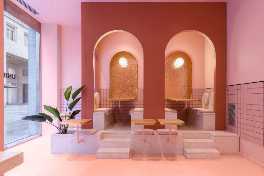
Pink and blue are used for two different seating areas both complete with built-in furniture.

In the pink area, a central table coloured partly in green straddles both the pink and green sections of the restaurant.

Sugary-pink terrazzo steps that double as a planter lead visitors to seats tucked into arched booths in the pink seating area, which also houses the burger joint’s toilets.

A planter features in the pink seating area
The pink seating area has terrazzo steps

Bun Turin’s all-blue seating area is built from pale tiles that are designed to look like a swimming pool.

The area features mock pool ladders which aim to give visitors the impression of floating in water while they eat.

“Once we defined Bun’s identity we developed the project in 3D,” said Penasse.

“At the end of the process, we do a lot of trials to reach the correct combination of colours and materials,” continued the designer.

“In this case, we had several options for colour combinations, all focussed on a younger audience.”

Masquespacio designed a swimming pool seating area
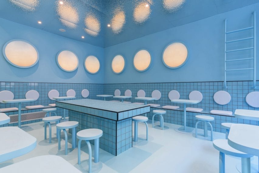
The blue seating area resembles a swimming pool

Apart from tiles by Complementto, all of the furniture in Bun Turin was designed by Masquespacio.

“It is important for clients that Bun spaces can be recognised wherever they are located,” explained Penasse.

“For this reason, the design will evolve and be slightly different in each space, but maintain a clear identity.”

Masquespacio designed the three sections in blocks of colour
Each section is revealed to the street by a large window

Masquespacio is a Valencia-based design agency founded in 2010 by Penasse and Ana Milena Hernández Palacios, known for its use of bright colour.

Other recent projects by the studio include colour-blocked student housing in Bilbao, and a stucco and terracotta restaurant in the Spanish town of Aragon constructed from twisting shapes informed by the nearby Pyrenees mountains.

Photography is by Gregory Abbate.

Reference