Kingston Lafferty Design includes “sensual” red kitchen in home renovation
CategoriesInterior Design

Kingston Lafferty Design includes “sensual” red kitchen in home renovation

Dublin studio Kingston Lafferty Design has transformed the architecture and interiors of this family home in Cork, Ireland, which features 1970s-style shapes and colours informed by the work of designer Verner Panton.

Positioned on Lovers Walk hill overlooking the city of Cork, the townhouse – called Lovers Walk – was renovated by Kingston Lafferty Design.
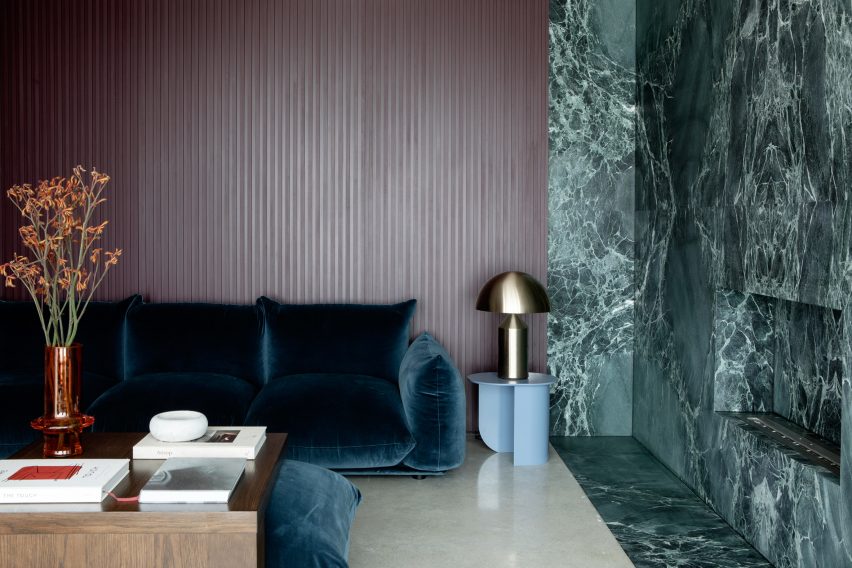
Living space with a green marble feature wallLiving space with a green marble feature wall
Kingston Lafferty Design completed the renovation in Cork

The studio originally planned to just update the interiors, but decided that a more extensive architectural transformation was needed after discovering structural instabilities in the home.

Kingston Lafferty Design removed all of the floors, which lacked foundations and insulation in their concrete slab, and completely reconfigured the two-storey property’s layout.
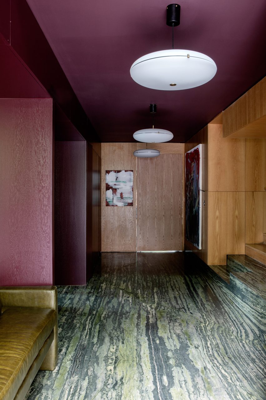
Oak-lined hallway with colourful accentsOak-lined hallway with colourful accents
Rooms on the ground floor were designed around an oak-lined hallway

“As the building was originally built in the 1970s, we wanted to return to its roots,” studio founder Róisín Lafferty told Dezeen.

“We thrived on inspiration from Verner Panton with his use of strong clashing colour, playful shapes and oversized elements,” she added.
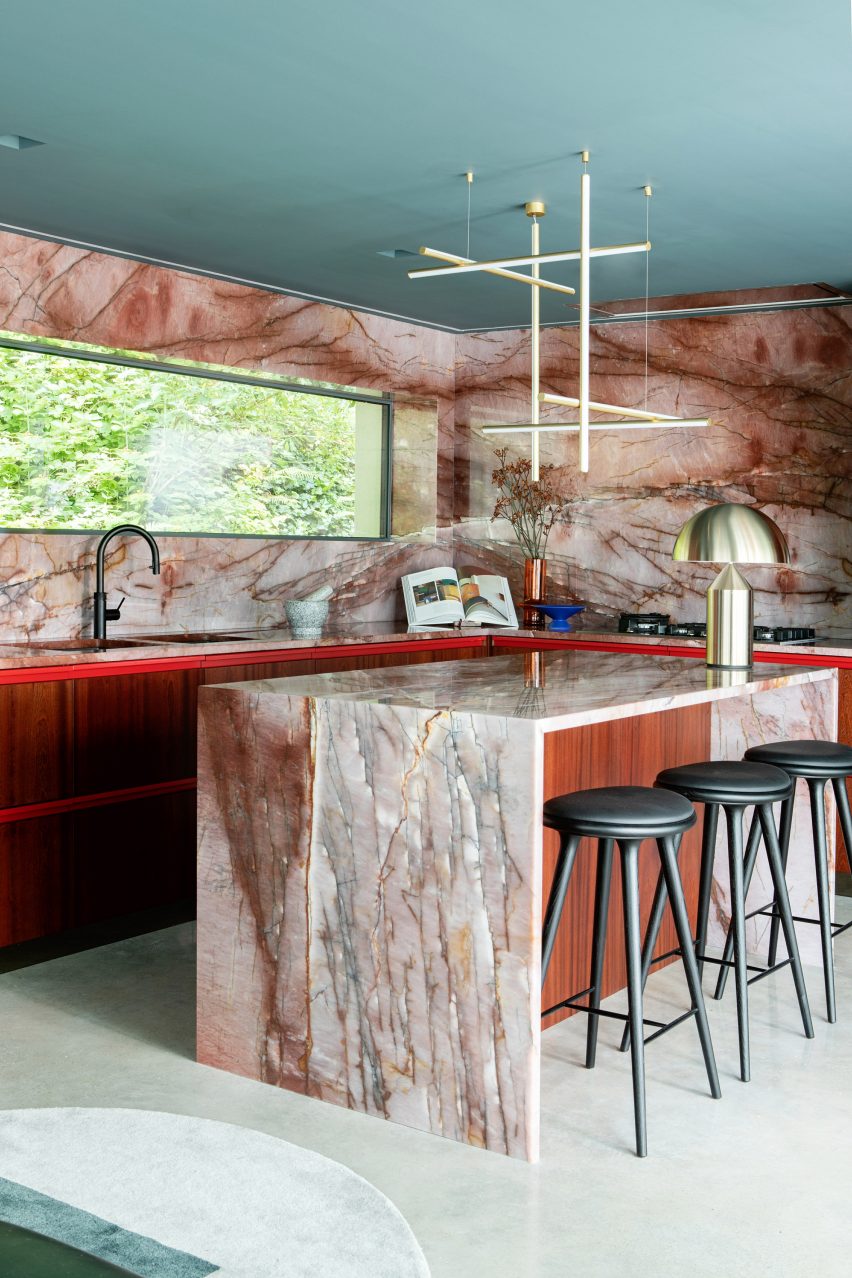
Quartzite-clad kitchen by Kingston Lafferty DesignQuartzite-clad kitchen by Kingston Lafferty Design
One of these spaces is a “sensual” red kitchen

The ground floor was adapted to include an open-plan kitchen defined by a counter, island and splashback finished in veiny red quartzite.

Ruby-toned timber was used to create the geometric cabinets. When layered with the quartzite, “it sounds like a disaster, but it’s a delight,” said the designer.
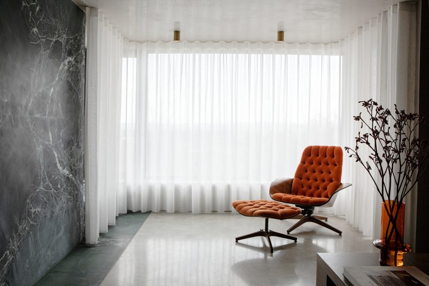
Living space with floor-to-ceiling curtainsLiving space with floor-to-ceiling curtains
The living room follows a similar design to the kitchen

The space, described by the studio as a “sensual red-toned jewel kitchen”, is one of several rooms on the ground floor of Lovers Walk that were designed around the central, oak-lined hallway.

“We used the hallway as the core of the house, which grounded the space with pops of colour stemming from it. Each room leading from the core appears like a framed view or window of colour,” explained Lafferty.
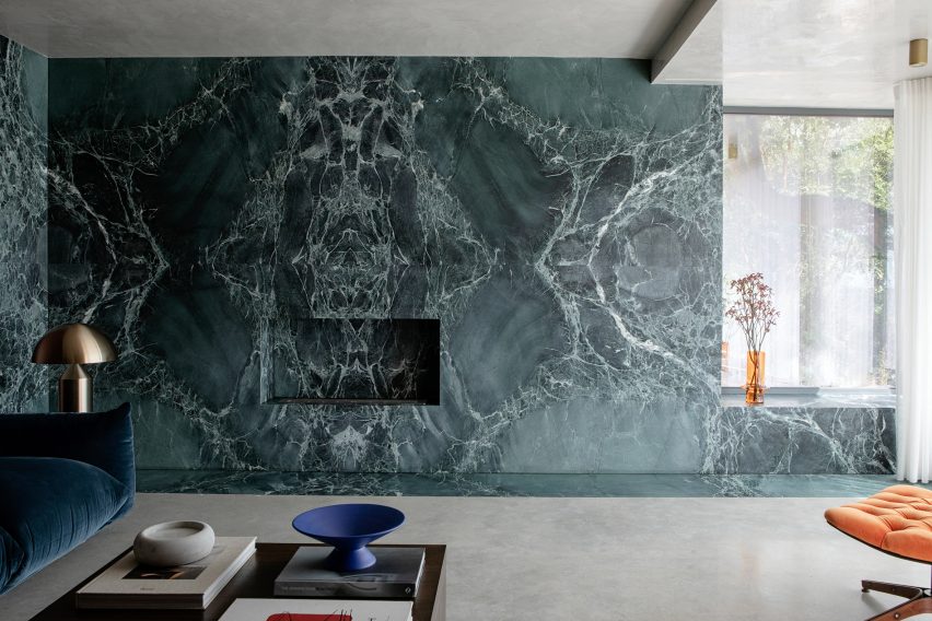
Marble feature wall designed by Kingston Lafferty DesignMarble feature wall designed by Kingston Lafferty Design
It includes a green feature wall that takes cues from Mies van der Rohe’s iconic Barcelona Pavilion

The living room includes blue velvet sofas and a green feature wall clad in swirly book-matched marble, which was fitted with an alcove reserved for a subtle fireplace.

When creating the polished stone wall, the studio took cues from the seminal Barcelona Pavilion, completed in 1929 by modernist architect Mies van der Rohe.
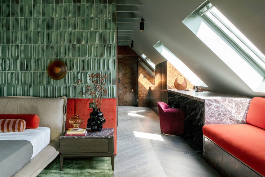
Green headboard in the main bedroomGreen headboard in the main bedroom
A floor-to-ceiling headboard takes centre stage in the main bedroom

“We used green as an overall thread throughout the house, inspired by the surrounding landscape,” added Lafferty.

“Although depending on the time of year, the colours tend to change and so we were able to add in other rich colours that anchor the green such as burgundies and bright oranges,” she added.
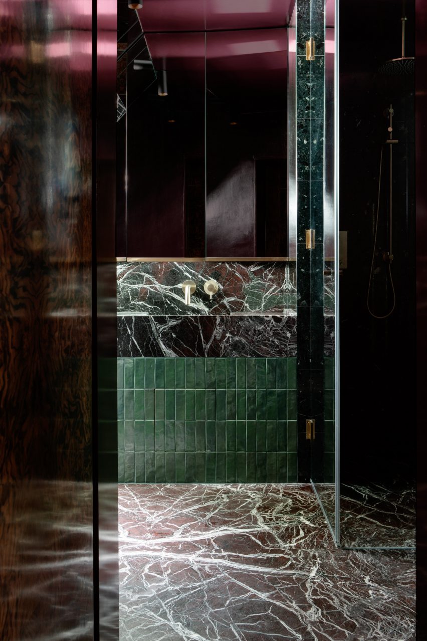
En-suite marble-clad bathroomEn-suite marble-clad bathroom
Stonework also defines the en-suite bathroom

“One would assume this mix of colours would clash, but we choose the tones and textures of each to ensure that all of them would blend harmoniously,” Lafferty said.

Upstairs, the main bedroom and en-suite bathroom were dressed in the same eclectic interiors as the communal spaces. A floor-to-ceiling headboard, finished in diamond-shaped green tiles originally designed by 20th-century architect Gio Ponti, frames the bed.
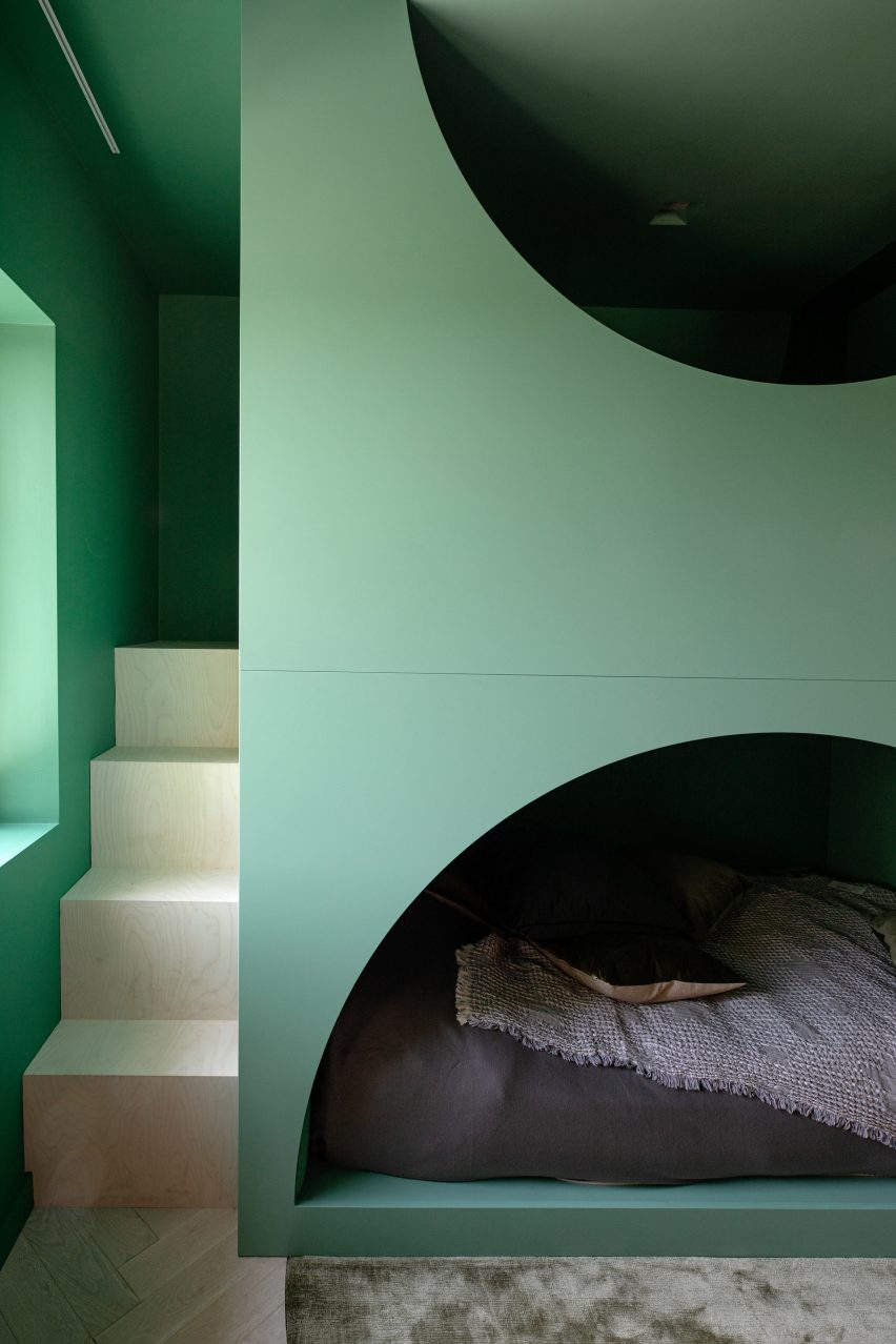
Playful bed design in Lovers Walk by Kingston Lafferty DesignsPlayful bed design in Lovers Walk by Kingston Lafferty Designs
A playful bed was added to the bedroom created for the occupants’ child

Balloon-like coloured glass vases were positioned on two bedside tables, which were topped with the same slabs of Rosso Levanto marble as the geometric vanity desk.

The bedroom designed for the occupants’ child features an alternative bed – a playful green structure with two stacked levels and half-moon openings that reveal a cosy sleeping area on the bottom level.

Other accents featured throughout the home include burl wood, terrazzo, plaster and brass. The repetition of 1970s-style thick pile carpets emphasises the dwelling’s textured material palette.

Lovers Walk is the studio’s “closest nod” to the work of Panton, explained Lafferty – “down to the selection of every tile, light fitting and exquisite piece of designer furniture”.
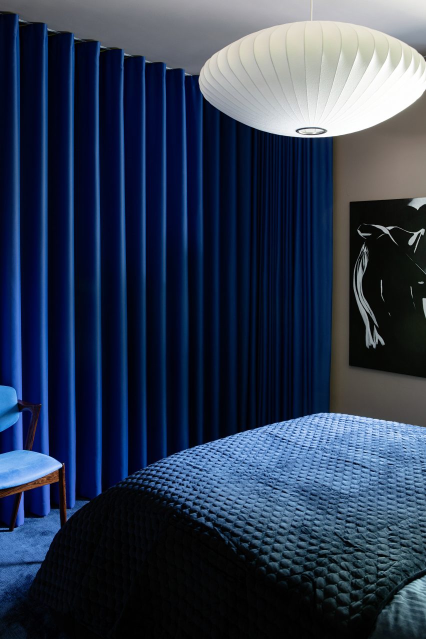
Deep blue-coloured guest bedroom by Kingston Lafferty DesignDeep blue-coloured guest bedroom by Kingston Lafferty Design
Deep blues characterise the guest bedroom

“Although there is such an array of materiality, it is balanced by repeated colour, shape and form,” she said.

“Every space in this house is an assault on the senses, in the best way possible.”
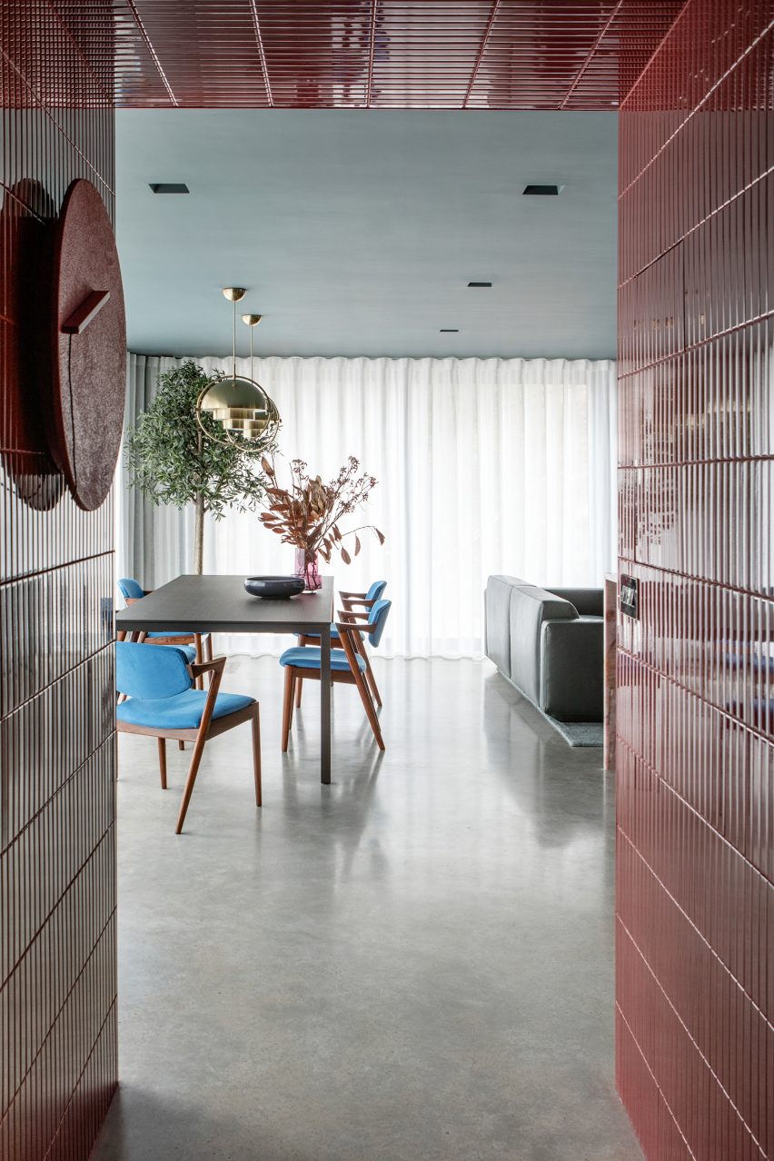
Lovers Walk by Kingston Lafferty DesignLovers Walk by Kingston Lafferty Design
Lovers Walk was informed by the work of Verner Panton

Founded in 2010, Kingston Lafferty Design has completed projects ranging from a Dublin restaurant with oversized lollipop-like lamps and a co-working office in Belfast that includes a yoga studio.

The photography is by Ruth Maria Murphy


Project credits:

Interior architecture and design: Kingston Lafferty Design
Woodwork: DFL
Stonework: Miller Brothers


Reference

A mixer for life: the kitchen appliance you can repair and upgrade
CategoriesSustainable News

A mixer for life: the kitchen appliance you can repair and upgrade

Spotted: The electronic devices and appliances industry is in the bottom ten of Kantar’s 2023 Sustainability Sector Index (SSI) rankings, which means it has inherent issues and needs radical innovation. German startup Open Funk is providing that innovation for one type of electronic appliance: the kitchen mixer or blender.  

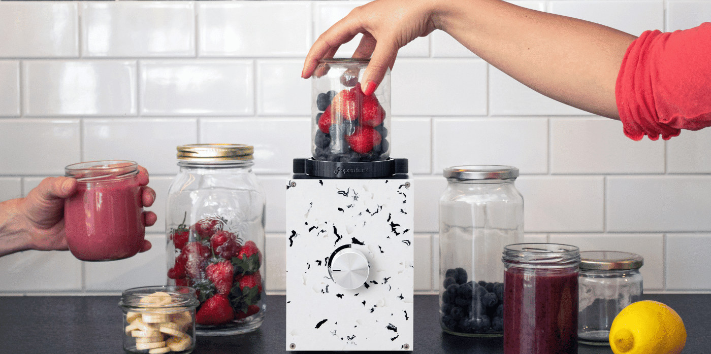
The company has created a blender, called Re:Mix, which has a customisable casing and is made from 100 per cent recycled plastic. The device is made up of modular components to enable the easy repair and upgrading of parts – either at the company’s Berlin workshop or at home. At-home repairs like this are possible thanks to the device’s open-source design.  

The blender works with any of a customer’s standard twist-off glass jars, provided they have the right-sized opening. And if a customer no longer wants their Re:Mix, Open Funk will buy it back for refurbishment and resale. 

The idea for Open Funk came when co-founder Paul Anca attempted to fix a blender that had broken within months of purchase. Unable to carry out the repairs himself, and determined not to add to the millions of tonnes of e-waste that is generated each year, he took it to a repair shop and was quoted €50 “just to have a look at it.”  

Spurred on by this unsatisfactory experience, Anca and his co-founder Ken Rostand devoted themselves to understanding how blenders are put together and why they break. Crowdsourcing broken blenders from Facebook, the pair discovered that the root of the problem lay in cheap materials and the gluing together of components for rapid assembly. The result of their inquiries was Re:Mix, which is made to be repaired and upgraded, with parts replaced over time.  

Selected earlier this year as a participant in Amazon’s Sustainability Accelerator, Open Funk has since sent out its first batch of orders.

Springwise has spotted other innovators taking kitchen appliances to the next level, including a novel, low-energy cooking device and a countertop compost machine.

Written By: Matthew Hempstead

Reference

Eight kitchen islands that have sleek waterfall edges
CategoriesInterior Design

Eight kitchen islands that have sleek waterfall edges

For our latest lookbook, we spotlight eight contemporary kitchens that centre on islands with waterfall countertops made from concrete, stone and chunky terrazzo.

As its name suggests, a waterfall edge is a style of kitchen island or cabinet where the countertop appears to flow seamlessly from the surface to the ground.

The feature, also known as a mitred end, is popular in contemporary kitchens as it is an easy way to create a focal point while retaining a sleek, pared-back aesthetic.

As revealed by this lookbook, they are particularly impactful when made from materials such as marble and concrete, which give rise to sculptural, monolithic centrepieces.

This is the latest in our lookbooks series, which provides visual inspiration from Dezeen’s archive. For more inspiration see previous lookbooks featuring living rooms with striking art pieces, colourful bedrooms and living rooms with cowhide rugs.


Oak and marble kitchen of Botaniczna Apartment by Agnieszka Owsiany Studio
Photo is by Pion Studio

Botaniczna Apartment, Poland, by Agnieszka Owsiany Studio

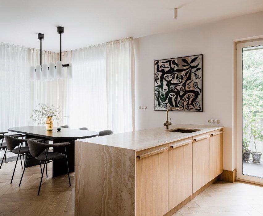
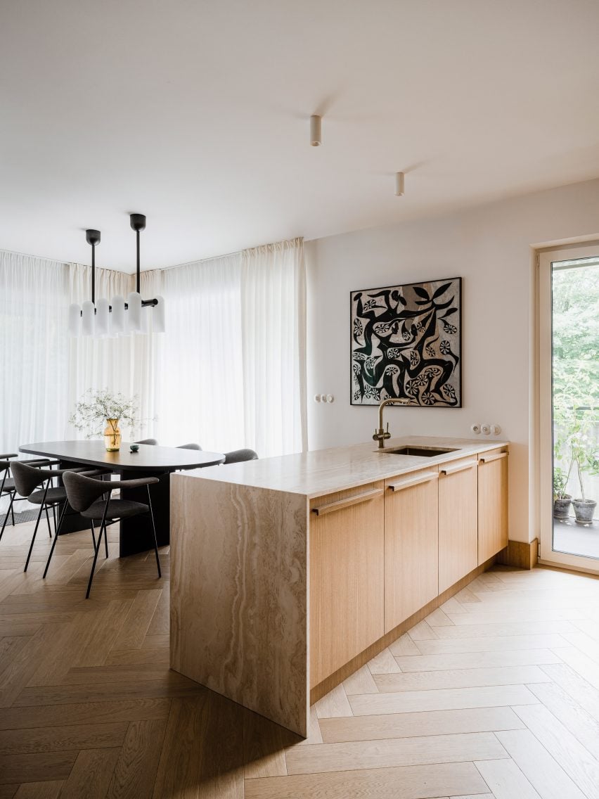
Agnieszka Owsiany Studio draped travertine over a series of oak cupboards to form this kitchen island. The wood helps accentuate the warm tones of the stone, which the studio chose because of its soothing and timeless qualities.

“I really wanted to create something timeless, hence the idea to use materials such as wood and travertine which age beautifully and hopefully won’t be replaced within many years,” said the studio’s founder Agnieszka Owsiany.

Find out more about Botaniczna Apartment


Kitchen island with a waterfall countertop
Photo by Megan Taylor

Sunderland Road, UK, by 2LG Studio

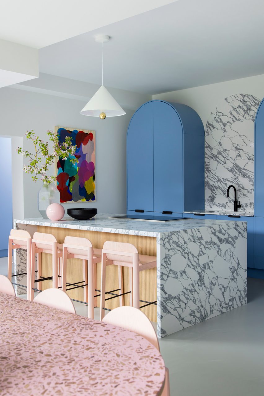
Sky-blue cabinetry offers a calm backdrop to the bold waterfall countertop in this kitchen, designed by 2LG Studio.

Made of white marble with grey veins, it extends over both ends of a wood-clad kitchen island and incorporates a hob for cooking. The countertop was paired with pink bar stools and is illuminated by a Cherry Pendant light by designer duo Daniel-Emma.

Find out more about Sunderland Road


Kitchen of Lake Geneva Residence by Collective Office
Photo by Mike Schwartz

Lake Geneva Residence, USA, by Collective Office

Concrete was used to form the mitred end of this kitchen island, creating a centrepiece that juxtaposes the light and natural look of its wood-lined surroundings.

It is complemented by matching concrete countertops on the adjacent wooden cabinets and incorporates a sink within its surface.

Find out more about Lake Geneva Residence


Kitchen island with mitred end in Montauk house by Desciencelab
Photo by Danny Bright

Montauk House, USA, by Desciencelab

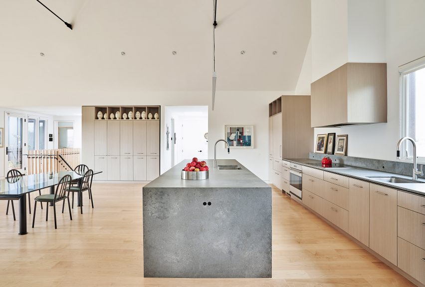
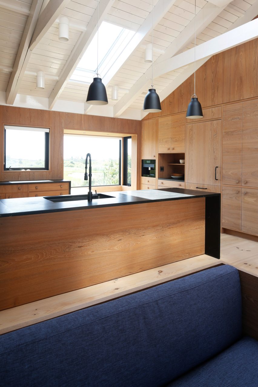
A black countertop overrides the wood-lined base of this central unit, found in the kitchen of a gabled house in Montauk, recently overhauled by Desciencelab.

Standing out against the surrounding wooden cupboards, it helps to demarcate the food preparation area within the open-plan room, which also contains the dining and living areas.

Find out more about Montauk House


Kitchen with a stone island and timber ceilings and floors
Photo by José Hevia

Paseo Mallorca 15 Apartments, Spain, by OHLAB

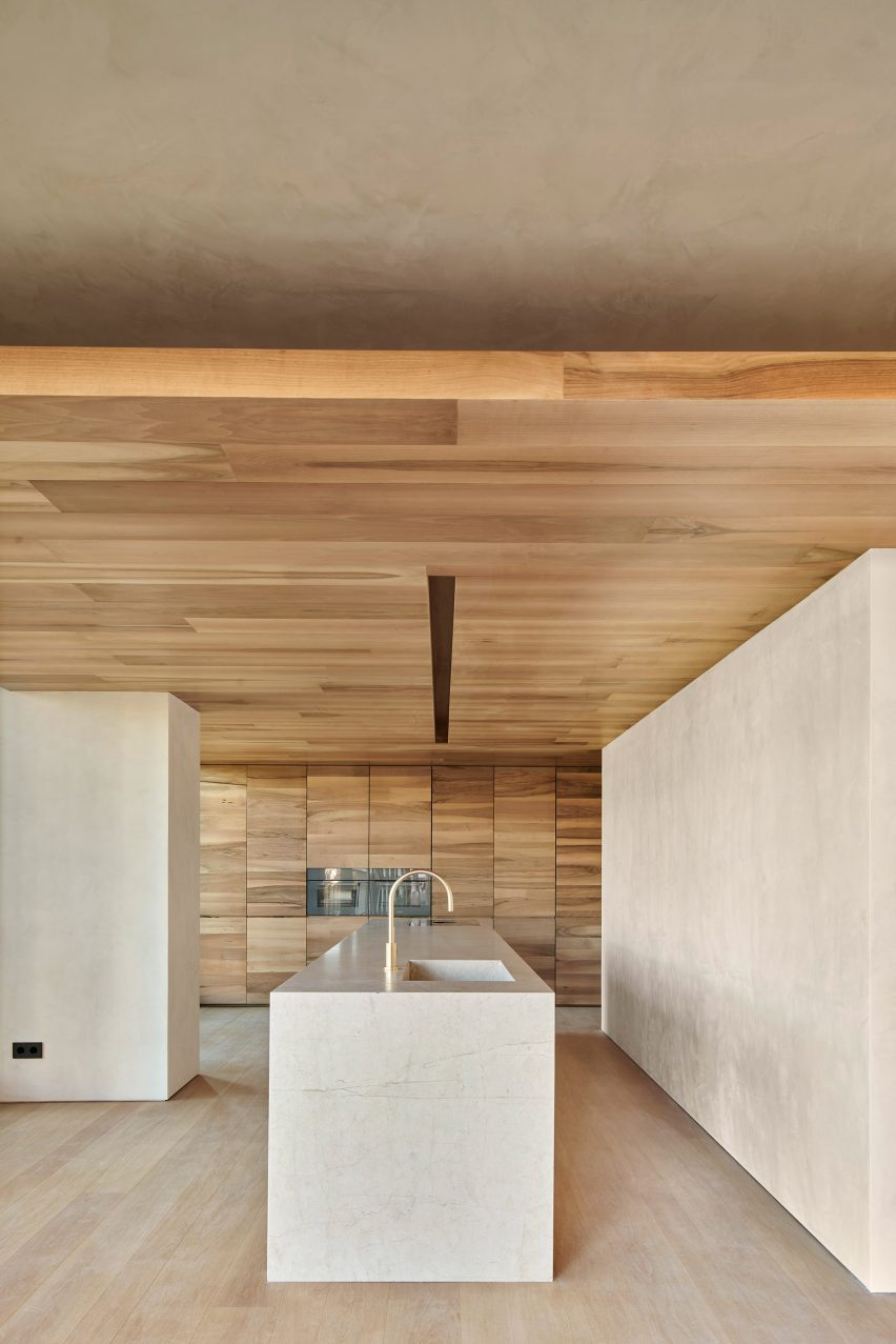
This clean-cut stone island is located in the light and airy interior of an apartment in a housing block in Mallorca.

Its minimalist aesthetic was paired with a more tactile material palette of rough plaster, dark wood and rustic fittings in the rest of the home, which OHLAB chose as a reflection of its Mediterranean setting.

Find out more about Paseo Mallorca 15 Apartments


Wooden kitchen with waterfall countertops
Photo by Daniëlle Siobhán

Family Home Zwaag, Netherlands, by DAB Studio

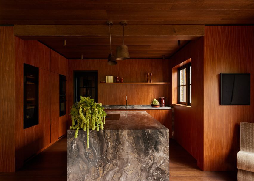
The sculptural waterfall countertops in this kitchen are formed from striking Arebescato Orobico marble.

Its earthy brown and grey tones are enhanced by the warm colours of the surrounding Afromosia wood joinery and oak ceilings and floors, which form part of DAB Studio’s wider “calm yet soulful” material palette.

Find out more about Family Home Zwaag


Terrazzo island in Glyn House extension designed by Yellow Cloud Studio
Photo courtesy of Yellow Cloud Studio

Glyn House, UK, by Yellow Cloud Studio

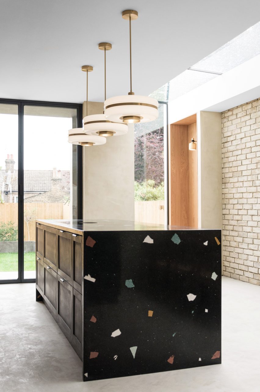
Oversized chunks of colourful aggregate were used to create the terrazzo finish of this statement kitchen unit, which is located in Glyn House by Yellow Cloud Studio in London.

Its waterfall edge conceals a series of black-painted drawers with silver handles and helps to “intensify the experience of raw, handmade surfaces” throughout the interior, the studio said.

Find out more about Glyn House


Kitchen with granite island
Photo by Fabián Martinez

Loma Residence, Mexico, by Esrawe Studio

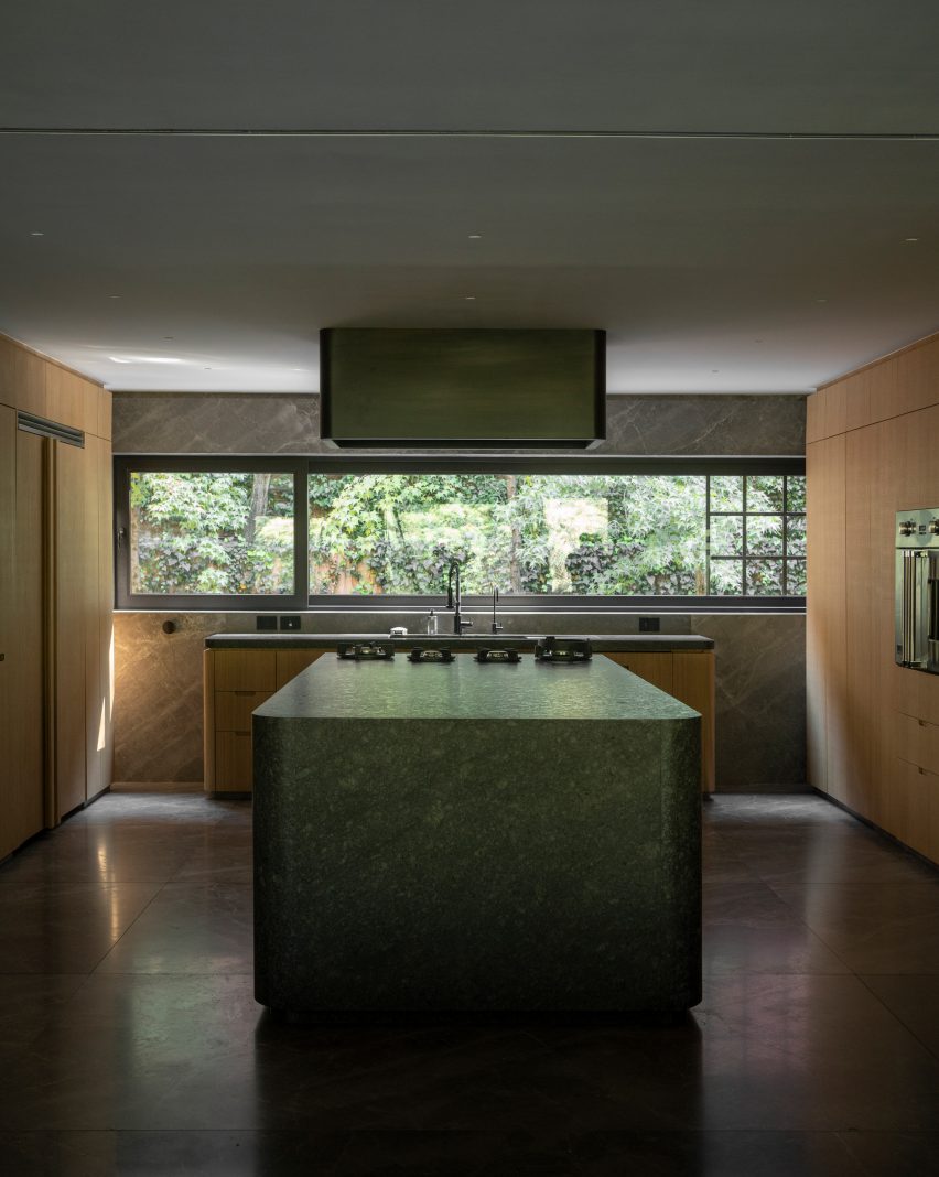
Curved sides and mitred ends soften the look of this monolithic kitchen island, which Esrawe Studio created as part of its remodelling of an apartment in Mexico City.

The unit sits in the centre of the home’s kitchen and was formed from a striking green-toned granite that pops out against its neutral surroundings.

Find out more about Loma Residence

This is the latest in our lookbooks series, which provides visual inspiration from Dezeen’s archive. For more inspiration see previous lookbooks featuring living rooms with striking art pieces, colourful bedrooms and living rooms with cowhide rugs.

Reference

DAB Studio lines kitchen of Dutch home with oak and Afromosia wood
CategoriesInterior Design

DAB Studio lines kitchen of Dutch home with oak and Afromosia wood

Dutch interior design practice DAB Studio has transformed the kitchen of a family home in Zwaag, the Netherlands, by covering the floors and ceiling in one type of wood and the walls and cabinets in another.

DAB Studio aimed to create a “calm yet soulful” interior with an earthy colour palette made up of tan and neutral shades.

Kitchen interior by DAB Studio with wood-lined walls, floors and cabinets
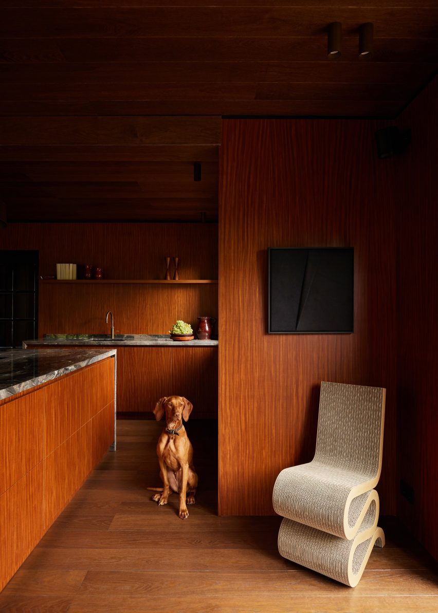
Quarter-sawn Afromosia wood lines the walls and kitchen units

The floors and ceiling were covered in hand-scraped oak with a smoked and black-oiled finish, laid in a pattern of side-by-side plank pairs.

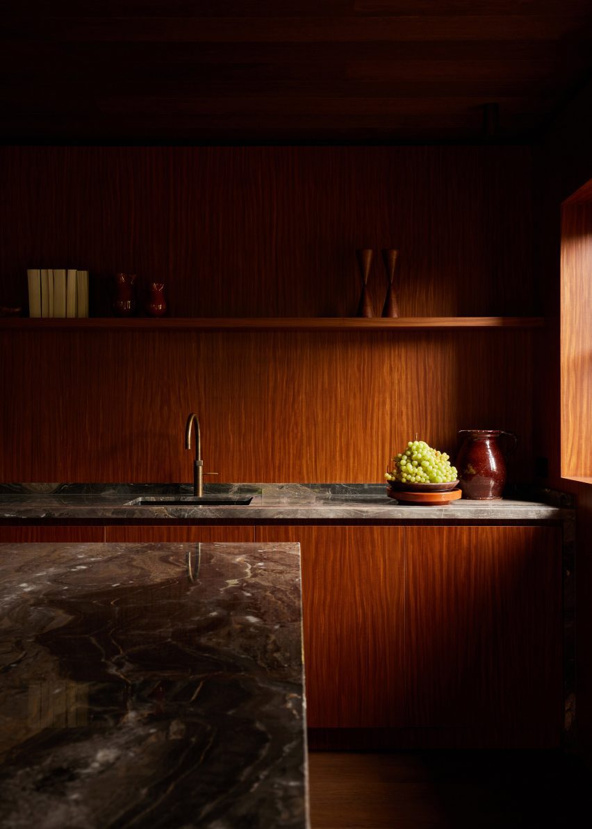
Afromosia wood, a tropical hardwood native to west Africa, was applied to the walls and cabinets. The wood was quarter sawn to create a decorative grain pattern and add a sense of playfulness to the interior.

Wood-lined dining room with a built-in seating nook
Oak planks were laid in side-by-side pairs on the floors and ceiling

DAB Studio co-founders, Lotte and Dennis Bruns, designed the interior to be a space that would balance “feminine and masculine elements” and reflect both of the owners’ design tastes.

According to the duo, the repeating wood choices for the different surfaces give the space a sense of completeness.

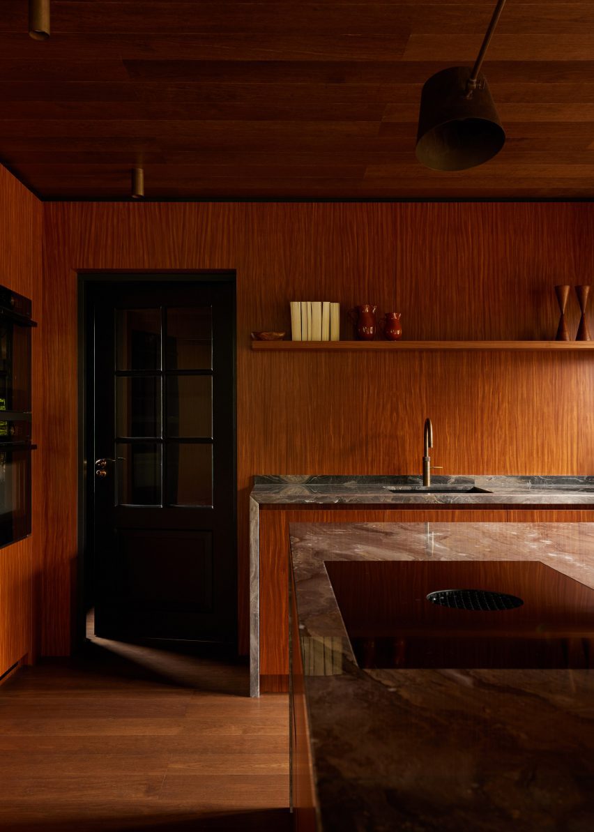
Wood-lined kitchen with a black door and marble worktops
Marble worktops extend down the sides of the kitchen units

“Per the client’s request, we wanted to merge the feminine and masculine vision of their new home, balancing each other out in one curated space,” the co-founders told Dezeen.

“This allowed us to create unique areas in line with our client’s habits and interests while imbuing the space with a sense of spaciousness and lightness.”

“In order to merge all elements of the design, it felt important to prioritise the theme of consistency,” the duo added.

“For that particular reason, the wood of the floor is repeated on the ceiling, and the wood used for cabinetry is continued into the walls of the room.”

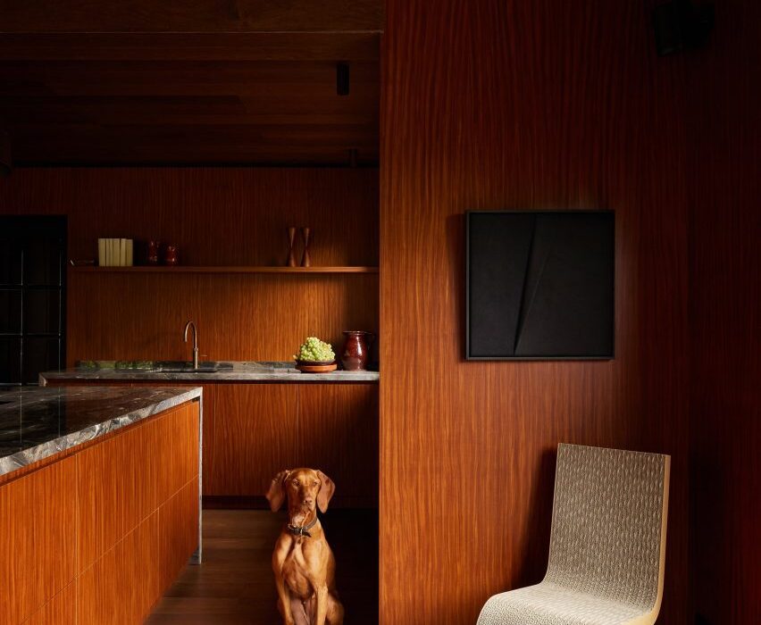
The centrepiece of the kitchen is the island, which features Afromosia wood cabinet doors and a waterfall countertop made from Arebescato Orobico marble.

Wood cabinets along one kitchen wall were also topped with a marble worktop, which extends down one side to frame the unit.

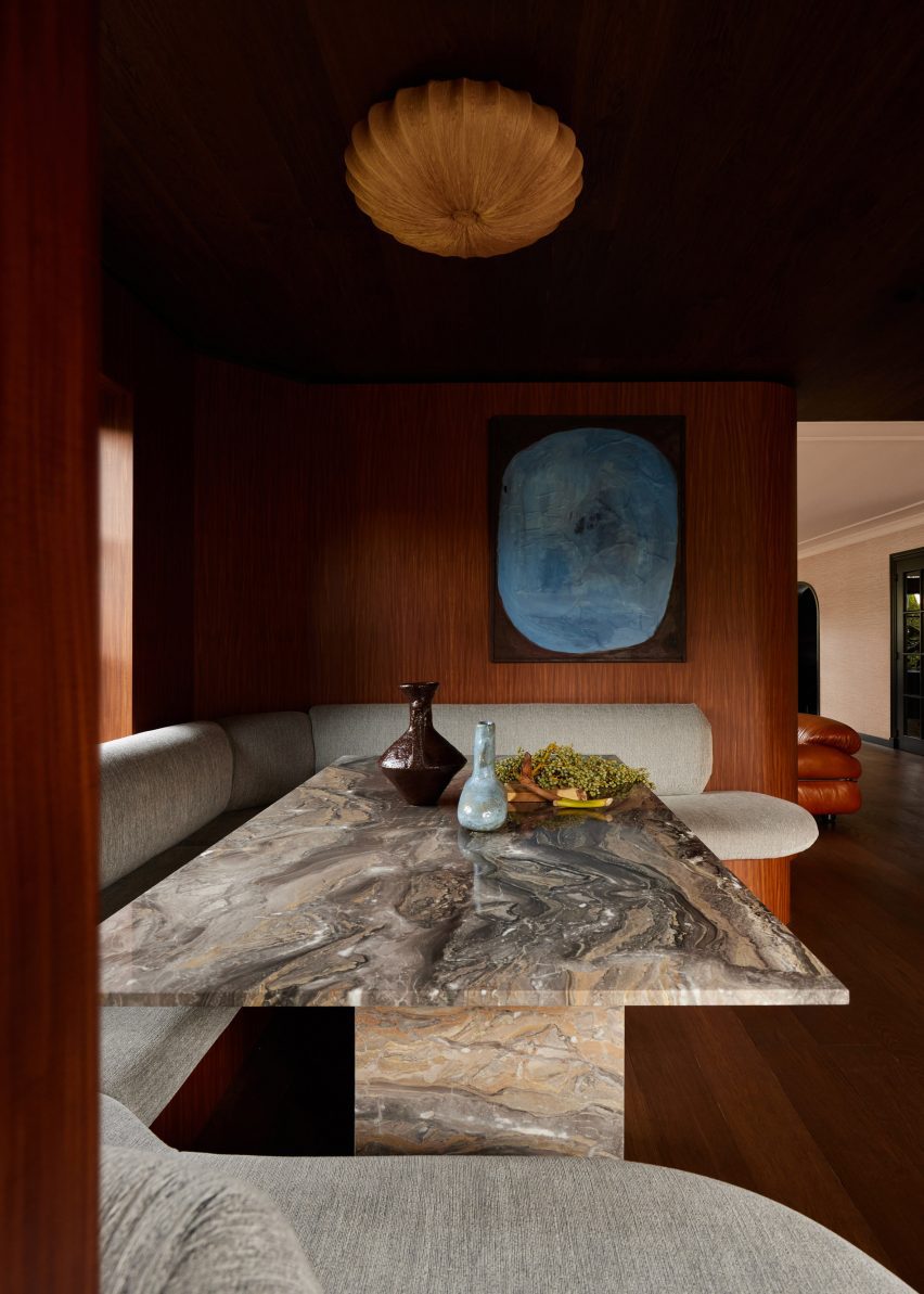
Wood-clad seating nook with upholstered seating and a marble table by DAB Studio
The studio balanced “masculine and feminine” elements in the interior

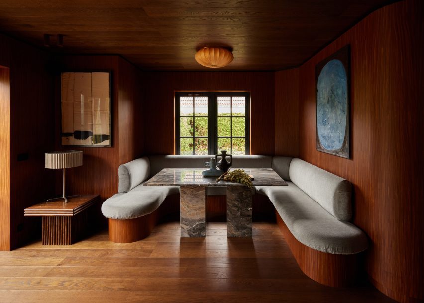
DAB Studio added a dining nook below a window, designed to be a space flooded with natural light where the family can gather.

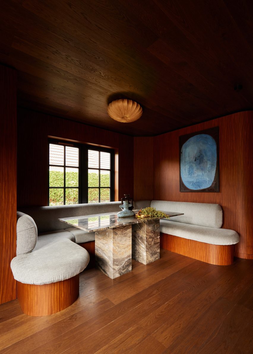
Seating with rounded corners wraps the three walls of the nook. The seating base was covered in the same wood as the interior walls, while the seat and backrest are covered in plush upholstery.

Wood-lined kitchen by DAB Studio with marble worktops
The quarter-sawn Afromosia wood creates a decorative grain

At the centre of the nook, a rectangular table with two blocky legs made from Arebescato Orobico marble contrasts the rounded seating.

“The dining nook is where the family can spend time together, welcome new conversations, and create core memories,” said Lotte and Dennis Bruns.

“The asymmetrical built-in banquette seating feels inviting with its round edges, and adds a dynamic feel to the space.”

Banquette seating in a dining room nook with wood flooring, ceiling and walls by DAB Studio
The dining nook sits below a window

Decorative items and free-standing furniture were introduced to the interior to add more rounded elements, including a Wiggle Chair by Frank Gehry.

Elsewhere in the Netherlands, Francois Verhoeven Architects has created a bungalow clad in vertical timber slats and Julia van Beuningen added a plywood staircase to a barn conversion.

The photography is by Daniëlle Siobhán.

Reference

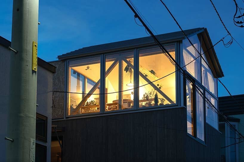
yoshichika takagi tops hokkaido house with ‘greenhouse’ kitchen
CategoriesArchitecture

yoshichika takagi tops hokkaido house with ‘greenhouse’ kitchen

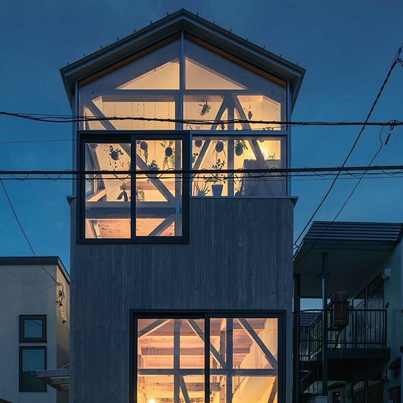
hokkaido dwelling opened with loft spaces


A typical 1975-built row house in Hokkaido has been renovated by Yoshichika Takagi + Associates to introduce a pair of modern, sunlit student dwellings and studio spaces. With its contemporary intervention, the architects sought to open up the existing structure, which long stood with dark interiors, low ceilings, and a light layout which included four cramped living units. The team notes that the structure had even been extended against local building code, which needed to be corrected. Thus, a section of the house was cut back while a rooftop ‘shed’ was added to houses a stairwell and spacious bedroom loft.

yoshichika takagi hokkaido houseimages © Yoshichika Takagi


yoshichika takagi makes the most of a compact site
 

One of the primary goals of Yoshichika Takagi’s renovation in Hokkaido was to reduce the number of households from four to two while updating the entire house to provide a modern lifestyle despite its compact size. The team considered the site’s proximity to a streetcar line and aimed to create a structure that could be adaptable for future conversions. Although the building was situated in a densely populated residential area, the east side offered an open garden across the street.


The architects decided to capitalize on this borrowed landscape by incorporating glass walls to actively connect the interior with the garden. On the west side, the building boasted views of Mt. Moiwa, a prominent symbol of Sapporo, inspiring the architects to design spaces that could make the most of the strong western sunlight that left a lasting impression.

yoshichika takagi hokkaido house


Balancing Privacy and Connectivity in Design


Considering the potential conversion of the first floor into a SOHO (Small Office/Home Office), the architects at Yoshichika Takagai + Associates  designed the front portion of the ground floor to be open and connected to the street while ensuring privacy in the further back areas. To maintain a balance between openness and privacy, the large windows were positioned higher up, offering a connection to the city while also considering external lines of sight.


Embracing Hokkaido’s traditional approach to creating a warm and stable environment for harsh winters, the first floor followed these practices. In contrast, the second floor featured three rooms with different environmental characteristics arranged in series, providing a flexible and nomadic living space that can be adapted according to the climate.

yoshichika takagi hokkaido house


Design Elements Inspired by Scandinavian Winter Living


Drawing inspiration from Scandinavian winter living rooms, which offer comfort and safety even during severe cold waves, this renovated house also incorporated a ‘winter living room’ on its west side. With high insulation performance and limited openings, this space ensured a stable indoor environment. Adjacent to the winter living room was the ‘summer living room,’ a private space enclosed by walls. While not insulated, it was protected from the wind and rain by a tarp, primarily used during mild seasons and even in winter, when people gathered for events and barbecues, donning appropriate clothing.


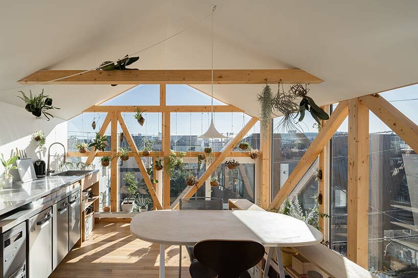
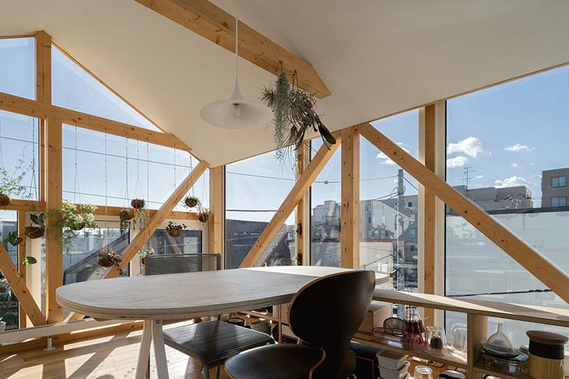
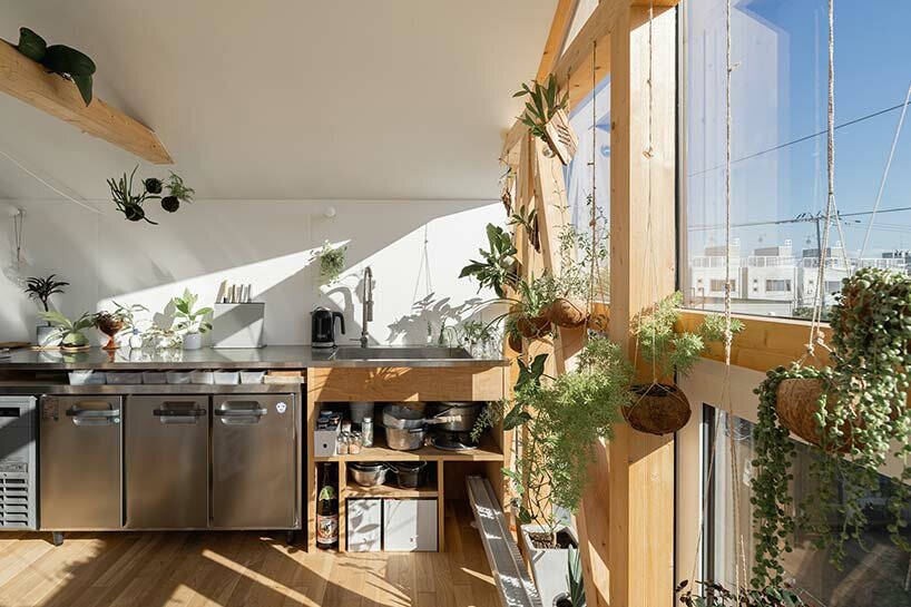
Another unique feature was the ‘greenhouse kitchen,’ which faced the city through a glass wall, creating a living-on-the-street feel. This space, however, experienced significant temperature fluctuations due to sunlight, making it challenging to control the indoor climate. Nevertheless, the evergreen appearance throughout winter and the ability to witness the beauty of a blizzard from within the space provided a joyful living experience that transcended minor inconveniences.

yoshichika takagi hokkaido house yoshichika takagi hokkaido house

Reference

Wine-red kitchen forms centrepiece of apartment by Hauvette & Madani
CategoriesInterior Design

Wine-red kitchen forms centrepiece of apartment by Hauvette & Madani

Interior design studio Hauvette & Madani has made a sumptuous wine-red kitchen the focus of this otherwise neutral apartment in Paris.

The Republique apartment is set within a typical Haussmann-era building in the French capital’s 11th arrondissement and belongs to a family with two children.

From the outset of the renovation, the clients called for the home to orbit around a “spectacular” atmospheric kitchen.

Republique apartment by Hauvette & Madani features red kitchen
A wine-red kitchen is the focal point of the Republique apartment

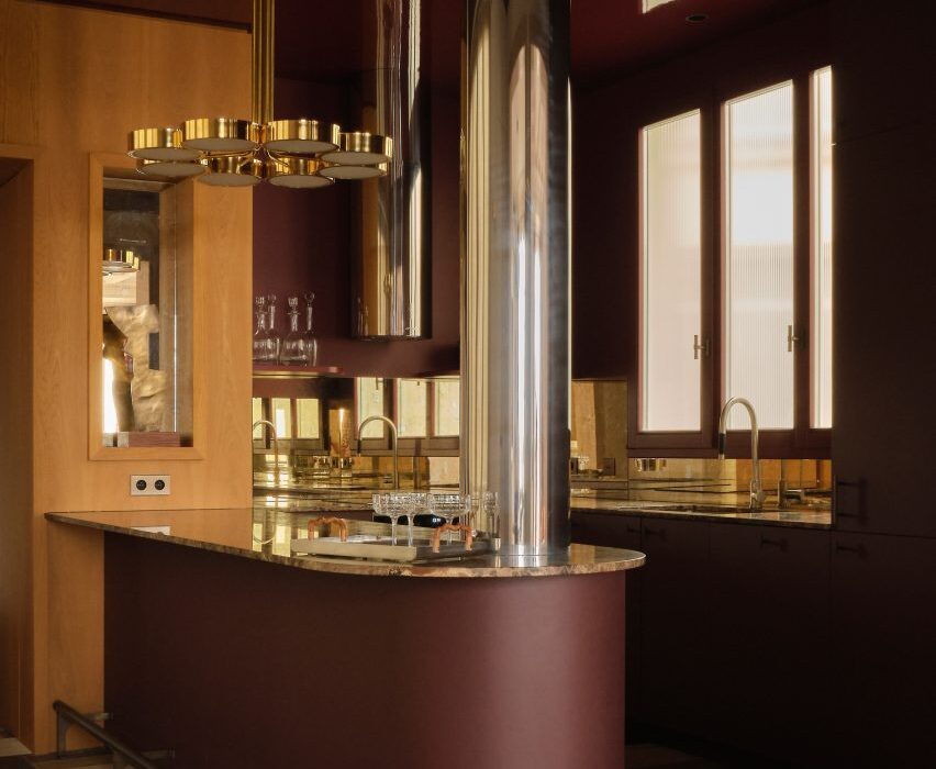
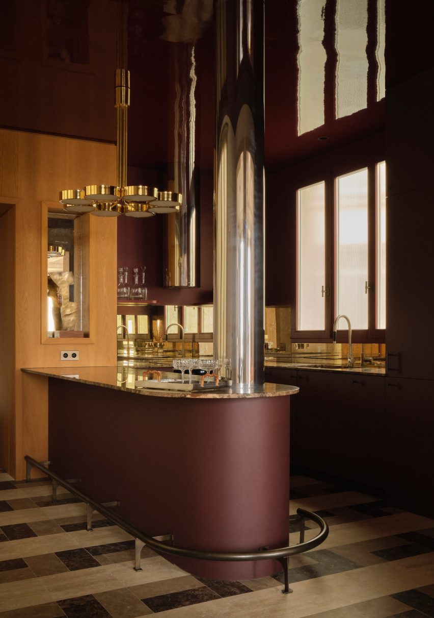
Hauvette & Madani responded by using a striking colour scheme, rendering all of the kitchen’s linoleum cabinets and its curved breakfast island in a wine-red colour. The same shade was also applied to the ceiling but in a glossy lacquer.

“We wanted a dark but joyful colour and ended up deciding on this substantial red,” founders Samantha Hauvette and Lucas Madani told Dezeen. “We also love the fact [the colour’s] eccentricity matches the rest of the calm and soft apartment.”

Living room interior of Republique apartment by Hauvette & Madani
Spaces are connected by travertine-framed doorways

Lustrous decorative elements such as an aged-mirror splashback and brass light were also introduced to the space, and a support column was wrapped in stainless steel.

The room’s original wooden flooring was overlaid with travertine and Emperador marble tiling.

Living room interior of Republique apartment by Hauvette & Madani
Shades of beige can be seen throughout the living room

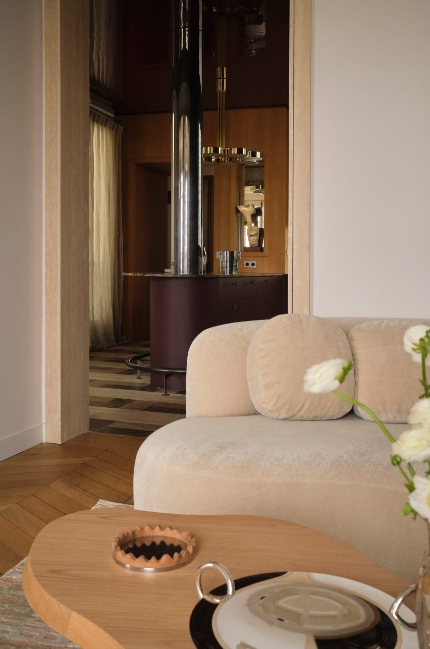
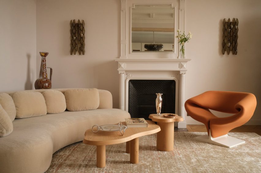
A travertine-framed doorway looks through to the adjacent living room, where walls were painted an oatmeal beige, matching a bean-shaped velvet sofa from French brand Pierre Augustin Rose.

A pair of wriggly-edged oak coffee tables and a terracotta-coloured edition of French designer Pierre Paulin’s Ribbon chair were also used to dress the space.

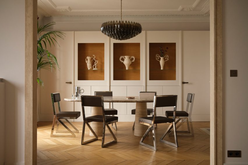
The dining room next door is centred by an oval travertine table, around which steel-framed leather seats have been arranged. At the rear of the room is a tall white dresser inset with oak-lined niches where ornaments or artworks can be displayed.

A Murano glass chandelier hangs from the ceiling, where ornate moulding was carefully preserved.

Dining room interior of Republique apartment by Hauvette & Madani
The nearby dining room has a travertine table at its centre

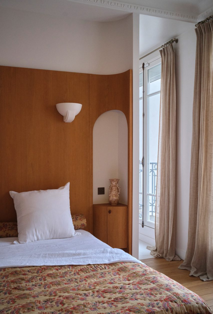
The project also saw Hauvette & Madani refresh the parents’ bedroom, which now features 1930s-style lighting and a bespoke oak headboard. This winds around the back of the room and has arched cut-outs that accommodate bedside tables.

A walnut-wood vanity cabinet and vintage Italian mirror were also fitted in its en-suite bathroom.

Bedroom interior of Republique apartment by Hauvette & Madani
A bespoke oak headboard was installed in the parents’ bedroom

Often considered the heart of the home, the kitchen is where architects and designers enjoy getting playful with colour.

Other examples include the kitchen inside Sans-Arc Studio’s Plaster Fun House, where a pink terrazzo breakfast island contrasts duck egg-blue cabinetry.

And the kitchen within this Belgian apartment by Carmine Van Der Linden and Thomas Geldof features birch wood cupboards that were stained a murky hue of green.

The photography is by Yannick Labrousse

Reference

Eight pared-back and elegant Scandinavian kitchen designs
CategoriesInterior Design

Eight pared-back and elegant Scandinavian kitchen designs

For our latest lookbook, we’ve collected eight peaceful kitchens with Scandinavian design details, in homes including a chalet in Belgium and a forest retreat in Sweden.

Plenty of wood and stone, minimalist details and practical solutions make these eight interiors from across the world good examples of Scandinavian kitchen design.

As well as being stylish, the pared-down interiors make for functional, clutter-free kitchens where it is easy to find and use all the items needed to make a meal in a relaxing atmosphere.

This is the latest in our lookbooks series, which provides visual inspiration from Dezeen’s archive. For more inspiration see previous lookbooks featuring outdoor showers, interiors with exposed services and Milanese homes with eye-catching material palettes.


Minimal interiors of forest retreat designed by Norm Architects
Photo by Jonas Bjerre-Poulsen

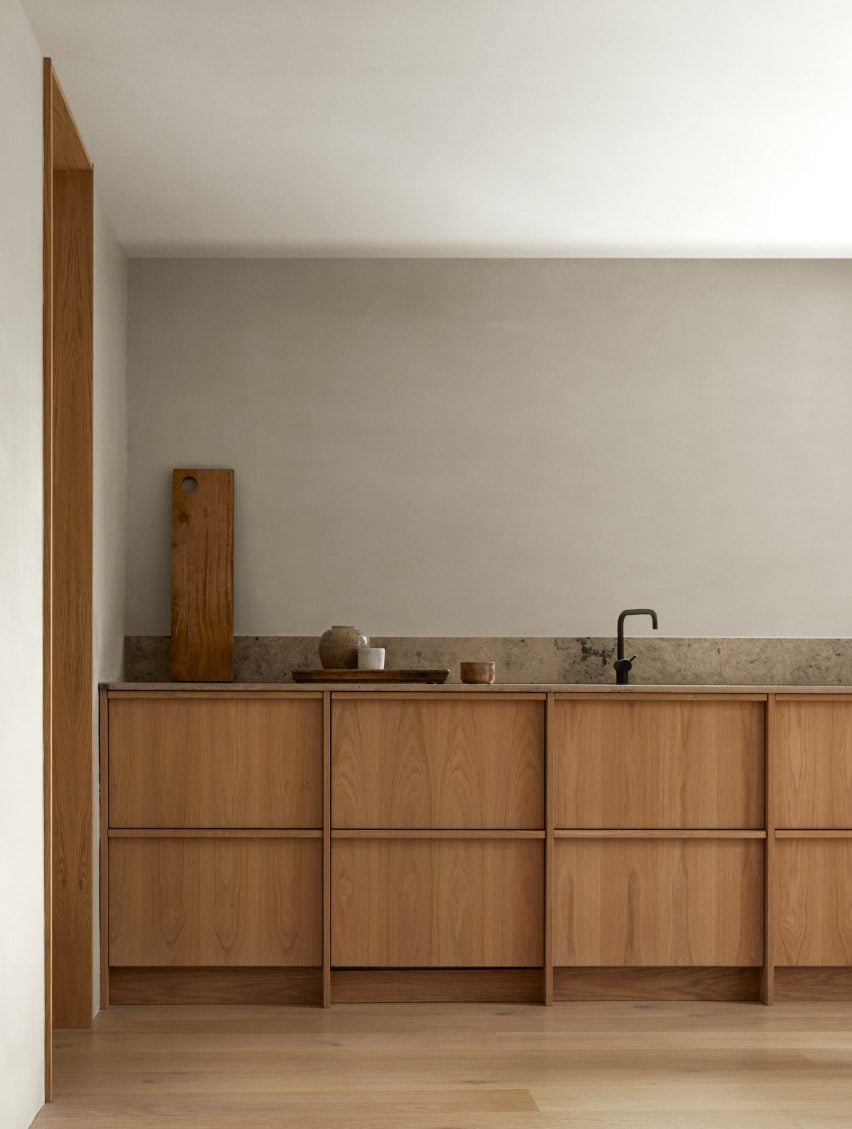
Forest Retreat, Sweden, by Norm Architects

Architecture studio Norm Architects designed this kitchen in a traditional Swedish timber cabin using oakwood to create a warm feel.

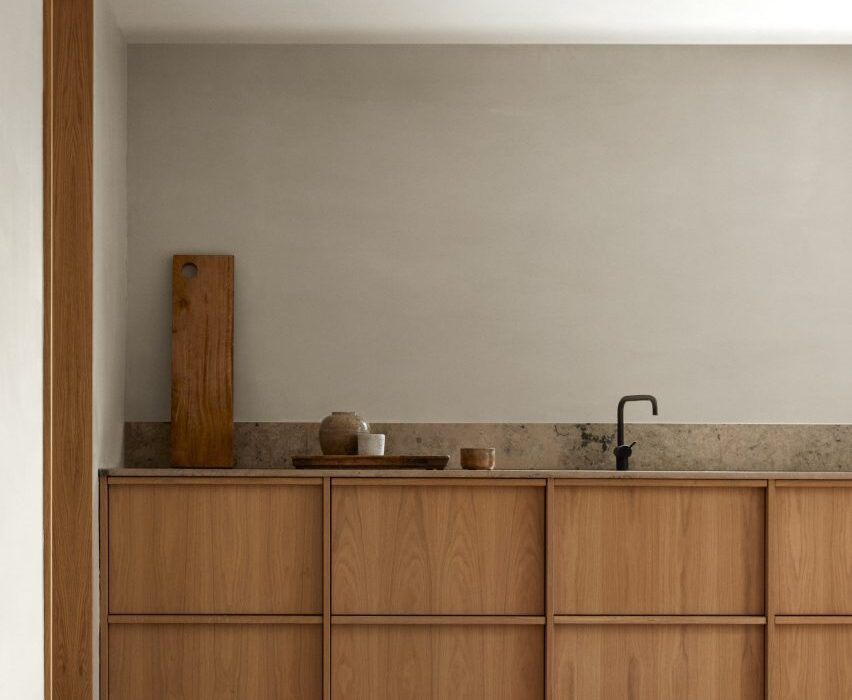
Its discrete handleless low-lying cupboards have plenty of storage space, while a stone splashback is both decorative and functional. A black tap adds graphic contrast.

Find out more about Forest Retreat ›


Kitchen and living room in Villa E by CF Møller Architects
Photo by Julian Weyer

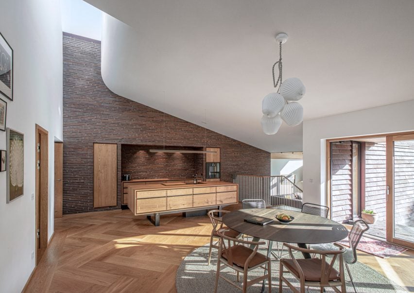
Villa E, Denmark, by CF Møller Architects

A carved lightwell brings light into this sundrenched kitchen in a villa in Denmark. The brick tiles that clad the kitchen wall give the room a tactile feeling.

The floor of the open-plan kitchen is made from herringbone parquet, a style often seen in living room that here gives the kitchen area a more luxurious feel.

Find out more about Villa E ›


Kitchen by Westblom Krasse Arkitektkontor
Photo by Jesper Westblom

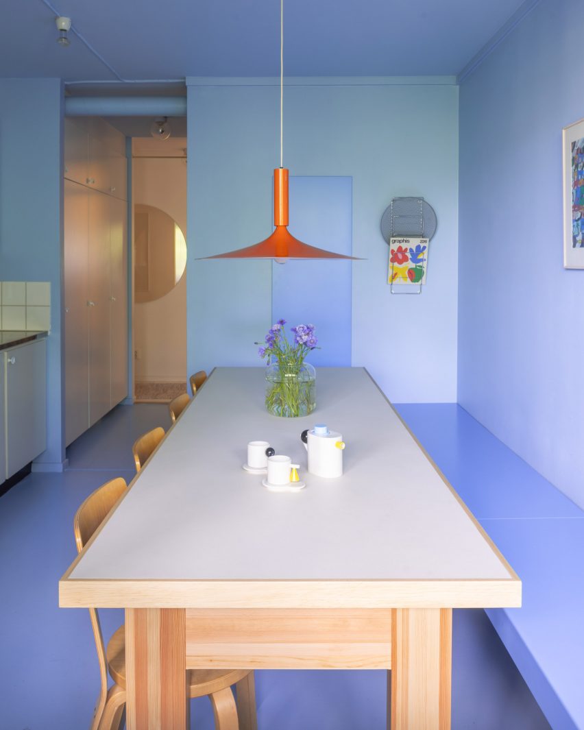
Stockholm apartment, Sweden, by Westblom Krasse Arkitektkontor

This Stockholm flat might be the exception that proves the rule when it comes to Scandinavian kitchen design – that it has to be designed using discrete colours and materials.

Instead, local studio Westblom Krasse Arkitektkontor chose a pale lilac hue for the kitchen, which nevertheless features wooden details in the form of a table and chairs. An orange pendant light contrasts nicely with the monochrome kitchen.

Find out more about Stockholm apartment ›


Vipp V2 kitchen
Photo by Anders Schønnemann

Vipp Pencil Factory, Denmark, by Vipp

Danish homeware brand Vipp used one of its own modular kitchens for Vipp Pencil Factory, a pop-up supper club in Copenhagen.

The dark-brown wood, commonly used in Scandinavian kitchens, contrasts against the grey concrete walls of the former pencil factory and is complimented by glass cabinets and a marble benchtop.

Find out more about Vipp Pencil Factory ›


Habima Square apartment by Maayan Zusman
Photo by Itay Benit

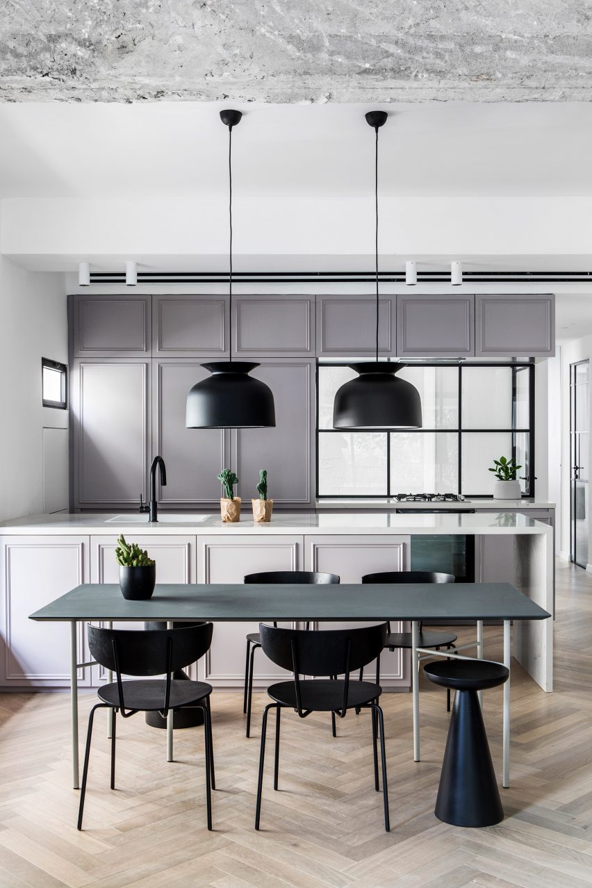
Habima Square apartment, Israel, by Maayan Zusman

Local designer Maayan Zusman renovated this apartment in Tel Aviv using plenty of Scandinavian brands and details, including lamps by Gubi and chairs by Ferm Living.

A pared-back colour palette and Crittal windows that let the light in also give the kitchen a slightly industrial feel.

Find out more about Stockholm apartment ›


House BL, Belgium
Photo by Jeroen Verrecht

Chalet, Belgium, by Graux & Baeyens Architecten

This 1960s chalet in Belgium features light-filled living spaces, including a wood-and-stone kitchen that has plenty of storage spaces and large windows that open up towards a lush garden.

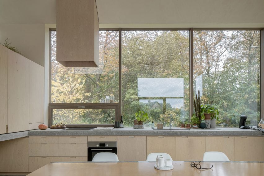
Even the kitchen fan has a plywood cover to ensure it matches the rest of the space.

Find out more about the Belgian chalet ›


Saltviga House by Kolman Boye Architects
Photo by Johan Dehlin

Saltviga House, Norway, by Kolman Boye Architects

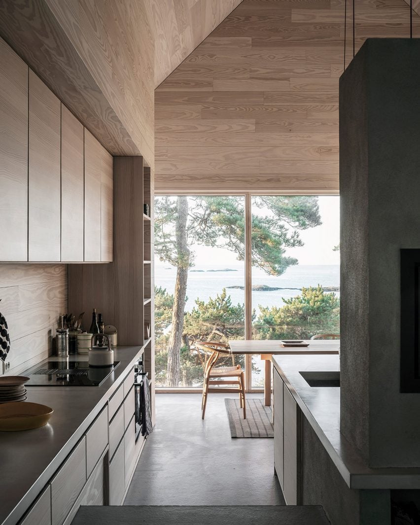
Nicknamed the “house of offcuts” because it has a facade made of offcuts of wooden flooring material, this weekend retreat in Lillesand, Norway, has a kitchen with a view.

The Scandinavian kitchen design is underlined by the use of Danish furniture brand Carl Hansen & Søn’s classic CH24 Wishbone chairs, which have been placed around a wooden dining table.

Find out more about Saltviga House ›


The Hat House by Tina Bergman
Photo by Jim Stephenson

The Hat House, Sweden, by Tina Bergman

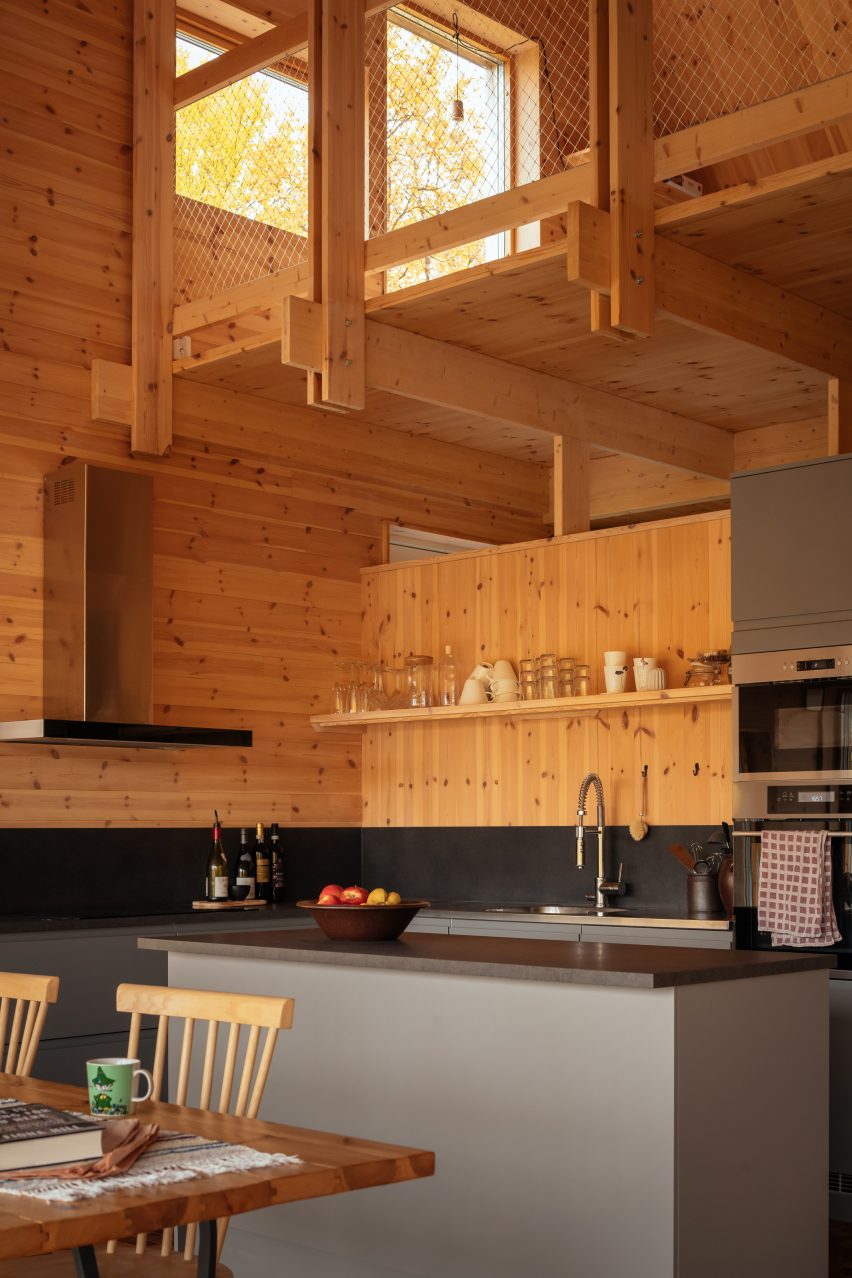
Located in the forested landscape of Tänndalen in western Sweden, The Hat House has a traditional Swedish kitchen with an entirely wood-lined interior.

To save space, a small floating shelf was used to provide open storage, rather than cupboards. Contrasting dark black and grey colours were used for the splashback as well as the kitchen island.

Find out more about The Hat House ›

This is the latest in our lookbooks series, which provides visual inspiration from Dezeen’s archive. For more inspiration see previous lookbooks featuring outdoor showers, interiors with exposed services and Milanese homes with eye-catching material palettes.

Reference

Emil Eve Architects designs small kitchen with space-saving appliances
CategoriesInterior Design

Emil Eve Architects designs small kitchen with space-saving appliances

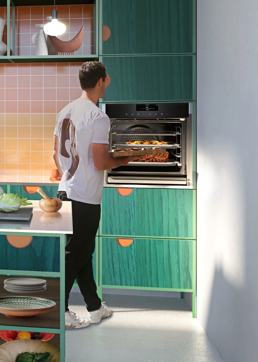
Dezeen has teamed up with Neff to commission London studio Emil Eve Architects to design a small contemporary kitchen using the German brand’s space-saving appliances, including an oven with a fully retractable oven door.

To coincide with the 20th anniversary of the brand’s Slide & Hide oven, which features an oven door that slides away under the appliance, Neff and Dezeen teamed up with Emil Eve Architects to develop a design for a modern kitchen for city homes where space is limited.

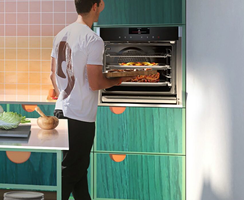
Man using Neff Slide & Hide oven in contemporary green-coloured kitchen
The Slide & Hide oven features a door that can “disappear” under the appliance to gain easy access to food

The design aims to balance smart and functional design that saves space in an imaginative and contemporary style.

“Smart and functional design doesn’t have to mean boring. We love to bring an element of fun to cooking with our appliances,” said Neff.

“Space in city centres comes at a cost, so when that space is limited, design and functionality is essential to love the home you live in.”

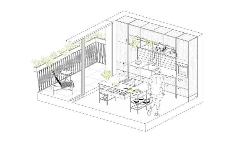
Technical drawing of Emil Eve Architect's small kitchen design
The kitchen was designed to optimise space in smaller city homes

Emil Eve Architects developed the design with the vision of creating a kitchen space for preparing and sharing food, where cooking and eating is a social experience to leisurely spend time.

The guiding principle behind the design was to combine efficiency and ergonomics and to maximise space for smaller city homes. The design features generous shelving for storage and displays, using products that have the ability to seamlessly slide everything away – even the appliances.

“We have greatly enjoyed the challenge of working with Neff to develop a kitchen design for a city centre home, where space is at a premium, but design does not need to be,” said the studio.

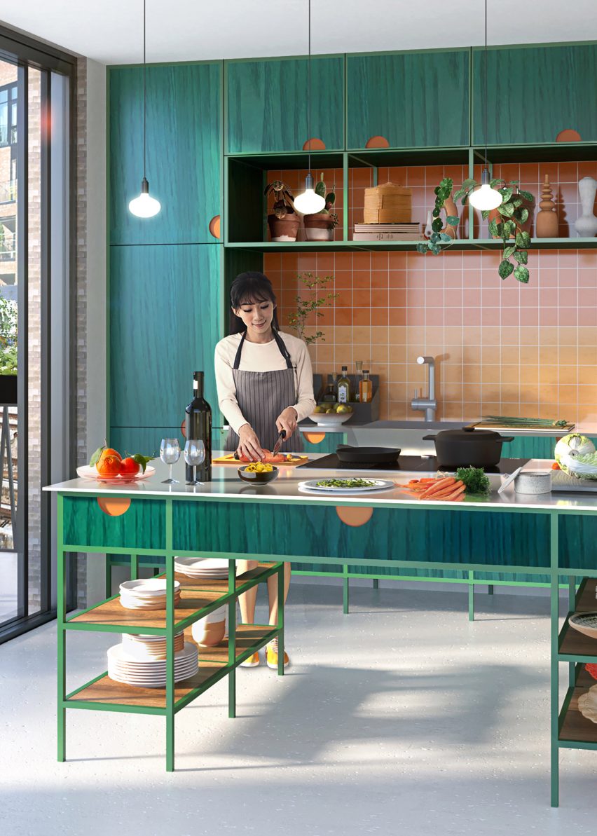
Woman cutting vegetables in contemporary green-coloured kitchen
The kitchen features ample shelving for storage and displays and appliances that can be compacted away

Neff describes its Slide & Hide oven as the “only oven with a fully retracting door” that not only frees up space in the kitchen, but also enables users to get up close to the food to add last-minute additions and allows users to safely retrieve dishes without risk of getting burns.

The built-in oven features a sliding door designed to “disappear” in one swift motion via a rotating handle. It comes in stainless steel or graphite grey with the option of adding steam functions, eco-clean, touch screen displays or be linked with Neff Home Connect app, which enables users to control home appliances remotely via voice commands.

“It’s more than just a technical object, it has a sort of playful component, and it’s simply fun to use,” said Neff vice president of design Ralf Grobleben.

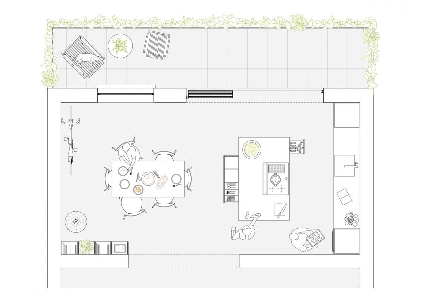
Plan drawing of small kitchen design and balcony by Emil Eve Architects
The design centres around a kitchen island with easily accessible storage

The kitchen features a central island as a contemporary take on a traditional farmhouse kitchen table. The island is equipped with a series of drawers and open shelves where everything is easily accessible.

The traditional kitchen garden is replaced with a richly planted balcony, designed to be a small but productive space elevated above the city.

The architects combined high-quality materials including vibrant stained solid timber fronts that contrast with exposed powder-coated steel and stainless steel work surfaces.

Founded in 1877, Neff develops and produces built-in home appliances for modern kitchens. Its products range from ovens, hobs, extractor hoods to refrigerators, freezers, dishwashers and coffee machines.

Dezeen x Neff

This article was written by Dezeen as part of a partnership with Neff. Find out more about Dezeen partnership content here.

Reference

Ten kitchen interiors with polished granite surfaces
CategoriesInterior Design

Ten kitchen interiors with polished granite surfaces

The durable, stain-resistant qualities of granite make it a choice material for kitchens. Our latest lookbook showcases 10 kitchens on Dezeen that celebrate the light-coloured stone.

Waterproof and scratch-resistant, the igneous rock granite has been used in construction and interior design for centuries.

Today, the versatile material is often used as an alternative to marble to top kitchen counters and work surfaces, as well as in bathrooms or on floors.

From a large grey granite kitchen island in a Mexican apartment to a chevron-patterned granite floor in a London house, the examples below showcase the many ways in which the stone can be used to furnish kitchens.

This is the latest in our lookbooks series, which provides visual inspiration from Dezeen’s archive. For more inspiration see previous lookbooks homes with characterful floating staircases that appear to defy gravity, atriums that brighten and expand residential spaces and calm green bedrooms that showcase the power of natural colours.


Photo is by Federica Carlet

403 Greenwich, US, by Stefano Pasqualetti

A mix of materials including steel, marble, granite and wood were peppered throughout this New York residence, which Italian architect Stefano Pasqualetti aimed to make feel “soothing and timeless”.

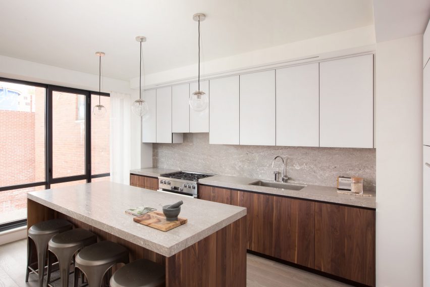
In the open-plan kitchen, which offers views onto Tribeca’s West Historic District neighbourhood, walnut cabinets are fitted with granite worktops while a standout blackened metal staircase runs through the property’s core.

Find out more about 403 Greenwich ›


Grove Park by O'Sullivan Skoufoglou
Photo is by Ståle Eriksen

Grove Park, UK, by O’Sullivan Skoufoglou Architects 

Designed for a client with a keen interest in the outdoors, Grove Park is a terraced house that offers expansive views of the greenery and wild woodland outside.

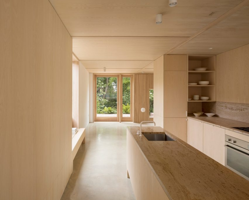
London-based studio O’Sullivan Skoufoglou Architects paired the ash-lined kitchen interior with creamy Shivakashi granite countertops and splashback and polished concrete flooring, which was cast in situ.

Find out more about Grove Park ›


A kitchen with grey granite countertops and wooden shelving
Photo is by Denilson Machado

DN Apartment, Brasil, by BC Arquitetos

Located in a 1970s building in the Jardins neighbourhood of São Paulo, this 230-square-metre apartment was designed for a landscape architect by local studio BC Arquitetos.

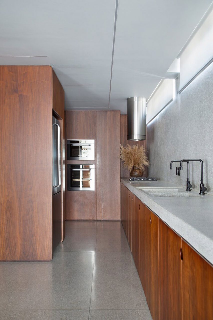
The apartment comprises a primarily warm natural walnut interior that is complemented with harder materials, such as concrete columns, stone flooring and granite countertops. A collection of mid-20th century art adds the finishing touch.

Find out more about DN Apartment ›


308 S Apartment by BLOCO Arquitetos
Photo is by Joana França

308 S, Brazil, by Bloco Arquiteos

Brazilian architecture studio Bloco Arquitetos transformed 308 S, an apartment in Brasília, by removing several walls and reconfiguring the challenging layout to make it more open plan.

To add to the stripped-back look, the architects opted for a neutral colour palette, while pale granite was used for the kitchen and bathroom countertops and flooring.

Find out more about 308 S›


Villarroel apartment by Raul Sanchez Architects
Photo is by José Hevia

Villarroel Apartment, Spain, by Raúl Sánchez Architects

The three main areas inside this apartment in Barcelona are distinguished by contrasting materials rather than traditional walls, making it appear more spacious and flexible.

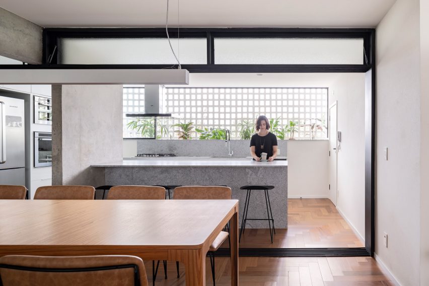
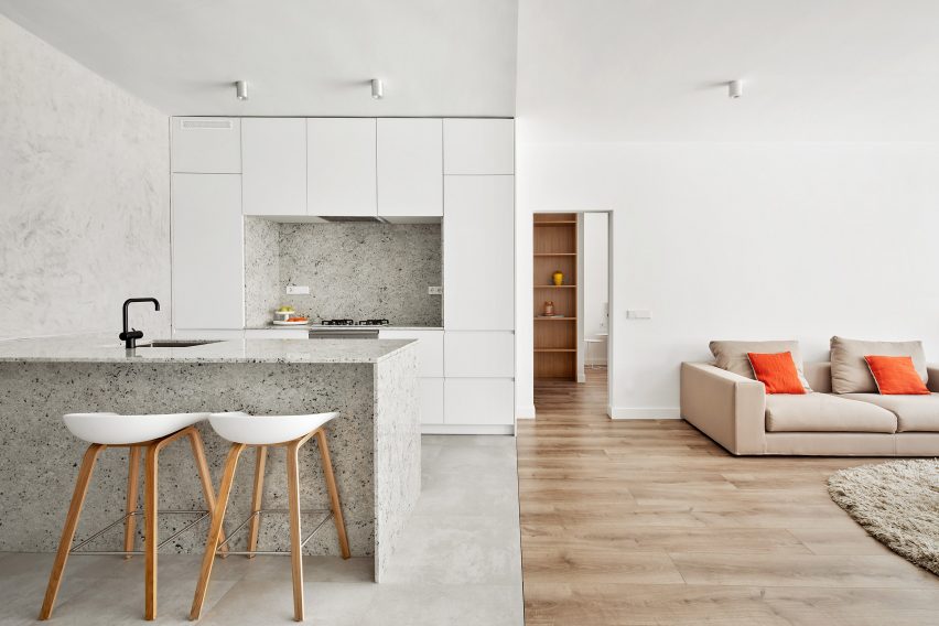
Wooden floors and white-washed walls define the living area while functional spaces such as the kitchen – where a granite breakfast island takes centre stage – are completed in shades of grey.

Find out more about Villarroel Apartment ›


Casa Nicte Ha by Di Frenna Arquitectos
Photo is by Onnis Luque

Casa Nicté-Ha, Mexico, by Di Frenna Arquitectos

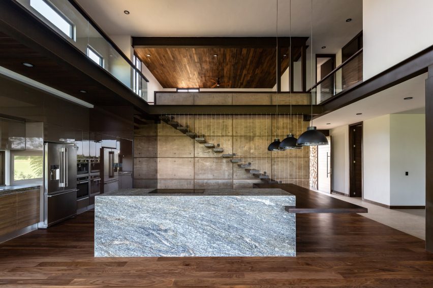
A large granite kitchen island with an adjoining wooden counter is positioned in the middle of the double-height kitchen and dining area inside Casa Nicté-Ha, a home designed by Di Frenna Arquitectos in Colima City, Mexico.

Elsewhere in the three-bedroom house, the studio mixed dark and light decor including white-painted walls, warm wood and concrete floors and exposed steel beams.

Find out more about Casa Nicté-Ha ›


A colourful kitchen with grey granite worktops
Photo is by Serena Eller

Diplomat Apartment, Italy, by 02A

Antique and mid-century furnishings join sleek, contemporary cabinetry to create this one-bedroom flat in Rome by local architecture and interiors studio 02A.

The stateless diplomat who owns and lives in the dwelling wanted to make his home a sanctuary filled with items he collected during his trips abroad.

Find out more about Diplomat Apartment ›


Berlin apartment by RAUM404
Photo is by Noshe

Art-Apart, Germany, by Raum404

Swiss-based studio Raum404 chose to keep the interiors as minimal, white and spacious as possible in its renovation of Art-Apart, a 19th-century apartment-cum-gallery in Berlin.

The artist owner tasked the studio with creating a space that could be opened up to the public for exhibitions, which resulted in furniture that could be folded up and plenty of white cupboards that could conceal personal belongings.

Find out more about Art-Apart ›


Hackney House by Applied Studio

Hackney House, UK, by Applied Studio

Black timber decor and plenty of windows were installed in architecture and interior design studio Applied Studio’s overhaul of this house in east London’s Hackney.

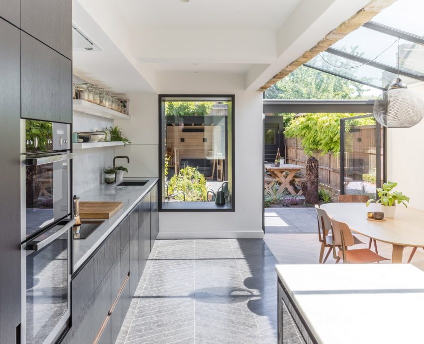
Afterward, the studio fitted the glass extension that houses the kitchen and dining table with chevron-patterned granite flooring.

Find out more about Hackney House ›


Kitchen in Golden Lane flat by Archmongers
Photo is by French + Tye

Golden Lane, UK, by Archmongers

Quirky modernist elements such as pops of primary colours and glossy furnishings were reinstated by Archmongers in its renovation of this 1950s flat in an inner city London estate.

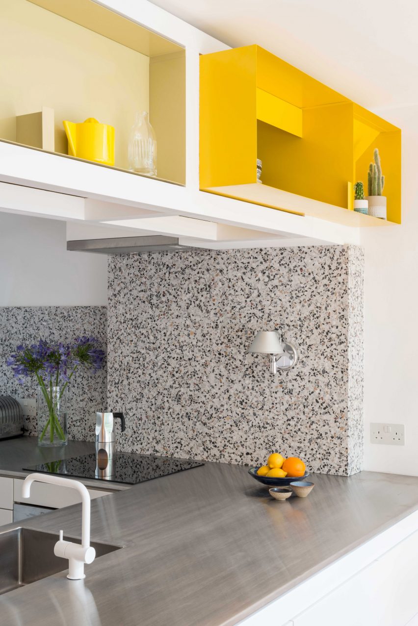
In the peninsula kitchen, which is separated from the dining area by chunky white door frames, white cabinets are topped with steel, while grey terrazzo with granite chips highlights the counter end and splashback.

Find out more about Golden Lane ›

This is the latest in our series of lookbooks providing curated visual inspiration from Dezeen’s image archive. For more inspiration see previous lookbooks showcasing residential interiors bolstered by exposed wooden beams, living spaces with glossy surfaces that create depth and dimension and gardens with swimming pools that are made for summer.

Reference

Swedish appliance company designs new sustainable kitchen
CategoriesSustainable News

Swedish appliance company designs new sustainable kitchen

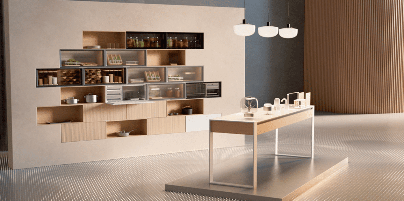
Spotted: Is the way we cook just as important to the future of our planet as the food we eat? Swedish appliance company Electrolux thinks so, as it has just launched GRO, a reimagining of the traditional kitchen that encourages sustainable and healthy cooking, following the EAT-Lancet planetary diet.

GRO, which means ‘to sprout’ in Swedish, is a new smart kitchen range composed of modular compartments that can be adapted to any home, creating infinite personalised combinations. In addition, there’s also a grain and pulse library designed to showcase the visual diversity of protein sources; a Nordic smoker that infuses food with flavour; and GRO Coach, a smart cooking companion that tracks eating habits and helps make more sustainable choices.

“By challenging conventional thinking of what a kitchen is, we have rethought everything from the start – aiming to help change behaviours by making planet-friendly eating effortless and enjoyable through groundbreaking design,” explains Tove Chevalley, Director CX Innovation Hub Electrolux.

GRO has launched on the Electrolux website, however, there is no set date for the appliances to be released to the general public.

While companies such as Miele and Samsung have created smart appliances, kitchen robots, and sustainable storage solutions, few have created an all-encompassing kitchen like GRO.

Other kitchen innovations recently spotted by Springwise include a new way to dispose of used cooking oil, a kitchen designed for zero-waste production, and an AI system that helps professional kitchens avoid food waste.

Written By: Lauryn De Nagy Berry

Email: sustainability@electrolux.com

Website: betterlivingelectrolux.com

Reference