Apple reveals Battersea Power Station shop as latest “evolution of the store”
CategoriesInterior Design

Apple reveals Battersea Power Station shop as latest “evolution of the store”

Technology company Apple has unveiled its latest Foster + Partners-designed store in the recently revamped Battersea Power Station in London, which features updated fixtures and furniture.

Set to open later today, Apple Battersea is the brand’s 40th UK store and represents an evolution in its retail design thinking with more of an emphasis placed on accessibility and sustainability.

“We developed this material palette and this fixture set that is really trying to align with like Apple’s goals,” said Bill Bergeron Mirsky, a global retail design lead at Apple.

“This material palette is new for us, it’s an evolution of the Apple Store,” he told Dezeen.
Apple Battersea by Foster + Partners
Apple Battersea opens today

Designed by UK studio Foster + Partners, the store is set on the ground floor of the shopping centre within the 1930s Turbine Hall A at the former power station, where the studio also designed the technology brand’s offices.

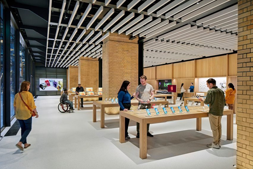
The shop is arranged around four original brick piers and has steel roof supports exposed on the ceiling. On top of this base, Foster + Partners overlaid a revamped fixture set that Mirsky said “will become familiar over time”.

Apple Battersea is the second store – after the recently reopened Tysons Corner store in the USA, which replaced Apple’s first ever store – to feature the redesigned fixtures.
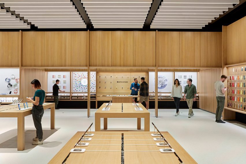
Apple Battersea by Foster + Partners
It features an updated fixture set

Around the edge of the store is an oak framework of shelving that was developed with Foster + Partners.  The timber structure also defines a space dedicated to watches, a pick-up area and a redesigned Genius Bar.

The Genius Bar has a counter for stand-up service along with a lowered area where people can be served sitting down. Along with its standard Parsons tables, which are made from sustainably harvested European oak, the store also has several lowered tables.
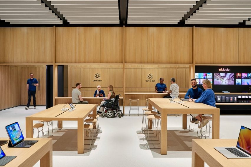
Updated Genius Bar
The redesigned Genius Bar has a lower counter

“We’ve thought about mobility issues across the whole fixture set,” explained Mirsky. “We have our traditional Parsons table with our standard height, but you notice that the tables in the back are varied and our new genius bar as well.”

“We have a standing height because the team really prefers to stand and it lets them work with more people and then they can stand at the tables, but customers who want to sit or need to sit can actually use these slightly modified tables,” he continued.

As part of the focus on mobility, Apple also increased the amount of circulation around the edge of the store.
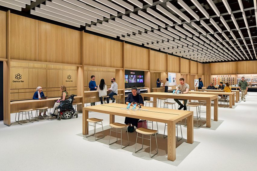
Tables in London Apple store
There is more space around the edge of the store

Along with the timber framework, Apple aimed to replace other more carbon-intensive elements in the store with biomaterials.

The floor, which was first used in the Brompton Road store, was made from aggregates bound together with a bio-polymer, while the acoustic baffles in the ceiling were made from biogenic material.

The acoustic baffles and bright floor form part of a focus on improving visual and acoustic clarity in the store, with a dark band placed around the base of the walls to provide visual differentiation with the flooring.

“Something I want to point out that is really part and parcel of the material palette, but also goes to our universal design, is the contrast in the store,” said Mirsky.

“We wanted to make sure we have this really enhanced kind of navigation,” he continued. “So the floor is brightened – it helps us with our low energy – but it also makes it so that you can clearly see the table and the walls are defined.”
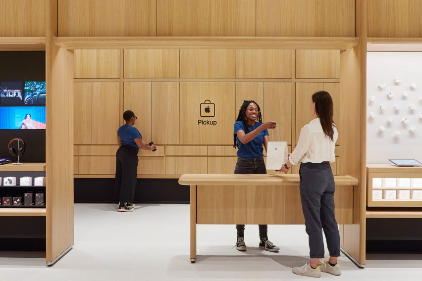
Pick up space in Apple Store
The store has a dedicated pick-up corner

The fixture set, flooring and ceiling baffles were also used at the Tysons Corner store and Mirsky believes the base can create a feeling of familiarity for Apple’s customers.

“Each store is really dealt with as a unique circumstance Battersea has this incredible, incredible existing architectural fabric to work in,” he said.

“We use the same fixture set at Tysons Corner in a mall setting in America which doesn’t have this sort of grand grandiose architecture, but the same fixture set can generate an environment that’s very familiar and welcoming no matter where you are.”

The store is the latest to open in London, following the Brompton Road store that opened last year, which was designed to be a “calm oasis”. Other recently completed Apple Stores include the band’s first shop in India and a store in Los Angeles’ historic Tower Theatre.

Reference

A generative AI answers users’ questions about the latest scientific research 
CategoriesSustainable News

A generative AI answers users’ questions about the latest scientific research 

Spotted: Global scholarship in many fields has been growing for years, with more researchers and scientists publishing larger numbers of articles. Trying to stay on top of the latest findings is a difficult job, even for someone immersed in a field. New company Consensus is using artificial intelligence (AI) to reduce the time burden of searching for the latest information.  

An AI-powered search engine, Consensus’ platform reads peer-reviewed articles to find research that addresses a users’ query. Search results are ranked according to their relevance to the query and quality of answers found. The Consensus team reminds users that the AI is trained on scholarly publications and is therefore not a general search engine that provides answers to basic facts.

Video source Consensus

Currently in beta format, users must set up an account to use the platform. Consensus provides an online best practice guide that includes suggestions for phrasing questions. The company also provides examples of search terms that return more limited results and explains the reasons why.  

The platform is constantly improving, and the Consensus team lists a few of the ways in which they are actively working to strengthen results, including broadening the AI’s understanding of text formatting in scientific papers and increasing the AI’s contextual understanding of a sentence.  

Academic publishing is complex, and technology is providing researchers with a range of new tools to help work more efficiently. Springwise has spotted a browser extension that automates citations and an algorithm that evaluates new research for its business potential.

Written By: Keely Khoury

Reference

Koichi Takada Architects’ Latest Tower Is Creating Major Waves on Australia’s Golden Coast
CategoriesArchitecture

Koichi Takada Architects’ Latest Tower Is Creating Major Waves on Australia’s Golden Coast

How can architecture be a force for good in our ever-changing world? During Future Fest, we’ll pose this question to some of the world’s best architects. Launching in September, our three-week-long virtual event will be 100% free to attend. Register here!

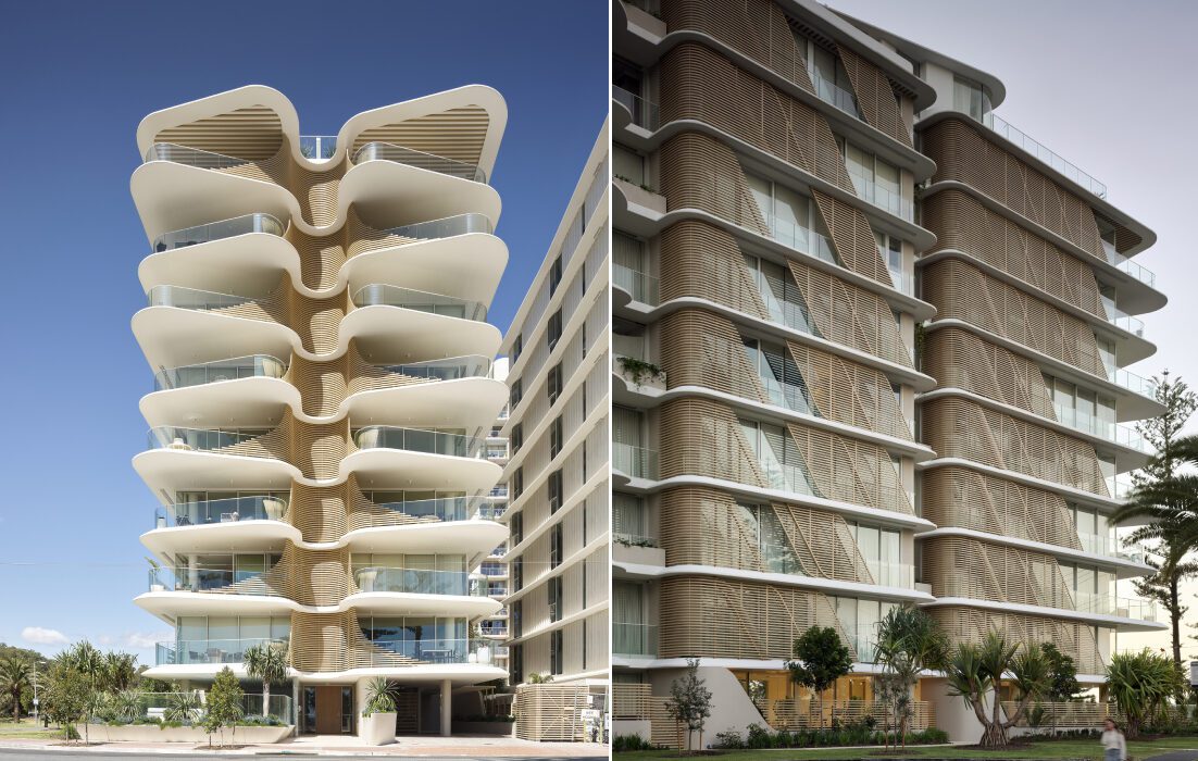
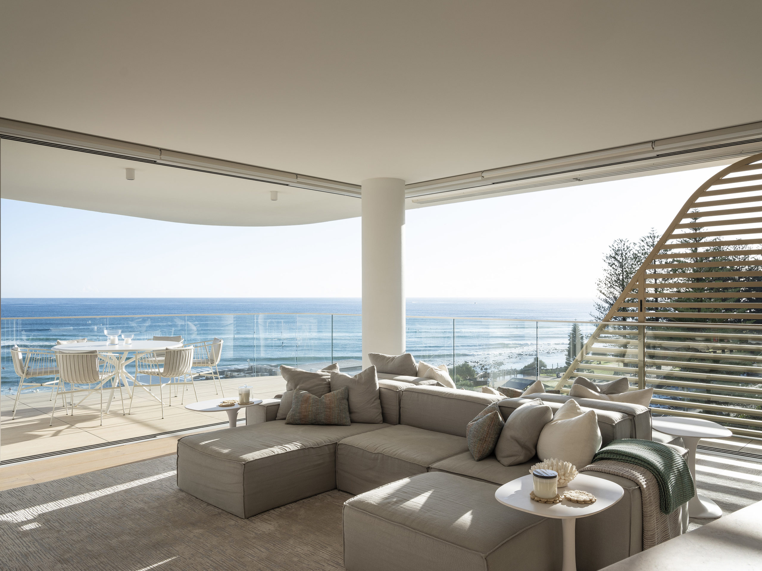
Nestled between beloved Surfers Paradise and chill Coolangatta, Burleigh Heads is a small suburb on Australia’s famed Golden Coast, known for its crowd-drawing surf breaks and iconic towering pine trees. In recent years, a hip dining scene has emerged, reflecting how the area’s popularity has grown. Now, there is a need for more multi-residential developments has increased to help house the growing influx of locals and visitors alike. For the first time in the area in three decades, a multi-residential development has gone up, taking the name of Norfolk, Burleigh Heads.

The iconic luxury apartment building gets both its name and from the heritage Norfolk pine trees found around the site, making a significant contribution to the unique features that set this area apart from the rest. “Just like their pinecones protect its seeds from bad weather and open when in ideal natural settings, Norfolk’s architecture can be adapted to protect residents from the elements or opened up to take in the 300 days of subtropical sunshine and stunning natural surroundings,” said the building’s visionary Koichi Takada Architects, a firm known for the diversity of their portfolio and imaginative willingness to push the bounds of architectural form.

Images by Scott Burrows

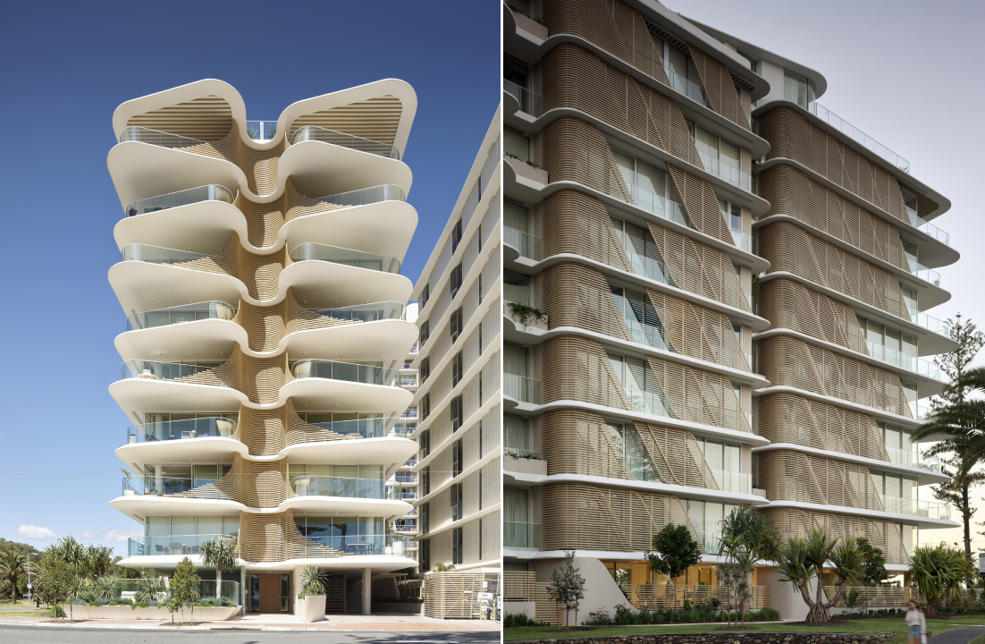
The 10-story building bagged both the Jury and Popular Choice A+Awards in the Multi-Unit Housing – Mid Rise category and for a good reason. It makes a statement, challenging how we imagine multi-residential towers, while staying true to the unique features that make the site special. Fanned balconies, a ribbed spine and endless views are just a few other elements that make it special. Its organic form allows it to be a spectacle from every angle and makes it seem like it will take flight. And while its geometry sets it apart, its neutral beige hue helps tie it to the beachy surroundings.

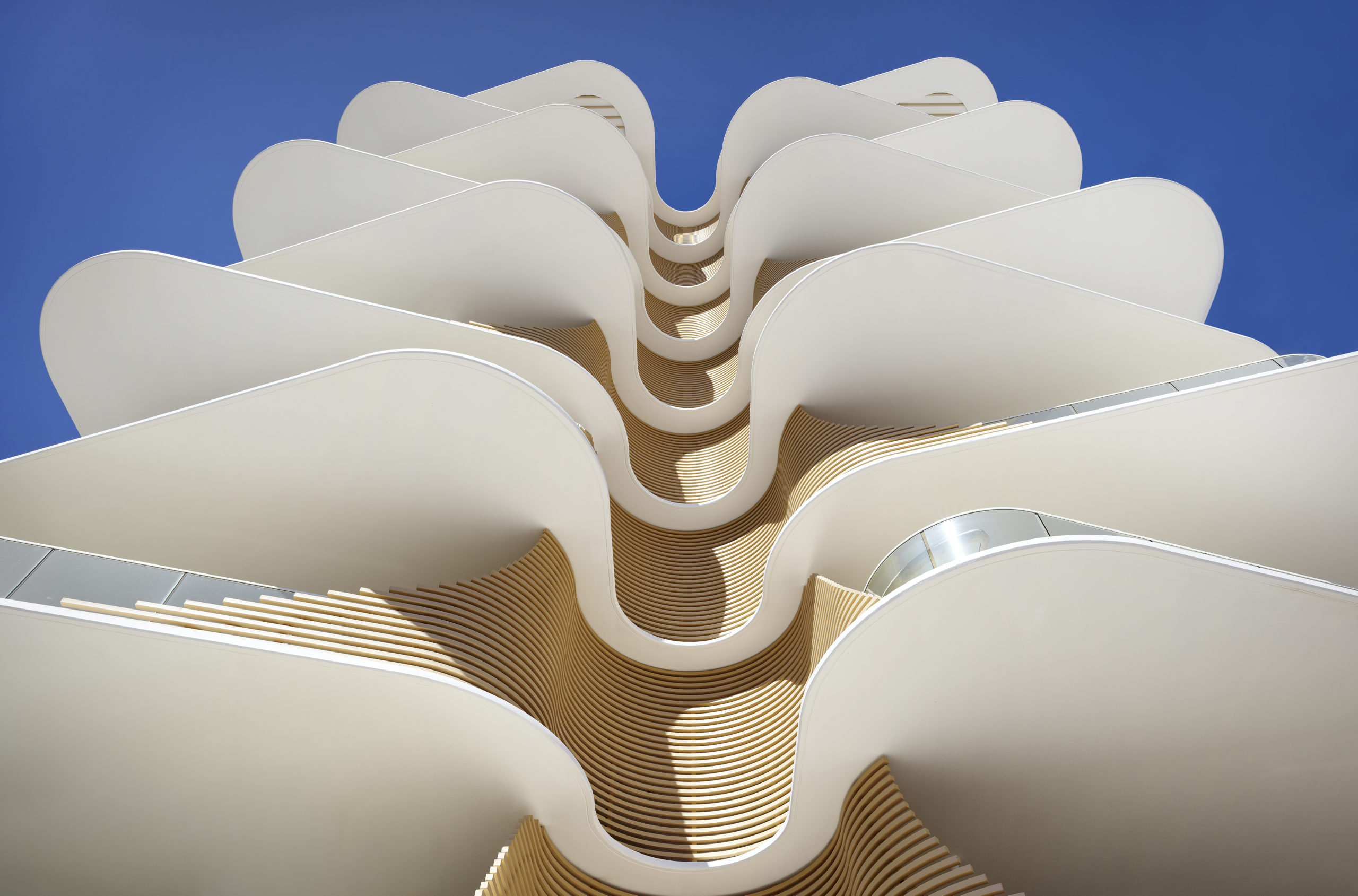
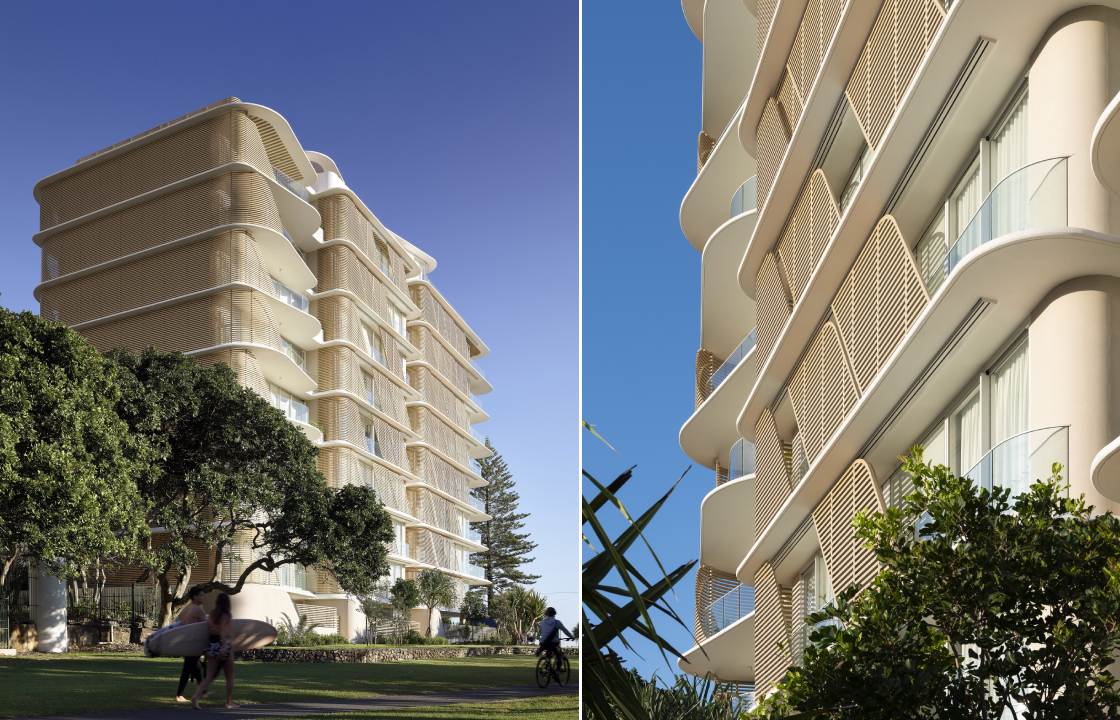
Large open balconies and maximized exterior surfaces allow more natural light to enter the building and increase the resident’s connection with the outdoors. Instead of being stacked uniformly on top of one another, the floating balcony slabs all vary in shape and are strategically overlapped to create additional shade and privacy for the homes below. Imitating the Norfolk pine, their sides are covered in slatted screening to create additional privacy. One can see that these floating slabs are also tapered at the edges and extend beyond the glass balustrade, making them seem even lighter and reflect natural light further into the homes.

Image by Scott Burrows

Cementing the relationship with nature, the architects have also added a spine to the building that curves inwards and allows the blades of the balconies to connect together like ribs. This provision creates shade in the summer, enhancing privacy while also allowing those inside to get glimpses of the ocean. The sides of the building also have slatted screens arranged in a diagonal pattern across the balconies to break up vertical lines and add some dynamism. Since these diagonal panels are movable, the façade is constantly changing are creating new patterns, further reflecting the ever-changing qualities of nature.

Images by Scott Burrows and Tom Ferguson

The structure holds fifteen apartments and a part of two-level penthouses with private rooftops. Making it even more enticing to residents is the inclusion of a gym, outdoor pool and sauna. While all the apartments have generous light and ventilation, the north-facing homes have an unhindered 180-degree view of the ocean. The living, dining and kitchen areas spill out into the large balconies. The southern end of the building holds the en-suite bedroom. There are two additional rooms in the center of the floor as well. Natural timber floors used within the home extend to the balconies as well and create a clear visual connection with the sandy shore beyond. The interior spaces of these homes, fashioned by Mim Design, build on the natural tones found on the exterior of the building to create a cozy coastal home.

How can architecture be a force for good in our ever-changing world? During Future Fest, we’ll pose this question to some of the world’s best architects. Launching in September, our three-week-long virtual event will be 100% free to attend. Register here!

Reference

Cosentino’s Latest Material Innovation Could Transform Sustainable Design
CategoriesArchitecture

Cosentino’s Latest Material Innovation Could Transform Sustainable Design

A leading manufacturer of surfaces, Cosentino’s products are invariably beautiful, resilient, and suited to a wide range of purposes. Whether you are looking for a kitchen countertop or a unique flooring or cladding system, you will find a reliable solution in one of Cosentino’s lines of synthetic or natural surfaces.

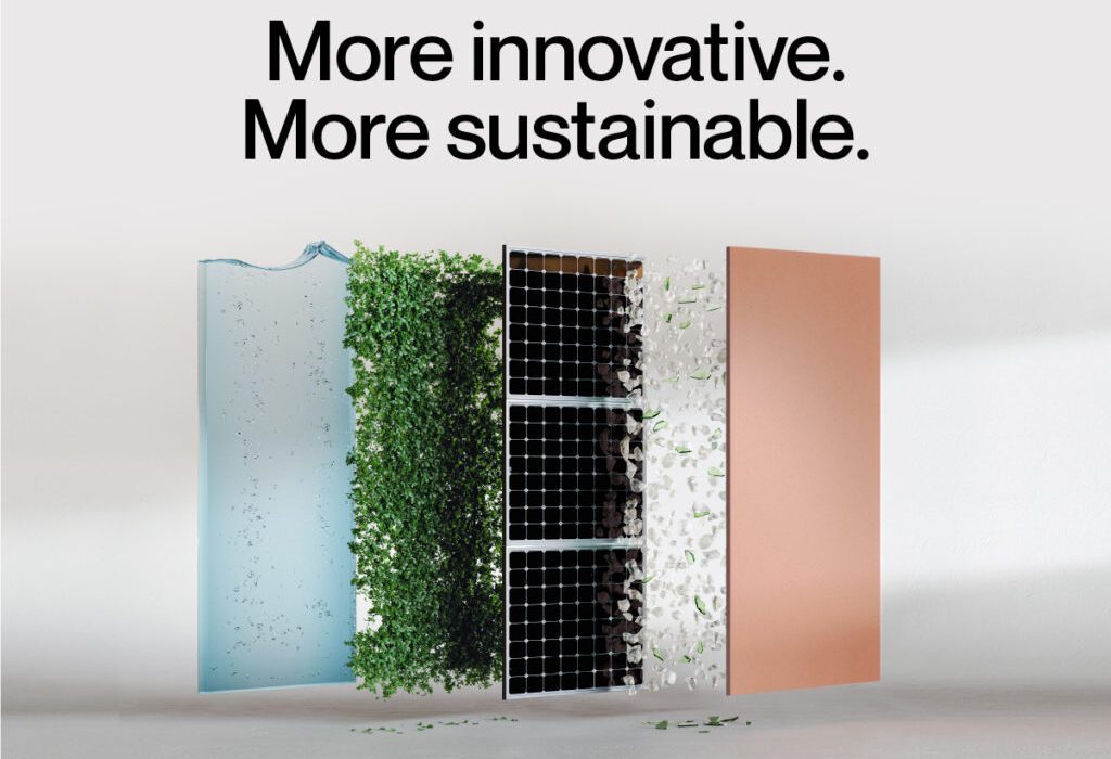
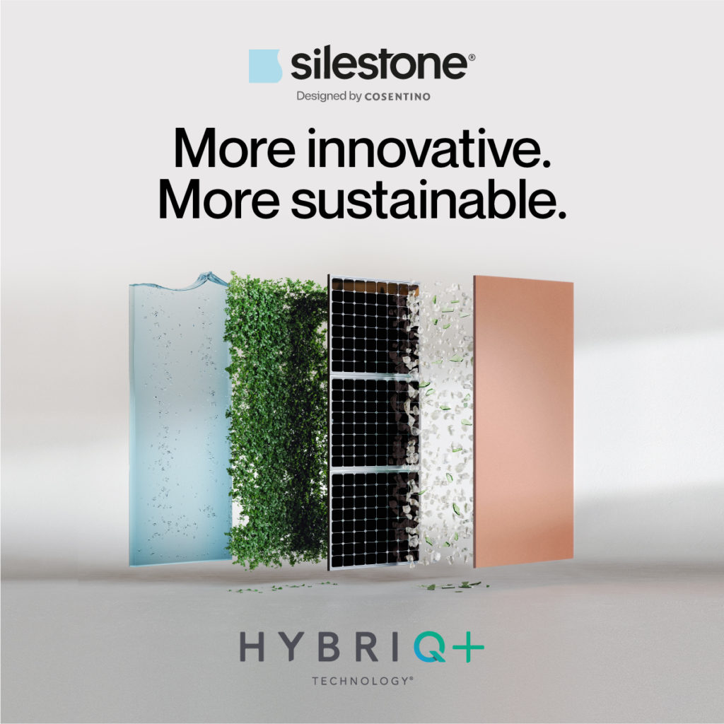
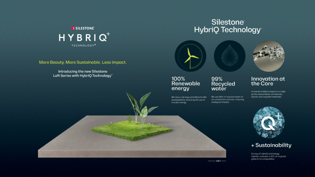
Among architects and builders, Cosentino surfaces are known to be innovative and high-quality, but one should also add visionary and socially conscious to the list of descriptors. Their newly developed HybriQ+ Technology, used for their versatile Silestone surfaces, blends premium minerals, quartz, and recycled materials with a sustainable manufacturing process that uses 99% recycled water, 100% renewable electric energy and a minimum of 20% recycled materials in its composition. Cosentino uses the term “Circular Economy” to describe their sustainable approach to resources.

All said and done, this process produces ZERO water waste. That’s right, zero with a Z. In 2022, this is welcome news indeed. The past few years have seen new attention given to the issue of water conservation as global water shortages have become a mounting problem.
The World Wildlife Federation summarizes the situation bluntly, writing that “Many of the water systems that keep ecosystems thriving and feed a growing human population have become stressed. Rivers, lakes and aquifers are drying up or becoming too polluted to use. More than half the world’s wetlands have disappeared.” They add that global climate change has put even more stress on the world’s water supply, and that “By 2025, two-thirds of the world’s population may face water shortages. And ecosystems around the world will suffer even more.”

The need for sustainable manufacturing practices is, to put it simply, an imperative. Cosentino illustrates this point quite vividly in their new campaign to promote HybriQ+. Early on in the clip, a sobering montage plays showing plastic bottles washed onto beaches, clear cut forests, and other examples of the destructive impact humanity has had on the globe. The message is poignant: alternatives must be found, and fast, if our species will be able to secure a high quality of life in the coming decades.

The rest of the video provides insight into the HybriQ+ manufacturing process, cross-cutting images of the raw materials Cosentino recycles with scenes of the laboratories in which the company’s research and development team discover new ways to conserve resources in their manufacturing process. This video is a testament to the power of technology and human ingenuity to overcome even dire obstacles.

The video closes with a simple slogan flashing on the scene: “Welcome to our revolution.” And it’s true – such an approach to manufacturing is revolutionary, especially in an era when it is easy to save money by pushing costs onto the planet. As the company notes, “We take care of the present to secure the future.”

Cosentino believes that consumers need not compromise quality in the name of sustainability. In fact, those Silestone surfaces that have been produced with HybriQ+ technology are among the most beautiful the company has ever produced. The company explains that “the new mineral composition enables never before-seen effects in color depth, texture and tone.” Indeed, Cosentino has long proven that synthetic materials can be just as elegant and intricate as natural materials.

Moreover, Silestone is engineered to withstand the harsh daily use that kitchen countertops are subject to, including stains, acid and everyday nicks and scratches. Silestone also comes with a 25 year warranty. This alone is cause for celebration for the eco-conscious among us. Materials that are built to last will not find their way to a landfill anytime soon.

We recommend spending time on the Cosentino website to explore the myriad patterns and colors that are available. The website also includes great photos of their surfaces in action in real spaces for inspiration. There really is something for any design aesthetic, to warm Mediterranean hues to the industrial gray that has proven so popular in modern homes. Silestone also comes in three textures: polished, suede (or matte), and volcano. The latter is really cool, featuring a rustic, rough texture that would add warmth to a kitchen.

As Cosentino points out in their promotional material for HybriQ+, “the kitchen has become the heart and soul of our homes. It is where we cook, work, study, and share memories. It is only natural that the next world-changing idea will come from the kitchen.” So next time you need a sustainable surface for a kitchen redesign, Cosentino Silestone with HybriQ+ should be top of mind.

To learn more about Cosentino’s HybriQ+ Technology and request a quote, click here.

Reference