“Our task is not to live forever” says Paola Antonelli
CategoriesSustainable News

“Our task is not to live forever” says Paola Antonelli

MoMA curator Paola Antonelli believes humans will go extinct as a result of climate change, but is “very positive” about how designers can help to slow the decline, she tells Dezeen in this interview.

The Museum of Modern Art curator is the author of several books including Design Emergency (co-written with Alice Rawsthorn), and runs the Instagram account of the same name that explores how design can help build a better future in the face of serious global issues.

Among the exhibitions she has curated is Broken Nature: Design Takes on Human Survival, which showcased architecture and design projects from the last 30 years that explore our fractured relationship with the planet.

To Antonelli, the vital importance of focusing on these issues is obvious.

“When one has a pulse and a brain, one can not be aware of the climate emergency and not be concerned and tempted to do whatever one can, whatever is possible,” she told Dezeen.

“Design is a force for any kind of change that needs to happen”

Antonelli believes that design is well-placed to play a leading role in the global effort to solve or mitigate issues relating to climate change.

“Design is a force for any kind of change that needs to happen,” she said. “It’s a force for propaganda, for changing people’s behaviour, for re-addressing issues, for changing products so that they can become more attuned to needs.”

“It is like an octopus that has different tentacles and can touch multiple point pressures in the ecosystems that make up our life.”

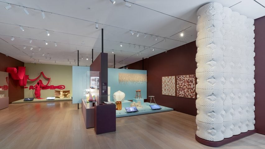
Life Cycles exhibition at MoMALife Cycles exhibition at MoMA
Life Cycles: The Materials of Contemporary Design is Paola Antonelli’s latest exhibition

“When it comes to the climate emergency, design can take on many different roles,” she added.

“I don’t feel that design by itself can change or save the world – that is always a utopia, and it’s unrealistic – but I find that it is a fundamental part of any team effort, and all efforts have to be team efforts at this point to change the status quo.”

One way in which designers can work towards slowing the climate emergency is by creating products which, rather than using materials that contribute to the pollution of the planet, focus on upcycling, re-use and using waste instead of new materials.

MoMA exhibition explores design’s impact on the ecosystem

This is the theme of Antonelli’s latest exhibition at MoMA, Life Cycles: The Materials of Contemporary Design, which explores “the regenerative power of design”, examining how design can be elegant and innovative while still respecting the ecosystem.

Among the pieces on show are works by Mexican designer Fernando Laposse, who has created a marquetry material from the husks of heirloom corn species, and by designer Mae-Ling Lokko, who has a company in Ghana that creates building products from mushroom mycelium and coconut shells.
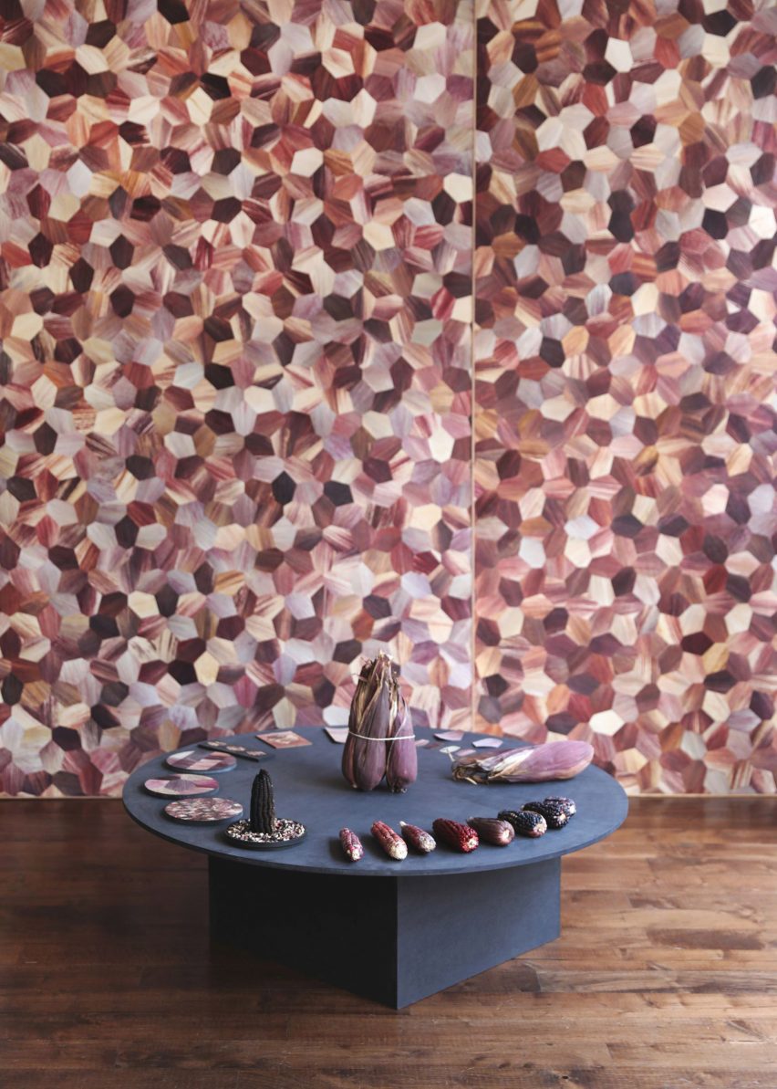
Corn by Fernando LaposseCorn by Fernando Laposse
Fernando Laposse works with heritage corn species

“[Lokko’s work] is about agricultural waste, but very localised to where it is, and I see many designers behaving that way,” Antonelli remarked.

In that vain, she believes designers should look to how people in their local environment have dealt with disastrous natural events in the past to help prepare for a future in which they will become more frequent.

“When you’re dealing with a disaster, it’s usually is a disaster that happens near you, so you could learn a lot from how things are done near you,” Antonelli explained.

“Floods have happened for centuries and they might be more frequent now, but cities and regions of the world have been dealing with them for a really long time,” she added.

“So they might have some structures already in place that need to be either relearned or deepened.”

This is already underway, Antonelli believes, with designers and architects increasingly “studying the local”.

“That is happening at many different levels,” she said. “There are architects and landscape designers that are really trying to understand Native and First Peoples approach to land, respect, land-use or land non-use.”

“Global technological efforts are important, but without that attention to local realities they will be simplifying, or at least overlooking, many important aspects.”

Coronavirus pandemic “gave us a feeling of what clean skies could be”

She argues the coronavirus pandemic also underlined how quickly things can change and that we can have an impact on the climate and how it behaves.

“The pandemic brought everything to a stop and gave us a feeling of what clean skies could be – I mean, we rapidly forgot about it, but there was still this moment of stunned recognition of the fact that skies can be blue if we all stop using cars for a few days,” Antonelli said.
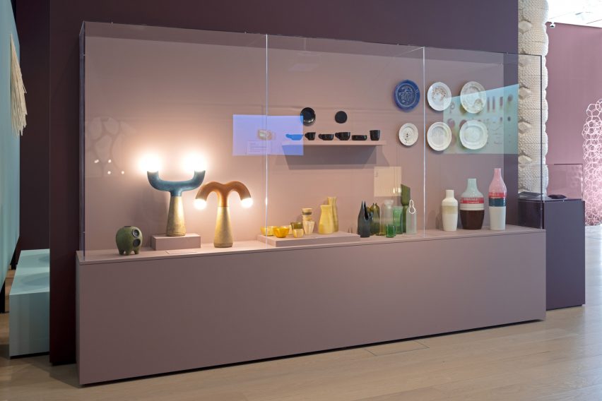
Life Cycles exhibitionLife Cycles exhibition
MoMA’s Life Cycles exhibition looks at design’s relationship with the ecosystem

And with much of the world currently in turmoil, whether from the climate emergency or other human-driven disasters and wars, she thinks there is more of a willingness to take these questions seriously.

“There are so many tragedies that are happening in the world right now, there’s no respite, but I feel like it brings everybody more on an alert kind of attitude,” she said.

“So I feel that the climate emergency is considered with more seriousness because it undergirds many of the other crises.”

“Our task is to leave the planet in a better condition”

While Antonelli doesn’t think humans can design our way out of our own extinction, she believes design can play an important role in slowing the decline.

“Slowing the decline is very, very positive; I am very positive,” Antonelli said.

“Even though – as I was saying at the time of Broken Nature – I believe we will become extinct, we have a little bit of control on the when and a lot of control on the how,” she added.

“I’m optimistic that we can be dignified, responsible, and compassionate towards other people, towards other species and towards the planet.”

“And that is our task. Our task is not to live forever. Our task is to leave the planet in a better condition than we found it, or at least as good as possible.”

The exhibition photography is courtesy of MoMA.

Dezeen In Depth
If you enjoy reading Dezeen’s interviews, opinions and features, subscribe to Dezeen In Depth. Sent on the last Friday of each month, this newsletter provides a single place to read about the design and architecture stories behind the headlines.

Reference

Can you live a more sustainable life? 
CategoriesSustainable News

Can you live a more sustainable life? 

Too much talking, not enough action – Alessandro Armillotta, CEO of the sustainability app AWorld, is heading to COP28 with a clear message. He believes that an ‘intention-behaviour gap’ in society is stalling progress on net-zero goals, but with a bit of tech-enabled encouragement on a personal or professional level, we can all make a difference through everyday actions.

Choose public transport when you can, air dry your laundry, eat a vegetarian meal once a week… There is a host of small actions we could take that would contribute to a lower carbon footprint if we did them consistently, but not enough people are doing them. A recent study by the American Psychological Association, for example, showed that 7 in 10 Americans wish they could do more about climate change, but over half do not know where to start, citing time, money, and skills as blockers.  

“We live as though our resources are infinite because we fail to see the impact of our daily actions and sustainability feels complicated,” says Alessandro. “My focus is to try and close the ‘intention-behaviour gap’ – the discrepancy between what consumers say and what they actually do.”

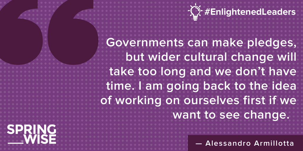
He doesn’t blame people. “Today’s culture doesn’t incentivise living sustainably,” he says. “At COP28, I will have meetings with an ecosystem of people and partners. It will be a privilege to be there, but it’s just talking. As soon as we get back home and go out onto the street no one has a clue. Governments can make pledges, but wider cultural change will take too long and we don’t have time. I am going back to the idea of working on ourselves first if we want to see change. I think it comes down to individual action.”

Enlightened Leaders - Alessandro Armillotta

The AWorld app, a partner to the United Nation’s ActNow campaign and the European Commision’s Climate Pact Initiative, is a guide for people who want to reduce their carbon footprint. A user can build their own set of easy-to-achieve tasks and goals (such as turning off lights or choosing clothes made from recycled fabrics), log when they’ve done them, and then see the positive impact of their choices through the amount of carbon, litres of water, and kilowatts of electricity saved. From December 2023, the app will include mobility data and automatically calculate the carbon footprint of journeys depending on the mode of transport, without the user having to input anything manually. Future features will include calculations around how actions can positively or negatively impact energy bills.  

“I feel it is our responsibility at AWorld to build a path with technology that gently nudges users and rewards them.” Key to this strategy is working with large businesses and corporates, who can leverage the AWorld app to encourage behaviour change in employees and consumers, which, in turn, can help them reach their own net-zero goals. Capgemini, Cognizant, and Blackrock are some of the companies currently using AWorld to empower their stakeholders to make positive changes.

“We have built out our experience based on what we understand about motivations. There are people who will make changes because it makes them feel good, they want to fit into a community of like-minded people, they want to compete, or they want to be rewarded.” The app caters to these motivations through gamification and a regular stream of content sharing big-picture context. “It needs to feel ‘normal’,” Alessandro says, “not like you are doing something sustainable that requires loads of inputs.”

Once COP28 is over, Alessandro will be back in his native Italy to launch a citizen engagement campaign in Umbria, with campaigns in other regions such as Marche, Lombardy, and Lazio, on the horizon.  It’s an exhausting schedule but Alessandro is all about action. “We all need to be active,” he says. “There are no passengers on Planet Earth, we are all crew.”

Disccover the AWorld app in the App Store or Google Play. Find out more about employee engagement via AWorld at aworld.org

Written By: Angela Everitt

Reference

21st Century Architect Guide: 7 Visualization Tools Architects Can’t Live Without
CategoriesArchitecture

21st Century Architect Guide: 7 Visualization Tools Architects Can’t Live Without

Judging for the 11th A+Awards is now underway! While awaiting the Winners, learn more about Architizer’s Vision Awards. The Main Entry Deadline on June 9th is fast approaching. Start your entry today >

The architectural design process is an intricate dance between creativity and technical mastery. From beginning to end, as each act of a project unfolds, and visions come to life, every architect must rely on an array of visualization tools to help them successfully navigate project stages. These tools are our trusty partners throughout the performance that is design.

From sketching the earliest of ideas to unveiling new worlds in digital landscapes, many tools have revolutionized the way we work and transformed how we communicate our ideas. While we each have individual preferences, undoubtedly, from concept to completion, there are some visualization tools we can all agree we would rather not live without.


Conceptualization: Sketching and Diagramming – The Napkin Chronicles

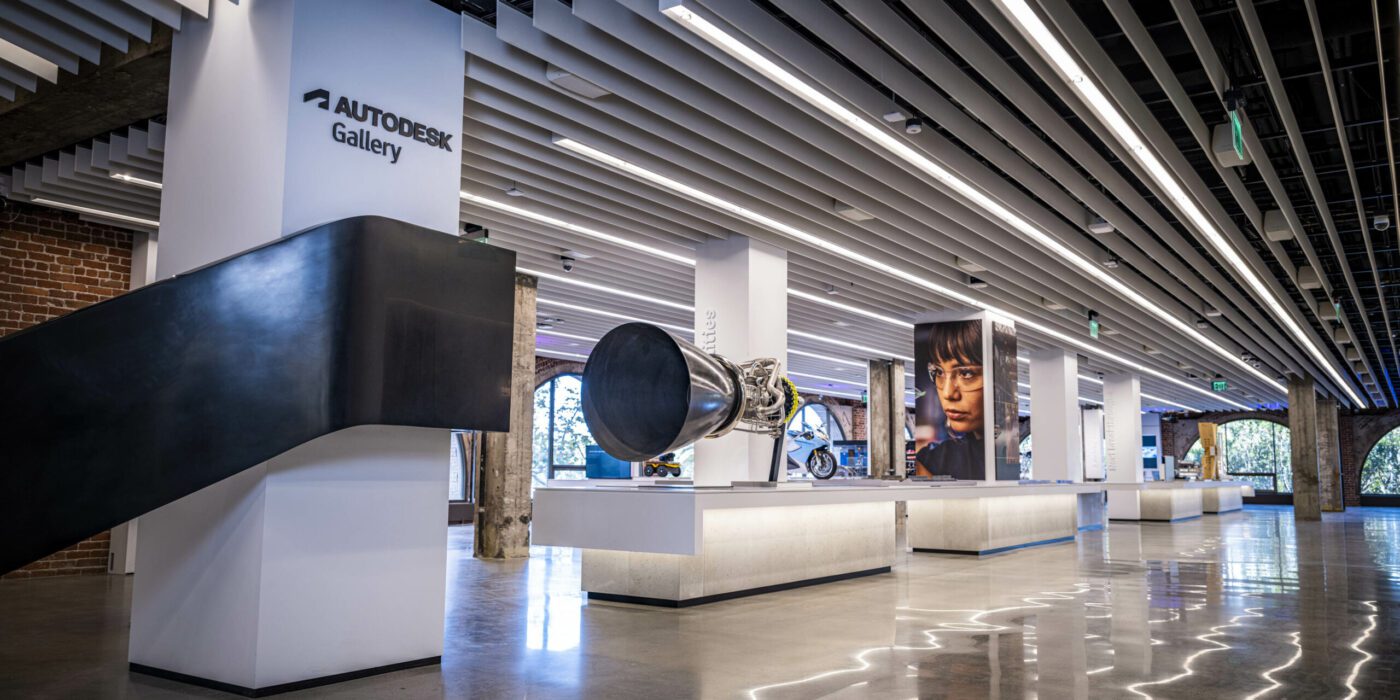
Interior of the reimagined Autodesk Gallery, San Francisco, CA, United States Photograph provided by Autodesk

We’ve all been there — a moment of divine inspiration striking in the middle of lunch, hastily scribbling our ideas on a napkin, a receipt, even our hand. Be it through traditional (pen and paper) sketching or digital tools like SketchBook by Autodesk and Morpholio Trace, conceptualization is the wild west of design documentation, and that’s precisely what these programs are built for.

By allowing us to quickly test various design concepts, proportions, and relationships while providing a platform for experimentation and ideation, such sketching software helps to support and facilitate mark-making and disjointed thought. The intuitive interface and versatile features of these digital sketching apps enable architects to easily switch between mediums, layers, and scales, streamlining the concept process and ultimately helping us make sense of our own ideas effectively.


Schematic Design: 2D CAD Drawings – Back to the Grid

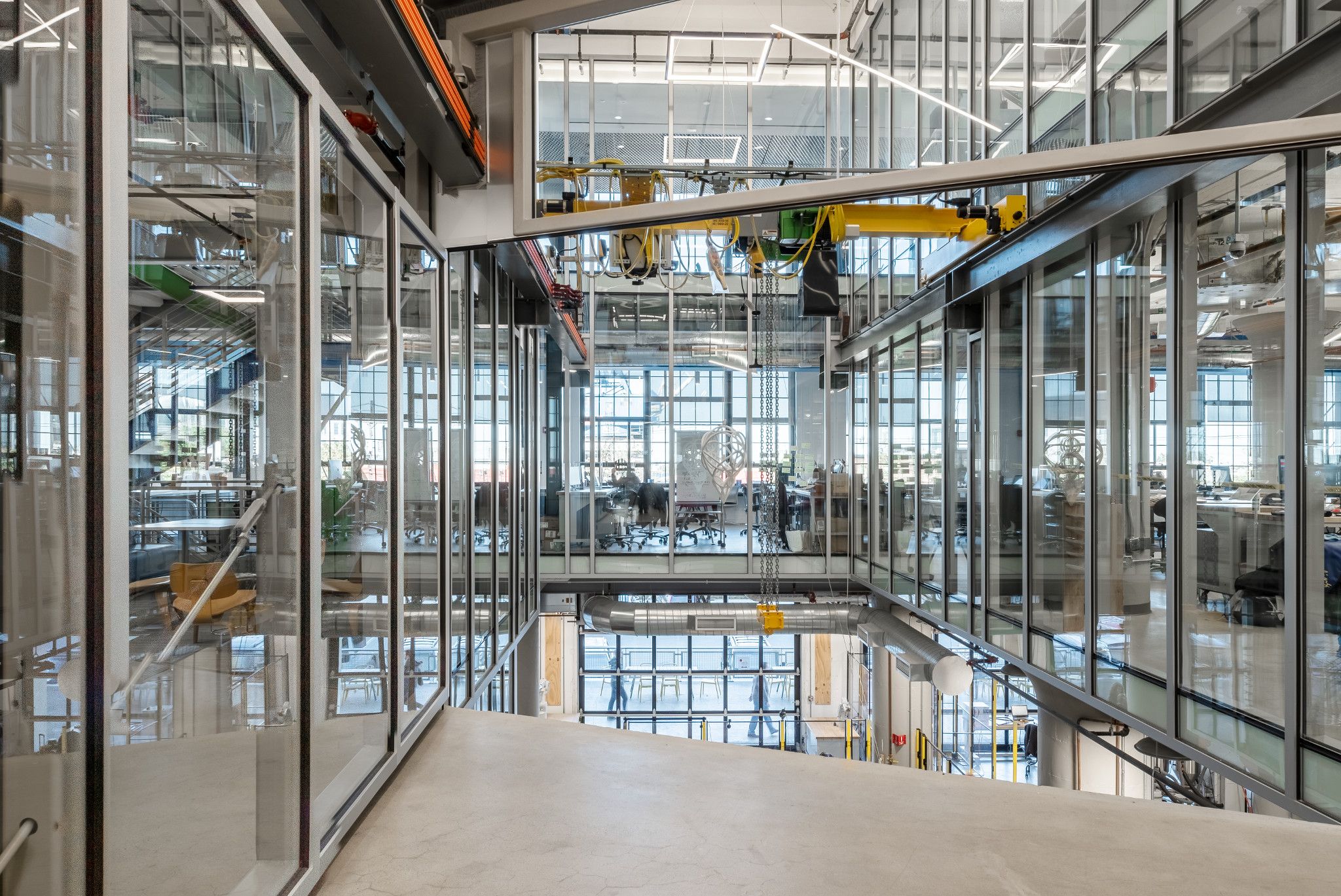
Autodesk Technology Center, Boston, MA, United States Photograph provided by Autodesk

With concepts refined, then comes the time to embrace the precision and orderliness of 2D CAD drawings. Bidding adieu to the delightful chaos of the napkin sketches, programs like AutoCAD and Vectorworks become our new best friends. During the schematic phase, meticulously articulating our visions is essential, ensuring that not even a single datum line goes astray.

Whatever your preferred platform may be, CAD programs allow us to create detailed, scalable drawings, facilitating coordination with consultants, and fine-tuning the review process for and with clients. Over the years, the software’s extensive libraries and automated tools have increased the efficiency of drawing tenfold, reducing errors and resources required at this stage of the design development process.


Design Development: 3D Modeling – The Taming of the Shrewd

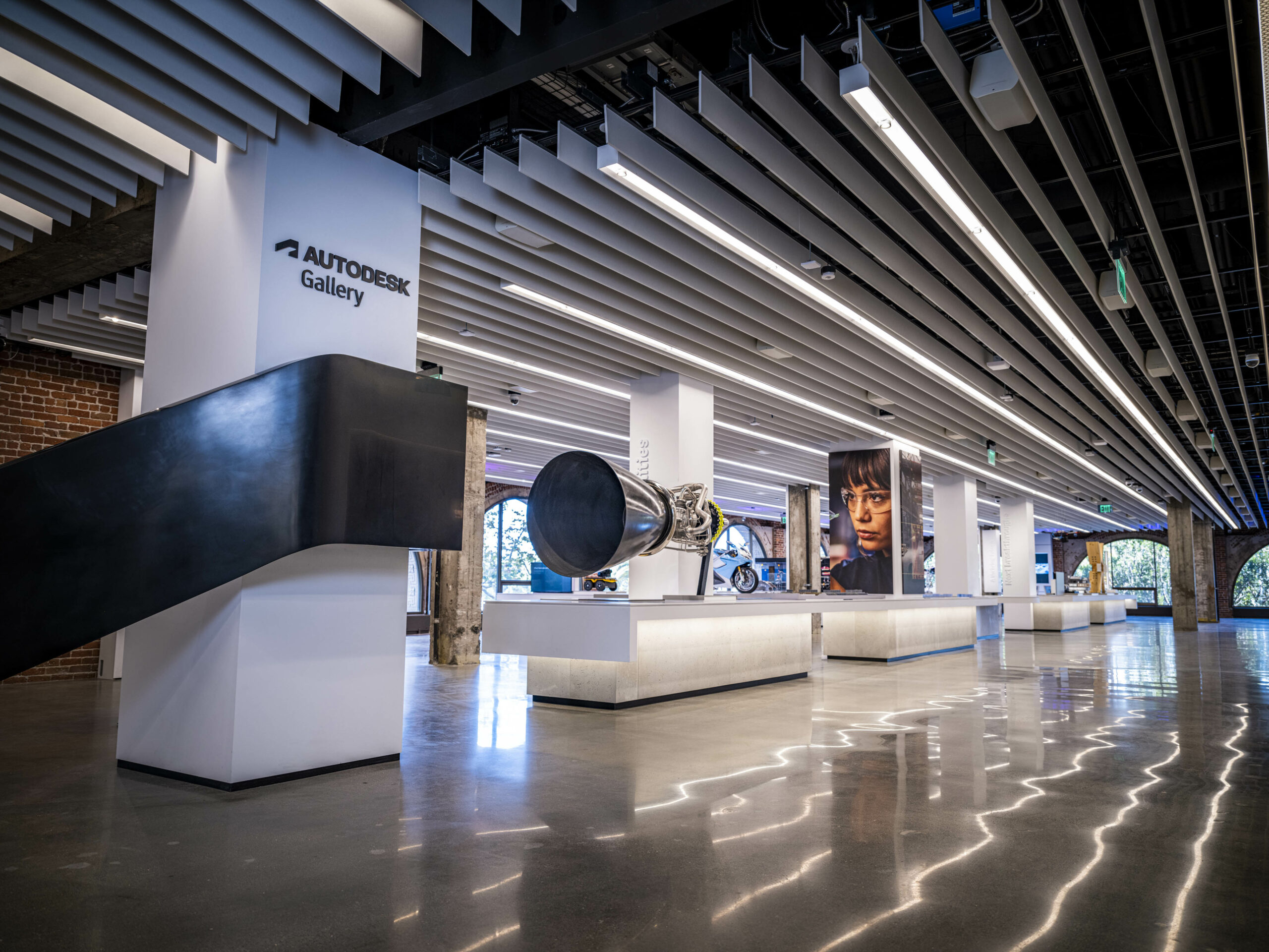
Interior of the new reimagined Autodesk Gallery in San Francisco, CA, United States Photograph provided by Autodesk

The design process can often feel a lot like herding cats, chaotic and unpredictable. 3D modeling software such as SketchUp, Rhino, and Revit can feel like our trusty shepherd’s staff in times of uncertainty and compromise. With these tools, we can juggle competing interests — structural engineers advocating for fewer cantilevers and environmental officers requesting more green space alongside MEP consultants demanding cavernous service risers.

3D models give us the capacity to study the spatial relationships and materiality of our designs, enabling us to make informed decisions on practicality with as little impact on the design ambition as possible. The real-time rendering capabilities of these programs thrive in the quest for seamless collaboration between team members, promoting an iterative design process and ensuring that all disciplines are working in harmony.


Visualization: Rendering and Virtual Reality – The Picture-Perfect Performance

The Lumion office building by atelier PRO architekten, Amsterdam, Netherlands. Photograph by Jan Paul Mioulet

During the design process, renderings are akin to a grand soiree, a sumptuous feast for the eyes that unveil creations in all their splendor. With virtuosos like V-Ray and Lumion at the helm, 3D renders allow us to conduct a mesmerizing performance of light and texture, conjuring spellbinding visuals that leave clients entranced.

These rendering maestros boast an array of sophisticated features, from global illumination to physically-based materials and ethereal atmospheric effects, empowering architects to craft lifelike images that impeccably embody their design aspirations. Furthermore, VR technologies such as the Oculus Rift and HTC Vive transport us to a realm where we can meander through our masterpieces as though they already stand tall — always remember to mind your footing in the tangible world as you navigate the virtual one.


Construction Documentation: BIM – The Clash of the Disciplines

The pièce de résistance of the design process, construction documentation through BIM software, such as Revit, is where the rubber meets the road. Architects know that, in today’s world, coordination is the name of the game, and nothing tests resolve quite like the clash detection feature in our BIM software.

By consolidating architectural, structural, and MEP models into a single, comprehensive database, BIM enables us to identify and resolve conflicts early in the design process, preventing costly and time-consuming issues during construction. BIM’s powerful parametric capabilities also facilitate the generation of detailed schedules and specifications, ensuring that the information is accurate, consistent, and up-to-date.


Digital Fabrication: Parametric Design – A Brave New World

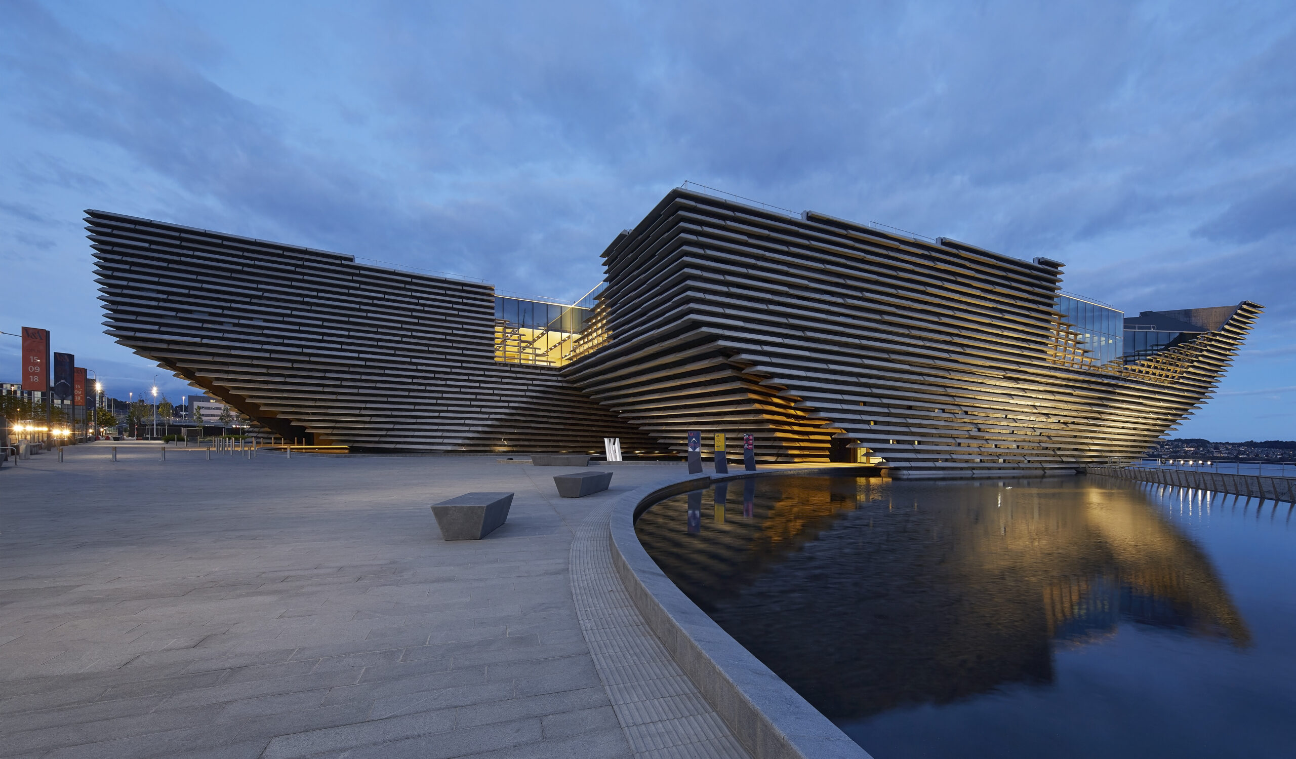
Designed using CATIA V&A Dundee by Kengo Kuma and Associates, Dundee, Scotland. Photograph by Hufton+Crow

As we explore the frontiers of design, the relatively new realm of digital fabrication beckons. Unlike days of old, armed with kappa board and scalpel, parametric design and computational tools like Grasshopper, Dynamo, and Catia empower us to translate complex geometries and intricate patterns into buildable forms. These tools enable us to visualize and rationalize our boldest ideas, bridging the gap between digital models and physical constructs.

We can optimize our designs for structural efficiency, environmental performance, and material utilization by scripting algorithms and generating parametric models. As we venture into the brave new world of 3D printing, CNC milling, and robotic assembly, these visual documentation tools are our invaluable guides, helping us push the boundaries of architectural possibility.


Interactive Presentations: Augmented Reality and Mixed Reality – The Future is Now

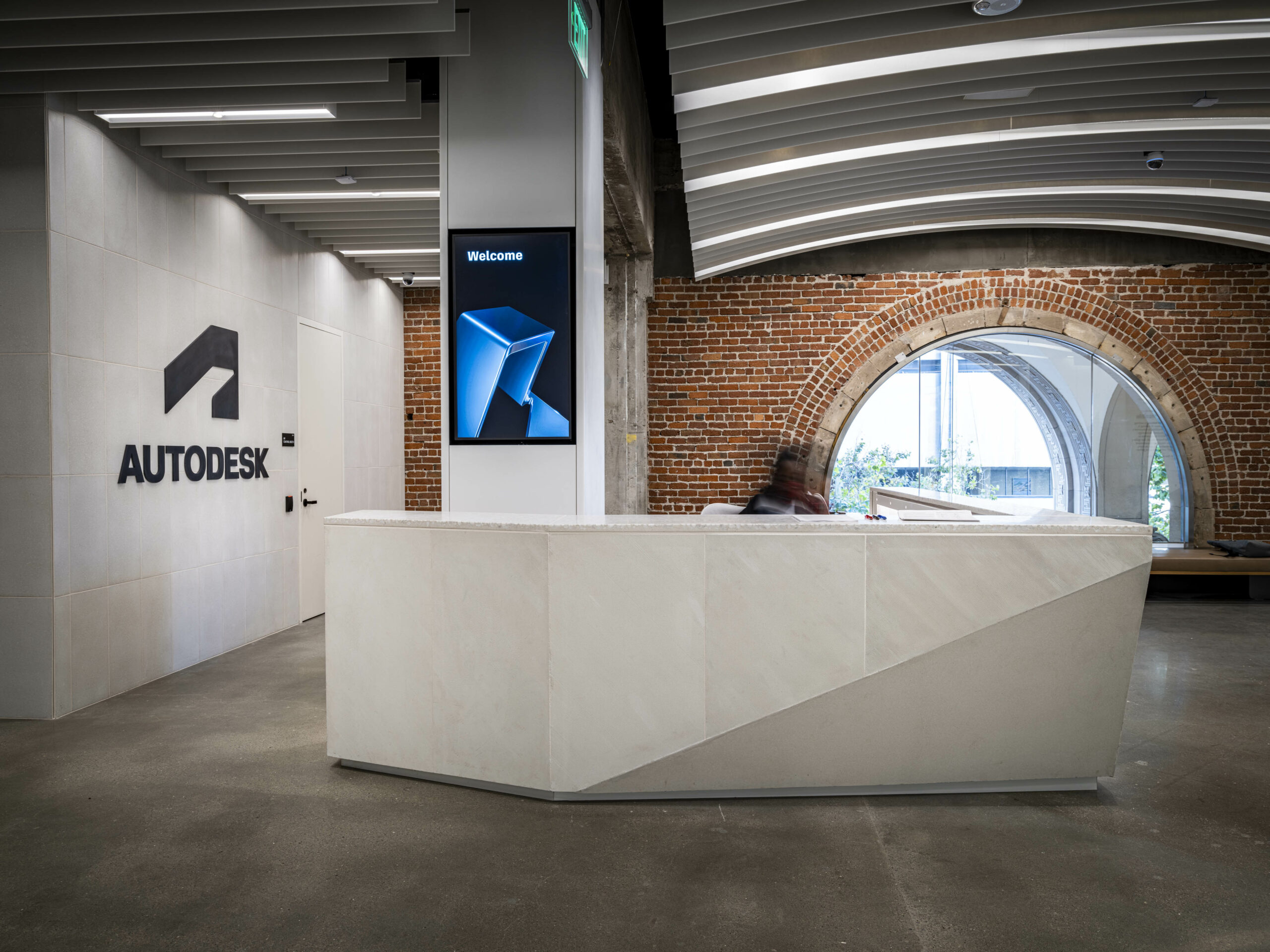
Autodesk, Montreal, Quebec, Canada. Photograph provided by Autodesk

As the future of architecture unfolds before us, augmented reality (AR) and mixed reality (MR) technologies are poised to revolutionize the way we present and experience our designs. Tools like Microsoft HoloLens, Magic Leap, and Apple ARKit allow us to superimpose digital information onto the physical environment, creating immersive and interactive presentations that captivate our clients and collaborators. These cutting-edge technologies enable us to visualize and manipulate design elements in real time, engaging with our projects in novel and exciting ways. By overlaying digital models onto site photographs, AR can enhance client presentations by demonstrating the proposed design in context. As we embrace AR and MR, we stand at the forefront of a paradigm shift, forever changing how we document, present, and interact with architecture.

Throughout the timeline of a project, architects employ an ever-evolving array of visualization tools, from the nascent stages of conceptualization to the emerging realms of digital fabrication and interactive presentations. By embracing these tools and the many more sure to be introduced over our careers, we can continue to push the boundaries of architectural possibility, shaping the world around us with passion, precision, and innovation. As we salute the visual documentation tools accompanying us on our architectural odyssey, let’s not forget the camaraderie and ingenuity that defines our profession. Together, we can create spaces that inspire, transform, and endure for generations.

Judging for the 11th A+Awards is now underway! While awaiting the Winners, learn more about Architizer’s Vision Awards. The Main Entry Deadline on June 9th is fast approaching. Start your entry today >

Reference

Go Small, Live Well – Zero Energy Project
CategoriesSustainable News Zero Energy Homes

Go Small, Live Well – Zero Energy Project

Hopefully, this period of human existence will be known for the rapid and effective response to the existential crisis of climate change. Either that, or human culture will descend into a Mad Max scramble for survival. Either way, homes will be changing. Perhaps the most noticeable change will be the shrinking of living space. The median square footage of a new home sold in the US in 2020 was 2,333 square feet, and many “luxury” homes range from over-sized to gargantuan. Fortunately, there is a counter trend of modest-sized houses that are more affordable and fit better on small urban lots. And that counter trend has deep roots. In the late 1940s, the average new home was just 750 square feet. In the 1950s, it increased to 950 square feet, 1,100 square feet in the 1960s and 1,350 sf in the 1970s. In fact, most of us at an age to purchase a home were raised in houses that are much smaller than those we see on the market today. 


Small homes have smaller carbon footprints. They consume fewer building materials, need smaller equipment, cost less, and require less energy to operate. Even better, they require less time and effort for cleaning and maintenance. You may think that less living space means sacrifice, but a well-designed home can live big in fewer square feet. 


The right size home is the smallest that will work for your current needs. Many homebuyers fall into the trap of buying for “resale.” They buy rooms and features that they don’t really want or need, because they may believe the market demands these features. If it was ever true, it’s now a myth perpetuated by some real estate brokers. There’s a need to educate today’s homebuyers to see through the myth that “bigger is better.” In fact, as the housing market changes, it’s likely that large homes with empty bedrooms and high energy bills may not compete well in the market as smart buyers migrate to small, energy-efficient homes with lower operating costs. And today’s homebuyers will want to be in the vanguard of this trend, not the tail end. 


Everyone is different and has different needs, but here are some basic size considerations: 

  • Single person or couple: 600-1,000 sq. ft.
  • 3 to 4 person family: 1,200 – 1,600 sq. ft. 
  • Larger families 1,800 to 2,000 sq. ft. 


Good design can deliver comfort, utility, and a feeling of spaciousness in a smaller space. The deciding factor should be that homes fit the owner’s current needs and known needs for the future in the smallest possible footprint. 


Follow the principles of smart, small home design 


Keep it simple. Architectural complexity increases cost and complicates insulation and air sealing details. This doesn’t mean that we need to live in cubes. However, when you add corners beyond the usual four, make sure the benefit outweighs the costs. Think of the home’s footprint as two or more connected rectangles — small ones. 

Invite natural light. Careful selection, sizing, and location of windows can flood a small space with natural light, making it look larger without increasing energy use. Windows with higher sill heights limit total window area while preserving views, and light — providing ample space to place furniture against the wall below the windows. 

Share light between rooms. Indoor windows, glass block partition walls, full- or half-lite glazed doors, and transoms allow light from a brighter space into an adjacent area that has less natural light. Operable transoms also allow better air circulation in small homes that use ductless heating and cooling systems. 

Open floor plans. Most modern layouts connect cooking, eating, and living spaces in a more open pattern. This makes each individual space feel larger and allows for long interior views and good air circulation. 

High ceilings. Smaller rooms need not feel cramped. High ceilings (nine or ten feet) add an airy feeling and visual interest. Consider well insulated cathedral ceilings, which create more interior volume. Some of this volume can contain usable space, such as lofts, mechanical rooms, or heated storage. Even if it’s not directly functional, high ceilings bring visual appeal to smaller rooms. 

Reduce circulation paths. Shorten or eliminate hallways, unless they serve a dual purpose. Traffic patterns can flow around the perimeter of rooms with open floor plans adding to the perception of spaciousness.

Eliminate formal spaces. Formal living and dining rooms are seldom used. Most people gather in kitchens, family rooms, or outdoor spaces. Avoid showcase rooms that are rarely used.

Create soft separations. Distinguish between functional spaces without building walls. Divide large rooms with “soft” visual cues, such as differing floor finishes, wall colors, moveable partitions, hanging plants, or furniture arrangements that differentiate the spaces. Or you can tie spaces together visually using similar materials, such as flooring, wall coverings, and trim, giving the overall impression of greater space.

Multi-use spaces. Every space in the home should serve more than one function. A home office and guest bedroom is a common combination. A hall or stairway can be used as a library or gallery, a landing can be a reading nook, the mudroom or bathroom can be a laundry. Install built-ins for exercise equipment and media, rather than using separate rooms — or include an exercise nook in the garage.

Build in furniture. Cabinets, bookcases, benches, work desks, and eating nooks use less space when they become part of the structure. Recess bookcases or display cases into interior walls. 

Create privacy. Everyone needs a place to spend a bit of quality time alone. This can be difficult in a small house, so create a private space. It could be a cozy window seat, a secluded loft, or a comfy chair in a solitary corner. 

Laundry in a closet. The washer and dryer don’t need privacy. Instead of getting their own room, stack them in a closet or in other space, such as a mudroom, bathroom, or utility closet. Several utilitarian functions, such as laundry, water heating, and ventilation equipment can be located in a mudroom. Add shelves and cupboards for cleaning supplies and linens, and space for hanging clothes to dry. 

Contain the mess. Clutter makes spaces seem smaller. There are countless methods to stay organized. Give the kids their own built-in cubbies in the mudroom to store coats, hats, and other personal gear. Add shelves and cupboards above a mudroom laundry. Add closets under stairs.

Include unheated space. Storage, hobbies, and exercise can tolerate a wide range of temperatures. Expand unconditioned spaces, such as the garage, full basements, or sheds to accommodate these functions at much lower cost per square foot. 

Encourage outside living. Large patios and decks extend the living space during mild weather. 

Bring in the outdoors. Locate windows and glazed doors for optimal views of the outdoors to create a visual extension and bring the outside in. Patio, deck, or courtyard doors extend the living space past the outer walls during fair weather. 

Work-at-home space. Remote workers cherish a quiet place to concentrate. Combine a home office with a complimentary function. A bedroom can be used at night for sleeping and during the day for office work — and these functions can be kept distinct. A Murphy bed will hide away during the day, and desk and work tools can be concealed by a cabinet or a curtain when not in use. 

Provide ample storage. When people want a “bigger house” they may actually need more storage. In small homes, careful planning can provide densely packed, three-dimensional, tightly organized storage — so it does not add square feet. Instead of large walk-in closets and pantries, consider making them open spaces where you can easily access three walls of shelves. If you have a closet door, you can use the back side of the door for hooks, racks, or baskets. Make use of the stairwell walls for hooks or cupboards. Always use the space below a staircase, but be more sophisticated than a simple closet door leading into an oddly shaped room. The shorter regions near the base of the stairs could have large drawers that fully use the space below the bottom steps. 

Stop swinging. Sliding doors use less space than swinging doors. Consider using pocket doors that slide into a wall cavity, a rolling door that hangs on the wall surface, a simple curtain on a rod, or no door at all. Rolling doors don’t seal tightly, which could be a concern for privacy. On the other hand, there is ample airflow around the door for ventilation and space conditioning to penetrate. 

Plan for flexibility. The design should allow for changes in lifestyle. A young couple may have children. Grown children will leave the nest. A business could be born in the kitchen and grow in the guest bedroom. Plan for these changes. Pre-plan a future addition or consider ways new uses could be accommodated inside the existing footprint. The upstairs or basement could become an apartment for an aging relative. 


Stock Plans for Small Homes

We may think that building small homes is a new idea, but in the 1950s through the early 1970s the Canada Mortgage and Housing Corporation released a series of small house designs to encourage affordable housing. The concept behind these plans holds up well today, but it needs to be updated to zero energy and contemporary expectations, such as multiple bathrooms. 


Some modern designers are also embracing the idea. Here’s a contemporary take on small house plans that can be upgraded with energy-saving features. Zero Energy Plans offers plans for a range of small zero energy homes. Just click on “Plan Filters” and go to the zero energy home size choices to find a suitable match. 


If you can’t find the perfect house plan, consider a custom zero energy design that meets your size needs exactly. Seek out zero energy designers and builders who understand the trend towards smaller more energy-efficient homes. With good design and conscientious construction, you may find that a small, custom-built, zero energy house is not only within reach but lives very well! 

Reference

Live Talk: Seven Pillars of Highly Successful Architecture Firms
CategoriesArchitecture

Live Talk: Seven Pillars of Highly Successful Architecture Firms

Want to learn the secrets to success for your architecture firm? If so, our next live event — the third episode in our architecture practice management series — is one not to be missed! Steve Burns FAIA, Chief Creative Officer at BQE, will reveal the ingredients of a well-run architectural business, including pearls of wisdom that will prove valuable for new and seasoned professionals alike.

As a bonus, architects can earn 1 AIA LU Credit for attending this talk, courtesy of BQE. Join us live on August 31st at 1:00pm ET — hit the blue button to register for free:

Register for the Event →

Culled from experiences working with more than 3,000 architecture and engineering firms over 25 years, this session will examine the seven common denominators of every successful firm. Success comes in many flavors. For some, it’s money; for others, it is peer recognition, awards, or fame; for most of us, it’s having access to challenging or exciting projects.

Regardless of how you measure success, adopting these Seven Pillars will help you create the framework from which you and every member of your firm can achieve their professional goals.

Learning Objectives

In this webinar, you’ll learn how to:

  • Apply your AE talents to your business and turn your firm into the most exciting project of your career.
  • Integrate your people, processes, and tools to create the perfect triangle
  • Create and manifest your business and strategic plan
  • List the three essential qualities which turn individuals into leaders

About Steve

Steven Burns is a member of the College of Fellows of the AIA and Chief Creative Officer of BQE Software. After receiving his Master of Architecture degree from the Harvard Graduate School of Design, Steve spent 7 years at SOM – working in Chicago, London, and Berlin before founding his own firm, BBA Architects in 1993. In 2007, Steve sold BBA to pursue his passion for business management software — starting with his creation of ArchiOffice. Steve is now focused on the product development of BQE CORE ARCHITECT, a fully-integrated, cloud-based firm management platform that includes time billing, invoicing, accounting, and project management for firms of all sizes. Steven is a global speaker and thought leader on topics related to firm management and emerging technologies.

About Paul

Paul Keskeys is Editor in Chief at Architizer. Paul graduated from UCL and the University of Edinburgh, gaining an MArch in Architectural Design with distinction. Paul has spoken about the art of architecture and storytelling at many national industry events, including AIANY, NeoCon, KBIS, the Future NOW Symposium, the Young Architect Conference and NYCxDesign. As well as hundreds of editorial publications on Architizer, Paul has also had features published in Architectural Digest, PIN—UP Magazine, Archinect, Aesthetica Magazine and PUBLIC Journal.

Register for the Event →

Reference

Live Talk: Join Ema Peter for a Masterclass in Architectural Photography
CategoriesArchitecture

Live Talk: Join Ema Peter for a Masterclass in Architectural Photography

With the birth of the smartphone, millions of people around the world gained access to incredibly advanced cameras, opening up the world of architectural photography to the global public. But while anyone can snap a photo, it takes more to create a truly compelling image. What kind of photograph captures the essence of a place? What can it tell us about the people that live, work and play within it? Can a photograph tell us a larger story about the cultural context of a home, city or country?

With the 3rd Annual One Photo Challenge set to launch, we invite award-winning photographer and competition juror Ema Peter to explore answers to some of these questions. Hit the button below to register for this free live talk, set to take May 10th, 2022 at 1pm ET:

Register for the Event →

During the talk, we’ll look back at some of the best images from last season, examining the photography rules they follow — and which they break — to tell powerful stories about architecture.

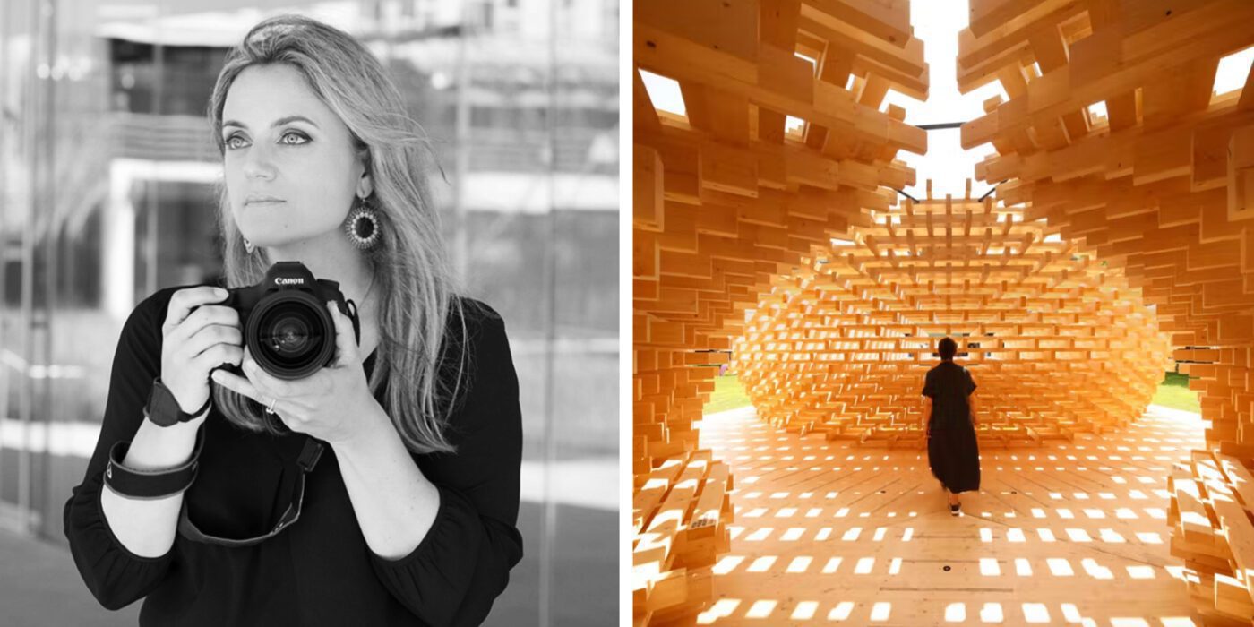
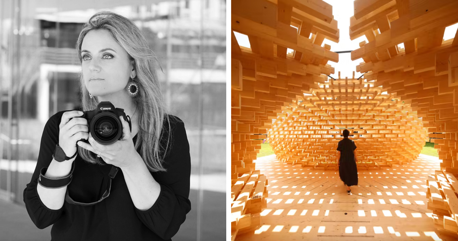
Left: Ema Peter; Right: Future Space Pavilion by Peter Pichler Architecture. Image © Ema Peter Photography

By attending this talk, you’ll learn:

  • How to harness unexpected lighting and composition to create a compelling architectural photograph
  • How to spot opportunities for a great photograph in different places and moments in time
  • What it’s like to be a professional architectural photographer and what it takes to succeed in the business

About Ema

Ema is the principle of Ema Peter Photography. In the past 10 years she has works with some of the largest architectural, interior design and engineering firms in North America. Ema’s photography has helped many of these firms reach award winning status. Her images have been published in Architectural Digest, Objekt International, Dwell, Wired, New York Times and many more. Ema holds a masters degree in art and applied photography from the national academy of theatre and film arts in Sofia Bulgaria as well as a PHD in Photojournalism.

She started her career as a TV anchor on Bulgarian National TV and then as an intern at Magnum Photo Agency in Paris. She then led one of the largest photography teams in North America at VRX Studios Inc. She was also the lead photographer for ad campaigns at Hilton, Hyatt and Fairmont and was responsible for creating photography standards for some of the top hotel brands around the world.

About Paul

Paul Keskeys is Editor in Chief at Architizer. An architect-trained editor, writer and content creator, Paul graduated from UCL and the University of Edinburgh, gaining an MArch in Architectural Design with distinction. Paul has spoken about the art of architecture and storytelling at many national industry events, including AIANY, NeoCon, KBIS, the Future NOW Symposium, the Young Architect Conference and NYCxDesign. As well as hundreds of editorial publications on Architizer, Paul has also had features published in Architectural Digest, PIN—UP Magazine, Archinect, Aesthetica Magazine and PUBLIC Journal.

Register for the Event →

Top image: Vancouver Tea House by Kengo Kuma & Associates; image © Ema Peter Photography. 

Reference

Watch a live talk with Serpentine Pavilion architect Sumayya Vally
CategoriesLandscaping

Watch a live talk with Serpentine Pavilion architect Sumayya Vally

Watch a live talk with Serpentine Pavilion architect Sumayya Vally

Portrait of Sumayya Vally

Dezeen has teamed up with the Serpentine Gallery to live stream a conversation between Hans Ulrich Obrist and architect Sumayya Vally of Counterspace about this year’s Serpentine Pavilion. Watch the talk here from 1:00pm London time.

Broadcasting live from the 20th Serpentine Pavilion in London, Vally will discuss the process and concepts behind her design with Serpentine Galleries artistic director Obrist in the talk.

Counterspace Serpentine Pavilion
The 20th Serpentine Pavilion is designed by Sumayya Vally

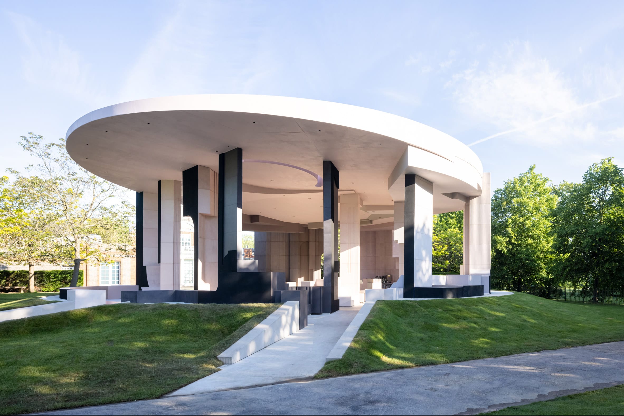
Vally’s Serpentine Pavilion is a circular pink-and-grey structure made from reclaimed cork and steel.

The temporary structure, which is currently located on the lawn outside the Serpentine Gallery, is one of five pavilions dispersed throughout the capital that comprise this year’s design.

Portrait of Sumayya Vally
Sumayya Vally is the director of Counterspace

A further four smaller pieces can be found at sites significant to London’s migrant communities, including Deptford, Barking and Dagenham, Finsbury Park and Nottinghill.

Vally gave an exclusive video interview to Dezeen in which she described the pavilion as “like a puzzle of many different elements coming together.”

Hans Ulrich Obrist
Serpentine Galleries artistic director Hans Ulrich Obrist will moderate the talk

The Serpentine Pavilion is an annual commission established in 2000 by the London gallery. Each year, it is awarded to international architects who have not yet had the opportunity to build in the UK .

Vally is the youngest architect to receive the prestigious commission. The likes of Zaha Hadid, Toyo Ito and Oscar Niemeyer are among the architects to have designed previous pavilions.


The talk takes place at 1:00pm London time on 9 June 2021. The Serpentine Pavilion 2021 is open to the public in London from 11 June to 17 October 2021. See Dezeen Events Guide for an up-to-date list of architecture and design events taking place around the world.

The post Watch a live talk with Serpentine Pavilion architect Sumayya Vally appeared first on Dezeen.

The post Watch a live talk with Serpentine Pavilion architect Sumayya Vally appeared first on Source link