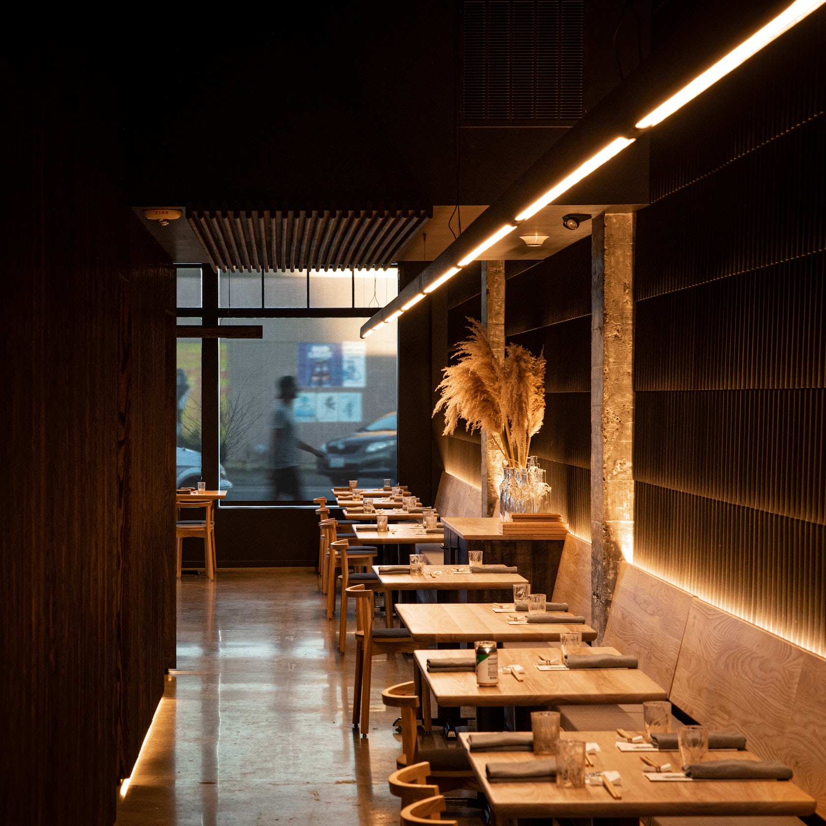
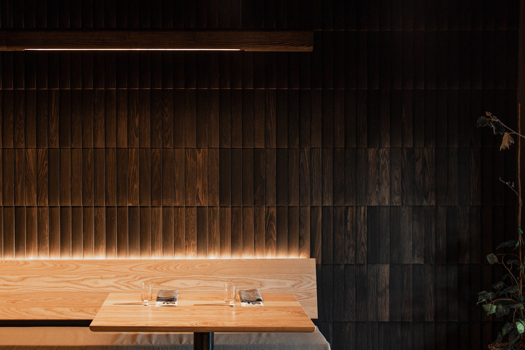
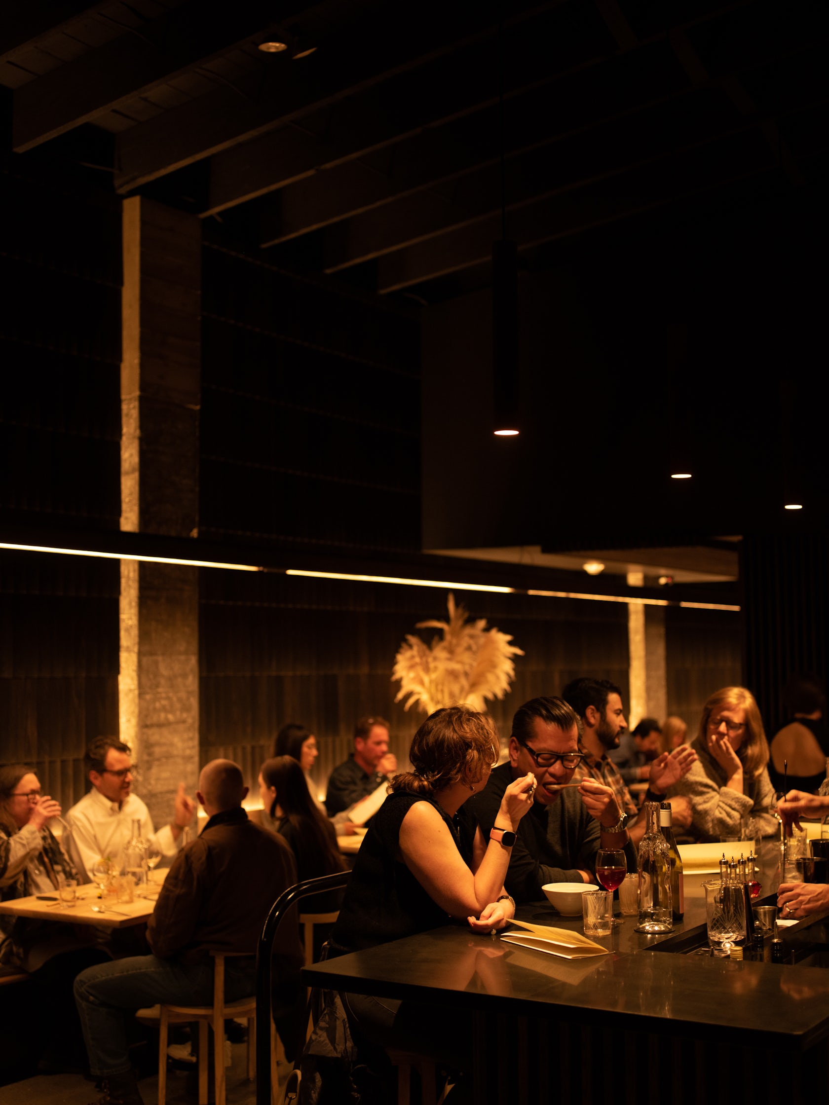
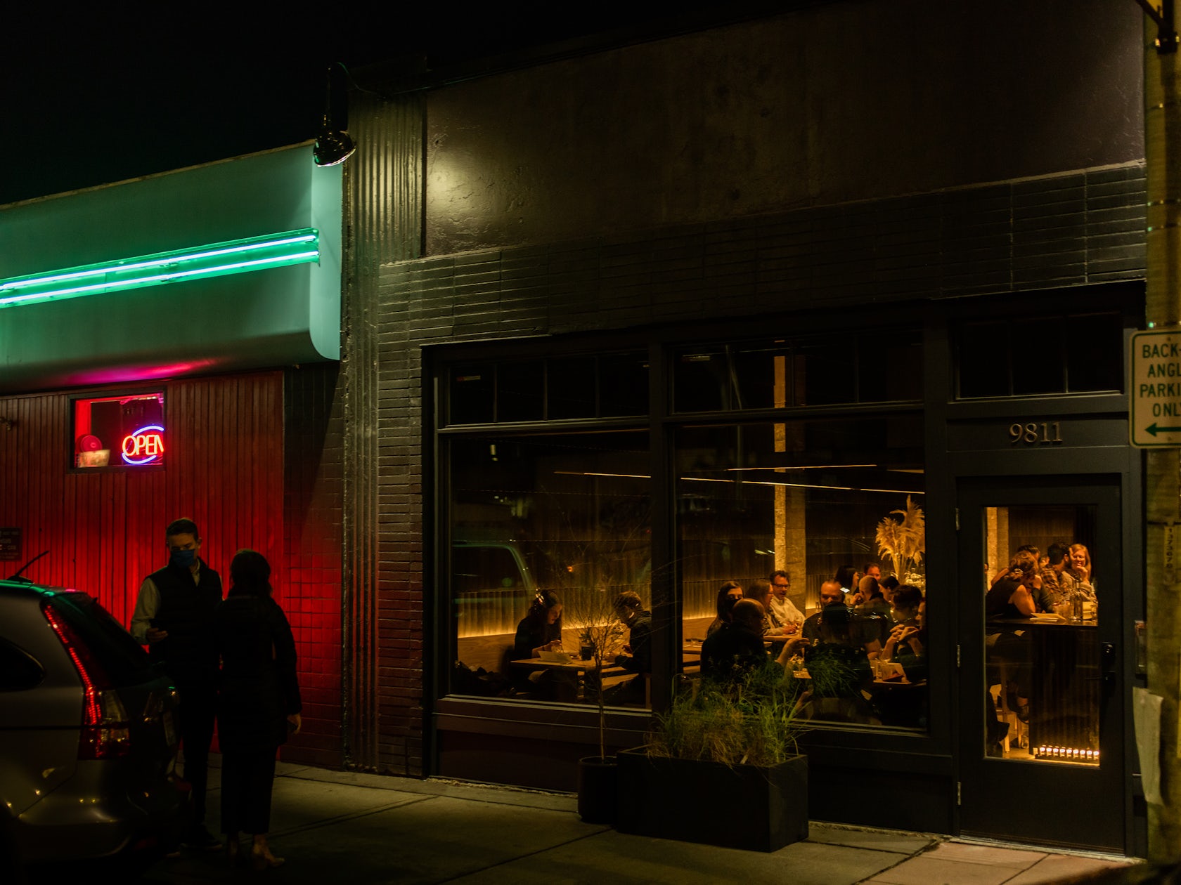
Tomo – is a restaurant in White Center, just south of Seattle, WA. The client named the restaurant after his grandmother, Tomoko, and the Japanese word “tomodachi”, meaning ‘friend’. Embracing these warm roots, wood became the centerpiece of the space. Nearly every piece of the interior was created locally, bringing down the carbon footprint of the project, and amplifying the local economic impact. The 80’ wooden light fixture, pendant lighting, bench seating, chairs, bar stools, tabletops, slatted wall panels and shake cladding were custom designed and fabricated by our team just five miles away.
Architizer chatted with Seth Grizzle, Founder & Creative Director at Graypants, Inc., to learn more about this project.
Architizer: What inspired the initial concept for your design?
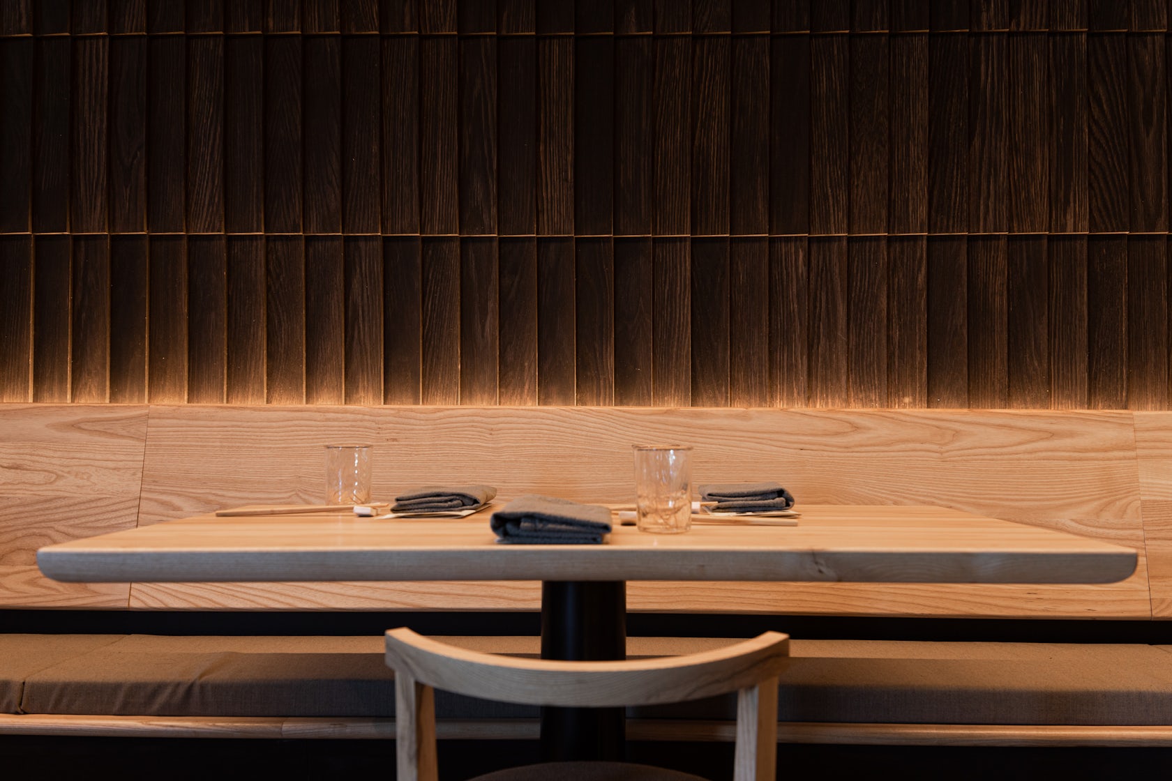
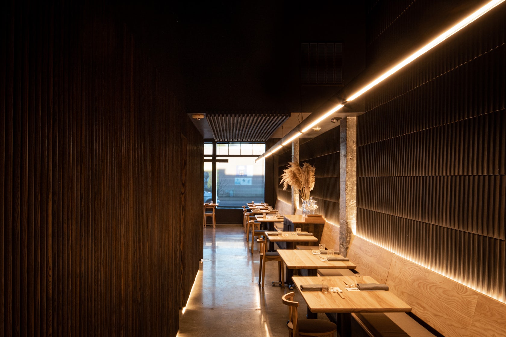
Seth Grizzle: Our initial concept was inspired by the idea of a space to enjoy great food without the trappings or stiffness of traditional fine dining. We wanted to create a lot of warmth, so wood is a centerpiece of the space: Referencing shou sugi ban, much of the interior wood has been stained a deep ebony, while oak shingles arranged like scales clad a wall running the length of the space, and contrast the strict geometry of the vertical ash slats that wrap the opposing walls.
This project won in the 10th Annual A+Awards! What do you believe are the standout components that made your project win?
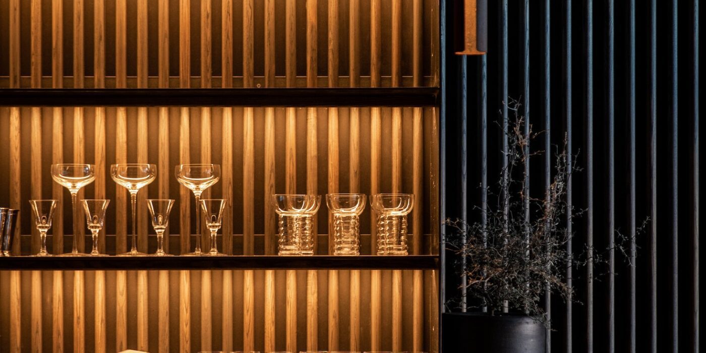
I think what stands out about Tomo is that nearly every piece of the interior was created locally, bringing down the carbon footprint of the project, and amplifying the upfront, local economic impact of the project. The 80’ light fixture, pendant lighting, bench seating, chairs, bar stools, tabletops, slatted wall panels and shake cladding were custom designed and fabricated by our team just five miles away. As well, nearly all of the lighting is directly integrated into the architectural elements–the wall panels, the bench seating, the bar shelves– the lighting is felt but not seen.
What was the greatest design challenge you faced during the project, and how did you navigate it?
The space is narrow and deep, posing a risk of feeling cold, tight and confining. Code restrictions meant fixed walls, plumbing and bathrooms. With these lines already drawn in the space, we worked with softening elements; wood, integrated light, a neutral pallette to create a dining experience that is refined but not extravagant, and elevated by light.
How did the context of your project — environmental, social or cultural — influence your design?
The context highly influenced the project. The client chose Tomo’s neighborhood, White Center, very deliberately as it has been on a slower path to economic growth and becoming more inviting to visitors. As a chef with a long list of accolades, and a community curious to learn his next endeavor, the client deliberately rejected the idea of another anticipated restaurant within the city of Seattle, in hopes of speeding the trajectory growth in White Center with a space to enjoy great food without the trappings or stiffness of traditional fine dining. With the design, the team responded by creating a space remarkable enough to feel like a destination–a place worth traveling to- for both food and ambiance.
What is your favorite detail in the project and why?
One of my favorite elements in the project is a custom, handmade 80-foot linear wood fixture that traces the entire length of the restaurant. The layout of the restaurant invited a reference to an evening in one of the endless alleyways of Japanese cities; the custom fixture beautifully connects this space without cluttering it.
How have your clients responded to the finished project?
We loved seeing that since opening, the restaurant has immediately begun outperforming their projections, with a booked solid calendar bringing hundreds of people to the neighborhood every single evening.
How do you believe this project represents you or your firm as a whole?
Tomo is a reflection of Graypants’ emphasis on the interplay between light and architecture. They always inform one another, and in Tomo, the lighting is felt much more than seen. With the exception of the linear fixture, which is very visible even as it is quite understated.
Is there anything else important you’d like to share about this project?
The cost per square feet of this project is, conservatively, 35 percent below the benchmark, largely due to the team’s ability to make simple, touchable materials feel chic in a monochrome palette. The team used a design/build approach for the project, fabricating much of the primary design elements such as fixtures and furnishings, cutting out suppliers and shortening the timeline significantly.
Team Members
Seth Grizzle, Bryan Reed, Caleb Patterson
Consultants
Fin Design Shop
For more on Tomo, please visit the in-depth project page on Architizer.
Tomo Gallery


