2LG Studio brings colour and personality into London family home
CategoriesInterior Design

2LG Studio brings colour and personality into London family home

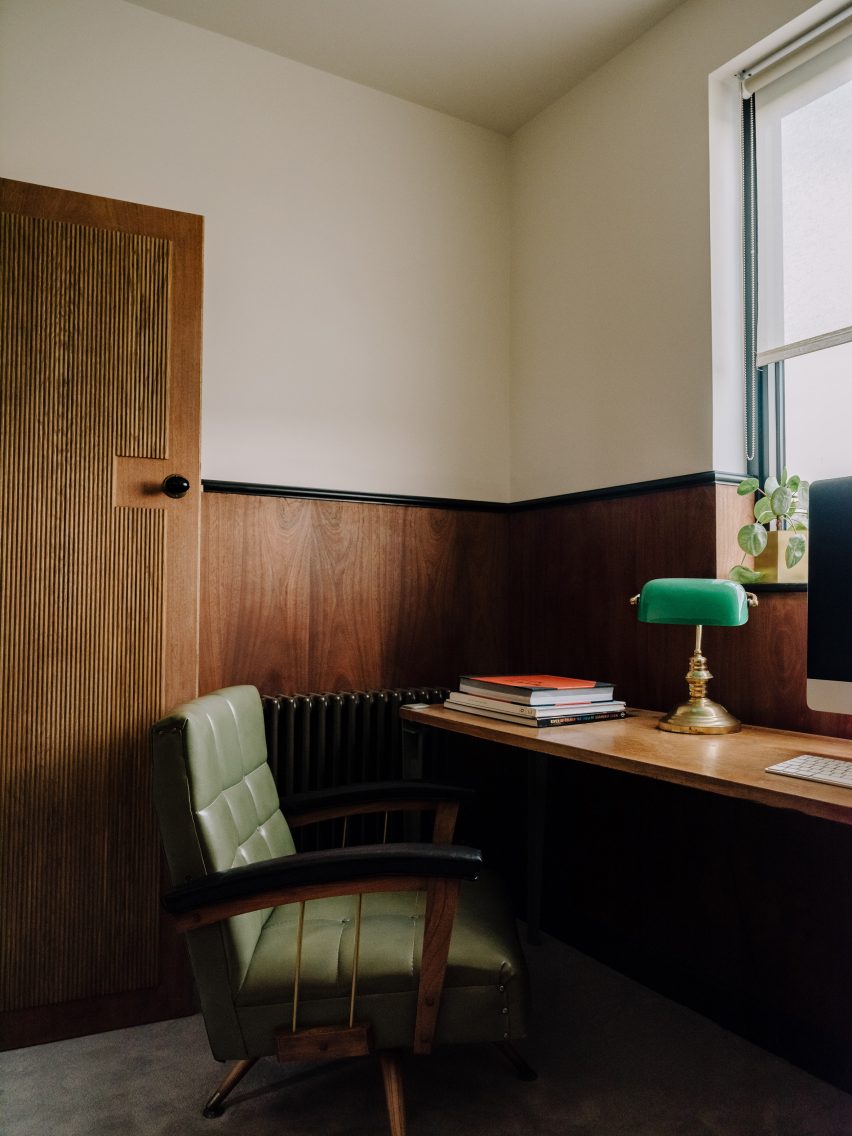
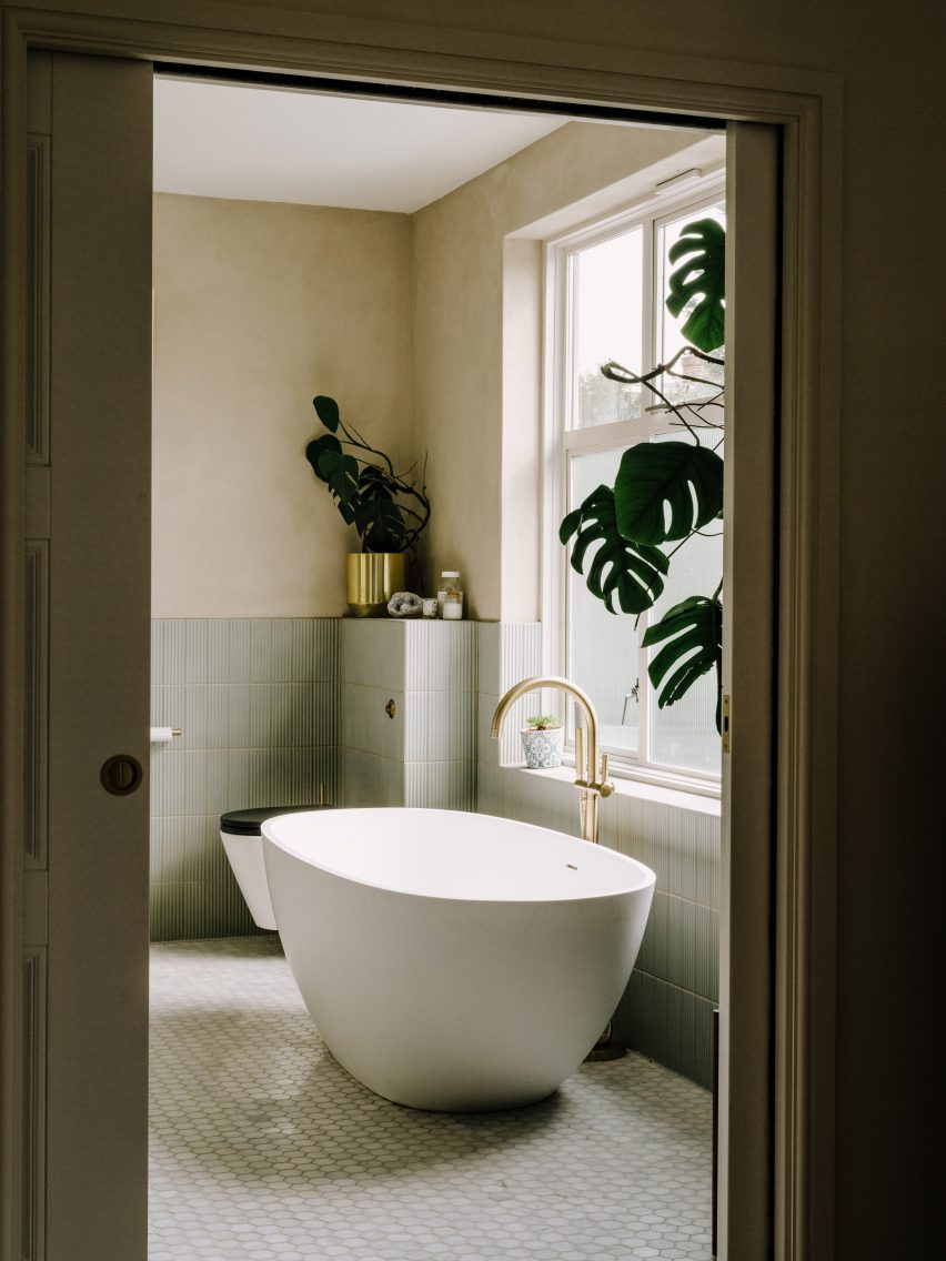
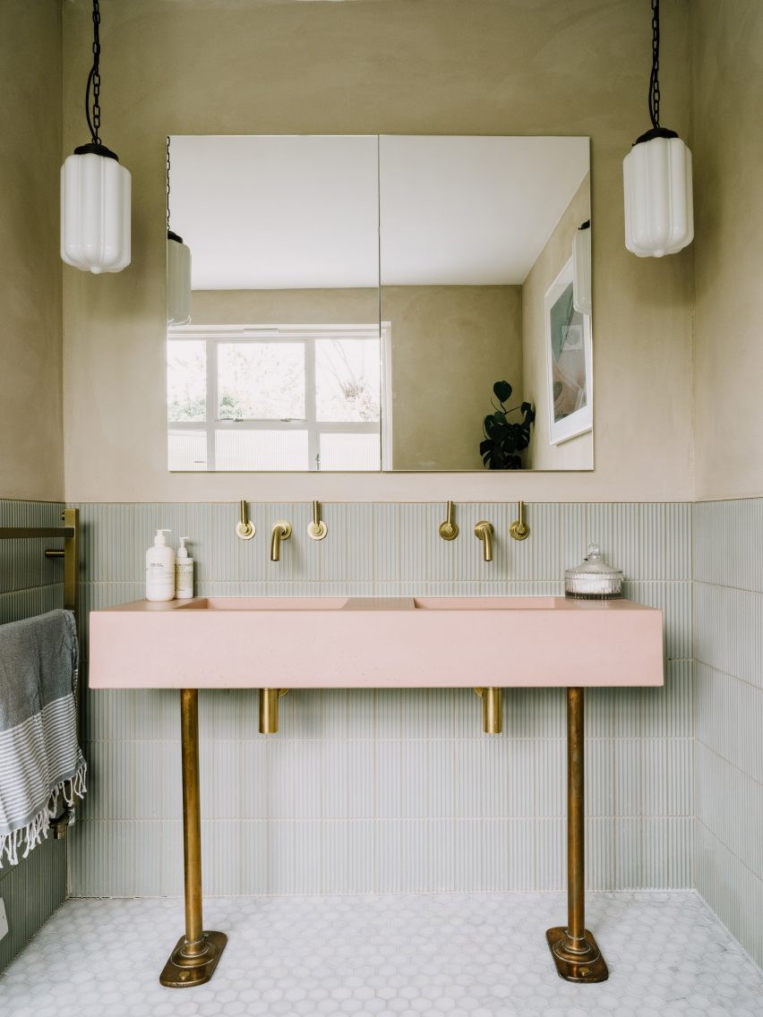
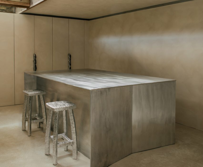
Ornately corniced ceilings were preserved and painted pastel inside this detached Edwardian house in southeast London, which local firm 2LG Studio has renovated for a returning client.

Set in the leafy residential area of Forest Hill, the house on Sunderland Road belongs to a couple who needed space for their three young children to grow and play.
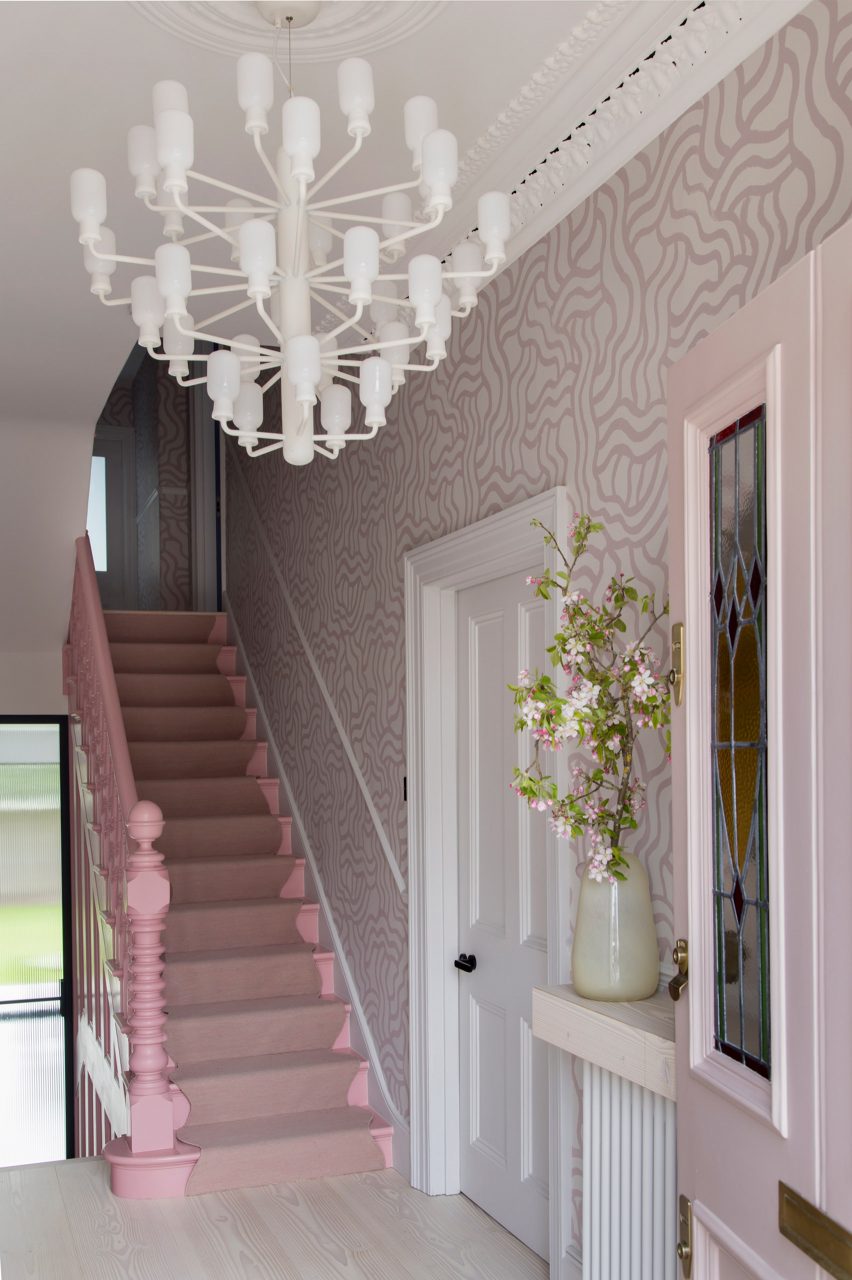
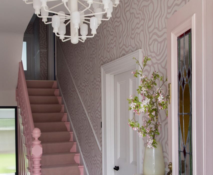
Hallway of Sunderland Road house
2LG has completed Sunderland Road house in Forest Hill

“Having designed this couple’s previous home, we had a strong sense of their tastes and wanted to evolve that for them in this house,” 2LG Studio founders Jordan Cluroe and Russell Whitehead told Dezeen.

“We wanted to bring out their characters by emboldening their love of colour and finding ways to build pattern and joy into the materiality of the home,” the duo added.

“The intent here was to respect the period elements of the building, whilst reflecting the modern style of the family who live there.”
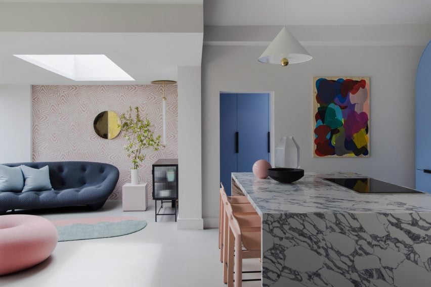
Open-plan living room and kitchen in London house by 2LG
Hand-printed wallpaper by Custhom Studio features in the lounge and hallway

Throughout the house, playful elements are in balance with a more serious aesthetic.

Instead of treating the home’s elaborate ceiling mouldings separately – as tradition dictates – 2LG Studio applied a colour-block philosophy and painted them in the same pastel tones used across the upper walls and ceilings.

The studio drew on a range of references for the interior, from 1980s colours to Italian design elements such as marble and Murano glass lighting, all the way to the Scandinavian influences seen in the natural materials and minimalist approach to furnishing.
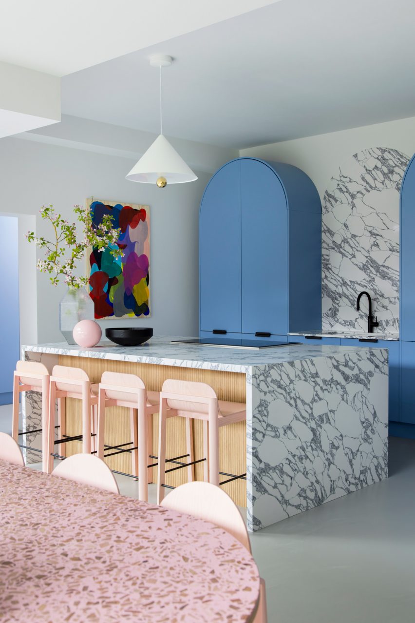
Kitchen and dining room of Sunderland Road house
The kitchen is defined by sky-blue cabinetry and marble countertops

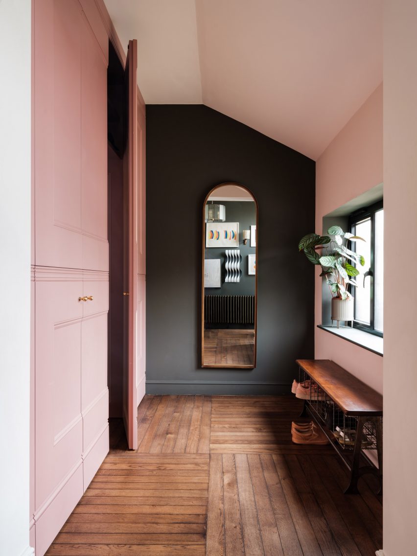
Creating impact in the entrance hall is a hand-printed wallpaper, designed by 2LG Studio with long-term collaborator Custhom Studio and used here in a bespoke calamine-pink colourway that’s repeated in the connecting spaces throughout the house, as well as in the rear living area.

“It creates a welcoming, human feel as soon as you enter,” the design team said.

This ballet-slipper colour is paired with a brighter candy pink, bringing calm and warmth to the overall scheme.
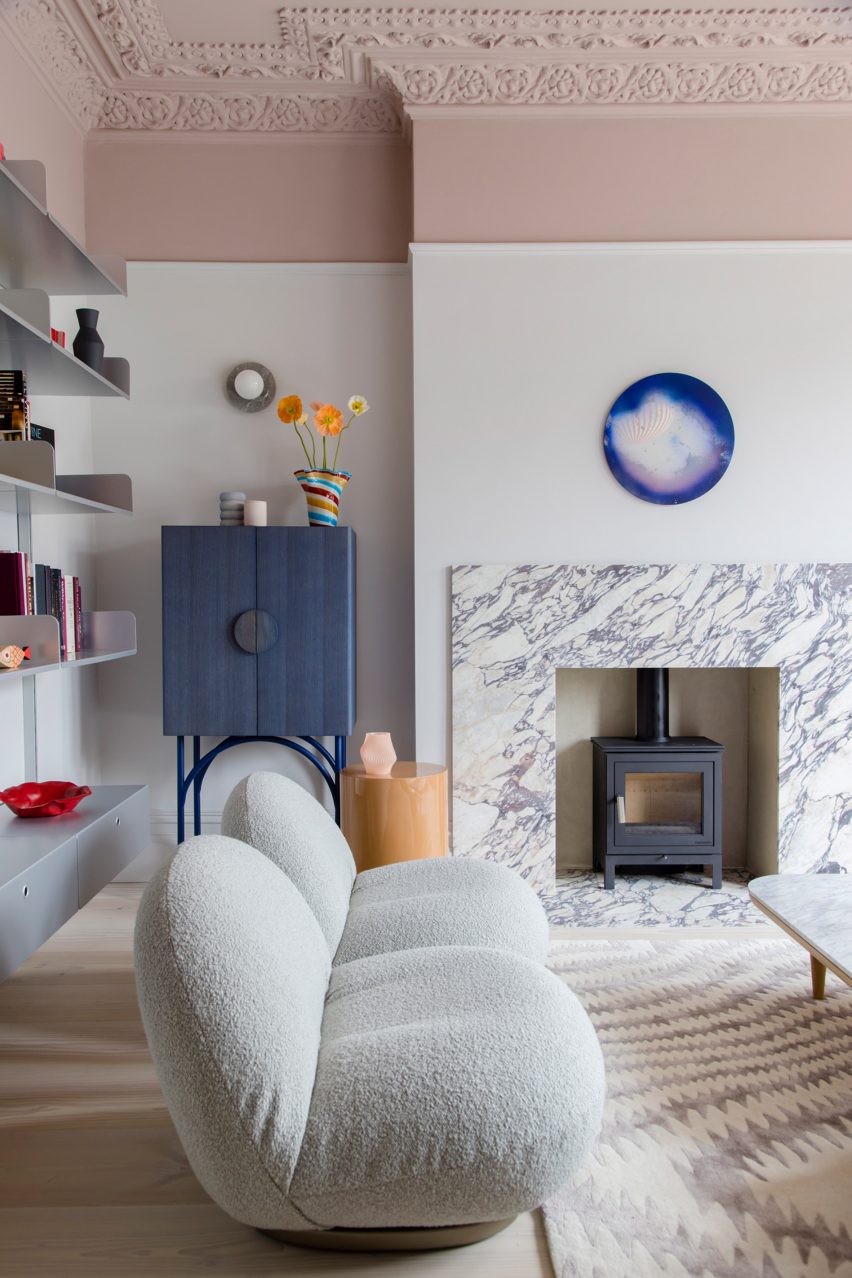
Lounge of Sunderland Road house
2LG painted ceilings, mouldings and upper walls in pastel colours

Pink-heavy palettes have become a signature for 2LG, also reflected in the natural pink undertones of the extra-wide Douglas fir floorboards that feature throughout the house alongside a grey poured-resin floor in the kitchen.

“The floorboards set the tone with a nod to Scandi minimalism, adding a natural soul throughout that unites the bolder elements,” said 2LG Studio.

In the kitchen, sky-blue cabinetry is used alongside marble countertops and splashbacks, with arched forms uniting the two finishes while pink elements such as bar stools pop against this calm backdrop.

“The colours are a key part of the atmosphere and identity of this house,” said 2LG. “The blues gets deeper and bolder as you move upstairs into the study and the family bathroom.”

“Primary red details give structure to the colour palette in the living room. Pastel green in the baby’s room is serene and fresh, warmed up with a mix of wood tones and creams.”
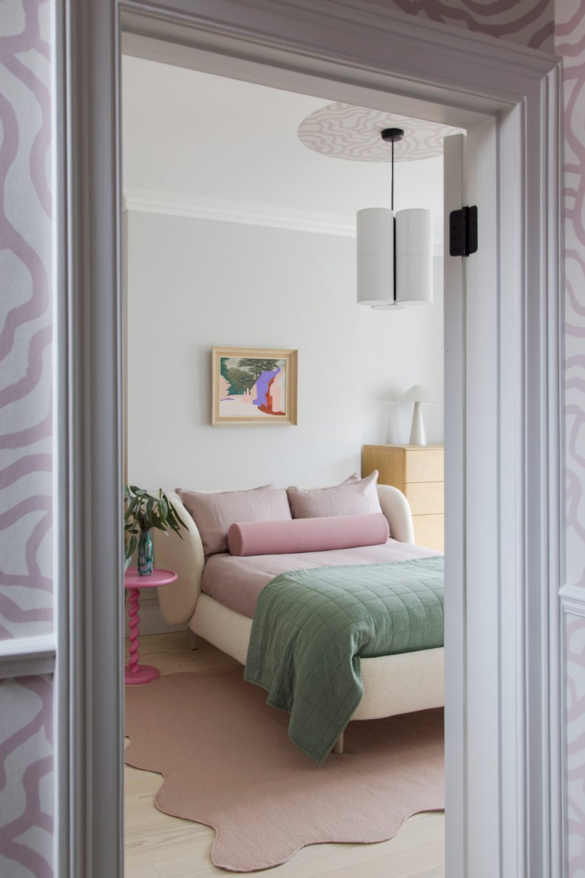
Bedroom of house in London by 2LG
Pink details feature throughout the home’s interiors

The project features bespoke joinery including a playhouse on stilts in one of the kids’ rooms alongside existing 2LG pieces such as the Luca bedhead in the loft bedroom and the Tilda sofa, both designed for London furniture company Love Your Home and upholstered here in Kvadrat x Raf Simons fabric.

“The fitted elements of the furniture give a sense of coherent design and function to the spaces whilst the classic design pieces bring a curated gallery feel, not unlike a contemporary luxury fashion store,” said 2LG Studio.
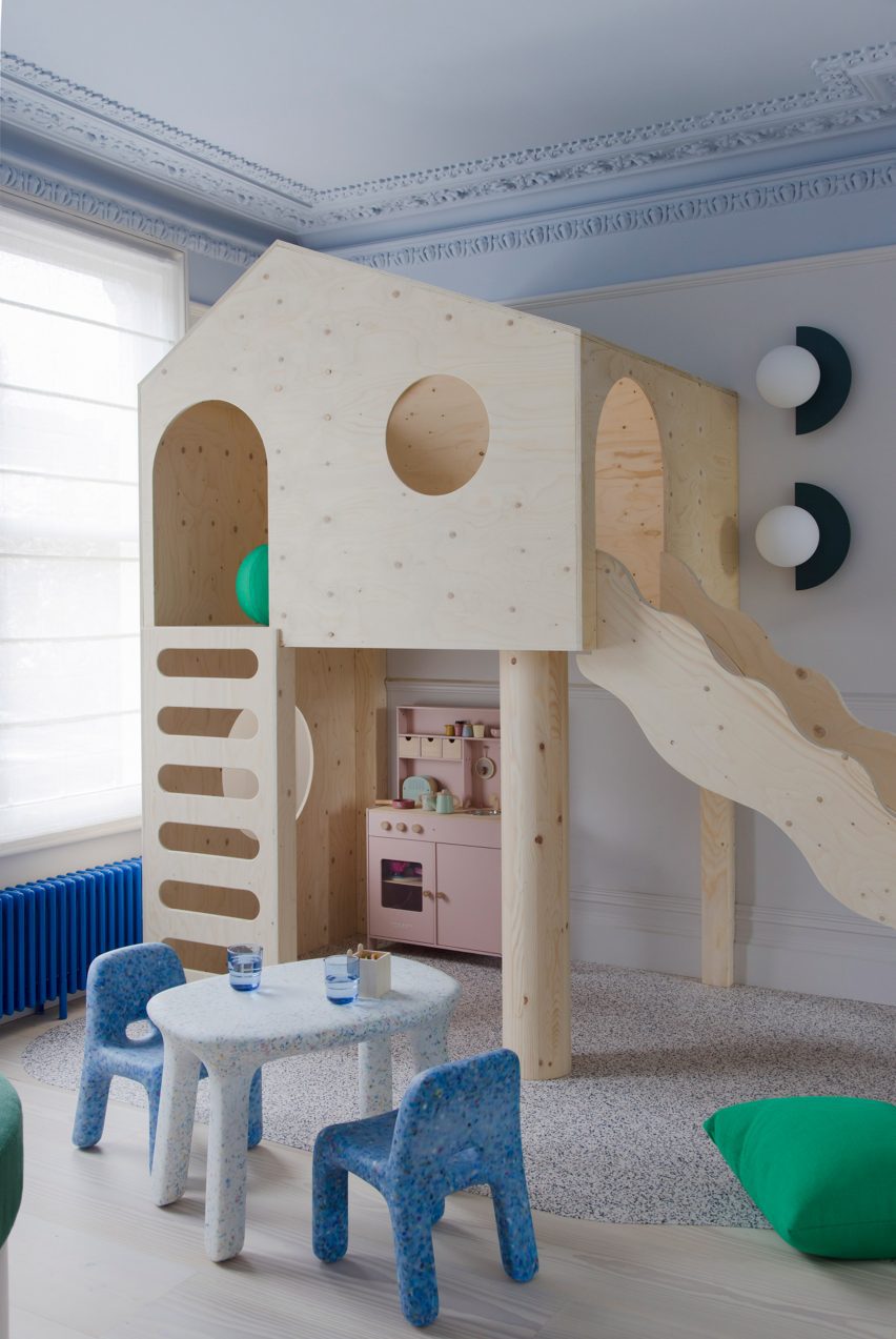
Children's bedroom of house in London by 2LG
2LG designed custom joinery including a stilted playhouse

Various recycled materials provide textural interest throughout the house, among them the recycled plastic wall lights in the living room by Spark and Bell.

2LG Studio also added a pink Foresso top made using waste wood chips and resin to the dining table, while the bespoke bathroom cabinet was made using leftover Douglas fir floorboards with recycled plastic details by UK company Smile Plastics.
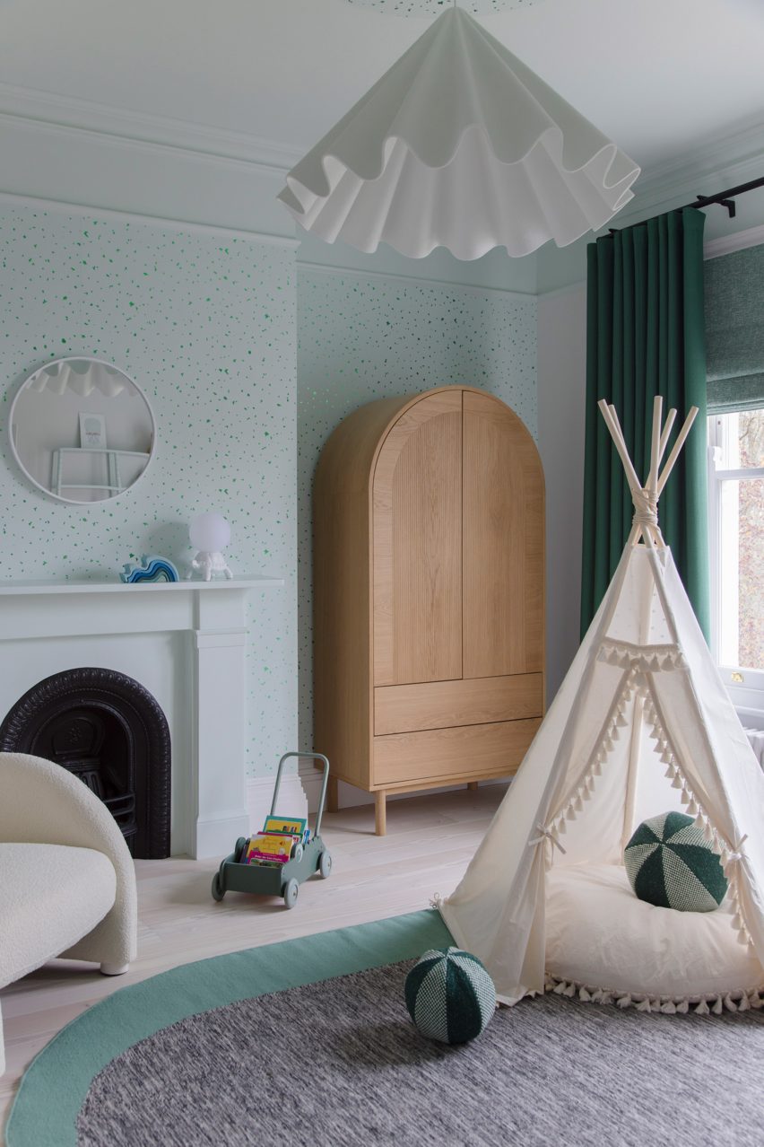
Children's bedroom in Sunderland Road house
Pastel green was used to finish the baby’s room

Since Cluroe and Whitehead founded their design practice in 2014 under the name 2 Lovely Gays, the studio has completed a number of residential projects in the British capital.

Among them is the couple’s own home and office – to which they recently added a garden pavilion with a “touch of Beetlejuice” – and an equally colour-led renovation of a period property in the Heaver Estate conservation area.

The photography is by Megan Taylor.

Reference

EBBA designs sculptural pop-up for Rotaro at London store Liberty
CategoriesInterior Design

EBBA designs sculptural pop-up for Rotaro at London store Liberty

London-based studio EBBA Architects has channelled the environmental ethos of fashion rental platform Rotaro for its pop-up boutique at department store Liberty.

The project aimed to show that beautiful and interesting spaces can be created for temporary use, while still considering the environmental impacts of materials and construction.

“We are very aware of our environmental impact and we believe design should speak to this, while also trying to make a unique experience for the visitor,” EBBA founder Benjamin Allan told Dezeen.

Pop-up shop at Liberty by EBBA
EBBA designed a pop-up shop for fashion rental platform Rotaro

Rotaro is all about fashion rental, as a response to waste in the industry,” he added. “Circularity is key to their ethos and we wanted to connect to this, both in the use of material and form.”

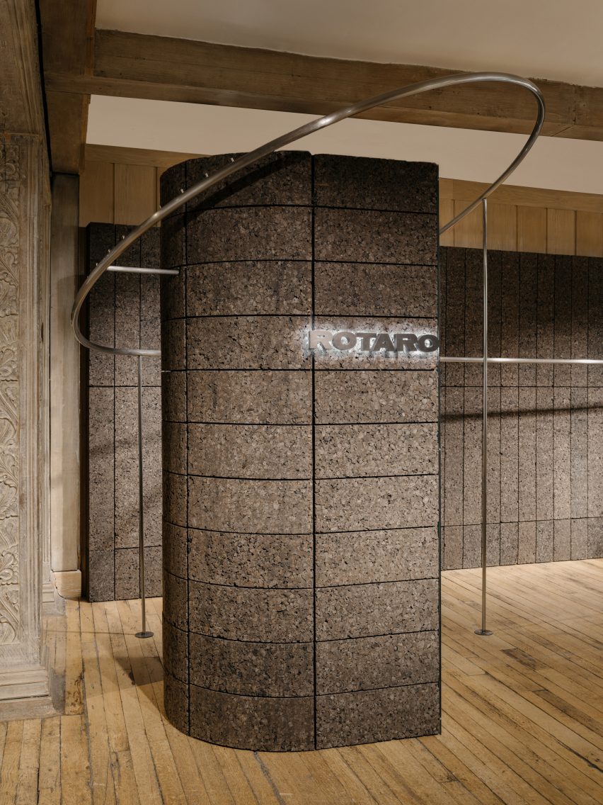
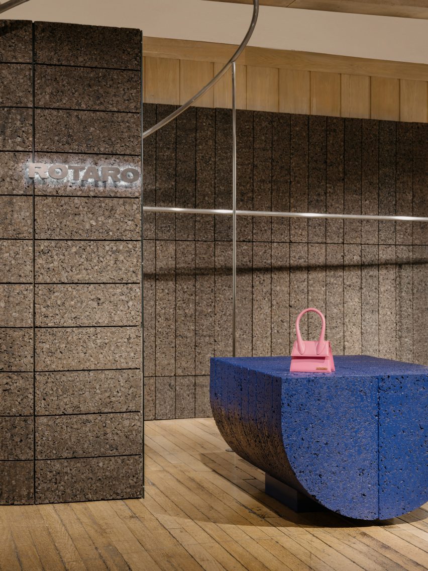
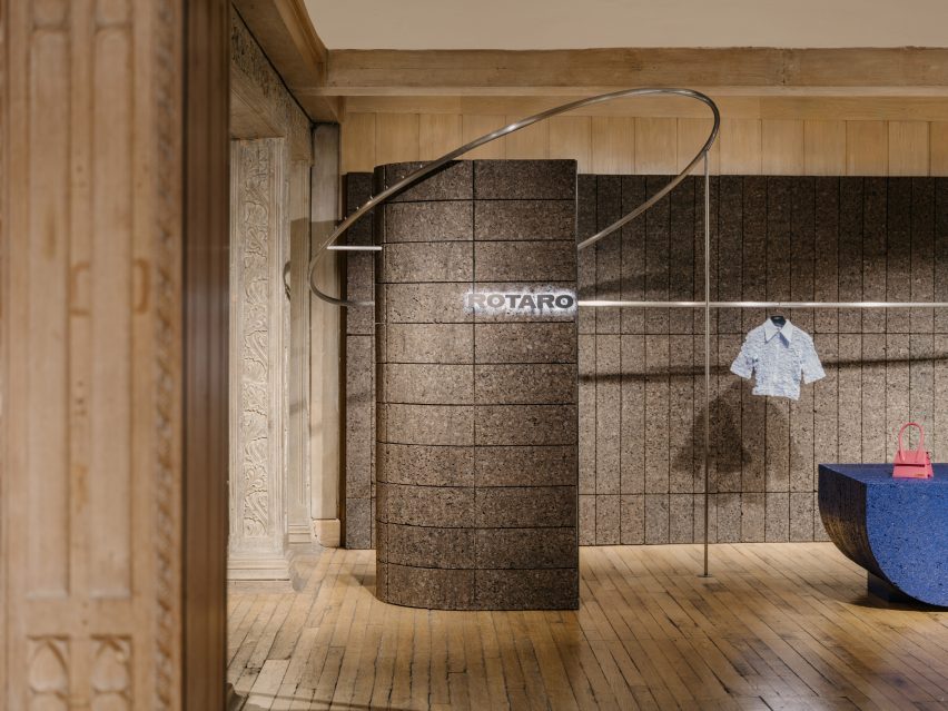
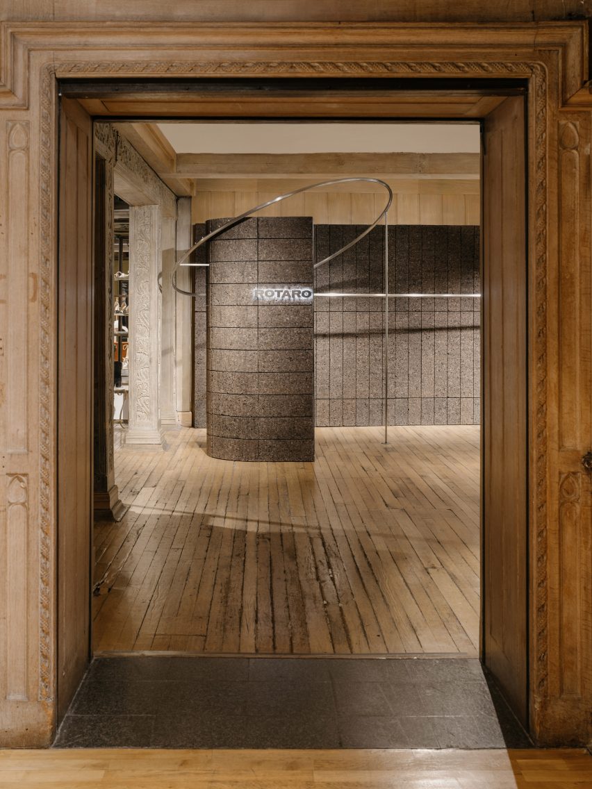
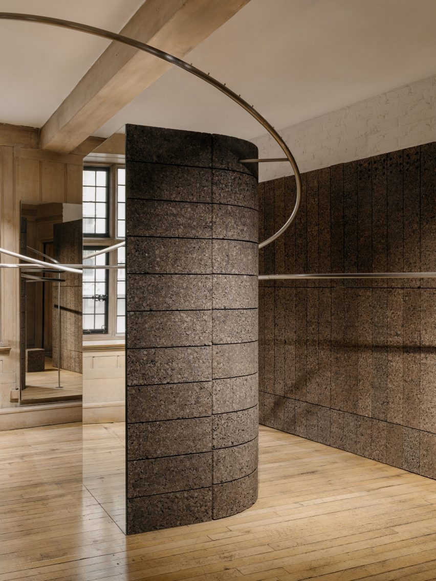
Bringing definition to Rotaro’s space within the wider store, EBBA has demarcated the area with a pair of substantial columns, each with an elongated, semi-circular cross-section.

“The position and shape of the columns create the sense of walking into an entirely new space within the historic context of Liberty,” said Allan.

Cork column emblazoned with the Rotaro logo
The studio demarcated the area with a pair of substantial columns

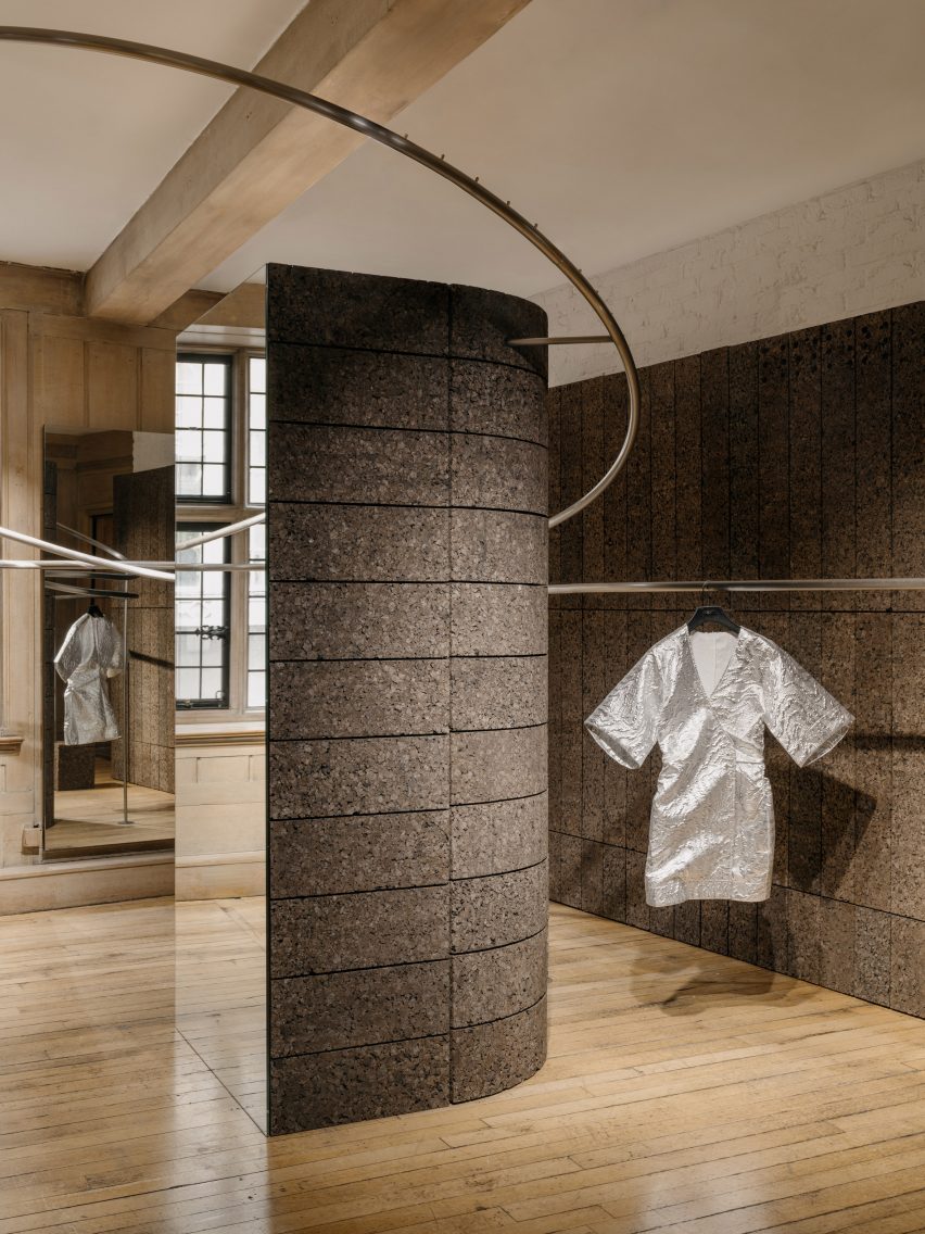
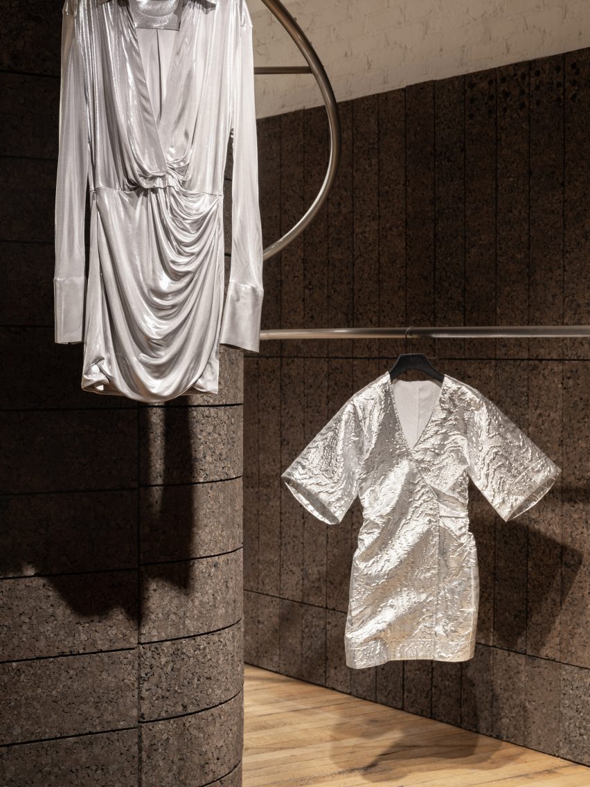
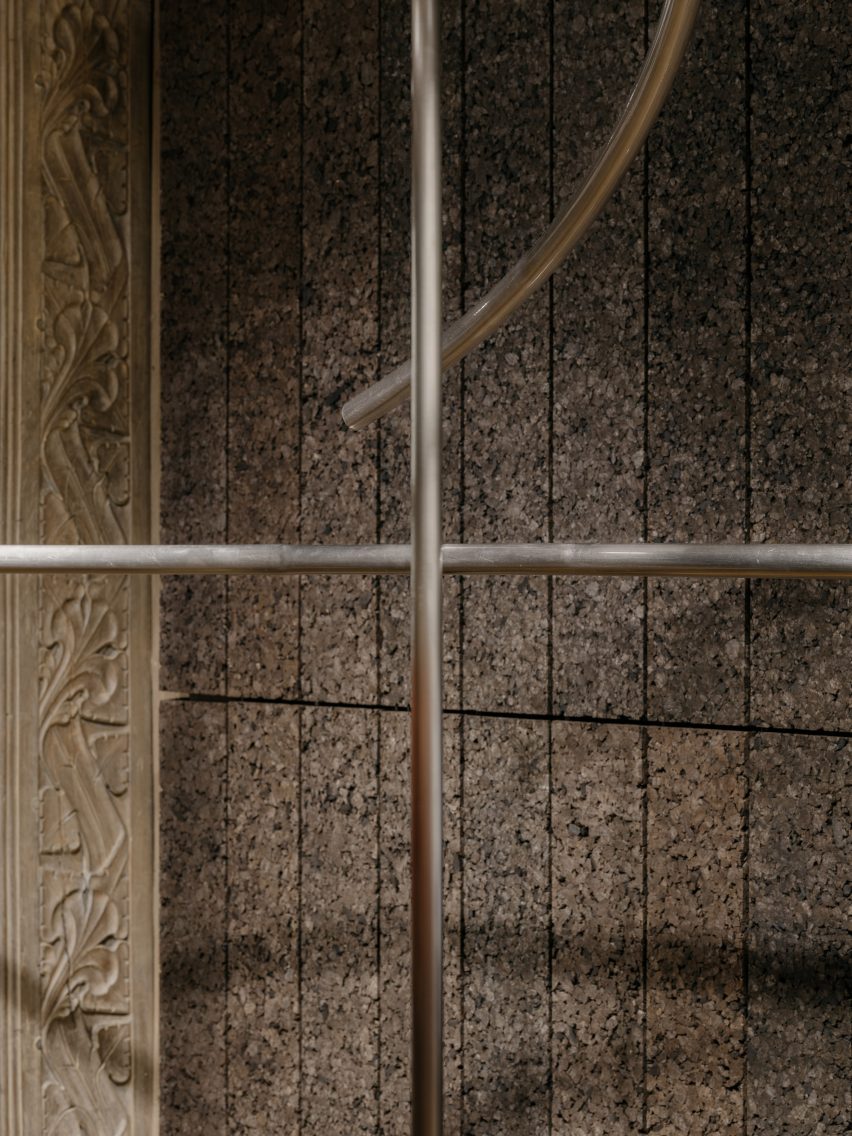
Entwining the two columns, a pair of metal rails have the dual function of creating a display area and introducing a sculptural element that further defines the space, with soaring, free-form curves.

“The two rails rotate and wrap around each of the columns, while also simultaneously responding to the opposite rail, a bit like a choreographed piece,” Allan said.

Cork column at Rotaro pop-up in Liberty
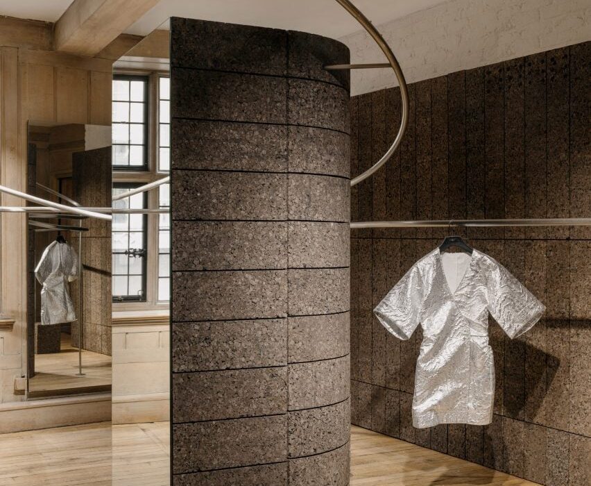
Cork is the project’s primary material

Continuing the theme of duality, just two key materials have been used in the space – cork and metal.

EBBA was influenced by the work of artists Donald Judd and Carl Andre and their elevation of humble materials through detailing and construction.

Metal rails by EBBA for the Rotaro pop-up
A pair of metal rails have a dual function

“We always look to push the potential of a project, to make the most impact through the simplest of means and also address the need to be economical,” Allan said.

“Essentially the design revolves around only two materials which, working together, give a sense of regularity in the layouts of the blocks, combined with the sculptural forms of the rails.”

Garments hanging from metal rails
Curated garments hang from the rails

Cork was used as the primary material, cladding the two columns and creating the backdrops that zone Rotaro’s area.

EBBA aimed to use a material that had an environmental quality, while using the standardisation of the blocks to set parameters for the design.

“We chose blocks of a specific dimension that could then be adapted to create both the walls and the columns themselves,” Allan said.

“The cork is a natural material that has an inherent warmth and depth, while also being incredibly versatile and easily recycled,” he added.

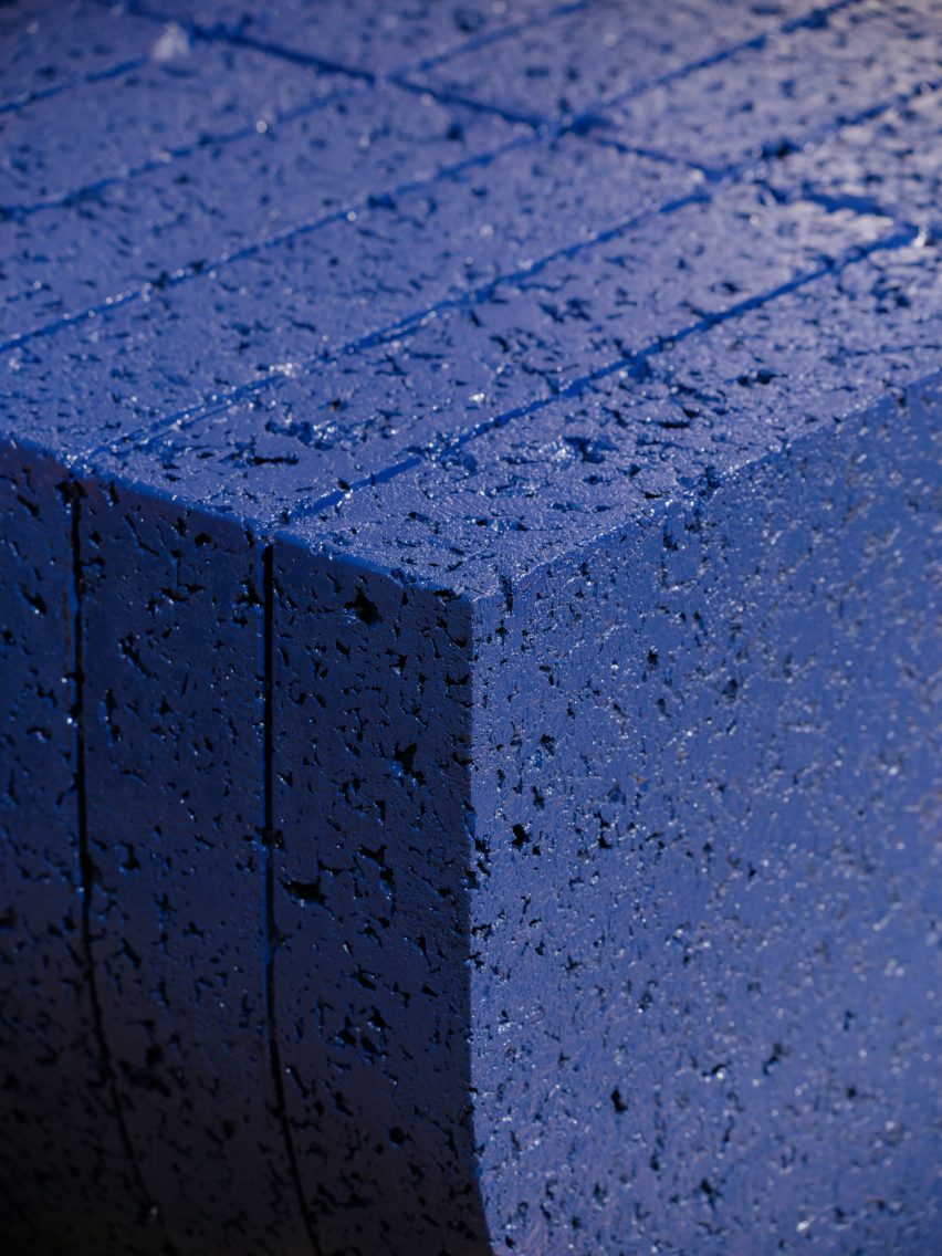
Textured ultramarine plinth
Texture characterises the pop-up shop

Brushed stainless steel was used for the metalwork, with each rail comprised of a single piece of metal that was bent and sculpted to wrap around the columns.

This rail’s curving form relates to the idea of circularity in Rotaro’s business model, while also bringing an adaptability to the space by allowing the garments to be shown in a variety of ways.

Stainless steel railing for Rotaro by EBBA
Brushed stainless steel was used for the metalwork

“The primary purpose is to display the continuously updated collection while also adding a sculptural aspect that helps to create a sense of space,” said Allan.

Within the ornately-detailed Liberty store, the project offers a bold, contemporary response to the interior, while finding common ground with the wider building.

Curving metal rail
The rail’s curving form relates to the idea of circularity

“The tones and textures in the warmth of the cork, tie in with the timber and natural colours of Liberty’s interior spaces,” Allan said. “Detailing and decoration in the original columns relate to nature and vegetation, which also tie into the use of cork and its qualities.”

Because the Liberty building has Grade II listed status, no fixings were allowed into the building fabric.

“The benefit of the lightweight cork material meant we could also adapt the Rotaro space with minimal impact on the wider building,” he added.

Lightweight cork column at Rotaro by EBBa
Cork was chosen for being lightweight

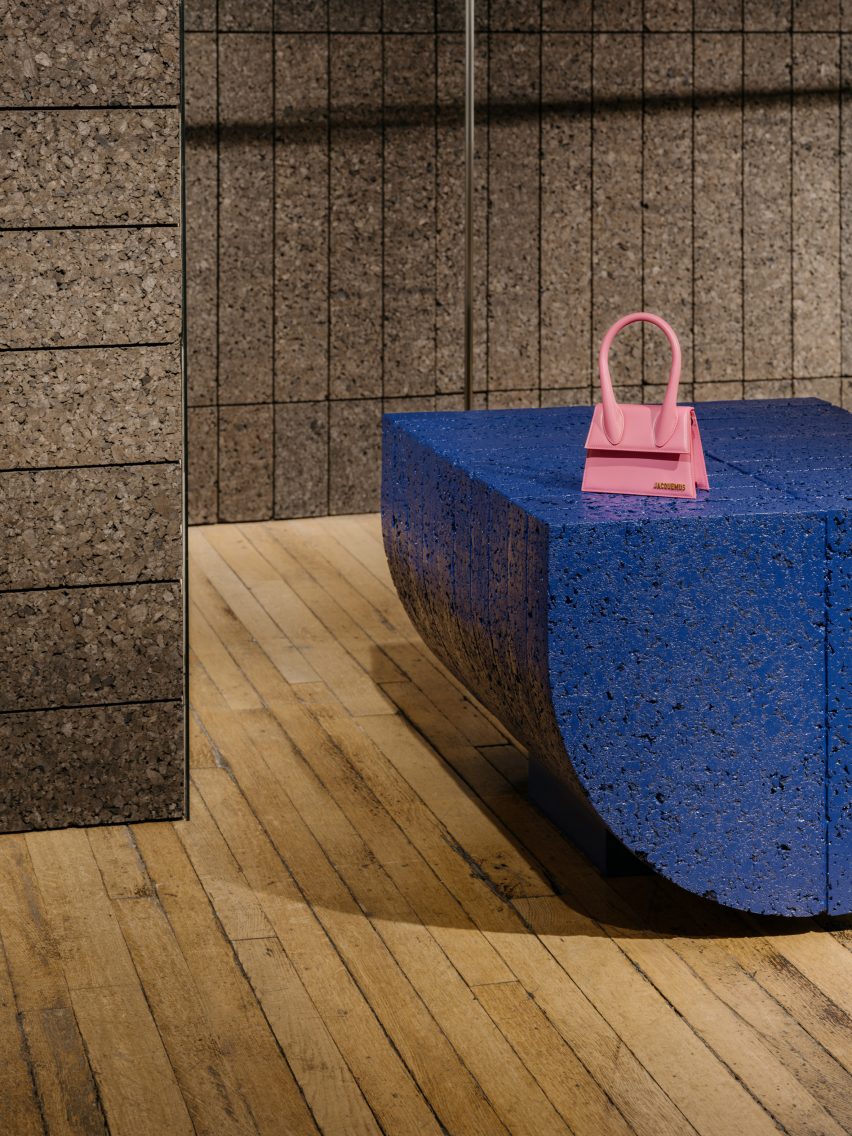
To create a plinth that provides a flat surface for displaying objects, EBBA used the same semi-circular form of the columns, but flipped onto its side.

This element has been given an ultramarine blue coating to add a sense of playfulness and catch the attention of visitors, using one of Rotaro’s key colours to connect with the brand’s identity.

Semi-circular plinth with ultramarine coating
A semi-circular plinth features an ultramarine blue coating

While the space has been designed as a pop-up, EBBA worked – through the quality of the materials and the construction of the walls and blocks – to give it a sense of permanence.

“All of our projects aim to achieve a quality of permanence through the use of natural materials and the detailing of the construction,” Allan said.

“We believe that this level of quality helps to create a design that feels purposeful, even for temporary uses.”

Other recent projects by EBBA Architects include a shop for Cubitts in an old pie-and-mash restaurant and a house extension with brutalist-style materials.

The photography is by James Retief

Reference

Dog-friendly London club refurbished with giant 3D dachshund relief
CategoriesInterior Design

Dog-friendly London club refurbished with giant 3D dachshund relief

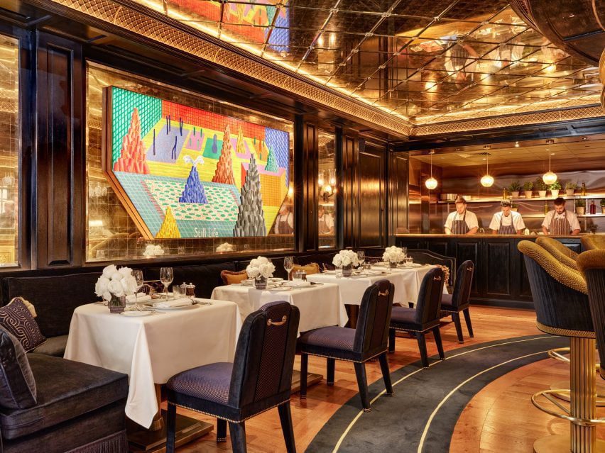
Dog-friendly private members’ club George in London has been refurbished by restaurateur Richard Caring with David Hockney murals and Mayfair’s largest dining terrace.

The revamped club was designed to be dog-friendly throughout as well as displaying a large collection of dog-related artwork.

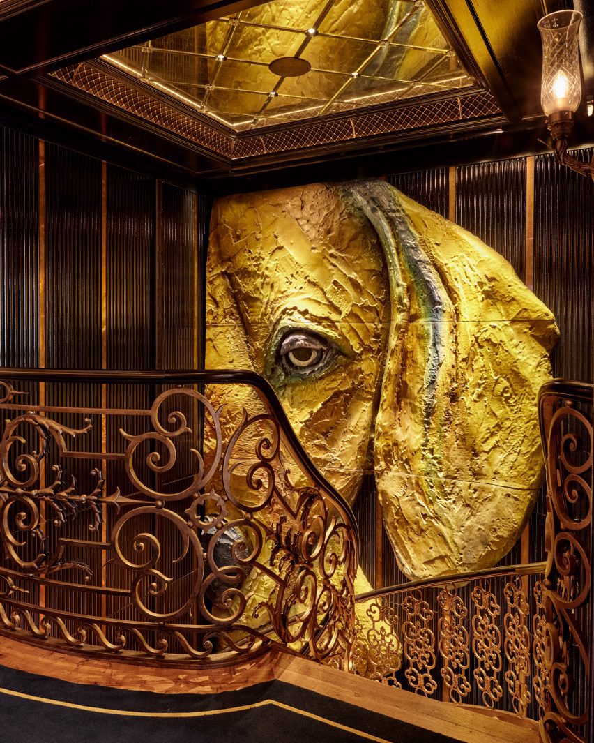
British painter Hockney created a mural for the dining room that sits alongside other original works of his, while London sculptor Jill Berelowitz has crafted a giant sculptural relief of a dachshund on the stairs descending to The Hound Club in the basement.

dining room with artwork metalwork and mirrored glass
A bespoke David Hockney artwork fills a mirrored wall panel at the George club

George was designed to be “a home away from home” for its members and their pets, Caring told Dezeen.

It was painted navy blue and features expansive navy awnings over an outdoor dining terrace that is the now the largest in Mayfair, providing space for guests and their pets.

3D dog sculpture on staircase
London sculptor Jill Berelowitz crafted a giant sculptural relief of a dachshund

Named after the club founder Mark Birley’s own dachsund, the George has been refurbished as “an oasis for both members and their four-legged friends –  continuing its legacy as London’s most dog friendly club”.

Served from the revamped open kitchen, which has been clad in copper panels, a menu of snacks has been curated just for the canine guests, which includes “dog caviar”.

The richly decorated interiors were painted a dark navy and furnished with bespoke furniture made in-house by The Birley Clubs’ design team.

dining tables with flowers beneath mirrored ceiling
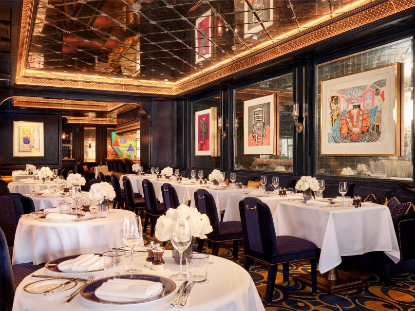
Paintings hang in mirror-tiled panels of the dining room, under a mirrored ceiling recess

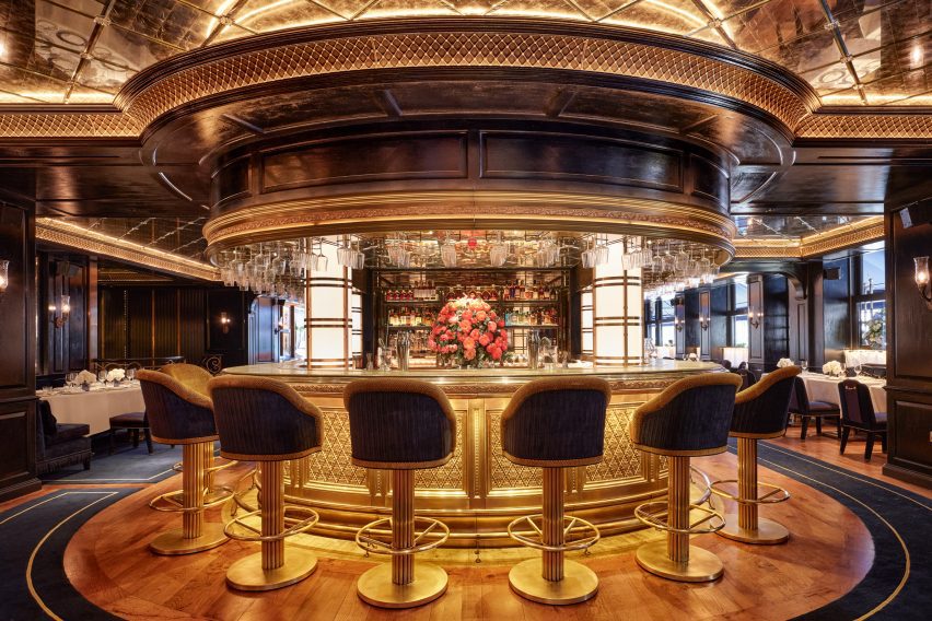
A circular bar, embellished with ornate metal work, separates the two dining rooms. Metal latticework cornicing echoes the level of decoration and detail throughout the scheme.

Artworks hang in mirror-tiled wall panels, below similarly mirror-tiled ceiling recesses.

A private dining room seats 16 and showcase works from Hockney’s iPad series, such as his 2011 work The Arrival of Spring in Woldgate.

circular bar with metal latticework and high bar stools
The main bar of George features high stools and intricate metal latticework

Berelowitz’s dachschund sculpture dominates the main stairwell. The work was cast in bronze and patinated to match the club’s interior palette. The sculpture measures five by three metre and weighs 1.5 tons.

The navy ground floor area leads to a burgundy red basement that houses The Hound Bar. An Art Deco theme dictated the use of antique brass and fluted mahogany panels for the bar.

More mirrored glass has been used on columns and doorways almost to the effect of a hall of mirrors, creating an after-dark, subterranean feeling.

red sofas and polished wood panel work
The Hound Bar is a dark and dramatic subterranean space in the basement

Highly polished mahogany was used to clad the vaulted ceilings and the same fluted panels from the bar were repeated in niches and around seating areas.

Caring, who designed the interiors of George with his team, previously commissioned Martin Brudnizki Design Studio to renovate his other London club, Annabel’s, in 2018.

He also worked with Martin Brudnizki Design Studio on the launch of Bacchanalia London, which features monumental sculptures by Damien Hirst.

Other restaurant interiors recently featured on Dezeen include nearby 20 Berkeley, also in Mayfair, where Pirajean Lees has created an Arts and Crafts-style interior, and an intimate cocktail lounge in Austin, USA, by Kelly Wearstler.

The photography is by Ryan Wicks and Milo Brown.

Reference

The Mint List brings mid-century influences to north London family home
CategoriesInterior Design

The Mint List brings mid-century influences to north London family home

Interior design studio The Mint List has brought light, space and warmth to this Edwardian house in London with multiple extensions, a hidden playroom and plenty of tactile materials.

The renovated end-of-terrace house in Kensal Rise belongs to a film-industry couple that wanted a cosy family home with mid-century elements, in particular referencing the work of designers Charles and Ray Eames.

North London house by The Mint List
The Mint List has renovated and extended an Edwardian house in north London

“The clients had a leaning towards mid-century style but they didn’t want that to overwhelm the scheme,” The Mint List founder Camilla Kelly told Dezeen.

“The Eames House was a good mid-century reference in terms of encompassing warm, repurposed textures, a sense of scale and an abundance of light.”

North London house by The Mint List
A new rear extension houses the home’s kitchen and dining space

The brief was to open up this formerly dark and “unremarkable” home and create an improved sense of flow.

As well as adding two bedrooms and a small study in the newly converted loft, The Mint List created a rear extension to house the kitchen-dining space and absorbed the property’s former garage into the house, providing a mudroom, pantry and playroom.

North London house by The Mint List
The custom-built kitchen island has two levels

The playroom is cleverly concealed behind a bank of new storage in the hallway, which has also been enlarged by opening it up into the former porch.

“There was huge importance given to light in the design,” said Kelly. “Wherever possible, we created tall windows benefiting from the south-facing aspect.”

North London house by The Mint List
Bookshelves act as room dividers to form a hybrid library and snug

The house is full of custom-designed features and finishes at the request of the client.

The floor uses unusually slim lengths of oak, laid at right angles to each other in huge grids, while the thresholds were distinguished with slender fins of brass that add subtle visual interest.

North London house by The Mint List
The children’s playroom is hidden inside a wall of storage in the hallway

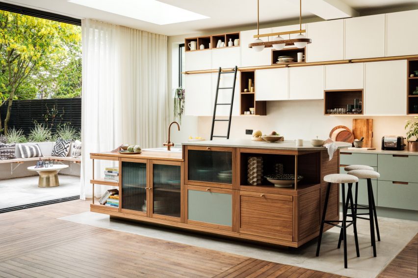
Drawing on the design language of mid-century furniture, the kitchen was completely custom-built for the space with a clean-lined, yet playfully asymmetric design.

“We centralised the assembly and used high windows on either side of the cabinets to emphasise the cubic nature of the design,” said Kelly. “The asymmetric cubes that form the cabinets were built using walnut, with cream-painted doors for the covered storage.”

The material mix includes walnut veneer, reeded glass, olive-coloured door fronts and antique brass detailing, as well as concrete and reclaimed iroko wood worktops.

“I’m averse to keeping things all in one colour,” the designer said. “It’s a missed opportunity to bring texture, colour and character to a space.”

North London house by The Mint List
The children’s bedroom is located on the first floor

The kitchen island was designed to account for the owners’ love of entertaining, with a section of the worktop raised to bar height to draw guests away from the cooking area.

“The island is even more asymmetric, with different levels, drawers, shelves and openings that served to show how the geometry of a design can sometimes be off-kilter and still look neatly intentioned, as long as it sits correctly within the scale of the space,” Kelly said.

North London house by The Mint List
A small study now occupies the loft alongside a primary bedrooms suite

The curved bar provides a visual link to the rounded steps that lead down into the kitchen area, as well as to other curved elements throughout the house.

“I like to include some curves in my projects through room openings, joinery and countertops,” Kelly said. “They help to soften spaces and improve flow from one area to the next.”

North London house by The Mint List
The main bathroom is held in pale blue and green tones

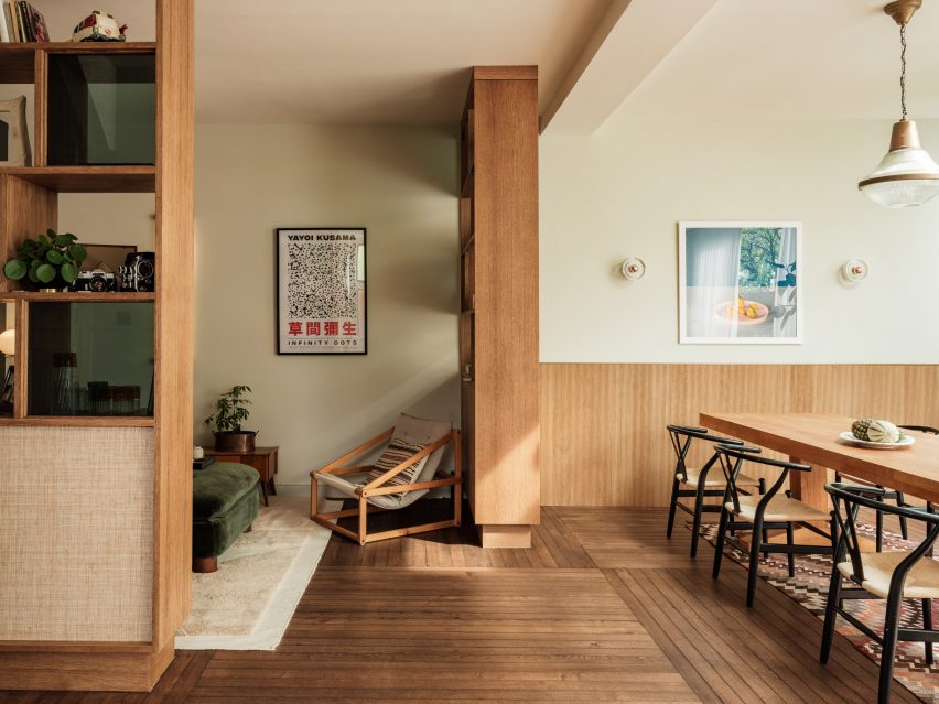
Adjoining the kitchen is a hybrid library and snug, which is partially enclosed with oak shelving finished in glass and raffia, that double up as room dividers and nod to the Eames House in California.

“We didn’t want this to be a dead space,” Kelly said. “It’s a quiet spot where you can curl up with a book or listen to music. And when the couple is entertaining, this is a soft space where you come to catch up with someone.”

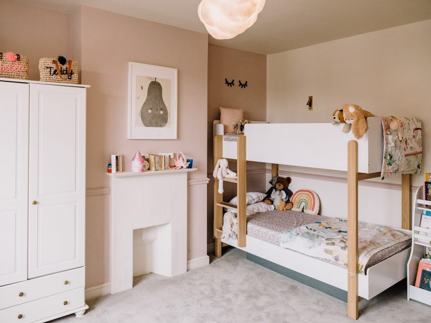
Four bedrooms are spread across the home’s upper levels, including a shared children’s bedroom with bunk beds on the first floor and two added bedrooms in the converted loft.

North London house by The Mint List
A baby pink sink provides a pop of colour

Since founding The Mint List in 2011, Kelly has completed a number of interior projects in London.

Among them are the headquarters of music management company Everybody’s in Highbury, which she kitted out with mid-century-style movable furniture.

The photography is by Dave Watts.

Reference

Hollie Bowden converts London pub into Completedworks showroom
CategoriesInterior Design

Hollie Bowden converts London pub into Completedworks showroom

Lime-washed walls meet aluminium display fixtures in this minimalist studio and showroom that designer Hollie Bowden has devised for London brand Completedworks.

Set over two floors of a former pub in Marylebone, it provides space for Completedworks to design and display its jewellery and ceramics, as well as to host an array of craft-focused classes.

Completedworks studio designed by Hollie Bowden features minimalist interior
Hollie Bowden has designed a studio and showroom for Completedworks

The brand was established in 2013 and up until now, has largely been sold via high-end department stores such as Dover Street Market and Liberty. But founder Anna Jewsbury felt it was time for Completedworks to have its own brick-and-mortar space.

“We increasingly had clients asking to come and see our pieces in person but felt that we didn’t have a space that felt considered and reflected our vision,” she said. “We wanted people to be able to enter our world and get to know us, and for us to get to know them.”

Completedworks studio designed by Hollie Bowden features minimalist interior
Display shelving was crafted from lustrous aluminium

For the design of the showroom, Jewsbury worked with London-based designer Hollie Bowden, who naturally looked to the brand’s jewellery for inspiration.

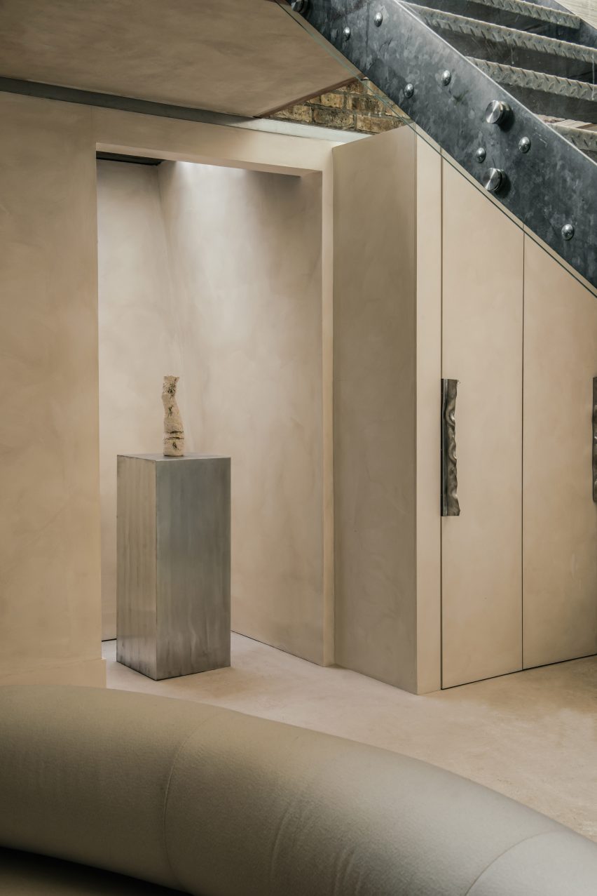
This can be seen for example in the hammered-metal door handles that appear throughout the studio and directly reference the creased design of the gold Cohesion earrings.

Completedworks studio designed by Hollie Bowden features minimalist interior
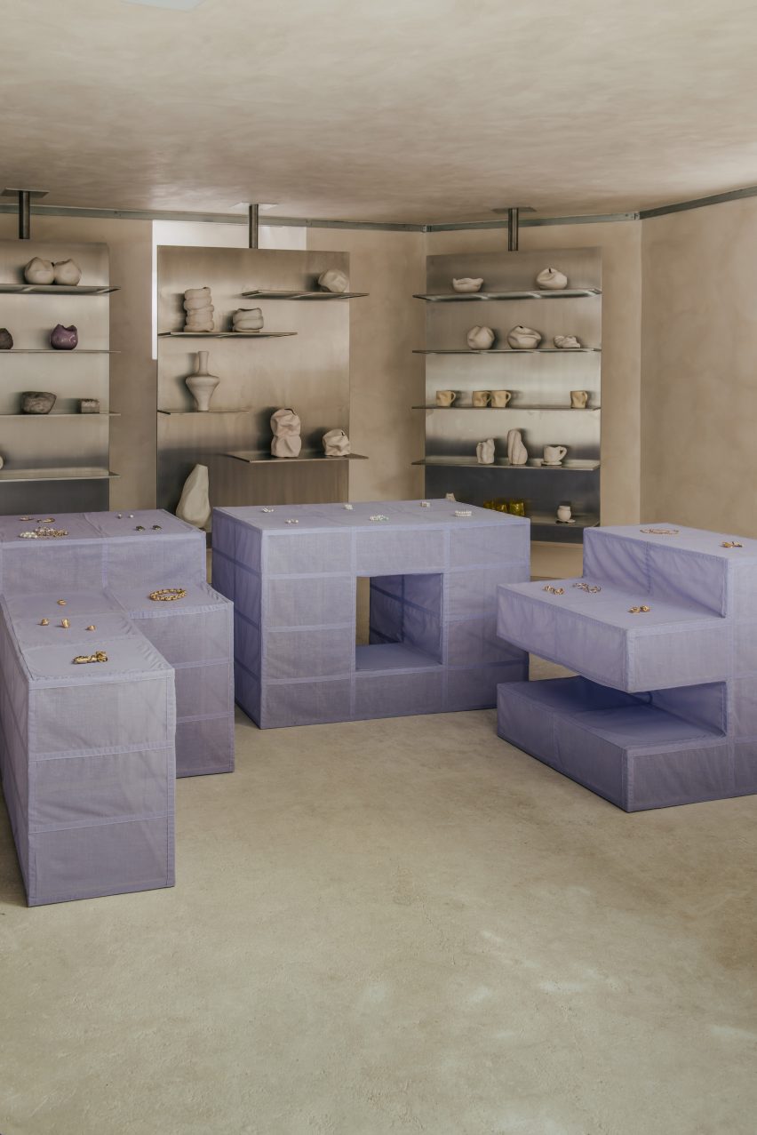
A modular display system in the showroom is clad in lilac linen

“[Completedworks] is known for the beauty of the textural surfaces and flowing almost baroque forms,” Bowden explained. “We developed a display language that played off that, with minimal details and strict lines.”

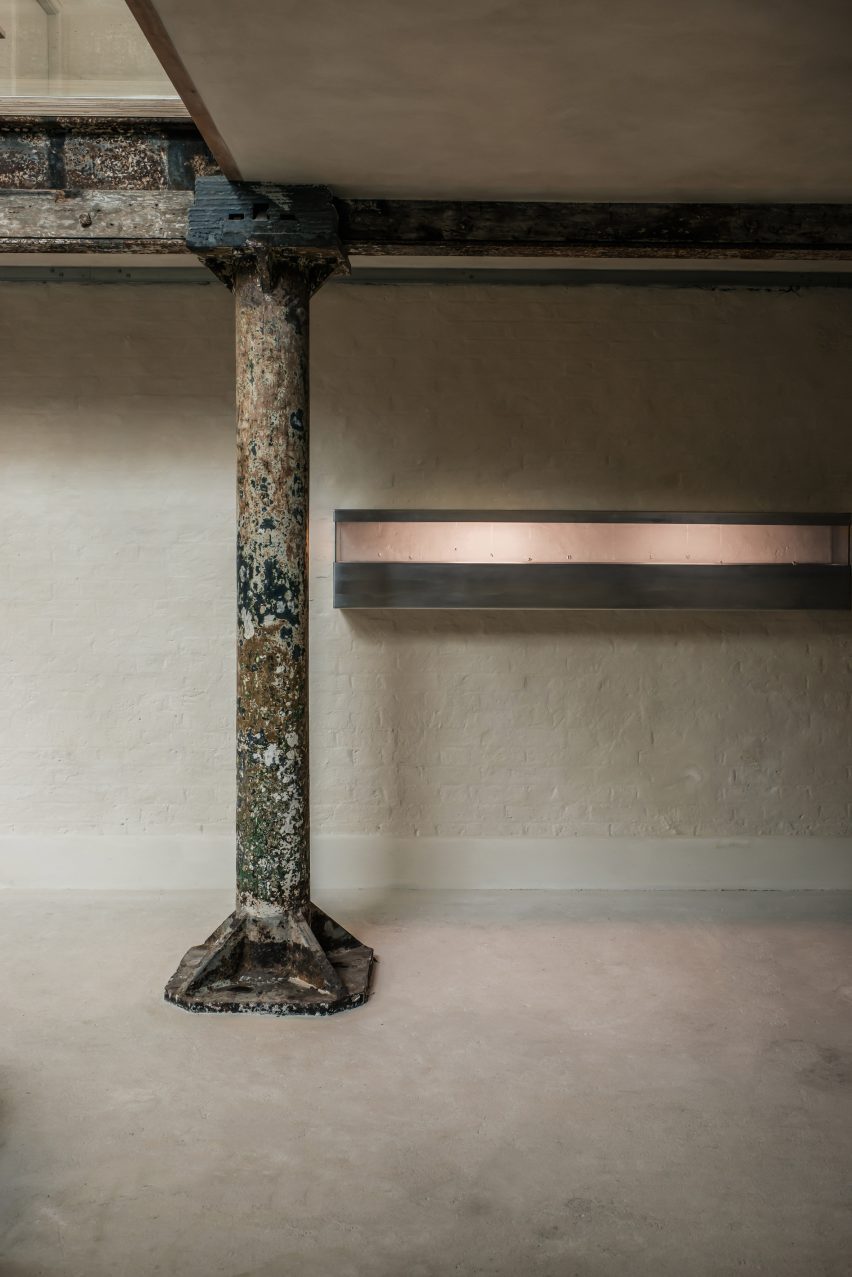
Almost every surface throughout the studio is washed in beige-toned lime paint, with only a few slivers of the original brick walls and a worn metal column left exposed near the central staircase.

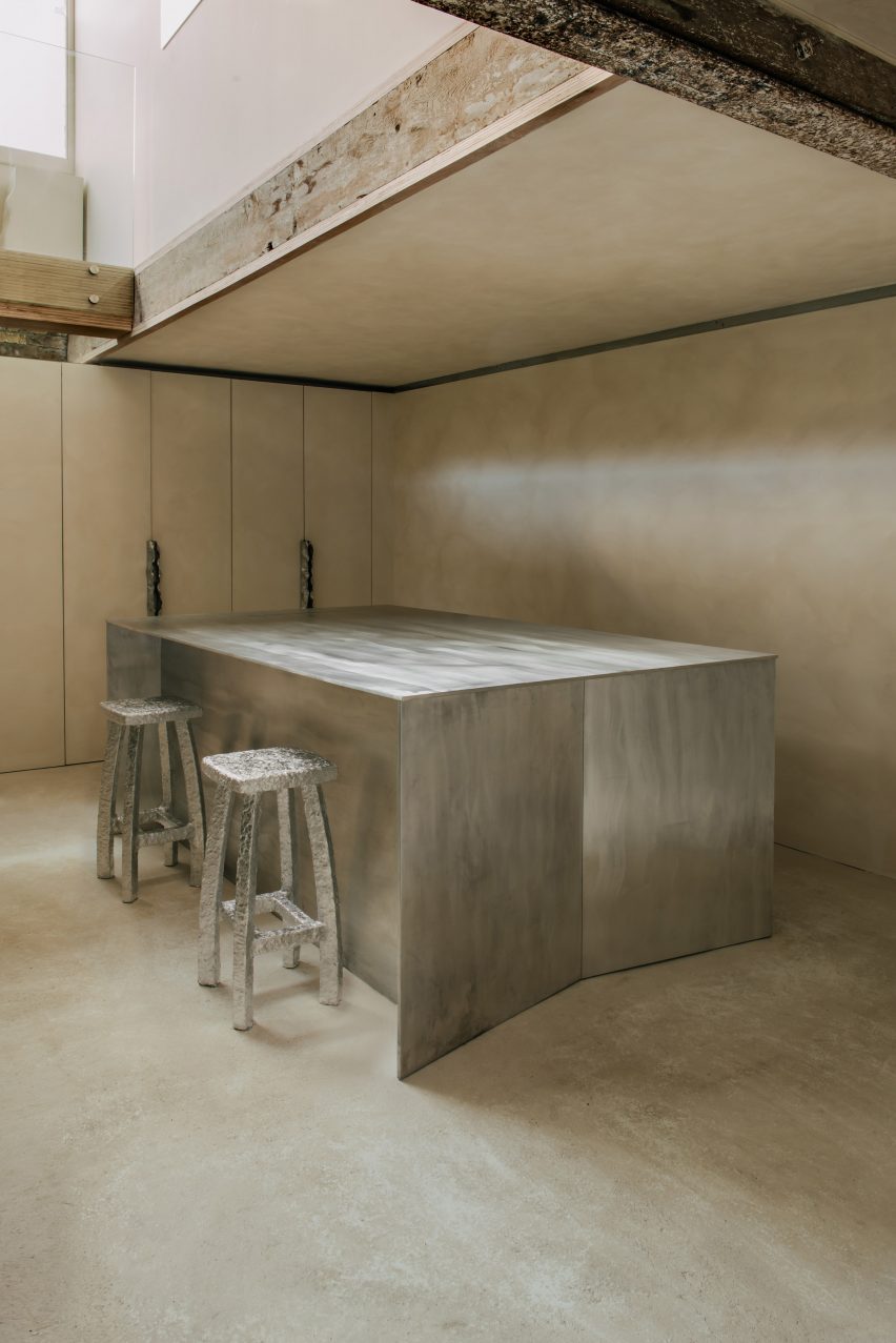
Bowden used brushed aluminium to create a range of display fixtures, including chunky plinths and super-slender shelving units supported by floor-to-ceiling poles.

The space also houses a couple of angular aluminium counters for packing orders that include discrete storage for boxes and subtle openings, through which tissue paper or bubble wrap can be pulled.

Completedworks studio designed by Hollie Bowden features minimalist interior
Shoji-style storage cabinets can be seen in the office

A slightly more playful selection of colours and materials was used for the studio’s custom furnishings.

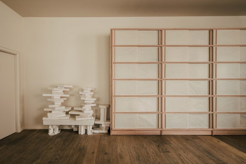
In the main showroom, there’s a modular display island sheathed in lilac linen. Meanwhile in the office, designer Byron Pritchard – who is also Bowden’s partner – created a gridded wooden cabinet inlaid with translucent sheets of paper, intended to resemble a traditional Japanese shoji screen.

Completedworks studio designed by Hollie Bowden features minimalist interior
Hammered-metal door handles in the studio resemble Completedworks’ earrings

This isn’t Bowden’s first project in London’s affluent Marylebone neighbourhood.

Previously, the designer created an office for real estate company Schönhaus, decking the space out with dark-stained oak and aged leather to emulate the feel of a gentleman’s club.

The photography is by Genevieve Lutkin.

Reference

Citizens Design Bureau retrofits Jacksons Lane arts space in London
CategoriesInterior Design

Citizens Design Bureau retrofits Jacksons Lane arts space in London

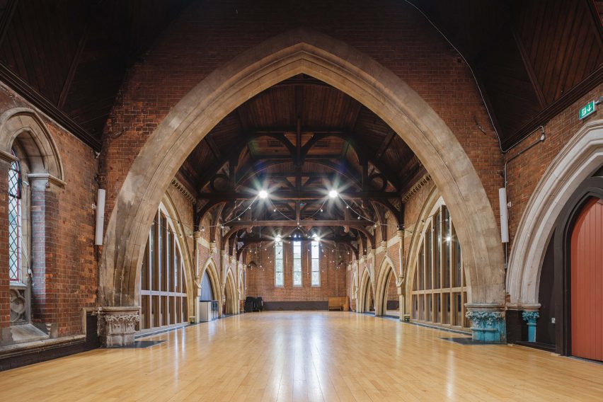
UK studio Citizens Design Bureau has given a colourful retrofit to Jacksons Lane, an arts and circus centre in an old church in London, with the aim of decluttering and simplifying its interior.
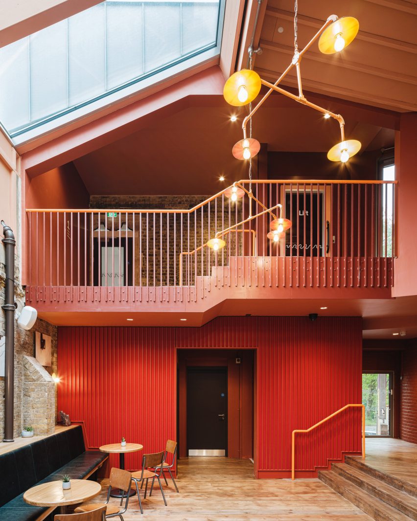
The studio aimed to improve the functionality of the grade II-listed building, which used to be a church but has been a community hub and “leading centre in contemporary circus arts” since the 1980s, Citizens Design Bureau said.

Retrofitted Jacksons Lane community centre
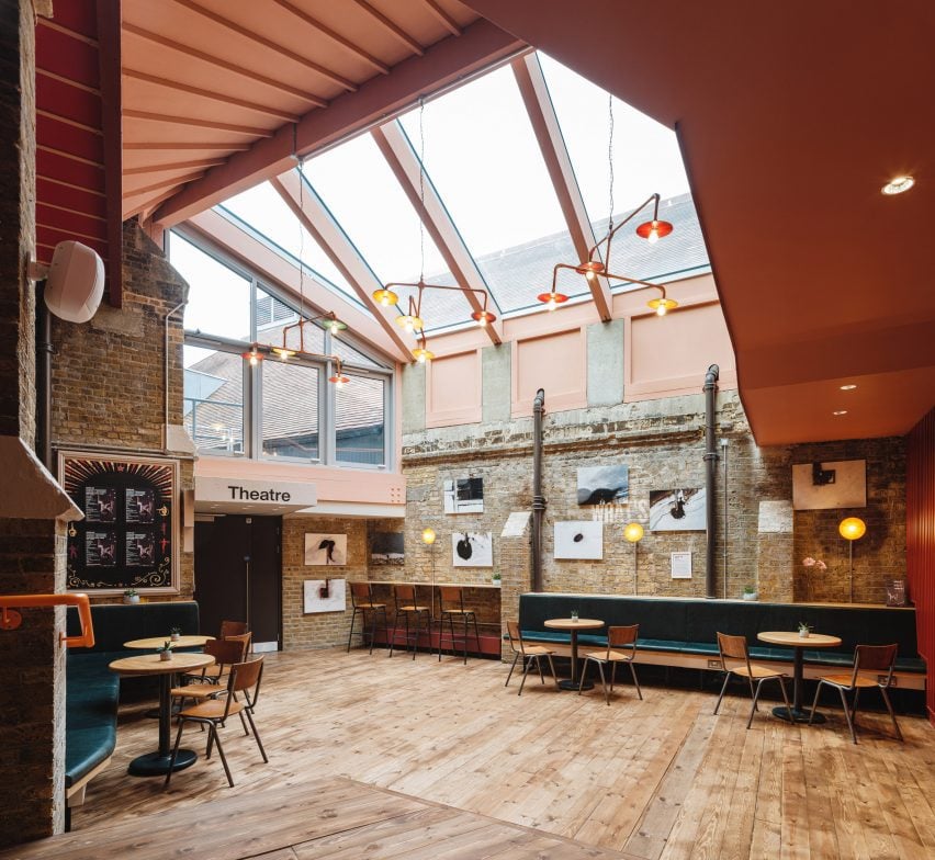
The Jacksons Lane building has a colourful interior

“The previous layout was a real jumble of spaces that didn’t work from a functional perspective,” the studio’s director Katy Marks told Dezeen.

“Our approach was to declutter the old church building, so that the original structure was more visible, giving a sense of the symmetrical cruciform of the original plan and using the drama of those spaces to full effect, improving acoustic separation, functionality as well as making the building fully accessible,” she added.

Interior of community u=hub by Citizens Design Bureau
Spaces were rearranged to create a more functional interior

The venue in Highgate, London, had a dated interior with more than 20 different levels.

While reconfiguring its spaces to make them more functional, Citizens Design Bureau added a cafe and hireable studios in the former church’s double-height transept.

Red walls in Jacksons Lane in London
Red and teal colours brighten up the space

New details that make Jacksons Lane more functional include acoustic windows, as well as ramps and lifts that create easier access to the different spaces.

It also restored some parts of the church that had been hidden under more recent interventions. This included reinstating the main entrance of the building to the original church porch, which had been boarded up.

“You would often see people still climbing the steps up to the original, boarded-up door, trying to push it open,” Marks said.

“In a grade II-listed building, we had limited scope to make big changes to the exterior, so we felt that opening up the original and intuitively obvious entrance was the most impactful move we could make, to make the building much more legible and welcoming to everyone,” she added.

Orange wall and teal details inside community centre by Citizens Design Bureau
Citizens Design Bureau retrofitted the arts centre in Highgate

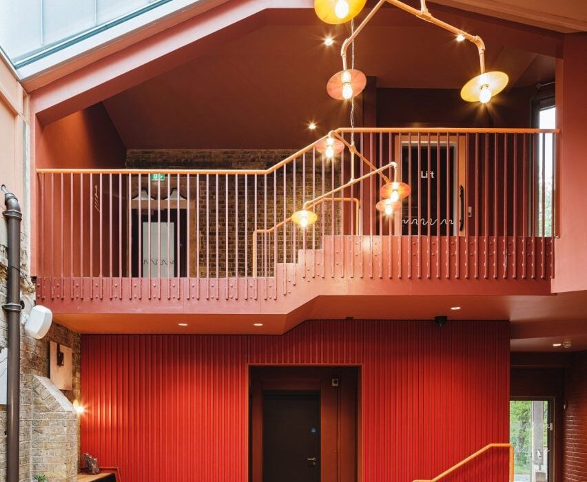
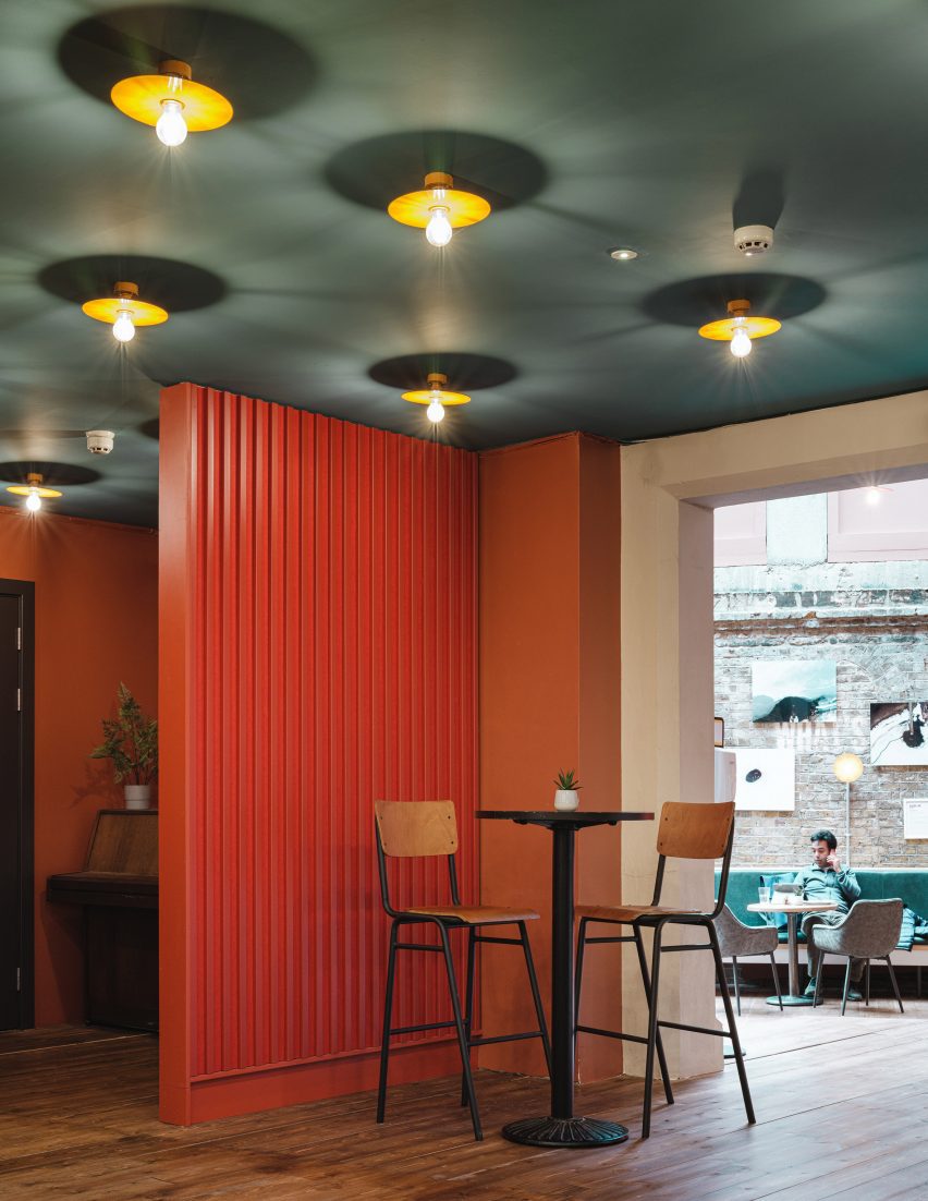
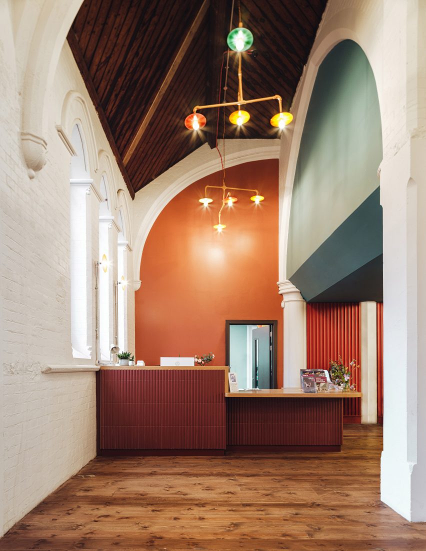
Inside the centre, Citizens Design Bureau introduced a warm colour palette of deep reds and oranges with teal accents, which complements the existing brick, stone and dark-wood details.

“The building has undergone many changes over decades of use, so the internal fabric in particular has a layered history,” Marks said.

“We have used colour to express those layers – white for the church structure, a teal blue for elements that were added in the 70s, and then volcanic oranges, reds and purples for completely new insertions with pops of other colours in the lighting, reflecting the playfulness of its current function as a creative space, specialising in circus arts.”

Room inside Jacksons Lane in London
Whitewashed walls contrast dark-wood floors

The studio clad some of Jacksons Lane’s ceilings with a pale-green concertina form that improves acoustics.

Lamps with bright orange cables add another colourful touch to the space.

View of community centre by Citizens Design Bureau
The former church is now used as an arts and circus hub

Jacksons Lane is used by a lot of people in the local area and Marks said the feedback so far has been “wonderful”.

“We hope that what we have done really expresses the ethos and character of Jacksons Lane with clarity and a bit of joy, raises a smile and is the kind of place that people really want to hang out in,” she said.

Citizens Design Bureau has previously added a “delicately perforated” Corten extension to Manchester Jewish Museum, for which the studio was longlisted for a Dezeen Award in 2021.

The photography is by Fred Howarth.

Reference

Monumental brick arches outline London houses by The DHaus Company
CategoriesArchitecture

Monumental brick arches outline London houses by The DHaus Company

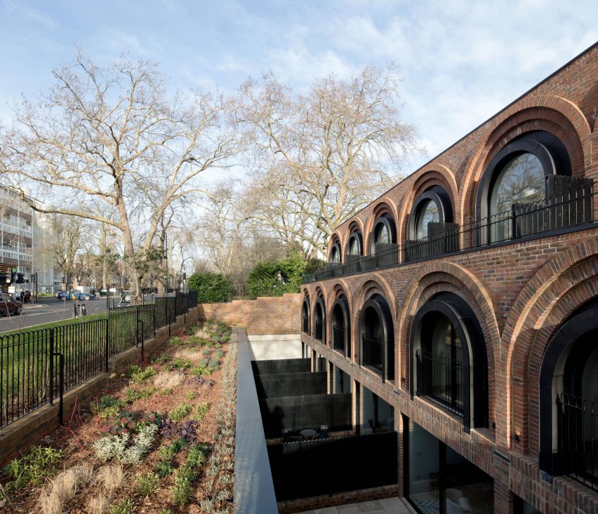
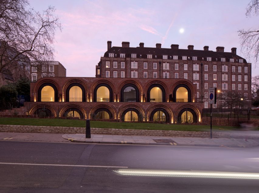
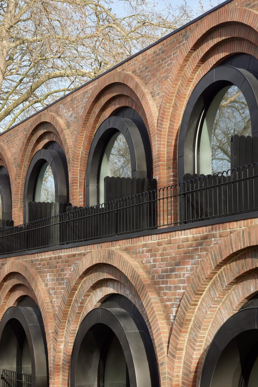
Architecture studio The DHaus Company has completed The Arches, a row of six brick-clad townhouses in a north London conservation area.

Replacing a derelict petrol station, the terrace is named after the monumental arches that form the facades of each partially sunken, three-level home.

Facade with sunken patio at The Arches townhouses by The DHaus Company
The Arches are townhouses partially sunken underground. Photo is by AVR London

The DHaus Company designed the row to echo its surroundings, which include Georgian-era housing named Grove Terrace and a row of Victorian railway arches.

The arch is a recurring motif, so the studio decided to create a contemporary interpretation.

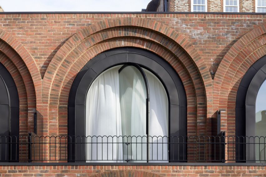
Arched window with pivoting glass
The facade is formed of a series of arches. Photo is by Richard Chivers

“We undertook a study of local buildings in and around the local area,” explained architects David Ben-Grunberg and Daniel Woolfson, the founders of The DHaus Company.

“These buildings highlighted a strong mixture of rectangles and arches set within a brick canvas,” they said.

The site is a highly prominent location within the Dartmouth Park Conservation Area, so the design process involved lengthy consultation.

Night view of The Arches townhouses by The DHaus Company
The height matches a petrol station previously on the site. Photo is by AVR London

As Ben-Grunberg grew up in the area, and Woolfson had lived nearby, the pair were able to use their instincts to come up with a design that felt appropriate for the setting.

A key aspect was the decision to partially sink the buildings below ground, so the roof is no higher than the petrol station that occupied the site previously.

Rear elevation of townhouses in London
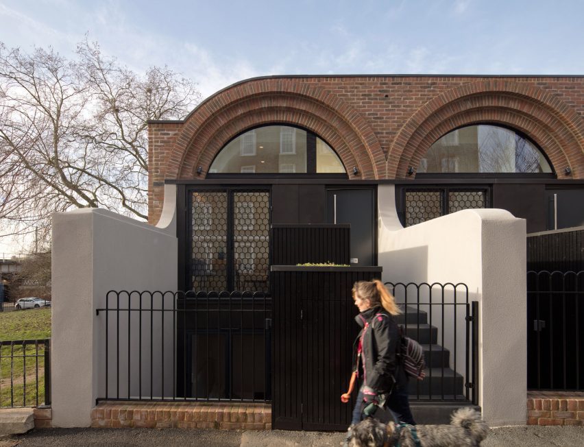
Scallop-patterned window screens reference the arch motif. Photo is by AVR London

Another idea was to reinstate green spaces along the street both in front and behind the terrace.

“Our initial design idea was inspired by the historic green lung of open green spaces along the Highgate Road,” said the duo.

“This meant reinstating the green lung as close to how it was back in 1873 – a futuristic Victorian throwback.”

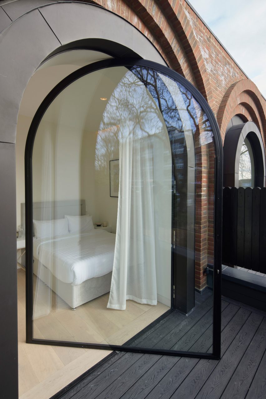
Pivoting window leading into bedroom of The Arches townhouses by The DHaus Company
Pivoting glass doors are set within one row of arches. Photo is by Richard Chivers

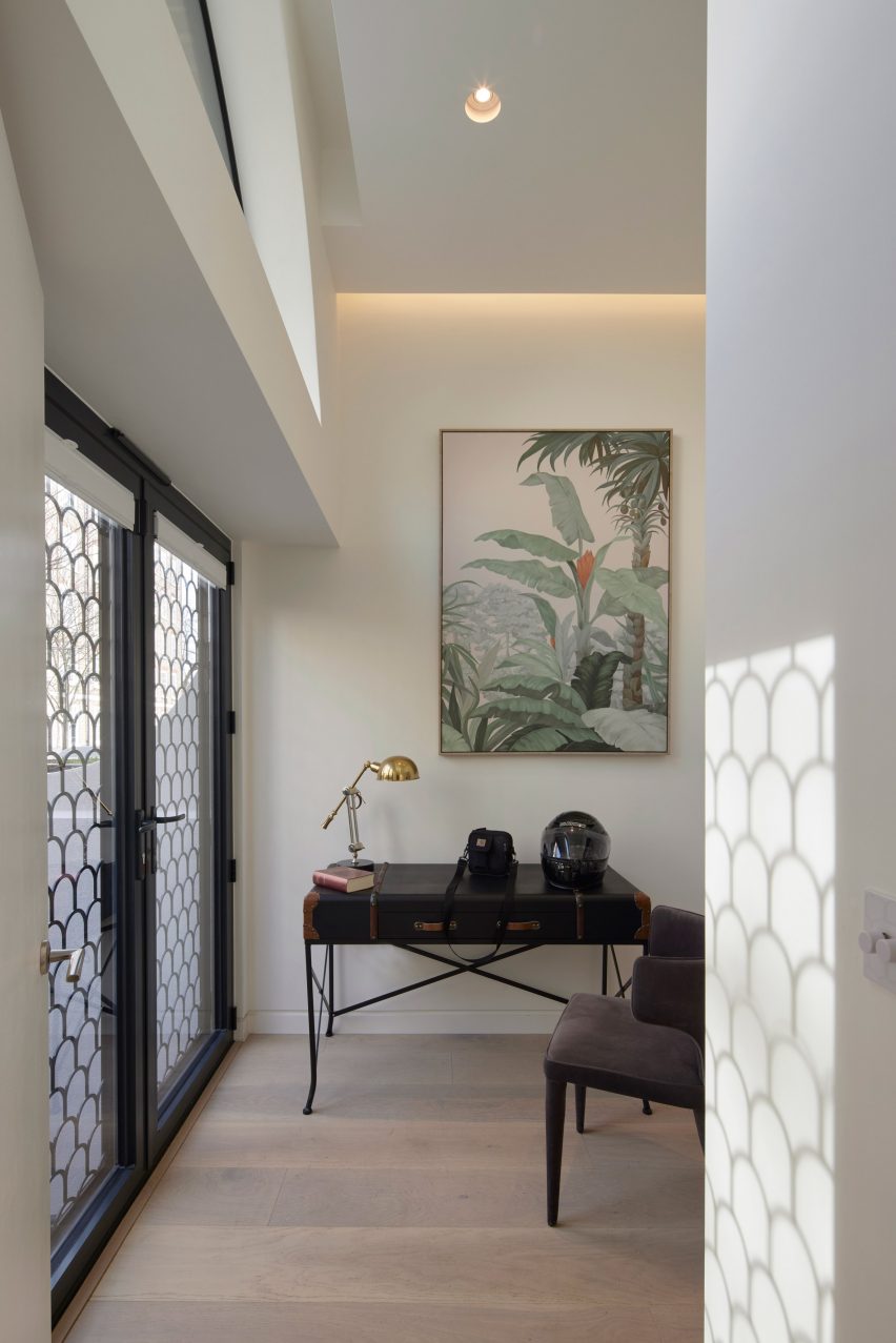
The view seen by most passersby is of the west-facing facade. Here, two rows of arches provide balconies for the two upper levels, while a glass-fronted basement opens out to a sunken patio.

“Because of the stepped nature of the site, this lower level does not feel like a basement,” said Ben-Grunberg and Woolfson.

“The living spaces enjoy a secluded feel with plenty of access to natural light despite sitting close to the main road.”

Entrances are located on the east-facing side, which has more of a quiet, residential feel.

Here, a single row of arches incorporates screens with a matching scallop pattern, while a second sunken patio helps to bring more natural light down to the floor below.

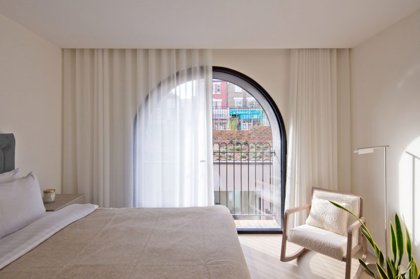
Bedroom of London townhouse by The DHaus Company
Each home contains three bedrooms. Photo is by AVR London

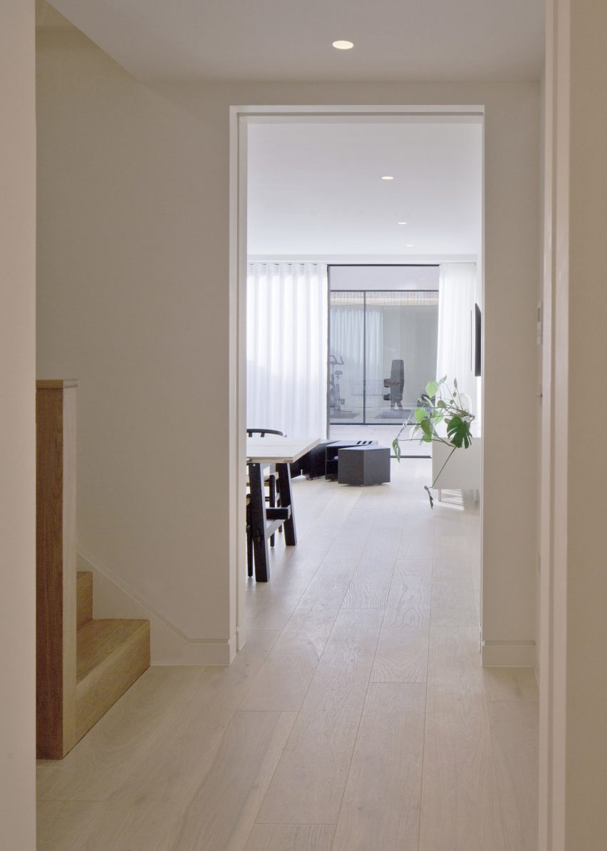
Inside, each 130-square-metre home has a layout that places a lounge, dining area and kitchen on the lowest level, and three bedrooms and a study across the upstairs floors.

Concrete retaining walls are an essential part of the build, but other parts of the structure are constructed from prefabricated timber components.

Living space at The Arches townhouses by The DHaus Company
A study could serve as a fourth bedroom. Photo is by Richard Chivers

The arches are also concrete, clad with red-brick slips that match the tone of the adjacent brickwork.

“We explored brick bonding patterns to differentiate the different areas of the building and give order to each facade,” said Ben-Grunberg and Woolfson.

The homes are topped by green roofs and photovoltaic solar panels.

Kitchen and living space sunken below street level
Kitchen and living spaces open out to a sunken patio. Photo is by Richard Chivers

The DHaus Company is best known for its experimental approach to residential design, on projects like its shape-shifting house concept and the playful Columbia Road extension.

More recently, the studio completed an overhaul of The Bull and Last, a pub located very close to The Arches, with the addition of two Japanese-inspired duplex flats.

Arched windows in brick facade of The Arches townhouses by The DHaus Company
The arches are pre-cast concrete and clad with brick slips. Photo is by Richard Chivers

The completion of this project marks the end of a five-year project, delayed by both the planning process and Covid-19 pandemic. Visualisations were first published on Dezeen in 2019.

“Over the last five years, this project has been such a big part of our lives,” concluded the studio.


Project credits

Architect: DHaus
Client: Design Ventures/EFKERIA
Structural engineer: AMA
Planning department: Camden
Planning consultant: The Heritage Practise
Glazing contractor: Vitrocsa by Brava Windows
Brickwork: Ibstock

Reference

On models London trainer store on “shoppable science museum”
CategoriesInterior Design

On models London trainer store on “shoppable science museum”

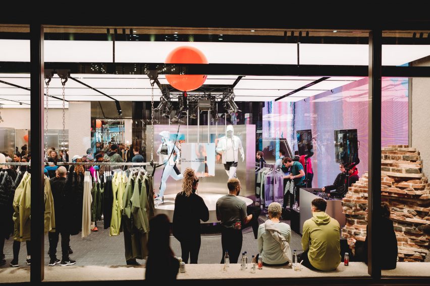
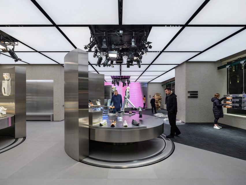
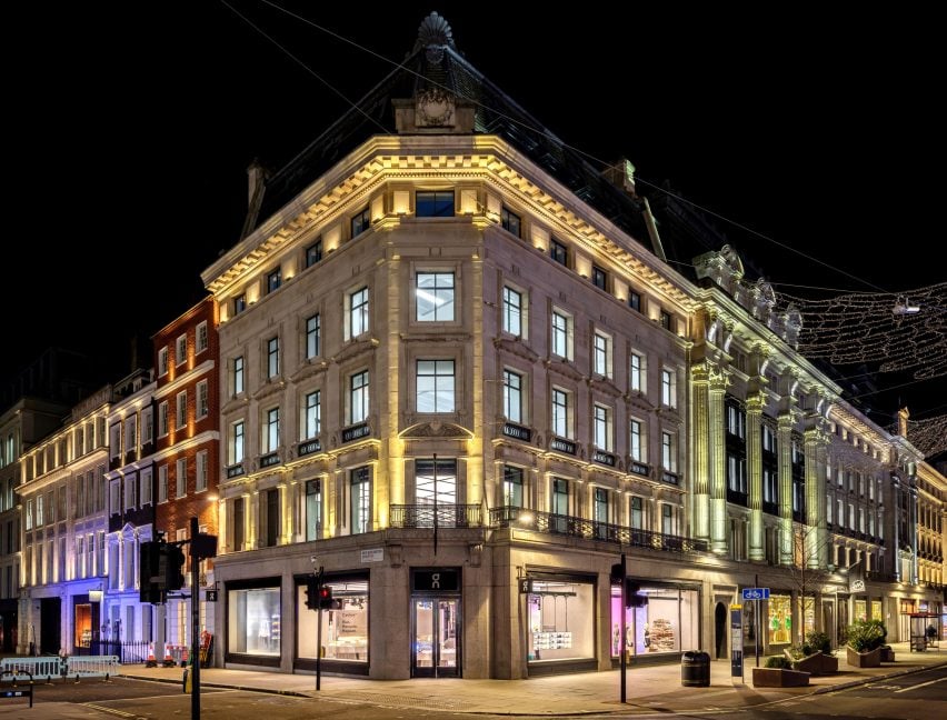
Swiss brand On has opened its first UK shop on London’s Regent Street, complete with steel fixtures and a robotic arm.

For its debut outpost in the United Kingdom, On aimed to showcase the science and technology behind its running shoes and clothing.

Sportswear shop on London's Regents Street
On has opened a trainer store on London’s Regent Street

“Our concept was a shoppable science museum in the sense that one of the main things we want to share is that what we do is science-based,” said On’s head of brand environments Nicholas Martin.

It is performance-run culture that is infused into everything we do.”

The store’s ground floor is defined by three circular steel tables, used to display the brand’s latest products.

Stainless steel table in On's trainer store
The store contains three circular steel tables

Each of the tables, which can be raised and lowered, is surrounded by a curved steel wall that can be rotated to create a variety of layouts within the store.

The table at the store’s entrance also holds a robotic arm that mimics the action of running to showcase On’s running shoes.

Stainless steel shoe cabinets are located on the upper floor
The upper floor houses steel shoe cabinets

“The first thing you actually see is our robotic arm,” Martin told Dezeen. “We want people to touch and explore. So you kind of get to see the movement.”

“And then we also try to add different layers of storytelling,” he continued. “So you can compare the different shoes.”

Steel trainer cabinet known as the magic wall
On describes the cabinets as a “magic wall”

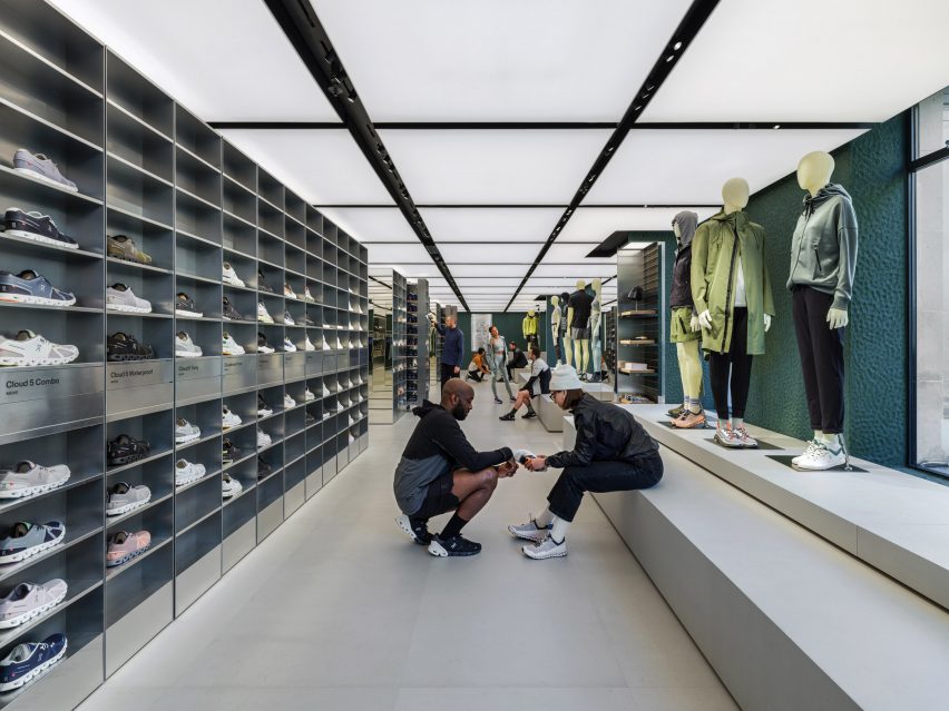
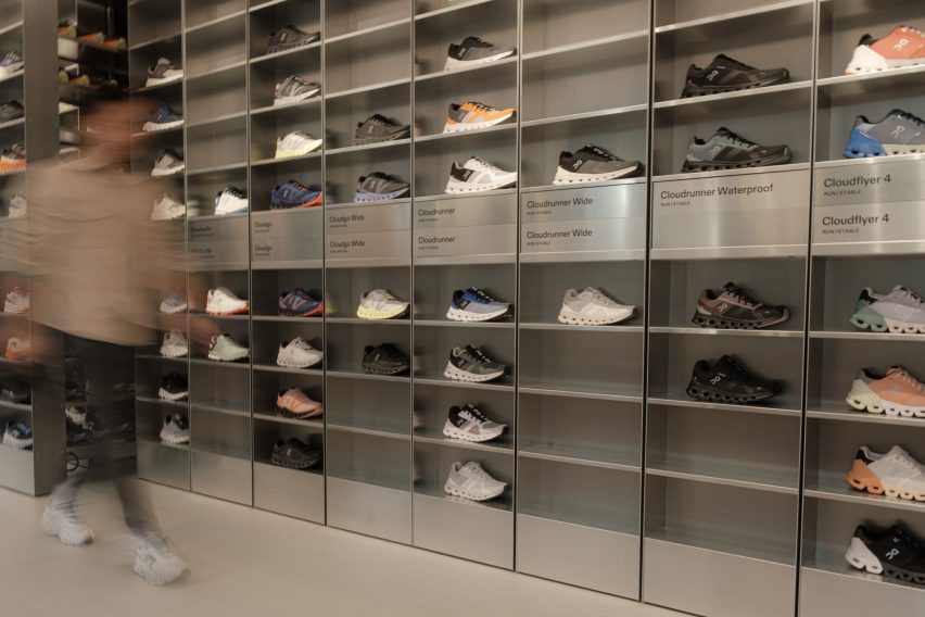
The first floor is defined by a pair of steel cabinets, described by On as a “magic wall” that runs the length of the store.

It contains all of On’s products in all available sizes so that customers can instantly try on trainers.

“Our goal was to revolutionise the way shoe try-ons happen,” said Martin. “At our stores, we let the product speak for itself. Our technology is something you feel once you put a product on.”

Contrasting the steel fixtures, the store’s walls were finished in natural clay sourced from Cornwall, which was applied by hand.

On the ground floor and in the basement-level event space, the walls are painted in a muted shade of grey while on the upper floors, they are finished in green.

On shoes in metal cabinets
The cabinets contain all sizes of On’s shoes

“Swiss engineering means for us loving technology and the natural world,” said Martin. “Technology makes the store look sleek, nature helps us to give the store a more imperfect and warmer look.”

“The store green is a nod to the legendary British racing green – a colour culturally saturated in movement, speed and engineering,” he continued.

On's store on Regents Street
The store is On’s first in the UK

Founded in 2010, On is known for its lightweight running shoes and is reportedly the fastest-growing running brand worldwide. Its stores form part of On’s wider efforts to build its brand internationally.

“They offer a space for our fans, community and new customers to explore and get to know the brand,” said Martin. “We see the store as a media channel that connects our fans with the brand.”

On previously created a reflective mountain cabin in the Swiss Alps to mark the launch of its first hiking shoe.

All photography courtesy of On.

Reference

The Mint List fits out London office with mid-century-style movable furniture
CategoriesInterior Design

The Mint List fits out London office with mid-century-style movable furniture

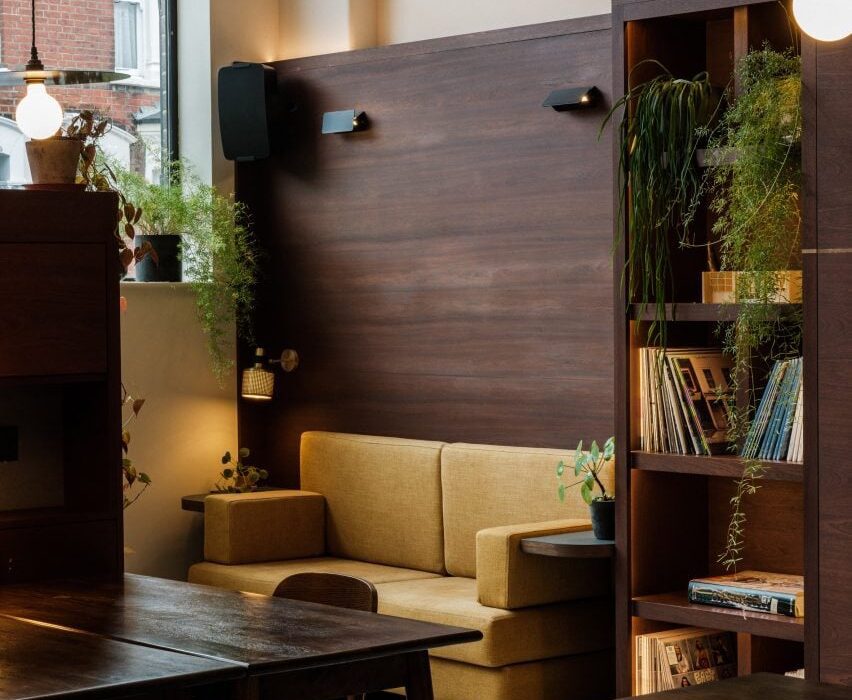
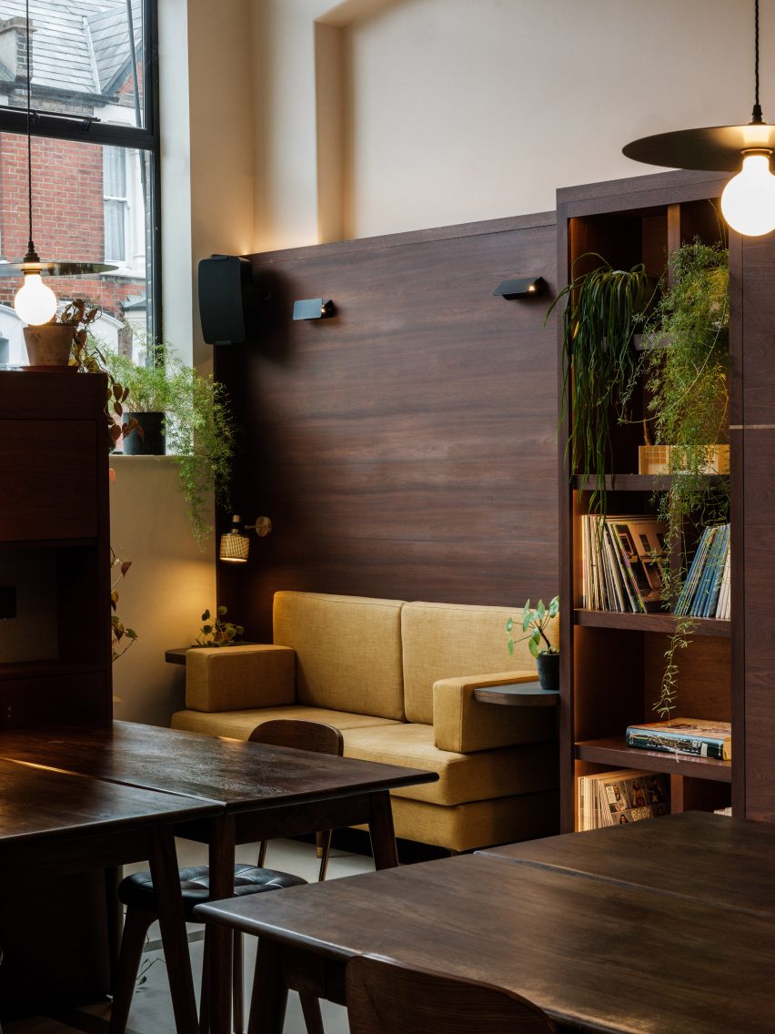
Bespoke furniture with a mid-century feel can be rearranged to alter the use of this office space in north London, which interior design studio The Mint List has created for a music management company.

Camilla Kelly of The Mint List designed the headquarters for management company Everybody’s, which recently upgraded to larger premises on the ground floor of a former shipping depot.

Office space with dark wood desks, wall panelling and a yellow sofa in office interior by The Mint List
Everybody’s office is located in a former shipping depot

Architect Duncan Woodburn developed plans to reconfigure the large, light-filled unit as an open-plan workspace including a high-ceilinged entrance along with a kitchen and dining area.

For the interior scheme, Kelly worked closely with Lucy Tudhope of Everybody’s, ensuring the focus was on retaining the building’s existing character and creating a flexible workspace with a midcentury feel.

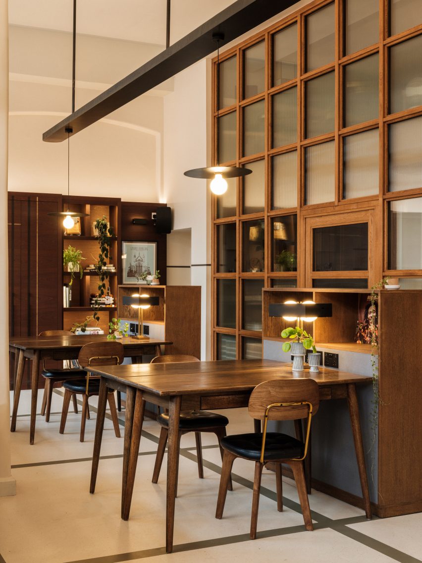
Flexible office space with white walls and floors, decorated with dark wood midcentury furniture
The Mint List designed custom joinery to divvy up the interior

“We wanted to ensure that we respected the modernist nature of this industrial site, whilst integrating a sense of creativity that was absolutely key for the client,” Kelly said.

One of the main challenges was zoning the large space to create different functional areas. This was achieved using custom-built joinery to separate self-contained yet open-plan spaces.

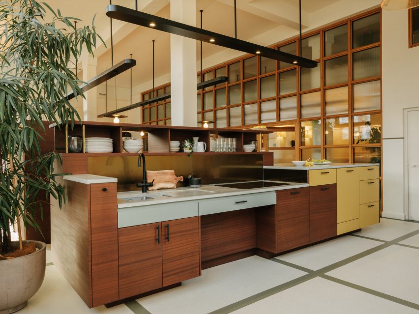
Modular kitchen island in a double-height space with overhead pendant lighting in office interior by The Mint List
Modular furniture features throughout the office interior

Much of the joinery is modular, allowing the space to be reconfigured if required. Large storage units at the entrance are accessible from both sides and completely movable so they can be rolled away to create an open event space.

Most of the time, the units serve to separate the office from the entrance area and provide staff with a degree of privacy from visitors.

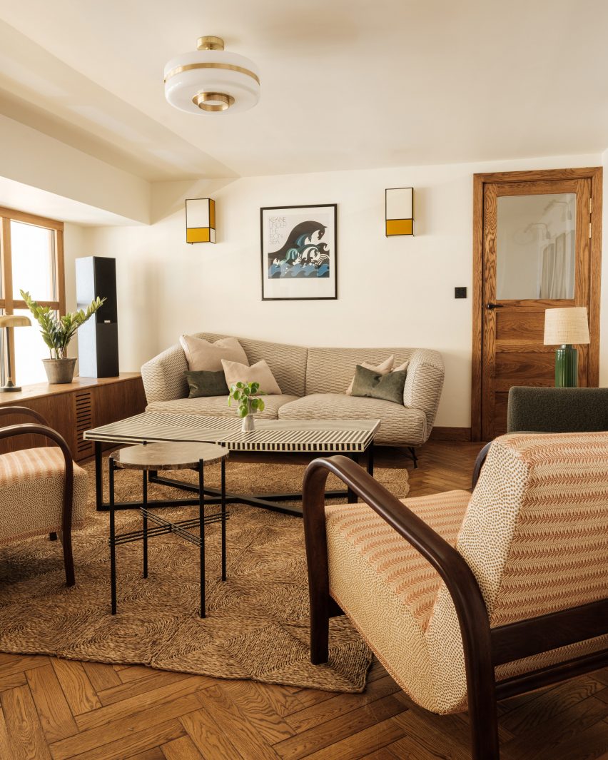
Lounge room with parquet flooring, grey sofa and cream armchair
The office also houses a lounge for playing music

The main workspace is flooded with light that enters through the building’s glazed frontage. It contains desks and bespoke oak credenzas that can also be easily moved to completely clear the open-plan room.

At one end of the office is a kitchen with built-in storage, including coloured drawers and cupboard fronts that complement the African sapele wood joinery.

The kitchen contains bar seating next to the windows and a dining space arranged around a three-metre-long leather-topped artist’s table.

A full-height glazed wall specified by the client separates the workspace from private offices and a cloakroom on the ground floor, as well as a mezzanine that houses an acoustically sealed meeting room and a lounge for playing music.

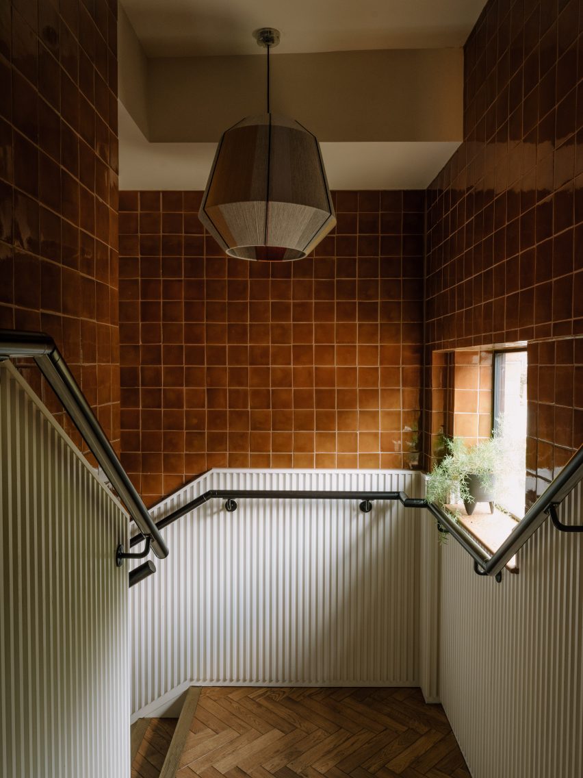
Staircase with brown tile walls, white panelling and glass pendant lamp in hallway by The Mint List
Glossy tiles feature in the stairwell

“The brief was a seamless, vertical grid of glass,” explained Kelly. “So we helped to translate that in terms of the finishes – textured glass to obscure vision through to the office and a beautifully finished oak frame that complements the midcentury scheme.”

Throughout the project, The Mint List applied a palette of tactile and honest materials including sapele wood, oak, concrete and burnished brass.

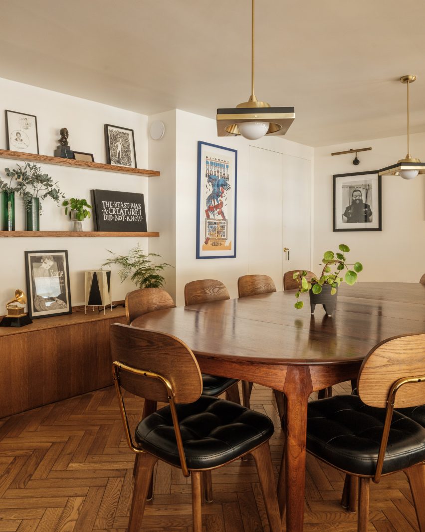
Office meeting room with parquet flooring wooden table and wooden chairs with black upholstered seats
The Mint List added wood surfaces and brass details

A colour scheme based on natural hues including greens, creams and earthy browns adds visual richness to the spaces.

The office’s Marmoleum flooring is a custom design that subtly separates the space into different zones. The renewable material was chosen for its excellent acoustic properties in order to help absorb sound within the open spaces.

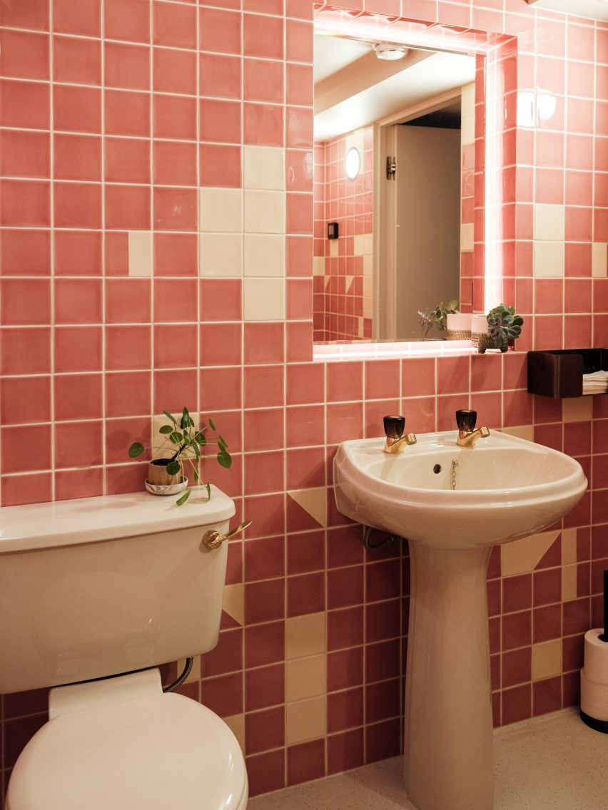
Bathroom with white sink and toilet and pink and white tiled wall in office interior by The Mint List
The bathrooms are playfully decorated with colourful tiles

Bathrooms located on the ground floor feature retro sanitary- and brassware complemented by playful tiles, with each wall laid in different patterns and colours.

Other recent office makeovers in London include Office S&M’s self-designed studio inside a former paint-making workshop and creative agency Ask Us For Ideas’ Soho office, which is split across two diametrically opposed floors.

The photography is by Dave Watts.

Reference

Object Space Place uses reclaimed materials to revamp London restaurant
CategoriesInterior Design

Object Space Place uses reclaimed materials to revamp London restaurant

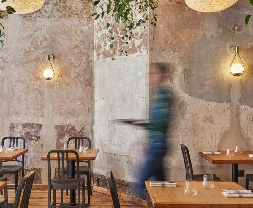
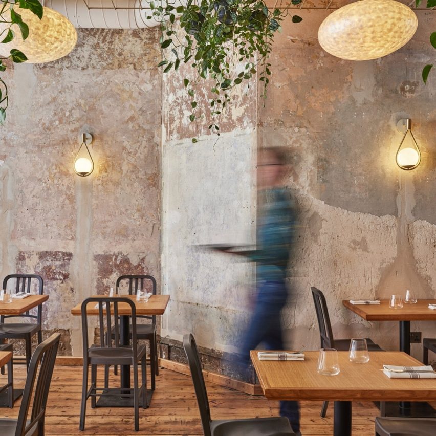
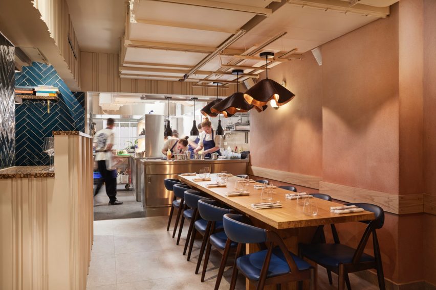
Interior design practice Object Space Place has revamped the Apricity restaurant interior in London with second-hand furniture and reclaimed materials.

The project has been shortlisted in the sustainable interior category of Dezeen Awards 2022, which will announce its winners next week.

Interior of Apricity restaurant by Object Space Place
The restaurant is furnished with second-hand tables and chairs

Part of the refurbishment involved removing a timber staircase to maximise usable floor space in the basement.

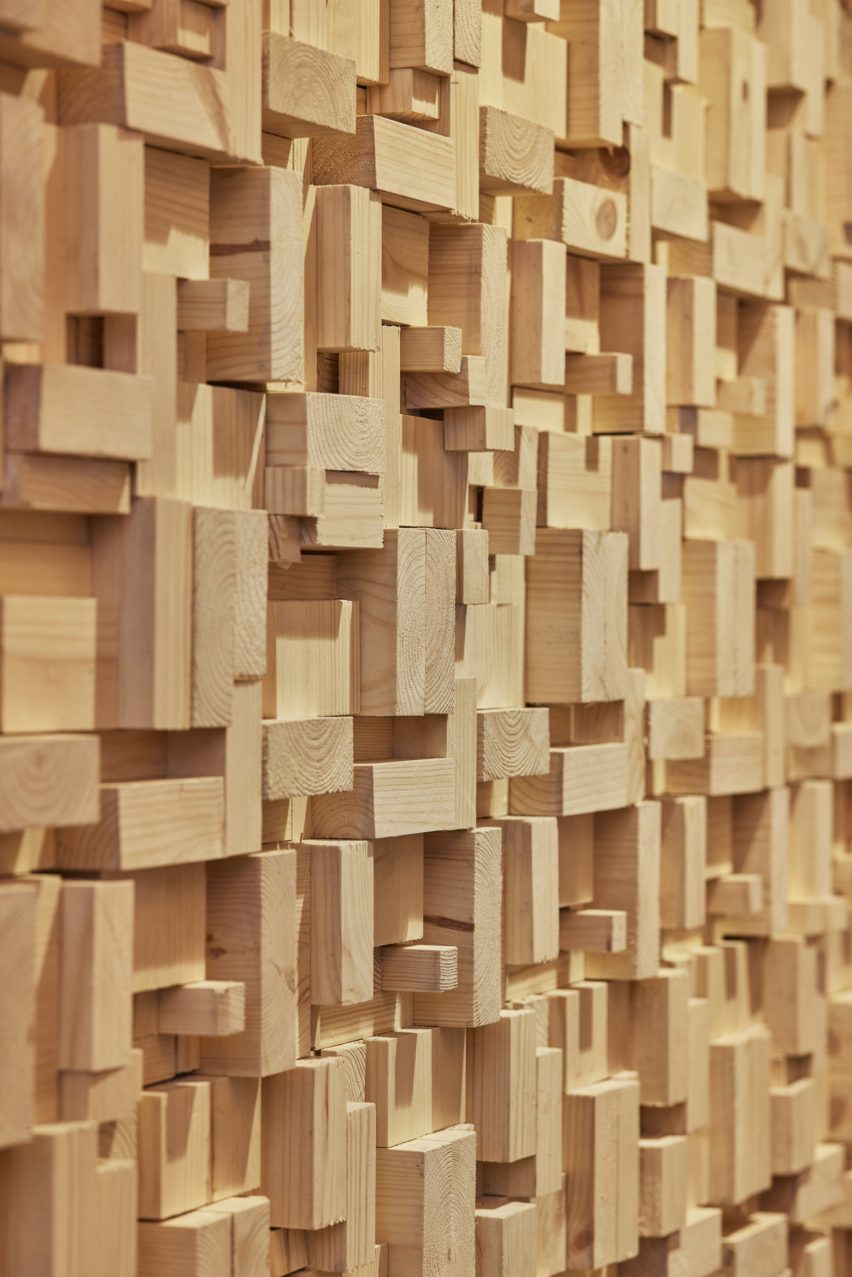
Object Space Place retained the staircase’s treads to reuse them for a new staircase and repurposed the rest of the usable material into decorative timber block wall cladding.

Decorative timber block wall
Material salvaged from a timber staircase was used as statement wall cladding

“We saw the old staircase as a materials bank full of wood that we could reuse, so we worked with the contractor to take the staircase apart carefully, grade the timber that was usable and create a repeating block pattern that could be made from these timber components,” Object Space Place told Dezeen.

“The timber wall finish has also been installed on a split batten system, so even if someone wants to change this in the future it can be done relatively easily.”

Front of bar at Apricity restaurant by Object Space Place
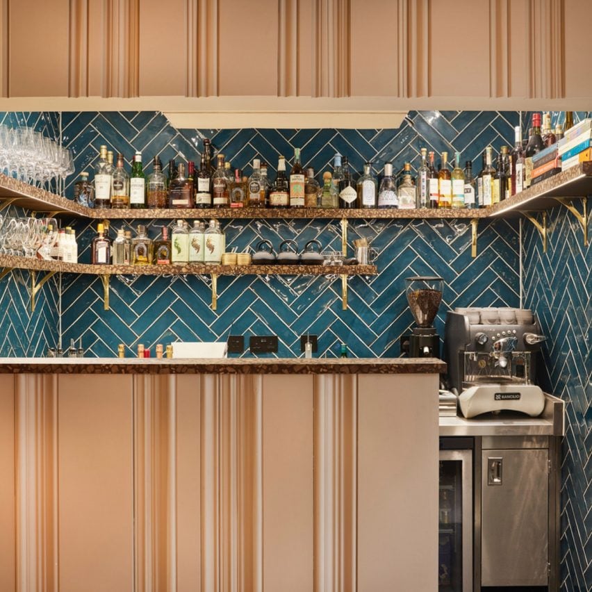
Skirting boards and architraves were reused to decorate the front of the bar

Architraves and skirting boards removed from the interior were reused to cover the front of the restaurant bar, creating a vertically grooved surface.

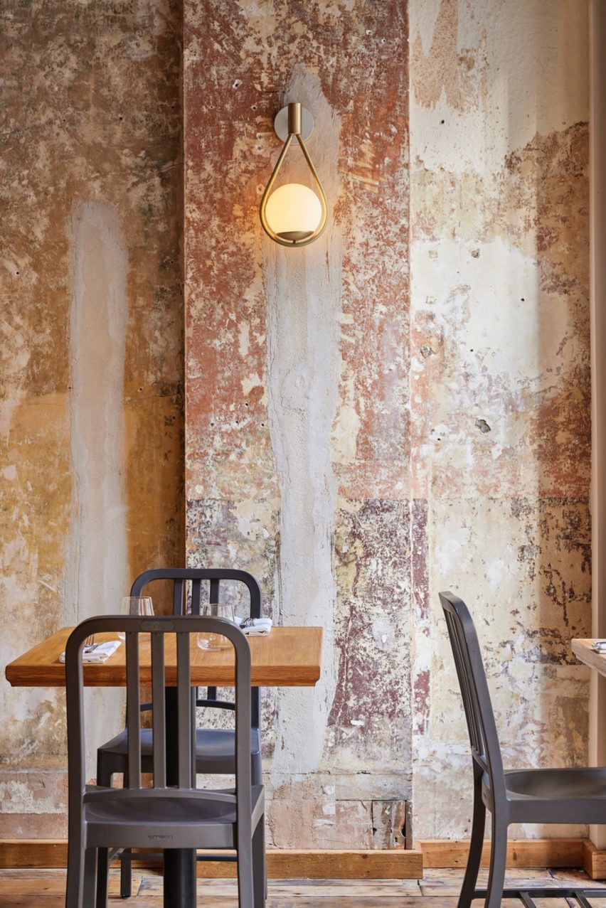
The practice overhauled the space to expose some of the original finishes, including brickwork, timber floorboards and aged walls.

“Customers really love the walls, which is interesting as these are simply what we found when we removed the blank white plasterboard wall linings on the ground floor,” said Object Space Place.

“This really epitomises what we discovered about working with waste and the circular economy – the extra effort you have to put in rewards you with a space rich in stories and these stories help add to a dining experience that exemplifies going the extra mile.”

Interior of Apricity restaurant by Object Space Place
The interior features pendant lights made from waste coffee grounds

Mechanical, electrical and plumbing (MEP) equipment was retained where possible and reclaimed furniture, sinks and mirrors were sourced to fit out the restaurant, including second-hand dining chairs that were reupholstered to suit the design scheme.

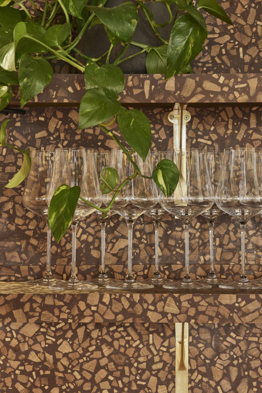
In instances where reclaimed items could not be acquired, new elements with sustainable qualities were used instead, including terrazzo-like surface material by Foresso made from recycled timber and lampshades made from oyster shells or waste coffee grounds.

Foresso timber terrazzo wine storage at Apricity restaurant
Foresso timber terrazzo was used on the bar and waiter stations

Object Space Place designed the refurbishment according to its Restorative Design Framework initiative, which is based on circular economy principles.

“We developed a true benchmark in sustainable design and fit-out by applying the principles of a circular economy, particularly designing out waste and pollution and keeping natural resources in use,” the studio explained.

Interior of Apricity restaurant by Object Space Place
Plasterboards were removed to reveal aged walls

According to Object Space Place, the project achieved a reduced embodied carbon footprint of 45 per cent compared to refurbishments of similar-sized restaurants where new furniture and finishes were applied.

Other restaurants that feature reclaimed materials include an eatery in Madrid with interior features made from upcycled junk and a restaurant in Bangalore decorated with discarded bicycle bells and cassette tape boxes.

The photography is by Ben Carpenter.
Reference