Lucas y Hernández Gil adds multi-use greenhouse to Casamontesa
CategoriesInterior Design

Lucas y Hernández Gil adds multi-use greenhouse to Casamontesa

A renovated 1970s bungalow with “kitsch character” and a greenhouse that doubles as a living room feature in Casamontesa – a weekend home designed by Spanish studio Lucas y Hernández Gil.

The project began when a couple asked the studio to overhaul a single-storey house that was once part of a hotel complex on the outskirts of Madrid.
Kresta Garden House doubles as home officeKresta Garden House doubles as home office
The renovated bungalow and a multifunctional greenhouse (above) make up Casamontesa

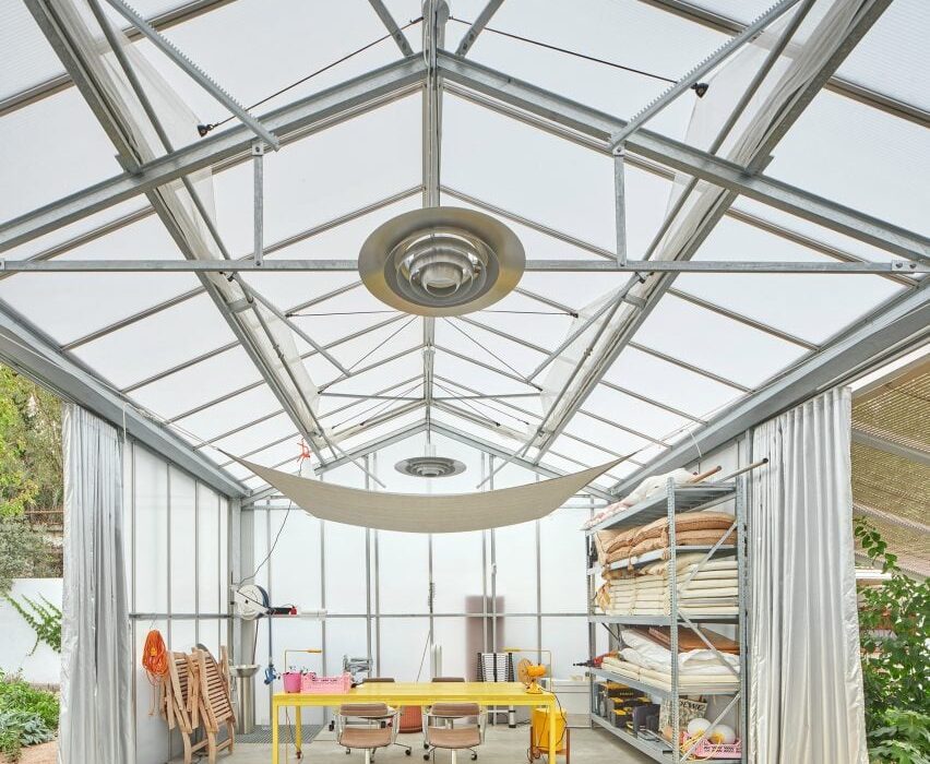
The brief later expanded to include a multifunctional greenhouse that can be used as a workspace, a guest bedroom, a gym or simply as a garden room.

Lucas y Hernández Gil, led by architects Cristina Domínguez Lucas and Fernando Hernández-Gil Ruano, developed a distinct character for each building.
Casamontesa renovation of 1970s bungalowCasamontesa renovation of 1970s bungalow
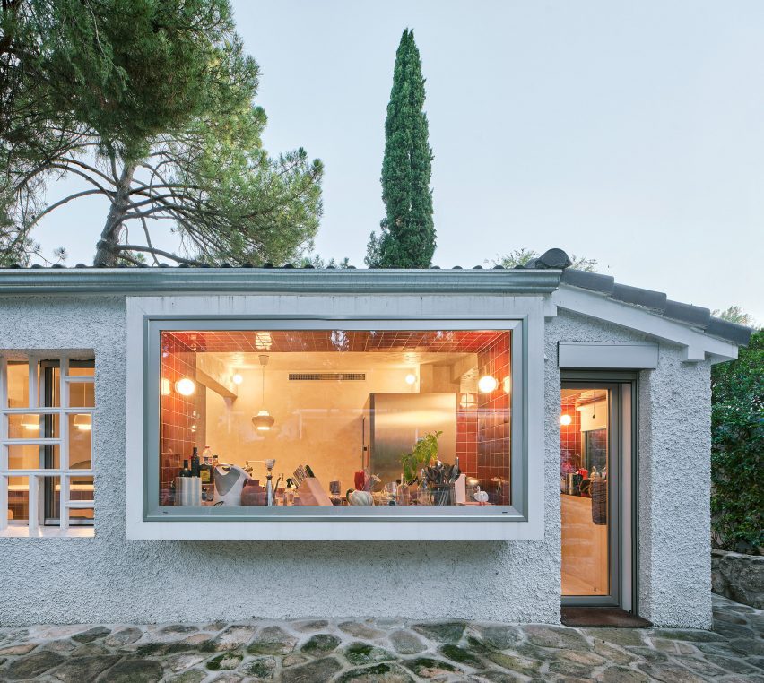
The main house is a bungalow built in the 1970s

Casamontesa’s renovated bungalow has a warm, playful style that draws on the 1970s aesthetic while the garden pavilion has a more utilitarian feel.

“The owners, a young urban couple who love design and live and work in the centre of Madrid, were looking for a functional and compact getaway within a fantastic garden,” Lucas told Dezeen.

“They wanted a very comfortable and flexible home that would be useful for both working and getting together with friends.”
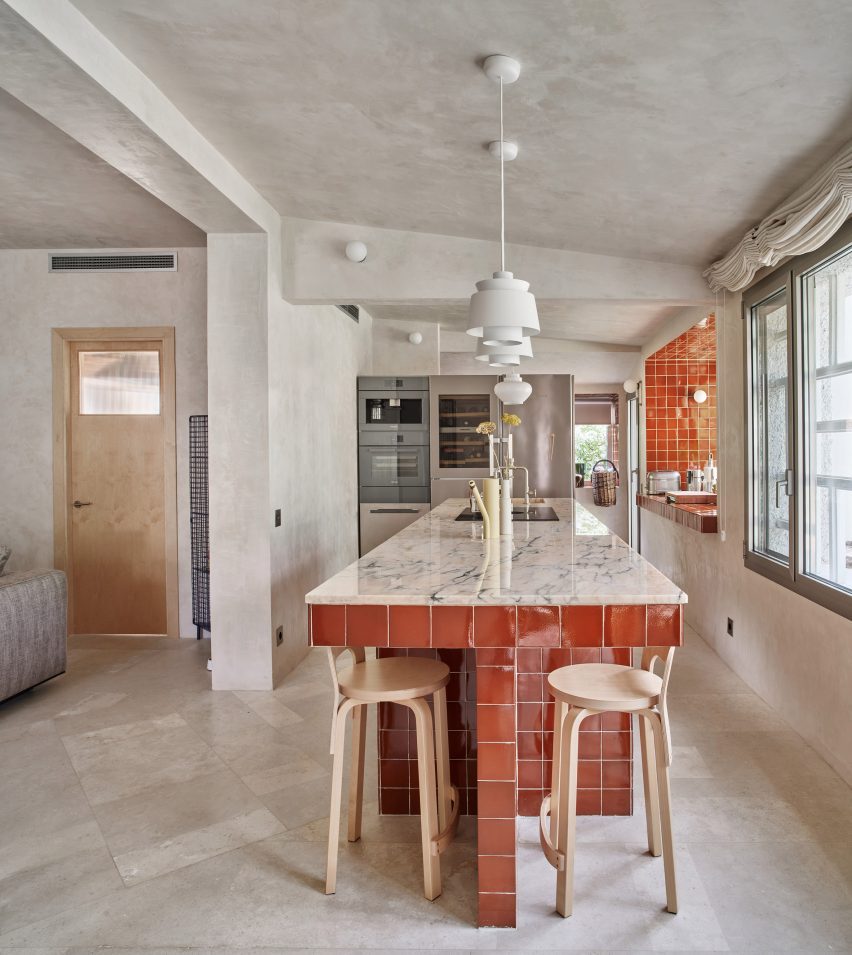
Casamontesa house kitchen islandCasamontesa house kitchen island
The interior centres around a new kitchen island

The bungalow renovation involved simplifying the interior layout to create a combined kitchen, dining room and living room, with a bedroom and bathroom off to one side.

“The house, in addition to being small, was very compartmentalised,” explained Lucas.
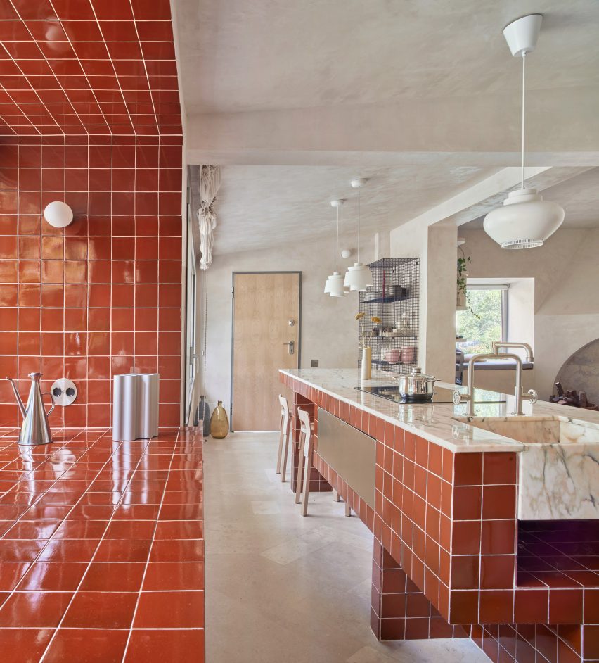
Casamontesa house kitchen islandCasamontesa house kitchen island
The materials palette includes pink marble and handmade tiles

To unify the newly open-plan living space, the designers installed an island that serves as a worktop, dining table and social gathering place.

This island features a countertop made from Portuguese pink marble while its sides are covered in the same handmade burgundy tiles that line an adjacent window recess.
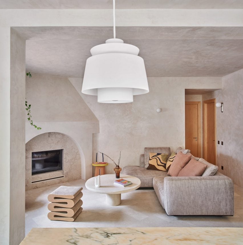
Casamontesa house with arched fireplaceCasamontesa house with arched fireplace
An arched fireplace provides a focal point in the living room

“The rest of the surfaces – Campaspero stone floors and waxed tinted plaster walls – establish a dialogue by contrast with the colourful and shiny surface of the tiles,” added Lucas.

Key details in the living room include an arched fireplace and a tadelakt plaster coffee table, while the bedroom features semi-circular marble nightstands.

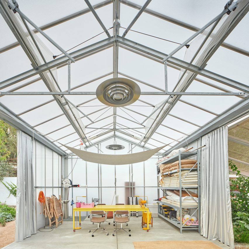
For Casamontesa’s garden room, the design team customised a prefabricated greenhouse.

A pergola extends the building volume outwards in a bid to blur the boundary between inside and out, and is topped with wooden blinds to provide shade.
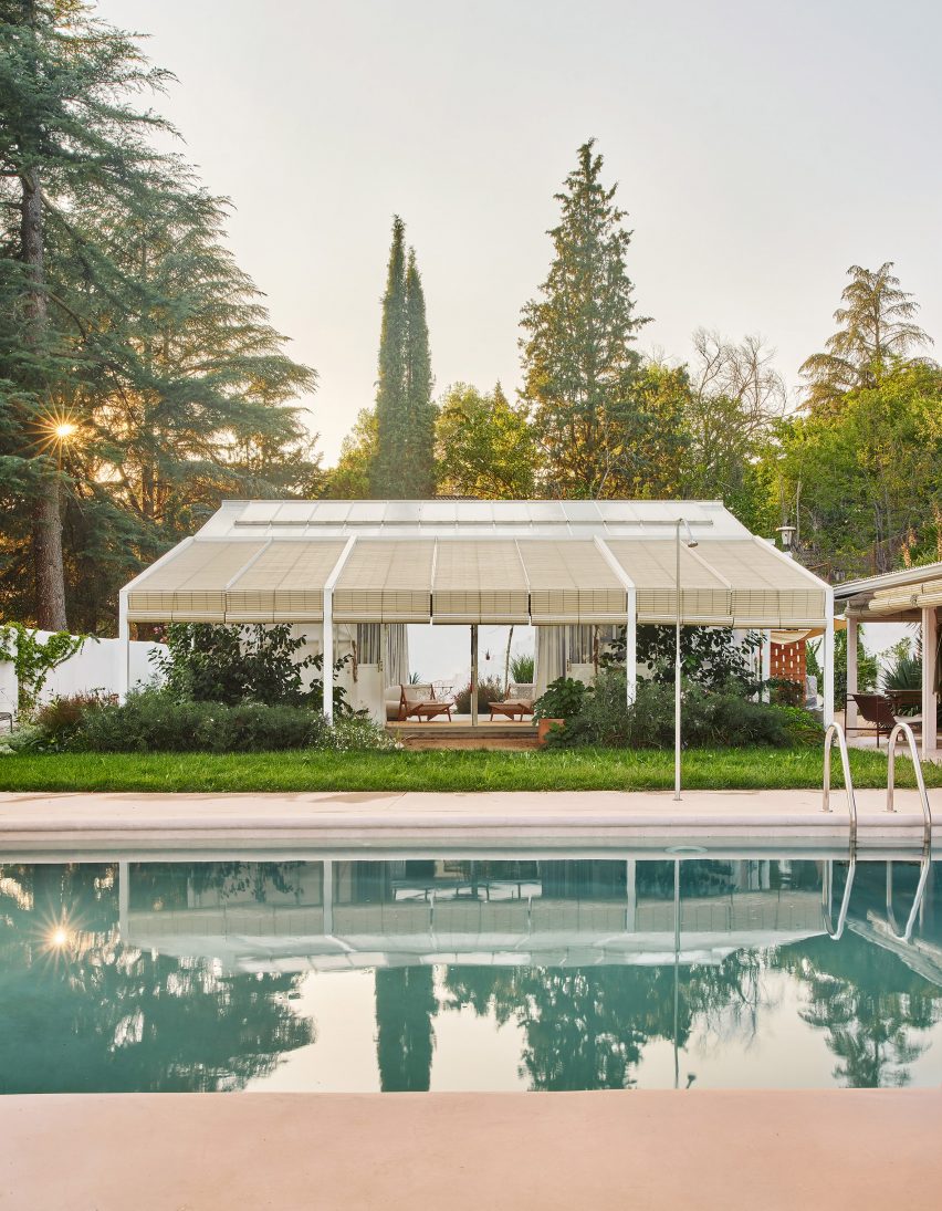
Kresta Garden House greenhouse with pergolaKresta Garden House greenhouse with pergola
A pergola extends the width of the greenhouse

A wooden box on wheels provides an additional bedroom, described as a “small Shigeru Ban-style mobile room”.

Other additions include thermal curtains and an automatic shading and ventilation system, which allow for versatile use of the space throughout the year.
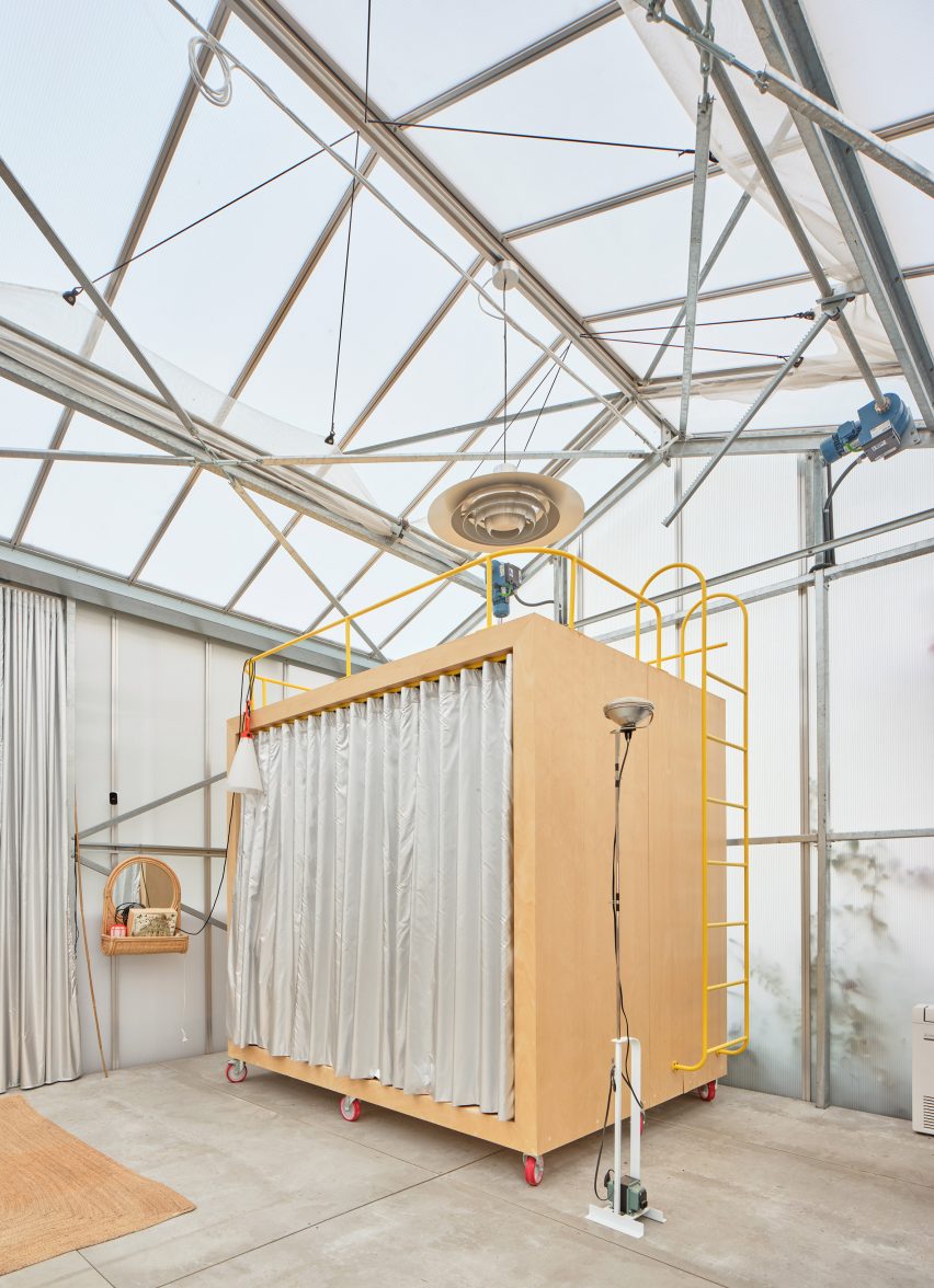
Kresta Garden House creates extra living room with mobile sleep spaceKresta Garden House creates extra living room with mobile sleep space
A “Shigeru Ban-style mobile room” provides an additional sleeping space

“By complementing the programme of the original bungalow, a more complete and flexible program is achieved, overcoming the limitations of a weekend house,” added Lucas.

Other recent projects by Lucas y Hernández Gil include a bar featuring extreme colour blocking and an apartment with a hidden closet.

The photography is by José Hevia.

Reference

el departamento infuses mountainous hues into texturized optical boutique in madrid
CategoriesArchitecture

el departamento infuses mountainous hues into texturized optical boutique in madrid

El Departamento unveils new PJ Lobster boutique in Madrid


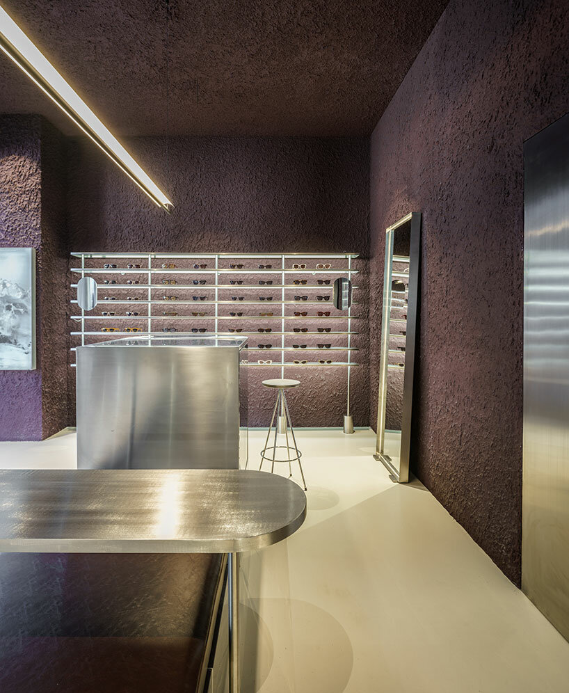
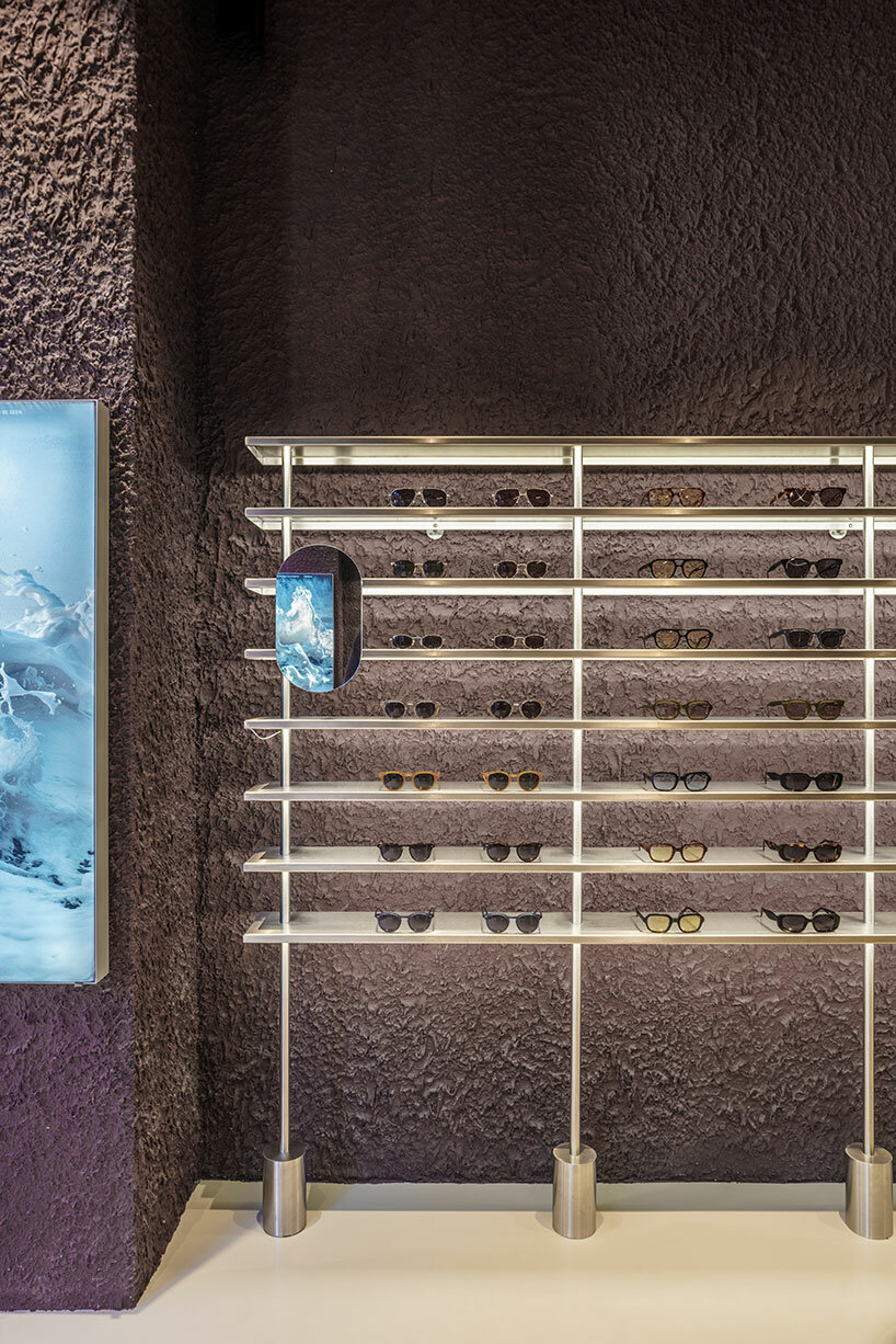
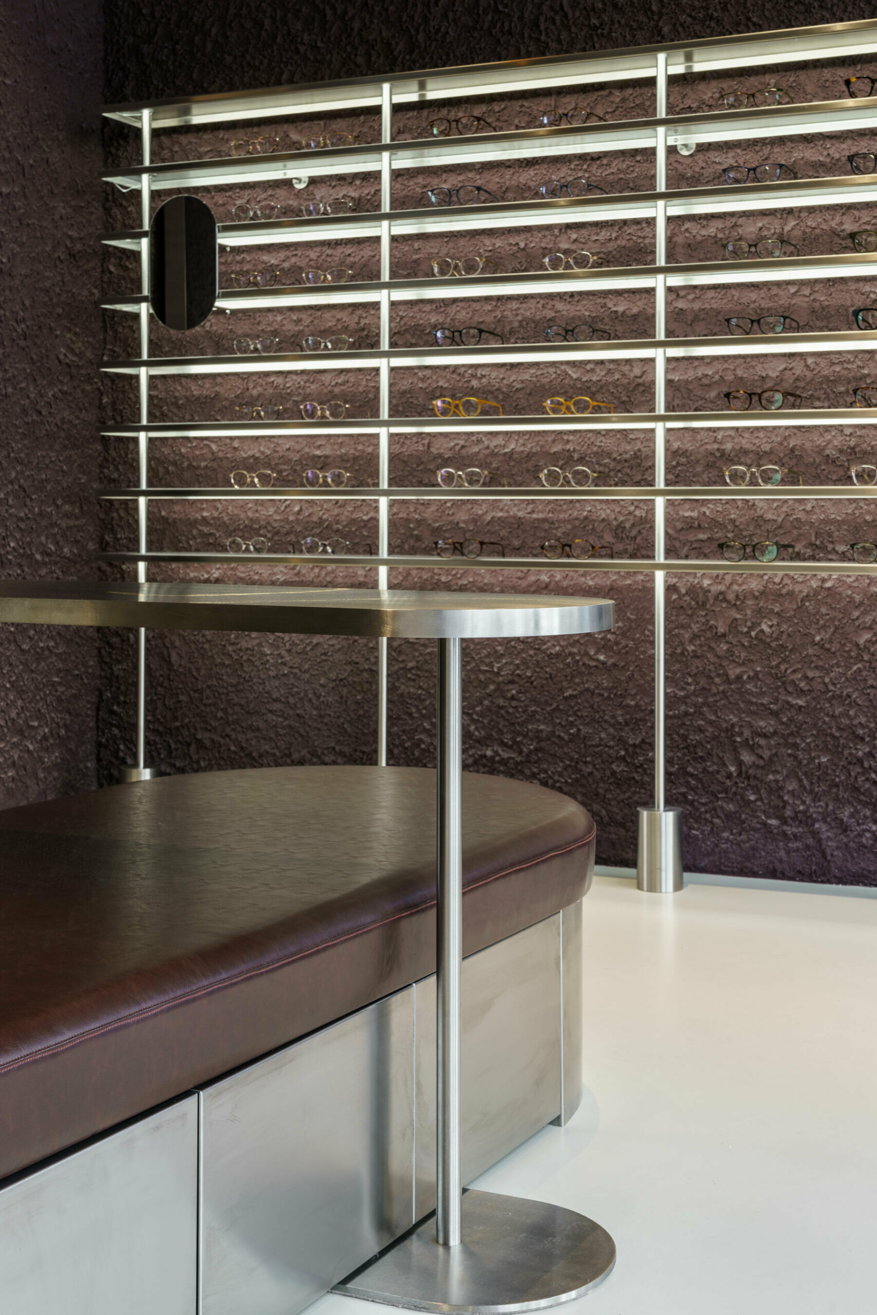
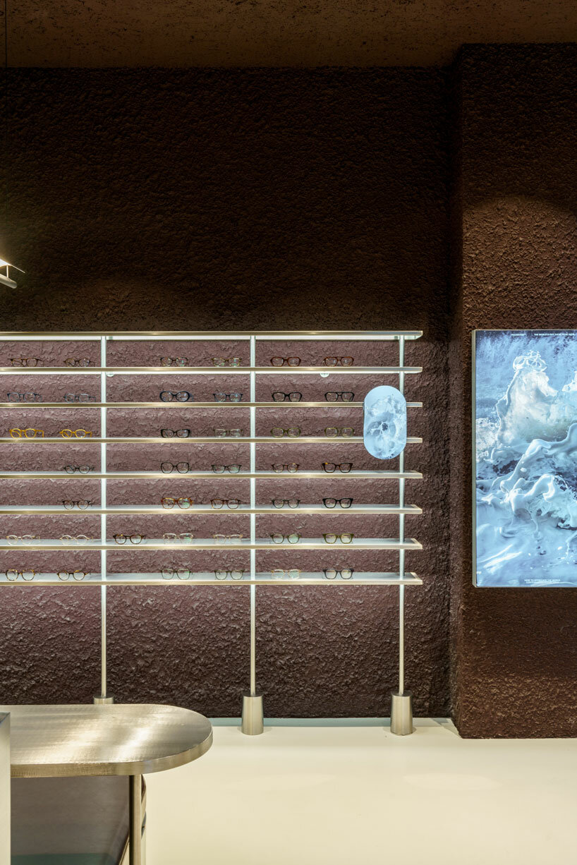
Valencia-based architecture practice El Departamento has crafted a contemporary optical boutique for the PJ Lobster brand in Madrid, Spain. Drawing from the character of the project location, which combines both sophistication and vibrancy, the retail interior incorporates texturized minimalism, rough materiality, organic forms, and stainless steel elements throughout its design. The color palette is inspired by the hues of the Madrid mountains, infusing a natural essence into the design which is otherwise described as ‘high-tech’.

el departamento infuses mountainous hues into texturized optical boutique in madrid
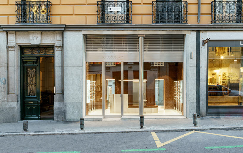
the exterior of the new PJ Lobster boutique in Madrid | all images courtesy of Miguel Fernández-Galiano


PJ Lobster’s Madrid store Unveils a Design Continuum


The new PJ Lobster boutique in Madrid continues the design exploration initiated in the previous project located in Barcelona (see designboom’s previous coverage here), focusing on color, organic forms, and different textures as common design elements.


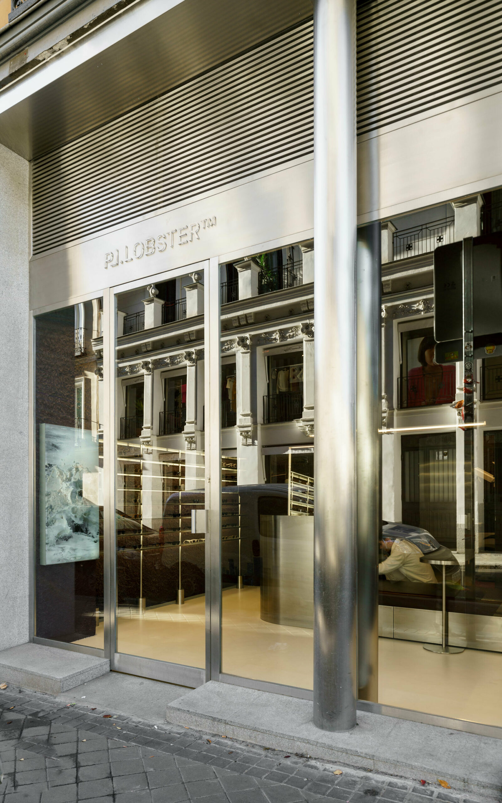
Spanning 42 m2, with an additional operational basement, the structure redefines traditional storefront concepts with an expansive, unobtrusive street-facing facade. The interior boasts ornamental structures, including wooden beams and cast-iron columns, maintaining an impressive free height of over 4 meters. El Departamento (find more here) preserved the original cast-iron pillars on the facade, encasing them in a sleek stainless-steel skin that transforms their appearance into two seamless cylinders. A striking glass facade, precisely centered between the two pillars, establishes a clear boundary, inviting patrons to experience the seamless transition between the external environment and the meticulously crafted interior space.


el departamento infuses mountainous hues into texturized optical boutique in madrid
the entrance of the store features reflective stainless steel elements


El Departamento’s Fusion of Textured Minimalism & Raw Precision


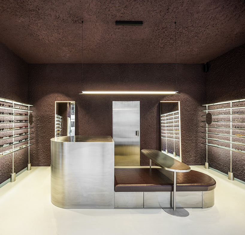
In their latest spatial exploration for this new optical boutique, El Departamento blends textured minimalism and raw precision. Meticulous attention to detail is evident as the color-blocked sales area dynamically contrasts with a neutral floor, yet harmonizes with stainless-steel furniture, accentuating the high-tech ambiance of the space.


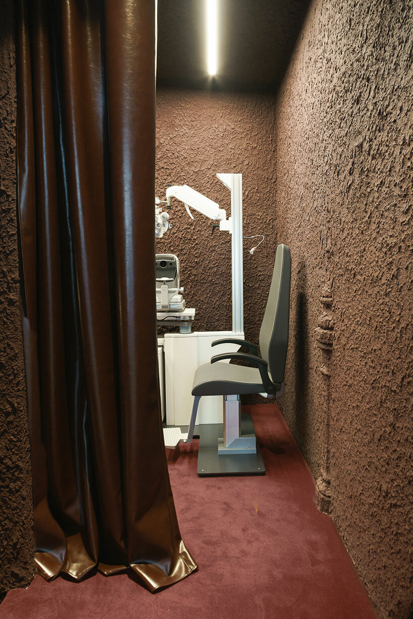
The design of the shop is characterized by rough materiality, as a prominent irregular plaster finish emerges. The color palette, dominated by dark garnet and aubergine hues, pays homage to the traditional color of Madrid’s exposed brick. This color, derived from the various clays of the central plateau, harks back to the architectural materials of Madrid’s late 19th-century aesthetics. ‘This tribute to reddish tones, transformed into garnet, evokes the hues that tint the fields of Madrid’s mountain range in autumnal twilights,’ the design team shares. 

el departamento infuses mountainous hues into texturized optical boutique in madrid
the retail interior incorporates rough materiality, organic forms, and stainless steel elements

el departamento infuses mountainous hues into texturized optical boutique in madrid
the color palette of the project is inspired by the hues of the Madrid mountains

el departamento infuses mountainous hues into texturized optical boutique in madrid
an irregular plaster finish emerges within the interior

el departamento infuses mountainous hues into texturized optical boutique in madrid
the interior boasts ornamental structures, including wooden beams and cast-iron columns

el departamento infuses mountainous hues into texturized optical boutique in madrid
the store is dominated by dark garnet and aubergine hues

el departamento infuses mountainous hues into texturized optical boutique in madrid
the boutique s characterized by a high-tech ambiance


project info: 

name: PJ Lobster Restyling
architects: El Departamento | @eldepartamento.estudio
design team: Alberto Eltini & Marina Martín

location: 2 Fernando VI Street, Madrid, Spain 
area: 42 sqm
photography: Miguel Fernández-Galiano

myrto katsikopoulou I designboom

dec 25, 2023


Reference

JJ16 apartment in Madrid features curves and colour blocking
CategoriesInterior Design

JJ16 apartment in Madrid features curves and colour blocking

Madrid studio Lucas y Hernández-Gil has completed a family home that makes the most of every inch, with details including a yellow storage wall, a corridor kitchen and a hidden closet.

JJ16 is a three-bedroom apartment in Madrid’s Salamanca district, but until recently it had been used as an office.

Kitchen with chrome counter in JJ16 apartment by Lucas y Hernández-Gil
JJ16 is a three-bedroom apartment for a family of four

Lucas y Hernández-Gil, a specialist in interior architecture, converted the property back into a residence for a family that includes a mother, three teenage children and their dog.

The challenge was not only to make it feel like a home again but also to create space for everyone’s personality within the 165 square-metre footprint.

Kitchen with chrome counter in JJ16 apartment by Lucas y Hernández-Gil
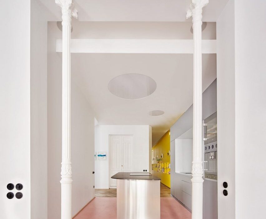
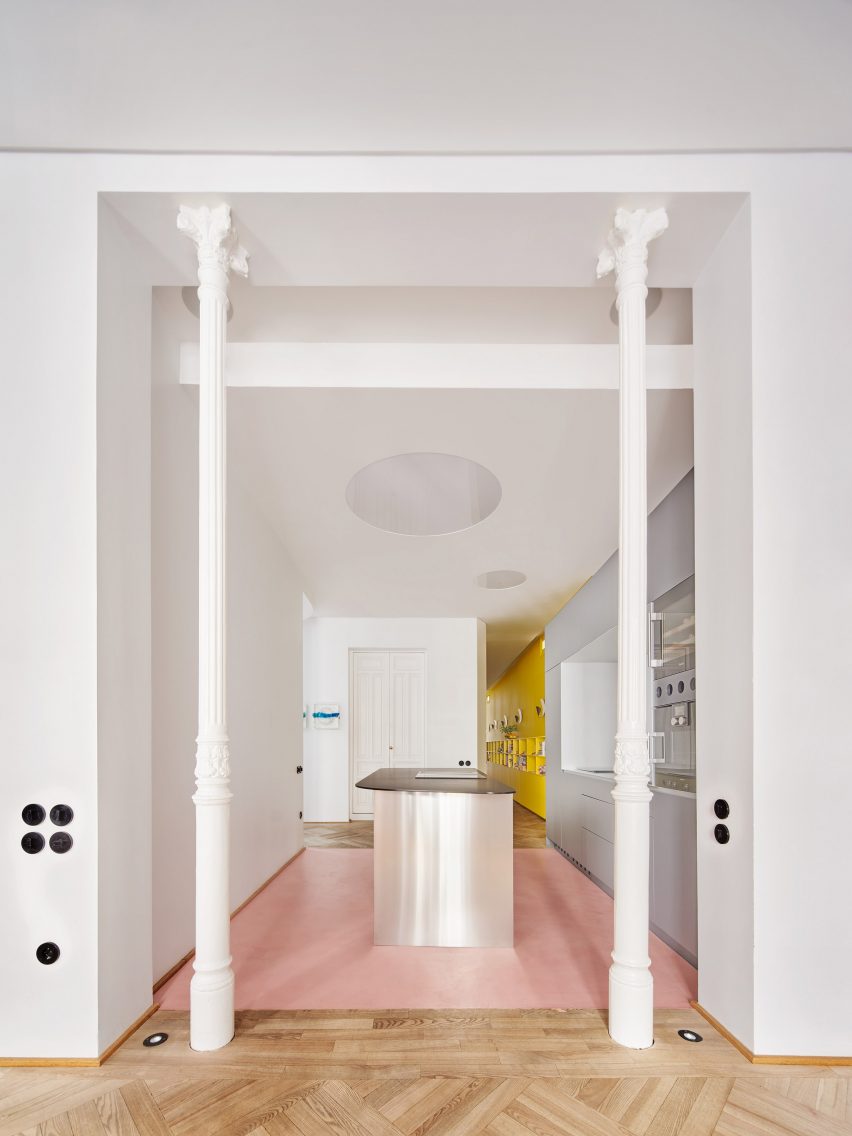
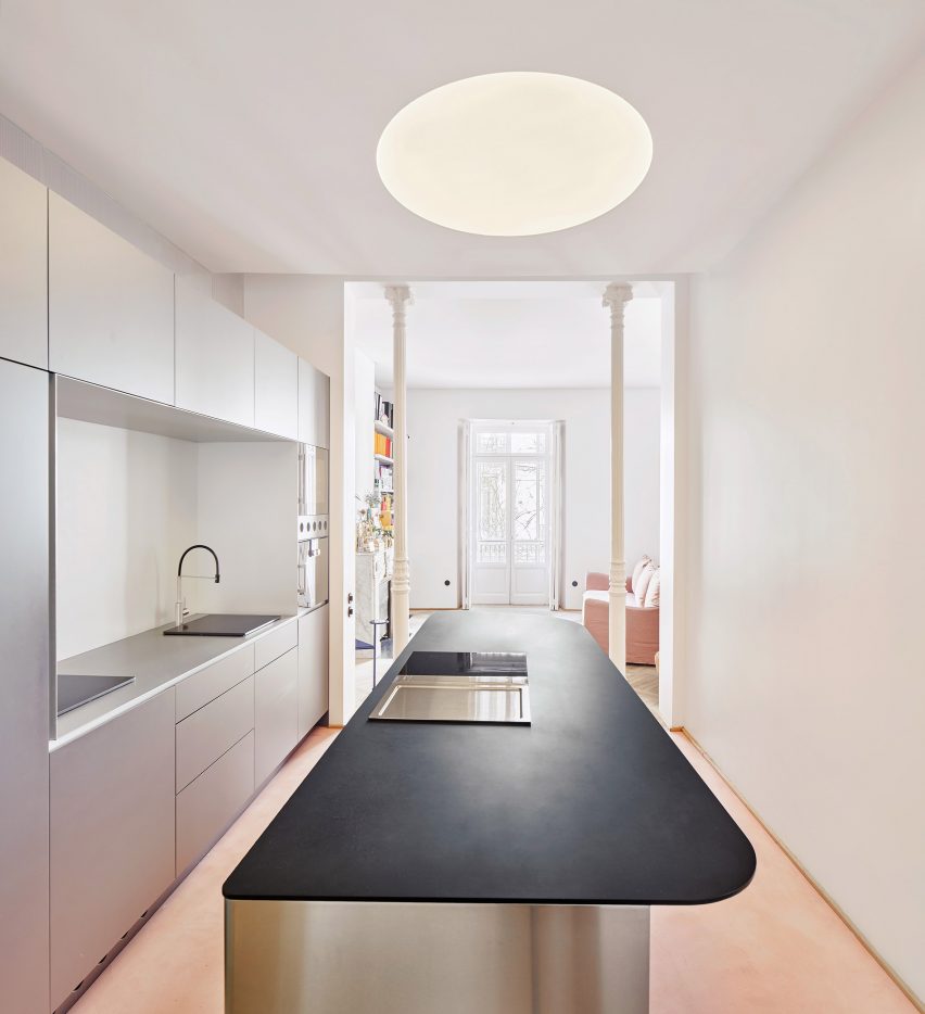
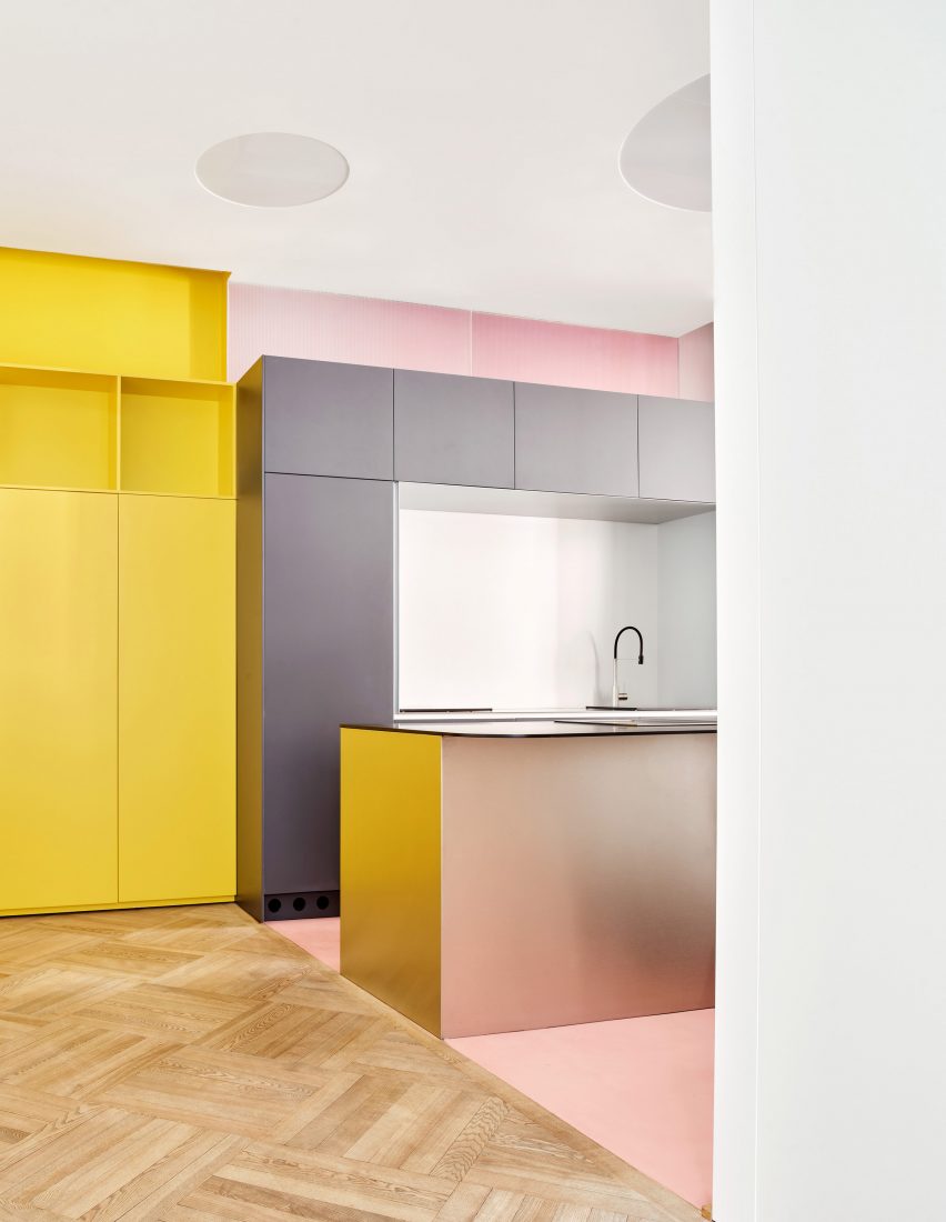
The kitchen occupies a corridor space between the entrance lobby and the living room

The designers achieved this by combining space-saving strategies with statement details, providing both functionality and character.

“Everyone had a clear idea of what they needed, which translated directly into the spaces,” said studio founders Cristina Domínguez Lucas and Fernando Hernández-Gil Ruano.

“Far from generating a conflict, different colours and materials give the house a richness, a harmonic heterogeneity,” they told Dezeen.

Pink, grey and chrome Kitchen in JJ16 apartment by Lucas y Hernández-Gil
The room is defined by shades of soft pink and grey

Optimising JJ16’s layout was crucial but difficult given the irregularity of the floor plan.

Lucas y Hernández-Gil’s strategy was to make every space, including the corridors, as useful as possible.

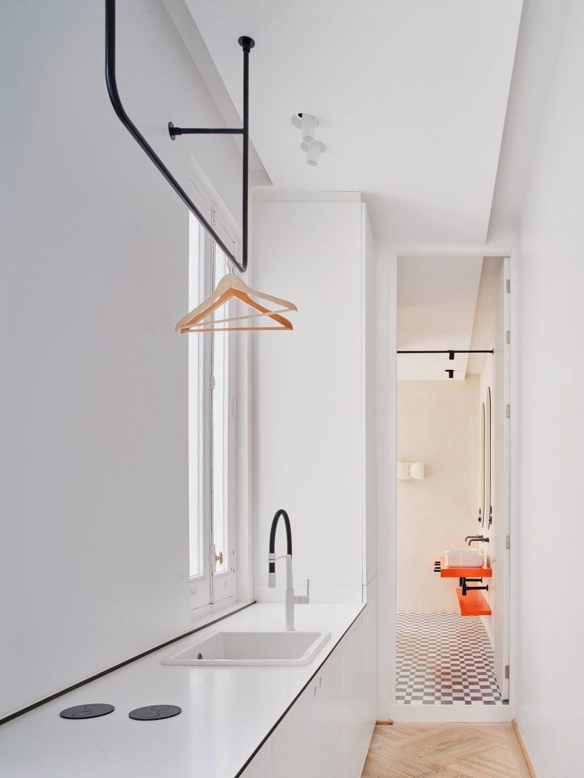
Utility area in corridor of JJ16 apartment by Lucas y Hernández-Gil
The utility area also occupies a corridor space

The kitchen now occupies a connecting space between the entrance lobby and the living room, freeing up space at the front of the apartment for a spacious main bedroom.

Meanwhile, the corridor leading to the main bathroom and the third bedroom incorporates a mini library and a utility area.

“The main challenge was the deep layout and long corridor,” said the architects.

“We provided circulation with content by creating spaces within it. This turned out to be one of the best design decisions of the project.”

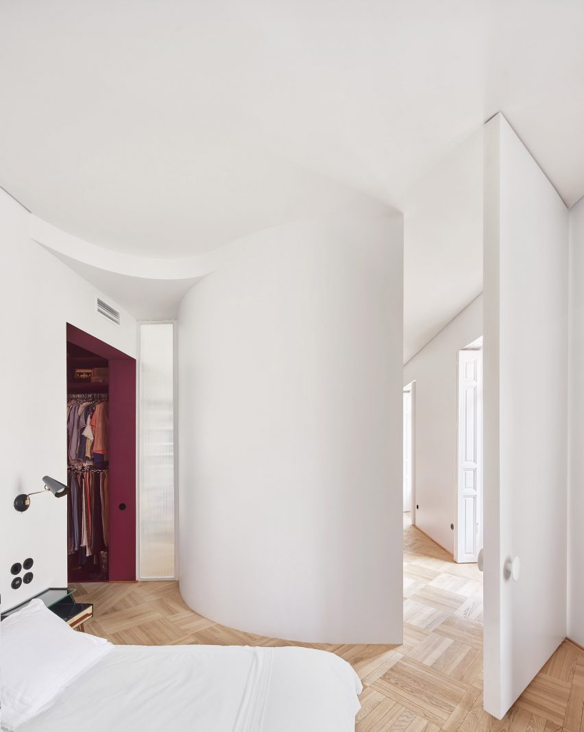
Bedroom with curved wall in JJ16 apartment by Lucas y Hernández-Gil
A curved wall frames the main bedroom

Curved partitions create variety within JJ16’s layout. The largest of these separates the living room from the main bedroom, but other curves can be found in the second bedroom and a shower room.

Many spaces have their own colours, which contrast with the bright white tones that otherwise dominate the interior.

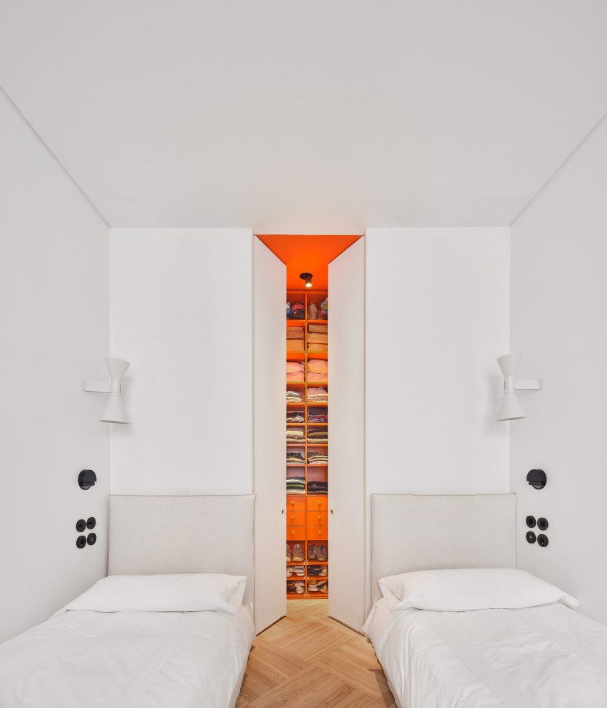
Bedroom with orange walk-in closet in JJ16 apartment by Lucas y Hernández-Gil
The third bedroom is a twin room with a hidden walk-in closet

The bright yellow bookshelf wall is the most striking, while the adjacent kitchen offers a two-tone effect with shades of soft pink and grey, and matt chrome finishes.

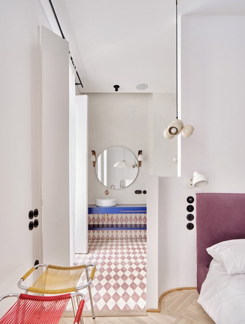
Bedrooms have a minimal feel, but they boast colourful dressing rooms and en-suites. Bright orange was chosen for the hidden walk-in closet, located in the twin third bedroom, while deep purple adds a luxury feel in the main bedroom.

Bedroom and en-suite with patterned floor tiles
Patterned tiles feature in the bathroom and en-suite areas

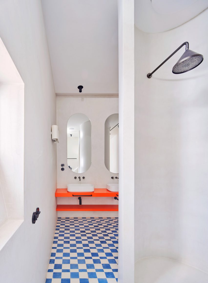
Floor surfaces provide more visual interest. Living spaces feature oak parquet, while bathrooms are all finished with patterned cement tiles.

This bold approach to colour and texture is a common feature in the work of Lucas y Hernández-Gil, whose other recent projects include the sunset-inspired Naked and Famous bar and the stylish Casa A12.

Bathroom with orange counter and chequered tiles
The main bathroom also features a curved shower room

“The approach to colour is a constant in our design process,” said Lucas and Hernández-Gil Ruano.

“It is about activating spaces and achieving a warm and joyful domestic atmosphere.”

The photography is by Jose Hevia.

Project credits

Architecture: Lucas y Hernández-Gil
Collaborators: Lucía Balboa, María Domínguez, Sara Urriza

Reference

Plantea Estudio creates cosy cave-like room within bar Gota in Madrid
CategoriesInterior Design

Plantea Estudio creates cosy cave-like room within bar Gota in Madrid

A red “cave” hides behind the main dining space of this wine and small plates bar in Madrid designed by interiors studio Plantea Estudio.

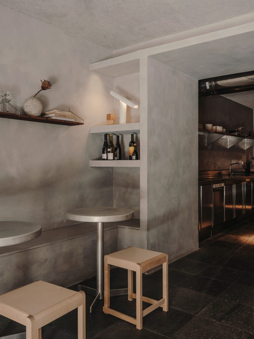
Located on the ground floor of a neoclassical building in Madrid’s buzzy Justicia neighbourhood, Plantea Estudio designed Gota to appear “dark, stony and secluded”.

Interior of Gota bar in Madrid designed by Plantea Estudio
Gota sits on the ground floor of a neoclassical building in the Justicia neighbourhood

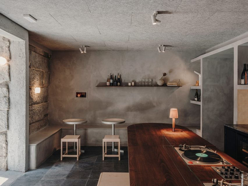
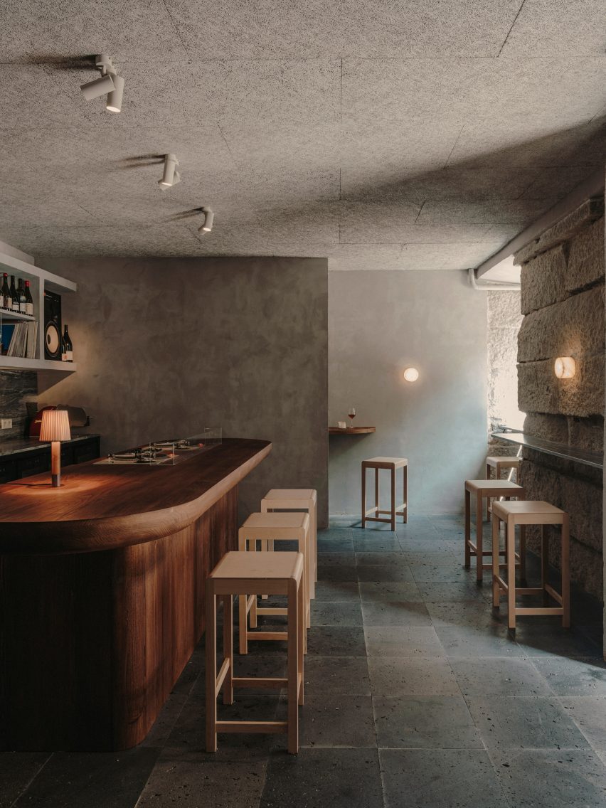
Guests ring a bell to enter the 70-square-metre bar, and are then welcomed into a dining room enclosed by thickset granite ashlar walls. While some of the walls were left exposed, others have been smoothly plastered over and washed with grey lime paint.

The floor was overlaid with black volcanic stone tiles that the studio thought were suggestive of a “newly discovered terrain”.

Interior of Gota bar in Madrid designed by Plantea Estudio
A counter in the first dining space is inbuilt with a record player

A bench seat runs down the left-hand side of the bar, accompanied by lustrous aluminium tables and square birchwood stools from Danish design brand Frama.

Guests can alternatively perch on high stools at the peripheries of the room, where lies a slender stone ledge for drinks to be set down on.

Interior of Gota bar in Madrid designed by Plantea Estudio
Shelving displays wine bottles, vinyls, and other objects

More seating was created around a bespoke chestnut counter at the room’s centre; its surfacetop has an in-built turntable on which the Gota team plays a curated selection of music.

Behind the counter is a storage wall where wine bottles, vintage vinyl records and other music-related paraphernalia are displayed.

Gota bar in Madrid includes red cave-like room
A cave-like dining room hides at the bar’s rear

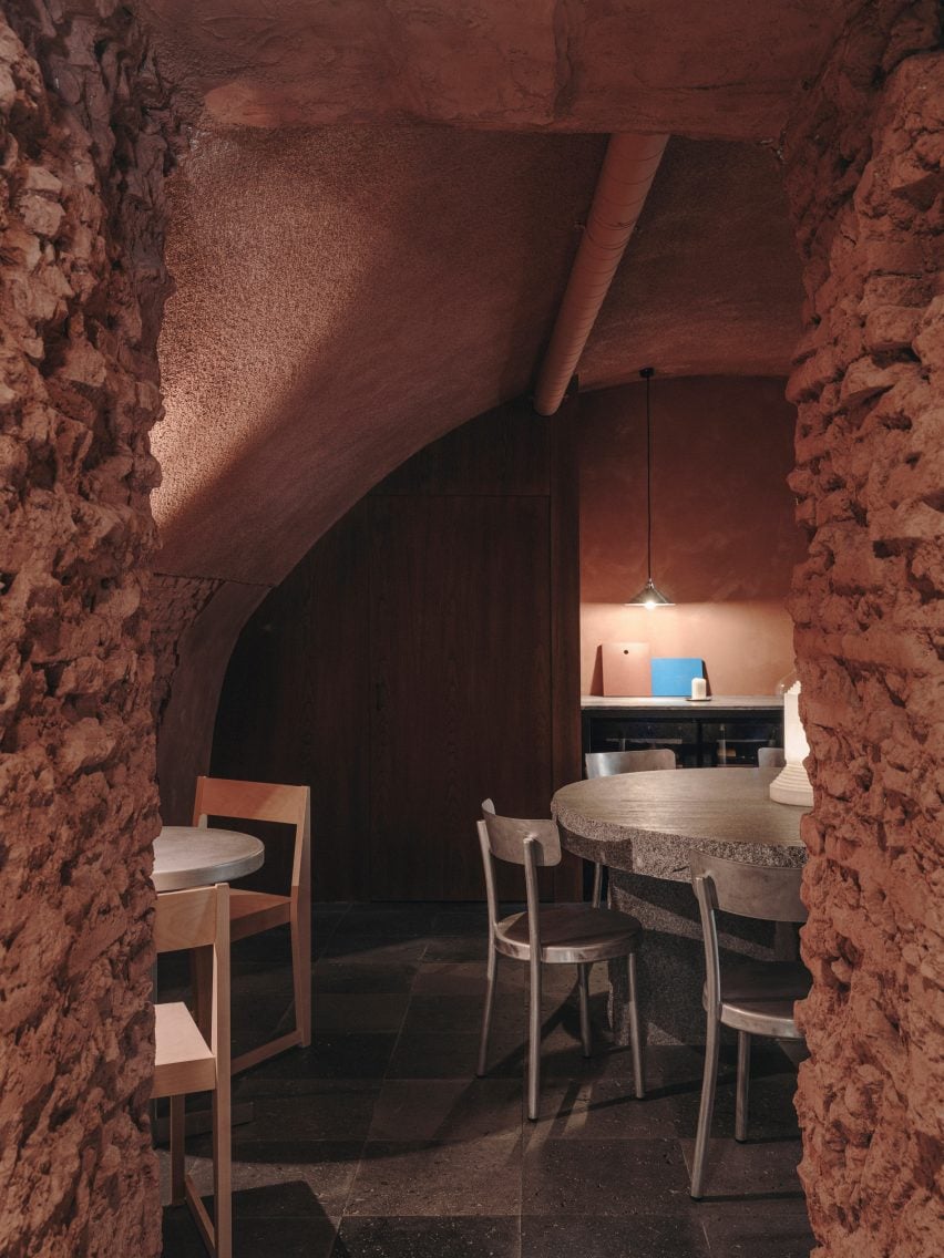
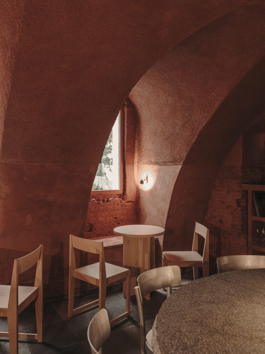
An open doorway takes guests down a short corridor to a secondary cave-like dining space, which boasts a dramatic vaulted ceiling and craggy brick walls. It has been almost entirely painted red.

“It’s relatively common to find this kind of vaulted brick space in the basements of old buildings in Madrid – this case was special because it’s on the ground floor with small openings to a garden,” the studio told Dezeen.

“It was perfect for a more quiet and private area of the bar,” it continued.

“The red colour is an abstract reference to the brick of which the cave is really made, and also a reference to wine.”

Gota bar in Madrid includes red cave-like room
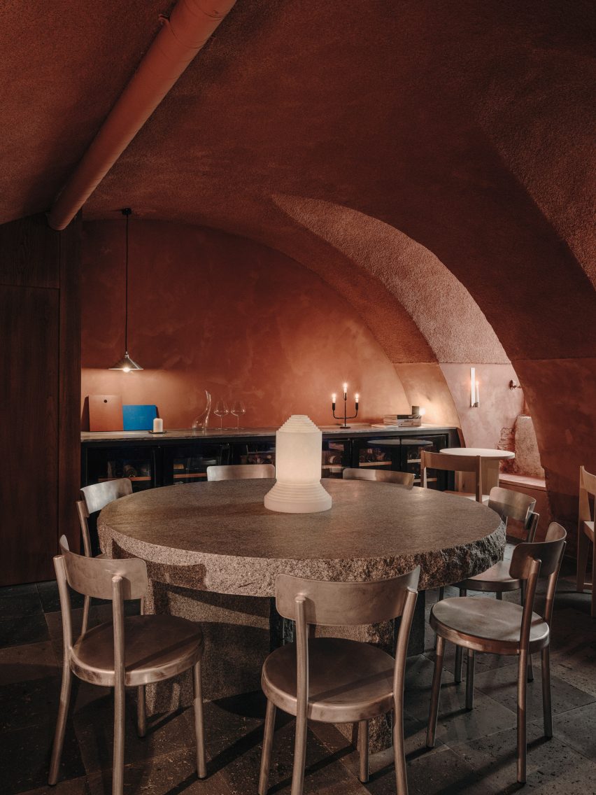
The space is arranged around a huge granite table

At the room’s heart is a huge 10-centimetre-thick granite table that’s meant to look as if it has “been there forever”, surrounded by aluminium chairs also from Frama. Smaller birch tables and chairs custom-designed by the studio have been tucked into the rooms corners.

To enhance the cosy, intimate feel of the bar, lighting has been kept to a minimum – there are a handful of candles, reclaimed sconces and an alabaster lamp by Spanish brand Santa & Cole.

Gota bar in Madrid includes red cave-like room
Red paint covers the space’s vaulted ceiling and brick walls

Established in 2008, Plantea Estudio is responsible for a number of hospitality projects in Madrid.

Others include Hermosilla, a Mediterranean restaurant decked out in earthy tones, and Sala Equis, a multi-purpose entertainment space that occupies a former erotic cinema.

The photography is by Salva López.

Reference

Vibrant glazed tiles divvy up Madrid apartment by Sierra + De La Higuera
CategoriesInterior Design

Vibrant glazed tiles divvy up Madrid apartment by Sierra + De La Higuera

Spanish architecture studio Sierra + De La Higuera has used traditional Moroccan zellige tiles to define the different spaces in this open-plan apartment in Madrid.

Housed in a 1940s building in the city’s bohemian Conde Duque neighbourhood, the apartment belongs to a well-travelled couple that wanted to stamp its Mexican and Galician heritage onto the interior.

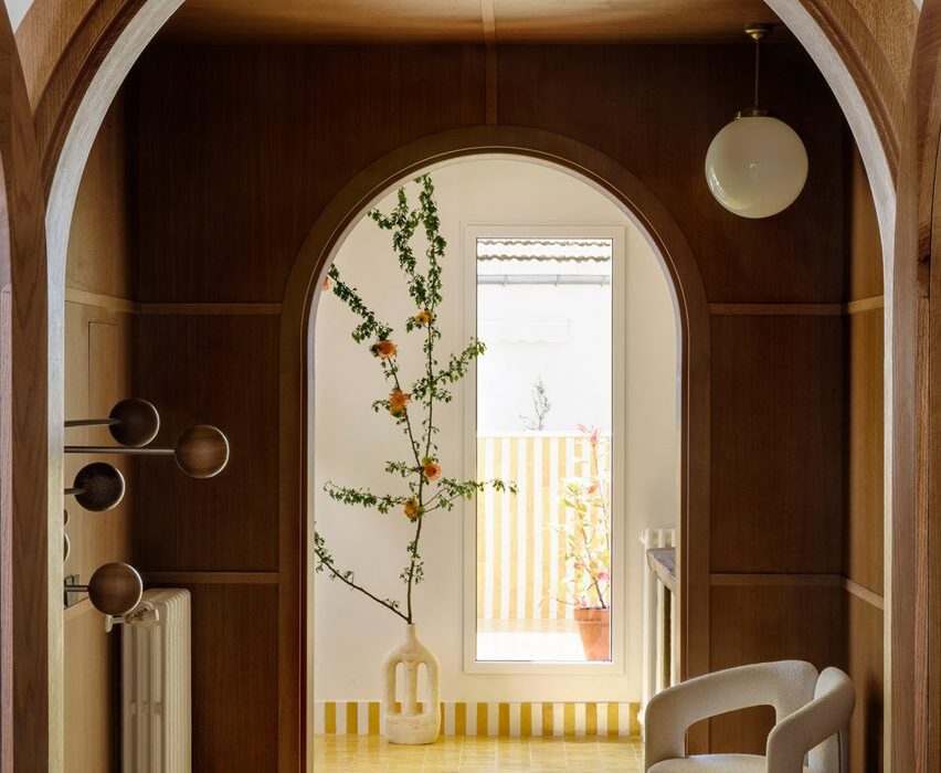
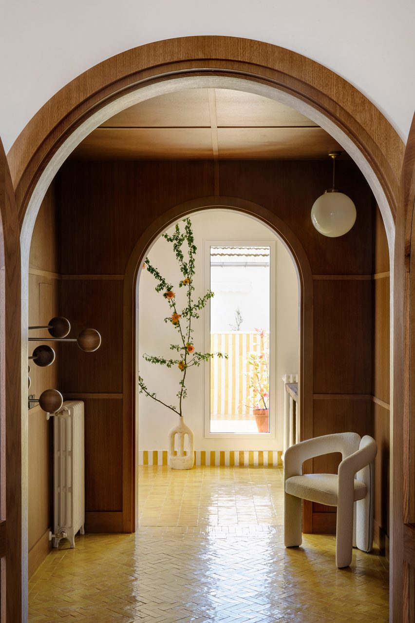
Wood-panelled hallway with white armchair in flat by Sierra + De La Higuera
Colourful tiling features throughout the Conde Duque apartment

“Our clients wanted to bring part of their origins to Madrid,” Sierra + De La Higuera told Dezeen. “This project is the outcome of a quest to find colour in Madrid, a characteristic marked by the owners’ journeys and origins.”

The studio was commissioned to carry out a complete refurbishment of the apartment, which included totally changing its layout.

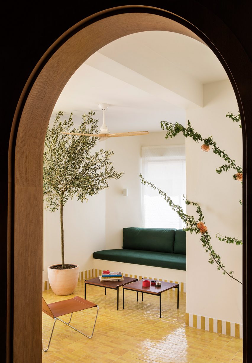
Built-in green sofa in Conde Duque apartment
The apartment is housed in a 1940s building in Madrid

The original plan consisted of a series of rooms laid out along a long windowless hallway. Sierra + De La Higuera removed as many walls as possible to create an open-plan kitchen, dining and living space.

“Historically in Madrid, houses had a lot of rooms and partitions,” the studio told Dezeen.

“But nowadays, we like to live on a more open-plan basis. The main aim of the new layout was to open spaces, eliminate corridors and hallways, and to gain as much natural light as possible.”

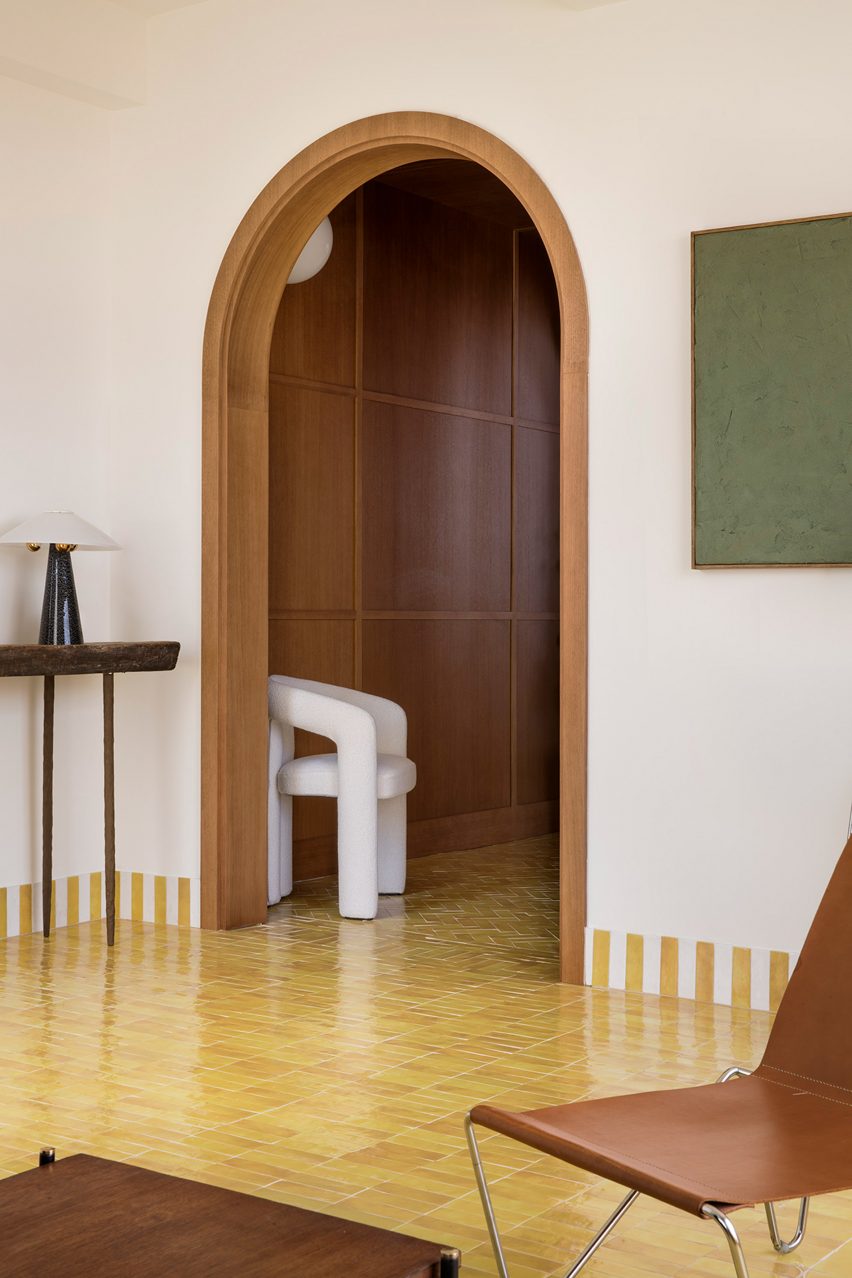
Curved, wood-panelled doorway in Conde Duque apartment
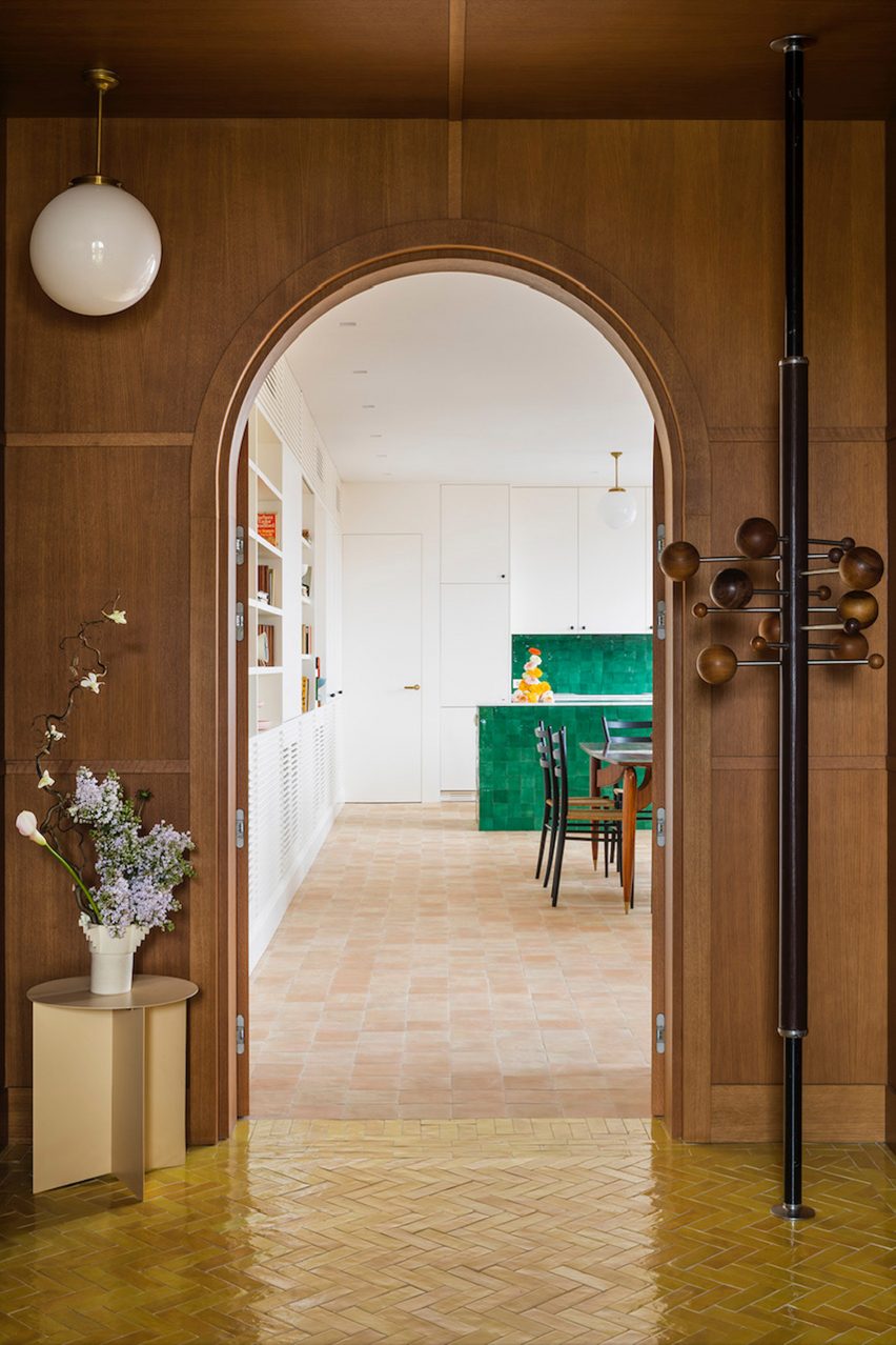
A wood-panelled entrance hall separates the living and dining spaces

Two bedrooms – one with a walk-in wardrobe and both with adjoining bathrooms – are located at the north end of the apartment while a bright sitting room wrapped by south-facing terraces sits at the opposite end.

Throughout the apartment, natural timber, terracotta tiles and white walls were used as foils to the zellige tiling, which is distinguished by its imperfect hand-moulded surfaces.

View from wood-panelled room into green-tiled kitchen of Sierra + De La Higuera apartment
Emerald green zellige tiles distinguish the kitchen

The wood-panelled entrance hall with its arched doorways was conceived as a buffer between two different zones. On the one side is the Mexico-influenced kitchen and dining area finished with emerald green tiles.

And on the other side are the living room and the terraces with their bold yellow colour scheme, which were informed by the couple’s travels to Singapore.

“We focused on vivid colours: bright yellows, greens, blues and reds, paired with materials like tiles, ceramics and fine wood,” explained Sierra + De La Higuera.

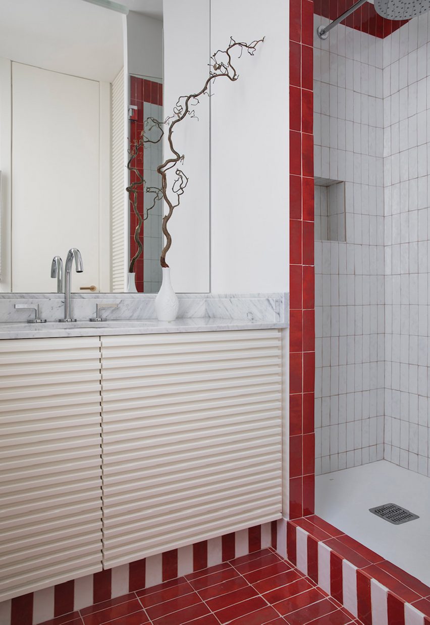
In the sitting room and the two bathrooms – finished in red and blue respectively – the tiles were used to create decorative striped skirting that frames the different zones.

In some areas, the colours of the tiles are applied to other furnishings to create a cohesive feel, with the green upholstery in the living room echoing the glazed green tiles in the kitchen.

Terrace with yellow-and-white tiles in Conde Duque apartment
Yellow was applied liberally throughout the terraces and in the living room

A large bookshelf that runs around the kitchen, dining and living room area was custom designed for the space by Sierra + De La Higuera.

“This element is very important to the clients, as it holds all the objects they have collected on each of their journeys in addition to all their books,” the studio explained.

Bathroom with red-and-white striped tiles by Sierra + De La Higuera
Tiles were also used to create decorative striped skirting in the bathrooms

In the bedroom, the architects designed custom cabinetry and specified a cloud-grey carpet to create a calm and cosy ambience, which is intended to evoke Galicia.

Other projects that use tiles to delineate rooms include a Barcelona bed and breakfast by Nook Architects that features vibrant blue tiles and cobalt-blue paintwork.

The photography is by German Sáiz.

Reference