Method Architecture outfits own Houston studio with vibrant mural
CategoriesInterior Design

Method Architecture outfits own Houston studio with vibrant mural

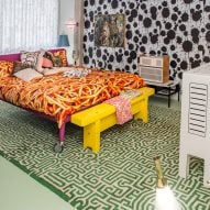
Texas studio Method Architecture has completed an office for itself in Houston with maximalist design, vibrant colours and a mural at its centre.

The 8,612-square foot (800-square metre) studio was completed in 2023 with a reception area, open office plan, private and collaborative meeting spaces and staff lounges.
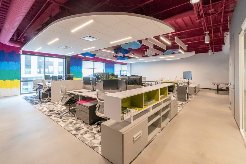
Colourful interior of studio for Method ArchitectureColourful interior of studio for Method Architecture
Method Architecture has completed its self-designed studio

Located in the mixed-use East River development, designed by architecture studio Page, the office was designed to serve as an inspiration source for the studio’s clients.

“Our approach was to pursue maximalism with the goal of creating an environment where our clients would feel safe expressing their bold and innovative ideas with us,” Ashley Bettcher, Research and Design Specialist with Method Architecture told Dezeen.
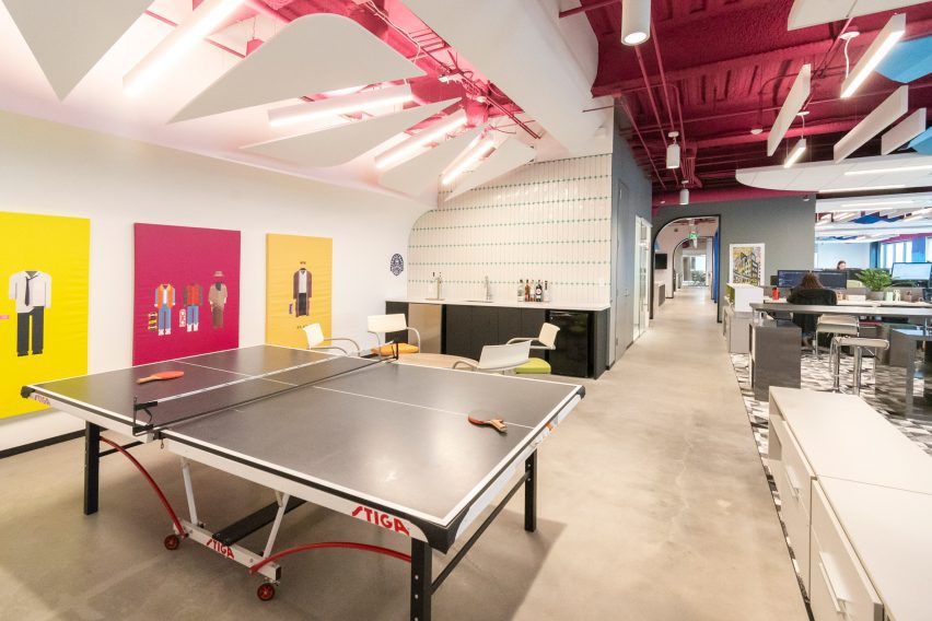
Table tennis table in Method Architecture's studioTable tennis table in Method Architecture's studio
The office was designed to serve as an inspiration source

“Creativity has no limits and great design doesn’t necessarily need to cost more. Method’s new Houston office perfectly encapsulates that mantra.”

The “ego-free” focus of the design is a nearly 50-foot multi-wall mural by local artist David Maldonado, known for creating nearly 20 pieces of public artwork throughout Houston.
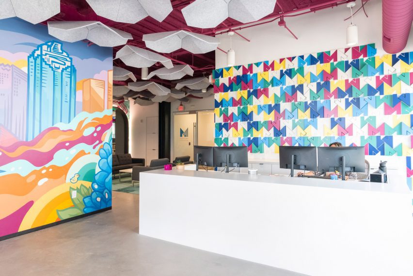
Multi-wall mural by David MaldonadoMulti-wall mural by David Maldonado
David Maldonado created a multi-wall mural for the studio

With pops of magenta, cobalt, and yellow, the mural features icons from the city and state like the skyline, a rocket for Johnson Space Center, a bluebonnet as the Texas state flower, and the neighbouring Buffalo Bayou.

The artwork also slips in custom motifs representing the studio, such as Method’s rubber duck mascot.
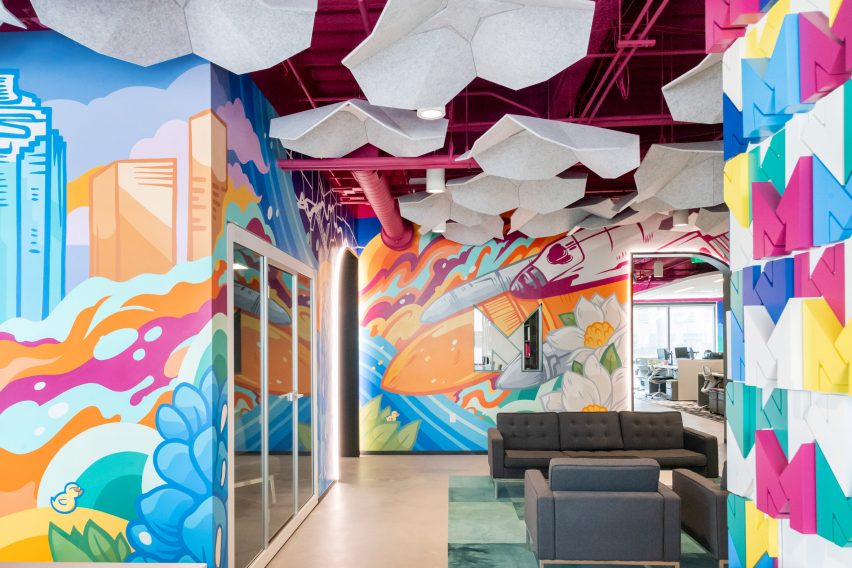
Acoustic baffles suspended from the ceilingAcoustic baffles suspended from the ceiling
Light grey flower-like acoustic baffles hang from the ceiling

“This feature piece of artwork helps set the tone for the remainder of the office including bold colors, geometric patterns and shapes and a secondary mural designed and installed by Maldanado featuring drip paint in mirroring colorways located at the back of the office,” the team said.

The mural is complemented by a 3D-printed wall installation behind the reception desk composed of the studio’s signature “M” logo and the raw ceiling with exposed mechanical lines all painted a vibrant shade of fuchsia.
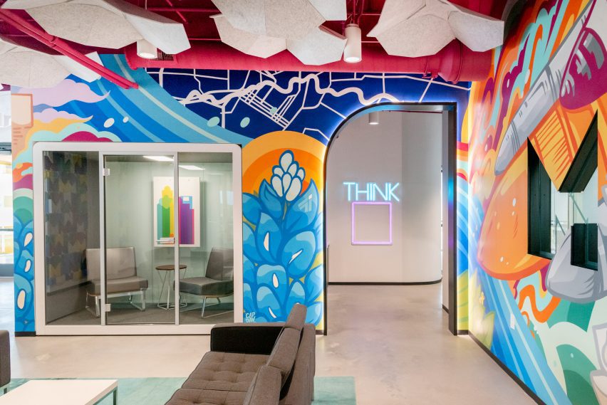
Half-arched portal at Method Architecture officeHalf-arched portal at Method Architecture office
Clients pass through a half-arched portal

Light grey flower-like acoustic baffles hang from the ceiling adding to the maximalist design. Light blue bicycles are mounted on one wall as another unique installation.

From the reception area lounge, clients pass through a half-arched portal – created with custom millwork and embedded lights – into the main office space which includes rows of desks over custom greyscale carpet.
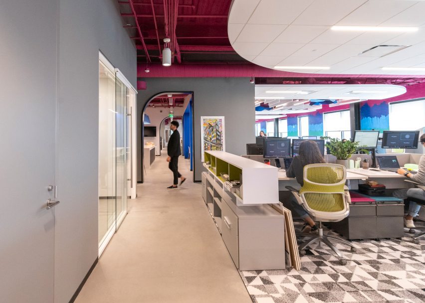
Desks and geometric carpet in self-designed studioDesks and geometric carpet in self-designed studio
Hotel desk stations accommodate hybrid work styles

Hotel desk stations accommodate hybrid work styles for both in-office and at-home work.

“Cozy architectural work booths are nestled amid the bustling breakroom and office areas, offering a quiet refuge for more private work, private conversations or meals with coworkers,” the team said.

The workspace is flanked by six meeting rooms: a large creative conference space, three medium-sized conference rooms and two smaller huddle spaces.

The all-white conference room was left intentionally blank to showcase the client’s material selections with tunable white lights to adjust the light temperature for each project.
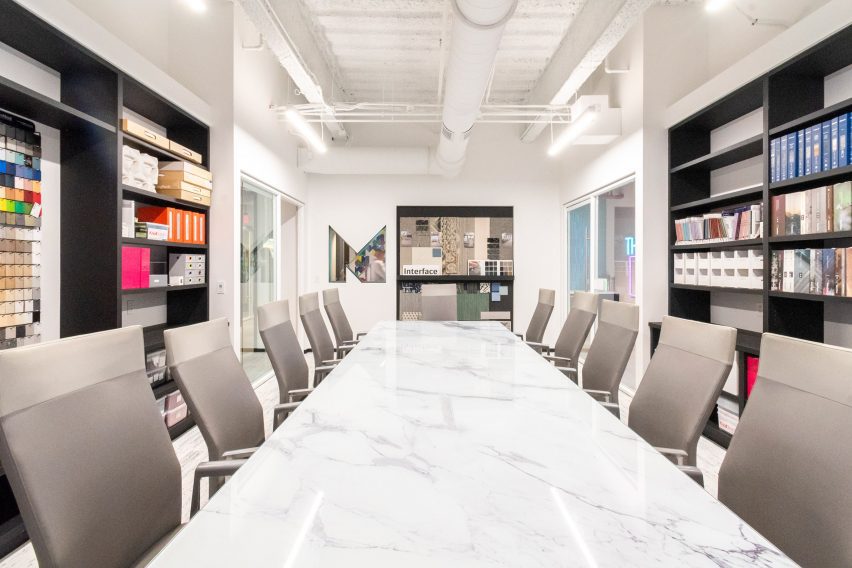
M-shaped window cutoutM-shaped window cutout
An M-shaped window cutout opens the conference room to the rest of the office

An M-shaped window cutout opens the conference room to the rest of the office.

In the break room, bright blue suede fabric adorns the walls to provide an unexpected texture and pale blue lamp shades – reminiscent of the shape of inverted cupcake liners – serve as a geometric juxtaposition to the rounded banquette boxes.
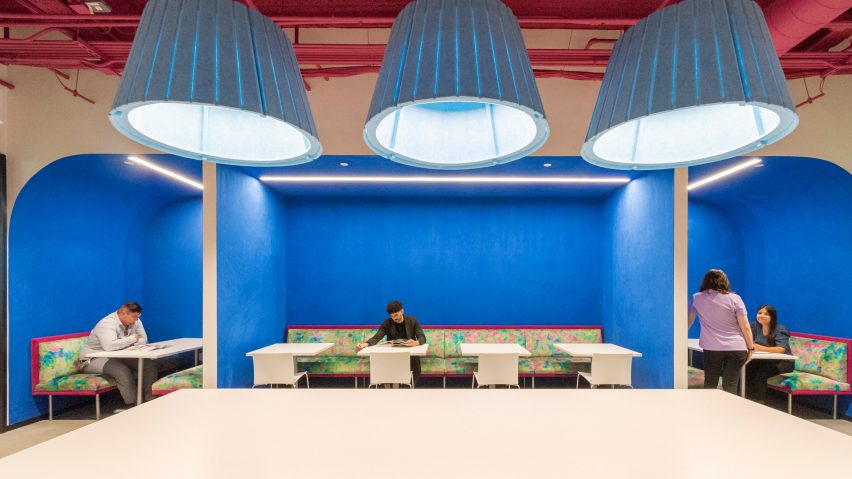
Bright blue-walled break roomBright blue-walled break room
Bright blue suede fabric adorns the walls in the break room

“Plush, psychedelic-inspired fabrics in meeting booths and distinctive light fixtures keep the space feeling light and fun to inspire creative design,” the studio said.

In addition to being designed for flexible workflows and teams, the space features multiple sustainable and WELL features like ample daylighting, repurposed materials and ergonomic furniture.

Other recently completed projects in Houston include Nelson Byrd Woltz’s grassed park that bridges a six-lane highway and Modu’s design for a wellness building with a self-cooling exterior.

The photography is by Ana Larranaga, Method Architecture.


Project credits:

Architecture: Method Architecture
MEP: Telios Engineering
General contractor: Burton Construction
Furniture: AGILE Interiors, MDI, OP,
Flooring: Interface, Shaw Contract
Tile: Trinity Surfaces, La Nova
Textiles: Knoll Textiles
Masonry: Upchurch Kimbrough
Demountable partitions: DIRTT
Countertops: CAMBRIA
Mural: David Maldonado
Lighting: Lighting Associates Inc.
Signage: ARIA Signs


Reference

“Maximalism is a manifestation of a desire for a different world”
CategoriesInterior Design

“Maximalism is a manifestation of a desire for a different world”

A return to the frivolous aesthetics of the British Empire tells us that all is not right in the world, writes Samuel Johnson-Schlee, author of the book Living Rooms.


In a moment where climate breakdown, economic uncertainty, geopolitical crisis, and many other things threaten to destroy the things that the middle classes take for granted, there appears to be a renewed interest in the extravagant, the ornate, and the rococo.

For instance, Lulu Lytle, whose design studio Soane Britain – named presumably after the influential architect John Soane – is remarkably upfront in its use of an imperial aesthetic; it even has a range called Egyptomania.

It makes sense that Boris Johnson chose this designer for his controversial Downing Street flat refurbishment, given that they share a nostalgia for an era of British power and colonial plunder. Why though, in a moment where it feels like there is more awareness than ever of the violence and injustice wrought by the British Empire, are we returning to such an aesthetic?

We return to the ornate for some of the same things that were sought from similar aesthetics in the past

On 15 October, the Leighton House Museum re-opened in Holland Park after a major refit. Previously something of a secret, the museum’s publicity machine is now in full swing. The house of a neo-classical Victorian painter, Frederic Leighton, was designed to reflect his enthusiasm for that generically foreign Victorian obsession, The Orient.

The most magnificent room in the house is the so-called Arab Hall. This room was an extension to the house built between 1877 and 1881, designed to display textiles and ceramics gathered from Leighton’s trips to Turkey, Egypt, and Syria.

Some of these objects were purchased, others were “procured” by a friend in the East India Company. A wild array of tiles cover the walls and beneath the golden-domed ceiling, a small fountain burbles. This should not be mistaken for a simple marker of admiration for different cultures – as the great critic of orientalism Edward Said puts it: “European culture gained in strength and identity by setting itself off against the Orient”.

Why are we drawn back to this aesthetic? It is too simple to attribute it to nostalgia alone and should be seen in the broader context of the trend for maximalism. We return to the ornate for some of the same things that were sought from similar aesthetics in the past.

If you scroll through Instagram you will find many of the elements of the bourgeois home of the nineteenth century. Pot plants, gallery walls, velvet, wallpaper, lace: the basic language of the fashionable urban middle classes from the early decades of industrialised capitalism are making a comeback. Perhaps we are doing something akin to the Orientalists, setting modern life off against an impossibly distant other in order to better come to terms with the world we live in.

The designers House of Hackney are purveyors of a pattern-clashing William Morris redux; it is as if Dennis Severs’ house had been processed through a succession of lurid Instagram filters. However, they do not tend to dwell on their obvious historical influences.

On their website, their Wallpaper Plantasia, a multi-coloured riff on the landscapes of French Toile du Jouy, is described as: “our vision of an idyllic landscape, completely untouched by man”. Instead of claiming authenticity via craftsmanship or historical detail, they are reproducing the back-to-nature fantasies of people like philosopher Jean Jacques Rousseau who, reeling at the alienation of the coming Industrial Age, idealised the life of the pre-cultural ‘savage’ [sic].

There is also an element of the surreal in the current trend for maximalism

This untethered enthusiasm for an imagined naturalness recalls bourgeois Victorian crazes for natural history, such as the vogue for ferns known as pteridomania, which launched dozens of designs, including the decoration on a custard cream biscuit. The House of Hackney designers wear their romanticism on their sleeves, their expensive products offer a way of introducing a reconstructed pastoral life within the confines of an East London home.

There is also an element of the surreal in the current trend for maximalism. In a recent article on this site, the live-in premises of Studio Job present what the designer Job Smeets refers to as a ‘visual assault’.

In the Design Museum, the exhibition Objects of Desire draws our attention to the history of surrealism and interior design. Particularly striking are the dream-like interiors that Salvador Dalí helped design for Edward James’ Sussex home Monkton House. Plush colour-clashing rooms include chairs with hands, telephones with Lobsters on top, and Mae West’s lips transformed into a sofa.

One of the best objects in the exhibition is a green carpet decorated with the footprints of James’ wife after leaving the bath. The effect of such extravagance is to create a kind of dream world, a space where it seems that the rules of reality are suspended and that all of your wishes might be fulfilled.

We create a space in which we can retreat from all the terror outside

We are looking for the same things in this aesthetic as the bourgeois did in their nineteenth-century apartments. The philosopher Walter Benjamin compared the homes of wealthy city-dwellers in the nineteenth century to the inside of a compass case, the body held in place by folds of violet velour. He described the wildly busy world of knickknacks, doilies, chintz and velvet as if it were the manifestation of a kind of religion, calling these objects ‘fallen household deities’ arranged to protect the householder from the violence and cruelty of the world outside. The same world that these people were profiting from.

By cultivating somewhere to live that is dream-like, natural, or utterly different from our everyday lives, we create a space in which we can retreat from all the terror outside. And just as was the case in the nineteenth century, the more money you spend the more protected you can become, hidden amongst your excessive home décor.

I’m not making a judgment, I am as susceptible to a brightly coloured wall and a clashing floral pattern as the next person, but it is important to recognise that even the most apparently frivolous design is shaped by the present moment. In contrast to the optimism that accompanied the slick minimalism of the nineties, the terrifying situation that we live in today has conjured a desire for the wealthy to hide themselves away.

But it is more than simple escape that drives this trend – I think unconsciously we are reaching for something. Maximalism is a manifestation of a desire for a different world, and if we can reflect critically on the kinds of things we are reaching for, we might also be able to find greater impetus to act to prevent the coming of the world that is so frightening.

Sam Johnson-Schlee is an academic and writer living by the sea in North Essex. He teaches Town Planning at London South Bank University. His first book, Living Rooms, is published by Peninsula Press on 10 November this year.

Reference