Walnut spiral staircase rising from green marble floor
CategoriesInterior Design

Modernist architecture informs Bottega Veneta store in historic galleria

Walnut spiral staircase rising from green marble floor

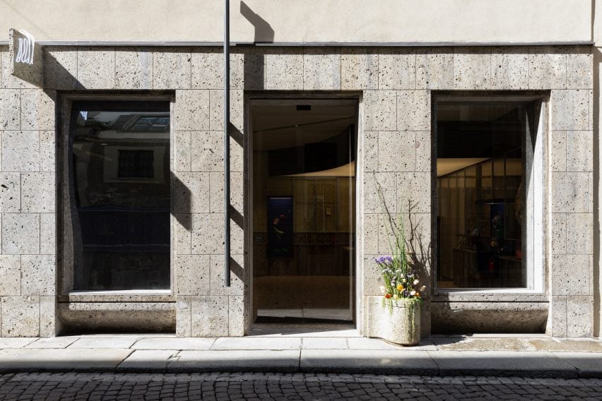
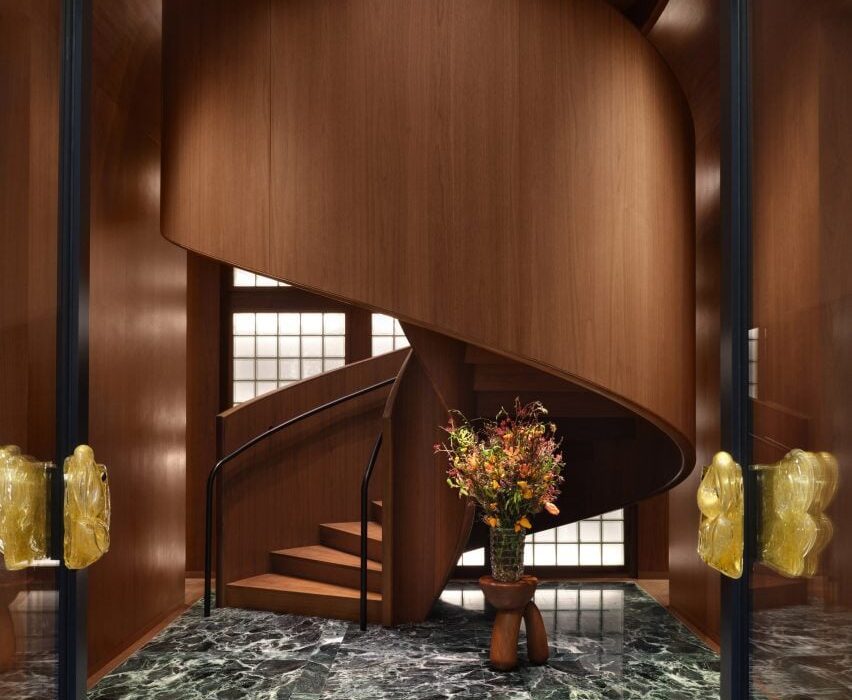
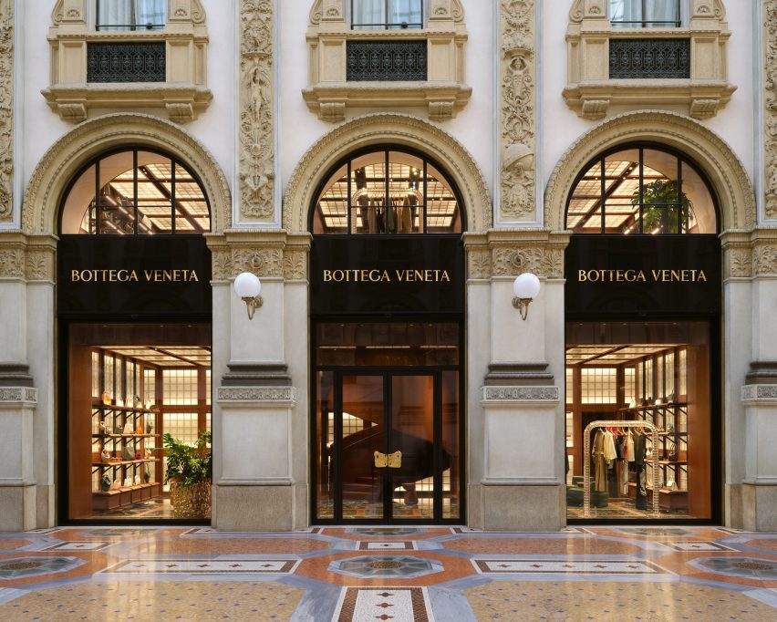
Fashion house Bottega Veneta has opened a boutique designed by its creative director Matthieu Blazy inside the Galleria Vittorio Emanuele II shopping arcade in Milan.

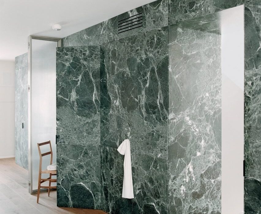
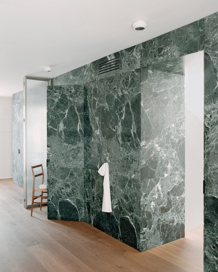
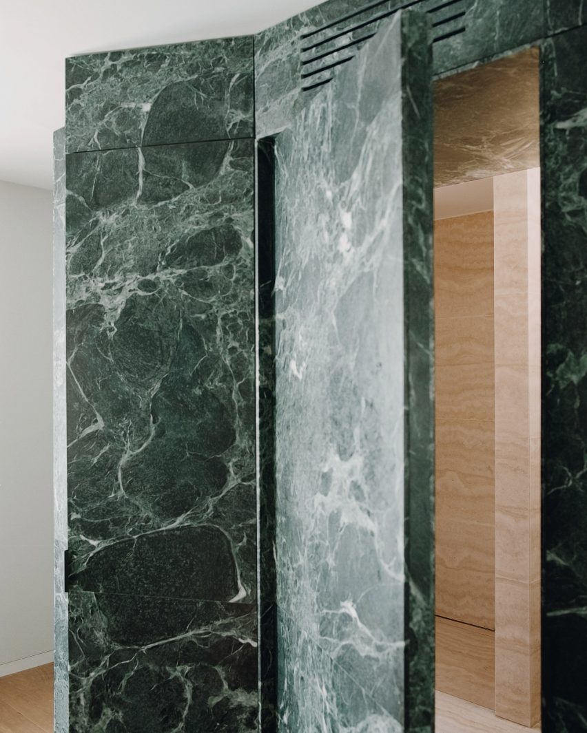
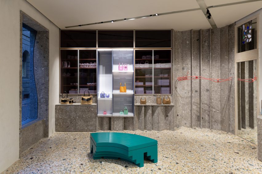
Bottega Veneta‘s two-storey store is distinguished by three primary materials: glass, Italian walnut and green Verde Saint Denis marble.

Walnut spiral staircase rising from green marble floorWalnut spiral staircase rising from green marble floor
A spiral staircase greets shoppers at the Bottega Veneta store in Milan

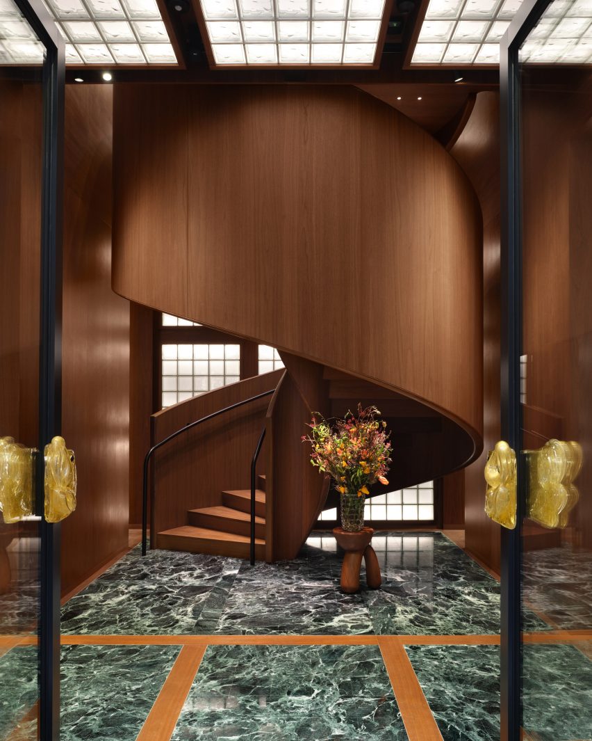
This trifecta is applied in strict grids to evoke Italian modernism and provide an organising principle in the various rooms.

“There are different experiences of space in the store,” said Blazy. “I wanted to express the idea of a domestic interior referring to Italian modernist architecture that contrasts with the aesthetic of a spaceship and to capture the intimacy and the imagination of getting dressed.”

Fashion store with glass-block walls and ceiling, and green marble flooringFashion store with glass-block walls and ceiling, and green marble flooring
Grids are used throughout the store to organise materials

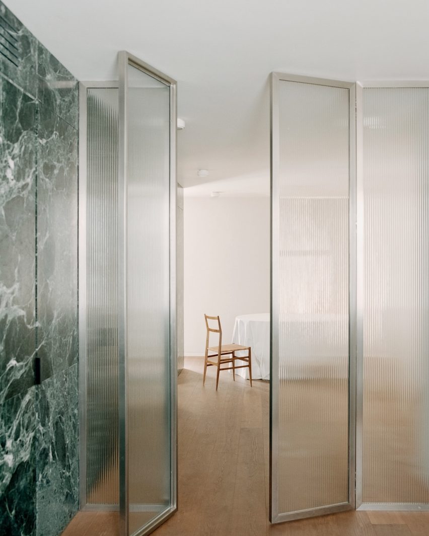
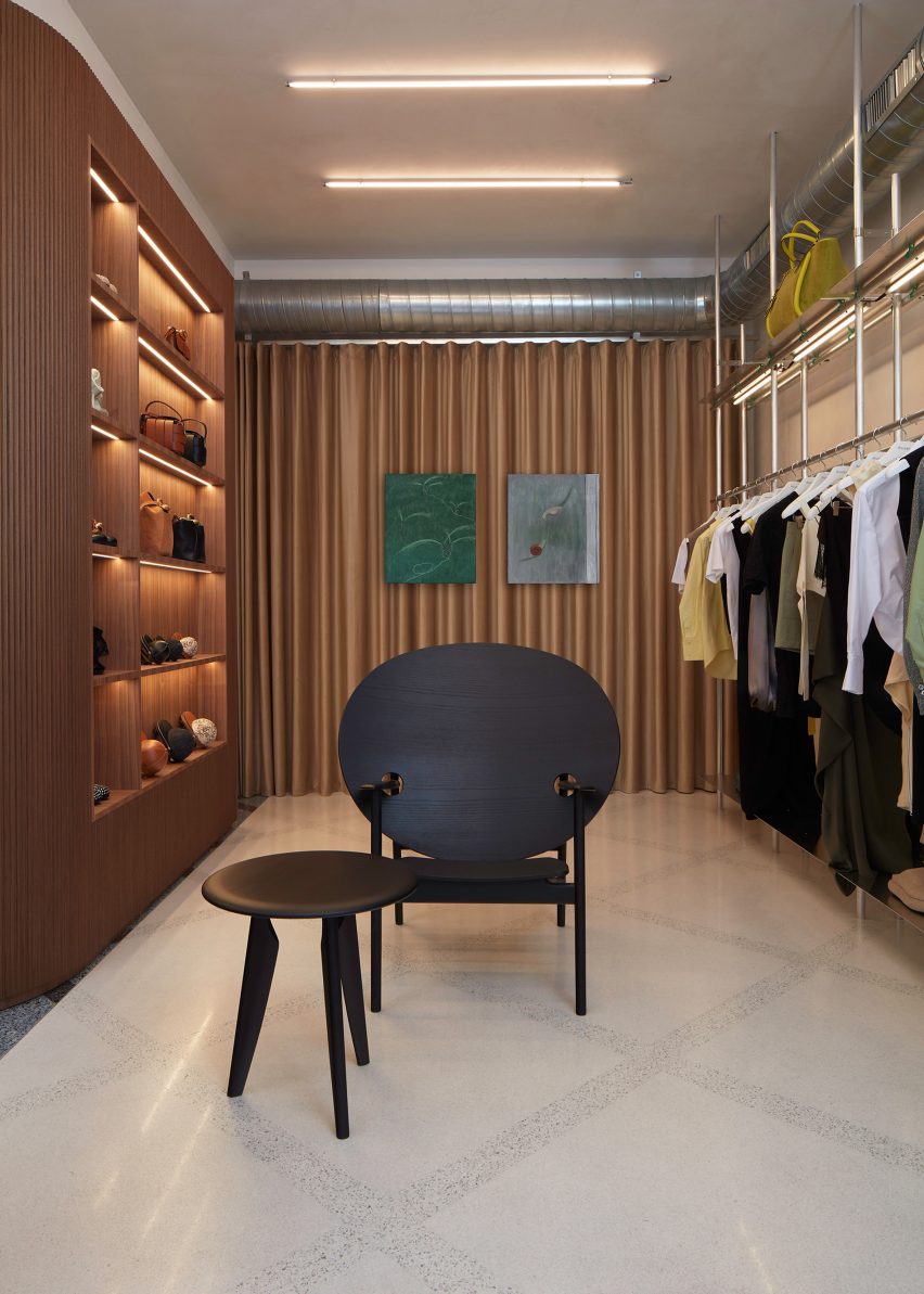
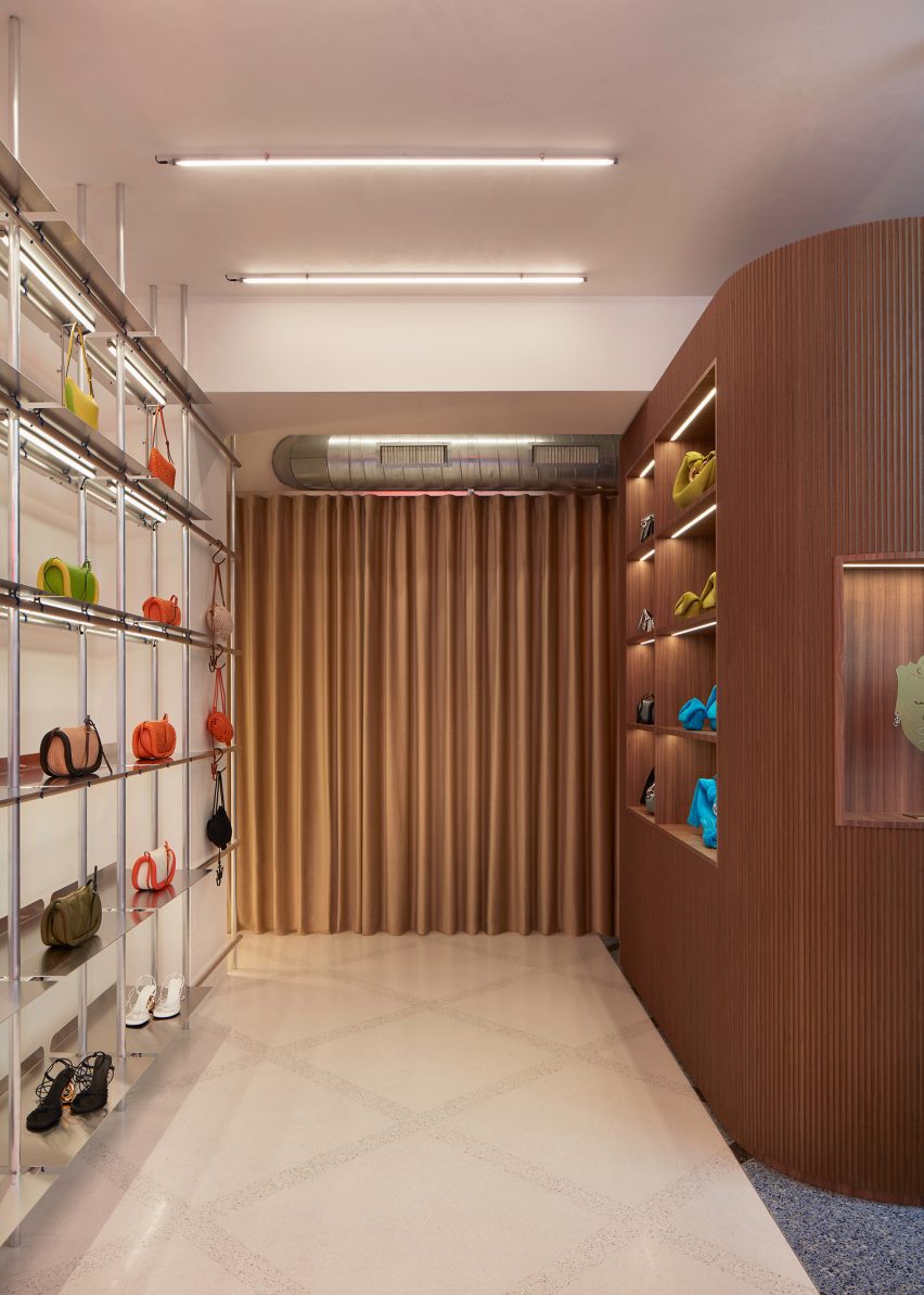
From the galleria, shoppers are greeted by a dramatic spiral staircase made entirely from Italian walnut – a material used throughout the interior as panelling, modular shelving and furniture.

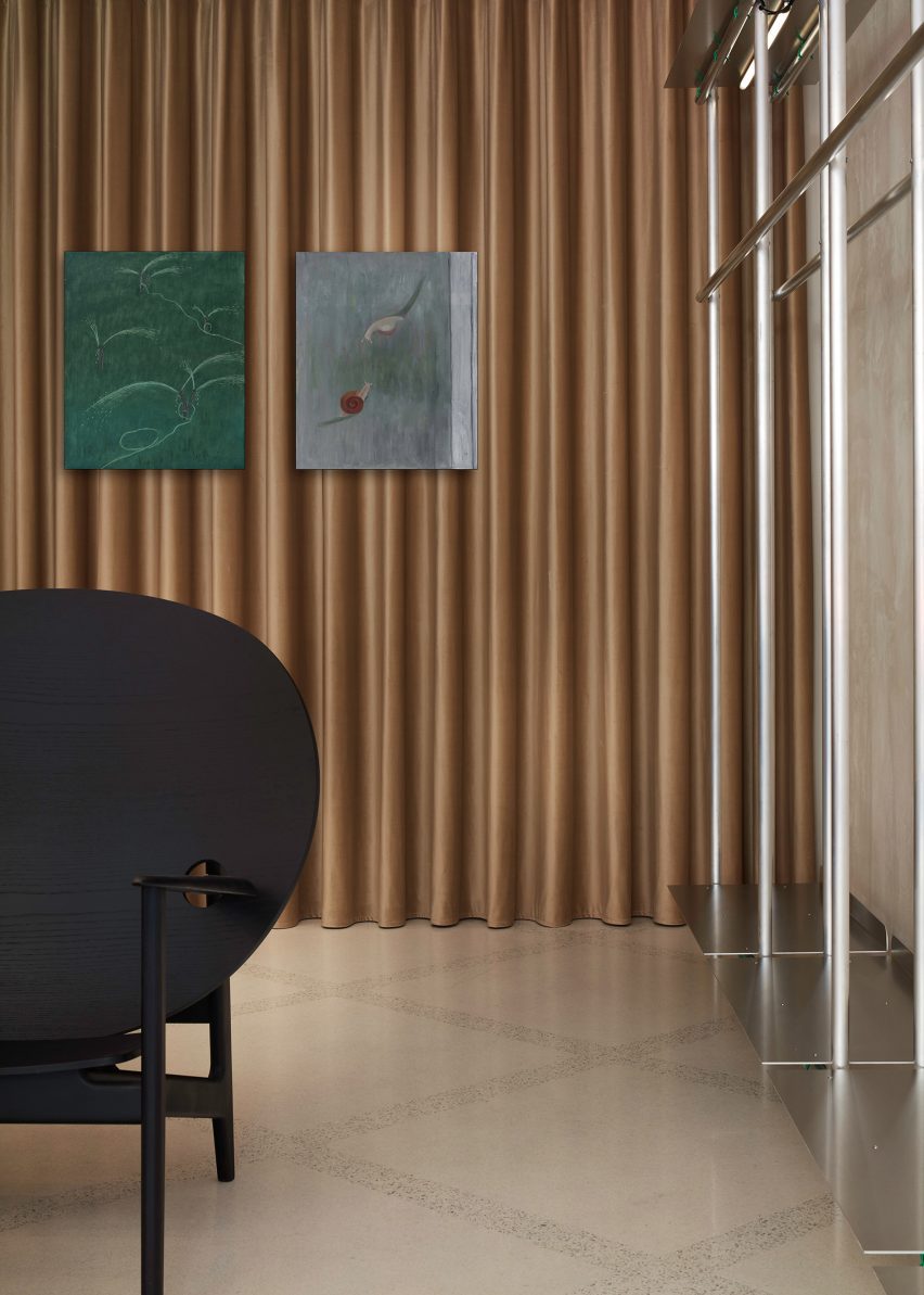
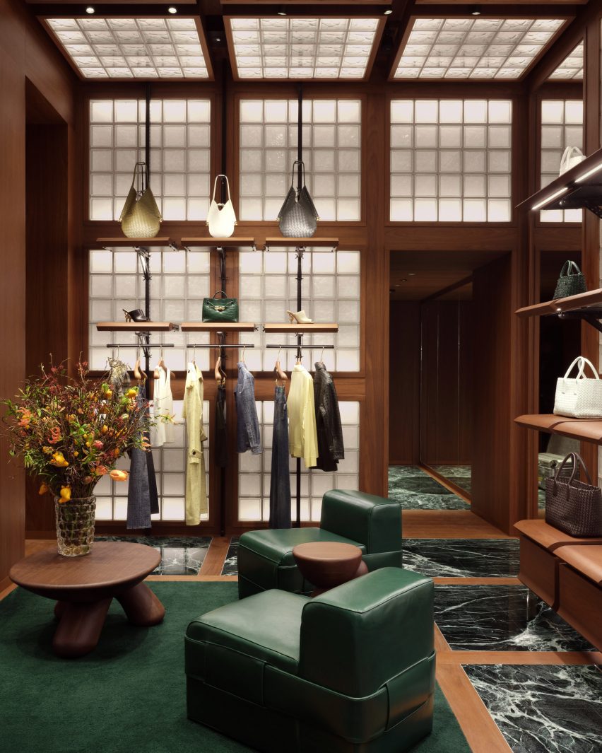
Green marble is laid in squares across the floors, separated by strips of walnut and occasionally swapped for larger patches of dark green wool carpet.

Room with squares of glass blocks across the walls and ceilingRoom with squares of glass blocks across the walls and ceiling
Glass blocks are integrated into the walls and ceilings

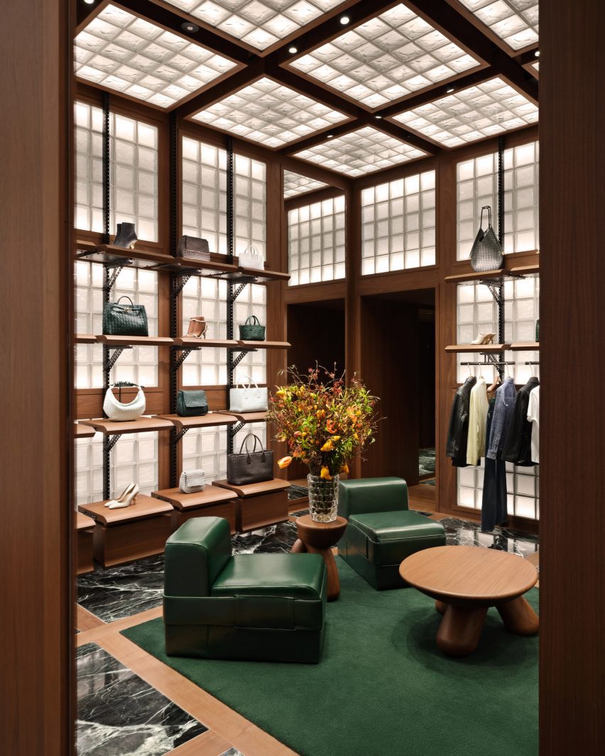
Square glass blocks are similarly arranged into grids across walls and ceilings, illuminated from behind to produce a soft warm glow throughout the store.

Green leather chairs and benches are accompanied by custom rounded wood tables and stools to form lounge areas.

“Throughout the space, soft textures are found in leather seating and wool carpets, while modular shelving units build a sense of discovery and play,” Bottega Veneta said.

Fitting room lined in walnut with a green leather niche and wool carpetFitting room lined in walnut with a green leather niche and wool carpet
The fitting rooms feature leather niches that provide a place to sit

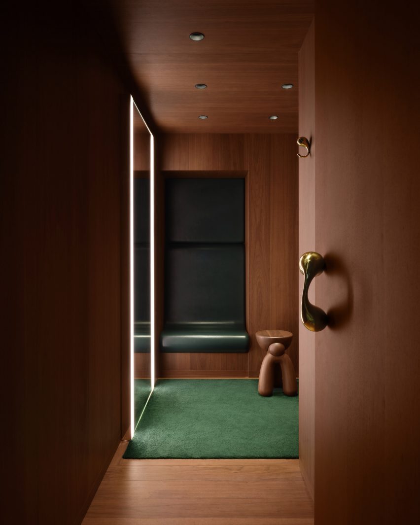
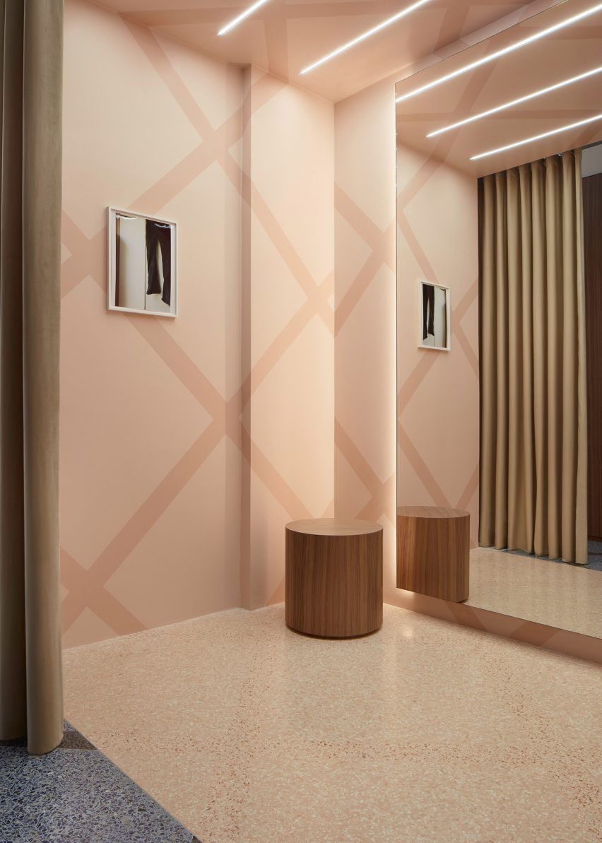
Fitting rooms are fully lined in walnut, except for leather-wrapped niches that provide a small seat, giant mirrors with built-in lighting and more green carpet.

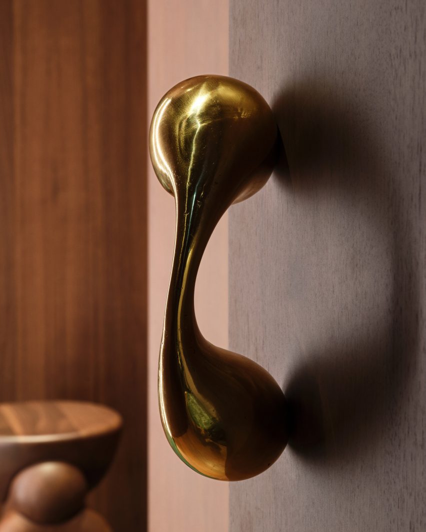
Sculptural polished metal elements form the door pulls and clothes hooks, their smooth surfaces contrasting with the more textured golden planters and entrance handles.

On the upper level, recesses formed by the Galleria’s arched windows provide nooks for seating and plants, as places to look out onto the highly decorative arcade.

Designed in 1861 by architect Giuseppe Mengoni, the neo-classical Galleria Vittorio Emanuele II is one of Milan’s most desirable shopping destinations.

Close-up of a polished metal sculptures that forms a door pullClose-up of a polished metal sculptures that forms a door pull
Polished metal sculptures form door pulls and clothing hooks in the fitting rooms

The four-storey, glass-vaulted double arcade is located in the city centre, close to other landmarks like the Duomo and the Teatro alla Scala.

The new Bottega store is the latest to open under Blazy since he took the reigns of the luxury brand in 2021, following locations on London’s Sloane Street and the Avenue Montaigne in Paris.

Exterior of the Bottega Veneta store in Milan's Galleria Vittorio Emanuele II Exterior of the Bottega Veneta store in Milan's Galleria Vittorio Emanuele II
The new store is located in the historic Galleria Vittorio Emanuele II shopping arcade

For the brand’s Spring Summer 2023 runway show, Bottega Veneta collaborated with Italian designer Gaetano Pesce, who envisioned a colourful resin-covered floor and 400 bespoke cotton-and-resin chairs for the set.

Pesce later went on to create a pair of handbags for the brand, which were designed to suggest different bucolic landscapes.

The photography is courtesy of Bottega Veneta.

Reference

View of marble partition in Green Nest Apartment by AIM Studio in Milan
CategoriesInterior Design

Monolithic green marble carves apartment interior in Milan by AIM Studio

View of marble partition in Green Nest Apartment by AIM Studio in Milan

Italian studio AIM has designed a compact, multi-level apartment interior in Milan organised around a floor-to-ceiling Verde Alpi marble partition.

Created in collaboration with local marble artisans Bianco67, AIM Studio used the wall to divide the various functions of Green Nest, aiming to create an elegant backdrop for a dynamic domestic experience.

View of marble partition in Green Nest Apartment by AIM Studio in MilanView of marble partition in Green Nest Apartment by AIM Studio in Milan
Monolithic green marble carves apartment interior by AIM Studio in Milan

“The design challenge [for] Green Nest was to combine the compact size of the dwelling with the desire to create inviting, functional and representative spaces pleasant to live in at all times of the day,” AIM Studio told Dezeen.

“We were looking for a single gesture to characterise the apartment [and were] inspired by the idea of a majestic wall [running] through the heart of the house,” the studio continued. “This massive element, both because of its solid presence and its intrinsic beauty, is the focal point on which the entire design revolves.”

Full height glass divider in Green Nest Apartment by AIM Studio in MilanFull height glass divider in Green Nest Apartment by AIM Studio in Milan
The fluid living spaces can be divided by an operable ribbed glass door

The marble partition was constructed as a permeable threshold between the apartment’s lower level living spaces and a staircase leading to the habitable roof terrace above.

Designed as a single, fluid area, the main living room and bedroom can be separated by full-height ribbed glass doors. 

Green Nest Apartment by AIM Studio in MilanGreen Nest Apartment by AIM Studio in Milan
The studio used the marble wall system to host functional storage and compartment spaces

AIM Studio sought to meet the practical requirements of small-footprint living by using the Alpi marble to conceal a series of deep storage compartments.

“More than a monolith, the volume is an inhabited wall whose thickness is continuously perforated, crossed and interrupted to host the different functions of living,” AIM Studio said.

“[It] was designed as a precious shell but [leaves] nothing to chance in terms of containment and management of the space. Every compartment, every opening, has been designed [for utility].”

Behind the marble partition, the staircase to the rooftop terrace was completed with a central lightwell to draw natural light into the space below.

The studio also integrated large windows into the main living area to encourage an interplay of light on the reflective marble surface and to evoke a chiaroscuro-like effect.

Suspended kitchen system inside Green Nest Apartment by AIM Studio in MilanSuspended kitchen system inside Green Nest Apartment by AIM Studio in Milan
The compact kitchen was formed by suspended travertine joinery

Tucked into a corner of the living room, the kitchen was demarcated by suspended travertine joinery and an embossed mirror feature wall.

Neutral-toned fixtures and restrained furniture pieces were selected to balance the apartment’s modern aesthetic and emphasise the drama of the green marble.

Green Nest Apartment by AIM Studio in MilanGreen Nest Apartment by AIM Studio in Milan
An embossed mirror feature wall was connected to the kitchen nook

“We conceived this project as a search for authenticity; a minimal but at the same time welcoming and functional design created through natural, precious [and] timeless materials.”

“We hope that this search for authenticity will be perceived by those who will inhabit these spaces and that it will translate into family atmospheres and elegant, but convivial, environments.”

Green Nest Apartment by AIM Studio in MilanGreen Nest Apartment by AIM Studio in Milan
The studio selected a neutral material palette to emphasise the green marble gesture

Founded in 2012 by Claudio Tognacca in Milan, AIM Studio has projects spanning across architecture, interior design and product development both in Italy and internationally.

Other recently completed projects in Italy include Antonino Cardillo’s design for “a miniature palazzo” residence near Lake Garda and Humbert & Poyet’s interior conversion of a 16th-century Milanese chapel into a Beefbar restaurant.

The photography is by Simone Bossi

Reference

A series of steel chairs on podiums within a railway arch
CategoriesInterior Design

Daisuke Yamamoto presents recycled steel chairs under Milan railway arch

A series of steel chairs on podiums within a railway arch

Japanese designer Daisuke Yamamoto presented recycled steel chairs on podiums of the same material as part of an exhibition in Milan, which has been shortlisted for a 2023 Dezeen Award.

Yamamoto‘s Flow project explores ways to minimise industrial waste by focusing on a single material – light-gauge steel (LGS).

A series of steel chairs on podiums within a railway arch
Daisuke Yamamoto presented his Flow chairs as part of the Dropcity showcase

Commonly used in construction as a strong, lightweight framing option, LGS is also one of the industry’s largest waste products, Yamamoto claims, as it is rarely recycled after demolition.

The designer therefore chose to create a second life for the steel sheets and components as a series of sculptural chairs.

Light-gauge steel chairs on podiums made from the same material
The chairs were placed on podiums made from the same light-gauge steel

He also used LGS to form platforms for showcasing the seating designs as part of an exhibition at Milan design week 2023 that has been shortlisted in the exhibition design category of this year’s Dezeen Awards.

“This project began with the awareness that everyday recycled construction materials are disposed of, then new construction begins – a so-called ‘scrap and build’,” Yamamoto said.

Recycled steel chairs with different forms
Each of the recycled steel chairs had a different form

“Using the iconic LGS material – one of the most popular materials normally used in framing systems throughout the interior wall structure – we transformed it into beautifully redesigned furniture, giving the materials a second chance,” he added.

The exhibition formed part of the Dropcity showcase, which took place inside the Magazzini Raccordati spaces at Milan Central Station during the design week in April.

A workshop bench with a partially built chair on top
A workshop bench was also placed at the centre of the space

These empty railway arches have a dilapidated, industrial aesthetic with peeling floors, stained tilework and exposed utilities.

Yamamoto chose to leave the vaulted room largely as he found it but placed a series of platforms in two rows, upon which he presented the series of chairs.

Track lighting was installed overhead to spotlight the elevated designs, each of which has a slightly different shape.

In the centre of the exhibition, a workshop bench also built from lightweight gauge steel was used to fabricate more chairs during live demonstrations between Yamamoto and craft artist Takeo Masui.

Daisuke Yamamoto and Takeo Masui building a recycled steel chair
Yamamoto and Takeo Masui built more recycled steel chairs during live demonstrations

“This is a landfill, a place where a volume of used LGS is collected,” Yamamoto said. “A place where the designer and craftsmen work hand in hand to recreate what was bound to be disposed into something new, a process of disassembling to re-assemble.”

The intention was to not only showcase the material’s capabilities for reuse but also to allow visitors to engage with the process and ask wider questions about how society deals with waste.

Daisuke Yamamoto and Takeo Masui assembling a chair
The demonstrations allowed visitors to engage with the process

Using waste materials produced by other industries was a key trend that Dezeen spotted during this year’s Milan Design Week, with designers and studios including Formafantasma, Prowl Studio, Atelier Luma and Subin Seol all looking to reduce the environmental impact of their products.

The photography is by Takumi Ota.

Future Landfill took place at Magazzini Raccordati from 15 to 23 April 2023 as part of Milan Design Week. See Dezeen Events Guide for an up-to-date list of architecture and design events taking place around the world.

Reference

Photo of JW Anderson store in Milan
CategoriesInterior Design

6a Architects brings Soho sex shop windows to JW Anderson Milan store

Photo of JW Anderson store in Milan

British fashion brand JW Anderson has opened a flagship store in Milan that was designed by British studio 6a Architects and draws on the local atmosphere as well as Soho sex shops.

The 53 square-metre-store is located on the Via Sant’Andrea luxury shopping street in Milan’s Quadrilatero shopping district. It is set across a single floor and comprises two rooms.

Photo of JW Anderson store in Milan
JW Anderson’s first Milan store was designed by 6a Architects

While the boutique primarily draws reference from its “bourgeoise” Milanese surroundings, the retail space also pulls from designer Jonathan Anderson’s first JW Anderson store in Soho and from the 2017 exhibition Disobedient Bodies, which was curated by him.

It was designed by 6a Architects, who Anderson began working with in 2017 after selecting the studio to design the set for Disobedient Bodies at The Hepworth Wakefield.

Interior photo of the JW Anderson store
It draws on a Milanese atmosphere

“I thought [6a Architects] really grasped how to take my visual language and turn it into something which was able to be educational,” Anderson told Dezeen.

“They’re very good at hybrid, old or new. They’re very good at this combination, they’re great architects.”

“The store actually is a combination of Disobedient Bodies and a store. It’s a little bit more elevated,” he said. “The front of the building feels Soho, and as you go in, it feels more kind of domestic Milanese.”

Interior photo of the JW Anderson store in Milan
It carries over elements from the Soho store

In a nod to the store frontages of the sex shops found in London’s Soho area, the windows of the Milanese store were decorated with neon lighting and rainbow-slatted curtains.

Anderson and 6a Architects used the design as a juxtaposition against the more typical Milanese interior.

“For me, there is something very sexual about neon lighting,” said Anderson. “I think we associate it with grand gestures and I felt like a window is kind of like a television set. There’s something with neon that it does, it kind of tricks you.”

Photo of the JW Anderson store
Traditional Italian furnishings and finishes fill the interior

“There are little alleyways and they have all these amazing sex stores on and these curtains,” Anderson continued.

“I liked the idea that we have this in Milan and then suddenly you enter into a kind of Milanese setting, something which is very bourgeoise.”

Inside, gridded handmade terrazzo covers the floor and visually divides areas of the interior through bespoke contrasting tones of grey and sand.

Brassy, metallic curtains ripple along the rear walls of the store, in a similar way to 6a Architects’ use of curtains in the exhibition design for Disobedient Bodies.

Photo of artworks at the store
Jonathan Anderson selected furniture and artwork for the interior

Aluminium scaffolding, which was also carried over from Anderson’s Soho store, was translated into display shelving and brought an “angst” to the interior that contrasts against traditional Italian furnishings, such as fluted walnut panelling that envelops two curved walls.

“There is something slightly more underground in terms of the construction of a JW Anderson store, whereas, I think Loewe [for which Anderson is creative director] is about a heightened perfection,” said Anderson. “With JW Anderson, there’s always a bit of slight angst to it.”

“It’s softer inside, and then you have this harshness with the windows where there’s neons and sex curtains and it’s kind of like a theatre. It has moveable parts and in a weird way the store becomes a giant window.”

Photo of the store
It has furniture by Mac Collins

Furniture and artworks personally selected by Anderson fill the interior.

Designer Mac Collins’ black Iklwa chair was paired with matching side tables, while a Cardinal Hat pendant light by Lutyens Furniture is suspended from the ceiling of the main space.

Oil paintings by Chinese artist Hongyan appear to float on the ripples of the brass-coloured curtains, and images by photographer Wolfgang Tillmans sit on the walls of the store’s fitting room.

Photo of the fitting room
An image by Wolfgang Tillmans is placed in the fitting room

“I don’t believe that stores should be completely cookie-cutter,” said Anderson. “I feel like the key is to make sure that each store has a different universe because there’s no point in having something which is just a duplication, duplication, duplication.”

Jonathan Anderson founded his eponymous label JW Anderson in 2008 and was appointed creative director of Spanish luxury house Loewe in 2014, which recently announced the winner of its sixth annual craft prize.

During London Fashion Week, JW Anderson presented a “parallel world of people trapped in their computers” for its Spring Summer 2023 collection.

The photography is by DePasquale+Maffini, courtesy of JW Anderson.

Reference

Interior of Boyy flagship store in Milan designed by FOS
CategoriesInterior Design

Boyy flagship in Milan reveals layers of the store’s history

Interior of Boyy flagship store in Milan designed by FOS

Danish artist Thomas Poulsen, also known as FOS, has revamped the flagship store of accessories brand Boyy in Milan, keeping time-worn surfaces left over from the site’s former fit-outs.

This marks the third time that FOS has refreshed the space on Via Bagutta since 2021, as part of the artist’s plan to create a dynamic “evolving” store.

Interior of Boyy flagship store in Milan designed by FOS
FOS has redesigned Boyy’s flagship in Milan

In its first incarnation, the Boyy flagship had funhouse-style mirrors, walls draped in faded pink fabric and cobalt-blue carpets emblazoned with everyday objects.

This colour scheme was inverted for the second iteration of the store featuring blue walls and bubblegum-pink carpet. Elements of both of these schemes now remain in the store’s third and final form, which was left purposefully unfinished.

Interior of Boyy flagship store in Milan designed by FOS
Unpanelled sections of the wall reveal the store’s past fit-outs

“This space was an experiment in formulating a shared language for how Boyy could develop as a brand,” FOS explained.

“We started by creating an installation – the first rendition – then used that experience to create a second installation, and finally built upon the combined experience to create this final permanent space that we have now arrived at.”

“We always envisioned the third rendition as the final act,” added Boyy co-founder Jesse Dorsey.

Interior of Boyy flagship store in Milan designed by FOS
Accessories are displayed inside illuminated glass vitrines

The Boyy flagship now has walls panelled with the same grey ceppo stone that clads the store’s facade.

Some areas were left without panelling, revealing the aged, fabric-lined walls left behind by a previous occupant – a 50-year-old antique shop that sold quaint Americana-style objects for the home.

Blue fabric can also be seen hanging in the rear corner, saved from FOS’s second overhaul of the space.

These swathes of time-worn fabric were enclosed inside aluminium window frames, as were some of the store’s display units.

Elsewhere, Boyy’s selection of shoes and handbags can be showcased in several illuminated glass vitrines or on the ledge that runs around the periphery of the store.

Interior of Boyy flagship store in Milan designed by FOS
The store has been finished with terrazzo flooring

FOS also created a display shelf around a crumbling structural column that sits in the middle of the floor plan.

A couple of tiered, sea-green bench seats were dotted throughout the store as decoration, complementing the flecks of greens stone that are found in the terrazzo floor.

Interior of Boyy flagship store in Milan designed by FOS
Curved benches provide seating throughout the store

Milan is home to an abundance of visually striking retail spaces.

Others include the Moschino flagship, which was designed to reference the history of ancient Italy, and the Off-White store, which is decked out with natural materials like Patagonia granite.

Reference

white dynamic ring loggias envelop the restored torre antonini in milan
CategoriesArchitecture

white ring loggias envelop the restored torre antonini in milan

white dynamic ring loggias envelop the restored torre antonini in milan

Studio Marco Piva reconstructs Torre Antonini after fire


Architectural Studio Marco Piva takes over the reconstruction of the skyscraper that caught fire in Milan on August 29, 2021, leaving 80 families homeless. The project provides for the partial restoration of the architecture of the pre-existing tower ‘Torre Antonini’, giving it a distinctive morphology that stems from the cues from the previous structure and translates into a modern architectural solution. The design composes loggias that, by enveloping the entire building, establish a connection with the surrounding area and offer usable and scenic outdoor spaces. The concept holds a soft aesthetic with sinuous shapes that enfold the structure, ‘like light and elegant ribbons’. The project is planned to be completed between 2025 and 2026.

white dynamic ring loggias envelop the restored torre antonini in milan
Torre Antonini exterior by Studio Marco Piva | all images courtesy of Studio Marco Piva


dynamic parapets and innovative green spaces adorn the tower


The building has two floors below ground and nineteen above, with a total height of approximately 70 meters. Starting from the lower floors, the dynamic elegance of the parapets extends fluidly over the entire height of the tower, softening its overall profile. The studio designs a stylistic element to be featured on the building, a special glass insert positioned in an irregular pattern in each parapet enabling residents to enjoy captivating views of the city of Milan.


The Torre Antonini project follows the ‘Green Wave’ concept by Marco Piva, offering an innovative and contemporary urban lifestyle that is expressed through the selection of high-quality finishes and materials and attention to every detail of the external spaces, and shaping new comfortable and functional living areas. The design of the outdoor zones and restructured loggias is the combination of research, inventiveness, and functionality, from the first objective of increasing private external areas to the subsequent implementation of sliding ‘brises soleils’ on all sides to mitigate exposure to the sun. Fixed planters and green-covered vertical grilles are provided near the lift shafts to increase the privacy of the adjacent terraces. The project aims to enhance the osmotic relationship between the Tower and its surrounding landscape, between indoor and outdoor areas, while fostering the necessary domestic intimacy.

white dynamic ring loggias envelop the restored torre antonini in milan
the facade as it looks before the restoration

white dynamic ring loggias envelop the restored torre antonini in milan
the designed loggias envelop the entire building offering usable and scenic outdoor spaces

white dynamic ring loggias envelop the restored torre antonini in milan
the current state of the skyscraper

Reference

View inside ICHI Station restaurant
CategoriesInterior Design

Space tourism informs design of Ichi Station sushi restaurant in Milan

View inside ICHI Station restaurant

Valencian design studio Masquespacio has completed a dine-in restaurant for takeaway sushi chain Ichi Station in Milan, with interiors designed to resemble a futuristic spaceship.

Set in a historic building in the Brera district, the chain’s latest outpost builds on the same travel and transport concept established across its other outlets – including eight in Milan and another in Turin.

View inside ICHI Station restaurant
Masquespacio has designed Ichi Station’s Brera outpost

But Masquespacio wanted to take this idea to the next level for the new restaurant by drawing on the visual language of sci-fi and space tourism.

“We proposed approaching the travel concept as a trip to the future,” said Masquespacio co-founder Christophe Penasse.

“When you enter Ichi, it’s like entering a capsule-like spaceship travelling through light, where you will disconnect from reality in order to get in touch with the food.”

Takeaway counter of sushi restaurant in Milan by Masquespacio
Customers can pick up orders at the takeaway counter

Masquespacio completely redeveloped the layout of the 80-square-metre site – previously another restaurant – creating a central dining area along with a tunnel where diners can observe some of the sushi-making process.

A pick-up bar close to the entrance was added to separate the circulation routes of take-away customers and diners.

Dining area of ICHI Station restaurant in Brera
The dining area is housed in a cylindrical tunnel

The tunnel motif was developed as a way to express the idea of travel and make a reference to Japan without falling into cliches.

“Some elements were incorporated to remind the customer of Japan, like the huge lighting circles, although we tried to avoid making typical references to Japan such as using wooden structures,” Penasse explained.

The tunnel motif also informed the circular and cylindrical details that pop up throughout the space across seat backs, bar stools and decorative elements such as the circular feature light in the main dining area.

“The shapes and forms give the project the futuristic look that it needed,” the designer said.

Counter seating in Milan restaurant by Masquespacio
Diners can also watch sushi being prepared at the counter

Masquespacio opted for a simple and restrained material palette that includes glass and micro-cement, which was used along with fully integrated tables and seating to create a seamless look reminiscent of a spaceship.

The restaurant’s custom-made furniture brings in another reference to transport design tropes. “You can recognise it as a reinterpretation of the seating in a station and especially on a train,” Penasse explained.

Dining booths in ICHI Station restaurant
LED light panels are integrated into the walls, ceilings and table tops

The interior is finished in neutral shades of beige and off-white but is cast in different vivid colours thanks to the LED lighting system that is integrated into the walls, ceilings and even the table tops.

The lights alternate between shades of blue, green, purple and peach at variable speeds and, according to Penasse, create a veritable “explosion of colour”.

Toilets of restaurant in Milan by Masquespacio
The toilets are finished in contrasting navy blue

Although based in Spain, Masquespacio has completed a number of projects in Italy in recent years.

Among them are two colour-block restaurants for fast-food chain Bun – a blue-and-green interior in Turin and a green-and-purple version in Milan.

The photography is by Luis Beltran.

Reference

Entryway at Artemest’s L'Appartamento in Milan by Dubai-based studio T.ZED Architects
CategoriesInterior Design

Six interior designers style rooms at L’Appartamento in Milan

Entryway at Artemest’s L'Appartamento in Milan by Dubai-based studio T.ZED Architects

Six interior design studios, including Kingston Lafferty Design and T.ZED Architects, have overhauled a room at the 1930s L’Appartamento for commerce platform Artemest at Milan design week.

The designers each used furniture, lighting and art from the brands, designers and artists represented on the Artemest platform to showcase their own style in a room at the apartment in Milan’s 5Vie district for the L’Appartamento exhibition.

“We wanted to bring this stunning apartment back to life and show how different interior design studios, each with its own style and design approach, can work with Artemest to create inspiring and surprising interiors that celebrate authentic Italian beauty,” said Artemest founder Ippolita Rostagno.

Entryway at Artemest’s L'Appartamento in Milan by Dubai-based studio T.ZED Architects
T.ZED Architects designed the entrance space at Artemest’s L’Appartamento

In the entryway, Dubai-based studio T.ZED Architects aimed “to set the tone for what is yet to come” by preserving the character of the room and adding selected pieces.

The studio choose a mix of furniture in off-white, cream and brown, including copper and leather finishes that plays off the green tones of the richly patterned, period wallpaper.

Mirrors – including a Sybilla mirror with console by Ettore Sottsass for Glas Italia, and an Itaca floor mirror by Atlasproject – were placed to illuminate and enlarge the space, while amplifying the period details.

Living room at Artemest's L'Appartamento in Milan by Kingston Lafferty Design
Kingston Lafferty Design placed a golden block in the living room

In the adjoining room, Dublin-based studio Kingston Lafferty Design aimed to “challenge visitors’ sense of what a living room should be” by placing a sculptural monolithic block seems to glow with a soft golden sheen in the centre of the space.

The block splits the room into two distinct spaces and contains a mirrored space described by the studio as “a gallery of lights”.

Golden block in living room
The golden block divides the space into two

On one side of the block is an informal living room that evokes a sense of playfulness through the use of oversized furniture in bright colours, including the Osaka Blue Sofa by Pierre Paulin for La Cividina.

The other side has a rich palette of jewel-tones to creates a more decadent atmosphere.

Terrace at Milanese villa
Moniomi aimed to create a room on the terrace

Leading from the living room a large terrace was reworked by Miami-based studio Moniomi, which aimed to create an outside room that felt like an interior space.

The studio used a combination of large-scale upholstered pieces, gridline patterns and graphic blacks and whites, softened by lush greens to reference the outdoor location.

The design language here features saturated colours and layered patterns – including the Nuovola 01 dining table by Mario Cucinella for Officine Tamborrino, which represent the studio’s Hispanic roots.

Dining space in Milanese apartment
Nina Magon designed the apartment’s dining space

Another US-based designer, Nina Magon, created the L’Appartamento dining room, playing with monochromatic hues to enhance the authenticity of the original finishes here.

Sculptural furniture, such as the Trompe-l’oeil Trois dining table by DelMondo Studio, topped with a cluster of Flow[t] pendant lamps by Nao Tamura for WonderGlass was added to the space.

Bedroom designed by Styled Habitat
The bedroom was designed by Styled Habitat

In the bedroom, Dubai-based studio, Styled Habitat, delved into the history of the 1930s to translate the romance of that era into the modern day and evoke a sense of timeless glamour.

To capture the experimental and avant-garde trends of European modernism, Styled Habitat juxtaposed new and old, with a Czech Chair by Hermann Czech for Gebrüder Thonet Vienna, alongside pieces like the Calle Pinzi Murano Glass Chandelier by Luci Italia.

Finally, for L’Appartamento’s hallway and the studio, Paris-based interior designer Anne-Sophie Pailleret was informed by her first reaction to seeing the apartment.

The long, narrow hall, has been covered with the textural Tra 1100 Wallpaper hand-crafted by La Scala Milano Wallcovering, contrasting with geometric Alfabeto Tiles by Margherita Rui for Ninefifty, on the floor.

Corridor by Anne-Sophie Pailleret
Anne-Sophie Pailleret styled the corridor

The walls are further decorated with Ninfea wall lamps by Giovanni Botticelli in collaboration with Paola Paronetto, functioning as a gallery-style grouping of lights.

For the studio room, Pailleret created a mix of warm colours and graphic patterns, with comfortable and curvaceous furniture.

The photography is courtesy of Artemest.

L’Appartamento takes place from 17 to 23 April 2023 at Via Cesare Correnti 14, 20123 Milan, Italy. See our Milan design week 2023 guide on Dezeen Events Guide for information about the many other exhibitions, installations and talks taking place throughout the week.

Reference

Shelving system in Milan store by Francesca Perani and Bloomscape
CategoriesInterior Design

Demountable electric-blue grid engulfs On-Off store interior in Milan

Shelving system in Milan store by Francesca Perani and Bloomscape

Italian architect Francesca Perani has teamed up with design studio Bloomscape to create a reversible fit-out for this clothing store in Milan, which is dominated by a flexible gridded shelving system.

Perani and Bloomscape installed the grid with its moveable shelves as a way to let the On-Off store effortlessly change its display arrangements.

Shelving system in Milan store by Francesca Perani and Bloomscape
A gridded blue framework covers the entire interior of Milan’s On-Off store

It was also a matter of making the store reversible, meaning that the fit-out could be easily dismantled should the retailer move on to a different site, saving waste and leaving behind a clean slate for the next occupier.

“Too often, the world of retail is still insensitive to sustainability; its lifecycle, however, is too short to continue being ignored,” explained Bloomscape co-founder Rosario Distaso.

Polycarbonate walls in ON-OFF store in Milan
Concrete chimney blocks form display plinths and benches

The gridded framework comprises beams of poplar wood surrounded by metal frames that were anodised to produce a vivid electric-blue colour.

The system runs along the walls and across the store’s ceiling, allowing On-Off to hang wayfinding signage.

Wood and metal shelving in Milan store by Francesca Perani and Bloomscape
Shelves can be moved around in the framework to create different displays

All of the shelves can be pulled out or slotted in at different points of the framework.

A fixed wooden clothes rail runs between two of the columns, allowing the hung garments to appear almost as part of the store’s architecture.

As the team was working with a limited budget, just a handful of materials were applied throughout the rest of On-Off.

The same metal-clad poplar wood was used to create freestanding clothing rails that appear at the edges of the store. Sheets of poplar also form the top of the store’s display plinths and bench seats, which have chimney cement blocks for a base.

Mirrored cash register in ON-OFF store in Milan
Mirrored panels clad the store’s cash register desk

At the rear of the floor plan is a mirror-clad cash register, set against a wall lined with translucent polycarbonate sheets.

More panels of polycarbonate were used to enclose On-Off’s changing rooms, with a shiny silver curtain suspended in front of each cubicle for privacy.

Polycarbonate changing rooms in Milan shop by Francesca Perani and Bloomscape
Polycarbonate walls and silver curtains feature in the changing rooms

Other striking retail spaces in Milan include the Marni flagship with its very own artists’ studio and IoNoi – a hybrid store and gallery dedicated to the work of Italian designer Fabio Novembre.

The photography is courtesy of Francesca Perani.

Reference