WGNB creates minimal monochrome SVRN store in Chicago
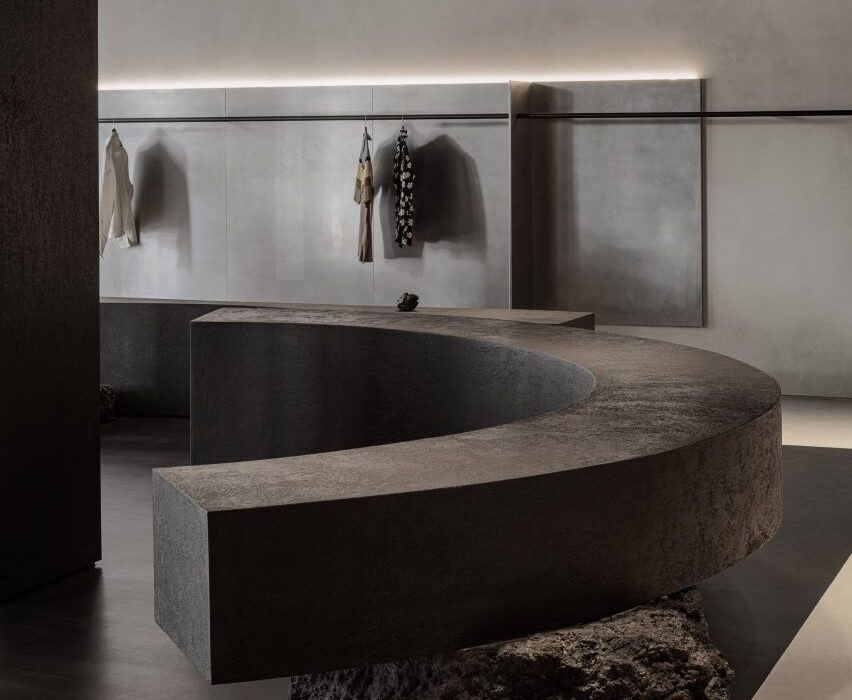
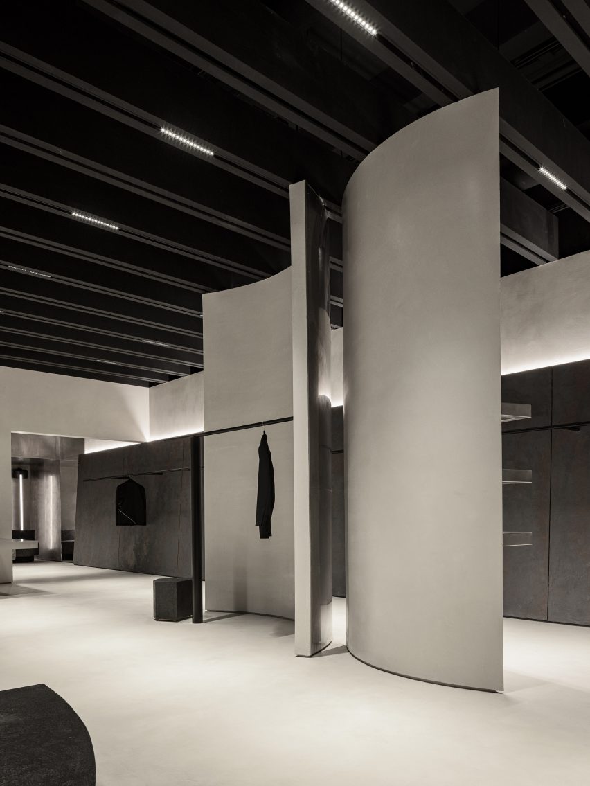
A variety of monolithic furniture pieces direct the flow of movement around this fashion boutique in Chicago, designed by South Korean studio WGNB.
The space for lifestyle brand SVRN is intended to highlight the products for sale as artworks and ideas, rather than simply as garments.
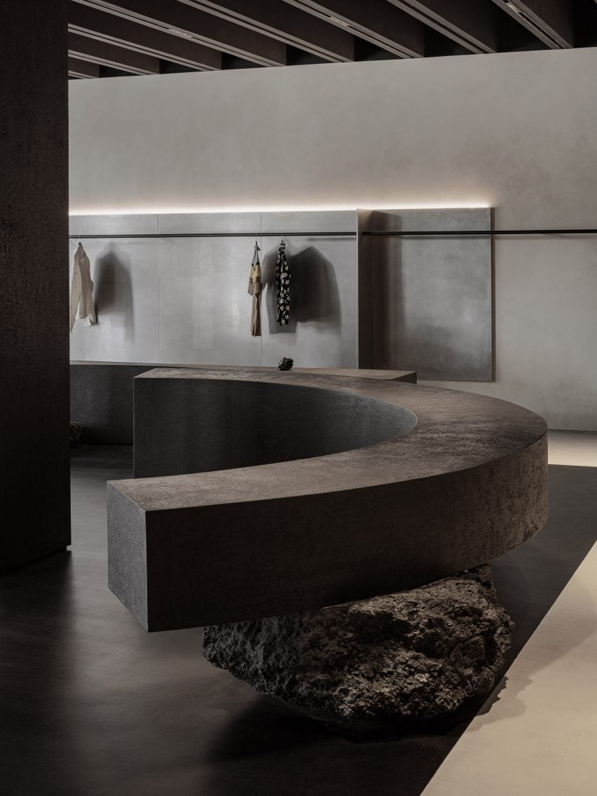
“Spatial design of the SVRN store began with our interpretation of the SVRN’s brand identity and narrative through the eastern perspective,” said WGNB.
“While the western perspective looks at the object itself, the eastern perspective rather focuses on the surrounding relationship of the object.”
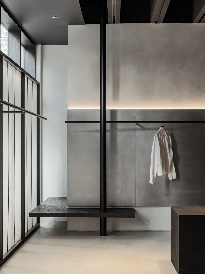
The 4,200-square-foot (390-square-metre) store on North Aberdeen Street, in the Fulton Market area, is split into two sections: the main sales floor and a back room, which are connected by a narrow corridor.
A muted, monochrome selection of materials creates a serene atmosphere in both of the spaces, while the architectural elements dictate purposeful paths that connect them.
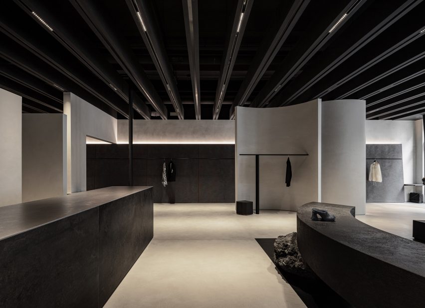
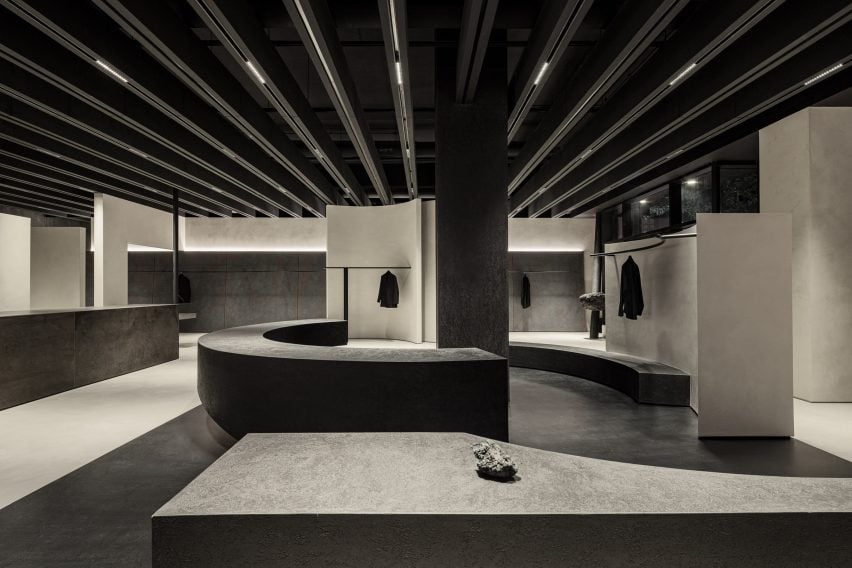
Black railings transverse the walls, puncturing curved and flat vertical partitions made from materials including concrete, steel and black-stained thermowood.
Curved benches that act as both accessory displays and seating are balanced on large irregularly shaped stones.
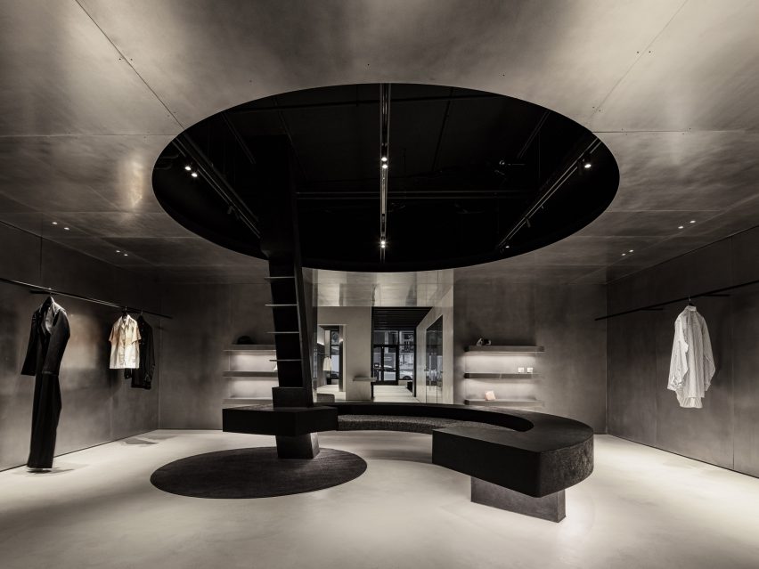
Together, all of these elements suggest multiple meandering routes for customers to trace through the store.
In the back room, the curvature of the benches corresponds with a circular opening in the brushed stainless steel ceiling, while a round patch of carpet sits offset on the floor.
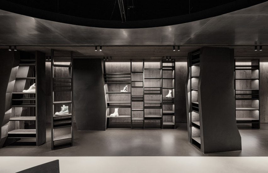
Hot-rolled steel continues across three walls, creating a sci-fi feel in certain areas of the room.
Micro-cement plaster paints are used to contrast the metal, adding a rougher texture against the smooth surfaces.
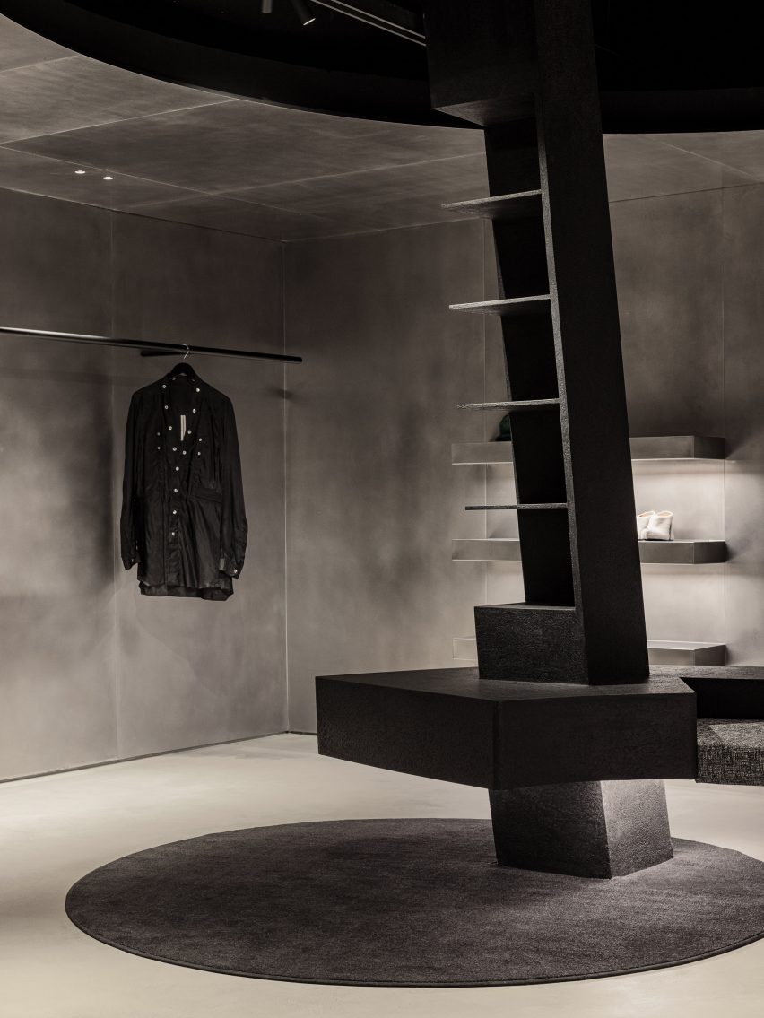
“Overall, usage of the materials are manifestations of the SVRN’s brand identity and narratives,” said WGNB.
The fourth wall in the rear space is reserved for displaying shoes, which sit on shelves of unequal heights that are silhouetted against backlighting.
“The spatial layout of the store considers the current that customer’s circulation creates in the space with the objects and openness,” said the studio.
“And, the visual tension is created by the constantly changing eyesight of the customers while navigating the store.”
Minimalist fashion boutiques can be found worldwide, with many brands opting for a simple and pared-back interior to allow the products to shine.
Recently completed examples include Snøhetta’s Holzweiler store in Copenhagen and a Jonathan Simkhai store in New York’s SoHo by Aruliden.
WGNB, which won the Dezeen Award for Emerging Interior Designer of the Year 2021, has also created monochromatic interiors for fashion brand Juun.J’s flagship store and a golf supply shop – both in Seoul.
The photography is by Yongjoon Choi.
Project credits:
Construction/general contractor: Helios Construction Services

