Haiku Architecture: Poetic Simplicity Offers an Emotive Alternative to Minimalist Design
CategoriesArchitecture

Haiku Architecture: Poetic Simplicity Offers an Emotive Alternative to Minimalist Design

Haiku Architecture: Poetic Simplicity Offers an Emotive Alternative to Minimalist Design

Last call: The clock is ticking as Architizer’s 12th Annual A+Awards enters its Extended Entry Deadline period. Submit your work before February 23rd for your chance at the global spotlight.  

.けぶりして露ふりて無我な在所哉
keburi shite tsuyu furite muga-na zaisho kana

dew turns to steam
trickling down selflessly…
farmhouse

Kobayashi Issa – 1811

Simplicity and suggestion are the foundation of a successful Haiku, a form of traditional Japanese poetry that strips away all but the essential words and uses them to beautifully convey a single moment in time. In the familiar 5-7-5 pattern of seventeen syllables that make up a Haiku, kigo (seasonal words) and kireji (cutting words) anchor the poem in a specific season, allowing the reader to engage their imagination to recreate a scenario the writer is retelling. Haiku often celebrates the beauty and impermanence of the natural world and invites readers to find profound meaning in nature and everyday experiences.

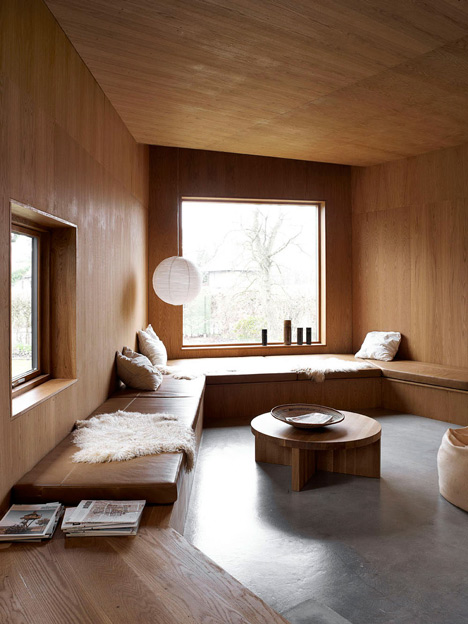
In architecture, this same principle has been adopted by a number of architects, finding a shared ethos with haiku in pursuit of simplicity, emotional resonance and the power of suggestion. Architects who embrace this ‘haiku approach’ often favor natural materials to celebrate the living world and play with light and shadow to connect occupants with the natural rhythms of the day while creating fluid spatial transitions that suggest rather than dictate how spaces should be used or lived in. It is a minimalist style that is deeply emotive.

The goal of haiku principles in architecture is to build unique relationships between a building and its users that encourage a connection to the environment and each other. Just as haiku strips away all but the essential words to convey a moment, architectural haiku seeks to distill design to its most fundamental aspects — form, light, material and space — creating places that invite visitors to fill the space with their interpretations and emotions.
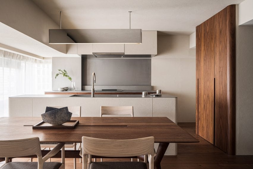
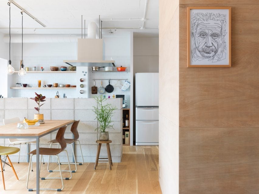
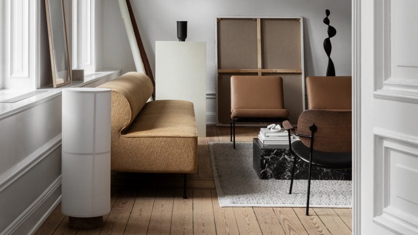
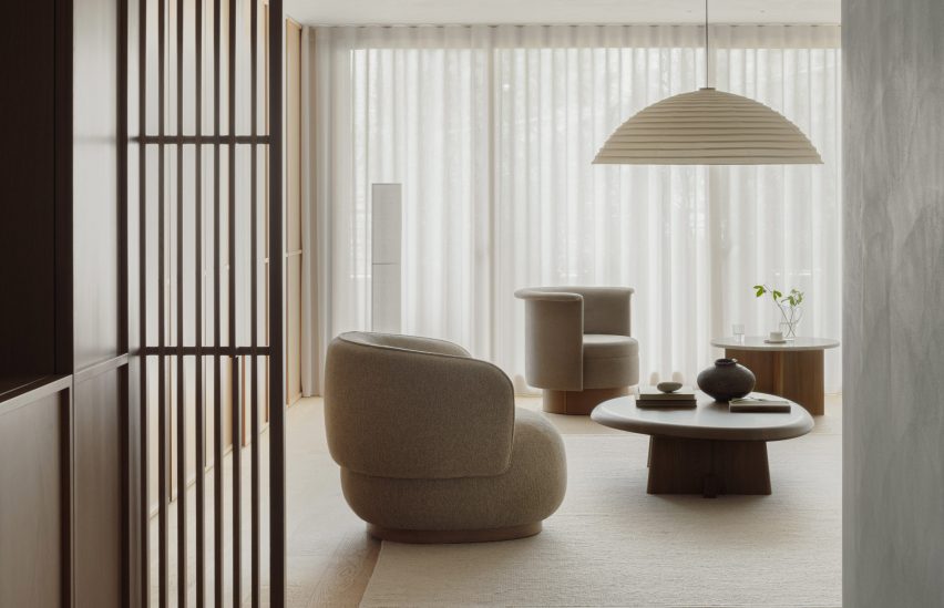
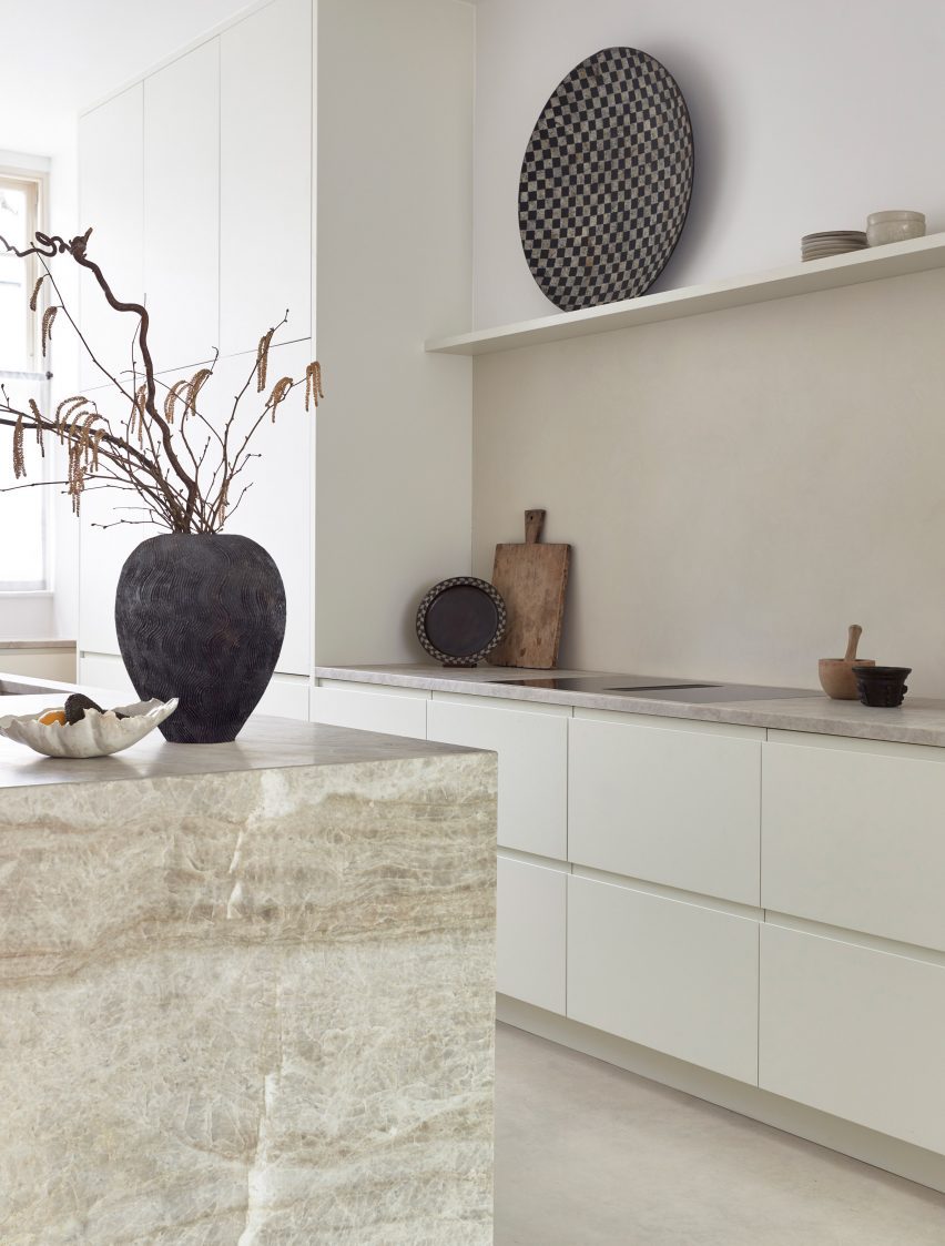
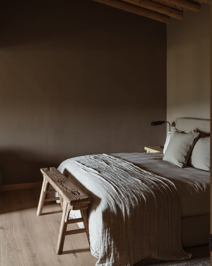

Casa Sexta

By All Arquitectura, CDMX, Mexico

Popular Choice Winner, 11th Annual A+Awards, Residential Interiors (>3000 sq ft)

Casa Sexta by All Arquitectura, CDMX, Mexico. Photographs by Zaickz Moz.

The white stucco, green foliage, warm tones and light woodwork of Casa Sexta, designed by All Arquitectura, serve as the perfect pallet to celebrate nature’s beauty and impermanence. An idea that is so fundamental in Haiku. The design of Casa Sexta suggests rather than dictates how spaces are to be inhabited. By developing the program across three levels and orienting the walls at a 45º angle to capture sunlight through ten patios, the structure of Casa Sexta encourages a fluid movement between the various spaces.

Each room benefits from natural lighting and ventilation that promote a harmonious flow. Allowing the inhabitants of the home to define their own experiences while always being connected to the natural rhythms of the day. The presence of a black acacia tree at the heart of the project deepens this connection. The living centerpiece links the various spaces of the house while also physically documenting the passage of time.
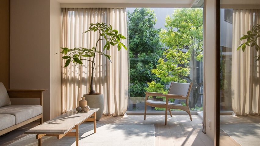
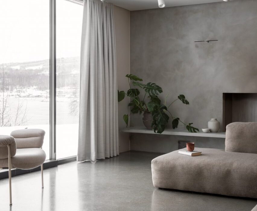
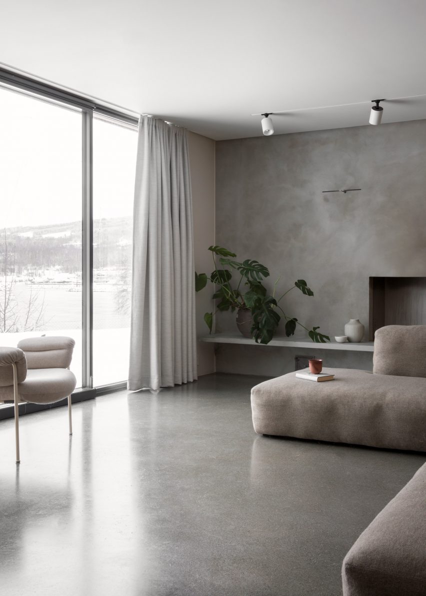
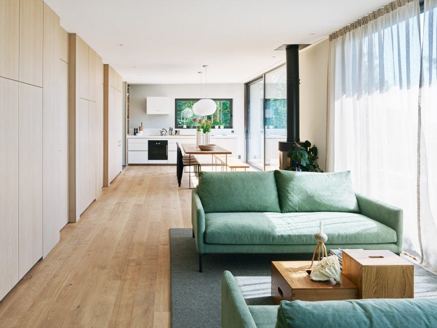
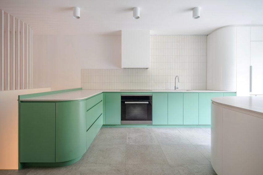
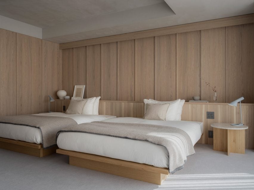

Panorama Penthouse

By Bureau Fraai, Netherlands

Jury Winner, 11th Annual A+Awards, Residential Interiors (>3000 sq ft)

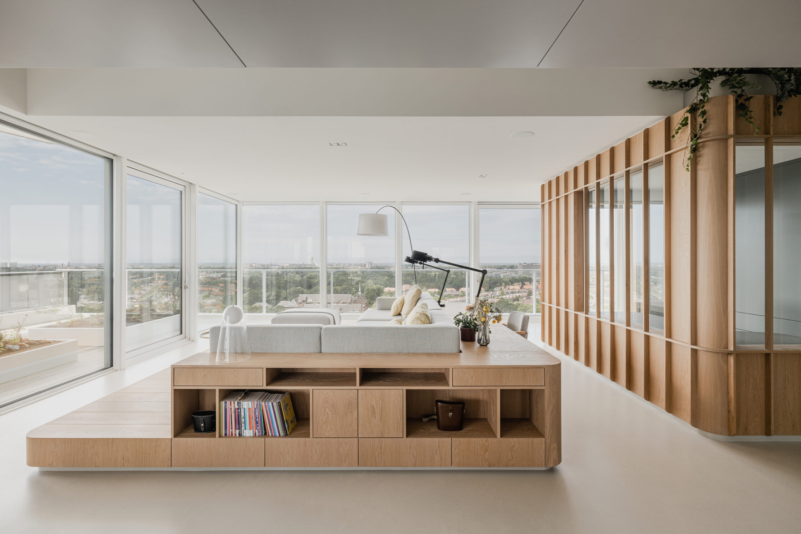
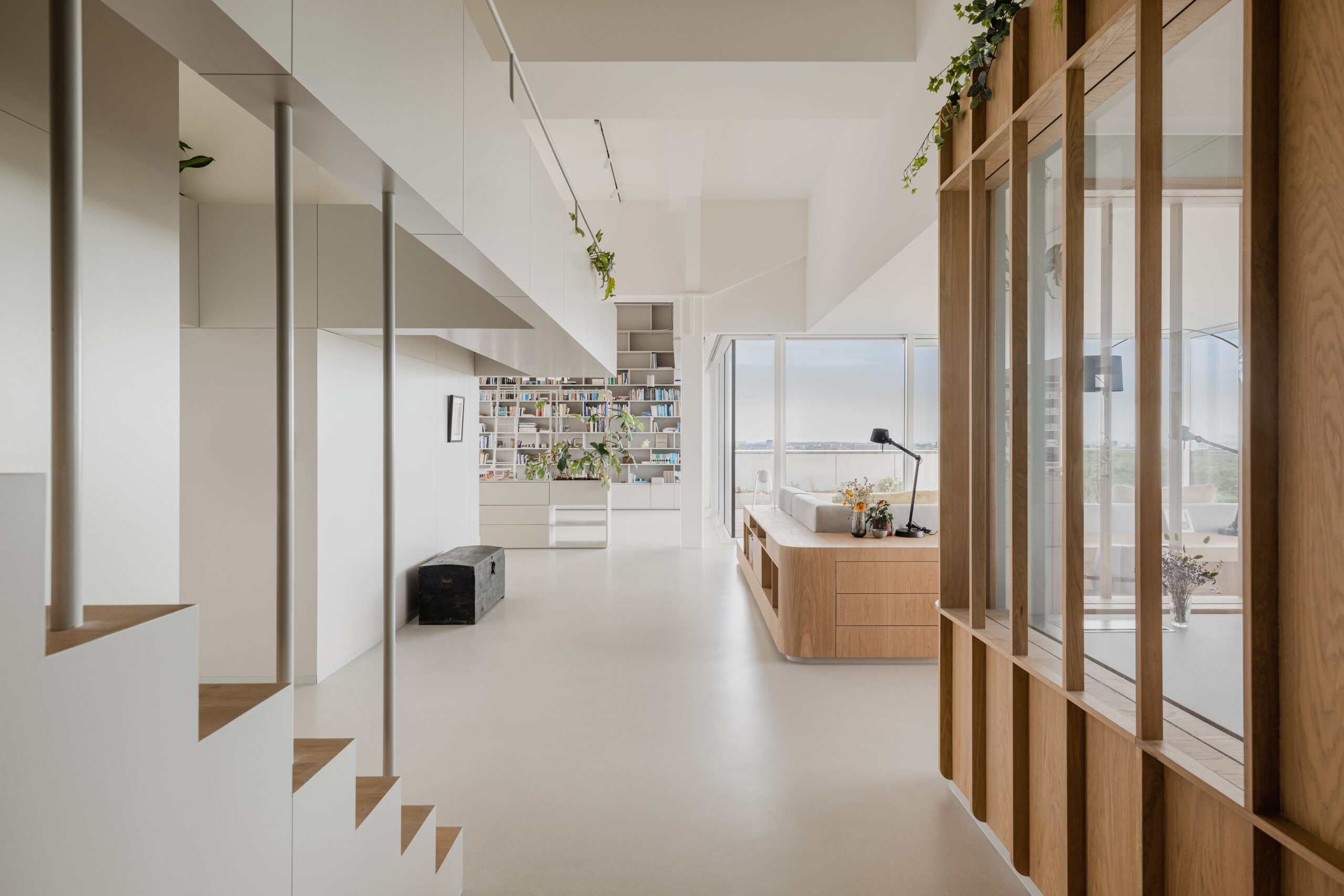
Panorama Penthouse  by Bureau Fraai, Netherlands. Photographs by Flare Department.

As suggested by its name, Panorama Penthouse was designed to amplify the relationship between the internal living space and the external skyline views. Opting for an open floor plan, the home provides unobstructed and simply breathtaking 180-degree panoramic views of the seaside and the city center. There are free-standing oak volumes that are built to house private areas such as the primary bathroom, office space and bedrooms in the evening. These structures add to the fluidity of the space while ensuring comfortable functionality.

The penthouse’s material palette was thoughtfully selected to reflect the visas beyond, echoing the haiku’s integration with nature. The light oak wood mirrors the dunes and beaches, while the muted grey cabinetry in the kitchen and dining room are intended to echo the distant city skyline. The design follows the capacity of a haiku to capture and convey the essence of a moment or scene – in this instance, the ever-changing colors of the skies, tides and urban landscape.
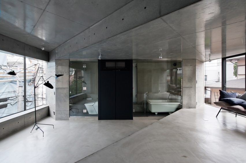
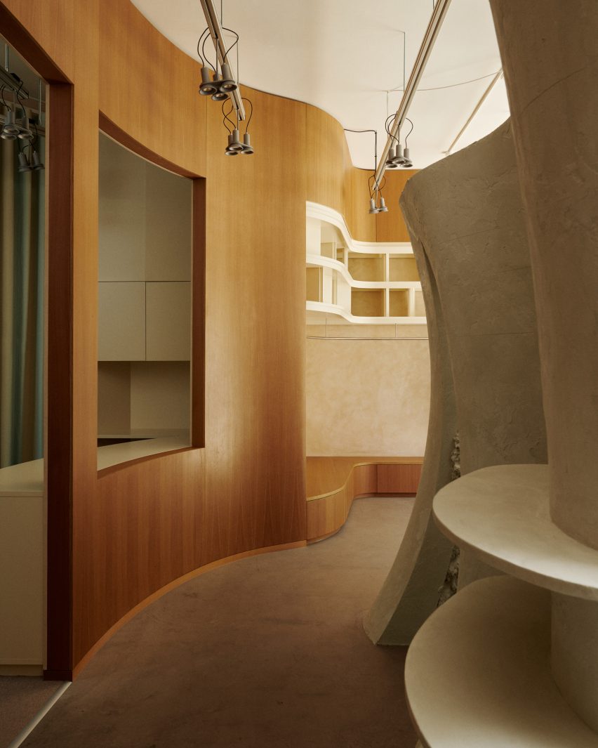
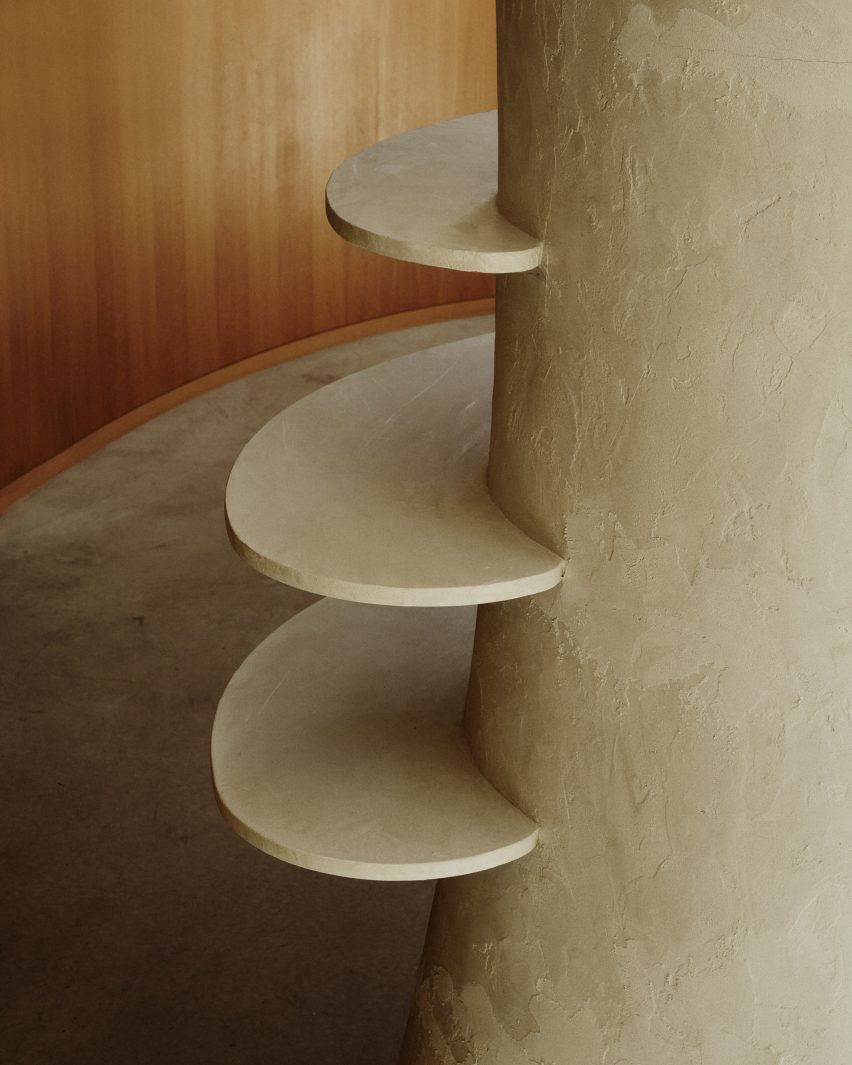
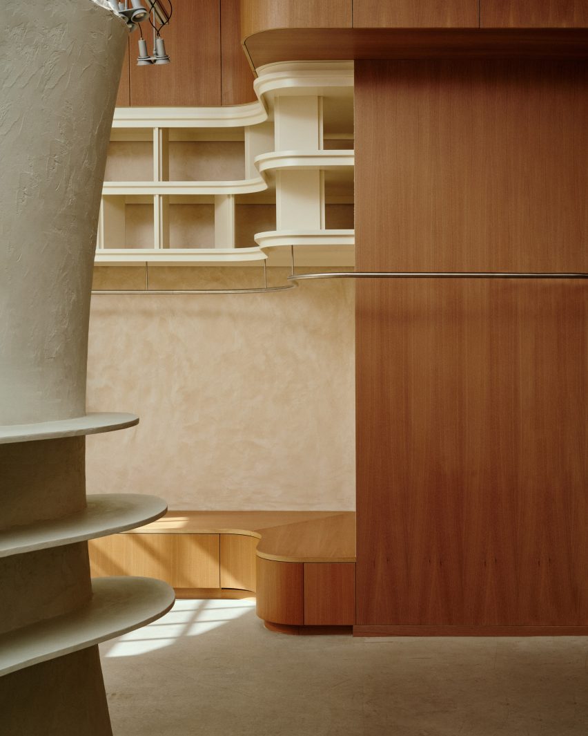
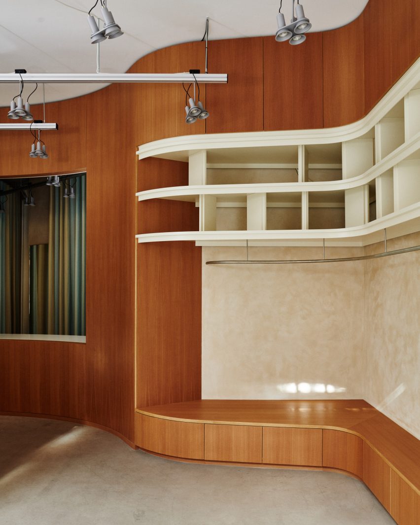
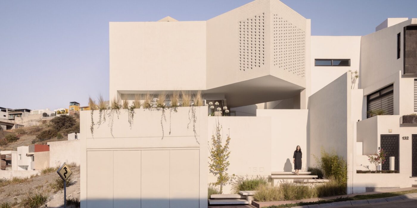
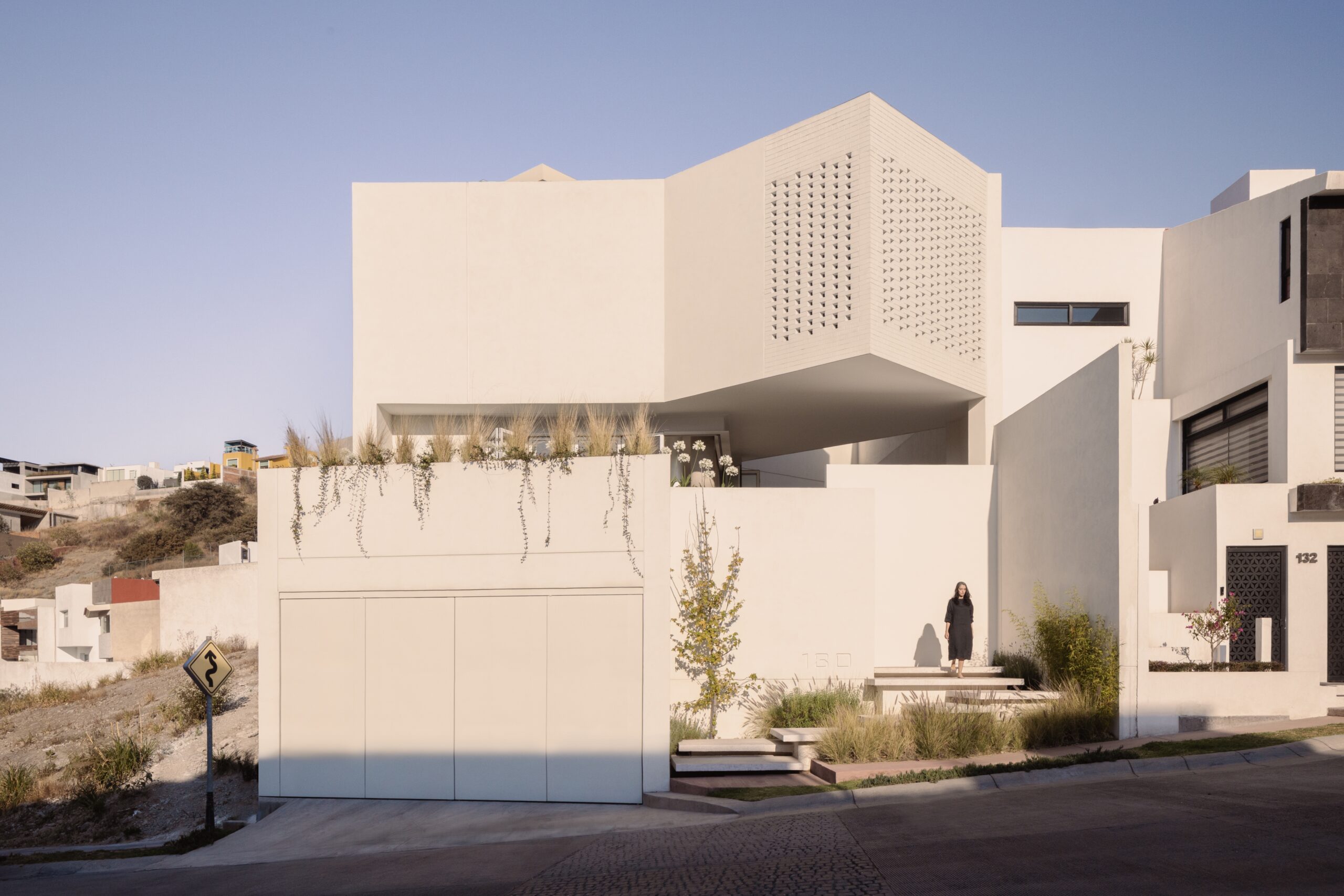
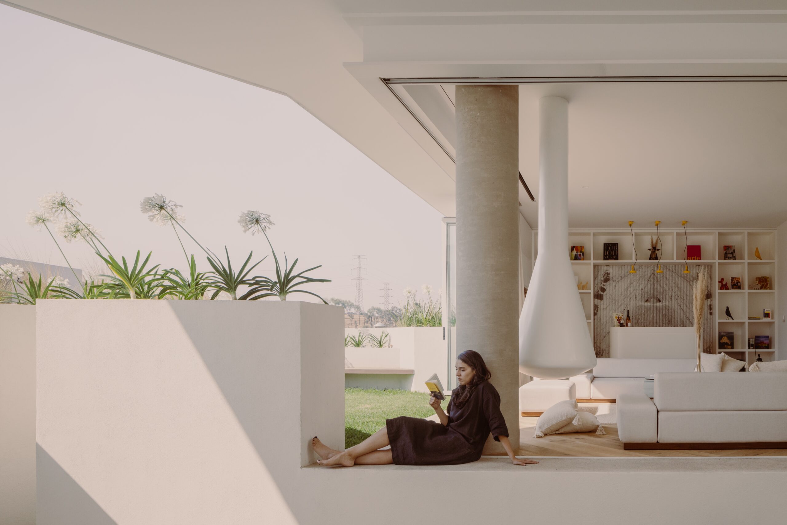
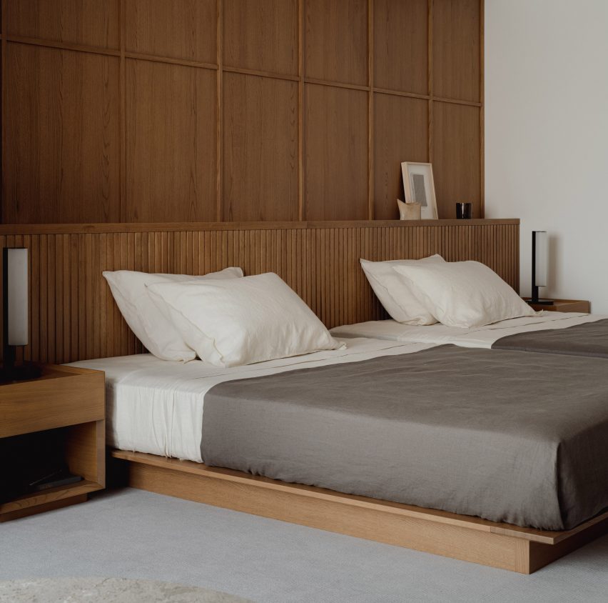
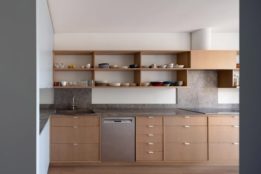
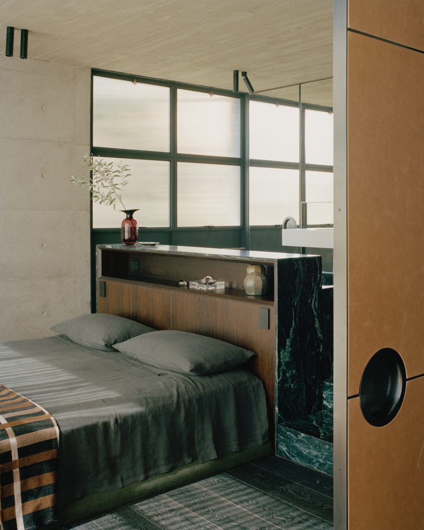

OG House

By Omar Gandhi Architects, Halifax, Canada

Jury Winner, 11th Annual A+Awards, Residential, Private House (M 2000 – 4000 sq ft) 

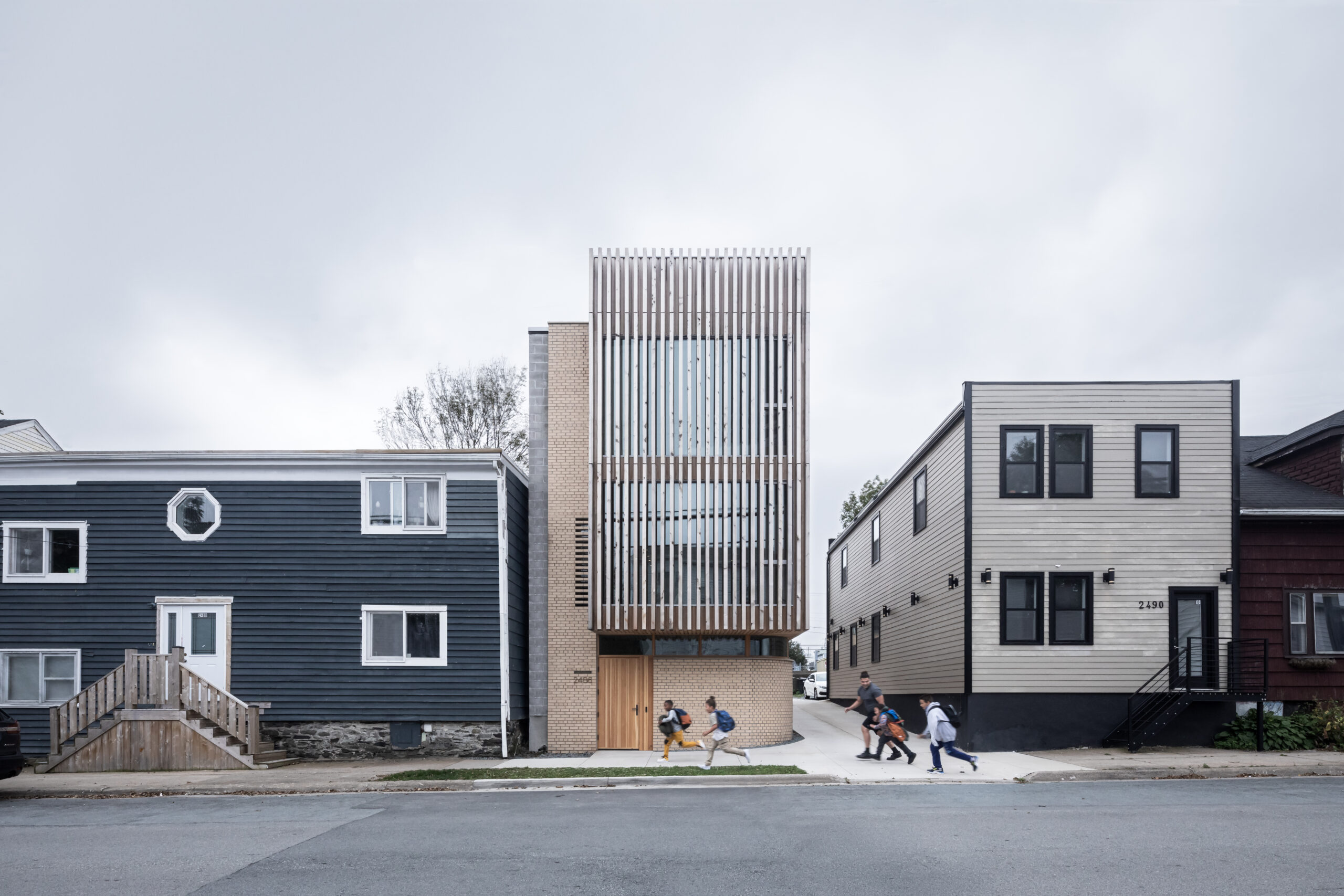
OG House by Omar Gandhi Architects, Halifax, Canada, Photographs by Ema Peter Photography.

On a site with deep community ties, OG House and architect Omar Gandhi reflect the principle of haiku in the building by grounding in a specific moment and setting. The transformation of the ground floor of the standout structure into a community studio dedicated to local projects and for local residents takes into consideration the site’s history as well as its present needs, creating a space that is deeply embedded in its community.

The choice of local materials, such as eastern white cedar, buff-colored brick, and white oak paneling, speaks to the project’s commitment to material honesty and the celebration of natural textures — a core of haiku poetry. The weathered cedar façade that blends with the neighborhood’s textures acknowledges the city’s architectural heritage and exemplifies a design that is both of and for its environment.

Within the space, the repeated use of gentle, rounded corners and the incorporation of organic shapes in the stairwells and handrails demonstrate an attention to form that is evocative of haiku elegance and subtlety. These design elements gently guide movement and focus within the house, inviting exploration and reflection.
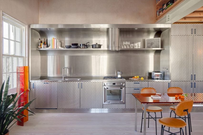

Empire Loft

By Raad Studio, New York City, New York

Popular Choice Winner, 11th Annual A+Awards, Residential Interiors (>3000 sq ft)

Empire Loft by Raad Studio, New York, NY, United States. Photography by Alan Tansey.

Through a series of deliberate spatial manipulations and material choices, Empire Loft is full of moments of elegance and unexpectedness. The dramatic cutaway of the second floor to introduce a suspended bridge is a bold spatial move that disrupts the traditional apartment layout, making the sinuous dark stone spiral staircase and the bridge focal points of movement and interaction, embodying the principle of simplicity in form yet complexity in experience that is fundamental in the creation of a haiku.

Mirrored elements throughout the apartment create illusions with the depth and boundary, inviting occupants and guests to reinterpret the apartment’s dimensions. Incorporating a recording studio wrapped in corrugated felt illustrates an understanding of sensory restraint—capturing haiku’s minimalist ethos. This thoughtful detail underlines the importance of not only visual comfort but also the management of all sensory experiences when striving for harmonious architecture.

Each design decision, from the layout to the material finishes, is part of a design strategy that aims to provide memorable moments of ordinary residential experience, elevating the every day through craftsmanship and creativity.

Last call: The clock is ticking as Architizer’s 12th Annual A+Awards enters its Extended Entry Deadline period. Submit your work before February 23rd for your chance at the global spotlight.  

Reference

Living space interior of Azabu Hills Residence in Japan
CategoriesInterior Design

Karimoku Case lines minimalist Tokyo apartment with local wood

Living space interior of Azabu Hills Residence in Japan

Japanese brand Karimoku Case has redesigned an apartment on a hilltop in Tokyo, using wood and a neutral colour palette to create a “calm and serene atmosphere”.

Named Azabu Hills Residence, the project was designed by Karimoku Case – a studio developed by Karimoku Furniture in collaboration with design studios Keiji Ashizawa and Norm Architects.

The studio used the project as an opportunity to optimise the use of local zelkova wood which is increasingly underutilised.

Living space interior of Azabu Hills Residence in JapanLiving space interior of Azabu Hills Residence in Japan
The apartment features furniture made from zelkova wood

“We sympathized with the story of how zelkova used to be a common material in Japan, but is now being chipped and discarded, and wished to explore the possibilities of zelkova through this project,” lead designer Keiji Ashizawa told Dezeen.

“When I first saw the sample of it, I felt that its gentle reddish hue, along with its story, was a good match for the project,” he continued.

“We decided to create the interior using zelkova that would come in harmony with the gentle light from the north side.”

View into living space of Tokyo residence by Karimoku CaseView into living space of Tokyo residence by Karimoku Case
A neutral material palette creates a “calm and serene atmosphere”

The 226-metre-square apartment was centred around a spacious, open-plan living area and dining room illuminated by floor-to-ceiling windows.

A small workspace nestled behind a wall in the living space makes use of the spacious interior, and is furnished with a desk, chair and shelving made from zelkova wood.

Desk space within Azabu Hills Residence in TokyoDesk space within Azabu Hills Residence in Tokyo
White plaster walls and wooden floors define the living spaces

The minimalist interior is defined by textured white walls and wood used for flooring, window frames and fittings, which are tied together by cream furnishings, paper lighting fixtures and decorative artwork.

In the living space, lattice wooden screens were used to separate programmes as well as provide cross ventilation through the space to create airy interiors.

“With the residence being located in the middle of a large city like Tokyo, it was important to have a home-like atmosphere that makes you feel at ease,” Ashizawa said.

“We were conscious of the calmness and tranquility needed to achieve this, and designed the interior with well-curated furniture, lighting, and art to create an environment for this purpose.”

Minimalist dining space in Azabu Hills Residence in TokyoMinimalist dining space in Azabu Hills Residence in Tokyo
Wooden, lattice screens allow ventilation through the home

A counter made from zelkova wood divides the living space and adjacent kitchen, while also serving as an additional seating and dining space.

Within the kitchen, cabinets built from gridded wooden frames were finished with concrete countertops, complemented by tiled terrazzo flooring that also features in the home’s entryway.

Bedroom interior of Tokyo apartment by Karimoku CaseBedroom interior of Tokyo apartment by Karimoku Case
Furnishings, paper lighting fixtures and pieces of artwork tie the interior together

Gridded wooden frames are repeated for both storage in the living area and a wall in the main bedroom where the home transitions into a cosy-feel with carpet flooring.

A circular chair and marbled table sit in front of the bedroom’s floor-to-ceiling windows, with a study desk nestled into the corner.

Bedroom interior of minimalist apartment Tokyo by Karimoku CaseBedroom interior of minimalist apartment Tokyo by Karimoku Case
Gridded wooden frames feature in the kitchen, living space and bedroom

Other recently completed projects with minimalist interiors include a dental clinic in Montreal designed to feel like “someone’s home” and a London pub converted into a pared-back jewellery showroom.

The photography is by Tomooki Kengaku


Project credits:

Architect: Keiji Ashizawa Design
Project architect: Keiji Ashizawa / Ryota Maruyama
Client: reBITA / NTT Urban Development Coperation Tokyo
Construction: Tamarix
Furniture collaboration: Norm Architects
Furniture:
Karimoku Case
Lighting: Kojima Shoten / Saito Shomei
Lighting plan: AURORA / Yoshiki Ichikawa
Interior styling: Yumi Nakata

Reference

Interior of Steele's Road House by Neiheiser Argyros
CategoriesInterior Design

Eight pared-back kitchens with minimalist storage solutions

Interior of Steele's Road House by Neiheiser Argyros

Sometimes the simple solutions are the best, as seen in this lookbook featuring tidy kitchen interiors where minimalist closed cabinets are combined with decorative materials.

In these kitchens, found in homes from Sweden to Mexico, architects and designers largely chose simple storage solutions but added material interest in the form of marble, steel and brick details.

By hiding utensils and crockery away, benches and kitchen islands are freed up to use for food preparation. In some of these kitchens, open shelves above the work areas also provide spaces to hold decorative plates, bowls and cookbooks.

This is the latest in our lookbooks series, which provides visual inspiration from Dezeen’s archive. For more inspiration see previous lookbooks featuring homes where the wardrobe is the focal point, bedrooms with statement headboards and homes with pergolas.


Interior of Steele's Road House by Neiheiser Argyros
Photo by Lorenzo Zandri

Steele’s Road House, UK, by Neiheiser Argyros

The original brickwork was uncovered in parts of this London flat, including in the kitchen where it forms the backdrop to the room’s minimalist cabinets.

Pale-wood cupboards sit underneath the brick wall, which also features shelves to add more storage.

Designers Neiheiser Argyros added a curved window seat, as well as a wooden kitchen table and stool to match the cabinets and give the room a more natural feel.

Find out more about Steele’s Road House ›


Canal Saint-Martin apartment by Rodolphe Parente
Photo by Giulio Ghirardi

Hausmann apartment, France, by Rodolphe Parente

This Parisian apartment in a 19th-century Haussmann building in Paris was given an overhaul by interior designer Rodolphe Parente, who took cues from the owner’s art collection.

In the kitchen, stainless steel cabinets were used to form storage and workspaces, creating an industrial feel that is tempered by pastel-pink walls.

“The kitchen is a deconstructed block sitting in the Haussmanian environment,” Parente told Dezeen. “It is connected to the historical elements through its composition.”

Find out more about the Hausmann apartment ›


Kitchen in Studio Vaaro's House M
Photo by Scott Norsworthy

House M, Canada, by Studio Vaaro

Studio Vaaro used oak cabinetry for the kitchen of this home in Canada, while matching oak shelving provides additional storage above the workspaces.

To contrast the warm wood, the studio chose grey marble for the countertops and splashbacks, which gives the kitchen an organic feel. Additional storage can be found in the pale grey cabinets that frame the kitchen.

Find out more about House M ›


Kitchen in apartment by Holloway Li
Photo by Edmund Dabney

London apartment, UK, by Holloway Li

A kitchen clad in circle-brushed stainless steel clads one wall in this London flat by local studio Holloway Li. Designed in reference to the city’s many fish-and-chip shops, it features a striking curved splashback.

Above the workspaces, a built-in open shelf provides space to store glasses and cooking utensils, with the rest of the storage is hidden behind patterned-steel cabinet doors.

Find out more about London apartment ›


Quesnel apartment
Photo by Ronan Mézière

Montreal apartment, Canada, by Naturehumanie

Fresh minty hues decorate the kitchen of this Montreal apartment, which was given a modern update while retaining many of its traditional details.

The green colour matches that of the apartment’s existing stained glass doors. And the kitchen island and cabinets both have inviting curved forms, finished in a glossy paint that complements the rougher tiles above the counters.

Find out more about the Montreal apartment ›


Kitchen in Highbury House by Daytrip
Photo by Gareth Hacker

Highbury House, UK, by Daytrip

Located in Highbury in north London, this home juxtaposes a gallery-like minimalism with more organic forms.

This is evident in the kitchen, where pared-back storage cabinets in an unusual rectangular shape sit underneath a decorative marble countertop.

Sculptural vases, plates and cooking utensils decorate the matching marble kitchen island as well as a small ledge that functions as both storage and display counter.

Find out more about Highbury House ›


Kitchen with white oak and Florida Brush quartzite
Photo by Yoshihiro Makino

Eastern Columbia Loft, US, by Sheft Farrace

Architecture studio Sheft Farrace renovated this flat, which is located in the iconic art deco Eastern Columbia building in Los Angeles, creating minimalist interiors that draw on the building’s exterior.

In the kitchen, this can be seen in the curved corners of the counters and the elongated cabinet hardware, which reference 1930s design. Florida Brush quartzite was used to cover much of the kitchen, adding a striking decorative detail that is complemented by white oak.

Find out more about Eastern Columbia Loft ›


Kitchen inside Archipelago House by Norm Architects
Photo courtesy of Jonas Bjerre-Poulsen of Norm Architects

Archipelago House, Sweden, by Norm Architects

Danish studio Norm Architects designed this home on the west coast of Sweden to embody both Scandinavian and Japanese aesthetics.

In the white-walled kitchen, a stainless-steel kitchen island offers both a practical workspace and cupboards for storage. Open wood shelving was decorated with black ceramics to create an art installation-style feature on one wall.

Find out more about Archipelago House ›

This is the latest in our lookbooks series, which provides visual inspiration from Dezeen’s archive. For more inspiration see previous lookbooks featuring homes where the wardrobe is the focal point, bedrooms with statement headboards and homes with pergolas.

Reference

yabashi architects ezu house
CategoriesArchitecture

yabashi architects stacks minimalist house and café in japan

yabashi architects ezu house

ezu house and café: multi-uses in harmony


Nestled in a tranquil corner of a lakeside residential area in Kumamoto, Japan, the recently completed ‘EZU House and Café‘ stands as a testament to innovative architectural design, crafted by Yabashi Architects and Associates (YAA). this structure opens broadly out toward its surroundings to provide a unique experience for its occupants. The site’s terrain, with its stepped landscape along the lakeside, offers breathtaking views of nearby gardens, private house roofs, and distant mountains. By skillfully incorporating these elements into the design, the architects have created a multi-layered structure that fosters a sense of harmony between its retail and residential programs.

yabashi architects ezu houseimages © Yashiro Photo Office


the Vertical Spiral Movement


At the core of the design philosophy is a square plan that encompasses the site. The upper floors of the building are ingeniously divided diagonally, establishing a dynamic interplay of spaces. By shifting the floors to increase the parameter with the ground and connecting them through a spiral vertical movement, the architects have achieved a three-layered structure that presents an array of viewpoints at every turn. This deliberate arrangement allows for a varied experience on each floor, with minimal necessary functions, furniture, and plants. The result is a space that transcends conventional definitions, offering an open canvas for inhabitants to freely create their own personalized environments.

yabashi architects ezu house


Seamless Integration of Functions


The ground floor of the EZU House and Café serves as a retail area, seamlessly transitioning into the residential space on the upper floor. The distinction between these two sections is purposefully fragmented, employing diagonal load-bearing walls that create a continuous three-dimensional living space. This approach fosters a sense of connectedness and flow throughout the entire structure. Furthermore, the architects have emphasized the integration with the natural surroundings by incorporating a double structure. This design envelops the earthquake-resistant framework with elements dedicated to wind resistance and heat insulation, while the outer skin of the building serves as a gateway to the outdoor environment.

yabashi architects ezu house


Unobstructed Views by yabashi architects


The absence of partitions between spaces is a deliberate choice that enhances the occupants’ experience of the surrounding environment. Depending on one’s body position and movement, glimpses of the sky, verdant greenery, or sudden visual breaks may appear through the windows on adjacent floors. This design creates a spatial experience that emphasizes the inherent richness of the location and the generosity of life itself. In essence, the EZU House and Café may appear as a mere assembly of floors, outer panels, and openings. However, it transcends its utilitarian nature, transforming into a powerful tool that allows individuals to perceive the external environment as an integral part of the internal space.

yabashi architects ezu house
a double structure wraps earthquake-resistant elements with wind resistance and heat insulation yabashi architects ezu house
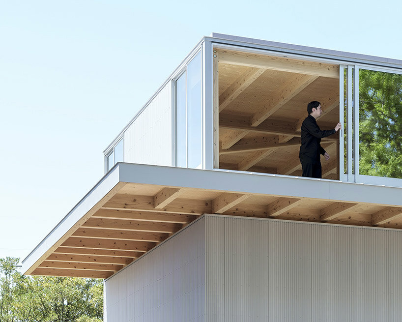
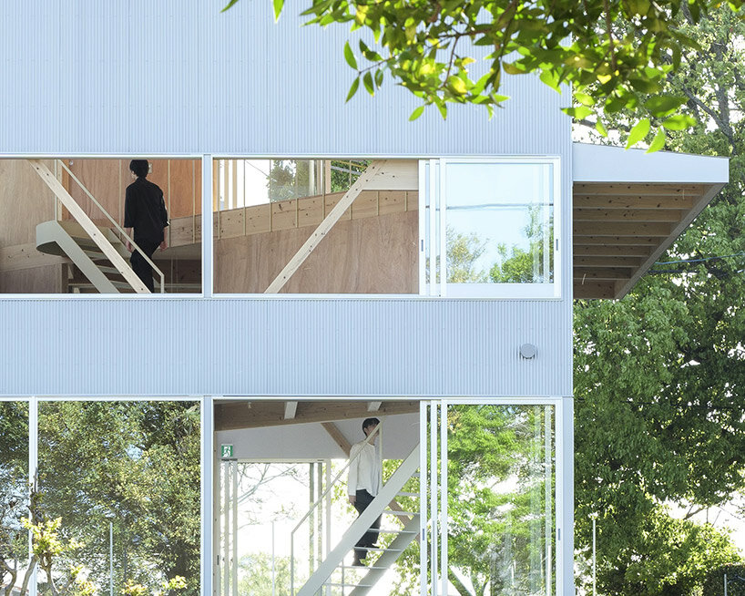
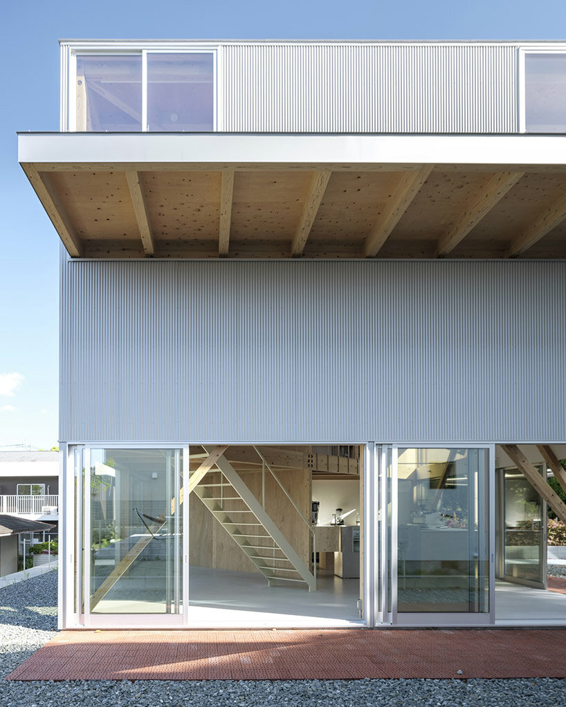
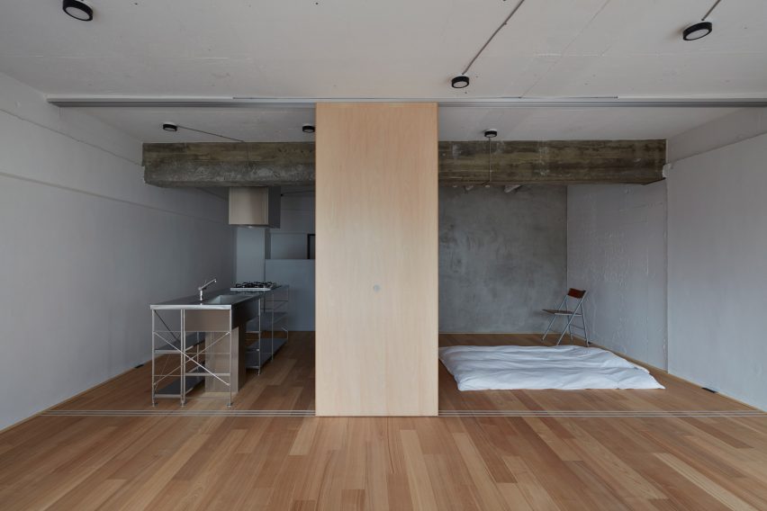
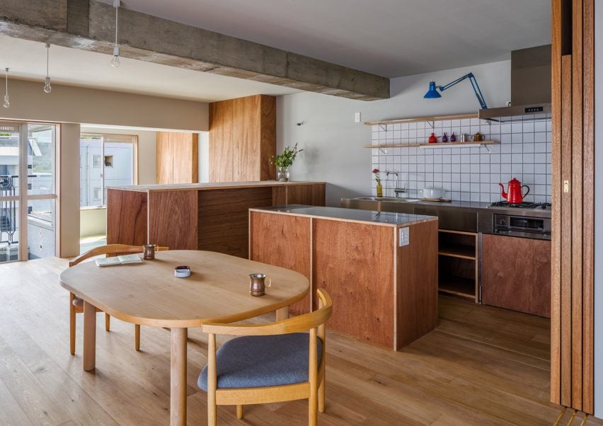
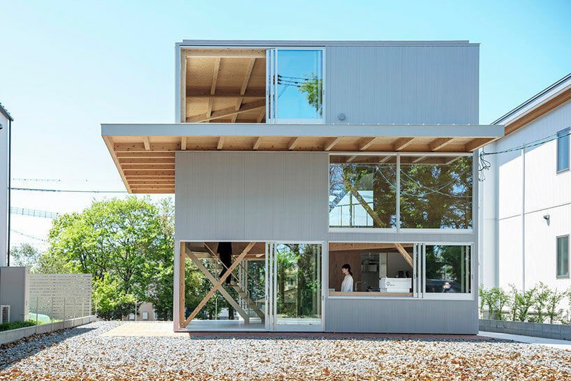
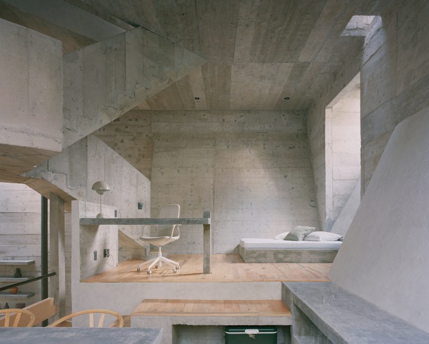
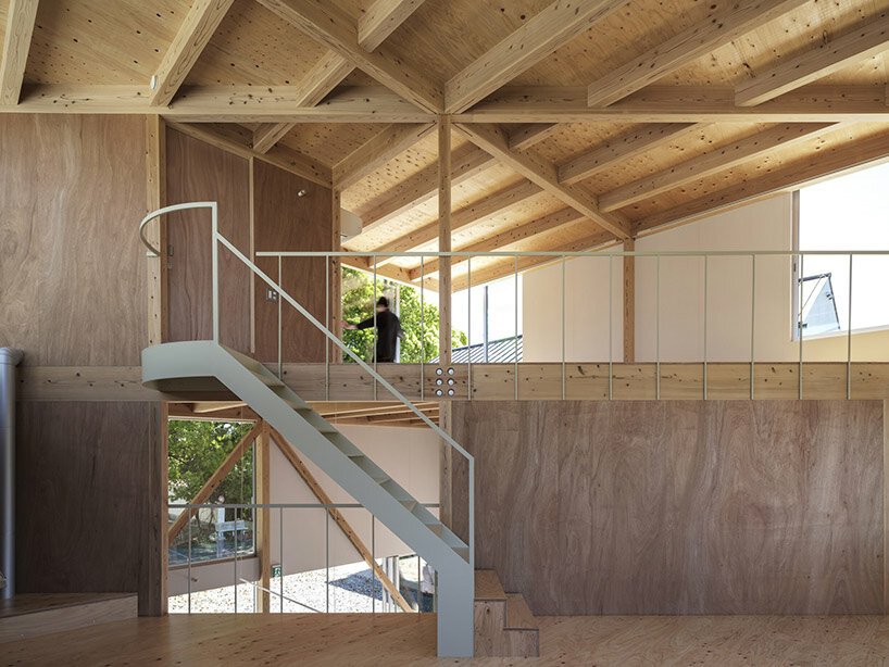
the multi-use space is flexible with a spiral vertical movement and minimal necessary functions

Reference

Bedroom, Casa Tres Árboles in Valle de Bravo by Direccion
CategoriesInterior Design

Eight calming bedrooms with minimalist interiors from across the world

Bedroom, Casa Tres Árboles in Valle de Bravo by Direccion

For our latest lookbook, we’ve gathered ten minimalist bedrooms with peaceful designs, ranging from a Mexican bedroom with a concrete bed to a cosy space in a former girls’ school in Puglia.

Natural materials including wood and stone were used to finish these eight bedrooms, which also feature muted colour palettes and little in the way of decoration.

Leaving walls bare and keeping the amount of artworks and personal items to a minimum can help create a more soothing and clutter-free bedroom.

Beige, grey and warm brown hues, meanwhile, make for relaxing spaces free from eye-catching colours.

This is the latest in our lookbooks series, which provides visual inspiration from Dezeen’s archive. For more inspiration see previous lookbooks featuring terraces and balconies, marble-lined bathrooms and cave-like interiors.


Bedroom, Casa Tres Árboles in Valle de Bravo by Direccion
Photo by Fabian Martinez

Casa Tres Árboles, Mexico, by Direccion

Designed to resemble a “monastic sanctuary”, this weekend retreat in Valle de Bravo, Mexico, aims to celebrate the contrast between shadow and light in its interior.

In the pared-down bedrooms, the walls were painted in dark colours to contrast the warm wooden ceiling beams. A wooden bench at the end of the bed and tactile linen textiles give the room a slightly rustic feel.

Find out more about Casa Tres Árboles ›


Bedroom inside Bangalore home
Photo by Aaron Chapman

Cabin House, India, by Taliesyn

Cabin House’s interior was informed by the vernacular architecture of its location in south Bangalore’s Jayanagar neighbourhood.

Earthy finishes were used for the home, which features bare concrete walls and plenty of wood details. A wooden bedframe and flowers create a friendly atmosphere in the mezzanine bedroom.

Find out more about Cabin House ›


Bedroom interior of Pacific House designed by Alexander & Co
Photo by Anson Smart

Pacific House, Australia, by Alexander & Co

Australian studio Alexander & Co aimed to create contemplative spaces inside Pacific House in Sydney.

In the minimalist bedroom, walls were rendered in concrete and matched with carpet in a darker grey colour. Sculptural bedside lamps and transparent floor-to-ceiling curtains add a softer feel to the spartan interior.

Find out more about Pacific House ›


Bedroom of Tokyo apartment by Keiji Ashizawa
Photo by Tomooki Kengaku

Hiroo Residence, Japan, by Keiji Ashizawa

Custom-made wooden furniture and art pieces are dotted throughout Hiroo Residence. Designer Keiji Ashizawa used muted tones to make the most of the sunlight in the central Tokyo apartment, which has several large windows.

In the bedroom, wood panels cover entire walls and hide away technical functions behind the beds. Organically shaped ceramics add discrete decorative touches.

Find out more about Hiroo Residence ›


Interiors of Fisherman's cottage
Photo by Gavin Green

Fisherman’s Cottage, Australia, by Studio Prineas

The bedroom in this Australian home is located inside a concrete extension to an old fisherman’s cottage.

Here, a solid-stone bath doubles as a bedhead and mirrored walls were used to make the small room feel bigger. To not clutter the space, accessories were restricted to a few glass trays and vases as well as a striped throw.

Find out more about Fisherman’s Cottage ›


Bedroom in brutalist home
Photo by Rory Gardiner

Casa Alférez, Mexico, by Ludwig Godefroy

A bedside nook sits underneath a high window inside this brutalist holiday home, which features wooden floors and walls made of board-formed concrete.

Architect Ludwig Godefroy also designed built-in concrete furniture for the house, including a concrete bed. A pale grey version of designer Verner Panton’s classic Flowerpot lamp adds a glossy detail to the room’s rough texture.

Find out more about Casa Alférez ›


Interior of Casolare Scarani in Puglia by Studio Andrew Trotter
Photo by Salva López

Casolare Scarani, Italy, by Studio Andrew Trotter

Architecture practice Studio Andrew Trotter converted a girls’ school in Puglia that dates back to 1883 into a grand family home with plenty of decorative arches.

In the cosy minimalist bedroom, a jute rug covers the stone floor made from crushed rocks and mortar, while the colour palette was kept to creamy whites as well as warm brown and tan hues.

Find out more about Casolare Scarani ›


Bedroom interior of Palau apartment by Colombo and Serboli Architecture
Photo by Roberto Ruiz

Palau apartment, Spain, by Colombo and Serboli Architecture

“Imperfect” original features were highlighted during the renovation of this apartment in Barcelona, which features white-washed walls and wooden floors.

In the mezzanine-level bedroom (above and top image), wicker doors front an entire wall and cover the closet. An organically shaped mirror and an orange chair make the calm space feel more playful.

Find out more about Palau apartment ›

This is the latest in our lookbooks series, which provides visual inspiration from Dezeen’s archive. For more inspiration see previous lookbooks featuring terraces and balconies, marble-lined bathrooms and cave-like interiors.

Reference

Architectural Details: How to Create a Stunning Minimalist Residence That Brings the Outside In
CategoriesArchitecture

Architectural Details: How to Create a Stunning Minimalist Residence That Brings the Outside In

Architectural Details: How to Create a Stunning Minimalist Residence That Brings the Outside In

Brevity is one of the most powerful tools in the architect’s apparatus. This astonishing glass house, perched on the banks of Minnesota’s Lake Minnetonka, is proof of precisely that. Clean, crisp lines define its striking structure, which emerges from the trees like a modernist specter.

The brief for the project called for a design that maximized light and forged an intimate relationship with the external world. Thanks to magnificent expanses of glass, the residence is a conduit for the surrounding landscape — an elegant, architectural “picture frame”. Yet creating a home that is visually defined by its glazed skin is not a straightforward endeavor, and its successful resolution hinges on the integration of resilient, high-performing materials.

Photo courtesy of Spacecrafting.

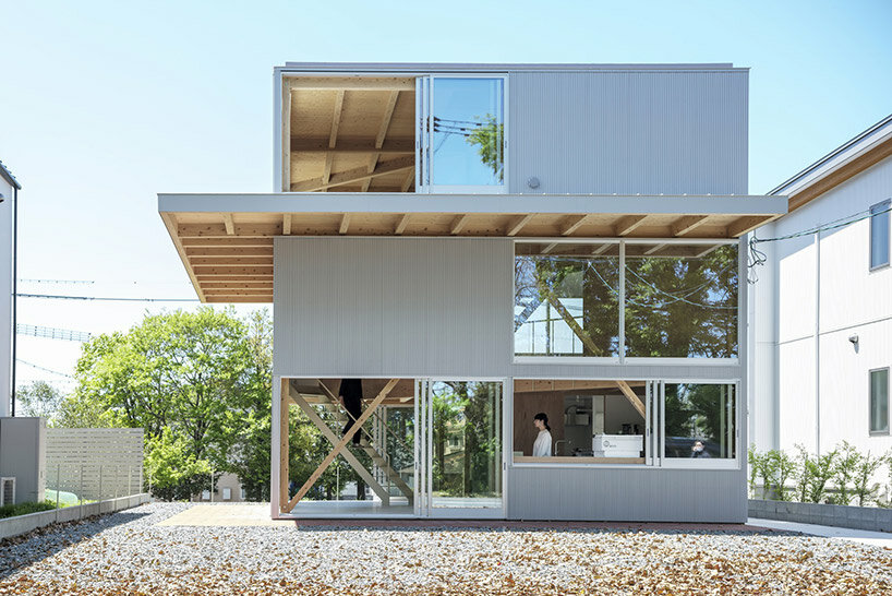
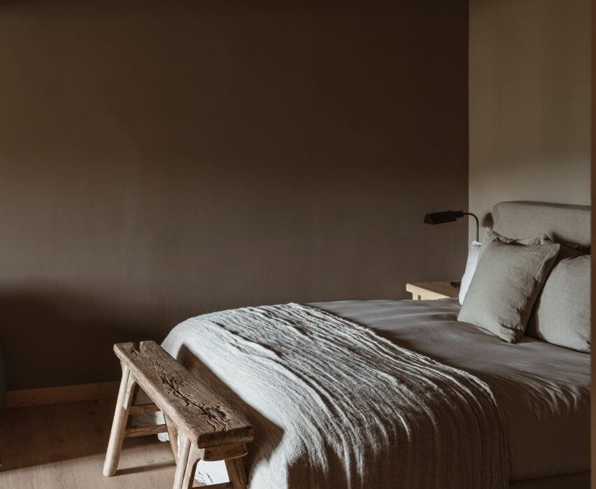
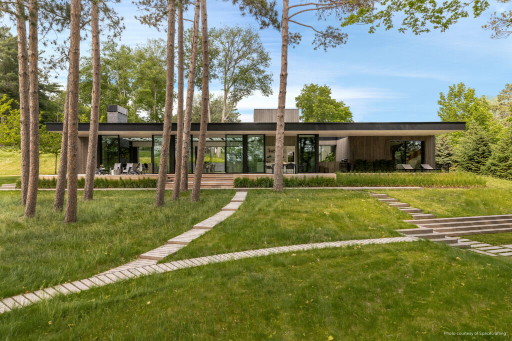
Making a Glass House Structurally Sound

Less is more, or so the mantra of modernism goes. Somewhat ironically though, achieving minimalism is no simple task. Subtracting as much as possible from a building’s fabric is an act of bravery, a challenge that Charlie & Co. Design and John Kraemer & Sons Custom Builders admirably rose to.

Charlie Simmons, the founding principal of Charlie & Co. Design, shared the formative questions they asked themselves at the start of the project: “You strip out all the unnecessary things. What’s the limited amount of structure you need? Could you really go floor-to-ceiling with glass? How high can you make it? And then you start whittling away and whittling away and what’s left?”

The team turned to Marvin to help them deliver the seamless, streamlined esthetic their client wanted. The Marvin Modern product line, comprising a modular series of durable, fiberglass products with narrow sightlines, was the ideal fit for the ambitious design. The doors and windows feature an integrated structural cavity that adds up to half an inch of mull reinforcement to aid structural performance.

But there was still a fundamental obstacle at the heart of the scheme: glass is not typically made to hold significant weight. The project architect and the Marvin engineering department crunched the numbers and came up with an innovative solution: unobtrusive, load-bearing components were integrated into the design without compromising its sleek finish.

“There are very few actual walls in this place, particularly on the first floor … so we have these structural elements that we need to keep the house up and prevent it from twisting,” Simmons explained. A stone fireplace at one end of the home anchors the building, bookended by what Simmons calls “a box within a box” at the opposite end – a wood structure that houses the kitchen, laundry room and powder room.

Photo courtesy of Spacecrafting.

Ensuring Impressive Thermal Efficiency

Minnesota is a land of climatic extremes, from frigid, frosty winters to humid summer months. For a form dominated by glass, extreme fluctuations in temperature posed another major challenge. Unsurprisingly, the home’s thermal envelope was of paramount concern for the architects, and it was vital that the material structure could stand up to snowstorms and heatwaves alike.

Marvin Modern doors and windows proved strong enough to endure the site’s environmental demands. Made from solid pieces of high-density fiberglass, they provide powerful insulation and an impressive U-factor of 0.28. Shielded from the elements, the residence’s interior is comfortable and inviting all year round, while maintaining a palpable connection with the natural topography. Remarkably, no additional insulating materials were required to aid the glazing’s thermal efficiency.

Photo courtesy of Spacecrafting.

Blurring the Boundary Between Inside and Out

The result of this innovative project is a stunning, living glass box that shifts organically with the light levels, weather conditions and seasons. The stretches of glazing are punctuated with Accoya wood cladding, while interior millwork in the same warm grain establishes a sense of continuity between indoors and out.

Yet however you look at this modern masterpiece, glass is the star of the show. Imbued with the Marvin Modern product line, the structure is a skillful and poetic negotiation of transparency. A trellis and purlins frame the skylight above the main living area, while latticework fragments the full-height windows that flank the stairwell. “It becomes a very subtractive and additive design process but in the end, it’s all about transparency and keeping things as simple and clean and minimalist as possible,” Simmons says.


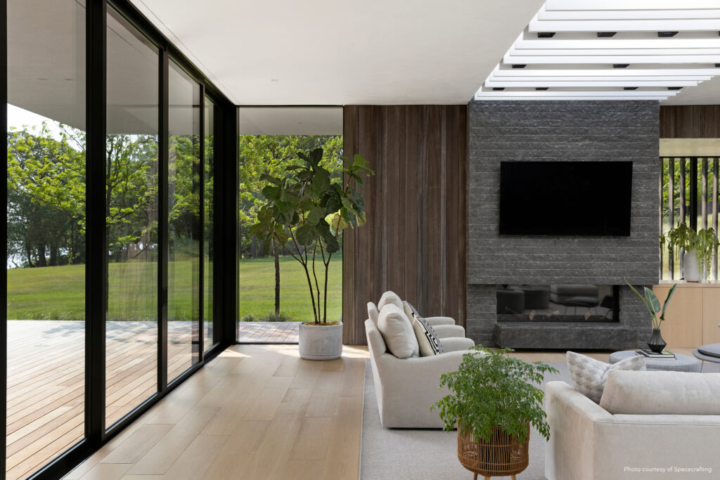
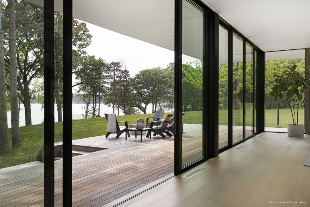
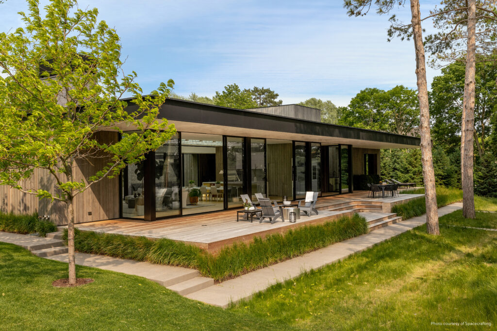
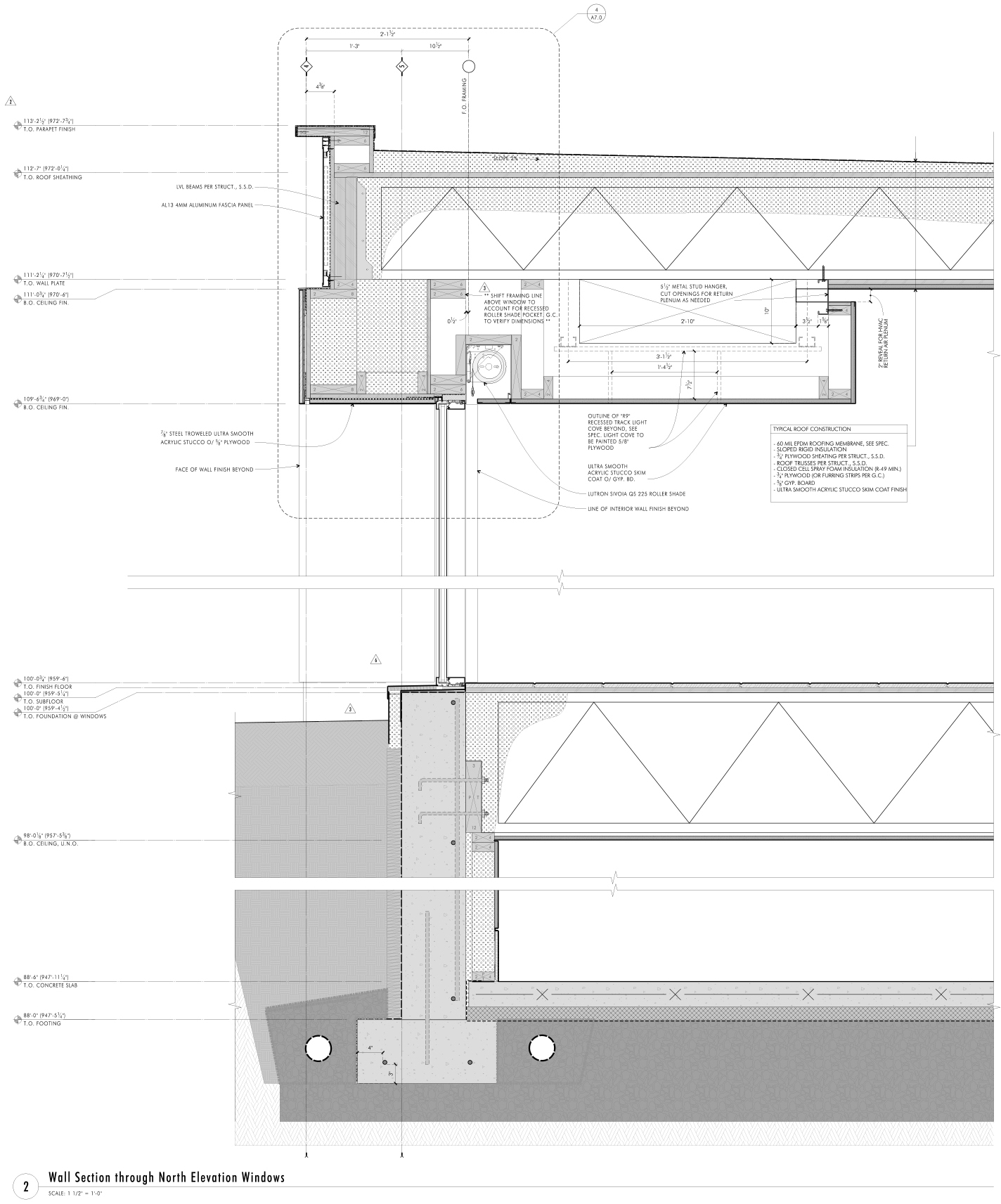
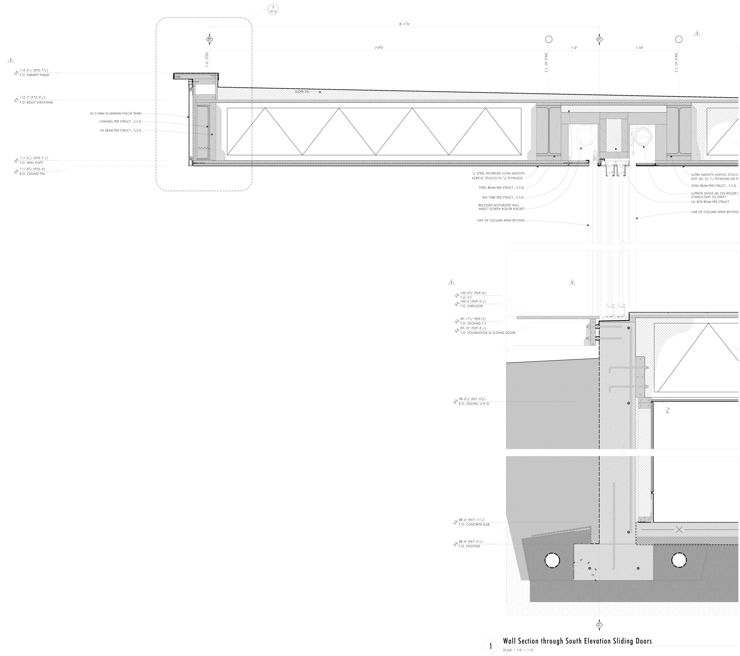
The most staggering feats of engineering are the two 60-foot-long glass walls, which line opposing aspects of the residence. Each wall is made up of three sets of 20-foot sliding doors with only 4 inches of steel structure in between them, allowing for uncompromised views throughout. Like the other Marvin Modern products, the profile of each door is slim and inconspicuous. Recessed channels in the frames conceal motorized insect screens and blackout shades, while still providing consistent, narrow sightlines of less than three inches.

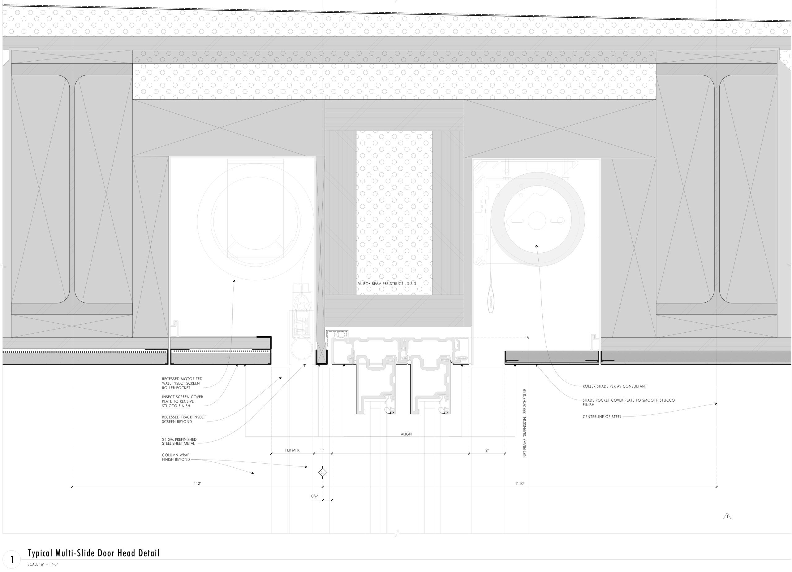
The swaths of glass are a portal to the organic terrain, rather than an obstruction. To that end, internal covers across the frames disguise fasteners and rubber gaskets, while low-gloss aluminum interior finishes and black spacer bars ensure an unimpeded outlook. This seamless finish allows inner and outer worlds to collide. In the warmer months when the doors are retracted, the covered deck becomes a natural extension of the interior floor plan.

Photo courtesy of Spacecrafting.

An interplay of modernist finesse and material resilience, this incredible waterfront home is a masterclass in building with glass. Negotiating challenging contextual and structural obstacles, the residence epitomizes the virtues of architectural minimalism. Simmons succinctly summarizes the scheme’s dual nature: “When you have this much glass, you feel like you’re a part of something out here, but you’re also being protected as well … Marvin gives us the tools to create environments such as this.”

To explore more case studies featuring Marvin Modern and learn how to harness windows and doors like these for your next project, click here.

All architectural drawings courtesy of Charlie and Co. Design; photography courtesy of Spacecrafting.

Reference

Norm Architects and Keiji Ashizawa's minimalist interior design
CategoriesInterior Design

Ten Tokyo apartments with minimalist interior designs

Norm Architects and Keiji Ashizawa's minimalist interior design

Cleverly concealed kitchens and subtle wooden accents feature in our latest lookbook, which collects Tokyo apartments characterised by minimalist and serene interiors.

These apartments in Japan’s capital are united by their muted colours and an abundance of wood – elements often associated with traditional Japanese interior design.

As one of the world’s most densely populated cities, Tokyo homes often feature smaller floor plans or less natural light than those located in more spacious cities.

Architects and designers have created plenty of understated solutions to these restrictions, such as inserting space-saving storage into open-plan living areas.

From a flat informed by traditional Kyoto townhouses to an Airbnb dressed in subtle geometric furniture, here are 10 Tokyo apartments with minimalist interior designs.

This is the latest in our lookbooks series, which provides visual inspiration from Dezeen’s archive. For more inspiration see previous lookbooks featuring concrete bathrooms, cosy cabins and homes with elevators.


Norm Architects and Keiji Ashizawa's minimalist interior design
Image is courtesy of Norm Architects and Keiji Ashizawa Design

Kinuta Terrace by Norm Architects and Keiji Ashizawa Design

Two apartments within Tokyo’s 1980s-designed Kinuta Terrace apartment block were renovated by Norm Architects and Keiji Ashizawa Design to include more natural light.

The studios reconfigured the floor plans to form fewer but larger living spaces, which are characterised by smooth concrete, timber fixtures and sheer sandy-hued curtains.

“Nature feels integrated into the apartment from most rooms so that, when looking out into the courtyard, you can’t quite tell you’re in a city as immense as Tokyo,” said Norm Architects designer Frederik Werner.

Find out more about these Kinuta Terrace apartments ›


Minorpoet applies traditional Japanese design to a renovated apartment in Tokyo
Photo is by Satoshi Shigeta

Apartment in Kitasando by Minorpoet

This 1960s apartment contains a sleek kitchen counter and storage space concealed behind folding doors informed by traditional Japanese screens known as Byōbu.

Design studio Minorpoet took cues from traditional Kyoto townhouses for the project, which features a hidden kitchen that cannot be seen from the living room.

Minimalist furniture and finishes match the pared-back theme, including iconic Finnish architect Alvar Aalto’s stackable wooden 60 stool.

Find out more about Apartment in Kitasando ›


Shibuya Apartment 201,202 by OgawaArchitects
Photo is by Kaku Ohtaki

Airbnb apartments by Hiroyuki Ogawa Architects

Local studio Hiroyuki Ogawa Architects renovated two Airbnb apartments in Tokyo’s Shibuya ward with completely contrasting designs. One has floors and walls clad in light wood (main image), while the other pairs a plush grey carpet with dark plasterwork.

Neon lighting in the latter apartment was chosen to remind guests of the bustling city while cork stools, metallic kitchen cabinetry and charcoal-toned accents create a moody atmosphere.

Find out more about these Airbnb apartments ›


The Life concept apartment by I IN
Photo is by Tomooki Kengaku

The Life concept apartment by I IN

The Life concept apartment is an understated residence set within a 1980s building by Tokyo design firm I IN. According to the studio, the project was created to encourage people to rethink renovated apartments in Japan, rather than favour newbuilds.

An open-plan living space contains a kitchen, living room and bedroom characterised by reeded glass partitions, stucco walls and luxurious red walnut joinery.

Find out more about The Life concept apartment ›


Apartment by FrontOfficeTokyo
Photo is by Toshiyuki Yano

Akasaka apartment by FrontOfficeTokyo

Almost all of the walls within this 50-square-metre flat were replaced with multi-functional box units and sliding partitions to make the space feel bigger and brighter.

Local studio FrontOfficeTokyo stripped the apartment down to a single room, which features designated zones to lounge, cook, eat and sleep.

Raw and simple materials emphasise the utilitarian interior design, including exposed ceilings, pale timber floors and a corner bathroom contained in a concrete box.

Find out more about this apartment ›


Tokyo apartment by Snark Architectures
Image is courtesy of Snark Architectures

House in Chofu by Snark Architectures

Snark Architectures renovated an apartment in Chofu – a city to the west of downtown Tokyo. Located at the base of Mount Takao, the dwelling intends to mirror traditional cabins.

With an open-plan layout that references mountain huts, House in Chofu is characterised by lauan plywood cabinetry and floor-to-ceiling glazing that offers views of the surrounding scenery.

“The house is the base camp connecting mountains and cities,” Snark Architectures director Yu Yamada told Dezeen.

Find out more about House in Chofu ›


Tokyo apartment by G Studio Architects
Image is courtesy of G Studio

Tokyo Loft by G Studio Architects

Located on one of the top floors of a 1980s housing block, Tokyo Loft is short-term accommodation that intends to balance home comforts with industrial finishes.

G Studio worked with architects Teruya Kido and Suma-Saga-Fudosan to complete the interior look, which includes original sloping concrete walls that were illustrated with splashes of white paint in a nod to traditional Japanese washi paper.

Rows of skylights were added to the walls to flood the apartment with natural light, while bright orange electrical wires and plumbing features were left exposed. A freestanding bathtub adds a playful touch to the main living space.

Find out more about Tokyo Loft ›


J House by Domino Architects
Photo is by Domino Architects

J House by Domino Architects

Wooden panelling creates “corners, blind spots and niches” in J House – a pared-back apartment renovated to maximise restricted floor space for a growing family.

Japanese studio Domino Architects used low-cost exposed plywood for its simplicity, while rough concrete in the kitchen adds to the dwelling’s minimalist interior design.

Find out more about J House ›


Motoazabu Apartment sYms
Photo is by Shigeo Ogawa

Motoazabu Apartment sYms by Kiyonobu Nakagame Architect & Associates 

Diagonally stepped floors and ceilings create a dynamic layout of triangular zones within a pair of apartments in Tokyo’s Motoazabu neighbourhood.

Smooth, understated concrete defines the central interior spaces, which are surrounded by kitchen worktops and glazed bathrooms.

“What we aimed to do with this structure was to create something that would blend with its surroundings and maintain absolute simplicity,” explained architect Kiyonubu Nakagame.

Find out more about Motoazabu Apartment sYms ›


Opera apartment
Image is courtesy of Taka Shinomoto and Voar Design Haus

Opera Apartment by Taka Shinomoto and Voar Design Haus

A material and colour palette influenced by the different shades of an Opera cake – a famed French dessert – informed the “layered” coffee-hued interiors in this apartment.

The hallway features sliding geometric cupboard doors stained in various shades of brown while a mixture of glossy, matte and textured coatings cover the white walls.

Find out more about Opera Apartment ›

This is the latest in our lookbooks series, which provides visual inspiration from Dezeen’s archive. For more inspiration see previous lookbooks featuring concrete bathrooms, cosy cabins and homes with cleverly designed lifts.

Reference

Copenhagen store features minimalist interiors by Snøhetta
CategoriesInterior Design

Snøhetta combines clay and oak for minimalist interior of Holzweiler store

Copenhagen store features minimalist interiors by Snøhetta

Architecture practice Snøhetta stuck to natural materials for the fit-out of the Holzweiler boutique in Copenhagen, incorporating subtle references to the fashion brand’s Norwegian heritage.

Snøhetta is a long-term collaborator of Holzweiler‘s, having designed the company’s flagship store and showroom in Oslo, as well as a number of its pop-up shops, runway sets and its digital identity.

Copenhagen store features minimalist interiors by Snøhetta
Snøhetta has designed Holzweiler’s Copenhagen outpost

For Holzweiler’s first international outpost in Copenhagen, Snøhetta followed the concept of “tracing” – devising an interior scheme that shows traces of the brand’s Norwegian roots alongside the minimalist aesthetic found in its previous retail spaces.

“Reminiscent of a memory or feeling that remains, the idea of ‘traces’ evokes an emotional sense of the brand’s beloved heritage as it travels to a new city,” the practice said.

Holzweiler's Copenhagen store features minimalist interiors by Snøhetta
A clay sculpture by Ingeborg Riseng sits at the heart of the store

At the centre of the 100-square-metre store is a tall, hollow sculpture by Norwegian artist Ingeborg Riseng, which shoppers can step into. Its undulating outer walls are fitted with display shelves and coated in a smooth layer of clay, while the inside has a rough, craggy surface.

An oakwood display plinth winds its way around the periphery of the store, eventually connecting to a curved timber partition at the rear of the floor plan.

Copenhagen store features minimalist interiors by Snøhetta
Around the edge of the store is an oak display plinth

Behind the wall lies a changing area with cubicles and curtains created by Danish textile design studio Tronhjem Rømer.

The fabric is digitally printed with subtle yellow and pale blue stripes, designed to evoke the shifting shades of the Norwegian sky.

To contrast the store’s largely natural material palette, Snøhetta added some industrial-style finishing touches like metal clothing rails and custom strip lighting, developed by Swedish brand Ateljé Lyktan.

Both the floors and ceilings were preserved from the store’s previous fit-out.

Holzweiler's Copenhagen store features minimalist interiors by Snøhetta
Garments hang from steel rails

Other recent projects by Snøhetta include Bolder Star Lodges, a quartet of wooden cabins that overlook a fjord in Norway.

Meanwhile in Denmark, the practice employed boat construction techniques to create a timber community centre in Esbjerg.

The photography is by Magnus Nordstrand, courtesy of Snøhetta and Holzweiler.

Reference

Scandi living room with grey walls
CategoriesInterior Design

Ten peaceful Scandi living rooms that feature minimalist design

Scandi living room with grey walls

For this week’s lookbook, we have picked ten Scandi-style living rooms from the Dezeen archive that play with textures and showcase natural materials, elegant accessories and muted colours.


Scandi style is a term used to describe designs from the three Scandinavian countries – Sweden, Denmark and Norway – but has also become a catchphrase that denotes minimalist interior design that uses plenty of natural materials, especially wood.

Wooden floors are traditional in Scandinavian homes, where they are often matched with wood details such as panelling and classic mid-century modern furniture.

Scandi living rooms often feature white or pale walls, which are common in the Nordic countries where the long, dark winter months mean people tend to choose light colours for their interiors.

Many of the ten interiors below also play with textures, adding fluffy throws to simple sofas, tactile rugs to wooden floors and rattan and leather seating.

This is the latest roundup in our Dezeen Lookbooks series providing visual inspiration for the home. Previous roundups include L-shaped kitchens, interiors that use internal glazing and inviting courtyards.


Scandi living room with grey walls

Gjøvik House, Norway, by Norm Architects

Located an hour outside of Oslo, Gjøvik House comprises six interconnected blocks with interiors featuring mottled grey walls, earthen textiles and warm wooden panelling.

Pale grey hues were used for the living room, which has a soft Bollo chair designed by Andreas Engesvik for Foglia and a modular sofa in a neutral grey tone.

According to the architect, the spaces were designed to have a “cosy and inviting feel, where you can truly hibernate while taking shelter from the frigid days of Nordic winter.”

Find out more about Gjøvik House ›


Living room of TypeO Loft in Sweden

TypeO Loft, Sweden, by TypeO

The living room area of creative studio TypeO’s guest loft in southern Sweden features floor-to-ceiling glazing that opens up onto a large balcony.

A coffee table by Isamu Noguchi for Vitra matches the wooden floor and beams and is complemented by Ligne Roset’s Togo armchairs in black leather. Sculptural decorative details add an art gallery-like feel to the bright living space.

Find out more about TypeO Loft ›


Living room of 20 Bond apartment by Home Studios

20 Bond Apartment, US, by Home Studios

Design firm Home Studios filled the 20 Bond Apartment in New York with bespoke furniture and vintage finds, including a leather Safari chair by Danish designer Kai Winding.

An entire wall is taken up by a bespoke shelving unit that the studio made from oak wood and brass, adding another Scandinavian-style feature to the room. A rattan table and a pink resin side table by Sabine Marcelis add a tactile touch.

Find out more about 20 Bond Apartment ›


The Sculptor's Residence installation by Norm Architects at Stockholm Design Week

Sculptor’s Residence, Sweden, by Norm Architects, Menu and Dux

Norm Architects, Menu and Dux collaborated on this installation that was designed to resemble the “eclectic living quarters of a creative.” Muted brown and beige hues lend the interiors an earthy, organic feel, which is contrasted by the elegance of the black marble table and black sculptures.

Menu’s Hashira floor lamp adds a subtle nod to Japanese interiors, and its sleek surface offsets the knobbly texture of the brand’s Eave Dining Sofa Bench.

Find out more about Sculptor’s Residence ›


Villa Weinberg by Weinberg Architects and Friis and Moltke

Villa Weinberg, Denmark, by Mette and Martin Weinberg

Wienberg Architects collaborated with fellow Danish architects Friis & Moltke to overhaul the 1940s Villa Weinberg. The result is a warm, inviting home lined with oil-treated oak walls.

The wood-clad living room also has a simple wooden coffee table and poufs for lounging on, as well as a built-in leather-clad bench. A rice lamp and sheepskin throw add texture to the wooden interior.

Find out more about Villa Weinberg ›


Summerhouse Solviken by Johan Sundberg Arkitektur

Solviken, Sweden, by Johan Sundberg

Scandi living rooms tend to have very neutral colours, but in this space in a Swedish holiday home, two comfy sofas in a calming seafoam green create a bright focal point in the room. The hue is picked up by a painting at the end of the large, open-plan kitchen and living room.

Small unpainted wooden coffee tables match the floor and the wooden storage cabinets alongside one wall.

Find out more about Solviken ›


Powerscroft Road by Daytrip

London townhouse, UK, by Daytrip

Design studio Daytrip’s renovation and expansion of an east London townhouse includes a living room with white walls, a wooden floor and furniture in muted colours.

A textured “Banana” sofa designed by Danish Cabinetmaker, contrasts with the glass Trebol side table by Oscar Tusquets Blanca.

Numerous ceramics and sculptures surround the open fireplace and add life and interest to the sleek white interior.

Find out more about London townhouse ›


Lyceum apartments by Andreas Martin-Löf Arkitekter

Lyceum Apartments, Sweden, by Andreas Martin-Löf Arkitekter

The Lyceum Apartments in Stockholm are located in the Old Technical College’s Pharmaceutical Institute and feature light-filled rooms with clean designs and historical details.

In the living room, a curved white sofa contrasts against the angular shapes of Pierre Jeanneret’s wood and cane Easy Chairs, Soft beige curtains match the neutral hues of the rest of the room.

Find out more about Lyceum Apartments ›


Sommarhus T by Johan Sundberg

Sommarhus T, Sweden, by Johan Sundberg

This summer house by Johan Sundberg features a green sofa and a matching armchair. Both are from Danish brand &tradition and match the verdant greenery outside the large glass windows.

A practical wooden table holds globe-shaped glass vases matching the slightly uneven glass lamps in the ceiling. The entire room is clad in pale wood, including the spruce floors, creating a calm, peaceful interior. The fixed furniture in the home was made from oak.

Find out more about Sommarhus T ›


Birkedal by urlaubsarchitektur

Birkedal, Denmark, by Jan Henrik Jansen

A circular holiday home on the island of Møn in Denmark features a playful living room with white-panelled walls and a floor covered in small white pebbles collected from the beach.

A built-in curved sofa has brown leather seats that have been made cosier with added throws and pillows, and a small circular side table provides space for books, magazines and snacks.

Find out more about Birkedal ›


This is the latest in our series of lookbooks providing curated visual inspiration from Dezeen’s image archive. For more inspiration see previous lookbooks showcasing colourful interiors, calm living rooms and colourful kitchens.

Reference