Karimoku Case lines minimalist Tokyo apartment with local wood
CategoriesInterior Design

Karimoku Case lines minimalist Tokyo apartment with local wood

Japanese brand Karimoku Case has redesigned an apartment on a hilltop in Tokyo, using wood and a neutral colour palette to create a “calm and serene atmosphere”.

Named Azabu Hills Residence, the project was designed by Karimoku Case – a studio developed by Karimoku Furniture in collaboration with design studios Keiji Ashizawa and Norm Architects.

The studio used the project as an opportunity to optimise the use of local zelkova wood which is increasingly underutilised.
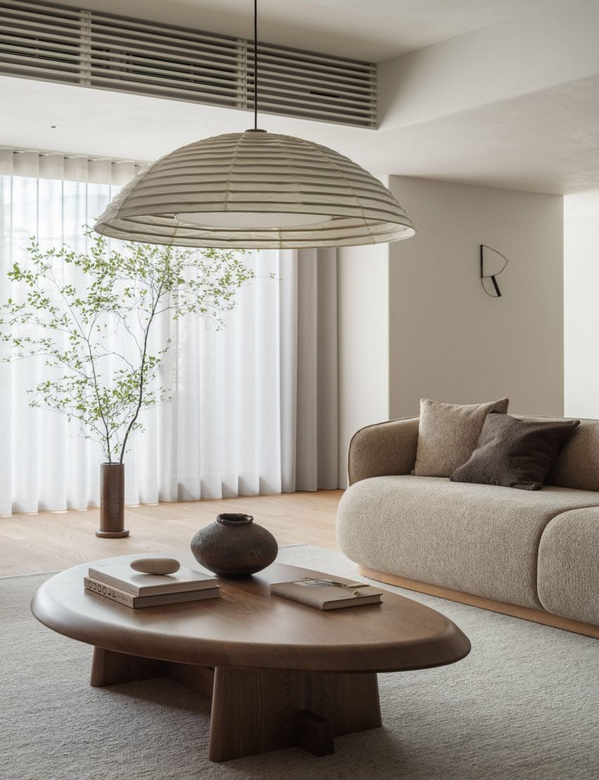
Living space interior of Azabu Hills Residence in JapanLiving space interior of Azabu Hills Residence in Japan
The apartment features furniture made from zelkova wood

“We sympathized with the story of how zelkova used to be a common material in Japan, but is now being chipped and discarded, and wished to explore the possibilities of zelkova through this project,” lead designer Keiji Ashizawa told Dezeen.

“When I first saw the sample of it, I felt that its gentle reddish hue, along with its story, was a good match for the project,” he continued.

“We decided to create the interior using zelkova that would come in harmony with the gentle light from the north side.”
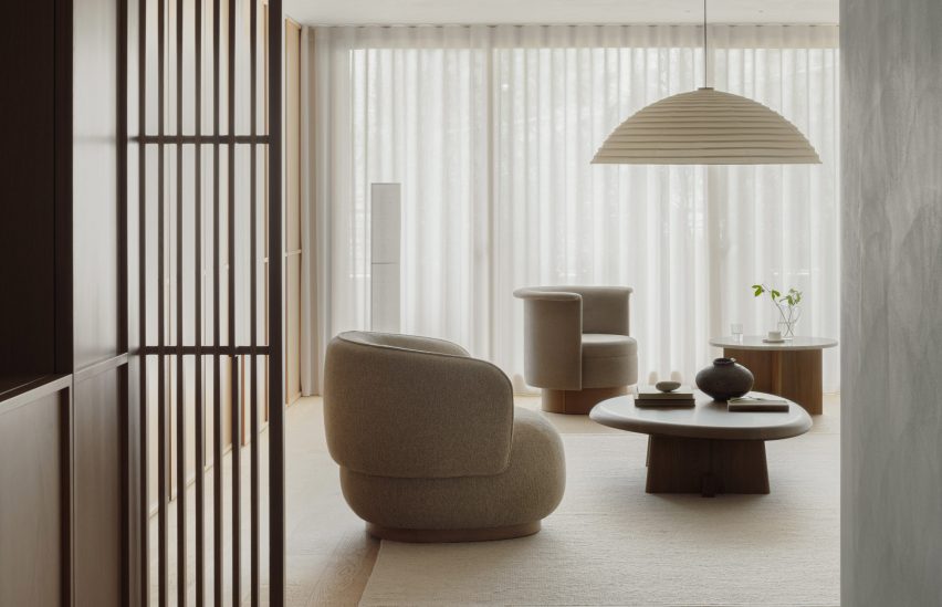
View into living space of Tokyo residence by Karimoku CaseView into living space of Tokyo residence by Karimoku Case
A neutral material palette creates a “calm and serene atmosphere”

The 226-metre-square apartment was centred around a spacious, open-plan living area and dining room illuminated by floor-to-ceiling windows.

A small workspace nestled behind a wall in the living space makes use of the spacious interior, and is furnished with a desk, chair and shelving made from zelkova wood.
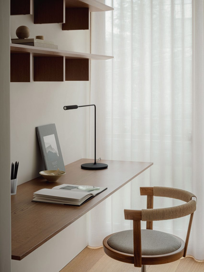
Desk space within Azabu Hills Residence in TokyoDesk space within Azabu Hills Residence in Tokyo
White plaster walls and wooden floors define the living spaces

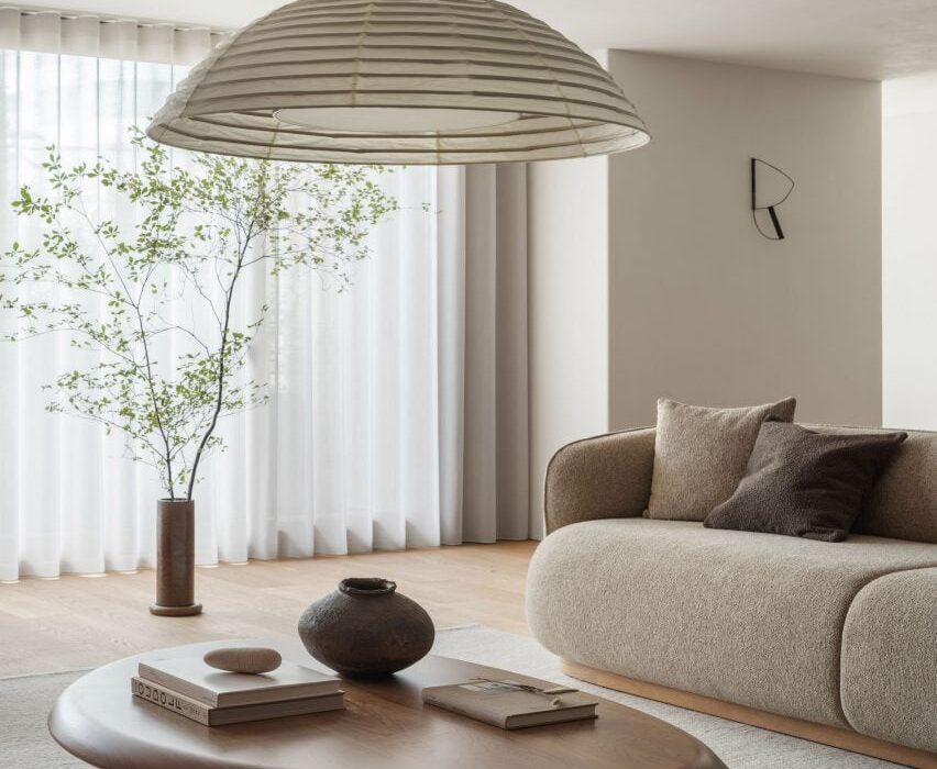
The minimalist interior is defined by textured white walls and wood used for flooring, window frames and fittings, which are tied together by cream furnishings, paper lighting fixtures and decorative artwork.

In the living space, lattice wooden screens were used to separate programmes as well as provide cross ventilation through the space to create airy interiors.

“With the residence being located in the middle of a large city like Tokyo, it was important to have a home-like atmosphere that makes you feel at ease,” Ashizawa said.

“We were conscious of the calmness and tranquility needed to achieve this, and designed the interior with well-curated furniture, lighting, and art to create an environment for this purpose.”
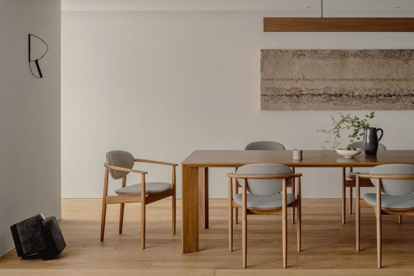
Minimalist dining space in Azabu Hills Residence in TokyoMinimalist dining space in Azabu Hills Residence in Tokyo
Wooden, lattice screens allow ventilation through the home

A counter made from zelkova wood divides the living space and adjacent kitchen, while also serving as an additional seating and dining space.

Within the kitchen, cabinets built from gridded wooden frames were finished with concrete countertops, complemented by tiled terrazzo flooring that also features in the home’s entryway.
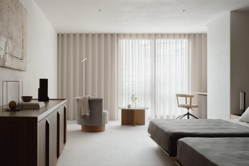
Bedroom interior of Tokyo apartment by Karimoku CaseBedroom interior of Tokyo apartment by Karimoku Case
Furnishings, paper lighting fixtures and pieces of artwork tie the interior together

Gridded wooden frames are repeated for both storage in the living area and a wall in the main bedroom where the home transitions into a cosy-feel with carpet flooring.

A circular chair and marbled table sit in front of the bedroom’s floor-to-ceiling windows, with a study desk nestled into the corner.
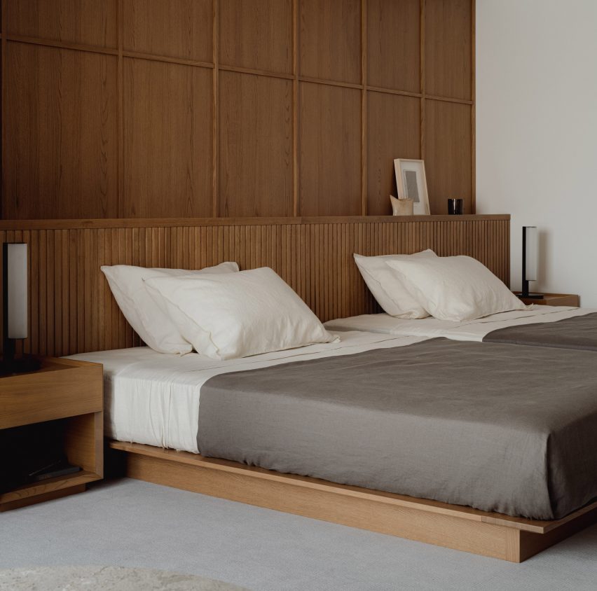
Bedroom interior of minimalist apartment Tokyo by Karimoku CaseBedroom interior of minimalist apartment Tokyo by Karimoku Case
Gridded wooden frames feature in the kitchen, living space and bedroom

Other recently completed projects with minimalist interiors include a dental clinic in Montreal designed to feel like “someone’s home” and a London pub converted into a pared-back jewellery showroom.

The photography is by Tomooki Kengaku


Project credits:

Architect: Keiji Ashizawa Design
Project architect: Keiji Ashizawa / Ryota Maruyama
Client: reBITA / NTT Urban Development Coperation Tokyo
Construction: Tamarix
Furniture collaboration: Norm Architects
Furniture:
Karimoku Case
Lighting: Kojima Shoten / Saito Shomei
Lighting plan: AURORA / Yoshiki Ichikawa
Interior styling: Yumi Nakata

Reference

Halleroed references Swedish Grace for Toteme flagship store
CategoriesInterior Design

Halleroed references Swedish Grace for Toteme flagship store

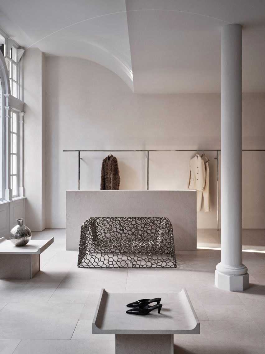
Stockholm studio Halleroed has designed fashion brand Toteme’s flagship store in London, which features a sculpture by artist Carl Milles and a steel sofa by designer Marc Newson.

Halleroed designed the store, located on Mount Street in the upmarket Mayfair area, together with Toteme founders Elin Kling and Karl Lindman. The duo wanted its third flagship to feature nods to the brand’s heritage.

“We like the idea of keeping certain elements that we find in our Swedish heritage,” Lindman told Dezeen at the store’s launch event.

“It can be by using certain vintage pieces, or like in [the brand’s Mercer Street store] in New York, we had a collaboration with Svenskt Tenn,” he added. “It’s about lifting this notion of Scandinavian design or Swedish design.”

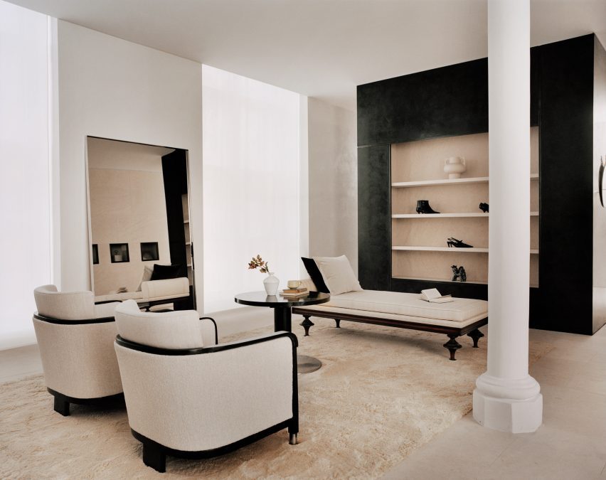
Interior of Totême store in LondonInterior of Totême store in London
A metal sofa by Marc Newson is among the sculptural details in the store

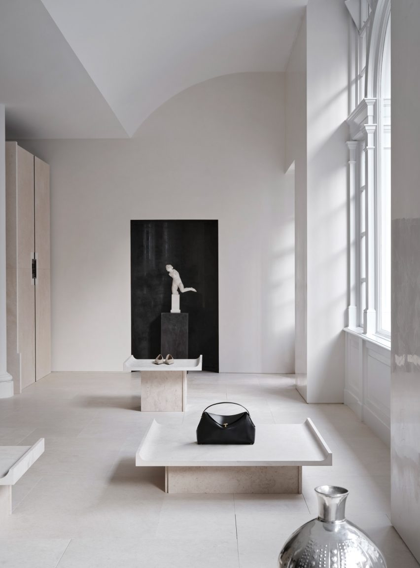
Halleroed drew on the space itself when designing the interior, focussing on how the light falls.

“We were inspired by the space itself with beautiful original windows letting the daylight in,” Halleored co-founder Ruxandra Halleroed told Dezeen.

“The upper part of the windows was partly hidden, which was a shame, so we redesigned the ceiling with a half vault towards the front to show the full height of the windows.”

Totême London storeTotême London store
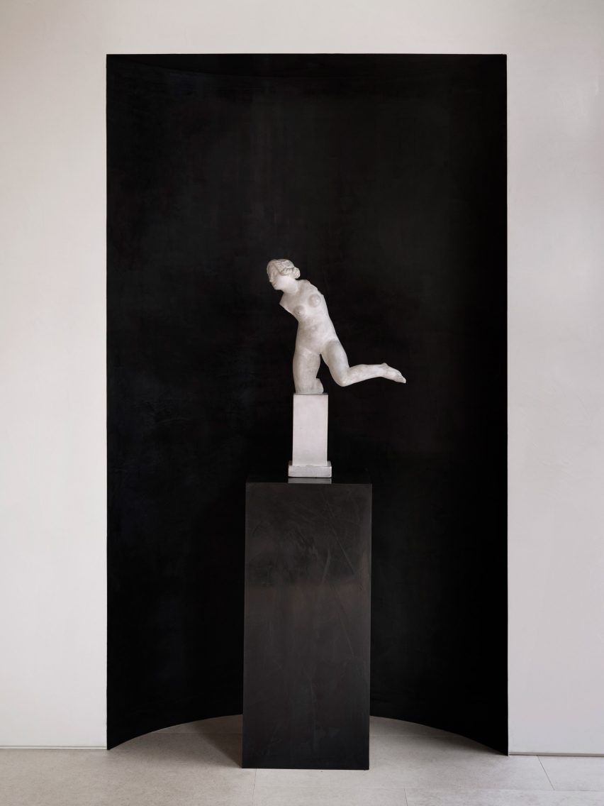
A piece by sculptor Carl Milles sits by the entrance

The design also references the work of Italian architect Carlo Scarpa as well as the Swedish Grace movement.

“We were also inspired by the Swedish Grace period – around 1920-30s – that has an elegant and pure design, something we think works well for Toteme as a brand,” Halleroed co-founder Christian Halleroed told Dezeen.

“Also the work of Carlo Scarpa we find interesting, more as a mindset on how to work with details and textures to create a subtle elegance and luxury.”

Cube inside fashion store in MayfairCube inside fashion store in Mayfair
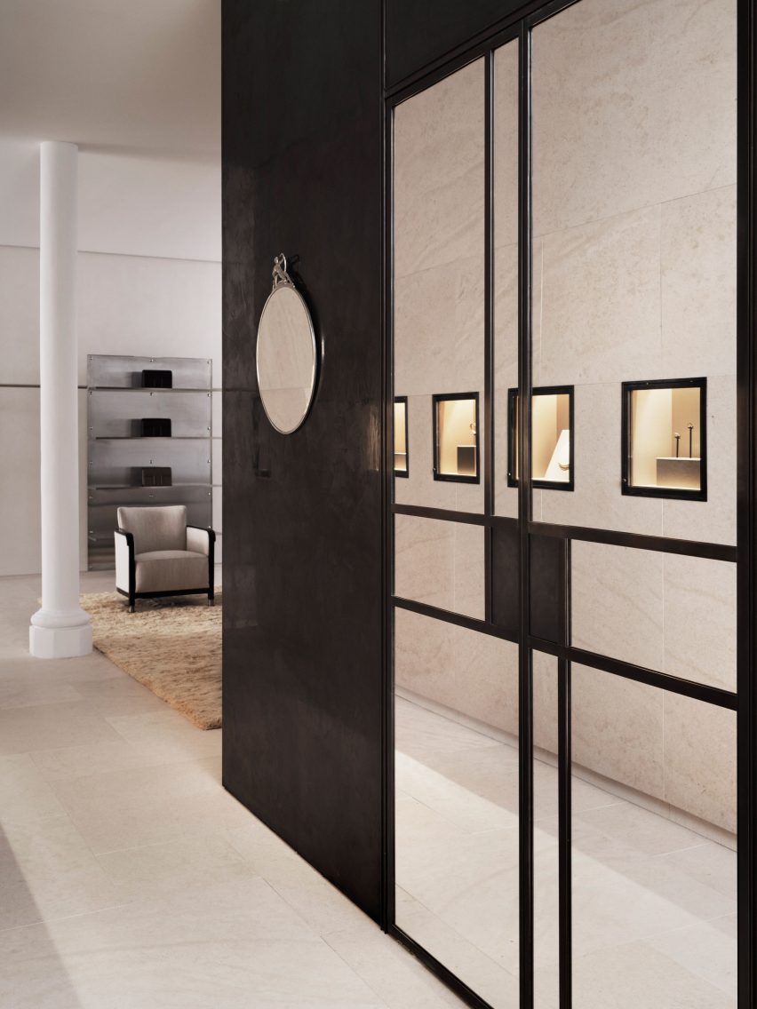
A black mirrored cube features at the rear of the store

Kling and Lindman wanted to keep the feel of “very posh” Mount Street where the store is located, while also underlining the space’s minimalist feel.

To do so, a lot of effort was put into the colour palette and different textured materials used for the flagship store.

“We worked with an off-white palette in different tones and different textures,” Ruxandra Halleroed said.

“The textures are as important as colour and materials. For walls, we have a glossy, off-white stucco, ceiling in same colour but matte. The floor is in a beige, honed limestone with a so-called Opus pattern.”

Milles sculpture inside Totême storeMilles sculpture inside Totême store
Halleroed chose to redesign the store’s ceiling to reveal its windows

In the middle of the Toteme shop, Halleroed created a stone-clad cube that holds shelves, vitrines and niches filled with artworks.

“The volume in the middle is clad with the same limestone, but in three different textures: honed, bush hammered and spiked texture, combined with oxidised dark brass,” Christian Halleroed said.

The store also features a square black volume in the back made from high-gloss stucco and dark brass.

Beige and white interior of London fashion storeBeige and white interior of London fashion store
The minimalist interior has a beige, white and black colour palette

To contrast the minimalist interior, the store is decorated with multiple artworks, including a sculpture by Milles and Newson’s intricately woven steel Random Pak Twin sofa, which Lindman found online.

“He’s a slave to auction houses,” Kling told Dezeen.

“So he found it and sent it to me and I loved it, and we also have a Marc Newsom piece in every store,” she added. “So we thought, ‘this one’s for the Mount Street store’. At that time we only had the signed contract, nothing else.”

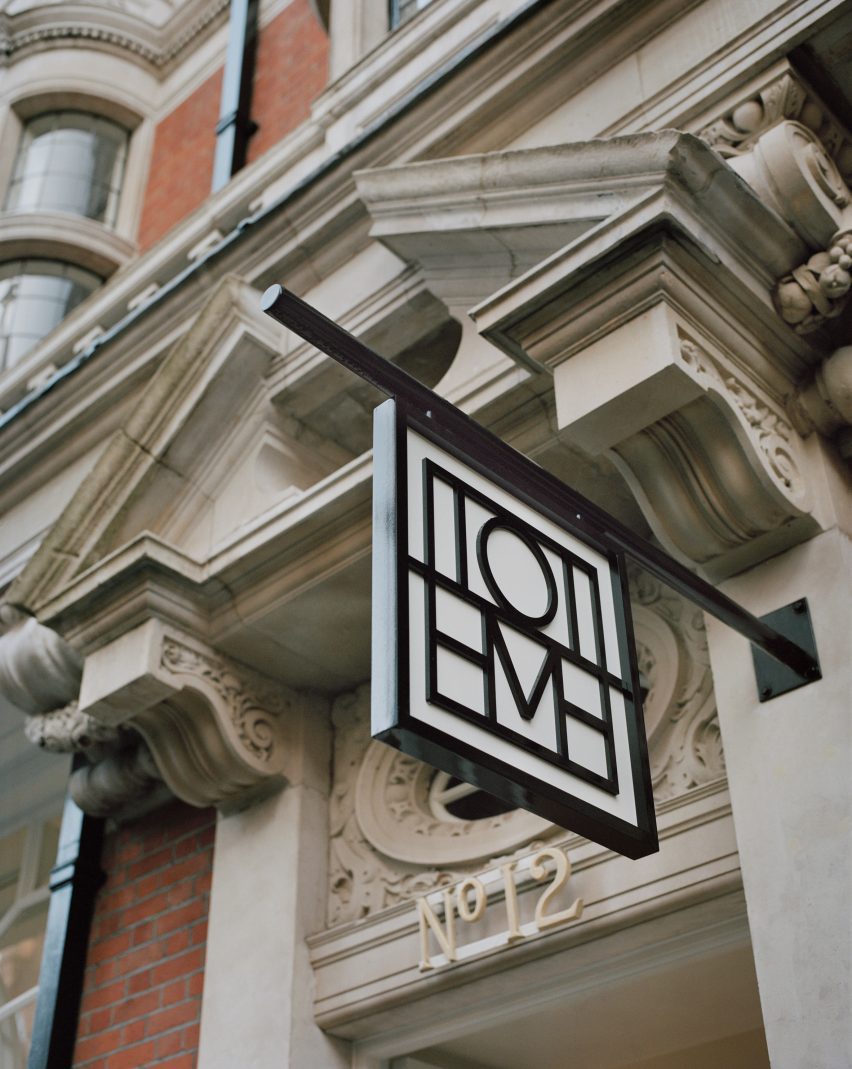
Sign outside Mount Street storeSign outside Mount Street store
The store is located on Mount Street in central London

The two founders and Halleroed decided on the gypsum Milles sculpture for the Toteme store together, with Halleroed designing a custom niche to place it in that is made from black high-gloss stucco to contrast the pale artwork.

Halleroed also added vintage Swedish Grace furniture to the store, including armchairs and a coffee table by furniture designer Otto Schulz, a daybed and a mirror in pewter made for the Stockholm Exhibition 1930.

The studio has designed a number of other store interiors, including a Paris boutique for French brand L/Uniform and an Acne Studios store in Chengdu that aimed to combine the futuristic and primitive.

Reference

Cake Architecture draws on Bauhaus principles for Hoxton bar
CategoriesInterior Design

Cake Architecture draws on Bauhaus principles for Hoxton bar

Cake Architecture has renovated A Bar with Shapes for a Name, an east London cocktail bar featuring “utilitarian” interiors.

A Bar with Shapes for a Name owes its title to the yellow triangle, red square and blue circle that are emblazoned on its facade in a nod to the primary colours and understated geometry commonly associated with the Bauhaus.

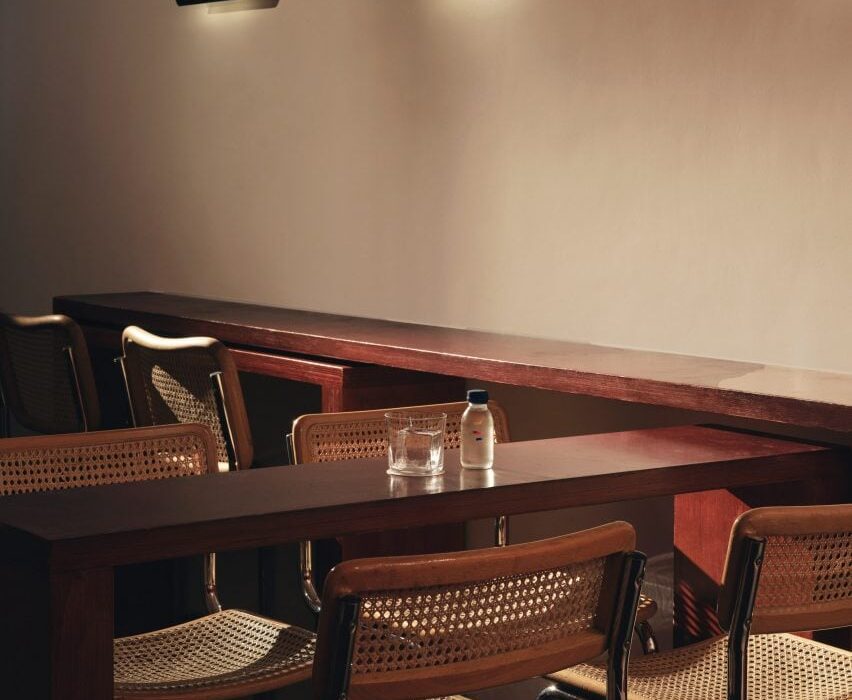
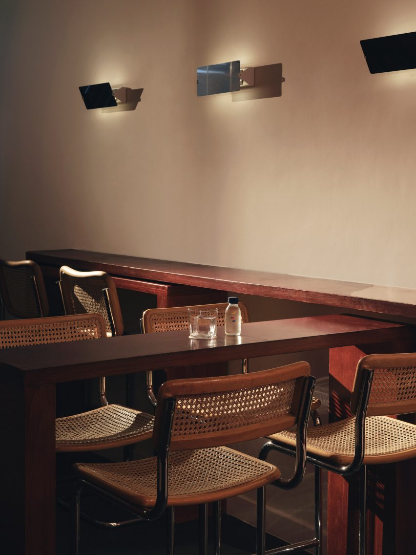
Tall tubular chairs at A Bar with Shapes for a Name by Cake ArchitectureTall tubular chairs at A Bar with Shapes for a Name by Cake Architecture
Tall tubular chairs feature on the ground floor

When creating the bar’s minimalist interiors, Dalston-based Cake Architecture took cues from the influential German art and design school that was established in 1919 and advocated for an emphasis on functionality, among other similar principles.

Located at 232 Kingsland Road in Hoxton, the cocktail bar was renovated by the studio to serve as a multipurpose venue.

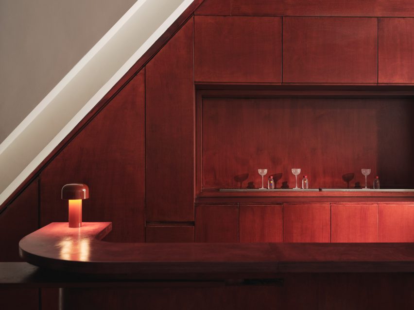
Reddish plywood barReddish plywood bar
Cake Architecture created a smooth ground-floor bar from reddish plywood

Cake Architecture doubled the bar’s capacity by adding a basement, which acts as a “kitchen-bar” room, and refurbished the ground floor’s existing seating area as well as a classroom-style space that offers a location for rotating events or workshops.

“These spaces have specific functional requirements and we selected colours and materials to suit,” studio director Hugh Scott Moncrieff told Dezeen.

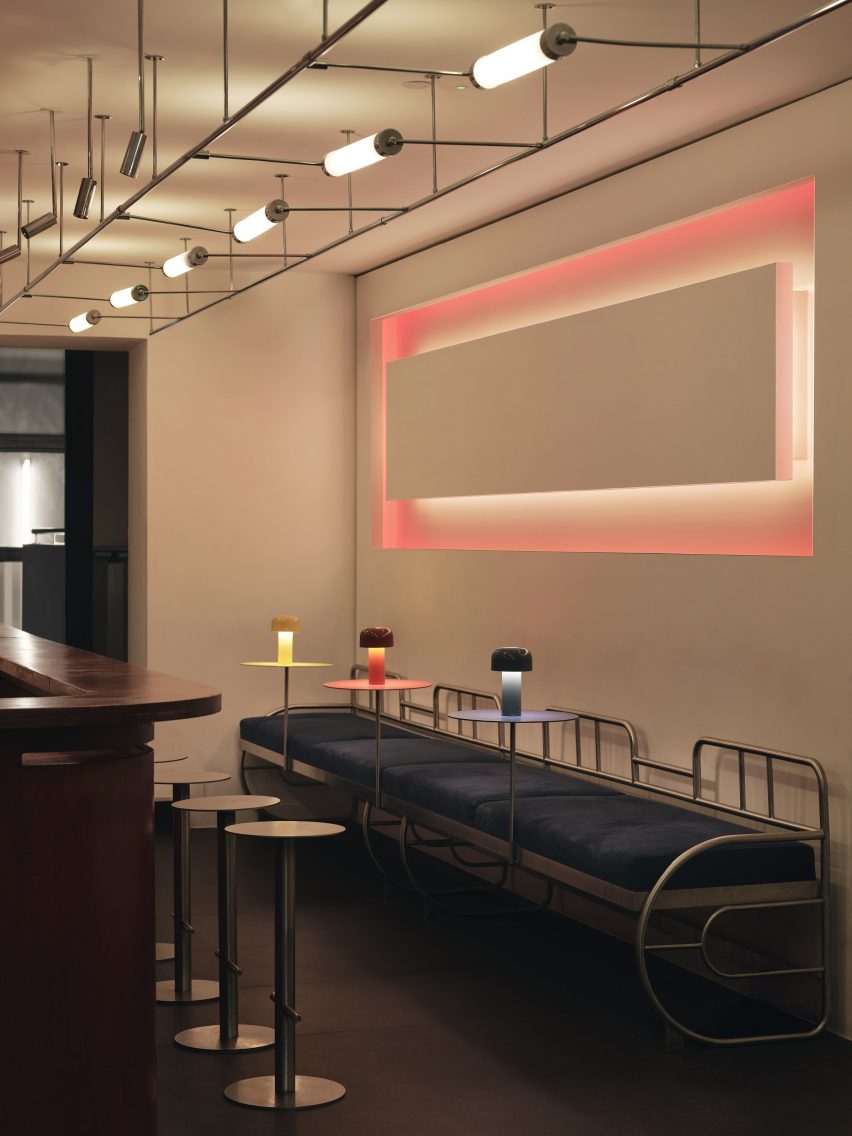
Rectilinear light installation within bar by Cake ArchitectureRectilinear light installation within bar by Cake Architecture
It was positioned opposite a rectilinear light installation

Upon entering the bar, visitors are greeted by the main seating area or “showroom”, which was designed to be warm and inviting.

Tall tubular chairs finished with neutral rattan were positioned around chunky geometric tables made from birch ply stained to a rich, reddish-brown hue.

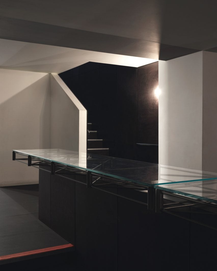
Glass-topped central table in the basementGlass-topped central table in the basement
The renovation included the addition of a new basement

The team also used the same timber to create the space’s curving bar, which is illuminated by a squat, cordless table lamp by lighting brand Flos.

Opposite the bar, a glowing rectilinear light installation by photographer Steve Braiden was fitted to the wall underneath bench-style seating reminiscent of early Bauhaus furniture designs.

Close-up of the steel, glass-topped tableClose-up of the steel, glass-topped table
A steel, glass-topped table sets an industrial tone

“We looked in particular at projects by the Bauhaus founder Walter Gropius,” reflected Scott Moncrieff.

“Gropius is a master of this elegant zoning through the application of colour and form,” he added.

Steel-framed tables in the classroomSteel-framed tables in the classroom
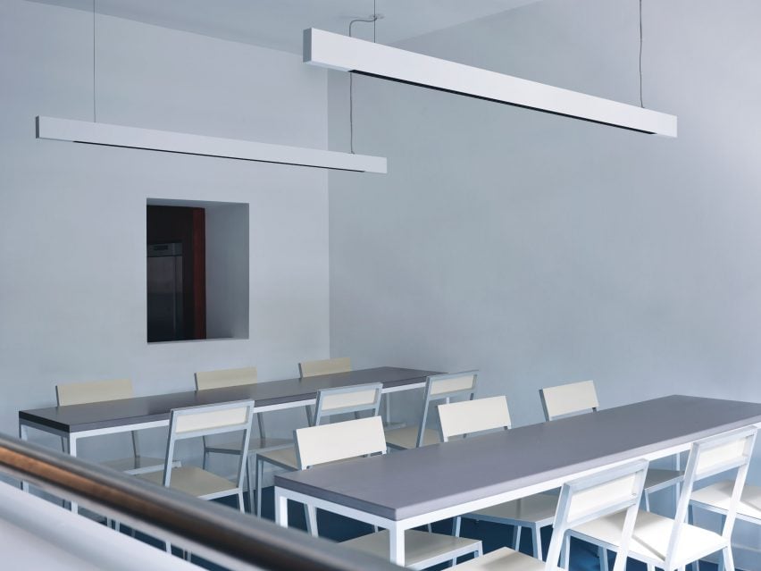
The “classroom” includes steel-framed tables

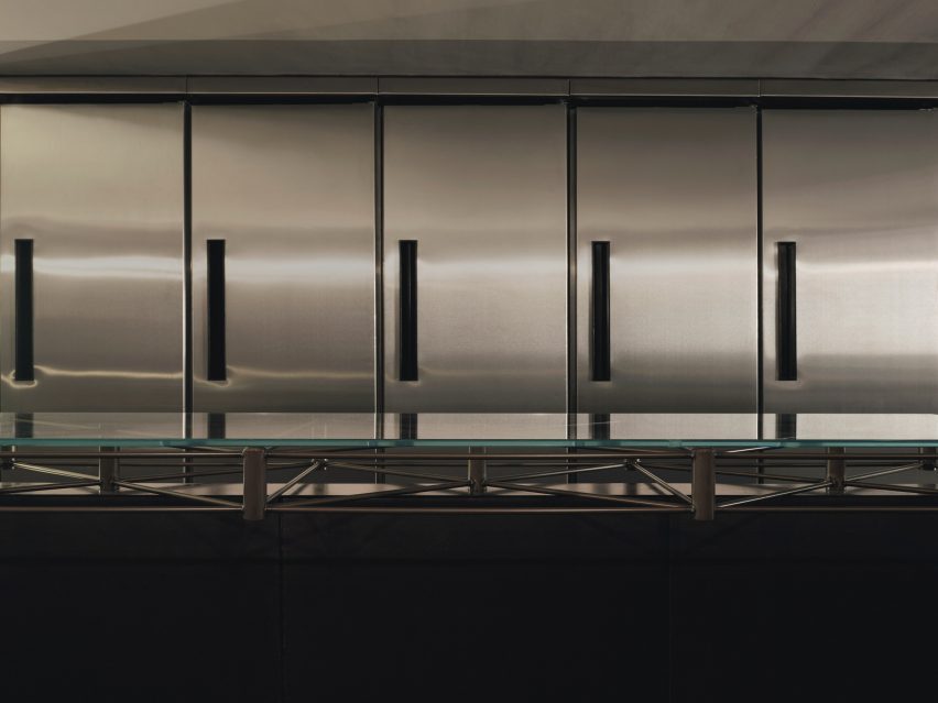
Downstairs, the low-lit basement was created to house additional seating as well as “all of the crazy machinery they use to prepare the drinks,” the designer said.

The basement is characterised by a bespoke central table by Cake Architecture and furniture designer Eddie Olin.

Sculptural, colourful lampSculptural, colourful lamp
Red, yellow and blue accents define a sculptural lamp

Consisting of a steel frame that “floats” over a central leg, the table was topped with a glass surface and its base was clad in phenolic-coated plywood to match the floor and walls.

“This new basement is predominantly a production space – so the palette reflects this with hardwearing, utilitarian and industrial materials,” said Scott Moncrieff.

A thick, felt curtain in ultramarine adds a pop of colour to the otherwise pared-back space.

With its pale blue walls and Valchromat-topped, steel-framed tables, the ground-floor “classroom” pays homage to the Bauhaus as an educational institution.

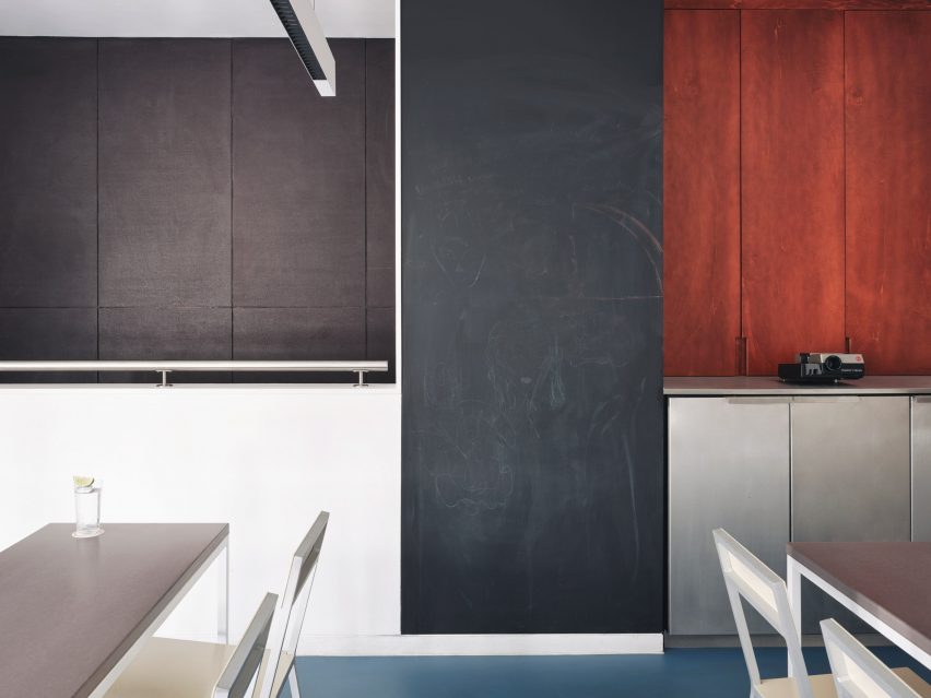
Tall blackboard in the classroomTall blackboard in the classroom
A tall blackboard provides space to learn in the classroom

Brighter blue vinyl covers the floors while a sculptural lamp featuring red, yellow and blue circles echoes the bar’s logo.

A tall blackboard and overhead strip lighting add to the classroom feel of the space, which is used for various group events.

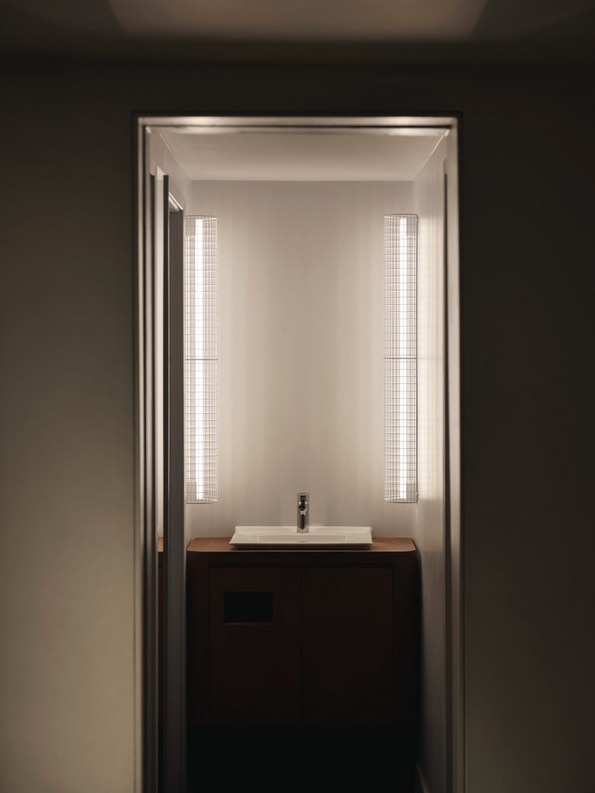
Illuminated bathroom sinkIlluminated bathroom sink
Thin vertical lights frame the bathroom sink

Cake Architecture worked closely with the bar’s founders Remy Savage and Paul Lougrat when creating the interiors, which were primarily informed by the duo’s way of working.

“The team has a conceptually driven ethos drawn from the theory and practice of Bauhaus embedded in everything they are doing. We found that incredibly exciting,” explained Scott Moncrieff.

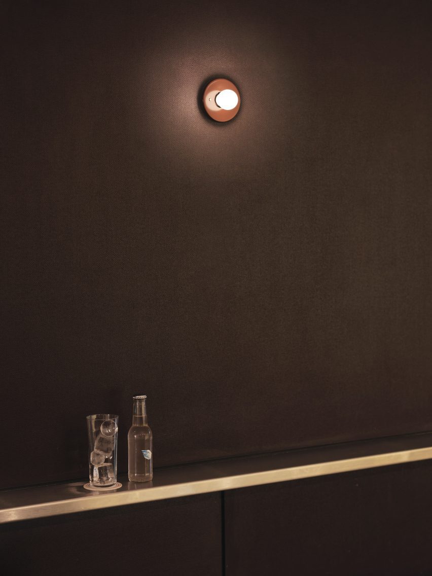
Sconce lighting on the wallSconce lighting on the wall
A Bar with Shapes for a Name is located on London’s Kingsland Road

“The Bauhaus phrase ‘party, work, play’ was pertinent to some early ideas and this carried through all our design discussions,” noted the designer.

“The space enables these three things. Separately as individual functions and simultaneously as a representation of the overall atmosphere of a bar!”

Cake Architecture previously worked with interior designer Max Radford to create a curtain-wrapped speakeasy in London’s Soho. The studio also designed a workspace for London agency Ask Us For Ideas in the same part of the city.

The photography is by Felix Speller


Reference