Atelier 9.81 models Calais port tower on stack of pebbles
CategoriesArchitecture

Atelier 9.81 models Calais port tower on stack of pebbles

French architecture studio Atelier 9.81 has designed a tower of staggered concrete blocks for a harbour master’s office and lookout building on the Calais coastline.

Forming part of the Calais Port 2015 expansion plan, the 38-metre-tall tower comprises four stacked white-concrete boxes with decorative surfaces.

The blocks are designed by Atelier 9.81 to resemble balancing pebbles and visually separate the functions of spaces inside.

Concrete Calais port lookout office tower by Atelier 9.81
The staggered concrete boxes feature patterned surfaces

Situated at the junction between the existing port and its planned extension, the building is intended as a distinctive entry point to Calais that is visible from the sea, surrounding beaches and the nearby city.

“We have opted for a visual fragmentation of the program,” Atelier 9.81 associate architect Cédric Michel told Dezeen.

“Like pebbles balanced on top of each other, this work is erected by accumulation, by stratification of stories contained in simple geometric shapes.”
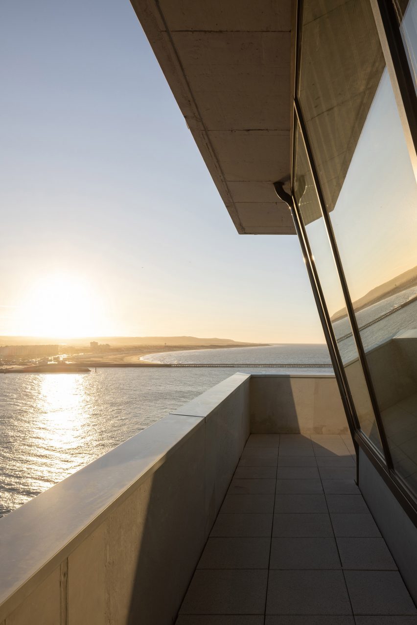
View from the lookout tower at Calais' harbour master's office
It forms part of the Calais port’s wider expansion

The harbour master’s office is built in white concrete to withstand harsh coastal weather and cement the image of a cairn – a man-made pile of stones.

“From this idea of ​​the cairn, it seemed important to us to use only one material,” explained Michel. “Also, with the extreme climatic conditions of the coast, the question of sustainability played a role in our choice.”

The base of the building is a square four-storey volume that was cast in situ. It contains offices, meeting rooms, a control station for locks and movable bridges, and a roof terrace.

Prefabricated concrete was used to construct the rest of the tower, including the central structural core.
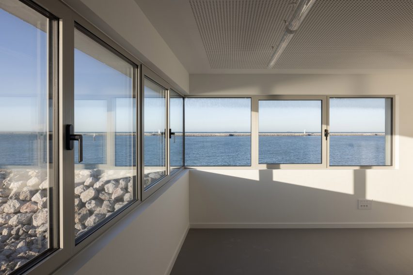
View of the sea from inside Calais' harbour master's office by Atelier 9.81
The base volume was cast in situ

The middle two volumes in the tower act as a structural void, clad in the precast concrete panels.

These panels feature light bas-relief, including crossing lines and a sandblasted geometric pattern depicting the Strait of Dover, or the Pas de Calais in French, which is the narrow water passage separating England and France.
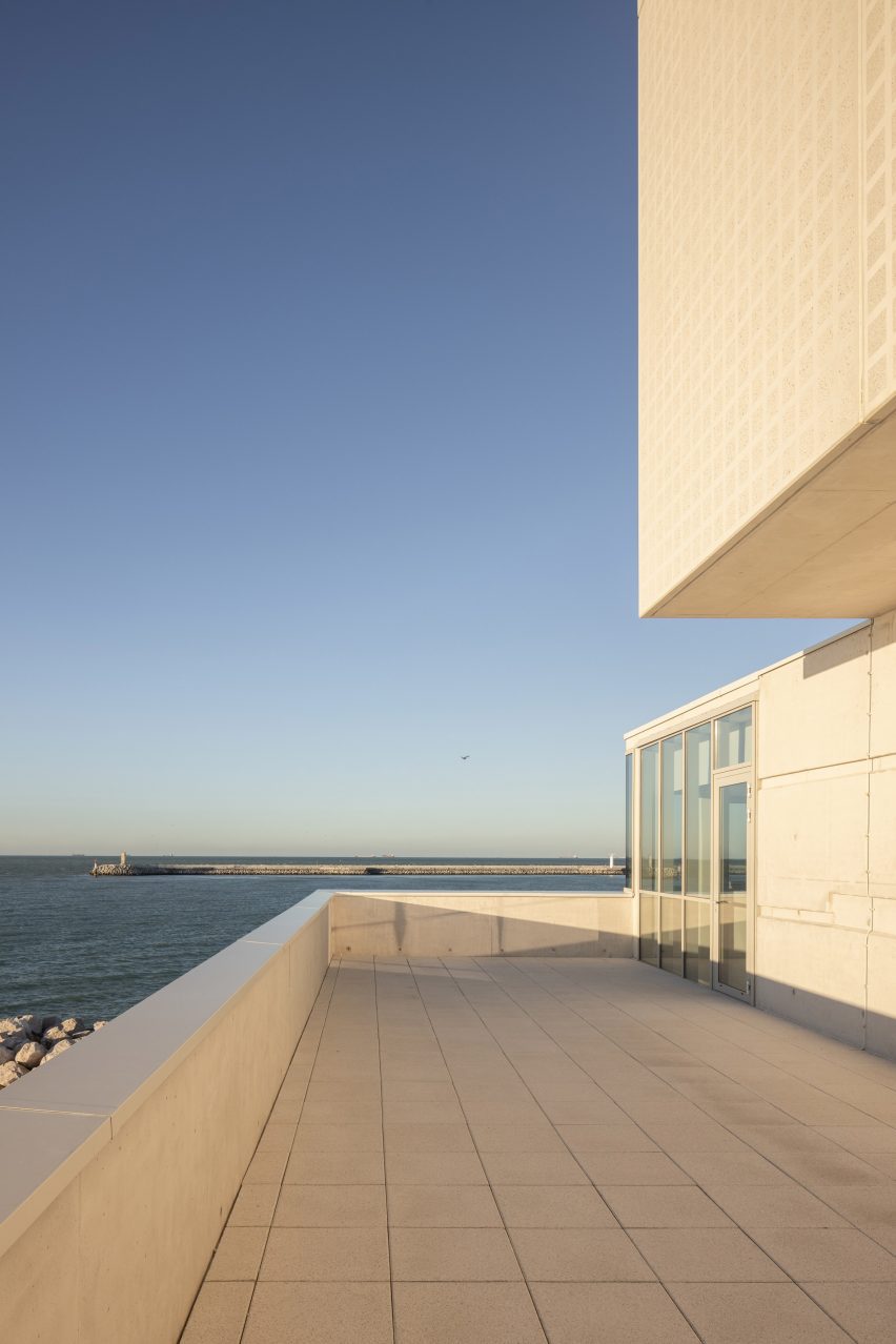
View of the sea from the terrace at Calais' harbour master's office by Atelier 9.81
Terraces overlook the port

Concrete cladding stamped with circular patterns wraps the volume at the top of the building, which contains the facilities and equipment for monitoring and managing the port.

This two-level volume has breakout space and living quarters on the lower section, and a glazed lookout with an outdoor panoramic terrace on the upper level.

Other concrete buildings with boxy silhouettes featured on Dezeen include a power station control centre in Austria and an apartment block in Tokyo that staggers to create a series of terraces.

The photography is by Nicolas da Silva Lucas.

Reference

On models London trainer store on “shoppable science museum”
CategoriesInterior Design

On models London trainer store on “shoppable science museum”

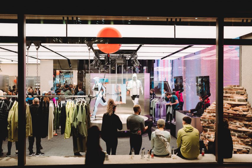
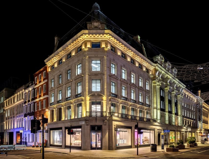
Swiss brand On has opened its first UK shop on London’s Regent Street, complete with steel fixtures and a robotic arm.

For its debut outpost in the United Kingdom, On aimed to showcase the science and technology behind its running shoes and clothing.

Sportswear shop on London's Regents Street
On has opened a trainer store on London’s Regent Street

“Our concept was a shoppable science museum in the sense that one of the main things we want to share is that what we do is science-based,” said On’s head of brand environments Nicholas Martin.

It is performance-run culture that is infused into everything we do.”

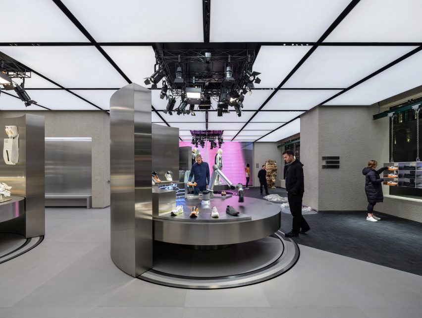
The store’s ground floor is defined by three circular steel tables, used to display the brand’s latest products.

Stainless steel table in On's trainer store
The store contains three circular steel tables

Each of the tables, which can be raised and lowered, is surrounded by a curved steel wall that can be rotated to create a variety of layouts within the store.

The table at the store’s entrance also holds a robotic arm that mimics the action of running to showcase On’s running shoes.

Stainless steel shoe cabinets are located on the upper floor
The upper floor houses steel shoe cabinets

“The first thing you actually see is our robotic arm,” Martin told Dezeen. “We want people to touch and explore. So you kind of get to see the movement.”

“And then we also try to add different layers of storytelling,” he continued. “So you can compare the different shoes.”

Steel trainer cabinet known as the magic wall
On describes the cabinets as a “magic wall”

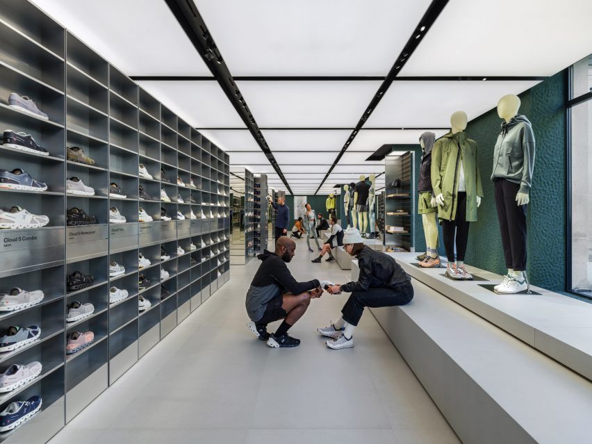
The first floor is defined by a pair of steel cabinets, described by On as a “magic wall” that runs the length of the store.

It contains all of On’s products in all available sizes so that customers can instantly try on trainers.

“Our goal was to revolutionise the way shoe try-ons happen,” said Martin. “At our stores, we let the product speak for itself. Our technology is something you feel once you put a product on.”

Contrasting the steel fixtures, the store’s walls were finished in natural clay sourced from Cornwall, which was applied by hand.

On the ground floor and in the basement-level event space, the walls are painted in a muted shade of grey while on the upper floors, they are finished in green.

On shoes in metal cabinets
The cabinets contain all sizes of On’s shoes

“Swiss engineering means for us loving technology and the natural world,” said Martin. “Technology makes the store look sleek, nature helps us to give the store a more imperfect and warmer look.”

“The store green is a nod to the legendary British racing green – a colour culturally saturated in movement, speed and engineering,” he continued.

On's store on Regents Street
The store is On’s first in the UK

Founded in 2010, On is known for its lightweight running shoes and is reportedly the fastest-growing running brand worldwide. Its stores form part of On’s wider efforts to build its brand internationally.

“They offer a space for our fans, community and new customers to explore and get to know the brand,” said Martin. “We see the store as a media channel that connects our fans with the brand.”

On previously created a reflective mountain cabin in the Swiss Alps to mark the launch of its first hiking shoe.

All photography courtesy of On.

Reference

Universal Design Studio models Biotherm’s Monaco concept store on a lab
CategoriesInterior Design

Universal Design Studio models Biotherm’s Monaco concept store on a lab

The visual language of scientific laboratories informed the look of this blue-lit concept store in Monaco, which London firm Universal Design Studio has devised for skincare brand Biotherm.

Set inside Monaco’s historic Oceanographic Institute, Blue Beauty Lab is where buyers and other industry insiders can come to expand their knowledge of the science underpinning Biotherm‘s skincare line.

Biotherm concept store in Monaco has blue interiors with science lab-inspired details
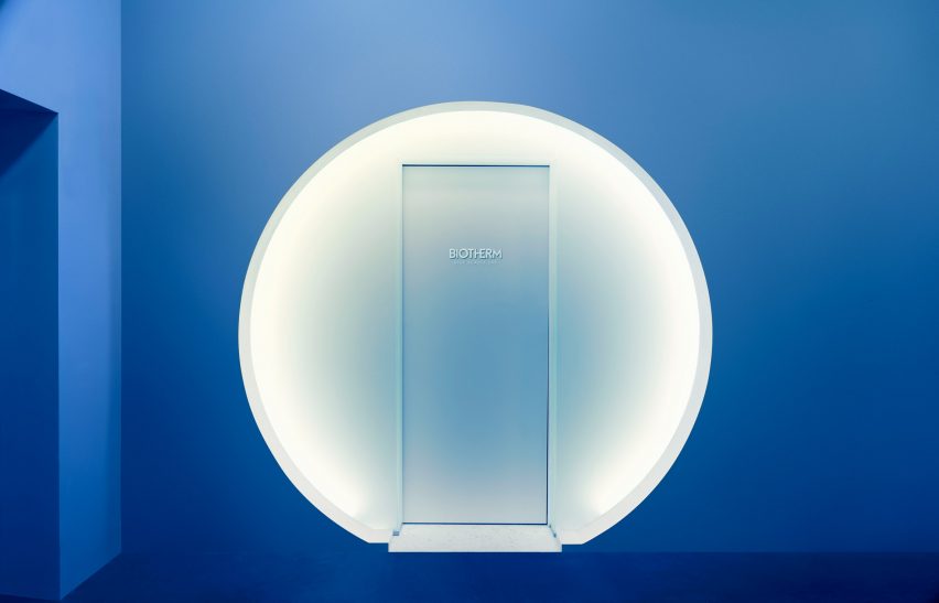
Visitors enter the Blue Beauty Lab via a circular doorway

Although the 30-square-metre concept store showcases a selection of the brand’s products, none of them are for sale. Instead, visitors can fully immerse themselves in the experience of being in the “lab”.

“Brands are increasingly looking to physical presence for means above and beyond selling products,” explained Satoshi Isono, creative director at Universal Design Studio.

“They’re harnessing spaces to storytell their core brand messaging in unique ways and ultimately connect with customers in a more impactful way.”

Biotherm concept store in Monaco has blue interiors with science lab-inspired details
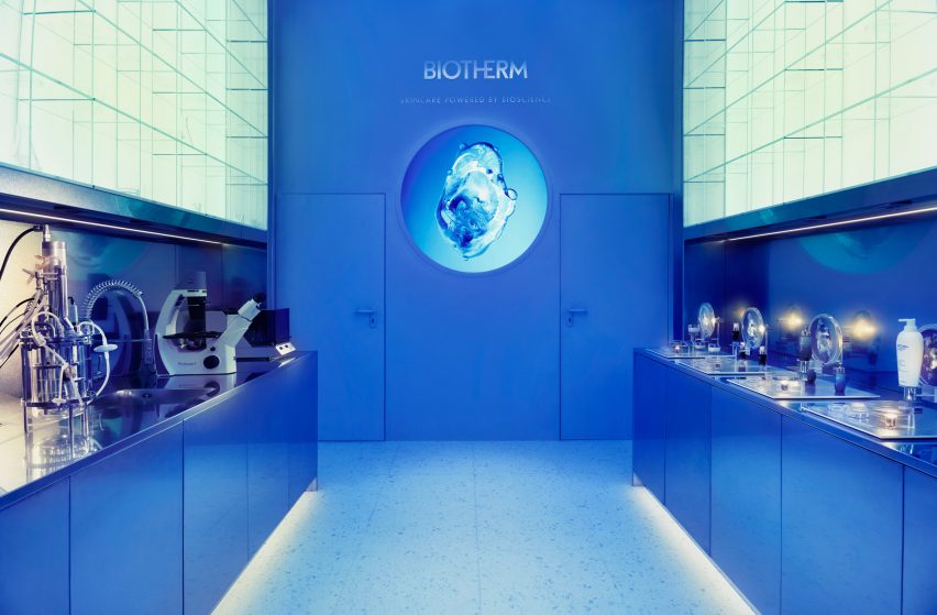
The first section of the store is set up like a science lab

As the outer walls of Blue Beauty Lab back onto water tanks harbouring various aquatic creatures, Universal Design Studio had to keep architectural interventions to a minimum. As a result, the store’s floor plan is fairly simple.

To enter, visitors walk through a circular doorway and a short mirrored tunnel. The interior is washed in sea-blue light and split into two parts.

Biotherm concept store in Monaco has blue interiors with science lab-inspired details
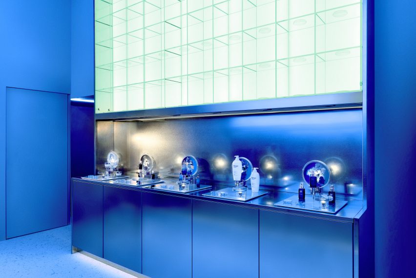
Steel worktops and petri dishes add to the lab-like feel of the space

The first is an area reminiscent of a research lab that gives an insight into the production process of Life Plankton – an extract containing 35 different nutrients that Biotherm incorporates throughout some of its moisturisers, serums and skin peels.

Stainless steel counters and glass shelving units run down the sides of the space, dotted with science paraphernalia like microscopes, petri dishes, test tubes and measuring flasks.

A small workshop forms the second part of the store, centred by a round table. Directly above is a large ring light emitting a bright white glow that enhances the lab-like feel of the space.

Interactive visuals produced by multimedia design studios Superbien and AC3 Studio are projected on the surrounding walls.

Biotherm concept store in Monaco has blue interiors with science lab-inspired details
Measuring flasks and test tubes are also displayed on the shelves

The clinical aesthetic of laboratories has also inspired a number of other interiors.

Among them is a bike shop in Copenhagen by local designer Johannes Torpe and a cafe in Tokyo with a white-lacquered steel ceiling grid.

Reference

Architecture Building Blocks: Placing 3D Models in Photographs
CategoriesArchitecture

Architecture Building Blocks: Placing 3D Models in Photographs

ArchiHacks is an online resource for architects dedicated to architecture visualization, portfolio, and design tips and tricks for students and professionals. This article was written by team member Tommy Minh Nguyen.

With the closure of workshops and in-person meetings, physical models became less effective during the pandemic. Nevertheless, there is a sense of completion and achievement that comes out of having physical models occupy real space. Today’s article will walk you through adding a 3D model into a photograph to fabricate a situation where a digital model can occupy “real” space. Unfortunately, not everyone will be able to utilize this tutorial, but it could still offer an alternative to achieving the same goal! Remember, design will always have more than just one solution.

Here’s what you’ll need:

  • 3D model
  • Rhino + V-ray *You can use any 3D software that supports V-ray
  • Photoshop

Step 1: Align Perspective

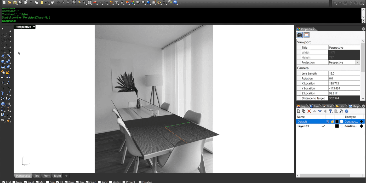
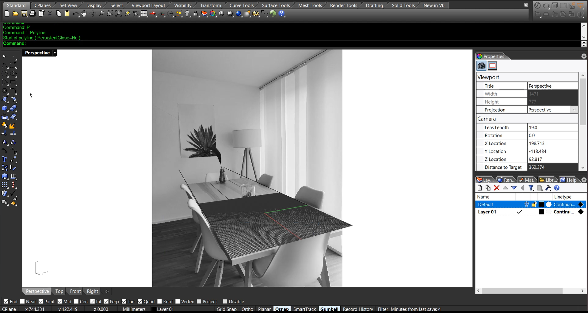
This is possibly the most tricky and frustrating part. Import the image into the background, and take your time to adjust the camera focal length to match perspective with the image. You might benefit from the video demonstration on our YouTube channel.

Step 2: Setup Light and Environment

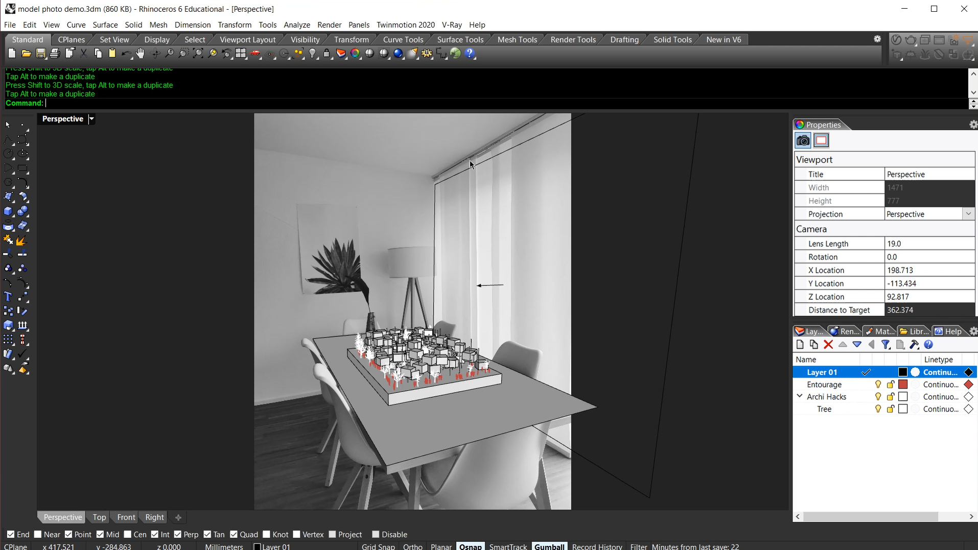
Try to replicate the real-world setup as much as possible, including lighting and other walls in the scene. In our example, we placed a rectangular light to the right side to simulate a diffused light from the window and blinds.

Step 3: Shadow Matte

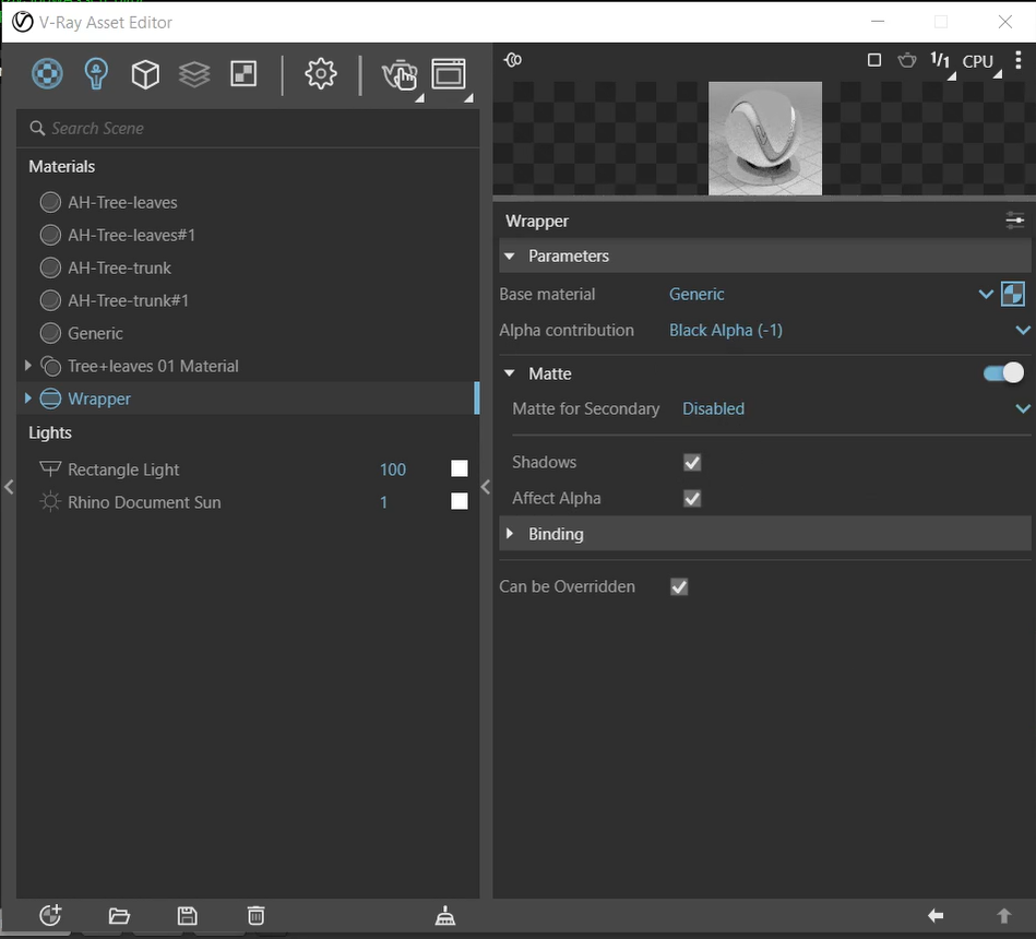
This is the magic material that will help us with the shadows. Create a generic material and a wrapper material. Use the generic material as the base, and use the following settings. Then you can apply the wrapper to the tabletop surface.

Step 4: Render in High Resolution + Save
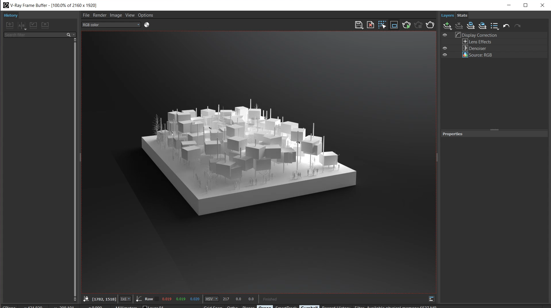
Make sure to save it as a .png file to preserve transparency and shadow!

Step 5. Combine Rendering on Top of the Background Image in Photoshop
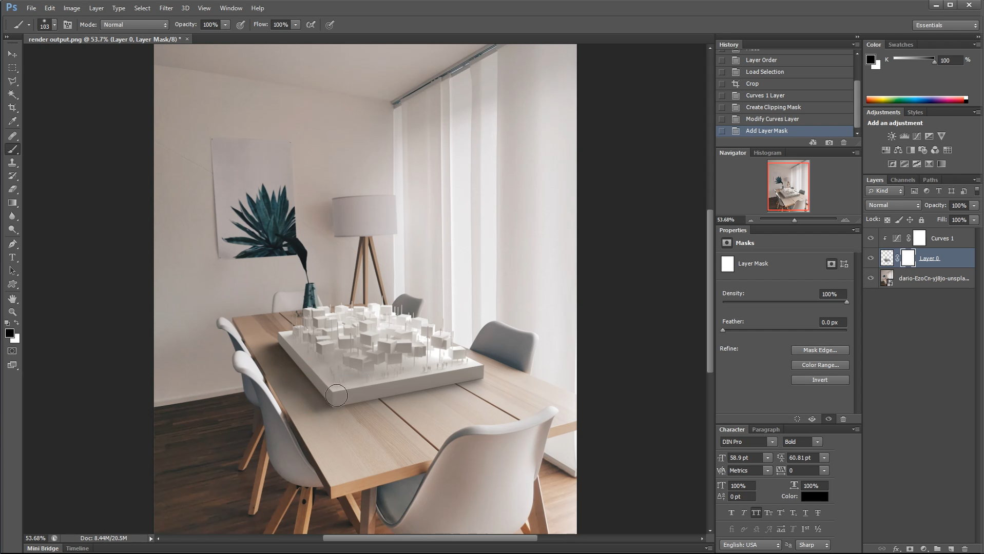
Place the rendering on top of the base image and make adjustments to help it blend in. In our case, we added a bit of color correction.

That’s all we got for today! Let us know how this came out for you and share it with our Instagram page by tagging @archi.hacks and #archihacks! I hope you found this article helpful, and if you have any tips for future students, please let us know in the comments below. Make sure to follow our YouTube and Instagram for more content!

 Send Us a Rendering. Tell Us a Story. Win $2,500! Architizer’s 3rd Annual One Rendering Challenge is open for entries, with a Late Entry Deadline of March 25th, 2022Submit a rendering.


Reference