Contemporary Vaults: 6 Modern Iterations of a Age-Old Architectural Classic
CategoriesArchitecture

Contemporary Vaults: 6 Modern Iterations of a Age-Old Architectural Classic

Architects: Want to have your project featured? Showcase your work through Architizer and sign up for our inspirational newsletter. 

Vaults have existed in architecture for thousands of years. Essentially an extrusion of an arch along an axis, the structural value of the self-supporting form has made it a popular motif across typologies and around the world: from the construction of homes, religious buildings and more. Additionally, arches can be created using a variety of materials such as stone, brick, timber and even bamboo. Some examples of traditional vault forms include smooth barrel vaults, complex groin vaults, pointed arch vaults and decorative rib vaults, among others. These systems not only act as a structural framework but also help elevate plain ceilings. With each innovation in arch-building technology came new aesthetic styles and forms of architectural expression.

Yet, despite their versatility, vaults and domes remain widely associated with more traditional design styles or religious architecture. The projects below break away from the stereotype and show how these time-tested forms can be adapted to suit modern homes and public spaces.


Waffled Spaces
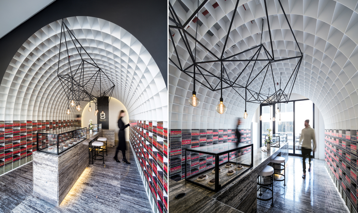
Bean to Bar Chocolatier by STUDIO TOGGLE, Salmiya, Kuwait

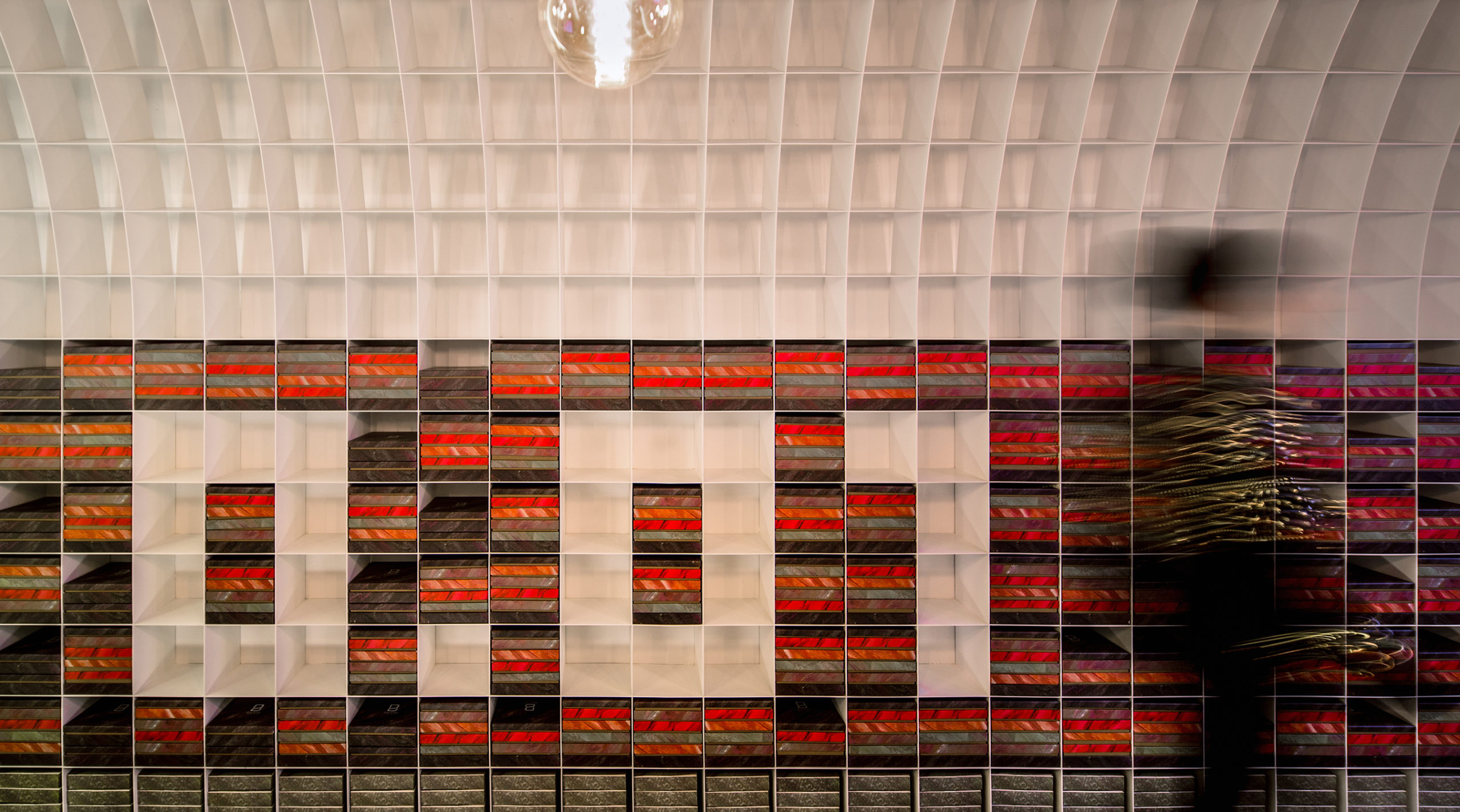
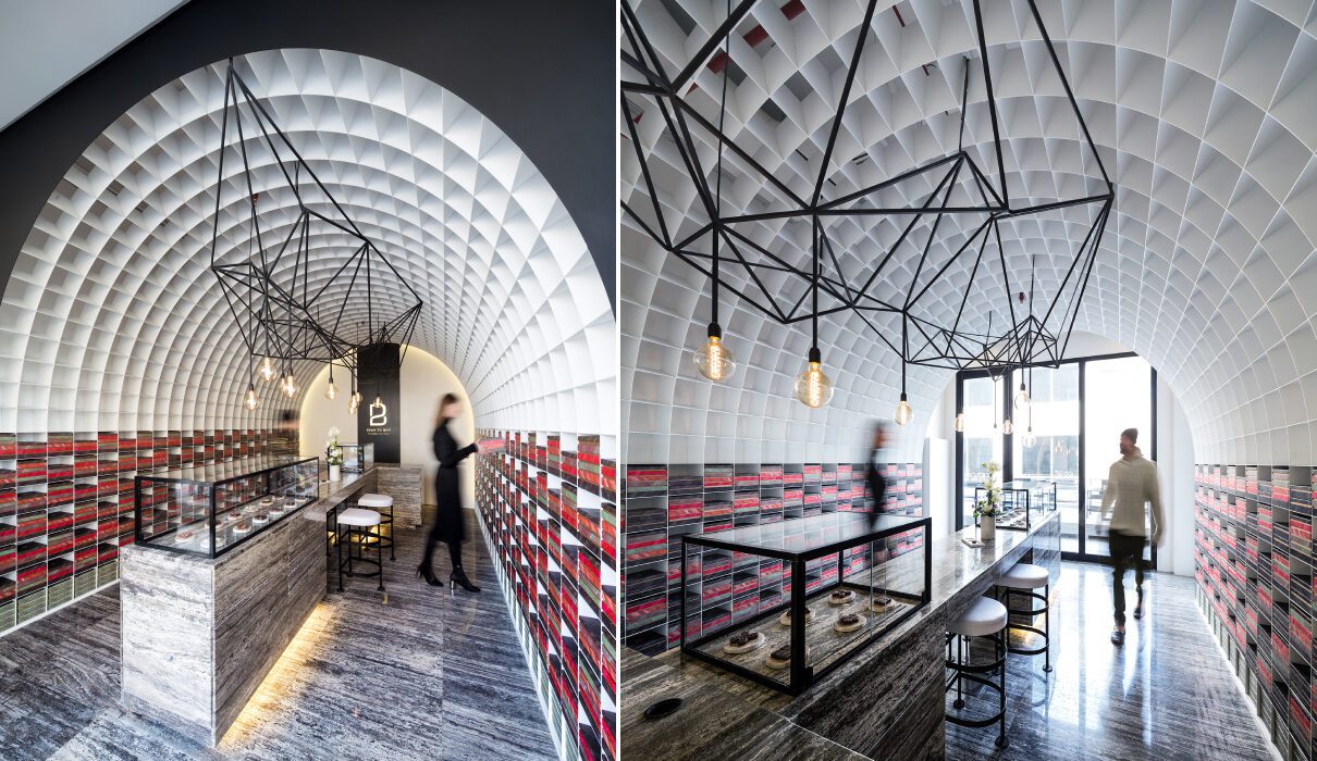
It was tricky to create brightness, storage and openness in a narrow, enclosed site. One solution, as showcased in the Bean to Bar Chocolatier store, introduces a waffle vault throughout the length of the space. A waffle vault can add dimension and interest to the ceiling without reducing the height in the way a false ceiling would. In this case, it can also extend to the floors and create room for display shelves. These pixels, which were sized based on the dimensions of the chocolate packaging, can be changed to create different patterns as and when needed. In other cases, waffle vaults such as this one can also be used to conceal lighting fixtures.


Organic Forms
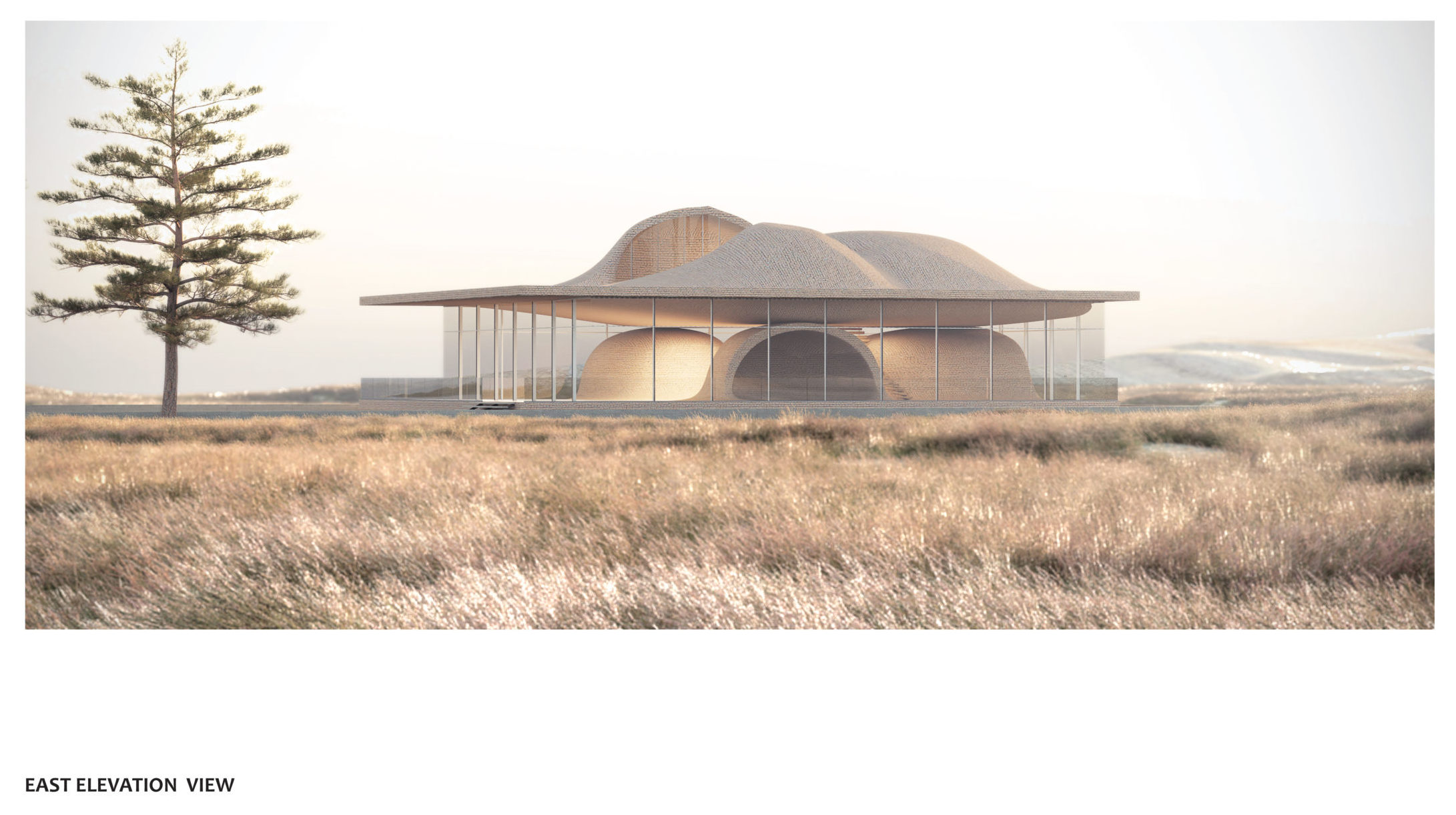
Guyim Vault House by Nextoffice, Concept

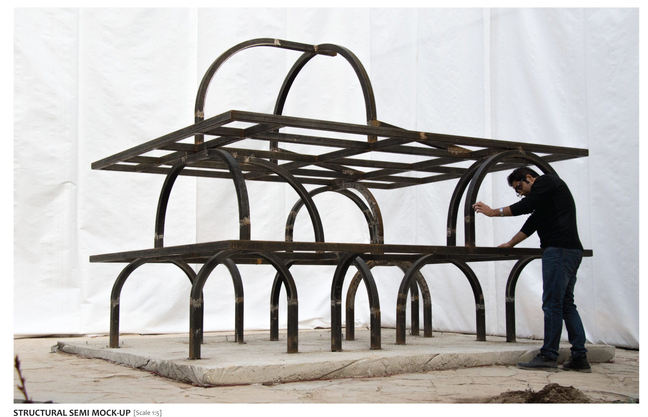
While vaults are traditionally elements that prominently enhance the interiors, they can also be used to redefine form on the outside. Using vaults in a skeletal cuboidal framework restrains the geometry while also creating a contoured form that clearly defines spaces and gives the structure a strong identity. In Guyim Vault House, Nextoffice uses semi-vaulted structural elements to create mounds in the different levels of the home. The system creates a very unique structural network that makes way for unique spatial blocks inside. These vaulted forms intersect with each other to create both public and private zones. For example, three domes face each other on the first floor to create a semi-private quadrangle. Taking this a step further, the forms on the upper level open up to allow light to enter the home.


Pointed Patterns
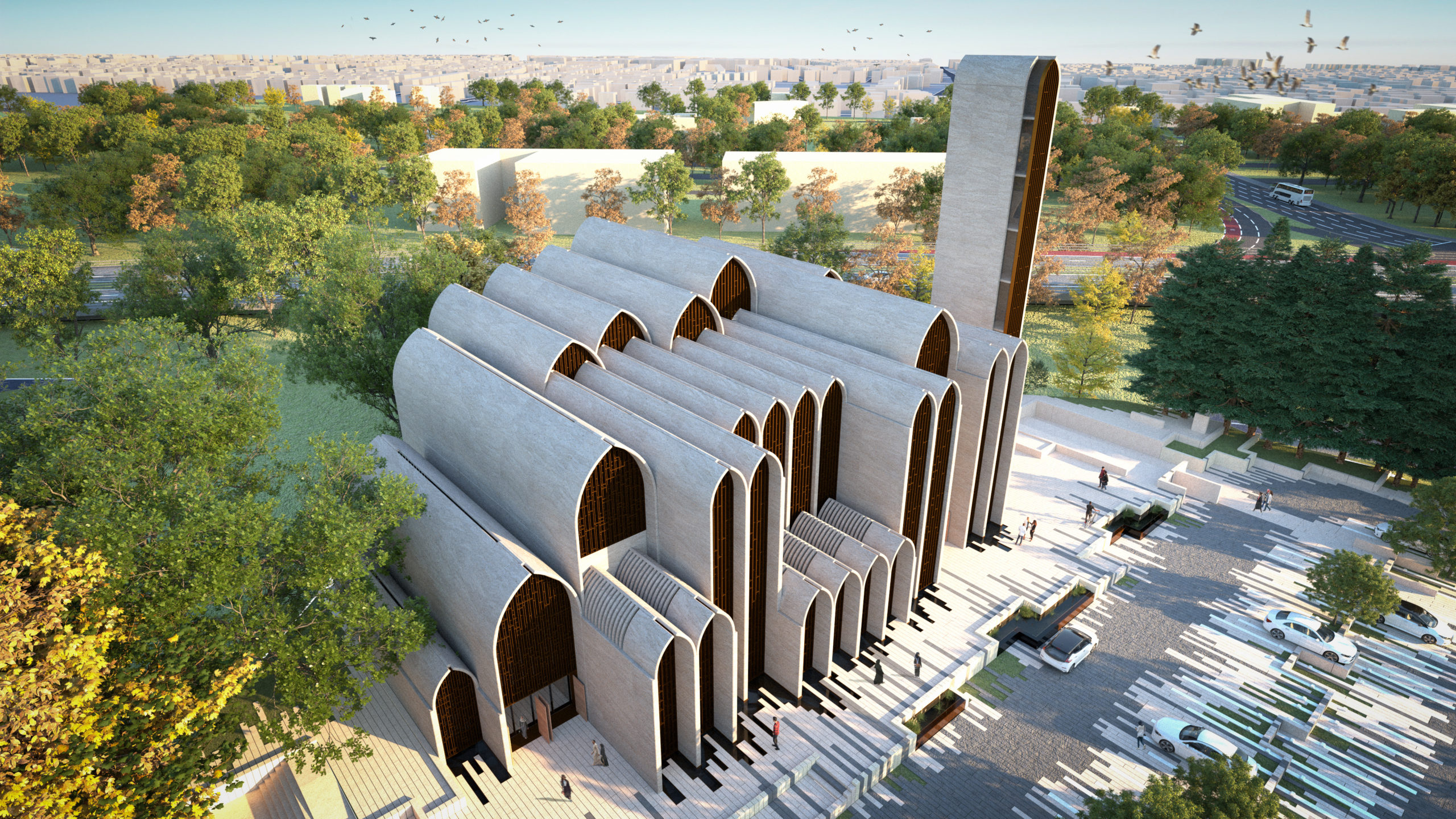
New Preston Mosque by AIDIA STUDIO

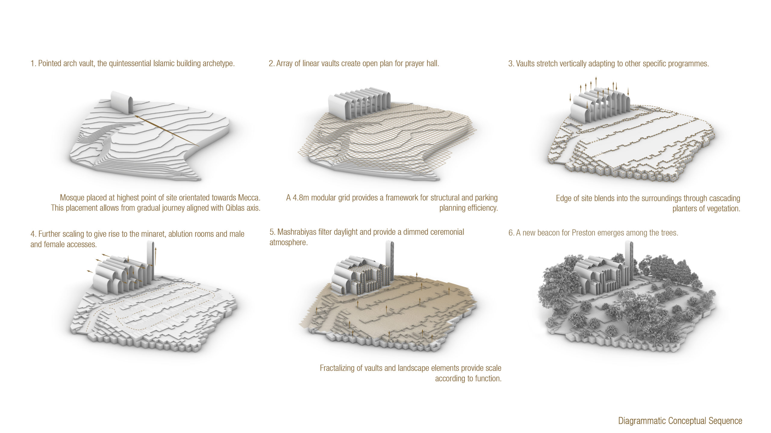
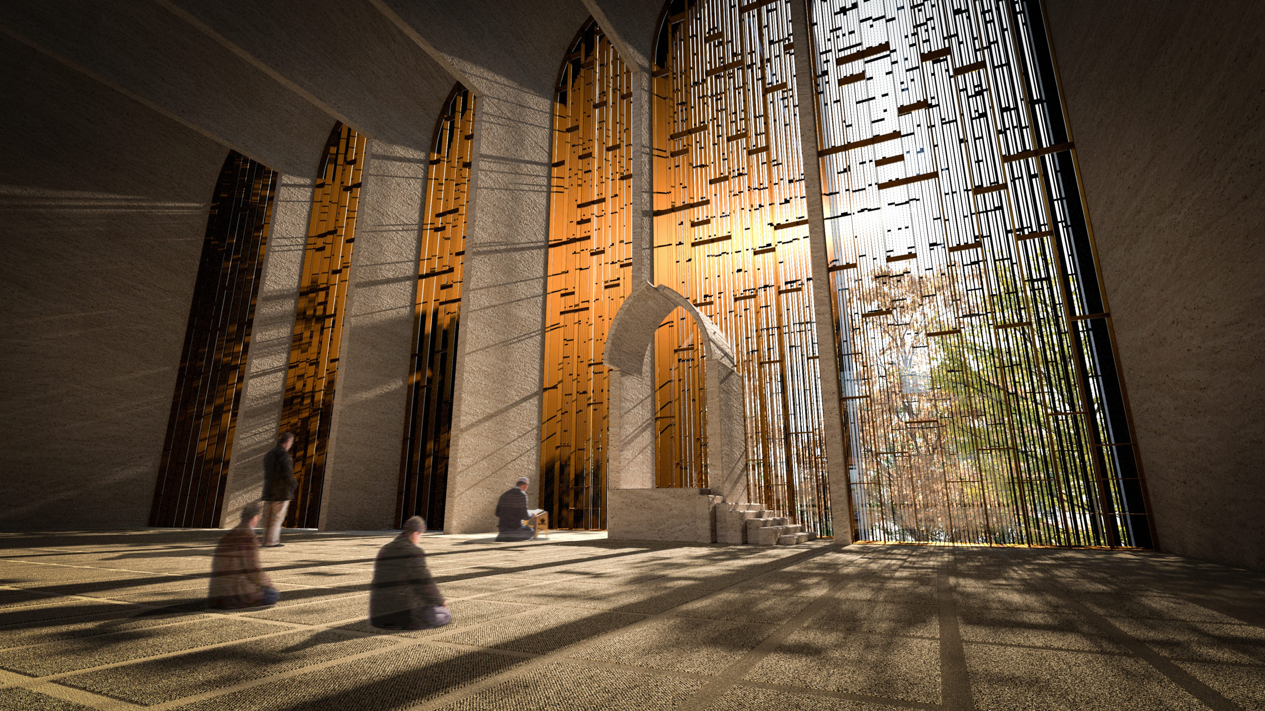
The pointed arch, which is commonly associated with Gothic architecture, found its origins in Islamic and Indian architecture. These arches were used to create doorways and ornate windows in religious or important structures. The team at AIDIA STUDIO used this historical reference and gave it a contemporary twist to create this conceptual mosque. Using a pointed arch form to create a vault allows the form to span more considerable lengths with more stability. It also allows for bigger column-free floor spans. Here, the studio turned this element into a fractal pattern that gets repeated across different levels and scales throughout the mosque.


Geometric Ceilings
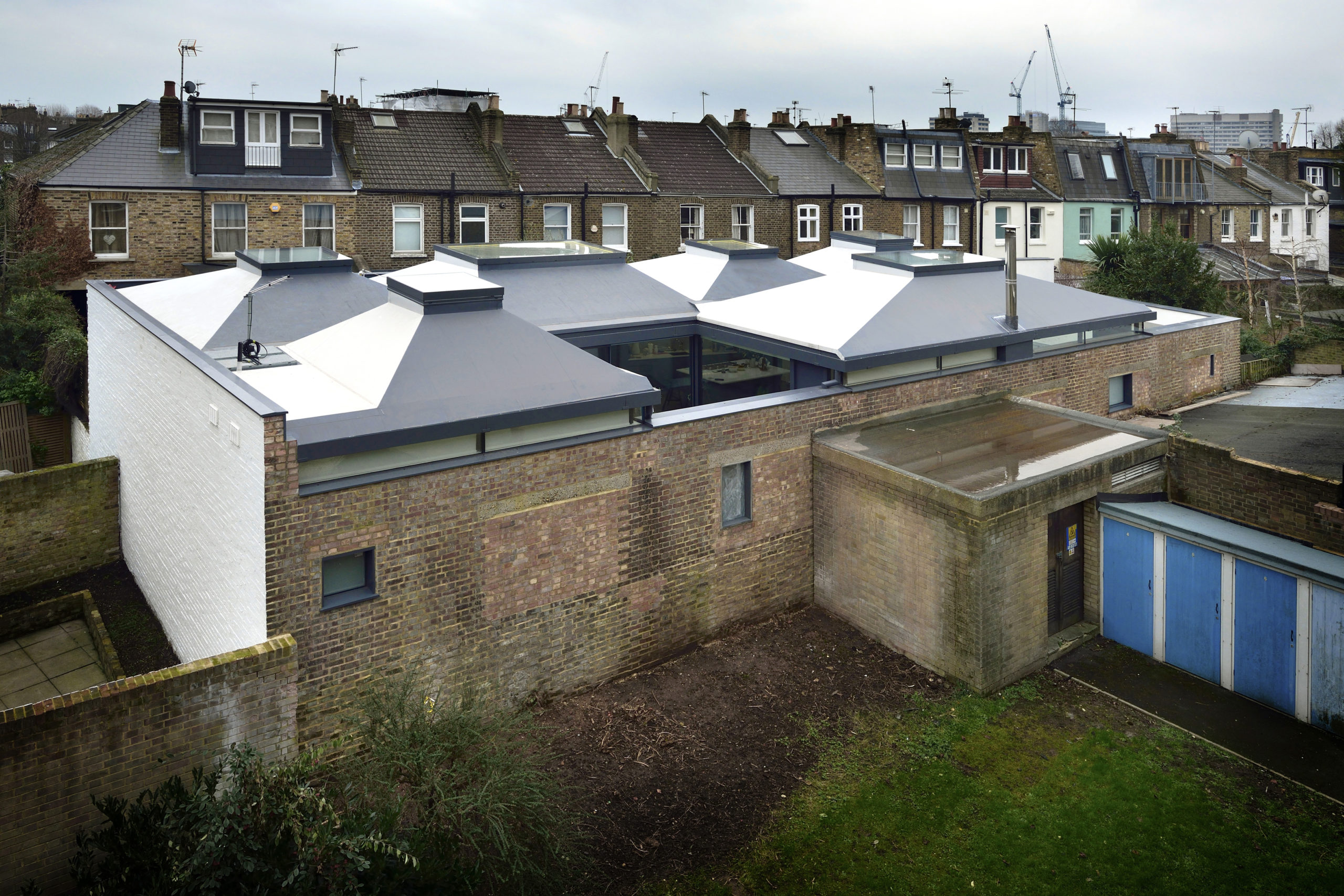
Vaulted House by vPPR Architects, London, United Kingdom

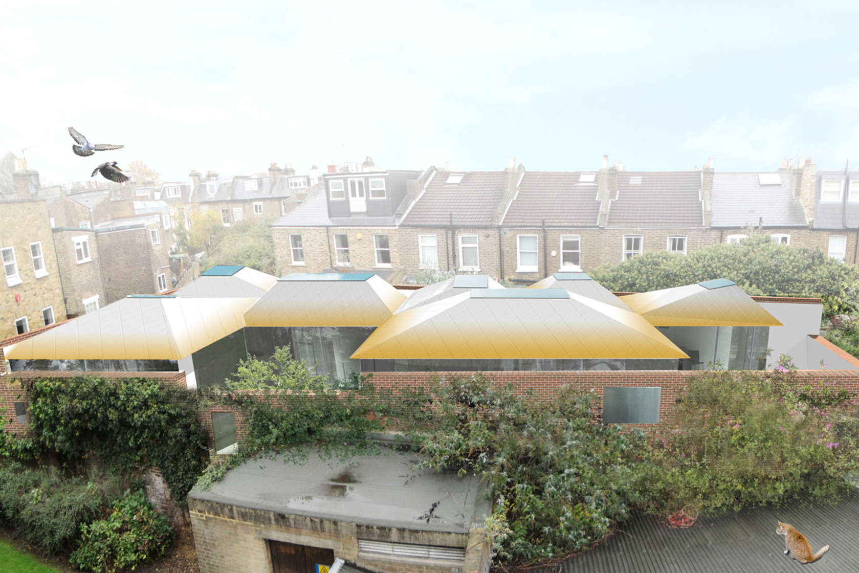
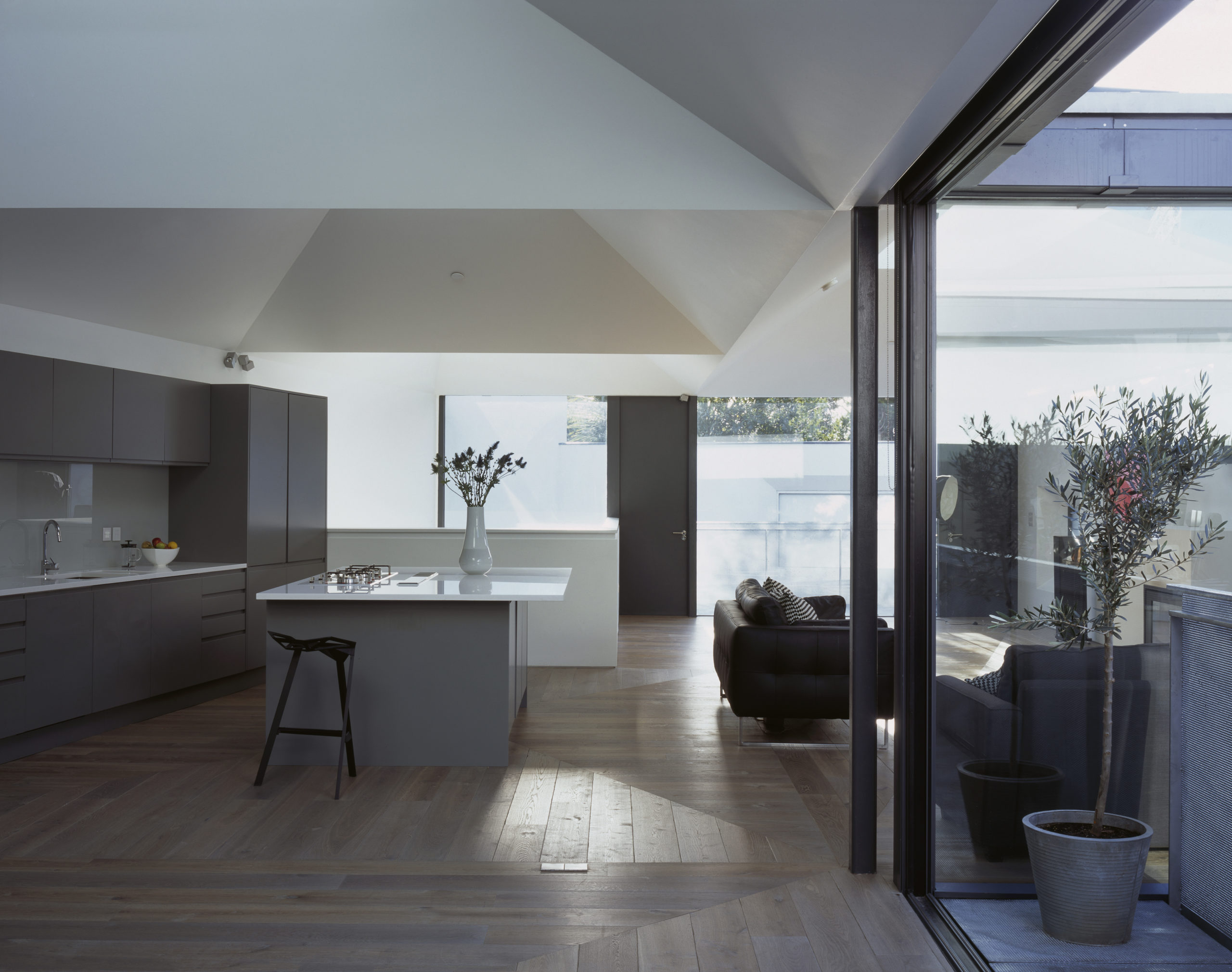
When curved ceilings don’t work with the overall design scheme, there is always an option to turn them into geometric arrangements that create a similar experience. This can be seen in Vaulted House by vPPR Architects. The roof of the entire home is divided into geometric vaults that coincide with the spatial distribution within the home. These sharp inclines completely mask the huge steel beams that are used to hold them up. The vaults are also capped with skylights to maximize the amount of natural light entering the home. To broaden the scope of this design, this trapezoidal geometry is further expanded to multiple objects around the house including the fireplace, windows, floors and the entrance.


Bamboo Lattice
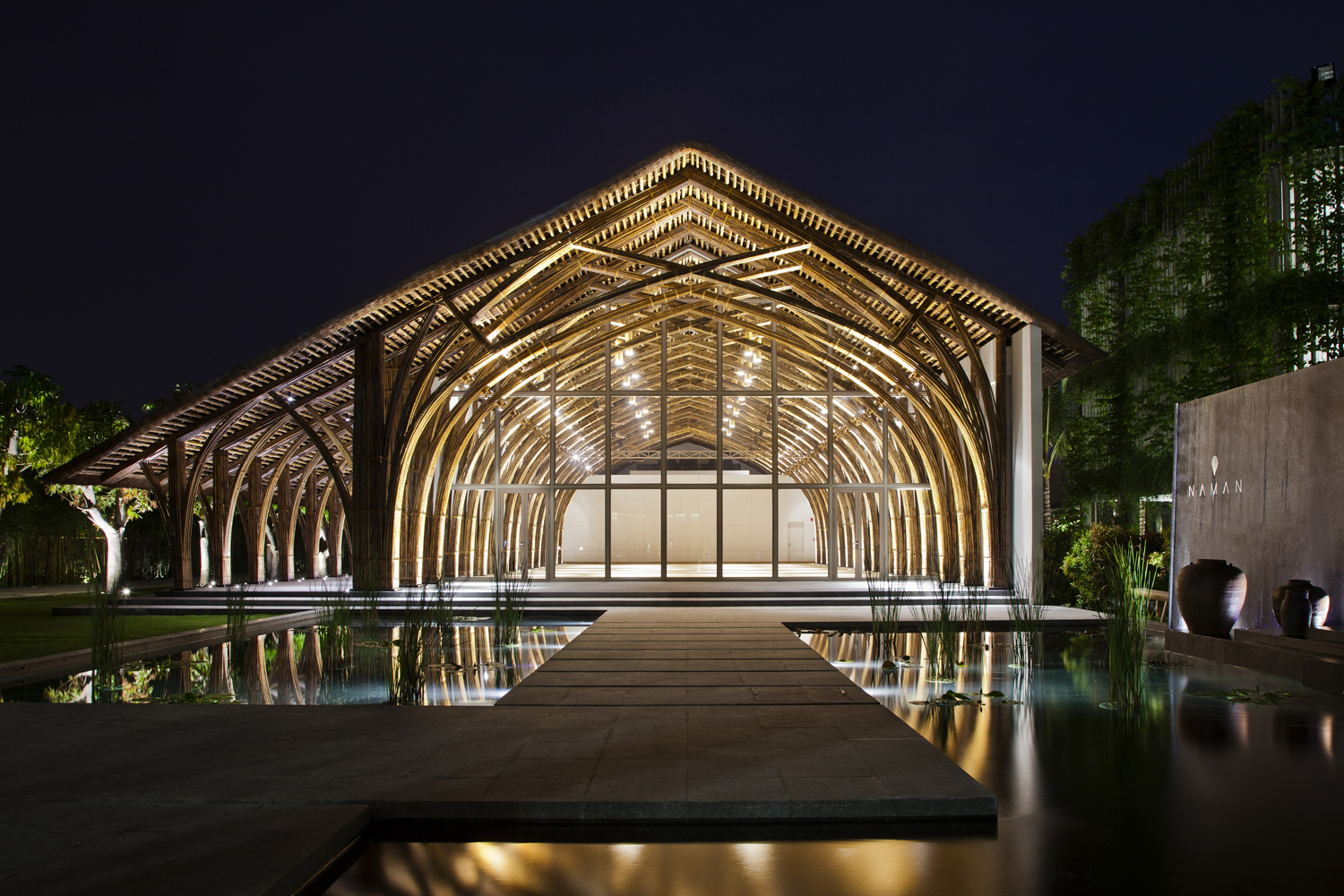
Naman Retreat Conference Hall by Vo Trong Nghia Architects, Ngũ Hành Sơn, Vietnam | Images by Hiroyuki Oki

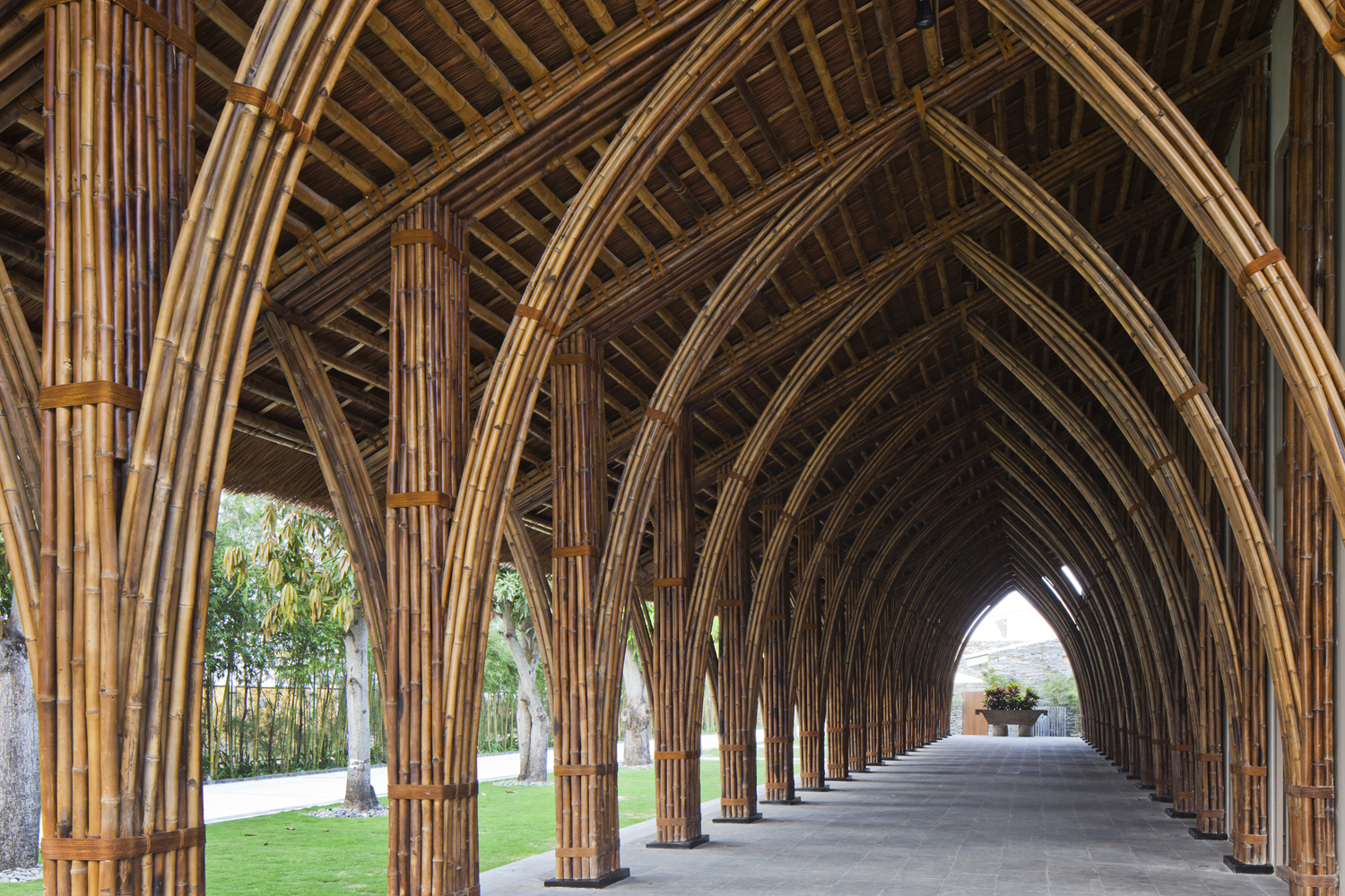
A way of adapting the vault form for tropical regions is constructing it using locally-acquired materials such as bamboo. The flexibility of bamboo stems allows them to be bent and bundled together to create a sturdy framework that can hold up a large column-free roof. In Naman Retreat Conference Hall, two types of bamboo are used to create the central hall and an adjoining vaulted corridor. The enclosed hall spans about 44 feet and goes as high as 31 feet. A large glass plane is placed three arches in to create an arched canopy outside. These curved frames are prefabricated on ground to ensure quick and easy assembly, while being very affordable and offering more control.


Asymmetrical Systems
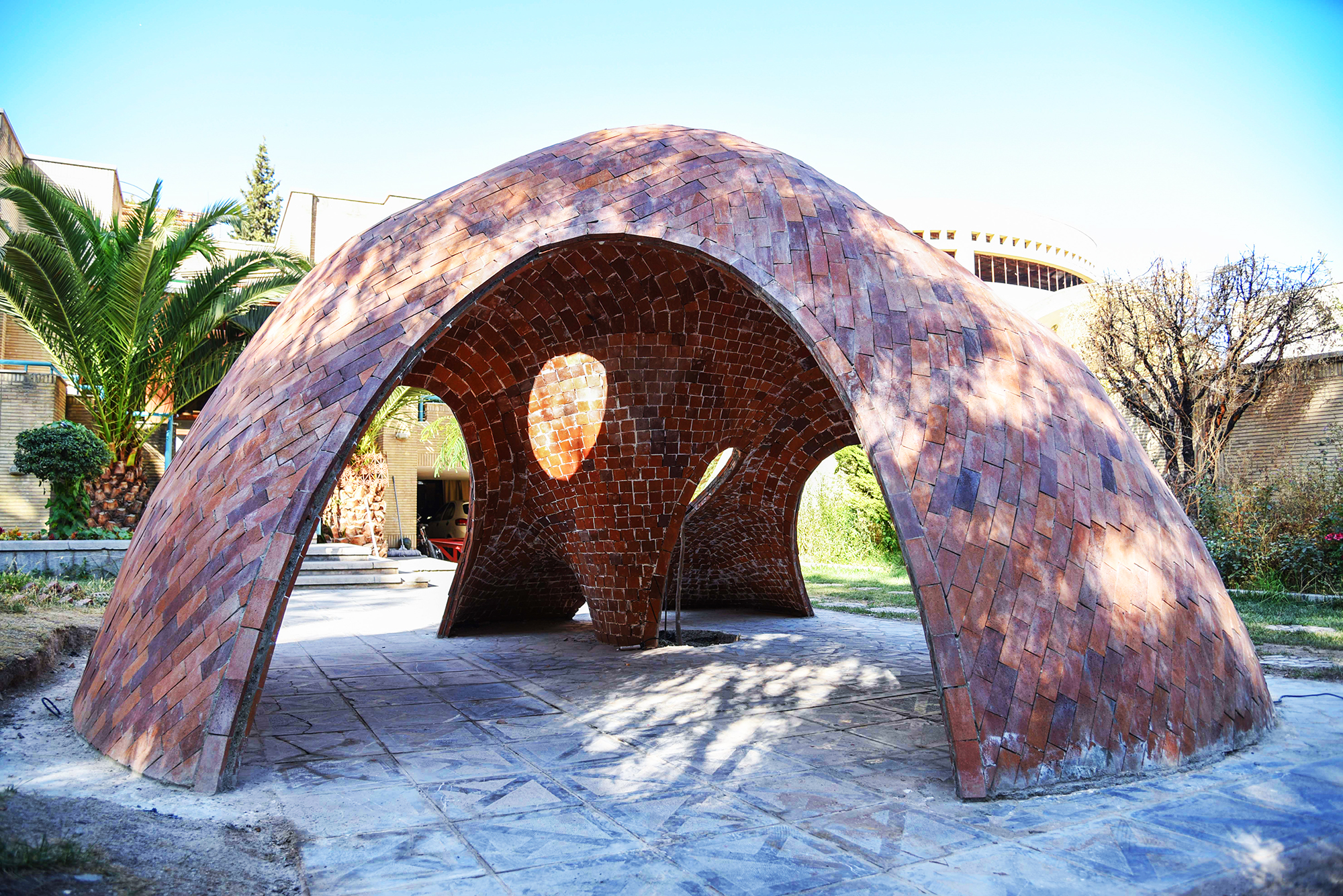
FaBRICKate by ADAPt, Isfahan, Iran | Images by Soroosh

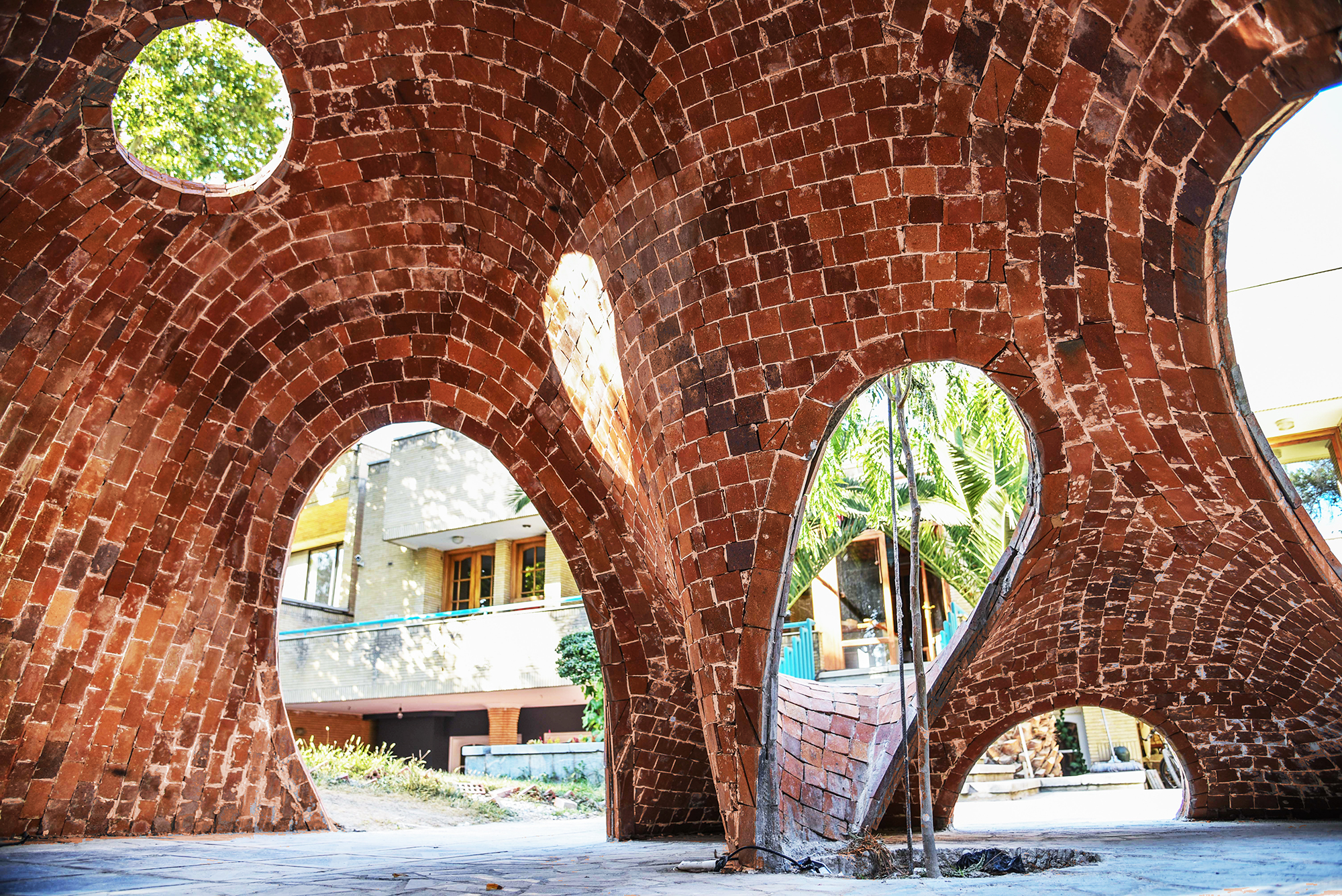
Modern fabrication methods and materials have expanded the possibilities of buildable forms and architectures. And so, while it was often taken as a given that vaults were symmetrical structures in the past, architects are now exploring new ways of looking at them by using manual and digital technologies. FaBRICKate is an experimental free-form compression-only vault system that reverses the mechanism used by the tension-dependent catenary form. Using different 3D modeling plugins, the team devised this asymmetrical form and used a waffle structure combining a grid mesh and steel rods to construct it. This reinterpretation of the classic vault opens up new ways of carving spaces that are transcendental and unique.

Architects: Want to have your project featured? Showcase your work through Architizer and sign up for our inspirational newsletter. 

Reference

Sleek New Products Designed for the Modern Kitchen
CategoriesArchitecture

Sleek New Products Designed for the Modern Kitchen

The A+Product Awards is open for entries, with a Main Entry Deadline of June 24th. Get started on your submission today! 

Fast-paced lives and busy schedules call for homes and spaces that are low maintenance and yet very stylish. Homeowners now want highly functional solutions that can simplify the processes in their daily routines. In addition to ease of handling, growing urban density and skyrocketing real estate prices have also increased the need for multi-tasking and space-saving fixtures that can uplift small spaces. This is not to say that it only has to be about functionality. This is about finding the right permanent additions that are durable and also versatile enough to be translated into a variety of different aesthetics as trends change.

This is most important when designing a kitchen. Using high-quality materials and fixtures that are durable, easy to clean and simplistic can help maintain the hygiene of cooking areas and also save time when cooking or serving. It can be hard to find spend hours every weekend trying to get spice stains off of stone counters or scrub off the burned residue on metal stovetops.

Start A+Product Awards Application

Product designers have recognized these needs and are now focusing on efficient designs that display both quality and elegance. Simple designs also offer the flexibility of going from a sleeker look to a maximalist kitchen with the addition of small décor objects and furnishings without requiring a complete kitchen overhaul. Below are just a few winning entries from last year’s A+Awards that can offer some inspiration when planning the perfect kitchen.

2021 A+Awards Product Winner in Cabinetry & Millwork

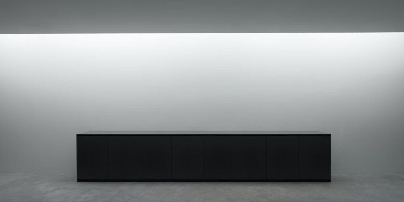
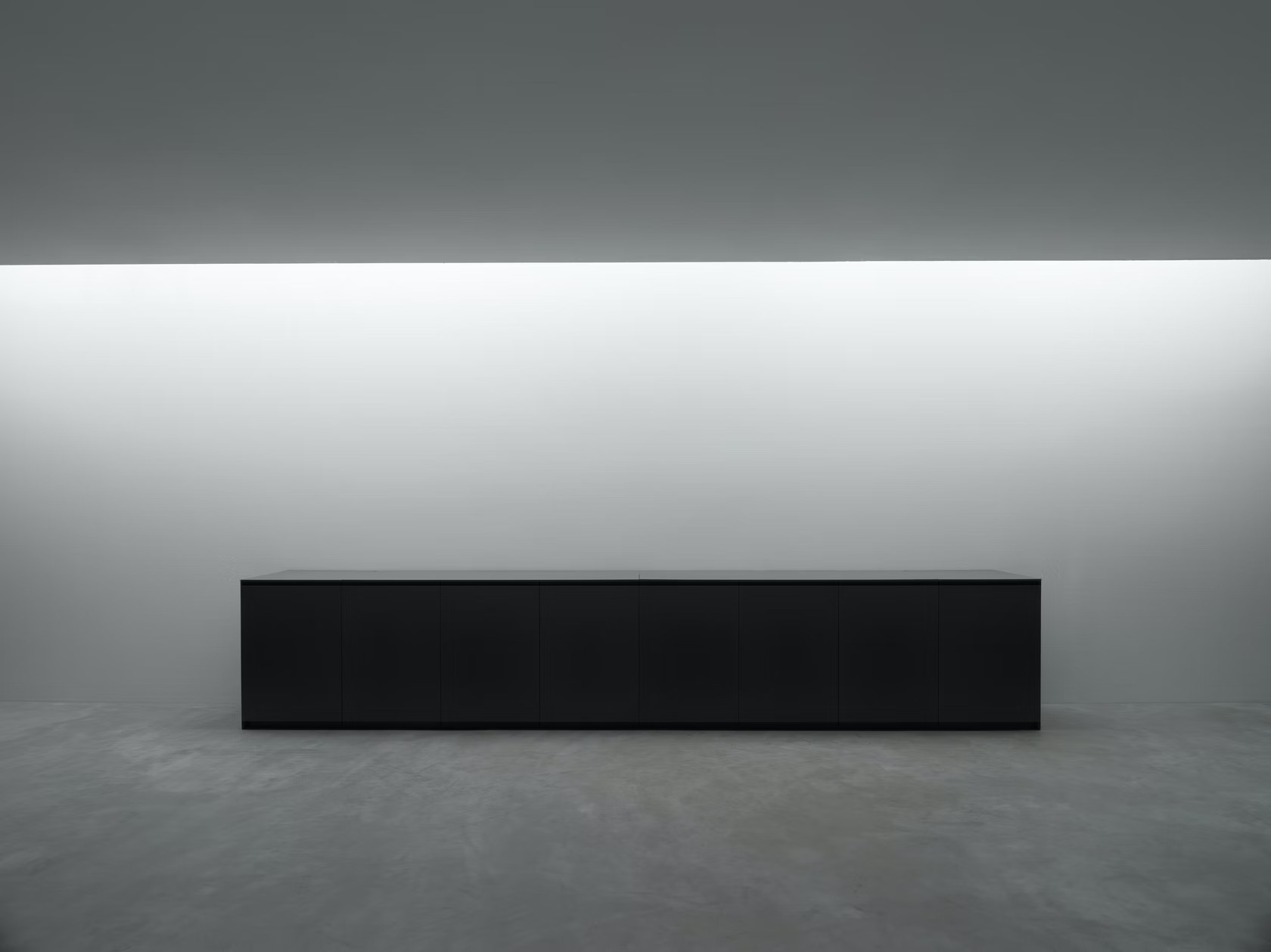
The core of a kitchen setup is always the counter or island. Today’s homeowners are looking for surfaces that are utilitarian without compromising the overall aesthetic. Plain surfaces with flushed drawers, concealed joints and even hidden electric stoves or sinks are making rounds on social media and in homes.
Along those lines, Nero Cucine is redefining kitchen interiors with futuristic kitchen essentials that are durable and sustainable. Users can raise the flat Corian or marble cover of the N037 counter to reveal a sink and cooktop. The opening is lined with steel for easy maintenance. Similarly, all the drawers are precisely made to ensure that the cabinet appears seamless when not in use. Taking the design even further is an option to avail the same setup with recyclable materials.

2021 A+Awards Product Winner in Appliances

No perfect counter is complete without the right stove. A recessed stovetop not only makes the kitchen seem more spacious but also makes movement and cleaning easier. Traditional burners can come with the headache of cleaning out grime and spillovers and using burner covers can mar the clean look of a kitchen.
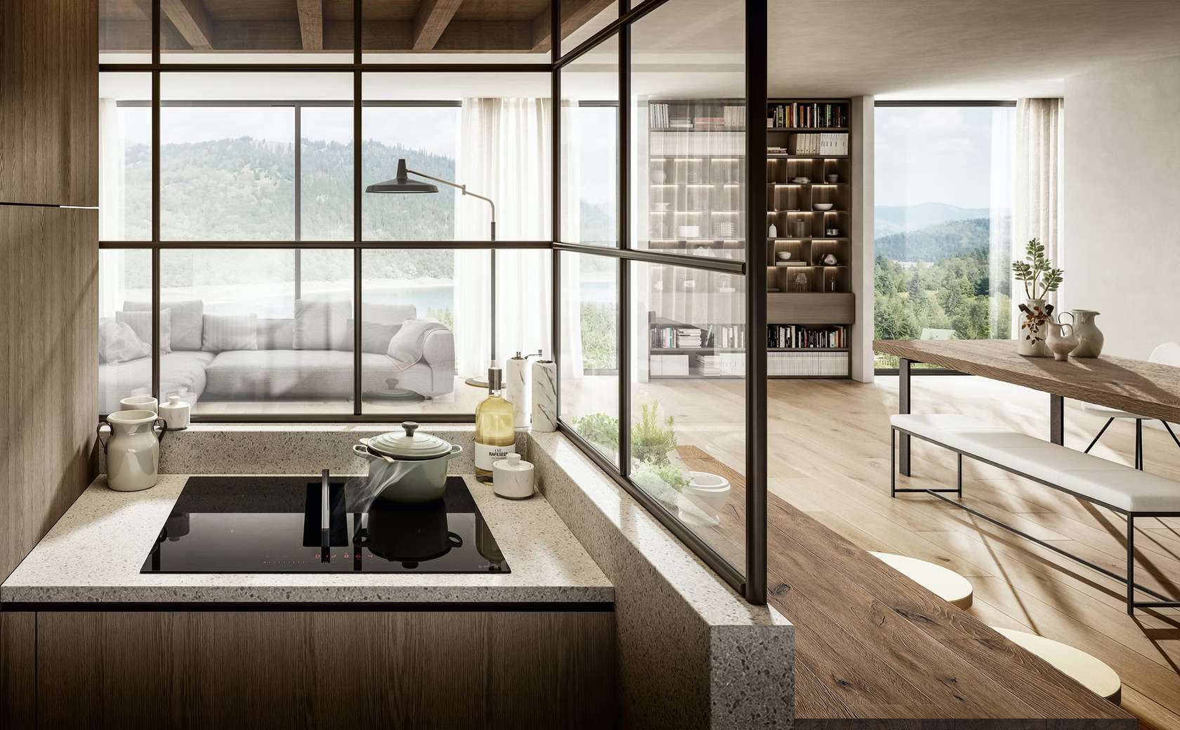
Elica’s NikolaTesla Fit is an induction hob with an in-built air extraction mechanism, helping make the most of compact spaces. This extraction mechanism is located in the center of the hob and can be operated with just a little bit of pressure. It is also covered with a glass top to help in cases of spills. The system also comes with a drain valve underneath to facilitate easy cleaning of excess liquids.

2021 A+Awards Product Winner in Fixtures & Fittings – Kitchen

The next step in assembling a minimal kitchen is finding the perfect sink — one that stands out but also blends in. Fewer seams and streamlined fittings can help prevent excess soap and grime buildup and also create the appearance of more room. In line with these needs, designers are now moving away from traditional metal sinks and opting for stone or ceramic options that are more geometric and modern.
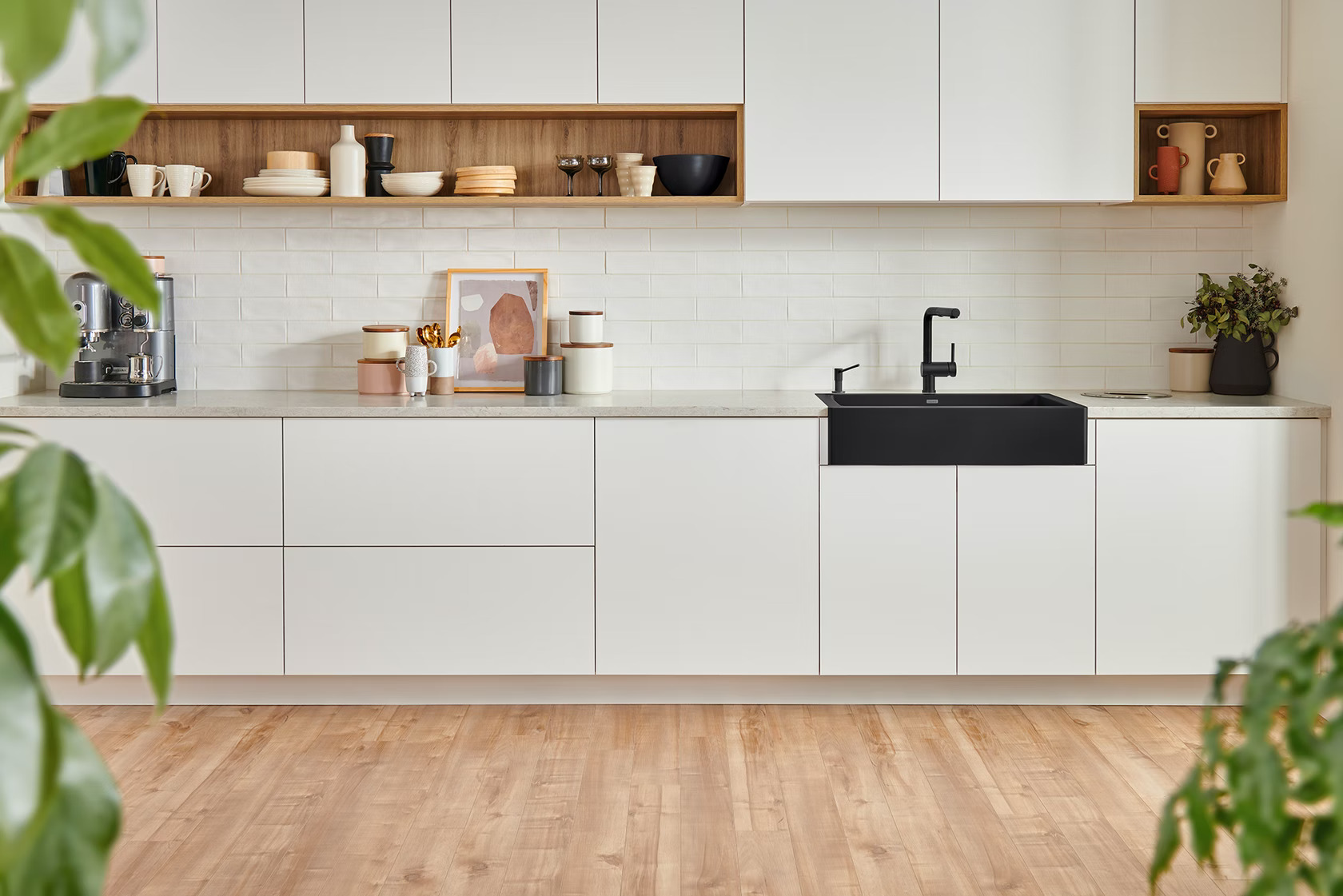
While kitchens can’t have a minimal slit-drain sink like the one in Kim Kardashian’s bathroom, there are still sleeker alternatives like the VINTERA from BLANCO. The flushmount fixture has an option to show part of its border in the front to break up the counter design. The sizing also enables the product to fit into standard cabinet dimensions so that it can be used both in custom and modular setups. Its durable granite body also has a protective shield to reduce dirt and bacteria growth.

2021 A+Awards Product Winner in Accessories and New Materials

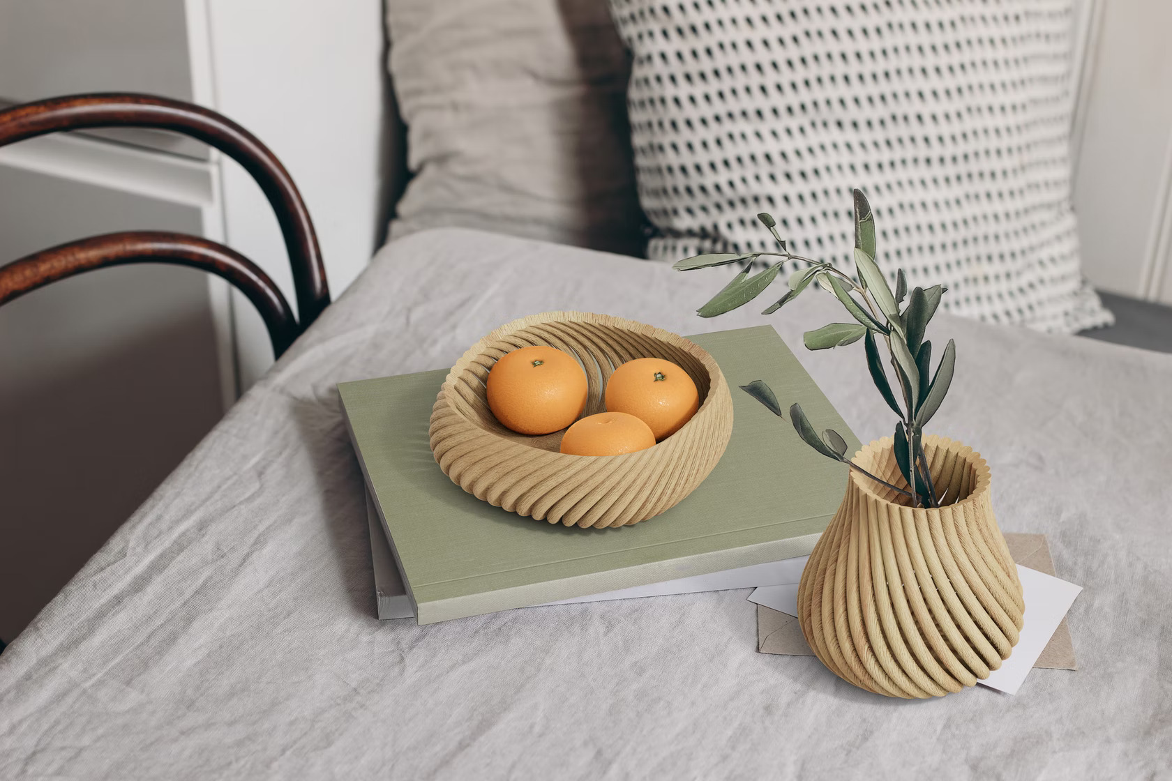
In addition to pots, pans and utensils, displayware is also becoming increasingly popular in kitchen décor. From ornate flower vases to decorative signs and stands, there are options for every kitchen aesthetic. Forust recently developed a 3D printing system that uses wood waste to craft home goods. The sustainable Vine range, designed by fuseproject, includes a vessel, bowl, basket and tray — all of which can be used for a variety of schemes ranging from whimsical cottagecore to minimal monochrome. These pieces are made up of 3D-printed rods that twist and come together to create curved forms without any adhesives. Their simple and versatile design language makes them an easy option to add some warmth to simple spaces.
The A+Product Awards is open for entries, with a Main Entry Deadline of June 24th. Get started on your submission today! 

Reference

Rooi revamps post-war Chinese apartment for modern life
CategoriesInterior Design

Rooi revamps post-war Chinese apartment for modern life

Multifunctional plywood structures that create spaces for sleeping, storage and drinking tea feature in this compact apartment in Beijing designed by Rooi.


Rooi aimed to create a unique apartment in the block of thirty-six identical units that was built in 1950 to provide accommodation for the families of workers employed at a nearby research institution.

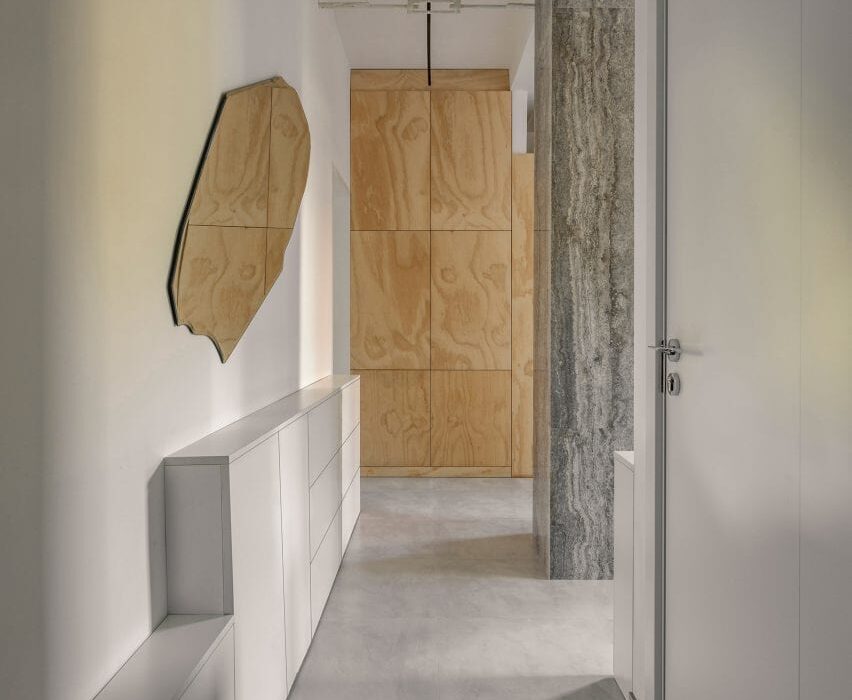
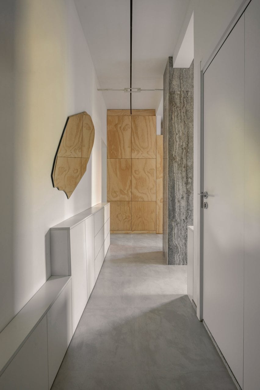
Entryway with concrete floor, white walls and plywood joinery in post-war Beijing apartment
Top: the apartment is located in a 1950s housing block. Above: one of its original columns was clad in stone and turned into a feature

At the time the apartment was built, China faced an influx of people moving to its cities, meaning that living spaces were often tight.

“There was no living room, no dining room or shower in each household,” Rooi explained.

“This type of layout represents the standard post-war Chinese apartment.”

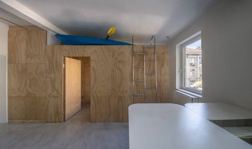
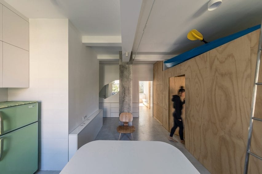
Open-plan room with kitchen and plywood unit holding a kayak in interior by Rooi
Rooi created an open-plan area for cooking and dining with a work table at its centre

As the cost of tearing down old buildings is so high in Beijing, Rooi was tasked with coming up with a modern but economical apartment concept, called T101, that could be replicated in each of the 36 units to make them more private, functional and livable.

“The project’s core was to find a way to adjust the old collective residence into modern city life and retain its previous structure, recovering the degraded green areas,” said ROOI.

“The budget was limited to ¥150,000 [£16,800] per apartment and T101 would be the first experimental renovation example.”

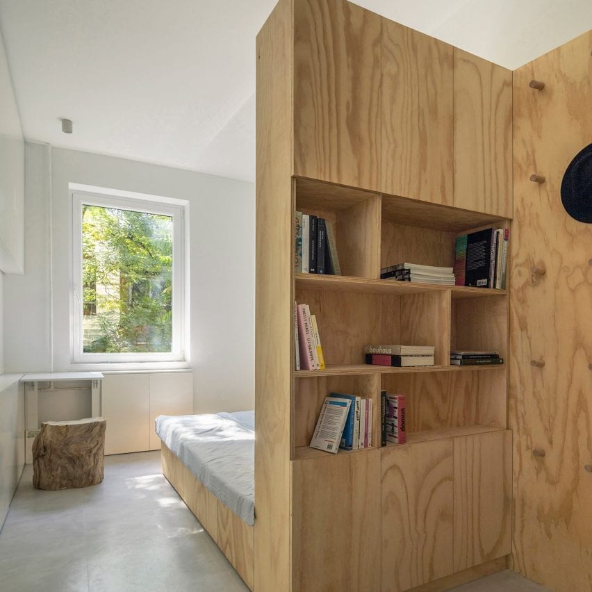
Inside of modular plywood unit in post-war Beijing apartment
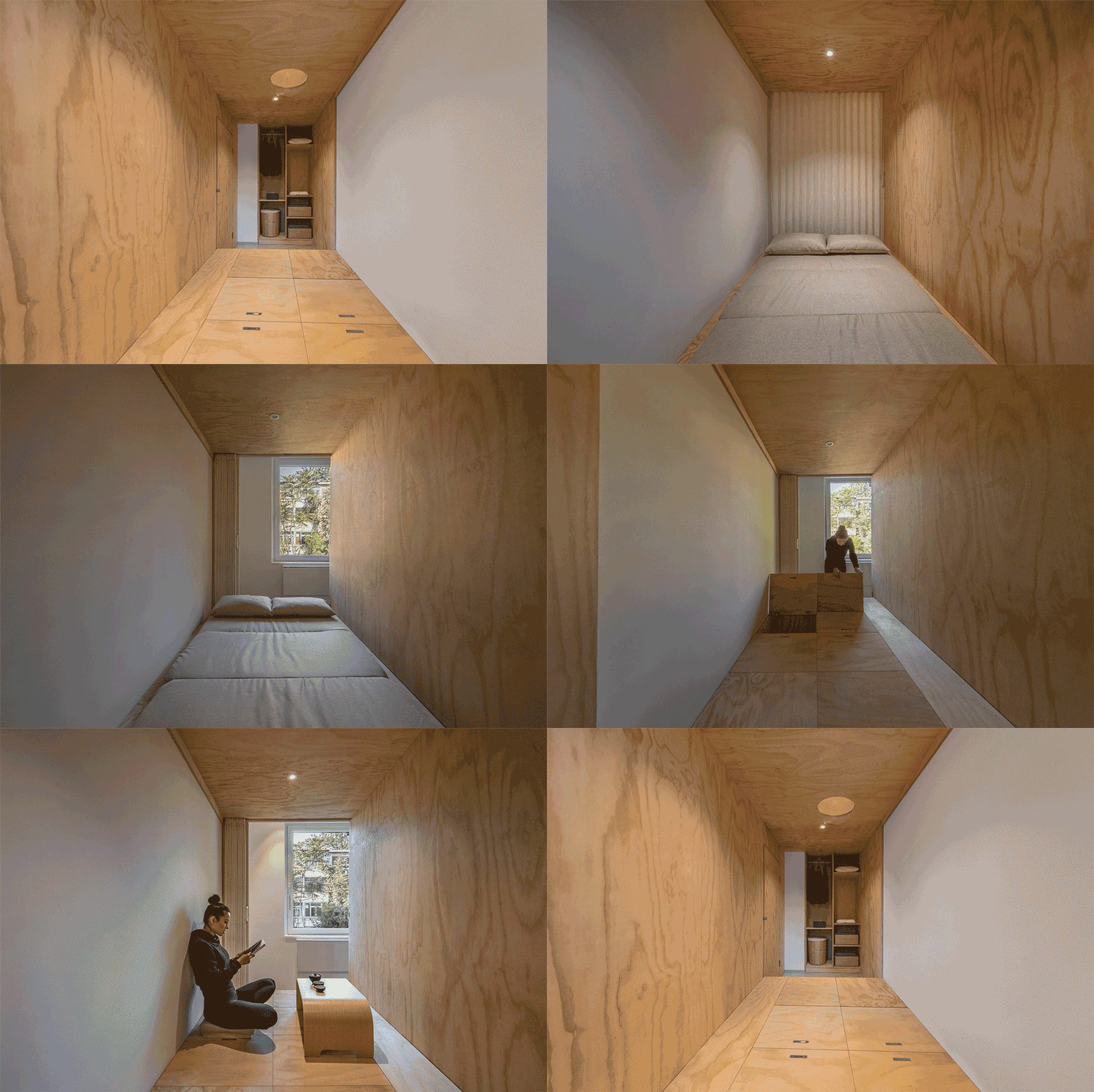
A modular birch plywood unit can act as a reception, tea room or temporary guest room

Rooi came up with a floor plan that incorporates a bedroom, living room, kitchen, dining room and bathroom all within the unit’s tight 50-square-metre footprint.

Designed to appeal to the city’s college students and white-collar workers, the layout features an open-plan area for cooking and dining with a work table at its centre.

This area provides enough space for residents to receive guests, work from home, relax in an armchair or exercise.

Modular plywood storage unit in apartment interior by Rooi
Bulk items such as sports equipment can be stored on top of the plywood module

An original column is positioned in the centre of the space and has been clad in stone to protect it and turn it into a design feature.

Running along one side of this flexible space, an enclosed north-facing structure made from birch plywood serves as a reception, tea room or temporary guest room.

Above the wooden enclosure, a large storage area can hold suitcases, outdoor sports equipment and other bulky items. A small toilet and a shower room are located on the opposite side of the space next to the apartment’s entrance.

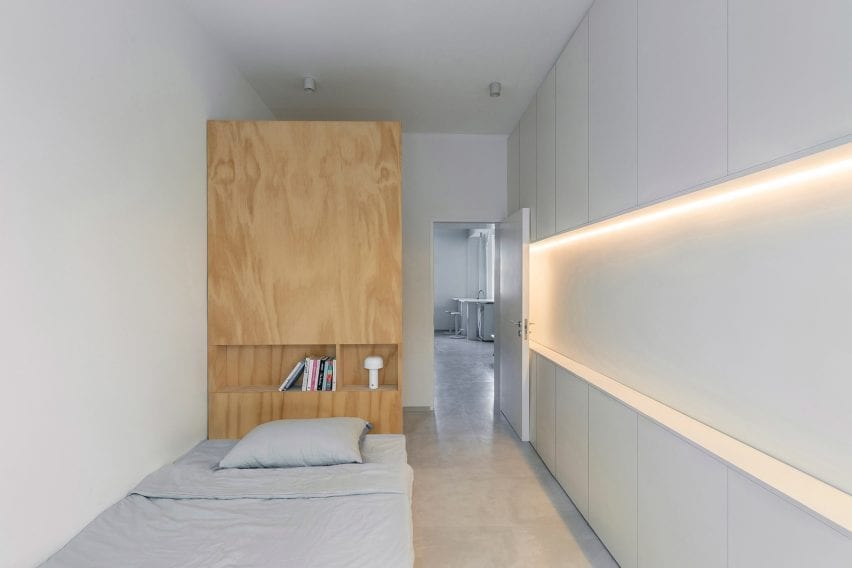
The bedroom is separated from the rest of the apartment and features a custom plywood bed with shelving built into its tall headboard, while a compact desk is located next to the window. The walls are lined with slim cabinets for additional storage.

Neutral colours and materials were chosen throughout so that the owners can put their own stamp on the interior.

Bed with integrated bookcase in backrest in interior designed by Rooi
A bookcase is integrated into the head of the bed

“The apartment was designed as open as possible and functionally very compacted,” the architecture studio told Dezeen.

“Natural materials and colour have been used throughout the design to create a comfortable and peaceful feel in contrast with contemporary city life.”

Bed with tall plywood backrest in white-painted room of post-war Beijing apartment
The bedroom is separated from the rest of the flat

Elsewhere, design studio I IN has created concept apartment in Tokyo to reframe the way that Japanese homeowners perceive renovated apartments.

Photography is by Weiqi Jin.

Reference

FOG Architecture creates “modern cave” for ToSummer’s Beijing store
CategoriesInterior Design

FOG Architecture creates “modern cave” for ToSummer’s Beijing store

Chinese studio FOG Architecture has added curved walls, mirrored surfaces and faux stone to the interiors of aromatherapy brand ToSummer’s flagship store in Beijing.


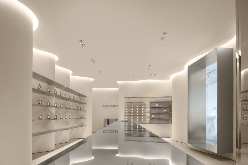
Located in Beijing’s Taikoo Li Sanlitun shopping village, FOG Architecture designed the 170-square-metre ToSummer store to recall the atmosphere of a cave.

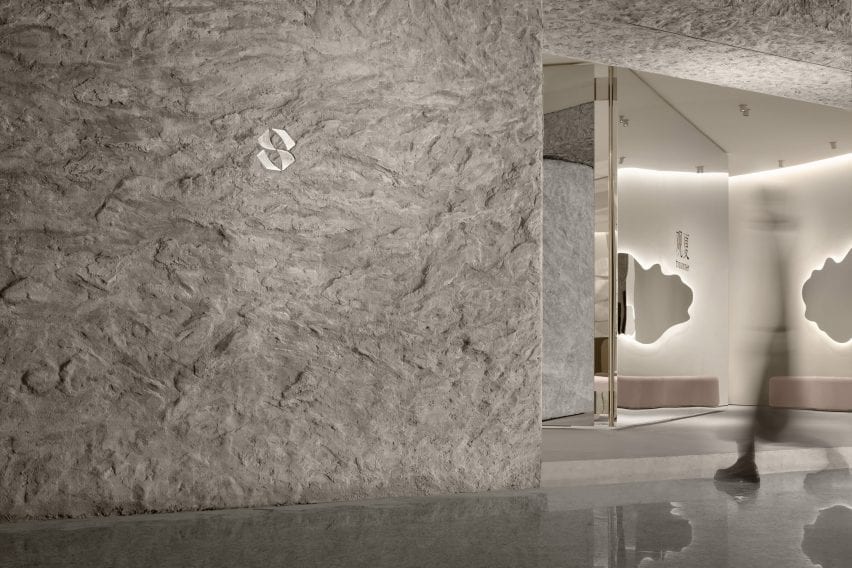
ToSummer Living Room has faux stone walls
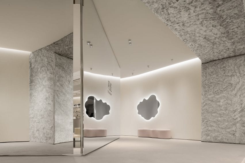
Top: a mirrored screen was placed at the entrance to the store. Above: the exterior of the store is covered in a textured faux stone

“The brand’s concrete requirement for this space design was a modern cave,” said FOG Architecture.

“We chose not to directly create the natural appearance of caves but, instead, presents the characteristic elements of material textures to inspire the sensory experience.”

Mirrored surfaces were used throughout ToSummer Living Room
The mirrored screen reflects passers-by and the interior of the store

The entrance to the store is marked by a large faux-stone wall and a mirrored screen, which leads visitors into the store.

The studio explained that the large mirrored screen was designed to draw passers-by into the store while referencing screens typically used in homes and domestic spaces.

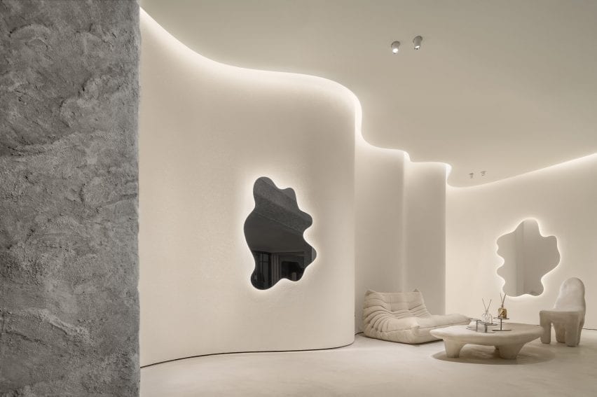
A togo sofa is placed beside undulating walls at ToSummer Living Room
Curving walls were used along the perimeter of the store

“The curiosity of what is behind attracts the beholders to walk inside,” FOG Architecture co-founder Zheng Yu told Dezeen. “The surface of the screen is usually decorated with an illustration of natural scenery.”

“It is a metaphor of the space hidden behind. And this is the reason we placed a scaled up, mirror polished screen as the central spatial element. It illustrates beauty in a restrained manner.”

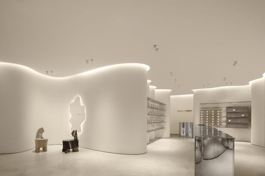
Mirrored furniture was used in the retail space at ToSummer Living Room
The store was divided into multiple zones

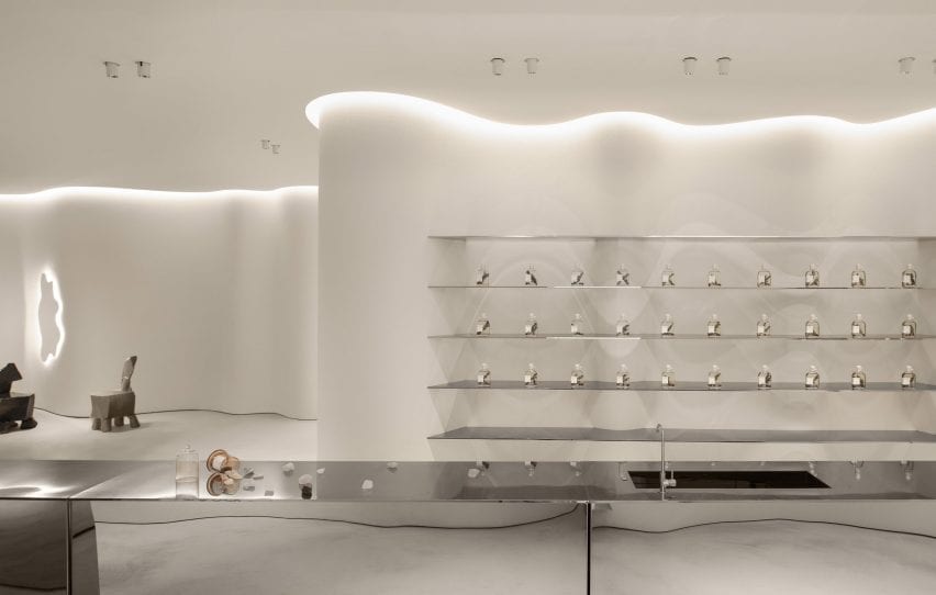
Natural-toned, undulating walls envelop the interior of the store and are illuminated by strip lighting set within the ceiling.

The interior was divided and zoned into a collection of small sections each with its own functions, housing retail space, exhibition space and installation areas.

A cream Togo by Michel Ducaroy for Ligne Roset, an off-white Playdough chair and coffee table by Karstudio as well as amorphous mirrors were placed throughout the store suggesting the idea of domestic space.

“The aim of the furniture is to convey a sense of the domestic,” said Yu. “That’s why we named this space a ‘Living Room’. A space that gives people a place to breathe in a busy and fast-moving shopping mall.”

The walls of the ToSummer Living Room were finished with white
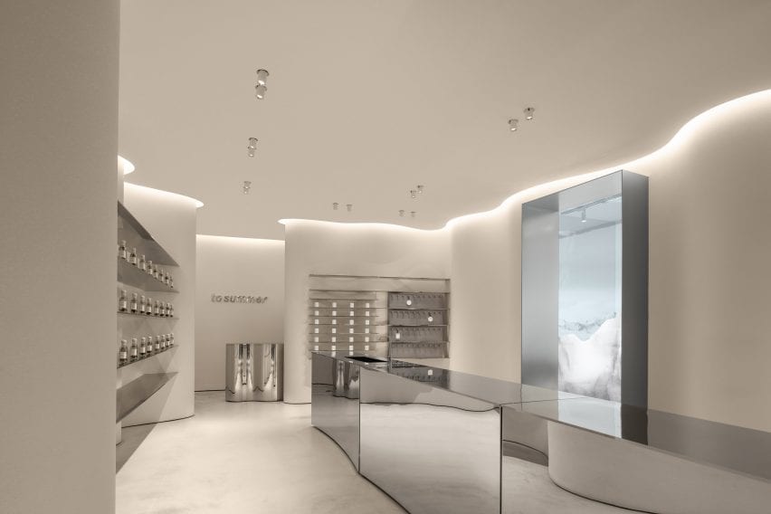
A long metal island contrats with the softness of the store

Custom “timber rotten” chairs designed by British designer Max Lamb were also placed across the store and in niches formed by its curved walls.

“In a way, Max Lamb was also our main inspiration during the project,” Yu explained.

“The [chairs] lacquering was smooth, shiny and colourful while the foam is tortured, torn, scarred – combined the materiality itself gives me an illusion of heaviness similar to a piece of timber rotten through time, but it is lightweight and smooth and newly made.”

Light reflects of the metal surfaces
Shelves were built within the curving walls

An exhibition and retail space at the rear of the store has a series of shelves organised around a long reflective metal island that contrasts to the curving walls it is surrounded by.

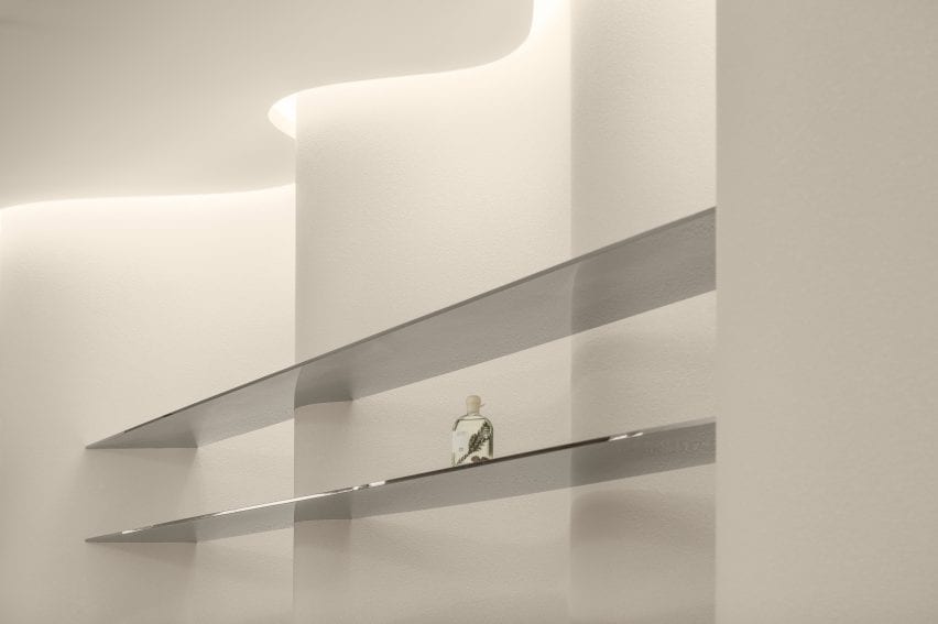
Rectangular metal shelves were suspended along the undulating walls, drawing attention to the irregularity of the space while displaying products like artworks.

Shelves house the stores product at ToSummer Living Room
Two chairs designed by Max Lamb occupy the space

A metal cashier’s table was tucked behind a curving volume and mimics the shape of its walls, forming a rounded counter space that becomes an extension of the walls.

“[The store] transforms the original cave concept into spatial language, integrating it into this realistic space full of modern oriental feeling to present a delicate balance between commercial and art, domestic and public realm, natural and artificial,” said the studio.

Fragrance is pictured on a metal shelf
The display areas were designed to showcase product like artwork

FOG Architecture is a studio with offices in London, Shanghai and Chongqing founded by Yu and Zhan Di.

Other Beijing projects with curved walls include this avocado-green space age informed hair salon and this kindergarten with a rooftop playground by MAD Architects.

Photography is by Inspace.


Project credits:

Design principle: Zheng Yu, Zhan Di
Design team: Hou Shaokai, Zhou Chuyang, Xiong Aijie, Vince Choi and Fu Shidi
Lighting design: School of Architecture, Tsinghua University and One Lighting Associates Beijing
Furniture and installation design: DEFRONT and F.O.G.
Construction drawing: SU PIN
Construction team: Youlong Jinsheng Decoration Ltd.

Reference