Etch by Steven Edwards in Hove
CategoriesInterior Design

Akram Fahmi’s monochrome revamp of Etch reflects two-ingredient dishes

Etch by Steven Edwards in Hove

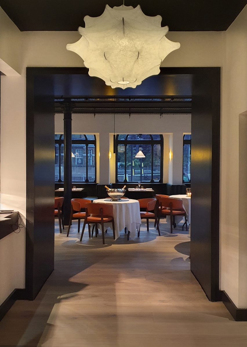
Interior designer Akram Fahmi has revamped the Etch restaurant in Hove, East Sussex, creating black and white interiors to reflect its minimalist menu.

Located in a space that was originally a bank, Etch was first renovated and opened as a restaurant in 2017.

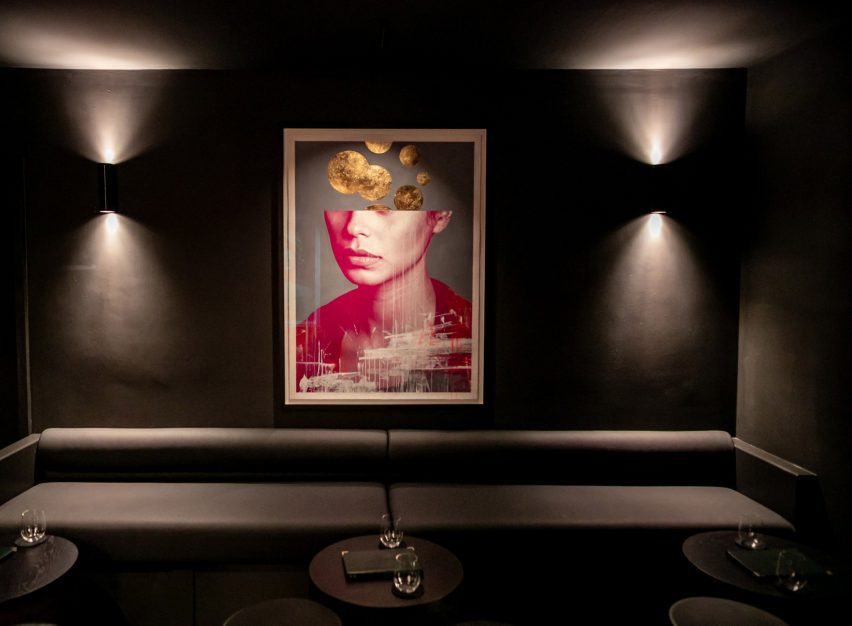
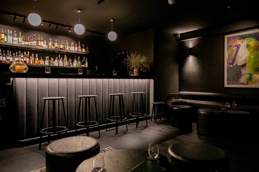
It has been reimagined by Fahmi, the founder of interiors studio London Design House, with an open kitchen and subterranean speakeasy bar.

Etch by Steven Edwards in Hove
Two modern arches were added to complement the three period arches of the existing building

Fahmi chose the simple colour palette to echo the approach of the restaurant’s menu, where most of the dishes are comprised of just two ingredients.

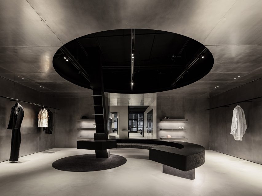
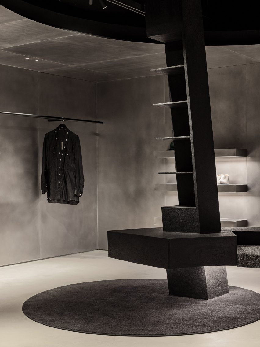
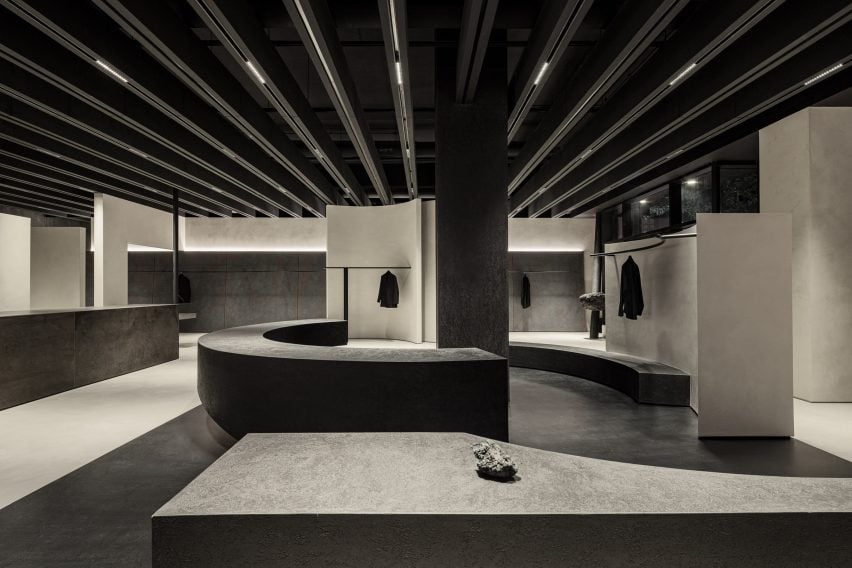
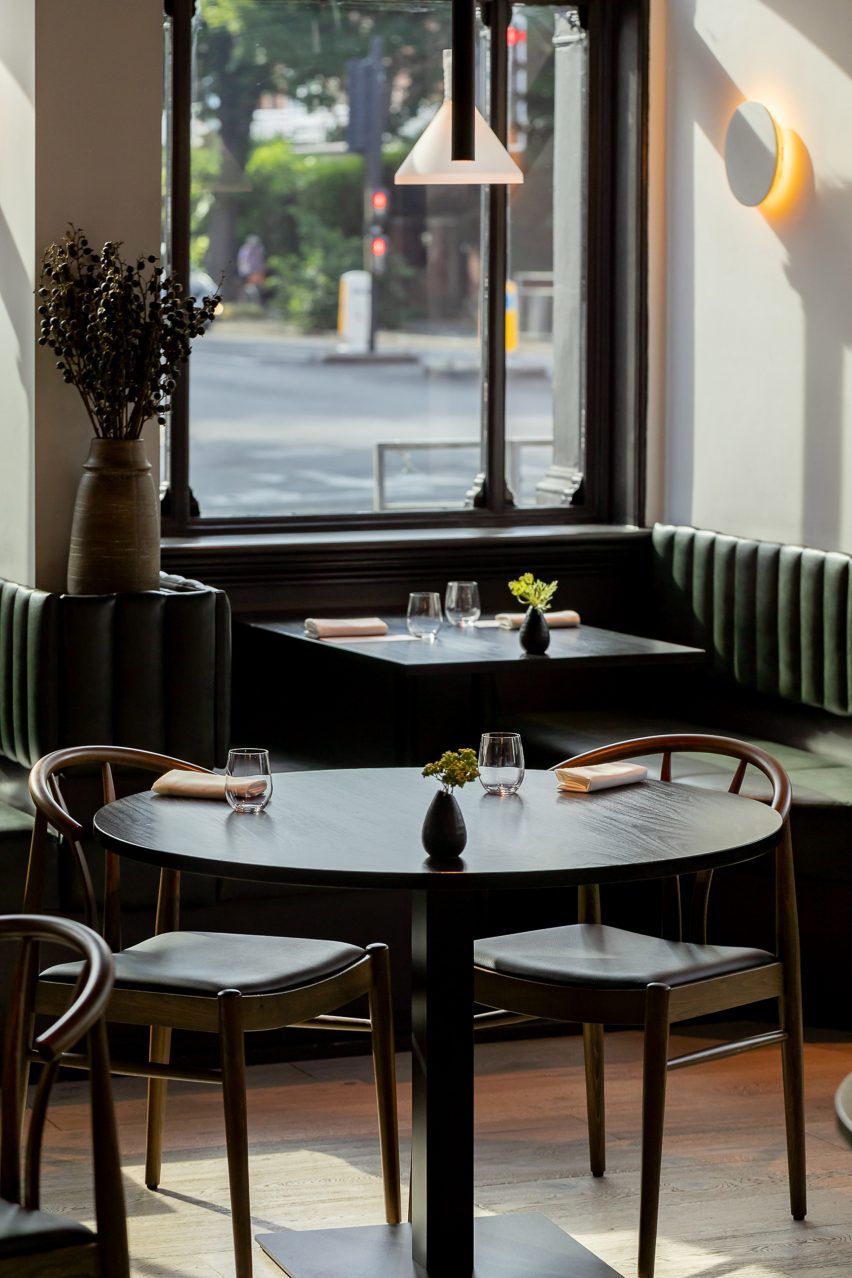
Wide-plank chalk-washed timber floors and white walls contrast black banquette seating and timber framing.

“We identified, and tried to achieve, three key principles in the design; refinement, texture, and locality,” Fahmi told Dezeen.

monochrome dining room at etch hove by steven edwards
Black-framed windows stand in stark contrast to the white interior walls

Rough quarry tiles, matte-finished stone and sinuous stretched-fabric lighting were chosen to reflect the textures of the nearby South Downs, the coastline and the urban landscape.

“The balance in texture and tone is key to the guests’ journey through every space in the restaurant and bar,” Fahmi explained.

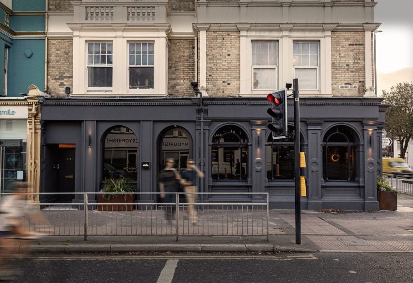
The renovation involved merging two ground-floor units together and uniting a single space that is flooded by natural light from five arched windows.

Looking out arched window at Etch
The lighting fixtures continue the monochrome theme

The studio kept three original Victorian arched windows on the corner and added two further full-height arches with modernised detailing to create a uniform facade.

This was further united by painting the whole ground-floor facade charcoal grey.

all black speakeasy bar
The subterranean speakeasy is decorated all in black with dramatic lighting

“You want to feel as though the architecture and interiors that you journey through are as curated and elegant as the food in front of you,” Fahmi said.

Internally, cast iron columns from the old bank were retained and suspended ceilings in the main spaces were stripped out to expose the original high ceilings.

Black and white interior design by London Design house
Stretched lampshades recall the nearby coastal landscape

Fahmi worked with the local council to find solutions for extract routes and plans that would “retain and respect the fabric of the historic building as much as possible”.

The studio used passive devices, such as tinting the glazing to reduce solar glare, to help control the internal temperature more efficiently.

New external planting troughs soften the austere facade and hard pavement. The studio chose plants, herbs and grasses that would be suitable for the local coastal environment.

London Design House also worked with local craftspeople and suppliers on the project to reflect Etch’s ethos of sourcing its produce locally and seasonally.

Speakeasy bar at Etch
A speakeasy bar is underneath the restaurant

“I wanted the restaurant to feel like an extension of the food and service we offer, which I would describe as British contemporary, but also minimalist  – mainly using two quality ingredients,” Etch’s chef and owner Steven Edwards told Dezeen.

The monochrome palette “gives a slightly nordic minimalist feel that works completely with my food style,” he added.

“I think the relationship between the food you eat and the setting you eat it in is really important. It’s not just about the food – although it’s hard for me to say that being a chef!”

Other restaurant interiors recently featured on Dezeen include Studio Becky Carter’s “distinctly New York” interiors for Cecchi’s and Otherworlds’ transformation of a Goan villa into restaurant.

The photography is by Justin de Souza and David Charbit.

Reference

Curved bench balanced on rocks
CategoriesInterior Design

WGNB creates minimal monochrome SVRN store in Chicago

Curved bench balanced on rocks

A variety of monolithic furniture pieces direct the flow of movement around this fashion boutique in Chicago, designed by South Korean studio WGNB.

The space for lifestyle brand SVRN is intended to highlight the products for sale as artworks and ideas, rather than simply as garments.

Curved bench balanced on rocks
Benches balanced on irregularly shaped rocks also act as product displays in the store

“Spatial design of the SVRN store began with our interpretation of the SVRN’s brand identity and narrative through the eastern perspective,” said WGNB.

“While the western perspective looks at the object itself, the eastern perspective rather focuses on the surrounding relationship of the object.”

Thin black rails for displaying clothing
Thin black railings are used for hanging garments

The 4,200-square-foot (390-square-metre) store on North Aberdeen Street, in the Fulton Market area, is split into two sections: the main sales floor and a back room, which are connected by a narrow corridor.

A muted, monochrome selection of materials creates a serene atmosphere in both of the spaces, while the architectural elements dictate purposeful paths that connect them.

Wide shot of the store with service counter on the left
Various architectural and furniture elements form pathways for shoppers to meander

Black railings transverse the walls, puncturing curved and flat vertical partitions made from materials including concrete, steel and black-stained thermowood.

Curved benches that act as both accessory displays and seating are balanced on large irregularly shaped stones.

Hole in the stainless steel ceiling
The walls and ceiling in the back room are lined with stainless steel

Together, all of these elements suggest multiple meandering routes for customers to trace through the store.

In the back room, the curvature of the benches corresponds with a circular opening in the brushed stainless steel ceiling, while a round patch of carpet sits offset on the floor.

Footwear display area
A section dedicated to footwear features multiple shelving units

Hot-rolled steel continues across three walls, creating a sci-fi feel in certain areas of the room.

Micro-cement plaster paints are used to contrast the metal, adding a rougher texture against the smooth surfaces.

Ladder of shelves sat on a circle of carpet
A monochrome colour scheme is applied throughout

“Overall, usage of the materials are manifestations of the SVRN’s brand identity and narratives,” said WGNB.

The fourth wall in the rear space is reserved for displaying shoes, which sit on shelves of unequal heights that are silhouetted against backlighting.

“The spatial layout of the store considers the current that customer’s circulation creates in the space with the objects and openness,” said the studio.

“And, the visual tension is created by the constantly changing eyesight of the customers while navigating the store.”

Store interior at night
A variety of smooth and textured surfaces create subtle contrasts across the boutique

Minimalist fashion boutiques can be found worldwide, with many brands opting for a simple and pared-back interior to allow the products to shine.

Recently completed examples include Snøhetta’s Holzweiler store in Copenhagen and a Jonathan Simkhai store in New York’s SoHo by Aruliden.

Wavy partitions define pathways
The store was designed by WGNB, the Dezeen Awards Emerging Interiors Studio in 2021

WGNB, which won the Dezeen Award for Emerging Interior Designer of the Year 2021, has also created monochromatic interiors for fashion brand Juun.J’s flagship store and a golf supply shop – both in Seoul.

The photography is by Yongjoon Choi.


Project credits:

Construction/general contractor: Helios Construction Services


Reference