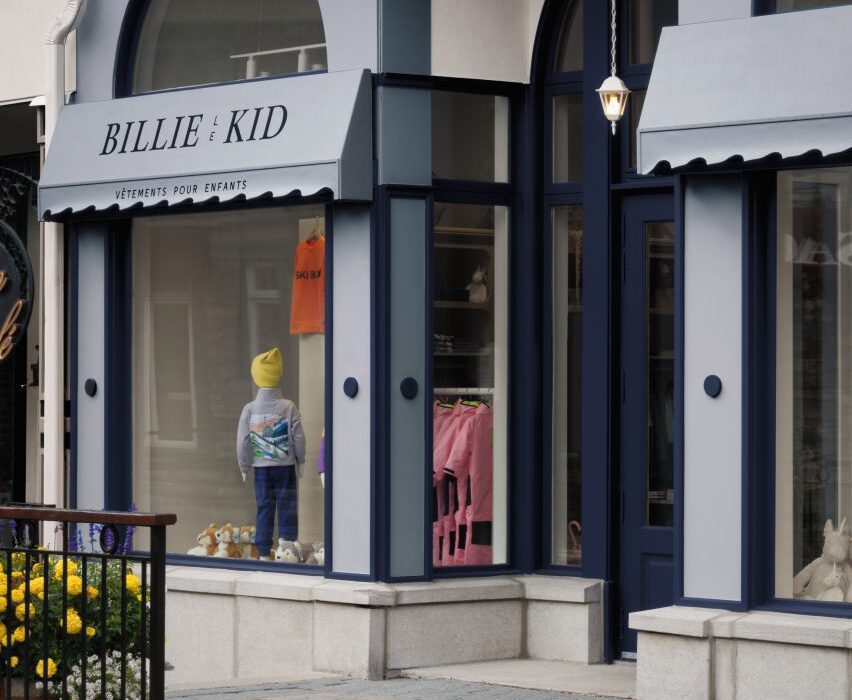
Vives St-Laurent creates Billie Le Kid boutique in Mont-Tremblant ski resort
Harnessing soft colours and gentle curves, interior design studio Vives St-Laurent has completed a shop for children’s boutique Billie Le Kid in Mont-Tremblant – a Canadian ski resort known for its colourful architecture.
Following on from Billie Le Kid‘s first store in Montreal, the brand brought in Vives St-Laurent to create a new outpost that captured the spirit of the brand while reflecting its location.
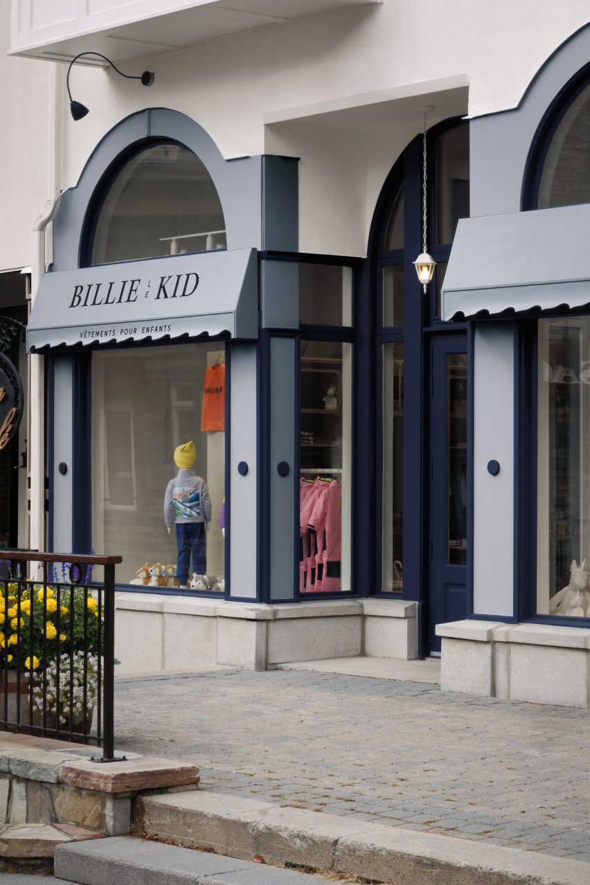
Its storefront was designed to resemble a theatre, showcasing the brand’s wholesome edit of children’s clothes, toys and books.
Custom-made awnings recall the idea of a general store, while the front was repainted in a vibrant blue-on-blue palette to reflect Mont-Tremblant’s colourful charter.
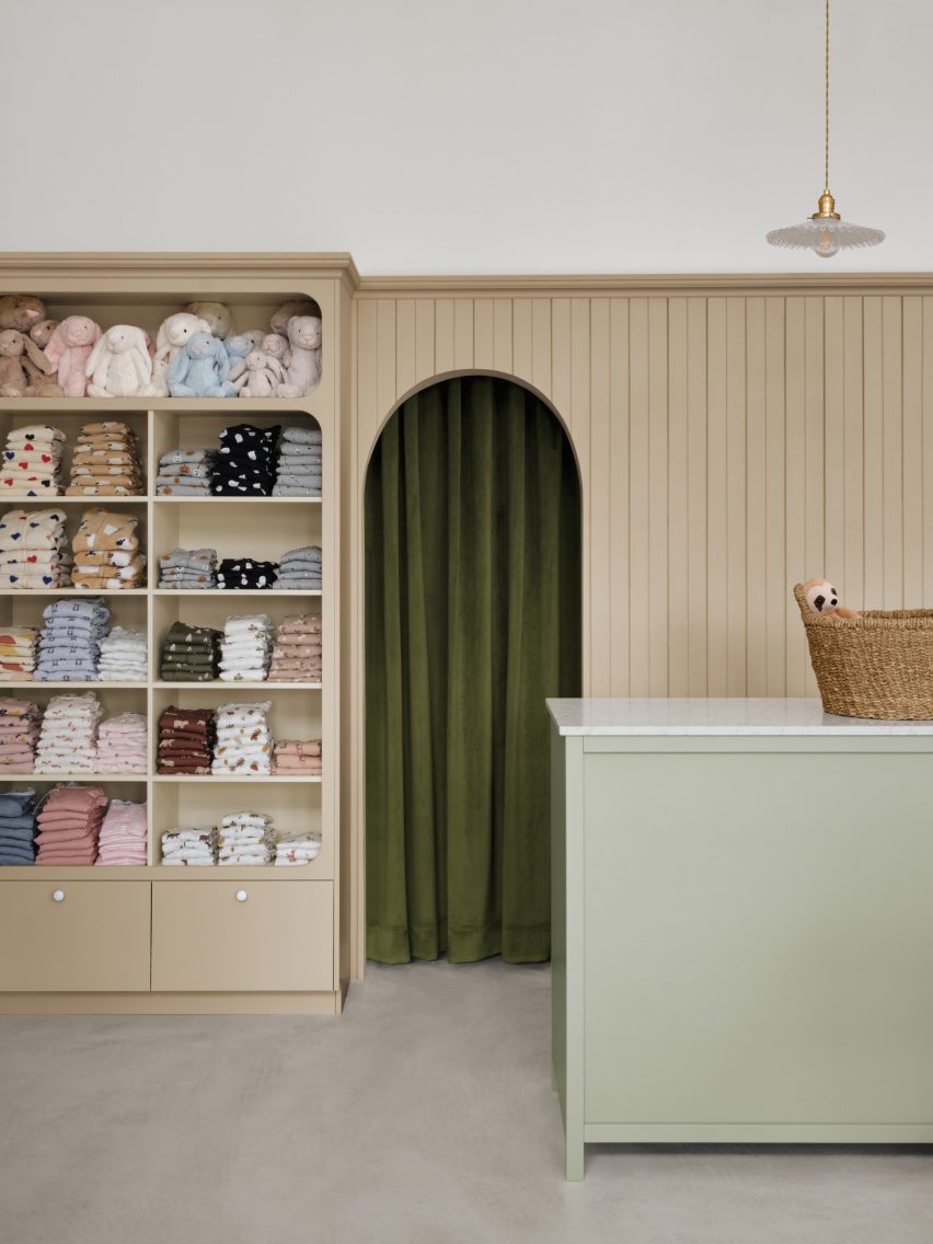
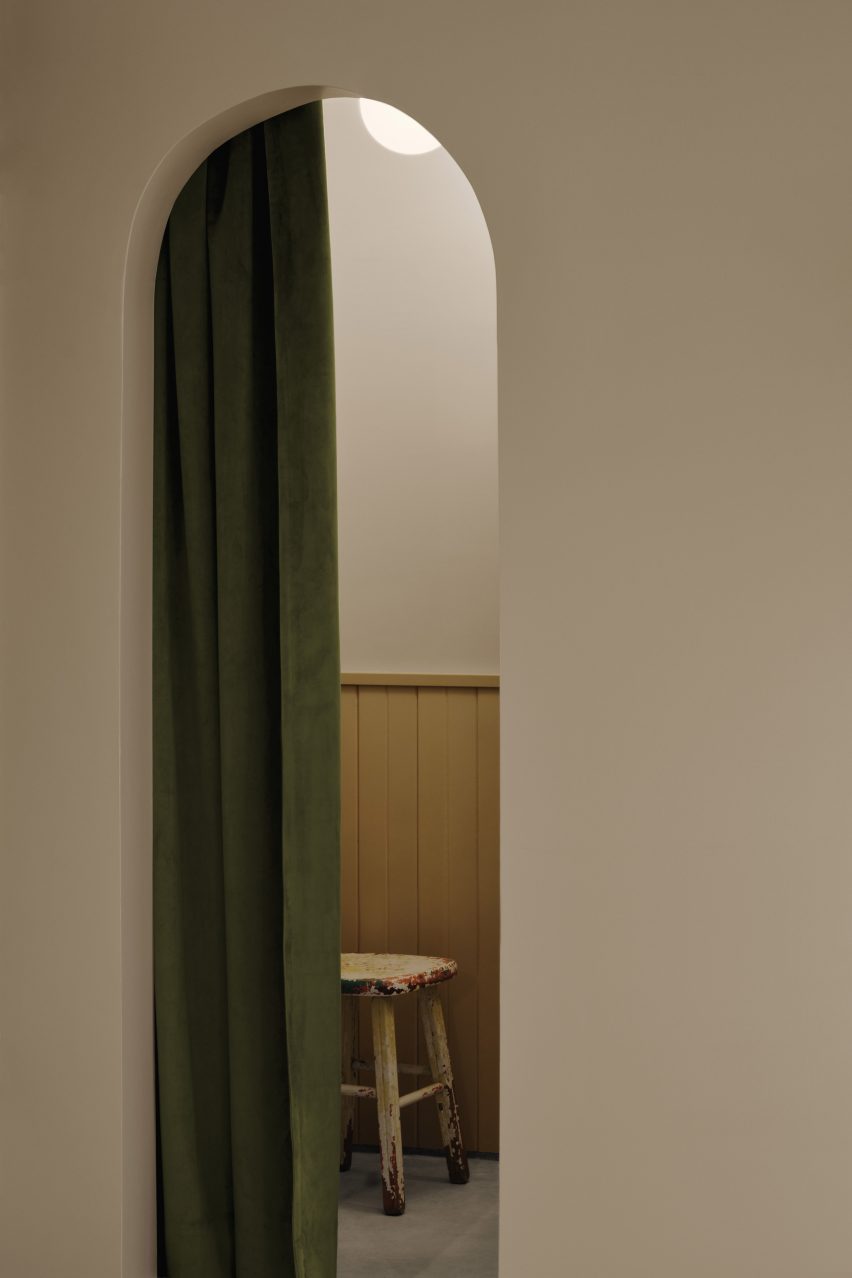
Referencing the facade, arched openings throughout the boutique bring a whimsical touch to the transitions between different sections.
Rounded corners were used to soften the edges of the display cabinets, adding character and creating a playful and welcoming atmosphere.
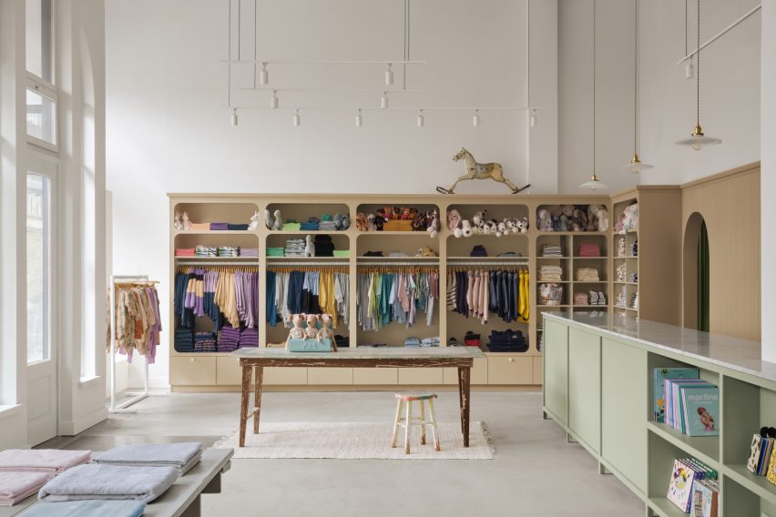
Bianco Carrara marble was used on top of the checkout counter to convey a sense of timeless luxury, while moss-coloured velvet changing room curtains reference the theatre concept and bring softness and tactility to the space.
The polished concrete floor was a practical choice, as the low-maintenance material allows skiers to visit the store in their ski boots.
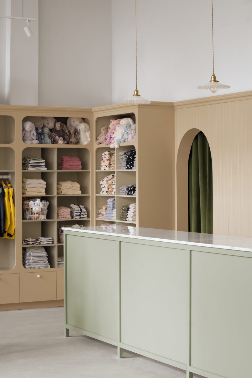
Painted tongue-and-groove panelling was added to give the boutique a touch of nostalgia.
“We combined classic and contemporary materials to create a harmonious yet unique ambience,” Vives St-Laurent’s interior designer Léa Courtadon told Dezeen.
Courtadon said she chose the store’s calming colour palette of stone beige and sage green to create “a whimsical mood that recalls the playful world of childhood while maintaining sophistication and ensuring the products stand out”.
Sturdy vintage Canadian furniture was chosen to draw on the idea of the general store and family home. Long wooden refectory tables were repurposed as displays for toys and clothing, adding visual interest while paying homage to the brand’s Canadian heritage.
A row of vintage frilled-glass pendant lights creates a feature above the counter.
“The lamps’ rippled globes resemble ballerina tutus, adding a delicate touch to the overall design,” Courtadon said.
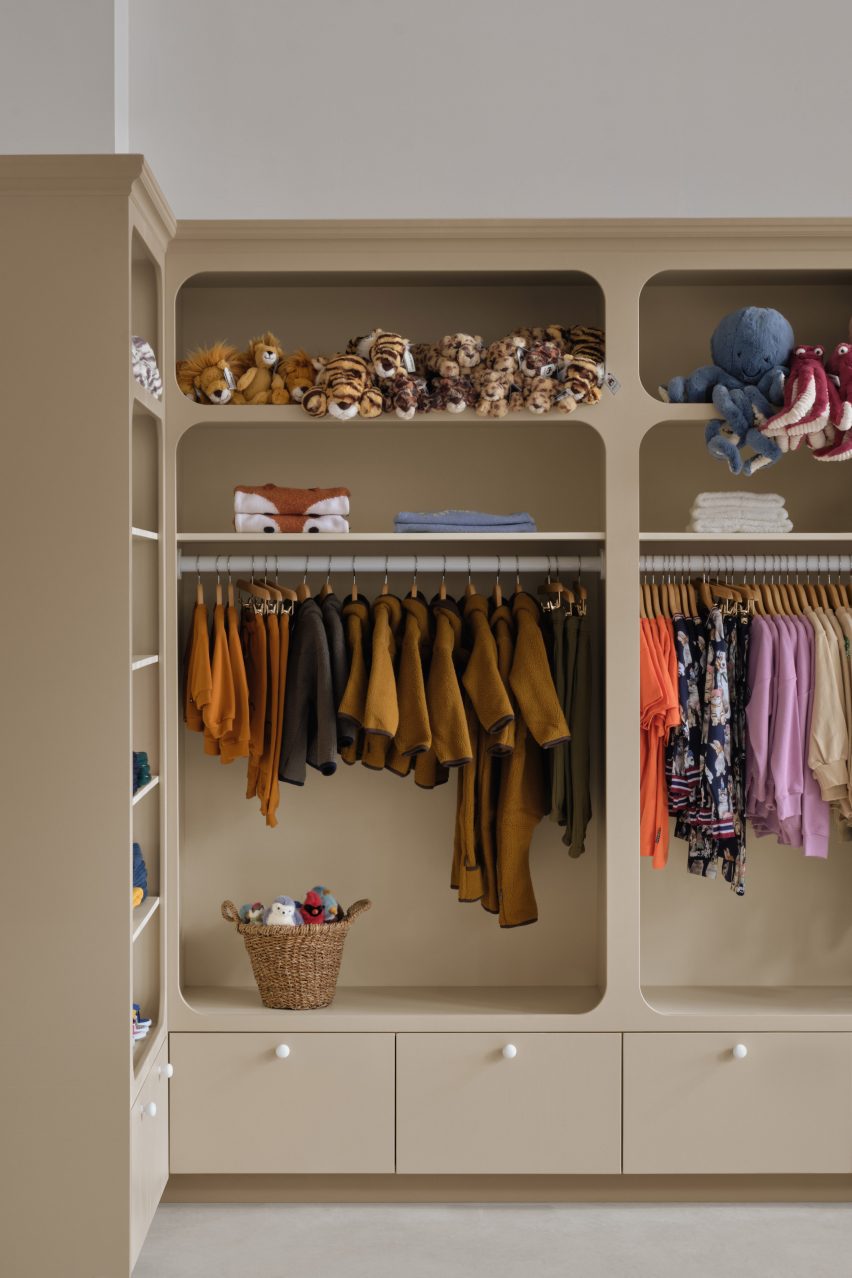
In contrast, the main lighting system with its matt white finish was chosen to blend seamlessly with the store’s high ceiling. The railing system allows for precise positioning to highlight different items within the display cabinets.
Vives St-Laurent used baskets for storage to contribute to the nostalgic, homespun aesthetic as well as offering a practical way to store and display plush toys.
“They create an impression of abundance and allow children to interact with the toys, promoting a sense of independence and autonomy,” said Courtadon. “It all contributes to a playful and engaging atmosphere that’s ideal for a kids’ store.”
Since its founding in 2018, Vives St-Laurent has completed a range of projects across Canada. Among them is a tactile home in Montreal with a grey-heavy colour scheme.
The photography is by Alex Lesage.

