In the Mood for Love: The Architecture of Neo-Romanticism
CategoriesArchitecture

In the Mood for Love: The Architecture of Neo-Romanticism

Architects: Want to have your project featured? Showcase your work through Architizer and sign up for our inspirational newsletters.

Whether it’s the quality, feeling or act, most would argue that a world void of romance is a world incomplete. And while Romanticism may have had its glory days back in the 18th century, romance and allure still pervade today’s built environment

Thankfully, that sought-after feeling is right at our fingertips. Romance is not just realized in the literal sense; there is a physicality that prevails through form, space and structure. The built environment is filled with romance — just have a look around. From the interior and exterior to the landscape, romance ceaselessly permeates like a beating heart.  Listed below are eight built projects, all of which remind us of the love we are all surrounded by, a romance that never leaves our side.


Manshausen Island Resort

By Stinessen Arkitektur, Steigen, Nordland, Norway

Jury & Popular Choice Winner, 2016 A+Awards, Architecture +Cantilever; Popular Choice Winner, 2016 A+Awards, Architecture +Glass; Popular Choice Winner, 2016 A+Awards, Hotels & Resorts
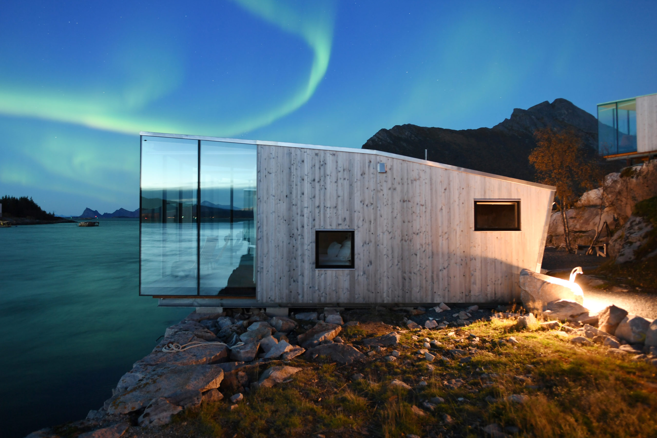
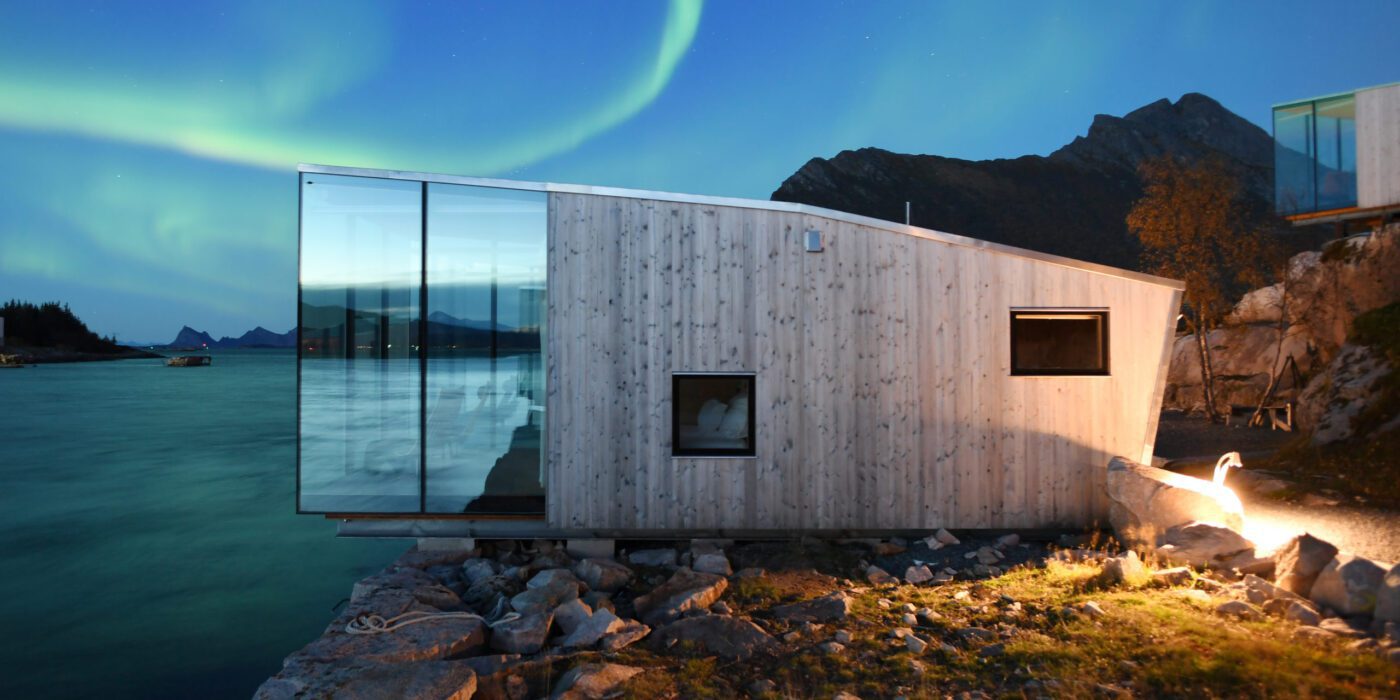
Nothing screams the quintessential “romantic getaway” quite like the Manshausen Island Resort in Norway. Sited in the Steigen Archipelago, this island resort is sandwiched by the Lofoten mountain range and the Barents Sea. Each cabin is partially cantilevered above the sea and has been carefully positioned to create individual panoramic views that equally ensure privacy. The landscape and the changing Northern lights make for an emotional and dramatic experience, underpinned by romance and beauty.


The Mushroom – a wood house in the forest

by ZJJZ Atelier, China

Jury Winner, 10th Annual A+Awards, Architecture +Joy
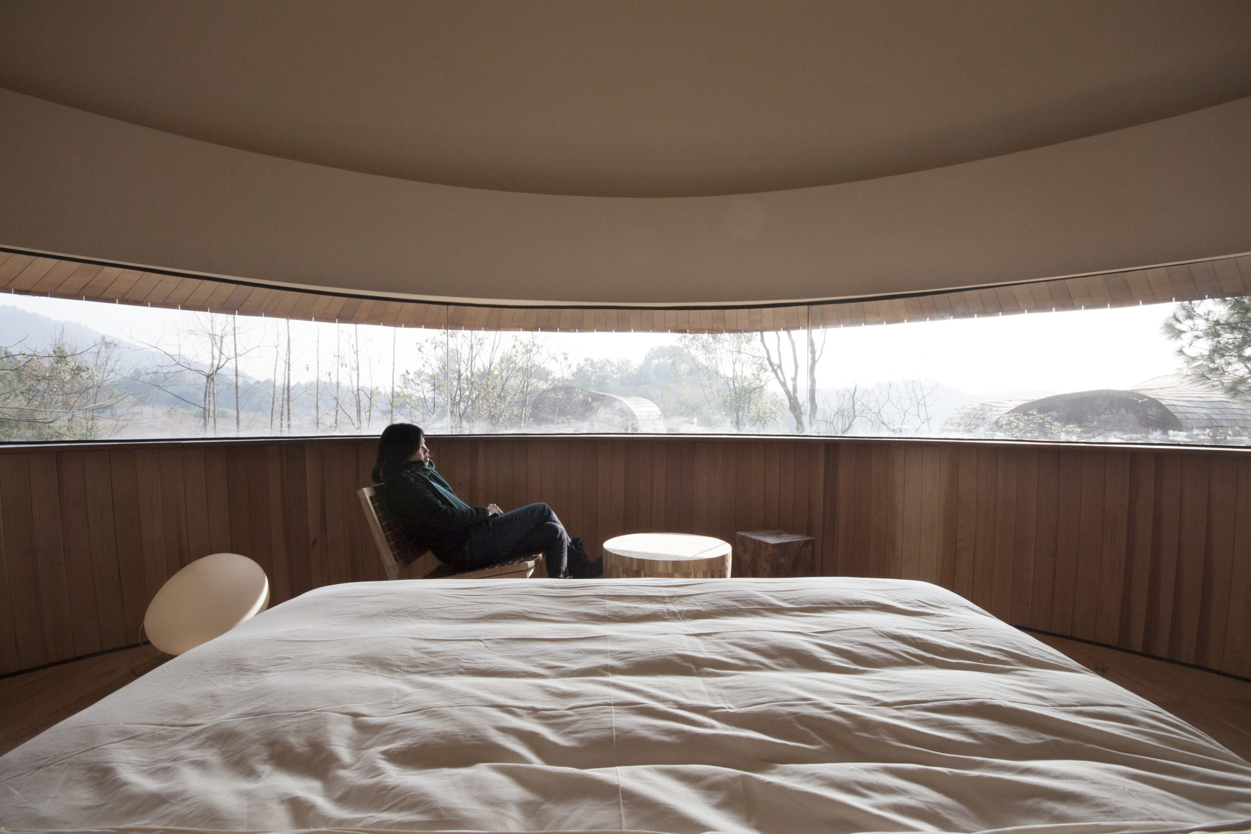
This guest suite is located in a pine forest, home to a 1600-year-old tale where a fairy is said to have fallen in love with a young farmer. A reminder of the romance in folklore, this guest suite mimics the shape of sprouting mycelium and offers a unique circular resting space. With a horizontal window encircling the entire suite, guests are confronted by panoramic views of the wondrous pine forest.  


Romantic Nest in Amalfi Coast 

By Ernesto Fusco Interior Designer, Amalfi, Italy
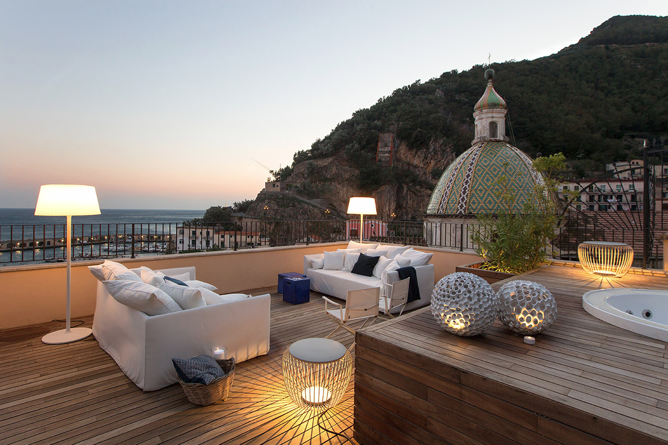
Perhaps it’s the magic of the terrace overlooking beautiful Amalfi or the blend of contemporary elements with evocative art and colorful tiles, but this apartment has a charming allure that makes you want to indulge in the riches of the Italian mercattos and sing along to Al Bano. 


Little Cottage

by Bettini Architetto, Bologna, Italy
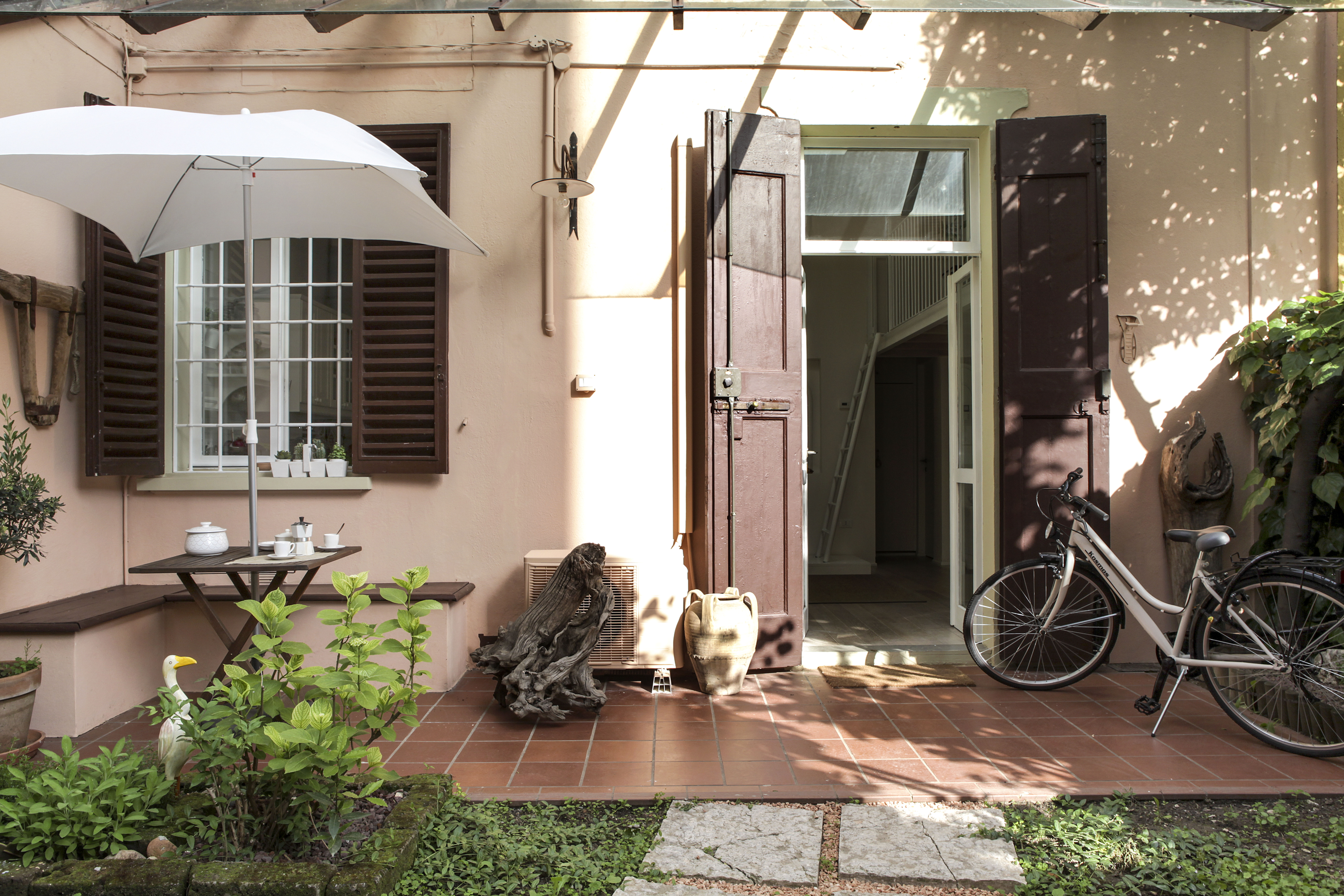
Photo by Brando Cimarosti

Courtyards are inherently magical spaces — the seclusion and privacy gives way for intimate connections. Located near the historic center of Bologna, this 50 square meter cottage offers guests an intimate yet well-functioning living space. During the day, the home radiates with sun and at night, carefully studied artificial lighting has been selected to produce a soft atmosphere. From the painting choices to the wallpaper, the apartment was designed with intentionality and makes room for individual experience.  


The Painterly Approach

By Arterra Landscape Architects, Tiburon, Belvedere Tiburon, California

Jury Winner, 2015 A+Awards, Private Garden
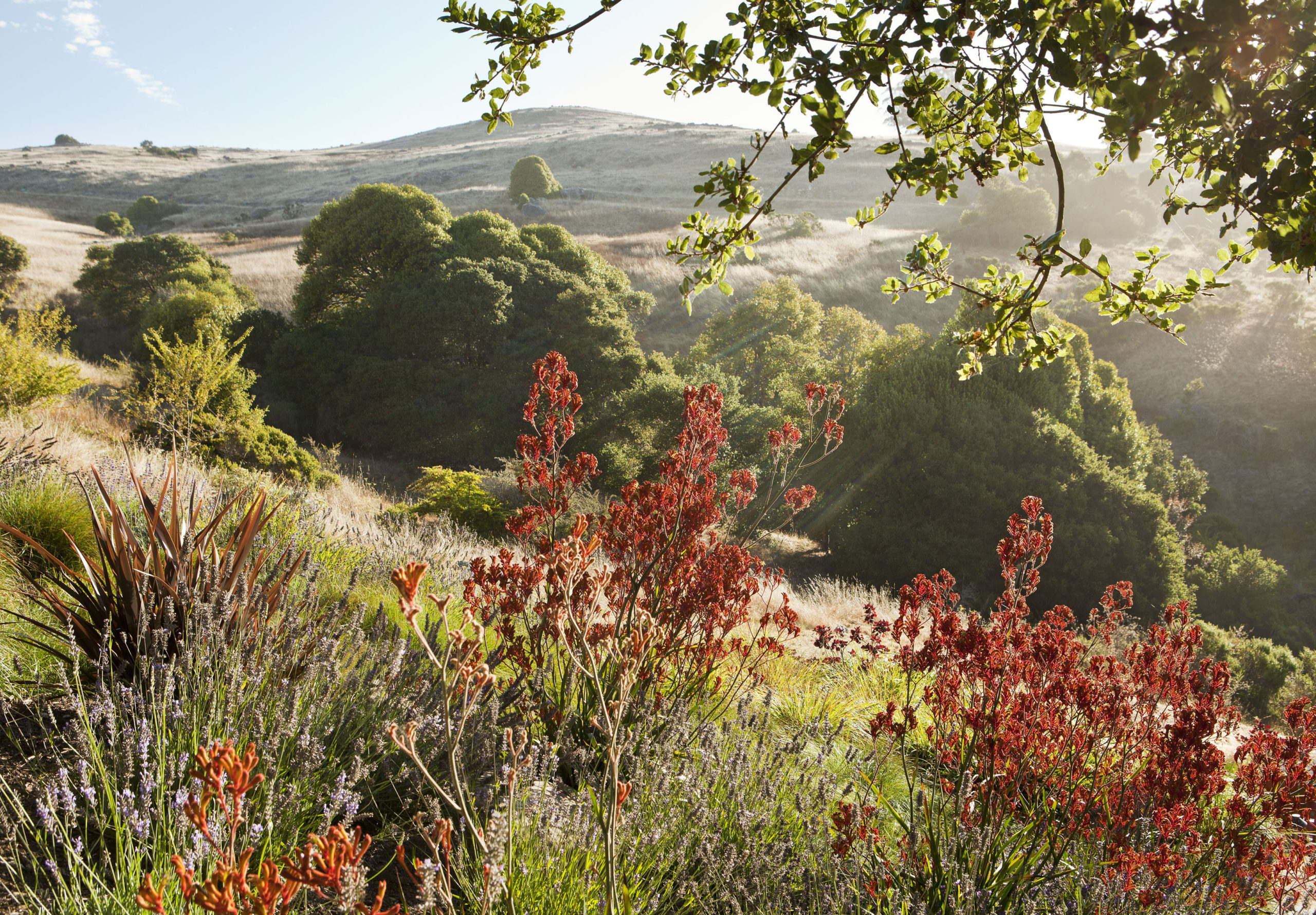
Photo by Michele Lee Willson

Just like its name, this landscape feels like a piece of art and embraces the romantic art form of hand painting. Conceived to address both functional and aesthetic purposes, this landscape addresses the site’s existing draining issues while creating an exterior space to draw in the family. Designed as a winding swale, the landscape offers a beautiful walking path that leads towards a seating area and outdoor pool. Incorporating many native Californian plants, the bright tones of yellow, red and purple create a painterly effect. Flowers that connect with the beautiful backdrop, almost touching the sky and reminiscent of the Romantic landscapes of the 18eme siècle. 


The Number 6

By Building, Turin, Italy
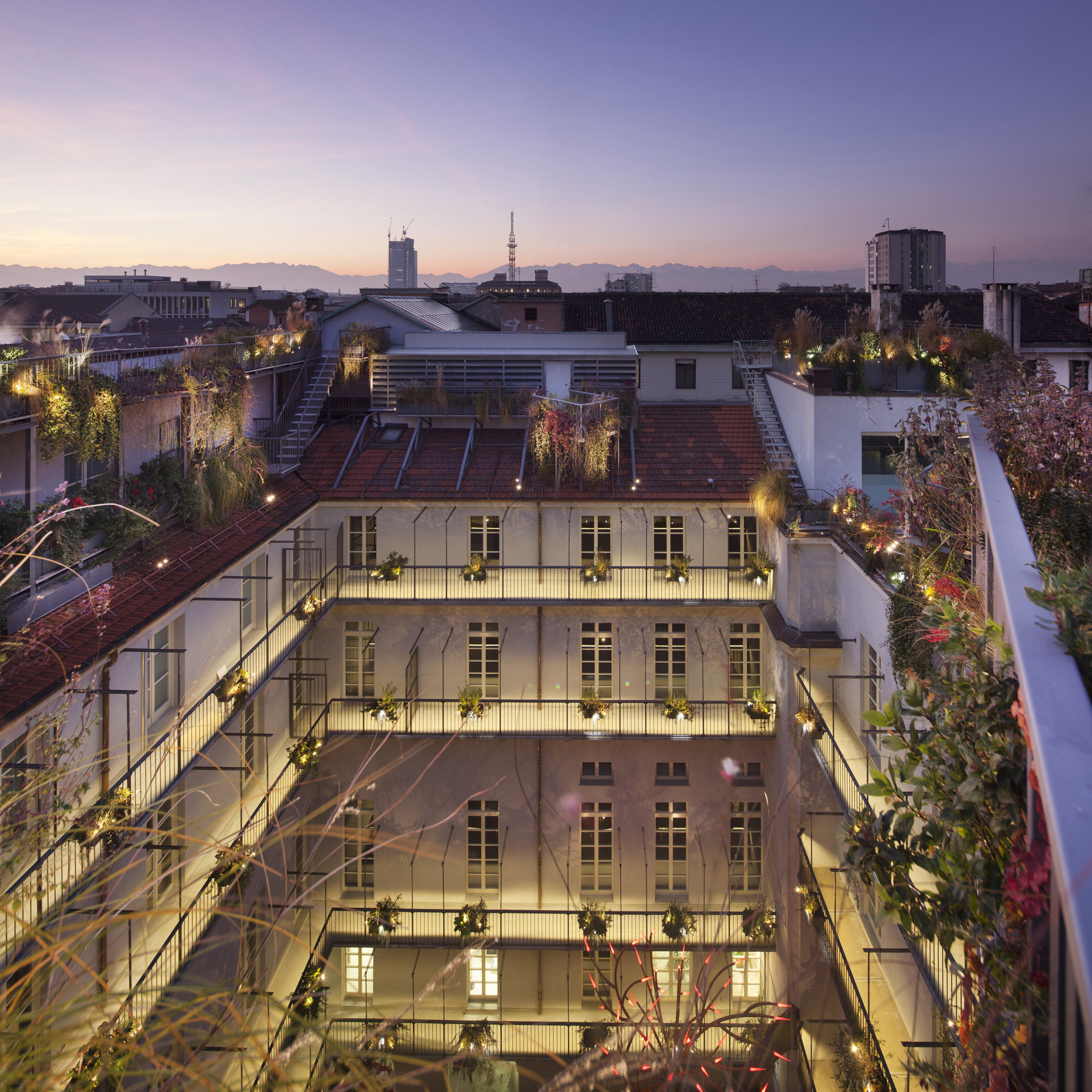
This project is a complete revitalization of the 17th-century Palazzo Valperga Galleani, realized into a vibrant city landmark and residence. By way of art, lighting and plants, this residential building is both cutting-edge and dramatic. The original garden was completely reconstructed, incorporating decorative elements in two horizontal and vertical planes which creates a romantic gesture towards the city. From the inside flats to the exterior communal courtyard, the warm tones transform this complex into an atmospheric wonder which heightens the site’s beauty and overall sensation of romance.


Shan-shui: A Duality | The Chuan Malt Whisky Distillery

By Neri & Hu, Emeishan City, Leshan, China

Finalist, 2022 A+Awards, Architecture +Branding
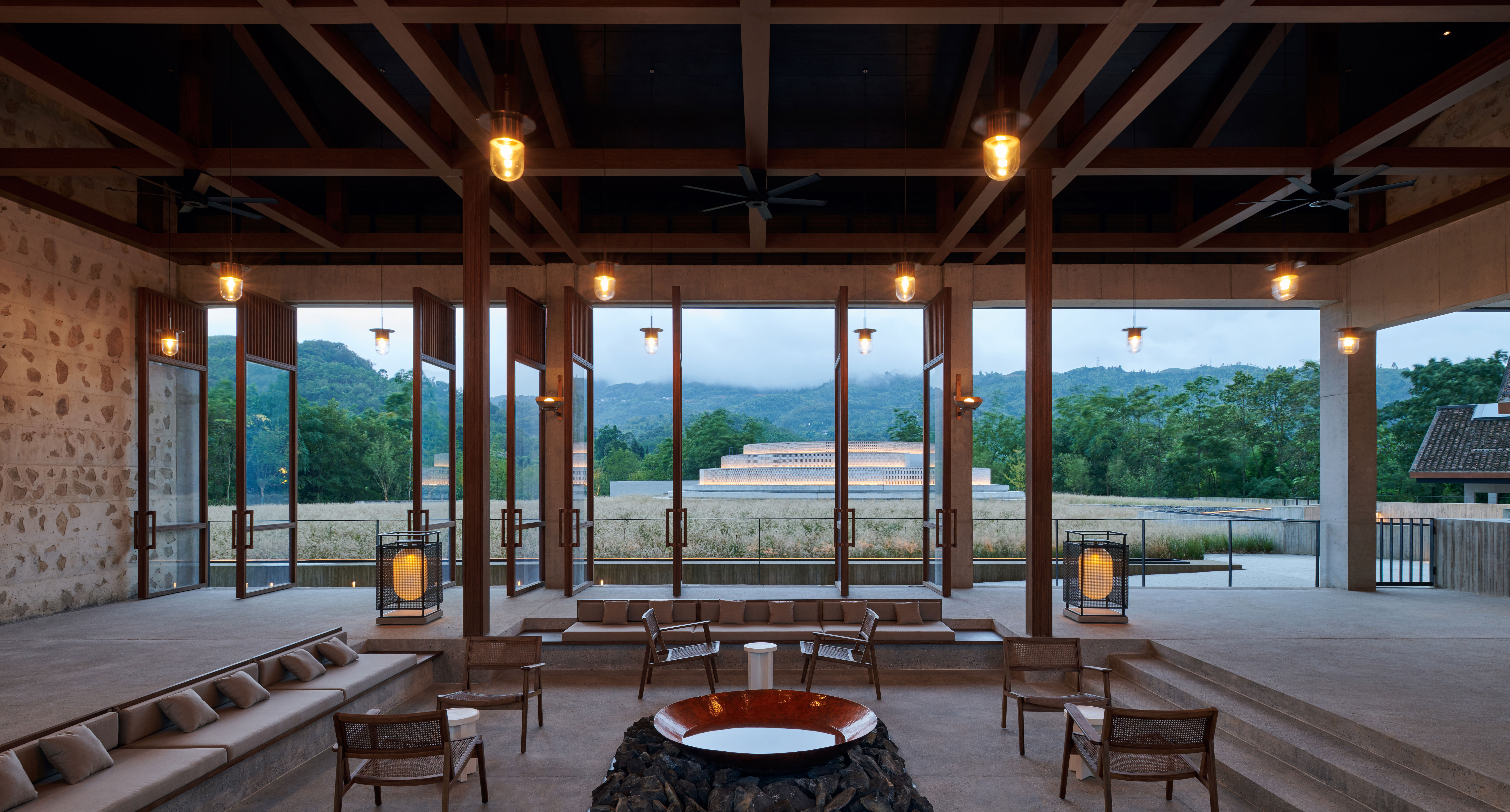
With the spiritual landmark of Mount Emei nestled the backdrop, this distillery is located on revered land and carry’s the responsibility of retaining memory while embracing growth. The project explores the notion of duality, otherwise known as shan-shui in Chinese culture, and aims to balance the concept of permeance and transformation. This paradigm is captured in the reckoning between Chinese vernacular architecture and contemporary geometries. As visitors move throughout the distillery’s numerous spaces –– both subterranean and above ground –– they are followed by a powerful romantic sensation. 


Garden Shed

By Avanto Architects Ltd and Linda Bergroth, Finland
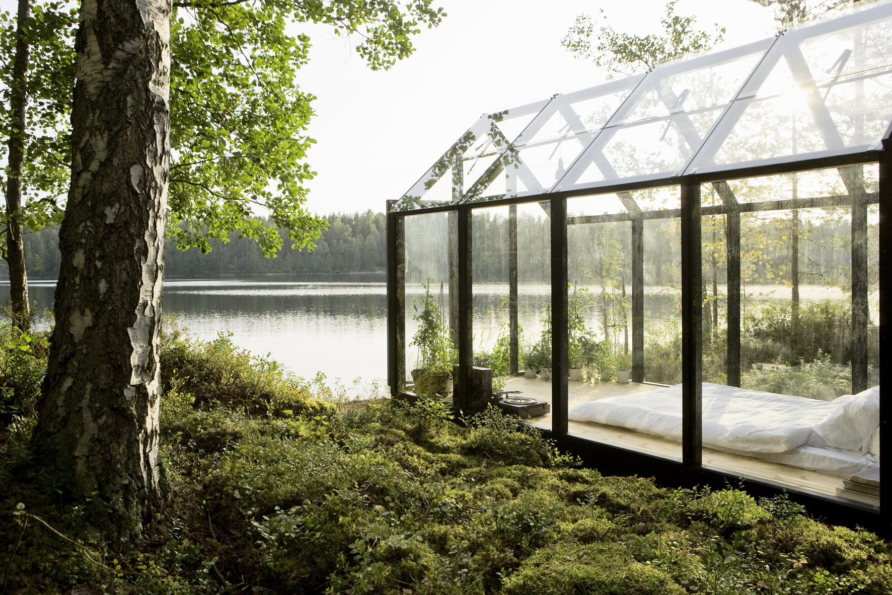
Needless to say, the romance in this project speaks for itself. Built with Finish pine, safety glass and an automatic temperature control system, this prefabricated garden can also double as a whimsical outdoor bedroom. With large floor-to-ceiling windows and a glass gabled roof, the interior space is an extension of the outdoors –– creating a profound connection with the surrounding flora and fauna. Emerging like a delicate glass box, this secluded structure intermingles with the sounds of the nearby water and makes for a magical oasis –– a scene right out of A Midsummer Night’s Dream.  

Architects: Want to have your project featured? Showcase your work through Architizer and sign up for our inspirational newsletters.

Reference

Eight retro interiors that capture the mood of a Wes Anderson film
CategoriesInterior Design

Eight retro interiors that capture the mood of a Wes Anderson film

Following the release of American filmmaker Wes Anderson’s eleventh motion picture Asteroid City, we have collected eight interiors that embody his distinctive cinematic style for our latest lookbook.

Anderson is known for his retro pastel colour palettes and use of symmetry, as seen in the sets from his latest feature film that are currently the subject of an exhibition at London’s 180 the Strand.

From a Milanese cafe designed by the director himself to a quirky makeup store in China that was styled to mimic 1970s offices, here are eight interiors that were either directly influenced by Anderson or look as if they are taken straight out of one of his films.

This is the latest in our lookbooks series, which provides curated visual inspiration from Dezeen’s archive. For more inspiration see previous lookbooks featuring bedrooms with bathtubs, Parisian apartments and striking art gallery interiors.


Bottle shop informed by Wes Anderson with central wooden counter and displays on either side
Photo is by Ye Rin Mok

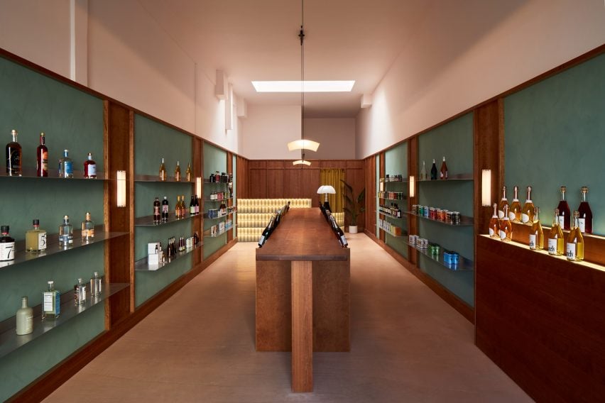
Boisson, USA, by Studio Paul Chan

Local firm Studio Paul Chan took cues from the opening scene of Anderson’s 2021 film The French Dispatch when designing the interiors for this bottle shop by non-alcoholic drinks brand Boisson in Los Angeles.

Elements of mid-century Hollywood design and art deco were combined in a space that includes walnut-stained wooden wall panelling, dusty green accents and a bespoke glass-block counter.

Find out more about Boisson ›


A yellow and orange store interior
Image is courtesy of AIM Architecture

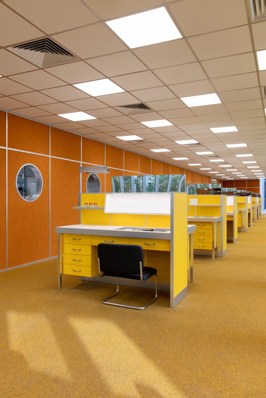
Harmay store, China, by AIM Architecture

A colour palette of muted yellow, orange and brown characterises this shop by makeup brand Harmay, which is set across the renovated second floor of a business park in Hangzhou.

Chinese studio AIM Architecture designed the space to mimic a 1970s office by using rows of yellow desks to display stock and incorporating a retro woollen carpet and frosted-glass sliding “meeting room” doors.

“Creating an ‘old fashioned’ physical retail experience in an actual office space just seemed a fun way to translate this duality of space and time,” the studio’s founder Wendy Saunders told Dezeen.

Find out more about this Harmay store ›


Shelves and a fridge inside a cannabis dispensary
Photo is by Alex Lysakowski

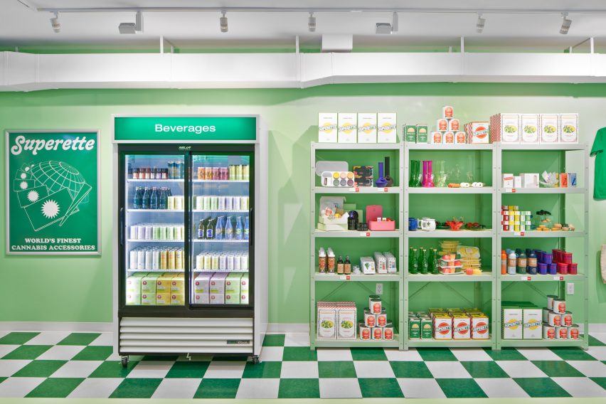
The Annex, Canada, by Superette

The vivid colour palettes and geometric shapes often associated with Anderson’s cinematography also feature at The Annex, a marijuana dispensary in Toronto that was modelled on Italian delis.

Green and beige checkerboard flooring was paired with deli props, tomato-red stools and hanging pendant lights while various cannabis paraphernalia was laid out like groceries.

Find out more about The Annex ›


Bar Luce by Wes Anderson
Photo is by Roland Halbe

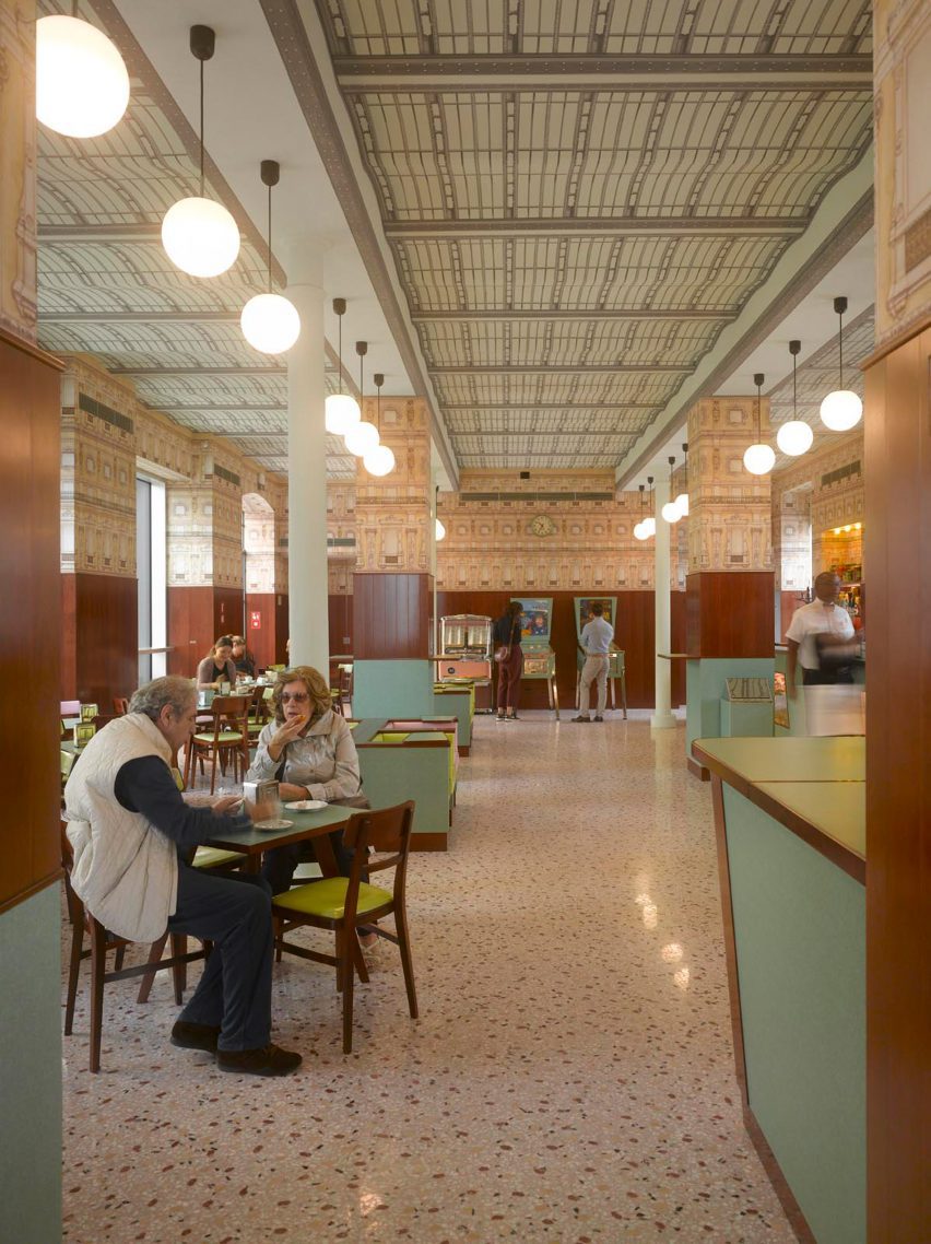
Bar Luce, Italy, by Wes Anderson

Created by Anderson himself, Bar Luce is located within the OMA-designed Fondazione Prada in Milan.

Pastel colours and veneered wood panelling were applied to the space, which was designed to reference iconic city landmarks and cafes – particularly those dating back to the 1950s and 60s.

“I tried to make it a bar I would want to spend my own non-fictional afternoons in,” said the filmmaker, who stressed that the bar was not designed as a set but rather as a “real” place.

Find out more about Bar Luce ›


Interior of Cafe Bancado with colour palette informed by Wes Anderson
Photo is by Mikael Lundblad

Cafe Banacado, Sweden, by ASKA

Cafe Banacado is an all-day breakfast cafe in Stockholm designed by local architecture studio ASKA.

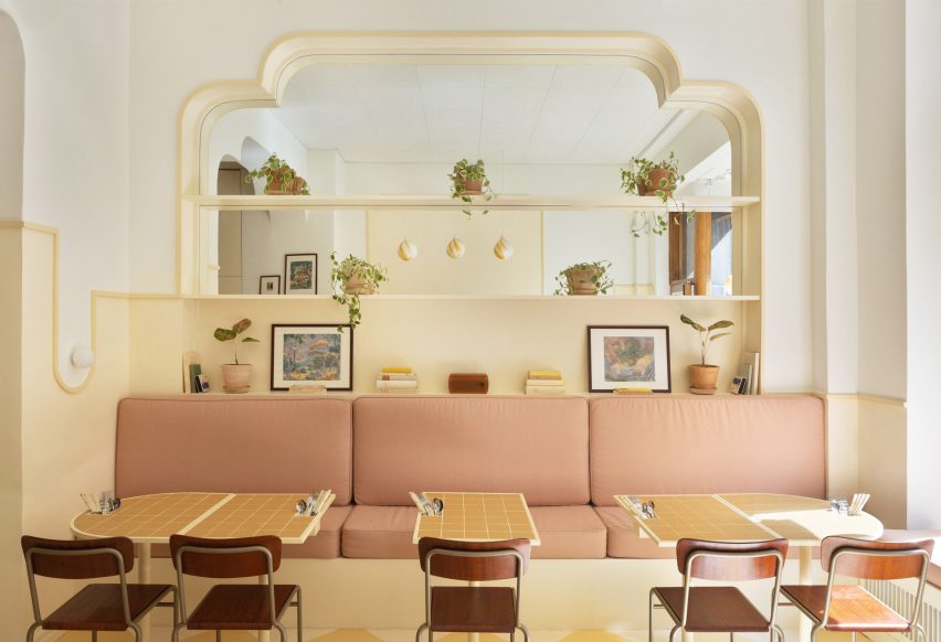
ASKA followed “a strong symmetry” when creating the interiors, which feature checkerboard flooring, arched mirrors and a sunny colour palette that was specifically chosen to evoke the dreamlike atmosphere of Anderson’s films.

Find out more about Cafe Banacado ›


The Budapest Cafe by Biasol
Photo is by Derek Swalwell

The Budapest Cafe, Australia, by Biasol

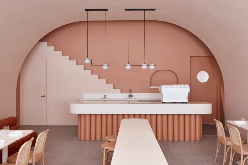
Local studio Biasol designed this salmon-hued cafe in Carlton, Melbourne, to reference Anderson’s 2014 feature film The Grand Budapest Hotel – in particular its symmetrical compositions and “nostalgic” colour palettes.

Stylised steps to nowhere decorate the walls, while a curved archway frames a glossy point-of-sale counter with a tubular base finished in terracotta.

Find out more about The Budapest Cafe in Melbourne ›


Budapest Cafe informed by Wes Anderson
Photo is by James Morgan

The Budapest Cafe, China, by Biasol

Biasol also designed another outpost for The Budapest Cafe in Chengdu, China, that references the titular film.

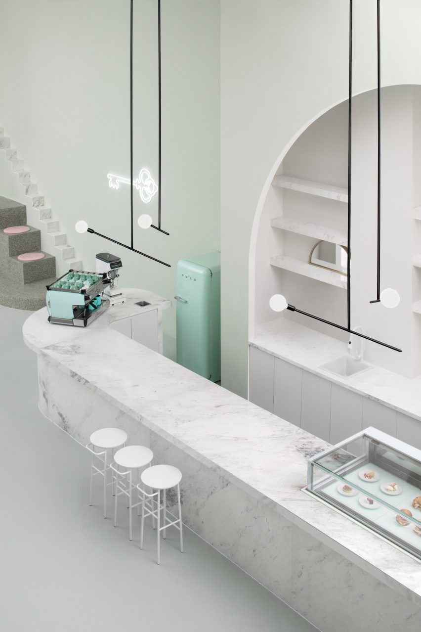
Here, Biasol combined pastel shades and marble surfaces with similar chunky elevations to those found in the Melbourne cafe. The centrepiece of the room is a tiered terrazzo seating area topped with a pink ball pit and an original Eero Aarnio Bubble chair.

Find out more about The Budapest Cafe in Chengdu ›


Hotel Palace restaurant, Finland, by Note Design Studio
Photo is by Romain Laprade

Hotel Palace restaurant, Finland, by Note Design Studio

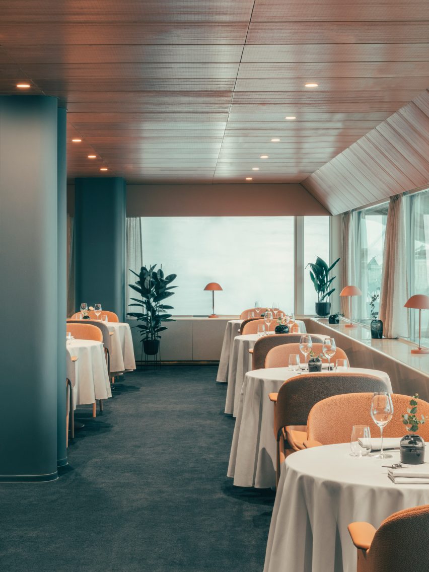
When Note Design Studio renovated a restaurant within Helsinki’s Hotel Palace, the Swedish firm set out to honour the history of the modernist building, which was opened in time for the city’s 1952 Summer Olympics.

Teak panelling, luxurious teal carpet and expansive windows lend themselves to a cinematic atmosphere, while white tablecloths add a touch of glamour to the space, where visitors can imagine Anderson’s characters dining.

This is the latest in our lookbooks series, which provides visual inspiration from Dezeen’s archive. For more inspiration see previous lookbooks featuring bedrooms with bathtubs, Parisian apartments and striking art gallery interiors.

Reference

Architecture Mood Board: Mies van der Rohe’s Barcelona Pavilion
CategoriesArchitecture

Architecture Mood Board: Mies van der Rohe’s Barcelona Pavilion

There are few buildings in the world with a more distinctive aesthetic than the Barcelona Pavilion, designed by Mies van der Rohe and Lilly Riech. Originally constructed as the German Pavilion for the Barcelona International Exhibition in 1929, and rebuilt in 1986, this iconic building bears all the characteristics of the Modernist principles that Mies is famed for. The pavilion’s emphatic horizontality, open-plan layout and minimalist detailing are renowned, but the project’s use of materials are arguably its most defining quality.

Sumptuous yet cool, rich yet understated, the pavilion’s material palette celebrates the art of contrast. Monumental slabs of marble work in harmony with slender glass partitions and reflecting pools to create a serene space, worlds away from the hustle and bustle of the nearby city.

Here, we take a closer look at some of those iconic materials, revealing the ingredients behind one of the purest manifestations of Modernist architecture. To the right of each image, you can find a selection of samples inspired by each material — visit Material Bank to start curating your own board.


Travertine (floor and exterior walls)

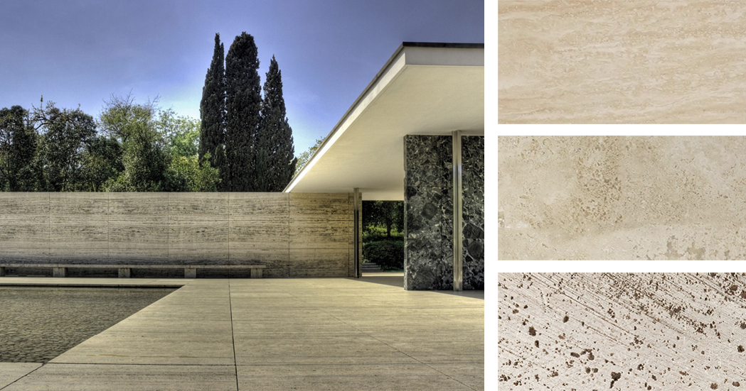
Left: The Barcelona Pavilion; image by Wojtek Gurak. Right: Materials inspired by the pavilion’s travertine surfaces; samples via Material Bank

The most prominent material used throughout the Pavilion is Roman travertine, a luxurious yet hard-wearing material that anchors the projects. Travertine forms the plinth upon which the building sits, as well as the surrounding walls, which enclose the reflecting pool and provide a sense of separation from the outside world. Its color, a soft, yellowish hue, acts as a perfect backdrop for the bold materials placed throughout the building.

Featured Material Samples


Golden Onyx (interior freestanding wall)

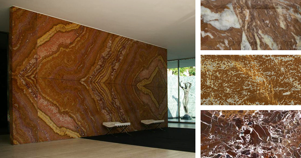
Left: Barcelona Pavilion interior; image by Martin D. Right: Materials inspired by the pavilion’s onyx wall; samples via Material Bank

At the heart of the building is a freestanding wall of golden onyx, sourced from the Atlas Mountains in Northern Africa. The uniquely patterned surface of this slab was revealed by a splitting process called broaching, enabling a symmetrical marbled pattern to be displayed across the wall’s entire expanse. In terms of color, amber hues transition into oranges and deep reds, providing a rich and complex finish that forms a focal point within the building’s interior. Interestingly, Carsten Krohn, author of Mies Van Der Rohe: The Built Work, states that “the honey-yellow onyx wall of the original is much redder in the modern reconstruction.”

Featured Material Samples


Green Marble (walls)

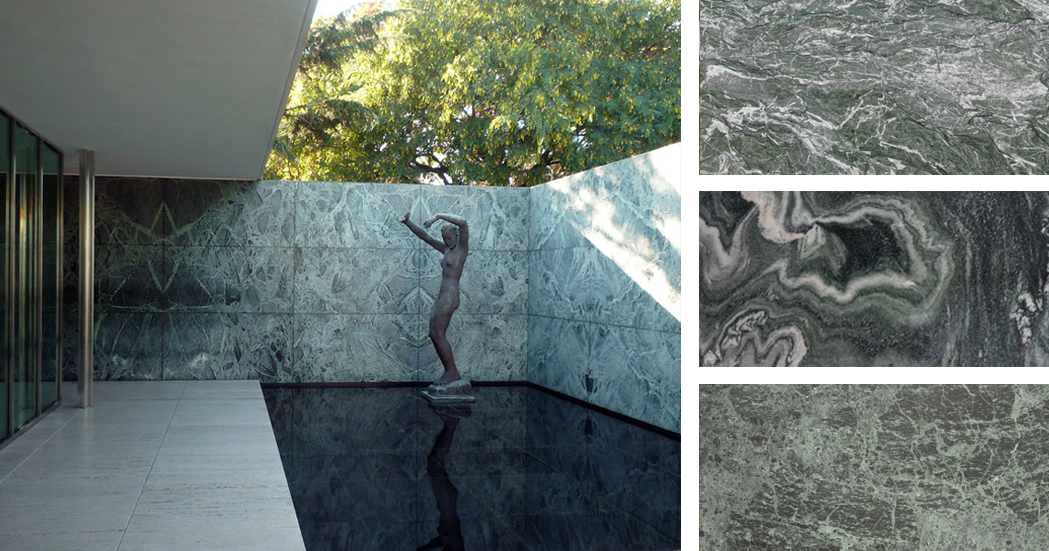
Left: Barcelona Pavilion exterior; image by Steven Zucker. Right: Materials inspired by the pavilion’s green marble walls; samples via Material Bank

Two types of marble with a green hue can be found in the Barcelona Pavilion: Polished green Tinian marble and “vert antique” marble, quarried in the French Alps. The hues of these walls range from deep green to gray-blue, contrasting with the lighter shades of travertine below and the pure white plane of the ceiling above.

Featured Material Samples


Glass (walls)

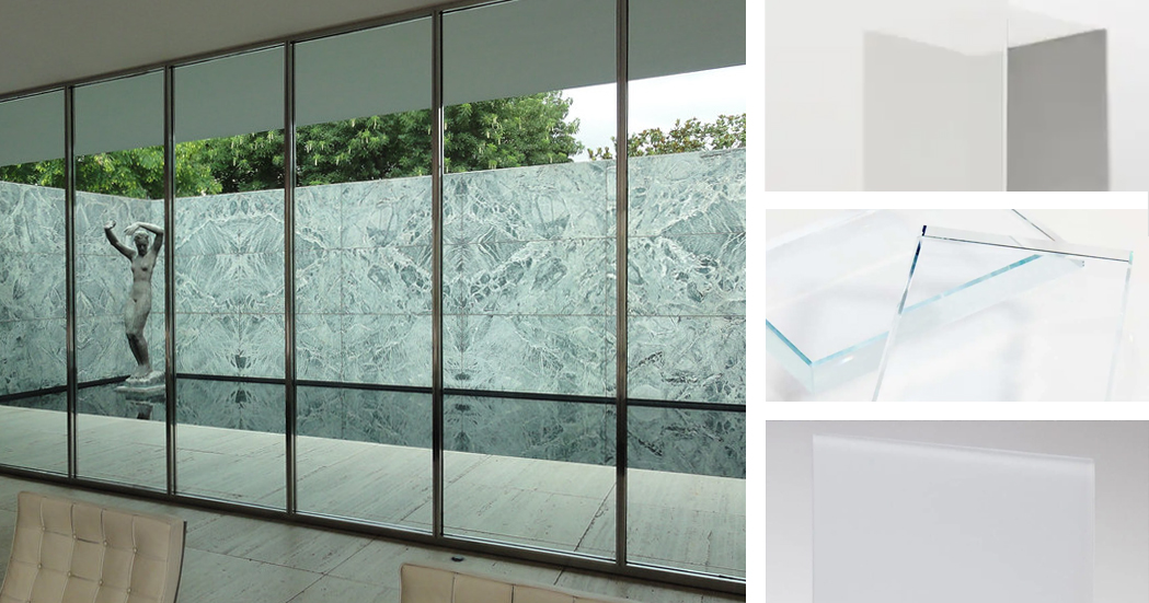
Left: Barcelona Pavilion glazing; image by Kent Wang. Right: Materials inspired by the pavilion’s glazing; samples via Material Bank

Mies employed a variety of glass materials throughout the pavilion, controlling the level of transparency, varying the sense of enclosure and framing specific views. According to Krohn, “an entire repertoire of materials have been employed: in addition to transparent glass, the building makes use of green and gray glass, frosted glass as well as black opaque glass for the table tops.” Together with the marble partitions, the glass panels of Mies’ pavilion challenge the conventional function of walls — rather than enclosing space, they act as devices to guide people through the building, channeling their path and blurring the boundaries between inside and out.

Featured Material Samples


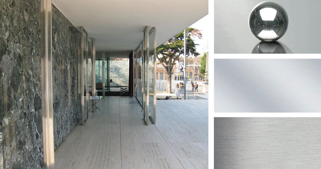
Stainless Steel (loading-bearing columns)

Left: Barcelona Pavilion interior; image by Rory Hyde. Right: Materials inspired by the stainless steel columns; samples via Material Bank

Key to Mies van der Rohe’s design was a set of eight polished steel columns that support the roof. As Krohn explains, “the columns form a structural unit that represents a separate architectonic element independent of the non-loadbearing partitioning walls.” Their cruciform shape provides the necessary structural rigidity, while their polished finish reflects light and flashes of color from the surrounding marble. It also echoes the reflective quality of the pools on the exterior or the building.

Featured Material Samples


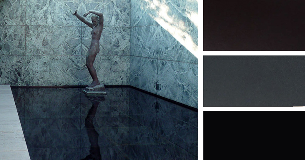
Black Glass (reflecting pool)

Left: Barcelona Pavilion exterior; image by Steven Zucker. Right: Materials inspired by the black glass of the reflecting pool; samples via Material Bank

Black glass was used to line the smaller of the two pools within the Barcelona pavilion, designed to heighten the reflective quality of the water and dramatize the solitary ornament within the building: a bronze reproduction of Georg Kolbe’s sculptural figure, entitled “Dawn”. Both the sculpture and the patterned marble walls behind it are perfectly reflected in the water, their curves contrasting with the perfectly straight lines that define the space.

Featured Material Samples


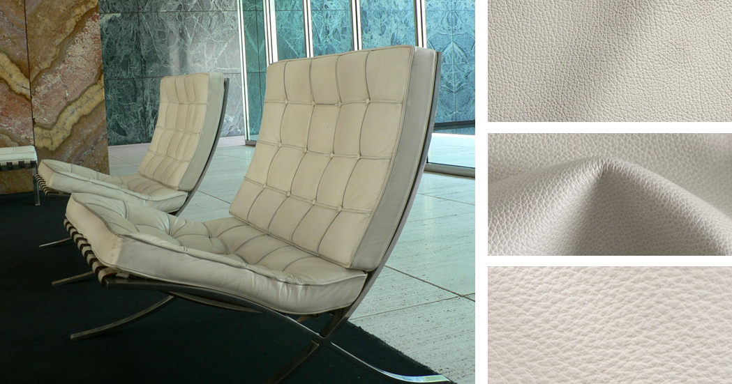
Ivory Leather (Barcelona Chairs)

Left: Interior featuring the Barcelona Chair; image by Yuichi. Right: Materials inspired by the Barcelona Chair; samples via Material Bank

Designed by Mies van der Rohe himself, the Barcelona Chair is an icon of modern design, to such an extent that faithful reproductions are still produced and sold today. The structure of the chair is polished stainless steel, echoing the cruciform columns of the pavilion. The back and cantilevered seat are upholstered with off-white kid leather, with welt and button details. MoMA sums it up best: “The Barcelona Chair achieves the serenity of line and the refinement of proportions and materials characteristic of Mies van der Rohe’s highly disciplined architecture.”

Featured Material Samples


Inspired by Mies? We invite you to create your own material mood boards using iconic architecture as your muse! Share your creations with editorial@architizer.com and we’ll publish a selection of the best on Architizer.

Top image: The Barcelona Pavilion via Wikimedia

Reference