backlit colourful marble "vanity rooms"
CategoriesInterior Design

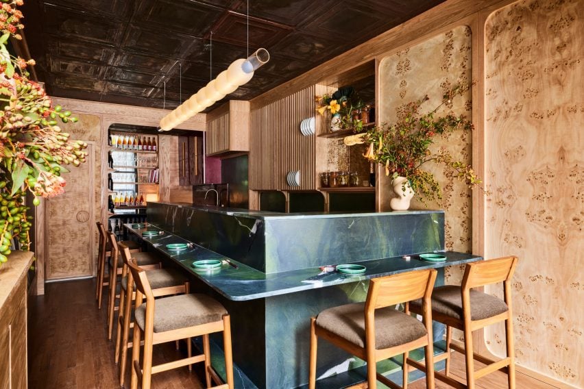
Al-Jawad Pike creates marble store for APL in NYC

backlit colourful marble "vanity rooms"

British architecture studio Al-Jawad Pike has used colourful marble for the interiors of trainer brand Athletic Propulsion Labs’ second flagship store in Soho, New York City.

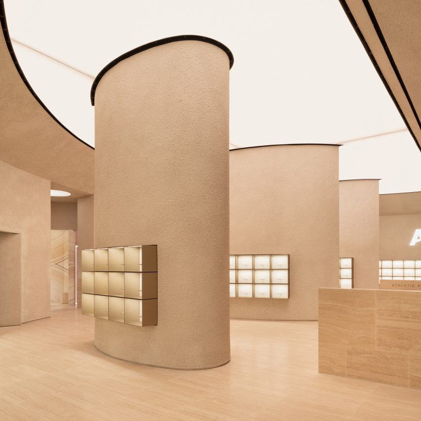
The interior of the 3,900-square-foot space (1,188 square metre) was laid out in a curving amphitheatre design, which the studio designed to be “simple yet severe” while creating a “completely immersive experience,” Al-Jawad Pike studio co-founder Jessam Al-Jawad told Dezeen.

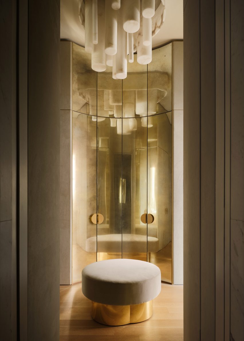
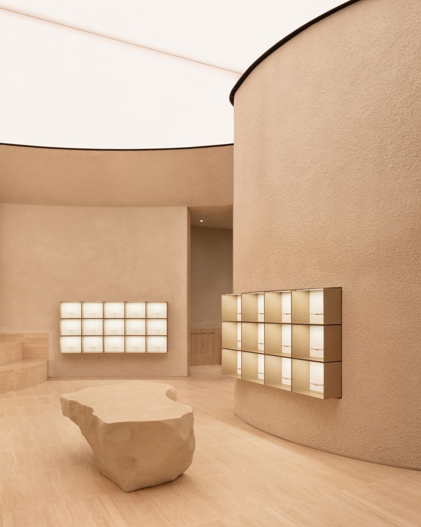
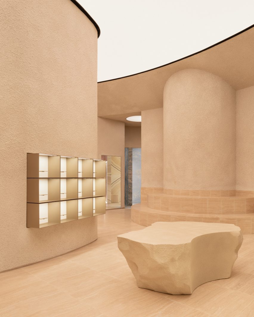
The centrepiece of the Athletic Propulsion Labs (APL) store is five “vanity rooms” in a radial design, each clad in different-coloured onyx or marble stone with matching stone stools and back-lit mirrors.

The rainbow-colour array of stone, chosen by the client from different quarries, was “intended to represent the five boroughs of New York,” Al-Jawad said.

backlit colourful marble "vanity rooms"backlit colourful marble
Five vanity rooms are each clad in distinctive coloured onyx or marble

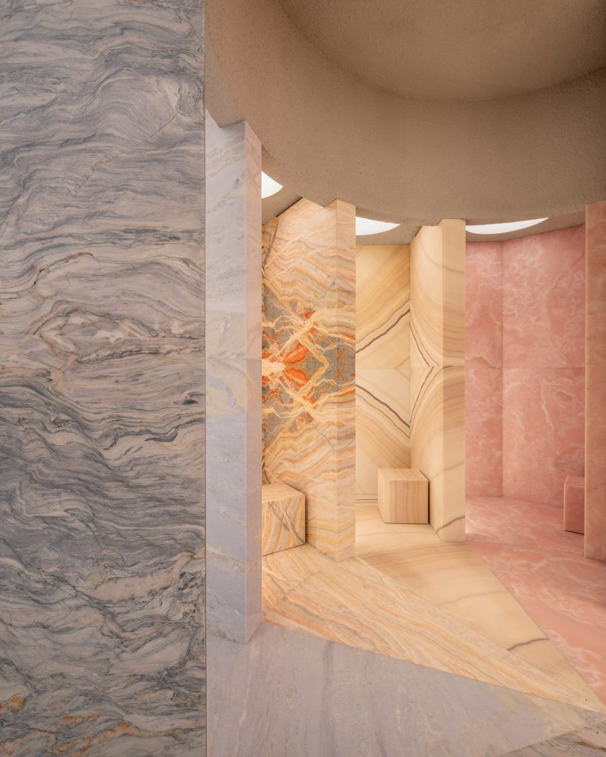
A teardrop-shaped column is located in the centre of the store, while boulder-like plinths positioned around the space are used for product displays.

The textured display plinths were developed with a bespoke fabricator based in New York, who CNC-carved the forms.

The studio incorporated various other materials into the scheme such as textured sprayed plaster on the walls, Romano travertine for the floor, and champagne-coloured anodised aluminium for the display boxes.

Athletic Propulsion Lab flag ship store by Al Jawad PikeAthletic Propulsion Lab flag ship store by Al Jawad Pike
Al Jawad Pike completed the interiors for Athletic Propulsion Lab’s flagship store in New York

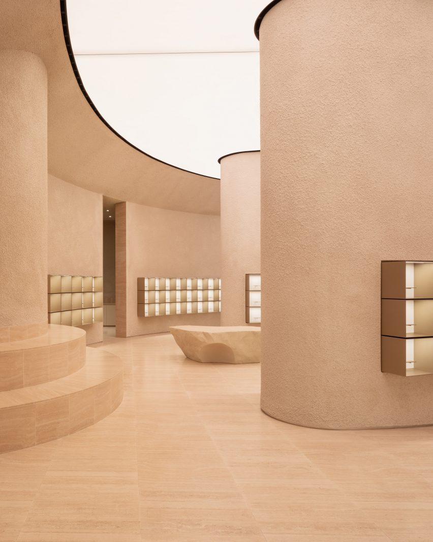
The aim of the store layout was to allow customers to see all the products from all parts of the store.

“We approached this by creating an architectural form that displays the product in a pan-optical array to provide visibility in completeness from almost any part of the store; whilst maintaining a seamless link between staff back-of-house functions at the basement level with the main retail space,” the studio explained.

Athletic Propulsion Lab flag ship store by Al Jawad PikeAthletic Propulsion Lab flag ship store by Al Jawad Pike
The space features a layout designed in a curvilinear amphitheatre style

The shoes are displayed in simple box frames, which are raised and lit up like artwork in a gallery. Ensuring that the trainers on display were the focal point was a main objective for the architects.

“The goal was to make sure the products were the main attraction in the store, while also making everything work smoothly for both customers and staff,” Al-Jawad Pike said.

Athletic Propulsion Lab flag ship store by Al Jawad PikeAthletic Propulsion Lab flag ship store by Al Jawad Pike
The studio devised a store layout enabling customers to view all products from any part of the store

The store’s semi-circular layout has street-facing windows that let in the light, and the studio also added adjustable warm lighting from the back-lit, semi-circular ceiling to provide additional illumination.

“We wanted to create a wash of light from above to bath the space in a warm and comfortable ambience,” said Al-Jawad.

“At its top, the perimeter wall banks into a semi-circular, back-lit stretch ceiling with adjustable warmth to dramatically alter the atmosphere in the space.”

Athletic Propulsion Lab flag ship store by Al Jawad PikeAthletic Propulsion Lab flag ship store by Al Jawad Pike
Sculpted boulders are dotted around the store space

Al-Jawad Pike was founded in 2014 by Al-Jawad and Dean Pike and aims to create spaces that “engender a sense of well-being and intrigue, as well as fun”.

Other retail interiors recently featured on Dezeen include Bottega Veneta’s Avenue Montaigne flagship store in Paris and Cúpla’s design for a boutique in central London.

The photography is by Ståle Eriksen.

Reference

Glass and bronze modules form an arch of light over a dining booth
CategoriesInterior Design

Rockwell Group creates “cathedral of fried chicken” for NYC restaurant

Glass and bronze modules form an arch of light over a dining booth

Arches of light warmly illuminate this Korean fried chicken restaurant in New York’s Flatiron district, designed by Rockwell Group.

Coqodaq is the brainchild of restauranteur Simon Kim’s Gracious Hospitality Management, the group behind the Michelin-starred and James Beard-nominated COTE Korean Steakhouse.

Glass and bronze modules form an arch of light over a dining boothGlass and bronze modules form an arch of light over a dining booth
At Cododaq, glass and bronze modules form arches of light over diners

The new restaurant offers an elevated take on traditional Korean-style fried chicken, encouraging diners to indulge in nuggets topped with caviar and to pair its “bucket” dishes with champagne.

“Designed by Rockwell Group as ‘the cathedral of fried chicken’, the restaurant design delivers a daring, yet refined dining experience that skillfully integrates Korean and American influences, placing them at the forefront of this enticing culinary adventure,” said the restaurant team.

Restaurant interior with moody material palette and warm lightingRestaurant interior with moody material palette and warm lighting
The restaurant’s moody material palette and warm lighting set the tone for an elevated take on Korean fried chicken

To create the right atmosphere for this experience, Rockwell Group opted for a dark and moody interior of rich materials and low, warm lighting.

“Our goal was to capture the essence of this unique concept and innovative approach to fried chicken and translate it into a memorable dining experience,” said founder David Rockwell.

Booth seating with crackled plaster wall panels aboveBooth seating with crackled plaster wall panels above
Plaster wall panels feature a crackled effect akin to fried chicken skin

Upon entry, guests are invited to wash their hands in leathered soapstone basins, above which a row of pill-shaped light bands glow within a bronzed mirror that also wraps onto the side walls.

Past the host stand, an area with four high-top tables offers a space reserved for walk-ins in front of garage-style windows.

A long bar topped with black soapstone and fronted with tambour woodA long bar topped with black soapstone and fronted with tambour wood
The long bar is topped with black soapstone and fronted with tambour wood

The main dining area is formed by a series of green leather and dark walnut booths on either side of a central walkway.

A series of illuminated arches soar overhead, formed from rippled glass and bronze modules that resemble bubbling oil in a deep-fat fryer.

Champagne collection displayed in glass cases with bubble-like lightingChampagne collection displayed in glass cases with bubble-like lighting
The restaurant’s extensive champagne collection is displayed in glass cases with bubble-like lighting

At the end of this procession, a mirrored wall reflects glowing arches and creates the illusion of doubled space. Meanwhile, plaster wall panels feature a crackled effect, nodding to the crispy skin of the fried chicken.

“The material palette was driven by a desire to surround diners in an envelope of warmth, creating a joyful place to be at any time,” Rockwell said.

Rockwell Group creates atmospheric interiors for Perelman Center in New York

Additional booth seating to one side is followed by the long bar, topped with black soapstone, fronted by tambour wood and backed by a luminous black liquor shelf.

The restaurant’s extensive champagne collection – which it claims is the largest in America – is displayed inside glass cabinets installed with globe-shaped lights that look like giant bubbles.

Area with high-top tables reserved for walk-in dinersArea with high-top tables reserved for walk-in diners
At the front of the restaurant is an area with high-top tables reserved for walk-in diners

“Simon and I share the belief that the most important thing about restaurants is how they ritualise coming together for a shared, celebratory experience and Coqodaq provides the perfect template for that,” said Rockwell.

Since Tony Award-winning designer founded his eponymous firm in New York 40 years ago, the studio has grown to a 250-person operation with additional offices in Los Angeles and Madrid.

Hand-washing station with leathered soapstone basins and rings of light aboveHand-washing station with leathered soapstone basins and rings of light above
Upon arrival, guests are encouraged to wash their hands in leathered soapstone basins

Among Rockwell Group’s recent hospitality projects are the Metropolis restaurant and lobby spaces at the Perelman Arts Center (PAC NYC) and Zaytina inside the Ritz-Carlton Hotel.

We’ve featured a few fried chicken restaurants recently, including a 1960s-influenced spot in Los Angeles and a neon-illuminated eatery in Calgary.

The photography is by Jason Varney.

Reference

Double-height living room surrounded by windows
CategoriesInterior Design

Timothy Godbold adorns Tribeca loft with modernist relief panels

Double-height living room surrounded by windows

New York interior designer Timothy Godbold has renovated an apartment in a historic Tribeca building, adding various relief treatments across its neutral walls including panels influenced by a 1970s sci-fi series.

The spacious loft is located in an 1881 cast-iron building on Franklin Street, which was formerly a textile factory and was overhauled by Pritzker Prize-winning Japanese architect Shigeru Ban in 2019.

Double-height living room surrounded by windowsDouble-height living room surrounded by windows
The most dramatic space in the loft is a double-height living room surrounded by windows

“The homeowners, a young family with two children, set out with the objective of creating a great home for entertaining that simultaneously utilized space efficiently to create a comfortable family living space,” said Godbold‘s team.

The designer helped to organise the layout so that it functioned optimally for the family, and despite opting for a neutral colour palette, Godbold upped the drama through the scale of the furniture and artwork.

Dining table anchored to a structural columnDining table anchored to a structural column
Rather than disguise a structural column, Timothy Godbold used it as an anchor for the dining table

A double-height living room occupies a corner flooded with light from windows on two sides, which can be diffused by drawing the sheer curtains.

To work around a large structural column disrupting the view to the living room, Godbold used the column to anchor a stone dining table to turn it into a focal feature.

Minimalist kitchen viewed from double-height living roomMinimalist kitchen viewed from double-height living room
The kitchen is intentionally minimal, benefitting from the absence of cabinet and drawer pulls

The table references a 1930s design by Hans and Wassili Luckhardt and Alfons Anker, in keeping with the industrial style of the building.

The kitchen is very minimal, thanks to the omission of cabinet and drawer pulls, and includes an island with a waterfall stone top that creates space for a breakfast bar.

Flexible office and bar space with a brown sofaFlexible office and bar space with a brown sofa
An area behind the kitchen was converted into a flexible office and bar space

Hidden behind the kitchen is a former TV room converted into a bar room and an office “to maximise the versatility of the space and meet multiple needs”.

The walls in this flexible room are covered in geometric plaster-relief panels, which add shadows and texture, while the furniture is darker and more masculine.

Plaster relief panels based on a 1970s sci-fi series covering a curved wallPlaster relief panels based on a 1970s sci-fi series covering a curved wall
Plaster relief panels based on a 1970s sci-fi series cover the walls

A Reprise pendant light from New York design studio Apparatus hangs in a corner that has been curved to accentuate the modernist-style wall panelling.

“The wall details in this Tribeca space are inspired by a classic 1970s sci-fi series that showcases an all-Italian modern aesthetic within a futuristic environment,” said the team.

A fluted feature wall behind a bedA fluted feature wall behind a bed
A feature wall behind the bed in the primary bedroom is fluted across its full width

A row of plastered arched niches separates the formal entertaining areas from a more casual seating area, where a large pale grey sofa shifts the tone from the warm whites found elsewhere.

In the primary bedroom, the built-in bed and nightstands are installed below a tufted upholstered headboard that runs the full width of the room, and a fluted wall feature that extends to the ceiling.

A sculptural sofa, large planters and a huge artwork by Etienne MoyatA sculptural sofa, large planters and a huge artwork by Etienne Moyat
The bedroom also features a sculptural sofa, large planters and a huge artwork by Etienne Moyat

Opposite the bed is a sculptural sofa surrounded by oversized planters and a large, carved relief artwork by French sculptor Etienne Moyat on the wall.

Godbold custom-designed many of the pieces throughout the home, including most of the furniture and decorative elements.

His references included mid-century Italian designers like Joe Colombo, whose space-age shapes are echoed in the dining chairs, sofas, and smaller lighting and decor items.

Godbold also played with proportion to add drama, as seen in the living room’s custom stone sofas that are upholstered in a “brutalist” fabric made in England, and the coffee table with an integrated planter.

Dressing room with curved metal closet doorsDressing room with curved metal closet doors
A variety of space-age shapes and materials can be found throughout the loft

The rugs also feature custom designs that outline the furniture in the same space.

Overall, the goal was to “marry the industrial, the art deco and the more surreal aspects of 1970s noir cult cinema for a glamorous and intriguing end product.”

Neutral-coloured nursery with soft toys on the floorNeutral-coloured nursery with soft toys on the floor
The home’s neutral colour palette continues through to the nursery

Originally from Australia, Godbold is currently based in the Hamptons, where he renovated his mid-century home to resemble a “villain’s hideout”.

He also aims to preserve other modernist dwellings built across the area through the nonprofit organisation Hamptons 20th Century Modern.

The photography is by David Mitchell.


Reference

Entrance area of The Wren with walnut wall panelling and hardwood floors
CategoriesInterior Design

Home Studios refreshes The Wren pub on NYC’s Bowery

Entrance area of The Wren with walnut wall panelling and hardwood floors

Brooklyn-based Home Studios has remodelled a bar and restaurant in New York’s East Village, using dark wood and velvet seating to retain a “worn-in and aged appearance”.

The Wren on the busy Bowery thoroughfare has become a neighbourhood staple since opening in 2012, but was ready for an interior revamp.

Entrance area of The Wren with walnut wall panelling and hardwood floorsEntrance area of The Wren with walnut wall panelling and hardwood floors
The Wren has been remodelled in a way that retains its rustic charm

Home Studios refreshed both levels of the upscale pub, including the upper-floor dining and drinking area, and private lounge downstairs.

“Despite the changes in the city and the evolution of the neighbourhood, The Wren has maintained its timeless appeal, offering visitors a glimpse into the past and an authentic pub experience,” said Home Studios, led by founder Oliver Halsegrave.

L-shaped bar with a marble counter and surrounded by wooden stoolsL-shaped bar with a marble counter and surrounded by wooden stools
The L-shaped bar has a marble counter and is surrounded by GAR Products stools

Across the main level, dark and moody materials have been used to retain the pub-like quality of the spaces, assisted by the exposed wooden ceiling beams and columns, and hardwood floors.

Either side of the entrance, black-painted, booth-style benches are installed against the walnut wall panelling, creating cosy nooks for pairs or small groups to occupy.

Chocolate-coloured velvet banquette featuring ribbed cushionsChocolate-coloured velvet banquette featuring ribbed cushions
Towards the back, a chocolate-coloured velvet banquette features ribbed cushions

The bar area features an L-shaped marble counter surrounded by GAR Products stools, opposite black wainscoting that runs below vintage-looking wallpaper.

Towards the back, a long banquette is dressed in ribbed cushions that form the seating and backrests, all wrapped in brown velvet.

Row of custom mirrors alternated with disk-shaped sconces above tablesRow of custom mirrors alternated with disk-shaped sconces above tables
Custom mirrors alternate with disk-shaped sconces by In Common With

Custom arched shaped mirrors mounted on the walls alternate with disk-shaped sconces by In Common With, against a beige textured plaster backdrop.

A variety of other sconces throughout were sourced from lighting brands including O’Lampia, Shades of Light, Allied Maker and Rejuvenation.

U-shaped both below two windowsU-shaped both below two windows
Guests can choose from a variety of booths, two-tops or standing areas

“With a worn-in and aged appearance, the space now exudes a moody winter-like atmosphere,” said Home Studios.

Downstairs, the mood is even more “sultry” and intimate, thanks to darker surfaces and a variety of dim, warm lighting sources.

The bar counter is made from Black Portoro marble and the wood floors are also stained black, while the banquette upholstery is a lighter tone than found on the upper level.

Between the two floors, guests can choose from a variety of seating or standing spots for enjoying their beers, cocktails and bar food.

Banquette below walnut panelling and candle sconcesBanquette below walnut panelling and candle sconces
In the private area downstairs, the mood is more sultry and the banquette upholstery is lighter in colour

“Home Studios has seamlessly blended nostalgic and rustic charm throughout The Wren’s interior, creating an inviting and distinctive ambiance that pays homage to the bar’s storied history,” said the team.

Home Studios is no stranger to refreshing beloved establishments, having completed interiors for The Bird in Montauk and The Pearl in Nantucket.

Downstairs area featuring dark-stained floors and a black marble bar counterDownstairs area featuring dark-stained floors and a black marble bar counter
The downstairs area features dark-stained floors and a black marble bar counter

The firm also recently turned a conference centre in Northern California back into a luxury hotel, as originally intended by the property’s founder: the inventor of the radio.

The photography is by Brian W Ferry.

Reference

Double-height gallery space viewed through arched opening
CategoriesInterior Design

StudioTwentySeven opens “monumental” flagship gallery in Tribeca

Double-height gallery space viewed through arched opening

Collectible design gallery StudioTwentySeven has taken over a huge space in a Tribeca textile building, creating a warm and serene environment to present museum-sized, limited-edition pieces.

The gallery’s New York City flagship at the corner of Church and Leonard Streets covers 7,000 square feet (650 square metres) across the ground floor of a 1901 neoclassical building by architect Henry J Hardenbergh.

Double-height gallery space viewed through arched openingDouble-height gallery space viewed through arched opening
StudioTwentySeven founders Nacho Polo and Robert Onsuka introduced curved walls and archways to the interior of their flagship gallery

Formerly Jean-Georges Vongerichten’s Restaurant 66, the grand space benefits from double-height ceilings and eight 16-foot-tall windows on two sides, overlooking the mirrored Anish Kapoor sculpture squashed beneath Herzog & de Meuron’s “Jenga Tower”.

StudioTwentySeven founders Nacho Polo and Robert Onsuka, who started their venture in Miami in 2018, chose this location for the New York flagship for its “monumental scale” and ability to showcase huge sculptural works.

Gallery with hanging bear sculpture by Italian artist Paola Pivi in the backgroundGallery with hanging bear sculpture by Italian artist Paola Pivi in the background
The double-height ceilings allow large-scale pieces to be displayed, like a hanging bear sculpture by Paola Pivi

“The building’s elaborately carved facade, and its stone entry staircase leading to beautifully restored original triple doors, set the tone for what clients of StudioTwentySeven will experience inside – a space that is sophisticated yet genuinely welcoming,” said the duo.

Led by Polo, the renovation of interiors involved the introduction of curved walls and a rotunda, along with an archway fitted with a 12-foot-tall, hand-carved chestnut door.

Giant bronze and glass chandelier above an organic-shaped dining tableGiant bronze and glass chandelier above an organic-shaped dining table
A giant bronze and glass chandelier hangs above an organic-shaped dining table

The team worked with lighting specialists L’Observatorie to design a custom system that imbues the space with a warm atmospheric quality, complementing the pieces on display.

A massive bronze and glass chandelier comprising hundreds of individual petals is suspended above an organically shaped French oak and waxed bronze dining table.

Pale oak floors run throughout the gallery, in places separated from the walls by glowing bands of light, and sheer curtains diffuse the abundance of natural light that enters during the day.

Other architectural details include a tall fireplace shaped into the hand-plastered walls and a chestnut-lined library hidden behind a pair of discreet doors, designed to “create moments of surprise”.

Dimly lit rotunda for displaying collectible designDimly lit rotunda for displaying collectible design
The founders also created a rotunda space for displaying specific pieces

For the gallery’s opening in February 2023, several museum-sized works from Polo and Onsuka’s private collection were installed in the space.

These include a hanging bear by Italian artist Paola Pivi, which had to be transported from the Aspen Art Museum in a special truck, and a bronze sculpture titled Owl and Boy by Japan-based Otani Workshop.

Hidden library lined in chestnutHidden library lined in chestnut
“Moments of surprise” include a hidden library lined in chestnut

Polo and Onsuka, who were judges for Dezeen Awards 2023, also have gallery spaces in Miami’s Little River and London’s Mayfair – open by appointment only.

Their new flagship in Tribeca joins a multitude of collectible design galleries in the Downtown NYC neighbourhood, like R & Company and Egg Collective, where expansive former industrial lofts provide ideal settings for presenting furniture, lighting and art.

The photography is by William Jess Laird.


Reference

Custom-built walnut podiums with olive trees growing through the centre
CategoriesInterior Design

Kith Women Flagship in Soho combines walnut and pink marble

Custom-built walnut podiums with olive trees growing through the centre

American fashion brand Kith has returned to the location of its first Manhattan flagship to open a women-dedicated store, in which olive trees grow up through display podiums.

The inaugural Kith Women Flagship in Soho opened last December at 644 Broadway, the same historic landmark building where the brand debuted its Manhattan retail offering in 2011.

Custom-built walnut podiums with olive trees growing through the centreCustom-built walnut podiums with olive trees growing through the centre
Custom-built podiums run through the middle of the Kith Women flagship store in Soho

Previously the Manhattan Savings Institute Bank, the red sandstone and brick structure’s exterior features wrought iron gates at the entrance and set the tone for the materials palette inside.

Kith founder and creative director Ronnie Fieg designed the interiors to include signature elements of the brand’s retail concepts, but with adjustments to acknowledge its context.

Kith Women store with apparel and accessories displayed in walnut and brass-trimmed nichesKith Women store with apparel and accessories displayed in walnut and brass-trimmed niches
The main room displays apparel and accessories in walnut and brass-trimmed niches

“The ambiance exudes modern elegance with its warm and calming aura, constructed with materials like Venetian plaster, travertine, and rosa aurora [marble],” said the Kith team.

The spacious main room benefits from tall ceilings and an open floor plan, and presents Kith Women in-house and multi-brand ready-to-wear apparel against Venetian plaster and Kith monogrammed suede wallpaper.

Footwear room with shoes presented on travertine shelvesFootwear room with shoes presented on travertine shelves
In a room dedicated to footwear, shoes are presented on travertine shelves

Clothing is displayed on rails installed in walnut and brass-trimmed niches around the perimeter, with accessories like hats and bags placed on shelves above.

A row of square walnut podiums runs through the middle of the room, each with an olive tree growing up through the centre of its pink marble surface.

A cafe and flower shop featuring mosaic floors and a fluted marble service counterA cafe and flower shop featuring mosaic floors and a fluted marble service counter
A cafe and flower shop is run in partnership with PlantShed, and features mosaic floors and a fluted marble service counter

Custom-built by Brooklyn-based woodworker Mark Jupiter, these units contain drawers for product storage, and alternating ones are topped with glass vitrines for showcasing jewellery and other small accessories.

Oak flooring is laid in a grid pattern transversed by walnut strips, and the darker wood also lines the fitting rooms.

Footwear has a dedicated room, in which shoes are displayed on shelves with integrated lighting that run from one end to the other.

“Entering the footwear space, you will find a grand arched plaster ceiling, travertine shelves, and a custom chandelier from Italy by Viabizzuno,” the team said.

Cafe in a courtyard behind historic wrought iron gatesCafe in a courtyard behind historic wrought iron gates
The cafe leads out to a courtyard behind the historic building’s wrought iron gates

In the final room is a cafe run in partnership with New York-based flower and plant shop PlantShed, which serves light bites and drinks and offers custom floral arrangements.

The space features a mosaic tiled floor, walnut wall panelling, a service counter with a fluted pink marble front and floral displays on stepped stone plinths.

The cafe leads out to a courtyard area behind the building’s impressive iron gates, which furnished with cafe tables and chairs in between topiary plants shaped into spirals.

Exterior view of red sandstone building at 644 BroadwayExterior view of red sandstone building at 644 Broadway
Kith Women is located at 644 Broadway, the same building where the brand opened its original flagship retail space in 2011

Feig also designed Kith’s recently opened Williamsburg store, located in the 25 Kent Plaza office building where the brand also has its corporate offices.

The company had previously worked with design studio Snarkitecture on its retail spaces around the world, including outposts in Miami, Los Angeles and Paris.

The photography is courtesy of Kith.

Reference

Bar area with stools surrounding a purple-fronted counter
CategoriesInterior Design

ALA draws on West Village history for Talea taproom interiors

Bar area with stools surrounding a purple-fronted counter

New York studio Alda Ly Architecture has designed a taproom for female- and veteran-owned brewery Talea in the city’s West Village neighbourhood, which includes a place for groups to “scheme”.

Talea West Village is the beer company’s third outpost and its first Manhattan location, following two established in Brooklyn.

Bar area with stools surrounding a purple-fronted counterBar area with stools surrounding a purple-fronted counter
The main dining and drinking area at the Talea West Village taproom is anchored by a colourful bar

The space is located in a 1920s building on Christopher Street, an iconic thoroughfare that’s home to several landmarks, businesses and historic spaces associated with the LGBTQ+ rights movement.

“This new taproom on Christopher Street reclaims the masculine identity of a West Village saloon to celebrate voices of women and LGBTQ+ communities in the Village, all while serving Talea’s popular sour brews in an elevated, vibrant space,” said Alda Ly Architecture (ALA).

Bar with built-in seating on the left and counter on the rightBar with built-in seating on the left and counter on the right
Bright hues chosen by ALA for the space include yellow for tiles, green seat backs and red dining chairs

Flooded with natural light thanks to large windows along the street facade, the main space is anchored by a purple-fronted bar with a curved white quartz countertop in one corner.

Behind, numerous beer taps are mounted onto a yellow-tiled partition, while glassware and cans are displayed on shelves above.

View towards an exposed brick wall with seating in frontView towards an exposed brick wall with seating in front
Exposed brick and stone floors allude to a saloon-style aesthetic

The bar is lit by Junit oak pendants from Schneid Studio and brass Dottie sconces by Visual Comfort are mounted around the perimeter.

“We opened up the space to provide as much open area for the front dining room, and brought the bar front and centre to highlight the taps with their extensive selection of beers,” said ALA founder Alda Ly.

Dining area and bar counter with street windows behindDining area and bar counter with street windows behind
The taproom was designed to celebrate its location in the West Village, which has played an important role in LGBTQ+ history

“We wanted the bar to be a welcoming beacon for all people in the neighborhood,” she added.

The other side features built-in, stained-oak seating and small circular tables against an exposed brick wall.

Brick-wrapped room with a skylight over a large tableBrick-wrapped room with a skylight over a large table
Behind the bar is The Revolution Room, intended for larger groups to gather

Pale green backrests and muted red Scroll dining chairs from Industry West continue the interior’s bright colour palette, which is also echoed in the works by local artists displayed on the walls.

“It was important to us to capture the spirit of Talea in a space that felt elevated but also very warm and welcoming,” said ALA project director Marissa Feddema.

Past the bar is a more intimate space called The Revolution Room, designed for groups of eight to 10 people to “scheme, hang and gather” according to the team.

A large table sits below a Nuura Miira 8 Oval chandelier that’s suspended from a skylight, and more brickwork is exposed to add to the saloon-like vibe.

Dimly lit room with dark walls and colourful furnitureDimly lit room with dark walls and colourful furniture
At the back is the Snug, a cosy space furnished with jewel-tone pieces

Further back still, patrons will find the Snug – a much darker and cosier room decorated with jewel-toned furniture, navy limewash painted walls and a vintage fireplace mantle.

The moody bathrooms are adorned with images of prominent local residents and gender activists through the years, further emphasising the neighbourhood’s importance to the LGBTQ+ community.

Bathroom with dark blue tiles, paintings on the walls and an oval mirror above a sinkBathroom with dark blue tiles, paintings on the walls and an oval mirror above a sink
Images of prominent local residents and gender activists are displayed in the moody bathrooms

The West Village is packed with bars and restaurants, from upscale dining spots like Cecchi’s to casual cocktail places like Donna.

Close by, in the Union Square area, ALA has previously designed the interior for a doctor’s office and clinic with earthy and homey details.

The photography is by Brooke Holm.


Project credits:

Architect and interior designer: ALA (Alda Ly, Marissa Feddema, Sheridan Treadwell, Marlee Anderson)
MEP engineer: Tan Engineering
General contractor: Aerial Design & Build

Reference

KPF New York skyscraper
CategoriesArchitecture

Dezeen Debate features Manhattan skyscraper that heralds “the end of messianic Miesianism”

KPF New York skyscraper

The latest edition of our Dezeen Debate newsletter features visuals of the 520 Fifth Avenue supertall skyscraper in Manhattan. Subscribe to Dezeen Debate now.

American architecture studio Kohn Pedersen Fox has unveiled images of a supertall skyscraper that is currently being built in Midtown Manhattan.

Commenters analysed the structure, with one praising the “contextual design approach” while another questioned: “Can we declare this day the end of messianic Miesianism?”

However, a commenter thought the design “kind of falls apart when you look at the details.”

Render of Aeroporto Amerigo Vespucci by Rafael Viñoly ArchitectsRender of Aeroporto Amerigo Vespucci by Rafael Viñoly Architects
Rafael Viñoly Architects unveils plans for vineyard-covered airport terminal

Other stories in this week’s newsletter that fired up the comments section included Rafael Viñoly Architects’ plans for a vineyard-covered airport terminal, a pavilion designed for The OWO hotel in London and the news that Elon Musk’s company Neuralink has implanted a brain chip into its first human patient.

Dezeen Debate

Dezeen Debate is sent every Thursday and features a selection of the best reader comments and most talked-about stories. Read the latest edition of Dezeen Debate or subscribe here.

You can also subscribe to our other newsletters; Dezeen Agenda is sent every Tuesday containing a selection of the most important news highlights from the week, Dezeen Daily is our daily bulletin that contains every story published in the preceding 24 hours and Dezeen In Depth is sent on the last Friday of every month and delves deeper into the major stories shaping architecture and design.

Reference

Apartment with green bedroom, blue kitchen and pink storage
CategoriesInterior Design

Ideas of Order selects bright colours for New York apartment renovation

Apartment with green bedroom, blue kitchen and pink storage

Bright hues define the different interventions that New York architecture studio Ideas of Order has made in this apartment at the northern tip of Manhattan.

The 1,000-square-foot primary residence in Hudson Heights was partially renovated for a couple, who had been living in the space for several years before deciding to invest in making it better suited to their needs, rather than buying another apartment.

Apartment with green bedroom, blue kitchen and pink storageApartment with green bedroom, blue kitchen and pink storage
One side of this Manhattan apartment was overhauled by Ideas of Order to make it function better for its owners

“Their sons had been sharing a room, but were beginning to need their own spaces,” Ideas of Order told Dezeen.

“They also wanted a space that could be designed for flexibility for when their children left for college.”

Bedroom with lime green built-ins housing a bed, a desk and storageBedroom with lime green built-ins housing a bed, a desk and storage
In the newly created bedroom, a lime green built-in houses a bed, a desk and storage

The kitchen also needed updating, to make it more suitable for entertaining, and more efficient storage space was required in the entryway.

So the architects reworked one side of the open living area, adding a bedroom on one side of the kitchen and refreshing the other areas.

Blue and purple kitchen cabinets behind a concrete counterBlue and purple kitchen cabinets behind a concrete counter
A new wall divides the bedroom from the kitchen

The husband is French, and the couple spent several years living together in France.

During this period, they both became enamoured by the midcentury architecture and design in the country and wanted to apply this style to their own home.

Raspberry and periwinkle cabinets surrounding a cooking area, which also features aluminium panelsRaspberry and periwinkle cabinets surrounding a cooking area, which also features aluminium panels
Raspberry and periwinkle cabinets surround the cooking area, which also features aluminium panels

“Inspired by their stories and the history of how colour was used by French midcentury designers like Charlotte Perriand, we suggested a series of polychrome millwork pieces inspired by Perriand’s design language, but updated for a contemporary home,” said Ideas of Order.

The different areas of the home were therefore given their own identities by applying bright hues.

Kitchen with cabinets on two sides and a porthole in the end wallKitchen with cabinets on two sides and a porthole in the end wall
A porthole looks through from the bedroom into the kitchen, which has rubber flooring

Lime green is used in the bedroom across a full wall of built-ins that incorporate a single bed, a workstation and plenty of storage.

Sliding doors with fritted glass panels pull across to enclose the slightly raised room, while a porthole window with double shutters looks through the new wall that separates the kitchen.

Pink and grey built-in storage in an entrywayPink and grey built-in storage in an entryway
Storage in the entryway was made more efficient by new pink and grey built-ins

This adjacent space is denoted by raspberry and periwinkle millwork, which surrounds a small preparation area with an aluminium backsplash and matching panels above.

The same metal also fronts the bar counter between an arched opening to the living area, which is topped with concrete.

Kitchen viewed through an arched openingKitchen viewed through an arched opening
Archways between spaces throughout the apartment have curved corners

Rubber flooring in the kitchen offers a practical alternative to the wood used through the rest of the apartment.

Finally, in the entryway – which is again raised slightly higher than the living area – an L-shaped cabinet system was constructed in a corner beside the door.

Pale pink is applied to the frames, while the doors and drawer fronts are finished in light grey and walnut is used for the trim. Choosing the right hues was a challenge that took many iterations to find the right balance, according to the architects.

“It was important that each pair of colours in the millwork work together, but that the colours also harmonise when viewed as a whole,” they said. “We wanted the colours to be bright, but not overpowering. And we wanted the colour pairings to feel timeless and not too trendy.”

Lime green bedroom to the left and blue kitchen to the rightLime green bedroom to the left and blue kitchen to the right
The architects went through many iterations to find the right balance of colours

Another challenge was the budget, which was modest by New York City standards and required some conscientious spending – particularly on small details that would make a big impact.

“We love the custom pulls for the millwork, the shutters for the circular window, and the rounded end to the partition between bedroom and kitchen, which reflects the rounded openings throughout the apartment,” the architects said.

Wide view of an apartment with wooden floors, white walls and colourful accentsWide view of an apartment with wooden floors, white walls and colourful accents
The couple had been living in the space for several years before deciding to invest in making it better suited to their needs

Ideas of Order was founded by Jacob Esocoff and Henry Ng, who are both Fosters + Partners and WORKac alumni.

Their renovation is one of the most colourful interiors we’ve featured in New York City of late, compared to a neutral show apartment inside the One Wall Street skyscraper and a loft in Dumbo with a subdued palette.

The photography is by Sean Davidson.

Reference

Small restaurant with dark blue-green counters and burl wood walls
CategoriesInterior Design

Bird feathers inform Bar Miller interior by Polonsky & Friends

Small restaurant with dark blue-green counters and burl wood walls

New York design studio Polonsky & Friends has lined this tiny New York omakase restaurant with burl wood veneer panels, while its counters and cabinetry are coloured to resemble bird feathers.

Designed as a sister location of Rosella, an East Village sushi spot that opened in 2020, Bar Miller is located a few blocks away in Alphabet City.

Small restaurant with dark blue-green counters and burl wood wallsSmall restaurant with dark blue-green counters and burl wood walls
The compact Bar Miller space seats eight covers around a counter made from rare Avocatus stone

The owners brought back Polonsky & Friends to complete the interiors so that the two outposts could share the same “warm, welcoming energy”.

Although the menu borrows from traditional sushi craft, it’s not authentically Japanese, so the designers wanted to steer clear of any tropes that might deceive customers.

Burl wood veneer panels framed in white oak on the wallsBurl wood veneer panels framed in white oak on the walls
Burl wood veneer panels on the walls are framed in white oak, matching the building’s original floors

“The design had to incorporate local and craft-centric elements and honour the food’s Japanese inspiration, but not fall into any folklore since the team isn’t Japanese and the menu is untraditional,” studio founder Anna Polonsky told Dezeen.

The restaurant only seats eight covers, which surround the open kitchen in the centre of the compact space.

Trio of panels with hand-painted wallpaper displaying bird feathersTrio of panels with hand-painted wallpaper displaying bird feathers
Custom wallpaper hand-painted by Hollie M Kelley displays the feathers of an eastern rosella bird

Deep blue-green Avocatus stone – a rare quartzite with a leathered finish – forms the entire bar counter

A custom ceiling pendant by Madrid-based designer Pablo Bolumar is suspended above the counter like a string of pearly beads.

Blue-green counter with ceramic vase and flowers, in front of a wood-panelled wallBlue-green counter with ceramic vase and flowers, in front of a wood-panelled wall
Pieces by several local designers are featured in the restaurant, including ceramic vases by Fefostudio

On the walls, panels of burl wood veneer are framed in white oak, which matches the refinished original parquet floors.

“We were able to sand back [the flooring] after it was hidden for years in the previous restaurant,” Polonsky said.

Glossy maroon kitchen cabinetsGlossy maroon kitchen cabinets
To contrast the blue-green dining area, kitchen cabinetry is coloured maroon as another nod to the rosella bird’s feathers

A trio of panels feature a custom wallpaper drawn by artist Hollie M Kelley, displaying the feathers of an eastern rosella bird.

Kelley also drew the icon for the sister restaurant, a western rosella, which has different colours in its plumage.

The maroon hues in the wallpaper are echoed on the cabinetry behind the kitchen counter, differentiating the food preparation area from the blue-green of the dining space.

Other details include a panel of vertical wood slats for storing plates above the sink and moulded-glass scones shaped like scallop shells.

Vertical wood slats provide spaces for storing dishesVertical wood slats provide spaces for storing dishes
Vertical wood slats provide spaces for storing dishes

The bar stools were crafted by Maderas Collective in Nicaragua and upholstered by Ecua in Queens, while ceramic vases were sourced from New York-based Fefostudio.

In the bathroom, green tiles laid in a herringbone pattern cover the walls and a rice paper pendant light hand-painted by Claire Dufournier hangs from the ceiling.

Bathroom featuring dark green tiles and a hand-painted rice paper pendant lightBathroom featuring dark green tiles and a hand-painted rice paper pendant light
The bathroom features dark green tiles and a hand-painted rice paper pendant light

For those looking for more Japanese restaurants with notable interiors, New York City has plenty of options to choose from.

Check out the Rockwell Group-designed Katsuya close to Hudson Yards, Rule of Thirds by Love is Enough in Greenpoint, and Tsukimi in the East Village designed by Post Company – formerly known as Studio Tack.

The photography is by Nicole Franzen.


Reference