Double-height living room surrounded by windows
CategoriesInterior Design

Timothy Godbold adorns Tribeca loft with modernist relief panels

Double-height living room surrounded by windows

New York interior designer Timothy Godbold has renovated an apartment in a historic Tribeca building, adding various relief treatments across its neutral walls including panels influenced by a 1970s sci-fi series.

The spacious loft is located in an 1881 cast-iron building on Franklin Street, which was formerly a textile factory and was overhauled by Pritzker Prize-winning Japanese architect Shigeru Ban in 2019.

Double-height living room surrounded by windowsDouble-height living room surrounded by windows
The most dramatic space in the loft is a double-height living room surrounded by windows

“The homeowners, a young family with two children, set out with the objective of creating a great home for entertaining that simultaneously utilized space efficiently to create a comfortable family living space,” said Godbold‘s team.

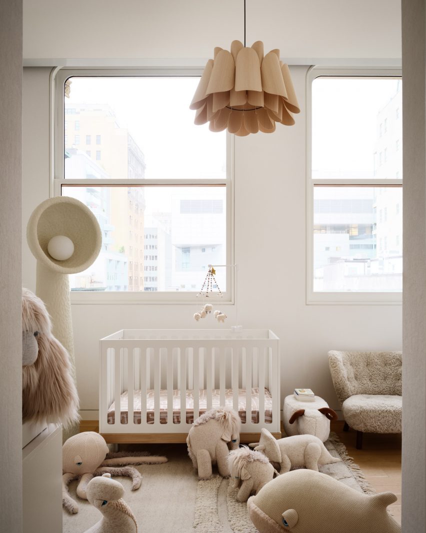
The designer helped to organise the layout so that it functioned optimally for the family, and despite opting for a neutral colour palette, Godbold upped the drama through the scale of the furniture and artwork.

Dining table anchored to a structural columnDining table anchored to a structural column
Rather than disguise a structural column, Timothy Godbold used it as an anchor for the dining table

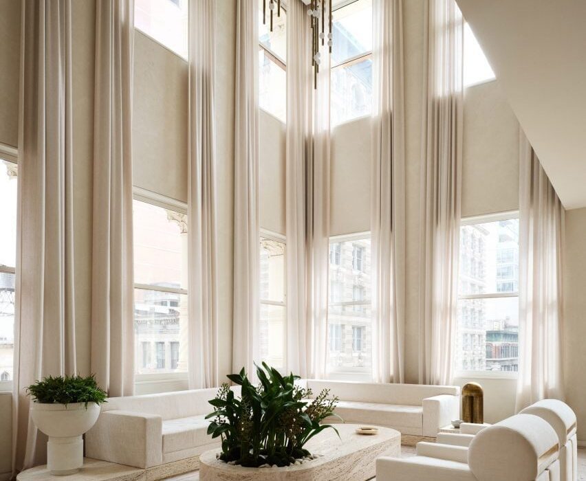
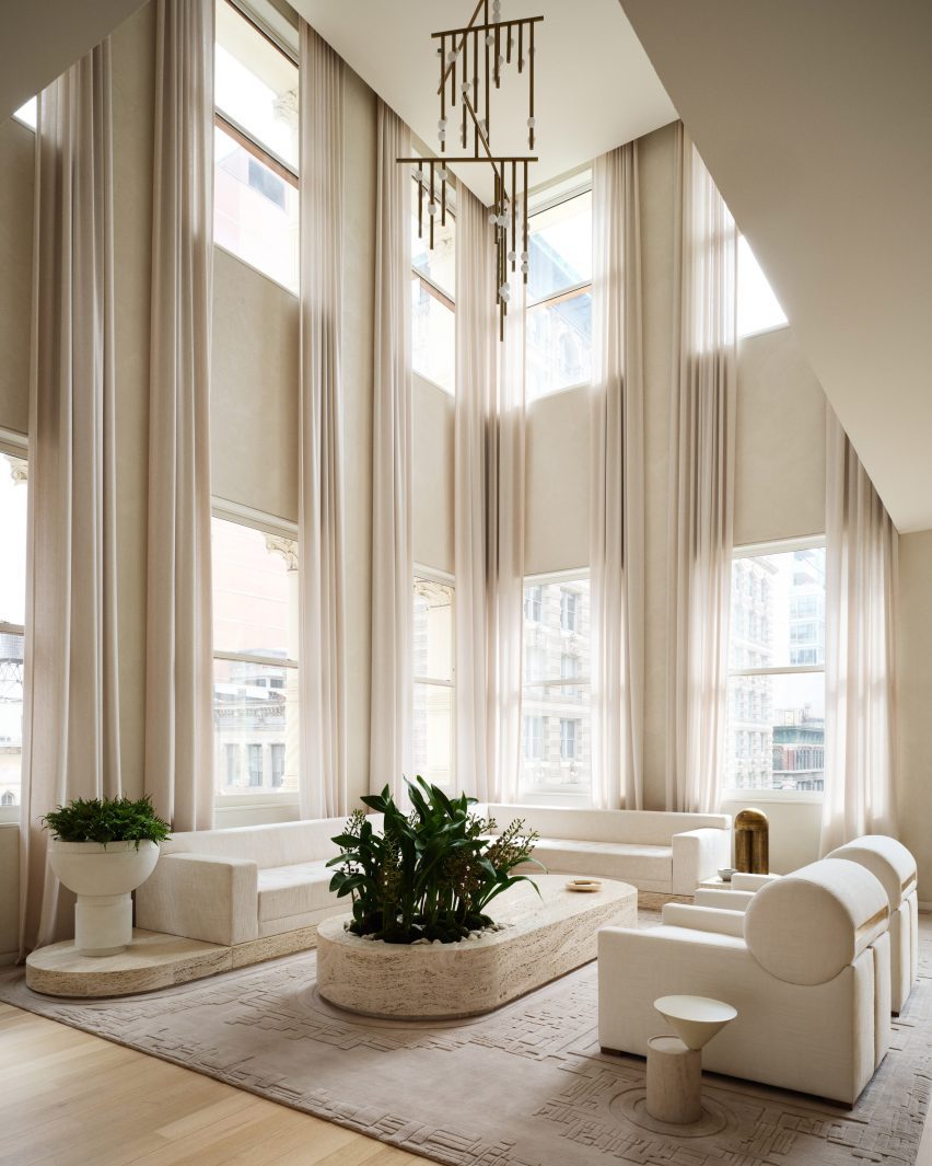
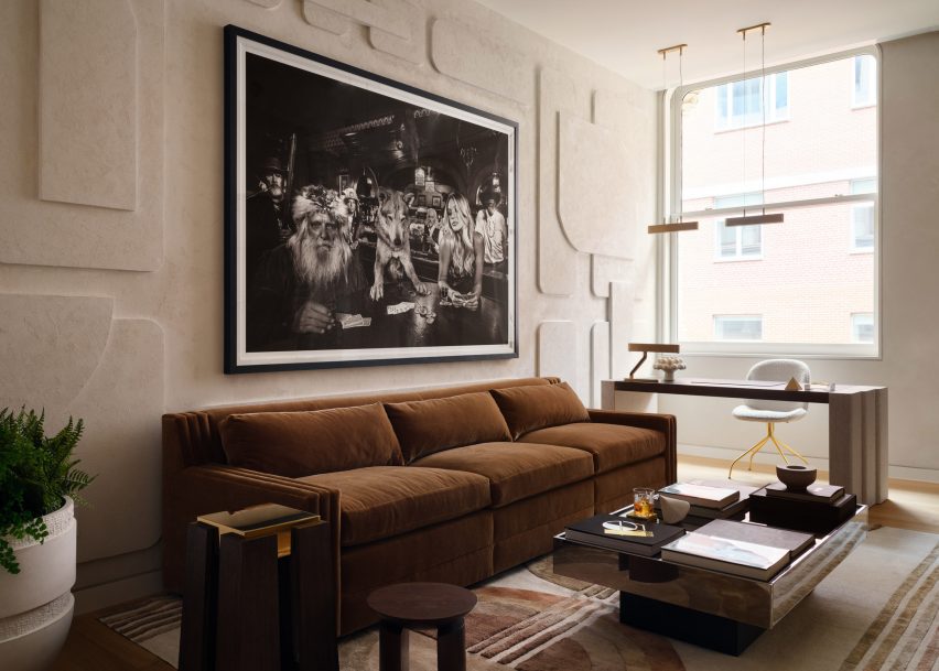
A double-height living room occupies a corner flooded with light from windows on two sides, which can be diffused by drawing the sheer curtains.

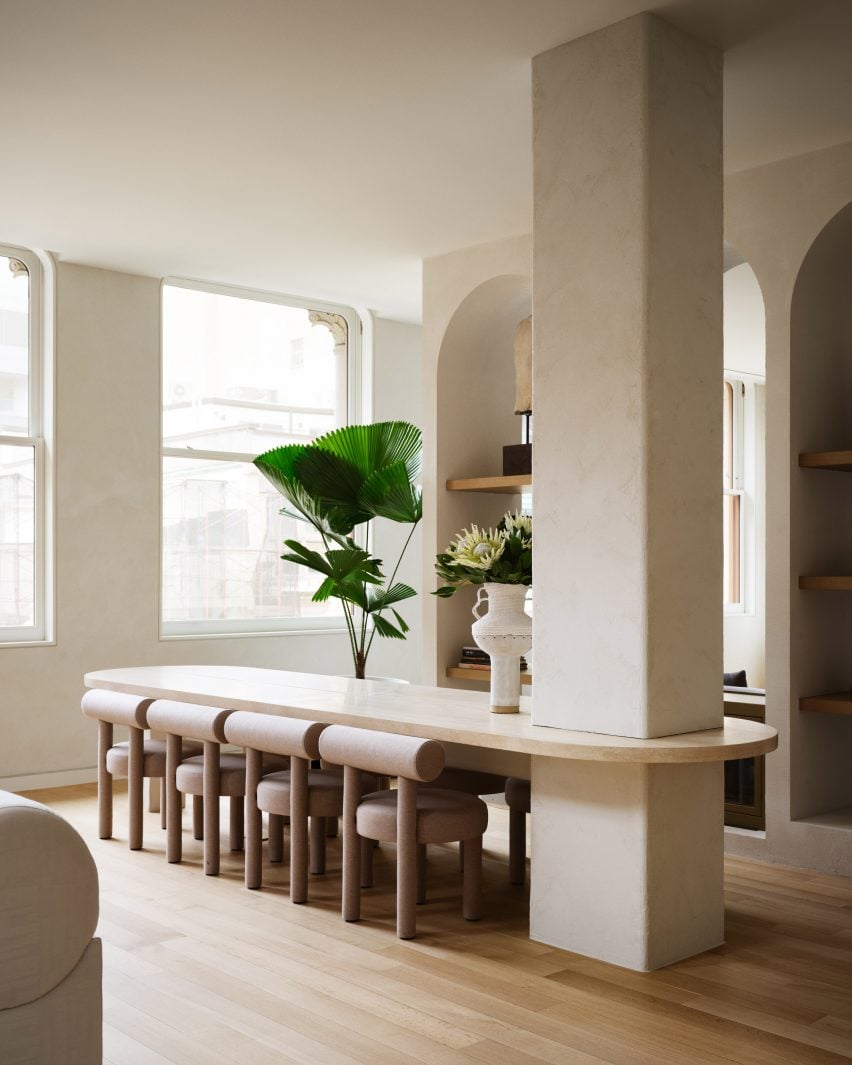
To work around a large structural column disrupting the view to the living room, Godbold used the column to anchor a stone dining table to turn it into a focal feature.

Minimalist kitchen viewed from double-height living roomMinimalist kitchen viewed from double-height living room
The kitchen is intentionally minimal, benefitting from the absence of cabinet and drawer pulls

The table references a 1930s design by Hans and Wassili Luckhardt and Alfons Anker, in keeping with the industrial style of the building.

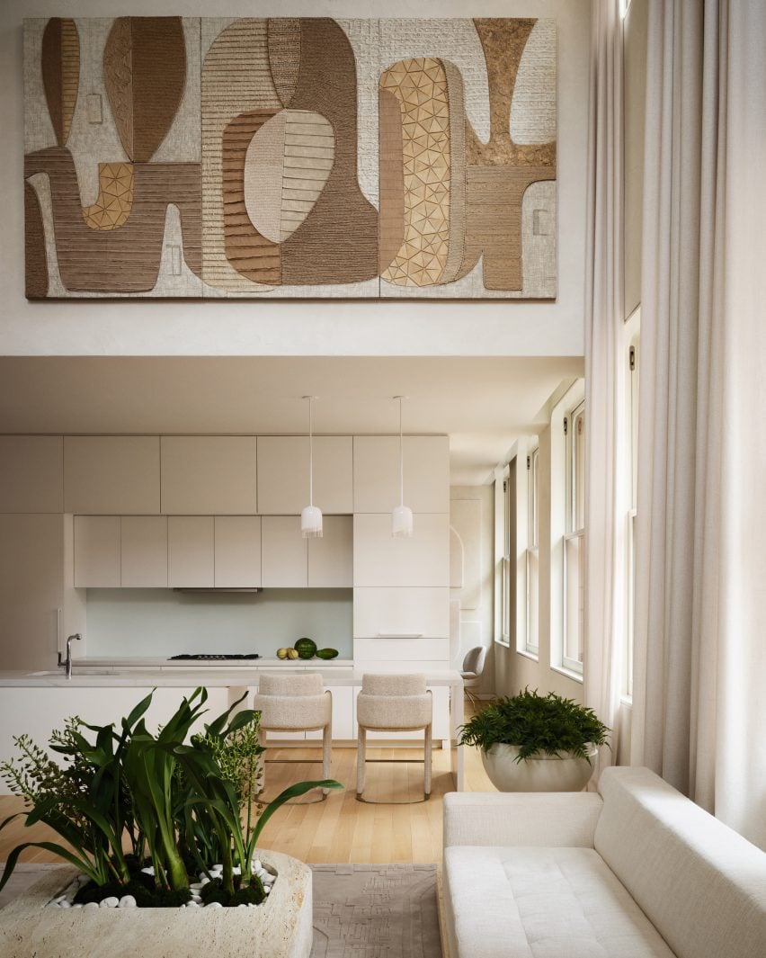
The kitchen is very minimal, thanks to the omission of cabinet and drawer pulls, and includes an island with a waterfall stone top that creates space for a breakfast bar.

Flexible office and bar space with a brown sofaFlexible office and bar space with a brown sofa
An area behind the kitchen was converted into a flexible office and bar space

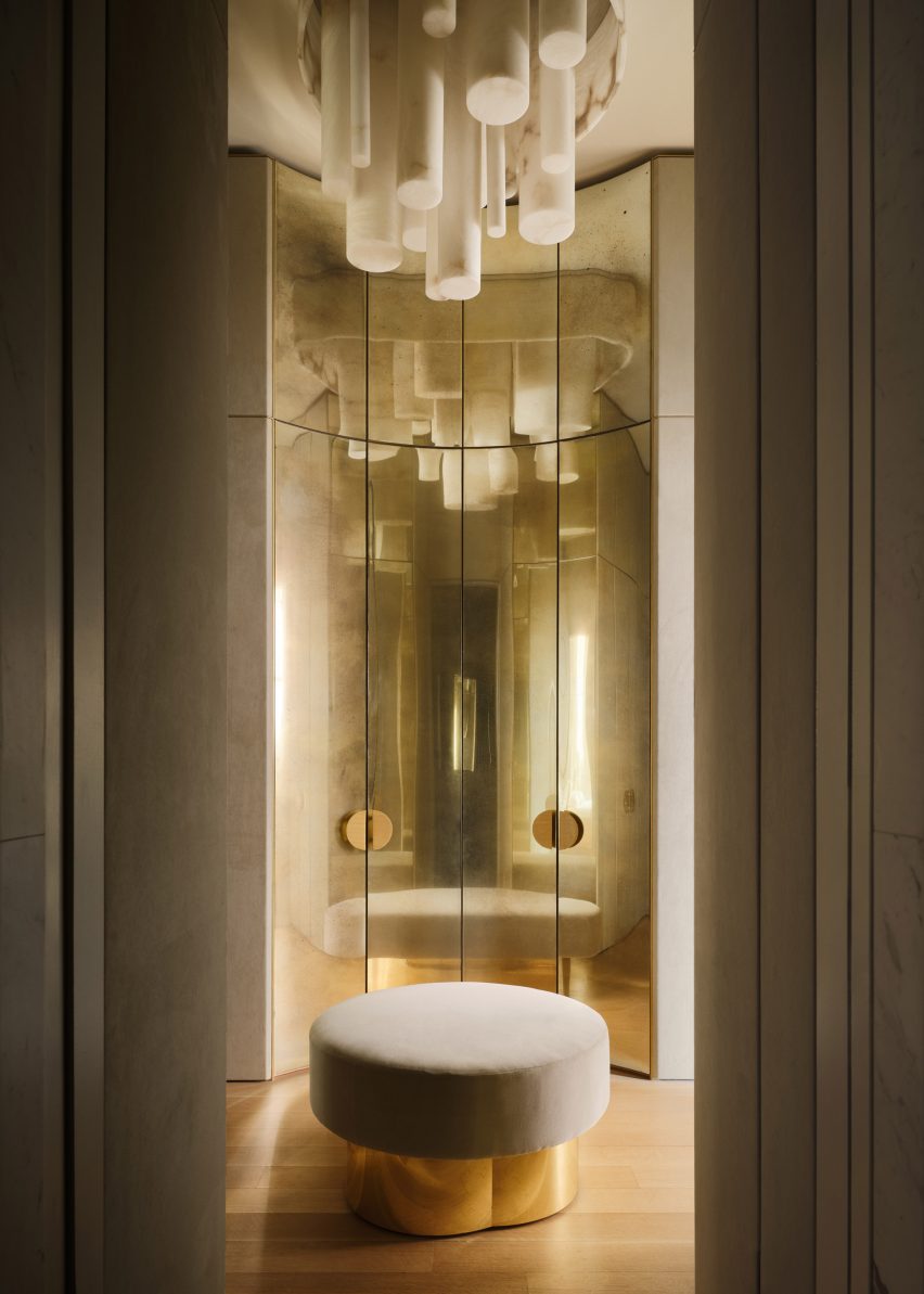
Hidden behind the kitchen is a former TV room converted into a bar room and an office “to maximise the versatility of the space and meet multiple needs”.

The walls in this flexible room are covered in geometric plaster-relief panels, which add shadows and texture, while the furniture is darker and more masculine.

Plaster relief panels based on a 1970s sci-fi series covering a curved wallPlaster relief panels based on a 1970s sci-fi series covering a curved wall
Plaster relief panels based on a 1970s sci-fi series cover the walls

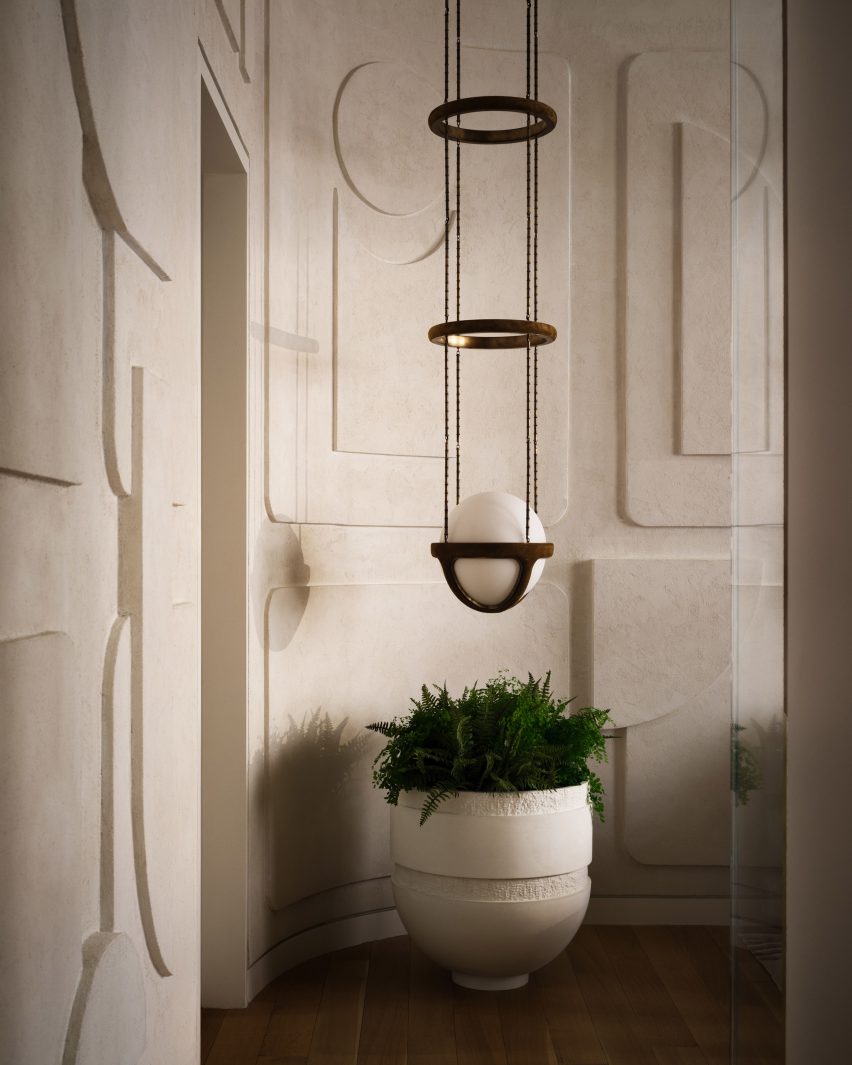
A Reprise pendant light from New York design studio Apparatus hangs in a corner that has been curved to accentuate the modernist-style wall panelling.

“The wall details in this Tribeca space are inspired by a classic 1970s sci-fi series that showcases an all-Italian modern aesthetic within a futuristic environment,” said the team.

A fluted feature wall behind a bedA fluted feature wall behind a bed
A feature wall behind the bed in the primary bedroom is fluted across its full width

A row of plastered arched niches separates the formal entertaining areas from a more casual seating area, where a large pale grey sofa shifts the tone from the warm whites found elsewhere.

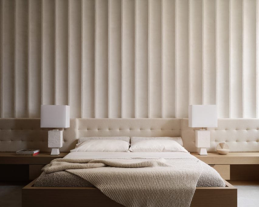
In the primary bedroom, the built-in bed and nightstands are installed below a tufted upholstered headboard that runs the full width of the room, and a fluted wall feature that extends to the ceiling.

A sculptural sofa, large planters and a huge artwork by Etienne MoyatA sculptural sofa, large planters and a huge artwork by Etienne Moyat
The bedroom also features a sculptural sofa, large planters and a huge artwork by Etienne Moyat

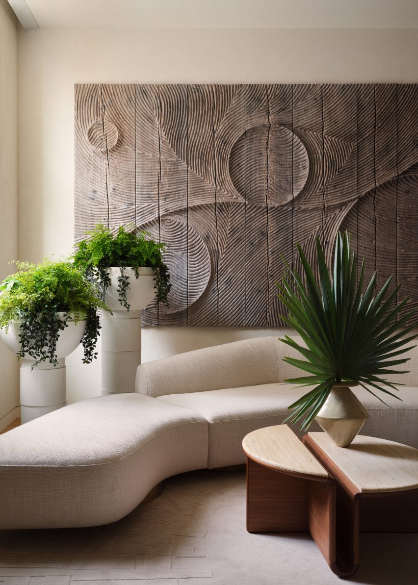
Opposite the bed is a sculptural sofa surrounded by oversized planters and a large, carved relief artwork by French sculptor Etienne Moyat on the wall.

Godbold custom-designed many of the pieces throughout the home, including most of the furniture and decorative elements.

His references included mid-century Italian designers like Joe Colombo, whose space-age shapes are echoed in the dining chairs, sofas, and smaller lighting and decor items.

Godbold also played with proportion to add drama, as seen in the living room’s custom stone sofas that are upholstered in a “brutalist” fabric made in England, and the coffee table with an integrated planter.

Dressing room with curved metal closet doorsDressing room with curved metal closet doors
A variety of space-age shapes and materials can be found throughout the loft

The rugs also feature custom designs that outline the furniture in the same space.

Overall, the goal was to “marry the industrial, the art deco and the more surreal aspects of 1970s noir cult cinema for a glamorous and intriguing end product.”

Neutral-coloured nursery with soft toys on the floorNeutral-coloured nursery with soft toys on the floor
The home’s neutral colour palette continues through to the nursery

Originally from Australia, Godbold is currently based in the Hamptons, where he renovated his mid-century home to resemble a “villain’s hideout”.

He also aims to preserve other modernist dwellings built across the area through the nonprofit organisation Hamptons 20th Century Modern.

The photography is by David Mitchell.


Reference

Apartment with green bedroom, blue kitchen and pink storage
CategoriesInterior Design

Ideas of Order selects bright colours for New York apartment renovation

Apartment with green bedroom, blue kitchen and pink storage

Bright hues define the different interventions that New York architecture studio Ideas of Order has made in this apartment at the northern tip of Manhattan.

The 1,000-square-foot primary residence in Hudson Heights was partially renovated for a couple, who had been living in the space for several years before deciding to invest in making it better suited to their needs, rather than buying another apartment.

Apartment with green bedroom, blue kitchen and pink storageApartment with green bedroom, blue kitchen and pink storage
One side of this Manhattan apartment was overhauled by Ideas of Order to make it function better for its owners

“Their sons had been sharing a room, but were beginning to need their own spaces,” Ideas of Order told Dezeen.

“They also wanted a space that could be designed for flexibility for when their children left for college.”

Bedroom with lime green built-ins housing a bed, a desk and storageBedroom with lime green built-ins housing a bed, a desk and storage
In the newly created bedroom, a lime green built-in houses a bed, a desk and storage

The kitchen also needed updating, to make it more suitable for entertaining, and more efficient storage space was required in the entryway.

So the architects reworked one side of the open living area, adding a bedroom on one side of the kitchen and refreshing the other areas.

Blue and purple kitchen cabinets behind a concrete counterBlue and purple kitchen cabinets behind a concrete counter
A new wall divides the bedroom from the kitchen

The husband is French, and the couple spent several years living together in France.

During this period, they both became enamoured by the midcentury architecture and design in the country and wanted to apply this style to their own home.

Raspberry and periwinkle cabinets surrounding a cooking area, which also features aluminium panelsRaspberry and periwinkle cabinets surrounding a cooking area, which also features aluminium panels
Raspberry and periwinkle cabinets surround the cooking area, which also features aluminium panels

“Inspired by their stories and the history of how colour was used by French midcentury designers like Charlotte Perriand, we suggested a series of polychrome millwork pieces inspired by Perriand’s design language, but updated for a contemporary home,” said Ideas of Order.

The different areas of the home were therefore given their own identities by applying bright hues.

Kitchen with cabinets on two sides and a porthole in the end wallKitchen with cabinets on two sides and a porthole in the end wall
A porthole looks through from the bedroom into the kitchen, which has rubber flooring

Lime green is used in the bedroom across a full wall of built-ins that incorporate a single bed, a workstation and plenty of storage.

Sliding doors with fritted glass panels pull across to enclose the slightly raised room, while a porthole window with double shutters looks through the new wall that separates the kitchen.

Pink and grey built-in storage in an entrywayPink and grey built-in storage in an entryway
Storage in the entryway was made more efficient by new pink and grey built-ins

This adjacent space is denoted by raspberry and periwinkle millwork, which surrounds a small preparation area with an aluminium backsplash and matching panels above.

The same metal also fronts the bar counter between an arched opening to the living area, which is topped with concrete.

Kitchen viewed through an arched openingKitchen viewed through an arched opening
Archways between spaces throughout the apartment have curved corners

Rubber flooring in the kitchen offers a practical alternative to the wood used through the rest of the apartment.

Finally, in the entryway – which is again raised slightly higher than the living area – an L-shaped cabinet system was constructed in a corner beside the door.

Pale pink is applied to the frames, while the doors and drawer fronts are finished in light grey and walnut is used for the trim. Choosing the right hues was a challenge that took many iterations to find the right balance, according to the architects.

“It was important that each pair of colours in the millwork work together, but that the colours also harmonise when viewed as a whole,” they said. “We wanted the colours to be bright, but not overpowering. And we wanted the colour pairings to feel timeless and not too trendy.”

Lime green bedroom to the left and blue kitchen to the rightLime green bedroom to the left and blue kitchen to the right
The architects went through many iterations to find the right balance of colours

Another challenge was the budget, which was modest by New York City standards and required some conscientious spending – particularly on small details that would make a big impact.

“We love the custom pulls for the millwork, the shutters for the circular window, and the rounded end to the partition between bedroom and kitchen, which reflects the rounded openings throughout the apartment,” the architects said.

Wide view of an apartment with wooden floors, white walls and colourful accentsWide view of an apartment with wooden floors, white walls and colourful accents
The couple had been living in the space for several years before deciding to invest in making it better suited to their needs

Ideas of Order was founded by Jacob Esocoff and Henry Ng, who are both Fosters + Partners and WORKac alumni.

Their renovation is one of the most colourful interiors we’ve featured in New York City of late, compared to a neutral show apartment inside the One Wall Street skyscraper and a loft in Dumbo with a subdued palette.

The photography is by Sean Davidson.

Reference