Adean Studios’ overhauled High Country Motor Lodge nods to astronomy
CategoriesInterior Design

Adean Studios’ overhauled High Country Motor Lodge nods to astronomy

An old roadside motel on America’s iconic Route 66 has been renovated by San Francisco-based Adean Studios to reflect the culture and enviromnent of Flagstaff, Arizona.

Adean Studios worked with local architecture studio Synectic Design to overhaul the High Country Motor Lodge, which is operated by Marc & Rose Hospitality.
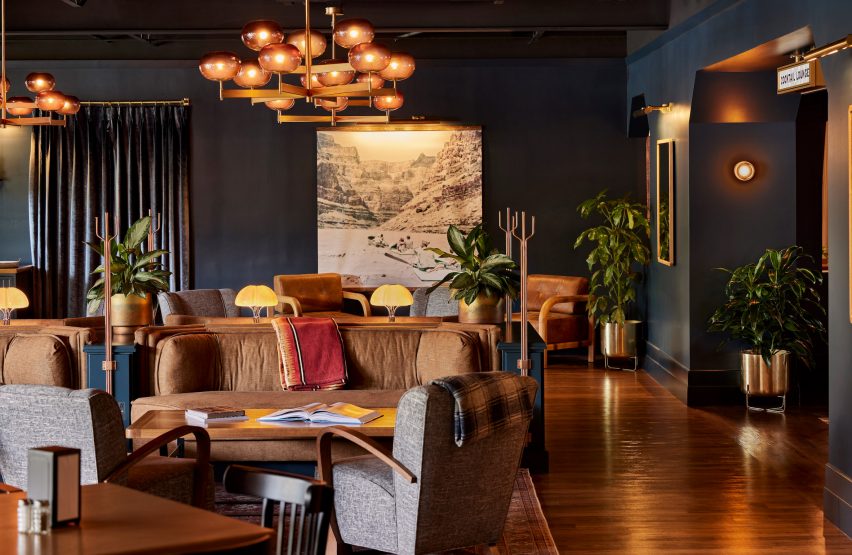
Hotel lounge with dark blue walls and amber lighting
Dark blue walls and amber lighting set the tone inside the High Country Motor Lodge lobby lounge

The mid-century property is accessed directly off the historic, cross-country Route 66 highway that runs through Flagstaff – the city that provides a base for visitors to the Grand Canyon, the Arizona Snowbowl ski resort and miles of hiking trails through the surrounding wilderness.

Almost 7,000 feet (2,100 metres) above sea level, the city is also home to the Lowell Observatory where Pluto was discovered in 1930.
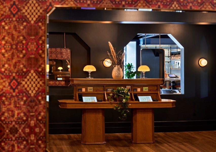
Self-check-in desk as viewed in a mirror
The hotel was renovated by Adean Studios to reflect the landscape and history of Flagstaff

All of these elements were combined as influences for the hotel’s design, which lands somewhere between a mountain lodge and a retro motel.

“Our goal was to incorporate the rich astronomical history of Flagstaff, while also creating an environment that blends elements of a retro 1960s lounge with modern mountain design,” said Adean Studios principal Alexa Nafisi-Movaghar. “The entire property showcases a darker colour palette accented with rustic woods and 1960s-inspired fixtures and furnishings.”
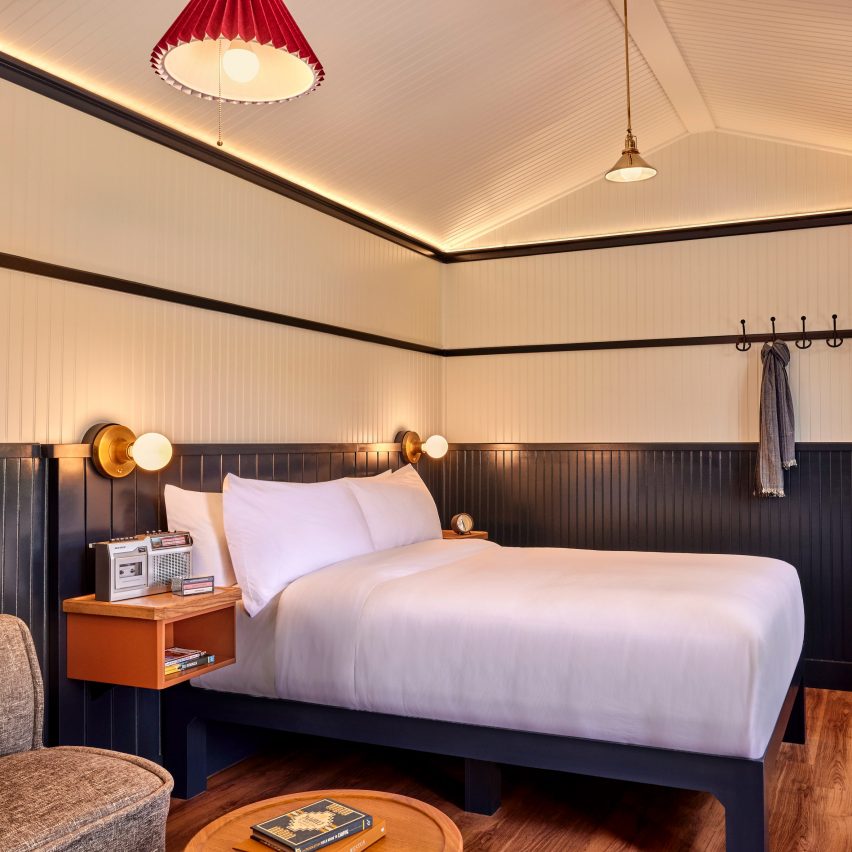
Guest room with double bed, blue wainscoting and white upper walls
Guest room interiors are a cross between mountain cabins and retro motel rooms

Painted midnight blue, the hotel buildings form a U shape around a central lawn and a large swimming pool, which was also renovated as part of the project.

The lobby, restaurant and other public areas face the highway, while the majority of guest rooms are located in perpendicular two-storey blocks behind.
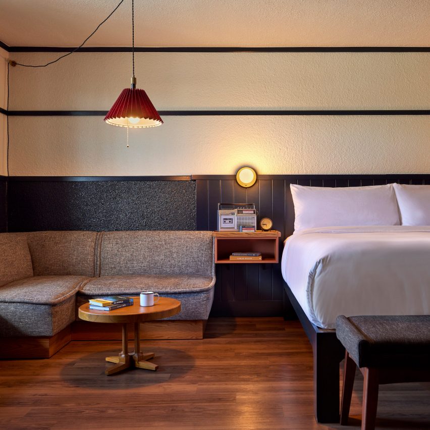
Guest room with low cushioned seating beside a double bed
Low furniture and cassette players add to the nostalgic atmosphere

On the west side of the site, three new shingle-clad cabins were constructed to house larger suites, bringing the total number of keys to 123.

The dark facade colours continue inside the lobby, lounge and bar areas, where a variety of seating types and configurations allow guests to dine or relax as they choose.
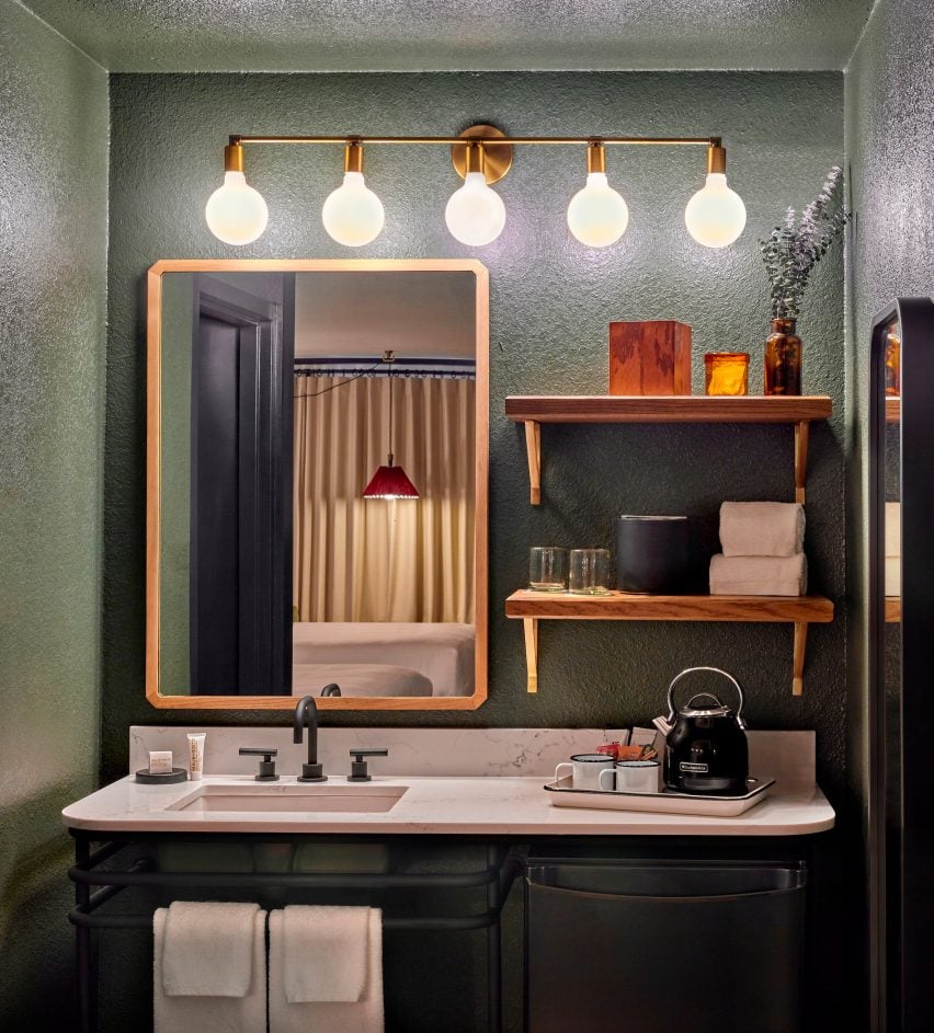
Dark green bathroom with lighting above a mirror, shelves and sink
Dark green and blue hues throughout the property nod to the forested surroundings and night sky

Amber-hued glass light fixtures emit a soft, warm glow in these spaces, while velvet curtains and blankets were included.

The bar and lounge opens onto a stepped outdoor terrace, where more dining tables and low chairs are arranged around a series of fire pits.
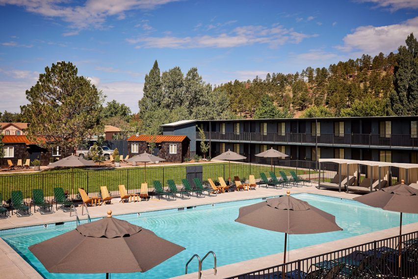
Motel rooms surrounding a central lawn and swimming pool
The property is arranged around a central lawn, which public events are held, and a large renovated swimming pool

A general store off the reception area sells a curated selection of snacks, merchandise and other locally sourced gifts.

In the guest rooms, navy blue wainscoting wraps the lower portion of off-white walls, and dark wood floors and low furniture add to the mid-century aesthetic.
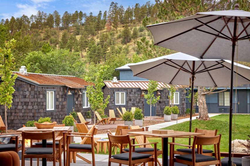
Shingle-clad cabins beyond wooden tables and chairs
Three shingle-clad cabins that house suites were built as part of the project

Each is equipped with a cassette player and a set of three tapes, which play tracks that evoke nostalgia for the road trip era.

High Country Motor Lodge also boasts a Nordic spa, comprising two private wood-lined saunas that guests can reserve for one-hour sessions.

These cabins are accessed from an enclosed courtyard with an outdoor shower and fire pits, and have direct access to the hot tub for further relaxation, or the swimming pool for a cold plunge.

“Inspired by the local lifestyle of adventure-seekers, day-sleepers, and night-watchers, the great lawn, private cottages, and the Nordic Spa have been designed to enhance the outdoor experience, constantly reminding guests of the beautiful nature that surrounds,” Nafisi-Movaghar said.
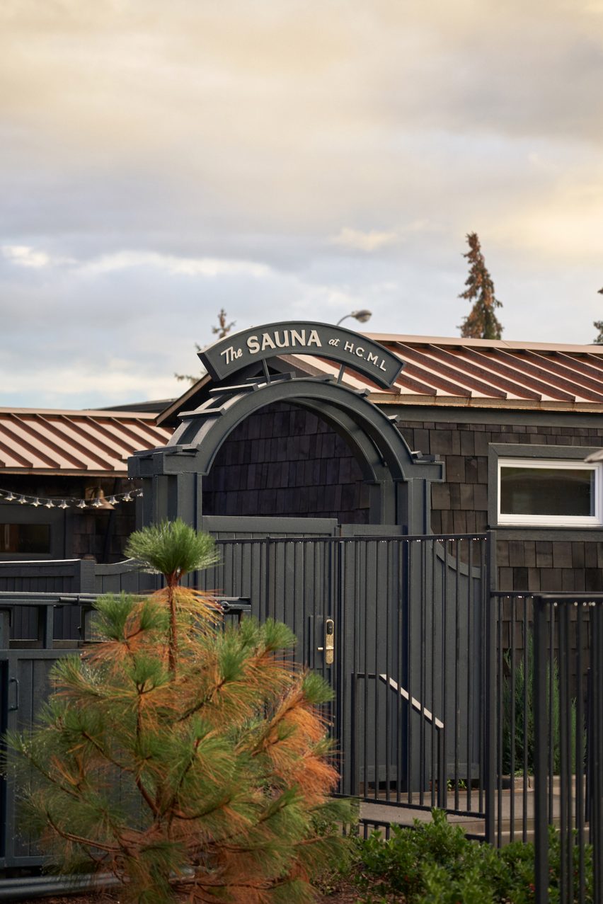
Arched gateway with "The Sauna at HCML" written above
The hotel has a Nordic spa that guests can book for private experiences. Photo by Landon Kroeger

The hotel’s branding was created by Charleston-based SDCO Partners, and also plays up the retro and astronomy themes.

“Nestled between the Grand Canyon and Barringer Crater, the High Country Motor Lodge is at once both celestial and earthly, and the brand design honors both,” said creative director and founding partner Amy Pastre.
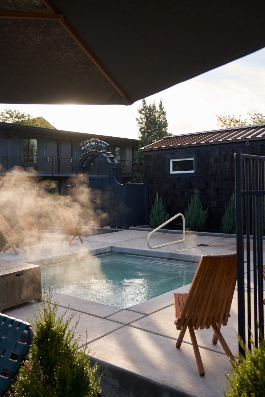
Hot tub with steam coming off it
The sauna cabins are located close to the hot tub. Photo by Landon Kroeger

“An eclectic family of hand-rendered typographic and illustrative graphic elements celebrate the motor lodge’s vintage style, contemporary design, and the love of high desert adventure.”

A range of public programming is organised at the location throughout the year, including theatrical performances, and a folk music festival in the fall.
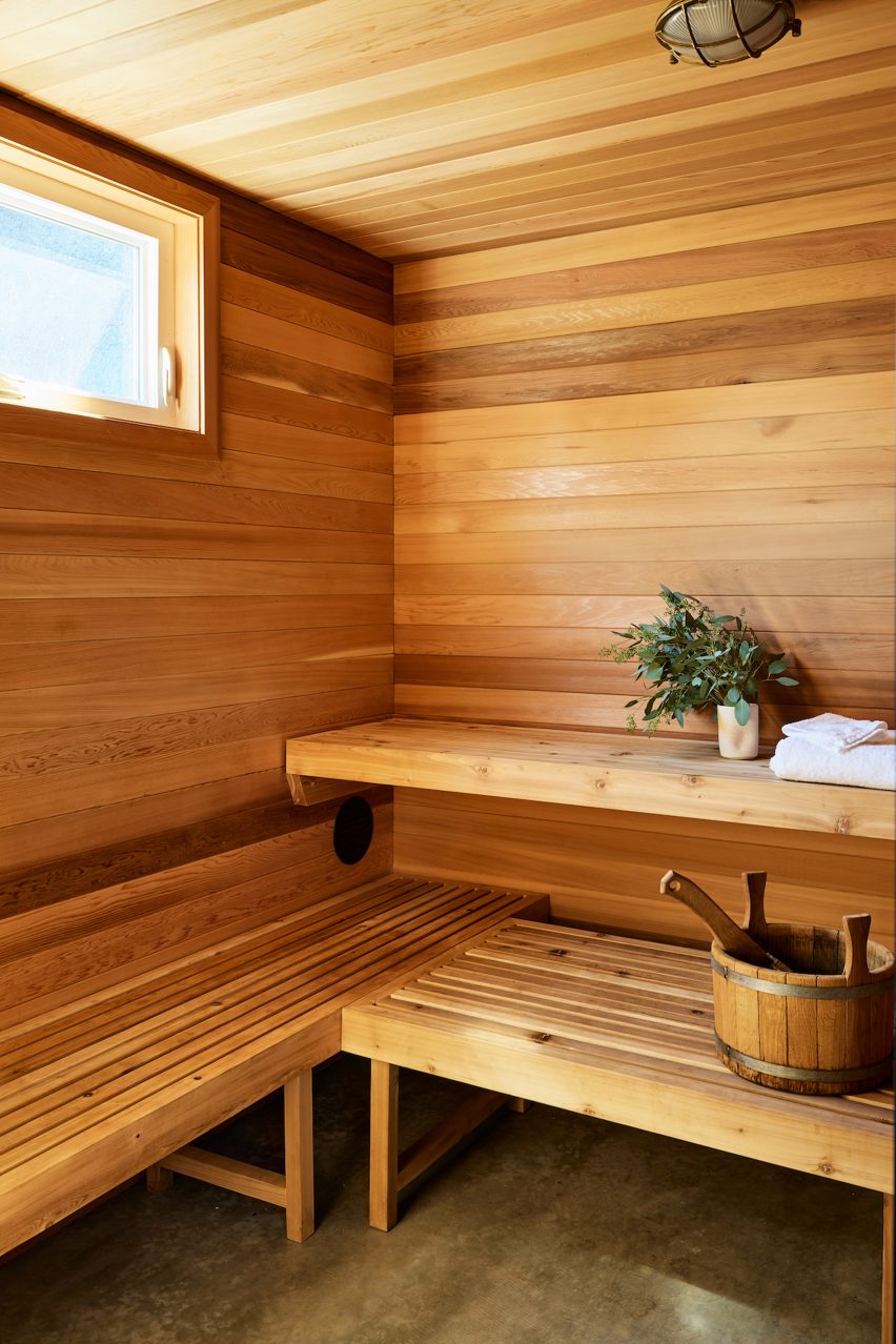
Wood-lined sauna with benches and a water bucket
The private saunas can be reserved for an hour. Photo by Landon Kroeger

Many former motels and motor lodges across the US have been bought up and renovated into boutique accommodations over the past decade.

From Hotel Joaquin in Laguna Beach and The Drifter in New Orleans, to Scribner’s in New York’s Catskills Mountains and Tourists in the Berkshires, these hotels are often designed with a location-specific twist.

The photography is by Werner Segarra, unless stated otherwise.

Reference

Studiopepe nods to Milan’s stations in La Rinascente department store
CategoriesInterior Design

Studiopepe nods to Milan’s stations in La Rinascente department store

Design and architecture agency Studiopepe references Milan’s offices and metro stations in its revamp of the fourth floor of the city’s renowned luxury department store La Rinascente.


The fourth floor, which is home to the store’s womenswear department, has been reimagined by the Milanese studio using bold graphic elements and pop colours.

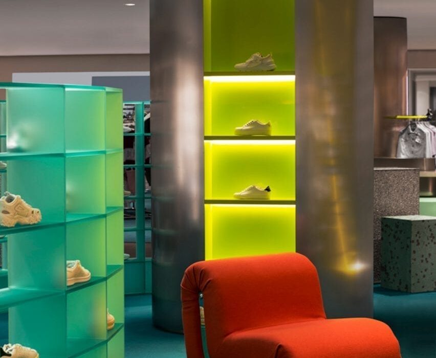
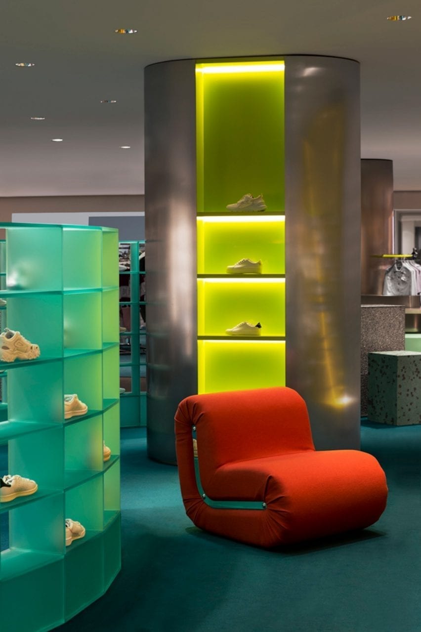
Illuminated display columns with red armchair in Rinascente womenswear department
The interior is dotted with colourful accents including changing rooms encircled in orange curtains (top image) and Rodolfo Bonetto’s Boomerang armchair (above)

Studiopepe, founded in Milan in 2006 by Arianna Lelli Mami and Chiara Di Pint, conceived the space as a series of zones subtly organised by functions and visual references.

1980s Milanese workplaces as well as the city’s rationalist M1 metro stations – the latter designed in 1964 by Italian architects Franco Albini and Franca Helg – were among the studio’s inspirations.

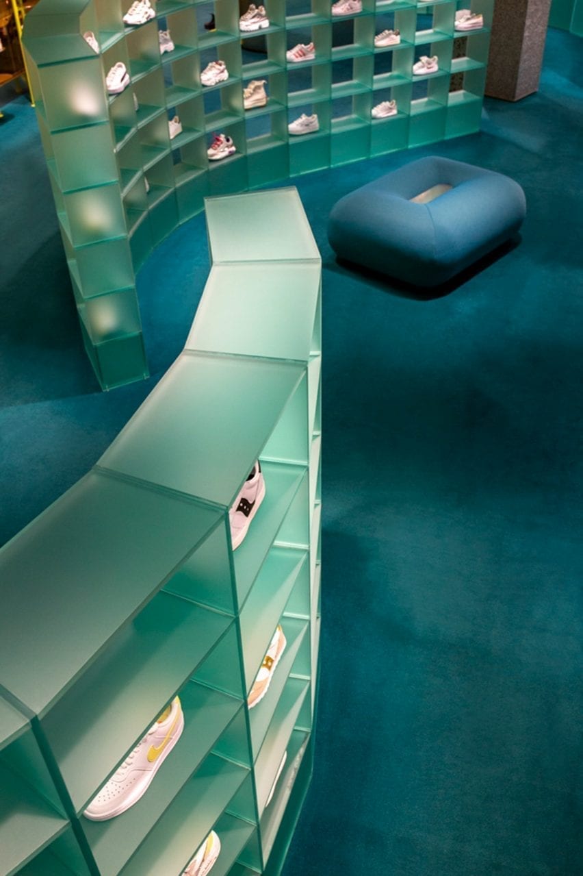
Curved plexiglass shelving displaying trainers on blue carpet in retail interior by Studiopepe
A system of curved plexiglass shelving meanders through the womenswear department

“The use of graphic elements and pop tones echoing Milan street style convey a new genderless approach to retail design,” explained the studio.

“Colour is conceived as an architectural tool – an intense emerald green, silver and black create an unusual palette animated by hints of coral and bright yellow tones.”

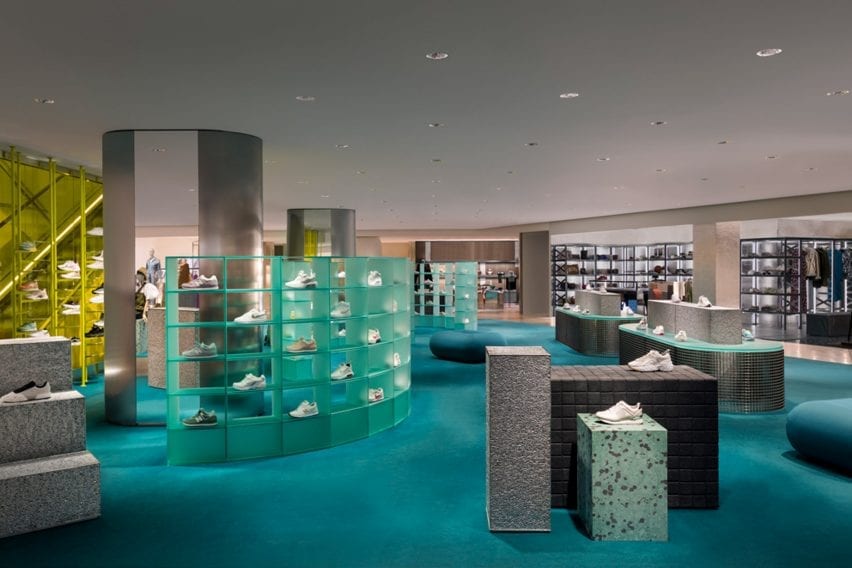
Overview of La Rinascente womenswear department with blue carpet and grey displays
The department is accessed via a bright yellow staircase

The steel tubes – which are used to clad display columns and create table legs – are a direct reference to the city’s underground stations.

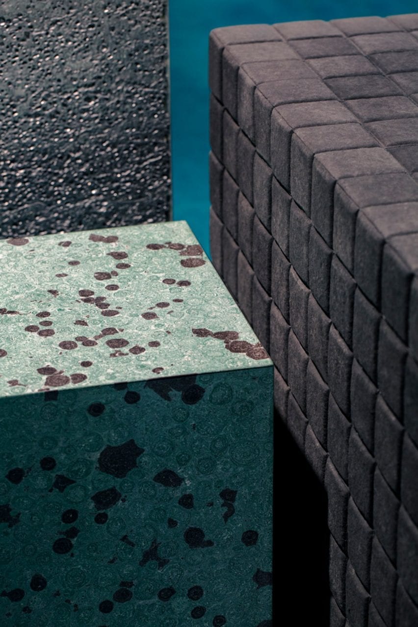
Materials such as satin steel, plexiglass and terrazzo are paired with experimental materials with contrasting textures such as Silipol – a material which was originally selected by Albini and Helg to cover the Metro stations’ walls; Alusion, the stabilised aluminium foam that is used to clad the city’s Fondazione Prada; and Milleform, a bio-based cotton acoustic tile.

To create a domestic feel, the space is furnished with a mix of bespoke rounded furniture and display cabinets, as well as classic design pieces like the Boomerang armchair by Rodolfo Bonetto.

Curved satin plexiglass shelving systems that display the store’s trainer offering also serve as space dividers.

The department’s distinctive circular changing rooms are enclosed in orange curtains made from structured leather – a feature that Studiopepe said nods to the textile folding doors often used by Italian architect Gio Ponti.

Turquoise stone table and upholstered pouf in retail interior by Studiopepe
Studiopepe used contrasting textures throughout the interior

A previous incarnation of La Rinascente’s fourth-floor womenswear department was designed by Japanese studio Nendo. Designed in 2013, the studio drew upon architectural elements observed while exploring Milan to create a calming, neutral space.

The studio said that it was “inspired by the unexpected encounters with shop windows, courtyard gardens and public squares that come from wandering Milan’s back streets.

Reference