Rethinking Recess: How Architects Are Playfully Nurturing a Water-Resilient Generation
CategoriesArchitecture

Rethinking Recess: How Architects Are Playfully Nurturing a Water-Resilient Generation

Last call: The clock is ticking as Architizer’s 12th Annual A+Awards enters its Extended Entry Deadline period. Submit your work before February 23rd for your chance at the global spotlight.  

It has been 17 years since then-UK Prime Minister Tony Blair predicted a new age of climate education fit for the generation that will be left to pick up the bill for the past 150 years of industrialization. Give or take.

Leader of the Labour Party at that time, he proclaimed that by focusing on improving and updating infrastructure, for example, an energy system in a school, children would begin to understand the nuances of our environmental crisis and the factors contributing to it. In turn, they’d pick up the behaviors we need to adopt for a chance at mitigating or even reversing the situation. 

Suffice to say, this wasn’t the only thing Blair got wrong, but the lack of progress on introducing sustainability to curriculums is nothing to laugh about. And not just in Britain but in most developed countries. Even if we were working in highly efficient, coherent, and connected ways to rapidly drive down emissions and return more land to nature, which we are not, we’d still need to start rethinking how we live daily.

The impact of wasted anything is profound. Our new power may be renewable, but clean energy sources still have a hugely detrimental effect on the planet, and we cannot continue to view even our supposedly inexhaustible resources, such as the wind or tides, as infinite.  This is particularly true of fresh water, given its role in the planet’s ecosystem and the fact we find it in limited supply.

Perhaps the most challenging idea to get our heads around is the growing water crisis. While it can be hard to believe when staring down the barrel of another winter defined by storms and floods, many regions are running dry. And while the mind leaps to the usual water-starved suspects, from Abu Dhabi to Los Angeles, many nations that are stereotyped by torrential downpours are waking up to the fact their taps may not continue flowing freely unless a number of things are done. Updating infrastructure is, of course, vital, but so is instilling a different mindset in how we look at and use water.
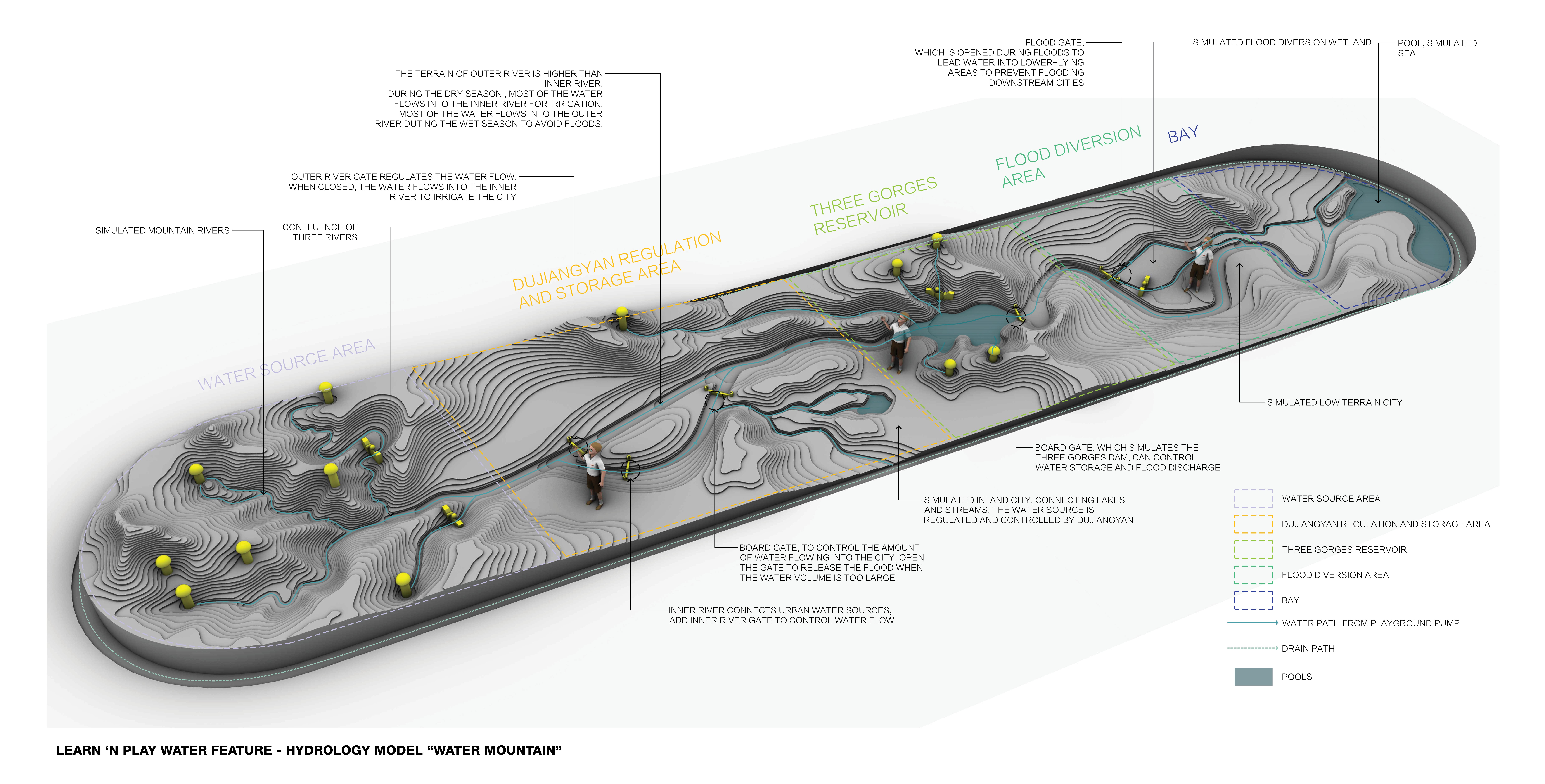
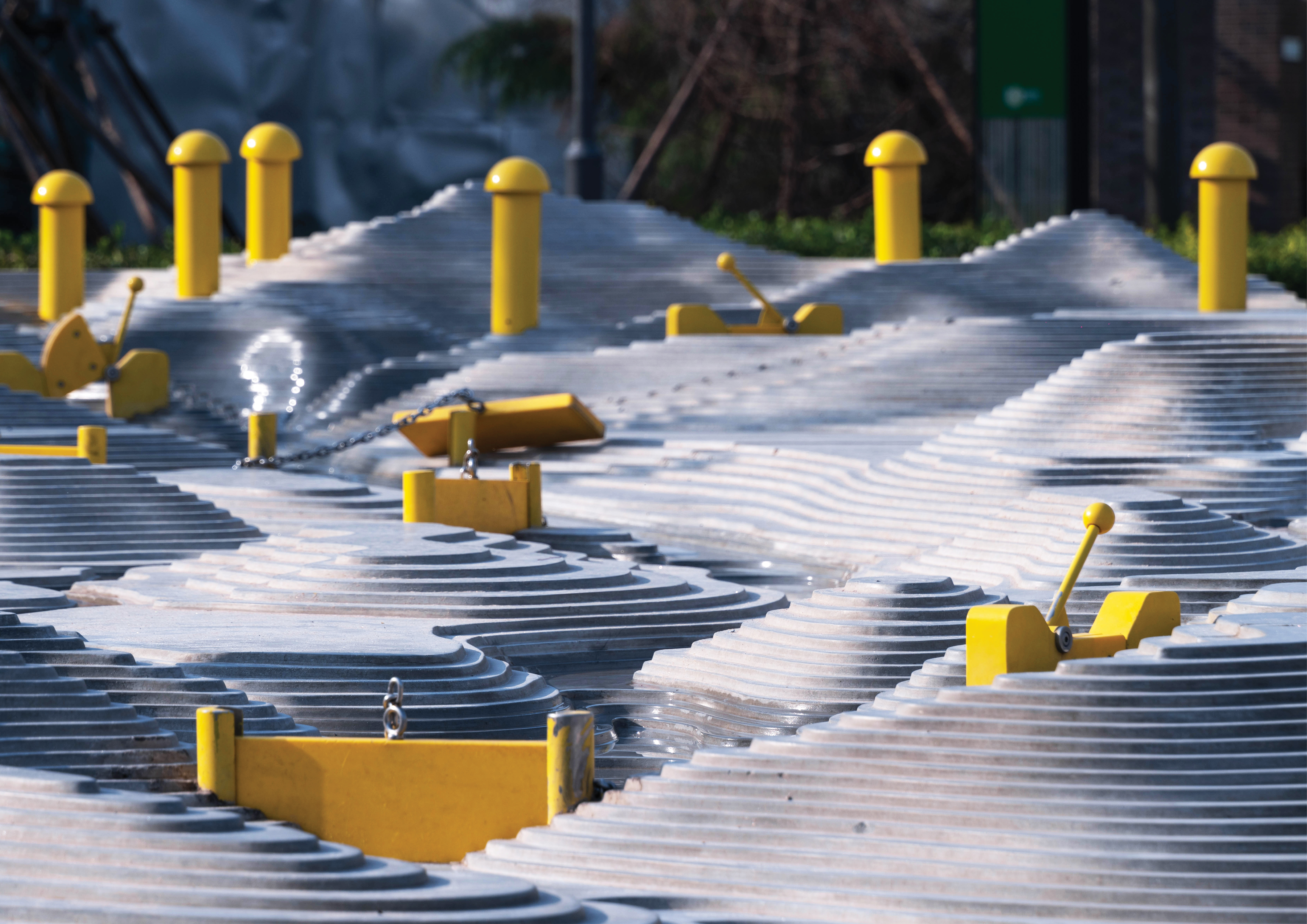
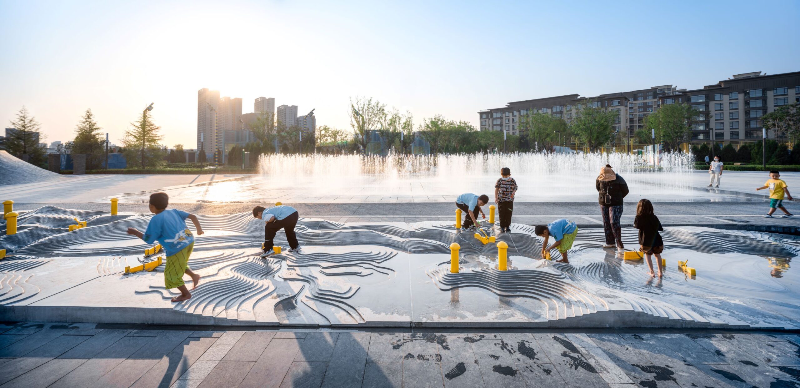
Interactive area of the Play ’N’ Learn Water Mountain by Ballistic Architecture Machine (BAM), Tianjin 4A Sports Park, China Jury Winner, 11th Annual A+Awards, Architecture +Learning 

One fascinating approach to this, and a great example of public realm creation in a place where space is under extreme pressure, is the Tianjin 4A Sports Park, and specifically the Play ’n Learn Water Mountain. Developed by Beijing and Shanghai-based Ballistic Architecture Machine (BAM) in the city of Tianjin, this project, a jury winner at the 2023 Architizer’s A+ Awards in the Architecture+ Learning category, addresses a number of urgent issues the modern city faces.

Firstly, it secures open areas to promote active lifestyles and breaks up built environment density. But it also introduces climate-aligned education to the everyday lives of the young people who will definitely need it. Their ability to consume with carefree abandon is unlikely to extend to anything like our current levels, so thinking with moderation front of mind is likely to prove very important.

Although covering a relatively small area, the park comprises a surprising number of key elements. Centrally placed, a large sculpture hides a geothermal chimney and steam exhaust for heated water, showing nature-based technologies in operation.

The Water Mountain itself takes this idea one step further, recreating a miniature version of the Yangtze River Delta, Three Gorges Reservoir, and ancient Dujiangyan irrigation system. Children are invited to play with, in and on this landscape, introducing dams and changing water flow to create reservoirs. It looks like a lot of fun, but success is pegged on striking a fine balance of careful water management, making this a highly strategic and engaging game. 
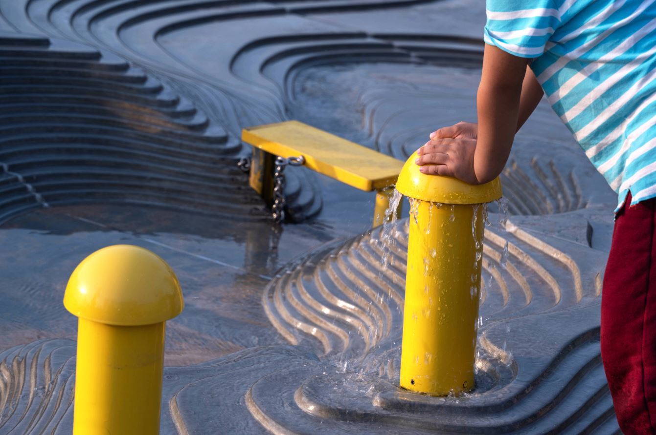
Children can choose where to stop and start water flow when using the Play ’N’ Learn Water Mountain by Ballistic Architecture Machine (BAM), Tianjin 4A Sports Park, China | Jury Winner, 11th Annual A+Awards, Architecture +Learning 

Through play, children come face-to-face with the complex networks we need to provide our homes and businesses with fresh water, a concept at the vanguard of learning-by-doing in the climate age. While not every kid who gets involved will go on to administer public services or engineer landscape-changing construction projects, by understanding how much effort has gone into creating crucial systems we don’t always get to see, but rely on, surely water itself will again be considered as the most of all resources, and respected as such.

But it also goes beyond this. Ultimately, the actions and decisions made by the human participants in Water Mountain that lead either to harmony or complete catastrophe for an entire region in miniature form. By experiencing this, let alone actively trying to control things, it seems almost unthinkable that players would not learn the importance of working with our planet in order to safeguard the lives on it. 

Last call: The clock is ticking as Architizer’s 12th Annual A+Awards enters its Extended Entry Deadline period. Submit your work before February 23rd for your chance at the global spotlight.  

Reference

Delve Architects designs “nurturing but playful” The Nest nursery
CategoriesInterior Design

Delve Architects designs “nurturing but playful” The Nest nursery

English practice Delve Architects has used joyful colours and natural, tactile materials to outfit a newly established kindergarten by the River Thames in east London that can be accessed via boat.

The Nest daycare centre is part of a wider housing development in the Royal Wharf area, occupying a commercial unit at the base of a 19-storey housing block.

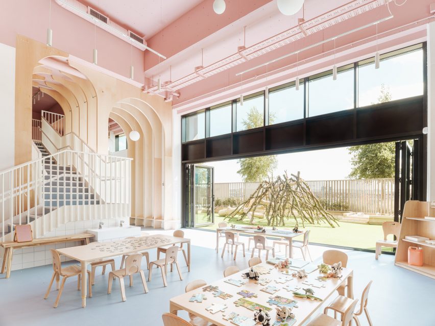
Overview of the Nest nursery in east London by Delve Architects
The Nest nursery was designed by Delve Architects

As a result, the primary challenge was to bring the towering newbuild space down to child scale and make it feel more homely while forging a greater connection to the riverfront.

“We wanted to create a calm, nurturing but playful space that reflected the values of the nursery,” Delve Architects co-founder Alex Raher told Dezeen.

“Their ethos is for children to have a positive learning experience through a healthy relationship with the environment around them and a connection to the outdoors.”

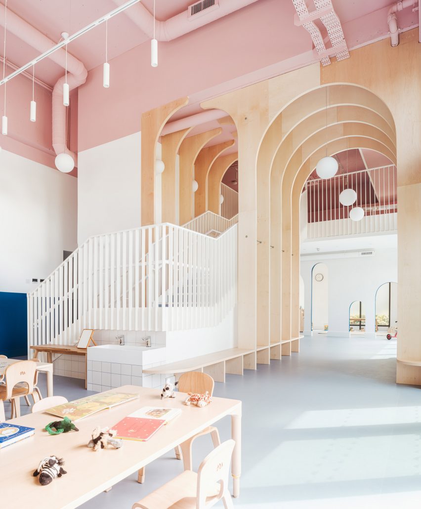
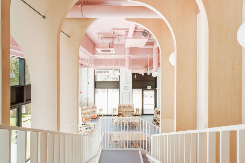
Stairway and wooden arches inside east London nursery
The studio used timber arches to define the space and envelop the new staircase

To boost the internal floor are, the studio installed a new mezzanine with a bespoke, powder-coated metal staircase that rises through a double-height space defined by a series of arched timber fins.

These maple-veneered arches – each around 4.5 metres tall – were conceived by Delve Architects to subdivide the space, creating zones without physical barriers.

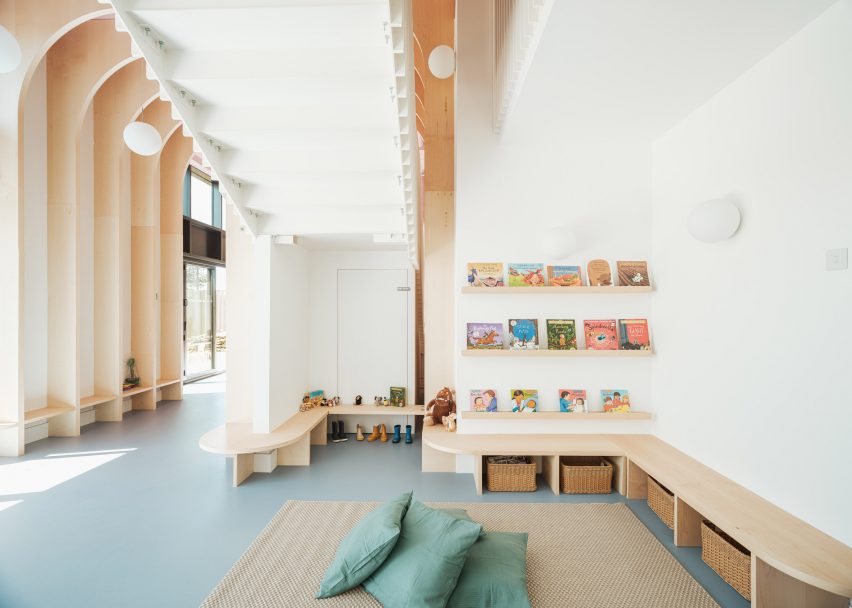
Area with low benches inside The Nest nursery
The timber fins taper off into low benches for the children

“We wanted to connect the spaces visually and physically between the mezzanine and lower level, and to soften the hardened edges of the space,” said Raher.

The arches are formed from a series of fins that merge into benches and individual seating as they approach the ground.

View from stairs of east London kindergarten by Delve Architects
The stairs lead up to a new mezzanine level

“The grand scale of the arches for a small child could feel overwhelming, so we brought this down into child-height seating, benches and joinery to play with the scale and make it more familiar to them,” said Raher.

“The material flows seamlessly between the two levels and creates a natural material palette that the children could recognise and read through different heights and spaces.”

The arches also span over the main staircase, where Raher says they suggest a canopy of trees.

“We wanted it to be a centrepiece that was exciting, functional and exploratory, almost like a meandering joinery up to a treehouse-style level on the mezzanine, through a network of arches and branches on the way,” the architect explained.

“One of the first concepts we explored was the treehouse idea, developing ideas around the nursery name The Nest and how we could bring a playful part of nature into the design.”

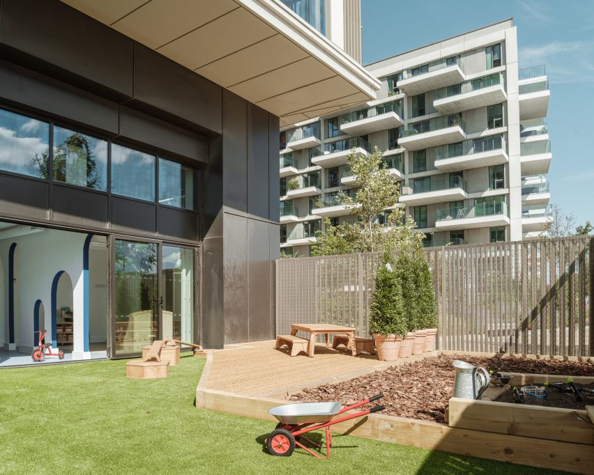
Given its inner-city location, the nursery is fortunate to have a large garden overlooking the riverfront, which is connected to the nursery via a double set of six bi-folding doors.

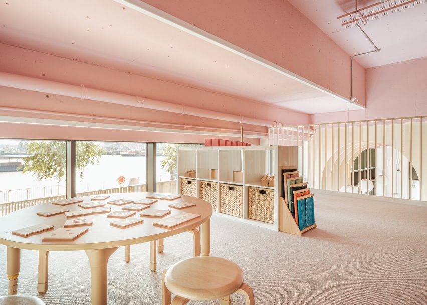
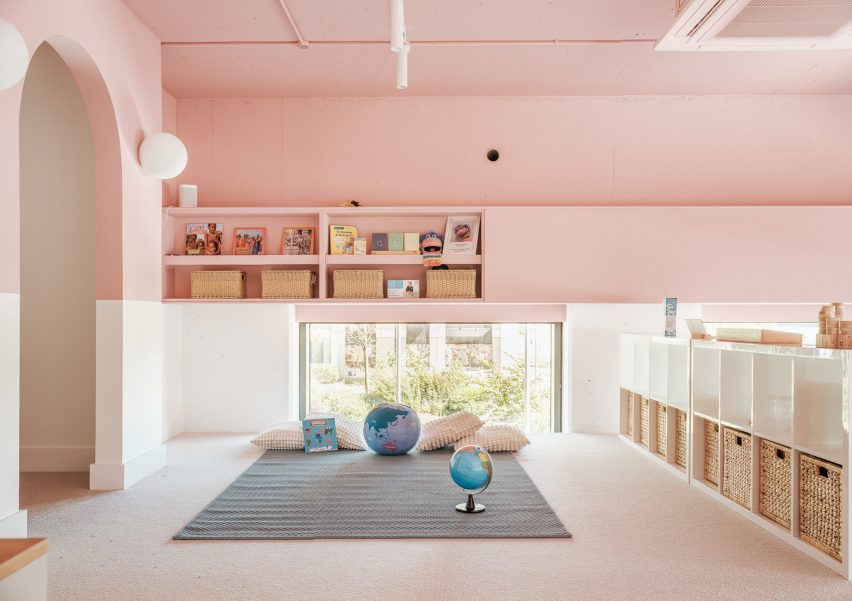
Pink-toned mezzanine of The Nest nursery
The upper level is finished almost entirely in baby pink

The external fencing was designed by Delve Architects “to merge with the rhythm of the existing tower’s balconies” and powder-coated in a matching colour.

“We wanted to celebrate the connection to the outside space, the riverfront location and the child-height views from the mezzanine to the water, as it was unique to the space and to the nursery setting,” said Raher.

“Children can arrive and parents can commute using the river boat directly outside the nursery. The new pier designed by Nex Architecture is a beautiful backdrop to the site.”

Pink-toned mezzanine of kindergarten in east London by Delve Architects
The mezzanine houses cosy play areas

To cope with the demands of a nursery setting, materials and finishes are resilient as well as being natural and tactile. Among them is recycled and recyclable Marmoleum flooring, maple-veneered joinery and low VOC paint.

A colour palette of soft muted shades helps to create a homely atmosphere inside The Nest.

“This palette works better than bolder primary colours, as these create too much visual noise for younger children,” Raher said.

Outdoor play area of The Nest nursery in east London
The Nest’s garden overlooks the riverfront

A panel of dark teal blue creates a datum line around the walls, designed to be “resilient to little fingers” while making the tall spaces feel more relatable to children.

“We always try to design from a child’s perspective, putting ourselves at that level, quite literally in some cases,” Raher said.

The soft blue of the flooring gels with the tones of the pale maple veneer and the matt pink that wraps around the ceiling and upper walls, covering almost the entire mezzanine.

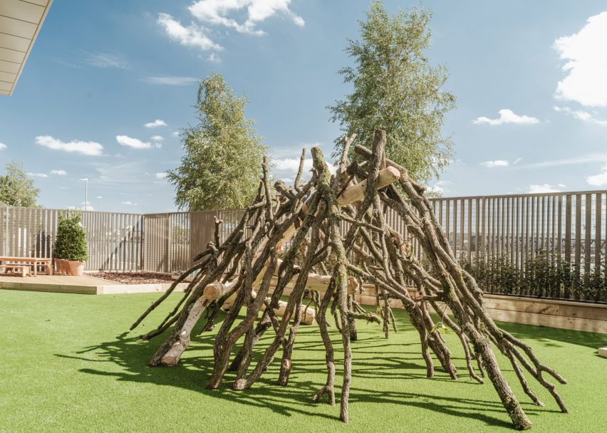
Twig house in kindergarten play area
It can be accessed via river boat

“It both draws your eye upwards but also manages to change the scale of the space,” said Raher. “In some areas there is a five-metre ceiling height, so we wanted to break this up visually.”

“The services for heating, cooling and ventilation were also left exposed, giving a little insight for children to explore and imagine what they could be – a network of intriguing forms and geometry running through the nursery.”

Other kindergartens that hope to forge a greater connection to nature include this English nursery by Feilden Clegg Bradley, which makes use of natural materials to reflect the surrounding woodland, and a timber kindergarten extension in Austria by Bernardo Bader Architekten.

The photography is by Fred Howarth.

Reference