Portal House by Svima features brass details and curved oak ribbons
CategoriesInterior Design

Portal House by Svima features brass details and curved oak ribbons

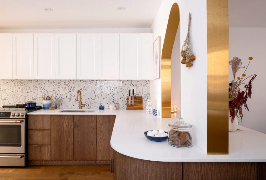
Brass ribbons line the asymmetric portals that connect the kitchen and dining room of this Toronto residence, renovated by local architecture and art studio Svima.

The Portal House was designed for a couple who had wanted to refresh their home for 10 years, but have very different aesthetic tastes.

Portal House by SvimaPortal House by Svima
Two portals connect the renovated kitchen and dining areas of this Toronto home

Toronto-based studio Svima found a compromise by combining his desire for “tenebrous minimalism” and her love of “bright French country kitchens” into the design.

The resulting “denlike cosiness” pairs dark oak across the lower half of the ground-floor spaces and clean white surfaces on the upper half.
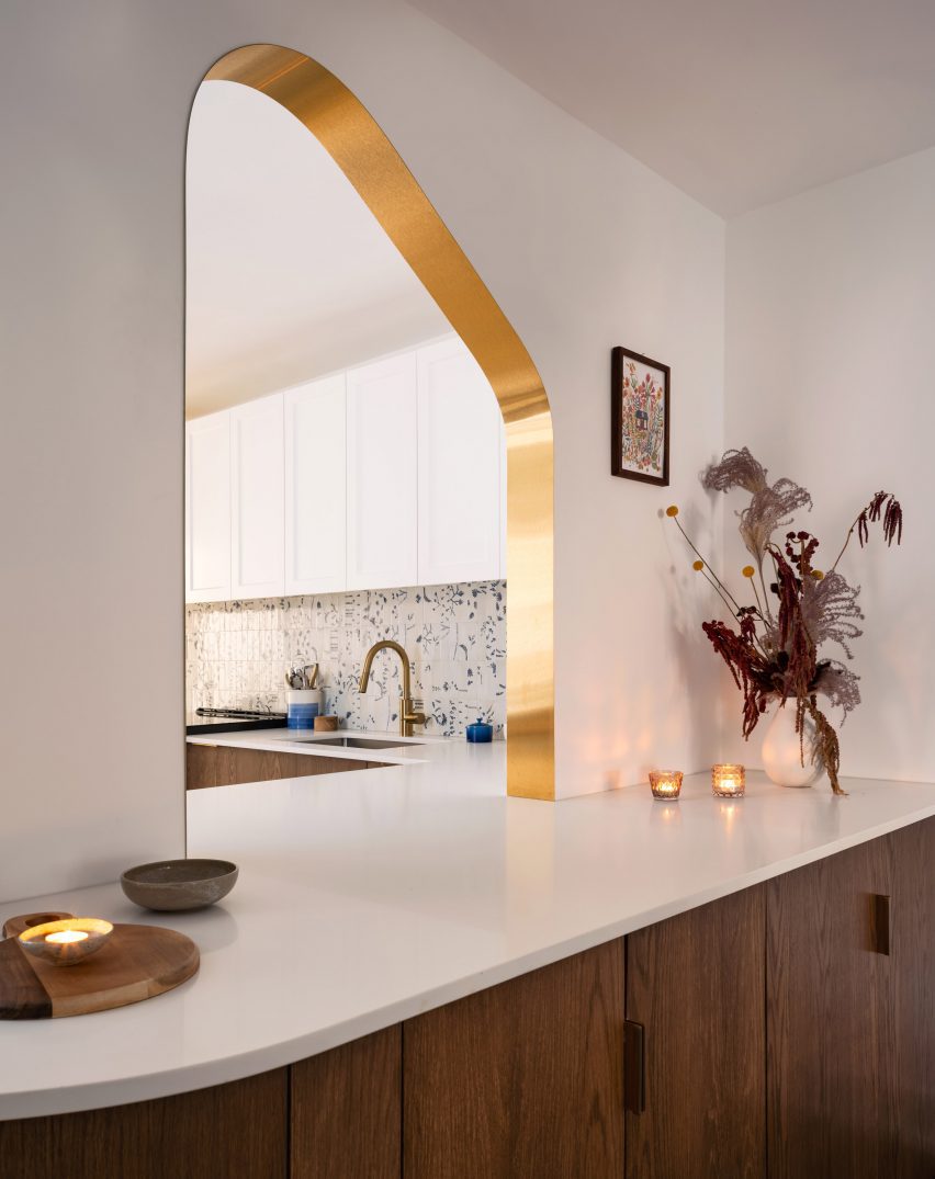
Brass-edged asymmetric portal looking into a kitchenBrass-edged asymmetric portal looking into a kitchen
The curved, asymmetric portal over the deep counter acts as a pass-through

The snaked kitchen layout is tight, so Svima curved the corners of cabinetry and counter surfaces to steal extra space for circulation.

This theme continues to the living room millwork: a bookcase is filleted at the corner and meets the wall at an angle, while a built-in sofa beneath the window also softly angles inward.
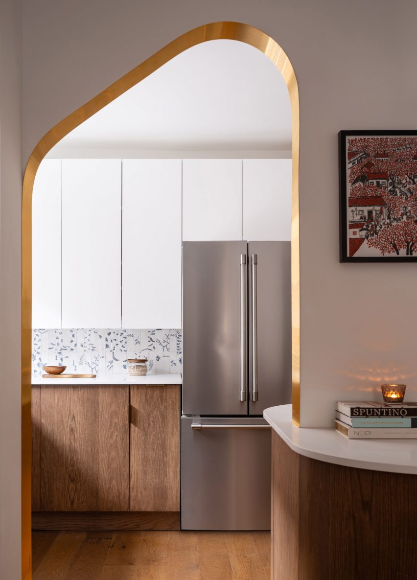
Open doorway with brass edges looking into the kitchenOpen doorway with brass edges looking into the kitchen
The other portal, mirrored in shape, forms a doorway between the two spaces

“The design hinges on ‘ribbons’ flowing through the space, guiding the motion through the rooms,” said Svima.

“The ribbons curve in areas where sharp corners would not fit, or would stop the flow of movement.”
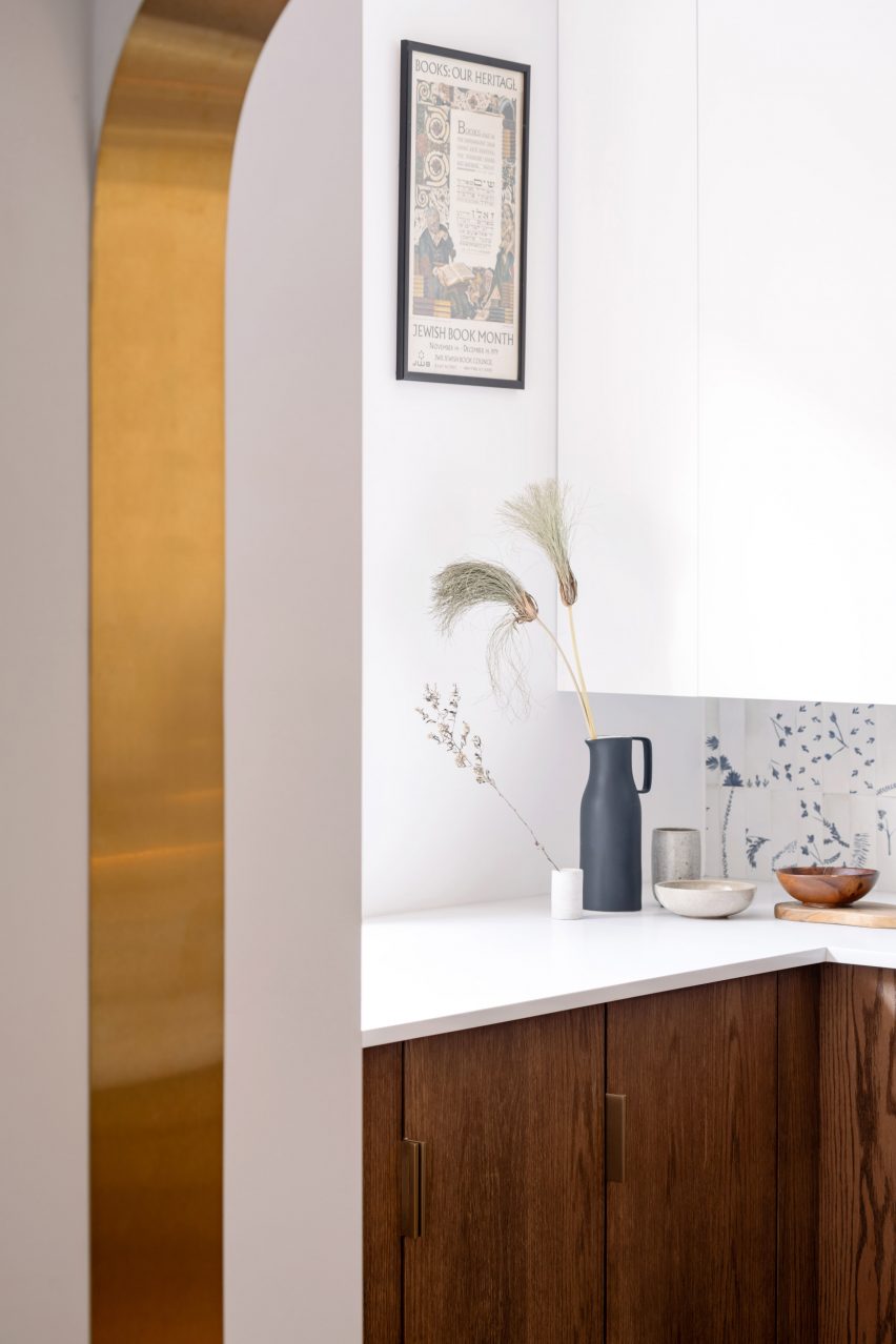
Detail of a brass-lined portal with a kitchen counter behindDetail of a brass-lined portal with a kitchen counter behind
Brass edges around the portals were artfully installed to perfectly fit the curved drywall

In the kitchen, the curved oak doors were handmade by a cabinetmaker who created a special jig to kerf-bend the oak into a radius.

Tiles that offer a contemporary take on Dutch Delft porcelain form the backsplash, adding small touches of blue to the otherwise neutral space.
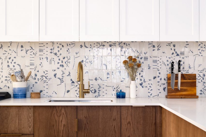
Kitchen with white upper cabinets, blue and white tiled backsplash, and dark oak lower cabinetsKitchen with white upper cabinets, blue and white tiled backsplash, and dark oak lower cabinets
To add touches of colour to the dark oak and bright white palette, tiles influenced by Delft porcelain were added to the backsplash

Two portals provide connections between the kitchen and adjacent dining room, both with a mirrored asymmetric shape and edged in brass.

One acts as a doorway, while the other over the deep counter is used as a pass-through for food, drinks and tableware.

“It was an artful process for the contractor to lay the brass into the wall, as it had to fit into the curved drywall perfectly with no tolerance for error,” the architects said.

The living room, located at the front of the house, was furnished with mid-century pieces such as a chair, a coffee table and a media console.
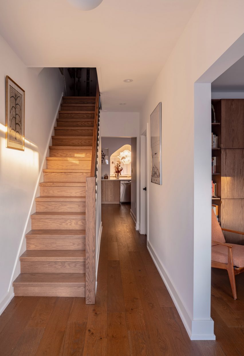
Hallway with dark oak flooring and a staircaseHallway with dark oak flooring and a staircase
Dark oak flooring throughout the home’s ground floor matches the other millwork

The closed and open shelving unit organises the family’s books and possessions, and its shape allows more light to enter from a side window.

Opposite, the built-in sofa helps to resolve an awkward space under a bay window and orients the sitter towards the TV to one side.
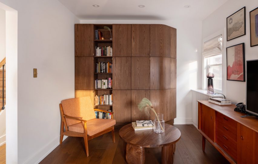
Living room featuring a dark oak storage unit with a filleted sideLiving room featuring a dark oak storage unit with a filleted side
In the living room, the curved kitchen cabinetry is translated as a storage unit with a filleted side

“The custom sofa sweeps into the space to provide seating at precisely the right sideways angle for viewing the media unit, for lounge reading, and for gathering,” Svima said.

The floors throughout the home match the other millwork, grounding the spaces with a rich dark hue.
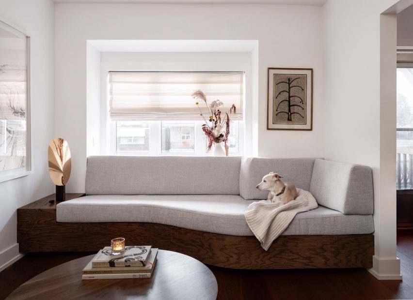
A built-in sofa under a living room bay windowA built-in sofa under a living room bay window
A built-in sofa under the living room’s bay window similarly features softly curved angles

Svima, founded by architects Anamarija Korolj and Leon Lai, is not the only studio that’s had to get creative with a tight Toronto floor plan.

When Studio Vaaro overhauled a house in the city, the firm created a series of volumes with minimally detailed millwork to form kitchen cabinetry, the staircase and a feature bookcase in the living room.

The photography is by Scott Norsworthy.

Reference

DAB Studio lines kitchen of Dutch home with oak and Afromosia wood
CategoriesInterior Design

DAB Studio lines kitchen of Dutch home with oak and Afromosia wood

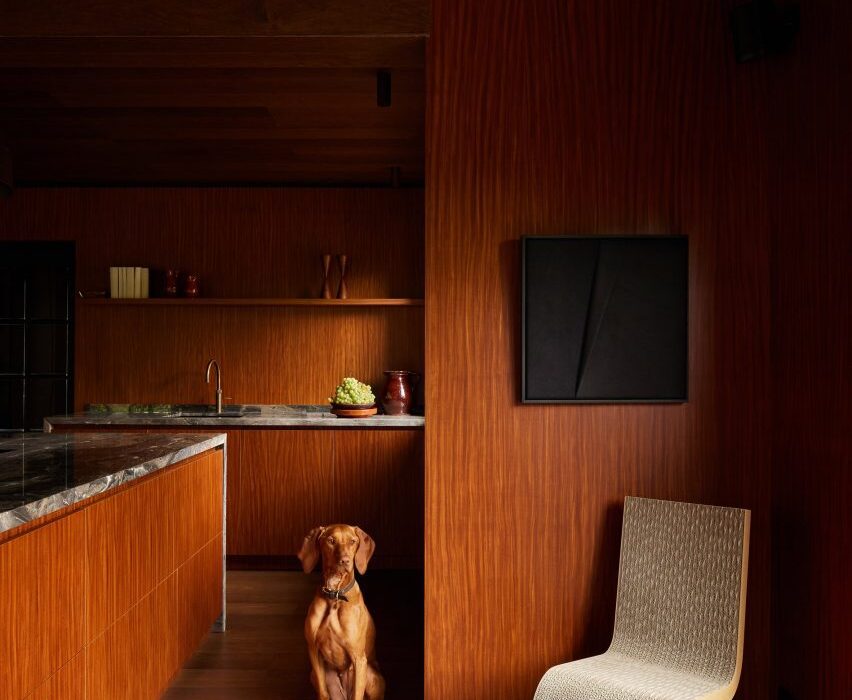
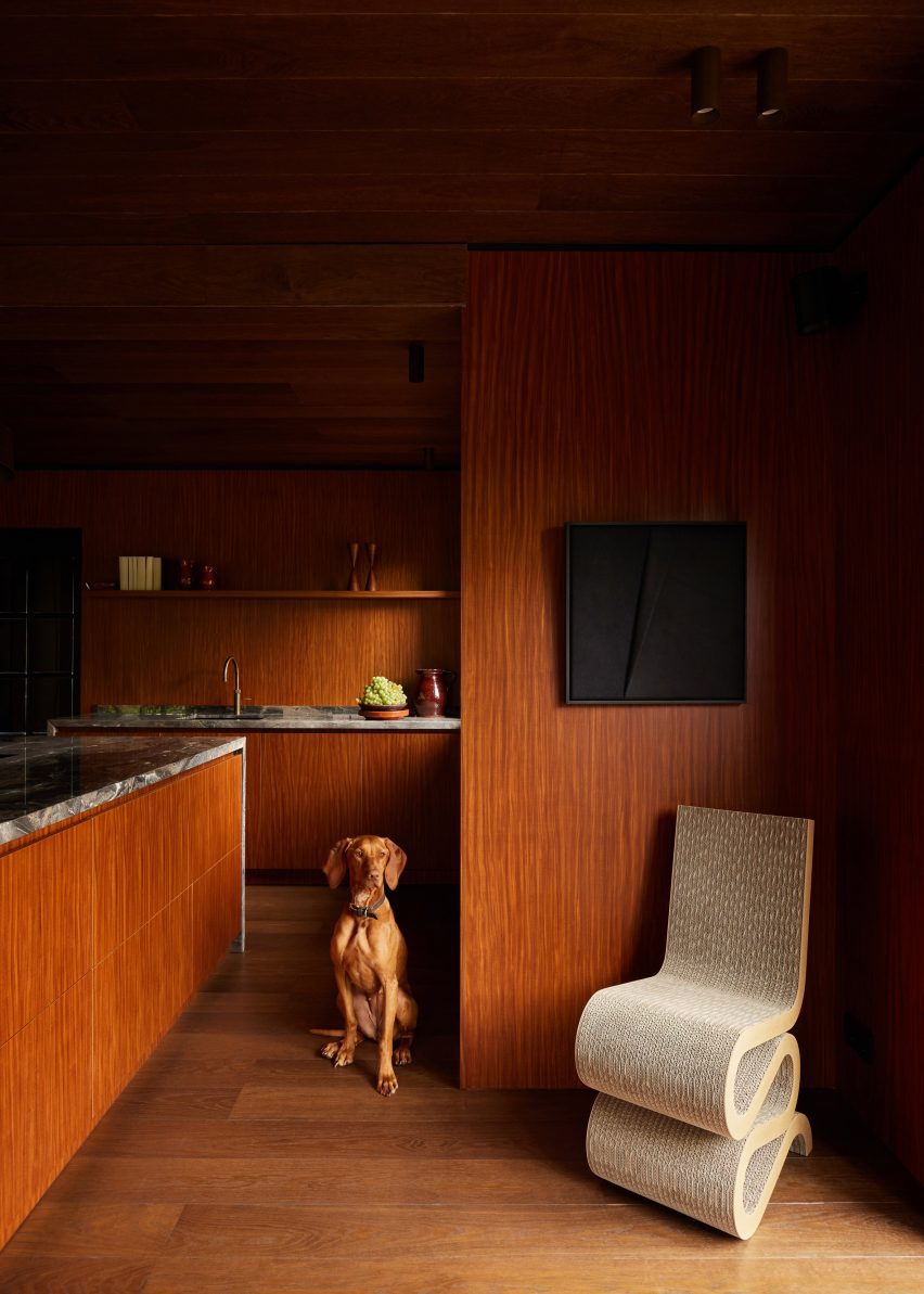
Dutch interior design practice DAB Studio has transformed the kitchen of a family home in Zwaag, the Netherlands, by covering the floors and ceiling in one type of wood and the walls and cabinets in another.

DAB Studio aimed to create a “calm yet soulful” interior with an earthy colour palette made up of tan and neutral shades.

Kitchen interior by DAB Studio with wood-lined walls, floors and cabinets
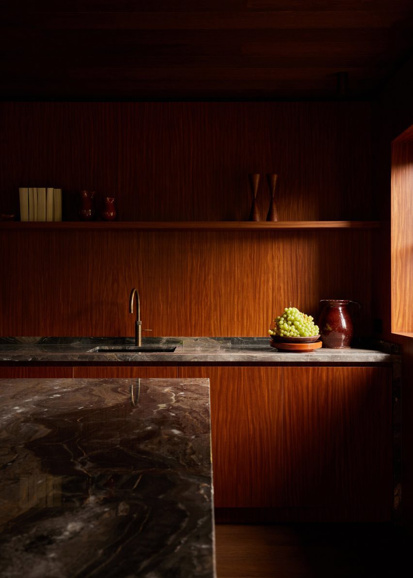
Quarter-sawn Afromosia wood lines the walls and kitchen units

The floors and ceiling were covered in hand-scraped oak with a smoked and black-oiled finish, laid in a pattern of side-by-side plank pairs.

Afromosia wood, a tropical hardwood native to west Africa, was applied to the walls and cabinets. The wood was quarter sawn to create a decorative grain pattern and add a sense of playfulness to the interior.

Wood-lined dining room with a built-in seating nook
Oak planks were laid in side-by-side pairs on the floors and ceiling

DAB Studio co-founders, Lotte and Dennis Bruns, designed the interior to be a space that would balance “feminine and masculine elements” and reflect both of the owners’ design tastes.

According to the duo, the repeating wood choices for the different surfaces give the space a sense of completeness.

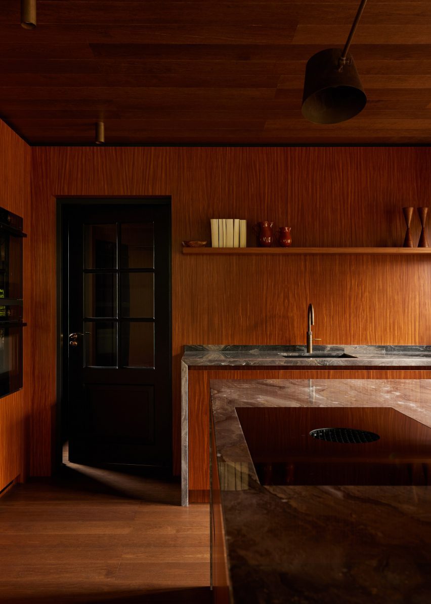
Wood-lined kitchen with a black door and marble worktops
Marble worktops extend down the sides of the kitchen units

“Per the client’s request, we wanted to merge the feminine and masculine vision of their new home, balancing each other out in one curated space,” the co-founders told Dezeen.

“This allowed us to create unique areas in line with our client’s habits and interests while imbuing the space with a sense of spaciousness and lightness.”

“In order to merge all elements of the design, it felt important to prioritise the theme of consistency,” the duo added.

“For that particular reason, the wood of the floor is repeated on the ceiling, and the wood used for cabinetry is continued into the walls of the room.”

The centrepiece of the kitchen is the island, which features Afromosia wood cabinet doors and a waterfall countertop made from Arebescato Orobico marble.

Wood cabinets along one kitchen wall were also topped with a marble worktop, which extends down one side to frame the unit.

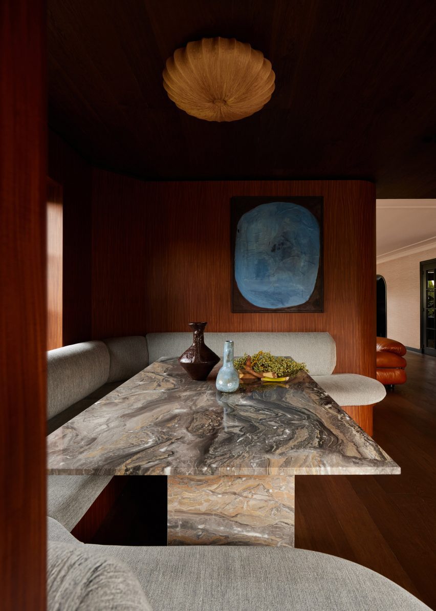
Wood-clad seating nook with upholstered seating and a marble table by DAB Studio
The studio balanced “masculine and feminine” elements in the interior

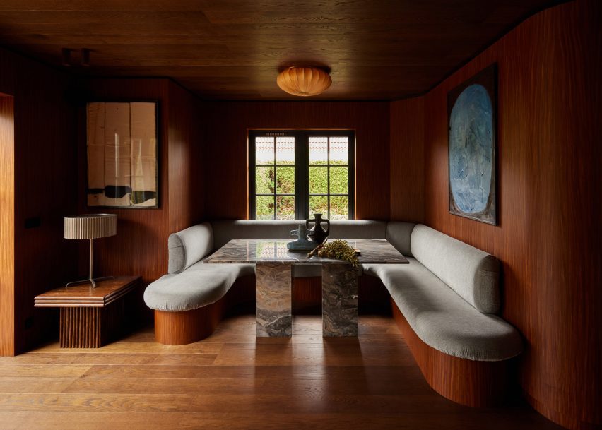
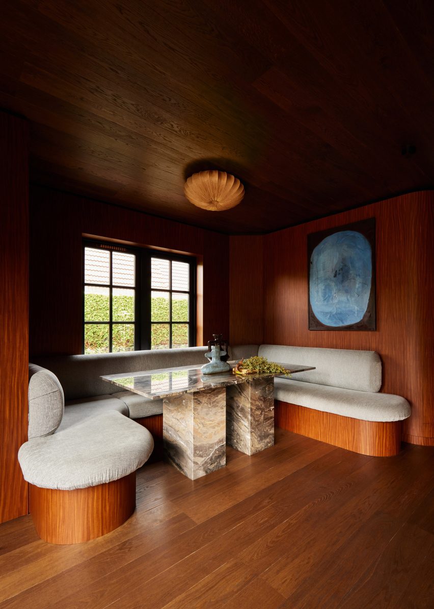
DAB Studio added a dining nook below a window, designed to be a space flooded with natural light where the family can gather.

Seating with rounded corners wraps the three walls of the nook. The seating base was covered in the same wood as the interior walls, while the seat and backrest are covered in plush upholstery.

Wood-lined kitchen by DAB Studio with marble worktops
The quarter-sawn Afromosia wood creates a decorative grain

At the centre of the nook, a rectangular table with two blocky legs made from Arebescato Orobico marble contrasts the rounded seating.

“The dining nook is where the family can spend time together, welcome new conversations, and create core memories,” said Lotte and Dennis Bruns.

“The asymmetrical built-in banquette seating feels inviting with its round edges, and adds a dynamic feel to the space.”

Banquette seating in a dining room nook with wood flooring, ceiling and walls by DAB Studio
The dining nook sits below a window

Decorative items and free-standing furniture were introduced to the interior to add more rounded elements, including a Wiggle Chair by Frank Gehry.

Elsewhere in the Netherlands, Francois Verhoeven Architects has created a bungalow clad in vertical timber slats and Julia van Beuningen added a plywood staircase to a barn conversion.

The photography is by Daniëlle Siobhán.

Reference

Snøhetta combines clay and oak for minimalist interior of Holzweiler store
CategoriesInterior Design

Snøhetta combines clay and oak for minimalist interior of Holzweiler store

Architecture practice Snøhetta stuck to natural materials for the fit-out of the Holzweiler boutique in Copenhagen, incorporating subtle references to the fashion brand’s Norwegian heritage.

Snøhetta is a long-term collaborator of Holzweiler‘s, having designed the company’s flagship store and showroom in Oslo, as well as a number of its pop-up shops, runway sets and its digital identity.

Copenhagen store features minimalist interiors by Snøhetta
Snøhetta has designed Holzweiler’s Copenhagen outpost

For Holzweiler’s first international outpost in Copenhagen, Snøhetta followed the concept of “tracing” – devising an interior scheme that shows traces of the brand’s Norwegian roots alongside the minimalist aesthetic found in its previous retail spaces.

“Reminiscent of a memory or feeling that remains, the idea of ‘traces’ evokes an emotional sense of the brand’s beloved heritage as it travels to a new city,” the practice said.

Holzweiler's Copenhagen store features minimalist interiors by Snøhetta
A clay sculpture by Ingeborg Riseng sits at the heart of the store

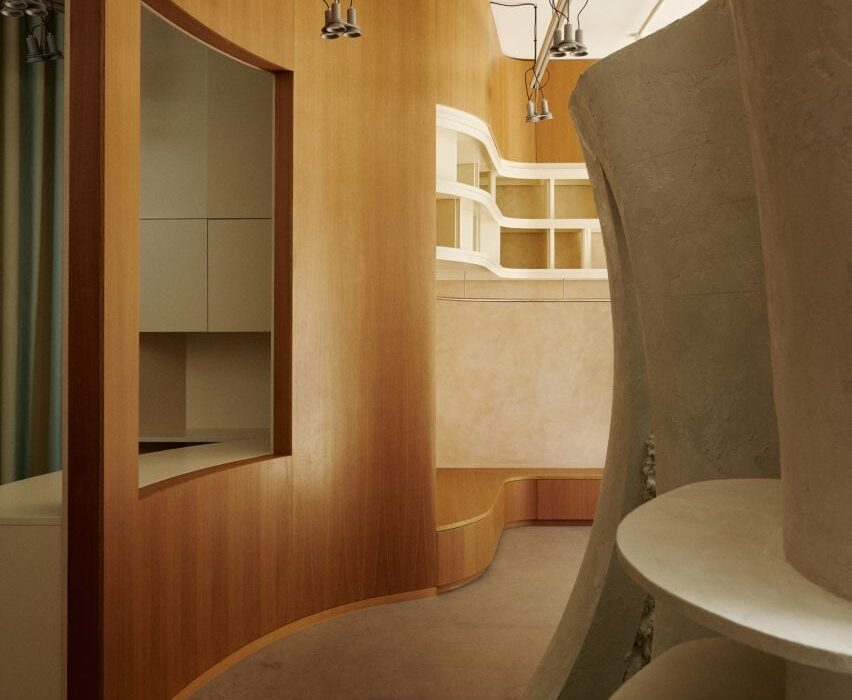
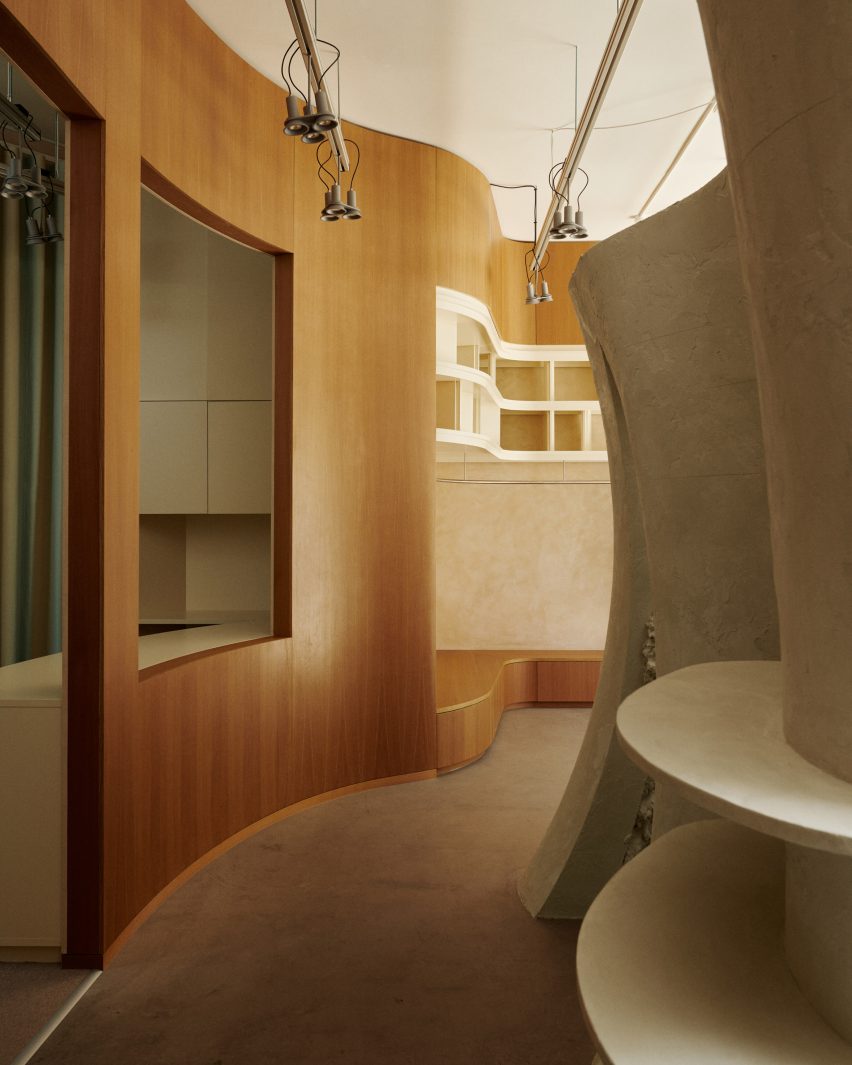
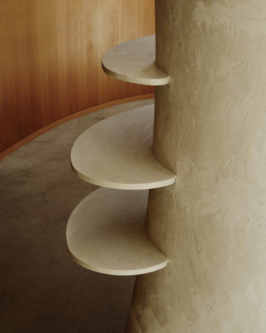
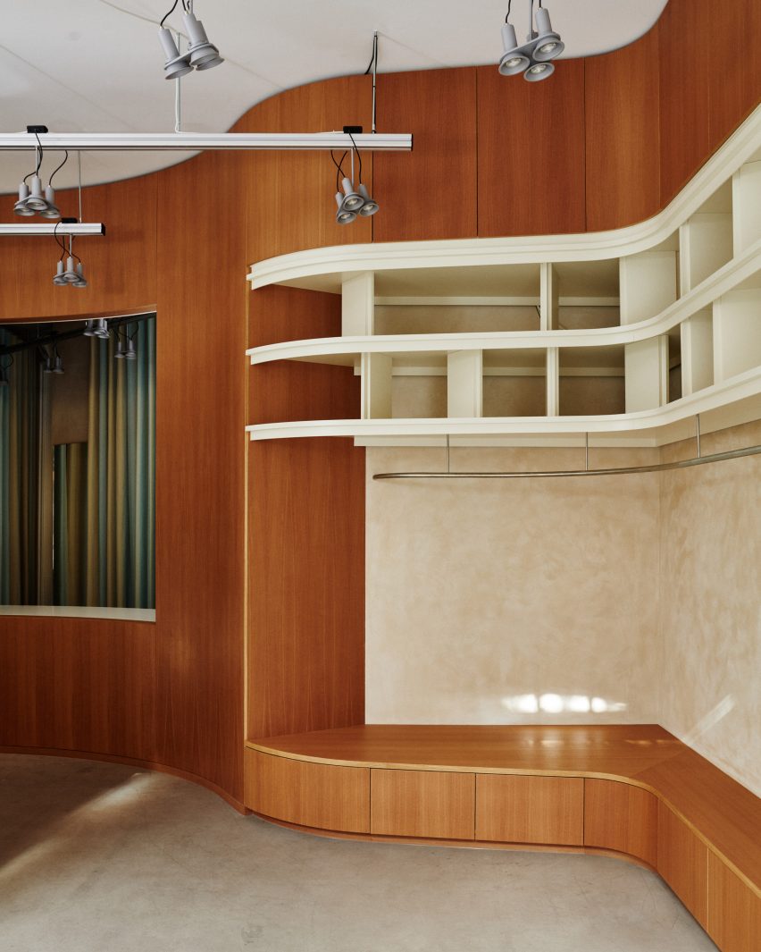
At the centre of the 100-square-metre store is a tall, hollow sculpture by Norwegian artist Ingeborg Riseng, which shoppers can step into. Its undulating outer walls are fitted with display shelves and coated in a smooth layer of clay, while the inside has a rough, craggy surface.

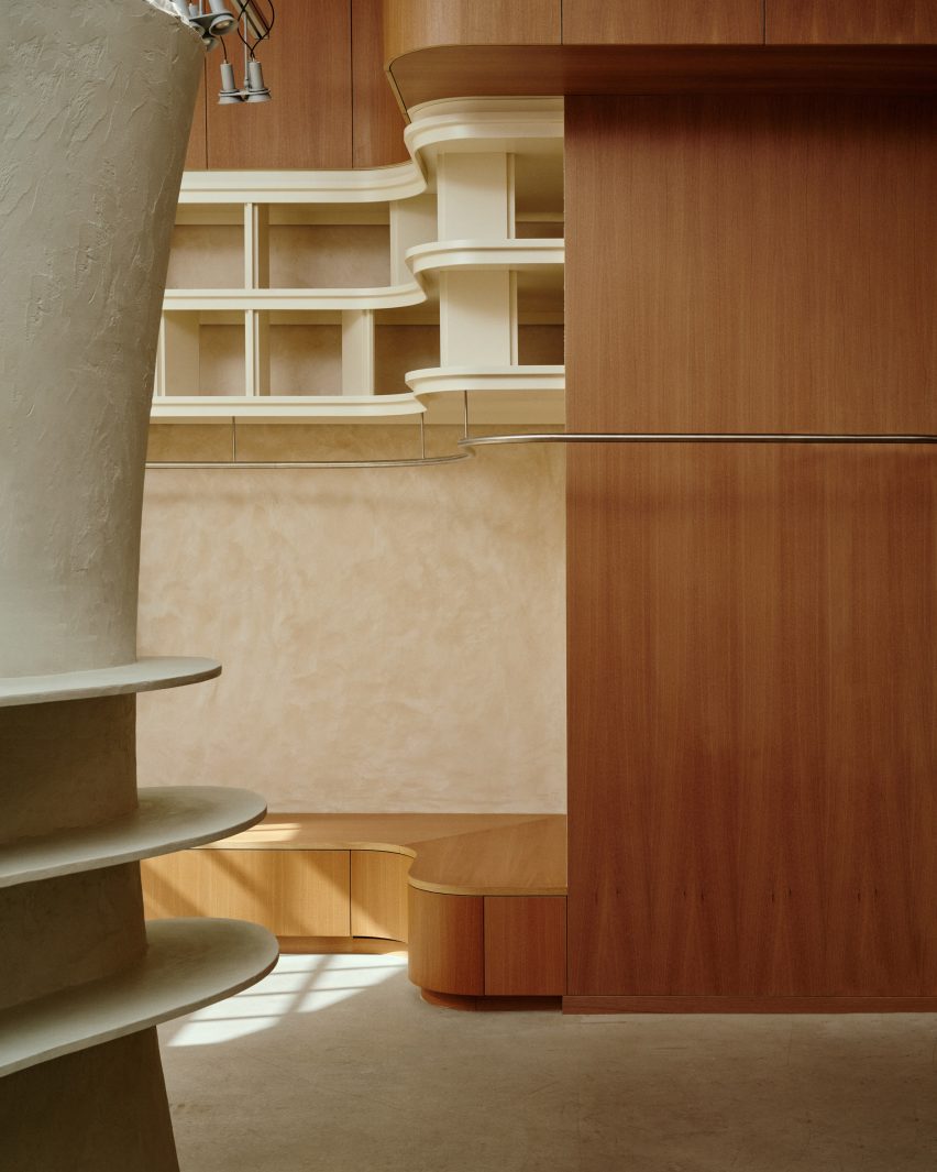
An oakwood display plinth winds its way around the periphery of the store, eventually connecting to a curved timber partition at the rear of the floor plan.

Copenhagen store features minimalist interiors by Snøhetta
Around the edge of the store is an oak display plinth

Behind the wall lies a changing area with cubicles and curtains created by Danish textile design studio Tronhjem Rømer.

The fabric is digitally printed with subtle yellow and pale blue stripes, designed to evoke the shifting shades of the Norwegian sky.

To contrast the store’s largely natural material palette, Snøhetta added some industrial-style finishing touches like metal clothing rails and custom strip lighting, developed by Swedish brand Ateljé Lyktan.

Both the floors and ceilings were preserved from the store’s previous fit-out.

Holzweiler's Copenhagen store features minimalist interiors by Snøhetta
Garments hang from steel rails

Other recent projects by Snøhetta include Bolder Star Lodges, a quartet of wooden cabins that overlook a fjord in Norway.

Meanwhile in Denmark, the practice employed boat construction techniques to create a timber community centre in Esbjerg.

The photography is by Magnus Nordstrand, courtesy of Snøhetta and Holzweiler.

Reference

Woods + Dangaran renovates mid-century modern Clear Oak Residence
CategoriesInterior Design

Woods + Dangaran renovates mid-century modern Clear Oak Residence

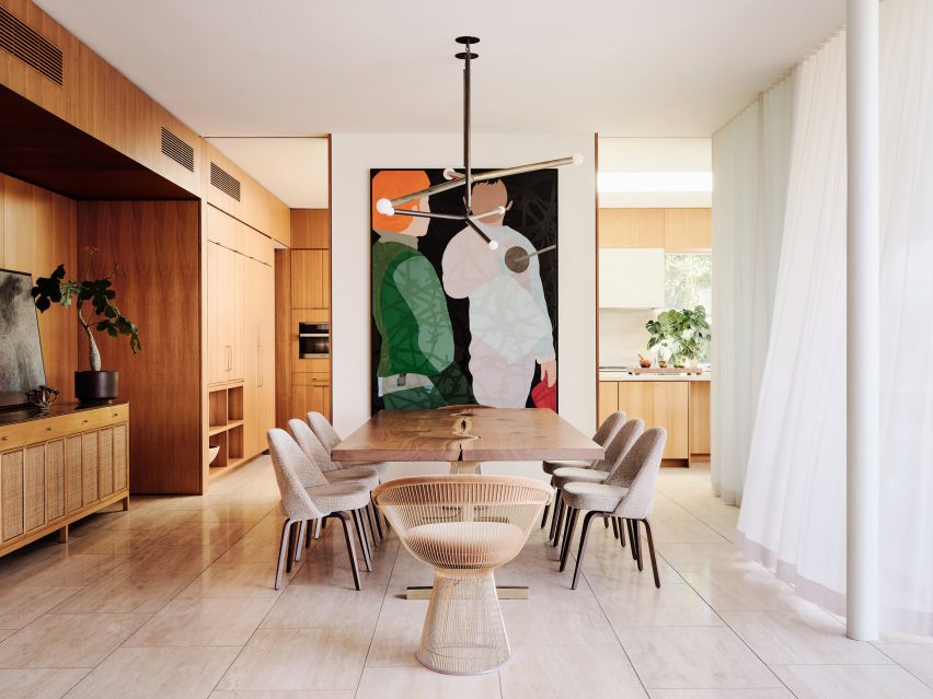
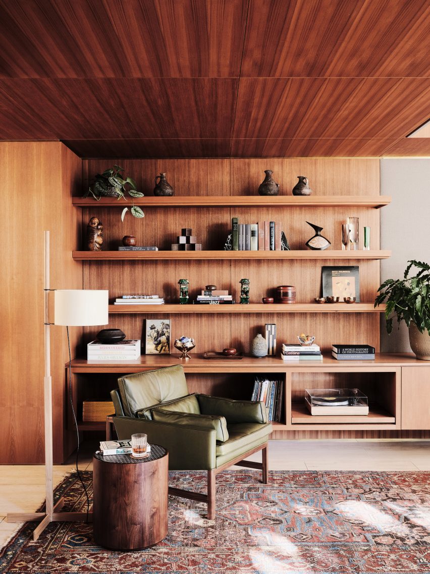
Teak wood, travertine stone and expansive glazing all feature in Woods + Dangaran’s renovation of a mid-century modern house that once belonged to singer Bing Crosby’s manager.

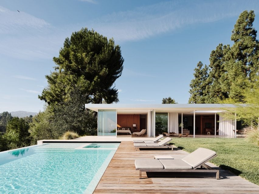
Los Angeles-based Woods + Dangaran has both upgraded the architecture and designed the interiors for Clear Oak Residence, which is located on a hillside above LA’s San Fernando Valley.

Swimming pool and sun deck of Clear Oak Residence by Woods + Dangaran
Clear Oak Residence is located on a hillside above LA’s San Fernando Valley

The design aims to enhance the building’s relationship with its setting while also bringing an increased sense of warmth and comfort to the living spaces.

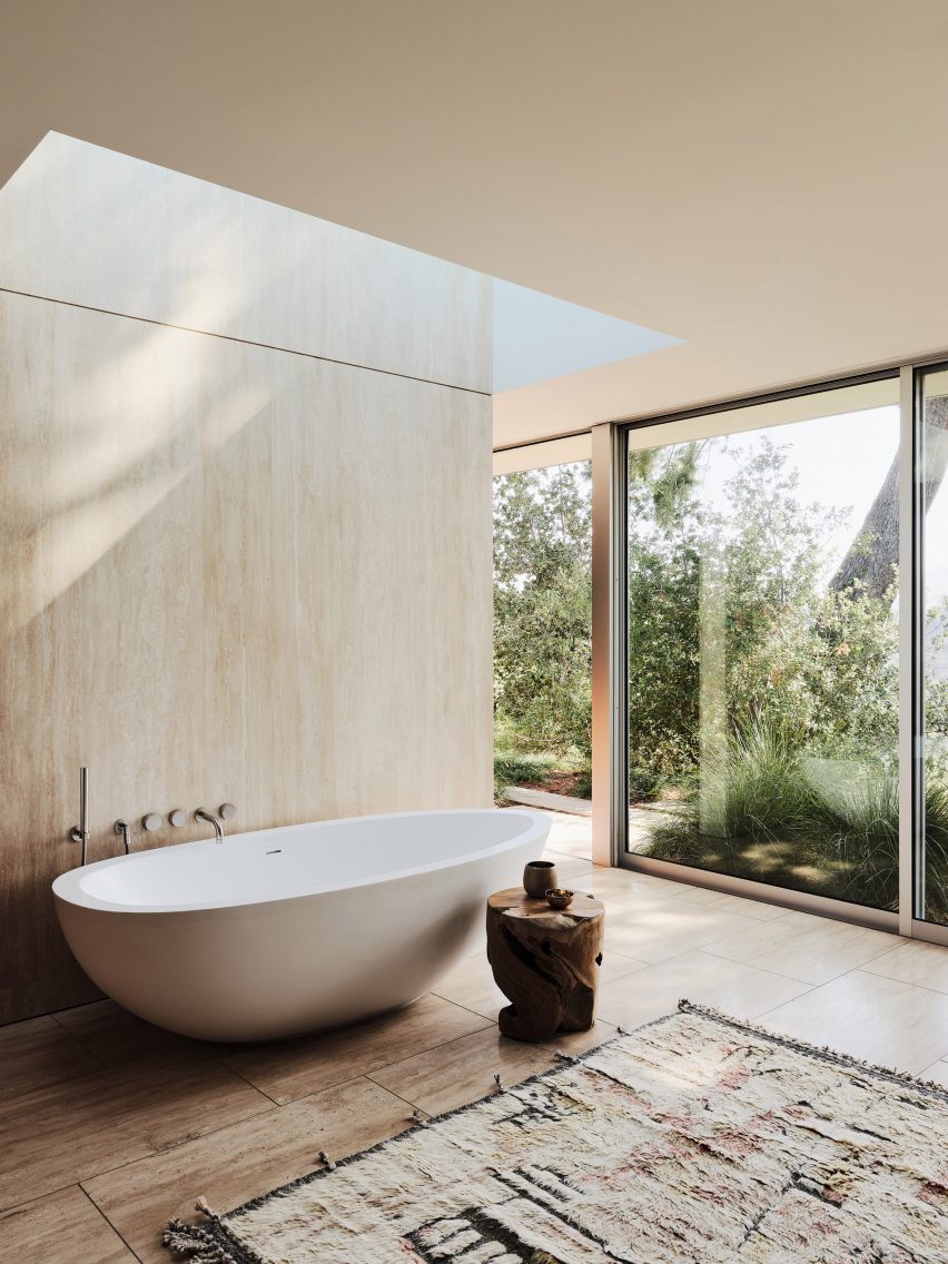
Doorways and windows were adjusted and enlarged to enable wraparound views of the landscape, while skylights were added to highlight key moments within the interior.

Cantilevered swimming pool at Clear Oak Residence by Woods + Dangaran
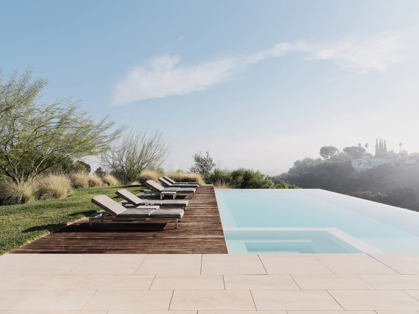
A new swimming pool cantilevers out towards the view

Travertine creates a continuous floor surface that extends out from the living spaces to a sunset terrace, while teak provides wall panelling and in-built joinery throughout.

“The architectural finish palette was intentionally limited to four materials: clear anodised aluminium, plaster, travertine, and teak for the wall panelling,” said Woods + Dangaran.

“This visual restraint manifests in a serene ambiance that permeates all aspects of the residence.”

Dining table in Clear Oak Residence by Woods + Dangaran
Travertine flooring extends both inside and out

Clear Oak Residence is shortlisted for Dezeen Awards 2022 in the house interior category, where it will compete with four other projects – including another one by Woods + Dangaran – for the title.

Woods + Dangaran designed this project for client Robert Galishoff, whose brief to the architects was to embrace the building’s mid-century heritage but ensure the result exudes a sense of “effortless luxury”.

Teak joinery in Clear Oak Residence by Woods + Dangaran
Teak provides wall panelling and custom joinery

Landscaping played a big role in the transformation. By relocating the swimming pool so that it cantilevers over the hill and adjusting the topography, more terrace and deck space could be created.

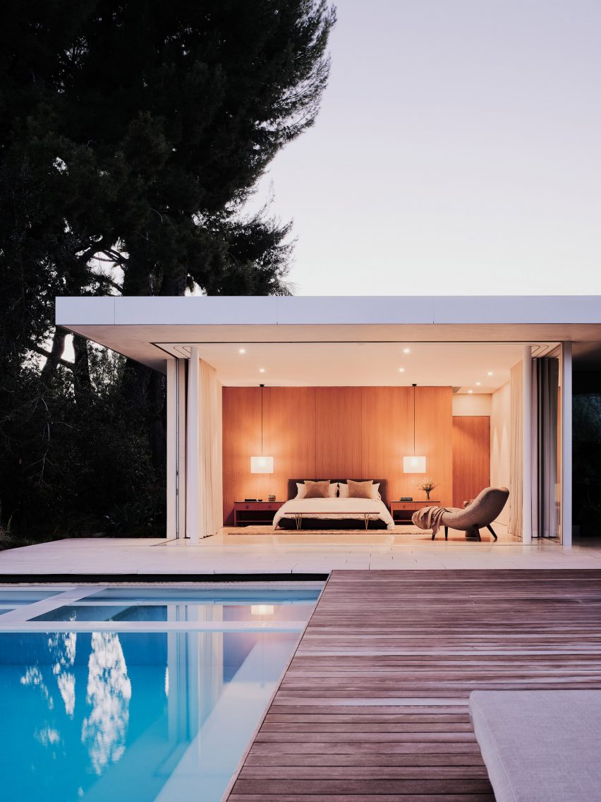
Sliding floor-to-ceiling glass doors allow the main bedroom, the living room and the dining area to open out to this terrace.

“Enlarged doorways and windows inside the house, including floor-to-ceiling glass doors, integrate the interior spaces with the landscape and foreground views by eliminating barriers,” said the architects.

“Glazed openings inserted along corridors create memorable spatial experiences from new axes and vantage points.”

Skylight above bath in Clear Oak Residence by Woods + Dangaran
Skylights create framed views of the sky

The interior furnishings include both new and retro pieces in natural materials and warm colours, which sit alongside Galishoff’s collection of objets d’art.

The living room features a copper silk shag rug from Mehraban, a Minotti sectional reupholstered in a retro-patterned textile and a pair of the Arthur Casas-designed Amorfa coffee tables.

“Inspired by mid-century pieces but adjusted for scale, function, and material, these pieces give the home a unique voice that mixes old and new, retro with contemporary vibes,” said Woods + Dangaran.

Bedroom facing pool in Clear Oak Residence by Woods + Dangaran
The design respect’s the building’s mid-century heritage

Led by architects Brett Woods and Joe Dangaran, Woods + Dangaran has developed a reputation for modernising mid-century homes but also designs new-builds with a similar character.

Other recent projects include an upgrade of a 1960s Craig Ellwood house and a brass-clad home in Palm Springs.

The photography is by Joe Fletcher.

Reference