Instead Of Stairs, A Spiraling Ramp Was Designed For This Office Building
CategoriesInterior Design

Instead Of Stairs, A Spiraling Ramp Was Designed For This Office Building

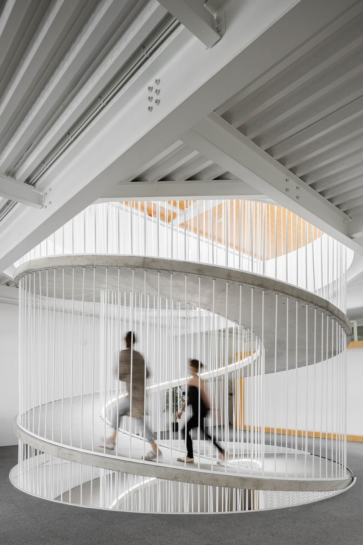
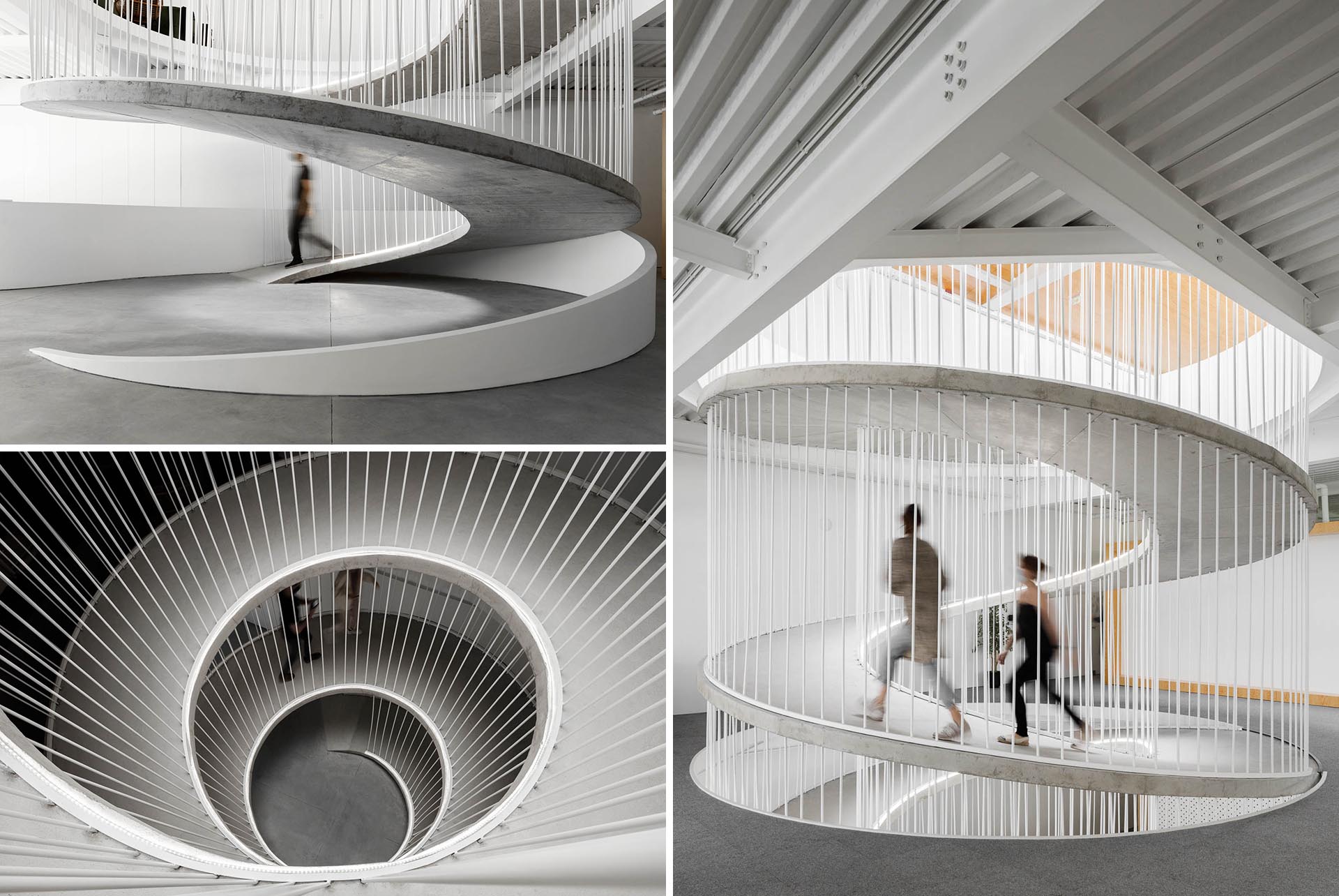
A spiraling ramp replaces the need for stairs in this modern office and adds a sculptural element.

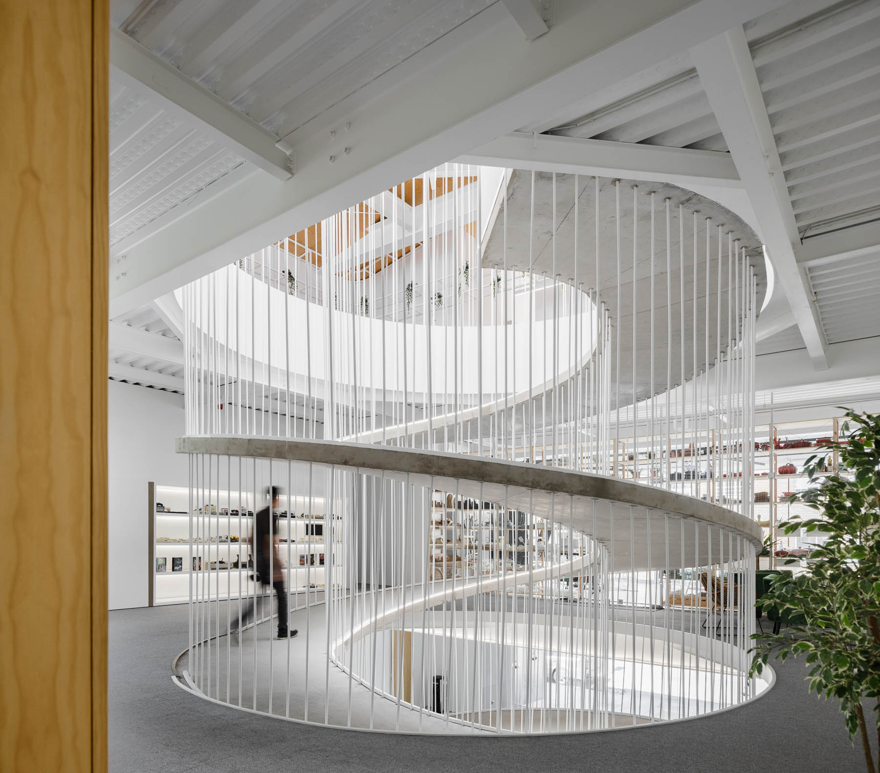
PAULO MERLINI architects has designed the offices of E-GOI & CLAVEL´S KITCHEN in Portugal, and one of the main design features central to the interior is a spiraling ramp.

A spiraling ramp replaces the need for stairs in this modern office and adds a sculptural element.

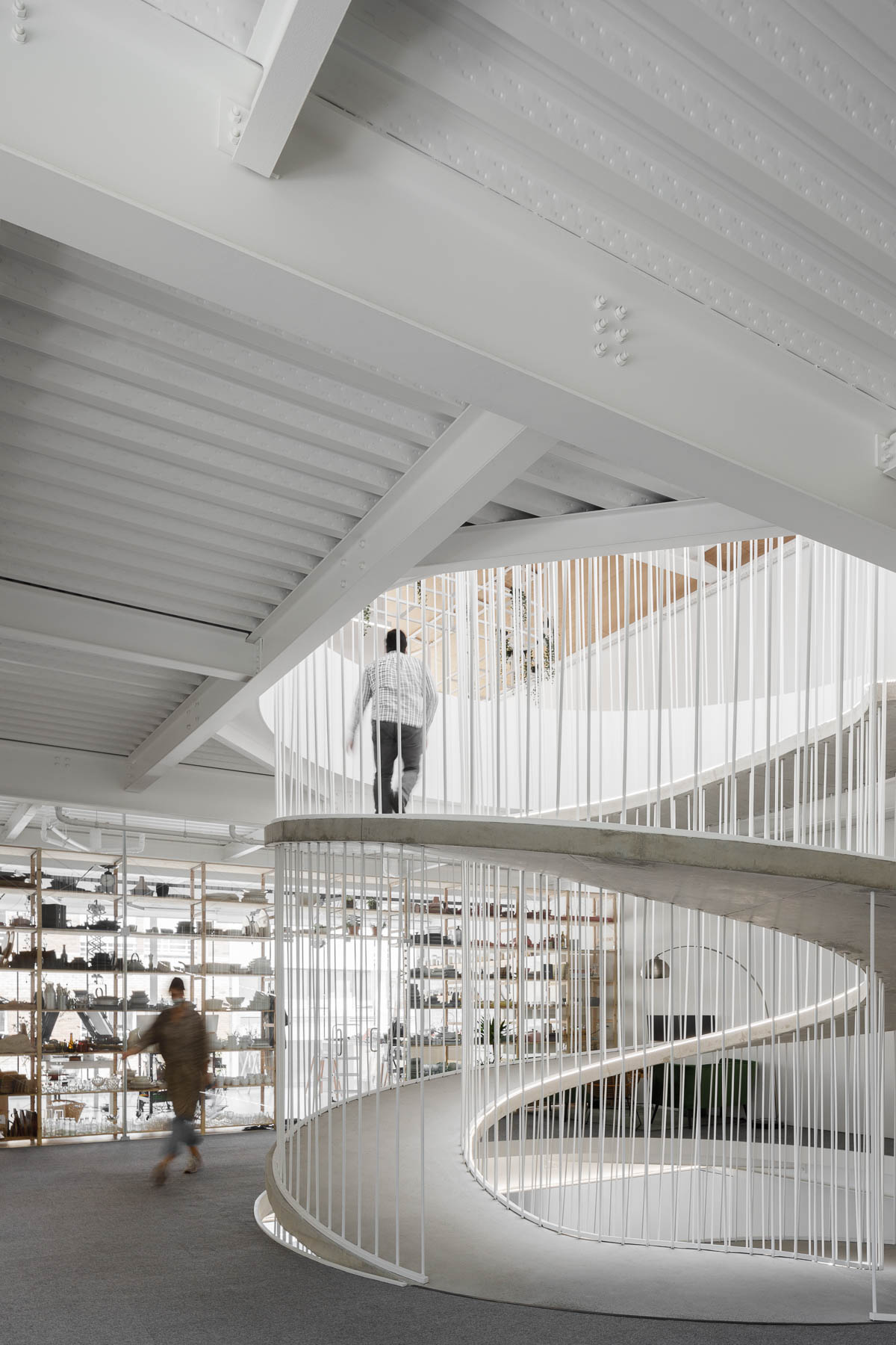
The former warehouse, which has now been transformed into offices that span multiple floors, includes a ramp that replaces the need for a staircase.

A spiraling ramp replaces the need for stairs in this modern office and adds a sculptural element.

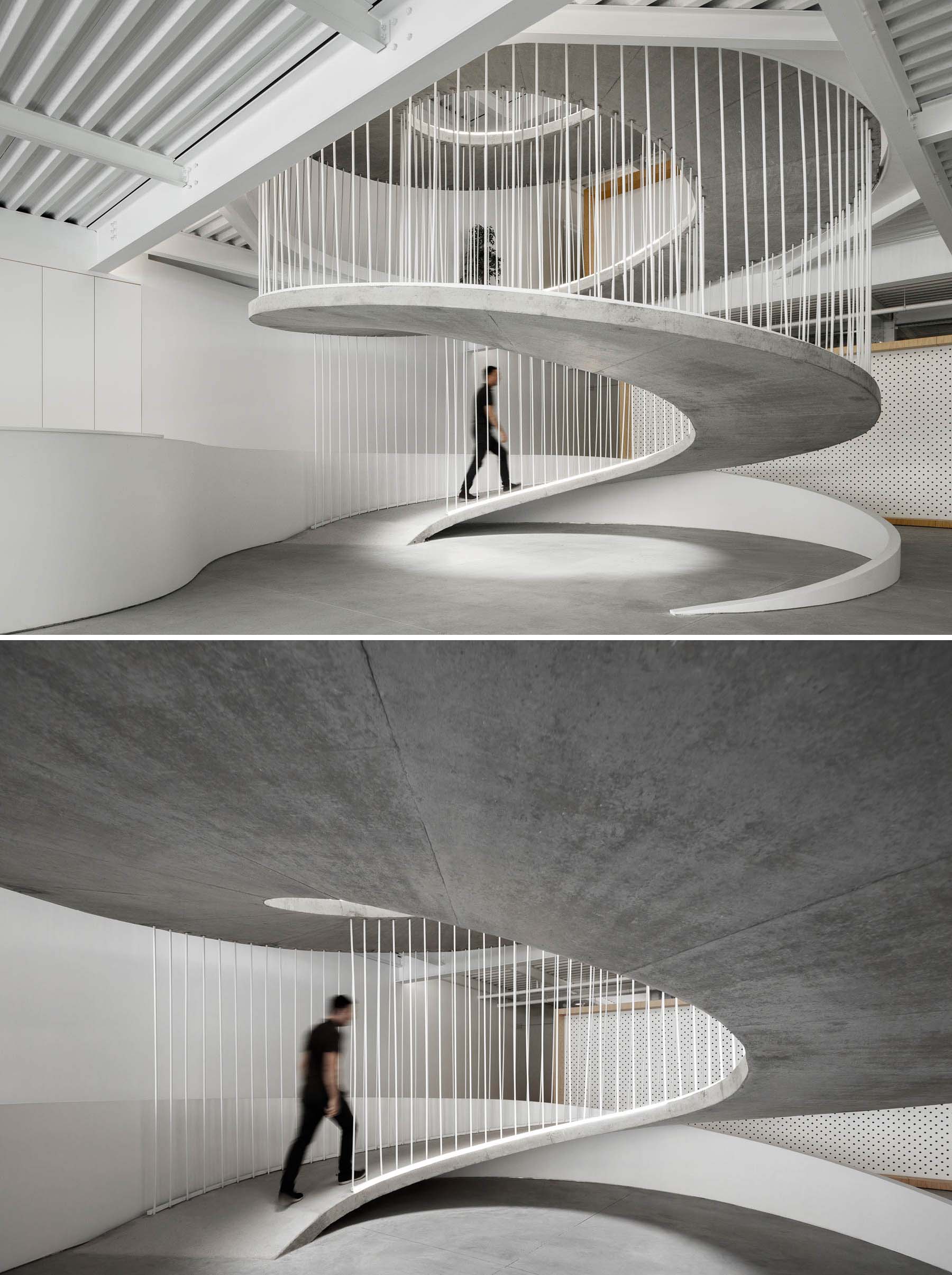
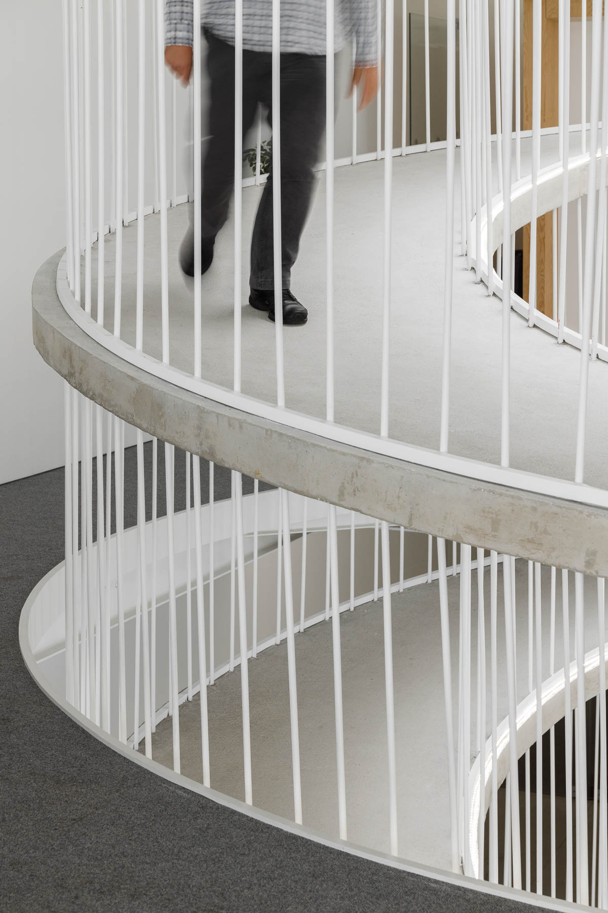
The elegantly curves of the concrete form is accentuated by the use of white bars and edges.

A spiraling ramp replaces the need for stairs in this modern office and adds a sculptural element.

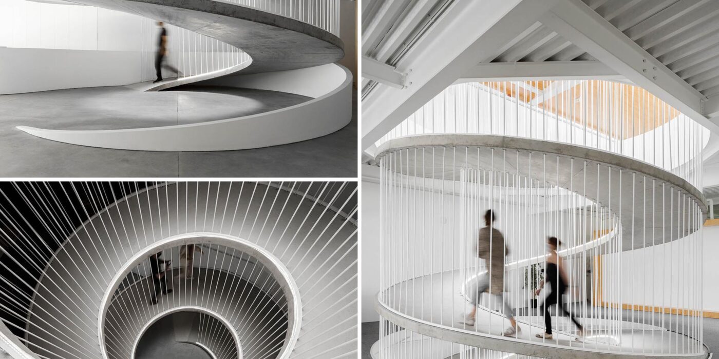
The circling ramp connects the floors of the office and adds a sculptural element that doesn’t block the light from traveling throughout the interior.

A spiraling ramp replaces the need for stairs in this modern office and adds a sculptural element.
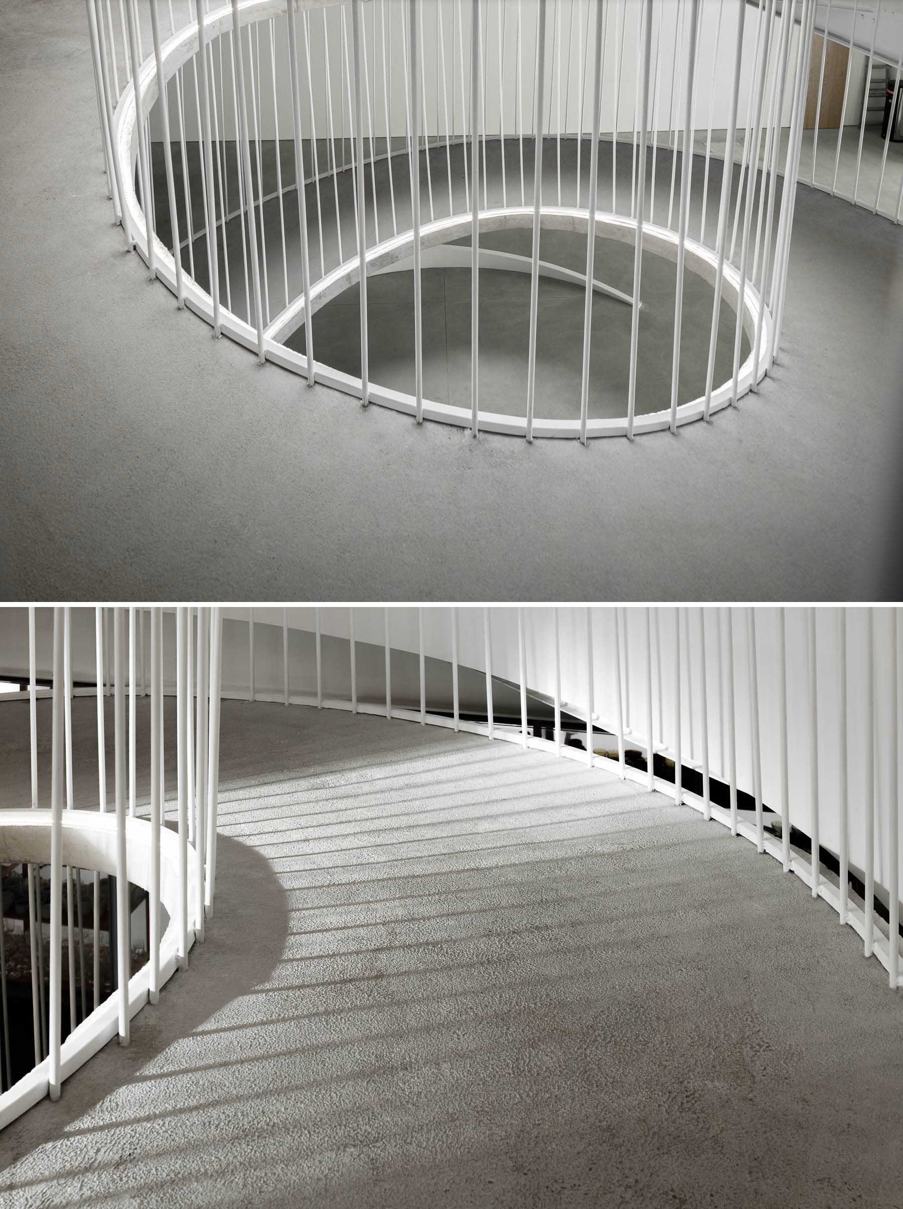
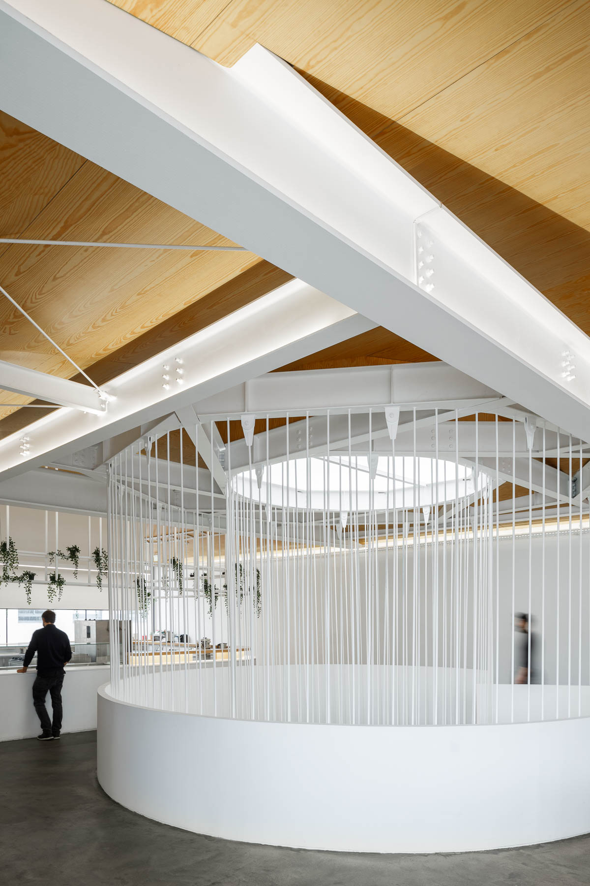
A white frame and supports connect the top of a spiraling ramp with the ceiling.

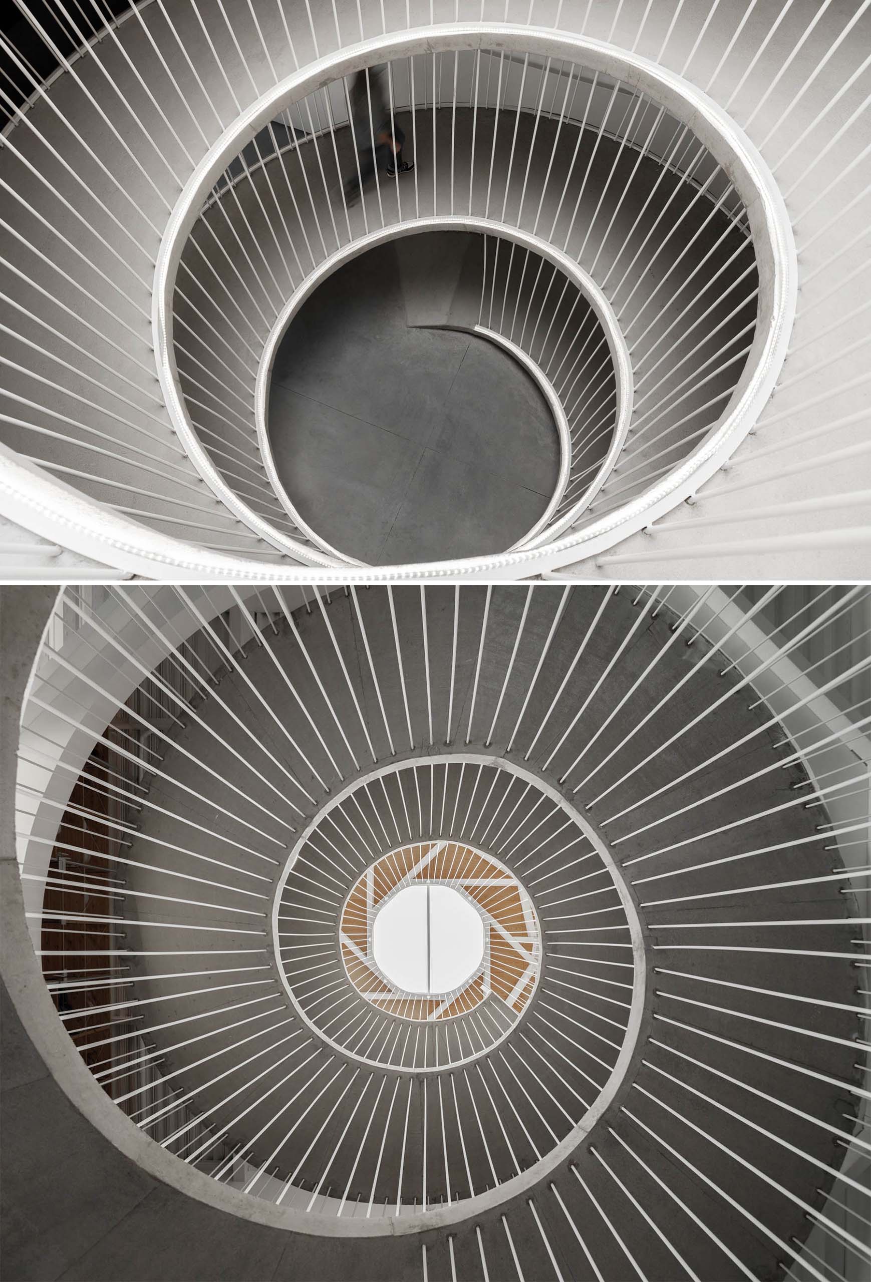
Here’s a glimpse of the ramp looking down from the top floor, and up from the ground.

A spiraling ramp replaces the need for stairs in this modern office.

Let’s take a look at the rest of the office…

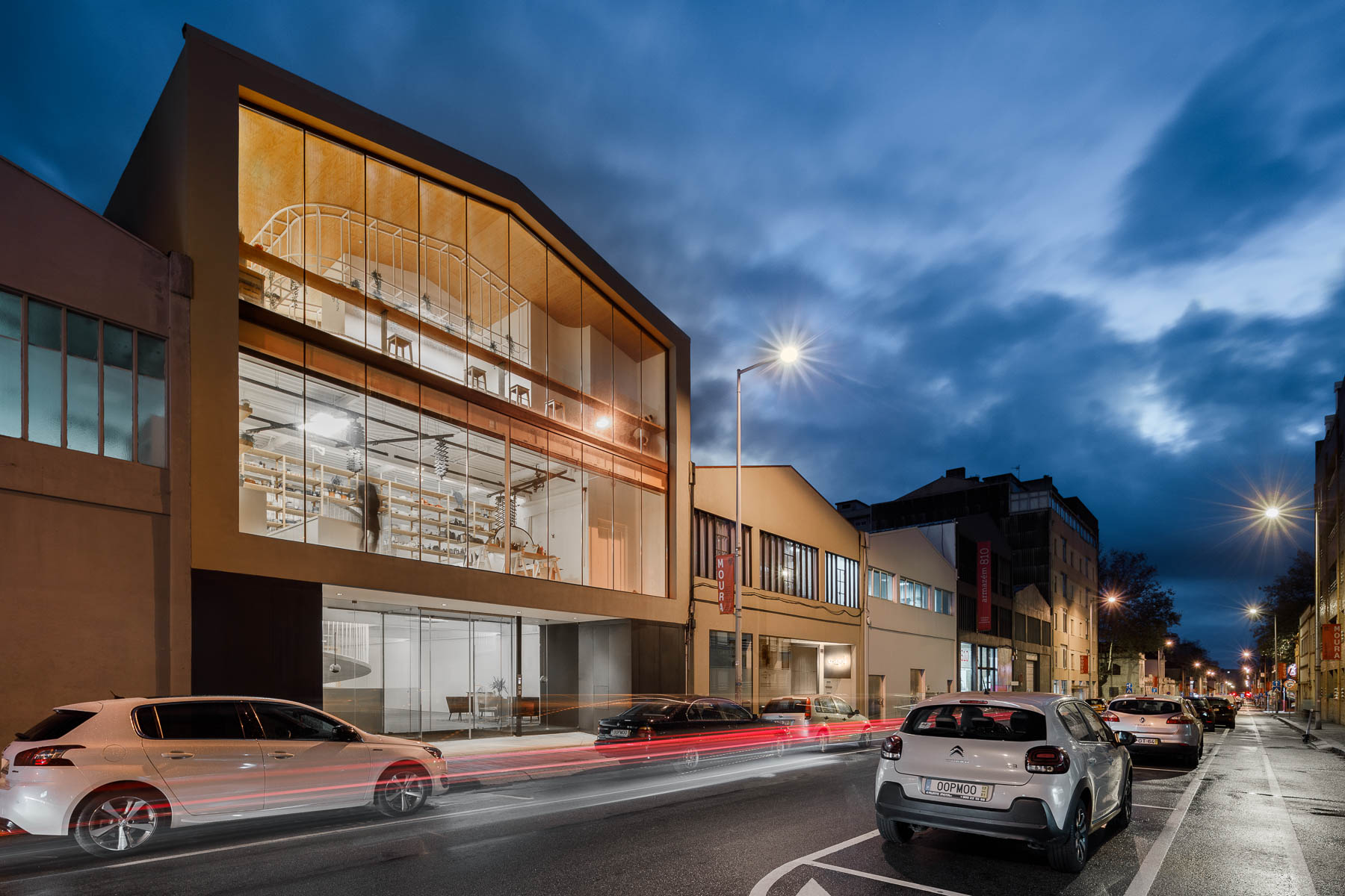
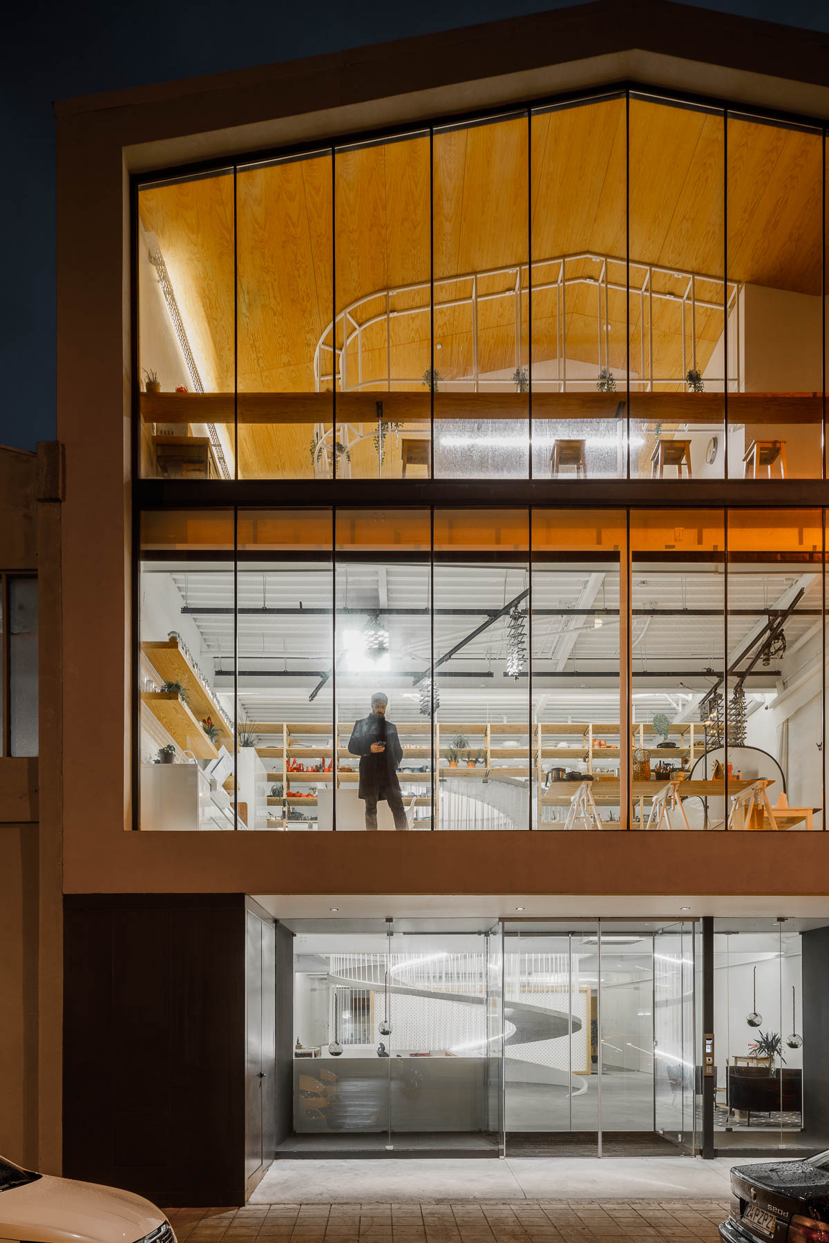
The exterior of the office has walls of glass providing a glimpse of the interior for the pedestrians on the street.

The exterior of this modern office has walls of glass providing a glimpse of the interior for the pedestrians on the street.

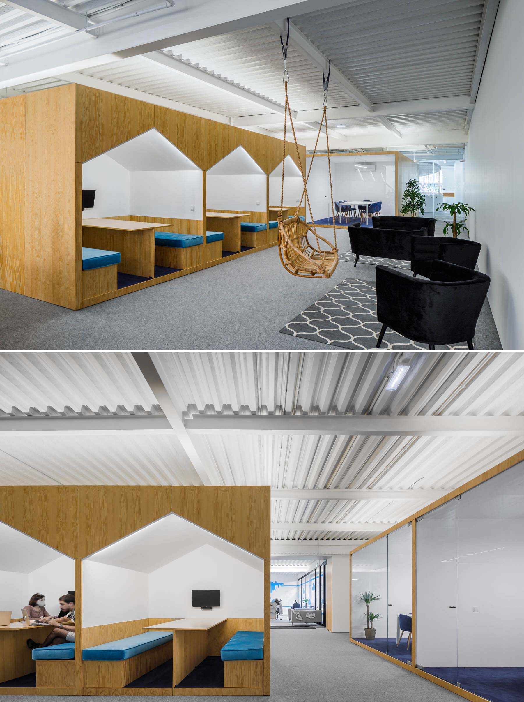
There’s a variety of different seating areas in the office interior, including spaces for casual meetings in house-shaped alcoves.

There's a variety of different seating areas in this modern office interior, including spaces for casual meetings in house-shaped alcoves.

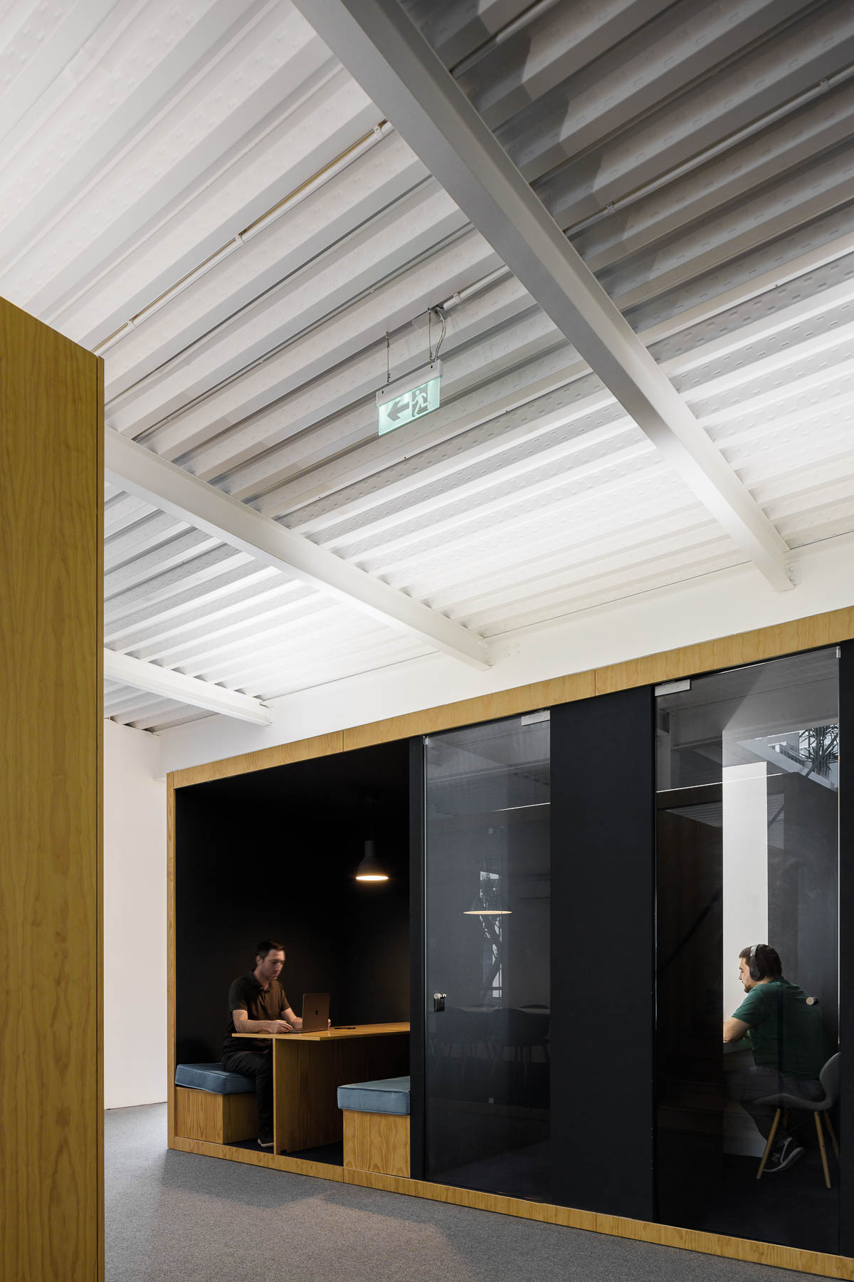
More private work rooms with glass walls that keep the sound in or out.

A modern office interior with a variety of work areas.

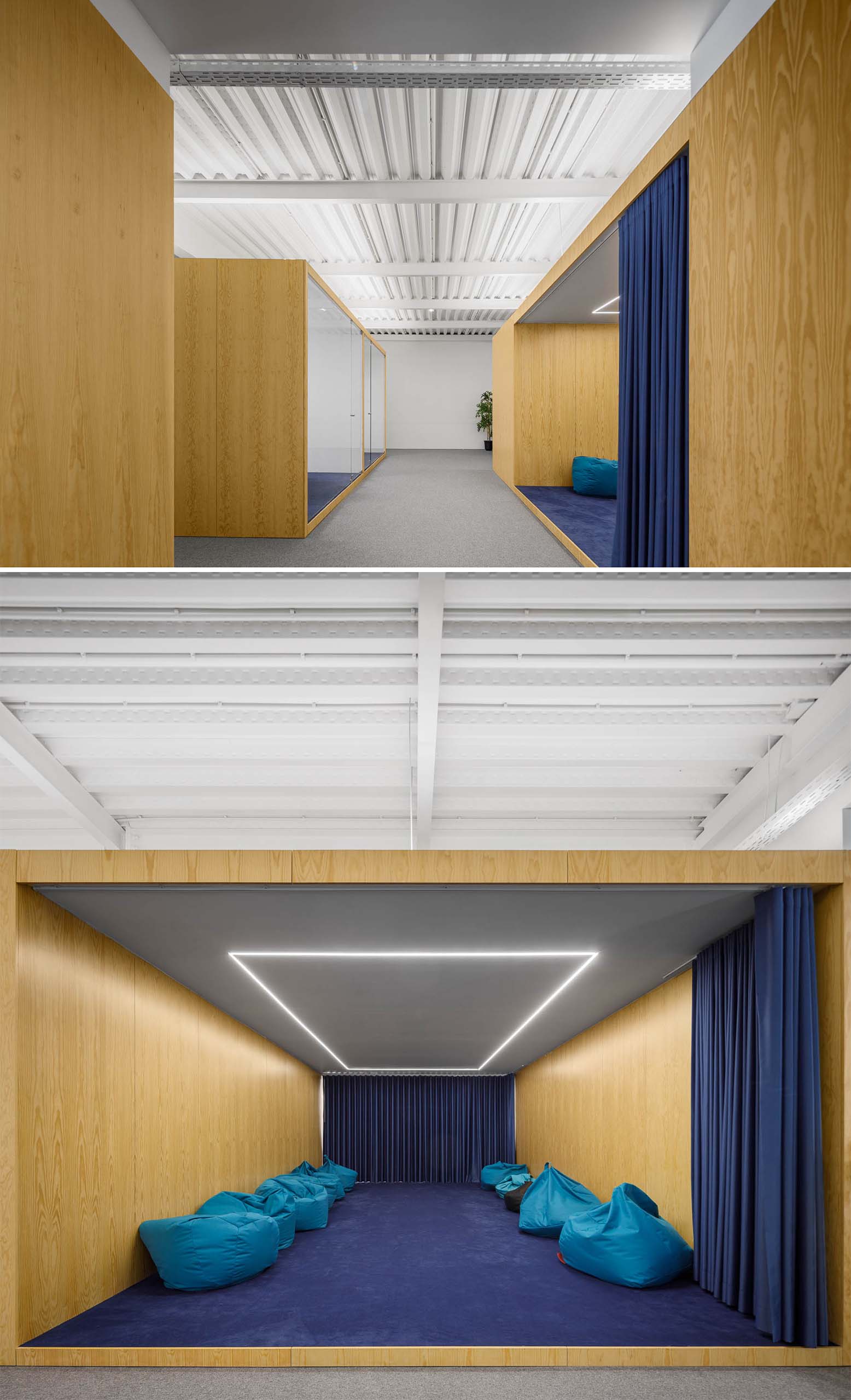
A larger meeting room with a blue curtain that’s filled with beanbags and has LED lighting in the ceiling.

A large meeting room with a blue curtain that's filled with beanbags and has LED lighting in the ceiling.

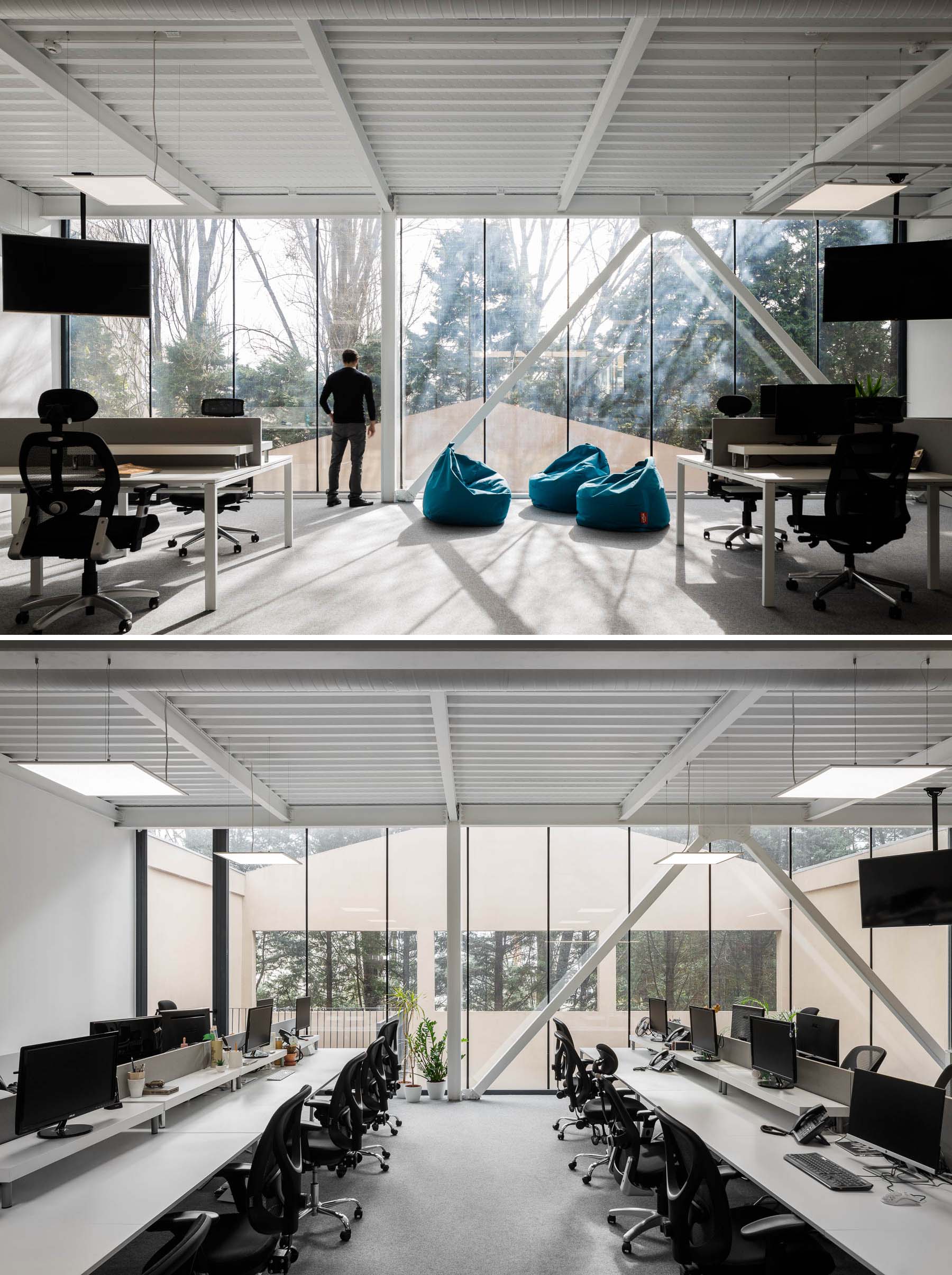
Other more traditional work spaces exist too, with desks that include multiple work stations.

A modern office with floor-to-ceiling windows.

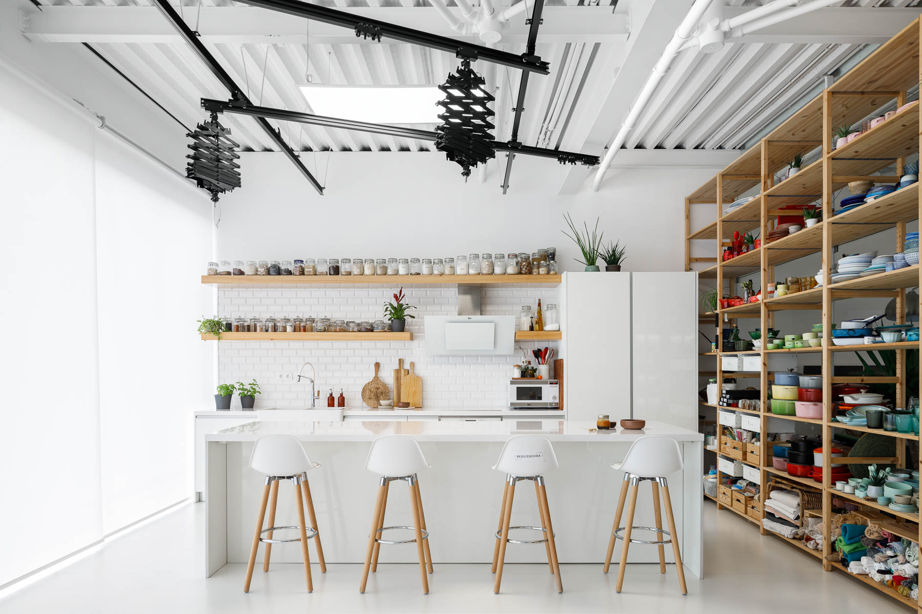
There’s also a photo studio with a minimalist white kitchen with floating wood shelves. Adjacent to the kitchen are tall wood shelves filled with photography props and kitchen equipment.

A modern office has a photo studio with a minimalist white kitchen with floating wood shelves. Adjacent to the kitchen are tall wood shelves filled with photography props and kitchen equipment.
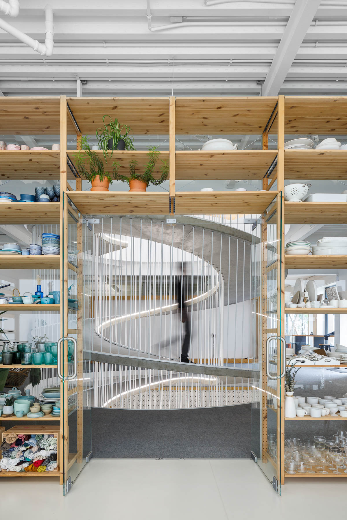
Wood shelves frame a spiraling ramp in the center of this modern office.

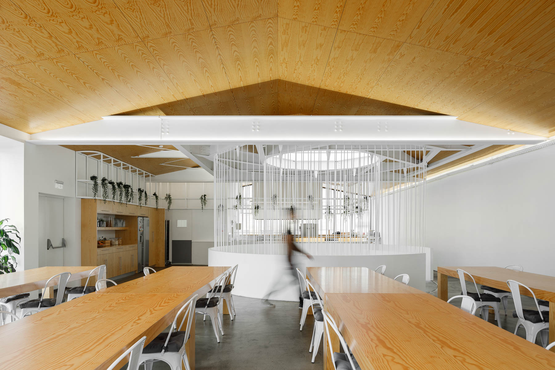
When it’s time to take a break from working, there’s a communal area with long wood tables, a kitchenette, seating by the windows, and an outdoor space.

A modern office with a communal break room.
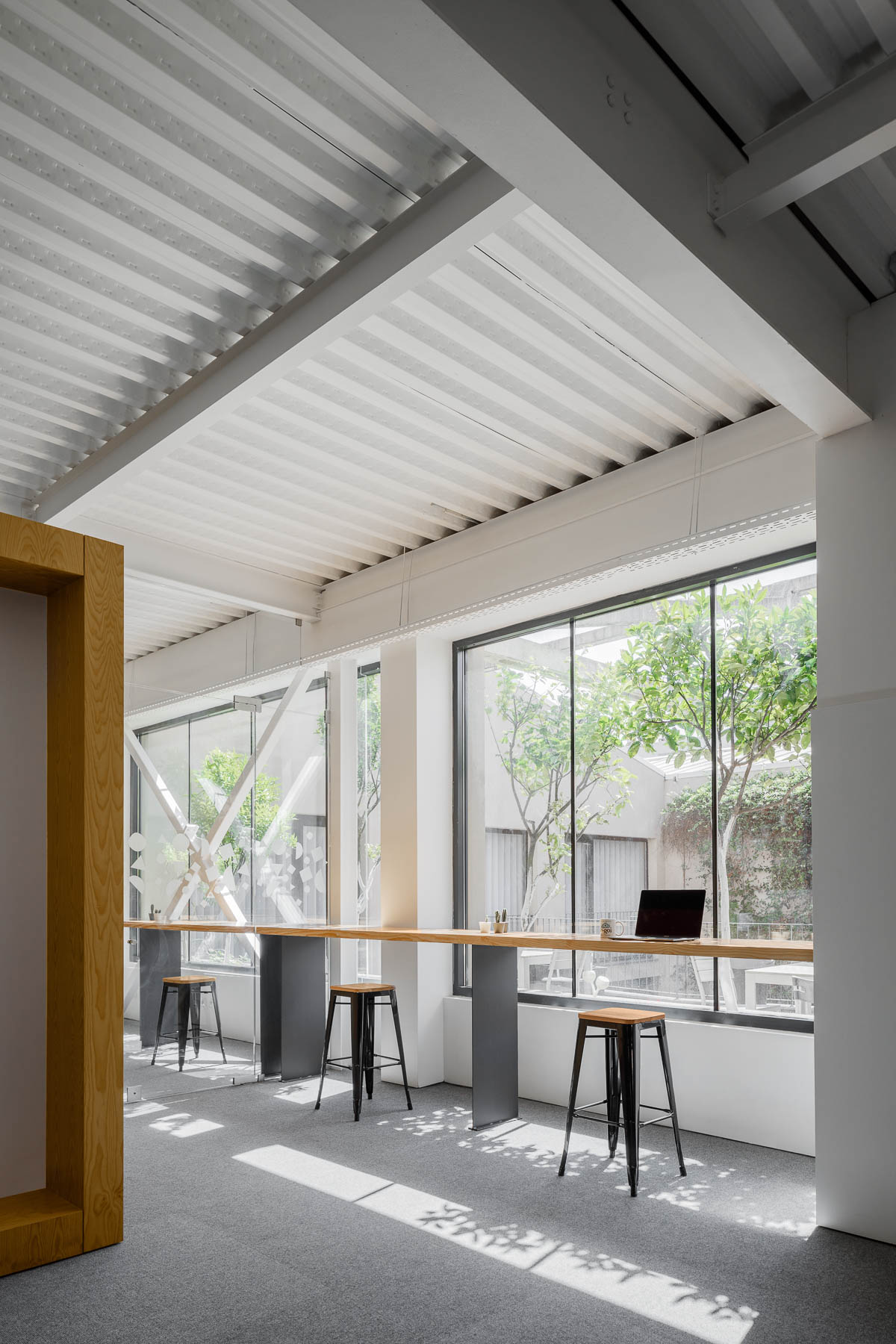
A modern office with seating by the windows that take advantage of the natural light.
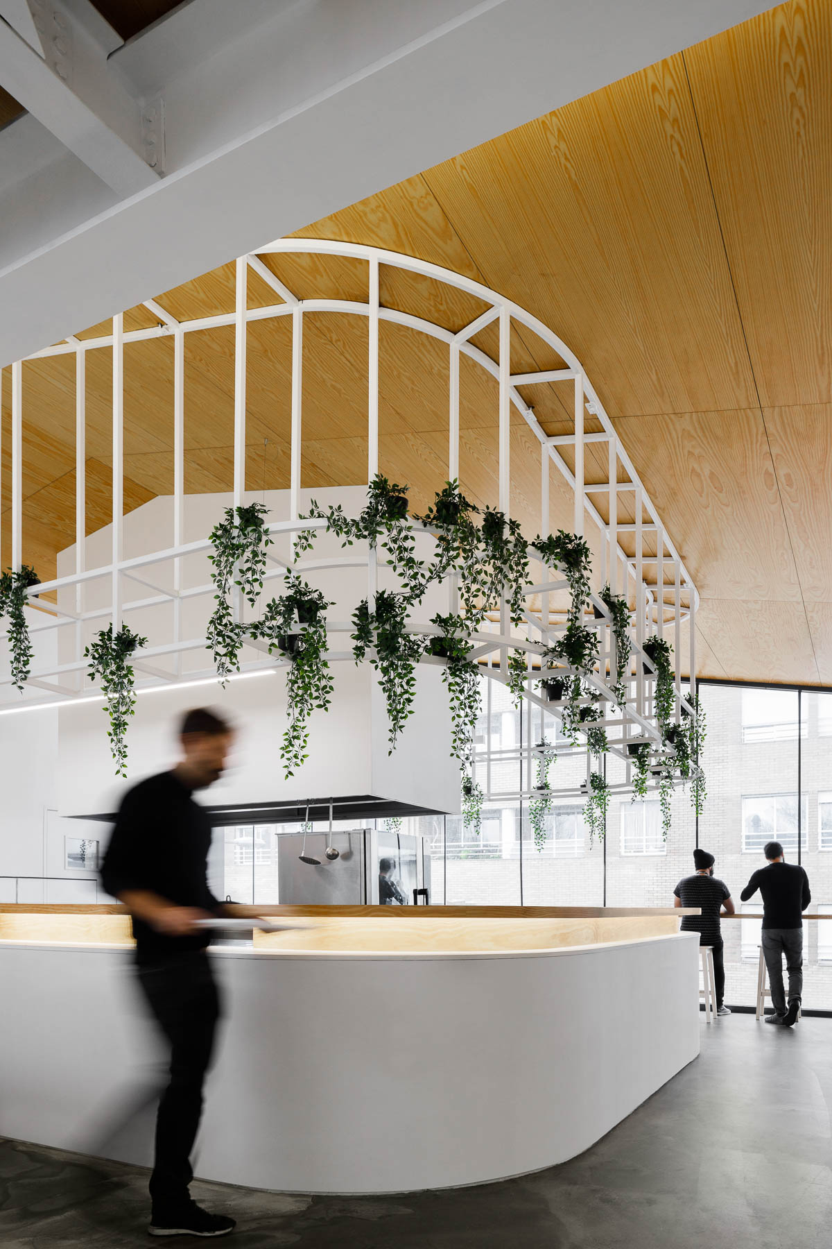
A modern office with plants that hang from a metal detail.
Photography by Ivo Tavares Studio | Architecture Office: PAULO MERLINI architects | Main Architects: Paulo Merlini/ André Santos Silva

6 Homey Ways Architects Are Designing Warmer Office Environments
CategoriesArchitecture

6 Homey Ways Architects Are Designing Warmer Office Environments

The latest edition of “Architizer: The World’s Best Architecture” — a stunning, hardbound book celebrating the most inspiring contemporary architecture from around the globe — is now available. Order your copy today.  

Today, our lives are no longer compartmentalized into rigid schedules, nor is the line separating work from leisure as clear-cut as before. When the global pandemic hit in 2020, everyone was forced to work from home, bringing their meetings and busy agendas to the middle of their living rooms, changing much of what we know about the workplace and further blurring the line between the office and the home. That shift later promoted many businesses to uphold the “working from home” setup, at least in a hybrid format with some in-office days, having realized its environmental, financial and social benefits for many.

Following these trends, many businesses are now adopting a comfortable home-like environment — sometimes prioritizing comfort over formality and other times upping their interior decor game to lure employees back to work. These office designs, of course, come without the challenges of WFH policies, such as unexpected family cameos in Zoom meetings and the difficulty of unplugging at the end of a day in the home office. The following trailblazing honorees from the 11th Annual A+Awards awards showcase examples of offices that are so comfortable that employees will feel right at home.


Bay Area Research Company

By SkB Architects, CA, United States

Bay Area Research CompanyEntering this think tank feels like entering someone’s living room, you almost feel like you need to knock first. Designed as an engaging and emotion provoking workplace that seamlessly flows between what used to be two warehouses in the Bay Area in California, this design research company adopts what the designers termed as a “better-than-home” concept, achieved through the selection of furniture, carpets, plants and materials that have contributed to producing a very relaxing and tranquil work environment. The workspaces are distributed over a wide variety of smaller spaces anchored in the open floor plan and staggered vertically across a number of split levels that together enrich the user experience for the employees, guests and collaborators.


EDGE Suedkreuz Berlin

By TCHOBAN VOSS Architekten GmbH,

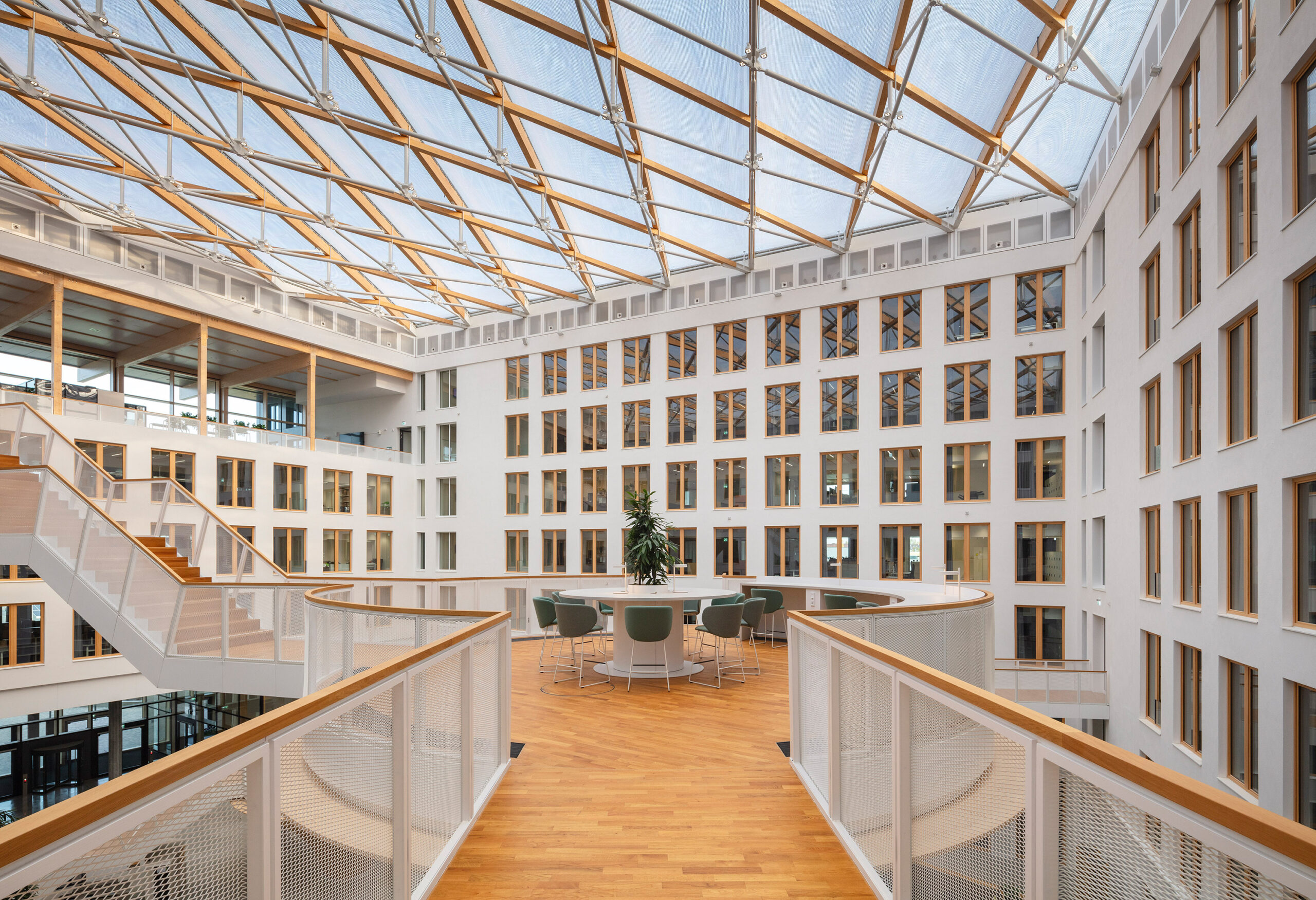
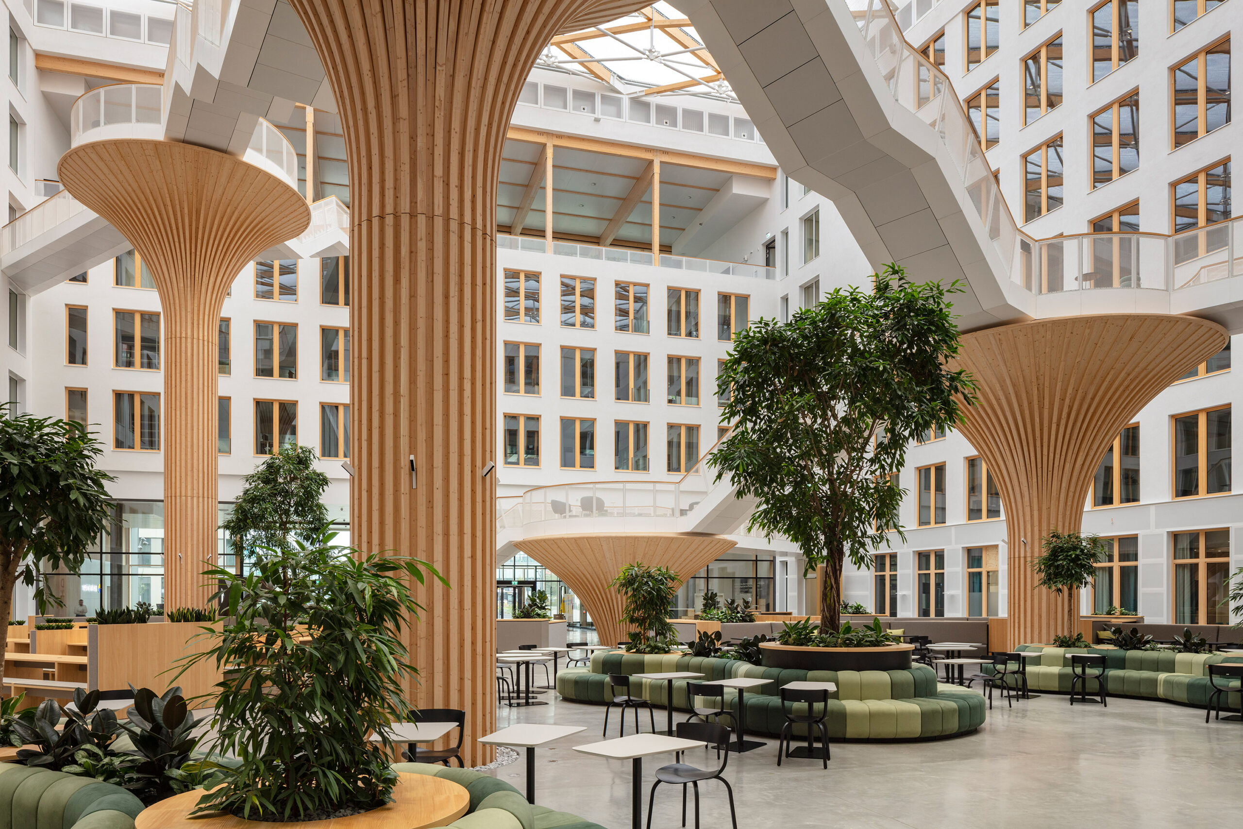
 From the outside, the two newly designed EDGE office buildings facing Hedwig-Dohm-Strasse in Berlin give no hint of what their insides look like, presenting employees a pleasant surprise once they enter. Inside the “Carré” building, the larger of the two buildings, a generously naturally lit atrium almost looks like a play area for adults, with its design blurring the boundary between the inside and the outside.

This atrium is playfully furnished with a web of tree like wooden structures that offer a variety of platforms for recreation and communication, connected by a network of by filigree steps that facilitate circulation across the building’s different parts. The sustainable state of the art design of both the buildings, which won the project the DGNB Platinum and DGNB Diamond awards, produces a healthy and vibrant work environment for employees and ensures the longevity of the buildings and the reusability of its materials.


DB55 Amsterdam

By D/DOCK, Amsterdam, Netherlands

Photo by Niels Vlug

Photo by Niels Vlug

Photo by Niels Vlug

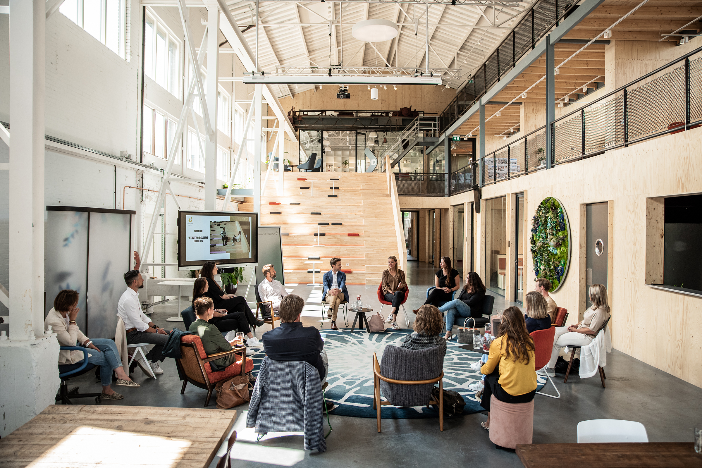
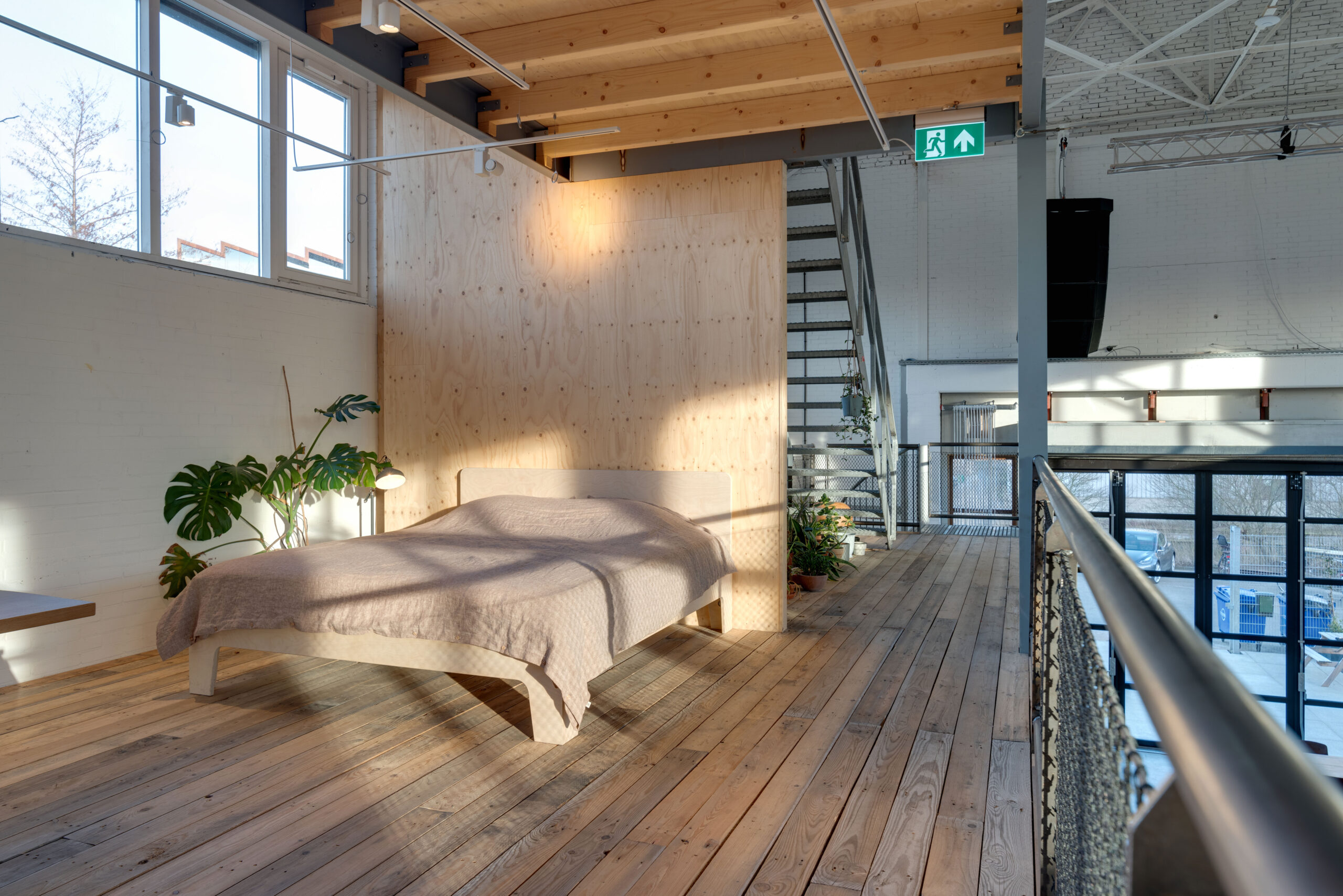
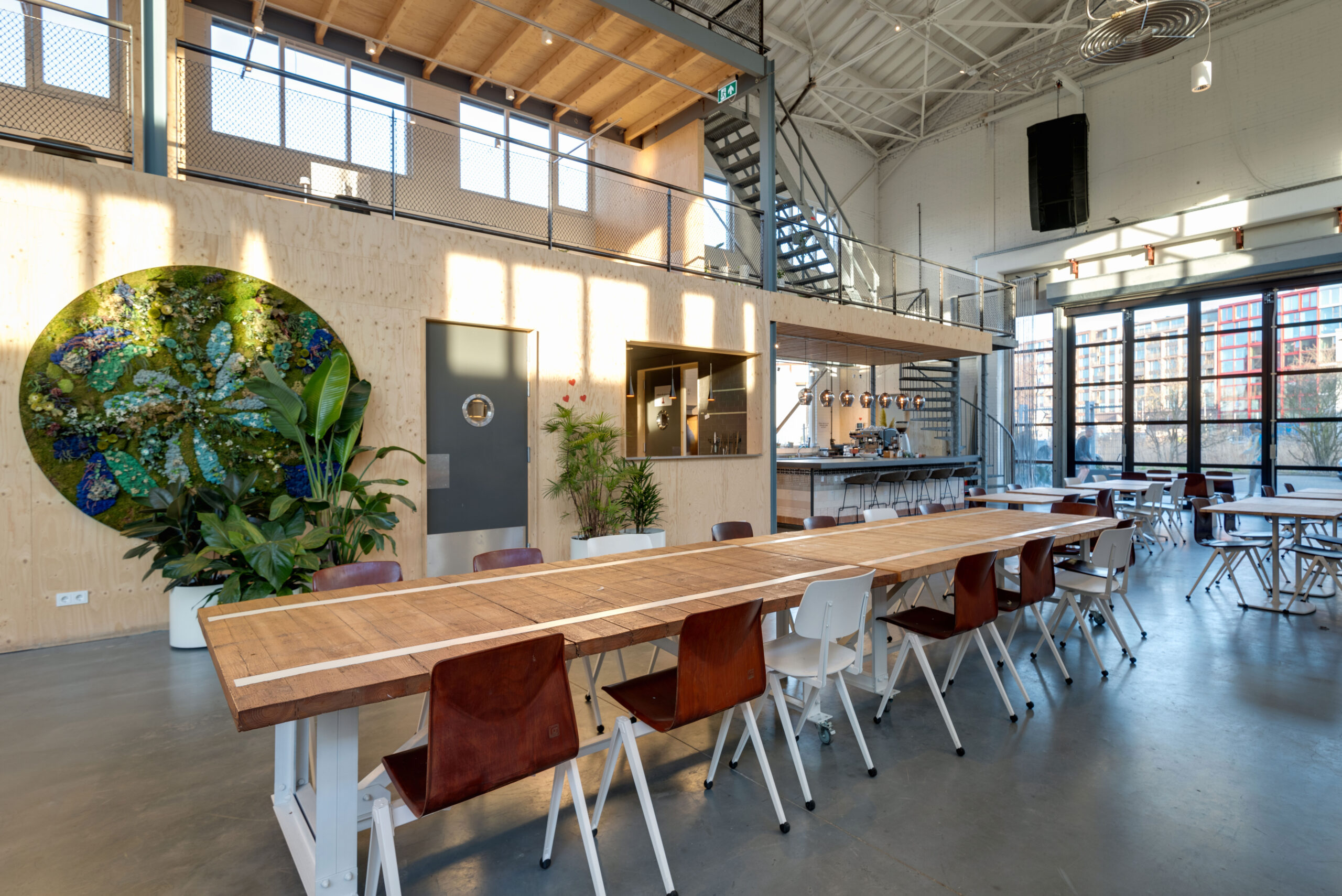
It is hard to tell what this place is for at first glance, given the variety of activities taking place around the miscellaneous furniture spread out across this building’s different sections. From a bed to a huge dining table and an abdunance of plants, the open floor plan contains a variety of levels where so much is going on at the same time. For those reasons, it comes as no surprise that this building, which used to be a timber warehouse, has a program that combines work and leisure, giving space to different events and even making room for a children’s playground. The array of windows on the top of the building connect the building with the outside and create a pleasant indoor experience, flooding the central open space with its double volume with natural sunlight, while the natural wood that is used in various elements of the interior give a soft and tranquil work ambiance.


Kabelovna Studios

By B² Architecture ,Praha, Czechia

Photo by Alex Shoots Buildings

Photo by Alex Shoots Buildings

Photo by Alex Shoots Buildings

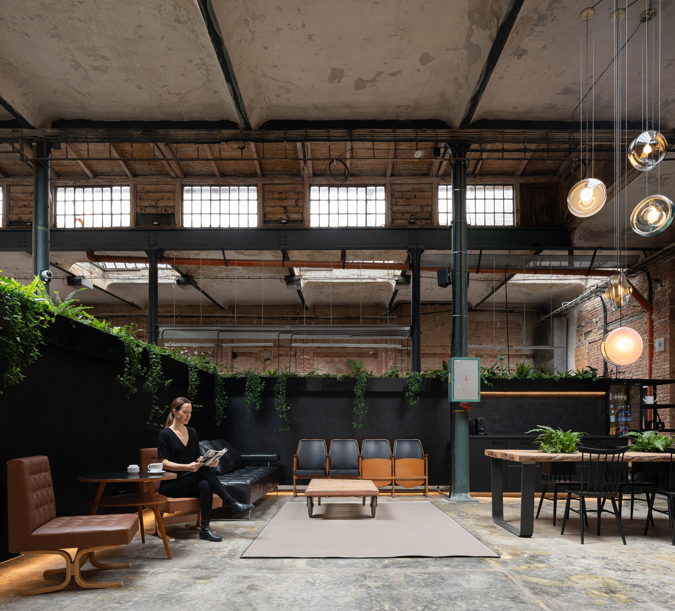
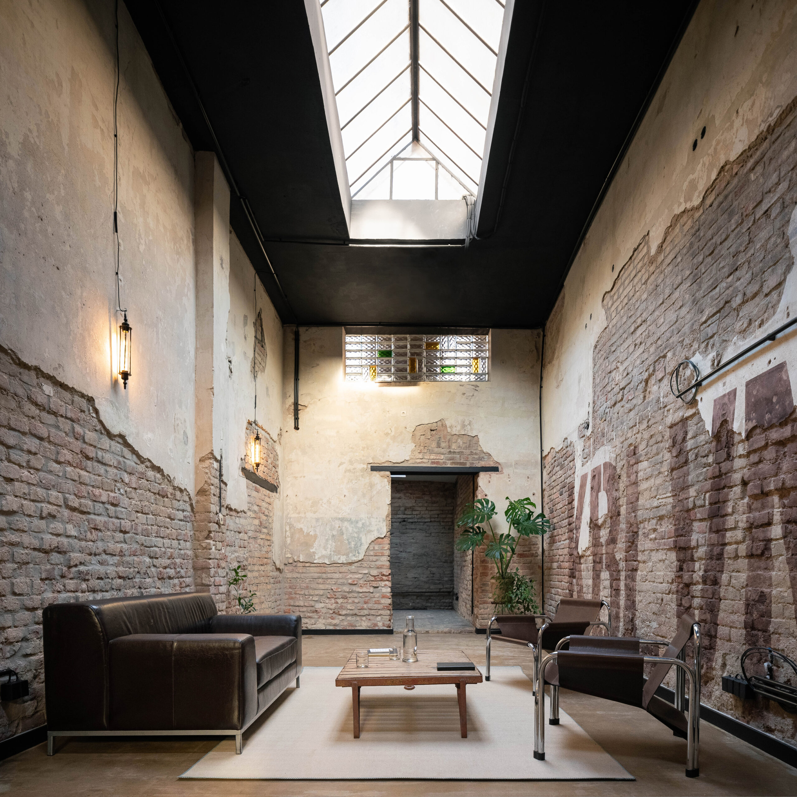
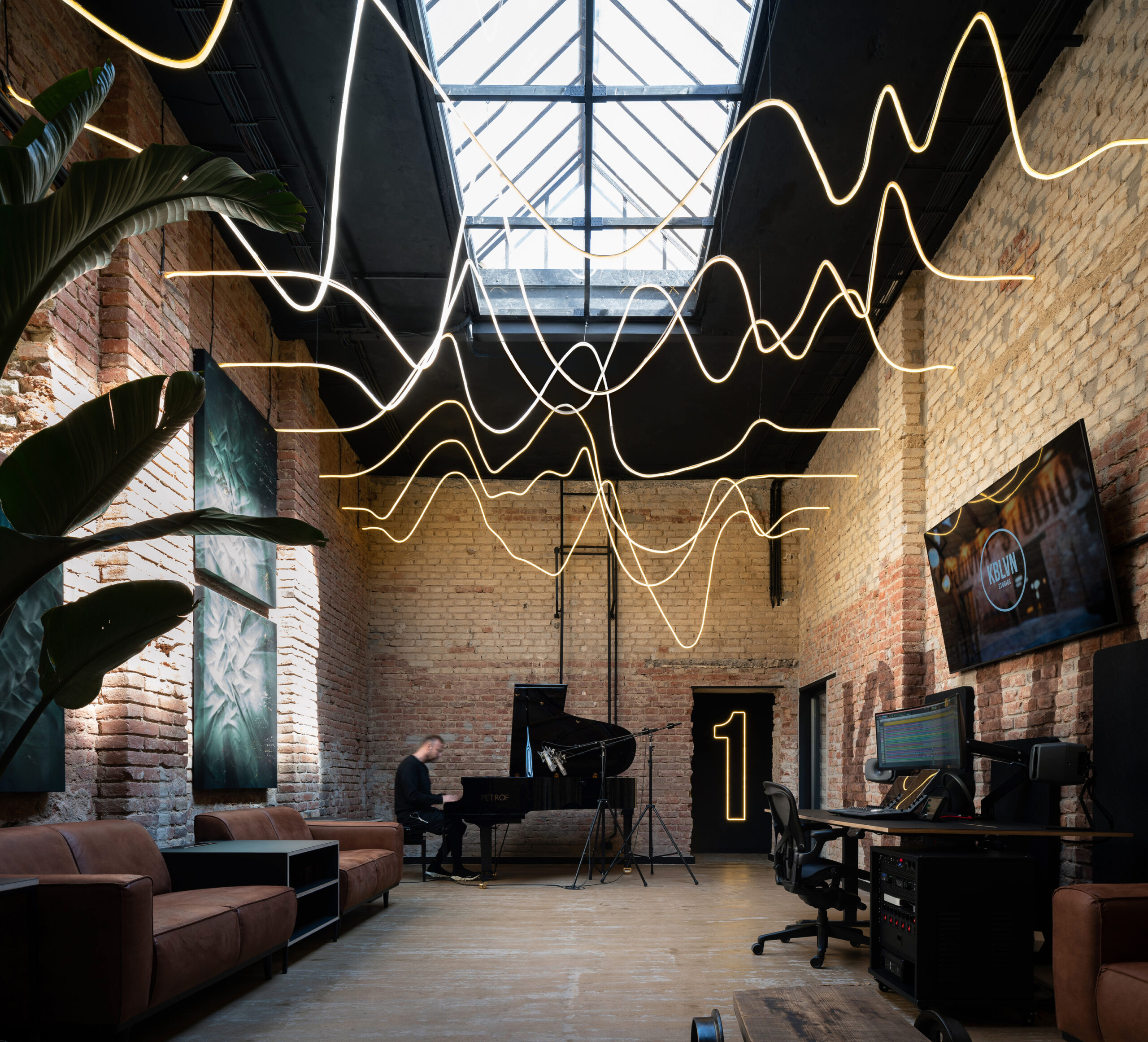
Set in what used to be a cable making factory, the super cozy atmosphere of this recording studio was established through the generous use of plants and the floods of natural sunlight that light up the entire space and allow an interplay of shades and shadows that complement the interplay of the musical notes across the sheets. The different recording studios are distributed around a central “living room” with a seating area and a kitchen, with the high ceiling giving a generous breathing space and the restored brick walls giving the studio a rustic and authentic character that offers a rich background for the recording artists.


Shenzhen Yeahka Office

By JSPA Design, Shenzhen, China

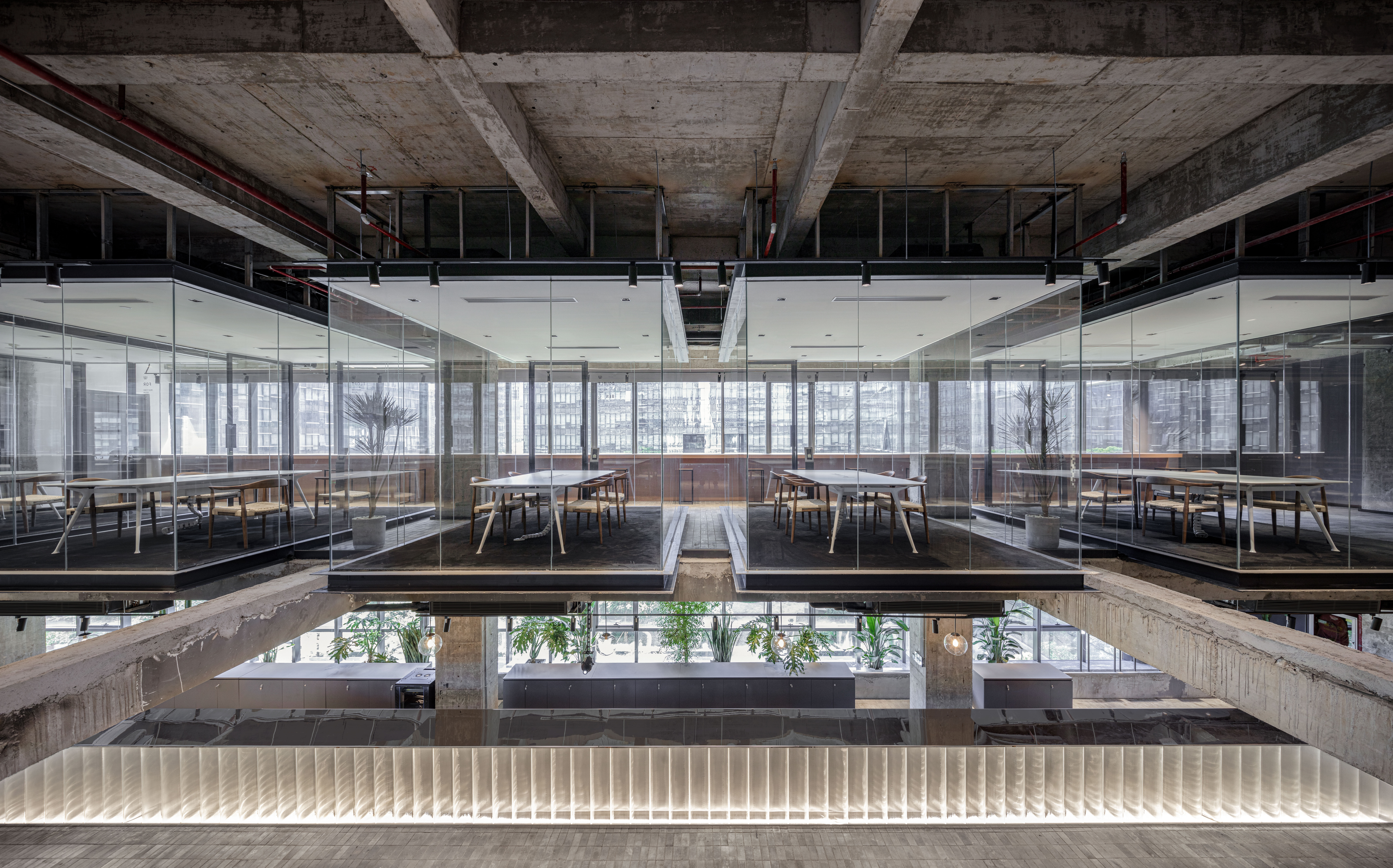
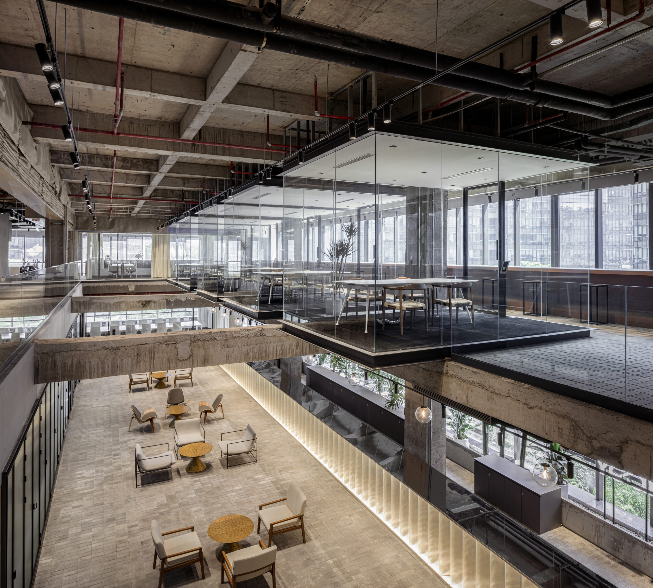
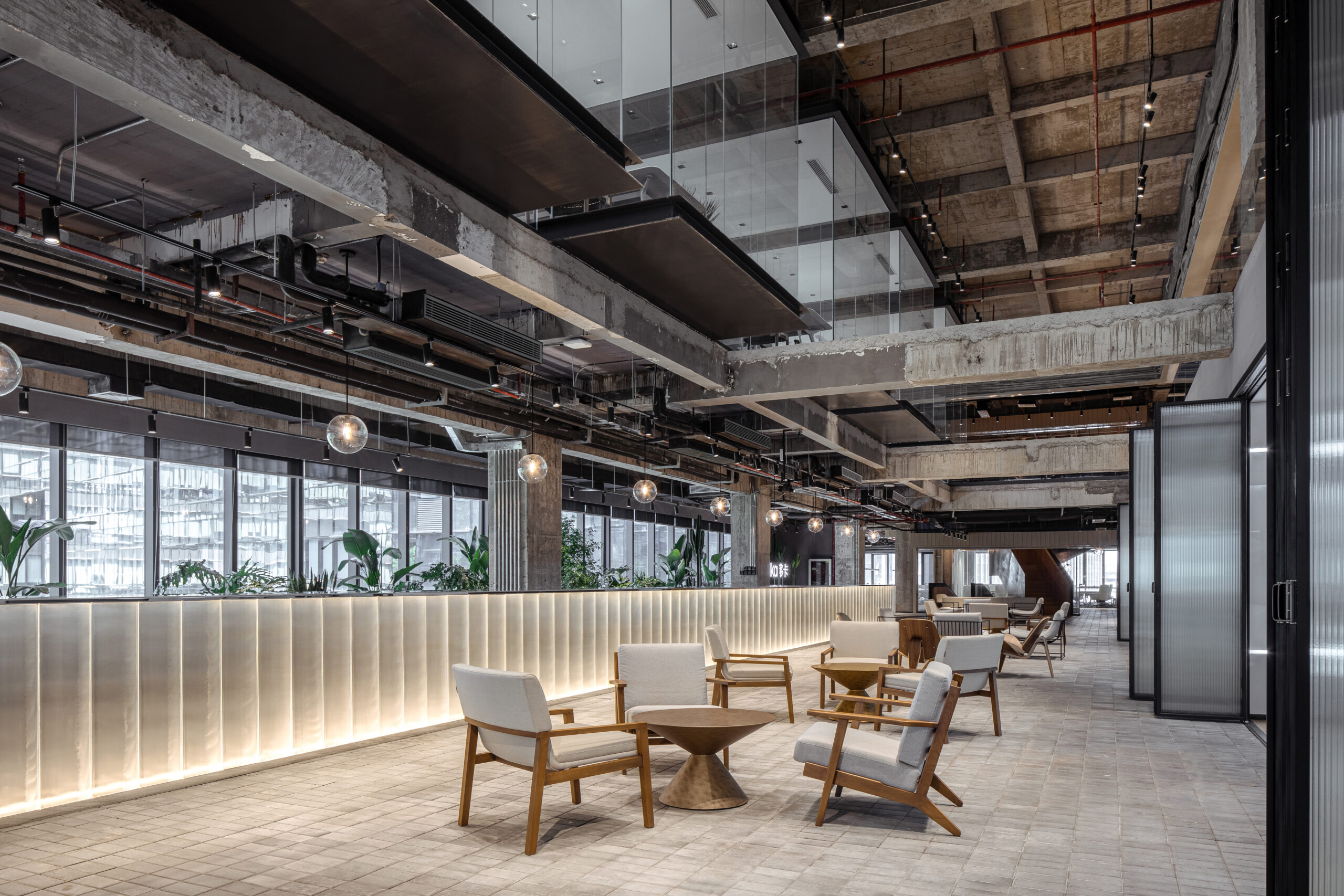
The interiors of the Yeahka headquarter office look like an ultra modern apartment set in a futuristic movie scene, with meeting tables hovering over the building’s central space inside glass boxes and the exposed structure of the refurbished building boldly exposed. The rough appearance of the building’s envelope is nicely contrasted with the use of softer materials and lighter colors for the partitions and the furniture, while the high ceilings allow floods of natural sunlight to travel across the office’s atriums and establish a variety of visual connections for visitors and employees across the different floors.


Casa Pich i Pon. LOOM Plaza Catalunya

By SCOB Architecture & Landscape 

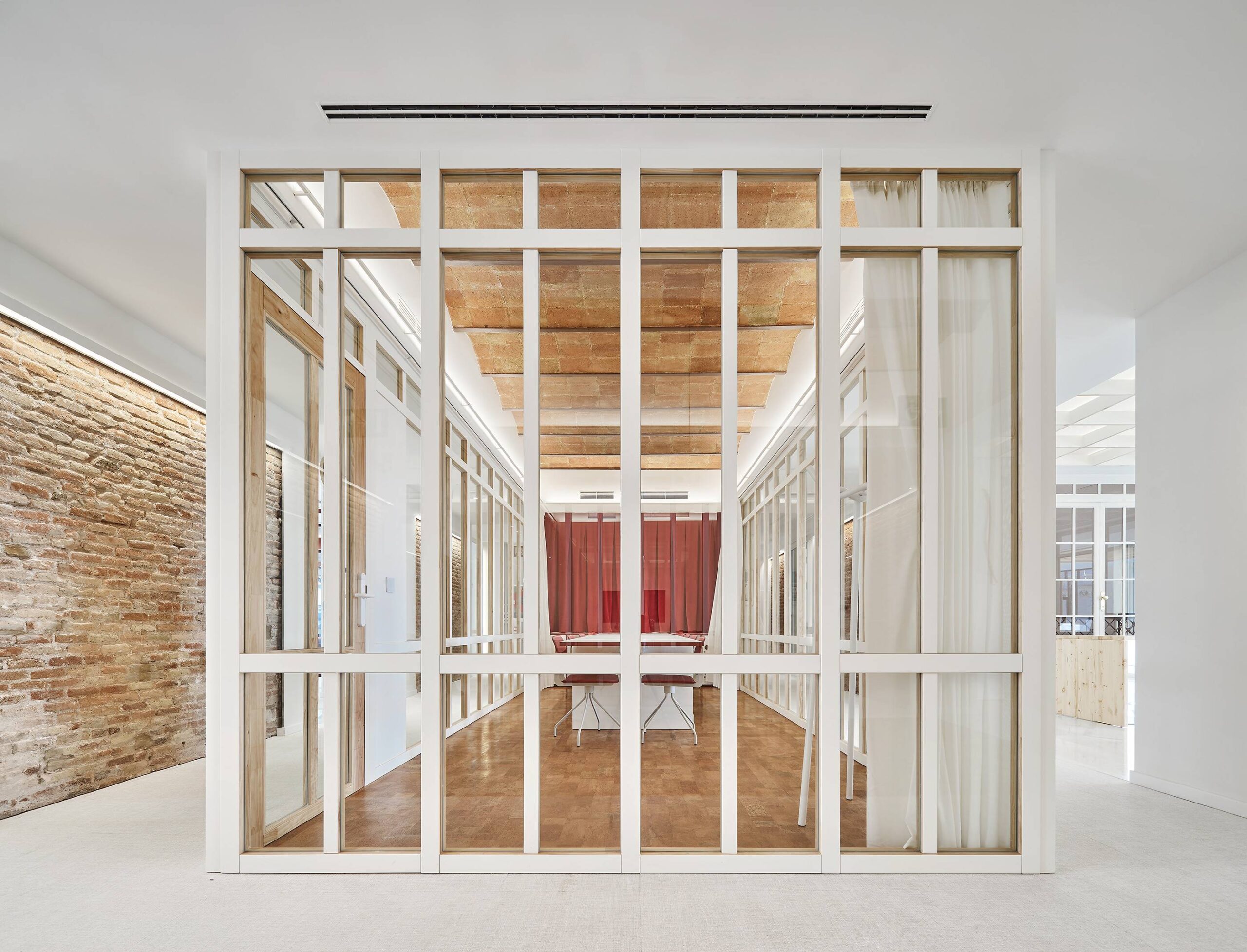
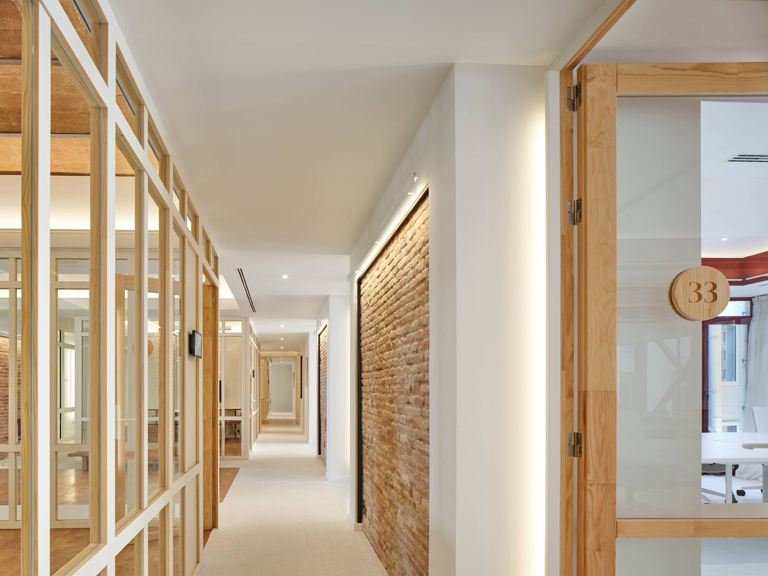
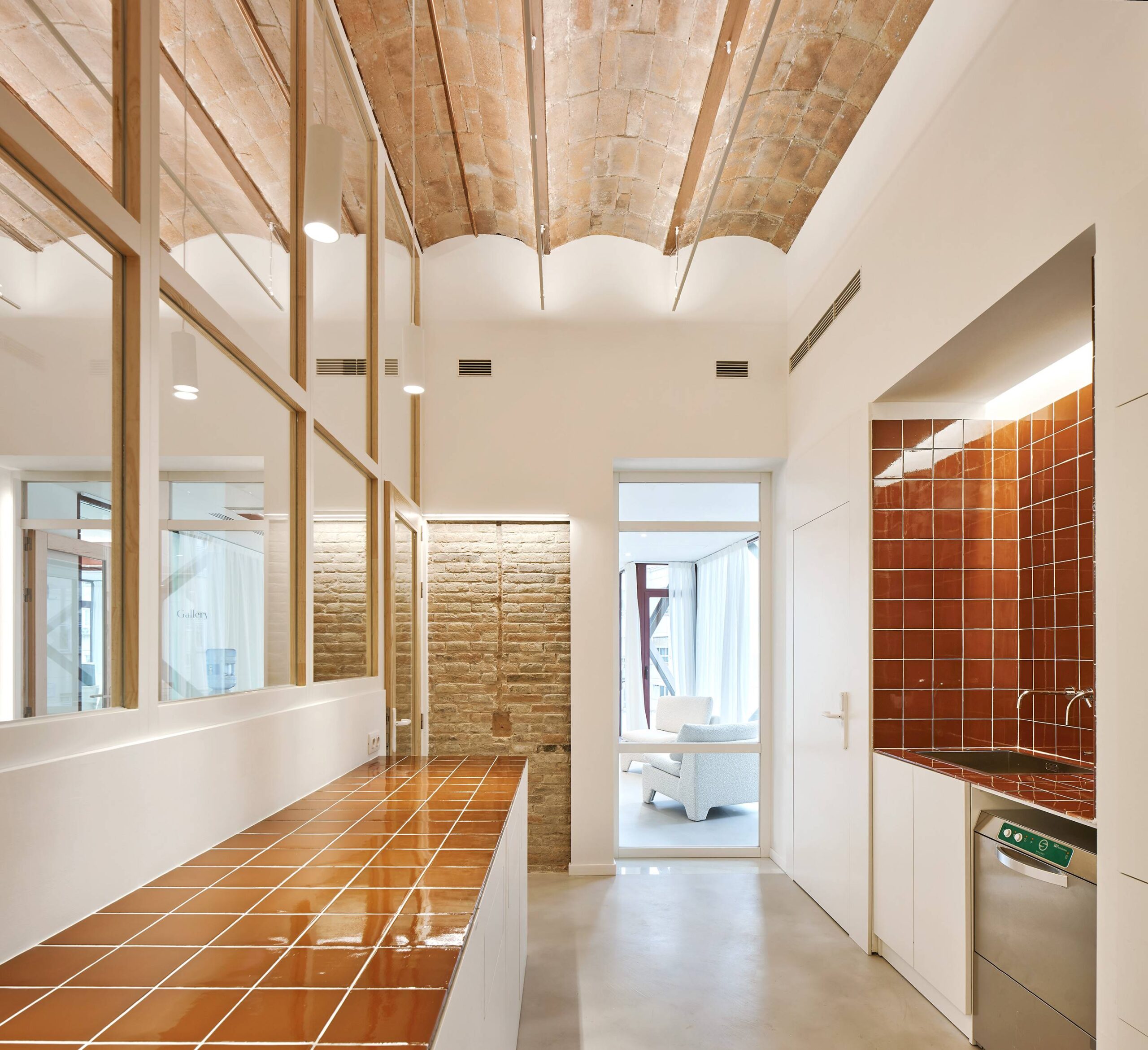
Aesthetically, the organization of this office space is remarkably appealing, allowing the eye to travel across a variety of layers and vertical lines around every corner. Whether it is through the contrast of materials, or the perfect positioning of the working chambers inside the open floor plan, a lot is happening inside this refurbished historical building whose celebratory classic exterior celebrates a masterpiece of its time. The color white, which dominates the interior, sets the stage for the other materials to occupy the space, particularly the red brick walls that stand as a reminder of the building’s rich past.

The latest edition of “Architizer: The World’s Best Architecture” — a stunning, hardbound book celebrating the most inspiring contemporary architecture from around the globe — is now available. Order your copy today.  

Reference

PW Architecture Office brings “a little excitement” into mid-century house
CategoriesInterior Design

PW Architecture Office brings “a little excitement” into mid-century house

Australian firm PW Architecture Office has revived the fortunes of this mid-century house in Orange, New South Wales, with a sensitive renovation that respects the original building while taking design cues from its material palette.

Park Lane house was originally designed by noted Australian architect Neville Gruzman for the 1962 Carlingford Home Fair before being built in 1964 by construction company Kell & Rigby – known for its work on Sydney’s landmark Grace Building.

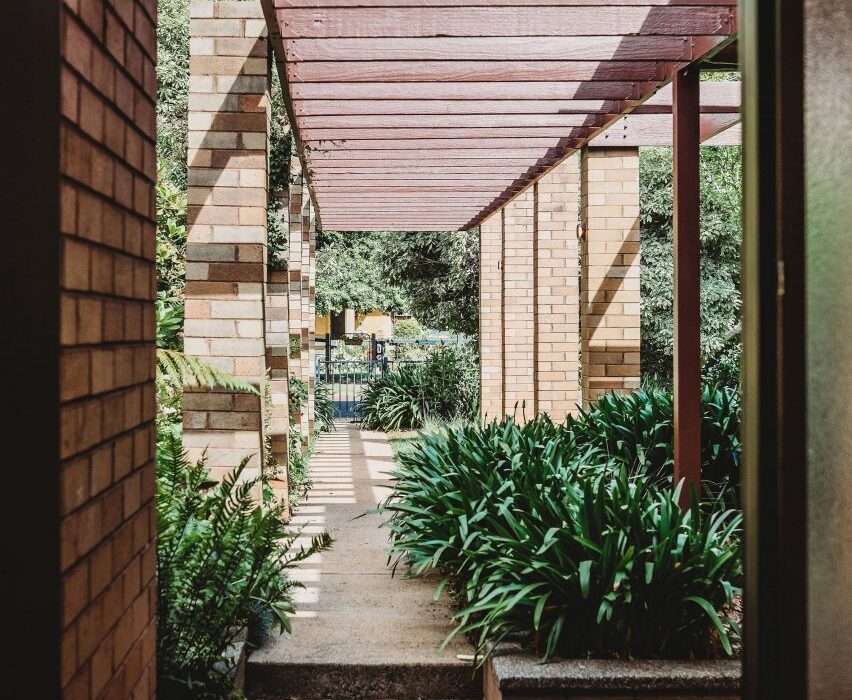
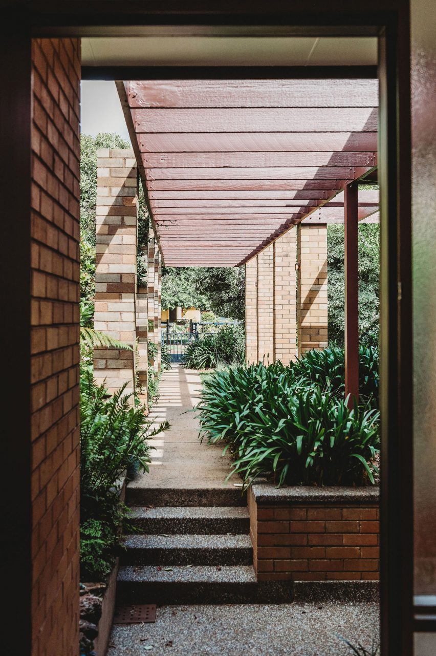
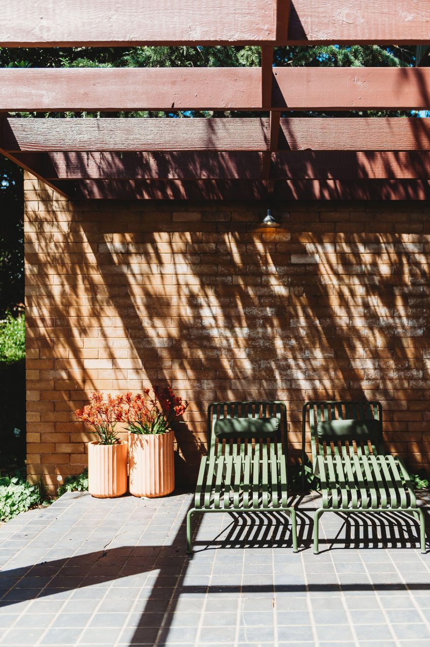
Covered pergolas of Park Lane house
PW Architecture Office has renovated a 1960s house by Neville Gruzman

When Paddy Williams, founder of PW Architecture Office, discovered that the house was on the market in 2022, the team went to take a look out of architectural curiosity.

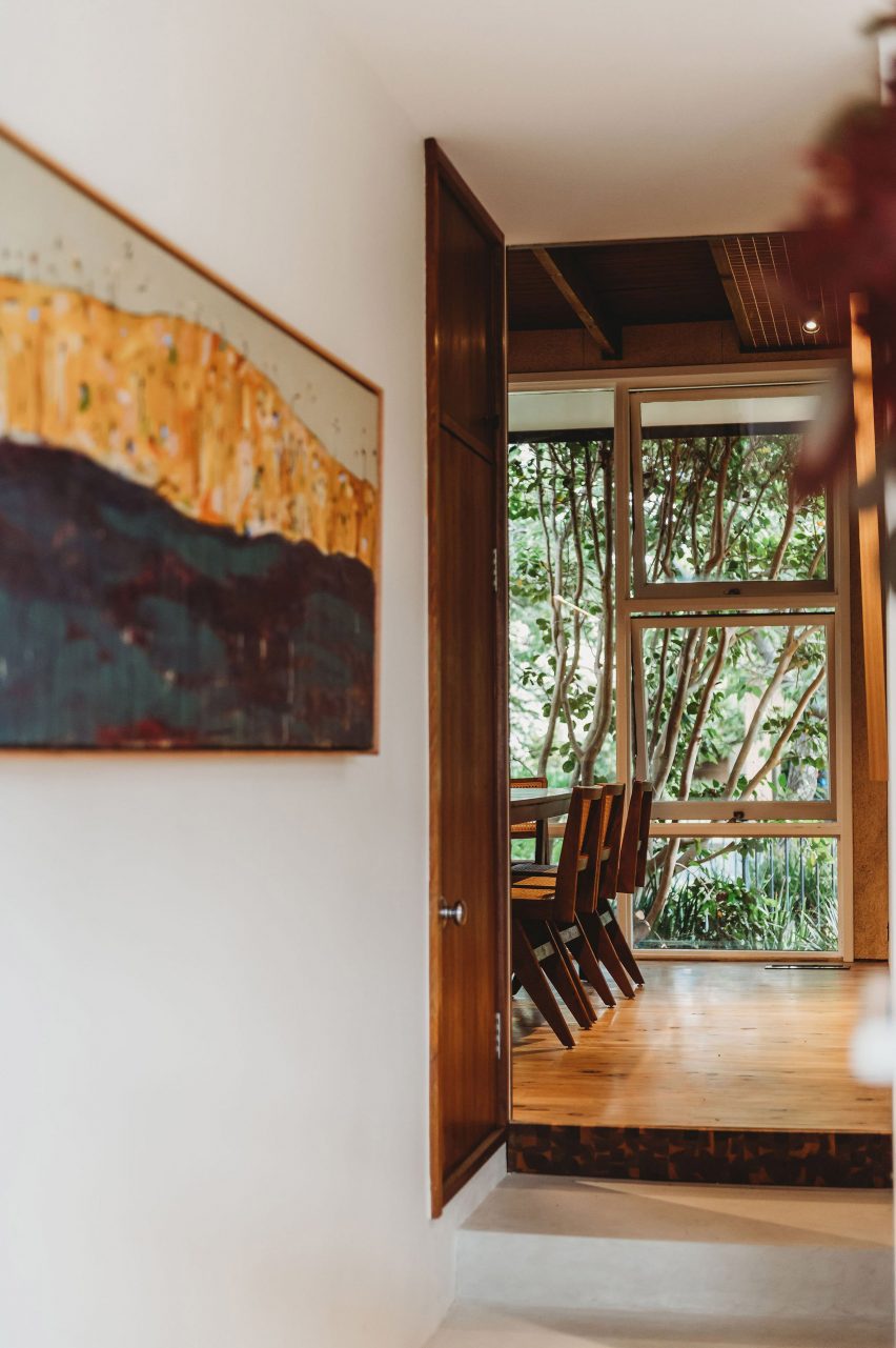
The studio was immediately seduced by the sense of flow between the indoor and outdoor spaces of the 1964 house and the quality of the design, construction and materials, despite the fact that it had been through several unsympathetic renovations.

Covered pergola and seats of house in Orange, New South Wales, by PW Architecture Office
Pergolas frame the entrance to the house

“We loved the sense of arrival created by the pergolas and colonnade that lead you past the garden and pond into the entrance hall,” Williams said.

“Pavilion-style wings separate the shared spaces from the private and we loved the way the pergolas wrap around the house and terraces, framing different spaces in the garden.”

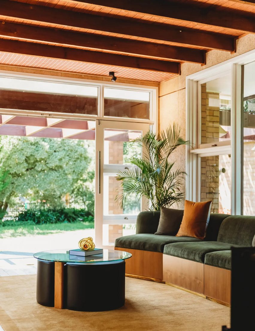
Living room of Park Lane house
The home’s original Oregon timber beams were exposed

The practice ended up buying and renovating the house as a short-term rental for other modernist architecture lovers.

“We felt a real sense of responsibility to do the project justice and retain the elements of the plan and materials as they were intended,” Williams said.

“We wanted to bring a little excitement back into this mid-century marvel, as it would have had when it was first built.”

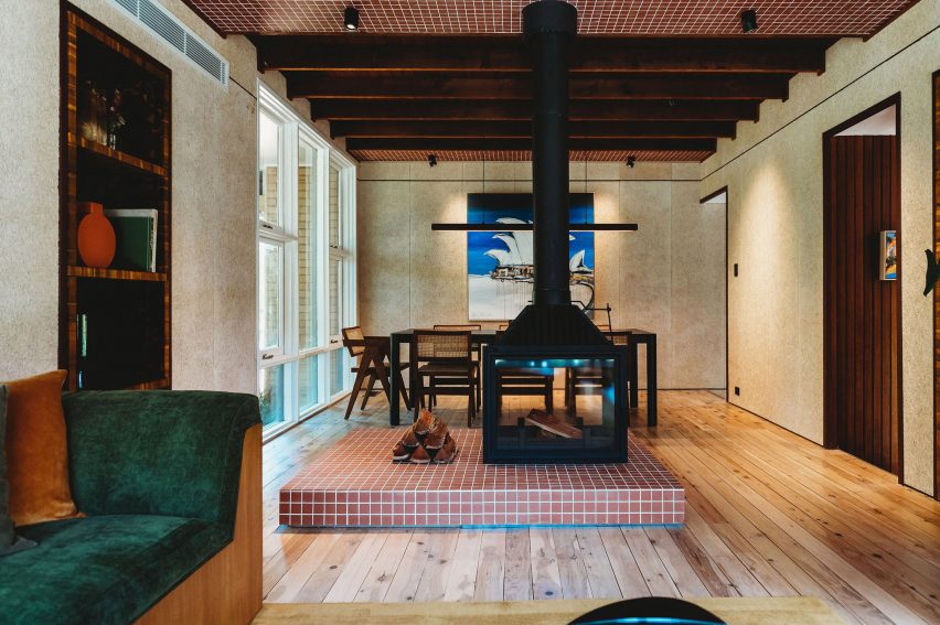
Living room of house in Orange, New South Wales, by PW Architecture Office
A double-sided fireplace divides the living and dining areas

Feeling that the floorplan still worked successfully, PW Architecture Office (PWAO) left it unchanged and set out to revive and celebrate the house’s original character while bringing it up to 21st-century living standards.

“We’ve designed it to be a modern take on the mid-century aesthetic, with an immediate sense of relaxation and peace through a refined palette and connection between house and gardens,” Williams told Dezeen.

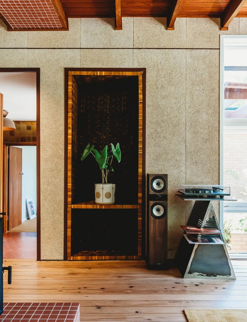
Hallway of Park Lane house
Textural wood wool panels clad the walls in the living room

Removing the worn-out carpets revealed the home’s original Australian cypress floorboards, which were sanded and polished to freshen them up.

Elsewhere, PWAO replaced vinyl flooring with “durable and low-maintenance” micro-cement in the smaller living room, kitchen and some bathrooms.

In the main living room, false ceilings were taken out to expose the original Oregon timber beams, now infilled with hardwood timber and tiled bulkheads.

“When we pulled down the badly damaged plasterboard, the beams were in such great condition and had a beautiful texture so we decided to keep them on show,” Williams said.

“This also allowed us to increase the height of the ceiling and play with the scale and rhythm of the beams.”

Dining area of Park Lane house
Micro-cement was used to finish some of the floors

In the panelled entrance hall, the original native blackbean timber needed only a little care to restore its rich varied tones, also seen on the doors throughout the house.

Elsewhere PWAO used acacia as a feature timber for panelling and detailing across headboards, stair treads and integrated shelving.

“We’ve used these acacia elements in a playful pattern,” the studio said. “They’re in an ongoing conversation with the original blackbean timber used around the house.”

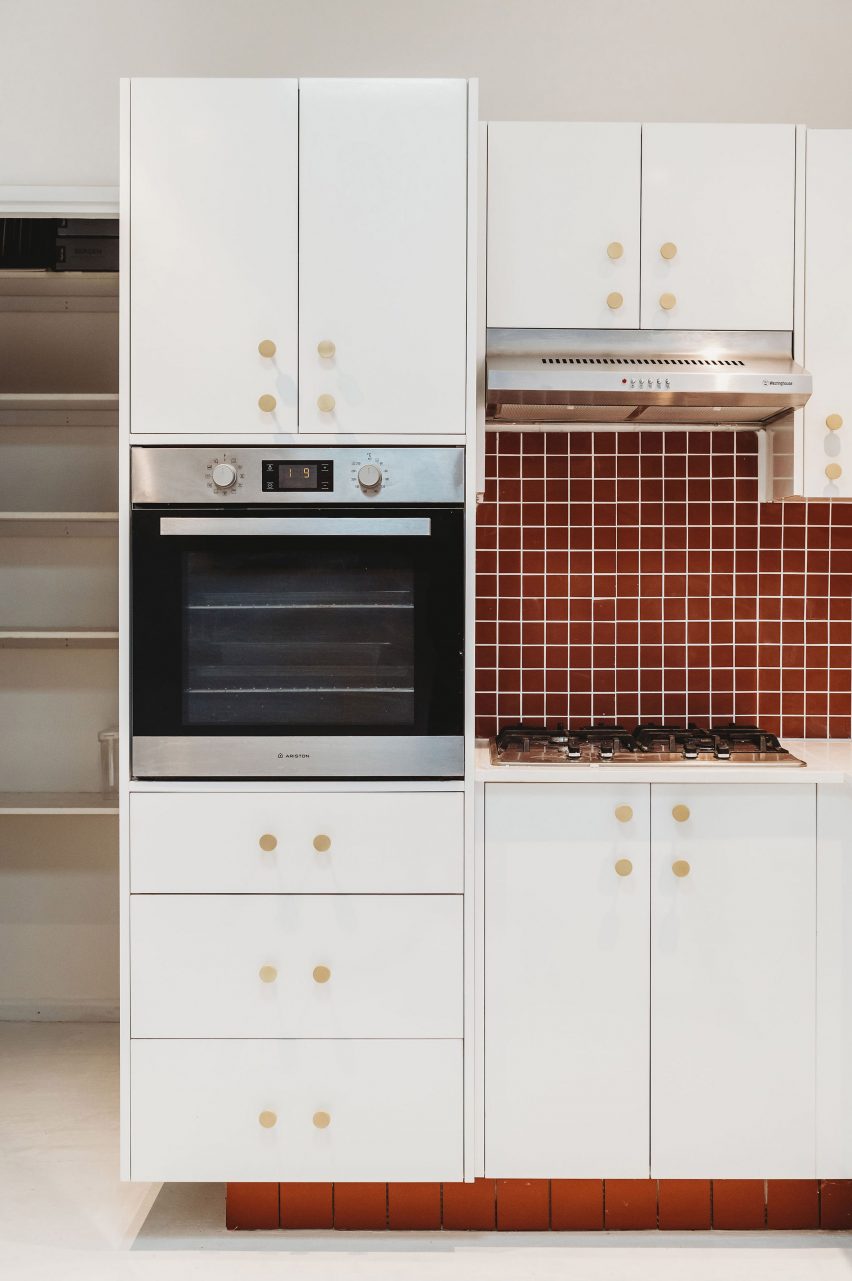
Kitchen of house in Orange, New South Wales, by PW Architecture Office
Terracotta tiles nod to the home’s original material palette

In the larger living space, a double-sided fireplace helps to zone the living and dining areas, while the walls were clad in textural wood wool panels – a composite made from recycled timber fibres.

“It is actually a thermal and acoustic panel, typically used for ceilings,” Williams said. “We thought it was a fabulous opportunity to provide texture on the walls.”

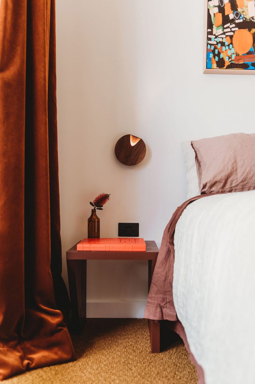
Bedroom of Park Lane house
Similar warm terracotta tones also feature in the bedroom

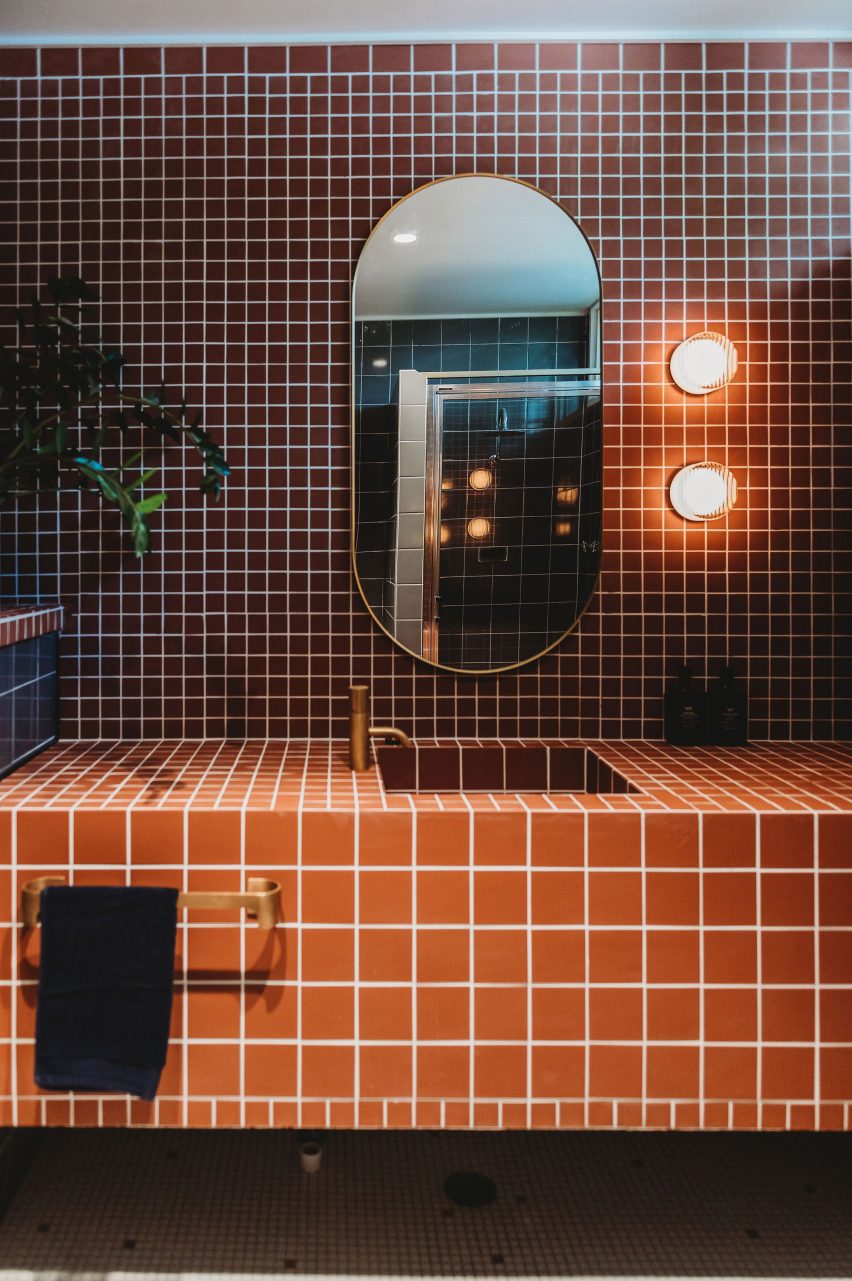
Throughout the house, terracotta tiles add to the sense of warm earthiness established through the material palette.

“The mosaic tiles were influenced by the original terracotta tiles in the entrance foyer,” the architect explained. “The smaller grids we’ve used are in contrast to the larger original terrace tiles, as well as the grid of the house itself, creating a play on scale.”

When the wiring was replaced, PWAO also had the opportunity to integrate the house with smart home technology, allowing the lights, heating, fans and irrigation to be controlled via an app, balancing modernist aesthetics with modern convenience.

Bathroom of house in Orange, New South Wales, by PW Architecture Office
The bathroom was designed to match

Dezeen recently rounded up eight other mid-century home renovations that marry period and contemporary details.

Among them was another 1960s Australian house with interiors updated by local studio Design Theory for a young client and her dog.

The photography is by Monique Lovick.

Reference

Seamless Integration: The Revitalization of 712 Fifth Avenue Lobby
CategoriesArchitecture

Seamless Integration: The Revitalization of 712 Fifth Avenue Lobby


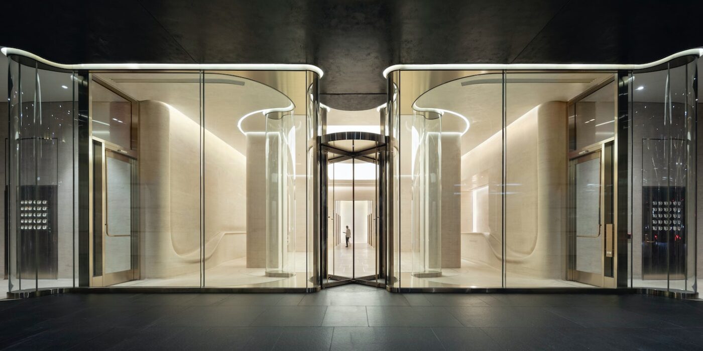
712 Fifth Avenue Renovation – Returning to one of our projects more than 30 years later, we were challenged with how to reimagine the entry and lobby to a prestigious postmodern building. This led to bigger questions; how do we engage with the discourse of history today? And how do we discuss postmodernism through built work? Our response was to generate a fundamental dialogue between glass, stone, and human occupation; to utilize advanced modern technology to fabricate the materials in a way that is both futuristic yet grounded in traditional historic construction methodologies; and to change everything without changing anything.

Architizer chatted with Hugh Trumbull, Design Principal at Kohn Pedersen Fox (KPF), to learn more about this project.

Architizer: What inspired the initial concept for your design?

Hugh Trumbull: Without changing the program or layout of the space, we countered the original proposition of placing ornate objects within a room with the concept of making space that integrate people and room.

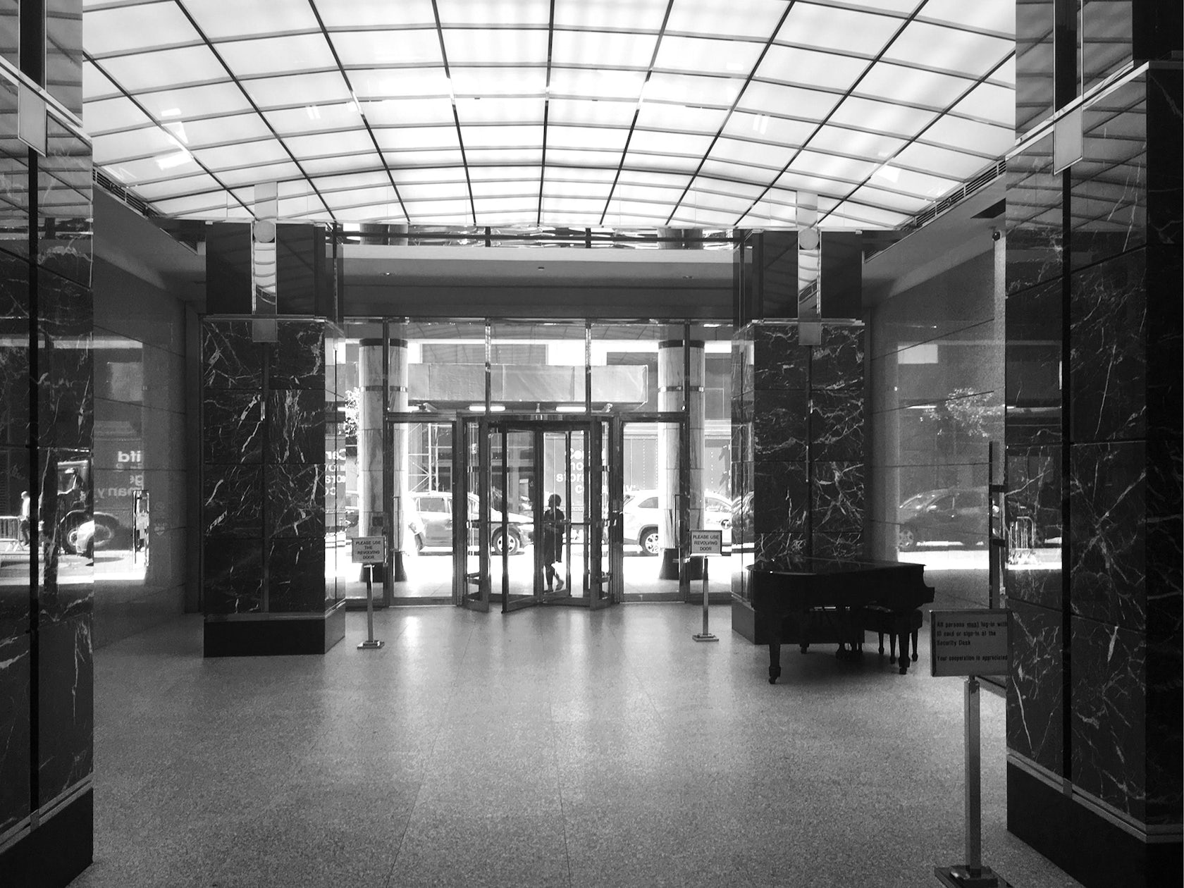
Originally, the lobby was designed with postmodern ornamental columns clad in many types of stone, objects within a grey granite room. The object-ness of these elements restricted the ease of movement in and out of the building.

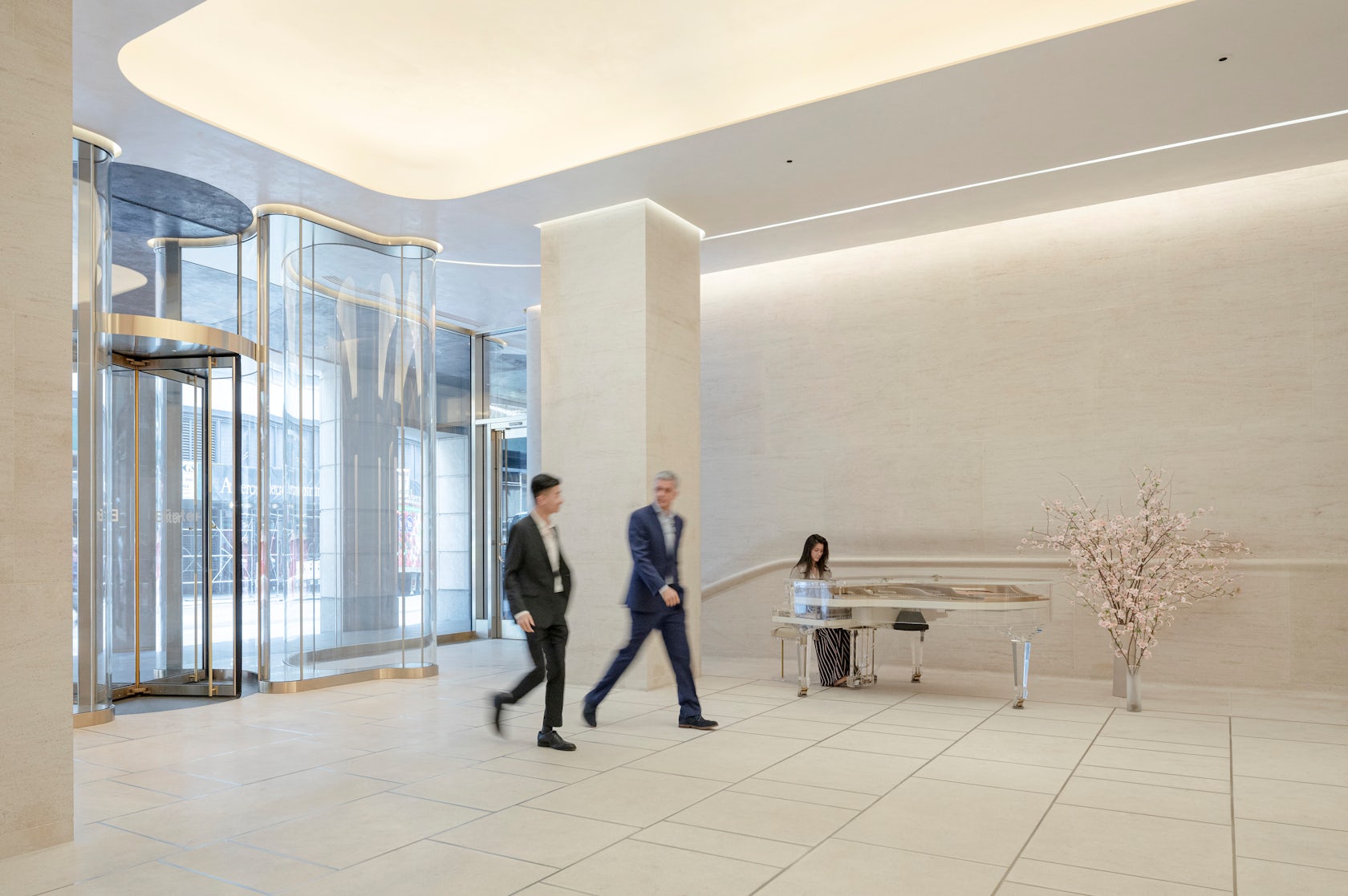
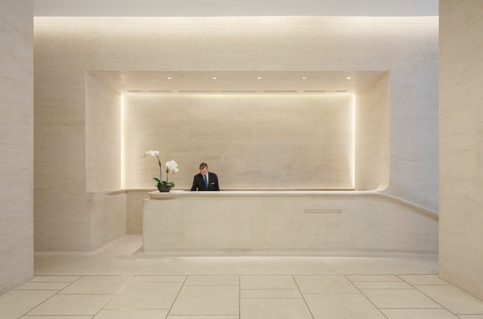
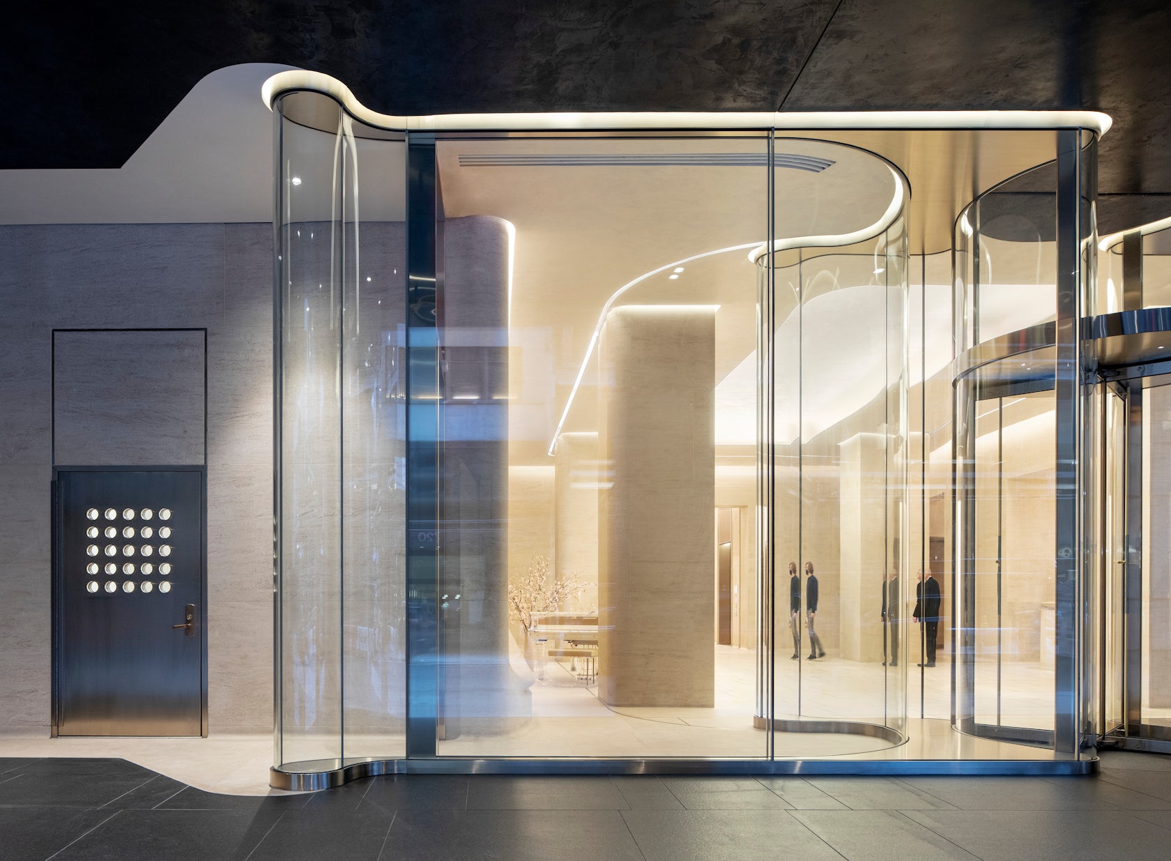
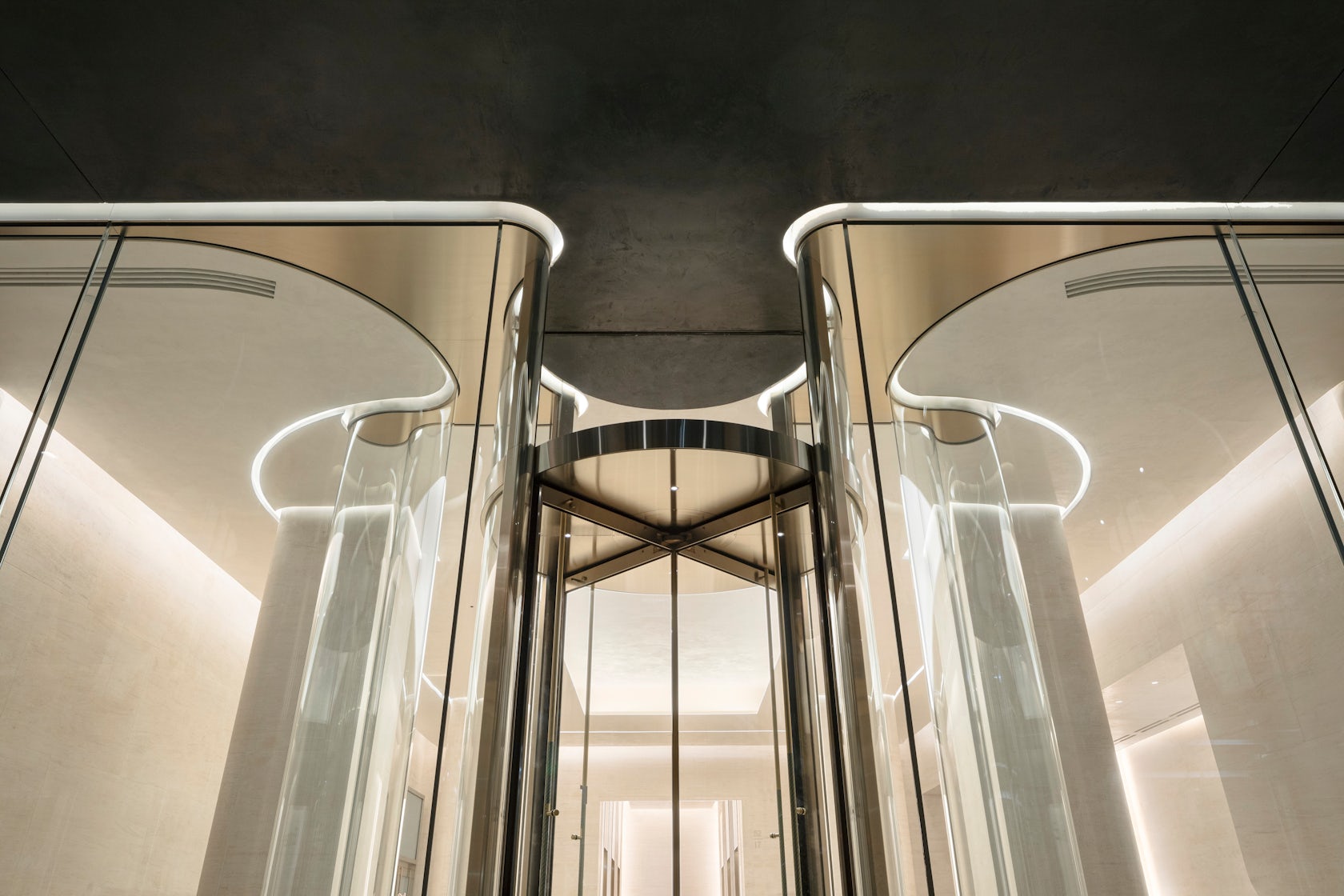
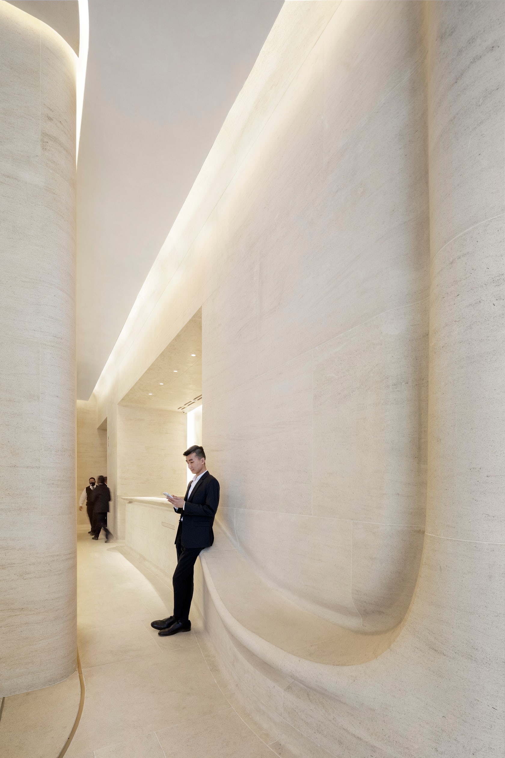
Our new proposition embraced a more tactile approach. The columns and wall are unified with one material, a soft welcoming stone detailed in a curving shape so that its vein and form are its sole ornament. Walls seamlessly transform into benches and a reception desk, inviting people to interact with one another and the architecture. At the entry, the sinuous structural glazing promotes a clear view and a seamless, organic flow in and out of the space.
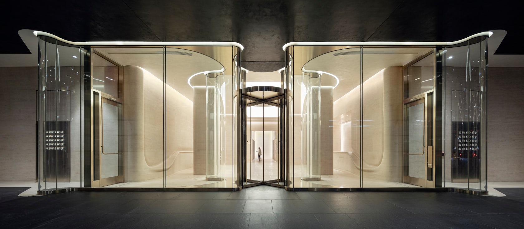
© Kohn Pedersen Fox Associates

© Kohn Pedersen Fox Associates

This project won in the 10th Annual A+Awards! What do you believe are the standout components that made your project win?

We’re thrilled that our work has been recognized in the A+ Awards. There are so many beautiful components of this project, but I think the way they work together is what makes this project truly stand out. The combined effect of the sinuous glass wall and unified stonework creates a clean and elegant space that simultaneously feels light yet solid. And I think the use of advanced technology to manipulate classical material is particularly successful.
© Kohn Pedersen Fox Associates

© Kohn Pedersen Fox Associates

What was the greatest design challenge you faced during the project, and how did you navigate it?

By engaging in advanced technical fabrication for the stone and glass, we were able to engage in a dialogue between the future and the past and examine the postmodern condition in a new way.

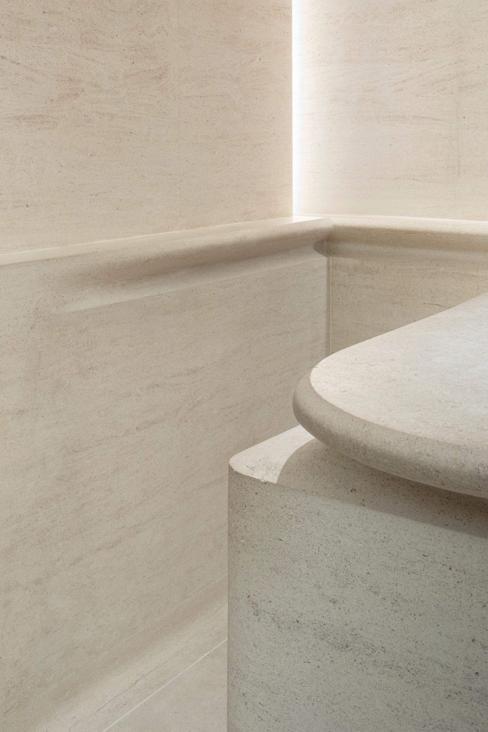
For the stone, the challenge was the fabrication of very large pieces. We utilized modern CNC milling techniques, yet also relied on age-old craftmanship of stereotomy found in medieval gothic construction. To ensure a seamless grain flow from one stone to the next, pieces were rotated ever so slightly in three dimensions.

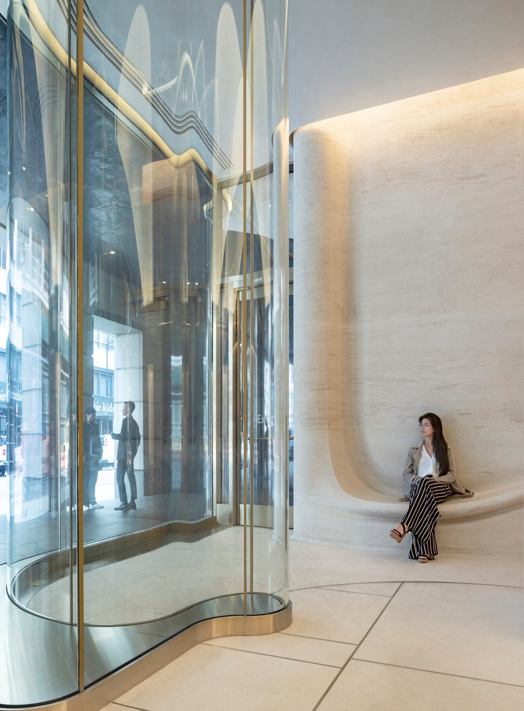
For the glass, the challenge was to build a high-performance double wall cavity that utilized the inherent structural capabilities of large curved panels while simultaneously defining an artful threshold that immerses the user into the architecture. The 14- foot-tall panels encase a mechanically isolated conditioned space that mitigates temperature differentials and humidity.
© Kohn Pedersen Fox Associates

© Kohn Pedersen Fox Associates

How did the context of your project — environmental, social or cultural — influence your design?

An interesting aspect of the context is that we were returning to work on a building that our firm designed. I think that touches on a really powerful idea, that buildings need to evolve and change with the cities around them, and it is up to architects to help achieve this goal. When presented with the project, we had to determine how we wanted to interact with the style today, and how to make this a more usable space without undermining the integrity of the original building. Because of the postmodern aesthetic, albeit fairly minimal version of postmodern work, this was a loaded problem full of historical references and thought history.
© Kohn Pedersen Fox Associates

© Kohn Pedersen Fox Associates

What drove the selection of materials used in the project?

We selected Magny Le Louvre limestone for the interior as a continuation of the tower’s Indiana limestone exterior. We wanted the interior to offer a sophisticated take on stone and give people the opportunity to touch and engage with it directly.

For the exterior wall, we shaped glass to create an immersive experience for the user as they pass through. They become part of the building as they enter or exit, and that process is completely visible, though distorted, to others passing by or pausing in the lobby. We also removed metalwork to unify the experience between the spaces.
© Kohn Pedersen Fox Associates

© Kohn Pedersen Fox Associates

What is your favorite detail in the project and why?

It’s always hard to pick a favorite anything when it comes to one’s own project, but one the things I think came out best here is this dialogue between materials that we’ve created. I think the way both the stone and glass are shaped and formed ergonomically enables the project to achieve its goal of serving as a point of engagement with users. Similarly, I think the contrast we’ve created between these materials – the solidity of the sedimentary veined stone and the transparency of the sculpted glass. Notably, both materials are created from sand, linking them in an essential way.
© Kohn Pedersen Fox Associates

© Kohn Pedersen Fox Associates

How important was sustainability as a design criteria as you worked on this project? 

Sustainability is a key aspect of all of our firm’s work. In this case, as a renovation project, we were starting out with an existing structure. We upgraded mechanical systems in the lobby to be more efficient, and we designed the new a high-performing façade for the entry.
© Kohn Pedersen Fox Associates

© Kohn Pedersen Fox Associates

How have your clients responded to the finished project?

We’ve been fortunate to work with a great and truly supportive client, Paramount Group, on this project. Since we first brought them our design concept all the way through construction and project completion, the Paramount team believed in our vision and remained dedicated to seeing it through. It has also been exciting to see the positive reaction from the building’s tenants as they experience the new space.
© Kohn Pedersen Fox Associates

© Kohn Pedersen Fox Associates

What key lesson did you learn in the process of conceiving the project?

Creating an architectural dialogue with the past, present, and future, though challenging and ever-evolving, is a great foundation for developing new designs, particularly within existing projects.
© Kohn Pedersen Fox Associates

© Kohn Pedersen Fox Associates

How do you believe this project represents you or your firm as a whole?

I think our work on this project represents KPF’s commitment to the evolution of cities and urban spaces. By reimagining this space, working within its constraints and addressing its challenges, we have enhanced the usefulness of this entire office building and met the needs of its current users. And, as a renovation, this project also reflects a commitment to sustainability and which is a core aspect of our work.

Team Members

Design Principal: Hugh Trumbull / Managing Principal: Richard Nemeth / Project Manager: Greg Mell / Team: Chris Dial, Xi Chen, Alex Lightman, Parker Russo

Consultants

AECOM Tishman (Construction Manager) / ETMA (Stone Fabricator) / Front Inc. (Facade Consultant) / Wilkstone (Stone Installation)

Photographer credit: Michael Moran / OTTO

Products and Materials

Magny Le Louvre limestone, Cristacurva glass

For more on 712 Fifth Avenue Renovation, please visit the in-depth project page on Architizer.

712 Fifth Avenue Renovation Gallery
Reference

SOM unveils black terracotta office block in New York
CategoriesArchitecture

SOM unveils black terracotta office block in New York

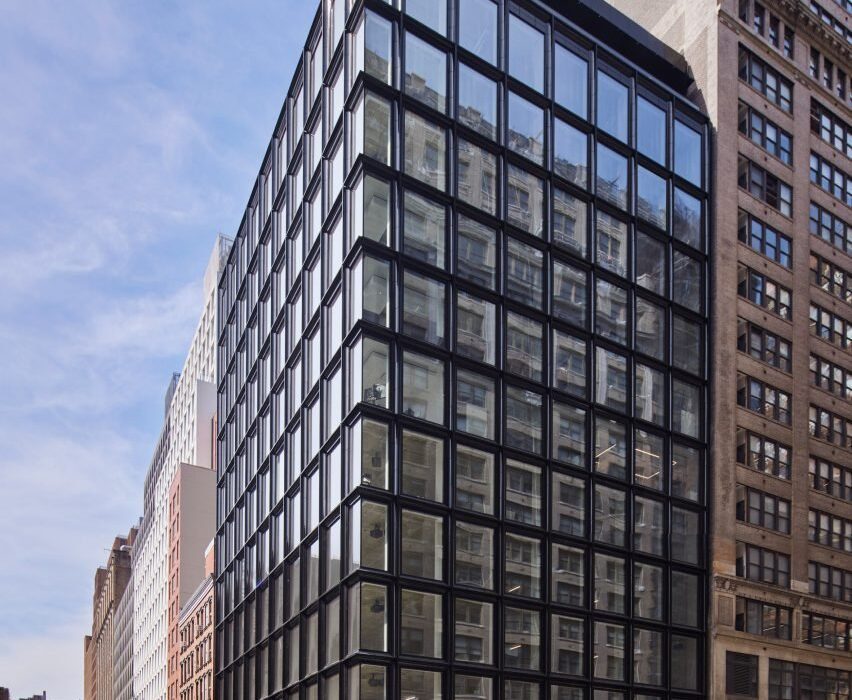
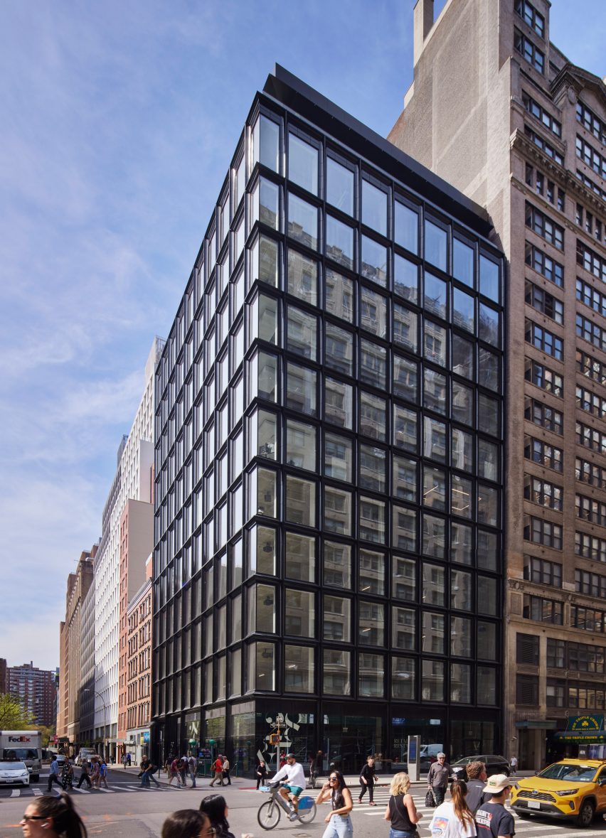
Architecture studio SOM has completed an office building in Manhattan’s Chelsea neighbourhood clad in black-glazed terracotta that was designed to complement the surrounding neighbourhood.

Called 28&7, the 12-storey-tall office building was designed to complement the nearby masonry-clad structures, while maintaining a modern look.

Black terracotta clad office building
SOM has used black-glazed terracotta for an office building in Manhattan

“The scale of the building is modest in its context,” SOM design partner Chris Cooper told Dezeen.

“Our all-black design creates a distinguishing contrast within the immediate neighbourhood of masonry buildings.”

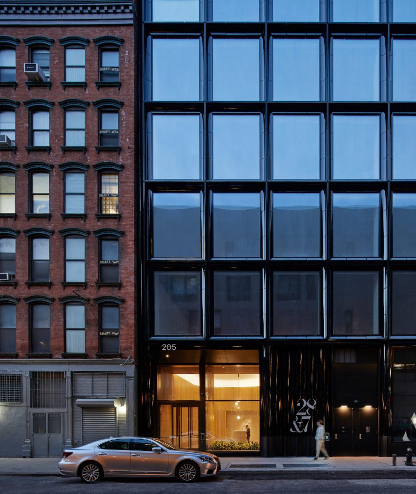
Black terracotta clad office building
The material was chosen to contrast with and complement the surrounding masonry structures

According to the studio, it is the first example of a structure in New York that uses black terracotta. The ceramic material was given a black glaze that is then polished to create a smooth, almost reflective surface.

SOM said that the material was chosen for the way it “harmonizes” with the clear glass used for the remainder of the facade.

Referred to the building’s minimalist look  as a “perfectly tailored suit”, the cladding conceals the window’s aluminium frames.

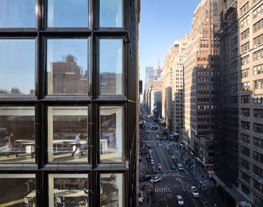
Black terracotta clad office building
The black material is meant to change with light conditions

“The black sheen in the glazing has an elusive surface quality that changes depending on the time of day, much like the glass,” said Cooper.

“As a contemporary interpretation of a historic typology, the facade design is an honest expression of the structure, construction and use,” he continued.

“The resulting tactility of the facade feels more comfortable and inviting than the sleek counterparts all in glass.”

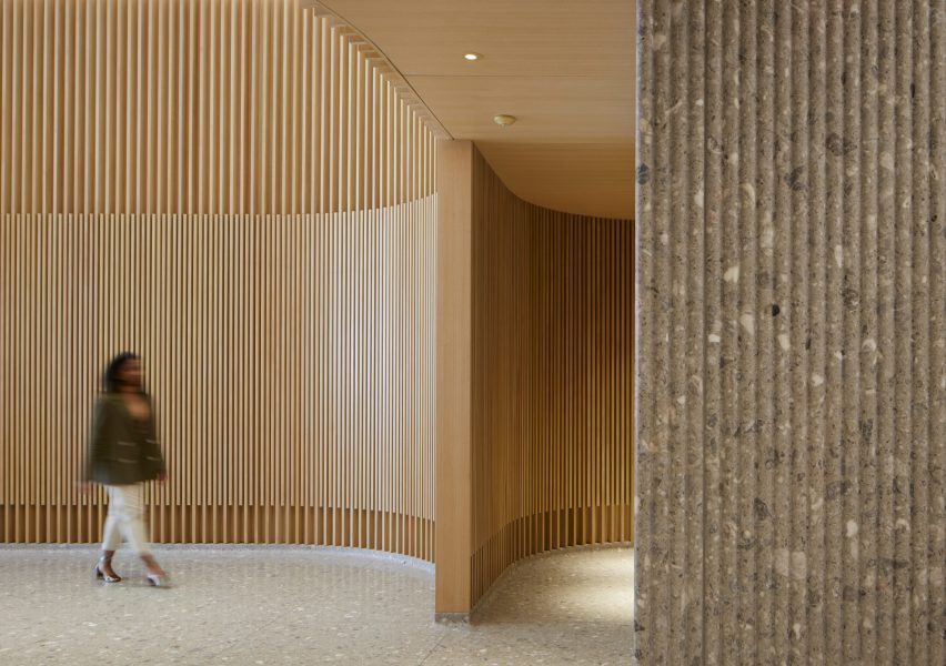
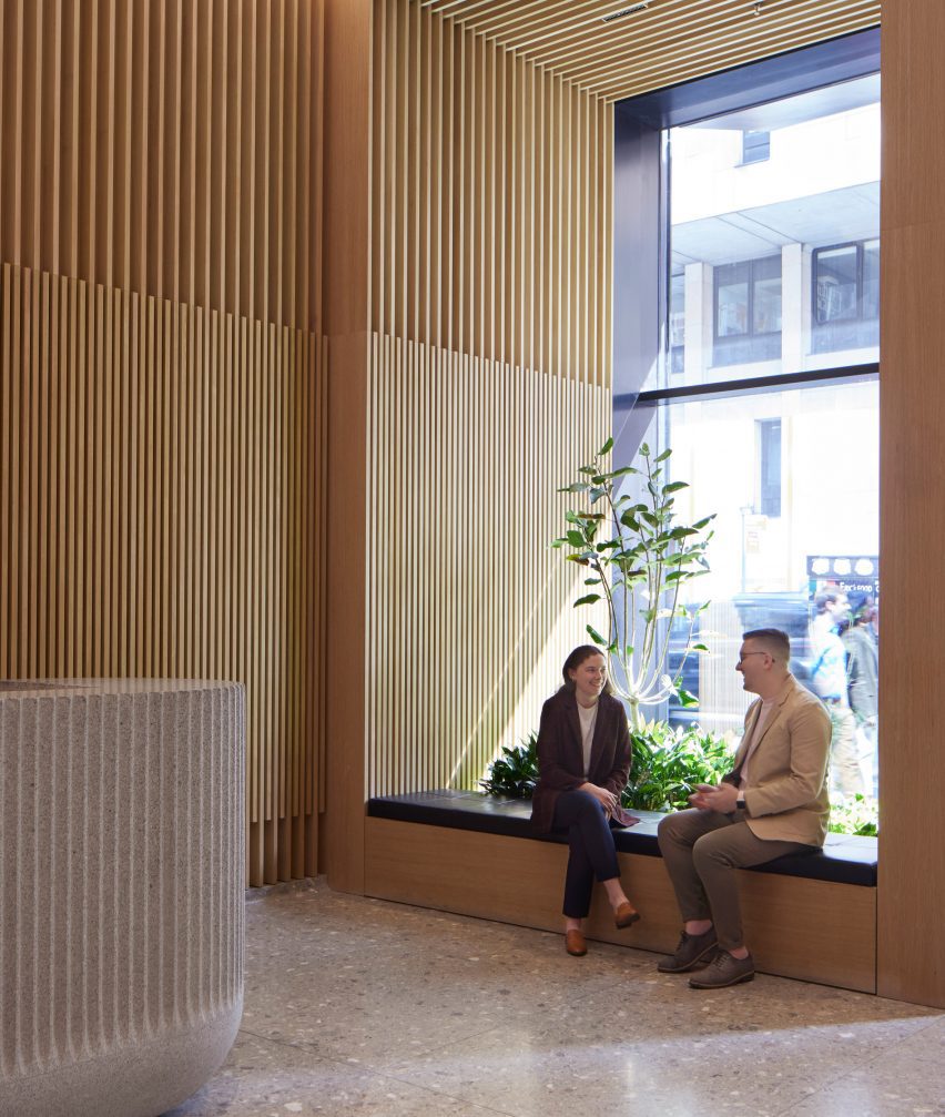
Wooden louvres and terrazzo in office lobby
The lobby features wooden louvres and terrazzo

The terracotta was also chosen for its “high-performing, yet-low carbon” attributes, and Cooper noted that the material has less of a footprint than steel or additional glass. It was manufactured using a dark terracotta blend from the fabrication company Shildan in Germany.

Designed before the pandemic, the building’s smaller envelope is an attempt to create a “boutique” approach to offices. The construction marks what Cooper says is a marked shift from mega-scale developments towards smaller, more flexible building typologies for offices.

The size of the building was used to leverage what Cooper calls a “community-centred workplace”, and suggested that this smaller, more open arrangement can help attract workers back to office buildings.

Because the structural columns were integrated into the facade, the floor plates are column-free, creating clear lines of sight throughout the 90,000 square-foot (8361 square-metre) plan.

Interior materials were selected to create a “feeling of comfort and warmth”, especially in the lobby area which is clad in wood and a terrazzo tiling.

Black terracotta clad office building
The 12-storey structure has a penthouse and open floor plans

Other buildings in New York City that incorporate unique shades of glazing for terracotta facades include a high rise in Long Island City with British racing green terracotta and a fire station in Brooklyn by Studio Gang that incorporates bright red terracotta details to mimic fire engines.

The material is even finding its way into the city’s supertall skyscrapers. SHoP Architects’ Steinway Tower, the skinniest supertall in the world, has two full faces clad in terracotta.

The photography is by Dave Burke/SOM.

Reference

Spill The Tea: How Architects Can Transform Workplace Culture and Call Out Toxic Office Environments
CategoriesArchitecture

Spill The Tea: How Architects Can Transform Workplace Culture and Call Out Toxic Office Environments

Wandile Mthiyane is an Obama Leader, TedxFellow, architectural designer, social entrepreneur and the founder and CEO of Ubuntu Design Group (UDG) and The Anti-Racist Hotdog. He is proud to introduce The Tea, a peer-to-peer inclusion rating platform.

For far too long, companies have chosen to remedy discrimination after the fact rather than proactively cultivating prevention tactics to ensure employees don’t endure negative and potentially traumatic experiences. This reactive default means that the people who plan our homes, neighborhoods and cities don’t have a plan preventing them from facing harmful and dangerous workplace situations. It’s too easy to simply blame architecture culture; architects shouldn’t have to depend on Plan B–lawsuits, support groups or even have therapists on speed dial. What if you had all the information you needed on a company’s culture before applying?

Recently, I asked some friends what they wished they had known before entering the workforce, and their responses shed light on the challenges they faced. Each told me a harrowing story about intersectional discrimination in the workplace: significant pay gaps, inadequate maternity leave and administrative reluctance to address these issues and others. Comparing their stories exposes how similar problems can be found anywhere in the world, with women and people of color trying to combat workplace discrimination while simply trying to do the jobs they were hired for.

One experience was shared by a Black female friend who worked as an architectural designer in South Africa. After her first year, the company hired her white male classmate from university, assigning her the task of mentoring him for six months and teaching him about the firm’s design philosophy. One day over lunch, he unexpectedly expressed his dissatisfaction with his salary and, in the process, revealed the significant pay gap between them. Surprised by this revelation, my friend confronted her boss, and the conversation that followed is almost unbelievable.

Library in Anzin by Dominique Coulon & Associés, Anzin, France

The boss initially justified the disparity by explaining that her classmate had financial responsibilities, such as paying rent to his mother. She pointed out that she paid rent to an actual landlord. The boss mentioned that his colleague — again, who she was mentoring — had a car, so they need to uphold his living standard, to which she responded she’d also have a car if she were compensated fairly. Only when she threatened to quit did she gain a raise to match her classmate’s salary.

These problems persist in North America, too. My Asian friend from Canada shared a comparable account of discovering that she was being paid significantly less than her colleagues. When she confronted her boss about the inequity, her boss quickly deflected the issue to the HR department, adopting a stance of concern and promising action. A week later, the boss informed her that the matter had been resolved and presented her with a list of goals she needed to achieve within a specific timeframe to earn a raise. Frustrated, she questioned the idea of needing to prove herself for a job she was already overqualified for just to receive equal pay. In the face of her threat to resign, the matter was resolved within a week.

Meanwhile, one of my white female friends in Germany revealed an age-based layer to gender discrimination. As she approached her mid-20s, she encountered difficulties securing a job. Once gainfully employed, she faced even greater hurdles in obtaining promotions. Companies perceived her as a potential liability because she could get pregnant, thus hindering her progress at work. Almost ironically, policies favoring maternity leave have led male bosses to view women as liabilities.

Clearly this problem is pervasive worldwide and is linked to problematic workplace cultures. While relevant in most workplaces, architecture is an industry well known for its toxic work culture. Architects have to deal with unnecessary competition between colleagues, work long hours, and pay off a mountain of school debt in the meantime. In 2023, Architecture Journal reported that over 40% of architects work at least 10 hours of overtime per week, largely unpaid, according to an AJ study completed by 400 architects. This work-pace leads to high burn-out rates, with almost 97% of architects reporting burn-out.

Take into consideration women and People of Color have to fight their own struggles against workplace discrimination while doing their own work in these already-toxic spaces. According to the National Council of Architectural Registration Boards (NCARB), out of the 121,603 licensed architects in the U.S. as of 2022, only 2% (2,492) are Black. Among them, only 566 are Black women, despite Black people making up 12.6% of the country’s population, with 52% of the Black population being Black women. These statistics clearly highlight the significant underrepresentation of people of color, particularly Black individuals and women, exposing them to vulnerability in white male-dominated studio spaces. Moreover, disparities in power structures within firms further exacerbate the situation, as women face additional challenges and are less likely to complete licensure, impeding their progression to principal roles. As one of my American friends noted, employees should have the ability to go to work and focus solely on their tasks without the added burden of being the unofficial and unpaid advocates for DEI within their companies.

Clearly, DEI programming is not enough to change our workplaces. Over the past two years, my team and I have partnered with leading social psychologists from Harvard, Columbia, Deloitte, and The Resolution Project, and closely studied company culture while consulting with architecture firms, both large and small. Throughout our research, we engaged with young professionals to understand what they wish they had known before entering the workforce, particularly what would have helped them make better decisions about the places where they would spend the majority of their adult lives.

Building upon this work, we developed The Tea: a demographic-specific, peer-to-peer inclusion rating platform that connects women and people of color to workplaces where they are truly valued. The Tea uses key workplace indicators that matter the most to individuals of similar demographics, based on research that shows why women and people of color leave or stay in workplaces. The platform uses ratings based on key workplace indicators such as salaries and benefits, path to growth, internal advocacy, external advocacy, authentic self, and valued expression. Users can also filter based on race, gender, sexual orientation and age to find how people that look like you have experienced a particular workplace.

The Tea is also built for firm leaders and HR directors, helping them know exactly what they need to improve in their own workplaces and the steps they have to take. Instead of providing negative anecdotes without clear solutions, The Tea’s data-driven key indicators show more precisely where companies need to improve. Companies can even upload their own efforts to address each indicator, so applicants can see how a company is dealing with certain problems. Above all, we value everyone’s identity and security, online and in the workplace: just log in with your LinkedIn, and your reporting remains anonymous.

In the end, The Tea benefits everyone involved. It provides employees with a safe space to identify companies that truly value their labor, eliminating the need for them to be BIM managers and the office’s designated MLK just because they’re a person of color. Simultaneously, employers gain valuable insights on how to create the most culturally diverse and inclusive firms in the world. We are transforming DEI from a mere aspiration into a tangible reality. Let’s join forces and spill the tea together, ensuring we never have to face these challenges again!

Architects: Want to have your project featured? Showcase your work through Architizer and sign up for our inspirational newsletters.

Reference

A circular subscription service for office furniture
CategoriesSustainable News

A circular subscription service for office furniture

Spotted: Following the COVID-19 pandemic and the rise of hybrid work models, companies need more flexibility than ever to scale their physical presence up or down as circumstances change. But as companies optimise their offices to fit changing working practices, there is a nagging problem: furniture.  

Danish startup Nornorm has developed a new model for circular office furniture – one that is based on subscription rather than ownership. Under the startup’s system, companies pay a monthly fee that starts at €3 per square metre (with a startup fee of €12 per square metre). 

At the start of the process, the company provides a floor plan and information on functional needs and personal style, and with this input, Nornorm creates a bespoke furniture solution. Before final sign-off, the company is provided with a 3D model of the re-configured workspace so they can add or remove elements as needed. 

Once the design phase is over, Nornorm installs the furniture at the company’s office – but this is not the end of the collaboration. Companies are free to alter their design at any time, scaling up or down as circumstances require. If a change is requested, Nornorm will deliver any additional furniture required and disassemble any items that are no longer needed. Companies are also free to cancel their subscription at any time, in which case all their furniture will be collected and re-used with another business. To minimise waste and extent the lifespan of each item, any retired furniture is repaired and refurbished for use elsewhere.

Throwaway culture is leading to increased waste, and that includes our furniture. Springwise has spotted many innovations tackling this issue in the archive, including customisable and dynamic cork-based furnishings and a marketplace for second-hand furniture.

Written By: Matthew Hempstead

Reference

Gensler and Civilian transform Detroit post office into technology centre
CategoriesArchitecture

Gensler and Civilian transform Detroit post office into technology centre

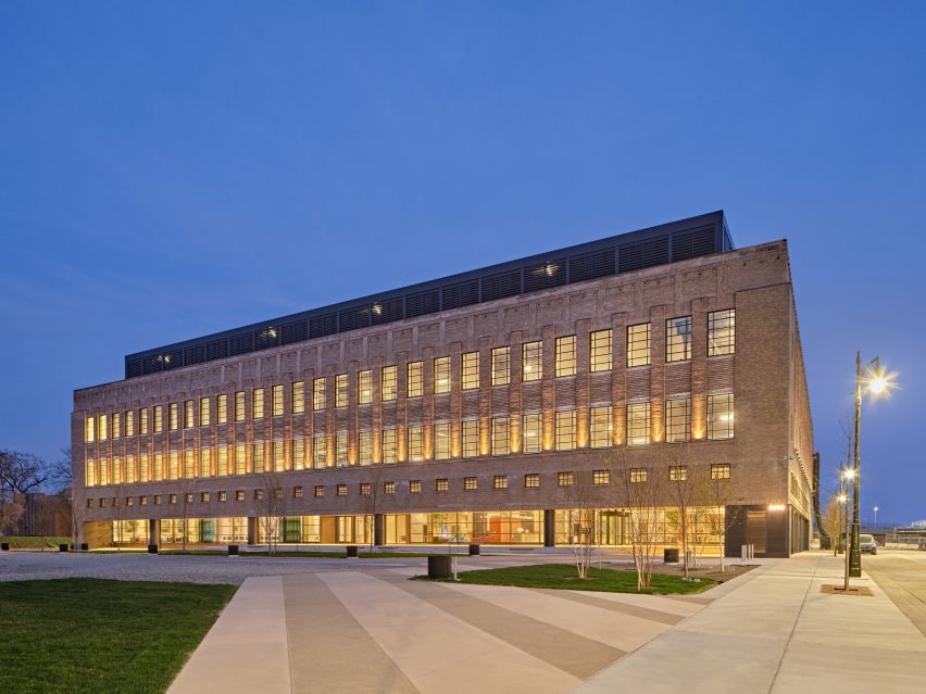
American architecture studio Gensler and interior design studio Civilian have restored the historic Book Depository building in Detroit and transformed it into the headquarters for technology company Newlab.

Gensler and Civilian transformed the art deco building to be usable by tech companies, adding purpose-built prototyping labs, open-plan co-working spaces and outdoor green spaces.

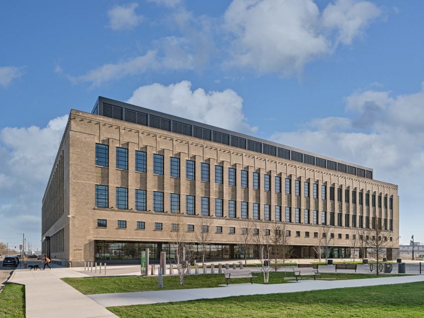
Exterior of the Book Depository building transformed by Gensler for the Newlab Detroit headquarters
Gensler and Civilian transformed a 1930s post office into a workspace and technology centre

The 270,000-square-foot (25,083 square metres) building will be used as a centre for startups, entrepreneurs, engineers and scientists working in mobility technology.

The Book Depository building was originally built in 1936, designed by American architect Albert Kahn as a post office and mail-sorting facility. It was later used as a place to store books by Detroit Public Schools, from which it draws its name.

Exterior of the Book Depository building transformed by Gensler for the Newlab Detroit headquarters
The building will be used as Newlabs Detroit headquarters

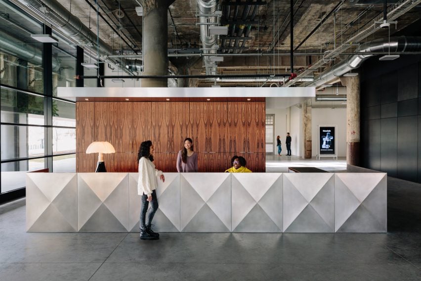
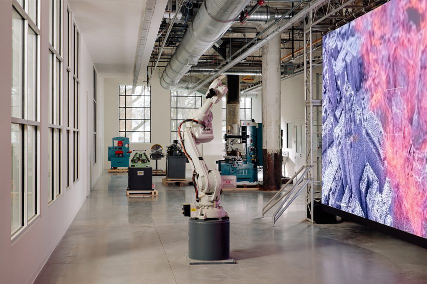
The building now includes an exhibition space, an event space, a robotics and prototyping facility, and two open studio spaces with desks, lounge areas, classrooms and meeting rooms.

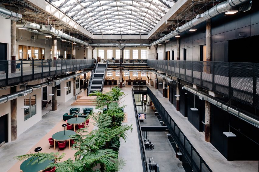
The interior has an industrial appearance with concrete floors and exposed services.

Lounge chairs, circular tables and planting fill the central atrium space, which provides a collaborative workspace lit by the skylight above.

Interior atrium space with large skylight and open-plan co-working space
An atrium space lets natural light into co-working spaces

“The building has been repositioned to meet the demands of the city’s top innovators, including ample access to daylight, open internal connectivity and destinations for exchange, and an engaging ground floor as a connective intersection within the overall development, serving as a boulevard for the community, industry partners, and the neighbourhood,” said Gensler.

“Embracing the rich history of the building, juxtaposing design elements with the industrial strength and structure associated with Albert Kahns work, Gensler reimagined the building with a focus on connection and collaboration,” added Newlab.

Newlab has an existing headquarters in Brooklyn, New York, and hopes that transforming the Book Depository building into the company’s Detroit headquarters will attract jobs to the area.

“Building on its success in Brooklyn, Newlab is scaling its model of applied innovation to create the conditions for a sustainable high-tech startup ecosystem to take hold in the region,” said the company.

Technology labs at the Newlab Detroit headquarters by Gensler
The building includes and robotics and prototyping facility

“Projected to attract thousands of new jobs to Michigan Central, the campus will offer high-design innovation and collaborative workspace, dozens of acres of green and open space for the community,” Newlab continued.

Architecture studio Ghafari assisted Gensler and Civilian with the interior design of the project and landscape design studio MYK created the landscaping scheme.

Interior of the Newlab Detroit headquarters
The interior has an industrial appearance

The building is situated on the Michigan Central campus, a district dedicated to mobility innovation that also includes Ford’s restoration and transformation of the Michigan Central Station.

Other large-scale projects set to be built in Detroit include a slanted glazed building designed by Kohn Pedersen Fox for the Detroit Center for Innovation campus and OMAs design to transform a derelict bakery into a mixed-use art and education facility.

The exterior photography is by Jason Keen. The interior photography is by Brian Ferry.

Reference

And And And Studio brings 1970s elements to Century City Law Office
CategoriesInterior Design

And And And Studio brings 1970s elements to Century City Law Office

And And And Studio has overhauled the offices for one of LA’s top entertainment law firms, opting for a look that’s “more akin to a hotel lobby”.

The firm, which represents several Hollywood actors, tasked And And And Studio founders Annie Ritz and Daniel Rabin with designing interiors for its offices in Century City, a commercial district south of Beverly Hills.

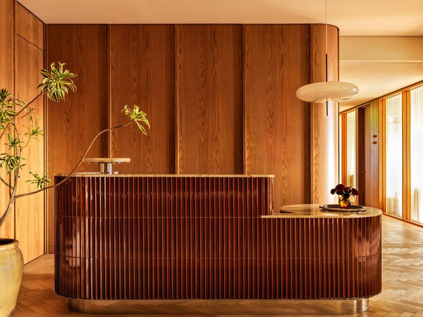
Reception desk wrapped in glossy oxblood-coloured tiles
Visitors to the law offices in Century City are greeted by a desk wrapped in glossy oxblood-coloured tiles

The design studio convinced the clients to stay in their current building rather than move – a decision that required a complete redesign of the 22,000-square-foot (2,044-square-metre) space and the gutting of the interiors to make room for a brand-new layout.

The clients required over 30 private offices within the floor plan, so it had to compromise on the size of the rooms to leave enough area for lounges and other communal facilities.

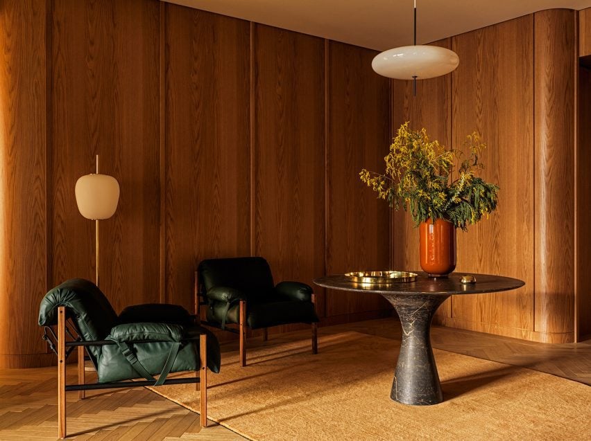
Wood-panelled seating area with two slingback chairs and a marble table
The wood-panelled reception area sets the tone for the rest of the interiors

“The goal was for Ritz and Rabin to make the space feel airy, open and more akin to a hotel lobby than an office,” said the studio.

“[The lawyers] traded slightly smaller private offices in order to provide the entire office with inviting and functional communal spaces.”

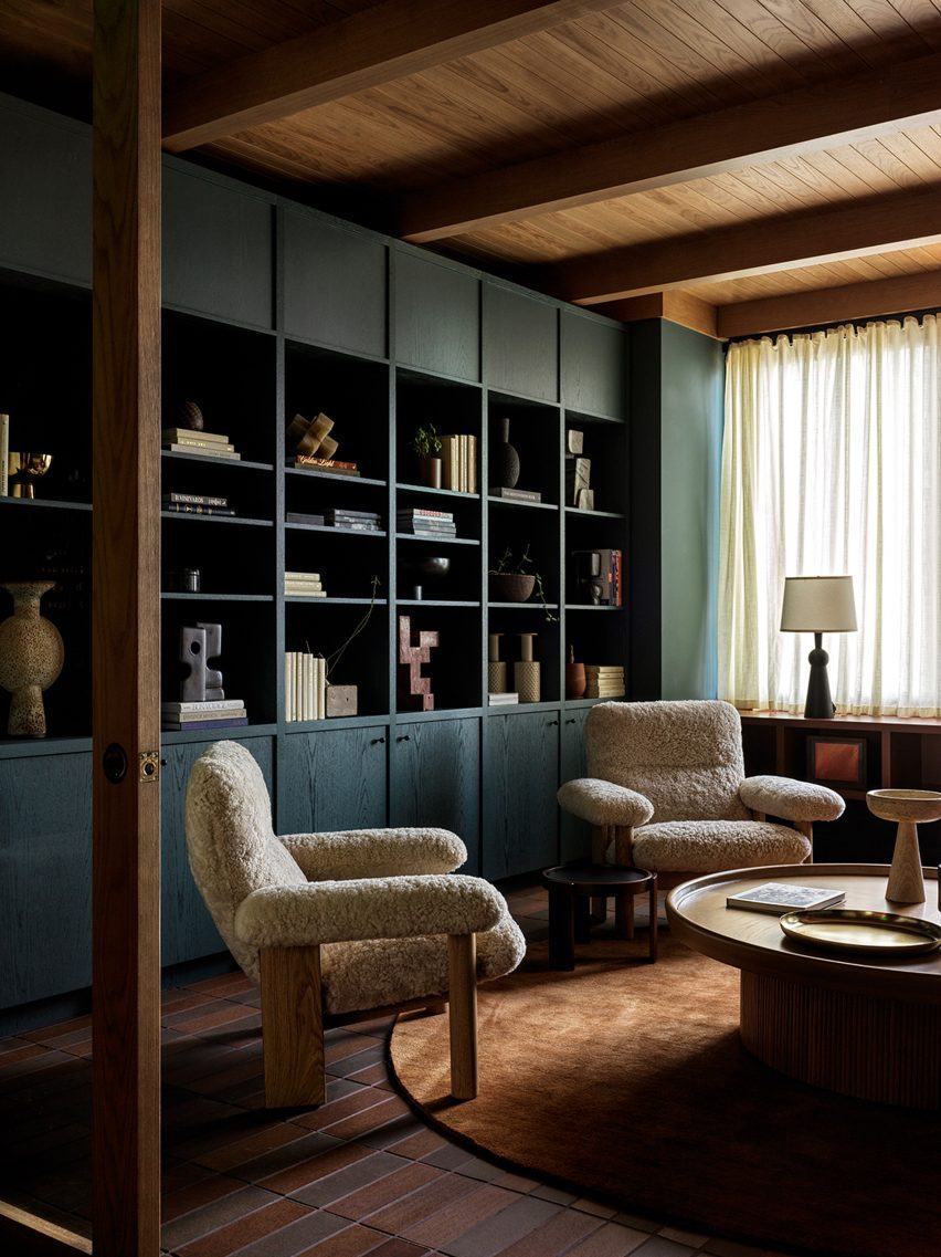
Lounge area with teal-coloured bookshelves, two armchairs and a coffee table
And And And Studio drew references from a variety of design styles, most noticeably the 1970s

Visitors arriving at the wood-panelled reception area are met by a counter wrapped in glossy oxblood Rombini tiles from Mutina, which also surround curved columns in meeting spaces.

Bassam Fellows sling lounge chairs and an Angelo M Marble Table from Alinea Design Objects were also placed in reception, setting the tone for the rest of the interiors.

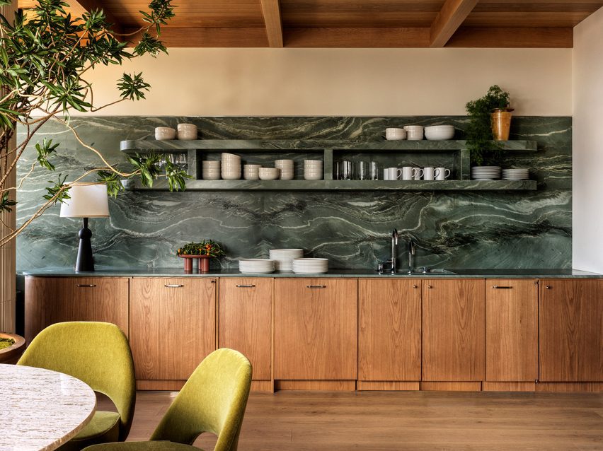
Kitchen featuring green marble countertops, backsplash and shelves
In the kitchen, green marble forms countertops, backsplash and shelves

Furnishings found throughout pull references from a variety of design styles, including art deco and 1970s, as seen in the Brasilia chairs by Menu, sofas by Arflex, and a Phillipe Malouin sofa for SCP.

Brown and yellow velvet upholstery in the lounge spaces also nods to the 1970s, while in the kitchen, green marble forms the countertop, backsplash and open shelving.

“The 1970s-inspired design transcends through warm wood tones, and bold-hued gold and green fabrics,” said And And And Studio.

Designing and executed during the Covid-19 pandemic, the team was met with various hurdles during the project, which resulted in multiple last-minute changes.

Conference room
The red tiles from the reception area are repeated in conference rooms

“[Our] approach to the re-design of this office embraces the goals and ethos of this law firm, giving a unique design to the space that is distinct,” And And And Studio said.

“This goal was met with several challenges due to the pandemic, creating delays and changes, specing and re-specing products, all while balancing a tight timeline.”

Meeting rooms with chairs around a circular table
The interior is designed to look more like a hotel lobby than an office

Ritz and Rabin’s studio has offices in both Los Angeles and Toronto.

Other law office designs include one created by Studio Arthur Casas for a firm in São Paulo with a chocolate-coloured space that’s brightened by hundreds of books, while Vladimir Radutny Architects used minimal white partitions to divide a lawyers’ office in Chicago.

The photography is by Chris Mottalini.

Reference

Wooden logs frame Forest Office in Japan by Tomoaki Uno Architects
CategoriesArchitecture

Wooden logs frame Forest Office in Japan by Tomoaki Uno Architects

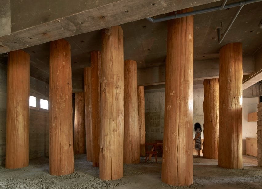
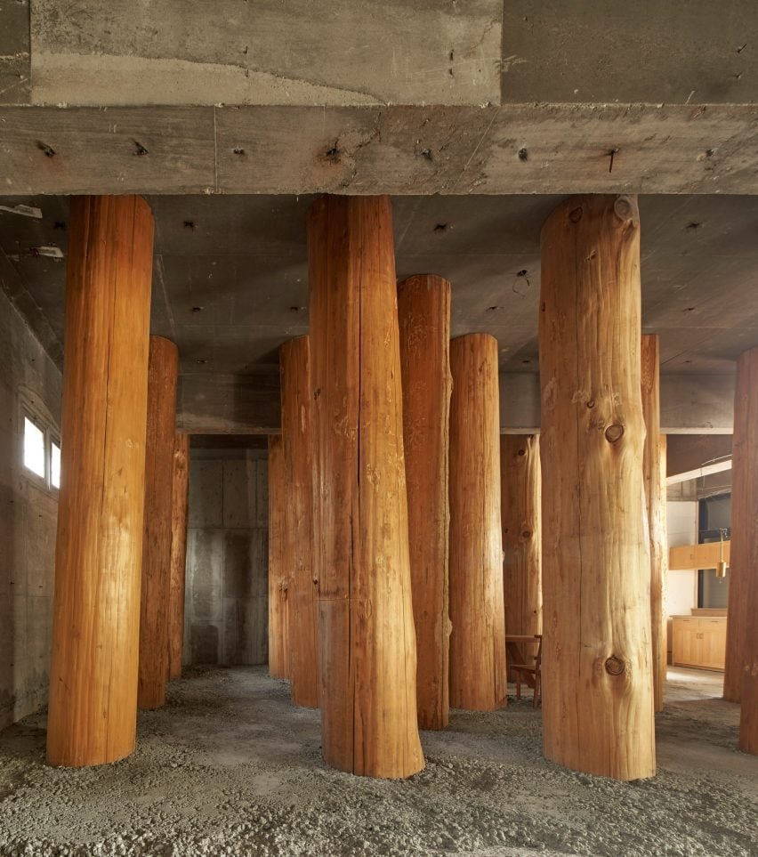
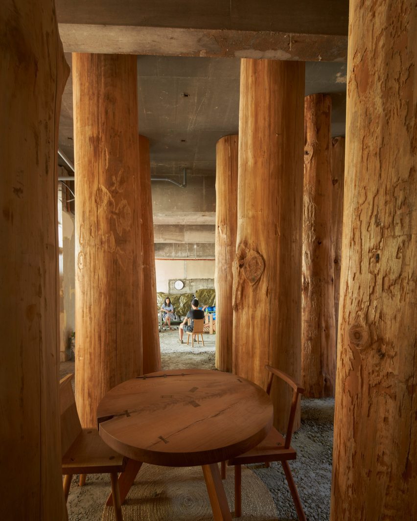
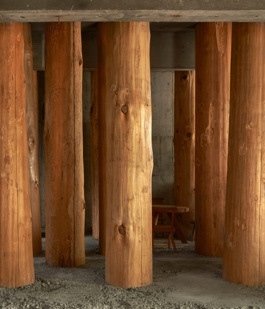
Columns made from thick wooden logs fill this office in Nagoya City, Japan, created by local studio Tomoaki Uno Architects at the base of a former apartment block.

Named Forest Office, the small workspace was commissioned by a client who simply requested that “something interesting” be created within half of his office space.

It was Tomoaki Uno Architects‘ second commission by the client, with the first being a sky-lit dwelling nearby named Ogimachi House.

Tomoaki Uno Architects-designed workspace in Japan
Tomoaki Uno Architects has created Forest Office in Japan

“There were no specific requirements for [the project],” studio founder Tomoaki Uno told Dezeen.

“As someone who usually works within functional constraints, this was an exciting opportunity for me,” he continued.

Drawing on the site’s natural surroundings and a nearby shrine, Tomoaki Uno Architects prioritised natural materials and rough finishes to create an atmospheric, multipurpose space.

Tree-trunk columns inside Forest Office in Japan
The workspace is filled with columns made from thick wooden logs

“I had long been inspired by the unique atmosphere I felt every time I walked along the approach to Ise Shrine,” said Uno.

“I knew that the irregular rows of large trees had a strong influence on this feeling. Therefore, I thought about using thick logs as a metaphor and seeing if I could recreate something similar,” he continued.

Interior of Forest Office by Tomoaki Uno Architects
A table is nestled at the centre

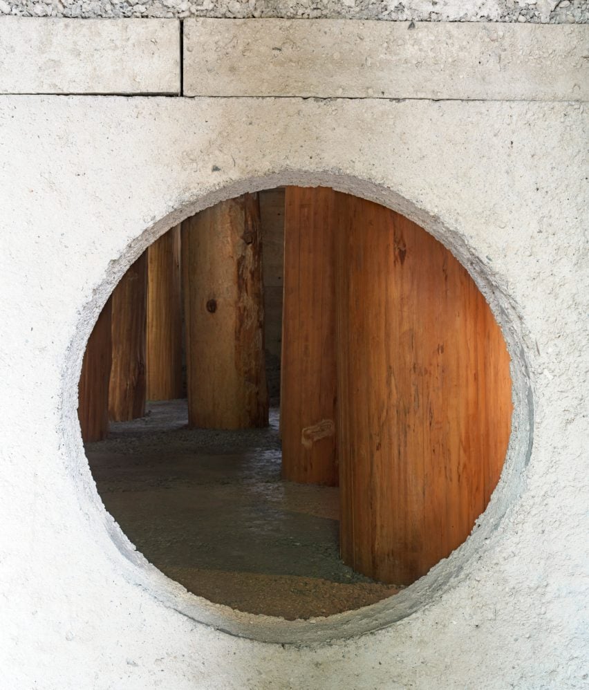
Inside, the concrete of the existing structure has been left exposed. It is teamed with a new floor and wall with a circular opening, both made of concrete with a rough aggregate.

Large wooden logs, stripped of their bark and spaced equally in a grid, are set into the concrete floor to create the feeling of being in a forest.
Due to their size, the trunks had to be brought into Forest Office horizontally, before being hoisted into position and cast into the concrete floor.

One of these trunks could not fit in the planned location, and all of them ended up being slightly tilted and displaced during construction, which Uno embraced as “serendipity”.

Japanese workspace filled with tree trunks
The columns are set into the rough concrete floor

“In a nutshell, this is a question of how to deal with nature,” said Uno. “Whether consciously or not, architects are constantly being questioned in every aspect of how they approach nature and their thoughts,” he continued.

“I explored unbuilt boundaries with this project, and I wanted to confirm that the presence of the spirit felt in nature is the origin of architecture.”

Concrete wall inside Forest Office by Tomoaki Uno Architects
A wall with a circular opening has been added

A kitchenette and bathroom occupy one corner of Forest Office, while a small table and chairs nestle between the large trunks at the centre.

Tomoaki Uno Architects was founded by Uno in Nagoya in 1990. Its previous projects include a concrete home with an Aztec-informed pyramid and a minimal concrete home illuminated by dramatic light wells, both of which are also located in Nagoya.

The photography is by Edmund Sumner.

Reference