A long industrial building
CategoriesArchitecture

Santiago Viale and Juan Manuel Juarez use screens for Córdoba offices

A long industrial building

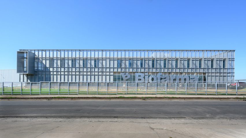
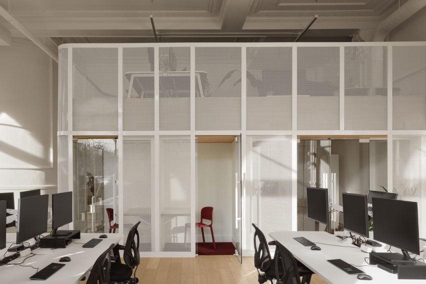
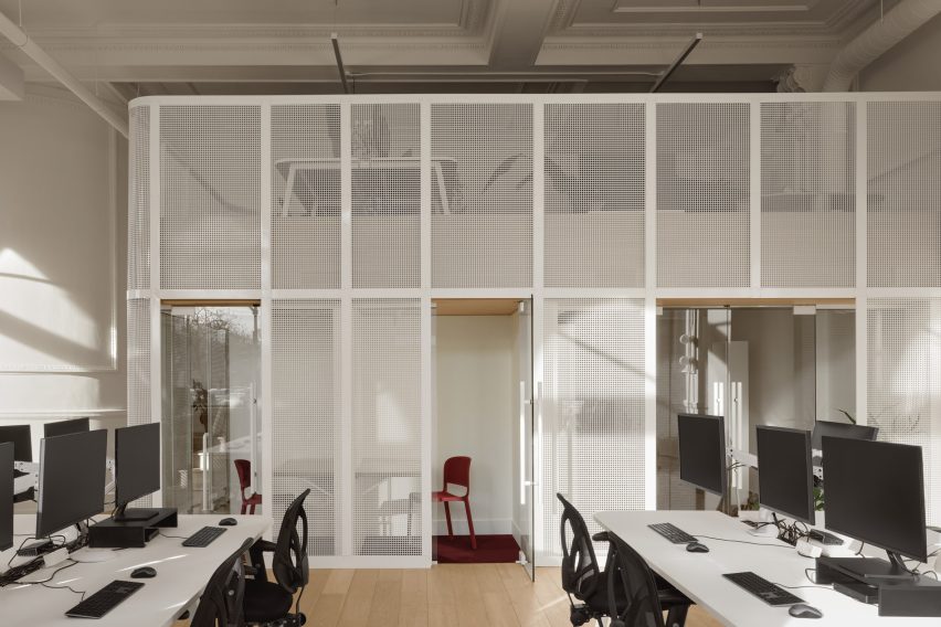
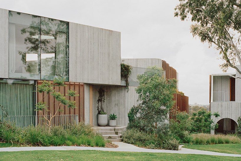
Local architects Santiago Viale and Juan Manuel Juarez have wrapped the offices of an animal feed plant in Córdoba with a perforated metal screen.

The 18,040 square foot (1,676 square metre) administrative building is part of a larger 199,000 square foot (18,460 square metre) industrial complex for Biofarma, which produces feed for animals including poultry, swine and cattle.

A long industrial buildingA long industrial building
Local architects Santiago Viale and Juan Manuel Juarez have wrapped an office building in a metal screen in Córdoba

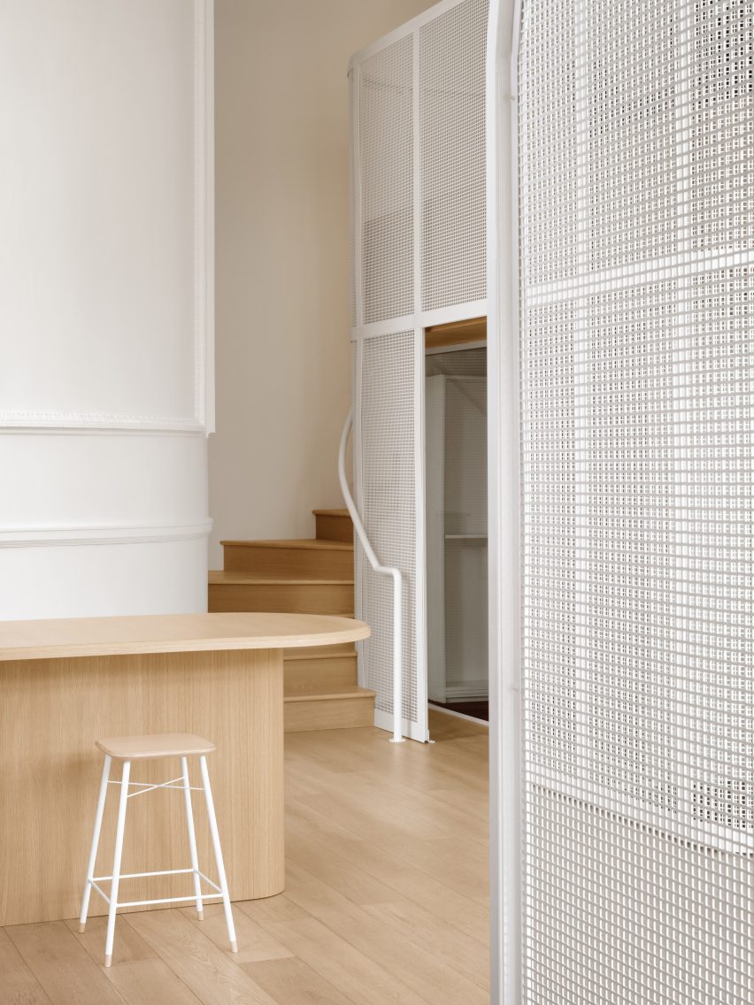
Santiago Viale and Juan Manuel Juarez organized offices, meeting rooms, printing areas and lounge areas across two rectangular floors, punctuated by two internal courtyards at the centre.

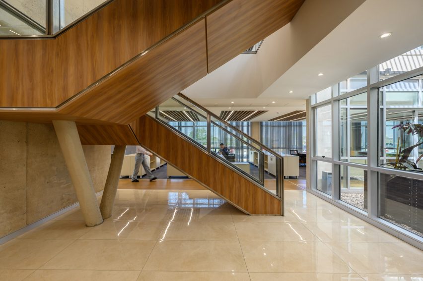
The courtyards, along with wood-clad staircases at either end of the building, create collaborative and interactive spaces for employees across the two levels, according to the team.

The front doors on a facade of an industrial buildingThe front doors on a facade of an industrial building
The building is part of an industrial complex that produces animal feed

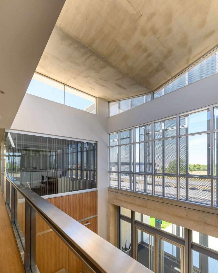
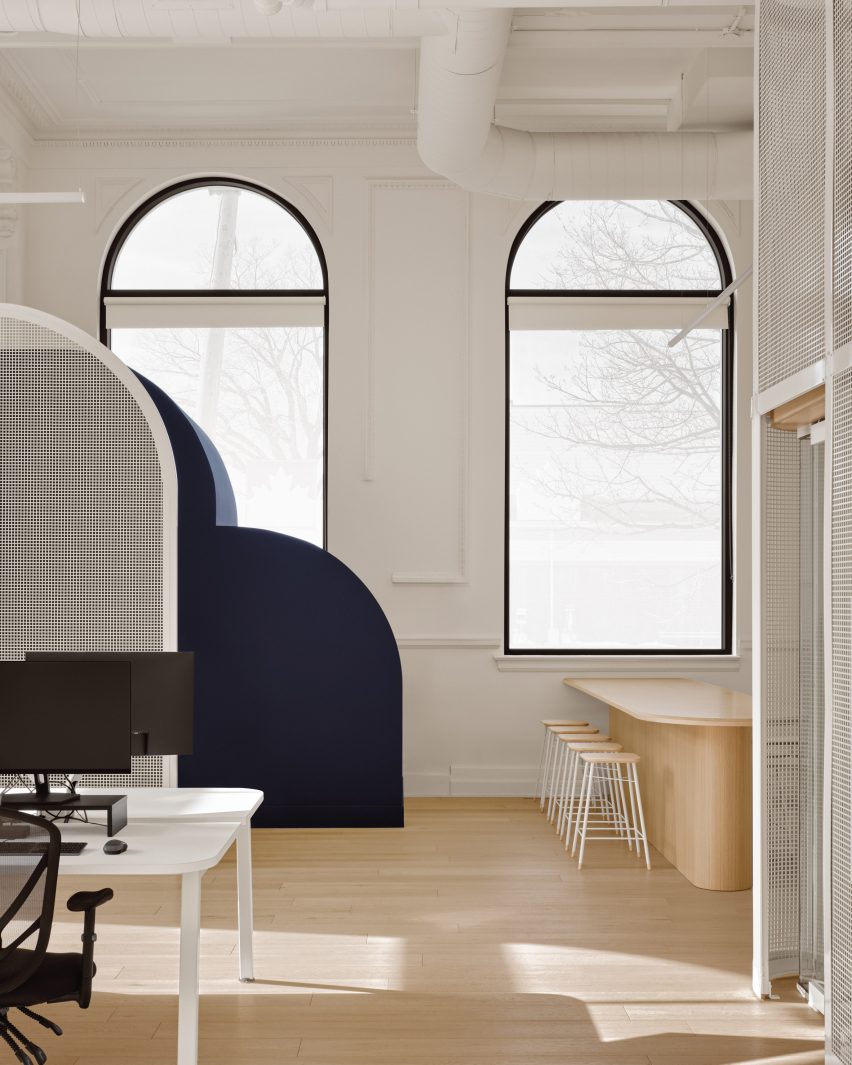
The office and meeting spaces were distributed along the internal perimeter, with one side abutting floor-to-ceiling windows that span the exterior and the other, a central passageway.

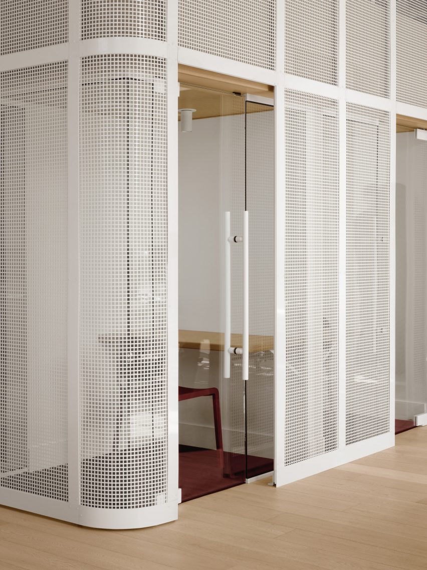
Glass partitions enclose several office spaces, while others were left open.

A building wrapped in a metal skinA building wrapped in a metal skin
A perforated metal skin wrapped around the exterior provides sun protection

“The company managers’ offices are distributed around a double-height space that connects with a hierarchized entrance on the ground floor, reinforcing the sense of institutional identity,” said the team.

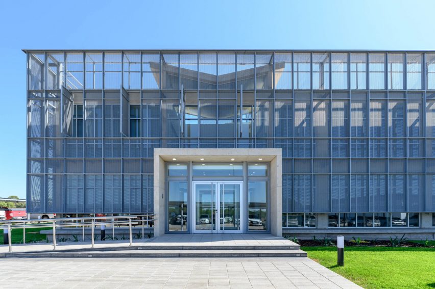
Visitors enter the building’s lobby through a concrete vestibule that extends out from underneath a metal screen enclosing the exterior.

Wooden staircase in a lobbyWooden staircase in a lobby
Two internal courtyards and staircases create interactive spaces for employees

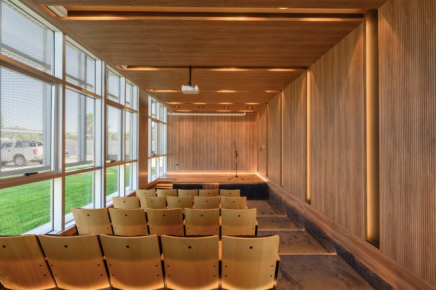
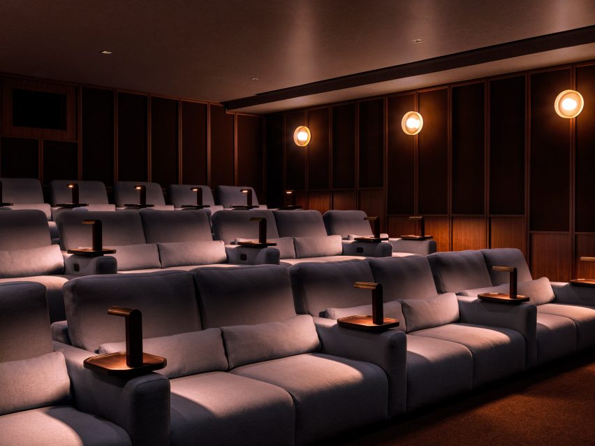
A small auditorium sits next to the lobby, clad in wooden panelling with integrated lighting running through its ceiling and walls. Large windows extend along its side.

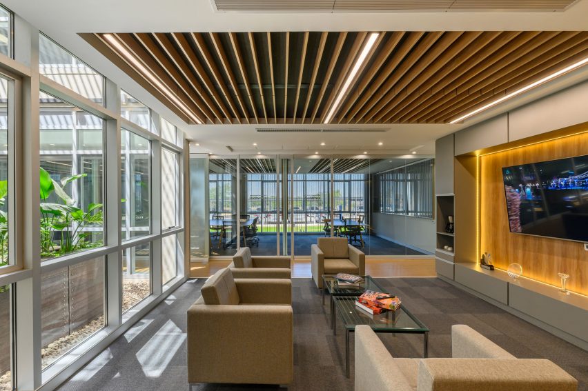
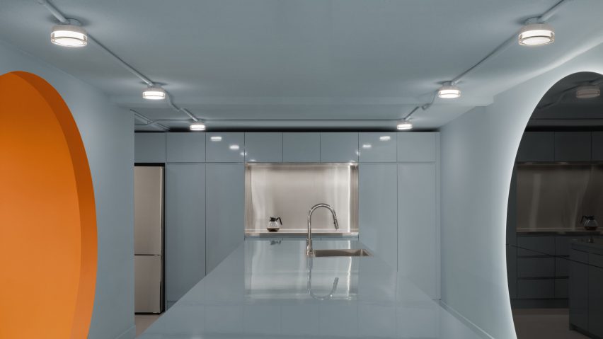
Lounge areas and a coffee break space provide additional gathering spaces on the second floor, while a dining area opens onto a roof terrace.

Couches and chairs in the lobby of an animal feed buildingCouches and chairs in the lobby of an animal feed building
The offices line the internal perimeter

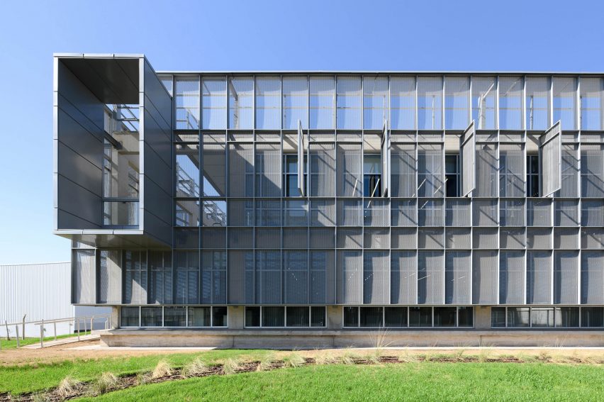
Reinforced concrete was used for the building’s structure, which was then wrapped in pre-painted grey galvanized expanded metal sheet skin.

A gap of 27 inches (70 centimetres) sits between the metallic screen and the building’s exterior to create sun protection.

Lobby area with concrete ceilingLobby area with concrete ceiling
Concrete was used for the building’s structure

“This skin plays a significant role in the project, as it forms an intermediate shaded space between the glass closure and the exterior, reducing direct sunlight radiation and, consequently, the building’s energy consumption,” said the team.

Moveable panels were also integrated into the cage-like wrapping, while integrated vertical blinds provide further sun protection for inhabitants.

“It also gives the building the language and institutional character of the company,” said the team.

Two large metal-framed openings were placed on either side of the building, which open onto the outdoor dining area.

A small wood paneled room with theatre seating and large windowsA small wood paneled room with theatre seating and large windows
A small auditorium, dining spaces and terrace were also integrated

A metal “Biofarma” sign was also placed on the exterior.

Other projects recently completed in Córdoba include a black concrete house by AR Arquitectos and two modular cabins by Set Ideas.

The photography is by Gonzalo Viramonte.


Project credits:
Collaborators: Salvador Viale, Tito Maximiliano Gonza, Francisco Gavilán, Nicolás Macasso, Santiago Viale Beviglia, Rocío Cornacchione, Emiliano Pino, Nicolás Borra, Lourdes Bruno, Fiama Ríos, Ricardo Cortesse, Eduardo Storaccio, Sonja Czeranski, Juan Macías
Deployed metal: ETC.
Integral front: Abest
Curtains: Suquía Curtains
Vinyl floor: Julia Sol
Auditorium Seats: Rassegna


Reference

Office reception with meeting room visible through glass and mint green sliding doors
CategoriesInterior Design

Civilian draws on “grandeur” of early cinemas for Sandbox Films offices

Office reception with meeting room visible through glass and mint green sliding doors

New York studio Civilian has designed the headquarters for a documentary production company in Manhattan’s Flatiron District, which includes an art deco-influenced screening room.

The offices for award-winning Sandbox Films are located in a landmarked 1920s neo-gothic skyscraper, and provide the company with its first dedicated workspace.

Office reception with meeting room visible through glass and mint green sliding doorsOffice reception with meeting room visible through glass and mint green sliding doors
Civilian’s interiors of the Sandbox Films offices draw upon multiple references, from old movie theatres to colours used by Danish modernist Poul Henningsen

Spread across 4,200 square feet (390 square metres) of space, the program includes an open-plan reception area that doubles as an events space, a conference room, private and open offices, and production and editing suites.

There’s also a 22-seat screening room with a Dolby Atmos sound system, in which the team and their visitors can preview the completed or in-progress cuts.

A custom, double-sided sofa upholstered in velvet and boucle fabricA custom, double-sided sofa upholstered in velvet and boucle fabric
In the centre of the reception area is a custom, double-sided sofa upholstered in velvet and boucle fabrics

The non-profit documentary production company makes cinematic science films, many of which have won or received nominations for prestigious awards.

Among them are Fire of Love, which was nominated for Best Documentary Feature at the 95th Academy Awards in 2022; Emmy-winning Fathom; Sundance winner All Light, Everywhere; and Fireball, co-directed by Werner Herzog.

Meeting room with table featuring ash legs and a white lacquered topMeeting room with table featuring ash legs and a white lacquered top
Another custom design is the meeting room table, which has ash legs and a white lacquered top

“Inspired by [our] clients’ love for the craft of storytelling, the space was informed by the grandeur of the amenity-rich yet intimate early movie houses of Stockholm and Amsterdam, art deco cinemas, the architectural colour gestures of Danish modernist designer Poul Henningsen, and the vanished world of interwar New York conjured by the project’s Broadway address,” said Civilian.

The reception area revolves around a circular stone-topped bar, which demarcates a staff pantry area by day, and can be used for serving food and drinks for events.

A pair of swiveling Milo Boughman chairs with a sculptural side tableA pair of swiveling Milo Boughman chairs with a sculptural side table
Vintage pieces sourced for the space include a pair of swivelling Milo Boughman chairs

“With an active roster of screenings, events and a residency program for independent filmmakers, the space acts as an office as well as a dynamic center of gravity for New York’s nonfiction film community at large,” the team said.

A custom double-sided, Pierre Chareau-inspired boucle and velvet sofa sits opposite a pair of refinished Milo Boughman swivel chairs.

Bar and pantry area with plaster walls and oak millworkBar and pantry area with plaster walls and oak millwork
A bar area in reception acts as a pantry by day and is used for hosting events in the evening

Marquee lights are installed in rows along the sides of the existing ceiling beams, with additional sconces mounted on the plastered pantry wall.

Structural columns have been wrapped in travertine cladding to highlight thresholds between the different spaces.

Swivel chairs in front of a periwinkle blue divider, with film posters behindSwivel chairs in front of a periwinkle blue divider, with film posters behind
Wood panelling and film posters hark back to art deco movie theatres

On either side of the reception, acoustic partitions with glass panels and mint-green frames cordon off the bright conference room and a private office.

Furnishing the conference room is a custom-designed meeting table that combines a solid ash frame and a high-gloss curved lacquer top, surrounded by vintage Tobia Scarpa Sling Chairs.

A communal workspace withsit-stand desks, oak dividers and plenty of ledges for plantsA communal workspace withsit-stand desks, oak dividers and plenty of ledges for plants
A communal workspace features sit-stand desks, oak dividers and plenty of ledges for plants

From reception, a neon-lit burgundy door leads into the screening room, where three tiers of seating face the large screen like in a mini movie theatre.

The cushioned seats are upholstered in soft powder-blue fabric, which contrasts with walnut wainscoting, and sound-absorbing brown wool wall panels that conceal the equipment.

Each chair has an individual armrest table for placing drinks or writing notes, complete with a small light created in collaboration with Lambert et Fils.

More private offices, sound-proofed editing suites and an open workspace are accessed via a short L-shaped corridor.

A 22-seat screening room with three seating tiersA 22-seat screening room with three seating tiers
A 22-seat screening room allows the team and their visitors to preview documentary films

In the communal work area, sit-stand desks feature white oak divider panels and are topped with a stone ledge for displaying objects and plants.

“This project has given us an opportunity to draw from so many inspiring references, from its iconic Broadway location to historic theatre architecture, to create an elevated and layered space that supports the work Sandbox is doing to uplift documentary film talent,” said Civilian co-founder Ksenia Kagner.

Screening room chairs with individual armrest tablesScreening room chairs with individual armrest tables
The screening rooms boasts a Dolby Atmos sound system, and includes chairs with individual armrest tables for drinks or note-writing

“We also felt it was important to be responsive to the changing priorities of the modern workplace, creating open, multipurpose spaces that nurture interaction and foster a sense of community,” she added.

Civilian was founded in 2018 by Kagner and Nicko Elliott, and the designers have since completed projects ranging from the transformation of Detroit’s historic Book Depository into a headquarters for tech company Newlab, to the renovation of a historic Bed-Stuy townhouse for themselves.

The photography is by Chris Mottalini.


Project credits:

Client: Sandbox Films (Simons Foundation)
Client rep: Cushman and Wakefield
Civilian scope: Interior design, creative direction, furniture design
Architect of record: LB Architects
Mechanical engineer: WB Engineers
AV engineer: Spectra
Acoustic engineer: WSDG
Production studio consultant: Tom Paul
Contractor: L&K Partners

Reference

Atrium at the Here+Now office building by HawkinsBrown
CategoriesInterior Design

HawkinsBrown renovates offices to create a “connection to nature”

Atrium at the Here+Now office building by HawkinsBrown

A stack of meeting rooms and a moss-covered wall overlook the atriums of Here + Now, a pair of office buildings in England refurbished by architecture studio Hawkins\Brown.

Informed by changing attitudes to workplace design following the Covid-19 pandemic, the two buildings have been renovated with a focus on wellbeing and a connection to nature.

They are located within a wider business park in Reading, formerly used by Microsoft.

Atrium at the Here+Now office building by Hawkins\Brown
Hawkins\Brown has renovated a pair of offices in Reading called Here + Now

Connected by a bridge at their centre, the two buildings contain different facilities. One of them, named Here, offers space for more established companies, while the other, named Now, contains offices for smaller companies and start-ups.

“Here + Now is located on a business park, not in a city centre, which provides users with a much closer connection to nature and therefore better opportunity for activity and wellbeing,” Hawkins\Brown partner Massimo Tepedino told Dezeen.

“The idea is that companies can scale up or down and thereby stay on the campus for longer – this ultimately helps to create a sense of community,” he added.

Atrium at the Here+Now office building
A moss-covered wall overlooks an atrium in the Now building

While the two buildings share a similar material and colour palette, the finishes of each were slightly different based on its tenants.

The approach to the Now building focuses on more cost-effective, flexible spaces, while the Here building is finished to a higher specification.

Here+Now office interior by Hawkins\Brown
Wood has been used to form seating areas and quiet nooks

Each of the two buildings features a large arrival atrium designed to evoke a sense of “wonder”.

In the Here building, this space has a stack of meeting pods described by Hawkins\Brown as a “treehouse”, while dehydrated moss-covered balconies animate the atrium in Now.

Shared by both buildings are a range of on-site amenities, including a gym and treatment rooms, as well as a “lifestyle manager” who organises events and workshops.

“The benefit of having two buildings share amenities is that office spaces can accommodate a wide range of budgets, while everyone benefits from best-in-class amenities and the opportunity to socialise with established professionals and young entrepreneurs,” explained Tepedino.

Glass pitched roof at the Here+Now office building
The two buildings are connected by a bridge

The glass and metal structures of the existing buildings have been treated internally with wooden panelling, which complements new wooden seating areas and nooks.

Particular attention was paid to the colour scheme, with a muted palette intended to evoke the nearby natural landscape and create a relaxing atmosphere.

Exterior of the Here+Now office building by Hawkins\Brown
The project is located on a business park

“We know that colours can facilitate, regulate, and even influence people’s behaviour – our colour palette takes its cues from the natural landscape and compliments the neutral tones of the existing buildings,” explained Hawkins\Brown.

“The bathrooms take inspiration from spas and hotels, with green shades and bold graphics create a strong visual connection to nature and a calming environment.”

Here + Now has been shortlisted in the large workplace interior category of Dezeen Awards 2023.

Other projects recently completed by Hawkins\Brown include a student hub at Queen’s University Belfast with RPP Architects and the transformation of the historic Central Foundation Boys’ School in London.

The photography is by Jack Hobhouse.

Reference

Curtain wall reflection
CategoriesArchitecture

Non-Architectural Challenges Architects Face When Converting Offices into Housing

Curtain wall reflection

Architizer’s new image-heavy daily newsletter, The Plug, is easy on the eyes, giving readers a quick jolt of inspiration to supercharge their days. Plug in to the latest design discussions by subscribing. 

COVID-19 has left many office buildings half-empty in city downtowns across the United States, and as vacancies rise, commercial property values drop. The demand for office space might not rebound to pre-pandemic levels as some observed have augured.

Banks, city governments and property management companies fear the severity of the situation and its potentially dismal economic consequences. At the same time, the housing shortage is becoming a major problem for many cities. Could empty office buildings be the remedy to the housing crisis? What does it take to convert office buildings into housing?

One would think that the idea of converting office buildings into residential would presumably face little-to-no opposition and be promoted by cities and planning authorities as a possibility to mitigate the housing shortage and activate districts. It could be a win-win situation if not for the red-tape bureaucracy — local building and zoning regulations — and the technical difficulties, including structural, energy/mechanical, accessibility and fire safety upgrades, among other requirements. These requirements limit the number of vacant office buildings that could potentially be converted into residential use.

Zoning Regulations

Curtain wall reflection

Image by Eloi Smith via Unsplash.

There is no general rule for turning office space into housing, and each building must comply with local building and zoning regulations. Zoning rules vary, but they often share the common purpose of separating occupancies i.e. separating residential from commercial use. For this specific reason, it is difficult to change the use of an existing building, and developers wanting to undertake such a task will have to apply for a variance, which may face opposition before it is granted. Difficulties don’t end here. In addition to zoning regulations, building codes will influence redevelopment projects.

Generally, building codes applied to residential projects are considerably different from those that apply to office buildings. Adapting an existing structure to a new use will involve the cooperation of different agencies to address the complexities that come with the change of occupancy use. But given the extraordinary situation where on the one hand, we have thousands of vacant office square footage and, on the other hand, an urgent housing shortage, it would make perfect sense to relax these regulations and try to solve both problems. City authorities have in their hands the opportunity to make change recommendations in city zoning regulations. In this respect, New York’s Mayor Eric Adams has been encouraging modifications to zoning and building codes to spur the office-housing transformation.

8899 Beverly Boulevard

8899 Beverly Boulevard by Olson Kundig, Los Angeles, California | Image by Nils Timm.

For the time being, zoning and building regulations make it hard for office buildings to be turned into a different use, especially into residential, simply because the requirements for one are so different from the other. Let’s look at some of the specific requirements to turn an office building into housing: Light and ventilation are perhaps the most critical factors that play into the equation.

Light and Ventilation Requirements

One crucial requirement is that habitable spaces need to be provided with a minimum amount of light and ventilation. Oddly, pre-air-conditioning-era office buildings are potentially better suited to office-to-housing transformation. Their size and configuration were dictated by the necessity to provide offices with light and ventilation. When air-conditioning and fluorescent lighting became characteristic features of the office environment, the narrow, rectangular footprint of the typical office building and its U-, L-, C, and E-wing variations could expand to larger floor plates filled with rows of offices that no longer needed a window close by. That is when things got complicated for the office-to-housing transformation. The distance from the center of the building to an exterior wall is often so great even when the center is formed by a circulation and utility core  — that it is impossible to create an effective layout where all the units have windows.

Adding to this problem is the type of building envelope. The interiors of modern office buildings are, for the most part, sealed behind curtain walls. To comply with the light and ventilation rule required in residential buildings, the entire glass skin needs to be replaced with a system that incorporates operable windows.

Structure Lofts

The Structure Lofts by H2 | Hawkins + Hawkins Architects, Inc. San Diego, California | Image by Brent Haywood.

Other factors, including the configuration of the structural grid and the window location, impact the viability of office-to-housing conversion projects and dictate the layout and size of the rooms in new apartments. Above, the Hawkins + Hawkins Architcts‘ office building-turned-apartment complex shows the typical floor plan for all levels above the ground floor with units around a circulation and storage central core. The open plan of all the units allows for natural light to reach every corner.

The design reimagines a four-story, modern office building that served as San Diego’s Blood Bank for nearly 40 years. Offering panoramic views of the city skyline, a central park and a bay, the building inspired the conversion to loft apartments. The goal was to create expansive, energy-efficient living units through adaptive reuse while preserving a landmark. The interior structural elements such as the concrete floors and coffered ceilings, were exposed to create a clean, industrial look. Single-glazed windows were replaced with energy-efficient, dual-glazed, floor-to-ceiling vinyl windows; and new, energy-efficient mechanical and electrical systems were installed.

8899 Beverly Boulevard

The International Design Center, originally designed by Richard Dorman in 1964 (left) and 8899 Beverly Boulevard by Olson Kundig, Los Angeles, California | Image by Joe Fletcher (right).

Olson Kundig's office to housing tower conversion

8899 Beverly Boulevard by Olson Kundig, Los Angeles, California| Images by Joe Fletcher.

Here is another office-to-housing redevelopment example. The International Design Center, originally designed by Richard Dorman in 1964, is located in today’s heart of West Hollywood’s vibrant arts and design district in Los Angeles. Olson Kundig‘s redevelopment design maintains the building’s original integrity while transitioning its function to a 48-unit luxury condo complex.New additions are set back from the structure to acknowledge the building’s form. The upper levels contain a mixture of one-, two-, three- and four-bedroom units, fifteen of which are designated market rate. Private amenities on the lower level include a residential lobby, fitness room and an adjacent pool area. The building’s new design highlights indoor-outdoor connections through a generous use of glass while maintaining the building’s original concrete balconies. The updated façade incorporates a shutter system to control shade and privacy. Roof terraces on the new penthouse level extend livable areas outdoors, opening to views of West Hollywood and the Hollywood Hills beyond.

Are Large Office Buildings Doomed?

8899-Penthouse

8899 Beverly Boulevard by Olson Kundig, Los Angeles, California | Images by Joe Fletcher.

The way office buildings are designed factors in the suitability for office-to-housing transformation, and for now, large office buildings offer a hornet nest of unsolvable technical difficulties after factoring in cost, profitability and physical limitations. The amendment of local zoning and building regulations is critical to facilitate the redevelopment of offices into homes. In the most extravagant and extraordinarily expensive cases, developers can allow their imagination to run wild: carve out portions of a building to create outdoor terraces that bring light and air into otherwise windowless apartments or blow up holes in the floor plates to run lightwells. Mix-use occupancy could be an option worth exploring. In this case, fire separation and exits would be challenging issues that would need to be addressed.

Office-to-housing redevelopment costs can be exorbitant, and most certainly, such projects would only be viable when offered as luxury apartment buildings. At this rate, the office-to-housing redevelopment projects will probably have little positive impact on the housing shortage, at least for now. Code relaxation and economic incentives to allow these conversions to take off are urgently needed.

Architizer’s new image-heavy daily newsletter, The Plug, is easy on the eyes, giving readers a quick jolt of inspiration to supercharge their days. Plug in to the latest design discussions by subscribing. 

Reference

Steel mesh mezzanine within historic bank building
CategoriesInterior Design

Ivy Studio converts historic bank into offices for Montreal ad agency

Steel mesh mezzanine within historic bank building

The offices that Montreal’s Ivy Studio has designed for digital advertising agency Cardigan include a mesh-wrapped mezzanine and a “futuristic” basement within a former bank building.

For Cardigan‘s expanding team, Ivy Studio has renovated a stone building that was built as a bank in 1907, in the Rosemont area of Montreal.

Steel mesh mezzanine within historic bank building
Ivy Studio inserted a steel mesh mezzanine inside the historic bank building to provide additional space

The structure has had many uses, including most recently a religious establishment, and boasts plenty of historic architectural details.

While the upper floor is a residential condo, Cardigan occupies 1,250 square feet (116 square metres) across the ground and basement levels – spaces with very different ceiling heights and light conditions.

Steel mesh partitions beside an oak staircase and counter
The mesh was painted white to accentuate the bright and airy feel in the office space

“One of the main challenges of working with the building was the contrasting ceiling heights between each floor,” said Ivy Studio. “This made the spacial blocking very important at the start of the project.”

To benefit from the 16.5 foot (5 metres) clearance and abundance of natural light, all the workstations are positioned on the ground level.

Glass-walled phone booth behind steel mesh
Under the mezzanine sit multiple phone booths and meeting rooms

However, the floor plate was not sufficient to accommodate all 25 employees as well as meeting rooms, so the studio took advantage of the ceiling height and added a mezzanine.

This addition was placed in a corner to avoid blocking the arched windows, and was painted entirely white to accentuate the bright and airy atmosphere of the space.

Large arched windows in office space
During the renovation, the building’s large arched windows were fully uncovered to let in more light

The structure is made from perforated steel mesh, allowing light to enter the phone booths and meeting rooms tucked underneath, and a gap was left between the mesh and the glass partitions behind to make space for planters.

Additional workstations are located on top of the mezzanine, which is curved at its corner. “The newly-built mezzanine structure interprets the curves of the existing space without competing with them,” Ivy Studio said.

To let even more light in, the boarded window arches were reopened to their original form, while the parquet flooring was replaced with natural oak to retain the warmth.

Meanwhile, in the basement, low ceiling heights and a lack of windows called for an entirely contrasting strategy.

“It is a different universe of its own,” said Ivy Studio, which took a “futuristic, in your face” approach to the sub-grade space.

Baby blue kitchen with orange portal on one side and mirror on the other
In the windowless basement, a contrasting “futuristic” aesthetic was chosen

This level accommodates the bathrooms, kitchen, lounge and storage, and features a mix of plastered ceilings, ceramic walls and epoxy floors.

In the kitchen, all of the surfaces are coloured baby blue, while the adjacent bathroom block is completely grey.

Blue kitchen with orange room beyond
The spaces are colour-blocked to heighten their visual impact

Across the kitchen island, a circular mirror faces an opening that’s exactly the same shape and leads into a room painted in orange.

“The spaces are all monochromatic, to increase the visual impact of their intense colors but also help camouflage the imperfections of the existing building,” said Ivy Studio.

Baby blue kitchen with stainless steel island and backsplash
Baby blue and stainless steel cover the kitchen

The office’s levels are linked by two staircases: an older one made from wood and a newer minimal design that emerges from under an arched portico.

Both are painted navy blue and are intended to reflect Cardigan’s contradicting “hard-working yet playful values”.

Bathroom with grey tiles viewed from blue room
The adjacent bathroom is executed entirely in grey

Ivy Studio’s portfolio of projects in its home city spans from workspaces and restaurants, to a spinning studio and a dry cleaners.

Recently completed interiors by the firm include a creative hub populated with pink and purple elements, and a renovated eatery that was damaged in a fire.

The photography is by Alex Lesage.


Project credits:

Design and architecture: Ivy Studio
Construction: Group Manovra

Reference

edition office fenwick
CategoriesArchitecture

edition office’s fenwick homes balance concrete & delicate copper

edition office fenwick

fenwick st: design-focused homes for hew, australia


Melbourne-based architecture studio Edition Office presents Fenwick St, a newly completed residential development situated on the edge of the Birrarung/Yarra River in Kew, Australia. This location offers unobstructed connections to breathtaking landscapes rarely found in such close proximity to the city. With the site surrounded by well-preserved 1950’s and 1960’s post-war houses, the architects sought to create the concrete complex as a contextually sensitive addition that balances density with visual porosity, while ensuring a connection to the lush natural surroundings.

edition office fenwickimages © Rory Gardiner@arorygardiner


a trio of residential pavilions


To maintain a strong connection to the distant vista while preserving the link between Fenwick St and the public realm, Edition Office emphasized drawing these connections deep into the plan and through the site to the street. In order to achieve this, the architects designed three visually independent pavilions rather than a single large structure. This approach allowed for a balance of similar scaled forms with neighboring houses and enabled the framing of views within the site itself.


The pavilions, connected by a common basement, were strategically positioned to optimize the site’s characteristics. Located at a sharp bend in the street, the split between the pavilions occurs at the fulcrum, creating a dynamic arrangement. As the pavilions extend past the site, they lower in scale at the street level, aligning with the neighboring residences, while gradually increasing in height as they integrate with the terrain leading to the escarpment.

edition office fenwick
nine new dwellings are created on a site that previously accommodated only one


edition office Integrates the lush landscape


The living spaces within Fenwick St were carefully planned to open towards the north, the river, and the valley, allowing the distant landscape to become an integral part of the internal experience. Circulatory paths were strategically designed to draw the surrounding environment deep into the plan, while bedrooms and ancillary spaces opened to the green spaces between pavilions, offering views through a copper mesh privacy veil. This nature inspired the team to blend the architecture into into its surroundings, with landscape designed by Eckersley Garden Architecture.


The need to anchor the building into the site led to a construction that appears rooted to the ground. By slightly shifting and rotating each floor plate, movement was introduced to the shear walls, softening the overall mass and scale. Copper screening was used to bring delicacy to the purposefully heavy pre-cast concrete construction, with the screens expected to age gracefully over time.

edition office fenwick
copper screening delicately balances the heavy pre-cast concrete construction


In addition to connecting with the landscape, creating light-filled private spaces filled with comfort and attention to detail was a key driver for Edition Office in the design of Fenwick St. Flack Studio, responsible for the interiors, imbued the spaces with warmth, calmness, and moments of dramatic nuance. Material tactility and the evolving patina of surfaces, such as the weathering copper screens and the maturation of the surrounding gardens, added depth and character to the interiors. The careful craftsmanship of junctions and thresholds enhanced the joy of navigation throughout the spaces.

edition office fenwick
the complex takes shape as three visually independent pavilions rather than a single large structure


The project brief called for the creation of nine new dwellings on a site that previously accommodated only one. In order to respect the immense environmental and cultural value of the location, Edition Office aimed to minimize the perceived mass of a single large volume. Instead, the design resulted in three distinct forms that conform to the domestic patterns and scale of the existing streetscape. These wedge-shaped pavilions meet at their narrowest points, creating moments of architectural exuberance and unobstructed sight-lines both within the site and towards the horizon.

edition office fenwick
the environment is drawn deep into the plan, while interiors open to the in-between green spaces


Reference

Modular offices with timber frames and glass walls
CategoriesInterior Design

KKDW Studios creates offices for a yoga teacher in Austin

Modular offices with timber frames and glass walls

Austin-based KKDW Studios has designed the headquarters for a yoga subscription app called Find What Feels Good, including a space for filming instructional videos.

KKDW Studios founder Kelly DeWitt collaborated with yoga teacher Adriene Mishler – who became well-known through her Yoga With Adriene instructional videos – to create a base for Find What Feels Good, the platform she co-founded that offers video tutorials for at-home workouts.

Modular offices with timber frames and glass walls
KKDW Studios used a modular system to build offices within the space for Find What Feels Good

Located in East Austin, the 5,000-square-foot (465-square-metre) space was previously an empty shell with blue walls and a high-gloss, yellow-tinged concrete floor.

DeWitt’s team described an intention to create “a space to evolve in and experiment with, a place to be inspired and inspired others.”

Open workspace featuring large wood tables
Communal workstations are positioned in front of private offices

“The space should feel welcoming with a warm, homey ambiance that makes you want to take a deep exhale,” the team added.

To add this warmth, the majority of the interventions were made with wood, which forms wall panelling, louvred partitions, frames for glass walls, and furniture. The concrete floors were refinished in matte grey.

Bright kitchen with a moveable island
A bright kitchen includes an island mounted on castors, which can be moved when needed

Designed for a quickly growing team and to be multi-functional, all the elements of the interiors are either bolted together or mounted on wheels, so they can be easily moved if needed.

The linear space is divided up along its fenestrated facade. At one end is a cosy lounge area for receiving visitors or communal work, while a bright, fully equipped kitchen is located at the other.

Beige sofa in front of glass-walled offices
Warm-toned materials were chosen for the space

In between, the modular timber-framed glazed walls form a row of private offices, while an open workspace with large tables is positioned in front.

Facing the windows is an uninterrupted wall that stretches 80 feet (24 metres), which is used by Mishler and her team as a backdrop for filming yoga videos for their app and Youtube channel.

Air ducts and other visual obstacles had to be moved to ensure that the shot is unobstructed, while the vertical slat in the lounge partition pivot to ensure the lighting is just right.

“Natural light can be inspiring, but when filming, sometimes what they need is control – this allows them the best of both worlds,” said KKDW Studios.

Welcome lounge in a corner of the office
Slats in a partition can be adjusted to control light levels when filming in the space

Cushions for sofas and armchairs are wrapped in tufted, textured beige fabric in a variety of tones that are echoed in the rugs.

From the exposed, angled ceiling hang a series of spherical pendant lamps, as well as power outlets on retractable cords for use at the workstations.

Find What Feels Good founder Adriene Mishler holds a yoga pose next to her dog
An uninterrupted wall provides a backdrop for Adriene Mishler’s instructional yoga videos

“All furniture is completely custom, designed after getting to know Adriene and her team, their needs, workflow, etc,” said KKDW Studios, which also acted as general contractor for the project.

Yoga – a group of physical, mental, and spiritual practices – continues to grow in popularity around the world, and demand for at-home workouts like those facilitated by Find What Feels Good skyrocketed during the Covid-19 pandemic.

Here are 10 homes with dedicated spaces for practising yoga and meditation.

The photography is by Andrea Calo.

Reference

Living room by FrenchCalifornia
CategoriesInterior Design

One Wall Street completes conversion from offices to apartments

Living room by FrenchCalifornia

Work to convert an art deco skyscraper from offices to residential use has completed, becoming the largest building in New York City to undergo this type of adaptive reuse.

A total of 566 homes now occupy One Wall Street, designed by Ralph Walker and completed in 1931, in Lower Manhattan’s Financial District.

Living room by FrenchCalifornia
The completion of One Wall Street’s conversion was marked by the reveal of a new model apartment

Developer Harry Macklowe of Macklowe Properties is behind the transformation, which encompasses one million square feet (92,900 square metres) of residential and 250,000 square feet (23,200 square metres) of commercial amenities.

“In the heart of the iconic financial district, One Wall Street, one of New York City’s most significant buildings, both in history and sheer size, has set the standard for residential conversions, marking yet another historic success,” said Macklowe.

Office with Lower Manhattan view
The apartment was designed by Guillaume Coutheillas of FrenchCalifornia

“The goal was to incarnate empty spaces into thoughtfully redesigned residences that will stand the test of time and continue to answer future demands of modern living.”

The building’s opening was marked by the reveal of a new model residence, designed by Guillaume Coutheillas of FrenchCalifornia.

Bedroom within FrenchCalifornia's model residence
Residence 3404 features three bedroom and multi-aspect views

Residence 3404, one of the building’s largest, includes three bedrooms and multi-aspect views of New York harbour.

Coutheillas envisioned the interiors as if Macklowe himself were to live there, blending European influences using warm neutral colours.

Sky Pool
Amenities in the tower include a “sky pool” with a glass ceiling

Many of the furniture and decor items were sourced from Mexico City studio Atra and are debuting in the space.

Other model residences completed last year were designed by Elizabeth Graziolo of Yellow House Architects and French architect and designer Cyril Vergniol.

A 6,500-square-foot (600-square-metre) co-working space available exclusively to residents and their guests was outfitted in partnership with architect Deborah Berke.

More amenity spaces cover the 38th and 39th floors, including a 75-foot (23-metre), glass-enclosed Sky Pool with a wraparound terrace, and a private restaurant, bar and dining room for residents.

One Wall Street entrance
One Wall Street was designed by Ralph Walker and completed in 1931

The Financial District, known locally as FiDi, is named for being home to the New York Stock Exchange and many global banking headquarters.

However, the area has gradually seen a rise in residential developments over the past decade.

One Wall Street art deco skyscraper
The skyscraper is the largest office building to be converted for residential use in New York City’s history

Many of Manhattan’s office buildings are still struggling with low occupancy rates following the Covid-19 pandemic, so this type of office-to-residential conversion may become more common in the near future.

The photography is by Colin Miller.


Reference

A Room in the Garden by Studio Ben Allen
CategoriesInterior Design

Twelve back-garden offices for working from home

A Room in the Garden by Studio Ben Allen

Houses with garden studios are ideal places for working from home during the coronavirus pandemic. Here are 12 that support focused work and creativity in our latest Dezeen Lookbook.


A Room in the Garden by Studio Ben Allen

A Room in the Garden by Studio Ben Allen, London, UK

Shaped like an artichoke, this garden studio was designed by London’s Studio Ben Allen and is coloured green inside and out.

It is made from a flatpack kit of CNC-cut timber pieces, so it can easily be re-built if the owners move.

Find out more about A Room in the Garden ›


Garden Studio by Six Four Five A, Toronto, Canada

Oliver Dang, founder of Toronto architecture firm Six Four Five A, created this workspace for himself modelled on a saltbox shed.

The unit was clad in vertical timber strips that were designed to emphasise its asymmetrical roof.

Find out more about Garden Studio ›


The Enchanted Shed by Sue Architekten, Eichgraben, Austria

This garden studio, which doubles as a guest bedroom, was an outhouse that was built in the 1930s.

Vienna studio Sue Architekten renovated the structure to accompany a two-storey family home in the Austrian town of Eichgraben.

Find out more about The Enchanted Shed ›


Garden Room by Indra Janda

Garden Room by Indra Janda, Belgium

White polycarbonate shingles cover the exterior of this garden structure in a pattern that resembles snakeskin.

Architect Indra Janda, co-founder of Ghent-based studio Atelier Janda Vanderghote, designed the project for her parent’s house in northern Belgium.

Find out more about Garden Room ›


Brexit Bunker by RISE Design Studio

Brexit Bunker by Rise Design Studio, London, UK

Rise Design Studio sunk this sturdy-looking building, designed to be a sanctuary from the UK’s divisive Brexit, into the garden of a house in London.

The project is clad it in weathered steel with plywood lining the walls and ceiling inside to provides a surprising contrast to its rough exterior.

Find out more about Brexit Bunker ›


Brooklyn Garden Studio by Hunt Architecture

Brooklyn Garden Studio by Nick Hunt, Brooklyn, USA

Brooklyn architect Nicholas Hunt built this wood-clad studio in his backyard in the Boerum Hill neighbourhood to provide “solitude within the immense landscape of New York City”.

It is painted all-white inside and topped with an angled roof covered in grass.

Find out more about Brooklyn Garden Studio ›


The Light Shed by Richard John Andrews

The Light Shed by Richard John Andrews, London, UK

London-based architect Richard John Andrews constructed a shed for himself with a sliding glass door so that it is filled with plenty of natural light.

It features a desk built into the wall and two office chairs, while the exterior is formed from black, corrugated fibreglass panels.

Find out more about The Light Shed ›


Writing pavilion by Architensions

Pavilion for a Writer by Architensions, Brooklyn, USA

Pine plywood covers the floors, ceilings and walls of this garden studio for two writers in New York City.

Brooklyn studio Architensions clad the petite structure with black cedar boards to create a stark contrast.

Find out more about Pavilion for a Writer ›


Garden Gallery by Panovscott

Garden Gallery by Panovscott, Sydney, Australia

Named Garden Gallery, this project garden office was built by Panovscott with contemporary, white interiors to highlight the creations of a couple in Sydney, Australia.

It was built for two artists who wanted a space to create and photograph their work while staying at home.

Find out more about Garden Gallery ›


Writer's Shed by Matt Gibson

Writer’s Shed by Matt Gibson, Melbourne, Australia

Ivy covers this writer’s retreat in Melbourne in order to camouflage it from its lush surrounds.

“Sitting inside at the desk, there’s a certain inherent delight in bunkering down to look out to the garden and house beyond,” said local architect Matt Gibson, who worked on it with landscape designer Ben Scott.

Find out more about Writer’s Shed ›


Cork Study house by Surman Weston

Cork Study by Surman Weston, London, UK

This workspace, designed by London architecture practice Surman Weston, was built for a musician and a seamstress who live in the north of the city.

Cork cladding weatherproofs the structure and provides acoustic and thermal insulation, while the interiors are plywood.

Find out more about Cork Study ›


Writer's cottage by Jarmund/Vigsnæs Arkitekter

Writer’s Studio by Jarmund/Vigsnæs Architects, Oslo, Norway

Norwegian studio Jarmund/Vigsnæs Architects built this two-storey structure for a couple in Oslo with an irregular, dark shape to frame certain views.

“The clients wanted a space that would allow them to isolate themselves to focus on their writing and work, while at the same time offering a generous view over the surroundings,” the studio said.

Find out more about Writer’s Studio ›

Reference