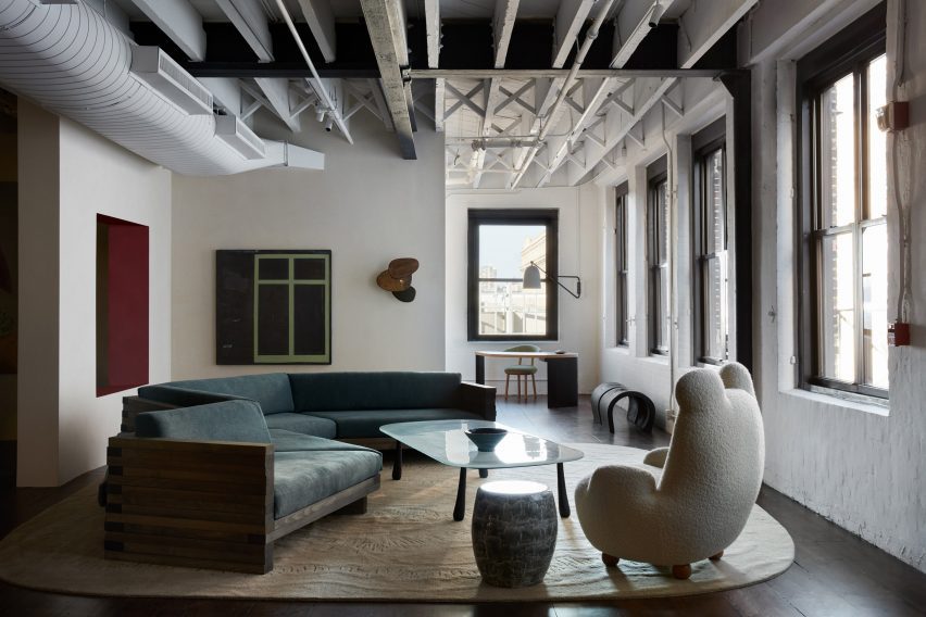
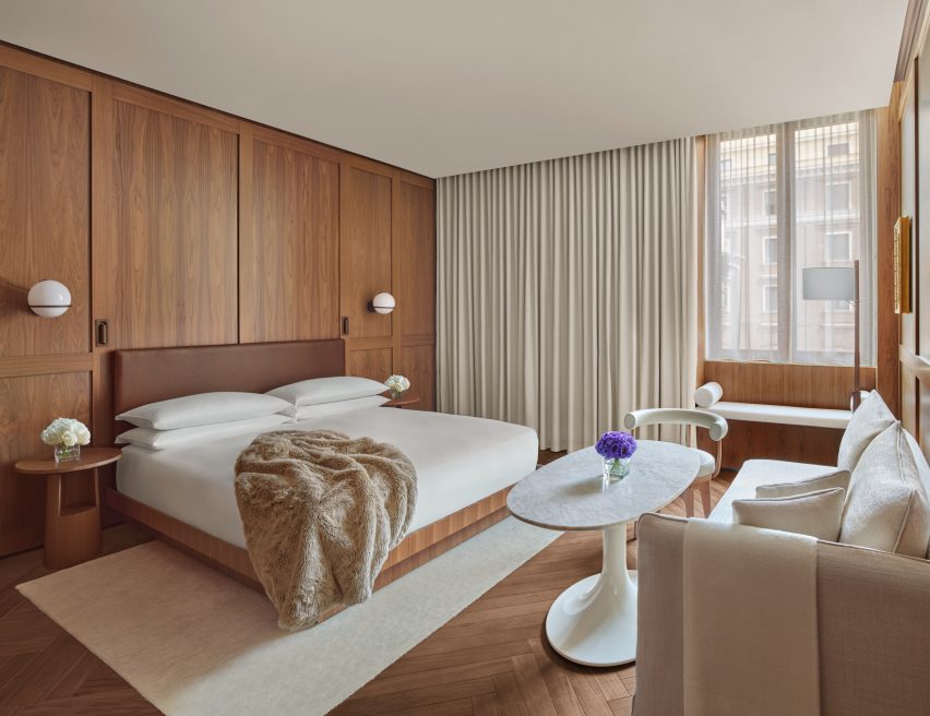
Collectible design gallery StudioTwentySeven has taken over a huge space in a Tribeca textile building, creating a warm and serene environment to present museum-sized, limited-edition pieces.
The gallery’s New York City flagship at the corner of Church and Leonard Streets covers 7,000 square feet (650 square metres) across the ground floor of a 1901 neoclassical building by architect Henry J Hardenbergh.
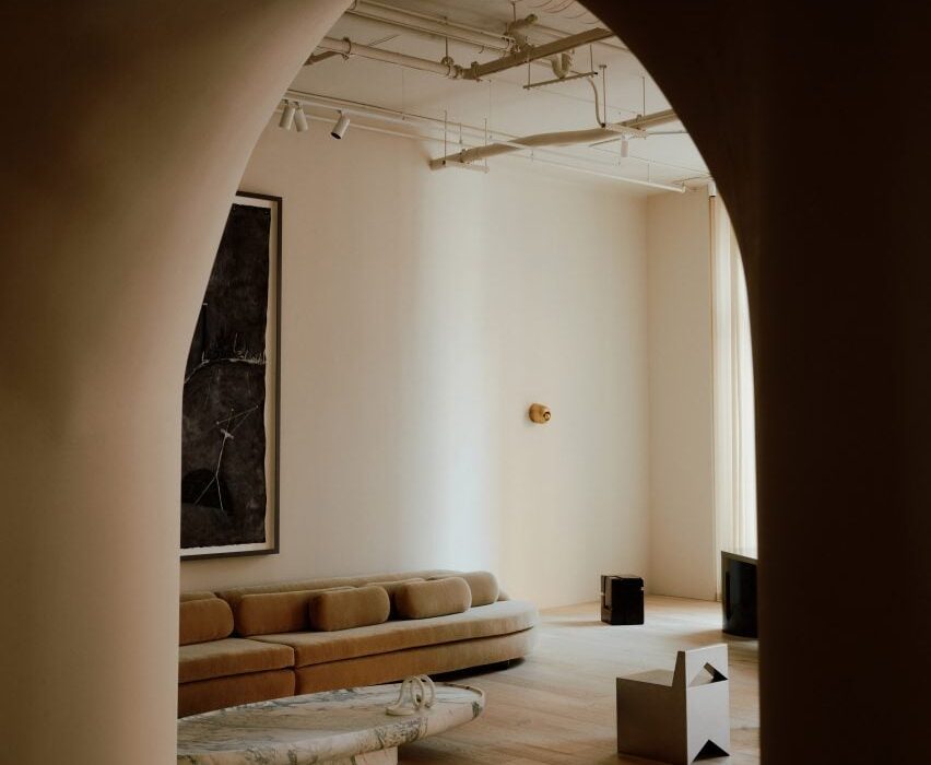
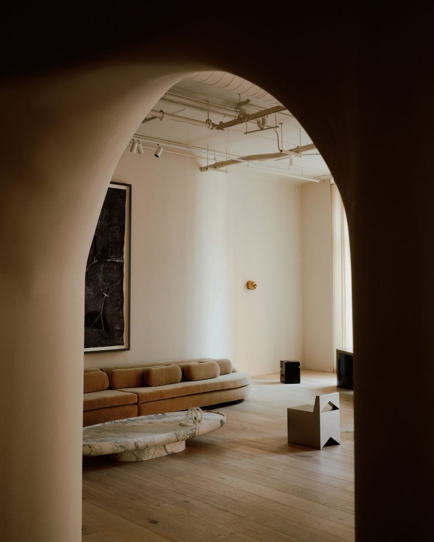
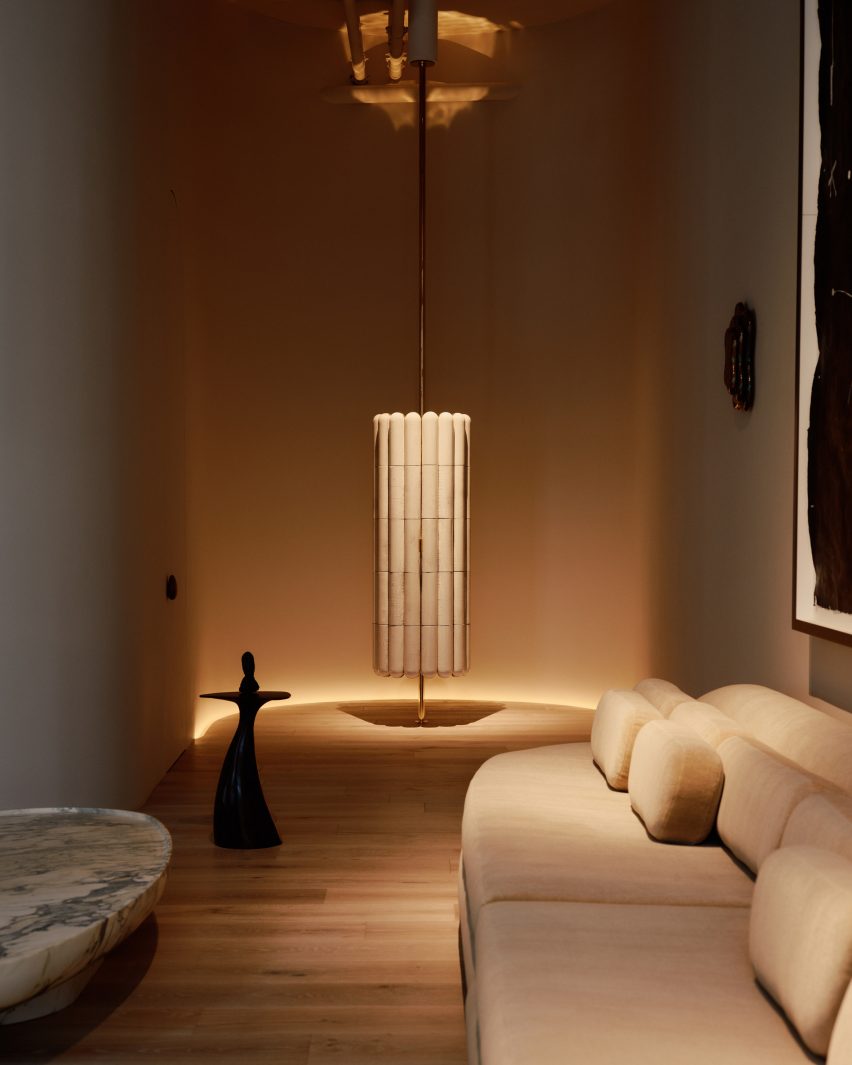
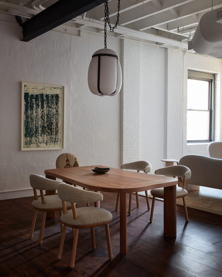
StudioTwentySeven founders Nacho Polo and Robert Onsuka introduced curved walls and archways to the interior of their flagship gallery
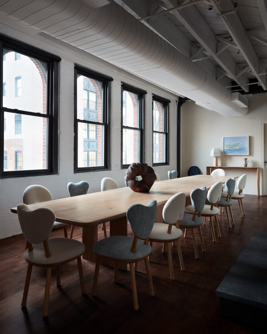
Formerly Jean-Georges Vongerichten’s Restaurant 66, the grand space benefits from double-height ceilings and eight 16-foot-tall windows on two sides, overlooking the mirrored Anish Kapoor sculpture squashed beneath Herzog & de Meuron’s “Jenga Tower”.
StudioTwentySeven founders Nacho Polo and Robert Onsuka, who started their venture in Miami in 2018, chose this location for the New York flagship for its “monumental scale” and ability to showcase huge sculptural works.
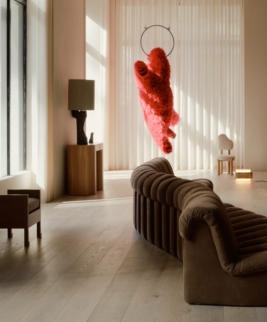
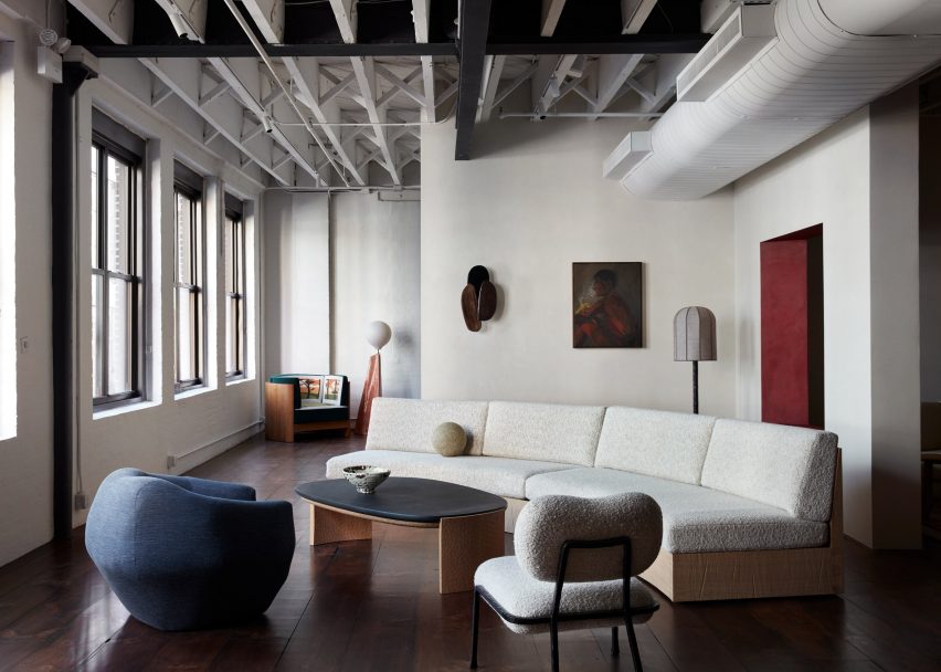
The double-height ceilings allow large-scale pieces to be displayed, like a hanging bear sculpture by Paola Pivi
“The building’s elaborately carved facade, and its stone entry staircase leading to beautifully restored original triple doors, set the tone for what clients of StudioTwentySeven will experience inside – a space that is sophisticated yet genuinely welcoming,” said the duo.
Led by Polo, the renovation of interiors involved the introduction of curved walls and a rotunda, along with an archway fitted with a 12-foot-tall, hand-carved chestnut door.
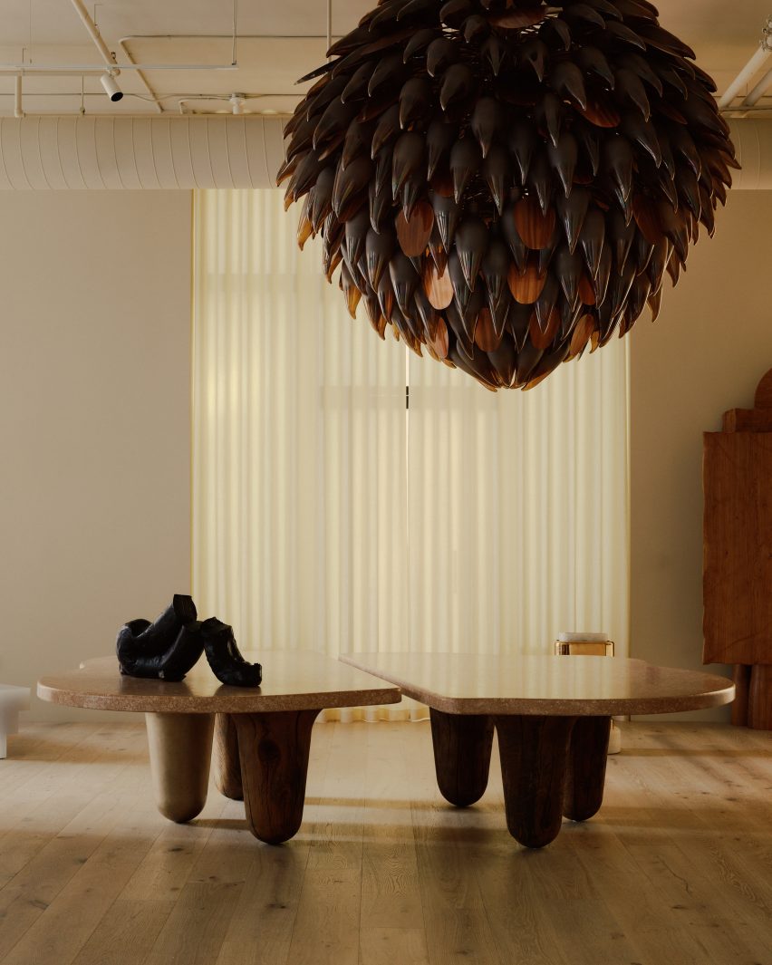
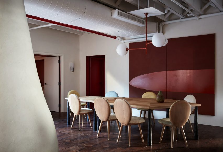
A giant bronze and glass chandelier hangs above an organic-shaped dining table
The team worked with lighting specialists L’Observatorie to design a custom system that imbues the space with a warm atmospheric quality, complementing the pieces on display.
A massive bronze and glass chandelier comprising hundreds of individual petals is suspended above an organically shaped French oak and waxed bronze dining table.
Pale oak floors run throughout the gallery, in places separated from the walls by glowing bands of light, and sheer curtains diffuse the abundance of natural light that enters during the day.
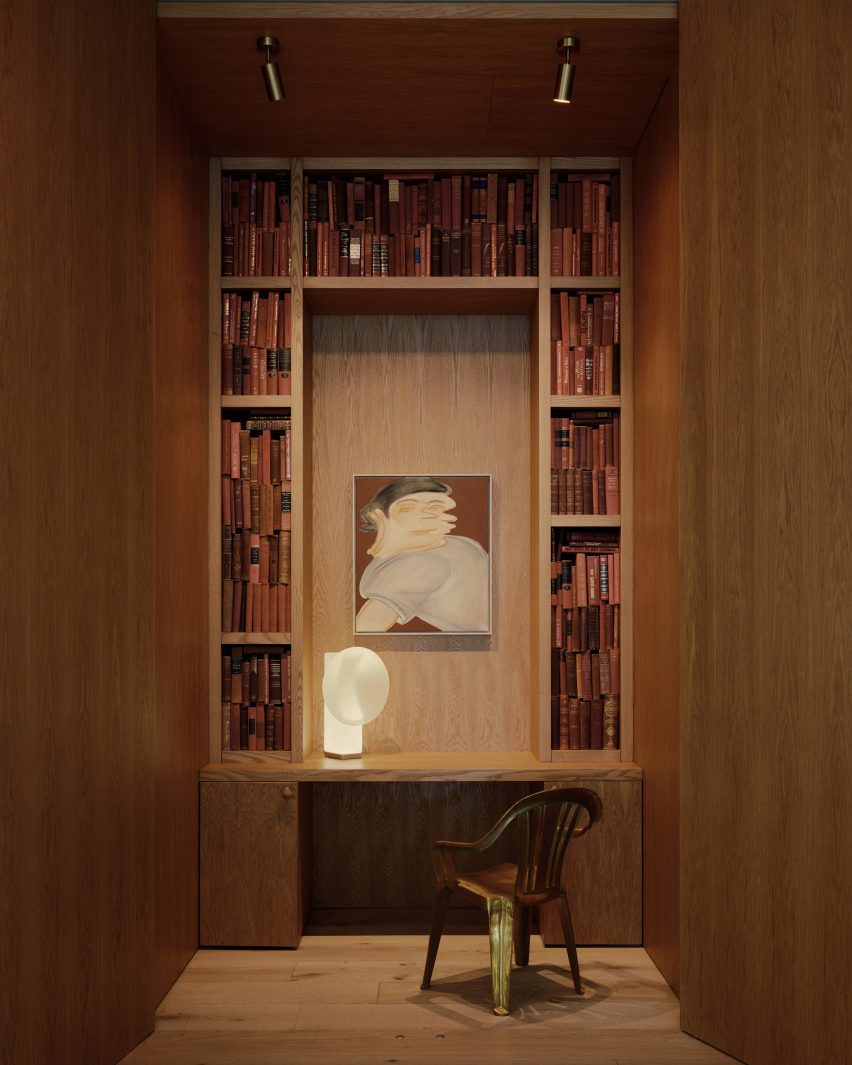
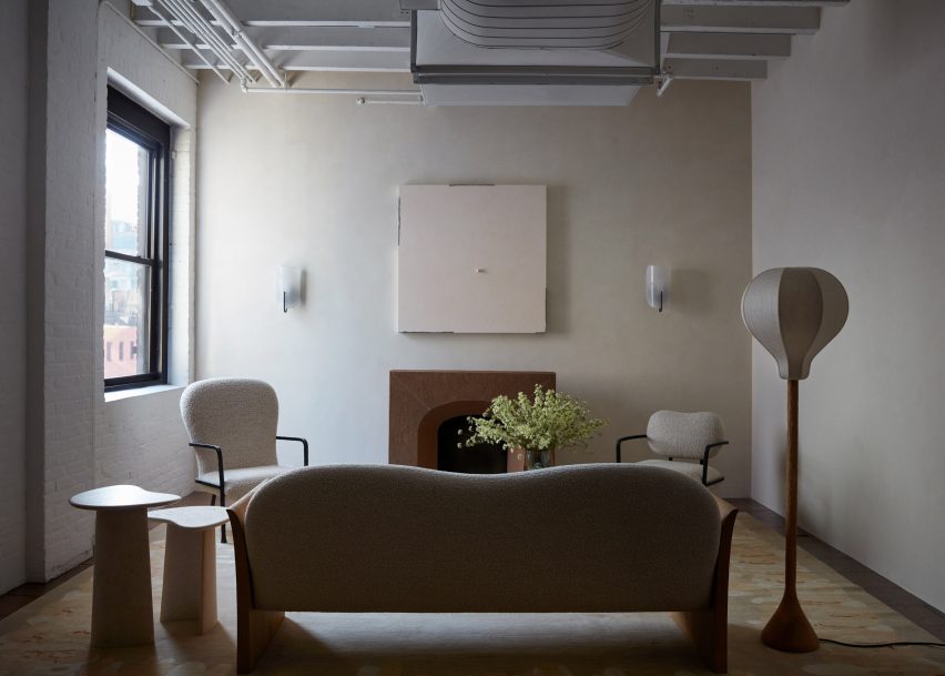
Other architectural details include a tall fireplace shaped into the hand-plastered walls and a chestnut-lined library hidden behind a pair of discreet doors, designed to “create moments of surprise”.
The founders also created a rotunda space for displaying specific pieces
For the gallery’s opening in February 2023, several museum-sized works from Polo and Onsuka’s private collection were installed in the space.
These include a hanging bear by Italian artist Paola Pivi, which had to be transported from the Aspen Art Museum in a special truck, and a bronze sculpture titled Owl and Boy by Japan-based Otani Workshop.
“Moments of surprise” include a hidden library lined in chestnut
Polo and Onsuka, who were judges for Dezeen Awards 2023, also have gallery spaces in Miami’s Little River and London’s Mayfair – open by appointment only.
Their new flagship in Tribeca joins a multitude of collectible design galleries in the Downtown NYC neighbourhood, like R & Company and Egg Collective, where expansive former industrial lofts provide ideal settings for presenting furniture, lighting and art.
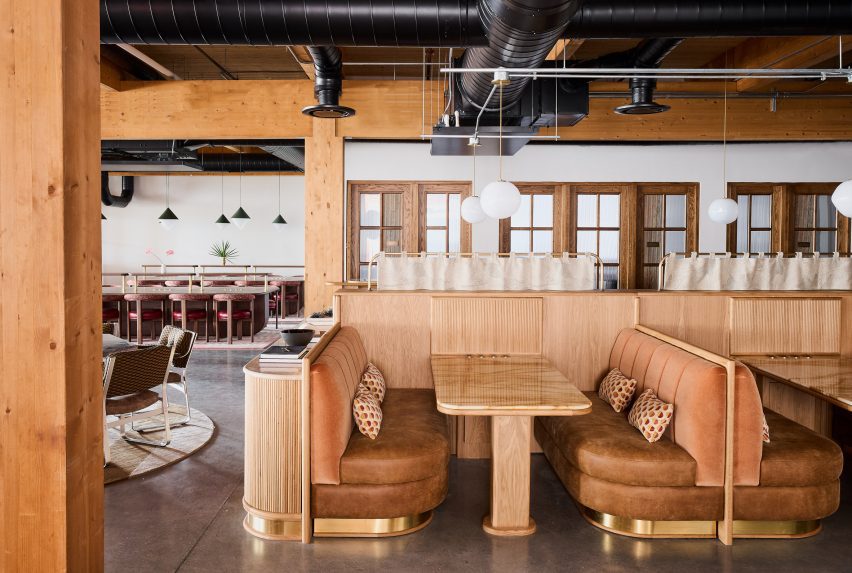
The Malin has designed its work-oriented member’s club in Nashville, its first outside of New York City, with an earthy colour palette and a mix of vintage and contemporary furniture to give it a hotel-like feel.
Located in the Wedgewood Houston neighbourhood, The Malin is one of a number of creative businesses within the Nashville Warehouse Co, which claims to be the city’s “first large-scale mass-timber building”.
The mass-timber structure of the Nashville Warehouse Co building is visible throughout The Malin’s interiors
The building’s timber structure is highly visible throughout the interiors, and the pine ceilings and deep beams add to the warm, earthy palette of the various work areas.
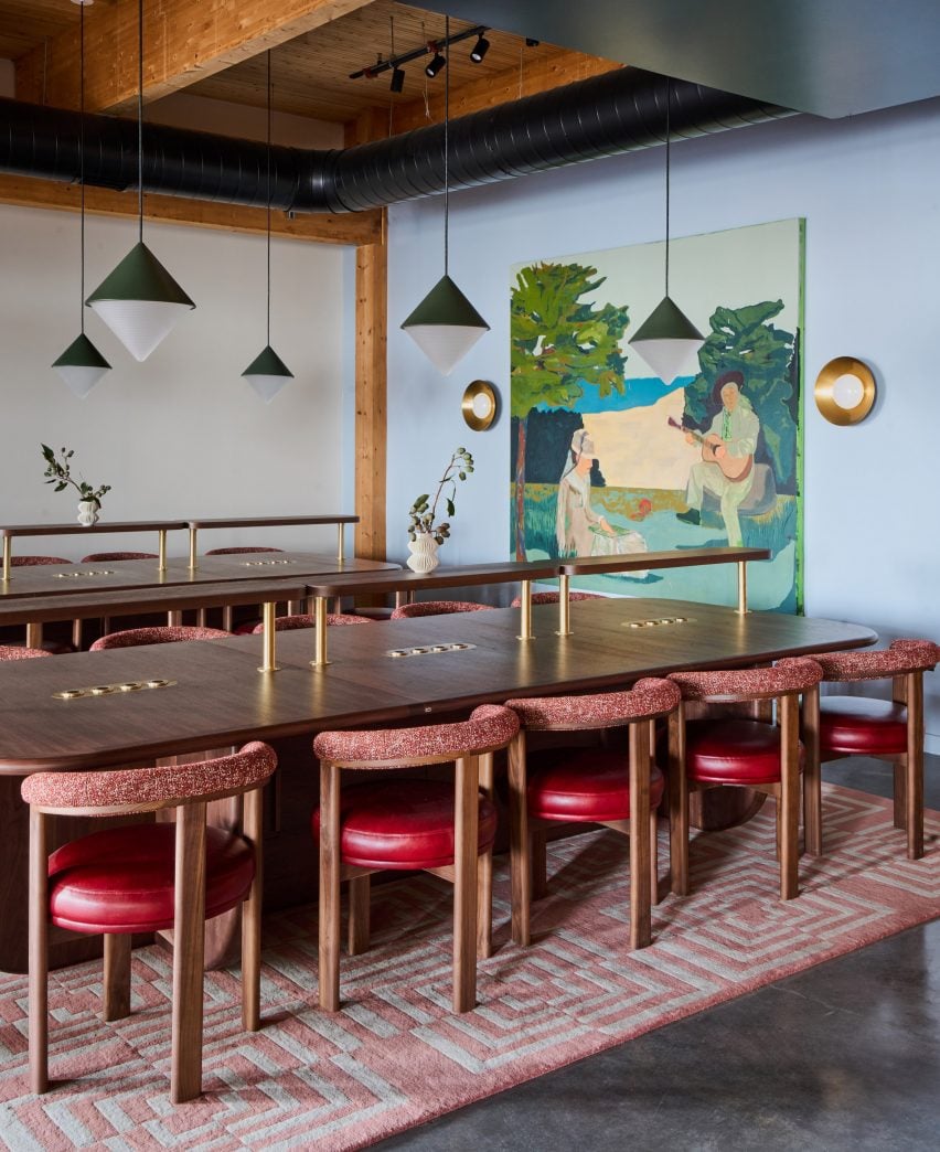
Designed by The Malin‘s in-house team, the club encompasses 16,000 square feet of space that encompasses 48 dedicated desks, seven private offices, five meeting rooms and two libraries.
Wood varieties including light oak and dark walnut are used throughout the member’s club
All of these rooms feature rich colours and an eclectic mix of vintage and contemporary furniture, intended to feel more like a hotel than a co-working space.
“We’re in the hospitality business, so we carefully tailor each location of The Malin to fit the needs of the neighbourhood and professional community,” said The Malin founder and CEO Ciaran McGuigan. “Not only are we providing the highest level of hospitality, but we’re doing it in a refined and beautiful space that contributes to a productive workflow.”
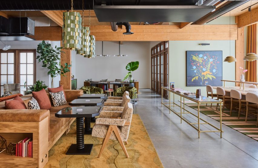
The club offers both dedicated workspaces and casual areas for members to meet and relax
The design team decorated The Malin Wedgewood Houston with deep-toned Benjamin Moore paints, Schumacher wallpapers and glazed zellige tiles, while bespoke millwork is executed in dark walnut and white oak.
A variety of formal and casual seating areas are available for members to utilise as desired, either for individual or group work, or entertaining guests.
Sofas, communal tables and banquettes are all available for use as desired
Large communal tables accompanied by cushioned tubular metal chairs, sofas and armchairs with brightly coloured velvet upholstery, and cafe tables beside leather banquettes are among the options available.
Surfaces of limestone, travertine and multiple varieties of marble – including Giallo Siena, Irish Green, Onice Brecia and Aresbecator Oribico – complement the wood tones and colourful furniture.
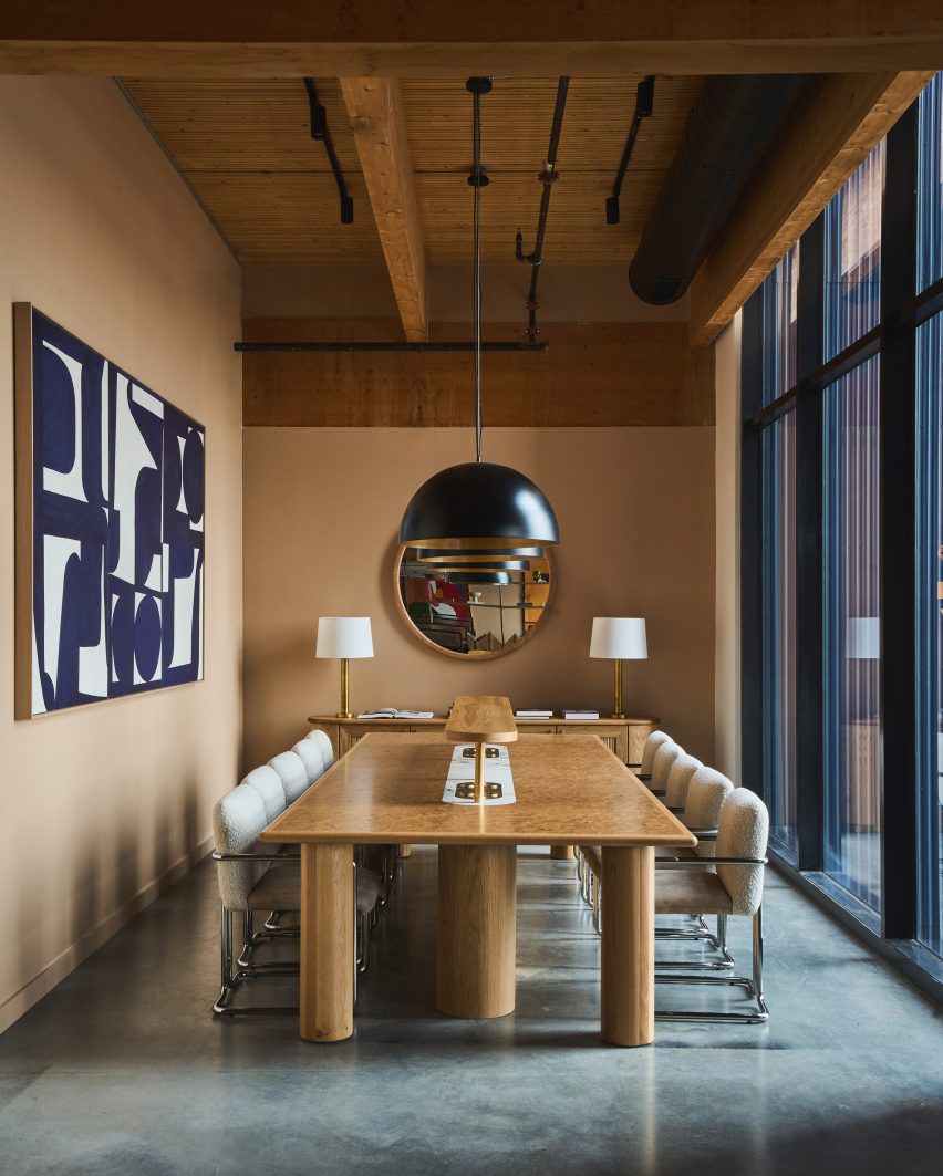
Private meeting rooms are similarly designed to look more like a hotel than an office
Members also have access to an acre of outdoor community park space for hosting events, and receive discounts and perks at several neighbourhood hotspots.
“The Malin is committed to providing an environment equipped with personalised services and high-touch amenities,” said the team. “In catering to a tight knit community with a finite number of members, The Malin is able to provide tailored lifestyle management services while offering both the comforts of a home and the resources of an office.”
The Malin’s first location in Manhattan’s Soho, which opened in 2022, was longlisted in the small workspace interiors category of Dezeen Awards 2022.
The company has since added spots in Williamsburg and the West Village to its portfolio, making The Malin Wedgewood Houston its fourth.
The colour scheme throughout the club is warm and earthy, aided by richly toned upholstery and deep paint hues
Long-known for its thriving music scene, Nashville is now quickly growing as a destination for other creative industries.
Recent openings in the city include an outpost of members’ club Soho House – just down the street from The Malin – and a multi-venue dining and drinking destination designed by AvroKO and owned by Sam Fox and Justin Timberlake.
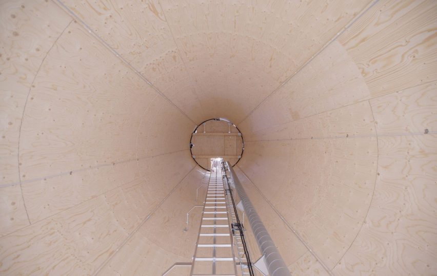
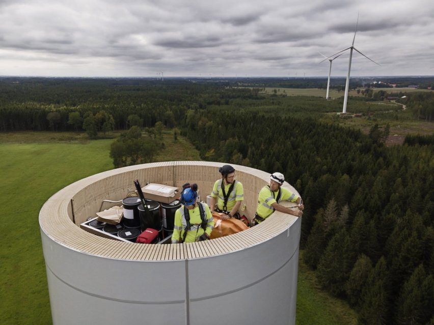
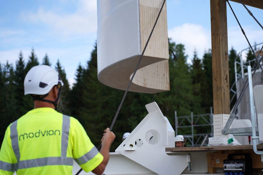
The world’s first full-scale timber wind turbine has started turning in Sweden, with a tower built by wood technology company Modvion.
The 105-metre-tall tower, located in the region of Skara, is Modvion‘s first commercial wind turbine tower, and follows on from a smaller 30-metre-high demonstration project the company completed in 2020.
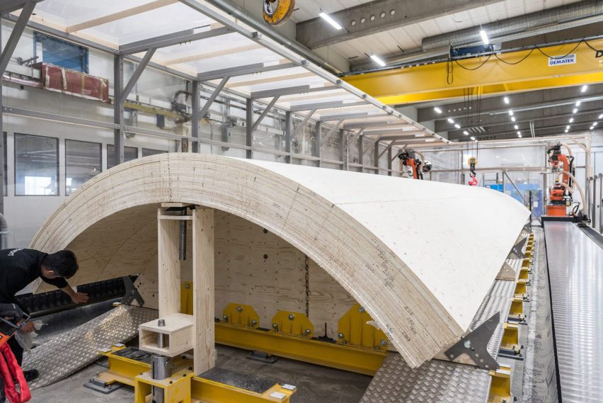
While its rotor blades and generator hub are made of conventional materials, the tower is made of laminated veneer lumber (LVL), a type of engineered wood made of thin veneer strips glued together and often used for beams and load-bearing building structures.
The tower of a wind turbine in Skara is made of engineered wood
The company says that this type of wood is not only strong enough to withstand the forces of a turning turbine, it is much more environmentally sustainable to build with than the currently used steel.
While wind power plays an important role in providing the world with green renewable energy, there are still ample carbon emissions created during their construction — in part because of the steel towers.
Modvion describes its wood towers as reducing the carbon emissions from wind turbine construction by over 100 per cent, due to the combination of a less emissions-heavy production process and the carbon storage provided by trees.
“Our towers, just in the production of them, they emit 90 per cent less than a steel tower that will do carry the same work,” Modvion chief financial officer Maria-Lina Hedlund told Dezeen. “And then if you add the carbon sequestration, then you actually end up with a minus — so a carbon sink. This is great if we want to reach net zero energy production, and we need to.”
The type of wood used is laminated veneer lumber
Hedlund, who is also an engineer, describes LVL as having a construction “similar to carbon fibre”, with strips of veneer just three millimetres thick sandwiched and glued together, giving it a high strength-to-weight ratio.
This lightness is a benefit, reducing the amount of material needed overall. With a heavy material, there is a “bad design spiral”, says Hedlund, as the weight of the tower itself adds to the load that it needs to carry.
And while some LVL has all their veneer strips facing in the same direction, Modvion uses its “own recipe” specifying the directions of the fibres, improving the material’s performance even more.
The turbine tower is the tallest so far built by Swedish company Modvion. Photo by Paul Wennerholm
The production process involves timber boards being made to order in a standard LVL plant and then delivered to Modvion’s factory. There, they are glued together into larger modules and bent into a rounded form in a step called lamination, and then very precisely machined to fine-tune the shape.
“In the wood industry, you usually see centimetre tolerances, while we are in the sub-millimetre scale,” said Hedlund.
The modular nature of LVL construction addresses another problem Modvion has observed with steel: that with turbines getting ever bigger to give more power, it’s becoming impossible to transport steel towers to site.
They are built as essentially large cylinders and transported by truck, but the base diameter desired for the tallest towers is getting to be taller than some bridges and roads can allow.
The timber is laminated into modules at Modvion’s factory
“We’re now reaching a point where they will not get through anymore,” said Hedlund. “So we will see a transition in the wind power industry to modular construction, because this is the way to get them there. And one of the big advantages of building in the material we do is that it’s naturally built modular.”
While steel could also be built modular, it would require bolts rather than glue to join it together on site, which Hedlund says is a disadvantage.
“Bolts are not very nice when you have so much dynamic loading, because it will loosen over time,” she said. “So first of all, you have to have to put them in place which is a lot of work, and then you have to also service them over the lifetime.”
The modules were assembled and glued together on site
On the outside, the tower has a thick white coating that makes it look similar to steel, and it’s rotor blades and generator hub, which are not supplied by Modvion, are made of conventional materials like fibreglass. This may change in the future, however, with another company, Voodin Blades, working on the technology for wooden blades.
Modvion was founded in 2016 by university peers David Olivegren and Otto Lundman. While its current focus is wind turbines, it is dedicated to wooden technology more broadly, and Hedlund told Dezeen that the team believes it has “the world’s strongest joint for timber construction”, which could also be put to other uses.
Another recent milestone for wind power came in the form of a wind-powered cargo ship, which had been retrofitted with two 37.5-metre-tall sails.
French designer Pierre Yovanovitch has opened his first US showroom and gallery in Manhattan’s Chelsea neighbourhood, displaying over 80 pieces from his own furniture brand.
Recognisable designs including the iconic Bear Chair fill the 10,000 square feet (930 square metres) of gallery and office space on the penthouse level of 555 West 25th Street.
Pierre Yovanovitch chose a penthouse in a pre-war building for his New York gallery
This business expansion offers a permanent base for Yovanovitch and his team in New York, and allows customers and clients from his largest retail market to see the Pierre Yovanovitch Mobilier products first-hand.
“Having worked on residential projects in the US since the beginning of my practice in 2001 and with two successful furniture collection debuts (2017 and 2019) in New York, the opening of my first gallery space in America and new official New York headquarters, is a long-awaited realization for me,” said Yovanovitch.
The exposed ceiling beams, whitewashed brick and dark wood floors are all typical of a New York loft
Inside the pre-war building, the gallery unfolds through a series of partial rooms that flow into one another without doorways or thresholds.
Throughout, exposed ceiling joists and ductwork are paired with dark wood flooring and whitewashed brick, typical of a New York loft space.
The gallery is laid out as a series of residential-style vignettes, which flow into one another
The largest display area centres around a sculptural fireplace, with a smooth plaster form that curves outward towards the base.
Furniture is oriented around the hearth, including a gently arced sofa and a chartreuse-toned resin coffee table, accompanied by the fluffy wing-backed Clifford armchair.
Yovanovitch curated a selection of artworks to accompany his furniture pieces
A variety of lounge and dining room vignettes showcase the products in suggested combinations with one another in residential-style layouts.
Other designs on show include the new Callis Table Lamp, the Roze Dining Table, the Arthur Sofa and the Artemis Rug.
A variety of signature furniture and lighting designs are on display alongside new pieces
All are made in collaboration with specialist craftspeople and are “created with longevity and exceptional quality in mind” according to the brand.
“The brand pays homage to Yovanovitch’s Provencal roots, in particular the region’s natural light, rich and varied natural materials and colourways of the surrounding nature, as well as the historic commitment to craft associated with the region,” said a statement from the gallery.
The wide array of furniture and lighting pieces are presented alongside a selection of contemporary art curated by Yovanovitch – including works by Camille Henrot, Wolfgang Tillmans and Alicja Kwade – in an attempt to tie the gallery in with Chelsea’s status as an arts destination.
“It seems only fitting to open my first gallery location in the epicenter of New York’s art scene,” he said. “Not only is contemporary art central to my design practice, the neighborhood’s architectural history serves as reflection to my approach of revitalising historic spaces to fit a contemporary design aesthetic.”
All of the Pierre Yovanovitch Mobilier products are “created with longevity and exceptional-quality in mind”
The New York gallery opening follows the debut of the brand’s new Paris showroom, which began welcoming visitors to a street-level space in the Marais neighbourhood from October 2023.
This move from the previous location in the 2nd arrondissement also strategically places Pierre Yovanovitch Mobilier amongst the city’s art galleries.
A sculptural fireplace anchors the largest area, accompanied by Yovanovitch’s Clifford chair
Yovanovitch founded his design practice in 2001 after working for fashion house Pierre Cardin. His interior design work has ranged from the salmon-pink and butter-yellow gift shop at Villa Noailles and ski hotel Le Coucou in France, to the high-end Hélène Darroze restaurant at The Connaught in London and ski hotel Le Coucou.
Earlier this year, the designer created a set with moving elements for Verdi’s Rigoletto at the Basel Opera.
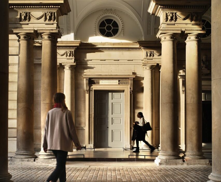
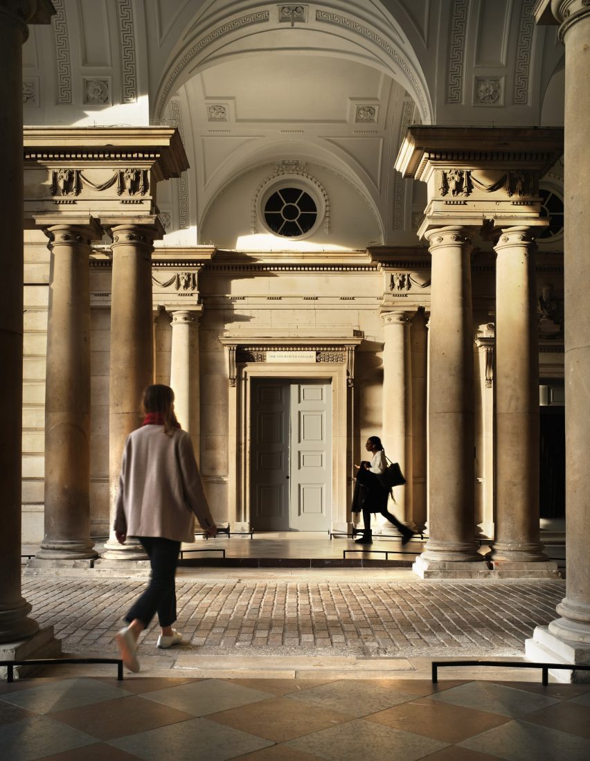
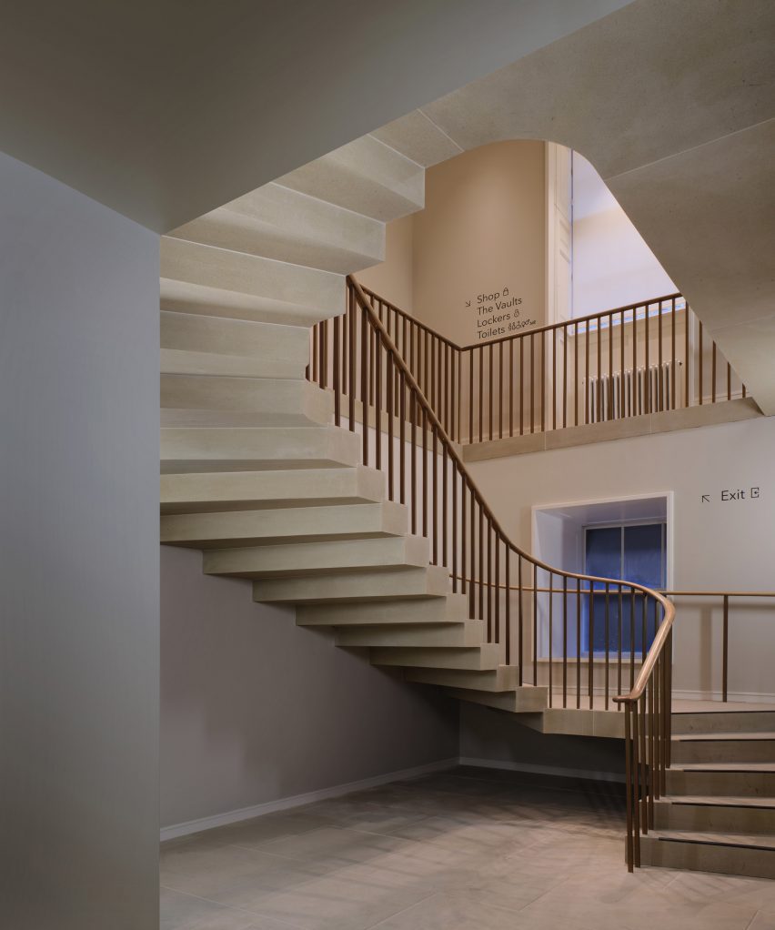
Architecture studio Witherford Watson Mann balanced “studious conservation and bold intervention” for its redevelopment of the historic Courtauld Institute of Art in London.
One of six projects shortlisted for the RIBA Stirling Prize 2023, the three-year project to update The Courtauld Gallery completed at the end of 2021 and marks the first phase of a wider scheme transforming the Grade I-listed Somerset House complex.
Witherford Watson Mann renovated the Courtauld Institute of Art
Supported by £11 million from the Heritage Lottery Fund, the transformation programme seeked to open up both spatially and culturally the “idiosyncratic” site that has been its home since the 1990s.
Former Stirling Prize winners Witherford Watson Mann sought to clarify the building’s spaces and circulation while maintaining its historic character, combining more subtle modifications in the galleries with a number of more extensive alterations.
Brick salts have been opened up
“[In the galleries], many may struggle to identify specifically what has changed: and yet there was barely a room, door, floor or cable that was not altered,” said director Stephen Witherford.
“The project preserves the institution’s rich past whilst securing its future.”
The environmental performance of all gallery spaces was improved
Improving the accessibility and arrival sequence into the gallery was a priority, and its main entrance off the Strand now features a ramp created by both re-using and matching the existing stone paving.
Previous gallery rooms were cleared to create a larger reception area, where a new stone staircase and lift provide clear circulation between floors.
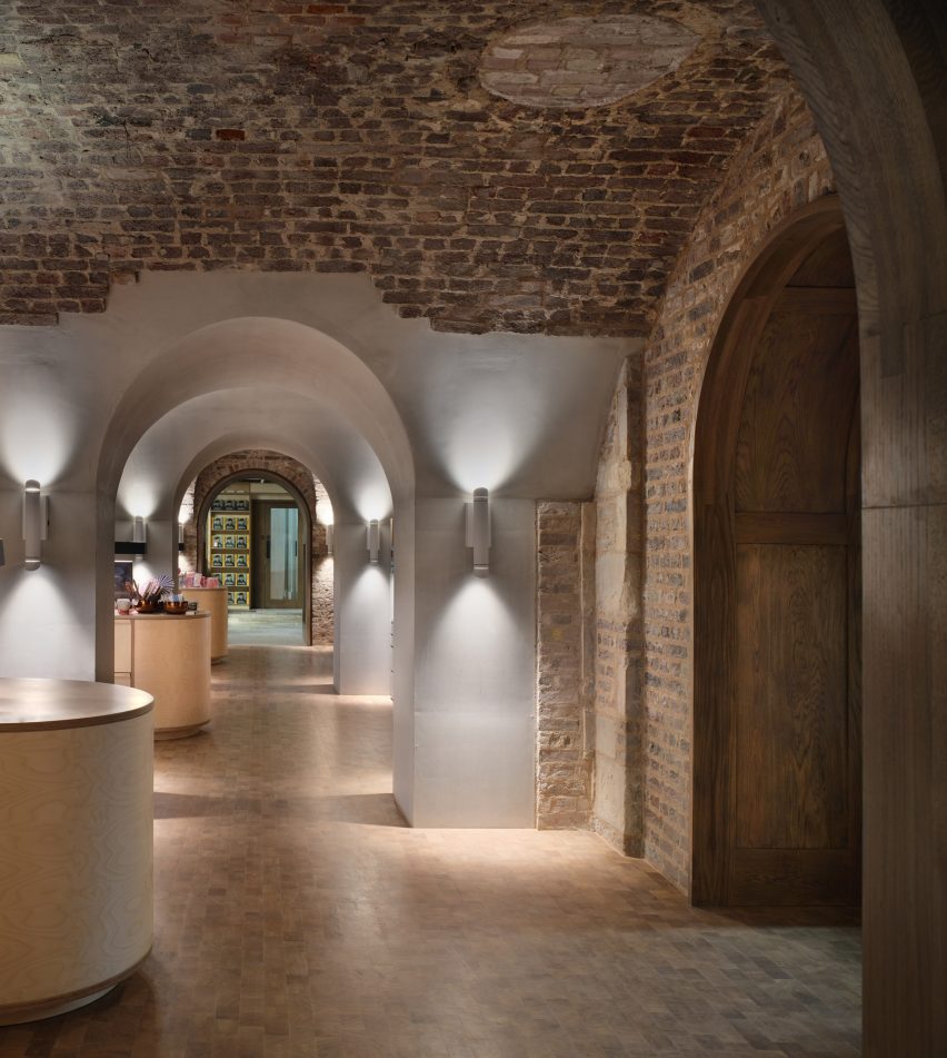
Beneath the building, a series of brick vaults previously inaccessible to the public have been cut through with a series of concrete-framed openings, providing an entirely new way to traverse the site.
Currently home to the gallery’s shop, these vaults will eventually form a connection through to the Courtauld Institute’s student areas, which are to be upgraded during the wider project’s second phase.
The project is shortlisted for this year’s Stirling Prize
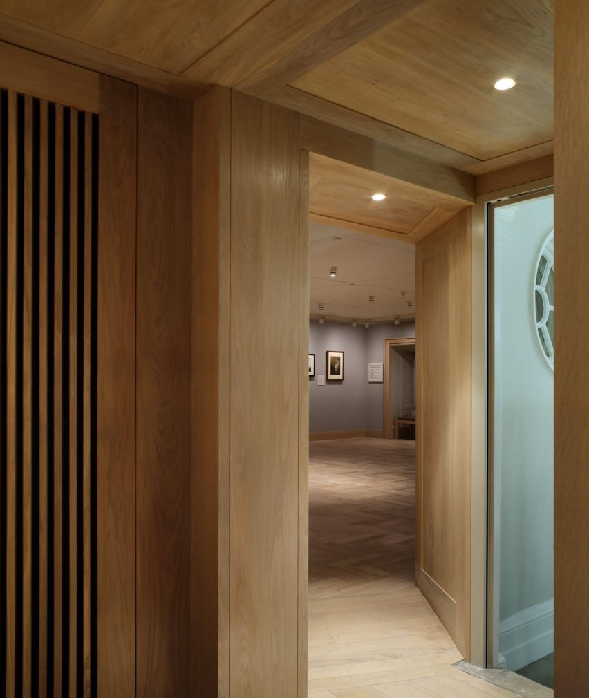
Above, alongside gallery spaces for the Courtauld’s permanent collection, new spaces were created for temporary exhibitions, as well as a learning studio for families and young people, a lecture room and an object study room.
On the top floor is the skylit Great Room – London’s oldest purpose-built exhibition space – where previous subdivisions have been stripped away to restore its original nature as a dramatic, single space.
In all of the gallery spaces, the insertion of new ducting, ventilation grilles and lighting has improved the building’s environmental performance, as well as conditions for both the artworks and visitors.
“The physical alterations are now beginning to support a change of culture,” says Wilford.
“Visitor diversity has increased, along with visitor numbers; school groups are making full use of the first onsite learning centre; and student initiatives and wider partnerships are reshaping the programme.”
“Altering buildings doesn’t change institutions on its own, but it can support their democratisation,” he added.
Witherford Watson Mann previously won the Stirling Prize in 2013 for their refurbishment of Astley Castle, which also involved the careful reconfiguration of a historic built fabric.
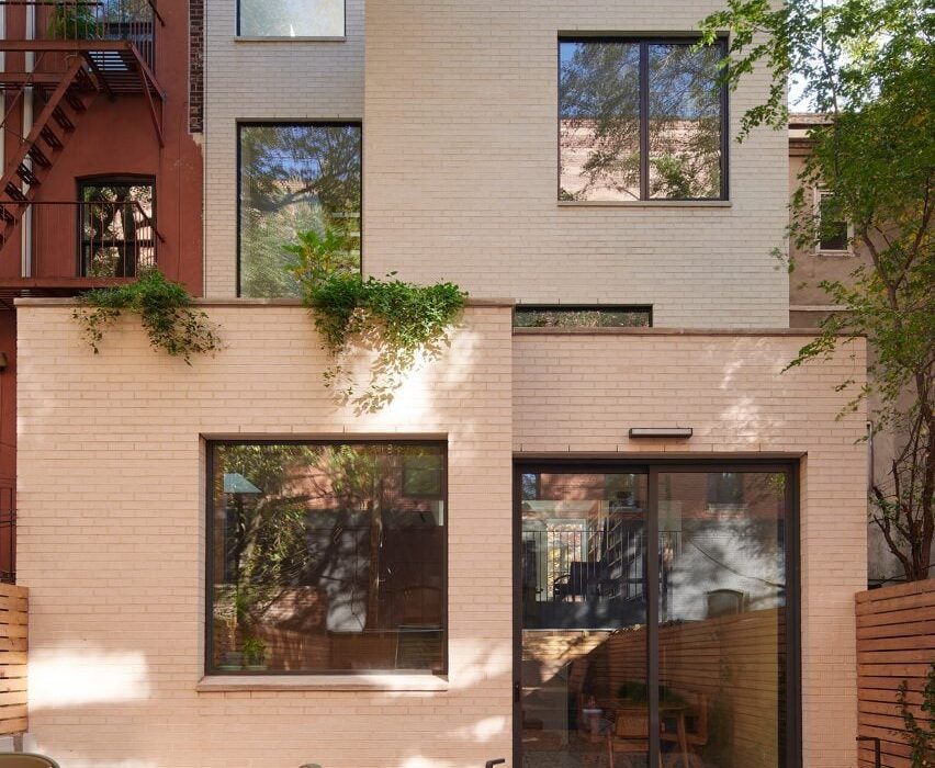
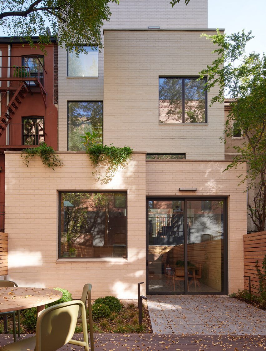
Local studio Light and Air has introduced a light-filled void at the centre of a Brooklyn townhouse as part of a major reconfiguration and extension project.
The home in the leafy Clinton Hill neighbourhood was bought by a family of four with roots in India and required a complete gut renovation to open up the spaces to the outside.
The overhaul of Z House involved a significant rear extension, comprising cube volumes clad in pale brick
“They wanted a house that exhibited a strong connection to nature, featuring a more seamless integration between inside and out,” said Light and Air.
The project involved extending the building one level vertically, bringing its total number of storeys to four, as well as pushing it out significantly at the back.
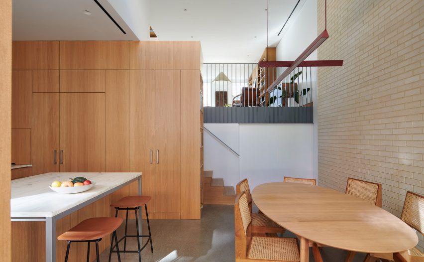
The brick continues into the kitchen and dining area on the lower floor
While the historic front facade was carefully restored, the rear elevation now presents as a contemporary stack of pale-brick cube volumes.
The interior was completely reorganized to allow sightlines between the original spaces, the new extensions and the outdoors.
Oak millwork in the kitchen continues through the minimal interiors
The most dramatic change involved swapping the stacked staircase with a switchback configuration – a similar approach taken by the studio at another Brooklyn townhouse in 2018.
This arrangement allows for improved visual connections between the levels and gave the project its name, Z House.
Reconfiguring the house involved swapping the stacked staircase for a switchback arrangement from the parlour level to the top floor
In addition, an angled skylight was added above the staircase void, bringing in light all the way down to the parlour 40 feet (12 metres) below.
“Filled by light and air, the stair’s drama is heightened by the placement of large windows punctuating the rear facade, allowing the vertical space to open to the exterior,” said the studio.
A skylight over the staircase void brings light down into the home
Of the home’s four storeys, the lower levels are occupied by the public spaces including the kitchen, dining, living and media rooms.
The top two levels are reserved for the children’s rooms and the primary suite respectively. The uppermost floor also accommodates a home office and provides access to a roof terrace created by the rear extension.
“This private, elevated, exterior space offers a unique domestic experience not typically found in most Brooklyn rowhouses,” Light and Air said.
Interiors throughout are clean and minimal, with white walls and custom oak millwork, built-ins and furniture.
The primary bedroom on the top floor features a custom oak bed and built-ins
The pale brick of the rear facade is also expressed inside the double-height kitchen and dining area, which is open to the back patio.
“Located above the garden level addition is a green roof that buffers sightlines from the parlor floor, creating the effect of a floating garden beyond,” said Light and Air.
The historic street facade of the Clinton Hill townhouse was also restored as part of the renovation
Founded by Shane Neufeld in 2017, the studio has completed a variety of interior design projects across New York City.
These include a Brooklyn apartment retrofitted with ample custom cabinetry and a spiral staircase and a Financial District loft where partitions were removed to create an open, inviting space.
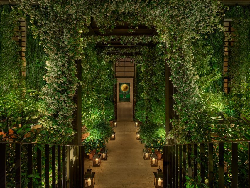
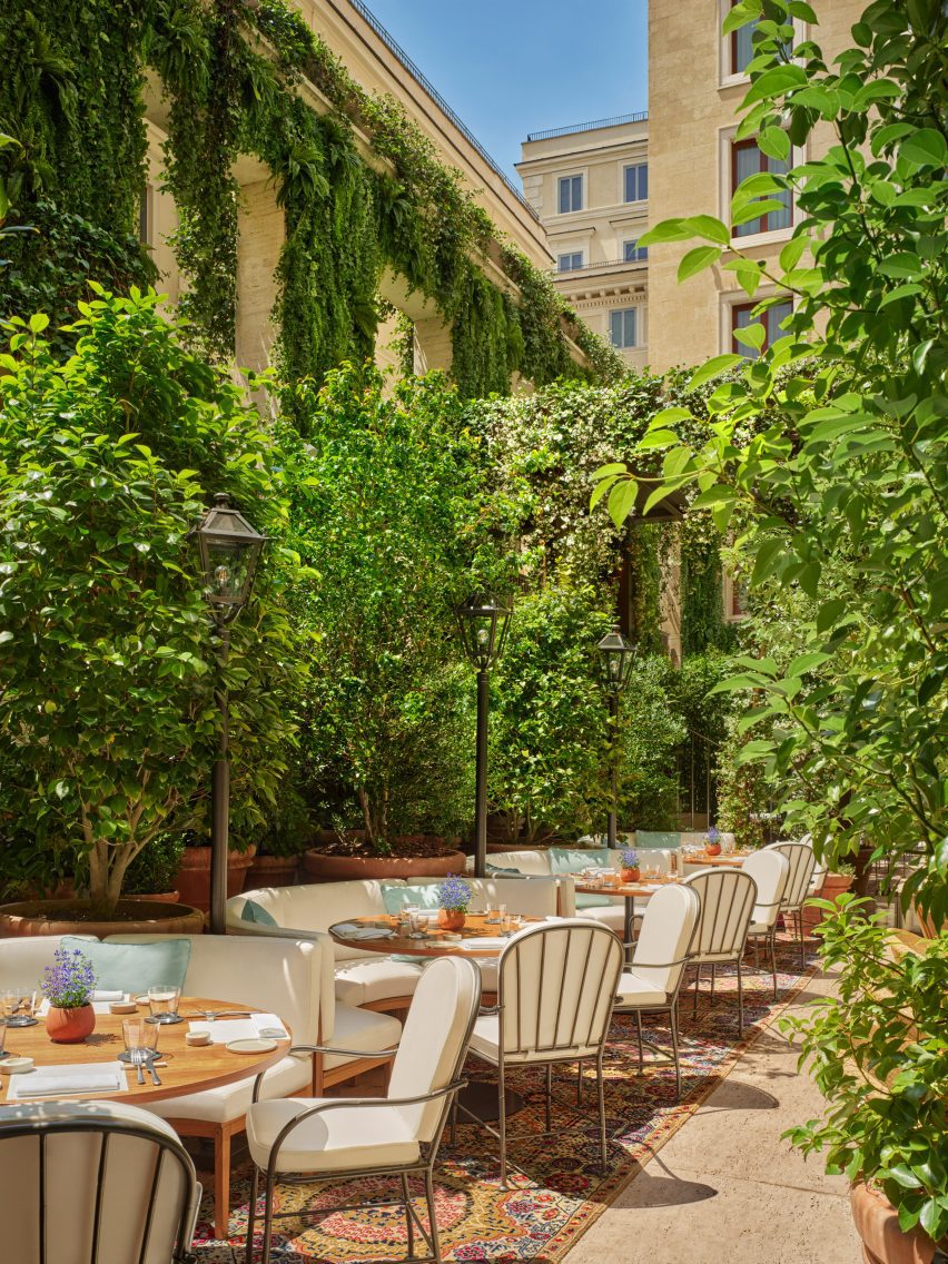
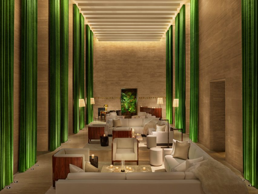
American entrepreneur Ian Schrager’s The Edition group has landed in Rome, opening a hotel in a converted bank that makes use of its soaring lobby, original marble staircases and hidden front courtyard.
The Rome Edition began welcoming guests earlier this year to the 91-room hotel, located a block away from Via Veneto – the street that was immortalised in the 1960 movie La Dolce Vita.
Arrival to The Rome Edition is via a path under a bronze pergola that leads to the lobby
Schrager and his in-house team spearheaded the renovation of the grand building, utilising many of the original features including a cipollino marble staircase, central courtyards, statues and lamps.
“Built in the 1940s and formerly occupied by one of the main Italian banks, the building is a striking example of the rationalist style and was created by Cesare Pascoletti in collaboration with the famed architect Marcello Piacentini,” said The Edition team.
The plant-filled, sunken courtyard acts as an all-day lounge and dining spot
Unusually for Rome, arriving guests are escorted through a sunken garden “piazza” – which acts as an outdoor lounge, restaurant extension and gathering place – before reaching the lobby.
Once inside, dramatic seven-metre-high ceilings, full-height windows and green curtains, and travertine floors and walls set the tone for The Edition’s signature brand of soft minimalism.
The dramatic hotel lobby features seven-metre-high ceilings and full-height green curtains
Symmetrical arrangements of custom white furniture and low coffee tables exaggerate the strict geometry of the architecture.
“The lobby is Edition at its most dynamic,” said the team. “It is a place to relax and make merry; a place to see and be seen or play a few games of pool on the custom-made table.”
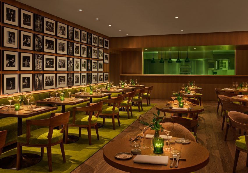
The Amina restaurant is divided into two dining spaces, one of which is accented with chartreuse-coloured upholstery and carpet
For the hotel’s signature restaurant, Anima, the team partnered with local chef Paola Colucci on a menu that puts a modern spin on family recipes and traditional Roman dishes.
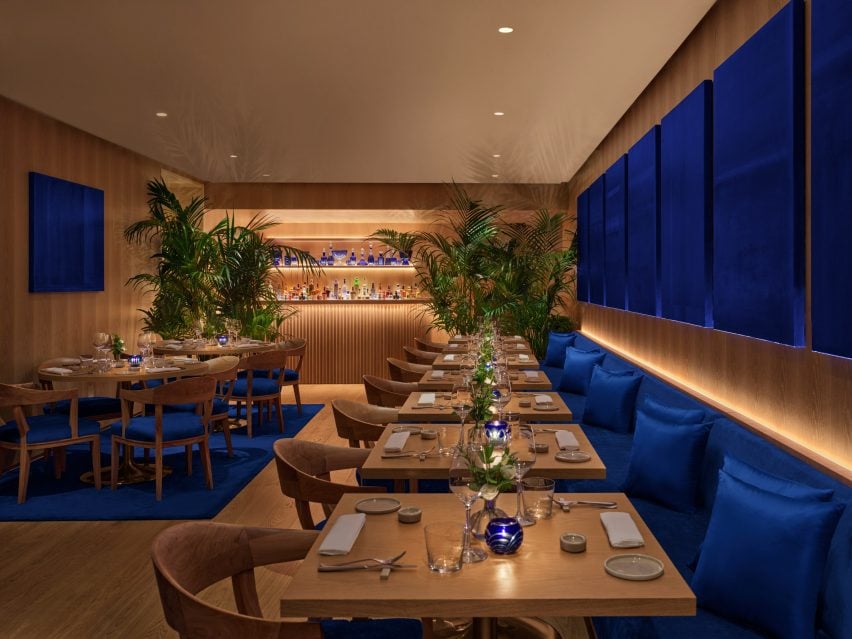
Amber glass separates the kitchen from the two dining areas, one with chartreuse-toned accents across furniture and artwork, and the other blue.
The restaurant’s second dining space is decorated with blue accents
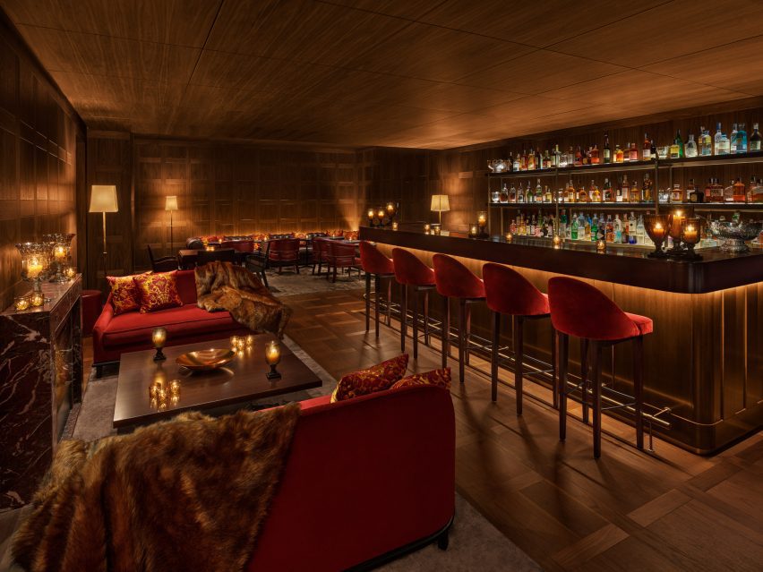
The various bar areas on the lobby level each provide guests with a experience. The Punch Room is a concept borrowed from other Edition properties including another recent opening in Tampa and occupies a cosy room with warm wood panelling and deep red tones, for sharing bowls of punch – a 17th-century tradition that’s been given a contemporary spin.
A dark walnut bar, Rosso Levanto marble fireplace, dark pink velvet sofas, and custom armchairs in rosewood and dark brown leather all add to the cosy atmosphere in the dimly lit space.
Off the lobby, The Punch Room bar is lined in walnut and includes dark pink velvet furniture
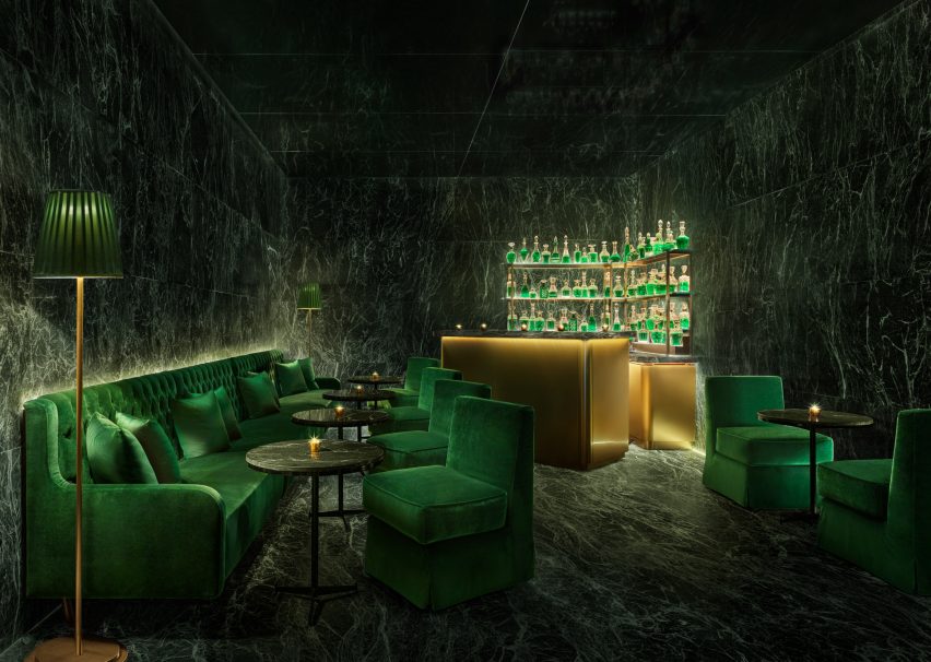
With space for just 10, the intimate Jade Bar features a rotating cocktail menu and is fully lined in deep green antique marble.
This small and dramatic room is furnished with emerald-hued velvet soft seating and satin brass and gold accents – including a wall-mounted sculpture influenced by artist Jeff Koons.
The Jade Bar is wrapped in antique green marble, with emerald seating and brushed brass accents
In the front courtyard, The Garden is filled with over 400 plants and lightly perfumed by the jasmine that climbs over the facade.
A bronze awning divides the outdoor space in two, with an al fresco dining area for Amina on one side, and an all-day casual terrace for cocktails and light bites on the other.
Teak banquettes and free-standing furniture are surrounded by “an Italianate arrangement of lanterns to give it the feel of a traditional Roman garden”.
The roof terrace on the seventh floor features a pool and bar area that offers sweeping views over the Eternal City’s rooftops.
Walnut wall panelling and herringbone floors feature in the bright guest rooms
In the bright guest rooms, walnut wall panelling and herringbone floors are paired with custom beige leather furniture.
Carrera marble basins and brushed brass fixtures stand out against the grey stone bathrooms, and frosted glass partitions are used to conceal showers and toilets.
Carrera marble sinks contrast the dark grey stone in the bathrooms
The Rome Edition is the group’s 16th global property, following locations that include Times Square in New York, West Hollywood in Los Angeles, and Tokyo.
The Madrid Edition, designed with British minimalist John Pawson, was longlisted in the hotel and short-stay interiors category of Dezeen Awards 2022.
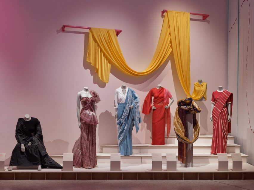
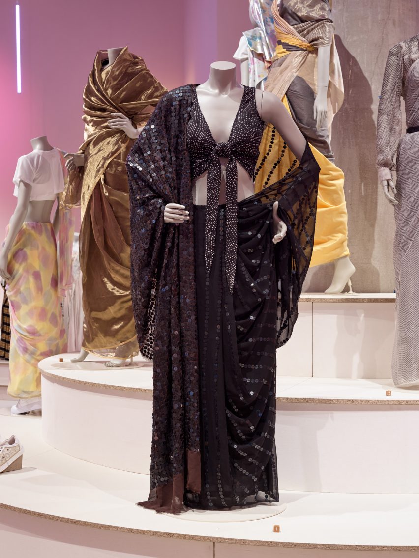
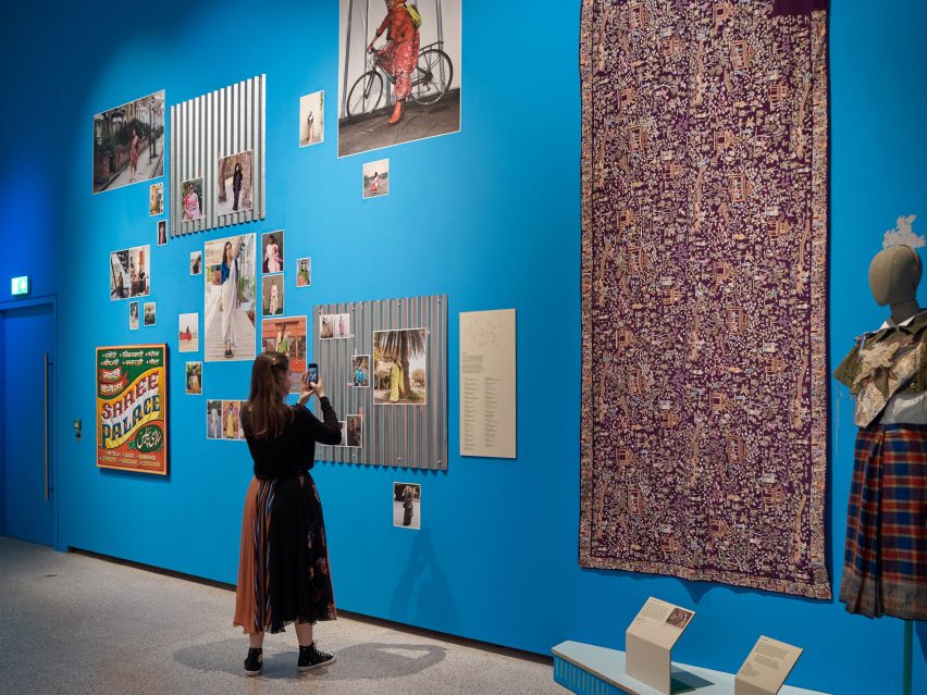
The first sari to be worn at the Met Gala and sequins made from discarded X-ray film sourced from hospitals feature in the Offbeat Sari exhibition, which showcases around 60 contemporary saris at London’s Design Museum.
The Offbeat Sari is the first UK exhibition to explore the contemporary sari, according to the Design Museum. The show opens today in a cavernous space within the museum’s subterranean gallery, illuminated by thin neon pendant lights.
Hailing from India and wider South Asia, a sari is traditionally thought of as an unstitched drape wrapped around the body from shoulder to waist.
The Offbeat Sari opens today at London’s Design Museum
In recent years, designers have been reinventing the 5,000-year-old garment to serve young people’s growing interest in the sari, which has led to its revival, according to Design Museum head of curatorial Priya Khanchandani.
“Women in cities who previously associated the sari with dressing up are transforming it into fresh, radical, everyday clothing that empowers them to express who they are, while designers are experimenting with its materiality by drawing on unbounded creativity,” said the curator.
The first sari worn to the Met Gala features in the exhibition
Split into various themes such as identity and resistance, the exhibition presents around 60 contemporary saris created by a range of established and emerging designers.
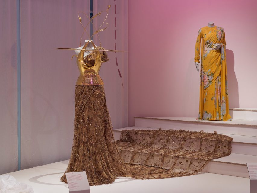
Among the garments is the first sari to be worn at New York’s Met Gala in response to the annual ball’s 2022 theme, Gilded Glamour.
Embellished with semi-precious stones, the tulle Sabyasachi-designed sari worn by Natasha Poonawalla features a statement train and was paired with a gold Schiaparelli bodice with protruding, orbit-shaped elements.
Fashion brand Abraham & Thakore created sequins from recycled X-ray film
Another navy blue sari by Abraham & Thakore is characterised by delicate sequins that were made using discarded X-ray film salvaged from hospitals – a design that aims to address the issue of sustainability within the fashion industry.
Also on display is a purple georgette silk sari embroidered with shimmering acrylics, sequins and crystals. Founder of the #DeGenderFashion movement, author and comedian Alok previously wore the garment to highlight their belief that saris can be worn by anyone, regardless of gender identity.
Photographs showing different ways of wearing saris are pasted across a blue wall
Contrasting textiles such as distressed denim and woven stainless steel make up other saris in the exhibition, highlighting the garment’s versatile evolution.
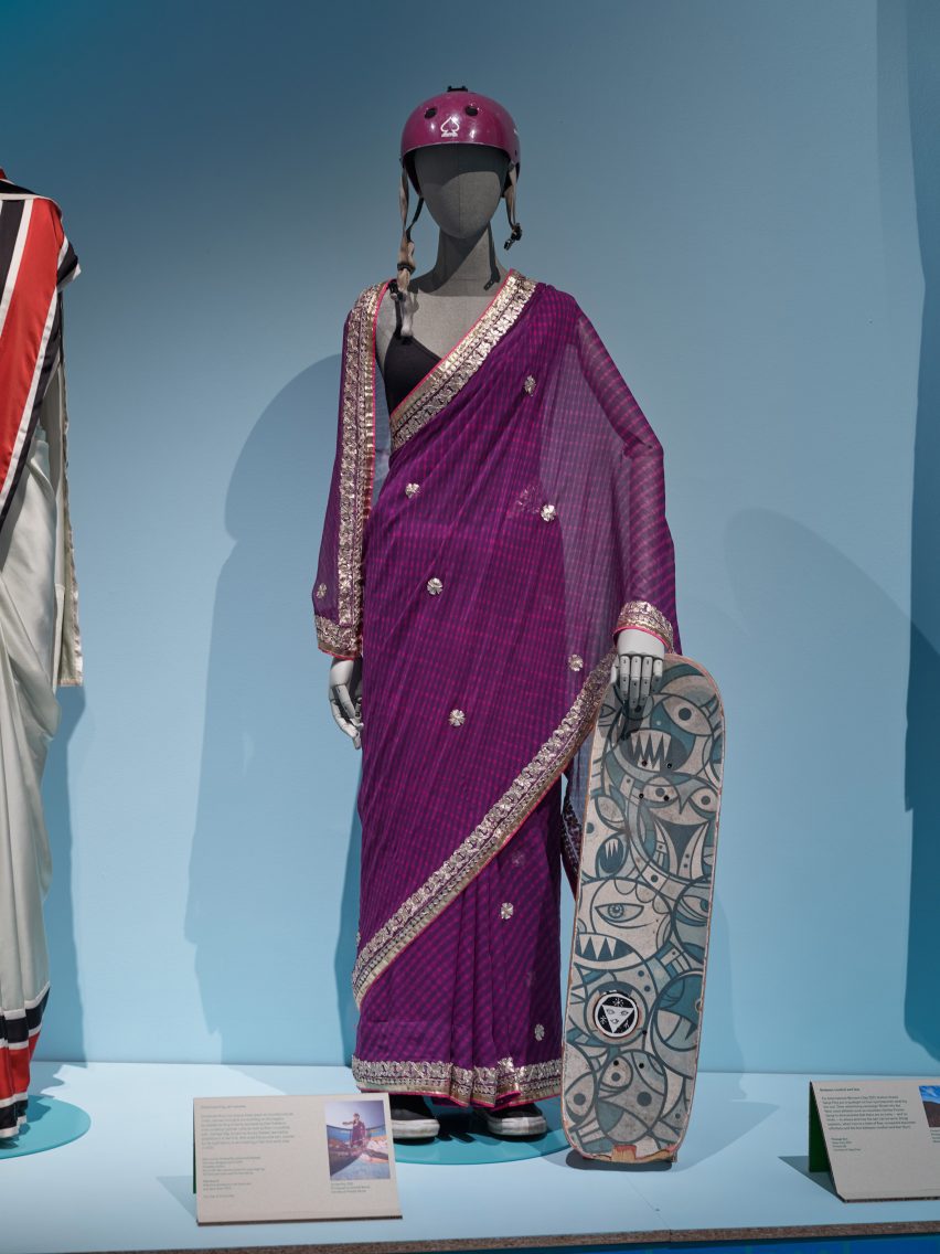
Within the show’s “movement” section are a number of saris worn by young people while engaging in sports. These include a garment adorned with cherry blossom motifs that was donned during a cricket match as well as a polyester chiffon sari, which is among the outfits worn by a group of women who have begun to skateboard in saris – a growing trend, according to the museum.
Sari wearers are increasingly wearing the garments to engage in sports, especially skateboarding
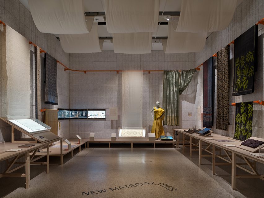
There is also an area dedicated to the craftsmanship involved in sari-making that explores how its history has transformed over the 21st century.
“The sari is experiencing what is conceivably its most rapid reinvention in its history. It makes the sari movement one of today’s most important global fashion stories, yet little is known of its true nature beyond South Asia,” explained Khanchandani.
“For me and for so many others, the sari is of personal and cultural significance,” reflected the curator.
“But it is also a rich, dynamic canvas for innovation, encapsulating the vitality and eclecticism of Indian culture.”
There is also an area dedicated to materials and craftsmanship
Chinese artist Ai Weiwei’s first design-focussed exhibition is another show that is currently on display at the Design Museum until late July. In other recent fashion news, designer Rick Owens has released a collection of wearable helmets that double as fluorescent floor lamps.
The Offbeat Sari is on display at London’s Design Museum from 19 May to 17 September 2023.See Dezeen Events Guide for an up-to-date list of architecture and design events taking place around the world.
Project credits:
Curator: Priya Khanchandani Associate curator: Rashmi Varma 3D design: Studio Mutt 2D design: Stuthi Ramesh
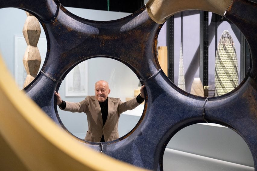
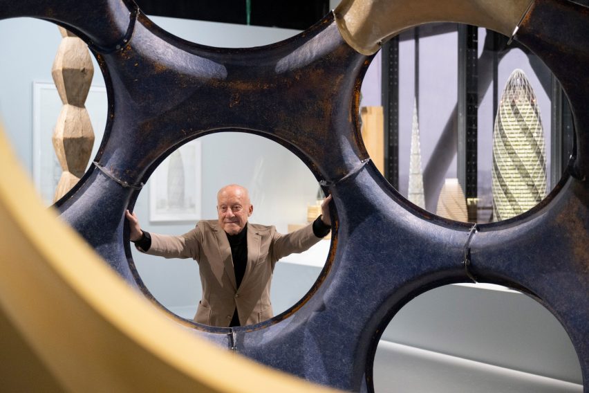
An exhibition dedicated to the work of British architect Norman Foster has opened at the Centre Pompidou in Paris, showcasing drawings and original models produced by the architect over the last six decades.
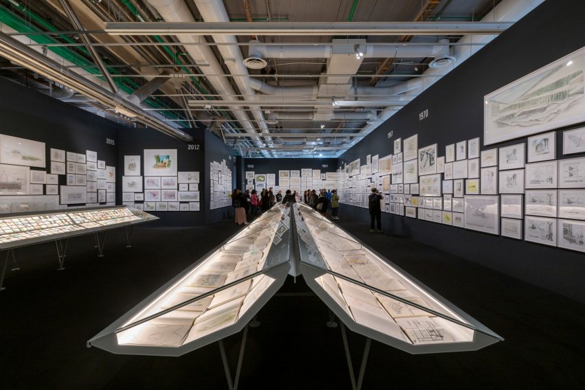
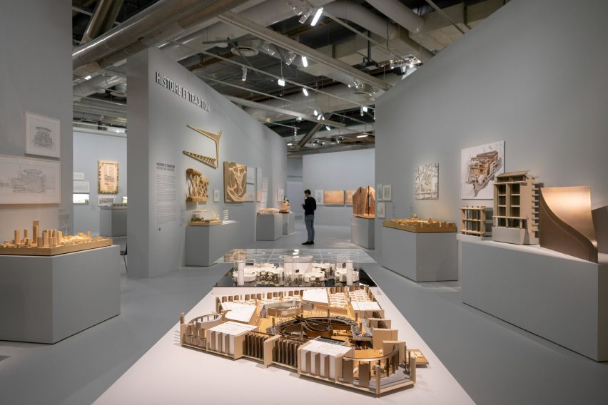
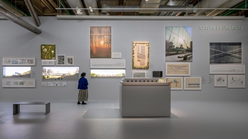
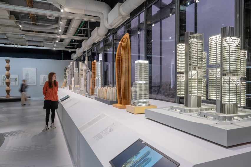
The exhibition, which according to the Norman Foster Foundation is the largest-ever retrospective display of Foster’s work, features around 130 of the architect’s projects including the Hong Kong and Shanghai Banking Corporation Headquarters, Hong Kong International Airport and Apple Park.
The exhibition was designed by Norman Foster
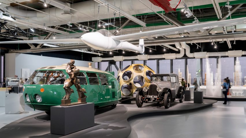
Designs that informed Foster’s work are also exhibited, including works by Chinese artist Ai Weiwei, French painter Fernand Léger, Romanian sculptor Constantin Brancusi and Italian painter Umberto Boccioni, and even cars, which the architect is passionate about.
The exhibition, simply called Norman Foster, was designed by Foster with his architecture studio Foster + Partners and nonprofit organisation the Norman Foster Foundation.
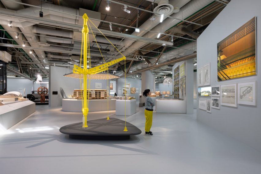
On display are sketches, drawings and models of the architect’s buildings
Curated by Centre Pompidou deputy director Frédéric Migayrou, the exhibition aims to showcase examples of Foster’s innovation and technology, his approach to sustainability and his ideas for the future of the built environment.
“This exhibition traces the themes of sustainability and anticipating the future,” said Foster.
“Throughout the decades we have sought to challenge conventions, reinvent building types and demonstrate an architecture of light and lightness, inspired by nature, which can be about joy as well as being eco-friendly.”
Examples of Foster’s work are interspersed with cars that have inspired him
The 2,200-square-metre exhibition begins with a room dedicated to Foster’s sketches and drawings, a practice he uses to communicate ideas and log design inspiration.
“For me, design starts with a sketch, continuing as a tool of communication through the long process that follows in the studio, factories and finally onto the building site,” said Foster.
“In 1975 I started the habit of carrying an A4 notebook for sketching and writing – a selection of these are displayed in the central cabinets, surrounded by walls devoted to personal drawings.”
Visitors begin the exhibition in a room filled with Foster’s sketches
The exhibition continues in a large space with partition walls that separates it into seven themes: Nature and Urbanity, Skin and Bones, Vertical City, History and Tradition, Planning and Place, Networks and Mobilities, and Future Perspectives.
The Nature and Urbanity section explores Foster’s approach to preserving nature by building “dense urban clusters, with privacy ensured by design,” the studio said.
Referencing a critic’s comment that the external appearance of Foster’s projects could be categorised as having a smooth “skin” facade or expressing its skeletal structure, the Skin and Bones portion of the exhibition showcases projects that illustrate the relationship between structure, services and cladding.
In the Vertical City section, the studio showcases how it created “breathing” towers by designing open, stacked spaces.
The exhibition features around 130 Norman Foster projects
“We were the first to question the traditional tower, with its central core of mechanical plant, circulation and structure, and instead to create open, stacked spaces, flexible for change and with see-through views,” said Foster.
“Here, the ancillary services were grouped alongside the working or living spaces, which led to a further evolution with the first ever series of ‘breathing’ towers.”
It showcases projects spanning Foster’s six-decade-long career
“In the quest to reduce energy consumption and create a healthier and more desirable lifestyle, we showed that a system of natural ventilation, moving large volumes of fresh filtered air, could be part of a controlled internal climate,” the architect continued.
The History and Tradition section aims to provide insight into examples of historic and vernacular architecture that influenced Foster, while the Planning and Places portion explores masterplanning and placemaking in urban spaces.
The exhibition is on display at the Centre Pompidou in Paris
Towards the open exhibition space’s exit, the Networks and Mobility section displays examples of transport and infrastructure and leads to the final room, Future Perspectives, which exhibits concepts for future methods of travel and communication.
On display are details of autonomous self-driving systems and designs for habitats on Mars and the moon that were developed with NASA and the European Space Agency.
Foster recently spoke with Dezeen about his views on sustainability in architecture, in which he said “there are lots of dangerous myths”.
The photography is by Nigel Young from Foster + Partners.
The Norman Foster exhibition is on display at the Centre Pompidou in Paris, France, from 10 May to 7 August 2023. See Dezeen Events Guide for an up-to-date list of architecture and design events taking place around the world.
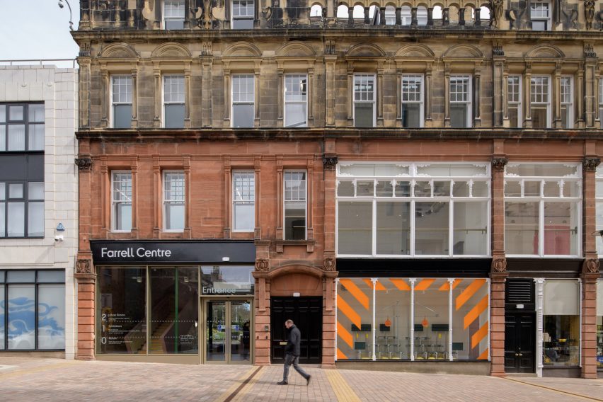
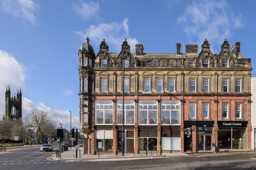
An architecture centre founded by British architect Terry Farrell has opened in Newcastle, England, with an exhibition exploring building materials of the future and “urban rooms” for local residents.
The Farrell Centre is an exhibition gallery, research centre and community space that aims to provoke conversation about architecture and planning, both in the city and at a global scale.
The project was instigated by Farrell, who donated his architectural archive and put £1 million towards the build.
The Farrell Centre occupies a former department store building in Newcastle
Fake fur, mycelium and wool insulation feature in a series of installations designed to challenge traditional methods of producing architecture.
Elsewhere, three urban rooms host workshops and other events where locals can learn about the past and future of Newcastle and voice their opinions on development plans.
The ground floor is designed to encourage people in, with glazed facades on two sides
“The centre is here to bring about a better, more inclusive and more sustainable built environment,” said Farrell Centre director and Dezeen columnist Owen Hopkins during a tour of the building.
“The belief that underpins everything we do is that we need to engage people with architecture and planning, and the transformative roles that they can have,” he told Dezeen.
“Architecture and planning are often seen as something that’s imposed from above. We need to shift that perception.”
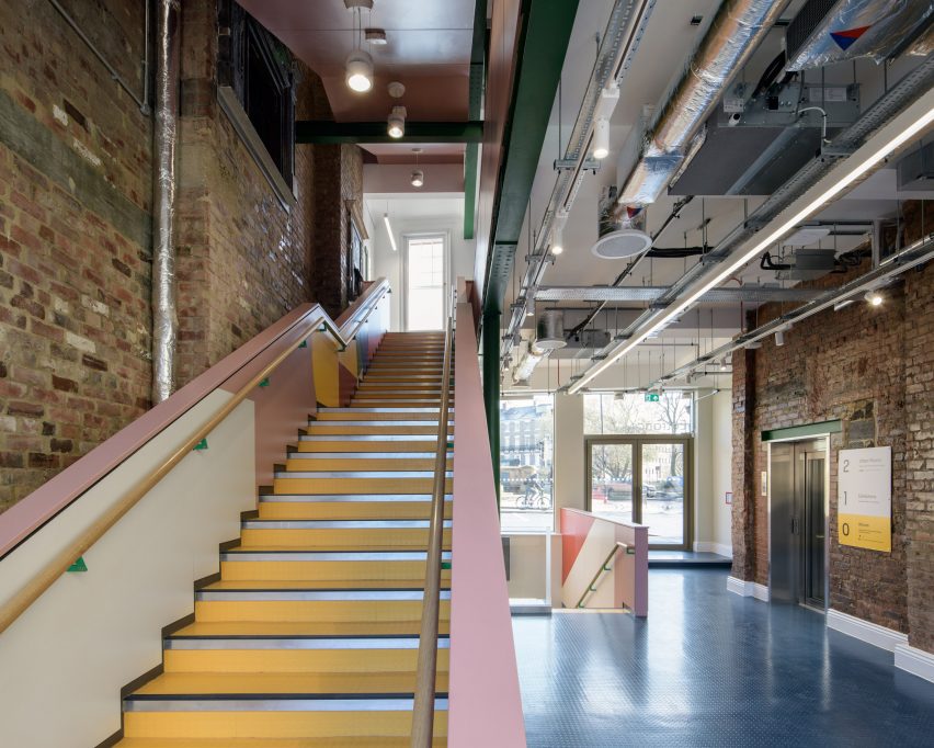
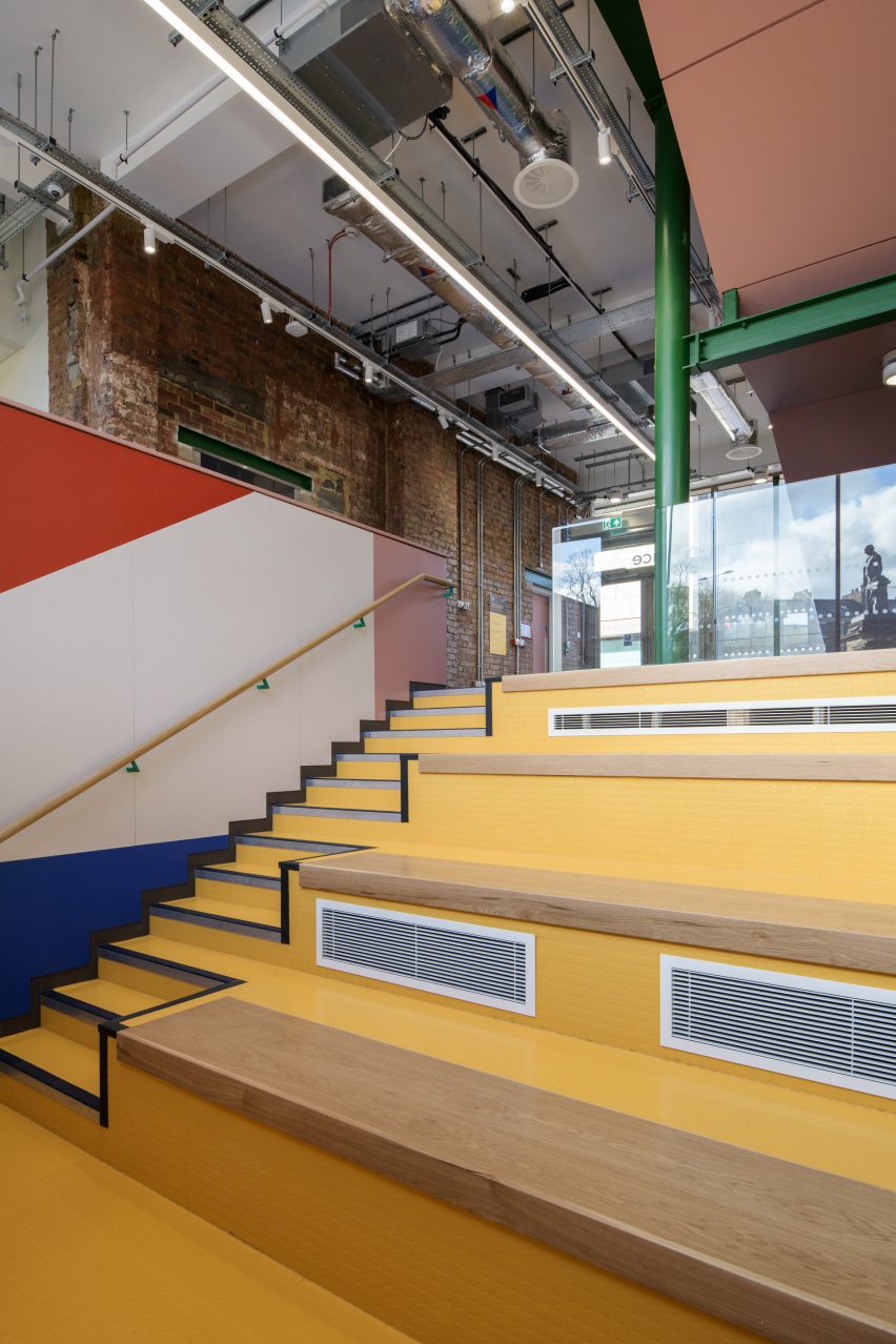
Seating bleachers create an informal space for talks and presentations
Forming part of Newcastle University, the Farrell Centre occupies a four-storey former department store building in the heart of the city.
Local studios Space Architects and Elliott Architects oversaw a renovation that aims to make the building feel as open and welcoming as possible.
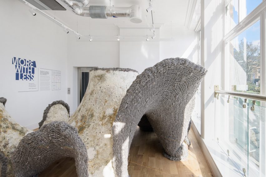
The exhibition More with Less includes an installation by HBBE made from mycelium, sawdust and wool
The ground floor has the feel of a public thoroughfare, thanks to glazed facades on two sides, while bleacher-style steps create a sunken seating area for talks and presentations.
A colourful new staircase leads up to the exhibition galleries on the first floor and the urban rooms on the second floor, while the uppermost level houses the staff offices.
McCloy + Muchemwa’s installation is a table filled with plants
According to Hopkins, the launch exhibition sets the tone for the type of content that visitors can expect from the Farrell Centre.
The show features installations by four UK architecture studios, each exploring a different proposition for future buildings.
“We wanted to create something that expands people’s understanding of what architecture is, beyond building an expensive house on Grand Designs,” Hopkins said, referencing the popular television show.
Dress for the Weather has created a mini maze of insulation
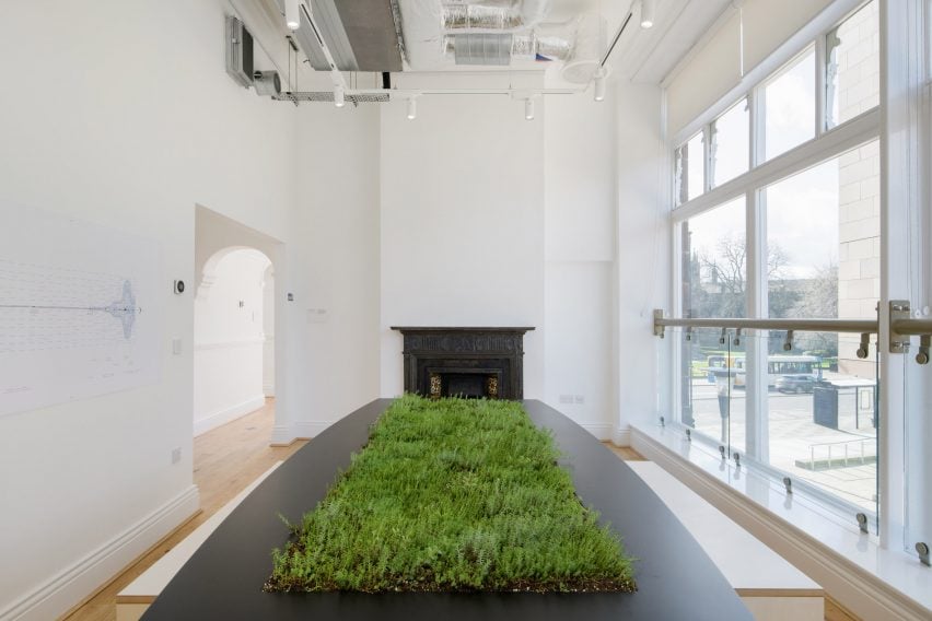
Newcastle University’s Hub for Biotechnology in the Built Environment (HBBE) has created Living Room, a cave-like structure made by cultivating a mixture of mycelium and sawdust over a giant wool blanket.
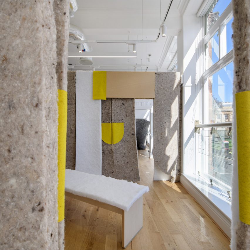
Next, a mini maze created by Glasgow studio Dress for the Weather aims to showcase the thermal and experiential qualities of building insulation, with varieties made from low-grade wool and plastic bottles.
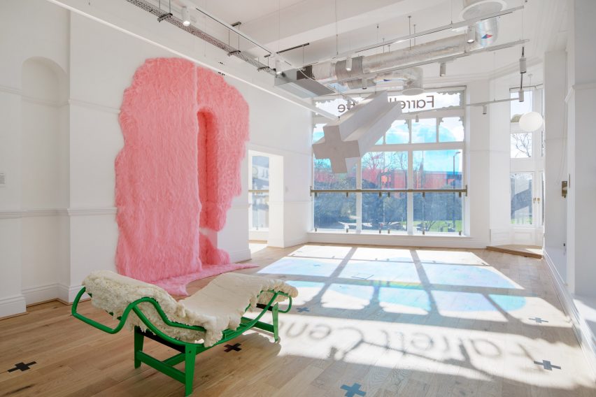
Office S&M’s installations include a silhouette of the head of Michelangelo’s David made from pink fur and a chaise longue covered in expanding foam
London-based Office S&M proposes low-tech but fun solutions for making buildings more comfortable.
These are represented by a silhouette of the head of Michelangelo’s David made from pink fur, a metallic space blanket, a chaise longue topped covered in expanding foam and a dichroic-film window covering that casts colourful reflections onto the floor.
“This whole room is about actually doing really simple mundane stuff, but in a way that is joyful and tells a story,” said Hopkins.
In the final room, an installation by London-based McCloy + Muchemwa brings nature indoors with a boardroom table covered in plants.
The urban rooms host events where people can learn about the development of the city
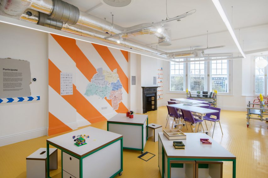
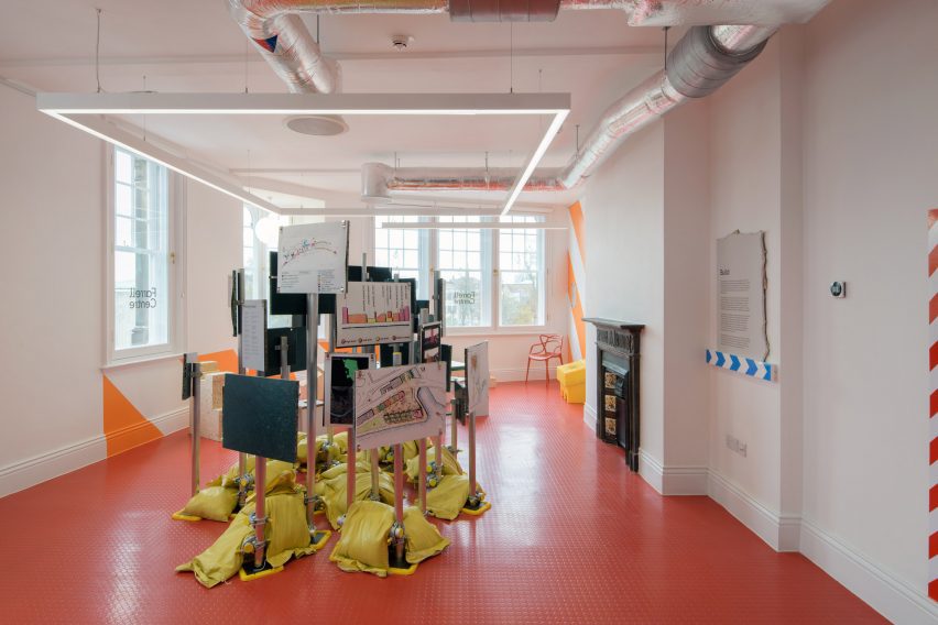
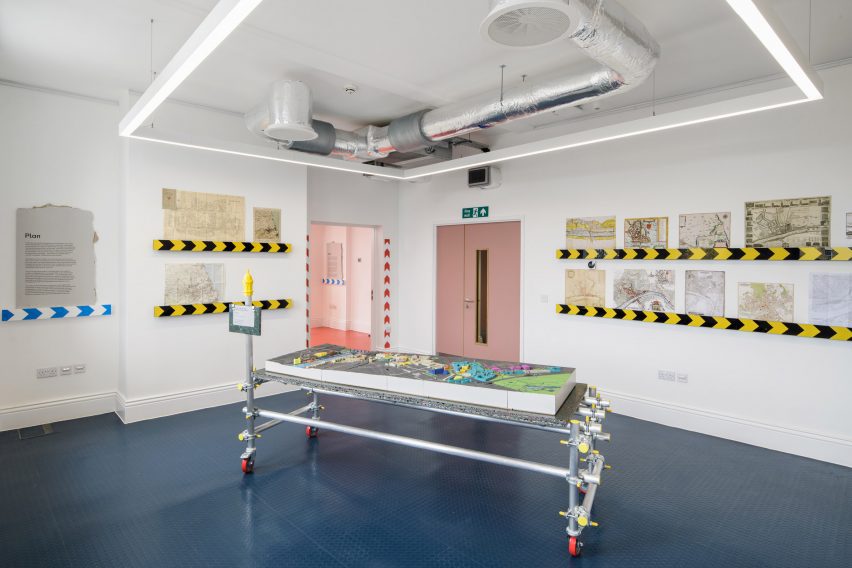
On the floor above, the three urban rooms have been fitted out by Mat Barnes of architecture studio CAN with custom elements that make playful references to building sites.
They are filled with historic maps, interactive models, informal furniture, display stands made from scaffolding poles, and architecture toys that include building-shaped soft play and Lego.
In one of the rooms, planning proposals are displayed on stands made from scaffolding poles
The idea of setting up an urban room in Newcastle was the starting point for the creation of the Farrell Centre.
A decade ago, Farrell was commissioned by the UK government to produce a report on the state of the UK’s architecture and planning system.
One of the key recommendations in the Farrell Review, published in 2014, was to create an urban room in every major city, giving local people of all ages and backgrounds a place to engage with how the city is planned and developed.
One urban room contains a model of a Terry Farrell-designed masterplan for Newcastle
As Farrell grew up in the Newcastle area and studied architecture at the university, he became keen to make this concept a reality in this city.
Although the Farrell Centre is named in his honour, Hopkins said that Farrell is happy for the facility to forge its own path in terms of programme and approach.
“He established the idea and vision for the centre, but he is happy for us to build out that vision in the way that we think is best,” added Hopkins.
The Farrell Centre forms part of Newcastle University
The director is optimistic about the centre’s potential to engage with the community.
“Newcastle is a city like no other,” he said. “The civic pride here is off the scale. People have such a deep-rooted love of where they live.”
“It’s amazing to be able to tap into that as a way of creating a better built environment.”
More with Less: Reimagining Architecture for a Changing World is on show at the Farrell Centre from 22 April to 10 September 2023. See Dezeen Events Guide for more architecture and design events around the world.