Architects: Want to have your project featured? Showcase your work through Architizer and sign up for our inspirational newsletter.
The Japanese art of origami consists of intricately folding paper to create detailed and delicate sculptures, ideally without using any cuts or glue. Triangular forms and fragmented surfaces are distinctive features of such sculptures. Much like these paper figures, origami-inspired architecture is a series of volumes that appear to be formed using folded sheets of paper.
These buildings feel light and in motion. The freedom from a traditional box shape also gives rise to dynamic interior configurations that are exciting and innovative. Cutouts and inward folds help carve out windows, balconies and terraces. Below are just a few examples of origami-inspired structures that can offer some out-of-the-box inspiration.
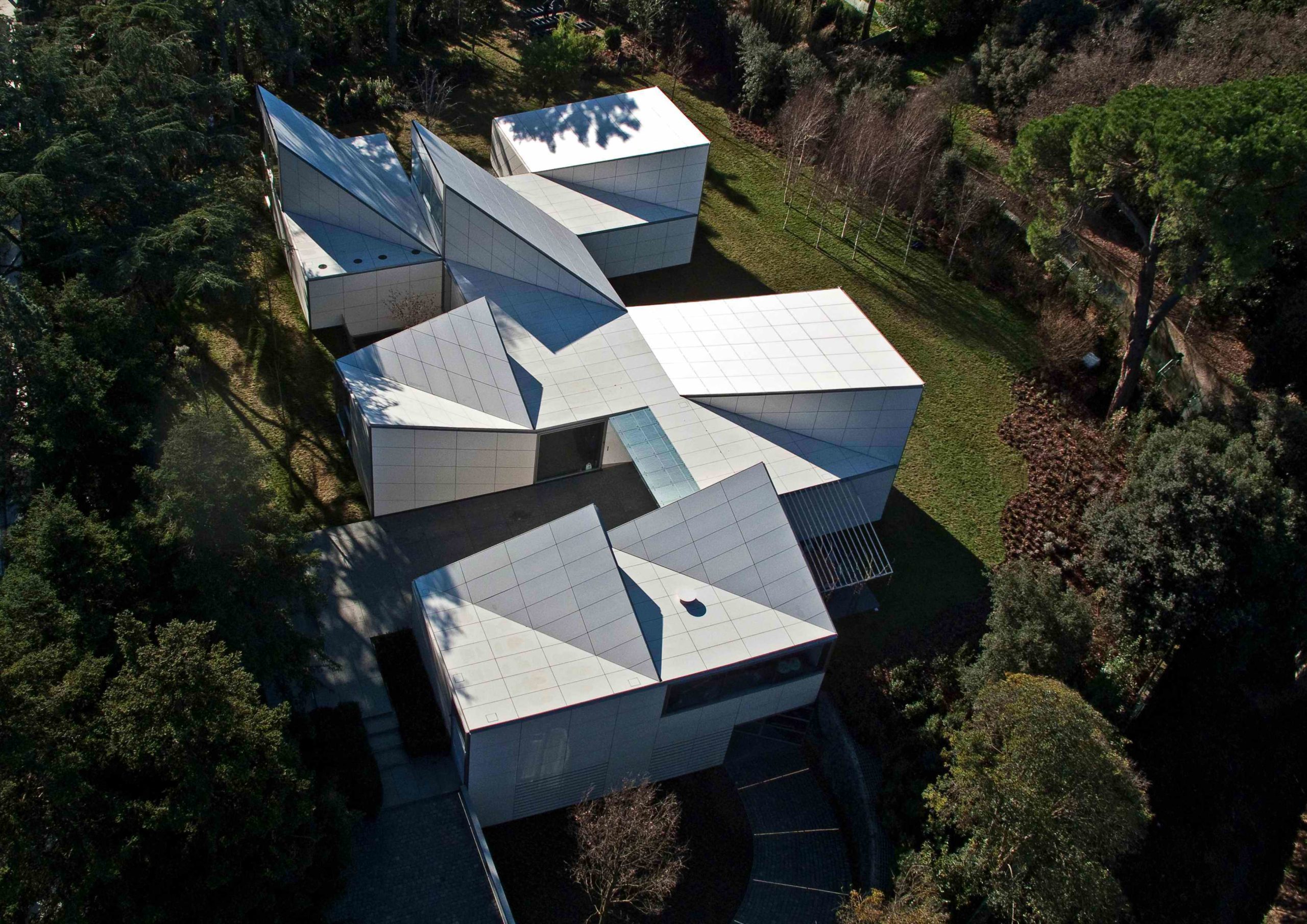
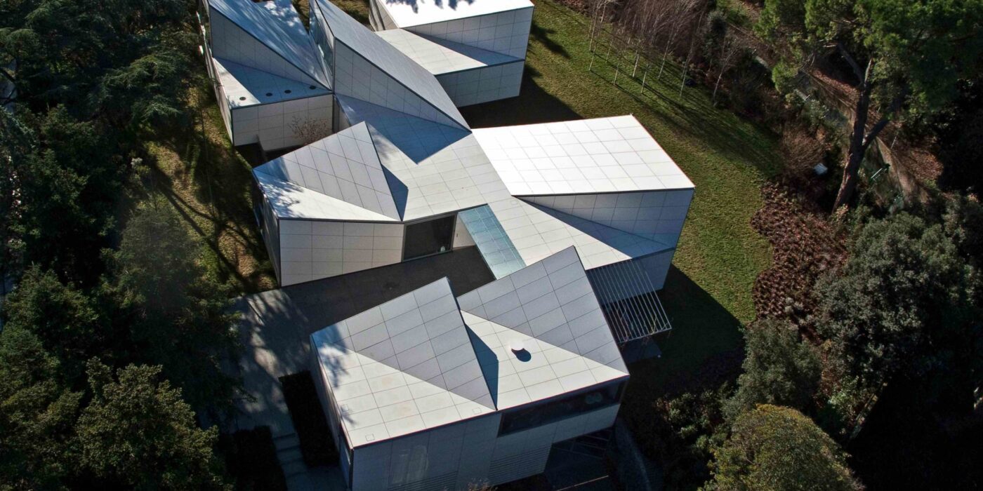
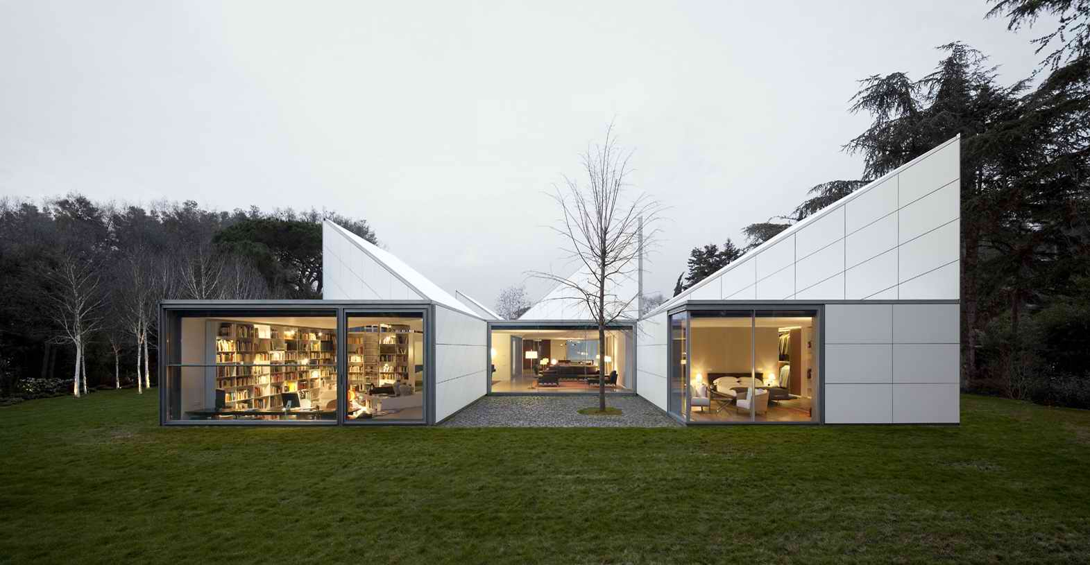 Origami House by Office of Architecture in Barcelona, Sant Cugat, Spain
White sloped roofs of the house stand out against the lush vegetation of the forest behind. The home looks more like a series of open boxes that look more like a pavilion than a home. Guests encounter a pool as soon as they reach the entrance, much like a plaza. This gives way to the changing volumes of the home, defined by sloping roofs and large windows.
The services are all located on a concealed lower floor, without any connecting staircase in sight. From within, the angled planes make it look like a camera lens that captures different parts of the scenery around. A well-hidden narrow staircase leads to a lower level which houses an indoor swimming pool and sauna. The home also features a library, cinema room, a loft, staff housing, garage, and more.
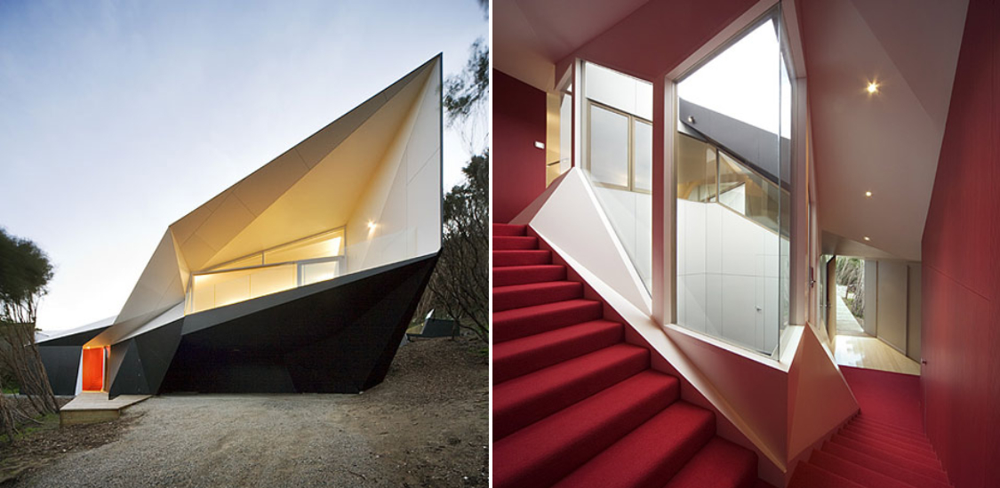 Klein Bottle House by McBride Charles Ryan, Rye, Australia
Challenging the idea of standard cuboidal spaces, the house takes inspiration from a unique surface developed by topological mathematicians. This allows the architects to create new and interesting spaces that create interest and create fun. Originally imagined as a complex spiral, the design slowly evolved into the form of a Klein Bottle, and then finally an origami version of the complex shape to create spatial intrigue. The form wraps around a central courtyard and a grand staircase, making all spaces feel both near and separate from each other. In addition to its energizing form, the house also showcases a changing color palette that incorporates shades of red, black and white.
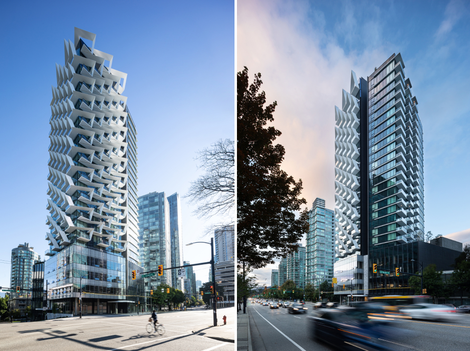
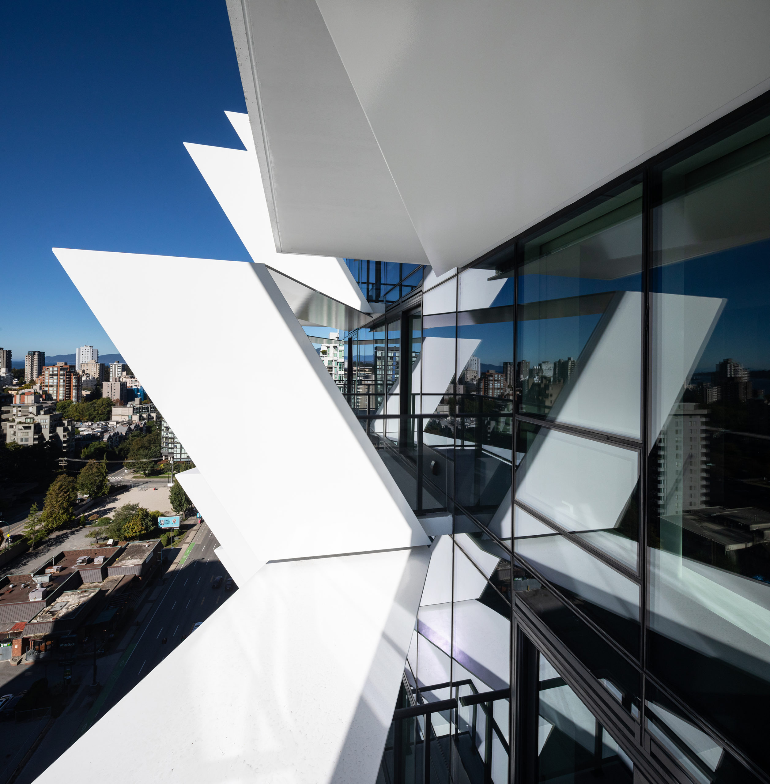 Cardero by Henriquez Partners Architects, Vancouver, Canada
Popular Winner, 2021 A+Awards, Multi Unit Housing High Rise (16+ Floors)
Folded strips of white covering the façade are the first thing that makes visitors stop in their tracks when they see Cardero. These modules are inspired by seagulls and seaplanes found in the Coal Harbour area as well as hand gliders found in the Grouse Mountain region nearby. In addition to being an aesthetic element, the origami-like screen also acts as a sun shade on the building’s southern and western façades. While one part of the tower has 26 floors, the other side has 21 floors to help it fit better with the buildings on that side.
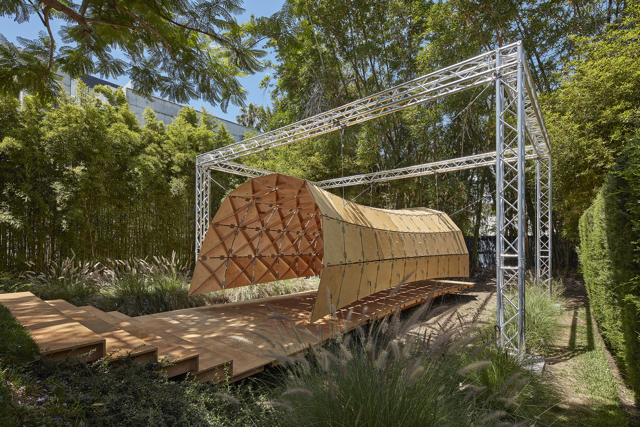
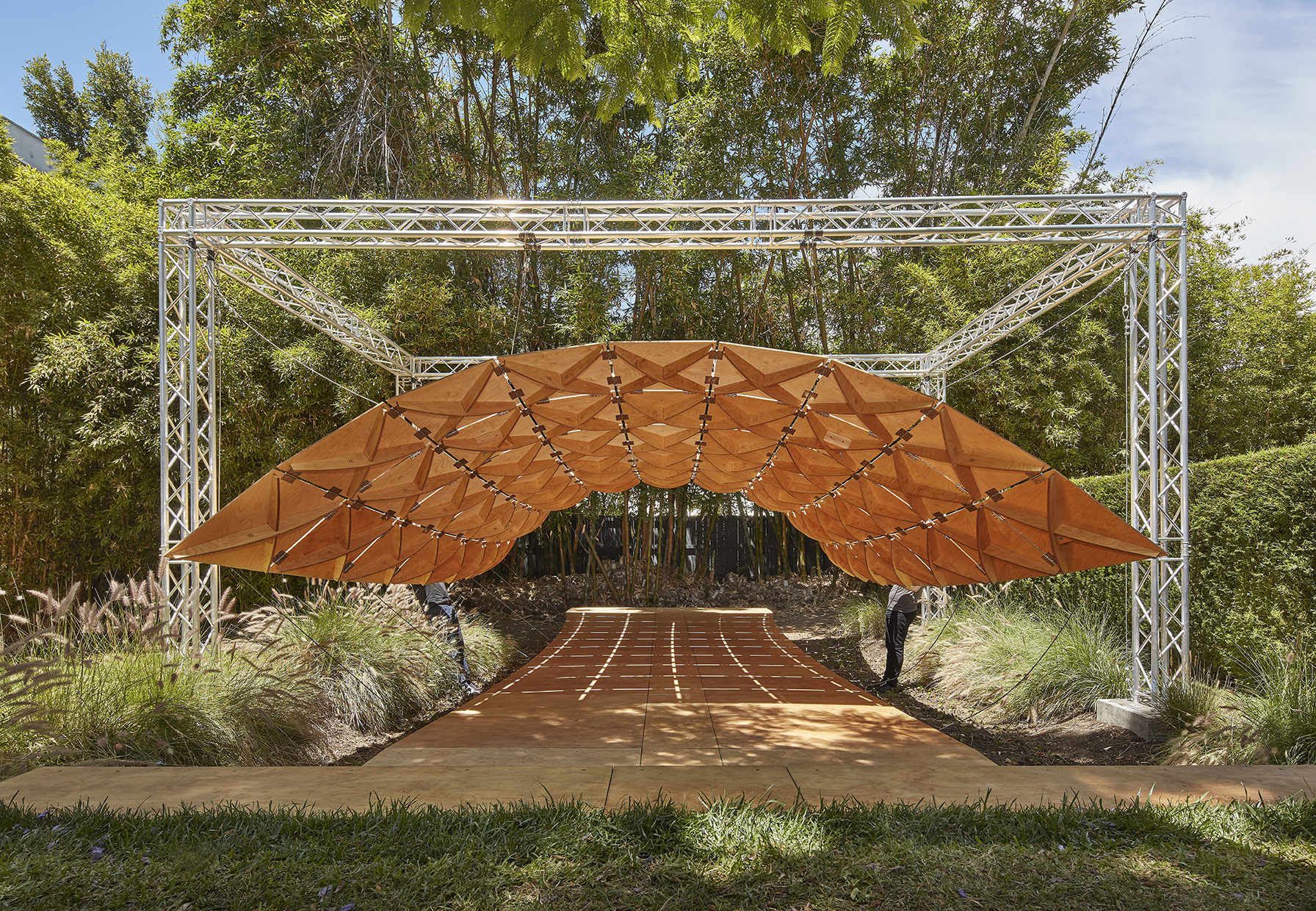 Kinematic Sculpture by Skidmore, Owings & Merrill (SOM), Chicago, Illinois
Much like folds in a paper, the dynamic pavilion is made of 99 flat wooden panels that are connected at different angles with stainless steel hinges to form a continuous sheet. It hopes to use kinematics to show the mathematical relationships between force and motion as it uses its hinged arrangement to change forms. It also shows how principles of origami, which is often associated with paper, can be adapted to other materials and architecture. This also paves way for similar structures that can be customized to cater to different programs.
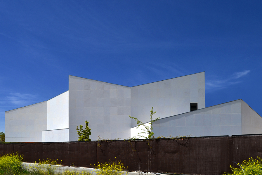
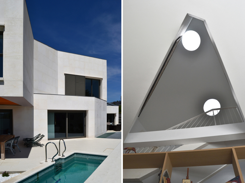 Zigzag House by Cobaleda & Garcia Arquitectos, Pozuelo de Alarcón, Spain
The geometric configuring of this home starts from the plan itself. Instead of a traditional grid, Cobaleda & Garcia Arquitectos opted for a diamond-shaped pattern that is better suited for the oddly shaped plot. This helped create cavities along the exterior for green spaces. The fragmented geometry continues to the upper level as well as the roof, causing it to aptly be named the Zigzag house. The form is achieved using reinforced concrete slabs.


Images by Milo Keller
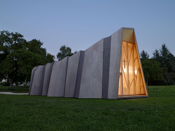
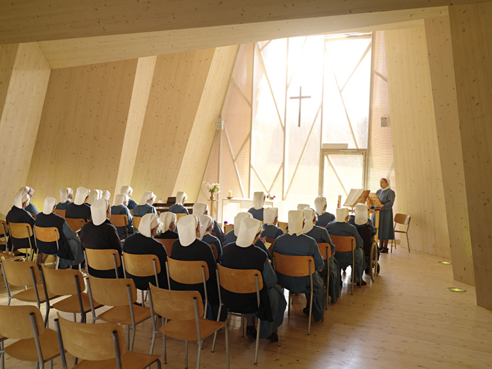
Temporary Chapel for the Deaconesses of St-Loup by LOCALARCHITECTURE, Pompaples, Switzerland
When renovating the mother house of the Deaconess Community of St-Loup, the studio proposed to construct a temporary chapel that worshipers could visit while the main building was inaccessible. Given their expertise in timber construction, they devised a computer-generated form that would use thin timber panels and could be built directly on the ground. The form appears like an accordion-folded tunnel that has just been stretched. Each panel reflects light in different directions and gives the building dimension and height. The gable end comprises clear plastic panels covered with fabric to filter natural light into the gathering space.


Images by David Frutos
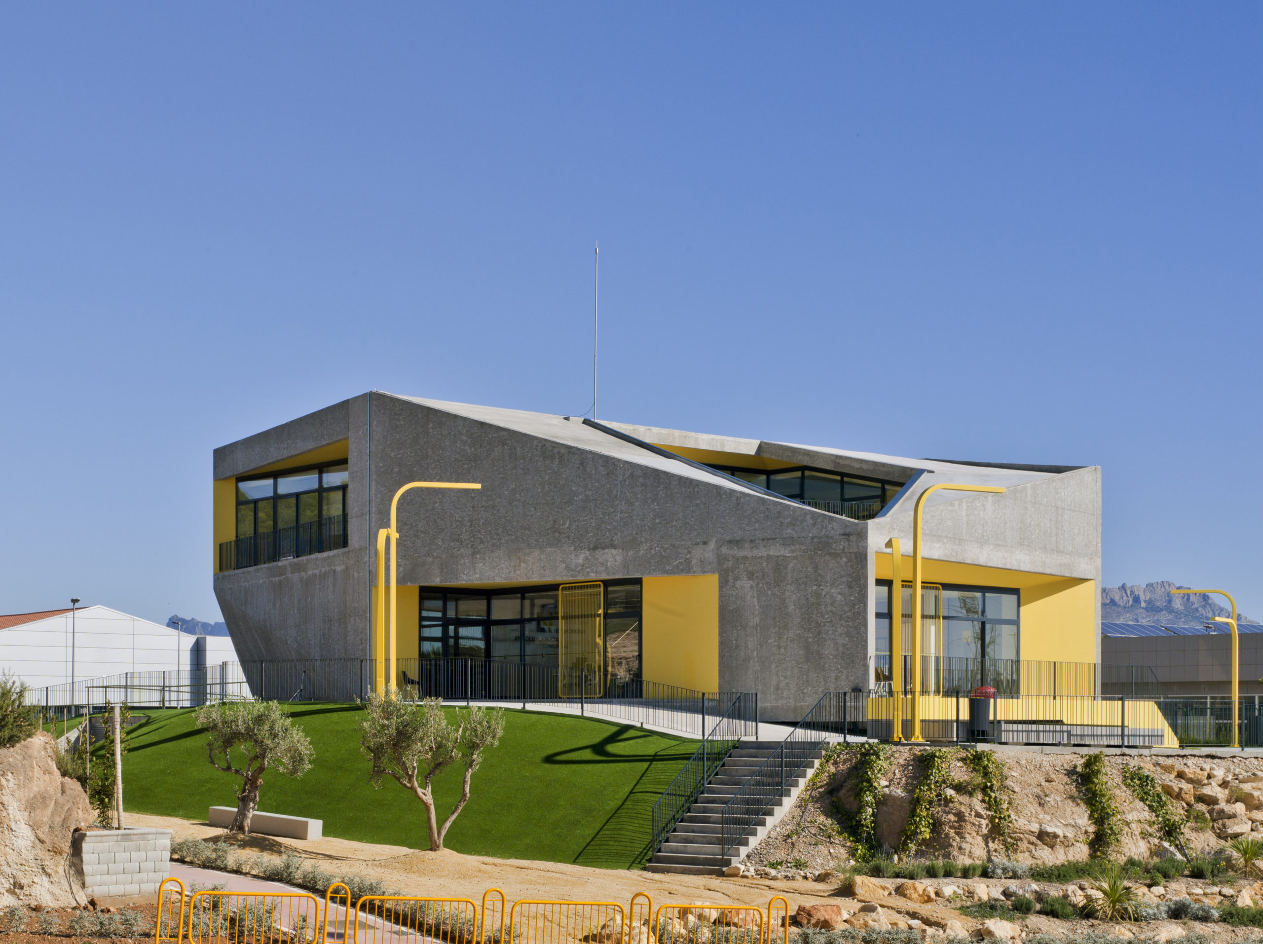
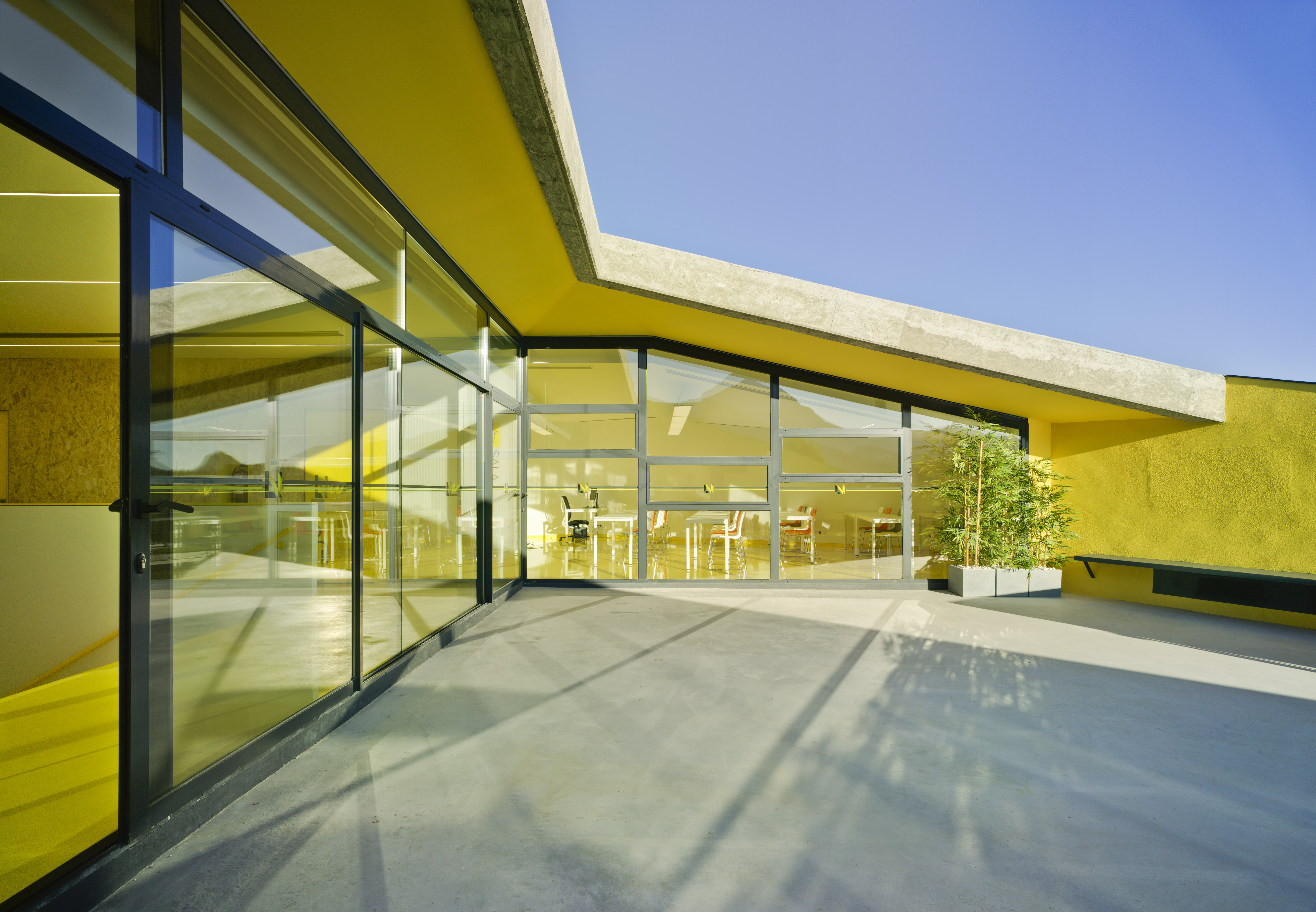
Coworking LAB Nucía by CrystalZoo, Alicante, Spain
Jury and Popular Winner, 2020 A+Awards, Government & Civic Buildings
The building’s solid volume appears to have cutouts that open into the structure to create windows and intermediate spaces. The design is governed by a central core around which the geometric volume shapes itself. The bright yellow used in the interior spaces contrasts with the muted gray of the exterior walls, holding an unexpected surprise as one goes in. The core is a large stepped space that can be used for presentations, social interactions and staged talks. There is a large terrace behind it that also governs the programming of the building. It connects to workshop areas, classrooms and offices.
Architects: Want to have your project featured? Showcase your work through Architizer and sign up for our inspirational newsletter.
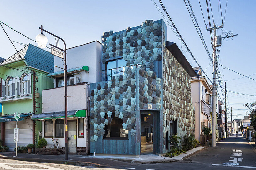 images courtesy Kengo Kuma & Associates



 Origami House by Office of Architecture in Barcelona, Sant Cugat, Spain
 Klein Bottle House by McBride Charles Ryan, Rye, Australia
 Cardero by Henriquez Partners Architects, Vancouver, Canada
 Kinematic Sculpture by Skidmore, Owings & Merrill (SOM), Chicago, Illinois
 Zigzag House by Cobaleda & Garcia Arquitectos, Pozuelo de Alarcón, Spain