Homes where flooring enhances connection between indoors and outdoors
Our latest lookbook explores homes where flooring details and materials help to create the impression that a living space extends out beyond a house’s exterior walls.
A range of different techniques can be used to create the sense of a continuous floor surface.
The most obvious is to use the same flooring material, or one that looks very similar, for both interior and exterior spaces.
However, this isn’t always necessary. By combining level thresholds with floor-to-ceiling glazing, it’s also possible to create that sense of continuation by simply maintaining a consistent surface.
Here, we look at 10 examples that use one or more of these methods to create different effects, ranging from a forest home in Mexico’s Valle de Bravo to a waterside villa in Denmark.
Many of these examples use continuous floor surfaces to connect a living room with a garden or patio, but some explore other rooms where the effect can be applied.
This is the latest in our lookbooks series, which provides visual inspiration from Dezeen’s archive. For more inspiration, see previous lookbooks featuring chocolate-brown interiors and minimalist bathrooms.
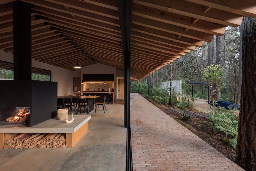

Casa Mola, Mexico, by Estudio Atemporal
Mexico City-based Estudio Atemporal designed this house in a densely forested area of Valle de Bravo with the aim of allowing residents to live “more organically”.
The large-format flooring tiles inside the house give way to brickwork paving outside, but sliding glass doors with level thresholds create a clean junction that allows the two spaces to feel connected.
Find out more about Casa Mola ›
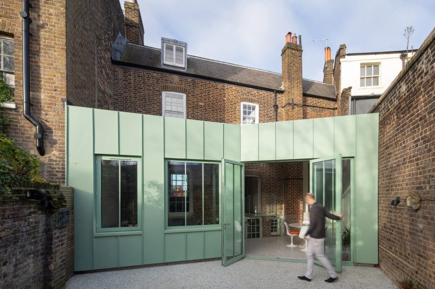

The Saddlery, UK, by Studio Octopi
Terrazzo flooring features both inside and outside this extension to a Georgian house in southeast London, designed by architecture office Studio Octopi.
Sourced from British manufacturer Diespeker, this material is speckled with colours that complement the mint-green tone of the building’s metal walls.
Find out more about The Saddlery ›
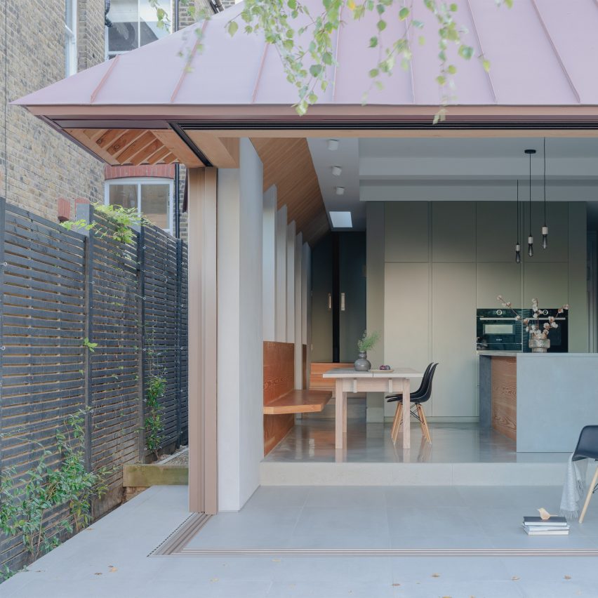

Dulwich House, UK, by Proctor & Shaw
Kitchen and terrace become a single space divided only by levels in this extension to a home in Dulwich, London, designed by architecture studio Proctor & Shaw.
Glass doors slide open on two sides – with one disappearing into a wall – to completely open up the building’s corner. The sliding mechanism is set into a continuous porcelain tile floor surface, resulting in a flush threshold.
Find out more about Dulwich House ›
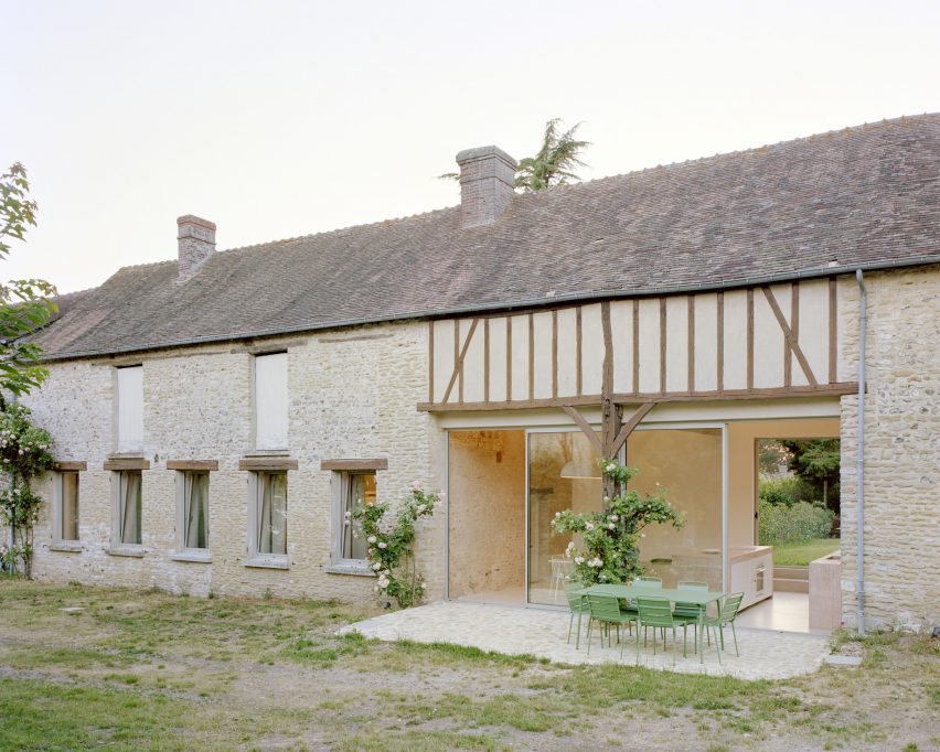

Maison Hercourt, France, Studio Guma
Minimal glazing plays a key role in connecting the kitchen of this renovated stone farmhouse in Normandy with an adjoining patio.
Designed by Paris-based Studio Guma, the renovation involved installing the kitchen in a space that previously functioned as a cart shed. Although the floor surface changes from concrete to stone from inside to outside, the slender-framed glass doors help the two surfaces to be read as one.
Find out more about Maison Hercourt ›
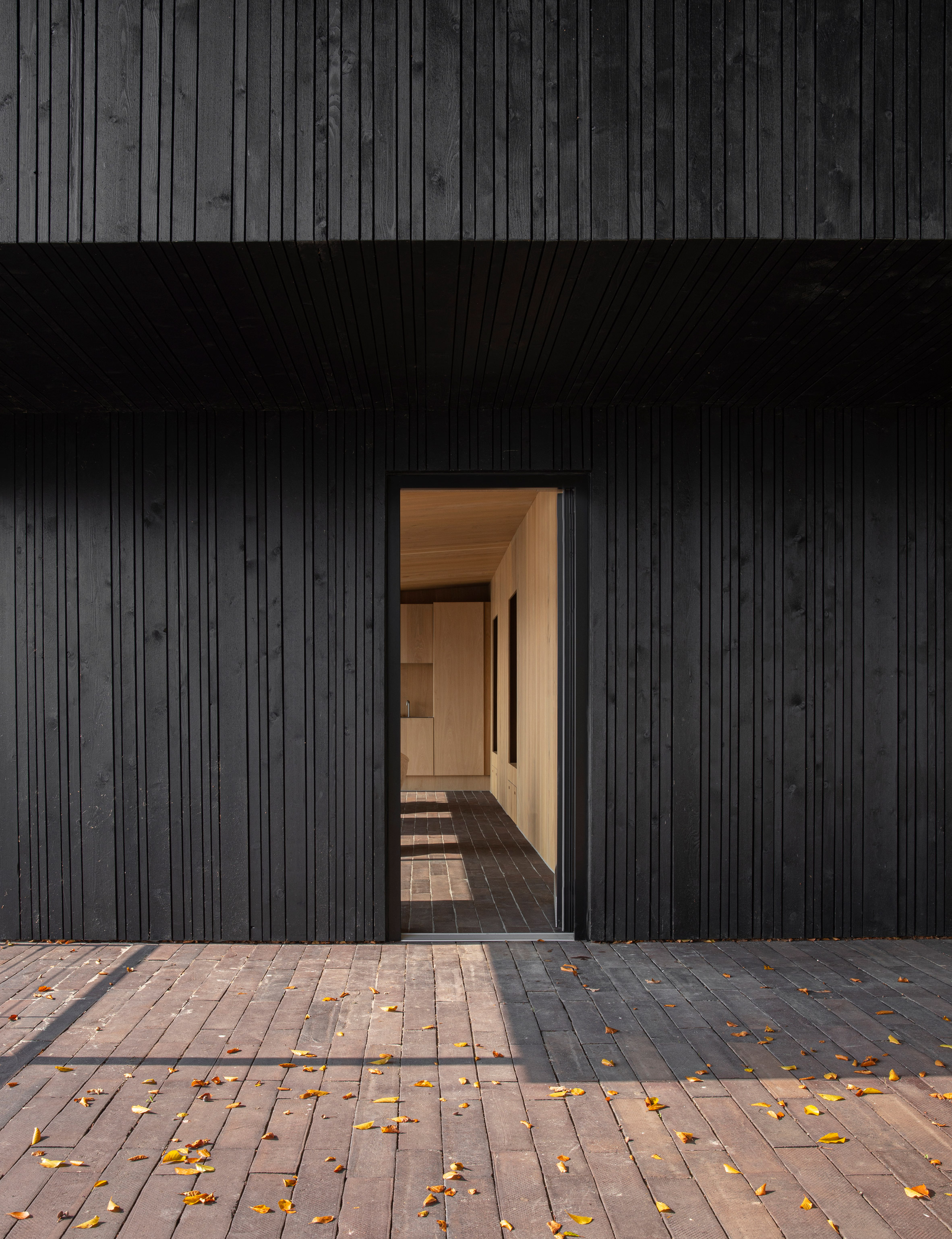

Fjord Boat House, Denmark, by Norm Architects
Copenhagen-based Norm Architects chose handmade ceramic bricks for the flooring of this vacation house, built on the edge of a fjord just outside the city.
They form stairs that lead down from the main house to a terrace, then continue inside to give the interior living spaces a casual, rustic feel. At the main entrance, the linearity of the brickwork pattern acts to draw the eye.
Find out more about Fjord Boat House ›
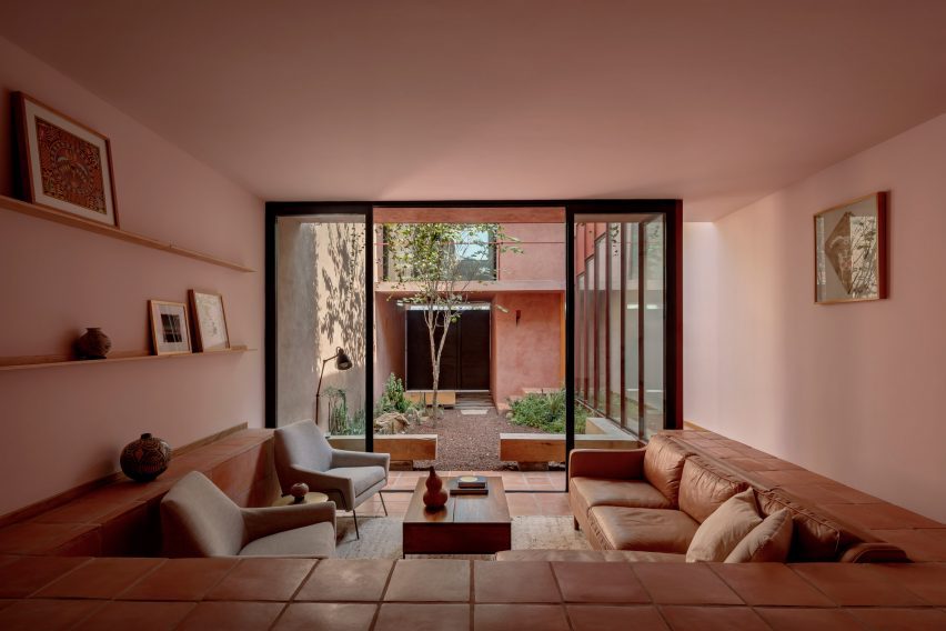

Ederlezi, Mexico, Práctica Arquitectura
Using the same flooring surface for both indoors and outdoors can become costly, but this low-cost infill house in Monterrey offers a clever solution.
Designed by locally based Práctica Arquitectura, the house features a stepped living space with an adjoining courtyard.
Most of the courtyard is landscaped, but the edges are lined with the same square saltillo tiles that provide interior flooring. This helps to extend the living space outdoors without requiring quite as many tiles.
Find out more about Ederlezi ›
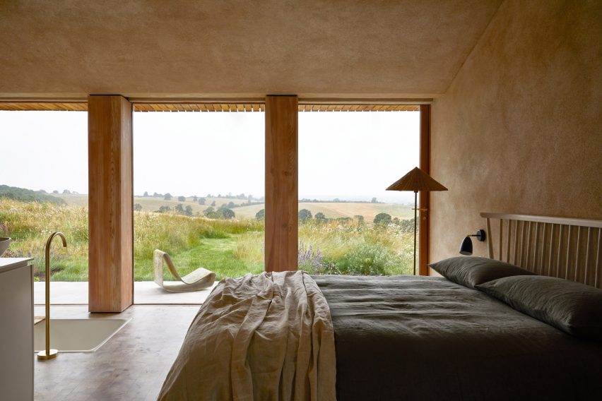

The Maker’s Barn, UK, by Hutch Design
Full-height glazing features in many of the rooms of this rural holiday rental on the outskirts of London, a former pig shed renovated by Hutch Design. This results in a strong connection with the surrounding patio.
The effect is particularly effective in the primary bedroom, which features a bath set into the floor. Here, it’s possible to observe the clean line running between the end-grain timber flooring inside and the paving tiles outside.
Find out more about The Maker’s Barn ›
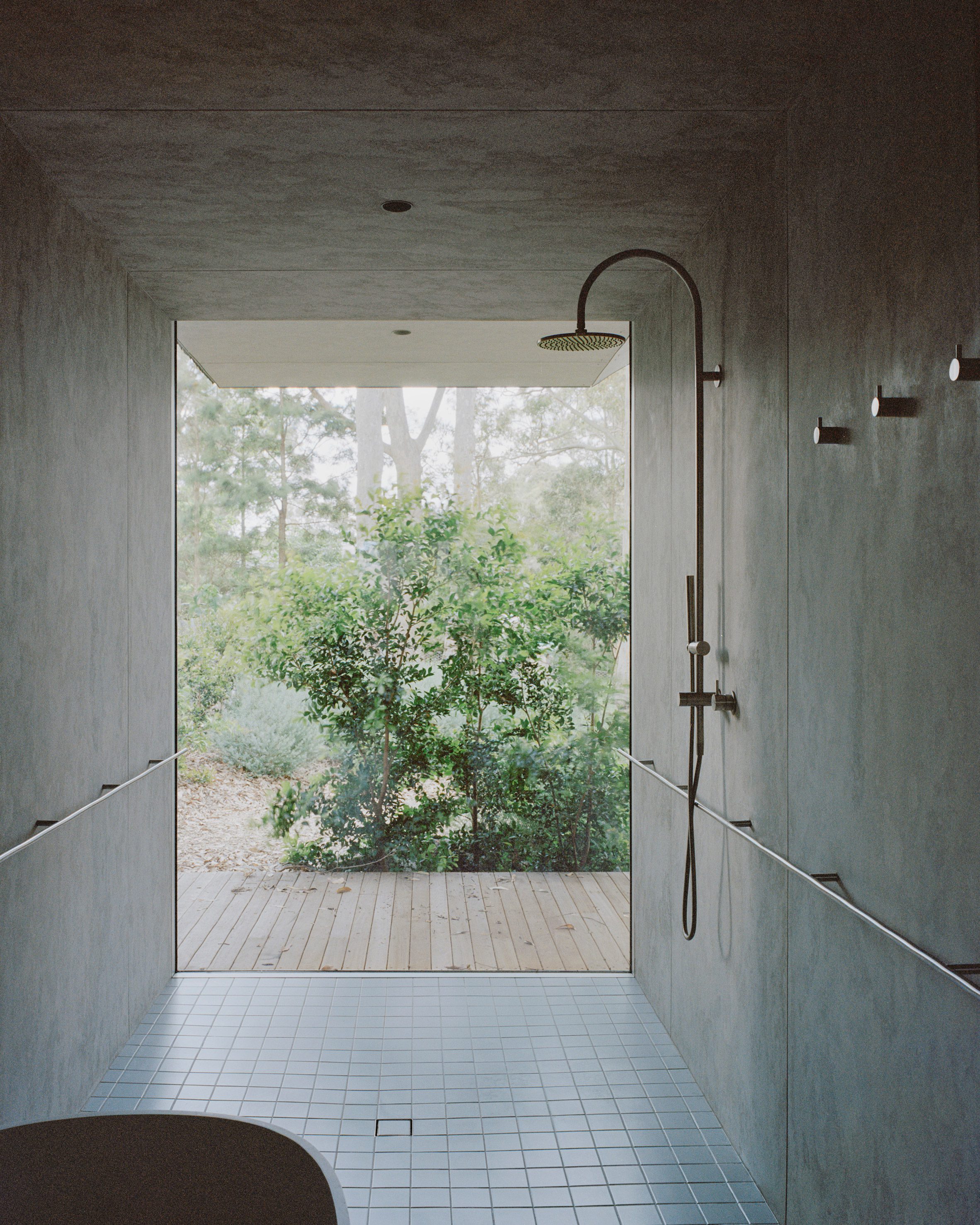

Mossy Point, Australia, by Edition Office
Melbourne-based Edition Office selected very different surfaces for the shower room of this house in Mossy Point, New South Wales, but they appear to merge thanks to the use of frameless glazing.
A similar effect can be found throughout the house, but the contrast between the wooden decking and the blue tiles of this room is the most striking.
Find out more about Mossy Point ›
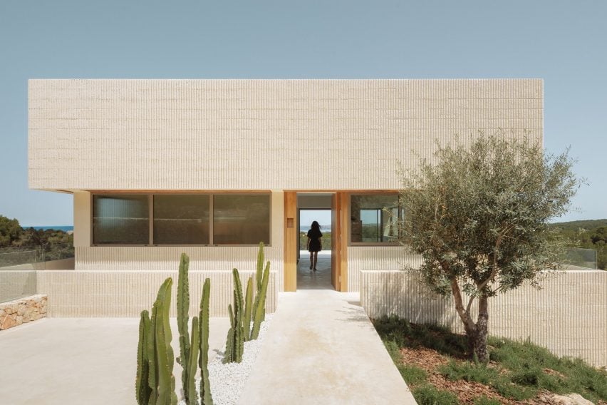

Shift House, Spain, by Nomo Studio
Roughly polished white concrete flooring unites both the interior and exterior of this house on the island of Menorca, designed by Barcelona-based Nomo Studio.
This creates a feeling of continuity from the building’s entrance, located on the uppermost storey, all the way across to a balcony terrace on the opposite side of the main living room.
Find out more about Shift House ›
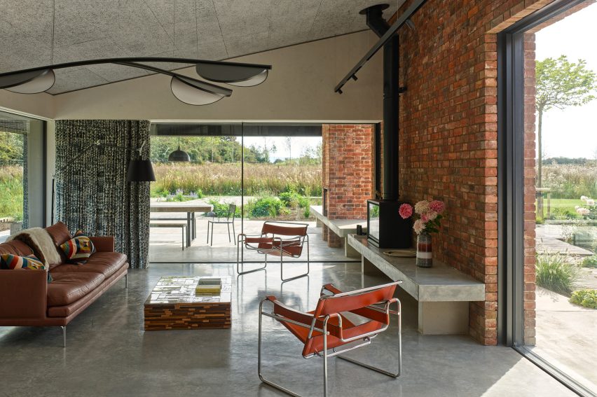

A Modern Oasis, UK, by Richard Parr Associates
The level thresholds of this house in Oxfordshire, England, create a visual connection between the polished concrete flooring inside and the paving tiles outside.
Architecture office Richard Parr Associates carefully matched the colours of these two surfaces so that they appear to be made of the same material.
Find out more about A Modern Oasis ›
This is the latest in our lookbooks series, which provides visual inspiration from Dezeen’s archive. For more inspiration, see previous lookbooks featuring chocolate-brown interiors and minimalist bathrooms.


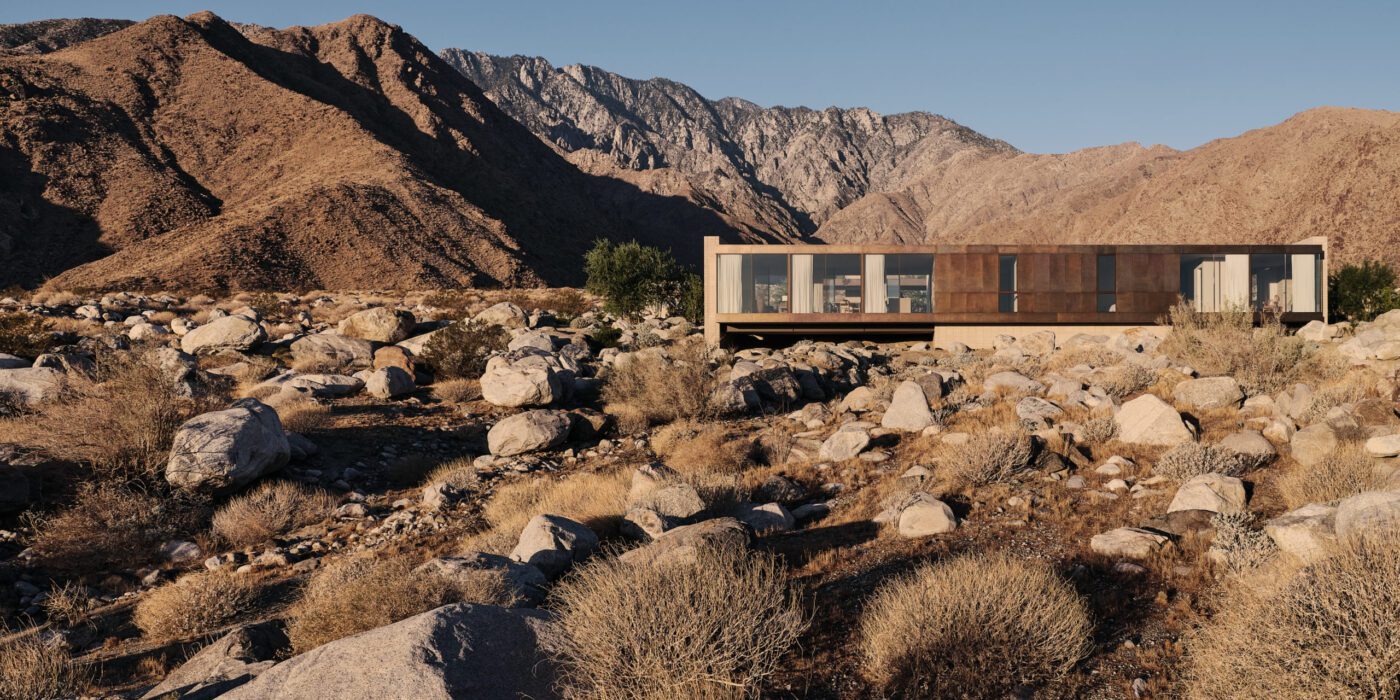

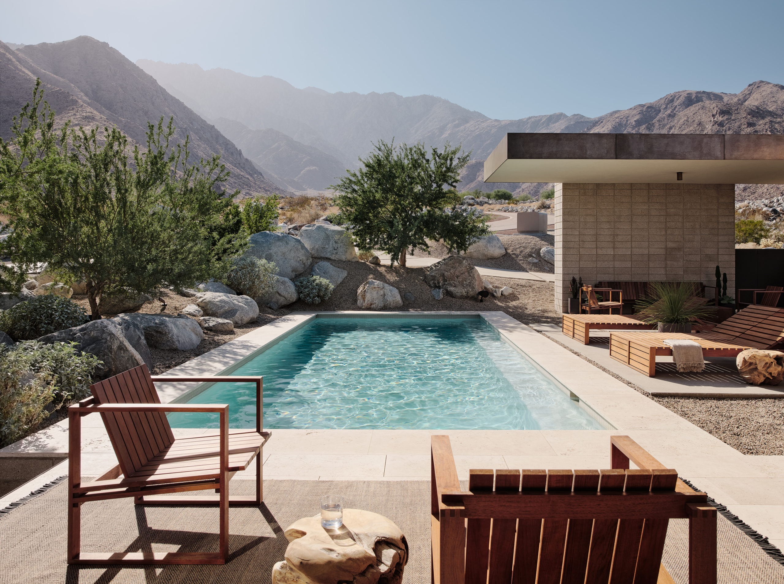 Lightly perched above the floor of the La Quinta Valley, this home adopts a classic desert modernist aesthetic. The home’s exterior cladding of earth-toned plaster and textured concrete masonry puts it in harmony with the similarly brownish desert, but the structure’s simple and elegant rectangular compositions offer a balanced contrast with the valley’s rugged, uneven and hostile character. In similar fashion, the small outdoor pool, sheltered in one of the home’s two courtyards, pairs well in tone with the constant clear-blue sky, but provides instead a refreshing alternative to the arid climate.
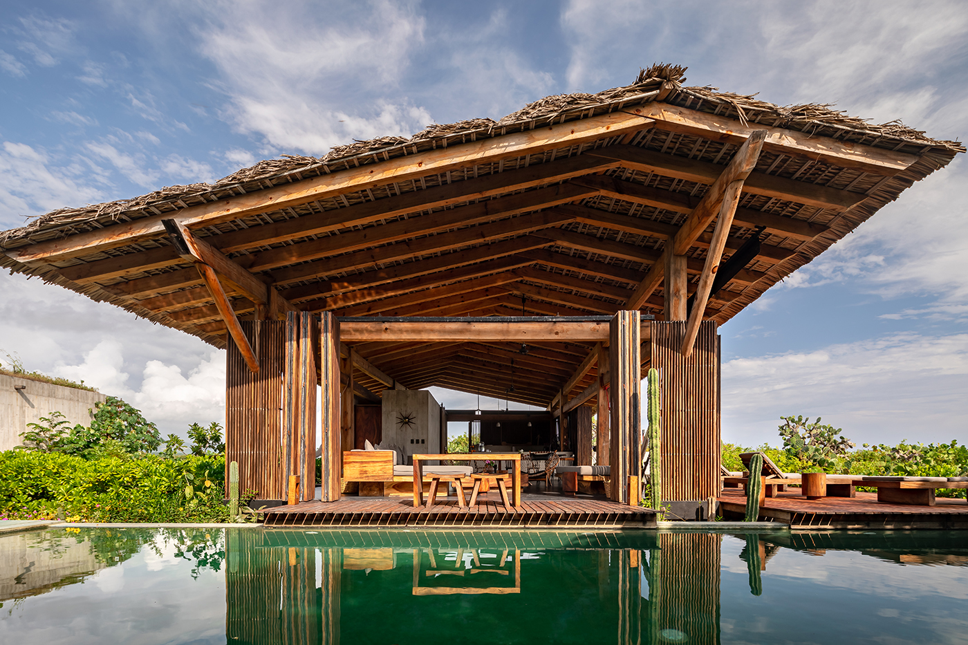
 This private home in the coastal town of Puerto Escondido uses vernacular materials to create a peaceful resort in line with the local architecture. But the concrete-cast pool which extends beyond the main room is undeniably modernist. It serves as its own micro-climate comfortably shielded by several canopies, both natural and man-made.
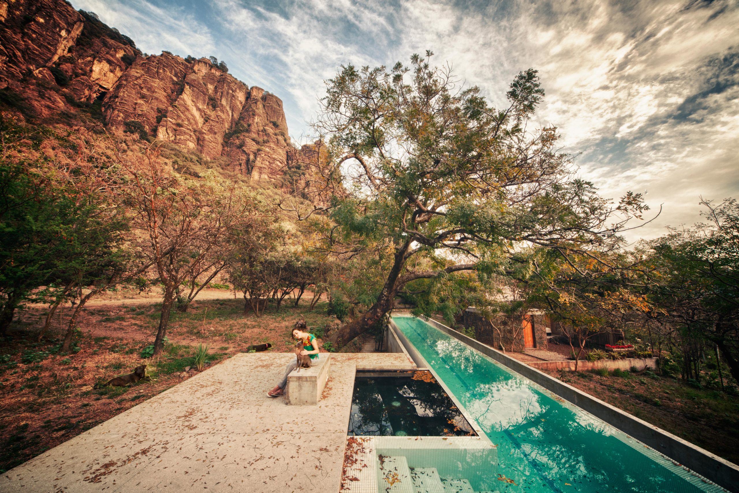
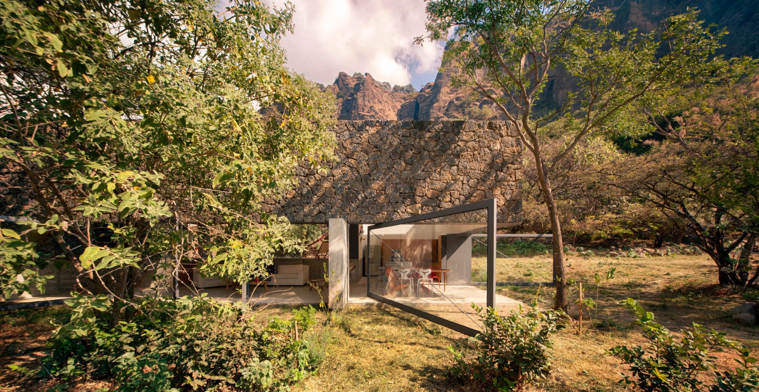 This rural home in Tepoztlán, Mexico is a tranquil abode flanked by the imposing rock mountains of El Tepozteco. The house brings together monolithic white volumes with vernacular rough stone sections, allowing nature to project itself onto the structure. Meanwhile, a lap pool nearby acts like the house’s miniature desert oasis; it crawls under trees’ dense foliage like an emerald-tinted river breaking through an arid landscape. The pool offers a peaceful place to enjoy the nature that surrounds and blankets over it.


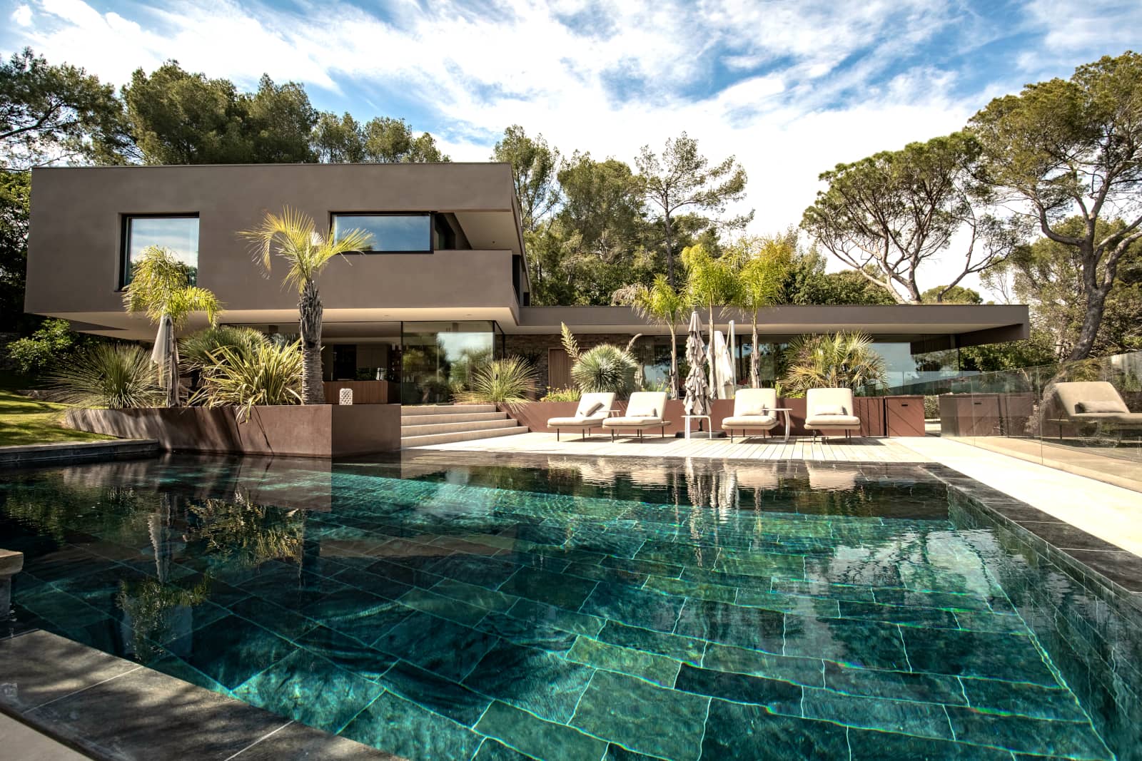
 Resting near the top of a hill in France, this new house takes advantage of the lot’s sloping angle to experiment with layering; from the house’s overlapping volumes to the stone walls guiding visitors down to it. As such, the house’s top floor acts like a belvedere overlooking the landscape further out. But right underneath it is the true surprise: a large tile-clad pool partly shaded by the diverse flora and from which visitors can continue enjoying the view in their bathing suits.
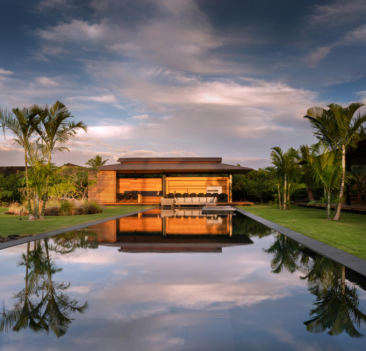
 For this new pavilion in Geneva, GMAA – GM Architectes Associés had envisioned a wooden volume gently hovering above a water surface. Their final project achieves this vision with a subtly integrated pool — more closely akin to a pond — that turns into a perfect mirror on windless days. As opposed to the natural ponds on the pavilions’ grounds, this artificial one is kept spotless; a pure and perfect counterpart to the surrounding nature, reflecting and emphasizing the beauty around.