Antonino Cardillo designs Elogio del Grigio house as “miniature palazzo”
CategoriesArchitecture

Antonino Cardillo designs Elogio del Grigio house as “miniature palazzo”

Italian architect Antonino Cardillo has completed a house near Lake Garda featuring steep ceilings, arched doorways and a palette of textured plaster and marble.

Located in Castiglione delle Stiviere, in Italy’s Lombardy region, the two-storey residence was designed by Cardillo in the spirit of “a miniature palazzo”.
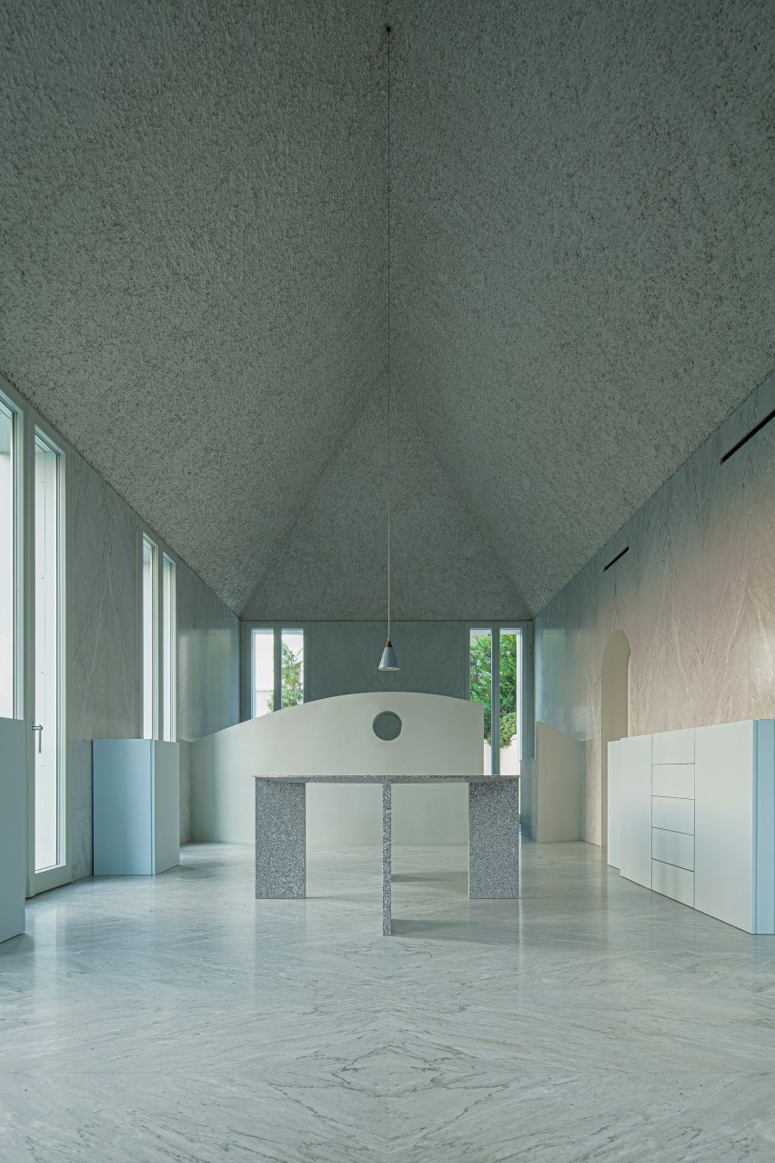
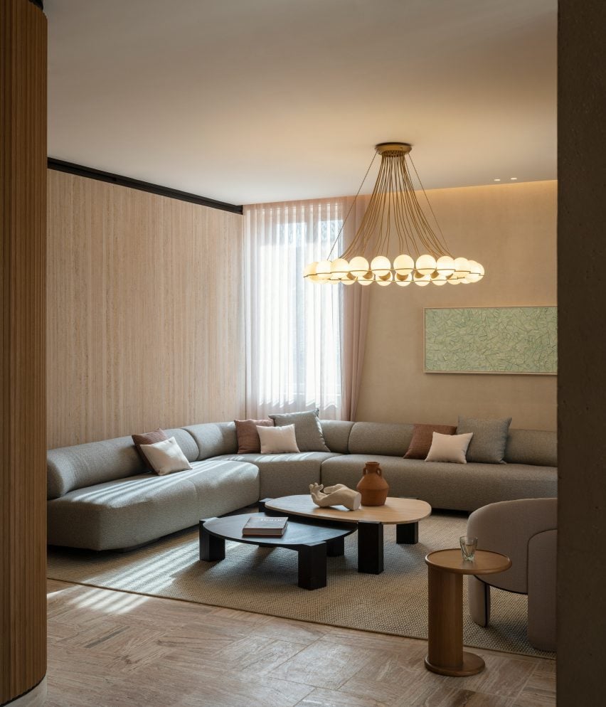
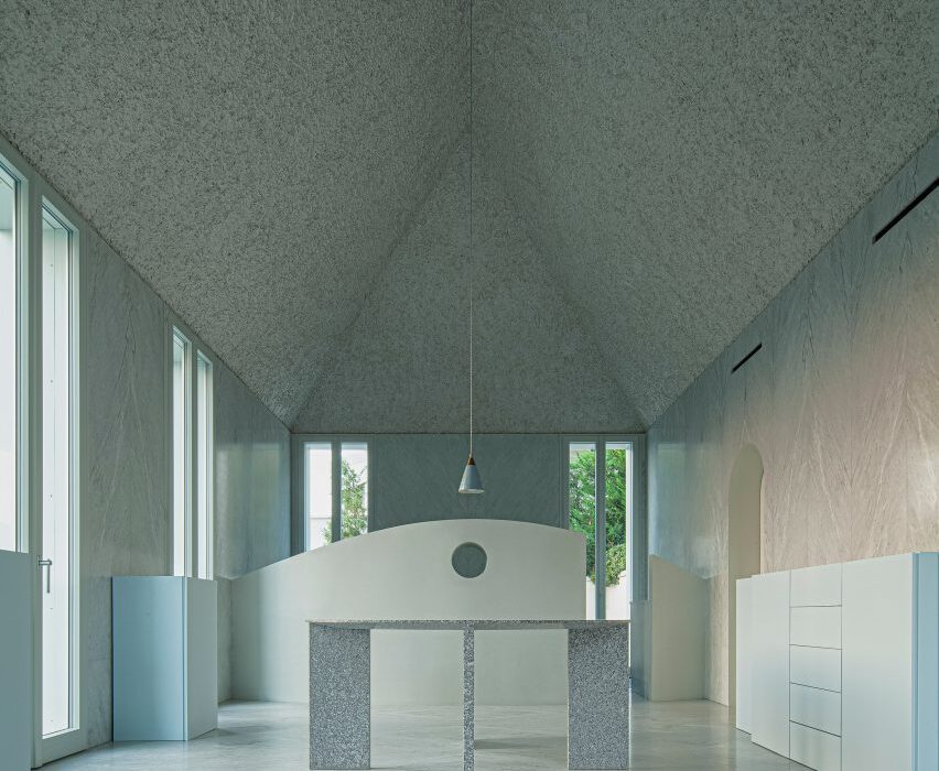
Living room in Elogio del Grigio house by Antonino CardilloLiving room in Elogio del Grigio house by Antonino Cardillo
The design centres around a grand first-floor living room and kitchen

Called Elogio del Grigio, which means “praise of grey”, the house combines classic proportions with a minimalist design aesthetic.

The building echoes the form of its red-walled neighbour, a typical northern Italian villa, but also incorporates references to traditional architecture from different parts of the Mediterranean.
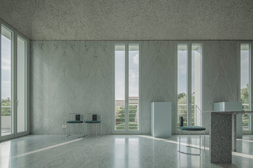
Marble wall in Elogio del Grigio house by Antonino CardilloMarble wall in Elogio del Grigio house by Antonino Cardillo
This room features marble walls and textured plaster ceilings

The layout centres around a grand first-floor living room described as “the soul of this house”.

Cardillo drew on “the rectangular cuspidate rooms of Marrakech” and “window panes somewhere between Venetian windows and the marble hammams of Istanbul” for the design.
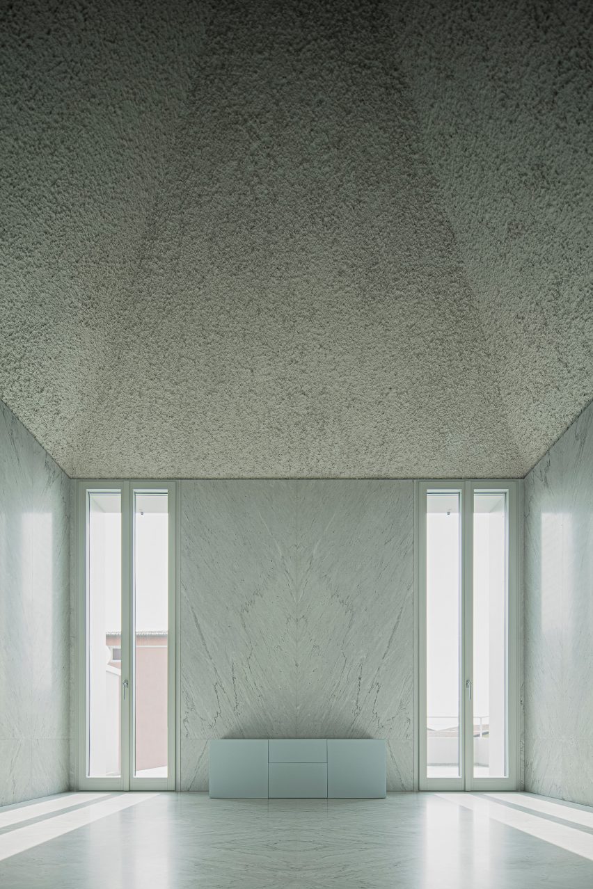
Sloping ceiling in Elogio del Grigio house by Antonino CardilloSloping ceiling in Elogio del Grigio house by Antonino Cardillo
Full-height glass doors lead out to roof terraces

“The project seeks to recognise and integrate some of the contributions of civilisations which are largely forgotten in Western architecture,” he told Dezeen.

“It accepts Hegel’s invitation to learn to see the endless greys of realities,” he added, referencing the words of a 19th-century German philosopher.
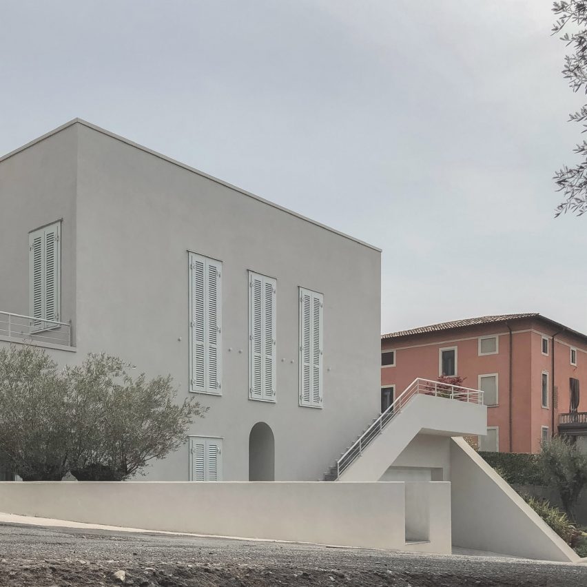
Exterior of Elogio del Grigio house by Antonino CardilloExterior of Elogio del Grigio house by Antonino Cardillo
The building’s exterior is relatively modest

Elogio del Grigio is home to a couple and their young daughter.

After visiting Cardillo’s House of Dust, a Rome apartment featuring deep wall recesses and textured ceilings, the couple asked the architect to design them a family home.

The brief called for generous living and dining spaces on two levels, three bedrooms, two bathrooms, a roof terrace and a garage with space for two cars.

The building’s exterior is relatively modest, with a cool grey render finish and door shutters painted in a slightly brighter green-toned grey.
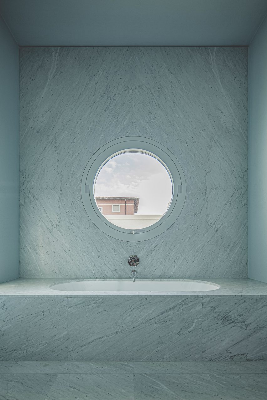
Marble bathroom in Elogio del Grigio house by Antonino CardilloMarble bathroom in Elogio del Grigio house by Antonino Cardillo
The first-floor bathroom features a porthole window

Inside, the materials palette becomes more luxurious.

Slabs of Carrara marble cover the walls and floors in the first-floor living room and bathroom, with a book-matching technique to create subtle repetition within the surface patterns.

The steeply sloping ceilings are coated with a plaster mix that includes volcanic ash, which was applied with a hand trowel to create the lumpy texture.
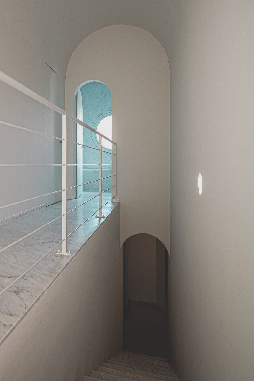
Hallway in Elogio del Grigio house by Antonino CardilloHallway in Elogio del Grigio house by Antonino Cardillo
Arched doorways can be found throughout the house

The living room also features a custom-made granite table based on the one in House of Dust, created thanks to the support of stone contractor and previous collaborator, Daniele Ghirardi.

“Daniele had already supported my research by funding an exhibition of my sculptures at the Soane Museum in London a few years ago,” Cardillo said.
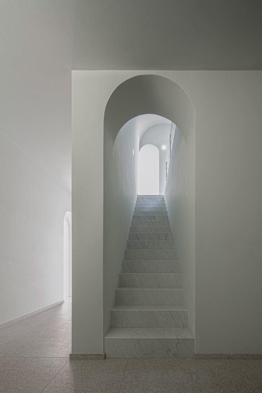
Staircase in Elogio del Grigio house by Antonino CardilloStaircase in Elogio del Grigio house by Antonino Cardillo
Granite provides flooring on the ground floor

Bedrooms are also located on the first floor, which is wrapped on three sides by terraces, while the lower level houses an office, the garage and the second kitchen and living space.

Other projects by Cardillo include a textured all-green gallery interior and a Sicilian grotto.

The photography is by Antonino Cardillo.


Project credits:

Architecture: Antonino Cardillo
Construction management: Giampaolo Piva
Quantity surveying: Massimo Maggi
Construction: Andrea Pennati, Giovanni Lancini, Giovanni Locatelli
Masonry: Stefano Camozzi, Marco Fontana, Osmanaj Jeton, Giuseppe Lancini, Carmelo Piterolo, Ramqaj Vehbi
Marbles and granites: Ghirardi
Windows: Wolf Fenster
Air system: Bonometti Graziano, Giacomo Averoldi

Reference

Patricia Urquiola converts historic palazzo into Six Senses Rome hotel
CategoriesInterior Design

Patricia Urquiola converts historic palazzo into Six Senses Rome hotel

Milan-based designer Patricia Urquiola has converted a palazzo in Rome into a hotel and spa, filled with circular elements and traditional Italian materials.

The Six Senses Rome is located within the Palazzo Salviati Cesi Mellini, close to historic sites like the Pantheon and the Trevi Fountain in the city centre.

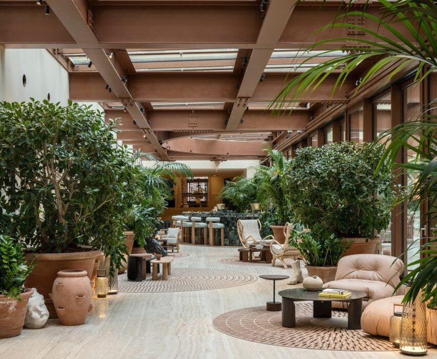
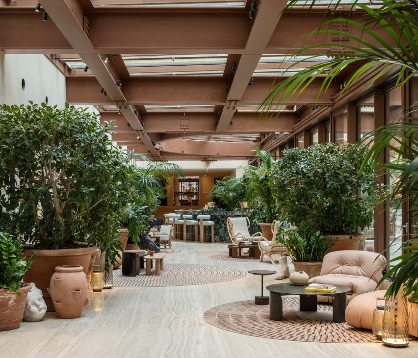
Open lobby with pockets of seating between potted plants in Six Senses Rome hotel by Patricia Urquiola
The lobby of the Six Senses Rome is an open social space with multiple seating areas

Adjacent to the Church of San Marcello al Corso, the building was first constructed in the 15th century before being updated in the 18th-century baroque style by architect Tomaso De Marchis.

An impressive central staircase and the building’s main UNESCO-listed facade, which overlooks the bustling Via del Corso, are among the period details that were restored during the renovation works led by Studio Urquiola.

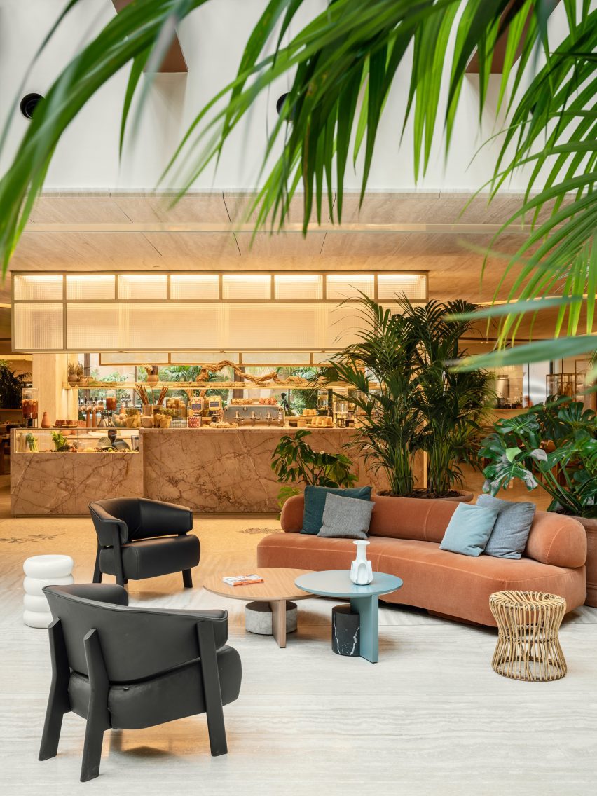
Lounge seating in front of restaurant counter
The Bivium restaurant connected to the lobby offers all-day dining

The entrance to the Six Senses Rome from Piazza di San Marcello leads into an open lobby and social area, furnished with a variety of sofas and lounge chairs from Urquiola’s oeuvre alongside classic Italian designs.

These are positioned in groupings with tables and decorative objects on circular rugs, between potted plants spread across the travertine floors.

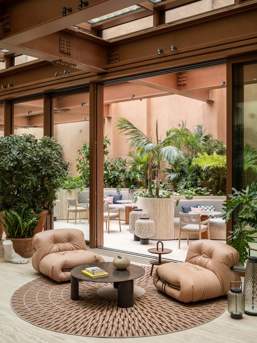
Lounge seats on a circular rug, in front of an opened glass partition in Six Senses Rome hotel by Patricia Urquiola
Circular elements appear throughout the hotel, including rugs and tables in the lobby

“At every turn, the craftsmanship, the finishes, the materials and the graphics create a union with nature while staying true to both Roman classicism and Palazzo Salviati Cesi Mellini’s rich history,” said Urquiola.

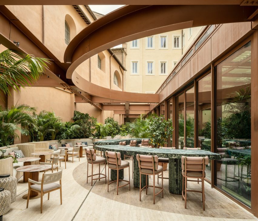
A curved green marble bar is positioned near the windows, forming an incomplete circle with the matching counters in the courtyard, which are visible through the glazing and follow the shape of earth-toned steelwork overhead.

Courtyard with green marble bar counter below steelwork in Six Senses Rome hotel by Patricia Urquiola
In the courtyard, a green marble bar counter continues from inside

The courtyard also features benches built into planters along the back wall and additional seating, where diners can enjoy food and drinks from the trattoria-style Bivium restaurant.

Circular forms and motifs continue throughout the hotel, including in the Six Senses Spa and Roman baths on the first floor.

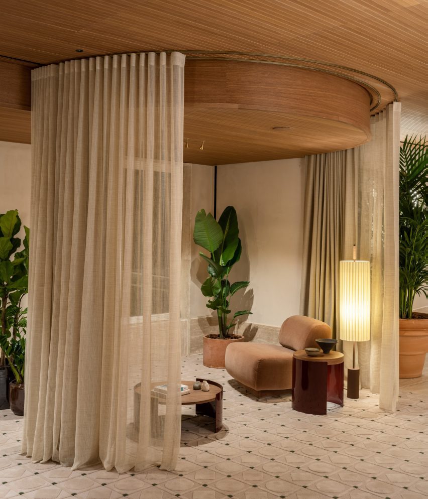
Spa waiting area featuring seating within sheer curtain enclosures
The spa waiting area features seating within sheer curtain enclosures

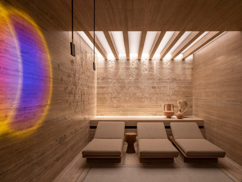
Here, sheer curtains encircle small seating areas for those waiting for treatments or preparing to enter the travertine-lined bathhouse, which offers multiple pools for soaking and relaxing.

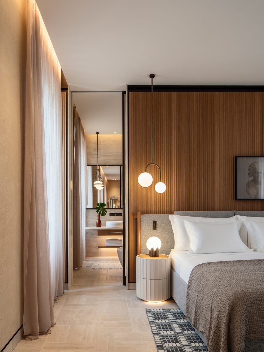
Bedrooms across the central levels have “quirky” layouts and a soft neutral decor, including tambour panelling, patterned rugs and a variety of spherical light fixtures.

Travertine lines the walls and ceiling inside the spa and Roman baths in Six Senses Rome hotel by Patricia Urquiola
Travertine lines the walls and ceiling inside the spa and Roman baths

Several of Six Senses Rome’s 96 guest rooms and suites have balconies, and all enjoy either a courtyard or city view.

Plasterwork in the rooms is made from an ancient Roman material known as cocciopesto, which comprises fragments of earthenware or brick mixed with lime and sand.

“The legacy of antiquity is also honoured with the choice of cocciopesto, which decorates the plaster of the rooms and gives a nod to Roman architect Vitruvius,” said the studio.

The hotel also features a roof terrace and bar called Notos that offers views across the city and serves botanical cocktails and light bites.

Bedrooms with soft neutral decor
The bedrooms at the Six Senses Rome have a soft neutral decor

Artworks such as watercolours, sculptures, textile works and canvases throughout the interior are curated by art advisor Federica Sala and are all unique to the hotel.

Six Senses Rome is shortlisted in the hotel and short stay interior category of Dezeen Awards 2023, while Studio Urquiola is shortlisted for interior designer of the year.

Lounge area within a guest room suite in Six Senses Rome hotel by Patricia Urquiola
Plasterwork in the bedrooms and suites is made from cocciopesto

Originally from Spain, Urquiola is one of Europe’s most sought-after designers and has released furniture and product collections with brands like Moroso, Cassina, Kettal and Boffi among many more.

Other hotels designed by her studio include the Haworth Hotel in Michigan, the Hotel Il Sereno on the shores of Lake Como and the Room Mate Giulia in Milan.

The photography is by Luca Rotondo.


Project credits:

General contractor: CDS Holding
Architecture: Starching and professor Paolo Micalizzi
Interior design: Patricia Urquiola

Reference

Vipp transforms 13th-century Italian palazzo into pop-up hotel
CategoriesInterior Design

Vipp transforms 13th-century Italian palazzo into pop-up hotel

Interior designer Julie Cloos Mølsgaard has created a pop-up hotel filled with Italian frescos and modern Scandinavian furniture for Danish homeware brand Vipp within Palazzo Monti in Brescia, Italy.

The collaboration with Vipp saw the Palazzo Monti, which is an artist residency foundation hosted in a 13th-century palace, transformed into a hotel for guests to stay overnight.

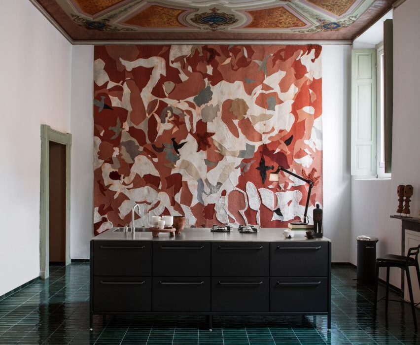
Kitchen with black cabinets and green-tiled floor
Palazzo Monti was converted into a pop-up hotel

The space was redesigned into a hotel suites focused on showcasing Vipp products.

Mølsgaard added minimalist furniture and lighting by Vipp to the interior spaces, aiming to complement the historic building, which features Baroque paintings from 1750 on its walls and ceilings.

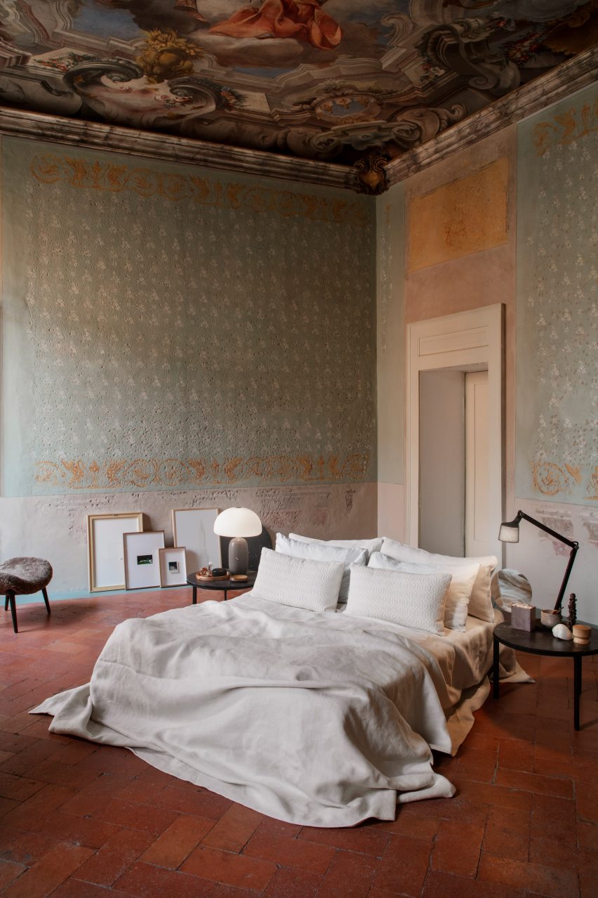
Bed on red-tiled floor of Palazzo Monti
The rooms were decorated with minimalist furniture

“Palazzo Monti showcases a broad array of art exhibitions,” said Palazzo Monti founder Edoardo Monti.

“For the first time, we will host a liveable installation curated by Vipp, where we invite guests to check into our residency,” he continued.

“Entering the opulent gates of the palazzo is like stepping into an old master’s painting.”

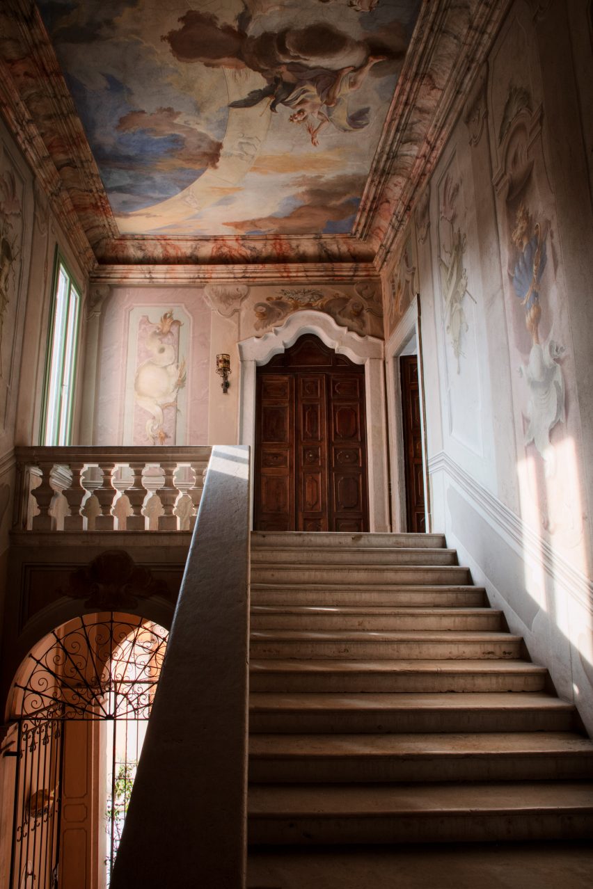
Staircase within Palazzo Monti with frescos
The staircase is surrounded by frescos on the walls and ceiling

“For the pop-up hotel at the palazzo, Mølsgaard had an ambition of building a bridge between the minimalist and the opulent,” said Vipp CEO Kasper Egelund.

“Vipp and Mølsgaard approached the interior design with a simple and minimalist mindset to respect and not compete with the surrounding richness.”

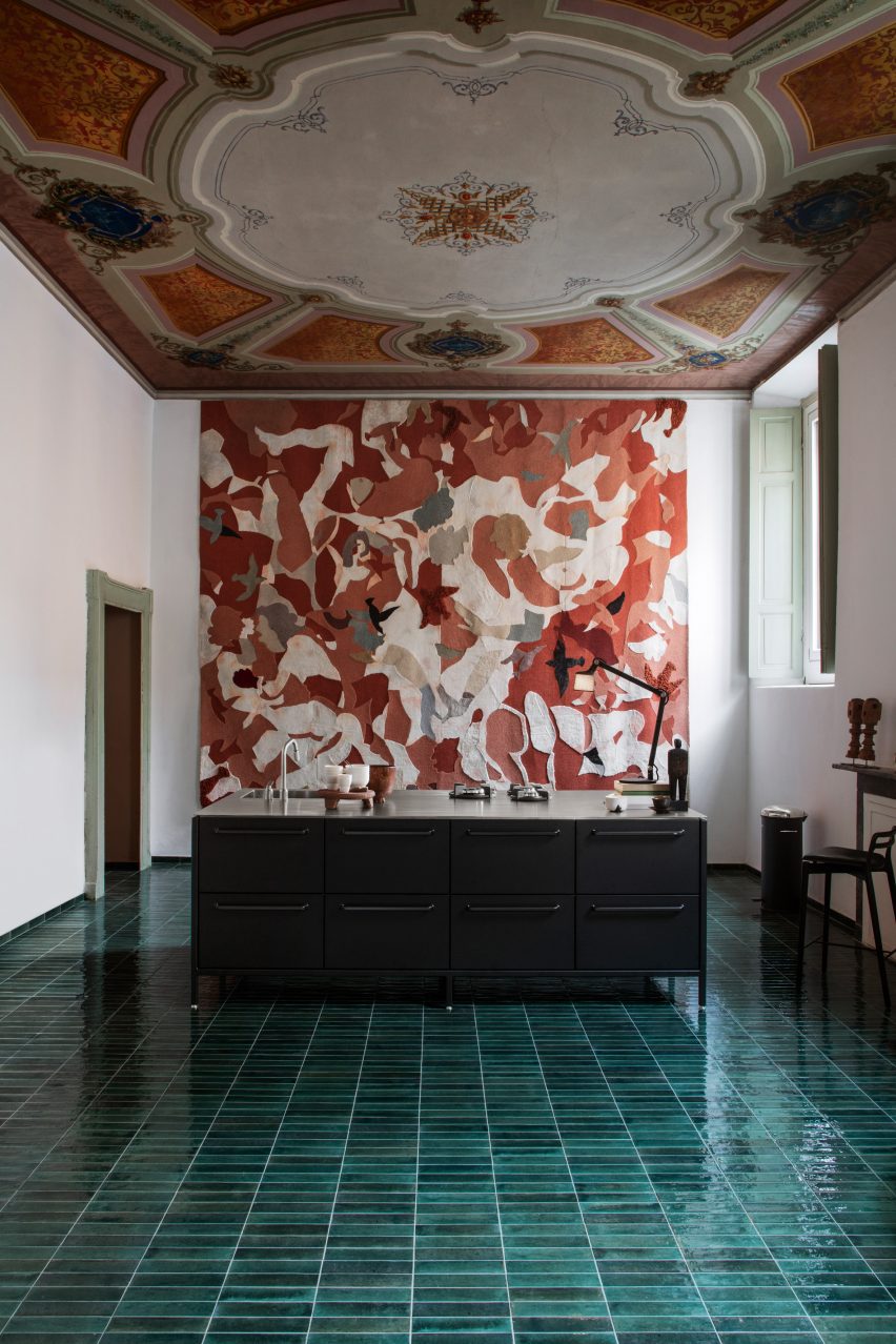
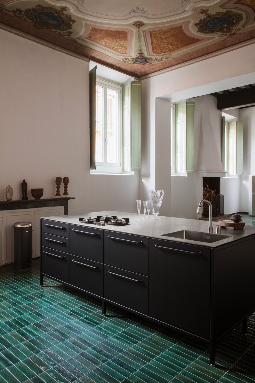
Black kitchen island counter with Italian palazzo
Green tiles cover the kitchen floor

On the ground floor is a combined kitchen and dining area. Mølsgaard added an industrial-looking matte black kitchen island in the middle of the space, which sits under an ornate ceiling and atop a green-tiled floor.

A grand staircase surrounded by pastel frescoes leads visitors to the pop-up hotel on the first floor.

A succession of rooms – a hallway, salon and bedroom – were transformed into a suite decorated with Vipp furniture and lighting.

The furniture in the bedroom was intended to be simple and minimalist. The mattress sits on the floor without a bedframe, making the painted three-metre-high ceiling the main focus of the room.

“The idea is that guests should visit and explore the space,” Mølsgaard told Dezeen. “When you wake up under the frescoes, it’s impossible not to think, what kind of life must have been lived in this house?”

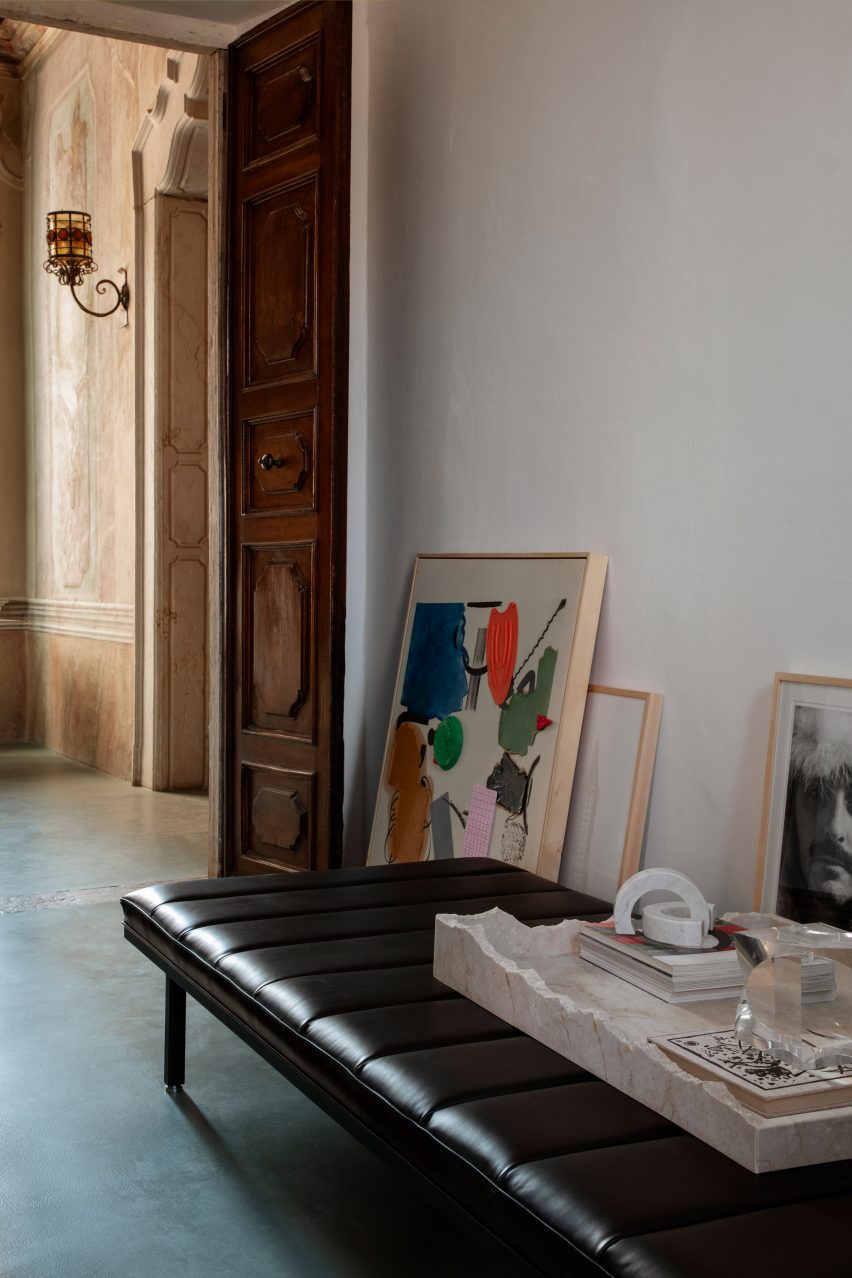
Hallway within Vipp pop-up hotel
Artwork was placed on the floor

Throughout the palazzo, artwork and picture frames were placed on the floor propped up against the walls, rather than being hung.

“We initially hung a lot of art on the walls, but it was making too much noise, so instead I have sought the purity of the history of the place and wanted to let it speak through the bare walls,” said Mølsgaard.

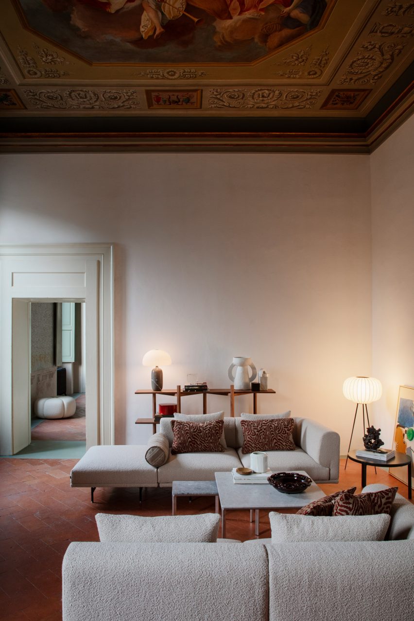
Living space in pop-up hotel with beige chez lounge in Palazzo Monti
Mølsgaard aimed to combine Scandinavian minimalism with Italian opulence

“The whole place is one big art piece,” she continued. “The staircase is a work of art, the doors are works of art, the shutters, the walls and the ceilings.”

“When you walk around the rooms, you simply experience so many things that you almost get overloaded, so there was something that had to be removed.”

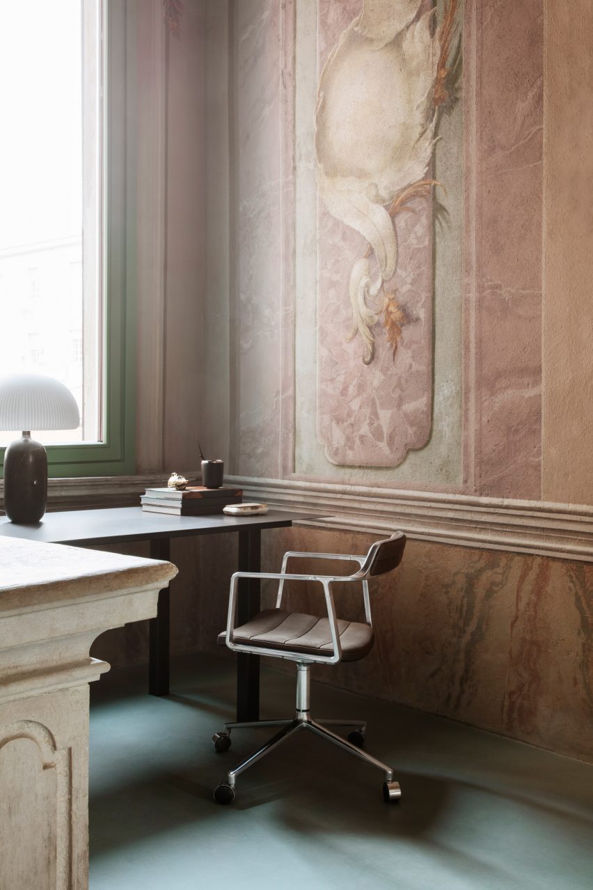
Desk space with Monti Edition chair
Vipp launched a special edition chair for the pop-up

Artist workshops on the second floor of the building overlook Brescia, which is a UNESCO World Heritage Site.

To celebrate the pop-up hotel at Palazzo Monti, Vipp launched the Monti Edition chair, which sees the brand’s Swivel chair design upholstered in an Italian woven fabric created by textile company Torri Lana.

The pop-up hotel at Palazzo Monti opens on 18 April to coincide with Milan furniture fair Salone del Mobile and closes on 18 May 2023.

Vipp and Mølsgaard have previously collaborated on projects including a one-room hotel in a converted pencil factory and a pop-up supper club venue.

The photography is by Irina Boersma César Machado.


Reference

Foster + Partners turns palazzo in Rome into Apple Store
CategoriesInterior Design

Foster + Partners turns palazzo in Rome into Apple Store

Fosters + Partners has restored and converted the Palazzo Marignoli in Rome into an Apple Store, uncovering historic features and opening up a central courtyard.


Apple Via del Corso is the largest Apple Store in Europe and occupies the historic Palazzo Marignoli, near the Piazza Colonna, in the centre of Rome.

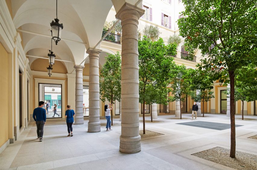
The courtyard of the Apple Via del Corso contains local trees
Top: the store is located in the Palazzo Marignoli. Above: a courtyard is at the centre of the building

The Apple Via del Corso building sits on a site that held a church and a convent in the 16th century.

The current Palazzo Marignoli building was constructed between 1873 and 1878 and served as a home for Marquis Filippo Marignoli. It also housed the Caffè Aragno, a famous gathering spot for artists.

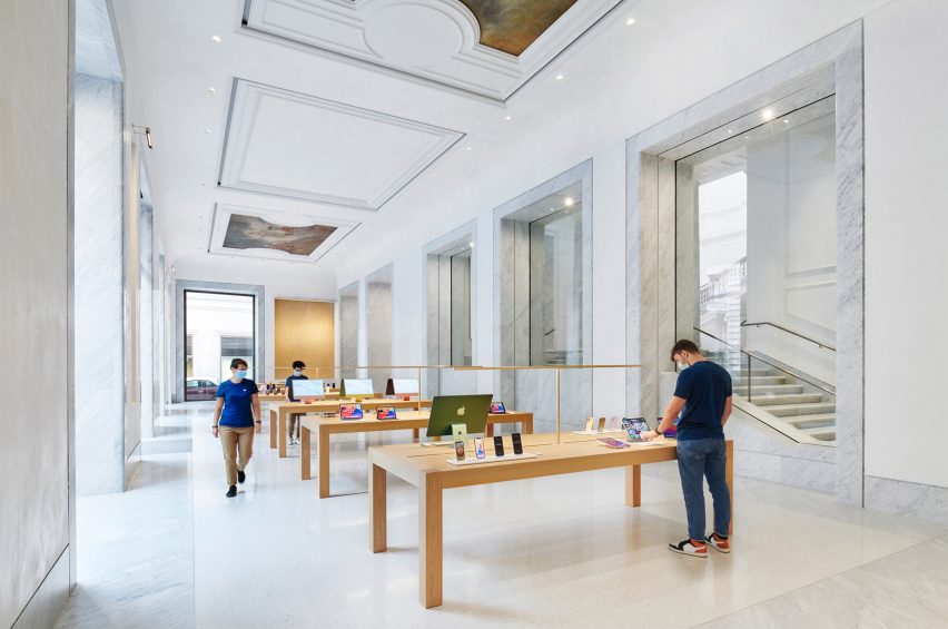
Marble covers the interior of Apple Via del Corso
Original paintings were restored and placed in the ceiling

Foster + Partners wanted to celebrate its history by highlighting its grandeur and restoring its historic features.

“The idea was to celebrate different aspects and various areas of the history of the building,” said Foster + Partners partner Luis Matania.

“You have this juxtaposition of all these various areas in the building’s history, through to now, the 21st century.”

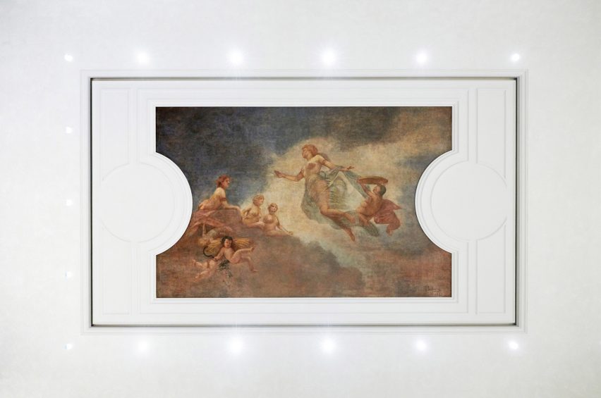
Lighting surrounds an original painting
Ettore Ballerini’s Dusk was placed between ceiling panelling

L-shaped in its plan, the building is organised around a large courtyard that the studio opened up to be used by the public and to greet visitors upon entry into the building.

Camphor trees placed across the courtyard informed by the 16th-century convent that previously existed on the site.

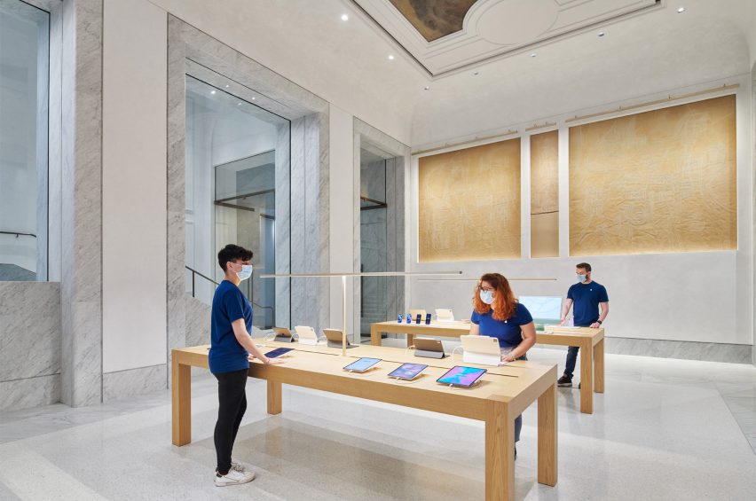
Grey marble frames doorways and windows at Apple Via del Corso
Wooden tables were placed within retail spaces

“The courtyard is no longer private, it becomes a democratic space that the community is invited to come through into and enjoy,” said Foster + Partners partner Stefan Behling.

“We reintroduced trees as a reference to the old convent and it allows the community to come and enjoy this beautiful space.”

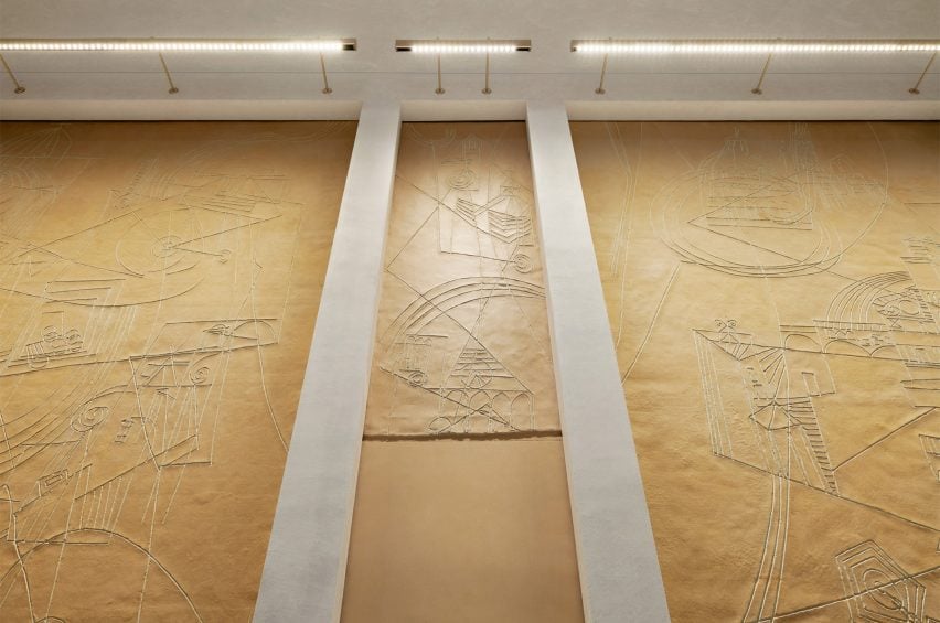
Artworks were placed within the walls of Apple Via del Corso
Artworks by Afro Basaldella that were found in the building were restored

Artworks by Italian artist Afro Basaldella from the building’s art cafe days abstractly depict imagery and scenes of Italy were carefully restored and set into the walls.

Large early-1900s ceiling paintings by Fabio Cipolla and Ettore Ballerini have also restored and incorporated above the marble interiors between ceiling panelling.

“It has been a complicated building and we have discovered things along the way,” said Matania.

“It has been an evolving design process, that has amended and adapted as we found new things, new painting and new aspects of the architecture”

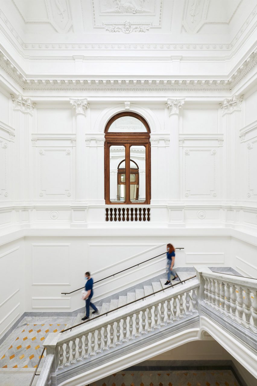
Decorative mouldings cover the walls and ceilings of Apple Via del Corso
The grand staircase was fitted with local marble

White marble was used throughout the interior of Apple Via del Corso, covering the floors of each room and framing large windows that provide glimpses into adjoining rooms.

To the west of the courtyard, a grand staircase with vast mouldings and a former oculus on its ceiling was restored, structurally reinforced and fitted with locally sourced Carrara marble.

The firm recreated daylight within the grand stairwell by adding LED lighting to the oculus that changes with the time of day.

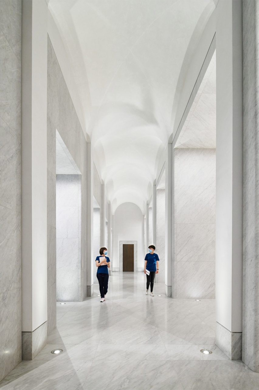
The corridor has a curved ceiling
A long corridor links spaces in the store

On the first floor, a long corridor connects a forum space with a Genius Bar and three retail areas.

The forum-style space will be used for community events, occupying what used to be the Palazzo’s ballroom a central point of the first floor.

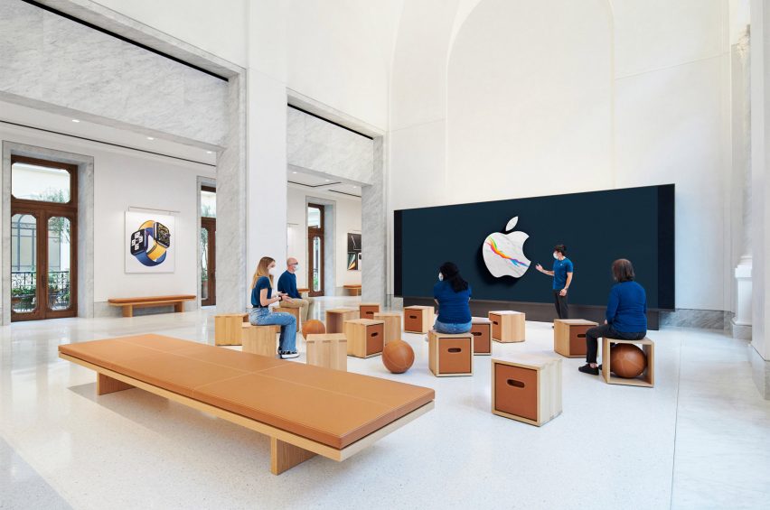
Box stools were placed around the room at Apple Via del Corso
Apple Via del Corso’s forum-style space was furnished with pale wood and leather

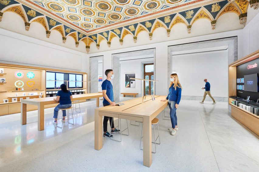
In the Genius Bar, conservators restored a hand-painted geometrically patterned ceiling with decorative crown mouldings.

Wooden furniture and joinery were used throughout to bring warmth to the interior spaces.

Cabinetry was constructed with a pale wood
An original hand-painted patterned ceiling covers the Genius Bar of Apple Via del Corso

Dark wood-framed doors and windows along the corridors and edge of the rooms open out onto Juliette balconies and a terrace that overlooks the courtyard below.

Camphor trees, olive trees and jasmine vines were placed across the terrace to reflect typical plant-filled Roman roof terraces.

Apple Via del Corso is one of many historic buildings the technology company has opened stores in, including the Foster + Partner designed Champs-Élysées store in Paris and the converted Washington DC library.

Reference