Studio Paolo Ferrari designs Toronto restaurant as a “world unto itself”
Toronto-based Studio Paolo Ferrari has created cinematic interiors for a restaurant in the city’s Downtown area, combining influences from filmmakers that range from Stanley Kubrick to Nancy Meyers.
Unlike a typical restaurant layout, Daphne unfolds as a series of rooms with distinct identities, each borrowing references from different cinema styles.

Studio Paolo Ferrari intended each space to offer a different experience for guests, and custom-designed all of the furniture and lighting for the restaurant to make it feel even more unique.
“Daphne is an elevated and exceedingly creative take on the American bistro, fusing the nostalgia of New England prep with wonder and eccentricity,” said Studio Paolo Ferrari. “At once intimate and grand, eccentric and sculptural, convivial and experimental, the deeply imaginative space is reminiscent of a great residence that’s evolved over time.”

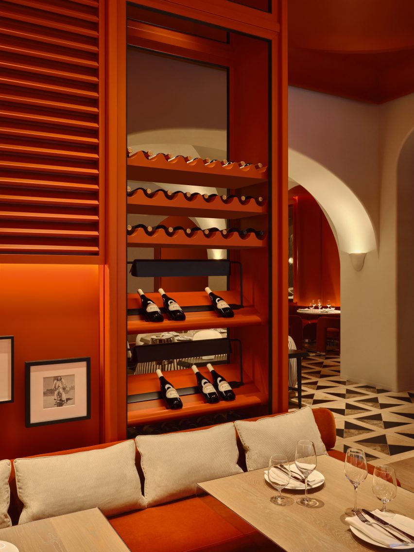
Guests arrive into an intimate space that features a transparent full-height wine cabinet, which offers glimpses of the dining area beyond.
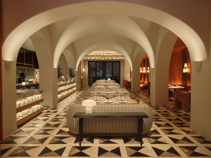
They then move through to the Great Room, a cavernous room framed by a dramatic vaulted ceiling and decorated in a warm neutral palette.

Through the centre is a line of dining tables, each paired with a rounded striped sofa and two boucle-covered chairs.
The open kitchen is fully visible through the arches on one side, while a darker, cosier dining area coloured a burnt orange hue runs along the other.

“The grand space is reminiscent of the warmly luxurious spirit of a Nancy Meyers film, with custom furnishings that are deeply residential in feel and varsity-inspired checkerboard tiling,” said Studio Paolo Ferrari.
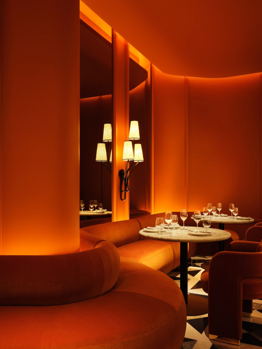
The Drawing Room beyond continues the burnt orange colour, fully enveloping the walls, ceiling and seating upholstery to create a monochromatic space.

Cove lighting is installed behind louvres that cover the upper walls, adding texture and shadows as well as hint of “Cape Cod Americana”.
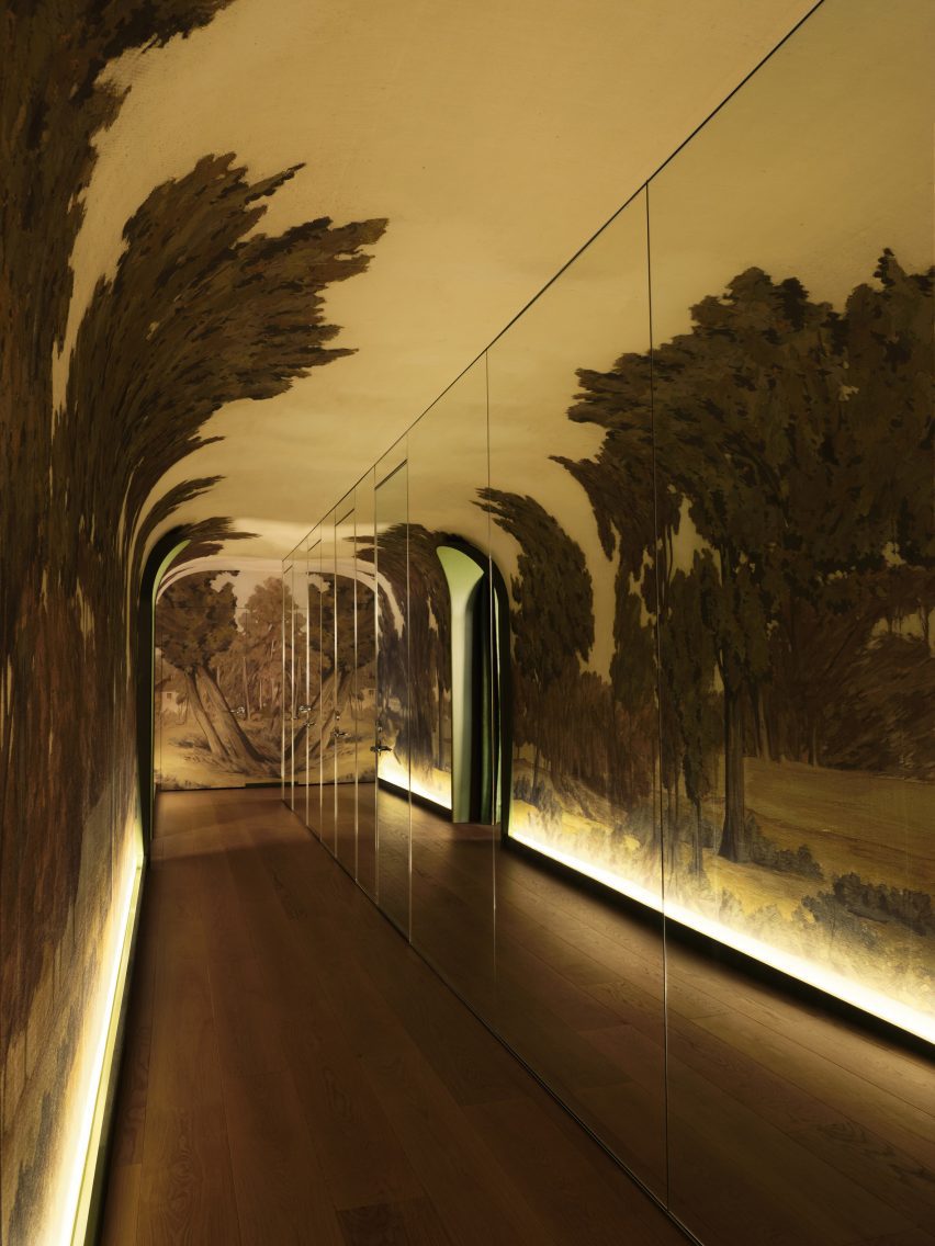
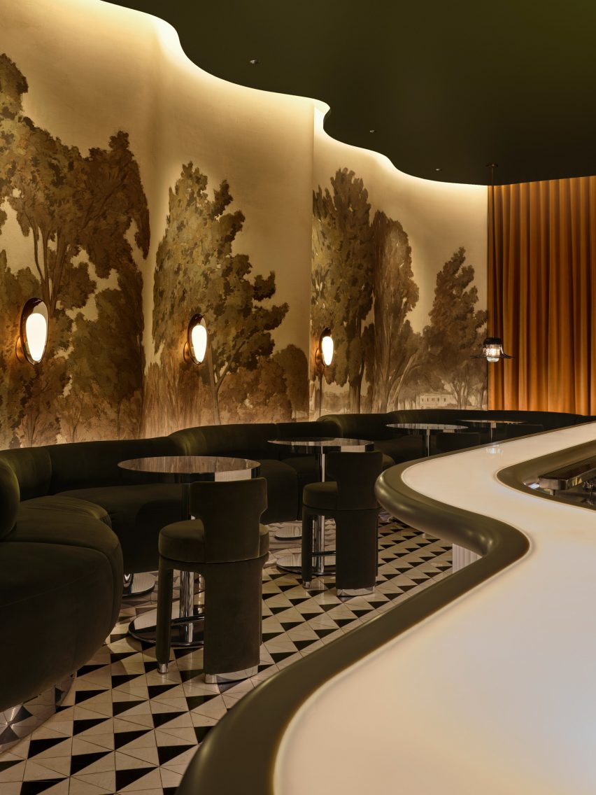
The bar area is reached via a long corridor that’s mirrored from floor to ceiling along one wall, and is lined with a hand-painted landscape mural across the opposite side.
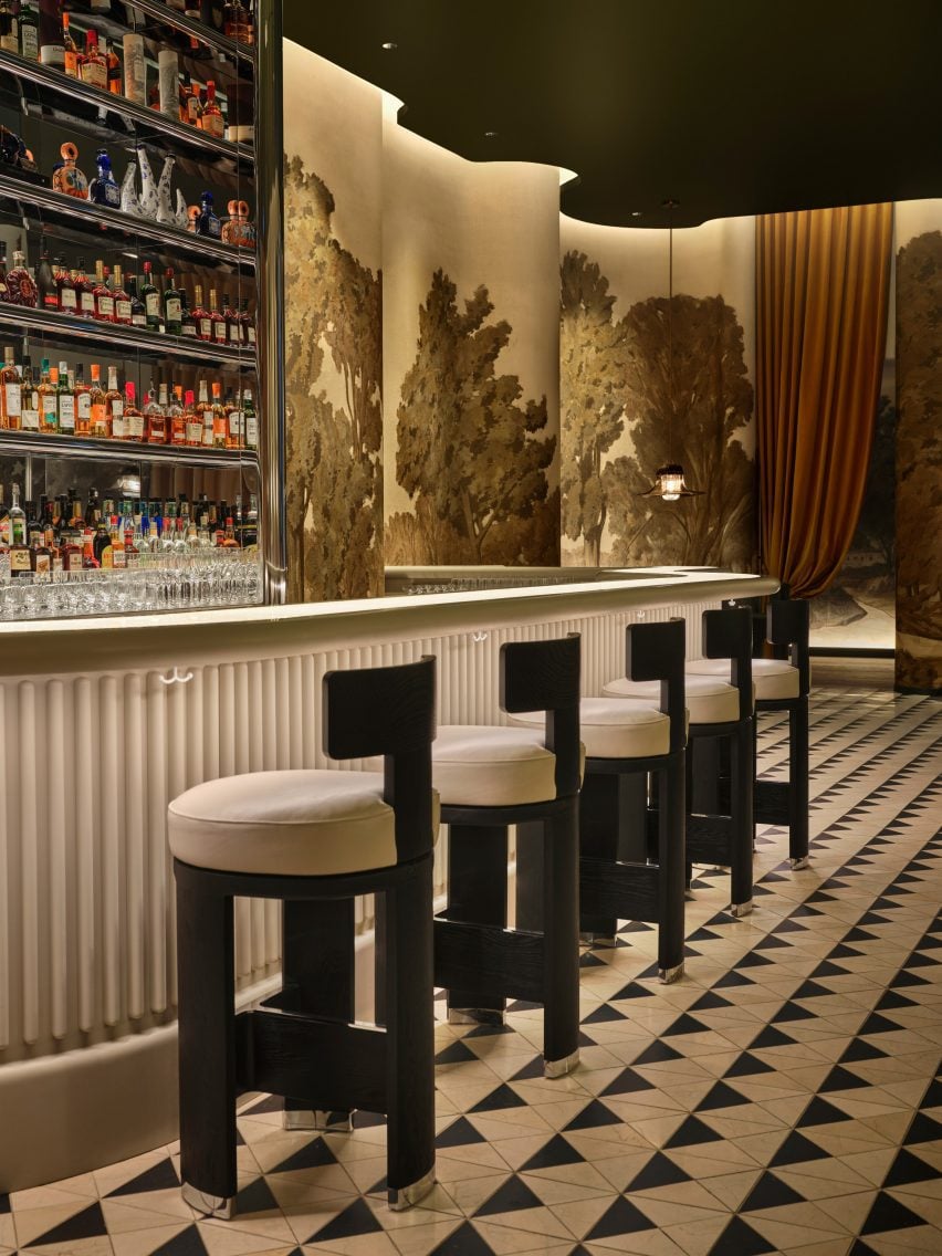

This verdant rural scene continues across the wavy surfaces in the bar room, above green banquettes that follow the flow of the wall.
“Daphne is a world unto itself, awaiting discovery,” the studio said. “Stepping into the bar is almost akin to stepping into an exquisitely-designed film set.”
The snaking glass-topped bar counter is illuminated from within, as a nod to the bar in the fictional Overlook Hotel from Stanley Kubrick’s movie The Shining.
The counter front is fluted in reverence to Beaux-Arts architect Henry Bacon, while reflective stainless steel across the back bar matches the circular tables and chair feet in the room.
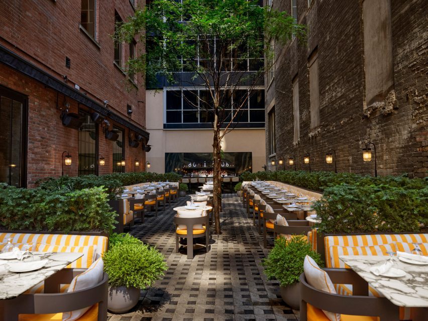

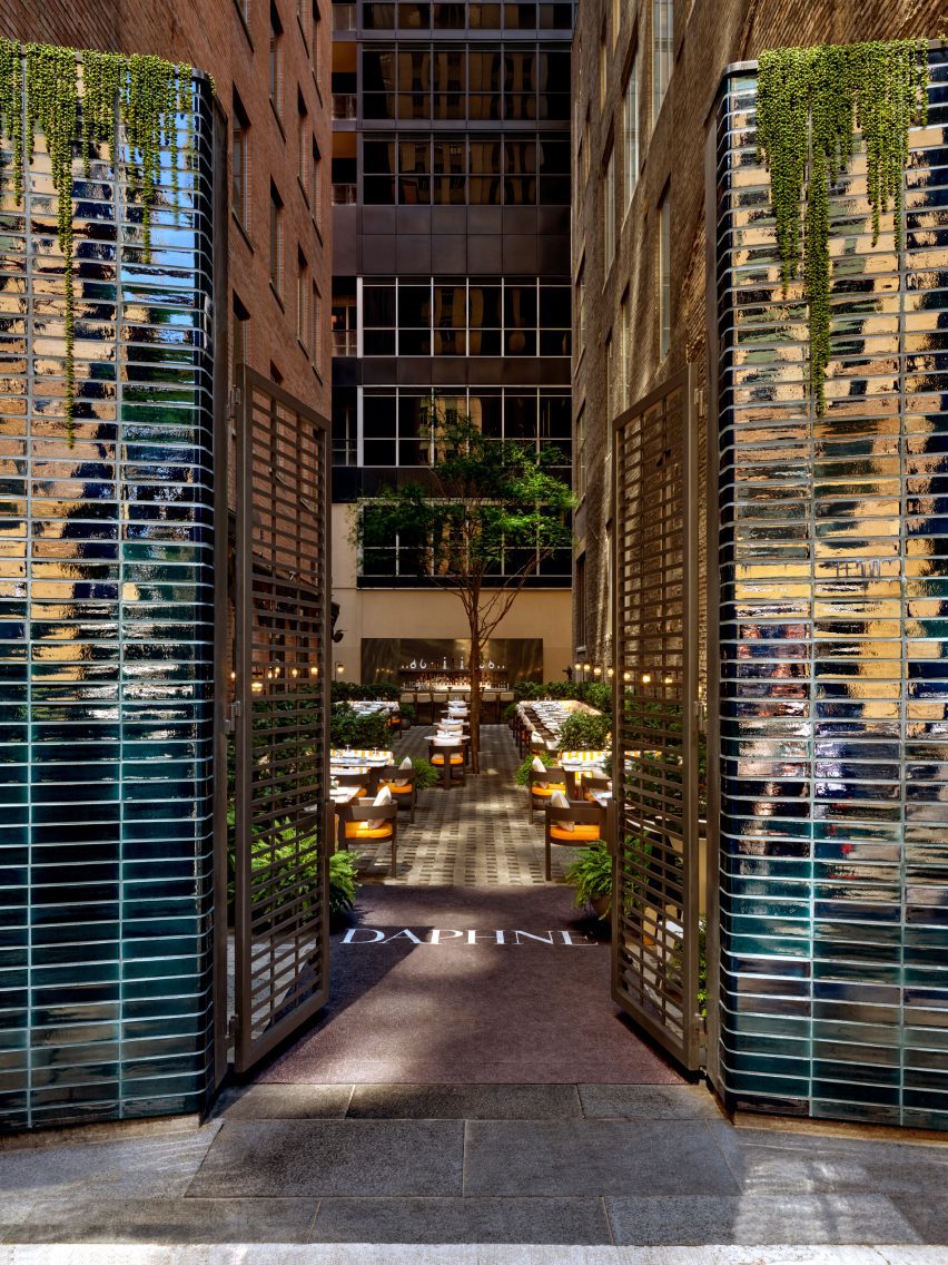
A dilapidated building adjacent to the restaurant was demolished to make way for an expansive outdoor Garden Terrace with a dining area and bar.
Sandwiched between two brick structures, this exterior space features comfy yellow and white-striped seating surrounded by plants, and a row of tall trees in the centre – continuing the botanical theme from inside.
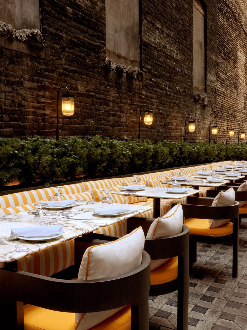

A separate entrance from the street leads guests between tall columns clad in dark blue-purple iridescent tiles into the alley-like space.
“It was important that the space had depth and a quality of experimentation,” said Paolo Ferrari, founder of his eponymous firm. “Daphne is truly an active experience of discovery, where guests can uncover thoughtful and innovative details throughout.”

The designer’s earlier projects in Canada have included a lake house with wood and granite interiors, and a showroom for a development in Ottawa that appears more like a home than a sales gallery.
Other recent additions to Toronto’s dining scene include Prime Seafood Palace, which features a vaulted-wood interior by Omar Gandhi Architect.
The photography is by Joel Esposito.

